Border Structures and Decoration
64
Gold-Tooled Bookbindings And Contemporary Collectables. 1500 – 1800. Chaper 2: Border Structures and Decoration By Ian Andrews 24
-
Upload
independent -
Category
Documents
-
view
0 -
download
0
Transcript of Border Structures and Decoration

Gold-TooledBookbindings
AndContemporaryCollectables.1500 – 1800.
Chaper 2: Border Structures andDecoration
By Ian Andrews
24

September 2013.
50, Wellhouse Lane, Mirfield
West Yorkshire WF14 0PN
Border Structures and
Decoration
Construction of borders: the earlier centuries
From around the eighth century, carved plaques of ivory were
mounted as decoration on the cover boards of holy books of the
Christian Church. Since the raw material from which these
panels were cut had come from the tusks of elephants or
mammoths whose remains had been preserved buried in the
permafrost, the size of the tusks imposed a natural maximum
limit on the panels. Panels of carved ivory were inevitably
smaller than the size of the book cover and, since at this
time books were hand-written on parchment, and heavy boards of
thick wood were needed to keep the book in shape, this left a
space around the centre panel, usually of bare wood, which
needed to be disguised with additional decorative material.
25

The usual practice was for additional strips of carved ivory
to be placed around the central carved plaque to complete the
decoration. This technique was referred to, rather
derogatorily, though accurately, by Libri, as ‘botching’.i The
design challenge was to create a balanced field using smaller
pieces to fill the space around it. The most common
arrangement was for single strips of full width to be pinned
across the top and bottom of the board, above and below the
central panel, and two or three smaller, square ones to each
side. (Figure 1)
Perhaps the most important aspect of the decoration on the
cover of a holy book was its visibility. Given the central
importance of the word of God in the rituals of the medieval
Church, it was inevitable that Gospel books and Bibles should
be adorned with the most valuable materials that could be
acquired.ii Plaques of carved ivory were still considered
essential for the centre piece, but these would be set within
plates of solid gold embedded with precious jewels and
gemstones. (Figure 2) The value of these materials was
enhanced by the way they scattered light. Carved ivory plaques
might look and feel exquisitely beautiful when close to, and
in good light, but in churches, where most of the light was
from candles of beeswax, they could not be seen to advantage.
Plates of gold, especially with filigree surface decoration,
together with quantities of cabochon jewels and polished
gemstones could be relied on to catch the flickering lights
from the candles, and to sparkle in a most magnificent manner.
It was to the advantage of churches and monasteries to invest
26

all their resources in such ornamentation of their precious
books, because it impressed their congregations and attracted
pilgrims who could be persuaded to contribute to their
coffers. Moreover, when times were bad, these valuable
ornamental pieces could be sold.
.
Figure 1
An assembly of carved ivory panels from an eighth to ninth-century
ecclesiastical book cover. Here it is possible to distinguish the five
panels from which the cover decoration was constructed, and also the heads
of the pins used to secure the panels to the baseboard.
27

Figure 2
The jewelled ‘treasure binding’ of the evangelary of St Aegidien
demonstrates how the assemblies of ivory strips developed into plates of
gold encrusted with jewels and gemstones in the eleventh and twelfth
centuries.
28

29

Figure 3
An English binding of c1526decorated with a central panel and smaller
panels forming the border around it, in the same construction style as was
used in the earlier ivory plaque designs and those of the ‘treasure
binding’ period.
Borders on leather bindings
By the beginning of the sixteenth century, the construction
and binding of books was of a very different order. They were
printed, usually on paper rather than vellum, with paste-board
covers, since a page-block of paper did not require heavy
wooden boards to keep it in shape. Books were covered with
leather, either goat-skin or calf. Leather was the most
versatile material of the time, combining the dual attributes
of strength and flexibility needed for covering a book. Alan
Thomas, when describing a late fifteenth-century calf binding
over wooden boards, made in the Celestine monastery at Oybin
in Saxony, rightly asserts that bindings of this sort were
intended to preserve the books ‘for all time’.iii Leather
possessed one other remarkable property: it could be moulded.
30

While very strong, and extremely resistant to changes in shape
when dry, leather loses its memory of its original form when
thoroughly soaked in water. It is this facility that makes it
possible to create a ‘full-leather’ binding. With the pages
sewn together, and on to cords, and the cords threaded into
the boards, the entire entity could be wrapped in leather,
soaked in flour-and-water paste, with all the edges neatly
turned in. When dry, the leather would retain its shape, thus
unifying the book. This ‘mouldability’ of the material could
be used to advantage by bookbinders in other ways. A moulding
tool pressed into wet leather, and kept in place until the
leather had dried, leaves a lasting impression, as does a
heated tool impressed into dry leather.
The pristine expanse of leather on the cover of a book must
have presented an irresistible invitation to impress it with
moulded decoration, which, due to the similarity of thickness,
would produce a result remarkably similar to that of carved
ivory. In this era of the first flush of mass-produced books,
cover designs moulded in the style of the original carved
panels of ivory proved an effective process for mass
production. The bindings of many books of the later fifteenth
and early sixteenth centuries have impressed designs on their
covers that appear remarkably similar to those earlier
fashioned from carved ivory.iv (Figure 3)
Border compartments
31

The extension of the outline of the central panel to the edges
of the cover established the basic set of permissible shapes
for the border elements. These four construction lines divided
the cover into nine rectangular compartments. While the
original version of these lines occurred simply from the gaps
between the ivory panels, on a leather binding they needed to
be imposed either by a knife or by use of a heated tool. On
bindings decorated in cuir-ciselé, where the technique involved
cutting through the ‘flesh’ before moulding the design into
low relief in moistened leather, it would have been necessary
for the frame lines to be terminated within the board area to
prevent the decorated section peeling away. When such lines
were impressed using a heated roll tool, the leather was
permanently compressed, thereby enabling multiple lines to be
impressed close together. However, the tool itself tended to
dictate the optimum design arrangement, since it was far
easier to run it right to the edge of the cover than it was to
make a clean start or stop part-way across. It is common to
find bindings of the late fifteenth and early sixteenth
century demarcated in this way.
The obvious result of laying in these four construction lines
is that a significant band of space has been defined between
the centre of the cover and its perimeter. The inner edge of
this border is usually contrived to be parallel with the edge
of the board. When an outer edging line is included, the
design area is bounded by a rectangular, box-like, frame,
divided into long strips along its edges, and with squares at
each corner. Two main options are available for utilising
32

areas of such space. These are either to introduce a pattern
structure that by its nature can be continued along the main
axis to fill the entire space available, or the space can be
divided into small separate sections each of which can then be
ornamented in whatever manner may be considered appropriate.
The former concept had been developed for floral motifs in
Persian designs of the first half of the sixteenth century,
and its nearest equivalent in Western Europe was the
ubiquitous sinuous vine stem design from Roman art. This is
occasionally seen, but before the availability of sizeable
stamping presses, the requirement for special tooling to make
appropriate impressions must have been a serious factor in
limiting its attraction. The structure that did prove
effective for filling long sections of a border might best be
described as a ‘totem pole.’ Only seen on bindings of the very
early sixteenth century, it appears as if a series of
decorative elements have been placed one above the other in an
endless pile, as for example in the two bindings of Figure 4.
Artistic precedents for the ornamentation of such borders with
blocks of decoration were available to be appropriated from
manuscript painting and ‘treasure bindings.’ These divided the
space into a series of small rectangular panels, which on
treasure bindings would have been gold or silver-gilt plates
secured to the baseboard by pins. These plates were themselves
decoratively tooled, highly polished and embellished with gold
filigree, enamelwork and precious stones. In the latter case,
precious jewels and gemstones were placed in groups of five, à
la quincunx, and often arranged in a running pattern that
33

continued all around the border. This pattern was not commonly
employed for the decoration of leather bindings, since there
could be no equivalent to the exhilarating sparkle of precious
stones.
At their simplest, the compartments or ‘boxed sections’ of
borders were adorned with individual motifs, as had been the
practice on Spanish Mudejar bindings. For larger compartments,
however, this was not visually satisfying, and the use of an
individual frame for each one, with some internal ornament,
was more appropriate. Stages in the evolution of this process
can be found from the division of the border into a series of
short sections, merely with a set of dividing lines, through
to elaborate definition by ribbon framing of ever-increasing
sophistication, and with the compartments being attached
together with various linkages. The other two styles, the
filigree and figurative ornaments, however, both transferred
very successfully to the medium of gold-tooling. Multiple gilt
impressions easily realised effects approximating to enamelled
figures, and the gold-tooling technique was even more suited
to the production of the sinuous and delicate scrolling of
filigree work. Early forms often appear to have copied styles
from the illustration of illuminated manuscripts, with
sequences of pictorial scenes closely abutted around the
entire border, while alternative forms evolved into less
segmented ‘totem pole’ structures.
After the mid-sixteenth century, bindings in the Persian style
featured elegantly decorated, discrete panels of gold. (Figure
5) As cartouche border designs continued to evolve, the 34
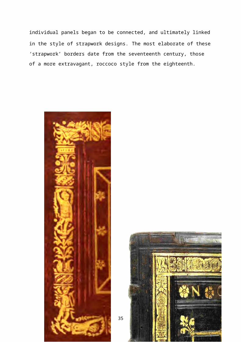
individual panels began to be connected, and ultimately linked
in the style of strapwork designs. The most elaborate of these‘strapwork’ borders date from the seventeenth century, those
of a more extravagant, roccoco style from the eighteenth.
35

Figure 4. Two examples of border decoration on bindings ofc1525, showing ‘totem pole’ designs. These indicate the way
gold tooling was used to create an impressive resemblance to
the style of ornamentation of illuminated manuscripts.
Multiple borders
The first quarter of the sixteenth century was a transition
period for the design of borders. Many of the designs of this
time reflect the stylistic techniques emanating from the
blind-tooled patterns of the previous century. The Spanish
fifteenth-century Mudejar v bindings, so influential in the
36

subsequent development of European bookbinding, were
characterised by both the number of their borders and by their
content. While it had been the practice for borders to be
narrow, it was equally usual for there to be multiple borders,
each one conncentric within its neighbour, and binding
designs having up to seven tiers of such narrow borders are
not uncommon. (Figure 6) It would appear that the technique
employed for the laying out of these borders relied on the use
of diagonals from each corner, since these construction guide-
lines, in blind-tooling, can often be seen in bindings of this
type. Having impressed tools along one section of a border,
for example the top, it is an easy task to continue it down
each side in the knowledge that the diagonals bisecting the
lower angles will ensure that the tooling at the bottom will
be identical to that of the top. Spanish Mudejar bindings from
the fourteenth century are characterised by the profusion of
these tiered borders, and by the fact that they are ornamented
with the repetition of only a comparatively small number of
tools. It has been suggested that it is these tiers of
borders, rather than the subjects portrayed by the tooled
impressions, that were considered the more important feature.
Within the tiered borders, a small central rectangle
inevitably remained, and it was usual practice to enhance this
with further blocks of tooling, either in linear or
rectangular groupings. Though early sixteenth century bindings
with several tiers of gilded impressions are only rarely seen,
the repetitive appearance of single rectangular tools to
develop a border was a very common technique.
37

38

Figure 5
39

The style of binding described by Nixon as, ‘Venetian Oriental’ c1574..
Bindings of this style were made for Commissions issued by the Doge to his
newly-appointed governors of Venetian possessions on the mainland and
overseas, and were handed over in person by the Doge to the recipient. The
design is in the style of contemporary Persian and Turkish book covers. The
design consists of deeply sunk compartments blocked in gold, leaving
sections of raised floral pattern, which were enamelled.
40
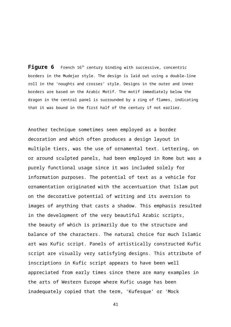
Figure 6 French 16th century binding with successive, concentric
borders in the Mudejar style. The design is laid out using a double-line
roll in the ‘noughts and crosses’ style. Designs in the outer and inner
borders are based on the Arabic Motif. The motif immediately below the
dragon in the central panel is surrounded by a ring of flames, indicating
that it was bound in the first half of the century if not earlier.
Another technique sometimes seen employed as a border
decoration and which often produces a design layout in
multiple tiers, was the use of ornamental text. Lettering, on
or around sculpted panels, had been employed in Rome but was a
purely functional usage since it was included solely for
information purposes. The potential of text as a vehicle for
ornamentation originated with the accentuation that Islam put
on the decorative potential of writing and its aversion to
images of anything that casts a shadow. This emphasis resulted
in the development of the very beautiful Arabic scripts,
the beauty of which is primarily due to the structure and
balance of the characters. The natural choice for much Islamic
art was Kufic script. Panels of artistically constructed Kufic
script are visually very satisfying designs. This attribute of
inscriptions in Kufic script appears to have been well
appreciated from early times since there are many examples in
the arts of Western Europe where Kufic usage has been
inadequately copied that the term, ‘Kufesque’ or ‘Mock
41

Kufic’vihas been given to these attempts to simulate its
appearance. Kufic script on western European bookbindings is
occasionally observed on bindings between the late 1560s and
the end of the century with only an occasional example in the
first quarter of the seventeenth century. The earliest
indications of Kufic-style decoration are on bindings from the
1540s and it is appropriate to contemplate the significance of
these dates since the first printed version of the Koran, in
Arabic Kufic was made by Alessandr Paganino in Venice between
1537-38vii. In contrast, the Roman uncials, used in formal
inscriptions, are stark and devoid of any natural
appurtenances to facilitate interlinking between letters or
inviting of decorative embellishment. Whereas words written in
most of the Arabic letter sets may readily be formed into
visually pleasing entities, there are no equivalent
possibilities with Roman uncials. No matter how the letters
were drawn the words do not make visually pleasing fluidic
structures. Conversely, the character set of the traditional
high German textura script, whilst more closely related in
appearance to the Roman alphabet and reliant upon a
preponderance of strong verticals, does however, epitomise
aspects of the overall decorative effect of Arabic script.
Like Arabic, because of their exaggerated serif-like
connections many of the letters in textura fit together
closely to form seemingly homogeneous groups while others
include looping elements that invite embellishment to form
flourishes.
42

43

Figure 7. A German binding of the sixteenth century, its design based onconcentric rectangles similar to the Spanish Mudejar style except that the
main border together with the central panel both consist of lettering in
close-packed textura script.
44

Two-Ring Frames
In fourteenth and fifteenth-century Spain, under Arab rule, an
original style of ornament evolved, known as Hispano-Mauresque or
Mudejar.viii So important was the production and binding of books
that whole streets were given over to binders and booksellers
in Cordoba and Seville. Abderrahman III, Caliph of Cordoba,
possessed a library of 400,000 volumes. Goldschmidt suggests
that the impetus for this formidable level of production was
not only from the Arabs but through their trading from the
Orient, where scholars and craftsmen were producing work
incomparably superior to anything in Europe. Of particular
interest in this connection is that a catalogue still survives
in which 353 volumes of the library of Isabella the Catholic
were meticulously described, with full details of their
titles, miniatures and bindings.ix
The characteristic feature of Mudejar designs is the
construction of tiers of concentric rectangular frames, each
the result of repetitive impression of a single tool, as if it
were the frames that were important, rather than the emblems
used to produce them. This was a practical way of achieving
wide bands of decoration. This technique formed the basis of
the Italian ‘two-ring’ border designs of the early sixteenth
century. All the borders in this design are built from the
repeated use of a two-ring element. Its design consists of a
mirror image pair of rings, each with a large split palmette
and various other additional small leaf ornaments. Their
arrangement is such that the pair of split palmettes combines
45

to create the form described by Meynell and Morrison as the
‘Arabic Motif’.x
Borders of this style can be observed on Italian bindings
throughout the sixteenth century, though its period of
greatest usage was from around 1510 to the mid-1530s. (Figure
7) In the early second quarter this pattern became generally
replaced by a more complex double version. Instead of the
tooled impressions being placed in-line sideways, as in Figure
6, they were arranged vertically, one above the other,
producing a ‘totem pole’ arrangement of Arabic motifs.
46

Figure 8
The two-ting pattern on a Persian tombstone of about 1300 AD.
This clearly shows the main parts of the design element: the
two rings and the mirror image arrangement of split palmette
leaves that create the form of the Arabic Motif.
47

48

Figure 9. An example of the two-ring pattern on an Italianbinding of c.1514. The same detail in the gold tooling can be
seen around the border of this bookbinding as in the tombstone
in Figure 8.
Figure 10. A short section of the double-width border
style based on a vertical arrangement of the two-ring design
element. This shows the production of a vertical sequence of
Arabic motifs aligned on the central axis of the column.
Defining the border
Designs based on borders consisting of single lines were
popular in the early sixteenth century, when plain,
rectangular frames were often decorated with circular inserts
at their mid-points. Curiously, this style was revisited, at
least by some Parisian binders, at the time of the Revolution.49

In general, though, they soon became tramlines, enhanced with
small additional ornaments of gouge work and odd little
motifs, invariably tooled ‘in solid’. These borders frequently
supported an inner lozenge, normally of undulating shape. The
principles of the complex interaction between the central
ornament and its frame, whereby through a sequence of cross-
overs, the outline of the central lozenge becomes that of the
border, and vice versa, had been devised by c1540. The full
potential of this pattern structure, however, was not reached
until the lines were replaced with bands or ribbons.
The resulting ‘strapwork’ borders incorporate two common
features: decorative corners and decorative enhancements
between the corners. Three early decorative enhancements to
corners were based on circles, squares and mitres. Designs of
the 1540s based on rectilinear linkages and mazes exhibited
the greatest complexity, but lacked precision of execution.
Prior to 1540, frames were significantly less complex, with
simpler, mitred or round scoop- corners and circular linkages,
and were usually of single line construction instead of
ribbons. By the end of the 1540s, the quality of ribbon
definition was superior and the linkages frequently included
circular knotting. From comparable designs in other art forms,
it appears likely that the round scoop corner, giving the
appearance of a ‘round bite’ having been removed from it, may
well have been a vestige of the ‘centre-and-corners’ design,
in which the adornments were often coins or coin-shaped.
A similar usage, based on a square or ‘box’ shape, occurs in a
wider range of variations than does the ‘round bite’ corner. 50

On a binding of Homer’s Odyssea for Thomas Mahieu in the early
mid-century, the ornament of the outer frame consists of large
constructs in the ‘Greek Key’ style, which, in the manner of
its convolutions, makes it the rectilinear equivalent of the
roller-bearing. The third type of corner, the mitred, is found
on bindings from the mid-first quarter of the sixteenth
century to about 1550, and is usually of comparatively simple
design, based either on a diagonal bisector of the corner or
else on a diagonal fold across it. An indication of the degree
to which the features of the mitred rectangular frame could be
developed is apparent in an Italian binding of c1544 from
Bologna. Not only has the border been doubled, but a third
tier has been inserted in the centre and an enormous number of
small compartments created from a profusion of cross-overs and
linkages between the frames. (Figure 11)
51

Figure 11. An Italian binding of c1545, believed to be from Bologna, and displaying the incredible degree of complexity introduced by binders at
that time. This design can be considered to have been developed from
numerous inter-changes between four narrow tramline frames. The central,
octagonal medallions, the traditional representation of heaven and earth,
52

while partly created by this structure, required the additional central
floating frame for their completion.
Linkages between frames
By the late 1520s the appearance of the frames was often
elaborated by the addition of circular extensions, usually in
the centres of each of the four sides. These may well have
originated in the ubiquitous half-knot which was so common on
the blind-tooled bindings of the previous century, especially
those from Spain, and is often seen as an item of jewellery,
particularly necklaces, in painted portraits of that period.
Whereas the earlier ones tended to consist of pairs of semi-
circular excursions, from one line of the frame towards the
other, their use rapidly turned into the cross-over, or
‘scissors’, linkage, which became the most common appearance
of this device. The most complex form, apparently based on a
roller-bearing, provided a decorative contrivance that could
be used to interlock two or more complete border structures,
and was by far the most impressive. (Figure 11)
In the 1530s and early 1540s, strapwork-like frames developed
that were essentially a non-linear departure from the
parallel-ribbon forms more usual at that time. They tend to be
more intricately interwoven, more closely packed and usually
more extensive than the ‘endless knot’ forms, and often
include animal heads, claws and leafy tails with something of
53

a reptilian incestuousness about their appearance, recalling
the ‘basket of eels’ and other vestiges of the Viking Mammen
and Ringerike styles. Elements of these designs often depart
significantly from the strict geometry that characterises most
of the strapwork decorations, with the inclusion of foliate
enhancements and three-dimensional roll-overs in the style of
heavy metal engineering. The so-called ‘black on white’ style
in which the strapwork design appears to have been produced by
squeezing black pigment from a tube on to a white leather
binding, and was apparently such a favourite of Grolier, Henry
II, Diane de Poitiers and Samuel Pepys, was another ‘heavy’
style of strapwork, with clear ancestral relations to the
polychromed designs of Mudejar Spain.
By the mid-1540s, strapwork frames were being designed with
ever-increasing complexity. Corners based on ‘square’
interlaces grew in complexity to form twists and mazes.
Diamond shapes forming incestuous mazes, and knots of
sometimes massive dimensions, were exploited to ornament
corners and the mid-sections of frame edges. Draughtsmanship,
however, was still far from perfect: lines were rarely
parallel and angles not square until the mid-century.
Borders with round scooped corners quite often include round
frames which are often used as roller bearings to hang
supplementary panels. By the mid-century, the incestuous
ribbon patterns are observed to incorporate a lot more
circular involvements than during the earlier period. By the
1540s, curving mazes and elements of ever-greater complexity
may be observed in the strapwork frames. Initially this was 54
mainly localised to particular areas but as the decade of the
1550s progressed, so the extent of these curling patterns
proliferated, interlinking not only the elements of the
rectangular frame but also the lozenge or ellipse within it,
until the entire board area was involved, with the sole
exception of a central region that was always reserved for
titles, crests or coats of arms. As these border structures
expanded into the main board area, so they changed from simple
curvilinear forms to include branching, elaborate and
eglomerate designs in which an infestation of horned, vine-
like curves and crescents intermingle, entirely filling the
board area. Designs of this type are all mid-century, the
recti-linear ones mainly Italian, particularly from Bologna,
and the others French, usually bound in Paris. They are all
characterised by a ribbon with single outline, and not
infrequently show instances of the threading of one part of
the ribbon through another - a most unusual feature of
strapwork designs. Volutes, snow-flake backgrounds, small
indications of perspective and fantasy leaf tools are common
elements incorporated into these designs. The likelihood of a
derivation of the knotwork constructions of this period from
some Arabic origin may perhaps be inferred from the frequent
location of knotwork structures above and below the central
medallion - a layout that typified many bindings from the
Middle East.
55

56

Figure 12. A binding of the mid-sixteenth century showingclear use of roller-bearing linkages within an otherwise
completely rectilinear border structure. Apparent also are
four circular extensions from the central frame which
interleave through the various rectangular sections of the
main border, securing them all together.
57

Figure 13. The cover of a copy of Cicero, bound by Claude de
Picques in Paris c1550. This design exhibits complex corner
assemblies with diamond knots intermediate between them,
together with the massive tour-de-force diamond that is developed
58

entirely from extensions of the central triangle and is
suspended between it and the diamond knot above it.
Figure 14. An example of a highly ornamented, curvilinear cornerassembly on an early 16th century binding.The ribbons from which the design
has been contrived are not of uniform width throughout their length. At
their widest the ribbons exhibit large circular notches which are a typical
enhancement of this period.
59

60

Figure 15. Binding design in the eglomerate style in whichthe ribbons of the border form a general complex between the
rectangular outer frame and the elliptical centre. The use of
ribbons in these designs is significantly different to that in
whole-field strapwork designs, since there is no intention to
create compartments. The complex meanderings of the ribbons
seem purely to fill the space with decorative activity.
Chinoiseries
In the literature on bookbinding history, the bindings
attributed to John Baumgarten have been noteworthy on account
of his employment of gold decoration in a ‘Chinese’ stylexi.
Baumgarten was a German binder who had moved to London in the
1760s to take advantage of the enthusiasm for fine bindings in
England at that time. He lived in London until his death in
1782. His skill was renowned and he specialised in elegant
bindings in the ‘Chinese taste’ in vogue at that time. While
Baumgarten’s name has been particularly associated with books
bound in London between about 1760 and 1780 with decoration in
the Chinoiserie style, he does not appear to have been the
61

sole progenitor of the style. A binding entitled, Das Neue
Testament, which displays the same structures and constituents
that characterise the later Chinoiserie style was bound by
Andreas Linde, also a German binder working in Londonxii. Linde
styled himself, Buchbinder zu Ihro Kőnigl. Hoheit Printz George in Katherine –
Street in den Strand. His bindings included garlands and the
latticework inserts that were so characteristic of the
Chinoiserie style but on this binding the gilding of the
lattice appears as the inverse of the normal lattice. Instead
of a net appearance, it is composed from a set of tiny solid
lozenges, as if achieved with a flat polished tool whose face
had been divided by two sets of saw cuts. Chinoiserie bindings
bound between 1760 and 1780 appear to contain lattice inserts
defined with straight lines and only occasionally with
additional internal ornamentation. To the outside they are
edged with acanthus foliage or rococo swags and there are
often additional compartments in the design in which these
swags and scrolls delineate small compartments of irregular
shape.
Not only were these designs an obvious attempt to capture
something of the Oriental atmosphere to which most of European
aristocracy of the time was so addicted , but when examined
more closely, the designs contain several features that were
new to the gold decoration on book covers and it is through
the exploration of these and their origins that it becomes
possible to begin to interpret aspects of the influence of
Eastern art and culture on Western Europe. Specific features
of the Chinoiserie bindings that have proved of particular
62

significance include, garlands and chains especially those
involving husks, areas of ornamented latticework and curving
arcs that appear to be on fire. During this period, from 1760
to 1780, the value of European imports of furniture and
lacquerware from China increased from 85kg to 450kg weight of
silver but European enthusiasm for products of the East was
not unique to this period and had in fact been aroused many
years previously around the time of the Restorationxiii.
The death of Oliver Cromwell without a constitutional process
in place to guarantee continuation of the Commonwealth, made
it possible for Charles I’s son to return and claim his right
to inherit the throne as King Charles II. The restoration of
Charles II as king of England in 1660 was less of an influence
on the decoration of book covers than was that of his new
wife, Catherine of Braganza, Infanta of Portugal and the Seven Islands of
Bombay and whose position also brought trading rights to
Brazil and the East Indies. She had also arrived in England
with a personal fortune of some five hundred thousand pounds.
After so many years of parsimony, the exotic luxuries,
furnishings and decorative artefacts Catherine and her retinue
of craftsmen brought with them from Portugal provoked a
spontaneous explosion of artistic creation. The London East
India Company that had been founded by Elizabeth I on 31st
December 1600 with the intention of benefiting from the silks,
spices, tortoise shell and jewels that might be acquired from
the Indian continent had never prospered since until the
arrival of the new Queen, the Company had had no rights of
access to any Indian port. Catherine’s title to Bombay made
63

possible access to the fabulous treasures known to come from
the East though until the end of the seventeenth century, ‘The
East’ was perceived as a single empire and people in Europe
did not distinguish those from China from those of India,
Japan or Siam. All were valued for their glitter, extravagance
and the luxury of their appearance. Catherine’s arrival
heralded an infatuation in England for all things exotic. In
France, the court of Louis XIV at Versailles has been
described as, “the vortex of fashion, not just for France but for all of Europe.
There Chinoiserie was given the Royal imprimatur and from there it spread as a
court style to Germany, the Scandinavian countries and to Russia.”xiv Entire
buildings were decorated à la manière de la Chine and in 1666 the
firm of Spinks opened in London as an importer of products
from China.
Embassies bearing extravagant gifts of gold and lacquer,
embroidered silks and crates of porcelain were received at the
French Court in 1684 and 1686 and stimulated a popular craze
for all things Eastern. Increasing quantities of such luxuries
and the general demand was such that artists and craftsmen all
over Europe began to produce their own versions. As a result,
as Dawn Jacobson expressed it, “Chinoiserie is an oddity. It is a wholly
European style whose inspiration is entirely Oriental.”xv Chinoiseries became a
key element in design until the last part of the eighteenth
century. The vogue for Chinoiserie reached a peak in the
middle of the eighteenth century, particularly in England,
helped by the publication of many books on Chinese designs for
buildings, dress and furniture, such as those by William and
John Halfpenny in 1750, by Darly and Edwards in 1754 and Sir
64

William Chambers in1757 and coincides incidentally with the
beginning of the period in which Chinoiserie designs on London
bookbindings came into fashion. Society had turned collector
with a mania for whatever took its fancy. Everything was
collected, drawings, paintings, porcelain, sea-shells and
people not rich enough to own a genuine Chinese vase could
have one copied in lacquered papier mache. By the 1760s the
craze had reached its height.
Designs on bookbindings in the Chinoiserie style are an
eighteenth century style and have a very particular
appearance. Nothing similar has been observed on bindings of
the later seventeenth. Chinoiserie designs are pseudo-
pictorial and while appearing to be essentially border
constructions they characteristically encroach into the
central area. Designs in this style were mainly bound in the
third quarter of the eighteenth century. Those in which the
Chinoiserie effect is most spectacularly achievedxvi include
complex structures defined by flaming rococo scrolls
supporting pedestals and bridges with birds and assorted
figures some of whom appear very Chinese while others more
traditionally European. By the beginning of the fourth quarter
although designs were still in the Chinoiserie style they tend
to be less capricious and more constrained to the space of a
border. While many of the same features and motifs continued
to be employed in their designs, in those of this period the
characteristic feature is the profusion of small areas of
trellis work. In all cases, the trellis work appears to have
been constructed from sets of lines, diagonal to the edges of
65

the binding, some just single lines and others of an
ornamental nature. These areas of trellis work are very
different to the compartments in strapwork designs. They are
in no way linked to other compartments as is the nature of
strapwork and it is a major feature of these that they are
framed with scrolls of extravagant rococo.
Had the time periods been more convenient it might have seemed
feasible for the stimulus for these areas of trellis work to
have been the chairs brought to England by Catherine in 1662.
Of all the items she brought, the chairs with seats and backs
made from rattan cane, “gave so much satisfaction to all the Nobility, Gentry
and Commonality of this Kingdom for their durableness, lightness and cleanness
from dust, worms and moths which inseparably attend Turkeywork, serge and other
stuff-chairs and couches to the spoiling of them and all furniture near them.”xvii
Though initially restricted to the aristocracy, the
destruction in four days of some 13,200 houses during the
Great Fire of London in 1666 resulted in a demand for chairs
that could only be met by these chairs with their woven cane
panels. Manufacture began in 1664 but did not reach peak
production until the 1680s. Most of these were made in
workshops clustered around St Paul’s Churchyard which
coincidentally was the location of many of the bookbinders at
that time so the binders would inevitably have been familiar
with the cane patterns used for the seat and back panels of
the chairs. Yet trellis patterns on bookbindings, which
arguably have some similarity with the chair panels, did not
appear until the middle of the eighteenth century, by which
time cane chairs were considered to be “now almost out of use.”
66

Indeed, amongst the aristocracy, the popularity of cane
furniture had reached its peak by about 1690 by which time
cane chairs were considered to have become too cheap and too
common. Trellis work inserts were a feature of Viking
artefacts such as those known as the Gripping Beasts from the
Oseberg Treasure. Closer in time is the possibility of the
inspiration having been passed from the ‘wire ground’ or ‘Kat
stitch’ that formed the lattice-work of French Point-de-Paris
lace or from Valenciennes lace which had similar features.
Another contemporary potential source could have been the
excavations at Pompeii. In this context it is significant that
bamboo trellis appears in the garden scenes in the frescoes of
Pompeii and that serious excavations there began in 1763.
Also, in those cases where the lines which form the trellis
patterns on bookbindings are
ornamented, their adornment
might best be described as in
the style of bamboo.
Figure 16. The ‘GrippingBeasts’ artefact from the
Oseberg Treasure.xviii
67

Figure 17. A book bound by John Baumgarten, c 1757 orlater, in the Chinoiserie style with numerous Chinese motifs.
The trellis inserts are of three different mesh sizes, the top
68
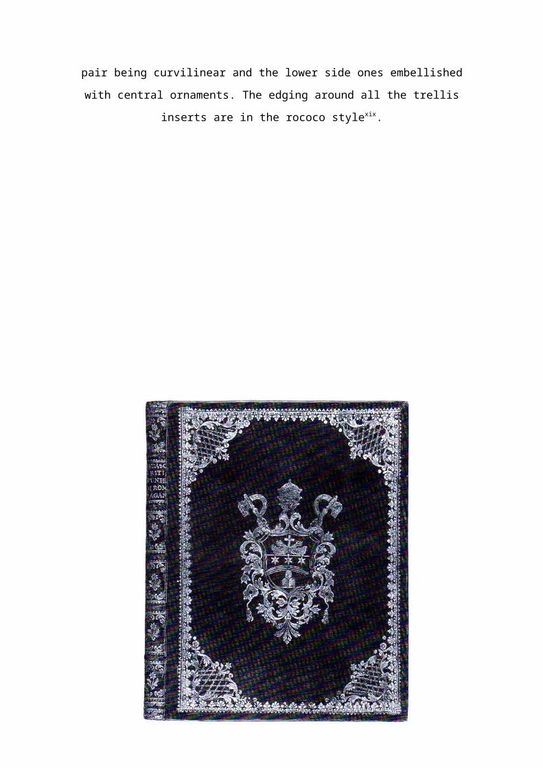
pair being curvilinear and the lower side ones embellished
with central ornaments. The edging around all the trellis
inserts are in the rococo stylexix.
69

Figure 18. Riti Funebri di Roma Pagana by Guasco,bound in Rome
1769-74.
Although the inclusion of inserts of trellis work was
retained, the entire style of this binding is different to
that of the previous one. This one reflects the transition to
the neoclassical style that became the vogue in the later part
of the century and proclaims an air of more elegant simplicity
which contrasts with the rather cluttered frippery of the
Chinoiserie style. The trellis work in this design are
significantly more refined and elegant than the earlier style.
The threads are in cable-stitch instead of simple line work,
the inserts are in the shape of tulip or lotus flowers not
just polymorphic and they are edged with scrolls of acanthus.
Chains of husks were a major feature of this fashion and are a
very noticeable feature in Robert Adam’s hanging girandoles
and fire screens, Brussels Lace, Stapleton’s design for the
ceiling of Belvedere College, Dublin and as enhancements to
the ornamental panels of fine furniturexx . On bookbindings,
designs of the mid-eighteenth century, in the Chinoiserie
style positively abound and drip with chains of husks and as
the vogue for this style evolved to Rococo and to the
70

neoclassical in which everything in France had to be, à la
Grecque, husk chains never lost their allure.
Figure 19. A section of the cover design on a bookbound for the Empress Marie Theresia in 1746xxi. In this book
cover, which dates from the time when the vogue for
Chinoiserie was at its height, the centre and corners
arrangement created from densely tooled areas filled with
numerous oriental style motifs. A major contribution to the
visual effect of this design is the result of the profusion of
71

short chains of husks. All parts of the design drip with husk
chains as if adorned for a festival.
Figure 20. The design on a thesis bound in Edinburgh c1784for G. Mercer. At this time only Scottish Universities
followed the Continental practice of printing and binding
theses to be defended. There were no theses in England or
Ireland that were required to be bound. The design on this
72

thesis consists of short catenaries of husk chains repeated in
scalloping style around the coverxxii.
In the ‘Greek’ neoclassical style, by the early 1760s foliated
adornments were replacing the Chinese style with festoons and
garlands of acanthus ornamented with trophies, swags, baskets
of flowers and gilded frames.
Two other decorative elements that appear on bindings from the
very late 1740s to early 1760s appear to have had Chinese
origins. One of these looks like a spider’s web and the other
a long and rather contiguous form, as if made as a concertina
from folded paper and perhaps based on the Chinese Cloudbands.
Shapes remarkably similar are observed on Chinese wallpapers
of this period. Jacobson has given examples of these and
explains that they were made in China especially for export to
the ‘Orient bewitched’ Europe of the eighteenth century.
Seemingly European interest in Chinese wallpapers developed
from the habit of the Chinese merchants presenting gifts of
such papers to their European contacts after a sale was
completed. European enthusiasm for these wallpapers quickly
led to orders being placed specifically for them and later for
similar papers being designed and printed in Europexxiii.
73

74

Figure 21. A French mosaic binding in the ‘Regency’ style,believed to have been bound by Padeloupxxiv.
This design, which has been considered to be reminiscent of
the fanfare style of the sixteenth century, is defined by
strapwork and includes snails and three-dimensional scrolls.
It is possible to hypothesise that the top and bottom
structures might be derived from cottage roofs. The feature
that has been referred to as a, ‘Spider’s Web’ appears four
times in the design, in each case both the structural threads
that support the web as well as the fine internal weavings are
readily discernable.
75

76

Figure 22. A panel of Chinese wallpaper c1760. Jacobsonwrote that these were hand-coloured and produced in China
specifically for the ‘Orient-bewitched’ Europe of the
eighteenth century. The arching form around the head at the
top of this piece has the appearance of being a concertina of
folded paper in the style of the traditional cloudband.
Edgings
From the early seventeenth century, narrow strips of
decorative effect began to appear as part of the border
structure. One of the simplest, yet most frequently occurring,
of these consists of a sequence of tiny triangular forms,
sometimes done as a tight group of dots, which is generally
known as ‘dente de rat’ due to the perceived similarity of its
shape with that of a rat’s teeth. It is used rather in the
manner of a ‘seaming lace’ to enhance the lines that define
the edges of the border. Occasionally observed on bindings
throughout the seventeenth century, and until the end of the
first quarter of the eighteenth, it later becomes much more
common. It was especially in vogue throughout the period from
1730 to 1780, peaking in the1750s.
Lacy edgings of ever more sophisticated form are observed
adorning the border edges from the late sixteenth century
through to the later eighteenth. In the earlier period these
were often just of a single band of braid lace. A popular
style consisted of a hoop with a cross on top, occurring in
77

many variant forms, ranging from starkly linear to circular.
The appearance of these edgings evolved following the latest
fashion fad, and may often be observed proliferating into
several tiers of lace within or around the main border
construction. During the period when ‘punto in aria’ lace was the
vogue, these edgings were usually shaped to consist of a
series of triangular panels of lace. Panels of similar shape
are commonly observed on bindings of the eighteenth century,
but with panels composed of pyramids of scales instead of
lace.
Border designs of the majority of the eighteenth century are
dominated by foliage constructions of the dentelle variety. Most
of these consist of large numbers of petit fers impressions, often
arranged in several layers, and with the description referring
to the inner boundary. ‘Dentelle’, as a descriptive term, has
usually been understood as relating either to the French word
for lace or to the ‘denticulated’, tooth-like protrusions,
though it has also been interpreted as having a varying
contour around the inner boundary that is symmetric about one
or more axes. Towards the end of the eighteenth century,
decorated borders tended to become much more rectangular,
though still with intense, fine ornamentation. One of the
major styles of this time was that described heraldically as,
‘flutings’. Borders in this style have the appearance of a
continuous run of leaves wrapped around a real or imaginary
central pillar. Yves Devaux has described them as, la fameuse
roulette ornée, once known as, dentelle du Louvre.xxv
78

Certain new geometrical structures became increasingly common
as the century progressed. The earliest of these is the curve
of the hanging chain, known as a catenary, and the other the
endless wave-like shape of the sinusoid. Scalloped edges around
the outer part of a border are one form in which this element
was widely used. It was, for example, a significant feature of
the border of one of the two surviving books from Oliver
Cromwell’s library.xxvi Catenary curves were also used in pairs,
described as citrons and, in a few bindings of the eighteenth
century, designs are dominated by large, heavily embellished
shapes of this type. From around the mid-century, borders are
often observed to be edged with hanging chains of husks or
wheat-ears. Occasionally these may be enhanced in the style of
leafy festoons but, while chains of husks may be quite long,
the only leafy festoons detected in the author’s extensive
study of bookbinding designs were of seriously miniature
proportion. In the later years of the century, some very
elegant designs featured chains across the corners, consisting
of strings of small motifs, all very precisely tooled in solid
gold.
79

Figure 23. A dentelle, garland border on a binding designof the eighteenth century showing the kind of usage of foliar
chains that was typical of the mid-century. Close examination
reveals that the foliar chains consist of repeated segments of
a flower and two pitcher shape motifs.
80

Certain new geometrical structures become increasingly common
as the century progressed. The earliest of these was the curve
of the hanging chain, known as a Catenary, and the other the
endless wave-like shape of the Sinusoid. This was sometimes
understated and the impression conveyed with a series of hints
instead of a blatantly continuous garland-like element.
Garlands are a feature of eighteenth century designs. The
smallest tend to appear like scalloped edgings while the
largest extend right around the cover usually acting as the
inner definition for the border decoration. They are seen on
bindings beginning in the 1730s right through to the 1790s,
with particular peaks in the 1750s and from 1770-90. Prior to
1770 cover designs which include garlands appear to be
entirely either English or French whereas after 1770 they
occur on Austrian, German, Italian, Scottish and Spanish
bindings as well.
Garlands usually consist of fairly basic chains of small,
uniform ornament such as baubles, husks or wheat-ears. The
more flamboyant form, the festoon which in the world of
floristry, consists of a lavish hanging creation of leaves and
flowers, is rarely seen as a decorative device in the gold-
tooling on bookbindings, though a few isolated examples have
been seen. The essential shape of a festoon is that it hangs
like a catenary and is most sumptuous at its centre. It
differs therefore from cresting which describes a decorative
construction of similar overall shape but which was based on
the type of ornamental metalwork structures placed over 81

gateways and the like. The distinguishing feature is the base
line, in cresting the structure is contrived to rest on a flat
support while the festoon sags between its two end supports.
The design on a binding for the Empress Marie Theresia by Jean
Bérain, 1746, positively droops with garlands and hanging
chains of husks.xxvii
Scalloped edges around the outer part of a border are one form
in which catenaries were widely used. It was for example a
very significant feature of the border of one of the two books
that have survived from Oliver Cromwell’s library.xxviii Catenary
curves were also used in pairs, described as Citrons and a few
bindings of the eighteenth century designs are dominated by
large, heavily ornamented citrons. From around the mid-century
borders are often observed to be edged with hanging chains of
husks or wheat-ears. Occasionally these may be enhanced in the
style of leafy festoons but while chains of husks may be quite
long, the only leafy festoons detected in a large study of
bookbinding designs were of seriously miniature proportion. In
the later years of the century, some very elegant designs
featured chains across the corners consisting of strings of
small motifs, all very precisely tooled in solid gold.
82

83

Figure 24. A late eighteenth century binding with adentelle style border defined by a long undulating chain of
baubles and husks supplemented with shorter ones in tiers
beneath it. English 1780.
During this review of the decoration of borders it has become
apparent that artistic exploitation of this space has proved
to be a major constituent of the overall design effect rather
than merely a supporting subsidiary. Decoration of the outer
parts of the cover area on bindings from the early years of
the sixteenth century tended to consist of very basic
rectangular frames with small finials at each corner. The
frame structure became increasingly elaborate and the space
defined by it increased to provide opportunities for ever more
sophisticated ornamentation. We have drawn attention to the
similarities between the design impressed into some of the
sixteenth century leather bindings and those of the panels of
carved ivory favoured by the early Christian Church. The
degree to which the moulded leather bindings seriously
resemble those of carved ivory suggests that it was the
intention to exploit the malleability of leather to recreate
their appearance. The octagonal symmetry of the four-ring
frame however has shown that designs in this period were
equally influenced by structural elements acquired from other,
more remote, religious origins. The original single line 84

borders of the early sixteenth century, having developed
through many phases of incestuous complexes of incredible
strapwork, had, by the end of the eighteenth century, returned
to their fundamental sparseness, albeit with slightly more
refined styling but nevertheless exactly the same simplicity.
85
i Wheatley, quotes Libri re expanding Treasure bindings with borders as, ‘botchings’. The History of the Art of BB, H B Wheatleii Suger quote on materials iii Thomas A G, Great Books and Book Collectors, Wiedenfeld & Nicolson, London, 1975 fig. 56 p 67.iv Hobson G D Parisian Bindings pl V p 415. and …………..v R Miquel y Planas, Restauracion del Arte hispano-arabe en la Decoracion exterior de los Libros, Barcelona 1913. This same style of construction and decoration of borders was not original to e Spain however since exactly the same arrangement and repetition of small motifs mat beseen in a 7th century BCE floor design from the Palace of King Assurbanipal at Nineveh.vi Irwin R Islamic Art, Laurence Ki9ng Publishing, London 1997 p 228.vii Nuovo A, The Library 6th Series, Dec 1990 vol 12(4) p 273-92. viii Goldschmidt W. Spanish Bookbindings from the XIIIth to the XIXth Century, Apollo Dec. 1934 vol xx No 120 p 329-30.ix Goldschmidt W. p330.x Meynell and Morison S xi Miner D Early Bookbindings – Report on an Exhibition at the Walther’s Art Gallery, Baltimore, Burlington Magazine August 1968 p 462.xii Nixon H M English Bookbindings XCII: A London Binding by Andreas Linde c1751The Book Collector vol 24(1) 1975 p 160-2.xiii Paludan A Chronicles of the Chinese Emperors Thames & Hudson, London 1998 p 200.xiv Dawn Jacobson. Chin pi para 1 ixv Dawn Jacobson Chinoiserie Phaidon Press London 1993 p 7.xvi Howard M Nixon English Bookbindings XCII The Book Collector vol 24(1) p160 1975. Nixon wrote that two bindings by Andreas Linde c1751 in this style were, ‘undeniably hideous’.xvii Drury 1969xviii Wilson D M, The Art of the Vikings, Apollo Jan-Jun 1980 p 315ff.xix Miner D, Walters Art Gallery No 58…………………..xx Gloag J, English Furniture in the French Taste pt II: The Last Third of the Eighteenth Century, Antiques Oct 1968, 586-93. For details of lace designs, Reigate Emily p 152. Formention of the ceiling design at Belvedere College, Dublin by Michael Stapleton,Burlington Magazine, May 1991 fig 35 p336. xxi Egger G, Viennese Bookbindings, Apollo vol LIII (315) May 1951 p 120-23.xxii Collins J, An Edinburgh Thesis Binding by Charles Cleland c1784, The Book Collector vol 36(3) Autumn 1987 p 372-4.xxiii Chine wallpapers ordered by Europexxiv The Art of the French Book ed. André Lajard, pub. Paul Elek, London 1947 p144 & plate 172.xxv Devaux Y p 134.xxvi Nixon H M Five Centuries of Bookbinding, Scolar Press, London 1978 pl 32. The book described isFrancis Sandford’s Scuta suprema, the binding of which is signed, ‘Lewis fecit’ and dated 1656. xxvii Egger G Viennese Bookbindings Apollo vol LIII (315) May 1951 120-23. Fig VI p121.xxviii Nixon H M Five Centuries of Bookbinding, Scolar Press, London 1978 pl 32. The bookdescribed is

Francis Sandford’s Scuta suprema, the binding of which is signed, ‘Lewis fecit’ and dated 1656.