Bicycle app - Case study slide deck - Webflow
25
Bicycle shop app Daniel Ponelat
-
Upload
khangminh22 -
Category
Documents
-
view
3 -
download
0
Transcript of Bicycle app - Case study slide deck - Webflow

Bicycle shop app
Daniel Ponelat

The product:
An app that allows cyclists to book a service for their
bicycle at the bicycle shop in Stockholm, Sweden.
Project overview
Project duration:
March 2021 - October 2021

The problem:
Bicycle riders who commute daily into work,
struggled to book services and maintain their
bicycles at the bicycle shop
Project overview
The goal:
Create an user friendly way to allow bicycle
riders to book their bicycle services in advance

My role:
UX Designer
Project overview
Responsibilities:
Created personas, researched and interviewed
potential users. Created wireframes and low-Fi
prototypes. Conducted usability studies and
created Hi-Fi mockups.

Understandingthe user
● User research
● Personas
● Problem statements
● User journey maps

User research: summary
After conducting several research studies, I was expecting the potential users of this app to mostly be sports enthusiasts and I was surprised that bicycle commuters have great need for this app
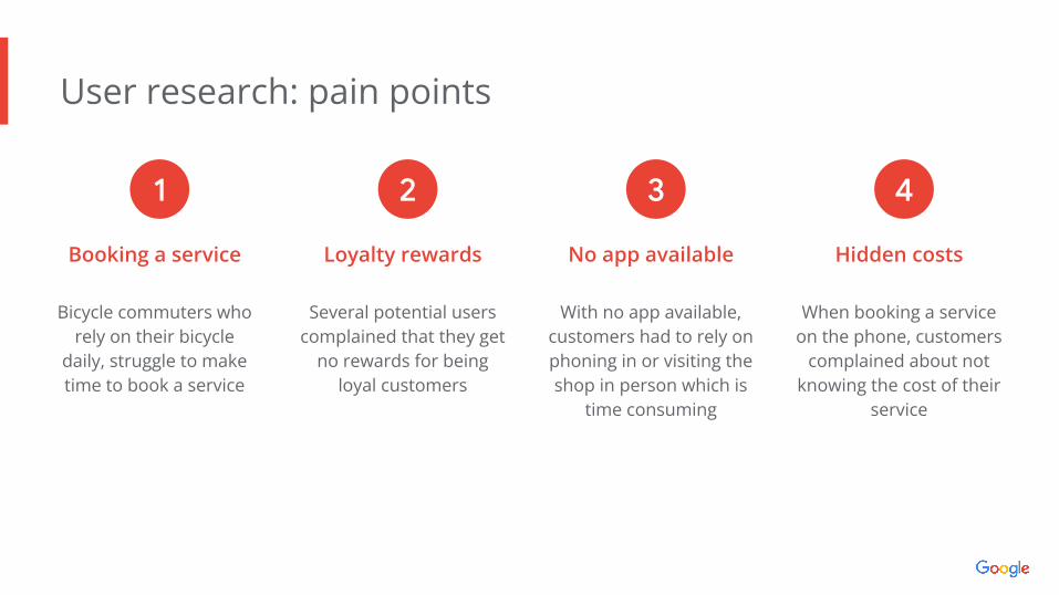
User research: pain points
Booking a service
Bicycle commuters who rely on their bicycle
daily, struggle to make time to book a service
Loyalty rewards
Several potential users complained that they get
no rewards for being loyal customers
No app available
With no app available, customers had to rely on phoning in or visiting the shop in person which is
time consuming
Hidden costs
When booking a service on the phone, customers
complained about not knowing the cost of their
service
1 2 3 4
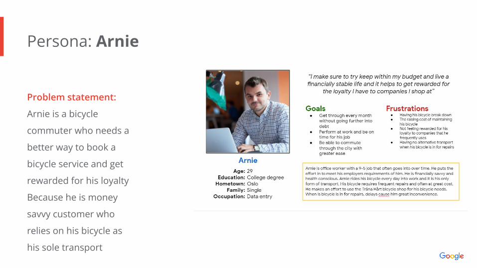
Persona: Arnie
Problem statement:
Arnie is a bicycle
commuter who needs a
better way to book a
bicycle service and get
rewarded for his loyalty
Because he is money
savvy customer who
relies on his bicycle as
his sole transport

User journey map
Image of user journey map
Arnie is all about saving
time and money. Following
his user journey we can see
if we offer him a way to
book a service in advance
and reward him for his
loyalty, he will achieve his
goals.

● Paper wireframes
● Digital wireframes
● Low-fidelity prototype
● Usability studies
Startingthe design
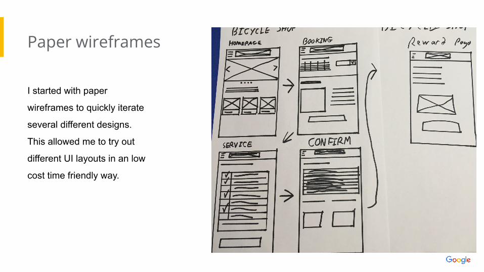
Paper wireframes
I started with paper
wireframes to quickly iterate
several different designs.
This allowed me to try out
different UI layouts in an low
cost time friendly way.
Image of paper wireframes including
five different versions of the same
screen and one image of the new,
refined version

Digital wireframes
During research a key
insight was the ability to
book a service. Something
potential users struggled
with in the past
This version of the home screen was designed to give a brief over of the bicycle shop and guide users to booking a service
Insert first wireframe example that
demonstrates design thinking aligned with
user research
The ability to create an account and save profile details would help users with future bookings

Digital wireframes
Booking a service and
scheduling the date and
time is critical to the user
experience. This was an
early draft of the booking
service
A full calendars months view of designed to give users the most choice and information when deciding their date of service
Insert second wireframe example that
demonstrates design thinking aligned with
user research
Store details would help new users unfamiliar with the store

Low-fidelity prototype
Screenshot of prototype with connections or prototype GIF
All the connections that made the
Low-Fi prototype used in the first
round of usability testing
Link
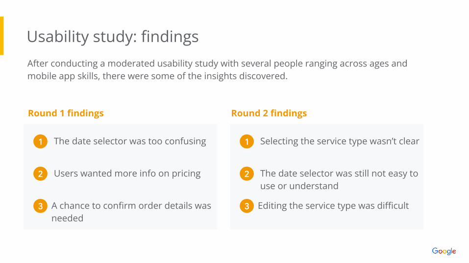
Usability study: findingsAfter conducting a moderated usability study with several people ranging across ages and mobile app skills, there were some of the insights discovered.
Round 1 findings
Selecting the service type wasn’t clear1
The date selector was still not easy to use or understand
2
Round 2 findings
Editing the service type was difficult3
The date selector was too confusing 1
Users wanted more info on pricing2
A chance to confirm order details was needed
3

● Mockups
● High-fidelity prototype
● Accessibility
Refiningthe design

Mockups
I changed the date selector
which was confusing users,
to a button which bought
up a pop Material Design
date selector
Image of selected
screen before usability study
Before usability study After usability study
Image of selected
screen after usability study
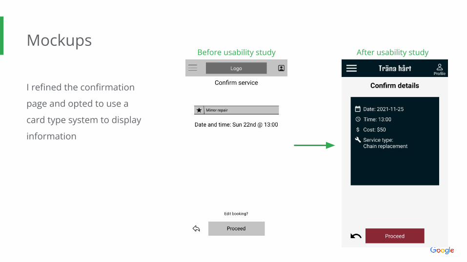
Mockups
I refined the confirmation
page and opted to use a
card type system to display
information
Before usability study After usability study
Image of selected
screen before usability study
Image of selected
screen after usability study

Mockups
Main mockup
screen for display
Main mockup
screen for display
Main mockup
screen for display
Main mockup
screen for display

High-fidelityprototype
Link to Figma prototypeScreenshot of prototype with connections or prototype GIF

Accessibility considerations
Contrast:
A colour contrast test was used to make sure all the text contrast is at least AA
grade
Icons and text:
Icons and titles we used to ensure buttons and
icons were understandable
Navigation:
Multiple points of entry and persistent back key allow users to navigate
more freely
1 2 3

● Takeaways
● Next stepsGoing forward

Takeaways
Impact:
“ I really feel like this was an app easy
to use, especially for users like myself
who are older and less computer
friendly” - Participant C, 56 years old.
What I learned:
Working on this app has been a journey. I feel
like my mind is more open to the needs of
others and accessibility is definitely something
I will consider more going forward

Next steps
Features:I do think this app needs more, beyond booking a
service and I would like to find out what users need
Test with real world data:Testing this app in its real
world situation and conducting unmoderated usability studies will go a long way in getting this
app ready
Deployment:Once we have fine tuned
the app and met the needs of the users. We can deploy the app and
perhaps even look at using this model for other
bicycle shops
1 2 3

Let’s connect!
Insert a few sentences summarizing the next steps you would take with this
project and why. Feel free to organize next steps in a bullet point list.
For more windows into my world of UX, check out hezzie.design
I can be reached at [email protected] keen to chat :)
Thanks for viewing this case study