
An Online Survey of Health Professionals' Opinions ...
83
An Online Survey of Health Professionals’ Opinions Regarding Observation Charts Report prepared for the Australian Commission on Safety and Quality in Health Care’s program for Recognising and Responding to Clinical Deterioration Megan H. W. Preece, Mark S. Horswill, Andrew Hill, Rozemary Karamatic, and Marcus O. Watson May 2010
-
Upload
khangminh22 -
Category
Documents
-
view
0 -
download
0
Transcript of An Online Survey of Health Professionals' Opinions ...

An Online Survey of
Health Professionals’
Opinions Regarding
Observation Charts
Report prepared for the Australian Commission on Safety
and Quality in Health Care’s program for Recognising and
Responding to Clinical Deterioration
Megan H. W. Preece, Mark S. Horswill, Andrew Hill,
Rozemary Karamatic, and Marcus O. Watson
May 2010

An Online Survey of Health Professionals’ Opinions Regarding Observation Charts
2
Preface
Chief Investigator: Project Manager:
Dr Mark Horswill Ms Megan Preece
School of Psychology School of Psychology
The University of Queensland The University of Queensland
Principal Investigator: Senior Consultant:
Associate Professor Marcus Watson Mr Andrew Hill
Queensland Health School of Psychology
Skills Development Centre The University of Queensland
Consultant:
Dr Rozemary Karamatic
Queensland Health
Skills Development Centre
Corresponding author:
Dr Mark Horswill
(07) 3346 9520
School of Psychology, The University of Queensland, St Lucia, QLD 4072, Australia
Acknowledgments
We would like to thank all of the interested parties who provided us with observation charts from
their hospital or area health service for inclusion the current study.
We thank Nicola Dunbar from the Commission and Jillann Farmer from the Patient Safety Centre,
Queensland Health for their support throughout the project, and Alexandra Sonsie from the
Commission for assembling the majority of the observation charts and distributing the recruitment
email to potential respondents.
We also thank Kirsten Price for her comments on the survey items and John Manly for research
assistance.

An Online Survey of Health Professionals’ Opinions Regarding Observation Charts
3
Table of Contents
Preface .................................................................................................................................................... 2 Acknowledgments ................................................................................................................................... 2 List of Tables ........................................................................................................................................... 4 List of Figures .......................................................................................................................................... 5 Executive Summary ................................................................................................................................. 6 1. Project Background ......................................................................................................................... 8
1.1 General background ............................................................................................................... 8 1.2 Background of the project ...................................................................................................... 9 1.3 The Adult Deterioration Detection System (ADDS) chart ...................................................... 9 1.4 Rationale for the current study ............................................................................................ 10
2. Method ......................................................................................................................................... 11 2.1 Participants ........................................................................................................................... 11 2.2 Online Survey........................................................................................................................ 11 2.3 Design and Procedure .......................................................................................................... 12 2.4 Data Analysis ........................................................................................................................ 12
3. Results ........................................................................................................................................... 13 3.1 Participant characteristics .................................................................................................... 13 3.2 Use of observation charts ..................................................................................................... 15 3.3 Understanding of abbreviations on observation charts ....................................................... 17 3.4 Which abbreviations are rated as easiest to understand on observation charts ................ 23 3.5 Preferences regarding recording vital signs and detecting deterioration on observation
charts ................................................................................................................................................ 27 3.6 Participants’ evaluation of their institution’s current observation chart ............................ 30 3.7 Participants’ evaluation of the 9 presented observation charts .......................................... 32
4. Discussion ...................................................................................................................................... 36 References ............................................................................................................................................ 39 Appendix A: Online Survey Items.......................................................................................................... 41 Appendix B: Participant Information About the Online Survey ............................................................ 66 Appendix C: Observation Charts Included in the Online Survey ........................................................... 68
Chart 1 ........................................................................................................................................ 68 Chart 2 ........................................................................................................................................ 70 Chart 3 ........................................................................................................................................ 72 Chart 4 ........................................................................................................................................ 74 Chart 5 ........................................................................................................................................ 76 Chart 6 ........................................................................................................................................ 78 Chart 7 ........................................................................................................................................ 80 Chart 8 ........................................................................................................................................ 81 Chart 9 ........................................................................................................................................ 83

An Online Survey of Health Professionals’ Opinions Regarding Observation Charts
4
List of Tables
Table 1: Participant characteristics. ...................................................................................................... 14 Table 2: Nurses’ roles. ........................................................................................................................... 15 Table 3: Participants’ responses to Likert scale items regarding recording vital signs and detecting
deterioration. .............................................................................................................................. 28 Table 4: Participants’ responses to Likert scale items regarding their institution’s current observation
chart. ........................................................................................................................................... 31 Table 5: Participants’ responses to Likert scale items regarding the 9 presented observation charts. 33 Table 6: Participants’ aggregated responses to13 Likert scale items regarding the 9 presented
observation charts. ..................................................................................................................... 34 Table 7: Pairwise comparisons between charts for aggregated ratings. ............................................. 35

An Online Survey of Health Professionals’ Opinions Regarding Observation Charts
5
List of Figures
Figure 1: Percentage of participants who use observation charts. ....................................................... 15 Figure 2: How frequently participants use observation charts, participants who reported not using
observation charts (n = 50) were excluded. ................................................................................ 16 Figure 3: Percentage of participants who record information in observation charts, participants who
reported not using observation charts (n = 50) were excluded. ................................................. 16 Figure 4: How frequently participants record information in observation charts, participants who
reported not using or not recording information in observation charts (n = 109) were excluded. .................................................................................................................................................... 17
Figure 5: Percentage of participants reporting training in the use of observation charts. ................... 17 Figure 6: Participants' understanding of the abbreviation "P". ............................................................ 18 Figure 7: Participants' understanding of the abbreviation "R". ............................................................ 18 Figure 8: Participants' understanding of the abbreviation "T". ............................................................ 19 Figure 9: Participants understanding of the abbreviation "LOC". ........................................................ 19 Figure 10: Participants' understanding of the abbreviation "Temp". ................................................... 20 Figure 11: Participants' understanding of the abbreviation "BP". ........................................................ 20 Figure 12: Participants' understanding of the abbreviation "RR". ........................................................ 21 Figure 13: Participants' understanding of the abbreviation "Sats". ..................................................... 21 Figure 14: Participants' understanding of the abbreviation "Resp". .................................................... 22 Figure 15: Participants' understanding of the abbreviation "HR". ....................................................... 22 Figure 16: Participants' understanding of the abbreviation "SBP". ...................................................... 23 Figure 17: Participants' preferred term for blood pressure. ................................................................. 23 Figure 18: Participants' preferred term for systolic blood pressure. ..................................................... 24 Figure 19: Participants' preferred term for pulse or heart rate. ........................................................... 24 Figure 20: Participants' preferred term for respiratory rate. ................................................................ 25 Figure 21: Participants' preferred term for oxygen saturation, note that the digit ‘2’ in ‘O2’ above was
presented as subscript (i.e. ‘O2’) in the survey. ........................................................................... 25 Figure 22: Participants' preferred term for oxygen delivery, note that the digit ‘2’ in ‘O2’ above was
presented as subscript (i.e. ‘O2’) in the survey. ........................................................................... 26 Figure 23: Participants' preferred term for temperature. ..................................................................... 26 Figure 24: Participants' preferred term for urine output. ..................................................................... 27 Figure 25: Participants' preferred term for level of consciousness. ...................................................... 27 Figure 26: Participants' preferences for how to record vital signs, where 1 = Write the value in a box;
2 = Plot the value on an otherwise ‘blank’ graph; 3 = Plot the value on a graph that has a line indicating physiological normality; 4 = Plot the value on a graph that has line(s) indicating physiological abnormality; 5 = Write the value in a box with graded colouring, where the colours correspond to a scoring system or graded responses for abnormality; 6 = Plot the value on a graph with graded colouring, where the colours correspond to a scoring system or graded responses for abnormality. ......................................................................................................... 29
Figure 27: Participants' preferences for how to view vital signs to detect deterioration, where 1 = Write the value in a box; 2 = Plot the value on an otherwise ‘blank’ graph; 3 = Plot the value on a graph that has a line indicating physiological normality; 4 = Plot the value on a graph that has line(s) indicating physiological abnormality; 5 = Write the value in a box with graded colouring, where the colours correspond to a scoring system or graded responses for abnormality; 6 = Plot the value on a graph with graded colouring, where the colours correspond to a scoring system or graded responses for abnormality. ..................................... 30
Figure 28: Distribution of participants' aggregated ratings of their institution's current observation chart (where 1 = strongly disagree, 3 = neutral, and 5 = strongly agree). .................................. 31

An Online Survey of Health Professionals’ Opinions Regarding Observation Charts
6
Executive Summary
The current study was the second stage of a project funded by the Australian Commission for Quality
and Safety in Health Care and Queensland Health to investigate the design and use of observation
charts in recognising and managing patient deterioration, including the design and evaluation of a
new adult observation chart that incorporated human factors principles.
Improving the recognition and management of patients who deteriorate whilst in hospital is a
frequently cited goal for patient safety. Changes in physiological observations or ‘vital signs’
commonly precede serious adverse medical events. Paper-based observation charts are the chief
means of recording and monitoring changes to patients’ vital signs. One approach to improve the
recognition and management of deteriorating patients is to improve the design of paper-based
observation charts (note that the management of patient deterioration can potentially be affected
by chart design if, for example, action plans are included on the chart).
There is considerable variation in the design of observation charts in current use in Australia and a
lack of empirical research on the performance of observation charts in general. The aim of the
current study was to gauge the opinions of the population who actually use observation charts.
We recruited a large sample of health professionals (N = 333) to answer general questions about the
design of observation charts and specific questions about nine observation charts. The participants
reported using observation charts daily, but only a minority reported having received any formal
training in the use of such charts.
In our previously-reported heuristic analysis of observation charts (1), we found that the majority of
charts included a large number of abbreviations. In this survey, participants were asked to nominate
which term they first thought of when seeing a particular abbreviation. Most abbreviations were
overwhelmingly assigned the same meaning. However, some abbreviations had groups of
participants nominating different terms for the same abbreviation. Participants were also asked to
nominate their preferred terms for nine vital signs that commonly appear on observation charts. For
some vital signs, there was a high level of agreement as to which term was easiest to understand;
however, for other vital signs, there was no clearly preferred term.
Participants were also asked about their chart design preferences both in terms of (a) recording
observations and (b) detecting deterioration. In both instances, participants preferred the option to
“Plot the value on a graph with graded colouring, where the colours correspond to a scoring system
or graded responses for abnormality”. Participants’ preference was in line with what a human
factors approach would recommend (i.e. charts with a colour-coded track and trigger system).
In the final sections of the survey, participants were first asked to respond to 13 statements
regarding the design of their own institution’s current observation chart, and then to respond to the
same 13 statements for one of nine randomly-assigned observation charts. The nine observation
charts included the new Adult Deterioration Detection System (ADDS) chart and eight charts of
“good”, “average”, or “poor” design quality from the heuristic analysis.

An Online Survey of Health Professionals’ Opinions Regarding Observation Charts
7
Participants’ mean aggregated rating across the 13 items for their institution’s current observation
chart was close to the scale’s mid-point, 3 = neutral. For the assigned charts, there was a statistically
significant effect of chart type on the aggregated rating. The a priori “poor” quality charts were each
rated as having a significantly poorer design compared with each of the other charts (collectively,
the a priori “average” and “good” quality charts). There was partial support for our hypothesis that
health professionals would rate the “good” charts as having better design, compared to the
“average” and “poor” charts.
In conclusion, the online survey served two main purposes. First, it collected quantitative data on
health professionals’ general preferences regarding aspects of the design of observation charts. This
information informed the design of the ADDS chart and could also be used by other chart designers
to produce more user-friendly hospital charts. Second, the online survey enabled health
professionals to rate the design of the new ADDS chart as well as eight existing charts of varying
quality. Overall, health professionals agreed with our human factors-based rating with regards to the
“poor” quality charts. However, the health professionals did not differentiate between the
“average” and “good” quality charts in their ratings.

An Online Survey of Health Professionals’ Opinions Regarding Observation Charts
8
1. Project Background
1.1 General background
Improving the recognition and management of patients who deteriorate whilst in hospital is a
priority both at the national and state level. The Australian Commission on Safety and Quality in
Health Care (ACSQHC) has launched a national program for ‘Recognising and Responding to Clinical
Deterioration’ (2). In parallel, Queensland Health’s Patient Safety Centre has released a strategy
options paper discussing gaps in the recognition and management of the deteriorating patient (3).
Changes in physiological observations or ‘vital signs’ commonly precede serious adverse events such
as cardiac or respiratory arrest, unplanned Intensive Care Unit (ICU) admission, or unexpected death
(4-9). Several studies report that derangements in vital signs are observable up to 48 hours before
the adverse event (4, 6, 7, 10). This suggests that if deterioration is recognised early and
appropriately managed, then complications arising from delays could be reduced (e.g. morbidity,
unexpected ICU admissions, extended length of stays in hospital), and some serious adverse events
could potentially be avoided altogether (11-14).
Paper-based observation charts are the principal means of recording and monitoring changes to
patients’ vital signs. However, vital signs are not always correctly recorded or appropriately acted
upon (4, 7, 10, 11, 15). The design of the observation charts themselves may contribute to failures in
the ability of medical and nursing staff to record vital signs and recognise deterioration.
There is considerable variation in the design of observation charts in current use in Australia. They
vary in both the number and selection of vital signs monitored. Observation charts also display
diversity in the way in which information is presented. For instance, respiration rate may be
displayed on one chart as a row containing boxes in which to write the number of breaths taken by a
patient per minute at each time-point, while on another chart it may be plotted as a graph over
time. Finally, observation charts also vary in the degree to which they incorporate track and trigger
systems based on clinical criteria to help users recognise a deteriorating patient and respond
appropriately.
There is presently a lack of empirical research on the design and use of observation charts. In
Australia, observation charts tend to be designed at the local hospital or individual health service
area level, resulting in a nationwide duplication of effort (11). Some observation charts appear to
have been trialled in specific wards before full implementation or evaluated by means of a staff
survey. Rigorous empirical evaluation is lacking in most cases.
There are indicative findings that efforts to improve the design of observation charts can produce
benefits for patients, staff, and the hospital. In the United Kingdom, Chatterjee et al. carried out an
empirical evaluation of five observation charts in use at a district general hospital (16). They
reported that the design of the charts had a significant effect on the ability of staff to recognise
patient deterioration (with a detection rate as low as 0% for one vital sign), and that no single
An Online Survey of Health Professionals’ Opinions Regarding Observation Charts
9
existing chart was best for all vital signs. As a result, they designed and implemented a new chart
incorporating a track and trigger system. They found that there was a significant improvement in
staff’s ability to recognise deterioration (all detection rates over 90%), after the re-design and
implementation of the new chart. Their new chart produced improvements in the detection of four
forms of deterioration, hypoxia (45% increase in detection), tachypnoea (41% increase in detection),
tachycardia (29% increase in detection), and fever (16% increase in detection). A recent Australian
project to improve the early detection of patient deterioration, which included improvements to
observation chart design (together with other interventions such as training), was found to produce
statistically significant gains in the frequency of recording vital signs, as well as decreasing unplanned
ICU admissions, decreasing the rate of cardiac arrests, and decreasing the rate of hospital deaths
(17).
1.2 Background of the project
The current study was part of the second phase of a project funded by the Australian Commission
for Quality and Safety in Health Care and Queensland Health to investigate the design and use of
observation charts in recognising and managing patient deterioration, including the design and
evaluation of a new adult observation chart that incorporated human factors principles. The initial
phase of the project was a systematic usability evaluation of the quality and extent of design
problems in 25 existing observation charts (1). A total of 1,189 usability problems were identified in
the observation charts. Usability problems were identified as affecting the observation charts’ page
layout, information layout, recording of vital signs, integration of track and trigger systems, language
and labelling, cognitive and memory load, use of fonts, use of colour, photocopying legibility, and
night-time legibility. In compiling lists of the various usability problems present in the observation
charts, we produced a de facto manual for producing a better designed observation chart. The next
step in the project was to design a new user-friendly observation chart that adhered to good design
principles whenever possible.
1.3 The Adult Deterioration Detection System (ADDS) chart
Using the information obtained from the heuristic analysis, a new chart was designed by combining
what were considered to be the best design features of existing charts (see 18 for an overview). The
chart was largely based on: (a) The Prince Charles Hospital chart (Brisbane, Queensland), which in
turn was based on the Compass chart developed at The Canberra Hospital, ACT Health, and (b) the
Children’s Early Warning Tool (CEWT) paedriatric chart developed at Royal Children’s Hospital
(Brisbane, Queensland). The new chart was named the Adult Deterioration Detection System (ADDS)
chart and incorporated the following features designed to minimize design problems that might lead
to human error in both recording and interpreting patient data (see Appendix C to view the ADDS
chart, labelled Chart 1). Note that the key function of the ADDS chart was to detect patient
deterioration, rather than to act as a general observation chart.
The ADDS chart featured both a single parameter and a multiple parameter colour-coded
track and trigger system to facilitate the detection of deterioration. The single parameter

An Online Survey of Health Professionals’ Opinions Regarding Observation Charts
10
system (in which a medical emergency response was required when any single patient vital
sign was outside a given range) had the advantage of simplicity of use. The multiple
parameter system (in which vital signs were scored using a colour-coded key and scores
were summed to give an overall indication of the patient’s condition) was potentially more
sensitive to deterioration and could lead to earlier detection of deterioration or fewer false
alarms (see reference 18 for further details).
Chart colours were chosen such that colour density correlated with the extent to which the
patient’s vital signs were outside the normal range (apart from being an intuitive
progression, this strategy would aid colour-blind users).
All information required for use (e.g. the colour key, the medical emergency criteria, and the
actions to be taken when different levels of deterioration were detected) was provided on
the same page as the vital signs data. This was in order to reduce cognitive load (e.g. to
avoid the user having to turn the page to access more information).
Only vital signs considered to be the most important for detecting deterioration were
included on the chart. If additional information had been included, this less important
information would potentially compete with the more important information for the user’s
attention.
Each vital sign was presented as a separate graph. Many existing charts either displayed data
numerically (making it difficult to see data trends and hence making deterioration harder to
detect) or included graphs with multiple vital signs plotted on the same graph area (this
increased visual clutter, which could make deterioration harder to detect).
The most critical vital signs were placed towards the top of the page, as this is where users
would look first. Most existing charts did not follow this practice.
Scales were labelled on both the left and right of each graph and bold vertical lines were
placed every 3 columns. These features were designed to minimize the chance of users
reading from the wrong column or row.
There was space to record modifications to vital sign thresholds. This information was placed
so that it would be in view when a user first picked up the chart.
1.4 Rationale for the current study
Before formally trialling the new observation chart, it was considered important to seek the opinions
of the population who actually use observation charts. The aim of the online survey was to recruit a
sample of relevant health professionals to answer general questions about the design of observation
charts and specific questions about nine observation charts. The nine observation charts in the
online survey included the new observation chart and eight observation charts of “good”, “average”,

An Online Survey of Health Professionals’ Opinions Regarding Observation Charts
11
or “poor” design quality according to the usability evaluation. It was hypothesised that health
professionals would rate the “good” charts as having better design, compared to the “average” and
“poor” charts.
2. Method
2.1 Participants
Participants (N = 333) were recruited via an invitation email sent by the ACSQHC on behalf of the
Research Team. The email was sent to approximately 250 health professionals who had previously
indicated their interest in patient deterioration. These individuals were also encouraged to forward
the invitation to any colleagues who might be interested in participating (snowball method).
Participants were offered the chance to win an Apple iPhone (valued at $879) if they completed the
online survey by 30 November 2009.
2.2 Online Survey
The online survey was run using Checkbox Survey Software version 4.6. The survey comprised 82
items. The survey began with questions about the participants’ characteristics and their current use
of observation charts. The second section of the survey assessed the comprehensibility of
abbreviations commonly found in observation charts. For example, “What do you first think of when
you see “P” on an Observation Chart?” (with the following response options: patient, pain, pulse or
other). The third section of the survey asked participants to nominate their preferred terms for nine
vital signs. For instance, “For temperature, which term do you think is the easiest for the average
nurse to understand?” (with the response options being: Temperature, Temp, or T).
The next sections of the survey asked the same set of questions twice: once in relation to ‘recording
vital signs’, and once in relation to ‘detecting deterioration’. The first question asked which chart
layout participants preferred (with options ranging from writing the value in a box to plotting the
value on a graph with graded colouring, where the colours correspond to a scoring system or graded
responses for abnormality). The second question asked whether participants preferred having blood
pressure and pulse together on the same graph or on separate graphs. The third question asked if
participants preferred having both systolic and diastolic blood pressure recorded on a chart, or
systolic blood pressure alone.
The penultimate section of the survey required participants to use a Likert scale to indicate the
extent to which they agreed with 13 statements about their institution’s current observation chart.
The statements addressed the chart’s design, recording of vital signs, signaling of deterioration,
response to deterioration, and support of staff’s clinical decision making. The final section of the
survey presented images of one of nine observation charts to each participant. The participants then
indicated their agreement with the same 13 statements for the presented chart. A final question

An Online Survey of Health Professionals’ Opinions Regarding Observation Charts
12
checked that the presented chart’s image was displayed on a participant’s computer screen (in case
of technical hitches).
The response format for the questions typically involved selecting one option from a list of likely
responses, or a Likert scale. However, an “other” option (with an accompanying blank field for
typing a unique answer) was included for many of the items. Furthermore, participants were given a
number of opportunities to make open-ended comments throughout the survey.
To minimise the time it took to complete the online survey, we took advantage of the Checkbox
software’s ‘conditions’ function where appropriate. For example, if a participant answered No to the
item, “Do you record information in Observation Charts as part of your current role?”, a further
question regarding the frequency the participant recorded information in charts was omitted. A copy
of the full survey is available in Appendix A.
2.3 Design and Procedure
The study was approved by the Queensland Health Human Research Ethics Committee (Central
Office). Potential participants were sent an invitation email on 23 October 2009 which included the
study’s URL. The website presented potential participants with information about the survey and
stated that participation would be completely voluntary, confidential, and anonymous (see Appendix
B for a copy of the information presented).
Most of the survey was designed as an observational study of health professionals’ design
preferences in relation to observation charts. However, each participant was also randomly assigned
to evaluate one of nine existing charts at the end of the survey. The nine charts included the new
ADDS chart designed to embody good chart design and eight charts of “good”, “average”, or “poor”
quality from the usability evaluation (1). De-identified copies of the charts can be found in Appendix
C. We chose to use a between-subjects design (rather than a within-subjects design where all
participants would rate all nine charts) to minimise the amount of time participants would have to
set aside to complete the survey.
2.4 Data Analysis
Data were exported from Checkbox on 7 December 2009. All analyses were conducted using SPSS
Version 16.0.

An Online Survey of Health Professionals’ Opinions Regarding Observation Charts
13
3. Results
3.1 Participant characteristics
Three hundred and thirty-three participants completed the survey; their characteristics are listed in
Table 1. The vast majority of the participants worked as nurses. The mean age of the current sample
was comparable to that of the Australian nursing workforce (Australian M = 43.7 years) (19).
However, males were over-represented in the current sample, compared with the general nursing
workforce (Australia = 9.6%) (19).
The participants reported working in various geographical locations and in various areas within their
institution. The survey used the Rural, Remote and Metropolitan Areas classification for participants’
place of work, which is not strictly comparable with the Australian Standard Geographical
Classification used to describe the Australian nursing workforce (19, 20). However, the rank order of
sites from metropolitan to very remote was in line with that of the general workforce. About a third
of the participants reported working on wards, other work areas reported are listed in Table 1.
As stated previously, the majority of participants were nurses. Table 2 shows the career levels of the
nurses in the current sample. In comparison to the Australian nursing workforce, educators and
managers were over-represented, while clinical nurses were under-represented (19). Ten doctors
also participated in the survey: one was a registrar, one was a visiting medical officer, three were
staff specialists, and five were senior staff specialists.

An Online Survey of Health Professionals’ Opinions Regarding Observation Charts
14
Table 1: Participant characteristics.
Mean or Percentage Standard deviation
Age in years 42.08 8.17 Gender Female: 83.5%
Male: 16.5%
Occupation Nurse: 91.3% Doctor: 3.0%
Paramedic: 3.3% Other: 2.4%
Years registered 19.31 8.61 Workplace’s RRMA classification M1: 55.9%
M2: 22.5% R1: 11.4% R2: 5.7% R3: 3.3%
Rem1: 0.9% Rem2: 0.3%
Work area Ward: 34.5% ICU: 15.6%
Emergency: 12.3% Administration: 5.4%
Education: 5.1% Multiple areas: 4.8%
Theatre: 3.6% Outpatient clinic: 3.9%
Pre-hospital: 1.8% Maternity: 1.2%
Other: 11.7%
Note. ICU = Intensive Care Unit; RRMA = Rural, Remote and Metropolitan Areas classification (20).

An Online Survey of Health Professionals’ Opinions Regarding Observation Charts
15
Table 2: Nurses’ roles.
Percentage
Student nurse 0.7% Nursing assistant 0.3% Registered nurse 17.2% Clinical nurse 10.9% Clinical nurse consultant 11.9% Nurse unit manager 23.4% Nurse educator 20.8% Nursing director 2.3% Nurse practitioner 3.0% Other 9.6%
3.2 Use of observation charts
The vast majority of participants reported using observation charts as part of their current role (see
Figure 1). Out of those who reported using charts, most used charts more than once a day (see
Figure 2) and recorded information in the charts (see Figure 3). As shown in Figure 4, about 73% of
those who recorded information in charts did so more than once a day. Given the importance of
using the observation chart in detecting patient deterioration, it is worrying that almost 18% of
participants reported having had no training in the use of such charts (see Figure 5).
Figure 1: Percentage of participants who use observation charts.
0
10
20
30
40
50
60
70
80
90
100
Yes No
Per
cen
t

An Online Survey of Health Professionals’ Opinions Regarding Observation Charts
16
Figure 2: How frequently participants use observation charts, participants who reported not using
observation charts (n = 50) were excluded.
Figure 3: Percentage of participants who record information in observation charts, participants who
reported not using observation charts (n = 50) were excluded.
0
10
20
30
40
50
60
70
80
90
100
More than once a day
Once a day More than once a
week, but less than
once a day
Once a week
More than once a
month, but less than
once a day
Once a month
Less than once a month
Per
cen
t
0
10
20
30
40
50
60
70
80
90
100
Yes No
Per
ent

An Online Survey of Health Professionals’ Opinions Regarding Observation Charts
17
Figure 4: How frequently participants record information in observation charts, participants who
reported not using or not recording information in observation charts (n = 109) were excluded.
Figure 5: Percentage of participants reporting training in the use of observation charts.
3.3 Understanding of abbreviations on observation charts
Figures 6 to 16 present the results for items that asked participants to nominate which term they
first thought of when seeing a particular abbreviation. Most abbreviations were almost uniformly
assigned the same meaning, e.g. “BP” was seen as standing for blood pressure. However, “SBP” and
“LOC” both had sizeable groups of participants nominating alternative terms.
0
10
20
30
40
50
60
70
80
90
100
More than once a day
Once a day More than once a
week, but less than
once a day
Once a week
More than once a
month, but less than
once a week
Once a month
Less than once a month
Per
cen
t
0
10
20
30
40
50
60
70
80
90
100
None Read the instructions
Informal (e.g. by co-worker)
Formal (e.g. in-service or workshop)
Other
Per
cen
t

An Online Survey of Health Professionals’ Opinions Regarding Observation Charts
18
Figure 6: Participants' understanding of the abbreviation "P".
Figure 7: Participants' understanding of the abbreviation "R".
0
10
20
30
40
50
60
70
80
90
100
Patient Pain Pulse Other
Per
cen
t
0
10
20
30
40
50
60
70
80
90
100
Respiratory rate Responsibility Responsive Other
Per
cen
t

An Online Survey of Health Professionals’ Opinions Regarding Observation Charts
19
Figure 8: Participants' understanding of the abbreviation "T".
Figure 9: Participants understanding of the abbreviation "LOC".
0
10
20
30
40
50
60
70
80
90
100
Time Temperature Total Other
Per
cen
t
0
10
20
30
40
50
60
70
80
90
100
Loss of consciousness Level of care Level of consciousness
Other
Per
cen
t

An Online Survey of Health Professionals’ Opinions Regarding Observation Charts
20
Figure 10: Participants' understanding of the abbreviation "Temp".
Figure 11: Participants' understanding of the abbreviation "BP".
0
10
20
30
40
50
60
70
80
90
100
Temporary Temperature Template Other
Per
cen
t
0
10
20
30
40
50
60
70
80
90
100
Blood pressure Body part Beats per… Other
Per
cen
t

An Online Survey of Health Professionals’ Opinions Regarding Observation Charts
21
Figure 12: Participants' understanding of the abbreviation "RR".
Figure 13: Participants' understanding of the abbreviation "Sats".
0
10
20
30
40
50
60
70
80
90
100
Relative risk Recovery room Respiratory rate Other
Per
cen
t
0
10
20
30
40
50
60
70
80
90
100
Satisfaction Oxygen saturation Standard Adult Test Score
Other
Per
cen
t

An Online Survey of Health Professionals’ Opinions Regarding Observation Charts
22
Figure 14: Participants' understanding of the abbreviation "Resp".
Figure 15: Participants' understanding of the abbreviation "HR".
0
10
20
30
40
50
60
70
80
90
100
Respiratory rate Responsibility Responsive Other
Per
cen
t
0
10
20
30
40
50
60
70
80
90
100
Hour Human Resources Heart Rate Other
Per
cen
t

An Online Survey of Health Professionals’ Opinions Regarding Observation Charts
23
Figure 16: Participants' understanding of the abbreviation "SBP".
3.4 Which abbreviations are rated as easiest to understand on observation charts
Figures 17 to 25 present participants’ preferred terms for 9 variables that commonly appear on
observation charts. For some variables, there was a high level of agreement amongst the
participants as to what they thought was easiest to understand, e.g. “BP” was most popular for
blood pressure. For other variables, there was not a clearly preferred term, e.g. oxygen saturation.
Figure 17: Participants' preferred term for blood pressure.
0
10
20
30
40
50
60
70
80
90
100
Standing blood pressure
Systolic blood pressure
Spontaneous Bacterial Peritonitis
Other
Per
cen
t
0
10
20
30
40
50
60
70
80
90
100
Blood Pressure B.P. BP
Per
cen
t

An Online Survey of Health Professionals’ Opinions Regarding Observation Charts
24
Figure 18: Participants' preferred term for systolic blood pressure.
Figure 19: Participants' preferred term for pulse or heart rate.
0
10
20
30
40
50
60
70
80
90
100
Systolic Blood
Pressure
Sys Blood Pressure
Systolic BP Sys BP S.B.P. S/BP SBP
Per
cen
t
0
10
20
30
40
50
60
70
80
90
100
Heart Rate Pulse HR H.R. P
Per
cen
t

An Online Survey of Health Professionals’ Opinions Regarding Observation Charts
25
Figure 20: Participants' preferred term for respiratory rate.
Figure 21: Participants' preferred term for oxygen saturation, note that the digit ‘2’ in ‘O2’ above was
presented as subscript (i.e. ‘O2’) in the survey.
0
10
20
30
40
50
60
70
80
90
100P
erce
nt
0
10
20
30
40
50
60
70
80
90
100
Per
cen
t

An Online Survey of Health Professionals’ Opinions Regarding Observation Charts
26
Figure 22: Participants' preferred term for oxygen delivery, note that the digit ‘2’ in ‘O2’ above was
presented as subscript (i.e. ‘O2’) in the survey.
Figure 23: Participants' preferred term for temperature.
0
10
20
30
40
50
60
70
80
90
100P
erce
nt
0
10
20
30
40
50
60
70
80
90
100
Temperature Temp T
Per
cen
t

An Online Survey of Health Professionals’ Opinions Regarding Observation Charts
27
Figure 24: Participants' preferred term for urine output.
Figure 25: Participants' preferred term for level of consciousness.
3.5 Preferences regarding recording vital signs and detecting deterioration on observation
charts
Participants had a strong preference for plotting blood pressure and pulse together on the same
graph, as opposed to plotting the two variables on separate graphs (see Table 3). Similarly,
participants preferred to record both systolic and diastolic blood pressure, rather than only systolic
0
10
20
30
40
50
60
70
80
90
100
4 hour Urine Output
Urine for 4 hours
Urinary Output
Urine Output Output Urine Urine
Per
cen
t
0
10
20
30
40
50
60
70
80
90
100
Per
cen
t

An Online Survey of Health Professionals’ Opinions Regarding Observation Charts
28
blood pressure. Participants also expressed the same preferences with regards to detecting patient
deterioration.
Table 3: Participants’ responses to Likert scale items regarding recording vital signs and detecting
deterioration.
Item Mean Standard Deviation
Recording vital signs I would prefer to plot blood pressure and pulse together on the same graph, rather than on separate graphs
4.18 1.32
I would prefer to record both systolic and diastolic blood pressure together, rather than only systolic blood pressure
4.49 1.12
Detecting deterioration I would find it easier to detect patient deterioration when blood pressure and pulse are together on the same graph, rather than on separate graphs
4.29 1.28
I would find it easier to detect patient deterioration when both systolic and diastolic blood pressure are recorded together, rather than only systolic blood pressure
4.53 1.05
Note. Response options were from 1 = strongly disagree to 5 = strongly agree, with a scale mid-point
3 = neutral.
Six formats for recording vital signs were presented to participants. As shown in Figure 26,
participants preferred option 6 (Plot the value on a graph with graded colouring, where the colours
correspond to a scoring system or graded responses for abnormality), but a substantial proportion
also preferred option 4 = (Plot the value on a graph that has line(s) indicating physiological
abnormality). Participants also expressed the same preferences with regards to detecting patient
deterioration (see Figure 27).

An Online Survey of Health Professionals’ Opinions Regarding Observation Charts
29
Figure 26: Participants' preferences for how to record vital signs, where 1 = Write the value in a box;
2 = Plot the value on an otherwise ‘blank’ graph; 3 = Plot the value on a graph that has a line
indicating physiological normality; 4 = Plot the value on a graph that has line(s) indicating
physiological abnormality; 5 = Write the value in a box with graded colouring, where the colours
correspond to a scoring system or graded responses for abnormality; 6 = Plot the value on a graph
with graded colouring, where the colours correspond to a scoring system or graded responses for
abnormality.
0
10
20
30
40
50
60
70
80
90
100
1 2 3 4 5 6
Per
cen
t

An Online Survey of Health Professionals’ Opinions Regarding Observation Charts
30
Figure 27: Participants' preferences for how to view vital signs to detect deterioration, where 1 = Write the value in a box; 2 = Plot the value on an otherwise ‘blank’ graph; 3 = Plot the value on a graph that has a line indicating physiological normality; 4 = Plot the value on a graph that has line(s) indicating physiological abnormality; 5 = Write the value in a box with graded colouring, where the colours correspond to a scoring system or graded responses for abnormality; 6 = Plot the value on a graph with graded colouring, where the colours correspond to a scoring system or graded responses for abnormality.
3.6 Participants’ evaluation of their institution’s current observation chart
Participants’ responses to 13 statements regarding their institution’s current observation chart are
presented in Table 4. Together, the 13 items (with Items 3, 4, 6, 7, 9, and 10 reverse scored) formed
a reliable scale (Cronbach’s α = 0.90). Figure 27 shows the distribution of participants’ aggregated
responses to the 13 items. The mean of the aggregated rating was 3.03 (SD = 0.81). Across the items,
charts received the highest rating for being “easy to record vital signs on”, but received the worst
rating for stating “how to respond when a patient’s vital signs are deteriorating”.
0
10
20
30
40
50
60
70
80
90
100
1 2 3 4 5 6
Per
cen
t

An Online Survey of Health Professionals’ Opinions Regarding Observation Charts
31
Table 4: Participants’ responses to Likert scale items regarding their institution’s current observation
chart.
Item Mean Standard Deviation
1. The Observation Chart has a user-friendly design 3.51 1.10 2. The Observation Chart is easy to record vital signs on 3.70 1.01 3. Staff may make errors when recording vital signs on the
Observation Chart 3.30
1.03
4. The design of the Observation Chart may cause errors when recording vital signs
2.88 1.11
5. The Observation Chart clearly signals when a patient’s vital signs are deteriorating
3.05 1.46
6. Staff may make errors in detecting when a patient’s vital signs are deteriorating
3.17
1.16
7. The design of the Observation Chart may cause errors in detecting when a patient’s vital signs are deteriorating
2.88 1.20
8. The Observation Chart clearly states how to respond when a patient’s vital signs are deteriorating
2.33 1.44
9. Staff may make errors when responding to a patient’s vital signs deteriorating
3.24
1.09
10. The design of the Observation Chart may cause errors in responding to a patient’s vital signs deteriorating
2.87 1.16
11. The design of the Observation Chart supports Staff’s clinical decision making
2.92 1.32
12. I like the design of the Observation Chart 3.05 1.21 13. I like the Observation Chart as a whole 3.14 1.23
Note. Response options were from 1 = strongly disagree to 5 = strongly agree, with a scale mid-point
3 = neutral.
Figure 28: Distribution of participants' aggregated ratings of their institution's current observation
chart (where 1 = strongly disagree, 3 = neutral, and 5 = strongly agree).

An Online Survey of Health Professionals’ Opinions Regarding Observation Charts
32
3.7 Participants’ evaluation of the 9 presented observation charts
Participants were randomly assigned to evaluate one of nine charts. The nine charts included charts
of “good”, “average”, or “poor” quality. Charts 1, 2, and 3 were thought to be of “good” quality from
a human factors perspective (a priori) (1). Charts 4, 5, and 6 were thought to be of “average” quality,
that is, perhaps representative of the average observation chart used in Australia. Charts 7, 8, and 9
were thought to be of “poor” quality from a human factors perspective.
Participants’ responses to 13 statements regarding their assigned chart are presented in Table 5. The
13 items (with Items 3, 4, 6, 7, 9, and 10 reverse scored) formed a reliable scale (Cronbach’s α =
0.89). Table 6 shows participants’ aggregated responses to the 13 items for each of the nine charts.
A between-subjects one-way analysis of variance was conducted with chart type as the independent
variable and the aggregated rating as the dependent variable. Levene’s test of homogeneity of
variances indicated no significant differences in the variances of the nine groups, Levene’s
statistic(8,299) = 0.38, p =0.93.
There was a significant effect of chart type viewed on the aggregated rating, F(8,299) = 20.53, p <
0.001. Pairwise comparisons between charts were conducted using the Bonferroni method of
correcting for multiple comparisons; results are listed in Table 7. The results of the pairwise
comparisons show that Charts 7, 8, and 9 (collectively, the “poor” quality charts) were each rated as
having a significantly poorer design compared to each of the other charts (collectively, the “average”
and “good” quality charts). Therefore, there was partial support for our hypothesis that health
professionals would rate the “good” charts as having better design, compared to the “average” and
“poor” charts.

Table 5: Participants’ responses to Likert scale items regarding the 9 presented observation charts.
Item Chart 1 n = 32
Chart 2 n = 35
Chart 3 n = 34
Chart 4 n = 37
Chart 5 n = 35
Chart 6 n = 34
Chart 7 n = 36
Chart 8 n = 32
Chart 9 n = 33
1. The Observation Chart has a user-friendly design
3.03 (1.31)
3.37 (1.19)
3.65 (1.10)
3.46 (1.10)
3.26 (1.15)
3.32 (1.15)
3.17 (1.16)
2.34 (1.23)
2.09 (1.01)
2. The Observation Chart is easy to record vital signs on
3.53 (1.02)
3.83 (0.79)
3.71 (1.06)
3.73 (0.99)
3.77 (0.81)
3.50 (1.05)
3.58 (1.03)
3.25 (1.27)
2.36 (1.14)
3. Staff may make errors when recording vital signs on the Observation Chart
3.09 (0.93)
3.37 (0.91)
3.24 (0.86)
3.03 (0.96)
2.83 (0.79)
3.21 (0.95)
3.22 (1.02)
3.31 (1.18)
3.61 (1.17)
4. The design of the Observation Chart may cause errors when recording vital signs
2.91 (1.15)
3.09 (1.01)
3.18 (1.03)
2.97 (0.99)
2.83 (0.92)
2.94 (1.01)
2.97 (1.08)
3.22 (1.21)
3.82 (0.92)
5. The Observation Chart clearly signals when a patient’s vital signs are deteriorating
3.75 (1.11)
3.97 (1.01)
3.97 (1.00)
3.89 (1.17)
2.80 (1.30)
3.18 (1.17)
2.03 (1.11)
1.62 (0.94)
2.24 (1.46)
6. Staff may make errors in detecting when a patient’s vital signs are deteriorating
2.69 (1.15)
2.80 (0.99)
2.88 (0.98)
2.89 (1.10)
3.20 (0.96)
2.97 (0.94)
3.83 (1.16)
3.88 (1.13)
3.94 (1.14)
7. The design of the Observation Chart may cause errors in detecting when a patient’s vital signs are deteriorating
2.62 (1.10)
2.91 (1.10)
2.56 (0.93)
2.78 (1.13)
3.00 (1.03)
2.97 (0.90)
3.67 (1.22)
3.50 (1.50)
3.97 (1.16)
8. The Observation Chart clearly states how to respond when a patient’s vital signs are deteriorating
4.06 (0.76)
3.40 (1.40)
4.03 (0.94)
4.22 (0.95)
2.83 (1.34)
2.32 (0.98)
1.75 (1.00)
1.38 (0.71)
1.48 (0.94)
9. Staff may make errors when responding to a patient’s vital signs deteriorating
2.88 (0.87)
3.11 (0.90)
2.85 (0.86)
3.24 (0.96)
3.17 (0.95)
3.24 (0.78)
3.81 (0.98)
3.78 (1.07)
3.97 (1.05)
10. The design of the Observation Chart may cause errors in responding to a patient’s vital signs deteriorating
2.59 (1.13)
2.83 (1.01)
2.74 (0.96)
2.76 (1.04)
3.06 (1.03)
3.06 (0.81)
3.83 (1.13)
3.84 (1.25)
4.18 (0.88)
11. The design of the Observation Chart supports Staff’s clinical decision making
3.69 (0.90)
3.60 (0.98)
3.88 (0.77)
3.68 (0.97)
2.94 (1.11)
3.41 (0.96)
2.39 (1.23)
1.78 (0.87)
2.12 (1.11)
12. I like the design of the Observation Chart 2.81 (1.33)
3.34 (1.31)
3.50 (1.24)
3.38 (1.16)
2.97 (1.22)
3.06 (1.13)
2.14 (1.07)
1.59 (0.80)
1.67 (1.02)
13. I like the Observation Chart as a whole 3.03 (1.28)
3.34 (1.26)
3.35 (1.10)
3.43 (1.17)
2.94 (1.21)
2.97 (1.11)
2.19 (1.12)
1.56 (0.76)
1.58 (0.83)
Note. Values are Mean (Standard deviation). Response options were from 1 = strongly disagree to 5 = strongly agree, with a scale mid-point 3 = neutral.

Table 6: Participants’ aggregated responses to13 Likert scale items regarding the 9 presented
observation charts.
Chart Mean Standard Deviation N
Good Chart 1 3.31 0.68 32 Chart 2 3.26 0.62 35 Chart 3 3.43 0.60 34
Average Chart 4 3.38 0.66 37 Chart 5 3.03 0.71 35 Chart 6 3.05 0.70 34
Poor Chart 7 2.53 0.63 36 Chart 8 2.22 0.63 32 Chart 9 2.12 0.57 33
Note. Total N = 308 after excluding participants who reported that their assigned observation chart
did not display on their computer. Response options were from 1 = strongly disagree to 5 = strongly
agree, with a scale mid-point 3 = neutral.

An Online Survey of Health Professionals’ Opinions Regarding Observation Charts
35
Table 7: Pairwise comparisons between charts for aggregated ratings.
Comparison Observed p Comparison significant at 5% level?
Chart 1 vs. Chart 2 0.738 Not significant
Chart 1 vs. Chart 3 0.190 Not significant
Chart 1 vs. Chart 4 0.407 Not significant
Chart 1 vs. Chart 5 0.188 Not significant
Chart 1 vs. Chart 6 0.267 Not significant
Chart 1 vs. Chart 7 < 0.001 Significant
Chart 1 vs. Chart 8 < 0.001 Significant
Chart 1 vs. Chart 9 < 0.001 Significant
Chart 2 vs. Chart 3 0.319 Not significant
Chart 2 vs. Chart 4 0.615 Not significant
Chart 2 vs. Chart 5 0.091 Not significant
Chart 2 vs. Chart 6 0.141 Not significant
Chart 2 vs. Chart 7 < 0.001 Significant
Chart 2 vs. Chart 8 < 0.001 Significant
Chart 2 vs. Chart 9 < 0.001 Significant
Chart 3 vs. Chart 4 0.617 Not significant
Chart 3 vs. Chart 5 0.007 Not significant
Chart 3 vs. Chart 6 0.014 Not significant
Chart 3 vs. Chart 7 < 0.001 Significant
Chart 3 vs. Chart 8 < 0.001 Significant
Chart 3 vs. Chart 9 < 0.001 Significant
Chart 4 vs. Chart 5 0.027 Not significant
Chart 4 vs. Chart 6 0.048 Not significant
Chart 4 vs. Chart 7 < 0.001 Significant
Chart 4 vs. Chart 8 < 0.001 Significant
Chart 4 vs. Chart 9 < 0.001 Significant
Chart 5 vs. Chart 6 0.849 Not significant
Chart 5 vs. Chart 7 0.001 Significant
Chart 5 vs. Chart 8 < 0.001 Significant
Chart 5 vs. Chart 9 < 0.001 Significant
Chart 6 vs. Chart 7 < 0.001 Significant
Chart 6 vs. Chart 8 < 0.001 Significant
Chart 6 vs. Chart 9 < 0.001 Significant
Chart 7 vs. Chart 8 0.071 Not significant
Chart 7 vs. Chart 9 0.024 Not significant
Chart 8 vs. Chart 9 0.625 Not significant
Note. Critical p for significance at the 5% level with 36 comparisons = 0.0014.

An Online Survey of Health Professionals’ Opinions Regarding Observation Charts
36
4. Discussion
Improving the recognition and management of patients who deteriorate whilst in hospital is a
frequently cited priority for improving patient safety (2, 11). One way to improve the recognition
and management of deteriorating patients is to improve the design of paper-based adult
observation charts. The aim of the current study was to gauge the opinions of the population who
actually use observation charts.
We recruited a large sample of health professionals (the vast majority of whom were nurses) to
answer general questions about the design of observation charts and specific questions about nine
observation charts. We found that most of our sample reported using charts more than once a day
and that the majority recorded information in the charts more than once a day. Despite the
participants reporting using observation charts daily and the importance of using patients’ vital signs
to detect deterioration, only a minority (35%) reported receiving any formal training in the use of
such charts.
In our initial heuristic analysis of observation charts, we found that the majority of charts included a
large number of abbreviations (1). Futhermore, many charts included abbreviations that could
potentially be misinterpreted (e.g. does “SBP” on a chart mean ‘systolic blood pressure’ or ‘standing
blood pressure’?). In designing a user-friendly chart, it is important to assess whether the terms and
abbreviations used in the chart are actually understood by chart users. A section of the online survey
asked participants to nominate which term they first thought of when seeing a particular
abbreviation. Most abbreviations were overwhelmingly assigned the same meaning, e.g. ‘blood
pressure’ for the abbreviation “BP”. However, “SBP” and “LOC” both had substantial numbers of
participants nominating different terms for the same abbreviation. Therefore, these two
abbreviations should be avoided wherever possible in the design of observation charts.
Following on from gauging participants’ understanding of commonly used abbreviations, we asked
participants to nominate their preferred terms for nine observations that commonly appear on
charts. A user-friendly chart should incorporate users’ preferred terminology wherever possible
(however, not when the preferred terminology is technically incorrect or potentially confusing). We
found that there was a high level of agreement amongst the participants as to what they thought
was easiest to understand for some variables, e.g. “BP” was most popular for blood pressure. For
other variables, there was not a clearly preferred term, e.g. oxygen saturation.
Participants were also asked about their preferences for recording observations on charts.
Interestingly, participants had a strong preference for plotting blood pressure and pulse together on
the same graph (as opposed to plotting the two vital signs on separate graphs), and for plotting both
systolic and diastolic blood pressure, rather than only systolic blood pressure. Participants also
expressed the same preferences with regards to detecting patient deterioration. From a human
factors point of view, plotting multiple vital signs (e.g. systolic blood pressure, diastolic blood
pressure, and pulse) on the same graph is seen as potentially problematic, in that the display is likely
to become cluttered, and patient deterioration on one vital sign could be obscured by observations
for one or both of the other vital signs. The final item in this section of the survey presented six

An Online Survey of Health Professionals’ Opinions Regarding Observation Charts
37
formats for recording vital signs. For both recording observations and detecting patient
deterioration, participants preferred option 6 (Plot the value on a graph with graded colouring,
where the colours correspond to a scoring system or graded responses for abnormality). On this item,
participants’ preference was in line with what a human factors approach would recommend (i.e. a
chart with a colour-coded track and trigger system).
In the final sections of the survey, participants were first asked to respond to 13 statements
regarding their institution’s current observation chart, and then to respond to the same 13
statements for one of nine observation charts. The nine observation charts included the new
observation chart and eight observation charts of “good”, “average”, or “poor” design quality,
according to the usability evaluation. It was hypothesised that health professionals would rate the
“good” charts as having better design, compared to the “average” and “poor” charts.
Participants’ mean aggregated rating across the 13 items for their institution’s current observation
chart was close to the scale’s mid-point, 3 = neutral. For the assigned charts, participants’ mean
aggregated rating varied from 3.43 (tending to agree with positive statements about the chart) for
Chart 3 to 2.12 (tending to disagee with positive statements about the chart) for Chart 9. Indeed, we
found that there was a statistically significant effect of chart type on the aggregated rating. Charts 7,
8, and 9 (collectively, the a priori “poor” quality charts) were each rated as having a significantly
poorer design compared to each of the other charts (collectively, the a priori “average” and “good”
quality charts). Therefore, there was partial support for our hypothesis that health professionals
would rate the “good” charts as having better design, compared to the “average” and “poor” charts.
As a result of collecting data regarding the preferences of participants in the online survey, we made
some changes to the terms used in new ADDS chart. We changed ‘O2 Delivery’ to ‘O2 Flow Rate’, as
‘O2 Flow Rate’ was the second most popular term after ‘O2 LPM’ for that observation (we did not
include ‘O2 LPM’ as this would introduce a new and unnecessary abbreviation into the chart). We
changed ‘Urine for 4 Hours’ to ‘4 Hour Urine Output’ as it was the most popular term for that vital
sign. We also changed ‘Pulse’ to ‘Heart Rate’ as the combined preferences for ‘Heart Rate’, ‘HR’, and
‘H.R.’ eclipsed those for ‘Pulse’ and ‘P’ (we did not include the single most popular term, ‘HR’, as this
would introduce an unnecessary abbreviation into the chart). We kept other terms unchanged on
the ADDS chart as we generally preferenced using the full word over more popular abbreviations
(i.e. ‘Temperature’, not ‘Temp’).
Responses to other sections of the online survey also suggested that we not modify the overall
design of the ADDS chart at this stage. First, participants expressed a preference for “plotting the
value [for a vital sign] on a graph with graded colouring, where the colours correspond to a scoring
system or graded responses for abnormality” for both recording observations and detecting patient
deterioration. All of the ADDS chart’s vital signs are to be plotted in this manner (except blood
pressure, for which users have to consult a look-up table). Second, participants’ aggregated rating
for the ADDS chart was no worse than that of any other chart (and significantly better than Charts 7,
8 and 9), even though the ADDS chart could be argued to be radically different from many existing
observation charts that participants may be familiar with.

An Online Survey of Health Professionals’ Opinions Regarding Observation Charts
38
The online survey served two main purposes. First, it collected quantitative data on health
professionals’ general preferences regarding aspects of the design of observation charts. This
information informed the design of the ADDS chart and could also be used by other chart designers
to produce more user-friendly hospital charts. Second, the online survey enabled health
professionals to rate the design of the ADDS chart as well as eight existing charts of varying quality.
Overall, health professionals agreed with our human factors-based rating with regards to the “poor”
quality charts. However, the health professionals did not differentiate between the “average” and
“good” quality charts in their ratings.

An Online Survey of Health Professionals’ Opinions Regarding Observation Charts
39
References
1. Preece M, Horswill M, Hill A, Karamatic R, Hewett D, Watson M. Heuristic Analysis of 25 Australian and New Zealand Adult General Observation Charts. Sydney, New South Wales, Australia: Australian Commission on Safety and Quality in Health Care; 2009. 2. Australian Commission on Safety and Quality in Health Care. Recognising and responding to clinical deterioration: Background paper: Australian Commission on Safety and Quality in Health Care, Department of Health and Ageing, Commonwealth of Australia; 2009 Jun. 3. Patient Safety Centre. Recognition and management of the deteriorating patient: Core strategy options paper. Brisbane, Queensland, Australia: Patient Safety Centre, Queensland Health; 2010. 4. Franklin C, Mathew J. Developing strategies to prevent inhospital cardiac arrest: Analyzing responses of physicians and nurses in the hours before the event. Critical care medicine 1994;22(2):189-91. 5. Buist M, Bernard S, Nguyen TV, Moore G, Anderson J. Association between clinically abnormal observations and subsequent in-hospital mortality: A prospective study. Resuscitation. 2004;62(2):137-41. 6. Hillman KM, Bristow PJ, Chey T, Daffurn K, Jacques T, Norman SL, et al. Antecedents to hospital deaths. Internal Medicine Journal. 2001;31(6):343-8. 7. Goldhill DR, White SA, Sumner A. Physiological values and procedures in the 24 h before ICU admission from the ward. Anaesthesia. 1999;54:529-34. 8. McQuillan P, Pilkington S, Allan A, Taylor B, Short A, Morgan G, et al. Confidential inquiry into quality of care before admission to intensive care. British Medical Journal. 1998;316:1853-8. 9. Kause J, Smith G, Prytherch D, Parr M, Flabouris A, Hillman K. A comparison of antecedents to cardiac arrests, deaths and emergency intensive care admissions in Australia and New Zealand, and the United Kingdom-the ACADEMIA study. Resuscitation. 2004;62:275-82. 10. Endacott R, Kidd T, Chaboyer W, Edington J. Recognition and communication of patient deterioration in a regional hospital: A multi-methods study. Australian Critical Care. 2007;20(3):100-5. 11. Lim P. Reconition and management of the deteriorating patient. Technical discussion paper: Patient Safety Centre, Queensland Health; 2009. 12. Bristow PJ, Hillman KM, Chey T, Daffurn K, Jacques TC, Norman SL, et al. Rates of in-hospital deaths and intensive care admissions: the effect of a medical emergency team. Medical Journal of Australia. 2000;173:236-40. 13. Bellomo R, Goldsmith D, Uchino S, Buckmaster J, Hart GK, Opdam H, et al. A prospective before-and-after trial of a medical emergency team. Medical Journal of Australia. 2003;179(6):283-7. 14. Bellomo R, Goldsmith D, Uchino S, Buckmaster J, Hart G, Opdam H, et al. Prospective controlled trial of medical emergency team on postoperative morbidity and mortality rates. Critical Care Medicine. 2004;32(4):916-21. 15. Van Leuvan CH, Mitchell I. Missed opportunities? An observational study of vital sign measurements. Critical Care & Resuscitation. 2008;10(2):111-5. 16. Chatterjee MT, Moon JC, Murphy R, McCrea D. The "OBS" chart: An evidence based approach to re-design of the patient observation chart in a district general hospital setting. Postgraduate Medical Journal. 2005;81:663-6. 17. Mitchell IA, McKay H, Van Leuvan C, Berry R, McCutcheon C, Avard B, et al. A prospective controlled trial of the effect of a multi-faceted intervention on early recognition and intervention in deteriorating hospital patients. Resuscitation. 2010; 81(6):658-66. 18. Preece MHW, Horswill MS, Hill A, Watson MO. The development of the Adult Deterioration Detection System (ADDS) chart. Sydney, New South Wales, Australia: Australian Commission on Safety and Quality in Health Care; 2010. 19. Australian Institute of Health and Welfare. Nursing and midwifery labour force 2007. National health labour force series. Canberra: Australian Institute of Health and Welfare; 2009.

An Online Survey of Health Professionals’ Opinions Regarding Observation Charts
40
20. Australian Institute of Health and Welfare. Rural, regional and remote health: A guide to remoteness classifications. Rural Health Series. Canberra, Australia: Australian Institute of Health and Welfare; 2004.

An Online Survey of Health Professionals’ Opinions Regarding Observation Charts
41
Appendix A: Online Survey Items
Questions about your background:
What is your occupation?
Nurse
Doctor
Other health professional:
Which of the following best describes your nursing role?
Enrolled Nurse
Nursing Assistant
Registered Nurse
Clinical Nurse
Nurse Unit Manager
Nurse Educator
Nursing Director
Nurse Practitioner
Other:

An Online Survey of Health Professionals’ Opinions Regarding Observation Charts
42
Which of the following best describes your medical role?
Post-graduate year 1 (Intern)
Post-graduate year 2 and not in an accredited training program
Post-graduate year 3 and not in an accredited training program
Post-graduate year 4+ and not in an accredited training program
Post-graduate and in an accredited training program
Hospitalist
Career Medical Officer
Senior Medical Officer
Visiting Medical Officer
Staff Specialist
Senior Staff Specialist
Other:
How many years have you been registered?
What is the postcode of your institution or place of work?
In what type of area is your institution located?Response options are modelled
on the RRMA (Rural, Remote and Metropolitan Areas) classification
Capital City
Other Metropolitan Centres (urban centre population > 100,000)
Large Rural Centres (urban centre population 25,000–99,999)
Small Rural Centres (urban centre population 10,000–24,999)
Other Rural Areas (urban centre population < 10,000)
Remote Centres (urban centre population > 5,000)
Other Remote Areas (urban centre population < 5,000)
Do not know
An Online Survey of Health Professionals’ Opinions Regarding Observation Charts
43
At your institution, where do you spend the greatest proportion of your time
working?
Ward
Emergency
Intensive Care Unit
Theatre
Outpatient Clinic
Other:
Your sex:
Female
Male
Your age in years:
Do you wear glasses or contact lenses in order to read?
Yes
No
Are you colour-blind?
Yes
No
What type of colour-blindness do you have (for example, red-green)?
Does your colour-blindness impact on your work?
Yes
No

An Online Survey of Health Professionals’ Opinions Regarding Observation Charts
44
The following questions are about the design and use of
General Observation Charts. All responses are completely
anonymous. Please answer the following questions as
honestly and accurately as possible. There are no right or
wrong answers.
The first few questions are about your current use of General
Observation Charts.
Do you use Observation Charts as part of your current role?
Yes
No
What training have you received in the use of Observation Charts?Select all
that apply:
None
Read the instructions
Informal (for example, by co-worker)
Formal (for example, in-service or workshop)
Other:
How frequently do you use Observation Charts?
More than once a day
Once a day
More than once a week, but less than once a day
Once a week
More than once a month, but less than once a week
Once a month
Less than once a month

An Online Survey of Health Professionals’ Opinions Regarding Observation Charts
45
Do you record information in Observation Charts as part of your current role?
Yes
No
How frequently do you record information in Observation Charts?
More than once a day
Once a day
More than once a week, but less than once a day
Once a week
More than once a month, but less than once a week
Once a month
Less than once a month
The next few questions are about abbreviations sometimes found on
Observation Charts. These questions assess how easy to understand
the abbreviations are, not your level of medical knowledge.
What do you first think of when you see “P” on an Observation Chart?
Patient
Pain
Pulse
Other:
What do you first think of when you see “R” on an Observation Chart?
Respiratory Rate
Responsibility
Responsive
Other:

An Online Survey of Health Professionals’ Opinions Regarding Observation Charts
46
What do you first think of when you see “T” on an Observation Chart?
Time
Temperature
Total
Other:
What do you first think of when you see “LOC” on an Observation Chart?
Loss of consciousness
Level of care
Level of consciousness
Other:
What do you first think of when you see “Temp” on an Observation Chart?
Temporary
Temperature
Template
Other:
What do you first think of when you see “BP” on an Observation Chart?
Blood pressure
Body part
Beats per...
Other:
What do you first think of when you see “RR” on an Observation Chart?
Relative risk
Recovery room
Respiratory rate
Other:

An Online Survey of Health Professionals’ Opinions Regarding Observation Charts
47
What do you first think of when you see “Sats” on an Observation Chart?
Satisfaction
Oxygen saturation
Standard Adult Test Score
Other:
What do you first think of when you see “Resp” on an Observation Chart?
Respiratory rate
Responsibility
Responsive
Other:
What do you first think of when you see “HR” on an Observation Chart?
Hour
Human Resources
Heart Rate
Other:
What do you first think of when you see “SBP” on an Observation Chart
Standing Blood Pressure
Systolic Blood Pressure
Spontaneous Bacterial Peritonitis
Other:

An Online Survey of Health Professionals’ Opinions Regarding Observation Charts
48
The next few questions are about which terms you think are the
easiest for the average nurse to understand.
For blood pressure, which term do you think is the easiest for the average
nurse to understand? Select one of the following:
Blood Pressure
B.P.
BP
Please enter any comments you would like to make about the terms for blood
pressure:
For systolic blood pressure, which term do you think is the easiest for the
average nurse to understand? Select one of the following:
Systolic Blood Pressure
Sys Blood Pressure
Systolic BP
Sys BP
S.B.P.
S/BP
SBP
Please enter any comments you would like to make about the terms for
systolic blood pressure:

An Online Survey of Health Professionals’ Opinions Regarding Observation Charts
49
For pulse or heart rate (beats per minute), which term do you think is the
easiest for the average nurse to understand? Select one of the following:
Heart Rate
Pulse
HR
H.R.
P
Please enter any comments you would like to make about the terms for pulse
or heart rate:
For respiratory rate (breaths per minute), which term do you think is the
easiest for the average nurse to understand? Select one of the following:
Respiratory Rate
Resp Rate
Respirations
Respiration
Resps
Resp
RR
R.R.
R
Please enter any comments you would like to make about the terms for
respiratory rate:

An Online Survey of Health Professionals’ Opinions Regarding Observation Charts
50
For oxygen saturation, which term do you think is the easiest for the average
nurse to understand? Select one of the following:
Oxygen Saturation (SaO2)
Oxygen Saturation (SpO2)
Oxygen Saturation
Oxygen – Saturation %
O2 Saturation %
O2 Saturation
Saturation
Sats (SpO2)
O2Sat
O2Sat %
O2 sat
Sat O2
SpO2 %
SpO2 Sats
SpO2 Sats %
SpO2
SaO2
Please enter any comments you would like to make about the terms for oxygen
saturation:

An Online Survey of Health Professionals’ Opinions Regarding Observation Charts
51
For the rate of oxygen delivery, which term do you think is the easiest for the
average nurse to understand? Select one of the following:
Rate of oxygen delivery
Oxygen delivery
O2 delivery
Oxygen delivered
O2 delivered
Oxygen therapy
O2 therapy
Oxygen flow rate
O2 flow rate
Oxygen rate
O2 rate
Oxygen
O2
Litres of O2
O2 LPM
Please enter any comments you would like to make about the terms for rate of
oxygen delivery:

An Online Survey of Health Professionals’ Opinions Regarding Observation Charts
52
For temperature, which term do you think is the easiest for the average nurse
to understand? Select one of the following:
Temperature
Temp
T
Please enter any comments you would like to make about the terms for
temperature:
For urine output (urine in millilitres per 4 hours), which term do you think is
the easiest for the average nurse to understand? Select one of the following:
4 hour Urine Output
Urine for 4 hours
Urinary output
Urine output
Output urine
Urine
Please enter any comments you would like to make about the terms for urine
output:

An Online Survey of Health Professionals’ Opinions Regarding Observation Charts
53
For level of consciousness, which term do you think is the easiest for the
average nurse to understand? Select one of the following:
Level of Consciousness
Consciousness
Conscious Level
Level of Alertness
Sedation Score
Alertness
Sedation
LOC
Please enter any comments you would like to make about the terms for level of
consciousness:

An Online Survey of Health Professionals’ Opinions Regarding Observation Charts
54
Next, we are going to be asking you first about recording vital
signs on Observation Charts (on this page) and we will then
ask you the same questions about detecting patient
deterioration using Observation Charts on the next page.
The questions on this page are about recording vital signs on
Observation Charts.
When recording vital signs (e.g. pulse) I would prefer to:
Write the value in a box
Plot the value on an otherwise ‘blank’ graph
Plot the value on a graph that has a line indicating physiological normality
Plot the value on a graph that has line(s) indicating physiological abnormality

An Online Survey of Health Professionals’ Opinions Regarding Observation Charts
55
Write the value in a box with graded colouring, where the colours correspond to a scoring
system or graded responses for physiological abnormality
Plot the value on a graph with graded colouring, where the colours correspond to a scoring
system or graded responses for physiological abnormality
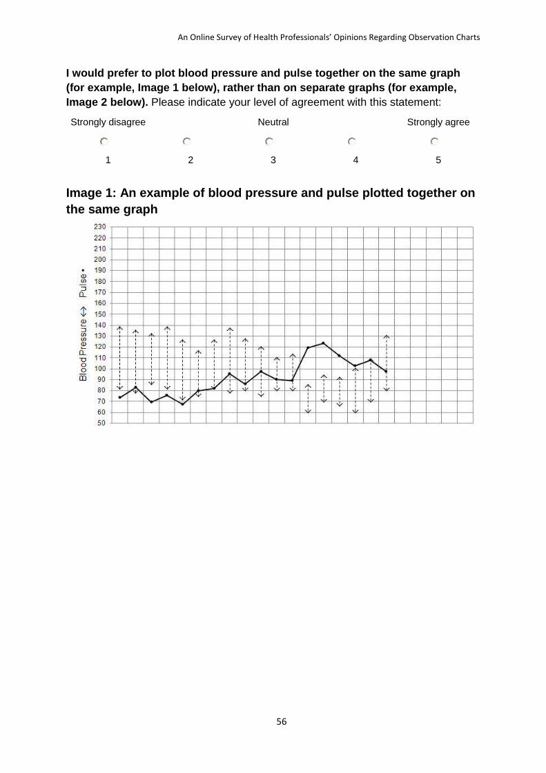
An Online Survey of Health Professionals’ Opinions Regarding Observation Charts
56
I would prefer to plot blood pressure and pulse together on the same graph
(for example, Image 1 below), rather than on separate graphs (for example,
Image 2 below). Please indicate your level of agreement with this statement:
Strongly disagree Neutral Strongly agree
1 2 3 4 5
Image 1: An example of blood pressure and pulse plotted together on
the same graph

An Online Survey of Health Professionals’ Opinions Regarding Observation Charts
57
Image 2: An example of blood pressure and pulse plotted on separate
graphs

An Online Survey of Health Professionals’ Opinions Regarding Observation Charts
58
I would prefer to record both systolic and diastolic blood pressure together
(for example, Image 3 below), rather than only systolic blood pressure (for
example, Image 4 below).Please indicate your level of agreement with this
statement:
Strongly disagree Neutral Strongly agree
1 2 3 4 5
Image 3: An example of recording both systolic and diastolic blood
pressure
Image 4: An example of recording only systolic blood pressure

An Online Survey of Health Professionals’ Opinions Regarding Observation Charts
59
The questions on this page are about detecting patient deterioration
using Observation Charts.
I would find it easier to detect patient deterioration when vital signs (e.g. pulse)
are presented as:
Write the value in a box
Plot the value on an otherwise ‘blank’ graph
Plot the value on a graph that has a line indicating physiological normality
Plot the value on a graph that has line(s) indicating physiological abnormality
Write the value in a box with graded colouring, where the colours correspond to a scoring
system or graded responses for physiological abnormality

An Online Survey of Health Professionals’ Opinions Regarding Observation Charts
60
Plot the value on a graph with graded colouring, where the colours correspond to a scoring
system or graded responses for physiological abnormality
I would find it easier to detect patient deterioration when blood pressure and
pulse are together on the same graph (for example, Image 1 below), rather than
on separate graphs (for example, Image 2 below).Please indicate your level of
agreement with this statement:
Strongly disagree Neutral Strongly agree
1 2 3 4 5
Image 1: An example of blood pressure and pulse plotted together on
the same graph

An Online Survey of Health Professionals’ Opinions Regarding Observation Charts
61
Image 2: An example of blood pressure and pulse plotted on separate
graphs

An Online Survey of Health Professionals’ Opinions Regarding Observation Charts
62
I would find it easier to detect patient deterioration when both systolic and
diastolic blood pressure are recorded together (for example, Image 3 below),
rather than only systolic blood pressure (for example, Image 4 below).Please
indicate your level of agreement with this statement:
Strongly disagree Neutral Strongly agree
1 2 3 4 5
Image 3: An example of recording both systolic and diastolic blood
pressure
Image 4: An example of recording only systolic blood pressure

An Online Survey of Health Professionals’ Opinions Regarding Observation Charts
63
The next few statements refer to your institution’s current
Observation Chart. Please indicate your level of agreement:
StronglyDisagree Neutral StronglyAgree
1 2 3 4 5
The Observation Chart has a user-friendly design.
The Observation Chart is easy to record vital signs on.
Staff may make errors when recording vital signs on the Observation
Chart.
The design of the Observation Chart may cause errors when recording
vital signs.
The Observation Chart clearly signals when a patient’s vital signs are
deteriorating.
Staff may make errors in detecting when a patient’s vital signs are
deteriorating.
The design of the Observation Chart may cause errors in detecting
when a patient’s vital signs are deteriorating
The Observation Chart clearly states how to respond when a patient’s
vital signs are deteriorating.
Staff may make errors when responding to a patient’s vital signs
deteriorating.
The design of the Observation Chart may cause errors in responding to
a patient’s vital signs deteriorating.
The design of the Observation Chart supports Staff’s clinical decision
making.
I like the design of the Observation Chart.
I like the Observation Chart as a whole.
Please enter any comments you would like to make about the Observation
Chart.

An Online Survey of Health Professionals’ Opinions Regarding Observation Charts
64
The final questions are about an example Observation Chart
that is under review by the Research Team. Please take 1 to 2
minutes to look at the de-identified Chart.
The next few statements refer to the example Observation Chart
shown above. Please indicate your level of agreement:
Stronglydisagree Neutral Stronglyagree
1 2 3 4 5
The Observation Chart has a user-friendly design.
The Observation Chart is easy to record vital signs on.
Staff may make errors when recording vital signs on the Observation
Chart.
The design of the Observation Chart may cause errors when recording
vital signs.
The Observation Chart clearly signals when a patient’s vital signs are
deteriorating.
Staff may make errors in detecting when a patient’s vital signs are
deteriorating.
The design of the Observation Chart may cause errors in detecting
when a patient’s vital signs are deteriorating.
The Observation Chart clearly states how to respond when a patient’s
vital signs are deteriorating.
Staff may make errors when responding to a patient’s vital signs
deteriorating.
The design of the Observation Chart may cause errors in responding to
a patient’s vital signs deteriorating.
The design of the Observation Chart supports Staff’s clinical decision
making.
I like the design of the Observation Chart.
I like the Observation Chart as a whole.
Please enter any comments you would like to make about the example
Observation Chart:
The example Observation Chart did not display on my computer.
Yes
No

An Online Survey of Health Professionals’ Opinions Regarding Observation Charts
65
End of survey questions.
Please enter your email address if you would like to enter the prize draw to win
a new Apple iPhone.Your survey responses and your email address will be stored
separately to maintain your anonymity.
I would like to receive a summary of the survey’s findings sent via email.
Yes
No
Thank you for taking part in the survey. You have been entered
in the prize draw to win a new Apple iPhone.

An Online Survey of Health Professionals’ Opinions Regarding Observation Charts
66
Appendix B: Participant Information About the Online Survey

An Online Survey of Health Professionals’ Opinions Regarding Observation Charts
67

An Online Survey of Health Professionals’ Opinions Regarding Observation Charts
68
Appendix C: Observation Charts Included in the Online Survey
Chart 1

An Online Survey of Health Professionals’ Opinions Regarding Observation Charts
69

An Online Survey of Health Professionals’ Opinions Regarding Observation Charts
70
Chart 2

An Online Survey of Health Professionals’ Opinions Regarding Observation Charts
71
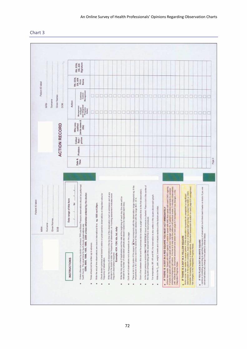
An Online Survey of Health Professionals’ Opinions Regarding Observation Charts
72
Chart 3

An Online Survey of Health Professionals’ Opinions Regarding Observation Charts
73

An Online Survey of Health Professionals’ Opinions Regarding Observation Charts
74
Chart 4

An Online Survey of Health Professionals’ Opinions Regarding Observation Charts
75

An Online Survey of Health Professionals’ Opinions Regarding Observation Charts
76
Chart 5

An Online Survey of Health Professionals’ Opinions Regarding Observation Charts
77

An Online Survey of Health Professionals’ Opinions Regarding Observation Charts
78
Chart 6

An Online Survey of Health Professionals’ Opinions Regarding Observation Charts
79

An Online Survey of Health Professionals’ Opinions Regarding Observation Charts
80
Chart 7

An Online Survey of Health Professionals’ Opinions Regarding Observation Charts
81
Chart 8

An Online Survey of Health Professionals’ Opinions Regarding Observation Charts
82

An Online Survey of Health Professionals’ Opinions Regarding Observation Charts
83
Chart 9