2015-The-IFTA-Journal.pdf - Management Solutions Plus
104
Men are born to succeed, not fail. —Henry David Thoreau 15 A Professional Journal Published by The International Federation of Technical Analysts Inside this Issue 6 Optimal f and diversification by Stanislaus Maier-Paape 10 Feeling the Market’s Pulse With Google Trends by Shawn Lim, CFTe, MSTA, and Douglas Stridsberg 89 Know Your System! – Turning Data Mining From Bias to Benefit Through System Parameter Permutation by Dave Walton, MBA IFTA Journal 2015 Edition
-
Upload
khangminh22 -
Category
Documents
-
view
0 -
download
0
Transcript of 2015-The-IFTA-Journal.pdf - Management Solutions Plus

Men are born to succeed, not fail.—Henry David Thoreau
15
A Professional Journal Published by The International Federation of Technical Analysts
Inside this Issue
6 Optimalfanddiversificationby Stanislaus Maier-Paape
10FeelingtheMarket’sPulseWithGoogleTrends by Shawn Lim, CFTe, MSTA, and Douglas Stridsberg
89KnowYourSystem!–TurningDataMiningFromBiastoBenefitThroughSystemParameterPermutationby Dave Walton, MBA
IFTA Journ
al 2015 E
dition

DO YOU WISH YOU HAD MORE TIME?Are you spending more time adjusting graphics or doing menial editing tasks than analysing charts?
Are you frustrated by having no easy way to rapidly find what most needs your attention?
How much is this wasted time costing you?
We understand. We’re here to help.
A recurring message we get from our clients is how thrilled they are that we have taken so much work off their shoulders and given them back so much time.
Time is what we want most, but we use worst. William Penn
If you are ready to explore how you can claw back your valuable time, go to the following address:
mav7.com/time
MA Flyer IFTA 2014.indd 1 22/08/2014 11:56:23 AM

EDITORIALAurélia Gerber, MBA, CFA (SAMT)Editor, and Chair of the Editorial Committee [email protected]
Jacinta Chan, [email protected]
Elaine [email protected]
Rolf [email protected]
Send your queries about advertising information and rates to [email protected]
IFTA Journal is published yearly by The International Association of Technical Analysts. 9707 Key West Avenue, Suite 100, Rockville, MD 20850 USA. © 2014 The International Federation of Technical Analysts. All rights reserved. No part of this publication may be reproduced or transmitted in any form or by any means, electronic or mechanical, including photocopying for public or private use, or by any information storage or retrieval system, without prior permission of the publisher.
Letter From the Editor By Aurélia Gerber, MBA, CFA ........................................................................................................... 3
ArticlesOptimal f and Diversification By Stanislaus Maier-Paape ............................................................................................................. 4
Feeling the Market’s Pulse With Google Trends By Shawn Lim, CFTe, MSTA, and Douglas Stridsberg ................................................................ 8
MFTA PapersIdentification of High Probability Target Zones (HPTZ) By Andrew J.D. Long, MFTA ............................................................................................................ 15
Testing the Effectiveness of Multivariate Wavelet De-noising for Intraday Trading Systems By Adam Cox, MFTA..........................................................................................................................30
Use of Social Media Mentions in Technical Analysis By Alex Neale, MFTA ..........................................................................................................................51
Enhancing Portfolio Returns and Reducing Risk by Utilizing the Relative Strength Index as a Market Trend Identifier By David Price BSc, MSc, CFTe, MSTA, MFTA ..............................................................................62
Anatomy of a Living Trend: Swing Charts, High Points and Low Points, Peaks and Troughs and How Their Underlying Structure May Define Their Forecasting Strength By Andreas Thalassinos, BSc, MSc, MSTA, CFTe, MFTA ......................................................... 67
Refining Wilder’s ADX: Adjustment to the Price Actions by Utilizing Closing Prices By Samuel Utomo, CFTe, MFTA ..................................................................................................... 74
The Alternative Head and Shoulders: A New Perspective on A Pre-Eminent Pattern By Fergal Walsh, MFTA ..................................................................................................................82
Wagner Award PaperKnow Your System! – Turning Data Mining From Bias to Benefit Through System Parameter Permutation By Dave Walton, MBA ...................................................................................................................... 87
Book ReviewCrowd Money: A Practical Guide to Macro Behavioural Technical Analysis—By Eoin Treacy Reviewed By David Hunt .................................................................................................................97
IFTA Board of Directors .............................................................................................................................98
IFTA Staff .....................................................................................................................................................98
Author Profiles ............................................................................................................................................99
About cover photo: Wildflowers in meadow during sunset—Photo by Pawel Gaul
IFTA JOURNAL 2014 EDITION
IFTA.ORG PAGE 1

Hosted by

Dear IFTA Colleagues and Friends:
The theme of this year’s 27th conference in London is “unravelling the DNA of the market”. Times sure have changed—it used to take several rooms full of sequencing machines and millions of dollars to decipher a genome, and now we need only one machine to draft far more complex DNA. Such developments have also been seen in the investment field.
The principles of technical analysis remain the same, however; price discounts everything, price movements are not totally random (they move in trends), and history has a tendency to repeat itself. These form the DNA, or the genes, of technical analysis.
The IFTA Journal is—through its global distribution to professionals in the field within member societies from 27 countries—one of the most important forums for publishing leading work in technical analysis. This year, the Journal has four sections.
In the first section, we have published seven Master of Financial Technical Analysis (MFTA) research submissions. This body of work offers fresh ways of looking at the behavior of markets and is testament to the high standing of the MFTA designation. Two articles deal with innovative ways of refining well-known technical indicators.
Other themes include the anatomy of living trend structure, denoising using multivariate wavelet algorithm, alternative head and shoulders pattern recognition, integration of multiple techniques to define high-probability target zones, and the use of social media in investing.
In the second section, one article was submitted by IFTA colleagues from the Society of Technical Analysts (STA) on the use of Google trends for feeling the market’s pulse, and the other from Vereinigung Technischer Analysten Deutschlands (VTAD) on optimal f for money management.
Next, with the permission of the National Association of Active Investment Managers (NAAIM), we are happy to publish a paper by Dave Walton, winner of the NAAIM Wagner Award 2014. We hope that you find this paper most interesting.
We also had the support of one book proposal reviewer, David Hunt, on crowd behaviour. This year’s Journal was produced by a returning team for IFTA. I would like to thank, Elaine
Knuth, Jacinta Chan and Regina Meani for their help in editing this Journal. Articles were peer reviewed by Elaine Knuth and Rolf Wetzer.
We are also able to create this timely and unique journal because of the intellect and generosity of time and materials from the authors. It was their tremendous spirit and endeavour that enabled us to achieve the goals of this high-quality journal. We are indebted to all authors for their contributions and for enabling us to meet our journal submission deadline.
Last but not least, we would also like to thank the production team at IFTA, in particular Linda Bernetich, Jon Benjamin, and Lynne Agoston, for their administrative, editorial and publishing work.
Letter From the Editor By Aurélia Gerber, MBA, CFA
…unravelling the DNA of the market
IFTA JOURNAL 2014 EDITION
IFTA.ORG PAGE 3
Hosted by

Abstract In this paper we use the optimal f / Kelly betting ansatz for
money management. Optimal f investments yield optimal growth of the equity curve, but at the same time catastrophic drawdowns when used for single investments.
In several simulations we show that a simple diversification of a portfolio helps a lot in order to reduce expected and achieved maximal drawdowns of the equity curve. Therefore the risk measure “maximal drawdown” shows similar behavior with respect to diversification as the commonly used standard deviation in Markowitz portfolio theory.
IntroductionMany traders and investors know that diversified depots
have many benefits compared with single investments. The distribution of risks on many shoulders reduces the risk of a portfolio remarkably while at the same time the return stays unchanged. On the other hand, the return of a portfolio can be maximized subject to a predefined risk level. In the Portfolio Theory of Markowitz (cf. [3]) these facts are formally derived.
As a byproduct, this ansatz yields concrete position sizes for single assets in order to build the optimal portfolio. This ansatz does, however, not regard the possible drawdown of the portfolio since the risk is measured solely via the standard deviation. The goal of this paper is to demonstrate, that diversified depots are also suitable to reduce possible (maximal) drawdowns, while not lowering ones sight on the return.
Optimal f and Kelly betting For our demonstration we choose the “optimal f ” ansatz, that
means position sizing that uses always a fixed percentage (“fixed fraction trading”) of the actual available investment capital (cf.
Vince [4] and [5]). In particular when large distributions of possible trading results are used, this ansatz quickly gets confusing. Therefore and for demonstration purposes we want to use optimal f only in its simplest version also known as “Kelly betting system” (cf. [1], [2] and for the variant following below [4], p. 30).
Here a trader can repeatedly place for him favorable bets. On each bet he either looses his stake which is a fixed percentage f ∈ [0,1] of his capital, or he wins B times his stake. In case we further assume that the winning probability is p ∈ (0,1) and the loosing probability is q =1 – p then for the capital Xk after k bets we get
Optimal f and diversification
Stanislaus Maier-Paape
Institut fur Mathematik, RWTH Aachen
Templergraben 55, 52062 Aachen, Germany
and
SMP Financial Engineering GmbH
Weiherstraße 14, 52134 Herzogenrath, Germany
November 28, 2013
Many traders and investors know that diversified depots have many benefits compared with single invest-
ments. The distribution of risks on many shoulders reduces the risk of a portfolio remarkably while at the
same time the return stays unchanged. On the other hand, the return of a portfolio can be maximized
subject to a predefined risk level. In the Portfolio Theory of Markowitz (cf. [3]) these facts are formally
derived.
As a byproduct, this ansatz yields concrete position sizes for single assets in order to build the optimal
portfolio. This ansatz does, however, not regard the possible drawdown of the portfolio since the risk is
measured solely via the standard deviation. The goal of this paper is to demonstrate, that diversified depots
are also suitable to reduce possible (maximal) drawdowns, while not lowering ones sight on the return.
Optimal f and Kelly betting
For our demonstration we choose the “optimal f ” ansatz, that means position sizing that uses always a fixed
percentage (“fixed fraction trading”) of the actual available investment capital (cf. Vince [4] and [5]). In
particular when large distributions of possible trading results are used, this ansatz quickly gets confusing.
Therefore and for demonstration purposes we want to use optimal f only in its simplest version also known
as “Kelly betting system” (cf. [1], [2] and for the variant following below [4], p. 30).
Here a trader can repeatedly place for him favorable bets. On each bet he either looses his stake which is a
fixed percentage f ∈ [0, 1] of his capital, or he wins B times his stake. In case we further assume that the
winning probability is p ∈ (0, 1) and the loosing probability is q = 1− p then for the capital Xk after k bets
we get
Xk =
�Xk−1 · (1 +Bf) with probability p
Xk−1 · (1− f) with probability q .
1
Under the condition that the capital after k – 1 bets is already known (equal to x), the expected value of Xk becomes Under the condition that the capital after k − 1 bets is already known (equal to x), the expected value of
Xk becomes
E
�Xk
�����Xk−1 = x
��= p · x(1 +Bf) + q · x(1− f)
= x ·�1 +
�Bp− q
�f�
Therefore, the bets are only favorable in case Bp > q. The expected gain of each of these bets gets maximized
for f = 1. This, however, immediately brings about ruin once only one bet gets lost. Clearly this cannot be
meaningful. Hence instead of maximizing the gain, Kelly started to maximize the expectation of the natural
logarithm of the capital instead. Using again the condition that Xk−1 is already known one obtains
E
�log
�Xk
� �����Xk−1 = x
��= p · log
�x�1 +Bf
��+ q · log
�x�1− f
��
= log x +�p log
�1 +Bf
�+ q log
�1− f
��(1)
If this expression is viewed as a function of f , its maximum is achieved at fopt = p − q
B> 0
(Kelly formula).
Simulation of single investments
In the following we want to do some simulations. Assume for example B = 2 and p = 0.4. The optimal f
according to Kelly then is
fopt = p − q
B= 0.4 − 0.6
2= 0.1 = 10% .
That means, in order to obtain optimal growth of the logarithmic utility function in the long run, always
a stake of 10% of the actual capital has to be used. Using a starting capital of X0 = 1000 a simulation of
10000 bets yields the results of Figure 1, left:
0 2000 4000 6000 8000 100000
20
40
60
80
100
120Equity log scale: steps = 10000, B = 2, p = 0.4, f = 0.1
Figure 1: y = log�Xk
�for fopt and is negative drawdown (right)
2
Under the condition that the capital after k − 1 bets is already known (equal to x), the expected value of
Xk becomes
E
�Xk
�����Xk−1 = x
��= p · x(1 +Bf) + q · x(1− f)
= x ·�1 +
�Bp− q
�f�
Therefore, the bets are only favorable in case Bp > q. The expected gain of each of these bets gets maximized
for f = 1. This, however, immediately brings about ruin once only one bet gets lost. Clearly this cannot be
meaningful. Hence instead of maximizing the gain, Kelly started to maximize the expectation of the natural
logarithm of the capital instead. Using again the condition that Xk−1 is already known one obtains
E
�log
�Xk
� �����Xk−1 = x
��= p · log
�x�1 +Bf
��+ q · log
�x�1− f
��
= log x +�p log
�1 +Bf
�+ q log
�1− f
��(1)
If this expression is viewed as a function of f , its maximum is achieved at fopt = p − q
B> 0
(Kelly formula).
Simulation of single investments
In the following we want to do some simulations. Assume for example B = 2 and p = 0.4. The optimal f
according to Kelly then is
fopt = p − q
B= 0.4 − 0.6
2= 0.1 = 10% .
That means, in order to obtain optimal growth of the logarithmic utility function in the long run, always
a stake of 10% of the actual capital has to be used. Using a starting capital of X0 = 1000 a simulation of
10000 bets yields the results of Figure 1, left:
0 2000 4000 6000 8000 100000
20
40
60
80
100
120Equity log scale: steps = 10000, B = 2, p = 0.4, f = 0.1
Figure 1: y = log�Xk
�for fopt and is negative drawdown (right)
2
Therefore, the bets are only favorable in case Bp > q. The expected gain of each of these bets gets maximized for f = 1. This, however, immediately brings about ruin once only one bet gets lost. Clearly this cannot be meaningful. Hence instead of maximizing the gain, Kelly started to maximize the expectation of the natural logarithm of the capital instead. Using again the condition that Xk – 1 is already known one obtains
Under the condition that the capital after k − 1 bets is already known (equal to x), the expected value of
Xk becomes
E
�Xk
�����Xk−1 = x
��= p · x(1 +Bf) + q · x(1− f)
= x ·�1 +
�Bp− q
�f�
Therefore, the bets are only favorable in case Bp > q. The expected gain of each of these bets gets maximized
for f = 1. This, however, immediately brings about ruin once only one bet gets lost. Clearly this cannot be
meaningful. Hence instead of maximizing the gain, Kelly started to maximize the expectation of the natural
logarithm of the capital instead. Using again the condition that Xk−1 is already known one obtains
E
�log
�Xk
� �����Xk−1 = x
��= p · log
�x�1 +Bf
��+ q · log
�x�1− f
��
= log x +�p log
�1 +Bf
�+ q log
�1− f
��(1)
If this expression is viewed as a function of f , its maximum is achieved at fopt = p − q
B> 0
(Kelly formula).
Simulation of single investments
In the following we want to do some simulations. Assume for example B = 2 and p = 0.4. The optimal f
according to Kelly then is
fopt = p − q
B= 0.4 − 0.6
2= 0.1 = 10% .
That means, in order to obtain optimal growth of the logarithmic utility function in the long run, always
a stake of 10% of the actual capital has to be used. Using a starting capital of X0 = 1000 a simulation of
10000 bets yields the results of Figure 1, left:
0 2000 4000 6000 8000 100000
20
40
60
80
100
120Equity log scale: steps = 10000, B = 2, p = 0.4, f = 0.1
Figure 1: y = log�Xk
�for fopt and is negative drawdown (right)
2
Figure 1: y = log (Xk) for fopt (left) and is negative drawdown (right)
0 2000 4000 6000 8000 100000
20
40
60
80
100
120Equity log scale: steps = 10000, B = 2, p = 0.4, f = 0.1
0 2000 4000 6000 8000 10000−1
−0.9
−0.8
−0.7
−0.6
−0.5
−0.4
−0.3
−0.2
−0.1
0blood curve(neg drawdown): steps = 10000, B = 2, p = 0.4, f = 0.1
(1)
Optimal f and Diversification By Stanislaus Maier-Paape
IFTA JOURNAL 2015 EDITION
PAGE 4 IFTA.ORG

If this expression is viewed as a function of f, its maximum is
achieved at
Under the condition that the capital after k − 1 bets is already known (equal to x), the expected value of
Xk becomes
E
�Xk
�����Xk−1 = x
��= p · x(1 +Bf) + q · x(1− f)
= x ·�1 +
�Bp− q
�f�
Therefore, the bets are only favorable in case Bp > q. The expected gain of each of these bets gets maximized
for f = 1. This, however, immediately brings about ruin once only one bet gets lost. Clearly this cannot be
meaningful. Hence instead of maximizing the gain, Kelly started to maximize the expectation of the natural
logarithm of the capital instead. Using again the condition that Xk−1 is already known one obtains
E
�log
�Xk
� �����Xk−1 = x
��= p · log
�x�1 +Bf
��+ q · log
�x�1− f
��
= log x +�p log
�1 +Bf
�+ q log
�1− f
��(1)
If this expression is viewed as a function of f , its maximum is achieved at fopt = p − q
B> 0
(Kelly formula).
Simulation of single investments
In the following we want to do some simulations. Assume for example B = 2 and p = 0.4. The optimal f
according to Kelly then is
fopt = p − q
B= 0.4 − 0.6
2= 0.1 = 10% .
That means, in order to obtain optimal growth of the logarithmic utility function in the long run, always
a stake of 10% of the actual capital has to be used. Using a starting capital of X0 = 1000 a simulation of
10000 bets yields the results of Figure 1, left:
0 2000 4000 6000 8000 100000
20
40
60
80
100
120Equity log scale: steps = 10000, B = 2, p = 0.4, f = 0.1
Figure 1: y = log�Xk
�for fopt and is negative drawdown (right)
2
(Kelly formula).
Simulation of single investments In the following we want to do some simulations. Assume for
example B = 2 and p = 0.4. The optimal f according to Kelly then is
Under the condition that the capital after k − 1 bets is already known (equal to x), the expected value of
Xk becomes
E
�Xk
�����Xk−1 = x
��= p · x(1 +Bf) + q · x(1− f)
= x ·�1 +
�Bp− q
�f�
Therefore, the bets are only favorable in case Bp > q. The expected gain of each of these bets gets maximized
for f = 1. This, however, immediately brings about ruin once only one bet gets lost. Clearly this cannot be
meaningful. Hence instead of maximizing the gain, Kelly started to maximize the expectation of the natural
logarithm of the capital instead. Using again the condition that Xk−1 is already known one obtains
E
�log
�Xk
� �����Xk−1 = x
��= p · log
�x�1 +Bf
��+ q · log
�x�1− f
��
= log x +�p log
�1 +Bf
�+ q log
�1− f
��(1)
If this expression is viewed as a function of f , its maximum is achieved at fopt = p − q
B> 0
(Kelly formula).
Simulation of single investments
In the following we want to do some simulations. Assume for example B = 2 and p = 0.4. The optimal f
according to Kelly then is
fopt = p − q
B= 0.4 − 0.6
2= 0.1 = 10% .
That means, in order to obtain optimal growth of the logarithmic utility function in the long run, always
a stake of 10% of the actual capital has to be used. Using a starting capital of X0 = 1000 a simulation of
10000 bets yields the results of Figure 1, left:
0 2000 4000 6000 8000 100000
20
40
60
80
100
120Equity log scale: steps = 10000, B = 2, p = 0.4, f = 0.1
Figure 1: y = log�Xk
�for fopt and is negative drawdown (right)
2
That means that in order to obtain optimal growth of the logarithmic utility function in the long run, a stake of 10% of the actual capital always has to be used. Using a starting capital of X0 = 1000, a simulation of 10000 bets yields the results of Figure 1, left:
On the x–axis the bets k = 1, ..., 10000 are assigned. The dotted line in Figure 1 (left) shows for f = fopt = 10%, k = 1, ..., 10000, the expected value E(log(Xk)) — a line with slope p log (1 + Bf ) + q log (1–f) ≈ 0.0097. This is more or less realized in the simulation.
The right graphic in Figure 1 shows the negative drawdowns (– drawdown(k), k = 1, ..., 10000) of this simulation and dotted the maximal drawdown (see also the empirical distribution of these drawdowns in Figure 2 (left)).
Here we set drawdown(k) = 1 – (Xk /equitymax(k)) ∈ [0,1] and equitymax(k) = max Xj . 1 ≤ j ≤ k
Figures 1 (right) and 2 (left) show clearly that for f = fopt severe drawdowns are to be expected. These drawdowns would have large psychological impact on every trader and investor.
On the other hand, in case a stake of only f = 1% of the actual capital is used (as recommended by many experts) the severe drawdowns can be prevented (cf. Figure 2 (right) and Figure 3). The expected value (dotted line in Figure 2 (right)) and the result of this simulation are however considerably lower.
It can be observed that large drawdowns can be avoided for suboptimal f << fopt, but only at the expense of a lower capital growth. What remains is the question, whether both, optimal capital growth with simultaneously bounded drawdowns, is reachable? Here the diversification comes into play.
Diversified optimal f The aim of diversification is to load the depot capital risk
on several “shoulders” (virtual depot parts). In case the capital growth on each depot part has positive expected value, the whole depot also becomes a positive expected value (through averaging).
If the expected returns of the depot parts are of the same order, then the expected return of the whole depot is also of that
Figure 2: Distribution drawdowns for fopt (left) and y = log(Xk) for f = 0.01 (right)
−0.2 0 0.2 0.4 0.6 0.8 1 1.20
1
2
3
4
5
6
7verteilung drawdown: steps = 10000, B = 2, p = 0.4, f = 0.1
0 2000 4000 6000 8000 100005
10
15
20
25
30Equity log scale: steps = 10000, B = 2, p = 0.4, f = 0.01
Figure 3: Negative drawdown for f = 0.01 (left) and distribution (right)
0 2000 4000 6000 8000 10000−0.35
−0.3
−0.25
−0.2
−0.15
−0.1
−0.05
0blood curve(neg drawdown): steps = 10000, B = 2, p = 0.4, f = 0.01
−0.2 0 0.2 0.4 0.6 0.8 1 1.20
2
4
6
8
10
12
14
16
18
20verteilung drawdown: steps = 10000, B = 2, p = 0.4, f = 0.01
IFTA JOURNAL 2015 EDITION
IFTA.ORG PAGE 5

magnitude, i.e. we give away nothing. Nevertheless, so the hope, the fluctuation of the equity curve of the whole depot will be reduced by the gains and losses of the partial depots. We want to apply this idea to fractional trading with optimal f.
Simulation with partial depots Thereto let us again consider the Kelly betting variant with
B =2, p = 0.4, fopt = 10% . This time, however, before each bet the capital will be splitted uniformly on M= 10 (or M= 25) virtual depot parts. Then each partial depot bets (stochastically independent) with an fopt fraction of its partial depot.
The lower dotted line in the left graphic of Figure 4 shows as in Figure 1 the expected value for a single investment per bet. The upper dotted line (which is very dose to the equity curve) shows the expected value of log(Xk) when M partial depots are used (cf. (2) below).
Observations �� The capital growth is even faster as expected for the single
investment. �� The drawdown (Figure 4 right and Figure 5 left) is reduced
remarkably.
The capital after k bets, Xk, is the sum of the capitals of the depot parts
Observations:
� The capital growth is even faster as expected for the single investment.
� The drawdown (Figure 4 right and Figure 5 left) is reduced remarkably.
−0.2 0 0.2 0.4 0.6 0.8 1 1.20
5
10
15
20
25
30
35
40
45
50verteilung drawdown: steps = 10000, B = 2, p = 0.4, M = 10, f = 0.1
0 2000 4000 6000 8000 100000
50
100
150
200
250Equity log scale: steps = 10000, B = 2, p = 0.4, M = 25, f = 0.1
Figure 5: distribution drawdown M = 10 (left) and y = log�Xk
�M = 25 with fopt (right)
The capital after k bets, Xk, is the sum of the capitals of the depot parts
Xk =M�
i=1
Y ki ,
where the i–th depot part is capitalized before the k–th bet withXk−1
M and the capital after the k–th bet is
denoted Y ki . In this case the expected log–growth is given by
E
�log
�Xk
� �����Xk−1 = x
��=
log(x) +
M�
j=0
�Mj
�pj�1− p
�M−jlog
�1 + f ·
�jB + 1
M− 1
��.
(2)
For convenience we give the argument for (2). By construction
Y ki =
(1 +Bf) ·Xk−1
�M with probability p
(1− f) ·Xk−1
�M with probability q
.
Since we use M depot parts there are 2M different possible results for�Y k1 , . . . , Y
kM
�but basically only the
number of winners and losers counts. Therefore, if we assume that j of the M trades are winners and M − j
5
where the i–th depot part is capitalized before the k–th bet with
Observations:
� The capital growth is even faster as expected for the single investment.
� The drawdown (Figure 4 right and Figure 5 left) is reduced remarkably.
−0.2 0 0.2 0.4 0.6 0.8 1 1.20
5
10
15
20
25
30
35
40
45
50verteilung drawdown: steps = 10000, B = 2, p = 0.4, M = 10, f = 0.1
0 2000 4000 6000 8000 100000
50
100
150
200
250Equity log scale: steps = 10000, B = 2, p = 0.4, M = 25, f = 0.1
Figure 5: distribution drawdown M = 10 (left) and y = log�Xk
�M = 25 with fopt (right)
The capital after k bets, Xk, is the sum of the capitals of the depot parts
Xk =M�
i=1
Y ki ,
where the i–th depot part is capitalized before the k–th bet withXk−1
M and the capital after the k–th bet is
denoted Y ki . In this case the expected log–growth is given by
E
�log
�Xk
� �����Xk−1 = x
��=
log(x) +
M�
j=0
�Mj
�pj�1− p
�M−jlog
�1 + f ·
�jB + 1
M− 1
��.
(2)
For convenience we give the argument for (2). By construction
Y ki =
(1 +Bf) ·Xk−1
�M with probability p
(1− f) ·Xk−1
�M with probability q
.
Since we use M depot parts there are 2M different possible results for�Y k1 , . . . , Y
kM
�but basically only the
number of winners and losers counts. Therefore, if we assume that j of the M trades are winners and M − j
5
and the capital after the k–th bet is denoted Yik. In
this case the expected log–growth is given by
Observations:
� The capital growth is even faster as expected for the single investment.
� The drawdown (Figure 4 right and Figure 5 left) is reduced remarkably.
−0.2 0 0.2 0.4 0.6 0.8 1 1.20
5
10
15
20
25
30
35
40
45
50verteilung drawdown: steps = 10000, B = 2, p = 0.4, M = 10, f = 0.1
0 2000 4000 6000 8000 100000
50
100
150
200
250Equity log scale: steps = 10000, B = 2, p = 0.4, M = 25, f = 0.1
Figure 5: distribution drawdown M = 10 (left) and y = log�Xk
�M = 25 with fopt (right)
The capital after k bets, Xk, is the sum of the capitals of the depot parts
Xk =M�
i=1
Y ki ,
where the i–th depot part is capitalized before the k–th bet withXk−1
M and the capital after the k–th bet is
denoted Y ki . In this case the expected log–growth is given by
E
�log
�Xk
� �����Xk−1 = x
��=
log(x) +
M�
j=0
�Mj
�pj�1− p
�M−jlog
�1 + f ·
�jB + 1
M− 1
��.
(2)
For convenience we give the argument for (2). By construction
Y ki =
(1 +Bf) ·Xk−1
�M with probability p
(1− f) ·Xk−1
�M with probability q
.
Since we use M depot parts there are 2M different possible results for�Y k1 , . . . , Y
kM
�but basically only the
number of winners and losers counts. Therefore, if we assume that j of the M trades are winners and M − j
5
For convenience we give the argument for (2). By construction
Observations:
� The capital growth is even faster as expected for the single investment.
� The drawdown (Figure 4 right and Figure 5 left) is reduced remarkably.
−0.2 0 0.2 0.4 0.6 0.8 1 1.20
5
10
15
20
25
30
35
40
45
50verteilung drawdown: steps = 10000, B = 2, p = 0.4, M = 10, f = 0.1
0 2000 4000 6000 8000 100000
50
100
150
200
250Equity log scale: steps = 10000, B = 2, p = 0.4, M = 25, f = 0.1
Figure 5: distribution drawdown M = 10 (left) and y = log�Xk
�M = 25 with fopt (right)
The capital after k bets, Xk, is the sum of the capitals of the depot parts
Xk =M�
i=1
Y ki ,
where the i–th depot part is capitalized before the k–th bet withXk−1
M and the capital after the k–th bet is
denoted Y ki . In this case the expected log–growth is given by
E
�log
�Xk
� �����Xk−1 = x
��=
log(x) +
M�
j=0
�Mj
�pj�1− p
�M−jlog
�1 + f ·
�jB + 1
M− 1
��.
(2)
For convenience we give the argument for (2). By construction
Y ki =
(1 +Bf) ·Xk−1
�M with probability p
(1− f) ·Xk−1
�M with probability q
.
Since we use M depot parts there are 2M different possible results for�Y k1 , . . . , Y
kM
�but basically only the
number of winners and losers counts. Therefore, if we assume that j of the M trades are winners and M − j
5
Since we use M depot parts there are 2M different possible results for (Y1
k,... , YMk) but basically only the number of winners
and losers counts. Therefore, if we assume that j of the M trades are winners and M – j trades are losers, then under the condition that Xk - 1 = x is known we obtain
Figure 4: y= log (Xk) for M = 10 partial depots with fopt (left) and negative drawdown (right)
0 2000 4000 6000 8000 100000
20
40
60
80
100
120
140
160
180
200Equity log scale: steps = 10000, B = 2, p = 0.4, M = 10, f = 0.1
0 2000 4000 6000 8000 10000−0.35
−0.3
−0.25
−0.2
−0.15
−0.1
−0.05
0blood curve(neg drawdown): steps = 10000, B = 2, p = 0.4, M = 10, f = 0.1
Figure 5: Distribution drawdown M = 10 (left) and y = log(Xk) M = 25 with fopt (right)
−0.2 0 0.2 0.4 0.6 0.8 1 1.20
5
10
15
20
25
30
35
40
45
50verteilung drawdown: steps = 10000, B = 2, p = 0.4, M = 10, f = 0.1
0 2000 4000 6000 8000 100000
50
100
150
200
250Equity log scale: steps = 10000, B = 2, p = 0.4, M = 25, f = 0.1
IFTA JOURNAL 2015 EDITION
PAGE 6 IFTA.ORG

trades are losers, then under the condition that Xk−1 = x is known we obtain
logXk = log
�M�i=1
Y ki
�
= log
�j(1 +Bf) x
M + (M − j)(1− f) xM
�
= log(x) + log
�1 + j
M Bf +�1 − j
M
��− f
��
= log(x) + log
�1 + f
�j B+1
M − 1
��
Now (2) follows easily because�Y k1 , . . . , Y
kM
�is binomially distributed.
�
Remark: For M = 1 formula (2) is equal to the old formula from (1):
E�log
�Xk
� ����Xk−1 = x
��= log(x) + p · log(1 + Bf) + ( 1 − p) log(1 − f)
In particular f = fopt of the utility function (1) is in general no longer optimal for maximizing the utility
function (2). Nevertheless, we obtain a win–win situation:
Advantages: � The severe drawdowns are controlled.
� The expected gain grows remarkably compared to a single investment.
Nevertheless, there are also disadvantages which should be mentioned:
Disadvantages: � More signals are needed for each bet(preferably stochastically independent or at least uncorrelated).
� The fees are multiplied.
The disadvantages seem to be of technical nature. They are, however, in fact restrictive or at least difficult
to realize. The assumption that the investments in partial depots is possible stochastically independent,
is probably not realizable in our globally connected financial markets. As easing of this assumption, one
could demand that the correlation of the returns of the depot parts is zero or at least in absolute value
small. This can be monitored by usual correlation estimators. One, however, has to be on alert when the
correlations grow dramatically as it happens regularly in financial crises (so called “correlation meltdown”).
To be warned early, there are powerful statistical tests which raise the alarm when correlations are changed
(cf. Wied [6]).
In Figure 5 (right) and Figure 6 we can observe that for M = 25 depot parts the drawdown is furthermore
reduced remarkably while the expected equity growth is extended a little.
6
Now (2) follows easily because (Y1k,... , YM
k ) is binomially distributed.
Remark: For M = 1 formula (2) is equal to the old formula from (1):
trades are losers, then under the condition that Xk−1 = x is known we obtain
logXk = log
�M�i=1
Y ki
�
= log
�j(1 +Bf) x
M + (M − j)(1− f) xM
�
= log(x) + log
�1 + j
M Bf +�1 − j
M
��− f
��
= log(x) + log
�1 + f
�j B+1
M − 1
��
Now (2) follows easily because�Y k1 , . . . , Y
kM
�is binomially distributed.
�
Remark: For M = 1 formula (2) is equal to the old formula from (1):
E�log
�Xk
� ����Xk−1 = x
��= log(x) + p · log(1 + Bf) + ( 1 − p) log(1 − f)
In particular f = fopt of the utility function (1) is in general no longer optimal for maximizing the utility
function (2). Nevertheless, we obtain a win–win situation:
Advantages: � The severe drawdowns are controlled.
� The expected gain grows remarkably compared to a single investment.
Nevertheless, there are also disadvantages which should be mentioned:
Disadvantages: � More signals are needed for each bet(preferably stochastically independent or at least uncorrelated).
� The fees are multiplied.
The disadvantages seem to be of technical nature. They are, however, in fact restrictive or at least difficult
to realize. The assumption that the investments in partial depots is possible stochastically independent,
is probably not realizable in our globally connected financial markets. As easing of this assumption, one
could demand that the correlation of the returns of the depot parts is zero or at least in absolute value
small. This can be monitored by usual correlation estimators. One, however, has to be on alert when the
correlations grow dramatically as it happens regularly in financial crises (so called “correlation meltdown”).
To be warned early, there are powerful statistical tests which raise the alarm when correlations are changed
(cf. Wied [6]).
In Figure 5 (right) and Figure 6 we can observe that for M = 25 depot parts the drawdown is furthermore
reduced remarkably while the expected equity growth is extended a little.
6
In particular f = fopt of the utility function (1) is in general no longer optimal for maximizing the utility function (2). Nevertheless, we obtain a win–win situation.
Advantages • The severe drawdowns are controlled. • The expected gain grows remarkably compared to a single investment.
Nevertheless, there are also disadvantages which should be mentioned
Disadvantages • More signals are needed for each bet (preferably stochastically independent or at least uncorrelated) • The fees are multiplied.
The disadvantages seem to be of technical nature. They are, however, in fact restrictive or at least difficult to realize. The assumption that the investments in partial depots is possible stochastically independent, is probably not realizable in our globally connected financial markets. As easing of this assumption, one could demand that the correlation of the returns of the depot parts is zero or at least in absolute value small. This can be monitored by usual correlation estimators. One, however, has to be on alert when the correlations grow dramatically as it happens regularly in financial crises (so called “correlation meltdown”). To be warned early, there are powerful
statistical tests which raise the alarm when correlations are changed (cf. Wied [6]).
In Figure 5 (right) and Figure 6 we can observe that for M = 25 depot parts the drawdown is furthermore reduced remarkably while the expected equity growth is extended a little.
To be applicable for real investments, the easy Kelly betting example has to be substituted by a realistic returns distribution and as investment fraction in the depot parts optimal f from Vince (cf. [4]) would have to be used. Since Kelly betting is just an easy case of optimal f, we expect that more complex return distributions would yield similar results. A drawdown control, as suggested in the “leverage space trading model” in [5], would not be necessary.
ConclusionWith the help of simulations it was possible to verify
that the use of optimal f position sizing in connection with diversified partial depots yields a remarkable reduction of the maximal drawdown compared to single investments while concurrently the expected equity growth is raised. Suboptimal fixed fraction trading approaches are literally declassified. The dificulty of applying this method is, however, to provide many uncorrelated investment possibilities simultaneously. A consistent implementation of such a strategy results in a win–win situation and may be viewed as a further prove why many experts for a long time call diversification the only “free lunch” on Wall Street. This seems to be a valuable complementation of the classical portfolio theory where the only risk measure used was the standard deviation and therefore drawdowns were not at all addressed.
Notes 1. T.Ferguson,The Kelly Betting System for Favorable Games,Statistics
Department,UCLA.2. J.L.Kelly,Jr.A new interpretation of information rate,BellSystemTechnicalJ.
35:917-926,(1956).3. HenryM.Markowitz,PortfolioSelection,FinanzBuchVerlag,(1991).4. R.Vince, The Mathematics of Money Management, Risk Analysis Techniques for
Traders,AWileyFinanceEdition,JohnWiley&Sons,Inc.,(1992).5. R.Vince,The Leverage Space Trading Model: Reconciling Portfolio Management
Strategies and Economic Theory,WileyTrading,(2009).6. D.Wied,Ein Fluktuationstest auf konstante Korrelation,Doktorarbeit,
TechnischeUniversit¨atDortmund,(2010).
Figure 6: M = 25 drawdown (left) and distribution (right)
0 2000 4000 6000 8000 10000−0.16
−0.14
−0.12
−0.1
−0.08
−0.06
−0.04
−0.02
0blood curve(neg drawdown): steps = 10000, B = 2, p = 0.4, M = 25, f = 0.1
−0.2 0 0.2 0.4 0.6 0.8 1 1.20
10
20
30
40
50
60
70
80verteilung drawdown: steps = 10000, B = 2, p = 0.4, M = 25, f = 0.1
IFTA JOURNAL 2015 EDITION
IFTA.ORG PAGE 7

AbstractThis article explores how Google Trends has been applied
in different disciplines and the relevance of search query data to financial markets. We contend that if Google Trends can be used to recover retail investor interest in a particular security, market or issue, it can provide valuable information to a technical analyst. We propose possible applications of Google Trends to improve existing concepts in technical analysis (price movements, trend analysis, oscillators and trading bands) and demonstrate how it can act as a useful tool to improve signal reliability. In addition, we suggest other areas that could benefit from the use of this data source (volume analysis, sentiment analysis and event studies).
IntroductionThe term ‘Big Data’ was born around the turn of the last
decade to describe the exponential growth in the availability and size of enormous, largely unstructured sets of data, such as those generated by Google users. The analysis and use of this data has gained traction in recent years as a means of understanding and predicting consumers’ needs in order to gain a competitive advantage. One of the first sources of Big Data to open to the public for analysis was Google Trends, which gained particular momentum when Choi & Varian (2009) demonstrated that various business metrics, such as sales volumes, could be predicted from Google Trends data. In this article, we argue
that Google Trends can be utilized by the financial technician as a source of data in addition to price and volume. Google enjoys an almost 70% share of the search engine market (Netmarketshare.com, 2014), and its data has been shown to reveal investor sentiment and interest. We will introduce Google Trends and lay the foundation for its inclusion in a technical analyst’s toolkit by investigating what Google Trends in fact can tell us about the stock market and, in particular, future stock price movements. We aim to propose new ways to incorporate Google Trends data into mainstream technical analysis in order to enhance profitability.
Understanding Google Trends
What is Google TrendsGoogle Trends is a service by Google that offers users the
ability to, among other things, visualize the relative popularity of a keyword (i.e. the number of searches done for it) over time. It also offers the opportunity to compare one keyword with another, as well as to rank the most popular search terms in various categories and in various geographical regions. Perhaps the most interesting aspect of the data is the fact that it reveals the intentions of a user, often long before they act (Da et al., 2011). The data is not presented in its raw form—rather, it is normalized to avoid problems with changing Google popularity and changing Internet usage. The data is then scaled from 0 to
100 in order to be comparable to other keywords, where 100 represents the maximum popularity during the time period chosen. In our paper, we will use the term search volume index (SVI) for the data provided by Google Trends on the relative popularity of a search term.
In Figure 1 we see an example of the SVI for the search term ‘german cars’.
Literature reviewThe increasing importance
of the Internet as a primary source of information has been one of the key themes that has characterized the last decade. With our recent ability to uncover the revealed interest
Feeling the Market’s Pulse With Google Trends By Shawn Lim, CFTe, MSTA, and Douglas Stridsberg
Figure 1: An example search for ‘german cars’ in Google Trends, showing the SVI between 2004 and 2014.
IFTA JOURNAL 2015 EDITION
PAGE 8 IFTA.ORG

of individuals through the SVI that has been made publicly available via Google Trends, researchers have taken advantage of that source of data to explore potential applications. The results from these studies have been fairly encouraging, with studies from a range of disciplines posting positive results from the use of Google Trends in various forms of inquiry.
In Medicine, for example, researchers have explored the possibility of using Google Trends to detect the spread of disease. Ginsberg et al (2009) conducted a study on the ability to detect influenza epidemics with search query data and found that flu trends could be predicted from search data, while Chan et al. (2011) conducted a similar study to detect Dengue epidemics with similar positive results. These findings have led to the development of the Google Flu Trends application based on aggregated search data and demonstrate the power of Google Trends in enabling us to gain an insight into a range of issues from the revealed interest of people identified through what they search for on Google.
The ability of Google Trends to predict the outcome of human-determined processes has also been the subject of a number of studies. Stephens (2013) explored the ability of Google Trends to predict election turnout and found that it can be used to proxy voting intention in various parts of the United States. There has also been an interest in the ability of Google Trends to help us better understand the underlying state of the economy. The ability of Google Trends to ‘nowcast’ macroeconomic data has been studied in Choi and Varian (2009), which found a positive correlation between initial unemployment claims and searches related to jobs, welfare and unemployment. Vosen and Schmidt (2011) conducted a study to evaluate the use of Google Trends as an indicator for private consumption and found that it offers significant benefits to forecasters of private consumption over traditional consumer confidence indices.
Besides macroeconomic variables, there has been an interest in the use of Google Trends to predict the economic performance of industries and corporations. Carrier and Labe (2010) tested the ability of Google Trends to predict automobile sales in Chile with positive results, while Azar (2009) investigated how oil prices react to search volumes related to electric cars and found a positive connection between them. This presents a potential means to improve our fundamental forecasts of industry and company performance.
Relevance to financial marketsThe ability of Google Trends to reveal information about
financial markets has also been of recent interest. Dimpfl and Jank (2011) investigated the link between search queries and stock market volatility and found a positive result, as the inclusion of Google Trends helped to improve in-sample and out-of-sample volatility forecasts. Bordino et al. (2012) explored the link between Google Trends and stock volume with positive findings for the NASDAQ, while Joseph et al. (2011) conducted an investigation of the link between Google Trends and abnormal returns with positive findings for the S&P 500.
The existing academic literature seems to suggest that there is some information contained in search volume data that can help improve various financial forecasts, but how should we
as technical analysts think about this potential new source of data? Da et al. (2011) provide some useful suggestions in their paper that explores the link between Google Trends and other proxies of investor attention and concludes that Google Trends is likely to measure the attention of retail investors. Beyond empirical evidence, the intuition behind that interpretation is also fairly convincing—when we think about financial market participants and the avenues through which they access information, professional investors are likely to have access to additional paid data sources, such as Bloomberg, and typically use that as their primary source when searching for security specific information. Hence, the participants who use Google to search for security information are likely to be those who do not have access to any specialist data sources, a group probably best described collectively as retail investors.
Besides attributing the identity of the group tracked by the search volume index to retail investors, Da et al. (2011) also provide some evidence on the behavioural characteristics of this group of investors. In particular, they find that an increase in the SVI predicts higher stock prices in the next two weeks and an eventual price reversal within the year. This is consistent with other literature (Barber and Odean, 2011) that has documented the tendency of retail investors to be influenced by various behavioural biases that contribute to such short-term overreaction. Beer et al. (2012) found evidence for similar dynamics of short-term overreaction in the French market and provide additional evidence of the ability of Google Trends to capture retail investor interest by studying the relationship between the SVI and mutual fund flows.
Throughout this paper, we employ these two key insights from existing academic literature in our exploration of its potential relevance to technical analysis. We view Google Trends as a proxy for retail investor interest and as a potential tool to identify the short-term overreaction often displayed by this group of investors. We utilize two terms to refer to this hypothesized relationship between the Google Trends indicator and retail investor interest. Firstly, we refer to the situation where the Google Trends indicator (SVI) is increasing while the general price is moving in an uptrend or a downtrend as short-term retail interest to capture the dynamic described in Da et al. (2011). Following the results from that study, we contend that observing such movements in the SVI captures the growing interest of retail investors and is likely to be followed by a reversal in trend. In addition, we define a security to be oversearched when the SVI has been steadily increasing and shows a strong indication of short-term retail interest.
Secondly, we refer to the situation where the SVI is falling while the price is moving in an uptrend or a downtrend as sustainable smart money to capture the implied dynamic of a price trend driven by non-retail interest. We define sustainable smart money to be broader than institutional interest and to refer to all investor interest driven by investors with access to more sophisticated sources of information. We contend that such interest is likely to be more informed and less subject to the biases often described in Behavioural Finance literature and hence we would expect such a trend to be more sustainable than a similar price movement characterized by short-term retail interest.
IFTA JOURNAL 2015 EDITION
IFTA.ORG PAGE 9

Applications to Technical AnalysisThe degree to which Google Trends data will be useful and
applicable depends mainly on the keywords chosen. For other applications, previous studies have used keywords ranging from generic economic terms such as ‘economics’, ‘ jobs’ and ‘unemployment’, to sentiment words such as ‘fear’, ‘hope’ and ‘worry’, to generic product names such as ‘electric car’ and ‘travel’. When looking at a particular security, however, the two most common types of keywords have been the stock ticker and company name. It is assumed that retail investors, when seeking information on a particular company, will tend to use either of the two types, as opposed to generic economic terms or product names. A quick glance at some company names and their tickers suggests that company names are much more widely used; however, this may be because users are using the company name to search for products produced by the company. Both types of keywords could potentially work, but for the purpose of this paper, we will use tickers exclusively.
Analysis of trendsThe concept of trend plays a critical role in the analysis of
price movements within technical analysis. Through various tools and techniques, technical analysts attempt to decipher two components of price movements: the direction of the current trend and the likelihood that it will continue. As a source of information on the intensity of retail interest in a particular security, Google Trends can play a critical role in informing technical analysts on the likely sustainability of a current trend.
The first way Google Trends can do that is through a direct comparison of the evolution of trend strength with search volume interest. One indicator that could be used for such a comparison is the Average Directional Indicator (ADX), first proposed in Wilder (1978). The ADX is a directionless indicator that measures trend strength, with a reading below 25 suggesting no trend in the market and a reading above 25 being indicative of a trending market, with a higher reading suggesting a stronger trend. A comparison of the ADX with Google Trends can thus allow us to better understand which types of investors are driving the market and hence, better evaluate the likely sustainability of the current trend.
Two possible scenarios could be observed through a careful analysis of price action in conjunction with changes in the SVI. The first possible scenario exists when the current trend is being driven primarily by retail investors. We can detect the presence of such short-term retail interest when the ADX is rising and moves above 25 and the security is oversearched, as detected by an SVI that increases along with it. This oversearched scenario suggests that the trend is likely to be short-lived, and we are likely to see a trend reversal soon, as the current price appreciation is more likely to be driven by short-term sentiment than the improvement of long-term fundamentals.
The second possible scenario exists when the current trend is being driven primarily by professional investors who are likely to have a longer term horizon and to react less violently to short-term sentiment. We can detect the presence of such sustainable smart money when the ADX is rising and moves above 25 but the security is not oversearched and the SVI remains constant or falls. This suggests that there has not been an increase in retail investor interest, and hence, we would expect
Figure 2: A demonstration of how the SVI (bottom graph) remains relatively aflat during a strong trend indicated by the ADX (middle graph) rising above 25. The keyword searched for was ‘SBUX’.
IFTA JOURNAL 2015 EDITION
PAGE 10 IFTA.ORG

the trend to be more sustainable and therefore more likely to continue to run its course.
Figure 2 demonstrates the application of this tool to security SBUX (Starbucks Corp.). At point A, we see the ADX beginning to increase and rise above 25, indicative of a market beginning to trend. The SVI remains fairly flat over this period, suggesting the presence of sustainable smart money and, as expected, the trend continues over the period and does not reverse quickly.
Analysis of pricePrice movement is the ultimate deciding factor in the success
of an executed trade. It is also the most relevant and direct source of data, along with trading volume, that a technical analyst has access to in his or her analysis. As such, the analysis of price together with Google Trends data is the crudest and perhaps the first one should undertake when deciding on a trade. As a proxy for retail investor attention, Google Trends can give us clues about the nature and likely medium-term outcome of a price movement.
The first of two scenarios exists when a short-term price movement occurs but is not either closely preceded by or closely followed by an increase in the SVI for the company. Assuming Google Trends measures retail investor attention, this scenario would suggest the price movement is not fueled by such retail investors and thus, may instead be fueled by professional investors with a longer term horizon and, perhaps, with better market knowledge. This theory would suggest the reason behind the price movement should be investigated, as it may be one of importance and may be a sustainable trend.
The second scenario exists when a significant short-term price movement occurs and the security is oversearched. By the same argument as in the previous section, an increase in the SVI for the firm or its stock ticker would indicate that the price movement is fueled by short-term retail interest. This, in turn, may suggest the price movement is not part of a sustainable trend.
Figure 3 demonstrates the situation above in the case of security BP (BP Amoco PLC). At region A we notice a sudden fall in the price of BP, while in this case, we see an increase in the SVI around the same point in time. This indicates that the fall is fueled by retail investors and should revert shortly, which it partly did.
Analysis of oscillatorsThe third way that Google
Trends can help us in trend analysis is when used in
conjunction with oscillators as a secondary indicator to flag potential false signals. Oscillators refer to the class of trend indicators that allow the analyst to identify short-term extremes, commonly referred to as overbought and oversold conditions. Common oscillators employed by technical analysts include Relative Strength Index (RSI), Rate of Change (ROC) and the Stochastic oscillator.
Oscillators can be used to signal that a trend may be nearing its end when there is a divergence between the oscillator and the price action. These divergences are commonly termed bullish and bearish divergence and are indicative of an impending reversal. Bearish divergence refers to the situation where the market is trending upwards and the price makes a new high, but the oscillator does not make a new high and instead falls lower than the initial high. Bullish divergence refers to the opposite situation, but in the case of a downwards trending market. Oscillators attempt to capture the momentum of a trend and use that in conjunction with price action to evaluate when a trend is starting to lose momentum and therefore likely to reverse. Google Trends can play a useful role in that endeavour by providing information that either confirms the signal generated by such divergent movements or signals the need for further investigation.
The divergence between an oscillator and price action signals that the market is likely to have run too far ahead of itself and that we are likely to see a reversal soon. One possible reason for that could be the short-term nature of investors that react violently to news and information and cause the price to
Figure 3: A demonstration of a sudden fall in the price with a corresponding spike in the SVI (bottom graph). The keyword searched for was ‘BP’.
IFTA JOURNAL 2015 EDITION
IFTA.ORG PAGE 11

deviate too far from its fundamental value—hence, the resulting trend reversal. Amongst the various market participants, retail investors are the most likely to be influenced by various behavioural biases that might affect their investing decision and thus exhibit such short-term behaviour.
We can use Google Trends to help us identify such a phenomenon by investigating the evolution of retail investor interest prior to the oscillator signal. If the security is oversearched and the SVI has been increasing sharply prior to the signal, this suggests that the trend has been driven primarily by retail interest and thus confirms the signal generated by the oscillator. However, if we see the security is not oversearched and the SVI has remained fairly flat or falls prior to the signal, this suggests that the trend is likely to be driven by institutional interest and thus suggests that we should further investigate the validity of the signal generated by the oscillator.
Figure 4 demonstrates the application of this idea to security LYG (Lloyds TSB Group PLC) using the RSI. At A, we see the case of a bullish divergence, while the SVI has been fairly flat prior to that. This indicates the need for further investigation, and we see the trend continuing to trend higher, making a new high later, suggesting that the signal generated by the oscillator was correct and thus, the potential utility of Google Trends as a secondary indicator to improve signal reliability.
Analysis of trading bandsGoogle Trends can also be used as a secondary indicator
in conjunction with trading bands to improve their signal reliability. Trading bands are bands plotted above and below the price line that try to provide a relative definition of high and low prices. Common examples of trading bands include the Keltner Channel and Bollinger Bands.
Trading bands can be used to identify short-term price overreaction, typically detected when the price moves above the upper band or below the lower band. As with the previous indicators, Google Trends can provide useful information on the underlying participants that are driving the observed price action and thus provide insights into the validity of the signal generated.
If the price moves above the upper band or below the lower band while the security is oversearched, this confirms the signal of likely short-term overreaction and hence, we would expect the trend to reverse soon. However, if the signal is generated while the SVI is decreasing or staying relatively flat, this suggests that the bands may have identified the start of a new trend and not a short-term overreaction and is indicative of the need to further analyse the underlying drivers of the recent price movements.
Figure 5 demonstrates the application of this idea to security HPQ (Hewlett-Packard Co.), using Bollinger Bands. At point A, we see the price move below the lower band while the SVI increases sharply, indicating that the security is oversearched. As expected, this is indicative of a short-term retail overreaction, and we see the trend reverse quickly at point B as returns to the upper half of the band. Later, we see the price move above the upper band while the SVI remains relatively flat. This is the start of a new trend, as we see the price continue to trend higher, and the use of Google Trends would have been helpful in identifying the need to further investigate this observed phenomenon.
Extensions
VolumeVolume is an important
additional source of data and should, if available, be used to confirm or question the signals given by Google Trends data. Volume can be seen as the source of the total investor attention, and as such, comparing it with SVI data can give investors an idea of the ratio between the volume of retail investors and other
Figure 4: A demonstration of a bullish RSI divergence (middle graph) with a relatively flat SVI (bottom graph). The keyword searched for was ‘LYG’.
IFTA JOURNAL 2015 EDITION
PAGE 12 IFTA.ORG

investors. In order to successfully analyse this, one would first need to find a reference volume level during a period of no or low SVI activity. This reference volume would then represent the current average interest from non-retail investors. If the SVI then increases, one can get a very rough idea about the number of retail investors that have entered the market. This method is, of course, prone to a lot of uncertainty since there could be an inflow of smart money at the same time as an increase in SVI data.
Event studiesBesides helping us to detect the amount of retail investor
interest in a security or market, the SVI can also be used as a source of information as part of an event study. By varying the keywords used to calculate the SVI, we can gather information on general interest in those keywords which can prove particularly useful for certain types of event studies. Some possible applications would include program evaluation, where we can analyse the SVI of related keywords to try to understand the likely take up of a new government policy or to get an early indicator of the success of a company’s new marketing strategy. The SVI could also help us to better understand the level of interest around corporate actions and announcements and could reveal unique insights about the interest and impact of such news. Through the SVI, we have a powerful tool to conduct such inquiry and test hypotheses on the interest that news and events might have generated, which could then provide additional insights to inform our trading decisions. One example of a potential application can be seen in Figure 3, which plots the price and SVI of the BP stock and captures the impact on search interest in the wake of the BP Deepwater Horizon oil spill that occurred in 2011. By combining the insights gained from Google Trends with the observed price movements, analysts might have been able to draw conclusions on the likely sustainability of the price correction and might have been in a better position to predict the subsequent reversal.
Recovering sentiment through choice of search terms
One limitation to using a security ticker or a company or market name for a search is that, while it provides information on investor interest, it offers only a directionless indicator with no information on the underlying sentiment. However, we can still use the SVI to uncover sentiment-related information through a careful choice of search terms. There are two possible ways that we could vary keywords. First, we could select keywords that imply a certain type of sentiment. For example, to try to identify the general retail market sentiment of the economy,
we could get the SVI for recession or depression as a proxy for negative sentiment or use recovery or expansion as a proxy for positive sentiment. Next, we could combine keywords that refer to the security or market of interest with keywords that transmit a particular sentiment. For example, one could search for X profit warning or X earnings disappointment as a proxy for negative sentiment or X earnings surprise as a proxy for positive sentiment. Through a careful choice of search terms, we can use the SVI to detect small hints of the underlying sentiment. However, the success of such an endeavour would depend on the suitability and relevance of the keywords chosen for the security of interest and is likely to require an iterative process for each security to find the most suitable keywords and combinations for sentiment analysis.
Google Trend indicatorsA possible extension of the use of the SVI could be to produce
some sort of indicator from its data. This could aid analysts in identifying signals more easily and may give them the ability to quantify the strength and credibility of the signal they are observing. For the many signals identified in this paper that are based on movements in the SVI, suitable indicators could include ROC and RSI, both measuring the speed of change in the data. Such indicators should, of course, only be used in conjunction with the SVI and the price and not as a replacement for the SVI. Caution must also be exercised, as the SVI itself is not guaranteed to be correlated to price movements. We leave this branch of Google Trends analysis open to the reader to explore.
Figure 5: A demonstration of a bullish Bollinger Bands signal with a steadily increasing SVI (bottom graph). The keyword searched for was ‘HPQ’.
IFTA JOURNAL 2015 EDITION
IFTA.ORG PAGE 13

ConclusionIn this paper, we have explored various ways to use
the information made available through Google Trends to complement established methods in Technical Analysis. When applying these ideas and thinking of other potential applications, we would encourage analysts to think creatively about the information that could be recovered, while keeping in mind the potential limitations of the tool as a coarse measure of retail interest. In addition, the applicability of the information to any particular security is likely to be influenced by its underlying ownership structure and the potential influence of retail investors on price movement. However, in spite of its potential limitations, we believe the dynamic nature of the information source and its potential versatility make it a tool with much promise to be developed further by Technical Analysts. As more knowledge in this area emerges and its applicability becomes more widespread through greater adoption of the Internet and Google around the world, we believe Google Trends could become a valuable instrument in every Technical Analysts’ toolkit.
Software and DataSVI data courtesy of Google Trends (www.google.com/
trends). Stock charts courtesy of StockCharts (www.stockcharts.com).
ReferencesNetmarketshare.com.2014.Search engine market share.[online]Available
at:<http://www.netmarketshare.com/search-engine-market-share.aspx?qprid=4&qpcustomd=0>[Accessed20Apr.2014].
Choi,H.andVarian,H.2012.PredictingthepresentwithGoogleTrends.Economic Record,88(s1),pp.2–9.
Ginsberg,J.,Mohebbi,M.H.,Patel,R.S.,Brammer,L.,Smolinski,M.S.andBrilliant,L.2009.Detectinginfluenzaepidemicsusingsearchenginequerydata.Nature,457(7232),pp.1012–1014.
Chan,E.H.,Sahai,V.,Conrad,C.andBrownstein,J.S.2011.Usingwebsearchquerydatatomonitordengueepidemics:anewmodelforneglectedtropicaldiseasesurveillance.PLoS neglected tropical diseases,5(5),p.1206.
Stephens-Davidowitz,S.2013.Whowillvote?AskGoogle.
Choi,H.andVarian,H.2009.Predictinginitialclaimsforunemploymentbenefits.Google Inc.
Vosen,S.andSchmidt,T.2011.Forecastingprivateconsumption:survey-basedindicatorsvs.Googletrends.Journal of Forecasting,30(6),pp.565–578.
Carrière-Swallow,Y.andLabbé,F.2011.NowcastingwithGoogleTrendsinanemergingmarket.Journal of Forecasting.
Azar,J.2009.Electriccarsandoilprices.
Dimpfl,T.andJank,S.2011.CanInternetsearchquerieshelptopredictstockmarketvolatility?
Bordino,I.,Battiston,S.,Caldarelli,G.,Cristelli,M.,Ukkonen,A.andWeber,I.2012.Websearchqueriescanpredictstockmarketvolumes.PloS one,7(7),p.40014.
Joseph,K.,BabajideWintoki,M.andZhang,Z.2011.Forecastingabnormalstockreturnsandtradingvolumeusinginvestorsentiment:Evidencefromonlinesearch.International Journal of Forecasting,27(4),pp.1116–1127.
Da,Z.,Engelberg,J.andGao,P.2011.Insearchofattention.The Journal of Finance,66(5),pp.1461–1499.
Barber,B.M.andOdean,T.2011.Thebehaviorofindividualinvestors.Handbook of the Economics of Finance,2pp.1533–1570.
Beer,F.,Hervé,F.andZouaoui,M.2013.IsBigBrotherWatchingUs?Google,InvestorSentimentandtheStockMarket.Economics Bulletin,33(1),pp.454–466.
Wilder,J.W.1978.New concepts in technical trading systems.Greensboro,N.C.:TrendResearch.
IFTA JOURNAL 2015 EDITION
PAGE 14 IFTA.ORG

AbstractTechnical Analysis is used to assess the current market
through historical data in an attempt to forecast future market potential. There are multiple varying techniques and methodologies that are employed to attempt this, each with their own strengths and weaknesses.
Each technical tool or method offers its own perspective and usually has several different options or potential scenarios for future market movement.
In some cases, more than one technique is used together in order to attempt to forecast the market with greater accuracy. For example, Elliott Wave and Fibonacci Theory are often paired up to assist in determining the size and locations of future waves.
Following along with this concept, it will be shown that using multiple techniques, properly integrated together, can increase the probabilities of an accurate analysis.
While it is possible to demonstrate the theory through back-testing data, the more effective means of real-world published forecasts will be used to showcase the methodology and its effectiveness.
IntroductionThrough the integration of multiple technical analysis
methodologies, it will be shown that it is possible to increase the probability of market forecasts. Target areas identified are referred to as High Probability Target Zones (HPTZ).
Methods Used
Fibonacci Bollinger BandsTrend Lines and Channels Patterns Elliott Wave TheoryMoving Averages Indicator (Williams %R)
Each method on its own has had extensive research and testing. Multiple books and research papers can be found on any one of the individual techniques. These are the standard tools taught and required by the Society of Technical Analysts to earn its diploma and should be familiar to anyone who is a technical analyst.
I make no claim to any of the individual processes, and their applications follow standard practice. Any exceptions (e.g., specific indicator settings) are detailed and explained in the Methodology section.
It is the integration and overlapping of several common tools and where their sum creates areas of interest that is the focus and my contribution.
More detail on each tool and how it is applied will be demonstrated in the Methodology section.
Data CollectionSince July 2012, the process of identifying HPTZ has been
ongoing through the publication of real-time forecasts to a subscriber base. The results of these forecasts are used for the purposes of “proof of concept”. As of September 30, 2013, 539 forecasts had been made across seven different markets and three timeframes. These markets are SPX, US$, EUR/JPY,EUR/USD, VIX, GOLD and OIL. The timeframes for the forecasts occur across the weekly, daily and hourly charts.
More detail on data collection and final results for the methodology are given in the Performance section.
Practical ApplicationA purely technical trading strategy will be discussed that is
a natural progression of the HPTZ process to demonstrate how a trader may use the method practically. This discussion can be found in the Technical Trading Method section.
MethodologyThe concept of Fibonacci is prevalent in the HPTZ
methodology and is used to tie different tools together through one commonality. The idea that the market moves in waves and is fractal in nature, and that Fibonacci expansion and contraction occurs throughout, is part of the underlying base or “belief system” of the process. Even if the analyst is not sold on these ideas, they should be assumed while applying the methodology.(1)
Whenever possible, any variables or settings that can be modified by the analyst should be done so with a Fibonacci number or ratio. For example, moving averages are set to 13 and 34; the Williams %R uses a 13 period setting.
The general concept is to overlay several different technical methods and tools. Where these tools appear to “converge” or tell a similar story is where we look for High Probability Targets.
Passive and Active Technical AnalysisThe method is divided into two steps.
1. Passive TA: This is a reference to the initial setup of the charts. For example, Fibonacci clustering is used and set up on the chart prior to trading. Any long-term studies that are assessed and applied to the chart are referred to as Passive TA.
2. Active TA: This is a reference to any analysis that is performed on the current market wave(s) and is projecting a potential future outcome.
The general process has the analyst set up several Passive tools prior to the market open. During the trading day, as the
Identification of High Probability Target Zones (HPTZ) By Andrew J.D. Long, MFTA
IFTA JOURNAL 2015 EDITION
IFTA.ORG PAGE 15

market is unfolding, Active analysis are then applied, and places where there are high concentrations of overlapping tools or convergences are noted.
Fibonacci ClusteringThis technique identifies significant levels of support and
resistance for the market, and I first read about the method from Constance Brown. Although she does not coin the phrase “Fibonacci Clustering” in her book, Technical Analysis for the Trading Professional (Chapter 6 : Adjusting Traditional Fibonacci Projections for Higher-Probability Targets), she discusses using multiple Fibonacci analyses and noting the places where they group.(2)
This is a very effective technique, and the concept is used in both the Passive setup and the Active analysis.
ApplicationThe concept and application is simple and straightforward.
Starting with a higher timeframe, set a Fibonacci Retracement Study from the lowest price to the highest price. Any other obvious high-low moves or waves should also have a Fibonacci Study applied to them. Repeat this process for lower time scales. I will usually assess the weekly, daily and hourly timeframes and recommend that these are the minimum that should be used.
Chart 1: OIL Weekly: A Fibonacci study is added from the low X to high Y.
Chart 2: Further studies are added to obvious waves; Y-L (blue) and L-M (purple).
Chart 3: Dropping down to the daily, the process is continued; T-M (pink), M-U (orange) and V-W (green) are added.
Capturing the significant waves from the weekly and daily timeframes with Fibonacci studies sets up levels the market clearly respects. From W (July 2012) forward, all studies could have been in place and offering guidance to the present day.
This example has demonstrated the application of several Fibonacci studies with Price Retracements. The same process is also done for both Price and Time Extensions.
Areas or levels of interest are those where we see several studies overlapping or grouping together.
Once you have set up Fibonacci studies for several timeframes, the next passive methods are added.
Trendlines, Channels and PatternsSimilar to the application of the Fibonacci studies, significant
supports and resistances are located and added across several timeframes. Parallel trendlines set up channels, and non-parallel trendlines identify patterns or wedges.
Chart 4: Supports and Resistances (s/r’s): Horizontal (blue), Angled (black), Patterns (green, purple). The same should be done for multiple timeframes, as we have for the Fibonacci studies.
www.triggers.cawww.triggers.ca
In the weekly Oil chart (chart 4), significant supports and resistances have been added. Note that the black trendlines are not horizontal. In the example above, the lowest black trendline was placed (A), and the other parallel lines were then added, creating a series of channels, one on top of the other. The green
IFTA JOURNAL 2015 EDITION
PAGE 16 IFTA.ORG

and purple trendlines identify different wedge patterns.Note the three red arrows. These mark places where there
are several supports and resistances coming together or crossing, and where the market has a pivot. These are examples of what we are looking for in the future. Areas on the chart, ahead of the current market, where several supports and resistances group together, are places of interest for HPTZ. Just as the market has pivoted where we can see the red arrows, we can expect that there is a potential for this to occur again, at the next areas of convergence.
As with all the tools we use for the HPTZ methodology, trendlines, channels, and patterns are basic technical analysis techniques, and most introductory books on the subject will discuss these. Technical Analysis Simplified, by Clif Droke, gives clear direction on supports, resistances, channels and basic pattern recognition for further reading.(3)
Moving Averages and Bollinger BandsMoving averages and Bollinger Bands, like supports and
resistances, are more basic building blocks for technical analysis.
Settings: • 34 Moving Average (MA) with a 2 standard deviation Bollinger Band (BB)
• 13 Moving Average (MA) with a 2 standard deviation Bollinger Band (BB)
Note that the settings are Fibonacci numbers.
Just as Fibonacci levels and trendlines can provide support and resistance, moving averages and Bollinger Bands are also respected in a similar manner.
Chart 5: Red Arrows: Market reverses off of BB; Blue Arrows: Market bounces from 34ma; Green Arrows: Market bounces from 13ma [continues in Charts 6]. Blue Box: Same location as blue box on the Daily Chart 6 (below); Weekly bars appear to spike to “nothing”, Daily Chart shows MA and BB.
www.triggers.cawww.triggers.ca
We continue to use multi-timeframes here as well. Keep track of the MA’s and BB’s on the weekly, daily and hourly timeframes at a minimum. The market respects the MA’s and BB’s across timeframes; monitoring several can offer perspective as well as targets and triggers.
Chart 6: Blue Box: Same as blue box on the weekly chart: can see the 34ma & 13ma LBB’s provide support; Yellow Box: Area of hourly Chart 7 below.
www.triggers.cawww.triggers.ca
Chart 7: With no other technical tools to provide perspective, it is unclear why the market turned at A,B and C. Looking to the daily timeframe holds some answers.
www.triggers.cawww.triggers.ca
Market turns at A, B and C occur without any obvious reasons on the hourly chart. If we look back to the daily timeframe, we can see that: pivot at A has the 13ma lower BB; pivot at B has 13ma upper BB; and pivot at C has the 13ma LBB and the 34ma.
For additional reading, consider the source of Bollinger Bands, John Bollinger. (4)
What We Have So Far…Before we take a look at what we have so far with our OIL
example, I want to give one example from the EUR/US$ to demonstrate what it is we are watching out for with trendlines and Bollinger Bands. (No moving averages are included in the example below, just Bollinger Bands.)
Chart 8: Where we see Bollinger Bands near or crossing significant trendlines, we have areas of interest for target locations.
IFTA JOURNAL 2015 EDITION
IFTA.ORG PAGE 17

In the example above, follow along with the EUR/US$ from left to right and note the convergences of BB’s with the trend lines. At W, we can see the market is moving toward a trendline, and we can also see the 13ma lower BB. At X, we can see the 34ma lower BB and another trendline. If the market does not hold at W, then the next target to look to would be X.
Here is what our Oil chart looks like with all the tools we have placed so far:
Chart 9: All tools from examples so far are included. Green boxes highlight potential target areas for the market.
It is important to locate targets both above and below the market. With what we have so far, we can see the next likely target(s) when the current move is complete (green boxes). Both the upper and lower Bollinger Bands are at significant levels marked by the Fibonacci studies. As we do not know for certain which way the market will break, we look for potential targets both above and below the current market.
The methods discussed for the tools so far have been for Passive Technical Analysis setup. They are to be in the background and offer a potential road map of supports and resistances.
These tools and methods offer targets as they are; however, we can increase probabilities and find more HPTZs by applying Active Technical Analysis to the current market wave(s).
Where we see Active TA forecasts overlapping with Passive TA we have HPTZ considerations.
More TrendlinesThe first time we applied trendlines we were looking for
significant support and resistances from the past that may be respected in the future. This also included channels and patterns.
We are going to add trendslines again, only this time, the focus is on the current market movement or waves. We want to identify the significant supports/resistances/channels/patterns for the most recent action.
In Chart 10, the red and blue trendlines could have been in place prior to the lift we see at S. Note the blue arrow pointing to the cross of the blue and red trendlines, to where the markets initial lift from S moves. If we look to the next lower red dashed trendline, we can see the market lifted up through this, where it was crossed by a blue dashed trendline ( just above S).
Chart 10: Trendlines added; solid red and blue are the original trendlines, with the dashed lines running parallel.
To the right of S we can see the lower target we had placed on previously. This is an excellent example of what we are looking for to identify HPTZs. We can see the blue channel support, a Fibonacci cluster that has previously held the market, and the 34ma lower Bollinger Band all coming together in one area. As the chart develops and tools are added, places of convergence become of interest.
Elliott WaveTwo authors for consideration discuss Elliott Wave Theory:
Robert Prechter gives a classical approach (5); Glen Neely offers his own spin in efforts to improve wave counts. (6)
For the purposes of the HPTZ method, however, we are not concerned about trying to achieve a complete or overall accurate wave count. The method and concepts are used for wave projections and to get a sense of what could be expected next from the market in the near future.
We are primarily focused on the concepts of Alternation, 3’s and 5’s, Fractals, and Wave Extensions (Fibonacci). All of these are used for an Active TA to give us guidance and locate potential targets.
Alternation: Consolidation waves 2 and 4 in a 5 wave count will usually alternate “form”. Where one wave has a sharp move, the other will be mild. This can be helpful in trying to determine what to expect from the next consolidation. As well, if the current structure is unrecognizable, the next should have a familiar pattern.
3’s and 5’s: As the market moves in waves of 3’s and 5’s, we can get a sense of where and when the next turn or pivot could occur when the market completes a 3 or 5 wave count. This shows us how far the current wave could extend and where to be looking for potential target locations.
Fractals: The basic application of Elliott Wave Theory demonstrates the fractal nature of the markets. Each wave within a 5 or 3 wave count can be further subdivided into a 5 or 3 wave count. Each wave in those counts can be further subdivided… and so on. This is helpful as you move across timeframes and try to locate the current market position within the overall structure. Also to consider: the subdivisions of a fractal are in proportion to the whole. If one wave structure can be identified to have Fibonacci ratios, then they all do.
IFTA JOURNAL 2015 EDITION
PAGE 18 IFTA.ORG

Chart 11: Alternation, 3’s & 5’s, wave extension (wave 3 = 2 x wave 1), and the fractal nature of the market.
Wave Extensions (Fibonacci): Apply Fibonacci extensions (and/or retracements) to the more recent wave structures. Look for several waves across timeframes, as we have done for the Fibonacci clustering. While extensions can be used with Elliott Wave to forecast future waves, it isn’t necessary to have an Elliott Wave count to apply extensions (retracements).
Example 1: No CountStarting with a higher timeframe again, we look for obvious
wave structures associated with the current market.To the right, we can see L – XX is the wave from which the
extension originates.The exact Elliott Wave count for the structure is not known.
However, we assume that the when the market lifts past XX and continues the wave, it will do so with a Fibonacci ratio in relation to L-XX.
We can see the market lifts to ZZ where the extension aligns with a retracement study from a larger wave structure.
Chart 12: Fibonacci extension, no Elliott Wave count.
Example 2: Elliott Wave CountNote: the view is the last wave structure from Chart 12
above. AA is marked on both charts for reference.As the market lifted past point X, we may have been able to
identify a potential count unfolding and labelled the 1-2 count.
In this case, we take the extension of wave 1 (AA – BB) and place the start at the end of wave 2. We would be expecting wave 3 to be a Fibonacci extension of wave 1.
The clustering at DD would have our initial attention, but the market continues through the levels with strength. Note however this cluster area appears to hold the overall consolidation pattern.
At CC we have the extension aligning with the red extension from Chart 12. The market pushed through the level slightly, moving to the next ratio, but does pull back, and the level at CC also provides resistance for the consolidation pattern.
Had the market continued with strength through the ratios at CC, we would then have been looking toward the cluster at EE as the next likely levels to find resistance.
Chart 13: Fibonacci extensions with a potential Elliott Wave count.
www.triggers.cawww.triggers.ca
The current count may not be entirely correct. At this point, wave 3 may actually be a third wave of a lesser degree from the original 1-2 count from which we started the extension. If this is the case, then we are looking towards EE for the end of wave 3 (possibly higher, not shown on chart). Regardless of whether we can figure out the correct count or not, as long as we can identify wave structures, we can apply Fibonacci extensions (retracements).
Indicator: Williams %RWhile this tool does not print on the price/time graph to
assist with HPTZ identification directly, I do use it for timing considerations in relation to potential HPTZs and other significant technical levels/tools.
As with the other variables throughout the methodology, I use a Fibonacci number for the period setting: 13.
The common practice, as given by Investopedia.com, is to use the indicator as an overbought or oversold tool. The extreme levels, above -20 and below -80, show when this occurs and suggest that the market may be ready for a turn.7
It has been my experience to use the tool a little differently: periods of extreme levels indicate positive or negative pressure on the market, and it is during these times that the
IFTA JOURNAL 2015 EDITION
IFTA.ORG PAGE 19

market makes its greatest advances/declines. I have found that when the W%R is at an extreme level it supports and “carries” a trend, and not until the indicator pulls back from the extreme level (drops below -20, lifts above -80) does the trend end.
It is not the intent of this paper to prove this, but rather I am explaining how I use it in relation to the HPTZ method.
The indicator can be helpful when approaching technical levels/tools and HPTZs. If the indicator is at an extreme level as the market approaches these, it will need to move out of the extreme level in order for the market to reverse. Otherwise, the indicator is suggesting the market may continue and move to the next significant tool, level or HPTZ. As the tools and levels are also potential trigger considerations, using the indicator in this manner also assists with market timing for potential entry/exit considerations.
Larry Williams first introduced his Williams %R indicator in 1966. Read more about the indicator and how Williams used it to turn $10,000 in to $1 million in a year.8
Additional ToolsFollowing along with the logic we are using to identify HPTZ
(convergence of tools), other tools the analyst is familiar with may also be layered on top of the methodology as given in attempts to offer more perspectives and increase the overall accuracy of the targets.
While I have used other tools myself, I have not done further research on any specifically to see if they are in fact increasing the odds or not.
The tools and methods outlined above are the base or backbone of the methodology. All of the HPTZ recorded for the results are a product of the method outlined.
Very rarely, an additional tool was used. However, I found that they would just confirm targets already identified and chosen, rather than giving me anything new to consider.
Gann: I have tried out Gann levels and price/time squared targets. The thought on using Gann is that the method is completely outside the Fibonacci concept we are employing throughout the process, and it could offer an “independent” perspective, increasing odds when the Gann analysis aligns with the rest. I have noticed, from time to time, that the Gann levels and targets will correspond, but I have not done enough investigation into this specifically to provide any real conclusions or data.
Fibonacci Circles: This is another tool that I have started using on a couple of the instruments from time to time. I have found it to be successful in identifying levels, similar to standard Fibonacci extensions and retracements, but again, the tool only helped confirm what was already being shown.
I encourage analysts to further study these and other tools in addition to the HPTZ methodology given to see if the process can be improved upon further.
Identifying High Probability Target ZonesWhen we have completed the Passive TA, and performed
an Active TA on the current wave structures, areas where we see high concentrations of tools are places of interest for HPTZ considerations.
Multiple areas of convergence should be apparent both above and below the current market. This is desirable and is further explained in the Technical Trading Method section.
Targets that contain tools the market is currently respecting should be looked at more closely than those that don’t.
Technical Trading MethodAs well as identifying target locations for potential market
moves, the tools set potential technical trigger considerations for the market as it moves through them.
This allows for a purely technical trading strategy. As HPTZs are identified both above and below the current market, the technical tools between the current location and the potential targets give us technical trigger considerations. This allows us to set up a strategy without any bias. Regardless of whether the market moves up or down, we can follow along as it crosses the technical tools.
As the market moves toward a HPTZ, the technical tools it crosses (trigger considerations) can be evaluated by the trader/investor for risk based on their own personal preferences.
There are usually several tools and triggers to choose from. I classify any trigger consideration that occurs prior to the market breaking out of its current boundaries as an aggressive trigger consideration. Those tools that currently hold the market, and when broken would be considered a “breakout” by the market, are trigger considerations with less risk.
While setting up the charts to identify HPTZ, a technical trading method is also naturally set up. All the significant market levels, supports and resistances should have been located while applying the process. We originally set these up to look for convergences through Passive and Active TA.
The methodology then allows any trader/investor style to use these as technical triggers for entry and exit considerations, based on their own risk tolerances. This is a methodology, not a trading plan. An individual’s own trading plan/strategy can be built with the methodology as the base.
Further examples and explanation can be found in the next section, Performance.
PerformanceI will first go over the data collection and performance of the
methodology. I will then provide examples taken from published calls to demonstrate the HPTZ methodology as well as discuss trigger considerations as they pertain to a technical trading method.
Data CollectionThe time period for the data collection begins July 2012 and
ends September 30, 2013. The tables below list the markets used, number of forecasts made, and hits and misses. Targets were identified on the weekly, daily and hourly timeframes.
As targets are identified both above and below the market, only those targets that are “activated” are included in the results. “Activation” occurs when the market makes a breakout of its current bounding supports/resistances and makes a move toward the target. See Chart 14 for examples of targets and “activation”.
IFTA JOURNAL 2015 EDITION
PAGE 20 IFTA.ORG

Table 2: Result Totals Across All Markets
July 2012–July 31st 2014 HPTZ ForecastMultiple Markets Combined Totals
Totals / % All Markets
Total # of HPTZ$ Forecasted 724
# Targets Hit: Both Price & Time* 580
# Targets Hit: Price Level Only* 79
Total # All Targets Hit** 659
# Targets Missed 65
Hit % : Both Price & Time Only* 80%
Hit %: All Targets Hit** 91%
In our example above (Chart 14) the supports at target Z held and the market lifted. Target X is not included in the results. We know the market lifts from the current location shown in the chart and lands in A. Once the market pushes past the upper Bollinger Bands and the Fibonacci level sitting at the base of the green up arrow, target A becomes “activated” and target B is not included. The market would need to break down through the 34ma, sitting at the base of the red down arrow, to activate B and include it in the results.
(Note: Data has been updated from the original paper submitted in 2013 and was current until August 2014)
Clarification On Hit DeterminationBoth Price & Time means exactly that, and the market moved
into the zone indicated. Price Only is counted if the price level was reached but just outside the time parameters given. This must be close, off by only a few bars to be counted as a hit for price level but a “just miss” for time. While the market does not technically land in the HPTZ exactly as identified, it does so close enough that it would have been deemed “tradeable”.
ExamplesAll examples below except for the first are taken from
published calls as of the date given for the chart.Through the examples, I will demonstrate the HPTZ
methodology and discuss trigger considerations as they pertain to the Technical Trading Method.
Example 1: Oil ContinuedFinishing off the oil example I have been using, here is the
completed chart with all the tool sets applied.Chart 15 is ahead in time from the original Chart 9, and we
can see the market spiked to the identified HPTZ at A.The market never makes a move towards target B and it would
not be included in the calculations for hit/miss percentage.
Chart 14: Arrow bases sit on significant technicals that need to be broken for a “breakout” of the current market to occur and to activate targets above or below the market.
Table 1: Data Collection From Specific Instruments
July 2012- July 31st 2014 HPTZ Forecast SPX USD EUR/JPY EUR/USD VIX GOLD OIL
Total # of HPTZ$ Forecasted 117 132 119 106 74 96 80
# Targets Hit: Both Price & Time* 89 109 92 88 60 73 69
# Targets Hit: Price Level Only* 18 13 16 8 7 13 4
Total # All Targets Hit** 107 122 108 96 67 86 73
# Targets Missed 10 10 11 10 7 10 7
IFTA JOURNAL 2015 EDITION
IFTA.ORG PAGE 21

Chart 15: Our oil example with all tools applied. Image captured further on in time than original Chart 9; note target at A was hit.
www.triggers.cawww.triggers.ca
Yellow and blue highlights show the market makes the most of its move in the blue highlighted area, when the W%R is above the -20 level.
Several targets other than A and B have been added (green boxes with a red border). They have been chosen because we can see a high concentration of tools converging in the area(s).
Although there are many tools and methods that can be used to make an educated guess as to where the market will move next, there is no way to ever know with 100% certainty which way the market will break. The tools we have set up are identifying significant supports and resistances, and we can use them as trigger considerations (when broken or respected) in a trading plan/strategy.
Example #2: US$The following examples are taken from published calls,
dates are shown.Charts are divided into two identical charts (time periods)
with different tool sets. They are presented to the subscriber base in this format for easier reading and identification of tools and trigger considerations.
Chart 16: Market at A—where will the market move to next? Lifting from the purple trend s/r and making new highs would offer trigger considerations for more lift, with the next targets above the market the green dashed trend line and then the solid black. Dropping below the grey support & resistance area that is supporting the market offers a trigger consideration for a move to the lower target at C. Targets D and E can be seen to be identified well ahead of the market.
Chart 17 picks up the market for Friday, August 23. Resistance at A holds, and the market dropped through C, landed on top of (and slightly inside) target D, and then gradually made its way over to target E.
Arguments for either a lift or more down can be made from here… how do you know what the market will do?
Technical triggers for consideration are the 13 and 34ma’s; top of the grey support/resistance zone; dropping below the current green dashed trend support. Waiting for these technicals to break to use as triggers allows you to enter the market with a target in mind (G above, F below), not caring which direction the market breaks because the method allows you to follow along with the market, not just guess at what it might do.
Chart 16: US$ Daily, Wednesday July 10. Note, target boxes hit prior to current market location (green and yellow boxes); Letters mark target locations and reference through charts 17 and 18.
IFTA JOURNAL 2015 EDITION
PAGE 22 IFTA.ORG

Chart 17: Friday, August 23; Market drops to C, grazes D and lands in E. Where is it going next? Can you know for sure?
In our final chart for this example, Chart 18 shows the market lifting from E, moving through the significant technical trigger considerations previously listed, and landing in target G.
Chart 18: Friday, September 6, 2013; market finds support at E and lifts to G.
Example 3: S&PThe series of charts that follows for Example 3 takes a look at the S&P market through the period from Tuesday, March 9, 2013, to
Thursday, May 9, 2013.
IFTA JOURNAL 2015 EDITION
IFTA.ORG PAGE 23
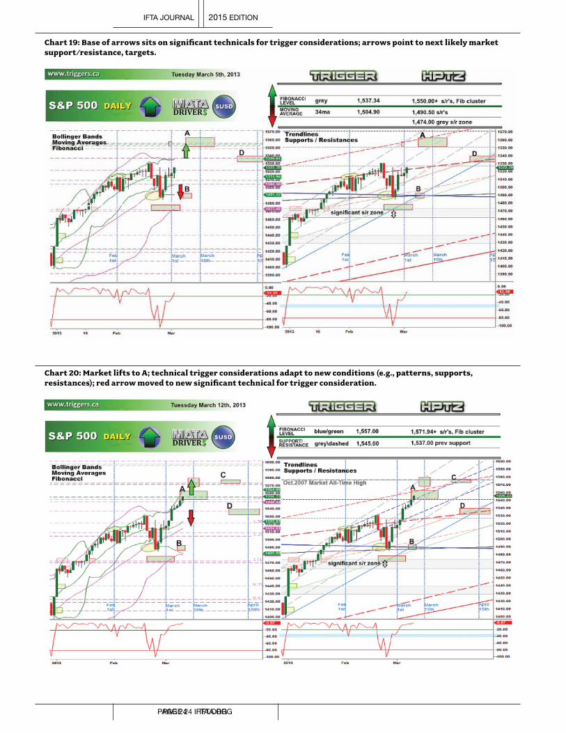
Chart 19: Base of arrows sits on significant technicals for trigger considerations; arrows point to next likely market support/resistance, targets.
Chart 20: Market lifts to A; technical trigger considerations adapt to new conditions (e.g., patterns, supports, resistances); red arrow moved to new significant technical for trigger consideration.
IFTA JOURNAL 2015 EDITION
PAGE 24 IFTA.ORGPAGE 24 IFTA.ORG

Chart 21: Market drops from A but does not break the technical trigger for a down as marked on Chart 20; market lifts and does break the technical trigger for a lift (Chart 20) and moves to C; it then drops and spikes to HPTZ-D; Fibonacci circles can be seen added as a new experimental tool, unknown at this time if they are increasing or decreasing odds (no noticeable change in statistics).
Chart 22: Lifting again, the market breaks the technical trigger consideration (Chart 21) and moves to E; dropping from there, the market moves toward lower targets, finding support on the 34ma (pink moving average).
IFTA JOURNAL 2015 EDITION
IFTA.ORG PAGE 25
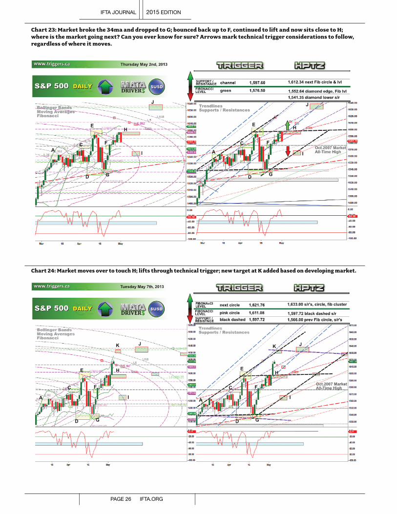
Chart 23: Market broke the 34ma and dropped to G; bounced back up to F, continued to lift and now sits close to H; where is the market going next? Can you ever know for sure? Arrows mark technical trigger considerations to follow, regardless of where it moves.
Chart 24: Market moves over to touch H; lifts through technical trigger; new target at K added based on developing market.
IFTA JOURNAL 2015 EDITION
PAGE 26 IFTA.ORG

Chart 25: Market lifts over the next two days, landing in HPTZ –K.
The example demonstrates:1. The identification of targets at areas of technical
convergence: note on the charts that the target locations contain several tools together in one location.
2. The use of the technical tools as trigger considerations for market entries and exits.
3. The development of the process and method as the market moves forward: triggers are dynamic and relative to current tools; new targets are identified as we analyse the market’s movement in real time.
4. Initial market movement from A to G was in a non-trending, consolidating market. The lift from G to K is a 16-day uptrend: targets are hit regardless of market conditions.
5. Addition of “non-standard” tools (Fibonacci Circles): other tools can also be added to the current methodology in the attempt to increase odds.
ConclusionsThrough the use of several common technical analysis
techniques, I have demonstrated that it is possible to locate areas on the chart to where the market could move with some degree of accuracy.
The locations identified are never a given, and multiple potential target locations make it difficult to know which target it will be, similar to trying to know which direction the market is going to break. However, I have shown that the market will move to an area of technical convergence.
Using the HPTZ methodology and setting up the charts to find these areas identifies significant technical levels, supports and resistances. These, in turn, can be used as trigger considerations for market entry and exits; and combined with
the targets, they can be used as the backbone for a purely technical trading plan or strategy.
While we would ultimately like a larger sampling size for data collection, what has been currently observed for over a year now merits further investigation.
The overall hit/miss percentages remained consistent throughout the data collection time period, regardless of market conditions.
Chart 26: While in an overall positive trend, different market conditions exist: grey non-trending; red pullbacks and reversals. Various conditions existed for weeks at a time; hit/miss ratio remained consistent regardless of market condition.
IFTA JOURNAL 2015 EDITION
IFTA.ORG PAGE 27

July 2012 marks the time period when data collection began. Although we can see a definite overall upward trend, different market conditions existed throughout the lift.
As well, targets were identified on several timeframes, each potentially having different market conditions relative to their time period.
Given all the variable market conditions gone through in the last year, and that the statistics for the hit/miss ratio remained consistent throughout (i.e., no change during non-trend periods), we can be confident that the ratios should continue to remain consistent in future market conditions.
HPTZs and data collection are ongoing, and results are updated at www.triggers.ca for future reference and to monitor progress.
Recent Examples The following charts are more recent examples of the HPTZ
methodology that have occurred since this paper was originally written.
Note that these charts are from TradingView.com. They allow you to publish an “idea”, whereby the chart is saved with your technical analysis at the time. This published chart cannot be altered in any way, except for the loading of new data to see how your “idea” panned out.
The following charts follow this format, and as such, they come in sets. The first image is the original published (saved) idea; and the second image is what occurred. The green area on the second chart identifies the new market data, or what occurred, after the chart was published.
Recent Example 1: Gold, April 2014
Chart 27-A: Gold 60 min. Potential targets above and below market; technical trigger considerations could be current channel(s) support for a drop, lift past current consolidation high for a continuation of the trend.
www.triggers.cawww.triggers.ca
Chart 27-B: Market drops, lands in identified HPTZ.
www.triggers.cawww.triggers.ca
Recent Example 2: Oil, April 2014
Chart 28-A: Oil Daily. Consolidating between two grey support and resistance zones. These offer technical trigger considerations for a break of the market in either direction. Targets above and below offer places to look once the market shows its direction.
www.triggers.cawww.triggers.ca
Chart 28-B: Market breaks to the downside, several technicals are moved through that could have offered trigger considerations as the market fell to the HPTZ.
www.triggers.cawww.triggers.ca
IFTA JOURNAL 2015 EDITION
PAGE 28 IFTA.ORG

Recent Example 3: S&P, June 2014
Chart 29-A: S&P 500, 60 min. Having just moved out of a HPTZ, two more—one below and one above—can be seen, as well as nearby technicals for trigger considerations, regardless of the direction of the next move.
www.triggers.cawww.triggers.ca
Chart 29-B: Market lifts through the blue dashed Fibonacci level and solid red trendline to the next HPTZ, breaks out of the solid black channel, and continues on to the second HPTZ.
www.triggers.cawww.triggers.ca
Software and DataAll market charts used are courtesy of eSignal.com
All 539 calls that were used in the data collection over the time period specified are available upon request.
Notes1. Prechter,RobertR.andA.J.Frost,Elliott Wave Principle: Key to Market Behavior,
10thedn.(Gainesville,Georgia:NewClassicsLibrary,2005)2. Brown,C.,Technical Analysis for the Trading Professional: Strategies and
Techniques for Today’s Turbulent Financial Markets (NewYork,NY:McGraw-Hill,1999)pg.85
3. Droke,C.,Technical Analysis Simplified(Columbia,MD:MarketplaceBooks,2000)pgs.21,67&73
4. Bollinger,J.,Bollinger on Bollinger Bands(NewYork,NY:McGraw-Hill,2002)5. Prechter,RobertR.andA.J.Frost,Elliott Wave Principle: Key to Market Behavior,
10thedn.(Gainesville,Georgia:NewClassicsLibrary,2005)6. Neely,G., Mastering Elliott Wave(Brightwaters,NY:WindsorBooks,1990)7. Investopedia.com,Definitionof“Williams%R”,http://www.investopedia.com/
terms/w/williamsr.asp8. Williams,L.,How I Made One Million Dollars… Last Year…,3rdedn.
(Brightwaters,NY:WindsorBooks,1979)
ReferencesBarnes,R.,Trading in Choppy Markets: Breakthrough Techniques for Exploiting
Non-Trending Markets(Chicago,IL:TimesMirrorHigherEducationGroup,1997)
Bollinger,J.,Bollinger on Bollinger Bands(NewYork,NY:McGraw-Hill,2002)
Brown,C.,Technical Analysis for the Trading Professional: Strategies and Techniques for Today’s Turbulent Financial Markets(NewYork,NY:McGraw-Hill,1999)
Droke,C., Technical Analysis Simplified (Columbia,MD:MarketplaceBooks,2000)
Elder,A.,Trading for a Living(NewYork,NY:JohnWiley&Sons,Inc.,1993)
Eng,W.,The Day Traders’ Manual: Theory, Art, and Science of Profitable Short-Term Investing(NewYork,NY:JohnWiley&Sons,Inc.,1993)
Etzkorn,M.,Trading with Oscillators: Pinpointing Market Extremes – Theory and Practice(NewYork,NY:JohnWiley&Sons,Inc.,1997)
Farley,A.,The Master Swing Trader: Tools & Techniques to Profit from Outstanding Short-Term Trading Opportunities(NewYork,NY:McGraw-Hill,2001)
Mandelbrot,B.,The (Mis)Behavior of Markets: A Fractal View of Risk, Ruin & Reward(NewYork,NY:BasicBooks,2006)
Miner,R.,Dynamic Trading: Dynamic Concepts in Time, Price and Pattern Analysis with Practical Strategies for Traders and Investors (Tucson,AZ:DynamicTradersGroupInc.)
Neely,G.,Mastering Elliott Wave (Brightwaters,NY:WindsorBooks,1990)
Pesavento,L.,Fibonacci Ratios with Pattern Recognition(Greenville,SC:TradersPress,Inc.)
Prechter,RobertR.andA.J.Frost,Elliott Wave Principle: Key to Market Behavior,10thedn.(Gainesville,Georgia:NewClassicsLibrary,2005)
Williams,L.,How I Made One Million Dollars… Last Year…,3rdedn.(Brightwaters,NY:WindsorBooks,1979)
IFTA JOURNAL 2015 EDITION
IFTA.ORG PAGE 29

AbstractTesting the effectiveness of multivariate wavelet de-
noising for intra-day trading systems; A New Zealand dollar study studies the effects that various multivariate wavelet denoising schemes have on trading system using popular technical analysis trading rules. The NZDUSD intraday currency returns sampled at 10 minute monotonic intervals were selected for this research.
Technical trading rules assessed include: Elders Impulse Repose system, Momentum crossover rule and a moving average rule. Each trading rule was assessed against unprocessed data, a univariate wavelet denoising, technique as well as two multivariate wavelet denoising techniques. The univariate denoising case, selected Symlet 12, with denoising applied at level five (hard) thresholding. Multivariate denoising included Symlet 12, with denoising applied at level 5 (hard) thresholding. Both five and six principal component examples were applied in the multivariate examples. Each wavelet denoising technique applied symmetrical padding.
The research methodology applied unit root testing, tests for heteroskedasticity, cointegration and granger causality to identify the data generation process of the NZDUSD 10 exchange, as well as confirm the effects (if any) on trading system results by applying each of the denoising techniques selected in this study.
System testing results include a wide range of trading system assessment techniques and measures including: expectations analysis, drawdown analysis, the probability of non-randomness of system returns, and the relationship between drawdown values and trade entry. This analysis was complemented by trading system metric reports generated from TradeStation 2000.
The research results were mixed. Multivariate denoising did not always improve system performance, particularly where trade entry timing was delayed, particularly where a ‘filter’ device had already been applied within the trading rule. The results of trading techniques which demonstrated a negative overall expectation were not greatly improved by denoising alone.
IntroductionVarious technical analysis indicators employ data smoothing
or utilise smoothed price data.
1. Many examples exist of using various smoothed or filtered versions of the underlying security price time series, including:
a. VIDYA—variable index dynamic average (Chande 2001, pp. 53–56)
b. Butterworth Filters (Ehlers 2004, p. 191)c. TEMA–triple exponential moving average (Malloy 1994)
2. Examples of other technical indicators employing de-noising concepts include: a. RAVI–range activation verification index (Chande
2001, p. 7)b. TRIX (Hutson 1982 )c. KST–know sure thing (Pring 1993).
The premise of utilising de-noised time series in trading applications lies in the fact that the de-noised series allows the trader to identify sustained directional trends by mitigating the effects of short-term noise. Positive expectations of a trading system lie in a system’s ability to distinguish between noisy and trending states (Chande 2001, p. 43).
De-noising, however, may often be confused with time series smoothing. A de-noised time series does not need to look smooth. De-noising in this research proposal pertains to the removal of data points of high frequency in order to deal with the effects of heteroskedasticity (Barclay et al. 1997). Heteroskedasticity, or time-varying volatility, is a characteristic of financial time series data, particularly at higher frequencies (Batten and Hogan 2001). De-noising techniques using averaging and filtering methodologies can be problematic for traders because smoothed time series often lag the underlying price time series (Ehlers 2004, pp. 13–15).
This research examines whether trading system results were enhanced by first de-noising intraday New Zealand exchange rate data by the multivariate wavelet smoothing methodology.
Wavelet algorithm design used in online or trading applications must, however, ensure that data is generated in a strictly causal basis. Smoothing algorithms such as splines and weighted moving averages that employ forward data points cannot be utilised in real-time trading applications. A scrolling window (See Figure 1) approach has subsequently been applied, but by doing so, edge effects can be introduced (Misiti et al. 2012). The window is 1,000 data points wide (n), and scrolls through the time series monotonically (x) from left to right. No forward information can be applied, and only points from Tx-n to Tx are applied.
Testing the Effectiveness of Multivariate Wavelet De-noising for Intraday Trading Systems By Adam Cox, MFTA
IFTA JOURNAL 2015 EDITION
PAGE 30 IFTA.ORG

Figure 1. Rolling window
3 | P a g e
MFTA Research Adam Cox (2014) - Abbreviated
Introduction
Various technical analysis indicators employ data smoothing or utilise smoothed price data.
1. Many examples exist of using various smoothed or filtered versions of the underlying security price
time series including:
a. VIDYA -variable index dynamic average (Chande 2001, pp 53-56),
b. Butterworth Filters (Ehlers 2004, p 191),
c. TEMA - triple exponential moving average (Malloy, 1994).
2. Examples of other technical indicators employing de-noising concepts include:
a. RAVI –range activation verification index (Chande 2001, p 7),
b. TRIX – (Hutson, 1982 ),
c. KST- know sure thing (Pring, 1993).
The premise of utilising de-noised time series in trading applications lies in the fact that the de-noised series
allows the trader to identify sustained directional trends by mitigating the effects of short term noise. Positive
expectations of a trading system lie in a system’s ability to distinguish between noisy states and trending states
(Chande 2001, p 43).
De-noising, however, may often be confused with time series smoothing. A de-noised time series does not
need to look smooth. Denoising in this research proposal pertains to the removal of data points of high
frequency in order to deal with the effects of heteroskedasticity (Barclay et al, 1997). Heteroskedasticity, or
time varying volatility, is a characteristic of financial time series data, particularly at higher frequencies (Batten
& Hogan, 2001). De-noising techniques using averaging and filtering methodologies can be problematic for
traders because smoothed time series often lag the underlying price time series (Ehlers, pp 13-15).
This research examines whether trading system results were enhanced by first denoising intra-day New
Zealand exchange rate data by the multivariate wavelet smoothing methodology.
Wavelet algorithm design used in on-line or trading applications must however, ensure that data is generated
in a strictly causal basis. Smoothing algorithms such as splines and weighted moving averages which employ
forward data points cannot be utilised in real-time trading applications. A scrolling window (Refer Fig 1)
approach has subsequently been applied, but by doing so edge effects can be introduced (Misiti et al, 2012).
The window is 1,000 data points wide (n), and scrolls through the time series monotonically (x) from left to
right. No forward information can be applied, and only points from Tx-n to Tx are applied.
Figure 1. Rolling window.
Only the right-hand side of the data window can be utilised as updated price data enters the equation. A method such as symmetric padding may be utilised to extend the width of the data window used by the wavelet algorithm in order to mitigate right-hand side edge effects. A right-hand side extension utilising symmetric padding was applied in this research.
An abbreviated version of the original research paper is presented herein. For brevity’s sake, appendices and associated tables have been removed. However, references have been left intact to assist any Q&A sessions following from this research.
Wavelets
Why Wavelets?Wavelets have a possible useful part to play in trading
applications because of their ability to provide multi-resolution analysis for time-based signals. Application of the Fast Fourier Transform (FFT) infers a time invariant deterministic signal. Once cycle and magnitude of the single are identified, it may be decomposed ( + and – infinity) into a series of Sine and Cosines (Hamilton 1994, p. 152), thus allowing future states of the signal to be predicted.
Many signals, such as financial time series, are characterised by heteroskedasticity. In short, these data may not be successfully represented in the frequency domain by the combination of Sines and Cosines. The Short Term Fourier Transform (STFT) deals with this issue by applying a sliding window approach. However, this approach is based on the notion of time invariance. In the context of financial data, the question arises “what window length should be selected?” Use of a window may provide perfect frequency domain representation but poor temporal information (Polikar 2006). A narrow window provides good time resolution but poor frequency resolution, and a wide window provides the opposite effect. Heisenberg’s uncertainty principle applies equally to signal analysis.
Wavelets address the time vs. frequency dichotomy, which is particularly important in context to non-stationary financial time series data characterised by heteroskedasticity.
De-noisingAt a conceptual level, wavelet de-noising entails a three-step
approach. For a vector y:
Step 1: Compute i iterations of the wavelet transform on y, obtain the new vector z, made of low pass filtered portion l, and a high-pass filtered portion d.
Step 2: Apply threshold rule to the high-pass filtered portion d of z, either:
i. Shrink the values (soft thresholding method), or ii. Set them equal to zero (hard thresholding).
Step 3: Join the modified high-pass portion to the original low-pass filtered version, creating the modified vector z.
Step 4: Compute i iterations of the inverse wavelet transform on z to obtain u, thus obtaining the original but de-noised version of the signal.
Thresholding For a threshold level λ (lambda) applied to x of d, two basic
types of thresholding are available: hard and soft.
Hard Thresholding If |d|< λ, reduce d to 0.If |d|> λ, keep d.
Soft ThresholdingIf |d|< λ, reduce d to 0.If |d|> λ, shrink or reduce d by λ, in accordance with a shrinking/threshold method selected by the user.
In this research, the heurusure1 method was used to apply soft thresholding.
Multivariate Wavelet FilteringConceptually, the multivariate wavelet de-noising applies
an univariate wavelet approach, but takes into consideration the correlation structure between the variables. The principal components technique is applied in accordance with the number of principal components defined by the user, noting that the number of principal components must lie in the range of 1 >= x < number of data series (e.g., six data series may have no more than six principal components and no fewer than 1). In this way, detailed data to be filtered may initially be modified to take into account the noise correlation matrix provided by principal component analysis. The smaller the number of principal components specified, the more noise removed.
Research Methodology
OverviewResearch methodology aims to identify differences
between the trading system candidates using raw prices and identical systems using price time series de-noised by the multivariate wavelet transformation. Specifically:a. Understand the data generation process (dgp) of each
currency along with summary statistics to identify how benefits (if any) may arise from applying wavelet smoothing algorithms in a trading system context. Testing includes non-stationarity (unit root testing), serial autocorrelation, runs (non-randomness), and heteroskedasticity hypothesis testing.
b. Identify whether lead-lag relationship exists between various currency pairs expressed in New Zealand terms against the New Zealand dollar, that is, do various currencies granger-cause the New Zealand dollar or do these currencies respond to common events and the inclusion of a multivariate algorithm may be limited.
IFTA JOURNAL 2015 EDITION
IFTA.ORG PAGE 31

c. Identify if the same currency pairs are cointegrated with the New Zealand dollar to identify whether any long-term relationships exist between these pairs. Whilst a correlation matrix has been produced to provide insight into correlation between currency pairs, cointegration testing can confirm whether currencies are held together in longer term relationships, and if so, benefits may arise by including such currencies because of this factor. Moreover, whilst cointegration is not a necessary condition for granger-causality, general causality exists in a cointegrated relation.
d. Understand the data generation process, serial autocorrelation, heteroskedasticity, variance and cross-correlation of the de-noised New Zealand time series using a sample of wavelet de-noising methods. If currency pairs do not granger-cause the New Zealand dollar, and the de-noised time series does not display a causal relationship that leads the New Zealand dollar in the cross-correlation plot, benefits arising from applying multivariate methods may be conjectured as arising from the benefits of de-noising (subject to lag) alone.
e. Identify trading measures that may identify benefits (if any) of applying the multivariate wavelet denoising method. Apply stationary measures to assess comparative trade performance. Where data samples are sufficiently large, such statistics would asymptotically converge to the appropriate distribution where means and variance do not depend the temporal element, but on sample size.i. Stop loss policy has been homogenously applied to each
trading system. Hence, trade entry efficiency and the relationship between Mean Adverse Excursion and Closed Trade Drawdown are compared for each trading system and data enumeration to confirm or reject the null hypothesis. Mean Favourable Excursion, being a function of Stop Loss policy does not form the basis of hypothesis testing.
ii. Summary statistics, including Number of Trades, Entry Efficiency etc., are used to supplement conclusions arrived at from hypothesis testing, and used to conjecture the reason for differences or similarities in trading results.
f. Identify each hypothesis to be tested, and confirm testing results.
g. Confirm conclusions complemented by TradeStation2 reports and equity curve analysis, as outlined above, to understand benefits (if any) of applying multivariate wavelet de-noising in respect to trading system candidates and the New Zealand Dollar (NZD/USD).
Data SelectionThe analysis is based on 10-minute monotonic time series
closing spot currency data, as provided by Dukascopy.3 Input data used in the model is based on NZD-based cross-rates. This ensures that all data are stated on a homogenous basis (i.e., the commodity currency is the NZD (Bin 2011). These data include:
Figure 2. Currencies and currency codes
Symbol Commodity Currency Terms Currency
NZD/USD New Zealand Dollar United States Dollar
NZD/AUD New Zealand Dollar Australian Dollar
NZD/EUR New Zealand Dollar Euro
NZD/GBP New Zealand Dollar British Pound
NZD/JPY New Zealand Dollar Japanese Yen
NZD/CAD New Zealand Dollar Canadian Dollar
These data are similar to that of the constituents of the New Zealand Trade Weighted Index (TWI);4 however, in this research paper, NZD/CAD exchange rate has been included. Currencies selected are free floating, and each respective country’s reserve bank operates open market operations in a not dissimilar manner. Although the Japanese Yen is characterised in numerous interventions by Japanese Ministry of Finance, the Japanese Yen cross-rate has been retained, as it is a constituent of the NZD TWI. The Chinese Yuan has been excluded on the basis that it is not allowed to trade freely (including the dual Yuan system).
Swap PointsExamining the effect of swap points on trading results, swap
points published by Dukascopy were reviewed. Because the effect is assumed small in context of the number of data points used in trading (63,004, noting that a scrolling window of 1,000 data points was used for wavelet de-noising purposes), and substantial opportunity was provided by stochastic trends in the data, swap points were not calculated. Rather, capital gains or losses were the sole contributor of system performance.
TradeStation DataExchange rate data was multiplied by 10,000, with 0.01 as
the minimum movement and same value. CSV files post-data validation were imported into TradeStation 2000, including data files related to de-noised datasets. A single USD unit is purchase or sold in USD terms against the NZD. Profits and losses are therefore stated in USD. Four data series were therefore required for each de-noised trading system, including:
a. NZD/USD mid-closing datab. NZD/USD bid closing datac. NZD/USD offer closing datad. NZD/USD de-noised mid-closing data
The rationale of applying mid prices and the uses of two-way pricing are explained in Data Analysis.
IFTA JOURNAL 2015 EDITION
PAGE 32 IFTA.ORG

SoftwareFigure 3 shows the Software utilised in this research proposal
Figure 3. Software and functions applied in this research.Software Module � ApplicationMatlab Applied Econometrics using
Matlab, James LeSage. Department of Economics University of Toledo 1999.
� Co-integration tests the Augmented Dickey Fuller two step testing procedure (Alexander 329), �Granger causality testing via the Johansen Procedure for multivariate applications (op cit, pp 357-358).
Matlab Wavelet toolbox, Mathworks.
�De-noised time series data is created using Matlab’s1 multivariate wavelet smoothing function wmulden function which applies Principal Components in a multivariate wavelet denoising function,
�Univariate denoising is provided by the wpdencmp wavelet packet denoising function. Statistics Toolbox � Time series analysis statistics including: Augmented Dickey Fuller (Matlab’s adftest function) statistic in relation to unit root
testing (LeSage, 1999), � LBQ Test to test serial autocorrelation (Matlab’s lbqtest), � Runs test to validate data series randomness (Matlab’s runtest), � Autocorrelation, partial autocorrelation (Matlab autocorr and parcorr functions), � Cross-correlation (Matlab’s crosscorr function) and Quintile-Quintile plot (Matlab’s QQPlot function), � The Jarque Berra (Matlab’s jbtest function) test confirmation normality of distributions, � Principal component analysis and principal component correlation matrix to conjecture the number of principal components the multivariate wavelet denoising function to be utilised (Matlab’s princomp function),
� A simply spectral plot (Matlab’s periodogram function) is used to confirm, at a general level, if any currency series are periodic. If not, then benefits of trading system adopting the wavelet de-noised data, may therefore originate from denoising and/or lead-lag effects as confirmed by any granger causality and/or co-integrated relationships (if any) with the New Zealand Dollar.
NB. Matlab Functions used to create scrolled de-noised data in batches were designed and programmed by the author.Microsoft Excel 2010
� Analysis trading data provided by TradeStation, � Apply F-Test to confirm whether variances of the data sets are identical and confirm which T-Test must be appropriately applied (Levine et al 2002, pp 350-352),
� Apply Student’s T-Test to confirm whether the mean of the samples are statistically different or identical (Ibid, pp 385-387), � Confirm the regression slope of two regressions (Maximum Adverse Excursion v. Closed Trade Drawdown) are statistical similar or not. � A range of basic summary statistics including: arithmetic mean, sample standard deviation, coefficient of variation, skew, kurtosis, minimum and maximum,
� Produce a correlation matrix of currency returns and as well as correlation matrices of equity curves for each trading system, � Creation of Visual Basic for Applications to interface wavelet smoothing functions from Excel to Matlab and visa-versa.
NB. MS Excel analysis sheets were designed by the author.Trade Station 2000i2
�Design trading system candidates, TradeStation Code to export trading data (Stridsman, 2000 pp 126-129), � Import Bid, Offer, Mid and Wavelet smoothed data (data series #4 in TradeStation) series for each trading system to apply to that trading system uses bid and offer prices to execute trades, and mid prices in respect to indicator calculations ,
� The SafeZone stop loss technique (Elder 2002, pp 173-180), is employed for each trading system enumeration, � Analysis carried out in MS Excel and was complemented by TradeStation Performance Reports.
NB. Trading Systems were written by the author.
Wavelet SelectionA number of mother wavelets are available; specifically, in this analysis, the following mother wavelets were considered by first
exploring univariate examples using sampled NZD/USD data. A univariate wavelet has been selected in order to provide the initial base case by which multivariate examples could be assessed against.
This is a heuristic approach that aims to review (by visual inspection) the level of timeliness and denoising characteristics of various wavelet types. Wavelet selection methods may be the subject of another research exercise. The following wavelet types were initially examined.
Figure 4. Mother wavelets considered in this research
Symlet(Sym) Sym 4 Sym 8 Sym 12
Coiflets Coiflets 1 Coiflets 5
Daubechies(Db) Db4 Db8 Db12
IFTA JOURNAL 2015 EDITION
IFTA.ORG PAGE 33

Wavelets Selected for Research The following wavelets were selected and applied in this research paper:
Figure 5. Wavelet settings used in this research paper
Wavelet Wavelet Type Window De-noising
LevelThresh- olding
Extension Type
Extension Length
Principle Components
Univariate Sym 12 Level 5 (Sym125) 1000 5 Soft Symmetrical 500 N/a
Multivariate Sym 12 Level 3,6,6 PC (Sym125_66PC) 1000 3 Soft Symmetrical 500 6
Multivariate Sym 12 Level 5,5,5 PC (Sym125_55PC) 1000 3 Soft Symmetrical 500 6
The multivariate wavelets selected provide the basis of hypothesis testing as outlined in the research, whilst the univariate wavelet analysis provided the base case by which complexity and possible utility of utilising multiple data may be gauged.
Multivariate Wavelet Examples Each of the wavelet families were visually inspected at various levels using all principal components to understand the
characteristics of each.
Figure 6. Comparison of multivariate wavelet examples and each Mother Wavelet
Data AnalysisData Analysis ResultsBid-Offer Spread Analysis
Bid-offer spread was examined for the following currency included in this research (refer to Data Selection). Mean bid-offer spread and standardisation of spread was examined on a day of week basis to understand both the relative quantum of spread, but also the day-of-week effect. Data analysed in this exercise included 262,479 10-minute monotonic data points for each currency pair, as provided by Dukascopy. In each case, the period of assessment was from 7/10/2005 5:50:00 to 3/10/2012 0:00:00. This sample assumed to be representative of the sample of data used in this research.
Figure 7. Bid-Offer (pips) mean and standard deviation of bid-offer spread
IFTA JOURNAL 2015 EDITION
PAGE 34 IFTA.ORG

The pattern of bid-offer spread and standard deviation over the course of the trading week is roughly similar for all currencies. Whilst de-noising could be applied to separate bid-offer series for each currency pair, the complexity of doing so is beyond the scope of this research. Bid-offer spread histograms and spread quintiles stated as a percentage of mid-prices is set out in Figure 8. Bid-offer spread lies in the range of 0.0055–0.0065 of each currency’s mid-price.
Figure 8. Histogram and cumulative probability of bid-offer spread as a percentage of mid-price for each currency used in this research
As a compromise, mid prices have been selected as the basis by which research has been applied, including the application of denoised time series, whilst two-way pricing has been retained for trading purposes.
Trading Volume AnalysisLiquidity patterns throughout the trading week, as indicated by the mean and standard deviation of trading volume, are similar for
each currency pair. Trading volume, whilst a proxy of true currency volume, is consistent with research by Dacorogna et al. (2001), who As a compromise, mid prices have been selected as the basis by which research has been applied, including the application of de-noised time series, whilst two-way pricing has been retained for trading purposes. identified weekly ‘seasonalites’, as well as research results set out by Aldridge (2010).
Figure 9. Mean volume and standard deviation of each currency by day of week
IFTA JOURNAL 2015 EDITION
IFTA.ORG PAGE 35

As a consequence of this analysis, trading system design has implemented various trade entry time and mandatory exit rules (refer to Trading System Selection).
Summary Statistics (Mid price close data)Summary and other statistics are prepared on mid-rate closing prices for each currency:
Figure 10. Summary statistics of each currency
Time Series TestsFigure 11 sets out the hypothesis summary.
Figure 11. Hypothesis results carried out on unprocessed mid-rate close data
Test of Normality The Jarque-Bera tests complemented by the Quintile-Quintile Plots (refer Fig. 16) confirm a lack of normality of each of each of the exchange rate used in this research. Significant excess kurtosis (substantially greater than a figure of 3 as for a normal distribution) is also indicated. NZD/JPY kurtosis was re-examined with a larger data set of 264,000 data points which confirmed similar findings. Standard errors of kurtosis and skewness have not been computed due to difficulty of accurate assessment in absence of normality. Excess kurtosis signifies the probability of large negative or positive values is greater than under the corresponding normal density function. For trading, this provide trading opportunities, but may also negatively impact trading by producing whipsaws, or large start trade drawdowns if trade entry efficiency is not high, or stop loss levels are tightly set.
The lack of normality, and kurtosis in intraday financial data has also been identified by Alexander (1993, p 287), which examines different data sampling times for USD/DEM data. She explains, “This is one of the stylised facts of high frequency financial returns, which is particularly pronounced in foreign exchange markets” (ibid).
Each of the samples displays skew greater than zero, with the NZD/JPY, NZD/CAD, NZD/EUR having negative skew and remaining currencies skewed to the right (or positive skew). Summary data results confer general findings set-out by Aldridge (2010, p 94) who finds excess kurtosis and negative skew in 5 minute, 15 minute and 1 hour spot EUR/USD exchange rate data.
Stationarity Testing Exchange rate data was tested for the presence of a unit root at levels (exchange rates), and in accordance with the Augmented Dickey Fuller (ADF) test statistic was non-stationary ( refer Table 1.1).
Stationarity was achieved by way of first differences (LN returns) of the data. Whilst the test was not ‘augmented’ in respect to heteroskedasticity, the test results are expected for financial time series data and infer that statistical analysis including regression analysis should be conducted on first differenced data. That is to say that the hypothesis of no unit root when tested on first differenced data was not rejected and confirmed that such transformed data was stationary. As a consequence statistics in this research is based on return data and not on exchange rates at levels, but it has been assumed the data is integrated order 1 that is I(1) and not I(2). Second differences have not been employed in this research.
IFTA JOURNAL 2015 EDITION
PAGE 36 IFTA.ORG

Tests for Randomness Runs Test indicated that runs above or below zero1 (left and right tails) are greater than expected in a random series for each exchange rate (refer Table 1.2).
Whilst the runs tests conducted in this research have been carried out at a basic specification, from a technical analysis perceptive, the presence of runs indicates that trading opportunities such as those identified by momentum or trend trading systems have validity. Too many runs may, however, identify oscillating behaviour, however, in accordance with the periodograms; deterministic periodicity in the frequency domain has not been identified.
Serial Correlation Each of the time series indicated the presence of serial autocorrelation both in respect to correlograms (ACF and PACF plots set out in Figure 10) as well as the Ljung Box Q-Test results on LN returns (Table 1.3) and has significance for technical trading methods employing short term momentum e.g. Elder’s Impulse System.
Heteroskedasticity Heteroskedasticity of time varying volatility was present in each of the time series tested as confirmed by Engle’s ARCH tests (Table 1.6), which rejected the null hypothesis on no arch effects. The Ljung Box Q-Test on Squared Returns (Table 1.5) further confirms with the null hypothesis on autocorrelation rejected for squared returns. Autocorrelation plot on squared returns (Table 1.4) also confirms which significant ARCH effects being noticeable by the persistence of autocorrelation of squared returns. The use of wavelets may therefore lie in their ability to denoising time series, such as short term exchange rate data with heteroskedastic characteristics.
Periodicity Inspection of the periodogram for each currency indicates that exchange rate is not periodic i.e. a Nyquist frequency is not noted. (Figure. 10) As a consequence, the wavelet transform may have real utility in context of denoising non-stationary, heteroskedastic non-periodic data such as 10 minute exchange rate data tested in this research as opposed to exploiting periodicity. The lack of genuine periodicity has been experienced by other trades, Elder (1993, p 124) stating, “Trouble is, cycles keep changing their length and disappearing”, he goes on to say “…shows that noise is greater than cycle amplitude most of the time”.
Cointegration Whilst currencies were found to be highly correlated (refer Correlation Matrix Fig 19.) with the New Zealand dollar, particularly currencies other than the NZD/AUD which exceed 65% correlation (in the sample period examined), cointegration was not clearly demonstrated however. Whilst cointegration at 95% confidence level was signalled for NZD/GBP–NZD/USD and NZD/AUD currencies pairs, the results were reversed at 99% confidence level. As such, the conclusion is that Null hypothesis of no cointegration cannot be accepted, rather than outright rejection. In all cases cointegration tests were conducted on levels (refer Tables 1.7 and 1.8)
Whilst the lack of cointegration in research examines triangular relationships between currency pairs and the associated cross-rates to determine if arbitrage or trading opportunities may exist (Wong & Ling), cointegration testing in respect to this research was carried out simply to identify how, if any, advantages arising from the wavelet approach may have arisen, i.e. were various currencies cointegrated with the NZD/USD at the 10 minute interval?
Granger Causality Whilst Granger-causality or lead-lag relationship between various currency pairs and the USD/NZD would arise if cointegration was demonstrated, cointegration is not a necessary condition. Granger-causality testing conducted in this research to ascertain if any currency leads the NZD/USD? If so, it may be conjectured, in the absence of a forecast model, that any advantages provided by trading systems using data de-noised by the multivariate wavelet denoising function, may have arisen from the lead-lag relationships present in the multivariate dataset. Granger causality testing was conducted on pairwise basis using up to 3 lags (refer Table 1.9) However, the granger causality tests only indicated that:
1. A lead-lag relationship from NZD/EUR, NZD/CAD and NZD/AUD to the NZD/USD is not evident at lags 1 and 3.2. However, a unidirectional lead relationship is noted from NZD/GBP to NZD/USD (but at only 90% confidence interval) using up to three lags.3. Bidirectional or contemporaneous relationship is noted between NZD/GBP and NZD/JPY, however, a stronger unilateral lead
relationship from NZD/EUR to NZD/AUD.
Trading System Selection
IntroductionThree trading systems were selected in order to test
whether differences exist between each trading system using raw exchange rate data (NZD/USD mid prices) and alternative trading systems using multivariate wavelet de-noising. A univariate wavelet de-noising method was also selected in order to compare multivariate results with those of the multivariate cases to determine the utility (if any) of applying the more complex multivariate approach.
Trading systems were selected on the basis of providing the most comparable challenge to the de-noised system alternatives. The trading systems include:
a. A 100-day momentum system b. A moving average cross-over systemc. Elder’s Impulse System
These systems were selected on the basis of providing the most challenge to the de-noised alternatives. Moreover, trading rule simplification and use of an homogenous stop loss policy allowed comparative system analysis to clearly identify benefits (if any) from applying the multivariate system without being confounded by rule complexity or heterogeneous stop
loss or profit-taking policies. For example, complexity grows at the rate of n*(n-1) / 2 5 bidirectional relationships or n!/r! * (n-r)! combinations without repetition. So, for a total of seven rules in combinations of three rules, 35 different combinations are available altogether that would require analysing. Furthermore, simplicity also ensures avoidance of multicollinearity, which in context of technical analysis, Edwards and Magee6 (2001, Glossary) explains as, “…the incorrect procedure of using identical data to supply different indicators...”
System Descriptions
Momentum 100 systemThe momentum effect has been widely researched and
documented in both the international, equity, and currency markets by both technicians (Pring) and academics alike. For example, Rouwenhorst tested momentum strategies in 12 European markets using data from 1980 to 1995 and concluded that momentum returns were present in every country. Okunev (2003 ) found that momentum effects were found in currencies, whilst Fama (1993) refers to momentum as “the premier unexplained anomaly”. In other words, the success of momentum-based investing is regarded by many as an exception to the efficient market hypothesis, whereas the principle of momentum is fundamental to many technical
IFTA JOURNAL 2015 EDITION
IFTA.ORG PAGE 37

analysis-based methodologies. Bernstein (2001, p. 17) stated “It provides you an idea of trend strength”. “Momentum is a measure of internal strength or weakness of a market”, ibid, p. 43. In addition, texts such as Pring (1993, p. 55) debate use of arithmetic momentum vs. rate of change in respect to long-term inter-security analysis; Pring stated “The division method is far superior since proportional price moves are represented by an equal risk or fall in the oscillator regardless of actual level of price”. Momentum has therefore been selected in this research as a comparative base case for hypothesis testing. However, in this analysis, inter-currency analysis has not been undertaken, and the “subtraction method” (ibid) is therefore applied.
Momentum, even at longer periods, is subject to the effects of heteroskedasticity, and often, momentum-based systems employ additional methods to complement the initial long or short signals provided by the momentum indicator. Such methods may include any or all of the following: use another indicator to confirm the trade setup, use an indicator or method to identify a price pull-back to identify the trigger for the trade and as a filter (e.g., Elder’s Force Index) (Elder 1993, pp. 229–234), or validate a trading setup by enforcing minimum consecutive cross-over periods before a trading signal is provided.
To provide the most challenge in a comparative sense to the de-noised enumerations being examined, as well as to allow benefits of the de-noised system, the following settings were used:
Momentum length. Momentum length was set to 100 periods. This would allow the non-de-noised series to identify larger trends and provide additional challenge to the de-noised system alternatives.
Consecutive cross-over rule. To mitigate false positive signals (Type 1 error) two consecutive cross-overs or cross-unders of the zero line are required by the system before a trading signal is generated. This policy favours the de-noised series and is aimed at challenging the de-noised alternatives. This type of rule has been adopted by Chande (2000), pp. 121–134 in the 65-EMA 3CC system, which requires three consecutive closes under or over the 65-day simple moving average before a trade is triggered and explains “...then the number of closes you will use will act like a filter in reducing the number of trades” (ibid, p. 122). Whilst this method may add delay into the momentum system, Bernstein (2001, p. 45) asserts, “… momentum tends to lead price most of the time”. Therefore, it is assumed that any lag created by the cross-over rule would be offset by the leading nature of the momentum indicator. Elder’s Force Index has not been applied in this research because the Force Index requires access to volume data. A single definitive source of volume data, unlike that provided by a stock exchange, is not available in the spot exchange rate market. Often, volume data provided relates only to a specific data vendor or venue.
Moving Average Cross-Over SystemThe moving average cross-over system appears frequently
in trading systems and technical texts. Terminology such as, golden cross-over or bull cross-over, have become mainstream technical analysis terminology. Cross-over systems have been
expanded to include several moving averages and/or respective cross-overs (e.g., the Bill William’s Alligator System) (Williams 1995). Guppy elaborates on the moving average system by introducing the GMMA, or Guppy Multiple Moving Average System (Guppy 2004) (also known as ribbon averages), whilst Chande (2000, p. 71) explains, “the moving average cross-over system (MAXO) system is the simplest trend-following strategy, but it can also be an anti-trend strategy”. Elder (2002, p. 94) recommends, “Use a longer term EMA to indicate trend, and the shorter to find entry points”.
As a consequence, a moving average cross-over system has been included in this analysis and complements the momentum 100 system. Where the momentum 100 system mitigates whipsaw trades or false positive trades by requiring no less than two consecutive crossovers (Stridsman 2000, p. 274), the moving average crossover system applies a longer term exponential moving average and a shorter term simple moving to capture longer term trends.
A minimum number of consecutive cross-overs or cross-unders are not featured in this system, but moving averages provide unprocessed price data and the benefits of a low-pass filter, which may mitigate the effects of heteroskedasticity, albeit lag (Ehlers 2004, pp. 13–15). Whilst Elder asserts that a moving average should be applied in respect to its lag, (e.g., a 10-period SMA should be lagged and plotted under the fifth and sixth bar (Elder 1993, p. 127), lags are not applied to the moving averages employed in the cross-over system in this research.
Two arbitrary moving average lengths were selected. The momentum system used 100 periods as the basis of its calculation. Therefore, in order to provide additional challenge, but also insight in comparative system performance, the moving average cross-over system employs:
Long-term average. A 200 (10-minute) period exponential period was used. This provides a longer look-back window than that of the momentum 100 system, but utilising an exponential moving average to ensure signal timeliness as an exponential moving average assigns more weight to incoming prices while exponentially decaying prior average values (Elder 2000, p. 90).
Short-term average. A 28 (10 minute) period simple moving average has been arbitrarily selected. The shorter averaging period ensures response timeliness. Hence, a simple moving average has been selected rather than an exponential average. The simple moving average acts as a finite response filter having lag equivalent to half the size of its window (Ehlers, 2004, p. 47). An exponential moving average of alpha = 1/(L+1) would have a lag in simple moving average terms of 2/(P+1), where P is the period used for the simple moving average (Hutson 1984).
Elder’s Impulse SystemThe momentum 100 system and the moving average
cross-over system are aimed at identifying and subsequently trading persistent trends in the NZD/USD. As identified in Data Analysis, currency rates examined showed substantial runs (the Runs Test) and trend-like behaviour (serial autocorrelation), but are expected to be subject to potential false positive trades
IFTA JOURNAL 2015 EDITION
PAGE 38 IFTA.ORG

and suffer from the effects of whipsaws due to the high level of heteroskedasticity. Hence, differential results between the de-noised vs. raw exchange rates could be driven from the ability of each system to identify trend commencement whilst dealing effectively with heteroskedasticity.
To provide additional challenge, Elder’s Impulse System has been applied. Elder describes the Impulse System in context of a momentum, or impulse trading system (Elder 2002, pp. 157–158). Adopting the shorter term exponential moving average (refer below to Impulse System settings), the Impulse System becomes a swing trading-like approach, given the extent of heteroskedasticity (refer to Data Analysis) measured in the NZD/USD exchange rate. Testing of shorter term trade settings, as employed by Elder’s Impulse System, complements medium and longer term trading systems such as the momentum 100 and moving average cross-over systems because shorter term systems tend to be more susceptible to heteroskedasticity (noise). However, this research does not assume that de-noising would be beneficial to all trading methods. If lag is introduced in context of a shorter term trading system, trading signals may be become mistimed, with overall system performance being degraded.
Settings employed in this system include those set out in Elder (2001, p. 159). Optimal length has not been selected, nor has a triple screen approach, as recommended by Elder, been adopted. For example, Elder recommends, “Before you rush off to apply the Impulse System, … Remember how Triple Screen analyses markets in more than one time frame” (ibid, p. 158).
The Impulse System settings include the following:
MACD histogram. MACD histogram employs the following settings:
a. MACD short moving average–12 periods (exponential average)
b. MACD long moving average–26 periods (exponential average)
c. Signal line (MACD histogram)–9 periods (exponential average)
Moving average. A 13-period exponential moving average was employed as per Elder.
Elder’s Impulse System has also been selected because it was based on closing prices like momentum and the moving average system, thereby providing a homogenous base by which the different trading system results can be compared.
Trading Rules
Bid Offer PricesFor each trading system, the following rules are applied:
a. Long trades, including short exit trades, are executed at current offer closing prices as a limit order.
b. Short trades, including long exit trades, are executed at current bid closing prices as a limit order.
c. Trading signals use mid-price closing data.
d. De-noised time series are imported into TradeStation as a fourth data series. Indicators such as momentum or MACD are subsequently based on this smoothed data series.
Limit orders have been selected in order to avoid TradeStation’s bouncing tick rule. The parameter for this rule has also been set to 0% in TradeStation. The purpose of this analysis is to provide measures by which comparative system performance can be gauged in accordance with hypothesis tests set out in this research. The motivation of using separate bid and offer prices follows the analysis of bid offer prices and associated standard deviation (refer to Data Analysis).
Entry and Exit TimesThe following time-based rules are applied for each trading
system and data enumeration in accordance with bid-offer and volume data analysis:
Monday entries. Trades may only occur post 7:00 GMT time (7 pm or 8 pm, depending on daylight saving).
Friday exits. Any open trades as of 19:30 GMT time each Friday are exited in accordance with bid offer rules stated above.
The motivation for these rules follows trading volume analysis of the currency pairs (refer to Data Analysis) and ensures that trading system results are generated at the most liquid times during the trading week.
Trading System ExitsA stop loss policy is used homogenously for all trading
systems and is the primary exit method unless a reverse signal is provided by a system. A common methodology has been utilised so that one system may not be advantaged or disadvantaged by a stop loss methodology uniquely applied to it. For example, Guppy (1999, p. 152) states, “Traders who use moving averages for entry do not often use them as exit signals”.
The stop loss method is the SafeZone stop loss (Elder 2002, pp. 173–180). A setting of 10 periods and three standard deviations has been applied consistent with Elder’s settings. The stop loss is based on mid-price raw data.
Trading System Hypothesis Testing
HypothesisThis research proposal is not aimed at creating great trading
systems or determining whether a good trading system can be created using de-noised data provided by the multivariate wavelet algorithm. Rather, in respect to trading systems applied to intraday New Zealand dollar data (NZD/USD) the following hypothesis is addressed:
The null hypothesis: H0 Technical trading indicator performance is not improved by
using NZD time series data de-noised by a multivariate wavelet transform, as measured by the selected metrics set out below.
The alternative hypothesis: H1 Technical trading indicator performance is improved by
using NZD time series data de-noised by a multivariate wavelet
IFTA JOURNAL 2015 EDITION
IFTA.ORG PAGE 39

transform, as measured by the selected metrics set out below.Trading results must be interpreted in context of the
hypothesis stated above and the data selected in respect to the generation of the de-noised data series. Selection of different input data may yield different results, including the acceptance or rejection of the currently stated null hypothesis.
Research MeasuresMeasures that support or reject the null hypothesis are based
on the need to measure relative trading performance of each trading system using raw exchange rate vs. system performance using de-noised data. Stridsman speaks of the need to de-clutter analysis to exclude unnecessary information (Stridsman 2000, p. 135), whilst also adopting an approach that analyzes winning and losing trades (ibid). The essence of this approach has been adopted, not for system design, but for hypothesis testing.
As a consequence, hypothesis testing has been undertaken in terms of the following win-loss enumerations:
a. Winning long tradesb. Winning short tradesc. Losing long tradesd. Losing short trades
Hypothesis testing has been undertaken in the context of data characteristics such as trend behaviour and heteroskedasticity, including:
Trade entry efficiency. In the context of volatile market conditions, does the system enter prematurely, only to experience high levels of draw-down (MAE), noting that Start Trade Drawdown (STD) is not measured in Stridsman (2000 pp. 126–129). Where a system comparison is applied with a homogenous stop loss policy (and no opening trade stop loss), differences in MAE are determined by entry timing. Statistically different MAE figures, therefore, provide inferences about STD and trade entry efficiency.
False positive trade signals. Due to exchange rate volatility, a system may be plagued by whipsaw trades which result in overtrading and/or with increased magnitude of drawdown.
Number of trades. A system may overtrade if not able to differentiate trading opportunities it was designed to identify.
Average winning and losing trade return, as well as the number of consecutive winning and losing trades are also provided to complement the aforementioned metrics, as well as develop expectations for each system and data enumeration.
The core measures used to differentiate relative trading performance and which form the basis of hypothesis testing include:
a. Is the variance of trading returns statistically different? Trade size variability is driven from the system performance, both in terms of system stability. This measure is complemented by the number of consecutive winning and losing trades and average trade win and loss7 as provided by the TradeStation reports.
b. Whether the mean size of returns is statistically different between trading systems and data enumerations. Trading loss and gain are a function of trade entry efficiency when
a homogenous stop loss policy is applied and the relative system’s ability to deal with trade entry efficiency (deal with volatility) and identify sustained (profitable) trends is inferred from this measure.
c. Is the variance and mean size of MAE statistically different? Whilst stop loss policy is homogenously applied, the core differentiator between systems reviewed is driven from entry efficiency. MAE variance and means may provide further insight to the TradeStation’s trade efficiency statistics when Start Trade Draw Down is not assessed directly.
d. Is the relationship between MAE and CTD (slope of the two regressions) statistically different? Similar to the above rationale, but the relationship to MAE and CTD is compared, that is to say, the regression: MAE% = B0 + B1 (CTD$) + e are compared. The null hypothesis of: no differences between the slopes of the regressions tests de-noised data trading results against the results of unprocessed data. Stridsman (2000, p. 152) uses a similar approach but tests the relationships between MAE and CTD. In this research, this approach has been adopted as proxy to infer trade entry efficiency, rather than relying on TradeStation performance summaries and absence of specific STD figures. Whilst the regression of: MAE% = B0 + B1 (CTD %) + e may have been measured, the actual specification of the regression is not being primarily sought; rather, the goal here is to test the null hypothesis as set out above.
Each of the points a through d above are tested for statistical differences between the raw exchange rate system and an alternative de-noised system. The pair-wise procedure is outlined below:
i. In the first instance, F-Tests were conducted to confirm whether variances are identical; the null hypothesis of no difference of the variance of returns generated by each system and data enumeration is tested. Lack of normality of distribution has not been remediated, and first differences using natural logarithms are assumed to be adequate for data remediation and stationarity purposes.
ii. Student’s T-Tests were conducted to confirm the null hypothesis of no difference of the means of returns generated from the de-noised data and unprocessed data for each trading is tested. T-Test type was selected in accordance with the results of F-Test hypothesis testing, as described above.
In addition to this analysis, the following has also been completed:
e. Are returns generated by the respective systems random or non-random? Stridsman (2000, p. 274) discusses the need to ascertain the dependencies among trades, stating “… do a runs test, which tells you if your system has more or fewer streaks of consecutive wins or losses than what could have been expected if the trades had been randomly distributed”,
IFTA JOURNAL 2015 EDITION
PAGE 40 IFTA.ORG

f. Does the trading system generate positive expectations? Chande (2001, p. 43) discusses the need of trading systems to have positive expectations, stating “A trading system that has a positive expectation is likely to be profitable in the future”. Hence, relative expectation, and whether expectations are positive or negative, assists qualitative analysis of each trading system enumeration. The Trading Strategy Accuracy (TSA) approach as set out by Aldridge (2010, pp. 228–231), has not been adopted in this research. Whilst TSA is interesting, this approach does not provide stationary analysis as required by statistical testing. To apply TSA, regression slope analysis would need to be undertaken; however, this approach has already been adopted by analysing MAE vs. CTD directly.
Complementing this analysis, trade diagnostics are provided by TradeStation reports and in particular:
a. Number of trades, complemented by winning and losing trade statistics
b. Trade entry efficiency statistics
These measures are aimed at providing an objective, measurable and stationary approach to trade system performance assessment. Whilst equity curves have been provided in each system test (as well as a correlation matrix of the equity curves of each system tested), measures such as slope of each system’s equity curves itself has not been tested, because this type of measure would depend on when testing commenced. The tests conducted in this research assume trading system results are stationary for statistical testing purposes.
Trading System ResultsTrading results and hypothesis testing are presented for each
trading system:
Momentum 100 System
Hypotheses Test ResultsThere was limited statistical difference between the various
trading systems with statistically significant differences as indicated in green (refer to Figure 12). Differences, however, were constrained to losing long and short trades, where mean MAE figures for losing long and short trades were statistically larger than those produced by unprocessed NZD/USD exchange rate data.
Variance of MAE figures were not statistically different when compared to the system utilising unprocessed NZD/USD exchange rate data. The relationship between MAE and CTD was not statistically different when the slope of the regressions were compared to that of the system employing unprocessed exchange rate date.
Expectations AnalysisThe de-noised series provided the highest expectations,
particularly that using Symlet 12, Level 5 with five principal components and the univariate base case.
Trading Systems Returns AnalysisVariability of returns around the mean is noticeably higher for
the system using unprocessed exchange rate data with the highest kurtosis. This variability must also be noted in context of the larger right-hand skew, which illustrates a number of positive outliers using unprocessed data, but on average (refer to Figure 13), mean returns ($) were smaller than other model candidates—but were not statistically significantly different (refer to Figure 15).
Figure 12. Comparative trading system hypothesis testing results
MultivariateSymlet 12
Level 36 Principal
Components
MultivariateSymlet 12
Level 55 Principal
Components
UnivariateSymlet 12
Level 5
Maximum adverse excursion - winning long trades Variance Ftest NO NO NO
Null Hypothesis: Mean Ttest NO NO NO
Alternative Hypothesis: Regression: P&L-MAE Comparison of 2 regression slopes NO NO NO
Maximum adverse excursion - winning short trades Variance Ftest NO NO NO
Mean Ttest NO NO NO
Regression: P&L-MAE Comparison of 2 regression slopes NO NO NO
Maximum adverse excursion - losing long trades Variance Ftest NO NO NO
Null Hypothesis: Mean Ttest Yes Yes Yes
Alternative Hypothesis: Regression: P&L-MAE Comparison of 2 regression slopes NO NO NO
Maximum adverse excursion - losing Short trades Variance Ftest NO NO NO
Mean Ttest Yes Yes Yes
Regression: P&L-MAE Comparison of 2 regression slopes NO NO NO
Momentum 100 System
Variance and mean MAE are not identical between the wavelet system and non-wavelet systems
The variance and mean MAE of the wavelet models is identical to that of the non-wavelet system
Variance and mean of MAE are not identical between the wavelet system and non-wavelet systems
The variance and mean MAE of the wavelet models is identical to that of the non-wavelet system
95% Cconfidence level applied to F-Test and T-Tests.
Null Hypothesis:
Alternative Hypothesis:
Statistical difference between wavelet results and results generated on price?
Variance and mean MAE are not identical between the wavelet system and non-wavelet systems
The variance and mean MAE of the wavelet models is identical to that of the non-wavelet system
The variance and mean MAE of the wavelet models is identical to that of the non-wavelet system
Variance and mean MAE are not identical between the wavelet system and non-wavelet systems
Null Hypothesis:
Alternative Hypothesis:
IFTA JOURNAL 2015 EDITION
IFTA.ORG PAGE 41

Figure 13. Comparative expectations analysis results
MultivariateSymlet 12
Level 3(6 Principal Components)
MultivariateSymlet 12
Level 5(5 Principal Components)
UnivariateSymlet 12
Level 5Price
Number–Wins 668 666 712 725Number–Losers 1158 1147 1197 1422Avg. Loser ($) -15.23747841 -15.17523976 -14.78279031 -12.94655Avg. Winner ($) 28.04041916 28.24024024 27.26264045 27.065172% Winner 0.365826944 0.367346989 0.372970141 0.3376805% Loser 0.634173066 0.632653061 0.627029859 0.6623195Expectation 0.594742607 0.773303916 0.898899948 0.5612483
Figure 14. Comparative trading system returns analysis
Returns Distribution
MultivariateSymlet 12
Level 3(6 Principal Components)
MultivariateSymlet 12
Level 5(5 Principal Components)
UnivariateSymlet 12
Level 5Unprocessed Price
Mean ($) 0.58 0.76 0.88 0.55
Skew 2.6731 2.6604 2.7263 3.0367Kurtosis 12.1706 12.0205 12.8018 15.2621Histgrams
Mean and Variance Analysis of ReturnsThere were no statistical differences between the mean and variances of comparative returns ($) of the de-noised systems when
compared to the system using unprocessed NZD/USD exchange rate data (refer to Figure 15).
Figure 15. Trading system return mean and variance of returns hypothesis testing results
Two-sample F-test for variances (two-tailed) Two-sample F-test for variances (two-tailed) Two-sample F-test for variances (two-tailed)
CTD
MultivariateSymlet 12
Level 36 Principal
Components
CTD
MultivariateSymlet 12
Level 55 Principal
Components
CTD
UnivariateSymlet 12
Level 5
Mean 0.549977 0.581994 Mean 0.549977 0.756611 Mean 0.549977 0.878648Variance 846.3645103 971.8262493 Variance 846.3645103 973.8321984 Variance 846.3645103 936.7009424Observations 2191 1866 Observations 2191 1853 Observations 2191 1953df 2190 1865 df 2190 1852 df 2190 1952F 0.87090106 F 0.869107133 F 0.90355894alpha 0.05 alpha 0.05 alpha 0.05p-value 1.998112103 p-value 1.998356411 p-value 1.978893999F-crit 1.091460388 F-crit 1.09164909 F-crit 1.090254943Significant? NO Significant? NO Significant? NO
CTD
MultivariateSymlet 12
Level 36 Principal
Components
CTD
MultivariateSymlet 12
Level 55 Principal
Components
CTD
UnivariateSymlet 12
Level 5
t-Test: Two-Sample Assuming Equal Variances t-Test: Two-Sample Assuming Equal Variances t-Test: Two-Sample Assuming Equal Variances
Variable 1 Variable 2
Mean 0.549977179 0.581993569 Mean 0.549977179 0.756610901 Mean 0.549977179 0.878648233Variance 846.3645103 971.8262493 Variance 846.3645103 973.8321984 Variance 846.3645103 936.7009424Observations 2191 1866 Observations 2191 1853 Observations 2191 1953Pooled Variance 904.0676282 Pooled Variance 904.7688048 Pooled Variance 888.9373532Hypothesized Mean Difference 0 Hypothesized Mean Difference 0 Hypothesized Mean Difference 0df 4055 df 4042 df 4142t Stat -0.033802312 t Stat -0.217663553 t Stat -0.354232429P(T<=t) one-tail 0.486518228 P(T<=t) one-tail 0.413851125 P(T<=t) one-tail 0.361591367t Critical one-tail 1.645229489 t Critical one-tail 1.645230698 t Critical one-tail 1.645221592P(T<=t) two-tail 0.973036456 P(T<=t) two-tail 0.82770225 P(T<=t) two-tail 0.723182734t Critical two-tail 1.96054918 t Critical two-tail 1.960551063 t Critical two-tail 1.960536885
NO NO NO
Hypothesis Tests ( mean identical)
Hypothesis Tests ( Variance identical)
MultivariateSymlet 12
Level 36 Principal Components
MultivariateSymlet 12
Level 55 Principal Components
UnivariateSymlet 12
Level 5
IFTA JOURNAL 2015 EDITION
PAGE 42 IFTA.ORG

Tests for Randomness of Trading System ReturnsThe null hypothesis that returns generated by each system are no different from a random process is not rejected according to the
results of the runs tests set out in Figure 16.
Figure 16. Comparative trading system runs test results
Runs Test Number of Runs above and below 0.
MultivariateSymlet 12
Level 3(6 Principal Components)
MultivariateSymlet 12
Level 5(5 Principal Components)
UnivariateSymlet 12
Level 5
Unprocessed Exchange Rate
Hypothosisi 0 0 0 0
Probability 0.7739 0.0627 0.0905 0.6029
Number of Runs 865 881 941 960
N1ii 668 666 712 725
NO 1198 1147 1241 1455
Z Statistic 0.2906 1.8608 1.6925 -0.5162
Conclusion The Null hypothesis of randomness in respect to returns from the momentum system cannot be rejectedi The result is H=0 if the null hypotheses (“sequence ud random”) cannot be rejected at the 5% significance level, or H=1 if the null hypothesis can be rejected at the 5% level.ii ‘n1’ –number of values above 0 (or up) –number of values below 0 (or down).
Comparative Equity CurvesDrawdown to net negative returns is exacerbated in the system employing unprocessed NZD/USD exchange rate data. Peak equity
levels of the univariate case surpassing those of the other systems where equity curves for the multivariate system being highly correlated. Reviewing equity peaks, it appears the de-noised system leads the unprocessed version, although systems oscillate in a similar way with a peak to trough cycle around identical linear growth rates being visually evident.
Comparative Drawdown CurvesComparative drawdown curves reveal a similar message as stated above, with unprocessed data displaying a larger and more sustained
drawdown period; with peak drawdown lagging the de-noised series, as identified in the equity curve analysis (refer to Figure 17).
Figure 17. Comparative equity curves Figure 18. Comparative drawdown curves
Moving Average Cross-Over System Results
Hypothesis Test ResultsTrading system MAE variance means that hypothesis testing for each of the four categories demonstrates there was no statistical
difference between the system except in the case of the univariate wavelet de-noising method, which concluded that variance of MAE was statistically smaller to that of the system based on unprocessed price; however, examining TradeStation trading performance reports, trading statistics were practically identical.
IFTA JOURNAL 2015 EDITION
IFTA.ORG PAGE 43

Figure 19. Comparative trading system hypothesis testing results
30 | P a g e
MFTA Research Adam Cox (2014)
Moving Average Cross-Over System Results
HYPOTHESIS TEST RESULTS
Trading system MAE variance mean hypothesis testing for each of the four categories demonstrates there was no
statistical difference between the system except in the case of the univariate wavelet denoising method which
concluded that variance of MAE was statistically smaller to that of system based on unprocessed price (refer Table
4.7), however, examining TradeStation trading performance reports (Table 4.1 and Table 4.2), trading statistics
were practically identical.
Figure 33. Comparative trading system hypothesis testing results.
Multivariate
Symlet 12
Level 3
6 Principal
Components
Multivariate
Symlet 12
Level 5
5 Principal
Components
Univariate
Symlet 12
Level 5
Maximum adverse excursion - winning long trades Variance Ftest NO NO NO
Null Hypothesis:
The variance and mean MAE of the
wavelet models is identical to that of
the non-wavelet system
Mean Ttest NO NO NO
Alternative Hypothesis:
Variance and mean of MAE are not
identical between the wavelet system
and non-wavelet systems
Regression: P&L-MAEComparison of 2 regression
slopesNO NO NO
Maximum adverse excursion - winning short trades Variance Ftest NO NO NO
The variance and mean MAE of the
wavelet models is identical to that of
the non-wavelet system
Mean Ttest NO NO NO
Variance and mean MAE are not
identical between the wavelet system
and non-wavelet systems
Regression: P&L-MAEComparison of 2 regression
slopesNO NO NO
Maximum adverse excursion - losing long trades Variance Ftest NO NO Yes
Null Hypothesis:
The variance and mean MAE of the
wavelet models is identical to that of
the non-wavelet system
Mean Ttest NO NO NO
Alternative Hypothesis:
Variance and mean MAE are not
identical between the wavelet system
and non-wavelet systems
Regression: P&L-MAEComparison of 2 regression
slopesNO NO NO
Maximum adverse excursion - losing Short trades Variance Ftest NO NO NO
The variance and mean MAE of the
wavelet models is identical to that of
the non-wavelet system
Mean Ttest NO NO NO
Variance and mean MAE are not
identical between the wavelet system
and non-wavelet systems
Regression: P&L-MAEComparison of 2 regression
slopesNO NO NO
Statistical difference between Wavelet
Results and results generated on price?
95% Cconfidence level applied to F-Test and T-Tests.
Null Hypothesis:
Alternative Hypothesis:
Null Hypothesis:
Alternative Hypothesis:
Moving Average Cross Over System
Expectations AnalysisExpectation analysis demonstrates the system based on unprocessed price had higher expectations than that of the de-
noised systems tested, and this is due to marginally higher average win ($) as well as the probability of winning. Two categories of expectations are evident, with the multivariate case occupying the least performing group.
Figure 20. Comparative trading system expectations analysis.
MultivariateSymlet 12
Level 3(6 Principal Components)
MultivariateSymlet 12
Level 5(5 Principal Components)
UnivariateSymlet 12
Level 5Price
Number–Wins 159 153 139 135
Number–Losers 260 258 219 219
Avg. Loser ($) -17.84615385 -17.49626856 -17.39726027 -17.79452055
Avg. Winner ($) 35.02515723 36.37906497 37.20863309 38.8962963
% Winner 0.37947494 0.363420428 0.388268156 0.381355932
% Loser 0.62052506 0.636579572 0.611731844 0.618544058
Expectation 2.217183771 2.083135392 3.804469274 3.824858757
Trading System Returns AnalysisTrading system return variability was improved only for the systems utilising multivariate wavelet de-noising, as illustrated by
lower kurtosis, although return distribution for the univariate case has the largest kurtosis and skew. This illustrates that outlier winning trades were characteristic of each system.
IFTA JOURNAL 2015 EDITION
PAGE 44 IFTA.ORG

Figure 21. Comparative trading system returns analysis.
MultivariateSymlet 12
Level 3(6 Principal Components)
MultivariateSymlet 12
Level 5(5 Principal Components)
UnivariateSymlet 12
Level 5Unprocessed Price
Mean ($) 2.21 2.05 3.76 3.76
Skew 1.9091 1.9762 2.1594 2.0689
Kurtosis 5.6907 5.8023 7.2464 6.3383
Histogram
Mean and Variance Analysis of ReturnsThere was no statistical difference between the variances and means of the returns ($) produced by the system employing
unprocessed exchange rate data and systems that utilise de-noised data series as measured by the F-Tests and T-Tests, respectively (refer to Figure 22).
Figure 22. Trading system returns mean and variance of returns ($) hypothesis testing results.
Two-sample F-test for variances (two-tailed) Two-sample F-test for variances (two-tailed) Two-sample F-test for variances (two-tailed)
CTD
MultivariateSymlet 12
Level 36 Principal
Components
CTD
MultivariateSymlet 12
Level 55 Principal
Components
CTD
UnivariateSymlet 12
Level 5
Mean 3.761111 2.206651 Mean 3.761111 2.049065 Mean 3.761111 3.762431Variance 1405.864779 1247.49767 Variance 1405.864779 1250.56199 Variance 1405.864779 1397.616535Observations 360 421 Observations 360 428 Observations 360 362df 359 420 df 359 427 df 359 361F 1.126947819 F 1.124186398 F 1.00590165alpha 0.05 alpha 0.05 alpha 0.05p-value 0.238357755 p-value 0.246144515 p-value 0.955435657F-crit 1.219861917 F-crit 1.218845895 F-crit 1.229855341Significant? NO Significant? NO Significant? NO
Price
MultivariateSymlet 12
Level 36 Principal
Components
Price
MultivariateSymlet 12
Level 55 Principal
Components
Price
UnivariateSymlet 12
Level 5
t-Test: Two-Sample Assuming Equal Variances t-Test: Two-Sample Assuming Equal Variances t-Test: Two-Sample Assuming Equal Variances
Mean 3.761111111 2.206650831 Mean 3.761111111 2.049065421 Mean 3.761111111 3.762430939Variance 1405.864779 1247.49767 Variance 1405.864779 1250.56199 Variance 1405.864779 1397.616535Observations 360 421 Observations 360 428 Observations 360 362Pooled Variance 1320.480715 Pooled Variance 1321.495452 Pooled Variance 1401.729201Hypothesized Mean Difference 0 Hypothesized Mean Difference 0 Hypothesized Mean Difference 0df 779 df 786 df 720t Stat 0.595909596 t Stat 0.658555742 t Stat -0.000473612P(T<=t) one-tail 0.27570436 P(T<=t) one-tail 0.255186973 P(T<=t) one-tail 0.499811122t Critical one-tail 1.646812027 t Critical one-tail 1.646794565 t Critical one-tail 1.646972715P(T<=t) two-tail 0.55140872 P(T<=t) two-tail 0.510373946 P(T<=t) two-tail 0.999622244t Critical two-tail 1.963013919 t Critical two-tail 1.962986715 t Critical two-tail 1.963264257
NO NO NO
MultivariateSymlet 12
Level 36 Principal Components
MultivariateSymlet 12
Level 55 Principal Components
UnivariateSymlet 12
Level 5
Hypothesis Tests ( Variance identical)
Hypothesis Tests ( mean identical)
IFTA JOURNAL 2015 EDITION
IFTA.ORG PAGE 45

Tests for Randomness of Trading System ReturnsThe null hypothesis that returns generated by each system are no different from a random process is not rejected according to the
results of the runs tests set out in Figure 23.
Figure 23. Comparative trading system runs test results.
Runs Test Number of Runs above and below 0.
MultivariateSymlet 12
Level 3(6 Principal Components)
MultivariateSymlet 12
Level 5(5 Principal Components)
UnivariateSymlet 12
Level 5
Unprocessed Exchange Rate
Hypothosisi 0 0 0 0
Probability 0.770 0.279 0.960 0.952
Number of Runs 195 185 172 169
N1i 159 153 139 135
NO 260 268 219 219
Z Statistic -0.2906 -1.8608 0.0489 0.0526
Conclusion The Null hypothesis of randomness in respect to returns from the momentum system cannot be rejected
Comparative Equity CurvesVisually, the equity curves are very similar in growth rate and drawdown, although the multivariate cases are once again grouped
together, and the unprocessed price and univariate case appear in a distinct group of their own. This dichotomy is caused by initial drawndown on trading commencement (although mean and variance of returns are not statistically different). Lead-lag behaviour of the price and univariate group and the multivariate group is evident, although trade entry and exit efficiency are similar.
Comparative Drawdown CurvesComparative drawdown curves reveal a similar message as stated above, noting extended drawdown period for the multivariate cases.
Figure 24. Comparative equity curves noting first 400 trades
Figure 25. Comparative drawdown curves noting first 400 trades
Elder’s Impulse System Results
Hypothesis Test ResultsStatistically significant differences between the systems was limited to mean MAE figures as indicated in green. For long and short
losing trades, statistical differences in mean MAE figures are noted, with the de-noised series having larger negative MAE figures on average than those of the unprocessed exchange rate version. This result is very similar to that of the Momentum 100 system and demonstrates a commonality when using de-noised series (i.e., trade entry timing may be been negatively impacted, and/or the incidence of false positive trades has not been effectively mitigated by using the de-noising method or specific settings).
Overall, MAE figures for winning and losing trades are more negative for those systems that employed de-noised data. However, in pragmatic terms, the differences are negligible.
IFTA JOURNAL 2015 EDITION
PAGE 46 IFTA.ORG

Figure 26. Comparative trading system hypothesis testing results
MultivariateSymlet 12
Level 36 Principal
Components
MultivariateSymlet 12
Level 55 Principal
Components
UnivariateSymlet 12
Level 5
Maximum adverse excursion - winning long trades Variance Ftest NO NO NO
Null Hypothesis:The variance and mean MAE of the wavelet models is identical to that of the non-wavelet system
Mean Ttest Yes Yes Yes
Alternative Hypothesis:Variance and mean of MAE are not identical between the wavelet system and non-wavelet systems
Regression: P&L-MAE Comparison of 2 regression slopes NO NO NO
Maximum adverse excursion - winning short trades Variance Ftest NO NO NO
The variance and mean MAE of the wavelet models is identical to that of the non-wavelet system
Mean Ttest NO NO NO
Variance and mean MAE are not identical between the wavelet system and non-wavelet systems
Regression: P&L-MAE Comparison of 2 regression slopes
Yes NO NO
Maximum adverse excursion - losing long trades Variance Ftest NO NO NO
Null Hypothesis:The variance and mean MAE of the wavelet models is identical to that of the non-wavelet system
Mean Ttest Yes Yes Yes
Alternative Hypothesis:Variance and mean MAE are not identical between the wavelet system and non-wavelet systems
Regression: P&L-MAE Comparison of 2 regression slopes NO NO NO
Maximum adverse excursion - losing Short trades Variance Ftest NO NO NO
The variance and mean MAE of the wavelet models is identical to that of the non-wavelet system
Mean Ttest Yes Yes Yes
Variance and mean MAE are not identical between the wavelet system and non-wavelet systems
Regression: P&L-MAE Comparison of 2 regression slopes NO NO Yes
Statistical difference between Wavelet Results and results generated on price?
Impulse System
Null Hypothesis:
Null Hypothesis:
Alternative Hypothesis:
Alternative Hypothesis:
95% Cconfidence level applied to F-Test and T-Tests.
Expectations AnalysisEach system produced negative expectations, with the multivariate cases not having dissimilar results. The smoother univariate
produced the least negative expectations. This is reflected in the comparative equity curves and correlation matrix. In this research, multivariate systems have more negative expectations than those of the alternative systems. Moreover,
statistically, each de-noised series had limited differential characteristics when compared to unprocessed exchange rate data. For example, mean and variance of returns were similar, albeit slightly reduced; however, heteroskedasticity (refer to Appendix 2) was still present in each de-noised series. As a result, a shorter term system like Elder’s Impulse System, which, if sensitive to heteroskedasticity and whipsaw trades, may not always experience dramatic improvements when multivariate de-noising methods are employed.
Figure 27. Comparative trading system runs test results
MultivariateSymlet 12
Level 3(6 Principal Components)
MultivariateSymlet 12
Level 5(5 Principal Components)
UnivariateSymlet 12
Level 5Price
Number–Wins 1167 1141 1174 1453
Number–Losers 2088 2112 2108 2927
Avg. Loser ($) -12.7098 -12.5433 -12.0384 -10.4151
Avg. Winner ($) 20.3882 20.7555 20.3220 18.9869
% Winner 0.3585 0.3506 0.3577 0.3377
% Loser 0.6415 0.6494 0.6423 0.6683
Expectation -0.8433 -0.8672 -0.4628 -0.6614
Trading System Returns AnalysisA common theme that has developed from the momentum system is that the de-noised systems offer tighter profit and loss ranges.
Lower kurtosis is experienced in the Elder’s Impulse System results using the de-noised versions, with the univariate case having the smallest negative mean return lowest kurtosis. Whilst each system produced overall negative mean returns, positive skew indicates the presence of large positive outliers. This effect being most evident in the unprocessed exchange rate version.
IFTA JOURNAL 2015 EDITION
IFTA.ORG PAGE 47

Figure 28. Comparative trading system returns analysis
Returns Distribution
MultivariateSymlet 12
Level 3(6 Principal Components)
MultivariateSymlet 12
Level 5(5 Principal Components)
UnivariateSymlet 12
Level 5Unprocessed Price
Mean ($) -0.8281 -0.8518 -0.4529 -0.6493
Skew 2.1819 2.2415 2.1750 2.5443
Kurtosis 10.8470 11.1960 10.5180 13.3637
Histgrams
Mean and Variance Analysis of ReturnsThere were no statistical differences noted between the means and variances of returns ($) of the de-noised system and the system
utilising unprocessed NZD/USD exchange rate data.
Comparative Equity CurvesThe correlation between the univariate and other versions is evident, with the de-noised series producing overall fewer trades. Equity
curve look and feel confirms the lack of statistical difference of mean and variances of returns as set out in Figure 45.
Figure 29. Trading system return mean and variance of returns hypothesis testing results
Two-sample F-test for variances (two-tailed) Two-sample F-test for variances (two-tailed) Two-sample F-test for variances (two-tailed)
CTD
MultivariateSymlet 12
Level 36 Principal
Components
CTD
MultivariateSymlet 12
Level 55 Principal
Components
CTD
UnivariateSymlet 12
Level 5
Mean -0.649260 -0.828054 Mean -0.649260 -0.851796 Mean -0.649260 -0.452892Variance 368.5689515 481.1997559 Variance 368.5689515 483.946326 Variance 368.5689515 465.10798Observations 4462 3315 Observations 4462 3313 Observations 4462 3354df 4461 3314 df 4461 3312 df 4461 3353F 0.765937528 F 0.761590556 F 0.792437385alpha 0.05 alpha 0.05 alpha 0.05p-value 2 p-value 2 p-value 2F-crit 1.065800553 F-crit 1.065812673 F-crit 1.065566737Significant? NO Significant? NO Significant? NO
Price
MultivariateSymlet 12
Level 36 Principal
Components
Price
MultivariateSymlet 12
Level 55 Principal
Components
Price
UnivariateSymlet 12
Level 5
t-Test: Two-Sample Assuming Equal Variances t-Test: Two-Sample Assuming Equal Variances t-Test: Two-Sample Assuming Equal Variances
Variable 1 Variable 2
Mean -0.649260421 -0.828054299 Mean -0.649260421 -0.851795955 Mean -0.649260421 -0.452892069Variance 368.5689515 481.1997559 Variance 368.5689515 483.946326 Variance 368.5689515 465.10798Observations 4462 3315 Observations 4462 3313 Observations 4462 3354Pooled Variance 416.5764738 Pooled Variance 417.7301331 Pooled Variance 409.9940043Hypothesized Mean Difference 0 Hypothesized Mean Difference 0 Hypothesized Mean Difference 0df 7775 df 7773 df 7814t Stat 0.382037305 t Stat 0.432094391 t Stat -0.424362285P(T<=t) one-tail 0.351222068 P(T<=t) one-tail 0.332842398 P(T<=t) one-tail 0.335656652t Critical one-tail 1.645049634 t Critical one-tail 1.645049684 t Critical one-tail 1.645048655P(T<=t) two-tail 0.702444135 P(T<=t) two-tail 0.665684796 P(T<=t) two-tail 0.671313304t Critical two-tail 1.960269147 t Critical two-tail 1.960269225 t Critical two-tail 1.960267623
NO difference NO difference NO difference
Hypothesis Tests ( mean identical)
Hypothesis Tests ( Variance identical)
MultivariateSymlet 12
Level 36 Principal Components
MultivariateSymlet 12
Level 55 Principal Components
UnivariateSymlet 12
Level 5
IFTA JOURNAL 2015 EDITION
PAGE 48 IFTA.ORG

Tests for Randomness of Trading System ReturnsThe null hypothesis that returns generated by each system are no different from a random process cannot be rejected according to
the results of the runs tests set out in Figure 30.
Figure 30. Comparative trading runs test results
Runs Test Number of Runs above and below 0
MultivariateSymlet 12
Level 3(6 Principal Components)
MultivariateSymlet 12
Level 5(5 Principal Components)
UnivariateSymlet 12
Level 5
Unprocessed Exchange Rate
Hypothosis 0 0 0 0
Probability 0.417 0.4516 0.389 0.770
Number of Runs 1489 1478 1460 1934
N1 1180 1167 1141 1453
NO 2096 2088 2115 2927
Z Statistic -0.8128 -0.7509 -0.897 -0.289
Conclusion The Null hypothesis of randomness in respect to returns from the momentum system cannot be rejected
Comparative Drawdown CurvesComparative drawdown curves (Figure 32) reveal a similar message.
Figure 31. Comparative equity curves. Figure 32. Comparative drawdown curves
Conclusion and OutlookThis research aimed at identifying whether benefits could
be derived from employing multivariate wavelet de-noising to various trading systems.
An identical stop loss method, the Elder’s SafeZone stop loss technique was employed, thereby reducing the number of dimensions requiring analysis. To provide an objective basis by which improvement (if any) could be identified, a series of statistical tests were undertaken for each trading system, where trading results of each de-noising method were compared to the unprocessed data version.
This process commenced with an analysis of the individual exchange rates (6) used in de-noising, in order to understand the possible effect de-noising would have on the New Zealand dollar and conjecture why trading system improvements could be experienced if multivariate de-noised data was employed. Each exchange rate was found to have significant runs, serial autocorrelation and heteroskedasticity, indicating the possibility of substantive trends and therefore technical trading opportunities.
No particular data series indicated a cointegrated relationship with the NZD/USD exchange rate over the short run using 10 minute data, and therefore, any system improvement could not be attributed to the effects of a cointegrated relationship with the New Zealand dollar. There was no evidence that the exchange rates Granger-cause or lead the NZD/USD exchange rate, and a bidirectional or contemporaneous information transmission across/between markets was assumed, although weak evidence was provided to confirm lead-lag relationship between other currency pairs. However, these tests were inconclusive and it has been assumed that no effective Granger-causing relationship could be exploited by utilising the multivariate de-noising method as specified in this research.
Trading system results analysis and hypothesis testing did not conclude overwhelming evidence that trading system results were improved using de-noised exchange rate data; specifically:
1. For the momentum 100 system, the multivariate cases provided significant reduction in trading activity, marginally higher expectation level, but with similar overall trading results, with entry efficiency being roughly equivalent to
IFTA JOURNAL 2015 EDITION
IFTA.ORG PAGE 49

the system that employed unprocessed NZD/USD exchange rate data. Each of the de-noised series provided higher expectations than the unprocessed price version. However, statistically different means and variance of returns could not be confirmed, whilst the multivariate de-noised versions had lower kurtosis and skew. Statistically, more negative MAE figures were confirmed for the multivariate systems, but this did not impact comparative overall returns.
2. For the moving average cross-over system, two distinct groups of trading results have emerged; unprocessed price and univariate de-noising, and those trading results produced by multivariate de-noising. Whilst hypothesis testing and returns analysis has not identified significantly (statistically) different results, the lead-lag of the equity curves being a more striking difference between the respective systems.
3. In terms of the Elder’s Impulse System, significant improvement was not evident when de-noised data series were employed. Expectations were worse for the multivariate case than that of the unprocessed exchange rate data version, although trading activity had been reduced, signifying an improvement in trading discretion. It may be conjectured that poorer expectations of the multivariate systems could be attributed to poorer trade entry efficiency. More negative MAE figures were also noted for the de-noised versions and in the context of an homogenous stop loss policy (Elder’s SafeZone), trade entry timing may have been degraded due to the use of de-noised data.
Results have been mixed. However, the null hypothesis that de-noised data using multivariate wavelet de-noising (as utilised by the trading systems set out in this research) does not improve trading system performance cannot be rejected.
Further research is proposed to address matters not addressed in this research including:
1. Lead-lag relationships between input data or even the de-noised data and the underlying price have not been fully explored.
2. Where additional data series are selected, use of principal components may be further explored to reduce dimensions in the dataset employed. The effects of using principal components in context of six data series has been limited; however, utility of this methodology may be further explored if a larger dataset were employed.
Notes1. Heuristicsurethresholdingmethod.2. TrademarkofOmegaCorporation3. www.dukascopy.com4. TheconstituentNewZealandcrossratesandweightingfactorsfortheNew
ZealanddollarTWIasof15October,2013aresetoutbelow:
United States Dollar USD 0.2990Euro EUR 0.2670 Japanese Yen JPY 0.1482 Australian Dollar AUD 0.2225 UK Sterling GBP 0.0633
5. n*(n-1)/2isequivalentton!/(((n-2)!*2),whichmayalsobestatedinsometexts.
6. Mageeactuallydefinetheword,‘Mulitcolincarity’,butitisassumedthatthisisaspellingmistakeandtheword‘multicollinearity’isactuallymeant.
References1. Aldridge,Irene.High Frequency trading – a practical guide to algorithm
strategies and trading systems. JohnWiley&Sons,(2010).2. Alexander,Carol.Marketmodels–aguidetofinancialdataanalysis.John
Wiley&SonsLtd,(1993).3. Barclay,BonnerandHamilton.Applicationofwavelettransformsto
experimentalspectra:smoothing,denoisinganddatasetcompression.Analyticalchemistry,Vol69No1(1997),pp78-90.
4. BattenandHogan.The spot AUD/USD Foreign Exchange market: evidence from high frequency data.UniversityofTechnology,Sydney.2001.
5. Bernstein,J.Momentum stock selection. Using the momentum method for maximum profit.McGraw-Hill,(2002).
6. Bin,BianchiandSu.Monthly seasonality in currency returns: 1972-2010.TheFINSIAJournalofAppliedFinance,(2011),Issue3,pp6-11.
7. Campbell,LoandMacKinlay.The econometrics of financial markets.PrincetonUniversityPress,(1997).
8. Crowder.Foreignexchangemarketefficiencyandcommonstochastictrends.JournalofInternationalMoneyandFinance,(1994),Vol13,No5,pp551-564.
9. Chande,Tushar.Beyond technical Analysis. How to develop and implement a winning trading system. JohnWileyandSons,2ndEdition2001.
10. Dacorogna,Gencay,Muller,OlsenandPictet.An introduction to high-frequency finance. AcademicPress,(2001).
11. Elder,Alexander.TradingforaLiving:Psychology,TradingTactics,MoneyManagementJohnWileyandSons,(1993).
12. Elder,Alexander.Come into my trading room. JohnWileyandSons,(2002).13. Edwards,D&Magee,JTechnical Analysis of Stock Trends,8thEditionCRCPress
LLC(2001)14. Ehlers,John.MovingaveragesandsmoothingfiltersStocks&Commodities
MagazineVol.7:3pp87-90,1988.15. Ehlers,John. Cybernetic analysis for stock and Futures. Cutting edge DSP
technology to improve trading. JohnWiley&Sons,(2004).16. Frances,KofmanandMoser.Garcheffectsonatestofcointegration.Review
ofquantitatefinancialandaccounting(1994),pp19-26.17. Guppy,Daryl.Trend Trading. A seven step approach to success. 18. Wrightbooks,(2004).19. Guppy,Daryl.ChartTrading. An approach for investors and traders.
Wrightbooks,(1999).20. Fama,E.andK.French,CommonRiskFactorsintheReturnsonStocksand
Bonds.JournalofFinancialEconomics,1993.33(1).21. Hakkio,Craig.Co-integration: how short is the long run? Journalof
InternationalMoneyandFinance(1991),pp571-581.22. Hamilton,JamesD.Time series analysis. PrincetonUniversityPress,(1994).23. Hutson,J.Good TRIX. Technicalanalysisofstocksandcommoditiesmagazine,
(1982)Vol1,No5,pp105-180.24. LeSage,J. Applied Econometrics using Matlab DepartmentofEconomics
UniversityofToledo(1999).25. Levine,Stephen,Krehbeil,Berenson.Statistics for managers using Microsoft
Excel PrenticeHall(2002)26. LoandMacKinlay.Stock markets prices do not follow random walks: evidence
from a simple specification test. Thereviewoffinancialstudies(1998),Vol1,No1,pp41-66.
27. Joiner,AandBraddick,P.ANZFairValueExchangeRateModel:AnUpdateANZResearch,ANZBankMelbourneAustralia(2006).
28. Malloy,P.Triple exponential moving average. Technical analysis of stocks and commodities magazine,Feb1994.
29. Meharena,Z.The information transmission across unites states and New Zealand spot exchange rate MasseyUniversity,(1996).
30. Misiti,Misiti,Oppenheim,andPoggi.Wavelet toolbox User’s Guide The Mathworks, (2012).
31. Matlab. GARCH Toolbox User’s Guide TheMathworks,(2002).32. Munro,A.What drives the New Zealand dollar?, Vol 67, No 2 pp 21-33 Reserve
BankofNewZealand.(2004).33. Okunev,J.andD.White,Domomentum-basedstrategiesstillworkinforeign
currencymarkets?JournalofFinancialandQuantitativeAnalysis,2003.38.34. Polikar,R.The Wavelet Tutorial. IowaStateUniversityofScienceand
Technology,(2001).35. Pring,Martin,J.Martin Pring on Market Momentum. McGraw-Hill,(1993).36. Stridsman,T.Trading systems that work. Building and evaluating effective
trading systems. McGraw-Hill(2000).37. Williams. Trading Chaos: Applying Expert Techniques to Maximize Your Profits.
JohnWiley&Sons(1995).38. Wong,H&LingK.A cointegrated heteroskedastic model with financial
applications.DepartmentofAppliedMathematics,TheHongKongUniversity,andDepartmentofEconomics,UniversityofWesternAustralia.Preprint2000-5(2000).
IFTA JOURNAL 2015 EDITION
PAGE 50 IFTA.ORG

Abstract This paper investigated the growing trend of using social
media mentions in technical analysis to aid in investment decisions and whether the On Balance Volume (OBV) methodology can be amended to include social media mention volumes to create a new indicator On Balance Sentiment Volume (OBSV). Volatility in social media mention volumes was also compared to traditional share volume volatility to investigate whether the technical analysis tenet that “volume precedes price” could also be applied to social media mentions. Stocks traded on the Dow Jones Industrial Average (DJIA) were the focus of the paper. The investigations comparing OBV and OBSV conclude that social media mention volumes can act as a useful tool in equity trading, indicating that social media mentions will continue to play an increasingly important role in technical analysis.
Introduction This paper investigated the growing trend of using social
media mentions in technical analysis to aid in investment decisions. I investigated whether the On Balance Volume (OBV) methodology can be amended to include social media mention volumes to create a new indicator On Balance Sentiment Volume (OBSV). I also compared social media mention (SMM) and traditional share volume volatility to investigate if the technical analysis tenet that “volume precedes price” applies to social media mentions. Stocks traded on the Dow Jones Industrial Average (DJIA) were the focus of my work, and covered the period from February 2, 2012, to August 30, 2013.
In this paper, I will briefly cover the history of technical analysis, behavioural finance, and sentiment in investing, as this background is required to appreciate the underlying logic of using social media mentions. Then, I detail the investigations comparing OBSV and OBV data, this paper is not intended to detail a trading system.
What Is Technical Analysis?In order to consider the proposed OBSV indicator, it is
necessary to briefly describe the technical approach. “Technical analysis is the study of market action for the
purposes of forecasting future price trends”1 and “in its basic form, technical analysis is the study of past market data, primarily price and volume data; this information is used to make trading or investing decisions”.2
Fundamental analysts however believe that the value of a security can be determined through its set of financial numbers.
These numbers can be derived from the company itself, the particular industry’s sector, the overall economy, or any combination.
Technical analysis is rooted in economic theory, and fundamental analysis by default, as market prices are the result of supply and demand. Charles Dow is considered by many to be the father of technical analysis, and his beliefs have come to be known as Dow Theory, which is central to technical analysis study. Charles Dow and his partner, Edward Jones, formed Dow Jones & Company in 1882. Dow was the founder of the Wall Street Journal. In July 1885, he published the first ever stock market average, and in 1897, he created the Dow Industrials Average Index (DJIA). The constituents of the DJIA are the focus of this paper.
Behavioural FinanceDespite Charles Dow’s major contribution to the formation
of Wall Street, and despite the numerous works on technical analysis written over the past century, technical analysis has not been widely accepted in academia. However, the field of behavioural finance is increasingly finding evidence to support some of the long-held beliefs of market technicians. Behavioural finance studies the effects of cognitive, social, and emotional factors on the economic decisions of both individuals and institutions, and the resultant consequences on market prices.
In 1979, Kahneman and Amos Tversky published work on the “Prospect Theory”, citing that “choices amongst risky prospects exhibit pervasive effects inconsistent with the basic tenets of Utility Theory”,3 indicating that standard economic teaching on utility theory does not explain all the actions taken by investors. The field of behavioural finance has described numerous other cognitive biases. Cognitive biases occur through heuristics, which are often simple but largely efficient rules, either learnt or hard coded through evolution, that allow us to quickly solve complex problems. These rules work under most circumstances, but not all, and can lead to systematic errors and biases. A number of these documented cognitive biases have similarities with the beliefs of technical analysts, such as Anchoring.4
A straightforward way to demonstrate that we do not always think or act logically can be described with simple visual illusions. Despite our hunter-gatherer evolutionary focus on sight, we can still be tricked with five very simple lines, such as with the Muller-Lyer illusion in Figure 1. The end arrows act as depth cues, creating the appearance that the horizontal line in Image A is wider than the horizontal line in B; they are in fact the same width.
Use of Social Media Mentions in Technical Analysis By Alex Neale, MFTA
IFTA JOURNAL 2015 EDITION
IFTA.ORG PAGE 51

Figure 1: Simple Muller-Lyer Perspective Illusion
In her book Technical Analysis for The Trading Professional, Constance Brown dedicates a whole chapter to the principles of depth perspectives applied to two-dimensional charting.5 She states that “our minds will unconsciously look for subtle clues to create a solution for the missing plane that has been omitted in our [2 dimensional] charts.”
Figure 2: Photo-Based Illusion Image source: Richardwiseman.wordpress.org.
Figure 2 is a photo-based example of a Ponzo Illusion. The effect was named by Mario Ponzo in 1911 and describes that images are viewed in context with their surroundings, not by precisely examining each element by itself. Due to the context of perspective, most viewers see the top car as larger than the lower; however, they are the same size.
Figure 3: Tonal Illusion Image source: Lottolab Studios
The images in Figure 3 detail how our perception of tone can also be confused. To many viewers, it appears that A is darker than B. However, they are the same shade, as can be seen in the masked version on the right.
Figure 4: Geometry Illusion
In this example (Figure 4), moving the four colour shapes, without otherwise resizing or altering them, seems to create a new blank square in the lower version. Clearly, this creation of new space is not possible. The illusion appears as the blue triangle’s hypotenuse has a ratio of 2:5, while the red triangle’s hypotenuse has a ratio of 2:5.333, so despite appearances, the upper shape is not a triangle.
All these illusions occur because we process images in ways that are useful to see, rather than seeing the world as it actually is.6 These examples describe visual biases, as what we think we see in the above examples is illogical and appears incorrect, yet intelligent readers still see them, often still seeing them even after being told of the effects being demonstrated. Behavioural finance describes numerous examples where intelligent individuals can make seemingly illogical and incorrect statistical and investing decisions. This is important, as a criticism of technical analysis over the years has been its basis in seemingly illogical investor behaviour. Behavioural finance details how some of this investor behaviour is not entirely illogical (it only appeared so), and that investing biases can be systematic, and can therefore be forecasted.
For example, it has been demonstrated by Dr. Hill that people regularly underestimate the likelihood of runs in coin toss experiments, and that people also incorrectly assume that the first digit on diverse data, such as the length of a river chosen at random, should have an equal probability of being a 1, 2, 3, 4, 5, 6, 7, 8 or 9. Benford’s Law, however, describes that number 1 should actually appear as the first digit around 30% of the time, due to the natural logarithmic characteristics of the Arabic numbering system.7
Readers may assume that this general misunderstanding of basic statistics and logic only applies to the general public and does not apply to professionals. It has been shown that doctors can also make seemingly illogical decisions.8
It has been demonstrated that investors buy more and sell less when the critical chart is characterised by a salient high rather than a low.9 This is due to the ‘Anchoring’ cognitive bias, which is a psychological heuristic that influences the way people intuitively assess probabilities.4
Interesting work on monkey behaviour by Dr. Agnieszka Tymula has led him to state that “Human sensitivity to wealth levels developed before the advent of money”,10 and that “It seems likely that the biological mechanisms that mediate changes in risk attitudes with wealth evolved around satiety mechanisms rather than around mortgages”, thus indicating that the human outlook on wealth, and therefore investing, may be much more deeply rooted in our evolution than simple economic utility theory would suggest. Indeed, most financial market participants would now agree that, while the markets are largely efficient and follow the standard utility theory some of the time, they are not efficient all of the time. Technical analysis attempts to highlight these periods of inefficiency in order to forecast future price moves.
Sentiment in Technical AnalysisTechnical analysis on share trading has traditionally used
market action, which is made up of price and volume. Due to the large amount of information available on social media, a third
IFTA JOURNAL 2015 EDITION
PAGE 52 IFTA.ORG

arm of technical analysis is increasingly being investigated—namely, sentiment.
Sentiment is a general term covering the degree to which a group of market participants, in aggregate, are bullish or bearish on the market. Sentiment at its broadest, therefore, is fundamental analysis plus technical analysis plus the effects of any additional cognitive, social and emotional factors.
Nobel Laureate Robert J. Shiller in his book Irrational Exuberance wrote that when certain key structural, cultural and psychological factors combine, the individual sentiment effects can act in unison to move markets into bubbles,11 such as the 1711 South Sea Bubble, 1920s Florida Land Boom, and the strong stock market bull trend through 1999, which was concentrated on the telecom, media and technology stocks.
Numerous measures of investor sentiment have been created over the years, such as Market Vane, Mutual Funds Cash Assets Ratio, and Put/Call Ratios, among many others. Sentiment measures are becoming increasingly used in finance. For example, in 2007, Malcolm Baker, then the associate professor of finance at Harvard Business School, wrote “Now, the question is no longer, as it was a few decades ago, whether investor sentiment affects stock prices, but rather how to measure investor sentiment and quantify its effects.”12
In finance, the market can be separated into informed players and noise players. The term ‘noise trader’ was first described by Fisher and Black in 1985.13 Another term is ‘uninformed player’, and it relates to the apparent random activity around the equilibrium price. The finance assumption is that the equilibrium price is largely set by the informed investors. Bradford De Long, also at Harvard, wrote that ‘noise traders’ can affect prices and that “The unpredictability of noise traders’ beliefs creates a risk in the price of an asset that deters rational arbitragers from aggressively betting against them. As a result prices can diverge significantly from fundamental values.”14
There have been numerous examples of studies on sentiment, such as Da, Engelberg and Gao, 2011, detailing that monitoring the totals of Google searches on U.S. companies acts as a proxy for investor interest and can be used to forecast higher stock returns in the following two weeks.15 Gidófalvi16 in 2012 and Schumaker17 in 2009 separately demonstrated that financial news articles affect share returns, and Edmans and Garcia in 2007 even described an effect when negative sports sentiment affects stock returns.18 These papers are mentioned to describe how evidence has been found that noise trader sentiment can affect stock returns. The next section details how social media mentions are increasingly being used to describe and measure noise trader sentiment.
Social Media in InvestingIn April 2, 2013, the Securities and Exchange Commission
(SEC) announced that “companies can use social media outlets like Facebook and Twitter to announce key information in compliance with Regulation Fair Disclosure (Regulation FD), as long as investors have been alerted about which social media will be used to disseminate such information.”19
This announcement has been seen as the date at which social media matured into a genuine data source for the financial
markets. On 13 August 2013, the billionaire activist investor Carl Icahn posted on Twitter that he had taken a “large position” in Apple, and that “We believe the company to be extremely undervalued.” Apple’s share price gained over 5% intraday on this tweet.
Twitter was only formed seven years ago, and already it has 218 million monthly users; 500 million tweets are sent each day on average. Twitter provided these details in October 2013 as part of its plans for a $7bn IPO.
Bloomberg is a financial services group, and its Bloomberg terminals are used by around 300,000 trading professionals. In May 2013, it launched the ‘Bloomberg Social Velocity’ service (Bloomberg terminal code: BSV <GO>), which tracks the number of social media mentions (SMMs) on individual stocks and highlights movements out of the norm based on Bloomberg algorithms. Currently, Bloomberg does not publish individual SMM volume data; it only summarises the information in what it calls Social Media Velocity alerts.
Numerous websites have been created to cater to the growing demand from investors in this space, which has become known as ‘Social Trading’—websites such as StockTwits, eToro, stockstreams.net and Knowsis, and to a lesser degree, estimize.com, Socialmention.com, Backtweets.com and bottlenose.com. These developments highlight how social media continues to mature into an increasingly important source of information for investors.
The amount of data available online, and the computing expertise required to analyse it, has led to a new science being created: computational social science. Numerous social media data mining opportunities have been exploited, such as Chicago authorities scanning tweets in 2013 for possible food poisoning outbreaks,20 Asur and Huberman in 2010 finding that social media content can be used to forecast box-office revenues for movies,21 and Daniel Gruhl in 2005 finding similar results for book sales,22 thus providing evidence that social media mentions can be used for forecasting in general. In 2011, Johan Bollen and Huina Mao provided data that was “strongly indicative of a predictive correlation between measurements of the public mood states from Twitter feeds and DJIA values” and suggested it was an interesting area for additional research into financial forecasting.23
Social Media Mention Data There is not an official source for SMM data, in the way
that exchanges publish official OHLC and volume data. For this paper, I used SMM volume data provided by Knowsis. Knowsis is a financial services provider, and it identifies and quantifies underlying behavioural trends from a broad range of online sources to generate alpha. It uses proprietary technology to identify and amalgamate financially relevant online conversation (from social media, blogs, forums) into quantifiable and actionable output to help with trading, investment and risk management. The algorithm includes searching for the use of company stock ticker codes in social media (e.g., WMT, Wal-Mart; KO, Coca-Cola), and it also searches for company related text, such as Coca-Cola, Coke, Cola. Knowsis can provide two datasets per asset, the volume of SMMs it collates, and a normalized data series of the SMMs it
IFTA JOURNAL 2015 EDITION
IFTA.ORG PAGE 53

collates. The volume of SMMs was used for this paper. The focus of my work was to examine if using Knowsis’ SMM
volume data on DJIA-listed stocks would demonstrate results comparable to, or better than, traditional share volumes. To test this, I started the investigations on the On Balance Volume methodology, as it has a wide following in the financial markets, and the underlying logic seemed applicable to SMM volume data.
On Balance Volume On Balance Volume (OBV), as the names implies, uses share
volume data in its calculations. Numerous methods have been designed over the years to analyse volume data. These include Demand Index, Volume ROC, Chaikin Money Flow; however, among the most widely used on stocks is OBV, and it was largely brought to the market by Joseph Granville (August 20, 1923–September 7, 2013) in his book, New Key to Stock Market Profits,24 first published in 1963. The idea, however, was originally called cumulative volume and had been written about Woods and Vignolia as early as 1946, and also presented to the American Statistical Association in 1932 by Paul Clay of Moody’s Investors Services.25 In his book, Granville explained OBV by using DJIA constituent stocks in his calculations, so his methodology was first designed to be used on well-capitalised and liquid stocks.
OBV is a simple calculation; starting with a nominal OBV value, the day’s volume is either added or subtracted to the previous day’s OBV, depending on the direction of the stock on that day. (The Excel formula is detailed in the Appendix.) The numerical levels in OBV graphs are not significant— only the direction and its relationship to price is considered. OBV is usually displayed as line graph under the graph of the stock. As OBV is such a simple calculation, it has been added to by numerous technicians over the years, such as Marstein’s Volume Price Trend in 1966, which adds emphasis to days with larger changes in price.26 Granville himself also suggested that OBV can be calculated on each of the open, high, low and close prices for extra weighting. For this paper, however, I focused on the simple OBV methodology.
One major aspect of OBV interpretation has been the argument that informed investors are better capitalised than noise players, and that as a result, accumulation/distribution from informed players may become visible in volume data ahead of changes in price. For this reason, OBV has come to be known primarily as a divergence indicator.
“The advantage of recording the OBV is in observing when the trend of the prices diverges from the OBV values.”27 OBV divergence monitoring is interesting but difficult to test. Less well known is that Granville also devised net field trends from the OBV, and these fields create more testable trading signals.
OBV/OBSV Net Field TrendsFor this paper, I calculated OBV and the related net field
trends. The formulas used in these calculations are detailed in the Appendix. The methodology employed is an interpretation of Granville’s net field trend calculations. Then, I repeated the calculations using SMM volumes to create an OBSV indicator and compared the results.
Figure 5: Walt Disney, OBV Graph Including Simplified Net Field Trends (Feb 2012–Jan 2013)
Figure 5 shows the net field trends of Walt Disney for 2012. OBV net fields can be rising, neutral or falling. This graph highlights how rising fields cluster in the bullish phases of the market, and falling fields cluster in bearish phases. Figure 6 shows the first weeks of this graph in more detail.
Figure 6: Walt Disney—Net Field Trends (February 2012–March 2012)
To create net field trends, two additional lines need to be created from the basic OBV—namely, peak and trough lines. These are shown in Figure 6. The Appendix outlines this procedure, and Table 1 details the data used to create the graph in Figure 6. Once these peak and trough signal lines are created, the OBV line itself is not used in signal generation, so the OBV line is included for reference only in Figure 6.
The net field signal methodology is very simple: Go long when both peak and trough lines have moved higher, and close long positions if one of the signal lines then moves lower. Go short if both signal lines have moved lower, and close shorts if one of the signal lines then moves higher.
Using the data in Table 1, and referencing the lines in Figure 6, we can see that at Point A, the previous move in the peak line was marginally negative, but the last move in the trough line was positive; therefore, there is no net field trend. At Point B, the trough line turns negative. This matches the negative direction of the peak line and creates a net falling field; short positions are opened at the open the next day. At Point C, the trough line direction has turned positive, turning the falling field off; at the open the next day, the short positions are closed. At Point D, the peak line also turns positive, posting the first net rising field; long positions would be opened at the open the next day. This rising field remains in place until Point E, when the trough line moves lower; where the net field turns neutral, long positions would be closed at the open the next day. These calculations were used for the full data series, on each stock, using share volumes, and then run again with SMM volumes.
IFTA JOURNAL 2015 EDITION
PAGE 54 IFTA.ORG

Table 1: Data Used to Calculate Wal-Mart Graph in Figure 6
Date Close Volume OBV Peak Line Trough Line Peak Trough Field Trades13/02/2012 41.79 9065800 77,294,000 78,344,500 68,228,200 - +14/02/2012 41.6 8210300 69,083,700 77,294,000 68,228,200 - +15/02/2012 41.25 7891200 61,192,500 77,294,000 68,228,200 - +16/02/2012 41.54 7464500 68,657,000 77,294,000 61,192,500 - - Falling17/02/2012 41.75 7758700 76,415,700 77,294,000 61,192,500 - - Falling Sell Short21/02/2012 41.57 5675100 70,740,600 76,415,700 61,192,500 - - Falling22/02/2012 41.27 6176200 64,564,400 76,415,700 61,192,500 - - Falling23/02/2012 41.48 6271000 70,835,400 76,415,700 64,564,400 - +24/02/2012 41.31 6150600 64,684,800 70,835,400 64,564,400 - + Close Short27/02/2012 41.64 9132300 73,817,100 70,835,400 64,684,800 - +28/02/2012 41.93 6895200 80,712,300 70,835,400 64,684,800 - +29/02/2012 41.99 14858700 95,571,000 70,835,400 64,684,800 - +01/03/2012 42.39 7995900 103,566,900 70,835,400 64,684,800 - +02/03/2012 42.36 5070500 98,496,400 103,566,900 64,684,800 + + Rising05/03/2012 42.7 9288800 107,785,200 103,566,900 98,496,400 + + Rising Buy Long06/03/2012 42 10434500 97,350,700 107,785,200 98,496,400 + + Rising07/03/2012 41.75 7793500 89,557,200 107,785,200 98,496,400 + + Rising08/03/2012 42.02 6163800 95,721,000 107,785,200 89,557,200 + -
For this paper, I used SMM volume data on 29 of the 30 of the stocks that constituted the DJIA as of January 2013. Dow Jones & Company periodically makes changes to the constituents of its DJIA Index. The five most recent changes are detailed in Table 2. UnitedHealth is not included in my calculations due to a lack of company-specific SMMs.
Table 2: Last Five DJIA Constituent Changes
Date Exclusions InclusionsSeptember 20, 2013 Alcoa, Bank of America, HP Goldman Sachs, Nike, VisaSeptember 24, 2012 Kraft Foods UnitedHealth Group
June 8, 2009 General Motors, Citigroup Travelers Companies, Cisco SystemsSeptember 22, 2008 American International Group (AIG) Kraft FoodsFebruary 19, 2008 Altria Group, Honeywell Chevron, Bank of America
Table 3 compares the average share and SMM volume data per stock over the period covered. From this it is clear that SMM volumes on average have a much higher standard deviation than traditional share volumes. This table also details the correlation between share and SMM volumes on each stock. The average was 0.375, with a standard deviation of 0.243, detailing a good relationship between the two datasets (e.g., the correlation between Microsoft and Intel stock volumes over the period was 0.276).
Table 3: DJIA Constituents, Volume and SMM Volume Data
Ticker Name Volume Volume Standard Deviation
SMM Volume SMM Volume Standard Deviation
Volume/SMM Volume Correlation
MMM 3M Company 2,759,219 893,174 29 45 0.390AA Alcoa 19,407,210 7,947,085 268 583 0.590AXP American Express Company 5,459,920 1,920,215 48 115 0.200T AT&T, Inc. 25,701,315 11,352,331 232 252 0.091BAC Bank of America 165,920,269 84,596,651 341 224 0.531BA The Boeing Company 4,888,393 2,940,233 189 376 0.753CAT Caterpillar Inc. 6,692,147 2,410,151 173 296 0.587CVX Chevron Corporation 6,112,829 1,938,063 313 573 0.092CSCO Cisco Systems, Inc. 40,053,697 18,985,608 287 415 0.688KO The Coca-Cola Company 14,788,585 6,690,808 147 131 0.233DD E. I. du Pont de Nemours and Co. 5,603,296 2,870,308 41 109 0.526XOM Exxon Mobil Corporation 13,965,967 5,425,609 654 1,266 -0.003GE General Electric Company 42,689,608 17,290,412 282 428 0.387HPQ HP 22,660,240 15,455,822 160 333 0.788HD The Home Depot, Inc. 8,506,140 3,460,825 97 279 0.411INTC Intel Corporation 41,860,113 18,044,523 461 620 0.397IBM International Business Machines 3,970,718 1,738,014 244 366 0.599
IFTA JOURNAL 2015 EDITION
IFTA.ORG PAGE 55

JNJ Johnson & Johnson 11,164,481 7,627,398 87 148 0.073JPM JPMorgan Chase & Co. 28,351,060 17,429,625 1,803 3,195 0.745MCD McDonald’s Corp. 5,551,451 2,304,350 208 459 0.142MRK Merck & Co. Inc. 14,430,342 7,916,679 420 279 0.303MSFT Microsoft Corporation 47,852,733 21,459,149 912 1,159 0.630PFE Pfizer Inc. 36,716,645 24,116,103 644 549 0.046PG The Procter & Gamble Company 9,939,426 5,023,999 192 201 0.389TRV The Travelers Companies, Inc. 2,380,454 902,890 8 16 -0.019UTX United Technologies Corp. 3,805,662 1,341,419 66 118 0.212VZ Verizon Communications Inc. 13,268,574 7,004,712 200 327 0.181WMT Wal-Mart Stores Inc. 8,528,863 4,272,934 104 109 0.510DIS The Walt Disney Company 8,435,038 3,304,364 216 282 0.403
Average 21,429,807 10,574,602 304 457 0.375Standard Deviation 30,765,137 15,733,252 350 595 0.243
OBV, OBSV, Net Field Trend: Profit and Loss ComparisonsThe net field trend methodology described in Table 1 was applied to volume data for the 29 stocks covered and repeated using SMM
volume data. Table 4 details the results.
Table 4: Number of Trades, % Wins and % Profit and Loss, for OBSV and OBV Net Field Trading Signals
OBSV Net Field Signals OBV Net Field Signals
Code Name Trades % Win % P&L Trades % Win % P&LMMM 3M Company 55 38.2% -0.28% 57 43.9% -0.20%AA Alcoa 44 38.6% -0.06% 42 42.9% -0.16%AXP American Express Company 59 42.4% 0.07% 57 49.1% -0.11%T AT&T, Inc. 36 47.2% -4.40% 53 41.5% -3.75%BAC Bank of America 44 38.6% -1.53% 54 42.6% 1.61%BA The Boeing Company 50 52.0% 8.08% 55 45.5% 0.54%CAT Caterpillar Inc. 47 51.1% 11.31% 48 37.5% -14.21%CVX Chevron Corporation 49 40.8% -5.66% 50 40.0% -17.37%CSCO Cisco Systems, Inc. 44 38.6% -5.05% 41 34.1% 0.77%KO The Coca-Cola Company 54 50.0% -0.04% 61 44.3% -5.35%DD E. I. du Pont de Nemours and Co. 54 37.0% -7.63% 55 43.6% -8.40%XOM Exxon Mobil Corporation 51 47.1% -0.05% 59 37.3% -25.64%GE General Electric Company 52 38.5% -0.16% 45 42.2% -2.35%HPQ HP 53 37.7% -0.65% 43 44.2% -7.61%HD The Home Depot, Inc. 52 59.6% 0.38% 50 52.0% 5.82%INTC Intel Corporation 55 38.2% -0.28% 55 34.5% -0.30%IBM International Business Machines 46 41.3% -0.12% 46 43.5% 0.03%JNJ Johnson & Johnson 46 54.3% 0.17% 45 57.8% 0.14%JPM JPMorgan Chase & Co. 48 47.9% 0.21% 51 35.3% 0.31%MCD McDonald’s Corp. 48 37.5% -0.30% 49 40.8% -0.09%MRK Merck & Co. Inc. 42 57.1% 0.23% 44 38.6% 0.02%MSFT Microsoft Corporation 50 42.0% -0.21% 53 37.7% -0.32%PFE Pfizer Inc. 49 34.7% -5.17% 58 37.9% -0.25%PG The Procter & Gamble Company 40 35.0% 8.53% 44 31.8% 0.02%TRV The Travelers Companies, Inc. 20 60.0% 9.86% 50 46.0% -0.11%UTX United Technologies Corp. 54 44.4% 13.23% 50 48.0% 0.24%VZ Verizon Communications Inc. 44 54.5% 0.03% 47 42.6% -0.08%WMT Wal-Mart Stores Inc. 48 52.1% 0.14% 47 44.7% 0.17%DIS The Walt Disney Company 47 51.1% 0.34% 52 38.5% 0.01%
Average 47.6 45.1% 0.72% 50.4 42.0% -2.64% Standard Deviation 7.3 7.7% 4.96% 5.4 0.06% 6.47% Totals 21.00% -76.64%
The average percentage profit and loss on SMM volume trades was 0.72% compared to -2.64% for share volume trades. SMM trades had a lower average standard deviation on the P&L returns at 4.96% from 6.47%. However, these standard deviations are still high, the data in Table 4 details how much of the P&L for both OBV and OBSV comes from just a handful of stocks. OBV and OBSV trading
IFTA JOURNAL 2014 EDITION
PAGE 56 IFTA.ORG

signals are essentially trend-following in nature. Figure 7 is an overlay graph of United Technologies Corp (UTX) and Exxon Mobil (XOM) graphs. XOM was the worst performing stock in OBV signals. The graph details how XOM range-traded around $90 for much of 2013. This caused serial whipsaws in net field calculations. In comparison, UTX posted a strong bull trend from the lows of June and was one of the strongest performers in OBV, and was the strongest in the OBSV.
The correlation of average returns between OBV and OBSV signals was -0.12088. Also of interest is how the maximum loss in OBSV was -7.63 (DD), with just three other stocks at -5 (CSCO, CVX and PFE). Traditional OBV, in comparison, had three stocks with worse than 10% in losses (CAT, CVX and XOM) and a maximum loss of -25.64%. This data shows that OBSV compares well to OBV in terms of both returns and standard deviations.
Table 5 displays the information for the DJIA Index itself, where DJIA Index closing prices were used and volume data on the individual constituents was cumulated into one volume data series. This generated 27 OBV trade signals with a win/loss percentage of only 29.6% and cumulative loss of 18.22%. For OBSV, however, the loss improved to -1.26%, and with improvements in the win/loss percentages to 45.5%. However, this performance was less than the average seen in the constituents. To calculate the DJIA SMM volume data daily, I totalled all of the individual stock daily SMM volumes into a single cumulative data series.
Table 5: OBSV and OBV Net Field Signals for DJIA Index
OBSV Net Field Signals OBV Net Field Signals
Trades % Win % P&L Trades % Win % P&L
DJIA Constituents
Average 47.6 45.1% 0.72% 50.4 42.0% -2.64%
DJIA Index 55.0 45.5% -1.26% 27 29.6% -18.22%
Climax IndicatorGranville suggested that once the net fields of the stocks in
the index had been calculated, they could be totalled to form a net cumulative ‘Climax Indicator’, which in a single figure, gave a reading on the overbought/oversold nature of the DJIA. A reading of +30, for example, would occur when all 30 stocks are in rising fields. He suggested that a cluster of levels over +18 signalled an approaching market top, and a cluster of levels under -16 signalled an approaching market bottom.
Table 6 details the results. The OBV climax index saw 13 days at -16 or under, with each signal followed by a 1% gain on average in the DJIA 10 days later, compared with only three days under -16 for the OBSV climax indicator, with an average of 0.43%. The OBSV also trailed the OBV for the highs in the climax indictor. Of interest is how, over this period, after both extremes, the market moved higher. According to Granville’s suggested overbought guidelines, we would have expected to see the DJIA on average fall after readings of above +18. However, the average climax indicator readings were positive for both data series, 1.89 and 1.18, reflecting the bullish underlying market over the period.
Table 6: OBSV and OBV Climax Indicator Results
OBSV OBV
Average Climax Indicator 1.89 1.18
Standard Deviation of Climax Indicator 7.52 8.82
Max Climax Indicator Over Period 21 22
Min Climax Indicator Over Period -17 -20
Days Climax Indicator 16 or Under 3 13
Days Climax Indicator 18 or Over 2 3
Total % Moves 10 Days After 16 or Under 1.28% 13.06%
Average % Moves 10 Days After 16 or Under 0.43% 1.00%
Total % Moves 10 Days After 18 or Over 1.93% 3.31%
Average % Moves 10 Days After 18 or Over 0.96% 1.10%
Table 4 detailed that OBSV had a better period than OBV for the individual constituents using net field trends. Table 6 details that averaging the constituent’s data underperforms. This details that the methodology of collating SMMs on specific individual stock mentions filters out some of the wider macro market influences, giving SMM data a higher correlation to the company’s specific risk.
Specific risk is the risk relating directly to the company, such as the risk of bankruptcy, whereas market risk is the risk that share
Figure 7: Exxon Mobil, United Technologies, Comparison Graph
IFTA JOURNAL 2015 EDITION
IFTA.ORG PAGE 57

prices can be affected by macro market events, such as wars. Traditional volumes will be affected by market risks to a higher degree than SMM volumes. News of U.S. missile strikes in Syria, for example, would affect stock market prices, and as a result, traditional stock volumes, and through index tracking and other market correlations, this event would impact prices and volumes at Walt Disney, for example. However this macro event is unlikely to greatly alter SMMs directly tied to Walt Disney. So, while the OBV net fields may be cumulated to form a cumulative climax index, the outlook for the OBSV is less compelling. To create a wider cumulative market sentiment reading, the collection of the SMMs would need to be widened beyond stock-specific mentions and focus on more general terms, such as bullish, optimistic, bearish and nervous.
The High-Volume Return PremiumIn The High-Volume Return Premium (2001), Simon Gervais
found that stock prices for stocks with unusually high trading volumes over a day or week tended to appreciate over the course of the following month.28 The following section investigates whether this is true for SMM volumes. Share volumes have traditionally been seen as a summary of informed investor sentiment; SMM volume could be described as summarising noise player sentiment. Noise player sentiment survey measurements have traditionally been used as contrarian indicators.2 The next section looks into volume spikes in both volumes and SMM volumes.
Figure 8 shows normalised Wal-Mart share volumes and SMM volumes. The correlation for Wal-Mart share and SMM volumes over the period was 0.51. (The correlation for Wal-Mart’s share price to the DJIA over this period was 0.679.) The average volume and SMM volume correlation across the constituents was 0.38, with a standard deviation of 0.24. Figure 8 illustrates this correlation and how the SMM volumes are
characterised by more significant spikes of activity. These SMM spikes understandably often coincide with news events, which can either be directly related to share prices, such as profit warnings, or related to more generic chatter, such as Wal-Mart Thanksgiving Day sales promotions.
It was necessary to investigate whether SMM volume spikes compare with share volume spikes and precede price moves, as Gervais suggested, or whether SMM volume data moves more in line with traditional noise player sentiment surveys and acts as a contrarian measure. To filter for volume spikes, a 30-day volatility filter was created. Volumes above this filter signalled a spike.
Volume Volatility Extreme = (30-Day Moving Average) + (30-Day Standard Deviation x 2)
Table 7 details that after SMM volume spikes the price over the following 10 days on average gained 5.02%, compared to 3.8% for traditional share volume spikes, albeit with a slightly higher standard deviation, in line with the findings of Da, Engelberg and Gao, 2011.15
Also of interest is the performance of volume spikes on the DJIA itself (bottom of Table 7). On the individual constituents, the average number of SMM volume spikes is 7.1; however, this drops to 2 for the parent index, while the share volume spike on the DJIA was 9 against an average of 10.1 for the constituents (no significant change). This is in line with the data in Table 6, showing that SMM data has a higher focus on the stock-specific risk over market risk. Stock specific risks by definition are reduced by diversification. This helps to explain why the profitability on OBSV net field signals is higher than for OBV, as the data is more focused on sentiment tied to the underlying security and less influenced by broader market forces.
Figure 8: Wal-Mart Normalised Share Volumes and SMM Volumes Overlay Graph
IFTA JOURNAL 2015 EDITION
PAGE 58 IFTA.ORG

Table 7: 10-Day Price Change Following OBV, OBSV Price Spikes
Volume Volatility Spike Price Change 10 Days After SpikeJoint Shares SMM Joint Shares SMM
MMM 3M Company 1 10 8 -1.05% 12.40% 5.18%
AA Alcoa 4 9 5 -6.71% -3.20% -6.60%
AXP American Express Company 1 13 11 -3.54% 8.42% -5.08%
T AT&T, Inc. 1 11 10 1.18% -9.55% 18.84%
BAC Bank of America 1 9 2 10.29% 26.27% 3.05%
BA The Boeing Company 3 9 9 -4.35% -5.70% 3.44%
CAT Caterpillar Inc. 5 10 7 -5.15% -5.21% -4.26%
CVX Chevron Corporation 0 7 1 0.00% -4.53% 0.03%
CSCO Cisco Systems, Inc. 5 12 6 12.03% -10.01% 28.95%
KO The Coca-Cola Company 2 8 6 6.37% 7.96% 10.10%
DD E.I. du Pont de Nemours and Co. 4 10 7 -1.88% -1.31% 14.53%
XOM Exxon Mobil Corporation 0 8 7 0.00% 6.15% -6.37%
GE General Electric Company 5 10 8 7.21% 9.28% 18.73%
HPQ Hewlett Packard 8 11 9 0.66% 6.81% 23.13%
HD The Home Depot, Inc. 5 11 9 7.90% 20.02% 27.32%
INTC Intel Corporation 4 10 8 -8.92% -18.41% -24.42%
IBM International Business Machines 4 11 6 7.48% 18.37% 3.92%
JNJ Johnson & Johnson 0 10 2 0.00% 8.07% 2.74%
JPM JPMorgan Chase & Co. 3 8 7 -8.87% -1.52% -14.84%
MCD McDonald’s Corp. 7 13 11 1.11% 6.59% 8.00%
MRK Merck & Co. Inc. 0 8 2 0.00% 4.58% -6.05%
MSFT Microsoft Corporation 2 9 7 -1.07% -2.94% -4.48%
PFE Pfizer Inc. 1 13 4 -2.56% 14.04% 0.47%
PG The Procter & Gamble Company 4 13 6 2.09% 8.29% 0.77%
TRV The Travelers Companies, Inc. 0 9 10 0.00% -1.73% 9.03%
UTX United Technologies Corp. 1 10 12 -0.97% -13.64% 1.91%
VZ Verizon Communications Inc. 2 12 8 6.11% -2.23% 8.03%
WMT Wal-Mart Stores Inc. 7 10 10 19.90% 25.25% 16.97%
DIS The Walt Disney Co. 2 10 9 -3.77% 7.76% 12.53%
Average 2.8 10.1 7.1 1.15% 3.80% 5.02%
Standard Deviation 2.3 1.7 2.9 6.52% 11.07% 12.38%
DJIA Dow Jones Industrial Average 1 9 2 -2.85% -3.07% -1.60%
AnalysisThe use of SMM data compares well to traditional volume,
albeit with a higher standard deviation. When using the OBV net field methodology, the number of trades signalled by SMM data has a higher standard deviation in profit and loss returns, but investors are rewarded for taking on this additional risk with higher returns.
Volume precedes price theories were not contradicted; however, the idea that noise player sentiment is best used as a contrarian indicator was not confirmed by the SMM volume, as it did not act as contrarian indicator. Instead, it mirrored traditional volumes by confirming and preceding price moves. The investigation into volume spikes suggests that SMM and volume data had positive correlations in spike activity, and that gains following spikes were 10.1% and 7.1% on average for volumes and SMM volumes. Cumulative volumes have traditionally been used to help predict market moves on the parent index. Totalling SMM volumes to form a climax indicator, however, did not create superior returns over traditional
volumes, as the trend-following and company-specific nature of SMM volume data was reduced when the data was combined into a single dataset for the whole market.
The calculations on volume spikes detailed did not take account of the direction of price moves on the day of the volume increases, so market impact of positive and negative sentiment may be asymmetric.29 This potential bias would need to be investigated further. Over the period covered, the DJIA gained 16.5%. I would also like to test OBSV in neutral market conditions and in a bearish phase of the market. However, due to the infancy of the field, this is not yet possible, as the data provided by Knowsis is all the data from the inception of their services. The relatively short time series will impact the reliability of the results. However, the numbers using social media have increased exponentially, so comparisons made over longer timeframes would also raise issues of their own.
A number of questions on the source and calculation of SMM data remain. SMMs on the DJIA are not regulated by the SEC; therefore, any data derived from them is vulnerable to
IFTA JOURNAL 2014 EDITION
IFTA.ORG PAGE 59PAGE 59 IFTA.ORG

more errors, lobbying and outright fraud than traditional share trading volumes. For example, on 23 April 2013, more than $135 billion was wiped off the S&P 500 for a short period intraday after the Associated Press Twitter account was hacked and a fake tweet about an explosion at the White House was posted. Also, Mary C. Joyce in 2010 described “Twitterbombing”, where campaigners bombard social media with phrases to raise awareness of their particular cause, which can artificially inflate SMM data.30
Investors looking to use SMMs also need to decide how they search for text. Some data providers only search for SMMs that include the ticker code of the stock in the posting; this method is employed at Bloomberg. The tweet from Carl Icahn on Apple, for example, did not include the Apple ticker as a hashtag so would have been missed using this method. Also, careful attention need to be made on which social media platforms to include, as the marketplace is rapidly evolving.
The constituents of the DJIA are among the most stable of the major global indices, but the index does still have occasional constituent changes, making cumulative SMM data difficult to compare over longer time periods without adjusting for these changes.
Most DJIA constituents are household names (e.g., McDonalds, Intel, Hewlett Packard, IBM), and the power of brand awareness and brand identity is an issue, as SMM volumes on Hewlett Packard are considerably higher than those on UnitedHealth, for example. UnitedHealth, as of October 2013, had a market capitalisation of $73bn and 133,000 employees and is the largest healthcare coverage provider in the United States, yet its brand is barely known among the general public. As a result, it has few SMMs. This effect will create a brand awareness bias to SMM data if not correctly adjusted and may result in analysis of SMM data in the future focusing on the company names with strong brand awareness.
SMM data calculations are not standardised. If Bloomberg does start to publish SMM time series data, it may become the most widely used data source due to its prevalence amongst the financial professionals, but not all in the industry agree with its approach. Even with some form of standardisation on how SMM data is calculated, it is unlikely ever be regulated to the same extent as share volumes. As a result, SMM data is set to remain secondary to official price and volume data.
ConclusionsDespite all the issues with the collection of SMM data, the
outlook for this emerging field in technical analysis looks intriguing. The intention of this paper was to investigate the use of social media mentions in equity selection. This was achieved by comparing the proposed On Balance Sentiment Volume indicator with the established On Balance Volume, and also analysing the extremes in volume and SMM volume data. Social media mention volumes performed well against share volume data in terms of correlations, net field signals and volume volatility extremes. Perhaps most interesting was that SMM volumes closely matched share volumes in periods of volume extremes, preceding price moves and not acting as a contrarian indicator as seen with other sentiment measures.
The results indicate that before market standardisation of
SMM information occurs, an opportunity exists for data miners to capture relevant market information on well capitalised stocks. As a result, the level of sophistication and focus on SMM analysis will continue its rapid expansion. Volume analysis has been widely used in financial markets for over 100 years, and On Balance Volume for over 50 years. As social media technology continues to evolve, the likelihood is that SMM data will also emerge to become a significant new field in technical analysis.
Notes1. Murphy,JohnJ.Technical Analysis of the Financial Markets.NYIF,1999.p.1.2. Kirkpatrick,Dahlquist,Technical Analysis: The Complete Resource for Financial
Market Technicians.FTPress.2007.p.3,p.92.3. Kahneman,Dl;Tversky,A.“ProspectTheory:AnAnalysisofDecisionunder
Risk.”EconometricaMarch1979.(47:2):p.1.4. Kahneman,D:Tversky,A.“Judgmentunderuncertainty:Heuristicsand
biases”.Science,1974(V185):1124–1130.5. Brown,C.Technical Analysis for the Trading Professional,McGrawHill,Second
Edition,2012.p.405.6. Lottolab,Illusions:http://www.lottolab.org/articles/illusionsoflight.asp.
ViewedOctober10,2013.7. Hill,TheodoreP.“TheFirstDigitPhenomenon”.American Scientist,July–
August1998(V86:4):358.8. Redelmeier,DonaldA.,M.D.;Shafir,Eldar,Ph.D.,“MedicalDecisionMaking
inSituationsThatOfferMultipleAlternatives.”The Journal of the American Medicine Association(JAMA).January25,1995(V273:4):302-305.
9. Mussweiler,Thomas;Schneller,Karl.“WhatGoesUpMustComeDown:HowChartsInfluenceDecisionstoBuyandSellStocks”The Journal of Behavioral Finance2003,(Vol.4,No.3):121–130.
10. Tymula,Agnieszka,etal.“Thirst-dependentriskpreferencesinmonkeysidentifyaprimitiveformofwealth”.CenterforNeuralScienceProceedingsoftheNationalAcademyofSciencesoftheUnitedStatesofAmerica,PNAS,2013(1308718110v1-201308718).
11. Shiller,RobertJ.Irrational Exuberance.PrincetonUniversityPress.2000.17–148.
12. Baker,Malcolm;Wurgler,Jeffrey.“InvestorSentimentintheStockMarket.”Journal of Economic Perspectives.Spring2007(V21:2):129–151.
13. Fisher,Black.“Noise.”The Journal of Finance,December30,1985(V41:3):529–543.
14. DeLong,J.Bradford,etal.“NoiseTraderRiskinFinancialMarkets.”The Journal of Political Economy,August,1990(V98:4):p.703.
15. Da,Zhi;Engelberg,Joseph;Gao,Pengjie.“InSearchofAttention.”The Journal of the American Finance Association,September2011(V66:5):1461–1499.
16. Gidófalvi,Győző.“UsingNewsArticlestoPredictStockPriceMovements”,UniversityofCalifornia,DepartmentofComputerScienceandEngineering,June15,2001.
17. Schumaker,RobertP;Chen,Hsinchun.“Aquantitativestockpredictionsystembasedonfinancialnews.”Information Processing & Management.September2009(V45:5):571–583.
18. Edmans,Alex;Garcia,Diego.“SportsSentimentandStockReturns.”The Journal of Finance,August2007(V62:4):1967–1998.
19. USSecurities&ExchangesCommission,SEC,NewsRelease:1365171513574.April2nd,2013http://www.sec.gov/News/PressRelease/Detail/PressRelease/1365171513574#.UlKRWFDWR51.
20. FoodborneChicago:http://foodborne.smartchicagoapps.org/.ViewedOctober10th,2013.
21. Asur,Sitaram;Huberman,Bernardo.“PredictingtheFuturewithSocialMedia.”HPLABS,2010.
22. Gruhl,D;Guha,R;Kumar,R;Novak,J;Tomkins,A.“ThePredictivePowerofOnlineChatter.”ConferenceonKnowledgeDiscoveryandDataMining(KDD),2005.
23. Bollen,Johan;Mao,Huina.“TwitterMoodasaStockMarketPredictor”.IEEE Computer,October2011.(V44:10):91–94.
24. Granville,JosephE.New Key to Stock Market Profits.MartinoPublishing,2010.25. Dormeier,BuffPelz.Investing with Volume Analysis. FTPress.2011.26. Martsein,David.How to Chart Your Way to Stock Market Profits.Arco,1966.27. Kaufman,PerryJ.New Trading Systems and Methods,5thEdition,2005.p.537.28. Gervais,S;Kaniel,R;MingelgrinD.“TheHigh-VolumeReturnPremium”The
Journal of Finance,(V56:3):2001.29. Akhtar,Shumi;Faff,Robert;Oliver,Barry;Subrahmanyam,Avanidhar.“Stock
salienceandtheasymmetricmarketimpactofconsumersentimentnews.”Journal of Banking & Finance,December2012,(V36:12):3289–3301.
30. Joyce,MaryC.Digital Activism Decoded: The New Mechanics of Change.InternationalDebateEducationAssociation,2010.
IFTA JOURNAL 2015 EDITION
PAGE 60 IFTA.ORG

Software and DataImagefromhttp://richardwiseman.wordpress.com/2013/09/26/amazing-
perspective-illusion/.AuthorRichardWiseman,ProfessorofthePublicUnderstandingofPsychologyattheUniversityofHertfordshire;PostedSeptember28,2013.ImagecopiedOctober8,2013.
Imagefromhttp://www.lottolab.org/illusiondemos/Demo%2016.html.LottolabStudio,“BrightnessIllusions10”;AuthorBeauLotto.ImagecopiedOctober8,2013.
References Asur,Sitaram;Huberman,BernardoA.“PredictingtheFuturewithSocial
Media.”HPLABS,2010.
Akhtar,Shumi;Faff,Robert;Oliver,Barry;Subrahmanyam,Avanidhar.“Stocksalienceandtheasymmetricmarketimpactofconsumersentimentnews.”Journal of Banking & Finance,December2012,(V36:12):3289–3301.
Baker,Malcolm;Wurgler,Jeffrey.“InvestorSentimentintheStockMarket.”Journal of Economic Perspectives.Spring2007(V21:2):129–151.
Bollen,Johan;Mao,Huina.“TwitterMoodasaStockMarketPredictor”.IEEE Computer, October2011.(V44:10):91–94.
Brown,Constance.Technical Analysis for the Trading Professional,McGrawHill,SecondEdition,2012.
Da,Zhi;Engelberg,Joseph;Gao,Pengjie.“InSearchofAttention.”The Journal of the American Finance Association,September2011(V66:5):1461–1499.
Dormeier,BuffPelz.Investing with Volume Analysis. FTPress.2011.
Edmans,Alex;Garcia,Diego.“SportsSentimentandStockReturns.”The Journal of Finance,August2007(V62:4):1967–1998.
Evans,Stuart.“OnBalanceVolume.”Stocks & Commodities,(V17:5):234–240.
Faber,Bruce.“OnBalanceVolumeIndicator.”Stock & Commodities,(V12:7):303–305.
Fisher,Black.“Noise.”The Journal of Finance,December30,1985(V41:3):529–543.
Gervais,S;Kaniel,R;MingelgrinD.“TheHigh-VolumeReturnPremium.”The Journal of Finance,(V56:3):2001.
Gruhl,D;Guha,R;Kumar,R;Novak,J;Tomkins,A.“ThePredictivePowerofOnlineChatter.”ConferenceonKnowledgeDiscoveryandDataMining(KDD)(2005).
Gidófalvi,Győző.“UsingNewsArticlestoPredictStockPriceMovements”,UniversityofCalifornia,DepartmentofComputerScienceandEngineering,June15,2001.
Granville,JosephE.New Key to Stock Market Profits.MartinoPublishing,2010.
Hill,TheodoreP.“TheFirstDigitPhenomenon”.American Scientist,July–August1998(V86:4):358.
Joyce,MaryC.Digital Activism Decoded: The New Mechanics of Change.InternationalDebateEducationAssociation,2010.
Kahneman,Dl;Tversky,A.“ProspectTheory:AnAnalysisofDecisionunderRisk.”Econometrica,March1979.(47:2):263–291.
Kahneman,D;Tversky,A.“Judgmentunderuncertainty:Heuristicsandbiases”.Science,1974(V185):1124–1130.
Kaufman,PerryJ.New Trading Systems and Methods,5thEdition,2005.
Kirkpatrick,Dahlquist,Technical Analysis: The Complete Resource for Financial Market Technicians. FTPress.2007.
DeLong,J.Bradford,etal.“NoiseTraderRiskinFinancialMarkets.”TheJournalofPoliticalEconomy,August,1990(V98:4):703–738.
Martsein,David.How to Chart Your Way to Stock Market Profits.Arco,1966.
Murphy,JohnJ.Technical Analysis of the Financial Markets.NewYorkInstituteofFinance,1999.
Mussweiler,Thomas;Schneller,Karl.“WhatGoesUpMustComeDownHowChartsInfluenceDecisionstoBuyandSellStocks”The Journal of Behavioral Finance,2003,(V4:3):121–130.
Pring,Martin.Technical Analysis Explained,McGrawHill,FourthEdition,2002.
Pring,Martin.Investment Psychology Explained Classic Strategies to Beat the Market.Wiley,1993.
Redelmeier,DonaldA.M.D.;Shafir,EldarPh.D.,“MedicalDecisionMakinginSituationsThatOfferMultipleAlternatives.”The Journal of the American Medicine Association (JAMA).January25,1995(V273:4):302–305.
Schumaker,RobertP;Chen,Hsinchun.“Aquantitativestockpredictionsystembasedonfinancialnews”Information Processing & Management.September2009(V45:5):571–583.
Shiller,RobertJ.Irrational Exuberance.PrincetonUniversityPress,2000.
Tymula,Agnieszka,etal.“Thirst-dependentriskpreferencesinmonkeysidentifyaprimitiveformofwealth”.CenterforNeuralScienceProceedingsoftheNationalAcademyofSciencesoftheUnitedStatesofAmerica,PNAS,2013(1308718110v1-201308718).
Appendix – Excel FormulasColumn A: Date
Column B: Close
Column C: Volume/SMMVolume
Column D: OnBalanceVolume/OnBalanceSentiment
CellD2:=C2CellD3:=IF((B2=B3),D2,IF(B3>B2,(D2+C3),(D2-C3)))Iftheclosetodayequalsthecloseyesterday,thendonothing,astheOBV/OBSVvaluedoesnotchangebecausetheday’svolumecannotbeattributedtoadirection.Ifthepricetodayclosedhigher,thenaddtheday’svolumetoyesterday’sOBV/OBSVvalue;Otherwise,thepricewasdownontheday,andsubtracttheday’svolumefromyesterday’sOBV/OBSVvalue.
TocalculatesimplifiedOBV/OBSVNetFieldTrends,theseadditionalcolumnsarerequired:
Column E: OBV/OBSV Peak Line: CellE4:=IF(IF(AND((D3>D4),(D3>D2)),1,0)=1,D3,E3)IfD3isgreaterthanD4,andD3isgreaterthanD2,thenD3isathreedaypeak,inwhichcasetheOBV/OBSVvalueofthatdayisrecordedinColumnE,ifnotthenthepreviousOBVpeakvalueismaintained.
Column F: OBV/OBSV Trough Line: CellF4:=IF(IF(AND((D3<D4),(D3<D2)),-1,0)=-1,D3,F3)SimilarcalculationtoColumnE,butitlooksfortroughvalues.
Column G: Peak Line Moving Higher or Lower: CellG4:=IF(E3=0,0,IF(E4<E3,”-”,IF(E4>E3,”+”,G3)))Measuresthelastdirectionofthepeakline,positiveornegative.
Columns H: Trough Line Moving Higher or Lower: H4=IF(F3=0,0,IF(F4<F3,”-”,IF(F4>F3,”+”,H3)))Measuresthelastdirectionofthetroughline,positiveornegative.
Column I: Net Field Trend: CellI4:=IF(AND(H4=”+”,G4=”+”),”RISING”,IF(AND(H4=”-”,G4=”-”),”FALLING”,””))Ifbothpeakandtroughlinesarepositive,thisequalsaNetRisingField.Ifbothpeakandtroughlinesarenegative,itequalsaNetFallingField.DifferentpeakandtroughdirectionsgivesnoNetFieldThesenetfieldcalculationsareasimplifiedversionofthemethodologydescribedbyGranville.ReaderswishingtopreciselyreplicateGranville’snetfieldmethodologyshouldrefertohisinstructions.
Joint Stock and SMM Volume
Column A: ShareVolumes:
Column B: SMMVolumes
Column C: JointVolumesCellC1:=A1+(B1*(AVERAGE(A:A)/AVERAGE(B:B)))
Volume Volatility Extremes
Column A: Volumes:
Column B: CellB30:=IF(A30>(AVERAGE(A1:A30)+(2*(STDEV(A:A30)))),1,0)
IFTA JOURNAL 2015 EDITION
IFTA.ORG PAGE 61

Note: This paper is covered by Creative Commons License Attribution-NonCommercial 3.0.
AbstractThe Relative Strength Index (RSI), developed by J. Welles
Wilder, is one of the most popular tools within technical analysis. RSI is conventionally understood to represent when a market is either overbought or oversold, providing sell or buy signals, respectively, to investors in the process. Used in this way, the RSI appears to function best as an indicator when a market is ranging and is less effective as an indicator when a market is trending.
Continuing on from Wilder’s original model, in more recent times, it’s been proposed that the RSI can also identify the trend of a market (e.g., whether it is in a bullish phase or a bearish one). If this is indeed the case, it could present relevant buy and sell signals during market trends, enabling investors to better preserve capital during bear markets and achieve greater capital appreciation during bull markets.
This research paper, therefore, seeks to test the practical benefits to investors of utilizing RSI as a market trend identifier. Through backtesting the implementation of the RSI in this way as an investment strategy, this paper will analyze what benefits this approach provides to a portfolio’s levels of return and risk, compared to a portfolio that was fully invested during the same time period. The performance of RSI as a market trend identifier will be summarized in this paper.
IntroductionSince the turn of the millennium, there has been no
shortage of eventful episodes that have affected the world’s markets. Investors within equity markets during this turbulent time will generally have seen their portfolio perform poorly. Institutional investors who had sought to generate returns on their assets are likely to have experienced a “lost decade” or more, had they invested on a buy and hold basis, as markets have transitioned between bull and bear phases and ultimately not appreciated much (if indeed at all) in that time. More tactical investors who will have tried to time their investments may have fared better; however, with the high level of volatility in markets, this approach will have also generated opportunities for uncompensated risk.
What indicator within the technical analysis panoply would have enabled those investors to better navigate the turbulent market conditions? Let us consider the utilization of the Relative Strength Index (RSI) as one such tool.
The traditional concept of RSIThe RSI indicator, developed by J. Welles Wilder, is one
of the most popular indicators within the field of technical analysis. This oscillator measures relative strength by comparing the magnitude of recent gains to recent losses, which makes it a momentum indicator. The RSI value will always oscillate between 0 and 100; the RSI value will be 0 if the market has fallen in all the periods in the calculation and 100 if the market rises in all of those periods.
Should you pick up any technical analysis textbook and look at its explanation of RSI, it will almost certainly focus solely on how the indicator creates investment signals at the overbought end of the range (a reading of 70 or over) or at the oversold end (a reading of 30 or below), which was Wilder’s original consideration. A limitation of the RSI indicator used in this way is that it functions with more clarity in ranging markets (where it can provide buy or sell signals at bottoms and tops, respectively) than it does in trending markets.
Michael Kahn1 provides a useful analogy for understanding RSI in the traditional manner. A car has both an accelerator pedal and a brake. When you are driving and start applying the brakes, the car will slow down. However, unless there is enough force applied to the brakes the car will still continue to move forward. The same goes for the markets, when buying pressure outweighs selling pressure the accelerator is applied and RSI increases. When selling pressure outweighs buying pressure the brakes are engaged and RSI decreases. We will return to this analogy shortly.
An alternative use of RSIConstance Brown2 challenged the traditional concept
of RSI, arguing that there was an alternate way of reading its values. By reading RSI values in her proposed manner, the indicator would reveal two specific market phases. She asserted that where a market was experiencing a downtrend (a bear market phase) the RSI level of 60 would act as a level of resistance. Should the RSI value rise up to reach this level, it would then weaken, confirming the resumption of the downtrend in the market. In an uptrend (a bull market phase), she believed the inverse was true, with the RSI level of 40 proving to be a level of support. Should the RSI value fall to this level, it would then strengthen, confirming the resumption of the market’s uptrend. If this is correct, then the significance of the traditional 30 and 70 oversold/overbought marks would be limited, as those levels would not be reached, depending on what phase the market was in.
Based on this understanding, the illustration that follows demonstrates how RSI values can be interpreted as to
Enhancing Portfolio Returns and Reducing Risk by Utilizing the Relative Strength Index as a Market Trend Identifier By David Price BSc, MSc, CFTe, MSTA, MFTA
IFTA JOURNAL 2015 EDITION
PAGE 62 IFTA.ORG

whether they are in a bull market or a bear market phase. You’ll see from the illustration that where the RSI value stays above 40, the market would be considered to be in a bull market phase, whereas if the RSI is below 60, this signifies that the market is in a bear market phase.
Evidently, these two market phases are not mutually exclusive. What do we make of an RSI value of 50, which would be within both phases? To understand that value and which phase the market is in, we would need to know where the RSI has come from and to where it is going. The latter part of that statement is (theoretically) impossible to know with certainty; the market will go where it goes, and only future RSI readings will tell us for sure which phase it is in. By that point, it might be too late to invest accordingly.
What we can take from this model is that there are two mutually exclusive parts: 1) an RSI value over 60 signifies a clear bull market phase; and 2) an RSI value below 40 signifies a clear bear market phase. By interpreting Brown’s alternate RSI proposition in this way, we can establish more clarity as to the phase of the market and probable direction (assuming the trend has not come to an end).
Investors who wish to generate capital appreciation by being long the market, we can assume, will be content for RSI to be 60 or over as this should be signaling a clear bull market phase and appreciation in market levels. The issue therefore is: what happens when RSI is below 40 and they are invested in a clear bear market and depreciating market levels?
The answer to this question, and the use of RSI as a market identifier, is lacking from technical analysis publications. A thorough review of all available IFTA Journals and Society of Technical Analysts’ Market Technician journals since Brown’s book was published in 1999, and many of the established reading books, reveal that RSI has not been further researched and considered in the way she prescribes. Much research has been conducted regarding RSI, including the impact of applying it with other technical indicators and considering the use of the mid-level 50 RSI value as a complementary investment signal, but I could find no research that utilized RSI as a market identifier as Brown provides, nor of any research into the effect of avoiding investing in clear bear market phases as identified by the alternate use of RSI.
The objective of this paper is therefore to understand if the RSI indicator could be used in a systematic way that would improve capital appreciation and reduce risk, by ensuring the portfolio was not invested during clear bear market phases, as identified by the alternate use of RSI.
By using RSI to keep a portfolio only invested within the
market when RSI is identifying that it is not in a definitive bear phase (based solely on its own indication), we can build upon Kahn’s analogy that was referenced earlier. When RSI is equal to or above 40, RSI is able to fluctuate between using the accelerator and brakes, and the invested portfolio will gain the
return of the market. When RSI is below 40 we use an additional instrument in our metaphorical car: the handbrake. Adding to Kahn’s analogy then, an override mechanism kicks in that has much the same effect as a handbrake. The market investment comes to a complete halt, neither benefiting from a rise in the market nor deteriorating where markets are falling. It bides its time until the market gives a non-bear market phase indication (i.e., an RSI value of 40)
before releasing the handbrake and letting the combination of accelerator and brakes have their freedom back.
Methodology for the RSI market identifier backtest
To test the hypothesis that RSI can be used utilized as a market identifier, and whether its readings provide an investment approach that enhances portfolio returns and reduces risk, the strategy is backtested in three different markets:
�� The S&P 500 Index – the U.S. stock market index of the 500 leading companies by market capitalization. �� The FTSE 100 Index – the UK stock market index of the 100
leading companies by market capitalization.�� The Nikkei 225 Index – the Japanese stock market index of
the 225 leading companies by market capitalization.
The methodology applied for the market identifier strategy is as follows. Using the standard 14-period settings for the RSI, a weekly value was calculated at the end of the week. Where the value was 40.0 or above, the portfolio invested into the stock market at the next opening price. The portfolio therefore gained the returns of the markets. Where the value was below 40.0, the portfolio exited the stock market at the next opening price and did not receive the returns of the market (or returns from any other source).
In the remainder of this paper, the strategy based on the RSI market identifier will be called the ‘RSI MI40+’ for brevity, while the investment strategy for comparison purposes is a buy and hold approach in each stock market.
The backtest in each market was made with a theoretical starting balance of US$100 million. This would be a reasonable amount for an institutional investor to allocate into a single country’s largest stocks and provides a sufficiently large size to demonstrate the deviance in performance between the RSI MI40+ strategy and the buy and hold strategy. Where the portfolio is invested in foreign markets, the effect of changes in foreign exchange rates was not taken into account, as this is outside the scope of what this paper tested for.
The time period for the backtests is from 1 January 2000 to 31 December 2012. This time period provides a rich sample of volatile
IFTA JOURNAL 2015 EDITION
IFTA.ORG PAGE 63

markets, with many natural and market-related events. There has been the ‘dotcom bust’, 9/11, the market rebound following the Iraq War, the London bombings, Hurricane Katrina, the global financial crisis and collapse of Lehman Brothers, Quantitative Easing and the Fukishima disaster. These events have provided threat and opportunity alike to investors’ portfolios.
The results of the RSI market identifier backtests
U.S. Equities: The S&P 500As can be seen in Chart 1, the RSI MI40+ strategy applied to
the S&P 500 outperformed the buy and hold approach over the period under review. By the time the market decline following the dotcom bust had bottomed out and turned upwards in 2003, the two strategies were achieving much the same portfolio value. In the boom markets of 2003–2007, the buy and hold approach was generating an enhanced return due to the strong uptrend. However, where the global financial crisis started in 2007 and experienced a significant fall until 2009, the RSI MI40+ strategy began to outperform. The strategy preserved capital better during this timeframe, whereas the buy and
hold approach suffered from being fully invested during the pronounced market slide.
Table 1a reveals the extent of the outperformance of the RSI MI40+ strategy. Whereas the buy and hold approach overall saw a deterioration in the initial portfolio, the RSI MI40+ strategy produced a cumulative return in excess of 13%. At the same time, the volatility of the returns was smaller at 1.95% compared to 2.68% for the buy and hold approach. This improvement in risk reflected the benefit of the portfolio not always being invested during significant changes in the market index, most notably between 2007–2009. Overall, the RSI MI40+ strategy was invested in 84.6% of the time periods in the backtest, meaning it outperformed and reduced risk despite being invested within the market for a substantial amount of the possible time.
Table 1b illustrates the effect that the RSI MI40+ strategy had on the S&P 500 portfolio in monetary terms. The minimum absolute value (the ‘trough’) reached by the RSI MI40+ strategy was $6.5 million higher than for the buy and hold approach, while the maximum value (the ‘peak’) it reached was almost $8 million higher. By the end of the period under review, the RSI MI40+ strategy yielded an increased value of $14.1 million
relative to the buy and hold approach, a significant improvement.
UK Equities: The FTSE 100In Chart 2, we can see
that the RSI MI40+ strategy applied to the FTSE 100 outperformed the buy and hold approach over the period under review. The two strategies evolved with little differentiation in the first couple of years. By mid-2002, as the market’s downturn became more pronounced, the RSI MI40+ strategy began to outperform by preserving capital. In the subsequent boom market of 2003–2007, the RSI MI40+ strategy returned much the same as the buy and hold approach, albeit with a higher level of capital with which to build upon. As the global financial crisis started in 2007, both approaches were experiencing deteriorations in capital, although the RSI MI40+ strategy avoided the worst of the falls and caught the market’s subsequent turn back up in 2009.
Chart 1: Evolution of performance for the two strategies
Table 1a: Performance of the two strategies
Investment strategy
Since inception cumulative return (%)
Since inception annualized return (%)
Volatility of returns (%)
Time invested (%)
S&P 500 RSI MI40+ 13.04 0.95 1.95 84.6
S&P 500 buy and hold -1.06 -0.08 2.68 100.0
Table 1b: Monetary performance of the two strategies
Investment strategy
Minimum absolute
value($ million)
Maximum absolute
value($ million)
Base capital to trough (%)
Base capital to peak (%)
Final value reached
($ million)
S&P 500 RSI MI40+ 53.9 116.2 -46.11 16.18 113.0
S&P 500 buy and hold 47.4 108.3 -52.59 8.35 98.9
IFTA JOURNAL 2015 EDITION
PAGE 64 IFTA.ORG

Table 2a highlights the outperformance of the RSI MI40+ strategy. Whereas the buy and hold approach saw a deterioration in the initial portfolio of 9.3%, the RSI MI40+ strategy produced a cumulative return in excess of 6.5%. At the same time, the volatility of the returns was smaller at 1.88% compared to 2.60% for the buy and hold approach. This improvement in risk reflected the benefit of the portfolio not being always invested during prolonged deteriorations in the market index, specifically 2002 and between 2008–2009. Overall, the RSI MI40+ strategy was invested in 83.6% of the time periods in the backtest, meaning it outperformed and reduced risk despite being invested within the market for a substantial amount of the possible time.
Table 2b illustrates the effect that the RSI MI40+ strategy had on the FTSE 100 portfolio in monetary terms. The minimum absolute value (the ‘trough’) reached by the RSI MI40+ strategy was $14.5 million higher than for the buy and hold approach, while the maximum value (the ‘peak’) it reached was almost $20 million higher. By the end of the period under review, the RSI MI40+ strategy yielded an increased value of $15.8 million relative to the buy and hold approach, a significant improvement.
Japanese Equities: The Nikkei 225
In Chart 3, the RSI MI40+ strategy applied to the Nikkei 225 outperformed the buy and hold approach over the period under review. As the index deteriorated from mid-2000 onwards, the RSI MI40+ strategy preserved capital relatively. As the market bottomed in 2003, the RSI MI40+ strategy was able to gain the appreciation that the buy and hold approach was benefiting from, albeit with a higher level of preserved capital. Outperformance was maintained until 2007 and then, when the market began to deteriorate substantially between 2007–2009, the RSI MI40+ strategy significantly preserved capital. As the market entered a trading range between 2009–2012 the RSI MI40+ strategy maintained its overall outperformance.
Table 3a demonstrates the extent of the outperformance of the RSI MI40+ strategy. The buy and hold approach saw a marked deterioration of 46.4% in the initial
Chart 2: Evolution of performance for the two strategies
Table 2a: Performance of the two strategies
Investment strategy
Since inception cumulative return (%)
Since inception annualized return (%)
Volatility of returns (%) Time invested (%)
FTSE 100 RSI MI40+ 6.51 0.49 1.88 83.6
FTSE 100 buy and hold -9.33 -0.75 2.60 100.0
Table 2b: Monetary performance of the two strategies
Investment strategy
Minimum absolute value($ million)
Maximum absolute value($ million)
Base capital to trough (%)
Base capital to peak (%)
Final value reached($ million)
FTSE 100 RSI MI40+ 68.2 123.9 -31.76 23.89 106.5
FTSE 100 buy and hold 53.7 104.4 -46.32 4.46 90.7
Chart 3: Evolution of performance for the two strategies
Table 3a: Performance of the two strategies
Investment strategy
Since inception cumulative return (%)
Since inception annualized return (%)
Volatility of returns (%) Time invested (%)
Nikkei 225 RSI MI40+
-18.60 -1.57 2.29 72.6
Nikkei 225 buy and hold
-46.42 -4.67 3.08 100.0
Table 3b: Monetary performance of the two strategies
Investment strategy
Minimum absolute value($ million)
Maximum absolute value($ million)
Base capital to trough (%)
Base capital to peak (%)
Final value reached($ million)
Nikkei 225 RSI MI40+
53.4 117.4 -46.62 17.38 81.4
Nikkei 225 buy and hold
39.4 112.3 -60.57 12.32 57.1
IFTA JOURNAL 2015 EDITION
IFTA.ORG PAGE 65PAGE 65 IFTA.ORG

portfolio while the RSI MI40+ strategy only fell 18.60%. At the same time, the volatility of the returns was smaller at 2.29% compared to 3.08% for the buy and hold approach. This improvement in risk reflected the benefit of the portfolio not being always invested during significant changes in the market index, especially the periods 2000–2003 and 2007–2009. Overall, the RSI MI40+ strategy was invested in 72.6% of the time periods in the experiment, meaning it outperformed and reduced risk despite being invested within the market for a substantial amount of the possible time.
Table 3b illustrates the effect that the RSI MI40+ strategy had on the Nikkei 225 portfolio in monetary terms. The minimum absolute value (the ‘trough’) reached by the RSI MI40+ strategy was $14 million higher than for the buy and hold approach, while the maximum value (the ‘peak’) it reached was over $5 million higher. By the end of the period under review, the RSI MI40+ strategy yielded an increased value of $24.3 million relative to the buy and hold approach, which is over half of the remaining value of the buy and hold portfolio and a substantial improvement.
ConclusionThe RSI MI40+ strategy outperformed
the buy and hold approach within each of the three markets that were the subject of the backtest, experiencing less volatility of its returns compared to a buy and hold approach in the process. In both the case of the S&P 500 and the FTSE 100, the RSI MI40+ strategy produced absolute gains for the initial portfolio size while the buy and hold approach experienced a loss of capital. In the case of the Nikkei 225, both the RSI MI40+ strategy and the buy and hold approach experienced losses in capital; however, the RSI MI40+ strategy significantly preserved capital in comparison.
Based on the results of these backtests there is clear value to long-term investors in utilizing the market identifier possibilities that the RSI presents. By avoiding clear bear market phases, as identified by the RSI, investors would be able to improve the risk/return profile of their portfolios, enhancing capital preservation, gaining capital appreciation and reducing volatility of their returns in comparison to a buy and hold approach.
The overall improvements in return and risk profiles for each of the markets is indicated by the green arrow shown in Charts 4a, 4b and 4c below.
Chart 4a: Improvement in return and risk for the S&P 500 backtest
Chart 4b: Improvement in return and risk for the FTSE 100 backtest
Chart 4c: Improvement in return and risk for the Nikkei 225 backtest
Software and DataBloomberg,MS-Excel
Notes1. Kahn,Michael.Technical Analysis: Plain & Simple. FinancialTimesPrenticeHall,1999,p.83.
2. Brown,Constance.Technical Analysis for the Trading Professional. McGraw-Hill,1999,pp.4–18.
ReferencesBrown,Constance. Technical Analysis for the Trading Professional.McGraw-Hill,1999.Edwards,Robert.D.andJohnMagee.Technical Analysis of Stock Trends. BNPublishing,2008.Kahn,Michael.Technical Analysis: Plain & Simple. FinancialTimesPrenticeHall,1999.Kaufman,PerryJ.A Short Course In Technical Trading. WileyTrading,2003.Murphy,JohnJ.Technical Analysis of the Financial Markets.NewYorkInstituteofFinance,1999.Person,JohnL.A Complete Guide to Technical Trading Tactics. WileyTrading,2004.Pring,MartinJ.The Investor’s Guide To Active Asset Allocation.McGraw-Hill,2006.
IFTA JOURNAL 2015 EDITION
PAGE 66 IFTA.ORG

AbstractThe paper is based on the fundamental premise of Technical
Analysis that prices move in trends. The basic structures (Gann Swing charts, HIP and LOP, Peaks and Troughs) that comprise trends will be revisited with proposed variations in an attempt, through algorithmic tests, to diagnose the healthy (promising) vs. weak setups. The tests will mostly focus on the definitions of peaks and troughs (e.g., higher high and higher low, higher close and higher low), the length of the swing leg, and the swing’s position in the life of the trend. The paper will not be limited to swings only, but the study will be extended to cover the basic structures of a trend reversal (i.e., failure and non-failure swings).
IntroductionIn my early trading steps, I stumbled upon a few books on
technical analysis, some of them more in-depth than others, while some referred to experienced traders and the rest to novice traders. I was amazed then to discover that all books gyrated around trend! Some of them even mentioned the principles or tenets of technical analysis, which of course refer to trend. One of the three tenets states that prices move in trends, and more specifically in another tenet, that prices do not move in a straight line but conversely follow a zigzag path. We all read or heard repeatedly throughout our technical analysis education the phrases “trend is your friend”, “follow the trend” and “never go against the trend”. Many years have passed since my first trading steps and now, as a certified technical analyst, I can assure you that this is one of the best pieces of advice one can get in his/her early trading career. Do not let the simplicity behind it obscure its value or importance. After all, it’s general advice that applies to all markets and all financial instruments. As simple as it sounds, though, the advice, I have to admit, is much more complicated or sophisticated, if I may use this word, or even better, it barely reveals the tip of the iceberg. Try to adopt it while trading a specific market or a specific financial instrument, and a lot of questions will arise. It encompasses many questions that need to be answered before adopting it to trade the markets. What is a trend? A simple question with supposedly a simple answer. How can we spot the early beginning of a trend and the end of it? How far will this trend travel? This is the question. What are the building blocks of a trend and how do they affect its future life? Welles Wilder mentioned the HIPs and LOPs as building blocks; Bill Williams mentioned fractals as a recursive entity that makes up the trend; and of course, John Murphy mentions in his book,
Technical Analysis for the Financial Markets, the failure and non-failure swings. In the quest to develop a profitable automated trading system, I discovered through extensive reading that a minimum of 1:1 risk reward is needed for a system to avoid negative balance. Of course, money management is out of the scope of this paper, but I am extremely obliged to urge all new traders to devote the relevant time to study the subject.
In the rest of this paper, I will try to prove through algorithmic tests that the length of the swing, its position in the life of the trend, and the structure of peaks and troughs are directly related to the strength of the unfolding trend—that is, how far the trend will travel.
Trend Building BlocksMany theories have been developed regarding trend. The
most popular technical tool used is of course the renowned moving average. If prices are above the moving average, then the market is in an uptrend, and consequently, if prices are below the moving average, then the market is in a downtrend. Naturally, more questions follow. What is the best moving average period ? What is the best moving average method? Which prices should be averaged? After investigating moving averages a bit further, a trader soon discovers that regardless of the type and price averaging, they are all lagging. Moreover, they are a sure prescription for negative balance during a sideways trendless range.
Going back to the 19th century, the father of technical analysis, Charles Dow, observed that it is the direction of peaks and troughs that defines the trend of the market. Thus, when the market experiences two peaks and troughs successively higher than each other, then the market is said to be in an uptrend (Fig. 1).
Figure 1
Anatomy of a Living Trend: Swing Charts, High Points and Low Points, Peaks and Troughs and How Their Underlying Structure May Define Their Forecasting Strength By Andreas Thalassinos, BSc, MSc, MSTA, CFTe, MFTA
IFTA JOURNAL 2015 EDITION
IFTA.ORG PAGE 67

Of course, the opposite is true as well. When the market shows two peaks and troughs successively lower than each other, then the market is said to be in a downtrend (Fig. 2).
Figure 2
Unfortunately, trend does not move in only two directions. When markets depict equal peaks and equal troughs then the market is trendless or in a range or moving sideways (Fig. 3).
Figure 3
So far, so good. But allow me to ask another simple question. What are peaks and troughs? Well, since the direction of trend depends on the direction of successive peaks and troughs, then it is imperative that we define the building blocks of trend. Welles Wilder mentions HIPs and LOPs (i.e., high points and low points) (Fig. 4) in his book, New Concepts in Technical Trading Systems.
Figure 4
LOP is an abbreviation used for LOW POINT. A LOP is any time bar that has a time bar immediately before it and immediately after it with a higher low. A HIP signifies a HIGH POINT and is defined as any time bar immediately before it and immediately after it with a lower high.1
In his book Chaos Theory: Applying Expert Techniques to Maximize Your Profits, Bill Williams states that “market or behavioural fractals indicate a significant behaviour change.”2 He goes on to say that fractals constitute the underlying structure of the Elliott Wave. Fractals come in two flavours. Up fractals and down fractals. An up fractal is a series of at least
five consecutive bars, where the highest bar is preceded by two lower highs and followed by two lower highs. Lows are not important for this pattern. Up fractals form peaks throughout the life of a trend. On the other hand, a down fractal is a series of at least five consecutive bars, where the lowest bar is preceded by two higher lows and followed by two higher lows. Highs are not important for this pattern. Down fractals form troughs throughout the life of a trend (Fig. 5).
Figure 5
Naturally, more questions arise. Which price is best to use? Closed or live? Charles Dow preferred the closed price, and more specifically, he considered the daily close the most significant price. Well, in today’s markets, most traders follow lower than daily timeframes and do not have the patience for a bar/candlestick to complete.
Last, but not least, is W.D. Gann, one of the best traders of all times. He formulated the swing charts. According to Clif Droke in the book Gann Simplified, “he had various ways of constructing a swing chart, which is basically a chart in which extreme tops and bottoms of each time increment (whether a day, week, month, or year, depending upon the type of chart used) is connected with a line for every two or three period move in a single direction.” 3 In other words, a Gann swing chart can be constructed by following the highs and lows of the bars. For example, a two-bar swing chart will define a bottom after the market has made two consecutive higher-highs. On the other hand, a two-bar swing chart will define a top after the market has made two consecutive lower-lows (Fig. 6).
Figure 6
Swing charts may be developed by using three-bar or even one-bar swing charts. Also, higher-close and lower-close bars may be used, as Gann himself mentions in his rule of five.
Trend may be defined as either of the above building blocks. Now, the question has to do with the swing leg. What is the minimum swing-leg length to adopt? Does the length of the swing have to do with how far the underlying trend will travel?
In the Elliott Wave Principle, Frost and Prechter state that “It is our practice to try to determine in advance where the next move will likely take the market.”4
IFTA JOURNAL 2015 EDITION
PAGE 68 IFTA.ORG

Peaks and Troughs—Gann Charts Throughout the rest of the paper and algorithmic tests, the
following definitions, parameters and assumptions are adopted: Peaks and troughs are defined by employing Gann’s two-bar swing charts. The first variation is based on higher high/higher low for peaks and lower high/lower low for troughs utilizing live closing prices (Fig. 7).
Figure 7
The second variation is based on higher close/higher low for peaks and lower high/lower close for troughs, but this time utilizing closing prices after the bar/candlestick had closed (Fig. 8).
Figure 8
Another parameter is the swing’s length—that is, the distance between peak and trough (Fig. 9).
Figure 9
Swing’s Position in the Life of the TrendThe third parameter used is the position of the swing in the
life of the trend. Two cases are under study: the first swing in the opposite direction (i.e., the reversal of a prior trend) and all swings after the reversal. A distinction is made between failure swing and non-failure swing reversals—that is, the first swing in the opposite direction.
A failure swing occurs after a trend has been in effect, exhibiting successively higher peaks and higher troughs during an uptrend (lower peaks and lower troughs in a downtrend) until prices fail to make a higher peak and instead swing direction, falling below the last trough. Peak Y fails to move higher than previous Peak X and instead, prices swing direction and fall below Trough Z (Fig. 10).
Figure 10
During a downtrend, the opposite is true. A series of successively lower peaks and lower troughs is interrupted by the failure of prices to make a new lower trough, and instead, they swing direction upwards, breaking the last peak. Trough Y fails to move lower than Trough X, and instead, prices swing direction and break Peak Z (Fig. 11).
Figure 11
A non-failure swing occurs after a trend has been in effect, exhibiting successively higher peaks and higher troughs during an uptrend (lower peaks and lower troughs in a downtrend) until prices do make a higher peak but swing direction, falling below the last trough. Peak Y moves higher than previous Peak X and prices swing direction and fall below Trough Z (Fig. 12).
Figure 12
IFTA JOURNAL 2015 EDITION
IFTA.ORG PAGE 69

In the course of a downtrend, the opposite is true. A series of successively lower peaks and lower troughs is interrupted by the prices making a new lower trough and swing direction upwards, breaking the last peak. Trough Y moves lower than Trough X and prices swing direction and break Peak Z (Fig. 13).
Figure 13
Algorithmic TestsDue to the vast popularity that foreign exchange enjoys
nowadays among traders, I decided to use the most liquid and popular currency pair, EUR/USD, to run all tests.
Also, I decided to set a realistic fixed spread of 2 pips for all tests. Apart from the above definitions and parameters, I used the 30-minute timeframe, as I strongly believe that the majority of today’s traders utilize timeframes below the daily. All tests were run on EUR/USD for the period of 1/9/2011–8/9/2013.
The first algorithmic test is based on the following parameters:�� Peaks are defined as Higher High/Higher Low (HH/HL) using
live closing prices. �� Troughs are defined as Lower High/Lower Low (LH/LL) using
live closing prices.�� Swing lengths of 8.5, 16, 20 and 25 pips are used.�� Price targets of 130%, 160%, 200%, 250%, 300% and 350% of
the swing length are examined.�� Only failure swings are used, ignoring the rest of the swings.�� EUR/USD is the financial instrument used.�� Periodicity of 30 minutes is employed.�� Spread is set to 2 pips.�� The algorithmic test will test the period of 01/09/2011 until
29/09/2013.
As you can see below (Table 1) the results are clearly inversely proportional. That is, the higher the price target, the lower the probability to achieve it. Also, as expected, the 130% level exhibits the highest probability to be reached—about 60%–75%—regardless of the swing length. Furthermore, the 160% level enjoys about 50% probability to be achieved. Surprisingly, the rest of the target levels fall below the 50% success rate. Another important finding has to do with risk-to-reward ratio. The probability of reaching a 1:1 ratio, 200% target level is in the range of 30%–40%. Also, the probability of reaching a 2:1 ratio, 300% target level is in the range of 13%–20%. In addition, the swing length of 8.5 pips shows the best performance compared to the rest of the swing lengths. The length of the swing is inversely proportional to the percentage of the trades that reached the target of the important levels of 200% and 300%.
Table 1
The second algorithmic test is based on the following parameters:�� Peaks are defined as Higher High/Higher Low (HH/HL) using
live closing prices. �� Troughs are defined as Lower High/Lower Low (LH/LL) using
live closing prices.�� Swing lengths of 8.5, 16, 20 and 25 pips are used.�� Price targets of 130%, 160%, 200%, 250%, 300% and 350% of
the swing length are examined.�� Only non-failure swings are used.�� EUR/USD is the financial instrument used.�� Periodicity of 30 minutes is employed.�� Spread is set to 2 pips.�� The algorithmic test will test the period of 01/09/2011 until
29/09/2013.
The second test is based on non-failure swings, with the rest of the parameters remaining the same. Looking at Table 2, we observe that the results are again inversely proportional, as expected. Once more, the 130% level exhibits the highest probability to be reached, but this time it is even improved, with a success rate close to 76%, regardless of the swing length. Furthermore, the 160% level shows a 50% probability to be reached. On the other hand, price targets of 300% and 350% have lower probabilities to be achieved compared to the first test of failure swings. The probability of reaching a 1:1 ratio, 200% target level is in the range of 37%–40%. The probability of reaching a 2:1 ratio, 300% target level is in the range of 10%–16%. The length of the swing is inversely proportional to the percentage of the trades that reached the target of the important levels of 200% and 300%.
IFTA JOURNAL 2015 EDITION
PAGE 70 IFTA.ORG

Table 2
The third algorithmic test is based on the following parameters:�� Peaks are defined as Higher High/Higher Low (HH/HL) using
live closing prices. �� Troughs are defined as Lower High/Lower Low (LH/LL) using
live closing prices.�� Swing lengths of 8.5, 16, 20 and 25 pips are used.�� Price targets of 130%, 160%, 200%, 250%, 300% and 350% of
the swing length are examined.�� All swings are considered except reversals.�� EUR/USD is the financial instrument used.�� Periodicity of 30 minutes is employed.�� Spread is set to 2 pips.�� The algorithmic test will test the period of 01/09/2011 until
29/09/2013.
The third test excludes failure and non-failure swings and only takes into account swings in the direction of the trend. The rest of the parameters remain the same. As you can observe, Table 3 reveals that the results are again inversely proportional. The 130% level exhibits the highest probability to be reached, with a success rate in the range of 73%–76%, regardless of the swing length. Additionally, the 160% level shows a further improvement of the probabilities to be achieved, reaching 60%. The probability of reaching a 1:1 reward-to-risk ratio, 200% target level is in the range of 36%–45%. Also, the probability of reaching a 2:1 ratio, 300% target level is in the range of 19%–24%. Once more, the swing length of 8.5 pips shows the best performance compared to the rest of the swing lengths on the important levels of 200% and 300%. The inverse proportionality between the length of the swing and the percentage of the trades that achieved the targets of 200% and 300% has been confirmed.
Table 3
Summing up the first three tests, we realize that the price target of 130% of the swing length has about 70% probability of reaching it, regardless of the length of the swing. More importantly, a 1:1 reward-to-risk ratio has a probability of less than 50%. The next important higher price target of 300%, 2:1 reward-to-risk ratio has a probability of less than 35%. Of course, the swing length and the percentage of the trades that achieved the target of 200% and 300% are inversely proportional. Overall, the third test revealed that all swings in the direction of the unfolding trend, excluding reversals, have a higher probability of reaching the important price targets of 200% and 300%.
The fourth algorithmic test is based on the following parameters:
�� Peaks are defined as Higher Close/Higher Low (HC/HL) using closed closing prices. �� Troughs are defined as Lower Close/Lower Low (LC/LL) using
closed closing prices.�� Swing lengths of 8.5, 16, 20 and 25 pips are used.�� Price targets of 130%, 160%, 200%, 250%, 300% and 350% of
the swing length are examined.�� Only failure swings are used.�� EUR/USD is the financial instrument used.�� Periodicity of 30 minutes is employed.�� Spread is set to 2 pips.�� The algorithmic test will test the period of 01/09/2011 until
29/09/2013.
This time, as will you will notice in the table below (Table 4), the results follow the same patterns. The higher the price target, the lower the probability to achieve it. More specifically, the 130% holds the highest probability to be reached—about 63%–73%—regardless of the swing length. Furthermore, the 160% level shows a probability to be achieved of close to 50%.
IFTA JOURNAL 2015 EDITION
IFTA.ORG PAGE 71

The rest of the target levels have less than a 50% probability to succeed. The probability of reaching a 1:1 ratio, 200% target level is in the range of 47%–55%. Also, the probability of reaching a 2:1 ratio, 300% target level is in the range of 17%–26%. For the fourth time, the inverse proportionality remains intact.
Table 4
The fifth algorithmic test is based on the following parameters:
�� Peaks are defined as Higher Close/Higher Low (HC/HL) using closed closing prices. �� Troughs are defined as Lower Close/Lower Low (LC/LL) using
closed closing prices.�� Swing lengths of 8.5, 16, 20 and 25 pips are used.�� Price targets of 130%, 160%, 200%, 250%, 300% and 350% of
the swing length are examined.�� Only non-failure swings are used.�� EUR/USD is the financial instrument used.�� Periodicity of 30 minutes is employed.�� Spread is set to 2 pips.�� The algorithmic test will test the period of 01/09/2011 until
29/09/2013.
The fifth test, as seen in Table 5, confirms the ongoing pattern of the 130% price target. It holds a probability of about 73, regardless of the swing length. Furthermore, the 160% level shows probabilities to be achieved close to 56%. The rest of the target levels have less than a 50% probability to succeed. The probability of reaching a 1:1 ratio, 200% target level is in the range of 36%–39%. Also, the probability of reaching a 2:1 ratio, 300% target level is in the range of 13%–17%. As expected, the length of the swing and the percentage of trades that reached the targets of 200% and 300% is inversely proportional.
Table 5
The sixth algorithmic test is based on the following parameters:
�� Peaks are defined as Higher Close/Higher Low (HC/HL) using closed closing prices. �� Troughs are defined as Lower Close/Lower Low (LC/LL) using
closed closing prices.�� Swing lengths of 8.5, 16, 20 and 25 pips are used.�� Price targets of 130%, 160%, 200%, 250%, 300% and 350% of
the swing length are examined.�� All swings are considered except reversals.�� EUR/USD is the financial instrument used.�� Periodicity of 30 minutes is employed.�� Spread is set to 2 pips.�� The algorithmic test will test the period of 01/09/2011 until
29/09/2013.
The last test (Table 6) follows the same result patterns. The higher the price target, the lower the probability to achieve it. The 130% holds the highest probability to be reached—about 73%—regardless of the swing length. Furthermore, the 160% level shows a probability to be achieved of close to 56%–59%. The rest of the target levels have less than a 40% probability to succeed. The probability of reaching a 1:1 ratio, 200% target level, is in the range of 33%–38%. Also, the probability of reaching a 2:1 ratio, 300% target level is in the range of 15%–18%. The fact that the swing length of 16 pips has a slightly higher probability (18.02%) than the length of 8.5 pips (17.70%) is not enough, I believe, to cancel the pattern of inverse proportionality.
IFTA JOURNAL 2015 EDITION
PAGE 72 IFTA.ORG

Table 6
Summing up the last three tests, we realize that the price target of 130% of the swing length has about 63%–75% probability of reaching it, regardless of the swing length and the position. More importantly, a 1:1 reward-to-risk ratio has a probability of less than 50%. The next important price target of 300% that is a 2:1 reward-to-risk ratio has a probability of less than 30%. The swing length and the percentage of the trades that achieved the target of 200% and 300% are inversely proportional. Furthermore, the last test revealed that reversals of failure swings have a higher probability of reaching the important price targets of 200% and 300% when the HC/HL and LC/LH structures are used utilizing closed closing prices.
ConclusionIn conclusion, I have noticed that the size of the swing’s leg
is important to the health of the unfolding trend—that is, how far the trend will travel. The smaller the length of the swing, the higher the probability of the prices to reach the target. It has been proven through algorithmic tests that I ran on MetaTrader 4 that the swing’s length is inversely proportional to the percentage of the targets reached, with emphasis on the crucial levels of 200% (1:1 reward-to-risk ratio), as seen below in Chart 1 and 300% (2:1 reward-to-risk ratio) in Chart 2.
More specifically, the 200% target level has less than a 50% probability to be reached, where the 300% level barely reaches the 27% success rate. In addition, the 130% target level enjoys a constant 70% success rate, regardless of the length and the position of the swing.
The hypothesis, that the position of the swing in the life of the trend, is important for the forecasting strength of the swing it was verified through the algorithmic tests as well. Failure swings boast higher performance when combined with the building blocks of peaks and troughs based on higher close/higher low and lower close/lower high using closed closing prices. On the other hand, all swings after a reversal boast
higher performance when combined with higher high/higher low structures for troughs and lower high/lower low for peaks using live closing prices. In a nutshell, closed closing prices act as filters on the reversals, thus decreasing the number of false swings in the opposite direction, where the live closing prices perform better when the trend is already in progress.
Of course, I do not claim that the methodology that I followed is flawless. There is always room for improvement. For example, in the future, during a new set of tests, I will include more financial instruments to cover a wider spectrum of the market. Also, I will experiment with a variety of time spans once the hurdle of accurate data availability is overcome.
Chart 1
Chart 2
Software and DataMetaTrader4Version4.00Build509fromMetaQuotesSoftwareCorporation,
Limassol,Cyprus.
Notes 1. Wilder,WellesJ.,New Concepts in Technical Trading Systems,Hunter,1978.p.7.2. Williams,Bill,Trading Chaos: Applying Expert Techniques to Maximize Your
Profits,Wiley,1995.p.134.3. Droke,Clif,Gann Simplified,MarketplaceBooks,2001.p.56.4. Prechter,RobertR.andA.J.Frost,Elliott Wave Principle,NewClassic’sLibrary,
1998.p.88.
ReferencesDroke,Clif,Gann Simplified,MarketplaceBooks,2001.
EdwardsRobertD.andJohnMagee,Technical Analysis of Stocks and Commodities,9thEdition,Amacom,2007.
Gregory-Williams,JustineandBillWilliams,Trading Chaos,2ndEdition,Wiley,2004.
Murphy,JohnJ.,Technical Analysis of the Financial Markets,NYIF,1999.
Prechter,RobertR.andA.J.Frost,Elliott Wave Principle, NewClassic’sLibrary,1998.
Pring,MartinJ.,Technical Analysis Explained,4thEdition,McGraw-Hill,2002.
Wilder,WellesJ.,New Concepts in Technical Trading Systems,Hunter,1978.
Williams,Bill,Trading Chaos: Applying Expert Techniques to Maximize your Profits,Wiley,1995.
IFTA JOURNAL 2015 EDITION
IFTA.ORG PAGE 73

AbstractAverage Directional Movement Index, or just ADX, is one of
very few known indicators to gauge the strength of the trend within the price action. Unfortunately, there is a flaw within the inputs of the Directional Movement, which rely solely on the use of highs and lows instead of using closing prices to determine the directional moves. This causes many misinterpretations of the proper direction of the price movements, as highs and lows only represent trading range while closing prices always show the direction of price in the end of each period, especially when the market becomes choppy and highly volatile.
Therefore, this paper mainly focuses on the development of the new type of Average Directional Movement Index that utilizes closing prices as its input, so it can remove the biases that result from using highs and lows in original ADX input. Then, it will be followed with thorough statistical analysis to compare both the sensitivity to the volatility and trading performances. The objective of this paper is to show the evidence that using closing prices is more statistically reliable than using highs and lows to determine the original Directional Movement value.
IntroductionAs a trend follower and technical trader, we should
acknowledge that Average Directional Movement Index, developed by J. Welles Wilder in 1978, has provided us with an unbelievably powerful tool to face the worst enemy of every trader—whipsaws. This indicator has been specifically designed to determine whether the current trend has reliable odds to be traded profitably or not—in other words, gauging the strength of the trend in an objective manner. Thus, if one reads this paper carefully, then he or she should be curious enough to ask this question: What is truly wrong with this indicator?
I believe that the finding of ADX indicator by Wilder is similar to when someone discovers precious stones from the earth he mines, perhaps stones like diamond stones. The first time he sees the diamond stones, it will absolutely not be in the form that makes many people desire them the most, because they are the rough diamond stones. It takes times to refine the diamond stones until they can show themselves again in a way that puts sparks in the eyes of the observers. It happens to be the same with ADX indicator; it needs to be refined in some ways to enhance its capabilities. Thus, as a researcher, I have to examine in a scientific way and break down each part of this indicator in order to rebuild it in a possibly better form.
Unfortunately, it has been so obvious that many, if not all, technical traders who use technical indicators do not even bother to take a glimpse of the inputs and assumptions from the developers. But, we should be able to realize the significant impact to the nature of an indicator that can result from a slight change within the indicator’s input. Although many have regarded ADX as great support to filter trading signals, few have realized that this indicator is built upon the foundation of a trading range rather than the actual price direction.
How can a “ directional movement” indicator be valued with trading range and not the actual price direction?
This paper intends to answer the question above by redeveloping ADX using closing prices as its Directional Movement input, and we call it the Modified ADX. We will use the Analysis of Covariance (ANCOVA) method to compare the slope of the ADXs relative to the volatility, then use student t-test to validate and compare the trading result objectively. Thus, two hypotheses are tested in this paper:
1. The slope of Modified ADX has significantly less significance compared to the slope of original ADX relative to the price volatility.
2. Trading systems that use the Modified DM input have better trading performances than systems that use the original DM input.
The Development of Original ADXWilder’s first intention to develop Average Directional
Movement Index (ADX) was based on the idea to be able to rate the directional movement of any or all commodities or stocks on a scale of 0 to 100, while the objective of this indicator is to define markets relative to technical trading systems. In other words, ADX is a technical tool to measure the trend strength regardless of the direction of the trend. The higher the ADX value, the stronger the tendency of the trend to persist. Conversely, the lower the ADX value, the less likely for the trend to persist.
There are several calculations to be done before obtaining the ADX value:
1. Directional Movement (DM)�� +DM = Current High − Previous High�� –DM = Previous Low − Current Low�� If + DM > –DM and +DM > 0, then DM = + DM, or else, + DM = 0.�� If –DM > +DM and –DM > 0, then DM = –DM, or else –DM = 0.
Refining Wilder’s ADX: Adjustment to the Price Actions by Utilizing Closing Prices By Samuel Utomo, CFTe, MFTA
IFTA JOURNAL 2015 EDITION
PAGE 74 IFTA.ORG

Figure 1: Scenarios for the calculation of original DM value
There are several scenarios that we should consider as a rule of thumb to determine whether a DM will be valued as +DM or –DM (Figure 1). The DM determinations within scenarios A, B, G, and H are so obvious that we can judge them virtually because they represent an impulsive type of price action. It means that the current bar has a higher (lower) high and a higher (lower) low compared to the previous bar. Conversely, we need to be more thorough when dealing with both scenario C and D because we need to calculate each +DM and –DM, then value DM using the largest one. The two last scenarios, E and F, are special cases that we will not assign any DM value, or just put 0 as its value.
2. Directional Indicator (DI)�� + DIn = + DMn/TRn (True Range)�� –DIn = –DMn/TRn
‘n’ represents the period that we decide to use. In his book, Wilder recommends a 14-day period because it represents the time span of an average half-time cycle period.
3. Average Directional Movement Index (ADX)�� ADXn = ( + DIn - –DIn ) / ( + DIn + –DIn )
As you can see above, the basic input of the ADX is the measurement of the DM that requires a process of differencing the highs and lows of two consecutive periods. It is an inconsistency to say that a direction of a market movement can be determined by its high and low, since they only represent the trading activity within one period of time. In reality, the majority of market participants pay more attention to the closing value to determine the main direction of a trading period—it is a daily, weekly, monthly, yearly, or even the tiny incremental period of time, such as seconds, minutes, and hours. This presumption is aligned with the Dow Theory, as one of its basic tenets states that only closing price is used.1 Therefore, a modification needs to be made to the input by utilizing the closing prices rather than highs and lows, and we should call this Modified indicator the Modified ADX.
Introducing the Modified ADXThe Modified ADX consists of several calculations similar to
the original ADX. Basically, the only difference between them is the DM input, but this only makes a significant difference within the output value. Instead of using the comparison between
highs and lows of two periods, this type of DM will only use closing prices to determine the DM value, whether it is positive or negative.
�� + DM = Current Close – Previous Close�� –DM = Previous Close – Current Close�� If Current Close > Previous Close, then DM = + DM�� If Current Close < Previous Close, then DM = –DM�� If Current Close = Previous Close, then DM = 0
There are also several scenarios that should be considered as a rule of thumb to determine the value of the DM. These scenarios will be the major part that differs between the Modified ADX and the original ADX. They are shown to expose the use of closing prices to determine DM.
Figure 2: Scenarios for the calculation of Modified DM
Referring to Figure 2 above, The bar patterns in scenarios A, B, E, and F seem to be very similar to scenarios E and F in the original DM, where the bars have the same high and low value. Instead of valuing the DM with 0 value, I prefer to value the DM based on the comparison with the closing price. Scenarios A and E are assigned as –DM because the current closing price is lower than the previous closing price, and both B and F are assigned as +DM because the current closing price is higher than the previous closing price.
Now, if we observe the bar patterns in scenarios C, D, I, and J thoroughly, we will find out that they are similar to the bar pattern in scenarios A and B in the original DM’s scenario. This is the most deceptive part. In the original DM, scenarios C and I will be assigned as + DM, while scenarios D and J are assigned as –DM. The problem is when we compare the closing prices. Scenarios C and I have lower current closing price values compared to the previous period’s values, showing a negative direction. Scenarios D and J have higher current closing price values compared to the previous period’s values, showing a positive direction. Based on the rules of the Modified ADX, scenarios C and I should be assigned with –DM and + DM for scenarios D and J.
The two last scenarios, G and H, are similar to scenarios C and D in the original DM. The good thing is that the Modified DM provides a simpler DM calculation than the original DM. Instead of comparing the difference as the original DM does, this Modified DM calculates only the difference between closing prices in order to get the DM’s value.
IFTA JOURNAL 2015 EDITION
IFTA.ORG PAGE 75

Through the DM scenarios in the earlier section, the difference between the original ADX and the Modified ADX arises. The original ADX will assign +DM value when there is higher difference between highs than the difference between the lows, even though the bar is closed lower than the previous bar’s close, and vice versa. It means that the calculation of the original ADX includes many inappropriate DM values; thus, biases will occur in the output value, the original ADX value. These biases conceptually translate as the higher original ADX value when being compared to the Modified ADX in the exact same period. In other words, we can say that the Modified ADX will be less sensitive to the price volatility compared to the original ADX. In the following charts, we will see the differences between the values of the ADXs.
The difference between the ADXs is expected to occur when the price tends to move in a sideways manner (Figures 3 and 4). Although the prices showed such erratic movement on the XAUUSD and LQ45 indexes, the original ADX value did not fully confirm the event because it tends to move both above and below the buffer level (Wilder suggests to stop using a trend-following trading system when the ADX value is below 20). Interestingly, the Modified ADX value gave a valid confirmation of the event, as its value moved below 20. It proves that the erratic movements within the price action have made the ADX value biased by a wide trading range, as it uses highs and lows as its input.
Meanwhile, the Modified ADX could capture the start of trending phase earlier than the original ADX on XAUUSD (Figure 5). On 8/28/10, we can see that the Modified ADX value has breached the level of 20 on 9/21/10. More than three weeks passed before the original ADX breached that level, indicating that the original DM input to calculate the ADX value has been biased. As a consequence of the biases within the original DM input, the trading signal resulted by the Directional Indicator tends to be late in capturing better timing on entering trades, as shown on the charts below.
The orange vertical lines show the entry point of the Directional Movement System that used closing prices as its DM
Figure 3: Comparison between ADXs on XAUUSD daily data
Figure 4: Comparison between ADXs on LQ45 index daily data
Figure 5: Comparison between ADXs on XAUUSD daily data
Figure 6: Wilder’s Directional Movement system on XAUUSD daily data
IFTA JOURNAL 2014 EDITION
PAGE 76 IFTA.ORG

input. The blue vertical lines show the entry point of the original Directional Movement System, and the purple vertical lines show the exit point of both systems. All the examples (Charts 6, 7 and 8) show that the Directional Movement System that used closing prices, as its DM input generated trading signals with earlier entry and entered the trades with a lower price than the original Directional Movement System one, while the exit timing is about the same.
In the next sections, I will conduct both the statistical significance test and trading performance comparison on Gold Spot Price (XAUUSD) and LQ45 index, an index that consisted of the top 45 companies and is considered as the most followed index in the Indonesia Stock Exchange. The data will span from 8/1/05–8/31/13, or eight years of daily data from eSignal. I believe the time span is sufficient enough to comply with the fitness of the test due to the huge amount of analyzed data, which consists of 2,108 daily trading data of XAUUSD and 1,958 daily trading data of LQ45 index.
Slope Comparison TestBoth of the ADXs should be valued
relative to other variables that can objectively measure the existence of a trend. This paper utilizes 14-day price volatility, specifically the Standard Deviation, as the variable to measure whether the price has sufficient trends to be traded profitably or not. The basic assumption is that when the volatility is low, then the price tends to move in a narrow range; therefore, there will be insufficient trends to be traded profitably. Conversely, there will be sufficient trends to be traded when the volatility is high.
We can see that both the volatility and ADX tend to rise significantly when the price moves in a strong trend, either bullish (Figure 9) or bearish (Figure 10). It suggests that strong trends tend to be followed with a rise in volatility along with the ADX value. A rising ADX value indicates the development of a strong trend within price action; thus, the instrument can be traded with better statistical edge. Conversely, a falling ADX value indicates the tendency of a weak trend; thus, many whipsaws
Figure 7: Wilder’s Directional Movement system on LQ45 index daily data
Figure 8: Wilder’s Directional Movement system on LQ45 index daily data
Figure 9: Comparison among price, ADXs, and price volatility on XAUUSD daily data
Figure 10: Comparison among price, ADXs, and price volatility on LQ45 index daily data
IFTA JOURNAL 2014 EDITION
IFTA.ORG PAGE 77

are expected to occur, and the statistical edge to trade will be diminished.
Since we need statistical evidence, both ADXs should act as the explanatory variable to the simple linear regression equation of the price volatility, the dependent variable. There are two simple linear regression equations with different explanatory variables. The first equation uses the original ADX as its explanatory variable, while the second one uses the Modified ADX as its explanatory variable. The slope of both regression lines will be compared using the Analysis of Covariance (ANCOVA) method to test the statistical significance of slope’s difference between them. The ANCOVA method is an extension of the Analysis of Variance (ANOVA) model for providing a way to statistically control the effects of the covariates within a model that includes both quantitative (the value of the ADX) and qualitative (the type of the ADX) regressors.
The objective is to prove that the biases within the original ADX formula unnecessarily enhance the sensitivity of the ADX value to the price volatility. This supports the belief about adjusting the ADX value with closing prices, as its input will lower the ADX sensitivity to the price volatility, thereby reducing more trading whipsaws.
The first ANCOVA model of both XAUUSD (Table 1) and LQ45 index (Table 5) shows that volatility (represented as std) is modeled as a dependent variable with type (type 1 represents the original ADX and type 2 represents Modified ADX) as its factor and ADX value as its covariate. Based on the first ANCOVA models, there is sufficient evidence to claim that there is a significant impact of type and ADX value. Furthermore, we can tell that the interaction between the regression lines is significant as it is shown in the graph above (Figures 11 and 12). We can see that the sensitivity of original the ADX value to the volatility has led the type 1’s regression line to cross upward to the type 2’s regression line.
The second model (Tables 2 and 6) shows that the ADX value has significant effect on the dependent variable. In other words, we can tell that there is significant difference within the intercepts of both regression lines. Therefore, we may come up with a conclusion that the original ADX value is significantly more sensitive to the volatility compared to the Modified ADX value.
Table 1: First ANCOVA model of XAUUSD daily data
Df Sum Sq Mean Sq F value PR(>F)
ADX 1 1.216 1.2164 188.55 <2E-16 ***
Type 1 0.096 0.0965 14.96 0.000112 ***
ADX:type 1 0.076 0.0756 11.72 0.000624 ***
Residuals 4212 27.172 0.0065
Signif. codes: 0 ‘***’ 0.001 ‘**’ 0.01 ‘*’ 0.05 ‘.’ 0.1 ‘ ’ 1
Table 2: Second ANCOVA model of XAUUSD daily data
Df Sum Sq Mean Sq F value PR(>F)
ADX 1 1.216 1.2164 188.07 <2E-16 ***
type 1 0.096 0.0965 14.92 0.000114 ***
Residuals 4213 27.248 0.0065
Signif. codes: 0 ‘***’ 0.001 ‘**’ 0.01 ‘*’ 0.05 ‘.’ 0.1 ‘ ’ 1
Table 3: Coefficients of regression equation between volatility (standard deviation) and original ADX value on XAUUSD daily data
Estimated Std. Error t value Pr(>|t|)
Intercept 0.1206854 0.004959 24.34 <2E-16 ***
ADX 0.0024551 0.000184 13.38 <2E-16 ***
Signif. codes: 0 ‘***’ 0.001 ‘**’ 0.01 ‘*’ 0.05 ‘.’ 0.1 ‘ ’ 1
Table 4: Coefficients of regression equation between volatility (standard deviation) and Modified ADX value on XAUUSD daily data
Estimated Std. Error t value Pr(>|t|)
Intercept 0.1530967 0.005007 30.576 <2E-16 ***
ADX 0.0014548 0.000229 6.6367 2.36E-10 ***
Signif. codes: 0 ‘***’ 0.001 ‘**’ 0.01 ‘*’ 0.05 ‘.’ 0.1 ‘ ’ 1
Figure 11: A graph of regression line of ADX and Modified ADX (ADX_mod) of XAUUSD daily data
Table 5: First ANCOVA model of LQ45 index daily data
Df Sum Sq Mean Sq F value PR(>F)
ADX 1 5.52 5.517 328.184 <2E-16 ***
type 1 0.14 0.144 8.573 0.00343 **
ADX:type 1 0.16 0.16 9.529 0.00204 **
Residuals 3912 65.76 0.017
Signif. codes: 0 ‘***’ 0.001 ‘**’ 0.01 ‘*’ 0.05 ‘.’ 0.1 ‘ ’ 1
Table 6: Second ANCOVA model of LQ45 index daily data
Df Sum Sq Mean Sq F value PR(>F)
ADX 1 5.52 5.517 327.47 <2E-16 ***
type 1 0.14 0.144 8.555 0.00347 **
Residuals 3913 65.92 0.017
Signif. codes: 0 ‘***’ 0.001 ‘**’ 0.01 ‘*’ 0.05 ‘.’ 0.1 ‘ ’ 1
Table 7: Coefficients of regression equation between volatility (standard deviation) and original ADX value on LQ45 index daily data
Estimated Std. Error t value Pr(>|t|)
Intercept 0.1236632 0.007479 16.54 <2E-16 ***
ADX 0.0046388 0.000284 16.36 <2E-16 ***
Signif. codes: 0 ‘***’ 0.001 ‘**’ 0.01 ‘*’ 0.05 ‘.’ 0.1 ‘ ’ 1
IFTA JOURNAL 2015 EDITION
PAGE 78 IFTA.ORG

Table 8: Coefficients of regression equation between volatility (standard deviation) and original ADX value on LQ45 index daily data
Estimated Std. Error t value Pr(>|t|)
Intercept 0.1672815 0.008052 20.774 <2E-16 ***
ADX 0.0032527 0.00035 9.286 <2E-16 ***
Signif. codes: 0 ‘***’ 0.001 ‘**’ 0.01 ‘*’ 0.05 ‘.’ 0.1 ‘ ’ 1
Figure 12: A graph of regression line of ADX and Modified ADX (ADX_mod) of LQ45 index daily data
Trading Implication AnalysisI believe the statistical evidence about the ADXs should
be translated into the validity of their trading performances through backtesting the two trading systems below:
a. Directional Movement System. This trading system is originally created by Wilder in his book New Concepts in Technical Trading Systems. When +DI14 crosses above –DI14, a long position is taken. The position is reversed when –DI14 crosses above +DI14.2
b. Donchian’s Dual Moving Average Crossover Filtered With Directional Movement System (Donchian’s MA). This trading system utilizes one of the alternative rules provided in the same book written by Wilder. When +DI14 crosses above –DI14, take only the long trades; when +DI14 crosses above –DI14, take only the short trades.3 I combine the system with one of the most commonly known trend-following trading systems—dual moving average—which consists of 5- and 20-day simple moving averages (SMA). So, the system will take long positions when the 5-day SMA crosses above 20-day SMA and the +DI14 is above the –DI14. The short position will be taken as the 20-day SMA crosses above the 5-day SMA and the –DI14 is above the +DI14. When the system is in conflict (bullish SMA crossover happens when the –DI14 is above the +DI14 or the opposite), then no trade will be taken.
The constraints of the backtest are:
�� Each system is capitalized with US$100,000 as a starting equity.�� I assume that there is no trading cost (and slippage) and that
the instrument can be bought or shorted with its price as a nominal value. This means that if the LQ45 index value is 500, then the value of one contract is US$500.�� The system will always use the whole cash (approximately
100% of the equity value) to buy or short each instrument.
�� There is no stop-loss used. The position will be closed when a trading signal occurs.�� A trade is executed with market order one day after the
trading signal occurs.
The trading summary consists of some key factors, such as Total Net Profit, Profit Factor, Return on Starting Equity, Total Number of Trades, Percent Profitable, Average Winning Trade, Average Losing Trade, Average Trade, and Average Drawdown. Each factor will be used to evaluate each system and compare between the one that uses original ADX inputs and the one that uses closing prices. The summaries are shown in tables 9 throught 12 below.
Table 9: Trading summary of Directional Movement System as applied to the XAUUSD daily data
DMI DMImod
Total Net Profit $24,692.69 $79,825.58
Profit Factor 1.119 1.376
Return on Starting Equity 24.69% 79.83%
Total Number of Trades 175 231
Percent Profitable 35.43% 27.71%
Average Winning Trade $3,755.09 $4,565.73
Average Winning Trade (%) 3.76% 3.85%
Average Losing Trade ($1,841.80) ($1,271.74)
Average Losing Trade (%) -1.75% -1.05%
Average Trade (Expectation) $141.10 $345.57
Average Trade (%) 0.20% 0.31%
Average Drawdown (%) 10.48% 5.91%
Table 10: Trading summary of Directional Movement System as applied to the LQ45 index daily data
DMI DMImod
Total Net Profit $100,804.62 $217,002.18
Profit Factor 1.22 1.344
Return on Starting Equity 100.80% 217.00%
Total Number of Trades 165 192
Percent Profitable 30.91% 29.69%
Average Winning Trade $10,973.71 $14,877.95
Average Winning Trade (%) 6.09% 6.21%
Average Losing Trade ($4,025.04) ($4,674.38)
Average Losing Trade (%) -1.86% -1.53%
Average Trade (Expectation) $610.94 $1,130.22
Average Trade (%) 0.60% 0.77%
Average Drawdown (%) 11.72% 8.09%
IFTA JOURNAL 2015 EDITION
IFTA.ORG PAGE 79

Table 11: Trading summary of Donchian’s MA system as applied to the XAUUSD daily data
MA_DMI MA_DMImod
Total Net Profit $9,741.64 $24,692.69
Profit Factor 1.078 1.119
Return on Starting Equity 9.74% 24.69%
Total Number of Trades 95 175
Percent Profitable 35.79% 35.43%
Average Winning Trade $3,945.44 $3,755.09
Average Winning Trade (%) 4.99% 3.76%
Average Losing Trade ($2,039.40) ($1,841.80)
Average Losing Trade (%) -2.48% -1.75%
Average Trade (Expectation) $141.10 $141.10
Average Trade (%) $102.54 0.20%
Average Drawdown (%) 19.52% 10.48%
Table 12: Trading summary of Donchian’s MA System as applied to the LQ45 index daily data
MA_DMI MA_DMImod
Total Net Profit $93,377.88 $111,683.01
Profit Factor 1.317 1.403
Return on Starting Equity 93.38% 111.70%
Total Number of Trades 82 85
Percent Profitable 41.46% 41.18%
Average Winning Trade $11,409.44 $11,117.39
Average Winning Trade (%) 7.80% 7.80%
Average Losing Trade ($6,136.32) ($5,548.51)
Average Losing Trade (%) -3.57% -3.40%
Average Trade (Expectation) $1,138.75 $1,313.92
Average Trade (%) 1.15% 1.21%
Average Drawdown (%) 13.19% 14.79%
The result shows a typical pattern in most of the key factors. The systems that used closing prices as their DM input (DMImod and MA_DMImod) tend to perform significantly better than the ones that used original inputs (DMI and MA_DMI), as seen on the Total Net Profit, Return on Starting Equity, and Average Trade factors. The other supporting key factors, such as Average Drawdown and Average Losing Trade, show a similar result, except the Donchian’s MA system that was applied on LQ45 index (Table 12), showing slightly higher Average Drawdown on MA_DMImod system.
The most interesting part is that there are two factors that generate opposite results—the Total Number of Trades and Percent Profitable factors. Systems that used closing prices as their DM input tend to produce more trading signals, yet they came up with a result of slightly lower winning rates. This means that these systems are able to capture more winning trades with larger expected profits and losing trades with
lower expected losses, since they have larger Average Winning Trades and Average Losing Trades than the other systems with original DM inputs. Thus, the result of these two key factors may fully comply with my earlier hypothesis of better trading performance from the trading systems using the closing price as its DM input.
To validate the trading performances further, I decided to apply Student’s t-test to the return of each system so that we can know the probability of a system producing positive return or greater than zero, and then compare it to the similar system with Modified DM input.
Table 13: Statistical significance test summary of Directional Movement System as applied to the XAUUSD daily data
DMI DMImod
Number of Trades 175 231
Number of Degrees of Freedom 165 221
Average trade at 95.00% confidence
$141.10 +/- 498.84
$345.57 +/- 439.01
Worst-case average trade at 95.00% confidence ($357.74) ($93.44)
Probability that average trade is greater than zero 67.56% 90.18%
Table 14: Statistical significance test summary of Directional Movement System as applied to the LQ45 index daily data
DMI DMImod
Number of Trades 165 192
Number of Degrees of Freedom 155 182
Average trade at 95.00% confidence
$610.94 +/- 1623.84
$1130.22 +/- 1809.79
Worst-case average trade at 95.00% confidence ($1,012.91) ($679.57)
Probability that average trade is greater than zero 73.04% 83.72%
Table 15: Statistical significance test summary of Donchian’s MA system as applied to the XAUUSD daily data
MA_DMI MA_DMImod
Number of Trades 95 104
Number of Degrees of Freedom 85 94
Average trade at 95.00% confidence
$102.54 +/- 638.91
$344.56 +/- 744.74
Worst-case average trade at 95.00% confidence ($536.37) ($400.18)
Probability that average trade is greater than zero 60.47% 77.24%
IFTA JOURNAL 2015 EDITION
PAGE 80 IFTA.ORG

Table 16: Statistical significance test summary of Donchian’s MA system as applied to the LQ45 index daily data
MA_DMI MA_DMImod
Number of Trades 82 85
Number of Degrees of Freedom 72 75
Average trade at 95.00% confidence
$1138.75 +/- 2442.02
$1313.92 +/- 2155.02
Worst-case average trade at 95.00% confidence ($1,303.27) ($841.10)
Probability that average trade is greater than zero 77.42% 83.24%
All of the results above show that the systems that used closing price as their DM input tend to have a larger probability of producing returns greater than zero. Similarly, the average trade at 95% confidence level provides us with evidence that systems with Modified DM input have a better range, higher profits on the winning trades and lower losses on the losing trades, except for the Directional Movement System, as applied on the LQ45 index and the Donchian’s MA on the XAUUSD, which have slightly higher losses on the losing trades.
The greatest spread of the probability occurs between the Directional Movement System as applied on XAUUSD (Table 13), as the DMI_mod system has 90.18% probability to generate an average trade greater than zero compared with 67.56% probability in the original DMI system. The smallest probability spread occurs on the Donchian’s MA System as applied on LQ45 index (Table 16), since the MA_DMImod system only has 83.24% probability compared with the MA_DMI system, which has 77.42% probability.
Another interesting factor that I observed is the worst-case average trade occurring on the 95% confidence level. As we can see, the Modified DM input has provided us with a better result, even in the expected worst condition. Although the Donchian’s MA System on LQ45 index has the lowest probability spread, it has better worst-case average trade of the MA_DMImod system, only losing $841.10 compared to $1,303.27 on the MA_DMI system. Therefore, there are strong reasons to believe that systems with closing price as their Modified DM input will provide significantly better trading performances than systems that used original DM input, due to the higher probability of generating average trades greater than zero as well as the capability of producing higher profits on the winning trades, lower losses on the losing trades, and lower losses on the worst-case average trade factor.
ConclusionThis paper shows that the original DM input has caused
biases within the ADX output value because it utilized the components of a trading range, which are the highs and lows between two consecutive bars. The biases occurred as the scenarios to determine the original DM value are fundamentally flawed and caused many misinterpretations of the proper direction of the price movements. Through the statistical analysis conducted in this paper, I now believe we have strong reasons to utilize closing price as the main input of Modified
DM in order to adjust the ADX output value with the proper interpretations of price actions.
The slope of the ADX with closing price as its Modified DM input has shown statistically much less sensitivity to the volatility as compared to the slope of original ADX over eight years of trading data for the XAUUSD and LQ45 indexes. It proved that the original ADX value has included much biased information regarding the directional movement resulting from its DM inputs. Furthermore, it has successfully translated its bias reduction within the DM into the significantly better overall trading performances. The statistical analysis on the average trade of each system has provided us with strong indications that the likelihood of generating a positive average trade for trading systems that used closing prices as their input is better than for the standard trading systems.
Nevertheless, this paper is constrained by some limitations, as I did not provide comparisons of the trading performances to any benchmark, and they were only tested with standard position sizing that always invests all of its equity. The sole purpose of this paper is not to criticize one of Wilder’s masterpieces, but rather to provide the reader with an alternative way of using ADX. As diamond stones need to be refined through time, there are still spaces for those who are willing to further explore the reliability of these systems by optimizing the variables within the ADX, such as its period and ADX buffer level, or to develop proper money management techniques that fit the trading systems, in the hope of generating maximized risk-adjusted return.
Software and DataMulticharts(www.multicharts.com)
MarketSystemAnalyzer(www.adaptrade.com/MSA)
R(www.r-project.org)
MicrosoftExcel
eSignal(www.esignal.com)
Notes1. Edwards,RobertD.andJohnMagee,Technical Analysis of Stock Trends 9th ed.,
FL:Taylor&FrancisGroup,2006,p.22.2. Wilder,WellesJ.,New Concepts in Technical Trading Systems,NY:Trend
Research,1978,p.47.3. ibid.,p.48.
ReferencesAronson,DavidR.,Evidence-Based Technical Analysis: Applying the Scientific
Method and Statistical Inference to Trading Signals,NY:JohnWiley&Sons,2007.
Edwards,RobertD.andJohnMagee,Technical Analysis of Stock Trends 9th ed.,FL:Taylor&FrancisGroup,2006.
Gujarati,Damodar.Basic Econometrics 4th ed.,NY:TheMcGraw-Hill,2004.
Kaufman,PerryJ.,Trading Systems and Methods3rd ed.,NY:JohnWiley&Sons,1998.
Marci,Glenn.“IsAverageTrueRangeaSuperiorVolatilityMeasure?”IFTAJournal(2012):pp.45–56.
Schaap,CharlesB.,ADXcellence: Power Trend Strategies,NV:StockMarketStore.com,2006.
Wilder,WellesJ.,New Concepts in Technical Trading Systems,NY:TrendResearch,1978.
IFTA JOURNAL 2015 EDITION
IFTA.ORG PAGE 81

AbstractThe Head and Shoulders formation is arguably the most
well-known market pattern in the field of Technical Analysis. It features prominently in Technical Analysis textbooks and has been the topic of a research paper produced by the Federal Reserve Bank of New York. More importantly though, it is a common feature on charts right across the asset spectrum, from precious metals to stock indices to currency markets, readily observable from even a precursory glance. Although it has been demonstrated to be a fairly accurate predictor of price reversals, I intend to demonstrate that an alternative to the traditional analytical approach exists, and that this alternative yields considerably superior results with regard to market prognostication.
In this paper, I catalogue all head and shoulders and alternative head and shoulders patterns across four asset classes (GBP/USD, AUD/USD, SPX and XAU/USD) from the period November 2001–April 2013 and conduct a comparative analysis between the two patterns across the aforementioned securities over the same time period. Subsequently, I investigate whether extreme Relative Strength Index (RSI) readings have any predictive value to successful pattern completion. I also examine pattern size to determine if there is any correlation between size and successful pattern completion. My results show that, over the test period in question, the alternative head and shoulders is a better market prognosticator and yields superior nominal profits compared to the traditional pattern. Given the nature of my undertaking, and lacking access to more sophisticated software for back testing, manual measurement was utilized for this project. As such, the figures perused in constructing the data tables throughout this paper are approximate; in addition, the drawing of lines and the evaluation of whether or not a particular pattern constitutes a Head and Shoulders are subjective matters and opinions may vary. With all this in mind, and given the minor errors contained within this work, for anyone seeking to utilise the concepts/data located within this paper, I ask that you conduct your own back tests beforehand and proceed only if you are pleased with your results.
The Selection ProcessWhen deliberating over which assets to include in my study,
I focused primarily on liquidity, asset class and geopolitical spread. I feel the selections conform to these principles in that all securities chosen are highly liquid, pertain to a
range of polities and derive from three distinct asset classes: currencies, commodities, and equities. I was especially eager to include currencies due to their especially high liquidity, 24-hour markets, and lack of a centralized exchange, factors highlighted by the authors of the Federal Reserve research paper.1
Defining PatternsTechnical analysis textbooks provide basic templates with
which to identify head and shoulders patterns but rarely provide quantitative parameters. Indeed none of the sources I referenced, namely Technical Analysis,2 Technical Analysis of Financial Markets,3 Technical Analysis of Stock Trends,4 Technical Analysis Explained and Encyclopaedia of Chart Patterns,5 provided specific quantitative guidelines regarding pattern formation. I have adhered to the basic tenets of a pattern formation in that each recorded pattern appears at the end of a trend and possesses two distinct shoulders connected to an intervening head by a neckline. The measured target, derived from measuring the distance from the apex of the head to the neckline projected from the neckline, is likewise retained. The invalidation level, for which there appears to be no general consensus amongst market technicians is, for the purpose of this study, the apex of the head. Unlike the authors of The Head and Shoulders: not just a flaky pattern,7 I have not included symmetry between shoulders as a necessary criterion. While it is evident that many patterns do exhibit this tendency, I concur with Edwards and Magee in concluding that “symmetry is not essential to a significant Head and Shoulders development,” and since this is not an intrinsically vital aspect of the pattern (as opposed to, for example, the tenet that the head must be, in all cases, greater in height than both shoulders) I don’t believe its exclusion is detrimental to this study.
Chart pattern analysis is perhaps the most unsuitable field of technical analysis to quantify. As Chang & Osler observe, they are “…highly non-linear and complex, trading rules based on these patterns normally cannot be expressed algebraically.”
I have attempted to address the issue of quantitative absence cited above by utilizing a series of guidelines (located below this paragraph), in addition to standard rules, for determining a head and shoulders pattern. However, in the realm of pattern analysis and, in particular, the more convoluted patterns such as the head and shoulders, a degree of qualitative interpretation is necessary.
The Alternative Head and Shoulders: A New Perspective on A Pre-Eminent Pattern By Fergal Walsh, MFTA
IFTA JOURNAL 2015 EDITION
PAGE 82 IFTA.ORG

1. During pattern formation, price must not breach the neckline by more 10% of the head height.
2. Both shoulders must be at least 33.3 % of the head height, as measured from their respective positions on the neckline.
3. The height measured from the start of a pattern formation to the apex of the head must not exceed 60% of the total price movement from the preceding trough/peak unless a new high in the current overall trend is established
Discussion of these guidelines is necessary:
No. 1: I feel that it is overly pedantic to nullify a pattern because a perfect neckline could not be drawn connecting the two shoulders and head. However, it is also true that too much leniency in this regard renders the pattern suspect. 10% is, I believe, an appropriate compromise, in that it provides a degree of interpretative flexibility without damaging the integrity of the pattern.
No. 2: The situation is more nuanced where there exists a sloping neckline. Essentially, the height of the head at the base of the shoulder and not the total head height as measured from the neckline, is the point of reference. From this point, the shoulder (measured from the neckline to the shoulder apex) in question must be at least 33.3% of the distance to the apex of the head. (See Figure 1)
No. 3: This might be considered contentious. The crux of the issue here is whether or not there is enough of a trend to reverse for a head and shoulders pattern to be considered a genuine reversal formation, or whether it should be classified as a continuation pattern. Continuation patterns themselves are a rather tentative element of head and shoulders literature. They occur at the apex of an upward price movement following a larger decline or at the trough of a downward price movement following a larger advance. Sometimes, they simply appear at the apex of uptrends in the form of inverse patterns, and at the trough of downtrends in the form af regular patterns. They are mentioned fleetingly in Tech Analysis Explained10 and Technical Analysis of Financial Markets 11 but receive no attention in Technical Analysis,12 Technical Analysis of Stock Trends13 and Encyclopaedia of Chart Patterns.14
Kirkpatrick merely states that some patterns appear in times of consolidation. The rules with respect to formation, targets and activation are identical to those of reversal patterns. As such, and provided that there is no universally accepted conclusion of their nature, I have treated patterns that have formed after only a brief price movement as reversal rather than continuation patterns, provided they meet the criteria of not exceeding 60% of the total price movement from the preceding trough in the case of uptrends, and peak in the case of downtrends. (See Figure 2)
These parameters were used to establish clear boundaries for defining head and shoulder patterns, and give a level of precision not found in mainstream technical analysis handbooks. I have applied these rules across the test samples in an unbiased manner, cataloguing patterns which, at times, do not conform to the idealized, immediately observable head and shoulders pattern but that nonetheless fit the basic criteria of technical analysis manuals, and also that which
I have applied in an attempt to provide a more quantitative basis for observation. Deviations from idealised patterns across varying technical analysis fields are not uncommon. The important factor is not the aesthetic quality but rather whether the pattern itself conforms to the underlying tenets of its construction. Guidelines 2 and 3 are illustrated below for further clarification in Figures 1 and 2 respectively.
The Alternative Head and Shoulders An alternative head and shoulders (my own terminology)
pattern is identical in formation to the traditional version and occurs when either A) price breaks through the neckline of a traditional H&S formation but does not meet the measured target (the length of the base to the apex of the head) and instead continues onward in the direction of the prior trend, rising above the highest point of the head, or B) when a traditional head and shoulders pattern develops but fails to activate with a close beyond the neckline and advances beyond the apex of the head. Once price surpasses the head, the pattern is initiated.
The target is derived from the same method used to calculate that of the traditional pattern, but instead of projecting the measurement forward from the neckline, it is projected forward from the apex of the head. If price breaks back below the lowest point (in the case of regular patterns) or above the highest point (in the case of inverted patterns) of the pattern, it is considered invalidated. As necklines at times have a tendency to slope, I judged it prudent to substitute this invalidation criteria in place of a movement beyond the neckline. Take, for example, the case of a downward sloping neckline for a regular alternative head and shoulders pattern. With each passing day, the neckline descends, necessitating an ever larger stop loss. For particularly protracted price action following the activation of an alternative pattern that subsequently fails, the resulting loss could be egregious. As such, establishing a concrete and readily observable point of pattern failure was, in my opinion, a prudent measure. So as to avoid any confusion, I have provided an illustration of the alternative pattern in Figure 3.
Comparing Results Once I had recorded and analysed the results of my tests,
it was clear that the alternative head and shoulders pattern was a superior prognosticator of market direction relative to the traditional pattern. Across all four assets, the alternative version had a higher success percentage. The success rate ranged between 58.33% (SPX) and 78.78 % (XAU/USD) for the former and between 45.83% (AUD/USD) and 53.19% (XAU/USD) for the latter. Furthermore, trading the alternative pattern in accordance with the measurement target described earlier in this paper yielded considerably higher nominal gains compared to the traditional head and shoulders (Table 3). In all four tests, the alternative pattern recorded profits; in contrast, only two of the traditional patterns were profitable. The alternative pattern outperformed the traditional in AUD/USD, GBP/USD, XAU/USD and the SPX. A full appraisal of my findings can be found below. All nominal figures are exclusive of transaction costs.
IFTA JOURNAL 2015 EDITION
IFTA.ORG PAGE 83

Table 1. Traditional Head and Shoulders Pattern Nominal And Percentage Success Figures
Nominal Success
Nominal Failure
% Success
GBP/USD 24 24 50%
AUD/USD 22 26 45.83%
XAU/USD 25 22 53.19%
SPX 18 19 48.64%
Table 2. Alternative Head and Shoulders Pattern Nominal and Percentage Success Figures
Nominal Success
Nominal Failure
% Success
GBP/USD 20 11 64.51%
AUD/USD 32 12 72.72%
XAU/USD 26 7 78.78%
SPX 21 15 58.33%
Table 3. Profits In Price Units For Each Security
GBP/USD TRADITIONAL -619 pips
GBP/USD ALTERNATIVE +1724 pips
AUD/USD TRADITIONAL -1348pips
AUD/USD ALTERNATIVE +5624pips
XAU/USD TRADITIONAL +213.70 $
XAU/USD ALTERNATIVE +469.23 $
SPX TRADIONAL +68.8pts
SPX ALTERNATIVE +229.4 pts
RSI Application I applied the RSI to each asset class to ascertain whether
there was any predictive significance in overbought (>70) or oversold (<30) levels in the RSI occurring during the formation of both the traditional and alternative head and shoulders patterns. In the case of normal patterns, each reading above 70 was noted, while for inverted patterns, each reading below 30 was noted. For this I used the 14-day setting. This was the period utilized by the indicator’s creator, Welles Wilder, and continues to be the most frequently used setting.15 The results were mixed. Across the four test periods, less than half of regular patterns were accompanied by an extreme RSI reading, an outcome mirrored by the alternative patterns. This indicated that there was no positive correlation between extreme RSI readings and head and shoulders patterns, both traditional and alternative. Examining those patterns that were associated with extreme readings presented some interesting findings, however. While analysis of traditional patterns accompanied by extreme readings (Table 3) indicated only a minor connection between successful pattern completion and an oversold or overbought RSI, extreme RSI readings were significant in forecasting the success of subsequent alternative H&S patterns (Table 4). An RSI above 70 during any stage of a regular pattern formation constituted one instance; similarly, an RSI below 30 during any stage of an inverted pattern formation also constituted one instance. Regardless of how many times the RSI registered an extreme reading during each pattern development, only one instance was recorded for each individual pattern. This suggests that for alternative patterns, the RSI has some predictive
capability when an extreme reading occurs simultaneously with pattern formation.
Table 4. Traditional Patterns with Extreme Rsi Readings During Formation (T = Total S= Successful F= Failed)
GBP/USD AUD/USD XAU/USD SPX
T= 23. S=12 F=11 T=18. S=9 F=9 T=18. S=8 F=10 T=11. S=7 F=4
Table 5. Alternative Patterns With Extreme Rsi Readings During Formation (T = Total S= Successful F= Failed)
GBP/USD AUD/USD XAU/USD SPX
T=13. S=9 F=4 T=16. S=12 F=4 T=12. S=10 F =2 T=10. S=5 F=5
Pattern Size The results for each asset class were divided into three
categories based on height. Rather than assign an arbitrary range to each category, I took the smallest and largest size patterns in each instrument and divided the intervening sum into three equal ranges, which were subsequently termed small, intermediate, and large, respectively. The vast majority of patterns in each test period fell under categories 1 and 2, with 3 accounting for only a minority of patterns, both traditional and alternative. For alternative head and shoulders, the success rate of small and intermediate patterns was high. Given that a considerable majority of patterns formed in these two categories, I feel this is particularly noteworthy and encouraging.
Table 6. Traditional Head and Shoulders Pattern Size Distribution
Small % of Total
Small Success %
Inter- mediate % of Total
Inter- mediate Success %
Large % of Total
Large Success %
GBP/USD 77.08% 48.64% 18.72 55.55% 4.16% 50%
AUD/USD 60.86% 53.57% 26.07% 58.33% 13.03% 16.66%
XAU/USD 65.21% 50% 28.24% 46.15% 6.51% 100%
SPX 69.44% 44% 22.16% 50% 8.31% 66.66%
Table 7. Alternative Head and Shoulders Pattern Size Distribution
Small % of Total
Small Success %
Inter- mediate % of Total
Inter- mediate Success %
Large % of Total
Large Success %
GBP/USD 62.50% 70% 31.20% 70% 6.30% 0%
AUD/USD 80.95% 76.47% 16.66% 85.71% 2.38% 100%
XAU/USD 54.54% 83.33% 27.27% 88.88% 18.18% 66.66%
SPX 86.48% 56.25% 10.80% 75% 2.70% 0%
Pattern Variety The distribution of inverted and regular patterns across
all assets for both the traditional and alternative head and shoulders was quite consistent, with regulars accounting for the vast majority of occurrences, while inverted patterns accounted for a minority. This was an unsurprising finding; Bulkowski, in his vast survey of head and shoulders patterns, found that regular patterns were far more frequent than inverted.16
IFTA JOURNAL 2015 EDITION
PAGE 84 IFTA.ORG

Table 8. Pattern Variety for Traditional Head And Shoulders Patterns
Regular Inverted
GBP/USD 32 16
AUD/USD 32 19
XAU/USD 33 15
SPX 27 10
Table 9. Pattern Variety for Alternative Head And Shoulders Patterns
Regular Inverted
GBP/USD 21 10
AUD/USD 32 12
XAU/USD 28 4
SPX 30 6
Practical Applications Having demonstrated the superiority of the alternative
pattern, turning briefly to practical applications of the findings would seem logical. To this end, there are, in my opinion, three methods of utilizing the data presented above. The first would be to simply trade the alternative pattern as it appears across the AUD/USD, GBP/USD, XAU/USD and SPX. As demonstrated, this approach would have been profitable had a prospective trader been following this pattern from the beginning of the data series (May 2001). Alternatively, the pattern could be useful for those already committed to the market. If, for example, a trader is currently holding a long position in the AUD/USD, and an alternative head and shoulders pattern is activated, they would be aware that the probability is that the current trend will continue until at least a point equal to the height of the pattern, as measured from the neckline to the apex of the head, projected upward from the apex. Finally, it could serve as a market prognosticator for those awaiting a turn in price, informing them that a reversal in trend is unlikely until, at least, the measured target of the alternative pattern is met.
Analysing Failure Why did the traditional head and shoulders pattern—
arguably the most prominent and supposedly the most reliable of all technical chart patterns—deliver such mediocre results? The test period could simply have been a particularly bad timeframe for the pattern; however, that it performed thusly across diverse asset classes and over a period encompassing both bull and bear markets is not encouraging. Furthermore, previous detailed studies have given a distinctly mixed picture as to the reliability of the head and shoulders. For example, Levy assigned no predictive value to the pattern,17 while Bulkowski rated it highly in his comprehensive study of equity chart patterns.18 The Federal Reserve Bank of New York paper, conducted using data from several FX pairs, concluded that the pattern had predictive value for some currencies but not for others.19 Meanwhile Pring observes that in recent years the pattern has become less reliable.20 It would appear that further comprehensive studies are required to establish whether the head and shoulders pattern deserves the pre-eminence it currently holds amongst the technical analysis community.
Conclusion My objective for this paper was to introduce the alternative
head and shoulders pattern; catalogue its occurrences across GBP/USD, AUD/USD, XAU/USD and SPX; and detail specific aspects, such as size and variety, so that it could be compared and contrasted with similar data pertaining to the traditional head and shoulders pattern, in order to prove its superiority as both a profitable trading pattern and market prognosticator. I believe I have demonstrated the validity of its superiority over the test period in question; my data clearly show that the alternative pattern surpasses the traditional pattern in both success rate and nominal gains accrued. I believe further investigation across a wider selection of asset classes and over a longer timeframe is warranted and will provide encouraging results.
Software and DataFXCMMarketscopeIncrediblechar
Notes1. Chang,K.P.H&Osler,C.L,‘HeadandShoulders:Notjustaflakypattern’,
FederalReserveBankofNewYork,19952. KirkpatrickII,C.D&Dahlquist,J.R,‘Technical analysis’,FTPress,NewJersey,20103. Murphy,J.J,‘Technical analysis of the financial markets’,PenguinGroup,New
York,NewYork,19994. Edwards,R.D&Magee,J,‘Technical Analysis of stock trends’, BNPublishing,20085. Pring,M.J,‘Technical Analysis Explained’, McGraw-Hill,20026. Bulkowski,T.N,‘Encyclopaedia of chart patterns’,Wiley,Hoboken,NewJersey,
20057. Chang,K.P.H&Osler,C.L,‘Head and Shoulders: Not just a flaky pattern’, Federal
ReserveBankofNewYork,19958. Edwards,R.D&Magee,J,‘Technical Analysis of stock trends’, BNPublishing,20089. Chang,K.P.H&Osler,C.L,‘Head and Shoulders: Not just a flaky pattern’, Federal
ReserveBankofNewYork,199510. M.J,‘Technical Analysis Explained’, McGraw-Hill,200211. Murphy,J.J,‘Technical analysis of the financial markets’,PenguinGroup,New
York,NewYork,199912. KirkpatrickII,C.D&Dahlquist,J.R,‘Technical analysis’, FTPress,New
Jersey,201213. Edwards,R.D&Magee,J,‘Technical Analysis of stock trends’, BNPublishing,200814. Bulkowski,T.N,‘Encyclopaedia of chart patterns’,Wiley,Hoboken,New
Jersey,200515. KirkpatrickII,C.D&Dahlquist,J.R,‘Technicalanalysis’,FTPress,New
Jersey,201016. Bulkowski,T.N,‘Encyclopaediaofchartpatterns’,Wiley,Hoboken,New
Jersey,200517. Levy,R.L,‘Thepredictivesignificanceoffive-pointchartpatterns’,Journalof
business,Volume44,Issue3,197118. Bulkowski,T.N,‘Encyclopaedia of chart patterns’,Wiley,Hoboken,New
Jersey,200519. Chang,K.P.H&Osler,C.L,‘Head and Shoulders: Not just a flaky pattern’,Federal
ReserveBankofNewYork,199520. Pring,M.J,‘Technical Analysis Explained’,McGraw-Hill,2002
ReferencesBulkowski,T.N,‘Encyclopaedia of chart patterns’,Wiley,Hoboken,NewJersey,2005
Edwards,R.D&Magee,J,‘Technical Analysis of stock trends’, BNPublishing,2008
KirkpatrickII,C.D&Dahlquist,J.R,‘Technical analysis’, FTPress,NewJersey,2011
Murphy,J.J,‘Technical analysis of the financial markets’,PenguinGroup,NewYork,NewYork,1999
Pring,M.J,‘Technical Analysis Explained’, McGraw-Hill,2002
Chang,K.P.H&Osler,C.L,‘Head and Shoulders: Not just a flaky pattern’,FederalReserveBankofNewYork,1995
Levy,R.L,‘The predictive significance of five-point chart patterns’, Journalofbusiness,Volume44,Issue3,1971
IFTA JOURNAL 2015 EDITION
PAGE 86 IFTA.ORG

AbstractThe goal of the paper is to assist the trader in answering two
questions: 1) “What is a reasonable performance estimate of the long-run edge of the trading system?” and 2) “What worst-case contingencies must be tolerated in short-run performance in order to achieve the long-run expectation?” With this information, the trader can make probabilistic, data-driven decisions on whether to allocate capital to the system, and once actively trading, whether the system is “broken” and should cease trading.
To achieve this goal, a method called System Parameter Permutation (SPP) is introduced that enables realistic contingency planning based on probabilities. Many traders and system developers go to great lengths to avoid the effects of randomness in simulated trading results, knowing the large impact it may cause. In contrast, SPP embraces randomness as a tool to help uncover what may probabilistically be expected from a trading system in the future. The method is simple to apply yet very effective.
Application to an example trading system shows how SPP fully leverages available historical data to enable deep understanding of potential risks and rewards prior to allocating capital to a trading system.
IntroductionPrior to putting capital at risk, every trader desires an
accurate estimate of the potential risks and rewards expected from a trading system and often employs historical simulation to gain such an understanding. Unfortunately, many traders are subsequently frustrated by poor realized trading system performance that does not live up to overly optimistic expectations. One large and prevalent source of overly optimistic expectations that remains largely misunderstood and underestimated is the data mining bias (DMB).
Even though DMB tends to have a large impact on historical simulation results, mitigation tools available to the average trader are relatively crude. More advanced tools are available to academics and quantitative professionals but are largely too complex for the average trading system developer. This paper attempts to change that by introducing System Parameter Permutation (SPP). With SPP, the average trader is armed with a simple yet powerful tool to effectively mitigate DMB and more accurately estimate future trading system performance.
The power of SPP extends beyond mitigating DMB, however. SPP explores facets of the trading system due to the
interaction of system rules, portfolio effects and market data that other methods do not. Thus, SPP enables a much deeper understanding of potential risks and rewards prior to allocating capital to a system.
Basic Requirements, Definitions and Methods
The only requirement for applying SPP as defined in this paper is that the trading system must be completely rules based and use parameters that are optimized during the development process. This requirement is necessary because SPP makes use of the parameter optimization process and corresponding data. Thus SPP is most applicable to trading systems based on technical analysis.
The following definitions and methods are used heavily throughout this paper:
Quantitative Trading System: A trading system defined by clear, unambiguous, and comprehensive entry and exit rules which can be machine coded. The results of a quantitative trading system can be independently reproduced and verified. Any mention of the term trading system in this paper implies it is quantitative.
The trading system used in this study is long only, meaning no shorting or inverse ETFs were used. In the context of a historical simulation, long-only systems greatly reduce the number of assumptions made regarding ability to borrow shares, share call-backs, dividends paid, and interest charged. The trading system was developed based on published research and simulated using realistic portfolio simulation that accounts for margin available, prioritization of trading signals, position sizing, and portfolio heat limits.
Trading Universe: A total of 10 ETFs were used: SPDR S&P 500 ETF (SPY), iShares Russell 2000 ETF (IWM), iShares MSCI Emerging Markets ETF (EEM), iShares Core S&P Mid-Cap ETF (IJH), PowerShares QQQ ETF (QQQ), SPDR Gold Shares ETF (GLD), iShares MSCI EAFE ETF (EFA), iShares 20+ Year Treasury Bond ETF (TLT), iShares US Real Estate ETF (IYR), and iShares 1-3 Year Treasury Bond ETF(SHY). These ETFs were chosen because they are the most liquid ETFs covering major asset classes.
Historical Simulation Timeframe: The trading system historical simulation period for this analysis begins 11/19/2005 and ends 5/31/2013. The start date was selected to allow roughly one year of market data history for all traded ETFs (GLD started trading 11/19/2004) prior to any entry signal.
Know Your System! – Turning Data Mining From Bias to Benefit Through System Parameter Permutation By Dave Walton, MBA
IFTA JOURNAL 2015 EDITION
IFTA.ORG PAGE 87

Input Data: Daily OHLC market data were used from Norgate Premium Data and adjusted for splits. Market data were not adjusted to include dividends in order to avoid non-linear, a posteriori distortion of technical indicator-based trading signals that use percentages (Kaufman 2013). To be as realistic as possible, historical dividend data were used from Yahoo! Finance,1 and dividend payments were injected into the portfolio as cash per the applicable ex-dividend date.
Transaction Costs and Fees: A $0.01 per share per side allowance was made for commissions as well as a 0.05% estimate per side for slippage. Where applicable, margin interest was charged daily at a rate of 1.5% + the Fed Funds daily rate2 (varied between 0.04% and 5.41% in the simulation period). Data for the Fed Funds daily rate was taken from the public website of the Federal Reserve Bank of New York.3 All order types used were Market-On-Open, Market-On-Close, or Market-On-Stop. Thus, fees and slippage were modeled toward what a retail trader might expect to see.
Output Data: Four different system metrics were evaluated: 1) compounded annual return including dividends, 2) max drawdown, 3) annualized information ratio4 (vs. dividend re-invested SPY ETF), and 4) annualized standard deviation of daily returns. For cross-validation of historical simulations, traditional Out-Of-Sample (OOS) testing was used for comparison to the SPP performance estimation method discussed in this paper. In OOS testing, market data was split into 80% training and 20% validation sets, with the validation set comprising the most recent data.
Data Mining BiasMany traders are familiar with the idea that future trading
system performance is likely to be worse than was seen in historical simulation. However, the origins of this performance degradation are often not well understood. One significantly large cause is the DMB, also commonly known by other names such as curve-fitting, over-fitting, data snooping, or over-optimization. DMB is built-into the typical system development process and yet largely remains unknown, misunderstood, and/or ignored.
This may be understandable for retail traders with limited knowledge of statistics. However, Bailey et al. (2013) note that professional publications also tend to disregard or gloss over the effects of DMB. Unfortunately, ignoring the problem doesn’t eliminate the consequence, which is that the trading system fails to live up to performance expectations in cross-validation or worse, in live trading.
Understanding Data Mining BiasTo understand DMB, one must first recognize its two
preconditions, which are inherent to the system development process: 1) randomness and 2) a multiple comparison procedure in the search for the best system rules. The interaction of randomness and the search process is unique to the system rules evaluated and the historical market data and results in inflated performance metrics.
The first precondition of DMB—randomness—means the random walk component of market data. In any sequence of trades, the result of system rules acting on the random
walk component is equally likely to be favorable (good luck) or unfavorable (bad luck). Thus, realized trading system performance consists of two components of unknown relative magnitude: the inherent edge and luck. Periods of good and bad luck cause variability around the long-run expected performance due to the system edge.
The second precondition of DMB is the multiple comparison and selection process inherent to the typical system development process. At each stage of development, system rules and parameters exhibiting the best performance are selected from historical simulation results. This selection process is known as data mining. Because of the random component in measured performance, the selected rules are guaranteed to have taken advantage of good luck. The probability that a favorable result is due to chance alone increases with the number of combinations tested.
Almost all trading system development platforms support multiple types of search optimization algorithms and thus lead the developer, perhaps unknowingly, into a data mining venture. The process of data mining to find the best performing system rules is not the problem however. Data mining in attempt to find the best (in meeting the objectives of the trader) entry/exit rules and best combination of parameters is a natural, intuitive process. In fact, Aronson (2007) mentions that data mining is the “preferred method of knowledge acquisition” when employing technical analysis.
The real problem is not considering that the performance of the chosen system rules is inflated by good luck and that the same amount of good luck is not likely to repeat in the future. In fact, the statistical law of regression toward the mean5 indicates that extreme performance in historical simulation will be probabilistically followed by performance closer to the unknown, long-run level of performance of the inherent edge. This is illustrated in Figure 1.
Figure 1: Impact of Luck on Trading Results
The Consequences of Data Mining BiasDMB has two consequences: inflated performance metrics
and inability to perform statistical inference using standard methods. Both consequences can lead to improper decision-making.
A logical question is how large DMB might be. Although the magnitude of the DMB is specific to the analyzed trading
IFTA JOURNAL 2015 EDITION
PAGE 88 IFTA.ORG
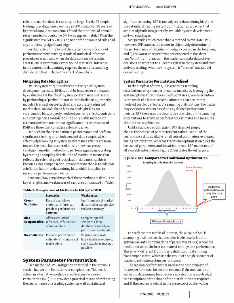
rules and market data, it can be quite large. For 6,402 simple trading rules data mined on the S&P500 index over 25 years of historical data, Aronson (2007) found that the level of annual return needed to overcome DMB was approximately 15% at the significance level of α = 0.05 and none of the examined rules had any statistically significant edge.
Further, attempting to test the statistical significance of performance metrics using standard statistical inference procedures is not valid when the data contain systematic error (DMB is systematic error). Sound statistical inference in the context of data mining requires the use of a sampling distribution that includes the effect of good luck.
Mitigating Data Mining BiasDMB is systematic; it is inherent to the typical system
development process. DMB cannot be lessened or eliminated by evaluating via the “best” system performance metrics or by performing a “perfect” historical simulation (e.g., properly modeled transaction costs, clean and accurately adjusted market data, no look-ahead bias, no hindsight bias, no survivorship bias, properly modeled portfolio effects, omissions and contingencies considered). The only viable methods to estimate performance or test significance in the presence of DMB are those that consider systematic error.
One such method is to estimate performance and perform significance testing on an independent data sample, which effectively is looking at system performance after regression toward the mean has occurred; this is known as cross-validation. Another method is to perform significance testing by creating a sampling distribution of maximum means that reflects the role that good luck plays in data mining; this is known as bias compensation. Yet another method is to calculate a deflation factor for data mining bias, which is applied to measured performance metrics.
Aronson (2007) explains each of these methods in detail. The key strengths and weaknesses of each are summarized in Table 1.
Table 1: Comparison of Methods to Mitigate DMB
Strengths Weaknesses
Cross-Validation
Ease of use, allows statistical inference, provides performance estimate
Inefficient use of market data, smaller sample size reduces accuracy
Bias Compensation
Allows statistical inference, efficient use of market data
Complex, special software + large database required, no performance estimate
Bias Deflation Provides performance estimate, efficient use of market data
Possibly inaccurate, large database required, statistical inference not possible
System Parameter PermutationEach method of DMB mitigation described in the previous
section has certain limitations or complexities. This section offers an alternative method called System Parameter Permutation (SPP). SPP provides a practical means of estimating the performance of a trading system as well as statistical
significance testing. SPP is not subject to data mining bias6 and uses standard trading system optimization approaches that are already built-into generally available system development software packages.
SPP provides much more than a method to mitigate DMB, however. SPP enables the trader to objectively determine: 1) the performance of the inherent edge expected in the long-run, and 2) the worst-case performance expected in the short-run. With this information, the trader can make data-driven decisions on whether to allocate capital to the system and once actively trading, whether the system is “broken” and should cease trading.
System Parameter Permutation DefinedIn the simplest of terms, SPP generates sampling
distributions of system performance metrics by leveraging the system optimization process. Each point in a given distribution is the result of a historical simulation run that accurately modeled portfolio effects. Via sampling distributions, the trader may evaluate a system based on any desired performance metrics. SPP then uses the descriptive statistics of the sampling distributions to arrive at performance estimates and measures of statistical significance.
Unlike standard optimization, SPP does not simply choose the best set of parameters but rather uses all of the performance data available for all sets of parameters evaluated during optimization. Whereas traditional optimization picks the best set of parameters and discards the rest, SPP makes use of all available information. Figure 2 illustrates the difference.
Figure 2: SPP Compared to Traditional Optimization
For each system metric of interest, the output of SPP is a sampling distribution that includes trade results from all system variants (combinations of parameter values) where the median serves as the best estimate of true system performance. This is very different from cross-validation or data mining bias compensation, which use the result of a single sequence of trades to estimate system performance.
The median performance is used as the best estimate of future performance for several reasons: 1) the median is not subject to data mining bias because no selection is involved; 2) no assumptions of the shape of the distribution are required; and 3) the median is robust in the presence of outlier values.
IFTA JOURNAL 2015 EDITION
IFTA.ORG PAGE 89

Steps of System Parameter PermutationTo generate sampling distributions of system variant
performance metrics, the set of parameter ranges under which the trading system is expected to function is determined ex ante in preparation for optimization. Methods for choosing the parameter ranges and observation points are beyond the scope of this paper; however, Kaufman (2013) and Pardo (2008) are suggested for further research into these topics. SPP follows these general steps:
1. Parameter scan ranges for the system concept are determined by the system developer.
2. Each parameter scan range is divided into an appropriate number of observation points (specific parameter values).
3. Exhaustive optimization (all possible parameter value combinations) is performed using a realistic portfolio-based historical simulation over the selected time period.
4. The simulated results for each system variant are combined to create a sampling distribution for each performance metric of interest (e.g., CAR, max drawdown, Sharpe ratio). Each point on a distribution is the result of a historical simulation run from a single system variant.
Figure 3: General Steps of System Parameter Permutation
Figure 3 illustrates the process. In this case, sampling distributions for four performance metrics are shown for illustration. Any number of specific performance metrics may be selected by the trader for his specific objectives. The cumulative distribution function (CDF) for each metric may be examined directly and may be used for performance estimation and statistical inference.
To ensure the SPP result is not biased, care must be taken to thoughtfully select parameter scan ranges ex ante. If SPP is repeated multiple times by changing the parameter scan ranges in an attempt to get a better result, data mining is at work and the SPP estimate may become positively biased. Since the intent of SPP is the avoidance of bias, such a practice would be counterproductive. Thus, it is important that the system developer start the system development process with this consideration in mind.
SPP Estimate of the Long–Run Performance of the Trading System
The trader would like to answer the question: “What is a reasonable performance estimate of the long-run edge of the system?” SPP can effectively answer this question.
To generate long-run performance estimates, sampling distributions are produced as described above using all available market data. The use of all available market data enables the best approximation of the long-run, so the more market data available, the more accurate the estimate. For each performance metric of interest, the median value is used as the best, unbiased performance estimate.
The trader may also be interested in testing the statistical significance of the SPP long-run performance estimates, either in terms of absolute returns or relative to a benchmark. Because SPP generates complete sampling distributions, estimated p-values and confidence levels may be observed directly from the CDF, as illustrated in Figure 4.
Figure 4: Using the Cumulative Distribution Function for Statistical Inference
The example in Figure 4 shows that in 95% of cases, the true value lies in the confidence interval above the level of 5% compounded annual return (CAR); this is equivalent to a p-value of 0.05. Depending on the objectives of the trader, this may or may not be satisfactory. If the trader is interested in outperforming a benchmark with a CAR of 10%, the picture is a bit different. In only 59% of cases does the true value lie in the confidence interval above the benchmark return; this is not statistically significant.
Short-Run Performance Estimate and Worst-Case Contingency Analysis
Whereas the long-run performance estimate indicates what may be expected from the system edge long term, short-run variability may be significant. Thus, the trader would also like to answer the question: “What worst-case contingencies must be tolerated in short-run performance in order to achieve the long-run expectation?” Once the short-run time period is specified, SPP can effectively answer this question.
The duration of the short-run time period is dependent on the preferences and psychology of the trader and/or clients. Chekhlov et al. (2003) mention that the typical drawdown duration tolerated by clients of managed account practitioners ranges from 1-2 years at the most. In any case, the trader needs
IFTA JOURNAL 2015 EDITION
PAGE 90 IFTA.ORG

to determine the duration of the short-run time period that best fits the trading objectives. In general, shorter duration periods have wider ranges of expected performance.
The following steps explain how to perform SPP for the short-run time period:
1. All available market data is split into blocks equal in length to the short-run time period (t). Each time block may overlap with the previous block depending on the timeframe of trading signals (such as any month within a year or any hour within a day). This results in some number of time blocks (m).
2. Steps 1 through 4 of the general SPP process are performed on all m time blocks separately. Thus, if a system has n combinations of parameter values, a total of m • n optimization permutations are performed on a historical time period of length t in order to generate the sampling distribution for each performance metric of interest over the selected short-run timeframe.
Figure 5 illustrates the process. Again, sampling distributions for four performance metrics are shown for illustration. Any number of specific performance metrics may be selected by the trader for his specific objectives.
Figure 5: SPP Application for Short-Run Performance Estimation
The sampling distributions resulting from this process each contain many more individual samples with a higher degree of variation than were generated via the SPP long-run performance estimate process. However each sample has a shorter simulation timeframe and thus a fewer number of closed trades contained in each sample. With fewer closed trades per sample, the standard error associated with each sample increases. As the standard error per sample increases, so does the variation of the sampling distribution. The increased variation can be seen in the respective probability density functions as shown in Figure 6.
Figure 6: Increased Variation in Short-Run Performance
0%5%
10%15%20%25%30%35%40%45%50%
-30
-25
-20
-15
-10 -5 0 5 10 15 20 25 30 35 40 45 50 55 60 65 70 75 80 85
Freq
uenc
y
CAR
Long-run
Short-run
With sampling distributions, the trader may make a probabilistic, data-driven decision of whether to risk capital on the system. To do so, the trader determines a probability level he determines to be highly improbable but tolerable as his worst-case (common levels are 5% or 1%). Alternatively, the trader may specify the worst-case in terms of the least favorable but tolerable level of performance. Whatever worst-case probability or level of performance is chosen, the CDF of the short-run system metrics of choice are examined as in Figure 7. If the worst-case contingency at the respective probability cannot be tolerated by the trader or clients, capital should not be allocated to the system.
Figure 7: Evaluating the “Worst-Case Contingency”
-40
-20
0
20
40
60
80
100
0% 10% 20% 30% 40% 50% 60% 70% 80% 90% 100%
Compounded Annual Return
Worst-Case Contingency Probability = 5% (p-val = 0.05)
-5.51% CAR Worst Case Contingency (@ SPP 5%)
The example in Figure 7 indicates that if the trader cannot tolerate a 5% probability of a realized compounded annual return of -5.51% over the short-run time period chosen, the system should not be traded. If the worst-case contingency is tolerable and capital is allocated to the trading system, the same (or different) worst-case probability(s) or level(s) of performance may be used to determine whether the system is “broken” and if trading should cease.
The stop trading decision should be made when the system has been traded for the duration of the short-term period selected. Thus, if one year was selected as the short-term time period, the stop trading decision should only be made at the one year mark. Again, using the example in Figure 7, if realized performance is worse than -5.51% over a year of trading, the trader may decide to stop trading the system because the ex ante worst case contingency was violated. Any timeframe or probability may
IFTA JOURNAL 2015 EDITION
IFTA.ORG PAGE 91

be used in this decision. Thus SPP enables the trader to add an objective method of risk control to his trading plan.
Why System Parameter Permutation Is EffectiveUsing traditional optimization, all performance metrics
for the system are derived from the single (best) sequence of trades selected during the optimization process. To generate a distribution of contingencies, randomization techniques employing resampling, such as bootstrap or Monte Carlo Permutation (MCP), are commonly used.
There are several problematic assumptions made by resampling methods, but two are of particular interest here: 1) the result of a single historical simulation is representative of the future distribution of trade results; 2) real world portfolio effects combined with position sizing are accurately modeled. The discussion of data mining bias already showed that assumption number one is problematic. Assumption number two is also problematic; portfolio effects such as buying power, dynamic inter-symbol correlation, and autocorrelation would likely not allow some of the resampled results to occur in real trading. Likewise, this type of randomization does not explore trades unseen in the original, single sample sequence of trades that may have occurred under slightly different conditions. This is a natural consequence of random resampling.
Unlike random resampling, the random variation in SPP originates from the application of a set of slightly varied entry/exit rules on actual market data, where trading signals are evaluated using a realistic simulated portfolio. In effect, SPP explores facets of the trading system that would otherwise remain hidden yet are possible in real trading.
SPP produces reliable estimates of trading system performance by: 1) leveraging the statistical law of regression toward the mean, and 2) extracting maximum information from available market data. For #1, the use of a large number of combinations of parameter values thoroughly examines various ways randomness may affect the system and thus estimates the effects of regression toward the mean. For #2, the use of all available market data ensures that performance results contain the smallest standard error possible and that the system has been exposed to the most varied market conditions possible. Both are explored in more detail.
How SPP Leverages Regression Toward the MeanIn system optimization, regression toward the mean
indicates that the specific combination of optimized parameter values that led to extreme performance in historical simulation will probabilistically not retain a level of extreme performance in the future. The section on DMB showed that extreme performance tends to regress toward the mean level over time as the impact of luck tends to change. It is instructive to examine the mechanics of how luck affects system variant performance.
In general, good luck involves some combination of catching favorable market moves and avoiding adverse market moves. One way luck affects system performance is through the interaction of parameters on market data. Parameter values control the exact timing of entry and exit signals; one combination of parameters may generate a very favorable set
of entry and exit signals where other similar combinations may generate much less favorable signals on the same market data.
SPP generates a distribution of performance results from a large number of individual historical simulation runs that use the same market data applied to different combinations of parameter values. The distribution includes the results from many slightly different entry/exit signal combinations across simulation runs. With a large number of samples, the impact of regression toward the mean is seen to varying degrees over the distribution of system variant performance results, as shown in Figure 8 below.
Figure 8: Sampling Distribution Generated by SPP
Good luckInflates Performance
Bad luckDeflates
Performance
Median performance
Another way luck affects system performance is through the interaction of the timing of market entry/exit signals and portfolio effects such as buying power, dynamic inter-symbol correlation, and autocorrelation. As demonstrated by Krawinkel (2011) randomly skipped trades can have a large impact on realized system performance. Yet, this phenomenon remains largely unrecognized and underexplored. SPP thoroughly and realistically explores this effect through the distribution of performance results.
In SPP, one combination of parameter values may capture a certain set of trades, whereas a slight variation in parameter values may capture trades not previously seen and/or skip others that were previously captured. Through this interaction, SPP includes the effects of randomly skipped and included trades. Again, the impact of regression toward the mean is seen to varying degrees over the distribution of performance results.
How SPP Extracts Maximum Information From Available Market Data
SPP minimizes standard error of the mean (SEM) by using all available market data in the historical simulation. As sample size increases, SEM decreases proportionally to the square root of the sample size due to the mathematical identity: SEM = s/ .
Although the use of all available market data is not a unique feature of SPP, it is one of its strengths. In contrast, traditional cross-validation methods split market data in some way. The effect on SEM of such a split can be large. Table 2 shows the approximate percentage increase of SEM for various data-splitting schemes over SPP.
IFTA JOURNAL 2015 EDITION
PAGE 92 IFTA.ORG

Table 2: Increase of SEM for Market Data Splits
50/50 Split 80/20 Split 90/10 Split
In-sample 41% 12% 5%
Out-of-sample 41% 124% 216%
Further, Inoue and Kilian (2002) found that OOS and IS tests are equally reliable in the presence of data mining once proper critical values are used and that IS (using all market data) tests have power advantages when there is “unmodelled structural change in the parameter of interest” (a change in market conditions). The use of all available market data ensures that the system has been exposed to the most varied market conditions possible in historical simulation. Doing so cannot guarantee that future market conditions will be similar to those seen historically, but any sort of data split ensures loss of information and thus less representative performance results. The most information-rich historical simulation uses all available market data.
Practical Example of SPP Applied to a Model Trading System
The relative momentum concept in the style of Blitz and Van Vliet (2008) was chosen to create an example system because significant research has validated these types of strategies within and across many different asset classes (Asness et al. 2009). Further, a large amount of post-publication, out-of-sample validation exists for relative momentum (Asness et al. 2009), thus confirming its viability.
Generalized System Model The relative momentum trading system concept is based on
the observation that the best performing assets or asset classes in the current period tend to continue their outperformance in the next period. Research indicates that momentum measured over 3–12 months tends to show the largest edge.
The generalized system model defines how momentum is measured, the number of assets to comprise the portfolio, and the timing of asset selection. In the interest of risk management, a catastrophic stop-loss is added to the general model as well. Thus, the generalized system model shown in Figure 9 contains four parameters.
Figure 9: Relative Momentum Generalized System Model
The ROC indicator was chosen to measure momentum as the percentage change over the look-back period. The timing of asset rotation was chosen to be once per month on a specific day in relation to the last trading day of month. Finally a catastrophic stop loss as a percentage of the entry price was introduced for risk management.
The parameter scan ranges were defined in light of the generalized system concept. The portfolio composition was limited to the top two to five assets out of 10 in a balance between momentum and diversification. The ROC look-back length was varied in increments of 10% starting from 60 trading days (~3 months) up to 251 trading days (~1 year). The date of entry/exit rotation chosen was the last trading day of month +/- 5 trading days. Finally the stop loss was varied from 10% to 20% in increments of 2%. The system details are shown in Table 3.
Table 3: Relative Momentum Trading System Details
System Component
Indicator Minimum Maximum Step # Values
# Assets Held N/A 2 5 1 4
Momentum Rank ROC(a) 60 251 10% 16
Rotation Time Period
Last DOM + b
-5 5 1 11
Stop Loss Point
% of entry price
10% 20% 2% 6
Exhaustive optimization of the above scan ranges resulted in 4,224 combinations of parameter values. The method of position sizing used was equal margin per position. A standard 100% maintenance margin requirement was used along with a 5% cash safety buffer. This allowed up to 95% of trading capital to be used to take entry signals.
Optimization Results and Out-of-Sample CalibrationThis section discusses traditional OOS testing applied to
the trading system. The OOS analysis is used for comparison purposes to SPP. The trading system was optimized using the annualized information ratio (vs. the dividend reinvested SPY ETF) as the fitness function in order to maximize benchmark outperformance. The OOS test used 80% of available market data in-sample, and the remaining 20% was reserved for out-of-sample calibration. Results are shown in Table 4.
Table 4: Relative Momentum System OOS Results
IS OOS OOS % of IS
Compounded Annual Return 22.41% 14.47% 65%
Maximum Drawdown -18.06% -9.6% 53%
Annualized Standard Deviation 19.08% 11.96% 63%
Annualized Information Ratio 0.70 -1.20 -171%
Using this method, the OOS performance metrics serve as the only unbiased estimates in setting expectations for future performance and thus also serve as the determinant
IFTA JOURNAL 2015 EDITION
IFTA.ORG PAGE 93

of whether to risk capital on the system. Standard practice in OOS testing dictates that a system passes cross-validation if OOS performance is >= 50% of IS performance. In this case, the majority of the system metrics are above the desired threshold, yet the information ratio for the OOS segment is much below. Therefore, this system fails traditional cross-validation due to the unacceptable OOS information ratio.
SPP Long-Run Estimate of System PerformanceNext, SPP was performed on the system as specified in the
section titled “SPP Estimate of the Long–Run Performance of the Trading System.” In contrast to the previously described method, SPP uses all available market data, and when applied to the same system, provides much more information. Table 5 shows the traditional OOS results/estimates compared to the respective SPP estimates and to the buy-and-hold benchmark (SPY ETF with dividends reinvested). The goal in employing this system is to outperform the benchmark, and thus, the statistical significance of outperformance for each system metric (via the equivalent p-value) is also shown.
The data in Table 5 may be used by the trader to decide whether to allocate capital to the system. For example, the trader may ask “Is an unbiased estimate of realizing a 8.94% CAR sufficient reward to compensate for the risk of a -24.22% drawdown and an annualized 15.61% standard deviation? Is a p-value of 0.10 for CAR significant enough to be confident in outperforming the benchmark?” These questions may be answered via the SPP generated sampling distributions.
Table 5: Long-Run SPP Estimate vs. OOS and Benchmark
Compounded Annual Return
Maximum Drawdown
Annualized Information Ratio
Annualized Standard Deviation
Cross-Validation OOS Estimate
14.47% -9.60% -1.20 11.96%
SPP Estimate of Long-Run Perf.
8.94% -24.22% 0.06 15.61%
SPY Benchmark 6.54% -55.05% N/A 24.97%
Equiv. P-Val for Outper-formance
0.10 0.00 0.25 0.00
The results in Table 5 are taken from specific points along the SPP sampling distributions. For the four system metrics examined in this example, the CDFs (blue) are shown in Figure 10, from which the trader can make further probabilistic estimates. The system metrics are shown on the y-axis of the charts and the cumulative probabilities on the x-axis.
Additionally, the SPP estimate (red), OOS estimate (green) and benchmark (purple) are overlaid onto each CDF chart. The vertical black line highlights the median of the sampling distribution. The intersection point of the CDF and the benchmark as measured along the x-axis is the value of the equivalent p-value from Table 5.
Figure 10: Long-Run SPP Generated CDFs for Selected System Metrics
0
5
10
15
20
25
0% 10% 20% 30% 40% 50% 60% 70% 80% 90% 100%
Compounded Annual Return
6.54% SPY Benchmark
14.47% OOS Estimate
8.94% SPP Estimate
-60
-50
-40
-30
-20
-10
00% 10% 20% 30% 40% 50% 60% 70% 80% 90% 100%
Maximum Drawdown
-55.05% SPY Benchmark
-9.60% OOS Estimate
-24.22% SPP Estimate
-0.3
-0.2
-0.1
0
0.1
0.2
0.3
0.4
0.5
0.6
0% 10% 20% 30% 40% 50% 60% 70% 80% 90% 100%
Information Ratio (Annualized)
-1.20 OOS Estimate
0.06 SPP Estimate
10
12
14
16
18
20
22
24
0% 10% 20% 30% 40% 50% 60% 70% 80% 90% 100%
Standard Deviation (Annualized)
24.97% SPY Benchmark
11.96% OOS Estimate
15.61% SPP Estimate
IFTA JOURNAL 2015 EDITION
PAGE 94 IFTA.ORG
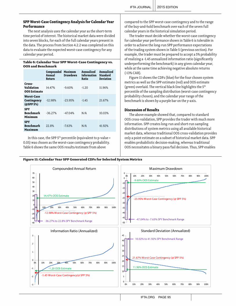
SPP Worst-Case Contingency Analysis for Calendar Year Performance
The next analysis uses the calendar year as the short-term time period of interest. The historical market data were divided into seven blocks, for each of the full calendar years present in the data. The process from Section 4.2.2 was completed on this data to evaluate the expected worst-case contingency for any calendar year period.
Table 6: Calendar Year SPP Worst-Case Contingency vs. OOS and Benchmark
Compounded Annual Return
Maximum Drawdown
Annualized Information Ratio
Annualized Standard Deviation
Cross-Validation OOS Estimate
14.47% -9.60% -1.20 11.96%
Worst-Case Contingency (@SPP 5%)
-12.98% -23.95% -1.45 21.67%
SPY Benchmark Minimum
-36.27% -47.04% N/A 10.03%
SPY Benchmark Maximum
22.8% -7.63% N/A 41.92%
In this case, the SPP 5th percentile (equivalent to p-value = 0.05) was chosen as the worst-case contingency probability. Table 6 shows the same OOS results/estimate from above
compared to the SPP worst-case contingency and to the range of the buy-and-hold benchmark over each of the seven full calendar years in the historical simulation period.
The trader must decide whether the worst-case contingency for calendar year performance shown in Table 6 is tolerable in order to achieve the long-run SPP performance expectations of the trading system shown in Table 5 (previous section). For example, the trader must be prepared to accept a 5% probability of realizing a -1.45 annualized information ratio (significantly underperforming the benchmark) in any given calendar year, while at the same time achieving negative absolute returns (-13% CAR).
Figure 11 shows the CDFs (blue) for the four chosen system metrics as well as the SPP estimate (red) and OOS estimate (green) overlaid. The vertical black line highlights the 5th percentile of the sampling distribution (worst-case contingency probability chosen), and the calendar year range of the benchmark is shown by a purple bar on the y-axis.
Discussion of ResultsThe above example showed that, compared to standard
OOS cross-validation, SPP provides the trader with much more information. SPP creates long-run and short-run sampling distributions of system metrics using all available historical market data, whereas traditional OOS cross-validation provides only a point estimate on a subset of historical market data. SPP enables probabilistic decision-making, whereas traditional OOS necessitates a binary pass/fail decision. Thus, SPP enables
Figure 11: Calendar Year SPP Generated CDFs for Selected System Metrics
-40
-30
-20
-10
0
10
20
30
40
50
60
70
0% 10% 20% 30% 40% 50% 60% 70% 80% 90% 100%
Compounded Annual Return
-36.27% to 22.8% SPY Benchmark Range
14.47% OOS Estimate
-12.98% Worst-Case Contingency (@ SPP 5%)
-50
-45
-40
-35
-30
-25
-20
-15
-10
-5
00% 10% 20% 30% 40% 50% 60% 70% 80% 90% 100%
Maximum Drawdown
-47.04% to -7.63% SPY Benchmark Range
-9.60% OOS Estimate
-23.95% Worst-Case Contingency (@ SPP 5%)
-3
-2
-1
0
1
2
3
0% 10% 20% 30% 40% 50% 60% 70% 80% 90% 100%
Information Ratio (Annualized)
-1.20 OOS Estimate
-1.45 Worst-Case Contingency(@ SPP 5%)
0
5
10
15
20
25
30
35
40
45
0% 10% 20% 30% 40% 50% 60% 70% 80% 90% 100%
Standard Deviation (Annualized)
10.02% to 41.92% SPY Benchmark Range
11.96% OOS Estimate
21.67% Worst Case Contingency (@ SPP 5%)
IFTA JOURNAL 2015 EDITION
IFTA.ORG PAGE 95

a much deeper understanding of how the trading system may perform going forward.
SPP applied to the relative momentum trading system demonstrates outperformance over the buy-and-hold benchmark in the long-run with varying degrees of statistical significance for different system metrics. Specifically, an equivalent p-value of 0.10 for CAR outperformance is marginally significant. In contrast, an equivalent p-value of 0.00 for max drawdown outperformance is highly significant, and these results together indicate that a strength of relative momentum is avoidance of large drawdowns.
However, the SPP worst-case contingency analysis for calendar year performance demonstrated that, in order to achieve long-term outperformance, the trader must be willing to accept the possibility of significant underperformance in any calendar year. With this information, the capital allocation decision may be made probabilistically.
ConclusionsIt is essential for any trader to thoroughly understand what
to expect from a trading system before allocating capital. Without knowledge of the probable ranges of performance expected in the future, the trader or client is prone to abandon a good system in the stress of an unexpected drawdown or period of underperformance. Even worse, capital may be allocated on the basis of inflated expectations gained from traditional evaluation methods when the system should be discarded in the light of the probabilistic information that SPP is able to provide.The majority of traditional system development approaches provide a single point estimate of performance and/or measure of statistical significance based on a single sequence of trades. With the limited information from such a point estimate, the capital allocation decision is difficult at best. In contrast, SPP produces sampling distributions of system metrics that allow more realistic contingency planning based on probabilities.
Ultimately, SPP offers a simple, easy to use, yet realistic method for estimating future system performance. It is the balance of these three factors that is the true strength of the method. Thus, SPP is broadly applicable by traders and system developers of varying backgrounds and adds value in real-life practice.
The trading system example showed that SPP provides a clear, balanced picture of expected system performance, whereas standard cross-validation did not. The example also demonstrated that the relative momentum trading system is likely to outperform the buy-and-hold benchmark over the long run but that in order to achieve long-term outperformance, the trader must be willing to accept the possibility of significant underperformance in any given year. With this information, the capital allocation decision may be made probabilistically.
Notes1. http://finance.yahoo.com/2. Fromthecurrent(January2014)scheduleoffeesformargininterestfrom
InteractiveBrokers<$500,000borrowed.3. http://www.newyorkfed.org/4. Definedasexpectedactivereturn(systemreturn–benchmarkreturn)
dividedbytrackingerror:.5. “Regressiontowardthemean”isastatisticallaw,nottobeconfused
withthefinancialterm“meanreversion,”whichassumesthatobservedhighandlowpricesaretemporaryandthatpricewilltendtomovetotheaverageovertime.
6. ToensuretheabsenceofDMB,SPPmustbeconductedasastandaloneprocess(nottocomparesystems).AnyexpostselectionbasedonperformancehasthepotentialtointroduceDMBasdiscussedinSection3.
ReferencesAronson,DavidR.,2007,Evidence-based Technical Analysis: Applying the
Scientific Method and Statistical Inference to Trading Signals,JohnWiley&Sons,Inc.,Hoboken,NJ,544p.
Asness,CliffordS.,TobiasJ.Moskowitz,andLasseJ.Pedersen,2009,“ValueandMomentumEverywhere,”AFA2010AtlantaMeetingsPaper,http://ssrn.com/abstract=1363476(December1,2013).
Bailey,DavidH.,JonathanM.Borwein,MarcosLópezdePrado,andQijiJimZhu,2013,“Pseudo-mathematicsandFinancialCharlatanism:TheEffectsofBacktestOverfittingonOut-of-samplePerformance,”http://ssrn.com/abstract=2308659(December20,2013).
Blitz,DavidC.andPimVanVliet,2008,“GlobalTacticalCross-AssetAllocation:ApplyingValueandMomentumAcrossAssetClasses,”Journal of Portfolio Management35(1),p.23–38.
Chekhlov,Alexei,Stanislov,Uryasev,andMichaelZabarankin,2003,“PortfolioOptimizationwithDrawdownConstraints,”http://www.ise.ufl.edu/uryasev/files/2011/11/drawdown.pdf(December20,2013).
Inoue,AtsushiandLutzKilian,2002,“In-SampleorOut-of-SampletestsofPredictability:WhichOneShouldWeUse?,”WorkingPaperNo.195,EuropeanCentralBankWorkingpaperSeries(November2002).
Kaufman,PerryJ.,2013,Trading Systems and Methods, + Website, 5th Edition,JohnWiley&Sons,Inc.,Hoboken,NJ,1232p.
Krawinkel,Thomas,2011,“BuyingPower–TheOverlookedSuccessFactor,”NAAIMWagnerAward2011.
Pardo,Robert,2008,The Evaluation and Optimization of Trading Strategies 2nd Edition,JohnWiley&Sons,Inc.,Hoboken,NJ,334p.
Note from the EditorThe author, Dave Walton, is the winner of the NAAIM Wagner Award 2014. This paper was originally submitted for this contest. IFTA is thankful to Greg Morris and the National Association of Active Investment Managers for the permission to print this document.
IFTA JOURNAL 2015 EDITION
PAGE 96 IFTA.ORG

Let me start by saying that I have been a big fan of David Fuller since I attended two of his Chart Seminars on point and figure charting in the mid to late 1980s in Sydney. His calm personality and array of knowledge and capacity to follow many markets set him apart from others I was studying at that time.
And so, when I saw this book in an airport bookstore, I figured I’ll take a look at it.
Yet, I had never really understood David’s macro-behavioural approach—probably due to the fact that I was a recovering economist who had just discovered charts to actually enjoy movements in the financial markets both on a short-term and long-term basis.
So reading this book by one of his associates was both a blast from the past and highly educational for me. What I enjoyed about this book was seeing the fusion of charting and macro-behavioural economics.
It is simply a well-crafted, holistic approach to markets and future trends that is well worth the read. As a bonus, Eoin discusses future themes for 2015–2025. Whether they come true is not important; it’s the thought process that goes into the development of the themes that is very useful.
Now, what shocked and stunned me about this book was the lack of point and figure charts! When I expressed amazement about this fact to one of my advisory clients who used to work with David Fuller at Fullermoney, she explained that while she was working there, they dropped the point and figure charts, as they took a lot more effort. She added that the point and figure software options they looked at were not quite right, so they went for the more standard charts. This broke my heart a little to see not one point and figure chart in an entire David Fuller derived book, but it would not be a surprise to subscribers.
The first thing you will notice is that David Fuller and Eoin Treacy use chart reading (his form of technical analysis) in only one part of their four investing pillars:
1. Price action/crowd psychology 2. Liquidity 3. Governance 4. Theme/fundamental value
Eoin is upfront: “Today, of all the technical indicators out there, the only one I use with any kind of regularity is the
200-day moving average (MA) because it represents the trend mean.”
As a result, this book is probably not going to greatly increase an expert’s knowledge of technical analysis. But what it does do is give you a greater understanding of the drivers behind the concepts that fund managers and larger investors incorporate into their decision-making (e.g., trends, fads), plus a good dollop of well-grounded trade management.
WD Gann talked about campaigns in the markets, and this book allows you to understand themes in the markets and campaigns on which you can trade technically based on the themes. Plus, it gives you a bonus of trade and stop loss management and investor and trader thought and action patterns (crowd psychology) from the perspective of how you hang in for the big moves.
One of the chapters in the book is “Governance is Everything.” I found this chapter particularly challenging in that with good governance, while we might
get bull markets, there is less chance of a complete routing. We all believe the American example is probably one of good governance, and of course the global financial crisis was a failure of regulation and governance. But the reality is, it wasn’t stealing—it was just a typical catastrophe, which we get every couple of decades!
All in all, it was a lovely way to see some charts along with behavioural and macro-economic reasons why these particular stocks were chosen as part of their themes.
Like it or lump it (as a technical analyst), the people who drive the markets are the biggest crowd we have—they are the fund managers. They also tend to be value investors.
Crowd Money: A Practical Guide to Macro Behavioural Technical Analysis—By Eoin Treacy Reviewed By David Hunt
IFTA JOURNAL 2015 EDITION
IFTA.ORG PAGE 97

PresidentRolf Wetzer, Ph.D. (SAMT)
Vice-President—the AmericasWilliam Chin, MBA (CSTA)
Vice-President—AsiaAkira Homma, CFA, CIIA, CFTe, FRM, CMA, CMT (NTAA)
Vice-President—Europe and Conference DirectorDeborah Owen, FSTA, CFTe (STA)
Vice-President—Middle East, AfricaMohamed Ashraf Mohfauz, MFTA, CFTe, CETA (ESTA)
TreasurerRalph Böckel, CFA (VTAD)
Education DirectorGregor Bauer, Ph.D., CFTe (VTAD)
Accreditation DirectorRoberto Vargas, CFTe, MSTA (TSAASF)
Marketing and Membership DirectorDan Valcu, CFTe (AATROM)
Exam Management DirectorJeannette Schwarz-Young CFP®, CMT, M.S. (AAPTA)
Strategic Development DirectorRobert Grigg, CPA (ATAA)
Online Development Director Roman Bogomazov (TSAASF)
Journal and Newsletter Director Aurélia Gerber, MBA, CFA (SAMT)
Website Content Director Akihiro Niimi, MFTA (NTAA)
Sponsorship Director Mohamed El Saiid, CFTe, MFTA (ESTA)
IFTA Board of Directors
Executive DirectorBeth W. Palys, FASAE, CAE
Vice President, MeetingsGrace L. Jan, CAE, CMP
Senior Member Services ManagerLinda Bernetich
Marketing Director Julie Hill
Director of Editorial Services Lynne Agoston
Senior Graphic Designer Jon Benjamin
Accounting Dawn Rosenfeld
IFTA Staff
If you are a technical analyst whose head is always in the price action chart-only detail, then PLEASE READ THIS BOOK. It will help you get inside the minds and hearts of people who regard technical analysts as aliens, enemies or an occasionally useful addenda.
The section on management and stops is something anyone managing money or advising others should spend time studying.
The final part of the book has a section on what David Fuller calls Autonomies (from page 138):
“David Fuller christened such large multinationals “mobile principalities” or “Autonomies” because they are independent, powerful, mobile “mini countries” that focus where the best potential for profit exists. What country they consolidate earnings in is less important than the source of their income.”
This is the only chapter in which I found myself wanting more detail. What the reader gets are charts with some 150–300 word descriptions of what they are and do. Now, while this is a great concept, it left me hungry to know more about why David Fuller and Eoin Treacy like these stocks and how they would handle them in the future.
This is a deep and well-thought-out book on Fuller’s methods, which have been honed over 40 years. I recommend it to anyone who dips their toes into the markets—no matter how deep. Technical analysts who want to know how to have greater appeal to investors should read Crowd Money five or six times—or at least as many times as you read WG Gann’s Tunnel Thru the Air. Buy Crowd Money—it certainly made me think in bigger terms, and it will help you too.
IFTA JOURNAL 2015 EDITION
PAGE 98 IFTA.ORG

Adam Cox, MFTAAdam Cox has more than 20 years of investment management, trading, and banking experience. He is currently director and head consultant for Prime Consulting, a specialist consulting company operating from New Zealand. Mr. Cox’s passion lies in trading system development,
systematic FX trading, and quantitative finance, including econometric-based system development and behavioral finance applications to trading. His current emphasis is based on US ETF, Futures (commodities, FX and indices) and macro strategies, as well as intraday trading. Mr. Cox is currently working on a Ph.D. in finance (proposal stage), aiming to explain trader behavior and provide a model for real-time applications. He has developed a range of customized indicators, which borrow from econometrics, time series analysis, and inter-market and investment analysis to discretionary trading, as well as trading risk management systems (scoring systems). Among these systems and analytical approaches, Mr. Cox has extensive and hands-on experience applying a wide range of methodologies, including wavelet de-noising and compres-sion techniques to trading, as well as mandani fuzzy logic, structural equation modeling, and SVM. Mr. Cox’s current emphasis in wavelet applications includes forecasting methodologies and in particular, multivariate approaches to short trading system design aimed at capturing inter-market relationships and trading behavioral patterns across markets. This work also extends to (mother) wavelet design for application to de-nosing applications to specific markets Mr. Cox is also very interested in emerging market Asia equities markets, and in particular, the Vietnamese equities market. As a side note, Mr. Cox has a Vietnamese and Cantonese language background and has extensively traveled, having lived in the United States, Canada, Australia, New Zealand and New Caledonia. He is currently located in Singapore. Adam can be reached at acox @ primeconsulting.co.nz and is open to any queries, feedback and business/work opportunities.
David HuntDavid Hunt has 32 years of experience covering hedging and trading for Macquarie Funds Group. He is CIO of private equity fund PHG Investments and is Australian charting advisor to financial advisors, professional investors and traders through his Profit Hunter Group. He is an author
of the Wiley Trading Guide II. Mr. Hunt is director and past president of the Australian Professional Technical Analysts (APTA) as well as co-founder of APTA and the Australian Technical Analysts Association. He is a regular on Fox Business TV in Australia and the Australian Financial Review. He can be contacted through http://adest.com.au.
Shawn Lim, CFTe, MSTA Shawn Lim is currently an analyst at Morgan Stanley in the London office. His research interests lie in asset pricing and portfolio theory, and he has written and published a number of articles in journals such as the International Journal of Economics and Finance
and the Journal of Finance and Investment Analysis. He is a Certified Financial Technician (CFTe) and a member of the Society of Technical Analysts UK (MSTA). He also graduated with a first class honours degree in economics from University College London and holds an advanced diploma in data and systems analysis from the University of Oxford.
Andrew J.D. Long, MFTAAndrew J.D. Long, MFTA, is a professional technical analyst and trader. The founder and publisher of TRIGGER$.ca, an economic and technical analysis publication for active traders and investors, he and his venture partner, Gordon T. Long.com, regularly publish market
and economic forecasts with uncanny accuracy. Mr. Long’s experiences vary and include working for a private fund researching and developing proprietary technical analysis methods. Researching and trying to understand the markets has been a lifelong pursuit and journey—starting in early high school with P/E ratios and balance sheets, to the present day, where he continues to research and develop advanced technical analysis techniques. In his publication, global economic and fundamental analysis is integrated with advanced technical analysis, offering unique and often correct market perspectives. The purely technical method discussed in his MFTA paper is practiced daily with published forecasts, tracking the progress of the system where it continues to achieve 80–90% accuracy.
Stanislaus Maier-PaapeProfessor Stanislaus Maier-Paape has taught mathematics at RWTH Aachen University since 2001. His specialties include differential equations, nonlinear analysis, stochastics, and applications of mathematics in other fields. Since 2010, he has been CEO of SMP Financial
Engineering GmbH (www.smp-fe.de). His research fields in quantitative finance include mechanical trading systems and portfolio and money management.
Author Profiles
IFTA JOURNAL 2015 EDITION
IFTA.ORG PAGE 99

Alex Neale, MSTA, CMT, MFTA Alex Neale is a professional technical analyst. He works for Cantor Fitzgerald Europe providing technical analysis and market commentary to high net worth CFD traders. Mr. Neale has 15 years of experience in writing analysis reports. He started his career in 1998 at GNI, the company that pioneered CFDs for individuals, before moving to Cantor Fitzgerald Europe in 2012. He is based in London and can be contacted through his LinkedIn profile.
David Price BSc, MSc, CFTe, MSTA, MFTADavid Price has over a decade of experience working for financial firms, including Goldman Sachs, Brevan Howard and JPMorgan, across equity, global macro, FX, quantitative and systematic investment strategies. Mr. Price has produced technical analysis research of equity,
fixed income, FX and commodity markets for discretionary portfolio managers. He is a Certified Financial Technician (CFTe), a Master of Financial Technical Analysis® (MFTA®), a Member of the Society of Technical Analysts (MSTA) and holds an MSc in financial management. As someone who is passionate about investment and technical analysis, he is keen to research and identify new technical alpha-generating and risk-reducing investment strategies.
Andreas Thalassinos, BSc, MSc, MSTA, CFTe, MFTA
Andreas Thalassinos, BSc, MSc, MSTA, CFTe, MFTA, is a highly respected lecturer in the education of traders, investors and FOREX professionals. His passion for trading led him to study the markets from a mathematical and mechanical point of view. He is a dynamic
advocate of algorithmic trading and has developed hundreds of automated systems, indicators, and trading tools. His trading products are being used today all over the world by traders, investors, FOREX brokers and investment firms. Mr. Thalassinos founded FxWizards (www.fxwizards.com), an educational company specialized in FOREX trading with the goal of providing the real truth about FOREX trading through high-level education to beginners and professionals alike. He emphasizes that capital preservation is imperative for traders to survive in the financial markets, and he guides traders on employing swing trading and locking profits based on his research findings and results. Mr. Thalassinos is currently travelling around the globe giving seminars as a guest speaker at FOREX conferences.
Douglas StridsbergDouglas Stridsberg is currently a student studying mechanical engineering at University College London (UCL). His interests span multiple disciplines, but his passion lies in Big Data and how it can improve financial forecasts. He is a keen trader and programmer
and is currently working on building an automated intraday FX trading algorithm. In the past, he founded UCL’s first discussion group on developments in the financial markets and has been involved in the running of several large-scale conferences about the financial industry.
Samuel Utomo, CFTe, MFTASamuel Utomo is currently a final-year undergraduate student at Prasetiya Mulya Business School, Indonesia, majoring in finance. He previously worked at PT Astronacci International as a technical analyst, and then as head of research and lecturer, dealing with individual and
institutional clients in Indonesia. Mr. Utomo frequently appears on local television and radio stations as well as on several online media channels, providing market outlook. He also passed the final level of the Chartered Market Technician (CMT) examination given by the Market Technician Association (MTA) as well as the local investment manager representative examination. He is now shifting his independent academic research focus to the development of a quantitative equity portfolio management platform for the South East Asian equity market.
Fergal Walsh, CFTe, MFTAFergal Walsh has been a part-time trader in financial markets since 2010, focusing primarily on CFDs and currencies. He is currently completing a bachelor of arts degree in economics and history at University College Dublin. Subsequently, he hopes to focus full time on trading, further his experience in
financial markets, and continue to develop trading strategies based primarily on technical analysis.
Dave Walton, MBA (Wagner Award)Dave Walton has been involved in active investing since 1999; he has focused on system trading since completing the Van Tharp Institute’s Super Trader program. A computer engineer by training, Mr. Walton applies system validation principles and statistical methods to trading. He spent 18
years ensuring the quality and reliability of cutting-edge technology products for one of the world’s largest computer chip manufacturers. Mr. Walton received his B.S. in computer engineering from Virginia Tech and his MBA from UC Davis. He is co-founder and principal of StatisTrade, LLC, a trading system evaluation firm that works with fund managers to evaluate and improve trading system performance using advanced statistical techniques. He is a proponent of applying a scientific approach to trading system development and evaluation, which includes rigorous validation principles gleaned from his engineering background. Mr. Walton won the NAAIM (National Association of Active Investment Managers) 2014 Wagner Award for one of his creative system validation methods. He primarily focuses on long-term trading systems that have significant academic research behind them. His primary trading vehicles are ETFs and U.S. stocks.
IFTA JOURNAL 2015 EDITION
PAGE 100 IFTA.ORG

Master of Financial Technical Analysis (MFTA) Program
IFTA’s Master of Financial Technical Analysis (MFTA) represents the highest professional achievement in the technical analysis community, worldwide. Achieving this level of certifi cation requires you to submit an original body of research in the discipline of international technical analysis, which should be of practical application.
The MFTA is open to individuals who have attained the Certifi ed Financial Technician (CFTe) designation or its equivalent, e.g. the Certifi ed ESTA Technical Analyst Program (CETA) from the Egyptian Society of Technical Analysts (ESTA)
For those IFTA colleagues who do not possess the formal qualifi cations outlined above, but who have other certifi cations and/or many years experience working as a technical analyst, the Accreditation Committee has developed an “alternate path” by which candidates, with substantial academic or practical work in technical analysis, can bypass the requirements for the CFTe and prequalify for the MFTA.
The alternate path is open to individuals who have a certifi cation, such as:
• Certifi ed Market Technician (CMT) or a Society of Technical Analysts (STA) Diploma, plus three years experience as a technical analyst; or
• a fi nancial certifi cation such as Certifi ed Financial Analyst (CFA), Certifi ed Public Accountant (CPA), or Masters of Business Administration (MBA), plus fi ve years experience as a technical analyst; or
• a minimum of eight years experience as a technical analyst.
A Candidate who meets the foregoing criteria may apply for the “alternate path”. If approved, they can register for the MFTA and submit their research abstract. On approval, the candidate will be invited to submit a paper.
ExaminationsIn order to complete the MFTA and receive your Diploma, you must write a research paper of no less than three thousand, and no more than fi ve thousand, words. Charts, Figures and Tables may be presented in addition.
Your paper must meet the following criteria:
• It must be original• It must develop a reasoned and logical
argument and lead to a sound conclusion, supported by the tests, studies and analysis contained in the paper
• The subject matter should be of practical application
• It should add to the body of knowledge in the discipline of international technical analysis
Timelines & SchedulesThere are two MFTA sessions per year, with the following deadlines:
Session 1“Alternative Path” application deadline
February 28Application, outline and fees deadline
May 2Paper submission deadline
October 15
Session 2“Alternative Path” application deadline
July 31Application, outline and fees deadline
October 2Paper submission deadline
March 15 (of the following year)
To RegisterPlease visit our website at http://www.ifta.org/certifi cations/master-of-fi nancial-technical-analysis-mfta-program/ for further details and to register.
Cost$900 US (IFTA Member Colleagues); $1,100 US (Non-Members)

Certified Financial Technician (CFTe) Program IFTA Certified Financial Technician (CFTe) consists of the CFTe I and CFTe II examinations.
Successful completion of both examinations culminates in the award of the CFTe, an internationally recognised professional qualification in technical analysis.
ExaminationsThe CFTe I exam is multiple-choice, covering a wide range of technical knowledge and understanding of the principals of technical analysis; it is offered in English, French, German, Italian, Spanish and Arabic; it’s available, year-round, at testing centers throughout the world, from IFTA’s computer-based testing provider, Pearson VUE.
The CFTe II exam incorporates a number of questions that require essay-based, analysis responses. The candidate needs to demonstrate a depth of knowledge and experience in applying various methods of technical analysis. The candidate is provided with current charts covering one specific market (often an equity) to be analysed, as though for a Fund Manager.
The CFTe II is also offered in English, French, German, Italian, Spanish and Arabic, typically in April and October of each year.
CurriculumThe CFTe II program is designed for self-study, however, IFTA will also be happy to assist in finding qualified trainers. Local societies may offer preparatory courses to assist potential candidates. Syllabuses, Study Guides and registration are all available on the IFTA website at http://www.ifta.org/certifications/registration/.
To RegisterPlease visit our website at http://www.ifta.org/certifications/registration/ for registration details.
CostIFTA Member Colleagues Non-MembersCFTe I $500 US CFTe I $700 USCFTe II $800* US CFTe II $1,000* US
*Additional Fees (CFTe II only): $250 US translation fee applies to non-English exams $100 US applies for non-IFTA proctored exam locations