


Bahasa
Halaman
Hukum


Practical Statistics for Educators
Fourth Edition
9781442206564_epdf.indb i9781442206564_epdf.indb i 9/1/10 7:10 AM9/1/10 7:10 AM

Practical Statistics for Educators
Fourth Edition
R U T H R A V I D
ROWMAN & LITTLEFIELD PUBLISHERS, INC.Lanham • Boulder • New York • Toronto • Plymouth, UK
9781442206564_epdf.indb iii9781442206564_epdf.indb iii 9/1/10 7:10 AM9/1/10 7:10 AM

Published by Rowman & Littlefield Publishers, Inc.A wholly owned subsidiary of The Rowman & Littlefield Publishing Group, Inc.4501 Forbes Boulevard, Suite 200, Lanham, Maryland 20706http://www.rowmanlittlefield.com
Estover Road, Plymouth PL6 7PY, United Kingdom
Copyright © 2011 by Rowman & Littlefield Publishers, Inc.
All rights reserved. No part of this book may be reproduced in any form or by any electronic or mechanical means, including information storage and retrieval systems, without written permission from the publisher, except by a reviewer who may quote passages in a review.
British Library Cataloguing in Publication Information Available
Library of Congress Cataloging-in-Publication Data
Ravid, Ruth. Practical statistics for educators / Ruth Ravid. — 4th ed. p. cm. Includes bibliographical references and index. ISBN 978-1-4422-0655-7 (pbk. : alk. paper) — ISBN 978-1-4422-0656-4 (electronic) 1. Educational statistics—Study and teaching. 2. Educational tests and measurements. I. Title. LB2846.R33 2011 370.2'1—dc22 2010017263
Printed in the United States of America
� ™ The paper used in this publication meets the minimum requirements of American National Standard for Information Sciences—Permanence of Paper for Printed Library Materials, ANSI/NISO Z39.48-1992.
Printed in the United States of America
9781442206564_epdf.indb iv9781442206564_epdf.indb iv 9/1/10 7:10 AM9/1/10 7:10 AM

vii
List of Statistical Symbols xiii
Preface xv
PART I. Introduction
1 An Overview of Educational Research 3
Basic (Pure), Applied, and Action Research 4
Quantitative vs. Qualitative Research 5
Experimental vs. Nonexperimental Research 6
Experimental Research 7
Threats to Internal Validity 9
Threats to External Validity 11
Comparing Groups 12
Comparing Individuals 14
Nonexperimental Research 15
Causal Comparative (Ex Post Facto) Research 15
Descriptive Research 16
Summary 17
2 Basic Concepts in Statistics 21
Variables and Measurement Scales 22
Nominal Scale 23
Ordinal Scale 23
Interval Scale 23
Ratio Scale 24
Populations and Samples 24
Parameters and Statistics 25
Methods of Sampling 25
Contents
9781442206564_epdf.indb vii9781442206564_epdf.indb vii 9/1/10 7:10 AM9/1/10 7:10 AM
viii C O N T E N T S
Simple Random Sample 26
Systematic Sample 26
Stratified Sample 27
Convenience Sample 27
Sample Bias 28
Size of Sample 28
Parametric and Nonparametric Statistics 29
Descriptive and Inferential Statistics 29
Using Hypotheses in Research 30
Alternative and Null Hypotheses 31
Directional and Nondirectional Hypotheses 32
Probability and Level of Significance 32
Errors in Decision Making 34
Degrees of Freedom 34
Effect Size 35
Comparing Means 36
Studying Relationship 37
Using Samples to Estimate Population Values 38
Standard Error of the Mean 39
Confidence Intervals 40
Steps in the Process of Hypothesis Testing 41
And Finally . . . 42
Summary 42
PART II. Descriptive Statistics
3 Organizing and Graphing Data 51
Organizing Data 52
Frequency Distributions 52
Class Intervals 52
Cumulative Frequency Distributions 54
Graphing Data 55
Histogram and Frequency Polygon 55
Comparing Histograms and Frequency Polygons 57
Pie Graph 58
Bar Graph 60
Line Graph 63
Box Plot 64
Drawing Accurate Graphs 66
Summary 68
9781442206564_epdf.indb viii9781442206564_epdf.indb viii 9/1/10 7:10 AM9/1/10 7:10 AM

C O N T E N T S ix
4 Measures of Central Tendency 71
Mode 72
Median 73
Mean 74
Comparing the Mode, Median, and Mean 75
Summary 76
5 Measures of Variability 79
The Range 81
Standard Deviation and Variance 81
Computing the Variance and SD for Populations and Samples 84
Using the Variance and SD 85
Variance and SD in Distributions with Extreme Scores 86
Factors Affecting the Variance and SD 87
Summary 87
PART III. The Normal Curve and Standard Scores
6 The Normal Curve and Standard Scores 91
The Normal Curve 92
Standard Scores 95
z Scores 96
T Scores 97
Other Converted Scores 98
The Normal Curve and Percentile Ranks 98
Summary 101
7 Interpreting Test Scores 103
Norm-Referenced Tests 104
Percentile Ranks 105
Stanines 106
Grade Equivalents 106
Criterion-Referenced Tests 108
Summary 108
PART IV. Measuring Relationships
8 Correlation 113
Graphing Correlation 114
Pearson Product Moment 118
Interpreting the Correlation Coefficient 119
Hypotheses for Correlation 120
Computing Pearson Correlation 121
9781442206564_epdf.indb ix9781442206564_epdf.indb ix 9/1/10 7:10 AM9/1/10 7:10 AM
x C O N T E N T S
Factors Affecting the Correlation 122
The Coefficient of Determination and Effect Size 123
Intercorrelation Tables 124
Correlation Tables 126
Summary 126
9 Prediction and Regression 129
Simple Regression 130
The Standard Error of Estimate (SE) 132
An Example of Simple Regression 133
Graphing the Regression Equation 135
The Coefficient of Determination (r2) 136
Multiple Regression 136
Summary 138
PART V. Inferential Statistics
10 t Test 143
Hypotheses for t Tests 144
t Test for Independent-Samples 146
An Example of a t Test for Independent Samples 147
t Test for Paired Samples 151
An Example of a t Test for Paired Samples 151
t Test for a Single Sample 153
An Example of a t Test for a Single Sample 153
Summary 155
11 Analysis of Variance 157
One-Way ANOVA 160
Conceptualizing the One-Way ANOVA 160
Hypotheses for a One-Way ANOVA 164
The ANOVA Summary Table 164
Further Interpretation of the F Ratio 165
An Example of a One-Way ANOVA 166
Post Hoc Comparisons 168
Two-Way ANOVA 168
Conceptualizing the Two-Way ANOVA 168
Hypotheses for the Two-Way ANOVA 169
Graphing the Interaction 170
The Two-Way ANOVA Summary Table 172
An Example of a Two-Way ANOVA 173
Summary 175
9781442206564_epdf.indb x9781442206564_epdf.indb x 9/1/10 7:10 AM9/1/10 7:10 AM

C O N T E N T S xi
12 Chi Square Test 179
Assumptions for the Chi Square Test 181
The Chi Square Goodness of Fit Test 182
Equal Expected Frequencies 182
Unequal Expected Frequencies 183
The Chi Square Test of Independence 185
Summary 187
PART VI. Reliability and Validity
13 Reliability 191
Understanding the Theory of Reliability 192
Methods of Assessing Reliability 193
Test-Retest Reliability 193
Alternate Forms Reliability 194
Measures of Internal Consistency 194
The Split-Half Method 195
Kuder-Richardson Methods 196
Cronbach’s Coefficient Alpha 196
Inter-Rater Reliability 196
The Standard Error of Measurement 197
Factors Affecting Reliability 198
Heterogeneity of the Group 198
Instrument Length 198
Difficulty of Items 199
Quality of Items 199
How High Should the Reliability Be? 199
Summary 200
14 Validity 203
Content Validity 204
Criterion-Related Validity 205
Concurrent Validity 205
Predictive Validity 205
Construct Validity 206
Face Validity 207
Assessing Validity 207
Test Bias 207
Summary 208
9781442206564_epdf.indb xi9781442206564_epdf.indb xi 9/1/10 7:10 AM9/1/10 7:10 AM

xii C O N T E N T S
PART VII. Conducting Your Own Research
15 Planning and Conducting Research Studies 211
Research Ethics 213
The Research Proposal 214
Introduction 214
Literature Review 215
Methodology 216
Sample 217
Instruments 217
Procedure 218
Data Analysis 218
References 218
The Research Report 218
Results 220
Discussion 220
Summary 221
16 Choosing the Right Statistical Test 225
Choosing a Statistical Test: A Decision Flowchart 226
Examples 228
Example 1 228
Example 2 229
Scenarios 230
Answers 233
Glossary 235
Index 247
About the Author 256
9781442206564_epdf.indb xii9781442206564_epdf.indb xii 9/1/10 7:10 AM9/1/10 7:10 AM

xiii
HA
Alternative (research) hypothesis; also represented by H1
HO Null hypothesis
p Probability; level of significance
α Probability level set at the beginning of the study
df Degrees of freedomES Effect sizeSE
X– Standard error of the mean
CI Confidence intervalX Raw scoreN Number of people in a group (or population)n Number of people in a group (or sample)
Σ Sum of (Greek letter sigma, uppercase)
x̄ Mean of sampleµ Mean of population (Greek letter mu)S Standard deviation (SD) of sampleS2 Variance of sample
σ Standard deviation (SD) of population (Greek letter sigma, lowercase)
σ2 Variance of population
z z scorer Pearson’s correlation coefficient (also an index of reliability)Y' Predicted Y score (in regression)b Slope (or coefficient; in regression)a Intercept (or constant; in regression)S
E Standard error of estimate (in regression)
R Multiple correlation coefficientR2 Coefficient of determination of multiple correlation (in regression)
List of Statistical Symbols
9781442206564_epdf.indb xiii9781442206564_epdf.indb xiii 9/1/10 7:10 AM9/1/10 7:10 AM

xiv L I S T O F S T A T I S T I C A L S Y M B O L S
t t valueF F ratioK Number of groups (in ANOVA)SS Sum of squares (in ANOVA)MS Mean squares (in ANOVA)
χ2 Chi square value
SEM Standard error of measurement
9781442206564_epdf.indb xiv9781442206564_epdf.indb xiv 9/1/10 7:10 AM9/1/10 7:10 AM

xv
The idea of action research is gaining ground in the field of education. However, the
focus of most textbooks on action research in education is on qualitative research.
Nonetheless, teachers, administrators, and other educational professionals need to un-
derstand quantitative research, to interpret test scores (how they are derived and how
to interpret them), to participate in data-driven decision making, and to be educated
consumers of educational research. It is just for this reason that I first published Practi-
cal Statistics for Educators, and with each subsequent edition, the need has continued
for this text.
Practical Statistics for Educators was written specifically for educators, and it focuses
on the application of research and statistics to the field. This book is a clear and easy-
to-follow text for education students in introductory statistics courses and in action
research courses. It is also a valuable resource and guidebook for educational practi-
tioners who wish to study their own settings.
This book introduces educational students and practitioners to the use of statis-
tics in education. Basic concepts in statistics are explained in an easy-to-understand
language. Examples taken from the field of education are presented to illustrate the
various concepts, terms, and statistical tests that are discussed in the book. The use of
formulas and equations is minimal and is only used to explain certain points; there-
fore, the book users are not required to do any computations. The topics of testing
and test score interpretation, reliability, and validity are included in the book to help
educators understand these topics that are essential for practitioners in education. The
last chapter offers readers multiple opportunities to practice the selection of the proper
statistical test to analyze their data. Chapter previews and summaries and a glossary
of the main terms and concepts help readers navigate the book and focus on the most
important points.
The focus of the book is on essential concepts in educational statistics, under-
standing when to use various statistical tests, and how to interpret the results. For the
Preface
9781442206564_epdf.indb xv9781442206564_epdf.indb xv 9/1/10 7:10 AM9/1/10 7:10 AM

xvi P R E F A C E
practitioner-researcher, there is information about planning a study and reporting
the results. The book also helps readers become knowledgeable researchers by better
understanding and being a more informed consumer of published research.
There are seven parts in the book: Introduction, Descriptive Statistics, The Normal
Curve and Standard Scores, Measuring Relationships, Inferential Statistics, Reliability
and Validity, and Conducting Your Own Research. Each of the sixteen chapters in the
book starts with a chapter preview and ends with a summary. A Glossary of all the
terms introduced in the book is also included, in addition to the Index.
The main changes to the fourth edition are as follows:
■ Chapter previews have been added to each chapter.■ Abbreviated sections of tables of critical values are now embedded into the text with
the appropriate explanations for easy access.■ Graphics have been expanded and updated.■ Detailed computational steps were eliminated in several places.■ The text has been revised and updated throughout.
The Study Guide for Accompany Practical Statistics for Educators, co-authored by Dr.
Elizabeth Oyer and me, is available for those who would like to review, practice, and
apply the statistical concepts and materials presented in the book. The study guide
also includes exercises in Excel to allow students to perform data analysis using the
computer. The workbook is a useful and straightforward supplement to an already
popular text.
Thanks go to Lynn Weber and Jin Yu who worked diligently and patiently on edit-
ing and typesetting the book. Having so many graphics, tables, and equations made
the task quite challenging! Special thanks go to Patti Belcher, my editor at Rowman &
Littlefield, for her patience, help, guidance, and friendship. Thanks also to Matt Cira,
who created the book’s graphics, and to Donna Rafanello, for her editorial suggestions
and good advice. Most of all, I wish to acknowledge and express my heartfelt thanks to
my family for their constant support and encouragement.
9781442206564_epdf.indb xvi9781442206564_epdf.indb xvi 9/1/10 7:10 AM9/1/10 7:10 AM

I
INTRODUCTION
9781442206564_epdf.indb 19781442206564_epdf.indb 1 9/1/10 7:10 AM9/1/10 7:10 AM

1
An Overview of Educational Research
In chapter 1, you are going to learn about various approaches to research in education and some ways researchers use to gather information effec-tively. We’ll go over three different research approaches (basic, applied, and action research) and learn about their advantages and limitations. Within each approach, researchers can decide which type of research to use—qualitative or quantitative. Differences between the two will be presented and explained. Researchers also have to choose between ex-perimental and nonexperimental designs for their studies. Experimental re-search is discussed in greater detail, and explanations of threats to internal and external validity and groups and individual designs are included. The discussion of nonexperimental research includes explanations of causal comparative and descriptive research.
By the end of this chapter, you will know the differences among all of these terms and the advantages and disadvantages of using one ap-proach over the other. As a consumer/reader of research, you will un-derstand better the approaches and designs used by researchers. As a producer of research, this chapter will enable you to better plan and carry out your own investigation.
9781442206564_epdf.indb 39781442206564_epdf.indb 3 9/1/10 7:10 AM9/1/10 7:10 AM
4 C H A P T E R 1
For many people, the term research conjures up a picture of a lab, researchers work-
ing at computers and “crunching numbers,” or mice being injected with experimental
drugs. Clearly, this is not what we mean by this term. In this book, we define research
as a systematic inquiry that includes data collection and analysis. The goal of research
is to describe, explain, or predict present or future phenomena. In the context of edu-
cation, these phenomena are most likely to be behaviors associated with the teaching
and learning processes. There are several ways to classify research into categories, and
each way looks at research from a different perspective. Research may be classified as:
(a) basic (pure), applied, or action research; (b) quantitative or qualitative research; and
(c) experimental or nonexperimental research.
BASIC (PURE), APPLIED, AND ACTION RESEARCH
Although not all textbooks agree, most generally divide the field of research into three
categories: basic (pure) research, applied research, and action research. Basic research
is conducted mostly in labs, under tightly controlled conditions, and its main goal is
to develop theories and generalities. This type of research is not aimed at solving im-
mediate problems or at testing hypotheses. For example, scientists who worked in labs,
using animals such as mice and pigeons, developed the theory of behaviorism. These
early behaviorists did not have an immediate application for their theory when it was
first developed.
Applied research is aimed at testing theories and applying them to specific situ-
ations. Based on previously developed theories, hypotheses are then developed and
tested in studies classified as applied research. For example, based on the theory of
behaviorism, educators have hypothesized that students’ behaviors will be improved
when tokens are used. Next, studies were conducted where tokens, such as candies,
were used as rewards for students whose behavior needed improvement. After the
introduction of the tokens, the students’ behavior was monitored and assessed to de-
termine the effectiveness of the intervention.
Action research is conducted by practitioner-researchers in their own settings to
solve a problem by studying it, proposing solutions, implementing the solutions, and
assessing the effectiveness of these solutions. The process of action research is cyclical;
the practitioner-researcher continues to identify a problem, propose a solution, imple-
ment the solution, and assess the outcomes. Both qualitative and quantitative data can
be gathered and analyzed in action research studies.
For many years, action research has been defined by many as research that is con-
ducted for the purpose of solving a local problem, without any attempt or interest in
generalizing the findings beyond the immediate setting. There were those who did not
view action research as serious, rigorous research. But in the last thirty years, educators
engaged in action research have borrowed tools from the field of applied research. For
9781442206564_epdf.indb 49781442206564_epdf.indb 4 9/1/10 7:10 AM9/1/10 7:10 AM

A N O V E R V I E W O F E D U C A T I O N A L R E S E A R C H 5
example, they have recognized the importance of the literature review and the need
to examine findings from past research. Further, educators in preschool through high
school who are conducting research have made great strides in sharing their findings
with colleagues through paper presentations in conferences, journal articles, books,
monographs, blogs, and other means. The end result is that although the impetus for
starting practitioner research may still be a local problem, the studies themselves are
much more rigorous, using tools similar to those used in applied research.
In reading educational research literature, you may come across several other terms
that may be used interchangeably with the term action research, such as the term
practitioner research. Other terms that may be used are teacher research, classroom
research, and teacher-as-researcher. In this book, we prefer using the term practitioner
research, because not all research and inquiry studies are undertaken for the sole pur-
pose of bringing about an action. Educators also may study their practice in order to
reflect, describe, predict, and compare.
Practitioner research has been embraced by educators, mostly classroom teachers,
who are interested in studying their own practice without attempting to generalize
their findings to other settings. These practitioners tend to use tools and procedures
typical of qualitative-descriptive research, such as interviews, journals, surveys, obser-
vations, and field notes. Tools used in quantitative-experimental research are deemed
by many educator-researchers as less appropriate for practitioner research because
they may require sampling, random assignment of participants to groups, interven-
tion, and manipulation of variables. However, keep in mind that practitioners also can
apply many experimental approaches and collect numerical data when studying their
own settings. Additionally, they can study individual students in their classes by using
experimental designs. In studies of groups or individuals, numerical data may be col-
lected before and after the experimental treatment in order to assess the effectiveness
of the intervention.
QUANTITATIVE VS. QUALITATIVE RESEARCH
Most textbooks on educational research describe methods and approaches as either
quantitative or qualitative. Quantitative research is defined in these textbooks as
research that focuses on explaining cause-and-effect relationships, studies a small
number of variables, and uses numerical data. Researchers conducting quantitative
research usually maintain objectivity and detach themselves from the study envi-
ronment. This research approach usually starts with a hypothesis, and the study is
designed to test this hypothesis. Quantitative researchers believe that findings can be
generalized from one setting to other similar settings and are looking for laws, pat-
terns, and similarities. Qualitative research is defined in most textbooks as that which
seeks to understand social or educational phenomena. Usually in such research the
9781442206564_epdf.indb 59781442206564_epdf.indb 5 9/1/10 7:10 AM9/1/10 7:10 AM

6 C H A P T E R 1
researcher focuses on one or a few cases, which are studied in-depth using multiple
data sources. These sources are subjective in nature (e.g., interviews, observations, and
field notes). Qualitative research is context-based, recognizing the uniqueness of each
individual and setting.
Quantitative research is not the same as experimental research, although a great deal
of quantitative research is experimental. And, while it is true that qualitative research
is descriptive, qualitative researchers also use numerical data, such as when they count
events or perform certain data reduction analyses. These quantitative and qualitative
paradigms are not a simple, clear way to classify research studies because they are not
two discrete sides of a coin. Rather, the paradigms are two end-points on a continuum,
and studies can be located at different points along this continuum.
Practitioner researchers tend to use the case study approach and are usually
personally involved in different phases of the study. Therefore, practitioner re-
search defies tightly controlled designs, objective data collection, randomization of
participants, sample selection from a larger population, and other characteristics
that are typical of applied or basic research. Thus, many practitioner action re-
search studies are conducted using qualitative, naturalistic paradigms. As teacher-
researchers, though, we should not limit ourselves to one paradigm. Our research
question should guide us in determining what paradigm(s) to use for the design and
implementation of our study.
In the past, researchers identified themselves as either “qualitative researchers” or
“quantitative researchers,” and the two paradigms were seen as completely different
from each other. Today, while recognizing the differences between the two paradigms,
more and more researchers see the two as complementary and support using both in
research studies.
In a typical quantitative study, data are collected to describe phenomena or to test
hypotheses. Statistical techniques are then used to analyze the data. This book, like most
other statistics textbooks, is geared toward the analysis of quantitative, numerical data.
EXPERIMENTAL VS. NONEXPERIMENTAL RESEARCH
The third way to classify research is to distinguish between experimental research
and nonexperimental research.1 In experimental research, researchers plan an in-
tervention and study its effect on groups or individuals. The intervention is called
the independent variable (or treatment), while the outcome measure is called the
dependent variable. The dependent variable is used to assess the effectiveness of the
intervention. For example, the independent variable may be a teaching method, new
curriculum, or classroom management approach. Examples of dependent variables
1. HINT: Nonexperimental research may also be called descriptive research.
9781442206564_epdf.indb 69781442206564_epdf.indb 6 9/1/10 7:10 AM9/1/10 7:10 AM

A N O V E R V I E W O F E D U C A T I O N A L R E S E A R C H 7
are test scores, time on task, level of satisfaction, students’ motivation, or choice of
extracurricular activities.
Nonexperimental research may be divided into two types: causal comparative (also
called ex post facto) and descriptive. Causal comparative research, like experimental
research, is designed to study cause-and-effect relationships. Unlike experimental
research, though, in causal comparative studies, the independent variable is not ma-
nipulated for two main reasons: either it has occurred prior to the start of the study, or
it is a variable that cannot be manipulated. Descriptive research is aimed at studying
a phenomenon as it is occurring naturally, without any manipulation or intervention.
Researchers are attempting to describe and study phenomena and are not investigat-
ing cause-and-effect relationships. Following is a discussion of experimental research,
followed by a brief discussion of nonexperimental research.
Experimental Research
Most experimental studies involve the use of statistical tests to investigate and
compare groups. However, in certain fields, such as psychology and special education,
studies that focus on individuals are gaining popularity. A discussion of such studies
follows a presentation of experimental group designs.
In experimental studies that are conducted to compare groups, the experimental
group members receive the treatment, while members in the control group either re-
ceive the traditional approach (e.g., teaching method) or do not receive any treatment.
An example might be a study conducted by a high school physics teacher who wants to
test the effectiveness of using an Internet website to enhance her teaching. The teacher
teaches two similar-level physics classes and uses an Internet website with one of the
classes, but not with the other. The Internet website, established, moderated, and fa-
cilitated by the teacher, enables the teacher and the students to communicate with and
among each other. The site contains materials prepared by the teacher, such as course
schedule or outline, handouts, daily and weekly assignments, review exercises, suggested
reading, other Internet sites to be used as resources, and practice tests. The Internet
website may also be used by the students to discuss assignments, pose questions, suggest
activities, and more. The students in the other physics class serve as the control group.
They continue their studies using the same approaches that were used the previous year.
Students in both classes are pretested and posttested on their knowledge of physics at
the beginning and at the end of the semester, and gain scores are computed. The gain
scores of the students in the experimental group who used the class Internet website are
compared to the gain scores of the students in the control group to determine the effect
of the Internet website on their performance in the physics class.
In other cases, no treatment is applied to control group members who are being
compared to the experimental group. For example, when researchers want to study the
9781442206564_epdf.indb 79781442206564_epdf.indb 7 9/1/10 7:10 AM9/1/10 7:10 AM

8 C H A P T E R 1
effect of violent movies on preschoolers, they may divide the class into two groups: one
group would watch the violent movie while the other children would continue their
daily routine. Then, all children would be observed as they interact and play with each
other to determine if the children who watched the movie are more likely to exhibit
aggressive behavior than those who did not watch the movie.
Other researchers, posing the same research question about the effect of violent
movies on young children, may choose another experimental design and have these
children serve as their own control. They may design a study where the behaviors
of the same children would be observed and studied twice: once before and once
after they watch the violent movie. Then, the researchers would note any change in
behavior in the children, all of whom were administered the treatment (i.e., watch-
ing the movie).
As mentioned before, researchers conducting experimental research study the
effect of the independent variable on the dependent variable. However, when re-
searchers observe changes in the dependent variable, they have to confirm that these
changes have occurred as a result of the independent variable and are not due to
other variables, called extraneous variables. Extraneous variables are other plausible
explanations that could have brought about the observed changes in the outcome
variable. For example, suppose students in a class using a new reading method score
higher on a reading test than students using the current method. The researchers
have to confirm that the higher scores are due to the method, rather than other
extraneous, confounding variables, such as the teaching expertise of the experi-
mental group teacher, amount of time devoted to reading, or ability levels of the
experimental group of students. Prior to starting the study, the researchers have to
review and control all possible extraneous variables that might affect the outcomes
of the study. In our example, the researchers may want to ensure that both groups,
experimental and control, are similar to each other before the new reading method
is implemented. The researchers have to document and verify that both groups have
capable teachers and have the same number of hours devoted daily or weekly to
reading instruction and that the reading ability of students in both groups is similar.
When the extraneous variables are controlled, it is assumed that the groups differ
from each other on one variable only—the reading instruction method. If experi-
mental group students score higher on a reading test at the end of the study, the
researchers can conclude that the new reading method is effective.
At times, extraneous variables develop during the study and are unforeseen. When
researchers observe unexpected outcomes at the end of their study, they may want to
probe and examine whether some unplanned, extraneous variables are responsible
for those outcomes. Often, when the research findings do not support the hypotheses
stated at the beginning of their study, the researchers examine the study to determine if
9781442206564_epdf.indb 89781442206564_epdf.indb 8 9/1/10 7:10 AM9/1/10 7:10 AM

A N O V E R V I E W O F E D U C A T I O N A L R E S E A R C H 9
any extraneous variables are responsible for these unexpected findings. When report-
ing their results, researchers are likely to include a discussion of possible extraneous
variables in order to explain why their hypotheses were not confirmed.
A study is said to have a high internal validity when the researchers control the
extraneous variables and the only obvious difference between the experimental and
control groups is the intervention (i.e., the independent variable). It makes sense then
that a well-designed experiment has to have high internal validity to be of value. When
there are uncontrolled, extraneous variables, they present competing explanations that
can account for the observed changes in the dependent variable. One way to eliminate
threats to internal validity and increase internal validity is to conduct studies in a lab-
like setting under tight control of extraneous variables. Doing so, though, decreases
the study’s external validity. External validity refers to the extent to which the results
of the study can be generalized and applied to other settings, populations, and groups.
Clearly, if researchers want to contribute to their field (e.g., education), their studies
should have high external validity. The problem is that when studies are tightly con-
trolled in order to have high internal validity, they tend to have low external validity.
Thus, researchers have to strike a balance between the two. First and foremost, every
study should have internal validity. But, when researchers control the study’s variables
too much, the study deviates from real life, thus decreasing the likelihood that the
results can be generalized and applied to other situations. Since experimental studies
must have internal validity to be of value, a brief discussion of the major threats to
internal validity is presented next.2
Threats to Internal Validity
1. History refers to events that happen while the study takes place that may affect the
dependent variable. For example, suppose a middle-school teacher wants to study
the effect of a new instructional method (the independent variable) he is using this
year to teach the Constitution to eighth-grade students. The dependent variable is
the students’ performance on the U.S. Constitution examination administered to
eighth-grade students. The scores of students from the previous year are compared
to those of this year’s students who are using the new method. However, during
this year the country is involved in a bitter, bipartisan political fight prior to the
presidential elections. Assume further that this year’s students score higher on the
Constitution examination compared with last year’s students. When the teacher
evaluates the effectiveness of the new method, he should consider the effect of his-
2. HINT: For more information about threats to internal and external validity, you may want to review a book by Campbell and Stanley that is considered the most-cited source on the topic of experimental designs. Campbell, D. T., & Stanley, J. C. (1971). Experimental and quasi-experimental designs for research. Chicago: Rand McNally.
9781442206564_epdf.indb 99781442206564_epdf.indb 9 9/1/10 7:10 AM9/1/10 7:10 AM

10 C H A P T E R 1
tory as a possible threat to the internal validity of his study. He should confirm that
the higher scores on the Constitution examination are due to the planned interven-
tion (i.e., the new instructional method) and not to the political events that have
occurred while the study was going on.
2. Maturation refers to physical, intellectual, or mental changes experienced by par-
ticipants while the study takes place. Maturation is a particular threat to internal
validity in studies that last for a longer period of time (as opposed to short-duration
studies) or in studies that involve young children who experience rapid changes in
their development within a short period of time. For example, suppose researchers
want to enhance the fine motor coordination of preschoolers by providing special
time each week for them to practice tying their shoes. Before and after a six-month
program, the children’s coordination is tested. A significant improvement in the
children’s skills in tying their shoes may be due to the intervention (practice time).
It is also possible that the children are better able to perform certain tasks that re-
quire fine motor coordination simply because they are older and their fine motor
skills have developed over time.
3. Testing refers to the effect that a pretest has on the performance of people on the
posttest. For example, in a study designed to test a new spelling method, students
are asked to spell the same twenty-five words before and after the new instructional
method is used. If they score higher on the posttest, it may be simply because they
were exposed to the same words before rather than due to the effectiveness of the
new method.
4. Instrumentation refers to the level of reliability and validity of the instrument being
used to assess the effectiveness of the intervention. For example, in a study designed
to assess the effectiveness of a new health education curriculum, a districtwide
health test is used as the dependent variable. If the teacher finds that the scores of
this year’s students are not higher than last year’s students, it may not be an indica-
tion that the curriculum is ineffective. Rather, it may be that the existing test does
not measure the new skills and content emphasized by the new curriculum. In
other words, the test lacks in validity and does not match the new curriculum.
5. Statistical regression refers to a phenomenon whereby people who obtain extreme
scores on the pretest tend to score closer to the mean of their group upon subse-
quent testing, even when no intervention is involved. For example, suppose an IQ
test is administered to a group of students. A few weeks later, the same students are
tested again, using the same test. If we examine the scores of those who scored at the
extreme (either very high or very low) when the test was administered the first time,
we would probably discover that many low-scoring students score higher the second
time around, while many high-scoring students score lower. The statistical regression
phenomenon may pose a threat to internal validity in certain studies where the fol-
9781442206564_epdf.indb 109781442206564_epdf.indb 10 9/1/10 7:10 AM9/1/10 7:10 AM

A N O V E R V I E W O F E D U C A T I O N A L R E S E A R C H 11
lowing occur: participants are selected for the study based on the fact that they have
scored either very high or very low on the pretest, and the participants’ scores on the
posttest serve as an indicator of the effectiveness of the intervention.
6. Differential selection may be a threat in studies where volunteers are used in the
experimental groups or in studies where preexisting groups are used as compari-
son groups (e.g., one serves as experimental group and one as control group). This
phenomenon refers to instances where the groups being compared differ from each
other on some important characteristics even before the study begins. For example,
if the experimental group is comprised of volunteers, they may perform better
because they are high achievers and are highly motivated, rather than as a result of
the planned intervention.
Threats to External Validity
Threats to external validity may limit the extent to which the results of the study
can be generalized and applied to populations that are not participating in a study.
It is easy to see why people might behave differently when they are being studied
and observed. For example, being pretested or simply tested several times during the
study may affect people’s performance and motivation. Another potential problem
may arise in studies where both experimental and control groups are comprised of
volunteers and, therefore, may not be representative of the general population. Other
potential problems that may pose a threat to external validity include: (a) People may
react to the personality or behavior of those who observe or interview them; (b) People
may try harder and perform better when they are being observed or when they view
the new intervention as positive even before the start of the study; and (c) Researchers
may be inaccurate in their assessments when they have some prior knowledge of the
study’s participants before the start of the study.
Two well-known examples serve to illustrate some potential threats to external va-
lidity. One is called the Hawthorne Effect, named after a study conducted in a Western
Electric Company plant in Hawthorne, Illinois, near Chicago. In this study, research-
ers wanted to assess the effect of light intensity on workers’ productivity. When the
researchers increased the light intensity, it resulted in an increase in productivity. To
confirm that the change in light intensity was indeed the cause for the increased pro-
ductivity, the researchers decreased the light intensity. They discovered that productiv-
ity still went up. This experiment led them to conclude that the reason productivity
went up in the first place was not the change in light intensity but the people’s percep-
tion that they were being studied. Today, when designing experiments, researchers
take into consideration the Hawthorne Effect, whereby the study’s participants may
behave in a certain way not necessarily because of the planned intervention but rather
as a result of their knowledge that they are being observed and assessed.
9781442206564_epdf.indb 119781442206564_epdf.indb 11 9/1/10 7:10 AM9/1/10 7:10 AM

12 C H A P T E R 1
Another threat is called the John Henry Effect. John Henry worked for a railroad
company when the steam drill was introduced with the intention of replacing manual
labor. John Henry, in his attempt to prove that men can do a better job than the steam
drill, entered into a competition with the machine. He did win, but dropped dead at
the finish line. Today, the John Henry Effect refers to conditions where control group
members perceive themselves to be in competition with experimental group members
and therefore perform above and beyond their usual level. In a study where the per-
formance of control and experimental groups are compared, an accelerated level of
performance of control group members may mask the true impact of the intervention
on the experimental group members.
Comparing Groups
In conducting experimental research, the effectiveness of the intervention (the inde-
pendent variable) is assessed via the dependent variable (the measured variable). In all
experimental studies, a posttest is used as a measure of the outcome, although not all
studies include a pretest. Researchers try to compare groups that are as similar as possible
prior to the start of the study so that any differences observed on the posttest can be at-
tributed to the intervention. One of the best ways to create two groups that are as similar
as possible is by randomly assigning people to the groups. Groups that are formed by us-
ing random assignment are considered similar to each other, especially when the group
size is not too small.3 When the groups being compared are small, even though they may
have been created through random assignment, they are likely to differ from each other.
Also, keep in mind that in real life, researchers are rarely able to randomly assign people
to groups and they often have to use existing, intact groups in their research studies.
Another approach that is used by researchers to create two groups that are as similar
as possible is matching. In this approach, researchers first identify a variable that they
believe may affect, or be related to, people’s performance on the dependent variable
(e.g., the posttest). Pairs of people with similar scores on that variable are randomly
assigned to the groups being compared. For example, two people who have the same
verbal aptitude score on an IQ test may be assigned to the experimental or control
group in a study that involves a task where verbal ability is important. The limitations
of matching groups include the fact that the groups may still differ from each other
because we cannot match them based on more than one or two variables. Also, there is
a good possibility that we would end up with a smaller sample size because we would
need to exclude from our study those people for whom we cannot find another person
with the same matching score.
3. HINT: A rule of thumb followed by most researchers recommends a group size of at least thirty for studies where statistical tests are used to analyze numerical data.
9781442206564_epdf.indb 129781442206564_epdf.indb 12 9/1/10 7:10 AM9/1/10 7:10 AM

A N O V E R V I E W O F E D U C A T I O N A L R E S E A R C H 13
The No Child Left Behind (NCLB) Act of 2001 places a heavy emphasis on scientifi-
cally based research and on the use of experimental and quasi-experimental designs.
When possible, the use of multiple sites, random assignments, or a careful matching
of experimental and control groups is highly recommended to minimize threats to
internal validity.
Experimental group designs can be divided into three categories: preexperimental,
quasi-experimental, and true experimental designs. The three categories differ from
each other in their level of control and in the extent to which the extraneous variables
pose a threat to the study’s internal validity. In studies classified as preexperimental
and quasi-experimental, when groups are compared researchers may still not be able
to confirm that differences between the groups on the posttest are caused by the in-
tervention. The reason is that these studies involve the comparison of intact groups,
which may not be similar to each other at the beginning of the study.
Studies using preexperimental designs do not have a tight control of extraneous
variables, thus their internal validity cannot be assured. That is, researchers using
these designs cannot safely conclude that the outcomes of the studies are due to the
intervention. Studies using preexperimental designs either do not use control groups
or, when such groups are used, no pretest is administered. Thus, researchers cannot
confirm that changes observed on the posttest are truly due to the intervention.
Studies using quasi-experimental designs have a better control than those in
preexperimental designs; however, there are still threats to internal validity, and
potential extraneous variables are not well controlled in such studies. In quasi-
experimental designs, the groups being compared are not assumed to be equivalent
at the beginning of the study. Any differences observed at the end of the study may
not have been caused by the intervention but are due to preexisting differences. It
is probably a good idea to acknowledge these possible preexisting differences and to
try to take them into consideration while designing and conducting the study, as well
as when analyzing the data from the study. Studies using quasi-experimental designs
include time series and counterbalanced designs. In time-series designs, groups are
tested repeatedly before and after the intervention. In counterbalanced designs, sev-
eral interventions are tested simultaneously, and the number of groups in the study
equals the number of interventions. All the groups in the study receive all interven-
tions, but in a different order.
True experimental designs offer the best control of extraneous variables. In true
experimental designs, participants are randomly assigned to groups. Additionally, if
at all possible, the study’s participants are drawn at random from the larger popula-
tion before being randomly assigned to their groups. Since the groups are considered
similar to each other when the study begins, researchers can be fairly confident that
any changes observed at the end of the study are due to the intervention.
9781442206564_epdf.indb 139781442206564_epdf.indb 13 9/1/10 7:10 AM9/1/10 7:10 AM
14 C H A P T E R 1
Comparing Individuals
While most experimental studies involve groups, a growing number of studies in
education and psychology focus on individuals. These studies, where individuals are
used as their own control, are called single-case (or single-subject) designs. In these
studies, individuals’ behavior or performance is assessed during two or more phases,
alternating between phases with or without an intervention. The measure used in
single-case studies (i.e., the dependent variable) is collected several times during each
phase of the study to ensure its stability and consistency. Since the measure is used to
represent the target behavior, the number of times the target behavior is recorded in
each phase may differ from one study to another.
One of the most common single-case designs involves three phases and is called the
A-B-A single-case design. The letter A is used to indicate the baseline phase where no
intervention is applied, and the letter B is used to indicate the intervention phase.
The study begins by collecting several measures of the target behavior to establish
the baseline (phase A). Then an intervention is introduced, during which the same
target behavior is again measured several times (phase B). Next, the intervention is
withdrawn and the target behavior is assessed again (phase A). The target behavior is
compared across all phases, with the intervention (phase B) and without the interven-
tion (phase A) to determine if the intervention was effective. If the target behavior is
improved during phase B, the researchers can speculate that this was caused by the in-
tervention. To rule out any extraneous variables as the possible cause for the change in
the target behavior, it is assessed again during the withdrawal phase (the third phase).
The expectation is that since no intervention is used at this phase (the second phase A),
the target behavior should return to its original level at the start of the study (phase A).
If the target behavior improves even though the intervention has been withdrawn, we
may speculate that the intervention has produced a long-term positive effect. Studies
may include repeated cycles of the baseline (phase A), treatment (phase B), withdrawal
of treatment (return to baseline A), and treatment (phase B). The results of single-case
studies are often displayed in a graphic form.
Basic single-case designs can be modified to include more than one individual and
more than one intervention in the same study. Another modification to this design is
studies in which several individuals are studied simultaneously and the length of time of
the baseline and treatment phases (phases A and B) differs from one person to another.
There are several potential problems associated with single-case studies. Because
only one or a few individuals are studied, the external validity of the study (the extent
to which the results can be generalized to other populations and settings) may be
limited. To overcome this problem, single-case studies should be replicated. Another
problem involves the nature of the intervention that may be used in single-case stud-
ies. In certain cases, it is not possible for researchers to withdraw the intervention and
9781442206564_epdf.indb 149781442206564_epdf.indb 14 9/1/10 7:10 AM9/1/10 7:10 AM

A N O V E R V I E W O F E D U C A T I O N A L R E S E A R C H 15
return to the baseline phase. For example, in a study where the intervention includes
the implementation of new learning strategies, the teacher may not be able to tell
the students during the withdrawal phase not to use these strategies once they have
mastered them in the intervention phase. In other cases, withdrawing the intervention
may pose ethical dilemmas. If the results from phase B convince the researchers that
the treatment is effective, they may be reluctant to withdraw it in order to return to
the baseline phase.
Note that single-case designs that use quantitative data are different from case stud-
ies that are used extensively in qualitative research. In the latter type, one or several in-
dividuals or “cases” (such as a student, a classroom, or a school) are studied in-depth,
usually over an extended period of time. Researchers employing a qualitative case
study approach typically use a number of data collection methods (such as interviews
and observations) and collect data from multiple data sources. They study people in
their natural environment and try not to interfere or alter the daily routine. Data col-
lected from these nonexperimental studies are usually in a narrative form. In contrast,
single-case studies, which use an experimental approach, collect mostly numerical
data and focus on the effect of a single independent variable (the intervention) on the
dependent variable (the outcome measure).
Nonexperimental Research
As mentioned before, nonexperimental research may be divided into two catego-
ries: causal comparative and descriptive. Causal comparative studies are designed to
investigate cause-and-effect relationships without manipulating the independent vari-
able. Descriptive studies simply describe phenomena.
Causal Comparative (Ex Post Facto) Research
In studies classified as causal comparative, researchers attempt to study cause-and-
effect relationships. That is, they study the effect of the independent variable (the
“cause”) on the dependent variable (the “effect”). Unlike in experimental research, the
independent variable is not being manipulated because it has already occurred when
the study is undertaken, or it cannot or should not be manipulated. The following
examples are presented to illustrate these points.
Let’s say researchers want to study the effect of divorce on the parenting skills of
individuals whose own parents had been divorced. The independent variable (i.e., the
parents’ divorce) had occurred prior to the start of the study and therefore cannot
be manipulated. Another example of causal comparative research may be a study de-
signed to assess the effect of students’ gender on their attitudes toward mathematics.
Obviously, the independent variable (i.e., the students’ gender) is predetermined and
cannot be manipulated.
9781442206564_epdf.indb 159781442206564_epdf.indb 15 9/1/10 7:10 AM9/1/10 7:10 AM
16 C H A P T E R 1
At times, the independent variable can be manipulated, but researchers would not
do so due to ethical reasons. For example, based on empirical data, researchers may
speculate that children born to mothers who abuse drugs while pregnant are more
likely to have learning disabilities in school compared with children of mothers who
did not use drugs. However, the relationship between mothers’ drug abuse and chil-
dren’s learning disabilities cannot be studied using experimental design. For obvious
reasons, researchers are not going to randomly select a group of pregnant mothers and
assign half of them to serve as the experimental group that is then told to use drugs.
Descriptive Research
Many studies are conducted to describe existing phenomena. Although researchers
may construct new instruments and procedures to gather data, there is no planned
intervention and no change in the routine of people or phenomena being studied. The
researchers simply collect data and interpret their findings. Thus, it is easy to see why
qualitative research is considered nonexperimental.
Quite often, researchers conducting descriptive research use questionnaires, sur-
veys, and interviews. The census survey, for example, is a nonexperimental study.
Other examples of findings from a nonexperimental study include information pre-
sented in a report card—either that of an individual student or that of a school or a
district. Information provided by governmental offices, such as the Consumer Price
Index (CPI), is also based on nonexperimental research. Descriptive statistics may be
used to analyze numerical data derived from nonexperimental studies. For example, a
district may compare mean scores on standardized achievement tests or mobility rate
from all schools in the district.
Correlation is often used in descriptive research. In most studies using correla-
tion, a group of individuals is administered two or more measures and the scores of
the individuals on these measures are compared. (For a discussion of correlation, see
chapter 8.) For example, members of a school board may want to correlate scores on
a norm-referenced achievement test of all fifth-grade students in the district with their
scores on a state-mandated achievement test that all schools have to administer to
fifth-graders each spring. If the correlation of the two tests is high, the school board
members may propose that the district stop administering the norm-referenced test
in fifth grade because similar information about the students’ performance can be
obtained from their scores on the state-mandated achievement test.
When researchers want to study how individuals change and develop over time,
they can conduct studies using cross-sectional or longitudinal designs. In cross-sectional designs, similar samples of people from different age groups are studied
at the same point in time. It is assumed that the older groups accurately represent
the younger groups when they would reach their ages. Each person in the different
9781442206564_epdf.indb 169781442206564_epdf.indb 16 9/1/10 7:10 AM9/1/10 7:10 AM
A N O V E R V I E W O F E D U C A T I O N A L R E S E A R C H 17
samples is studied one time only. The biggest advantage of this design is that it saves
time because data can be collected quickly. The biggest disadvantage is that we are
studying different cohorts rather than following the same group of individuals. As an
example, let’s say that researchers want to study the physical and social development
of preschool children from ages three to five. Random samples of preschoolers ages
three, four, and five are chosen and studied. Such a study is based on the assumption
that the children who are three at the time the study is conducted would behave the
following year like the children in the study who are currently four, and that those who
are currently four would behave the following year like those who are five at the time
the study is conducted.
Longitudinal studies are used to measure change over time by collecting data at
two or more points for the same or similar groups of individuals. The greatest advan-
tage of this design is that the same or similar individuals are being followed; a major
disadvantage is that the study lasts a long time. There are three types of longitudinal
studies: panel, cohort, and trend.
In a panel study, the same people are studied at two or more points in time. For
example, in 1962, the first group of preschoolers entered the Head Start program in
Ypsilanti, Michigan. Children in the program were followed for many years. Another
example is a study that began in 1921 by Lewis Terman and his associates at Stanford.
Using surveys and interviews, the researchers followed a group of about 1,500 gifted
boys and girls between the ages of three to nineteen with IQ scores above 135 as these
boys and girls aged and matured.
In a cohort study, similar people, selected from the same cohort, are studied at two
or more points in time. For example, a university may survey its students to compare
their attitudes toward the choice of classes offered to them. In the first year, a group
of freshmen is selected and surveyed. In the second year, a group of sophomores is
selected and surveyed. The following year, a group of juniors is selected and surveyed,
followed by a group of seniors the next year.
In a trend study, the same research questions are posed at two or more points in
time to similar individuals. For example, teachers and other educators may be asked
for their opinions about homeschooling every year or every five years to allow re-
searchers to record and note any trends and changes over time.
SUMMARY
1. Research is a systematic inquiry that includes data collection and analysis. The goal of research is to describe, explain, or predict present or future phe-nomena. In the context of education, these phenomena are most likely to be behaviors associated with the teaching and learning processes.
2. Basic research, whose main goal is to develop theories and generalizations, is conducted mostly in labs, under tightly controlled conditions.
9781442206564_epdf.indb 179781442206564_epdf.indb 17 9/1/10 7:10 AM9/1/10 7:10 AM
18 C H A P T E R 1
3. Applied research is aimed at testing theories and applying them to specific situations.
4. Action research is conducted by practitioner-researchers in their own set-tings to solve a problem by studying it, proposing solutions, implementing the solutions, and assessing the effectiveness of these solutions.
5. The terms practitioner research, classroom research, and teacher-as-researcher are often used in place of the term action research.
6. Quantitative research is often conducted to study cause-and-effect relation-ships and to focus on studying a small number of variables and collecting numerical data.
7. Qualitative research seeks to understand social or educational phenomena and focuses on one or a few cases that are studied in-depth using multiple data sources.
8. Data sources used in qualitative research are subjective in nature (e.g., inter-views and observations), and they yield mostly narrative data.
9. In many textbooks, quantitative research is equated with experimental de-signs and the use of numerical data, while qualitative research is equated with descriptive research and narrative data.
10. A better way to describe quantitative and qualitative paradigms is to state that the paradigms are two endpoints on a continuum. Studies can be lo-cated at different points along this continuum.
11. While most experimental studies use numerical data and most descriptive studies use narrative data, both numerical and narrative data can be used in experimental or descriptive studies.
12. When educational practitioners conduct research, they often use a small sample size and employ a case study approach.
13. In experimental research, researchers plan an intervention and study its ef-fect on groups or individuals. The intervention is also called the independent
variable or treatment.14. Experimental research is designed to test the effect of the independent vari-
able on the outcome measure, called the dependent variable.15. Nonexperimental research may be divided into causal comparative (also
called ex post facto) research and descriptive research.16. Descriptive research is aimed at studying phenomena as they occur natu-
rally without any intervention or manipulation of variables.17. In many experimental studies, the experimental group that receives the
treatment (the intervention) is compared to the control group that receives no treatment or is using the existing method. In other experimental studies, the performance of the same group is compared before the intervention (the pretest) and after the intervention (the posttest).
18. Extraneous variables are variables—other than the planned intervention—that could have brought about changes that are measured by the dependent variable. Extraneous variables may be unforeseen and develop during the study, especially when the study lasts for a long period of time.
19. A study is said to have high internal validity when the extraneous variables are controlled by the researchers and the only obvious difference between
9781442206564_epdf.indb 189781442206564_epdf.indb 18 9/1/10 7:10 AM9/1/10 7:10 AM

A N O V E R V I E W O F E D U C A T I O N A L R E S E A R C H 19
the experimental and control groups is the planned intervention (i.e., the independent variable).
20. External validity refers to the extent to which the results of the study can be generalized and applied to other settings, populations, or groups.
21. Threats to internal validity include: history, maturation, testing, instrumen-
tation, statistical regression, and differential selection.22. Threats to external validity include the Hawthorne Effect and the John Henry
Effect.23. Experimental group designs can be described as preexperimental, quasi-
experimental, and true experimental.24. Preexperimental designs do not have a tight control of extraneous variables,
and their internal validity is low.25. In quasi-experimental designs, the groups being compared are not assumed
to be equivalent prior to the start of the study. Studies in this category have a better control of extraneous variables compared with preexperimental designs. Examples of quasi-experimental designs are time-series and coun-terbalanced designs.
26. In time-series designs, groups are tested repeatedly before and after the intervention.
27. In counterbalanced designs, several interventions are tested simultaneously and the number of groups in the study equals the number of interventions. All the groups in the study receive all interventions, but in a different order.
28. The most important aspect of true experimental designs is that participants are assigned at random to groups. Therefore, the groups are considered similar to each other at the start of the study.
29. In single-case (or single-subject) designs, the behavior or performance of people is assessed during two or more phases, alternating between phases with and without intervention.
30. The measure (i.e., the dependent variable) used in a single-case study is administered several times during each phase of the study to ensure the stability and consistency of the data. The results of single-case studies are often displayed in a graphic form.
31. One of the most common single-case designs is the A-B-A single-case de-
sign. In studies using this design, the target behavior (i.e., the dependent variable) is measured before the intervention (phase A), during the inter-vention (phase B), and during the second phase A, when the intervention is withdrawn.
32. A single-case design can be modified to include more than one individual and more than one intervention in the same study.
33. Nonexperimental research is divided into two major categories: causal com-parative (also called ex post facto) and descriptive.
34. In causal comparative research studies, the independent variable is not ma-nipulated either because it has occurred before the study begins or it cannot or should not be manipulated.
35. Descriptive research includes studies that are conducted to describe existing phenomena.
9781442206564_epdf.indb 199781442206564_epdf.indb 19 9/1/10 7:10 AM9/1/10 7:10 AM

20 C H A P T E R 1
36. Qualitative research is considered nonexperimental, and many researchers conducting nonexperimental research use qualitative approaches and collect narrative data.
37. Researchers conducting descriptive research may collect narrative or nu-merical data. The census is an example of a descriptive study where a large amount of numerical data is collected.
38. Correlation is a statistical test often used in descriptive research. In most cor-relational studies, two or more measures are administered and participants’ scores on these measures are compared. (See chapter 8.)
39. When researchers want to study how individuals change and develop over time, they may use cross-sectional or longitudinal designs.
40. In cross-sectional studies, similar samples of people from different age groups are studied at the same point in time.
41. Longitudinal studies are used to measure change over time by collecting data at two or more points for the same or similar groups of individuals over a period of time. There are three types of longitudinal studies: panel, cohort, and trend.
42. In a panel study, the same people are studied at two or more points in time. In a cohort study, similar people, selected from the same cohort, are studied at two or more points in time. In a trend study, the same research questions are posed to similar individuals at two or more points in time.
9781442206564_epdf.indb 209781442206564_epdf.indb 20 9/1/10 7:10 AM9/1/10 7:10 AM

2
Basic Concepts in Statistics
Chapter 2 introduces to you several basic concepts in statistics that are referred to and used in other chapters in the book. Each concept is defined and explained, and concrete examples are provided to further illustrate the concepts. The major topics covered in this chapter include: variables and measurement scales, population and sampling, and parameters and statistics. The use of hypotheses in the process of statistical testing is high-lighted. You will also learn how to evaluate your statistical results and how to decide if they confirm your hypotheses.
You will probably find yourself referring back to certain sections of this chapter as you learn about the various statistical tests that are presented in this book. For example, the process of stating hypotheses or deciding whether they are confirmed is an integral part of several statistical tests discussed in the book (e.g., correlation and t test). Therefore, this chapter is an important introduction to other chapters in the book.
9781442206564_epdf.indb 219781442206564_epdf.indb 21 9/1/10 7:10 AM9/1/10 7:10 AM

22 C H A P T E R 2
The term statistics refers to methods and techniques used for describing, organiz-
ing, analyzing, and interpreting numerical data. Statistics are used by researchers and
practitioners who conduct research in order to describe phenomena, find solutions to
problems, and answer research questions.
VARIABLES AND MEASUREMENT SCALES
A variable is a measured characteristic that can assume different values or levels. Some
examples of variables are age, grade level, height, gender, and political affiliation. By
contrast, a measure that has only one value is called a constant. For example, the
length of each side of a square with a perimeter of 24 inches is a constant; that is, all
sides are equal (as opposed to other geometric shapes where the sides may have differ-
ent lengths). Or, the number of hours in a day—twenty-four—is also a constant.
The decision about whether a certain measure is a constant or a variable may
depend on the purpose and design of the study. For example, grade level may be a
variable in a study where several grade levels are included in an attempt to measure
a particular type of growth over time (e.g., cognitive abilities or social skills). On the
other hand, in a study where three different instructional methods are used with first-
graders to see which method is preferred by the students, grade level is a constant.
A variable may be continuous or discrete. Continuous variables can take on a wide
range of values and contain an infinite number of small increments. Height, for ex-
ample, is a continuous variable. Although we may use increments of one inch, people’s
heights can differ by a fraction of an inch. Discrete variables, on the other hand, con-
tain a finite number of distinct values between any two given points. For example, on
a classroom test, a student may get a score of 20 or 21, but not a score of 20.5.
It is important to remember that in the case of intelligence tests, for instance, while
the test can only record specific scores (discrete variable), intelligence itself is a con-
tinuous variable. On the other hand, research reports may describe discrete variables
in the manner usually prescribed for continuous variables. For example, in reporting
the number of children per classroom in a given school, a study may indicate that there
are, on average, 26.4 children per room. In actuality, the number of children in any
given classroom would, of necessity, be indicated by a whole number (e.g., 26 or 27).
Reporting the discrete variable in this manner lets the researcher make finer distinc-
tions, allowing for more sensitivity to the data than would be possible if adhering to
the format generally used for the reporting of discrete variables.
Measurement is defined as assigning numbers to observations according to certain
rules. Measurement may refer, for example, to counting the number of times a certain
phenomenon occurs or the number of people who responded “yes” to a question on a
survey. Other examples include using tests to assess intelligence or to measure height,
weight, and distance. Each system of measurement uses its own units to quantify what
9781442206564_epdf.indb 229781442206564_epdf.indb 22 9/1/10 7:10 AM9/1/10 7:10 AM

B A S I C C O N C E P T S I N S T A T I S T I C S 23
is being measured (e.g., meters, miles, dollars, percentiles, frequencies, and text read-
ability level).
There are four commonly used types of measurement scales: nominal, ordinal, inter-
val, and ratio. For all four scales we use numbers, but the numbers in each scale have dif-
ferent properties and should be manipulated differently. It is the duty of the researcher
to determine the scale of the numbers used to quantify the observations in order to select
the appropriate statistical test that should be applied to analyze the data.
Nominal Scale
In nominal scales, numbers are used to label, classify, or categorize data. For ex-
ample, the numbers assigned to the members of a football team comprise a nominal
scale, where each number represents a player. Numbers may also be used to describe
a group in which all members have some characteristic in common. For example, in
coding data from a survey to facilitate computer analysis, boys may be coded as “1”
and girls as “2.” In this instance, it clearly does not make sense to add or divide the
numbers. We cannot say that two boys, each coded as 1, equal one girl, coded as 2,
although in other contexts, 1 + 1 = 2. Similarly, it will not make sense to report that the
average gender value is, for example, 1.5! For nominal scales, the numbers are assigned
arbitrarily and are interchangeable. Consequently, instead of assigning 1 to boys and 2
to girls, we can just as easily reverse this assignment and code boys as 2 and girls as 1.
Ordinal Scale
For ordinal scales, the observations can be ordered based on their magnitude or
size. This scale has the concept of less than or more than. For example, using grade
point average (GPA) as a criterion, a student who is ranked tenth in the class has a
higher GPA than a student that is ranked fiftieth. But we do not know how many
points separate these two students. The same can be said about three medal winners in
the long jump at the Olympic Games. It is clear that the gold medalist performed bet-
ter than the silver medalist, who, in turn, did better than the bronze medalist. But we
should not assume that the same number of inches separate the gold medalist from the
silver medalist as those inches separating the silver medalist from the bronze medalist.
Thus, in an ordinal scale, observations can be rank-ordered based on some criterion,
but the intervals between the various observations are not assumed to be equal.
Interval Scale
Interval scales have the same properties as ordinal scales, but they also have equal
intervals between the points of the scale. Most of the numerical examples used in this
book are measured using an interval scale. Temperatures, calendar years, IQ, and
achievement test scores all are considered interval scales. The difference between a
9781442206564_epdf.indb 239781442206564_epdf.indb 23 9/1/10 7:10 AM9/1/10 7:10 AM

24 C H A P T E R 2
temperature of 20°F and 25°F is 5°F, and is the same as, let’s say, the difference between
65°F and 70°F. However, we cannot say that a temperature of 90°F is three times as hot
as a temperature of 30°F or that a child with an IQ of 150 is twice as smart as a child
with an IQ of 75 because an interval scale does not have an absolute, or true, zero. An
absolute zero is a point lacking completely the characteristic being measured. In Fahr-
enheit temperature, the temperature of 0° does not imply lack of heat. (The absolute
zero is –273°F, where the molecules do not move at all.) Similarly, the zero point in an
IQ scale is not a true zero, because we cannot say that a person who received a score
of zero on our IQ test has no intelligence at all. We probably can find other questions
that this person can answer, but these questions were not asked.
Ratio Scale
Ratio scales have the same characteristics as interval scales, but in addition they
have an absolute zero. Thus, we can compare two points on the scale and make state-
ments such as this point is twice as high as that point, or this person is working half
time (as opposed to full time). Height, for example, is a ratio scale. We can say that a
person whose height is 3'2" is half as tall as a person whose height is 6'4". Height has
a true zero point, usually the floor on which the person stands while being measured.
Or, for example, in a race, the absolute zero point is when the gun sounds and the
stopwatch is pressed to start the counting. Ratio scales exist most often in the physical
sciences but rarely in behavioral sciences, such as education, psychology, or sociology.
POPULATIONS AND SAMPLES
An entire group of persons or elements that have at least one characteristic in common
is called a population. Examples would include all the residents of a particular suburb,
all high school mathematics teachers in a district, or all the states in the United States.
A population may have more than one characteristic, or trait, in common. For ex-
ample, we may talk about a population of female students in the local state university
who are majoring in computer sciences.
In real life, we rarely study and measure entire populations. The most notable ex-
ample of a study of the entire population is that of the census, which is conducted once
every ten years. Clearly, including all members of a population in a study is expensive,
time-consuming, and often simply impractical. Yet, most research studies are con-
cerned with generalization and obtaining rules and findings that describe large groups.
Thus, quite often, the researchers draw a sample and use it to gain information about
the population. A sample, then, is a small group of observations selected from the total
population. A sample should be representative of the population, because information
gained from the sample is used to estimate and predict the population characteristics
that are of interest.
9781442206564_epdf.indb 249781442206564_epdf.indb 24 9/1/10 7:10 AM9/1/10 7:10 AM

B A S I C C O N C E P T S I N S T A T I S T I C S 25
As an example, suppose we want to know what the parents of the students in the
elementary school district think about sex education. In a large district, we may have
as many as 10,000 parents, and it might be too expensive to survey every household.
Instead, a sample of 500 parents that represent the various grade levels and schools in
the district may be selected and surveyed. The results of this survey can be said to rep-
resent all the parents in the district. Of course, as with every survey, the response rate
has to be adequate to assure that the results truly reflect the total population.
A certain level of error is expected when we use samples to estimate populations. Some
chance variation in the sample numerical values (e.g., mean) occur when we repeatedly
select same-size samples from the same population and compare their numerical values.
This error, called a sampling error, is beyond the control of the researcher.
PARAMETERS AND STATISTICS
A measure that describes a characteristic of an entire population is called a parameter.
The number of school-age children in the district who get free or reduced lunch is a
parameter, because it describes a certain characteristic of the entire district. A statistic
is a measure that describes a characteristic of a sample.1
In most research studies, we are interested in obtaining information about a popu-
lation parameter, but instead of obtaining the parameter directly by measuring every
member of the population, we draw a sample, measure the sample to obtain the statis-
tic, and then use that statistic to estimate the corresponding population parameter.
For example, an electronic gaming company that develops computer action games
may want to pilot test a new game designed to be marketed to teenage children. The
company may select a sample of teenage children, let them play with the new com-
puter game, observe their reactions to the game, and ask them for their opinions. The
company will then generalize the findings from the sample to the total population of
teenagers who are the potential users of this new computer game.
Clearly, the sample selected should be representative of the population, because the
sample statistics are used to estimate and predict the population parameters. There are
a number of procedures that may be used to select a sample. The next section describes
several of the most common sampling techniques that are used by researchers.
METHODS OF SAMPLING
The majority of the research studies in education are designed to study populations
by using samples that are representative of these populations. In many studies in the
physical sciences it is quite simple to obtain a representative sample. For example,
1. HINT: Note the difference between two similar terms: a statistics and statistic. A statistic is a numerical index or value of a sample, whereas statistics refers to a group of methods, techniques, and analysis of numerical data.
9781442206564_epdf.indb 259781442206564_epdf.indb 25 9/1/10 7:10 AM9/1/10 7:10 AM
26 C H A P T E R 2
assume that a scientist wants to study the quality of the water of a pool. All the scientist
needs to do is to scoop out a small jar with the pool water and analyze this sample. We
would all agree that the sample of water in the jar is representative of the pool water.
In education, as well as in other behavioral sciences (e.g., psychology and sociology),
the task of obtaining a representative sample of babies, children, or adults is much
more complicated.
There are several sampling methods that may be used in research. In choosing the
sampling method, the researcher has to decide which one is appropriate and feasible
in a given situation. Most sampling methods share the same steps, or sequence: first,
the population is identified; then the sample size required is determined; and lastly,
the sample is selected. The following is a description of several commonly used
sampling techniques.
Simple Random Sample
In selecting a simple random sample, every member of the population has an equal
and independent chance of being selected for inclusion in the sample. That is, the
selection of one member in no way increases or decreases the chances of another mem-
ber also being selected. Sampling procedures whereby the first one hundred people
who stand in line are chosen, or every other person from a list is selected, do not fit
the definition of a random sample. When the first one hundred people are selected,
those who stand behind them do not have a chance of being included in the sample.
Likewise, choosing every other person means that persons next to those being selected
do not have a chance of being included.
In theory, if the random sample is large enough, it will truly represent the popula-
tion in every respect and be an accurate reflection of the population. On the other
hand, selecting ten people from a population of 1,000, even if done by using a random
sampling procedure, may result in a sample that is not truly representative of the
population.
The typical idea that comes to mind when we think of a random sample is drawing
names out of a hat. While a random sample can be drawn this way, such a process is
not efficient and there are more practical means of achieving the same results. Using
a table of random numbers by hand or by computer offers a faster way of drawing a
random sample.
Systematic Sample
In a systematic sample, every Kth member (e.g., every fifth or tenth person) is se-
lected from a list of all population members. The procedure starts by ascertaining the
size of the population and the desired sample size. The population size is then divided
by the sample size to obtain the value of K. For example, if we have a population of
9781442206564_epdf.indb 269781442206564_epdf.indb 26 9/1/10 7:10 AM9/1/10 7:10 AM

B A S I C C O N C E P T S I N S T A T I S T I C S 27
500 and need a sample of 25, we divide 500 by 25 to obtain a K of 20. In other words,
we select every twentieth member to achieve the desired sample size of 25.
A systematic sample can be a good representation of the population when the
names on the list from which the sample members are selected are listed randomly.
Since this is rarely the case, the sample may be biased. For example, certain nationali-
ties tend to have many last names that start with the same letter. Thus, a whole group
of people of the same nationality may be excluded from the sample if the names of
those selected are listed just before and just after that group of names.
Stratified Sample
To obtain a stratified sample, the population is first divided into subgroups (strata),
and then a random sample is taken from each subgroup. Stratified sampling is used ex-
tensively in market research, in political polls, and in norming standardized tests. The
final sample represents, proportionately, the various subgroups in the population. A
stratified sample may be used when there is a reason to believe that various subgroups
in the population may have different opinions or behave differently because of some
characteristics that the group members have in common. An example may help to il-
lustrate this sampling procedure.
Suppose a large, urban elementary school district with 5,000 teachers wants to sur-
vey its teachers about their attitudes toward merit pay. Instead of surveying all 5,000
teachers, a stratified sample of 250 may be selected. The teachers may first be divided
into strata based on variables such as grade level taught (primary, intermediate, or
upper), subjects taught, and annual salary (in increments of $5,000). For example, we
may have a stratum of intermediate grades, social studies teachers, whose annual sal-
ary is $60,000 to $65,000. From each subgroup, a random sample may be drawn. The
resulting sample of 250 teachers will include, proportionally, all subgroups from the
total district population of 5,000 teachers. Thus, the sample of teachers that will par-
ticipate in the survey will be a miniature version of the population where each stratum
is represented in proportion to its size in the population.
Convenience Sample
Occasionally, researchers conduct studies using an accessible sample, such as the
researchers’ own classrooms or schools. A convenience (or incidental) sample is a
group that is chosen by the researcher to participate in the study because of its conve-
nience. For example, college psychology professors may choose, for convenience and
cost-cutting purposes, to use their own students to conduct an experimental study. Or
graduate students working on their dissertations may use their schools to collect data.
In fact, a fair number of research studies in education and psychology are done using
an available convenience sample.
9781442206564_epdf.indb 279781442206564_epdf.indb 27 9/1/10 7:10 AM9/1/10 7:10 AM

28 C H A P T E R 2
The main problem in using an incidental sampling is that it is not always clear what
population the sample belongs to, since the study did not start by choosing a sample
from a defined population. Great care should be exercised in generalizing the results
of the study to a larger population.
SAMPLE BIAS
Sample bias refers to systematic (as opposed to random) differences between the
sample and the population from which it was selected. A biased sample contains a
certain systematic error. If, for example, a political poll is conducted by randomly
selecting respondents from the telephone book, the resulting sample is likely to be
biased because it excludes voters with unlisted telephone numbers or voters who do
not have telephones.
A well-publicized example of such sample bias occurred during the 1936 presidential
elections when Republican Alf Landon ran against Democrat Franklin D. Roosevelt. The
Literary Digest predicted a victory by Landon after receiving a 25 percent response rate
from ten million written ballots, which were mailed out. The mailing list for the ballots
was based on telephone books and state registries of motor vehicles. Of course, such a
list left out a big segment of the population that voted in the presidential election but was
not included in the survey because they did not own a telephone or a car.
Another possible sample bias stems from using volunteers in a study. Even though
the volunteers may come from a clearly defined population, they may not be “typical”
of the other members of that population. Conducting a study with volunteers and then
generalizing the results to the population at large can lead to incorrect conclusions.
A sample may also be biased when it is based solely on the responses of people who
mailed back their completed surveys. Those responding are often similar to people
who volunteer to participate in a study. Therefore, their responses may, or may not,
represent the rest of the population. In many cases, those who respond to surveys feel
strongly one way or another about the topic of the survey, whereas the majority of
people do not bother to respond. Yet, quite often, the responses of those who returned
their surveys are generalized to the total population.
SIZE OF SAMPLE
As sample size increases, it is more likely to be representative of the population, espe-
cially when the sample is randomly selected. In well-designed experimental studies, as
the population gets larger, a sample that is a smaller portion of the population may be
sufficient to provide an accurate representation. When the population is greater than
10,000, a sample of 1,000 to 1,500 (10 to 15 percent) may give adequate precision.
In determining whether a sample truly represents the population, it is important
to consider how the sample was selected as well as the size of the sample used. For ex-
9781442206564_epdf.indb 289781442206564_epdf.indb 28 9/1/10 7:10 AM9/1/10 7:10 AM

B A S I C C O N C E P T S I N S T A T I S T I C S 29
ample, a sample that is drawn by using a simple random sampling approach is highly
regarded. If that sample consists of five students only, it is probably not an adequate
representation of the population from which it was selected. By the same token, size
alone does not guarantee an accurate sample, and a large sample may also be biased.
In general, it is recommended that researchers try to obtain as large a sample as is fea-
sible. A sample size of at least thirty cases or subjects is recommended in most studies
in education.
PARAMETRIC AND NONPARAMETRIC STATISTICS
There are different research situations that call for the use of two types of statistics:
parametric and nonparametric.2 Parametric statistics are applied to data from popu-
lations that meet the following assumptions: the variables being studied are mea-
sured on an interval or a ratio scale; individuals are randomly assigned to groups;
the scores are normally distributed; and the variances of the groups being compared
are similar. When these assumptions are being met, researchers are likely to use
parametric tests that are more efficient and powerful than their nonparametric
counterparts. However, in many research situations in behavioral science and edu-
cation, it is hard to meet all the required assumptions. As a result, findings should
be interpreted cautiously. It is probably safe to say that many researchers always use
interval or ratio scales when applying parametric tests, while it is more common for
researchers to violate the other assumptions.
Nonparametric statistics are used with ordinal and nominal data, or with interval
and ratio scale data that fail to meet the assumptions needed for parametric statistics.
Nonparametric statistics are easier to compute and understand, compared with para-
metric statistics. The chi square test, for example (see chapter 12), is a nonparametric
statistic, whereas the t test (see chapter 10) and analysis of variance (see chapter 11)
are examples of parametric statistics. The majority of the statistical tests you are likely
to read about in the literature are classified as parametric.
DESCRIPTIVE AND INFERENTIAL STATISTICS
The field of statistics is often divided into two broad categories: descriptive statistics and
inferential statistics. Descriptive statistics classify, organize, and summarize numerical
data about a particular group of observations. There is no attempt to generalize these sta-
tistics, which describe only one group, to other samples or populations. Some examples
of descriptive statistics are the mean grade point average of the students in the biology
honors class, the number of students in the district, and the ethnic makeup of students
at a given university.
2. HINT: Nonparametric statistics are also called assumption-free or distribution-free statistics.
9781442206564_epdf.indb 299781442206564_epdf.indb 29 9/1/10 7:10 AM9/1/10 7:10 AM

30 C H A P T E R 2
Inferential statistics (which may also be called sampling statistics), involve selecting
a sample from a defined population and studying that sample in order to draw conclu-
sions and make inferences about the population. The sample that is selected is used
to obtain sample statistics, which are used to estimate the population parameters. The
rationale behind inferential statistics is that since the sample represents the popula-
tion, what holds true for the sample probably also holds true for the population from
which the sample was drawn.
In political polls, for example, a pollster may survey 1,500 voters and use their re-
sponses to predict the national elections results the next day. Another example may be
of a curriculum coordinator in a large high school district who is conducting a study
to explore the efficacy of using cooperative learning in science classes and the effects of
this approach on students’ achievement and attitudes. Four teachers who are trained
to use cooperative learning agree to pilot test this approach in their classes for one
year. At the end of the year, the curriculum coordinator gathers students’ achievement
and attitudes scores. These scores are then used to decide whether to implement coop-
erative learning in all the high school science classes in the district.
Descriptive and inferential statistics are not mutually exclusive. In a sense, inferen-
tial statistics include descriptive statistics. When a sample is observed and measured,
we obtain descriptive statistics for that sample. Inferential statistics can take the pro-
cess one step further and use the information obtained from the sample to estimate
and describe the population to which the sample belongs. Whether or not a given
statistic is descriptive or inferential does not necessarily depend on the type of statistic,
but rather on its purpose. For example, the mean score on a spelling test is a descrip-
tive statistic if the teacher wants to compare the scores of the students on the test that
was given on Friday to the scores of the same students on the same test given at the
beginning of the week. However, the same spelling test can be given in another study
done in the district. In that study, spelling scores from two randomly selected groups
of second-grade students are compared: the students in one group are using a new
method to learn spelling, and the students in the other group are using the traditional
spelling method. The results from the two instructional methods can be compared
to determine if, indeed, the new method is more effective. If this were the case, the
language arts coordinator in the district may recommend that other second-grade
teachers in the district use the new method.
USING HYPOTHESES IN RESEARCH
A research study often begins with a hypothesis (an “educated guess”) that is a pre-
diction about the outcome of the study. After the hypothesis is proposed, a study is
designed to test that hypothesis. The data collected in the study enable the research-
9781442206564_epdf.indb 309781442206564_epdf.indb 30 9/1/10 7:10 AM9/1/10 7:10 AM

B A S I C C O N C E P T S I N S T A T I S T I C S 31
ers to decide whether the hypothesis is supported. Hypotheses should be clearly and
concisely stated and be testable.
A study may have more than one hypothesis. For example, in a study of middle
school students, their attitudes toward school are assessed using a questionnaire and
their school performance is measured using their GPA. One hypothesis in this study
may predict that the girls’ mean score on the questionnaire would be significantly
higher than the boys’ mean score, while another hypothesis may predict a positive
correlation between students’ scores on the questionnaire and their GPA.
Alternative and Null Hypotheses
Two types of hypotheses are used in research to explain phenomena and to make
predictions about relationships between variables in a study. These two hypotheses
are the alternative hypothesis and the null hypothesis. The alternative hypothesis (rep-
resented by HA or H
1) guides the investigation and gives direction to the design of the
study. Often, the alternative hypothesis is simply referred to as the hypothesis or the
research hypothesis.3 It predicts that there will be some relationship between variables
or difference between means or groups. For example, the alternative hypothesis may
state that there will be a positive correlation between students’ reading fluency and
their reading comprehension scores. Or, the alternative hypothesis may predict that
students in classes where the teachers use differentiated instruction will score signifi-
cantly higher on the end-of-year spelling test compared with students in similar classes
where teachers do not use differentiated instruction.
The null hypothesis (represented by HO) predicts that there will be no relationship
between variables or no difference between groups beyond that which may be attrib-
uted to chance alone. In most cases, the null hypothesis (which may also be called the
statistical hypothesis) is not formally stated, but it is always implied. The following two
examples may illustrate how the null hypothesis is used in educational research. In the
first example, we will conduct an experimental study to test the null hypothesis. This
study would be conducted to test the effect of starting the school day half an hour
later on students’ achievement test scores. In one junior high school in the district, the
students would start their day half an hour later and in the other school in the district,
the students would continue with the same schedule as in past years. The null hypoth-
esis in this study states that there would be no difference in the mean scores on an
achievement test between the students in the two junior high schools who start school
at different times. In our second example, the null hypothesis states that there would
3. HINT: In this book, whenever we use the word hypothesis, we are referring to the alternative hypothesis, whereas the null hypothesis is always called null hypothesis.
9781442206564_epdf.indb 319781442206564_epdf.indb 31 9/1/10 7:10 AM9/1/10 7:10 AM

32 C H A P T E R 2
be no significant correlation between IQ and depression scores in college students.
This hypothesis would be tested using a random sample of two hundred students from
one university. IQ and depression scores of those students would be obtained and cor-
related to test the null hypothesis.
Directional and Nondirectional Hypotheses
Hypotheses may be stated as directional or nondirectional. A directional hypothesis
predicts the direction of the outcomes of the study. In studies where group differences
are investigated, a directional hypothesis may predict which group’s mean would be
higher. In most experimental studies, when the hypothesis predicts differences in per-
formance or behavior of experimental and control groups on the dependent variable,
researchers are likely to use a directional hypothesis. In other words, they are quite
certain that there will be a difference between the groups as a result of the intervention.
In studies that investigate relationships between variables, directional hypotheses may
predict whether the correlation will be positive or negative.
A nondirectional hypothesis predicts that there will be a difference or relationship,
but the direction of the difference or association is not specified. For example, the
researcher predicts that one group’s mean would be higher, but it does not specify
which of the two means would be higher. Similarly, when the researcher predicts a
statistically significant relationship but cannot predict whether the relationship would
be positive or negative, the hypothesis is nondirectional.
PROBABILITY AND LEVEL OF SIGNIFICANCE
Statistical results from research studies may be used to decide whether to retain (i.e.,
accept) or reject the null hypothesis. Once this first decision is made, a researcher can
then determine whether the alternative hypothesis has been confirmed. It should be
mentioned, however, that this statistical decision is made in terms of probability, not
certainty. We cannot prove anything; we can only describe the probability of obtaining
these results due to sampling error or chance. For example, we may want to compare
the means from experimental and control groups using a statistical procedure called
the t test for independent samples (see chapter 10). The null hypothesis states that the
difference between the two means is zero. The statistical results may lead us to two
possible conclusions:
1. It is unlikely that the two means came from the same population, and the difference
between them is too great to have happened by chance alone. The null hypothesis
is rejected.
2. The difference between the two means is not really greater than zero, and the two
means probably did come from the same population. In such cases, even if we ob-
9781442206564_epdf.indb 329781442206564_epdf.indb 32 9/1/10 7:10 AM9/1/10 7:10 AM

B A S I C C O N C E P T S I N S T A T I S T I C S 33
serve some differences between the two means, we attribute them to sampling error
and not to some systematic differences resulting from the experimental treatment.
The null hypothesis is retained.
In most statistical tests, the probability level of 5 percent (p value of .05) serves as
the cutoff point between results considered statistically significant and those consid-
ered not statistically significant.4 The p level (i.e., level of significance) indicates the
probability that we are rejecting a true null hypothesis. Findings are usually reported
as statistically significant if the probability level is 5 percent or less (p ≤ .05).5 If the
probability level is higher than 5 percent (p > .05) researchers are likely to report the
findings as not statistically significant, rather than report the actual p level. As you read
published research reports, you may find that researchers often list the exact probabil-
ity level (p value) instead of using the 5 percent cutoff point.
Regardless of the research hypothesis presented at the outset, the statistical testing
and the evaluation of the findings start with a decision regarding the null hypothesis.
To make a decision about the null hypothesis, we first calculate the sample statistic to
get the obtained value. We then compare the obtained value to the appropriate critical value, which is determined from statistical tables of critical value, often found in the
appendix of statistics textbooks.6 If the obtained value exceeds the critical value, the
null hypothesis is rejected. Rejecting the null hypothesis means that the probability of
obtaining these results by chance alone is very small (e.g., 5 percent or 1 percent). We
conclude that the relationship or difference, as predicted by the alternative hypothesis
(HA), is probably true. Retaining the null hypothesis means that these results (e.g., the
difference between two means) may be due to sampling error and could have hap-
pened by chance alone more than 5 percent of the time. Statistical software packages,
such as SPSS, routinely provide the p values, thereby eliminating the need to compare
the obtained values to the critical values.
There is a clear relationship between the sample size and the confidence level in
rejecting the study’s null hypothesis. As the sample size increases, a lower computed
test statistic value is needed in order to reject the null hypothesis at the p = .05 level.
To illustrate this point, let’s look at studies that use the Pearson correlation. The null
hypothesis in such studies is that the correlation coefficient r is equal to zero (r = 0).
(See chapter 8 for a discussion of correlation.) For example, with a sample size of thirty
(n = 30), the correlation coefficient has to be at least .349 (r = .349) to be considered
4. HINT: The term significant does not necessarily mean the same as “useful in practice” or “important.”
5. HINT: When the results are statistically significant, report the highest (the best) level of significance. For example, if results are significant at the p < .01 level, report that level, rather than p < .05. Of course, you can always report the exact p value (e.g., p = .03).
6. HINT: In this book, only short sections from these tables are used, embedded into the text.
9781442206564_epdf.indb 339781442206564_epdf.indb 33 9/1/10 7:10 AM9/1/10 7:10 AM

34 C H A P T E R 2
statistically significant at p = .05. As the sample size increases to fifty (n = 50), a cor-
relation coefficient of r = .273 would be considered statistically significant at p = .05.
And when the sample size is one hundred (n = 100), a correlation coefficient as low
as r = .195 is statistically significant at p = .05. Note the inverse relationship between
the sizes of the samples and the magnitude of the correlation coefficients. Thus, with
a very large sample size, even very low correlation coefficients are going to be defined
as statistically significant.
This book provides step-by-step explanations of the processes for determining the
p values in each of the statistical tests examples in the book (see chapters 8–12). In real
life, though, you will probably use a computer program to compute the appropriate p
values. There are several powerful computer software programs (such as SPSS) readily
available to novices, as well as experienced researchers.7 These programs can analyze
your statistical data and will, in most cases, provide the exact p values.
ERRORS IN DECISION MAKING
When the probability level is set at the beginning of the study, before collecting and
analyzing the data, it is represented by the Greek letter alpha (α). The convention is
to use an alpha of .05. Nevertheless, in some exploratory studies, researchers may set
alpha at .10. In other studies, the researchers may want to set the alpha level at .01 so
as to have a higher level of confidence in their decision to reject the null hypothesis.
When researchers decide to reject the null hypothesis (HO) when in fact it is true
and should not be rejected, they are making a Type I error. And, when they decide to
retain the null hypothesis when in fact it should be rejected, they are making a Type II error. The proper decision is made when researchers reject a false null hypothesis or
when they retain a true null hypothesis.
If we decide to set alpha at p = .01 (instead of .05), we decrease the chance of making
a Type I error because we are less likely to reject the null hypothesis. However, in set-
ting alpha at .01, we increase the chance of making a Type II error and are more likely
to retain the null hypothesis when in fact we should have rejected it.
DEGREES OF FREEDOM
In order to consult tables of critical values (found usually in the appendix of statistics
textbooks), the researcher needs to know the degrees of freedom (df). Essentially, df is
n – 1 (the number of cases or subjects in the study, minus 1), although there are some
modifications to this rule in some statistical tests. The exact way to calculate the df will be
explained in the discussion of each of the statistical tests that are included in this book.
Note that computer software programs will compute the degrees of freedom for you.
7. HINT: Excel can also be used to analyze statistical data and compute the p values.
9781442206564_epdf.indb 349781442206564_epdf.indb 34 9/1/10 7:10 AM9/1/10 7:10 AM

B A S I C C O N C E P T S I N S T A T I S T I C S 35
EFFECT SIZE
The decision whether to retain or reject the null hypothesis is affected greatly by the
study’s sample size. A large sample size may lead researchers to reject the null hypoth-
esis even when there are very small differences between the variables or when the cor-
relation between the variables is very low. Conversely, in studies where a small sample
size is used, researchers may decide to retain the null hypothesis even when there are
large differences or a high correlation between variables. In the last decade, the concept
of effect size has gained much popularity as another way to evaluate the statistical data
gathered in research studies. The American Psychological Association (2010; p. 34)
recommended the inclusion of effect size in the Results sections of research reports
where the numerical results of studies are presented.8
Effect size (abbreviated as ES) is an index that is used to express the strength or
magnitude of a difference between two means. It can also be used to indicate the
strength of an association between two variables using correlation coefficients. Effect
size is scale-free and can be used to compare outcomes from different studies where
different measures are used. It is not sensitive to sample size and can be computed
regardless of whether the results are statistically significant. Using effect size in ad-
dition to tests of statistical significance allows researchers to evaluate the practical
significance of the study’s finding. There are several ways to calculate effect sizes,
but one of the most commonly used approaches is the index called d, which was
developed by Cohen (1988).9
Effect size can be used to compare the mean scores of two groups, such as experi-
mental and control groups, or women and men. It can also be used in experimental
studies where pretest and posttest mean scores are being compared. The comparison
of the means is done by converting the difference between the means of the groups
into standard deviation units.
When interpreting statistical results, researchers should look at the direction of the
outcome (e.g., which mean is higher or whether the correlation is positive or negative)
and whether the test statistics they compute are statistically significant. When appro-
priate, the effect size should also be computed to help researchers evaluate the practical
importance of their data. (See chapter 10, which has two examples where the effect size
is used in interpreting statistical data obtained using the t test.)
Once the effect size is calculated, it can then be evaluated and interpreted. While no
clear-cut guidelines are available to interpret the magnitude of the effect size, many re-
searchers follow guidelines suggested by Cohen (1988). According to Cohen, an effect
8. HINT: See American Psychological Association (2010). Publication Manual of the American Psychological Association (6th ed.). Washington, DC: Author.
9. HINT: See Cohen, J. (1988). Statistical power analysis for behavioral sciences (2nd ed.). Hillsdale, NJ: Law-rence Erlbaum.
9781442206564_epdf.indb 359781442206564_epdf.indb 35 9/1/10 7:10 AM9/1/10 7:10 AM

36 C H A P T E R 2
size (i.e., d) of .2 is considered small; an effect size of .5 is considered medium; and an
effect size of .8 is considered large. Guidelines developed by other researchers define
effect size of .2 as small; effect size of .6 as moderate; effect size of 1.2 as large; and effect
size of 2.0 as very large. Effect sizes of 1.00 or higher are rare in educational research.
Whether an effect size is considered practically significant may depend not only on
its magnitude but also on the purpose and expectation of the researcher and the type
of data being collected. For example, when assessing the efficacy of a new program
that costs a great deal of money, time, and resources, an effect size of .6 may not be
considered beneficial or cost-effective. By comparison, a school that is assessing the
effect of a new program on standardized test scores of low-ability students may view
an effect size of .3 as very valuable if the increase in test scores allows the district to get
off a list of “failing” schools.
Comparing Means
In comparing means, the index of ES is a ratio that is calculated by dividing the
difference between the two means by a standard deviation. (See chapter 5 for a discus-
sion of standard deviation.) The literature offers several approaches to obtaining the
standard deviation that is used as the denominator in the equation to compute the
effect size. In this book, we use some of the most commonly used methods that are
fairly easy to use and interpret.
In experimental studies the means of experimental and control groups are usually
compared in order to assess the effectiveness of the intervention. In the computation
of effect size in experimental studies, the difference in means between the two groups
is the numerator. Because the experimental group scores are usually higher than the
scores of the control group, the mean of the control group is subtracted from the mean
of the experimental group. The standard deviation of the control group is used as the
denominator.
Where ES = Effect size
MeanExp
= Mean of experimental group
MeanCont
= Mean of control group
SDCont
= Standard deviation of control group
When the two means in the numerator are two comparison groups, such as Group
A and Group B (or boys and girls), the denominator is the pooled standard deviation
of the two groups.
9781442206564_epdf.indb 369781442206564_epdf.indb 36 9/1/10 7:10 AM9/1/10 7:10 AM

B A S I C C O N C E P T S I N S T A T I S T I C S 37
Where ES = Effect size
MeanGroup A
= Mean of Group A
MeanGroup B
= Mean of Group B
SDPooled
= Pooled standard deviation of Group A and Group B
Effect size can also be computed in studies that assess change from pretest to post-
test (e.g., in experimental studies). One approach is to calculate the effect size in such
studies, subtract the pretest from the posttest, then divide the difference by the stan-
dard deviation of the gain (or change) scores.
Where ES = Effect size
MeanPosttest
= Mean of posttest
MeanPretest
= Mean of pretest
SDGain
= Standard deviation of gain (change) scores
An effect size around .00 indicates that the two groups scored about the same. A
positive effect size indicates that the first group listed in the numerator scored higher
than the second group or that the posttest mean was higher than the pretest mean. A
negative effect size indicates that the second mean listed in the numerator was higher
than the first mean.
Studying Relationship
In studying relationship between two variables, effect sizes may be interpreted
similarly to the way the correlation coefficient r is evaluated. (See chapter 8 for a dis-
cussion of correlation.) The correlation coefficient serves as an index that quantifies
the relationship between two variables, and it can be used to evaluate the statistical
significance, as well as the practical significance, of the study. Just like d, the index of
effect size used to compare means, r can also be positive or negative. However, while
the effect size d can take on values that are higher than 1.00, the correlation coefficient
r can range only from –1.00 (a perfect negative correlation) to +1.00 (a perfect posi-
tive correlation). Several researchers suggest the use of squared correlation coefficients
(r2; also known as the coefficient of determination) as an index of effect size in place of
9781442206564_epdf.indb 379781442206564_epdf.indb 37 9/1/10 7:10 AM9/1/10 7:10 AM

38 C H A P T E R 2
the correlation coefficient r. Cohen suggests the following guidelines to interpret the
practical importance of correlation coefficients: r = .10 (r2 = .01) is considered a small
effect; r = .30 (r2 = .09) is considered medium effect; and r = .50 (r2 = .25) is considered
a large effect.
USING SAMPLES TO ESTIMATE POPULATION VALUES
In research, we often want to gather data about a population that is of interest to us. In
most cases, though, it is not possible, or not practical, to study all the members of the
population. Instead, we select a sample from that population and use the sample’s nu-
merical data (the sample statistics) to estimate the population values (the parameters).
In using statistics to estimate parameters, we can expect some sampling error.
Population parameters have fixed values, but when we select a single sample from a
population, the sample statistics are likely to be different from their respective popula-
tion parameters. Sample values (e.g., the mean) are likely to be higher or lower than
the fixed population values they are designed to estimate. Nevertheless, in conducting
research we usually use information from a single sample to estimate the parameters
of the population from which that sample was selected. Our estimate is expressed in
terms of probability, not certainty.
For example, members of a school board in a large, urban school district may be in-
terested in investigating the attitudes of all the students in their district toward school
uniforms. The school board members construct a survey designed to assess students’
attitudes. Instead of surveying the entire student population, the school board mem-
bers select a random sample of students and administer their survey to that group of
students. The responses of the students are then used to estimate the responses of all
the students in the district.
The school board members may ask themselves how well the responses of the sample
students represent the attitudes of the rest of the students in the district and whether the
information gathered from the sample (the sample statistics) are an accurate representa-
tion of the population information (the population parameters). Clearly, when we use
sample values to estimate population values, instead of studying the whole population,
we risk making a certain level of error. All of us can probably agree that a sample is not
likely to be a perfect representation of the population. However, in education, as in
political polls or market research, we usually agree to accept a certain “margin of error”
and often choose to select a sample, study that sample, and use the information from the
sample to make inferences about the population that is of interest to us.
If we select multiple samples of the same size from the same population, compute
the sample means, and plot the sample means, we would see that they are normally
distributed in a bell-shaped curve. (See chapter 6 for a discussion of the normal curve.)
9781442206564_epdf.indb 389781442206564_epdf.indb 38 9/1/10 7:10 AM9/1/10 7:10 AM

B A S I C C O N C E P T S I N S T A T I S T I C S 39
As the number of samples increases, the shape of the distribution gets closer to a
smooth-looking bell-shaped curve.
As an example, suppose we want to assess the average (i.e., mean) IQ of the 5,000
parents of the students in our high school district. If we select several samples of
parents, each with fifty parents, and test their IQ, we are not going to get the exact
same mean IQ. We can predict that there will be some variability in the mean scores
obtained from each sample. The expected variation among means that are selected
from the same population is considered a sampling error. Suppose we were to test a
group of fifty parents, record their IQ scores, put their names back in the population
list of names, and repeat this process over and over and select additional samples of
fifty parents. If we record the mean IQ of each sample, these means would form a
normal distribution.
The distribution of multiple sample means of the same size that are drawn from
the same population has its own mean and standard deviation. The mean indicates
the location of the center of the distribution. The standard deviation (abbreviated as
SD) is an index of the spread of a set of scores and their variability around the mean
of the distribution. The SD indicates the average distance of scores away from the
mean. (See chapters 4 and 5, respectively, for a discussion of the mean and standard
deviation.) In a normal distribution, approximately 68 percent of the scores lie within
plus or minus 1SD (written as ± 1SD) from the mean; approximately 95 percent of the
scores lie within ± 2SD from the mean; and over 99 percent of the scores lie within ±
3SD from the mean.
Standard Error of the Mean
The standard deviation of the sample means is called the standard error of the mean, and it is expressed by the symbol SE
X–. Luckily, we do not have to draw many
samples in order to estimate the population mean and standard deviation. Instead, we
can draw a single sample and use the information from that sample to compute the
population mean and standard deviation. The mean of the sample is used to estimate
the population mean. The standard deviation of the population can be estimated from
the sample standard deviation by using this formula:
Where SEX– = Standard error of the mean
SD = Standard deviation of the sample
n = Sample size
9781442206564_epdf.indb 399781442206564_epdf.indb 39 9/1/10 7:10 AM9/1/10 7:10 AM

40 C H A P T E R 2
The standard error of the mean is used to estimate the sampling error. It shows
the extent to which we can expect sample means to vary if we were to draw other
samples from the same population. It can be used to estimate the sampling error we
can expect if we use the information from a single sample to estimate the population
standard deviation.
In the formula used to compute the standard error of the mean, the square root
of the sample size is used as the denominator. Therefore, higher sample sizes would
result in lower standard errors of the mean. For example, suppose we were to draw two
samples from the same population, one sample with one hundred members and one
sample with twenty members, and compute the standard error of the mean for these
two samples. We can expect the standard error of the mean of the sample with twenty
members to be higher compared with the larger sample of one hundred members.
Our estimate of the population standard deviation would be more accurate using the
standard error of the mean from the large sample because the standard error of the
mean computed from the large sample would be smaller.
The standard error of the mean tells us that if we were to continue to draw additional
samples of the same size from the same population, we could expect that 68 percent of
the sample means would be within ± 1SD of our obtained sample mean; 95 percent of
the sample means would be within ± 2SD of the obtained sample mean; and 99 percent
of the sample means would be within ± 3SD of the obtained sample mean.
Confidence Intervals
As was explained, using statistics derived from a single sample to estimate the popu-
lation parameters is likely to result in a certain level of error. A confidence interval is
a way to estimate the population value that is of interest to us. The confidence interval
(CI) lets us predict, with a certain degree of confidence, where the population param-
eter is. A confidence interval allows us to state the boundaries of a range within which
the population value we try to estimate (e.g., mean) would be included in a certain
percent (e.g., 95 percent) of the time in samples of the same size drawn from that same
population as our single sample.
The sample mean is used as the center of the confidence interval. The standard
error of the mean is also used in constructing confidence intervals. The confidence
interval includes two boundaries: the lower limit, represented as CIL; and the upper
limit, represented by CIU.
In many research situations, the goal of the researchers is to use a single sample
mean to estimate the population mean. However, there are many other situations
where researchers are interested in comparing two means from different populations.
An example would be a study where experimental and control groups are compared
to each other. (See chapter 10 for a discussion of the t test for independent samples.)
9781442206564_epdf.indb 409781442206564_epdf.indb 40 9/1/10 7:10 AM9/1/10 7:10 AM

B A S I C C O N C E P T S I N S T A T I S T I C S 41
Another example would be a study where researchers want to study the effect of an
intervention by comparing pretest and posttest scores for the same group of people.
(See chapter 10 for a discussion of the t test for paired samples.)
When we select multiple samples of the same size from two different populations,
or when we repeat a certain intervention with multiple samples of the same size cho-
sen from the same population, the differences between the two means are normally
distributed. The distribution of the differences between the means has its own mean
and standard deviation. The confidence intervals in these studies provide the lower
and upper limits of the distribution of the differences between the means.
Computer programs (such as SPSS) usually provide upper and lower limits of the
confidence intervals at the 95 percent confidence level. The interval’s lower boundary
(CIL) and its upper boundary (CI
U) are usually reported, along with the mean and
standard error of the mean. An interval of 68 percent confidence (CI68
) contains a
narrower range compared with a confidence interval associated with 95 percent con-
fidence. Similarly, intervals of 99 percent confidence are wider than similar intervals
associated with 95 percent confidence.
The formulas used to construct confidence intervals (that are used to estimate
population means in different research situations) include two statistics (z scores and
t values) that are discussed later (see chapters 6 and 10). Therefore, no numerical
examples are provided here to illustrate how to compute the confidence intervals and
their lower and upper limits (CIL and CI
U).
STEPS IN THE PROCESS OF HYPOTHESIS TESTING
Research studies that are conducted to test hypotheses follow similar steps. These
steps are likely to be taken in studies where samples are selected and studied for the
purpose of making inferences about the populations from which they were selected
(i.e., inferential statistics).
The hypothesis-testing process starts with the study’s research question and ends
with conclusions about the findings. Following is a summary of the steps in the process
of the statistical hypothesis testing.
1. Formulating a research question for the study.
2. Stating a research hypothesis (i.e., an alternative hypothesis). The hypothesis
should represent the researcher’s prediction about the outcome of the study and
should be testable. Note that a null hypothesis for the study is always implied, but
it is not formally stated in most cases. The null hypothesis predicts no difference
between groups or means or no relationship between variables.
3. Designing a study to test the research hypothesis. The study’s methodology
should include plans for selecting one or more samples from the population that
9781442206564_epdf.indb 419781442206564_epdf.indb 41 9/1/10 7:10 AM9/1/10 7:10 AM

42 C H A P T E R 2
is of interest to the researcher; selecting or designing instruments to gather the
numerical data; carrying out the study’s procedure (and intervention in experi-
mental studies); and determining the statistical test(s) to be used to analyze the
data. (See chapter 15 for further information about the study’s methodology.)
4. Conducting the study and collecting numerical data.
5. Analyzing the data and calculating the appropriate test statistics (e.g., Pearson
correlation coefficient, t test value, or chi square value; see chapters 8, 10, and 12,
respectively).
6. Determining the appropriate p value.
7. Deciding whether to retain or reject the null hypothesis. A p value of .05 is the most
commonly used benchmark to consider the results statistically significant. If the re-
sults are statistically significant, the researcher may also wish to calculate the effect
size (ES) to determine the practical significance of the study’s results.10
8. Making a decision whether to confirm the study’s alternative hypothesis (i.e., the
research hypothesis) and how probable it is that the results were obtained purely by
chance. This decision is based on the decision made regarding the null hypothesis.
9. Summarizing the study’s conclusions, addressing the study’s research question.
AND FINALLY . . .
Computer programs make the task of data analysis quick, easy, and efficient. However,
it is up to the researcher to interpret the results and evaluate their implications. For
example, a difference of three points between two group means in one study may not
be as meaningful as the same finding in another study.
Statistical analyses are based on observations that are collected using certain instru-
ments and procedures. If the instruments used to collect data lack in reliability or
validity, any conclusions or generalizations based on the results obtained using these
instruments are going to be questionable. Similarly, when a study is not well designed,
one may question the results obtained. Problems resulting from a poorly designed study
and bad data cannot be overcome with a fancy statistical analysis. Just because the com-
puter processes the numbers and comes up with “an answer” does not mean that these
numbers have any real meaning. Remember what is often said regarding the use of com-
puters: “garbage in, garbage out.” This adage applies to the use of statistics as well.
SUMMARY
1. The term statistics refers to methods and techniques used for describing, organizing, analyzing, and interpreting numerical data.
10. HINT: The concept of effect size is fairly new; therefore, you may come across older published research articles that do not include information about the study’s effect size.
9781442206564_epdf.indb 429781442206564_epdf.indb 42 9/1/10 7:10 AM9/1/10 7:10 AM

B A S I C C O N C E P T S I N S T A T I S T I C S 43
2. A variable is a measured characteristic that can vary and assume different values or levels.
3. A constant is a measured characteristic that has only one value. 4. Variables may be continuous or discrete. Continuous variables can take on
a wide range of values and contain an infinite number of small increments. Discrete variables contain a finite number of distinct values between two given points.
5. Measurement is defined as assigning numbers to observations according to certain rules. There are four types of measurement scales: nominal, ordinal, interval, and ratio.
6. In nominal scales, numbers are used to label, classify, or categorize observa-tions to indicate similarities or differences. This is the least precise form of measurement.
7. In ordinal scales, observations are ordered to indicate more than or less than based on magnitude or size. The intervals between the observations, though, cannot be assumed to be equal.
8. In interval scales, observations are ordered with equal intervals between points on the scale. Since there is no absolute zero point, inferences cannot be made that involve ratio comparisons.
9. In ratio scales, observations are ordered with equal intervals between points. This scale has an absolute zero; therefore, comparisons can be made involv-ing ratios. This is the most precise form of measurement. Ratio scales are generally used in physical sciences rather than in the behavioral sciences.
10. A population is the entire group of persons or things that have some char-acteristic in common.
11. A sample is a group of observations selected from the total population.12. Some chance variation in sample numerical values (e.g., mean) occurs when
we repeatedly select same-size samples from the same population and com-pare their numerical values. This error, called a sampling error, is beyond the control of the researcher.
13. A parameter is a measure of a characteristic of the entire population.14. A statistic is a measure of a characteristic of the sample.15. A sample should be representative of the population because the statistics
gained from the sample are used to estimate the population parameters.16. Most research studies in education are designed to study populations by us-
ing samples that are representative of these populations.17. In selecting a simple random sample, every member of the population has
an equal and independent chance of being selected.18. In systematic sampling, every Kth person is selected from the population. K
is determined by dividing the total number of population members by the desired sample size.
19. The first step in obtaining a stratified sample is to divide the population into subgroups (called strata), followed by a random selection of members from each subgroup. The final sample represents, proportionately, the various subgroups in the population.
9781442206564_epdf.indb 439781442206564_epdf.indb 43 9/1/10 7:10 AM9/1/10 7:10 AM
44 C H A P T E R 2
20. A convenience (or incidental) sample is a sample that is readily available to the researcher. Researchers have to exercise great caution in generalizing results from a convenience sample to the population.
21. Sample bias refers to systematic (as opposed to random) differences be-tween the sample and the population from which it was selected. A biased sample contains a certain systematic error.
22. As sample size increases, it is more likely to be an accurate representation of the population, especially when the sample is randomly chosen. In many research studies, a sample size of at least thirty is desirable. However, size alone does not guarantee that the sample is representative, and a large sample may still be biased.
23. There is a clear relationship between the sample size and the confidence level in rejecting the study’s null hypothesis. As the sample size increases, a lower computed test statistic value is needed in order to reject the null hypothesis at the p = .05 level.
24. When the population is greater than 10,000, a sample size of 1,000 to 1,500 (10 to 15 percent) may accurately represent this population.
25. Parametric statistics (also called assumption-free statistics) are applied to populations that meet certain requirements. Nonparametric statistics can be applied to all populations, even those that do not meet the basic assumptions.
26. Parametric statistics are used more often by researchers and are considered more powerful and more efficient than nonparametric statistics.
27. Nonparametric statistics can be used with nominal, ordinal, interval, and ratio scales. Parametric statistics can be used with interval and ratio scales only.
28. Descriptive statistics classify, organize, and summarize numerical data about a particular group of observations.
29. Inferential statistics (also called sampling statistics) involve selecting a sample from a defined population, studying the sample, and using the infor-mation gained to make inferences and generalizations about that population.
30. Descriptive and inferential statistics are not mutually exclusive, and the same measures can be used in both types. The purpose or the use of the statistics determines whether they are descriptive or inferential.
31. A hypothesis is a prediction (an “educated guess”) about the outcome of the study. After the hypothesis is proposed, a study is designed to test the hypothesis.
32. The main hypothesis proposed by the researcher about the study’s outcome is called the alternative hypothesis (or simply the hypothesis). It is repre-sented by the symbol HA or H1.
33. A null hypothesis (also called a statistical hypothesis) always states that there would be no differences between groups or means being compared, or no relationship between variables being correlated, beyond what might be ex-pected purely by chance. A null hypothesis is represented by the symbol HO.
9781442206564_epdf.indb 449781442206564_epdf.indb 44 9/1/10 7:10 AM9/1/10 7:10 AM
B A S I C C O N C E P T S I N S T A T I S T I C S 45
34. Hypotheses may be stated as directional or nondirectional. A directional hy-
pothesis predicts the direction of the outcome of the study. A nondirectional
hypothesis predicts that there would be a statistically significant difference or relationship, but the direction is not stated.
35. In studies where differences are investigated, a directional hypothesis pre-dicts which group would score higher on the dependent variable. A nondi-rectional hypothesis predicts a difference in scores on the dependent vari-able, but not the direction of the difference (i.e., which group’s mean would be higher).
36. In studies of relationship, a directional hypothesis predicts whether the re-lationship (e.g., correlation) would be positive or negative. A nondirectional hypothesis predicts that the variables would be related, but it does not spec-ify whether the relationship would be positive or negative. A null hypothesis predicts no relationship between the variables.
37. The process of the statistical hypothesis testing starts with a decision regard-ing the null hypothesis.
38. The study’s statistical results are used to decide whether the null hypoth-esis should be retained or rejected. In studies where the alternative hypoth-esis is directional or nondirectional, rejecting the null hypothesis usually leads to the confirmation of the alternative hypothesis, while retaining the null hypothesis usually leads to a decision not to confirm the alternative hypothesis.
39. Results may be reported as statistically significant or not statistically signifi-cant. When the results are statistically significant, the exact level of signifi-cance may be reported.
40. Statistical results are reported in terms of probability, not certainty. Results that are statistically significant are usually reported in terms of probability (p
value), or level of significance, using terms such as p < .05 or p < .01.41. When the probability level is set at the beginning of the study, before col-
lecting and analyzing the data, it is represented by the Greek letter alpha (α). The convention is to use an alpha level of .05.
42. A Type I error is made when researchers decide to reject the null hypothesis (HO) when in fact it is true and should not be rejected.
43. A Type II error is made when researchers decide to retain the null hypoth-esis, when in fact it should be rejected.
44. The proper decision is made when researchers reject a false null hypothesis, or when they retain a true null hypothesis.
45. The degrees of freedom (df) in most statistical tests are calculated as n – 1 (the number of people in the study, minus 1). Researchers routinely get df (as well as p values) from computer statistical programs.
46. In interpreting statistical results, researchers should look at the direction of the outcome and whether the results are statistically significant. When appropriate, effect size should be computed to evaluate the practical signifi-cance of the data.
9781442206564_epdf.indb 459781442206564_epdf.indb 45 9/1/10 7:10 AM9/1/10 7:10 AM

46 C H A P T E R 2
47. Effect size (ES) is an index that is used to express the strength or magnitude of difference between two means or the relationship between variables. Using the index of effect size allows researchers to evaluate the practical significance as well as the statistical significance of their studies.
48. There are several ways to calculate effect sizes. One of the most commonly used effect sizes, called d, was developed by Cohen (1988). ES is calculated by dividing the difference between the two means by a standard deviation (SD).
49. While no clear-cut guidelines are available for the interpretation of effect size, many researchers follow those offered by Cohen in 1988: ES of .2 is considered small; ES of .5 is considered medium effect; and ES of .8 is con-sidered large.
50. The effect size may be interpreted similarly to the way the correlation coef-ficient r is evaluated. Researchers use r or r2 as an index of effect size. Cohen suggested the following guidelines for evaluating correlation coefficients: r = .10 (r2 = .01) is considered small; r = .30 (r2 = .09) is considered medium; and r = .50 (r2 = .25) is considered large.
51. Population parameters have fixed values, but when we select a single sam-ple from a population, the sample statistics are likely to be different from the respective population parameters. Sample values (e.g., means) are likely to be higher or lower than the fixed population values they are designed to estimate.
52. If we select multiple samples of the same size from the same population, compute the sample means, and plot the sample means, we would see that they are normally distributed in a bell-shaped curve.
53. The distribution of multiple sample means of the same size that are drawn from the same population has its own mean and standard deviation.
54. The standard deviation of the sample means is called the standard error of
the mean. A single sample can be used to compute the standard error of the mean, which can be used as an estimate of the standard deviation of the population. The sample standard deviation and size are used in the formula to compute the standard error of the mean:
55. The index of the standard error of the mean is used to estimate sampling error. It shows the extent to which we can expect sample means to vary if we were to draw other samples from the same population. It can be used to estimate the sampling error we can expect if we use the information from a single sample to estimate the population standard deviation.
9781442206564_epdf.indb 469781442206564_epdf.indb 46 9/1/10 7:10 AM9/1/10 7:10 AM

B A S I C C O N C E P T S I N S T A T I S T I C S 47
56. The standard error of the mean tells us that if we were to continue to draw additional samples of the same size from the same population, we could expect that 68 percent of the sample means would be within ± 1SD of our obtained sample mean; 95 percent of the sample means would be within ± 2SD of the obtained sample mean; and 99 percent of the sample means would be within ± 3SD of the obtained sample mean.
57. The confidence interval (CI) allows us to state the boundaries of a range within which the population value (e.g., the mean) we try to estimate would be included. The interval lets us predict, with a certain degree of confidence, where the population parameter is expected to be.
58. The sample mean serves as the center of the interval used to estimate the population mean. The standard error of the mean is also used in construct-ing confidence intervals.
59. The confidence interval includes two boundaries: the lower limit, repre-sented as CIL; and the upper limit, represented by CIU.
60. When we select multiple samples of the same size from two different popu-lations, or when we repeat a certain intervention with multiple samples of the same size chosen from the same population, the differences between the two means are normally distributed. This distribution has its own mean and standard deviation. The confidence intervals in these studies provide the lower and upper limits of the distribution of the differences between the means.
61. The confidence level of 95 percent (CI95) is used the most and it is the one that is reported most often on the printouts of statistical software programs (e.g., SPSS). The interval’s lower boundary (CIL) and its upper boundary (CIU) are usually reported, along with the mean and standard error of the mean.
62. Research studies that are conducted to test hypotheses follow similar steps. The hypothesis-testing process starts with the study’s research question and ends with conclusions about the findings. These steps are likely to be taken in studies where samples are studied for the purpose of making inferences about the populations from which they were selected.
9781442206564_epdf.indb 479781442206564_epdf.indb 47 9/1/10 7:10 AM9/1/10 7:10 AM

II
DESCRIPTIVE STATISTICS
9781442206564_epdf.indb 499781442206564_epdf.indb 49 9/1/10 7:10 AM9/1/10 7:10 AM

3
Organizing and Graphing Data
Chapter 3 focuses on ways to organize numerical data and present them visually with the use of graphs. Data that you have access to or have col-lected as part of your study often do not come well organized, and it is hard to see trends or compare results from one set of numbers to another. Organizing your data helps you get a better “feel” for your data. One way to organize your data is to create a frequency distribution. Next, when you are ready to graph your data, you have several types of graphs to choose from. Choices include histogram and frequency polygon, pie shape, bar graph, line graph, and box plot. Explanations about the use of each shape, guidelines about its appropriate use and how to construct it, and specific examples of each type of graph are provided throughout the chapter.
Various software programs, such as Excel, can easily produce graphs for you. Remember, though, that it is your responsibility to choose the right graphs for displaying your data and produce accurate and clear graphs that will present your data visually and be easy to read and interpret.
9781442206564_epdf.indb 519781442206564_epdf.indb 51 9/1/10 7:10 AM9/1/10 7:10 AM

52 C H A P T E R 3
ORGANIZING DATA
Frequency Distributions
Organizing and graphing data allows researchers and educators to describe, sum-
marize, and report their data. By organizing data they can compare distributions and
observe patterns. In most cases, though, the original data we collect is not ordered or
summarized. Therefore, after collecting data, we may want to create a frequency dis-tribution by ordering and tallying the scores.
To illustrate the use of frequency distributions, let’s look at the following example.
A seventh-grade social studies teacher wants to assign end-of-term letter grades to the
twenty-five students in her class. After administering a thirty-item final examination,
the teacher records the students’ test scores next to each student’s name (table 3.1).
These scores show the number of correct answers obtained by each student on the
social studies final examination. Next, the teacher can create a frequency distribution
by ordering and tallying these test scores (table 3.2).
Table 3.1. Scores of Twenty-five Students on a
Thirty-item Social Studies Test
27 16 23 22 2125 28 26 20 2230 24 29 17 2824 17 23 24 2619 21 18 23 25
Table 3.2. A Frequency Distribution of a Thirty-item Test Ordered from the
Highest to the Lowest Score: Test Scores of Twenty-five Students
Score Frequency Score Frequency
30 1 22 229 1 21 228 2 20 127 1 19 126 2 18 125 2 17 224 3 16 123 3
Note that the list of scores is still quite long; the highest is thirty and the lowest is
sixteen. The teacher may want to group every few scores together in order to assign
letter grades to the students. The following is a discussion of the process used for
grouping scores.
Class Intervals
When the ordered list of scores in the frequency distribution is still quite long, as is
the case in our example (see table 3.2), the teacher may want to group every few scores
9781442206564_epdf.indb 529781442206564_epdf.indb 52 9/1/10 7:10 AM9/1/10 7:10 AM
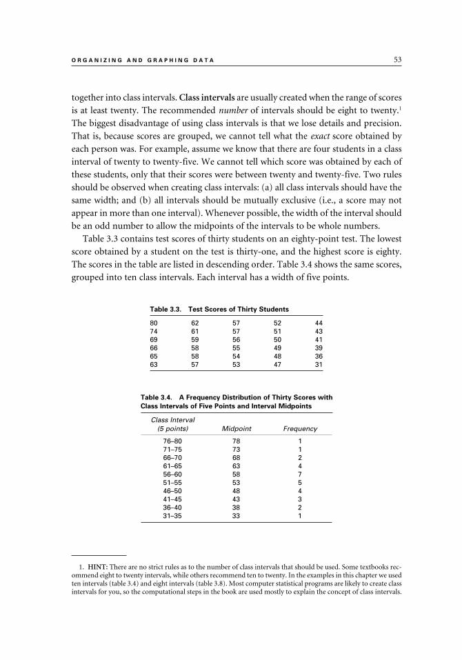
O R G A N I Z I N G A N D G R A P H I N G D A T A 53
together into class intervals. Class intervals are usually created when the range of scores
is at least twenty. The recommended number of intervals should be eight to twenty.1
The biggest disadvantage of using class intervals is that we lose details and precision.
That is, because scores are grouped, we cannot tell what the exact score obtained by
each person was. For example, assume we know that there are four students in a class
interval of twenty to twenty-five. We cannot tell which score was obtained by each of
these students, only that their scores were between twenty and twenty-five. Two rules
should be observed when creating class intervals: (a) all class intervals should have the
same width; and (b) all intervals should be mutually exclusive (i.e., a score may not
appear in more than one interval). Whenever possible, the width of the interval should
be an odd number to allow the midpoints of the intervals to be whole numbers.
Table 3.3 contains test scores of thirty students on an eighty-point test. The lowest
score obtained by a student on the test is thirty-one, and the highest score is eighty.
The scores in the table are listed in descending order. Table 3.4 shows the same scores,
grouped into ten class intervals. Each interval has a width of five points.
1. HINT: There are no strict rules as to the number of class intervals that should be used. Some textbooks rec-ommend eight to twenty intervals, while others recommend ten to twenty. In the examples in this chapter we used ten intervals (table 3.4) and eight intervals (table 3.8). Most computer statistical programs are likely to create class intervals for you, so the computational steps in the book are used mostly to explain the concept of class intervals.
Table 3.3. Test Scores of Thirty Students
80 62 57 52 4474 61 57 51 4369 59 56 50 4166 58 55 49 3965 58 54 48 3663 57 53 47 31
Table 3.4. A Frequency Distribution of Thirty Scores with
Class Intervals of Five Points and Interval Midpoints
Class Interval (5 points) Midpoint Frequency
76–80 78 171–75 73 166–70 68 261–65 63 456–60 58 751–55 53 546–50 48 441–45 43 336–40 38 231–35 33 1
9781442206564_epdf.indb 539781442206564_epdf.indb 53 9/1/10 7:10 AM9/1/10 7:10 AM

54 C H A P T E R 3
Cumulative Frequency Distributions
Another way to organize data is to create a cumulative frequency distribution. A cu-mulative frequency distribution shows the number of scores at or below a given score.
Percentages are often added to these tables. (Computer programs such as SPSS can
easily generate cumulative frequency tables.) Table 3.5 is a cumulative frequency table
showing test scores of twenty students. The table starts with a frequency distribution
in column 1 and column 2 (similar to the frequency distribution in table 3.2). These
two columns are titled Score and Frequency. In the third column, Percent Frequency,
the frequencies that are listed in the second column are converted into percentages.
For example, inspecting the top of column 2, we can see that one student had a score
of twenty. Because there are twenty students in the class, we can say that 5 percent (one
out of twenty) of those students had a score of twenty. Similarly, we can see that 10
percent (two students out of twenty) had a score of seventeen.
In the fourth column, Cumulative Frequency, entries are created from the bottom
up. For example, to calculate the first entry at the bottom of column 4, look at the
lowest numbers in columns 1 and 2 and ask yourself the following: How many stu-
dents had a score of 5 (the lowest score in this distribution) or less? The answer is “1”;
therefore, “1” is recorded at the bottom of column 4.
Next, ask yourself: How many students had a score of 6 or less? (To find the answer
to this question, add up the two lowest numbers in column 2.) The answer is “3,” and
this number is recorded right above “1” at the bottom of the fourth column. Now,
calculate the number of students who had a score of 8 or less. The answer is “5,” the
third lowest number in column 4. Continue constructing column 4 all the way up until
the column has been completed.
Table 3.5. Cumulative Frequency Distributions of Test Scores of Twenty Students1
(Col. 1)
Score
(Col. 2)
Frequency
(Col. 3)Percent
Frequency
(Col. 4)Cumulative Frequency
(Col. 5)Cumulative Percentage
20 1 5 20 10019 1 5 19 9517 2 10 18 9016 4 20 16 8014 4 20 12 6010 3 15 8 40 8 2 10 5 25 6 2 10 3 15 5 1 5 1 5
N = 20
1. A HINT: Note that the number of scores in this distribution is indicated at the bottom of the second column as “N = 20.” In statistics, the symbol N or n is used to represent the number of cases or scores.
9781442206564_epdf.indb 549781442206564_epdf.indb 54 9/1/10 7:10 AM9/1/10 7:10 AM

O R G A N I Z I N G A N D G R A P H I N G D A T A 55
The fifth column is titled Cumulative Percentage. To create this column, the cu-
mulative frequencies in column 4 are converted to percentages. The conversion can
be done by starting either at the top or at the bottom of column 5. To compute each
entry in column 5, convert the corresponding cumulative frequency in column 4 into
percentages. To do so, divide the number in column 4 by twenty, the total number of
students in our example. If you work your way from the top down, the first cumula-
tive frequency you need to convert to percentage is twenty (the top number in column
4). In other words, you have to calculate what percentage of students in the class had
a score of 20 or less. Clearly, all twenty students in the class had a score of 20 or less.
Therefore, enter 100 (i.e., 100 percent) at the top of the fifth column. Next, convert 19
(the second number in column 4) into percentages. Nineteen out of twenty (the total
number of students in the class) is 95 percent, which appears as the second number
in column 5. Continue to work all the way down to the bottom of column 5 until it
is complete.
Following the same steps as those used to create the entries in table 3.5, classroom
teachers can use scores from tests they give their students to compute the students’ cu-
mulative percentiles. These cumulative percentiles are also called percentile ranks, and
they are used to compare performance of students in the class to their classmates. (See
chapter 6 for a more comprehensive discussion of percentile ranks.) Using the data in
table 3.5 as an example, we can say that a student with a score of 19 had a percentile
rank of 95. This percentile rank means that the student did better than, or as well as, 95
percent of the other students in the class who took the examination at the same time
as that student. Similarly, a student with a score of 14 had a percentile rank of 60 and
did better than, or as well as, 60 percent of the students in the class.
GRAPHING DATA
Graphs are used to communicate information by transforming numerical data into a
visual form. Graphs allow us to see relationships not easily apparent by looking at the
numerical data. There are various forms of graphs, each one appropriate for a differ-
ent type of data. While many computer software programs provide a dazzling array of
graphic choices, it is the responsibility of those creating the graphs to select the right
graph for their data. The rest of this chapter discusses various graphs and how they
can be used.
Histogram and Frequency Polygon
Frequency distributions, such as the one in table 3.6, can be depicted using two
types of graphs, a histogram (figure 3.1, Part a) or a frequency polygon (figure 3.1,
Part b).
9781442206564_epdf.indb 559781442206564_epdf.indb 55 9/1/10 7:10 AM9/1/10 7:10 AM
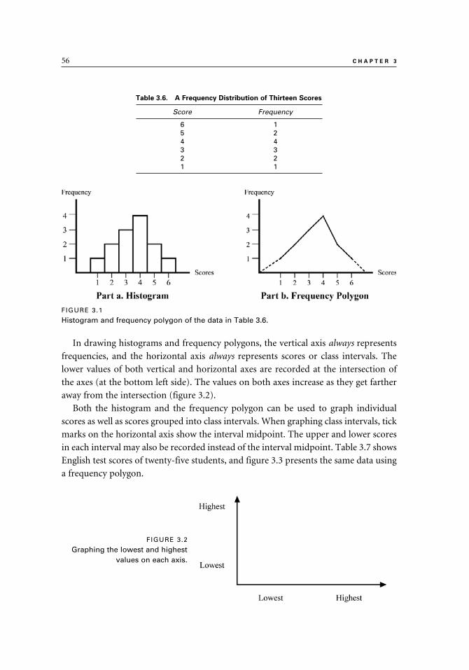
56 C H A P T E R 3
In drawing histograms and frequency polygons, the vertical axis always represents
frequencies, and the horizontal axis always represents scores or class intervals. The
lower values of both vertical and horizontal axes are recorded at the intersection of
the axes (at the bottom left side). The values on both axes increase as they get farther
away from the intersection (figure 3.2).
Both the histogram and the frequency polygon can be used to graph individual
scores as well as scores grouped into class intervals. When graphing class intervals, tick
marks on the horizontal axis show the interval midpoint. The upper and lower scores
in each interval may also be recorded instead of the interval midpoint. Table 3.7 shows
English test scores of twenty-five students, and figure 3.3 presents the same data using
a frequency polygon.
Table 3.6. A Frequency Distribution of Thirteen Scores
Score Frequency
6 15 24 43 32 21 1
FIGURE 3.1
Histogram and frequency polygon of the data in Table 3.6.
FIGURE 3.2
Graphing the lowest and highest values on each axis.
9781442206564_epdf.indb 569781442206564_epdf.indb 56 9/1/10 7:10 AM9/1/10 7:10 AM

O R G A N I Z I N G A N D G R A P H I N G D A T A 57
As the number of scores in the distribution increases, it is more likely to have
smoother curve lines, compared with a distribution with fewer scores. Distributions
with a small number of cases are likely to have curve lines that are more jagged and
uneven. The bell-shaped normal distribution that all of us are familiar with is actually
a special case of a frequency polygon with a large number of cases. (See chapter 6 for
a discussion of the normal curve and bell-shaped distributions.)
Comparing Histograms and Frequency Polygons
To some extent, the decision about whether to use a histogram or a frequency
polygon is a question of personal choice. One advantage of the polygon over the
histogram is that the polygon can be used to compare two groups by displaying both
groups on the same graph. For example, figure 3.4 shows test scores of a group of boys
and a group of girls on a biology test. As can be easily seen, the ranges of both groups
were about the same. However, the girls overall performed better than the boys and
obtained higher scores.
Table 3.7. A Frequency Distribution of Twenty-five Scores
with Class Intervals and Midpoints
Class Interval Midpoint Frequency
38–42 40 133–37 35 328–32 30 423–27 25 618–22 20 513–17 15 3 8–12 10 2 3–7 5 1
FIGURE 3.3
A frequency distribution with interval midpoints representing class intervals of the data in Table 3.7.
9781442206564_epdf.indb 579781442206564_epdf.indb 57 9/1/10 7:10 AM9/1/10 7:10 AM

58 C H A P T E R 3
Several textbooks list another difference between a histogram and a frequency poly-
gon. These books suggest using histograms for data that naturally occur in discrete units.
For example, people’s IQ scores may be reported to be 101, 102, or 103, but not 101.5
or 102.5.2 By comparison, frequency polygons are recommended for depicting distribu-
tions of scores that can take on in-between values, such as height and weight. For ex-
ample, let’s say we want to use a frequency polygon to graph the heights of the students
in our class, rounded off to the nearest inch. Using one-inch increments to mark the
horizontal axis, the frequency polygon would show only data points such as 5'1", 5'2",
or 5'3" even though in reality we may have students whose height is somewhere between
5'1" and 5'2", or between 5'2" and 5'3". It is important to remember that although the
scores on the variable being graphed are measured on a continuum, the frequency poly-
gon itself may show only discrete units. In our example, we use a frequency polygon with
one-inch increments, rather than record the exact height of each student using more
exact in-between values such as one-fourth or one-half of an inch.
Pie Graph
The pie graph (or pie chart) looks like a circle that is divided into “wedges,” or “seg-
ments.” Each wedge represents a category or subgroup within that distribution. The
size of each wedge indicates the percent of cases represented by that wedge. By inspect-
ing the pie graph, we can readily see the proportion of each wedge to the total pie as
well as the relationships among the different wedges. The percentages represented by
the different-sized wedge should add up to 100 percent.
When drawing a pie graph, the different wedges of the pie should be identified, and
numerical information, such as percentages, should be included. This would allow
2. HINT: Although IQ scores for individuals are reported only as whole numbers, group mean scores may have decimal places, such as 103.4 or 104.8.
FIGURE 3.4
A frequency polygon comparing scores of boys and girls.
9781442206564_epdf.indb 589781442206564_epdf.indb 58 9/1/10 7:10 AM9/1/10 7:10 AM

O R G A N I Z I N G A N D G R A P H I N G D A T A 59
easy and accurate interpretation of the graph. There should not be too many wedges
in the pie circle. The previous edition (fifth) of the Publication Manual of the American
Psychological Association (p. 179) recommended that the pie graph be used to compare
no more than five items and that the wedges be ordered from the largest to the small-
est, starting at 12 o’clock.3 However, it is not uncommon to see reports that include
pie graphs with more than five wedges.
To illustrate how to draw and interpret pie graphs, study the data in table 3.8 and
the graph in figure 3.5. The table and pie graph show the proportions of four feeder
elementary schools in the total population of a junior high school. Note that the total
percentages of the four schools add up to 100 percent.
3. HINT: The complete reference for the previous edition of the APA publication manual is: American Psy-chological Association. (2001). Publication manual of the American Psychological Association (5th ed.). Washing-ton, DC: Author.
Table 3.8. Proportions of Four Feeder Elementary Schools
in a District Junior High School
SchoolPercent inJr. High
Grand Oak 20Jefferson Elementary 35Ocean View 35Sunset HillTOTAL
10100
FIGURE 3.5
A pie graph showing the percentages of students from four different schools.
9781442206564_epdf.indb 599781442206564_epdf.indb 59 9/1/10 7:10 AM9/1/10 7:10 AM

60 C H A P T E R 3
Pie graphs lend themselves well to making comparisons by placing two pie graphs
next to each other. For example, we can create two side-by-side pies to show changes
in demographic characteristics (e.g., racial or ethnic groups) in a city. One pie graph
can depict the demographic data from one year, and the other graph can show the
same demographic data from another year. This would allow those studying the two
graphs to easily see changes from one year to the next. Or the two pies can represent
demographic data from two different cities to allow a comparison of the two. Another
popular way to use two pies side by side is to use one of the pies to depict income and
the other pie to depict expenses. To demonstrate that the budget is balanced, the total
dollar amount in the pie showing expenses should not exceed the dollar amount in
the pie showing the income. By looking at the two pies, it is easy to see what the main
sources of income are and what the main lines of expenses are.
Bar Graph
A bar graph (also called a bar diagram) is a graph with a series of bars next to each
other. The bars often represent discrete categories, and they are ordered in some way,
usually from the highest to the lowest or from the lowest to the highest. The bars are
placed next to one another, but they should not touch each other.
To illustrate the use of a bar graph, let’s say we want to compare the level of sup-
port for school uniforms for students among four groups: administrators, parents,
students, and teachers. Five hundred respondents from each group indicated whether
they support school uniforms, and the results are recorded in table 3.9. The actual
number of respondents in each group who support school uniforms was converted
into percentages and recorded in the table. Inspecting the data in table 3.9 makes it
clear that there are differences among the administrators, parents, students, and teach-
ers regarding their support of school uniforms.
Note that the four groups in table 3.9 comprise categories that are independent
of each other. In other words, the responses of people in one group do not affect or
change the responses of people in another. Note also that the percentages recorded
in the column on the right side do not add up to 100 percent because each row rep-
resents an independent category (a group of respondents). This is different from pie
Table 3.9. Comparing the Responses of Administrators,
Parents, Students, and Teachers to the Question, “Do You
Support School Uniforms?”
Group% Supporting
School Uniforms
Administrators 85Parents 68Students 30Teachers 77
9781442206564_epdf.indb 609781442206564_epdf.indb 60 9/1/10 7:10 AM9/1/10 7:10 AM

O R G A N I Z I N G A N D G R A P H I N G D A T A 61
graphs, where the percentages add up to 100 percent. Before drawing the bar graph in
figure 3.6, we need to decide how to order the bars. Although the groups are listed in
alphabetical order in the “Group” column, we need to reorder the groups so that the
bar graph we draw has bars that are ordered by height. Therefore, we can start with
the bar representing the administrators, the group with the highest percentage (85
percent). This bar is followed by the bars representing the other three groups: teachers
(77 percent), parents (68 percent), and students (30 percent).
The bars may also be drawn horizontally to allow for easier identification and label-
ing of each bar. Figure 3.7 shows the same data as in figure 3.6.
Bar graphs may look a bit like histograms because both of them have a series of bars
next to each other. However, they are used for different purposes. The histogram, as
you remember, is used to display frequency distributions. In a histogram, the hori-
zontal bar shows scores or class intervals and the vertical axis shows frequencies. The
scores (or intervals) in a histogram comprise an interval or a ratio scale, and they are
on a continuum in numerical order. By comparison, the bars in a bar graph represent
nominal, categorical data (e.g., several groups of respondents), and do not imply a
continuum. To indicate that each bar is independent of the other bars and represent
discrete data, these bars should not touch.
Occasionally, we may want to compare data from two or more groups within each
category, in addition to comparing the data across categories. To facilitate such com-
parison, we can use multiple joint bars within each category.
FIGURE 3.6
A bar graph showing the data in Table 3.9.
9781442206564_epdf.indb 619781442206564_epdf.indb 61 9/1/10 7:10 AM9/1/10 7:10 AM

62 C H A P T E R 3
Let’s say we want to compare the ratio of female and male students who are enrolled
in different college major programs: Business, Education, Engineering, and Social
Sciences. Table 3.10 displays gender data across the four majors. After inspecting
the table, we can see that there are differences in the proportions of female and male
students enrolled in each of the four college majors. An overwhelming majority of stu-
dents in education are female (80 percent), and the majority of students in engineering
are male (83 percent), while the majority of students in Social Sciences are female (64
percent). The number of female and male students in Business is practically even.
The joint bars in figure 3.8 represent the data in table 3.10. The differences between
the lengths of the joint bars in each of the four majors visually express the differences
in gender enrollment in these majors.
When drawing a bar graph with joint bars, it may be difficult at times to decide how
to order the bars. In figure 3.8, the joint bars are ordered by female student enrollment.
Therefore, the first set of joint bars shows the gender enrollment figures representing
FIGURE 3.7
A horizontal bar graph showing the same data as in Figure 3.6.
Table 3.10. Enrollment Breakdown by Gender in Four Undergraduate
College Majors (in Percents)
Major Females Males TOTAL
Business 49 51 100Education 80 20 100Engineering 17 83 100Social Sciences 64 36 100
9781442206564_epdf.indb 629781442206564_epdf.indb 62 9/1/10 7:10 AM9/1/10 7:10 AM

O R G A N I Z I N G A N D G R A P H I N G D A T A 63
Education, and the last set of joint bars shows the enrollment figures representing En-
gineering. If we had decided to order the bars by male student enrollment figures, then
the joint bars representing Engineering should be first and the joint bars representing
Education enrollment should be last.
Line Graph
A line graph is used to show relationships between two variables, which are depicted
on the two axes. The horizontal axis indicates values that are on a continuum (e.g.,
calendar years or months). The vertical axis can be used for various types of data (e.g.,
test scores, temperatures, and amount of income). A line connects the data points on
the graphs. Table 3.11 shows mean test scores of second-grade students in one school
over the last four years, and figure 3.9 shows the same information graphically.
A big advantage of the line graph is that more than one group can be shown on the
same graph simultaneously. If you cannot use colors, each group can be presented by
FIGURE 3.8
A bar graph with joint bars comparing enrollment figures of male and female students in four different college majors.
Table 3.11. Mean Test Scores of Second Graders, 2007–2010
Year Mean Test Score
2007 562008 742009 662010 81
9781442206564_epdf.indb 639781442206564_epdf.indb 63 9/1/10 7:10 AM9/1/10 7:10 AM

64 C H A P T E R 3
a different kind of line (e.g., broken or solid). Figure 3.10 shows mean test scores of
two groups of students over a four-year period.
Notice that the line graph is different from a frequency polygon. Although the two
graphs may look somewhat similar at times, the line graph is used for a different pur-
pose and does not display frequencies on the vertical axis.
Box Plot
The box plot (which is also called box-and-whiskers), consists of a box and two
whiskers and is used to depict the spread and skewness of frequency distributions.
This graph was developed by John Tukey in 1977. The box represents the middle 50
percent of the distribution, and the whiskers represent the top and bottom 25 percent.
A horizontal line inside the box represents the median of the distribution.4 The lengths
of the whiskers indicate the spread.
To create the box plot, the scores are first ordered and divided into four quartiles,
identified as Q1, Q
2, Q
3, and Q
4. The two middle quartiles (Q
2 and Q
3) are located
within the box, whereas the two extreme quartiles (Q1 and Q
4) are displayed using
vertical lines (the whiskers) outside the box.
4. HINT: See chapter 4 for a discussion of the median.
FIGURE 3.9
A line graph showing the data in Table 3.11.
FIGURE 3.10
A line graph showing mean test scores of two groups
over a four-year period.
9781442206564_epdf.indb 649781442206564_epdf.indb 64 9/1/10 7:10 AM9/1/10 7:10 AM

O R G A N I Z I N G A N D G R A P H I N G D A T A 65
To illustrate how to use, construct, and interpret a box plot, let’s look at the follow-
ing example. An eighth-grade mathematics teacher wants to examine different ways
to practice estimation with her class of twenty students. Each student is asked to esti-
mate, to the nearest inch, the length of a thirty-inch stick. The students’ estimates are
recorded in table 3.12 in the “Prepractice” column. Next, the teacher practices with the
students a new way of estimating length and each student is asked to estimate again the
length of the stick. These estimates are recorded as “Postpractice” in the table.
To display the changes in the students’ prepractice and postpractice estimation
scores, the teacher creates a box plot graph (see figure 3.11). Notice that the median
scores of the prepractice and postpractice are similar (31.60 and 30.50, respectively).
However, the range of the scores on the prepractice estimation is much higher than
the range on the postpractice estimation. The scores on the prepractice range from 13
to 49 compared with a range of 24 to 36 on the postpractice. Note that the whiskers
of the prepractice scores are much longer, indicating a greater range of scores in the
top and bottom quartiles, compared with the postpractice whiskers, which are quite
short. Further, the two middle quartiles (Q2 and Q
3), which include the middle 50
percent of the scores (the “boxes”), are narrower on the postpractice compared with
the prepractice.
Based on the data in table 3.12 and the box plot in figure 3.11, the mathematics
teacher observes the following: (a) the most extreme prepractice scores were eliminated,
(b) the range of scores decreased from prepractice to postpractice, and (c) the whiskers
Table 3.12. Prepractice and Postpractice Scores for Twenty Eighth-grade Students
Student Number Prepractice Postpractice
1 13 24 2 18 25 3 22 25 4 24 26 5 27 27 6 28 28 7 28 28 8 29 29 9 29 2910 30 3011 32 3112 32 3113 33 3214 35 3215 38 3216 39 3317 39 3418 42 3419 45 3520 49 36
9781442206564_epdf.indb 659781442206564_epdf.indb 65 9/1/10 7:10 AM9/1/10 7:10 AM

66 C H A P T E R 3
FIGURE 3.11
A box plot of the prepractice and postpractice scores showing the data in Table 3.12.
became shorter on the postpractice. The teacher concludes that the class exercises im-
proved the students’ ability to estimate the length of the stick.
DRAWING ACCURATE GRAPHS
This chapter describes some of the most popular and commonly used graphs, as well
as some of the rules and guidelines for drawing such graphs. Because most of us de-
pend on statistical software packages to generate graphs for us, we should carefully
check the different options available on the software packages we use. Graphs should
offer an accurate visual image of the data they represent and be easy to read and in-
terpret. Each graph should be clearly labeled, and different parts of the graph should
be identified. Graphs that are too “dense” or include too much information can be
confusing and hard to follow. This is especially true for graphs in printed materials
where colors are not available (e.g., hard copies of journals). For example, pie graphs
with too many wedges or line graphs that depict too many groups may become too
“dense” and difficult to read.
To illustrate this point, look at the line graph in figure 3.12. This graph shows mean
test scores of six groups of students over four years. Inspecting the graph, we can see
that having so many lines in one graph makes it difficult to compare the groups or
observe trends over time.
The scale one chooses for drawing graphs can affect the message conveyed by the
graph. For example, let’s look at figure 3.13 and study the two graphs in Part a and
9781442206564_epdf.indb 669781442206564_epdf.indb 66 9/1/10 7:10 AM9/1/10 7:10 AM

O R G A N I Z I N G A N D G R A P H I N G D A T A 67
Part b. This figure shows the graduation rates (in percentages) of students in four
high school districts. Note that while the two graphs look similar, the vertical axis
in Part a starts with a score of 0 (zero) while the vertical axis in Part b starts with
a score of 50. Consequently, the differences among the four bars that represent the
districts in Part b look much more pronounced than in Part a. While the scale of the
FIGURE 3.12
Line graph showing too many horizontal lines (six lines) that create a confusing graph.
FIGURE 3.13
Graduation rates in four high school districts: A comparison of two graphs showing the same data.
Part a Part b
9781442206564_epdf.indb 679781442206564_epdf.indb 67 9/1/10 7:10 AM9/1/10 7:10 AM
68 C H A P T E R 3
bars in Part b shows more details, it also magnifies the differences and presents an
exaggerated picture of them.
SUMMARY
1. The first step in organizing data is to order the scores in some manner. For example, the scores can be ordered from the highest to the lowest score or from the lowest to the highest score.
2. When scores in a distribution repeat more than once, researchers may choose to tally the scores in order to eliminate the need to list duplicate scores.
3. A frequency distribution is a list of scores that have been ordered and tallied. 4. When a distribution has a wide range of scores (a range of twenty or more in
most cases), it is recommended that every few scores in that distribution be grouped into class intervals. However, when class intervals are used, detail and precision are lost and there is no way to know what the exact scores in each interval are.
5. When using class intervals, all intervals should have the same width and no score should appear in more than one interval.
6. Data may be organized using a cumulative frequency distribution, which shows the number and percentage of scores at or below a given score.
7. Graphs convey numerical information in a visual form. It is important to choose the proper graph for each type of data.
8. Histograms and frequency polygons are used to visually display frequency distributions.
9. When drawing either a histogram or frequency polygon, the following guide-lines should be used: (a) the vertical axis represents frequencies and the horizontal axis represents scores or class intervals, and (b) the lower values of both axes are at the point of their intersection. (Other guidelines for draw-ing histograms and frequency polygons are also discussed in the chapter.)
10. When drawing histograms or frequency polygons to show grouped data, midpoints or exact scores are used to mark each class interval.
11. The pie graph (or pie chart) looks like a circle that is divided into “wedges,” or “segments.” Pie graphs allow us to see relationships among the different wedges that comprise the total distribution. The size of each wedge indicates the proportion of cases in that wedge.
12. The bar graph (or bar diagram) is used to represent nominal, categorical data. It has a series of bars that do not touch each other and that are usually ordered by height.
13. Joint bars may be used in bar graphs to compare data from two or more groups within each category.
14. The line graph is used to show trends and changes in values over time. The horizontal axis displays scores measured on a continuum (e.g., years or months). The vertical axis can be used for various types of data (e.g., test scores, temperatures, and income). A line connects the data points on the graphs.
9781442206564_epdf.indb 689781442206564_epdf.indb 68 9/1/10 7:10 AM9/1/10 7:10 AM

O R G A N I Z I N G A N D G R A P H I N G D A T A 69
15. A line graph can be used to compare multiple groups. Each group on the graph is represented by its own line.
16. The box plot (also called box-and-whiskers) consists of a box and two whiskers and is used to depict the spread and skewness of frequency distri-butions. The box represents the middle 50 percent of the distribution, and the whiskers represent the top and bottom 25 percent of the distribution. A horizontal line inside the box represents the median of the distribution. The lengths of the whiskers show the spread of the distribution.
17. To create the box plot, the scores are first ordered and divided into four quartiles, identified as Q1, Q2, Q3, and Q4. The two middle quartiles (Q2 and Q3) are located within the box, whereas the two extreme quartiles (Q1 and Q4) are displayed using vertical lines (the whiskers) outside the box.
18. Graphs should be clearly labeled and easy to read and interpret. It is impor-tant to choose the right scale for the graphs in order to provide an accurate visual representation of the data. Other guidelines for drawing graphs are also described in this chapter.
9781442206564_epdf.indb 699781442206564_epdf.indb 69 9/1/10 7:10 AM9/1/10 7:10 AM

4
Measures of Central Tendency
Chapter 4 discusses three measures of central tendency: mode, median, and mean. A measure of central tendency is a summary score that is used to represent a distribution of scores. Depending on the type of data you have collected, one or more of these measures will be appropriate. In this chapter, you will find definitions, explanations, and examples of each measure. Additionally, advantages and disadvantages of each measure are clearly presented and highlighted. The detailed guidelines that are included in this chapter about which measure to use in any given situation will help you choose the right measure.
9781442206564_epdf.indb 719781442206564_epdf.indb 71 9/1/10 7:10 AM9/1/10 7:10 AM

72 C H A P T E R 4
A measure of central tendency is a summary score that represents a set of scores. It is
a single score that is typical of a distribution of scores. There are three commonly used
measures of central tendency: mode, median, and mean. The decision as to which of
these three measures should be used in a given situation depends on which measure is
the most appropriate and the most representative of the distribution.
In this chapter, we introduce mode, median, and mean and demonstrate how to
compute them. However, you can easily obtain these statistics, along with other de-
scriptive statistics, by using readily available computer programs.
MODE
The mode of a distribution is the score that occurs with the greatest frequency in that
distribution. For example, examine the frequency column in table 4.1, which shows
the scores of fifteen students. We can see that the score of 8 is repeated the most (four
times); therefore, the mode of the distribution is 8.
In a frequency polygon, the mode is the peak of the graph (figure 4.1, Part a). In a
bimodal distribution, there are two peaks, both the same or similar height (figure 4.1,
Part b).
A score should repeat at least twice in order to be considered a mode. If two scores
have the same frequency, the distribution is called bimodal, and if no score is repeated
the distribution looks flat and is classified as amodal (has no mode). Table 4.2 shows
Table 4.1. Test Scores of Fifteen Students
Score Frequency
12 111 110 2 9 3
Mode→ 8 4 7 2 6 1 5 1
FIGURE 4.1
Frequency polygons with one mode (Part a) and two modes (Part b).
9781442206564_epdf.indb 729781442206564_epdf.indb 72 9/1/10 7:10 AM9/1/10 7:10 AM

M E A S U R E S O F C E N T R A L T E N D E N C Y 73
an example of a bimodal distribution. The two modes are the scores of 5 and 4. If three
or more scores repeat the same number of times, the distribution is referred to as a
multimodal distribution.
MEDIAN
The median is the middle point of a distribution of scores that are ordered. Fifty per-
cent of the scores are above the median, and 50 percent are below it. For example, in
the distribution of scores in table 4.3, the score of 6 is the median because there are
three scores above it and three below it.
The median is a point, and it does not have to be an actual score in that distribution.
For example, suppose a special education teacher administers a daily quiz to the four
students in her class. The scores of the students are: 10, 8, 7, and 6. The median of the
distribution is 7.5, even though the teacher assigns only full points on the test.
When the exact median is hard to calculate, it can be estimated. For example, the
median of the seven scores in table 4.4 is estimated to be 8, even though the number
Table 4.2. A Bimodal Distribution with Two Modes (4 and 5)
Score Frequency
Mode→6 55 7
Mode→ 4 73 42 2
Table 4.3. Test Scores of Seven Students
Score
10 8 7
Median→ 6 4 2 1
Table 4.4. Test Scores with a Median of 7
Score
1311 9
Median→ 8 8 7 6
9781442206564_epdf.indb 739781442206564_epdf.indb 73 9/1/10 7:10 AM9/1/10 7:10 AM

74 C H A P T E R 4
of scores above is not exactly the same as the number of scores below it. As we can see,
there are three scores above the median of 8 and two scores below it.1
MEAN
The mean, which is also called the arithmetic mean, is obtained by adding up the scores
and dividing that sum by the number of scores. The mean is sometimes called “the av-
erage,” although the word average may also be used in everyday life to mean “typical”
or “normal.” The mean, which is used in both descriptive and inferential statistics, is
used more often than the mode or the median.
The statistical symbol for the mean of a sample is X–
(pronounced “ex bar”), and
the symbol for the population mean is µ, the Greek letter mu (pronounced “moo”
or “mew”). The statistical symbol for “sum of” is Σ (the capital Greek letter sigma).
A raw score is represented in statistics by the letter X. A raw score is a score as it was
obtained on a test or any other measure, without converting it to any other scale. ΣX
means “the sum of all the X scores.” Thus, the mean may be computed as ΣX divided
by the number of scores:
The mean serves as the best measure when we have to estimate an unknown value
of any score in a distribution (for both samples and populations). That is, if the exact
value of a particular score is unknown, the mean may be used to estimate that score.
In research, the mean of a sample (X̄ ) is often used to estimate the population mean
(µ). In many studies, researchers are interested in finding the mean of the population;
however, it may not be practical or possible to study the whole population in order to
find its mean. Therefore, they select a sample, measure it to obtain its mean, and use
that mean to estimate the population mean.
While the mean is often the best measure of central tendency, there are instances
where the mean is not an accurate representative score. To illustrate this point, let’s
look at figure 4.2. Part a shows a symmetrical bell-shaped distribution, where the ma-
jority of the scores cluster around the mean. In that distribution, the mean of 40 serves
as an appropriate representative score.
Part b in figure 4.2 depicts a negatively skewed distribution, and Part c depicts
a positively skewed distribution. As we can see, in these skewed distributions, the
mean is pulled toward the “tail” and it does not represent a point around which
1. HINT: Computer programs can provide the exact median of each distribution. There are also ways to compute the exact median by hand.
9781442206564_epdf.indb 749781442206564_epdf.indb 74 9/1/10 7:10 AM9/1/10 7:10 AM

M E A S U R E S O F C E N T R A L T E N D E N C Y 75
scores tend to cluster.2 Note that in a positively skewed distribution the scores tend
to cluster below the mean, and in a negatively skewed distribution the scores tend to
cluster above the mean.
COMPARING THE MODE, MEDIAN, AND MEAN
The mean is affected by every score in the distribution because to calculate the mean
all the scores are first added before dividing that sum of scores (ΣX) by the number
of scores. Changing even one score in the distribution may result in a change in the
mean. By contrast, the mode and the median may, or may not, be changed as a result
of a change in one score. This characteristic of the mean can be both an advantage and
a disadvantage. It is an advantage because the mean is a measure that reflects every
score in the distribution. It is a disadvantage when there are extreme scores in a skewed
distribution. Let’s look, for example, at these six scores: 10, 12, 13, 13, 15, and 16. The
mode is 13, the median is 13, and the mean is 13.17. All three measures are similar to
each other, and all can represent the distribution. Now, let’s change the last score from
16 to another score, such as 40. This change has no impact on the mode or the median,
but the mean changes drastically from 13.17 to 17.17. The extreme score of 40 in the
second distribution “pulled” the mean upward. Consequently, the mean of 17.17 does
not represent any of the six scores in the second distribution. It is too high for the first
five (10, 12, 13, 13, and 15) and is much too low for the last score of 40.
Not all three measures of central tendency can be used with all types of data. The
mode is the only measure of central tendency that can be used with nominal scale
data. As you recall, in nominal scales the observations are not ordered in any way (see
chapter 2). Because the mode is an index of frequency, it can be used with observations
that are not ordered. Mode can also be used with data measured on ordinal, interval,
and ratio scales.
2. HINT: Negatively skewed distributions may also be referred to as “skewed to the left,” whereas positively skewed distributions may be called “skewed to the right.” In both cases, the tail of the distribution determines how it is labeled.
FIGURE 4.2
Symmetrical distribution (Part a), negatively skewed distribution (Part b), and positively skewed distribution (Part c).
Part a Part b Part c
9781442206564_epdf.indb 759781442206564_epdf.indb 75 9/1/10 7:10 AM9/1/10 7:10 AM

76 C H A P T E R 4
To find the median (the middle point), we need to be able to order the scores. A
nominal scale has no order; therefore, the median cannot be used with nominal scale
data. The median can be used with ordinal, interval, and ratio scales where scores can
be ordered. The mean can be computed only for interval and ratio scale data because
to calculate the mean, we need to add the scores and divide the sum by the number
of scores.
The mode and the median are most often used for descriptive statistics, whereas the
mean is used for descriptive statistics and inferential statistics. For example, the mean
is used to compute the variance, standard deviation, and z scores (see chapters 5 and
6). It can also be used to compute other statistical tests such as the t test (see chapter
10). The median is used in everyday life for reporting incomes and housing prices.
When distributions of scores that are measured on an interval or ratio scale include
extreme scores, the median is usually chosen as a measure of central tendency. For ex-
ample, assume we have a few expensive homes in an area where most of the homes are
moderately priced. The mean housing price may cause potential buyers, who rely on
this information, to think that all the houses in that area are too expensive for them.
Therefore, when the mean is inflated, it does not serve as a true representative score,
and the median should be used.
SUMMARY
1. A measure of central tendency is a summary score that represents a set of scores. There are three commonly used measures of central tendency: mode, median, and mean.
2. The mode of a distribution is the score that occurs most frequently in that distribution.
3. A distribution of scores may have one mode, two modes (bimodal), three or more modes (multimodal), or no mode (amodal).
4. The median is the middle point of a distribution of scores that are ordered. Fifty percent of the scores are above the median, and 50 percent are below it.
5. The mean, which is also called the arithmetic mean, is calculated by dividing ΣX (the total sum of the scores) by the number of scores (N or n). The symbol for the population mean is µ (the Greek letter mu) and the symbol for the sample mean is X̄ (“ex bar”).
6. The mean serves as the best measure when we have to estimate an unknown value of any score in a distribution (for both samples and populations).
7. In research, the mean of a sample (X̄) is often used to estimate the population mean (µ).
8. The mean is affected by every score in the distribution, because to calculate the mean, all the scores are first added before dividing that sum of scores (ΣX) by the number of scores. Changing even one score in the distribution may
9781442206564_epdf.indb 769781442206564_epdf.indb 76 9/1/10 7:10 AM9/1/10 7:10 AM

M E A S U R E S O F C E N T R A L T E N D E N C Y 77
result in a change in the mean. By contrast, the mode and the median may, or may not, be changed as a result of a change in one or a few scores.
9. The mode can be used with nominal, ordinal, interval, and ratio scales. The median can be used with ordinal, interval, and ratio scales. The mean can be used with interval and ratio scales.
10. The mean is not an appropriate measure of central tendency when interval or ratio scale distributions have extreme scores because it may yield a skewed measure. In such cases, the median, which is not affected by extreme scores, should be used.
11. The mode and the median are most often used for descriptive statistics, whereas the mean is used for descriptive statistics and inferential statistics. The mean can also be used to compute other statistical tests, such as the t test.
9781442206564_epdf.indb 779781442206564_epdf.indb 77 9/1/10 7:10 AM9/1/10 7:10 AM
5
Measures of Variability
In addition to using a summary score to represent a distribution of scores, it is important to describe the variability, or spread, of scores in that distribution. Chapter 5 describes three measures of spread: range, variance, and standard deviation. Range is a fairly common measure that you are probably familiar with already. The variance is not an important measure on its own, but it is related to standard deviation and is used in the computations of a few other statistical tests. Standard deviation, by comparison, is an important concept to understand because it is used ex-tensively in statistics and assessment. In essence, it describes the average deviation around the mean.
Although the computational steps of each measure are demonstrated in this chapter, you are likely to use computer programs to do the computa-tions for you; therefore, make sure you understand the essence of each measure and do not worry about how to calculate them.
9781442206564_epdf.indb 799781442206564_epdf.indb 79 9/1/10 7:10 AM9/1/10 7:10 AM

80 C H A P T E R 5
We have described a measure of central tendency (a mode, a median, or a mean) as
a representative score; that is, a single number that represents a set of scores. These
measures indicate the center of the distribution. The graphs in figure 5.1 illustrate that,
in addition to central tendency measures, it is often necessary to obtain an index of the
variability or spread of the group.
Note that the two groups in Part a (Groups A and B) share the same mean, but
Group A has a larger spread (i.e., Group A is more heterogeneous than Group B).
Group B seems to be more homogeneous, and this group’s scores tend to cluster closer
to the mean. Next, examine Part b of figure 5.1. Notice that Group C and Group D
have the same spread, or variability, but Group D has a higher mean than Group C.1
Suppose Part a in figure 5.1 represents test scores of two third-grade classes. If you
were asked to choose which class you would like to teach and knew only that both
classes have the same mean test scores, you may be tempted to flip a coin to choose the
class you want to teach. If, on the other hand, a graphic representation was available
to you, as depicted in Part a, you would probably choose the third-grade class repre-
sented by B, which is more homogeneous and, therefore, easier to teach.
Looking at Part b, assume the same question was asked and you were given only the
means for both Group C and Group D. You would probably choose the third-grade
class depicted by D, which has a higher mean. In fact, even though the mean of Group
D is higher than the mean of Group C, teaching either group would involve about the
same amount of work for the teacher.
The examples in figure 5.1 were provided to demonstrate to you that the mean
alone does not provide a complete and accurate description of a group. In addition
to the mean, another index is needed in order to indicate the variability of the group.
1. HINT: How can you tell which mean is higher if there are no numbers along the horizontal axis? Remem-ber the rule about drawing a frequency polygon (discussed in chapter 3): the numbers increase as you move to the right on the horizontal axis. Since the mean of Group D is farther to the right, it is higher than the mean of Group C.
FIGURE 5.1
A graph showing two groups with the same means but different spreads (Part a); and a graph showing two groups with different means but the same spreads (Part b).
9781442206564_epdf.indb 809781442206564_epdf.indb 80 9/1/10 7:10 AM9/1/10 7:10 AM

M E A S U R E S O F V A R I A B I L I T Y 81
In this chapter, we discuss three measures of variability: range, standard deviation,
and variance.
THE RANGE
The range indicates the distance between the highest and the lowest score in the dis-
tribution. The range is a simple and easy-to-compute measure of variability. To find
the range, simply subtract the lowest score from the highest score in the distribution.
The range has a limited usefulness as a measure of variability, and it does not give
us much information about the variability within the distribution. The range is used
much less frequently compared with the other two measures of variability discussed in
this chapter (the variance and standard deviation).
To illustrate why range does not tell us much about the variability within a dis-
tribution of scores, compare these two sets of numbers: 10, 10, 10, 9, 1; and 10, 2,
1, 1, 1. Both have the same range (10 – 1 = 9), yet they represent a very different set
of scores.
STANDARD DEVIATION AND VARIANCE
The distance between each score in a distribution and the mean of that distribution
(X-X–
) is called the deviation score.2 Looking at figure 5.2, we can expect higher devia-
tion scores in Part a, where the scores are widely spread, than in Part b, where most of
the scores cluster around the mean. We would expect that in distributions with a high
spread of scores, the mean (average) of the deviation scores would be higher than in
distributions where most scores are closer to the mean.
2. HINT: Some textbooks use the symbol x (lowercase “ex”) to represent the deviation score. Other texts, including this textbook, use X – X
– to represent the deviation score.
FIGURE 5.2
Two graphs showing distributions with the same means but different spreads.
9781442206564_epdf.indb 819781442206564_epdf.indb 81 9/1/10 7:10 AM9/1/10 7:10 AM

82 C H A P T E R 5
The mean of the deviation scores is called the standard deviation, abbreviated often
as SD. The SD describes the mean distance of the scores around the distribution mean.
Squaring the SD gives us another index of variability, called the variance. As you will
next see, the variance is needed in order to calculate the SD.
Let’s look at the computational steps needed to calculate the deviation scores, vari-
ance, and SD. In order to simplify the computations, we will use as an example a small
distribution of five numbers. The numbers are: 6, 5, 4, 3, and 2 (see table 5.1). To
compute the deviation scores, we need to first compute the mean of the five scores.
We do so by adding up the raw scores (ΣX) and dividing them by the number of scores
(n = 5). The mean is 4.
As you can see in table 5.1, the sum of the deviation scores is 0 (zero). Therefore,
we cannot divide that sum by 5 (the number of scores) to find the mean of the devia-
tion scores, as we were planning to do. As a matter of fact, with any combination of
numbers, the mean of the deviation scores will always be 0 (zero). This is because the
sum of the deviation scores above the mean of a distribution is equal to the sum of
the deviation scores below the mean. We can overcome this problem by squaring each
deviation score first, then finding the mean of the squared deviation scores.
The next step, then, is to square each deviation score, add up the squared deviation
scores, and find their mean (see table 5.2). The mean of the squared deviations is the
variance. Therefore, the variance may be defined as the mean of the squared deviations
around the mean. The statistical symbol used to represent the sample variance is S2.
It is important to know whether our distribution of scores is a sample or a popula-
tion because there is a difference in the computational steps for finding the variances
of samples and populations. The difference is in the denominator in the formula that
is used to compute the variance. The denominator is n – 1 (number of scores minus 1)
Table 5.1. Computing Deviation Scores
(Raw Scores) (Deviation Scores)
X X – X–
6 6 – 4 = 25 5 – 4 = 14 4 – 4 = 03 3 – 4 = –12 2 – 4 = –2
ΣX = 20 Σ(X – X–) = 0
Sum of Raw Scores Sum of Deviation Scores
9781442206564_epdf.indb 829781442206564_epdf.indb 82 9/1/10 7:10 AM9/1/10 7:10 AM

M E A S U R E S O F V A R I A B I L I T Y 83
for samples, and N (number of scores) for populations. Because there are five scores in
our example, we assume the scores to be a sample rather than a population.
The formula for the computation of the sample variance (S2) is:
Where S2 = Sample variance
Σ (X – X–
) = Sum of the squared deviations from the mean
n – 1 = Number of scores minus 1
Replacing the symbols with our numbers from table 5.2 will give us a sample variance
of 2.5.
Our reason for computing a measure of variability was that we would find an index
of the mean (average) of the deviations around the mean. Clearly, the variance is not a
good measure for that purpose. In our example, we computed a variance of 2.5, which
is not representative of the deviation scores of 2, 1, 0, –1, and –2. The reason why the
variance is higher than all the deviation scores in our example is pretty obvious: As you
recall, the sum of the deviation scores in table 5.1 was 0. To overcome this problem
(see table 5.2), we squared the deviation scores. Therefore, to get over the problem of
obtaining such an inflated index, we simply reverse the process. In other words, we
find the square root of the variance, which would help us get back to the original units
we used in table 5.1. The square root of the variance is the standard deviation (SD, or
S). In our example, the variance is 2.5 and its square root, the SD, is 1.58. The compu-
tation formula for the standard deviation is:
Table 5.2. Computing the Variance
X X – X–
(X – X–)2
6 6 – 4 = 2 45 5 – 4 = 1 14 4 – 4 = 0 03 3 – 4 = –1 12 2 – 4 = –2 4
ΣX = 20 Σ(X – X–) = 0 Σ(X – X
–)2 = 10
9781442206564_epdf.indb 839781442206564_epdf.indb 83 9/1/10 7:10 AM9/1/10 7:10 AM

84 C H A P T E R 5
Where S = Sample standard deviation
S2 = Sample variance
Conversely, we can reverse the process and find the variance by squaring the SD. For
example, when the SD is 5, we can find the variance (S2) by squaring the SD.
Where S2 = Sample variance
SD2 = Sample SD, squared
Because the SD is the square root of the variance, it is usually smaller than the
variance. However, this is not always the case. As you know, the square root of 1 is 1.
In fact, when the variance is less than 1, the SD will be higher than the variance. For
example, when the variance is 0.8, the SD is 0.89 and when the variance is 0.5, the SD
is 0.7.
As we said, the symbol that is used for the sample standard deviation is S, and the
one used for the sample variance is S2. By comparison, Greek letters are used for the
population values. The symbol used for the population standard deviation is σ (Greek
lowercase letter sigma), and the symbol for the population variance is σ2. There is a
difference in the equations used to compute the sample and population variances and
standard deviations. Following is an explanation of that difference.
Computing the Variance and SD for Populations and Samples
The standard deviation of a population (σ) is a fixed number, but the sample
standard deviation (S) varies, depending on the sample that was selected. If we select
several samples from the same population and compare their standard deviations,
we are likely to see that not all of them are exactly the same.3 When researchers
started comparing such samples to the population from which they were selected,
they realized that not all samples have the same means and standard deviations.
Further, researchers also found that variances and standard deviations from samples
were consistently lower than the variances and standard deviations of the popula-
tions from which the samples were selected. This was especially true with small
samples (with n ≤ 30). In conducting research, researchers often use the standard
deviation and variance from a single sample to estimate the variance and standard
deviation of the population. Because the sample variance and standard deviation are
likely to consistently underestimate the population variance and standard deviation,
3. HINT: The same applies to means: means from different samples selected from the same population are likely to differ, whereas the mean of the population is a fixed number (see chapter 2).
9781442206564_epdf.indb 849781442206564_epdf.indb 84 9/1/10 7:10 AM9/1/10 7:10 AM

M E A S U R E S O F V A R I A B I L I T Y 85
there was a need to modify the equations used to compute the sample variance and
standard deviation. These modified equations result in a slightly higher variance and
standard deviation that are more representative of the variance and standard devia-
tion of the population.
For example, in table 5.2 we have only five scores. It is very likely that such a small
group of scores is a sample, rather than a population. Therefore, we computed the
variance and SD for these scores, treating them as a sample, and used a denomina-
tor of n – 1 in the computations that followed table 5.2. When, on the other hand,
we consider a set of scores to be a population, we should use a denominator of N to
compute the variance.
The difference in the choice of denominator is especially important when the num-
ber of cases in the distribution is small. Consider, for example, the data in table 5.2. In
our computation of the variance, which follows that table, we had a numerator of 10
and used a denominator of 4 (n-1). If we had decided that the group of five scores is a
population, we should have used a denominator of N when computing the variance.
Consequently, with a numerator of 10, we would have obtained a variance of 2 instead
of our variance of 2.5 and a SD of 1.41 instead of our SD of 1.58.
When the sample is large, the choice of the proper denominator (N vs. n-1) to
be used for the computation of the variance and SD is not as important as when the
sample is very small. For example, let’s assume we have a set of one hundred scores and
the numerator in the formula used to compute the variance is 800. If that set of scores
is considered a population, then to compute the variance we will divide the numerator
by 100. The variance would be 8.00 (800 divided by 100). The SD for that population
of 100 scores would be 2.83 (the square root of the variance). If, on the other hand,
the set of scores is considered to be a sample, then the denominator would be 99 (n-1)
and the variance would be 8.08 (800 divided by 99). The SD would be 2.84 (the square
root of 8.08). Clearly, there is very little difference between the two standard deviations
(2.83 for a population and 2.84 for a sample) when the sample size is large.
Using the Variance and SD
In real life, you are not likely to have to calculate either the variance or the SD by
hand. There are many computer programs that are easy to use that can calculate both
the variance and SD. We introduced the computation steps here simply to explain
these concepts.
A higher variance may show higher variability in a group, compared with a lower
variance, but these values are difficult to interpret because they are measured in
squared units. The SD, on the other hand, is measured in the same units as the original
data and is easier to interpret. For example, when measuring height, a SD of 3 means
that, on average, the heights of the members of the group deviate three inches from
the mean.
9781442206564_epdf.indb 859781442206564_epdf.indb 85 9/1/10 7:10 AM9/1/10 7:10 AM

86 C H A P T E R 5
The variance may be used as an intermediate step in the computation of the
standard deviation. The variance is also found in the computational steps of some
statistical tests such as t test (see chapter 10) and analysis of variance (ANOVA) (see
chapter 11). Standard deviation, on the other hand, is often used to summarize data,
along with the mean or other measures of central tendency. For instance, in report-
ing results of tests, we are most likely to use summary scores, such as the mean and
standard deviation. Technical manuals for tests show an extensive use of the mean and
SD. Further, scales of tests are usually described in terms of their mean and SD. For
example, we are told that a certain IQ test has a mean of 100 and a SD of 15. (These
concepts are presented in chapter 6, which discusses the normal curve, and chapter 7,
which discusses test scores.)
Variance and SD in Distributions with Extreme Scores
The variance and the SD are sensitive to extreme scores. Having skewed distribu-
tions with even one extreme score may substantially increase the variance and SD.
Consider these two sets of scores, Set 1 and Set 2 (table 5.3). Note that the two sets
are the same with the exception of one extreme score in Set 2 (40, the first score in
Set 2).
Set 1 has a SD of 3.03, which seems like a good representation of the distances of the
scores around their mean of 6.50. The mean of 6.50 in Set 1 is also a good representa-
tion of the scores in that set. By comparison, the SD of 11.06 in Set 2 is much higher
than the SD in Set 1, due to the extreme score of 40. The mean of 9.40 in Set 2 is also
misleading, and it is higher than most of the scores in that set.
The SD is supposed to be an index of the average distances of the scores around
their mean. In Set 2, the SD of 11.06 provides misleading information. It implies a
much higher variability in the group, compared with the SD in Set 1. In fact, all the
scores in Set 2, with the exception of the first score of 40, are fairly close together.
Table 5.3. Two Sets of Scores, with an Extreme Score in Set 2
Set 1 Set 2
11 4010 10 9 9 8 8 7 7 6 6 5 5 4 4 3 3 2 2
ΣX = 65.00 94.00X– = 6.50 9.40
VAR = 9.17 122.27SD = 3.03 11.06
9781442206564_epdf.indb 869781442206564_epdf.indb 86 9/1/10 7:10 AM9/1/10 7:10 AM
M E A S U R E S O F V A R I A B I L I T Y 87
Factors Affecting the Variance and SD
As you probably have noticed, there is a relationship between the range, variance,
and SD; the wider the range, the higher the variance and SD. The range is higher when
the group is more heterogeneous regarding the characteristic being measured. This
characteristic can be, for example, height, IQ, reading scores, and age. The range, vari-
ance, and SD are also higher when there is at least one extreme score in the distribu-
tion, even if the rest of the scores cluster together (see Set 2 in table 5.3). These three
measures (range, variance, and SD) tend to be lower when the scores cluster together,
as is the case in Set 1 in table 5.3.
The length of a test can also affect the variance and SD. A longer test has the po-
tential to spread the scores more widely and have a higher SD than does a short test.
Compare, for example, two tests: Test A, with one hundred items, and Test B, with
ten items. Let’s assume the mean of Test A is 50, and the mean of Test B is 5. In Test
A, people might score up to fifty points above or below the mean. In Test B, on the
other hand, people might score only up to five points above or below the mean. Since
the SD is a measure of the mean (average) distance of the scores from the mean, it is
likely to be higher in Test A than in Test B. The same would apply to the variance of
the distribution of scores, which is obtained by squaring the SD of that distribution.
Shorter tests tend to produce smaller variances than longer tests.
Another factor that can affect the variance and SD is the level of difficulty of a test.
When a test is very easy, most students answer all the questions correctly; therefore,
the scores cluster together and there is little variability in the scores and the variance
and SD are likely to be lower. Clustering of the scores can happen in mastery tests and
criterion-referenced tests that tend to be easier. Similarly, scores from tests that are
very difficult for all examinees tend to cluster together at the low end of the distribu-
tion. When scores cluster at the high end or the low end of the distribution curve, the
variance and SD tend to be lower than in cases where the scores are spread along a
bell-shape distribution. Norm-referenced commercial tests are designed to spread the
scores widely to create a bell-shape distribution (see chapter 7). Scores from such tests
would have higher variance and SD than those obtained on tests where the scores tend
to cluster together.
SUMMARY
1. To describe a distribution of scores, an index of variability, as well as a mea-sure of central tendency, is needed.
2. The range is the distance between the highest and the lowest scores in the distribution. To calculate the range, subtract the lowest score from the high-est score.
3. The range is an index of the variability of the group, and it is used mostly for descriptive purposes.
4. The deviation score is the distance of the raw score from the mean, indicated by X – X
– (i.e., the score minus the mean).
9781442206564_epdf.indb 879781442206564_epdf.indb 87 9/1/10 7:10 AM9/1/10 7:10 AM

88 C H A P T E R 5
5. The sum of the deviation scores (i.e., the distances between the raw scores and the mean of that distribution) is always 0 (zero).
6. The variance is the mean of the squared deviations. To calculate it, square each deviation score, add all the squared deviations, and divide their sum by n – 1 (the number of scores minus 1) for the sample variance.
7. In the equation used to compute the population variance, the denominator is N (number of scores) compared with a denominator of n-1 in the equa-tion used to compute the sample variance. Choosing the correct equation is especially important when the sample size is small (n ≤ 30).
8. The standard deviation (SD) is the mean (average) distance of scores from the mean. It can be computed by finding the square root of the variance (SD = �Variance).
9. When we square the SD, we can find the variance (Variance = SD2).10. The symbol that is used for the sample variance is S2, and the symbol used
for the population variance is σ2. The symbol for the sample standard de-viation is S, and the symbol for the population standard deviation is σ (the Greek lowercase letter sigma).
11. The standard deviation of a population (σ) is a fixed number, but the sample standard deviation (S) varies, depending on the sample that was selected.
12. Empirical research has shown that the variances and standard deviations of small samples consistently underestimate the population variance and standard deviation. Therefore, the equations used to compute the variance and standard deviation of samples were modified to produce slightly higher variances and standard deviations that are more representative of the vari-ance and standard deviation of the population.
13. The standard deviation is measured using the same units as the original data and is easier to interpret than the variance. Standard deviation is often used along with the mean in summarizing and reporting test data.
14. The variance is not commonly used when describing a distribution of scores. The reason is that the variance, which is expressed in squared units, tends to be much larger than the majority of the deviation scores around the mean of the distribution.
15. The range, variance, and standard deviation are sensitive to extreme scores. Using the same test, groups with a wide range of scores (heterogeneous groups) have a larger range, variance, and standard deviation than groups where scores cluster together (homogeneous groups).
16. Variance and standard deviation of longer tests (with more items) tend to be higher than the variance and standard deviation of shorter tests (with fewer items).
17. In tests that are very easy or very difficult, the scores of examinees tend to cluster at one end and the variance and standard deviation are likely to be low on such tests.
18. In norm-referenced commercial tests, the examinees’ scores are usually spread along a bell-shaped curve. Therefore, the scores tend to have a wider range, resulting in higher variance and standard deviation (see chapter 7).
9781442206564_epdf.indb 889781442206564_epdf.indb 88 9/1/10 7:10 AM9/1/10 7:10 AM

III
THE NORMAL CURVE AND STANDARD SCORES
9781442206564_epdf.indb 899781442206564_epdf.indb 89 9/1/10 7:10 AM9/1/10 7:10 AM

6
The Normal Curve and Standard Scores
In chapter 6 you will learn about the normal curve and standard scores. The normal curve is important as a theoretical and practical model, and we are all familiar with the bell-shaped distribution, which is also a normal curve. Various characteristics in nature are distributed in a bell-shape distribution; for example, height and IQ. The unique features of the normal curve are discussed and explained. Using the bell-shape distribution, you can convert raw scores into standardized scores, such as z scores and percentile ranks. Doing so allows you to compare scores obtained on different tests, each with its own mean and standard deviation. For example, we can compare how well a student has performed on reading and math tests if we know (a) the student’s scores on these two tests, and (b) the means and standard deviations of the whole class on the two tests. Advantages and appropriate uses of each type of standard score are also included in this chapter.
9781442206564_epdf.indb 919781442206564_epdf.indb 91 9/1/10 7:10 AM9/1/10 7:10 AM

92 C H A P T E R 6
THE NORMAL CURVE
For years, scientists have noted that many variables in the behavioral and physical
sciences are distributed in a bell shape. These variables are normally distributed in the
population, and their graphic representation is referred to as the normal curve.1 For
example, in the general population, the mean of the most commonly used measure of
IQ is 100. If the IQ scores of a group of 10,000 randomly selected adults are graphed
using a frequency polygon, the graph is going to be bell-shaped, with the majority of
people clustering just above or below the mean. There would be increasingly fewer
and fewer IQ scores toward the right and left tails of this distribution as the IQ scores
get higher or lower. Similarly, if we were to record the heights of 1,000 three-year-old
children and then graph the distribution, we would see that it forms a normal curve.
The development of the mathematical equation for the normal distribution is cred-
ited, according to some sources, to the French mathematician Abraham de Moivre
(1667–1754). According to other sources, it was the German mathematician Karl
Friedrich Gauss (1777–1855) who developed the equation. Thus, the normal curve is
also called the “Gaussian Model.”
The normal curve is a theoretical, mathematical model that can be represented by
a mathematical formula. However, since many behavioral measures are distributed in
a shape like the normal curve, the model has practical implications in the behavioral
sciences and education. In this chapter, we show how this model can be applied to
education.
The normal distribution is actually a group of distributions, each determined by a
mean and a standard deviation. Some of these distributions are wider and more “flat,”
while others are narrower, with more of a “peak” (see figure 6.1).2
1. HINT: The standard normal curve is referred to by most people as the normal curve, or a bell-shaped distribution.
2. HINT: The level of “peakedness” or “flatness” of the curves is called kurtosis.
FIGURE 6.1
Three normal distributions with different levels of “peakedness” (or “flatness”).
9781442206564_epdf.indb 929781442206564_epdf.indb 92 9/1/10 7:10 AM9/1/10 7:10 AM

T H E N O R M A L C U R V E A N D S T A N D A R D S C O R E S 93
Regardless of the exact shapes of the normal distributions, all share four character-
istics:
1. The curve is symmetrical around the vertical axis (half the scores are on the right
side of the axis, and half the scores are on its left).
2. The scores tend to cluster around the center (i.e., around the mean, or the vertical
axis in the center).
3. The mode, median, and mean have the same values.
4. The curve has no boundaries on either side (the tails of the distribution are getting
very close to the horizontal axis, but never quite touch it).3
Although many characteristics are normally distributed in the population, measur-
ing and graphing these characteristics for a small number of cases will not necessarily
look like the normal curve. Part a in figure 6.2 depicts a distribution of scores obtained
from a smaller sample, and Part b depicts scores from a larger sample. Note that the
graph of the distribution in Part b looks “smoother” than the graph of the distribution
in Part a. As the number of cases increases, the shape of the distribution is more likely
to approximate a normal curve.
The normal curve is divided into segments, and each segment contains a certain
percentage of the area under the curve (see figure 6.3). The distances between the
various points on the horizontal axis are equal, but the segments closer to the center
contain more scores than the segments farther away from the center.
Figure 6.3 shows the normal curve with a distribution of scores that have a mean of
0 and a standard deviation (SD) of 1. The units below the mean (on the left side) are
3. HINT: Keep in mind that this is a theoretical model. In reality, the number of scores in a given distribution is finite, and certain scores are the highest and the lowest points of that distribution.
FIGURE 6.2
Normal curve distributions with a smaller sample size (Part a) and a larger sample size (Part b).
9781442206564_epdf.indb 939781442206564_epdf.indb 93 9/1/10 7:10 AM9/1/10 7:10 AM

94 C H A P T E R 6
considered negative (e.g., –1, –2), and the units above the mean (on the right side) are
considered positive (e.g., +1, +2).
In normal distributions, 34.13 percent of the scores are expected to be between the
mean and +1SD and 34.13 percent of the scores are expected to be between the mean
and –1SD. The area between the mean and 2SD above the mean and between the mean
and –2SD is expected to include 47.72 percent (34.13 + 13.59 = 47.72) of the scores
(see figure 6.4). The area between 3SD above and 3SD below the mean is expected to
contain almost all the cases in the distribution, 99.74 percent.
The normal curve can be used to describe, predict, and estimate many types of
variables that are normally distributed. If we know the distribution mean and standard
FIGURE 6.3
A bell-shaped (normal) distribution with a mean of 0 and a standard deviation of 1.
FIGURE 6.4
The percentages of the area under the normal curve at ±1SD, ±2SD, and ±3SD.
9781442206564_epdf.indb 949781442206564_epdf.indb 94 9/1/10 7:10 AM9/1/10 7:10 AM

T H E N O R M A L C U R V E A N D S T A N D A R D S C O R E S 95
deviation, we can estimate the percentages of scores in different parts of the distribu-
tion. For example, we can use the normal curve to estimate the IQ scores of people
in the general population by using the information about the areas under the normal
curve. Suppose we use an IQ test with a mean of 100 and a standard deviation of 15.
Using the information in figure 6.4, we can mark the mean IQ score as 100; the IQ
score of 115 at +1SD and the IQ score of 130 at +2SD. In the area below the mean,
–1SD corresponds to an IQ score of 85 and –2SDs correspond to an IQ score of 70. We
can determine that in the general population, approximately 34 percent of the people
are expected to have IQ scores between 100 and 115 (between the mean and +1SD),
and about 68 percent (or two-thirds) of the people in the population are expected to
have IQ scores between 85 and 115. (An IQ of ±1SD is considered within the normal
range.) In some school districts, students have to score at least +2SD above the mean
on an IQ test to be defined as gifted. Using this criterion, we can ascertain that about
2 percent of the students in the general population would have IQ scores high enough
to be classified as gifted.
STANDARD SCORES
Until now, two types of scores were introduced in the book: individual scores (raw
scores) and group scores (mode, median, mean, range, variance, and standard devia-
tion). Raw scores are scores obtained by individuals on a certain measure, and group
scores are summary scores that are obtained for a group of scores. However, both
types of scores are scale specific and cannot be used to compare scores on two different
measures, each with its own mean and standard deviation. To illustrate this point, let’s
look at the following example.
Suppose we want to compare the scores obtained by a student on two achievement
tests, one in English and one in mathematics. Let’s say that the student received a score
of 50 in English and 68 in mathematics. Because the two tests are different, we cannot
conclude that the student performed better in mathematics than in English. Know-
ing the student’s score on each test will not allow you to determine on which test the
student performed better. We do not know, for example, how many items were on
each test, how difficult the tests were, and how well the other students did on the tests.
Simply put, the two tests are not comparable.
To be able to compare scores from different tests, we can first convert them into
standard scores. A standard score is a derived scale score that expresses the distance
of the original score from the mean in standard deviation units. Once the scores are
measured using the same units, they can then be compared to each other. Two types
of standard scores are discussed in this chapter: z scores and T scores.4
4. HINT: The T scores are not related to the t test that is discussed in chapter 10.
9781442206564_epdf.indb 959781442206564_epdf.indb 95 9/1/10 7:10 AM9/1/10 7:10 AM

96 C H A P T E R 6
z Scores
The z score is a type of standard score that indicates how many standard deviation
units a given score is above or below the mean for that group. The z scores create a scale
with a mean of 0 and a standard deviation of 1. The shape of the z score distribution
is the same as that of the raw scores used to calculate the z scores.
The theoretical range of the z scores is ± ∞ (“plus/minus infinity”). Since the area
above a z score of +3 or below a z score of –3 includes only 0.13 percent of the cases,
for practical purposes most people only use the scale of –3 to +3. To convert a raw
score to a z score, the raw score as well as the group mean and standard deviation are
used. The conversion formula is:
Where X = Raw score
X–
= Group mean
S = Group standard deviation (SD)
Table 6.1 presents the raw scores of one student on four tests (social studies, lan-
guage arts, mathematics, and reading). The table also displays the means and standard
deviations of the student’s classmates on these tests and shows the process for convert-
ing raw scores into z scores.5
The raw scores that are above the mean convert into positive z scores, and the raw
scores that are below the mean convert into negative z scores. Consequently, about
half of the students are expected to get positive z scores and half are expected to get
5. HINT: Computer programs, such as SPSS, can easily convert raw scores into z scores.
Table 6.1. Student’s Score, Class Means, Class Standard Deviations, and z Scores on Four Tests
SubjectRaw
Score Mean SD z Score
Social Studies 85 70 14 85 – 70 = +1.07 14
Language Arts 57 63 12 57 – 63 = –0.50 12
Mathematics 65 72 16 65 – 72 = –0.44 16
Reading 80 50 15 80 – 50 = +2.00 15
9781442206564_epdf.indb 969781442206564_epdf.indb 96 9/1/10 7:10 AM9/1/10 7:10 AM

T H E N O R M A L C U R V E A N D S T A N D A R D S C O R E S 97
negative z scores. As we can see in table 6.1, a student may answer many questions
correctly (e.g., see the score of 85 on the social studies test), yet get a z score of 1.07,
which may appear to be a low score. It is clear that for reporting purposes, z scores are
not very appealing.
T Scores
The T score is another standard score measured on a scale with a mean of 50 and a
SD of 10 (figure 6.5). In order to calculate T scores, z scores have to be calculated first.
Using this standard score overcomes problems associated with z scores. All the scores
on the T score scale are positive and range from 10 to 90. Additionally, they can be
reported in whole numbers instead of decimal points.
In order to convert scores from z to T, we multiply each z score by 10 and add a
constant of 50 to that product. The formula to convert from a z score to a T score is:
T = 10(z) + 50
Next, we convert the z scores in table 6.1 into T scores using the conversion for-
mula. The computations are displayed in table 6.2. T scores are usually rounded off
FIGURE 6.5
A normal curve showing z scores and the corresponding T scores.
Table 6.2. Conversion of z Scores to T Scores
Subject z Score T Score
Social Studies +1.07 10 (+1.07) + 50 = 60.7 or 61Language Arts –0.50 10 (-0.50) + 50 = 45.0 or 45Mathematics –0.44 10 (-0.44) + 50 = 45.6 or 46Reading +2.00 10 (+2.00) + 50 = 70.0 or 70
9781442206564_epdf.indb 979781442206564_epdf.indb 97 9/1/10 7:10 AM9/1/10 7:10 AM

98 C H A P T E R 6
and reported as whole numbers. Inspecting the table, we can see that negative z scores
convert to T scores that are below 50. For example, a z score of –0.50 is converted to a
T score of 45. Positive z scores convert to T scores that are higher than 50. For example,
a z score of +2.00 is converted to a T score of 70.
Other Converted Scores
Many measures used for educational and psychological testing indicate the position
of an individual in relation to the population. The population is described in terms of
mean and standard deviation. For example, the Wechsler IQ test has a mean of 100
and a SD of 15, the Stanford-Binet IQ test has a mean of 100 and a SD of 16, and the
Scholastic Aptitude Test (SAT) has a mean of 500 and a SD of 100. A recent ACT test
was reported to have a mean of 21.1 and a SD of 5.0 (its mean and SD tend to fluctu-
ate slightly).
The Normal Curve and Percentile Ranks
A percentile rank of a score is defined by most people as the percentage of examin-
ees that scored at or below that score. For example, a percentile rank of 65 (P65
) means
that 65 percent of the examinees scored at or below that score. Other definitions of
a percentile rank state that it indicates the percentage of examinees that scored below
that score (omitting the word “at”). The second definition is the one used most often
by commercial testing companies on their score reports.
In practice, a percentile rank of 100 is not reported. We cannot say that a person
with a certain raw score did better than 100 percent of the people in the group, because
that person has to be included in the group. Instead, 99 percent (or in some cases, 99.9
percent) is considered the highest percentile rank.
Percentiles are used to describe various points in a distribution. For example, a per-
centile rank of 70 (P70
) is said to be at the 70th percentile. Since percentiles represent
an ordinal, rather than interval or ratio scale, they should not be manipulated (e.g.,
added or multiplied). If manipulation is desired, percentiles should first be converted
to z scores (which have equal intervals) or to raw scores.
The normal curve can be used to calculate percentiles, assuming that the distribu-
tion of scores is normally distributed (see figure 6.6). For example, a z score of +1 cor-
responds to a percentile rank of 84.14 (or 84). We find that percentile rank by adding
up the percent of scores between the mean and a z score of +1 on the normal curve
(it is 34.14 percent) to the percent of scores below the mean (50 percent). A z score of
–2 corresponds to a percentile rank of 2 (the percent of area under the normal curve
below a z score of –2).
In real life, obtained z scores are not likely to be whole numbers, but rather num-
bers such as +1.66 or –0.44 (see table 6.2). Table 6.3 shows a portion of a special table
9781442206564_epdf.indb 989781442206564_epdf.indb 98 9/1/10 7:10 AM9/1/10 7:10 AM

T H E N O R M A L C U R V E A N D S T A N D A R D S C O R E S 99
that lists z scores and the area under the normal curve corresponding to these scores.
The percentile score that corresponds to each z score can be found by calculating the
area under the normal curve corresponding to that z score.
To use table 6.3, you have to locate the z score in the left-hand column (column 1).
Moving to column 2, marked “Area from Mean to z,” locate the number correspond-
ing to the z score. This number indicates the area between the mean and the z score.
The four decimals can be converted to percentages by rounding down to two digits.
For example, 0.3599 is converted to 36 percent. For positive z scores, we add these
percentages to 50 percent, and for negative z scores, we subtract these percentages from
50 percent. We can use table 6.3 to calculate the percentiles for the student’s four test
scores by converting the z scores listed in table 6.2.
The student’s z score on the social studies test was +1.07, and the corresponding
number in column 2 is 0.3577, which is converted to 36 percent and added to 50 per-
cent, resulting in a percentile of 86. Similarly, we can compute the percentiles for the
other three tests.
For the language arts test, the student’s z score is –0.50 and the corresponding
number in column 2 is 0.1915 (19 percent). We subtract 19 percent from 50 percent
FIGURE 6.6
The normal curve with standard deviations and cumulative percentages.
Table 6.3. Sample z Scores and Percentage of Area under
the Normal Curve between Given z Scores and the Mean
(Column 1)z Score
(Column 2)Area from Mean to z
0.44 0.17000.50 0.19151.07 0.35772.00 0.4772
9781442206564_epdf.indb 999781442206564_epdf.indb 99 9/1/10 7:10 AM9/1/10 7:10 AM

100 C H A P T E R 6
(because the z score is negative), resulting in a percentile of 31. For the student’s z
score of –0.44 on the mathematics test, the corresponding number in column 2 is
0.1700, which is converted to 17 percent and subtracted from 50 percent, resulting in a
percentile of 33. The student’s z score of 2.00 on the reading test corresponds to 0.4772
in column 2, resulting in a percentile of 98 (50% + 48%).
Using the normal curve to find percentiles is justified when normal distributions
are studied. However, suppose a classroom teacher wants to convert the teacher-
made test scores to percentiles in order to report the scores to the students’ parents.
The teacher can first use the test scores to create a frequency polygon. Then, the
teacher can examine the graph to ascertain whether the distribution of scores is
“normal.”
In most instances where we have small group size (n < 30), the shape of the dis-
tribution will not approximate the normal curve. When the shape of the distribution
is not assumed to be normal, it is inappropriate to use the normal curve model as
a means to calculate percentiles. Instead, the teacher can use a simple formula to
convert raw scores to percentile ranks. The information needed to convert a raw
score to percentile rank is the number of students who scored below that score, the
number of students who obtained the same score, and the total number of students.
The formula is:
Where PR = Percentile Rank
NBelow
= Number of students who scored below that raw score
Nat = Number of students who received the same score
NTotal
= Total number of students
For example, assume that three students in a class of twenty-five get a score of 21,
scoring better than eighteen other students in the class. Using this formula, we obtain a
percentile rank of 84 for these students. In other words, they did better than, or as well
as, 84 percent of their classmates who took the same test. The computations are:
In practice, you are not likely to compute the percentile ranks by hand. Instead,
you can use computer programs (such as SPSS) to compute percentile ranks as well
as z scores.
9781442206564_epdf.indb 1009781442206564_epdf.indb 100 9/1/10 7:10 AM9/1/10 7:10 AM

T H E N O R M A L C U R V E A N D S T A N D A R D S C O R E S 101
SUMMARY
1. The normal curve is a graphic representation of normally distributed vari-ables in the behavioral and physical sciences.
2. The graph of the normal curve is bell shaped, with the majority of scores clustering just above or below the mean and increasingly fewer scores at either end of the curve.
3. The normal curve is a theoretical, mathematical model that can be repre-sented by a mathematical formula. Since many behavioral measures are normally distributed, the model has practical implications in the behavioral sciences and education.
4. The normal distribution consists of a group of distributions, each determined by a mean and a standard deviation. Some of these distributions are wider and more “flat,” while others are narrower, with more of a “peak.”
5. The normal distribution has four characteristics: (a) it is symmetrical around the vertical axis; (b) the scores tend to cluster around the center; (c) the mode, median, and mean have the same value; and (d) theoretically, the curve has no boundaries on either side.
6. The normal curve is divided into segments, and each segment contains a certain percentage of the area under the curve. The distances between the various points on the horizontal axis are equal, but the segments closer to the center contain more scores than the segments farther away from the center.
7. In a normal distribution, 34.13 percent of the scores are expected to be be-tween the mean and 1SD and between the mean and –1SD. The area between the mean and 2SD above the mean is expected to include 47.72 percent of the scores, and the area between 3SD above and 3SD below the mean is expected to contain almost all the cases in the distribution (99.74 percent).
8. The normal curve can be used to describe, predict, and estimate many types of variables that are normally distributed. If we know the distribution mean and standard deviation, we can estimate the percentages of scores in differ-ent parts of the distribution.
9. A standard score is a derived scale score that expresses the distance of the original score from the mean in standard deviation units. Standard scores, such as z scores, can be used to compare raw scores from different distribu-tions of scores (e.g., from different achievement tests).
10. A z score is a commonly used standard score that indicates how many stan-dard deviation units a given score is above or below the mean for that group. The group’s mean and standard deviation are used to convert the raw scores to z scores. The conversion formula is:
11. Raw scores that are above the mean convert into positive z scores, and raw scores that are below the mean convert into negative z scores. Therefore, if classroom teachers convert their students’ raw scores to z scores, the raw
9781442206564_epdf.indb 1019781442206564_epdf.indb 101 9/1/10 7:10 AM9/1/10 7:10 AM

102 C H A P T E R 6
scores of approximately half of the students in the class are expected to convert to positive z scores and the other half to negative z scores. Students who score exactly at the mean, the most “average” students, are assigned a z score of 0.00.
12. Using z scores for the purpose of reporting students’ scores can be prob-lematic because students may be assigned negative scores, scores of 0, and scores with decimal places. Additionally, no student may get a score higher than 4.
13. T scores are standard scores that can range from 10 to 90, with a mean of 50 and a standard deviation of 10. To obtain T scores, it is necessary to find the z scores first. The conversion formula is: T = 10(z) + 50.
14. A percentile rank of a score is defined by most people as the percentage of examinees that scored at or below that score. For example, a percentile rank of 65 (P65) means that 65 percent of the examinees scored at or below that score. Other definitions of a percentile rank state that it indicates the percent-age of examinees that scored below a given score (omitting the word “at”).
15. Percentiles are used to describe various points in a distribution. For example, a percentile rank of 70 (P70) is said to be at the 70th percentile. Since percentiles represent an ordinal, rather than interval or ratio scale, they should not be ma-nipulated (e.g., added or multiplied).
16. When a distribution is assumed to be normal, a table listing the area under the normal curve can be used to convert z scores into percentiles.
17. When the shape of the distribution is not assumed to be normal, percentile ranks can be hand calculated, using this formula.
9781442206564_epdf.indb 1029781442206564_epdf.indb 102 9/1/10 7:10 AM9/1/10 7:10 AM

7
Interpreting Test Scores
Being in a school system, you are probably aware of the major role of test-ing. Chapter 7 focuses on two main types of tests that are most prevalent in schools: norm-referenced and criterion-referenced tests. Many of the high-stakes tests that are administered to schoolchildren, such as mandated state tests, are norm-referenced. Other norm-referenced tests are admission tests used by universities (e.g., SAT and GRE). The word norm refers to the norm-ing group that was used in developing the test. Performance of test takers is compared to those in the norming group through the use of scale scores, percentiles, stanines, and grade equivalents. Norm-referenced tests are usu-ally created by professional test writers.
By comparison, criterion-referenced tests are used to compare the per-formance of students to certain criteria, not to each other. For example, a student may be required to get a certain minimum score (such as 80 percent correct) in order to pass the test, regardless of the performance of other test takers. Criterion-referenced tests are also available commercially; they may also be constructed by classroom teachers.
9781442206564_epdf.indb 1039781442206564_epdf.indb 103 9/1/10 7:10 AM9/1/10 7:10 AM

104 C H A P T E R 7
Tests are used in all areas of life. They are given to people seeking certifications and, in
some cases, to job applicants. They are also used to determine placement and admis-
sion into programs, to diagnose and evaluate patients, to monitor progress, to assign
grades, and more. Those who create educational tests include classroom teachers, state
boards of education, textbook writers, and national corporations. Some of the biggest
designers of tests are commercial companies that produce school-related standardized
achievement tests, such as the Terra Nova (published by CTB McGraw-Hill). The No
Child Left Behind bill, passed by legislators in Washington in 2001, places a strong
emphasis on testing school-age children. Our discussion in this chapter will focus
exclusively on school-related tests, particularly achievement tests.
There are several ways to report test scores. Some of the most common ways are raw
scores, percent correct, percentile ranks, stanines, grade equivalents, and scale scores. (See
chapter 6 for a discussion of percentile ranks.)
It is hard to interpret raw scores obtained by students on an achievement test if no
additional information is available about the test, such as the number of items and their
level of difficulty and the scores of the other examinees who took the tests. Classroom
teachers often convert the raw scores obtained by their students on a teacher-made test to
percent correct and letter grades. Raw scores derived from standardized tests constructed
by commercial test companies are usually converted into scale scores and norms.
Tests can be classified into two major categories: norm-referenced and criterion-
referenced. The two types of tests differ in the way they are constructed and how they
are used.
NORM-REFERENCED TESTS
Norm-referenced (NR) tests include norms that allow the test user to compare the
performance of an individual taking the test to that of similar examinees who have
taken the test previously. These examinees comprise the norming group. The norming group is a sample taken from the population of all potential examinees. A stratified
random sampling procedure is usually used to select the sample used for norming.
Stratification is done on characteristics such as gender, age, socioeconomic status,
race, and geographic region. The norming group should be large enough and demo-
graphically represent the characteristics of the potential test takers. The test is first
given to the norming group, and then the scores on the test are used to generate the
norms. Later, when new examinees take the test, their scores are usually compared to
the scores of the norming group, rather than to the scores of others taking the test with
them. However, in some cases the score of an examinee is compared to the scores of
those who took the test at the same time in order to generate local norms.
In standardized tests, items are first pilot tested and revised, as necessary. Test items
constructed for NR tests are written specifically to maximize differences among the
9781442206564_epdf.indb 1049781442206564_epdf.indb 104 9/1/10 7:10 AM9/1/10 7:10 AM

I N T E R P R E T I N G T E S T S C O R E S 105
examinees. Some items have a high level of difficulty in order to differentiate among
the top students, while other items are easy in order to distinguish among the low-
scoring students. Easy items may also be placed at the beginning of the test or section
to encourage all students. Most items are of average difficulty and are designed to be
answered correctly by 30 to 80 percent of the examinees.
Commercial achievement test companies describe in their technical manual how
the norming group was selected, its demographic characteristics, and when the norms
were obtained. Other technical aspects of the test, such as its reliability and validity, are
likely to be discussed in the manual as well. Norms are usually provided for standard-
ized, commercially constructed tests.
Testing companies may develop two types of norms: national and local. This is
especially common with standardized achievement tests, which are given annually to
many students in the United States. In a typical school, students and their parents re-
ceive a computer-generated report that lists the raw scores as well as national and local
norms. The national norms compare the student to similar students in the population
at large, while local norms compare the student to others with the same demographic
characteristics, such as other students in the district or school.
Several tests, such as college admission tests, are designed for a particular purpose.
The norming group, although more specific, is still comprised of examinees with
characteristics similar to those of the potential test users. For example, the Scholastic
Aptitude Test (SAT) and the ACT Assessment are normed on college-bound high
school juniors or seniors. The Graduate Record Examination (GRE) is normed on
students who plan to attend graduate schools. Professional graduate programs (such
as law schools, business school, and medical schools) have their own admission tests
that are normed on a representative sample of students who apply to these profes-
sional programs.
Test publishers report several types of scores. A typical student report includes raw
scores on each subtest, in addition to norms. Three of the most commonly used norms
are percentile ranks, stanines, and grade equivalents (GE).
Percentile Ranks
A percentile rank describes the percentage of people who scored at or below a given
raw score. For example, when a raw score of 58 is converted to a percentile rank of
82, it means that a student with that raw score performed better than, or as well as, 82
percent of those in the norming group. At times, a percentile rank is described simply
as the percentage of examinees that scored below a given score (omitting the word at
from the definition). Standardized achievement test publishers routinely include per-
centile ranks in the reports they provide to school personnel and parents. (See chapter
6 for a more comprehensive discussion of percentile ranks and percentiles.)
9781442206564_epdf.indb 1059781442206564_epdf.indb 105 9/1/10 7:10 AM9/1/10 7:10 AM

106 C H A P T E R 7
Percentile ranks are easy for laypeople to understand, which may be one of the
reasons they are popular as norm-referenced scores. The public may also be familiar
with the concept of percentile ranks because they are used by pediatricians to chart the
height and weight of babies and young children.
In addition to percentile ranks, standardized test reports often include percentile bands. Since the tests are not completely reliable and include a certain level of error,
the band gives an estimated range of the true percentile rank. A confidence level of 68
percent is commonly used in constructing the band. On the test report, the band is
often represented by a shaded area.
After a commercial norm-referenced achievement test is administered in school,
the parents or guardians of the students are likely to receive reports describing their
children’s performance on the test. Although the format and content of the reports
produced by various testing companies differ from each other, most of them include
information about the student’s national percentile ranks and percentile bands on the
subject areas covered by the test.
Additional information provided on test reports may include the following: local
percentile ranks, a breakdown of the various subject areas into subscales, the total
number of items for each subscale, and the number of items answered correctly by
the student. To help parents understand the report, an explanation of the information
is usually provided. In addition, parents are encouraged to meet with their children’s
teachers, who can provide further explanation of the report.
Stanines
The word stanine was derived from the words “standard nine.” Stanines comprise
a scale with nine points, a mean of 5, and a standard deviation of 2. In a bell-shaped
distribution, stanines allow the conversion of percentile ranks into nine larger units
(see figure 7.1). Thus, stanine 5 includes the middle 20 percent of the distribution;
stanines 4 and 6 each include 17 percent; stanines 3 and 7 each include 12 percent;
stanines 2 and 8 each include 7 percent; and stanines 1 and 9 each include 4 percent of
the distribution. Approximately one-fourth of the scores in the distribution (23 per-
cent, to be exact) are in stanines 1–3, and 23 percent of the scores are in stanines 7–9.
Approximately one-half (54 percent) of the scores in the distribution are contained in
stanines 4–6, the middle stanines.
Grade Equivalents
Grade equivalents (GE) are used to convert raw scores into grade-level norms, ex-
pressed in terms of years and months. GE consists of a whole number representing the
grade level, and a tenth, representing the month of the school year. For example, a GE
9781442206564_epdf.indb 1069781442206564_epdf.indb 106 9/1/10 7:10 AM9/1/10 7:10 AM

I N T E R P R E T I N G T E S T S C O R E S 107
of 4.2 is equivalent to the average raw score obtained by students in the norming group
at the end of the second month of the fourth grade. “Typical” students are expected to
gain one GE a year to maintain their position in relation to their age-mates.
Grade equivalents from different tests cannot be accurately compared to each other
because each GE is derived from a different test. Because of the way they are derived
and calculated, grade equivalents should not be averaged for groups.
Grade equivalents are often misunderstood and misinterpreted. Therefore, there
are schools that do not include the student’s GE scores in the report to parents. As an
example, parents of a fifth-grader who receives a GE of 7.5 in reading may request that
their child be promoted to the seventh grade. This request is misguided for several rea-
sons: (a) the other students in the fifth-grade class may also be performing above grade
level; (b) the student may be above grade level in reading, but not in other subjects;
(c) the fifth grader may have difficulties adjusting socially to peers in the seventh grade;
and (d) a GE of 7.5 means only that the average student in the seventh grade would
have received that score, not that a fifth-grader is likely to succeed in the seventh grade.
In assigning a GE of 7.5 to a particular raw score on the fifth-grade test, those who de-
veloped the norms are actually speculating on how well a seventh-grader would have
performed on the fifth-grade test because the seventh-graders in the norming group
did not actually take the fifth-grade test. In addition, since the fifth-grader has not
actually taken the seventh-grade test, we should not assume that this student is likely
to succeed in the seventh grade.
FIGURE 7.1
A graph showing standard deviations, percentiles, stanines, and percentages of scores in each stanine.
9781442206564_epdf.indb 1079781442206564_epdf.indb 107 9/1/10 7:10 AM9/1/10 7:10 AM

108 C H A P T E R 7
CRITERION-REFERENCED TESTS
Criterion-referenced (CR) tests are designed to compare the performance of an indi-
vidual to certain criteria (unlike norm-referenced tests that compare the examinees to
other people in the norming group).1 The criteria, which should be specific and clear,
are based on skills or objectives as set forth by educators (e.g., teachers, curriculum
specialists, and content experts). After specifying the criteria, a task is designed to
measure the extent to which the criteria have been met. For example, the task may be
a pencil-and-paper or computer-assisted achievement test, or it may be performance-
based, such as identifying countries on a world map.
Two main types of scores are used with CR tests: percent correct and mastery/non-
mastery. Reporting scores in terms of percent correct is often used by the classroom
teachers to generate letter grades. For example, a teacher may inform the class that to
get an A on a test, one must score at least 90 percent correct, and to get a B, one must
score 80 to 89 percent correct. This type of score does not take into consideration that
the whole test may be too difficult or too easy.
Reporting scores in terms of mastery/nonmastery is based on the theory of mastery
learning that advocates mastery of the present material before moving on to new ma-
terial. There are several approaches that can be used to set the standards for mastery
and to determine the point separating mastery from nonmastery. For example, con-
tent specialists can help establish a cutoff score to separate mastery from nonmastery,
while other educators may decide that students have to answer at least 80 percent of
the items correctly in order to demonstrate mastery.
While several published CR tests are available in specific areas, such as mathemat-
ics or reading, many publishers also include CR interpretation in their NR tests. In
addition to listing information about norms, such as percentiles and stanines, the
computer-generated report sent to the school for each student may also show the total
number of items in each section of each subtest and the number of items answered
correctly by the student. Similar information about the whole class may also be in-
cluded. This information can help the teacher diagnose the strengths and weaknesses
of individual students as well as the whole class.
SUMMARY
1. There are several ways to report test scores. Some of the most common ways are: raw scores, percent correct, standard scores (such as z scores), percentile ranks, stanines, grade equivalents, and scale scores.
2. Raw scores derived from teacher-made tests are usually converted into letter grades; raw scores derived from standardized tests are usually converted into norms.
1. HINT: Criterion-referenced tests may also be called domain-referenced or content-referenced tests.
9781442206564_epdf.indb 1089781442206564_epdf.indb 108 9/1/10 7:10 AM9/1/10 7:10 AM

I N T E R P R E T I N G T E S T S C O R E S 109
3. Tests can be classified into two major categories: norm-referenced and criterion-referenced. These two types differ in the way they are constructed and how they are used.
4. Norm-referenced (NR) tests include norms that allow the test user to com-pare the performance of an individual taking the test to that of similar exam-inees who have taken the test previously.
5. A norming group is a sufficiently large sample with demographic character-istics similar to those of potential test takers. Scores from the norming group are used to develop the test norms. When new examinees take the test, their scores are compared to the scores of the norming group.
6. Test items constructed for NR tests are written specifically to maximize dif-ferences among the examinees. Some items have a high level of difficulty in order to differentiate among the top students, while other items are easy in order to distinguish among the low-scoring students. Most items are of average level of difficulty and are designed to be answered correctly by 30 to 80 percent of the examinees.
7. Technical manuals of standardized tests include information about the test development process, the demographic characteristics of the norming sample, and other psychometric information (such as the test reliability and validity).
8. Testing companies may develop two types of norms: national and local. National norms compare the student to similar students in the population at large, while local norms compare the student to others with the same demo-graphic characteristics, such as other students in the district or school.
9. A percentile rank describes the percentage of people who scored at or below a given raw score. Percentile ranks are easy for laypeople to understand, which may be one of the reasons they are popular as norm-referenced scores.
10. A percentile band is often used to provide an estimated range of the true percentile rank. The bands are used due to the fact that the tests are not completely reliable and include a certain level of error.
11. Stanines (derived from the words “standard nine”) comprise a scale of norms that is used to convert percentile ranks into nine larger units. The scale has a mean of 5 and a standard deviation of 2.
12. Grade equivalents (GE) are used to convert raw scores into grade-level norms. A grade equivalent consists of a number that represents the grade level and the month of the school year.
13. Grade equivalents from different tests cannot be accurately compared to each other because each GE is derived from a different test. Grade equiva-lents are often misunderstood and misinterpreted.
14. Criterion-referenced (CR) tests are designed to compare the performance of an individual to certain criteria. The criteria, which should be specific and clear, are based on skills or objectives as set forth by educators. Two main types of scores are used with CR tests: percent correct and mastery/nonmastery.
9781442206564_epdf.indb 1099781442206564_epdf.indb 109 9/1/10 7:10 AM9/1/10 7:10 AM

110 C H A P T E R 7
15. Reporting scores in terms of percent correct is easy to do and to understand. It is often used by classroom teachers to generate letter grades.
16. Reporting scores in terms of mastery/nonmastery is based on the theory of mastery learning that advocates mastery of the present material before mov-ing on to new material.
9781442206564_epdf.indb 1109781442206564_epdf.indb 110 9/1/10 7:10 AM9/1/10 7:10 AM

IV
MEASURING RELATIONSHIPS
9781442206564_epdf.indb 1119781442206564_epdf.indb 111 9/1/10 7:10 AM9/1/10 7:10 AM

9781442206564_epdf.indb 1129781442206564_epdf.indb 112 9/1/10 7:10 AM9/1/10 7:10 AM

8
Correlation
Chapter 8 is the first chapter that introduces you to specific statistical tests. In this chapter, we highlight correlation, a statistical test that is designed to study relationship and association between variables. Examples may include the relationship between reading and writing, school attendance and grade point average, and attitudes and motivation. A correlation coefficient is used to quantify and represent the relationship, and it can tell us whether the variables have a positive or negative correlation and whether the correla-tion is low, moderate, or high. In this chapter, we use the Pearson correla-tion coefficient, the most commonly used correlation. After obtaining the coefficient, the next step is to determine whether the results are statistically significant or could have happened purely by chance. The concept of level of significance, or p value, is introduced in this chapter. It also contains an ex-planation of the process and a discussion of how to evaluate the statistical—as well as the practical—significance of the computed correlation.
In this chapter, you will learn how to interpret the correlation coefficient and how to create a scattergram to display the correlation graphically. Although computers can easily do the computations for you, you need to decide when to use the correlation and how to interpret the results.
When there are more than two variables that are correlated, the results of the correlation are often displayed in correlation tables. Therefore, this chap-ter also includes an explanation of how to construct and read such tables.
9781442206564_epdf.indb 1139781442206564_epdf.indb 113 9/1/10 7:10 AM9/1/10 7:10 AM
114 C H A P T E R 8
The word correlation is used in everyday life to indicate a relationship or association
between events or variables. However, in statistics, correlation refers specifically to the
procedure used to quantify the relationship between two numerical variables through
the use of a correlation coefficient.
Correlation may be defined as the relationship or association between two or more
numerical variables. These variables have to be related to each other or paired. The
most common way to use correlation in the field of education is to administer two
measures to the same group of people and then correlate their scores on one measure
with their scores on the other measure.
The strength, or degree of correlation, as well as the direction of the correlation
(positive or negative), is indicated by a correlation coefficient. The coefficient can
range from –1.00, indicating a perfect negative correlation; to 0.00, indicating no cor-
relation; to +1.00, indicating a perfect positive correlation.
It is important to understand that correlation does not imply causation. Just be-
cause two variables correlate with each other does not mean that one caused the other.
The only conclusion we can draw from a correlation between two variables is that they
are related. In many cases, there is a possibility that there is a third variable that causes
both variables to correlate.
In addition to being used to describe the relationship between variables, correla-
tion can also be used for prediction (in a statistical procedure called regression that is
described in chapter 9). Further, correlation can be used in assessing reliability (e.g.,
test-retest reliability; see chapter 13) and in assessing validity (e.g., concurrent validity;
see chapter 14).
GRAPHING CORRELATION
Correlation between two measures obtained from the same group of people can be
shown graphically through the use of a scattergram. A scattergram (or a scatterplot) is
a graphic presentation of a correlation between two variables (see figure 8.1). The two
axes in the graph represent the two variables, and the points represent pairs of scores.
Each point is located above a person’s score on the horizontal axis (the X variable) and
across from that person’s score on the vertical axis (the Y variable). The direction of the
correlation (positive or negative) and the magnitude of the correlation (ranging from
–1.00 to +1.00) are depicted by a series of points.
Notice that the points on the scattergram in figure 8.1 create a pattern that goes
from the bottom left upward to the top right. This is typical of a positive correlation,
in which an increase in one variable is associated with an increase in the other variable.
The points on this scattergram cluster together to form a tight, diagonal pattern. This
pattern is typical of a high (or very high) positive correlation.
To illustrate an example of the positive correlation displayed in the scattergram in
figure 8.1, let’s imagine the following fictitious study. In this study, the X variable is
9781442206564_epdf.indb 1149781442206564_epdf.indb 114 9/1/10 7:10 AM9/1/10 7:10 AM

C O R R E L A T I O N 115
the amount of time (measured as hours per day) that students spend online, and the Y
variable is the students’ scores on a test that measures technological skills. According
to figure 8.1, students who spend more time online score higher on the technology
skills test. Conversely, those who spend a short amount of time online are less profi-
cient in their technology skills. In real life, though, we rarely observe such high correla-
tion between any two variables, especially those that measure behaviors or attitudes.
In a negative correlation, an increase in one variable is associated with a decrease in
the other variable. For example, we can expect a negative correlation between days per
year students are absent from school (X variable) and their grade point average (GPA)
(Y variable). That is, as students are absent more and more days (an increase in X),
their GPA falls lower and lower (a decrease in Y). The scattergram in figure 8.2 shows
FIGURE 8.1
A scattergram showing a positive correlation between two variables, X and Y.
FIGURE 8.2
A scattergram showing a negative correlation between the number of days students are absent from school and their grade point aver-age (GPA).
9781442206564_epdf.indb 1159781442206564_epdf.indb 115 9/1/10 7:10 AM9/1/10 7:10 AM
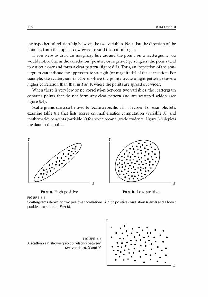
116 C H A P T E R 8
the hypothetical relationship between the two variables. Note that the direction of the
points is from the top left downward toward the bottom right.
If you were to draw an imaginary line around the points on a scattergram, you
would notice that as the correlation (positive or negative) gets higher, the points tend
to cluster closer and form a clear pattern (figure 8.3). Thus, an inspection of the scat-
tergram can indicate the approximate strength (or magnitude) of the correlation. For
example, the scattergram in Part a, where the points create a tight pattern, shows a
higher correlation than that in Part b, where the points are spread out wider.
When there is very low or no correlation between two variables, the scattergram
contains points that do not form any clear pattern and are scattered widely (see
figure 8.4).
Scattergrams can also be used to locate a specific pair of scores. For example, let’s
examine table 8.1 that lists scores on mathematics computation (variable X) and
mathematics concepts (variable Y) for seven second-grade students. Figure 8.5 depicts
the data in that table.
FIGURE 8.3
Scattergrams depicting two positive correlations: A high positive correlation (Part a) and a lower positive correlation (Part b).
FIGURE 8.4
A scattergram showing no correlation between two variables, X and Y.
9781442206564_epdf.indb 1169781442206564_epdf.indb 116 9/1/10 7:10 AM9/1/10 7:10 AM

C O R R E L A T I O N 117
Each point on the scattergram represents one student and corresponds to the scores
listed in table 8.1. For example, let’s find the point located at the top right-hand side
of the scattergram in figure 8.5 that represents Student G. We can draw a vertical
line from that point down toward the X axis (math computation). Our line should
intersect the axis at the score of 17. A horizontal line from point G toward the Y axis
(math concepts) should intersect the axis at the score of 18. These scores—17 in math
computation and 18 in math concepts—are indeed the same as those listed for Student
G in table 8.1.
A scattergram can help us identify scores that are noticeably different from the
other scores. These scores, called outliers, can be easily spotted on a scattergram where
Table 8.1. Scores of Seven Students on
Two Mathematics Tests
Student Number
Math Computation
X
Math Concepts
Y
A 18 20B 17 15C 11 12D 19 18E 13 12F 15 16G 17 18
FIGURE 8.5
A scattergram of the correlation between math computation and math concepts (data in Table 8.1).
9781442206564_epdf.indb 1179781442206564_epdf.indb 117 9/1/10 7:10 AM9/1/10 7:10 AM
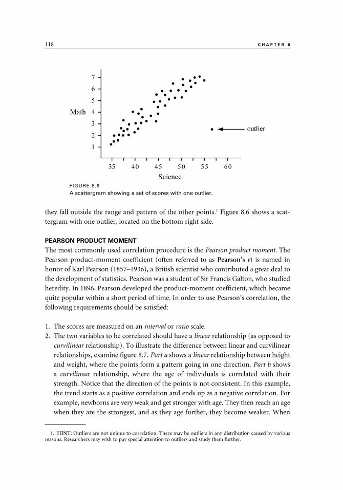
118 C H A P T E R 8
they fall outside the range and pattern of the other points.1 Figure 8.6 shows a scat-
tergram with one outlier, located on the bottom right side.
PEARSON PRODUCT MOMENT
The most commonly used correlation procedure is the Pearson product moment. The
Pearson product-moment coefficient (often referred to as Pearson’s r) is named in
honor of Karl Pearson (1857–1936), a British scientist who contributed a great deal to
the development of statistics. Pearson was a student of Sir Francis Galton, who studied
heredity. In 1896, Pearson developed the product-moment coefficient, which became
quite popular within a short period of time. In order to use Pearson’s correlation, the
following requirements should be satisfied:
1. The scores are measured on an interval or ratio scale.
2. The two variables to be correlated should have a linear relationship (as opposed to
curvilinear relationship). To illustrate the difference between linear and curvilinear
relationships, examine figure 8.7. Part a shows a linear relationship between height
and weight, where the points form a pattern going in one direction. Part b shows
a curvilinear relationship, where the age of individuals is correlated with their
strength. Notice that the direction of the points is not consistent. In this example,
the trend starts as a positive correlation and ends up as a negative correlation. For
example, newborns are very weak and get stronger with age. They then reach an age
when they are the strongest, and as they age further, they become weaker. When
1. HINT: Outliers are not unique to correlation. There may be outliers in any distribution caused by various reasons. Researchers may wish to pay special attention to outliers and study them further.
FIGURE 8.6
A scattergram showing a set of scores with one outlier.
9781442206564_epdf.indb 1189781442206564_epdf.indb 118 9/1/10 7:10 AM9/1/10 7:10 AM

C O R R E L A T I O N 119
Pearson’s r is used with variables that have a curvilinear relationship, the resulting
correlation is an underestimate of the true relationship between these variables.
When observations on the variables to be correlated are rank-ordered, the statistic
known as Spearman rank-order correlation is used. The correlation coefficient is repre-
sented by rs. This rank-order correlation coefficient is interpreted in the same way as
the Pearson coefficient r.2
Interpreting the Correlation Coefficient
After obtaining the correlation coefficient, the next step is to evaluate and interpret
it. It is important to remember that the sign of the correlation (negative or positive) is
not indicative of the strength of the correlation. A negative correlation is not something
negative. What matters is the absolute value of the correlation. Thus, a negative cor-
relation of –.93 indicates a stronger relationship than a positive correlation of +.80.
Table 8.2 lists guidelines for the interpretation of the strength of the correlation
coefficients. These guidelines apply to both positive and negative correlation coeffi-
cients. There is no clear consensus among researchers as to the exact definition of each
category, and the categories in the table overlap. Thus, it is the researcher’s decision
how to define a certain coefficient. As an example, one researcher may describe a cor-
relation coefficient of .68 as high, and another may define it as moderate. You can also
use two categories to define a coefficient; for example, describing a correlation of .40
as low-to-moderate and a correlation of .65 as moderate-to-high.
Another way to evaluate correlation coefficients is to divide the coefficients between
.00 and 1.00 into three categories. Coefficients between .00 and .33 would be defined as
2. HINT: The Greek letter ρ (rho) may also be used to indicate the rank-order correlation coefficient.
FIGURE 8.7
Scattergrams showing a linear relationship between height and weight (Part a) and a curvilinear relationship between age and strength (Part b).
9781442206564_epdf.indb 1199781442206564_epdf.indb 119 9/1/10 7:10 AM9/1/10 7:10 AM

120 C H A P T E R 8
low; coefficients between .34 and .66 would be considered moderate; and coefficients
between .67 and 1.00 would be considered high. Again, two categories can be used to
describe borderline coefficients. For example, coefficients such as .28 or .36 can be
described as low-to-moderate and coefficients such as .60 or .68 can be described as
moderate-to-high.
In describing and assessing correlations, it is important to consider the purpose of
the study and the potential use of the results of the study. For example, a correlation
coefficient of .60 may be adequate for the purpose of group prediction but insufficient
for individual prediction purposes.
The statistical significance level (p value) is often reported along with the coefficient
itself. However, if the study involves the whole population and there is no attempt
to generalize the results to other groups or settings, then the p value is not of impor-
tance. Rather, the obtained correlation coefficient is used to indicate the relationship
between the variables.
The level of statistical significance is greatly affected by the sample size and might
imply a high level of association between variables even when the correlation is low.
For example, with a sample size of 350, even a low correlation, such as r = .12, is re-
ported to be significant at p < .05, and a correlation of r = .15 is reported as significant
at the p < .01 level. Therefore, it is always a good idea to consider the practical signifi-
cance of the correlation, along with its statistical significance.
Hypotheses for Correlation
The null hypothesis (HO) states that in the population the correlation coefficient
expressing the relationship between the two variables being studied is zero:
The alternative hypothesis (HA) states that the population correlation is not equal
to zero:
Table 8.2. An Interpretation of Correlation Coefficients
Correlation Interpretation
.00 to .20 Negligible to low (a correlation of .00 would be defined as “no correlation”)
.20 to .40 Low
.40 to .60 Moderate
.60 to .80 High
.80 to 1.00 Substantial/Very high (a correlation of 1.00 would be defined as a “perfect correlation”)
9781442206564_epdf.indb 1209781442206564_epdf.indb 120 9/1/10 7:10 AM9/1/10 7:10 AM

C O R R E L A T I O N 121
After we obtain the correlation coefficient, we then consult a table of critical val-
ues. To use the table, we have to calculate the degrees of freedom (df) for the study.
In correlation, the degrees of freedom are the number of pairs of scores minus 2. If
the obtained correlation coefficient (r) exceeds the critical value, the null hypothesis is
rejected. Rejecting the null hypothesis means that the chance that the correlation coef-
ficient is 0 (r = 0) is very small and that r is large enough to be considered different
from zero. When the obtained coefficient is smaller than the critical value, the null
hypothesis is retained. We conclude that there is a high degree of likelihood that the
correlation is not significantly different from 0.3
When the null hypothesis is rejected, the level of significance (p level) is reported.
This can be done using two approaches. There are researchers who choose to use the
conventional “benchmarks” approach, where the level of significance (p level) is listed
as p < .05, p < .02, or p < .01. Other researchers prefer to report the exact level of sig-
nificance. Computer statistical packages usually print the exact p values, thus making
this information readily available to researchers.
Computing Pearson Correlation
To demonstrate the use of Pearson correlation, let’s look at the scores of six stu-
dents on two tests, reading vocabulary (X) and reading comprehension (Y) (table 8.3).
Using a computer, we calculated that the correlation is r = .95. Note that the relative
positions of students on the two tests are similar, which explains the high correlation.
For example, student F scored low on both X and Y; and student D scored high on
both X and Y.
After the correlation coefficient is calculated, the next step is to ascertain whether it
is statistically significant. Table 8.4 lists the critical values of the Pearson r coefficient.
In our example, the degrees of freedom (df) are 4 (the number of pairs minus 2). The
critical values are .811 for a p level of .05, .882 for a p level of .02, and .917 for a p
3. HINT: Computer statistical programs routinely calculate the degrees of freedom and p values.
Table 8.3. Scores of Six Students on Reading Vocabulary
Test (X) and Reading Comprehension Test (Y)
Student
ReadingVocabulary
X
ReadingComprehension
Y
A 9 14B 8 12C 10 14D 11 15E 10 15F 7 11
9781442206564_epdf.indb 1219781442206564_epdf.indb 121 9/1/10 7:10 AM9/1/10 7:10 AM

122 C H A P T E R 8
level of .01. These critical values can be listed as: r(.05,4)
= .811, r(.02,4)
= .882, and r(.01,4)
= .917. The .05, .02, and .01 listed inside the parentheses indicate the p level, and the
number 4 indicates the degrees of freedom. Our calculated r value of .95 exceeds the
critical values listed for .05, .02, and .01 levels of significance. Consequently, we reject
the null hypothesis at p < .01 level. We conclude that a correlation coefficient of this
magnitude (r = .95) could have occurred by chance alone less than 1 time in 100. (See
chapter 2 for a discussion of the statistical hypothesis testing.)
FACTORS AFFECTING THE CORRELATION
The example in table 8.3 demonstrates the effect of the relative positions of individuals
in their group on the correlation coefficient. The correlation is high if the following
occurs: those who score high on X also score high on Y; those who score low on X also
score low on Y; and those who score in the middle on X also score in the middle on Y.
The actual scores on X and on Y do not have to be the same, only the relative position
of scores in their group.
The reliability of the instruments used to collect data may also affect the correla-
tion. The correlation coefficient may underestimate the true relationship between two
variables if the measurement instruments used to obtain the scores are not reliable.
(See chapter 13 for a discussion of reliability.)
The correlation obtained may underestimate the real relationship between the
variables if one or both variables have a restricted range (i.e., low variance). To dem-
onstrate an extreme case, suppose all of the students receive the same score on test X.
(This may happen if the test is too easy.) If we try to correlate their scores on test X
with their scores on another test, Y, we will get a correlation of zero (r = .00).
To illustrate this point, let’s look at the scores of four students on two tests, X and Y,
which are listed in table 8.5. Notice that all the students received the same score on X
(X = 25). Figure 8.8 is a scattergram showing the same data. As you can see, the points
Table 8.4. Partial Distribution of the Correlation Coefficient (Pearson’s r) Critical Values
p value
df .10 .05 .02 .01
4 .729 .811 .882 .917
Table 8.5. Scores of Four Students on Two Tests
Student Test X Test Y
A 25 15B 25 18C 25 17D 25 14
9781442206564_epdf.indb 1229781442206564_epdf.indb 122 9/1/10 7:10 AM9/1/10 7:10 AM
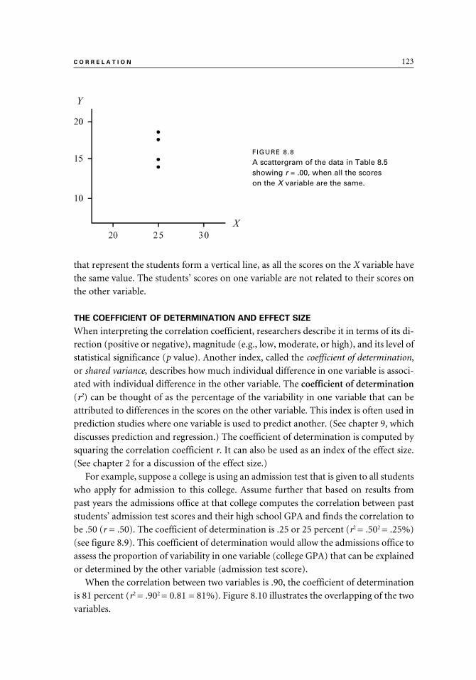
C O R R E L A T I O N 123
that represent the students form a vertical line, as all the scores on the X variable have
the same value. The students’ scores on one variable are not related to their scores on
the other variable.
THE COEFFICIENT OF DETERMINATION AND EFFECT SIZE
When interpreting the correlation coefficient, researchers describe it in terms of its di-
rection (positive or negative), magnitude (e.g., low, moderate, or high), and its level of
statistical significance (p value). Another index, called the coefficient of determination,
or shared variance, describes how much individual difference in one variable is associ-
ated with individual difference in the other variable. The coefficient of determination
(r2) can be thought of as the percentage of the variability in one variable that can be
attributed to differences in the scores on the other variable. This index is often used in
prediction studies where one variable is used to predict another. (See chapter 9, which
discusses prediction and regression.) The coefficient of determination is computed by
squaring the correlation coefficient r. It can also be used as an index of the effect size.
(See chapter 2 for a discussion of the effect size.)
For example, suppose a college is using an admission test that is given to all students
who apply for admission to this college. Assume further that based on results from
past years the admissions office at that college computes the correlation between past
students’ admission test scores and their high school GPA and finds the correlation to
be .50 (r = .50). The coefficient of determination is .25 or 25 percent (r2 = .502 = .25%)
(see figure 8.9). This coefficient of determination would allow the admissions office to
assess the proportion of variability in one variable (college GPA) that can be explained
or determined by the other variable (admission test score).
When the correlation between two variables is .90, the coefficient of determination
is 81 percent (r2 = .902 = 0.81 = 81%). Figure 8.10 illustrates the overlapping of the two
variables.
FIGURE 8.8
A scattergram of the data in Table 8.5 showing r = .00, when all the scores on the X variable are the same.
9781442206564_epdf.indb 1239781442206564_epdf.indb 123 9/1/10 7:10 AM9/1/10 7:10 AM

124 C H A P T E R 8
INTERCORRELATION TABLES
At times, researchers are interested in correlating several variables with each other. In-
stead of embedding the results from such analyses in the text narrative, the results can
be presented in an intercorrelation table. An intercorrelation table is used to display the
correlations of several variables with each other. For example, let’s say that the curricu-
lum coordinator in a school district wants to take an in-depth look at the standardized
test scores from one of the grade levels in the district and to see whether there are
correlations between four subject areas: spelling, phonics, vocabulary, and language
mechanics. The Total Battery test score is also included in the analysis. The curriculum
coordinator displays the results in an intercorrelation table (see table 8.6).
As you can see, table 8.6 has two distinct features:
1. All the correlations that are listed on the diagonal line in the center of the table
(from top left to bottom right) are perfect (r = 1.00). The reason is obvious: these
are all correlations of a variable with itself (e.g., spelling and spelling, phonics and
phonics).
FIGURE 8.9
A graphic presentation of the relationship between two variables when r = .50 and the coefficient of determination (r2) is 25 percent.
FIGURE 8.10
A graphic presentation of the relationship between two variables when r = .90 and the coefficient of determination
(r2) is 81 percent.
9781442206564_epdf.indb 1249781442206564_epdf.indb 124 9/1/10 7:10 AM9/1/10 7:10 AM

C O R R E L A T I O N 125
2. If we divide the table into two triangles: top right and bottom left, we can see that
the correlation coefficients that are recorded in the two triangles are the same and
are a mirror image of each other.
Considering these two features, it is clear that table 8.6 contains duplicate informa-
tion and unnecessary information (the correlations of 1.00 on the diagonal). Thus, the
table can be reorganized to present the results more efficiently. Table 8.7 may look as
if it lacks some information, but, in fact, it contains all the information needed.
You may find published reports where the lower left-hand side triangle is used to
display the information, instead of the top right-hand side, as is the case in table 8.7.
You may also find intercorrelation tables that include additional information about
the measures that are being intercorrelated. For example, some of these tables may also
list the means and standard deviations of the measures.
In presenting an intercorrelation table, there are two ways to identify those cor-
relation coefficients that are statistically significant. One approach is to display the
significance levels with asterisks that indicate certain levels of significance (e.g., * p <
.05 or ** p < .01). The other approach is to list the exact level of significance next to
each correlation coefficient (e.g., p = .046, or p = .003).
Table 8.6. Intercorrelations of Five Tests
1Spelling
2Phonics
3Vocab.
4L. M.
5Total
1. Spelling 1.00 .63 .45 .57 .82
2. Phonics .63 1.00 .39 .68 .78
3. Vocabulary .45 .39 1.00 .85 .86
4. Lang. Mech. .57 .68 .85 1.00 .91
5. Total Battery .82 .78 .86 .91 1.00
Table 8.7. A Revised Intercorrelation Table
2Phonics
3Vocab.
4L. M.
5Total
1. Spelling .63 .45 .57 .822. Phonics .39 .68 .783. Vocabulary .85 .864. Language Mechanics .915. Total Battery
9781442206564_epdf.indb 1259781442206564_epdf.indb 125 9/1/10 7:10 AM9/1/10 7:10 AM

126 C H A P T E R 8
CORRELATION TABLES
Correlation tables differ from intercorrelation tables in the type of information they
convey and in their layout. Both types of tables provide an efficient way to present a
large number of correlation coefficients. In correlation tables, the variables listed in the
rows and columns are different from each other, whereas in intercorrelation tables, the
rows and columns list the same variables.
To illustrate the use of a correlation table, suppose we want to correlate the IQ lev-
els of parents and their children (see table 8.8). The children in the study are divided
into three groups: those with low, medium, and high IQ scores. In addition, IQ scores
are available for these children’s fathers and mothers.4 Incidentally, note that in this
example we do not have two scores for each participant, as was the case with other ex-
amples in this chapter (e.g., spelling and phonics). Instead, in this example each child
is paired with his/her parents.
In addition to the correlation coefficient (r) in table 8.8, the level of significance and
the sample size (n) are also recorded in each cell. For example, according to this table,
we have correlational data for fifteen girls and their mothers (n = 15) in the low IQ
category. The correlation of the scores of these girls and their mothers is .56 (r = .56),
significant at the .05 level (*p < .05).
SUMMARY
1. Correlation is defined as the relationship or association between two or more paired variables. The most common way to pair variables is to administer two measures to the same group of people and correlate their scores on the two measures.
2. The correlation coefficient indicates the strength (or degree) of correlation. The coefficient can range from 1.00 (perfect positive correlation) to –1.00 (per-fect negative correlation). A coefficient of 0.00 indicates no correlation.
3. Correlation does not imply causation. Just because two variables correlate with each other does not mean that one caused the other.
4. HINT: As with any continuous variable that is divided into categories (such as high, medium, and low), the criterion used for creating the categories has to be logical.
Table 8.8. Correlations of Mothers and Fathers with Their Daughters or Sons
Low IQ Medium IQ High IQ
Daughter Son Daughter Son Daughter Son
Mother r = .56*n = 15
r = .62n = 20
r = .55**n = 22
r = .44*n = 21
r = .48n = 16
r = .58*n = 15
Father r = .52n = 14
r = .45n = 18
r = .54**n = 23
r = .48*n = 20
r = .49*n = 17
r = .50n = 15
* p < .05 ** p < .01
9781442206564_epdf.indb 1269781442206564_epdf.indb 126 9/1/10 7:10 AM9/1/10 7:10 AM

C O R R E L A T I O N 127
4. Correlation is used to describe relationships between variables in prediction studies and in the assessment of reliability and validity.
5. A scattergram (or a scatterplot) is a graphic presentation of a correlation be-tween two variables. The two axes in the graph represent the two variables, and the points represent pairs of scores.
6. The direction of the points on the scattergram and the degree to which they cluster indicate the strength of the correlation and whether the correlation is positive or negative. A scattergram can also show whether there are scores that are outliers.
7. In a positive correlation, an increase in one variable is associated with an increase in the other variable. In a negative correlation, an increase in one variable is associated with a decrease in the other variable.
8. The most commonly used correlation procedure is the Pearson product mo-ment, whose coefficient is represented by the letter r. Pearson’s r is used with data measured on an interval or a ratio scale when the variables to be correlated have a linear relationship.
9. Correlation coefficients can be described using words such as negligible, low, moderate, high, and very high. A combination of categories may also be used, such as moderate to high.
10. In describing and assessing correlations, it is important to consider the pur-pose of the study and the potential use of the results of the study. It is also important to consider the practical significance of the correlation and the effect size, along with its statistical significance.
11. The null hypothesis in correlation states that in the population the correla-tion coefficient is zero, and the alternative hypothesis states that in the popu-lation the correlation is not equal to zero.
12. The obtained correlation coefficient may be an underestimate of the real rela-tionship between the variables if one or both variables have low reliability or if one or both variables have a restricted range (i.e., low variance).
13. The coefficient of determination (r2) (or shared variance) describes how much individual differences in one variable are associated with individual differences in the other variable. This index is often used in prediction stud-ies where one variable is used to predict another. The coefficient of deter-mination is found by squaring the correlation coefficient. It can also be used as the effect size to assess the practical significance of the study’s results.
14. Correlations between three or more variables are often presented in an in-tercorrelation or correlation table.
9781442206564_epdf.indb 1279781442206564_epdf.indb 127 9/1/10 7:10 AM9/1/10 7:10 AM

9
Prediction and Regression
In chapter 9 we extend the concept of correlation and show how it can be used in prediction. The statistical test that is introduced in this chapter is called regression. This is the process of using one variable to predict an-other when the two are correlated. It makes sense to expect that the higher the correlation between the variables, the more accurate the prediction. When one variable is used as a predictor, the statistical test is called simple regression; when two or more variables are used as predictors, multiple regression is used. We focus our discussion on simple regression and explain various terms and concepts. Regression can be depicted visually with the use of a scattergram, which has a line of best fit (regression line) drawn through the dots that create the scattergram. You will learn how to evaluate the line and how to decide if there are outliers; that is, scores that fall outside the pattern created by the rest of the scores. You can always expect a certain level of error when making a prediction, and we show you how to calculate and determine how accurate your prediction is going to be with the use of the standard error or estimate.
We include in this chapter a numerical example to demonstrate and ap-ply the concepts and terms used in this chapter. The statistical and practical significance of the results are also explained and discussed.
9781442206564_epdf.indb 1299781442206564_epdf.indb 129 9/1/10 7:10 AM9/1/10 7:10 AM

130 C H A P T E R 9
In our daily life, prediction is quite common. When we hear thunder and see light-
ning, we often predict they will be followed by rain. We also might predict the rela-
tionship between the day of the week and the expected crowd at the movie theater.
In education, we also use prediction. For example, we might predict that a bright
elementary school student will do well in high school or that a student who is having
difficulties on the midterm examination is probably going to get a low grade on the
final examination.
From our personal experience we know that our predictions do not always mate-
rialize, and people and events continue to surprise us. Sometimes rain does not fol-
low thunder and lightning, and occasionally, bright young children drop out of high
school. Nevertheless, knowing something about the relationship among the variables
allows us to make a prediction that is better than a chance guessing.
Prediction is based on the assumption that when two variables are correlated, we
can use one of them to predict the other. The discussion in this chapter focuses on
using prediction in educational settings. The examples demonstrate how educational
and psychological instruments can be used in prediction.
The variable used as a predictor is the independent variable, and it is represented by
the letter X. The predicted variable, represented by the letter Y, is called the criterion variable, or the dependent variable. For example, the Scholastic Aptitude Test (SAT)
may be used as a predictor variable, and college freshman grade point average (GPA)
may be the criterion variable.
The technique used for prediction is called regression. When only one variable is
used to predict another, the procedure is called simple regression, and when two or
more variables are used as predictors, the procedure is called multiple regression.
The discussion that follows focuses on simple linear regression, where the predictor
variable (X) and the criterion variable (Y) have a linear relationship.1 Our numerical
example demonstrates the computations involved in simple regression. Additionally,
the concept of multiple regression will be introduced briefly, without the use of a nu-
merical example.
SIMPLE REGRESSION
After observing a high correlation between two variables, a researcher may want to
use one variable to predict the other one. For example, suppose a high school coun-
selor has noticed that high-achieving students have higher academic self-concept
compared with low-achieving students who have lower academic self-concept. The
counselor may want to conduct a study to explore the idea of using a measure of
academic self-concept (ASC) of high school students to predict their grade point
1. HINT: See chapter 8 for a discussion of the concept of linear relationship in correlation.
9781442206564_epdf.indb 1309781442206564_epdf.indb 130 9/1/10 7:10 AM9/1/10 7:10 AM

P R E D I C T I O N A N D R E G R E S S I O N 131
average (GPA). The counselor chooses a random sample of high school students to
participate in the study. ASC scores and GPA are gathered for the students in the
study and analyzed. If the ASC test is shown to be a good predictor of GPA, other
educators may want to assess their students’ academic self-concept at the beginning
of the year and use this information in planning individualized instruction and
course work for their students.
Because correlation does not imply causation, we cannot conclude from the re-
gression study that the students’ academic self-concept has an effect on their GPA.
Quite likely, both variables are related to ability; able students generally have higher
academic self-concepts and they also get higher grades on their course work. To ascer-
tain whether ASC affects GPA, an experimental study should be conducted in which
academic self-concept is manipulated.
The prediction of scores of a group of people on one variable from their scores
on another variable can be done by using a regression equation. The equation is used
to draw a line that is used for prediction. In order to develop the equation, we first
need to have the predictor and criterion scores for a group of people. The members
of the group should be similar to those whose criterion scores we would like to be
able to predict in the future. Once the equation is available, it can be used to predict
criterion (dependent) scores for a new group of people for whom only the predictor
scores are available.
The regression equation can be used to draw a line through a scattergram of the two
variables involved, designated as X and Y. This line is called the regression line, or the
line of best fit (figure 9.1).
The position of the line is determined by the slope (the angle) and the intercept (the
point where the line intersects the vertical axis, Y). The slope is represented by the let-
ter b, and the intercept is represented by the letter a. The slope may also be referred to
as the coefficient, and the intercept may be referred to as the constant.
Figure 9.2 illustrates four regression lines when the intercept is zero (i.e., the regres-
sion line passes through the point where both axes are at zero). Part a shows that when b
= 0.25, for every increase of 1 unit in X, there is an increase of 0.25 unit in Y; and when
FIGURE 9.1
A scattergram showing the regression line.
9781442206564_epdf.indb 1319781442206564_epdf.indb 131 9/1/10 7:10 AM9/1/10 7:10 AM

132 C H A P T E R 9
b = 0.5, for every increase of 1 unit in X, there is an increase of 0.5 units in Y (Part b).
When b = 1, for every increase of 1 unit in X, there is an increase of 1 unit in Y (Part c);
and when b = 2, for every increase of 1 unit in X, there is an increase of 2 units in Y (Part
d). As figure 9.2 shows, you would realize that the higher the value of b (the slope), the
steeper the regression line; and the lower the value of b, the flatter the line.
The Standard Error of Estimate (SE)
Unless the predictor and the criterion variables have a perfect correlation, any at-
tempt to use X (the predictor) to predict Y' (the criterion) is likely to result in a certain
degree of error. Consequently, for some individuals the Y' score (the predicted score)
is an overestimate of their “true” Y score, while for others, the Y' score is an under-
estimate of their “true” Y score. The difference between the actual Y score and the
predicted Y score for each individual is called the error score (or residual). The standard
deviation of the error scores, across all individuals, is called the standard error of es-timate (S
E).2 More specifically, assuming a normal distribution of the error scores, the
2. HINT: The standard error of estimate may also be represented by the symbol Sy•x.
FIGURE 9.2
Four regression lines with different slopes.
9781442206564_epdf.indb 1329781442206564_epdf.indb 132 9/1/10 7:10 AM9/1/10 7:10 AM

P R E D I C T I O N A N D R E G R E S S I O N 133
actual Y score would lie within ± 1SE of the Y' score about 68 percent of the time, and
within ± 2SE about 95 percent of the time. The S
E is calculated by using the scores from
the group used to generate the regression equation. The formula for SE is:
Where SE = Standard error of estimate
SY = Standard deviation of the Y variable
r2 = Square of the correlation3
Holding SY constant, S
E decreases as r increases. Thus, the higher the correlation, the
lower the SE; and when the standard error of estimate is lower, the prediction is more
accurate. The following formula demonstrates that when X and Y have a perfect cor-
relation (r = 1.00), there is no error in prediction and the standard error of estimate
(SE) is zero:
By comparison, when r = 0.00 (there is no correlation), SE is equal to the SD of the
Y variable (SY):
An Example of Simple Regression
Ms. Wright, an eighth-grade language arts teacher, wants to know whether she
could use a practice test she constructed to predict the scores of her students on the
state-mandated end-of-year language arts test. The teacher hypothesizes that the
practice test administered at the beginning of the second semester is a good predic-
tor of the state-mandated test. Thus, she might want to administer the practice test
to her students, then use the test results to design early intervention and remediation
programs for students who are expected to do poorly on the state-mandated test. To
ascertain whether the practice test is a good predictor of the state-mandated test, the
teacher uses the scores from the practice test (the predictor, or independent variable)
and the scores from the state-mandated test (the criterion, or dependent variable) from
her last year’s students to generate the regression equation. Since the state-mandated
language arts test is scored on a scale of 1 to 50, the teacher has designed her test to use
3. HINT: You may recall that in chapter 8 we discussed the concept of r2 (the coefficient of determination or shared variance) that refers to the proportion of the variability (or information) of Y that is contained in X.
9781442206564_epdf.indb 1339781442206564_epdf.indb 133 9/1/10 7:10 AM9/1/10 7:10 AM

134 C H A P T E R 9
the same scale.4 In this computational example, the scores of ten students are used to
demonstrate how to generate the regression equation (table 9.1).
The teacher finds that the correlation between the two tests is r = .764.5 Next, the
teacher computes the b coefficient, followed by the computation of the value of a.
After finding the values of b (the slope) and a (the intercept), they can be entered
into the regression equation.
Now, after administering the practice test to her students, the teacher can use
the equation to predict their scores on the state-administered language arts test. For
example, the teacher can predict that a student with a practice test (X) score of 30 is
expected to have a score of 33.682 on the state test (Y’):
4. HINT: In this example, we use numbers in a range of 1–50 for both the predictor (the practice test) and the criterion (the eighth-grade end-of-year state-mandated test); however, the regression procedure allows for any range of scores to be used for the two variables.
5. HINT: The computations of the correlation coefficient are not included here. (See chapter 8 for a discus-sion of correlation.)
Table 9.1. Scores of Ten Students on the Practice Test
and on the State-mandated Test
Practice Test State TestStudent X Y
A 45 40B 45 46C 46 37D 50 49E 35 31F 47 50G 23 32H 46 48I 40 44J 41 39
Mean X– = 41.80 Y
– = 41.60
Standard Deviation SX = 7.843 SY = 6.883
9781442206564_epdf.indb 1349781442206564_epdf.indb 134 9/1/10 7:10 AM9/1/10 7:10 AM

P R E D I C T I O N A N D R E G R E S S I O N 135
Of course, using this equation to predict the scores of new students on the state-
mandated language arts test is predicated on the assumption that the new students
taking the practice test are similar to those whose scores were used to derive the regres-
sion equation.
Using the equation above, we found that the standard error of estimate for the
data in table 9.1 is 4.44. This means that for each student, on the average, the teacher
is likely to overestimate or underestimate the state-mandated language arts score by
close to 4.5 points. For example, for students whose Y' score is 42, about 68 percent of
the time the actual Y score will lie within 4.44 above or below the Y’ score (i.e., between
approximately 37.5 and 46.5). Even though this may look to you like a wide margin of
error in prediction, remember that without having this information, it may have been
even more difficult for the teacher to predict her students’ scores!
Graphing the Regression Equation
As was mentioned before, the slope and the intercept in the regression equation can
be used to draw a line through a scattergram that depicts the correlation of the two
variables. Figure 9.3 shows a scattergram of the actual scores obtained on the practice
test (X) and the scores obtained on the state-mandated test (Y) (table 9.1), with the
FIGURE 9.3
A regression line for predicting scores of ten students on the state-mandated test using the practice test scores as a predictor (see data in Table 9.1).
9781442206564_epdf.indb 1359781442206564_epdf.indb 135 9/1/10 7:10 AM9/1/10 7:10 AM

136 C H A P T E R 9
regression line added.6 All of the predicted Y' scores would lie on the regression line.
Note that the regression line goes through the intersection of the means of the two
variables (the mean of X is 41.80 and the mean of Y is 41.60).
As we can see, for several students, the Y' score is an overestimate (i.e., the Y' score
is above the actual Y score); and for several students, the Y' score is an underestimate
(i.e., the Y' score is below the actual Y score).
The Coefficient of Determination (r2)
The coefficient of determination (r2) can be used to describe the relationship between
the variables.7 In our example, the language arts teacher used her own practice test
to predict her students’ scores on the end-of-year state-mandated language arts test.
The teacher found that the correlation between the two tests was r = .764. As you may
recall, to find the coefficient of determination we need to square the correlation (r2).
With r = .764, the coefficient of determination is .7642 = .584 (or 58%). This coeffi-
cient means that about 58 percent of the variation in performance on the state test (Y)
can be accounted for by individual differences in performance on the practice test (X);
42 percent of the variation is due to other factors. As was discussed in chapter 2, the
coefficient of determination (r2) can also be used as an index of effect size.
MULTIPLE REGRESSION
The multiple regression procedure is used when two or more variables are used to
predict one criterion variable. For example, scores on a kindergarten readiness test,
combined with teacher assessment scores, may be used to predict first-graders’ scores
on a standardized achievement test. A researcher is likely to consider using several
variables as predictors when there is no single variable that has a high correlation with
the criterion so as to serve as a satisfactory single predictor. In such cases, additional
predictor variables may be used in order to predict the criterion variable more ac-
curately. In our example, combining the two predictor variables (kindergarten readi-
ness test and teacher assessment) is likely to predict the criterion variable (first-grade
standardized achievement test) more accurately, compared with using only one of the
two predictors.
The regression equation in multiple regression is an extension of the equation for
simple regression. In addition to the intercept (a), the equation contains a regression
coefficient (b) for each of the predictor variables (X). The combined correlation of
the predictor variables with the criterion variable is called multiple correlation, repre-
sented by the symbol R. With two predictors, the equation is:
6. HINT: Computer statistical programs can be used to draw the line.
7. HINT: This concept was discussed in chapter 8 (Correlation).
9781442206564_epdf.indb 1369781442206564_epdf.indb 136 9/1/10 7:10 AM9/1/10 7:10 AM

P R E D I C T I O N A N D R E G R E S S I O N 137
Where Y' = Predicted Y score
b1
= Slope (coefficient) of predictor X1
X1
= Score on independent variable (predictor) X1
b2
= Slope (coefficient) of predictor X2
X2
= Score on independent variable (predictor) X2
a = Intercept (constant)
In multiple regression, the coefficient of determination is represented by R2, which is
similar to r2 in simple regression. Just like r2, the coefficient of determination in mul-
tiple regression can range from 0 to 1.00. R2 indicates the proportion of the variation
in Y that can be accounted for by the variation of the combined predictor variables.
For any level of correlation between the predictor variables and the criterion, when
the predictor variables have a low correlation with each other, R2 is greater than when
the predictor variables correlate highly with each other. To illustrate this point, let’s
look at figure 9.4. Part a shows two predictor variables, X1 and X
2, which correlate
highly with the criterion variable Y. In addition, the two predictors also correlate
highly with each other. The high correlation between the two predictor variables is
evidenced by the fact that they overlap a great deal. Adding a second predictor (X2) to
the first predictor (X1) has not significantly increased R2, the amount of variation in
Y (the criterion) that can be accounted for by the predictors. That is, adding a second
FIGURE 9.4
Two graphs showing different levels of correlation between the two predictors and between the predictors and the criterion: the two predictors, X1 and X2, cor-relate highly with each other (Part a); and the two predictors, X3 and X4, have a low correlation with each other (Part b).
9781442206564_epdf.indb 1379781442206564_epdf.indb 137 9/1/10 7:10 AM9/1/10 7:10 AM

138 C H A P T E R 9
predictor does not account for a much greater proportion of the criterion Y. As we can
tell, in Part a there is a large, white area on the left side that represents the proportion
in variable Y that is not accounted for by the two predictors.
Part b shows two predictor variables, X3 and X
4, and a criterion variable Y. Each of
the two predictors has a high correlation with the criterion variable and a low correla-
tion with each other (X3 and X
4 overlap very little). In Part b, the small, white area in
variable Y shows that the two combined predictor variables cover more of the criterion
variable and can account for more of the variation in Y.
SUMMARY
1. Regression is a technique used for prediction. The variable used as a predic-tor is called the independent variable, and it is represented by the letter X. The predicted variable is called the criterion or the dependent variable, and is represented by the letter Y.
2. Regression is based on the assumption that the predictor (or predictors) and the criterion variable correlate with each other. The higher the correlation, the more accurate the prediction.
3. When one variable is used to predict another variable, the procedure is called simple regression. When two or more variables are used as predictors, the procedure is called multiple regression.
4. Linear regression is used when the predictor variable (X) and the criterion variable (Y) have a linear relationship.
5. The regression equation is used to predict Y scores for a given group of indi-viduals for whom the X scores are available. The predicted Y score is repre-sented by Y’. The equation is:
6. The regression equation can be used to draw a line. The position of the line is determined by its slope, represented by the letter b, and by its intercept (the point where the regression line intersects the vertical axis), represented by the letter a. The slope may also be identified as the coefficient, and the intercept may be identified as the constant.
7. The characteristics of the sample used to derive the regression equation should be similar to those of the sample for whom we want to predict future scores.
8. When inspecting regression lines, we can see that the higher the value of b, the steeper the line, and the lower the value of b, the flatter the line.
9. Unless the predictor and the criterion variables have a perfect correlation, any attempt to use the predictor variable (X) to predict the criterion variable (Y’) is likely to result in a certain degree of error. The error score (or the residual) is the difference between actual Y and predicted Y’ scores.
9781442206564_epdf.indb 1389781442206564_epdf.indb 138 9/1/10 7:10 AM9/1/10 7:10 AM

P R E D I C T I O N A N D R E G R E S S I O N 139
10. The standard deviation of the error scores across all individuals is called the standard error of estimate (S
E). SE indicates how much, on average, Y’ scores
overestimate or underestimate the actual Y scores.11. As the correlation between variables increases, the SE decreases, thereby
making the prediction more accurate.12. The coefficient of determination, r2, can be used to describe the relationship
between the two variables. It describes the amount of variation in the scores on the criterion variable Y that can be accounted for by individual differences on X, the predictor variable.
13. The multiple regression procedure is employed when two or more variables are used to predict one criterion variable. A researcher is likely to consider using two or more variables as predictors when there is no single variable that has a high correlation with the criterion so as to serve as a satisfactory predictor. In such cases, additional predictor variables may be used in order to predict the criterion variable more accurately.
14. The regression equation for multiple regression is an extension of the equa-tion for simple regression. It includes one intercept (a; the constant); and a series of slopes (b; the regression coefficient), one for each of the predictor variables. With two predictors (X1 and X2), the multiple regression prediction equation is:
15. The combined correlation of the predictor variables with the criterion vari-able is called multiple correlation R.
16. R2 (which is similar to r2 in simple regression) indicates the proportion of the variation in Y (the criterion variable) that can be accounted for by the varia-tion of the combined predictor variables.
9781442206564_epdf.indb 1399781442206564_epdf.indb 139 9/1/10 7:10 AM9/1/10 7:10 AM

V
INFERENTIAL STATISTICS
9781442206564_epdf.indb 1419781442206564_epdf.indb 141 9/1/10 7:10 AM9/1/10 7:10 AM
10
t Test
The previous two chapters discussed approaches to data analysis when there are two or more variables that are correlated. Chapter 10 looks at a different research question: comparing two means to ascertain which mean is of greater statistical significance. The statistical test used for this type of analysis is the t test, and the statistic that is computed is called a t value. In this chapter, you will learn about three research situations in which the t test can be used to analyze the data and compare the means from (a) two independent groups (e.g., experimental and control); (b) two paired sam-ples (e.g., pretest and posttest scores); and (c) a sample and a population (e.g., comparing a mean of a sample to the mean of the population).
Examples with numerical data are included in the chapter to illustrate each of the three types of t tests. As you will see in these examples, after the t value is computed you have to decide whether it is statistically signifi-cant and whether your research hypothesis was confirmed. We also show you how to evaluate the practical significance of your findings and how to draw conclusions about your study.
9781442206564_epdf.indb 1439781442206564_epdf.indb 143 9/1/10 7:10 AM9/1/10 7:10 AM

144 C H A P T E R 1 0
Many researchers are concerned with comparing groups to each other. Their stud-
ies are conducted to determine whether differences between groups are statistically
significant or whether they could have occurred simply by chance. When two means
are being compared with each other, the statistic used is a t test. For example, research
studies may compare an experimental group to a control group, boys to girls, or pre-
test to posttest scores. The numbers used for the comparison are the means of the two
groups. The scores used to compute the means should be measured on an interval or
ratio scale and be derived from the same measure (e.g., the same test). As we analyze
research data, we should keep in mind that small differences are expected even among
members of the same group. These differences may occur due to sampling error and
are considered chance differences.
You might ask, “How can we distinguish between differences due to sampling error
and ‘real’ differences? At what point do we say that the difference is too large to be attrib-
uted to sampling error, and that it probably indicates a real difference?” Unfortunately,
there are no standards or cutoff scores. After obtaining the means, we cannot simply
“eyeball” them and determine whether they are similar or different. A difference of two
points between means may be defined as statistically significant in some cases, but not in
others. The group means and variances, in addition to the sample size, all play a role in
determining whether the difference between the means is a “real” difference.
The t test is based on the t distribution that was developed in 1908 by W. S. Gosset,
who worked for a brewery in Dublin. Since employees were not allowed to publish in
journals, Gosset used the pseudonym “Student” in an article he sent to a journal, and
the t distribution became known as “Student’s t distribution.”
HYPOTHESES FOR t TESTS
Predictions of outcomes in studies that are using the t test reflect what the researcher
hypothesizes about the nature of the differences between the means. The alternative
hypothesis (i.e., the research hypothesis), represented by the symbol HA or H
1, predicts
whether there would be a statistically significant difference between the two means being
compared.1 For example, the alternative hypothesis may be a directional hypothesis that
predicts that a group of first-graders using the whole-language approach (experimental
group) would score higher on an end-of-year reading test compared with a similar group
of first-graders using basal readers (control group). The alternative hypothesis is
Where HA
= Research hypothesis (the alternative hypothesis)
MeanE = Mean of the experimental group
MeanC = Mean of the control group
1. HINT: See chapter 2 for a full explanation of alternative (research) and null hypotheses.
9781442206564_epdf.indb 1449781442206564_epdf.indb 144 9/1/10 7:10 AM9/1/10 7:10 AM

t T E S T 145
A nondirectional hypothesis in a t test predicts that there would be a difference be-
tween the two means, but the direction of the outcome is not specified. For example,
we may predict differences in attitudes toward computers between junior high boys
and girls, but due to inconclusive results in previous studies, we are unable to pre-
dict which of the two groups will have a more positive attitude. The nondirectional
hypothesis is
Occasionally, the research hypothesis is not stated as directional or nondirectional,
but in a null form. That is, we predict that there will be no difference between the
means. This is not very common in educational research, but in cases where the re-
search hypothesis is stated as null, that hypothesis is considered nondirectional.
The null hypothesis (H0) in the t test states that any observed difference between the
means is too small to indicate a real difference between them and that such difference
is probably due to sampling error. In other words, the null hypothesis always predicts
no difference between the means.2 In symbols, the null hypothesis is
HO : Mean
1 – Mean
2
Or: HO: Mean
1 – Mean
2 = 0
The null hypothesis is submitted to a statistical test. Based on the results of this
statistical test, we decide whether to retain or reject the null hypothesis. Since the null
hypothesis always predicts no difference, there is no need to formally state it when the
research hypotheses are presented. But when the research (alternative) hypothesis pre-
dicts no difference between the means, then it should be stated and included among
the other study’s research hypotheses.
In order to calculate the t test value, a score should be obtained for each person
or case. The scores are then used to calculate the t value. After calculating a t value,
the next step is to consult the table of critical values for the t distribution in order to
determine the level of significance (p value) of the obtained t value. In order to use the
table, the researcher needs to know whether to use the critical values listed under the
one-tailed or two-tailed test. If your research hypothesis is directional and you predict
which mean will be higher, use the one-tailed test. If your research hypothesis is non-
directional and you predict a difference between the means but do not specify which
mean will be higher, use a two-tailed test. If your hypothesis is stated as null and you
predict no difference between the means beyond what might be expected purely by
2. HINT: This is true when we use the t test. You may remember that in correlational studies, the null hypoth-esis always predicts no relationship between the variables being correlated (i.e., it predicts a correlation that does not differ significantly from zero; see chapter 8).
9781442206564_epdf.indb 1459781442206564_epdf.indb 145 9/1/10 7:10 AM9/1/10 7:10 AM

146 C H A P T E R 1 0
chance, use the two-tailed test. When in doubt, use the two-tailed test, which is con-
sidered more conservative.3
Nowadays, with computer statistical software packages readily available, there is
no need to compute the p value by hand. The computer program will provide the
appropriate p value and the t value, along with the two means and standard devia-
tions. Nonetheless, you will still need to know whether to use a one-tailed or two-
tailed test.
A t test is used to compare two means in three different situations:
1. t test for independent samples. The two groups whose means are being compared
are independent of each other. A typical example is a comparison of experimental
and control groups.
2. t test for paired samples (also called a t test for dependent, matched, or correlated
samples). The two means represent two sets of scores that are paired. A typical
example is a comparison of pretest and posttest scores obtained from one group
of people.
3. t test for a single sample. This t test is used when the mean of a sample is compared
to the mean of a population. For example, we may use the Graduate Record Exami-
nation (GRE) scores of psychology graduate students (the sample) to test whether
they are significantly different from the overall mean GRE in the university (the
population).
In using the t test, it is assumed that the scores of those in the groups being stud-
ied are normally distributed and that the groups were randomly selected from their
respective populations. In studies conducted in educational and behavioral sciences,
it is quite difficult to satisfy these requirements. Nonetheless, empirical studies have
demonstrated that we can use the t test even if the assumptions are not fully met.
t TEST FOR INDEPENDENT SAMPLES
The t test for independent samples is used extensively in experimental designs and
in causal comparative (ex post facto) designs when means from two groups are being
compared. There are several assumptions underlying this test:
1. The groups are independent of each other.
2. A person (or case) may appear in only one group.
3. The two groups come from two populations whose variances are approximately the
same. This assumption is called the assumption of the homogeneity of variances. We
3. HINT: A conservative test or a conservative decision generally reduces the chance of making a Type I error. (See chapter 2.)
9781442206564_epdf.indb 1469781442206564_epdf.indb 146 9/1/10 7:10 AM9/1/10 7:10 AM

t T E S T 147
compare the two variances to determine if there is a statistically significant differ-
ence between them. When the two groups are approximately the same size, there is
no need to test for the homogeneity of variances.
To test for the assumption of the homogeneity of the variances, we divide the larger
variance by the smaller variance and obtain a ratio, called the F value (or F ratio).
When the F value is statistically significant we cannot assume that the variances are
equal. A test for the equality of variances, such as the Levene’s test, is used to test the sig-
nificance of the F value. An F value that is not statistically significant (p > .05) indicates
that the assumption for the homogeneity of variances is not violated and, therefore,
equal variances can be assumed. On the other hand, a significant F value (p < .05) in-
dicates that the assumption for the homogeneity of variances was violated. The t test
statistical results are adjusted for the unequal variances.
It is unlikely that you will have to do the computations by hand in order to test
for the homogeneity of variances. Most statistical software packages (such as SPSS)
include the level of significance of the F value in their report of results for the
independent-samples t test.
The t test is considered a robust statistic. Therefore, even if the assumption of the
homogeneity of variance is not fully met, the researcher can probably still use the test
to analyze the data. As a general rule, it is desirable to have similar group sizes, especially
when the groups are small.4
An Example of a t Test for Independent Samples
A new test preparation company, called Bright Future (BF), wants to convince high
school students studying for the American College Testing (ACT) test that enrolling
in their test preparation course would significantly improve the students’ ACT scores.
BF selects ten students at random and assigns five to an experimental group and five
to a control group.5 The students in the experimental group participate in the test
preparation course conducted by BF. At the conclusion of the course, both groups
of students take the ACT test, which was given to high school students the previous
year. BF conducts a t test for independent samples to compare the scores of Group 1
(Experimental E) to those of Group 2 (Control C).
The study’s research (alternative) hypothesis (HA) is directional and can be de-
scribed as:
4. HINT: As in several other statistical tests, researchers usually try to have a group size of at least 30. Larger samples are more stable and require a smaller t value (compared with smaller samples) to reject the null hypothesis.
5. HINT: Although in real-life studies researchers try to have larger sample sizes, in this chapter (as well as in other chapters) we are using small sample sizes to simplify the computations in the examples given.
9781442206564_epdf.indb 1479781442206564_epdf.indb 147 9/1/10 7:10 AM9/1/10 7:10 AM

148 C H A P T E R 1 0
Note that µ, the symbol for the population mean, is used in writing hypotheses.
Remember that although we may conduct our studies using samples, we are testing
hypotheses about populations. The null hypothesis states that there is no significant
difference between the two means. A study is then designed to test the null hypothesis
and to decide whether it is tenable. The null hypothesis is:
The t value is computed using this formula:
Where X–
1 = Mean of Group 1
X–
2 = Mean of Group 2
S12 = Variance of Group 1
S22 = Variance of Group 2
n1
= Number of people in Group 1
n2
= Number of people in Group 2
As we can see, in addition to the difference between the two means (the numera-
tor), the formula also includes the two sample sizes and the two variances (the de-
nominator). This can explain why we cannot simply look at the difference between
the two means and decide whether that difference is statistically significant. The
number of scores in each group and the variability of these scores also play a role in
the t test calculations. In other words, the difference between the means is viewed in
relation to the spread of the scores. When the spread is small (a low variance), even
a small difference between the means may lead to results that are considered statisti-
cally significant. With a larger spread (a higher variance), a relatively large difference
between the means may be required in order to obtain results that are considered
statistically significant.
When the two groups have the same number of scores (i.e., n1 = n
2), a simpler for-
mula can be used to compute the t value:
9781442206564_epdf.indb 1489781442206564_epdf.indb 148 9/1/10 7:10 AM9/1/10 7:10 AM

t T E S T 149
After finding the t value, it is then compared to appropriate critical values in the t
test table of critical values. When the obtained t test exceeds its appropriate critical value,
the null hypothesis is rejected. This allows us to conclude that there is a high level of
probability that the difference between the means is notably greater than zero and that
a difference of this magnitude is unlikely to have occurred by chance alone. When the
obtained t test does not exceed the critical value, the null hypothesis is retained. Follow-
ing are the computations of the t value for students in experimental and control groups
who participated in a study conducted by BF. Their ACT scores are shown in table 10.1.
Next, we need to determine the appropriate critical value and decide whether to
reject or retain the null hypothesis. We calculate the degrees of freedom to be 18 (df =
(10 + 10 – 2 = 18), and because our hypothesis was directional, we use the one-tailed
test. Table 10.2 shows a section from the table of critical values for t tests.
As is the convention, we start by examining the critical value under a p value of .05.
In our case, it is 1.734 for a one-tailed test. (This is listed as: tcrit(.05,18)
= 1.734, with .05
showing the p level and 18 indicating the df.) We find the critical value by locating p of
Table 10.1. ACT Scores of Experimental Group (n = 10)
and Control Group (n = 10)
(Experimental) (Control) Group 1 Group 2
26 19 27 24 21 18 31 23 21 22 25 24 29 32 32 29 34 15 23 20Mean X
–1 = 26.90 X
–2 = 22.60
SD S = 4.56 S = 5.08Variance S1
2 =. 20.77 S22 =. 25.83
Sample size n1 =. 10 n2 = 10
9781442206564_epdf.indb 1499781442206564_epdf.indb 149 9/1/10 7:10 AM9/1/10 7:10 AM

150 C H A P T E R 1 0
.05 under the one-tailed test, and df of 18. In our example the critical value is 1.734. Our
obtained t value of 1.992 exceeds the corresponding critical value of 1.734; therefore, we
move to the right to the next column and check the critical value at p = .025, which is
2.101 (tcrit(.025,18)
= 2.101). Our obtained value of 1.992 does not exceed this critical value.
Therefore, we report our results to be significant at the p < .05 level, which is the last
critical value that we did exceed.
Our decision is to reject the null hypothesis. Such a large difference between the
two groups could have occurred by chance alone less than 5 percent of the time.6 The
hypothesis stated by BF Company is confirmed: students who participated in the test-
taking course scored significantly higher on the practice form of the ACT than did the
control group students. Based on the results of this study, we can be at least 95 percent
confident that the course offered by BF is indeed helpful to students similar to those
who participated in the study.
As was discussed in chapter 2, reporting the statistical significance of an experimen-
tal study should be followed by an evaluation of its practical significance. In addition
to inspecting and evaluating the difference between the means of the two groups, we
can use the index of effect size (ES) to evaluate the practical significance of our study
and the effectiveness of the intervention. As you recall, the effect size is calculated us-
ing this formula:
The numerator is the difference between the means of the experimental and control
groups, and the denominator is the standard deviation of the control group.
Our ES is .85, which is considered high. This ES confirms that the difference of 4.30
points between the two groups is practically significant, in addition to being statistically
6. HINT: You should remember, though, that we are making our statistical decision in terms of probability, not certainty. Rejecting the null hypothesis at p <.05 means that there is a possible error associated with this decision.
Table 10.2. A Section from the Table of Critical Values for t Tests
Level of significance (p value) for one-tailed test
p values .10 .05 .025 .01 .005
Level of significance (p value) for two-tailed test
p values .20 .10 .05 .02 .01
df = 18 1.330 1.734 2.101 2.552 2.878
9781442206564_epdf.indb 1509781442206564_epdf.indb 150 9/1/10 7:10 AM9/1/10 7:10 AM

t T E S T 151
significant (at p < .05). This information seems to support the statistical significance
that indicated that the likelihood of getting such a large difference between the two
groups purely by chance is less than 5 percent. We can conclude that participating in
the BF test-taking preparation course is effective and can bring about a statistically and
practically significant increase in students’ ACT scores. Of course, this was a study with
a very small sample size, and BF may need to repeat the study with larger samples to
really convince students and their parents!
t TEST FOR PAIRED SAMPLES
A t test for paired samples is used when the two means being compared come from two
sets of scores that are related to each other. It is used, for example, in experimental re-
search to measure the effect of an intervention by comparing the posttest to the pretest
scores. The most important requirement for conducting this t test is that the two sets
of scores are paired. In studies using a pretest-posttest design, it is easy to see how the
scores are paired: they belong to the same individuals. It is assumed that the two sets
of scores are normally distributed and that the samples were randomly selected.
To compute the paired-samples t test, we need to first find for each person the dif-
ference (D) between the two scores (e.g., between pretest and posttest) and sum up
those differences (∑D). Usually, the lower scores (e.g., pretest) are subtracted from the
higher scores (e.g., posttest) so D values are positive. We also need to compute the sum
of the squares of the differences (∑D2). The t value is computed using this formula:
Where ∑D = Sum of the difference scores (D)
∑D 2 = Sum of the squared differences (D2)
n = Number of pairs of scores
The example that follows demonstrates the computation of a paired-samples t
test. To simplify the computations, we use scores of eight students only. Of course, in
conducting real-life research, it is recommended that larger samples (thirty or more)
be used.
An Example of a t Test for Paired Samples
Research has documented the potential effect of students’ positive self-concept on
their self-perceptions, attitudes toward self, schoolwork, and general development. A
special program is developed by school psychologists and primary grade teachers to
enhance the self-concept of young, school-age children. The program is implemented
9781442206564_epdf.indb 1519781442206564_epdf.indb 151 9/1/10 7:10 AM9/1/10 7:10 AM
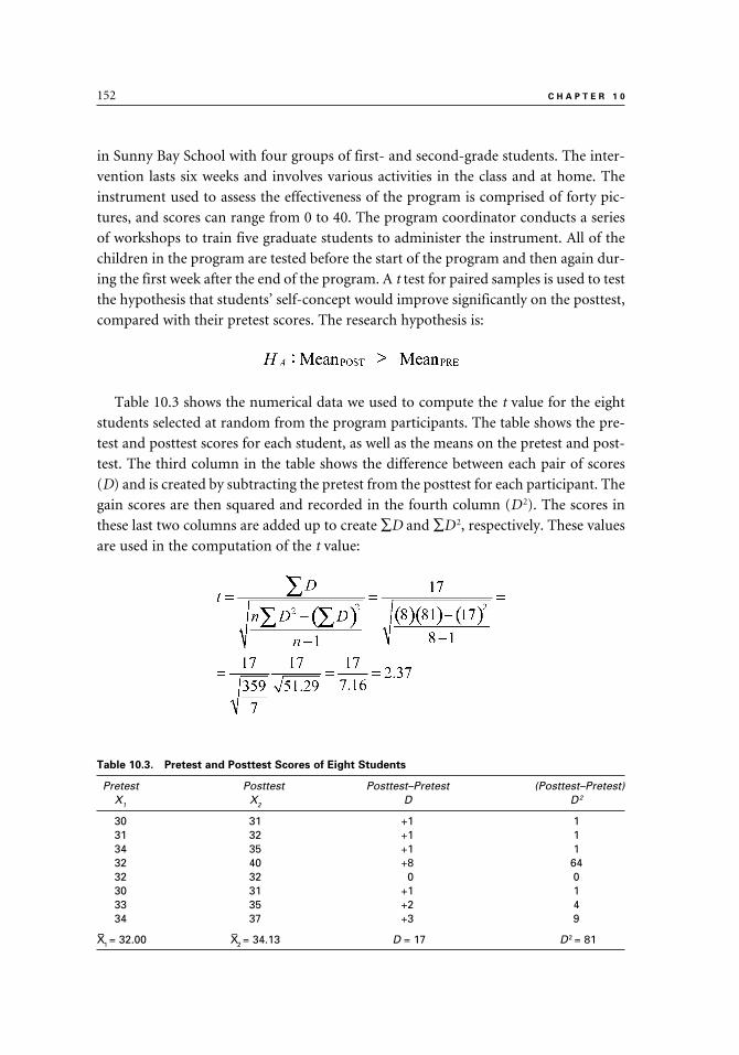
152 C H A P T E R 1 0
in Sunny Bay School with four groups of first- and second-grade students. The inter-
vention lasts six weeks and involves various activities in the class and at home. The
instrument used to assess the effectiveness of the program is comprised of forty pic-
tures, and scores can range from 0 to 40. The program coordinator conducts a series
of workshops to train five graduate students to administer the instrument. All of the
children in the program are tested before the start of the program and then again dur-
ing the first week after the end of the program. A t test for paired samples is used to test
the hypothesis that students’ self-concept would improve significantly on the posttest,
compared with their pretest scores. The research hypothesis is:
Table 10.3 shows the numerical data we used to compute the t value for the eight
students selected at random from the program participants. The table shows the pre-
test and posttest scores for each student, as well as the means on the pretest and post-
test. The third column in the table shows the difference between each pair of scores
(D) and is created by subtracting the pretest from the posttest for each participant. The
gain scores are then squared and recorded in the fourth column (D 2). The scores in
these last two columns are added up to create ∑D and ∑D 2, respectively. These values
are used in the computation of the t value:
Table 10.3. Pretest and Posttest Scores of Eight Students
Pretest Posttest Posttest–Pretest (Posttest–Pretest)X1 X2 D D2
30 31 +1 131 32 +1 134 35 +1 132 40 +8 6432 32 0 030 31 +1 133 35 +2 434 37 +3 9
X–1 = 32.00 X–2 = 34.13 D = 17 D2 = 81
9781442206564_epdf.indb 1529781442206564_epdf.indb 152 9/1/10 7:10 AM9/1/10 7:10 AM

t T E S T 153
Our computations show that the obtained t value is 2.37. This obtained t value
is then compared to the values in the abbreviated table of critical values of the t
distribution (table 10.4). The obtained t value of 2.37 exceeds the critical values
for one-tailed test under p = .05 and the critical value of p = .025. The obtained t
value does not exceed the critical value under p < .01, which is 2.998. Therefore, we
reject the null hypothesis that states that there is no difference between the pretest
and the posttest scores and report our results as significant at the p < .025 level. The
chance that these results were obtained purely by chance is less than 2.5 percent. We
confirm the research hypothesis that predicted that the posttest mean score would
be significantly higher than the pretest mean score. According to this study, the
self-concept enhancement program was effective in increasing the self-concept of
first- and second-grade students.
Our data seem to indicate that the intervention to increase the self-concept of the
primary grade students was effective. However, those conducting the research or those
reading about it should still decide for themselves whether the intervention is worth-
while. The question to be asked is whether an increase of 2.13 points (out of forty pos-
sible points on the scale) is worth the investment of time, money, and effort.
t TEST FOR A SINGLE SAMPLE
Occasionally, a researcher is interested in comparing a single group (a sample) to a
larger group (a population). For example, a high school teacher of a freshmen-accel-
erated English class may want to confirm that the students in that class had obtained
higher scores on an English placement test compared with their peers. In order to carry
out this kind of a study the researcher must know prior to the start of the study the
mean value of the population. In this example, the mean score of the population is the
overall mean of the scores of all freshmen on the English placement test.
An Example of a t Test for a Single Sample
A kindergarten teacher in a school commented to her colleague that the students
in her class this year seem to be less bright than those she had in the past. Her col-
league disagrees with her, and to test whether the first-graders this year are really
different from those in previous years, they conduct a t test for a single sample. The
Table 10.4. Abbreviated Table of Critical Values of the t Distribution
Level of significance (p value) for one-tailed test
p values .10 .05 .025 .01 .005
Level of significance (p value) for two-tailed test
p values .20 .10 .05 .02 .01
df = 7 1.415 1.895 2.365 2.998 3.499
9781442206564_epdf.indb 1539781442206564_epdf.indb 153 9/1/10 7:10 AM9/1/10 7:10 AM

154 C H A P T E R 1 0
scores used are from the Wechsler Preschool and Primary Scale of Intelligence–
Third Edition (WPPSI-III), which is given every year to all kindergarten students in
the district. In this example, we consider the district to be the population to which
we compare the mean of the current kindergarten class. Although the mean IQ score
of the population at large is 100 (µ =100), this district’s mean IQ score is 110 (µ =
110), and this mean is used in the analysis. The research hypothesis is stated as a
null hypothesis and predicts that there is no statistically significant difference in the
mean IQ score of this year’s kindergarten students (the sample) and the mean IQ
score of all kindergarten students in the district (the population) that were gathered
and recorded over the last three years.
The formula for t test of a single sample is:
Where X–
= Sample mean
µ = Population mean
SX– = Standard error of the mean
To find SX– we use this formula:
Where SX– = Standard error of the mean
S = Sample standard deviation
n = Number of individuals in the sample
Table 10.5. IQ Scores of Ten Students
Scores
115 118135 113105 98107 120112 99
ΣX = 1122X– = 112.20S (SD) = 10.94
9781442206564_epdf.indb 1549781442206564_epdf.indb 154 9/1/10 7:10 AM9/1/10 7:10 AM

t T E S T 155
In order to test their hypothesis, the two teachers randomly select IQ scores of ten
students from this year’s kindergarten class. These IQ scores are listed in table 10.5,
followed by the computation of the t value.
The degrees of freedom in this study are nine (number of students in the sample
minus one). We examine the p values for a two-tailed t test because our hypothesis is
stated as a null hypothesis. Table 10.6 shows the critical values for df = 9.
The obtained t value of 0.64 does not exceed the critical value under p = .05, which
is 2.262. Thus, the null hypothesis is retained. Based on these results, the two teachers
conclude that there is no significant difference between this year’s kindergarten class
and the “typical” kindergarten students in the district. In fact, the mean IQ score of
this year’s kindergarten students (mean = 112.20) is actually slightly higher than the
mean score of the district (mean = 110). The research hypothesis that was stated in a
null form (i.e., predicting no difference between the two means) is confirmed.
SUMMARY
1. The t test is used to compare two means to determine whether the difference between them is statistically significant.
2. The t test requires data measured on an interval or ratio scale.3. A directional hypothesis in t test predicts which of the two means is going to
be higher (HA: Mean1 > Mean2).4. A nondirectional hypothesis in a t test predicts a difference between the two
means but does not specify which mean will be higher (HA: Mean1 ≠ Mean 2).5. The null hypothesis in t test states that any observed difference between the
means is too small to indicate a real difference between them and that such a difference is probably due to sampling error. In other words, the null hypoth-esis always predicts no difference between the means beyond what might happen purely by chance (H0: Mean1 = Mean2).
Table 10.6. Critical values for df = 9
Level of significance (p value) for one-tailed test
p values .10 .05 .025 .01 .005
Level of significance (p value) for two-tailed test
p values .20 .10 .05 .02 .01
df = 9 1.383 1.833 2.262 2.821 3.250
9781442206564_epdf.indb 1559781442206564_epdf.indb 155 9/1/10 7:10 AM9/1/10 7:10 AM

156 C H A P T E R 1 0
6. When using the table of critical values, directional hypotheses are tested using the one-tailed test, and nondirectional hypotheses are tested using the two-tailed test. When in doubt, use the two-tailed test, which is more conservative.
7. The t test can be used to compare means from: (a) two independent groups, (b) two paired groups, and (c) a single sample and a population.
8. In using the t test, it is assumed that the scores of those in the groups being studied are normally distributed and that the groups were randomly selected from their respective populations. In studies conducted in educational and behavioral sciences, it is sometimes difficult to satisfy these requirements. However, empirical studies have demonstrated that we can use the t test even if these assumptions are not fully met.
9. The t test for independent samples is used when the two groups or sets of scores whose means are being compared are independent of each other. When conducting the t test for independent samples, it is assumed that the two groups being compared come from two populations whose variances are approximately the same. This assumption is called the assumption of the homogeneity of variances. We can compare the two variances to check whether they are not significantly different from each other.
10. The t test is considered a robust statistic; therefore, even if the assumption about the homogeneity of the variance is not met, the researcher can still safely use the test to analyze the data. As a general rule, it is desirable to have similar group sizes, especially when the groups are small.
11. The t test for paired samples (also called a t test for dependent, matched, or correlated samples) is used when the means come from two sets of paired scores.
12. The t test for a single sample is used when the mean of a sample is com-pared to the mean of a population. In order to carry out this kind of a study the researcher must know prior to the start of the study the mean value of the population.
13. In studies that compare the means of experimental and control groups, the
effect size (ES) may also be calculated, in addition to the t value.
9781442206564_epdf.indb 1569781442206564_epdf.indb 156 9/1/10 7:10 AM9/1/10 7:10 AM

11
Analysis of Variance
In chapter 11, you will learn about the statistical procedure called analysis of variance (abbreviated as ANOVA). This is a procedure used to test for significant differences between means when there are two or more means. There are several types of ANOVA tests; in this book we introduce you to the two most common. The test statistic that is computed in ANOVA is called the F ratio. One-way ANOVA can be thought of as an extension of the t test for independent samples. However, when there are multiple means to compare, ANOVA also can compare all means simultaneously; to do so using the t test, you would need to conduct a series of comparisons, two means at a time. The concept of one-way ANOVA is explained in detail with the use of graphs. The numerical example in the chapter walks you step-by-step through the data analysis and interpretation. As you will see, when the results of the one-way ANOVA are statistically significant, we conduct a post hoc pairwise comparison to determine which means are different from each other.
When there are two or more independent variables, we use a factorial ANOVA. In this chapter, we introduce you to a test called two-way ANOVA. You may wish to use this test when you have two independent variables and you want to test for an interaction between the two. Again, a numerical example is used to illustrate this statistical test.
9781442206564_epdf.indb 1579781442206564_epdf.indb 157 9/1/10 7:10 AM9/1/10 7:10 AM

158 C H A P T E R 1 1
The analysis of variance (ANOVA) test is used to compare the means of two or more
independent samples and to test whether the differences between the means are sta-
tistically significant. ANOVA, which was developed by R. A. Fisher in the early 1920s,
can be thought of as an extension of the t test for independent samples. However, a
t test can compare only two means, whereas an ANOVA can compare two or more
means simultaneously.1
Suppose, for example, that we want to compare five groups. If a t test is used, we
have to repeat it ten times to compare all the means to each other. We have to com-
pare the mean from group 1 with the means from groups 2, 3, 4, and 5; and the mean
from group 2 with the means from groups 3, 4, and 5; and so on. Every time we do a
t test, there is a certain level of error that is associated with our decision to reject the
null hypothesis, and the error is compounded as we repeat the test over and over. The
main risk is that we may make a Type I error; that is, reject the null hypothesis when
in fact it is true and should be retained (see chapter 2). By comparison, when we use
ANOVA to compare the five means simultaneously, the error level can be kept at the
.05 level (5 percent). In addition to keeping the error level at a minimum, performing
one ANOVA procedure is more efficient than doing a series of t tests.
In ANOVA, the independent variable is the categorical variable that defines the
groups that are compared (e.g., instructional methods, grade level, or marital status).
The dependent variable is the measured variable whose means are being compared
(e.g., language arts test scores, level of job satisfaction, or test anxiety).
There are several assumptions for ANOVA: (a) the groups are independent of each
other, (b) the dependent variable is measured on an interval or ratio scale, (c) the de-
pendent variable is normally distributed in the population, (d) the scores are random
samples from their respective populations, and (e) the variances of the populations
from which the samples were drawn are equal (the assumption of the homogeneity of
variances). The first two assumptions (a and b) must always be satisfied. Assumptions
c and d are often difficult to satisfy in education and behavioral sciences. Nonetheless,
even if we cannot determine that random sampling was used, we can generally satisfy
the requirement that the samples are not biased. ANOVA is considered a robust statis-
tic that can stand some violation of the third and fourth assumptions, and empirical
studies show that there are no serious negative consequences if these assumptions are
not fully met. The last assumption (e) can be tested using special tests, such as the F
test, in which the largest variance is divided by the smallest variance.
1. HINT: Although ANOVA can be used with two or more groups, most researchers use the independent-samples t test when the study involves two independent groups, and ANOVA is used when there are three or more independent groups in the study.
9781442206564_epdf.indb 1589781442206564_epdf.indb 158 9/1/10 7:10 AM9/1/10 7:10 AM

A N A L Y S I S O F V A R I A N C E 159
The test statistic in ANOVA is called the F statistic. The F ratio (or F value) is com-
puted by dividing two variance estimates by each other.2 If the F ratio is statistically
significant (i.e., if p < .05) and if there are three or more groups in the study, then a
pairwise comparison is done to assess which two means are significantly different from
each other.3
When one independent variable is used, the test is called a one-way analysis of variance (one-way ANOVA). To illustrate, let’s look at a study to test the effect of
three instructional methods on the reading scores of first-grade students. In this study,
the instructional method is the independent variable and the students’ reading scores
are the dependent variable. Three instructional methods are tested: phonics, whole
language, and a combination of phonics and whole language. At the end of the year,
the scores of the students who were taught reading using the three instructional ap-
proaches are compared to each other using a one-way ANOVA. The F ratio would be
used to assess whether there are significant differences in the mean scores of the three
groups of students.
The ANOVA test can be applied to studies with more than one independent vari-
able. For example, we can study the relationship between two independent variables
and a dependent variable. When there are two independent variables, the design is
called a two-way analysis of variance. In general, when two or more independent vari-
ables are studied in ANOVA, the design is called a factorial analysis of variance.
Let’s go back to our example of the three reading instructional methods and first-
grade students’ reading scores. The three instructional methods were phonics, whole
language, and a combination of phonics and whole language. Based on prior research
and our own experience, suppose we believe that the students’ gender also makes a
difference and that reading scores of first-grade boys and girls would differ depending
on the reading instructional method used by their teacher. A two-way ANOVA can be
used to explore the effect of the two independent variables (instructional method and
gender) on the dependent variable (reading scores). In addition, using the two-way
ANOVA would allow us to study the interactions among all variables. In the factorial
ANOVA test, the interaction refers to a situation where one or more levels of the in-
dependent variable have a different effect on the dependent variable when combined
with another independent variable. For example, we may find that boys score higher
in reading when their teacher uses the phonics method, whereas girls’ reading scores
are higher when their teacher uses the whole-language approach.
2. HINT: Even though the ANOVA test is designed to compare means, the samples’ variances and variance estimates are used in the computation of the F ratio.
3. HINT: An example of the pairwise comparison is discussed later in this chapter in the section titled “Post Hoc Comparison.”
9781442206564_epdf.indb 1599781442206564_epdf.indb 159 9/1/10 7:10 AM9/1/10 7:10 AM

160 C H A P T E R 1 1
An independent variable must have at least two levels (or conditions). For example,
the variable of gender has two levels (female and male) and the variable of the seasons
of the year has four levels (fall, winter, spring, and summer). To further explain the
concept of levels of independent variables, let’s look at the following examples of two-
way and three-way ANOVA tests.
Suppose we conduct a study of high school students to investigate the relationship
between two independent variables, gender and socioeconomic status (SES), and their
effect on the students’ attitudes toward school (the dependent variable). The variable
of gender has two levels (female and male), and the variable of SES in this study has
three levels (low, middle, and high). The design of the study is indicated as a 2 × 3
factorial ANOVA (or a two-way ANOVA). Assume we want to add a third variable
to our study, such as the level of education of the students’ parents. In our study, the
variable of parents’ education would have three levels or categories. We would assign
a code of 1–3 to each student depending on the parents’ level of education. A code of
1 would be assigned to students if their parents did not go to college; a code of 2 would
be assigned to students if at least one of their parents has had a minimum of two years
of college education; a code of 3 would be assigned to students if both parents have
had a minimum of two years of college education. The design of our study would be:
2 × 3 × 3 ANOVA.
ONE-WAY ANOVA
Conceptualizing the One-Way ANOVA
ANOVA studies three types of variability that are called the sum of squares (ab-
breviated as SS). They are:
1. Within-groups sum of squares (SSW
), which is the variability within the groups.
2. Between-groups sum of squares groups (SSB), which is the average variability of the
means of the groups around the total mean. (The total mean is the mean of all the
scores, combined.) (It may also be called among-groups sum of squares, abbreviated
as SSA).
3. Total sum of squares (SST), the variability of all the scores around the total mean.4
The total sum of squares is equal to the combined within-groups sum of squares
and the between-groups sum of squares:
4. HINT: Think of it as combining the scores from all the groups to create one large group and computing the variability of this group around the total mean.
9781442206564_epdf.indb 1609781442206564_epdf.indb 160 9/1/10 7:10 AM9/1/10 7:10 AM

A N A L Y S I S O F V A R I A N C E 161
Figure 11.1 illustrates the different sum of squares and shows that the sum of
squares within (SSW
) plus the total sum between (SSB) equal the total sum of squares
(SST). In this figure, X
1 is the score of an individual in Group 1; X
–1 is the mean of
Group 1; and X–
1 is the total mean.
After finding the sums of squares, the next step is to compute the variance esti-
mates. The variance estimates are called the mean squares, abbreviated as MS. The
mean squares are found by dividing the sum of squares (SS) by the appropriate degrees
of freedom. This process is similar to the computation of a variance for a single sample
where we divided the sum of the squared distances of scores around their means (the
sum of squared deviations) by n – 1 (see chapter 5). In ANOVA, the degrees of free-
dom are used in place of N – 1 as the denominator when computing the variance.
The degrees of freedom for within (dfW
) are found by subtracting the number of
groups in the study (i.e., K) from the total number of individuals in the study (N – K).
The degrees of freedom for between (dfB) are found by subtracting 1 from the total
number of groups (K – 1). The degrees of freedom associated with the total variance
estimate (dfT) are the total number of scores minus 1 (N – 1). The df
T is equal to the
combined degrees of freedom for the within mean square (dfW
) and between mean
squares (dfB). For example, let’s say we have three groups in our study with twenty
people in each group. The total number of people in the study is 60 (3 × 20 = 60). In
this example, K = 3, n = 20, and N = 60. We calculate the degrees of freedom as follows:
dfW
= N – K = 15 – 3 = 12
dfB = K – 1 = 3 – 1 = 2
dfT = N – 1 = 15 – 1 = 14
FIGURE 11.1
A graph showing the three sums of squares: SSW, SSB, and SST.
9781442206564_epdf.indb 1619781442206564_epdf.indb 161 9/1/10 7:10 AM9/1/10 7:10 AM
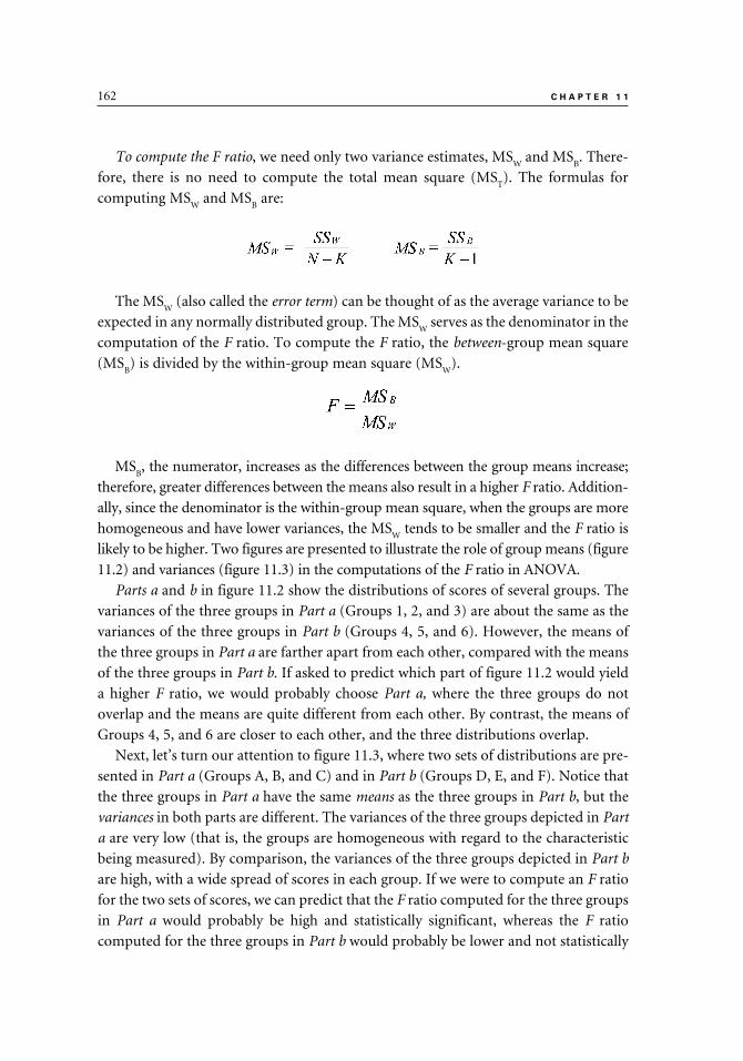
162 C H A P T E R 1 1
To compute the F ratio, we need only two variance estimates, MSW
and MSB. There-
fore, there is no need to compute the total mean square (MST). The formulas for
computing MSW
and MSB are:
The MSW
(also called the error term) can be thought of as the average variance to be
expected in any normally distributed group. The MSW
serves as the denominator in the
computation of the F ratio. To compute the F ratio, the between-group mean square
(MSB) is divided by the within-group mean square (MS
W).
MSB, the numerator, increases as the differences between the group means increase;
therefore, greater differences between the means also result in a higher F ratio. Addition-
ally, since the denominator is the within-group mean square, when the groups are more
homogeneous and have lower variances, the MSW
tends to be smaller and the F ratio is
likely to be higher. Two figures are presented to illustrate the role of group means (figure
11.2) and variances (figure 11.3) in the computations of the F ratio in ANOVA.
Parts a and b in figure 11.2 show the distributions of scores of several groups. The
variances of the three groups in Part a (Groups 1, 2, and 3) are about the same as the
variances of the three groups in Part b (Groups 4, 5, and 6). However, the means of
the three groups in Part a are farther apart from each other, compared with the means
of the three groups in Part b. If asked to predict which part of figure 11.2 would yield
a higher F ratio, we would probably choose Part a, where the three groups do not
overlap and the means are quite different from each other. By contrast, the means of
Groups 4, 5, and 6 are closer to each other, and the three distributions overlap.
Next, let’s turn our attention to figure 11.3, where two sets of distributions are pre-
sented in Part a (Groups A, B, and C) and in Part b (Groups D, E, and F). Notice that
the three groups in Part a have the same means as the three groups in Part b, but the
variances in both parts are different. The variances of the three groups depicted in Part
a are very low (that is, the groups are homogeneous with regard to the characteristic
being measured). By comparison, the variances of the three groups depicted in Part b
are high, with a wide spread of scores in each group. If we were to compute an F ratio
for the two sets of scores, we can predict that the F ratio computed for the three groups
in Part a would probably be high and statistically significant, whereas the F ratio
computed for the three groups in Part b would probably be lower and not statistically
9781442206564_epdf.indb 1629781442206564_epdf.indb 162 9/1/10 7:10 AM9/1/10 7:10 AM

FIGURE 11.2
A graph showing three groups with different means and similar variances (Part a), and a graph showing three groups with similar means and similar variances (Part b).
FIGURE 11.3
A graph showing three distributions with small variances (Part a), and a graph showing three distributions with the same means as the groups in Part a but with higher variances (Part b).
9781442206564_epdf.indb 1639781442206564_epdf.indb 163 9/1/10 7:11 AM9/1/10 7:11 AM

164 C H A P T E R 1 1
significant. This prediction is based on the knowledge that when the group variances
are low (as is the case in Part a), MSW
(the denominator in the F ratio computation)
is low and we are more likely to get a high F ratio. The variances in Part b are higher
than those in Part a, and we can expect a higher MSW
and a lower F ratio.
Once the F ratio is obtained, we have to decide whether to retain or reject the null
hypothesis. Retaining the null hypothesis means that the sample means are not signifi-
cantly different from each other beyond what might be expected purely by chance, and
we consider them as coming from the same population. Rejecting the null hypothesis
means that at least two sample means differ significantly from each other.
In studies where the null hypothesis is rejected, the next step is to conduct a post hoc comparison, in which all possible pairs of means are compared in order to find
out which pair(s) of means differ(s). When the researcher predicts which means are
expected to differ before starting the investigation, a method of a priori (or planned)
comparisons is used to test this prediction. A priori comparisons are appropriate when
the researcher has a sound basis for predicting the outcomes before starting the study,
while post hoc comparisons are appropriate in exploratory studies or when no specific
prediction is made prior to the start of the study.
Hypotheses for a One-Way ANOVA
A one-way ANOVA tests the null hypothesis (HO) that states that all the groups
represent populations that have the same means. When there are three means, the null
hypothesis is5
The alternative hypothesis, HA (also called the research hypothesis), states that there
is a statistically significant difference between at least two means. When there are three
groups, the alternative hypothesis is
HA : µ
1 ≠ µ
2 and/or µ
1 ≠ µ
3 and/or µ
2 ≠ µ
3
The ANOVA Summary Table
The results of the ANOVA computations are often displayed in a summary table
(see table 11.1). This table lists the sum of squares (SS), degrees of freedom (df), mean
squares (MS), F ratio (F), and the level of significance (p level). The general format of
the ANOVA summary table is:
5. HINT: Although samples are studied, as with other statistical tests, we are interested in the populations that are represented by these samples. Therefore, in the null and alternative hypotheses, µ (the Greek letter mu) is used to represent the population means.
9781442206564_epdf.indb 1649781442206564_epdf.indb 164 9/1/10 7:11 AM9/1/10 7:11 AM

A N A L Y S I S O F V A R I A N C E 165
Instead of being displayed in a summary table, the results may also be incorporated
into the text. The information in the text includes the F ratio, the degrees of freedom
for the numerator (dfB) and the degrees of freedom for the denominator (dfW). The
information is listed as F(dfB,dfW)
. The text most likely will also include the level of sta-
tistical significance (p level).
Further Interpretation of the F Ratio
Figure 11.4, Parts a, b, and c, represent three hypothetical samples and their F
ratios. Part a depicts language arts test scores of seventh-grade students from three
neighboring school districts. Note that the distributions of the three groups of students
Table 11.1. The General Format of the One-Way ANOVA Summary Table
Source SS df MS F p
Between SSB K-1 MSB F ratio <.05>Within SSW N-K MSW
Total SST N-1
FIGURE 11.4
Three sets of distributions showing different F ratios: a nonsignificant F ratio (Part a); a significant F ratio (Part b); and a significant F ratio (Part c).
9781442206564_epdf.indb 1659781442206564_epdf.indb 165 9/1/10 7:11 AM9/1/10 7:11 AM
166 C H A P T E R 1 1
overlap a great deal, and the means are not very different from each other. The F ratio
comparing the students from the three districts is probably small and not statistically
significant. Part b shows mean scores from a fifth-grade mathematics test given to
fourth-, fifth-, and sixth-grade classes. As is expected, the fourth-graders scored the
lowest, and the sixth-graders scored the highest. The F ratio comparing the fourth-
and sixth-graders is statistically significant. The figure also shows clear differences
between the fourth- and fifth-graders and between the fifth- and sixth-graders. There-
fore, the ANOVA test that compares these groups to each other is likely to yield an F
ratio that is statistically significant. Part c shows mean scores on an aggression scale,
given to three groups after an intervention designed to decrease aggression. The three
groups are: control (C), placebo (P), and experimental (E). Note that after the inter-
vention the experimental group had the lowest aggression mean score, followed by the
placebo group, while the control group scored the highest. The difference between the
experimental group and the placebo group may be statistically significant, and, quite
likely, there is a statistically significant difference between the experimental and con-
trol groups. The difference between the placebo and the control groups is probably not
statistically significant. We can speculate that in this hypothetical example, the F ratio
is probably large enough to lead us to reject the null hypothesis.
An Example of a One-Way ANOVA
Professor Learner, the statistics course instructor at Midwestern State University,
wants to test four instructional methods for teaching statistics. Students who signed
up to take her statistics course are assigned at random to four sections: Section 1 is
taught online; Section 2 is taught using lectures; Section 3 is taught using independent
study; and Section 4 is taught using a combination of lectures, group work, and online
work. In this study, the instructional methods are the independent variable. Students
in all four sections have to take five quizzes and a comprehensive final examination
(the dependent variable). The scores on each quiz can range from 1 to 15. With four
sections, the null hypothesis (HO) and the alternative hypothesis (H
A) are:
The subscripts i and j can represent any two of the four sections. In other words,
the alternative hypothesis predicts that there will be a significant difference between
at least two of the four means. The null hypothesis predicts that there would be no
significant differences between the section means beyond what might happen purely
by chance, due to some sampling error.
9781442206564_epdf.indb 1669781442206564_epdf.indb 166 9/1/10 7:11 AM9/1/10 7:11 AM

A N A L Y S I S O F V A R I A N C E 167
To illustrate the computations of ANOVA, we choose at random the scores of
five students from each section on one of the quizzes. These quiz scores are the
dependent variable. Of course, if this was a real study, we would have used a much
larger sample size!
Table 11.2 lists the scores of the twenty randomly selected students. The sample
sizes and means (n and X–
) are listed for each section and for the total group (N and
X–
T). As we can see, there are differences between the means of the four groups (X
–1 =
13.8, X–
2 = 13.2, X
–3 = 11.2, and X
–4 = 14.6). The question is whether these differences are
statistically significant or are due to chance; ANOVA can help us answer this question.
(Note that our numerical example does not include the computational steps because
we are likely to use a computer program to do the calculations for us.)
The numerical results are displayed in an ANOVA summary table (table 11.3). The
table lists the three sources of variability (SS), the three degrees of freedom (df), the
two mean squares (MS), the F ratio, and the p value.
Our conclusion is that the teaching method does make a difference in the students’
test scores. As indicated in table 11.2, students in Section 4, where the teaching method
was a combination of lectures, group work, and online work obtained the highest
quiz scores. The second highest mean quiz score was obtained by students in Section
1 (Online), followed by Section 2 (Lectures). The students in Section 3 (Independent
Study) obtained the lowest mean score on the quiz.
Since our F ratio was significant at the p < .01 level, our next step is to conduct
a post hoc comparison to find out which means are significantly different from each
other. In our example, we use the Tukey method for the post hoc comparisons.
Table 11.2. Raw Scores and Summary Scores for Four Groups on a Statistics Quiz
Online Lectures Independent Study CombinedSection 1 Section 2 Section 3 Section 4 TOTAL
14 14 11 1515 13 10 1413 11 11 1513 13 14 1414 15 10 15
n1 = 5 n2 = 5 n3 = 5 n4 = 5 NT = 20X–1 = 13.80 X–2 = 13.20 X–3 = 11.20 X–4 = 14.60 X–T = 13.20
Table 11.3. One-Way ANOVA Summary Table for the Data in Table 11.2
Source SS df MS F p
Between 31.6 3 10.53 7.14 < .01Within 23.5 16 1.48 Total 55.2 19
9781442206564_epdf.indb 1679781442206564_epdf.indb 167 9/1/10 7:11 AM9/1/10 7:11 AM
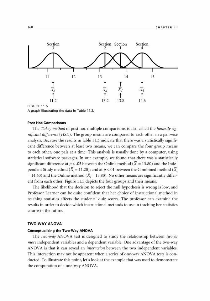
168 C H A P T E R 1 1
Post Hoc Comparisons
The Tukey method of post hoc multiple comparisons is also called the honestly sig-
nificant difference (HSD). The group means are compared to each other in a pairwise
analysis. Because the results in table 11.3 indicate that there was a statistically signifi-
cant difference between at least two means, we can compare the four group means
to each other, one pair at a time. This analysis is usually done by a computer, using
statistical software packages. In our example, we found that there was a statistically
significant difference at p < .05 between the Online method (X–
1 = 13.80) and the Inde-
pendent Study method (X–
3 = 11.20); and at p <.01 between the Combined method (X
–4
= 14.60) and the Online method (X–
1 = 13.80). No other means are significantly differ-
ent from each other. Figure 11.5 depicts the four groups and their means.
The likelihood that the decision to reject the null hypothesis is wrong is low, and
Professor Learner can be quite confident that her choice of instructional method in
teaching statistics affects the students’ quiz scores. The professor can examine the
results in order to decide which instructional methods to use in teaching her statistics
course in the future.
TWO-WAY ANOVA
Conceptualizing the Two-Way ANOVA
The two-way ANOVA test is designed to study the relationship between two or
more independent variables and a dependent variable. One advantage of the two-way
ANOVA is that it can reveal an interaction between the two independent variables.
This interaction may not be apparent when a series of one-way ANOVA tests is con-
ducted. To illustrate this point, let’s look at the example that was used to demonstrate
the computation of a one-way ANOVA.
FIGURE 11.5
A graph illustrating the data in Table 11.2.
9781442206564_epdf.indb 1689781442206564_epdf.indb 168 9/1/10 7:11 AM9/1/10 7:11 AM

A N A L Y S I S O F V A R I A N C E 169
Four different instructional methods were tested with four sections of students
enrolled in a college statistics course. Students who registered to take the course were
assigned at random to one of the four sections. The means on a quiz administered to
students in all four sections were compared to each other using a one-way ANOVA.
Suppose we want to further divide the students in each group by their major in col-
lege, by ability level, or by gender. It is possible to conduct another ANOVA test to
compare, for example, the quiz scores of psychology students in all four instructional
methods to the scores of their classmates who major in history. We can run two sepa-
rate one-way ANOVA tests; one to compare the four methods and one to compare the
two majors. However, instead of running these two tests, we can do a single two-way
ANOVA test. The two-way ANOVA would allow us to compare simultaneously the
method effect, the college major effect, and the possible effect of the interaction be-
tween the method and the major on the students’ quiz scores. For example, psychology
students may score higher using one instructional method, whereas history students
may do better using another method.
The total variation in a two-way ANOVA is partitioned into two main sources: the
within-groups variation and the between-groups variation. The between group varia-
tion is further partitioned into three components: (a) the variation among the row
means, (b) the variation among the column means, and (c) the variation due to the
interaction.
Four mean squares (MS) are computed in a two-way ANOVA. Two are computed
for the two main effects (the independent variables), one is computed for the interac-
tion, and one for the within. Then, using the mean squares within (MSW
) as the de-
nominator, three F ratios are computed. These F ratios are found by dividing each of
the three mean squares (MSRow
, MSColumn
, and MSRow X Column
) by MSW
. As was the case
with a one-way ANOVA, a summary table is used to display the two-way ANOVA
summary information. The table includes the sum of squares, degrees of freedom,
mean squares, F ratios, and p levels.
Hypotheses for the Two-Way ANOVA
A two-way ANOVA is conducted to test three null hypotheses about the effect of
each of the two independent variables on the dependent variable and about the in-
teraction between the two independent variables. The two independent variables (or
factors) are referred to as the row variable and the column variable.
To test the three null hypotheses, three F ratios are calculated in a two-way ANOVA.
The three null hypotheses are:
HO(Row)
: There are no statistically significant differences among population means on
the dependent measure for the first factor (the row factor).
9781442206564_epdf.indb 1699781442206564_epdf.indb 169 9/1/10 7:11 AM9/1/10 7:11 AM

170 C H A P T E R 1 1
HO(Column)
: There are no statistically significant differences among the population
means on the dependent measure for the second factor (the column factor).
HO(Interaction)
: In the population, there is no statistically significant interaction between
Factor 1 and Factor 2 (the row × column interaction).
Graphing the Interaction
It is often helpful to further study the interaction by graphing it. To create the in-
teraction graph, the mean scores on the dependent variable are marked on the vertical
axis. Lines are then used to connect the means of the groups.
Suppose, for example, that we want to conduct a study to investigate two methods
designed to increase the attention span of third- and sixth-grade students using two
behavior modification methods. In this study, students’ grade level is one independent
variable; the second independent variable is the behavior modification method. Half
of the students in grade three and half of the students in grade six are taught using
Method 1. The other half in each class is taught using Method 2. The dependent vari-
able is the students’ attention span. Figure 11.6 shows two possible outcomes of the
study: the interaction is significant and the lines intersect (Part a); and the interaction
is not significant and the lines are parallel (Part b).
Part a in figure 11.6 shows that there was an interaction effect between the behavior
modification method and student grade level. We can conclude that Method 1 was
more effective with the sixth-graders, and Method 2 was more effective with the third-
graders regarding their attention span. Part b shows no interaction effect. Method 1
was more effective for both the third-graders and the sixth-graders, and Method 2 was
less effective for both grade levels. In addition, the sixth-graders who were taught using
FIGURE 11.6
A graph showing a statistically significant interaction (Part a), and a graph showing an interac-tion that is not statistically significant (Part b).
9781442206564_epdf.indb 1709781442206564_epdf.indb 170 9/1/10 7:11 AM9/1/10 7:11 AM
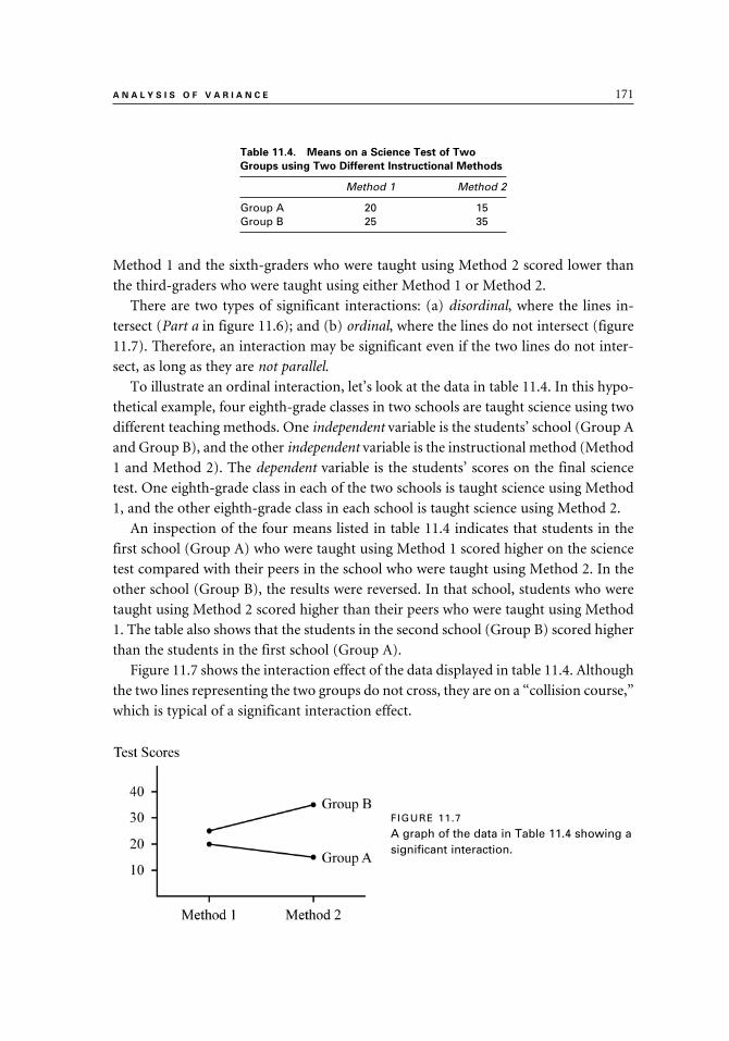
A N A L Y S I S O F V A R I A N C E 171
Method 1 and the sixth-graders who were taught using Method 2 scored lower than
the third-graders who were taught using either Method 1 or Method 2.
There are two types of significant interactions: (a) disordinal, where the lines in-
tersect (Part a in figure 11.6); and (b) ordinal, where the lines do not intersect (figure
11.7). Therefore, an interaction may be significant even if the two lines do not inter-
sect, as long as they are not parallel.
To illustrate an ordinal interaction, let’s look at the data in table 11.4. In this hypo-
thetical example, four eighth-grade classes in two schools are taught science using two
different teaching methods. One independent variable is the students’ school (Group A
and Group B), and the other independent variable is the instructional method (Method
1 and Method 2). The dependent variable is the students’ scores on the final science
test. One eighth-grade class in each of the two schools is taught science using Method
1, and the other eighth-grade class in each school is taught science using Method 2.
An inspection of the four means listed in table 11.4 indicates that students in the
first school (Group A) who were taught using Method 1 scored higher on the science
test compared with their peers in the school who were taught using Method 2. In the
other school (Group B), the results were reversed. In that school, students who were
taught using Method 2 scored higher than their peers who were taught using Method
1. The table also shows that the students in the second school (Group B) scored higher
than the students in the first school (Group A).
Figure 11.7 shows the interaction effect of the data displayed in table 11.4. Although
the two lines representing the two groups do not cross, they are on a “collision course,”
which is typical of a significant interaction effect.
Table 11.4. Means on a Science Test of Two
Groups using Two Different Instructional Methods
Method 1 Method 2
Group A 20 15Group B 25 35
FIGURE 11.7
A graph of the data in Table 11.4 showing a significant interaction.
9781442206564_epdf.indb 1719781442206564_epdf.indb 171 9/1/10 7:11 AM9/1/10 7:11 AM

172 C H A P T E R 1 1
When, in addition to having a significant interaction, the two main effects (the row
variable and the column variable) are also significant, it may be difficult to interpret
the results. Figure 11.8 illustrates another hypothetical example of interaction, show-
ing the means of two groups (Group A and Group B) and two teaching methods
(Method 1 and Method 2). As you can see, the interaction is significant (the lines
cross). Group A scored higher than Group B when Method 2 was used, and Group B
scored a bit higher than Group A when Method 1 was used.
Looking at figure 11.8, we can speculate that in addition to a significant F ratio for
the interaction, the two F tests for main effects (methods and groups) are also signifi-
cant. Those interpreting the results from the study should exercise caution when they
make a decision about the efficacy of the teaching methods.
The Two-Way ANOVA Summary Table
As was mentioned, the results of the computations of a two-way ANOVA test are
presented in a summary table, similar to the table that is used for presenting the results
of a one-way ANOVA (see table 11.1). Each of the two factors in a two-way ANOVA
(which are also called the main effects) is associated with an F ratio. Similarly, the
interaction is analyzed using its own F ratio. As in the one-way ANOVA, a summary
table is used to display the results of the two-way ANOVA analyses (see table 11.5).
Note, though, that there are three F ratios in table 11.5, as opposed to a single F ratio
in the one-way ANOVA (see table 11.1). The three F ratios in a two-way ANOVA are
Table 11.5. Two-Way ANOVA Summary Table
Source SS df MS F p
Main Effects Factor 1 (row) SSR no. of levels – 1 MSR FR <.05> Factor 2 (column) SSC no. of levels – 1 MSC FC <.05> Interaction SSRxC dfrow × dfcol. MSRxC FRxC <.05>Within Groups1 SSW N – K MSW Total SST N – 1
1. A HINT: The “Within” (i.e., within groups) listed under the “Source” column is also called Residual or Error.
FIGURE 11.8
A graph showing a significant interaction and significant main effects.
9781442206564_epdf.indb 1729781442206564_epdf.indb 172 9/1/10 7:11 AM9/1/10 7:11 AM

A N A L Y S I S O F V A R I A N C E 173
designed to test the three null hypotheses. Table 11.5 also shows the computations of
the degrees of freedom associated with each of the three F tests.
An Example of a Two-Way ANOVA
Two fourth-grade teachers in Lincoln School want to know if the gender of the main
character in a story makes a difference in their students’ interest in stories they read.
Their two fourth-grade classes are similar to each other in their student makeup, and
each includes fourteen girls and fourteen boys.6 The teachers choose two books where
the main character is a girl and two books where the main character is a boy. The four
stories are comparable in terms of plot, length, and readability level. Fourteen girls in
one classroom and fourteen boys in the other classroom are asked to choose one of the
two stories with a girl as the main character. The other fourteen boys and fourteen girls
are asked to choose one of the stories with a boy as the main character. All students
are asked to read their stories and complete an interest inventory designed to measure
their interest in the stories read. Scores on the interest inventory can range from 10 to
50 points. Table 11.6 presents the scores of all fifty-six students, as well as the groups’
means. The rows show the scores of the boys and girls in both classes, and the columns
show the scores of the two groups of students who read the two types of stories (a story
with a female main character and a story with a male main character).7
6. HINT: Although ANOVA assumes that the groups are random samples from their respective populations, in studies conducted in a typical school this assumption may not be fully met. As mentioned before, empirical studies have shown that ANOVA can be conducted under such conditions without seriously affecting the results, especially when the group sizes are similar.
7. HINT: Remember that in ANOVA, each mean represents a separate and independent group of individuals and no person can appear in more than one group. In our example, each student read either a story with a female main character or a story with a male main character (but not both types of stories).
Table 11.6. Scores and Means of Boys and Girls Reading Stories with Male versus Female Main
Characters
Type of Story
Female as Main Character Male as Main Character Total
14 13 17 10 18 19 17 18 20 18Boys 16 15 15 15 16 17 16 18 20 19 X–B = 16.46 14 17 16 15 18 17 16 17
X– = 15.07 X– = 17.86
17 20 19 19 20 18 14 16 15 14Girls 18 16 15 17 19 13 17 15 14 14 X–G = 16.39 18 16 17 18 13 16 15 16
X– = 17.79 X– = 15.00
Total X–F = 16.43 X–M = 16.43
9781442206564_epdf.indb 1739781442206564_epdf.indb 173 9/1/10 7:11 AM9/1/10 7:11 AM

174 C H A P T E R 1 1
Note that the total mean of the twenty-eight boys on the interest inventory (X–
B
= 16.46) is almost identical to the total mean of the twenty-eight girls (X–
G = 16.39).
There is also no difference in the students’ interest in the two stories read (see the two
column totals); the mean score for the boys and girls who read a story with a female
character (X–
F = 16.43) is identical to the mean score for the group of boys and girls
who read a story with a male character (X–
M = 16.43).
The interaction of student gender (the row factor) and the type of story read (the
column factor) is displayed in figure 11.9. The figure shows that the lines cross, indi-
cating a significant interaction of the two factors. There is a clear preference by boys to
read stories where the main character is a male, while girls prefer stories with a female
main character.
The two-way ANOVA summary table (table 11.7) lists the sum of squares (SS),
the degrees of freedom (df), the mean squares (MS), the F ratios, and the level of
significance (p value).8 The F ratios in the summary table confirm our earlier inspec-
tion of table 11.6. The F ratio for rows (comparing the interests of boys and girls) and
the F ratio for columns (comparing the interest in the two types of stories) are not
statistically significant (F = 0.03 and F = 0.00, respectively). However, the F ratio for
the interaction effect is very high (F = 43.13) with a p value of < .001. We can be very
confident about our decision to reject the null hypothesis. There is a strong interaction
between the students’ gender and their interest in the story they read.
If we had conducted two one-way ANOVA tests instead of the single two-way
ANOVA test, we might have concluded the following: (a) there is no difference in the
level of interest expressed by boys and girls toward the two types of stories (a nonsig-
nificant F ratio for rows), and (b) the gender of the main character in the story does not
make a difference in student’s attitudes toward the stories (a nonsignificant F ratio for
the columns). Upon inspecting the means in table 11.6, the interaction diagram in figure
8. HINT: The detailed computations of the three F ratios are not included in this book. The data presented in table 11.7 were analyzed using a computer statistical software package.
FIGURE 11.9
A graph showing the mean scores and significant interaction of the two factors (student gender and gender of the main
character) of the data in Table 11.6.
9781442206564_epdf.indb 1749781442206564_epdf.indb 174 9/1/10 7:11 AM9/1/10 7:11 AM

A N A L Y S I S O F V A R I A N C E 175
11.9, and the level of statistical significance (p values) in table 11.7, it becomes clear that
there is a difference between boys and girls in their level of interest toward the two types
of stories. In our fictitious study, the boys were more interested in a story with a male
as the main character, and the girls were more interested in a story with a female as the
main character. If this were a real study, instead of a fictitious one, the implications for
educators would have been that the selection of stories for their students should be made
carefully, taking into consideration the gender of the main character in the story.
SUMMARY
1. An analysis of variance (ANOVA) is used to compare the means of two or more independent samples and to test whether the differences between the means are statistically significant.
2. The one-way analysis of variance (one-way ANOVA) can be thought of as an extension of a t test for independent samples. It is used when there are two or more independent groups.
3. The independent variable is the categorical variable that defines the groups that are compared. The dependent variable is the measured variable whose means are being compared.
4. There are several assumptions for ANOVA: (a) the groups are independent of each other, (b) the dependent variable is measured on an interval or ratio scale, (c) the dependent variable being measured is normally distributed in the population, (d) the scores are random samples from their respective popu-lations, and (e) the variances of the populations from which the samples were drawn are equal (the assumption of the homogeneity of variances). The first two assumptions cannot be violated.
5. ANOVA is considered a robust statistic that can stand some violation of the third and fourth assumptions. Empirical studies show that there are no seri-ous negative consequences if these assumptions are not fully met. The as-sumption of the homogeneity of variances can be tested using special tests.
6. The test statistic in ANOVA is called the F statistic. The F ratio (or F value) is computed by dividing two variance estimates by each other. If the F ratio is statistically significant (i.e., if p < .05) and if there are three or more groups in the study, then a pairwise comparison is done to assess which means are significantly different from each other.
Table 11.7. Two-Way ANOVA Summary Table
Source SS df MS F
Main Effects Gender 0.07 1 0.07 0.03 Type of Character 0.00 1 0.00 0.00Interaction 108.64 1 108.64 43.13*Within Groups 131.00 52 2.52Total 239.71 55 4.36
*p < .001
9781442206564_epdf.indb 1759781442206564_epdf.indb 175 9/1/10 7:11 AM9/1/10 7:11 AM

176 C H A P T E R 1 1
7. When one independent variable is used, the design is called a one-way analysis of variance; when two independent variables are used, the design is called a two-way analysis of variance. In general, when two or more inde-pendent variables are used, the design is called a factorial ANOVA.
8. In the factorial ANOVA test, the interaction refers to a situation where one or more levels of the independent variable have a different effect on the depen-dent variable when combined with another independent variable.
9. An independent variable must have at least two levels (or conditions).10. The null hypothesis (HO) in a one-way ANOVA states that there is no sig-
nificant difference between the population means; the alternative hypothesis (HA) states that at least two population means differ significantly from each other.
11. The variability in a one-way ANOVA is divided into three sums of squares (SS): within-groups sum of squares (SSW), between-groups sum of squares (SSB), and total sum of square (SST). The SST is equal to the combined SSW and SSB.
12. The variance estimates in ANOVA are called the mean squares. The mean squares between (MSB) and the mean squares within (MSW) are obtained by dividing SSB and SSW by their corresponding degrees of freedom.
13. The MSW (also called the error term) can be thought of as the average vari-ance to be expected in any normally distributed group. The MSW serves as the denominator in the computation of the F ratio.
14. The F ratio is obtained by dividing the MSB by the MSW:
15. The results of the ANOVA test are often displayed in a summary table. The summary table includes the sum of squares, degrees of freedom, mean squares, F ratio, and level of significance (p value).
16. If the F ratio is statistically significant (p < .05), a post hoc comparison test, such as Tukey’s honestly significantly difference (HSD) test, is conducted to determine which means are significantly different from each other.
17. The two-way ANOVA test is used to compare two independent variables (or factors) simultaneously. This statistical test enables us to study the effect of each of the two factors on the dependent variable as well as the interaction of the two factors. The independent variables in factorial ANOVA are also called the main effects.
18. A two-way ANOVA is conducted to test three hypotheses about differences between the row variable, the column variable, and the interaction of these two independent variables (or factors). Three F ratios are calculated to test each of the three null hypotheses.
19. The total variation in a two-way ANOVA is partitioned into two main sources: the within-groups variation and the between-groups variation. The between-groups variation is further partitioned into three components: the variation
9781442206564_epdf.indb 1769781442206564_epdf.indb 176 9/1/10 7:11 AM9/1/10 7:11 AM
A N A L Y S I S O F V A R I A N C E 177
among the row mean, the variation among the column means, and the varia-tion due to interaction.
20. As was the case with a one-way ANOVA, the two-way ANOVA summary information is presented in a table. The summary table includes four sums of squares, four degrees of freedom, three mean squares, three F ratios, and three p levels.
21. In order to better understand an interaction, it is often helpful to graph it. To create the interaction graph, the mean scores on the dependent variable are marked on the vertical axis. Lines are then drawn to connect the means of the groups.
22. A nonsignificant interaction is represented by parallel lines, and a significant interaction is represented by nonparallel lines.
23. There are two types of significant interactions: (a) disordinal, where the lines intersect; and (b) ordinal, where the lines do not intersect (but are not parallel).
9781442206564_epdf.indb 1779781442206564_epdf.indb 177 9/1/10 7:11 AM9/1/10 7:11 AM

12
Chi Square Test
Chapter 12 introduces you to the chi square test, represented by the Greek letter chi, squared (χ2). This test uses frequencies (“head counts”) from dis-crete, categorical data, and it is the only one in the book that belongs to the type of statistics that are called nonparametric. (Nonparametric statistics can be applied to data that do not meet other, more strict requirements that are necessary for parametric statistics. Correlation and t test, for example, are considered parametric statistics.) The frequencies that are counted are called the observed frequencies, and they are compared to expected fre-quencies. The test statistic’s chi square is then computed and evaluated to determine whether it is statistically significant.
In this chapter, you will learn about two kinds of chi square tests. The test of best fit is used when there is one independent variable (e.g., com-pare responses of girls to boys on a question that requires a Yes/No an-swer; gender is the independent variable). The second test is called the test of independence, and it is used when there are two independent variables (e.g., compare the responses of administrators, teachers, and parents from two neighboring school districts to a question that requires a Yes/No an-swer; role and district are the independent variables). Numerical examples in this chapter will help you gain an appreciation and understanding of the chi square test.
9781442206564_epdf.indb 1799781442206564_epdf.indb 179 9/1/10 7:11 AM9/1/10 7:11 AM

180 C H A P T E R 1 2
The chi square (χ2) test, is applied to discrete data (i.e., nominal, categorical data).
The units of measurement that are often used are frequency counts and observations
(rather than scores). The chi square test was developed by Karl Pearson (who also
developed the Pearson product moment correlation) in 1900 in order to measure how
well-observed data fit a theoretical distribution. The chi square test belongs to a group
of statistical methods called nonparametric, or distribution-free. These statistical tests
can be applied to data that do not meet certain assumptions (e.g., being measured on
an interval or ratio scale, or being normally distributed). (See chapter 2 for a discus-
sion of measurement scales.)
The chi square statistic can be used to analyze data measured on a nominal scale,
such as gender, where there are two or more discrete categories. It can also be used
to analyze other types of numerical data (such as data measured on an interval scale)
that are first divided into logically defined and generally agreed-upon categories. For
example, IQ scores can be divided into three categories (high, average, and low) by
using the standard deviation of the IQ scale to define each category.
The chi square test is often used to analyze questionnaire data where a numeri-
cal code is assigned to groups or responses. For example, the political affiliations of
registered voters may be assigned a numerical code of 1–4 as follows: Democrats = 1;
Republicans = 2; Independents = 3; and Other = 4.1 In another example, a number is
assigned to each position in the school: teacher is coded as 1; administrator is coded as
2, and support staff is coded as 3.
In applying the chi square test, two types of frequencies are used: observed and ex-
pected. The observed frequencies (O) are based on actual (empirical) observations and
on “head counts.” An example of observed frequencies is the actual number of people
who respond “Yes” or “No” to a particular question. The expected frequencies (E) are
theoretical or based on prior knowledge. The observed and expected frequencies can
be expressed as actual head counts or as percentages. (The process for determining the
expected frequencies is explained in this chapter.)
The chi square test is used to decide whether there is a significant difference be-
tween the observed and expected frequencies, and both types of frequencies are used
in the computation of the chi square value (χ2).
Each pair of observed frequencies and its corresponding expected frequencies is
called a cell. To compute χ2, for each cell we start by computing (O – E)2 then divide
it by E. We then add up the results of the computations from each cell to obtain the
χ2 value. The formula for χ2 is:
1. HINT: Political affiliation is a nominal scale variable, and the code we assigned in this example was arbi-trarily chosen.
9781442206564_epdf.indb 1809781442206564_epdf.indb 180 9/1/10 7:11 AM9/1/10 7:11 AM

C H I S Q U A R E T E S T 181
Where χ2 = Chi square statistic
O = Observed frequencies for each cell
E = Expected frequencies for each cell
The numerator in the equation includes the difference between the observed and
expected frequencies. When there are very small differences between the observed and
expected frequencies in each cell, the numerator is small and the chi square value is
low. On the other hand, when there are large differences between the observed and
expected frequencies in each cell, the numerator is large, and, in turn, so is the chi
square value.
The degrees of freedom (df) in the chi square statistic are related to the number of
levels (i.e., categories) in the dependent variable(s). This is different from the proce-
dures for computing the degrees of freedom in other statistical tests, such as Pearson
correlation and t test, where the degrees of freedom are related to the sample sizes. This
chapter includes explanations of the proper procedures for calculating the degrees of
freedom used in the chi square analysis.
ASSUMPTIONS FOR THE CHI SQUARE TEST
Various types of data can be analyzed using the chi square statistic. Several assumptions
are required in order to apply the chi square test. These assumptions are
1. The observations should be independent of each other, and a particular response
cannot be counted in more than one category. For example, a person may not be
asked on two different occasions to respond to the same question, as if two people
each responded once. The total number of observed frequencies should not exceed
the number of participants.
2. The data must be in the form of frequencies. The total number of observed frequen-
cies must equal the total number of expected frequencies.
3. The categories, especially those that comprise ordinal, interval, or ratio scale, should
be created in some logical, defensible way. The criteria used to establish the categories
should be chosen carefully and wisely. For example, suppose one of the variables in
a study is the participants’ level of income. Income is a continuous variable, and it
is necessary to establish logical cutoff points to define the various categories. The re-
searcher may want to divide the variable of income into categories (e.g., high, middle,
and low) by following some official guidelines for defining income levels.
9781442206564_epdf.indb 1819781442206564_epdf.indb 181 9/1/10 7:11 AM9/1/10 7:11 AM

182 C H A P T E R 1 2
There are two types of chi square tests: The chi square goodness of fit test, which is
used with one independent variable; and the chi square test of independence, which is
used with two independent variables. The chi square goodness of fit test is used to test
the fit between a distribution of observed frequencies and a distribution of expected
frequencies. The chi square test of independence is used to test whether two factors
(independent variables) are independent of each other.
THE CHI SQUARE GOODNESS OF FIT TEST
In a goodness of fit chi square test, the number of expected frequencies in each cat-
egory may be equal or unequal. The following is a discussion of the two types.
Equal Expected Frequencies
In this type of chi square test, there are equal expected frequencies in each category.
The observed frequencies, as always, are based on empirical data—that is, on observa-
tion. We collect data by recording the number of occurrences in each category. For ex-
ample, we can use the chi square procedure to test whether a coin is fair by tossing the
coin one hundred times and recording the number of heads and tails. These numbers
are our observed frequencies. The expected frequencies are based on the assumption
that the coin is fair; thus, half of the time it should land heads, and half of the time,
tails. The null hypothesis states that the coin is fair and, consequently, would land as
many times heads as tails.
Suppose we toss a coin one hundred times and record fifty-five heads and forty-five
tails (see table 12.1). With a fair coin (the null hypothesis is true), we would expect
fifty heads and fifty tails. Therefore, we must ask ourselves whether our coin is fair or
biased. As with other statistical tests, such as the t test, we cannot simply eyeball our
observed data and decide whether the coin is biased based on our observations. In
other words, it would be difficult to look at the difference between fifty-five and forty-
five and determine whether it is large enough to indicate a biased coin or whether this
difference is small enough to have occurred purely by chance.
Table 12.1. Observed and Equal Expected Frequencies for Heads and Tails
(O – E)2 O E (Observed) (Expected) E
(55 – 50)2 25HEADS 55 50 = = 0.50 50 50
(45 – 50)2 25TAILS 45 50 = = 0.50 50 50
TOTAL 100 100 χ2 = 1.00
9781442206564_epdf.indb 1829781442206564_epdf.indb 182 9/1/10 7:11 AM9/1/10 7:11 AM

C H I S Q U A R E T E S T 183
The computations that are displayed in table 12.1 show that we obtained a chi
square value of 1.00. We now need to determine whether this test statistic is statisti-
cally significant by consulting the table of critical values for chi square statistic (see
table 12.2). The degrees of freedom (df) are the number of categories, or levels, mi-
nus 1. In our example, the variable has two levels, heads and tails, resulting in a df of
1 (2 – 1 = 1).
As before, unless told otherwise, we use the convention of 95 percent confidence
level and inspect the critical values listed in the column of p = .05. With 1 degree of
freedom (df = 1), the appropriate critical value is 3.841. Our obtained χ2 value of 1.00
does not exceed this critical value; therefore, we retain the null hypothesis. Our conclu-
sion is that the coin is fair even though when we tossed it one hundred times it landed
more times heads than tails. The difference between the heads and the tails is small
enough to have happened by chance alone and is probably due to a random error,
rather than a systematic error (i.e., a biased coin).
Unequal Expected Frequencies
The chi square test for unequal expected frequencies is used primarily to examine
similarities and differences between a group’s observed frequencies and its expected
frequencies that are unequal. Often, the expected frequencies represent the population
distribution of the observations on the variable being investigated. In the study, the
researcher studies the match between the sample distribution (the observed frequen-
cies) and the population distribution (the expected frequencies). The researcher has to
know the expected frequencies a priori (ahead of time) in order to conduct this type of
chi square analysis. An example may help to illustrate this chi square test.
A series of articles published in the local press reports that there is an ongoing prob-
lem of grade inflation in the School of Education at the state university. Reporters con-
tend that too many grades of A and B are given to undeserving students in the School
of Education. The dean of the school argues that the distribution of grades given to
students in the school is comparable to the distribution of grades in other similar
institutions. The chi square statistic is selected to analyze the data and compare the
distribution of grades in the School of Education (the observed frequencies) with the
grades in other similar institutions (the expected frequencies) (table 12.3). The null
hypothesis states that there is no difference in the distribution of grades between the
School of Education and other similar institutions. If the two distributions of observed
Table 12.2. Partial Distribution of the χ2 Critical Values
p values
df .10 .05 .02 .011 2.706 3.841 5.412 6.635
9781442206564_epdf.indb 1839781442206564_epdf.indb 183 9/1/10 7:11 AM9/1/10 7:11 AM
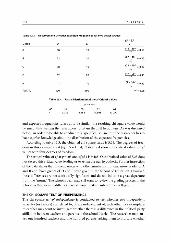
184 C H A P T E R 1 2
and expected frequencies turn out to be similar, the resulting chi square value would
be small, thus leading the researchers to retain the null hypothesis. As was discussed
before, in order to be able to conduct this type of chi square test, the researcher has to
have a priori knowledge about the distribution of the expected frequencies.
According to table 12.3, the obtained chi square value is 5.25. The degrees of free-
dom in this example are 4 (df = 5 – 1 = 4). Table 12.4 shows the critical values for χ2
values with four degrees of freedom.
The critical value of χ2 at p = .05 and df of 4 is 9.488. Our obtained value of 5.25 does
not exceed this critical value, leading us to retain the null hypothesis. Further inspection
of the data shows that in comparison with other similar institutions, more grades of A
and B and fewer grades of D and F were given in the School of Education. However,
these differences are not statistically significant and do not indicate a great departure
from the “norm.” The school’s dean may still want to review the grading process in the
school, as they seem to differ somewhat from the standards at other colleges.
THE CHI SQUARE TEST OF INDEPENDENCE
The chi square test of independence is conducted to test whether two independent
variables (or factors) are related to, or are independent of, each other. For example, a
researcher may want to investigate whether there is a difference in the political party
affiliation between teachers and parents in the school district. The researcher may sur-
vey one hundred teachers and one hundred parents, asking them to indicate whether
Table 12.3. Observed and Unequal Expected Frequencies for Five Letter Grades
(O – E)2
Grade O E E
(16 – 10)2A 16 10 = 3.60 10
(22 – 10)2B 22 20 = 0.20 20
(38 – 40)2C 38 40 = 0.10 40
(17 – 20)2D 17 20 = 0.45 10
(7 – 10)2F 7 10 = 0.90 10
TOTAL 100 100 χ2 = 5.25
Table 12.4. Partial Distribution of the χ2 Critical Values
p values
df .10 .05 .02 .014 7.779 9.488 11.668 13.277
9781442206564_epdf.indb 1849781442206564_epdf.indb 184 9/1/10 7:11 AM9/1/10 7:11 AM

C H I S Q U A R E T E S T 185
they are Democrat, Republican, or Independent.2 The responses of all participants are
then tallied and arranged in a 2 × 3 (“two by three”) table (see table 12.5).
The null hypothesis states that political party affiliation is independent of group
membership (i.e., there is no difference in the political affiliation distribution between
the teachers and the parents). The degrees of freedom for the chi square test of inde-
pendence are calculated as the number of rows minus 1, multiplied by the number of
columns minus 1: (Row – 1)(Column – 1). In the example above, there are two rows
and three columns, so the degrees of freedom are 2 (df = [2 – 1] × [3 – 1] = 2).
The most common tables in the chi square tests are those that have two levels in
each of the two variables (e.g., boys/girls and yes/no). These are contingency tables,
which are referred to as 2 × 2 (“two by two”) tables. Next, we use an example to take
you through several of the steps in the computations of a chi square value using data
presented in a 2 × 2 table. In this example, a group of eighty regular students and
ninety English Language Learners (ELL) students are asked to respond to the follow-
ing question: “I believe my classmates like me” by circling “yes” or “no.” Table 12.6
displays their responses (the observed frequencies).
Even without conducting any statistical test, it is clear that the majority of students
in both groups perceive that their classmates like them. However, just by inspecting
the data in the table it is difficult to know whether any differences we observe between
the groups are indicative of significantly different self-perceptions or are due to some
sampling error and could have happened purely by chance. As before, we cannot sim-
ply eyeball the data and come up with a conclusion.
2. HINT: When one of the variables is group membership (e.g., gender or political affiliation), and the other variable is the responses of the group members (e.g., “yes” or “no”), the convention is to record the groups in the rows and their responses in the columns.
Table 12.5. Observed Frequencies: Teacher and Parent Survey about Political Parties Affiliation
Democrats Republicans Independents TOTAL
Teachers 60 35 5 100Parents 50 45 5 100TOTAL 110 80 10 200
Table 12.6. Observed Frequencies: Regular and ELL Students and Their
Responses to the Question: “I Believe My Classmates Like Me”
Yes No TOTAL
(Cell A) (Cell B)Regular Students 62 18 80
(Cell C) (Cell D)Special Ed. Students 57 33 90TOTAL 119 51 170 ↑ Grand Total
9781442206564_epdf.indb 1859781442206564_epdf.indb 185 9/1/10 7:11 AM9/1/10 7:11 AM

186 C H A P T E R 1 2
The expected frequencies are based on the null hypothesis that states that there is no
relationship between the group membership (“Regular” vs. “ELL”) and the students’
perceptions. In other words, the null hypothesis states that the two variables (group
membership and perception) are independent of each other. Table 12.7 lists the ob-
served and expected frequencies and the totals. The computations of the expected
frequencies are a bit tedious and are not included here. Computer statistical packages,
such as SPSS, can easily provide the expected frequencies as part of the chi square
analysis in their cross-tabulation tables.
The observed row and column totals are used to compute the expected frequen-
cies for each cell. Note that in table 12.7, the row and column totals for the expected
frequencies are the same as those for the observed frequencies.
As before, we use the observed and expected values in each cell to compute a cell
value, using this formula:
The values from each cell are then added to obtain a chi square value of 4.04. De-
grees of freedom are calculated as df = (2 – 1)(2 – 1) = 1. Next, we consult table 12.8
that shows the critical values associated with one degree of freedom.
Table 12.7. Observed and Expected Frequencies of Regular and ELL Students and Their Responses
to the Question “I Believe My Classmates Like Me”
Yes No
Group Observed Expected Observed Expected TOTAL
Regular Students 62 56 18 24 80Spec. Ed. Students 57 63 33 27 80
9781442206564_epdf.indb 1869781442206564_epdf.indb 186 9/1/10 7:11 AM9/1/10 7:11 AM

C H I S Q U A R E T E S T 187
Our obtained χ2 value of 4.04 exceeds the critical value under p of .05 and 1 df,
which is 3.81, but not the value under p = .02, which is 5.41. Therefore, we report the
results of this chi square test to be significant at p < .05 and reject the null hypothesis.
We are at least 95 percent confident that our decision to reject the null hypothesis
is the right decision. The differences in the responses of the two groups of students
are too large to have occurred purely by chance. We conclude that although in both
groups the majority of students feel their classmates like them, the percentage of
regular education students responding positively to the question posed is higher than
that of the ELL students. The results of our study suggest that students’ responses may
depend on their group membership.
SUMMARY
1. The chi square (χ2) test is applied to discrete, categorical data where the units of measurement are frequency counts.
2. The chi square test is considered a nonparametric, or a distribution-free statis-tic. It can be used to analyze data measured on a nominal scale (such as gen-der) where there are two or more discrete categories. It can also be used to analyze other types of numerical data (such as data measured on an interval scale) that are first divided into logically defined and generally agreed-upon categories.
3. The chi square test is often used to analyze questionnaire data where a nu-merical code is assigned to groups or responses.
4. In applying the chi square test, two types of frequencies are used: observed and expected. The observed frequencies are based on actual (empirical) ob-servations and on “head counts.” The expected frequencies are theoretical or based on prior knowledge. The observed and expected frequencies can be expressed as actual head counts or as percentages.
5. Each pair of observed frequencies and its corresponding expected frequen-cies is called a cell.
6. The observed and expected frequencies in each cell are used to compute the chi square value. In the formula for computing the chi square, “O” refers to the observed frequencies and “E” refers to the expected frequencies in each cell. The chi square value is found by adding up the results of the division (the quotient) from each cell.
Table 12.8. Partial Distribution of the χ2 Critical Values
p values
df .10 .05 .02 .011 2.706 3.841 5.412 6.635
9781442206564_epdf.indb 1879781442206564_epdf.indb 187 9/1/10 7:11 AM9/1/10 7:11 AM

188 C H A P T E R 1 2
7. The degrees of freedom (df) in the chi square statistic are related to the num-ber of levels or cells (i.e., categories) in the independent variable(s). This is different from the procedures for computing the degrees of freedom in sev-eral other statistical tests, such as Pearson correlation and t test, where the degrees of freedom are related to the sample sizes.
8. The assumptions required for applying the chi square statistic are (a) the observations should be independent of each other, (b) the data are recorded as frequencies (“head count”), and (c) the categories are created in some logical and agreed-upon way.
9. There are two types of chi square tests: (a) The goodness of fit test, with one independent variable, is used to test the fit between a distribution of observed frequencies and expected frequencies; and (b) the test of indepen-dence, with two independent variables, is used to test whether the two fac-tors (the independent variables) are independent of each other.
10. In a chi square goodness of fit test, the number of expected frequencies in each category may be equal or unequal. When equal expected frequencies are used, they represent the null hypothesis that posits that there is an equal probability of having the same number of frequencies in each cell. When unequal expected frequencies are used, they must be known a priori (ahead of time) and be provided by the researcher.
11. The chi square test of independence is used to determine whether two variables are related to, or are independent of, each other. Each of the two variables has to have at least two levels (e.g., male/female, true/false, above/below).
9781442206564_epdf.indb 1889781442206564_epdf.indb 188 9/1/10 7:11 AM9/1/10 7:11 AM

VI
RELIABILITY AND VALIDITY
9781442206564_epdf.indb 1899781442206564_epdf.indb 189 9/1/10 7:11 AM9/1/10 7:11 AM

13
Reliability
In chapter 13, you will learn about the concept of reliability as it applies to tests and measurements. Reliability refers to the consistency and dependability of a measuring instrument; using it repeatedly should give us the same or similar results every time. In real life, of course, we cannot use the same test over and over and expect the same results. Therefore, there are several practical ways that can be used to assess the reliability of a newly developed instrument. Four ways to assess reliability are presented in the chapter: test-retest, alternate forms, internal consistency, and inter-rater reliability. As you will see, the correlation coefficient r (see chapter 8) is also used in assessing the test reliability. Keep in mind, though, that it is the responsibility of the test developer (rather than the test user) to conduct studies to demonstrate the reliability of the measuring tool.
You may have seen bands of scores reported for students on their standardized test reports for each part of the test. The band relates to a concept called standard error of measurement, which is discussed in this chapter. This is predicated on the idea that no test is 100 percent reliable, so the true score of test-takers can only be estimated based on their performance on the test. The chapter also explains various factors that affect reliability and the question of the desired level of reliability.
9781442206564_epdf.indb 1919781442206564_epdf.indb 191 9/1/10 7:11 AM9/1/10 7:11 AM

192 C H A P T E R 1 3
The term reliable, when used to describe a person, usually means that this person is de-
pendable and consistent. Similarly, a reliable measure is expected to provide consistent
and accurate results. If we use a reliable measure over and over again to measure physi-
cal traits, the same or very similar results should be obtained each time. For example,
when we repeatedly use a precise scale to measure weight, we are likely to obtain the
same weight time after time. However, when dealing with the affective domain (e.g.,
self-concept or motivation) or even with the cognitive domain (e.g., academic achieve-
ment), the performance of individuals on a measuring tool tends to change and is
much less consistent. Factors such as moods, pressure, fatigue, anxiety, and guessing
all tend to affect performance. Therefore, even with a reliable measure it is hard to
achieve a high level of consistency between measures. Since this book is intended for
educators, our discussion of reliability will focus on procedures used in education.
Reliability refers to the level of consistency of an instrument and the degree to
which the same results are obtained when the instrument is used repeatedly with the
same individuals or groups. This consistency may be determined by using the same
measure twice, administering two equivalent forms of the measure, or using a series of
items designed to measure similar concepts.
The symbol used to indicate the reliability level is r, the same as that used for Pearson
product-moment correlation coefficient (see chapter 8). As will be explained later in this
chapter, several procedures to assess reliability use correlation, so it is not surprising that
the two share the same symbol. In theory, reliability can range from 0 to 1.00, but the
reliability of measures of human traits and behaviors never quite reaches 1.00. Some very
good achievement tests may reach .98, but probably not any higher than that.
It is the responsibility of the test developer to assess the reliability of the measure.
Those who consider using the test must have information about the test reliability
in order to make informed decisions. If those who use the instrument employ the
measure to study groups and conditions that are similar to the groups and conditions
used by the instrument developer, then the users of the instrument can assume that the
measure has the same reliability as that reported by those who developed it.
UNDERSTANDING THE THEORY OF RELIABILITY
The classical theory of reliability states that an observed score, X (e.g., a score obtained
on an achievement test), contains two components: a true score (T) and an error score
(E). The observed score can be described as:
X = T + E
The true score (T) reflects the real level of performance of a person, but it cannot be
observed or measured directly. Based on the assumption that the error scores (E) are
9781442206564_epdf.indb 1929781442206564_epdf.indb 192 9/1/10 7:11 AM9/1/10 7:11 AM

R E L I A B I L I T Y 193
random and do not correlate with the true scores, the observed scores (X) are used to
estimate the true scores. For some people, X is an overestimate of their true score; and
for other people, X is an underestimate of their true score.
Theoretically, the true score of a person can be determined by administering the
same measure over and over, recording the scores each time, and then averaging all the
scores. In practice, though, people are tested with the same measure only once or twice
at the most. Using the variance of the error scores and the variance of the observed
scores, we can compute the reliability of the test using this formula.
Where Se2 = Error variance
Sx2 = Variance of the observed scores
As the formula shows, a decrease in the ratio of the two variances causes the reli-
ability to increase. This ratio can be decreased either by decreasing the numerator or
by increasing the denominator. The error component is related to the way the instru-
ment is created and to the way it is administered. Therefore, there are several ways
to reduce the variance of the error scores (the numerator), such as writing good test
items, including clear instructions, and creating a proper environment for the testing
to take place. The variance of the observed scores (the denominator) can be increased
by using heterogeneous groups of examinees (in terms of ability and performance) or
by writing longer tests.
METHODS OF ASSESSING RELIABILITY
This chapter describes several methods to assess the reliability of tests: test-retest, al-
ternate forms, and internal consistency methods. Inter-rater reliability is also discussed.
Test-Retest Reliability
The test-retest reliability is assessed by administering the same test twice to the
same group of people. The scores of the examinees from the two testing sessions are
correlated, and the correlation coefficient is used as the reliability index. The time
interval between the two testing sessions is important and should be reported along
with the reliability coefficient. When the interval between the testing sessions is short,
the reliability is likely to be higher than in cases when the interval between the testing
sessions is long.
The test-retest method of assessing reliability seems the most obvious approach,
because reliability is related to consistency over time. There are several problems
9781442206564_epdf.indb 1939781442206564_epdf.indb 193 9/1/10 7:11 AM9/1/10 7:11 AM

194 C H A P T E R 1 3
involved in this method of assessing reliability. First, people need to be tested twice,
which may be time-consuming and expensive. Second, some memory or experience
from the first test is likely to affect individuals’ performance on the retest. Increas-
ing the time interval between the two testing sessions may reduce this effect, but
with a longer interval, new experiences and learning may occur and affect people’s
performance. Generally, it is recommended that the interval between retests not
exceed six months.
Due to the problems associated with the test-retest method, this method is not
considered a conclusive measure of reliability in education and psychology. It may be
used, though, in combination with other methods designed to assess test reliability.
Alternate Forms Reliability
The alternate forms reliability is obtained when a group of examinees is adminis-
tered the two forms, and the two sets of scores (from the two test forms) are correlated
with each other. This method of assessing reliability is based on the assumption that if
examinees are being tested twice, with two alternate forms of the same test, their scores
on the two forms will be the same. As with test-retest, the correlation coefficient serves
as the index of reliability. The two forms of the test should be equivalent in terms of
their statistical properties (e.g., equal means, variances, and item intercorrelation), as
well as the content coverage and the types of items used.
There are two major problems involved in using this reliability assessment method.
The first is that the examinees have to be tested twice, as was the problem with the test-
retest method. The second problem is that it is very difficult, and often impractical, to
develop an alternate form. If the purpose is merely to assess the reliability of a single
test, then the alternate form method is unlikely to be used because it requires having
a second form of the test. Many commercial testing companies, especially those that
develop achievement tests, construct alternate forms for other purposes. Thus, these
forms can also be used to assess the reliability. Alternate forms are useful for security
reasons (e.g., every other student gets the same form to reduce copying and cheat-
ing). They are also useful in some research studies, when one form is administered as
a pretest and the other form as a posttest in order to eliminate the possible effect that
previous exposure to the test may have on subsequent testing scores.
Measures of Internal Consistency
One major disadvantage of the two aforementioned reliability assessment methods
is that the examinees have to be tested twice. Internal consistency methods to assess
reliability allow the use of scores from a single testing session to estimate the reliability.
In essence, each item on a test can be viewed as a single measurement, and the test
can be viewed as a series of repeated measures. There are several internal consistency
9781442206564_epdf.indb 1949781442206564_epdf.indb 194 9/1/10 7:11 AM9/1/10 7:11 AM

R E L I A B I L I T Y 195
methods that are based on the assumption that when a test measures a single basic
concept, items correlate with each other and people who answer one item correctly are
likely to correctly answer similar items. The reliability estimates obtained by internal
consistency methods are usually similar to those obtained by correlating two alternate
forms. The split-half method, KR-20 and KR-21, and Cronbach’s coefficient alpha are
some methods that can be used to estimate the test’s internal consistency.
The Split-Half Method
In the split-half method, the test is split into two halves and the scores of the exam-
inees on one half are correlated with their scores on the other half. Each half is con-
sidered an alternate form of the test. The most common way to split a test is to divide
it into odd and even items, although other procedures that create two similar halves
are also acceptable. However, dividing the test into the first half and the second half
may create two halves that are not comparable. These two halves may differ in terms of
content coverage, item difficulty, and students’ level of fatigue and practice. To use the
split-half approach, items on the test should be scored dichotomously, where a correct
answer is assigned 1 point and a wrong answer is assigned 0 points.
The first step in the computation of the split-half reliability procedure is to obtain
the scores from the two halves for each person. The scores from one half are then
correlated with the scores from the other half. Unlike the first two methods discussed
(test-retest and alternate forms), this correlation is not an accurate assessment of the
test reliability. In fact, it underestimates the reliability because it is computed for a test
half as long as the actual test for which we wish to obtain the reliability. Research has
demonstrated that all things being equal, a longer test is more reliable. That is, if we
have two tests with similar items, but one is shorter than the other, we can predict that
the longer test is more reliable than the shorter test.
In order to calculate the reliability for a full-length test, the Spearman-Brown
prophecy formula is used. This formula uses the reliability obtained for the half-
length test to estimate the reliability of a full-length test. The Spearman-Brown
prophecy formula is:
Where rfull
= Reliability for the whole test
rhalf
= Reliability for the half test (i.e., the correlation of the two halves)
Suppose we want to estimate the reliability of a thirty-item test, and the correla-
tion of the odd-item half with the even-item half is r=.50. This correlation estimates
9781442206564_epdf.indb 1959781442206564_epdf.indb 195 9/1/10 7:11 AM9/1/10 7:11 AM

196 C H A P T E R 1 3
the reliability for a fifteen-item test, whereas our test has thirty items. In order to
estimate the reliability of the full-length test, the Spearman-Brown formula is ap-
plied as follows:
In this example, the test developer should report the test split-half reliability as
r = .67.
Kuder-Richardson Methods
G. F. Kuder and M. W. Richardson developed a series of formulas in an article pub-
lished in 1937. Two of these formulas, KR-20 and KR-21, are used today to measure
agreement, or intercorrelation, among test items. As with the split-half method, these
procedures can only be used for items that are scored dichotomously (right or wrong).
KR-20 can be thought of as the average of all possible split-half coefficients obtained
for a group of examinees. KR-21 is easier to compute, but it is appropriate only when
the level of difficulty of all items is similar, a requirement that is not easily satisfied.
Cronbach’s Coefficient Alpha
The coefficient alpha was developed by Lee Cronbach in 1951. Cronbach’s coeffi-cient alpha yields results similar to KR-20 when used with dichotomous items. Coef-
ficient alpha can be used for tests with various item formats. For example, it can be
applied to instruments that use a Likert scale, where each item may be scored on a scale
of one to five. Coefficient alpha measures how well items or variables that measure a
similar trait or concept correlate with each other and it is considered by researchers
to provide good reliability estimates in most situations. Readers of educational and
psychological research are likely to see the coefficient alpha being reported as an index
of reliability because it is a popular choice among researchers.
Inter-Rater Reliability
Inter-rater reliability refers to the degree of consistency and agreement between
scores assigned by two or more raters or observers who judge or grade the same per-
formance or behavior. For example, the process of scoring essay tests or observing and
rating behaviors calls for subjective decisions on the part of those who have to grade
the tests or rate the behaviors. Essays may be assessed using rubrics that include crite-
ria such as content, organization, syntax and grammar, completeness, and originality.
To assess the reliability of the essay-scoring process and the criteria used for grading,
the essays first are read by two or more readers who assign a score on each criterion
9781442206564_epdf.indb 1969781442206564_epdf.indb 196 9/1/10 7:11 AM9/1/10 7:11 AM
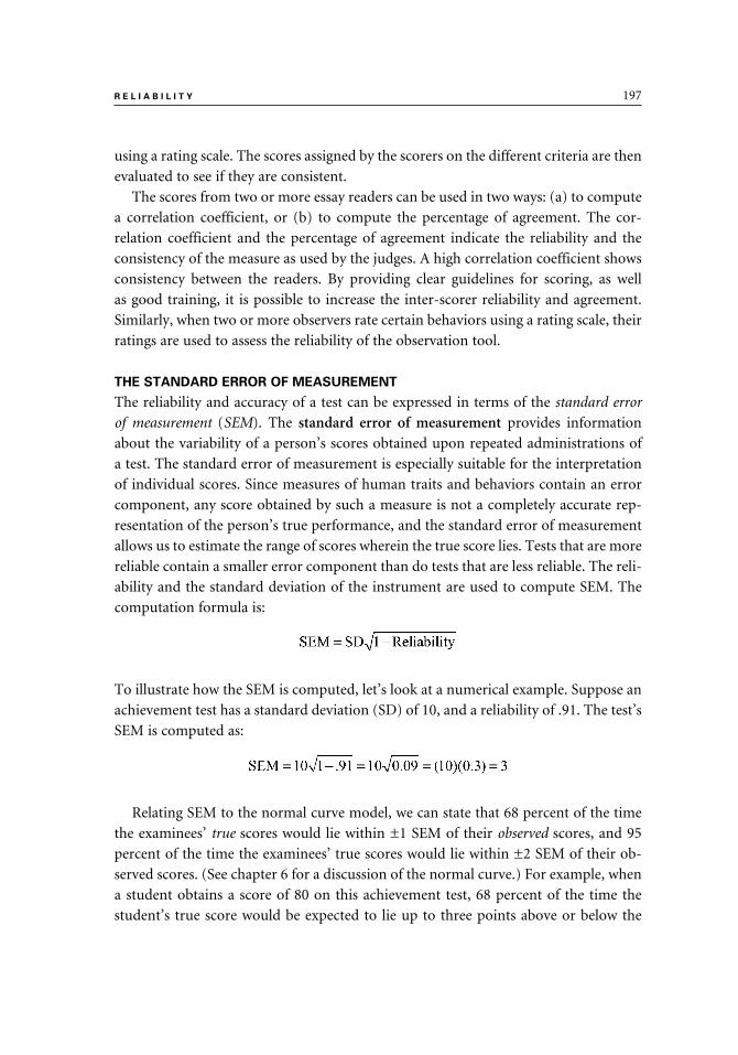
R E L I A B I L I T Y 197
using a rating scale. The scores assigned by the scorers on the different criteria are then
evaluated to see if they are consistent.
The scores from two or more essay readers can be used in two ways: (a) to compute
a correlation coefficient, or (b) to compute the percentage of agreement. The cor-
relation coefficient and the percentage of agreement indicate the reliability and the
consistency of the measure as used by the judges. A high correlation coefficient shows
consistency between the readers. By providing clear guidelines for scoring, as well
as good training, it is possible to increase the inter-scorer reliability and agreement.
Similarly, when two or more observers rate certain behaviors using a rating scale, their
ratings are used to assess the reliability of the observation tool.
THE STANDARD ERROR OF MEASUREMENT
The reliability and accuracy of a test can be expressed in terms of the standard error
of measurement (SEM). The standard error of measurement provides information
about the variability of a person’s scores obtained upon repeated administrations of
a test. The standard error of measurement is especially suitable for the interpretation
of individual scores. Since measures of human traits and behaviors contain an error
component, any score obtained by such a measure is not a completely accurate rep-
resentation of the person’s true performance, and the standard error of measurement
allows us to estimate the range of scores wherein the true score lies. Tests that are more
reliable contain a smaller error component than do tests that are less reliable. The reli-
ability and the standard deviation of the instrument are used to compute SEM. The
computation formula is:
To illustrate how the SEM is computed, let’s look at a numerical example. Suppose an
achievement test has a standard deviation (SD) of 10, and a reliability of .91. The test’s
SEM is computed as:
Relating SEM to the normal curve model, we can state that 68 percent of the time
the examinees’ true scores would lie within ±1 SEM of their observed scores, and 95
percent of the time the examinees’ true scores would lie within ±2 SEM of their ob-
served scores. (See chapter 6 for a discussion of the normal curve.) For example, when
a student obtains a score of 80 on this achievement test, 68 percent of the time the
student’s true score would be expected to lie up to three points above or below the
9781442206564_epdf.indb 1979781442206564_epdf.indb 197 9/1/10 7:11 AM9/1/10 7:11 AM

198 C H A P T E R 1 3
observed score of 80, or between 77 and 83. We can also predict that 95 percent of the
time the student’s true score will lie between 74 and 86, a range that is within six points
of the obtained score (i.e., within ±2 SEM). Clearly, it is desirable to have a small SEM
because then the band of estimate (the range within which the true score lies) is nar-
rower and the true score is closer to the observed score.
If you inspect the formula for the computation of SEM, you would realize that the
reliability of a test affects its SEM. A lower reliability results in a higher SEM; therefore,
there is a wider, less precise band of estimate. Assume that the reliability of the test in
our example had been .64 instead of .91, SEM would then be computed as:
When the SEM is 6, it means that 68 percent of the time the student’s true score
would have been up to six points above or below the student’s observed score of 80
(i.e., between 74 and 86), and 95 percent of the time, the true score of these students
would have been between 68 and 92. It is as if we are saying that although the student
obtained a score of 80, we are 68 percent sure that the true score is somewhere between
six points above to six points below that score.
FACTORS AFFECTING RELIABILITY
Heterogeneity of the Group
When the group used to derive the reliability estimate is heterogeneous with regard
to the characteristic being measured (e.g., typing speed, achievement level, or at-
titudes toward corporal punishment), the variability of the test scores is higher and,
consequently, the reliability is expected to be higher. Test manuals that report the
test’s reliability are likely to include information on the groups used to assess the reli-
ability. Suppose, for example, that the group used to generate the test’s reliability levels
included students from grades three through five. If the test is to be used with third-
graders only, the reliability of the test for the third-graders is probably lower than that
reported in the manual.
Instrument Length
As was mentioned before, all things being equal, a longer instrument is more reli-
able than a shorter instrument. In a shorter instrument, the probability of guessing
the right answers is higher than in a long instrument. Therefore, creating a longer test
can help provide a more stable estimate of the student’s performance. The split-half
reliability, which uses the Spearman-Brown formula, demonstrates the effect of the
test length on reliability. It shows that a full-length test is more reliable than a test
that is half as long. If you check the manual of a commercial test, you will see that the
9781442206564_epdf.indb 1989781442206564_epdf.indb 198 9/1/10 7:11 AM9/1/10 7:11 AM

R E L I A B I L I T Y 199
reliability levels of subsections of the test are usually lower than the reliability level of
the whole test. In determining the desired length of any given test, though, it may be
necessary to consider other variables, such as time constraints or the ages of the pro-
spective students who will be taking the test.
Difficulty of Items
Tests that are too easy or too difficult tend to have lower reliability because they
produce little variability among the scores obtained by the examinees. Tests where
most of the items have an average level of difficulty tend to have higher reliability than
tests where the majority of the items are very hard or very easy.
Quality of Items
Improving the quality of items increases an instrument’s reliability. The process
starts by writing clear, unambiguous items, providing good instructions for those
administering and taking the test, and standardizing the administration and scoring
procedures. Ideally, the instrument can then be field tested with a group similar to the
one intended to take the test in the future. An item analysis can be performed to reveal
weaknesses in the items and to help improve the test by reducing the error variance.
HOW HIGH SHOULD THE RELIABILITY BE?
Usually, self-made instruments, such as those created by classroom teachers, tend to
have lower reliability levels than tests prepared by commercial companies or by pro-
fessional test writers. Teachers and other practitioners may not have the time or the
expertise to construct the tests, and they may not perform an item analysis or revise
the items where needed.
Another point to keep in mind is that tests that measure the affective domain tend
to have lower reliability levels than tests that measure the cognitive domain. The main
reason for this phenomenon is that the affective domain behavior is less consistent
than the cognitive domain behavior.
As a rule, important decisions, such as admitting students into a program, should
not be based on a single test score because every test contains a certain level of error.
Instead, multiple measures should be used for making important decisions. Batteries
of achievement tests should report the reliability levels for the subtests, as well as for
the total test. Additionally, the standard error of measurement (SEM) should be re-
ported, whenever possible, to indicate the test’s margin of error.
Decisions about the acceptable level of reliability depend to a great extent on the
intended use of the test results. In exploratory research, even a modest reliability of
.50 to .60 is acceptable (although a higher reliability is always preferable). For group
decisions, reliability levels in the .60s may be acceptable. For example, in experimental
9781442206564_epdf.indb 1999781442206564_epdf.indb 199 9/1/10 7:11 AM9/1/10 7:11 AM

200 C H A P T E R 1 3
studies that involve a comparison of experimental and control groups, individuals
are not usually compared; rather, group information (e.g., mean scores) is likely to
be used for comparing the groups. On the other hand, when important decisions are
made based on the results of the test, the reliability coefficients should be very high.
Most commercial tests used for decisions regarding individuals have reliability levels
of at least .90. Even though many classroom teachers do not have the time or the ex-
pertise to assess the reliability of the tests they construct, they should be aware of the
issue of reliability in educational and psychological testing.
SUMMARY
1. Reliability refers to the consistency of a measurement obtained for the same persons upon repeated testing. A reliable measure yields the same or similar results every time it is used.
2. The affective and cognitive domains are more difficult to measure reliably than are physical traits.
3. The real level of performance for any individual, or the true score (T), can-not be observed directly. The observed score (X) is likely to overestimate or underestimate the true score for any given individual. The observed score equals the sum of the true score and the error score (E).
4. The reliability of a measure can be represented by the formula:
5. Methods for decreasing the error component include writing good items, giv-ing clear instructions, and providing an optimal environment for the test tak-ers. Methods of increasing the variance of the observed scores include using heterogeneous groups of examinees and writing longer tests.
6. The reliability of a particular measure may be assessed using these methods: test-retest, alternate forms, and internal consistency approaches.
7. Test-retest reliability is assessed by administering the same test twice to the same group of people. The scores of the examinees from the two testing ses-sions are correlated, and the correlation coefficient is used as the reliability index.
8. The alternate forms reliability is obtained when a group of examinees is administered two alternative forms of the test and their two scores are corre-lated with each other. The correlation between the two alternate forms serves as the index of reliability.
9. Internal consistency methods to assess reliability use the scores from a single testing session. In these methods, each individual item becomes a single measurement, while the test as a whole is viewed as a series of repeated mea-sures. Internal consistency methods include the split-half, Kuder-Richardson methods (KR-20 and KR-21), and Cronbach’s coefficient alpha.
9781442206564_epdf.indb 2009781442206564_epdf.indb 200 9/1/10 7:11 AM9/1/10 7:11 AM
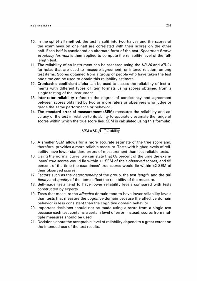
R E L I A B I L I T Y 201
10. In the split-half method, the test is split into two halves and the scores of the examinees on one half are correlated with their scores on the other half. Each half is considered an alternate form of the test. Spearman Brown prophecy formula is then applied to compute the reliability level of the full-length test.
11. The reliability of an instrument can be assessed using the KR-20 and KR-21 formulas that are used to measure agreement, or intercorrelation, among test items. Scores obtained from a group of people who have taken the test one time can be used to obtain this reliability estimate.
12. Cronbach’s coefficient alpha can be used to assess the reliability of instru-ments with different types of item formats using scores obtained from a single testing of the instrument.
13. Inter-rater reliability refers to the degree of consistency and agreement between scores obtained by two or more raters or observers who judge or grade the same performance or behavior.
14. The standard error of measurement (SEM) measures the reliability and ac-curacy of the test in relation to its ability to accurately estimate the range of scores within which the true score lies. SEM is calculated using this formula:
15. A smaller SEM allows for a more accurate estimate of the true score and, therefore, provides a more reliable measure. Tests with higher levels of reli-ability have lower standard errors of measurement than less reliable tests.
16. Using the normal curve, we can state that 68 percent of the time the exam-inees’ true scores would lie within ±1 SEM of their observed scores, and 95 percent of the time the examinees’ true scores would lie within ±2 SEM of their observed scores.
17. Factors such as the heterogeneity of the group, the test length, and the dif-ficulty and quality of the items affect the reliability of the measure.
18. Self-made tests tend to have lower reliability levels compared with tests constructed by experts.
19. Tests that measure the affective domain tend to have lower reliability levels than tests that measure the cognitive domain because the affective domain behavior is less consistent than the cognitive domain behavior.
20. Important decisions should not be made using a score from a single test because each test contains a certain level of error. Instead, scores from mul-tiple measures should be used.
21. Decisions about the acceptable level of reliability depend to a great extent on the intended use of the test results.
9781442206564_epdf.indb 2019781442206564_epdf.indb 201 9/1/10 7:11 AM9/1/10 7:11 AM

14
Validity
In addition to being reliable, a measuring instrument, such as a test, has to be valid. In chapter 14, we introduce to you the concept of validity and different ways to assess it. Validity refers to the extent to which a test mea-sures what it is supposed to measure and the appropriateness of the ways it is used and interpreted. Several major types of validity are discussed in this chapter: content, criterion-related, construct, and face validity. An explanation of the process of assessing validity and the issue of test bias are also addressed in this chapter. As you will see, correlation is used in assessing criterion-related validity, whereas the other types of validity are assessed by gathering various types of evidence.
9781442206564_epdf.indb 2039781442206564_epdf.indb 203 9/1/10 7:11 AM9/1/10 7:11 AM

204 C H A P T E R 1 4
The validity of a test refers to the degree to which an instrument measures what it is
supposed to measure and the appropriateness of specific inferences and interpreta-
tions made using the test scores. It is not sufficient to say that a test is “valid”; rather,
the intended use of the test should be indicated. Keep in mind that validity is not inher-
ent in the instrument itself and that an instrument is considered valid for a particular
purpose only. For example, a test that is a valid measure of reading comprehension for
students in the third grade is not valid as a measure of spelling for fifth-grade students.
Validation of a test involves conducting empirical studies where data are collected to
establish the instrument’s validity. A valid test is assumed to be reliable and consistent,
but a reliable test may be valid only for a specific purpose.
There are three basic types of validity, according to Standards for Educational and
Psychological Testing (1999): content validity, criterion-related validity, and construct
validity.1 Although not listed in the Standards as a type of validity, face validity is also
important and is included in this chapter.
CONTENT VALIDITY
Content validity describes how well an instrument measures a representative sample
of behaviors and content domain about which inferences are to be made. In order to
establish the content validity of a test, its items are examined and compared to the
content of the unit to be tested, or to the behaviors and skills to be measured.
It is most important to assess the content validity of achievement tests. The achieve-
ment test developer should ensure that the items are an adequate sample of the con-
tent to be tested. If instructional objectives are available, the teacher may choose to
examine the match between the test items and the objectives. Well-defined content
domain and behaviors help increase the test’s content validity.
The commercially available norm-referenced standardized achievement tests that
are used by many school districts are designed to measure various standards, skills, and
topics in the subject areas being tested. The developers of such tests usually provide
information about the content being tested and show the match between the test items
and the content they are designed to measure.
Educators who are assigned the responsibility of choosing a series of standardized,
commercial achievement tests for their schools need to compare the items on the tests
to their curricula and make sure they match. Because curricula are likely to differ from
school to school, a particular standardized test may have a high content validity for
some schools but a low content validity for other schools.
1. HINT: See Standards for Educational and Psychological Testing (1999) that was written by a joint committee of the American Educational Research Association (AERA), the American Psychological Association (APA), and the National Council on Measurement in Education (NCME). The book was published by the American Psychological Association, 1230 17th St., NW, Washington, D.C., 20036.
9781442206564_epdf.indb 2049781442206564_epdf.indb 204 9/1/10 7:11 AM9/1/10 7:11 AM

V A L I D I T Y 205
Teachers who write their own achievement tests should make sure that items
on the test correspond to what was covered in their classes in terms of content, be-
haviors, and skills. For example, a teacher who teaches a unit on the Civil War and
emphasizes understanding reasons and processes should not write test items that ask
students to recall dates, events, and names, because such items lower the validity of
the test.
CRITERION-RELATED VALIDITY
The process of assessing the criterion-related validity of a measure involves collecting
evidence to determine the degree to which the performance on a measuring instrument
is related to the performance on some other external measure. The external measure
is labeled as the criterion. As part of the process to assess the criterion-related validity
of the instrument, test developers can correlate it with an appropriate criterion. The
correlation coefficient is called the validity coefficient, and it is used to indicate the
strength of the relationship between the instrument and the criterion. There are two
types of criterion-related validity: concurrent validity and predictive validity.
Concurrent Validity
Concurrent validity is concerned with the evaluation of how well the test we wish
to validate correlates with another well-established instrument that measures the same
thing. The well-established instrument is designated as the criterion. For example, a
newly created short version of a well-established test may be correlated with the full-
length test. If the correlation between the two measures is high, it may indicate that
they measure similar characteristics, skills, or traits. In order to establish concurrent
validity, the two measures are administered to the same group of people, and the
scores on the two measures are correlated. The correlation coefficient serves as an
index of concurrent validity.
To illustrate, suppose a researcher develops a new IQ test that takes thirty minutes
to administer and twenty minutes to score. This is much faster than the commonly
used IQ tests. In order to establish the concurrent validity of the new IQ test, the re-
searcher may correlate it with a well-established IQ test by administering both tests to
the same group of people. A high positive correlation of the new test with the estab-
lished IQ test would lend support to the validity of the new test.
Predictive Validity
Predictive validity describes how well a test predicts some future performance. This
type of validity is especially useful for aptitude and readiness tests that are designed
to predict some future performance. The test to be validated is the predictor (e.g., the
9781442206564_epdf.indb 2059781442206564_epdf.indb 205 9/1/10 7:11 AM9/1/10 7:11 AM

206 C H A P T E R 1 4
Scholastic Aptitude Test or the ACT test) and the future performance is the criterion
(e.g., GPA of college freshmen). Data are collected for the same group of people on
both the predictor and the criterion, and the scores on the two measures are correlated
to obtain the validity coefficient. Unlike concurrent validity where both instruments
are administered at about the same time, predictive validity involves administering the
predictor first, while the criterion is administered later in the future.
Suppose a researcher wants to establish the predictive validity of a music aptitude
test for elementary school children. Forty third-graders are administered the music
aptitude test and are then given musical instruments in their schools. At the end of
the year, the music teacher is asked to rate each student’s musical achievement using
a scale of 1 (poor) to 10 (excellent). Next, the aptitude scores are correlated with the
teacher’s ratings. A high positive correlation indicates that the aptitude test has a high
predictive validity because it predicted accurately the students’ end-of-year achieve-
ment in music.
You should keep in mind that tests that are intended to predict future performance
may provide incomplete information about the criterion. For example, the music
aptitude test may not always predict how well a student plays a musical instrument
a year later. The reason is that this test may measure natural aptitude but probably
not other factors such as motivation, perseverance, quality of music instruction, and
parental support.
CONSTRUCT VALIDITY
The term construct is used to describe characteristics that cannot be measured directly,
such as intelligence, sociability, and aggression. Construct validity is the extent to
which an instrument measures and provides accurate information about a theoretical
trait or characteristic. The process of establishing the instrument’s construct validity
can be quite complicated. The process includes administering the instrument to be
validated to a group of people and then collecting other pieces of related data for these
same individuals.
Suppose, for example, that a new scale has been developed in order to measure test
anxiety. To demonstrate that the scale indeed measures test anxiety, the researcher first
administers the scale to a group of people and then collects additional information
about them. Those who score low on the test anxiety measure are considered to have
a low level of test anxiety and are expected to exhibit behaviors and responses that are
consistent with low anxiety levels. Conversely, those who score high on the test are
expected to behave in ways that are compatible with a high level of test anxiety. Thus,
establishing construct validity consists of accumulating supporting evidence. Evidence
for construct validity is not gathered just once for one sample; rather, it is collected
with the use of many samples and multiple sources of data.
9781442206564_epdf.indb 2069781442206564_epdf.indb 206 9/1/10 7:11 AM9/1/10 7:11 AM

V A L I D I T Y 207
FACE VALIDITY
Face validity refers to the extent to which an instrument appears to measure what it is
intended to measure. The extent to which an instrument appears valid to the exam-
inees and to other people involved in the testing process may determine how well the
instrument is accepted and used. Additionally, face validity helps to keep test takers
motivated and interested because they can see the relevance of the test to the perceived
task. For example, a test with a high face validity that is used to screen a pool of ap-
plicants for certain positions is quite defensible as an appropriate instrument because
applicants can see the test as relevant and perceive it as an appropriate measure.
Face validity is likely to be assessed based on a superficial inspection of an instru-
ment. However, this inspection is not sufficient. The mere appearance of face valid-
ity is not a guarantee that an instrument is valid and that it truly measures what it is
supposed to measure. You should be aware of the fact that face validity is not always
found in discussions of validity, and it may not be considered by all to be as important
as the other types of validity.
ASSESSING VALIDITY
Although we have identified several different types of validity, they are not necessar-
ily separate or independent of each other. Establishing a measure’s validity usually
involves a series of steps of gathering data. Information provided by the instrument
developer about its validity should include a description of the sample used in the
validation process. Ideally, the characteristics of this sample are similar to those of
future test takers.
Assessing the content validity of an instrument does not involve numerical calcula-
tion. Rather, it is a process of examining the instrument in relation to the content it is
supposed to measure. In measuring criterion-related validity, the validity coefficient is
used to describe the correlation between an instrument and a criterion. To be useful,
the criterion has to be reliable and appropriate. The process of establishing the con-
struct validity of an instrument includes the use of statistical methods (e.g., correla-
tion) as well as procedures for gathering and comparing various measures.
TEST BIAS
Standardized tests, especially those used for admission, placement, and grading, are
viewed at times as being biased against one group or another. A test is considered
biased if it consistently and unfairly discriminates against a particular group of people
who take the test. For example, certain tests are said to be gender-biased, usually dis-
criminating against female examinees. Other tests may be considered biased against
certain racial or cultural groups.
9781442206564_epdf.indb 2079781442206564_epdf.indb 207 9/1/10 7:11 AM9/1/10 7:11 AM

208 C H A P T E R 1 4
Norm-referenced tests are constructed to discriminate among examinees of dif-
ferent ability levels. This type of discrimination is not to be confused with the notion
of test bias, where a test systematically discriminates against a particular group of
examinees.
SUMMARY
1. Validity refers to the degree to which an instrument measures what it is sup-posed to measure and the appropriateness of specific inferences and interpre-tations made using the test scores. The intended use of the instrument should be indicated because it is considered valid for a particular purpose only.
2. The three basic types of validity are content validity, criterion-related validity, and construct validity.
3. Content validity refers to the adequacy with which an instrument measures a representative sample of behaviors and content domain about which infer-ences are to be made. In order to establish the content validity of the instru-ment, its items are examined and compared to the content of the unit to be tested, or to the behaviors and skills to be measured.
4. Instruments have criterion-related validity with respect to the relationship of scores on two separate measures. One measure is the newly developed instrument, and the other measure serves as a criterion. There are two types of criterion-related validity: concurrent and predictive.
5. The correlation coefficient between the instrument and the criterion is called the validity coefficient, and it indicates the strength of the relationship be-tween the two measures.
6. Assessing the instrument’s concurrent validity involves evaluating the de-gree to which the results from the instrument correlate with another well-established instrument that measures the same thing.
7. An instrument has predictive validity if it can successfully predict future performance in a given area. The newly developed instrument is called the predictor, and the future performance is the criterion.
8. Construct validity refers to the extent to which an instrument measures and provides information about a theoretical trait or characteristic. To establish the construct validity of an instrument, it is necessary to collect additional data over a period of time and to correlate these data with the instrument results.
9. Face validity, which is not always recognized as a formal type of validity, refers to the extent to which an instrument appears to measure what it is intended to measure.
10. An instrument is considered biased if it systematically discriminates against a particular group of examinees.
9781442206564_epdf.indb 2089781442206564_epdf.indb 208 9/1/10 7:11 AM9/1/10 7:11 AM

VII
CONDUCTING YOUR OWN RESEARCH
10_397_15a_Pt07.indd 20910_397_15a_Pt07.indd 209 9/1/10 7:23 AM9/1/10 7:23 AM

9781442206564_epdf.indb 2109781442206564_epdf.indb 210 9/1/10 7:11 AM9/1/10 7:11 AM

15
Planning and Conducting Research Studies
In chapter 15, we focus our attention on the process of planning and con-ducting research studies. We start with a brief discussion of ethical consid-erations in research. We then provide an explanation of the steps involved in planning your investigation and how to write a research proposal. While the specifics may differ and your proposal may be more or less formal than we describe, you would usually include an introduction, where you explain the need for the study and present your research questions and hypotheses. A brief literature review is often included in the introduction to provide background and a framework for the proposed study. The next part is the literature review, where you present, summarize, and critique the research that relates to your topic, expanding on the information provided in the introduction. The third main part of the proposal is your proposed methodology. Here you address questions such as: Who will be studied? What tools and procedures will I use to collect my data? A list of all the references that were cited in the proposal is the last part.
The second major topic in this chapter is the research report. After you col-lect and analyze your data, you will need to write a report to summarize and present your results. The first three parts of the research report (introduction, literature review, and methodology) are similar to the proposal but are more developed and provide additional details. You then add two sections, results and discussion. In the results section, you objectively present your findings, often with the aid of tables and charts. In your discussion, you interpret your results as they relate to your research questions and hypotheses.
9781442206564_epdf.indb 2119781442206564_epdf.indb 211 9/1/10 7:11 AM9/1/10 7:11 AM

212 C H A P T E R 1 5
Before researchers carry out studies, they need to plan and map out their steps. After
the study is conducted, most researchers write a report that summarizes the study.
This chapter focuses on the process of writing research proposals for quantitative stud-
ies and on reports that describe these studies.
Both qualitative and quantitative studies require a clearly articulated research
proposal prior to beginning the study. However, different research paradigms fol-
low different guidelines and call for different approaches to the process of planning,
conducting, and reporting research studies. While quantitative studies demand more
detailed plans, proposals for conducting qualitative studies may be more tentative and
less specific. Since this textbook is about quantitative statistics, the discussion here
focuses on proposals and reports of quantitative studies. In this chapter, we focus on
guidelines for students and researchers who conduct studies that examine quantitative
data. Keep in mind, though, that your university probably has its own specific set of
rules and guidelines that may differ from those described in this chapter.
Students who are writing proposals to meet degree requirements, such as theses or
dissertations, would probably need to follow specific guidelines given to them by their
committees. Granting agencies are also likely to have their own guidelines for grant
application proposals. Therefore, the discussion here is geared mainly toward students
who plan to conduct research projects as a class assignment or for practitioners who
would like to study their own settings.
After a study is completed, it is described in a research report. Although the research
proposal and the research report share common elements, they differ in several ways.
For example, proposals include only three main chapters: Introduction, Literature
Review, and Methodology. By comparison, research reports include these chapters plus
two additional chapters: Results and Discussion. Reports may also include an Abstract
that summarizes the report and appears at the beginning. Another key difference be-
tween proposals and reports is the tense used. Proposals are written using future tense,
whereas reports use past tense. Both proposals and reports also include a chapter called
References, which lists all the references cited or quoted in the text. Additionally, an
Appendix may be found in both proposals and reports.
When writing a proposal or report, you may be asked to use a particular writing
style. The most well-known writing style, and the one used by most universities, is the
one described in the APA Publication Manual.1 Nonetheless, other styles may be used
as well, and you should check to see which style you should follow.2
1. HINT: At the time this book was written, the most recent edition of the APA Publication Man-ual (published by the American Psychological Association) was the sixth edition, dated 2010. As you read this book, check to see if there is a newer edition. The most recent APA publication guidelines may also be found on the Internet at http://www.apastyle.org.
2. HINT: Another writing style that is used by university students and faculty is called Chicago Style, which was originally written by Turabian in 1937 and has been updated several times since
9781442206564_epdf.indb 2129781442206564_epdf.indb 212 9/1/10 7:11 AM9/1/10 7:11 AM

P L A N N I N G A N D C O N D U C T I N G R E S E A R C H S T U D I E S 213
Before writing your research proposal, you should investigate your topic by reading
about it as much as possible. By reviewing the literature you become well informed
about your topic, gather background information, learn about current trends and
theories related to your topic, and identify gaps and controversies in the literature.
All of these should help you sharpen your focus and select your own specific research
topic. The literature review process can also prevent you from unintentionally du-
plicating other studies and will help you avoid other researchers’ mistakes as well as
benefit from their experience.
There is a wealth of information available electronically on the Internet. The elec-
tronic data search techniques change and are updated at a rapid pace; it is probably a
good idea for you to consult with your librarian in order to learn about the most recent
techniques for electronic literature search.
Note that in discussing the different parts of the proposal and report in this book,
the term chapter is used to describe the main parts of the proposal and report. The
word section is used to denote a subpart of a chapter.
Every researcher undertaking a research study should be cognizant of ethical con-
siderations involved in research. Before discussing the research proposal, we briefly
review the ethics of research. This chapter then continues with a discussion of research
proposals, followed by a discussion of research reports.
RESEARCH ETHICS
When planning your study, you should be concerned with research ethics. The rights
of those you study should be protected at all times. As a researcher, you have to ensure
that the participants are well informed of the nature of the study and that you have
not placed them in risky situations. Adult participants should provide their consent to
participate in the study, while parents or legal guardians should provide consent for
minors under their care. The study’s participants also should be given an opportunity
to withdraw from the study after it has started. People’s request for privacy should be
honored and their confidentiality should be assured, when requested.
Ethical considerations are especially important in experimental studies, where par-
ticipants undergo planned interventions. Practitioners who conduct research in their
own settings should also maintain high ethical standards and be aware of all possible
consequences of their studies. When you research your own practice, you should en-
sure the rights, welfare, and well-being of the study’s participants. You may want to
check with your supervisors before undertaking your study and secure their permis-
sion to conduct the study.
then. The MLA Handbook, published by The Modern Language Association of America, is also used in some cases.
9781442206564_epdf.indb 2139781442206564_epdf.indb 213 9/1/10 7:11 AM9/1/10 7:11 AM

214 C H A P T E R 1 5
Several professional associations provide guidelines for their members regard-
ing studies that involve human subjects.3 Institutions, such as universities, as well as
government offices and granting agencies, may request that all research proposals
undergo a review by a human subjects review board as part of the proposal approval
process. Many school districts also have research review boards to ensure that high
ethical standards are maintained in their schools.
THE RESEARCH PROPOSAL
After deciding on a topic for your study, your next step is to write a research proposal.
A proposal may be viewed as the blueprint for the study. It provides a rationale for
the study and an explanation of the reasons the study should be conducted. A well-
written, carefully planned proposal helps you plan ahead, anticipate your needs, and
outline a realistic timetable.
A typical proposal has three chapters: Introduction, Literature Review, and Meth-
odology. A list of sources used in the proposal is also included in the References. All
proposals are expected to include these three parts, whether they are submitted to
fulfill requirements for a degree or to request grants. In some cases, the Introduction
and Literature Review are combined into one chapter, called Introduction. Regardless
of the number of chapters required, all proposals should have an introductory chap-
ter that includes a statement of purpose or research questions and any hypotheses,
as well as a brief review of the literature. Additionally, a proposal should contain a
description of the study’s methodology and a list of the references cited. The Meth-
odology chapter may also include a section entitled Data Analysis. Information about
data analysis can be included either as a separate section in Methodology or as part
of the Procedure section.
Following is a description of the main components of the research proposal: In-
troduction, Literature Review, and Methodology. A brief discussion of References is also
included.
Introduction
The Introduction chapter introduces the study by stating the problem to be investi-
gated, the purpose of the study, the rationale for conducting the study, and the study’s
potential contributions to the field. This chapter also includes the research questions
and any hypotheses stated by the researchers prior to the study.4 The background of
3. HINT: See, for example, the guidelines of the American Psychological Association web page at http://www.apa.org/ethics/. See also: The American Educational Research Association. (2002). Ethical standards of the American Educational Research Association: Cases and commentary. Washington, DC: Author.
4. HINT: See chapter 2 for a discussion of research questions and hypotheses.
9781442206564_epdf.indb 2149781442206564_epdf.indb 214 9/1/10 7:11 AM9/1/10 7:11 AM

P L A N N I N G A N D C O N D U C T I N G R E S E A R C H S T U D I E S 215
the problem should be briefly developed in this chapter, but the main discussion of
background information should be included in the Literature Review chapter.
The Introduction chapter includes a statement of the problem that is written as a
question or a declarative statement and is usually placed at the beginning of the chap-
ter. For example, a declarative statement may state that the study was designed to
investigate the effect of inclusion on the social self-concept of included middle-school
children. An example of a problem stated as a question is: Are there differences in
grade point averages (GPAs) between high school athletes and nonathletes?
The Introduction chapter should include a rationale and a clear explanation of the
need for studying the problem and for finding solutions to the problem. After reading
this explanation, the reader should be able to understand the potential contribution
of the proposed research to educational practice or theory. For example, with regard
to inclusion, it can be argued that those who promote it claim that it enhances the
social skills of included children. Now, after many schools have had an opportunity
to include children with special needs for a number of years, has inclusion lived up
to its expectations? Do included middle-school students have healthier self-concepts
than similar students who are not included? The second topic dealt with high school
athletes. There are people who have an image of high school athletes as “jocks” that
are not very smart, take “easy” classes, and do not spend much of their time studying.
Those who coach and work with athletes contend that this image is unjustified and
that high school athletes perform academically as well as, or better than, their non-
athletic peers. Therefore, a study should be undertaken to compare the GPAs of high
school athletes and nonathletes.
Many proposals also include research hypotheses, especially those that propose ex-
perimental studies. The exact placement of the hypotheses may differ. Most guidelines
require placing them in the Introduction chapter, but others may suggest placing the
hypotheses in the second or third chapter (Literature Review or Methodology) of the
proposal. We suggest that you check the specific guidelines given to you for further
directions about the placement of the study’s hypotheses.
The Introduction chapter also includes a brief review of selected sources that are
most related to the topic. Those references are discussed in greater detail in the Litera-
ture Review chapter that follows the Introduction. Proposals may also include defini-
tions of key terms, assumptions, and limitations of the study.
Literature Review
The Literature Review chapter summarizes literature related to the topic being
investigated. In the proposal, the review of related literature tends to be limited in
scope, citing briefly a small number of studies. Later, when writing the research report,
this section is expanded. Literature reviews in dissertations and thesis proposals are
9781442206564_epdf.indb 2159781442206564_epdf.indb 215 9/1/10 7:11 AM9/1/10 7:11 AM

216 C H A P T E R 1 5
expected to include the most important studies on the topic. In less formal proposals,
such as those written as part of class research projects, the literature review is not likely
to be comprehensive due to time constraints. When the literature review in a proposal
is comprehensive and includes a discussion of a number of subtopics, it is recom-
mended that a summary of the review be included at the end of this chapter.
When writing the review, it should be organized by topic, rather than as an an-
notated bibliography or a series of summaries of articles, reports, or books. As the
writer of the proposal, it is your responsibility to synthesize the research on your
topic and to point out controversies in the field, as well as similarities, agreements,
or disagreements among researchers who have conducted research on your topic.
Additionally, existing gaps in knowledge and practice should be noted. You should
also include a critique of studies you review and point to their shortcomings and
contributions.
The information presented in the Literature Review should be properly attributed
to its authors to avoid plagiarism. Sources must be acknowledged whether quoted di-
rectly or summarized. You should summarize key ideas, findings, and conclusions of
other researchers. It is best to quote very little, if at all, and quote only phrases or ideas
that are so well stated you feel you cannot summarize them accurately. Remember to
include the page numbers for the quotes you use, when available. Try to keep the tone
of your writing objective and unbiased and present a balanced discussion of all views,
even those you may personally oppose.
A number of studies that are discussed in the Literature Review chapter would most
likely be discussed again in the Discussion chapter of your research report. In that
chapter, results from your own study should be examined and related to the existing
body of knowledge in the field.
Methodology
The Methodology chapter in the proposal is designed to describe your plan of
action and to clarify for the reader how you are going to investigate the research
questions and test the hypotheses. The description of your methodology should be
specific enough to communicate to the reader that you have carefully planned every
step of your study.
When planning the specifics of the study, you should ask yourself questions such as:
Do I have the expertise, resources, and know-how to carry out the study? Is my study
feasible? Have I set a realistic timetable to design, conduct, and complete the study?
Can I obtain the cooperation and collaboration of others, if needed? Do I need permis-
sion to conduct the study? What data collection instruments should I use? How can I
recruit participants for my study?
9781442206564_epdf.indb 2169781442206564_epdf.indb 216 9/1/10 7:11 AM9/1/10 7:11 AM

P L A N N I N G A N D C O N D U C T I N G R E S E A R C H S T U D I E S 217
The three main sections of this chapter are Sample (or Participants), Instruments
(also called Tests or Measures, or Data Collection Tools), and Procedure.5 Sections about
Design or Data Analysis may also be included in this chapter.6
Sample
In the Sample section, describe those who will participate in your study. In most
studies, your participants are likely to be people, but a sample can comprise of a group
of cases or items. You should present information related to the sample, such as how
the sample will be selected, the size of the sample, and relevant demographic charac-
teristics about the sample. You, as the researcher-author, have to decide which demo-
graphic characteristics are relevant to your study. For example, family income, age,
or IQ scores of the study’s participants may be considered important demographic
characteristics in one study, but not in another.
Obviously, the exact information about the sample in your own study (e.g., the
mean age or the number of boys and girls in each group) may not be known until you
actually conduct the study. Nevertheless, the Sample section should communicate your
plans and intentions and provide a general description of the study’s participants.
Instruments
The instruments you plan to use in the study should be clearly described and their
purposes explained. If you plan to use existing instruments that were developed by
others, their reliability and validity should be reported.7 Additional information about
the instruments may also be reported when available. For example, you may describe
the number and type of items used, the length of time required to complete the in-
strument, and how test norms are reported. Check for copyright information and for
permission to use the instrument or to include it in your proposal.
If you plan to develop a data collection instrument (e.g., a questionnaire or an
achievement test), explain how you plan to construct it and the type of items you will
use. When appropriate, you should also discuss how you plan to assess the instru-
ment’s reliability and validity and whether you plan to pilot test it first before using it
5. HINT: In some textbooks and journal articles, the term subjects is used in place of sample or participants. Note, though, that currently most guidelines recommend using the terms we use in this book, namely sample and participants, rather than subjects.
6. HINT: Some writing guidelines further divide the Methodology chapter (especially in experi-mental studies) into additional sections, such as Materials, Independent Variables, and Dependent Variables.
7. HINT: Several publications provide information about published tests. For example, the Buros Institute publishes the Mental Measurement Yearbook and Tests in Print (see http://www.unl.edu/buros/); online test reviews are also available on this website. See also chapters 13 and 14 in this book for additional information about reliability and validity.
9781442206564_epdf.indb 2179781442206564_epdf.indb 217 9/1/10 7:11 AM9/1/10 7:11 AM

218 C H A P T E R 1 5
in your full-scale study. It is also advisable to include sample items of your proposed
instrument. You can include the complete instrument in the proposal’s Appendix.
Procedure
The Procedure section describes how the study will be conducted. It explains, in as
much detail as possible, what will happen and how you will carry out the proposed
investigation. This section is especially important in experimental studies that require
a detailed description of the intervention. Examples of information to present in this
section include a description of the training required to implement a new experimen-
tal teaching method and the types of instructions to be provided to respondents who
are asked to complete a survey. This section should also contain a realistic timetable
for the different phases of the study.
Data Analysis
A description of your plans for organizing and analyzing the data to be collected
in the study should be included in the Data Analysis section. You have to decide in
advance which statistical tests and techniques you will use to investigate your research
questions and test your hypotheses.
In descriptive studies, the data analysis may include tables to summarize basic
descriptive statistics, such as percentages, means, and ranges. Graphs and charts are
also likely to be used in such studies. Other studies, especially those using inferential
statistics, may require statistical techniques, such as the t test and analysis of variance
(see chapters 10 and 11, respectively).
References
The last chapter in a proposal is References, where you list all the references cited
or quoted in the proposal. The exact way to list the references depends on the writing
style used. For example, APA Publication Manual requires that you list all the refer-
ences in alphabetical order according to the authors’ last names. Other styles may
specify that references be listed in the order they are cited in the text. The exact rules
and guidelines for listing each individual reference also vary depending on the writ-
ing convention used. Regardless, all references cited in the text should be listed in the
References chapter, and all references listed should have been cited in the text.
THE RESEARCH REPORT
After conducting your research study and analyzing the data collected, you are now
ready to write your report. As with the proposal, specific guidelines for writing research
reports may vary, depending on the nature and purpose of the report. For example,
if you have to write the report as part of a class research project, your instructor may
9781442206564_epdf.indb 2189781442206564_epdf.indb 218 9/1/10 7:11 AM9/1/10 7:11 AM
P L A N N I N G A N D C O N D U C T I N G R E S E A R C H S T U D I E S 219
give you particular guidelines to follow. If this is a thesis or a dissertation study, your
committee will ask you to follow your university’s guidelines. In general, though, all
quantitative research reports are likely to have similar components.
Research Reports usually have six chapters: the first five are Introduction, Literature
Review, Methodology, Results, and Discussion. The sixth chapter, References, includes a
list of references cited or quoted in the first five chapters. And, as was the case with
the proposal, the references listed in that chapter should correspond to those cited in
the text.
The first three chapters of a research report are the same as those found in a pro-
posal (i.e., Introduction, Literature Review, and Methodology), but they are longer, more
detailed, and better developed. In a report, the Literature Review chapter usually in-
cludes more references and citations than in a proposal. This is true especially in theses
and dissertations, where the author is expected to include all references related to the
research topic. When writing the Methodology chapter in the report, you are likely to
include more specific information about the study. For example, you can now report
the exact number of those who participated in the study and how many responded to
a questionnaire you administered. And, unlike the stage of writing the proposal, now
you have the results of the study and can write the Results and Discussion chapters.
At times, the Introduction and Literature Review chapters are combined into one
chapter, titled Introduction.8 For example, some journal editors advise authors who are
interested in submitting manuscripts to their journals to combine the two chapters.
However, dissertations and theses guidelines typically advise students to keep the two
chapters separate.
You may also be asked to write an abstract, which is usually found at the beginning
of the report, before the introduction. The Abstract summarizes the study and focuses
on the study’s research problem, methodology, main results, and major conclusions.
Abstracts are usually limited in length (i.e., number of words), from about one short
paragraph of one hundred words to about a page-and-a-half (or 1,000 words). Because
the length of the abstract is limited, it has to be succinct and present only the most
important points. If you plan to submit an article for publication, check the guidelines
specified by the journal editors.
Many reports, especially theses and dissertations, include an Appendix at the end
of the report. The appendix includes information that is too lengthy or too specific
to be included in the text of the report. For instance, the appendix may include the
complete survey used in a study or a letter to parents asking for their permission to
observe their children.
8. HINT: According to APA Publication Manual, there is no need to type the word Introduction because its placement at the beginning of the manuscript identifies it as the introduction. It is always a good idea to check the specific typing guidelines given to you.
9781442206564_epdf.indb 2199781442206564_epdf.indb 219 9/1/10 7:11 AM9/1/10 7:11 AM

220 C H A P T E R 1 5
Results
The Results chapter presents the study’s findings. This chapter includes numbers,
tables, and figures (e.g., charts and graphs). The information presented and conveyed
to the reader in this chapter should be written objectively, factually, and without ex-
pressing personal opinion. For example, you should not make statements such as, “We
were disappointed to see that girls did not choose to use computers, even though they
could play games that are of interest to girls their age.”
A good way to organize and discuss your findings in this chapter is to reiterate
the hypotheses, one by one, and present the data that were collected to test each hy-
pothesis. It is your decision as to what data to present in a narrative form and what
to present in tables or figures. Quite often, the tables and figures are accompanied by
a narrative explanation. There is no need to describe in words everything that is pre-
sented in a numerical or visual form. Instead, “walk” the reader through the numerical
and visual information. As the author, you should highlight the main findings, point
to trends and patterns, and guide the reader through the information you present. For
example, in a table displaying results from four independent-samples t tests, you can
state that the second t value, which was used to test the second research hypothesis,
was statistically significant at p < .01, and that the mean of the experimental group was
eight points higher than the mean of the control group. There is no need to repeat in
the narrative all the numerical information reported in the tables. Or, suppose your
Results chapter includes a double-bar graph that is used to show trends and differences
in the percentages of male and female teachers in preschool, elementary school, and
high school. You may explain that the trend is for the percentage of male teachers to
increase with grade level, whereas the percentage of female teachers decreases from
preschool to high school.
As to the actual typing of tables and figures, consult the guidelines given to you.
Each style has different requirements, and those requirements can be quite specific.
For example, according to APA style the title of a table should be typed above the table
while the caption (i.e., title) of a figure should be typed below the figure.
The tables and charts you construct should be easy to read and understand. In all
likelihood, the computer printouts produced by the statistical program you use are not
going to be “reader-friendly” and you will probably need to retype them following the
guidelines given to you.
Discussion
Results from the study are discussed, explained, and interpreted in the Discussion
chapter. The results are examined to determine whether the study’s hypotheses were
confirmed. This chapter allows you to offer your interpretation and explain the meaning
of your results. If the findings are different from those that were predicted by the hypoth-
9781442206564_epdf.indb 2209781442206564_epdf.indb 220 9/1/10 7:11 AM9/1/10 7:11 AM

P L A N N I N G A N D C O N D U C T I N G R E S E A R C H S T U D I E S 221
eses, you have to provide tentative explanations for those discrepancies. For example,
some common explanations for unexpected results in a study are that the sample size
was too small, the study was too short, directions given to participants were not followed
properly, the instruments were not valid or reliable, or the survey response rate was too
low. Or, in some studies, one may speculate that the responses given by the participants
were contrary to what was expected because people were dishonest in their responses or
were reluctant to share certain sensitive information with others.
Often, the study’s shortcomings are discussed in a section called Limitations of the
Study. For example, you may explain that the results of the study should be generalized
only to other groups with demographic characteristics similar to those of the study’s
participants. At other times, you may include as a limitation the fact that people may
not have been honest in their responses.
Besides discussing the results from your own study, you should include in this
chapter a discussion of your findings in relation to findings from other researchers.
Point to examples where your own research supports or contradicts other researchers
whose work was discussed in the Introduction and Literature Review chapters. By doing
so, you demonstrate how your study relates to the field and to its knowledge base.
Other sections, such as Conclusions, Recommendations, Implications (or Implications for Practitioners), and Suggestions for Further (or Future) Research may follow the dis-
cussion of the findings and be included in the Discussion chapter. Again, consult the
guidelines given to you to find out what you are expected to include in the research
report.
SUMMARY
1. Different research paradigms follow different guidelines and require different approaches to the process of planning, conducting, and reporting research studies.
2. Quantitative studies demand a more detailed research plan, compared to proposals for qualitative studies.
3. This chapter discusses how to plan, conduct, and report quantitative research, with a focus on numerical data.
4. When writing a proposal or report, researchers usually follow a specific writ-ing style, such as APA style.
5. Researchers, including those studying their own practice, should follow ethical principles. This is especially important in experimental studies where participants undergo a planned intervention. The rights of the study’s partici-pants should be protected at all times. Other guidelines are also discussed in the chapter.
6. The research proposal can be viewed as the blueprint for the study. It also provides a rationale for the study and an explanation of the reasons the study should be conducted.
9781442206564_epdf.indb 2219781442206564_epdf.indb 221 9/1/10 7:11 AM9/1/10 7:11 AM

222 C H A P T E R 1 5
7. A research proposal includes the following chapters: Introduction, Literature Review, Methodology, and References.
8. Reading as much as possible about your topic will assist you in narrowing down and selecting your specific topic and in writing the literature review. It will also prevent you from unintentionally duplicating other studies and help you select methods and procedures for your study.
9. The Introduction chapter of your proposal should provide a brief background of the problem and explain the significance of the topic and its potential con-tributions to the profession. This chapter should also include a rationale for your study in order to convince the reader that your topic is worthwhile.
10. Your proposal should include a statement of the problem that explains the question to be explored. It should be in the form of a declarative statement or a question.
11. Most proposals include hypotheses. This is true especially in proposals that are written to propose an experimental study.
12. Definitions, assumptions, and limitations may also be included in a proposal.13. The Literature Review chapter summarizes research related to the topic be-
ing investigated. All information presented in the review should be properly acknowledged and attributed to its authors to avoid plagiarism.
14. The Methodology chapter is designed to describe your plan of action and to clarify to the reader how you are going to answer the research questions and test the hypotheses.
15. Information about those who will participate in the study and their demo-graphic characteristics is found in the Methodology chapter, under Sample (or Participants).
16. A clear description of the instruments to be used in the study should be included in the Methodology chapter under Instruments (also called Tests or Measures, or Data Collection Tools). When appropriate, sample items, as well as information about instruments’ reliability and validity, should be included.
17. The Methodology chapter also includes a Procedure section that describes how the study will be conducted. This section is especially important to include in experimental studies that require a detailed description of the intervention.
18. The Data Analysis section should describe how you plan to organize and analyze the data to be collected in the study.
19. The last chapter in a proposal is References. All references cited or quoted in the text should be listed in this chapter.
20. Most research reports include the following chapters: Introduction, Litera-ture Review, Methodology, Results, Discussion, and References.
21. The first three chapters of the report are the same as those in the proposal (i.e., Introduction, Literature Review, and Methodology). However, these chapters in the report are longer, more detailed, and better developed than in the proposal.
9781442206564_epdf.indb 2229781442206564_epdf.indb 222 9/1/10 7:11 AM9/1/10 7:11 AM

P L A N N I N G A N D C O N D U C T I N G R E S E A R C H S T U D I E S 223
22. An Abstract, summarizing the study, may also be included in a research report. It is usually placed right at the beginning of the report (before the Introduction).
23. The information in the Results chapter should be reported objectively, factu-ally, and without expressing personal opinion. This chapter tends to be com-prised of words, numbers, tables, charts, and figures. A good way to orga-nize your findings is to reiterate the hypotheses (or research questions) one by one and present the data that were collected to test each hypothesis.
24. The results from the study are discussed, explained, and interpreted in the Discussion chapter. This chapter refers back to the study’s research ques-tions and hypotheses and discusses them. It also places the results from the study in relation to findings from previous studies.
25. The research report may also include Conclusions, Recommendations, or Suggestions for Further Research.
9781442206564_epdf.indb 2239781442206564_epdf.indb 223 9/1/10 7:11 AM9/1/10 7:11 AM

16
Choosing the Right Statistical Test
The final chapter in the book, chapter 16, provides you with an opportunity to apply the knowledge you have gained in the book about the appropriate use of statistical tests in different research situations. The chapter includes fourteen hypothetical scenarios, and you have to choose from a list of ten statistical tests that were introduced in the book. Your task is to determine which statistical test should be used to analyze the data described in the scenario and to answer the research question. The chapter begins with a decision flowchart that will help you determine which statistical test to use for your analysis; you can use this chart as you go through the scenarios to select the correct test.
To help you choose the right test for each scenario, we have two ex-amples that take you step-by-step through the process. You can follow the same process used in these examples as you read the fourteen scenarios and try to select the correct tests.
You are now ready to embark on your own journey as educational-practitioner researcher!
9781442206564_epdf.indb 2259781442206564_epdf.indb 225 9/1/10 7:11 AM9/1/10 7:11 AM

226 C H A P T E R 1 6
CHOOSING A STATISTICAL TEST: A DECISION FLOWCHART
After researchers collect their data, they have to decide how to analyze their data in
order to answer the study’s questions and test its hypotheses. This chapter provides
an opportunity for you to practice this important skill—that of choosing the proper
statistical test to analyze the data you collected.
The chapter includes a decision flowchart that displays the various statistical tests
covered in this book. The first level of the flowchart lists measurement scales of data (see
figure 16.1). There are two choices: (a) nominal, and (b) interval/ratio scales. The second
level of the flowchart displays the types of hypotheses that are tested in the study. There
are two types of hypotheses: (a) hypotheses that measure differences between groups or
sets of scores, and (b) hypotheses that measure association between variables.
In general, statistical tests may be classified into those designed to test hypotheses
of association and those designed to test hypotheses of difference. It may be easier
for you to distinguish between these two types of tests if you remember the follow-
ing: tests that are designed to measure association between variables can indicate the
presence or absence of an association as well as indicate the degree (or extent) of such
an association. For example, the Pearson correlation that is used to test hypotheses of
association can also provide information about the degree of association between two
paired variables. This is done through the use of the correlation coefficient r. Tests
that are designed to measure differences can also indicate the presence of a relation-
ship between independent and dependent variables, but these tests cannot indicate the
degree of the relationship. For example, a t test for independent samples may be used
to measure the relationship between, let’s say, gender and attitude toward homework,
but it cannot quantify the magnitude of these relationships.
The third level of the flowchart asks you to decide whether the groups or variables
in the study are independent or paired and whether there are one or more groups or
variables. The final level in the flowchart includes a series of circles that list the various
statistical tests that are described in this book.
To help you learn how to select the right statistical test to analyze your data, follow-
ing are fourteen research scenarios that provide you with practice opportunities. After
reading each scenario, decide which statistical test should be used to analyze the data
and answer the research question that is stated or implied in that scenario. You can
check your answers with those provided at the end of this chapter.
You may want to use the flowchart to assist you in selecting the proper statisti-
cal test. To use the flowchart, first determine the scale of measurement of the data
in that scenario. Next, decide whether the research question or hypothesis in that
scenario predicts a difference or association. Finally, decide whether there are one or
more groups or variables in the study and whether they are independent or paired.
9781442206564_epdf.indb 2269781442206564_epdf.indb 226 9/1/10 7:11 AM9/1/10 7:11 AM
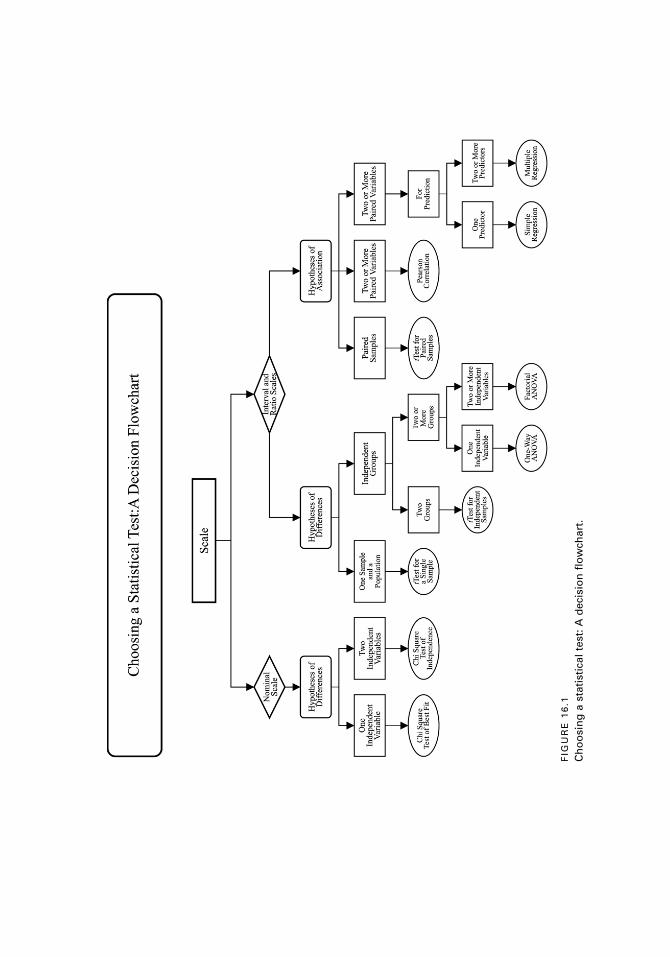
FIG
UR
E 1
6.1
Ch
oo
sin
g a
sta
tist
ical
tes
t: A
dec
isio
n f
low
char
t.
9781442206564_epdf.indb 2279781442206564_epdf.indb 227 9/1/10 7:11 AM9/1/10 7:11 AM

228 C H A P T E R 1 6
Diagramming the design is often helpful as well. The answers to all of these ques-
tions should help you choose the right statistical test.
In deciding which statistical test to use to answer the research questions and to ana-
lyze the data in the scenarios that follow, choose from these statistical tests:
1. Pearson correlation
2. t test for independent samples
3. t test for paired samples
4. t test for a single sample
5. One-way ANOVA
6. Two-way ANOVA
7. Chi square test of best fit
8. Chi square test of independence
9. Simple regression
10. Multiple regression
In order to help you get the “hang of it,” start by reading the two examples that
follow. The examples include answers to the questions about the scale of the data,
the stated or implied hypothesis in the study, the groups used in the study, and some
hypothetical data. As you work through the fourteen passages, we suggest that you
ask yourself the same questions as those in the two practice exercises and create some
hypothetical data points.
EXAMPLES
Example 1
Many studies comparing cooperative learning to traditional teaching have found
that the social self-concept of students is improved when cooperative learning is used.
A fourth-grade teacher implements cooperative learning, and another fourth-grade
teacher continues with the traditional approach. At the end of the school year, a survey
with twenty Likert-scale items designed to measure social self-concept is administered
to the fourth-grade students in the two classes. Scores on the self-concept measure can
range from 20 to 100. The teachers want to compare the social self-concept scores of
the students in both classes to see if those in the cooperative learning class have higher
scores than those in the traditional approach class.
Answer:
1. Scale: Interval. The measure used in the study is a survey designed to assess the
social self-concept of fourth-grade students. Scores on the survey can range from
20–100.
9781442206564_epdf.indb 2289781442206564_epdf.indb 228 9/1/10 7:11 AM9/1/10 7:11 AM
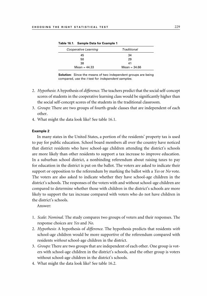
C H O O S I N G T H E R I G H T S T A T I S T I C A L T E S T 229
2. Hypothesis: A hypothesis of difference. The teachers predict that the social self-concept
scores of students in the cooperative learning class would be significantly higher than
the social self-concept scores of the students in the traditional classroom.
3. Groups: There are two groups of fourth-grade classes that are independent of each
other.
4. What might the data look like? See table 16.1.
Example 2
In many states in the United States, a portion of the residents’ property tax is used
to pay for public education. School board members all over the country have noticed
that district residents who have school-age children attending the district’s schools
are more likely than other residents to support a tax increase to improve education.
In a suburban school district, a nonbinding referendum about raising taxes to pay
for education in the district is put on the ballot. The voters are asked to indicate their
support or opposition to the referendum by marking the ballot with a Yes or No vote.
The voters are also asked to indicate whether they have school-age children in the
district’s schools. The responses of the voters with and without school-age children are
compared to determine whether those with children in the district’s schools are more
likely to support the tax increase compared with voters who do not have children in
the district’s schools.
Answer:
1. Scale: Nominal. The study compares two groups of voters and their responses. The
response choices are Yes and No.
2. Hypothesis: A hypothesis of difference. The hypothesis predicts that residents with
school-age children would be more supportive of the referendum compared with
residents without school-age children in the district.
3. Groups: There are two groups that are independent of each other. One group is vot-
ers with school-age children in the district’s schools, and the other group is voters
without school-age children in the district’s schools.
4. What might the data look like? See table 16.2.
Table 16.1. Sample Data for Example 1
Cooperative Learning Traditional
45 3450 2938 41
Mean = 44.33 Mean = 34.66
Solution: Since the means of two independent groups are being compared, use the t test for independent samples.
9781442206564_epdf.indb 2299781442206564_epdf.indb 229 9/1/10 7:11 AM9/1/10 7:11 AM
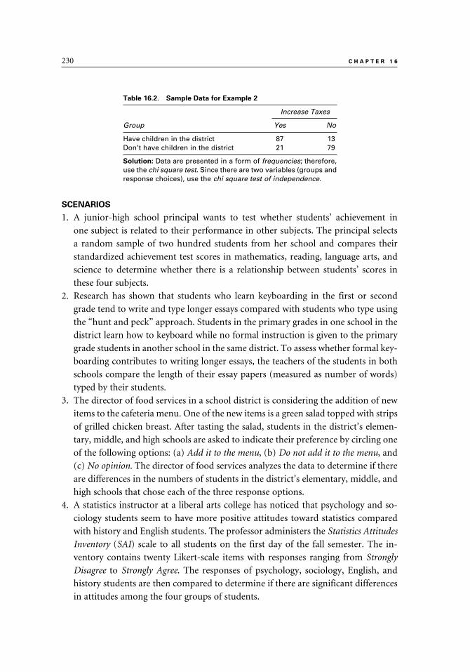
230 C H A P T E R 1 6
SCENARIOS
1. A junior-high school principal wants to test whether students’ achievement in
one subject is related to their performance in other subjects. The principal selects
a random sample of two hundred students from her school and compares their
standardized achievement test scores in mathematics, reading, language arts, and
science to determine whether there is a relationship between students’ scores in
these four subjects.
2. Research has shown that students who learn keyboarding in the first or second
grade tend to write and type longer essays compared with students who type using
the “hunt and peck” approach. Students in the primary grades in one school in the
district learn how to keyboard while no formal instruction is given to the primary
grade students in another school in the same district. To assess whether formal key-
boarding contributes to writing longer essays, the teachers of the students in both
schools compare the length of their essay papers (measured as number of words)
typed by their students.
3. The director of food services in a school district is considering the addition of new
items to the cafeteria menu. One of the new items is a green salad topped with strips
of grilled chicken breast. After tasting the salad, students in the district’s elemen-
tary, middle, and high schools are asked to indicate their preference by circling one
of the following options: (a) Add it to the menu, (b) Do not add it to the menu, and
(c) No opinion. The director of food services analyzes the data to determine if there
are differences in the numbers of students in the district’s elementary, middle, and
high schools that chose each of the three response options.
4. A statistics instructor at a liberal arts college has noticed that psychology and so-
ciology students seem to have more positive attitudes toward statistics compared
with history and English students. The professor administers the Statistics Attitudes
Inventory (SAI) scale to all students on the first day of the fall semester. The in-
ventory contains twenty Likert-scale items with responses ranging from Strongly
Disagree to Strongly Agree. The responses of psychology, sociology, English, and
history students are then compared to determine if there are significant differences
in attitudes among the four groups of students.
Table 16.2. Sample Data for Example 2
Increase Taxes
Group Yes No
Have children in the district 87 13Don’t have children in the district 21 79
Solution: Data are presented in a form of frequencies; therefore, use the chi square test. Since there are two variables (groups and response choices), use the chi square test of independence.
9781442206564_epdf.indb 2309781442206564_epdf.indb 230 9/1/10 7:11 AM9/1/10 7:11 AM

C H O O S I N G T H E R I G H T S T A T I S T I C A L T E S T 231
5. A director of a large childcare center decides to train all her teachers in the use of
CPR. The Red Cross is invited to provide the training. To assess whether the CPR
training program is effective, the Red Cross instructors administer a competency
test to the teachers before and after the training program. The competency test
contains multiple-choice questions and a performance assessment designed to
measure CPR skills. The director and the instructors hypothesize that there will be
a significant increase in knowledge of CPR on the posttest compared with the pretest
scores on the multiple-choice test.
6. Many school districts administer readiness tests to students upon kindergarten
entry. A publisher of a new kindergarten readiness test wants to convince potential
users of the test that it can accurately predict students’ academic performance in
first grade. The test publisher offers to administer the readiness test, free of charge,
to all kindergarten students in the district. After the test is administered, the readi-
ness test score for each student is recorded. At the end of first grade, all students are
administered a standardized achievement test. The readiness test scores obtained
a year earlier and the scores on the standardized achievement test administered at
the end of the first grade are studied to determine whether, as the readiness test
publisher predicted, the readiness test can serve as a good predictor of end-of-year
achievement of first-grade students.
7. The faculty members in a large liberal arts college claim that the professors in the
psychology department get paid more than faculty in other departments. The dean
of the college assures the faculty that there is no significant difference in annual
salaries between faculty members from different departments. The dean conducts a
study to compare the annual salaries of the thirty-two psychology professors to the
mean of the annual salaries of all the 530 faculty members in the college.
8. There are people who contend that spending hours each week playing games online
is a major contributor to a variety of academic problems, including low literacy
rates. A group of middle-school parents and teachers decides to investigate whether
there is a relationship between the number of hours children play games online and
their grade point average (GPA). For two weeks, parents and their children record
the number of hours the children play games online. For each student, the number
of hours is recorded next to the student’s grade point average (GPA). Teachers and
parents can now analyze the data (number of hours playing games online and GPA)
and determine whether there is a relationship between these two variables.
9. The students in a high school mathematics class are learning about probability.
They conduct an experiment with a four-sided spinner. The students hypothesize
that the spinner would land an equal number of times on each of the four sides. To
test their hypothesis, the students spin the spinner two hundred times and record
the outcomes. They then compare their observed results to those that are expected.
9781442206564_epdf.indb 2319781442206564_epdf.indb 231 9/1/10 7:11 AM9/1/10 7:11 AM

232 C H A P T E R 1 6
Since there are four sides, the students expect the spinner to land fifty times on
each side.
10. A high school physics teacher wants to evaluate two teaching methods in his
classes that are studying about light. In one class, the teacher is using textbook and
demonstrations, while in the other class he is using inquiry-based experiments
and investigations. At the end of the unit, the teacher gives a test to all his students
and compares the mean scores of the students in the two classes to determine
which mean is higher.
11. Research to date has documented that there is a gender gap in computer use
and in the field of Information Technology (IT). Some say that this disparity
can be attributed in part to the fact that most electronic games are oriented
toward boys’ interests. A study is conducted with a randomly selected group of
250 fifth-grade boys and 250 fifth-grade girls who are given electronic games
to play. Two electronic games are tested: Game A is an adventure game that
requires competition among the players, and Game B is an adventure game that
requires collaboration between the players. Half of the boys and half of the girls
are given Game A, and the other half is given Game B. The researchers want
to find out which computer game seems to appeal more to fifth-graders and
whether there are gender differences in preferences and attitudes toward the two
games. A twenty-item survey measuring attitudes and opinions is administered
to the fifth-graders after they play with their assigned game. Responses to each
item on the questionnaire include four choices, ranging from I liked it a lot
(4 points) to I did not like it at all (1 point). Scores on the survey items are added
to create a total attitude score.
12. The directors of admissions in a large graduate school want to reexamine four
variables currently used to select students for admission into the graduate pro-
grams. They want to determine whether these variables are good predictors of
students’ success in the program, as measured by the students’ graduate program
GPA. The variables that are used for selecting students are: (a) the Verbal score
on the Graduate Record Examination (GRE), (b) the Quantitative score on the
GRE, (c) the students’ undergraduate GPA, and (d) the students’ essay for admis-
sion. The records of five hundred randomly selected students who have completed
their graduate studies are used to test how well the four predictors predicted the
students’ graduate school GPA.
13. There are educators who claim that parents of younger children tend to be more
satisfied with their children’s schools compared with parents of older children.
The teachers and administrators in a K–8 school disagree with this opinion and
predict that there will not be significant differences in the attitudes of parents of
students in their school, regardless of the age of the students. To confirm their
opinion, they examine results from a survey that is administered annually at the
9781442206564_epdf.indb 2329781442206564_epdf.indb 232 9/1/10 7:11 AM9/1/10 7:11 AM

C H O O S I N G T H E R I G H T S T A T I S T I C A L T E S T 233
end of the school year to parents of students in kindergarten, third, and seventh
grades. The survey is designed to measure the level of parents’ satisfaction re-
garding the services, curricula, and programs provided by the school. The survey
includes thirty questions, with responses to each question ranging from 1 (Very
Dissatisfied) to 4 (Very Satisfied). A score of overall satisfaction is obtained for each
of the respondents.
14. A sixth-grade teacher has noticed that often when the students in his class talk
about the television programs they had watched the evening before, the boys tend
to discuss different programs from those discussed by the girls. To test whether
there is a gender difference in the type of program watched by the children, the
teacher asks all seventy-five sixth-grade students in the school to list their favorite
television program. The teacher then classifies the television programs into five
categories: action, drama, comedy, nature, and news. The teacher compares the
program types viewed by boys and girls to determine any gender differences.
ANSWERS
Scenario 1
The association between four measures obtained for the same group of people is
assessed; therefore, correlation should be used. And, because the scale of measures is
interval, use the Pearson correlation.
Scenario 2
The mean numbers of words on the essay papers typed by two independent groups
are being compared; therefore, use the t test for independent samples.
Scenario 3
Data are presented in the form of frequencies; therefore, use the chi square test.
Since there are two variables (grade level and response choices), use the chi square test
of independence.
Scenario 4
The means of four independent groups (four college majors) are being compared;
therefore, use the one-way ANOVA.
Scenario 5
Pretest and posttest means that are obtained for the same group of teachers are be-
ing compared; therefore, use the t test for paired samples.
Scenario 6
The reading readiness test is used to predict the first-grade standardized achieve-
ment test for a group of students; therefore, use simple regression.
9781442206564_epdf.indb 2339781442206564_epdf.indb 233 9/1/10 7:11 AM9/1/10 7:11 AM

234 C H A P T E R 1 6
Scenario 7
A mean of one group (psychology department faculty) is being compared to the
mean of the population (all other faculty members); therefore, use the single-sample
t test.
Scenario 8
The association between two measures (number of hours children play games on-
line and their GPA) obtained for the same group of people is assessed; therefore, use
the Pearson correlation.
Scenario 9
Data are presented in a form of frequencies; therefore, use the chi square test. Since
only one variable is used (the sides of a spinner) and the expected frequencies are of
equal probability, use the goodness of fit chi square with equal expected frequencies.
Scenario 10
The means of two independent groups (two high school physics classes) are being
compared; therefore, use the t test for independent samples.
Scenario 11
There are two independent variables (gender and type of game), each with two lev-
els. Therefore, there are four independent groups in the study. The means of the four
groups are compared; therefore, use the two-way ANOVA.
Scenario 12
All four measures are obtained for the same group of students. Three of these mea-
sures (GRE Verbal, GRE Quantitative, and undergraduate GPA) are used to predict
the fourth measure (graduate GPA); therefore, use multiple regression.
Scenario 13
The means of three independent groups (parents of students in kindergarten, third,
and seventh grades) are being compared; therefore, use the one-way ANOVA.
Scenario 14
The data are presented in a form of frequencies; therefore, use the chi square test.
Since there are two variables (gender and the type of television program), use the chi
square test of independence.
9781442206564_epdf.indb 2349781442206564_epdf.indb 234 9/1/10 7:11 AM9/1/10 7:11 AM

235
A-B-A single-case design: Single-case experimental designs with three phases: A (base-
line); B (intervention); and A (a second baseline, after the intervention is withdrawn).
Multiple data points are used at each phase to obtain a stable measure of the target
behavior. (Ch. 1)
Action research: Also practitioner research; research that is undertaken by practitioner-
researchers to study their own setting. Action research is usually conducted by practitio-
ners to solve a problem by studying it, proposing solutions, implementing the solutions,
and assessing the effectiveness of these solutions. The process of action research is cycli-
cal; the researcher continues to identify a problem, propose a solution, implement the
solution, and assess the outcomes. Both qualitative and quantitative data can be collected
in action research. (Ch. 1)
Alternate forms reliability: An approach used to assess the degree of consistency be-
tween two forms of the same test. (Ch. 13)
Alternative hypothesis: A prediction about the expected outcomes of the study that
guides the investigation and the design of the study. The alternative hypothesis is
represented by HA or H
1. Often, the alternative hypothesis is simply referred to as the
hypothesis. It usually predicts that there would be some relationship between variables
or a difference between groups or means. (Ch. 2)
Amodal distribution: A distribution without a mode. (Ch. 4)
Analysis of variance (ANOVA): A statistical test used to compare the means of two or
more independent samples and to test whether the differences between the means are
statistically significant. (Ch. 11)
Applied research: Research that is aimed at testing theories and applying them to spe-
cific situations. Based on previously developed theories, hypotheses are developed and
tested in studies classified as applied research. (Ch. 1)
Glossary
9781442206564_epdf.indb 2359781442206564_epdf.indb 235 9/1/10 7:11 AM9/1/10 7:11 AM

236 G L O S S A R Y
Bar graph (or bar diagram): A graph with a series of bars that do not touch that is used
to display discrete and independent categories or groups. The bars are often ordered in
some way (e.g., from the highest to the lowest). (Ch. 3)
Basic research: Research that is conducted mostly in labs, under tightly controlled con-
ditions, and its main goal is to develop theories and generalities. This type of research
is not aimed at solving immediate problems or at testing hypotheses. (Ch. 1)
Bimodal distribution: A distribution with two modes. (Ch. 4)
Box plot (or box-and-whiskers): A graph that is used to show the median and spread
of a set of scores using a box and vertical lines. The two middle quartiles are located
within the box, and a horizontal line inside the box shows the location of the median.
The two extreme quartiles are displayed using the vertical lines (the “whiskers”) out-
side the box. (Ch. 3)
Causal comparative (or ex post facto) research: Research designed to study cause-and-
effect relationships, where the independent variable is not manipulated because it oc-
curred prior to the start of the study or it is a variable that cannot be manipulated. (Ch. 1)
Chi square (χ2) test: A nonparametric statistical test that is applied to categorical or
nominal data where the units of measurement are frequency counts. Observed fre-
quencies gathered in a study are compared to expected frequencies to test whether the
differences between them are significant. The chi square test statistic is represented by
χ2. There are two types of chi square tests: (a) the goodness of fit chi square test that is
used with one independent variable; and (b) the chi square test of independence that is
used with two independent variables. (Ch. 12)
Class intervals: Equal-width groups of scores in a distribution. (Ch. 3)
Coefficient alpha: An approach to calculate the reliability of an instrument using scores
from a single testing; also known as Cronbach alpha. (Ch. 13)
Coefficient of determination (r 2): An index used to describe the proportion of variance
in one variable (usually the criterion) that can be explained by differences in the other
variable (usually the predictor). The coefficient of determination may also be called
the shared variance. (Ch. 8)
Cohort study: A type of longitudinal study where similar people, selected from the
same cohort, are studied at two or more points in time. (Ch. 1)
Concurrent validity: The correlation between scores from an instrument and scores
from another well-established instrument that measure the same thing. (Ch. 14)
Confidence interval (CI): A range within which we would expect to find, with a certain
level of confidence (e.g., 95 percent), the population value we want to estimate from
our sample. The interval includes two boundaries: a lower limit (CIL) and an upper
limit (CIU). (Ch. 2)
Constant: A measure that has only one value (Ch. 2). In regression, constant is the
point where the regression line intersects the vertical axis. (Ch. 9)
9781442206564_epdf.indb 2369781442206564_epdf.indb 236 9/1/10 7:11 AM9/1/10 7:11 AM

G L O S S A R Y 237
Construct validity: The extent to which a test measures and provides accurate informa-
tion about a theoretical trait or characteristic. (Ch. 14)
Content validity: The degree to which an instrument measures behaviors and content
domain about which inferences are to be made; the extent of the match between the
test and the content it is intended to measure. (Ch. 14)
Continuous variable: A variable that can take on a wide range of values and contain an
infinite number of small increments. (Ch. 2)
Convenience (or incidental) sample: A sample that is chosen for the study by the re-
searcher because of its convenience. (Ch. 2)
Correlation: The relationship or association between two or more paired variables.
(Ch. 8)
Correlation coefficient: An index indicating the degree of association or relationship be-
tween two variables. The coefficient can range from –1.00 (perfect negative) to +1.00
(perfect positive). The most commonly used coefficient is Pearson’s r. (Ch. 8)
Counterbalanced designs: Experimental designs where several interventions are tested
simultaneously, and the number of groups in the study equal the number of interven-
tions. All the groups in the study receive all interventions, but in a different order.
(Ch. 1)
Criterion-referenced (CR) test: A test used to compare the performance of an individual
to certain criteria. (Ch. 7)
Criterion-related validity: The degree to which an instrument is related to another
measure, called the criterion. (See concurrent validity and predictive validity for types
of criterion-related validity.) (Ch. 14)
Critical value: A value of a test statistic that is found in statistical tables of critical values,
which are associated with different statistical tests. The computed test statistics are
compared to the appropriate critical values in order to make decisions about whether
to retain or reject the null hypothesis. (Ch. 2)
Cronbach’s coefficient alpha: A type of internal consistency measure of test reliability
that uses scores from a single testing. This approach assesses how well items or vari-
ables that measure a similar trait or concept correlate with each other. (Ch. 13)
Cross-sectional designs: Nonexperimental designs conducted to study how individuals
change and develop over time by collecting data at one point in time on different-age
individuals. (Ch. 1)
Cumulative frequency distribution: A distribution of scores that shows the number and
percentage of scores at or below a given score. The distribution includes the follow-
ing: scores, frequencies, percent frequencies, cumulative frequencies, and cumulative
percent frequencies. (Ch. 3)
Degrees of freedom (df ): In most cases, the degrees of freedom are n – 1 (the number
of people in the study, minus 1), although there are some modifications to this rule
9781442206564_epdf.indb 2379781442206564_epdf.indb 237 9/1/10 7:11 AM9/1/10 7:11 AM
238 G L O S S A R Y
in some statistical tests. In most studies, degrees of freedom relate to the sample size.
(Ch. 2)
Dependent variable: An outcome measure in an experimental study designed to measure
the effectiveness of the intervention. (Ch. 1) The criterion variable in regression. (Ch 9)
Descriptive research: Studies aimed at investigating phenomena as they are naturally
occurring, without any manipulation or intervention. (Ch. 1)
Descriptive statistics: Procedures used to classify, organize, and summarize numerical
data about a particular group of observations. There is no attempt to generalize these
statistics, which describe only one group, to other samples or populations. (Ch. 2)
Deviation score: The distance between each score in a distribution and the mean of that
distribution, expressed as X – X–
. (Ch. 5)
Differential selection: A threat to internal validity; refers to studies where preexisting
group differences may contribute to different performance on the dependent variable.
(Ch. 1)
Directional hypothesis: A prediction that states the direction of the outcome of the
study. For example, in studies where group differences are investigated, a directional
hypothesis predicts which group’s mean would be higher; and in studies that inves-
tigate relationships between variables, a directional hypothesis predicts whether the
correlation will be positive or negative. (Ch. 2)
Discrete variable: A variable that contains a finite number of distinct values between
any two given points. (Ch. 2)
Effect size (ES): An index that is used to express the strength or magnitude of difference
between two means or the strength of association of two variables. The comparison
of the means is done by converting the difference between the means into standard
deviation units. Effect size can also be used to assess the strength of the association
between two variables by using the correlation coefficient (r) or a square of the cor-
relation coefficient (r2, or R2). (Ch. 2)
Experimental research: Research designed to study cause-and-effect relationships by
manipulating the independent variable (i.e., the cause) and observing possible changes
in the dependent variable (the effect, or outcome). Experimental research is designed to
assess the effectiveness of a planned intervention on groups or individuals. (Ch. 1)
Ex post facto research: See Causal comparative research. (Ch. 1)
External validity: The extent to which the results of the study can be generalized and
applied to other settings, populations, and groups. (Ch. 1)
Extraneous variable: A variable that presents a threat to the study’s internal validity; an
uncontrolled variable that can present a competing explanation of the impact of the
planned intervention. (Ch. 1)
F ratio (or F value): A test statistic used in the analysis of variance (ANOVA). It is com-
puted by dividing two variance estimates by each other. (Ch. 11)
9781442206564_epdf.indb 2389781442206564_epdf.indb 238 9/1/10 7:11 AM9/1/10 7:11 AM

G L O S S A R Y 239
Face validity: The extent to which an instrument appears to measure what it is intended
to measure. (Ch. 14)
Factorial ANOVA: A general name for ANOVA with two or more independent vari-
ables. (Ch. 11)
Frequency distribution: A distribution of scores that are ordered and tallied. (Ch. 3)
Frequency polygon: A graph that is used to display frequency distributions. The bell-
shaped normal distribution is a special case of a frequency polygon with a large num-
ber of cases. (Ch. 3)
Grade equivalent (GE): A scale that is used to convert raw scores to grade-level norms
by expressing scores in terms of years and months. (Ch. 7)
Graph: A visual representation of numerical data. (Ch. 3)
Hawthorne Effect: A threat to external validity whereby the behavior of the study’s
participants may be affected by their knowledge that they participate in a study, rather
than by the planned intervention. (Ch. 1)
Histogram: A graph that contains a series of consecutive vertical bars used to display
frequency distributions. (Ch. 3)
History: A threat to internal validity; refers to events that happened during the study
that may affect the dependent variable. (Ch. 1)
Hypothesis: A prediction about the outcome of the study; an “educated guess.” (Ch. 2)
Independent variable: The intervention (or treatment) in experimental studies; the
grouping variable in nonexperimental studies. (Ch. 1) The predictor variable in re-
gression. (Ch. 9)
Inferential statistics: Procedures that involve selecting a sample from a defined popu-
lation and studying that sample in order to draw conclusions and make inferences
about the population. The sample that is selected is used to obtain sample statistics to
estimate the population parameters. May also be called sampling statistics. (Ch. 2)
Instrumentation: A threat to internal validity; refers to the level of reliability and
validity of the instrument being used to assess the effectiveness of the intervention.
(Ch. 1)
Interaction: A situation in factorial ANOVA where one or more levels of the indepen-
dent variable have a different effect on the dependent variable when combined with
another independent variable. (Ch. 11)
Intercorrelation table: A table that is used to display the correlations of several variables
with each other. (Ch. 8)
Internal consistency approach: Approaches used to assess the reliability of an instru-
ment using scores from a single administration of the instrument. (Ch. 13)
Internal validity: The extent to which observed changes in the dependent variable (out-
come measure) can be attributed to the independent variables (the intervention); the
extent of control over the extraneous variables. (Ch. 1)
9781442206564_epdf.indb 2399781442206564_epdf.indb 239 9/1/10 7:11 AM9/1/10 7:11 AM

240 G L O S S A R Y
Inter-rater reliability: A method to assess the degree of consistency and agreement be-
tween scores assigned by two or more raters or observers who judge or grade the same
performance or behavior. (Ch. 13)
Interval scale: A measurement scale with observations that are ordered by magnitude
or size with equal intervals between the different points. (Ch. 2)
John Henry Effect: A threat to external validity; refers to a condition where the inter-
vention does not seem to be effective because control group members perceive them-
selves to be in competition with experimental group members and therefore perform
above and beyond their usual level. (Ch. 1)
Level of significance (p level): The level of error associated with rejecting a null hypoth-
esis; a probability that the study’s results were obtained purely by chance. (Ch. 2)
Linear regression: A process of prediction where the predictor variable (X) and the
criterion variable (Y) have a linear relationship. (Ch. 9)
Line graph: A graph used to show relationships between two variables through lines
that connect the data points. The horizontal axis indicates values that are on a con-
tinuum, and the vertical axis can be used for various types of data. (Ch. 3)
Longitudinal studies: Nonexperimental designs conducted to measure changes over
time by following the same group of individuals. (Ch. 1)
Maturation: A threat to internal validity; refers to physical or mental changes experi-
enced by the study’s participants while the study takes place. (Ch. 1)
Mean: The most commonly used measure of central tendency that is obtained by
adding up the scores and dividing the sum by the number of scores; also called the
arithmetic mean. (Ch. 4)
Mean squares (MS): In ANOVA, there are different variance estimates. For example,
MSW
is the estimate of the variances within groups; MSB is the estimate of the variance
of groups around the total mean. (Ch. 11)
Measure of central tendency: A summary score; a single score that represents a set of
scores. (Ch. 4)
Measurement: A process of assigning numbers to observations according to certain
rules. (Ch. 2)
Median: A measure of central tendency that is the distribution’s midpoint, where 50
percent of the scores are above it and 50 percent are below it. (Ch. 4)
Mode: A measure of central tendency; the score that occurs with the greatest frequency.
(Ch. 4)
Multimodal distribution: A distribution with three or more nodes. (Ch. 4)
Multiple correlation (R): An index of the combined correlation of the predictor variables
with the criterion variable. (Ch. 9)
Multiple regression: See Regression.
9781442206564_epdf.indb 2409781442206564_epdf.indb 240 9/1/10 7:11 AM9/1/10 7:11 AM

G L O S S A R Y 241
Nominal scale: A measurement scale where numbers are used to label, classify, or cat-
egorize data. The various points on the scale are not ordered. (Ch. 2)
Nondirectional hypothesis: A hypothesis that predicts that there would be a difference
or relationship, but the direction of the difference or association is not specified.
(Ch. 2)
Nonexperimental research: A research study where no planned intervention takes
place. Nonexperimental research is divided into two types: causal comparative (also
called ex post facto) and descriptive. (Ch. 1)
Nonparametric statistics: Statistics that are used with ordinal and nominal data or with
interval and ratio scale data that fail to meet the assumptions needed for parametric
statistics. Nonparametric statistics are easier to compute and understand, compared
with parametric statistics. (Ch. 2)
Normal curve: A graphic presentation of a theoretical model that is bell-shaped. Vari-
ous characteristics in nature are normally distributed, and each normal distribution
has its own mean and standard deviation. (Ch. 6)
Normal distribution: A symmetrical distribution where the mean, median, and mode
have the same value and the scores tend to cluster in the center (about two-thirds of
the scores are within ±1SD from the mean). (Ch. 6)
Norming group: A group used to develop test norms with demographic characteristics
similar to those of the potential test takers. (Ch. 7)
Norm-referenced (NR) test: A test that includes norms designed to compare the per-
formance of examinees taking the test to the performance of similar individuals in a
norming group who took the same test and whose scores were used to generate the
norms. (Ch. 7)
Null hypothesis: A hypothesis that predicts that there would be no relationship be-
tween variables or no difference between groups or means beyond that which may
be attributed to chance alone; represented by HO. In most cases, the null hypothesis
(which may also be called the statistical hypothesis) is not formally stated, but it is al-
ways implied. (Ch. 2)
One-tailed test: Used when the alternative hypothesis (i.e., the study’s main research
hypothesis) is directional to decide whether to reject the null hypothesis. (Ch. 10)
One-way analysis of variance (one-way ANOVA): Analysis of variance with one indepen-
dent variable and one dependent variable. (Ch. 11)
Ordinal scale: A measurement scale where the observations can be ordered based on
their magnitude or size and the intervals among the different points on the scale are
not assumed to be equal. (Ch. 2)
Outlier: A score that is noticeably different from the other scores in the distribution
and is outside the range and pattern of the other points; an extreme score. (Ch. 8)
9781442206564_epdf.indb 2419781442206564_epdf.indb 241 9/1/10 7:11 AM9/1/10 7:11 AM

242 G L O S S A R Y
p (probability) level (level of significance): An index used to indicate the probability
that we are making an error in rejecting a true null hypothesis. A probability level
of 5 percent is commonly used to decide whether to consider the results statistically
significant. (Ch. 2)
Panel study: A type of longitudinal study, where the same people are studied at two or
more points in time. (Ch. 1)
Parameter: A measure that describes a characteristic or a value of an entire population.
(Ch. 2)
Parametric statistics: Statistics that are applied to data from populations that meet the
following assumptions: the variables being studied are measured on an interval or a ra-
tio scale; subjects are randomly assigned to groups; the scores are normally distributed;
and the variances of the groups being compared are similar. Parametric tests are con-
sidered more efficient and powerful than their nonparametric counterparts. (Ch. 2)
Pearson’s r: A measure of the linear relationship between two continuous variables
(measured on an interval or ratio scale). Pearson’s r can range from –1.00 (a perfect
negative correlation) to 0.00 (no correlation) to +1.00 (perfect positive). (Ch. 8)
Percentile band: An estimated range where a student’s true percentile rank is expected
to be, usually reported with 68 percent confidence level. (Ch. 7)
Percentile rank: An index that describes the relative position of a person by indicating
the percentage of people at or below that score. (Ch. 3, 6, 7)
Pie graph (or pie chart): A graph that looks like a circle that is divided into “wedges”
or “segments.” Each wedge represents a category or subgroup within that distribution.
(Ch. 3)
Population: An entire group of persons or elements that have at least one characteristic
in common. (Ch. 2)
Post hoc comparison: In ANOVA, it is a process of multiple comparisons done after the
completion of the study where all possible pairs of means are compared to determine
which differences between the means are statistically significant. Tukey’s honestly sig-
nificant difference (HSD) is an example of a post hoc comparisons test. (Ch. 11)
Practitioner research: See Action research. (Ch. 1)
Predictive validity: The extent to which an instrument can predict some future perfor-
mance. (Ch. 14)
Preexperimental designs: Designs classified as preexperimental do not have a tight con-
trol over extraneous variables, and their internal validity cannot be assured. (Ch. 1)
Qualitative research: Research that seeks to understand social or educational phe-
nomena. The researcher focuses on one or a few cases that are studied in-depth using
multiple data sources that are subjective in nature. Qualitative research, which uses
mostly narrative data, is context-based, recognizing the uniqueness of each individual
and setting. (Ch. 1)
9781442206564_epdf.indb 2429781442206564_epdf.indb 242 9/1/10 7:11 AM9/1/10 7:11 AM

G L O S S A R Y 243
Quantitative research: Research that is conducted to describe phenomena or to study
cause-and-effect relationships by examining a small number of variables and using nu-
merical data gathered from large samples. Researchers conducting quantitative research
usually maintain objectivity and detach themselves from the study’s environment. (Ch. 1)
Quasi-experimental designs: Experimental designs where intact groups are used and
where the groups being compared are not assumed to be equivalent at the beginning
of the study. (Ch. 1)
Range: A measure of spread (or variability) that indicates the distance between the
highest and the lowest scores in a distribution. (Ch. 5)
Ratio scale: A measurement scale where the observations are ordered by magnitude, with
equal intervals between the different points on the scale and an absolute zero. (Ch. 2)
Raw score: A score obtained by an individual on some measure that is not converted
to another measure or scale. (Ch. 4)
Regression: A statistical technique used for estimating scores on one variable (the
dependent variable, or criterion) from scores on one (or more) variable (the indepen-
dent variable, or predictor). When one variable is used to predict another, the proce-
dure is called simple regression, and when two or more variables are used as predictors,
the procedure is called multiple regression. (Ch. 9)
Regression line: A line of best fit on a scattergram where the predicted scores are ex-
pected to be. (Ch. 9)
Reliability: The level of consistency of an instrument and the degree to which the same
results are obtained when the instrument is used repeatedly with the same individuals
or groups. (Ch. 13)
Research: A systematic inquiry that includes data collection and analysis. The goal of
research is to describe, explain, or predict present or future phenomena. There are
several ways to classify research, and each approach looks at research from a different
perspective. (Ch. 1)
Sample: A small group of observations selected from the total population for the pur-
pose of making inferences about the population. A sample should be representative of
the population because information gained from the sample is used to estimate and
predict the population characteristics that are of interest. (Ch. 2)
Sample bias: Systematic, rather than random, differences between the population and
the selected sample; a systematic error in a sample. (Ch. 2)
Sampling error: A chance variation in the numerical values of a sample (e.g., mean)
that occurs when we repeatedly select same-size samples from the same population
and compare their numerical values. Sampling error is beyond the control of the re-
searcher. (Ch. 2)
Scattergram (or scatterplot): A graph used to depict the association (correlation) be-
tween two numerical variables. (Ch. 8)
9781442206564_epdf.indb 2439781442206564_epdf.indb 243 9/1/10 7:11 AM9/1/10 7:11 AM
244 G L O S S A R Y
Simple random sample: A sample where every member of the population has an equal
and independent chance of being selected for inclusion. (Ch. 2)
Simple regression: See Regression.
Single-case (or single-subject) designs: Experimental designs where individuals are
used as their own control. Their behavior or performance is assessed during two or
more phases, alternating between phases with and without an intervention. See also
A-B-A single-case designs. (Ch. 1)
Split-half method: A procedure for assessing test reliability by dividing the items into
two halves and correlating the scores from one half with the other. Spearman-Brown
prophecy formula is then used to estimate the reliability of a full-length test. (Ch. 13)
Standard deviation (SD): A measure of spread in a distribution of scores. It is the mean
of the distances of the scores around the distribution mean. The standard deviation is
the squared root of the variance. The SD of the sample is S, and the SD of the popula-
tion is σ (the Greek letter sigma, lowercase). (Ch. 5)
Standard error of estimate (SE): An index that estimates the amount of error expected
in predicting a criterion score; the standard deviation of the differences between actual
and predicted scores in regression. (Ch. 9)
Standard error of measurement (SEM): An estimate of the error in a person’s score on
a test. (Ch. 13)
Standard error of the mean: The standard deviation of the sample means, expressed by
symbol SEX–. (Ch. 2)
Standard score: A derived scale score that expresses the distance of the original score
from the mean in standard deviation units. The most common standard score is the
z score. (Ch. 6)
Stanine: A nine-point scale that is derived from the words “standard nine” with a mean
of 5 and a standard deviation of 2. Stanines allow the conversion of percentile ranks
into larger units. (Ch. 7)
Statistic: A measure that describes a characteristic of a sample. (Ch. 2)
Statistical regression: A threat to internal validity; refers to a phenomenon whereby
people who obtain extreme scores on a pretest tend to score closer to the mean of their
group upon subsequent testing, even when no intervention is involved. (Ch. 1)
Statistically significant: Most researchers use the convention whereby they report their
findings as statistically significant if their computed probability level (p value) is 5
percent or less (p ≤ .05). Reporting results as statistically significant means that the
likelihood of obtaining these results purely by chance is low and that similar results
would be obtained if the study was repeated. (Ch. 2)
Stratified sample: A sample that contains proportional representations of the popula-
tion subgroups. To obtain a stratified sample, the population is first divided into sub-
groups (strata), then a random sample is selected from each subgroup. (Ch. 2)
9781442206564_epdf.indb 2449781442206564_epdf.indb 244 9/1/10 7:11 AM9/1/10 7:11 AM

G L O S S A R Y 245
Sum of squares (SS): In ANOVA, these are different sources of variability. The within-
groups sum of squares (SSW
) is the variability within the groups. The between-groups sum
of squares (SSB) is the average variability of the means of the groups around the total
mean. (SSB may also be called among-groups sum of squares; abbreviated as SS
A.) The total
sum of squares (SST) is the variability of all the scores around the total mean. (Ch. 11)
Systematic sample: A sample where every Kth member (e.g., every fifth person) is se-
lected from a list of all population members. (Ch. 2)
T score: A type of a standard score measured on a scale with a mean of 50 and a SD of
10. All the scores on the T score scale are positive and range from 10 to 90. T scores
can be converted from z scores using the formula: T = 10(z) + 50. (Ch. 6)
t test: A statistical test used to compare two means. The means may be from two dif-
ferent samples, from paired samples, or from a sample and a population. The scores
used to compute the means should be measured on an interval or ratio scale and be
derived from the same measure. (See t test for independent samples, t test for paired
samples, and t test for a single sample.) (Ch. 10)
t test for independent samples: A t test used to compare the mean scores of two groups
that are independent of each other. (Ch. 10)
t test for paired samples: A t test that is used to compare the mean scores of two sets of
scores that are paired. (May also be called a t test for dependent, matched, or correlated
samples.) (Ch. 10)
t test for a single sample: A t test used to compare the mean of a sample (X ) to the
mean of a population (μ). (Ch. 10)
Testing: When used in the context of threats to internal validity, testing refers to the
potential effect that a pretest may have on the performance of people on the posttest.
(Ch. 1)
Test-retest reliability: A procedure for assessing the reliability of a test by administer-
ing the test twice to the same group of examinees and correlating the two sets of test
scores. (Ch. 13)
Time-series designs: Designs that are classified as quasi-experimental, where intact
groups are tested repeatedly before and after the intervention. (Ch. 1)
Trend study: A type of longitudinal study where the same research questions are posed
at two or more points in time to similar individuals. (Ch. 1)
True experimental designs: Experimental designs where the groups are considered
equal because participants are randomly assigned to groups. (Ch. 1)
Two-tailed test: Used when the alternative hypothesis (i.e., the study’s main research
hypothesis) is nondirectional or stated as no difference between means or no associa-
tion between variables. (Ch. 10)
Two-way analysis of variance (two-way ANOVA): An ANOVA test used to compare
two independent variables (or factors) simultaneously. This statistical test enables us
9781442206564_epdf.indb 2459781442206564_epdf.indb 245 9/1/10 7:11 AM9/1/10 7:11 AM

246 G L O S S A R Y
to study the effect of each of the two factors on the dependent variable as well as the
interaction of the two factors. The independent variables in factorial ANOVA are also
called the main effects. (Ch. 11)
Type I error: An error made by researchers when they decide to reject the null hypoth-
esis (HO) when in fact it is true and should not be rejected. (Ch. 2)
Type II error: An error made by researchers where they decide to retain the null hypoth-
esis, when in fact it should be rejected. (Ch. 2)
Validity: The degree to which an instrument measures what it is supposed to measure
and the appropriateness of specific inferences and interpretations made using the test
scores. (Ch. 14)
Variable: A measured characteristic that can assume different values or levels. (Ch. 2)
Variance: A measure of spread in a distribution of scores, in squared units. It is the mean
of the squared distances of the scores around the distribution mean. The variance can be
obtained by squaring the standard deviation. The variance of the sample is S2 and the SD
of the population is σ2 (the Greek letter sigma, lowercase, squared). (Ch. 5)
z score: A type of standard score that indicates how many standard deviation units a
given score is above or below the mean for that group. The z scores create a scale with
a mean of 0 and a standard deviation of 1. (Ch. 6)
9781442206564_epdf.indb 2469781442206564_epdf.indb 246 9/1/10 7:11 AM9/1/10 7:11 AM

247
Index
A-B-A single-case design, 14
abstract in research report, 219
academic self-concept (ASC), 130
action research, xv, 4–5
ACT test, 98, 105, 147, 149, 150, 206
affective domain, 199
alpha level, setting, 34
alternate forms reliability, 194
alternative hypotheses, 41; for correlation, 120;
for one-way ANOVA, 164; for t test, 144
American Educational Research Association
(AERA), 204n, 214n
American Psychological Association (APA),
204n. See also APA Publication Manual
amodal distribution, 72
among-groups sum of squares (SSA), 160
analysis of variance (ANOVA), 29, 157–175;
alternative hypothesis in, 164; a priori
comparisons in, 164; degree of freedom
in, 161; dependent variables in, 158,
159; F ratio in, 157, 159; F statistic in,
159; homogeneity of variances in, 158;
honestly significant difference in, 168;
independent variables in, 158, 159; pair-
wise comparison in, 158; Type I errors in,
158. See also one-way analysis of variance
(one-way ANOVA); two-way analysis of
variance (two-way ANOVA)
ANOVA summary table, 164–165, 167, 172,
175
APA Publication Manual, 35n, 59, 59n, 212,
218, 219n, 220
appendix in research report, 219
applied research, 4
a priori comparison in ANOVA, 164
arithmetic mean, 74
assessment of validity, 207
assumption-free statistics, 29n
assumption of the homogeneity of variances,
147
averages, 74. See also measures of central
tendency
bar diagram. See Bar graphs
bar graphs, 60–63
baseline measure, 14, 15
basic research, 4
behaviorism, theory of, 4
benchmarks approach, 121
between-groups mean square (MSB), 162
between-groups sum of squares groups (SSB),
160
between groups variation, 169
bias: sample, 28; test, 207–208
bimodal distribution, 72
box-and-whiskers. See box plots
box plots, 64–66
9781442206564_epdf.indb 2479781442206564_epdf.indb 247 9/1/10 7:11 AM9/1/10 7:11 AM

248 I N D E X
Campbell, D. T., 9n
case study approach, 6, 15
causal comparative (ex post facto) research,
7, 15–17
cause-and-effect relationships, 7, 15
census survey, 16
central tendency, measures of. See measures
of central tendency
charts. See graphs
chi-square goodness of fit test, 182–184
chi-square (χ2 test), 29, 179–187;
assumptions for, 181–182; equal
expected frequencies, 182–183; expected
frequencies for, 180, 181, 182; observed
frequencies for, 181; unequal expected
frequencies for, 183–184
chi-square (χ2 test of independence, 185–187
chi square value (χ2), 180
class intervals, 52–53
coefficient, 131; alpha (Cronbach’s alpha),
195, 196; of determination (r 2), 37–38,
123–124, 136, 137; validity, 205
cognitive domain, 199
Cohen, J., 35n
cohort studies, 17
commercial achievement tests, 105
computer statistical packages, 121
concurrent validity, 205
confidence intervals, 40–41
constant, 22, 131
construct validity, 206
content-referenced tests, 108n
content validity, 204–205
contingency tables, 185
continuous variables, 22
control group, 7–8, 11, 35
convenience samples, 27–28
correlation, 113–126; coefficient of
determination, 123–124; curvilinear
relationship, 118–119; defined, 114; in
descriptive research, 16; direction of,
114; factors affecting, 122–123; graphing,
114–118; hypotheses for, 120–121;
intercorrelation table in, 124–125; linear
relationship, 118; magnitude of, 114;
multiple, 136–137; negative, 115–116;
Pearson product moment, 118–122, 192;
positive, 114–115; scattergrams in, 114–
118; strength or degree of, 114
correlation coefficient, 37–38, 113;
interpreting, 119–120
correlation tables, 126
counterbalanced designs, 13
criterion-referenced tests, 108
criterion-related validity, 205–206
criterion variables, 130, 133
critical value: chi square and, 183, 184, 187;
correlation and, 121; degrees of freedom
and, 33, 34
Cronbach, Lee, 196
Cronbach’s coefficient alpha, 195, 196
cross-sectional design, 16–17
cumulative frequency distributions, 54–55
curvilinear relationship, 118, 119
data: analysis of, 42; graphing, 55–68;
nominal, 29; numerical, 6; ordinal,
29; organizing, 52–55; qualitative, 4;
quantitative, 4, 15
data analysis section in research proposal,
218
decision flowchart, choosing statistical test
for, 225, 226–230
decision making, 199; errors in, 34
degrees of freedom, 34, 121; analysis of
variance and, 161, 164, 165, 167, 169, 173,
174; in chi square test, 181, 183, 184, 185,
187; in correlation, 121, 122; t test and,
149, 155
dependent variables, 130, 133; in ANOVA,
158, 159; in experimental research, 6–7, 8,
9, 12; in nonexperimental research, 15
9781442206564_epdf.indb 2489781442206564_epdf.indb 248 9/1/10 7:11 AM9/1/10 7:11 AM

I N D E X 249
descriptive research, 6n, 7, 16–17; correlation
in, 16
descriptive statistics, 29–30, 76; graphing
data in, 55–68; measures of central
tendency, 71–73; measures of variability,
79–87; organizing data in, 52–55
descriptive studies, 15
deviation scores, 81
differential selection as threat to internal
validity, 10–11
directional hypothesis, 32, 144, 145, 146, 147,
149
discrete variables, 22
discussion in research report, 219, 220–221
disordinal interaction, 171
distribution-free statistics, 29n
distributions with extreme scores, variance
and standard deviation, 86
educational research, 3–17; action research
in, 4–5; applied research in, 4; basic
research in, 4; experimental versus
nonexperimental research in, 6–17;
practitioner research in, 5; quantitative
versus qualitative research in, 5–6
effect size, 35–38, 42n, 123, 150; coefficient
of determination and, 123–124; index
of, 36, 37–38, 123, 150; interpretation of,
35; magnitude of, 35–36; negative, 37;
positive, 37; in results section of research
reports, 35
equal expected frequencies, 182–183
errors: in decision making, 34; margin of,
38; sampling, 25, 38, 39, 166; standard of
estimate, 132–133; Type I, 34, 146n, 158;
Type II, 34
error scores, 132, 192–193; reliability and,
192
error term, 162
ethics, research, 213–214
expected frequencies, 180
experimental groups, 7–8, 11, 13, 35;
comparing, 12–13
experimental research, 6, 7–15; A-B-A
single-case design in, 14; comparing
groups in, 12–13; comparing individuals
in, 14–15; control groups in, 7–8, 11;
counterbalanced designs in, 13; dependent
variables in, 12, 14; differential selection
in, 11; effect size in, 35–36; experimental
groups in, 7–8, 11; external validity
of, 9 (threats to, 11–12); extraneous
variables in, 8–9, 14; Hawthorne effect
in, 11; history in, 9–10; independent
variables in, 12; instrumentation in, 10;
internal validity of, 9 (threats to, 9–11);
John Henry effect in, 12; matching in,
12; maturation in, 10; preexperimental
designs in, 13; quasi-experimental
designs in, 13; random assignment in, 12;
single-case designs in, 14–15; statistical
regression in, 10–11; testing in, 10; time-
series design in, 13; true experimental
designs in, 13
experimental studies, 131
ex post facto research, 7, 15–16, 146
external validity, 9; threats to, 11–12
extraneous variables, 8–9, 14
face validity, 207
factorial analysis of variance, 157, 159
F ratio, 147, 157, 159, 169, 172; computing,
162; interpretation of, 165–166; frequency
distributions, 52; frequency polygons, 55–
57, 72, 80n, 100; comparing histograms
and, 57–58
F statistic, 159
F test, 158, 172–173
F value, 147, 159
Gain scores, 7, 37, 152
Gaussian Model, 92
9781442206564_epdf.indb 2499781442206564_epdf.indb 249 9/1/10 7:11 AM9/1/10 7:11 AM

250 I N D E X
goodness of fit, chi square test, 182–184
grade equivalents, 104, 105, 106–107
grade point average (GPA), 23, 130–131
Graduate Record Examination (GRE), 105,
146
graphing data, 55–68; accuracy in, 66–68;
bar graphs, 60–63; box plots in, 64–66;
frequency polygons in, 55–58; histograms
in, 55–587; line graphs, 63–64; pie graphs,
58–60
graphing regression equations, 135–136
graphs: bar, 60–63; drawing accurate, 66–68;
line, 63–64, 66; pie, 58–60
groups, comparing, in experimental research,
12–13
Hawthorne Effect, 11
heterogeneity of the group, 198
histograms, 55–57; comparing frequency
polygons and, 57–58
homogeneity of variances, 158
honestly significant difference (HSD), 168
hypothesis, 4; alternative, 31, 41, 144,
164; for correlation, 120–121; defined,
30; directional, 32, 144; nondirectional,
32, 145; null, 31–32, 145, 158; for
one-way analysis of variance (one-way
ANOVA), 164; research, 31, 164; in
research, 30–32; statistical, 31; steps in
testing, 41–42; for t tests, 144–146; for
two-way analysis of variance (two-way
ANOVA), 169–170
incidental samples, 27
independent samples, t tests for, 32, 40,
146–151
independent variables, 130; in ANOVA,
158, 159; in causal comparative research,
12; in experimental research, 6, 8; in
nonexperimental research, 15, 16; in
regression, 133
index: of effect size, 36, 37–38, 123, 150; of
variability, 82
individuals, comparing, in experimental
research, 14–15
inferential statistics, 30, 76; analysis of
variance, 157–175; chi square test, 179–
187; t test in, 143–155
instrumentation as threat to internal validity,
10
instrument length, 198–199
instruments, reliability of, 122
instrument section in research proposal,
217–218
intelligence tests, 22
interaction, 159; disordinal, 171; graphing,
170–172; ordinal, 171
interaction graph, 170
intercept, 131
intercorrelation tables, 124–125
internal consistency, measures of, 194–195
internal validity, 9; threats to, 9–11
inter-rater reliability, 196–197
interval scale, 23–24, 29, 76
intervention in experimental research,
14–15
introduction: in research proposal, 214–215;
in research report, 219
John Henry Effect, 12
joint bars, 61, 62–63
KR-20, 196
KR-21, 196
Kuder-Richardson reliability methods, 196
kurtosis, 92n
level of significance, 32–34, 113
Levine’s test, 147
limitations of study in research report, 221
linear regression, 130
linear relationship, 118, 130n
9781442206564_epdf.indb 2509781442206564_epdf.indb 250 9/1/10 7:11 AM9/1/10 7:11 AM

I N D E X 251
line graphs, 63–64, 66
line of best fit, 129, 131
lines, regression, 135
literature review, 211; importance of, 5; in
research proposal, 215–216; in research
report, 219
local norms, 104, 105
longitudinal studies, 17
lower boundary, 41
lower limit, 40
magnitude of effect size, 35–36
main effects, 172
margin of error, 38
mastery, reporting scores in terms of, 108
mastery learning, theory of, 108
mastery tests, 87
matching groups, 12
maturation as threat to internal validity, 10
mean, 74–75; comparing, 36–37; total, 160
mean squares (MS), 161; within, 161;
between/among, 161
measurement, 22–23; standard error of, 191,
197–198
measurement scales, 23; interval, 23–24;
nominal, 23; ordinal, 23; ratio, 24
measures of central tendency, 71–73, 79;
comparing mode, median and mean,
75–76; defined, 72; mean, 74–75; median,
73–74; mode, 72–73
measures of internal consistency, 194–195
measures of variability, 79–87; range, 81;
standard deviation and variance, 81–87;
using, 85–86
median, 73–74
methodology, 211; in research proposal,
216–218; in research report, 219
mode, 72–73
multimodal distribution, 73
multiple correlation, 136–137
multiple regression, 129, 130, 136–138
national norms, 105, 106
negative correlation, 115–116
negative effect size, 37
negatively skewed distributions, 76-77, 75n
nominal data, 29, 75
nominal scale, 23, 76, 180
nondirectional hypothesis, 32, 145, 146, 147,
149
nonexperimental research, 6n, 7, 15–17;
ausal comparative (ex post facto) research,
7, 15–16; cohort studies in, 17; cross-
sectional designs in, 16–17; descriptive
research, 16–17; longitudinal studies in,
17; panel studies in, 17; trend studies in,
17
nonmastery, reporting scores in terms of, 108
nonparametric statistics, 29, 179, 180;
descriptive free (assumption free)
statistics, 29n
normal curve, 38, 92–95; percentile ranks
and, 98–100
normal distribution, 57, 92–93
norming group, 104
norm-referenced tests, 16, 87, 104–107, 204,
208; percentile ranks, 105–106
norms, 104; grade-equivalent, 105; local, 104,
105; national, 105, 106; percentile band,
105; percentile rank, 105; stanine, 105
null hypothesis, 31–32, 158; rejecting, 33,
164; retaining, 33, 164
numerical data, 6
observed frequencies, 180
one-group pretest-posttest design, 151
one-tailed test, 146, 150
one-way analysis of variance (one-way
ANOVA), 157, 159; conceptualizing, 160–
164; example of, 166–167; hypotheses for,
164; summary table, 164–165
ordinal data, 29
ordinal interaction, 171
9781442206564_epdf.indb 2519781442206564_epdf.indb 251 9/1/10 7:11 AM9/1/10 7:11 AM

252 I N D E X
ordinal scale, 23, 76
outliers, 117–118
paired samples, t tests for, 146, 151–153
pairwise comparison, 159n
panel studies, 17
parameters, 25; population, 38
parametric statistics, 29, 179
Pearson, Karl, 118, 180
Pearson correlation, 33, 113; computing,
121–122; correlation tables, 126; factors
affecting, 122–123; hypotheses for,
120–121; intercorrelation tables, 124–125;
interpreting, 119–120; Pearson product
moment, 118–122; requirements for,
118–119
Pearson product moment correlation, 118–
122, 192
Pearson’s r, 118
percent correct, 104, 108
percentile bands, 106
percentile ranks, 55, 104, 105–106; grade
equivalents, 106–107; normal curve and,
98–100; stanines, 106
percentiles, 98
percentiles ranks, 105
pie chart. See pie graph
pie graphs, 58–60
population mean, 74, 164n
population parameters, 38
populations, 24–25, 98; comparing the
variance and standard distribution of,
84–85; standard deviation of a, 84; testing
hypotheses about, 148; using samples to
estimate values, 38–41
positive correlation, 114–115
positive effect size, 37
positively skewed distributions, 76–77, 75n
post hoc comparison, 164, 167, 168; pairwise,
157; Tukey method for, 167, 168
practitioner research, 5
prediction, 130
predictive validity, 205–206
predictor variables, 133
preexperimental design, 13
pretest-posttest design, 151
probability, 32–34; level of significance and,
32–34
proportion of the variability, 133
pure research, 4
p value, 34, 113
qualitative data, 4
qualitative research, xv, 5–6, 15
qualitative studies, 212
quantitative data, 4, 15
quantitative-experimental research, tools
used in, 5
quantitative research, 5
quantitative studies, 212
quasi-experimental designs, 13
random assignment, 12
random samples, 32, 38, 131, 158
range, 81
rank-order correlation coefficient, 119n
ratio scale, 24, 29, 76
raw scores, 74, 82, 95, 104
references: in research proposal, 218; in
research report, 219
regression, 114, 129, 130; linear, 130;
multiple, 129, 130, 136–138; simple, 129,
130–136
regression equation, 131; graphing, 135–
136
regression line, 135. See also line of best fit
relationships: cause-and-effect, 7, 15;
curvilinear, 118; linear, 130n; studying,
37–38
reliability, 191–200; acceptable level of, 199–
200; alternate forms of, 194; Cronbach’s
coefficient alpha, 195, 196; defined,
192; error score, 192; factors affecting,
9781442206564_epdf.indb 2529781442206564_epdf.indb 252 9/1/10 7:11 AM9/1/10 7:11 AM

I N D E X 253
198–199; of instruments, 122; inter-rater,
196–197; Kuder-Richardson methods,
196; measures of internal consistency,
194–195; methods of assessing, 193–197;
split-half method, 195–196; standard
error of measurement, 197–198; test-
retest, 193–194; theory of, 192–193; true
score, 192
research, 4; action, 4–5; applied, 4; basic,
4; causal comparative, 7, 15–16;
descriptive, 6n, 7, 16–17; ethics in,
213–214; experimental, 6, 7–15; ex
post facto, 7, 15–16; hypothesis in,
30–32; nonexperimental, 6n, 7, 15–17;
practitioner, 5; pure, 4; qualitative,
5–6, 15; quantitative, 5; quantitative-
experimental, 5; scientifically based, 13
research hypothesis, 31, 164; for one-way
analysis of variance (one-way ANOVA),
164; for t test, 144–146; for two-way
analysis of variance (two-way ANOVA),
169–170; in research proposal, 215; steps
in testing, 41–42
research proposal, 211, 214–218; data
analysis section in, 218; instrument
section in, 217–218; introduction in,
214–215; literature review in, 215–216;
methodology in, 216–218; procedure
section in, 218; references in, 218; sample
section in, 217
research report, 211, 218–221; abstract in,
219; appendix in, 219; discussion in, 219,
220–221; introduction in, 219; limitations
of the study in, 221; literature review in,
219; methodology in, 219; references in,
219; results in, 219, 220
research studies, planning and conducting,
211–221
residual, 132
results in research report, 219, 220
robust statistic, 147, 158
sample bias, 28
samples, 24–25; comparing the variance
and standard distribution of, 84–85;
convenience, 27–28; in estimating
population values, 38–41; incidental,
27; mean of, 74; random, 32, 38, 131,
158; simple random, 26; stratified, 27;
systematic, 26–27
sample section in research proposal, 217
sample size, 26–29, 33, 35, 40, 120, 148
sample statistics, 38
sampling, methods of, 25
sampling error, 25, 38, 39, 166
sampling statistics, 30
scale scores, 104
scatterplots. See scattergrams
scattergrams, 113, 114, 116–118, 129
scenarios, choosing statistical test for, 230–
2343
Scholastic Aptitude Test (SAT), 98, 105, 130,
206
scientifically based research, 13
scores: deviation, 81; group, 95; individual,
95; raw, 74, 82, 95, 104; scale, 104; T, 95,
97–98; true, 192
shared variance, 123
significance, probability and level of, 32–34
simple random sample, 26
simple regression, 129, 130–136; example of,
133–135
single-case design, 14–15; problems
associated with, 14–15; quantitative data
in, 15
single sample, t tests for, 146, 153–155
single-subject design, 14–15
slope, 131
Spearman-Brown prophecy formula, 195–
196, 198
Spearman rank-order correlation, 119
split-half method, 195–196
SPSS, 34, 41, 54n, 96n, 100
9781442206564_epdf.indb 2539781442206564_epdf.indb 253 9/1/10 7:11 AM9/1/10 7:11 AM

254 I N D E X
squared correlation coefficients, 37–38
squared units, 85
square root of the variance, 83
squaring the standard deviation, 84
Standard-Binet IQ test, 98
standard deviation, 36, 39, 76, 82, 83;
computing for populations and
samples, 84–85; factors affecting, 87; in
distributions with extreme scores, 86; in
effect size, 36; of a population, 84; using,
85–86; variance and, 81–87
standard error of estimate (SE), 132–133
standard error of measurement, 191, 197–
198
standard error of the mean, 39–40
standard scores, 95–100; normal curve and
percentile ranks, 98–100; other converted
scores, 98; T scores, 97–98; z scores, 96–97
stanines, 106
statistic: robust, 147; versus statistics, 25n
statistical analysis, 42
statistical hypothesis, 31
statistically significant, 33
statistical regression, as threat to internal
validity, 10–11
statistical symbols, list of, xiii–xiv
statistical tests, choosing the right, 225–234
statistics: assumption-free, 29n; defined, 22;
descriptive, 29–30, 76; distribution-free,
29n; inferential, 30, 76; nonparametric,
29, 179, 180; parametric, 29, 179; sample,
38; sampling, 30; versus statistic, 25n
stratification, 104
stratified samples, 27
sum of squares (SS), 160; between groups,
160; within groups, 160; total, 160
systematic sample, 26–27
tables: contingency, 185; correlation, 126;
intercorrelation, 124–125
t distribution, 144
test bias, 207–208
testing, as threat to internal validity, 10
test of best fit, 179
test of independence, 179, 185–187
test-retest reliability, 193–194
tests: commercial achievement, 105; content
referenced, 108n; criterion-referenced, 108;
domain-referenced, 108n; intelligence, 22,
98; interpreting scores on, 103–108; norm-
referenced, 87, 104–107, 208
time-series design, 13
total mean, 160
total sum of squares (SST), 160
trend studies, 17
true experimental design, 13–14
true score, 192
T scores, 97–98
t tests, 29, 143–155, 158n; hypotheses for,
144–146; for independent samples, 32,
40, 146–151; for paired samples, 41, 146,
151–153; for single sample, 146, 153–155;
using, 146
t-test table of critical values, 149
Tukey method for post hoc comparison, 167,
168
two-tailed test, 146, 155
two-way analysis of variance (two-way
ANOVA), 157, 159; conceptualizing,
168–169; example of, 173–175; graphing
the interaction, 170–172; hypotheses for,
169–170
two-way ANOVA summary table, 172–173,
174
Type I error, 34, 146n, 158
Type II error, 34
upper boundary, 41
upper limit, 40
validity, 203–208; assessing, 207; concurrent,
205; construct, 206; content, 204–205;
9781442206564_epdf.indb 2549781442206564_epdf.indb 254 9/1/10 7:11 AM9/1/10 7:11 AM

I N D E X 255
criterion-related, 205–206; defined, 203;
external, 9 (threats to, 11–12); face, 207;
internal, 9 (threats to, 9–11); predictive,
205–206
validity coefficient, 205
variability: index of, 82; measures of, 79–87;
proportion of, 133
variables, 22; continuous, 22; criterion,
130; dependent, 8, 9, 12, 130, 133, 158,
159; discrete, 22; extraneous, 8–9, 14;
independent, 8, 12, 130, 133, 158, 159
variance, 76; computing, 83; defined, 82;
in distributions with extreme scores, 86;
factors affecting, 87; homogeneity of, 147,
158; shared, 123; using, 85–86
variation: between groups, 169; within-
groups, 169
within-groups mean square (SSw), 162, 169
within-groups sum of squares (SSw), 160
within-groups variation, 169
z scores, 76, 96–97; negative, 96; positive, 96
9781442206564_epdf.indb 2559781442206564_epdf.indb 255 9/1/10 7:11 AM9/1/10 7:11 AM

256
Ruth Ravid is professor of education at National College of Education, National-
Louis University, Illinois. She holds an MA and PhD in education from North-
western University. Ravid is the inaugural recipient of the AERA School-University
Collaborative Research Service Award, 2010. She is the co-author of the forthcom-
ing book Study Guide to Practical Statistics for Educators, fourth edition (with Oyer,
2011). Her previous works include Collaboration in Education (with Slater, 2010),
Practical Statistics for Business: An Introduction to Business Statistics (with Haan,
2008), and The Many Faces of School-University Collaboration: Characteristics of Suc-
cessful Partnership (with Handler, 2001).
About the Author
9781442206564_epdf.indb 2569781442206564_epdf.indb 256 9/1/10 7:11 AM9/1/10 7:11 AM
Top Related
Copyright © 2022 FDOKUMEN

