


Bahasa
Halaman
Hukum


Elección Tipográfica

Las tipografías nacen de una idea

Las tipografías nacen de una idea
y cada idea tiene su contexto

PerfumePrecisión

FranciaSuiza
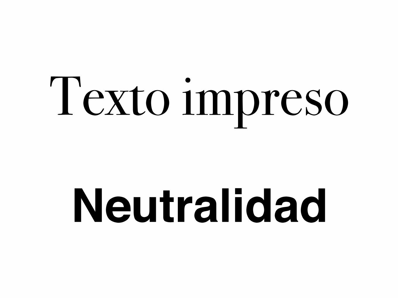
Texto impreso
Neutralidad

BodoniHelvética

Revistas & Marcas
TODO.


By the mid-1950s, the Haas typefoundry in Switzerland recognized a decrease in sales of their sans serif (“grotesk”) typefaces. �eir classic designs were less favored than com-petitors like Berthold’s Akzidenz-Grotesk, which was especially popular in the emerging “International Style” of graphic design. Presi-dent of the company, Eduard Hoffmann, saw an opportunity and commissioned former Haas salesman and designer, Max Miedinger, to design a new Haas Grotesk.


Función & Connnotación

Lectura Impreso
Lectura pantalla
Señalización
Pixel / Stencil
Identidad
Aprendizaje
Multilenguaje
Cifras
Función FuenteGaramond/Karmina
Verdana/Georgia
Interstate
Jara / stencil
Rotis Sans
Tcl Grafito califrafía
Adobe Arabic نضااثجبج
Lucida mono
1234567890

Neutro, Clásico, Serio
Neutro, Moderno, Clásico, Serio
Neutro, Práctico, Urbano
Tecnología, Game / Rudo, Militar, Industrial
Moderno, Relajado, Confianza
Niños, Escuela, Infantil, Tierno
Árabe, Antiguo, Religioso, Exótico
Funcional, Autmático, Moderno
Display, depende de su forma.
connotación FuenteGaramond/Karmina
Verdana/Georgia
Interstate
Jara / stencil
Rotis Sans
Tcl Grafito califrafía
Adobe Arabic نضااثجبج
Lucida mono
todo lo demás

Función Connotación
Técnica
Historia

HOLA!Ochenas-Noventas • Post-it, Títulos • Plumón

RockRevolución Industrial • Texto, Títulos • Metal Cortado

Política
Libros Impresos Europa • Texto • Pluma/imprenta

Aristóteles
Europa Clásica • Caligrafía • Pluma de ave

Política
Europa Germana Medieval • Caligrafía • Pluma

PODER
Europa Clásica • Arquitectura • Cincel

San AntonioLatinoamérica • Carteles • Pincel, Brocha

Salida
Neutra • Señalización • Diseño
Top Related
Copyright © 2022 FDOKUMEN

