User preferences for life-cycle decision support tools: Evaluation of a survey of BEES users
160
NISTIR 6874 User Preferences for Life-Cycle Decision Support Tools: Evaluation of a Survey of BEES Users Patrick Hofstetter Barbara C. Lippiatt Jane C. Bare Amy S. Rushing
-
Upload
independent -
Category
Documents
-
view
2 -
download
0
Transcript of User preferences for life-cycle decision support tools: Evaluation of a survey of BEES users

NISTIR 6874
User Preferences for Life-Cycle Decision Support Tools: Evaluation of a Survey of BEES Users
Patrick Hofstetter Barbara C. Lippiatt Jane C. Bare Amy S. Rushing

NISTIR 6874
User Preferences for Life-Cycle Decision Support Tools: Evaluation of a Survey of BEES Users Patrick Hofstetter ORISE Research Fellow U.S. Environmental Protection Agency Barbara C. Lippiatt Building and Fire Research Laboratory National Institute of Standards and Technology Jane C. Bare National Risk Management Research Laboratory U.S. Environmental Protection Agency Amy S. Rushing Building and Fire Research Laboratory National Institute of Standards and Technology July 2002
U.S. Department of Commerce Donald L. Evans, Secretary Technology Administration Phillip J. Bond, Under Secretary for Technology National Institute of Standards and TechnologyArden L. Bement, Jr., Director
U.S. Environmental Protection Agency Christine T. Whitman, Administrator Office of Research and Development Paul Gilman, Assistant Administrator

2
3
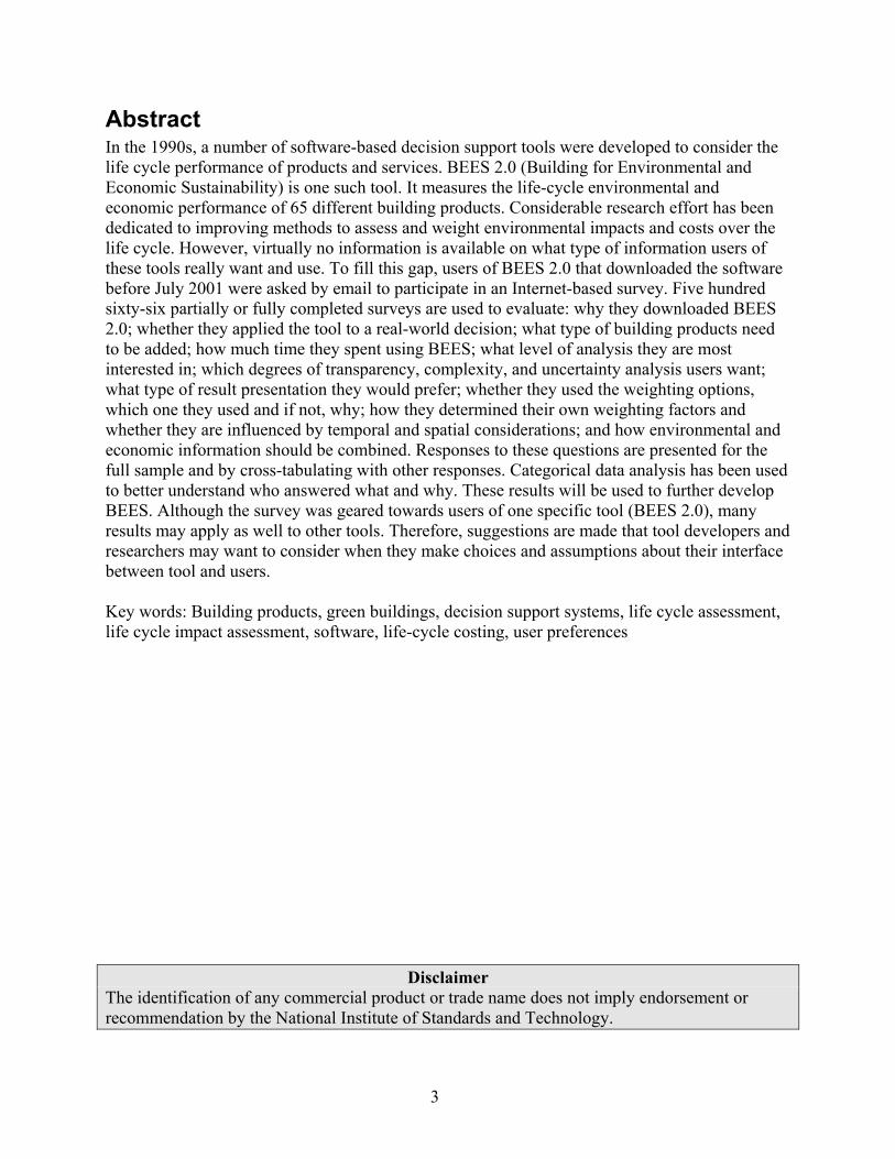
Abstract In the 1990s, a number of software-based decision support tools were developed to consider the life cycle performance of products and services. BEES 2.0 (Building for Environmental and Economic Sustainability) is one such tool. It measures the life-cycle environmental and economic performance of 65 different building products. Considerable research effort has been dedicated to improving methods to assess and weight environmental impacts and costs over the life cycle. However, virtually no information is available on what type of information users of these tools really want and use. To fill this gap, users of BEES 2.0 that downloaded the software before July 2001 were asked by email to participate in an Internet-based survey. Five hundred sixty-six partially or fully completed surveys are used to evaluate: why they downloaded BEES 2.0; whether they applied the tool to a real-world decision; what type of building products need to be added; how much time they spent using BEES; what level of analysis they are most interested in; which degrees of transparency, complexity, and uncertainty analysis users want; what type of result presentation they would prefer; whether they used the weighting options, which one they used and if not, why; how they determined their own weighting factors and whether they are influenced by temporal and spatial considerations; and how environmental and economic information should be combined. Responses to these questions are presented for the full sample and by cross-tabulating with other responses. Categorical data analysis has been used to better understand who answered what and why. These results will be used to further develop BEES. Although the survey was geared towards users of one specific tool (BEES 2.0), many results may apply as well to other tools. Therefore, suggestions are made that tool developers and researchers may want to consider when they make choices and assumptions about their interface between tool and users. Key words: Building products, green buildings, decision support systems, life cycle assessment, life cycle impact assessment, software, life-cycle costing, user preferences
Disclaimer The identification of any commercial product or trade name does not imply endorsement or recommendation by the National Institute of Standards and Technology.

4
Acknowledgements We would like to thank Matt Heberling, Hale Thurston (both from the U.S. Environmental Protection Agency), and Thomas Mettier (from ETH Zurich) for their contributions in designing the survey and the survey process; Jennifer Saxe, Mary Ann Curran, Rolf Nielsen, Richard Rush, Kaci Shaeheen, and Deborah Dunning for their contributions in the pre-test interviews; those individuals that volunteered their time in the pilot survey; and all 566 survey respondents. Further, we thank Kelly Black (from Neptune Inc) for statistical support. Patrick Hofstetter was supported, in part, by an appointment to the Postdoctoral Research Program at the U.S. EPA National Risk Management Research Laboratory. The program is administered by the Oak Ridge Institute for Science and Education (ORISE) through an interagency agreement between the U.S. Department of Energy and the U.S. EPA. Also deserving thanks are National Institute of Standards and Technology (NIST) reviewers Robert Chapman of the NIST Building and Fire Research Laboratory and James Yen of the NIST Information Technology Laboratory. Their comments inspired many improvements. This report may or may not reflect the views of the supporting agencies.
5
Contents ABSTRACT…. .............................................................................................................................. 3
ACKNOWLEDGEMENTS ......................................................................................................... 4
LIST OF FIGURES ...................................................................................................................... 8
LIST OF TABLES ...................................................................................................................... 10
1. INTRODUCTION.................................................................................................................. 13
1.1 Background..................................................................................................................... 13 1.2 Purpose ........................................................................................................................... 13 1.3 Organization ................................................................................................................... 14
2. THE BEES MODEL.............................................................................................................. 15
2.1 Environmental Performance........................................................................................... 15 2.2 Economic Performance................................................................................................... 20 2.3 Overall Performance ...................................................................................................... 22 2.4 Limitations ...................................................................................................................... 23
3. SURVEY DESIGN................................................................................................................. 27
4. SURVEY PROCESS.............................................................................................................. 31
4.1 Pre-test............................................................................................................................ 31 4.2 Pilot Survey..................................................................................................................... 31 4.3 Main Survey .................................................................................................................... 32
5. SURVEY RESULTS.............................................................................................................. 37
5.1 Business Type.................................................................................................................. 37 5.2 Type of construction sector............................................................................................. 38 5.3 Why Was BEES Downloaded?........................................................................................ 39 5.4 Actual Application .......................................................................................................... 40 5.5 Time Spent With BEES.................................................................................................... 42 5.6 Which Additional Product Categories? .......................................................................... 42 5.7 Generic or Specific Products? ........................................................................................ 44 5.8 Element, Assembly, or Whole Building Level? ............................................................... 45 5.9 Transparency .................................................................................................................. 46 5.10 Trade-off Practicality and Built-in Assumptions .......................................................... 47 5.11 Type of End Result ........................................................................................................ 48 5.12 Was Single Score Used? ............................................................................................... 50 5.13 Why Not Aggregate? ..................................................................................................... 51 5.14 Was Weighted Score Used to Support Decision-making? ............................................ 52 5.15 Which Weighting Scheme Was Used?........................................................................... 53 5.16 User-defined Weights Used in BEES 2.0 ...................................................................... 54 5.17 Test of Understanding................................................................................................... 57
6
5.18 Assumed time horizons and areas by impact category ................................................. 59 5.19 Did the Weights Change? ............................................................................................. 60 5.20 Temporal and Spatial Scale of Impact Categories ....................................................... 61 5.21 New Weights?................................................................................................................ 63 5.22 Modifications to List of Impact Categories .................................................................. 66 5.23 Level Within Cause-effect Chain .................................................................................. 69 5.24 Consistency of Level ..................................................................................................... 71 5.25 How to Integrate Cost Information?............................................................................. 72 5.26 Information on Uncertainty .......................................................................................... 73 5.27 Additional Comments.................................................................................................... 74
6. STATISTICAL ANALYSIS OF RESULTS: CROSS-TABLES, TEST OF HYPOTHESES AND DETAILED EVALUATION.......................................................... 77
6.1 Type of Business.............................................................................................................. 78 6.2 Commercial or Residential Construction? ..................................................................... 78 6.3 Reasons for Downloading BEES .................................................................................... 80 6.4 Were Results Actually Applied?...................................................................................... 82 6.5 Time Invested in BEES.................................................................................................... 84 6.6 Building Elements ........................................................................................................... 88 6.7 Specific/generic Products ............................................................................................... 88 6.8 Level of Analysis ............................................................................................................. 88 6.9 Transparency .................................................................................................................. 89 6.10 User-friendliness........................................................................................................... 92 6.11 Type of End Result ........................................................................................................ 94 6.12 Aggregate to Single Score?........................................................................................... 95 6.13 Reasons for Not Aggregating........................................................................................ 96 6.14 Was Single Score Used? ............................................................................................. 100 6.15 Which Weighting Set? ................................................................................................. 103 6.16 What Were the User-defined Weights? ....................................................................... 105 6.17 Were Own Weights Used for All Applications?.......................................................... 106 6.18 Temporal and Spatial Scale of User-defined Weights ................................................ 107 6.19 Did the Weights Change? ........................................................................................... 108 6.20 Temporal and Spatial Scales of Impact Categories.................................................... 108 6.21 Did the Opinion on Weights Change? ........................................................................ 108 6.22 Set of Impact Categories............................................................................................. 111 6.23 Level of Interpretation ................................................................................................ 111 6.24 Same Level Important? ............................................................................................... 119 6.25 Overall Score .............................................................................................................. 121 6.26 Information on Uncertainty ........................................................................................ 124
7. DISCUSSION AND CONCLUSIONS ............................................................................... 127
7.1 The Survey Procedure and Instrument ......................................................................... 127 7.2 Comparison of Weights................................................................................................. 127 7.3 Are the Research Questions Answered? ....................................................................... 129 7.4 Major Results ................................................................................................................ 130
REFERENCES .......................................................................................................................... 135

7
APPENDIX 1: IMPACT ASSESSMENT AND WEIGHTING IN LCA – WHAT DO WE NEED TO KNOW?................................................................................ 137
APPENDIX 2: EMAILS SENT TO THE DOWNLOADERS OF BEES ........................... 141
APPENDIX 3: SURVEY INSTRUMENT........................................................................... 1457

8
List of Figures Figure 2.1 BEES Inventory Data Categories .............................................................................. 18 Figure 2.2 BEES Study Periods for Measuring Building Product Environmental
and Economic Performance ....................................................................................... 22 Figure 2.3 Deriving the BEES Overall Performance Score........................................................ 25 Figure 5.1 Distribution of Survey Respondents Among Businesses. (556 out of 566 =
98.2 %)....................................................................................................................... 37 Figure 5.2 Building Sectors the Respondents Are Interested In (553 out of 566 = 97.7 %) ...... 39 Figure 5.3 Reasons for Downloading BEES (552 out of 566 = 97.5 %).................................... 39 Figure 5.4 Share of Respondents Applying BEES to Actual Projects (474 out of 566 =
83.7 %)....................................................................................................................... 41 Figure 5.5 Type of Project BEES Was Applied To (n = 42) ...................................................... 41 Figure 5.6 Time Spent to Study/Use BEES (n = 545 out of 566 = 96.3 %) ............................... 42 Figure 5.7 Multiple Answer Adjusted Votes for Adding Specific Building Elements
(n = 485 out of 566 = 85.7 %).................................................................................... 43 Figure 5.8 Preferences on Level of Product Specificity (n = 524 out of 566 = 92.6 %) ............ 44 Figure 5.9 Preferred Level of Building Analysis (n = 517 out of 566 = 91.3 %)....................... 45 Figure 5.10 Preferred Level of Analysis (n = 517 out of 566 = 91.3 %)...................................... 46 Figure 5.11 Preferred Level of Transparency (n = 531 out of 566 = 93.8 %) .............................. 47 Figure 5.12 Tradeoff Between Ease of Use and Number of Built-In Assumptions (n = 520
out of 566 = 91.9 %) .................................................................................................. 48 Figure 5.13 Type of Preferred End Result (n = 498 out of 566 = 88 %) ...................................... 49 Figure 5.14 Optimal and Maximum Number of Impact Categories for Environmental
Performance Scores (95 out of 161) And EcoProfiles (98 out of 172)..................... 50 Figure 5.15 Usage of Single Score (471 out of 566 = 83.2 %)..................................................... 50 Figure 5.16 Reasons for Not Aggregating Across Impacts (285 out of 325 that Answered
“no” to Question 12 = 87.7 %). ................................................................................ 51 Figure 5.17 Was Score Used in Decision Support? (248 out of 566 (43.8 %), or 248 out of
146 that Answered “yes” in Question 12)................................................................. 52 Figure 5.18 Which Weighting Schemes Were Used? (220 out of 566 (38.9 %))......................... 53 Figure 5.19 Mean User-Defined, 6-Impact Weight Sets That Were Used in BEES 2.0,
Compared with Two Offered Weighting Sets (n=54)............................................... 54 Figure 5.20 Median Weights (Red Dots), Interquartiles (Bold Blue Bars) and Distributions
(Yellow) of User-Defined, 6-Impact Weight Sets Used in BEES 2.0 (n=54). ......... 55 Figure 5.21 Mean User-Defined, 10-Impact Weight Sets That Were Used in BEES 2.0,
Compared With Two Offered Weighting Sets (n=49).............................................. 56 Figure 5.22 Median Weights (Red Dots), Interquartiles (Bold Blue Bars) and Distributions
(Yellow) of User-Defined, 10-Impact Weight Sets Used in BEES 2.0 (n=49). ...... 57 Figure 5.23 Did Respondents Use Different Weighting Sets for Different Comparisons?
(n=72)........................................................................................................................ 58 Figure 5.24 Which Time Horizon Was Assumed? (n=64 (Eutrophication/Acidification) to 76
(Global Warming)).................................................................................................... 59 Figure 5.25 Assumed Impact Area (n=61 (Eutrophication) to 74 (Global Warming)). ............... 60 Figure 5.26 Did Weights Change? (n=73).................................................................................... 61
9
Figure 5.27 Which Time Horizon Was Assumed? (n=118 (Eutrophication) to 129 (Global Warming))................................................................................................................. 62
Figure 5.28 Which Impacted Area Was Assumed? (n=119 (Eutrophication) to 126 (Global Warming))................................................................................................................. 63
Figure 5.29 Did Weights Change? (n=142).................................................................................. 64 Figure 5.30 Median Weights (Red Dots), Interquartiles (Bold Blue Bars) and Distributions
(Yellow) of Weight Sets Adjusted for Temporal and Spatial Scopes By Predefined Weight Set Users (n=13)........................................................................................... 65
Figure 5.31 New Mean Weights (n=13). ...................................................................................... 66 Figure 5.32 How Should the Set of BEES 2.0 Impact Categories Be Changed (Each
Respondent’s Vote Was Partitioned Among the Answers Given (n=427 out of 566=75.4 %)). ........................................................................................................... 67
Figure 5.33 Which Impact Categories Should Not Be Included? (n=63)..................................... 67 Figure 5.34 Which Impact Categories Should Be Added to the List? (n=105)............................ 68 Figure 5.35 What Level in the Cause-Effect Chain Should Be Chosen for the Category
Indicators? (n=432 out of 566 = 76.3 %).................................................................. 69 Figure 5.36 What Criteria Were Used in Selecting the Level of Category Indicators? (n=353
out of 566 = 62.4 %). ................................................................................................ 70 Figure 5.37 Should the Information Be Provided at the Same Level? (n=420 out of 566 =
74.2 %)...................................................................................................................... 72 Figure 5.38 How Were Life-cycle Costs and Environmental Score Combined? (Each
Respondent Got One Vote that Was Apportioned if More than One Answer Was Given) (n=394 out of 566 = 69.6 %). ....................................................................... 73
Figure 5.39 Which Type of Uncertainty Information Would You Prefer? (n=395 out of 566 = 69.8 %)...................................................................................................................... 74
10
List Of Tables Table 3.1 Sampling of Research Questions Addressed in the Customer Feedback Survey ....... 27 Table 4.1 Statistics for the Pilot Survey...................................................................................... 32 Table 4.2 Statistics for the Main Survey..................................................................................... 33 Table 4.3 Given Reasons Why People Never Used BEES or Otherwise Felt Unable
to Complete the Survey............................................................................................... 34 Table 4.4 Comparing Distribution By Business Type of Survey Population and Survey
Respondents ................................................................................................................ 35 Table 6.1 Cross –Table Displaying the Variables Type of Business Versus Construction
Sector of Interest. ........................................................................................................ 79 Table 6.2 Estimated Odds Ratios with a Logit Model (Bold=Significant at p<0.05, Bold
and Italic=Significant at p<0.01, Italic = Significance Not Calculated)..................... 79 Table 6.3 Cross –Table Displaying the Variables Type of Business Versus the Reasons for
Downloading BEES. ................................................................................................... 81 Table 6.4 Estimated Odds Ratios With a Logit Model, Bold=Significant At p<0.05, Bold
and Italic=Significant At p<0.01, Italic = Significance Not Calculated..................... 81 Table 6.5 Cross –Table Displaying the Variables Type of Business Versus Actually
Applying BEES Results. ............................................................................................. 82 Table 6.6 Cross –Table Displaying the Variables Reasons for Downloading BEES Versus
Actually Applying BEES Results. .............................................................................. 83 Table 6.7 Logistic Regression Model for ‘Applied’, Retaining Variables that Are
Significant at the " = 0.1 Level .................................................................................. 83 Table 6.8 Odds Ratios for the Logit Model for ‘Applied’, Retaining Variables That Are
Significant at the " = 0.1 Level .................................................................................. 84 Table 6.9 Re-Estimated Logit Model Including Only Reasons for Downloading as
Explanatory Variable. (n=463) ................................................................................... 84 Table 6.10 Cross –Table Displaying the Variables Business Type Versus Hours Spent
Studying and Using BEES. ......................................................................................... 85 Table 6.11 Cross –Table Displaying the Variables Applied Versus Hours Spent Studying
and Using BEES. ........................................................................................................ 86 Table 6.12 Cross –Table Displaying the Variables Degree of Transparency Versus Hours
Spent Studying and Using BEES................................................................................ 87 Table 6.13 Cross –Table Displaying the Variables Reasons for Downloading BEES Versus
Hours Spent Studying and Using BEES. .................................................................... 87 Table 6.14 Cross –Table Displaying the Variables Business Type Versus Level of
Application.................................................................................................................. 89 Table 6.15 Cross –Table Displaying the Variables Business Type Versus Transparency. .......... 90 Table 6.16 Cross –Table Displaying the Variables User-Friendliness Versus Transparency. ..... 91 Table 6.17 Cross –Table Displaying the Variables Single Score Versus Transparency. ............. 91 Table 6.18 Cross –Table Displaying the Variables Type of Product Versus Transparency......... 92 Table 6.19 Cross –Table Displaying the Variables BusinessType Versus Easiness to Use the
Tool. ............................................................................................................................ 93 Table 6.20 Cross –Table Displaying the Variables Type Of Result Versus Easiness to Use the
Tool. ............................................................................................................................ 94
11
Table 6.21 Cross –Table Displaying the Variables Transparency Versus Type of End Result. .. 95 Table 6.22 Cross –Table Displaying the Variables Aggregation to Single Score Versus Type
of End Result............................................................................................................... 96 Table 6.23 Cross –Table Displaying the Variables Transparency and Reasons for Not
Aggregating to Single Score. ...................................................................................... 97 Table 6.24 Cross –Table Displaying the Variables Type of End Result and Reasons for Not
Aggregating to Single Score. ...................................................................................... 98 Table 6.25 Cross –Table Displaying the Variables Aggregating to Single Score and Reasons
for Not Aggregating to Single Score. ......................................................................... 99 Table 6.26 Cross –Table Displaying the Variables Not Combining Economic and
Environmental Scores and Reasons for Not Aggregating Environmental Impacts to Single Score (p=0.05). ............................................................................................ 99
Table 6.27 Estimated Odds Ratios with a Logit Model, Bold=Significant At p<0.05, Bold and Italic=Significant At p<0.01, Italic=Significant Not Calculated. ...................... 100
Table 6.28 Cross –Table Displaying the Variables Whether Single Score Was Used in Decision Support Versus the Variable Whether BEES Was Applied to Support Decisions................................................................................................................... 101
Table 6.29 Cross –Table Displaying the Variables Whether Single Score Was Used in Decision Support Versus the Variable Whether BEES Was Applied to Support Decisions Controlling for the Variable Single Score = No. ..................................... 102
Table 6.30 Cross –Table Displaying the Variables Whether Single Score Was Used in Decision Support Versus the Variable Whether BEES Was Applied to Support Decisions Controlling for the Variable Single Score = Yes. .................................... 103
Table 6.31 Cross –Table Displaying the Variables Chosen Weighting Sets Versus Time Spent Studying and/or Applying BEES.................................................................... 104
Table 6.32 Cross –Table Displaying the Variables Chosen Weighting Sets Versus Type of Business. ................................................................................................................... 105
Table 6.33 Odds Ratios Calculated By a Logit Model Using Weights for Impact Categories (Question 16b) as Dependent and Type of Business as Independent Variables. Bold Numbers Indicate High/Low Numbers But Not Statistical Significance......... 106
Table 6.34 Cross –Table Displaying the Variables Used Own Weighting Sets for One/All Comparisons Versus Type of Business..................................................................... 107
Table 6.35 Results of the Regression Analysis With the Weights in Questions 16 and 21 Being the Dependent Variables and Assumed Time, Area and Time*Area Being the Explanatory Variable. The Explanatory Variables are Here Cardinal. x=Strongest Predictor (Last To Be Removed In Backward Elimination), (x)=Second Strongest Predictor (Second Last To Be Removed In Backward Elimination), *=Significant at The 0.05 Level. ..................................................................................................... 109
Table 6.36 Results of the Regression Analysis With the Weights in Questions 16 and 21 Being the Dependent Variables and Assumed Time, Area and Time*Area Being the Explanatory Variable. The Explanatory Variables Are Here Ordinal. x=Strongest Predictor (Last To Be Removed In Backward Elimination), (x)=Second Strongest Predictor (Second Last To Be Removed In Backward Elimination), *=Significant at The 0.05 Level. ..................................................................................................... 110
Table 6.37 Cross –Table Displaying the Variables Level of Interpretation Versus Type of Business. ................................................................................................................... 112

12
Table 6.38 Cross –Table Displaying the Variables Level of Interpretation Versus Trusting the Science/Values Behind the Scores (CMH p=0.002)........................................... 113
Table 6.39 Cross –Table Displaying the Variables Level of Interpretation Versus the Comprehensives of the Model (CMH p<0.0001). .................................................... 114
Table 6.40 Cross –Table Displaying the Variables Level of Interpretation Versus Understanding the Meaning of the Scores (CMH p=0.024). .................................... 115
Table 6.41 Cross –Table Displaying the Variables Level of Interpretation Versus Understanding The Meaning of the Scores (CMH p=0.73)...................................... 116
Table 6.42 Cross –Table Displaying the Variables Level of Interpretation Versus Transparency (CMH p<0.0001)................................................................................ 117
Table 6.43 Cross –Table Displaying the Variables Level of Interpretation Versus User-Friendliness (CMH p=0.0015). ................................................................................. 118
Table 6.44 Response Profile for the Modified Variable ‘Level Of Interpretation’ Used in a Logistic Analysis. ..................................................................................................... 119
Table 6.45 Results of a Logistic Regression Using p=0.15 as a Retention Criterion. Probabilities Modeled Are Cumulated Over the Lower Ordered Values. ................ 119
Table 6.46 Cross –Table Displaying the Variables Level of Homogeneity Versus Type of Business (CMH p=0.0056). ...................................................................................... 120
Table 6.47 Cross –Table Displaying the Variables Level Of Homogeneity Versus Level of Interpretation (CMH p<0.0001)................................................................................ 121
Table 6.48 Cross –Table Displaying the Variables Not Combine Environmental and Cost Scores Versus Choosing to Aggregate Environmental Impact in One Score (CMH p<0.0001). ..................................................................................................... 122
Table 6.49 Cross –Table Displaying the Variables Making Use of Overall Score Versus Choosing to Aggregate Environmental Impact in One Score (CMH p<0.0001)...... 122
Table 6.50 Cross –Table Displaying the Variables Making Use of Overall Score Versus Time Spent With BEES (CMH p=0.0035). .............................................................. 123
Table 6.51 Cross –Table Displaying the Variables Like the BEES Approach Versus Choosing to Aggregate Environmental Impact in One Score (CMH p<0.0001)...... 123
Table 6.52 Cross –Table Displaying The Variables Using The Overall Score And/Or Like the BEES Approach Versus Choosing To Aggregate Environmental Impact In One Score (CMH p<0.0001)..................................................................................... 124
Table 6.53 Cross –Table Displaying the Variables Uncertainty Information Versus Transparency (CMH p=0.0004)................................................................................ 125
Table 6.54 Estimated Odds Ratio With a Logit Model, Bold=Significant At p<0.05, Bold and Italic=Significant At p<0.01, Italic=Significance Not Calculated. .................... 125
Table 7.1 Comparison of Weights Between Impact Categories from Different Studies (std=Standard Deviation). ......................................................................................... 128
Table 7.2 Relative Comparison of Weights for Climate Change, Ozone Depletion and Acidification, Normalized By The Weight for Climate Change (Bold=Highest Weight, Italic=Lowest Weight). ............................................................................... 128
13
1. Introduction
1.1 Background The BEES (Building for Environmental and Economic Sustainability) software1 measures and compares the environmental and economic performance of building products. Developed by the NIST (National Institute of Standards and Technology) Building and Fire Research Laboratory with support from the U.S. EPA Environmentally Preferable Purchasing Program and the White House-sponsored Partnership for Advancing Technology in Housing (PATH), the tool is based on consensus standards and designed to be practical and flexible. Version 2.0 of the decision support software, aimed at designers, builders, and product manufacturers, includes actual environmental and economic performance data for 65 building products spread across 15 building applications. BEES measures the environmental performance of building products by using the environmental life-cycle assessment (LCA) approach specified in ISO 14040 standards. All stages in the life of a product are analyzed: raw material acquisition, manufacture, transportation, installation, use, and recycling and waste management. Economic performance is measured using the ASTM standard life-cycle cost method, which covers the costs of initial investment, replacement, operation, maintenance and repair, and disposal. Environmental and economic performance are combined into an overall performance measure using the ASTM standard for Multi-Attribute Decision Analysis. For the entire BEES analysis, building products are defined and classified according to the ASTM standard classification for building elements known as UNIFORMAT II. The BEES software is fairly straightforward. To conduct a BEES analysis, the user selects the building products to be compared, the transportation distances for each, the importance weights of environmental impacts included in the environmental performance score, and the relative importance of environmental versus economic performance.
1.2 Purpose As of July 2001, there were nearly 4500 BEES 2.0 users.2 This large group of users motivated NIST and the U.S. EPA to gather feedback on the utility of the current version and suggestions for the future in order to best meet the needs of and expand the user group. This effort follows up on five BEES focus group sessions held from December 2000 through February 2001 in Atlanta, Madison, Portland (Oregon), Pittsburgh, and Austin. As the focus groups were supported by the residentially-focused PATH Program, however, they were limited to identifying needs of residential users of BEES. The current effort, the “Customer Feedback Survey,” is intended to survey all users of BEES to determine how best to meet their decision support needs.
1 The BEES software and manual may be downloaded from http://www.bfrl.nist.gov/oae/software/bees.html 2 As of June 2002, the number of BEES 2.0 users had increased to over 8000.

14
The Customer Feedback Survey includes a number of questions to help clarify needs that have been aired informally or during the BEES focus group meetings. In addition, the survey intends to clarify some overarching research questions that have ultimate consequences for the design of LCA methods and software interfaces. This report discusses the survey and its administration, then delivers and statistically analyzes the survey results. The results are interesting and important because:
• The survey population is large enough to produce statistically significant results. Further, the survey population represents those that have actually downloaded BEES, rather than a hypothetical group of users or highly involved experts.
• The responses include concrete advice for future developments and make clear the diversity of the user group.
• Survey questions include topics that are not only relevant for the next version of BEES, but are transferable to many other similar software tools for applied decision support.
• Certain questions have been asked and evaluated for the first time and help close some pertinent research gaps.
The report is geared toward a wide range of interest groups, as it covers a wide range of topics. First, LCA researchers and educators may be interested in structured feedback from users and students of their methods. Second, LCA tool developers may be interested in the decision support needs and diversity of users of LCA-based tools, as well as in the lessons learned in LCA survey design and administration. Third, tool users, including designers, builders, government bodies, and consultants, may benefit from knowing how other groups are using LCA tools as well as from learning more about LCA and its evolution. Finally, manufacturers—whose products are evaluated by LCA tools—may be interested in the nature of the demand for such tools.
1.3 Organization The report is organized as follows: section 2 provides background on the BEES approach excerpted from the BEES documentation, section 3 describes the design of the survey, section 4 gives information on the survey process, section 5 includes simple presentations of the responses to each question, and section 6 tries to shed light on how these answers are linked and why some respondents answered the way they did. Major findings are discussed in section 7.

15
2. The BEES Model The BEES methodology takes a multidimensional, life-cycle approach. That is, it considers multiple environmental and economic impacts over the entire life of the building product. Considering multiple impacts and life-cycle stages is necessary because product selection decisions based on single impacts or stages could obscure others that might cause equal or greater damage. In other words, a multidimensional, life-cycle approach is necessary for a comprehensive, balanced analysis. It is relatively straightforward to select products based on minimum life-cycle economic impacts because building products are bought and sold in the marketplace. But how do we include life-cycle environmental impacts in our purchase decisions? Environmental impacts such as global warming, water pollution, and resource depletion are for the most part economic externalities. That is, their costs are not reflected in the market prices of the products that generated the impacts. Moreover, even if there were a mandate today to include environmental “costs” in market prices, it would be nearly impossible to do so due to difficulties in assessing these impacts in economic terms. How do you put a price on clean air and clean water? What is the value of human life? Economists have debated these questions for decades, and consensus does not appear likely. While measuring environmental performance on a monetary scale seems to be controversial, it can be quantified using the evolving, multi-disciplinary approach known as environmental life-cycle assessment (LCA). The BEES methodology measures environmental performance using an LCA approach, following guidance in the International Organization for Standardization 14040 series of standards for LCA (ISO 1997, ISO 1998, ISO 2000). Economic performance is separately measured using the American Society for Testing and Materials (ASTM) standard life-cycle cost (LCC) approach (ASTM 1999). These two performance measures are then synthesized into an overall performance measure using the ASTM standard for Multiattribute Decision Analysis (ASTM 1998). For the entire BEES analysis, building products are defined and classified based on UNIFORMAT II, the ASTM standard classification for building elements (ASTM 1997).
2.1 Environmental Performance Environmental life-cycle assessment is a “cradle-to-grave,” systems approach for measuring environmental performance. The approach is based on the belief that all stages in the life of a product generate environmental impacts and must therefore be analyzed, including raw materials acquisition, product manufacture, transportation, installation, operation and maintenance, and ultimately recycling and waste management. An analysis that excludes any of these stages is limited because it ignores the full range of upstream and downstream impacts of stage-specific processes.

16
The strength of environmental life-cycle assessment is its comprehensive, multi-dimensional scope. Many green building claims and strategies are now based on a single life-cycle stage or a single environmental impact. A product is claimed to be green simply because it has recycled content, or claimed not to be green because it emits volatile organic compounds (VOCs) during its installation and use. These single-attribute claims may be misleading because they ignore the possibility that other life-cycle stages, or other environmental impacts, may yield offsetting impacts. For example, the recycled content product may have a high embodied energy content, leading to resource depletion, global warming, and acid rain impacts during the raw materials acquisition, manufacturing, and transportation life-cycle stages. LCA thus broadens the environmental discussion by accounting for shifts of environmental problems from one life-cycle stage to another, or one environmental medium (land, air, water) to another. The benefit of the LCA approach is in implementing a trade-off analysis to achieve a genuine reduction in overall environmental impact, rather than a simple shift of impact. The general LCA methodology involves four steps (ISO 1996). The goal and scope definition step spells out the purpose of the study and its breadth and depth. The inventory analysis step identifies and quantifies the environmental inputs and outputs associated with a product over its entire life cycle. Environmental inputs include water, energy, land, and other resources; outputs include releases to air, land, and water. However, it is not these inputs and outputs, or inventory flows, that are of primary interest. We are more interested in their consequences, or impacts on the environment. Thus, the next LCA step, impact assessment, characterizes these inventory flows in relation to a set of environmental impacts. For example, the impact assessment step might relate carbon dioxide emissions, a flow, to global warming, an impact. Finally, the interpretation step combines the environmental impacts in accordance with the goals of the LCA study. 2.1.1 Goal and Scope Definition The goal of the BEES LCA is to generate relative environmental performance scores for building product alternatives based on U.S. average data. These will be combined with relative, U.S. average economic scores to help the building community select environmentally and economically balanced building products. The scoping phase of any LCA involves defining the boundaries of the product system under study. The manufacture of any product involves a number of unit processes (e.g., ethylene production for input to the manufacture of the styrene-butadiene bonding agent for stucco walls). Each unit process involves many inventory flows, some of which themselves involve other, subsidiary unit processes. The first product system boundary determines which unit processes are included in the LCA. In the BEES system, the boundary-setting rule consists of a set of three decision criteria. For each candidate unit process, mass and energy contributions to the product system are the primary decision criteria. In some cases, cost contribution is used as a third criterion.3 Together, these criteria provide a robust screening process.
3 While a large cost contribution does not directly indicate a significant environmental impact, it may indicate scarce natural resources or numerous subsidiary unit processes potentially involving high energy consumption.

17
The second product system boundary determines which inventory flows are tracked for in-bounds unit processes. Quantification of all inventory flows is not practical for the following reasons: • An ever-expanding number of inventory flows can be tracked. For instance, including the
U.S. Environmental Protection Agency’s Toxic Release Inventory (TRI) data would result in tracking approximately 200 inventory flows arising from polypropylene production alone. Similarly, including radionucleide emissions generated from electricity production would result in tracking more than 150 flows. Managing such large inventory flow lists adds to the complexity, and thus the cost, of carrying out and interpreting the LCA.
• Attention should be given in the inventory analysis step to collecting data that will be useful in the next LCA step, impact assessment. By restricting the inventory data collection to the flows actually needed in the subsequent impact assessment, a more focused, higher quality LCA can be carried out4.
Therefore, in the BEES model, a focused, cost-effective set of inventory flows is tracked, reflecting flows that will actually be needed in the subsequent impact assessment step. Defining the unit of comparison is another important task in the goal and scoping phase of LCA. The basis for all units of comparison is the functional unit, defined so that the products compared are true substitutes for one another. In the BEES model, the functional unit for most building products is 0.09 m2 (1 ft2) of product service for 50 years.5,6 Therefore, for example, the functional unit for the BEES roof covering alternatives is covering 0.09 m2 (1 ft2) of roof surface for 50 years. The functional unit provides the critical reference point to which all inventory flows are scaled. Scoping also involves setting data requirements. Data requirements for the BEES study include: • Geographic coverage: The data are U.S. average data. • Time period covered: The data are a combination of data collected specifically for BEES
within the last 8 years, and data from the well-known Ecobalance LCA database created in 1990 (Ecobalance 1999). Most of the Ecobalance data are updated annually. No data older than 1990 are used.
• Technology covered: When possible, the most representative technology is studied. Where data for the most representative technology are not available, an aggregated result is used based on the U.S. average technology for that industry.
2.1.2 Inventory Analysis Inventory analysis entails quantifying the inventory flows for a product system. Inventory flows include inputs of water, energy, and raw materials, and releases to air, land, and water. Data categories are used to group inventory flows in LCAs. For example, in the BEES model, flows 4 This assumes that the impact assessment methods used capture all relevant stressors. 5 All product alternatives are assumed to meet minimum technical performance requirements (e.g., acoustic and fire performance). 6 The functional unit for concrete products except concrete paving is 0.76 m3 (1 yd3) of product service for 50 years.

18
such as aldehydes, ammonia, and sulfur oxides are grouped under the air emissions data category. Figure 2.1 shows the categories under which data are grouped in the BEES system. For each product included in BEES, up to 400 inventory flow items are tracked.
Figure 2.1 BEES Inventory Data Categories A number of approaches may be used to collect inventory data for LCAs. These range from (U.S. EPA, 1993): • Unit process- and facility-specific: collect data from a particular process within a given
facility that are not combined in any way • Composite: collect data from the same process combined across locations • Aggregated: collect data combining more than one process • Industry-average: collect data derived from a representative sample of locations believed to
statistically describe the typical process across technologies • Generic: collect data whose representatives may be unknown but which are qualitatively
descriptive of a process Since the goal of the BEES LCA is to generate U.S. average results, data are primarily collected using the industry-average approach. Data collection is done under contract with Environmental Strategies and Solutions (ESS) and PricewaterhouseCoopers/Ecobalance, using the Ecobalance LCA database covering more than 6,000 industrial processes gathered from actual site and literature searches from more than 15 countries. Where necessary, the data are adjusted to be representative of U.S. operations and conditions. Approximately 90 % of the data come directly from industry sources, with about 10 % coming from generic literature and published reports. The generic data include inventory flows for electricity production from the average United States grid, and for selected raw material mining operations (e.g., limestone, sand, and clay
UnitProcess
Other Releases
Releases to Land
Water Effluents
Air Emissions
Water
Energy
Raw Materials
Intermediate Materialor Final Product

19
mining operations). In addition, ESS and Ecobalance gathered additional LCA data to fill data gaps for the BEES products. Assumptions regarding the unit processes for each building product are verified through experts in the appropriate industry to assure the data are correctly incorporated in BEES. 2.1.3 Impact Assessment The impact assessment step of LCA quantifies the potential contribution of a product’s inventory flows to a range of environmental impacts. BEES takes a classification/characterization approach to impact assessment, as developed within the Society for Environmental Toxicology and Chemistry (SETAC). It involves a two-step process (SETAC-Europe, 1992, SETAC 1993a, SETAC, 1993b): • Classification of inventory flows that contribute to specific environmental impacts. For
example, greenhouse gases such as carbon dioxide, methane, and nitrous oxide are classified as contributing to global warming.
• Characterization of the potential contribution of each classified inventory flow to the corresponding environmental impact. This results in a set of indices, one for each impact, that is obtained by weighting each classified inventory flow by its relative contribution to the impact. For instance, the Global Warming Potential index is derived by expressing each contributing inventory flow in terms of its equivalent amount of carbon dioxide.
The BEES model uses this classification/characterization approach because it enjoys some general consensus among LCA practitioners and scientists (SETAC, 1997). The following global and regional impacts are assessed using the classification/characterization approach: Global Warming Potential, Acidification Potential, Eutrophication Potential, and Natural Resource Depletion. Indoor Air Quality and Solid Waste impacts are also included in BEES, for a total of six impacts for most BEES products. As part of its Framework for Responsible Environmental Decisionmaking project, EPA confirmed the validity of the six impacts included in BEES 1.0. In addition, EPA suggested that four additional impacts be pilot tested in BEES 2.0: Smog, Ecological Toxicity, Human Toxicity, and Ozone Depletion (U.S. EPA, 1999). For a select group of products, BEES 2.0 also assesses Smog and in some cases Ecological Toxicity, Human Toxicity, and Ozone Depletion as well. Note that the data and science underlying measurement of these four impacts are less certain than for the original six BEES impacts. The classification/characterization method does not offer the same degree of relevance for all environmental impacts. For global and regional effects (e.g., global warming and acidification) the method may result in an accurate description of the potential impact. For impacts dependent upon local conditions (e.g., smog, ecological toxicity, and human toxicity) it may result in an oversimplification of the actual impacts because the indices are not tailored to localities. 2.1.4 Interpretation At the LCA interpretation step, the impact assessment results are combined. Few products are likely to dominate competing products in all BEES impact categories. Rather, one product may

20
out-perform the competition relative to natural resource depletion and solid waste, fall short relative to global warming and acidification, and fall somewhere in the middle relative to indoor air quality and eutrophication. To compare the overall environmental performance of competing products, the performance measures for all impact categories may be synthesized. Note that in BEES 2.0, synthesis of impact measures is optional. Synthesizing the impact category performance measures involves combining apples and oranges. Global warming potential is expressed in carbon dioxide equivalents, acidification in hydrogen equivalents, eutrophication in phosphate equivalents, and so on. How can the diverse measures of impact category performance be combined into a meaningful measure of overall environmental performance? One technique is Multiattribute Decision Analysis (MADA). MADA problems are characterized by tradeoffs between apples and oranges, as is the case with the BEES impact assessment results. The BEES system follows the ASTM standard for conducting MADA evaluations of building-related investments (ASTM 1998). MADA first places all impact categories on the same scale by normalizing them. Within an impact category, each product’s performance measure can be normalized by dividing by the highest measure for that category, as in the BEES model. All performance measures are thus translated to the same, dimensionless, relative scale from 0 to 100, with the worst performing product in each category assigned the highest possible normalized score of 100. Note that the normalization procedure used by BEES 2.0 results in relative environmental performance scores, meaning they indicate how much better or worse products perform with respect to one another. Absolute performance scores are more desirable, as they measure a product’s performance in relation to fixed benchmarks of environmental performance and will not change with changes in the product comparison set. With the impending release of fixed environmental performance benchmarks for the United States, the next release of BEES 3.0 will incorporate an absolute scoring system. MADA then weights each impact category by its relative importance to overall environmental performance. In the BEES software, the set of importance weights is selected by the user. Several derived, alternative weight sets are provided as guidance, and may either be used directly or as a starting point for developing user-defined weights. The alternative weights sets are based on an EPA Science Advisory Board study, a Harvard University study, and a set of equal weights, representing a spectrum of ways in which people value various aspects of the environment. 2.2 Economic Performance Measuring the economic performance of building products is more straightforward than measuring environmental performance. Published economic performance data are readily available, and there are well-established ASTM standard methods for conducting economic performance evaluations. First cost data are collected from the R.S. Means publication, 2000 Building Construction Cost Data, and future cost data are based on data published by Whitestone Research in The Whitestone Building Maintenance and Repair Cost Reference 1999, supplemented by industry interviews. The most appropriate method for measuring the economic
21
performance of building products is the life-cycle cost (LCC) method. BEES follows the ASTM standard method for life-cycle costing of building-related investments (ASTM 1999). It is important to distinguish between the time periods used to measure environmental performance and economic performance. These time periods are different. Recall that in environmental LCA, the time period begins with raw material acquisition and ends with product end-of-life. Economic performance, on the other hand, is evaluated over a fixed period (known as the study period) that begins with the purchase and installation of the product, and ends at some point in the future that does not necessarily correspond with product end-of-life. Economic performance is evaluated beginning at product purchase and installation because this is when out-of-pocket costs begin to be incurred, and investment decisions are made based upon out-of-pocket costs. The study period ends at a fixed date in the future. For a private investor, its length is set at the period of product or facility ownership. For society as a whole, the study period length is often set at the useful life of the longest-lived product alternative. However, when all alternatives have very long lives, (e.g., more than 50 years), a shorter study period may be selected for three reasons:
• Technological obsolescence becomes an issue • Data become too uncertain • The farther in the future, the less important the costs In the BEES model, economic performance is measured over a 50 year study period, as shown in Figure 2.2. This study period is selected to reflect a reasonable period of time over which to evaluate economic performance for society as a whole. The same 50 year period is used to evaluate all products, even if they have different useful lives. This is one of the strengths of the LCC method. It adjusts for the fact that different products have different useful lives when evaluating them over the same study period. For consistency, the BEES model evaluates the use stage of environmental performance over the same 50 year study period. Product replacements over this 50 year period are accounted for in the environmental performance score, and end-of-life solid waste is prorated to year 50 for products with partial lives remaining after the 50 year period. The LCC method sums over the study period all relevant costs associated with a product. Alternative products for the same function, say floor covering, can then be compared on the basis of their LCCs to determine which is the least cost means of providing that function over the study period. Categories of cost typically include costs for purchase, installation, maintenance, repair, and replacement. A negative cost item is the residual value. The residual value is the product value remaining at the end of the study period. In the BEES model, the residual value is computed by prorating the purchase and installation cost over the product life remaining beyond the 50 year period.7
7 For example, a product with a 40 year life that costs $10 per 0.09 square meters ($10 per square foot) to install would have a residual value of $7.50 in year 50, considering replacement in year 40.

22
Site Selectionand
Preparation
Constructionand Outfitting
Operationand Use
Renovationor Demolition
ProductManufacture
RawMaterials
Acquisition
ENVIRONMENTALSTUDY PERIOD
50 Year Use Stage
ECONOMIC STUDY PERIOD
50 yearsFACILITY LIFE CYCLE
Figure 2.2 BEES Study Periods for Measuring Building Product Environmental
and Economic Performance The LCC method accounts for the time value of money by using a discount rate to convert all future costs to their equivalent present value. Future costs must be expressed in terms consistent with the discount rate used. There are two approaches. First, a real discount rate may be used with constant-dollar (e.g., 2000) costs. Real discount rates reflect the portion of the time value of money attributable to the real earning power of money over time and not to general price inflation. Even if all future costs are expressed in constant 2000 dollars, they must be discounted to reflect this portion of the time-value of money. Second, a market discount rate may be used with current-dollar amounts (e.g., actual future prices). Market discount rates reflect the time value of money stemming from both inflation and the real earning power of money over time. When applied properly, both approaches yield the same LCC results. The BEES model computes LCCs using constant 2000 dollars and a real discount rate. As a default, BEES 2.0 uses a real rate of 4.2 %, the 2000 rate mandated by the U.S. Office of Management and Budget (OMB) for most Federal projects (U.S. OMB 1992, U.S. OMB 2000).
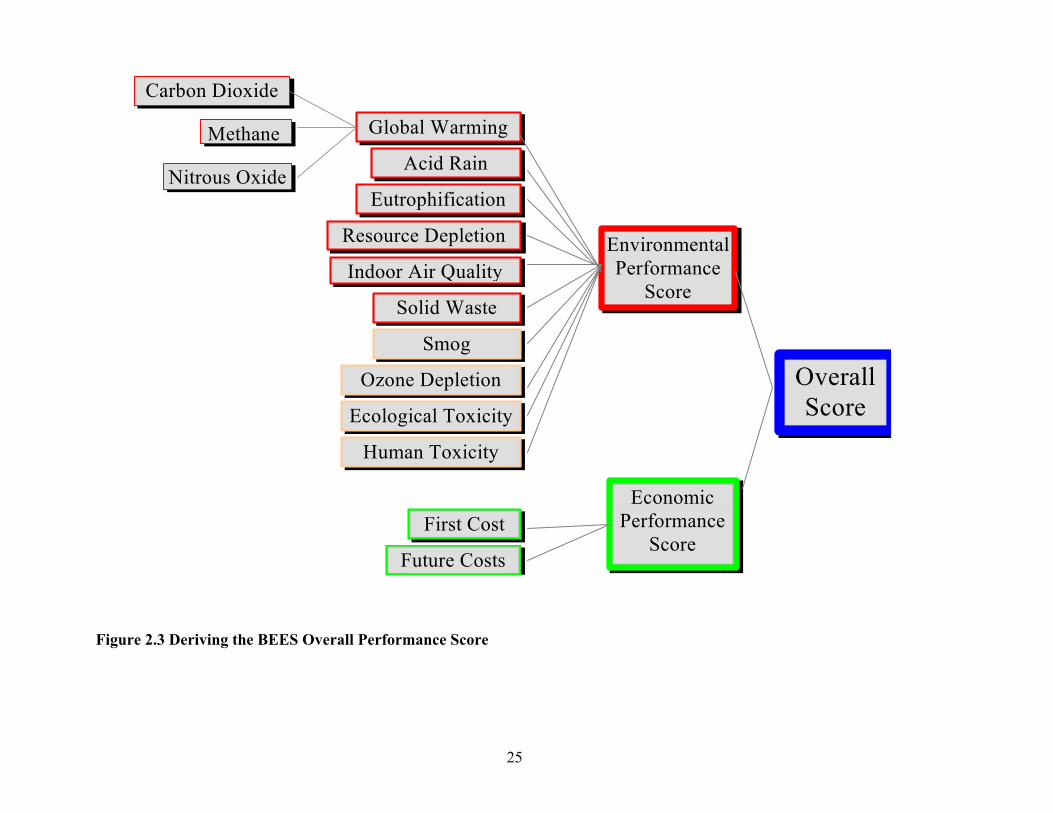
2.3 Overall Performance The BEES overall performance score combines the environmental and economic results into a single score, as illustrated in Figure 2.3. To combine them, the two results must first be placed on a common basis. The environmental performance score reflects relative environmental performance, or how much better or worse products perform with respect to one another. The economic performance score, the LCC, reflects absolute performance, regardless of the set of alternatives under analysis. Before combining the two, the life-cycle cost is converted to the same, relative basis as the environmental score by dividing by the highest-life-cycle cost alternative. Then the environmental and economic performance scores are combined into an
23
overall score by weighting environmental and economic performance by their relative importance values. Overall scores are thereby placed on a scale from 0 to 100; if a product performs worst with respect to all environmental impacts and has the highest life-cycle cost, it would receive the worst possible overall score of 100. The BEES user specifies the relative importance weights used to combine environmental and economic performance scores and may test the sensitivity of the overall scores to different sets of relative importance weights.
2.4 Limitations Properly interpreting the BEES scores requires placing them in perspective. There are inherent limits to applying U.S. industry-average LCA and LCC results and in comparing building products outside the design context. The BEES 2.0 LCA and LCC approaches produce U.S. average performance results for generic product alternatives. The BEES results do not apply to products manufactured in other countries where manufacturing and agricultural practices, fuel mixes, environmental regulations, transportation distances, and labor and material markets may differ.8 Furthermore, all products in an industry-average, generic product group, such as vinyl composition tile floor covering, are not created equal. Product composition, manufacturing methods, fuel mixes, transportation practices, useful lives, and cost can all vary for individual products in a generic product group. Thus, the BEES results for the generic product group do not necessarily represent the performance of an individual product. The BEES LCA uses selected inventory flows converted to selected local, regional, and global environmental impacts to assess environmental performance. Those inventory flows which currently do not have scientifically proven or quantifiable impacts on the environment are excluded, such as mineral extraction and wood harvesting which are qualitatively thought to lead to loss of habitat and an accompanying loss of biodiversity. Ecological toxicity, human toxicity, ozone depletion, and smog impacts are included in BEES 2.0 for a select set of products, but the science and data underlying their measurement are less certain. Finally, since BEES develops U.S. average results, some local impacts such as resource scarcity (e.g., water scarcity) are excluded even though the science is proven and quantification is possible. If the BEES user has important knowledge about these or other potential environmental impacts, it should be brought into the interpretation of the BEES results. During the interpretation step of the BEES LCA, environmental impacts are optionally combined into a single environmental performance score using relative importance weights. These weights necessarily incorporate values and subjectivity. BEES users should routinely test the effects on the environmental performance scores of changes in the set of importance weights.
8 Since most linoleum manufacturing takes place in Europe, linoleum is modeled based on European manufacturing practices, fuel mixes, and environmental regulations. However, the BEES linoleum results are only applicable to linoleum imported into the United States because transport from Europe to the United States is built into the BEES linoleum data.
24
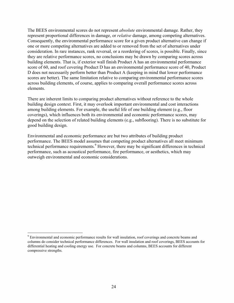
The BEES environmental scores do not represent absolute environmental damage. Rather, they represent proportional differences in damage, or relative damage, among competing alternatives. Consequently, the environmental performance score for a given product alternative can change if one or more competing alternatives are added to or removed from the set of alternatives under consideration. In rare instances, rank reversal, or a reordering of scores, is possible. Finally, since they are relative performance scores, no conclusions may be drawn by comparing scores across building elements. That is, if exterior wall finish Product A has an environmental performance score of 60, and roof covering Product D has an environmental performance score of 40, Product D does not necessarily perform better than Product A (keeping in mind that lower performance scores are better). The same limitation relative to comparing environmental performance scores across building elements, of course, applies to comparing overall performance scores across elements. There are inherent limits to comparing product alternatives without reference to the whole building design context. First, it may overlook important environmental and cost interactions among building elements. For example, the useful life of one building element (e.g., floor coverings), which influences both its environmental and economic performance scores, may depend on the selection of related building elements (e.g., subflooring). There is no substitute for good building design. Environmental and economic performance are but two attributes of building product performance. The BEES model assumes that competing product alternatives all meet minimum technical performance requirements.9 However, there may be significant differences in technical performance, such as acoustical performance, fire performance, or aesthetics, which may outweigh environmental and economic considerations.
9 Environmental and economic performance results for wall insulation, roof coverings and concrete beams and columns do consider technical performance differences. For wall insulation and roof coverings, BEES accounts for differential heating and cooling energy use. For concrete beams and columns, BEES accounts for different compressive strengths.
25
Figure 2.3 Deriving the BEES Overall Performance Score
Global Warming
Acid Rain
Eutrophification
Resource Depletion
Indoor Air Quality
Solid Waste
EnvironmentalPerformance
Score
EconomicPerformance
Score
OverallScore
First Cost
Future Costs
Carbon Dioxide
Methane
Nitrous Oxide
Smog
Ozone Depletion
Ecological Toxicity
Human Toxicity

26

27
3. Survey Design The Customer Feedback Survey covered questions about the BEES user group, user preferences for application areas, and features of the software. Questions were also asked to gauge how users understand and use the tool. Additionally, the survey sought to clarify some overarching research questions that have ultimate consequences for the design of LCA methods and software interfaces. Appendix 1 includes a compilation of such LCA research questions. Table 3.1 gives a sampling of these questions considered in the design of the Customer Feedback Survey. Table 3.1 Sampling of Research Questions Addressed in the Customer Feedback Survey On what level in the cause-effect chain do decision makers have preferences? (stressors, midpoints, different endpoints, damages) Do the category indicators need to be on the same level in the cause-effect network? What are the temporal scales that decision makers have in mind when they compare the relative importance of environmental impact categories? What are the spatial scales that decision makers have in mind when they compare the relative importance of impact categories? Do decision makers prefer to monetize indicator results? If people do not aggregate single indicators, why? Because it is difficult (overwhelming), because indicators are not compensatory (theoretical/ethical), because others should do it (competence)? The web-based survey instrument is given in appendix 3. Radio buttons indicate that the survey accepts only one answer. Check boxes allow for as many answers as the respondent considers appropriate. Underlined words indicate a hot link to either additional information or to the next question that makes sense for the respondent, given previous responses. Although this implies making use of the web in designing the survey, it was in fact very similar to a paper survey. A more advanced web design would have made it necessary to split the survey into several files. However, in order to make sure that responses submitted from different files could be identified as coming from one respondent, the survey needs either to use cookies or to have software at the receiving server that is able to recombine submitted pieces of answers. Since some users disallow the use of cookies on their computers, and developing software to sort received responses was beyond the scope of this effort, the simpler, one-file design was chosen. This also meant that the time spent per question could not be monitored, nor could the process of going back in the survey to change previously-entered answers. Question 1 asks for the type of business the respondent is involved in, to better understand his or her background. Questions 2 and 6 through 8 were asked to better understand the kind of building products the respondent is interested in analyzing, and at what level of specificity and aggregation (e.g., generic vs. manufacturer-specific). BEES 2.0 features a database of 65 generic, industry-average building products. BEES users have expressed a strong desire for an expanded database, an expensive undertaking. Thus, it is important that future BEES data collections are geared toward those products that will most benefit BEES users. In order to better understand the relationships among the motivation for downloading BEES, actual applications of BEES, the time and effort spent to understand and use BEES, Questions 3 to 5 were posed.

28
Question 9 and 10 intend to shed light on the dichotomy between tools that are easy to use and those that are transparent. While Question 9 is posed in a way such that respondents are not forced into a trade-off but rather could state their preferred level of transparency, Question 10 makes clear the trade-off between ease of use and number of built-in assumptions, which tends to correlate with transparency. Questions 11 through 25 relate to the type of result provided by BEES and the methodological choices that have to be made. Question 11 is designed to get a more representative answer to focus group feedback suggesting that some users would prefer eco-labels rather than the environmental performance score currently provided by BEES. The weighting and subsequent aggregation of environmental impacts has been controversial when discussed within national and international fora. Questions 12 through 14 intend to quantify the proportion of users sharing one or the other view and to understand better why some users would not aggregate impacts into one score. Further, the survey asks of those who choose to aggregate whether they subsequently used this single score for actual decision support. Questions 15 and 16 ask for the actual weighting sets that have been used to aggregate environmental impacts. Question 17 needs some explanation. As noted in section 2.1.4, BEES 2.0 is designed such that, after calculating the category indicators for each impact category, they are scaled relative to the most polluting product among the selected group of products.10 This is called ‘internal normalization’ in the literature (Norris 2001, Finnveden et al. 2002). If a decision maker wants the relative importance of the category indicators (e.g., the importance of 1 kg CO2-equivalents for global warming versus 1 kg SO2-equivalents for acidification) to remain the same for all comparisons made in BEES, they need to set the weights anew for each comparison (Norris 2001, Finnveden et al. 2002). Respondents that used one of the provided weighting sets (equal weights, weights based on a Harvard University study, or a set based on an EPA–Scientific Advisory Board study) did not set case-specific weights. Thus, from comparison to comparison, they implicitly assigned different importance to the different impact categories on a per unit basis. However, some of those setting their own weights may indeed have set different weights to different comparisons. Question 17 was designed to determine who was actually doing so without revealing why this issue is relevant. An initial thought was that if the number of respondents using different weighting sets was sufficiently high, this question could be used to analyze those individuals and their answers to other questions in more detail. In questions 18 through 21 it was investigated what temporal and spatial scales were considered for different impact categories and how they influence the used weights. A key decision in the development of any LCA tool is which impact categories should be included. Question 22 seeks feedback on the set of impact categories by soliciting suggestions for additional categories and for removing existing ones.
10 BEES 3.0 will incorporate an absolute scoring system, which measures a product’s performance in relation to fixed benchmarks of environmental performance so that scores do not change with changes in the product comparison set.
29
Among researchers there has been considerable debate about the most appropriate modeling level in the cause-effect chain from stressor through damage level (e.g., Bare et al. 2000). Question 23 asks for preferences as to the best level for interpretation and the criteria used for choosing the level. Once it is acknowledged that there are different modeling levels it is also interesting to see whether the user expects that all impacts are modeled at the same level or not (Question 24). In addition to measuring environmental performance, BEES measures economic performance based on life-cycle costs. Whether economic and environmental performance information should be combined or not and whether environmental impacts should be monetized to do so was investigated in Question 25. Finally, LCA tools are often criticized for not providing information on the (un)certainty of the results. It is not clear, however, what type of information on uncertainty would be most preferred. A first attempt to shed light on this question was made in Question 26. Further attempts would need to confront respondents with actual alternative formats to see how they interpret and use such formats. A final open question asked for comments on the survey and/or BEES. Such open questions are important and used throughout the survey to give respondents the chance to air concerns and share alternative ideas and preferences. Since the formal evaluation of open questions is much more difficult and time intensive than evaluation of closed questions, open questions are restricted to places where responses to closed questions are not affected. Question 16, 19, and 21 asked respondents to enter weights that, by definition, must sum to 100,%. Before the survey was accepted for submission it was automatically checked whether the weights summed to 100 %, and, if not, the user was asked to correct the error. This procedure made sure that all responses to these questions were valid. Further information on individual questions is provided in section 4. The initial version of the survey included an additional question to better define the respondents. It solicits socio-economic information that may help explain answers to other questions related to the weights and temporal and spatial scales assigned to impact categories. Since the survey involved more than 10 external respondents, it needed approval from the U.S. Office of Management and Budget (OMB) in order to comply with the Paper Reduction Act. Based on the argument that the second question is outside the scope of “customer feedback,” OMB refused to permit its inclusion in the Customer Feedback Survey. The excluded question follows:

30
For us to better understand your perspective, please provide the following information: I grew up in a mostly ◘ rural ◘ urban ◘ suburban environment I live now in a ◘ rural ◘ urban ◘ suburban environment I live in ◘ U.S.A. ◘ Canada ◘ Europe
◘ Asia ◘ Australia ◘ Mexico/South America ◘ Africa
I have ◘ no garden ◘ a garden where I grow edible food ◘ a wildflower garden ◘ a garden with grass/flowers I enjoy ◘ many outdoor activities ◘ mostly indoor activities I vacation mostly to ◘ areas of nature/parks ◘ urban areas/cities ◘ neither I have ◘ children ◘ grand children I am ◘ female ◘ male My age is ◘ below 20 ◘ 21-30 ◘ 31-40 ◘ 41-60 ◘ over 60 I work for/am ◘ private industry ◘ government ◘ academia/student
◘ self-employed ◘ non-profit org. ◘ unemployed In environmental issues ◘ I am an expert ◘ I have some expertise ◘ I am (just) interested My household income is ◘ < $20,000/yr ◘ $20-59,999/yr ◘ $60-100,000/yr ◘ >$100,000/yr I read/listen/watch ◘ local ◘ national ◘ international newspaper, radio, or TV I have traveled in ◘North America ◘Europe ◘ other developed areas ◘ less developed areas Other factors I believe are important to understanding my perspective are: _____________________________________________________________________________________________ As will be seen in sections 4 through 6, dropping this question affects the value of some of the survey responses because the variation among respondents cannot be explained with the remaining variables.

31
4. Survey Process The survey process was designed with extensive input from Dillman (2000) and insights from other surveys that have been performed in the field of life cycle impact assessment (Lindeijer 1997, Huppes et al. 1997, Nagata et al. 1997, Goedkoop & Spriensma 2000, Mettier & Baumgartner 2000). Thanks to the large number of BEES users that registered their email address before downloading BEES, it was possible to administer the survey electronically. Email messages were sent inviting and reminding these users to participate in the survey, and the survey itself was designed as an electronic, web-based survey. As shown in appendix 3, while web-based, the BEES Customer Feedback survey was ultimately similar in design to a paper survey.
4.1 Pre-test First, a paper version of the survey was pre-tested among six selected individuals. The pre-test used the think-aloud protocol technique. The interviews took place in person or on the phone and have been taped. The pre-testers were asked to fill in the survey during the interview, to read the questions aloud as they went along, and to vocalize anything that comes to mind in the process. When the pre-testers got quiet, they were reminded by the interviewer to share what they were thinking. The survey took them between 20 min and 50 min to complete. Afterwards they were asked some general questions (e.g., how they felt, where they had difficulties) plus some specific questions based on the recorded comments in order to better understand their thoughts and to get input for improvements in wording. During the pre-test, some improvements were instantly made. After the pre-test, major rewording and regrouping was done to take into account the insights from the taped interviews.
4.2 Pilot Survey As a next step, a small pilot survey was conducted in order to detect weak points in the survey process, the wording, and the answer options. Dillman (2000) suggests a five-contact procedure in which the downloaders would be contacted five times unless they complete the survey earlier or ask to be removed from the list. Testing these five email messages was part of the pilot study. For the pilot survey, an electronic version of the survey was attached directly to the email messages. Once completed, the surveys were automatically sent to NIST. First, an announcement and invitation was sent to alert users to expect to receive a survey soon. The survey was sent two days later. A few days after that, a first reminder was sent to those that had not yet responded. Those who had responded received a ‘thank you’ message. After the second reminder, pilot survey participants were contacted by phone to uncover their reasons for not responding. The contacts for the pilot survey were as follows: Invitation sent on June 26, 5:17 p.m. Survey sent on June 28, 10:33 a.m. First reminder sent July 2, 4:25 p.m. Last reminder sent July 5, 10:48 a.m.
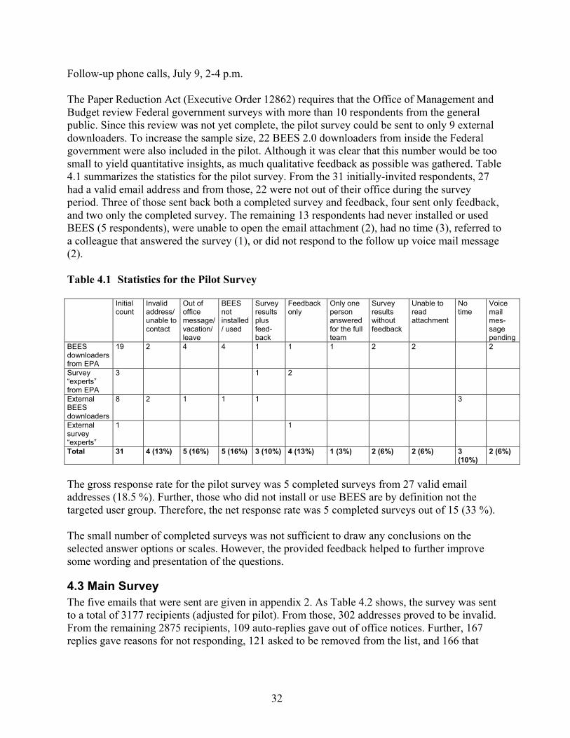
32
Follow-up phone calls, July 9, 2-4 p.m. The Paper Reduction Act (Executive Order 12862) requires that the Office of Management and Budget review Federal government surveys with more than 10 respondents from the general public. Since this review was not yet complete, the pilot survey could be sent to only 9 external downloaders. To increase the sample size, 22 BEES 2.0 downloaders from inside the Federal government were also included in the pilot. Although it was clear that this number would be too small to yield quantitative insights, as much qualitative feedback as possible was gathered. Table 4.1 summarizes the statistics for the pilot survey. From the 31 initially-invited respondents, 27 had a valid email address and from those, 22 were not out of their office during the survey period. Three of those sent back both a completed survey and feedback, four sent only feedback, and two only the completed survey. The remaining 13 respondents had never installed or used BEES (5 respondents), were unable to open the email attachment (2), had no time (3), referred to a colleague that answered the survey (1), or did not respond to the follow up voice mail message (2). Table 4.1 Statistics for the Pilot Survey Initial
count Invalid address/unable to contact
Out of office message/ vacation/ leave
BEES not installed/ used
Survey results plus feed-back
Feedback only
Only one person answered for the full team
Survey results without feedback
Unable to read attachment
No time
Voice mail mes-sage pending
BEES downloaders from EPA
19 2 4 4 1 1 1 2 2 2
Survey “experts” from EPA
3 1 2
External BEES downloaders
8 2 1 1 1 3
External survey “experts”
1 1
Total 31 4 (13%) 5 (16%) 5 (16%) 3 (10%) 4 (13%) 1 (3%) 2 (6%) 2 (6%) 3 (10%)
2 (6%)
The gross response rate for the pilot survey was 5 completed surveys from 27 valid email addresses (18.5 %). Further, those who did not install or use BEES are by definition not the targeted user group. Therefore, the net response rate was 5 completed surveys out of 15 (33 %). The small number of completed surveys was not sufficient to draw any conclusions on the selected answer options or scales. However, the provided feedback helped to further improve some wording and presentation of the questions.
4.3 Main Survey The five emails that were sent are given in appendix 2. As Table 4.2 shows, the survey was sent to a total of 3177 recipients (adjusted for pilot). From those, 302 addresses proved to be invalid. From the remaining 2875 recipients, 109 auto-replies gave out of office notices. Further, 167 replies gave reasons for not responding, 121 asked to be removed from the list, and 166 that

33
completed the survey took advantage of the opportunity to be subsequently removed from further emails. The 5-step email procedure and the online format of the survey allowed monitoring of how the emails affected the response rate. Within the first 26 hours of the survey being made available, 193 responses were received. The following 6 days yielded only 75 additional responses. The reminder/thank you email motivated 79 additional responses within 17 hours. During the following 5 days 58 more responses came in; the subsequent reminder produced within 24 hours 53 additional responses. Again, the following 5 days produced only 24 more responses, but the final reminder produced 55 responses within 26 hours. The following 20 days produced only 29 additional responses. This response history suggests that an online format greatly encourages and facilitates immediate response. Further, reminder emails are important. Email messages, in particular, seem to have a short half-life, that is, either they are replied to immediately or not at all. Fully 380 of the 566 responses (67 %) were received within 1 day of sending the four emails (recall that the fifth email was the invitation). NIST received 566 submitted surveys. The gross response rate is therefore 566 out of 2875 (19.7 %). This gross rate could be compared to that for surveys administered by regular mail, for which business trips and vacations are valid reasons for not completing the survey. In the pilot survey, 12 of 27 recipients (44 %) were either out of the office, never used BEES, or were unable to open the survey. If this share holds for the main survey, the survey population would be reduced from 2875 to 1597 respondents, and the net rate would be 35 %. However, this is pure speculation. Table 4.2 Statistics for the Main Survey
Survey stage
Recipients (including
delivery failures)
DeliveryFailures
(bad addresses)
Replied that wouldn't complete survey
(details below)
Requested to be removed from
email list
Replied that survey completed, so
didn't send further emails
Pilot 14 6Email #1 3178* 302 9 0 1Email #2 3168** 302*** 14 42 84Email #3 3028 302*** 30 2 48Email #4 2948 302*** 18 77 27Email #5 2826 302*** 96 Total 167 121 166 *=3450 BEES 2.0 downloaders as of 7/11/01 less 259 duplicates less 14 removed per pilot plus one colleague of recipient asked to be added **=3178-9 declined (with reason)-1 more pilot person removed ***=didn't recount since email #1 since number shouldn't change Table 4.3 summarizes the reasons why people had never used BEES or otherwise felt unable to complete the survey. Most of these respondents do not belong to the intended survey population because they were either unable to install and use BEES or did not yet do it (about 100 respondents). Adjusting the number of actual recipients of the emails for the out of office auto-

34
replies11 and for those 100 respondents that explained why they should not be part of the survey population reduces the realistic survey population to a maximum of 2666. This means that the net response rate was at least higher than 21 %, and probably much higher, due to a large additional number of people that were out of office during the survey period or that never used or installed BEES. Table 4.3 Given Reasons Why People Never Used BEES or Otherwise Felt Unable to Complete the Survey Never used BEES. Because: Passed on to someone else 5BEES wasn't what I thought it was 7Software didn't work 4Download difficulties 9BEES only applicable in US 3Job change 5Needs Mac version 3Has no idea what this is all about 1Just interested in BEES concept; not a user 8BEES is too complicated 1No reason given 10Didn't complete survey because… Needs to study BEES more 82Conflict of interest 1Survey completion difficulties 3Survey too long 4Survey closed before had chance to complete 1Never complete surveys 2Simply have no time 18Total 167 How representative is a survey with a response rate of 21 % or more? In order to answer this question one would need to randomly select a sub-sample of the survey population and determine in a follow-up reasons for not participating in the survey. While this was not possible, the representativeness of the Customer Feedback Survey can be gleaned by comparing the distribution by business type of the survey population versus the survey respondents. Table 4.4 provides this information and suggests that the survey respondents have in general a similar type of business distribution as the total survey population. However, there are two exceptions. A much higher percentage of designers, and a much lower percentage of builders, responded to the survey than were represented in the survey population. This can be interpreted in two ways. First, BEES 2.0 addresses the decision support needs of designers better than it does builders. Therefore, many builders that downloaded BEES never used it and many of the designers that downloaded BEES actually looked into it in more detail. Second, the work-load in the construction sector, especially in the busy summer months when the survey was conducted, is so intense that they didn’t have time to respond to email messages and surveys. While the first explanation would not bias the results, the second would. Although responses could be adjusted for their deviation from the sample population, they are not because it is not clear this would
11 As the pilot survey showed, everyone who is on a leave, vacation, or a business trip does not use the auto-reply function of their email software. In fact, less than half did so.
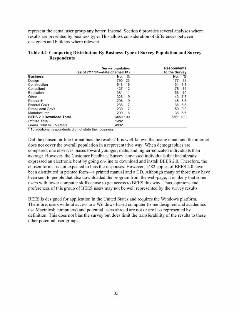
35
represent the actual user group any better. Instead, Section 6 provides several analyses where results are presented by business type. This allows consideration of differences between designers and builders where relevant. Table 4.4 Comparing Distribution By Business Type of Survey Population and Survey
Respondents
Survey population(as of 7/11/01—date of email #1)
Respondents to the Survey
Business No. % No. % Design 795 23 177 32 Construction 548 16 34 6.1 Consultant 427 12 76 14 Education 381 11 56 10 Other 326 9 43 7.7 Research 298 9 48 8.5 Federal Gov't 236 7 36 6.5 State/Local Gov't 230 7 50 9.0 Manufacturer 209 6 36 6.5 BEES 2.0 Download Total 3450 100 556* 100 Printed Total 1482 Grand Total BEES Users 4932 * 10 additional respondents did not state their business Did the chosen on-line format bias the results? It is well-known that using email and the internet does not cover the overall population in a representative way. When demographics are compared, one observes biases toward younger, male, and higher-educated individuals than average. However, the Customer Feedback Survey canvassed individuals that had already expressed an electronic bent by going on-line to download and install BEES 2.0. Therefore, the chosen format is not expected to bias the responses. However, 1482 copies of BEES 2.0 have been distributed in printed form—a printed manual and a CD. Although many of those may have been sent to people that also downloaded the program from the web-page, it is likely that some users with lower computer skills chose to get access to BEES this way. Thus, opinions and preferences of this group of BEES users may not be well represented by the survey results. BEES is designed for application in the United States and requires the Windows platform. Therefore, users without access to a Windows-based computer (some designers and academics use Macintosh computers) and potential users abroad are not or are less represented by definition. This does not bias the survey but does limit the transferability of the results to these other potential user groups.

36
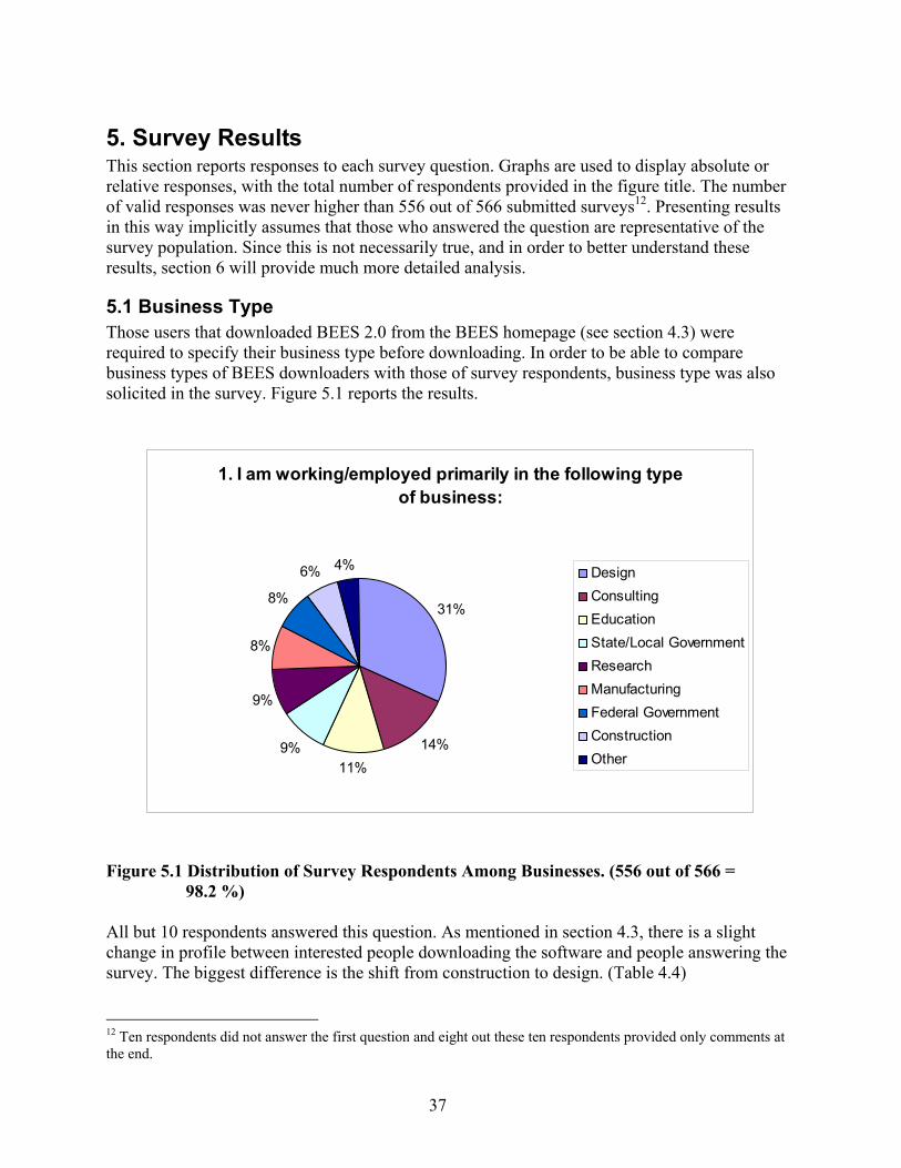
37
5. Survey Results This section reports responses to each survey question. Graphs are used to display absolute or relative responses, with the total number of respondents provided in the figure title. The number of valid responses was never higher than 556 out of 566 submitted surveys12. Presenting results in this way implicitly assumes that those who answered the question are representative of the survey population. Since this is not necessarily true, and in order to better understand these results, section 6 will provide much more detailed analysis.
5.1 Business Type Those users that downloaded BEES 2.0 from the BEES homepage (see section 4.3) were required to specify their business type before downloading. In order to be able to compare business types of BEES downloaders with those of survey respondents, business type was also solicited in the survey. Figure 5.1 reports the results.
Figure 5.1 Distribution of Survey Respondents Among Businesses. (556 out of 566 =
98.2 %) All but 10 respondents answered this question. As mentioned in section 4.3, there is a slight change in profile between interested people downloading the software and people answering the survey. The biggest difference is the shift from construction to design. (Table 4.4) 12 Ten respondents did not answer the first question and eight out these ten respondents provided only comments at the end.
1. I am working/employed primarily in the following type of business:
31%
14%11%
9%
9%
8%
8%
6% 4% DesignConsultingEducationState/Local GovernmentResearchManufacturingFederal GovernmentConstructionOther

38
The category ‘other’ was used by 29 individuals and included the following specifications: Student 6Facilities Management 4Energy Production/Distribution/Services 4Property Development/Bldg owner 3Non profit 2Institutional 1Technology Planning 1Retail 1Home Energy Rating 1Psychology 1Environmental Advocacy 1Communications 1Distribution 1Regional Chamber of Commerce 1Int'l Standardization 1 In order to prepare the data for further analysis in section 6, a new category “facility management” was created. Students were considered to be in “education.” Energy production and distribution was considered as “manufacturing” since this is an input to buildings. Property development was interpreted as “construction” and other categories were attributed to the closest match (e.g., “consulting” for non-profit organizations or “industry associations” for one person who mentioned “international standardization” as type of business).
5.2 Type of construction sector Question 2 asked whether the respondents are interested in residential, commercial, or both construction sectors. The results in Figure 5.2 are somewhat surprising because half of the respondents are interested in both although the two applications are in practice clearly separated. Further, 8 % of respondents were not interested in construction at all. From this we can hypothesize that these respondents are interested in BEES because of its new methodological approach and not so much for its immediate application. The following questions 3 and 4 try to clarify this issue.

39
2. I am primarily interested in:
50%
32%
10%
8%
BothCommercialResidentialNeither
Figure 5.2 Building Sectors the Respondents Are Interested In (553 out of 566 = 97.7 %)
5.3 Why Was BEES Downloaded? In order to better understand the motivation for downloading BEES, the survey offered five reasons and allowed the user to specify other reasons. Since multiple answers were possible, Figure 5.3 shows the adjusted shares when considering that each respondent (not response) gets equal weight, regardless of numbers of responses. If a respondent gave two answers, for example, each would be counted as half a response in the overall response tally.
3. I downloaded BEES for the following reason(s):
32%
30%
12%
7%
7%
6%6%
Educate me about LCAtoolsLearn about BEES--willapply resultsEducate others about LCAtoolsOther
Inspect results for oneelementApply results to actualprojectLearn about BEES--will notapply results
Figure 5.3 Reasons for Downloading BEES (552 out of 566 = 97.5 %)

40
Only 13 % of respondents inspected or applied the BEES results, while an additional 30 % intend to do so in future. Forty-four percent wanted to educate themselves or others and another 6 % decided that they will not apply BEES to future projects. An additional 61 written comments are summarized in the table below. Where possible, these “other” reasons to download BEES were attributed to the existing categories in order to prepare the data for analysis in section 6 (in many cases the respondents already checked one of the other boxes themselves). This was not possible for those with problems in downloading BEES, those that were responding to the survey because they were asked to, and those that have not used BEES (a total of 6). This means that 546 responses with one or more answers are available for analysis in section 6. To see how BEES works and study its method 8To compare with other life-cycle tools 8To look at results for particular product 7To see if we could use BEES 6Research 5Review info 5Had download problems 3Educational purposes 2Haven't used 2Economic analysis 2To see if BEES comprehensive 2Asked to take survey 2To compare building products and make informed choices 2To help government about environment 1Interested in design of software 1Fire code info on mattresses 1Clean renewable energy 1Building audits 1To help with whole bldg LCA 1To include BEES in contract specs 1
5.4 Actual Application Question 4 confirmed the suspicion that many respondents that downloaded BEES have so far not applied BEES to a specific decision. However, as Figure 5.4 shows, 9 % did so and Figure 5.5 shows that the vast majority of those 42 respondents did so in real world situations (not hypothetical classroom problems). Another 14 (3 %) tried to apply BEES but then realized that the offered building products did not match their decision support needs (see also question 6). Based on question 3 results, 546 respondents were expected to answer question 4. However, only 474 did so. The 42 respondents that applied BEES represent 7.7 % of this adjusted sample that excludes those that never installed or intended to use BEES.
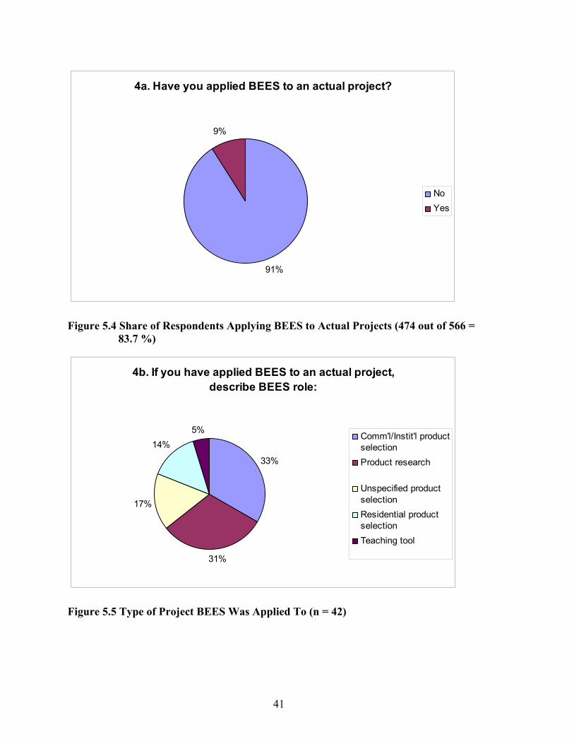
41
4a. Have you applied BEES to an actual project?
91%
9%
NoYes
Figure 5.4 Share of Respondents Applying BEES to Actual Projects (474 out of 566 =
83.7 %)
4b. If you have applied BEES to an actual project, describe BEES role:
33%
31%
17%
14%5%
Comm'l/Instit'l productselectionProduct research
Unspecified productselectionResidential productselectionTeaching tool
Figure 5.5 Type of Project BEES Was Applied To (n = 42)

42
5.5 Time Spent With BEES For the following questions it is not only interesting to know whether somebody actually applied BEES to a project but also how detailed the respondent’s knowledge about BEES is. As a proxy, question 5 asked for the time spent using BEES.
5. I have used/studied BEES for a total of:
48%
36%
10%6%
1- 4 hours<1 hour5- 10 hours>10 hours
Figure 5.6 Time Spent to Study/Use BEES (n = 545 out of 566 = 96.3 %) This question proves to be very important because it reveals that although only 7.7 % applied BEES to an actual project (see section 5.4), 16 % have studied BEES in much detail, spending 5 or more hours with the software and most likely also with the manual. Another 48 % spent 1 hour to 4 hours, which allows one to get familiar with BEES and do a fair number of sample calculations and browsing of the manual. Only the remaining 36 % who spent less than one hour with BEES may need to be analyzed critically in cases where they answer questions 10 and 12 through 26.
5.6 Which Additional Product Categories? BEES 2.0 is limited in terms of numbers of building products that are covered. In question 4, 14 respondents also stated that they could not apply BEES to their project due to lacking coverage. Here, feedback was solicited to understand where future BEES developments should focus in terms of covered products.

43
6. I would like for future BEES releases to evaluate products or activities belonging to the following building
elements:
0
5
10
15
20
25
30
35
40
45
50
HVAC Interior FinishesInterior Construction RoofingExterior Closure ElectricalPlumbing FurnishingsEquipment Site ImprovementsFoundations Fire ProtectionSuperstructure Site Civil/Mechanical UtilitiesSite Electrical Utilities Basement ConstructionOther StaircasesConveying Systems
Figure 5.7 Multiple Answer Adjusted Votes for Adding Specific Building Elements (n = 485
out of 566 = 85.7 %) Since the question format allowed for multiple answers and included an option to select “all of the above,” the data has been scaled by giving equal weight to each respondent. For example, 203 respondents suggested that all 19 building elements should be included in future BEES versions. This translates into slightly more than 10 full votes for each building element. Therefore, none of the suggested elements is unimportant per se. The building elements receiving the most votes are clearly suggested for inclusion. For instance, after the 203 respondents that prefer to add all elements, 173 respondents specifically prefer HVAC systems. Conveying systems got an additional 46 mentions. When developing the survey it was feared that the order of the mentioned elements might bias the responses. However, the results do not show such a bias. In the comments box, 44 respondents provided the following inputs:
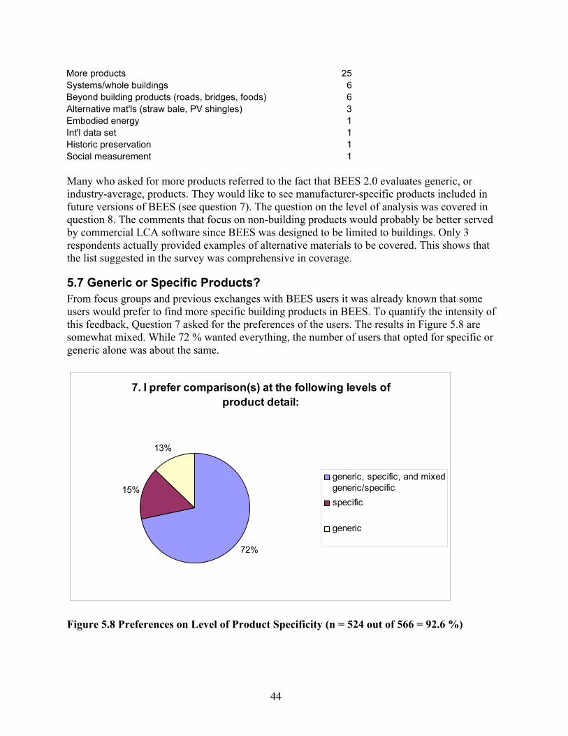
44
More products 25Systems/whole buildings 6Beyond building products (roads, bridges, foods) 6Alternative mat'ls (straw bale, PV shingles) 3Embodied energy 1Int'l data set 1Historic preservation 1Social measurement 1 Many who asked for more products referred to the fact that BEES 2.0 evaluates generic, or industry-average, products. They would like to see manufacturer-specific products included in future versions of BEES (see question 7). The question on the level of analysis was covered in question 8. The comments that focus on non-building products would probably be better served by commercial LCA software since BEES was designed to be limited to buildings. Only 3 respondents actually provided examples of alternative materials to be covered. This shows that the list suggested in the survey was comprehensive in coverage.
5.7 Generic or Specific Products? From focus groups and previous exchanges with BEES users it was already known that some users would prefer to find more specific building products in BEES. To quantify the intensity of this feedback, Question 7 asked for the preferences of the users. The results in Figure 5.8 are somewhat mixed. While 72 % wanted everything, the number of users that opted for specific or generic alone was about the same.
7. I prefer comparison(s) at the following levels of product detail:
72%
15%
13%
generic, specific, and mixedgeneric/specificspecific
generic
Figure 5.8 Preferences on Level of Product Specificity (n = 524 out of 566 = 92.6 %)
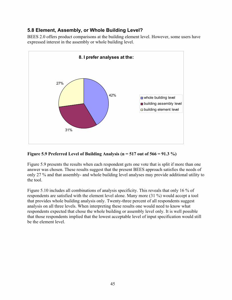
45
5.8 Element, Assembly, or Whole Building Level? BEES 2.0 offers product comparisons at the building element level. However, some users have expressed interest in the assembly or whole building level.
8. I prefer analyses at the:
42%
31%
27%
whole building levelbuilding assembly levelbuilding element level
Figure 5.9 Preferred Level of Building Analysis (n = 517 out of 566 = 91.3 %) Figure 5.9 presents the results when each respondent gets one vote that is split if more than one answer was chosen. These results suggest that the present BEES approach satisfies the needs of only 27 % and that assembly- and whole building level analyses may provide additional utility to the tool. Figure 5.10 includes all combinations of analysis specificity. This reveals that only 16 % of respondents are satisfied with the element level alone. Many more (31 %) would accept a tool that provides whole building analysis only. Twenty-three percent of all respondents suggest analysis on all three levels. When interpreting these results one would need to know what respondents expected that chose the whole building or assembly level only. It is well possible that those respondents implied that the lowest acceptable level of input specification would still be the element level.

46
8. I prefer the following level(s) of analysis:5%
2%
5%
23%
16%18%
31% element+assemblyelement and wholeassemply+wholeall levelselementassemblywhole
Figure 5.10 Preferred Level of Analysis (n = 517 out of 566 = 91.3 %)
5.9 Transparency LCA experts usually prefer as much transparency as possible since practicability and time requirements are of lesser importance to them. However, this survey was structured to determine how much BEES users value transparency. In order to examine this question two questions were posed. First, question 9 presents the transparency issue as if no trade-offs would be involved. Then, question 10 focuses on the fact that transparency comes often at the expense of user friendliness. Figure 5.11 shows that indeed 82 % of respondents want more or most transparency. Only a minority is focused on results only or major assumptions only. The analysis in section 6 will reveal whether those responses come from a certain group of respondents.

47
9. How much emphasis do you place on transparency?
41%
41%
15%3%
MostMoreLessNone
Figure 5.11 Preferred Level of Transparency (n = 531 out of 566 = 93.8 %)
5.10 Trade-off Practicality and Built-in Assumptions Although 82 % were in favor of more or most transparency, only 50 % are actually ready to trade the ease of use of the software for less built-in assumptions. This result suggests that increased transparency or less built-in assumptions should not be achieved at any cost. Flexible interface design and comprehensive documentation in manuals may be needed to fulfill both requests. Other options include the provision of two versions, a fully transparent expert version and a results-focused product (see also question 11).
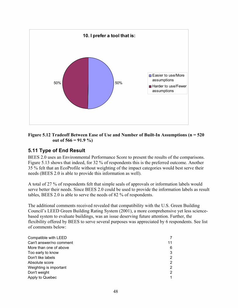
48
10. I prefer a tool that is:
50%50%
Easier to use/MoreassumptionsHarder to use/Fewerassumptions
Figure 5.12 Tradeoff Between Ease of Use and Number of Built-In Assumptions (n = 520
out of 566 = 91.9 %)
5.11 Type of End Result BEES 2.0 uses an Environmental Performance Score to present the results of the comparisons. Figure 5.13 shows that indeed, for 32 % of respondents this is the preferred outcome. Another 35 % felt that an EcoProfile without weighting of the impact categories would best serve their needs (BEES 2.0 is able to provide this information as well). A total of 27 % of respondents felt that simple seals of approvals or information labels would serve better their needs. Since BEES 2.0 could be used to provide the information labels as result tables, BEES 2.0 is able to serve the needs of 82 % of respondents. The additional comments received revealed that compatibility with the U.S. Green Building Council’s LEED Green Building Rating System (2001), a more comprehensive yet less science-based system to evaluate buildings, was an issue deserving future attention. Further, the flexibility offered by BEES to serve several purposes was appreciated by 6 respondents. See list of comments below: Compatible with LEED 7 Can't answer/no comment 11 More than one of above 6 Too early to know 3 Don't like labels 2 Absolute score 2 Weighting is important 2 Don't weight 2 Apply to Quebec 1
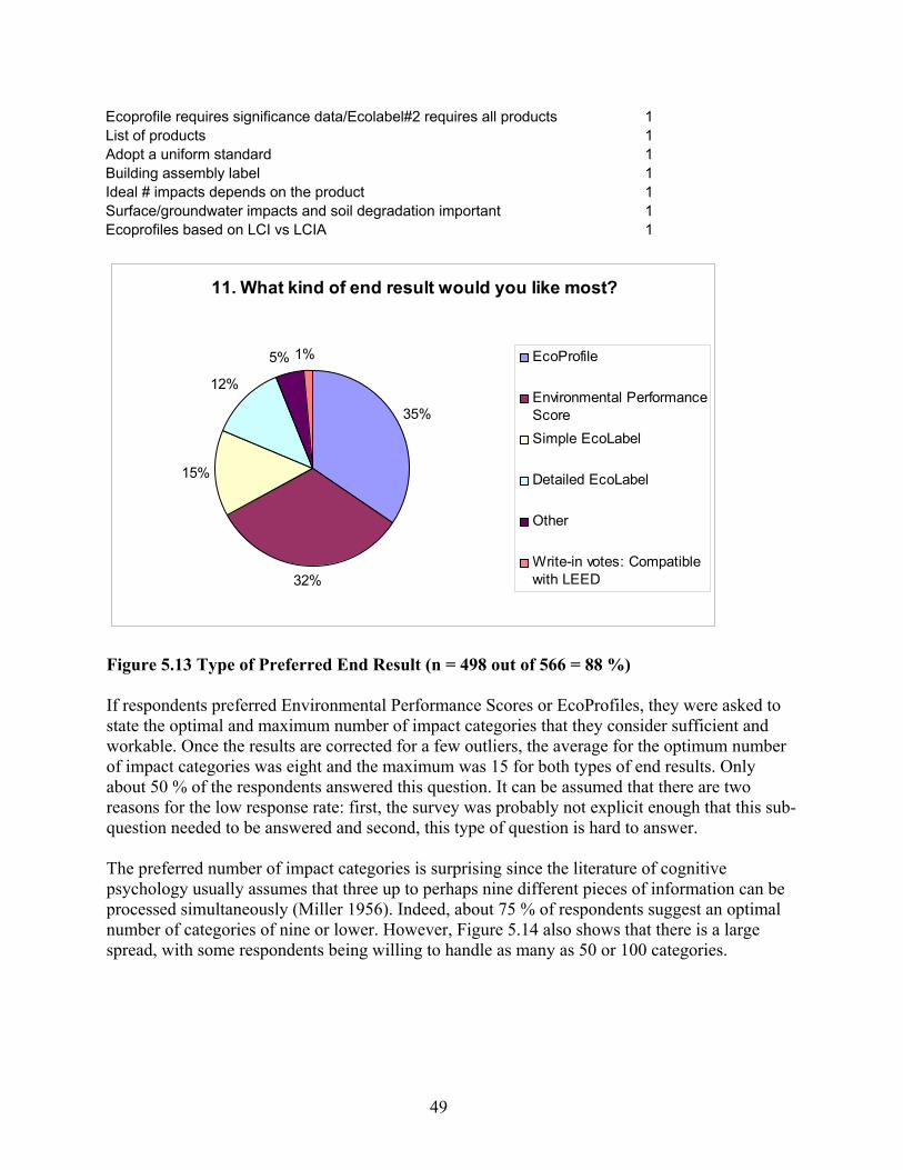
49
Ecoprofile requires significance data/Ecolabel#2 requires all products 1 List of products 1 Adopt a uniform standard 1 Building assembly label 1 Ideal # impacts depends on the product 1 Surface/groundwater impacts and soil degradation important 1 Ecoprofiles based on LCI vs LCIA 1
11. What kind of end result would you like most?
35%
32%
15%
12%
5% 1% EcoProfile
Environmental PerformanceScoreSimple EcoLabel
Detailed EcoLabel
Other
Write-in votes: Compatiblewith LEED
Figure 5.13 Type of Preferred End Result (n = 498 out of 566 = 88 %) If respondents preferred Environmental Performance Scores or EcoProfiles, they were asked to state the optimal and maximum number of impact categories that they consider sufficient and workable. Once the results are corrected for a few outliers, the average for the optimum number of impact categories was eight and the maximum was 15 for both types of end results. Only about 50 % of the respondents answered this question. It can be assumed that there are two reasons for the low response rate: first, the survey was probably not explicit enough that this sub-question needed to be answered and second, this type of question is hard to answer. The preferred number of impact categories is surprising since the literature of cognitive psychology usually assumes that three up to perhaps nine different pieces of information can be processed simultaneously (Miller 1956). Indeed, about 75 % of respondents suggest an optimal number of categories of nine or lower. However, Figure 5.14 also shows that there is a large spread, with some respondents being willing to handle as many as 50 or 100 categories.
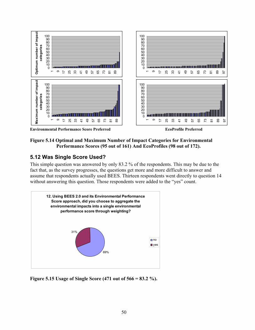
50
0102030405060708090
100
1 9 17 25 33 41 49 57 65 73 81 89Opt
imum
num
ber o
f im
pact
ca
tego
ries
0102030405060708090
100
1 9 17 25 33 41 49 57 65 73 81 89Max
imum
num
ber o
f im
pact
ca
tego
ries
Environmental Performance Score Preferred
0102030405060708090
100
1 9 17 25 33 41 49 57 65 73 81 89 97
0102030405060708090
100
1 9 17 25 33 41 49 57 65 73 81 89 97
EcoProfile Preferred
Figure 5.14 Optimal and Maximum Number of Impact Categories for Environmental
Performance Scores (95 out of 161) And EcoProfiles (98 out of 172).
5.12 Was Single Score Used? This simple question was answered by only 83.2 % of the respondents. This may be due to the fact that, as the survey progresses, the questions get more and more difficult to answer and assume that respondents actually used BEES. Thirteen respondents went directly to question 14 without answering this question. Those respondents were added to the “yes” count.
12. Using BEES 2.0 and its Environmental Performance Score approach, did you choose to aggregate the environmental impacts into a single environmental
performance score through weighting?
69%
31%
noyes
Figure 5.15 Usage of Single Score (471 out of 566 = 83.2 %).

51
The result that 31 % used the weighting feature compares well with the results in question 11. Section 6 will test whether indeed the respondents were consistent in answering these two questions.
5.13 Why Not Aggregate? In order to better understand reasons for not aggregating across impact categories, respondents were asked to explain their answer to question 12. Sixty-six percent of these respondents strictly believe that such trade-offs between impact categories cannot and shall not be made. This group of 188 respondents deserves more attention since this group went through the effort to download and install BEES, study it, and to answer this survey even though they reject for reasons of principle trade-offs between impact categories. Strictly speaking, this group is either looking for Pareto-optimal solutions--where one product scores best in all impact categories--or not interested in product choices so much as product improvements. Section 6 may shed some light on this issue through analysis of this group’s responses to other questions. Interestingly, an additional 7 % of respondents found such Pareto-optimal solutions in their example and 10 % felt that others like their customers or bosses need to make these value choices.
13. Below are some reasons why people choose not to aggregate the impacts. Please indicate which reason was your
main motivation:
48%
18%
11%
10%
7%6%
I do not trust that such anaggregation is valid
I do not think that there are trade-offs among the impacts
Other
I believe that others need to makethis aggregation
There was no need because oneproduct alternative scored best onall impactsWrite-in: Haven't applied BEES toa project
Figure 5.16 Reasons for Not Aggregating Across Impacts (285 out of 325 that Answered
“no” to Question 12 = 87.7 %). The following list summarizes the 46 received comments: Haven't really applied BEES to a project 18Don't know enough to properly weight 7Prefer to do "loose" weighting myself 5Project not suitable for BEES-style aggregation 3

52
No opinion 3I'm against subjectivity 2Oversimplifies 2Use phase reasons 1Cost should be overriding concern 1Did not need to 1No good method to aggregate 1Like to see both individual impacts and aggregation 2
5.14 Was Weighted Score Used to Support Decision-making? This question was designed to see who actually used the aggregated Environmental Performance Score for decision support. In principle, only those 146 respondents that answered “yes” to question 12 should have answered this question. However, 248 respondents actually did. Out of those, 30 % (75) mentioned that indeed, they used the score for decision support. Section 6 will place these results in perspective by further analyzing them.
14. You weighted the impacts and aggregated them into a single environmental performance score. Did you use
this performance score?.
48%
30%
11%
6% 5% no, I did not use BEES tosupport a decisionyes
no, without comment
no, there was no need
no, other reason
Figure 5.17 Was Score Used in Decision Support? (248 out of 566 (43.8 %), or 248 out of
146 that Answered “yes” in Question 12). An additional 6 % (16) would probably have used the score, but since one alternative scored best in all categories there was no need for it. Half of the respondents did not use BEES in a decision-making setting (48 %). The following list offers some of the other reasons stated for not using BEES scores in decision support:
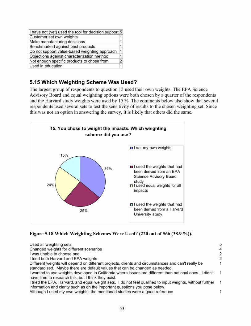
53
I have not (yet) used the tool for decision support 5Customer set own weights 1Make manufacturing decisions 1Benchmarked against best products 1Do not support value-based weighting approach 1Objections against characterization method 1Not enough specific products to chose from 2Used in education 1
5.15 Which Weighting Scheme Was Used? The largest group of respondents to question 15 used their own weights. The EPA Science Advisory Board and equal weighting options were both chosen by a quarter of the respondents and the Harvard study weights were used by 15 %. The comments below also show that several respondents used several sets to test the sensitivity of results to the chosen weighting set. Since this was not an option in answering the survey, it is likely that others did the same.
15. You chose to weight the impacts. Which weighting scheme did you use?
36%
25%
24%
15%
I set my own weights
I used the weights that hadbeen derived from an EPAScience Advisory BoardstudyI used equal weights for allimpacts
I used the weights that hadbeen derived from a HarvardUniversity study
Figure 5.18 Which Weighting Schemes Were Used? (220 out of 566 (38.9 %)). Used all weighting sets 5Changed weights for different scenarios 4I was unable to choose one 2I tried both Harvard and EPA weights 2Different weights will depend on different projects, clients and circumstances and can't really be standardized. Maybe there are default values that can be changed as needed.
1
I wanted to use weights developed in California where issues are different than national ones. I didn't have time to research this, but I think they exist.
1
I tried the EPA, Harvard, and equal weight sets. I do not feel qualified to input weights, without further information and clarity such as on the important questions you pose below.
1
Although I used my own weights, the mentioned studies were a good reference 1
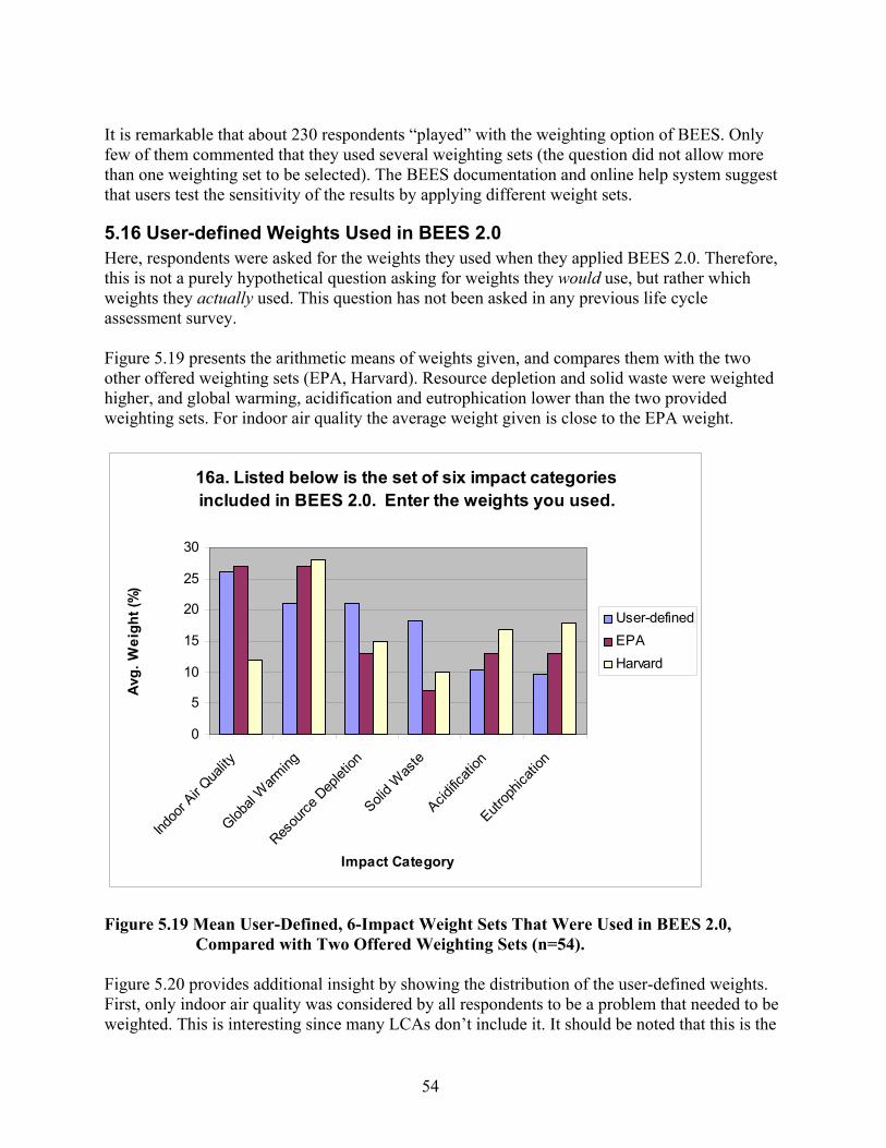
54
It is remarkable that about 230 respondents “played” with the weighting option of BEES. Only few of them commented that they used several weighting sets (the question did not allow more than one weighting set to be selected). The BEES documentation and online help system suggest that users test the sensitivity of the results by applying different weight sets.
5.16 User-defined Weights Used in BEES 2.0 Here, respondents were asked for the weights they used when they applied BEES 2.0. Therefore, this is not a purely hypothetical question asking for weights they would use, but rather which weights they actually used. This question has not been asked in any previous life cycle assessment survey. Figure 5.19 presents the arithmetic means of weights given, and compares them with the two other offered weighting sets (EPA, Harvard). Resource depletion and solid waste were weighted higher, and global warming, acidification and eutrophication lower than the two provided weighting sets. For indoor air quality the average weight given is close to the EPA weight.
16a. Listed below is the set of six impact categories included in BEES 2.0. Enter the weights you used.
0
5
10
15
20
25
30
Indoo
r Air Q
uality
Global
Warm
ing
Resou
rce D
eplet
ion
Solid W
aste
Acidific
ation
Eutrop
hicati
on
Impact Category
Avg.
Wei
ght (
%)
User-definedEPAHarvard
Figure 5.19 Mean User-Defined, 6-Impact Weight Sets That Were Used in BEES 2.0,
Compared with Two Offered Weighting Sets (n=54). Figure 5.20 provides additional insight by showing the distribution of the user-defined weights. First, only indoor air quality was considered by all respondents to be a problem that needed to be weighted. This is interesting since many LCAs don’t include it. It should be noted that this is the

55
industry which is most sensitized to this issue though. All other problems (especially acidification and eutrophication) were considered by some respondents to be unimportant to the decision/comparison at hand. While the spread of weights is small for acidification and eutrophication and the distribution slightly multimodal13, the weights for the other categories were widely spread and close to normally distributed (since the weights are limited by the interval from 0 % to 100 %, much more skewed distributions would have been expected).
0.0
33.3
66.7
100.0
Wei
ght [
%]
Figure 5.20 Median Weights (Red Dots), Interquartiles (Bold Blue Bars) and Distributions
(Yellow) of User-Defined, 6-Impact Weight Sets Used in BEES 2.0 (n=54). Figure 5.21 presents the results for those respondents that set their own weights for 10 impact categories (40 respondents set weights for both 6 and 10 impacts, 9 for only 10 impacts). Since there is a large overlap of respondents, these two are not independent sets of weights. It is therefore not surprising that resource depletion and solid waste are again weighted higher, and eutrophication and acidification lower, than the two offered weighting sets. However, this time, indoor air quality was weighted quite a bit higher than both offered weighting sets. Ozone
13 I.e., there are several local sub-maxima.
Glo
bal
War
min
g
Acid
ifica
tion
Eutro
phic
atio
n
Nat
ural
Res
ourc
e D
eple
tion
Indo
or A
ir Q
ualit
y
Solid
Was
te
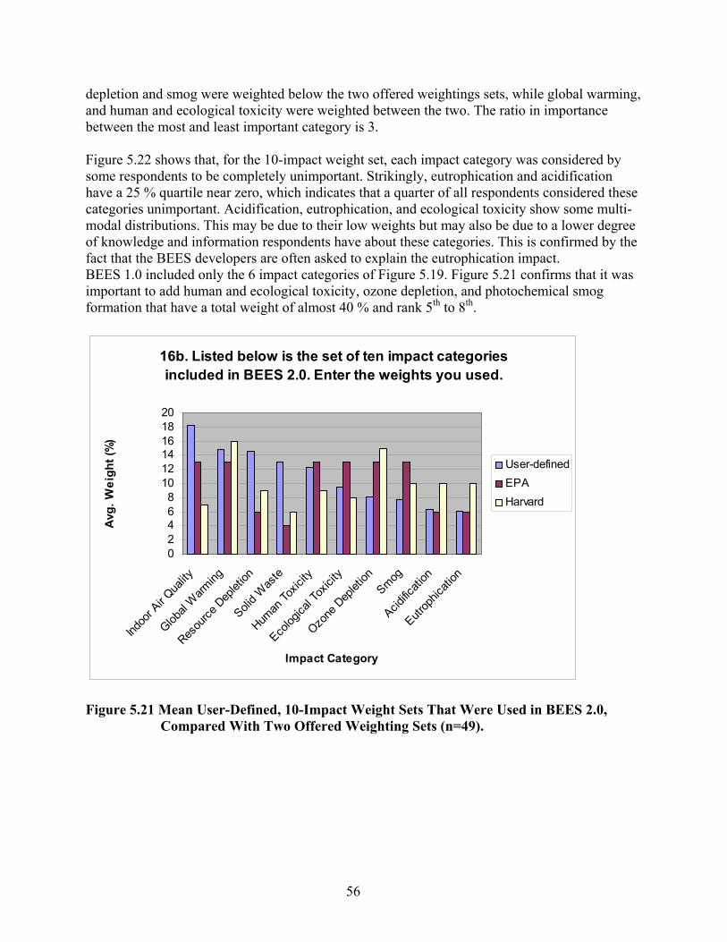
56
depletion and smog were weighted below the two offered weightings sets, while global warming, and human and ecological toxicity were weighted between the two. The ratio in importance between the most and least important category is 3. Figure 5.22 shows that, for the 10-impact weight set, each impact category was considered by some respondents to be completely unimportant. Strikingly, eutrophication and acidification have a 25 % quartile near zero, which indicates that a quarter of all respondents considered these categories unimportant. Acidification, eutrophication, and ecological toxicity show some multi-modal distributions. This may be due to their low weights but may also be due to a lower degree of knowledge and information respondents have about these categories. This is confirmed by the fact that the BEES developers are often asked to explain the eutrophication impact. BEES 1.0 included only the 6 impact categories of Figure 5.19. Figure 5.21 confirms that it was important to add human and ecological toxicity, ozone depletion, and photochemical smog formation that have a total weight of almost 40 % and rank 5th to 8th.
16b. Listed below is the set of ten impact categories included in BEES 2.0. Enter the weights you used.
02468
101214161820
Indoo
r Air Q
uality
Global
Warm
ing
Resou
rce D
eplet
ion
Solid W
aste
Human
Toxic
ity
Ecolog
ical T
oxici
ty
Ozone
Dep
letion
Smog
Acidific
ation
Eutrop
hicati
on
Impact Category
Avg.
Wei
ght (
%)
User-definedEPAHarvard
Figure 5.21 Mean User-Defined, 10-Impact Weight Sets That Were Used in BEES 2.0,
Compared With Two Offered Weighting Sets (n=49).
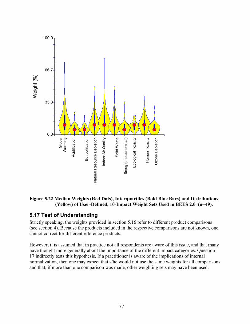
57
0.0
33.3
66.7
100.0W
eigh
t [%
]
Figure 5.22 Median Weights (Red Dots), Interquartiles (Bold Blue Bars) and Distributions
(Yellow) of User-Defined, 10-Impact Weight Sets Used in BEES 2.0 (n=49).
5.17 Test of Understanding Strictly speaking, the weights provided in section 5.16 refer to different product comparisons (see section 4). Because the products included in the respective comparisons are not known, one cannot correct for different reference products. However, it is assumed that in practice not all respondents are aware of this issue, and that many have thought more generally about the importance of the different impact categories. Question 17 indirectly tests this hypothesis. If a practitioner is aware of the implications of internal normalization, then one may expect that s/he would not use the same weights for all comparisons and that, if more than one comparison was made, other weighting sets may have been used.
Glo
bal
War
min
g
Acid
ifica
tion
Eu
troph
icat
ion
N
atur
al R
esou
rce
Dep
letio
n
Indo
or A
ir Q
ualit
y
So
lid W
aste
Smog
(pho
toch
emic
al)
Ecol
ogic
al T
oxic
ity
Hum
an T
oxic
ity
Ozo
ne D
eple
tion
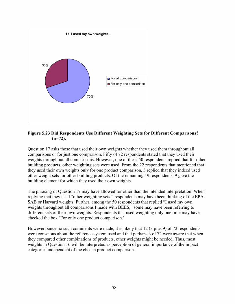
58
17. I used my own weights...
70%
30%
For all comparisons
For only one comparison
Figure 5.23 Did Respondents Use Different Weighting Sets for Different Comparisons?
(n=72). Question 17 asks those that used their own weights whether they used them throughout all comparisons or for just one comparison. Fifty of 72 respondents stated that they used their weights throughout all comparisons. However, one of these 50 respondents replied that for other building products, other weighting sets were used. From the 22 respondents that mentioned that they used their own weights only for one product comparison, 3 replied that they indeed used other weight sets for other building products. Of the remaining 19 respondents, 9 gave the building element for which they used their own weights. The phrasing of Question 17 may have allowed for other than the intended interpretation. When replying that they used “other weighting sets,” respondents may have been thinking of the EPA-SAB or Harvard weights. Further, among the 50 respondents that replied “I used my own weights throughout all comparisons I made with BEES,” some may have been referring to different sets of their own weights. Respondents that used weighting only one time may have checked the box ‘For only one product comparison.’ However, since no such comments were made, it is likely that 12 (3 plus 9) of 72 respondents were conscious about the reference system used and that perhaps 3 of 72 were aware that when they compared other combinations of products, other weights might be needed. Thus, most weights in Question 16 will be interpreted as perception of general importance of the impact categories independent of the chosen product comparison.

59
5.18 Assumed time horizons and areas by impact category In order to gain some insight into why certain impact categories where weighted higher than others, and to see whether major aspects of importance - temporal and spatial scales - have been considered, respondents were asked to specify the assumed reference system.
18a: Which time horizon was assumed when setting/chosing weights?
0
5
10
15
20
25
30
35
40
Global
Warm
ing
Acidific
ation
Eutrop
hicati
on
Natural
Res
ource
Dep
letion
Indoo
r Air Q
uality
Solid W
asteSmog
Ecolog
ical T
oxici
ty
Human
Toxic
ity
Ozone
Dep
letion
resp
onse
s weeks to 1 season1 year10 years100 years infinity
Figure 5.24 Which Time Horizon Was Assumed? (n=64 (Eutrophication/Acidification) to
76 (Global Warming)). Figure 5.24 presents the result for the time horizon, and Figure 5.25 for the spatial dimension. The results are not surprising. Global warming, resource depletion, and ozone depletion received the longest time horizons, indoor air quality the shortest. The same pattern can be found for the area assumed to be impacted. For all but indoor air quality, solid waste, and smog, the world scale was mentioned most frequently. In section 6.21 these temporal and spatial assumptions will be studied for their influence on individuals’ weights.
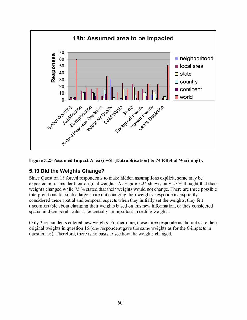
60
18b: Assumed area to be impacted
010203040506070
Global
Warming
Acidific
ation
Eutrop
hicati
on
Natural
Resou
rce D
eplet
ion
Indoo
r Air Q
uality
Solid W
aste
Smog
Ecolog
ical T
oxici
ty
Human
Toxic
ity
Ozone
Dep
letion
Resp
onse
sneighborhoodlocal areastatecountrycontinentworld
Figure 5.25 Assumed Impact Area (n=61 (Eutrophication) to 74 (Global Warming)).
5.19 Did the Weights Change? Since Question 18 forced respondents to make hidden assumptions explicit, some may be expected to reconsider their original weights. As Figure 5.26 shows, only 27 % thought that their weights changed while 73 % stated that their weights would not change. There are three possible interpretations for such a large share not changing their weights: respondents explicitly considered these spatial and temporal aspects when they initially set the weights, they felt uncomfortable about changing their weights based on this new information, or they considered spatial and temporal scales as essentially unimportant in setting weights. Only 3 respondents entered new weights. Furthermore, these three respondents did not state their original weights in question 16 (one respondent gave the same weights as for the 6-impacts in question 16). Therefore, there is no basis to see how the weights changed.

61
19a. Has your opinion on the most appropriate weights changed after answering question 18?
73%
23%
4%Opinion has not changed
Changed, but unable tocome up with a new set ofweightsChanged, new weight set
Figure 5.26 Did Weights Change? (n=73).
5.20 Temporal and Spatial Scale of Impact Categories Those respondents that did not set their own weights but used predefined weighting sets were asked to answer the same questions those that used their own weights were asked in Questions 18 and 19. Figure 5.27 shows the results for the time horizon. The general trend is the same for figures 24 and 27. Figure 28 shows the responses for assumed area impacted. As in Figure 5.25, for all but indoor air quality, solid waste, and smog, the level ‘world’ was chosen by most respondents. The additional comments given indicate that some survey respondents were answering the weighting questions without having used BEES to the extent assumed. Further, eutrophication seems to be the only impact category with problems of understanding. Since this impact is covered the least by the media, this makes sense. Further, only 4 respondents admitted that this question is too hard to answer, and one respondent correctly noted that bioregional areas may be more relevant than the given area categories.

62
20a: Which time horizon should be considered
01020304050607080
Global
Warm
ing
Acidific
ation
Eutrop
hicati
on
Natural
Res
ource
Dep
letion
Indoo
r Air Q
uality
Solid W
aste
Smog
Ecolog
ical T
oxici
ty
Human
Toxic
ity
Ozone
Dep
letion
Res
pons
es
weeks to 1 season1 year10 years100 years infinity
Figure 5.27 Which Time Horizon Was Assumed? (n=118 (Eutrophication) to 129 (Global
Warming)).
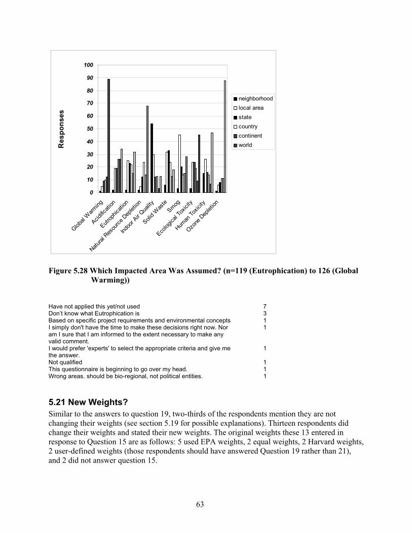
63
0
10
20
30
40
50
60
70
80
90
100
Global
Warm
ing
Acidific
ation
Eutrop
hicati
on
Natural
Res
ource
Dep
letion
Indoo
r Air Q
uality
Solid W
aste
Smog
Ecolog
ical T
oxici
ty
Human
Toxic
ity
Ozone
Dep
letion
Res
pons
es
neighborhoodlocal areastatecountrycontinentworld
Figure 5.28 Which Impacted Area Was Assumed? (n=119 (Eutrophication) to 126 (Global
Warming)) Have not applied this yet/not used 7Don’t know what Eutrophication is 3Based on specific project requirements and environmental concepts 1I simply don't have the time to make these decisions right now. Nor am I sure that I am informed to the extent necessary to make any valid comment.
1
I would prefer 'experts' to select the appropriate criteria and give me the answer.
1
Not qualified 1This questionnaire is beginning to go over my head. 1Wrong areas. should be bio-regional, not political entities. 1
5.21 New Weights? Similar to the answers to question 19, two-thirds of the respondents mention they are not changing their weights (see section 5.19 for possible explanations). Thirteen respondents did change their weights and stated their new weights. The original weights these 13 entered in response to Question 15 are as follows: 5 used EPA weights, 2 equal weights, 2 Harvard weights, 2 user-defined weights (those respondents should have answered Question 19 rather than 21), and 2 did not answer question 15.

64
21a. Has your opinion on the most appropriate weights changed after answering question 20?
66%
25%
9%Opinion has not changed
Changed, but unable tocome up with a new set ofweightsChanged, new weight set
Figure 5.29 Did Weights Change? (n=142). The new weights provided by the 13 respondents are presented in Figure 5.30. Due to the low number of responses, many distributions are multi-modal. It can be seen that many respondents would use 5 % and 10 % weights. Figure 5.31 provides the mean weights. Comparing them against those from section 5.16, it is surprising to see how global warming was weighted even higher and indoor air quality much lower by the group using offered weight sets than by the group specifying their own weights. One could suggest that this is due to the large difference in spatial and temporal scopes of these two impacts (see section 6.21).

65
0.0
16.7
33.3
50.0W
eigh
t [%
]
Figure 5.30 Median Weights (Red Dots), Interquartiles (Bold Blue Bars) and Distributions
(Yellow) of Weight Sets Adjusted for Temporal and Spatial Scopes By Predefined Weight Set Users (n=13).
Glo
bal
War
min
g
Acid
ifica
tion
Eu
troph
icat
ion
N
atur
al R
esou
rce
Dep
letio
n
Indo
or A
ir Q
ualit
y
So
lid W
aste
Smog
(pho
toch
emic
al)
Ecol
ogic
al T
oxic
ity
Hum
an T
oxic
ity
Ozo
ne D
eple
tion

66
21b. Your opinion may have changed after answering question 20. If so and if possible, list a
new set of weights that compares the importance of the impacts in the area and during the time span
entered in question 20.
0
5
10
15
20
25
Global
Warming
Resou
rce Dep
letion
Ozone
Deplet
ion
Solid W
aste
Indoo
r Air Q
uality
Ecolo
gical
Toxic
ity
Human
Toxic
itySmog
Acidif ic
ation
Eutro
phica
tion
Impact Category
Avg
. Wei
ght (
%)
Figure 5.31 New Mean Weights (n=13).
5.22 Modifications to List of Impact Categories Question 22 asks how the list of BEES 2.0 impact categories should be modified for future versions of the tool. Seventy-five percent of all survey respondents answered this question, which indicates success since Questions 16 through 21 were burdensome and difficult. As Figure 5.32 shows, 48 % of respondents are satisfied with the present list and another 20 % did not know how to answer. The remaining votes suggested excluding, adding, or combining impact categories. Among those impacts suggested to be excluded are ozone depletion and eutrophication. The reasons for exclusion are likely very different. In the case of ozone depletion, respondents may feel that this problem has been solved within the building sector. In the case of eutrophication, respondents may not know/understand the problem or may assume that buildings are not relevant contributors to eutrophication. None of the impact categories received more than 17 votes for exclusion. Therefore, the present set of impacts may be considered a minimum set.

67
22. BEES evaluates up to ten environmental impacts. I think that this set of impacts:
48%
20%
19%
11% 2%
Is about rightShould add…Don't knowShould not include…Could combine…
Figure 5.32 How Should the Set of BEES 2.0 Impact Categories Be Changed (Each
Respondent’s Vote Was Partitioned Among the Answers Given (n=427 out of 566=75.4 %)).
22b. BEES impacts should not include...
02468
1012141618
ozon
e dep
letion
eutro
phica
tion
human
toxic
ity
globa
l warm
ing
indoo
r air q
uality
acidif
icatio
n sm
og
resou
rce de
pletio
n
solid
w aste
ecolo
gical
toxicit
y
Impact Category
No. R
espo
nses
Figure 5.33 Which Impact Categories Should Not Be Included? (n=63). Those suggesting additional impacts were asked to provide a list of these impacts. Figure 5.34 gives the responses, showing that land and water use were mentioned particularly often and
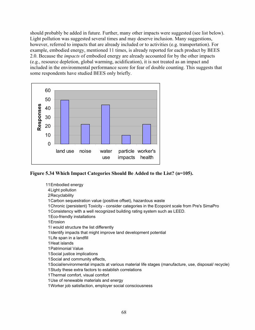
68
should probably be added in future. Further, many other impacts were suggested (see list below). Light pollution was suggested several times and may deserve inclusion. Many suggestions, however, referred to impacts that are already included or to activities (e.g. transportation). For example, embodied energy, mentioned 11 times, is already reported for each product by BEES 2.0. Because the impacts of embodied energy are already accounted for by the other impacts (e.g., resource depletion, global warming, acidification), it is not treated as an impact and included in the environmental performance score for fear of double counting. This suggests that some respondents have studied BEES only briefly.
0
10
20
30
40
50
60
land use noise wateruse
particleimpacts
worker'shealth
Res
pons
es
Figure 5.34 Which Impact Categories Should Be Added to the List? (n=105).
11Embodied energy 4Light pollution 2Recyclability 1Carbon sequestration value (positive offset), hazardous waste 1Chronic (persistent) Toxicity - consider categories in the Ecopoint scale from Pre's SimaPro 1Consistency with a well recognized building rating system such as LEED. 1Eco-friendly installations 1Erosion 1I would structure the list differently 1Identify impacts that might improve land development potential 1Life span in a landfill 1Heat islands 1Patrimonial Value 1Social justice implications 1Social and community effects, 1Social/environmental impacts at various material life stages (manufacture, use, disposal/ recycle) 1Study these extra factors to establish correlations 1Thermal comfort, visual comfort 1Use of renewable materials and energy 1Worker job satisfaction, employer social consciousness
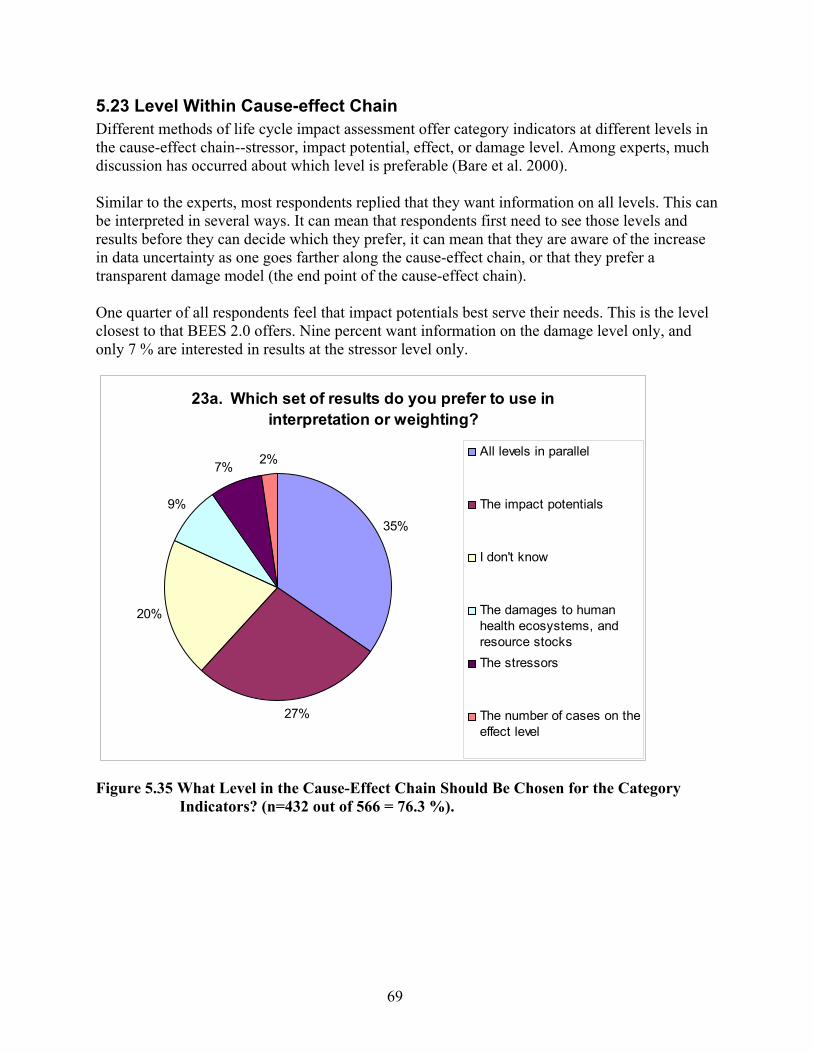
69
5.23 Level Within Cause-effect Chain Different methods of life cycle impact assessment offer category indicators at different levels in the cause-effect chain--stressor, impact potential, effect, or damage level. Among experts, much discussion has occurred about which level is preferable (Bare et al. 2000). Similar to the experts, most respondents replied that they want information on all levels. This can be interpreted in several ways. It can mean that respondents first need to see those levels and results before they can decide which they prefer, it can mean that they are aware of the increase in data uncertainty as one goes farther along the cause-effect chain, or that they prefer a transparent damage model (the end point of the cause-effect chain). One quarter of all respondents feel that impact potentials best serve their needs. This is the level closest to that BEES 2.0 offers. Nine percent want information on the damage level only, and only 7 % are interested in results at the stressor level only.
23a. Which set of results do you prefer to use in interpretation or weighting?
35%
27%
20%
9%
7% 2% All levels in parallel
The impact potentials
I don't know
The damages to humanhealth ecosystems, andresource stocksThe stressors
The number of cases on theeffect level
Figure 5.35 What Level in the Cause-Effect Chain Should Be Chosen for the Category
Indicators? (n=432 out of 566 = 76.3 %).

70
23b. In answering question 23a, what criteria did you use?
0
50
100
150
200
250
Very
Impo
rtant
Somew
hat Im
porta
nt
Not Im
porta
nt
Not Con
sidere
d
No. R
espo
nses
I trust the science/values behindthe scores
All potential consequences aresomehow included in theassessment
I can w eight or directly interpretthe scores because Iunderstand their meaning
My company/customer does nothave to report damages
Other
Figure 5.36 What Criteria Were Used in Selecting the Level of Category Indicators?
(n=353 out of 566 = 62.4 %). To gain insight into criteria that were considered important when making the choice of the level for category indicators, Question 23b asks respondents for the importance of 4 predefined criteria and for additional ones. While most respondents agreed that trust, comprehensiveness, and understandability are very important, only a few thought that reporting damages would be a problem for their company/customers. The comments made were in some cases extensive but did not reveal many additional criteria. The only one that appears several times is the issue of uncertainty in the cause-effect chains. The following comments are verbatim and each cell refers to one respondent. I think the program should stay out of the evaluation end, and should promote a more industry wide evaluation standard. Dependent on the situation, one or the other evaluation may be necessary. Looking at a single paint I may want the stressors, looking at a project in its entirety, I may want to know how many species may be endangered or killed by it. Ecosystem focus preferable to human-centric focus I am interested in long-term sustainability and limiting damage to the environment over short-term health issues because fewer people take notice and act on very long-term impacts. I am not knowledgeable of the science, consequences etc. but I believe this tends to be driven by politics and a non-Christian worldview. I can't weight or directly interpret the scores because I do not yet understand their meaning and how they may impact my choices or those of a client. I couldn't understand what the heck the question was asking. (3 comments) I do like to interpret the scores using my understanding of the data but I also like to see what others get for results according to set standards. I do not trust the data in the BEES program. I question the science behind some of the "damages" caused by stressors. I support the midpoint level, because the calculation of endpoint effects are so poorly known that they have error bars of orders of magnitude. I do think it is important to include all the relevant impact

71
categories to obtain a holistic assessment, but aggregation to three impact endpoints is fraught with so much error as to be meaningless. I think this part of the analysis may be too confusing. It seems that as more factors and impacts are considered it is more difficult to make a rational choice of how to select materials and design solutions. It is important to trust the science and the values behind the scores. However, that does not necessarily mean that one actually does trust that science and those values at this point. What is most important here is a recognition that the process is neither perfect nor complete, and that its decisions may be flawed or incorrect. It does, however, represent a significant step in the right direction. Not enough science. And with many companies making big strides toward improving their environmental impact the difference from product to product might be very large. That going into impacts vastly opens up the uncertainty level of the assessments; the itemizing of stressors is more achievable and knowable, and is a more sound basis for decision making The assessment will be most effective in terms of damages, because my company/customer can understand those, not the stressors or the impacts and to a lesser degree the effects. The calculation of uncertainty for these interpretations is very important The knowledge of impact potentials is totally inaccurate. The potential damage (scores) and potential solutions implied The science is mostly political They seem to me to all be interdependent. I think BEES does not add anything to someone's ability to "interpret" the scores. Thus, I considered BEES as it now exists, but as a consequence, did not know how to answer the first and third parts above. Specifically, I don't trust the science behind BEES and I don't think any "weight" can be given to interpret the scores because most building professionals are not qualified, or even educated, as to the science involved with these issues. However, everyone can understand if something, taken in a "holistic" approach, shortens one's life (e.g., cigarette smoking). Thus, I choose for the life impact ... however this part of the survey is interpreted. Transparency and reliance on hard science are critical issues in developing a legitimate defensible tool.
5.24 Consistency of Level So far, life cycle impact assessment methods have tried to provide category indicators that are all on the same level. The reasons include avoiding overlap in coverage of impacts and making it easier to interpret the category indicators. Another reason is that users prefer that information be provided on the same level. Since the latter has never been tested, the survey explicitly asks, whether respondents favor information that is all on the same level or whether the information is better provided on different levels. Because it is not mentioned in the survey, the respondents are not likely to consider the problem of overlap but rather to reflect their preference regarding interpretation. The results are surprising. Forty-three percent prefer sets with inconsistent levels in the cause-effect chain, while only 25 % prefer consistency in level. These results clearly deserve further analysis and testing since they may alter the preconceptions underlying method development. Although the wording of the question makes clear that “different levels” refers to different levels for different types of impacts, some respondents may have been voting for different levels for the same impact category (i.e., they would prefer getting results for both ozone depletion potentials and number of skin cancer cases).

72
24. I prefer that results for interpretation/weighting be:
43%
32%
25%
On different levelsI don't knowAll on the same level
Figure 5.37 Should the Information Be Provided at the Same Level? (n=420 out of 566 =
74.2 %).
5.25 How to Integrate Cost Information? When combining an environmental with an economic (in terms of life-cycle cost) performance score, users need not only to use a weighting scheme for computing environmental score but also need to select a trade-off between environmental and economic performance. Implicitly, this puts a dollar value on the environmental score. In the survey, 131 respondents stated they did not want to combine life cycle costs with environmental impacts. Section 6 will explore whether these respondents also refrained from weighting the impact category scores. However, 13 of these respondents stated that, despite their reservations, they calculated an overall score, and another 12 (2 from the 13 respondents above) also liked the idea of expressing all environmental impacts in monetary terms. This means that, in effect, only 108 respondents do not want to combine environmental and cost information, while 286 (73 %) do. These results seem inconsistent with those for Question 12. Figure 5.38 shows the results when each respondent is assigned one vote. A surprisingly high share of the votes, 14 %, are for monetization of environmental impacts.
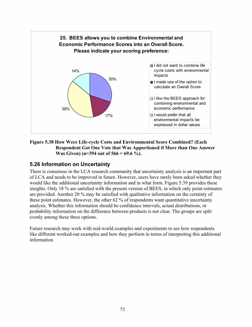
73
25. BEES allows you to combine Environmental and Economic Performance Scores into an Overall Score.
Please indicate your scoring preference:
30%
17%39%
14%I did not want to combine lifecycle costs with environmentalimpactsI made use of the option tocalculate an Overall Score
I like the BEES approach forcombining environmental andeconomic performanceI would prefer that allenvironmental impacts beexpressed in dollar values
Figure 5.38 How Were Life-cycle Costs and Environmental Score Combined? (Each
Respondent Got One Vote that Was Apportioned if More than One Answer Was Given) (n=394 out of 566 = 69.6 %).
5.26 Information on Uncertainty There is consensus in the LCA research community that uncertainty analysis is an important part of LCA and needs to be improved in future. However, users have rarely been asked whether they would like the additional uncertainty information and in what form. Figure 5.39 provides these insights. Only 18 % are satisfied with the present version of BEES, in which only point estimates are provided. Another 20 % may be satisfied with qualitative information on the certainty of these point estimates. However, the other 62 % of respondents want quantitative uncertainty analysis. Whether this information should be confidence intervals, actual distributions, or probability information on the difference between products is not clear. The groups are split evenly among these three options. Future research may work with real-world examples and experiments to see how respondents like different worked-out examples and how they perform in terms of interpreting this additional information.

74
26. If uncertainty data were to become available, how would you like this information integrated into BEES?
21%
20%
20%
19%
18%2%
95% confidence interval for eachscoreWith which probability product A isbetter than BAdditional, qualitative information
Probability distribution for each score
Single point estimates okay
Wouldn't use BEES unless probabilitydistribution for each score
Figure 5.39 Which Type of Uncertainty Information Would You Prefer? (n=395 out of 566
= 69.8 %).
5.27 Additional Comments At the end of the survey, respondents were asked to provide additional comments on BEES as well as on the survey. One hundred twenty-three respondents offered comments. Each respondent got one vote, and if more than one point was raised, this vote was evenly split among these points. The comments were in general very enthusiastic and friendly, and many also added their names. This is an indication that the respondents took the survey seriously and did their best to provide thoughtful answers. This is worthy of note because it is rarely true when random subjects are selected for surveys. The following comments were made: Comment Count Haven’t used BEES enough to a) feel confident about my answers or b) complete all questions 34.67BEES is a great tool 20.08Need more products 12Approach/results too confusing 8.5Make applicable to foreign countries 5.5Keep it/make it more flexible 4.08Survey questions too technical/survey too long 4.08Wants MAC version 4Needs more documentation 3.83Add manufacturer-specific data 2.5Make software more user-friendly 2.42Very interested in assigning dollar values to impacts 2Relate BEES to LEED 2Great survey 1.83Integrate environmental with technical performance parameters 1.3Had BEES download problems 1.25BEES too simplistic 1.17Wants to arrange an international BEES conference 1
75
Use BEES for a standardized evaluation of whether products meet pre-established impact "goals" 1Wants to edit raw data 1Don’t get misled by manufacturers when adding manufacturer-specific data 1BEES has raw data categories that don't correspond to good environmental science 1Apply to renovation work 1BEES needs a "save analysis" feature 1Doesn’t like weighting 1Wants to incorporate temporal and spatial aspects into decision making 0.5Develop version for classroom (educational tool) 0.5BEES not reliable enough 0.5Link to CAD tools 0.5Wants uncertainty results 0.5Results are not as expected 0.33Wants list of green products 0.33Make U.S. region-specific 0.33Evaluate at whole building level 0.25 123 Note that a weighted total of 34 respondents either did not feel sure about some answers they gave or left them blank because they thought they needed to work more with BEES before they would be able to answer them. Another 4 votes state that the questionnaire was too difficult. Therefore, a certain degree of randomness must be assumed when interpreting the results.

76
77
6. Statistical Analysis of Results: Cross-tables, Test of Hypotheses and Detailed Evaluation
While the results presented in section 5 give a good indication of the preferences/characteristics of the survey population as a whole, they do not give any hints as to who and why. Therefore, this section will provide a selection of potentially interesting cross-tabulations between different variables, test some hypotheses on associations that are expected, report some odds ratios, and offer further insights. Most of the following subsections will include cross tables reporting whether or not the response levels across tested items are heterogeneous. Most response data are categorical with nominal, and sometimes ordinal, scales. This data format requires methods that make no restrictive assumptions regarding type of distribution. For this data format, SAS Stat14 uses the Cochran-Mantel-Haenszel statistics within its “FREQ” procedure to test one of the following hypotheses: (1) no general association for the case where scales of both variables are nominal, (2) no differences in row means if the column variable is on an ordinal scale (and the row on a nominal scale), and (3) plausibility of zero correlation when both row and column variables are ordinal. This type of analysis is inspired by Cochran (1954) and is established for hypergeometric distributions by Mantel and Haenszel (1959). Thus, the test is considered in line with SAS Stat Cochran-Mantel-Haenszel statistics (Stokes et al. 1995). Depending on the type of data (nominal or ordinal), this section will provide the probabilities that the hypothesis of no general association between two variables can be rejected. These tests of no association may sometimes be sufficient to answer the question at hand. However, in many cases one wants also to know how strong the statistical association is. This requires additional regression analysis. Standard linear regression analysis falls short because it poorly reflects information such as values smaller than zero or larger than 1 not being possible if a dichotomous response variable is labeled with 0 and 1. In order to build models including categorical data, logistic regression has been developed and is today the standard technique for analyzing categorical data. The general logistic (or logit) model can be written as: log[pi/1-pi] = α + β1xi1 + β2xi2 + ...+ βkxik, where p is the probability, there are k explanatory variables (denoted by x), β is their respective regression coefficients, α an intercept, and i = 1,....,n for the individual respondents. The left side of this equation is called logit or log-odds. Such models are applicable for dependant variables with two or more categories, and in the case of more than two categories the model can be estimated for ordered and nominal categories (Allison 1999, Agresti 1990). The SAS Stat
procedure LOGISTIC will be used to estimate the parameters for binary logit analysis (2 categories of dependent variables) and for cumulative logit analysis (for ordered categories) and CATMOD is used for the multinomial logit analysis where the dependent categories are unordered..
14 This is a product of the SAS Institute Inc., Cary, NC, USA
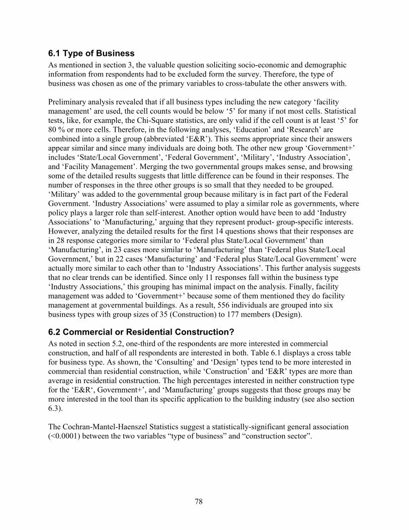
78
6.1 Type of Business As mentioned in section 3, the valuable question soliciting socio-economic and demographic information from respondents had to be excluded form the survey. Therefore, the type of business was chosen as one of the primary variables to cross-tabulate the other answers with. Preliminary analysis revealed that if all business types including the new category ‘facility management’ are used, the cell counts would be below ‘5’ for many if not most cells. Statistical tests, like, for example, the Chi-Square statistics, are only valid if the cell count is at least ‘5’ for 80 % or more cells. Therefore, in the following analyses, ‘Education’ and ‘Research’ are combined into a single group (abbreviated ‘E&R’). This seems appropriate since their answers appear similar and since many individuals are doing both. The other new group ‘Government+’ includes ‘State/Local Government’, ‘Federal Government’, ‘Military’, ‘Industry Association’, and ‘Facility Management’. Merging the two governmental groups makes sense, and browsing some of the detailed results suggests that little difference can be found in their responses. The number of responses in the three other groups is so small that they needed to be grouped. ‘Military’ was added to the governmental group because military is in fact part of the Federal Government. ‘Industry Associations’ were assumed to play a similar role as governments, where policy plays a larger role than self-interest. Another option would have been to add ‘Industry Associations’ to ‘Manufacturing,’ arguing that they represent product- group-specific interests. However, analyzing the detailed results for the first 14 questions shows that their responses are in 28 response categories more similar to ‘Federal plus State/Local Government’ than ‘Manufacturing’, in 23 cases more similar to ‘Manufacturing’ than ‘Federal plus State/Local Government,’ but in 22 cases ‘Manufacturing’ and ‘Federal plus State/Local Government’ were actually more similar to each other than to ‘Industry Associations’. This further analysis suggests that no clear trends can be identified. Since only 11 responses fall within the business type ‘Industry Associations,’ this grouping has minimal impact on the analysis. Finally, facility management was added to ‘Government+’ because some of them mentioned they do facility management at governmental buildings. As a result, 556 individuals are grouped into six business types with group sizes of 35 (Construction) to 177 members (Design).
6.2 Commercial or Residential Construction? As noted in section 5.2, one-third of the respondents are more interested in commercial construction, and half of all respondents are interested in both. Table 6.1 displays a cross table for business type. As shown, the ‘Consulting’ and ‘Design’ types tend to be more interested in commercial than residential construction, while ‘Construction’ and ‘E&R’ types are more than average in residential construction. The high percentages interested in neither construction type for the ‘E&R‘, Government+’, and ‘Manufacturing’ groups suggests that those groups may be more interested in the tool than its specific application to the building industry (see also section 6.3). The Cochran-Mantel-Haenszel Statistics suggest a statistically-significant general association (<0.0001) between the two variables “type of business” and “construction sector”.
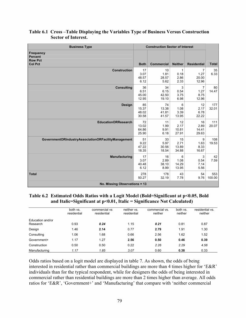
79
Table 6.1 Cross –Table Displaying the Variables Type of Business Versus Construction Sector of Interest.
Business Type Construction Sector of Interest
Frequency Percent Row Pct Col Pct Both Commercial Neither Residential Total
Construction 173.07
48.576.12
101.81
28.575.62
1 0.18 2.86 2.33
71.27
20.0012.96
356.33
Consulting 366.51
45.0012.95
346.15
42.5019.10
3 0.54 3.75 6.98
71.278.75
12.96
8014.47
Design 8515.3748.0230.58
7413.3841.8141.57
6 1.08 3.39
13.95
122.176.78
22.22
17732.01
EducationORResearch 7213.0264.8625.90
111.999.916.18
12 2.17
10.81 27.91
162.89
14.4129.63
11120.07
GovernmentORIndustryAssociationORFacilityManagement 519.22
47.2218.35
335.97
30.5618.54
15 2.71
13.89 34.88
91.638.33
16.67
10819.53
Manufacturing 173.07
40.486.12
162.89
38.108.99
6 1.08
14.29 13.95
30.547.145.56
427.59
Total 27850.27
17832.19
43 7.78
549.76
553100.00
No. Missing Observations = 13
Table 6.2 Estimated Odds Ratios with a Logit Model (Bold=Significant at p<0.05, Bold
and Italic=Significant at p<0.01, Italic = Significance Not Calculated)
both vs.
residential commercial vs
residential neither vs. residential
commercial vs. neither
both vs. neither
residential vs. neither
Education and/or Research 0.93 0.24 1.15 0.21 0.81 0.87 Design 1.46 2.14 0.77 2.79 1.91 1.30 Consulting 1.06 1.68 0.66 2.56 1.62 1.52 Government+ 1.17 1.27 2.56 0.50 0.46 0.39 Construction 0.50 0.50 0.22 2.26 2.29 4.56 Manufacturing 1.17 1.85 3.07 0.60 0.38 0.33 Odds ratios based on a logit model are displayed in table 7. As shown, the odds of being interested in residential rather than commercial buildings are more than 4 times higher for ‘E&R’ individuals than for the typical respondent, while for designers the odds of being interested in commercial rather than residential buildings are more than 2 times higher than average. All odds ratios for ‘E&R’, ‘Government+’ and ‘Manufacturing’ that compare with ‘neither commercial
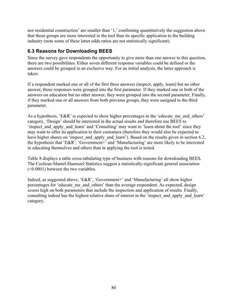
80
nor residential construction’ are smaller than ‘1,’ confirming quantitatively the suggestion above that those groups are more interested in the tool than its specific application to the building industry (note some of these latter odds ratios are not statistically significant).
6.3 Reasons for Downloading BEES Since the survey gave respondents the opportunity to give more than one answer to this question, there are two possibilities. Either seven different response variables could be defined or the answers could be grouped in an exclusive way. For an initial analysis, the latter approach is taken. If a respondent marked one or all of the first three answers (inspect, apply, learn) but no other answer, those responses were grouped into the first parameter. If they marked one or both of the answers on education but no other answer, they were grouped into the second parameter. Finally, if they marked one or all answers from both previous groups, they were assigned to the third parameter. As a hypothesis, ‘E&R’ is expected to show higher percentages in the ‘educate_me_and_others’ category, ‘Design’ should be interested in the actual results and therefore use BEES to ‘inspect_and_apply_and_learn’ and ‘Consulting’ may want to ‘learn about the tool’ since they may want to offer its application to their customers (therefore they would also be expected to have higher shares on ‘inspect_and_apply_and_learn’). Based on the results given in section 6.2, the hypothesis that ‘E&R’, ‘Government+’ and ‘Manufacturing’ are more likely to be interested in educating themselves and others than in applying the tool is tested. Table 8 displays a table cross-tabulating type of business with reasons for downloading BEES. The Cochran-Mantel-Haenszel Statistics suggest a statistically-significant general association (<0.0001) between the two variables. Indeed, as suggested above, ‘E&R’, ‘Government+’ and ‘Manufacturing’ all show higher percentages for ‘educate_me_and_others’ than the average respondent. As expected, design scores high on both parameters that include the inspection and application of results. Finally, consulting indeed has the highest relative share of interest in the ‘inspect_and_apply_and_learn’ category.
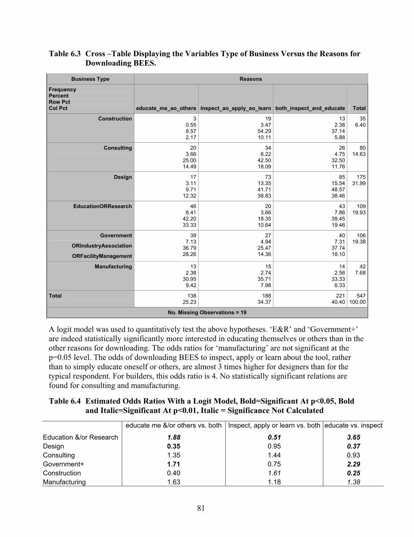
81
Table 6.3 Cross –Table Displaying the Variables Type of Business Versus the Reasons for Downloading BEES.
Business Type Reasons
Frequency Percent Row Pct Col Pct educate_me_ao_others Inspect_ao_apply_ao_learn both_inspect_and_educate Total
Construction 30.558.572.17
193.47
54.2910.11
132.38
37.145.88
356.40
Consulting 203.66
25.0014.49
346.22
42.5018.09
264.75
32.5011.76
8014.63
Design 173.119.71
12.32
7313.3541.7138.83
8515.5448.5738.46
17531.99
EducationORResearch 468.41
42.2033.33
203.66
18.3510.64
437.86
39.4519.46
10919.93
Government
ORIndustryAssociation
ORFacilityManagement
397.13
36.7928.26
274.94
25.4714.36
407.31
37.7418.10
10619.38
Manufacturing 132.38
30.959.42
152.74
35.717.98
142.56
33.336.33
427.68
Total 13825.23
18834.37
22140.40
547100.00
No. Missing Observations = 19 A logit model was used to quantitatively test the above hypotheses. ‘E&R’ and ‘Government+’ are indeed statistically significantly more interested in educating themselves or others than in the other reasons for downloading. The odds ratios for ‘manufacturing’ are not significant at the p=0.05 level. The odds of downloading BEES to inspect, apply or learn about the tool, rather than to simply educate oneself or others, are almost 3 times higher for designers than for the typical respondent. For builders, this odds ratio is 4. No statistically significant relations are found for consulting and manufacturing. Table 6.4 Estimated Odds Ratios With a Logit Model, Bold=Significant At p<0.05, Bold
and Italic=Significant At p<0.01, Italic = Significance Not Calculated
educate me &/or others vs. both Inspect, apply or learn vs. both educate vs. inspect
Education &/or Research 1.88 0.51 3.65 Design 0.35 0.95 0.37 Consulting 1.35 1.44 0.93 Government+ 1.71 0.75 2.29 Construction 0.40 1.61 0.25 Manufacturing 1.63 1.18 1.38
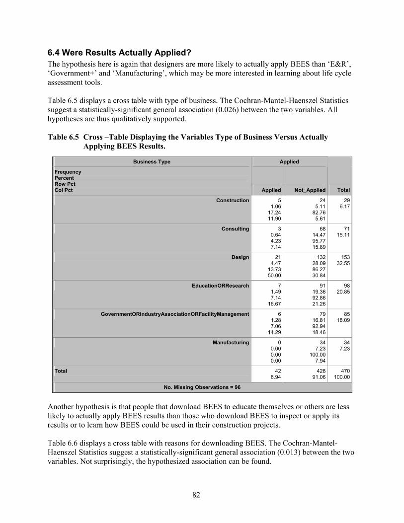
82
6.4 Were Results Actually Applied? The hypothesis here is again that designers are more likely to actually apply BEES than ‘E&R’, ‘Government+’ and ‘Manufacturing’, which may be more interested in learning about life cycle assessment tools. Table 6.5 displays a cross table with type of business. The Cochran-Mantel-Haenszel Statistics suggest a statistically-significant general association (0.026) between the two variables. All hypotheses are thus qualitatively supported. Table 6.5 Cross –Table Displaying the Variables Type of Business Versus Actually
Applying BEES Results.
Business Type Applied
Frequency Percent Row Pct Col Pct Applied Not_Applied Total
Construction 51.06
17.2411.90
245.11
82.765.61
296.17
Consulting 30.644.237.14
6814.4795.7715.89
7115.11
Design 214.47
13.7350.00
13228.0986.2730.84
15332.55
EducationORResearch 71.497.14
16.67
9119.3692.8621.26
9820.85
GovernmentORIndustryAssociationORFacilityManagement 61.287.06
14.29
7916.8192.9418.46
8518.09
Manufacturing 00.000.000.00
347.23
100.007.94
347.23
Total 428.94
42891.06
470100.00
No. Missing Observations = 96
Another hypothesis is that people that download BEES to educate themselves or others are less likely to actually apply BEES results than those who download BEES to inspect or apply its results or to learn how BEES could be used in their construction projects. Table 6.6 displays a cross table with reasons for downloading BEES. The Cochran-Mantel-Haenszel Statistics suggest a statistically-significant general association (0.013) between the two variables. Not surprisingly, the hypothesized association can be found.

83
Table 6.6 Cross –Table Displaying the Variables Reasons for Downloading BEES Versus Actually Applying BEES Results.
Reasons Applied
Frequency Percent Row Pct Col Pct Applied Not_Applied Total
Inspect_ao_apply_ao_learn 204.32
12.7447.62
13729.5987.2632.54
157 33.91
both_inspect_and_educate 194.10
10.0545.24
17036.7289.9540.38
189 40.82
educate_me_ao_others 30.652.567.14
11424.6297.4427.08
117 25.27
Total 429.07
42190.93
463 100.00
No. Missing Observations = 103 In a logistic regression analysis using LOGISTIC from SAS Stat, a forward regression was used to build a model that would explain the “yes” answer of the dependent variable ‘applied’ by the following variables: reasons (#3), estimated_hours (#5), end_result_type (#11), transparaency (#9), single_score (#12), overall_score (#25), overall_score_and_or_BEES_approach (#25). Up to 4 interaction terms15 were included in the model and α=0.1 was specified as a criterion to retain a variable. As expected, only ‘reasons’ qualified to be retained in the model, and gives the estimates provided in tables 12 and 13. Thus, if a respondent stated that s/he downloaded BEES to inspect or apply the results, s/he was also 5.6 [1.6-19.8] times more likely to apply BEES to a specific case study as a respondent who marked education as a reason for downloading. Table 6.7 Logistic Regression Model for ‘Applied’, Retaining Variables that Are
Significant at the α = 0.1 Level
Analysis of Maximum Likelihood Estimates
Parameter DF EstimateStandard
ErrorWald
Chi-Square Pr > ChiSq
Intercept 1 -2.1404 0.2331 84.2953 <.0001
Reasons Inspect_ao_apply 1 0.7403 0.2783 7.0780 0.0078
Reasons both_inspect_and 1 0.2402 0.2798 0.7367 0.3907
15 Interaction terms refer to the possibility to create additional independent variables by combining independent variables. Here, the software was checking all combinations with two, three and four combined independent variables in addition to the stated independent variables.

84
Table 6.8 Odds Ratios for the Logit Model for ‘Applied’, Retaining Variables That Are Significant at the α = 0.1 Level
Odds Ratio Estimates
Effect Point
Estimate95% Wald
Confidence Limits
Reasons Inspect_ao_apply vs educate_me_ao_ot 5.589 1.576 19.824
Reasons both_inspect_and vs educate_me_ao_ot 3.389 0.952 12.069
A logit model that included the type of business did not produce meaningful results because ‘business type’ and ‘reasons’ are too highly correlated to allow for independent estimates. The model presented in tables 12 and 13 relied on only 285 observations because the inclusion of many variables reduces the number of complete records. Re-estimating the model including ‘reasons’ as the only explanatory variable raises the number of observations to 463, and results in the odds ratios given in Table 14. Now, those who downloaded to inspect, apply, or/and learn about the tool, and those who marked in addition that they wanted to educate themselves or others, are significant predictors for applying BEES to an actual project, with high odds ratios of 5.5 and 4.2, respectively. Table 6.9 Re-Estimated Logit Model Including Only Reasons for Downloading as
Explanatory Variable. (n=463)
Wald Confidence Interval for Adjusted Odds Ratios
Effect Unit Estimate 95% Confidence Limits
Reasons Inspect_ao_apply vs educate_me_ao_ot 1.0000 5.547 1.607 19.144
Reasons both_inspect_and vs educate_me_ao_ot 1.0000 4.247 1.228 14.684
6.5 Time Invested in BEES It is not only interesting to know how much time people spend in using/learning about BEES, but also how this is associated with type of business, chances to apply the results, and being interested in a more detailed and transparent software tool. Someone who applied BEES is likely to have spent more time studying and using it than somebody who did not. Further, ‘E&R’ individuals likely spend more time than those in design, construction or manufacturing where simple result inspection may be more important. Further, someone who asks for the highest level of transparency must be willing to spend extra time to make use of this transparency, and must have dived into BEES deeply enough to ask for more transparency. Tables 6.10 through 6.12 display the cross tables that shed light on these suggested associations. As Table 6.10 shows, designers indeed spent less time with BEES than those in ‘E&R’. Associations between business type and hours spent are significant at the p<0.0002 level, using estimated hours as an ordinal variable. Table 6.11 confirms that people that spend more than 1 hour with BEES are more likely to apply its results to an actual project. Of course, the causality
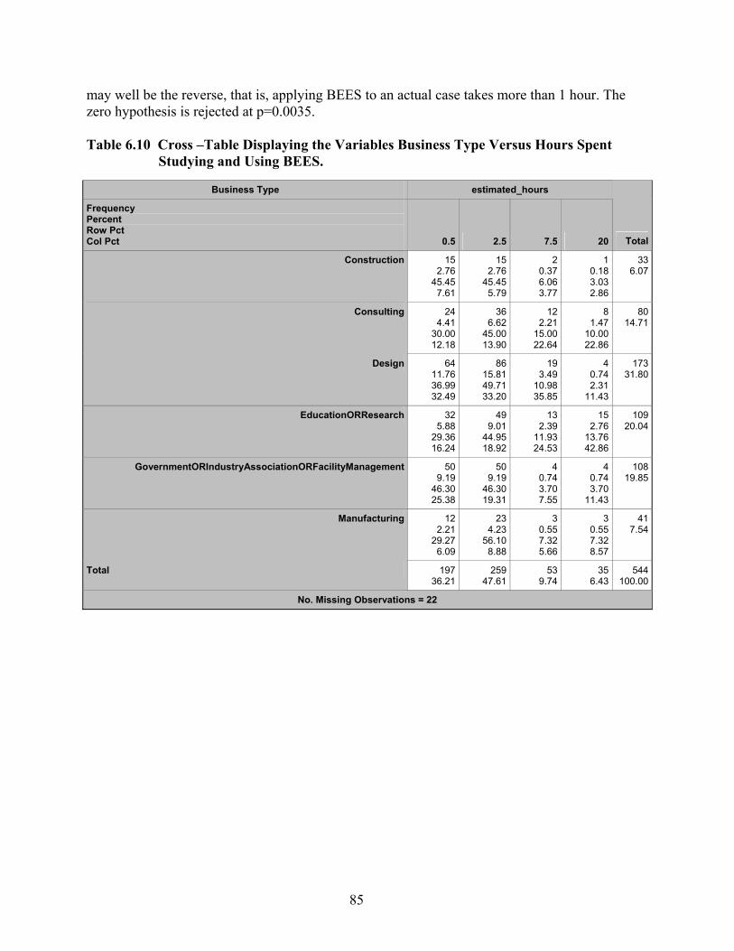
85
may well be the reverse, that is, applying BEES to an actual case takes more than 1 hour. The zero hypothesis is rejected at p=0.0035. Table 6.10 Cross –Table Displaying the Variables Business Type Versus Hours Spent
Studying and Using BEES.
Business Type estimated_hours
Frequency Percent Row Pct Col Pct 0.5 2.5 7.5 20 Total
Construction 152.76
45.457.61
152.76
45.455.79
2 0.37 6.06 3.77
10.183.032.86
336.07
Consulting 244.41
30.0012.18
366.62
45.0013.90
12 2.21
15.00 22.64
81.47
10.0022.86
8014.71
Design 6411.7636.9932.49
8615.8149.7133.20
19 3.49
10.98 35.85
40.742.31
11.43
17331.80
EducationORResearch 325.88
29.3616.24
499.01
44.9518.92
13 2.39
11.93 24.53
152.76
13.7642.86
10920.04
GovernmentORIndustryAssociationORFacilityManagement 509.19
46.3025.38
509.19
46.3019.31
4 0.74 3.70 7.55
40.743.70
11.43
10819.85
Manufacturing 122.21
29.276.09
234.23
56.108.88
3 0.55 7.32 5.66
30.557.328.57
417.54
Total 19736.21
25947.61
53 9.74
356.43
544100.00
No. Missing Observations = 22
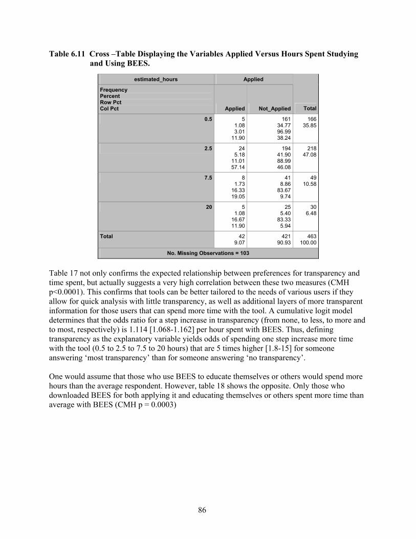
86
Table 6.11 Cross –Table Displaying the Variables Applied Versus Hours Spent Studying and Using BEES.
estimated_hours Applied
Frequency Percent Row Pct Col Pct Applied Not_Applied Total
0.5 51.083.01
11.90
16134.7796.9938.24
166 35.85
2.5 245.18
11.0157.14
19441.9088.9946.08
218 47.08
7.5 81.73
16.3319.05
418.86
83.679.74
49 10.58
20 51.08
16.6711.90
255.40
83.335.94
30 6.48
Total 429.07
42190.93
463 100.00
No. Missing Observations = 103
Table 17 not only confirms the expected relationship between preferences for transparency and time spent, but actually suggests a very high correlation between these two measures (CMH p<0.0001). This confirms that tools can be better tailored to the needs of various users if they allow for quick analysis with little transparency, as well as additional layers of more transparent information for those users that can spend more time with the tool. A cumulative logit model determines that the odds ratio for a step increase in transparency (from none, to less, to more and to most, respectively) is 1.114 [1.068-1.162] per hour spent with BEES. Thus, defining transparency as the explanatory variable yields odds of spending one step increase more time with the tool (0.5 to 2.5 to 7.5 to 20 hours) that are 5 times higher [1.8-15] for someone answering ‘most transparency’ than for someone answering ‘no transparency’. One would assume that those who use BEES to educate themselves or others would spend more hours than the average respondent. However, table 18 shows the opposite. Only those who downloaded BEES for both applying it and educating themselves or others spent more time than average with BEES (CMH p = 0.0003)

87
Table 6.12 Cross –Table Displaying the Variables Degree of Transparency Versus Hours Spent Studying and Using BEES.
transparency estimated_hours
Frequency Percent Row Pct Col Pct 0.5 2.5 7.5 20 Total
None 91.72
60.004.89
61.15
40.002.37
00.000.000.00
0 0.00 0.00 0.00
15 2.86
Less 356.68
44.3019.02
407.63
50.6315.81
30.573.805.66
1 0.19 1.27 2.94
79 15.08
More 8315.8438.9745.11
10419.8548.8341.11
183.448.45
33.96
8 1.53 3.76
23.53
213 40.65
Most 5710.8826.2730.98
10319.6647.4740.71
326.11
14.7560.38
25 4.77
11.52 73.53
217 41.41
Total 18435.11
25348.28
5310.11
34 6.49
524 100.00
No. Missing Observations = 42
Table 6.13 Cross –Table Displaying the Variables Reasons for Downloading BEES Versus
Hours Spent Studying and Using BEES.
Reasons estimated_hours
Frequency Percent Row Pct Col Pct 0.5 2.5 7.5 20 Total
Inspect_ao_apply_ao_learn 6712.4836.2234.72
8716.2047.0333.85
183.359.73
34.62
13 2.42 7.03
37.14
185 34.45
both_inspect_and_educate 5610.4325.9329.02
11621.6053.7045.14
275.03
12.5051.92
17 3.17 7.87
48.57
216 40.22
educate_me_ao_others 7013.0451.4736.27
5410.0639.7121.01
71.305.15
13.46
5 0.93 3.68
14.29
136 25.33
Total 19335.94
25747.86
529.68
35 6.52
537 100.00
No. Missing Observations = 29
88
6.6 Building Elements No further analysis was performed for these questions. If NIST runs into a prioritization problem or at some point wants to target the tool to one or a few business types, one could run an analysis later.
6.7 Specific/generic Products No statistically significant association was found between type of product and business type and applied (question #4) respectively. Since most respondents (72 %) prefer both generic and specific information, this result is not surprising.
6.8 Level of Analysis This question had a “check all that apply” format. Instead of treating the answers as three separate variables, we transformed the responses into 7 exclusive response categories within the same variable ‘level_of_analysis’. The hypothesis is that manufacturers are interested in an ‘element’ level, while others are interested in ‘all levels’. Table 6.14 confirms this, and the two variables are statistically significantly associated (CMH p<0.0001).

89
Table 6.14 Cross –Table Displaying the Variables Business Type Versus Level of Application.
Business Type level_of_analysis
Frequency Percent Row Pct Col Pct all_evels assembly
Assemply
ANDwhole element
Element
ANDassembly elementANDwhole whole Total Construction 7
1.36 21.88
5.83
61.16
18.756.38
20.396.257.41
71.36
21.888.43
10.193.133.70
0 0.00 0.00 0.00
91.74
28.135.77
326.20
Consulting 11 2.13
15.07 9.17
163.10
21.9217.02
81.55
10.9629.63
71.369.598.43
61.168.22
22.22
2 0.39 2.74
22.22
234.46
31.5114.74
7314.15
Design 53 10.27 30.46 44.17
428.14
24.1444.68
112.136.32
40.74
295.62
16.6734.94
122.336.90
44.44
1 0.19 0.57
11.11
265.04
14.9416.67
17433.72
EducationORResearch 25 4.84
24.04 20.83
112.13
10.5811.70
40.783.85
14.81
132.52
12.5015.66
20.391.927.41
5 0.97 4.81
55.56
448.53
42.3128.21
10420.16
Government
ORIndustryAssociation
ORFacilityManagement
17 3.29
17.71 14.17
112.13
11.4611.70
20.392.087.41
152.91
15.6318.07
61.166.25
22.22
1 0.19 1.04
11.11
448.53
45.8328.21
9618.60
Manufacturing 7 1.36
18.92 5.83
81.55
21.628.51
00.000.000.00
122.33
32.4314.46
00.000.000.00
0 0.00 0.00 0.00
101.94
27.036.41
377.17
Total 120 23.26
9418.22
275.23
8316.09
275.23
9 1.74
15630.23
516100.00
No. Missing Observations = 50
6.9 Transparency The high correlation between hours spent with BEES and the desire for more transparency was already discussed in section 6.5. Here the following hypotheses are tested: (1)‘E&R’ want more transparency while designers and builders less; (2) people that downloaded BEES for educational purposes want more transparency; (3) people that applied the tool were comfortable with the offered transparency and are more likely to prefer less or more than most transparency; (4) people that prefer no or less transparency want tools that are easier to use, and (5) people that like single scores ask for less transparency than people that do not. Table 6.15 confirms that ‘E&R’ want most transparency, while builders prefer less transparency. However, designers want more, not less, transparency (CMH p<0.0001). No statistically-significant association between reasons for downloading BEES and transparency was found. However, this might be an artifact of the grouping of parameters.

90
No significant association was found between transparency and actually applying BEES to a project. However, the cross tables reveal that those who applied BEES want more or most transparency relatively more often. This rejects the hypothesis (3) above. Table 6.16 confirms that people that want tools that are harder to use want the most transparency, and vice versa (CMH p<0.0001). Choosing to aggregate environmental impacts into a single score does not necessarily imply that less transparency is acceptable. The association in Table 6.17 is not statistically significant (CMH p=0.074), and the differences are small. Table 6.15 Cross –Table Displaying the Variables Business Type Versus Transparency.
Business Type transparency
Frequency Percent Row Pct Col Pct None Less More Most Total
Construction 20.386.25
13.33
50.94
15.636.33
14 2.64
43.75 6.45
11 2.08
34.38 5.02
32 6.04
Consulting 00.000.000.00
61.138.007.59
26 4.91
34.67 11.98
43 8.11
57.33 19.63
75 14.15
Design 40.752.29
26.67
305.66
17.1437.97
100 18.87 57.14 46.08
41 7.74
23.43 18.72
175 33.02
EducationORResearch 20.381.90
13.33
142.64
13.3317.72
23 4.34
21.90 10.60
66 12.45 62.86 30.14
105 19.81
GovernmentORIndustryAssociationORFacilityManagement 40.753.92
26.67
213.96
20.5926.58
41 7.74
40.20 18.89
36 6.79
35.29 16.44
102 19.25
Manufacturing 30.577.32
20.00
30.577.323.80
13 2.45
31.71 5.99
22 4.15
53.66 10.05
41 7.74
Total 152.83
7914.91
217 40.94
219 41.32
530 100.00
No. Missing Observations = 36

91
Table 6.16 Cross –Table Displaying the Variables User-Friendliness Versus Transparency.
transparency User_friendliness
Frequency Percent Row Pct Col Pct Easier Harder Total
None 132.53
86.675.10
2 0.39
13.33 0.78
15 2.92
Less 6312.2880.7724.71
15 2.92
19.23 5.81
78 15.20
More 11221.8353.0843.92
99 19.30 46.92 38.37
211 41.13
Most 6713.0632.0626.27
142 27.68 67.94 55.04
209 40.74
Total 25549.71
258 50.29
513 100.00
No. Missing Observations = 53
Table 6.17 Cross –Table Displaying the Variables Single Score Versus Transparency.
transparency Single_score
Frequency Percent Row Pct Col Pct no yes Total
None 122.60
80.003.76
30.65
20.002.10
15 3.25
Less 367.79
57.1411.29
275.84
42.8618.88
63 13.64
More 13429.0073.6342.01
4810.3926.3733.57
182 39.39
Most 13729.6567.8242.95
6514.0732.1845.45
202 43.72
Total 31969.05
14330.95
462 100.00
No. Missing Observations = 104
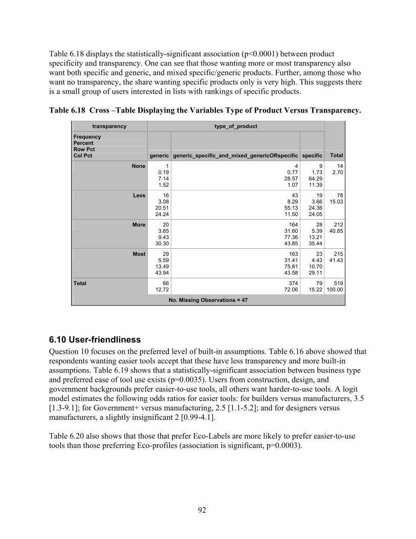
92
Table 6.18 displays the statistically-significant association (p<0.0001) between product specificity and transparency. One can see that those wanting more or most transparency also want both specific and generic, and mixed specific/generic products. Further, among those who want no transparency, the share wanting specific products only is very high. This suggests there is a small group of users interested in lists with rankings of specific products. Table 6.18 Cross –Table Displaying the Variables Type of Product Versus Transparency.
transparency type_of_product
Frequency Percent Row Pct Col Pct generic generic_specific_and_mixed_genericORspecific specific Total
None 10.197.141.52
4 0.77
28.57 1.07
9 1.73
64.29 11.39
142.70
Less 163.08
20.5124.24
43 8.29
55.13 11.50
19 3.66
24.36 24.05
7815.03
More 203.859.43
30.30
164 31.60 77.36 43.85
28 5.39
13.21 35.44
21240.85
Most 295.59
13.4943.94
163 31.41 75.81 43.58
23 4.43
10.70 29.11
21541.43
Total 6612.72
374 72.06
79 15.22
519100.00
No. Missing Observations = 47
6.10 User-friendliness Question 10 focuses on the preferred level of built-in assumptions. Table 6.16 above showed that respondents wanting easier tools accept that these have less transparency and more built-in assumptions. Table 6.19 shows that a statistically-significant association between business type and preferred ease of tool use exists (p=0.0035). Users from construction, design, and government backgrounds prefer easier-to-use tools, all others want harder-to-use tools. A logit model estimates the following odds ratios for easier tools: for builders versus manufacturers, 3.5 [1.3-9.1]; for Government+ versus manufacturing, 2.5 [1.1-5.2]; and for designers versus manufacturers, a slightly insignificant 2 [0.99-4.1]. Table 6.20 also shows that those that prefer Eco-Labels are more likely to prefer easier-to-use tools than those preferring Eco-profiles (association is significant, p=0.0003).

93
Table 6.19 Cross –Table Displaying the Variables BusinessType Versus Easiness to Use the Tool.
Business Type User_friendliness
Frequency Percent Row Pct Col Pct Easier Harder Total
Construction 234.43
67.658.78
11 2.12
32.35 4.28
346.55
Consulting 285.39
37.8410.69
46 8.86
62.16 17.90
7414.26
Design 9317.9254.7135.50
77 14.84 45.29 29.96
17032.76
EducationORResearch 479.06
43.9317.94
60 11.56 56.07 23.35
10720.62
GovernmentORIndustryAssociationORFacilityManagement 5610.7959.5721.37
38 7.32
40.43 14.79
9418.11
Manufacturing 152.89
37.505.73
25 4.82
62.50 9.73
407.71
Total 26250.48
257 49.52
519100.00
No. Missing Observations = 47
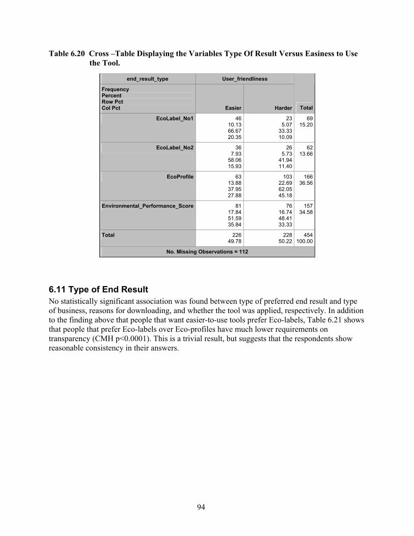
94
Table 6.20 Cross –Table Displaying the Variables Type Of Result Versus Easiness to Use the Tool.
end_result_type User_friendliness
Frequency Percent Row Pct Col Pct Easier Harder Total
EcoLabel_No1 4610.1366.6720.35
23 5.07
33.33 10.09
69 15.20
EcoLabel_No2 367.93
58.0615.93
26 5.73
41.94 11.40
62 13.66
EcoProfile 6313.8837.9527.88
103 22.69 62.05 45.18
166 36.56
Environmental_Performance_Score 8117.8451.5935.84
76 16.74 48.41 33.33
157 34.58
Total 22649.78
228 50.22
454 100.00
No. Missing Observations = 112
6.11 Type of End Result No statistically significant association was found between type of preferred end result and type of business, reasons for downloading, and whether the tool was applied, respectively. In addition to the finding above that people that want easier-to-use tools prefer Eco-labels, Table 6.21 shows that people that prefer Eco-labels over Eco-profiles have much lower requirements on transparency (CMH p<0.0001). This is a trivial result, but suggests that the respondents show reasonable consistency in their answers.
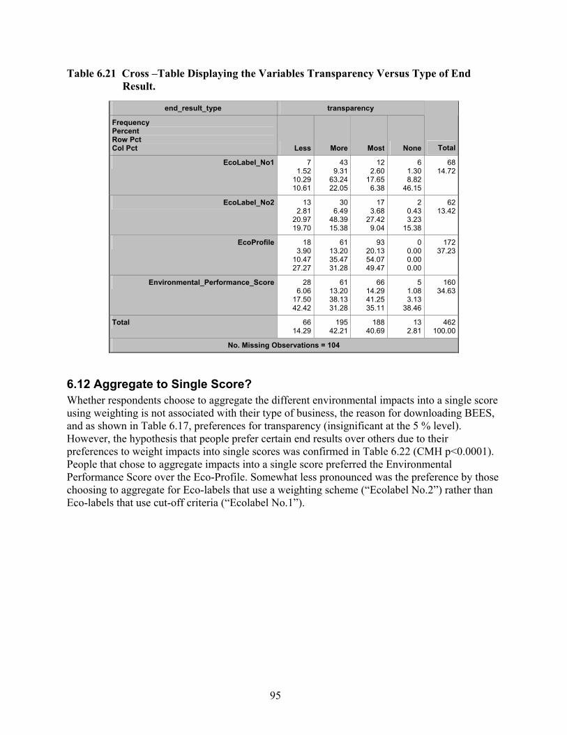
95
Table 6.21 Cross –Table Displaying the Variables Transparency Versus Type of End Result.
end_result_type transparency
Frequency Percent Row Pct Col Pct Less More Most None Total
EcoLabel_No1 71.52
10.2910.61
439.31
63.2422.05
122.60
17.656.38
6 1.30 8.82
46.15
68 14.72
EcoLabel_No2 132.81
20.9719.70
306.49
48.3915.38
173.68
27.429.04
2 0.43 3.23
15.38
62 13.42
EcoProfile 183.90
10.4727.27
6113.2035.4731.28
9320.1354.0749.47
0 0.00 0.00 0.00
172 37.23
Environmental_Performance_Score 286.06
17.5042.42
6113.2038.1331.28
6614.2941.2535.11
5 1.08 3.13
38.46
160 34.63
Total 6614.29
19542.21
18840.69
13 2.81
462 100.00
No. Missing Observations = 104
6.12 Aggregate to Single Score? Whether respondents choose to aggregate the different environmental impacts into a single score using weighting is not associated with their type of business, the reason for downloading BEES, and as shown in Table 6.17, preferences for transparency (insignificant at the 5 % level). However, the hypothesis that people prefer certain end results over others due to their preferences to weight impacts into single scores was confirmed in Table 6.22 (CMH p<0.0001). People that chose to aggregate impacts into a single score preferred the Environmental Performance Score over the Eco-Profile. Somewhat less pronounced was the preference by those choosing to aggregate for Eco-labels that use a weighting scheme (“Ecolabel No.2”) rather than Eco-labels that use cut-off criteria (“Ecolabel No.1”).

96
Table 6.22 Cross –Table Displaying the Variables Aggregation to Single Score Versus Type of End Result.
end_result_type Single_score
Frequency Percent Row Pct Col Pct no yes Total
EcoLabel_No1 4811.4377.4216.49
14 3.33
22.58 10.85
62 14.76
EcoLabel_No2 399.29
63.9313.40
22 5.24
36.07 17.05
61 14.52
EcoProfile 12930.7182.6944.33
27 6.43
17.31 20.93
156 37.14
Environmental_Performance_Score 7517.8653.1925.77
66 15.71 46.81 51.16
141 33.57
Total 29169.29
129 30.71
420 100.00
No. Missing Observations = 146
A logistic model was built using 12 variables and their interaction terms at level 2 (i.e., in addition to the 12 variables all combinations of two variables were included). The model retained as legitimate predictors ‘overall score and/or like BEES’(#25), ‘comprehensive’(#23b), and their interaction. The odds ratios are 0.18, 0.19, and 4.1 respectively (n=115 for the model including all 12 variables). Re-estimating the model by including only those two variables allowing for an interaction term increases the number of included observations (n=296) and reveals that ‘overall score and/or like BEES’ is the only statistically-significant predictor with an odds ratio of 3.3 [1.9-6.0]. That is, someone wanting to combine economic and environmental information in one score and/or likes the way BEES makes this combination is 3.3 times more likely to aggregate environmental impacts in one score by weighting than someone not wanting to combine environmental and economic information.
6.13 Reasons for Not Aggregating The variable ‘reasons for aggregating’ has been found to not be associated with type of business, aggregation to single score, and user friendliness. This is especially true for the share of respondents thinking others need to assign the weights; this share is roughly the same for all types of businesses (58 %). As expected, there is a statistically-significant association (p=0.0005) between transparency and reasons for not aggregating. People that ask for no or less transparency are more likely to find ‘no need for aggregation because all category indicators were lower for the most preferred alternative’. If such respondents would have compared products for which trade-offs between
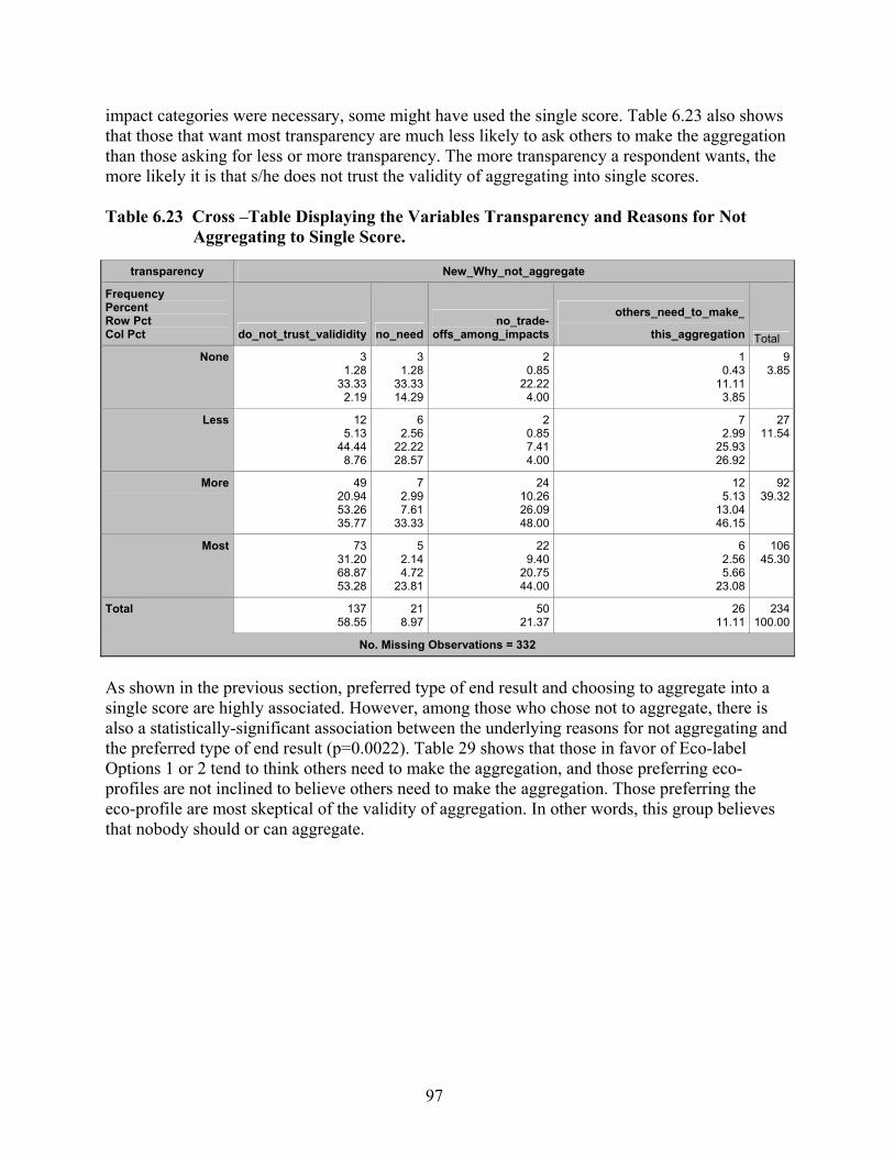
97
impact categories were necessary, some might have used the single score. Table 6.23 also shows that those that want most transparency are much less likely to ask others to make the aggregation than those asking for less or more transparency. The more transparency a respondent wants, the more likely it is that s/he does not trust the validity of aggregating into single scores. Table 6.23 Cross –Table Displaying the Variables Transparency and Reasons for Not
Aggregating to Single Score.
transparency New_Why_not_aggregate
Frequency Percent Row Pct Col Pct do_not_trust_valididity no_need
no_trade-offs_among_impacts
others_need_to_make_
this_aggregation Total None 3
1.2833.33
2.19
31.28
33.3314.29
20.85
22.224.00
10.43
11.113.85
93.85
Less 125.13
44.448.76
62.56
22.2228.57
20.857.414.00
72.99
25.9326.92
2711.54
More 4920.9453.2635.77
72.997.61
33.33
2410.2626.0948.00
125.13
13.0446.15
9239.32
Most 7331.2068.8753.28
52.144.72
23.81
229.40
20.7544.00
62.565.66
23.08
10645.30
Total 13758.55
218.97
5021.37
2611.11
234100.00
No. Missing Observations = 332
As shown in the previous section, preferred type of end result and choosing to aggregate into a single score are highly associated. However, among those who chose not to aggregate, there is also a statistically-significant association between the underlying reasons for not aggregating and the preferred type of end result (p=0.0022). Table 29 shows that those in favor of Eco-label Options 1 or 2 tend to think others need to make the aggregation, and those preferring eco-profiles are not inclined to believe others need to make the aggregation. Those preferring the eco-profile are most skeptical of the validity of aggregation. In other words, this group believes that nobody should or can aggregate.

98
Table 6.24 Cross –Table Displaying the Variables Type of End Result and Reasons for Not Aggregating to Single Score.
end_result_type New_Why_not_aggregate
Frequency Percent Row Pct Col Pct do_not_trust_valididity no_need
no_trade-offs_among_impacts
others_need_to_make_
this_aggregation Total EcoLabel_No1 12
5.5640.0010.08
41.85
13.3319.05
62.78
20.0012.24
83.70
26.6729.63
3013.89
EcoLabel_No2 104.63
35.718.40
41.85
14.2919.05
73.24
25.0014.29
73.24
25.0025.93
2812.96
EcoProfile 7233.3367.9260.50
52.314.72
23.81
2411.1122.6448.98
52.314.72
18.52
10649.07
Environmental_Performance
_Score
2511.5748.0821.01
83.70
15.3838.10
125.56
23.0824.49
73.24
13.4625.93
5224.07
Total 11955.09
219.72
4922.69
2712.50
216100.00
No. Missing Observations = 350
The associations between the variables in Table 6.25 are not statistically significant (p=0.1). The table reveals, however, that only eight respondents failed to be consistent by saying they aggregated and yet giving reasons for not aggregating. Three of these eight respondents think that others should make this aggregation.

99
Table 6.25 Cross –Table Displaying the Variables Aggregating to Single Score and Reasons for Not Aggregating to Single Score.
New_Why_not_aggregate Single_score
Frequency Percent Row Pct Col Pct no yes Total
do_not_trust_valididity 13256.9097.7858.93
3 1.29 2.22
37.50
13558.19
no_need 198.19
95.008.48
1 0.43 5.00
12.50
208.62
no_trade-offs_among_impacts 5021.5598.0422.32
1 0.43 1.96
12.50
5121.98
others_need_to_make_this_aggregation 239.91
88.4610.27
3 1.29
11.54 37.50
2611.21
Total 22496.55
8 3.45
232100.00
No. Missing Observations = 334 Among those choosing to combine environmental and economic performance scores, but also giving reasons for not doing so (a surprising number of 114 respondents), a relatively high share thought that actually others need to make this aggregation. However, not trusting the validity of such an aggregation was by far the likeliest response from both those that did and those that did not aggregate (Table 6.26). Table 6.26 Cross –Table Displaying the Variables Not Combining Economic and
Environmental Scores and Reasons for Not Aggregating Environmental Impacts to Single Score (p=0.05).
Not_combine New_Why_not_aggregate
Frequency Percent Row Pct Col Pct do_not_trust_valididity no_need no_trade-offs_among_impacts
others_need_to_make_
this_aggregation Total 0 64
33.16 56.14 54.70
73.636.14
63.64
2613.4722.8157.78
17 8.81
14.91 85.00
11459.07
1 53 27.46 67.09 45.30
42.075.06
36.36
199.84
24.0542.22
3 1.55 3.80
15.00
7940.93
Total 117 60.62
115.70
4523.32
20 10.36
193100.00
No. Missing Observations = 373
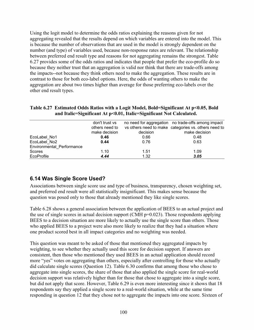
100
Using the logit model to determine the odds ratios explaining the reasons given for not aggregating revealed that the results depend on which variables are entered into the model. This is because the number of observations that are used in the model is strongly dependent on the number (and type) of variables used, because non-response rates are relevant. The relationship between preferred end result type and reasons for not aggregating remains the strongest. Table 6.27 provides some of the odds ratios and indicates that people that prefer the eco-profile do so because they neither trust that an aggregation is valid nor think that there are trade-offs among the impacts--not because they think others need to make the aggregation. These results are in contrast to those for both eco-label options. Here, the odds of wanting others to make the aggregation are about two times higher than average for those preferring eco-labels over the other end result types. Table 6.27 Estimated Odds Ratios with a Logit Model, Bold=Significant At p<0.05, Bold
and Italic=Significant At p<0.01, Italic=Significant Not Calculated.
don't trust vs others need to make decision
no need for aggregation vs others need to make
decision
no trade-offs among impact categories vs. others need to
make decision EcoLabel_No1 0.46 0.66 0.48 EcoLabel_No2 0.44 0.76 0.63 Environmental_Performance Scores 1.10 1.51 1.09 EcoProfile 4.44 1.32 3.05
6.14 Was Single Score Used? Associations between single score use and type of business, transparency, chosen weighting set, and preferred end result were all statistically insignificant. This makes sense because the question was posed only to those that already mentioned they like single scores. Table 6.28 shows a general association between the application of BEES to an actual project and the use of single scores in actual decision support (CMH p=0.023). Those respondents applying BEES to a decision situation are more likely to actually use the single score than others. Those who applied BEES to a project were also more likely to realize that they had a situation where one product scored best in all impact categories and no weighting was needed. This question was meant to be asked of those that mentioned they aggregated impacts by weighting, to see whether they actually used this score for decision support. If answers are consistent, then those who mentioned they used BEES in an actual application should record more “yes” votes on aggregating than others, especially after controlling for those who actually did calculate single scores (Question 12). Table 6.30 confirms that among those who chose to aggregate into single scores, the share of those that also applied the single score for real-world decision support was relatively higher than for those that chose to aggregate into a single score, but did not apply that score. However, Table 6.29 is even more interesting since it shows that 18 respondents say they applied a single score to a real-world situation, while at the same time responding in question 12 that they chose not to aggregate the impacts into one score. Sixteen of

101
these 18 respondents also say they did not use BEES for actual decision support. These results raise some doubts about the consistency of the respondents’ answers. Controlling for the question whether they chose to aggregate to a single score had little effect on these findings, i.e., produced a similar level of general association as not controlling (CMH p=0.026). Table 6.28 Cross –Table Displaying the Variables Whether Single Score Was Used in
Decision Support Versus the Variable Whether BEES Was Applied to Support Decisions.
Single_score_used_and_why) Applied
Frequency Percent Row Pct Col Pct Applied Not_Applied Total
No, other reasons 10.499.094.76
104.88
90.915.43
11 5.37
no (without reason) 31.46
15.0014.29
178.29
85.009.24
20 9.76
no, not_used_to_support_decisions 52.444.63
23.81
10350.2495.3755.98
108 52.68
no, there_was_no_need 31.46
33.3314.29
62.93
66.673.26
9 4.39
yes, used for decision support 94.39
15.7942.86
4823.4184.2126.09
57 27.80
Total 2110.24
18489.76
205 100.00
No. Missing Observations = 361
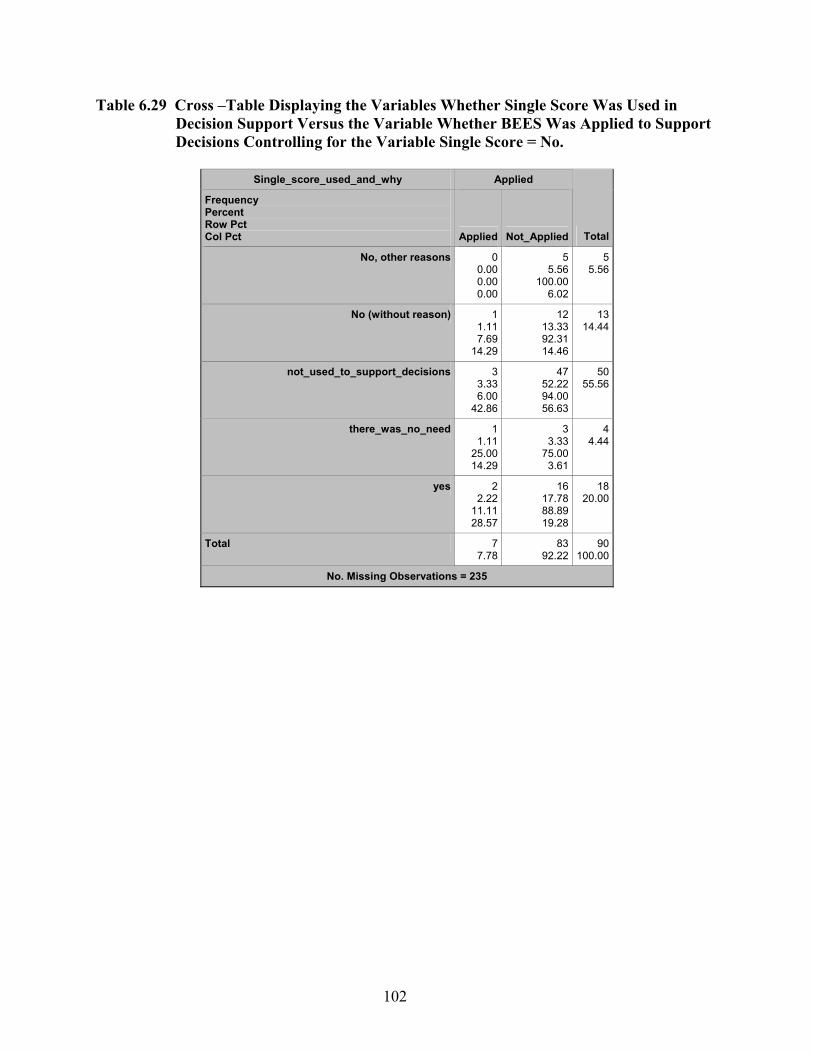
102
Table 6.29 Cross –Table Displaying the Variables Whether Single Score Was Used in Decision Support Versus the Variable Whether BEES Was Applied to Support Decisions Controlling for the Variable Single Score = No.
Single_score_used_and_why Applied
Frequency Percent Row Pct Col Pct Applied Not_Applied Total
No, other reasons 00.000.000.00
55.56
100.006.02
5 5.56
No (without reason) 11.117.69
14.29
1213.3392.3114.46
13 14.44
not_used_to_support_decisions 33.336.00
42.86
4752.2294.0056.63
50 55.56
there_was_no_need 11.11
25.0014.29
33.33
75.003.61
4 4.44
yes 22.22
11.1128.57
1617.7888.8919.28
18 20.00
Total 77.78
8392.22
90 100.00
No. Missing Observations = 235
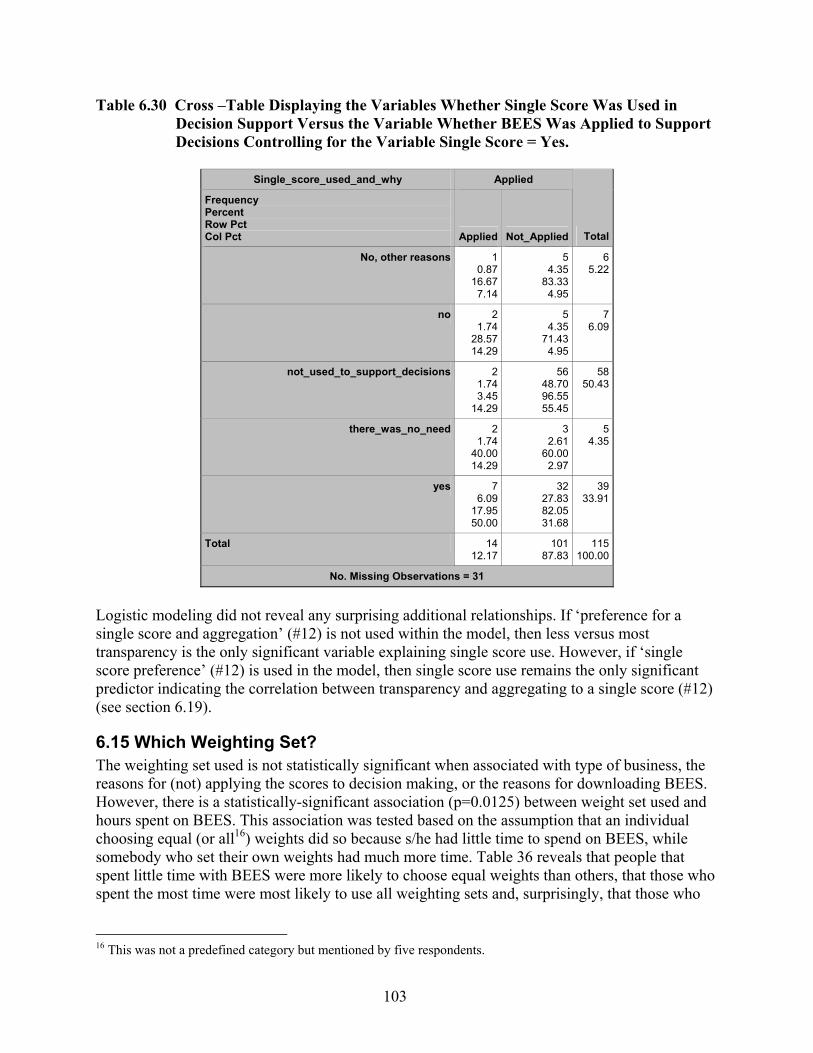
103
Table 6.30 Cross –Table Displaying the Variables Whether Single Score Was Used in Decision Support Versus the Variable Whether BEES Was Applied to Support Decisions Controlling for the Variable Single Score = Yes.
Single_score_used_and_why Applied
Frequency Percent Row Pct Col Pct Applied Not_Applied Total
No, other reasons 10.87
16.677.14
54.35
83.334.95
6 5.22
no 21.74
28.5714.29
54.35
71.434.95
7 6.09
not_used_to_support_decisions 21.743.45
14.29
5648.7096.5555.45
58 50.43
there_was_no_need 21.74
40.0014.29
32.61
60.002.97
5 4.35
yes 76.09
17.9550.00
3227.8382.0531.68
39 33.91
Total 1412.17
10187.83
115 100.00
No. Missing Observations = 31
Logistic modeling did not reveal any surprising additional relationships. If ‘preference for a single score and aggregation’ (#12) is not used within the model, then less versus most transparency is the only significant variable explaining single score use. However, if ‘single score preference’ (#12) is used in the model, then single score use remains the only significant predictor indicating the correlation between transparency and aggregating to a single score (#12) (see section 6.19).
6.15 Which Weighting Set? The weighting set used is not statistically significant when associated with type of business, the reasons for (not) applying the scores to decision making, or the reasons for downloading BEES. However, there is a statistically-significant association (p=0.0125) between weight set used and hours spent on BEES. This association was tested based on the assumption that an individual choosing equal (or all16) weights did so because s/he had little time to spend on BEES, while somebody who set their own weights had much more time. Table 36 reveals that people that spent little time with BEES were more likely to choose equal weights than others, that those who spent the most time were most likely to use all weighting sets and, surprisingly, that those who
16 This was not a predefined category but mentioned by five respondents.

104
set their own weights spent little time with BEES. This latter finding is counter-indicated and needs to be considered when Questions 16 through 21 are assessed. Table 6.31 Cross –Table Displaying the Variables Chosen Weighting Sets Versus Time
Spent Studying and/or Applying BEES.
Used_weighting_set estimated_hours
Frequency Percent Row Pct Col Pct 0.5 2.5 7.5 20 Total
All 10.45
20.002.17
20.90
40.001.64
1 0.45
20.00 2.78
1 0.45
20.00 5.88
52.26
EPA_SAB 83.62
15.0917.39
2310.4143.4018.85
16 7.24
30.19 44.44
6 2.71
11.32 35.29
5323.98
Harvard 31.369.096.52
198.60
57.5815.57
8 3.62
24.24 22.22
3 1.36 9.09
17.65
3314.93
equal_weights 114.98
21.1523.91
3415.3865.3827.87
6 2.71
11.54 16.67
1 0.45 1.92 5.88
5223.53
own_weights 2310.4129.4950.00
4419.9156.4136.07
5 2.26 6.41
13.89
6 2.71 7.69
35.29
7835.29
Total 4620.81
12255.20
36 16.29
17 7.69
221100.00
No. Missing Observations = 345
Table 6.32 displays the cross table for business type versus weighting set. Although the association was not significant for all parameters together, one can see that manufacturers were likely to set their own weights, and ‘E&R’, ‘Consulting’ and ‘Government+’ were more likely than others to test the sensitivity of the results by applying all weighting sets. Equal weights were most popular for ‘Construction’, which according to a logit model is the only statistically-significant relationship (odds ratio 5.5 when compared to manufacturing). We do not know whether builders lack trust in EPA and Harvard, just have no basis or knowledge to choose one set over the other, or think that setting weights equally is like not having to make the weighting decision. We also do not know why the EPA-SAB weighting set was chosen more often than the Harvard weighting set.

105
Table 6.32 Cross –Table Displaying the Variables Chosen Weighting Sets Versus Type of Business.
Business Type Used_weighting_set
Frequency Percent Row Pct Col Pct All EPA_SAB Harvard equal_weights own_weights Total
Construction 00.000.000.00
10.457.141.89
31.36
21.439.09
8 3.62
57.14 15.38
20.90
14.292.56
146.33
Consulting 10.453.03
20.00
104.52
30.3018.87
52.26
15.1515.15
7 3.17
21.21 13.46
104.52
30.3012.82
3314.93
Design 10.451.35
20.00
209.05
27.0337.74
135.88
17.5739.39
18 8.14
24.32 34.62
229.95
29.7328.21
7433.48
EducationORResearch 20.904.17
40.00
125.43
25.0022.64
52.26
10.4215.15
9 4.07
18.75 17.31
209.05
41.6725.64
4821.72
GovernmentORIndustryAssociationORFacilityManagement 10.453.13
20.00
62.71
18.7511.32
52.26
15.6315.15
7 3.17
21.88 13.46
135.88
40.6316.67
3214.48
Manufacturing 00.000.000.00
41.81
20.007.55
20.90
10.006.06
3 1.36
15.00 5.77
114.98
55.0014.10
209.05
Total 52.26
5323.98
3314.93
52 23.53
7835.29
221100.00
No. Missing Observations = 345
6.16 What Were the User-defined Weights? There are no clear hypotheses regarding the weights. However, it may be interesting to see whether weights for global warming (covered extensively in the media), acidification (mostly harming ecosystems), and indoor air quality (with direct impact on people) show any association with type of business. While those that are concerned with the inhabitants of buildings and liability issues may pay more attention to indoor air quality than others (e.g., E&R), it is more likely that people downloading BEES are already a special strata of the general population in which such differences do not exist. A preliminary analysis using logit models reveals that most associations between weights and business types are not statistically significant. Table 38 displays the results for global warming, acidification, and indoor air quality. The displayed odds ratios mean that the odds of weighting the corresponding environmental impact lower are x times higher for one business type versus another business type. For example, the odds of weighting global warming 1% lower are 3 times higher for builders than for manufacturers. Due to the small number of respondents (total n=49),
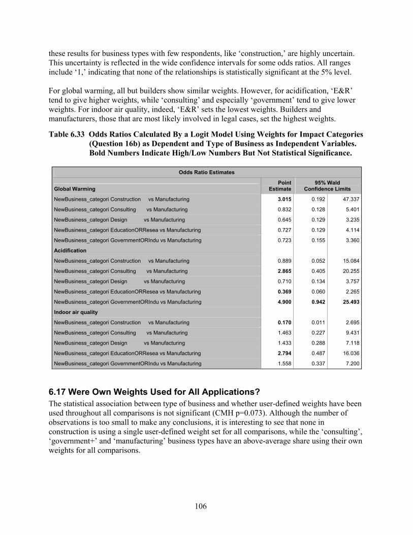
106
these results for business types with few respondents, like ‘construction,’ are highly uncertain. This uncertainty is reflected in the wide confidence intervals for some odds ratios. All ranges include ‘1,’ indicating that none of the relationships is statistically significant at the 5% level. For global warming, all but builders show similar weights. However, for acidification, ‘E&R’ tend to give higher weights, while ‘consulting’ and especially ‘government’ tend to give lower weights. For indoor air quality, indeed, ‘E&R’ sets the lowest weights. Builders and manufacturers, those that are most likely involved in legal cases, set the highest weights. Table 6.33 Odds Ratios Calculated By a Logit Model Using Weights for Impact Categories
(Question 16b) as Dependent and Type of Business as Independent Variables. Bold Numbers Indicate High/Low Numbers But Not Statistical Significance.
Odds Ratio Estimates
Global Warming Point
Estimate 95% Wald
Confidence Limits
NewBusiness_categori Construction vs Manufacturing 3.015 0.192 47.337
NewBusiness_categori Consulting vs Manufacturing 0.832 0.128 5.401
NewBusiness_categori Design vs Manufacturing 0.645 0.129 3.235
NewBusiness_categori EducationORResea vs Manufacturing 0.727 0.129 4.114
NewBusiness_categori GovernmentORIndu vs Manufacturing 0.723 0.155 3.360
Acidification
NewBusiness_categori Construction vs Manufacturing 0.889 0.052 15.084
NewBusiness_categori Consulting vs Manufacturing 2.865 0.405 20.255
NewBusiness_categori Design vs Manufacturing 0.710 0.134 3.757
NewBusiness_categori EducationORResea vs Manufacturing 0.369 0.060 2.265
NewBusiness_categori GovernmentORIndu vs Manufacturing 4.900 0.942 25.493
Indoor air quality
NewBusiness_categori Construction vs Manufacturing 0.170 0.011 2.695
NewBusiness_categori Consulting vs Manufacturing 1.463 0.227 9.431
NewBusiness_categori Design vs Manufacturing 1.433 0.288 7.118
NewBusiness_categori EducationORResea vs Manufacturing 2.794 0.487 16.036
NewBusiness_categori GovernmentORIndu vs Manufacturing 1.558 0.337 7.200
6.17 Were Own Weights Used for All Applications? The statistical association between type of business and whether user-defined weights have been used throughout all comparisons is not significant (CMH p=0.073). Although the number of observations is too small to make any conclusions, it is interesting to see that none in construction is using a single user-defined weight set for all comparisons, while the ‘consulting’, ‘government+’ and ‘manufacturing’ business types have an above-average share using their own weights for all comparisons.

107
Table 6.34 Cross –Table Displaying the Variables Used Own Weighting Sets for One/All Comparisons Versus Type of Business.
Business Type Used_own_weights
Frequency Percent Row Pct Col Pct one_product_comparison throughout_all_comparisons Total
Construction 45.63
100.0018.18
00.000.000.00
45.63
Consulting 22.82
20.009.09
811.2780.0016.33
1014.08
Design 68.45
30.0027.27
1419.7270.0028.57
2028.17
EducationORResearch 57.04
33.3322.73
1014.0866.6720.41
1521.13
GovernmentORIndustryAssociationORFacilityManagement 34.23
23.0813.64
1014.0876.9220.41
1318.31
Manufacturing 22.82
22.229.09
79.86
77.7814.29
912.68
Total 2230.99
4969.01
71100.00
No. Missing Observations = 495
As discussed in section 5.17, only four respondents mentioned they used different user-defined weight sets for different comparisons. They may have realized that since each comparison uses a different normalization scale, the weights need to be set anew for each comparison if the relative weights per unit of potential impact (e.g., 1 kg CO2-equivalent for global warming versus 1 kg SO2-equivalent for acidification) are intended to be the same for all comparisons. Since four responses are too few, statistical analysis is inappropriate. Although not statistically significant, a cross tabulation of using one’s own weights with hours spent with BEES shows interesting trends. The more hours respondents spent with BEES, the more likely they were to use their own weight set for one product comparison.
6.18 Temporal and Spatial Scale of User-defined Weights Temporal and spatial scales have been transformed into two scales each. First, the temporal responses were made ratio scale by transforming ‘weeks to 1 season’ into 0.2 years, infinity to 10,000 years, while spatial responses were assigned the values 1km2, 100 km2, 100,000 km2, 2,000,000 km2, 20,000,000 km2, and 500,000,000 km2. The second, scale numbered temporal and spatial response categories on an ordinal scale.
108
The hypothesis is that the assumed temporal or/and spatial scale did influence the user-defined weights given in Question 16. To test this hypothesis, in section 6.21 each impact category from Question 16 will be correlated with assumed temporal and spatial scales (once for each scale), plus with the product of the temporal and spatial scales (only interval scales can be multiplied, but results can be interpreted as either interval or ordinal data).
6.19 Did the Weights Change? As noted in section 5.19, an analysis of how assumed temporal and spatial scales altered the weights cannot be done because none answered both questions. An analysis of whether opinions changed or not according to type of business and hours spent with BEES reveals no statistically-significant associations.
6.20 Temporal and Spatial Scales of Impact Categories The same transformations noted in section 6.18 for users of user-defined weights were made to analyze responses by those not using their own weights. No statistically-significant association between assumed temporal and spatial scales and type of business was found. As discussed in section 3, an additional question was initially designed to be used in the analysis of these responses.
6.21 Did the Opinion on Weights Change? While changing weights based on assumed temporal and spatial scales is not statistically associated with type of business, the relationship between the new weights given by 13 respondents and the temporal and spatial scales can be explored. Temporal and spatial scales, and their product, are all available as ordinal and interval scales. The weights are interval scale. Therefore, a simple linear regression model was used to see how much of the variance in weights can be explained by the three variables time, area, and time*area. This analysis was done two times, first using the cardinal information (Table 6.35) and then using the ordinal information (Table 6.36). The results of the regression analysis are interesting, but not conclusive. The three variables (time, area, and time*area) explain only 5.3 % of the variance in the user-defined weights set before considering temporal and spatial scales. While each variable was the strongest predictor for some impact categories, there is no clear trend. Area tended to be the best predictor, but no variable was statistically significant in any analysis. The same analysis can be done for those that set new weights after considering temporal and spatial scales. Since the average number of responses was very low (about 12), these results must be interpreted with caution. However, an average of 22 % of the variance in weights can be explained by the three variables--a huge increase compared to weights set before considering scale of impact. Therefore, one can suggest that once respondents are asked to think about temporal and spatial scales, they are more likely to consider them in the weighting of impacts. However, since they explain only 22 % of the variance, it is obvious that temporal and spatial scale are among many other criteria implicitly considered in weighting. For human toxicity, both area and area*time proved to be statistically significant, and explained 45 % of the variance in the weights. Although area looks like the strongest predictor on average, none of the variables can be neglected per se. For ozone
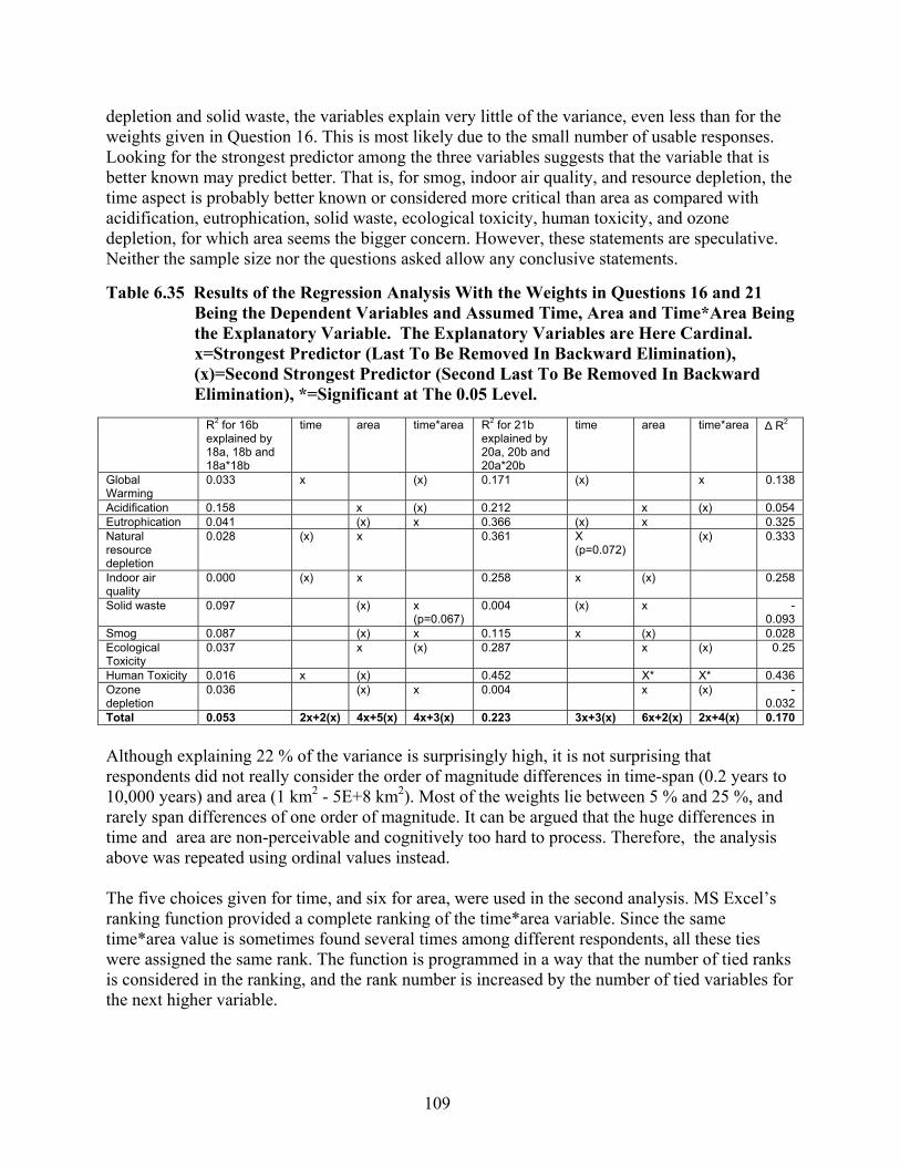
109
depletion and solid waste, the variables explain very little of the variance, even less than for the weights given in Question 16. This is most likely due to the small number of usable responses. Looking for the strongest predictor among the three variables suggests that the variable that is better known may predict better. That is, for smog, indoor air quality, and resource depletion, the time aspect is probably better known or considered more critical than area as compared with acidification, eutrophication, solid waste, ecological toxicity, human toxicity, and ozone depletion, for which area seems the bigger concern. However, these statements are speculative. Neither the sample size nor the questions asked allow any conclusive statements. Table 6.35 Results of the Regression Analysis With the Weights in Questions 16 and 21
Being the Dependent Variables and Assumed Time, Area and Time*Area Being the Explanatory Variable. The Explanatory Variables are Here Cardinal. x=Strongest Predictor (Last To Be Removed In Backward Elimination), (x)=Second Strongest Predictor (Second Last To Be Removed In Backward Elimination), *=Significant at The 0.05 Level.
R2 for 16b
explained by 18a, 18b and 18a*18b
time area time*area R2 for 21b explained by 20a, 20b and 20a*20b
time area time*area ∆ R2
Global Warming
0.033 x (x) 0.171 (x) x 0.138
Acidification 0.158 x (x) 0.212 x (x) 0.054 Eutrophication 0.041 (x) x 0.366 (x) x 0.325 Natural resource depletion
0.028 (x) x 0.361 X (p=0.072)
(x) 0.333
Indoor air quality
0.000 (x) x 0.258 x (x) 0.258
Solid waste 0.097 (x) x (p=0.067)
0.004 (x) x -0.093
Smog 0.087 (x) x 0.115 x (x) 0.028 Ecological Toxicity
0.037 x (x) 0.287 x (x) 0.25
Human Toxicity 0.016 x (x) 0.452 X* X* 0.436 Ozone depletion
0.036 (x) x 0.004 x (x) -0.032
Total 0.053 2x+2(x) 4x+5(x) 4x+3(x) 0.223 3x+3(x) 6x+2(x) 2x+4(x) 0.170 Although explaining 22 % of the variance is surprisingly high, it is not surprising that respondents did not really consider the order of magnitude differences in time-span (0.2 years to 10,000 years) and area (1 km2 - 5E+8 km2). Most of the weights lie between 5 % and 25 %, and rarely span differences of one order of magnitude. It can be argued that the huge differences in time and area are non-perceivable and cognitively too hard to process. Therefore, the analysis above was repeated using ordinal values instead. The five choices given for time, and six for area, were used in the second analysis. MS Excel’s ranking function provided a complete ranking of the time*area variable. Since the same time*area value is sometimes found several times among different respondents, all these ties were assigned the same rank. The function is programmed in a way that the number of tied ranks is considered in the ranking, and the rank number is increased by the number of tied variables for the next higher variable.
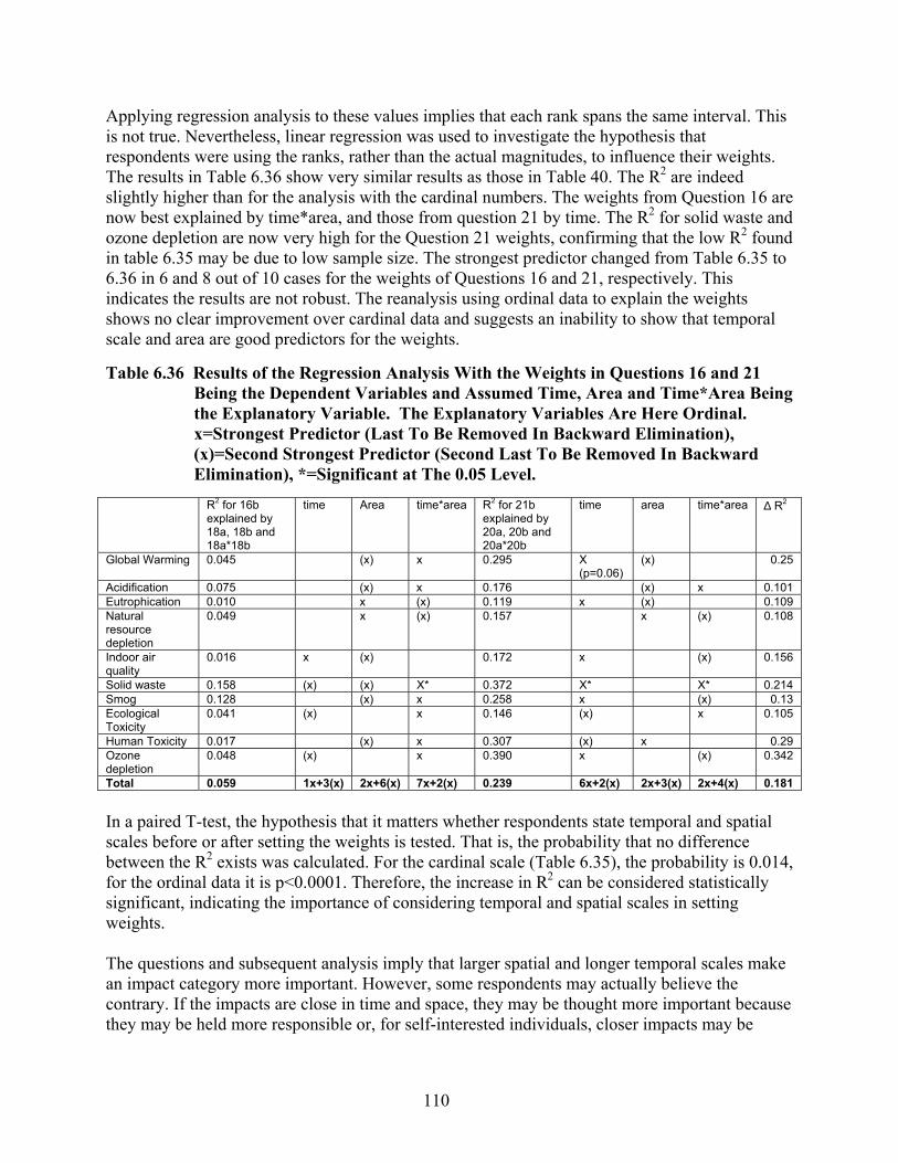
110
Applying regression analysis to these values implies that each rank spans the same interval. This is not true. Nevertheless, linear regression was used to investigate the hypothesis that respondents were using the ranks, rather than the actual magnitudes, to influence their weights. The results in Table 6.36 show very similar results as those in Table 40. The R2 are indeed slightly higher than for the analysis with the cardinal numbers. The weights from Question 16 are now best explained by time*area, and those from question 21 by time. The R2 for solid waste and ozone depletion are now very high for the Question 21 weights, confirming that the low R2 found in table 6.35 may be due to low sample size. The strongest predictor changed from Table 6.35 to 6.36 in 6 and 8 out of 10 cases for the weights of Questions 16 and 21, respectively. This indicates the results are not robust. The reanalysis using ordinal data to explain the weights shows no clear improvement over cardinal data and suggests an inability to show that temporal scale and area are good predictors for the weights. Table 6.36 Results of the Regression Analysis With the Weights in Questions 16 and 21
Being the Dependent Variables and Assumed Time, Area and Time*Area Being the Explanatory Variable. The Explanatory Variables Are Here Ordinal. x=Strongest Predictor (Last To Be Removed In Backward Elimination), (x)=Second Strongest Predictor (Second Last To Be Removed In Backward Elimination), *=Significant at The 0.05 Level.
R2 for 16b
explained by 18a, 18b and 18a*18b
time Area time*area R2 for 21b explained by 20a, 20b and 20a*20b
time area time*area ∆ R2
Global Warming 0.045 (x) x 0.295 X (p=0.06)
(x) 0.25
Acidification 0.075 (x) x 0.176 (x) x 0.101 Eutrophication 0.010 x (x) 0.119 x (x) 0.109 Natural resource depletion
0.049 x (x) 0.157 x (x) 0.108
Indoor air quality
0.016 x (x) 0.172 x (x) 0.156
Solid waste 0.158 (x) (x) X* 0.372 X* X* 0.214 Smog 0.128 (x) x 0.258 x (x) 0.13 Ecological Toxicity
0.041 (x) x 0.146 (x) x 0.105
Human Toxicity 0.017 (x) x 0.307 (x) x 0.29 Ozone depletion
0.048 (x) x 0.390 x (x) 0.342
Total 0.059 1x+3(x) 2x+6(x) 7x+2(x) 0.239 6x+2(x) 2x+3(x) 2x+4(x) 0.181 In a paired T-test, the hypothesis that it matters whether respondents state temporal and spatial scales before or after setting the weights is tested. That is, the probability that no difference between the R2 exists was calculated. For the cardinal scale (Table 6.35), the probability is 0.014, for the ordinal data it is p<0.0001. Therefore, the increase in R2 can be considered statistically significant, indicating the importance of considering temporal and spatial scales in setting weights. The questions and subsequent analysis imply that larger spatial and longer temporal scales make an impact category more important. However, some respondents may actually believe the contrary. If the impacts are close in time and space, they may be thought more important because they may be held more responsible or, for self-interested individuals, closer impacts may be

111
deemed more important because they impact themselves and their families the most. Future research would need to investigate this possibility.
6.22 Set of Impact Categories No further analysis of the preferred set of impact categories was performed. If future BEES developments intend to target certain user groups, a reanalysis could reveal the preferences of such a strata.
6.23 Level of Interpretation
The level in the cause-effect chain preferred for result interpretation is associated with type of business (CMH p=0.011). While builders prefer damage level relatively best and stressors least, consultants show exactly the opposite pattern. In addition, designers show the lowest relative desire for stressor level (Table 6.17). This provokes the question whether consultants actually provide what their customers (designers and builders) really want.
There is no statistically-significant association between the level of interpretation and either the reasons for downloading BEES or the chosen weighting set. Since all weighting sets used the impact potential level, the lack of association is not surprising.
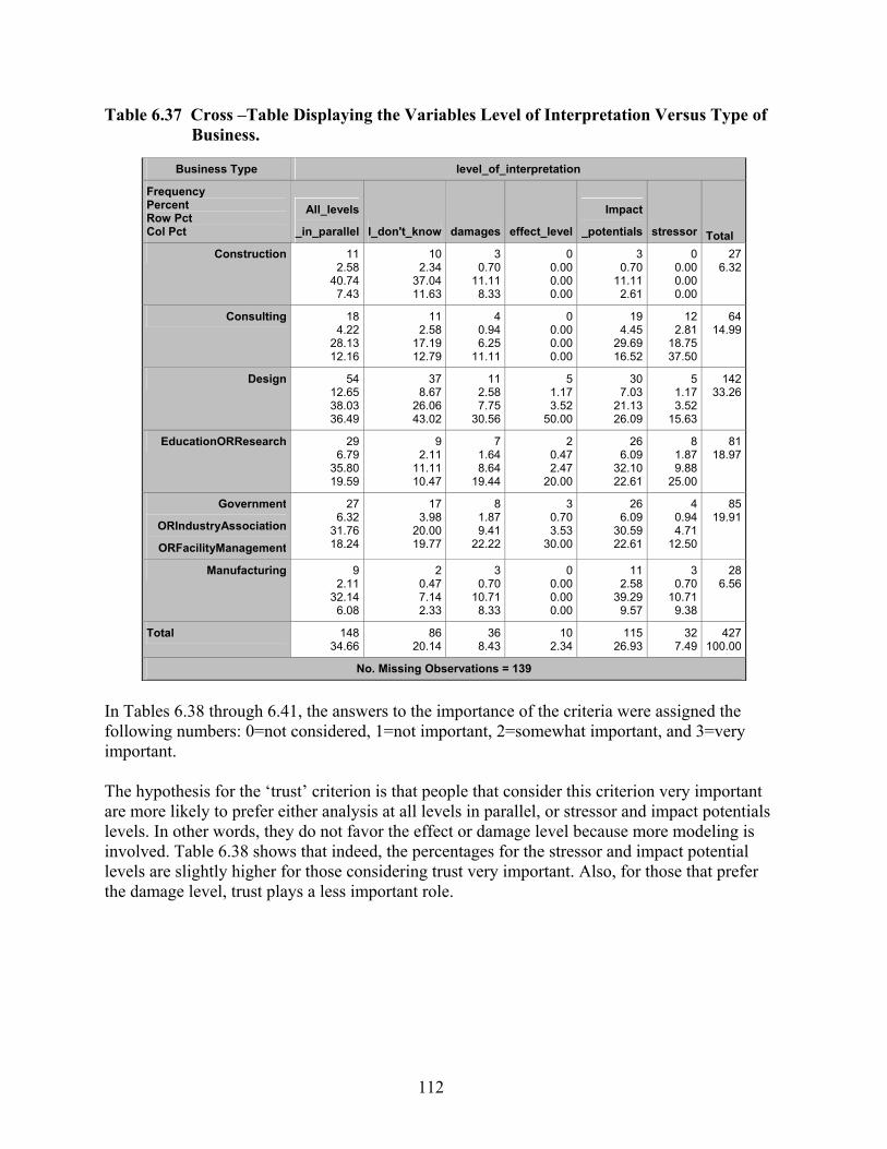
112
Table 6.37 Cross –Table Displaying the Variables Level of Interpretation Versus Type of Business.
Business Type level_of_interpretation
Frequency Percent Row Pct Col Pct
All_levels
_in_parallel I_don't_know damages effect_level
Impact
_potentials stressor Total Construction 11
2.5840.74
7.43
102.34
37.0411.63
30.70
11.118.33
00.000.000.00
3 0.70
11.11 2.61
0 0.00 0.00 0.00
276.32
Consulting 184.22
28.1312.16
112.58
17.1912.79
40.946.25
11.11
00.000.000.00
19 4.45
29.69 16.52
12 2.81
18.75 37.50
6414.99
Design 5412.6538.0336.49
378.67
26.0643.02
112.587.75
30.56
51.173.52
50.00
30 7.03
21.13 26.09
5 1.17 3.52
15.63
14233.26
EducationORResearch 296.79
35.8019.59
92.11
11.1110.47
71.648.64
19.44
20.472.47
20.00
26 6.09
32.10 22.61
8 1.87 9.88
25.00
8118.97
Government
ORIndustryAssociation
ORFacilityManagement
276.32
31.7618.24
173.98
20.0019.77
81.879.41
22.22
30.703.53
30.00
26 6.09
30.59 22.61
4 0.94 4.71
12.50
8519.91
Manufacturing 92.11
32.146.08
20.477.142.33
30.70
10.718.33
00.000.000.00
11 2.58
39.29 9.57
3 0.70
10.71 9.38
286.56
Total 14834.66
8620.14
368.43
102.34
115 26.93
32 7.49
427100.00
No. Missing Observations = 139
In Tables 6.38 through 6.41, the answers to the importance of the criteria were assigned the following numbers: 0=not considered, 1=not important, 2=somewhat important, and 3=very important. The hypothesis for the ‘trust’ criterion is that people that consider this criterion very important are more likely to prefer either analysis at all levels in parallel, or stressor and impact potentials levels. In other words, they do not favor the effect or damage level because more modeling is involved. Table 6.38 shows that indeed, the percentages for the stressor and impact potential levels are slightly higher for those considering trust very important. Also, for those that prefer the damage level, trust plays a less important role.

113
Table 6.38 Cross –Table Displaying the Variables Level of Interpretation Versus Trusting the Science/Values Behind the Scores (CMH p=0.002).
level_of_interpretation Trust
Frequency Percent Row Pct Col Pct 0 1 2 3 Total
All_levels_in_parallel 51.423.65
27.78
41.142.92
33.33
5615.9140.8845.53
72 20.45 52.55 36.18
137 38.92
I_don't_know 71.99
22.5838.89
10.283.238.33
102.84
32.268.13
13 3.69
41.94 6.53
31 8.81
damages 20.575.56
11.11
30.858.33
25.00
143.98
38.8911.38
17 4.83
47.22 8.54
36 10.23
effect_level 00.000.000.00
00.000.000.00
30.85
30.002.44
7 1.99
70.00 3.52
10 2.84
impact_potentials 10.280.925.56
30.852.75
25.00
339.38
30.2826.83
72 20.45 66.06 36.18
109 30.97
stressor 30.85
10.3416.67
10.283.458.33
71.99
24.145.69
18 5.11
62.07 9.05
29 8.24
Total 185.11
123.41
12334.94
199 56.53
352 100.00
No. Missing Observations = 214
For the criterion comprehensiveness of consequence coverage and how it relates to preferred interpretation level, the hypothesis that those considering this criterion of highest importance would also be those preferring either analysis on all levels, or on stressor and impact potential levels, is tested. Table 6.39 confirms this relationship for those that chose “all levels”. However, for the stressor and impact potential levels, the answer ‘not important’ was relatively more frequent.
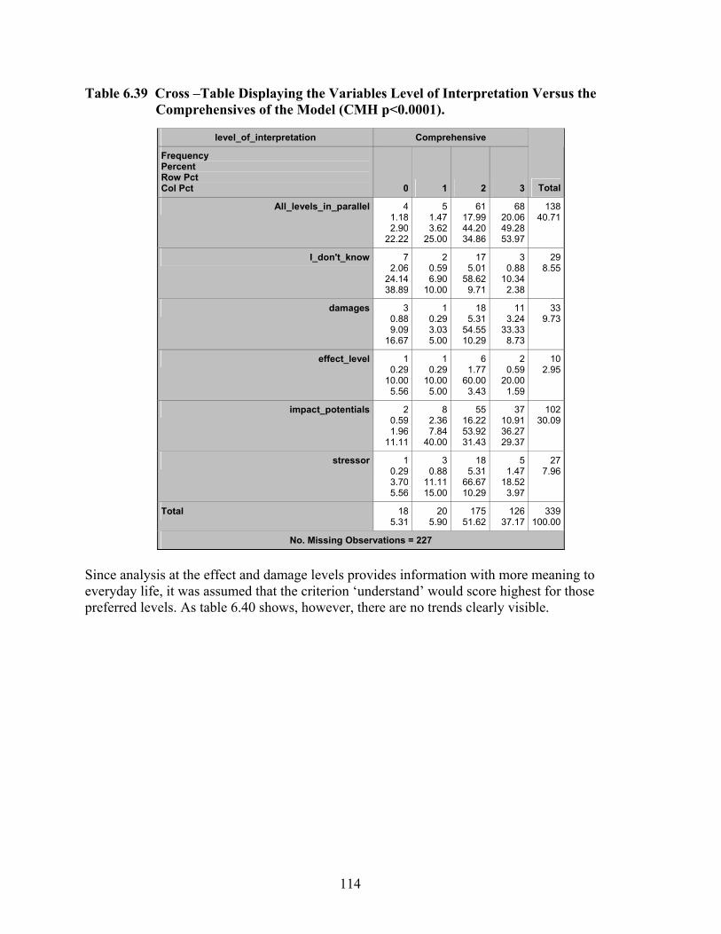
114
Table 6.39 Cross –Table Displaying the Variables Level of Interpretation Versus the Comprehensives of the Model (CMH p<0.0001).
level_of_interpretation Comprehensive
Frequency Percent Row Pct Col Pct 0 1 2 3 Total
All_levels_in_parallel 41.182.90
22.22
51.473.62
25.00
6117.9944.2034.86
68 20.06 49.28 53.97
138 40.71
I_don't_know 72.06
24.1438.89
20.596.90
10.00
175.01
58.629.71
3 0.88
10.34 2.38
29 8.55
damages 30.889.09
16.67
10.293.035.00
185.31
54.5510.29
11 3.24
33.33 8.73
33 9.73
effect_level 10.29
10.005.56
10.29
10.005.00
61.77
60.003.43
2 0.59
20.00 1.59
10 2.95
impact_potentials 20.591.96
11.11
82.367.84
40.00
5516.2253.9231.43
37 10.91 36.27 29.37
102 30.09
stressor 10.293.705.56
30.88
11.1115.00
185.31
66.6710.29
5 1.47
18.52 3.97
27 7.96
Total 185.31
205.90
17551.62
126 37.17
339 100.00
No. Missing Observations = 227
Since analysis at the effect and damage levels provides information with more meaning to everyday life, it was assumed that the criterion ‘understand’ would score highest for those preferred levels. As table 6.40 shows, however, there are no trends clearly visible.
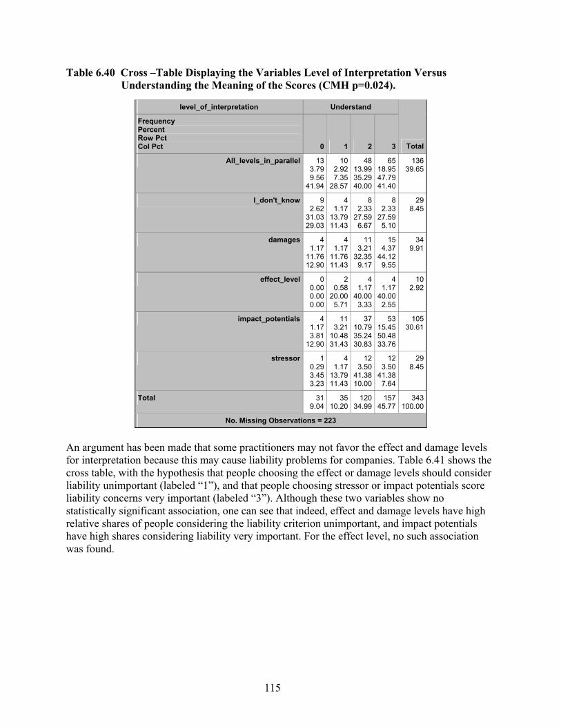
115
Table 6.40 Cross –Table Displaying the Variables Level of Interpretation Versus Understanding the Meaning of the Scores (CMH p=0.024).
level_of_interpretation Understand
Frequency Percent Row Pct Col Pct 0 1 2 3 Total
All_levels_in_parallel 133.799.56
41.94
102.927.35
28.57
4813.9935.2940.00
65 18.95 47.79 41.40
136 39.65
I_don't_know 92.62
31.0329.03
41.17
13.7911.43
82.33
27.596.67
8 2.33
27.59 5.10
29 8.45
damages 41.17
11.7612.90
41.17
11.7611.43
113.21
32.359.17
15 4.37
44.12 9.55
34 9.91
effect_level 00.000.000.00
20.58
20.005.71
41.17
40.003.33
4 1.17
40.00 2.55
10 2.92
impact_potentials 41.173.81
12.90
113.21
10.4831.43
3710.7935.2430.83
53 15.45 50.48 33.76
105 30.61
stressor 10.293.453.23
41.17
13.7911.43
123.50
41.3810.00
12 3.50
41.38 7.64
29 8.45
Total 319.04
3510.20
12034.99
157 45.77
343 100.00
No. Missing Observations = 223
An argument has been made that some practitioners may not favor the effect and damage levels for interpretation because this may cause liability problems for companies. Table 6.41 shows the cross table, with the hypothesis that people choosing the effect or damage levels should consider liability unimportant (labeled “1”), and that people choosing stressor or impact potentials score liability concerns very important (labeled “3”). Although these two variables show no statistically significant association, one can see that indeed, effect and damage levels have high relative shares of people considering the liability criterion unimportant, and impact potentials have high shares considering liability very important. For the effect level, no such association was found.

116
Table 6.41 Cross –Table Displaying the Variables Level of Interpretation Versus Understanding The Meaning of the Scores (CMH p=0.73).
level_of_interpretation Not_report
Frequency Percent Row Pct Col Pct 0 1 2 3 Total
All_levels_in_parallel 6620.2551.9739.52
226.75
17.3234.38
278.28
21.2642.86
12 3.68 9.45
37.50
127 38.96
I_don't_know 164.91
53.339.58
51.53
16.677.81
61.84
20.009.52
3 0.92
10.00 9.38
30 9.20
damages 175.21
53.1310.18
92.76
28.1314.06
41.23
12.506.35
2 0.61 6.25 6.25
32 9.82
effect_level 51.53
50.002.99
41.23
40.006.25
00.000.000.00
1 0.31
10.00 3.13
10 3.07
impact_potentials 4814.7248.4828.74
206.13
20.2031.25
185.52
18.1828.57
13 3.99
13.13 40.63
99 30.37
stressor 154.60
53.578.98
41.23
14.296.25
82.45
28.5712.70
1 0.31 3.57 3.13
28 8.59
Total 16751.23
6419.63
6319.33
32 9.82
326 100.00
No. Missing Observations = 240
Some claim that impact assessment methods are not transparent enough and they therefore prefer stressor-level information. Table 6.42 shows that indeed, stressor and impact potential levels are associated more with preferences for higher transparency than are the damage or effect levels. It is also not surprising that those who opt for less or no transparency are not sure about their preferred level.
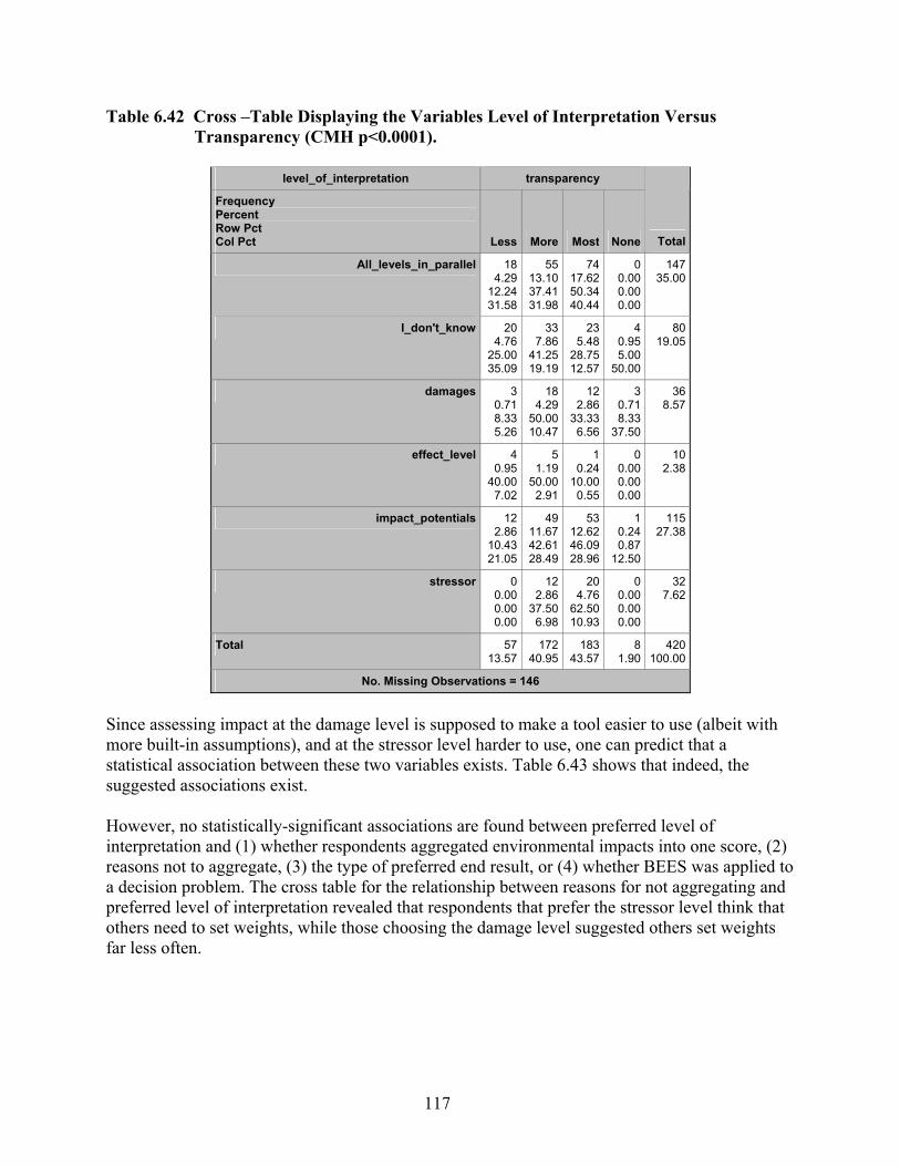
117
Table 6.42 Cross –Table Displaying the Variables Level of Interpretation Versus Transparency (CMH p<0.0001).
level_of_interpretation transparency
Frequency Percent Row Pct Col Pct Less More Most None Total
All_levels_in_parallel 184.29
12.2431.58
5513.1037.4131.98
7417.6250.3440.44
0 0.00 0.00 0.00
147 35.00
I_don't_know 204.76
25.0035.09
337.86
41.2519.19
235.48
28.7512.57
4 0.95 5.00
50.00
80 19.05
damages 30.718.335.26
184.29
50.0010.47
122.86
33.336.56
3 0.71 8.33
37.50
36 8.57
effect_level 40.95
40.007.02
51.19
50.002.91
10.24
10.000.55
0 0.00 0.00 0.00
10 2.38
impact_potentials 122.86
10.4321.05
4911.6742.6128.49
5312.6246.0928.96
1 0.24 0.87
12.50
115 27.38
stressor 00.000.000.00
122.86
37.506.98
204.76
62.5010.93
0 0.00 0.00 0.00
32 7.62
Total 5713.57
17240.95
18343.57
8 1.90
420 100.00
No. Missing Observations = 146
Since assessing impact at the damage level is supposed to make a tool easier to use (albeit with more built-in assumptions), and at the stressor level harder to use, one can predict that a statistical association between these two variables exists. Table 6.43 shows that indeed, the suggested associations exist. However, no statistically-significant associations are found between preferred level of interpretation and (1) whether respondents aggregated environmental impacts into one score, (2) reasons not to aggregate, (3) the type of preferred end result, or (4) whether BEES was applied to a decision problem. The cross table for the relationship between reasons for not aggregating and preferred level of interpretation revealed that respondents that prefer the stressor level think that others need to set weights, while those choosing the damage level suggested others set weights far less often.
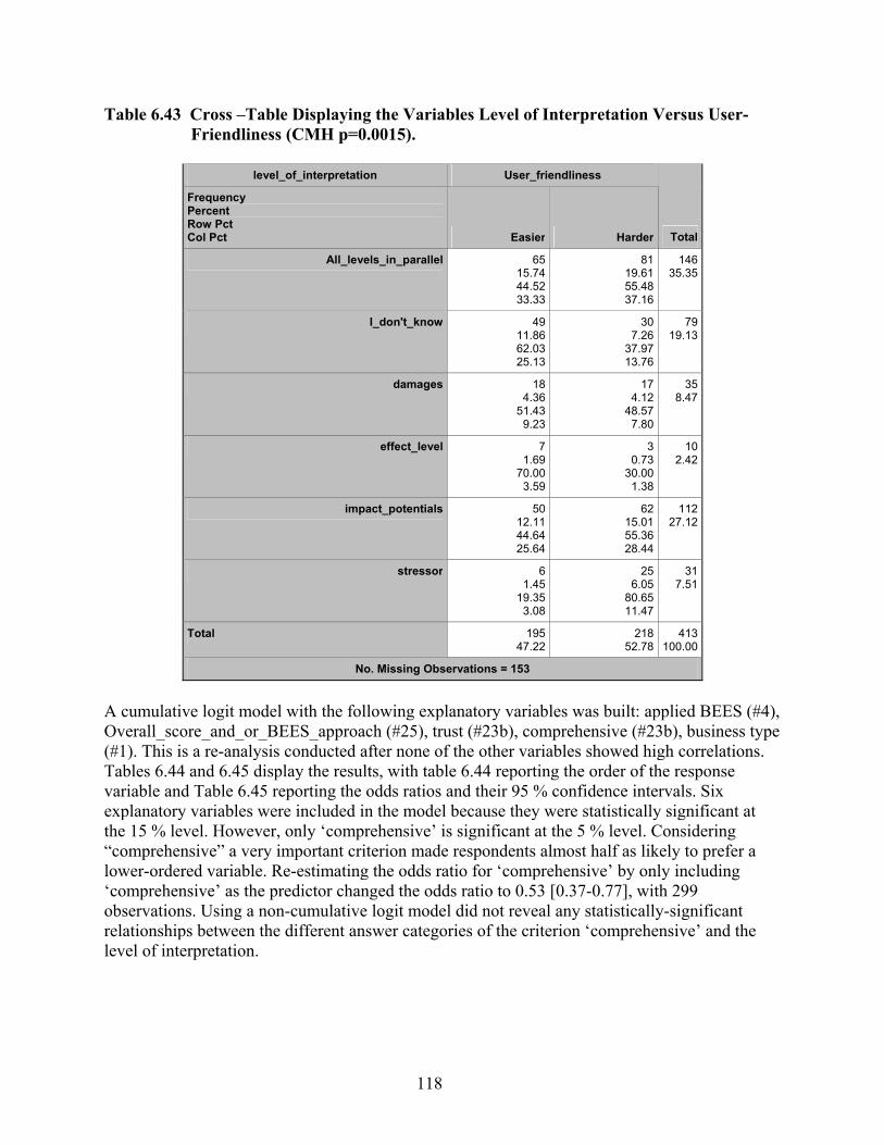
118
Table 6.43 Cross –Table Displaying the Variables Level of Interpretation Versus User- Friendliness (CMH p=0.0015).
level_of_interpretation User_friendliness
Frequency Percent Row Pct Col Pct Easier Harder Total
All_levels_in_parallel 6515.7444.5233.33
81 19.61 55.48 37.16
146 35.35
I_don't_know 4911.8662.0325.13
30 7.26
37.97 13.76
79 19.13
damages 184.36
51.439.23
17 4.12
48.57 7.80
35 8.47
effect_level 71.69
70.003.59
3 0.73
30.00 1.38
10 2.42
impact_potentials 5012.1144.6425.64
62 15.01 55.36 28.44
112 27.12
stressor 61.45
19.353.08
25 6.05
80.65 11.47
31 7.51
Total 19547.22
218 52.78
413 100.00
No. Missing Observations = 153
A cumulative logit model with the following explanatory variables was built: applied BEES (#4), Overall_score_and_or_BEES_approach (#25), trust (#23b), comprehensive (#23b), business type (#1). This is a re-analysis conducted after none of the other variables showed high correlations. Tables 6.44 and 6.45 display the results, with table 6.44 reporting the order of the response variable and Table 6.45 reporting the odds ratios and their 95 % confidence intervals. Six explanatory variables were included in the model because they were statistically significant at the 15 % level. However, only ‘comprehensive’ is significant at the 5 % level. Considering “comprehensive” a very important criterion made respondents almost half as likely to prefer a lower-ordered variable. Re-estimating the odds ratio for ‘comprehensive’ by only including ‘comprehensive’ as the predictor changed the odds ratio to 0.53 [0.37-0.77], with 299 observations. Using a non-cumulative logit model did not reveal any statistically-significant relationships between the different answer categories of the criterion ‘comprehensive’ and the level of interpretation.

119
Table 6.44 Response Profile for the Modified Variable ‘Level Of Interpretation’ Used in a Logistic Analysis.
Response Profile
Ordered Value New_level_of_interpretation
TotalFrequency
1 stressor 19
2 impact_potential 78
3 effect_level 8
4 damages 21
5 All_levels_in_pa 109
Table 6.45 Results of a Logistic Regression Using p=0.15 as a Retention Criterion.
Probabilities Modeled Are Cumulated Over the Lower Ordered Values.
Wald Confidence Interval for Adjusted Odds Ratios
Effect Unit Estimate 95% Confidence Limits
New_Comprehensive 1.0000 0.594 0.391 0.902
NewBusiness_categori Construction vs Manufacturing 1.0000 0.249 0.054 1.159
NewBusiness_categori Consulting vs Manufacturing 1.0000 1.012 0.342 2.993
NewBusiness_categori Design vs Manufacturing 1.0000 0.517 0.190 1.407
NewBusiness_categori EducationORResea vs Manufacturing 1.0000 0.919 0.324 2.603
NewBusiness_categori GovernmentORIndu vs Manufacturing 1.0000 0.831 0.285 2.422
6.24 Same Level Important? Somewhat unexpectedly, there is a statistically-significant association between type of business and preference for homogeneity of interpretation level. The fact that many respondents were unsure of their answer, may be responsible for this association. For instance, ‘E&R’ respondents not only understood the question but had an opinion on it, while designers, builders, and manufacturers had more than proportional shares in the category ‘I don’t know’.
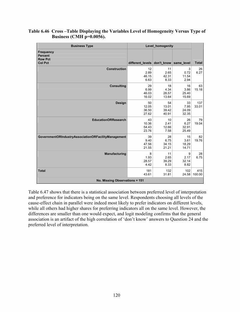
120
Table 6.46 Cross –Table Displaying the Variables Level of Homogeneity Versus Type of Business (CMH p=0.0056).
Business Type Level_homogenity
Frequency Percent Row Pct Col Pct different_levels don't_know same_level Total
Construction 122.89
46.156.63
11 2.65
42.31 8.33
3 0.72
11.54 2.94
266.27
Consulting 296.99
46.0316.02
18 4.34
28.57 13.64
16 3.86
25.40 15.69
6315.18
Design 5012.0536.5027.62
54 13.01 39.42 40.91
33 7.95
24.09 32.35
13733.01
EducationORResearch 4310.3654.4323.76
10 2.41
12.66 7.58
26 6.27
32.91 25.49
7919.04
GovernmentORIndustryAssociationORFacilityManagement 399.40
47.5621.55
28 6.75
34.15 21.21
15 3.61
18.29 14.71
8219.76
Manufacturing 81.93
28.574.42
11 2.65
39.29 8.33
9 2.17
32.14 8.82
286.75
Total 18143.61
132 31.81
102 24.58
415100.00
No. Missing Observations = 151
Table 6.47 shows that there is a statistical association between preferred level of interpretation and preference for indicators being on the same level. Respondents choosing all levels of the cause-effect chain in parallel were indeed most likely to prefer indicators on different levels, while all others had higher shares for preferring indicators all on the same level. However, the differences are smaller than one would expect, and logit modeling confirms that the general association is an artifact of the high correlation of ‘don’t know’ answers to Question 24 and the preferred level of interpretation.
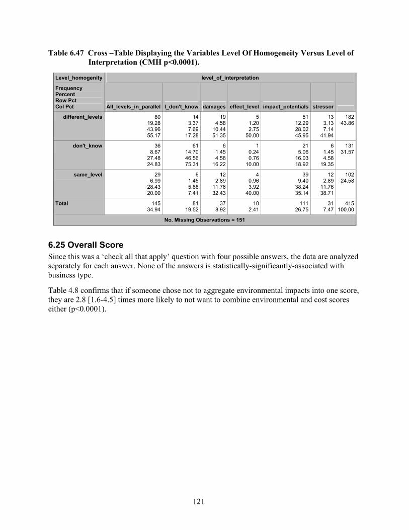
121
Table 6.47 Cross –Table Displaying the Variables Level Of Homogeneity Versus Level of Interpretation (CMH p<0.0001).
Level_homogenity level_of_interpretation
Frequency Percent Row Pct Col Pct All_levels_in_parallel I_don't_know damages effect_level impact_potentials stressor
different_levels 80 19.28 43.96 55.17
143.377.69
17.28
194.58
10.4451.35
51.202.75
50.00
51 12.29 28.02 45.95
133.137.14
41.94
18243.86
don't_know 36 8.67
27.48 24.83
6114.7046.5675.31
61.454.58
16.22
10.240.76
10.00
21 5.06
16.03 18.92
61.454.58
19.35
13131.57
same_level 29 6.99
28.43 20.00
61.455.887.41
122.89
11.7632.43
40.963.92
40.00
39 9.40
38.24 35.14
122.89
11.7638.71
10224.58
Total 145 34.94
8119.52
378.92
102.41
111 26.75
317.47
415100.00
No. Missing Observations = 151
6.25 Overall Score Since this was a ‘check all that apply’ question with four possible answers, the data are analyzed separately for each answer. None of the answers is statistically-significantly-associated with business type. Table 4.8 confirms that if someone chose not to aggregate environmental impacts into one score, they are 2.8 [1.6-4.5] times more likely to not want to combine environmental and cost scores either (p<0.0001).
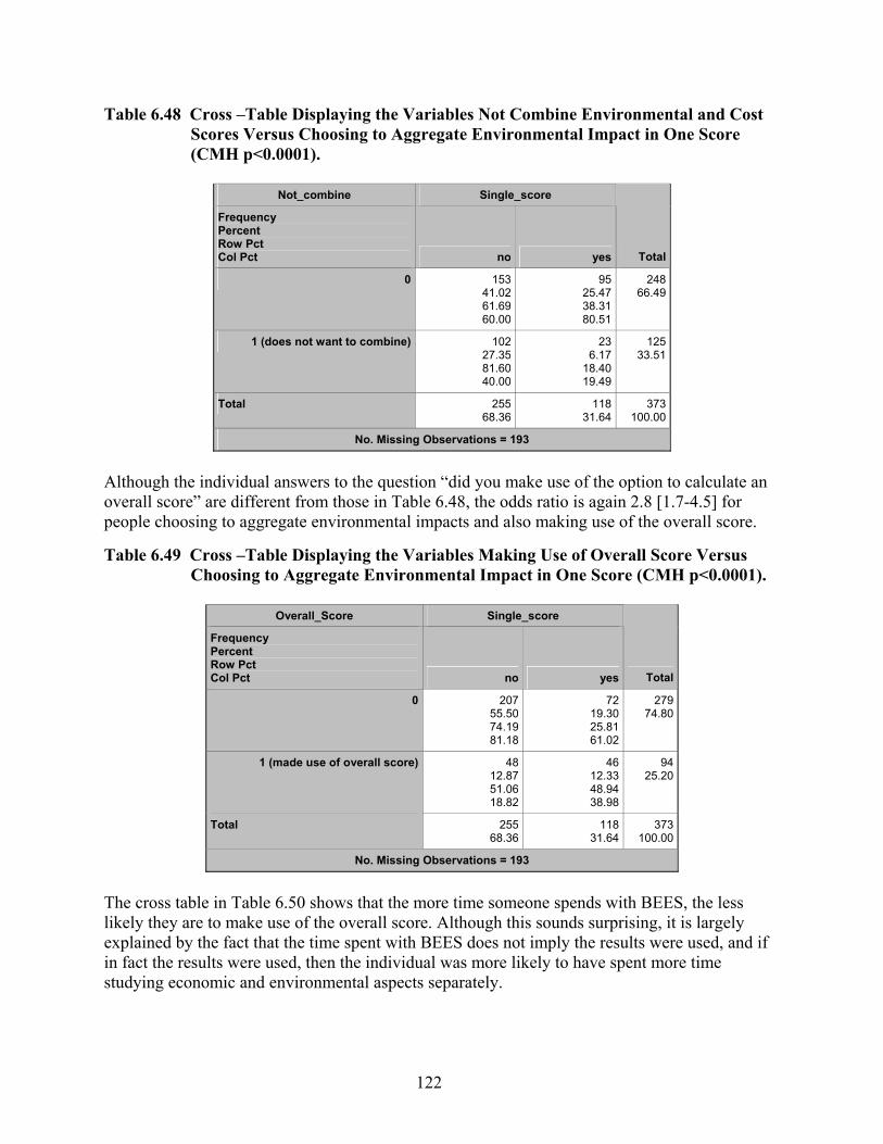
122
Table 6.48 Cross –Table Displaying the Variables Not Combine Environmental and Cost Scores Versus Choosing to Aggregate Environmental Impact in One Score (CMH p<0.0001).
Not_combine Single_score
Frequency Percent Row Pct Col Pct no yes Total
0 15341.0261.6960.00
9525.4738.3180.51
248 66.49
1 (does not want to combine) 10227.3581.6040.00
236.17
18.4019.49
125 33.51
Total 25568.36
11831.64
373 100.00
No. Missing Observations = 193
Although the individual answers to the question “did you make use of the option to calculate an overall score” are different from those in Table 6.48, the odds ratio is again 2.8 [1.7-4.5] for people choosing to aggregate environmental impacts and also making use of the overall score.
Table 6.49 Cross –Table Displaying the Variables Making Use of Overall Score Versus Choosing to Aggregate Environmental Impact in One Score (CMH p<0.0001).
Overall_Score Single_score
Frequency Percent Row Pct Col Pct no yes Total
0 20755.5074.1981.18
7219.3025.8161.02
279 74.80
1 (made use of overall score) 4812.8751.0618.82
4612.3348.9438.98
94 25.20
Total 25568.36
11831.64
373 100.00
No. Missing Observations = 193
The cross table in Table 6.50 shows that the more time someone spends with BEES, the less likely they are to make use of the overall score. Although this sounds surprising, it is largely explained by the fact that the time spent with BEES does not imply the results were used, and if in fact the results were used, then the individual was more likely to have spent more time studying economic and environmental aspects separately.

123
Table 6.50 Cross –Table Displaying the Variables Making Use of Overall Score Versus Time Spent With BEES (CMH p=0.0035).
Overall_Score estimated_hours
Frequency Percent Row Pct Col Pct 0.5 2.5 7.5 20 Total
0 10226.4235.0588.70
14236.7948.8073.20
276.999.28
58.70
20 5.18 6.87
64.52
291 75.39
1 133.37
13.6811.30
5213.4754.7426.80
194.92
20.0041.30
11 2.85
11.58 35.48
95 24.61
Total 11529.79
19450.26
4611.92
31 8.03
386 100.00
No. Missing Observations = 180
While Table 6.49 explores whether the overall score was used, table 6.51 shows whether respondents felt comfortable using it. The questions differ in two ways. On the one hand, someone who used the overall score may not like it and may feel uncomfortable in assigning weights, but does so anyway for convenience and other reasons. On the other hand, many who did not use BEES to the extent that they needed to calculate an overall score may still state that in principle they like it. Both trends are mixed in Table 6.51, but based on the much higher number of people agreeing that they like the BEES approach, it can be assumed that most of the difference is caused by the fact that not everyone actually used BEES to that level of aggregation. Compared with the typical respondent, the odds ratio is 2.6 (1.7-4.1) that someone who chose to aggregate environmental impacts into one score also liked the BEES approach of calculating an overall score.
Table 6.51 Cross –Table Displaying the Variables Like the BEES Approach Versus Choosing to Aggregate Environmental Impact in One Score (CMH p<0.0001).
like_BEES_approach Single_score
Frequency Percent Row Pct Col Pct no yes Total
0 15742.0977.7261.57
45 12.06 22.28 38.14
20254.16
1 9826.2757.3138.43
73 19.57 42.69 61.86
17145.84
Total 25568.36
118 31.64
373100.00
No. Missing Observations = 193

124
Combining the answers for using the overall score and liking the BEES overall score approach ensures those respondents that marked only one of those responses are captured. This combination increases the odds ratio to 3.7 [2.2-6.3]. Table 6.52 Cross –Table Displaying The Variables Using The Overall Score And/Or Like
the BEES Approach Versus Choosing To Aggregate Environmental Impact In One Score (CMH p<0.0001).
Overall_score_and_or_BEES_approach Single_score
Frequency Percent Row Pct Col Pct no yes Total
0 12132.4484.0347.45
236.17
15.9719.49
144 38.61
1 13435.9258.5252.55
9525.4741.4880.51
229 61.39
Total 25568.36
11831.64
373 100.00
No. Missing Observations = 193
6.26 Information on Uncertainty The answers given in the survey to the question of uncertainty were relabeled by grouping all those answers suggesting quantitative uncertainty information into one category. The main hypothesis is that those wanting more or most transparency also prefer quantitative information on uncertainty. Table 6.53 shows that this trend is confirmed. No general association was found with business type, reasons for downloading, or preferences for aggregating into single scores. A logit model with type of business showed that only the designers’ preference for point estimates rather than quantitative uncertainty information is significant (odds ratio 2.1).

125
Table 6.53 Cross –Table Displaying the Variables Uncertainty Information Versus Transparency (CMH p=0.0004).
New_uncertainty_categories transparency
Frequency Percent Row Pct Col Pct None Less More Most Total
point_estimates 51.287.25
62.50
174.35
24.6431.48
28 7.16
40.58 18.30
19 4.86
27.54 10.80
6917.65
qualitative_information 10.261.28
12.50
71.798.97
12.96
30 7.67
38.46 19.61
40 10.23 51.28 22.73
7819.95
quantitative_unceratinty_information 20.510.82
25.00
307.67
12.3055.56
95 24.30 38.93 62.09
117 29.92 47.95 66.48
24462.40
Total 82.05
5413.81
153 39.13
176 45.01
391100.00
Estimating the odds ratios with a logit model leads to the results given in Table 5.54. ‘No’ and ‘most’ transparency are in particular very strong predictors for point estimates and quantitative uncertainty information, respectively.
Table 6.54 Estimated Odds Ratio With a Logit Model, Bold=Significant At p<0.05, Bold and Italic=Significant At p<0.01, Italic=Significance Not Calculated.
Transparency quantitative vs. point estimates qualitative vs. point estimate quantitative vs. qualitativenone 0.20 0.30 0.67 less 0.90 0.63 1.44 more 1.73 1.63 1.06 most 3.14 3.21 0.98 The fact that only the obvious predictor ‘transparency’ was a good explanatory factor for the preferences regarding uncertainty information suggests that more detailed analysis may be needed as to why the preference for uncertainty information varies so much and what solutions, if any, best serves all.

126

127
7. Discussion and Conclusions This section summarizes the survey procedure, discusses the weights used by BEES users, re-evaluates some of the research questions that were targeted in this survey, and provides a summary of results. Refer to sections 5 and 6 for the details necessary to better understand the evidence, and for many more results that may be important for future LCA tools.
7.1 The Survey Procedure and Instrument The survey was developed and tested in three phases. A first version was developed by the research team. This version was pre-tested by a few individuals from the study population using a think aloud protocol and a follow-up interview. A revised version was tested in a pilot survey, and based on this additional feedback the final survey was designed. The survey was posted on a web page but did not make use of multi-layer formats or animations. Based on the feedback received, the chosen survey format did not pose problems for the respondents. The study population was contacted five times by email. First, the survey was announced and the study population invited to participate, then the web-link to the survey was sent, and then three reminders were sent to motivate respondents to complete the survey. Within less than one month, 566 surveys were submitted. Responses represented at least 21 % of those that have downloaded and installed BEES, that provided a valid email address, and that were in their office during the survey period. Comparing the survey respondents with the study population reveals that, relatively speaking, the response rate for designers was much higher than the average response rate, and that the average response rate was higher than the response rate for builders. This may either reflect a bias in the survey responses or indicate that indeed, designers were more likely than builders to study and use BEES. Some BEES users ordered the software by regular mail rather than downloading it from the internet. These users are not covered in the survey, but are in the minority. Since BEES is only offered for MS Windows platforms, the results may not be valid for potential users without access to Windows (e.g., Macintosh users). Experience with this format suggests that using web-based surveys works well, that frequent reminders by email are essential, and that extensive pre-tests using think-aloud protocols are important to understand what respondents are thinking when answering the questions and how they may be (mis)understanding them.
7.2 Comparison of Weights The weights given in Question 16 by 49 respondents refer to weights BEES users actually used when applying BEES. The weights of 13 respondents to Question 21 were given after they had been questioned about temporal and spatial scales, and represent further refined weights. Both weighting sets can be compared to similar weights that have been given in the literature (Table 7.1). Most of the weights from the literature have been elicited in surveys. Most cannot be strictly compared because the underlying definitions for the environmental problems or the temporal and spatial boundaries may differ. However, as shown in this report, temporal and

128
spatial aspects explain little variation. Therefore, it may be interesting to compare the weights of BEES 2.0 users with those in the literature. In general, the weights from (mostly American) BEES users are similar to weights given in the European and Japanese literature. As discussed in Hofstetter (2000), this is probably due to anchoring and framing effects that become more important if respondents have no pre-defined preferences (see e.g., Tversky and Kahneman 1973, Baron 1997, van der Pligt et al. 1998). The low ratios of the highest to the lowest weight could be interpreted as an indication of anchoring. Anchoring assumes that an indifferent user would on average assign a weight of 100 %/(number of impact categories) for each impact category. However, someone assuming different temporal and spatial scales may well apply weights that vary by factors of 1000 and more. To improve comparability, the first three impact categories—global warming, ozone depletion, and acidification—are chosen, because they were used in all 10 available weighting sets (Table 7.2). The Euro-barometer and the IPOS population survey were not designed for weighting in an LCA context and do not consider global warming to be the most important impact category. The rank order between ozone depletion and acidification changes as well among the 10 weighting sets. However, for six weighting sets (including the two BEES sets), the rank order is the same. Table 7.1 Comparison of Weights Between Impact Categories from Different Studies
(std=Standard Deviation).
Policy/ Industry Panel
weights revealed
preferences
Population survey Euro-
barometer
Population survey IPOS
Delphi expert survey
Environ-mental
scientists JP
Method users
JP
Environ-mental
scientists Europe
BEES 2.0
user's
Refined BEES 2.0
survey
Huppes et al. 1997 std
Huppes et al. 1997 Walz et al. Walz et al.
Walz et al.
Nagata et al. 96
Nagata et al. 96
Lindeijer 1997 std std
greenhouse effect 32 11 34 9 16 16 0.1 0.17 0.223 13.6 12.7 21.3 12.5ozone depletion 12 5 13 22 18 16 0.09 0.12 0.211 7.0 5.7 8.0 3.6acidification 17 4 18 18 15 12 0.075 0.09 0.085 5.0 4.4 5.8 1.5nutrification 13 3 13 8 16 9 4.8 4.0 6.3 2.5summer smog 11 5 12 6.6 5.7 8.5 2.4human toxicity 15 8 11 11.3 7.7 7.0 2.4ecotoxicty 14 11 15 8.7 5.2 10.0 4.1solid waste 15 10 14 0.09 0.09 0.037 12.2 10.3 7.0 2.4resources 14 14 18 0.125 0.09 0.064 13.7 10.9 14.3 4.3energy 0.165 0.1 0.081 air pollution 0.1 0.12 0.096 Ecological effects 0.155 0.13 0.119 Ocean and water pollution 0.1 0.13 0.085 Indoor Air Quality 17.1 15.5 12.0 8.9Ratio highest to lowest weight 2.9 3.1 2.8 1.8 2.0 2.2 1.9 6.0 3.6 3.7 Table 7.2 Relative Comparison of Weights for Climate Change, Ozone Depletion and
Acidification, Normalized By The Weight for Climate Change (Bold=Highest Weight, Italic=Lowest Weight).
Policy/Industry Panel weights
revealed preferences
Population survey Euro-barometer
Population survey IPOS
Delphi expert survey
Environmental scientists JP
Method users JP
Environmental scientists Europe
BEES 2.0 user's
BEES 2.0 survey
Climate change 100% 100% 100% 100% 100% 100% 100% 100% 100% 100%Ozone
depletion 38% 38% 244% 113% 100% 90% 70% 95% 52% 38%Acidification 53% 53% 200% 94% 75% 75% 52% 38% 37% 27%

129
Considering the large confidence intervals of the BEES weights, one cannot identify significant differences from values in the literature.
7.3 Are the Research Questions Answered? Now the research questions and the insights gained through the survey will be briefly revisited. Two of the research questions were: 1) On what level in the cause-effect chain do decision makers have preferences? 2) Need the category indicators be on the same level in the cause-effect chain? Instead of testing question 1 with experiments, the survey asked respondents what level they prefer for interpretation, which may indirectly get at the level for which they have preferences. However, since the largest group of respondents chose ‘all levels in parallel,’ it is clear that their answers cannot be used per se to answer research question 1. Whether those choosing ‘all levels in parallel’ did so because they wanted a transparent damage level model, implying they have preferences on a damage level, or whether they chose this ‘catch-all’ category because they just wanted maximum information, remains unclear. Against expectations, respondents preferred impact assessment information on different levels for different types of impacts; only 25 % thought that there is a need for all assessments to be on the same level (question 1). However, the 32 % responding ‘I don’t know’ indicates that many people had not thought about this question before and therefore were unlikely to have considered the implications (e.g., overlapping in modeling, large difference in number of scores per impact area). As a next step, it might be most useful to prepare examples that provide results on one of the four different levels, or mix them, and to develop a format that allows for differentiating between the need for information and transparency versus preferred level for interpretation. 3) What are the temporal scales that decision makers have in mind when they compare the relative importance of impact categories? 4) What are the spatial scales that decision makers have in mind when they compare the relative importance of impact categories? Figures 5.24 through 5.28 display the chosen temporal and spatial scales. In general, large areas and long time horizons have been chosen, which indicates that users understand well the site-independent approach taken by BEES. Although some respondents applied the same temporal and spatial scales to all impact categories, most did not. Future surveys investigating research questions 3 and 4 should be sure to distinguish between (1) from which area and during what time span emissions occur and (2) which area is affected and for how long. This first attempt to address scale of impact suggests that neither temporal nor spatial scale is a good predictor for the relative importance given for different impacts. To better understand important predictors, first focus groups may be needed to garner additional qualitative insights, then another survey could evaluate their importance. Since people are reluctant to correct their weights once they have stated them, a better format may be to stratify the survey in two groups, where one group states first their weights and then the importance of some contributing criteria,
130
while the other group states the weights only after revealing insights into the criteria they consider to be relevant. Researchers and analysts are challenged by these findings because they show that respondents take these scales into account only to a minor extent, while it is obvious that the order of magnitude for each weight is strongly dependent on the assumptions made on temporal and spatial scales. For the time being, it may be wise to ask software users to specify for which temporal and spatial scales they will state their weights, and then to calculate the normalized category indicators based on this information. 5) If people do not aggregate individual indicators, why not? Because it is difficult (overwhelmed), because indicators are not compensatory (theoretical/ethical), or because others should do it (competence)? Answers to survey question 13 (see sections 5.13 and 6.13) allow one to conclude that those choosing not to aggregate to a single environmental score did so due to either complexity or the belief that the indicators are not compensatory. Only 10 % wanted others to aggregate, and only 7 % were fortunate enough to find a Pareto-optimal solution where one alternative scored best in all impact categories. Software tool developers may learn the following:
- Users should be able to apply no weighting at all. - The output should be prepared in a way such that others could provide an aggregation.
This means that the indicators and their reference system need to be explained in detail together with the results.
- The software could test automatically for Pareto-optimal solutions. 6) Do decision makers prefer to monetize indicator results? Since the survey population included BEES users but not necessarily decision makers, this question cannot be answered. Eighty respondents (20 %) mentioned they indeed prefer dollar-values for environmental impacts. Indirectly, another 183 respondents (46 %) were willing to trade-off environmental and cost impacts. This indirectly assigns a dollar-value to environmental impacts. Therefore, one can conclude that two-thirds of the respondents may indeed support monetization of environmental impacts. However, it may well be that some would disagree that their answer implies this preference. Software tools that allow aggregation of environmental and cost information may want to provide the user with the implied dollar-values per environmental impact unit once trade-off weights between environmental and economic scores are set. This information may prove helpful in refining the weights.
7.4 Major Results Following is a summary of results that has been grouped according to survey section. Who uses BEES and why?

131
• By far the largest business group (31 % of the respondents) are designers and architects. Therefore, it may be justified to target future BEES releases to this group.
• 44 % of the respondents downloaded BEES to educate themselves or others about life cycle tools. This reflects the case that BEES covers a new field in which potential users have no formal education. Designers were more than three times more likely to download BEES to ‘apply BEES to a specific problem,’ to ‘inspect BEES results,’ or to ‘learn to use BEES’ than to download it to ‘educate themselves or others’ in life cycle tools. The same holds for builders.
• Only 16 % spent 5 or more hours with BEES, while 36 % spent less than an hour. Those that spent more time were also those that wanted more or most transparency, and were more likely to apply BEES to an actual project.
What aspects of building should BEES analyze?
• Commercial (32 %) and both commercial and residential (50 %) construction are the major interest areas of the respondents. This implies that the software may need to focus more on commercial construction in the future. Respondents from education and research were four times more likely to express an interest in residential over commercial construction, designers two times less likely. Since designers were also more likely to use BEES to support decisions, this suggests even more strongly to increase the coverage of commercial construction.
• Fewer than 8 % of the respondents applied BEES to an actual project. The strong need for more building product coverage in BEES, and the need for more education to familiarize both analysts and decision makers with such tools may explain this low share. Those that downloaded BEES to ‘apply BEES to a specific problem,’ to ‘inspect BEES results,’ or to ‘learn to use BEES’ were more than five times more likely to apply BEES than those who downloaded it to ‘educate themselves or others’ in life cycle tools.
• Many respondents suggested additional building elements to cover in future BEES versions. More than 40 % wanted the most comprehensive set of elements possible, while the others selected subsets of possible new elements. The expansion of covered elements seems to be of major interest to respondents.
• Most respondents would prefer to analyze both generic products representing industry averages plus manufacturer-specific products.
• Only 16 % (with a relatively high proportion of manufacturers) were satisfied analyzing buildings at the element level only. Most respondents preferred either the assembly or whole building level or a combination of all levels.
How should the tool and the results be presented?
• 82 % of the respondents prefer more or most transparency. However, when tradeoffs between user-friendliness and number of built-in assumptions need to be made, 50 % of the respondents prefer easier to use tools with more built-in assumptions. Therefore, two separate tools, or a tool with different layers of information and interaction, may serve best the respondents’ needs. Respondents from ‘education’ and ‘research’ were most likely to prefer most transparency, builders the least. Those who preferred the most transparency were also more likely to accept harder-to-use tools, while those that wanted ‘no transparency’ favored easier-to-use tools. ‘Builders’, ‘designers’ and those in government preferred easier-to-use tools.

132
• Although only 32 % of respondents prefer the Environmental Performance Score approach that is used in BEES, a total of 82 % preferred either the Environmental Performance Score, EcoProfiles, or EcoLabels with detailed performance scores. Results computed by BEES can support all three types of end results. Respondents stating that they prefer easier to use tools were more likely to prefer Ecolabels, while those that preferred harder to use tools were more likely to opt for EcoProfiles.
• There is a subgroup of respondents that preferred less or no transparency, easier to use tools, aggregation into single scores, and the EcoLabel types of end results.
• The overall score that combines environmental and economic information was used or liked by 73 % of the respondents. Therefore, BEES is able to serve an important user need. People that prefer overall scores are 3.3 times more likely to aggregate environmental impact scores by weighting. Many that liked the fact that BEES permits a combination of environmental and economic scores did not yet use this option. This reflects the fact that many respondents did not yet apply BEES to an actual project.
• Quantitative uncertainty analysis was mentioned by 62 % as desirable; 18 % prefer single point estimates without information on uncertainty. Designers were 2.1 times more likely to prefer point estimates versus quantitative uncertainty information. Someone asking for the most transparency was 3 times more likely to prefer quantitative uncertainty information over point estimates.
Weighting and aggregation
• 31 % of respondents chose to weight and aggregate different impact categories, and an additional 15 % used weighting without aggregation. There was no correlation between those that chose to aggregate and those that wanted less or no transparency. Therefore, respondents do not suggest that aggregating necessarily implies less transparency.
• Among those that did not aggregate the impacts into a single score, 66 % mentioned that they either do not trust that such an aggregation would be valid (48 %) or do not think that there are trade-offs among the impacts (18 %).
• Respondents preferring EcoProfiles were 4.4 times more likely to reply that they ‘do not trust that such an aggregation would be valid’ than that they ‘believe that others need to make this aggregation,’ and 3 times more likely to ‘not think there are trade-offs among the impacts’ than to ‘believe that others need to make this aggregation’. People that preferred EcoLabels were about two times less likely, respectively.
• Among those who chose to aggregate into a single score, 30 % actually used it in decision support. There was a high correlation between those who used the single score and those who applied BEES to a specific project.
• From those that used weighting, 36 % used their own weights rather than one of the pre-defined weighting sets. Some respondents used different weighting sets. People that spent more time with BEES were more likely to use either the pre-defined Harvard or EPA-Science Advisory Board weighting sets. Those spending less time were more likely to use several or all weighting sets, to set their own weights, or to use equal weights. This is strongly counter-indicated.
• The vast majority of respondents that used weighting did not apply case-specific weights. Because BEES 2.0 uses internal normalization, this implies that most users weight the units of potential impact different for different comparisons.
133
• Mostly, the world level was chosen as the assumed spatial scale and 10 years to 100 years as the assumed temporal scale for comparing different impact categories. The same scales were smaller and shorter for photochemical smog, indoor air quality, and solid waste.
• If temporal and spatial scales are elicited after the weights have been set, these two scales can explain only about 5 % of the variation in the weights. However, if the weights are set immediately after asking for temporal and spatial scales, they explain significantly more of the variation (22 % to 24 %). However, in both settings temporal and spatial scale are not significant variables.
• 25 % to 33 % did want to change their weights after they made explicit their assumed temporal and spatial scale.
• The average respondent thought that 8 impact categories would be the optimal and 15 the maximum number. 73 % of the respondents thought that the optimum number should be 9 or lower.
• One third of the respondents suggest changing the list of the existing 10 impact categories. Adding land and water use are among the changes mentioned most often.
• Only 7 % would prefer to get stressor-level information only. All others prefer higher- level information or information on all levels. Consultants have a relatively high share of respondents that prefer the stressor level, while designers and builders prefer the effect, damage, or all levels in parallel.
• The criteria ‘trusting the science/values behind the scores’, ‘being comprehensive in including all potential consequences’ and ‘understanding the meaning of the scores’ were judged by the majority to be either very or somewhat important in determining their preferred level of interpretation.
• For those that prefer the stressor or impact potential levels, trusting the science/values behind the scores was more important, and the comprehensiveness less important, than for those that preferred higher-level modeling.
• While 25 % of respondents prefer impact assessment in which all results are provided on the same level in the cause-effects chain, 43 % preferred results at different levels.

134
135
References Agresti A. (1990). Categorical Data Analysis. New York: John Wiley & Sons. Allison PD. (1999). Logistic regression using the SAS System: Theory and application. Cary, NC: SAS Institute Inc. ASTM (1999). Standard Practice for Measuring Life-Cycle Costs of Buildings and Building Systems, ASTM
Designation E 917-99, American Society for Testing and Materials (ASTM), West Conshohocken, PA, USA.
ASTM (1998). Standard Practice for Applying the Analytic Hierarchy Process to Multiattribute Decision Analysis of Investments Related to Buildings and Building Systems, ASTM Designation E 1765-98, American Society for Testing and Materials (ASTM), West Conshohocken, PA, USA.
ASTM (1997). Standard Classification for Building Elements and Related Sitework—UNIFORMAT II, ASTM Designation E 1557-97, American Society for Testing and Materials (ASTM), West Conshohocken, PA, USA.
Bare J., Hofstetter P., Pennington D. and H.A. Udo de Haes. (2000). Midpoints versus Endpoints: The Sacrifices and Benefits. Int.J.LCA 5(6) 319-326
Baron J. (1997). Biases in the Quantitative Measurement of Values for Public Decisions, Psychological Bulletin, 122 (1): 72-88
Cochran WG. (1954). Some methods for strengthening the common χ2 tests, Biometrics, 10, 417-451 Dillman DA. (2000). Mail and internet Surveys: The tailored design method. 2nd edition, John Wiley & Sons, New
York Ecobalance, Inc. (1999). DEAMTM 3.0: Data for Environmental Analysis and Management, Bethesda, MD Finnveden G, Hofstetter P, Bare J, Basson L, Ciroth A, Mettier Th, Seppälä J, Johansson J., Norris G and Volkwein
St. (2002). Normalization, Grouping and Weighting in Life Cycle Impact Assessment. In Udo de Haes et al. (eds). Towards Best Practice in Life Cycle Impact Assessment. SETAC Publishers (in press)
Goedkoop M. and Spriensma R. (2000). The Eco-indicator’99: A damage oriented method for Life Cycle Impact Assessment, VROM Zoetermeer, Nr. 1999/36A/B, 2nd edition April 2000 (http://www.pre.nl)
Hofstetter P. (2000) Hofstetter P. Looking at the full picture – Implications Associated with Valuation. In Bare J., Hofstetter P., Pennington D. and H.A. Udo de Haes. Midpoints versus Endpoints: The Sacrifices and Benefits. Proceedings of the UNEP/USEPA/CML Expert Workshop, Brighton (UK), May 25&26, 2000 (in press)
Huppes G., Sas H., de Haan E., Kuyper J. (1997). Efficient Environmental Investments, in SENSE International Workshop, Session Environmental Analysis and Economics in Industrial Decision Making, Amsterdam, 20 February 1997
ISO (1997). Environmental Management − Life Cycle Assessment − Principles and Framework, International Standard 14040, International Organization for Standardization (ISO), Geneva, Switzerland.
ISO (1998). Environmental Management − Life Cycle Assessment − Goal and Scope Definition and Inventory Analysis, International Standard 14041, International Organization for Standardization (ISO), Geneva, Switzerland.
ISO (2000). Environmental Management − Life Cycle Assessment − Life Cycle Impact Assessment, International Standard 14042, International Organization for Standardization (ISO), Geneva, Switzerland.
Lindeijer E. (1997). Results try-out Japanese/Dutch LCA valuation questionnaire 1996, IVAM, Amsterdam, 1997 Mantel N. and Haenszel W. (1959). Statistical aspects of the analysis of data from retrospective studies of disease.
Journal of the National Cancer Institute 22:719-748 Marris C, Langford I., O’Riordan T. (1996). Integrating sociological and psychological approaches to public
perceptions of environmental risks: detailed results from a questionnaire survey, CSERGE Working paper, GEC 96-07, London
136
Mettier Th. and Baumgartner Th. (2000). A non-monetary approach to weight environmental damages in Life Cycle Assessment: Panel methods compared to contingent valuation and other monetary approaches, Paper Nr. 226 presented at ESEE 2000, 3rd Biennial Conference of the European Society for Ecological Economics, Vienna, 3-6 May 2000
Miller GA. (1956). The magical number seven, plus or minus two: some limits on our capacity for processing information. The Psychological Review, 93, (2), 81-97.
Nagata K., Fujii Y., Ishikawa M., Yokota R., Ureshino M. (1997). Developing an Impact Assessment Methodology Using Panel Data, Summary report prepared for RITE International Workshop on Total Ecobalance in Tokyo
Norris GA. (2001). The requirement for congruence in normalization. Int J LCA 6(2);85-88 SETAC-Europe (1992). Life Cycle Assessment, B. DeSmet, et al. (eds) SETAC (1993a). A Conceptual Framework for Life Cycle Impact Assessment, J. Fava, et al. (eds) SETAC (1993b). Guidelines for Life Cycle Assessment: A “Code of Practice,” F. Consoli, et al. (eds) SETAC (1997). Life-Cycle Impact Assessment: The State-of-the-Art, J. Owens, et al. (eds) Stokes ME., Davis CS., & GG Koch. (1995). Categorical Data Analysis Using the SAS System, Cary, NC, USA:
SAS Institute Inc. Tversky A. and Kahneman D. (1973). Availability: A heuristic for judging frequency and probability, Cognitive
Psychology, 4: 207-232 U.S. Environmental Protection Agency (1999). Framework for Responsible Environmental Decisionmaking
(FRED): Using Life Cycle Assessment to Evaluate Preferability of Products, by Science Applications International Corporation, Research Triangle Institute, and EcoSense, Inc, Draft Report.
U.S. Environmental Protection Agency, Office of Research and Development (1993). Life Cycle Assessment: Inventory Guidelines and Principles, EPA/600/R-92/245
U.S. Green Building Council (2001), LEED Rating System, Version 2.0, Washington, D.C. U.S. Office of Management and Budget (OMB) Circular A-94 (1992). Guidelines and Discount Rates for Benefit-
Cost Analysis of Federal Programs, Washington, DC U.S. Office of Management and Budget (OMB) Circular A-94 (2000), Guidelines and Discount Rates for Benefit-
Cost Analysis of Federal Programs, Washington, DC Van der Pligt J., van Schie E.C.M., Hoevenagel R. (1998). Understanding and valuing environmental issues: The
effects of availability and anchoring on judgment, Zeitschrift fuer Experimentelle Psychologie, 45(4):286-302
Walz R., Herrchen M., Keller D., Stahl B. (1997). Ecotoxicological Impact Assessment and the Valuation Step within LCA – Pragmatic Approaches, Fh-ISI, Karlsruhe

137
Appendix 1: Impact Assessment and Weighting in LCA – What Do We Need to Know?
Following is a compilation of research questions that must be answered to improve the state-of-the-art in LCA valuation. Although the questions are selected with the intention to empirically test them, they are not yet on the level of hypotheses and test procedures. Some of these questions may be answered by current research activities at Carnegie Mellon University in Pittsburgh, USA, ETH in Zurich, Switzerland, and published studies, but most are not. The contributions of Thomas Mettier, ETH Zurich, and Jane Bare, U.S. EPA, were important inputs to this compilation. Research questions (not survey questions) Focus
Group** Targeted survey***
comments
Important for Life Cycle Impact Assessment modeling
1 On what level in the cause-effect chain do DM**** have preferences? (actions (products), stressors, midpoints, different endpoints, damages)
x X
2 On what level in the cause-effect chain can DM construct preferences? (context construction)
X x 17
3 Need the category indicators be on the same level in the cause-effect network?
x 18
4 If indicators would be supplemented by information on manageability and a proxy for unknown damage: Would this information be used? How? and by whom (Cultural theory).
x x 19
5 How does the modeling of ecosystems health alter its relative weight compared to human health? (Can potentially disappeared fraction (PDF) of species be seen as a relevant proxy? How do non-modeled impact pathways affect the weighting if qualitative information is/is not provided?)
x x 20
Important for elicitation of preferences
6 Which type of information is primarily used when provided in a panel procedure? Quantitative/qualitative - Text/images/videos/facilitator, intrinsic versus functional definitions
x x 21
7 Is it easier to elicit preferences for marginal or total importance? (not prioritized because one needs marginal weights, but one may instead show *whether and how different average versus marginal weights are”)
x x
8 What are the temporal scales that DM have in mind when they compare the relative importance of impact/damage categories?
x x
9 What are the spatial scales that DM have in mind when they compare the relative importance of impact/damage categories?
x x
17 This is tricky because it is not clear how to test “can”. Self-evaluation is probably the only feasible way, maybe paired with some questions that would test for biases. 18 This also concerns the problem of major categories and sub-categories and the dependence problem. A hypothesis would be that people are not concerned about such irregularities and that one would test this by adding, for example, one category on the stressor level. It may also be very important to let people create hierarchies once important environmental aspects are listed. One respondent on the pretest for the BEES survey also suggested such grouping. 19 This may help determine the underlying criteria used to determine overall importance. Work on comparative risk assessment, risk perception and ongoing work at CMU could be starting points. 20 Initial results by Thomas Mettier suggest that this aspect is not very important;, people are not very sensitive to underlying models when they weight categories. 21 The work of Bill Smith on associations may be useful.

138
10 Is it easier for DM to monetize indicator results or to weight them relatively? x x
11 What do people think when trading off ecological and human health? X 22
12 If both midpoint indicators, plus damages due to midpoint indicators for some pathways combined with various degrees of qualitative information on missing pathways, are provided: What information is used and to what extent to come up with weights? (One could also use an experiment where for some participants additional quantitative modeling is provided and for others it is not in order to see how meaningful the qualitative modeling is)
x X
Important for interpretation
13 Does the world view of DM statistically significantly alter their weights for given category indicators? (Thomas Mettier’s work)
x X
14 Does the world view of DM statistically significantly alter the selection of indicators to be included? How should they be selected?
x X 23
15 Does the world view of DM influence the preferred level in the cause effect chain? (Hypothesis: precaution-oriented people want midpoints/startpoints, outcome-oriented people want endpoints)
x X
16 What is the think-aloud protocol of someone that assigns weights? What is considered and what is not? (This would be used as a method to understand the thinking behind the answers)
x x 24
17 To what extent do individuals surroundings and previous experiences influence their spatial and temporal scopes and their relative weights for impact/damage indicators?
x x
18 If people do not aggregate single indicators, why? Because it is difficult (overwhelmed), because indicators are not compensatory (theoretical/ethical), because others should do it (competence)
x x
19 How do media reports shape the assigned weights? (conduct surveys during two periods that follow increased media attention to different environmental problems modeled in LCIA.)
x X
20 How does an occupational DALY (disability-adjusted life-years) compare with an indoor DALY, a leisure time DALY, and an environmental DALY? (degree of volunteering, compensation, controllability)
x x
21 How does an immediate DALY compare with a delayed DALY? How important is time discounting? (answer probably clear)
x x
22 Do individuals –once they have stated their preferences- accept the outcomes, i.e., the aggregation of different impacts for products? (especially if the preference statements have been adjusted for temporal and spatial scales)
X x
23 Do product-dependent impact category weights differ from generic weights? Why and how?
X x
Importance of biases
24 How sensitive are respondents if certain categories are split (e.g., carcinogenic and non-carcinogenic human toxicity, aquatic and terrestrial eutrophication/nutrification) or merged (e.g., summarizing summer smog in human toxicity, or ODP and GWP in climate change. (anchoring effects)
x X
25 How do the biases found in CVM studies flaw panel results (scope, context, sequence)?
x x
22 For instance, one would expect that people struggle with the fact that those two are not independent. 23 E.g., Eco-Indicator’99 assumes that individualists weight the resource problem as ‘zero’ because this is not a problem. This should be tested. 24 Textbooks on qualitative methods of social science research may support this.

139
**Focus Groups: Groups of about 8 people that are or may become potential decision makers using LCA results, or may interpret LCA results for their CEOs. A half or full day is required. ***Targeted Survey: Same group as included in the BEES survey, but with sample size sufficient to garner statistically significant results. ****DM: Decision makers

140

141
Appendix 2: Emails Sent to the Downloaders of BEES This appendix includes the five emails that were sent to the 3450 downloaders of BEES. To avoid unnecessary emails, the respondents could request removalfrom the mailing list once they submitted their completed survey. Bobbie Lippiatt <[email protected]>
07/11/2001 01:51 PM
To: [email protected] cc: Subject: Invitation for BEES Customer Feedback Survey
You have downloaded the BEES (Building for Environmental and Economic Sustainability) software from our BEES website at the National Institute of Standards and Technology (http://www.bfrl.nist.gov/oae/bees.html). As you may recall, BEES measures and compares the life-cycle environmental and economic performance of building products. We’re planning on improving and extending BEES over the next several years, and would like your input to help guide our efforts. In order to learn about your needs and opinions in a systematic way, we cordially invite you to participate in a web-based survey. We’ll send you the web address for the survey in the coming days. The survey has been developed jointly by Bobbie Lippiatt and Amy Rushing of the U.S. Department of Commerce’s National Institute of Standards and Technology and Jane Bare and Patrick Hofstetter of the U.S. Environmental Protection Agency’s Office of Research and Development. If you have any questions regarding this invitation, feel free to contact Bobbie Lippiatt at [email protected] or (301) 975-6133. Your needs and opinions are very important to us and we hope that you will volunteer your time (approximately 20 minutes) and interest for this effort. Sincerely, Bobbie Lippiatt, BEES developer Building and Fire Research Laboratory National Institute of Standards and Technology U.S. Department of Commerce Barbara C. Lippiatt, Economist Office of Applied Economics Building and Fire Research Laboratory National Institute of Standards and Technology 100 Bureau Drive, Mail Stop 8603 Gaithersburg, MD 20899-8603 Voice: (301) 975-6133 Fax: (301) 975-5337 Home Page: http://www.bfrl.nist.gov/oae.html

142
Bobbie Lippiatt <[email protected]>
07/18/2001 01:18 PM
To: (BEES 2.0 Downloaders) cc: Subject: BEES Customer Feedback Survey
Last week we invited you to participate in our web-based BEES survey. Your participation is important because it will help us tailor future BEES enhancements to best meet your needs. Even if you haven’t used BEES, or have used it but not applied its results, your input is important. You can access the survey at http://www.bfrl.nist.gov/oae/software/bees/survey.html. Please let us know if you encounter any problems completing the survey. Once you have completed the survey and clicked the "Submit" button, your survey responses will automatically and anonymously be sent to the National Institute of Standards and Technology (NIST). Your responses will be processed by NIST and summarized in statistical form so that individuals cannot be identified. A report summarizing and evaluating the results will be made available on http://www.bfrl.nist.gov/oae/bees.html. While the survey is voluntary, you can help us very much by sharing your needs, opinions, and experiences. If you have any questions or comments about the survey, feel free to email Bobbie Lippiatt at [email protected]. Your time and effort are very much appreciated. Thank you! Sincerely, Bobbie Lippiatt, BEES developer Building and Fire Research Laboratory National Institute of Standards and Technology U.S. Department of Commerce [email protected] Voice: (301) 975-6133 PS: In the event you downloaded but never intended to use BEES, please reply directly to this email, changing the Subject line to REMOVE so that we can remove your address from further email reminders. Many thanks.

143
Bobbie Lippiatt <[email protected]>
07/25/2001 01:30 PM
To: (BEES 2.0 Downloaders) cc: Subject: Thank you/Reminder: BEES Customer Feedback Survey
Last week we sent you a survey seeking your opinions and needs relating to the BEES software. You were selected for the survey because you registered your email address when you downloaded BEES. If you have already submitted the survey, please accept our sincere thanks. If not, please do so today. We are truly grateful for your help because it is only by asking users like you to share your ideas and experiences that we can understand how future versions of BEES can be designed to best meet your needs. Sincerely, Bobbie Lippiatt, BEES developer Building and Fire Research Laboratory National Institute of Standards and Technology U.S. Department of Commerce [email protected] Voice: (301) 975-6133 P.S. You can access the survey at http://www.bfrl.nist.gov/oae/software/bees/survey.html.

144
Bobbie Lippiatt <[email protected]>
07/31/2001 09:37 AM
To: (BEES 2.0 Downloaders) cc: Subject: Reminder: BEES Customer Feedback Survey
If you have not yet found the time to complete the BEES survey, please do so before August 7. If you are one of the many BEES users that have already submitted their survey, we sincerely thank you and apologize for this unnecessary email. (Since the survey is truly anonymous, we do not know whether you have already helped us to understand your needs and opinions.) You can access the survey at http://www.bfrl.nist.gov/oae/software/bees/survey.html . Please let us know if you encounter any problems completing the survey. A few people have replied that they downloaded but never installed or intended to use BEES. If this is the case for you, please reply directly to this email, changing the subject line to "Subject: REMOVE" so that we can remove your address from further email reminders. Many thanks. We are looking forward to your survey submission. Thank you for your support. Sincerely, Bobbie Lippiatt, BEES developer Building and Fire Research Laboratory National Institute of Standards and Technology U.S. Department of Commerce [email protected] Voice: (301) 975-6133

145
Bobbie Lippiatt <[email protected]>
08/07/2001 01:44 PM
To: (BEES 2.0 Downloaders) cc: Subject: Final reminder: BEES Customer Feedback Survey
Sorry for the multiple email reminders about our BEES Customer Feedback Survey. As a BEES user, however, we kindly ask you to complete the survey as it will help us tailor future BEES enhancements to best meet your needs. The survey is accessible at http://www.bfrl.nist.gov/oae/software/bees/survey.html . If you have submitted the BEES survey we thank you very much and apologize for this unnecessary email. If you have not yet responded, we realize that many of you have been on vacation and that three weeks may not have been enough time for you to take on this task. Therefore, we invite you to submit your survey as soon as possible. However, we understand there may be other reasons why you have not yet responded. Understanding these reasons will help us interpret the submitted surveys. If there is another reason why you have not responded, please reply to this email with an answer to the following question at the beginning of the message: I have not responded to the BEES survey because 1. I should not have been included in the survey group because... (explain) 2. I never complete questionnaires 3. I simply have no time 4. I started to fill it out but then stopped because... (explain) 5. Other, please specify: _____________________________. Your time and effort are very much appreciated. Sincerely, Bobbie Lippiatt, BEES developer Building and Fire Research Laboratory National Institute of Standards and Technology U.S. Department of Commerce [email protected] Voice: (301) 975-6133 P.S.: A report summarizing and evaluating the results will be made available at http://www.bfrl.nist.gov/oae/bees.html .

146
147
Appendix 3: Survey Instrument
Customer Feedback Survey U.S. Department of Commerce
National Institute of Standards and Technology Building and Fire Research Laboratory
OMB NO: 0693-0031 Expires 10/31/2002 This survey is authorized under Executive Order 12862, "Setting Customer Service Standards." Your response is voluntary and all data collected will be considered anonymous. Public reporting for this collection of information is estimated to average 20 minutes per response, including the time of reviewing instructions, searching existing data sources, gathering and maintaining the data needed, and completing and reviewing the collection of information. Send comments regarding this estimate or any other aspects of this collection of information, including suggestions for reducing the length of this questionnaire, to the National Institute of Standards and Technology, 100 Bureau Drive, Stop 3220, Gaithersburg, MD, 10899-3220 and the Office of Management and Budget Information and Regulatory Affairs, Office of Management and Budget, Washington, D.C. 20503.
Dear BEES User Your ideas and opinions are important to the future development of BEES! For this reason, we'd like to ask you a few questions that will help us determine how best to serve your needs. This survey provides an opportunity to contribute your ideas. Your individual response to this survey is completely confidential and anonymous. Your responses will be processed by the National Institute of Standards and Technology and answers summarized in statistical form so that individuals cannot be identified. It is very important that you answer the questions the way you really feel. This is not a test. There are no right or wrong answers. The usefulness of this survey in helping to make a better BEES will depend upon your frankness in answering the questions. Your time and feedback are very much appreciated.

148
1. I am working/employed primarily in the following type of business (only one answer possible):
Construction
Consulting
Design
Education
Industry Association
Manufacturing
Military
Research
Federal Government
State/Local Government
Other. Specify: 2. I am primarily interested in:
Commercial construction
Residential construction
Both commercial and residential construction
Neither commercial nor residential construction 3. I downloaded BEES for the following reason(s) (more than one answer possible):
To inspect BEES results for one particular building element
To immediately apply BEES results to select cost-effective, green building products for an actual construction project
To learn about the tool to see if I might be comfortable applying its results to future construction projects. I probably
will will not apply its results in the future.
To educate myself about how life-cycle assessment tools work
To educate others about how life-cycle assessment tools work
Other. Specify:

149
4. If you have applied BEES results to an actual construction project, briefly describe the project and the role BEES played in it.
I have not applied BEES to a project 5. I have used/studied the BEES software and/or manual for a total of:
less than 1 hour
1- 4 hours
5- 10 hours
more than 10 hours
150
6. I would like for future BEES releases to evaluate products or activities belonging to the following building elements (more than one answer possible):
Foundations
Basement Construction
Superstructure
Exterior Closure
Roofing
Interior Construction
Staircases
Interior Finishes
Conveying Systems
Plumbing
HVAC
Fire Protection
Electrical
Equipment
Furnishings
Site Improvements
Site Civil/Mechanical Utilities
Site Electrical Utilities
All of the Above
Other. Specify: Comment:
7. Through the new "BEES Please" program, future BEES versions are planning to allow more specific product comparisons (e.g., of manufacturer-specific products). I prefer: (check only one):
comparing "generic," industry-average building products.
making more specific product comparisons.
making generic, specific, and mixed generic/specific product comparisons. 8. Future BEES versions are planning to let users combine building elements into building assemblies (e.g., combine interior wall partitions and interior wall finishes into an interior wall assembly). I prefer analyses: (check all that apply)
at the building element level
at the building assembly level
at the whole building level

151
9. How much emphasis do you place on transparency (having access to the underlying data, methods, and assumptions)? (check only one)
None. Just give me the answer.
Less. I'd like to know some major assumptions.
More. I'd like to understand the reasoning behind most of the results.
Most. I want the ability to view and understand the sources of all data, methods, and assumptions. 10. I prefer a tool that is:
Easier to use but has more built-in assumptions
Harder to use but with fewer built-in assumptions 11. What kind of end result would you like most? (check only one)
EcoLabel Option #1: seal of approval only for products earning at least the pre-selected "cut-off" score and using predefined fixed weighting of the relative importance of environmental impacts.
EcoLabel Option #2: label for any product that simply reports its environmental performance score, is similar in design to the U.S. appliance labels, and uses fixed weights.
Environmental Performance Score with flexible weighting: result is a single number that captures all environmental aspects, like BEES 2.0.
Specify the number of environmental impact categories that you consider both sufficient and still workable in the flexible weighting:
optimum: maximum:
EcoProfile: environmental scorecard with no aggregation into a single score, similar to a nutrition label.
Specify the number of environmental scores that you consider both sufficient and still workable in the interpretation:
optimum: maximum:
Other. Specify:
12. Using BEES 2.0 and its Environmental Performance Score approach, did you choose to aggregate the environmental impacts into a single environmental performance score through weighting?
no
yes -> After clicking this option, CLICK HERE to skip to question #14
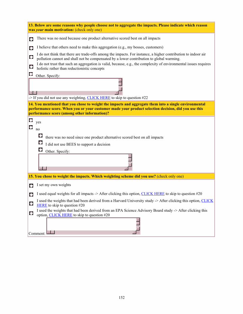
152
13. Below are some reasons why people choose not to aggregate the impacts. Please indicate which reason was your main motivation: (check only one)
There was no need because one product alternative scored best on all impacts
I believe that others need to make this aggregation (e.g., my bosses, customers)
I do not think that there are trade-offs among the impacts. For instance, a higher contribution to indoor air pollution cannot and shall not be compensated by a lower contribution to global warming.
I do not trust that such an aggregation is valid, because, e.g., the complexity of environmental issues requires holistic rather than reductionistic concepts
Other. Specify:
-> If you did not use any weighting, CLICK HERE to skip to question #22 14. You mentioned that you chose to weight the impacts and aggregate them into a single environmental performance score. When you or your customer made your product selection decision, did you use this performance score (among other information)?
yes
no
there was no need since one product alternative scored best on all impacts
I did not use BEES to support a decision
Other. Specify:
15. You chose to weight the impacts. Which weighting scheme did you use? (check only one)
I set my own weights
I used equal weights for all impacts -> After clicking this option, CLICK HERE to skip to question #20
I used the weights that had been derived from a Harvard University study -> After clicking this option, CLICK HERE to skip to question #20
I used the weights that had been derived from an EPA Science Advisory Board study -> After clicking this option, CLICK HERE to skip to question #20
Comment:

153
16. Listed below are the impact categories included in BEES 2.0. Please enter the weights you used.
Six Impact Categories Weights Ten Impact Categories Weights
Global Warming % Global Warming %
Acidification % Acidification %
Eutrophication % Eutrophication %
Natural Resource Depletion % Natural Resource Depletion %
Indoor Air Quality % Indoor Air Quality %
Solid Waste % Solid Waste %
Total % Smog (photochemical) %
Ecological Toxicity %
Human Toxicity %
Ozone Depletion %
Total % 17. I used my own weights:
throughout all comparisons I made with BEES
for only one product comparison
This was for:
For other building products I used other weighting sets. 18. When you assigned these weights you implicitly had in mind certain time span(s) and impacted area(s). Time spans and impacted areas could have been the same or different from impact category to impact category. Please mark for each impact category the scopes you used when assigning your own weights. We are aware that this is a tough question since you may only have done this implicitly. Impact Categories the assumed time horizon was the area assumed to be impacted was
weeks to 1
season 1
year 10
years 100
years infinity my residence or neighborhood
my local area
my state
my country
my continent the world
Global Warming Acidification Eutrophication Natural Resource Depletion
Indoor Air Quality

154
Solid Waste Smog (photochemical) Ecological Toxicity Human Toxicity Ozone Depletion If you did not mark for each impact category a time horizon and impact area please comment:
19. Your opinion on the most appropriate weights may have changed after answering the previous question. For instance, you may have changed your mind about the magnitude of the impacts. Therefore, feel free to list a new set of weights that compares the importance of the impacts in the area and during the time span entered above. (You can use from 0.01 to 100 percentage points for each weight and should make sure they add up to a total of 100)
my opinion on the weights has not changed
my opinion on the weights has changed but I am unable to come up with a new, meaningful set of weights
my new weights are: Six Impact Categories Weights Ten Impact Categories Weights
Global Warming % Global Warming %
Acidification % Acidification %
Eutrophication % Eutrophication %
Natural Resource Depletion % Natural Resource Depletion %
Indoor Air Quality % Indoor Air Quality %
Solid Waste % Solid Waste %
Total % Smog (photochemical) %
Ecological Toxicity %
Human Toxicity %
Ozone Depletion %
Total % -->After completing this question, CLICK HERE to skip to question #22

155
20. The chosen weighting set(s) implicitly referred to impacts during a certain time span in a defined area. Which time span and which area do you think was or should have been considered (can be the same or different from category to category)? Please mark for each impact category these preferred or assumed time horizons and areas. Impact Categories the time span should be the area should be
weeks to 1
season 1
year 10
years 100
years infinity my residence or neighborhood
my local area
my state
my country
my continent the world
Global Warming Acidification Eutrophication Natural Resource Depletion
Indoor Air Quality Solid Waste Smog (photochemical) Ecological Toxicity Human Toxicity Ozone Depletion If you did not mark for each impact category a time horizon and impact area please comment:
21. Your opinion on the most appropriate weights may have changed after answering the previous question. For instance, you may have changed your mind about the magnitude of the impacts. Therefore, feel free to list a new set of weights that compares the importance of the impacts in the area and during the time span entered above. (You can use from 0.01 to 100 percentage points for each weight and should make sure they add up to a total of 100)
my opinion on the weights has not changed
my opinion on the weights has changed but I am unable to come up with a new, meaningful set of weights
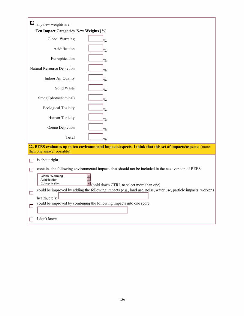
156
my new weights are: Ten Impact Categories New Weights [%]
Global Warming %
Acidification %
Eutrophication %
Natural Resource Depletion %
Indoor Air Quality %
Solid Waste %
Smog (photochemical) %
Ecological Toxicity %
Human Toxicity %
Ozone Depletion %
Total % 22. BEES evaluates up to ten environmental impacts/aspects. I think that this set of impacts/aspects: (more than one answer possible)
is about right
contains the following environmental impacts that should not be included in the next version of BEES:
Global WarmingAcidificationEutrophication (hold down CTRL to select more than one)
could be improved by adding the following impacts (e.g., land use, noise, water use, particle impacts, worker's
health, etc.):
could be improved by combining the following impacts into one score:
I don't know

157
23. BEES evaluates building products based on a selected number of environmental impacts at the level of impact potentials in the cause-effect chain. The figure below shows that one can (and there are methods that do) also evaluate building products on the level of stressors, effects, or damages. It illustrates the type of information that can be obtained on each level (without being comprehensive). For ozone layer depleting substances the figure includes arrows indicating which quantifications are currently possible (solid lines) and which are not (dotted lines).
a) Which set of results do you prefer to use in interpretation or weighting? (check only one)
The stressors (e.g., emission amounts of different pollutants)
The impact potentials as they are currently available in BEES (e.g., global warming, ozone depletion)
The number of cases on the effect level (e.g., skin cancer cases, malaria cases)
The damages to human health (e.g., measured in severity-weighted life years lost), ecosystems (e.g., measured in share of species lost), and resource stocks
All levels in parallel
I don't know b) In answering question a) above, what criteria did you use?
very important
somewhat important
not important
not considered
I trust the science/values behind the scores. All potential consequences are somehow included in the assessment, not only those consequences that have a high level of scientific understanding and quantification
I can weight or directly interpret the scores because I understand their meaning My company/customer does not have to report damages to people's or ecosystems' health
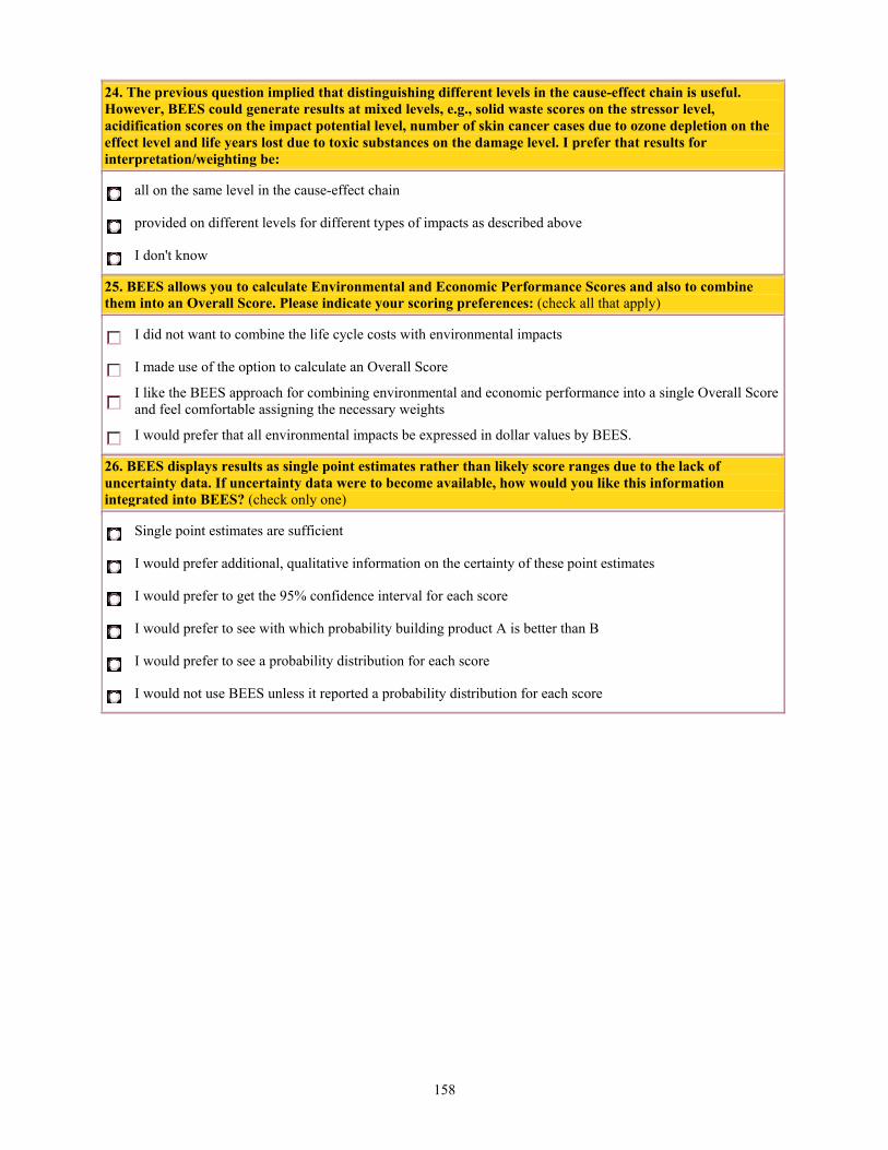
158
24. The previous question implied that distinguishing different levels in the cause-effect chain is useful. However, BEES could generate results at mixed levels, e.g., solid waste scores on the stressor level, acidification scores on the impact potential level, number of skin cancer cases due to ozone depletion on the effect level and life years lost due to toxic substances on the damage level. I prefer that results for interpretation/weighting be:
all on the same level in the cause-effect chain
provided on different levels for different types of impacts as described above
I don't know 25. BEES allows you to calculate Environmental and Economic Performance Scores and also to combine them into an Overall Score. Please indicate your scoring preferences: (check all that apply)
I did not want to combine the life cycle costs with environmental impacts
I made use of the option to calculate an Overall Score
I like the BEES approach for combining environmental and economic performance into a single Overall Score and feel comfortable assigning the necessary weights
I would prefer that all environmental impacts be expressed in dollar values by BEES. 26. BEES displays results as single point estimates rather than likely score ranges due to the lack of uncertainty data. If uncertainty data were to become available, how would you like this information integrated into BEES? (check only one)
Single point estimates are sufficient
I would prefer additional, qualitative information on the certainty of these point estimates
I would prefer to get the 95% confidence interval for each score
I would prefer to see with which probability building product A is better than B
I would prefer to see a probability distribution for each score
I would not use BEES unless it reported a probability distribution for each score

159
Thank you for additional comments/suggestions on the Survey and/or BEES
Submit Reset
Thanks for your time and feedback!
Office of Applied Economics Please send comments about this site to [email protected] Last modified: 7/18/01