UNCONDITONAL LOVE OF A GENTLE SOUL DAN ... - My LCAD
44
UNCONDITONAL LOVE OF A GENTLE SOUL DAN NGUYEN
-
Upload
khangminh22 -
Category
Documents
-
view
0 -
download
0
Transcript of UNCONDITONAL LOVE OF A GENTLE SOUL DAN ... - My LCAD

UNCONDITONAL LOVE OF A GENTLE SOUL
DAN NGUYEN

UNCONDITIONAL LOVE OF A GENTLE SOUL
A Thesis
Submitted to the Faculty
of
Laguna College of Art & Design
by
DAN NGUYEN
In Partial Fulfillment of the
Requirements for the Degree
of
Master of Fine Arts
April 2020

Laguna College of Art and Design
Master of Fine Arts Thesis Approval
Signature Page
Title of Thesis: Unconditional Love of a Gentle Soul
MFA Candidate:
Dan Nguyen
Thesis Advisor:
Rachel Smith, Ed.D
MFA Program Chair:
Peter Zokosky
Dean of MFA Program:
Hélène Garrison PhD, Provost
LCAD President:
Jonathan Burke
Date Approved:

ABSTRACT
Unconditional Love of a Gentle Soul focuses on human connections. I draw
inspiration from the relationships that I have with people around me, who are both unique
and artistic. By choosing to dig deep and highlighting the most vulnerable everyday moments
and feelings I have in these interactions, I consciously capture not only their cheerful,
uplifting, and pleasing aspects, but also the real, raw and sometimes uncomfortable attributes.
My chosen artistic path has been a straight, yet very rocky road, but the reward comes with
challenging myself to become a bolder and stronger creative.

iii
ACKNOWLEDGEMENTS
Thank you so much to everyone that has been on this amazing journey with me! I am
especially grateful for my family and my mentor - Natalia Fabia, who guides me through all
my self-doubts and hardships. I also want to send my heart out to every single person that
plays a role in my experiences with human connection. Even though some are no longer a
part of my life, I love you and still deeply care about you.

iv
DEDICATION
To mom, who has always been my number one support from a distance.
Without you, my dream would never come true.

v
EPIGRAPH
Mười năm
…Có người đến, có người đi và có người ở lại
Có lúc khôn và cũng có lần nhỡ dại
Có lúc tủi, có lúc vinh và có lúc thăng hoa
Có ngày cười, có ngày khóc và có ngày hoan ca
Đời cho ta quá nhiều thứ
Ta chưa cho đời được nhiều
Đến bây giờ vẫn chưa học được cách làm sao để lời
được nhiều
Mười năm như một bức hoạ, cũng may là trời đỡ xám
hơn
Thứ mà ta học được nhiều nhất là cách xin lỗi và lời
cám ơn… 1
-Đen
1 Translation in Appendix B

vi
TABLE OF CONTENTS
UNCONDITIONAL LOVE OF A GENTLE SOUL 1
DESCRIPTION 1
RESEARCH 10
METHODOLOGY 18
CONCLUSION 23
WORKS CITED 25
APPENDIX A 26
APPENDIX B 33
ARTIST’S NOTE 34

vii
TABLE OF FIGURES
Figure 1 Too Hot To Die, Dan Nguyen, 2018 2
Figure 2
Figure 3
Figure 4
Figure 5
Figure 6
Figure 7
Figure 8
Painterhood, Dan Nguyen, 2018
3AM, Dan Nguyen, 2018
Ghosting Friends, Dan Nguyen, 2020
F4, Dan Nguyen, 2020
Nude Woman, Joaquin Sorolla, 1902
Path, Natalia Fabia, 2016
Emma, Nick Alm, 2013
4
5
7
8
11
12
13

viii
TABLE OF PLATES
Plate 1 Too Hot To Die, Dan Nguyen, 2018 26
Plate 2
Plate 3
Plate 4
Plate 5
Plate 6
Plate 7
Painterhood, Dan Nguyen, 2018
3AM, Dan Nguyen, 2018
Ghosting Friends, Dan Nguyen, 2020
Grief, Dan Nguyen, 2020
F4, Dan Nguyen, 2020
Wellness Witchy Club, Dan Nguyen, 2020
27
28
29
30
31
32
1
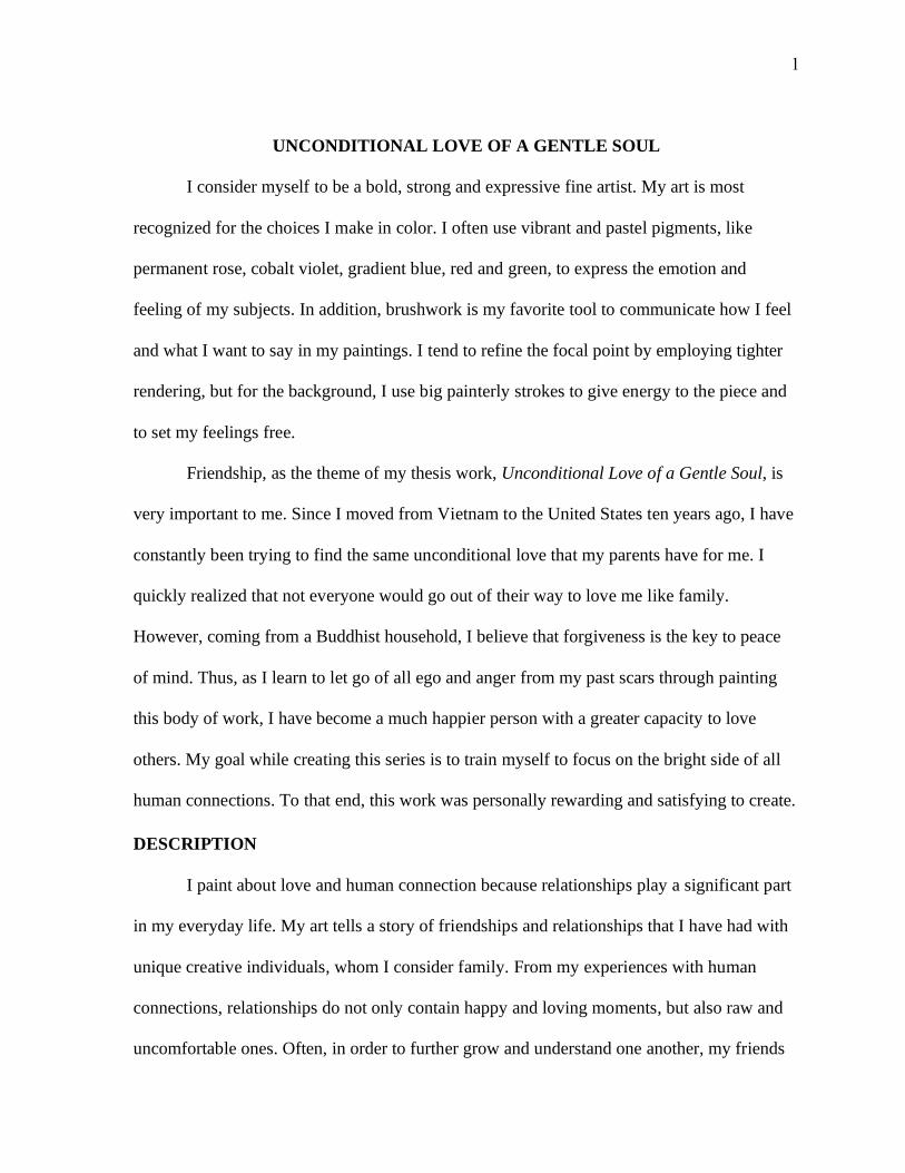
UNCONDITIONAL LOVE OF A GENTLE SOUL
I consider myself to be a bold, strong and expressive fine artist. My art is most
recognized for the choices I make in color. I often use vibrant and pastel pigments, like
permanent rose, cobalt violet, gradient blue, red and green, to express the emotion and
feeling of my subjects. In addition, brushwork is my favorite tool to communicate how I feel
and what I want to say in my paintings. I tend to refine the focal point by employing tighter
rendering, but for the background, I use big painterly strokes to give energy to the piece and
to set my feelings free.
Friendship, as the theme of my thesis work, Unconditional Love of a Gentle Soul, is
very important to me. Since I moved from Vietnam to the United States ten years ago, I have
constantly been trying to find the same unconditional love that my parents have for me. I
quickly realized that not everyone would go out of their way to love me like family.
However, coming from a Buddhist household, I believe that forgiveness is the key to peace
of mind. Thus, as I learn to let go of all ego and anger from my past scars through painting
this body of work, I have become a much happier person with a greater capacity to love
others. My goal while creating this series is to train myself to focus on the bright side of all
human connections. To that end, this work was personally rewarding and satisfying to create.
DESCRIPTION
I paint about love and human connection because relationships play a significant part
in my everyday life. My art tells a story of friendships and relationships that I have had with
unique creative individuals, whom I consider family. From my experiences with human
connections, relationships do not only contain happy and loving moments, but also raw and
uncomfortable ones. Often, in order to further grow and understand one another, my friends

2
and I must go through a process of learning each other’s good and bad qualities. As our
relationship progresses deeper, we develop an unconditional love and acceptance of our
flaws. When portraying human connection in art, it is important for me to stay honest and
paint both good and bad aspects of all relationships because these layers of depth keep my
audiences intrigued and analytical. My goal is to have them relate to each painting in many
different emotional levels.
The first painting that I made for this series of human connection was Too Hot to Die
(2017) (Figure 1). This was the first group-figure painting in my body of work. Too Hot to
Die brings the audience to my
personal space, the vanity area of my
room. Here is a scene of three young
females, including myself, getting
ready to go out. On the upper left side
of the canvas, the first figure, Mary, a
close friend of mine, is wearing a lime
green dress with a dark blue denim
jacket. She is leaning on the wall with
a champagne flute on her left hand
while looking and smiling at me, who
is on the right side of the painting. As
I look and smile back at Mary, my
hands are curling the hair of the third
figure – Claire. Claire is sitting on a Figure 1. Dan Nguyen, Too Hot To Die, 2018, Oil on
Canvas, 24" x 36", Private Collection.

3
chair below Mary and me. She is holding a small table mirror on her left hand while having
another champagne flute in her right hand that slightly touches Mary’s flute as they cheer.
Her eyes gaze up to Mary, creating a circle of movement throughout the painting.
In this painting, color and content are used to deliver the story of my friendship with
these two young women. Both Claire and I were wearing red dresses, the opposite
temperature and hue of Mary’s clothing. I made this choice intentionally in order to show the
differences in our personality. Mary is often more tomboyish and simpler in the way she
dresses in comparison to Claire and me. The fact that we were all smiling at one another in
the exact same way makes the piece seem superficial to me. The circle of movement from
one facial expression to the next appear posed and insincere. My development of this content
works for Too Hot to Die because this circle of friends often focuses on having exciting
activities together, instead of being there for each other in the way that best friends do. After
finishing up this piece, I realized that our friendship was not as close as I had always thought.
Therefore, I have never shared any deep conversations with them ever since. The next
painting in this series, Painterhood (2018), however, captures an intimate relationship of
mine with more depth and insight (Figure 2).
Painterhood (2018) is about my special relationship with my best girlfriend and
fellow artist, Kaela, whose personality is very different from mine. It was inspired by a
semester I spent here at Laguna College of Art + Design, sharing a small studio space with
her. In this painting, I portrayed our friendship through the placement of figures and contrasts
I created using colors. First, to show intimacy between the two figures, I positioned us sitting
close to each other in the middle of the painting. I also chose to overlap us in order to
emphasize the small scale of the studio. This showed that we were comfortably creating art in

4
the cramped space
together. It suggests our
support and love for one
another regardless of our
differences, which the
audiences start to notice
at second glance.
I used the
contrasts in colors as a
tool to show an important
characteristic of our friendship – the differences of our personalities. On the right of the
painting, I wear a fluffy fur coat in pastel colors: orange, blue, green and pink arranged in
rainbow-like order. My face is shown at a three-quarter angle, pointing away from my large
painting, Too Hot To Die. It is placed on a brown wooden easel to my right as a nod to the
shallowness of past relationships and my present desire to have deep friendships. Next to me
over to the left, Kaela is dressed in a black sweatshirt. Her blonde hair is pulled up in a messy
bun. Her face is looking down very closely at her small painting placed on a black metal
easel. In her painting, a female figure is also wearing all black and sitting against a black
background. The distinct contrast between the colors of our clothes and arts indicates big
differences in our personalities and painting styles. I am colorful, romantic, and expressive,
while Kaela is darker, practical and realistic. However, that never stops us from being close
and supportive towards each other. Once again, having two figures whose personalities are
different in a shared personal space together helps communicate that we comfortably accept
Figure 2. Dan Nguyen, Painterhood, 2018, Oil on Board, 24" x 18", Allan
Proctor Collection.

5
each other. The interesting dynamic of our friendship is what makes it intimate. This painting
for me is an example of the application of unconditional love. My friendship with Kaela
indicates good relationships celebrate differences. While being two different individuals that
we are, we still enjoy loving and more than anything letting the other be themselves.
Similarly, my painting,
3AM (2018) focuses on the
same meaning of human
connection (Figure 3). It is my
favorite piece from my body of
work that portrays the layers of
depth in the unique relationship
that I have with my former
roommate – Robbie. Here, I
used content and colors in
order to get my story across to
the audiences. The painting
was a scene in our living room at three o’clock in the morning. Around this hour, Robbie and
I would often hang out and watch TV together on our gray leather couch because he worked
long hours and I studied late. I usually ordered food and ate out from a to-go box while
enjoying our favorite TV show. Robbie, on my right, had his feet on the coffee table as his
body sank into the cushion of the couch. He slowly got more and more quiet. Out of
curiosity, I turned around to look at him only to realize that he had fallen asleep. As a result, I
got annoyed. However, I did not want to wake him up, which showed my care and empathy
Figure 3. Dan Nguyen, 3AM, 2018, Oil on Board, 24" x 24", Private
Collection.

6
for him. I understood that Robbie worked very hard and came home late at night, but he
would still give us time to catch up at the end of the day. Even though the time we spent
together was not long, it did not change our intimate friendship because we accepted and
loved each other unconditionally.
The color blue in 3AM plays a significant part in setting a somber tone to my story. I
pushed the blue TV light source to be much stronger with a layer of thinned out ultramarine
blue in order to show a dramatic effect of the piece. The intense blue tone brings more weight
to the story. Blue symbolizes sadness, and it implies the worry that I had for Robbie. When I
stared at him, I sensed his extreme exhaustion after a long day at work. Deep down inside, I
knew that he was trying very hard to survive as an expressive free spirit in the society filled
with judgements. As the color blue takes over the atmosphere, audiences start to connect with
the somberness and quietness of 3AM at a personal level.
The fourth painting that belongs to my theme of human connection is Ghosting
Friends (2019) (Figure 4). Instead of capturing an actual scene of my everyday life, this
painting has invented elements, specifically an imaginary scene, because it symbolizes my
inner pains and struggles that I face in friendships. According to Urban Dictionary, ghosting
means “when a person cuts off all communication with their friends or the person they're
dating, with zero warning or notice before hand.” Throughout my life, I have experienced
ghosting numerous times. There were many people who wanted to be my friend only to
suddenly disappear one day without any explanation. When getting into an intimate
friendship, I tend to be overly caring. I often go out of my way to help friends. To people that
prefer personal space, I can be viewed as clingy and needy. For the longest time, I would feel

7
hurt and upset whenever my
kindness was not returned with
the same type of treatment. I
constantly live with my past scars
and often end up feeling isolated
and alone. That is why in
Ghosting Friends, I painted my
self-portrait in a twisting and
turning gesture as the focal point
in the foreground. It implies that I
get caught up with what is behind
me and not be able to see what is
in front of me.
In this painting, I
developed a complex composition and used desaturated colors to help deliver a multiplex
story of past friendship experiences. I invented the whole space by painting San Francisco
cityscape as the far background and Laguna Beach as the near foreground. The contrast
between cityscapes is the most important component in building the narrative for Ghosting
Friends. I intentionally did so to separate the two types of relationship that I have
experienced. In the Laguna Beach nature setting, a couple of my friends are waiting for me to
catch up. One of them even turns around to get me. I painted the plants and figures here with
hints of saturation but still kept the color mostly cool for a believable atmosphere. By making
this choice, I imply that within this part of the painting, people are warmer and more loving.
Figure 4. Dan Nguyen, Ghosting Friends, 2020, Oil on Canvas,
24" x 30", Private Collection.

8
Painting nature is my way of saying that people that stand here are in the present and aware
of what really matters to them. In contrast, among the cityscape of San Francisco, there are
silhouettes of people walking always like ghosts. They slowly disappear into the fog, an
important character of the city. For this half of the painting, I used a lot of cool and neutral
greys with highly compressed value range to create a haunted atmosphere and sorrowful
mood. This painting reminds me that people are simply busy sometimes, but whoever truly
cares about me will always be there for me in hard times. This is the reality of life and
relationship. Because of that, I need to stay open-minded and have faith in them.
The fifth
painting that I
consider to be my
most important piece
of Unconditional
Love of a Gentle Soul
is F4 (2020), the
largest group figure
painting that I have
ever created (Figure 5). The narrative of F4 took place at the art studio of my mentor, Natalia
Fabia, where five female friends, including herself and me, were hanging out while being
creative together. In the middle of the painting, Natalia sat on a rolling stool with her left
hand holding a piece of paper towel and her right hand holding a paint brush as she talked.
She pointed her brush at her previously toned canvas on a wooden easel. With her lips
slightly opened, her face at a profile was looking straight to the posing model that sat on the
Figure 5. Dan Nguyen, F4, 2020, Oil on Canvas, 6' x 4', Private Collection.

9
model stand to the right side of the painting. The model is Erin, a close friend to us, whom I
consider to be my American aunt. She is the most respected person in this friend circle
because she always takes good care of us like her own nieces. Under Erin in the painting was
Carolina, another close friend of mine, being captured from a back view. She sat right by
Natalia on a pink plastic chair as she watched her paint. However, Carolina could not help
herself but to be distracted and looked at the two figures on the left, my friend, Jessie, and I.
We were having fun together and dancing on heels as Natalia’s painting demo went on.
I pushed content and composition in this piece to be my main vehicles that
communicate our femininity and the diversity of this friend circle. For example, in this art
studio, there are often so many different activities that take place. We dress up, paint, talk,
laugh, and dance together. F4 is an example of our jolly intimate hangouts, where we can
comfortably be ourselves and express our femininity although we come from different
varieties of age, personality and race. This painting is not considered to be a relatable
experience for most people because they often associate art studio with serious work mode
and dirty paint marks everywhere. However, Natalia is known for her glamorous fashion
style and her bold, girly personality. Her studio, with the pink floor, greatly represents her. At
first glance, in the middle of the painting, Natalia was dressed in her sparkly diamond boots
and mixed-pattern outfit of a white polka dot blouse with a pink floral mini skirt. I chose to
tightly render every single glamorous detail on her to make her the focal point of the
painting. Since we were in Natalia’s studio, I wanted to make her the most important figure
of the piece. Next to her, Carolina also dressed up, wearing a black provocative off-shoulder
top with a tight gold sequin skirt. On the other hand, Erin, on the model stand, was wearing a
long sleeve black dress with pearl necklaces, implying that she was more conservative and

10
matured than the rest of us. On the left of the painting, Jessie and I were standing back from
everyone while having our own playful interaction. We both dressed in revealing dancing
outfits of sport bras, boy shorts, knee pads, and exceeding high heels since we were
practicing and showing the girls a choreography that we have learned. The way I captured all
of us, through how we dressed to our body language, our multitasking ability, showed our
confidence and highlighted our femininity. F4 is my way of introducing to the audience a
beautiful diverse friendship that I have with these strong women, who never forget to have
fun together regardless of our different backgrounds.
Human connection is the theme for my current body of work. My paintings are about
different experiences I have had with each relationship in my life. The narratives in Too Hot
to Die, Painterhood, 3AM, Ghosting Friends, and F4 are examples of how much each of my
unique friendships means to me.
RESEARCH
Relationships play a significant role in my life and represent who I am as a fine artist.
Using oil paint as my main medium, I explore relationships through the lens of both Realism
and Impressionism. My expressive and colorful paintings focus on telling stories of my
experiences with the special friendships that I have had in my life. I often depict single or
multi-figured compositions in carefully crafted environments that support the narrative. In
this way, my art spotlights my moral value of love and human connection.
I choose Realism to capture the theme of love and human connection because it
supports the autobiographical narratives I am depicting. Realism “…refers to a mid-
nineteenth century artistic movement characterized by subjects painted from everyday life in
a naturalistic manner” (Tate). However, the term is generally used to describe artworks

11
painted in a realistic, almost photographic way. It can also be “…a passive capturing of
reflection of the real” (McGrath 20). To me, it is important for my audiences to recognize the
theme of my paintings immediately. With that being said, Realism is the style that most
successfully communicates my theme.
Another style that I
apply in my work is
Impressionism. It gives me
energy and freedom when
painting. Impressionism was
developed around the same
time period as Realism. Its
characteristics include rapid brushwork that is “broken into separate dabs in order to render
the fleeting quality of light” (Tate). One of my favorite masters that practiced Impressionism
is Joaquin Sorolla (1863-1923). He is “[a] painter and graphic artist especially known for his
lighting effects on canvas and rich coloration” (Askart.com). I had a chance to view his
painting, Nude Woman (1902), in person in Spain, and it completely blew my mind (Figure
6). The figure’s forms are beautifully captured with subtle shifts of pastel colors, while the
satin sheet was painted with big brushstrokes representing light when hitting the fabric
surface. The main shadows are in the figure’s hair, areas under her arms and between her
legs. These dark notes found on the nude figure direct the audiences to where he wants them
to look. I incorporate elements of Impressionism especially in the background of my
paintings mainly for visual effects. It does not necessarily help me deliver my theme better,
but it drives the viewers’ eyes to my focal point – the relationship that I am painting about.
Figure 6. Joaquin Sorolla, Nude Woman, 1902, Oil on Canvas, Private
Collection.

12
The evidence for this style is shown in the background of my painting, 3AM, where the
wooden floor, under two focal point figures, is painted with pronouncedly active
brushstrokes, following the direction of its perspective. Impressionism is my favorite design
tool when composing figurative paintings against a large environment.
In sum, I embrace both Realism and Impressionism in order to give my paintings a
complex contrast within surface and texture. While figures in my paintings are always
rendered smoothly, leaving very few brushstrokes to be seen, I handle the background around
them loosely and boldly. This does not mean that I fully abstract the background. I paint
every area of my paintings as the representation of reality with some experiments of mark
making. In the back of my
mind, I consciously want to
stay honest and vulnerable with
the viewers while leaving room
for their endless interpretation.
When looking for
inspiration, I am attracted to
the qualities of my mentor,
Natalia Fabia, a figurative artist
that also merges Realism and
Impressionism together. Her
website states, “Infused with
Fabia’s signature style, vividly
saturated candy color palettes Figure 7. Natalia Fabia, Path, 2016, Oil on panel, 48 x 60 in, Private
Collection.

13
and a dazzling spectrum of light, her work is a combination of fantasy narratives and actual
moments captured from the artist’s life” (nataliafabia.com). For example, in her painting,
Path (2016), she used saturated colors, painterly brush strokes and paint splatters (Figure 7).
In contrast to the expressive background, Fabia highly rendered the nude female figure in the
front, which keeps the eyes focus on the body forms. This combination of Realism and
Impressionism becomes a characteristic of my work after having studied under her for many
years. I have learned to explore paint application in many ways, like using palette knife,
fingers, paper towels, the edge of drawing papers, etc. I aim for my audiences to feel the
excitement when viewing my works like they do with Natalia’s works.
I also draw inspiration from
Nick Alm, another young
contemporary figurative artist that
produces paintings of one or multi-
figures against indoor or outdoor
environments. It has been said that
Alm “…moves freely between
realism and abstraction, often in the
same painting, in a dynamic
interplay” (Nick Alm: Selected
Works 2010-2018 2). What makes
his works so remarkable to me is
the beautiful glowing effect that he
achieves from his control of Figure 8. Nick Alm, Emma, 2013, Oil, 60 x 45 cm, Private
Collection.

14
lighting and value. Not only that, his composition where he places objects and figures is very
well designed that the viewers cannot stop staring at and engaging to them. He often
emphasizes the facial expression and body language of the figures in his work. This emphasis
is something that I use in my own personal work to support the interpretation of my
narratives.
Furthermore, Alm often plays with simplification. He sacrifices secondary details in
order to draw the viewers’ eyes to his focal point. For example, in the painting Emma (2013),
Alm abandoned all the details on a figure’s right hand and feet (Figure 8). They are painted
with two or three values, without any indication of fingers and toes. He is able to keep them
very suggestive but accurate at the same time, which requires a lot of experiences with
painting. Another area that he often simplifies is the background. He paints it expressively
with thinned out paints with little to no details. His paintings are not direct copies of photos
but the products of intentional execution and confident decision making. This is a huge
influence on my work. Even though I do not paint my background as thinly as Alm, I still
keep it fairly loose compared to my figures. I slowly give up unimportant details in my
paintings in order to make room for the viewer’s eyes to rest after they concentrate in highly
rendered areas – the narrative and connection of my figures. I make the decision to design
my paintings with big graphic shapes of solid color or putting certain areas in complete
shadow for dramatic lighting effect. This helps with creating emotion for my works. I try to
look at each of my paintings as a whole instead of focusing so much on the tiny little details.
The motivation for why I choose love and human connection as my theme goes way
back to when I was a child. I was born and raised in Hanoi, Vietnam in 1992 in a big family.
I have a total of eight uncles and aunts from my mother’s side, and each of them has at least

15
one child. As a result, I was always surrounded by love and laughter. My cousins and I often
played games, shared toys, and slept over at each other’s house. We were like actual siblings
to one another. My experience as a child was filled with warmth and loving interactions from
my family. This influences me to become a warm and caring person that I am today. My
main value in life remains to be love and human connection for years. As so, friendships and
relationships are the main subjects in my body of work.
My late grandmother was another reason why I grew up valuing love and human
connection. She was the person that helped take care of me when my parents were busy
working. I remember her as a fiery and confident woman, who would do anything in order to
support the family, including crossing the border of Vietnam and China to import fruit and
selling them at local markets. One of her biggest values was her religion. She was a
Buddhist, so I grew up believing in Buddhism.
Buddhism influences my views on friendship and relationship. I study and practice
Buddhist teaching in order to help me deal with anxiety and stress. One beautiful lesson that I
have learned particularly from reading about Nichiren Buddhism2 is that: “…at the heart of
Buddhism lies the belief that each individual has limitless positive potential and the power to
change his or her life for the better” (SGI). Regardless of each person’s individual
background, gender, race, color or creed, there is potential for good. I always carry this
teaching and apply it to my daily life. Throughout my time in the United States, I have been
friends with a wide variety of people of different races, genders, educational backgrounds
2 “In the 13th century, the Japanese priest Nichiren expressed the essence of the Lotus Sutra as “Nam-myoho-
renge-kyo.” He taught the practice of chanting this phrase as a means for all people to overcome suffering and
lead happy and fulfilled lives.” (SGI)

16
and ages, so diversity has a direct connection to the subjects and compositions of my art. We,
as human being, sometimes forget that we are sharing a home together on this earth. It is
important to be there, supporting and motivating each other no matter how different we are.
My body of work includes narrative figure paintings set within environment that
enhances the nature of the relationships conveyed. Each painting is a separate story of special
and unique friendships that I have in life. Since human connection is complex, I intentionally
arrange my compositions and contents to show layers of depth and different emotional states
for these relationships. Instead of only capturing exciting and uplifting moments, I dig deeper
to capture somber and quiet scenes as well.
Some of my somber narrative paintings about human connection took inspiration
from my time living in the States alone without family. I had to learn to take care of myself
and stay independent emotionally. Occasionally, when life got tough, I could not help but
miss my family. Slowly over time, I developed a new emotional support system within the
friendships that I considered family. My favorite sentiment about family comes from a quote
that I read on Elitedaily.com, “Family – Life’s greatest blessing. A group that dreams,
laughs, plays and loves together. Those whom you can always count on, always present not
only in the good times. The most precious gift.” The way I treat my friends is very similar to
the way I have learned to love my family unconditionally, which means that they can count
on me in both good and bad times. It is loving and caring for each other, not expecting
anything in return. Unconditional love is not a transaction. As I get older, I have learned that
not everyone is willing to love me unconditionally like my family. There are many times that
I need emotional support; I cannot find anyone who is available to be there and listen to me

17
vent. People are busy with their own lives, families and careers. This experience has hugely
affected the artistic voice and some sorrowful narratives of my art.
Everyone has his/her own personal experience of love and human connection, so it is
normal that a few audiences disagree with me about my value on love. Some may even
question why I have to constantly seek for support and happiness in life from other people. If
so, I have to admit that at one point in my life, I have counted on my friends and loved ones
to validate that I am a worthy being. I felt like if I surrounded my life with human
interactions at all times, it must mean that I was important to them. However, the moment I
could not get a hold of anyone, I started to question my existence on earth. It was not until
the past two months that I have fully realized that I did not love myself enough. I have
learned that there is no better unconditional love than the infinite self-love. My fear of
isolation starts to fade away as I invest more time in caring for myself. My painting Ghosting
Friends was the first time that I openly voiced my struggles on friendship and self-love. I
portrayed myself in a very vulnerable stage. I seemed lost and upset as my friends left me
behind. Little do I know; I am often caught up with my past scars that I do not see there are
people who truly love me unconditionally. Moreover, I am so afraid to be alone that instead
of viewing my personal time as an opportunity to grow, I sink deeply into depression. As I
painted the piece, I learned a lot about my past scars and realized that I should have a more
positive perspective and give people second chances.
In summary, as a fine artist that focuses on Realism and Impressionism stylistically
and uses oil as the main medium, my art is narrative of my love and connection with the
people around me, whom I consider family. My childhood faith in Buddhism has had a direct
influence in the way I pick friends and express my love to them. Those relationships also

18
represent who I am as a person. Each of them showcases a different side of my personality
and life story. Regardless of the ups and downs that I have experienced on human
connection, until today, I still hold my belief about unconditional love.
METHODOLOGY
I make art not only to express myself, but also to portray the love that I have for the
unique and creative people, whom I consider family. Therefore, my body of work focuses on
human connection. By digging deep and touching the most vulnerable mundane moments
and internal feelings that I have in these relationships, I consciously capture both their
cheering, uplifting, and pretty aspects and also, the real, raw and sometimes uncomfortable
aspects. I am an organized person when it comes to planning my everyday routine, thus my
creative process also tends to be very structured. While there are details within each step that
shift depending on what painting I am working on, I generally follow a consistent system
from start to finish. That includes journaling, preparing photo reference and painting.
Journaling is the first step of my creative process because this is where my inspiration
comes from. I do not always have a clear vision of what I want to paint, but my intuition tells
me that I should chase after a certain message. Whenever I feel that way, I know it is time for
me to journal. Journaling sends me to my highest meditative state. It helps me organize my
thoughts and feelings. It is a way to self-reflect and self-analyze in order to give me a better
understanding of what I am going through before I can paint it. This practice also helps me
seek answers and solutions for my relationships. It is very much like the job of a fortune
teller, in which she helps finding closures and answers for clients by looking into their past
and present. By writing down all the current thoughts, I discover my vision for future

19
paintings, similar to how a fortune teller foresees the future by gazing into her crystal ball
during scrying ritual.
To begin, I prepare a comfortable space, where I can journal. The space is usually a
dark quiet room like that of a fortune teller’s booth. Darkness allows me to enter a trance-like
state. I usually go for a cozy indoor spot with warm, dim lighting like my bedroom. I love
sitting on the mattress, tucking my feet inside a fluffy blanket, and positioning my back
against two to three pillows. Then, I turn on meditation music. Sometimes, I light up candles
or incense sticks to help soothe my mind and awaken my senses. Having a dreamy light
source and lingering smoke around the room is essential for concentration. As I feel more at
peace and focused, I place the laptop on my lap and start typing.
While I journal, I envision symbols and metaphors that represent those past and
present as they relate to the narrative or issue regarding my relationships. For example, I was
going through a tough time grieving for my grandmother and a close friend, both of whom
passed away not long ago. After two months of feeling the urge and conflict as to whether I
should create a painting expressing my love and sadness for them, I decided to journal to find
an answer. As I was writing about my feelings, the symbol of a lotus kept appearing in my
mind. Lotus is considered the national flower of Vietnam, and in Buddhism, it stands for
recreation and rebirth. It reminded me of my childhood when I used to chant with my
grandmother every night before we went to bed. She was the only person in my family that
frequently practiced the teaching and philosophy of Buddhism. Since the lotus symbol did
not disappear from me, I knew that I needed to hold onto it.
After I am done typing, I ruminate on the visual messages that appear during my
journaling meditation in order to find direct inspirations for my paintings. My vision of the

20
lotus flower was not an exception. When I slowly awoke from my meditation, I went online
to look for pictures of Buddhist art. I wanted to confirm that the image that I envisioned was
associated with Buddhism. As I looked through them, I felt more confident and certain to
make a painting of lotus flower. Then, the next step following my journaling was gathering
photo reference.
Preparing photo reference is the second step of my creative process because it is
crucial to have a high-resolution picture with an effective composition to refer to while
painting, especially for figurative artists like myself. The production of photo reference starts
out with sketching at least five small thumbnail ideas in my sketchbook. These drafts help me
see my overall vision tangibly in front of me for the first time. Each thumbnail would present
a totally different arrangement of composition and value range so that I can look at and
compare them together. Then, I pick one to three strongest compositions to be the direct
reference for a photoshoot. Deciding on my favorite thumbnails saves me time from guessing
on what to do at the photoshoot. Moreover, it acts as a guide to communicate with my
models and photographer to make sure that no one misunderstands my vision.
After choosing the final thumbnails, I contact everyone that will be at the photoshoot.
Most of the time, I prefer to take my own picture reference because I can better control the
camera angle to the best of my liking. However, when I appear to be one of the figures in my
paintings, I ask a close artist or photographer friend to help me with shooting. Once I make
sure all the figures are in their position like in my thumbnails, I would take or direct my
friends to take the actual photos. This process is usually somewhere around twenty to forty
minutes. I, then, go through all the pictures the next day and pick my favorite ones that have
high resolution, distinct lighting contrast, compelling facial expression and body language.
21
With the photo that conveys my narrative best, I use Photoshop to revise colors and rearrange
some placements of objects before I jump to painting.
The last step of my creative process is painting. To best demonstrate my execution, I
use 3AM, a painting from my body of work, as an example since my work mostly follows the
same order. 3AM portrayed the special bond and friendship of my ex roommate, Robbie, and
me. It captured a scene in our living room, where Robbie was falling asleep on the couch
next to me as we hung out and watched TV late at night. With the edited photo reference that
I have previously chosen, I roughly painted a small color study on an 8” x 8” gesso board.
My goals for making a quick color study before creating any final product is to prepare
myself with deep understanding of color, lighting, and composition of each scene. For 3AM,
it was to test out how much blue tint I should paint for the overall lighting coming from the
TV. I also wanted to practice for any drawing difficulties on perspective of the coffee table
and couch. Because of that, adding information and details on the faces was not necessary.
Once the color study was completed, I went to the art store to pick out a surface to
paint on. I chose a 24” x 24” gesso board, my preferred surface since it is smooth and
nonabsorbent, which allows me to play with mark making and painterly brushwork. I wanted
a medium sized board instead of large because there was not a lot of details in the faces in
my reference photo. Besides, I did not want to go with a small board because the viewers
often looked at paintings from a distance, so there needed to be enough room on the surface
for me to showcase details of smallest items on the coffee table. Afterwards, the actual
painting part began.
On the chosen gesso board, I often start with toning my surface because painting on
white is difficult for me to judge any value range and color relationship. While a lot of
22
painters prefer this first layer to be neutral, I like to take advantage and pick a color that helps
creating a filter for the painting. For specifically 3AM, I used a layer of thinned out
ultramarine blue, using Gamsol, to emphasize the hue of TV lighting. Once this layer was dry
enough to the touch, I began drawing using dark earth tone colors like burn sienna mixed
with olive green or ultramarine blue. In this painting, there was a lot of perspectives
involved, so I used a 03 x 03 grid template to guide myself. For some bigger works, I prefer
to project the picture onto my surface and trace over it, and for smaller works, I freehand the
drawing using my eyes and paint brush as measuring tools. As I have the drawing as close as
possible to the reference photo, I fill in shadow shapes with the same thinned out paint that I
used for the drawing. This whole layer of the painting is called a wash, or underpainting. I
always leave this to dry overnight before moving to the next layer.
On top of the wash, I pick between the figures or background to start blocking in with
paint mixed with little to no medium. I like to work from thin to thick consistency because
doing so helps my paintings maintain its original colors and condition over time. 3AM was a
painting of figures in environment, as so the background was the larger area. I began painting
the couch with a grey mixture created by adding thirty-five percent of ultramarine blue, thirty
percent of alizarin crimson, twenty percent of radiant turquoise and fifteen percent of viridian
that neutralizes the purple hue. For the wall, I used the same colors but with a slight ratio
adjustment where I added titanium white until it reached my desired brightness. Next, I
mixed color for the table in similar process, but I warmed it up with radiant red and cobalt
violet paint to give the piece variety and complexity. Lastly, I painted the figures, my friend
and me. For my regular skin tone mixture, I often use burnt sienna, yellow ochre, and
titanium white, depending on how light or dark the area is. Then, I add in either olive green,

23
ultramarine blue, alizarin crimson, cad red light or cad orange, depending on the temperature
of their flesh tone. I try my best to get the value and color as close to my planned-out color
study as possible so that I do not have to repaint over this second layer. In 3AM, my blocked-
in layer was quite accurate except for the table’s perspective that I had to make adjustments
on, using my photo reference to refer back. After repainting the table, I waited for 3AM to be
complete dry to add color glazing on top.
Last but not least, glazing layer is necessary for me because it helps with color
unification and acts as a quick complement to value contrast of the painting. For instance,
with 3AM, I added a tad of olive green and ultramarine blue in some walnut oil on the areas
on the left where the wall and blinds were not facing the TV. This act darkened the plane that
was not catching any TV lights and furthermore carried on the blue color harmony. Once all
of what mentioned above were completed, I considered my painting to be done.
My consistent painting process includes three steps of journaling, preparing photo
reference and painting. For me, it is most efficient to stick with an organized structure
because it allows me to compose a cohesive body of work. Not only that, I find this process
effective because it best assists me in achieving my personal goal of making successful
paintings that consist of thoroughly rendered focal point, high contrast in lighting value with
a good balance between saturated and desaturated colors.
CONCLUSION
Unconditional Love of a Gentle Soul is a journal about my complex relationships and
vulnerable emotions. Through my paintings, I tell the stories of my life experiences with the
people around me, whom I consider family. Each painting in the series represents a milestone
of my path in developing my deep values for love and human connection. Because

24
relationship is a complex idea, I include in this body of thesis work both uplifting and
sorrowful aspects of my experiences. The unhappy moments, that I have had, mostly come
from my desire to seek for outsider to fill up the emptiness of my heart. Unconditional Love
of a Gentle Soul started out as my way to voice an opinion on how relationships should
contain unconditional love. However, what I have learned from this series is that I need to let
go of all my expectations for people and love. I, instead, accept that change happens on
regular basis, and that people make a daily choice to whether they want to stay with me or
not. As I paint through each painting, I have brought myself back to inner awareness that
self-love is what I lack within me. Self-love is the only thing that I have full control of. From
there, I work on caring and dedicating more time to myself so that I do not have to search for
fulfillment from others. Instead, people around me – my family and friends – can truly play
their role as my support system and not as my validation. This, perhaps, will inspire me to
paint my next series focusing on love, specifically, self-love.

25
WORKS CITED
Alm, Nick. Emma, 2013, Oil, 60 x 45 cm, Private Collection.
“ABOUT.” Natalia Fabia, www.nataliafabia.com/about.
“Biography Joaquin Sorolla Y Bastida.” AskArt,
www.askart.com/artist_bio/Joaquin_Sorolla_Y_Bastida/11131421/Joaquin_Sorolla_
Y_Bastida.aspx.
Chapman, Rachel. “18 Quotes About Family That Describe Why You Love These Humans
Endlessly.” Elite Daily, 21 Nov. 2017.
Đen. “Mười Năm Lyrics.” Record Ack Studio, 2019, Musixmatch.
Fabia, Natalia. Path, 2016, Oil on panel, 48 x 60 in, Private Collection.
“Ghosting.” Urban Dictionary, 19 Aug. 2016.
McGrath, Jason. “Realism.” Journal of Chinese Cinemas, vol. 10, no. 1, Mar. 2016, pp. 20–
23. EBSCOhost.
“Nick Alm Brings Inner Worlds to Life.” Nick Alm: Selected Works 2010-2018, by Susanne
Lamm, Galleri Agardh & Tornvall, 2019, p. 2.
Sorolla, Joaquin. Nude Woman, 1902, Oil on Canvas, Private Collection.
Soka Gakkai International. “What Do Buddhists Believe in? What Is ‘Enlightenment’?” Soka
Gakkai International (SGI), www.sgi.org/faq/faq-buddhism/what-do-buddhists-
believe-in.html.
Soka Gakkai International. “SGI: A Snapshot” Soka Gakkai International (SGI),
www.sgi.org/snapshot/.
Tate. “Realism – Art Term.” Tate, www.tate.org.uk/art/art-terms/r/realism.
Tate. “Impressionism – Art Term.” Tate, www.tate.org.uk/art/art-terms/i/impressionism.

26
APPENDIX A
Plate 1: Dan Nguyen, Too Hot To Die, 2018, Oil on Canvas, 24" x 36", Private
Collection.

27
Plate 2: Dan Nguyen, Painterhood, 2018, Oil on Board, 24" x 18", Allan Proctor Collection.

28
Plate 3: Dan Nguyen, 3AM, 2018, Oil on Board, 24" x 24", Private Collection.

29
Plate 4: Dan Nguyen, Ghosting Friends, 2020, Oil on Canvas, 24" x 30", Private Collection.

30
Plate 5: Dan Nguyen, Grief, 2020, Oil on Board, 11" x 20", Private Collection.

31
Plate 6: Dan Nguyen, F4, 2020, Oil on Canvas, 6' x 4', Private Collection.

32
Plate 7: Dan Nguyen, Wellness Witchy Club, 2020, Oil on Canvas, 30" x 40", Private Collection.

33
APPENDIX B
Ten Years
…People come and go but some are meant to stay
Sometimes I’m wise but at times I’m a fool
Some days are bad while other days are glorious and
uplifting
Life is full of laughter, tears, and celebration
Life brings me so many things
But I haven’t given much back to it
Till today, I still don’t fully know how to gain from all
my mistakes
Ten years seem like a painting, and fortunately the sky
has slowly gotten less gloomy
At the end, what I have learned the most is how to
apologize and appreciate…
-Đen