To score or not to score? Tripling insights for participatory design
10
Published by the IEEE Computer Society 0272-1716/09/$25.00 © 2009 IEEE IEEE Computer Graphics and Applications 29 Visual-Analytics Evaluation To Score or Not to Score? Tripling Insights for Participatory Design Michael Smuc, Eva Mayr, Tim Lammarsch, Wolfgang Aigner, and Silvia Miksch ■ Danube University Krems Johannes Gärtner ■ Ximes V isual tools were used in the ancient world for data analysis (for example, the abacus for calculation), but human processing abilities and the capacities of these tools restricted analysis to small data sets. It wasn’t until the de- velopment of computers with greater processing power that more complex mathematical analyses of huge data sets became possible. In recent years, computers have also been used to develop visual methods and tools that further support the data analysis process. With the advent of the emerging field of visual analytics (VA), the underlying concept of visual tools is taken a step further. In essence, VA combines human analytical capabilities with com- puter processing capacities. 1 In the human-computer interaction process, the user generates new knowledge and gains insights. One challenge confronting VA is to develop visual-analysis tools that best support the user during data analysis to solve the problem at hand— to score. This is frequently achieved by scoring the insights generated using different tools (summative evaluation ). Another way to reach this goal is to design novel VA tools in a participatory way and to work with users during the design process (forma- tive evaluation ). In the process of determining how best to meet this challenge, we developed a three- level methodology that suits both approaches. Here, we examine this methodology in the con- text of the DisC¯ o research project (www.donau- uni.ac.at/disco). DisC¯ o The DisC¯ o project (from the Latin disco, meaning “I learn”) aims to design novel tools to visually analyze time-oriented data (see the “Novel Visual- Analytics Tools Developed in DisC¯ o” sidebar, next page). These tools are developed for use with Ximes’ Time Intelligence Solutions software and are tar- geted at human-resource-planning consultants. At the beginning of the project, we used task and user analysis to assess this target group’s requirements, which included optimal staffing or the design of shift work systems. Users have to present their re- sults to their customers, and new tools must have an intuitive, easy-to-understand design. Therefore, DisC¯ o tools are designed with an early focus on users and iterative testing phases. Insight as an Evaluation Method for Participatory Design Various methods have been de- veloped in recent years to test the use of visualization tools to support human reasoning. Clas- sic benchmarking metrics, such as efficiency and efficacy, proved to be of limited use for either gaining a deeper understanding of a visualization technique’s utility or evaluating the VA tool’s qual- ity. Benchmark metrics are typically task-based and used in highly standardized experimental settings, where tasks have to be compact and predefined. The experimental setting forces definitive, unam- biguous, and distinctive answers, and time con- straints leave little room for deeper elaboration of the findings. 2 Owing to the exploratory nature of knowledge discovery in VA, new paradigms for testing and evaluation that go “beyond time and errors” were For evaluating visual-analytics tools, many studies confine to scoring user insights into data. For participatory design of those tools, we propose a three-level methodology to make more out of users’ insights. The Relational Insight Organizer (RIO) helps to understand how insights emerge and build on one each other.
-
Upload
independent -
Category
Documents
-
view
6 -
download
0
Transcript of To score or not to score? Tripling insights for participatory design
Published by the IEEE Computer Society 0272-1716/09/$25.00 © 2009 IEEE IEEE Computer Graphics and Applications 29
Visual-Analytics Evaluation
To Score or Not to Score? Tripling Insights for Participatory Design
Michael Smuc, Eva Mayr, Tim Lammarsch, Wolfgang Aigner, and Silvia Miksch ■ Danube University Krems
Johannes Gärtner ■ Ximes
Visual tools were used in the ancient world for data analysis (for example, the abacus for calculation), but human processing
abilities and the capacities of these tools restricted analysis to small data sets. It wasn’t until the de-velopment of computers with greater processing power that more complex mathematical analyses of huge data sets became possible. In recent years, computers have also been used to develop visual methods and tools that further support the data analysis process. With the advent of the emerging field of visual analytics (VA), the underlying concept of visual tools is taken a step further. In essence, VA combines human analytical capabilities with com-puter processing capacities.1 In the human-computer interaction process, the user generates new knowledge and gains insights.
One challenge confronting VA is to develop visual-analysis tools that best support the user during data analysis to solve the problem at hand—to score. This is frequently achieved by scoring the insights generated using different tools (summative evaluation). Another way to reach this goal is to design novel VA tools in a participatory way and to work with users during the design process (forma-tive evaluation). In the process of determining how best to meet this challenge, we developed a three-level methodology that suits both approaches. Here, we examine this methodology in the con-text of the DisCo research project (www.donau-uni.ac.at/disco).
DisCoThe DisCo project (from the Latin disco, meaning “I learn”) aims to design novel tools to visually analyze time-oriented data (see the “Novel Visual-
Analytics Tools Developed in DisCo” sidebar, next page). These tools are developed for use with Ximes’ Time Intelligence Solutions software and are tar-geted at human-resource-planning consultants. At the beginning of the project, we used task and user analysis to assess this target group’s requirements, which included optimal staffing or the design of shift work systems. Users have to present their re-sults to their customers, and new tools must have an intuitive, easy-to-understand design. Therefore, DisCo tools are designed with an early focus on users and iterative testing phases.
Insight as an Evaluation Method for Participatory DesignVarious methods have been de-veloped in recent years to test the use of visualization tools to support human reasoning. Clas-sic benchmarking metrics, such as efficiency and efficacy, proved to be of limited use for either gaining a deeper understanding of a visualization technique’s utility or evaluating the VA tool’s qual-ity. Benchmark metrics are typically task-based and used in highly standardized experimental settings, where tasks have to be compact and predefined. The experimental setting forces definitive, unam-biguous, and distinctive answers, and time con-straints leave little room for deeper elaboration of the findings.2
Owing to the exploratory nature of knowledge discovery in VA, new paradigms for testing and evaluation that go “beyond time and errors” were
For evaluating visual-analytics tools, many studies confine to scoring user insights into data. For participatory design of those tools, we propose a three-level methodology to make more out of users’ insights. The Relational Insight Organizer (RIO) helps to understand how insights emerge and build on one each other.

30 May/June 2009
Visual-Analytics Evaluation
promoted to fill these explanatory gaps.3 (For other examples, visit the Web pages for the BELIV 06 [www.dis.uniroma1.it/~beliv06] and BELIV 08 [www.dis.uniroma1.it/~beliv08] workshops.) One of these metrics is the qualitative and quantitative measurement of user-reported insights.4 Although this approach was originally developed (and is ap-plied) for summative evaluations, it seemed po-tentially suitable for generating suggestions on improving the design of VA tools. After all, as insights are assessed in the analysis process, they should also be able to deliver information about the user’s knowledge discovery process.
Defining “Insight”However, one shortcoming of the insight meth-odology is the absence of a widely accepted, clear definition for what is actually an insight.4–6 What’s particularly problematic is that “insight” is an everyday word that everybody seems to un-derstand intuitively, but it has a wide variety of
different meanings (for example, Wikipedia lists four different meanings). In the scientific domain, “insights” have additional meanings, such as the “aha” experience during problem solving in psy-chology or knowledge discovery in VA. All of these meanings are in some way related, raising the need for clear differentiation. A clear definition is a pre-requisite for valid measurement of insights (see the “What’s Next on Our Journey into Understanding Insights?” sidebar, page 34).
But in VA, defining insights is further compli-cated by the granularity of the insight-gaining process: Is a new insight gained when a pattern is detected in a visualization, when a cognitive script is identified for data analysis, or when a mental model of the whole data set is completed? Differ-ent kinds of insights can be of interest in partici-patory design: how users make sense of a novel VA tool at first sight, which discoveries they make in the data, or the mental model they develop about data and data analysis. So, insight studies in par-
Analysis of time-oriented data includes exploration of trends, patterns, and relationships of multivariate
information. Time data is difficult to analyze because of its complex, natural (for example, seasons or days), and social (for example, business years or holidays) structure.1
In the case study we present in the main article as an example, we analyzed two visual-analytics tools for time-oriented data: the cycle plot2 and the multiscale plot.3 The cycle plot (see Figure A) aims to help the user differentiate trend and cyclic structures in data. The multiscale plot (see Figure B) aims to show as much data as possible in a limited space. It uses the structure of time and was modi-
fied to provide insight into overview and detail in a single visualization.
References 1. W. Aigner et al., “Visualizing Time-Oriented Data—a Systematic
View,” Computers & Graphics, vol. 31, no. 3, 2007, pp. 401–409.
2. W. Cleveland, Visualizing Data, Hobart Press, 1993.
3. M. Shimabukuro et al., “Coordinated Views to Assist Exploration
of Spatio-temporal Data: A Case Study,” Proc. 2nd Int’l Conf.
Coordinated and Multiple Views in Exploratory Visualization
(CMV 04), IEEE CS Press, 2004, pp. 107–117.
Novel Visual-Analytics Tools Developed in DisCo
60
50
40
30
20
10
00:00 1:00 2:00 3:00 4:00 5:00 6:00 7:00 8:00 9:00 10:00 11:00 12:00 13:00 14:00 15:00 16:00 17:00 18:00 19:00 20:00 21:00 22:00 23:00
Figure A. A cycle plot showing the number of police assignments in the Monday daily cycle (24 hours, x-axis). Within each hour, data from four
successive Mondays is displayed to show trends.
IEEE Computer Graphics and Applications 31
ticipatory design need a pragmatic definition that encompasses all these kinds of insights. Conse-quently, we have defined an insight as
the understanding gained by an individual using a visualization tool (or parts thereof) for the purpose of data analysis, which is a gradual process toward discovering new knowledge.
Because we define “insight” as a process rather than an outcome, it’s clear that insights can be assessed only in the actual process of visual analysis.
Insight Methodology in DisCoWe encountered a number of challenges in using insight methodology (as described by Purvi Saraiya and her colleagues4) in the DisCo project. First, only very few expert users actually analyze time-related data for human-resources (HR) planning (our application domain), so we couldn’t recruit
a large-enough sample to allow statistical hypoth-esis testing. Second (and most important), the resulting “insight counters” were too superficial and didn’t give detailed suggestions for improv-ing the tools.
Given the small number of experts available, we were able to interview only two appropriate us-ers on their insights into the visualizations. We also interviewed three semi-experts with limited knowledge of the application domain but some background knowledge in data analysis, and com-pared their results with those of the domain ex-perts. The similarities identified between experts and semi-experts (reported in previous work by Michael Smuc and his colleagues7) encouraged us to make further use of semi-experts for analysis purposes.
Confronted with the second challenge, we suc-cessively refined the methodological approach pro-posed by Saraiya and her colleagues and adapted it to the needs of our participatory-design project.
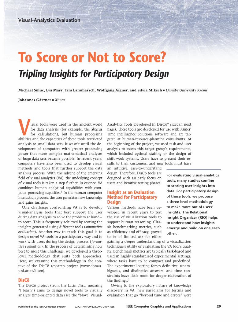
Police assignments 2005, daily average and 5-minute-raster
Many ongoing assignments on a day with many assignmentsMany ongoing assignments on a day with average assignmentsMany ongoing assignments on a day with few assignments
Few ongoing assignments on a day with many assignmentsFew ongoing assignments on a day with average assignmentsFew ongoing assignments on a day with few assignments
Mon. Tue. Wed. Thu. Fri. Sat. Sun.
0:00
12:00
24:000:00
12:00
24:000:00
12:00
24:000:00
12:00
24:00:00 :15 :30 :45 :60 :00 :15 :30 :45 :60 :00 :15 :30 :45 :60 :00 :15 :30 :45 :60 :00 :15 :30 :45 :60 :00 :15 :30 :45 :60 :00 :15 :30 :45 :60
Figure B. A multiscale plot. Like a calendar, each block shows one day. Inside each block, the rows represent hours, and each pixel in a row
represents a five-minute interval. In this visualization, 7,803 data points are displayed.

32 May/June 2009
Visual-Analytics Evaluation
This led to our three-level methodology. For our formative evaluation, we decided not to train par-ticipants on the use of the tools but to confront them instead with novel tools. This let us deter-mine how users make sense of the tools when they first see them.7
Level 1: “In the North”—Counting InsightsSaraiya and her colleagues4 and Chris North2 offer a detailed description of a way to analyze insights. First, they ask participants to analyze data using a given tool and to think aloud while doing so. The think-aloud protocols are then coded by domain experts with respect to different characteristics (see “An Insight-Based Methodology for Evaluat-ing Bioinformatics Visualizations”4 for a detailed description): the number of insights, the time of the insight, its domain value, its correctness, its directedness, its breadth and depth, and its cat-egory (overview, pattern, groups, and details). The values for each of these characteristics can be used to evaluate the tool in question.
When we examined the coding of these charac-teristics in detail, we found that “domain value” was coded similarly to “breadth and depth,” whereas “breadth and depth” in return was coded similarly to “overview” and “detail.” Especially deep insights have a high domain value and focus on details. De-spite intensive research, we have so far been unable to identify any studies addressing the redundan-cies between these insight categories. Correlations between these categories could uncover the redun-dancies and show whether they measure one or more dimensions. The characteristics also need to
be more clearly defined to allow differentiation. But this is beyond the scope of this article.
In DisCo, we followed the procedure suggested by Saraiya and her colleagues4 in our first level of analysis, with the following results. On average, participants gained more insights into the multi-scale plot than the cycle plot (see the “Novel Visual Analytics Tools Developed in DisCo” sidebar for a description of these plots). Both tools supported pattern finding and insights at an overview level, but neither supported any one of the insight cat-egories in particular (overview, patterns, groups, details; see Figure 1).
We found these results interesting when com-paring the two new tools and the different user groups (experts and semi-experts). However, we encountered problems in suggesting improvements for the novel VA tools, because no salient insight profile emerged. Therefore, we decided to look more closely at the insights to determine what the study participants contribute when it comes to im-proving the VA tools.
Level 2: “New Horizons”—Bottom Up, Top DownApart from the categories introduced by Saraiya and her colleagues, what other options are avail-able for coding insights? North suggests generat-ing these categories from the bottom up—that is, from the insights themselves by means of content analysis. By searching for similar insights and naming the resulting clusters according to their meaning, you can generate categories from the think-aloud protocols.
A different approach that fits well with a partic-ipatory-design process is to define categories in ad-vance. This top-down process can be aligned with the intended purpose of a tool. Most VA tools are designed to support specific kinds of analytic pro-cesses. Therefore, insight categories can be defined a priori for each of these analytic processes. If the users generate many insights related to the tool’s intended purpose, the tool is helpful to the user. If there are only a few or no such insights, the tool fails to accomplish its intended purpose, and its design needs to be reconsidered. An analysis at this level requires a tight integration between the tool’s development, design, and evaluation processes, to define top-down insight categories, interpret re-sults, and improve the tool accordingly.
Using the bottom-up approach in DisCo, we found that our participants reported two kinds of insights (see Figure 2): insights into the data but also insights into the tool (omitted from the re-sults presented at Level 1). These tool insights en-
Mean Standard deviation
Insight categories Mean Standard deviation
Time to �rst data insight (sec.) 128.8 103.3
Overview (%) 29 21
70.8 34.2
33 8Patterns (%) 54 20
43 6Groups (%) 15 10
Mean Standard deviation
12 10
Number of data insights 10.3 1.8
Details (%) 3 6
6.4 1.5
12 5
Multiscale plot Cycle plot
Figure 1. An overview of evaluation results at Level 1 for all participants. Although differences between the number of insights for each VA tool can be seen, no suggestions for improvements can be derived.

IEEE Computer Graphics and Applications 33
compass the users’ understanding of how the tool works, how it should be read, and where further improvements are needed to better support data analysis. Our analyses of data and tool insights for the two tools showed that although more data insights were gained for the multiscale plot, nearly the same number of tool insights was generated for both plots (see Figure 3).
Beyond counting the tool insights, a qualitative analysis of them is interesting because it shows how users without any prior knowledge make sense of a novel tool. For example, all participants in our study recognized the “calendar metaphor” ad hoc for the multiscale plot. This metaphor helped them immensely in understanding how the tool worked. As a consequence, the tool could be renamed to reflect this metaphor, and other tools could be de-signed and built using similar, well-known, easy-to-apply metaphors. This applies in particular to the cycle plot, because most participants had problems in understanding how it worked.
Taking the top-down approach, we generated insight categories in advance based on the ana-lytic processes each tool was designed to support (see the “Novel Visual Analytics Tools Developed in DisCo” sidebar). Because the intention of the cycle plot is to help users identify trends and cy-cles, we coded data insights for this plot as either cycle or trend data insights (see Figure 2). The multiscale plot is designed to help users gain in-sights at both the overview and the detail levels. We again coded data insights accordingly as over-view or detail data insights (see Figures 2 and 3). At first sight, these categories are similar to those defined by Saraiya and her colleagues.4 However, here we also coded both for patterns and groups as to whether they focused on an overview or a detail level.
In contrast to the results obtained at Level 1, more details were categorized at this level. One possible explanation for this could be that patterns and groups are coded preferentially as a detail level. For the new categories “trends” and “cycles,” a clear picture emerged: cyclic structures led more often to insights. However, the standard deviation for these two categories is rather high.
These findings reveal the need for improvement for both plots. Neither supports the user in gener-ating insights into both categories to an equivalent extent (as originally intended). A possible improve-ment could be to allow the user to switch inter-actively between trend and cycle lines or between overview and detailed view.
More detailed analyses of the transcripts from Level 2 indicated that tool insights often precede
any related data insights. As a consequence, we looked more closely at the connections between insights—that is, how they build on one another and how a complete picture is obtained.
Level 3: “Arriving in RIO”—the Relational Insight OrganizerIn the prior two levels, we coded only characteris-tics of single insights. But insights always build on prior knowledge and insights into the data and the tool. That is why most evaluations focus only on expert users or imply intensive a priori training. To better understand how such expert users gain insights when they use VA tools, an analysis of the insight generation process and how insights build on each other is required.
Bottom-up Data insight “It decreases until 6 a.m. when it reaches a minimum.
I assume this is due to […], to my knowledge, the
change of shift.” (multiscale plot)
Tool insight “The more green, the fewer assignments; the more
blue, the more assignments.” (multiscale plot)
Top-down Multiscale plot
Overview “On average, Sundays are rather low.”
Detail “It peaks at noon. It’s always darkest then.”
Cycle plot
Cycle “Starting in the morning, it rises to a peak around
10 or 11 a.m. It then calms down by noon, but there
is a second peak around 4 or 5 p.m., after which it
decreases again.”
Trend “The first Monday is high, the second is lower, but it
rises again on the third and fourth.”
Figure 2. Examples for each category generated by a bottom-up and a top-down approach.
Multiscale plot Cycle plot
Mean Standard deviation
Intended categories Mean Standard deviation
Number of data insights 10.3 1.8
Overview (%) 73 15
6.4 1.5
Detail (%) 27 15
Number of tool insights 12.0 7.910.0 3.2
Cycles (%) 61 38Trends (%) 39 38
(b)
(a)
Figure 3. Overview of evaluation results at Level 2: (a) bottom up and (b) top down. The top-down insights provide information on whether the visualization meets its intended purpose.

34 May/June 2009
Visual-Analytics Evaluation
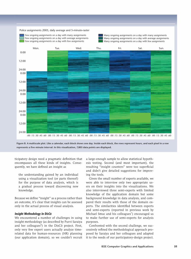
How best can these relations between insights be analyzed? In computer-supported collaborative learning, Daniel Suthers and his colleagues sug-gest an uptake graph showing how the utterances made by learners build on their own prior utter-ances and those of other learners on a timeline.8 We applied this approach to the insight timeline of one participant in our study and drew a relational insight organizer (RIO).
A RIO (see Figure 4a) consists of multiple rows of icons along a timeline. The upper row shows prior knowledge, the next rows each show one (bottom-up or top-down) insight category (in our case, insights into both the tool and the data). The icons are posi-tioned according to when they were first mentioned. For each insight identified in the think-aloud proto-col, we noted whether it required prior knowledge and built on a prior insight. To ensure the reliability of these relations, we found it beneficial to have them rated by at least two researchers. When the insight is built on prior knowledge, a prior-knowledge icon is added at this point in the first row, and an arrow is drawn to indicate the relation. Similarly, for insights that build on prior insights, an arrow is drawn from the first to the second insight.
To further aid interpretation of the relations between utterances, Suthers adds content (parts of the utterances) to the graph. In RIO, we fol-lowed this suggestion to a certain degree for easier interpretation, naming insights according to their assigned category (see Level 2). For some analyses, it might be interesting to add annotations, parts of the transcripts, or screenshots to help other re-searchers and designers reconstruct the interpre-tations. An example is given in Figure 4b for User 3 (see also the “What’s Next on Our Journey into Understanding Insights?” sidebar).
When we used this type of visualization for the insights into both novel VA tools in DisCo, we found the visual analysis of our participants’ in-sights particularly enlightening. In a first analysis step, we took a process-oriented view of success or failure stories for individual users to identify fac-tors that allowed them to score or not. In a second step, these individual processes could be compared to identify more general patterns of analysis. These patterns could then be used to align tool design to user analysis processes.
In Figure 4, we show two RIOs for the cycle plot. Figure 4a shows insight generation by a semi-expert. Relatively quickly, this user had the insight that the tool shows trends over a four-week period (H1). The user’s data insights prior to the explanation of the tool can be divided into three phases: The first three data insights focus on the daily cycle (C1 to C3), the next three are generated with respect to trends (T4 to T6), and his final insight identifies an interaction between cycles and trends (CT7).
Interestingly, we found that these first two phases were common to nearly all other participants: they focus initially on the daily cycle, then change to trends. Only the expert user (Figure 4b) skipped the first phase and primarily analyzed trends, mention-ing only at the end that “a daily cycle can also be seen.” This result allows us to draw two inferences. First, users seem to find it difficult to switch quickly and frequently between interpreting cycles and trends (which they all did for the multiscale plot’s intended overview and detail categories). Second, the salience of cycles seems to be higher because corresponding insights are nearly always generated first and (as can be seen in Figure 4a) they do not require a related preceding tool insight.
On the basis of these results, we suggested two improvements to the tool: an increase in the sa-lience of the trends and the provision of a switch between the cycle-salient and trend-salient views. A second pattern identified in the RIOs displayed in Figure 4 is the use of prior knowledge by experts
Until now, insights in visual analytics (VA) were defined rather narrowly as knowledge discoveries regarding the data. In our
study, we categorized user insights from the bottom up and found that they also frequently included insights into the tool. Such tool insights offer valuable information for the design of VA tools.
Further work on insight methodology should address how interaction with the tool, the data, and the annotations relates to user insights. The amount of elaboration is also interesting (one user in our study took several minutes to elaborate on one tool insight). With some refinements, both ideas could be visualized in the Relational Insight Organizer (as new relations and duration-dependent insight blocks).
An important contribution for the community and for under-standing user insight generation would also be a cognitive theory of the user in visual data analysis. Important sources for such a theory could be findings from psychology and sense-making, with the inclusion of the elaboration cycles introduced by sense-making frameworks in particular worth consideration.1
Reference 1. P. Pirolli and S. Card, “The Sense-Making Process and Leverage
Points for Analyst Technology as Identified through Cognitive Task
Analysis,” Proc. 2005 Int’l Conf. Intelligence Analysis, McLean, 2005,
pp. 2–4.
What’s Next on Our Journey into Understanding Insights?
IEEE Computer Graphics and Applications 35
in comparison to semi-experts. User 3 (an expert) used more prior knowledge than User 1 (a semi-expert) to understand how the tool works and how it should be used for data insight generation. This pattern was also observed for the second tool and the second expert. This indicates that an expert’s domain knowledge guides the use of a VA tool to a great extent but does not have as much of an influence on his or her interpretation of data. This might be a problem specific to the HR planning domain, because customers come from different sectors of industry, requiring less sector-specific knowledge than analysis-specific knowledge. The expert’s cognitive scripts and knowledge of analyz-ing time-oriented HR data greatly influence how he or she extracts information from a tool.
Moving North or to RIO? A GuidepostWe introduced three different levels of analysis that can be applied to insights assessed via think-aloud protocols: insight counters, bottom-up and top-down insight categories, and RIO. But which of these levels is the most appropriate? In our opinion, no single approach is superior. When applying the various levels in DisCo, we always gained impor-tant results. Each level provides answers to different questions. Our methodological exploration leads to the conclusion that the appropriate level of analy-sis depends primarily on the evaluation goals (for example, whether it is applied during summative evaluation or iterative testing or how much time is available for analysis) and the research question (for example, whether tools are to be compared or
Tool
insi
ghts
Dat
a in
sigh
ts
M2
P2
H1 M3
M4
M5 I7
I8
I9
M6 I10
I11
I12
I13
C1
C2
C3
T4
T5 T6
CT7
C8
P3P1
Exp
lana
tion
´0:30 ´1:00 ´1:30 ´2:00 `2:30 ´3:00 `3:30 ´4:00 `4:30 ´5:00 `5:30 ´6:00 `6:30 ´7:00 `7:30 ´8:00 `8:30 ´9:00 `9:30 ´10:00 `10:30
Priorknowledge
Tool
insi
ghts
Dat
a in
sigh
ts
´0:30 ´1:00 ´1:30 ´2:00 `2:30 ´3:00 `3:30 ´4:00 `4:30 ´5:00 `5:30 ´6:00 `6:30 ´7:00 `7:30 ´8:00 `8:30
H2
H3 I4 I7
I9
T1
T2 T4 C6
Explanation
P1 P2 P3 P4 P5 Tool insight categoriesH Insight—how the
tool worksM Meta-insight—how
to “read” the toolI Insight—how to
improve the tool
Data insight categoriesC Cycle insightT Trend insightO Other insight
Priorknowledge
No overallpattern
Number ofassignments ata given time
Trend patternin the evening(from 5pm)
Trend patternin the morning(until 7am)
Data from 4weeks withina bin
T4T2 C6
Timescale
Trend patternduring the day(7am–5pm)
Need formetadata
Restriction innumber of data thatcan be displayed
Course of the day
Intradailychange invariance
H1 M5
O5
I8
Zoom
T3
Identi�cation ofoutliers
Filtering outdata pointswithin bin
Graphical combina-tion of mean and standard derivation
M6
(a)
(b)
Figure 4. Relational insight organizers (RIOs) of (a) User 1, a semi-expert, and (b) User 3, an expert, for the cycle plot. It shows the insights organized by time, and how they relate to each other.

36 May/June 2009
Visual-Analytics Evaluation
improved and what kind of results are needed). In the following, we provide assistance with choosing the route to take—that is, to go North or to go to RIO. Table 1 provides an overview of all levels.
When we look again at Level 1, a major advan-tage is that the analysis steps are relatively well defined (with the exception of the previously men-tioned difficulties with some of the categories) and can be applied with the least effort. However, this analysis level is also time consuming. We found it most appropriate when used to analyze differences between groups of users or visualizations. Saraiya and her colleagues also used insight counters to compare different VA tools with regard to their ability to support user knowledge discovery pro-cesses.4 One restriction of insight counters is that they provide more quantitative than qualitative re-sults. This is beneficial insofar as they are easy to interpret, but also problematic because no qualita-tive findings for design improvements are gained. In participatory design, this level is beneficial only if we have a direct comparison between alternative tools or different variants of the same tool.
At Level 2, top-down or bottom-up strategies can be applied to generate new, tailored insight catego-ries. Top-down strategies are particularly important for insight studies in participatory design. By defin-ing the kind of insights the novel VA tool should promote in advance, the results of the user study demonstrate whether the tool fulfils its intended purpose. This can be less time-consuming than a full analysis at Level 1 (although you should con-sider using both levels), but the output can be much more relevant for design improvements.
Bottom-up strategies are more time-consuming in analysis because clustering and content analysis have to be carried out before the insights can be coded. But a bottom-up approach is often worth the additional effort because it demonstrates those insights promoted by the novel tool that the devel-opers and researchers did not think of in advance.
In our study, we found that users gain both tool and data insights, which might have been provoked by the omission of the a priori training phase in the DisCo project. But these insights allow us to observe how participants gain an understanding of how a novel VA tool works. Although this is rare for insight studies to date, we would like to encourage this approach in other participatory-design studies because it provides valuable findings on how users make sense of a tool, how they struggle with vi-sualization elements, how they learn to “read” the visualizations, and how they start to work with the tool in the analysis processes.
Analyses at Level 2 can be more laborious than at Level 1, especially when insight categories are generated bottom-up. But both bottom-up and top-down categories provide useful information on the kind of insights the tool promotes. This information can be used to further improve the tool in the next iterative design phase.
Level 3 contains the most time-consuming in-sight analyses: data and tool insights are visually plotted on the user’s analysis process timeline. In the RIO, insights are related to the prior insights and knowledge on which they are built and to the subsequent insights that make use of them. This analysis has to be conducted separately for each individual user and could, therefore, be restricted to subsamples only. In our experience, to provide visual clarity, a RIO for a think-aloud protocol of approximately one hour can be drawn on one sheet of paper.
One benefit of RIO over the first two levels is that we remain close to the visual-analysis process instead of being restricted to summative insight counting. As with VA, we move from pure compu-tational data analysis to visual data analysis. The latter makes it easier to obtain a more complete picture, to see relations, and to interpret data more qualitatively. By taking this step, we not only as-sess our measures during the analysis process but
Table 1. A comparison of the three levels of insight analysis with respect to the outcomes, answerable research questions, potential, problems, and possible design improvements.
Level Research question Output Potential benefits Challenges and problems Design questions
1 Comparison of tools, users, or user groups
Number of insights, timeline, insight categories, correctness
Easy to apply, easy to interpret, quantitative results
No qualitative findings Which of the different visualizations should be selected?
2 What kinds of insights does a tool promote?
Intended insight categories, tool insights
Findings tailored to the visual-analytics tool
More laborious data analysis, only some qualitative findings
How can the tool be improved to support the intended analysis processes?
3 How does the tool promote the generation of insights?
Relations between insights, analysis process
More-qualitative findings related to the process, shows relations between insights instead of simply counting
Very laborious data analysis, only possible with small samples
Where did users fail and succeed in gaining the intended insights? How can the process be supported?

IEEE Computer Graphics and Applications 37
also interpret them in a process-like manner. This aids the design of VA tools enormously. We can see where a user is able to generate insight and where a user succeeds or fails to gain the intended insight—that is, where a user scores or doesn’t score. This process view helps to improve the design of VA tools throughout the data analysis process.
In an early, iterative usability-engineering phase in DisCo, we conducted analyses using all three levels we’ve described to test the insight method-ology. RIO turned out to be valuable in provid-ing insights leading to design improvements. One restraint of our study is that RIO was not tested using interactive elements, which might have led to additional errors and detours. At this early stage in DisCo, we used only mock-ups of the tools, but we did gain insight-based suggestions for where in-teractions were necessary. These findings were sub-sequently used to develop the VA tools further.
Our plan for the next iterations of formative testing is to use RIO for single, early-stage develop-ments, but analyses at Levels 1 and 2 for multiple comparisons and summative evaluation at the end of the project. In other words, we are already head-ing back North but are prepared to come back for a “samba in RIO.”
One limitation of all these levels of analysis is that collecting and analyzing insights is time consuming and should be used only when neces-sary. Insight analyses proved appropriate only for some research questions (see Table 1) and can be combined or substituted with other less time-consuming methodologies. For example, in DisCo we also relied on questionnaires and traditional posttests. Nonetheless, insights provide a good il-lustration of the understanding gained by users when using VA tools.
To conclude our journey from North to RIO, we suggest using all three levels of analysis at
different phases of participatory design:
Level 1 for comparing different tools, tool vari- ■
ants, or groups of users;Level 2 for testing the goodness of fit of a de- ■
signer’s intentions; andLevel 3 for better aligning the tool with the user ■
insight generation process.
We recommend starting the journey in the North and traveling to new horizons only if the results at that stage lack salience. If user insights do not meet the tool’s purpose on this trip, feel free to put on your dancing shoes and join in the samba in RIO.
AcknowledgmentsThe DisCo project (project 813388) is supported by the FIT-IT Visual Computing program of the Austria Federal Ministry of Transport, Innovation, and Technology. We thank our colleagues Hanna Risku, Karin Siebenhandl, Kay Muehlmann, and Florian Windhager, as well as the other members of the DisCo project consortium, for their feedback on earlier versions of this article.
References 1. J.J. Thomas and K.A. Cook, Illuminating the Path:
The Research and Development Agenda for Visual Analytics, US Nat’l Visualization and Analytics Center, 2005; http://nvac.pnl.gov/docs/RD_Agenda_VisualAnalytics.pdf.
2. C. North, “Toward Measuring Visualization Insight,” IEEE Computer Graphics and Applications, vol. 26, no. 3, 2006, pp. 6–9.
3. C. Plaisant, J. Fekete, and G. Grinstein, “Promoting Insight-Based Evaluation of Visualizations: From Contest to Benchmark Repository,” IEEE Trans. Visualization and Computer Graphics, vol. 14, no. 1, 2008, pp. 120–134.
4. P.B. Saraiya, C. North, and K. Duca, “An Insight-Based Methodology for Evaluating Bioinformatics Visualizations,” IEEE Trans. Visualization and Computer Graphics, vol. 11, no. 4, 2005, pp. 443–456.
5. G.W. Hartmann, “The Concept and Criteria of Insight,” Psychological Rev., vol. 38, 1931, pp. 242–252.
6. G. Jones, “Testing Two Cognitive Theories of Insight,” J. Experimental Psychology: Learning, Memory, and Cognition, vol. 29, 2003, pp. 1017–1027.
7. M. Smuc et. al., “Visualizations at First Sight: Do Insights Require Training?” Learners, Technology, and the Brain, LNCS 5298, Springer, 2008, pp. 261–280.
8. D. Suthers et al., “An Abstract Transcript Notation for Analyzing Interactional Construction of Meaning in Online Learning,” Proc. 40th Ann. Hawaii Int’l Conf. System Sciences (HICSS 07), IEEE CS Press, 2007, p. 4c.
Michael Smuc is a research associate in the Research Center KnowComm at Danube University Krems. His research interests include usability, human-computer interaction from a psychological view, and participa-tory information design. Smuc has a Diploma in psy-chology from the University of Vienna. Contact him at [email protected].
Eva Mayr is a research associate at the Research Cen-ter KnowComm at Danube University Krems. Her research interests include participatory information design, computer-supported informal learning, and us-ability. Mayr is working on a PhD in applied cognitive

38 May/June 2009
Visual-Analytics Evaluation
and media psychology at the University of Tübingen. Contact her at [email protected].
Tim Lammarsch is a research associate in the Depart-ment of Information and Knowledge Engineering at Danube University Krems. He’s working on the InfoVis part of the DisCo Visual Analytics (VA) project, focus-ing on time-oriented data. His research interests include VA, information visualization, interactive computer graphics, pattern recognition, and human-computer interaction. Lammarsch has a Diploma in computer engineering from the University of Mannheim. Con-tact him at [email protected].
Wolfgang Aigner is a research associate in the De-partment of Information and Knowledge Engineering at Danube University Krems and a lecturer at the Vienna University of Technology. His research inter-ests include visual analytics and information visual-ization, human-computer interaction, usability, and user-centered design. Aigner has a PhD in computer science from the Vienna University of Technology. Contact him at [email protected].
Silvia Miksch is a professor in, and head of, the De-partment of Information and Knowledge Engineering at Danube University Krems, and head of the Infor-mation and Knowledge Engineering research group at the Institute of Software Technology and Interactive Systems at the Vienna University of Technology. Her research interests include information visualization and visual analytics (in particular, focus and context and interaction techniques). Miksch has a PhD in Information Systems from the University of Vienna. Contact her at [email protected]; www.donau-uni.ac.at/ike.
Johannes Gärtner is CEO of Ximes GmbH, a soft-ware company and consultancy that specializes in working-time and compensation schemes. He’s also an associate professor at the Faculty of Informatics (Institute of Design and Assessment of Technology) at the Vienna University of Technology. His research interests include the design and use of software in consulting and shift scheduling. Gärtner has a PhD in business informatics from the Vienna University of Technology. Contact him at [email protected].
The IEEE Computer Society Press is actively seeking authors who are interested in writing for our ReadyNotes—short, peer-reviewed e-books on a variety of “hot topics” aimed at busy computing professionals
looking for brief, practical reference guides and tutorials. ReadyNotes are focused on topics of current interest for practitioners and researchers alike and are offered at attractive prices as downloadable PDFs.
For more information, contact Kate Guillemette, [email protected], or visit www.computer.org/readynotes.
he IEEE Computer Society Press is actively seeking authors who are interested in writing for our ReadyNotes—short, peer-reviewed e-books on a variety of “hot topics” aimed at busy computing professionals
[ARE YOU READY? ]
C A L L F O R A U T H O R S