
The Process, Data, and Methods Using Stata Erik Mooi Marko ...
429
Springer Texts in Business and Economics Market Research The Process, Data, and Methods Using Stata Erik Mooi Marko Sarstedt Irma Mooi-Reci
-
Upload
khangminh22 -
Category
Documents
-
view
0 -
download
0
Transcript of The Process, Data, and Methods Using Stata Erik Mooi Marko ...

Springer Texts in Business and Economics
MarketResearchThe Process, Data,and Methods Using Stata
Erik Mooi Marko Sarstedt Irma Mooi-Reci

Springer Texts in Business and Economics

More information about this series at http://www.springer.com/series/10099

Erik Mooi • Marko Sarstedt • Irma Mooi-Reci
Market ResearchThe Process, Data, and MethodsUsing Stata

Erik MooiDepartment of Managementand MarketingUniversity of MelbourneParkville, Victoria, Australia
Marko SarstedtChair of MarketingOtto-von-Guericke-UniversityMagdeburg, Sachsen-Anhalt, Germany
Irma Mooi-ReciSchool of Social and Political SciencesUniversity of MelbourneParkville, Victoria, Australia
ISSN 2192-4333 ISSN 2192-4341 (electronic)Springer Texts in Business and EconomicsISBN 978-981-10-5217-0 ISBN 978-981-10-5218-7 (eBook)DOI 10.1007/978-981-10-5218-7
Library of Congress Control Number: 2017946016
# Springer Nature Singapore Pte Ltd. 2018This work is subject to copyright. All rights are reserved by the Publisher, whether the whole or part ofthe material is concerned, specifically the rights of translation, reprinting, reuse of illustrations,recitation, broadcasting, reproduction on microfilms or in any other physical way, and transmissionor information storage and retrieval, electronic adaptation, computer software, or by similar ordissimilar methodology now known or hereafter developed.The use of general descriptive names, registered names, trademarks, service marks, etc. in thispublication does not imply, even in the absence of a specific statement, that such names are exemptfrom the relevant protective laws and regulations and therefore free for general use.The publisher, the authors and the editors are safe to assume that the advice and information in thisbook are believed to be true and accurate at the date of publication. Neither the publisher nor theauthors or the editors give a warranty, express or implied, with respect to the material containedherein or for any errors or omissions that may have been made. The publisher remains neutral withregard to jurisdictional claims in published maps and institutional affiliations.
Printed on acid-free paper
This Springer imprint is published by Springer NatureThe registered company is Springer Nature Singapore Pte Ltd.The registered company address is: 152 Beach Road, #21-01/04 Gateway East, Singapore 189721,Singapore

To Irma– Erik Mooi
To Johannes– Marko Sarstedt
To Erik– Irma Mooi-Reci

Preface
In the digital economy, data have become a valuable commodity,much in theway that
oil is in the rest of the economy (Wedel and Kannan 2016). Data enable market
researchers to obtain valuable and novel insights. There aremany new sources of data,
such as web traffic, social networks, online surveys, and sensors that track suppliers,
customers, and shipments. A Forbes (2015a) survey of senior executives reveals that
96% of the respondents consider data-driven marketing crucial to success. Not
surprisingly, data are valuable to companies who spend over $44 billion a year on
obtaining insights (Statista.com 2017). So valuable are these insights that companies
go to great lengths to conceal the findings. Apple, for example, is known to carefully
hide that it conducts a great deal of research, as the insights from this enable the
company to gain a competitive advantage (Heisler 2012).
This book is about being able to supply such insights. It is a valuable skill for
which there are abundant jobs. Forbes (2015b) shows that IBM, Cisco, and Oracle
alone have more than 25,000 unfilled data analysis positions. Davenport and Patil
(2012) label data scientist as the sexiest job of the twenty-first century.
This book introduces market research, using commonly used quantitative
techniques such as regression analysis, factor analysis, and cluster analysis. These
statistical methods have generated findings that have significantly shaped the way
we see the world today. Unlike most market research books, which use SPSS
(we’ve been there!), this book uses Stata. Stata is a very popular statistical software
package and has many advanced options that are otherwise difficult to access. It
allows users to run statistical analyses by means of menus and directly typed
commands called syntax. This syntax is very useful if you want to repeat analyses
or find that you have made a mistake. Stata has matured into a user-friendly
environment for statistical analysis, offering a wide range of features.
If you search for market(ing) research books on Google or Amazon, you will find
that there is no shortage of such books. However, this book differs in many
important ways:
– This book is a bridge between the theory of conducting quantitative research and
its execution, using the market research process as a framework. We discuss
market research, starting off by identifying the research question, designing the
vii

data collection process, collecting, and describing data. We also introduce
essential data analysis techniques and the basics of communicating the results,
including a discussion on ethics. Each chapter on quantitative methods describes
key theoretical choices and how these are executed in Stata. Unlike most other
books, we do not discuss theory or application but link the two.
– This is a book for nontechnical readers! All chapters are written in an accessible
and comprehensive way so that readers without a profound background in
statistics can also understand the introduced data analysis methods. Each chapter
on research methods includes examples to help the reader gain a hands-on
feeling for the technique. Each chapter concludes with an illustrated case that
demonstrates the application of a quantitative method.
– To facilitate learning, we use a single case study throughout the book. This case
deals with a customer survey of a fictitious company called Oddjob Airways
(familiar to those who have seen the James Bond movie Goldfinger!). We also
provide additional end-of-chapter cases, including different datasets, thus
allowing the readers to practice what they have learned. Other pedagogical
features, such as keywords, examples, and end-of-chapter questions, support
the contents.
– Stata has become a very popular statistics package in the social sciences and
beyond, yet there are almost no books that show how to use the program without
diving into the depths of syntax language.
– This book is concise, focusing on the most important aspects that a market
researcher, or manager interpreting market research, should know.
– Many chapters provide links to further readings and other websites. Mobile tags
in the text allow readers to quickly browse related web content using a mobile
device (see section “How to Use Mobile Tags”). This unique merger of offline
and online content offers readers a broad spectrum of additional and readily
accessible information. A comprehensive web appendix with information on
further analysis techniques and datasets is included.
– Lastly, we have set up a Facebook page called Market Research: The Process,Data, and Methods. This page provides a platform for discussions and the
exchange of market research ideas.
viii Preface

How to Use Mobile Tags
In this book, there are several mobile tags that allow you to instantly access
information by means of your mobile phone’s camera if it has a mobile tag reader
installed. For example, the following mobile tag is a link to this book’s website at
http://www.guide-market-research.com.
Severalmobile phones comewith amobile tag reader already installed, but you can
also download tag readers. In this book, we use QR (quick response) codes, which can
be accessed by means of the readers below. Simply visit one of the following
webpages or download the App from the iPhone App Store or from Google Play:
– Kaywa: http://reader.kaywa.com/
– i-Nigma: http://www.i-nigma.com/
Once you have a reader app installed, just start the app and point your camera at
the mobile tag. This will open your mobile phone browser and direct you to the
associated website.
Step 1Point at a mobile tag and
take a picture
Step 2Decoding and
loading
Loading WWW
Step 3Website
Preface ix

How to Use This Book
The following will help you read this book:
• Stata commands that the user types or the program issues appear in a different
font.• Variable or file names in the main text appear in italics to distinguish them from
the descriptions.
• Items from Stata’s interface are shown in bold, with successive menu options
separated while variable names are shown in italics. For example, the text could
read: “Go to► Graphics► Scatterplot matrix and enter the variables s1, s2, ands3 into the Variables box.” This means that the word Variables appears in the
Stata interface while s1, s2, and s3 are variable names.
• Keywords also appear in bold when they first appear in the main text. We have
used many keywords to help you find everything quickly. Additional index
terms appear in italics.• If you see Web Appendix! Downloads in the book, please go to https://www.
guide-market-research.com/stata/ and click on downloads.
In the chapters, youwill also find boxes for the interested reader in whichwe discuss
details. The text can be understood without reading these boxes, which are therefore
optional. We have also included mobile tags to help you access material quickly.
For Instructors
Besides the benefits described above, this book is also designed to make teaching as
easy as possible when using this book. Each chapter comes with a set of detailed
and professionally designed PowerPoint slides for educators, tailored for this book,
which can be easily adapted to fit a specific course’s needs. These are available on
the website’s instructor resources page at http://www.guide-market-research.com.
You can gain access to the instructor’s page by requesting log-in information under
Instructor Resources.
x Preface

The book’s web appendices are freely available on the accompanying website
and provide supplementary information on analysis techniques not covered in the
book and datasets. Moreover, at the end of each chapter, there is a set of questions
that can be used for in-class discussions.
If you have any remarks, suggestions, or ideas about this book, please drop us a
line at [email protected] (Erik Mooi), [email protected] (Marko
Sarstedt), or [email protected] (Irma Mooi-Reci). We appreciate any
feedback on the book’s concept and contents!
Parkville, VIC, Australia Erik Mooi
Magdeburg, Germany Marko Sarstedt
Parkville, VIC, Australia Irma Mooi-Reci
Preface xi

Acknowledgments
Thanks to all the students who have inspired us with their feedback and constantly
reinforce our choice to stay in academia. We have many people to thank for making
this book possible. First, we would like to thank Springer and particularly Stephen
Jones for all their help and for their willingness to publish this book. We also want
to thank Bill Rising of StataCorp for providing immensely useful feedback. Ilse
Evertse has done a wonderful job (again!) proofreading the chapters. She is a great
proofreader and we cannot recommend her enough! Drop her a line at
[email protected] if you need proofreading help. In addition, we would like to
thank the team of current and former doctoral students and research fellows at Otto-
von-Guericke-University Magdeburg, namely, Kati Barth, Janine Dankert, Frauke
Kühn, Sebastian Lehmann, Doreen Neubert, and Victor Schliwa. Finally, we would
like to acknowledge the many insights and 1 suggestions provided by many of our
colleagues and students. We would like to thank the following:
Ralf Aigner of Wishbird, Mexico City, Mexico
Carolin Bock of the Technische Universitat Darmstadt, Darmstadt, Germany
Cees J. P. M. de Bont of Hong Kong Polytechnic University, Hung Hom,
Hong Kong
Bernd Erichson of Otto-von-Guericke-University Magdeburg, Magdeburg,
Germany
Andrew M. Farrell of the University of Southampton, Southampton, UK
Sebastian Fuchs of BMW Group, München, Germany
David I. Gilliland of Colorado State University, Fort Collins, CO, USA
Joe F. Hair Jr. of the University of South Alabama, Mobile, AL, USA
J€org Henseler of the University of Twente, Enschede, The Netherlands
Emile F. J. Lancee of Vrije Universiteit Amsterdam, Amsterdam, The Netherlands
Tim F. Liao of the University of Illinois Urbana-Champaign, USA
Peter S. H. Leeflang of the University of Groningen, Groningen, The Netherlands
Arjen van Lin of Vrije Universiteit Amsterdam, Amsterdam, The Netherlands
Leonard J. Paas of Massey University, Albany, New Zealand
xiii

Sascha Raithel of FU Berlin, Berlin, Germany
Edward E. Rigdon of Georgia State University, Atlanta, GA, USA
Christian M. Ringle of Technische Universitat Hamburg-Harburg, Hamburg,
Germany
John Rudd of the University of Warwick, Coventry, UK
Sebastian Scharf of Hochschule Mittweida, Mittweida, Germany
Tobias Sch€utz of the ESB Business School Reutlingen, Reutlingen, Germany
Philip Sugai of the International University of Japan, Minamiuonuma, Niigata,
Japan
Charles R. Taylor of Villanova University, Philadelphia, PA, USA
Andres Trujillo-Barrera of Wageningen University & Research
Stefan Wagner of the European School of Management and Technology, Berlin,
Germany
Eelke Wiersma of Vrije Universiteit Amsterdam, Amsterdam, The Netherlands
Caroline Wiertz of Cass Business School, London, UK
Michael Zyphur of the University of Melbourne, Parkville, Australia
References
Davenport, T. H., & Patil, D. J. (2012). Data scientist. The sexiest job of the 21st century. HarvardBusiness Review, 90(October), 70–76.
Forbes. (2015a). Data driven and customer centric: Marketers turning insights into impact. http://www.forbes.com/forbesinsights/data-driven_and_customer-centric/. Accessed 21 Aug 2017.
Forbes. (2015b).Where big data jobs will be in 2016. http://www.forbes.com/sites/louiscolumbus/
2015/11/16/where-big-data-jobs-will-be-in-2016/#68fece3ff7f1/. Accessed 21 Aug 2017.
Heisler, Y. (2012). How Apple conducts market research and keeps iOS source code locked down.Network world, August 3, 2012, http://www.networkworld.com/article/2222892/wireless/
how-apple-conducts-market-research-and-keeps-iossource-code-locked-down.html. Accessed
21 Aug 2017.
Statista.com. (2017). Market research industry/market – Statistics & facts. https://www.statista.com/topics/1293/market-research/. Accessed 21 Aug 2017.
Wedel, M., & Kannan, P. K. (2016). Marketing analytics for data-rich environments. Journal ofMarketing, 80(6), 97–121.
xiv Acknowledgments

Contents
1 Introduction to Market Research . . . . . . . . . . . . . . . . . . . . . . . . . . 1
1.1 Introduction . . . . . . . . . . . . . . . . . . . . . . . . . . . . . . . . . . . . . 1
1.2 What Is Market and Marketing Research? . . . . . . . . . . . . . . . 2
1.3 Market Research by Practitioners and Academics . . . . . . . . . . 3
1.4 When Should Market Research (Not) Be Conducted? . . . . . . . 4
1.5 Who Provides Market Research? . . . . . . . . . . . . . . . . . . . . . . 5
1.6 Review Questions . . . . . . . . . . . . . . . . . . . . . . . . . . . . . . . . . 8
1.7 Further Readings . . . . . . . . . . . . . . . . . . . . . . . . . . . . . . . . . 8
References . . . . . . . . . . . . . . . . . . . . . . . . . . . . . . . . . . . . . . . . . . . . 9
2 The Market Research Process . . . . . . . . . . . . . . . . . . . . . . . . . . . . . 11
2.1 Introduction . . . . . . . . . . . . . . . . . . . . . . . . . . . . . . . . . . . . . 11
2.2 Identify and Formulate the Problem . . . . . . . . . . . . . . . . . . . . 12
2.3 Determine the Research Design . . . . . . . . . . . . . . . . . . . . . . . 13
2.3.1 Exploratory Research . . . . . . . . . . . . . . . . . . . . . . . . 14
2.3.2 Uses of Exploratory Research . . . . . . . . . . . . . . . . . . 15
2.3.3 Descriptive Research . . . . . . . . . . . . . . . . . . . . . . . . 17
2.3.4 Uses of Descriptive Research . . . . . . . . . . . . . . . . . . 17
2.3.5 Causal Research . . . . . . . . . . . . . . . . . . . . . . . . . . . . 18
2.3.6 Uses of Causal Research . . . . . . . . . . . . . . . . . . . . . . 21
2.4 Design the Sample and Method of Data Collection . . . . . . . . . 23
2.5 Collect the Data . . . . . . . . . . . . . . . . . . . . . . . . . . . . . . . . . . 23
2.6 Analyze the Data . . . . . . . . . . . . . . . . . . . . . . . . . . . . . . . . . 23
2.7 Interpret, Discuss, and Present the Findings . . . . . . . . . . . . . . 23
2.8 Follow-Up . . . . . . . . . . . . . . . . . . . . . . . . . . . . . . . . . . . . . . 23
2.9 Review Questions . . . . . . . . . . . . . . . . . . . . . . . . . . . . . . . . . 24
2.10 Further Readings . . . . . . . . . . . . . . . . . . . . . . . . . . . . . . . . . 24
References . . . . . . . . . . . . . . . . . . . . . . . . . . . . . . . . . . . . . . . . . . . . 25
3 Data . . . . . . . . . . . . . . . . . . . . . . . . . . . . . . . . . . . . . . . . . . . . . . . . 27
3.1 Introduction . . . . . . . . . . . . . . . . . . . . . . . . . . . . . . . . . . . . . 28
3.2 Types of Data . . . . . . . . . . . . . . . . . . . . . . . . . . . . . . . . . . . . 28
3.2.1 Primary and Secondary Data . . . . . . . . . . . . . . . . . . . 31
3.2.2 Quantitative and Qualitative Data . . . . . . . . . . . . . . . 32
xv

3.3 Unit of Analysis . . . . . . . . . . . . . . . . . . . . . . . . . . . . . . . . . . 33
3.4 Dependence of Observations . . . . . . . . . . . . . . . . . . . . . . . . . 34
3.5 Dependent and Independent Variables . . . . . . . . . . . . . . . . . . 35
3.6 Measurement Scaling . . . . . . . . . . . . . . . . . . . . . . . . . . . . . . 35
3.7 Validity and Reliability . . . . . . . . . . . . . . . . . . . . . . . . . . . . . 37
3.7.1 Types of Validity . . . . . . . . . . . . . . . . . . . . . . . . . . . 39
3.7.2 Types of Reliability . . . . . . . . . . . . . . . . . . . . . . . . . 40
3.8 Population and Sampling . . . . . . . . . . . . . . . . . . . . . . . . . . . . 41
3.8.1 Probability Sampling . . . . . . . . . . . . . . . . . . . . . . . . 43
3.8.2 Non-probability Sampling . . . . . . . . . . . . . . . . . . . . . 45
3.8.3 Probability or Non-probability Sampling? . . . . . . . . . 46
3.9 Sample Sizes . . . . . . . . . . . . . . . . . . . . . . . . . . . . . . . . . . . . 47
3.10 Review Questions . . . . . . . . . . . . . . . . . . . . . . . . . . . . . . . . . 47
3.11 Further Readings . . . . . . . . . . . . . . . . . . . . . . . . . . . . . . . . . 48
References . . . . . . . . . . . . . . . . . . . . . . . . . . . . . . . . . . . . . . . . . . . . 49
4 Getting Data . . . . . . . . . . . . . . . . . . . . . . . . . . . . . . . . . . . . . . . . . . 51
4.1 Introduction . . . . . . . . . . . . . . . . . . . . . . . . . . . . . . . . . . . . . 51
4.2 Secondary Data . . . . . . . . . . . . . . . . . . . . . . . . . . . . . . . . . . 52
4.2.1 Internal Secondary Data . . . . . . . . . . . . . . . . . . . . . . 53
4.2.2 External Secondary Data . . . . . . . . . . . . . . . . . . . . . 54
4.3 Conducting Secondary Data Research . . . . . . . . . . . . . . . . . . 58
4.3.1 Assess Availability of Secondary Data . . . . . . . . . . . 58
4.3.2 Assess Inclusion of Key Variables . . . . . . . . . . . . . . 60
4.3.3 Assess Construct Validity . . . . . . . . . . . . . . . . . . . . . 60
4.3.4 Assess Sampling . . . . . . . . . . . . . . . . . . . . . . . . . . . 61
4.4 Conducting Primary Data Research . . . . . . . . . . . . . . . . . . . . 62
4.4.1 Collecting Primary Data Through Observations . . . . . 62
4.4.2 Collecting Quantitative Data: Designing Surveys . . . . 64
4.5 Basic Qualitative Research . . . . . . . . . . . . . . . . . . . . . . . . . . 82
4.5.1 In-Depth Interviews . . . . . . . . . . . . . . . . . . . . . . . . . 82
4.5.2 Projective Techniques . . . . . . . . . . . . . . . . . . . . . . . 84
4.5.3 Focus Groups . . . . . . . . . . . . . . . . . . . . . . . . . . . . . . 84
4.6 Collecting Primary Data Through Experimental Research . . . . 86
4.6.1 Principles of Experimental Research . . . . . . . . . . . . . 86
4.6.2 Experimental Designs . . . . . . . . . . . . . . . . . . . . . . . . 87
4.7 Review Questions . . . . . . . . . . . . . . . . . . . . . . . . . . . . . . . . . 89
4.8 Further Readings . . . . . . . . . . . . . . . . . . . . . . . . . . . . . . . . . 90
References . . . . . . . . . . . . . . . . . . . . . . . . . . . . . . . . . . . . . . . . . . . . 91
5 Descriptive Statistics . . . . . . . . . . . . . . . . . . . . . . . . . . . . . . . . . . . . 95
5.1 The Workflow of Data . . . . . . . . . . . . . . . . . . . . . . . . . . . . . 96
5.2 Create Structure . . . . . . . . . . . . . . . . . . . . . . . . . . . . . . . . . . 97
5.3 Enter Data . . . . . . . . . . . . . . . . . . . . . . . . . . . . . . . . . . . . . . 99
xvi Contents

5.4 Clean Data . . . . . . . . . . . . . . . . . . . . . . . . . . . . . . . . . . . . . . 99
5.4.1 Interviewer Fraud . . . . . . . . . . . . . . . . . . . . . . . . . . . 100
5.4.2 Suspicious Response Patterns . . . . . . . . . . . . . . . . . . 100
5.4.3 Data Entry Errors . . . . . . . . . . . . . . . . . . . . . . . . . . . 102
5.4.4 Outliers . . . . . . . . . . . . . . . . . . . . . . . . . . . . . . . . . . 102
5.4.5 Missing Data . . . . . . . . . . . . . . . . . . . . . . . . . . . . . . 104
5.5 Describe Data . . . . . . . . . . . . . . . . . . . . . . . . . . . . . . . . . . . . 110
5.5.1 Univariate Graphs and Tables . . . . . . . . . . . . . . . . . . 110
5.5.2 Univariate Statistics . . . . . . . . . . . . . . . . . . . . . . . . . 113
5.5.3 Bivariate Graphs and Tables . . . . . . . . . . . . . . . . . . . 115
5.5.4 Bivariate Statistics . . . . . . . . . . . . . . . . . . . . . . . . . . 117
5.6 Transform Data (Optional) . . . . . . . . . . . . . . . . . . . . . . . . . . 120
5.6.1 Variable Respecification . . . . . . . . . . . . . . . . . . . . . . 120
5.6.2 Scale Transformation . . . . . . . . . . . . . . . . . . . . . . . . 121
5.7 Create a Codebook . . . . . . . . . . . . . . . . . . . . . . . . . . . . . . . . 123
5.8 The Oddjob Airways Case Study . . . . . . . . . . . . . . . . . . . . . . 124
5.8.1 Introduction to Stata . . . . . . . . . . . . . . . . . . . . . . . . . 124
5.8.2 Finding Your Way in Stata . . . . . . . . . . . . . . . . . . . . 126
5.9 Data Management in Stata . . . . . . . . . . . . . . . . . . . . . . . . . . . 134
5.9.1 Restrict Observations . . . . . . . . . . . . . . . . . . . . . . . . 134
5.9.2 Create a New Variable from Existing Variable(s) . . . . 135
5.9.3 Recode Variables . . . . . . . . . . . . . . . . . . . . . . . . . . . 136
5.10 Example . . . . . . . . . . . . . . . . . . . . . . . . . . . . . . . . . . . . . . . . 137
5.10.1 Clean Data . . . . . . . . . . . . . . . . . . . . . . . . . . . . . . . . 138
5.10.2 Describe Data . . . . . . . . . . . . . . . . . . . . . . . . . . . . . 139
5.11 Cadbury and the UK Chocolate Market (Case Study) . . . . . . . 149
5.12 Review Questions . . . . . . . . . . . . . . . . . . . . . . . . . . . . . . . . . 150
5.13 Further Readings . . . . . . . . . . . . . . . . . . . . . . . . . . . . . . . . . 151
References . . . . . . . . . . . . . . . . . . . . . . . . . . . . . . . . . . . . . . . . . . . . 151
6 Hypothesis Testing & ANOVA . . . . . . . . . . . . . . . . . . . . . . . . . . . . 153
6.1 Introduction . . . . . . . . . . . . . . . . . . . . . . . . . . . . . . . . . . . . . 153
6.2 Understanding Hypothesis Testing . . . . . . . . . . . . . . . . . . . . . 154
6.3 Testing Hypotheses on One Mean . . . . . . . . . . . . . . . . . . . . . 156
6.3.1 Step 1: Formulate the Hypothesis . . . . . . . . . . . . . . . 156
6.3.2 Step 2: Choose the Significance Level . . . . . . . . . . . . 158
6.3.3 Step 3: Select an Appropriate Test . . . . . . . . . . . . . . 160
6.3.4 Step 4: Calculate the Test Statistic . . . . . . . . . . . . . . 168
6.3.5 Step 5: Make the Test Decision . . . . . . . . . . . . . . . . . 171
6.3.6 Step 6: Interpret the Results . . . . . . . . . . . . . . . . . . . 175
6.4 Two-Samples t-Test . . . . . . . . . . . . . . . . . . . . . . . . . . . . . . . 175
6.4.1 Comparing Two Independent Samples . . . . . . . . . . . . 175
6.4.2 Comparing Two Paired Samples . . . . . . . . . . . . . . . . 177
Contents xvii

6.5 Comparing More Than Two Means: Analysis of Variance
(ANOVA) . . . . . . . . . . . . . . . . . . . . . . . . . . . . . . . . . . . . . . 179
6.6 Understanding One-Way ANOVA . . . . . . . . . . . . . . . . . . . . . 180
6.6.1 Check the Assumptions . . . . . . . . . . . . . . . . . . . . . . 181
6.6.2 Calculate the Test Statistic . . . . . . . . . . . . . . . . . . . . 182
6.6.3 Make the Test Decision . . . . . . . . . . . . . . . . . . . . . . 186
6.6.4 Carry Out Post Hoc Tests . . . . . . . . . . . . . . . . . . . . . 187
6.6.5 Measure the Strength of the Effects . . . . . . . . . . . . . . 188
6.6.6 Interpret the Results and Conclude . . . . . . . . . . . . . . 189
6.6.7 Plotting the Results (Optional) . . . . . . . . . . . . . . . . . 189
6.7 Going Beyond One-Way ANOVA: The Two-Way
ANOVA . . . . . . . . . . . . . . . . . . . . . . . . . . . . . . . . . . . . . . . . 190
6.8 Example . . . . . . . . . . . . . . . . . . . . . . . . . . . . . . . . . . . . . . . . 198
6.8.1 Independent Samples t-Test . . . . . . . . . . . . . . . . . . . 198
6.8.2 One-way ANOVA . . . . . . . . . . . . . . . . . . . . . . . . . . 202
6.8.3 Two-way ANOVA . . . . . . . . . . . . . . . . . . . . . . . . . . 207
6.9 Customer Analysis at Credit Samouel (Case Study) . . . . . . . . 212
6.10 Review Questions . . . . . . . . . . . . . . . . . . . . . . . . . . . . . . . . . 213
6.11 Further Readings . . . . . . . . . . . . . . . . . . . . . . . . . . . . . . . . . 213
References . . . . . . . . . . . . . . . . . . . . . . . . . . . . . . . . . . . . . . . . . . . . 214
7 Regression Analysis . . . . . . . . . . . . . . . . . . . . . . . . . . . . . . . . . . . . . 215
7.1 Introduction . . . . . . . . . . . . . . . . . . . . . . . . . . . . . . . . . . . . . 216
7.2 Understanding Regression Analysis . . . . . . . . . . . . . . . . . . . . 216
7.3 Conducting a Regression Analysis . . . . . . . . . . . . . . . . . . . . . 219
7.3.1 Check the Regression Analysis Data
Requirements . . . . . . . . . . . . . . . . . . . . . . . . . . . . . . 219
7.3.2 Specify and Estimate the Regression Model . . . . . . . . 222
7.3.3 Test the Regression Analysis Assumptions . . . . . . . . 226
7.3.4 Interpret the Regression Results . . . . . . . . . . . . . . . . 231
7.3.5 Validate the Regression Results . . . . . . . . . . . . . . . . 237
7.3.6 Use the Regression Model . . . . . . . . . . . . . . . . . . . . 239
7.4 Example . . . . . . . . . . . . . . . . . . . . . . . . . . . . . . . . . . . . . . . . 243
7.4.1 Check the Regression Analysis Data
Requirements . . . . . . . . . . . . . . . . . . . . . . . . . . . . . . 244
7.4.2 Specify and Estimate the Regression Model . . . . . . . 248
7.4.3 Test the Regression Analysis Assumptions . . . . . . . . 249
7.4.4 Interpret the Regression Results . . . . . . . . . . . . . . . . 254
7.4.5 Validate the Regression Results . . . . . . . . . . . . . . . . 258
7.5 Farming with AgriPro (Case Study) . . . . . . . . . . . . . . . . . . . . 260
7.6 Review Questions . . . . . . . . . . . . . . . . . . . . . . . . . . . . . . . . . 262
7.7 Further Readings . . . . . . . . . . . . . . . . . . . . . . . . . . . . . . . . . 262
References . . . . . . . . . . . . . . . . . . . . . . . . . . . . . . . . . . . . . . . . . . . . 263
xviii Contents

8 Principal Component and Factor Analysis . . . . . . . . . . . . . . . . . . . 265
8.1 Introduction . . . . . . . . . . . . . . . . . . . . . . . . . . . . . . . . . . . . . 266
8.2 Understanding Principal Component and Factor Analysis . . . . 267
8.2.1 Why Use Principal Component and Factor
Analysis? . . . . . . . . . . . . . . . . . . . . . . . . . . . . . . . . . 267
8.2.2 Analysis Steps . . . . . . . . . . . . . . . . . . . . . . . . . . . . . 269
8.3 Principal Component Analysis . . . . . . . . . . . . . . . . . . . . . . . . 270
8.3.1 Check Requirements and Conduct Preliminary
Analyses . . . . . . . . . . . . . . . . . . . . . . . . . . . . . . . . . 270
8.3.2 Extract the Factors . . . . . . . . . . . . . . . . . . . . . . . . . . 273
8.3.3 Determine the Number of Factors . . . . . . . . . . . . . . . 278
8.3.4 Interpret the Factor Solution . . . . . . . . . . . . . . . . . . . 280
8.3.5 Evaluate the Goodness-of-Fit of the Factor
Solution . . . . . . . . . . . . . . . . . . . . . . . . . . . . . . . . . . 282
8.3.6 Compute the Factor Scores . . . . . . . . . . . . . . . . . . . . 283
8.4 Confirmatory Factor Analysis and Reliability Analysis . . . . . . 284
8.5 Structural Equation Modeling . . . . . . . . . . . . . . . . . . . . . . . . 289
8.6 Example . . . . . . . . . . . . . . . . . . . . . . . . . . . . . . . . . . . . . . . . 291
8.6.1 Principal Component Analysis . . . . . . . . . . . . . . . . . 291
8.6.2 Reliability Analysis . . . . . . . . . . . . . . . . . . . . . . . . . 304
8.7 Customer Satisfaction at Haver and Boecker (Case Study) . . . 306
8.8 Review Questions . . . . . . . . . . . . . . . . . . . . . . . . . . . . . . . . . 308
8.9 Further Readings . . . . . . . . . . . . . . . . . . . . . . . . . . . . . . . . . 309
References . . . . . . . . . . . . . . . . . . . . . . . . . . . . . . . . . . . . . . . . . . . . 309
9 Cluster Analysis . . . . . . . . . . . . . . . . . . . . . . . . . . . . . . . . . . . . . . . 313
9.1 Introduction . . . . . . . . . . . . . . . . . . . . . . . . . . . . . . . . . . . . . 314
9.2 Understanding Cluster Analysis . . . . . . . . . . . . . . . . . . . . . . . 314
9.3 Conducting a Cluster Analysis . . . . . . . . . . . . . . . . . . . . . . . . 316
9.3.1 Select the Clustering Variables . . . . . . . . . . . . . . . . . 316
9.3.2 Select the Clustering Procedure . . . . . . . . . . . . . . . . . 321
9.3.3 Select a Measure of Similarity or Dissimilarity . . . . . 333
9.3.4 Decide on the Number of Clusters . . . . . . . . . . . . . . . 340
9.3.5 Validate and Interpret the Clustering Solution . . . . . . 344
9.4 Example . . . . . . . . . . . . . . . . . . . . . . . . . . . . . . . . . . . . . . . . 349
9.4.1 Select the Clustering Variables . . . . . . . . . . . . . . . . . 350
9.4.2 Select the Clustering Procedure and Measure
of Similarity or Dissimilarity . . . . . . . . . . . . . . . . . . 353
9.4.3 Decide on the Number of Clusters . . . . . . . . . . . . . . . 354
9.4.4 Validate and Interpret the Clustering Solution . . . . . . 358
9.5 Oh, James! (Case Study) . . . . . . . . . . . . . . . . . . . . . . . . . . . . 362
9.6 Review Questions . . . . . . . . . . . . . . . . . . . . . . . . . . . . . . . . . 363
9.7 Further Readings . . . . . . . . . . . . . . . . . . . . . . . . . . . . . . . . . 364
References . . . . . . . . . . . . . . . . . . . . . . . . . . . . . . . . . . . . . . . . . . . . 365
Contents xix

10 Communicating the Results . . . . . . . . . . . . . . . . . . . . . . . . . . . . . . 367
10.1 Introduction . . . . . . . . . . . . . . . . . . . . . . . . . . . . . . . . . . . . . 367
10.2 Identify the Audience . . . . . . . . . . . . . . . . . . . . . . . . . . . . . . 368
10.3 Guidelines for Written Reports . . . . . . . . . . . . . . . . . . . . . . . 369
10.4 Structure the Written Report . . . . . . . . . . . . . . . . . . . . . . . . . 370
10.4.1 Title Page . . . . . . . . . . . . . . . . . . . . . . . . . . . . . . . . 371
10.4.2 Executive Summary . . . . . . . . . . . . . . . . . . . . . . . . . 371
10.4.3 Table of Contents . . . . . . . . . . . . . . . . . . . . . . . . . . . 371
10.4.4 Introduction . . . . . . . . . . . . . . . . . . . . . . . . . . . . . . . 372
10.4.5 Methodology . . . . . . . . . . . . . . . . . . . . . . . . . . . . . . 372
10.4.6 Results . . . . . . . . . . . . . . . . . . . . . . . . . . . . . . . . . . 373
10.4.7 Conclusion and Recommendations . . . . . . . . . . . . . . 383
10.4.8 Limitations . . . . . . . . . . . . . . . . . . . . . . . . . . . . . . . 384
10.4.9 Appendix . . . . . . . . . . . . . . . . . . . . . . . . . . . . . . . . . 384
10.5 Guidelines for Oral Presentations . . . . . . . . . . . . . . . . . . . . . . 384
10.6 Visual Aids in Oral Presentations . . . . . . . . . . . . . . . . . . . . . . 385
10.7 Structure the Oral Presentation . . . . . . . . . . . . . . . . . . . . . . . 386
10.8 Follow-Up . . . . . . . . . . . . . . . . . . . . . . . . . . . . . . . . . . . . . . 387
10.9 Ethics in Research Reports . . . . . . . . . . . . . . . . . . . . . . . . . . 388
10.10 Review Questions . . . . . . . . . . . . . . . . . . . . . . . . . . . . . . . . . 389
10.11 Further Readings . . . . . . . . . . . . . . . . . . . . . . . . . . . . . . . . . 389
References . . . . . . . . . . . . . . . . . . . . . . . . . . . . . . . . . . . . . . . . . . . . 389
Glossary . . . . . . . . . . . . . . . . . . . . . . . . . . . . . . . . . . . . . . . . . . . . . . . . . 391
Index . . . . . . . . . . . . . . . . . . . . . . . . . . . . . . . . . . . . . . . . . . . . . . . . . . . 411
xx Contents

Introduction to Market Research 1
Keywords
American Marketing Association (AMA) • ESOMAR • Field service firms • Full
service providers • Limited service providers • Segment specialists • Specialized
service firms • Syndicated data
Learning Objectives
After reading this chapter, you should understand:
– What market and marketing research are and how they differ.
– How practitioner and academic market(ing) research differ.
– When market research should be conducted.
– Who provides market research and the importance of the market research
industry.
1.1 Introduction
When Toyota developed the Prius—a highly fuel-efficient car using a hybrid petrol/
electric engine—it took a gamble on a grand scale. Honda and General Motors’
previous attempts to develop frugal (electric) cars had not worked well. Just like
Honda and General Motors, Toyota had also been working on developing a frugal
car, but focused on a system integrating a petrol and electric engine. These
development efforts led Toyota to start a project called Global Twenty-first Century
aimed at developing a car with a fuel economy that was at least 50% better than
similar-sized cars. This project nearly came to a halt in 1995 when Toyota encoun-
tered substantial technological problems. The company solved these problems,
using nearly a thousand engineers, and launched the car, called the Prius, in
Japan in 1997. Internal Toyota predictions suggested that the car was either going
# Springer Nature Singapore Pte Ltd. 2018
E. Mooi et al., Market Research, Springer Texts in Business and Economics,
DOI 10.1007/978-981-10-5218-7_1
1

to be an instant hit, or that the product’s acceptance would be slow, as it takes time
to teach dealers and consumers about the technology. In 1999, Toyota decided to
start working on launching the Prius in the US. Initial market research showed that
it was going to be a difficult task. Some consumers thought it was too small for the
US and some thought the positioning of the controls was poor for US drivers. There
were other issues too, such as the design, which many thought was too strongly
geared towards Japanese drivers.
While preparing for the launch, Toyota conducted further market research,
which could, however, not reveal who the potential car buyers would be. Initially,
Toyota thought the car might be tempting for people concerned with the environ-
ment, but market research dispelled this belief. Environmentalists dislike technol-
ogy in general and money is a big issue for this group. A technologically complex
and expensive car such as the Prius was therefore unlikely to appeal to them.
Additional market research did little to identify any other good market segment.
Despite the lack of conclusive findings, Toyota decided to sell the car anyway and
to await the public’s reaction. Before the launch, Toyota put a market research
system in place to track the initial sales and identify where customers bought the
car. After the formal launch in 2000, this system quickly found that celebrities were
buying the car to demonstrate their concern for the environment. Somewhat later,
Toyota noticed substantially increased sales figures when ordinary consumers
became aware of the car’s appeal to celebrities. It appeared that consumers were
willing to purchase cars that celebrities endorse.
CNW Market Research, a market research company specializing in the automo-
tive industry, attributed part of the Prius’s success to its unique design, which
clearly demonstrated that Prius owners were driving a different car. After substan-
tial increases in the petrol price, and changes to the car (based on extensive market
research) to increase its appeal, Toyota’s total Prius sales reached about four
million and the company is now the market leader in hybrid petrol/electric cars.
This example shows that while market research occasionally helps, sometimes it
contributes little, or even fails. There are many reasons for market research’s
success varying. These reasons include the budget available for research, the
support for market research in the organization, the implementation, and the market
researchers’ research skills. In this book, we will guide you step by step through the
practicalities of the basic market research process. These discussions, explanations,
facts, and methods will help you carry out successful market research.
1.2 What Is Market and Marketing Research?
Market research can mean several things. It can be the process by which we gain
insight into how markets work. Market research is also a function in an organiza-
tion, or it can refer to the outcomes of research, such as a database of customer
purchases, or a report that offers recommendations. In this book, we focus on the
market research process, starting by identifying and formulating the problem,
continuing by determining the research design, determining the sample and method
2 1 Introduction to Market Research

of data collection, collecting the data, analyzing the data, interpreting, discussing,
and presenting the findings, and ending with the follow-up.
Some people consider marketing research and market research to be synony-
mous, whereas others regard these as different concepts. TheAmericanMarketing
Association (AMA), the largest marketing association in North America, defines
marketing research as follows:
The function that links the consumer, customer, and public to the marketer through
information – information used to identify and define marketing opportunities and
problems; generate, refine, and evaluate marketing actions; monitor marketing perfor-
mance; and improve understanding of marketing as a process. Marketing research specifies
the information required to address these issues, designs the method for collecting infor-
mation, manages and implements the data collection process, analyzes the results, and
communicates the findings and their implications (American Marketing Association 2004).
On the other hand, ESOMAR, the world organization for market, consumer and
societal research, defines market research as:
The systematic gathering and interpretation of information about individuals and
organisations. It uses the statistical and analytical methods and techniques of the applied
social, behavioural and data sciences to generate insights and support decision-making by
providers of goods and services, governments, non-profit organisations and the general
public. (ICC/ESOMAR international code on market, opinion, and social research and data
analytics 2016).
Both definitions overlap substantially, but the AMA definition focuses on mar-
keting research as a function (e.g., a department in an organization), whereas the
ESOMAR definition focuses on the process. In this book, we focus on the process
and, thus, on market research.
1.3 Market Research by Practitioners and Academics
Practitioners and academics are both involved in marketing and market research.
Academic and practitioner views of market(ing) research differ in many ways, but
also have many communalities.
There is, however, a key difference is their target groups. Academics almost
exclusively undertake research with the goal of publishing in academic journals.
Highly esteemed journals include the Journal of Marketing, Journal of MarketingResearch, Journal of the Academy of Marketing Science, and the InternationalJournal of Research in Marketing. On the other hand, practitioners’ target group is
the client, whose needs and standards include relevance, practicality, generalizabil-
ity, and timeliness of insights. Journals, on the other hand, frequently emphasize
methodological rigor and consistency. Academic journals are often difficult to read
and understand, while practitioner reports should be easy to read.
Academics and practitioners differ greatly in their use of and focus on methods.
Practitioners have adapted and refined some of the methods, such as cluster analysis
1.3 Market Research by Practitioners and Academics 3

and factor analysis, which academics developed originally.1 Developing methods is
often a goal in itself for academics. Practitioners are more concerned about the
value of applying specific methods. Standards also differ. Clear principles and
professional conduct as advocated by ESOMAR and the Australian Market &
Social Research Society (AMSRS) (for examples, see https://www.esomar.org/
uploads/public/knowledge-and-standards/codes-and-guidelines/ICCESOMAR-
International-Code_English.pdf and http://www.amsrs.com.au/documents/item/
194) mostly guide practitioners’ methods. Universities and schools sometimes
impose data collection and analysis standards on academics, but these tend not to
have the level of detail advocated by ESOMAR or the AMSRS. Interestingly, many
practitioners claim that their methods meet academic standards, but academics
never claim that their methods are based on practitioner standards.
Besides these differences, there are also many similarities. For example, good
measurement is paramount for academics and practitioners. Furthermore,
academics and practitioners should be interested in each other’s work; academics
can learn much from the practical issues that practitioners faced, while practitioners
can gain much from understanding the tools, techniques, and concepts that
academics develop. Reibstein et al. (2009), who issued an urgent call for the
academic marketing community to focus on relevant business problems, underlined
the need to learn from each other. Several other researchers, such as Lee and
Greenley (2010), Homburg et al. (2015), and Tellis (2017), have echoed this call.
1.4 When Should Market Research (Not) Be Conducted?
Market research serves several useful roles in organizations. Most importantly,
market research can help organizations by providing answers to questions firms
may have about their customers and competitors; answers that could help such firms
improve their performance. Specific questions related to this include identifying
market opportunities, measuring customer satisfaction, and assessing market
shares. Some of these questions arise ad hoc, perhaps due to issues that the top
management, or one of the departments or divisions, has identified. Much market
research is, however, programmatic; it arises because firms systematically evaluate
market elements. Subway, the restaurant chain, systematically measures customer
satisfaction, which is an example of programmatic research. This type of research
does not usually have a distinct beginning and end (contrary to ad hoc research), but
is executed continuously over time and leads to daily, weekly, or monthly reports.
The decision to conduct market research may be taken when managers face an
uncertain situation and when the costs of undertaking good research are (much)
lower than good decisions’ expected benefits. Researching trivial issues or issues
that cannot be changed is not helpful.
1Roberts et al. (2014) and Hauser (2017) discuss the impact of marketing science tools on
marketing practice.
4 1 Introduction to Market Research

Other issues to consider are the politics within the organization, because if the
decision to go ahead has already been made (as in the Prius example in the
introduction), market research is unnecessary. If market research is conducted
and supports the decision, it is of little value—and those undertaking the research
may have been biased in favor of the decision. On the other hand, market research is
ignored if it rejects the decision.
Moreover, organizations often need to make very quick decisions, for example,
when responding to competitive price changes, unexpected changes in regulation,
or to the economic climate. In such situations, however, market research may only
be included after decisions have already been made. Consequently, research should
mostly not be undertaken when urgent decisions have to be made.
1.5 Who Provides Market Research?
Many organizations have people, departments, or other companies working for
them to provide market research. In Fig. 1.1, we show who these providers of
market research are.
Most market research is provided internally by specialized market research
departments, or people tasked with this function. It appears that about 75% of
organizations have at least one person tasked with carrying out market research.
This percentage is similar across most industries, although it is much less in govern-
ment sectors and, particularly, in health care (Iaccobucci and Churchill 2015).
In larger organizations, a sub department of the marketing department usually
undertakes internally provided market research. Sometimes this sub department is
not connected to a marketing department, but to other organizational functions,
such as corporate planning or sales (Rouzies and Hulland 2014). Many large
organizations even have a separate market research department. This system of
having a separate market research department, or merging it with other
Providers ofmarket research
Internal External
Syndicated data
Full service
Segment specialists
Limited service
SpecializedCustomized services Field service
Fig. 1.1 The providers of market research
1.5 Who Provides Market Research? 5

departments, seems to become more widespread, with the marketing function
devolving increasingly into other functions within organizations (Sheth and Sisodia
2006).
The external providers of market research are a powerful economic force. In
2015, the Top 50 external providers had a collective turnover of about $21.78 billion
(Honomichl 2016). The market research industry has also become a global field
with companies such as The Nielsen Company (USA), Kantar (UK), GfK
(Germany), and Ipsos (France), playing major roles outside their home markets.
External providers of market research are either full service providers or
limited ones.
Full service providers are large market research companies such as The Nielsen
Company (http://www.nielsen.com), Kantar (http://www.kantar.com), and GfK
(http://www.gfk.com). These large companies provide syndicated data and
customized services. Syndicated data are data collected in a standard format and
not specifically collected for a single client. These data, or analyses based on the
data, are then sold to multiple clients. Large marketing research firms mostly collect
syndicated data, as they have the resources to collect large amounts of data and can
spread the costs of doing so over a number of clients. For example, The Nielsen
Company collects syndicated data in several forms: Nielsen’s Netratings, which
collects information on digital media; Nielsen Ratings, which details the type of
consumer who listens to the radio, watches TV, or reads print media; and Nielsen
Homescan, which collects panel information on the purchases consumers make.
These large firms also offer customized services by conducting studies for a specific
client. These customized services can be very specific, such as helping a client carry
out specific analyses.
Measuring TV audiences is critical for advertisers. But measuring the number
of viewers per program has become more difficult as households currently
have multiple TVs and may have different viewing platforms. In addition,
“time shift” technologies, such as video-on-demand, have further compli-
cated the tracking of viewer behavior. Nielsen has measured TV and other
media use for more than 25 years, using a device called the (Portable) People
Meter. This device measures usage of each TV viewing platform and
instantly transmits the results back to Nielsen, allowing for instant measure-
ment. Altogether, Nielsen captures about 40% of the world’s viewing
behavior.2
In the following seven videos, experts from The Nielsen Company discuss
how the People Meter works.
(continued)
2See http://www.nielsen.com/eu/en/solutions/measurement/television.html for further detail.
6 1 Introduction to Market Research

Contrary to full service providers, which undertake nearly all market research
activities, limited service providers specialize in one or more services and tend to
be smaller companies. In fact, many of the specialized market research companies
are one-man businesses and the owner—after (or besides) a practitioner or aca-
demic career—offers specialized services. Although there are many different types
of limited service firms, we only discuss three of them: those focused on segmenta-
tion, field service, and specialized services.
Segment specialists concentrate on specific market segments. Skytrax, which
focuses on market research in the airline and airport sector, is an example of such
specialists. Other segment specialists do not focus on a particular industry, but on a
type of customer; for example, Ethnic Focus (http://www.ethnicfocus.com), a
UK-based market research firm, focuses on understanding ethnic minorities.
Field service firms, such as Survey Sampling International (http://www.
surveysampling.com), focus on executing surveys, determining samples, sample
sizes, and collecting data. Some of these firms also translate surveys, or provide
addresses and contact details.
Specialized Service firms are a catch-all term for those firms with specific
technical skills, thus only focusing on specific products, or aspects of products,
such as market research on taste and smell. Specialized firms may also concentrate
on a few highly specific market research techniques, or may focus on one or more
highly specialized analysis techniques, such as time series analysis, panel data
analysis, or quantitative text analysis. Envirosell (http://www.envirosell.com), a
research and consultancy firm that analyzes consumer behavior in commercial
environments, is a well-known example of a specialized service firm.
A choice between these full service and limited service market research firms
boils down to a tradeoff between what they can provide (if this is highly specialized,
you may not have much choice) and the price of doing so. In addition, if you have to
combine several studies to gain further insight, full service firms may be better than
multiple limited service firms. The fit and feel with the provider are obviously also
highly important!
1.5 Who Provides Market Research? 7

1.6 Review Questions
1. What is market research? Try to explain what market research is in your own
words.
2. Imagine you are the head of a division of Procter & Gamble. You are just about
ready to launch a new shampoo, but are uncertain about who might buy it. Is it
useful to conduct a market research study? Should you delay the launch of the
product?
3. Try to find the websites of a few market research firms. Look, for example, at the
services provided by GfK and the Nielsen Company, and compare the extent of
their offerings to those of specialized firms such as those listed on, for example,
http://www.greenbook.org.
4. If you have a specialized research question, such as what market opportunities
there are for selling music to ethnic minorities, would you use a full service or
limited service firm (or both)? Please discuss the benefits and drawbacks.
1.7 Further Readings
American Marketing Association at http://www.marketingpower.com
Website of the American Marketing Association. Provides information on theiractivities and also links to two of the premier marketing journals, the Journal ofMarketing and the Journal of Marketing Research.
Insights Association at http://www.insightsassociation.org/ Launched in 2017, theInsights Association was formed through the merger of two organizations withlong, respected histories of servicing the market research and analytics industry:CASRO (founded in 1975) and MRA (founded in 1957). The organizationfocuses on providing knowledge, advice, and standards to those working in themarket research profession.
The British Market Research Society at http://www.mrs.org.uk
The website of the British Market Research society contains a searchable directoryof market research providers and useful information on market research careersand jobs.
Associac~ao Brasileira de Empresas de Pesquisa (Brazilian Association of Research
Companies) at http://www.abep.org/novo/default.aspx
The website of the Brazilian Association of Research Companies. It documentsresearch ethics, standards, etc.
ESOMAR at http://www.esomar.org
The website of ESOMAR, the world organization for market, consumer and societalresearch. Amongst other activities, ESOMAR sets ethical and technicalstandards for market research and publishes books and reports on marketresearch.
GreenBook: The guide for buyers of marketing research services at http://www.
greenbook.org
This website provides an overview of many different types of limited service firms.
8 1 Introduction to Market Research

References
Hauser, J. R. (2017). Phenomena, theory, application, data, and methods all have impact. Journalof the Academy of Marketing Science, 45(1), 7–9.
Homburg, C., Vomberg, A., Enke, M., & Grimm, P. H. (2015). The loss of the marketing
department’s influence: Is it happening? And why worry? Journal of the Academy of MarketingScience, 43(1), 1–13.
Honomichl, J. (2016). 2016 Honomichl Gold Top 50. https://www.ama.org/publications/
MarketingNews/Pages/2016-ama-gold-top-50-report.aspx
Iaccobucci, D., & Churchill, G. A. (2015). Marketing research: Methodological foundations(11th ed.). CreateSpace Independent Publishing Platform.
ICC/ESOMAR international code on market and social research. (2007). http://www.
netcasearbitration.com/uploadedFiles/ICC/policy/marketing/Statements/ICCESOMAR_
Code_English.pdf
Lee, N., & Greenley, G. (2010). The theory-practice divide: Thoughts from the editors and senior
advisory board of EJM. European Journal of Marketing, 44(1/2), 5–20.Reibstein, D. J., Day, G., &Wind, J. (2009). Guest editorial: Is marketing academia losing its way?
Journal of Marketing, 73(4), 1–3.Roberts, J. H., Kayand, U., & Stremersch, S. (2014). From academic research to marketing
practice: Exploring the marketing science value chain. International Journal of Research inMarketing, 31(2), 128–140.
Rouzies, D., & Hulland, J. (2014). Does marketing and sales integration always pay off? Evidence
from a social capital perspective. Journal of the Academy of Marketing Science, 42(5),511–527.
Sheth, J. N., & Sisodia, R. S. (Eds.). (2006). Does marketing need reform? In does marketing needreform? Fresh perspective on the future. Armonk: M.E. Sharpe.
Tellis, G. J. (2017). Interesting and impactful research: On phenomena, theory, and writing.
Journal of the Academy of Marketing Science, 45(1), 1–6.
References 9

The Market Research Process 2
Keywords
Causal research • Descriptive research • Ethnographies • Exploratory research •
Field experiments • Focus groups • Hypotheses • In-depth interviews • Lab
experiments • Market segments • Observational studies • Projective
techniques • Research design • Scanner data • Test markets
Learning ObjectivesAfter reading this chapter, you should understand:
– How to determine a research design.
– The differences between, and examples of, exploratory research, descriptive
research, and causal research.
– What causality is.
– The market research process.
2.1 Introduction
How do organizations plan for market research processes? In this chapter, we
explore the market research process and various types of research. We introduce
the planning of market research projects, starting with identifying and formulating
the problem and ending with presenting the findings and the follow-up (see
Fig. 2.1). This chapter is also an outline of the chapters to come.
# Springer Nature Singapore Pte Ltd. 2018
E. Mooi et al., Market Research, Springer Texts in Business and Economics,
DOI 10.1007/978-981-10-5218-7_2
11

2.2 Identify and Formulate the Problem
The first step in setting up a market research process involves identifying and
formulating the research problem. Identifying the research problem is valuable, but
also difficult. To identify the “right” research problem, we should first identify the
marketing symptoms or marketing opportunities. The marketing symptom is a prob-
lem that an organization faces. Examples of marketing symptoms include declining
market shares, increasing numbers of complaints, or new products that consumers do
not adopt. In some cases, there is no real problem, but instead a marketing opportu-
nity, such as the potential benefits that new channels and products offer, or emerging
market opportunities that need to be explored. Exploring marketing symptoms and
marketing opportunities requires asking questions such as:
– Why is our market share declining?
– Why is the number of complaints increasing?
– Why are our new products not successful?
– How can we enter the market for 3D printers?
– How can we increase our online sales?
Fig. 2.1 The market research process
12 2 The Market Research Process

The research problems that result from such questions can come in different
forms. Generally, we distinguish three types of research problems:
– ambiguous problems,
– somewhat defined problems, and
– clearly defined problems.
Ambiguous problems occur when we know very little about the issues that need
to be solved. For example, ambiguity typically surrounds the introduction of
radically new technologies or products. When Toyota planned to launch the Prius
many years ago, critical, but little understood, issues arose, such as the features that
were essential and even who the potential buyers of such a car were.
When we face somewhat defined problems, we know the issues (and variables) that
are important for solving the problem, but not how they are related. For example, when
an organization wants to export products, it is relatively easy to obtain all sorts of
information onmarket sizes, economic development, and the political and legal system.
However, how these variables impact the exporting success may be very uncertain.
When we face clearly defined problems, the important issues and variables, as
well as their relationships, are clear. However, we do not know how to make the
best possible choice. We therefore face the problem of how the situation should be
optimized. A clearly defined problem may arise when organizations want to change
their prices. While organizations know that increasing (or decreasing) prices gen-
erally leads to decreased (increased) demand, the precise relationship (i.e., how
many units do we sell less when the price is increased by $1?) is unknown.
2.3 Determine the Research Design
The research design is related to the identification and formulation of the problem.
Research problems and research designs are highly related. If we start working on
an issue that has never been researched before, we seem to enter a funnel where we
initially ask exploratory questions, because we as yet know little about the issues we
face. These exploratory questions are best answered using an exploratory research
design. Once we have a clearer picture of the research issue after our exploratory
research, we move further into the funnel. Generally, we want to learn more by
describing the research problem in terms of descriptive research. Once we have a
reasonably complete picture of all the issues, it may be time to determine exactly
how key variables are linked. We then move to the narrowest part of the funnel. We
do this through causal (not casual!) research (see Fig. 2.2).
Each research design has different uses and requires the application of different
analysis techniques. For example, whereas exploratory research can help formulate
problems exactly or structure them, causal research provides exact insights into
how variables relate. In Fig. 2.3, we provide several examples of different types of
research, which we will discuss in the following paragraphs.
2.3 Determine the Research Design 13

2.3.1 Exploratory Research
As its name suggests, the objective of exploratory research is to explore a problem
or situation. As such, exploratory research has several key uses regarding the
solving of ambiguous problems. It can help organizations formulate their problems
exactly. Through initial research, such as interviewing potential customers, the
opportunities and pitfalls may be identified that help determine or refine the
Fig. 2.2 The relationship between the marketing problem and the research design
Exploratory research
Descriptive research
Causal research
Uses
• Understand structure
• Formulate problems precisely
• Generate hypotheses
• Develop measurement scales
• Describe customers or competitors
• Understand market size
• Segment markets
• Measure performance (e.g., share of wallet, brand awareness)
• Uncover causality
• Understand the performance effects of marketing mix elements
Ambiguous problems
Somewhat defined problems
Clearly defined problems
Fig. 2.3 Uses of exploratory, descriptive, and causal research
14 2 The Market Research Process

research problem. It is crucial to discuss this information with the client to ensure
that your findings are helpful. Such initial research also helps establish priorities
(what is nice to know and what is important to know?) and eliminate impractical
ideas. For example, market research helped Toyota dispel the belief that people
concerned with the environment would buy the Prius, as this target group has an
aversion to high technology and lacks spending power.
2.3.2 Uses of Exploratory Research
Exploratory research can be used to formulate problems precisely. For example,
focus groups, in-depth interviews, projective techniques, observational studies, and
ethnographies are often used to achieve this. In the following, we briefly introduce
each technique, but provide more detailed descriptions in Chap. 4.
Focus groups usually have between 4 and 6 participants, who discuss a defined
topic under the leadership of a moderator. The key difference between a depth
interview and focus group is that focus group participants can interact with one
another (e.g., “What do you mean by. . .?,” “How does this differ from. . ..”),thereby providing insight into group dynamics. In-depth interviews consist of an
interviewer asking an interviewee several questions. Depth interviews allow prob-
ing on a one-to-one basis, which fosters interaction between the interviewer and the
respondent. Depth interviews are required when the topic needs to be adjusted for
each interviewee, for sensitive topics, and/or when the person interviewed has a
very high status.
Projective techniques present people with pictures, words, or other stimuli to
which they respond. For example, a researcher could ask what people think of
BMW owners (“A BMW owner is someone who. . ..”) or could show them a picture
of a BMW and ask them what they associate the picture with. Moreover, when
designing new products, market researchers can use different pictures and words to
create analogies to existing products and product categories, thus making the
adoption of new products more attractive (Feiereisen et al. 2008).
Observational studies are frequently used to refine research questions and
clarify issues. Observational studies require an observer to monitor and interpret
participants’ behavior. For example, someone could monitor how consumers spend
their time in shops or how they walk through the aisles of a supermarket. These
studies require a person, a camera or other tracking devices, such as radio frequency
identification (RFID) chips, to monitor behavior. Other observational studies may
comprise click stream data that track information on the web pages people have
visited. Observational studies can also be useful to understand how people consume
and/or use products. New technology is being developed in this area, for example,
market research company Almax (also see Chap. 4) has developed the EyeSee
Mannequin which helps observe who is attracted by store windows and reveals
important details about customers, such as their age range, gender, ethnicity, and
dwell time.
2.3 Determine the Research Design 15

In the award-winning paper “An Exploratory Look at Supermarket
Shopping Paths,” Larson et al. (2005) analyze the paths individual shoppers
take in a grocery store, which the RFID tags located on their shopping carts
provide. The results provide new perspectives on many long-standing
perceptions of shopper travel behavior within a supermarket, including
ideas related to aisle traffic, special promotional displays, and perimeter
shopping patterns. Before this study, most retailers believed that customers
walked through the aisles systematically. Larson et al.’s (2005) research
reveals this rarely happens.
Ethnography (or ethnographic studies) originate from anthropology. In ethno-
graphic research, a researcher interacts with consumers over a period to observe and
ask questions. Such studies can consist of, for example, a researcher living with a
family to observe how they buy, consume, and use products. For example, the
market research company BBDO used ethnographies to understand consumers’
rituals. The company found that many consumer rituals are ingrained in consumers
in certain countries, but not in others. For example, women in Colombia, Brazil, and
Japan are more than twice as likely to apply make-up when in their cars, than
women in other countries. Miele, a German whitegoods producer, used
ethnographies to understand how people with allergies do their washing and
developed washing machines based on the insights gathered (Burrows 2014).
Exploratory research can also help establish research priorities. What is
important to know and what is less important? For example, a literature search
may reveal that there are useful previous studies and that new market research is
not necessary. Exploratory research may also lead to the elimination of impracti-
cal ideas. Literature searches, just like interviews, may again help eliminate
impractical ideas.
Another helpful aspect of exploratory research is the generation of hypotheses.
A hypothesis is a claim made about a population, which can be tested by using
sample results. For example, one could hypothesize that at least 10% of people in
16 2 The Market Research Process
France are aware of a certain product. Marketers frequently suggest hypotheses,
because they help them structure and make decisions. In Chap. 6, we discuss
hypotheses and how they can be tested in greater detail.
Another use of exploratory research is to develop measurement scales. For
example, what questions can we use to measure customer satisfaction? What
questions work best in our context? Do potential respondents understand the
wording, or do we need to make changes? Exploratory research can help us answer
such questions. For example, an exploratory literature search may use measurement
scales that tell us how to measure important variables such as corporate reputation
and service quality.
2.3.3 Descriptive Research
As its name implies, descriptive research is all about describing certain phenom-
ena, characteristics or functions. It can focus on one variable (e.g., profitability) or
on two or more variables at the same time (“what is the relationship between market
share and profitability?” and “how does temperature relate to the sale of ice
cream?”). Descriptive research often builds on previous exploratory research.
After all, to describe something, we must have a good idea of what we need to
measure and how we should measure it. Key ways in which descriptive research
can help us include describing customers, competitors, market segments, and
measuring performance.
2.3.4 Uses of Descriptive Research
Market researchers conduct descriptive research for many purposes. These include,
for example, describing customers or competitors. For instance, how large is the
UK market for pre-packed cookies? How large is the worldwide market for cruises
priced $10,000 and more? How many new products did our competitors launch last
year? Descriptive research helps us answer such questions. Much data are available
for descriptive purposes, particularly on durable goods and fast moving consumer
goods. One source of such data are scanner data, which are collected at the
checkout of a supermarket where details about each product sold are entered into
a vast database. By using scanner data, it is, for example, possible to describe the
market for pre-packed cookies in the UK.
Descriptive research is frequently used to define market segments, or simply
segments. Since companies can seldom connect with all their (potential) customers
individually, they dividemarkets into groups of (potential) customerswith similar needs
and wants. Firms can then target each of these segments by positioning themselves in a
unique segment (such as Ferrari in the high-end sports car market). Many market
research companies specialize in market segmentation; an example is Claritas, which
developed a segmentation scheme for the US market called PRIZM (Potential RatingsIndex by Zip Markets). PRIZM segments consumers along a multitude of attitudinal,
2.3 Determine the Research Design 17

behavioral, and demographic characteristics; companies can use these segments to
better target their customers. Segments have names, such as Up-and-Comers (young
professionals with a college degree and a mid-level income) and Backcountry Folk
(older, often retired people with a high school degree and low income).
Another important function of descriptive market research is to measure perfor-
mance. Nearly all companies regularly track their sales across specific product
categories to evaluate the performance of the firm, the managers, or specific
employees. Such descriptive work overlaps with the finance or accounting
departments’ responsibilities. However, market researchers also frequently mea-
sure performance using measures that are quite specific to marketing, such as share
of wallet (i.e., how much do people spend on a certain brand or company in a
product category?) and brand awareness (i.e., do you know brand/company X?), or
the Net Promotor Score, a customer loyalty metric for brands or firms (see Chap. 3
for more information).
2.3.5 Causal Research
Causal research is used to understand the relationships between two or more
variables. For example, we may wish to estimate how changes in the wording of
an advertisement impact recall. Causal research provides exact insights into how
variables relate and may be useful as a test run to try out changes in the marketing
mix. Market researchers undertake causal research less frequently than exploratory
or descriptive research. Nevertheless, it is important to understand the delicate
relationships between important marketing variables and the outcomes they help
create. The key usage of causal research is to uncover causality. Causality is the
relationship between an event (the cause) and a second event (the effect) when the
second event is a consequence of the first. To claim causality, we need to meet the
following four requirements:
– relationship between cause and effect,
– time order,
– controlling for other factors, and
– an explanatory theory.
First, the cause needs to be related to the effect. For example, if we want to
determine whether price increases cause sales to drop, there should be a negative
relationship or correlation between price increases and sales decreases (see
Chap. 5). Note that people often confuse correlation and causality. Just because
there is some type of relationship between two variables does not mean that the one
caused the other (see Box 2.1).
18 2 The Market Research Process

Second, the cause needs to come before the effect. This is the time order’s
requirement. A price increase can obviously only have a causal effect on the sales if
it occurred before the sales decrease.
Third, we need to control for other factors. If we increase the price, sales may go
up, because competitors increase their prices even more. Controlling for other
factors is difficult, but not impossible. In experiments, we design studies so that
external factors’ effect is nil, or as close to nil as possible. This is achieved by, for
example, conducting experiments in labs where environmental factors, such as the
conditions, are constant (controlled for). We can also use statistical tools that
account for external influences to control for other factors. These statistical tools
include an analysis of variance (see Chap. 6), regression analysis (see Chap. 7), and
structural equation modeling (see end of Chap. 8).
Fourth, the need for a good explanatory theory is an important criterion. Without
a theory, our effects may be due to chance and no “real” effect may be present. For
example, we may observe that when we advertise, sales decrease. Without a good
explanation of this effect (such as people disliking the advertisement), we cannot
claim that there is a causal relationship.
Box 2.1 Correlation Does Not Automatically Imply Causation
Correlation does not automatically imply causality. For example, Fig. 2.4
plots US fatal motor vehicle crashes (per 100,000 people) against the
harvested area of melons (in 1,000 acres) between 2000 and 2015.
Clearly, the picture shows a trend. If the harvested area of melons
increases, the number of US fatal motor vehicle crashes increases. The
resulting correlation of 0.839 is very high (we discuss how to interpret
correlations in Chap. 5). While this correlation is the first requirement to
determine causality, the story falls short when it comes to explanatory theory.
What possible mechanism could explain the findings? This is likely a case of
a spurious correlation, which is simply due to coincidence.
In the above situation, most people would be highly skeptical and would
not interpret the correlation as describing a causal mechanism; in other
instances, the situation is much less clear-cut. Think of claims that are part
of everyday market research, such as “the new advertisement campaign
caused a sharp increase in sales”, “our company’s sponsorship activities
helped improve our company’s reputation”, or “declining sales figures are
caused by competitors’ aggressive price policies”. Even if there is a correla-
tion, the other requirements for causality may not be met. Causal research
may help us determine if causality can be claimed.
(continued)
2.3 Determine the Research Design 19

Box 2.1 (continued)
Some of these and other examples can be found in Huff (1993) or on
Wikipedia. Furthermore, check http://www.tylervigen.com for more enter-
taining examples of spurious correlations—see also Vigen (2015).
http://en.wikipedia.org/wiki/Correlation_does_not_imply_causation
Fig. 2.4 Correlation and causation (the data were taken from the NHTSA Traffic Safety
Facts, DOT HS 810780, and the United States Department of Agriculture, National
Agricultural Statistics Service)
20 2 The Market Research Process

2.3.6 Uses of Causal Research
Experiments are a key type of causal research and come in the form of either lab or
field experiments.
Lab experiments are performed in controlled environments (usually in a com-
pany or academic lab) to isolate the effects of one or more variables on a certain
outcome. To do so, researchers impose a treatment (e.g., a new advertisement) that
induces changes in one variable (e.g., the type of advertising appeal) and evaluate
its impact on an outcome variable (e.g., product choice). Field experiments are like
lab experiments in that they examine the impact of one or more variables on a
certain outcome. However, field experiments are conducted in real-life settings (not
set up in controlled environments), thus reducing (or even eliminating) plausible
claims of causality (Gneezy 2017). On the plus side, their realism makes them
attractive for market research purposes, as the observed effects can probably be
generalized to similar settings. For example, isi (https://www.isi-goettingen.de/en),
a German sensory market research company, regularly runs product acceptance
tests in which consumers sequentially evaluate different products, interrupted by
short breaks to neutralize their senses. These tests are traditionally run in sensory
labs under controlled conditions. However, isi also runs field experiments in actual
consumption environments. Figure 2.5 shows a photo of a field experiment the
company ran in a coffeehouse to evaluate consumer ratings of different cappuccino
products. We discuss experimental set-ups in more detail in Chap. 4.
Fig. 2.5 Field experiment
2.3 Determine the Research Design 21

Field experiments are not always a good idea. In the city of Rotterdam, the
local council tried to reduce bike accidents by turning the traffic lights at bike
crossings at a very busy intersection green at the same time. While the idea
was that bicyclists would pay more attention, it took less than a minute for
two accidents to happen. Needless to say, the experiment was cancelled (see
https://www.youtube.com/watch?v¼QIsLSmbfaiQ, in Dutch only).
Test markets are a form of field experiment in which organizations in a
geographically defined area introduce new products and services, or change the
marketing mix to gauge consumer reactions. Test markets help marketers learn
about consumer response, thus reducing the risks of a nationwide rollout of new
products/services or changes in the marketing mix. For example, gps dataservice
(http://www.gps-dataservice.de/en) runs several test markets for a series of major
European retailers to evaluate the effect of treatments, such as new product
launches, price changes, promotions, or product placements, on purchasing behav-
ior. The company uses data from scanners, customer cards, and other sources (e.g.,
surveys, observations) to investigate their effects on sales. For example, shelf testsinvolve placing dummy packages in the usual shelves in selected stores, and
determining the reactions to these new packages by means of shopper observations
(e.g., eye or physical contact with the product; Fig. 2.6), surveys, and scanner data.
In Chap. 4, we discuss test markets in more depth.
Fig. 2.6 Shelf test
22 2 The Market Research Process

2.4 Design the Sample and Method of Data Collection
Having determined the research design, we need to design a sampling plan and
choose a data-collecting method. This involves deciding whether to use existing
(secondary) data or to conduct primary research. We discuss this in more detail in
Chap. 3.
2.5 Collect the Data
Collecting data is a practical, but sometimes difficult, part of the market research
process. How do we design a survey? How do we measure attitudes toward a
product, brand, or company if we cannot observe these attitudes directly? How do
we get CEOs to respond? Dealing with such issues requires careful planning and
knowledge of the marketing process. We discuss related key issues in Chap. 4.
2.6 Analyze the Data
Analyzing data requires technical skills. We discuss how to enter, clean, and
describe data in Chap. 5. After this, we introduce key techniques, such as hypothesis
testing and analysis of variance (ANOVA), regression analysis, principal compo-
nent, factor analysis, and cluster analysis in Chaps. 6, 7, 8 and 9. In each of these
chapters, we discuss the key theoretical choices and issues that market researchers
face when using these techniques. We also illustrate how researchers can practically
deal with these theoretical choices and issues by means of Stata.
2.7 Interpret, Discuss, and Present the Findings
When executing the market research process, researchers’ immediate goals are
interpreting, discussing, and presenting the findings. Consequently, researchers
should provide detailed answers and actionable suggestions based on data and
analysis techniques. The last step is to clearly communicate the findings and
recommendations to help decision making and implementation. This is further
discussed in Chap. 10.
2.8 Follow-Up
Market researchers often stop when the results have been interpreted, discussed,
and presented. However, following up on the research findings is important too.
Implementing market research findings sometimes requires further research,
because suggestions or recommendations may not be feasible or practical and
2.8 Follow-Up 23

market conditions may have changed. From a market research firm’s perspective,
follow-up research on previously conducted research can be a good way of entering
new deals for further research. Some market research never ends, for example,
many firms track customer satisfaction continuously, but even such research can
have follow-ups, for example, because the management may wish to know the
causes of drops in customer satisfaction.
2.9 Review Questions
1. What is market research? Try to explain what market research is in your own
words.
2. Why do we follow a structured process when conducting market research? Are
there any shortcuts you can take? Compare, for example, Qualtrics’ market
research process (http://www.qualtrics.com/blog/marketing-research-process)
with the process discussed above. What are the similarities and differences?
3. Describe what exploratory, descriptive, and causal research are and how they are
related to one another. Provide an example of each type of research.
4. What are the four requirements for claiming causality? Do we meet these
requirements in the following situations?
– Good user design led to Google’s Android becoming the market leader.
– When Rolex charges a higher price, this increases sales.
– More advertising causes greater sales.
2.10 Further Readings
Levitt, S. D., & Dubner, S. J. (2005). Freakonomics. A rogue economist exploresthe hidden side of everything. New York, NY: HarperCollins.
An entertaining book that discusses statistical (mis)conceptions and introducescases of people confusing correlation and causation.
Levitt, S. D., & Dubner, S. J. (2009). Superfreakonomics. New York, NY:
HarperCollins.
The follow-up book on Freakonomics. Also worth a read.Nielsen Retail Measurement at http://www.nielsen.com/us/en/nielsen-solutions/
nielsen-measurement/nielsen-retail-measurement.html
Pearl, J. (2009). Causality, Models, reasoning, and inference. New York, NY:
Cambridge University Press.
This book provides a comprehensive exposition of the modern analysis of causation.Strongly recommended for readers with a sound background in statistics.
PRIZM by Claritas at http://www.claritas.com/MyBestSegments/Default.jsp?
ID¼20
This website allows looking up US lifestyle segments at the zip level.
24 2 The Market Research Process

References
Burrows, D. (2014). How to use ethnography for in-depth consumer insight.Marketing Week, May
9, 2014. https://www.marketingweek.com/2014/05/09/how-to-use-ethnography-for-in-depth-
consumer-insight/. Accessed 21 Aug 2017.
Feiereisen, S., Wong, V., & Broderick, A. J. (2008). Analogies and mental simulations in learning
for really new products: The role of visual attention. Journal of Product Innovation Manage-ment, 25(6), 593–607.
Gneezy, A. (2017). Field experimentation in marketing research. Journal of Marketing Research,54(1), 140–143.
Huff, D. (1993). How to lie with statistics. New York: W. W. Norton & Company.
Larson, J. S., Bradlow, E. T., & Fader, P. S. (2005). An exploratory look at supermarket shopping
paths. International Journal of Research in Marketing, 22(4), 395–414. http://papers.ssrn.com/
sol3/papers.cfm?abstract_id=723821.
Vigen, T. (2015). Spurious correlations. New York: Hachette Books.
References 25
Data 3
Keywords
Armstrong and Overton procedure • Case • Census • Constant • Construct •
Construct validity • Content validity • Criterion validity • Dependence of
observations • Discriminant validity • Equidistance • Face validity • Formative
constructs • Index • Index construction • Internal consistency reliability • Inter-
rater reliability • Items • Latent concept • Latent variable • Measurement
scaling • Multi-item constructs • Net Promoter Score (NPS) • Nomological
validity • Non-probability sampling • Observation • Operationalization •
Population • Predictive validity • Primary data • Probability sampling •
Qualitative data • Quantitative data • Reflective constructs • Reliability •
Sample size • Sampling • Sampling error • Scale development • Secondary
data • Single-item constructs • Test-retest reliability • Unit of analysis •
Validity • Variable
Learning ObjectivesAfter reading this chapter, you should understand:
– How to explain what kind of data you use.
– The differences between primary and secondary data.
– The differences between quantitative and qualitative data.
– What the unit of analysis is.
– When observations are independent and when dependent.
– The difference between dependent and independent variables.
– Different measurement scales and equidistance.
– Validity and reliability from a conceptual viewpoint.
– How to set up different sampling designs.
– How to determine acceptable sample sizes.
# Springer Nature Singapore Pte Ltd. 2018
E. Mooi et al., Market Research, Springer Texts in Business and Economics,
DOI 10.1007/978-981-10-5218-7_3
27

3.1 Introduction
Data are at the heart of market research. By data we mean a collection of facts that
can be used as a basis for analysis, reasoning, or discussions. Think, for example, of
people’s answers to surveys, existing company records, or observations of
shoppers’ behaviors. “Good” data are vital, because they form the basis of useful
market research. In this chapter, we discuss different types of data. This discussion
will help you explain the data you use and why you do so. Subsequently, we
introduce strategies for collecting data in Chap. 4.
3.2 Types of Data
Before we start discussing data, it is a good idea to introduce the terminology we
will use. In the next sections, we will discuss the following four concepts:
– variables,
– constants,
– cases, and
– constructs.
A variable is an attribute whose value can change. For example, the price of a
product is an attribute of that product and generally varies over time. If the price
does not change, it is a constant. A case (or observation) consists of all the
variables that belong to an object such as a customer, a company, or a country.
The relationship between variables and cases is that within one case we usually
find multiple variables. Table 3.1 includes six variables: type of car bought and the
customer’s age, as well as brand_1, brand_2, and brand_3, which capture
statements related to brand trust. In the lower rows, you see four observations.
Another important and frequently used term in market research is construct,
which refers to a variable that is not directly observable (i.e., a latent variable).
More precisely, a construct is used to represent latent concepts in statistical
analyses. Latent concepts represent broad ideas or thoughts about certain phenom-
ena that researchers have established and want to measure in their research (e.g.,
Bollen 2002). However, constructs cannot be measured directly, as respondents
cannot articulate a single response that will completely and perfectly provide a
measure of that concept. For example, constructs such as satisfaction, loyalty, and
brand trust cannot be measured directly. However, we can measure satisfaction,
loyalty, and brand trust by means of several items. The term items (or indicators) isnormally used to indicate posed survey questions. Measuring constructs requires
combining items to form a multi-item scale, an example of which appears in
Table 3.1 in the form of three items Brand_1 (“This brand’s product claims are
believable”), Brand_2 (“This brand delivers what it promises”), and Brand_3(“This brand has a name that you can trust”). Bear in mind that not all items are
28 3 Data

constructs, for example, the type of car bought and customer’s age in Table 3.1 are
not a construct, as these are observable and a single response can measure it
accurately and fully.
Like constructs, an index also consists of sets of variables. The difference is that
an index is created by the variable’s “causes.” For example, we can create an index
of information search activities, which is the sum of the information that customers
require from dealers, the promotional materials, the Internet, and other sources.
This measure of information search activities is also referred to as a compositemeasure, but, unlike a construct, the items in an index define what we want to
measure. For example, the Retail Price Index consists of a “shopping” bag of
common retail products multiplied by their price. Unlike a construct, each item in
a scale captures a part of the index perfectly.
The procedure of combining several items is called scale development,
operationalization, or, in the case of an index, index construction. These
procedures involve a combination of theory and statistical analysis, such as factor
analysis (discussed in Chap. 8) aimed at developing an appropriate construct
measure. For example, in Table 3.1, Brand_1, Brand_2, and Brand_3 are items
that belong to a construct called brand trust (as defined by Erdem and Swait 2004).
The construct is not an individual item that you see in the list, but it is captured by
calculating the average of several related items. Thus, in terms of brand trust, the
score of customer 1 is (6 þ 5 þ 7)/3 ¼ 6.
But how do we decide which and how many items to use when measuring
specific constructs? To answer these questions, market researchers make use of
scale development procedures. These procedures follow an iterative process with
several steps and feedback loops. For example, DeVellis (2017) provides a thor-
ough introduction to scale development. Unfortunately, scale development requires
much (technical) expertise. Describing each step is therefore beyond this book’s
scope. However, many scales do not require this procedure, as existing scales can
Table 3.1 Quantitative data
Variable
name
Type of carbought
Customer’sAge Brand_1 Brand_2 Brand_3
Description Name of car
bought
Age in years This brand’s
product claims
are believable
This brand
delivers
what it
promises
This brand
has a name
that you can
trust
Customer 1 BMW 328i 29 6 5 7
Customer 2 Mercedes
C180K
45 6 6 6
Customer 3 VW Passat
2.0 TFSI
35 7 5 5
Customer 4 BMW
525ix
61 5 4 5
Coding for Brand_1, Brand_2, and Brand_3: 1 ¼ fully disagree, 7 ¼ fully agree
3.2 Types of Data 29

be found in scale handbooks, such as theHandbook of Marketing Scales by Beardenet al. (2011). Furthermore, marketing and management journals frequently publish
research articles that introduce new scales, such as for measuring the reputation of
non-profit organizations (e.g., Sarstedt and Schloderer 2010) or for refining existing
scales (e.g., Kuppelwieser and Sarstedt 2014). In Box 3.1, we introduce two
distinctions that are often used to discuss constructs.
Box 3.1 Types of Constructs
In reflective constructs, the items are considered to be manifestations of an
underlying construct (i.e., the items reflect the construct). Our brand trust
example suggests a reflective construct, as the items reflect trust. Thus, if a
respondent changes his assessment of brand trust (e.g., due to a negative
brand experience), this is reflected in the answers to the three items. Reflec-
tive constructs typically use multiple items (3 or more) to increase the
measurement stability and accuracy. If we have multiple items, we can use
analysis techniques to inform us about the measurement quality, such as
factor analysis and reliability analysis (discussed in Chap. 8). Formative
constructs consist of several items that define a construct. A typical example
is socioeconomic status, which is formed by a combination of education,
income, occupation, and residence. If any of these measures increases, the
socioeconomic status would increase (even if the other items did not change).
Conversely, if a person’s socioeconomic status increases, this would not
necessarily go hand in hand with an increase in all four measures. The
distinction between reflective and formative constructs is that they require
different approaches to decide on the type and number of items. For example,
reliability analyses (discussed in Chap. 8) cannot be run on formative
measures. For an overview of this distinction, see Bollen and
Diamantopoulos (2017), Diamantopoulos et al. (2008), or Sarstedt et al.
(2016c).
Instead of using multiple items to measure constructs (i.e., multi-item
constructs), researchers and practitioners frequently use single items (i.e.,
single-item constructs). For example, we may only use “This brand has a
name that you can trust” to measure brand trust, instead of using three items.
A popular single-item measure is the Net Promoter Score (NPS), which
aims to measure loyalty by using the single question: “How likely are you torecommend our company/product/service to a friend or colleague?”(Reichheld 2003). While this is a good way of making the questionnaire
shorter, it also reduces the quality of your measures (e.g., Diamantopoulos
et al. 2012, Sarstedt et al. 2016a, b). You should therefore avoid using single
items to measure constructs unless you only need a rough proxy measure of a
latent concept.
30 3 Data

3.2.1 Primary and Secondary Data
Generally, we can distinguish between primary data and secondary data. While
primary data are data that a researcher has collected for a specific purpose, another
researcher collected the secondary data for another purpose.
The US Consumer Expenditure Survey (www.bls.gov/cex), which makes data
available on what people in the US buy, such as insurance, personal care items, and
food, is an example of secondary data. It also includes the prices people pay for
these products and services. Since these data have already been collected, they are
secondary data. If a researcher sends out a survey with various questions to find an
answer to a specific issue, the collected data are primary data. If primary data are
re-used to answer another research question, they become secondary data.
Secondary and primary data have their own specific advantages and
disadvantages, which we illustrate in Table 3.2. The most important reasons for
using secondary data are that they tend to be cheaper and quick to obtain access to
(although lengthy processes may be involved). For example, if you want to have
access to the US Consumer Expenditure Survey, all you have to do is to use your
web browser to go to www.bls.gov/cex and to download the required files. How-
ever, the authority and competence of some research organizations could be a
factor. For example, the claim that Europeans spend 9% of their annual income
on health may be more believable if it comes from Eurostat (the statistical office of
the European Community) rather than from a single, primary research survey.
However, important secondary data drawbacks are that they may not answer
your research question. If you are, for example, interested in the sales of a specific
Table 3.2 The advantages and disadvantages of secondary and primary data
Secondary data Primary data
Advantages – Tends to be cheaper – Are recent
– Sample sizes tend to be greater – Are specific for
the purpose
– Tend to have more authority – Are proprietary
– Are usually quick to access
– Are easier to compare to other research using the same
data
– Are sometimes more accurate (e.g., data on
competitors)
Disadvantages – May be outdated – Are usually
more expensive
– May not fully fit the problem – Take longer to
collect– There may be hidden errors in the data – difficult to
assess the data quality
– Usually contain only factual data
– No control over data collection
– May not be reported in the required form (e.g.,
different units of measurement, definitions, aggregation
levels of the data)
3.2 Types of Data 31

product (and not in a product or service category), the US Expenditure Survey may
not help much. In addition, if you are interested in the reasons for people buying
products, this type of data may not help answer your question. Lastly, as you did not
control the data collection, there may be errors in the data.
In contrast, primary data tend to be highly specific, because the researcher (you!)
can influence what the research comprises. In addition, research to gather primary
data can be carried out when and where required and competitors cannot access
it. However, gathering primary data often requires much time and effort and is
therefore usually expensive compared to secondary data.
As a rule, start looking for secondary data first. If they are available, and of
acceptable quality, use them! We will discuss ways to gather primary and second-
ary data in Chap. 4.
3.2.2 Quantitative and Qualitative Data
Data can be quantitative or qualitative. Quantitative data are presented in values,
whereas qualitative data are not. Qualitative data can take many forms, such as
words, stories, observations, pictures, and audio. The distinction between qualita-
tive and quantitative data is not as black-and-white as it seems, because quantitative
data are based on qualitative judgments. For example, the questions on brand trust
in Table 3.1 take the values of 1–7. There is no reason why we could not have used
other values to code these answers, such as 0–6, but it is common practice to code
the answers to a construct’s items on a range of 1–7.
In addition, many of the sources that market researchers use, such as Twitter
feeds or Facebook posts, produce qualitative data. Researchers can code attributes
of the data, which describe a particular characteristic, thereby turning it into
quantitative data. Think, for example, of how people respond to a new product in
an interview. We can code the data by setting neutral responses to 0, somewhat
positive responses to 1, positive responses to 2, and very positive responses to 3. We
have therefore turned qualitative data into quantitative data. Box 3.2 shows an
example of how to code qualitative data.
Box 3.2 Coding Qualitative Data
In 2016 Toyota launched new Prius, the Prius Prime (www.toyota.com/
priusprime/). Not surprisingly, Facebook reactions were divided. Here are
some examples of Facebook posts:
– “Love it! But why only 2 seats at the back? Is there any technical reason
for that?”
– “Wondering if leather seats are offered? The shape of the seats looks super
comfy!”
(continued)
32 3 Data

Box 3.2 (continued)
– “Here’s that big black grill on yet another Toyota. Will be very glad when
this ‘fashion faze’ is over.”
One way of structuring these responses is to consider the attributes men-
tioned in the posts. After reading them, you may find that, for example, the
seat and styling are attributes. You can then categorize in respect of each post
whether the response was negative, neutral, or positive. If you add the actual
response, this can later help identify the aspect the posts liked (or disliked).
As you can see, we have now turned qualitative data into quantitative data!
Attribute Negative Neutral Positive
Seats 1-why only two
seats?
2-are leather seats
offered?
2-shape looks super
comfy!
Styling 3-big black grill 1-love it!
Qualitative data’s biggest strength is their richness, as they have the potential to
offer detailed insights into respondents’ perceptions, attitudes, and intentions.
However, their downside is that qualitative data can be interpreted in many ways.
Thus, the process of interpreting qualitative data is subjective. To reduce subjectiv-
ity, (multiple) trained researchers should code qualitative data. The distinction
between quantitative and qualitative data is closely related to that between quanti-
tative and qualitative research, which we discuss in Box 3.3. Most people think of
quantitative data as being more factual and precise than qualitative data, but this is
not necessarily true. Rather, how well qualitative data have been collected and/or
coded into quantitative data is important.
3.3 Unit of Analysis
The unit of analysis is the level at which a variable is measured. Researchers often
ignore this aspect, but it is crucial because it determines what we can learn from the
data. Typical measurement levels include that of the respondents, customers, stores,
companies, or countries. It is best to use data at the lowest possible level, because
this provides more detail. If we need these data at another level, we can aggregate
them. Aggregating datameans that we sum up a variable at a lower level to create a
variable at a higher level. For example, if we know how many cars all car dealers in
a country sell, we can take the sum of all the dealer sales, to create a variable
measuring countrywide car sales. Aggregation is not possible if we have incomplete
or missing data at the lower levels.
3.3 Unit of Analysis 33
Box 3.3 Quantitative Research and Qualitative Research
Market researchers often label themselves as either quantitative or qualitative
researchers. The two types of researchers use different methodologies, differ-
ent types of data, and focus on different research questions. Most people
regard the difference between qualitative and quantitative as the difference
between numbers and words, with quantitative researchers focusing on num-
bers and qualitative researchers on words. This distinction is not accurate, as
many qualitative researchers use numbers in their analyses. The distinction
should instead depend on when the information is quantified. If we know the
values that may occur in the data even before the research starts, we conduct
quantitative research. If we only know this after the data have been collected,
we conduct qualitative research. Think of it in this way: If we ask survey
questions and use a few closed questions, such as “Is this product of good
quality?,” and the respondents can either choose “Completely disagree,”
“Somewhat disagree,” “Neutral,” “Somewhat agree,” and “Completely
agree,” we know that the data we will obtain from this will—at most—
contain five different values. Because we know all possible values before-
hand, the data are quantified beforehand. If, on the other hand, we ask
someone “Is this product of good quality?,” he or she could give many
different answers, such as “Yes,” “No,” “Perhaps,” “Last time yes, but
lately. . .”. This means we have no idea what the possible answer values
are. Therefore, these data are qualitative. We can, however, recode these
qualitative data, for example, as described in Box 3.2, and assign values to
each response. Thus, we quantify the data, allowing further statistical
analysis.
Qualitative research accounts for 17% of money spent in the market
research industry, with quantitative research making up the rest.1 Practically,
market research is often hard to categorize as qualitative or quantitative, as it
may include elements of both. Research that includes both elements is
sometimes called hybrid market research, fused market research, or simply
mixed methodology.
3.4 Dependence of Observations
A key issue for any data is the degree to which observations are related, or the
dependence of observations. If we have exactly one observation from each
individual, store, company, or country, we label the observations independent.
1See ESOMAR Global Market Research Report 2013.
34 3 Data

That is, the observations are unrelated. If we have multiple observations of each
individual, store, company, or country, we label them dependent. For example, we
could ask respondents to rate a type of Cola, then show them an advertisement, and
again ask them to rate the same type of Cola. Although the advertisement may
influence the respondents, it is likely that the first response and second response will
be related. That is, if the respondents first rated the Cola negatively, the chance is
higher that they will continue to rate the Cola negative rather than positive after the
advertisement. If the observations are dependent, this often impacts the type of
analysis we should use. For example, in Chap. 6, we discuss the difference between
the independent samples t-test (for independent observations) and the paired
samples t-test (for dependent observations).
3.5 Dependent and Independent Variables
Dependent variables represent the outcome that market researchers study, while
independent variables are those used to explain the dependent variable(s). For
example, if we use the amount of advertising to explain sales, then advertising is
the independent variable and sales the dependent.
This distinction is artificial, as all variables depend on other variables. For
example, the amount of advertising depends on how important the product is for
a company, the company’s strategy, and other factors. However, this distinction is
frequently used in the application of statistical methods. While researching
relationships between variables, we, on the basis of theory and practical
considerations, need to distinguish between the dependent and the independent
variables beforehand.
3.6 Measurement Scaling
Not all data are equal! For example, we can calculate the respondents’ average age
in Table 3.1. However, if we would have coded the color of the car as black = 1,
blue = 2, silver = 3 it would not make any sense to calculate the average. Why is
this? The values that we have assigned 1, 2, and 3 are arbitrary; we could just as
well have changed these value for any other. Therefore, choosing a different coding
would lead to different results, which is meaningless.Measurement scaling refers
to two things: the variables we use for measuring a certain construct (see discussion
above) and the level at which a variable is measured, which we discuss in this
section. This can be highly confusing!
There are four levels of measurement:
– nominal scale,
– ordinal scale,
– interval scale, and
– ratio scale.
3.6 Measurement Scaling 35

These scales relate to how we quantify what we measure. It is vital to know the
scale on which something is measured, because, as the gender example above
illustrates, the measurement scale determines the analysis techniques we can, or
cannot, use. For example, as indicated above, it makes no sense to calculate. We
will return to this issue in Chap. 5 and beyond. However, even when we know the
scale, be aware that, as Fig. 3.1 shows, meaningful calculations are not always
possible!
The nominal scale is the most basic level at which we can measure something.
Essentially, if we use a nominal scale, we substitute a word for a numerical value.
For example, we could code the color of each Prius sold: black ¼ 1, blue ¼ 2,
silver ¼ 3. In this example, the numerical values represent nothing more than a
label.
The ordinal scale provides more information. If a variable is measured on an
ordinal scale, increases or decreases in values give meaningful information. For
example, if we code the Prius version people bought as the first generation ¼ 1,
second generation ¼ 2, third generation ¼ 3, and fourth generation ¼ 4, we know
Fig. 3.1 Meaningless!
Table 3.3 Measurement
ScalingLabel Order Differences Origin is 0
Nominal scale ✓
Ordinal scale ✓ ✓
Interval scale ✓ ✓ ✓
Ratio scale ✓ ✓ ✓ ✓
36 3 Data

whether the model is more recent. The ordinal scale provides information about the
order of our observations. However, we do not know if the differences in the order
are equally spaced. That is, we do not know if the difference between first genera-
tion and second generation is the same as between second and third generation,
even though the difference in values (1–2 and 2–3) is equal.
If something is measured on an interval scale, we have precise information on
the rank order at which something is measured and we can interpret the magnitude
of the differences in values directly. For example, if the temperature in a car
showroom is 23�C, we know that if it drops to 20�C, the difference is exactly
3�C. This difference of 3�C is the same as the increase from 23 to 26�C. This exact“spacing” is called equidistance. Equidistant scales are necessary for some analysis
techniques, such as factor analysis (discussed in Chap. 8). What the interval scale
does not give us, is an absolute zero point. If the temperature is 0�C it may feel cold,
but the temperature can drop further. The value of 0 does not therefore mean that
there is no temperature at all.
The ratio scale provides the most information. If something is measured on a
ratio scale, we know that a value of 0 means that that the attribute of that particular
variable is not present. For example, if a dealer sells zero Prius cars (value¼ 0) then
he or she really sells none. Or, if we spend no money on advertising a Prius
(value ¼ 0), we really spend no money. Therefore, the origin of the variable is
equal to 0.
While it is relatively easy to distinguish between the nominal and the interval
scales, it is sometimes hard to see the difference between the interval and the ratio
scales. The difference between the interval and the ratio scales can be ignored in
most statistical methods. Table 3.3 shows the differences between these four scales.
3.7 Validity and Reliability
In any market research process, it is paramount to use “good” measures. Good
measures are those that measure what they are supposed to measure and do so
consistently. For example, if we are interested in knowing whether customers like a
new TV commercial, we could show a commercial and ask the following two
questions afterwards:
1. “Did you enjoy watching the commercial?,” and
2. “Did the commercial provide the essential information required for a purchase
decision?”
How do we know if these questions really measure whether or not the viewers
liked the commercial? We can think of this as a measurement problem through
which we relate what we want to measure—whether existing customers like a new
TV commercial—with what we actually measure in terms of the questions we ask.
If these relate perfectly, our actual measurement is equal to what we intend to
3.7 Validity and Reliability 37

measure and we have no measurement error. If these do not relate perfectly, we
have measurement error.This measurement error can be divided into a systematic error and a random
error. We can express this as follows, where XO stands for the observed score (i.e.,
what the customers indicated), XT for the true score (i.e., what the customers’ true
liking of the commercial is), ES for the systematic error, and ER for the random
error.
XO ¼ XT þ ES þ ER
Systematic error is a measurement error through which we consistently measure
higher, or lower, than we want to measure. If we were to ask customers, for
example, to evaluate a TV commercial and offer them remuneration in return,
they may provide more favorable information than they would otherwise have. This
may cause us to think that the TV commercial is systematically more enjoyable than
it is in reality. There may also be random errors. Some customers may be having a
good day and indicate that they like a commercial, whereas others, who are having a
bad day, may do the opposite.
Systematic errors cause the actual measurement to be consistently higher, or
lower, than what it should be. On the other hand, random error causes (random)
variation between what we actually measure and what we want to measure.
The systematic and random error concepts are important, because they relate to
a measure’s validity and reliability. Validity refers to whether we are measuring
what we want to measure and, therefore, to a situation where the systematic error
ES is small. Reliability is the degree to which what we measure is free from
random error and therefore relates to a situation where the ER is zero. In Fig. 3.2,
we illustrate the difference between reliability and validity by means of a target
comparison. In this analogy, different measurements (e.g., of a customer’s satis-
faction with a specific service) are compared to arrows shot at a target. To
measure each score, we have five measurements (indicated by the black circles),
which correspond to, for example, questions asked in a survey. The cross
indicates their average. Validity describes the cross’s proximity to the bull’s
eye at the target center. The closer the average to the true score, the higher the
validity. If several arrows are fired, reliability is the degree to which the arrows
are apart. If all the arrows are close together, the measure is reliable, even though
it is not necessarily near the bull’s eye. This corresponds to the upper left box
where we have a scenario in which the measure is reliable, but not valid. In the
upper right box, both reliability and validity are given. In the lower left box,
though, we have a situation in which the measure is neither reliable, nor valid.
This is obviously because the repeated measurements are scattered around and the
average does not match the true score. However, even if the latter were the case
(i.e., if the cross were in the bull’s eye), we would still not consider the measure
valid. An unreliable measure can never be valid. If we repeated the measurement,
say, five more times, the random error would probably shift the cross to a different
position. Reliability is therefore a necessary condition for validity. This is also
38 3 Data

why the scenario that is not reliable/valid (lower right box) is not included, as it is
not possible for a measure to be valid, but not reliable.
3.7.1 Types of Validity
For some variables, such as length or income, we can objectively verify what the
true score is. For constructs, such as satisfaction, loyalty and brand trust, this is
impossible. From a philosophical point of view, one could even argue that there is
no “true” score for a construct. So how do we know if a measure is valid? Because
there is no objective way of verifying what we are measuring, several forms of
validity have been developed, including face, content, predictive, criterion, dis-
criminant, and nomological validity (Netemeyer et al. 2003). Researchers fre-
quently summarize these validity types under the umbrella term construct
validity, which relates to the correspondence between a measure at the conceptual
level and a purported measure. The different types of validity help us understand the
association between what we should measure and what we actually measure,
thereby increasing the likelihood of adequately measuring the latent concept
under consideration.
Fig. 3.2 Validity and reliability
3.7 Validity and Reliability 39

– Face validity is an absolute minimum requirement for a variable to be valid and
refers to whether a variable reflects what you want to measure. Essentially, face
validity exists if a measure seems to make sense. For example, if you want to
measure trust, using items such as “this company is honest and truthful”makes a lot
of sense,whereas “this company is notwell known”makes little sense. Researchers
should agree on the face validity before starting the actual measurement. Face
validity is usually determined by using a sample of experts who discuss and agree
on the degree of face validity (this is also referred to as expert validity).– Content validity is strongly related to face validity, but is more formalized. To
assess content validity, researchers need to first define what they want to
measure and discuss what is included in the definition and what not. For
example, trust between businesses is often defined as the extent to which a
firm believes that its exchange partner is honest and/or benevolent (Geyskens
et al. 1998). This definition clearly indicates what should be mentioned in the
questions used to measure trust (honesty and benevolence). After researchers
have defined what they want to measure, questions have to be developed that
relate closely to the definition. Consequently, content validity is mostly achieved
prior to the actual measurement.
– Predictive validity requires a measure to be highly correlated (see Chap. 5 for
an introduction to correlations) with an outcome variable, measured at a later
point in time, to which it is conceptually strongly related. For example, loyalty
should lead to people purchasing a product in the future. Similarly, a measure of
satisfaction should be predictive of people not complaining about a product or
service. Assessing predictive validity requires collecting data at two points in
time and therefore requires a greater effort. If both measures (i.e., the one to be
evaluated and the outcome variable) are measured at the same point in time, we
call this criterion validity.– Discriminant validity ensures that a measure is empirically unique and
represents phenomena of interest that other measures in a model do not capture.
For example, customer satisfaction and customer loyalty are two distinct latent
concepts. Discriminant validity requires the constructs used to measure these two
concepts to also be empirically distinct (i.e., they should not correlate too highly).
– Nomological validity is the degree to which a construct behaves as it should in a
system of related constructs. For example, customer expectations, perceived
quality, and value have a significant influence on customer satisfaction. Simi-
larly, satisfaction generally relates positively to customer loyalty. As such, you
would expect the measure of satisfaction that you are evaluating to correlate with
these measure.
3.7.2 Types of Reliability
How do we know if a measure is reliable? Three key factors are used to assess
reliability: test-retest reliability, internal consistency reliability, and inter-rater
reliability (Mitchell and Jolley 2013).
40 3 Data

Test–retest reliability means that if we measure something twice (also called
the stability of the measurement), we expect similar outcomes. The stability of
measurement requires a market researcher to have collected two data samples, is
therefore costly, and could prolong the research process. Operationally, researchers
administer the same test to the same sample on two different occasions and evaluate
how strongly the measurements are correlated. We would expect the two
measurements to correlate highly if a measure is reliable. This approach is not
without problems, as it is often hard, if not impossible, to survey the same people
twice. Furthermore, the respondents may learn from past surveys, leading to
practice effects. In addition, it may be easier to recall events the second time a
survey is administered. Moreover, test–retest approaches do not work if a survey
concentrates on specific time points. If we ask respondents to provide information
on their last restaurant experience, the second test might relate to a different
restaurant experience. Thus, test–retest reliability can only be assessed in terms
of variables that are stable over time.
Internal consistency reliability is by far the most common way of assessing
reliability. Internal consistency reliability requires researchers to simultaneously
use multiple items to measure the same concept. Think, for example, of the set of
questions commonly used to measure brand trust (i.e., “This brand’s product claims
are believable,” “This brand delivers what it promises,” and “This brand has a name
that you can trust”). If these items relate strongly, there is a considerable degree of
internal consistency. There are several ways to calculate indices of internal consis-
tency, including split-half reliability and Cronbach’s α (pronounced as alpha),
which we discuss in Chap. 8.
Inter-rater reliability is used to assess the reliability of secondary data or
qualitative data. If you want to identify, for example the most ethical organizations
in an industry, you could ask several experts to provide a rating and then calculate
the degree to which their answers relate.
3.8 Population and Sampling
A population is the group of units about which we want to make judgments. These
units can be groups of individuals, customers, companies, products, or just about
any subject in which you are interested. Populations can be defined very broadly,
such as the people living in Canada, or very narrowly, such as the directors of large
hospitals in Belgium. The research conducted and the research goal determine who
or what the population will be.
Sampling is the process through which we select cases from a population. The
most important aspect of sampling is that the selected sample is representative of
the population. Representative means that the characteristics of the sample closely
match those of the population. In Box 3.4, we discuss how to determine whether a
sample is representative of the population.
3.8 Population and Sampling 41

Box 3.4 Do I Have a Representative Sample?
It is important for market researchers that their sample is representative of the
population. How can we determine whether this is so?
– The best way to test whether the sample relates to the population is to use a
database with information on the population (or to draw the sample from
such databases). For example, the Amadeus database (www.bvdinfo.com)
provides information on public and private companies around the world at
the population level. We can (statistically) compare the information from
these databases to the selected sample. However, this approach can only
support the tested variables’ representativeness; that is, the specific repre-sentativeness. Conversely, global representativeness—that is, matching
the distribution of all the characteristics of interest to the research ques-
tion, but which lie outside their scope—cannot be achieved without a
census (Kaplan 1964).
– You can use (industry) experts to judge the quality of your sample. They
may look at issues such as the type and proportion of organizations in your
sample and population.
– To check whether the responses of people included in your research differ
significantly from those of non-respondents (which would lead to your
sample not being representative), you can use the Armstrong and
Overton procedure. This procedure calls for comparing the first 50% of
respondents to the last 50% in respect of key demographic variables. The
idea behind this procedure is that later respondents more closely match the
characteristics of non-respondents. If these differences are not significant
(e.g., through hypothesis tests, discussed in Chap. 6), we find some support
for there being little, or no, response bias (see Armstrong and Overton
1977). When the survey design includes multiple waves (e.g. the first wave
of the survey is web-based and the second wave is by phone), this
procedure is generally amended by comparing the last wave of
respondents in a survey design to the earlier waves. There is some evi-
dence that this procedure is better than Armstrong and Overton’s original
procedure (Lindner et al. 2001).
– Using follow-up procedures, a small sample of randomly chosen
non-respondents can again be contacted to request their cooperation.
This small sample can be compared against the responses obtained earlier
to test for differences.
When we develop a sampling strategy, we have three key choices:
– census,
– probability sampling, and
– non-probability sampling.
42 3 Data

Box 3.5 The US Census
https://www.youtube.com/user/uscensusbureau
If we are lucky and somehow manage to include every unit of the population in
our study, we have conducted a census. Thus, strictly speaking, this is not a
sampling strategy. Census studies are rare, because they are very costly and because
missing just a small part of the population can have dramatic consequences. For
example, if we were to conduct a census study of directors of Luxemburg banks, we
may miss a few because they were too busy to participate. If these busy directors
happen to be those of the very largest companies, any information we collect would
underestimate the effects of variables that are more important at large banks.
Census studies work best if the population is small, well-defined, and accessible.
Sometimes census studies are also conducted for specific reasons. For example, the
US Census Bureau is required to hold a census of all persons resident in the US
every 10 years. Check out the US Census Bureau’s YouTube channel using the
mobile tag or URL in Box 3.5 to find out more about the US Census Bureau.
If we select part of the population, we can distinguish two types of approaches:
probability sampling and non-probability sampling. Figure 3.3 provides an over-
view of the different sampling procedures, which we will discuss in the following
sections.
3.8.1 Probability Sampling
Probability sampling approaches provide every individual in the population with a
chance (not equal to zero) of being included in the sample (Cochran 1977, Levy and
Lemeshow 2013). This is often achieved by using an accurate sampling frame,which is a list of individuals in the population. There are various sampling frames,
such as Dun & Bradstreet’s Selectory database (includes executives and
3.8 Population and Sampling 43

companies), the Mint databases (includes companies in North and South America,
Italy, Korea, the Netherlands, and the UK), and telephone directories. These
sampling frames rarely cover the population of interest completely and often
include outdated information, but are frequently used due to their ease of use and
availability. If the sampling frame and population are very similar, we have little
sampling error. Starting with a good-quality sampling frame, we can use several
methods to select units from it (Sarstedt et al. 2017).
The easiest way is to use simple random sampling, which is achieved by
randomly selecting the number of cases required. This can be achieved by using
specialized software, or using Stata.2
Systematic sampling uses a different procedure. We first randomize the order of
all the observations, number them and, finally, select every nth observation. For
example, if our sampling frame consists of 1000 firms and we wish to select just
100 firms, we could select the 1st observation, the 11th, the 21st, etc. until we reach
the end of the sampling frame and have our 100 observations.
Stratified sampling and cluster sampling are more elaborate techniques of
probability sampling requiring us to divide the sampling frame into different
groups. When we use stratified sampling, we divide the population into several
different homogenous groups called strata. These strata are based on key sample
Probability sampling
Sampling procedures
Simple random sampling
Systematic sampling
Stratified sampling
Cluster sampling
Non-probability sampling
Judgmental sampling
Snowball sampling
Quota sampling
Other types of conveniencesampling
Fig. 3.3 Sampling procedures
2See www.stata.com/support/faqs/statistics/random-samples for details. Stata will be discussed in
detail in Chap. 5 and beyond.
44 3 Data
characteristics, such as different departments in organizations, or the areas in which
consumers live. Subsequently, we draw a random number of observations from
each stratum. While stratified sampling is more complex and requires accurate
knowledge of the sampling frame and population, it also helps ensure that the
sampling frame’s characteristics are similar to those of the sample.
Cluster sampling requires dividing the population into different heterogeneous
groups, with each group’s characteristics similar to those of the population. For
example, we can divide a country’s consumers into different provinces, counties, and
councils. Several of these groups could have key characteristics (e.g., income, political
preference, household composition) in common, which are very similar (representative
of) to those of the population.We can select one or more of these representative groups
and use random sampling to select observations that represent this group. This tech-
nique requires knowledge of the sampling frame and population, but is convenient
because gathering data from one group is cheaper and less time consuming.
Generally, all probability sampling methods allow for drawing representative
samples from the target population. However, simple random sampling and
stratified sampling are considered superior in terms of drawing representative
samples. For a detailed discussion, see Sarstedt et al. (2017).
Stata features several advanced methods to deal with sampling. A few are
discussed on http://www.ats.ucla.edu/stat/stata/library/svy_survey.htm. For
detail, please see http://www.stata.com/manuals13/svy.pdf
3.8.2 Non-probability Sampling
Non-probability sampling procedures do not give every individual in the popula-
tion an equal chance of being included in the sample (Cochran 1977, Levy and
Lemeshow 2013). This is a drawback, because the resulting sample is most cer-
tainly not representative of the population, which may bias the subsequent analyses’
results. Nevertheless, non-probability sampling procedures are frequently used as
they are easily executed, and are normally less costly than probability sampling
methods. Popular non-probability procedures include judgmental sampling, snow-
ball sampling, and quota sampling (Sarstedt et al. 2017).
Judgmental sampling is based on researchers taking an informed guess regarding
which individuals should be included. For example, research companies often have
panels of respondents who are continuously used in research. Asking these people
to participate in a new study may provide useful information if we know, from
experience, that the panel has little sampling frame error.
Snowball sampling involves existing study participants to recruit other
individuals from among their acquaintances. Snowball sampling is predominantly
used if access to individuals is difficult. People such as directors, doctors, and high-
level managers often have little time and are, consequently, difficult to involve. If
we can ask just a few of them to provide the names and the details of others in a
3.8 Population and Sampling 45

similar position, we can expand our sample quickly and then access them. Simi-
larly, if you post a link to an online questionnaire on your LinkedIn or Facebook
page (or send out a link via email) and ask your friends to share it with others, this is
snowball sampling.
Quota sampling occurs when we select observations for the sample that are
based on pre-specified characteristics, resulting in the total sample having the same
distribution of characteristics assumed to exist in the population being studied. In
other words, the researcher aims to represent the major characteristics of the
population by sampling a proportional amount of each (which makes the approach
similar to stratified sampling). Let’s say, for example, that you want to obtain a
quota sample of 100 people based on gender. First you need to find what proportion
of the population is men and what women. If you find that the larger population is
40% women and 60% men, you need a sample of 40 women and 60 men for a total
of 100 respondents. You then start sampling and continue until you have reached
exactly the same proportions and then stop. Consequently, if you already have
40 women for the sample, but not yet 60 men, you continue to sample men and
discard any female respondents that come along. However, since the selection of
the observations does not occur randomly, this makes quota sampling a
non-probability technique. That is, once the quota has been fulfilled for a certain
characteristic (e.g., females), you no longer allow any observations with this
specific characteristic in the sample. This systematic component of the sampling
approach can introduce a sampling error. Nevertheless, quota sampling is very
effective and inexpensive, making it the most important sampling procedure in
practitioner market research.
Convenience sampling is a catch-all term for methods (including the three
non-probability sampling techniques just described) in which the researcher
draws a sample from that part of the population that is close at hand. For example,
we can use mall intercepts to ask people in a shopping mall if they want to fill out a
survey. The researcher’s control over who ends up in the sample is limited and
influenced by situational factors.
3.8.3 Probability or Non-probability Sampling?
Probability sampling methods are recommended, as they result in representative
samples. Nevertheless, judgmental and, especially, quota sampling might also lead
to (specific) representativeness (e.g., Moser and Stuart 1953; Stephenson 1979).
However, both methods’ ability to be representative depends strongly on the
researcher’s knowledge (Kukull and Ganguli 2012). Only when the researcher
considers all the factors that have a significant bearing on the effect under study,
will these methods lead to a representative sample. However, snowball sampling
never leads to a representative sample, as the entire process depends on the
participants’ referrals. Likewise, convenience sampling will almost never yield a
representative sample, because observations are only selected if they can be
accessed easily and conveniently. See Sarstedt et al. (2017) for further details.
46 3 Data

3.9 Sample Sizes
After determining the sampling procedure, we have to determine the sample size.
Larger sample sizes increase the precision of the research, but are also much more
expensive to collect. The gains in precision decrease as the sample size increases (inBox
6.3 we discuss the question whether a sample size can be too large in the context of
significance testing). It may seem surprising that relatively small sample sizes are
precise, but the strength of samples comes from selecting samples accurately, rather
their size. Furthermore, the required sample size has very little relation to the population
size. That is, a sample of 100 employees from a company with 100,000 employees can
be nearly as accurate as selecting 100 employees from a company with 1,000
employees.
There are some problems with selecting sample sizes. The first is that market
research companies often push their clients to accept large sample sizes. Since the
fee for market research services, such as those offered by Qualtrics or Toluna, is
often directly dependent on the sample size, increasing the sample size increases the
market research company’s profit. Second, if we want to compare different groups,
we need to multiply the required sample by the number of groups included. That is,
if 150 observations are sufficient to measure how much people spend on organic
food, 2 times 150 observations are necessary to compare singles and couples’
expenditure on organic food.
The figures mentioned above are net sample sizes; that is, these are the actual
(usable) number of observations we should have. Owing to non-response (discussed
in Chaps. 4 and 5), a multiple of the initial sample size is normally necessary to
obtain the desired sample size. Before collecting data, we should have an idea of the
percentage of respondents we are likely to reach (often high), a percentage estimate
of the respondents willing to help (often low), as well as a percentage estimate of
the respondents likely to fill out the survey correctly (often high). For example, if
we expect to reach 80% of the identifiable respondents, and if 25% are likely to
help, and 75% of those who help are likely to fully fill out the questionnaire, only
15% (0.80�0.25�0.75) of identifiable respondents are likely to provide a usable
response. Thus, if we wish to obtain a net sample size of 100, we need to send
out desired sample sizelikely usable responses
� �¼ 100/0.15 ¼ 667 surveys. In Chap. 4, we will discuss how
we can increase response rates (the percentage of people willing to help).
3.10 Review Questions
1. Explain the difference between items and constructs.
2. What is the difference between reflective and formative constructs?
3. Explain the difference between quantitative and qualitative data and give
examples of each type.
4. What is the scale on which the following variables are measured?
– The amount of money a customer spends on shoes.
3.10 Review Questions 47

– A product’s country-of-origin.
– The number of times an individual makes a complaint.
– A test’s grades.
– The color of a mobile phone.
5. Try to find two websites offering secondary data and discuss the kind of data
described. Are these qualitative or quantitative data? What is the unit of
analysis and how are the data measured?
6. What are “good data”?
7. Discuss concepts reliability and validity. How do they relate to each other?
8. Please comment on the following statement: “Face and content validity are
essentially the same.”
9. What is the difference between predictive and criterion validity?
10. Imagine you have just been asked to execute a market research study to
estimate the market for notebooks priced $300 or less. What sampling approach
would you propose to the client?
11. Imagine that a university decides to evaluate their students’ satisfaction. To do
so, employees issue every 10th student at the student cafeteria on one weekday
with a questionnaire. Which type of sampling is conducted in this situation?
Can the resulting sample be representative of the student population?
3.11 Further Readings
Mitchell, M. L., & Jolley, J. M. (2013). Research design explained (8th ed.).
Belmont, CA: Wadsworth.
The book offers an in-depth discussion of different types of reliability and validity,including how to assess them.
Churchill, G. A. (1979). A paradigm for developing better measures for marketing
constructs. Journal of Marketing Research, 16(1), 64–73.A landmark article that marked the start of the rethinking process on how to
adequately measure constructs.Cochran, W. G. (1977). Sampling techniques (3rd ed.). New York, NY: John Wiley
and Sons.
This is a seminal text on sampling techniques, providing a thorough introduction tothis topic. However, please note that most descriptions are rather technical andrequire a sound understanding of statistics.
Diamantopoulos A, Winklhofer HM (2001) Index construction with formative
indicators: an alternative to scale development. Journal of Marketing Research,38(2), 269–277.
In this seminal article the authors provide guidelines on how to operationalizeformative constructs.
DeVellis, R. F. (2017). Scale development: Theory and applications (4th ed.).
Thousand Oaks, CA: Sage.
48 3 Data
This is a very accessible book which guides the reader through the classic way ofdeveloping multi-item scales. The text does not discuss how to operationalizeformative constructs, though.
Marketing Scales Database at www.marketingscales.com/search/search.php
This website offers an easy-to-search database of marketing-related scales. Adescription is given of every scale; the scale origin, reliability, and validityare discussed and the items given.
Netemeyer, R. G., Bearden, W. O., & Sharma, S. (2003). Scaling procedures:Issues and applications. Thousand Oaks, CA: Sage.
Like DeVellis (2017), this book presents an excellent introduction to the principlesof the scale development of measurement in general.
References
Armstrong, J. S., & Overton, T. S. (1977). Estimating nonresponse bias in mail surveys. Journal ofMarketing Research, 14(3), 396–403.
Bearden, W. O., Netemeyer, R. G., & Haws, K. L. (2011). Handbook of marketing scales. Multi-item measures for marketing and consumer behavior research (3rd ed.). Thousand Oaks: Sage.
Bollen, K. A. (2002). Latent variables in psychology and the social sciences. Annual Review ofPsychology, 53(1), 605–634.
Bollen, K. A., & Diamantopoulos, A. (2017). In defense of causal-formative indicators: A minority
report. Psychological Methods, 22(3), 581–596.Cochran, W. G. (1977). Sampling techniques (3rd ed.). New York: Wiley.
DeVellis, R. F. (2017). Scale development: Theory and applications (4th ed.). Thousand Oaks:
Sage.
Diamantopoulos, A., Riefler, P., & Roth, K. P. (2008). Advancing formative measurement models.
Journal of Business Research, 61(12), 1203–1218.Diamantopoulos, A., Sarstedt, M., Fuchs, C., Wilczynski, P., & Kaiser, S. (2012). Guidelines for
choosing between multi-item and single-item scales for construct measurement: A predictive
validity perspective. Journal of the Academy of Marketing Science, 40(3), 434–449.Erdem, T., & Swait, J. (2004). Brand credibility, brand consideration, and choice. Journal of
Consumer Research, 31(1), 191–198.Geyskens, I., Steenkamp, J.-B. E. M., & Kumar, N. (1998). Generalizations about trust in
marketing channel relationships using meta-analysis. International Journal of Research inMarketing, 15(3), 223–248.
Kaplan, A. (1964). The conduct of inquiry. San Francisco: Chandler.
Kukull, W. A., & Ganguli, M. (2012). Generalizability. The trees, the forest, and the low-hanging
fruit. Neurology, 78(23), 1886–1891.Kuppelwieser, V., & Sarstedt, M. (2014). Confusion about the dimensionality and measurement
specification of the future time perspective scale. International Journal of Advertising, 33(1),113–136.
Levy, P. S., & Lemeshow, S. (2013). Sampling of populations: Methods and applications (5th ed.).Hoboken: Wiley.
Lindner, J. R., Murphy, T. H., & Briers, G. E. (2001). Handling nonresponse in social science
research. Journal of Agricultural Education, 42(4), 43–53.Mitchell, M. L., & Jolley, J. M. (2013). Research design explained (8th ed.). Belmont: Wadsworth.
Moser, C. A., & Stuart, A. (1953). An experimental study of quota sampling. Journal of the RoyalStatistical Society. Series A (General), 116(4), 349–405.
Netemeyer, R. G., Bearden, W. O., & Sharma, S. (2003). Scaling procedures: Issues andapplications. Thousand Oaks: Sage.
References 49

Reichheld, F. F. (2003). The one number you need to grow. Harvard Business Review, 81(12),46–55.
Sarstedt, M., & Schloderer, M. P. (2010). Developing a measurement approach for reputation of
nonprofit organizations. International Journal of Nonprofit and Voluntary Sector Marketing,15(3), 276–299.
Sarstedt, M., Diamantopoulos, A., Salzberger, T., & Baumgartner, P. (2016a). Selecting single
items to measure doubly-concrete constructs: A cautionary tale. Journal of Business Research,69(8), 3159–3167.
Sarstedt, M., Diamantopoulos, A., & Salzberger, T. (2016b). Should we use single items? Better
not. Journal of Business Research, 69(8), 3199–3203.Sarstedt, M., Hair, J. F., Ringle, C. M., Thiele, K. O., & Gudergan, S. P. (2016c). Estimation issues
with PLS and CBSEM: Where the bias lies! Journal of Business Research, 69(10), 3998–4010.Sarstedt, M., Bengart, P., Shaltoni, A. M., & Lehmann, S. (2017, forthcoming). The use of
sampling methods in advertising research: A gap between theory and practice. InternationalJournal of Advertising.
Stephenson, C. B. (1979). Probability sampling with quotas: An experiment. Public OpinionQuarterly, 43(4), 477–496.
50 3 Data

Getting Data 4
Keywords
Back-translation • Balanced scale • Big data • Closed-ended questions • Constant
sum scale • Customer relationship management • Double-barreled questions •
Equidistant scale • Ethnography • Experiments • Experimental design • External
secondary data • External validity • Face-to-face interviews • Focus groups •
Forced-choice scale • Free-choice scale • In-depth interviews • Internal secondary
data • Internal validity • Laddering • Likert scale • Mail surveys • Manipulation
checks • Means-end approach • Mixed mode • Mystery shopping • Observational
studies • Open-ended questions • Personal interviews • Primary data • Projective
techniques • Qualitative research • Rank order scales • Reverse-scaled items •
Secondary data • Semantic differential scales • Sentence completion • Social
desirability bias • Social media analytics • Social networking data • Surveys •
Syndicated data • Telephone interviews • Test markets • Treatments •
Unbalanced scale • Visual analogue scale • Web surveys • Verbatim items
Learning Objectives
After reading this chapter, you should understand:
– How to find secondary data and decide on their suitability.
– How to collect primary data.
– How to design a basic questionnaire.
– How to set up basic experiments.
– How to set up basic qualitative research.
4.1 Introduction
In the previous chapter, we discussed some of the key theoretical concepts and
choices associated with collecting data. These concepts and choices included
validity, reliability, sampling, and sample sizes. We also discussed different types
# Springer Nature Singapore Pte Ltd. 2018
E. Mooi et al., Market Research, Springer Texts in Business and Economics,
DOI 10.1007/978-981-10-5218-7_4
51

of data. Building on Chap. 3, this chapter discusses the practicalities of collecting
data. First, we discuss how to work with secondary data. Before collecting primary
data, market researchers should always consider secondary data, which are often
available and do not depend on respondents’ willingness to participate. Although
secondary data have already been collected, you usually need to spend considerable
effort preparing them for analysis, which we discuss first. If you find that the
required secondary data are unavailable, outdated, or very costly, you may have
to collect primary data. In the sections that follow, we discuss how to collect
primary data through observations, surveys, and experiments. In Fig. 4.1, we
provide an overview of some types of secondary and primary data.
4.2 Secondary Data
Secondary data are data that have already been gathered, often for a different
research purpose and some time ago. Secondary data comprise internal secondary
data, external secondary data, or a mix of both.
Data collection procedures
Primary
AskObserve
Secondary
ExternalInternal
Company records
Sales reports
Existing research studies
Governments
Trade associations
Market research firms
Consulting firms
(Literature) databases
Internet &social networks
Focus groups
In-depthinterviewsTest markets
Projectivetechniques
Experiments (mix of observe and ask)
Observationalstudies Surveys
Fig. 4.1 Types of primary and secondary data sources
52 4 Getting Data

4.2.1 Internal Secondary Data
Internal secondary data are data that companies compiled for various reporting
and analysis purposes. Much of these data have been collected and stored because
“you can’t manage what you don’t measure.”1 Large companies have systems in
place, such as Enterprise Resource Planning systems (usually abbreviated as ERP
systems), in which vast amounts of customer, transaction, and performance data are
stored. In general, internal secondary data comprise the following:
– company records,
– sales reports, and
– existing research studies.
Company records are a firm’s repository of information. They may contain data
from different business functions, such as finance, or Customer Relationship
Management (CRM). The finance function may provide internal reviews of an
organization’s financial well-being and strategic advice, as it has access to the
organization’s financial and operational data. The term CRM refers to a system of
databases and analysis software that tracks and predicts customer behavior. Firms
such as IBM, Microsoft, and Oracle market the database systems that the analysis
software utilizes. These database management systems often include information
on, for example, purchasing behavior, (geo-)demographic customer data, and the
after-sales service. This information is compiled to allow marketers to track indi-
vidual customers over different sales channels and types of products in order to
tailor their offerings to these customers’ needs. Several information technology
companies, such as SAP, Oracle, and Salesforce.com sell the analysis software that
utilizes these databases. Companies use this software to, for example, identify
customer trends, calculate their profitability per customer, or identify opportunities
to sell new or different products. The CRM market is substantial, generating about
$37 billion in 2017.2
Sales reports are created when products and services are sold to business-to-
business clients. Many of these reports detail discussions held with clients, as well
as the products and services sold. The reports therefore provide insights into
customers’ needs. Sales reports are also a means of retaining customers’
suggestions regarding products and services, and can be a productive source of
information. For example, DeMonaco et al. (2005) found that 59% of existing drugs
had uses other than those that the producing company described. Because it is
important to be aware of a drug’s uses, sales discussions with doctors, hospitals, and
research institutes can help this company market these drugs. When sales reports
are available, they are often part of a CRM system.
1This quote has been attributed to Peter F. Drucker.2www.gartner.com/DisplayDocument?id¼2515815&ref¼g_sitelink
4.2 Secondary Data 53

Existing research studies are a good source of secondary data. You should,
however, carefully consider whether existing research studies are still useful and
what you can learn from them. Even if you believe their findings are outdated, their
measures may be very useful. Consequently, if you wish to use existing research
studies, it is important that you ascertain that enough of their details are available to
make them useful.
4.2.2 External Secondary Data
External secondary data have been compiled outside a company for a variety of
purposes. Important sources of secondary data, which we discuss next, include:
– governments,
– trade associations,
– market research firms,
– consulting firms,
– (literature) databases, and
– internet & social networks.
Governments often provide data that can be used for market research purposes.
For example, The CIA World Fact Book provides information on the economy,
politics, and other issues of nearly every country in the world. Eurostat (the
statistics office of the European Union) provides detailed information on the
economy and different market sectors of the European Union. Much of this
information is free of charge and is an easy starting point for market research
studies.
Trade associations are organizations representing different companies whose
purpose is to promote their common interests. For example, the Auto Alliance—
which consists of US automakers—provides information on the sector and lists the
key issues it faces. The European Federation of Pharmaceutical Industries and
Associations represents 1900 pharmaceutical companies operating in Europe. The
federation provides a detailed list of key figures and facts, and regularly offers
statistics on the industry. Most of the other trade associations also provide lists of
their members’ names and addresses. These can be used, for example, as a sampling
frame (see Chap. 3). Most trade associations regard ascertaining their members’
opinions a key task and therefore collect data regularly. These data are often
included in reports that researchers can download from the organization’s website.
Such reports can be a short-cut to identifying key issues and challenges in specific
industries. Sometimes, these reports are free of charge, but non-members usually
need to pay a (mostly substantial) fee.
Market research firms are another source of secondary data. Especially large
market research firms provide syndicated data that different clients can use (see
Chap. 1). Syndicated data are standardized, processed information made available
to multiple (potential) clients, usually for a substantial fee. Syndicated data often
54 4 Getting Data

allow the client’s key measures (such as satisfaction or market share) to be
compared against the rest of the market. Examples of syndicated data include the
J.D. Power Initial Quality Study, which provides insights into the initial quality of
cars in the US, and the J.D. Power Vehicle Ownership Satisfaction Study, which
contains similar data on other markets, such as New Zealand and Germany. GfK
Spex Retail, which we introduce in Box 4.1, is another important example of
syndicated data.
Consulting firms are a rich source of secondary data. Most firms publish full
reports or summaries of reports on their website. For example, McKinsey &
Company publish the McKinsey Quarterly, a business journal that includes articleson current business trends, issues, problems, and solutions. Oliver Wyman
publishes regular reports on trends and issues across many different industries.
Other consulting firms, such as Gartner and Forrester, provide data on various
topics. These data can be purchased and used for secondary analysis. For example,
Forrester maintains databases on market segmentation, the allocation of budgets
across firms, and the degree to which consumers adopt various innovations. Con-
sulting firms provide general advice, information, and knowledge, while market
research firms only focus on marketing-related applications. In practice, there is
some overlap in the activities that consulting and market research firms undertake.
(Literature) databases comprise professional and academic journals,
newspapers, and books. Two important literature databases are ProQuest (www.
proquest.com) and JSTOR (www.jstor.org). ProQuest contains over 9,000 trade
journals, business publications, and leading academic journals, including highly
regarded publications such as the Journal of Marketing and the Journal of Market-ing Research. A subscription is needed to gain access, although some papers are
published as open access. Academic institutions often allow their students and,
sometimes, their alumni to access these journals. JSTOR is like ProQuest, but is
mostly aimed at academics. Consequently, it provides access to nearly all leading
Box 4.1 GfK Spex Retail
GfK is a large market research company. One of its databases, Spex Retail,
provides resellers, distributors, manufacturers, and website portals with prod-
uct data. In 20 languages, it offers aggregated data on more than seven million
products from 20,000 manufacturers in 30 countries. This database provides
details on IT, consumer electronics, household appliances, and other
products. Spex Retail also provides insight into new products being launched
by providing 70,000 new information sheets that describe new products or
product changes every month. The data can also be used to map product
categories. Such information helps its clients understand the market structure,
or identify cross-selling or up-selling possibilities. See www.etilize.com/
spex-plus-product-data.htm for more details, including a demo of its
products.
4.2 Secondary Data 55

academic journals. A helpful feature of JSTOR is that the first page of academic
articles (which contains the abstract) can be read free of charge. In addition,
JSTOR’s information is searchable via Google Scholar (discussed in Box 4.2).
Certain database firms provide firm-level data, such as names and addresses. For
example, Bureau van Dijk (www.bvdep.com), as well as Dun and Bradstreet (www.
dnb.com), publish extensive lists of firm names, the industry in which they operate,
their profitability, key activities, and address information. This information is often
used as a sampling frame for surveys.
Internet data is a catch-all term that refers to data stored to track peoples’
behavior on the Internet. Such data consist of page requests and sessions. A page
request refers to people clicking on a link or entering a specific Internet address. A
session is a series of these requests and is often identified by the IP number, a
specific address that uniquely identifies the receiver for a period of time, or by
means of a tracking cookie. With this information, researchers can calculate when
and why people move from one page to another. The conversion rate is a specifictype of information, namely the ratio of the number of purchases made on a website
relative to the number of unique visitors, which often interests researchers.
Facebook, Instagram, and LinkedIn, provide valuable information in the form of
social networking profiles, which include personal details and information. These
social networking data reflect how people would like others to perceive them and,
thus, indicate consumers’ intentions. Product or company-related user groups are of
specific interest to market researchers. Take, for example, comments posted on a
Facebook group site such as that of BMW or Heineken. An analysis of the postings
helps provide an understanding of how people perceive these brands.
Interpretations of such postings usually include analyzing five elements: the agent
(who is posting?), the act (what happened, i.e., what aspect does the posting refer
to?), the agency (what media is used to perform the action?), the scene (what is the
background situation?), and the purpose (why do the agents act?). By analyzing this
qualitative information, market researchers can gain insight into consumers’
motives and actions. Casteleyn et al. (2009), for example, show that the Heineken
Facebook posts reveal that the brand has a negative image in Belgium. The task of
collecting, processing, analyzing, and storing social networking data is very chal-
lenging, due to the data’s complexity and richness. To enable these tasks,
researchers have combined theories and methods from a variety of disciplines
(e.g., computer science, linguistics, statistics) in the emerging research field of
social media analytics to develop new approaches to and method for analyzing
social networking data. These include (1) text mining to derive high-quality infor-
mation from text, (2) social network analysis to study the structure of the
relationships between persons, organizations, or institutions in social networks,
and (3) trend analysis to predict emerging topics in, for example, Twitter tweets
or Facebook posts (Stieglitz et al. 2014). Several companies, such as Talkwaker
(www.talkwalker.com), aggregate data from different websites (including blogs)
and social media platforms, such as Twitter, Facebook, and Instagram, which they
analyze. These sites also provide statistics, such as the number of mentions or
complaints, thereby providing insight into people, brands, and products rated on
various dimensions. Talkwalker, for example, conducted a sentiment analysis of a
56 4 Getting Data

major product recall by Toyota. Toyota found that its social media mentions
increased sharply and were far more negative in the US and Europe than in
Indonesia and Japan (see Fig. 4.2; https://www.talkwalker.com/blog/navigate-the-
automotive-recall-storm-with-social-media-monitoring).
Social websites also provide quantitative information. For example, Facebook’s
Ad Manager provides information on the effectiveness of advertising on Facebook,
including on measures, such as the click-through-rate, and on demographics, such
as gender or location.
Big data is an important term in the context of Internet and social networking
data. The term big data describes very large datasets, generally a mix of quantitative
and qualitative data in very large volumes, which are automatically analyzed, often
with the aim of making predictions. There is no commonly accepted definition of
the term, but the use of big data has become very important very quickly. Big data’s
use is not unique to market research, but spans boundaries and often includes IT,
operations, and other parts of organizations. Netflix, a provider of videos and
movies, relies on big data. Netflix faces the challenge that it pays upfront for the
videos and the movies it purchases, and therefore needs to understand which, and
how many, of its customers will watch them. Netflix analyzes two billion hours of
video each month in an endeavor to understand its customers’ viewing behavior and
to determine which videos and movies will become hits. Walmart, the largest
retailer in the world, also uses big data. One of Walmart’s challenges is to
proactively suggest products and services to its customers. Using big data, Walmart
connects information from many sources, including their location, and uses a
product database to find related products. This helps Walmart make online
recommendations.
Fig. 4.2 Snapshot of sentiment analysis via www.talkwalker.com
4.2 Secondary Data 57

4.3 Conducting Secondary Data Research
In Chap. 2, we discussed the market research process, starting with identifying and
formulating the research question, followed by determining the research design.
Once these two have been done, your attention should turn to designing the sample
and the method of data collection. In respect of secondary data, this task involves
the steps shown in Fig. 4.3.
4.3.1 Assess Availability of Secondary Data
Search engines (such as Google or Bing) provide easy access to many sources of the
secondary data we have just discussed. Furthermore, many (specialist) databases
also provide access to secondary data.
Search engines crawl through the Internet, regularly updating their contents.
Algorithms, which include how websites are linked, and other peoples’ searches
evaluate this content and present a set of results. Undertaking searches by means of
search engines requires careful thought. For example, the word order is important
(put keywords first) and operators (such as þ, �, and ~) may have to be added to
restrict searches. In Box 4.2, we discuss the basics of using Google to search the
Internet.
Assess construct validity
Assess sampling• Assess representativeness of the sample
• Assess recency, time frame, and future data collection
• What is the consistency of the measurement over time?
Specify the
construct
theoretically
Assess ability of secondary data
items to measure the construct
Assess
nomological
validity
Assess inclusion of key variables
Assess availability of secondary data
Fig. 4.3 Assessing secondary data
58 4 Getting Data

Box 4.2 Using Google to Searching for Secondary Data
Most people use Google daily, so why not use it for market research purposes
too? Google has an easy interface, but if you use the standard search box, you
may not find the data you are looking for. What must you then do to find
useful data?
– You could use Google Scholar (https://scholar.google.com) if you are
looking for scholarly information such as that found in academic journals.
While you can search for any information, specific search items can
usually only be accessed if you have an organizational, university, or
library password.
– By using Google Books (https://books.google.com/books), you can enter
several keywords to easily search through a very large catalogue of books.
Google clearly indicates the books in which the search results are found
and the pages on which the keywords occur. Ngram Viewer (https://
books.google.com/ngrams/), which shows the relative frequency with
which words are used, is a cool Google books tool.
– If you cannot find what you are looking for, Google allows you to refine
your search. After you have searched you can typically select All, Images,Videos, News, Maps, and More to select the type of result you are
interested in. Under Tools, you can select the country and time range
from which results are to be shown.
– Google Public Data Explorer (https://www.google.com/publicdata/
directory) facilitates exploration of a variety of public-interest datasets.
These include the US Census Bureau, Eurostat, and the OECD datasets.
This site is particularly useful if you want to obtain visualized data on
economic indicators.
– Try using operators, which are signs that you use to restrict your research.
For example, putting a minus symbol (�) (without a space) before a search
word excludes this word from your findings. Putting a sequence of
words, or an entire sentence in quotation marks (e.g., “a concise guide to
market research”) indicates that Google should only search for exact
matches.
Databases contain existing data that can be used for market research purposes,
which we discussed in the section “External Secondary Data.” Lightspeed Research
(www.lightspeedresearch.com), for example, maintains several databases, such as
the Travel & Leisure Specialty Panel, providing details on selected market
segments. GfK provides several databases that track retail sales. Nielsen maintains
a large consumer panel of some 250,000 households in 27 countries. It is clearly not
possible to provide an exhaustive list of the databases available, but an online
4.3 Conducting Secondary Data Research 59

search, a market research agency, or an expert should help you identify the options
quickly.
Once a potential secondary data source has been located, the next task is to
evaluate the available data. It is important to critically assess the (potential) data’s
fit with your needs. Figure 4.3 provides a set of criteria to help evaluate this fit.
4.3.2 Assess Inclusion of Key Variables
Measurement is the first element to assess. It consists of a set of criteria. You should
first check whether the desired variables are included in the source. The key
variables in which you are interested, or could use, should obviously be part of
the data. Also check if these variables are included at the required level of analysis,
which is called the aggregation level (see Chap. 3). For example, the American
Customer Satisfaction Index (ACSI) satisfaction dataset reports on satisfaction at
the company level;3 therefore, if researchers need the measurement of satisfaction
at a product, service, or store level, these data are inappropriate.
4.3.3 Assess Construct Validity
After checking that the desired variables are included in the source, the construct
validity should be assessed (see Chap. 3 for a discussion of validity). Validity
relates to whether variables measure what they should measure. Construct validityis a general term relating to how a variable is defined conceptually and its suggested
(empirical) measure (see Chap. 3). Houston (2002) establishes a three-step method
to assess the construct validity of secondary data measures.
– First, specify the theoretical definition of the construct in which you are inter-
ested. Satisfaction is, for example, often defined as the degree to which an
experience conforms to expectations and the ideal.
– Second, compare your intended measure against this theoretical definition
(or another acceptable definition of satisfaction). Conceptually, the items should
fit closely.
– Third, assess if these items have nomological validity (see Chap. 3). For exam-
ple, customer expectations, perceived quality, and value have a significant
influence on customer satisfaction. Similarly, satisfaction generally relates posi-
tively to customer loyalty. As such, you would expect the measure of satisfaction
that you are evaluating to correlate with these measures (if included in the
database).
3See www.theacsi.org for a detailed description of how ACSI data are collected.
60 4 Getting Data

Taking these three steps is important, as the construct validity is often poor when
secondary data are used.4 See Raithel et al. (2012) for an application of this three-
step process.
If there are multiple sources of secondary data, identical measures can be
correlated to assess the construct validity. For example, the Thomson Reuter SDC
Platinum and the Bioscan database of the American Health Consultants both
include key descriptors of firms and financial information; they therefore have a
considerable overlap regarding the measures included. This may raise questions
regarding which databases are the most suitable, particularly if the measures do not
correlate highly. Fortunately, databases have been compared; for example, Schil-
ling (2009) compares several databases, including SDC Platinum.
4.3.4 Assess Sampling
Next, the sampling process of the collected secondary data should be assessed. First
assess the population and the representativeness of the sample drawn from it. For
example, the sampling process of Nielsen Homescan’s data collection effort is
based on probability sampling, which can lead to representative samples (see
Chap. 3). Sellers of secondary data often emphasize the size of the data collected,
but good sampling is more important than sample size! When sampling issues arise,
these can be difficult to detect in secondary data, because the documents explaining
the methodology behind secondary data (bases) rarely discuss the data collection’s
weaknesses. For example, in many commercial mailing lists 25% (or more) of the
firms included routinely have outdated contact information, are bankrupt, or other-
wise not accurately recorded. This means that the number of contactable firms is
much lower than the number of firms listed in the database. In addition, many firms
may not be listed in the database. Whether these issues are problematic depends on
the research purpose. For example, descriptive statistics may be inaccurate if data
are missing.
The recency of the data, the time period over which the data were collected, and
future intentions to collect data should be assessed next. The data should be recent
enough to allow decisions to be based on them. The data collection’s timespan and
the intervals at which the data were collected (in years, months, weeks, or in even
more detail) should match the research question. For example, when introducing
new products, market competitors’ market share is an important variable, therefore
such data must be recent. Also consider whether the data will be updated in the
future and the frequency with which such updates will done. Spending considerable
time on getting to know data that will not be refreshed can be frustrating! Other
measurement issues include definitions that change over time. For example, many
firms changed their definitions of loyalty from behavioral (actual purchases) to
4Issues related to construct validity in business marketing are discussed by, for example,
Rindfleisch and Heide (1997). A more general discussion follows in Houston (2002).
4.3 Conducting Secondary Data Research 61

attitudinal (commitment or intentions). Such changes make comparisons over time
difficult, as measures can only be compared if the definitions are consistent.
4.4 Conducting Primary Data Research
Primary data are gathered for a specific research project or task. There are two
ways of gathering primary data. You can observe consumers’ behavior, for exam-
ple, by means of observational studies, or test markets. Alternatively, you can ask
consumers directly by means of surveys, in-depth interviews, predictive techniques,
or focus groups. Experiments are a special type of research, which is normally a
combination of observing and asking. We provide an overview of the various types
of primary data collection methods in Fig. 4.1.
Next, we briefly introduce observing as a method of collecting primary data. We
proceed by discussing how to conduct surveys. Since surveys are the main means of
collecting primary data by asking, we discuss the process of undertaking survey
research in enough detail to allow you to set up your own survey-based research
project. We then discuss in-depth interviews, including a special type of test used in
these interviews (projective techniques). Last, we discuss combinations of observ-
ing and asking – the basics of conducting experimental research.
4.4.1 Collecting Primary Data Through Observations
Observational studies can provide important insights that other market research
techniques do not. Observational techniques shed light on consumers’ and
employees’ behavior and can help answer questions such as: How do consumers
walk through supermarkets?; how do they consume and dispose of products?; and
how do employees spend their working day? Observational techniques are normally
used to understand what people are doing rather than why they are doing it. They
work well when people find it difficult to put what they are doing into words, such
as shoppers from different ethnic backgrounds.
Most observational studies use video recording equipment, or trained
researchers, who unobtrusively observe what people do (e.g., through one-way
mirrors or by using recording equipment). Recently, researchers started using
computer chips (called RFIDs) as observational equipment to trace consumers’
shopping paths within a supermarket. Almax, an Italian company, has developed a
special type of observational equipment. Their EyeSee product is an in-store
mannequin equipped with a camera and audio recording equipment. The product
also comprises software that analyze the camera recordings and provides statistical
and contextual information, such as the shoppers’ demographics. Such information
is useful for developing targeted marketing strategies. For example, a retail com-
pany found that Chinese visitors prefer to shop in Spanish stores after 4 p.m.,
prompting these stores to increase their Chinese-speaking staff at these hours.
Figure 4.4 shows what the EyeSee Mannequin looks like.
62 4 Getting Data

Mystery shopping, when a trained researcher is asked to visit a store or
restaurant and consume the products or services, is a specific type of observational
study. For example, McDonalds and Selfridges, the latter a UK retail chain, both
use mystery shoppers to ensure the quality of their services and products (see Box
4.3 for an MSNBC video on mystery shopping).
Sometimes observational studies are conducted in households, with researchers
participating in them to see how the inhabitants buy, consume, and dispose of
products or services. The type of study in which the researcher is a participant is
called an ethnography. An example of an ethnography is Volkswagen’s
Moonraker project, in which several Volkswagen employees followed American
drivers to gain an understanding of how their usage of and preferences for
automobiles differ from those of European drivers (Kurylko 2005).
Test markets are a useful, but costly, type of market research in which a
company introduces a new product or service to a specific geographic market.
Test markets are sometimes also used to understand how consumers react to
different marketing mix instruments, such as changes in pricing, distribution, or
advertising and communication. Test marketing is therefore about changing a
product or service offering in a real market and gauging consumers’ reactions.
While the results from such studies provide important insights into consumer
behavior in a real-world setting, they are expensive and difficult to conduct.
Some frequently used test markets include Hassloch in Germany, as well as
Indianapolis and Nashville in the US.
Fig. 4.4 The EyeSee Mannequin
4.4 Conducting Primary Data Research 63

Box 4.3 Using Mystery Shopping to Improve Customer Service
www.youtube.com/watch?v¼JK2p6GMhs0I
4.4.2 Collecting Quantitative Data: Designing Surveys
There is little doubt that surveys are the mainstay of primary market research.
While it may seem easy to conduct a survey (just ask what you want to know,
right?), there are many issues that could turn good intentions into bad results. In this
section, we discuss the key design choices for good surveys. A good survey requires
at least seven steps. First, determine the survey goal. Next, determine the type of
questionnaire required and the administration method. Thereafter, decide on the
questions and the scale, as well as the design of the questionnaire. Conclude by
pretesting and administering the questionnaire. We show these steps in Fig. 4.5.
4.4.2.1 Set the Survey GoalBefore you start designing the questionnaire, it is vital to consider the survey goal.
Is it to collect quantitative data on customers’ background, to assess customer
satisfaction, or do you want to understand why and how customers complain?
These different goals influence the type of questions asked (such as open-ended
or closed-ended questions), the method of administration (e.g., by mail or on the
Web), and other design issues discussed below. Two aspects are particularly
relevant when designing surveys:
First, consider the information or advice you want to emerge from the study for
which the survey is required. Say you are asked to help understand check-in waiting
times at an airport. If the specific study question is to gain an understanding of how
many minutes travelers are willing to wait before becoming dissatisfied, you should
be able to provide an answer to the question: How much does travelers’ satisfaction
decrease with increased waiting time? If, on the other hand, the specific question is
64 4 Getting Data

to understand how people perceive waiting time (short or long), your questions
should focus on how travelers perceive this time and, perhaps, what influences their
perception. Thus, the information or advice you want to provide influences the
questions that you should pose in a survey.
Second, consider the method required for the study early in the design process.
For example, if a study’s goal is to determine market segments, you should
probably use cluster analysis (see Chap. 9). Similarly, if the study’s goal is to
develop a way to systematically measure customer satisfaction, you are likely to use
factor analysis (see Chap. 8). This approach is crucial, as each method requires
different types of data. Cluster analysis, for example, generally requires variables
that are not too highly correlated, meaning that researchers need to use a type of
questionnaire that can produce these data. On the other hand, factor analysis
requires data that include different, but highly correlated, variables. If you use
factor analysis to distinguish between the different aspects of consumer satisfaction,
you need to design a survey that will produce data allowing you to conduct factor
analysis.
Design the questionnaire
Set the survey goal
Determine the type of questionnaire and method of administration
Design the items
Pretest the questionnaire
Execution
Set the scale
Fig. 4.5 Steps in designing surveys
4.4 Conducting Primary Data Research 65

4.4.2.2 Determine the Type of Questionnaire and Methodof Administration
After determining the survey goal, you need to decide on the type of questionnaire
you should use and how it should be administered. There are four key ways of
administering a survey:
– personal interviews,
– telephone interviews,
– web surveys, and
– mail surveys.
In some cases, researchers combine different ways of administering surveys. This is
called a mixed mode.
Personal interviews (or face-to-face interviews) can obtain high response
rates, since engagement with the respondents is maximized, allowing rich informa-
tion (visual expressions, etc.) to be collected. Moreover, since people find it hard to
walk away from interviews, it is possible to collect answers to a reasonably lengthy
set of questions. Consequently, personal interviews can support long surveys. It is
also the best type of data collection for open-ended responses. In situations where
the respondent is initially unknown, this may be the only feasible data collection
type. Consequently, in-depth interviews may be highly preferable, but they are also
the costliest per respondent. This is less of a concern if only small samples are
required (in which case personal interviewing could be the most efficient). Other
issues with personal interviews include the possibility of interviewer bias (i.e., abias resulting from the interviewer’s behavior e.g., in terms of his/her reactions or
presentation of the questions), respondent bias to sensitive items, and the data
collection usually takes more time. Researchers normally use personal interviewing
when they require an in-depth exploration of opinions. Such interviewing may also
help if drop out is a key concern. For example, if researchers collect data from
executives around the globe, using methods other than face-to-face interviewing
may lead to excessive non-response in countries such as Russia or China where
face-to-face interviews are a sign of respect for and appreciation of the time taken.
CAPI, which is the abbreviation of computer-assisted personal interviews, is a
frequently used term in the context of in-depth interviewing. CAPI involves using
computers during the interviewing process to, for example, route the interviewer
through a series of questions, or to enter responses directly. Similarly, in CASI(computer-assisted self-interviews), the respondent uses a computer to complete the
survey questionnaire without an interviewer administering it.
Telephone interviews allow researchers to collect data quickly. These
interviews also support open-ended responses, although not as well as personal
interviews. Moreover, interviewer bias can only be controlled moderately, since the
interviewers follow predetermined protocols, and the respondent’s interactions with
others during the interview is strongly controlled. Telephone interviewing can be a
good compromise between mailed interviews’ low cost and the richness of in-depth
66 4 Getting Data
interviews. CATI refers to computer-assisted telephone interviews, which are an
important method of administering surveys. Until the 1990s, telephone interviews
were generally conducted via landlines, but mobile phone usage has soared in the
meantime. In many countries, mobile phone adoption rates are higher than landline
adoption. This holds especially for African countries, India, and many European
countries if younger consumers are the targeted interviewees (Vincente and Reis
2010). Consequently, mobile phone surveys have become dominant in market
research.
A decade ago, the differences between landline and mobile phone surveys
could be large, with younger and richer individuals being overrepresented in
mobile phone surveys (Vincente et al. 2008). As the adoption of mobile
phones increased, the use of landlines decreased, which introduced new
problems in terms of sampling errors (Stern et al. 2014). For example,
younger people are now less likely to have landlines. An additional issue is
that landlines are fixed to a geographical area whereas mobile phones are not.
As people move or travel, mobile phones are far less likely to give useful
information about geographic areas. While recent research has shown that
differences in response accuracy between mobile phone and landline surveys
are small (e.g., with regard to social desirability bias), especially for questions
that are not cognitively demanding (e.g., Kennedy and Everett 2011; Lynn
and Kaminska 2013), the samples from which they are drawn can be very
different in practice. There are some other differences as well. For example,
the likelihood of full completion of surveys is higher for mobile calling, even
though completion takes around 10–15% longer (Lynn and Kaminska 2013).
Web surveys (sometimes referred to as CAWI, or computer-assisted webinterviews) are often the least expensive to administer and can be fast in terms of
data collection, particularly since they can be set up very quickly. Researchers can
administer web surveys to very large populations, even internationally, because,
besides the fixed costs of setting up a survey, the marginal costs of administering
additional web surveys are relatively low.
Many firms specializing in web surveys will ask $0.30 (or more) for each
respondent, which is substantially lower than the costs of telephone interviews,
in-depth interviews, and mail surveys. It is also easy to obtain precise quotes
quickly. Qualtrics (http://www.qualtrics.com) is a leading web service provider
that allows a specific type of respondent and a desired sample size to be chosen. For
example, using Qualtrics’s sample to survey 500 current owners of cars to measure
their satisfaction costs $2,500 for a 10-min survey. This cost increases sharply if
samples are hard to access and/or require compensation for their time. For example,
surveying 500 purchasing managers by means of a 10-min survey costs approxi-
mately $19,500.
4.4 Conducting Primary Data Research 67

Web surveys also support complex survey designs with elaborate branching and
skip patterns that depend on the response. For example, web surveys allow different
surveys to be created for different types of products. Further, since web surveys
reveal the questions progressively to the respondents, there is an option to channel
them to the next question based on their earlier responses. This procedure is called
adaptive questioning. In addition, web surveys can be created that allow
respondents to automatically skip questions if they do not apply. For example, if
a respondent has no experience with an iPad, researchers can create surveys that do
not ask questions about this product. However, web surveys impose similar burdens
on the respondents as mail surveys do (see below), which they may experience as an
issue. This makes administering long web surveys difficult. Moreover, open-ended
questions tend to be problematic, because few respondents are likely to provide
answers, leading to a low item response. There is evidence that properly conducted
web surveys lead to data as good as those obtained from mail surveys; in addition,
the lack an interviewer and the resultant interviewer bias means they can provide
better results than personal interviews (Bronner and Ton 2007; Deutskens et al.
2006). In web surveys, the respondents are also less exposed to evaluation appre-
hension and less inclined to respond with socially desirable behavior.5 Web surveys
are also used when a quick “straw poll” is needed on a subject.
It is important to distinguish between true web-based surveys used for
collecting information on which marketing decisions will be based and
polls, or very short surveys, on websites used to increase interactivity.
These polls/short surveys are used to attract and keep people interested in
websites and are not part of market research. For example, USA Today
(http://www.usatoday.com), an American newspaper, regularly publishes
short polls on their main website.
Mail surveys are paper-based surveys sent out to respondents. They are a more
expensive type of survey research and are best used for sensitive items. Since no
interviewer is present, there is no interviewer bias. However, mail surveys are a
poor choice for complex survey designs, such as when respondents need to skip a
large number of questions depending on previously asked questions, as this means
that the respondent needs to correctly interpret the survey structure. Open-ended
questions are also problematic, because few people are likely to provide answers to
such questions if the survey is administered on paper. Other problems include a lack
of control over the environment in which the respondent fills out the survey and that
mail surveys take longer than telephone or web surveys. However, in some
situations, mail surveys are the only way to gather data. For example, while
executives rarely respond to web-based surveys, they are more likely to respond
5For a comparison of response behavior between CASI, CAPI, and CATI, see Bronner and
Ton (2007).
68 4 Getting Data

to paper-based surveys. Moreover, if the participants cannot easily access the web
(such as employees working in supermarkets, cashiers, etc.), handing out paper
surveys is likely to be more successful.
The method of administration also has a significant bearing on a survey’s
maximum duration (Vesta Research 2016). As a rule of thumb, telephone
interviews should be no longer than 20 min. When calling a on a mobile
phone, however, the survey should not exceed 5 min. The maximum survey
duration of web surveys is 20–10 min for social media-based surveys. Per-
sonal interviews and mail surveys can be much longer, depending on the
context. For example, surveys comprising personal interviews on topics that
respondents find important, could take up to 2 h. However, when topics are
less important, mail surveys and personal interviews need to be considerably
shorter.
Market researchers are increasingly usingmixed mode approaches. An example
of a mixed mode survey is when potential respondents are first approached by
phone, asked to participate and confirm their email addresses, after which they are
given access to a web survey. Mixed mode approaches are also used when people
are first sent a paper survey and then called if they fail to respond.
Mixed mode approaches may help, because they signal that the survey is
important. They may also help improve response rates, as people who are more
visually oriented prefer mail and web surveys, whereas those who are aurally
oriented prefer telephone surveys. However, there is only evidence of increased
response rates when modes are offered sequentially and of mixed modes reducing
response rates when offered simultaneously (Stern et al. 2014). By providing
different modes, people can use the mode they most prefer. A downside of mixed
mode surveys is that they are expensive and require a detailed address list (includ-
ing a telephone number and matching email address). However, systematic (non)
response is the most serious mixed mode survey issue. For example, when filling
out mail surveys, the respondents have more time than when providing answers by
telephone. If respondents need this time to think about their answers, the responses
obtained from mail surveys may differ systematically from those obtained from
telephone surveys.
4.4.2.3 Design the ItemsDesigning the items, whether for a personal interview, web survey, or mail survey,
requires a great deal of thought. Take, for example, the survey item shown in
Fig. 4.6.
It is unlikely that people can give meaningful answers to such an item. First,
using a negation (“not”) in sentences makes questions hard to understand. Second,
the reader may not have an iPhone, or may not have experience using it. Third, the
answer categories are unequally distributed. That is, there is one category above
4.4 Conducting Primary Data Research 69

neutral while there are two below. These issues are likely to create difficulties with
understanding and answering questions, which may, in turn, cause validity and
reliability issues. While the last aspect relates to the properties of the scale (see
section Set the Scale), the first two issues refer to the item content and wording,
which we will discuss next.
Item ContentWhen deciding on the item content, there are at least three essential rules you
should keep in mind.
As a first rule, ask yourself whether everyone will be able to answer each item. If
the item is, for example, about the quality of train transport and the respondent
always travels by car, his or her answers will be meaningless. However, the framing
of items is important, since, for example, questions about why the specific respon-
dent does not use the train can yield important insights.
As a second rule, you should check whether respondents can construct or recall
an answer. If you require details that possibly occurred a long time ago (e.g., “what
information did the real estate agent provide when you bought/rented your current
house?”), the respondents may have to “make up” an answer, which also leads to
validity and reliability issues.
As a third rule, assess whether the respondents are willing to answer an item. If
contents are considered sensitive (e.g., referring to sexuality, money, etc.),
respondents may provide more socially desirable answers (e.g., by reporting higher
or lower incomes than are actually true). Most notably, respondents might choose to
select a position that they believe society favors (e.g., not to smoke or drink, or to
exercise), inducing a social desirability bias. They may also not answer such
questions at all. You should determine whether these items are necessary to attain
the research objective. If they are not, omit them from the survey. The content that
respondents may regard as sensitive is subjective and differs across cultures, age
categories, and other variables. Use your common sense and, if necessary, use
experts to decide whether the items are appropriate. In addition, make sure you
pretest the survey and ask the pretest participants whether they were reluctant to
provide certain answers. To reduce respondents’ propensity to give socially desir-
able answers, use indirect questioning (e.g., “What do you believe other people
think about. . .?”), frame questions as neutrally as possible, and suggest that many
people exhibit behavior different from the norm (e.g., Brace 2004). Adjusting the
response categories also helps when probing sensitive topics. For example, instead
Fig. 4.6 Example of a bad survey item
70 4 Getting Data

of directly asking about respondents’ disposable income, you can provide various
answering categories, which will probably increase their willingness to answer this
question.
Designing the items also requires deciding whether to use open-ended or closed-
ended questions. Open-ended questions provide little or no structure for
respondents’ answers. Generally, the researcher asks a question and the respondent
writes down his or her answer in a box. Open-ended questions (also called verba-
tim items) are flexible and allow for explanation, making them particularly suitable
for exploratory research. However, the drawback is that the respondents may be
reluctant to provide detailed information. Furthermore, answering open-ended
questions is more difficult and time consuming. In addition, their interpretation
requires substantial coding. Coding issues arise when respondents provide many
different answers (such as “sometimes,” “maybe,” “occasionally,” or “once in a
while”) and the researcher has to divide these into categories (such as very
infrequently, infrequently, frequently, and very frequently) for further statistical
analysis. This coding is very time-consuming, subjective, and difficult. Closed-
ended questions provide respondents with only a few categories from which to
choose, which drastically reduces their burden, thereby inducing much higher
response rates compared to open-ended questions. Closed-ended questions also
facilitate immediate statistical analysis of the responses as no ex post coding is
necessary. However, researchers need to identify answer categories in advance and
limit this number to a manageable amount. Closed-ended questions are dominant in
research and practice.
Item WordingThe golden rule of item wording is to keep it short and simple. That is, use simple
words and avoid using jargon or slang as some respondents may misunderstand
these. Similarly, keep grammatical complexities to a minimum by using active
rather than passive voice, repeat the nouns instead of using pronouns, and avoiding
possessive forms (Lietz 2010). Use short sentences (20 words max; Oppenheim
1992) to minimize the cognitive demands required from the respondents (Holbrook
et al. 2006) and to avoid the risk of double-barreled questions, causing
respondents to agree with one part of the question but not the other, or which
they cannot answer without accepting a particular assumption. An example of such
a double-barreled question is: “In general, are you satisfied with the products and
services of the company?” A more subtle example is: “Do you have the time to read
the newspaper every day?” This question also contains two aspects, namely “having
time” and “reading the paper every day.” The question “Do you read the newspaper
every day?” followed by another about the reasons for a negative or a positive
answer would be clearer (Lietz 2010).
Moreover, avoid using the word not or no where possible. This is particularly
important when other words in the same sentence are negative, such as “unable,” or
“unhelpful,” because sentences with two negatives (called a double negative) are
hard to understand. For example, a question such as “I do not use the email function
on my iPhone because it is unintuitive” is quite hard to follow. Also, avoid the use
4.4 Conducting Primary Data Research 71

of vague quantifiers, such as “frequent” or “occasionally” (Dillman et al. 2014),
which make it difficult for respondents to answer questions (what exactly is meant
by “occasionally?”). They also make comparing responses difficult. After all, what
one person considers “occasionally,” may be “frequent” for another.6 Instead, it is
better to use frames that are precise (“once a week”).
Never suggest an answer. For example, a question like “Company X has done
very well, how do you rate it?” is highly suggestive and would shift the mean
response to the positive end of the scale.
Many researchers recommend including reverse-scaled items in surveys.
Reverse-scaled means the question, statement (if a Likert scale is used), or word
pair (if a semantic differential scale is used) are reversed compared to the other
items in the set. Reverse-scaled items act as cognitive “speed bumps” that alert
inattentive respondents that the content varies (Weijters and Baumgartner 2012)
and help reduce the effect of acquiescence, which relates to a respondent’s ten-
dency to agree with items regardless of the item content (Baumgartner and
Steenkamp 2001; see also Chap. 5). Furthermore, reverse-scaled items help identify
straight-lining, which occurs when a respondent marks the same response in almost
all the items (Chap. 5). However, numerous researchers have shown that reverse-
scaled items create problems, for example, by generating artificial factors, as
respondents have greater difficulty verifying the item. This creates misresponserates of 20% and higher (e.g., Swain et al. 2008; Weijters et al. 2013). Given these
results, we suggest employing reverse-scaled items sparingly (Weijters and
Baumgartner 2012), for example, only to identify straight-lining. If used, reverse-
scaled items should not contain a particle negation such as “not” or “no.”
Finally, when you undertake a survey in different countries (or adapt a scale
from a different language), use professional translators, because translation is a
complex process. Functionally, translating one language into another seems quite
easy, as there are many websites, such as Google translate (translate.google.com),
that do this. However, translating surveys requires preserving the conceptual
equivalence of whole sentences and paragraphs; current software applications and
websites cannot ensure this. In addition, cultural differences normally require
changes to the instrument format or procedure. Back-translation is a technique to
establish conceptual equivalence across languages. Back-translation requires
translating a survey instrument into another language, after which another translator
takes the translated survey instrument and translates it back into the original
language (Brislin 1970). After the back-translation, the original and back-translated
instruments are compared and points of divergence are noted. The translation is
then corrected to more accurately reflect the intent of the wording in the original
language.
6Foddy (1993) reported 445 interpretations of the word “usually,” with the meaning assigned to the
word varying, depending on, for example, the type of activity or who was asked about the activity.
72 4 Getting Data
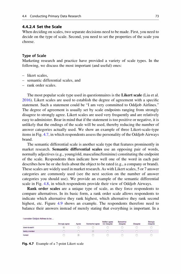
4.4.2.4 Set the ScaleWhen deciding on scales, two separate decisions need to be made. First, you need to
decide on the type of scale. Second, you need to set the properties of the scale you
choose.
Type of ScaleMarketing research and practice have provided a variety of scale types. In the
following, we discuss the most important (and useful) ones:
– likert scales,
– semantic differential scales, and
– rank order scales.
The most popular scale type used in questionnaires is the Likert scale (Liu et al.
2016). Likert scales are used to establish the degree of agreement with a specific
statement. Such a statement could be “I am very committed to Oddjob Airlines.”
The degree of agreement is usually set by scale endpoints ranging from strongly
disagree to strongly agree. Likert scales are used very frequently and are relatively
easy to administer. Bear in mind that if the statement is too positive or negative, it is
unlikely that the endings of the scale will be used, thereby reducing the number of
answer categories actually used. We show an example of three Likert-scale-type
items in Fig. 4.7, in which respondents assess the personality of the Oddjob Airways
brand.
The semantic differential scale is another scale type that features prominently in
market research. Semantic differential scales use an opposing pair of words,
normally adjectives (e.g., young/old, masculine/feminine) constituting the endpoint
of the scale. Respondents then indicate how well one of the word in each pair
describes how he or she feels about the object to be rated (e.g., a company or brand).
These scales are widely used in market research. As with Likert scales, 5 or 7 answer
categories are commonly used (see the next section on the number of answer
categories you should use). We provide an example of the semantic differential
scale in Fig. 4.8, in which respondents provide their view of Oddjob Airways.
Rank order scales are a unique type of scale, as they force respondents to
compare alternatives. In its basic form, a rank order scale allows respondents to
indicate which alternative they rank highest, which alternative they rank second
highest, etc. Figure 4.9 shows an example. The respondents therefore need to
balance their answers instead of merely stating that everything is important. In a
Fig. 4.7 Example of a 7-point Likert scale
4.4 Conducting Primary Data Research 73

more complicated form, rank order scales ask respondents to allocate a certain total
number of points (often 100) to a number of alternatives. This is called the constant
sum scale. Constant sum scales work well when a small number of answer
categories are used (normally up to five). Generally, respondents find constant
scales that have 6 or 7 answer categories somewhat challenging, while constant
scales that have eight or more categories are very difficult to answer. The latter are
thus best avoided.
In addition to these types of scaling, there are other types, such as graphic rating
scales, which use pictures to indicate categories, and the MaxDiff scale, in which
respondents indicate the most and least applicable items. We introduce the MaxDiff
scale in the Web Appendix (! Downloads).
Properties of the ScaleAfter selecting the type of scale, we need to set the scale properties, which involves
making several decisions:
– decide on the number of response categories,
– choose between forced-choice scale and free-choice scales,
– design the response categories,
– label the response categories,
– decide whether to use a “don’t know” option, and
– choose between a balanced and unbalanced scale.
Decide on the number of response categories: When using closed-ended
questions, the number of answer categories needs to be determined. In its simplest
form, a survey could use just two answer categories (yes/no). Multiple categories
(such as, “completely disagree,” “disagree,” “neutral,” “agree,” “completely
agree”) are used more frequently to allow for more nuances. When determining
how many scale categories to use, we face a trade-off between having more
variation and differentiation in the responses versus burdening the respondents
Fig. 4.8 Example of a 7-point semantic differential scale
Fig. 4.9 Example of a rank order scale
74 4 Getting Data

too much, which can trigger different types of response biases (e.g., Weijters et al.
2010). Because 5-point scales and 7-point scales are assumed to achieve this trade-
off well, their use has become common in marketing research (e.g., Fink 2003;
Peterson 1997). Research on these two scale types in terms of their reliability and
validity is inconclusive, but the differences between them are generally not very
pronounced (e.g., Lietz 2010; Peng and Finn 2015; Weijters et al. 2010). Ten-point
scales are often used in market research practice. However, scales with many
answer categories often confuse respondents, because the wording differences
between the scale points become trivial. For example, the difference between
“tend to agree” and “somewhat agree” are subtle and respondents may not be
able to differentiate between them. In such a case, respondents tend to choose
categories in the middle of the scale (Rammstedt and Krebs 2007). Given this
background, we recommend using 5-point or 7-point scales.
Finally, many web surveys now use levers that allow scaling on a continuum
without providing response categories. This scale type is called a visual analogue
scale and is especially recommended if small differences in response behavior need
to be detected. Visual analogue scales are well known in paper-and-pencil-based
research (especially in the medical sector) and have become increasingly popular in
web surveys. A visual analogue scale consists of a line and two anchors, one at each
end. The anchors often consist of verbal materials that mark opposite ends of a
semantic dimension (e.g., good and bad). However, the anchors may also be
pictures, or even sound files. Visual anchors, such as smileys, are often used with
participants who may not fully grasp the meaning of verbal materials—for example,
preschool children (Funke 2010). Compared to ordinal scales, measurement by
means of visual analogue scales is more exact, leading to more narrow confidence
intervals, and higher power statistical tests. This exactness helps detect smaller
effect that may be unobservable with ordinal scales (Reips and Funke 2008).
However, although not all web survey platforms offer visual analogue scales, you
should use them if possible. Figure 4.10 shows an example of a visual analogue
scale that measures customers’ expectations of Oddjob Airlines.
Choose between a forced-choice scale and a free-choice scale: Sometimes,
researchers and practitioners use 4-point or 6-point scales that omit the neutral
Fig. 4.10 Example of a visual analogue scale
4.4 Conducting Primary Data Research 75

category, thereby forcing the respondents to be positive or negative. Using such a
forced-choice scale could bias the answers, leading to validity issues.7 By
providing a neutral category choice (i.e., a free-choice scale), the respondents are
not forced to give a positive or negative answer. Many respondents feel more
comfortable about participating in a survey using a free-choice scales (Nowlis
et al. 2002). Furthermore, research has shown that including a neutral category
minimizes response bias (Weijters et al. 2010). Therefore, we strongly suggest
using free-choice scales and including a neutral category.
Design the response categories: When designing response categories for cate-
gorical variables, use response categories that are exclusive, so that answers do not
overlap (e.g., age categories 0–4, 5–10, etc.). The question here is: How do we
decide on the spacing between the categories? For example, should we divide US
household income in the categories 0–$9,999, $10,000–$19,999, $20,000-higher,
or use another way to set the categories? One suggestion is to use narrower
categories if the respondent can recall the variable easily. A second suggestion is
to space the categories so that we, as researchers, expect an approximately equal
number of observations per category. In the example above, we may find that most
households have an income of $20,000 or higher and that categories 0–$9,999 and
$10,000–$19,999 are infrequently used. It is best to choose categories where equal
percentages are expected such as 0–$24,999, $25,000–$44,999, $45,000–$69,999,
$70,000–$109,999, $110,000–and higher. Although the range in each category
differs, we can reasonably expect each category to hold about 20% of the responses
if we sample US households randomly (https://en.wikipedia.org/wiki/Household_
income_in_the_United_States#Household_income_over_time). Box 4.4 shows a
real-life example of oddly chosen response categories (and there are a few other
issues too!).
Box 4.4 Oddly Chosen Response Categories
7Forced-choice scales can, of course, also be used for uneven response categories such as 5-point
or 7-point Likert scales.
76 4 Getting Data

Note that the response categories also give the respondents the range of accept-
able answers. Respondents generally view the middle of the scale as normal, or
most common, and position themselves in relation to this (e.g., Revilla 2015). For
example, Tourangeau and Smith (1996) found that the reported number of sexual
partners in an open-ended question is more than twice as high when the answer
category labels used in a previously asked closed-ended question on the same topic
shifted to indicate higher numbers (from 0, 1, 2, 3, 4, 5 or more to 0, 1–4, 5–9,
10–49, 50–99, 100 or more).
Label the response categories:A common way of labeling response categories is
to use endpoint labels only, omitting intermediary labels. For example, instead of
labeling all five points of a Likert scale (e.g., “completely disagree,” “disagree,”
“neutral,” “agree,” and “completely agree”), we only label the endpoints (e.g.,
“completely disagree” and “completely agree”). While this approach makes
response category labeling easy, it also amplifies acquiescence, because the
endpoints reinforce the respondents’ agreement (Weijters et al. 2010). Conversely,
if all the categories are labeled, this helps the respondents interpret and differenti-
ate, making the midpoint more salient and accessible. Labeling the response
categories fully also increases the scale reliability (Weng 2004), but reduces
criterion validity. Drawing on Weijters et al. (2010), we generally recommend
only labeling the endpoints. However, when using the items for prediction-type
analyses, such as in correlation and regression analyses, it is beneficial to label all
the categories.8
Decide whether or not to use a “don’t know” option: Another important choice to
make is whether or not to include a “don’t know” option in the scaling (Lietz 2010).
Using a “don’t know” option allows the researcher to distinguish between those
respondents who have a clear opinion and those who do not. Moreover, the
respondents may find that answering the survey is slightly easier. While these are
good reasons for including this category, the drawback is that there will then be
missing observations. Ifmany respondents choose not to answer, thiswill substantially
reduce the number of surveys that can be used for analysis. Generally, when designing
surveys, you should only include a “don’t know” (or “undecided”) option as an answer
to questions that the respondents might genuinely not know, for example, when
requiring answers to factual questions. If included, the option should appear at the
end of the scale. The “don’t know” option should not be included in other types of
questions (such as on attitudes or preferences), as researchers are interested in the
respondents’ perceptions regardless of their knowledge of the subject matter.
Choose between a balanced and unbalanced scale: A balanced scale has an
equal number of positive and negative scale categories. For example, in a 5-point
Likert scale, we may have two negative categories (“completely disagree” and
“disagree”), a neutral option, and two positive categories (“agree” and “completely
8Sometimes, researchers number the response options. For example, when numbering the response
options of a 7-point scale you can use only positive numbers (1–7), or positive and negative
numbers (�3 to þ3). For recommendations, see Cabooter et al. (2016).
4.4 Conducting Primary Data Research 77

agree”). Besides this, the wording in a balanced scale should reflect equal distances
between the scale items. This is called an equidistant scale, which is a requirement
for analysis techniques such as factor analysis (Chap. 8). Consequently, we strongly
recommend using a balanced scale instead of an unbalanced scale. A caveat of
balanced scales is that many constructs cannot have negative values. For example,
one can have some trust in a company or very little trust, but negative trust is highly
unlikely. If a scale item cannot be negative, you will have to resort to an unbalanced
scale in which the endpoints of the scales are unlikely to be exact opposites.
Table 4.1 summarizes the key choices we have to make when designing surveys.
4.4.2.5 Design the QuestionnaireAfter determining the individual questions, you have to integrate these, together
with other elements, to create the questionnaire. Questionnaire design involves the
following elements:
– designing the starting pages of the questionnaire,
– choosing the order of the questions, and
– designing the layout and format.
Starting pages of the questionnaire: At the beginning of each questionnaire, the
importance and goal are usually described to stress that the results will be treated
confidentially, and to mention what they will be used for. This is usually followed
by an example question (and answer), to demonstrate how the survey should be
filled out. Keep this page very short when using mobile surveys.
If questions relate to a specific issue, moment, or transaction, you should indicate
this clearly at the very beginning. For example, “Please provide answers to the
following questions, keeping the purchase of product X in mind.” If applicable, you
should also point out that your survey is conducted in collaboration with a univer-
sity, a recognized research institute, or a known charity, as this generally increases
respondents’ willingness to participate. Moreover, do not forget to provide a name
and contact details for those participants who have questions, or if technical
problems should arise. Consider including a photo of the research team, as this
increases response rates. Lastly, you should thank the respondents for their time and
describe how the questionnaire should be returned (for mail surveys).
Order of the questions: Choosing an appropriate question order is crucial,
because it determines the questionnaire’s logical flow and therefore contributes to
high response rates. The order of questions is usually as follows:
1. Screening questions (typically simply referred to as screeners) come first. These
questions determine what parts of the survey a respondent should fill out.
2. Next, ask questions relating to the study’s key variables. This includes the
dependent variables, followed by the independent variables.
3. Use a funnel approach. That is, ask questions that are more general first and then
move on to details. This makes answering the questions easier as the order helps
the respondents recall. Make sure that sensitive questions are put at the very end
of this section.
78 4 Getting Data

Table 4.1 A summary of some of the key choices when designing survey items
Aspect Recommendation
Item content
Can all the respondents answer the
question asked?
Ensure that all potential respondents can answer all
items. If they cannot, ask screener questions to direct
them. If the respondents cannot answer questions,
they should be able to skip them.
Can the respondents construct or recall
the answers?
If the answer is no, you should use other methods to
obtain information (e.g., secondary data or
observations).
Moreover, you should ask the respondents about
major aspects before zooming in on details to help
them recall answers.
Do the respondents want to answer
each question?
If the questions concern “sensitive” subjects, check
whether they can be omitted. If not, stress the
confidentiality of the answers and mention why these
answers are useful for the researcher, the respondent,
or society before introducing them.
Open-ended or closed-ended
questions?
Keep the subsequent coding in mind. If easy coding
is possible beforehand, design a set of exhaustive
answer categories. Further, remember that open-
ended scale items have a much lower response rate
than closed-ended items.
Item wording
Grammar and sentences Use simple wording and grammar. Keep sentences
short. Avoid negations, vague quantifiers, and
double-barreled questions. Employ reverse-scaled
items sparingly. Use back-translation if necessary.
Type of scale
Number of response categories Use visual analogue scales. If not available, use
5-point or 7-point scales.
Forced-choice or free-choice scale? Use a free-choice scale by including a neutral
category.
Design of the response categories Ensure that the response categories are exclusive and
that each category has approximately the same
percentage of responses.
What scaling categories should you use
(closed-ended questions only)?
Use visual analogue scales if possible, otherwise
Likert scales. If the question requires this, use
semantic differential scales, or rank order scales.
Labeling of response categories Label endpoints only. When using the items for
prediction-type analyses, label all categories.
Inclusion of a “Don’t know” option Include a “Don’t know” option only for items that the
respondent might genuinely not know. If included,
place this at the end of the scale.
Balanced or unbalanced scale? Always use a balanced scale. There should be an
exact number of positive and negative wordings in
the scale items. The words at the ends of the scale
should be exact opposites.
4.4 Conducting Primary Data Research 79

4. Questions related to demographics are placed last if they are not part of the
screening questions. If you ask demographic questions, always check whether
they are relevant to the research goal and if they are not already known.9 In
addition, check if these demographics are likely to lead to non-response. Asking
about demographics, like income, educational attainment, or health, may result
in a substantial number of respondents refusing to answer. If such sensitive
demographics are not necessary, omit them from the survey. Note that in certain
countries asking about a respondent’s demographic characteristics means you
must adhere to specific laws, such as the Data Protection Act 1998 in the UK.
If your questionnaire comprises several sections (e.g., in the first section, you ask
about the respondents’ buying attitudes and, in the following section, about their
satisfaction with the company’s services), you should make the changing context
clear to the respondents.
Layout and format of the survey: The layout of both mail and web-based surveys
should be concise and should conserve space where possible, particularly in respect
of mobile surveys. Avoid using small and colored fonts, which reduce readability.
Booklets work well for mail-based surveys, since postage is cheaper if surveys fit in
standard envelopes. If this is not possible, single-sided stapled paper can also work.
When using web-based surveys, it is good to have a counter that tells the
respondents what percentage of the questions they have already filled out. This
gives them some indication of how much time they are likely to need to complete
the survey. Make sure the layout is simple and compatible with mobile devices and
tablets. Qualtrics and other survey tools offer mobile-friendly display options,
which should always be ticked.
4.4.2.6 Pretest the Questionnaire and ExecutionWe have already mentioned the importance of pretesting the survey several times.
Before any survey is sent out, you should pretest the questionnaire to enhance its
clarity and to ensure the client’s acceptance of the survey. Once the questionnaire is
in the field, there is no way back! You can pretest questionnaires in two ways. In its
simplest form, you can use a few experts (say 3–6) to read the survey, fill it out, and
comment on it. Many web-based survey tools allow researchers to create a pretested
version of their survey, in which there is a text box for comments behind every
question. Experienced market researchers can spot most issues right away and
should be employed to pretest surveys. If you aim for a very high quality survey,
you should also send out a set of preliminary (but proofread) questionnaires to a
small sample of 50–100 respondents. The responses (or lack thereof) usually
indicate possible problems and the preliminary data can be analyzed to determine
the potential results. Never skip pretesting due to time issues, since you are likely to
run into problems later!
9The demographics of panels (see Sect. 4.4.2.2) are usually known.
80 4 Getting Data

Box 4.5 Dillman et al.’s (2014) Recommendations on How to Increase Response
Rates
It is becoming increasingly difficult to get people to fill out surveys. This may
be due to over-surveying, dishonest firms that disguise sales as research, and a
lack of time. Dillman et al. (2014) discuss four steps to increase response
rates:
1. Send out a pre-notice letter indicating the importance of the study and
announcing that a survey will be sent out shortly.
2. Send out the survey with a sponsor letter, again indicating the importance
of the study.
3. Follow up after 3–4 weeks with a thank you note (for those who
responded) and the same survey, plus a reminder (for those who did not
respond).
4. Call or email those who have still not responded and send out a thank you
note to those who replied during the second round.
Motivating potential respondents to participate is an increasingly important
aspect of survey research. In addition to Dillman et al.’s (2014) recommendations
on how to increase response rates (Box 4.5), incentives are used. A simple example
of such an incentive is to provide potential respondents with a cash reward. In the
US, one-dollar bills are often used for this purpose. Respondents who participate in
(online) research panels often receive points that can be exchanged for products and
services. For example, Research Now, a market research company, gives its
Canadian panel members AirMiles that can be exchanged for, amongst others,
free flights. A special type of incentive is to indicate that some money will be
donated to a charity for every returned survey. ESOMAR, the world organization
for market and social research (see Chap. 10), suggests that incentives for
interviews or surveys should “be kept to a minimum level proportionate to the
amount of their time involved, and should not be more than the normal hourly fee
charged by that person for their professional consultancy or advice.”
Another incentive is to give the participants a chance to win a product or service.
For example, you could randomly give a number of participants gifts. The
participants then need to disclose their name and address in exchange for a chance
to win a gift so that they can be reached. While this is not part of the research itself,
some respondents may feel uncomfortable providing their contact details, which
could potentially reduce the response rate.
Finally, reporting the findings to the participants is an incentive that may help
participation (particularly in professional settings). This can be done by providing a
general report of the study and its findings, or by providing a customized report
detailing the participant’s responses and comparing them with all the other
responses (Winkler et al. 2015). Obviously, anonymity needs to be assured so
4.4 Conducting Primary Data Research 81

that the participants cannot compare their answers to those of other individual
responses.
4.5 Basic Qualitative Research
Qualitative research is mostly used to gain an understanding of why certain thingshappen. It can be used in an exploratory context by defining problems in more
detail, or by developing hypotheses to be tested in subsequent research. Qualitative
research also allows researchers to learn about consumers’ perspectives and vocab-
ulary, especially if they are not familiar with the context (e.g., the industry). As
such, qualitative research offers importance guidance when little is known about
consumers’ attitudes and perceptions or the market (Barnham 2015).
As discussed in Chap. 3, qualitative research leads to the collection of qualitative
data. One can collect qualitative data by explicitly informing the participants that
you are doing research (directly observed qualitative data), or you can simple
observe the participants’ behavior without them being explicitly aware of the
research goals (indirectly observed qualitative data). There are ethical issues
associated with conducting research if the participants are not aware of the research
purpose. Always check the regulations regarding what is allowed in your context
and what not. It is, in any case, good practice to brief the participants on their role
and the goal of the research once the data have been collected.
The two key forms of directly observed qualitative data are in-depth interviews
and focus groups. Together, they comprise most of the conducted qualitative
market research. First, we will discuss in-depth interviews, which are—as the
terms suggests—interviews conducted with one participant at a time, allowing for
high levels of personal interaction between the interviewer and respondent. Next,
we will discuss projective techniques, a frequently used type of testing procedure in
in-depth interviews. Lastly, we will introduce focus group discussions, which are
conducted with multiple participants.
4.5.1 In-Depth Interviews
In-depth interviews are qualitative conversations with participants on a specific
topic. These participants are often consumers, but, in a market research study, they
may also be the decision-makers, who are interviewed to gain an understanding of
their clients’ needs. They may also be government or company representatives. The
structure levels of interviews vary. In their simplest form, interviews are unstruc-
tured and the participants talk about a topic in general. This works well if you want
to obtain insight into a topic, or as an initial step in a research process. Interviews
can also be fully structured, meaning all the questions and possible answer
categories are decided beforehand. This way allows you to collect quantitative
data. However, most in-depth interviews for gathering qualitative data are semi-
structured and contain a series of questions that need to be addressed, but have no
82 4 Getting Data

specific format regarding what the answers should look like. The person
interviewed can make additional remarks, or discuss somewhat related issues, but
is not allowed to wander off too far. In these types of interviews, the interviewer
often asks questions like “that’s interesting, could you explain?,” or “how
come. . .?” to gain more insight into the issue. In highly structured interviews, the
interviewer has a fixed set of questions and often a fixed amount of time for each
person’s response. The goal of structured interviews is to maximize the compara-
bility of the answers. Consequently, the set-up of the questions and the structure of
the answers need to be similar.
In-depth interviews are unique in that they allow probing on a one-to-one basis,
thus fostering an interaction between the interviewer and interviewee. In-depth
interviews also work well when those being interviewed have very little time and
when they do not want the information to be shared with the other study
participants. This is, for example, probably the case when you discuss marketing
strategy decisions with CEOs. The drawbacks of in-depth interviews include the
amount of time the researcher needs to spend on the interview itself and on
traveling (if the interview is conducted face-to-face and not via the telephone), as
well as on transcribing the interview.
When conducting in-depth interviews, a set format is usually followed. First, the
interview details are discussed, such as confidentiality issues, the interview topic,
the structure, and the duration. Moreover, the interviewer should disclose whether
the interview is being recorded and inform the interviewee that there is no right or
wrong answer, just opinions on the subject. The interviewer should also try to be
open and maintain eye contact with the interviewee. Interviewers can end an
interview by informing their respondents that they have reached the last question
and thanking them for their time.
Interviews are often used to investigate means-end issues, in which
researchers try to understand what ends consumers aim to satisfy and which
means (consumption) they use to do so. A means-end approach involves
first determining a product’s attributes. These are the functional product
features, such as the speed a car can reach or its acceleration. Subsequently,
researchers look at the functional consequences that follow from the product
benefits. This could be driving fast. The psychosocial consequences, or
personal benefits, are derived from the functional benefits and, in this exam-
ple, could include an enhanced status, or being regarded as successful.
Finally, the psychosocial benefits are linked to people’s personal values or
life goals, such as a desire for success or acceptance. Analyzing and
identifying the relationships between these steps is called laddering.
4.5 Basic Qualitative Research 83

4.5.2 Projective Techniques
Projective techniques describe a special type of testing procedure, usually used as
part of in-depth interviews. These techniques provide the participants with a
stimulus and then gauge their responses. Although participants in projective
techniques know that they are participating in a market research study, they may
not be aware of the research’s specific purpose. The stimuli that the projective
techniques provide are ambiguous and require a response from the participants.
Sentence completion is a key form of projective techniques, for example:
An iPhone user is someone who: ...................................The Apple brand makes me think of: ...................................iPhones are most liked by: ...................................
In this example, the respondents are asked to express their feelings, ideas, and
opinions in a free format.
Projective techniques’ advantage is that they allow for responses when people
are unlikely to respond if they were to know the study’s exact purpose. Thus,
projective techniques can overcome self-censoring and allow expression and fan-
tasy. In addition, they can change a participant’s perspective. Think of the previous
example. If the participants are iPhone users, the sentence completion example asks
them how they think other people regard them, not what they think of the iPhone. A
drawback is that projective techniques require the responses to be interpreted and
coded, which can be difficult.
4.5.3 Focus Groups
Focus groups are interviews conducted with a number of respondents at the same
time and led by a moderator. This moderator leads the interview, structures it, and
often plays a central role in transcribing the interview later. Focus groups are
usually semi or highly structured. The group usually comprises between 4 and
6 people to allow for interaction between the participants and to ensure that all the
participants have a say. The duration of a focus group interview varies, but is often
between 30 and 90 min for company employee focus groups and between 60 and
120 min for consumers. When focus groups are held with company employees,
moderators usually travel to the company and conduct their focus group in a room.
When consumers are involved, moderators often travel to a market research com-
pany, or hotel, where the focus group meets in a conference room. Market research
companies often have specially equipped conference rooms with, for example,
one-way mirrors, built-in microphones, and video recording devices.
How are focus groups structured? They usually start with the moderator
introducing the topic and discussing the background. Everyone in the group is
introduced to all the others to establish rapport. Subsequently, the moderator
encourages the members of the focus group to speak to one another, instead of
asking the moderator for confirmation. Once the focus group members start
84 4 Getting Data

discussing topics with one another, the moderator tries to stay in the background,
merely ensuring that the discussions stay on-topic. Afterwards, the participants are
briefed and the discussions are transcribed for further analysis.
Focus groups have distinct advantages: they are relatively cheap compared to
in-depth interviews, work well with issues that are socially important, or which
require spontaneity. They are also useful for developing new ideas. On the down-
side, focus groups do not offer the same opportunity for probing as interviews do,
and also run a greater risk of going off-topic. Moreover, a few focus group members
may dominate the discussion and, especially in larger focus groups, “voting”
behavior may occur, hindering real discussions and the development of new
ideas. Table 4.2 summarizes the key differences between focus groups and
in-depth interviews.
Table 4.2 Comparing focus groups and in-depth interviews
Focus groups In-depth interviews
Group
interactions
Group interaction, which may
stimulate the respondents to produce
new thoughts.
There is no group interaction. The
interviewer is responsible for
stimulating the respondents to
produce new ideas.
Group/peer
pressure
Group pressure and stimulation may
clarify and challenge thinking.
In the absence of group pressure, the
respondents’ thinking is not
challenged.
Peer pressure and role playing. With just one respondent, role playing
is minimized and there is no peer
pressure.
Respondent
competition
Respondents compete with one
another for time to talk. There is less
time to obtain in-depth details from
each participant.
Individuals are alone with the
interviewer and can express their
thoughts in a non-competitive
environment. There is more time to
obtain detailed information.
Peer
influence
Responses in a group may be biased
by other group members’ opinions.
With one respondent, there is no
potential of other respondents
influencing this person.
Subject
sensitivity
If the subject is sensitive, respondents
may be hesitant to talk freely in the
presence of other people.
If the subject is sensitive, respondents
may be more likely to talk.
Stimuli The volume of stimulus materials that
can be used is somewhat limited.
A fairly large amount of stimulus
material can be used.
Interviewer
schedule
It may be difficult to assemble 8 or
10 respondents if they are a difficult
type to recruit (such as busy
executives).
Individual interviews are easier to
schedule.
4.5 Basic Qualitative Research 85

4.6 Collecting Primary Data Through Experimental Research
In Chap. 2, we discussed causal research and briefly introduced experiments as a
means of conducting research. The goal of experiments is to avoid unintended
influences through the use of randomization. Experiments are typically conducted
by manipulating one variable, or a few, at a time. For example, we can change the
price of a product, the type of product, or the package size to determine whether
these changes affect important outcomes such as attitudes, satisfaction, or
intentions. Simple field observations are often unable to establish these
relationships, as inferring causality is problematic. Imagine a company that wants
to introduce a new type of soft drink aimed at health-conscious consumers. If the
product were to fail, the managers would probably conclude that the consumers did
not like the product. However, many (usually unobserved) variables, such as
competitors’ price cuts, changing health concerns, and a lack of availability, can
also influence new products’ success.
4.6.1 Principles of Experimental Research
Experiments deliberately impose one or more treatments and then observe the
outcome of a specific treatment (Mitchell and Jolley 2013). This way, experiments
attempt to isolate how one change affects an outcome. The outcome(s) is (are) the
dependent variable(s) and the independent variable(s) (also referred to as factors)
are used to explain the outcomes. To examine the influence of the independent
variable(s) on the dependent variable(s), the participants are subjected to
treatments. These are supposed to manipulate the participants by putting them in
different situations. A simple form of treatment could be an advertisement with and
without humor. In this case, the humor is the independent variable, which can take
two levels (i.e., with or without humor). If we manipulate, for example, the price
between low, medium, and high, we have three levels. When selecting independent
variables, we normally include those that marketers care about and which are
related to the marketing and design of the products and services. To assure that
the participants do indeed perceive differences, manipulation checks are
conducted. For example, if two different messages with and without humor are
used as stimuli, we could ask the respondents which of the two is more humorous.
Such manipulation checks help establish an experiment’s validity.
Care should be taken not to include too many of these variables in order to keep
the experiment manageable. An experiment that includes four independent
variables, each of which has three levels and includes every possible combination
(called a full factorial design) requires 43 ¼ 64 treatments. Large numbers of levels
(five or more) will dramatically increase the complexity and cost of the research.
Finally, extraneous variables, such as the age or income of the experiment partici-
pant, are not changed as part of the experiment. However, it might be important to
control for their influence when setting up the experimental design.
86 4 Getting Data

Experiments can run in either a lab or field environment. Lab experiments areperformed in controlled environments (usually in a company or academic lab),
thereby allowing for isolating the effects of one or more variables on a certain
outcome. Extraneous variables’ influence can also be controlled for. However, field
experiments’ often lack internal validity, which is the extent to which we can make
causal claims based on the study results. Lab experiments often take place in highly
stylized experimental settings, which typically ignore real-world business
conditions, they therefore usually lack external validity, which is the extent to
which the study results can be generalized to similar settings. Field experiments, onthe other hand, are performed in natural environments (e.g., in a supermarket or
in-home) and, and such, generally exhibit high degrees of external validity. How-
ever, since controlling for extraneous variables’ impact is difficult in natural
environments, field experiments usually lack internal validity (Gneezy 2017).
4.6.2 Experimental Designs
Experimental design refers to an experiment’s structure. There are various types
of experimental designs. To clearly separate the different experimental designs,
researchers have developed the following notation:
O: A formal observation or measurement of the dependent variable. Subscripts below an
observation O such as 1 or 2, indicate measurements at different points in time.
X: The test participants’ exposure to an experimental treatment.
R: The random assignment of participants. Randomization ensures control over extraneous
variables and increases the experiment’s reliability and validity.
In the following, we will discuss the most prominent experimental designs:
– one-shot case study,
– before-after design,
– before-after design with a control group, and
– solomon four-group design.
The simplest form of experiment is the one-shot case study. This type of
experiment is structured as follows:10
X O1
This means we have one treatment (indicated by X), such as a new advertising
campaign. After the treatment, we await reactions to it and then measure the
outcome of the manipulation (indicated by O1), such as the participants’ willingness
10If one symbol precedes another, it means that the first symbol precedes the next one in time.
4.6 Collecting Primary Data Through Experimental Research 87

to purchase the advertised product. This type of experimental set-up is common, but
does not tell us if the effect is causal. One reason for this is that we did not measure
anything before the treatment and therefore cannot assess what the relationship
between the treatment and outcome is. The participants’ willingness to purchase the
product was perhaps higher before they were shown the advertisement, but since we
did not measure their willingness to purchase before the treatment, this cannot be
ruled out. Consequently, this design does not allow us to establish causality.
The simplest type of experiment that allows us to make causal inferences—
within certain limits—is the before-after design used for one group. The notation
for this design is:
O1 X O2
We have one measurement before (O1) and one after a treatment (O2). Thus, this
type of design can be used to determine whether an advertisement has a positive,
negative, or no effect on the participants’ willingness to purchase a product.
A problem with this type of design is that we do not have a standard of
comparison with which to contrast the change between O1 and O2. While the
advertisement may have increased the participants’ willingness to purchase, this
might have been even higher if they had not seen the advertisement. The reason for
this is that the before-after-design does not control for influences occurring between
the two measurements. For example, negative publicity after the initial measure-
ment could influence the subsequent measurement. These issues make the “real”
effect of the advertisement hard to assess.
If we want to have a much better chance of identifying the “real” effect of a
treatment, we need a more complex setup, called the before-after design with acontrol group. In this design, we add a control group who is not subjected to the
treatment X. The notation of this type of experiment is:
Experimental group (R) O1 X O2
Control group (R) O3 O4
The effect attributed to the experiment is the difference between O1 and O2
minus the difference between O3 and O4. For example, if the participants’ willing-
ness to purchase increases much stronger in the experimental group (i.e., O2 is
much higher than O1) than in the control group (i.e., O4 is slightly higher than or
equal to O3), the advertisement has had an impact on the participants.
The random assignment of the participants to the experimental and the control
groups (indicated by R), is an important element of this experimental design. This
means that, for any given treatment, every participant has an equal probability of
being chosen for one of the two groups. This ensures that participants with different
characteristics are spread randomly (and, it is hoped, equally) between the treat-
ment(s), which will neutralize self-selection. Self-selection occurs when
participants can select themselves into either the experimental or the control
group. For example, if participants who like sweets participate in a cookie tasting
88 4 Getting Data

test, they will certainly try to give the treatment (cookie) a try! See Mooi and
Gilliland (2013) for an example of self-selection and an analysis method.
However, the before-after experiment with a control group does have
limitations. The initial measurement O1 may alert the participants that they are
being studied, which may bias the post measurement O2. This effect is also referred
to as the before measurement effect, or the testing effect (Campbell and Stanley
1966). Likewise, the initial measurement O1 may incite the participants to drop out
of the experiment, leading to no recorded response for O2. If there is a systematic
reason for the participants to drop out, this will threaten the experiment’s validity.
The Solomon four-group design is an experimental design accounting for before
measurement effects and is structured as follows (Campbell and Stanley 1966):
Experimental group 1 (R) O1 X O2
Control group 1 (R) O3 O4
Experimental group 2 (R) X O5
Control group 2 (R) O6
The design is much more complex, because we need to measure the effects six
times and administer two treatments. This method provides an opportunity to
control for the before measurement effect of O1 on O2. The design also provides
several measures of the treatment’s effect (i.e., (O2–O4), (O2–O1)–(O4–O3), and
(O6–O5)). If these measures agree, the inferences about the treatment’s effect are
much stronger.
In Chap. 6, we discuss how to analyze experimental data using ANOVA and
various other tests.
4.7 Review Questions
1. What is the difference between primary and secondary data? Can primary data
become secondary data?
2. Please search for and download two examples of secondary data sources found
on the Internet. Discuss two potential market research questions that each dataset
can answer.
3. Imagine you are asked to understand what consumer characteristics make these
consumers likely to buy a BMW i3 (http://www.bmw.com). How would you
collect the data? Would you start with secondary data, or would you start
collecting primary data directly? Do you think it is appropriate to collect
qualitative data? If so, at what stage of the process should you do so?
4. What are the different reasons for choosing interviews rather than focus groups?
What choice would you make if you want to understand CEOs’ perceptions of
the economy, and what would seem appropriate when you want to understand
how consumers feel about a newly introduced TV program?
4.7 Review Questions 89

5. Consider the following examples of survey items relating to how satisfied
iPhone users are with their performance, reliability, and after-service. Please
assess their adequacy and make suggestions on how to revise the items, if
necessary.
6. Make recommendations regarding the following aspects of scale design: the
number of response categories, the design and labeling of response categories,
and the inclusion of a “don’t know” option.
7. Describe the Solomon four-group design and explain which of the simpler
experimental design problems it controls for.
8. If you were to set up an experiment to ascertain what type of product package
(new or existing) customers prefer, what type of experiment would you choose?
Please discuss.
4.8 Further Readings
Barnham, C. (2015). Quantitative and qualitative research: Perceptual foundations.
International Journal of Market Research, 57(6), 837–854.This article reflects on the classic distinction between quantitative and qualitative
research and the underlying assumptions.Campbell, D. T., & Stanley, J. C. (1966). Experimental and quasi-experimental
designs for research. Chicago: Wadsworth Publishing.
Strongly
disagree
Somewhat
disagree
Somewhat
agree Agree
Completely
agree
I am satisfied with the
performance and
reliability of my
iPhone.
□ □ □ □ □
Strongly
disagree
Somewhat
disagree Neutral
Somewhat
agree
Completely
agree
I am satisfied with the
after-sales service of
my iPhone.
□ □ □ □ □
Not at all
important
Not
important Neutral Important
Very
important
Which of the following
iPhone features do you
find most important?
Camera □ □ □ □ □
Music player □ □ □ □ □
App store □ □ □ □ □
Web browser □ □ □ □ □
Mail □ □ □ □ □
90 4 Getting Data

Cook, T. D., & Campbell, D. T. (1979). Quasi-experimentation: Design andanalysis issues for field settings. Chicago: Wadsworth Publishing.
These are the two great books on experimental research.Dillman, D. A., Smyth, J. D., & Christian, L. M. (2014). Internet, phone, mail, and
mixed-mode surveys: The tailored design method (4th ed.). Hoboken: Wiley.
This book gives an excellent overview of how to create questionnaires and how toexecute them. Mixed-mode surveys and web surveys are specifically addressed.
FocusGroupTips.com.
This website provides a thorough explanation of how to set-up focus groups fromplanning to reporting the results.
Lietz, P. (2010). Current state of the art in questionnaire design: A review of the
literature. International Journal of Market Research, 52(2), 249–272.Reviews survey design choices from an academic perspective.Mystery Shopping Providers Association (www.mysteryshop.org).
This website discusses the mystery shopping industry in Asia, Europe, NorthAmerica, and South America.
Veludo-de-Oliveira, T. M, Ikeda, A. A., & Campomar, M. C. (2006). Laddering in
the practice of marketing research: Barriers and solutions. Qualitative MarketResearch: An International Journal, 9(3), 297–306.
This article provides an overview of laddering, the various forms of laddering, andbiases that may result and how these should be overcome.
References
Barnham, C. (2015). Quantitative and qualitative research: Perceptual foundations. InternationalJournal of Market Research, 57(6), 837–854.
Baumgartner, H., & Steenkamp, J. B. E. M. (2001). Response styles in marketing research: A
cross-national investigation. Journal of Marketing Research, 38(2), 143�156.
Brace, I. (2004). Questionnaire design. How to plan, structure and write survey material foreffective market research. London: Kogan Page.
Brislin, R. W. (1970). Back-translation for cross-cultural research. Journal of Cross-CulturalPsychology, 1(3), 185–216.
Bronner, F., & Ton, K. (2007). The live or digital interviewer. A comparison between CASI, CAPI
and CATI with respect to differences in response behaviour. International Journal of MarketResearch, 49(2), 167–190.
Cabooter, E., Weijters, B., Geuens, M., & Vermeir, E. (2016). Scale format effects on response
option interpretation and use. Journal of Business Research, 69(7), 2574–2584.Casteleyn, J., Andre, M., & Kris, R. (2009). How to use facebook in your market research.
International Journal of Market Research, 51(4), 439–447.DeMonaco, H. J., Ayfer, A., & Hippel, E. V. (2005). The major role of clinicians in the discovery
of off-label drug therapies. Pharmacotherapy, 26(3), 323–332.Deutskens, E., de Jong, A., de Ruyter, K., & Martin, W. (2006). Comparing the generalizability of
online and mail surveys in cross-national service quality research. Marketing Letters, 17(2),119–136.
Dillman, D. A., Smyth, J. D., & Christian, L. M. (2014). Internet, phone, mail, and mixed-modesurveys: The tailored design method (4th ed.). Hoboken: Wiley.
Fink, A. (2003). How to ask survey questions. Thousand Oaks: Sage.
References 91
Foddy, W. (1993). Constructing questions for interviews and questionnaires. Theory and practicein social science research. Cambridge: Cambridge University Press.
Funke, F. (2010). Internet-based measurement with visual analogue scales. An experimentalinvestigation. Dissertation, Eberhard Karls Universitat Tübingen. Available online at: https://publikationen.uni-tuebingen.de/xmlui/handle/10900/49480
Holbrook, A., Cho, Y. I. K., & Johnson, T. (2006). The impact of question and respondent
characteristics on comprehension and mapping difficulties. Public Opinion Quarterly, 70(4),565–595.
Houston, M. B. (2002). Assessing the validity of secondary data proxies for marketing constructs.
Journal of Business Research, 57(2), 154–161.Kennedy, C., & Everett, S. E. (2011). Use of cognitive shortcuts in landline and cell phone
surveys. Public Opinion Quarterly, 75(2), 336–348.Kurylko, D. T. (2005). Moonraker project seeks marketing savvy for VW. Automotive News
Europe, 10(17), 22.Lietz, P. (2010). Research into questionnaire design. A summary of the literature. International
Journal of Market Research, 52(2), 249–272.Liu, M., Lee, S., & Conrad, F. G. (2016). Comparing extreme response styles between agree-
disagree and item-specific scales. Public Opinion Quarterly, 79(4), 952–975.Lynn, P., & Kaminska, O. (2013). The impact of mobile phones on survey measurement error.
Public Opinion Quarterly, 77(2), 586–605.Mooi, E., & Gilliland, D. I. (2013). How contracts and enforcement explain transaction outcomes.
International Journal of Research in Marketing, 30(4), 395–405.Mitchell, M. L., & Jolley, J. M. (2013). Research design explained (8th ed.). Belmont: Wadsworth.
Nowlis, S. M., Kahn, B. E., & Dhar, R. (2002). Coping with ambivalence: The effect of removing a
neutral option on consumer attitude and preference judgments. Journal of Consumer Research,29(3), 319–334.
Oppenheim, A. N. (1992). Questionnaire design, interviewing and attitude measurement. London:Pinter.
Peng, L., & Finn, A. (2015). Assessing response format effects on the scaling of marketing stimuli.
International Journal of Market Research, 58(4), 595–619.Peterson, R. A. (1997). A quantitative analysis of rating-scale response variability. Marketing
Letters, 8(1), 9–21.Raithel, S., Sarstedt, M., Scharf, S., & Schwaiger, M. (2012). On the value relevance of customer
satisfaction. Multiple drivers in multiple markets. Journal of the Academy of MarketingScience, 40(4), 509–525.
Rammstedt, B., & Krebs, D. (2007). Does response scale format affect the answering of personal-
ity scales? European Journal of Psychological Assessment, 23(1), 32–38.Reips, U.-D., & Funke, F. (2008). Interval-level measurement with visual analogue scales in
Internet-based research: VAS generator. Behavior Research Methods, 40(3), 699–704.Revilla, M. (2015). Effect of using different labels for the scales in a web survey. International
Journal of Market Research, 57(2), 225–238.Rindfleisch, A., & Heide, J. B. (1997). Transaction cost analysis: Past, present, and future
applications. Journal of Marketing, 61(4), 30–54.Schilling, M. A. (2009). Understanding the alliance data. Strategic Management Journal, 30(3),
233–260.
Stern, M. J., Bilgen, I., & Dillman, D. A. (2014). The state of survey methodology challenges,
dilemmas, and new frontiers in the era of the tailored design. Field Methods, 26(3), 284–301.Stieglitz, S., Dang-Xuan, L., Bruns, A., & Neuberger, C. (2014). Social media analytics, An
interdisciplinary approach and its implications for information systems. Business & Informa-tion Systems Engineering, 6(2), 89–96.
Swain, S. D., Weathers, D., & Niedrich, R. W. (2008). Assessing three sources of misresponse to
reversed Likert items. Journal of Marketing Research, 45(1), 116�131.
92 4 Getting Data

Tourangeau, R., & Smith, T. W. (1996). Asking sensitive questions: The impact of data collection
mode, question format, and question context. Public Opinion Quarterly, 60(2), 275–304.Vesta Research. (2016). Rules of thumb for survey length. Vesta Research Blog. Available at:
http://www.verstaresearch.com/blog/rules-of-thumb-for-survey-length/
Vicente, P., & Reis, E. (2010). Marketing research with telephone surveys: Is it time to change?
Journal of Global Marketing, 23(4), 321�332.
Vincente, P., Reis, E., & Santos, M. (2008). Using mobile phones for survey research. Interna-tional Journal of Market Research, 51(5), 613–633.
Weijters, B., & Baumgartner, H. (2012). Misresponse to reversed and negated items in surveys: A
review. Journal of Marketing Research, 49(5), 737–747.Weijters, B., Cabooter, E., & Schillewaert, N. (2010). The effect of rating scale format on response
styles: The number of response categories and response category labels. International Journalof Research in Marketing, 27(3), 236–247.
Weijters, B., Baumgartner, H., & Schillewaert, N. (2013). Reversed item bias: An integrative
model. Psychological Methods, 18(3), 320–334.Weng, L.-J. (2004). Impact of the number of response categories and anchor labels on coefficient
alpha and test-retest reliability. Educational and Psychological Measurement, 64(6), 956–972.Winkler, T. J., Sarstedt, M., Keil, M., & Rost, P. (2015). Selfsurvey.org: A platform for prediction-
based benchmarking and feedback-enabled survey research. In Proceedings of the Europeanconference on information systems, Paper 204, Münster, Germany.
References 93

Descriptive Statistics 5
Keywords
Acquiescence • Aggregation • Bar chart • Bivariate statistics • Box plot •
Codebook • Construct score • Correlation • Covariance • Crosstabs • Data
entry errors • Dummy variables • Extreme response styles • Frequency table •
Histogram • Inconsistent answers • Index • Interquartile range • Interviewer
fraud • Item non-response • Line chart • Listwise deletion • Little’s MCAR test •
Log transformation • Mean • Measures of centrality • Measures of dispersion •
Median • Middle response styles • Missing (completely) at random • Missing
data • Multiple imputation • Non-random missing • Outliers • Pie chart • Range •
Range standardization • Reverse-scaled items • Scale transformation • Scatter
plot • Skewed data • Stata • Standard deviation • Standardizing variables •
Straight-lining • Survey non-response • Suspicious response patterns •
Transforming data • Univariate statistics • Variable respecification •
Variance • Workflow • z-standardization
Learning Objectives
After reading this chapter, you should understand:
– The workflow involved in a market research study.
– Univariate and bivariate descriptive graphs and statistics.
– How to deal with missing values.
– How to transform data (z-transformation, log transformation, creating dummies,
aggregating variables).
– How to identify and deal with outliers.
– What a codebook is.
– The basics of using Stata.
# Springer Nature Singapore Pte Ltd. 2018
E. Mooi et al., Market Research, Springer Texts in Business and Economics,
DOI 10.1007/978-981-10-5218-7_5
95

5.1 The Workflow of Data
Market research projects involving data become more efficient and effective if
they have a proper workflow of data, which is a strategy to keep track of the
entering, cleaning, describing, and transforming of data. These data may have
been collected through surveys or may be secondary data (Chap. 3). Entering,
cleaning, and analyzing bits of data haphazardly is not a good strategy, since it
increases the likelihood of making mistakes and makes it hard to replicate results.
Moreover, without a good data workflow, it becomes hard to document the
research process and to cooperate on projects. For example, how can you out-
source the data analysis if you cannot indicate what the data are about or what
specific values mean? Finally, a lack of a good workflow increases the risk of
duplicating work or even losing data. In Fig. 5.1, we show the steps required to
create and describe a dataset after the data have been collected. We subsequently
discuss each step in greater detail.
Fig. 5.1 The workflow of data
96 5 Descriptive Statistics

5.2 Create Structure
The basic idea of setting up a goodworkflow is that good planning saves the researcher
time and allows other researchers to do their share of the analysis and/or replicate the
research. After the data collection phase, the first step is to save the available data. We
recommend keeping track of the dataset by providing data and data-related files in
separate directories by means of Windows Explorer or macOS Finder. This directory
should have subdirectories for at least: (1) the data files, (2) commands, (3) a tempo-
rary directory, and (4) related files; that is, a directorywith files that are directly related
to a project, such as the survey used to collect the data.1
In Table 5.1, we show an example of a directory structure. Within the main
directory, there are four subdirectories, each with distinct files. Notice that in the
Data files subdirectory, we have the original dataset, two modified datasets (one
without missing data and one which includes several transformations of the data),
as well as a zip file that contains the original dataset. If the data file is contained in a
zip or other archive file, it is stored and unlikely to be modified, but can be easily
opened if the working file is accidentally overwritten or deleted. In the Data files
subdirectories, we distinguish between two files with the suffix rev1 and rev2. We
use rev (abbreviation of revision), but you however, can choose another file name
Table 5.1 Example of a directory structure for saving market-research-related files
Directory name Subdirectory name Example file names
Oddjob Data files oddjob.dta
oddjob.zip
oddjob rev1.dta
oddjob rev2.dta
Command files Missing data analysis.do
Descriptives.do
Factor analysis.do
Regression analysis.do
Temporary files Missing data analysis rev1.smcl
Descriptives rev1.smcl
Factor analysis rev1.smcl
Regression analysis rev1.smcl
Related files Codebook.docx
Survey.pdf
Initial findings–presentation to client.pptx
Findings–presentation to client.pptx
Recommendations rev1.docx
Recommendations rev2.docx
1Alternatively, you could also choose one of the many control system versions, including
Subversion, Git, and Mecurial, which enable simple branching and project management. These
systems work well with version control in centralized and in distributed environments.
5.2 Create Structure 97

as long as it clearly indicates the revision on which you are working. In the
Command files subdirectory we store all commands that were used to manage
our data. These commands may relate to different project phases, including a
missing data analysis, descriptives, factor analysis, and other methods used over
the course of the project. As the name indicates, Temporary files serve as interme-
diary files that are kept until the final data or command files are established, after
which they are removed. Finally, in the Related Files subdirectory, we have a
codebook (more on this later), the survey, two presentations, and two documents
containing recommendations.
Another aspect of creating a structure is setting up the variables for your study
properly. This involves making decisions on the following elements:
– variable names,
– variable labels,
– data type, and
– coding of variables.
The variable names should be clear and short so that they can be read in the dialog
boxes. For example, if you have three questions on product satisfaction, three on
loyalty, and several descriptors (age and gender), you could code these variables as
satisfaction1, satisfaction2, satisfaction3, loyalty1, loyalty2, loyalty3, age, and gender.In Stata, and most other statistical software programs, you can include variable
labels that describe what each variable denotes. The description generally includes
the original question if the data were collected by means of surveys. Another point
to consider is variable coding. Coding means assigning values to a variable. When
collecting quantitative data, the task is relatively easy; we use values that corre-
spond with the answers for Likert and semantic differential scales (see Chap. 4).
For example, when using a 7-point Likert scale, responses can be coded as 1–7 or
as 0–6 (with 0 being the most negative and 6 being the most positive response).
Open-ended questions (qualitative data) require more effort, usually involving a
three-step process. First, we collect all the responses. In the second step, we group
these responses. Determining the number of groups and the group to which a
response belongs is the major challenge in this step. Two or three market
researchers usually code the responses independently to prevent the process from
becoming too subjective and thereafter discuss the differences that may arise. The
third step is providing a value for each group. Stata can perform such analyses with
the help of the additional software packageWordstat (https://provalisresearch.com/
products/content-analysis-software/wordstat-for-stata/). Please see Krippendorff
(2012) for more details about coding qualitative variables.
Once a system has been set up to keep track of your progress, you need to
consider safeguarding your files. Large companies usually have systems for creat-
ing backups (extra copies as a safeguard). If you are working alone or for a small
company, you are probably responsible for this. You should save your most recent
and second most recent version of your file on a separate drive and have multiple
copies of your entire drive! Always keep at least two copies and never keep both
backups in the same place, because you could still lose all your work through theft,
98 5 Descriptive Statistics

fire, or an accident! You can use cloud storage services, such as Dropbox, Google
Drive, or Microsoft’s OneDrive for small projects to prevent loss. Always read the
terms of the cloud storage services carefully to determine whether your data’s
privacy is guaranteed.
5.3 Enter Data
How do we enter survey or experimental data into a dataset? Specialized software is
often used for large datasets, or datasets created by professional firms. For example,
Epidata (http://www.epidata.dk, freely downloadable) is frequently used to enter
data from paper-based surveys, Entryware’s mobile survey (http://www.techneos.
com) to enter data from personal intercepts or face-to-face interviewing, and
Voxco’s Interviewer CATI for telephone interviewing. Stata has no dedicated
data entry platform. It does, however, facilitate the use of StatTransfer (http://
www.stattransfer.com), a software program designed to simplify the transfer of
statistical data between many software packages, including Stata, SPSS, Excel,
and SAS.
Such software may not be available for smaller projects, in which case data
should be entered directly into Stata. A significant drawback of direct data entry is
the risk of typing errors, for which Stata cannot check. Professional software, such
as Epidata, can directly check if values are admissible. For example, if a survey
question has only two answer categories, such as gender (coded 0/1), Epidata (and
other packages) can directly check if the value entered is 0 or 1, and not any other
value. The software also allows for using multiple typists when very large amounts
of data need to be entered simultaneously (note that Epidata can export directly to
Stata).
5.4 Clean Data
Cleaning data is the next step in the workflow. It requires checking for:
– interviewer fraud,
– suspicious response patterns,
– data entry errors,
– outliers, and
– missing data.
These issues require researchers to make decisions very carefully. In the following,
we discuss each issue in greater detail.
5.4 Clean Data 99

5.4.1 Interviewer Fraud
Interviewer fraud is a difficult and serious issue. It ranges from interviewers
“helping” respondents provide answers to entire surveys being falsified. Interviewer
fraud often leads to incorrect results. Fortunately, we can avoid and detect inter-
viewer fraud in various ways. First, never base interviewers’ compensation on the
number of completed responses they submit. Second, check and control for
discrepancies in respondent selection and responses. If multiple interviewers were
used, each of whom collected a reasonably large number of responses (n > 100), a
selection of the respondents should be similar. This means that the average
responses obtained should also be similar. In Chap. 6 we will discuss techniques
to test this. Third, if possible, contact a random number of respondents afterwards
for their feedback on the survey. If a substantial number of people claim they were
not interviewed, interviewer fraud is likely. Furthermore, if people were previously
interviewed on a similar subject, the factual variables collected, such as their
gender, should not change (or no more than a trivial percentage), while variables
such as a respondent’s age and highest education level should only move up. We
can check this by means of descriptive statistics. If substantial interviewer fraud is
suspected, the data should be discarded. You should check for interviewer fraud
during the data collection process to safeguard the quality of data collection and
minimize the risk of having to discard the data in the end.
5.4.2 Suspicious Response Patterns
Before analyzing data, we need to identify suspicious response patterns. There are
two types of response patterns we need to look for:
– straight-lining, and
– inconsistent answers.
Straight-lining occurs when a respondent marks the same response in almost all
the items. For example, if a 7-point scale is used to obtain answers and the response
pattern is 4 (the middle response), or if the respondent selects only 1s, or only 7s in
all the items. A common way of identifying straight-lining is by including one or
more reverse-scaled items in a survey (see Chap. 4). Reverse-scaled means that the
way the question, statement (when using a Likert scale), or word pair (when using a
semantic differential scale) is reversed compared to the other items in the set.
Box 5.1 shows an example of a four-item scale for measuring consumers’ attitude
toward the brand (e.g., Sarstedt et al. 2016) with one reverse-scaled item printed in
bold. By evaluating the response patterns, we can differentiate between those
respondents who are not consistent for the sake of consistency and those who are
merely mindlessly consistent. Note, however, that this only applies if respondents
do not tick the middle option. Straight-lining is very common, especially in web
surveys where respondents generally pay less attention to the answers. Likewise,
100 5 Descriptive Statistics

long surveys and those with many similarly worded items trigger straight-lining
(Drolet and Morrison 2001). An alternative is to note potential straight-lined
responses and include this as a separate category in the subsequent statistical
analyses. This step avoids the need to reduce the sample and indicates the size
and direction of any bias.
However, straight-lining can also be the result of culture-specific responsestyles. For example, respondents from different cultures have different tendencies
regarding selecting the mid points (middle response styles) or the end points of a
response scale (extreme response styles). Similarly, respondents from different
cultures have different tendencies regarding agreeing with statements, regardless
of the item content; this tendency is also referred to as acquiescence
(Baumgartner and Steenkamp 2001). For example, respondents from Spanish-
speaking countries tend to show higher extreme response styles and high acqui-
escence, while East Asian (Japanese and Chinese) respondents show a relatively
high level of middle response style. Within Europe, the Greeks stand out as
having the highest level of acquiescence and a tendency towards an extreme
response style. Harzing (2005) and Johnson et al. (2005) provide reviews of
culture effects on response behavior.
Inconsistent answers also need to be addressed before analyzing your
data. Many surveys start with one or more screening questions. The purpose
of a screening question is to ensure that only individuals who meet the pre-
scribed criteria complete the survey. For example, a survey of mobile phone
users may screen for individuals who own an iPhone. If an individual indicates
that he/she does not have an iPhone, this respondent should be removed from the
dataset.
Surveys often ask the same question with slight variations, especially when
reflective measures (see Box 3.1 in Chap. 3) are used. If a respondent gives a
different answer to very similar questions, this may raise a red flag and could
suggest that the respondent did not read the questions closely, or simply marked
answers randomly to complete the survey as quickly as possible.
Box 5.1 An Example of a Scale with Reverse-Scaled Items (in Bold)
Please rate the brand in the advertisement on the following dimensions:
Dislike 1 2 3 4 5 6 7 Like
Unpleasant 1 2 3 4 5 6 7 Pleasant
Good 1 2 3 4 5 6 7 Bad
Expensive 1 2 3 4 5 6 7 Inexpensive
Useless 1 2 3 4 5 6 7 Useful
5.4 Clean Data 101

5.4.3 Data Entry Errors
When data are entered manually, data entry errors occur routinely. Fortunately,
such errors are easy to spot if they happen outside the variable’s range. That is, if an
item is measured using a 7-point scale, the lowest value should be 1 (or 0) and the
highest 7 (or 6). We can check if this is true by using descriptive statistics
(minimum, maximum, and range; see next section). Data entry errors should always
be corrected by going back to the original survey. If we cannot go back (e.g.,
because the data were collected using face-to-face interviews), we need to delete
this specific observation for this specific variable.
More subtle errors—for example, incorrectly entering a score of 4 as 3—are
difficult to detect using statistics. One way to check for these data entry errors is to
randomly select observations and compare the entered responses with the original
survey. We do, of course, expect a small number of errors (below 1%). If many data
entry errors occur, the dataset should be entered again.
Manual double data entry is another method to detect data entry errors. That is,
once the data has been entered manually, a second data checker enters the same data
a second time and the two separate entries are compared to ensure they match.
Entries that deviate from one another or values that fall outside the expected range
of the scales (e.g., 7-point Likert scales should have values that fall within this
range) are then indicative of data entry errors (Barchard and Verenikina 2013).
Various studies reveal that—although double data entry is more laborious and
expensive—it still detects errors better than single data entry (Barchard and Pace
2011; Paulsen et al. 2012).
5.4.4 Outliers
Data often contain outliers, which are values situated far from all the other
observations that may influence results substantially. For example, if we compare
the average income of 20 households, we may find that the incomes range between
$20,000 and $100,000, with the average being $45,000. If we considered an
additional household with an income of, say, $1 million, this would increase the
average substantially.
Malcolm Gladwell’s (2008) book “Outliers: The Story of Success” is an
entertaining study of how some people became exceptionally successful
(outliers).
102 5 Descriptive Statistics

5.4.4.1 Types of OutliersOutliers must be interpreted in the context of the study and this interpretation
should be based on the types of information they provide. Depending on the source
of their uniqueness, outliers can be classified into three categories:
– The first type of outlier is produced by data collection or entry errors. For
example, if we ask people to indicate their household income in thousands of
US dollars, some respondents may just indicate theirs in US dollars (not
thousands). Obviously, there is a substantial difference between $30 and
$30,000! Moreover, (as discussed before) data entry errors occur frequently.
Outliers produced by data collection or entry errors should be deleted, or we
need to determine the correct values by, for example, returning to the
respondents.
– A second type of outlier occurs because exceptionally high or low values are a
part of reality. While such observations can influence results significantly, they
are sometimes highly important for researchers, because the characteristics of
outliers can be insightful. Think, for example, of extremely successful
companies, or users with specific needs long before most of the relevant market-
place also needs them (i.e., lead users). Deleting such outliers is not appropriate,
but the impact that they have on the results must be discussed.
– A third type of outlier occurs when combinations of values are exceptionally
rare. For example, if we look at income and expenditure on holidays, we may
find someone who earns $1,000,000 and spends $500,000 of his/her income on
holidays. Such combinations are unique and have a very strong impact on the
results (particularly the correlations that we discuss later in this chapter). In such
situations, the outlier should be retained, unless specific evidence suggests that it
is not a valid member of the population under study. It is very useful to flag such
outliers and discuss their impact on the results.
5.4.4.2 Detecting OutliersIn a simple form, outliers can be detected using univariate or bivariate graphs and
statistics.2 When searching for outliers, we need to use multiple approaches to
ensure that we detect all the observations that can be classified as outliers. In the
following, we discuss both routes to outlier detection:
Univariate DetectionThe univariate detection of outliers examines the distribution of observations of
each variable with the aim of identifying those cases falling outside the range of the
“usual” values. In other words, finding outliers means finding observations with
very low or very high variable values. This can be achieved by calculating the
2There are multivariate techniques that consider three, or more, variables simultaneously in order
to detect outliers. See Hair et al. (2010) for an introduction, and Agarwal (2013) for a more detailed
methodological discussion.
5.4 Clean Data 103

minimum and maximum value of each variable, as well as the range. Another useful
option for detecting outliers is by means of box plots, which are a means of
visualizing the distribution of a variable and pinpointing those observations that
fall outside the range of the “usual” values. We introduce the above statistics and
box plots in greater detail in the Describe Data section.
It is important to recognize that there will always be observations with excep-
tional values in one or more variables. However, we should strive to identify
outliers that impact the presented results.
Bivariate DetectionWe can also examine pairs of variables to identify observations whose
combinations of variables are exceptionally rare. This is done by using a scatterplot, which plots all observations in a graph where the x-axis represents the first
variable and the y-axis the second (usually dependent) variable (see the DescribeData section). Observations that fall markedly outside the range of the other
observations will show as isolated points in the scatter plot.
A drawback of this approach is the number of scatter plots that we need to draw.
For example, with 10 variables, we need to draw 45 scatter plots to map all possible
combinations of variables! Consequently, we should limit the analysis to only a few
relationships, such as those between a dependent and independent variable in a
regression. Scatterplots with large numbers of observations are often problematic
when we wish to detect outliers, as there is usually not just one dot, or a few isolated
dots, just a cloud of observations where it is difficult to determine a cutoff point.
5.4.4.3 Dealing with OutliersIn a final step, we need to decide whether to delete or retain outliers, which should
be based on whether we have an explanation for their occurrence. If there is an
explanation (e.g., because some exceptionally wealthy people were included in the
sample), outliers are typically retained, because they are part of the population.
However, their impact on the analysis results should be carefully evaluated. That is,
one should run an analysis with and without the outliers to assess if they influence
the results. If the outliers are due to a data collection or entry error, they should be
deleted. If there is no clear explanation, outliers should be retained.
5.4.5 Missing Data
Market researchers often have to deal with missing data. There are two levels at
which missing data occur:
– Entire surveys are missing (survey non-response).
– Respondents have not answered all the items (item non-response).
Survey non-response (also referred to as unit non-response) occurs when entiresurveys are missing. Survey non-response is very common and regularly only
104 5 Descriptive Statistics
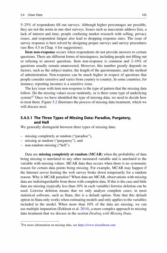
5–25% of respondents fill out surveys. Although higher percentages are possible,
they are not the norm in one-shot surveys. Issues such as inaccurate address lists, a
lack of interest and time, people confusing market research with selling, privacy
issues, and respondent fatigue also lead to dropping response rates. The issue of
survey response is best solved by designing proper surveys and survey procedures
(see Box 4.5 in Chap. 4 for suggestions).
Item non-response occurs when respondents do not provide answers to certain
questions. There are different forms of missingness, including people not filling out
or refusing to answer questions. Item non-response is common and 2–10% of
questions usually remain unanswered. However, this number greatly depends on
factors, such as the subject matter, the length of the questionnaire, and the method
of administration. Non-response can be much higher in respect of questions that
people consider sensitive and varies from country to country. In some countries, for
instance, reporting incomes is a sensitive issue.
The key issue with item non-response is the type of pattern that the missing data
follow. Do the missing values occur randomly, or is there some type of underlying
system?3 Once we have identified the type of missing data, we need to decide how
to treat them. Figure 5.2 illustrates the process of missing data treatment, which we
will discuss next.
5.4.5.1 The Three Types of Missing Data: Paradise, Purgatory,and Hell
We generally distinguish between three types of missing data:
– missing completely at random (“paradise”),
– missing at random (“purgatory”), and
– non-random missing (“hell”).
Data are missing completely at random (MCAR) when the probability of data
being missing is unrelated to any other measured variable and is unrelated to the
variable with missing values. MCAR data thus occurs when there is no systematic
reason for certain data points being missing. For example, MCAR may happen if
the Internet server hosting the web survey broke down temporarily for a random
reason. Why is MCAR paradise? When data are MCAR, observations with missing
data are indistinguishable from those with complete data. If this is the case and little
data are missing (typically less than 10% in each variable) listwise deletion can be
used. Listwise deletion means that we only analyze complete cases; in most
statistical software, such as Stata, this is a default option. Note that this default
option in Stata only works when estimating models and only applies to the variables
included in the model. When more than 10% of the data are missing, we can
use multiple imputation (Eekhout et al. 2014), a more complex approach to missing
data treatment that we discuss in the section Dealing with Missing Data.
3For more information on missing data, see https://www.iriseekhout.com
5.4 Clean Data 105

Unfortunately, data are rarely MCAR. If a missing data point (e.g., xi) is
unrelated to the observed value of xi, but depends on another observed variable,
we consider the data missing at random (MAR). In this case, the probability that
the data point is missing varies from respondent to respondent. The term MAR is
unfortunate, because many people confuse it with MCAR; however, the label has
stuck. An example of MAR is when women are less likely to reveal their income.
That is, the probability of missing data depends on the gender and not on the
income. Why is MAR purgatory? When data are MAR, the missing value pattern is
not random, but this can be handled by more sophisticated missing data techniques
such as multiple imputation techniques. In the Web Appendix (! Downloads),
we will illustrate how to impute a dataset with missing observations.
Use one of the following:• listwise deletion if < 10%
missing;• multiple imputation with
m = 5 if >10% missing.
Carry outLittle’s test
Carry out meandifference tests
Do Not Reject H0 Reject H0
Data are missingcompletely at
random (MCAR)
Data are missingat random (MAR)
or non-randommissing (NRM)
Data are missingat random (MAR)
Data are non-random missing
(NRM)
Use multiple imputationmethod with m = 5.
Use listwise deletionand acknowledge
limitations arising fromthe missing data.
Fig. 5.2 Treating missing data
106 5 Descriptive Statistics

Lastly, data are non-random missing (NRM) when the probability that a data
point (e.g., xi) is missing depends on the variable x and on other unobserved factors.For example, very affluent and poor people are less likely to indicate their income.
Thus, the missing income values depend on the income variable, but also on other
unobserved factors that inhibit the respondents from reporting their incomes. This is
the most severe type of missing data (“hell”), as even sophisticated missing data
techniques do not provide satisfactory solutions. Thus, any result based on NRM
data should be considered with caution. NRM data can best be prevented by
extensive pretesting and consultations with experts to avoid surveys that cause
problematic response behavior. For example, we could use income categories
instead of querying the respondents’ income directly, or we could simply omit
the income variable.
A visualization of these three missingness mechanisms can be found under
https://iriseekhout.shinyapps.io/MissingMechanisms/
5.4.5.2 Testing for the Type of Missing DataWhen dealing with missing data, we must ascertain the missing data’s type. If the
dataset is small, we can browse through the data for obvious nonresponse patterns.
However, missing data patterns become more difficult to identify with an increasing
sample size and number of variables. Similarly, when we have few observations,
patterns should be difficult to spot. In these cases, we should use one (or both) of the
following diagnostic tests to identify missing data patterns:
– Little’s MCAR test, and
– mean difference tests.
Little’s MCAR test (Little 1998) analyzes the pattern of the missing data by
comparing the observed data with the pattern expected if the data were randomly
missing. If the test indicates no significant differences between the two patterns, the
missing data can be classified as MCAR. Put differently, the null hypothesis is that
the data are MCAR. Thus,
– if we do not reject the null hypothesis, we assume that the data are MCAR, and
– if we reject the null hypothesis, the data are either MAR or NRM.
If the data cannot be assumed to be MCAR, we need to test whether the missing
pattern is caused by another variable in the dataset by using the procedures
discussed in Chap. 6.
Looking at group means and their differences can also reveal missing data
problems. For example, we can run a two independent samples t-test to explore
whether there is a significant difference in the mean of a continuous variable (e.g.,
income) between the group with missing values and the group without missing
5.4 Clean Data 107

values. In respect of nominal or ordinal variables, we could tabulate the occurrence
of non-responses against different groups’ responses. If we put the (categorical)
variable about which we have concerns in one column of a table (e.g., income
category), and the number of (non-)responses in another, we obtain a table similar
to Table 5.2.
Using the χ2-test (pronounced as chi-square), which we discuss under nonpara-
metric tests in the Web Appendix (! Downloads), we can test if there is a
significant relationship between the respondents’ (non-)responses in respect of a
certain variable and their income. In this example, the test indicates that there is a
significant relationship between the respondents’ income and the (non-)response
behavior in respect of another variable, supporting the assumption that the data are
MAR. We illustrate Little’s MCAR test, together with the missing data analysis and
imputation procedures in this chapter’s appendix Web Appendix (! Downloads).
5.4.5.3 Dealing with Missing DataResearch has suggested a broad range of approaches for dealing with missing data.
We discuss the listwise deletion and the multiple imputation method.
Listwise deletion uses only those cases with complete responses in respect of all
the variables considered in the analysis. If any of the variables used have missing
values, the observation is omitted from the computation. If many observations have
some missing responses, this decreases the usable sample size substantially and
hypotheses are tested with less power (the power of a statistical test is discussed in
Chap. 6).
Multiple imputation is a more complex approach to missing data treatment
(Rubin 1987; Carpenter and Kenward 2013). It is a simulation-based statistical
technique that facilitates inference by replacing missing observations with a set of
possible values (as opposed to a single value) representing the uncertainty about the
missing data’s true value (Schafer 1997). The technique involves three steps. First,
the missing values are replaced by a set of plausible values not once, but m times
(e.g., five times). This procedure yields m imputed datasets, each of which reflects
the uncertainty about the missing data’s correct value (Schafer 1997). Second, each
of the imputed m datasets are analyzed separately by means of standard data
methods. Third and finally, the imputed results from all m datasets (with imputed
values) are combined into a single multiple-imputation dataset to produce statistical
inferences with valid confidence intervals. This is necessary to reflect the uncer-
tainty related to the missing values. According to the literature, deciding on the
number of imputations, m, can be very challenging, especially when the patterns ofthe missing data are unclear. As a rule of thumb, an m of at least 5 should be
Table 5.2 Example of response issues
Low income Medium income High income
Response 65 95 70
Non-response 35 5 30
N ¼ 300
108 5 Descriptive Statistics

sufficient to obtain valid inferences (Rubin 1987; White et al. 2011). Additional
information about the multiple imputation techniques available when using Stata
can be found in the Web Appendix (! Downloads).
Now that we have briefly reviewed the most common approaches for handling
missing data, there is still one unanswered question: Which one should you use? As
shown in Fig. 5.2, if the data are MCAR, listwise deletion is recommended (Graham
2012) when the missingness is less than 10% and multiple imputation when this is
greater than 10%. When the data are not MCAR but MAR, listwise deletion yields
biased results. You should therefore use the multiple imputation method with an
m of 5 (White et al. 2011). Finally, when the data are NRM, the multiple imputation
method provides inaccurate results. Consequently, you should choose listwise
deletion and acknowledge the limitations arising from the missing data. Table 5.3
summarizes the data cleaning issues discussed in this section.
Table 5.3 Data cleaning issues and how to deal with them
Problem Action
Interviewer fraud – Check with respondents whether they were interviewed and correlate
with previous data if available.
Suspicious response
patterns
– Check for straight lining.
– Include reverse-scaled items.
– Consider removing the cases with straight-lined responses.
– Consider cultural differences in response behavior (middle and
extreme response styles, acquiescence).
– Check for inconsistencies in response behavior.
Data entry errors – Use descriptive statistics (minimum, maximum, range) to check for
obvious data entry errors.
– Compare a subset of surveys to the dataset to check for
inconsistencies.
Outliers – Identify outliers by means of univariate descriptive statistics
(minimum, maximum, range), box plots, and scatter plots.
– Outliers are usually retained unless they:
. . . are a result of data entry errors,
. . . do not fit the objective of the research, or
. . . influence the results severely (but report results with and without
outliers for transparency).
Missing data – Check the type of missing data by running Little’s MCAR test and, if
necessary, mean differences tests.
– When the data are MCAR, use either listwise deletion or the multiple
imputation method with an m of 5.
– When the data are MAR, use the multiple imputation method with an
m of 5.
– When the data are NRM, use listwise deletion and acknowledge the
limitations arising from the missing data.
5.4 Clean Data 109

5.5 Describe Data
Once we have performed the previous steps, we can turn to the task of describing
the data. Data can be described one variable at a time (univariate descriptives) or in
terms of the relationship between two variables (bivariate descriptives). We further
divide univariate and bivariate descriptives into graphs and tables, as well as
statistics.
The choice between the two depends on the information we want to convey.
Graphs and tables can often tell a non-technical person a great deal. On the other
hand, statistics require some background knowledge, but have the advantage that
they take up little space and are exact. We summarize the different types of
descriptive statistics in Fig. 5.3.
5.5.1 Univariate Graphs and Tables
In this section, we discuss the most common univariate graphs and univariatetables:
– bar chart,
– histogram,
– box plot,
– pie chart, and the
– frequency table.
Univariate Bivariate
Graphs & tables Statistics
Measures of centrality:
• Mode
• Median
• Mean
Scatter plots
Measures of dispersion
• Range
• Interquartile Range
• Variance
• Standard deviation
Covariance
StatisticsGraphs & tables
Bar chart
Histogram
Box plot
Pie chart
Crosstabs
Frequency table
Describe Data
Correlation
Fig. 5.3 The different types of descriptive statistics
110 5 Descriptive Statistics

Figure 5.4 draws on these different types of charts and tables to provide information
on the characteristics of travelers taken from the Oddjob Airways dataset that we
use throughout this book.
A bar chart (Fig. 5.4 top left) is a graphical representation of a single categori-
cal variable indicating each category’s frequency of occurrence. However, each
bar’s height can also represent other indices, such as centrality measures or the
dispersion of different data groups (see next section). Bar charts are primarily
useful for describing nominal or ordinal variables. Histograms should be used for
interval or ratio-scaled variables.
A histogram (Fig. 5.4 top middle) is a graph that shows how frequently
categories made from a continuous variable occur. Differing from the bar chart,
the variable categories on the x-axis are divided into (non-overlapping) classes of
equal width. For example, if you create a histogram for the variable age, you can
use classes of 21–30, 31–40, etc. A histogram is commonly used to examine the
distribution of a variable. For this purpose, a curve following a specific distribution
(e.g., normal) is superimposed on the bars to assess the correspondence of the actual
distribution to the desired (e.g., normal) distribution. Given that overlaying a
normal curve makes most symmetric distributions look more normal then they
are, you should be cautious when assessing normality by means of histograms. In
Chap. 6 we will discuss several options for checking the normality of data.
Histograms plot continuous variables with ranges of the variables grouped
into intervals (bins), while bar charts plot nominal and ordinal variables.
de ch at fr us
020
0
20 2040
6080
100
0.0
1D
ensi
ty
Age
.02
.03
40 60Age
80 100
GoldBlue Silver
400
coun
t of n
fligh
ts 600
800
Fig. 5.4 From top left to bottom right; the bar chart, histogram, box plot, pie chart, and frequency
table
5.5 Describe Data 111

Another way of displaying the distribution of a (continuous) variable is the box
plot (Fig. 5.4 top right) (also referred to as a box-and-whisker plot). The box plot
is a graph representing a variable’s distribution and consists of elements expressing
the dispersion of the data. Note that several elements refer to terminologies
discussed in the Univariate Statistics section. Figure 5.5 shows a box plot for the
variable age based on the Oddjob Airways dataset.
– Outside values are observations that fall above the 3rd quartileþ1.5 interquartile
range.
– The upper adjacent value represents observations with the highest value that fallwithin the 3rd quartile þ1.5 interquartile range.
– The upper line extending the box (whisker) represents the distance to
observations with the highest values that fall within the following range: 3rd
quartile þ interquartile range. If there are no observations within this range, the
line is equal to the maximum value.
– The top and bottom of the box describe the 3rd quartile (top) and 1st quartile
(bottom); that is, the box contains the middle 50% of the data, which is
equivalent to the interquartile range.
– The solid line inside the box represents the median.– The lower line extending the box (whisker) represents the distance to the
smallest observation that is within the following range: 1st quartile �interquartile range. If there are no observations within this range, the line is
equal to the minimum value.
– The lower adjacent value represents observations with lowest values that fall
inside the 3rd quartile �1.5 interquartile range.
Fig. 5.5 Elements of the box plot
112 5 Descriptive Statistics

We can make statements about the dispersion of the data with a box plot. The larger
the box, the greater the observations’ variability. Furthermore, the box plot helps us
identify outliers in the data.
The pie chart (i.e., Fig. 5.4 bottom left) visualizes how a variable’s different
values are distributed. Pie charts are particularly useful for displaying percentages
of variables, because people interpret the entire pie as being 100%, and can easily
see how often values occur. The limitation of the pie chart is, however, that it is
difficult to determine the size of segments that are very similar.
A frequency table (i.e., Fig. 5.4 bottom right) is a table that includes all possible
values of a variable in absolute terms (i.e., frequency), how often they occur
relatively (i.e., percentage), and the percentage of the cumulative frequency,
which is the sum of all the frequencies from the minimum value to the category’s
upper bound (i.e., cumulative frequency). It is similar to the histogram and pie chart
in that it shows the distribution of a variable’s possible values. However, in a
frequency table, all values are indicated exactly. Like pie charts, frequency tables
are primarily useful if variables are measured on a nominal or ordinal scale.
5.5.2 Univariate Statistics
Univariate statistics fall into two groups: those describing centrality and those
describing the dispersion of variables. Box 5.2 at the end of this section shows
sample calculation of the statistics used on a small set of values.
5.5.2.1 Measures of CentralityMeasures of centrality (sometimes referred to asmeasures of central tendency) arestatistical indices of a “typical” or “average” score. There are two main types of
measures of centrality, the median and the mean.4
The median is the value that occurs in the middle of the set of scores if they are
ranked from the smallest to the largest, and it therefore separates the lowest 50% of
cases from the highest 50% of cases. For example, if 50% of the products in a
market cost less than $1,000, then this is the median price. Identifying the median
requires at least ordinal data (i.e., it cannot be used with nominal data).
The most commonly used measure of centrality is the mean (also called the
arithmetic mean or, simply, the average). The mean (abbreviated as �x) is the sum of
each observation’s value divided by the number of observations:
�x ¼ Sum xð Þn
¼ 1
n
Xn
i¼1xi
4The mode is another measure. However, unlike the median and mean, it is ill-defined, because it
can take on multiple values. Consequently, we do not discuss the mode.
5.5 Describe Data 113

In the above formula, xi refers to the value of observation i of variable x and n refersto the total number of observations. The mean is only useful for interval or ratio-
scaled variables.
Each measure of centrality has its own use. The mean is most frequently used,
but is sensitive to very small or large values. Conversely, the median is not sensitive
to outliers. Consequently, the relationship between the mean and the median
provides us with valuable information about a variable’s distribution. If the mean
and the median are about the same, the variable is likely to be symmetrically
distributed (i.e., the left side of the distribution mirrors the right side). If the
mean differs from the median, this suggests that the variable is asymmetrically
distributed and/or contains outliers. This is the case when we examine the prices of
a set of products valued $500, $530, $530, and $10,000; the median is $530, while
the mean is $2,890. This example illustrates why a single measure of centrality can
be misleading. We also need to consider the variable’s dispersion to gain a more
complete picture.
5.5.2.2 Measures of DispersionMeasures of dispersion provide researchers with information about the variability
of the data; that is, how far the values are spread out. We differentiate between four
types of measures of dispersion:
– range,
– interquartile range,
– variance, and
– standard deviation.
The range is the simplest measure of dispersion. It is the difference between the
highest and the lowest value in a dataset and can be used on data measured at least
on an ordinal scale. The range is of limited use as a measure of dispersion, because
it provides information about extreme values and not necessarily about “typical”
values. However, the range is valuable when screening data, as it allows for
identifying data entry errors. For example, a range of more than 6 on a 7-point
Likert scale would indicate an incorrect data entry.
The interquartile range is the difference between the 3rd and 1st quartile. The 1st
quartile corresponds to the value separating the 25% lowest values from the 75%
largest values if the values are ordered sequentially. Correspondingly, the 3rd quartile
separates the 75% lowest from the 25% highest values. The interquartile range is
particularly important for drawing box plots.
The variance (generally abbreviated as s2) is a common measure of dispersion.
The variance is the sum of the squared differences of each value and a variable’s
mean, divided by the sample size minus 1. The variance is only useful if the data are
interval or ratio-scaled:
114 5 Descriptive Statistics

s2 ¼Pn
i¼1 xi � �xð Þ2n� 1
The variance tells us how strongly observations vary around the mean. A low
variance indicates that the observations tend to be very close to the mean; a high
variance indicates that the observations are spread out. Values far from the mean
increase the variance more than those close to the mean.
The most commonly used measure of dispersion is the standard deviation(usually abbreviated as s). It is the square root of—and, therefore, a variant of—
the variance:
s ¼ffiffiffiffis2
p¼
ffiffiffiffiffiffiffiffiffiffiffiffiffiffiffiffiffiffiffiffiffiffiffiffiffiffiffiffiffiffiPni¼1 xi � �xð Þ2n� 1
s
The variance and standard deviation provide similar information, but while the
variance is expressed on the same scale as the original variable, the standard
deviation is standardized. Consequently, the following holds for normally
distributed variables (this will be discussed in the following chapters in more
detail):
– 66% of all observations are between plus and minus one standard deviation units
from the mean,
– 95% of all observations are between plus and minus two standard deviation units
from the mean, and
– 99% of all observations are between plus and minus three standard deviation
units from the mean.
Thus, if the mean price is $1,000 and the standard deviation is $150, then 66% of all
the prices fall between $850 and $1150, 95% fall between $700 and $1300, and
99% of all the observations fall between $550 and $1,450.
5.5.3 Bivariate Graphs and Tables
There are several bivariate graphs and tables, of which the scatter plot and the
crosstab are the most important. Furthermore, several of the graphs, charts, and
tables discussed in the context of univariate analysis can be used for bivariate
analysis. For example, box plots can be used to display the distribution of a variable
in each group (category) of nominal variables.
A scatter plot (see Fig. 5.6) uses both the y and x-axis to show how two variables
relate to one another. If the observations almost form a straight diagonal line in a
5.5 Describe Data 115

scatter plot, the two variables are strongly related.5 Sometimes, a third variable,
corresponding to the color or size (e.g., a bubble plot) of the data points, is included,adding another dimension to the plot.
Crosstabs (also referred to as contingency tables) are tables in a matrix format
that show the frequency distribution of nominal or ordinal variables. They are the
equivalent of a scatter plot used to analyze the relationship between two variables.
While crosstabs are generally used to show the relationship between two variables,
they can also be used for three or more variables, which, however, makes them
difficult to grasp. Crosstabs are also part of the χ2-test (pronounced as chi-square),which we discuss under nonparametric tests in the Web Appendix (!Downloads).
0
00
0 .25 -.5 -.3 -.1 .1 .3 .5.5 .75 1
-.5
-.3
-.1
.1.3
.5
.25
.5x x
.75
1.2
.4.6
.81
.2 .4 .6y
y y
r = 1.0
r = 0 r = 0
r = -1.0
x
0.2
.4.6
.81
x
.8 1 0 .2 .4 .6y
.8 1
Fig. 5.6 Scatter plots and correlations
5A similar type of chart is the line chart. In a line chart, measurement points are ordered (typically
by their x-axis value) and joined with straight line segments.
116 5 Descriptive Statistics

5.5.4 Bivariate Statistics
Bivariate statistics involve the analysis of two variables to determine the empirical
relationship between them. There are two key measures that indicate (linear)
associations between two variables; we illustrate their computation in Box 5.2:
– covariance, and
– correlation.
The covariance is the degree to which two variables vary together. If the
covariance is zero, then two variables do not vary together. The covariance is the
sum of the multiplication of the differences between each value of the xi and yivariables and their means, divided by the sample size minus 1:
Covðxi, yiÞ ¼1
n� 1
Xn
i¼1ðxi � x
�Þ ∙ ðyi � y�Þ
The correlation (typically abbreviated as r) is a common measure of how
strongly two variables relate to each other. The most common type of correlation,
the Pearson’s correlation coefficient, is calculated as follows:
r ¼ Cov xi; yið Þsx ∙ sy
¼Pn
i¼1 xi � �xð Þ ∙ yi � �yð ÞffiffiffiffiffiffiffiffiffiffiffiffiffiffiffiffiffiffiffiffiffiffiffiffiffiffiffiffiffiPni¼1 xi � �xð Þ2
q∙
ffiffiffiffiffiffiffiffiffiffiffiffiffiffiffiffiffiffiffiffiffiffiffiffiffiffiffiffiffiPni¼1 yi � �yð Þ2
qThe numerator contains the covariance of xi and yi (Cov(xi, yi)), while the
denominator contains the product of the standard deviations of xi and yi.6 Thus,
the correlation is the covariance divided by the product of the standard deviations.
As a result, the correlation is standardized and, unlike the covariance, is no longer
dependent on the variables’ original measurement. More precisely, the correlation
coefficient ranges from �1 to 1, where �1 indicates a perfect negative relationship
and 1 indicates the contrary. A correlation coefficient of 0 indicates that there is no
relationship, also implying that their covariance is zero.
As a rule of thumb (Cohen 1988), an absolute correlation. . .
– . . . below 0.30 indicates a weak relationship,
– . . . between 0.30 and 0.49 indicates a moderate relationship, and
– . . . above 0.49 indicates a strong relationship.
6Note that the terms n�1 in the numerator and denominator cancel each other and are therefore not
shown here.
5.5 Describe Data 117

The scatter plots in Fig. 5.6 illustrate several correlations between two variables
x and y. If the observations almost form a straight diagonal line in the scatter plot
(upper left and right in Fig. 5.6), the two variables have a high (absolute) correla-
tion. If the observations are uniformly distributed in the scatter plot (lower right in
Fig. 5.6), or one variable is a constant (lower left in Fig. 5.6), the correlation is zero.
Pearson’s correlation coefficient is the most common coefficient and is generally
simply referred to as the correlation (Agresti and Finlay 2014). Pearson’s correla-
tion is appropriate for calculating correlations between two variables that are
both interval or ratio-scaled. However, it can also be used when one variable is
Box 5.2 Sample Calculation of Univariate and Bivariate Statistics
Consider the following list of values for variables x and y, which we treat as
ratio-scaled:
x 6 6 7 8 8 8 12 14 14
y 7 6 6 9 8 5 10 9 9
Measures of centrality for x:
Median ¼ 8
Mean �x ¼ 1
96þ 6þ . . .þ 14þ 14ð Þ ¼ 83
9� 9:22
Measures of dispersion for x:
Minimum ¼ 6
Maximum ¼ 14
Range ¼ 14 – 6 ¼ 8
Interquartile range ¼ 6.5
Variance s2ð Þ ¼h6� 9:22ð Þ2 þ . . .þ �
14� 9:22�2i
9� 1¼ 83:56
8� 10:44:
Standard deviation sð Þ ¼ffiffiffiffis2
p¼ ffiffiffiffiffiffiffiffiffiffiffi
10:44p � 3:23
Measures of association between x and y:
Covariance cov x; yð Þð Þ ¼ 1
9� 16� 9:22ð Þ ∙ 7� 7:67ð Þ þ . . .½
þ 14� 9:22ð Þ ∙ 9� 7:67ð Þ� ¼ 31:67
8� 3:96
Correlation rð Þ ¼ 3:96
3:23 ∙ 1:73� 0:71
118 5 Descriptive Statistics

interval or ratio-scale and the other is, for example, binary. There are other
correlation coefficients for variables measured on lower scale levels. Some
examples are:
– Spearman’s correlation coefficient and Kendall’s tau when at least one variable
for determining the correlation is measured on an ordinal scale.
– Contingency coefficient, Cramer’s V, and Phi for variables measured on a
nominal scale. These statistical measures are used with crosstabs; we
discuss these in the context of nonparametric tests in the Web Appendix
(! Downloads).
In Table 5.4, we indicate which descriptive statistics are useful for differently
scaled variables. The brackets X indicate that the use of a graph, table, or statistic
is potentially useful while (X) indicates that use is possible, but less likely useful,
because this typically requires collapsing data into categories, resulting in a loss of
information.
Table 5.4 Types of descriptive statistics for differently scaled variables
Nominal Ordinal Interval & ratio
Univariate graphs & tables
Bar chart X X
Histogram X
Box plot X
Pie chart X X (X)
Frequency table X X (X)
Univariate statistics: Measures of centrality
Median X X
Mean X
Univariate statistics: Measures of dispersion
Range (X) X
Interquartile range (X) X
Variance X
Standard deviation X
Bivariate graphs/tables
Scatter plot X
Crosstab X X (X)
Bivariate statistics
Contingency coefficient X
Cramer’s V X
Phi X
Spearman’s correlation X
Kendall’s tau X
Pearson’s correlation X
5.5 Describe Data 119

5.6 Transform Data (Optional)
Transforming data is an optional step in the workflow. Researchers transform data
as certain analysis techniques require this: it might help interpretation or might help
meet the assumptions of techniques that will be discussed in subsequent chapters.
We distinguish two types of data transformation:
– variable respecification, and
– scale transformation.
5.6.1 Variable Respecification
Variable respecification involves transforming data to create new variables or to
modify existing ones. The purpose of respecification is to create variables that are
consistent with the study’s objective. Recoding a continuous variable into a cate-
gorical variable is an example of a simple respecification. For example, if we have a
variable that measures a respondent’s number of flights (indicating the number offlights per year), we could code those flights below 5 as low (¼1), between 5 and
10 flights as medium (¼2), and everything above 11 as high (¼3). Recoding a
variable in such a way always results in a loss of information, since the newly
created variable contains less detail than the original. While there are situations that
require recoding (e.g., we might be asked to give advice based on different income
groups where income is continuous), we should generally avoid recoding.
Another example of respecification is swapping the polarity of a question. If you
have a variable measured on a 5-point Likert-scale where: 1 ¼ “strongly agree”;
2 ¼ “agree”; 3 ¼ “undecided”; 4 ¼ “disagree”; 5 ¼ “strongly disagree” and you
wish to switch the polarity of the values so that value 1 reverses to 5, value
2 becomes 4, and so on.
Creating a dummy variable is a special way of recoding data. Dummy variables
(or simply dummies) are binary variables that indicate if a certain trait is present or
not. For example, we can use a dummy variable to indicate that advertising was
used during a period (value of the dummy is 1) or not (value of the dummy is 0). We
can also use multiple dummies to capture categorical variables’ effects. For exam-
ple, three levels of flight intensity (low, medium, and high) can be represented by
two dummy variables: The first takes a value of 1 if the intensity is high (0 else), the
second also takes a value of 1 if the intensity is medium (0 else). If both dummies
take the value 0, this indicates low flight intensity. We always construct one
dummy less than the number of categories. We explain dummies in further detail
in the Web Appendix (! Downloads) and more information can be found
at http://www.stata.com/support/faqs/data-management/creating-dummy-variables/.
Dummies are often used in regression analysis (discussed in Chap. 7).
120 5 Descriptive Statistics

The creation of constructs is a frequently used type of variable respecification.
As described in Chap. 3, a construct is a concept that cannot be observed, but can be
measured by using multiple items, none of which relate perfectly to the construct.
To compute a construct measure, we need to calculate the average (or the sum) of
several related items. For example, a traveler’s commitment to fly with Oddjob
Airways can be measured by using the following three items:
– I am very committed to Oddjob Airways.
– My relationship with Oddjob Airways means a lot to me.
– If Oddjob Airways would no longer exist, it would be a true loss for me.
By calculating the average of these three items, we can form a composite measureof commitment. If one respondent indicated 4, 3, and 4 on the three items’ scale, we
calculate a construct score (also referred to as a composite score) for this person as
follows: (4 þ 3 þ 4)/3 ¼ 3.67. Note that we should take the average over the
number of nonmissing responses.7 In Chap. 8 we discuss more advanced methods
of doing this by, for example, creating factor scores.
Similar to creating constructs, we can create an index of sets of variables. For
example, we can create an index of information search activities, which is the sum
of the information that customers require from promotional materials, the Internet,
and other sources. This measure of information search activities is also referred to
as a composite measure, but, unlike a construct, the items in an index define the trait
to be measured.
5.6.2 Scale Transformation
Scale transformation involves changing the variable values to ensure comparabil-
ity with other variables or to make the data suitable for analysis. Different scales are
often used to measure different variables. For example, we may use a 5-point Likert
scale for one set of variables and a 7-point Likert scale for a different set of
variables in our survey. Owing to the differences in scaling, it would not be
meaningful to make comparisons across any respondent’s measurement scales.
These differences can be corrected by standardizing variables.A popular way of standardizing data is by rescaling these to have a mean of 0 and
a variance of 1. This type of standardization is called the z-standardization.Mathematically, standardized scores zi (also called z-scores) can be obtained by
7In Stata, this is best done using the rowmean command. For example, egen commit-ment ¼ rowmean (com1 com2 com3). This command automatically calculates the mean
over the number of nonmissing responses.
5.6 Transform Data (Optional) 121

subtracting the mean �x of every observation xi and dividing it by the standard
deviation s. That is:
zi ¼ xi � �xð Þs
Range standardization (ri) is another standardization technique which scales thedata in a specific range. For example, standardizing a set of values to a range of 0 to
1 requires subtracting the minimum value of every observation xi and then dividingit by the range (the difference between the maximum and minimum value).
ri ¼ xi � xminð Þxmax � xminð Þ
The range standardization is particularly useful if the mean, variance, and ranges of
different variables vary strongly and are used for some forms of cluster analysis (see
Chap. 9).
A log transformation—another type of transformation—is commonly used if
we have skewed data. Skewed data occur if we have a variable that is asymmetri-
cally distributed and can be positive or negative. A positive skew (also called right-skewed data or data skewed to the right) occurs when many observations are
concentrated on the left side of the distribution, producing a long right tail. When
data are right-skewed, the mean will be higher than the median. A negative skew(also called left-skewed data or data skewed to the left) is the opposite, meaning that
many observations are concentrated on the right of the distribution, producing a
long left tail. When data are negatively skewed, the mean will be lower than the
median. A histogram will quickly show whether data are skewed. Skewed data can
be undesirable in analyses. Log transformations are commonly used to transform
data closer to a normal distribution when the data are right-skewed (i.e., the data are
non-negative). Taking a natural logarithm will influence the size of the coefficient
related to the transformed variable, but will not influence the value of its outcome.8
Finally, aggregation is a special type of transformation. Aggregation means that
we take variables measured at a lower level to a higher level. For example, if we
know the average customer’s satisfaction with an airline and the distribution
channels from which they buy (i.e., the Internet or a travel agent), we can calculate
the average satisfaction at the channel level. Aggregation only works from lower to
higher levels and is useful if we want to compare groups at a higher level.
8The logarithm is calculated as follows: If x¼ yb, then y¼ logb(x) where x is the original variable,b the logarithm’s base, and y the exponent. For example, log 10 of 100 is 2. Logarithms cannot be
calculated for negative values (such as household debt) and for the value of zero. In Stata, you can
generate a log-transformed variable by typing: gen loginc ¼ log(income), whereby
loginc refers to the newly created log-transformed variable and income refers to the income
variable.
122 5 Descriptive Statistics
While transforming data is often necessary to ensure comparability between
variables or to make the data suitable for analysis, there are also drawbacks to
this procedure. Most notably, we may lose information during most
transformations. For example, recoding the ticket price (measured at the
ratio scale) as a “low,” “medium,” and “high” ticket price will result in an
ordinal variable. In the transformation process, we have therefore lost infor-
mation by going from a ratio to an ordinal scale. Another drawback is that
transformed data are often more difficult to interpret. For example, the log
(ticket price) is far more difficult to interpret and less intuitive than simply
using the ticket price.
5.7 Create a Codebook
After all the variables have been organized and cleaned, and some initial descriptive
statistics have been calculated, we can create a codebook, containing essential
details of the data collection and data files, to facilitate sharing. Codebooks usually
have the following structure:
Introduction: The introduction discusses the goal of the data collection, why the
data are useful, who participated, and how the data collection effort was
conducted (mail, Internet, etc.).
Questionnaire(s): It is common practice to include copies of all the types of
questionnaires used. Thus, if different questionnaires were used for different
respondents (e.g., for French and Chinese respondents), a copy of each original
questionnaire should be included. Differences in wording may afterwards
explain the results of the study, particularly those of cross-national studies,
even if a back-translation was used (see Chap. 4). These are not the
questionnaires received from the respondents themselves, but blank copies of
each type of questionnaire used. Most codebooks include details of each variable
as comments close to the actual items used. If a dataset was compiled using
secondary measures (or a combination of primary and secondary data), the
secondary datasets are often briefly discussed (the version that was used, when
it was accessed, etc.).
Description of the variables: This section includes a verbal description of each
variable used. It is useful to provide the variable name as used in the data file, a
description of what the variable is supposed to measure, and whether the
measure has previously been used. You should also describe the measurement
level (see Chap. 3).
Summary statistics: This section includes descriptive statistics of each variable. Theaverage (only for interval and ratio-scaled data), minimum, and maximum are
often shown. In addition, the number of observations and usable observations
(excluding observations with missing values) are included, just like a histogram
(if applicable).
5.7 Create a Codebook 123

Datasets: This last section includes the names of the datasets and sometimes the
names of all the revisions of the used datasets. Codebooks sometimes include the
file date to ensure that the right files are used.
5.8 The Oddjob Airways Case Study
The most effective way of learning statistical methods is to apply them to a set of
data. Before introducing Stata and how to use it, we present the dataset from a
fictitous company called Oddjob Airways (but with a real website, http://www.
oddjobairways.com) that will guide the examples throughout this book. The dataset
oddjob.dta ( Web Appendix ! Downloads) stems from a customer survey of
Oddjob Airways. Founded in 1962 by the Korean businessman Toshiyuki Sakata,
Oddjob Airways is a small premium airline, mainly operating in Europe, but also
offering flights to the US. In an effort to improve its customers’ satisfaction, the
company’s marketing department contacted all the customers who had flown with
the airline during the last 12 months and were registered on the company website. A
total of 1,065 customers who had received an email with an invitation letter
completed the survey online.
The survey resulted in a rich dataset with information about travelers’ demo-
graphic characteristics, flight behavior, as well as their price/product satisfaction
with and expectations in respect of Oddjob Airways. Table 5.5 describes the
variables in detail.
5.8.1 Introduction to Stata
Stata is a computer package specializing in quantitative data analysis, and widely
used by market researchers. It is powerful, can deal with large datasets, and
relatively easy to use. In this book, we use Stata MP4 14.2 (to which we simply
refer to as Stata). Prior versions (12 or higher) for Microsoft Windows, Mac or
Linux can be used for (almost) all examples throughout the book.
Stata offers a range of versions and packages; your choice of these depends on
the size of your dataset and the data processing speed. Stata/SE and Stata/MP are
recommended for large datasets. The latter is the fastest and largest version of Stata.
Stata/MP can, for example, process large datasets with up to 32,767 variables and
20 billion observations, while Stata/SE can process datasets with the same number
of variables, but a maximum of 2.14 billion observations. Stata/IC is recommended
124 5 Descriptive Statistics

Table 5.5 Variable description and label names of the Oddjob Dataset
Variables Variable description
Variable name
in the dataset
Demographic measures
Age of the customer Numerical variable ranging between the ages of
19 and 101.
Age
Customer’s gender Dichotomous variable, where 1¼ Female; 2¼Male. Gender
Language of
customer
Categorical variable, where 1 ¼ German;
2 ¼ English; 3 ¼ French.
Language
Home country Categorical variable, whereby: 1 ¼ Germany (de),
2 ¼ Switzerland (ch); 3 ¼ Austria (at); 4 ¼ France
(fr), 5 ¼ the United States (us).
Country
Flight behaviour measures
Flight class Categorical variable distinguishing between the
following categories: 1 ¼ First; 2 ¼ Business;
3 ¼ Economy.
flight_class
Latest flight Categorical variable querying when the customer last
flew with Oddjob Airways. Categories are:
1¼Within the last 2 days; 2¼Within the last week;
3 ¼ Within the last month; 4 ¼ Within the last
3 months; 5 ¼ Within the last 6 months; 6 ¼ Within
the last 12 months.
flight_latest
Flight purpose Dichotomous variable distinguishing between:
1 ¼ Business; 2 ¼ Leisure.
flight_purpose
Flight type Dichotomous variable, where: 1 ¼ Domestic;
2 ¼ International.
flight_type
Number of flights Numeric variable ranging between 1 and 457 flights
per year.
nflights
Traveler’s status Categorical variable, where membership status is
defined in terms of: 1 ¼ Blue; 2 ¼ Silver; 3 ¼ Gold.
status
Perception and satisfaction measures
Traveler’s
expectations
23 items reflecting a customer’s expectations with
the airline: “How high are your expectations that. . .”All items are measured on a continuous scale ranging
from 1 very low to 100 very high.
e1 to e23
Traveler’s
satisfaction
23 items reflecting a customer’s satisfaction with
Oddjob Airways regarding the features asked in the
expectation items (e1-e23) on a continuous scale
ranging from 1=very unsatisfied to 100=very
satisfied.
s1 to s23
Recommendation Item on whether a customer is likely to recommend
the airline to a friend or colleague. This item is
measured on an 11-point Likert-scale ranging from
1 very unlikely to 11 very likely.
nps
Reputation One item stating “Oddjob Airways is a reputable
airline.” This item is measured on a 7-point Likert-
scale ranging from 1 fully disagree to 7 fully agree.
reputation
Overall price/
performance
satisfaction
One item stating “Overall I am satisfied with the
price performance ratio of Oddjob Airways.” This
item is measured on a 7-point Likert-scale ranging
from 1 fully disagree to 7 fully agree.
overall_sat
(continued)
5.8 The Oddjob Airways Case Study 125

for moderate-sized datasets. This can process datasets with a maximum of 2,047
variables and up to 2.14 billion observations. Small Stata is only available for
students and handles small-sized datasets with a maximum of 99 variables and
1,200 observations. To obtain a copy of Stata, check the stata.com website, or ask
the IT department, or your local Stata distributor. Special student and faculty prices
are available.
In the next sections, we will use the ► sign to indicate that you should click
on something. Options, menu items or drop-down lists that you should look
up in dialog boxes are printed in bold. Variable names, data files or data
formats are printed in italics to differentiate them from the rest of the text.
Finally, Stata commands are indicated in Courier.
5.8.2 Finding Your Way in Stata
5.8.2.1 The Stata Main/Start Up Window and the ToolbarIf you start up Stata for the first time, it presents a screen as shown in Fig. 5.7. This
start up screen is the main Stata window in the Mac version.9
The main Stata window in Fig. 5.7 consists of five sub-windows. The first
sub-window on the left of the start-up screen is called the Review window, which
displays the history of commands since starting a session. Successful commands are
displayed in black, and those containing errors are displayed in red. If you click on one
of the past commands displayed in theReviewwindow, itwill be automatically copied
Table 5.5 (continued)
Variables Variable description
Variable name
in the dataset
General satisfaction 3 items reflecting a customer’s overall satisfaction
with the airline. All items are measured on a 7-point
Likert scale ranging from 1 fully disagree to 7 fully
agree.
sat1 to sat3
Loyalty 5 items reflecting a customer’s loyalty to the airline.
All items are measured on a 7-point Likert-scale
ranging from 1 fully disagree to 7 fully agree.
loy1 to loy5
Commitment 3 items reflecting a customer’s commitment to fly
with the airline. All items are measured on a 7-point
Likert-scale ranging from 1 fully disagree to 7 fully
agree.
com1 to com3
9If you open Stata in the Windows or Linux operating systems, the toolbar looks a bit different, but
is structured along the same lines as discussed in this chapter.
126 5 Descriptive Statistics

into theCommand window, which is located at the bottom of the central screen. The
Review window stores and displays your commands. It allows you to recall all
previous commands, edit, and re-submit them if youwish. The output of your analyses
is displayed in the Results window, located in the center. The Variables window
(upper-right) lists all the variables included in the dataset, whereas the Properties
window (lower-right) displays the features of the selected variable(s).
Stata’s toolbar is located underneath its menu bar. This toolbar contains a range of
shortcuts to frequently used commands, including opening, saving, printing, view-
ing, and editing your data. An overview of the toolbar icons is shown in Table 5.6.
5.8.2.2 The Menu BarStata’s menu bar includes File, Edit, Data,Graphics, Statistics, Users,Windows,
and Help, which will be discussed briefly in this section. The menu options
Graphics and Statistics will, later in this chapter be discussed in greater detail
by means of examples.
You can open Stata’s dialog box by simply typing db, followed by the
operation (i.e., edit, describe, copy, etc.) or technique (regression) that you
wish to carry out. For example, if you wish to open the data editor, you could
type: db edit. Similarly, if you wish to specify your regression model, you
could type db regress, which will open the dialog window for the regres-
sion model.
Fig. 5.7 The Stata interface
5.8 The Oddjob Airways Case Study 127

File
Format Types
Stata uses multiple file formats. The .dta file format only contains data. Stata can
also import other file formats such as Excel (.xls and .xlsx), SAS, SPSS and can read
text files (such as .txt and .dat). Once these files are open, they can be saved as
Stata’s .dta file format. Under ► File, you find all the commands that deal with the
opening, closing, creating, and saving of the different types of files. In the startup
screen, Stata shows several options for creating or opening datasets. The options
that you should use are either Open Recent, under which you can find a list with
recently opened data files, or New Files.
Table 5.6 Toolbar icons
Stata’s toolbar in detail:
Symbol Action
Opens dataset by selecting a dataset from a menu.
Saves the active dataset.
Prints contents of a selected window.
Log begins/closes/suspends/resumes the current log. It also allows for
viewing the current log if a log file is open.
Opens the viewer that provides advice on finding help and how to search
through Stata’s online resources.
Brings the graph window to the front.
Opens a new do-file editor or brings a do-file editor to the front.
Opens the data editor (edit) or brings the data editor to the front. It allows you
to edit variables.
Opens the data editor (browse) or brings the data editor to the front. It allows
you to browse through the variables.
This tells Stata to show more output.
This tells Stata to interrupt the current task.
Enables searching for help for Stata commands.
128 5 Descriptive Statistics

You can import different types of files into Stata if you go to ► File ► Import,
select the file format, and then select the file you wish to open. The Example
dataset menu item is particularly useful for learning new statistical methods, as it
provides access to all the example datasets mentioned under the titles of the various
user manuals for a particular statistical method.
Stata has an extensive number of user-written programs, which, once
installed, act as Stata commands. If you know the name of the program,
you can directly type help, followed by a keyword, which initiates a
keyword search. Alternatively, if you do not know the name of the command,
but are looking for a specific method, such as cluster analysis, you can type:
help cluster to initiate a keyword search for this method. This will open a
new window containing information about this technique from the help files,
the Stata reference manual, the Stata Journal, the Frequently Asked
Questions, references to other articles, and other help files.
Stata .do Files
In addition to the menu functionalities, we can run Stata by using its command
language, called Stata command. Think of this as a programming language that
can be directly used (if you feel comfortable with its command) or via dialog boxes.
Stata’s commands can be saved (as a .do file) for later use. This is particularly
useful if you undertake the same analyses across different datasets. Think, for
example, of standardized marketing reports on daily, weekly, or monthly sales.
Note that discussing Stata .do files in great detail is beyond the scope of this book,
but, as we go through the different chapters, we will show all the Stata’s commands
that we have used in this book.
EditThis menu option allows you to copy Stata output and analysis, and paste the
content into, for example, a Word document. If you want to copy a table from your
output, first select the table and then go to► Edit► Copy table. Remember that you
need to have an output to make use of this option!
ViewThe Data Editor button is listed first in this menu option and brings the data editor
to the front. The data editor looks like a spreadsheet (Fig. 5.8) listing variables in
columns and the corresponding observations in rows. String variables are displayed
in red, value labels and encoded numeric variables with value labels in blue, and
numeric variables in black. The data editor can be used to enter new or amend old
data across the rows or the columns of the spreadsheet. Entering the new value on
the cell and pressing Enter will take you to the next row, while, if you press Tab,
you are able to work across the rows. Blank columns and rows will be marked as
missing, so make sure that you do not skip columns and rows when entering new
data. Note that there are different types of variables in the data editor and their
5.8 The Oddjob Airways Case Study 129

properties can be changed in the Properties sub-window located at the bottom right
of the data editor screen. Another way to bring Data Editor to the front is by typing
edit in the command window of the Main/Startup Window. Similarly, typing
browse will open up the data editor (browse) mode, which allows you to navigate
through your dataset.
The View menu (which is only found on the Mac version) includes other editing
options that work in combination with .do files (Do-file Editor), graphs (Graph
Editor), and structural equation modelling (SEM) (SEM-Builder). These options
are beyond the scope of this book and will not be discussed in detail here.
DataThe Data menu provides subcommands that allow for summarizing, inspecting,
creating, changing or restructuring your dataset.
Under► Data► Describe data, you can view or inspect the dataset in a detailed
way, including the content, type, and values of the variables included in the dataset.
This offers useful information that complements the compact overview that you can
obtain from ► Data ► Describe data ► Summary statistics.
Under ► Data ► Data Editor, you can access the different data editor modes
(i.e., the edit and browse mode). As discussed above, these options are useful if you
want to browse through the specific records in your data (i.e., the browse mode) or
wish to change the content of a specific cell (i.e., the edit mode).
By going to► Data ► Sort, you can sort the data according to the values of one
or more specific variable(s). Data are usually sorted according to the respondents’
key identifying variable; this a numerical variable that is often called the idvariable. Depending on the purpose of the analysis, you could, for example, sort
Fig. 5.8 The Stata data editor
130 5 Descriptive Statistics
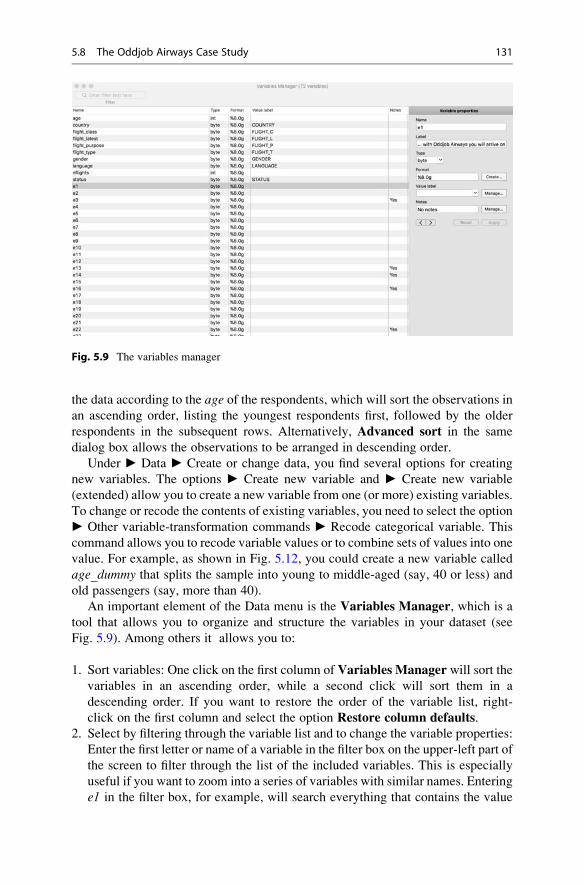
the data according to the age of the respondents, which will sort the observations inan ascending order, listing the youngest respondents first, followed by the older
respondents in the subsequent rows. Alternatively, Advanced sort in the same
dialog box allows the observations to be arranged in descending order.
Under ► Data ► Create or change data, you find several options for creating
new variables. The options ► Create new variable and ► Create new variable
(extended) allow you to create a new variable from one (or more) existing variables.
To change or recode the contents of existing variables, you need to select the option
► Other variable-transformation commands ► Recode categorical variable. This
command allows you to recode variable values or to combine sets of values into one
value. For example, as shown in Fig. 5.12, you could create a new variable called
age_dummy that splits the sample into young to middle-aged (say, 40 or less) and
old passengers (say, more than 40).
An important element of the Data menu is the Variables Manager, which is a
tool that allows you to organize and structure the variables in your dataset (see
Fig. 5.9). Among others it allows you to:
1. Sort variables: One click on the first column of Variables Manager will sort the
variables in an ascending order, while a second click will sort them in a
descending order. If you want to restore the order of the variable list, right-
click on the first column and select the option Restore column defaults.2. Select by filtering through the variable list and to change the variable properties:
Enter the first letter or name of a variable in the filter box on the upper-left part of
the screen to filter through the list of the included variables. This is especially
useful if you want to zoom into a series of variables with similar names. Entering
e1 in the filter box, for example, will search everything that contains the value
Fig. 5.9 The variables manager
5.8 The Oddjob Airways Case Study 131

e1. It will bring all variables to the front that have e1 in their root, including e1,e10, e11 to e19. Once you click on a specific variable (e.g., e1), the name, label,
type, format, value labels, and notes under Variable properties will be
populated; their content can then be edited if necessary. The properties of each
of these boxes is briefly discussed below:
• Name: lists the name of the specified variable. Stata is case sensitive,
meaning that the variable e1 differs from E1. Variable names must begin
with letters (a to z) or an underscore (_). Subsequent characters can include
letters (a to z), numbers (0–9) or an underscore (_). Note that neither spaces
nor special characters (e.g., %, &, /) are allowed.
• Label: allows for a longer description of the specified variable. This can, for
example, be the definition of the variable or the original survey question.
Click on the tick box to select the option to attach a label to a new variable
and type in the preferred label for this variable.
• Type: specifies the output format type of the variable. String refers to words
and is stored as str#, indicating the string’s maximum length. String
variables are useful if you want to include open-ended answers, email
addresses or any other type of information that is not a number. Numbers
are stored in Stata as byte, int, long, float, or double.10
• Format: describes the display format associated with a specified variable. As
described in the Stata manual,11 formats are denoted by a % sign, followed by
the number of characters (i.e., width) and the number of digits following the
decimal points. For example, %10.2g means that our display format
(indicated by %) should be 10 characters wide (indicated by the number 10)
with two digits (indicated by the number 2 following the decimal point). The
g format indicates that Stata fills the 10 display characters with as much as it
can fit. In addition, Stata has a range of formats for dates and time stamps to
control how data are displayed.12
• Value label: presents a description of the values that a specified variable
takes. It allows the researcher to create, edit or drop the label of a specified
variable. The value labels for gender, for example, can be specified as female(for values coded as 1) and male (for values coded as 0).
3. Keep variables: if you wish to work with a subset of your variables, select all the
relevant variables (by dragging the selected variables) and right-click. Then
select the option Keep only selected variables. Note that this should only be
done after careful consideration, as dropping relevant variables can ruin the
dataset!
4. Drop variables: this is similar to the previous action, but now you only select the
variables that you want to drop from the variables list. You can do so by first
selecting the variables that you want to drop, then right-click and select the
10http://www.stata.com/manuals14/ddatatypes.pdf11http://www.stata.com/manuals14/u.pdf12http://www.stata.com/manuals14/dformat.pdf
132 5 Descriptive Statistics

option Drop selected variables. Here, you also think very carefully before
dropping variables from the list!
The default missing value in Stata is called system missing, which is indicatedby a period (.) in the dataset. In addition, there are 26 missing values, also
called extended missing values, ranging from .a to .z, depending on how the
data are stored. These are necessary to understand the type of the missing
data. As discussed in the Missing Data section, missing values arise for
various reasons. In some occasions, such as in panel studies where the same
respondent is approached repeatedly, some respondents may refuse to answer
a question at each interview leading to missing observations in some
interviews. It could also be that the researcher decides to skip a question
from the questionnaire. While both situations lead to missing values, their
nature differs. The extended missing values in Stata allow the researcher to
distinguish between these different reasons by assigning an .a to the first
situation and .b to the second situation, etc.
GraphicsUnder► Graphics, Stata offers a range of graphical options and tools with which to
depict data. These vary from graphical options that support distributional graphs,
including two-way graphs, charts, histograms, box and contour plots to graphs that
support more advanced statistical methods such as time series, panel, regression,
survival techniques, etc. We will discuss the application and interpretation of the
different plots as we move through the different chapters and statistical techniques
in this book.
StatisticsUnder ► Statistics, you find numerous analysis procedures, several of which we
will discuss in the remainder of the book. For example, under Summaries, tables,
and tests, you can request univariate and bivariate statistics. The rest are numerous
types of regression techniques, as well as a range of other multivariate analysis
techniques. We will discuss descriptive statistics in the next section. In Chap. 6, we
will describe models that fall within the group ► Linear models and related, while
Chap. 7 will discuss techniques in the ► Multivariate analysis group.
UserUnder►User, you find three empty data, graphs, and statistics subdirectories. Stata
programmers can use these to add menu options.
WindowThe►Window option enables you to bring the different types of windows to front.
You can also zoom in or minimize the screen.
5.8 The Oddjob Airways Case Study 133

HelpThe ► Help function may come in handy if you need further guidance. Under ►Help, you find documentations and references that show you how to use most of the
commands included in Stata.
5.9 Data Management in Stata
In this section, we will illustrate the application of some of the most commonly used
commands for managing data in Stata. These include the following:
– restrict observations,
– create a new variable from existing variable(s), and
– recode variables.
5.9.1 Restrict Observations
You can also use the Summary Statistics command to restrict certain observations
from the analyses by means of a pre-set condition (e.g., display the summary
statistics only for those between 25 and 54 years old). To restrict observations, go
to ► Data ► Describe data ► Summary statistics, which opens a screen similar
to Fig. 5.10. Under Variables: (leave empty for all variables), enter the condition
if age > 24 & age < 55. to specify your restriction and then click on OK. Stata
will now only display the summary statistics for the observations that satisfy this
condition. In the Stata command (see below) this restriction appears as an ifstatement.
summarize if age>24 & age<55
To summarize cases with only valid (non-missing) observations, it is com-
mon to add the following rule after the pre-set condition: & age!¼ missing(). In Stata language, !¼ means “not equal” and missing() means “all
numerical and string variables included in the dataset.” All together, &age! ¼ missing()means “if age is not missing from all the included
variables in the dataset”.
summarize if age>24 & age<55 & age !=missing()
134 5 Descriptive Statistics

5.9.2 Create a New Variable from Existing Variable(s)
The Create new variable (extended) command enables you to create new
variables containing the interquartile range, median, row means, standardized
values, and many more different options. We will not discuss all these options in
this section, but will demonstrate the power of this tool by creating and index
variable from the mean of the following three items related to travelers’ satisfac-
tion: sat1, sat2, and sat3. Go to ► Data ► Create or change data ► Create new
variable (extended), which will open a dialog box similar to Fig. 5.11.
Next, enter the name of the new variable (e.g., rating_index) in the Generate
variable box on the upper left part of the screen and select Row Mean from the
Egen Function drop-down menu. Under Generate variable as type, the variable
type Float should be automatically selected (i.e., this is Stata’s default for numeric
variable types). Finally, enter sat1, sat2, and sat3 in the Variables box and click onOK. You have now created a new variable called rating_index that appears at thebottom of the variable list. Alternatively, you can type the following command:
egen float rating_index = rowmean(sat1 sat2 sat3)
Fig. 5.10 Restrict observations
5.9 Data Management in Stata 135

5.9.3 Recode Variables
Recoding (i.e., changing or transforming) the values of an existing variable according
to a number of rules is a key data management activity. Numeric variables can be
changed by means of the recode command. Go to► Data► Create or change data
► Other variable-transformation commands ► Recode categorical variables. This
will open a dialog box similar to the Main Tab left in Fig. 5.12.
Specify the name of the variable that you want to recode (i.e., age) under
Variables in the Main tab. Next, specify the values of the new variable under
Fig. 5.11 Create new variable(s) extended
Fig. 5.12 Recode into different variables (Main and Options tabs)
136 5 Descriptive Statistics

Required. These are based on the values of the original variable (age). Theoption (min/40 ¼ 1) indicates that all values ranging from the smallest age
observations to the age of 40 should be coded as 1. Under Optional all other ageobservations are coded as 0 (else ¼ 0).
Next, click on theOptions tab (right in Fig. 5.12). In the dialog box that follows,
you need to indicate whether you want to: (1) Replace existing variables, (2)Gen-
erate new variables, or (3) Generate new variables with this prefix. We always
recommend using either the second option or the third. If you were to use the first
option, any changes you make to the variable will result in the overwriting of the
original variable. Consequently, if you thereafter wish to return to the original data,
you will either need to revert to a saved previous version, or need to enter all the
data again, because Stata cannot undo these actions! Select the second option (i.e.,
Generate new Variables), enter the name of the new variable (i.e., age_dummy),and then click on OK. Alternatively, the recoding of this variable can be obtained
through the following command:
recode age(min/40=1)(else=0),generate(age_dummy)
You have now created a new dichotomous variable (i.e., age_dummy) located atthe bottom of the variables list.
Everyone makes mistakes!
If you are worried that commands may not change the data as desired, type
preserve in the Command window. This keeps a snapshot of the data in
the computer’s memory. Should you wish to revert, simply type restore to
go back to where you were. You could also save a copy of the dataset under a
new name as a milestone and then later delete it manually. This allows you to
back up multiple steps and across work sessions.
5.10 Example
We will now examine the dataset Oddjob.dta in closer detail by following all the
steps in Fig. 5.1. Cleaning the data generally requires checking for interviewer
fraud, suspicious response patterns, data entry errors, outliers, and missing data.
Several of these steps rely on statistics and graphs, which we discussed in the
context of descriptive statistics (e.g., box plots and scatter plots). Note that missing
values strategies and the multiple imputation technique will be described and
illustrated by means of Oddjob.dta in the Web Appendix (! Downloads).
5.10 Example 137

5.10.1 Clean Data
Since the data were cleaned earlier, we need not check for interviewer fraud or
suspicious response patterns. Beside double data entries to detect and minimize
errors in the process of data entry, exploratory data analysis is required to spot data
entry errors that have been overlooked.
A first step in this procedure is to look at the minimum and maximum values of
the relevant variables to detect values that are not plausible (i.e., fall outside the
expected range of scale categories). To do so, go to ► Data ► Describe Data ►Summary statistics, which opens a dialog box like the one in Fig. 5.13. The
Variables box should be left empty to obtain the statistics for all the variables in
the dataset. Next, select the Standard display option that requires the number of
observations, the mean, standard deviation, minimum, and maximum values. Pro-
ceed by clicking onOK. Alternatively, the dialog box for summary statistics can be
brought to front by typing db summarize in the Command window and clicking
on enter.
Table 5.7 shows a partial display of the summary statistics, including the number
of observations, means, standard deviation, as well as minimum and maximum
values. Under Obs, we can see that all the listed variables are observed across all
1,065 respondents, meaning that none of the selected variables suffer from missing
observations. Among others, it appears that the age of the travelers varies between
Fig. 5.13 Summary statistics dialog box
138 5 Descriptive Statistics

19 and 101, while the number of flights varies between 1 and 457 flights over the
past 12 months. Particularly the maximum value in number of flights appears to be
implausible. While this observation could represent a flight attendant, it appears
more reasonable to consider this observation an outlier, which may need to be
eliminated, depending on the type of analysis.
5.10.2 Describe Data
In the next step, we describe the data in more detail, focusing on those statistics and
graphs that were not part of the previous step. To do so, we make use of graphs,
tables, and descriptive statistics. In Fig. 5.14, we show how you can ask for each
previously discussed graph, table, and statistic in Stata.
5.10.2.1 Univariate Graphs and Tables
Bar ChartsTo produce a bar chart that plots the age of respondents against their country of
residence, go to ► Graphics ► Bar chart. This will take you to a dialog box where
theMain tab is displayed by default (left of Fig. 5.15). Under Type of data specify
the type of bar chart that you want displayed (Graph of summary statistics). Next,
under Orientation, you should select the option Vertical, given that it is Stata’s
default and indicates the direction in which the bar chart is displayed.
Under Statistics to plot, select the variable age under Variables and indicate
that you want to display the mean of this variable for all valid observations by
selecting the optionmean. Next, click on the Categories tab (displayed to the right
of Fig. 5.15) to indicate how you want to categorize the data in the bar chart. Tick
the first box, Group 1 and select the variable country from the drop-down menu
under Grouping Variable.
Table 5.7 A (partial) output of summary statistics
Variable | Obs Mean Std. Dev. Min Max-------------+---------------------------------------------------------
age | 1,065 50.41972 12.27464 19 101country | 1,065 2 1.551739 1 5
flight_class | 1,065 2.798122 .4352817 1 3flight_lat~t | 1,065 3.788732 1.368779 1 6flight_pur~e | 1,065 1.507042 .5001853 1 2-------------+---------------------------------------------------------flight_type | 1,065 1.476056 .499661 1 2
gender | 1,065 1.737089 .4404212 1 2language | 1,065 1.237559 .4473162 1 3nflights | 1,065 13.41878 20.22647 1 457status | 1,065 1.498592 .7204373 1 3
-------------+---------------------------------------------------------
5.10 Example 139

By default, Stata displays the value labels of the grouping variable horizontally,
but you can change this. By clicking on the Properties button (see Fig. 5.16), which
is next to the Grouping variable box, set Labels to Angle: 45� and then click
Accept. Stata will then show a graph as in Fig. 5.17.
Describe Data
Univariate Bivariate
Measures of centrality:
• Mode
• Median
• Mean
Measures of dispersion:
• Range
• Interquartile Range
• Variance
• Standard deviation
► Statistics ►Summaries, tables, andtests ► Other tables ►Compact table ofsummary statistics, select
Scatter plots
► Graphics ► Twowaygraph, select Scatter.
► Graphics ►Scatterplot matrix
Correlation
► Statistics ►Summaries, tables, andtests ► Summary anddescriptive statistics ►Correlations andcovariances.
Statistics Statistics
Crosstabs
► StatisticsSummaries, tables,tables, and tests ►Frequency tables ►Two-way table
Graphs & tables Graphs & tables
Bar chart
► Graphics ► Barchart
Histogram
► Graphics ►Histogram
Box plot
► Graphics ► Box plot
Pie chart
► Graphics ► Pie chart
Frequency table
► Statistics ► Summaries,tables, tables, and tests ►Frequency tables ► One-way table
Covariance
► Statistics ►Summaries, tables, andtests ► Summary anddescriptive statistics ►Correlations andcovariances, go to
50th percentile, Mean,
Range, Interquartilerange, Variance,Standard deviation.
Options select Displaycovariances.
Fig. 5.14 How to ask for graphs, tables, and statistics in Stata
Fig. 5.15 Main dialog box, Bar chart
140 5 Descriptive Statistics

Fig. 5.16 Properties dialog box
Fig. 5.17 A bar chart
5.10 Example 141

Tip: You can also edit your graph by right-clicking on the graph. Select the
option Start Graph Editor, which will start the Graph Editing menu. Double
click on the x-axis and select the option Label properties to adjust the angle
of the labels in the same way as described above. You can additionally also
adjust the range of the values you want to display on the x-axis by specifying
the desired range. The same applies to adjusting the label properties of the
y-axis.
HistogramsHistograms are useful for summarizing numerical variables. If you go to ►Graphics ► Histogram, Stata will open a dialog box as shown in Fig. 5.18 on the
left. To plot a histogram that summarizes the respondents’ age, select the relevantvariable age in the Variable drop-down menu and select the Data are continuous
option. Next, specify Frequency under Y axis and click on OK. Stata will produce
a histogram as shown in Fig. 5.18 on the right.
Box PlotTo ask for a box plot, go to ► Graphics ► Box plot, which will open a dialog box
similar to the one in Fig. 5.19.
Specify the option Vertical underOrientation to display the box plot vertically.
Next, select the relevant variable age in the Variables box and then click onOK. A
box plot like the one in Fig. 5.20 appears.
Pie ChartsPie charts are useful for displaying categorical or binary variables. Create a pie
chart by going to ► Graphics ► Pie chart, which will open a dialog box similar to
Fig. 5.18 Dialog box, histogram and a histogram
142 5 Descriptive Statistics

that displayed in Fig. 5.21 on the left. In Stata, the default (standard) option is
Graph by Categories. Plot respondents’ membership status (status) by selecting
status under Category variable and then clicking on OK. Stata will show a pie
chart similar to the one on the right in Fig. 5.21.
Fig. 5.19 Box plots graph dialog box
Fig. 5.20 Box plot
5.10 Example 143

Frequency TablesWe can produce a frequency table by clicking on► Statistics► Summaries, tables,
and tests ► Frequency tables ► One-way table. Select the variable country underCategorical variable and then click onOK. This operation will produce Table 5.8,
which displays the value of each country with the corresponding absolute number
of observations (i.e., Freq.), the relative values (i.e., Percent), as well as the
cumulative relative values (i.e., Cum.). It shows that 65.25 percent of our sample
consists of travelers who reside in Germany, followed by travelers from the United
States (18.31 percent), Austria (10.14 percent), Switzerland (6.20 percent), and,
finally, France (0.09 percent).
5.10.2.2 Univariate StatisticsAnother useful way of summarizing your data is through the Tabstat option, which
you can find under ► Statistics ► Summaries, tables, and tests ► Other tables ►Compact table of summary statistics. Selecting this menu option opens a dialog box
similar to that in Fig. 5.22. In the Variables box, select the relevant variables for
which you would like to display summary statistics. These variables range from ageto gender. Next, under Statistics to display tick the blank boxes and specify the
Fig. 5.21 Pie chart
Table 5.8 Example of a frequency table in Stata
tabulate country
Home |country | Freq. Percent Cum.
------------+-----------------------------------de | 695 65.26 65.26ch | 66 6.20 71.46at | 108 10.14 81.60fr | 1 0.09 81.69us | 195 18.31 100.00
------------+-----------------------------------Total | 1,065 100.00
144 5 Descriptive Statistics

descriptive statistics to be displayed from the drop-down menu. In this example, we
specify the number of nonmissing observations (Count in Stata), the median (50th
percentile in Stata), theMean, the Range, the Interquartile range, the Variance,
and the Standard deviation.
Clicking on OK will display an output similar to that in Table 5.9, which
includes the number of nonmissing observations (N), median (p50), mean (mean),range (range), interquartile range (iqr), variance (var), and standard deviation (sd).
Note that tabstat arranges the table like a dataset, with the variables as
columns. For a more a typical table, go to the Options tab (see Fig. 5.22) and
change the value of the Use as columns from Variables to Statistics.
Table 5.9 Example of a summary table using the tabstat option
tabstat age-gender, statistics (count p50 mean range iqr var sd)
stats | age country flight~s flight~t fligh~se fligh~pe gender---------+----------------------------------------------------------------------
N | 1065 1065 1065 1065 1065 1065 1065p50 | 50 1 3 4 2 1 2
mean | 50.41972 2 2.798122 3.788732 1.507042 1.476056 1.737089range | 82 4 2 5 1 1 1
iqr | 16 2 0 2 1 1 1variance | 150.6667 2.407895 .1894702 1.873557 .2501853 .2496611 .1939708
sd | 12.27464 1.551739 .4352817 1.368779 .5001853 .499661 .4404212--------------------------------------------------------------------------------
Fig. 5.22 Dialog box for univariate statistics
5.10 Example 145

5.10.2.3 Bivariate Graphs and Tables
Scatter Plots and Matrix Scatter PlotsMatrix scatter plots can be easily displayed in Stata by going to ► Graphics ►Twoway graph (scatter, line, etc.) or Graphics ► Scatterplot matrix. These two
separate graphs differ in the following way:
1. Twoway graph (scatter, line, etc.): plots two variables against each other, but
you can display multiple scatter plots at a time on the same graph. Produce a
twoway scatter plot by going to► Graphics► Twoway graph (scatter, line, etc.)
and clicking on Create. In the dialog box that opens (on the left-hand side of
Fig. 5.23), select Scatter, enter the outcome variable overall satisfaction
(overall_sat) in the Y variable box, and age in the X variable box, click on
Accept, and then on OK. The right-hand side of Fig. 5.23 shows the resulting
scatter plot.
2. Scatterplot matrix: creates scatter plots for multiple variables simultaneously.
Going to Graphics ► Scatterplot matrix opens a dialog box similar to the one
shown on the left of Fig. 5.24. Select nflights, overall_sat, and age underVariables.To change the density of the scatter matrix, click on the buttonMarker Properties.
This opens the dialog window on the right of Fig. 5.24. Select the option Pointunder Symbol, click on Accept, and then on OK.
This will produce the matrix scatter plot shown in Fig. 5.25. The graph
shows distinct bands, because the overall satisfaction variable takes on 7 values
(1 to 7).
The first scatter plot in the first row reveals the relationship between the
number of flights and overall price satisfaction. Next to this on the first row,
the relationship between the number of flights and age is displayed. In the
second row, the relationship between the overall price satisfaction and numberof flights is shown and so on. In the same row, to the right, the relationship
Fig. 5.23 Dialog box and scatter plot
146 5 Descriptive Statistics

between the overall price satisfaction and age is displayed. Finally, the last
row displays the relationships between age and number of flights (first scatter
plot), as well as the relationship between age and overall price satisfaction(second scatter plot).
Fig. 5.24 Dialog box scatter plot matrix and the marker properties box
Fig. 5.25 Matrix scatter plot
5.10 Example 147

Cross TabulationCross tabulations are useful for understanding the relationship between two
variables scaled on a nominal or ordinal scale. To create a crosstab, go to ►Statistics ► Summaries, tables, and tests ► Frequency tables ► Two-way table
with measures of association. It is important that you specify which variable goes in
the column and which in the rows. Choose country under Row variable and genderunder Column variable. Next, select the boxes Within-column relative
frequencies andWithin-row relative frequencies under Cell Contents to display
the column and row percentages. Click on OK and Stata produces a table similar to
the one in Table 5.10.
5.10.2.4 Bivariate Statistics: Correlation and CovarianceIn Stata, we can calculate bivariate correlations by going to ► Statistics ►Summaries, tables, and tests ► Summary and descriptive statistics ► Correlations
and covariances. In the dialog box that opens, select the variables to be considered
in the analysis. For example, enter nflights, age, and overall_sat in the Variables
box. When you click on OK, Stata will produce a correlation matrix like the one in
Table 5.11.
Table 5.10 Example of a crosstab
tabulate country gender, column row
+-------------------+| Key ||-------------------|| frequency || row percentage || column percentage |+-------------------+
Home | Gendercountry | female male | Total
-----------+----------------------+----------de | 180 515 | 695
| 25.90 74.10 | 100.00 | 64.29 65.61 | 65.26
-----------+----------------------+----------ch | 17 49 | 66
| 25.76 74.24 | 100.00 | 6.07 6.24 | 6.20
-----------+----------------------+----------at | 25 83 | 108
| 23.15 76.85 | 100.00 | 8.93 10.57 | 10.14
-----------+----------------------+----------fr | 1 0 | 1
| 100.00 0.00 | 100.00 | 0.36 0.00 | 0.09
-----------+----------------------+----------us | 57 138 | 195
| 29.23 70.77 | 100.00 | 20.36 17.58 | 18.31
-----------+----------------------+----------Total | 280 785 | 1,065
| 26.29 73.71 | 100.00 | 100.00 100.00 | 100.00
148 5 Descriptive Statistics

The correlation matrix in Table 5.11 shows the correlation between each
pairwise combination of three variables. For example, the correlation between
nflights and age is �0.1158, which is negative and rather weak. Conversely, the
relationship between age and overall_sat is positive (0.1207), but still rather weak.Alternatively, a covariance matrix as in Table 5.12, can be obtained as follows.
Go to ► Statistics ► Summaries, tables, and tests ► Summary and descriptive
statistics ► Correlations and covariances and ticking the box Display covariances
in the Options tab. This will produce the following covariance matrix.
5.11 Cadbury and the UK Chocolate Market (Case Study)
The UK chocolate market is expected to be £6.46 billion in 2019. Six subcategories
of chocolates are used to identify the different chocolate segments: boxed choco-
late, molded bars, seasonal chocolate, count lines, straight lines, and “other.”
To understand the UK chocolate market for molded chocolate bars, we have a
dataset (chocolate.dta) that includes a large supermarket’s weekly sales of 100g
molded chocolate bars from January 2016 onwards. This data file can be
downloaded from the book’s Web Appendix (! Downloads). This file contains
a set of variables. Once you have opened the dataset, you will see the set of
variables we discuss in the main Stata window under Variables (see Fig. 5.7).The first variable is week, indicating the week of the year and starts with Week
1 of January 2016. The last observation for 2016 ends with observation 52, but the
variable continues to count onwards for 16 weeks in 2017.13 The next variable is
Table 5.11 Correlation matrix produced in Stata
correlate nflights age overall_sat(obs=1,065)
| nflights age overal~t-------------+---------------------------
nflights | 1.0000age | -0.1158 1.0000
overall_sat | -0.1710 0.1207 1.0000
Table 5.12 Covariance matrix produced in Stata
correlate nflights age overall_sat, covariance(obs=1,065)
| nflights age overal~t-------------+---------------------------
nflights | 409.11age | -28.7408 150.667
overall_sat | -5.62173 2.40806 2.64118
13Note an ordinary year has 52 weeks and 1 day, while a leap year has 52 weeks and 2 days. This is
because 1 week comprises part of 2016 and part of 2017.
5.11 Cadbury and the UK Chocolate Market (Case Study) 149

sales, which indicates the weekly sales of 100g Cadbury bars in ₤. Next, four pricevariables are included, price1-price4, which indicate the price of Cadbury, Nestle,
Guylian, and Milka in ₤. Next, advertising1-advertising4 indicate the amount of ₤the supermarket spent on advertising each product during that week. A subsequent
block of variables, pop1-pop4, indicate whether the products were promoted in the
supermarket by means of point of purchase advertising. This variable is measured
as yes/no. Variables promo1-promo4 indicate whether the product was put at the
end of the supermarket aisle, where it is more noticeable. Lastly, temperatureindicates the weekly average temperature in degrees Celsius.
You have been tasked with providing descriptive statistics for a client by means
of this dataset. To help you with this task, the client has prepared a number of
questions:
1. Do Cadbury’s chocolate sales vary substantially across different weeks? When
are Cadbury’s sales at their highest? Please create an appropriate graph to
illustrate any patterns.
2. Please tabulate point-of-purchase advertising for Cadbury against point-of-pur-
chase advertising for Nestle. In addition, create a few more crosstabs. What are
the implications of these crosstabs?
3. How do Cadbury’s sales relate to the price of Cadbury? What is the strength of
the relationship?
4. Which descriptive statistics are appropriate for describing the usage of advertis-
ing? Which statistics are appropriate for describing point-of-purchase
advertising?
5.12 Review Questions
1. Imagine you are given a dataset on car sales in different regions and are asked to
calculate descriptive statistics. How would you set up the analysis procedure?
2. What summary statistics could best be used to describe the change in profits over
the last 5 years? What types of descriptive statistics work best to determine the
market shares of five different types of insurance providers? Should we use just
one or multiple descriptive statistics?
3. What information do we need to determine if a case is an outlier? What are the
benefits and drawbacks of deleting outliers?
4. Download the codebook of the Household Income and Labour Dynamics in
Australia (HILDA) Survey at: http://melbourneinstitute.unimelb.edu.au/hilda/
for-data-users/user-manuals. Is this codebook clear? What do you think of its
structure?
150 5 Descriptive Statistics

5.13 Further Readings
https://www.stata.com/manuals13/mi.pdf
This manual provides a hands-on application of multiple imputation in Stata.http://www.stata.com/manuals13/u.pdf
There is a detailed description of Stata’s properties coupled with hands-onexamples in Stata’s manual.
http://www.ats.ucla.edu/stat/mult_pkg/whatstat/default.htm
The following link provides a range of general guidelines regarding the type ofstatistical analyses of and tips about the application of various methods usingStata.
https://www.iriseekhout.com/promotie/thesis/
General strategies on how to deal with missing data.https://eagereyes.org/pie-charts
This blog provides a good description of the advantages and disadvantages relatedto pie charts.
This book provides an introduction to multivariate analysis and easy to followdiscussions of fundamental statistical concepts.
Hair, J. F., Jr., Black, W. C., Babin, B. J., & Anderson, R. E. (2013). Multivariatedata analysis. A global perspective (7th ed.). Upper Saddle River: Prentice-Hall.
This book teaches you how to make high-quality graphs in Stata.Mitchel, M.N. A Visual Guide to Stata Graphics. (2008). Stata Press: StataCorp LP.This book teaches readers how to decipher the meaning of symbols, tables, and
figures included in research reports in order to improve their ability to criticallyassess such reports.
Huck, W.S. (2014). Reading statistics and research (6th ed.). Harlow: Pearson.
SticiGui at http://www.stat.berkeley.edu/~stark/SticiGui/Text/correlation.htm.
These websites interactively demonstrate how strong the correlations betweendifferent datasets are.
References
Agarwal, C. C. (2013). Outlier analysis. New York: Springer.
Agresti, A., & Finlay, B. (2014). Statistical methods for the social sciences (4th ed.). London:
Pearson.
Barchard, K. A., & Pace, L. A. (2011). Preventing human error: The impact of data entry methods
on data accuracy and statistical results. Computers in Human Behavior, 27(5), 1834–1839.Barchard, K. A., & Verenikina, Y. (2013). Improving data accuracy: Electing the best data
checking technique. Computers in Human Behavior, 29(50), 1917–1912.Baumgartner, H., & Steenkamp, J.-B. E. M. (2001). Response styles in marketing research: A
cross-national investigation. Journal of Marketing Research, 38(2), 143–156.Carpenter, J., & Kenward, M. (2013). Multiple imputation and its application. New York: Wiley.
Cohen, J. (1988). Statistical power analysis for the behavioral sciences (2nd ed.). Hillsdale:
Lawrence Erlbaum Associates.
Drolet, A. L., & Morrison, D. G. (2001). Do we really need multiple-item measures in service
research? Journal of Service Research, 3(3), 196–204.
References 151

Eekhout, I., de Vet, H. C. W., Twisk, J. W. R., Brand, J. P. L., de Boer, M. R., & Heymans, M. W.
(2014). Missing data in a multi-item instrument were best handled by multiple imputation at
the item score level. Journal of Clinical Epidemiology, 67(3), 335–342.Gladwell, M. (2008). Outliers: The story of success. New York: Little, Brown, and Company.
Graham, J. W. (2012). Missing data: Analysis and design. Berlin et al.: Springer.
Hair, J. F., Jr., Black, W. C., Babin, B. J., & Anderson, R. E. (2010). Multivariate data analysis.A global perspective (7th ed.). Upper Saddle River: Pearson.
Harzing, A. W. (2005). Response styles in cross-national survey research: A 26-country study.
International Journal of Cross Cultural Management, 6(2), 243–266.Johnson, T., Kulesa, P., Lic, I., Cho, Y. I., & Shavitt, S. (2005). The relation between culture and
response styles. Evidence from 19 countries. Journal of Cross-Cultural Psychology, 36(2),264–277.
Krippendorff, K. (2012). Content analysis: An introduction to its methodology. Thousand Oaks:
Sage.
Little, R. J. A. (1998). A test of missing completely at random for multivariate data with missing
values. Journal of the American Statistical Association, 83(404), 1198–1202.Paulsen, A., Overgaard, S., & Lauritsen, J. M. (2012). Quality of data entry using single entry,
double entry and automated forms processing – An example based on a study of patient-
reported outcomes. PloS One, 7(4), e35087.Rubin, D. B. (1987). Multiple imputation for nonresponse in surveys. New York: Wiley.
Sarstedt, M., Diamantopoulos, A., Salzberger, T., & Baumgartner, P. (2016). Selecting single
items to measure doubly-concrete constructs: A cautionary tale. Journal of Business Research,69(8), 3159–3167.
Schafer, J. L. (1997). Analysis of incomplete multivariate data. London: Chapman & Hall.
White, I. R., Royston, P., & Wood, A. M. (2011). Multiple imputation using chained equations:
Issues and guidance for practice. Statistics in Medicine, 30(4), 377–399.
152 5 Descriptive Statistics

Hypothesis Testing & ANOVA 6
Keywords
α-Inflation • α error • Analysis of Variance (ANOVA) • β error • Bonferroni
correction • Degrees of freedom • eta-squared • F-test • F-test of sample
variance • Factor variable • Familywise error rate • Independent samples t-test • Interaction effect • Levene’s test • Mann-Whitney U test • Main effect •
Nonparametric tests • Null and alternative hypothesis • Omega-squared • One-
sample t-test • One-tailed test • One-way ANOVA • p-value • Paired samples t-test • Parametric test • Practical significance • Post hoc tests • Power of a test •
Shapiro-Wilk test • Significance level • Sampling error • Statistical significance •
t-test • Test statistic • Tukey’s honestly significant difference test • Two-sample
t-test • Two-tailed test • Two-way ANOVA • Type I and type II error • Welch
correction • Wilcoxon signed-rank test • z-test
Learning Objectives
After reading this chapter, you should understand:
– The logic of hypothesis testing.
– The steps involved in hypothesis testing.
– What a test statistic is.
– Types of error in hypothesis testing.
– Common types of t-tests, one-way, and two-way ANOVA.
– How to interpret Stata output.
6.1 Introduction
Do men or women spend more money on the Internet? Assume that the mean
amount that a sample of men spends online is $200 per year against a women
sample’s mean of $250. When we compare mean values such as these, we always
# Springer Nature Singapore Pte Ltd. 2018
E. Mooi et al., Market Research, Springer Texts in Business and Economics,
DOI 10.1007/978-981-10-5218-7_6
153

expect some difference. But, how can we determine if such differences are statisti-
cally significant? Establishing statistical significance requires ascertaining whether
such differences are attributable to chance or not. In this chapter, we will introduce
hypothesis testing and how this helps determine statistical significance.
6.2 Understanding Hypothesis Testing
A hypothesis is a statement about a certain effect or parameter (such as a mean or
correlation) that can be tested using a sample drawn from the population. A
hypothesis may comprise a claim about the difference between two sample
parameters (e.g., there is a difference between males’ and females’ mean spending).
It can also be a test of a judgment (e.g., teenagers spend an average of 4 h per day
on the Internet). Data from the sample are used to obtain evidence against, or in
favor of, the statement.
Hypothesis testing is performed to infer whether or not a certain effect is statisti-
cally significant. Statistical significance means that the effect is so large that it is
unlikely to have occured by chance. Whether results are statistically significant
depends on several factors, including the size of the effect, the variation in the sample
data, and the sample size (Agresti and Finlay 2014).When drawing a sample from the
population, there is always some probability that we might reach the wrong conclu-
sion due to a sampling error, which is the difference between the sample and the
population characteristics. To determine whether the claim is true, we start by setting
an acceptable probability (called the significance level) that we could incorrectly
conclude there is an effect when, in fact, there is none. This significance level is
typically set at 0.05, which corresponds to a 5% error probability. Next, subject to the
claim made in the hypothesis, we should decide on the correct type of test to perform.
This involves making decisions regarding four aspects.
First, we should understand the testing situation. What exactly are we testing:
Are we comparing one value against a fixed value, or are we comparing groups,
and, if so, how many?
Second, we need to specify the nature of the samples: Is our comparison based
on paired samples or independent samples (the difference is discussed later in this
chapter)?
Third, we should check assumptions about the distribution of our data to
determine whether parametric or nonparametric tests are appropriate. Parametric
tests make assumptions about the properties of the population distributions from
which the data are drawn, while nonparametric tests are not based on any
distributional assumptions.
Fourth, we need to decide on the region where we can reject our hypothesis; that
is, whether the region of rejection will be on one side or both sides of the sampling
distribution.
154 6 Hypothesis Testing & ANOVA

Once these four aspects are sorted, we calculate the test statistic, which identifieswhether the sample supports or rejects the claim stated in the hypothesis. We can
then decide to either reject or support the hypothesis. This decision enables us to
draw market research conclusions in the final step. Figure 6.1 illustrates the six
steps involved in hypothesis testing.
To illustrate the process of hypothesis testing, consider the following example:
A department store chain wants to evaluate the effectiveness of three different
in-store promotion campaigns that drive the sales of a specific product. These
campaigns comprise: (1) a point of sale display, (2) a free tasting stand, and
(3) in-store announcements. To help with the evaluation, the management decides
to conduct a one-week experiment during which 30 stores are randomly assigned to
each campaign type. This random assignment is important to obtain reliable and
generalizable results, because randomization should equalize the effect of system-
atic factors not accounted for in the experimental design (see Chap. 4). Table 6.1
shows the sales of the three different in-store promotion campaigns. The table also
contains information on the service type (personal or self-service) in the first
column and the marginal means representing the means of sales within stores in
the last column. The very last row also shows the marginal mean of the type of
campaign, while the very last cell shows the grand mean across all the service types
and campaigns.
Step 1: Formulate the hypothesis
Step 3: Select an appropriate test
Step 4: Calculate the test statistic
Step 5: Make the test decision
Step 6: Interpret the results
Step 2: Choose the significance level
1. Define the testing situation2. Determine if samples are paired or independent3. Check assumptions and choose the test4. Specify the region of rejection
Fig. 6.1 Steps involved in hypothesis testing
6.2 Understanding Hypothesis Testing 155

We will use these data to carry out tests to compare the different in-store
promotion campaigns’ mean sales separately, or in comparison to each other. We
first discuss each test theoretically (including the formulas), followed by an empiri-
cal illustration. You will realize that the formulas are not as complicated as
you might have thought! These formulas contain Greek characters and we have
therefore included a table describing each Greek character in the Web Appendix
(! Downloads).
6.3 Testing Hypotheses on One Mean
6.3.1 Step 1: Formulate the Hypothesis
Hypothesis testing starts with the formulation of a null and alternative hypothesis.
A null hypothesis (indicated as H0) is a statement expecting no difference or effect.
Conversely, an alternative hypothesis (indicated as H1) is the hypothesis against
which the null hypothesis is tested (Everitt and Skrondal 2010). Examples of
potential null and alternative hypotheses on the campaign types are:
1. H0: The mean sales in stores that installed a point of sale display are equal to or
lower than 45 units.
H1: The mean sales in stores that installed a point of sale display are higher than
45 units.
Table 6.1 Sales data
Sales (units)
MarginalmeanService type
Point of sale display(stores 1–10)
Free tasting stand(stores 11–20)
In-storeannouncements(stores 21–30)
Personal 50 55 45 50.00Personal 52 55 50 52.33Personal 43 49 45 45.67Personal 48 57 46 50.33Personal 47 55 42 48.00Self-service 45 49 43 45.67
Self-service 44 48 42 44.67Self-service 49 54 45 49.33Self-service 51 54 47 50.67Self-service 44 44 42 43.33Marginalmean
47.30 52.00 44.7 48.00Grand mean
156 6 Hypothesis Testing & ANOVA

2. H0: There’s no difference in the mean sales of stores that installed a point of sale
display and those that installed a free tasting stand (statistically, the average
sales of the point of sale display ¼ the average sales of the free tasting stand).
H1: There’s a difference in the mean sales of stores that installed a point of sale
display and those that installed a free tasting stand (statistically, the average
sales of the point of sale display 6¼ the average sales of the free tasting stand).
Hypothesis testing can have two outcomes: First, we do not reject the null hypoth-
esis. This suggests there is no difference and that the null hypothesis can be
retained. However, it would be incorrect to subsequently conclude that the null
hypothesis is true, as it is not possible to “prove” the non-existence of a certain
effect or condition. For example, one can examine any number of crows and find
that they are all black, yet that would not make the statement “There are no white
crows” true. Only sighting one white crow will prove its existence. Second, we
could reject the null hypothesis, thus finding support for the alternative hypothesis
in which some effect is expected. This outcome is, of course, desirable in most
analyses, as we generally want to show that something (such as a promotion
campaign) is related to a certain outcome (e.g., sales). Therefore, we frame the
effect that we want to investigate as the alternative hypothesis.
Inevitably, each hypothesis test has a certain degree of uncertainty so that
even if we reject a null hypothesis, we can never be totally certain that this
was the correct decision. Consequently, market researchers should use terms
such as “find support for the alternative hypothesis” when they discuss their
findings. Terms like “prove” should never be part of hypotheses testing.
Returning to our initial example, the management only considers a campaign
effective if the sales it generates are higher than the 45 units normally sold (you can
choose any other value, the idea is to test the sample mean against a given standard).
One way of formulating the null and alternative hypotheses in respect of this
expectation is:
H0: μ � 45
H1: μ > 45
In words, the null hypothesis H0 states that the population mean, indicated by μ(pronounced as mu), is equal to or smaller than 45, whereas the alternative hypoth-
esis H1 states that the population mean is larger than 45. It is important to note that
the hypothesis always refers to a population parameter, in this case, the population
mean, represented by μ. It is practice for Greek characters to represent population
parameters and for Latin characters to indicate sample statistics (e.g., the Latin �x ).In this example, we state a directional hypothesis as the alternative hypothesis,
6.3 Testing Hypotheses on One Mean 157

which is expressed in a direction (higher) relative to the standard of 45 units. Since
we presume that during a campaign, the product sales are higher, we posit a right-tailed hypothesis (as opposed to a left-tailed hypothesis) for the alternative hypoth-esis H1.
Alternatively, presume we are interested in determining whether the mean sales
of the point of sale display (μ1) are equal to the mean sales of the free tasting
stand (μ2). This implies a non-directional hypothesis, which can be written as:
H0: μ1 ¼ μ2
H1: μ1 6¼ μ2
The difference between the two general types of hypotheses is that a directional
hypothesis looks for an increase or a decrease in a parameter (such as a population
mean) relative to a specific standard. A non-directional hypothesis tests for anydifference in the parameter, whether positive or negative.
6.3.2 Step 2: Choose the Significance Level
No type of hypothesis testing can evaluate the validity of a hypothesis with absolute
certainty. In any study that involves drawing a sample from the population, there is
always some probability that we will erroneously retain or reject the null hypothesis
due to sampling error, which is a difference between the sample and the popula-
tion. In statistical testing, two types of errors can occur (Fig. 6.2):
1. a true null hypothesis is incorrectly rejected (type I or α error), and
2. a false null hypothesis is not rejected (type II or β error).
In our example, a type I error occurs if we conclude that the point of sale displays
increased the sales beyond 45 units, when in fact it did not increase the sales, or may
have even decreased them. A type II error occurs if we do not reject the null
hypothesis, which suggests there was no increase in sales, even though the sales
increased significantly.
Correctdecision
Correctdecision
Type Ierror
Type IIerror
Tes
t de
cision H
0 re
ject
edH
0 no
t re
ject
ed
True state of H0
H0 falseH0 trueFig. 6.2 Type I and type II
errors
158 6 Hypothesis Testing & ANOVA

A problem with hypothesis testing is that we don’t know the true state of the null
hypothesis. Fortunately, we can establish a level of confidence that a true null
hypothesis will not be erroneously rejected. This is the maximum probability of a
type I error that we want to allow. The Greek character α (pronounced as alpha)represents this probability and is called the significance level. In market research
reports, this is indicated by phrases such as “this test result is significant at a 5%
level.” This means that the researcher allowed for a maximum chance of 5% of
mistakenly rejecting a true null hypothesis.
The selection of an α level depends on the research setting and the costs
associated with a type I error. Usually, α is set to 0.05, which corresponds to a
5% error probability. However, when researchers want to be conservative or strict
in their testing, such as when conducting experiments, α is set to 0.01 (i.e., 1%). In
exploratory studies, an α of 0.10 (i.e., 10%) is commonly used. An α-level of 0.10means that if you carry out ten tests and reject the null hypothesis every time, your
decision in favor of the alternative hypothesis was, on average, wrong once. This
might not sound too high a probability, but when much is at stake (e.g., withdrawing
a product because of low satisfaction ratings) then 10% may be too high.
Why don’t we simply set α to 0.0001% to really minimize the probability of a
type I error? Setting α to such a low level would obviously make the erroneous
rejection of the null hypothesis very unlikely. Unfortunately, this approach
introduces another problem. The probability of a type I error is inversely related
to that of a type II error, so that the smaller the risk of a type I error, the higher the
risk of a type II error! However, since a type I error is considered more severe than a
type II error, we control the former directly by setting α to a desired level (Lehmann
1993).
Sometimes statistical significance can be established even when differences
are very small and have little or no managerial implications. Practitioners,
usually refer to “significant” as being practically significant rather than
statistically significant. Practical significance refers to differences or effects
that are large enough to influence the decision-making process. An analysis
may disclose that a type of packaging increases sales by 10%, which could be
practically significant. Whether results are practically significant depends on
the management’s perception of the difference or effect and whether this
warrants action. It is important to separate statistical significance from prac-
tical significance. Statistical significance does not imply practical
significance.
Another important concept related to this is the power of a statistical test
(defined by 1 � β, where β is the probability of a type II error), which represents
the probability of rejecting a null hypothesis when it is, in fact, false. In other words,
the power of a statistical test is the probability of rendering an effect significant
when it is indeed significant. Researchers want the power of a test to be as high as
6.3 Testing Hypotheses on One Mean 159

possible, but when maximizing the power and, therefore, reducing the probability
of a type II error, the occurrence of a type I error increases (Everitt and Skrondal
2010). Researchers generally view a statistical power of 0.80 (i.e., 80%) as satis-
factory, because this level is assumed to achieve a balance between acceptable type
I and II errors. A test’s statistical power depends on many factors, such as the
significance level, the strength of the effect, and the sample size. In Box 6.1 we
discuss the statistical power concept in greater detail.
6.3.3 Step 3: Select an Appropriate Test
Selecting an appropriate statistical test is based on four aspects. First, we need to
assess the testing situation: What are we comparing? Second, we need to assess the
nature of the samples that are being compared: Do we have one sample with
observations from the same object, firm or individual (paired), or do we have two
different sets of samples (i.e., independent)? Third, we need to check the
assumptions for normality to decide which type of test to use: Parametric (if we
meet the test conditions) or non-parametric (if we fail to meet the test conditions)?
This step may involve further analysis, such as testing the homogeneity of group
variances. Fourth, we should decide on the region of rejection: Do we want to test
one side or both sides of the sampling distribution? Table 6.2 summarizes these four
aspects with the recommended choice of test indicated in the grey shaded boxes. In
the following we will discuss each of these four aspects.
Box 6.1 Statistical Power of a Test
Market researchers encounter the common problem that they, given a
predetermined level of α and some fixed parameters in the sample, have to
calculate the sample size required to yield an effect of a specific size.
Computing the required sample size (called a power analysis) can be compli-
cated, depending on the test or procedure used. Fortunately, Stata includes a
power and sample size module that allows you to determine sample size
under different conditions. In the Web Appendix (! Downloads), we use
data from our example to illustrate how to run a power analysis using Stata.
An alternative is G * Power 3.0, which is sophisticated and yet easy-to-use. It
can be downloaded freely from http://www.psycho.uni-duesseldorf.de/
abteilungen/aap/gpower3/.
If these tools are too advanced, Cohen (1992) suggests required sample
sizes for different types of tests. For example, detecting the presence of
differences between two independent sample means for α ¼ 0.05 and a
power of β ¼ 0.80 requires a sample size (n) of n ¼ 26 for large differences,
n ¼ 64 for medium differences, and n ¼ 393 for small differences. This
demonstrates that sample size requirements increase disproportionally when
the effect that needs to be detected becomes smaller.
160 6 Hypothesis Testing & ANOVA

Table
6.2
Selectingan
appropriatetest
Test
#
Testingsituation
Nature
ofsamples
ChoiceofTesta
Regionof
rejection
What
dowecompare
Paired
vs.Independ
ent
Assum
ptions
Param
etric
Non
-param
etric
One
ortwo-sided
test
1Onegroupagainsta
fixed
value
Notapplicable
Shapiro-W
ilktest¼
norm
alOnesample
t-test
Oneor
two-sided
Shapiro-W
ilktest6¼
norm
alWilcoxonsigned-
ranktest
Oneor
two-sided
2Outcomevariable
across
twogroups
Pairedsample
Shapiro-W
ilktest¼
norm
al
&Levene’stest:σ2 1¼
σ2 2
Pairedt-test
Oneor
two-sided
Shapiro-W
ilktest6¼
norm
al
&Levene’stest:σ2 1¼
σ2 2
Pairedt-testb
Oneor
two-sided
Shapiro-W
ilktest¼
norm
al
&Levene’stest:σ2 16¼
σ2 2
Pairedt-testwith
Welch’s
correction
Oneor
two-sided
Shapiro-W
ilktest6¼
norm
al
&Levene’stest:σ2 16¼
σ2 2
Wilcoxonmatched-
pairs
signed-rank
test
Oneor
two-sided
3Outcomevariable
across
twogroups
Independentsamples
Shapiro-W
ilktest¼
norm
al
&Levene’stest:σ2 1¼
σ2 2
Two-sam
ple
t-test
Oneor
two-sided
Shapiro-W
ilktest6¼
norm
al
&Levene’stest:σ2 1¼
σ2 2
Two-sam
ple
t-testb
Oneor
two-sided
Shapiro-W
ilktest¼
norm
al
&Levene’stest:σ2 16¼
σ2 2
Two-sam
ple
t-testwith
Welch’s
correction
Oneor
two-sided
Shapiro-W
ilktest6¼
norm
al
&Levene’stest:σ2 16¼
σ2 2
Wilcoxonrank-sum
test
Oneor
two-sided
4Outcomevariable
across
threeormore
groups
Onefactorvariable,
independentsamples
Shapiro-W
ilktest¼
norm
al
&Levene’stest:σ2 1¼
σ2 2
One-way
ANOVA:F-test
Two-
sided*c
(continued)
6.3 Testing Hypotheses on One Mean 161

Table
6.2
(continued)
Test
#
Testingsituation
Nature
ofsamples
ChoiceofTesta
Regionof
rejection
What
dowecompare
Paired
vs.Independ
ent
Assum
ptions
Param
etric
Non
-param
etric
One
ortwo-sided
test
Shapiro-W
ilktest6¼
norm
al
&Levene’stest:σ2 1¼
σ2 2
One-way
ANOVA:F-test
Two-
sided*
Shapiro-W
ilktest¼
norm
al
&Levene’stest:σ2 16¼
σ2 2
One-way
ANOVA:F-test
withWelch’s
correction
Two-
sided*
Shapiro-W
ilktest6¼
norm
al
&Levene’stest:σ2 16¼
σ2 2
Kruskal-W
allisrank
test
Two-
sided*
5Outcomevariable
across
threeormore
groups
Twofactorvariables,
independentsamples
Shapiro-W
ilktest¼
norm
al
&Levene’stest:σ2 1¼
σ2 2
Two-w
ayANOVA:F-
test
Two-
sided*
Shapiro-W
ilktest6¼
norm
al
&Levene’stest:σ2 1¼
σ2 2
Two-w
ayANOVA:F-test
Two-
sided*
Shapiro-W
ilktest¼
norm
al
&Levene’stest:σ2 16¼
σ2 2
Two-w
ayANOVA:F-
testwithWelch’s
correction
Two-
sided*
Shapiro-W
ilktest6¼
norm
al
&Levene’stest:σ2 16¼
σ2 2
Kruskal-W
allisrank
test
Two-
sided*
aSelectionapplies
tosample
sizes>
30
bIf
thesample
size
isless
than
30,youshould
transform
youroutcomevariable—
throughlogarithms,
squarerootorpower
transform
ations—
andre-runthe
norm
alitytest.Alternatively,ifnorm
alityremainsan
issue,youshould
use
anon-param
etrictestthat
does
notrely
onthenorm
alityassumption
c*¼
Note
that
althoughtheunderlyingalternativehypothesisin
ANOVA
istwo-sided,itsF-statistic
isbased
ontheF-distribution,whichisright-skew
edwith
extrem
evalues
only
intherighttailofthedistribution
162 6 Hypothesis Testing & ANOVA

6.3.3.1 Define the Testing SituationWhen we test hypotheses, we may find ourselves in one of three situations. First,
we can test if we want to compare a group to a hypothetical value (test 1). In our
example, this can be a pre-determined target of 45 units to establish whether a
promotion campaign has been effective or not. Second, we may want to compare
the outcome variable (e.g., sales) across two groups (tests 2 or 3). Third, we may
wish to compare whether the outcome variable differs between three or more
levels of a categorical variable (also called a factor variable) with three or more
sub-groups (tests 4 or 5). The factor variable is the categorical variable that we
use to define the groups (e.g., three types of promotion campaigns). Similarly, we
may have situations in which we have two or more factor variables (e.g., three
types of promotion campaigns for two types of service). Each of these situations
leads to different tests. When assessing the testing situation, we also need to
establish the nature of the dependent variable and whether it is measured on an
interval or ratio scale. This is important, because parametric tests are based on
the assumption that the dependent variable is measured on an interval or ratio
scale. Note that we only discuss situations when the test variable is interval or
ratio-scaled (see Chap. 3).
6.3.3.2 Determine If Samples Are Paired or IndependentNext, we need to establish whether we compare paired samples or independentsamples. The rule of thumb for determining the samples’ nature is to ask if a
respondent (or object) was sampled once or multiple times. If a respondent was
sampled only once, this means that the values of one sample reveal no information
about the values of the other sample. If we sample the same respondent or object
twice, it means that the reported values in one period may affect the values of the
sample in the next period.1 Ignoring the “nested” nature of the data increases the
probability of type I errors. We therefore need to understand the nature of our
samples in order to select a test that takes the dependency between observations
(i.e., paired versus independent samples tests) into account. In Table 6.2, test
2 deals with paired samples, whereas tests 3, 4 and, 5 deal with independent
samples.
6.3.3.3 Check Assumptions and Choose the TestSubsequently, we need to check the distributional properties and variation of our
data before deciding whether to select a parametric or a non-parametric test.
1In experimental studies, if respondents were paired with others (as in a matched case control
sample), each person would be sampled once, but it still would be a paired sample.
6.3 Testing Hypotheses on One Mean 163
Normality TestTo test whether the data are normally distributed, we conduct the Shapiro-Wilk
test (Shapiro and Wilk 1965) that formally tests for normality. Without going into
too much detail, the Shapiro-Wilk test compares the correlation between the
observed sample scores (which take the covariance between the sample scores
into account) with the scores expected under a standard normal distribution. The
resulting ratio is called the W-statistic and its scaled version is known as the
V-statistic. When the distribution is close to normal, the V statistic will be close
to 1 and the associated p-value will be larger than 0.05. Large deviations from a V
of 1 will therefore be coupled with p-values that are smaller than 0.05, suggesting
that the sample scores are not normally distributed. The Kolmogorov-Smirnov test,
which we discuss in Box 6.2, is another popular test to check for normality. An
alternative strategy to check for normality is by means of visual inspection, which
we discuss in Box 6.3.
Equality of Variances TestWe use Levene’s test (Levene 1960), also known as the F-test of sample variance,
to test for the equality of the variances between two or more groups of data. The null
hypothesis is that population variances across the sub-samples are the same,
whereas the alternative hypothesis is that they differ. If the p-value associated
with Levene’s statistic (referred to as W0 in Stata) is lower than 0.05, we reject
the null hypothesis, which implies that the variances are heterogeneous. Con-
versely, a p-value larger than 0.05 indicates homogeneous variances. In Levene’s
original paper, the formula for the test statistic is based on the sample mean (Levene
Box 6.2 The Kolmogorov-Smirnov Test
An important (nonparametric) test for normality is the one-sampleKolmogorov–Smirnov (KS) test. We can use it to test whether or not a variable
is normally distributed. Technically, when assuming a normal distribution,
the KS test compares the sample scores with an artificial set of normally
distributed scores that has the same mean and standard deviation as the
sample data. However, this approach is known to yield biased results,
which are modified by means of the Lilliefors correction (1967). The
Lilliefors correction takes into consideration that we do not know the true
mean and standard deviation of the population. An issue with the KS test with
the Lilliefors correction is that it is very sensitive when used on large samples
and often rejects the null hypothesis if very small deviations are present. This
also holds for Stata’s version of the KS test, which only works well for very
large sample sizes (i.e., at least 10,000 observations). Consequently, Stata
does not recommend the use of a one-sample KS test (for more, read the
information in Stata’s help file on the KS test: https://www.stata.com/
manuals14/rksmirnov.pdf).
164 6 Hypothesis Testing & ANOVA

1960), which performs well when the variances are symmetric and have moderate
tailed distributions. For skewed data, Brown and Forsythe (1974) proposed a
modification of Levene’s test whereby the group sample’s median (referred to as
W50 in Stata) replaces the group sample mean. Alternatively, the group sample’s
trimmed mean can also replace the group sample mean, whereby 10% of the
smallest and largest values of the sample are removed before calculating the
mean (referred to as W10 in Stata). If the data are normally distributed, the p-values associated with W0, W10, and W50 will all align, thus all be higher than
0.05. If the data are not normally distributed, this might not be the case. In this
situation, we should focus on the p-values associated with the sample’s median
(W50), because this measure is robust for samples that are not normally distributed.
Parametric TestsIt is clear-cut that when the normality assumption is met, we should choose a
parametric test. The most popular parametric test for examining one or two means
is the t-test, which can be used for different purposes. For example, the t-test can be
used to compare one mean with a given value (e.g., do males spend more than $150 a
year online?). The one-sample t-test is an appropriate test. Alternatively, we can usea t-test to test the mean difference between two samples (e.g., do males spend more
time online than females?). In this case, a two-sample t-test is appropriate. The
independent samples t-tests considers two distinct groups, such as males versus
females, or users versus non-users. Conversely, the paired samples t-test relates tothe same set of twice observed objects (usually respondents), as in a before-after
experimental design discussed in Chap. 4. We are, however, often interested in
Box 6.3 Visual Check for Normality
You can also use plots to visually check for normality. The normal probabil-ity plot visually contrasts the probability distribution of the test variable’s
ordered sample values with the cumulative probabilities of a standard normal
distribution. The probability plots are structured such that the cumulative
frequency distribution of a set of normally distributed data falls in a straight
line. This straight line serves as a reference line, meaning that sample values’
deviations from this straight line indicate departures from normality (Everitt
and Skrondal 2010). The quantile plot is another type of probability plot,
which differs from the former by comparing the quantiles (Chap. 5) of the
sorted sample values with the quantiles of a standard normal distribution.
Here, again, the plotted data that do not follow the straight line reveal
departures from normality. The normal probability plot assesses the normal-
ity of the data in the middle of the distribution well. The quantile plot is better
equipped to spot non-normality in the tails. Of the two, the quantile plots are
most frequently used. Note that visual checks are fairly subjective and should
always be used in combination with more formal checks for normality.
6.3 Testing Hypotheses on One Mean 165

examining the differences between the means of more than two groups of
respondents. Regarding our introductory example, we might be interested in
evaluating the differences between the point of sale display, the free tasting stand,
and the in-store announcements’ mean sales. Instead of making several paired
comparisons by means of separate t-tests, we should use the Analysis of Variance
(ANOVA). The ANOVA is useful when three or more means are compared and,
depending on how many variables define the groups to be compared (will be
discussed later in this chapter), can come in different forms.
The parametric tests introduced in this chapter are very robust against normality
assumption violations, especially when the data are distributed symmetrically. That
is, small departures from normality usually translate into marginal differences in
the p-values, particularly when using sample sizes greater than 30 (Boneau 1960).
Thus, even if the Shapiro–Wilk test suggests the data are not normally distributed,
we don’t have to be concerned that the parametric test results are far off, provided
we have sample sizes greater than 30. The same holds for the ANOVA in cases
where the sample sizes per group exceed 30.
In sum, with sample sizes greater than 30, we choose a parametric test even
when the Shapiro-Wilk test suggests that the data are not normally distributed.
When sample sizes are less than 30, we can transform the distribution of the
outcome variable—through logarithms, square root, or power transformations
(Chap. 5)—so that it approaches normality and re-run a normality test. If violations
of normality remain an issue, you should use a non-parametric test that is not based
on the normality assumption.
Next, we can also have a situation in which the data are normally distributed, but
the variances between two or more groups of data are unequal. This issue is
generally unproblematic as long as the group-specific sample sizes are (nearly)
equal. If group-specific sample sizes are different, we recommend using parametric
tests, such as the two-sample t-tests and the ANOVA, in combination with tests that
withstand or correct the lack of equal group variances, such asWelch’s correction.
Welch’s modified test statistic (Welch 1951) adjusts the underlying parametric tests
if the variances are not homogenous in order to control for a type I error. This is
particularly valuable when population variances differ and groups comprise very
unequal sample sizes.2 In sum, when samples are normally distributed, but the
equality of the variance assumption is violated (i.e., the outcome variable is not
distributed equally across three or more groups), we choose a parametric test with
Welch’s correction. Depending on the testing situation this can be: a paired t-testwith Welch’s correction, a one-way ANOVA F-test with Welch’s correction, or a
two-way ANOVA F-test with Welch’s correction.
2Stata does not directly support Welch’s correction for an ANOVA, but a user-written package
called wtest is readily available and can be installed (see Chap. 5 on how to install user-written
packages in Stata). This allows you to perform a test similar to the standard ANOVA test with
Welch’s correction. For more information see Stata’s help file: http://www.ats.ucla.edu/stat/stata/
ado/analysis/wtest.hlp
166 6 Hypothesis Testing & ANOVA

Finally, where both the normality and equality of variance assumptions are
violated, non-parametric tests can be chosen directly. In the following, we briefly
discuss these non-parametric tests.
Non-parametric TestsAs indicated in Table 6.2, there is a non-parametric equivalent for each parametric
test. This would be important if the distributions are not symmetric. For single
samples, the Wilcoxon signed-rank test is the equivalent of one sample t-test,which is used to test the hypothesis that the population median is equal to a fixed
value. For two-group comparisons with independent samples, the Mann-Whitney
U test (also called theWilcoxon rank-sum test, orWilcoxon–Mann–Whitney test) isthe equivalent of the independent t-test, while, for paired samples, this is the
Wilcoxon matched-pairs signed-rank test. The Mann-Whitney U test uses the null
hypothesis that the distributions of the two independent groups being considered
(e.g., randomly assigned high and low performing stores) have the same shape
(Mann and Whitney 1947). In contrast to an independent sample t-test, the Mann-
Whitney U test does not compare the means, but the two groups’ median scores.
Although we will not delve into the statistics behind the test, it is important to
understand its logic. The Mann-Whitney U test is based on ranks and measures the
differences in location (Liao 2002). The test works by first combining the separate
groups into a single group. Subsequently, each outcome variable score (e.g., sales)
is sorted and ranked in respect of each condition based on the values, with the
lowest rank assigned to the smallest value. The ranks are then averaged based on the
conditions (e.g., high versus low performing stores) and the test statistic
U calculated. The test statistic represents the difference between the two rank totals.
That is, if the distribution of the two groups is identical, then the sum of the ranks in
one group will be the same as in the other group. The smaller the p-value (which
will be discussed later in this chapter), the lower the likelihood that the two
distributions’ similarities have occurred by chance; the opposite holds if otherwise.
The Kruskal-Wallis rank test is the non-parametric equivalent of the ANOVA.
The null hypothesis of the Kruskal-Wallis rank test is that the distribution of the test
variable across group sub-samples is identical (Schuyler 2011). Given that the
emphasis is on the distribution rather than on a point estimate, rejecting the null
hypothesis implies that such distributions vary in their dispersion, central tendency
and/or variability. According to Schuyler (2011) and Liao (2002), the following are
the steps when conducting this test: First, single group categories are combined into
one group with various categories. Next, objects in this variable (e.g., stores/
campaigns) are sorted and ranked based on their associations with the dependent
variable (e.g., sales), with the lowest rank assigned to the smallest value. Subse-
quently, the categorical variable is subdivided to reestablish the original single
comparison groups. Finally, each group’s sum of its ranks is entered into a formula
that yields the calculated test statistic. If this calculated statistic is higher than the
critical value, the null hypothesis is rejected. The test statistic of the Kruskal-Wallis
rank follows a χ2 distribution with k� 1 degrees of freedom. Use the Kruskal-Wallis
6.3 Testing Hypotheses on One Mean 167

H test in situations where the group variances are not equal, as it corrects group
variances’ heterogeneity.
6.3.3.4 Specify the Region of RejectionFinally, depending on the formulated hypothesis (i.e., directional versus
non-directional), we should decide on whether the region of rejection is on one
side (i.e., one-tailed test) or on both sides (i.e., two-tailed test) of the sampling
distribution. In statistical significance testing, a one-tailed test and a two-tailed test
are alternative ways of computing the statistical significance of a test statistic,
depending on whether the hypothesis is expressed directionally (i.e., < or > in
case of a one-tailed test) or not (i.e., 6¼ in case of a two-tailed test). The word tail is
used, because the extremes of distributions are often small, as in the normal
distribution or bell curve shown in Fig. 6.3 later in this chapter. Instead of the
word tail, the word “sided” is sometimes used.
We need to use two-tailed tests for non-directional hypotheses. Even when
directional hypotheses are used, two-tailed tests are used for 75% of directional
hypotheses (van Belle 2008). This is because two-tailed tests have strong
advantages; they are stricter (and therefore generally considered more appropriate)
and can also reject a hypothesis when the effect is in an unexpected direction. The
use of two-tailed testing for a directional hypothesis is also valuable, as it identifies
significant effects that occur in the opposite direction from the one anticipated.
Imagine that you have developed an advertising campaign that you believe is an
improvement on an existing campaign. You wish to maximize your ability to detect
the improvement and opt for a one-tailed test. In doing so, you do not test for the
possibility that the new campaign is significantly less effective than the old cam-
paign. As discussed in various studies (van Belle 2008; Ruxton and Neuhaeuser
2010), one-tailed tests should only be used when the opposite direction is theoreti-
cally meaningless or impossible (Kimmel 1957; Field 2013). Such an example
would apply to controlled experiments where the intervention (i.e., the drug) can
only have a positive and no negative outcome, because such differences are
removed beforehand and have no possible meaning (e.g., Lichters et al. 2016).
The use of two-tailed tests can seem counter to the idea of hypothesis testing,
because two-tailed tests, by their very nature, do not reflect any directionality in a
hypothesis. However, in many situations when we have clear expectations (e.g.,
sales are likely to increase), the opposite is also a possibility.
6.3.4 Step 4: Calculate the Test Statistic
Having formulated the study’s main hypothesis, the significance level, and the type
of test, we can now proceed with calculating the test statistic by using the sample
data at hand. The test statistic is a statistic, calculated by using the sample data, to
assess the strength of evidence in support of the null hypothesis (Agresti and Finlay
2014). In our example, we want to compare the mean with a given standard of
168 6 Hypothesis Testing & ANOVA

45 units. Hence, we make use of a one-sample t-test, whose test statistic is
computed as follows:
t ¼ �x � μ
s�x
Here �x is the sample mean, μ is the hypothesized population mean, and s �x the
standard error (i.e., the standard deviation of the sampling distribution). Let’s first
look at the formula’s numerator, which describes the difference between the sample
mean �x and the hypothesized population mean μ. If the point of sale display was
highly successful, we would expect �x to be higher than μ, leading to a positive
difference between the two in the formula’s numerator. Alternatively, if the point of
sale display was not effective, we would expect the opposite to be true. This means
that the difference between the hypothesized population mean and the sample mean
can go either way, implying a two-sided test. Using the data from the second
column of Table 6.1, we can compute the marginal mean of the point of sales
display campaign as follows:
�x ¼ 1
n
Xni¼1
xi ¼ 1
1050þ 52þ . . .þ 51þ 44ð Þ ¼ 47:30
When comparing the calculated sample mean (47.30) with the hypothesized
value of 45, we obtain a difference of 2.30:
�x � μ ¼ 47:30� 45 ¼ 2:30
At first sight, it appears as if the campaign was effective as sales during the time
of the campaign were higher than those that the store normally experiences.
However, as discussed before, we have not yet considered the variation in the
sample. This variation is accounted for by the standard error of �x (indicated as s�x ),which represents the uncertainty of the sample estimate.
This sounds very abstract, so what does it mean? The sample mean is used as an
estimator of the population mean; that is, we assume that the sample mean can be a
substitute for the population mean. However, when drawing different samples from
the same population, we are likely to obtain different sample means. The standard
error tells us how much variance there probably is in the mean across different
samples from the same population.
Why do we have to divide the difference �x � μ by the standard error s �x ? We do
so, because when the standard error is very low (there is a low level of variation or
uncertainty in the data), the value in the test statistic’s denominator is also small,
which results in a higher value for the t-test statistic. Higher t-values favor the
rejection of the null hypothesis. In other words, the lower the standard error s�x , thegreater the probability that the population represented by the sample truly differs
from the hypothesized value of 45.
6.3 Testing Hypotheses on One Mean 169

But how do we compute the standard error? We do so by dividing the sample
standard deviation (s) by the square root of the number of observations (n), asfollows:
s �x ¼ sffiffiffin
p ¼ffiffiffiffiffiffiffiffiffiffiffiffiffiffiffiffiffiffiffiffiffiffiffiffiffiffiffiffiffiffiffiffiffiffiffiffiffiffiffiffiffi1
n�1
Pni¼1 xi � �xð Þ2
qffiffiffin
p
As we can see, a low standard deviation s decreases the standard error (which
means less ambiguity when making inferences from these data). That is, less
variation in the data decreases the standard error, thus favoring the rejection of
the null hypothesis. Note that the standard error also depends on the sample size n.By increasing the number of observations, we have more information available,
thus reducing the standard error.
If you understand this basic principle, you will have no problems understanding
most other statistical tests. Let’s go back to the example and compute the standard
error as follows:
s �x ¼
ffiffiffiffiffiffiffiffiffiffiffiffiffiffiffiffiffiffiffiffiffiffiffiffiffiffiffiffiffiffiffiffiffiffiffiffiffiffiffiffiffiffiffiffiffiffiffiffiffiffiffiffiffiffiffiffiffiffiffiffiffiffiffiffiffiffiffiffiffiffiffiffiffiffiffiffiffiffiffiffiffiffiffiffiffi1
10�150� 47:30ð Þ2þ . . .þ 44� 47:30ð Þ2
h irffiffiffiffiffi10
p ¼ 3:199ffiffiffiffiffi10
p � 1:012
Thus, the result of the test statistic is:
t ¼ �x � μ
s�x¼ 2:30
1:012� 2:274
This test statistic applies when we compute a sample’s standard deviation. In
some situations, however, we might know the population’s standard deviation,
which requires the use of a different test, the z-test, (see Box 6.4).
Box 6.4 The z-Test
In the previous example, we used sample data to calculate the standard error s�x .If we know the population’s standard deviation beforehand, we should use the
z-test. The z-test follows a normal (instead of a t-distribution).3 The z-test is alsoused in situations when the sample size exceeds 30, because the t-distributionand normal distribution are similar for n > 30. As the t-test is slightly more
accurate (also when the sample size is greater than 30), Stata uses the t-test,which can be accessed by going to► Statistics► Summaries, tables, and tests
► Classical tests of hypotheses ► t test (mean-comparison test). We do not
show the formulas associated with the z-test here, but have included these in theWeb Appendix (! Downloads).
3The fundamental difference between the z- and t-distributions is that the t-distribution is depen-
dent on sample size n (which the z-distribution is not). The distributions become more similar with
larger values of n.
170 6 Hypothesis Testing & ANOVA

6.3.5 Step 5: Make the Test Decision
Once we have calculated the test statistic, we can decide how likely it is that the
claim stated in the hypothesis is correct. This is done by comparing the test statistic
with the critical value that it must exceed (Option 1). Alternatively, we can
calculate the actual probability of making a mistake when rejecting the null
hypothesis and compare this value with the significance level (Option 2). In the
following, we discuss both options.
6.3.5.1 Option 1: Compare the Test Statistic with the Critical ValueTo make a test decision, we must first determine the critical value, which the test
statistic must exceed for the null hypothesis to be rejected. In our case, the critical
value comes from a t-distribution and depends on three parameters:
1. the significance level,
2. the degrees of freedom, and
3. one-tailed versus two-tailed testing.
We have already discussed the first point, so let’s focus on the second. The degrees
of freedom (usually abbreviated as df) represent the amount of information avail-
able to estimate the test statistic. In general terms, an estimate’s degrees of freedom
are equal to the amount of independent information used (i.e., the number of
observations) minus the number of parameters estimated. Field (2013) provides a
great explanation, which we adapted and present in Box 6.5.
In our example, we count n – 1 or 10 – 1¼ 9 degrees of freedom for the t-statisticto test a two-sided hypothesis of one mean. Remember that for a two-tailed test,
Box 6.5 Degrees of Freedom
Suppose you have a soccer team and 11 slots on the playing field. When the
first player arrives, you have the choice of 11 positions in which you can place
him or her. By allocating the player to a position, this occupies one position.
When the next player arrives, you can choose from 10 positions. With every
additional player who arrives, you have fewer choices where to position him
or her. With the very last player, you no longer have the freedom to choose
where to put him or her—there is only one spot left. Thus, there are 10 degrees
of freedom. You have some degree of choice with 10 players, but for 1 player
you don’t. The degrees of freedom are the number of players minus 1.
6.3 Testing Hypotheses on One Mean 171

when α is 0.05, the cumulative probability distribution is 1 – α/2 or 1 – 0.05/
2 ¼ 0.975. We divide the significance level by two, because half of our alpha tests
the statistical significance in the lower tail of the distribution (bottom 2.5%) and
half in the upper tail of the distribution (top 2.5%). If the value of the test statistic is
greater than the critical value, we can reject the H0.
We can find critical values for combinations of significance levels and degrees of
freedom in the t-distribution table, shown in Table A1 in the Web Appendix (!Downloads). For 9 degrees of freedom and using a significance level of, for
example, 5%, the critical value of the t-statistic is 2.262. Remember that we have
to look at the α ¼ 0.05/2 ¼ 0.025 column, because we use a two-tailed test. This
means that for the probability of a type I error (i.e., falsely rejecting the null
hypothesis) to be less than or equal to 5%, the value of the test statistic must be
2.262 or greater. In our case, the test statistic (2.274) exceeds the critical value
(2.262), which suggests that we should reject the null hypothesis.4 Even though the
difference between the values is very small, bear in mind that hypothesis testing is
binary—we either reject or don’t reject the null hypothesis. This is also the reason
why a statement such as “the result is highly significant” is inappropriate.
Figure 6.3 summarizes this concept graphically. In this figure, you can see that
the critical value tcritical for an α-level of 5% with 9 degrees of freedoms equals
� 2.262 on both sides of the distribution. This is indicated by the two dark-shaded
rejection regions in the upper 2.5% and bottom 2.5% and the remaining white 95%
non-rejection region in the middle. Since the test statistic ttest (indicated by the
dotted line) falls in the dark-shaded area, we reject the null hypothesis.
Table 6.3 summarizes the decision rules for rejecting the null hypothesis for
different types of t-tests, where ttest describes the test statistic and tcritical the criticalvalue for a specific significance level α. Depending on the test’s formulation, test
values may well be negative (e.g.,�2.262). However, due to the symmetry of the t-distribution, only positive critical values are displayed.
6.3.5.2 Option 2: Compare the p-Value with the Significance LevelThe above might make you remember your introductory statistics course with
horror. The good news is that we do not have to bother with statistical tables
when working with Stata. Stata automatically calculates the probability of
obtaining a test statistic that is at least as extreme as the actually observed one if
the null hypothesis is supported. This probability is also referred to as the p-value orthe probability of observing a more extreme departure from the null hypothesis
(Everitt and Skrondal 2010).
4To obtain the critical value, write display invt(9,1–0.05/2) in the command window.
172 6 Hypothesis Testing & ANOVA

In the previous example, the p-value is the answer to the following question: If
the population mean is not equal to 45 (i.e., therefore, the null hypothesis holds),
what is the probability that random sampling could lead to a test statistic value of at
least � 2.274? This description shows that there is a relationship between the
p-value and the test statistic. More precisely, these two measures are inversely
related; the higher the absolute value of the test statistic, the lower the p-value andvice versa (see Fig. 6.3).
Table 6.3 Decision rules for testing decisions
Type of test Null hypothesis (H0) Alternative hypothesis (H1) Reject H0 if
Right-tailed test μ � value μ > value |ttest|> tcritical (α)
Left-tailed test μ � value μ < value |ttest|> tcritical (α)
Two-tailed test μ ¼ value μ 6¼ value ttestj j > tcriticalα2
� �
The t-distribution for 9 degrees of freedomtwo-tailed test and α = .05
95% of areaunder the curve
a = 2.5%to the left
0.1
.2.3
.4
a = 2.5% tothe right
t value
-2.262tcritical
2.262tcritical
ttest2.274
Pro
babi
lity
dens
ity
Fig. 6.3 Relationship between test value, critical value, and p-value
6.3 Testing Hypotheses on One Mean 173

The description of the p-value is similar to the significance level α, whichdescribes the acceptable probability of rejecting a true null hypothesis. How-
ever, the difference is that the p-value is calculated using the sample, and that αis set by the researcher before the test outcome is observed.5 The p-value is notthe probability of the null hypothesis being supported! Instead, we should
interpret it as evidence against the null hypothesis. The α-level is an arbitrary
and subjective value that the researcher assigns to the level of risk of making a
type I error; the p-value is calculated from the available data. Related to this
subjectivity, there has been a revived discussion in the literature on the
usefulness of p-values (e.g., Nuzzo 2014; Wasserstein and Lazar 2016).
The comparison of the p-value and the significance level allows the researcher todecide whether or not to reject the null hypothesis. Specifically, if the p-value is
smaller than or equal to the significance level, we reject the null hypothesis. Thus,
when examining test results, we should make use of the following decision rule—
this should become second nature!6
– p-value � α ! reject H0
– p-value > α ! do not reject H0
Note that this decision rule applies to two-tailed tests. If you apply a one-tailed
test, you need to divide the p-value in half before comparing it to α, leading to the
following decision rule7:
– p-value/2 � α ! reject H0
– p-value/2 > α ! do not reject H0
In our example, the actual two-tailed p-value is 0.049 for a test statistic of
� 2.274, just at the significance level of 0.05. We can therefore reject the null
hypothesis and find support for the alternative hypothesis.8
5Unfortunately, there is some confusion about the difference between the α and p-value. SeeHubbard and Bayarri (2003) for a discussion.6Note that this is convention and most textbooks discuss hypothesis testing in this way. Originally,
two testing procedures were developed, one by Neyman and Pearson and another by Fisher (for
more details, see Lehmann 1993). Agresti and Finlay (2014) explain the differences between the
convention and the two original procedures.7Note that this doesn’t apply, for instance, to exact tests for probabilities.8We don’t have to conduct manual calculations and tables when working with Stata. However, we
can easily compute the p-value ourselves by using the TDIST function in Microsoft Excel. The
function has the general form “TDIST(t, df, tails)”, where t describes the test value, df the degreesof freedom, and tails specifies whether it’s a one-tailed test (tails¼ 1) or two-tailed test (tails¼ 2).
Just open a new spreadsheet for our example and type in “¼TDIST(2.274,9,1)”. Likewise, there
are several webpages with Java-based modules (e.g., http://graphpad.com/quickcalcs/pvalue1.
cfm) that calculate p-values and test statistic values.
174 6 Hypothesis Testing & ANOVA

6.3.6 Step 6: Interpret the Results
The conclusion reached by hypothesis testing must be expressed in terms of the
market research problem and the relevant managerial action that should be taken. In
our example, we conclude that there is evidence that the point of sale display
influenced the number of sales significantly during the week it was installed.
6.4 Two-Samples t-Test
6.4.1 Comparing Two Independent Samples
Testing the relationship between two independent samples is very common in
market research. Some common research questions are:
– Do heavy and light users’ satisfaction with a product differ?
– Do male customers spend more money online than female customers?
– Do US teenagers spend more time on Facebook than Australian teenagers?
Each of these hypotheses aim at evaluating whether two populations (e.g., heavy
and light users), represented by samples, are significantly different in terms of
certain key variables (e.g., satisfaction ratings).
To understand the principles of the two independent samples t-test, let’s recon-sider the previous example of a promotion campaign in a department store. Specifi-
cally, we want to test whether the population mean of the point of sale display’s
sales (μ1) differs in any (positive or negative) way from that of the free tasting stand
(μ2). The resulting null and alternative hypotheses are now:
H0: μ1 ¼ μ2
H1: μ1 6¼ μ2
The test statistic of the two independent samples t-test—which is distributed
with n1 + n2�2 degrees of freedom—is similar to the one-sample t-test:
t ¼ �x 1 � �x 2ð Þ � μ1 � μ2ð Þs�x 1� �x 2
,
where �x 1 is the mean of the first sample (with n1 numbers of observations) and �x 2
is the mean of the second sample (with n2 numbers of observations). The term
μ1 � μ2 describes the hypothesized difference between the population means. In
this case, μ1 � μ2 is zero, as we assume that the means are equal, but we could use
any other value to hypothesize a specific difference in population means. Lastly,
s �x 1� �x 2describes the standard error, which comes in two forms:
6.4 Two-Samples t-Test 175

– If we assume that the two populations have the same variance (i.e., σ21 ¼ σ22), wecompute the standard error based on the so called pooled variance estimate:
s �x 1��x 2¼
ffiffiffiffiffiffiffiffiffiffiffiffiffiffiffiffiffiffiffiffiffiffiffiffiffiffiffiffiffiffiffiffiffiffiffiffiffiffiffiffiffiffiffiffiffiffiffiffiffiffiffiffiffiffiffiffiffin1 � 1ð Þ � s21 þ n2 � 1ð Þ � s22
� �n1þn2 � 2
s�
ffiffiffiffiffiffiffiffiffiffiffiffiffiffiffi1
n1þ 1
n2
r
– Alternatively, if we assume that the population variances differ (i.e., σ21 6¼ σ22),we compute the standard error as follows:
s�x 1� �x 2¼
ffiffiffiffiffiffiffiffiffiffiffiffiffiffiffis21n1
þ s22n2
s
How do we determine whether the two populations have the same variance? As
discussed previously, this is done using Levene’s test, which tests the following
hypotheses:
H0: σ21 ¼ σ22
H1: σ21 6¼ σ22
The null hypothesis is that the two population variances are the same and the
alternative hypothesis is that they differ. In this example, Levene’s test provides
support for the assumption that the variances in the population are equal, which
allows us to proceed with the pooled variance estimate. First, we estimate the
variances of the first and second group as follows:
s21 ¼1
n1 � 1
X10
i¼1ðx1 � �x 1Þ2 ¼ 1
10� 1
hð50� 47:30Þ2 þ � � � þ ð44� 47:30Þ2
i� 10:233
s22 ¼1
n2 � 1
X10
i¼1x2 � �x 2ð Þ2 ¼ 1
10� 155� 52ð Þ2 þ . . .þ 44� 52ð Þ2
h i� 17:556:
Using the variances as input, we can compute the standard error:
s�x 1� �x 2¼
ffiffiffiffiffiffiffiffiffiffiffiffiffiffiffiffiffiffiffiffiffiffiffiffiffiffiffiffiffiffiffiffiffiffiffiffiffiffiffiffiffiffiffiffiffiffiffiffiffiffiffiffiffiffiffiffiffiffiffiffiffiffiffiffiffiffiffiffiffiffiffiffiffiffiffiffi10� 1ð Þ � 10:233þ 10� 1ð Þ � 17:556½ �
10þ 10� 2
r�
ffiffiffiffiffiffiffiffiffiffiffiffiffiffiffiffi1
10þ 1
10
r� 1:667
176 6 Hypothesis Testing & ANOVA

Inserting the estimated standard error into the test statistic results in:
t ¼ �x 1 � �x 2ð Þ � μ1 � μ2ð Þs �x 1��x 2
¼ 47:30� 52ð Þ � 0
1:667� �2:819
The test statistic follows a t-distribution with n1 – n2 degrees of freedom. In our
case, we have 10 þ 10 – 2 ¼ 18 degrees of freedom. Looking at the statistical
Table A1 in the Web Appendix (! Downloads), we can see that the critical value
of a two-sided test with a significance level of 5% is 2.101 (note that we should look
at the column labeled α¼ 0.025 and the line labeled df¼ 18). The absolute value of
the test statistic (i.e., 2.819) is greater than the critical value of 2.101 and, thus, falls
within the bottom 2.5% of the distribution. We can therefore reject the null
hypothesis at a significance level of 5% and conclude that the absolute difference
between means of the point of sale display’s sales (μ1) and those of the free tasting
stand (μ2) is significantly different from 0.
6.4.2 Comparing Two Paired Samples
In the previous example, we compared the mean sales of two independent samples.
If the management wants to compare the difference in the units sold before and after
they started the point of sale display campaign. The difference can be either way;
that is, it can be higher or lower, indicating a two-sided test. We have sales data for
the week before the point of sale display was installed, as well as for the following
week when the campaign was in full swing (i.e., the point of sale display had been
installed). Table 6.4 shows the sale figures of the 10 stores in respect of both
experimental conditions. You can again assume that the data are normally
distributed.
At first sight, it appears that the point of sale display generated higher sales: The
marginal mean of the sales in the week during which the point of sale display was
Table 6.4 Sales data (extended)
StoreSales (units)No point of sale display Point of sale display
50461
53512434035048447465454564442753518
514994443104846.10Marginal mean
6.4 Two-Samples t-Test 177

installed (48) is slightly higher than in the week when it was not (46.10). However,
the question is whether this difference is statistically significant.
We cannot assume that we are comparing two independent samples, as each set
of two samples originates from the same set of stores, but at different points in time
and under different conditions. Hence, we should use a paired samples t-test. In thisexample, we want to test whether the sales differ significantly with or without the
installation of the point of sale display. We can express this by using the following
hypotheses, where μd describes the population difference in sales; the null hypoth-
esis assumes that the point of sale display made no difference, while the alternative
hypothesis assumes a difference in sales:
H0: μd ¼ 0
H1: μd 6¼ 0
To carry out this test, we define a new variable di, which captures the differencesin sales between the two conditions (point of sale display – no point of sale display)
in each of the stores. Thus:
d1 ¼ 50� 46 ¼ 4
d2 ¼ 53� 51 ¼ 2
. . .
d9 ¼ 51� 49 ¼ 2
d10 ¼ 44� 43 ¼ 1
Based on these results, we calculate the mean difference:
�d ¼ 1
n
X10i¼1
di ¼ 1
104þ 2þ . . .þ 2þ 1ð Þ ¼ 1:9
as well as the standard error of this difference:
s �d ¼
ffiffiffiffiffiffiffiffiffiffiffiffiffiffiffiffiffiffiffiffiffiffiffiffiffiffiffiffiffiffiffiffiffiffiffiffiffiffiffiffiffiffiffiffiffi1
n� 1
X10
i¼1di � �dð Þ2
rffiffiffin
p
¼
ffiffiffiffiffiffiffiffiffiffiffiffiffiffiffiffiffiffiffiffiffiffiffiffiffiffiffiffiffiffiffiffiffiffiffiffiffiffiffiffiffiffiffiffiffiffiffiffiffiffiffiffiffiffiffiffiffiffiffiffiffiffiffiffiffiffiffiffiffiffiffiffiffiffiffiffiffiffiffiffiffiffiffiffiffiffiffiffiffiffiffiffiffiffiffiffiffiffiffiffiffiffiffiffiffiffiffiffiffiffiffiffiffiffiffiffiffi1
94� 1:9ð Þ2 þ 2� 1:9ð Þ2 þ . . .þ 2� 1:9ð Þ2 þ 1� 1:9ð Þ2
h irffiffiffiffiffi10
p � 0:383
178 6 Hypothesis Testing & ANOVA

Next, we compare the mean difference �d in our sample with the difference
expected under the null hypothesis μd and divide this difference by the standard
error s �d . Thus, the test statistic is:
t ¼�d � μds �d
¼ 1:9� 0
0:383� 4:960:
The test statistic follows a t-distribution with n – 1 degrees of freedom, where
n is the number of pairs that we compare. Recall that for a two-tailed test, when αis 0.05, we need to look at the column labeled α¼ 0.025 and the line labeled df¼ 9.
Looking at Table A1 in the Web Appendix (! Downloads), we can see that the
critical value of a two-sided test with a significance level of 5% is 2.262 for 9 degrees
of freedom. Since the test value (4.960) is larger than the critical value, we can reject
the null hypothesis and presume that the point of sale display makes a difference.
6.5 Comparing More Than Two Means: Analysis of Variance(ANOVA)
Researchers are often interested in examining differences in the means between
more than two groups. For example:
– Do light, medium, and heavy internet users differ in respect of their monthly
disposable income?
– Do customers across four different types of demographic segments differ in their
attitude towards a certain brand?
– Is there a significant difference in hours spent on Facebook between US, UK,
and Australian teenagers?
Continuing with our previous example on promotion campaigns, we might be inter-
ested in whether there are significant sales differences between the stores in which the
three different types of campaigns were launched. One way to tackle this research
question would be to carry out multiple pairwise comparisons of all the groups under
consideration. In this example, doing so would require the following comparisons:
1. the point of sale display versus the free tasting stand,
2. the point of sale display versus the in-store announcements, and
3. the free tasting stand versus the in-store announcements.
While three comparisons seem manageable, you can imagine the difficulties when a
greater number of groups are compared. For example, with ten groups, we would
have to carry out 45 group comparisons.9
9The number of pairwise comparisons is calculated as follows: k�(k � 1)/2, with k the number of
groups to compare.
6.5 Comparing More Than Two Means: Analysis of Variance (ANOVA) 179

Making large numbers of comparisons induces the severe problem of α-infla-tion. This inflation refers to the more tests that you conduct at a certain significance
level, the more likely you are to claim a significant result when this is not so (i.e., an
increase or inflation in the type I error). Using a significance level of α ¼ 0.05 and
making all possible pairwise comparisons of ten groups (i.e., 45 comparisons), the
increase in the overall probability of a type I error (also referred to as familywise
error rate) is:
α∗ ¼ 1� 1� αð Þ45 ¼ 1� 1� 0:05ð Þ45 ¼ 0:901
That is, there is a 90.1% probability of erroneously rejecting your null hypothe-
sis in at least some of your 45 t-tests—far greater than the 5% for a single
comparison! The problem is that you can never tell which of the comparisons’
results are wrong and which are correct.
Instead of carrying out many pairwise tests, market researchers use ANOVA,
which allows a comparison of three or more groups’ averages. In ANOVA, the
variable that differentiates the groups is referred to as the factor variable (don’t
confuse this with the factors of factor analysis discussed in Chap. 8!). The values of
a factor (i.e., as found in respect of the different groups under consideration) are
also referred to as factor levels.In the previous example of promotion campaigns, we considered only one factor
variable with three levels, indicating the type of campaign. This is the simplest form
of an ANOVA and is called a one-way ANOVA. However, ANOVA allows us to
consider more than one factor variable. For example, we might be interested in
adding another grouping variable (e.g., the type of service offered), thus increasing
the number of treatment conditions in our experiment. In this case, we should use a
two-way ANOVA to analyze both factor variables’ effect on the sales (in isolation
and jointly). ANOVA is even more flexible, because you can also integrate interval
or ratio-scaled independent variables and even multiple dependent variables. We
first introduce the one-way ANOVA, followed by a brief discussion of the two-way
ANOVA.10 For a more detailed discussion of the latter, you can turn to the Web
Appendix (! Downloads).
6.6 Understanding One-Way ANOVA
We now know ANOVA is used to examine the mean differences between more than
two groups. In more formal terms, the objective of the one-way ANOVA is to test
the null hypothesis that the population means of the groups (defined by the factor
variable and its levels) are equal. If we compare three groups, as in the promotion
campaign example, the null hypothesis is:
10Mitchell (2015) provides a detailed introduction to other ANOVA types, such as the analysis of
covariance (ANCOVA).
180 6 Hypothesis Testing & ANOVA

H0: μ1 ¼ μ2 ¼ μ3
This hypothesis implies that the population means of all three promotion
campaigns are identical (which is the same as saying, that the campaigns have the
same effect on the mean sales). The alternative hypothesis is:
H1: At least two of μ1, μ2, and μ3 are unequal:
Before we even think of running an ANOVA, we should, of course, produce a
problem formulation, which requires us to identify the dependent variable and the
factor variable, as well as its levels. Once this task is done, we can dig deeper into
ANOVA by following the steps described in Fig. 6.4. We next discuss each step in
more detail.
6.6.1 Check the Assumptions
ANOVA is a parametric test that relies on the same distributional assumptions as
discussed in Sect. 6.3.3.3. We may use ANOVA in situations when the dependent
variable is measured on an ordinal scale and is not normally distributed, but we
should then ensure that the group-specific sample sizes are similar. Thus, if
possible, it is useful to collect samples of a similar size for each group. As discussed
Calculate the test statistic
Check the assumptions
Make the test decision
Carry out post hoc tests
Measure the strength of the effects
Interpret the results
Plot the results (optional)
Fig. 6.4 Steps in conducting an ANOVA
6.6 Understanding One-Way ANOVA 181

previously, ANOVA is robust to departures from normality with sample sizes
greater than 30, meaning that it can be performed even when the data are not
normally distributed. Even though ANOVA is rather robust in this respect,
violations of the assumption of the equality of variances can bias the results
significantly, especially when the groups are of very unequal sample size.11 Conse-
quently, we should always test for the equality of variances by using Levene’s test.
We already touched upon Levene’s test and you can learn more about it in Web
Appendix (! Chap. 6).
Finally, like any data analysis technique, the sample size must be sufficiently
high to have sufficient statistical power. There is general agreement that the bare
minimum sample size per group is 20. However, 30 or more observations per group
are desirable. For more detail, see Box 6.1.
6.6.2 Calculate the Test Statistic
ANOVA examines the dependent variable’s variation across groups and, based on
this variation, determines whether there is reason to believe that the population
means of the groups differ. Returning to our example, each store’s sales are likely to
deviate from the overall sales mean, as there will always be some variation. The
question is therefore whether a specific promotion campaign is likely to cause the
difference between each store’s sales and the overall sales mean, or whether this is
due to a natural variation in sales. To disentangle the effect of the treatment (i.e., the
promotion campaign type) and the natural variation, ANOVA separates the total
variation in the data (indicated by SST) into two parts:
1. the between-group variation (SSB), and2. the within-group variation (SSW).
12
These three types of variation are estimates of the population variation.
Conceptually, the relationship between the three types of variation is expressed as:
SST ¼ SSB þ SSW
However, before we get into the math, let’s see what SSB and SSW are all about.
6.6.2.1 The Between-Group Variation (SSB)SSB refers to the variation in the dependent variable as expressed in the variation inthe group means. In our example, it describes the variation in the mean values of
sales across the three treatment conditions (i.e., point of sale display, free tasting
11In fact, these two assumptions are interrelated, since unequal group sample sizes result in a
greater probability that we will violate the homogeneity assumption.12SS is an abbreviation of “sum of squares,” because the variation is calculated using the squared
differences between different types of values.
182 6 Hypothesis Testing & ANOVA

stand, and in-store announcements) in relation to the overall mean. What does SSBtell us? Imagine a situation in which all mean values across the treatment conditions
are the same. In other words, regardless of which campaign we choose, the sales are
the same, we cannot claim that the promotion campaigns had differing effects. This
is what SSB expresses: it tells us how much variation the differences in observations
that truly stem from different groups can explain (for more, see Box 6.6). Since SSBis the explained variation (explained by the grouping of data) and thus reflects
different effects, we would want it to be as high as possible. However, there is no
given standard of how high SSB should be, as its magnitude depends on the scale
level used (e.g., are we looking at 7-point Likert scales or income in US$?).
Consequently, we can only interpret the explained variation expressed by SSB in
relation to the variation that the grouping of data does not explain. This is where
SSW comes into play.
6.6.2.2 The Within-Group Variation (SSW)As the name already suggests, SSW describes the variation in the dependent variable
within each of the groups. In our example, SSW simply represents the variation in
sales in each of the three treatment conditions. The smaller the variation within the
groups, the greater the probability that the grouping of data can explain all the
observed variation. It is obviously the ideal for this variation to be as small as
possible. If there is much variation within some or all the groups, then some
extraneous factor, not accounted for in the experiment, seems to cause this variation
instead of the grouping of data. For this reason, SSW is also referred to as unex-plained variation.
Unexplained variation can occur if we fail to account for important factors in our
experimental design. For example, in some of the stores, the product might have
been sold through self-service, while personal service was available in others. This
is a factor that we have not yet considered in our analysis, but which will be used
Box 6.6 Types of Sums of Squares in Stata
Stata allows two options to represent a model’s sums of squares. The first, and
also the default option, is the partial sums of squares. To illustrate what this
measure represents, presume we have a model with one independent variable
var1 and we want to know what additional portion of our model’s variation is
explained if we add independent variable var2, to the model. The partial sums
of squares indicates the portion of the variation that is explained by var2,given var1. The second option is the sequential sums of squares, which adds
variables one at a time to the model in order to assess the model’s incremental
improvement with each newly added variable. Of the two options, the partial
sums of squares is the simpler one and does not rely on the ordering of the
variables in the model, but is not suitable for full factorial designs that include
interactions between two variables.
6.6 Understanding One-Way ANOVA 183

when we look at the two-way ANOVA later in the chapter. Nevertheless, some
unexplained variation will always be present, regardless of how sophisticated our
experimental design is and how many factors we consider. If the unexplained
variation cannot be explained, it is called random noise or simply noise.
6.6.2.3 Combining SSB and SSW into an Overall PictureThe comparison of SSB and SSW tells us whether the variation in the data is
attributable to the grouping, which is desirable, or due to sources of variation not
captured by the grouping, which is not desirable. Figure 6.5 shows this relationship
across the stores featuring our three different campaign types:
– point of sale display (•),
– free tasting stand (▪), and– in-store announcements (~).
We indicate the group mean of each level by dashed lines. If the group means are all
the same, the three dashed lines are horizontally aligned and we then conclude that
the campaigns have identical sales. Alternatively, if the dashed lines are very
different, we conclude that the campaigns differ in their sales.
At the same time, we would like the variation within each of the groups to be as
small as possible; that is, the vertical lines connecting the observations and the
dashed lines should be short. In the most extreme case, all observations would lie on
2 4 6 8 10 12 14 16 18 20 22 24 26 28 30
45
50
55
60
40
Point of sale display
In-store announcements
Store
Free tasting stand
Sal
es
Fig. 6.5 Scatter plot of stores with different campaigns vs. sales
184 6 Hypothesis Testing & ANOVA

their group-specific dashed lines, implying that the grouping explains the variation
in sales perfectly. This, however, hardly ever occurs.
If the vertical bars were all, say, twice as long, it would be difficult to draw any
conclusions about the effects of the different campaigns. Too great a variation
within the groups then swamps the variation between the groups. Based on the
discussion above, we can calculate the three types of variation.
1. The total variation, computed by comparing each store’s sales with the overall
mean, which is equal to 48 in our example:13
SST ¼Xn
i¼1xi � �xð Þ2
¼ 50� 48ð Þ2 þ 52� 48ð Þ2 þ . . .þ 47� 48ð Þ2 þ 42� 48ð Þ2 ¼ 584
2. The between-group variation, computed by comparing each group’s mean sales
with the overall mean, is:
SSB ¼X k
j¼1nj �x j � �x� �2
As you can see, besides index i, as previously discussed, we also have index j torepresent the group sales means. Thus, �x j describes the mean in the j-th group and njthe number of observations in that group. The overall number of groups is denoted
with k. The term nj is used as a weighting factor: Groups that have many
observations should be accounted for to a higher degree relative to groups with
fewer observations. Returning to our example, the between-group variation is then
given by:
SSB ¼ 10 � 47:30� 48ð Þ2 þ 10 � 52� 48ð Þ2 þ 10 � 44:70� 48ð Þ2 ¼ 273:80
3. The within-group variation, computed by comparing each store’s sales with its
group sales mean is:
SSw ¼Xkj¼1
Xnji¼1
ðxij � �x jÞ2
13Note that the group-specific sample size in this example is too small to draw conclusions and is
only used to show the calculation of the statistics.
6.6 Understanding One-Way ANOVA 185

Here, we should use two summation signs, because we want to compute the
squared differences between each store’s sales and its group sales’ mean for all
k groups in our set-up. In our example, this yields the following:
SSW ¼ 50� 47:30ð Þ2 þ . . .þ 44� 47:30ð Þ2h iþ 55� 52ð Þ2 þ . . .þ 44� 52ð Þ2h i
þ 45� 44:70ð Þ2 þ . . .þ 42� 44:70ð Þ2h i
¼ 310:20
In the previous steps, we discussed the comparison of the between-group and
within-group variation. The higher the between-group variation is in relation to the
within-group variation, the more likely it is that the grouping of the data is
responsible for the different levels in the stores’ sales instead of the natural
variation in all the sales.
A suitable way to describe this relation is by forming an index with SSB in the
numerator and SSW in the denominator. However, we do not use SSB and SSWdirectly, because they are based on summed values and the scaling of the variables
used therefore influence them. Therefore, we divide the values of SSB and SSW by
their degrees of freedom to obtain the true mean square values MSB (called
between-group mean squares) and MSW (called within-group mean squares). Theresulting mean square values are:
MSB ¼ SSBk � 1
, and MSW ¼ SSWn� k
We use these mean squares to compute the following test statistic, which we then
compare with the critical value:
F ¼ MSBMSW
Turning back to our example, we calculate the test statistic as follows:
F ¼ MSBMSW
¼SSB=
k�1
SSW=n�k
¼273:80=
3�1
310:20=30�3
� 11:916
6.6.3 Make the Test Decision
Making the test decision in ANOVA is like the t-tests discussed earlier, with the
difference that the test statistic follows an F-distribution (as opposed to a t-distri-bution). Different from before, however, we don’t have to divide α by 2 when
186 6 Hypothesis Testing & ANOVA

looking up the critical value, even though the underlying alternative hypothesis in
ANOVA is two-sided! The reason for this is that an F-test statistic is the ratio of thevariation explained by systematic variance (i.e., between-group mean squares) to
the unsystematic variance (i.e., within-group mean squares), which is always equal
to or greater than 0, but never lower than 0. For this reason, and given that no
negative values can be taken, it makes no sense to split the significance level in half,
although you can always choose a more restrictive alpha (van Belle 2008).
Unlike the t-distribution, the F-distribution depends on two degrees of freedom:
One corresponding to the between-group mean squares (k � 1) and the other
referring to the within-group mean squares (n � k). The degrees of freedom of
the promotion campaign example are 2 and 27; therefore, on examining Table A2 in
the Web Appendix (! Downloads), we see a critical value of 3.354 for α ¼ 0.05.
In our example, we reject the null hypothesis, because the F-test statistic of 11.916is greater than the critical value of 3.354. Consequently, we can conclude that at
least two of the population sales means of the three types of promotion campaigns
differ significantly.
At first sight, it appears that the free tasting stand is most successful, as it exhibits
the highest mean sales (�x 2 ¼ 52) compared to the point of sale display (�x 1 ¼ 47.30)
and the in-store announcements (�x 3 ¼ 44.70). However, rejecting the null hypothe-
sis does not mean that all the population means differ—it only means that at least
two of the population means differ significantly! Market researchers often assume
that all means differ significantly when interpreting ANOVA results, but this is
wrong. How then do we determine which of the mean values differ significantly
from the others? We deal with this problem by using post hoc tests, which is done in
the next step of the analysis.
6.6.4 Carry Out Post Hoc Tests
Post hoc tests perform multiple comparison tests on each pair of groups and tests
which of the groups differ significantly from each other. The basic idea underlying
post hoc tests is to perform tests on each pair of groups and to correct the level of
significance of each test. This way, the overall type I error rate across all the
comparisons (i.e., the familywise error rate) remains constant at a certain level,
such as at α ¼ 0.05 (i.e., α-inflation is avoided).
There are several post hoc tests, the easiest of which is the Bonferroni correc-
tion. This correction maintains the familywise error rate by calculating a new
pairwise alpha that divides the statistical significance level of α by the number of
comparisons made. How does this correction work? In our example, we can
compare three groups pairwise: (1) Point of sale display vs. free tasting stand,
(2) point of sale display vs. in-store announcements, and (3) free tasting stand
vs. in-store announcements. Hence, we would use 0.05/3 � 0.017 as our criterion
for significance. Thus, to reject the null hypothesis that the two population means
are equal, the p-value would have to be smaller than 0.017 (instead of 0.05!). The
Bonferroni adjustment is a very strict way of maintaining the familywise error rate.
6.6 Understanding One-Way ANOVA 187

However, there is a trade-off between controlling the familywise error rate and
increasing the type II error. By reducing the type I error rate, the type II error
increases. Hence the statistical power decreases, potentially causing us to miss
significant effects in the population.
The good news is that there are alternatives to the Bonferroni method. The bad
news is that there are numerous types of post hoc tests—Stata provides no less than
nine such methods! All these post hoc tests are based on different assumptions and
designed for different purposes, whose details are clearly beyond the scope of this
book.14
The most widely used post hoc test in market research is Tukey’s honestly
significant difference test, often simply referred to as Tukey’s method. Tukey’smethod is a very versatile test controlling for type I error, but is limited in terms of
statistical power (Everitt and Skrondal 2010). The test divides the difference
between the largest and smallest pairs of means by the data’s standard error that
combines all possible pairwise differences and produces a value called Tukey’sstatistic. Where Tukey’s statistic is larger than the critical value obtained from a
normal distribution, the pairwise differences are rendered statistically significant.
Tukey’s method relies on two important requirements:
1. they require an equal number of observations for each group (differences of only
a few observations are not problematic, though), and
2. they assume that the population variances are equal.
Alternative post hoc tests are available if these requirements are not met. When
sample sizes clearly differ, we can draw on Scheffe’s method, which is conservativeby nature and thus has low statistical power. Alternatively, we can use Dunnett’smethod, which is useful when multiple pairwise comparisons (i.e., multiple treat-
ment groups) are made with reference to a single control group. This is standard in
experiments that distinguish between control and treatment groups, as is often
encountered in marketing research.
Post hoc tests thus facilitate pairwise comparisons between groups while
maintaining the familywise error rate. However, they do not allow for making
statements regarding the strength of a factor variable’s effects on the dependent
variable. We can only do this after calculating the effect sizes, which we will
do next.
6.6.5 Measure the Strength of the Effects
We can compute the η2 (the eta-squared) coefficient to determine the strength of
the effect (also referred to as the effect size) that the factor variable exerts on the
dependent variable. The eta squared is the ratio of the between-group variation
14The Stata help contrast function provides an overview and references.
188 6 Hypothesis Testing & ANOVA

(SSB) to the total variation (SST) and therefore indicates the variance accounted for
by the sample data. Since η2 is equal to the coefficient of determination (R2), known
from regression analysis (Chap. 7), Stata refers to it as R-squared in the output.
η2 can take on values between 0 and 1. If all groups have the samemean value, and
we can thus assume that the factor has no influence on the dependent variable, η2
is 0. Conversely, a high value implies that the factor exerts a strong influence on the
dependent variable. In our example, η2 is:
η2 ¼ SSBSST
¼ 273:80
584� 0:469
The outcome indicates that 46.9% of the total variation in sales is explained by the
promotion campaigns. The η2 is often criticized as being too high for small sample
sizes of 50 or less. We can compute ω2 (pronounced omega-squared), whichcorresponds to the Adjusted R2 from regression analysis (Chap. 7), to compensate
for small sample sizes:
ω2 ¼ SSB � k � 1ð Þ �MSWSST þMSW
¼ 273:80� 3� 1ð Þ � 11:916584þ 11:916
� 0:421
This result indicates that 42.1% of the total variation in sales is accounted for by the
promotion campaigns. Generally, you should use ω2 for n � 50 and η2 for n > 50.
It is difficult to provide firm rules of thumb regarding which values are appro-
priate for η2 or ω2, as this varies from research area to research area. However, since
the η2 resembles Pearson’s correlation coefficient (Chap. 7), we follow the
suggestions provided in Chap. 7. Thus, we can consider values below 0.30 weak,
values from 0.31 to 0.49 moderate, and values of 0.50 and higher strong.
6.6.6 Interpret the Results and Conclude
Just as in any other type of analysis, the final step is to interpret the results. Based on
our results, we conclude that not all promotional activities have the same effect on
sales. An analysis of the strength of the effects revealed that this association is
moderate.
6.6.7 Plotting the Results (Optional)
In a final step, we can plot the estimated means of the dependent variable across the
different samples. We could, for example, plot the mean of the sales across the
stores with different types of promotion campaigns (i.e., point of sales display, free
tasting stand or in-store display). When plotting the estimated group means, it is
common to show the confidence interval, which is the interval within which the
mean estimate falls with a certain probability (e.g., 95%). In this way, we can see
whether the mean of the outcome variable across the different groups differ
6.6 Understanding One-Way ANOVA 189

significantly or not without examining the numbers in the table. We will illustrate
this optional step in the case study later in this chapter.
6.7 Going Beyond One-Way ANOVA: The Two-Way ANOVA
A logical extension of the one-way ANOVA is to add a second factor variable to the
analysis. For example, we could assume that, in addition to the different promotion
campaigns, management also varied the type of service provided by offering either
self-service or personal service (see column “Service type” in Table 6.1). The
two-way ANOVA is similar to the one-way ANOVA, except that the inclusion of
a second factor variable creates additional types of variation. Specifically, we need
to account for two types of between-group variations:
1. the between-group variation in factor variable 1 (i.e., promotion campaigns), and
2. the between-group variation in factor variable 2 (i.e., service type).
In its simplest form, the two-way ANOVA assumes that these factor variables
are unrelated. However, in market research applications, this is rarely so, thereby
requiring us to consider related factors. When we take two related factor variables
into account, we not only have to consider each factor variable’s direct effect (also
called themain effect) on the dependent variable, but also their interaction effect.
Conceptually, an interaction effect is an additional effect due to combining two
(or more) factors. Most importantly, this extra effect cannot be observed when
considering each of the factor variables separately and thus reflects a concept
known as synergy. There are many examples in everyday life where the whole is
more than simply the sum of its parts as we know from cocktail drinks, music, and
paintings. For an entertaining example of interaction, see Box 6.7.
In our example, the free tasting stand might be the best promotion campaign
when studied separately, but it could well be that when combined with personal
service, the point of sale display produces higher sales. A significant interaction
effect indicates that the combination of the two factor variables results in higher
(or lower) sales than when each factor variable is considered separately. The
computation of these effects, as well as a discussion of other technical aspects,
lies beyond the scope of this book, but are discussed in the Web Appendix (!Downloads).
Table 6.5 provides an overview of the steps involved when carrying out the
following tests in Stata: One-sample t-test, paired samples t-test, independentsamples t-test, and the one-way ANOVA. Owing to data limitations to accommo-
date all types of parametric tests in this chapter by means of Oddjobs Airways, we
will use data from the case study in the theory section to illustrate the Stata
commands. This data restriction applies only to this chapter.
190 6 Hypothesis Testing & ANOVA

Box 6.7 A Different Type of Interaction
http://tinyurl.com/interact-coke
Table 6.5 Steps involved in carrying out one, two, or more group comparisons with Stata
Theory Action
One-sample t-testa
Formulate the hypothesis:
Formulate the study’s hypothesis: For example:
H0: μ¼ #b
H1: μ 6¼ #
Choose the significance level:
Usually, α is set to 0.05, but:
if you want to be conservative, α is set to 0.01,
and:
in exploratory studies, α is set to 0.10. We
choose a significance level of 0.05.
Select an appropriate test:
What is the testing situation? Determine the fixed value again which that
you are comparing.
Is the test variable measured on an interval or
ratio scale?
Check Chap. 3 to determine the measurement
level of the variables.
Are the observations independent? Consult Chap. 3 to determine whether the
observations are independent.
Is the test variable normally distributed or is
n>30 and are the group variances the same?
Check for normality
Carry out the Shapiro-Wilk normality test. Go
to ► Statistics ► Summaries, tables, and tests
►Distributional plots and tests ►Shapiro-
Wilk normality test. Select the test variable
outcome1 under Variables: and click on OK.
A p-value below 0.05 indicates non-normality.
swilk outcome1
(continued)
6.7 Going Beyond One-Way ANOVA: The Two-Way ANOVA 191

Table 6.5 (continued)
Theory Action
Specify the type of t-test Select the one-sample t-test.
Is the test one or two-sided? Determine the region of rejection.
Calculate the test statistic:
Specify the test variable and the fixed value Go to ► Statistics ► Summaries, tables, and
tests ► Classical tests of hypotheses ► t test
(mean-comparison test). Select the first option
One-sample from the dialog box and specify
the test variable outcome1 under the Variablename:. Next, enter the hypothetical mean
under Hypothesized mean:, choose theconfidence interval 95, which equates to a
statistical significance at< 0.05 and clickOK.
ttest outcome1¼¼#
Interpret the results:
Look at the test results For two-sided tests: compare the p-valueunder Ha: mean(diff) !¼ 0 with 0.05 and
decide whether the null hypothesis is
supported. The p-value under Pr(|T| > |t|)should be lower than 0.05 to reject the null
hypothesis.
For one-sided tests, look at either Ha: mean(diff) < 0 (left-sided) or Ha: mean(diff) >0 (right-sided).
What is your conclusion? Reject the null hypothesis that the population
mean of the outcome variable outcome1 is
equal to the hypothetical known parameter
against which you compare (i.e., #) if the p-value is lower than 0.05.
Paired samples t-test
Formulate the hypothesis:
Formulate the study’s hypothesis: For example:
H0: μ1¼ μ2H1: μ1 6¼ μ2
Choose the significance level:
Usually, α is set to 0.05, but:
if you want to be conservative, α is set to 0.01,
and:
in exploratory studies, α is set to 0.10. We
choose a significance level of 0.05.
Select an appropriate test:
What is the testing situation? Determine the number of groups you are
comparing.
Are the test variables measured on an interval
or ratio scale?
Check Chap. 3 to determine the measurement
level of the variables.
Are the observations dependent? Next, consult Chap. 3 to determine whether
the observations are independent.
Check for normality
(continued)
192 6 Hypothesis Testing & ANOVA

Table 6.5 (continued)
Theory Action
Are the test variables normally distributed or
is n > 30 in each of the groups and are the
group variances the same?
Run the Shapiro-Wilk normality test. Go to►Statistics ► Summaries, tables, and tests
►Distributional plots and tests ►Shapiro-
Wilk normality test. Select the test variable
outcome1 under Variables. Next, under thetab by/if/in tick the box Repeat command bygroups, specify the grouping variable
groupvar under Variables that definegroups: and click on OK. A p-value below0.05 indicates non-normality.
by groupvar,c sort: swilk outcome1
Check for equality of variances assumptions
To perform Levene’s test, go to► Statistics►Classical tests of hypotheses ► Robust equal-
variance test. Specify the dependent variable
under Variable outcome1, and the grouping
variable groupvar under Variable definingcomparison groups and click OK. To
validate the equality of variances, the
assumption p-values should lie above 0.05 for
W0, W50, and W10.
robvar outcome1, by(groupvar)
Specify the type of t-test The data appear to be normally distributed
with equal group variances. We can now
proceed with the paired sample t-test.
Is the test one or two-sided? Determine the region of rejection.
Calculate the test statistic:
Select the paired test variables Go to ► Statistics ► Summaries, tables, and
tests ► Classical tests of hypotheses ► t test
(mean-comparison test). Select the fourth
option Paired from the dialog box and specify
the test variable “variable1” under the FirstVariable. Next, enter the second comparison
group “variable2” under Second variable,choose the confidence interval 95, whichequates to a statistical significance of
α ¼ 0.05 and click OK.
ttest variable1¼¼variables2d
Interpret the results:
Look at the test results For two-sided tests: compare the p-value underHa: mean(diff) !¼ 0 with 0.05 and decide
whether the null hypothesis is supported. The
p-value under Pr(|T|> |t|) should be lower than0.05 to reject the null hypothesis.
For one-sided tests, look at either Ha: mean(diff) < 0 (left-sided) or Ha: mean(diff) >0 (right-sided).
What is your conclusion? Reject the null hypothesis if the p-value islower than 0.05.
(continued)
6.7 Going Beyond One-Way ANOVA: The Two-Way ANOVA 193

Table 6.5 (continued)
Theory Action
Independent sample t-test
Formulate the hypothesis:
Formulate the study’s hypothesis: For example:
H0: μ1¼ μ2H1: μ1 6¼ μ2
Choose the significance level:
Usually, α is set to 0.05, but:
if you want to be conservative, α is set to 0.01,
and:
in exploratory studies, α is set to 0.10. We
choose a significance level of 0.05.
Select an appropriate test:
What is the testing situation? Determine the number of groups you are
comparing.
Are the test variables measured on an interval
or ratio scale?
Check Chap. 3 to determine the measurement
level of the variables.
Are the observations dependent? Next, consult Chap. 3 to determine whether
the observations are independent.
Are the test variables normally distributed or
is n > 30 in each of the groups and are the
group variances the same?
Check for normality
Run the Shapiro-Wilk normality test. Go to►Statistics► Summaries, tables, and tests►Distributional plots and tests► Shapiro-Wilk
normality test. Select the test variable
overall_sat under Variables. Next, under thetab by/if/in tick the box Repeat command bygroups, specify the grouping variable genderunder Variables that define groups and clickonOK. A p-value below 0.05 indicates
non-normality.
by gender, sort: swilkoverall_sat
Check for equality of variances assumptions
Next, to perform Levene’s test, go to ►Statistics ► Classical tests of hypotheses
►Robust equal-variance test. Specify the
dependent variable overall_sat underVariable: and the variable gender underVariable defining comparison groups: aandclickOK. The p-values ofW0,W50 andW10should be above 0.05 to validate the equality
of the variances assumption.
robvar overall_sat, by(gender)
Specify the type of t-test The data appear to be normally distributed
with equal group variances. We can now
proceed with the two-sample t-test.
Is the test one or two-sided? Determine the region of rejection.
(continued)
194 6 Hypothesis Testing & ANOVA

Table 6.5 (continued)
Theory Action
Calculate the test statistic:
Select the test variable and the grouping
variable
Go to ► Statistics ► Summaries, tables, and
tests ► Classical tests of hypotheses ► t test
(mean-comparison test). Select the second
option Two-sample using groups from the
dialog box and specify the test variable
overall_sat under the Variable name. Next,enter the variable gender under Groupvariable name. Select the confidence interval95, which equates to a statistical significance
of α ¼ 0.05 and then click OK.
ttest overall_sat, by(gender)
Interpret the results:
Look at the test results For two-sided tests: Compare the p-value underHa: mean(diff)! ¼ 0 with 0.05 and decide
whether the null hypothesis is supported. The
p-value under Pr(|T|> |t|) should be lower than0.05 to reject the null hypothesis.
For one-sided tests, look either at Ha: mean(diff) < 0 (left-sided) or Ha: mean(diff) >0 (right-sided).
What is your conclusion? Reject the null hypothesis that the population
mean of the overall satisfaction score among
female travelers is equal to the population
overall mean satisfaction score of male
traverlers if the p-value is lower than 0.05.
One-way ANOVA
Formulate the hypothesis:
Formulate the study’s hypothesis: For example:
H0: μ1¼ μ2¼ μ3H1: At least two of the population means are
different.
Choose the significance level:
Usually, α is set to 0.05, but:
if you want to be conservative, α is set to 0.01,
and:
in exploratory studies, α is set to 0.10. We
choose a significance level of 0.05.
Select an appropriate test:
What is the testing situation? Determine the number of groups you are
comparing.
Are there at least 20 observations per group? Check Chap. 5 to determine the sample size in
each group.
Is the dependent variable measured on an
interval or ratio scale?
Determine the type of test that you need to use
for your analyses by checking the underlying
assumptions first. Check Chap. 3 to determine
the measurement level of the variables.
(continued)
6.7 Going Beyond One-Way ANOVA: The Two-Way ANOVA 195

Table 6.5 (continued)
Theory Action
Are the observations independent? Next, consult Chap. 3 to determine whether
the observations are independent.
Is the test variable normally distributed or is
n larger than 30 per group and are the group
variances the same?
Check for normality
Carry out the Shapiro-Wilk normality test. Go
to ► Statistics ► Summaries, tables, and tests
►Distributional plots and tests ►Shapiro-
Wilk normality test. Select the test variable
overall_sat under Variables. Next, under thetab by/if/in tick the box Repeat command bygroups, specify the grouping variable statusunder Variables that define groups and click
onOK. Values (V) larger than 1 with p-valuesbelow 0.05 indicate non-normality.
by status, sort: swilkoverall_sat
Check for Equality of Variances Assumption
Perform Levene’s test. Go to ► Statistics ►Classical tests of hypotheses ►Robust equal-
variance test. Specify the dependent variable
overall_sat under Variable: aand the
grouping variable status under Variabledefining comparison groups: aand then click
on OK. The p-values of W0, W50 and W10should be above 0.05 to validate the equality
of the variances assumption.
robvar overall_sat, by (status)
Select the type of the test Now that the assumption of normality and
equality of the variance are met, proceed with
the one-way ANOVA analysis.
Calculate the test statistic:
Specify the dependent variable and the factor
(grouping variable)
Go to►Statistics►Linear models and related
ANOVA/MANOVA ►Analysis of variance
and covariance. Specify the dependent
variable overall_sat under the Dependentvariable: aand the variable status under theModel:. Next, select the Partial Sums ofsquares and then click on OK.
anova overall_sat status
Interpret the results:
Look at the test results Compare the p-value under Model with the
significance level. The p-value should be
lower than 0.05 to reject the null hypothesis.
Carry out pairwise comparisons You can only carry out post hoc tests after youhave carried out the ANOVA analysis. After
the ANOVA analysis, go to ► Statistics ►Postestimation. In the next window that
follows, go to ►Tests, contrasts, and
comparisons of parameter estimates ►Pairwise comparisons and click on Launch.
(continued)
196 6 Hypothesis Testing & ANOVA

Table 6.5 (continued)
Theory Action
Select the variable status under Factor termsto compute pairwise comparisons for: aandselect Tukey’s method option in theMultiplecomparisons box. Finally, go to the
Reporting tab, tick the box Show effectstable with confidence intervals and p-valuesand the box Sort the margins/differences ineach term and click on OK. Now check
whether the pairwise mean comparisons differ
significantly if the p-values (under P>|t|) arelower than 0.05.
pwcompare status, effects sortmcompare (tukey)
If unequal variances are assumed, use
Scheffe’s method.
Look at the strength of the effects Check for the strengths of the effects under
R-squared and Adjusted R-squared in the
output.
What is your conclusion? Based on pairwise comparisons: Check which
pairs differ significantly from each other. If the
p-values tied to the pairwise mean
comparisons are < 0.05, reject the null
hypothesis that the mean comparisons
between the two groups are equal.
Based on the output from the one-way
ANOVA table, reject the null hypothesis that
at least two population means are equal if the
p-value is lower than 0.05.
Plotting the ANOVA results (optional) To plot the results from the one-way ANOVA,
go to ► Statistics ► Postestimation. In the
next window that follows, go to ► Marginal
analysis ► Marginal means and marginal
effects, fundamental analyses and click on
Launch. Enter the variable status underCovariate, tick the box Draw profile plots ofresults and then click on OK.
aNote that the Oddjob Airways dataset is not well suited to perform (1) the one-sample t-test and(2) the paired samples t-test. We therefore use hypothetical variables to illustrate the Stata
commandsb# ¼ refers to a hypothetical constant (number) against which you want to comparecOutcome1 refers to the dependent variable, with groupvar representing the two groups with andwithout treatmentdVariable1 and Variable2 represent the outcome variable with and without treatment
6.7 Going Beyond One-Way ANOVA: The Two-Way ANOVA 197

6.8 Example
Let’s now turn to the Oddjob Airways case study and apply the materials discussed in
this chapter. Our aim is to identify the factors that influence customers’ overall price/
performance satisfaction with the airline and explore the relevant target groups for
future advertising campaigns. Based on discussions with the Oddjob Airways man-
agement, answering the following three research questions will help achieve this aim:
1. Does the overall price/performance satisfaction differ by gender?
2. Does the overall price/performance satisfaction differ according to the traveler’s
status?
3. Does the impact of the traveler’s status on the overall price/performance satis-
faction depend on the different levels of the variable gender?
The following variables (variable names in parentheses) from the Oddjob Airways
dataset ( Web Appendix ! Downloads) are central to this example:
– overall price/performance satisfaction (overall_sat),– respondent’s gender (gender), and– traveler’s status (status).
6.8.1 Independent Samples t-Test
6.8.1.1 Formulate HypothesisWe start by formulating a non-directional hypothesis. The null hypothesis of the
first research question is that the overall price/performance satisfaction means of
male and female travelers are the same (H0), while the alternative hypothesis (H1)
expects the opposite.
6.8.1.2 Choose the Significant LevelNext, we decide to use a significance level (α) of 0.05, which means that we allow a
maximum chance of 5% of mistakenly rejecting a true null hypothesis.
6.8.1.3 Select an Appropriate TestWe move to the next step to determine the type of test, which involves assessing the
testing situation, the nature of the measurements, checking the assumptions, and
selecting the region of rejection. We start by defining the testing situation of our
analysis, which concerns comparing the mean overall price/performance satisfaction
scores (measured on a ratio scale) of male and female travelers. In our example, we
know that the sample is a random subset of the population and we also know that
other respondents’ responses do not influence those of the respondents (i.e., they are
independent). Next, we need to check if the dependent variable overall_sat is
normally distributed between male and female travelers (i.e., normality assumption)
and whether male travelers show the same variance in their overall price satisfaction
as female travelers (i.e., equality of variance assumption). We use the Shapiro-Wilk
198 6 Hypothesis Testing & ANOVA

test for the normality test. Go to ► Statistics ► Summaries, tables, and tests ►Distributional plots and tests► Shapiro-Wilk normality test. In theMain dialog box
that follows (Fig. 6.6), select the variable overall_sat under Variables. Next, in the
by/if/in tab, tick the box Repeat command by groups and enter the variable genderunder Variables that define groups and then click on OK.
Table 6.6 displays the Stata output that follows. Stata reports the Shapiro-Wilk
test statistic in its original version (W) and scaled version (V) with their
corresponding z-values (z) and p-values under (Prob > z). Table 6.6 shows that
Table 6.6 Shapiro-Wilk normality test output
by gender, sort: swilk overall_sat
------------------------------------------------------------------------------------------> gender = female
Shapiro-Wilk W test for normal data
Variable | Obs W V z Prob>z-------------+------------------------------------------------------overall_sat | 280 0.98357 3.293 2.788 0.00265
------------------------------------------------------------------------------------------> gender = male
Shapiro-Wilk W test for normal data
Variable | Obs W V z Prob>z-------------+------------------------------------------------------overall_sat | 785 0.99050 4.805 3.848 0.00006
Fig. 6.6 Shapiro-Wilk normality test dialog box
6.8 Example 199

the p-values under (Prob > z) of both female (0.00265) and male (0.00006)samples are smaller than 0.05, indicating that the normality assumption is violated.
Next, we need to check for the equality of the variances assumption. Go to ►Statistics► Summaries, tables, and tests► Classical tests of hypotheses► Robust
equal-variance test. Enter the dependent variable overall_sat into the Variable boxand gender in the Variable defining the comparison groups box and click onOK.
As you can see in Table 6.7, Stata calculates Levene’s test for the mean (W0), the
median (W50), and for the 10% trimmed mean replacement (W10), with their
corresponding p-values (Pr > F) at the bottom of the table. We can see that the p-values of W0, W50, and W10 are higher than 0.05 and, thus, not significant. This
means that there is no reason to think that the variances for male and female travelers
are different. Overall, we conclude that the data are not normally distributed, but that
the variances across the male and the female groups are equal, allowing us to utilize a
parametric test for group differences, because these are robust against violations of
normality when sample sizes are larger than 30. Having checked the underlying
assumptions, we can now decide on the region of rejection of our study’s main
research questions. This relates does, of course, relate to our study’s main hypothesis,
which was formulated as non-directional, implying a two-sided test.
6.8.1.4 Calculate the Test Statistic and Make the Test DecisionIn the next step, and given that the equal variances assumption was tenable, we
decide to use an independent samples t-test. To run this test, go to ► Statistics ►Summaries, tables, and tests ► Classical tests of hypotheses ► t test (mean-
comparison test). In the Main dialog box that follows (Fig. 6.7), select the second
option Two-sample using groups from the dialog box and specify the outcome
variable (overall_sat) under Variable name. Next, enter the grouping variable
gender under Group variable name. Select the confidence interval 95, which
equates to a significance level of 5% and then click OK.
Table 6.7 Levene’s test output
robvar overall_sat, by(gender)
| Summary of Overall, I am satisfied| with the price performance ratio of| Oddjob Airways.
Gender | Mean Std. Dev. Freq.------------+------------------------------------
female | 4.5 1.6461098 280male | 4.2369427 1.6130561 785
------------+------------------------------------Total | 4.3061033 1.6251693 1,065
W0 = 0.41763753 df(1, 1063) Pr > F = 0.51825772W50 = 0.23527779 df(1, 1063) Pr > F = 0.62773769W10 = 0.02419285 df(1, 1063) Pr > F = 0.87642474
200 6 Hypothesis Testing & ANOVA

The output that follows (Table 6.8) provides diverse information on the male and
female travelers, including their mean overall price/performance satisfaction, the
standard error, standard deviation, and the 95% confidence intervals (see Chap. 5).
At the bottom of the table, Stata shows the results of the t-test for both one-sided
and two-sided tests, and leaves it to the researcher to decide which results
to interpret. In our case, our main hypothesis was formulated non-directionally
Table 6.8 Output of the independent sample t-test in Stata
ttest overall_sat, by(gender)
Two-sample t test with equal variances------------------------------------------------------------------------------
Group | Obs Mean Std. Err. Std. Dev. [95% Conf. Interval]---------+--------------------------------------------------------------------female | 280 4.5 .0983739 1.64611 4.306351 4.693649male | 785 4.236943 .0575724 1.613056 4.123928 4.349957
---------+--------------------------------------------------------------------combined | 1,065 4.306103 .0497994 1.625169 4.208387 4.403819---------+--------------------------------------------------------------------
diff | .2630573 .1128905 .0415438 .4845708------------------------------------------------------------------------------
diff = mean(female) - mean(male) t = 2.3302Ho: diff = 0 degrees of freedom = 1063
Ha: diff < 0 Ha: diff != 0 Ha: diff > 0Pr(T < t) = 0.9900 Pr(|T| > |t|) = 0.0200 Pr(T > t) = 0.0100
Fig. 6.7 Dialog box, independent sample t-test
6.8 Example 201

(i.e., two-sided) and we therefore focus on the test results under Ha: diff! ¼ 0,
which are based on the two-tailed significance level. You can ignore the other test
results, since these tests are for directional hypotheses (Ha: diff< 0 for a one-(left)sided hypothesis and Ha: diff > 0 for a one-(right) sided hypothesis).
6.8.1.5 Interpret the ResultsWhen comparing the p-value under Pr(|T| > |t|) with the significance level, we
learn that the p-value (0.020) is smaller than the significance level (0.05). Hence,
we conclude that that the overall price satisfaction differs significantly between
female and male travelers.
If the normality and equality of the variance assumptions were violated, and
the sample sizes were small (i.e., < 30 observations), the Mann-Whitney U
test, which Stata refers to as the Wilcoxon signed rank-sum test, should have
been performed. This is the non-parametric counterpart of the independent
sample t-test. To obtain the Wilcoxon signed rank-sum test, go to►Statistics
► Summaries, tables, and tests ► Non-parametric tests of hypotheses ►Wilcoxon rank-sum test. In theMain dialog box that follows, enter the depen-
dent variable overall_sat underVariable and the variable gender underGroup-
ing variable. Stata lists the number of observations for female and male
travelers separately, followed by their corresponding observed and expected
rank sums. The test statistic can be found at the bottomof the table under theH0.
The p-value under Prob> |z| is 0.0125 and, thus, smaller than 0.05. This result
indicates that the medians of male and female travelers differ significantly.
6.8.2 One-way ANOVA
In the second research question, we examine whether customers’ membership
status influences their overall price/performance satisfaction (i.e., overall_sat)with Oddjob Airways. The membership can have three forms: Blue, Silver, andGold. Again, we start by formulating a null hypothesis that is again non-directional
in nature, expecting that the mean of the overall price/performance satisfaction is
the same between the status groups, while the alternative hypothesis states that at
least two status groups differ. Next, we decide to use a significance level (α) of 0.05.We have already established that a comparison of three or more groups involves a
one-way ANOVA and we therefore follow the steps as indicated in Fig. 6.4.
6.8.2.1 Check the AssumptionsIn checking the assumptions, we already know that the sample is a random subset of
the population and we also know that other respondents’ responses do not influence
those of the respondents (i.e., they are independent). Next, we check the normality
and equality of the variance assumptions by focusing directly on Stata’s output
tables (see previous research question for the menu options). We start with the
results of the Shapiro-Wilk test displayed in Table 6.9.
202 6 Hypothesis Testing & ANOVA

We can see that the Shapiro-Wilk test produces significant effects for Bluemembers (Prob > z ¼ 0.00000), but not for Silver members (Prob > z ¼ 0.37021)
and Gold members (Prob > z ¼ 0.39927). This means that in the three different
samples, the overall price satisfaction is normally distributed in the Silver and Goldgroups, but not in the Blue group. As we mentioned previously, the ANOVA is
robust to violations from normality when samples are greater than 30, meaning that
we can move to the next step to test the equality of variance assumptions, even
though one of our samples violates the normality assumption. The output of
Levene’s test is shown in Table 6.9.
As we can see in Table 6.10, the p-values of W0, W50, and W10 under PR >F are higher than 0.05 (thus not significant), which means that the variances
between travelers with different statuses are the same. Overall, we conclude that
the equal variance assumption is tenable, we can therefore move ahead and test our
study’s second research question.
6.8.2.2 Calculate the Test StatisticTo run an ANOVA, go to ► Statistics ► Linear models and related ► ANOVA/
MANOVA ► Analysis of variance and covariance. In the dialog box that follows
(Fig. 6.8), select overall_sat from the drop-down menu under Dependent variableand status (status) from the drop-down menu under Model. Next, then click on
OK.
Stata will produce the output as shown in Table 6.11. The top part of the table
reports several measures of model fit, which we discuss in Box 6.6. Under Partial
SS, Stata lists different types of variation. Model represents the between-group
variation (SSB), whereas Residual indicates the within-group variation (SSW). Next
Table 6.9 Stata ouput of the Shapiro-Wilk test
by status, sort: swilk overall_sat--------------------------------------------------------------------------> status = Blue
Shapiro-Wilk W test for normal data
Variable | Obs W V z Prob>z-------------+------------------------------------------------------overall_sat | 677 0.98403 7.067 4.764 0.00000
--------------------------------------------------------------------------> status = Silver
Shapiro-Wilk W test for normal data
Variable | Obs W V z Prob>z-------------+------------------------------------------------------overall_sat | 245 0.99353 1.153 0.331 0.37021
--------------------------------------------------------------------------> status = Gold
Shapiro-Wilk W test for normal data
Variable | Obs W V z Prob>z-------------+------------------------------------------------------overall_sat | 143 0.98998 1.119 0.255 0.39927
6.8 Example 203

to status, Stata lists this variable’s partial contribution to the total variance. Given
that the model has only one variable at this stage, the partial sums of squares
explained by status (51.755064) is exactly the same as the partial sums of squares of
the model (51.755064).
Fig. 6.8 ANOVA dialog box
Table 6.10 Stata output of Levene’s test
robvar overall_sat, by(status)
| Summary of Overall, I am satisfied| with the price performance ratio of
Traveler | Oddjob Airways.status | Mean Std. Dev. Freq.
------------+------------------------------------Blue | 4.4726736 1.6411609 677
Silver | 4.0326531 1.5599217 245Gold | 3.986014 1.5563863 143
------------+------------------------------------Total | 4.3061033 1.6251693 1,065
W0 = 0.90696260 df(2, 1062) Pr > F = 0.4040612W50 = 0.06775398 df(2, 1062) Pr > F = 0.93449438W10 = 0.88470222 df(2, 1062) Pr > F = 0.41314113
204 6 Hypothesis Testing & ANOVA

6.8.2.3 Make the Test DecisionLet’s now focus on the F-test result with respect to the overall model. The model
has an F-value of 9.96, which yields a p-value of 0.0001 (see Prob> F), suggesting
a statistically significant model.
6.8.2.4 Carry Out Post Hoc TestsNext, we carry out pairwise group comparisons using Tukey’s method. In Stata, this
is a post estimation command, which means that comparisons can only be carried
out after estimating the ANOVA. To run Tukey’s method, go to ► Statistics ►Postestimation. In the window that follows, go to ► Tests, contrasts, and
comparisons of parameter estimates► Pairwise comparisons and click on Launch.
In the dialog box that opens, select the variable status under Factor terms to
compute pairwise comparisons for and select the Tukey’s method option from
theMultiple comparisons drop-down menu. Next, go to the Reporting tab and first
tick Specify additional tables (default is effects table with confidence intervals)
and then tick Show effects table with confidence intervals and p-values. Finally, in
the same window, tick the box Sort the margins/differences in each term, and then
click on OK. This produces the following output as in Table 6.12.
To check whether the means differ significantly, we need to inspect the p-valuesunder Tukey P > |t|. The results in Table 6.12 indicate that the overall price/
performance satisfaction differs significantly between Gold and Blue members, as
well as between Silver and Blue members. The p-values of these pairwise
comparisons are respectively 0.003 and 0.001 and, thus, smaller than 0.05. In
contrast, the pairwise mean difference between Gold and Silver members does
not differ significantly, as the p-value of 0.959 is above 0.05, indicating that
members from these two status groups share similar views about the overall
price/performance satisfaction with Oddjob Airways.
6.8.2.5 Measure the Strength of the EffectsThe upper part of Table 6.11 reports the model fit. Besides the R-squared Stata
reports the effect size η2 (0.0184). This means that differences in the travelers’
status explain 1.841% of the total variation in the overall price satisfaction. The ω2
displayed under Adj R-squared is 0.0166.
Table 6.11 One-way ANOVA
anova overall_sat status
Number of obs = 1,065 R-squared = 0.0184Root MSE = 1.61165 Adj R-squared = 0.0166
Source | Partial SS df MS F Prob>F-----------+----------------------------------------------------
Model | 51.755064 2 25.877532 9.96 0.0001status | 51.755064 2 25.877532 9.96 0.0001
Residual | 2758.4553 1,062 2.5974155 -----------+----------------------------------------------------
Total | 2810.2103 1,064 2.6411751
6.8 Example 205

6.8.2.6 Interpret the ResultsOverall, based on the outputs of the ANOVA in Tables 6.11 and 6.12, we conclude
that:
1. Gold and Bluemembers, as well as Silver and Bluemembers, differ significantly
in their mean overall price satisfaction.
2. Membership status explains only a minimal share of the customers’ price
satisfaction. Hence, other factors—presently not included in the model—explain
the remaining variation in the outcome variable.
6.8.2.7 Plot the ResultsNext, we plot the results, but we first should save the estimated parameters. Note that
these estimated parameters capture the instantaneous change in the overall satisfaction
level in respect of every unit change in themembership status, also termed themarginaleffect (Greene 1997; Bartus 2005). Stata allows a fast and efficient way of saving the
estimated parameters from the ANOVA. To do so, go to► Statistics► Postestimation.
In the dialog box that follows, go to ► Marginal analysis ► Marginal means and
marginal effects, fundamental analyses and click on Launch. Enter the variable statusunderCovariate, tick the boxDrawprofile plots of results and then click onOK. Stata
will simultaneously produce Table 6.13 and the plot shown in Fig. 6.9.
The plot depicts the predicted group means (listed in Table 6.13) surrounded by
their confidence intervals, which the vertical lines through the dots in Fig. 6.9
indicate. These intervals are very useful, because they immediately reveal whether
the predicted group means differ significantly. More precisely, if the vertical bars
do not overlap vertically with each other, we can say there is a significant differ-
ence. Overall, Fig. 6.9 indicates that there is a significant mean difference in the
overall price satisfaction between Blue and Silver members and between Blue andGold members, but no significant difference between Silver and Gold members.
This is exactly what Tukey’s pairwise comparison indicated in Table 6.12.
Table 6.12 Output of Tukey’s method
pwcompare status, effects sort mcompare(tukey)
Pairwise comparisons of marginal linear predictionsMargins : asbalanced---------------------------
| Number of| Comparisons
-------------+-------------status | 3
----------------------------------------------------------------------------------------------------------
| Tukey Tukey| Contrast Std. Err. t P>|t| [95% Conf. Interval]
----------------+--------------------------------------------------------------status |
Gold vs Blue | -.4866596 .1483253 -3.28 0.003 -.8347787 -.1385404Silver vs Blue | -.4400205 .1201597 -3.66 0.001 -.722035 -.158006Gold vs Silver | -.0466391 .1696038 -0.27 0.959 -.4446987 .3514205---------------------------------------------------------------------------------
206 6 Hypothesis Testing & ANOVA
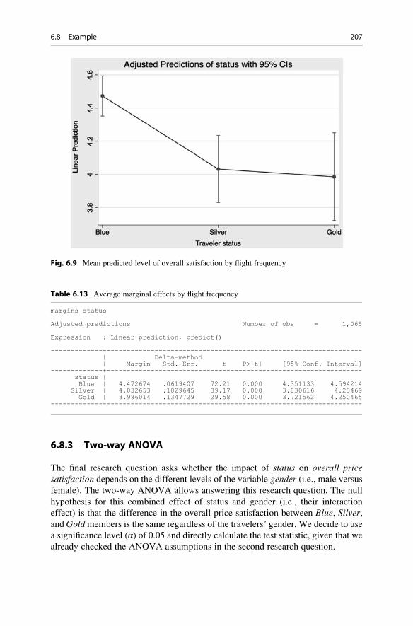
6.8.3 Two-way ANOVA
The final research question asks whether the impact of status on overall pricesatisfaction depends on the different levels of the variable gender (i.e., male versus
female). The two-way ANOVA allows answering this research question. The null
hypothesis for this combined effect of status and gender (i.e., their interaction
effect) is that the difference in the overall price satisfaction between Blue, Silver,and Goldmembers is the same regardless of the travelers’ gender. We decide to use
a significance level (α) of 0.05 and directly calculate the test statistic, given that wealready checked the ANOVA assumptions in the second research question.
Fig. 6.9 Mean predicted level of overall satisfaction by flight frequency
Table 6.13 Average marginal effects by flight frequency
margins status
Adjusted predictions Number of obs = 1,065
Expression : Linear prediction, predict()
------------------------------------------------------------------------------| Delta-method| Margin Std. Err. t P>|t| [95% Conf. Interval]
-------------+----------------------------------------------------------------status |Blue | 4.472674 .0619407 72.21 0.000 4.351133 4.594214
Silver | 4.032653 .1029645 39.17 0.000 3.830616 4.23469Gold | 3.986014 .1347729 29.58 0.000 3.721562 4.250465
------------------------------------------------------------------------------
6.8 Example 207

6.8.3.1 Calculate the Test StatisticIn Stata, interaction effects between two variables are indicated by a hashtag (#)between the variables that we interact. Now, let us test for interaction effects. Go to
► Statistics ► Linear models and related ► ANOVA/MANOVA ► Analysis of
variance and covariance. The dialog box that opens is similar to that shown in
Fig. 6.10, only this time we enter status##gender (instead of only status) in the
Model box and click on OK. This produces the output shown in Table 6.14. Note
that it is essential to have two hashtags (i.e., ##), as this tells Stata to include the two
main variables status and gender, plus the interaction variable status#gender. The
Fig. 6.10 ANOVA dialog box
Table 6.14 Output ANOVA
anova overall_sat status##gender
Number of obs = 1,065 R-squared = 0.0255Root MSE = 1.6081 Adj R-squared = 0.0209
Source | Partial SS df MS F Prob>F--------------+----------------------------------------------------
Model | 71.656085 5 14.331217 5.54 0.0000|
status | 53.277593 2 26.638796 10.30 0.0000gender | .2061234 1 .2061234 0.08 0.7777
status#gender | 14.512817 2 7.2564083 2.81 0.0609|
Residual | 2738.5542 1,059 2.5859813 --------------+----------------------------------------------------
Total | 2810.2103 1,064 2.6411751
208 6 Hypothesis Testing & ANOVA

reason for this is that status and gender are conditional main effects, whereby the
effect of the one main variable is conditional on the effect of the other main variable
with a value of 0. Thus, in this example, the conditional main effect of statusrepresents the effect of statuswhen gender is equal to 0, while the conditional effectof gender represents the effect of gender when status is equal to 0. When the
included variables have no 0 category, such conditional effects have no interpreta-
tion. It is therefore important to set a meaningful 0 category.
6.8.3.2 Make the Test DecisionThe output in Table 6.14 shows an F-value of 2.81 with a corresponding p-value of0.0609 for the interaction term (status#gender). This p-value is higher than 0.05
and thereby not statistically significant. Note that had we decided to use a signifi-
cance level (α) of 0.10, we would have found a significant interaction effect!
However, as this is not the case in our example, we conclude that the overall
level of price satisfaction by membership status does not depend on gender.
6.8.3.3 Carry Out Post Hoc TestsTo run Tukey’s method, go to ► Statistics ► Postestimation. In the window that
follows, go to ► Tests, contrasts, and comparisons of parameter estimates ►Pairwise comparisons and click on Launch. In the dialog box that opens, select
the variable status#gender under Factor terms to compute pairwise comparisons
for and select the Tukey’s method option from the Multiple comparisons drop-
down menu. Finally, go to the Reporting tab and first tick Specify additional
tables (default is effects table with confidence intervals) and then tick Show
effects table with confidence intervals and p-values. Finally, in the same window,
tick the box Sort the margins/differences in each term, and then click on OK.
This produces the output as shown in Table 6.15.
In this special case, post hoc tests are carried out across 15 distinct combinations
within and between gender and membership status groups. We can check whether
the pairwise mean comparisons differ significantly if the p-values (under Tukey
P> |t|) are lower than 0.05. The results in Table 6.15 indicate that the overall price/
performance satisfaction is significantly lower between: (1) female travelers with a
Silver and Blue membership status, (2) female travelers with a Gold and Bluemembership status, and (3) male and female travelers with a Silver membership
status. The p-values of these pairwise comparisons are respectively 0.006, 0.002,
and 0.002, thus smaller than 0.05. All the other effects have a p-value higher than0.05 and are not significant.
6.8.3.4 Measure the Strength of the EffectsIn the next step, we focus on the model’s effect strength. In Table 6.14 this is shown
under R-squared and is 0.0255, indicating that our model, which includes the
interaction term, explains 2.5% of the total variance in the overall price satisfaction.
6.8 Example 209

6.8.3.5 Interpret the ResultsThe mere increase of 0.7% in the explained variance (from 1.8% in Table 6.11 to
2.5% in Table 6.14) indicates that the interaction term does not add much to the
model’s fit. This is not surprising, as the interaction term reiterates the main effects
in a slightly different form.
6.8.3.6 Plot the ResultsFinally, we move to plotting the results, which is optional. Like research question
2, we go to ► Statistics ► Postestimation. In the dialog box that follows, go to ►Marginal analysis ► Marginal means and interaction analysis ► At sample means
and click on Launch. Next, enter the first variable status under Covariate and tick
the box Interaction analysis with another covariate where you enter the second
variable gender. Then tick the box Draw profile plots of results and click OK.
Stata will produce the output in Table 6.16 and the plot displayed in Fig. 6.11.
Under status#gender in Table 6.16, we see the average marginal effects of
overall price satisfaction in respect of all status groups as they vary by gender. Here
we find that the mean overall price satisfaction of female Blue status members
(indicated by Blue#female) is 4.68, while the mean of male Blue status members
equals 4.369469, and so on. Figure 6.11 depicts exactly these margins and their
corresponding confidence intervals. Overall, we conclude that the relationship
between the overall price satisfaction and travelers’ membership status does not
vary by gender.
Table 6.15 Output of Tukey’s method
pwcompare status#gender, mcompare(tukey) effects sort
Pairwise comparisons of marginal linear predictions
Margins : asbalanced
----------------------------| Number of| Comparisons
--------------+-------------status#gender | 15-------------------------------------------------------------------------------------------------------------------------------
| Tukey Tukey| Contrast Std. Err. t P>|t| [95% Conf. Interval]
----------------------------------+----------------------------------------------------------------status#gender |
(Silver#female) vs (Blue#female) | -.9876923 .2789273 -3.54 0.006 -1.784013 -.1913714(Gold#female) vs (Blue#female) | -.7425 .4160734 -1.78 0.476 -1.930365 .4453648
(Gold#male) vs (Blue#female) | -.687874 .1784806 -3.85 0.002 -1.197425 -.1783227(Silver#female) vs (Blue#male) | -.6771613 .2683811 -2.52 0.118 -1.443373 .0890507(Silver#male) vs (Blue#female) | -.5829126 .1550695 -3.76 0.002 -1.025627 -.1401984
(Gold#female) vs (Blue#male) | -.431969 .4090783 -1.06 0.899 -1.599863 .735925(Gold#male) vs (Blue#male) | -.377343 .1615031 -2.34 0.180 -.8384248 .0837387
(Blue#male) vs (Blue#female) | -.310531 .1312038 -2.37 0.169 -.6851101 .0640482(Silver#male) vs (Blue#male) | -.2723816 .1351832 -2.01 0.334 -.6583217 .1135584
(Gold#female) vs (Silver#male) | -.1595874 .4173454 -0.38 0.999 -1.351083 1.031909(Gold#male) vs (Silver#male) | -.1049614 .1814259 -0.58 0.992 -.6229216 .4129988(Gold#male) vs (Gold#female) | .054626 .426598 0.13 1.000 -1.163286 1.272538
(Gold#female) vs (Silver#female) | .2451923 .4774212 0.51 0.996 -1.117817 1.608201(Gold#male) vs (Silver#female) | .2998183 .2943965 1.02 0.912 -.540666 1.140303
(Silver#male) vs (Silver#female) | .4047797 .2808212 1.44 0.702 -.3969479 1.206507---------------------------------------------------------------------------------------------------
210 6 Hypothesis Testing & ANOVA

Table 6.16 Predicted average marginal effects of a combination between flight frequency and
gender
margins status#gender, plot
Adjusted predictions Number of obs = 1,065
Expression : Linear prediction, predict()at : 1.status = .6356808 (mean)
2.status = .2300469 (mean)3.status = .1342723 (mean)1.gender = .2629108 (mean)2.gender = .7370892 (mean)
-------------------------------------------------------------------------------| Delta-method| Margin Std. Err. t P>|t| [95% Conf. Interval]
---------------+---------------------------------------------------------------status#gender |Blue#female | 4.68 .1072066 43.65 0.000 4.469639 4.890361Blue#male | 4.369469 .0756386 57.77 0.000 4.22105 4.517888
Silver#female | 3.692308 .2575019 14.34 0.000 3.187036 4.19758Silver#male | 4.097087 .1120415 36.57 0.000 3.877239 4.316936Gold#female | 3.9375 .4020247 9.79 0.000 3.148645 4.726355Gold#male | 3.992126 .1426957 27.98 0.000 3.712128 4.272124
-----------------------------------------------------------------------------
Fig. 6.11 Mean predicted level of overall satisfaction by membership status and gender
6.8 Example 211
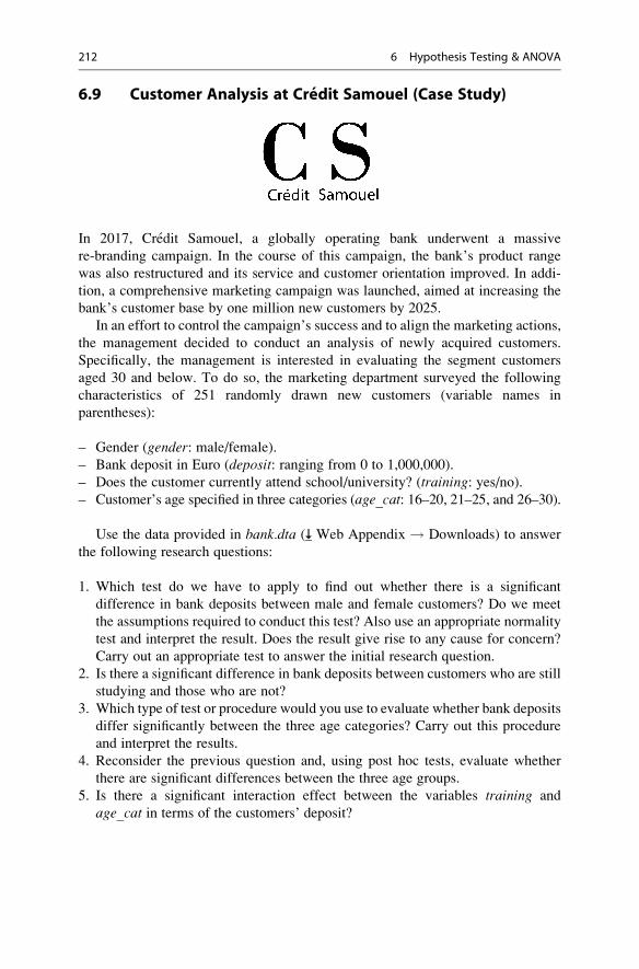
6.9 Customer Analysis at Credit Samouel (Case Study)
In 2017, Credit Samouel, a globally operating bank underwent a massive
re-branding campaign. In the course of this campaign, the bank’s product range
was also restructured and its service and customer orientation improved. In addi-
tion, a comprehensive marketing campaign was launched, aimed at increasing the
bank’s customer base by one million new customers by 2025.
In an effort to control the campaign’s success and to align the marketing actions,
the management decided to conduct an analysis of newly acquired customers.
Specifically, the management is interested in evaluating the segment customers
aged 30 and below. To do so, the marketing department surveyed the following
characteristics of 251 randomly drawn new customers (variable names in
parentheses):
– Gender (gender: male/female).
– Bank deposit in Euro (deposit: ranging from 0 to 1,000,000).
– Does the customer currently attend school/university? (training: yes/no).– Customer’s age specified in three categories (age_cat: 16–20, 21–25, and 26–30).
Use the data provided in bank.dta ( Web Appendix ! Downloads) to answer
the following research questions:
1. Which test do we have to apply to find out whether there is a significant
difference in bank deposits between male and female customers? Do we meet
the assumptions required to conduct this test? Also use an appropriate normality
test and interpret the result. Does the result give rise to any cause for concern?
Carry out an appropriate test to answer the initial research question.
2. Is there a significant difference in bank deposits between customers who are still
studying and those who are not?
3. Which type of test or procedure would you use to evaluate whether bank deposits
differ significantly between the three age categories? Carry out this procedure
and interpret the results.
4. Reconsider the previous question and, using post hoc tests, evaluate whether
there are significant differences between the three age groups.
5. Is there a significant interaction effect between the variables training and
age_cat in terms of the customers’ deposit?
212 6 Hypothesis Testing & ANOVA

6. Estimate and plot the average marginal effects of bank deposits over the
different combinations of training groups and the customers’ different age
categories.
7. Based on your analysis results, please provide recommendations for the man-
agement team on how to align their future marketing actions.
6.10 Review Questions
1. Describe the steps involved in hypothesis testing in your own words.
2. Explain the concept of the p-value and explain how it relates to the significance
level α.3. What level of α would you choose for the following types of market research
studies? Give reasons for your answers.
(a) An initial study on preferences for mobile phone colors.
(b) The production quality of Rolex watches.
(c) A repeat study on differences in preference for either Coca Cola or Pepsi.
4. Write two hypotheses for each of the example studies in question 3, including
the null hypothesis and alternative hypothesis.
5. Describe the difference between independent and paired samples t-tests in your
own words and provide two examples of each type.
6. What is the difference between an independent samples t-test and an ANOVA?
7. What are post hoc test and why is their application useful in ANOVA?
6.11 Further Readings
Hubbard, R., & Bayarri, M. J. (2003). Confusion over measure of evidence (p’s)
versus errors (α’s) in classical statistical testing. The American Statistician,57(3), 171–178.
The authors discuss the distinction between p-value and α and argue that there isgeneral confusion about these measures’ nature among researchers andpractitioners. A very interesting read!
Kanji, G. K. (2006). 100 statistical tests (3rd ed.). London: Sage.If you are interested in learning more about different tests, we recommend this best-
selling book in which the author introduces various tests with information onhow to calculate and interpret their results using simple datasets.
Mooi, E., & Ghosh, M. (2010). Contract specificity and its performance
implications. Journal of Marketing, 74(2), 105–120.This is an interesting article that demonstrates how directional hypotheses are
formulated based on theory-driven arguments about contract specificity andperformance implications.
Stata.com (http://www.stata.com/manuals14/rmargins.pdf).
6.11 Further Readings 213

Stata offers a very thorough explanation of marginal effects and the correspondingStata syntaxes for the estimation of marginal means, predictive margins, andmarginal effects.
References
Agresti, A., & Finlay, B. (2014). Statistical methods for the social sciences (4th ed.). London:
Pearson.
Bartus, T. (2005). Estimation of marginal effects using marge off. The Stata Journal, 5(3),309–329.
Boneau, C. A. (1960). The effects of violations of assumptions underlying the t test. PsychologicalBulletin, 57(1), 49–64.
Brown, M. B., & Forsythe, A. B. (1974). Robust tests for equality of variances. Journal of theAmerican Statistical Association, 69(346), 364–367.
Cohen, J. (1992). A power primer. Psychological Bulletin, 112(1), 155–159.Everitt, B. S., & Skrondal, A. (2010). The Cambridge dictionary of statistics (4th ed.). Cambridge:
Cambridge University Press.
Field, A. (2013). Discovering statistics using SPSS (4th ed.). London: Sage.
Greene, W. H. (1997). Econometric analysis (3rd ed.). Upper Saddle River: Prentice Hall.Hubbard, R., & Bayarri, M. J. (2003). Confusion over measure of evidence (p’s) versus errors (α’s)
in classical statistical testing. The American Statistician, 57(3), 171–178.Kimmel, H. D. (1957). Three criteria for the use of one-tailed tests. Psychological Bulletin, 54(4),
351–353.
Lehmann, E. L. (1993). The Fischer, Neyman-Pearson theories of testing hypotheses: One theory
or two? Journal of the American Statistical Association, 88(424), 1242–1249.Levene, H. (1960). Robust tests for equality of variances. In I. Olkin (Ed.), Contributions to
probability and statistics (pp. 278–292). Palo Alto: Stanford University Press.
Liao, T. F. (2002). Statistical group comparison. New York: Wiley-InterScience.
Lichters, M., Brunnlieb. C., Nave, G., Sarstedt, M., & Vogt, B. (2016). The influence of serotonin
defficiency on choice deferral and the compromise effect. Journal of Marketing Research,53(2), 183–198.
Lilliefors, H. W. (1967). On the Kolmogorov–Smirnov test for normality with mean and variance
unknown. Journal of the American Statistical Association, 62(318), 399–402.Mann, H. B., & Whitney, D. R. (1947). On a test of whether one of two random variables is
stochastically larger than the other. The Annals of Mathematical Statistics, 18(1), 50–60.Mitchell, M. N. (2015). Stata for the behavioral sciences. College Station: Stata Press.Nuzzo, R. (2014). Scientific method: Statistical errors. Nature, 506(7487), 150–152.Ruxton, G. D., & Neuhaeuser, M. (2010). When should we use one-tailed hypothesis testing?
Methods in Ecology and Evolution, 1(2), 114–117.Schuyler, W. H. (2011). Readings statistics and research (6th ed.). London: Pearson.
Shapiro, S. S., & Wilk, M. B. (1965). An analysis of variance test for normality (complete
samples). Biometrika, 52(3/4), 591–611.Van Belle, G. (2008). Statistical rules of thumb (2nd ed.). Hoboken: Wiley.
Wasserstein, R. L., & Lazar, N. A. (2016). The ASA’s statement on p-values: Context, process,
and purpose. The American Statistician, 70(2), 129–133.Welch, B. L. (1951). On the comparison of several mean values: An alternative approach.
Biometrika, 38(3/4), 330–336.
214 6 Hypothesis Testing & ANOVA
Regression Analysis 7
Keywords
Adjusted R2 • Akaike information criterion (AIC) • Autocorrelation • Bayes
information criterion (BIC) • Binary logistic regression • Breusch-Pagan test •
Coefficient of determination • Constant • Collinearity • Cross validation •
Disturbance term • Dummy variable • Durbin-Watson test • Error • Estimation
sample • η2 (eta-squared) • F-test • Heteroskedasticity • Interaction effects •
Intercept • Moderation analysis • (Multi)collinearity • Multinomial logistic
regression • Multiple regression • Nested models • Ordinary least squares •
Outlier • Ramsey’s RESET test • Residual • R2 • Robust regression • Simple
regression • Split-sample validation • Standard error • Standardized effects •
Unstandardized effects • Validation sample • Variance inflation factor (VIF) •
White’s test
Learning Objectives
After reading this chapter, you should understand:
– The basic concept of regression analysis.
– How regression analysis works.
– The requirements and assumptions of regression analysis.
– How to specify a regression analysis model.
– How to interpret regression analysis results.
– How to predict and validate regression analysis results.
– How to conduct regression analysis with Stata.
– How to interpret regression analysis output produced by Stata.
# Springer Nature Singapore Pte Ltd. 2018
E. Mooi et al., Market Research, Springer Texts in Business and Economics,
DOI 10.1007/978-981-10-5218-7_7
215

7.1 Introduction
Regression analysis is one of the most frequently used analysis techniques in market
research. It allows market researchers to analyze the relationships between dependent
variables and independent variables (Chap. 3). In marketing applications, the depen-
dent variable is the outcome we care about (e.g., sales), while we use the independent
variables to achieve those outcomes (e.g., pricing or advertising). The key benefits of
using regression analysis are it allows us to:
1. Calculate if one independent variable or a set of independent variables has a
significant relationship with a dependent variable.
2. Estimate the relative strength of different independent variables’ effects on a
dependent variable.
3. Make predictions.
Knowing whether independent variables have a significant effect on dependent
variables, helps market researchers in many different ways. For example, this
knowledge can help guide spending if we know promotional activities relate
strongly to sales.
Knowing effects’ relative strength is useful for marketers, because it may help
answer questions such as: Do sales depend more on the product price or on product
promotions? Regression analysis also allows us to compare the effects of variables
measured on different scales, such as the effect of price changes (e.g., measured in
dollars) and the effect of a specific number of promotional activities.
Regression analysis can also help us make predictions. For example, if we have
estimated a regression model by using data on the weekly supermarket sales of a
brand of milk in dollars, the milk price (which changes with the season and supply),
as well as an index of promotional activities (comprising product placement,
advertising, and coupons), the results of the regression analysis could answer the
question: what would happen to the sales if the prices were to increase by 5% and
the promotional activities by 10%? Such answers help (marketing) managers make
sound decisions. Furthermore, by calculating various scenarios, such as price
increases of 5%, 10%, and 15%, managers can evaluate marketing plans and create
marketing strategies.
7.2 Understanding Regression Analysis
In the previous paragraph, we briefly discussed what regression can do and why it is
a useful market research tool. We now provide a more detailed discussion. Look at
Fig. 7.1, which plots a dependent (y) variable (the weekly sales of a brand of milk in
dollars) against an independent (x1) variable (an index of promotional activities).
Regression analysis is a way of fitting a “best” line through a series of observations.
With a “best” line we mean one that is fitted in such a way that it minimizes the sum
of the squared differences between the observations and the line itself. It is
216 7 Regression Analysis

important to know that the best line fitted by means of regression analysis is not
necessarily the true line (i.e., the line that represents the population). Specifically, if
we have data issues, or fail to meet the regression assumptions (discussed later), the
estimated line may be biased.
Before we discuss regression analysis further, we should discuss regression
notation. Regression models are generally denoted as follows:
y ¼ αþ β1x1 þ e
What does this mean? The y represents the dependent variable, which is the
outcome you are trying to explain. In Fig. 7.1, we plot the dependent variable on the
vertical axis. The α represents the constant (or intercept) of the regression model,
and indicates what your dependent variable would be if the independent variable
were zero. In Fig. 7.1, you can see the constant is the value where the fitted straight
(sloping) line crosses the y-axis. Thus, if the index of promotional activities is zero,
we expect the weekly supermarket sales of a specific milk brand to be $2,500. It
may not always be realistic to assume that independent variables are zero (prices
are, after all, rarely zero), but the constant should always be included to ensure the
regression model’s best possible fit with the data.
The independent variable is indicated by x1, while the ß1 (pronounced beta)
indicates its (regression) coefficient. This coefficient represents the slope of the
line, or the slope of the diagonal grey line in Fig. 7.1. A positive ß1 coefficient
indicates an upward sloping regression line, while a negative ß1 coefficient
indicates a downward sloping line. In our example, the line slopes upward. This
0
050
0010
000
wee
kly
sale
s in
$
1500
0
50 100 150
Index of promotional activities
Fig. 7.1 A visual explanation of regression analysis
7.2 Understanding Regression Analysis 217

makes sense, since sales tend to increase with an increase in promotional activities.
In our example, we estimate the ß1 as 54.59, meaning that if we increase the
promotional activities by one unit, the weekly supermarket sales of a brand of
milk will go up by an average of $54.59. This ß1 value has a degree of associateduncertainty called the standard error. This standard error is assumed to be
normally distributed. Using a t-test (see Chap. 6), we can test if the ß1 is indeedsignificantly different from zero.
The last element of the notation, the e, denotes the equation error (also called
the residual or disturbance term). The error is the distance between each obser-
vation and the best fitting line. To clarify what a regression error is, examine
Fig. 7.1 again. The error is the difference between the regression line (which
represents our regression prediction) and the actual observation (indicated by
each dot). The predictions made by the “best” regression line are indicated by by(pronounced y-hat). Thus, the error of each observation is:1
e ¼ y� byIn the example above, we have only one independent variable. We call this
simple regression. If we include multiple independent variables, we call this
multiple regression. The notation for multiple regression is similar to that of
simple regression. If we were to have two independent variables, say the price
(x1), and an index of promotional activities (x2), our notation would be:
y ¼ αþ β1x1 þ β2x2 þ e
We need one regression coefficient for each independent variable (i.e., ß1 and ß2).Technically the ßs indicate how a change in an independent variable influences the
dependent variable if all other independent variables are held constant.2
The Explained Visually webpage offers an excellent visualization of how
regression analysis works, see http://setosa.io/ev/ordinary-least-squares-
regression/
Now that we have introduced a few regression analysis basics, it is time to
discuss how to execute a regression analysis. We outline the key steps in Fig. 7.2.
We first introduce the regression analysis data requirements, which will determine
if regression analysis can be used. After this first step, we specify and estimate the
regression model. Next, we discuss the basics, such as which independent variables
to select. Thereafter, we discuss the assumptions of regression analysis, followed by
1Strictly speaking, the difference between the predicted and the observed y-values is be.2This only applies to the standardized βs.
218 7 Regression Analysis
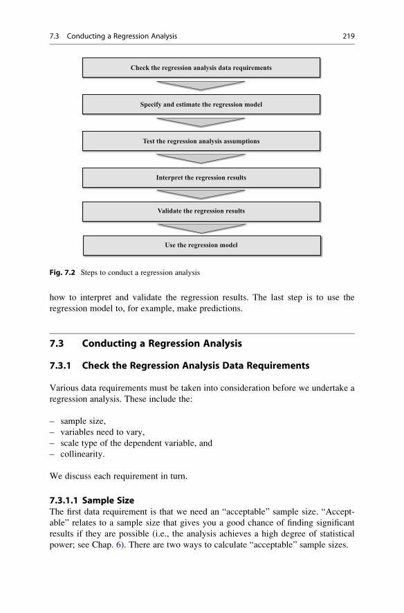
how to interpret and validate the regression results. The last step is to use the
regression model to, for example, make predictions.
7.3 Conducting a Regression Analysis
7.3.1 Check the Regression Analysis Data Requirements
Various data requirements must be taken into consideration before we undertake a
regression analysis. These include the:
– sample size,
– variables need to vary,
– scale type of the dependent variable, and
– collinearity.
We discuss each requirement in turn.
7.3.1.1 Sample SizeThe first data requirement is that we need an “acceptable” sample size. “Accept-
able” relates to a sample size that gives you a good chance of finding significant
results if they are possible (i.e., the analysis achieves a high degree of statistical
power; see Chap. 6). There are two ways to calculate “acceptable” sample sizes.
Check the regression analysis data requirements
Specify and estimate the regression model
Test the regression analysis assumptions
Interpret the regression results
Validate the regression results
Use the regression model
Fig. 7.2 Steps to conduct a regression analysis
7.3 Conducting a Regression Analysis 219

– The first, formal, approach is a power analysis. As mentioned in Chap. 6 (Box 6.
1), these calculations require you to specify several parameters, such as the
expected effect size and the maximum type I error you want to allow for.
Generally, you also have to set the power—0.80 is an acceptable level. A
power level of 0.80 means there is an 80% probability of deciding that an effect
will be significant, if it is indeed significant. Kelley and Maxwell (2003) discuss
sample size requirements in far more detail, while: https://stats.idre.ucla.edu/
stata/dae/multiple-regression-power-analysis/ discusses how to calculate sample
sizes precisely.
– The second approach is by using rules of thumb. These rules are not specific or
precise, but are easy to apply. Green (1991) and VanVoorhis and Morgan (2007)
suggest that if you want to test for individual parameters’ effect (i.e., whether one
coefficient is significant or not), you need a sample size of 104 + k. Thus, if youhave ten independent variables, you need 104 + 10¼ 114 observations. Note that
this rule of thumb is best applied when you have a small number of independent
variables, say less than 10 and certainly less than 15. VanVoorhis and Morgan
(2007) add that having at least 30 observations per variable (i.e., 30�k) allows fordetecting smaller effects (an expected R2 of 0.10 or smaller) better.
7.3.1.2 Variables Need to VaryA regression model cannot be estimated if the variables have no variation. If there is
no variation in the dependent variable (i.e., it is constant), we also do not need
regression, as we already know what the dependent variable’s value is! Likewise, if
an independent variable has no variation, it cannot explain any variation in the
dependent variable.
No variation can lead to epic failures! Consider the admission tests set by the
University of Liberia: Not a single student passed the entry exams. In such
situations, a regression analysis will clearly make no difference! http://www.
independent.co.uk/student/news/epic-fail-all-25000-students-fail-university-
entrance-exam-in-liberia-8785707.html
7.3.1.3 Scale Type of the Dependent VariableThe third data requirement is that the dependent variable needs to be interval or
ratio scaled (Chap. 3 discusses scaling). If the data are not interval or ratio scaled,
alternative types of regression should be used. You should use binary logistic
regression if the dependent variable is binary and only takes two values (zero and
one). If the dependent variable is a nominal variable with more than two levels, you
should use multinomial logistic regression. This should, for example, be used if
you want to explain why people prefer product A over B or C. We do not discuss
these different methods in this chapter, but they are related to regression. For a
discussion of regression methods with dependent variables measured on a nominal
or ordinal scale, see Cameron and Trivedi (2010).
220 7 Regression Analysis

7.3.1.4 CollinearityThe last data requirement is that no or little collinearity should be present.3 Collin-
earity is a data issue that arises if two independent variables are highly correlated.
Perfect collinearity occurs if we enter two or more independent variables containing
exactly the same information, therefore yielding a correlation of 1 or�1 (i.e., they are
perfectly correlated). Perfect collinearity may occur if you enter the same indepen-
dent variable twice, or if one variable is a linear combination of another (e.g., one
variable is a multiple of another variable, such as sales in units and sales in thousands
of units). If this occurs, regression analysis cannot estimate one of the two
coefficients; this means one coefficient will not be estimated. In practice, however,
weaker forms of collinearity are common. For example, if we study what drives
supermarket sales, variables such as price reductions and promotions are often used
together. If this occurs very often, the variables price and promotion may be collinear,
which means there is little uniqueness or new information in each of the variables.
The problem with having collinearity is that it tends to regard significant parameters
as insignificant. Substantial collinearity can even lead to sign changes in the regres-
sion coefficients’ estimates. When three or more variables are strongly related to each
other, we call this multicollinearity.
Fortunately, collinearity is relatively easy to detect by calculating the variance
inflation factor (VIF). The VIF indicates the effect on the standard error of the
regression coefficient for each independent variable. Specifically, the square root of
the VIF indicates you how much larger the standard error is, compared to if that
variable were uncorrelated with all other independent variables in the regression
model. Generally, a VIF of 10 or above indicates that (multi) collinearity is a
problem (Hair et al. 2013).4 Some research now suggests that VIFs far above 10—
such as 20 or 40—can be acceptable if the sample size is large and the R2 (discussed
later) is high (say 0.90 or more) (O’brien 2007). Conversely, if the sample sizes are
below 200 and the R2 is low (0.25 or less), collinearity is more problematic (Mason
and Perreault 1991). Consequently, in such situations, lower VIF values—such as
5—should be the maximum.
You can remedy collinearity in several ways. If perfect collinearity occurs, drop
one of the perfectly overlapping variables. If weaker forms of collinearity occur,
you can utilize two approaches to reduce collinearity (O’brien 2007):
– The first option is to use principal component or factor analysis on the collinear
variables (see Chap. 8). By using principal component or factor analysis, you
create a small number of factors that comprise most of the original variables’
3This is only a requirement if you are interested in the regression coefficients, which is the
dominant use of regression. If you are only interested in prediction, collinearity is not important.4The VIF is calculated using a completely separate regression analysis. In this regression analysis,
the variable for which the VIF is calculated is regarded as a dependent variable and all other
independent variables are regarded as independents. The R2 that this model provides is deducted
from 1 and the reciprocal value of this sum (i.e., 1/(1 � R2)) is the VIF. The VIF is therefore an
indication of how much the regression model explains one independent variable. If the other
variables explain much of the variance (the VIF is larger than 10), collinearity is likely a problem.
7.3 Conducting a Regression Analysis 221

information, but are uncorrelated. If you use factors, collinearity between the
previously collinear variables is no longer an issue.
– The second option is to re-specify the regression model by removing highly
correlated variables. Which variables should you remove? If you create a
correlation matrix of all the independent variables entered in the regression
model, you should first focus on the variables that are most strongly correlated
(see Chap. 5 for how to create a correlation matrix). First try removing one of the
two most strongly correlated variables. The one you should remove depends on
your research problem—pick the most relevant variable of the two.
– The third option is not to do anything. In many cases removing collinear
variables does not reduce the VIF values significantly. Even if we do, we run
the risk of mis-specifying the regression model (see Box 7.1 for details). Given
the trouble researchers go through to collect data and specify a regression model,
it is often better to accept collinearity in all but the most extreme cases.
7.3.2 Specify and Estimate the Regression Model
We need to select the variables we want to include and decide how to estimate the
model to conduct a regression analysis. In the following, we will discuss each step
in detail.
7.3.2.1 Model SpecificationThe model specification step involves choosing the variables to use. The regression
model should be simple yet complete. To quote Albert Einstein: “Everything should
be made as simple as possible, but not simpler!” How do we achieve this? By
focusing on our ideas of what relates to the dependent variable of interest, the
availability of data, client requirements, and prior regression models. For example,
typical independent variables explaining the sales of a particular product include
the price and promotions. When available, in-store advertising, competitors’ prices,
and promotions are usually also included. Market researchers may, of course,
choose different independent variables for other applications. Omitting important
variables (see Box 7.1) has substantial implications for the regression model, so it is
best to be inclusive. A few practical suggestions:
– If you have many variables available in the data that overlap in terms of how
they are defined—such as satisfaction with the waiter/waitress and with the
speed of service—try to pick the variable that is most distinct or relevant for
the client. Alternatively, you could conduct a principal component or factor
analysis (see Chap. 8) first and use the factors as the regression analysis’s
independent variables.
– If you expect to need a regression model for different circumstances, you should
make sure that the independent variables are the same, which will allow you to
compare the models. For example, temperature can drive the sales of some
supermarket products (e.g., ice cream). In some countries, such as Singapore,
the temperature is relatively constant, so including this variable is not important.
222 7 Regression Analysis

In other countries, such as Germany, the temperature can fluctuate far more. If
you are intent on comparing the ice cream sales in different countries, it is best to
include variables that may be relevant to all the countries you want to compare
(e.g., by including temperature, even if it is not very important in Singapore).
– Consider the type of advice you want to provide. If you want to make concrete
recommendations regarding how to use point-of-sales promotions and free prod-
uct giveaways to boost supermarket sales, both variables need to be included.
– Take the sample size rules of thumb into account. If practical issues limit the
sample size to below the threshold that the rules of thumb recommend, use as
few independent variables as possible. Larger sample sizes allow you more
freedom to add independent variables, although they still need to be relevant.
7.3.2.2 Model EstimationModel estimation refers to how we estimate a regression model. The most common
method of estimating regression models is ordinary least squares (OLS). OLS fits
a regression line to the data that minimizes the sum of the squared distances to
it. These distances are squared to stop negative distances (i.e., below the regression
line) from cancelling out positive distances (i.e., above the regression line), because
squared values are always positive. Moreover, by using the square, we emphasize
observations that are far from the regression much more, while observations close
to the regression line carry very little weight. The rule to use squared distances is an
effective (but also arbitrary) way of calculating the best fit between a set of
observations and a regression line (Hill et al. 2008). If we return to Fig. 7.1., we
see the vertical “spikes” from each observation to the regression line. OLS estima-
tion is aimed at minimizing the squares of these spikes.
Box 7.1 Omitting Relevant Variables
Omitting key variables from a regression model can lead to biased results.
Imagine that we want to explain weekly sales by only referring to promotions.
From the introduction, we know the ß of the regression model only containing
promotions is estimated as 54.59. If we add the variable price (arguably a key
variable), the estimated ß of promotions drops to 42.27. As can be seen, the
difference between the estimated ßs in the two models (i.e., with and without
price) is 12.32, suggesting that the “true” relationship between promotions
and sales is weaker than in a model with only one independent variable. This
example shows that omitting important independent variables leads to biases
in the value of the estimated ßs. That is, if we omit a relevant variable x2 froma regression model that only includes x1, we cause a bias in the ß1 estimate.
More precisely, the ß1 is likely to be inflated, which means that the
estimated value is higher than it should be. Thus, the ß1 itself is biased
because we omit x2!
7.3 Conducting a Regression Analysis 223
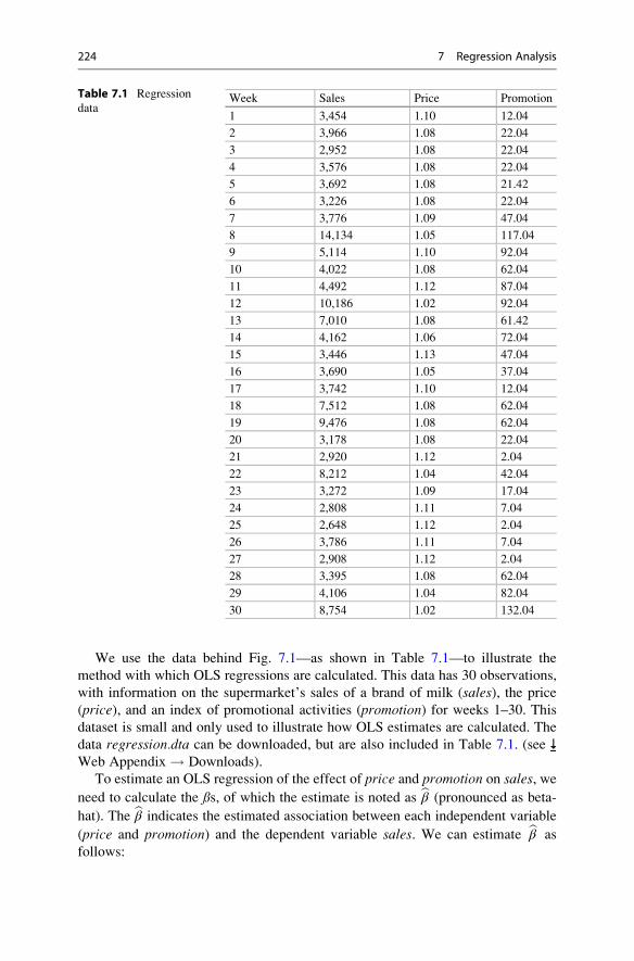
We use the data behind Fig. 7.1—as shown in Table 7.1—to illustrate the
method with which OLS regressions are calculated. This data has 30 observations,
with information on the supermarket’s sales of a brand of milk (sales), the price
(price), and an index of promotional activities (promotion) for weeks 1–30. Thisdataset is small and only used to illustrate how OLS estimates are calculated. The
data regression.dta can be downloaded, but are also included in Table 7.1. (see
Web Appendix ! Downloads).
To estimate an OLS regression of the effect of price and promotion on sales, we
need to calculate the ßs, of which the estimate is noted as bβ (pronounced as beta-
hat). The bβ indicates the estimated association between each independent variable
(price and promotion) and the dependent variable sales. We can estimate bβ as
follows:
Table 7.1 Regression
dataWeek Sales Price Promotion
1 3,454 1.10 12.04
2 3,966 1.08 22.04
3 2,952 1.08 22.04
4 3,576 1.08 22.04
5 3,692 1.08 21.42
6 3,226 1.08 22.04
7 3,776 1.09 47.04
8 14,134 1.05 117.04
9 5,114 1.10 92.04
10 4,022 1.08 62.04
11 4,492 1.12 87.04
12 10,186 1.02 92.04
13 7,010 1.08 61.42
14 4,162 1.06 72.04
15 3,446 1.13 47.04
16 3,690 1.05 37.04
17 3,742 1.10 12.04
18 7,512 1.08 62.04
19 9,476 1.08 62.04
20 3,178 1.08 22.04
21 2,920 1.12 2.04
22 8,212 1.04 42.04
23 3,272 1.09 17.04
24 2,808 1.11 7.04
25 2,648 1.12 2.04
26 3,786 1.11 7.04
27 2,908 1.12 2.04
28 3,395 1.08 62.04
29 4,106 1.04 82.04
30 8,754 1.02 132.04
224 7 Regression Analysis

bβ ¼ xTx� ��1
: xTy
In this equation to solve the bβ, we first multiply the transposed matrix indicated as xT.This matrix has three elements, a vector of 1s, which are added to estimate the
intercept and two vectors of the independent variables price and promotion. Together,these form a 30 by 3 matrix. Next, we multiply this matrix with the untransposed
matrix, indicated as x, consisting of the same elements (as a 3 by 30 matrix). This
multiplication results in a 3�3 matrix of which we calculate the inverse, indicated by
the power of�1 in the equation. This also results in a 3 by 3 matrix (xTx)�1. Next, we
calculate xTy, which consists of the 30 by 3 matrix and the vector with the dependent
variables’ observations (a 1 by 30 matrix). In applied form:5
x ¼1 1:10 12:041 1:08 22:04⋮ ⋮ ⋮1 1:02 132:04
2664
3775,
xT ¼1 1 . . . 1
1:10 1:08 . . . 1:0212:04 22:04 . . . 132:04
24
35,
xTx� ��1 ¼
77:97 �70:52 �0:04�70:52 63:86 0:03� 0:04 0:03 0:00
24
35,
xTy ¼147615:00158382:648669899:36
24
35,
Hence, xTx� ��1 ∙ xTy ¼
30304:05�25209:86
42:27
24
35:
This last matrix indicates the estimated βs with 30304.05 representing the intercept,�25209.86 representing the effect of a one-unit increase in the price on sales, and
42.27 the effect of a one-unit increase in promotions on sales. This shows how the
OLS estimator is calculated.
5This term can be calculated manually, but also by using the function mmult in Microsoft Excel
where xTx is calculated. Once this matrix has been calculated, you can use the minverse function toarrive at (xTx)�1 .
7.3 Conducting a Regression Analysis 225

As discussed before, each bβ has a standard error, which expresses the uncertaintyassociated with the estimate. This standard error can be expressed in standard
deviations and, as discussed in Chap. 6, with more than 100 degrees of freedom
and α¼ 0.05, t-values outside the critical value of �1.96 indicate that the estimated
effect is significant and that the null hypothesis can be rejected. If this the t-value
falls within the range of � 1.96, the bβ is said to be insignificant.While OLS is an effective estimator, there are alternatives that work better in
specific situations. These situations occur if we violate one of the regression
assumptions. For example, if the regression errors are heteroskedastic (discussed
in Sect. 7.3.3.3), we need to account for this by, for example, using robust
regression (White 1980).6 Random-effects estimators allow for estimating a
model with correlated errors. There are many more estimators, but these are beyond
the scope of this book. Greene (2011) discusses these and other estimation
procedures in detail. Cameron and Trivedi (2010) discuss their implementation in
Stata.
7.3.3 Test the Regression Analysis Assumptions
We have already discussed several issues that determine whether running a regres-
sion analysis is useful. We now discuss regression analysis assumptions. If a
regression analysis fails to meet its assumptions, it can provide invalid results.
Four regression analysis assumptions are required to provide valid results:
1. the regression model can be expressed linearly,
2. the regression model’s expected mean error is zero,
3. the errors’ variance is constant (homoscedasticity), and
4. the errors are independent (no autocorrelation).
There is a fifth assumption, which is, however optional. If we meet this assumption,
we have information on how the regression parameters are distributed, which
allows straightforward conclusions regarding their significance. If the regression
analysis fails to meet this assumption, the regression model will still be accurate,
but it becomes we cannot rely on the standard errors (and t-values) to determine the
regression parameters’ significance.
5. The errors need to be approximately normally distributed.
We next discuss these assumptions and how we can test each of them.
6In Stata this can be done by using the, robust option.
226 7 Regression Analysis

7.3.3.1 First Assumption: LinearityThe first assumption means that we can write the regression model as y¼ α +β1x1 + e. Thus, non-linear relationships, such as β
21x1, are not permissible. However,
logarithmic expressions, such as log(x1), are possible as the regression model is still
specified linearly. If you can write a model whose regression parameters (the ßs) arelinear, you satisfy this assumption.
A separate issue is whether the relationship between the independent variable
x and the dependent variable y is linear. You can check the linearity between x andy variables by plotting the independent variables against the dependent variable.
Using a scatter plot, we can then assess whether there is some type of non-linear
pattern. Fig. 7.3 shows such a plot. The straight, sloping line indicates a linear
relationship between sales and promotions. For illustration purposes, we have also
added a curved upward sloping line. This line corresponds to a x21 transformation. It
visually seems that a linear line fits the data best. If we fail to identify non-linear
relationships as such, our regression line does not fit the data well, as evidenced in a
low model fit (e.g., the R2, which we will discuss later) and nonsignificant effects.
After transforming x1 by squaring it (or using any other transformation), you still
satisfy the assumption of specifying the regression model linearly, despite the
non-linear relationship between x and y.Ramsey’s RESET test is a specific linearity test (Ramsey 1969; Cook and
Weisberg 1983). This test includes the squared values of the independent variables
0
050
0010
000
wee
kly
sale
s in
$
1500
020
000
50 100
index of promotional activities
150
Fig. 7.3 Different relationships between promotional activities and weekly sales
7.3 Conducting a Regression Analysis 227

(i.e., x21 and third powers (i.e., x31), and tests if these are significant (Baum 2006).7
While this test can detect these specific types of non-linearities, it does not indicate
which variable(s) has(ve) a non-linear relationship with the dependent variable.
Sometimes this test is (falsely) called a test for omitted variables, but it actually
tests for non-linearities.
7.3.3.2 Second Assumption: Expected Mean Error is ZeroThe second assumption is that the expected (not the estimated!) mean error is zero.
If we do not expect the sum of the errors to be zero, we obtain a biased line. That is,
we have a line that consistently overestimates or underestimates the true relation-
ship. This assumption is not testable by means of statistics, as OLS always renders a
best line with a calculated mean error of exactly zero. This assumption is important,
because if the error’s expected value is not zero, there is additional information in
the data that has not been used in the regression model. For example, omitting
important variables, as discussed in Box 7.1, or autocorrelation may cause the
expected error to no longer be zero (see Sect. 7.3.3.4).
7.3.3.3 Third Assumption: HomoscedasticityThe third assumption is that the errors’ variance is constant, a situation we call
homoscedasticity. Imagine that we want to explain various supermarkets’ weekly
sales in dollars. Large stores obviously have a far larger sales spread than small
supermarkets. For example, if you have average weekly sales of $50,000, you might
see a sudden jump to $60,000, or a fall to $40,000. However, a very large supermar-
ket could see sales move from an average of $5 million to $7 million. This causes the
weekly sales’ error variance of large supermarkets to be much larger than that of
small supermarkets. We call this non-constant variance heteroskedasticity. If we
estimate regression models on data in which the variance is not constant, they will
still result in correct βs. However, the associated standard errors are likely to be too
large and may cause some βs to not be significant, although they actually are.
Figure 7.4 provides a visualization of heteroskedasticity. As the dependent
variable increases, the error variance also increases. If heteroskedasticity is an
issue, the points are typically funnel shaped, displaying more (or less) variance as
the independent variable increases (decreases). This funnel shape is typical of
heteroskedasticity and indicates that, as a function of the dependent variable, the
error variance changes.
We can always try to visualize heteroskedasticity, whose presence is calculated
by means of the errors, but it is often very difficult to determine visually whether
heteroskedasticity is present. For example, when datasets are large, it is hard to see
a funnel shape in the scatterplot. We can formally test for the presence of
heteroskedasticity by using the Breusch-Pagan test and White’s test.
The Breusch-Pagan test (1980) is the most frequently used test. This test
determines whether the errors’ variance depends on the variables in the model by
7The test also includes the predicted values squared and to the power of three.
228 7 Regression Analysis

using a separate regression analysis (Greene 2011). This tests the null hypothesis
that the errors’ variance does not depend on the variables in the regression model.8
Rejecting this null hypothesis suggests that heteroskedasticity is present. If the
Breusch-Pagan test indicates that heteroskedasticity is an issue, robust regressionremedy for this (see Sect. 7.3.2.2). Note that to illustrate heteroskedasticity, we
have used slightly different data than in the other examples.
White’s test, as extended by Cameron and Trivedi (1990), is a different test for
heteroskedasticity. This test does not test if the error goes up or down, but adopts a
more flexible approach whereby errors can first go down, then up (i.e., an hourglass
shape), or first go up, then down (diabolo-shaped). Compared to the Breusch-Pagan
test, White’s test considers more shapes that can indicate heteroskedasticity. This has
benefits in that more forms of heteroskedasticity can be detected, but in small samples;
however, White’s test may not detect heteroskedasticity, even if it is present. It is
therefore best to use both tests, as they have slightly different strengths. Generally, the
two tests are comparable, but if they are not, it is best to rely on White’s test.
7.3.3.4 Fourth Assumption: No AutocorrelationThe fourth assumption is that the regression model errors are independent; that is,
the error terms are uncorrelated for any two observations. Imagine that you want to
explain the supermarket sales of a brand of milk by using the previous week’s sales
Large error variance
Small error variance
Fig. 7.4 An example of heteroskedasticity
8Specifically, in the mentioned regression model y¼ α+ β1x1 + β2x2 + β3x3 + e, the Breusch-Pagantest determines whether be2 ¼ αþ βBP1x1 þ βBP2x2 þ βBP3x3 þ eBP.
7.3 Conducting a Regression Analysis 229

of that milk. It is very likely that if sales increased last week, they will also increase
this week. This may be due to, for example, the growing economy, an increasing
appetite for milk, or other reasons that underlie the growth in supermarket sales of
milk. This issue is called autocorrelation and means that regression errors are
correlated positively (or negatively) over time. For example, the data in Table 7.1
are taken from weeks 1 to 30, which means they have a time component.
We can identify the presence of autocorrelation by using the Durbin-Watson
(D-W) test (Durbin and Watson 1951). The D-W test assesses whether there is
autocorrelation by testing the null hypothesis of no autocorrelation, which is tested
for negative autocorrelation against a lower and upper bound and for positive
autocorrelation against a lower and upper bound. If we reject the null hypothesis
of no autocorrelation, we find support for an alternative hypothesis that there is
some degree of positive or negative autocorrelation. Essentially, there are four
situations, which we indicate in Fig. 7.5.
First, the errors may be positively related (called positive autocorrelation). This
means that if we have observations over time, we observe that positive errors are
generally followed by positive errors and negative errors by negative errors. For
example, supermarket sales usually increase over certain time periods (e.g.,
before Christmas) and decrease during other periods (e.g., the summer holidays).
Second, if positive errors are commonly followed by negative errors and negative
errors by positive errors, we have negative autocorrelation. Negative autocorre-
lation is less common than positive autocorrelation, but also occurs. If we study,
for example, how much time salespeople spend on shoppers, we may see that if
they spend much time on one shopper, they spend less time on the next, allowing
the salesperson to stick to his/her schedule, or to simply go home on time.
Third, if no systematic pattern of errors occurs, we have no autocorrelation. This
absence of autocorrelation is required to estimate standard (OLS) regression
models.
Fourth, the D-W values may fall between the lower and upper critical value. If this
occur, the test is inconclusive.
The situation that occurs depends on the interplay between the D-W test statistic
(d) and the lower (dL) and upper (dU) critical value.
Indecision IndecisionPositiveautocorrelation
Noautocorrelation
Negativeautocorrelation
dL=1.352 4-dL=2.648dU=1.489 4-dU=2.511
Fig. 7.5 Durbin-Watson test values (n ¼ 30, k ¼ 1)
230 7 Regression Analysis

1. If the test statistic is lower than the lower critical value (d < dL), we have
positive autocorrelation.
2. If the test statistic is higher than 4 minus the lower critical value (d> 4 – dL), we
have negative autocorrelation.
3. If the test statistic falls between the upper critical value and 4 minus the upper
critical value (dU < d < 4 – dU), we have no autocorrelation.
4. If the test statistic falls between the lower and upper critical value (dL< d< dU),
or it falls between 4 minus the upper critical value and 4 minus the lower critical
value (4 – dU < d < 4 – dL), the test does not inform on the presence of
autocorrelation and is undecided.
The critical values dL and dU can be found on the website accompanying this
book ( Web Appendix! Downloads). From this table, you can see that the lower
critical value dL of a model with one independent variable and 30 observations is
1.352 and the upper critical value dU is 1.489. Figure 7.5 shows the resulting
intervals. Should the D-W test indicate autocorrelation, you should use models
that account for this problem, such as panel and time series models. We do not
discuss these methods in this book, but Cameron and Trivedi (2010) is a useful
source of further information.
7.3.3.5 Fifth (Optional) Assumption: Error DistributionThe fifth, optional, assumption is that the regression model errors are approximately
normally distributed. If this is not the case, the t-values may be incorrect. However,
even if the regression model errors are not normally distributed, the regression
model still provides good estimates of the coefficients. Consequently, we consider
this assumption an optional one. Potential reasons for regression errors being
non-normally distributed include outliers (discussed in Chap. 5) and a non-linear
relationship between the independent and (a) dependent variable(s) as discussed in
Sect. 7.3.3.1.
There are two main ways of checking for normally distributed errors: you can
use plots or carry out a formal test. Formal tests of normality include the Shapiro-
Wilk test (see Chap. 6), which needs to be run on the saved errors. A formal test
may indicate non-normality and provide absolute standards. However, formal test
results reveal little about the source of non-normality. A histogram with a normality
plot may can help assess why errors are non-normally distributed (see Chap. 5 for
details). Such plots are easily explained and interpreted and may suggest the source
of non-normality (if present).
7.3.4 Interpret the Regression Results
In the previous sections, we discussed how to specify a basic regression model and
how to test regression assumptions. We now discuss the regression model fit,
followed by the interpretation of individual variables’ effects.
7.3 Conducting a Regression Analysis 231

7.3.4.1 Overall Model FitThe model significance is the first aspect that should be determined. While model
significance is not an indicator of (close) fit, it makes little sense to discuss model fit
if the model itself is not significant. The F-test determines the model significance.
The test statistic’s F-value is the result of a one-way ANOVA (see Chap. 6) that
tests the null hypothesis that all the regression coefficients equal zero. Thus, the
following null hypothesis is tested:9
H0¼ β1 ¼ β2 ¼ β3 ¼ . . . ¼ 0
If the regression coefficients are all equal to zero, then all the independent
variables’ effect on the dependent variable is zero. In other words, there is no
(zero) relationship between the dependent variable and the independent variables. If
we do not reject the null hypothesis, we need to change the regression model, or, if
this is not possible, report that the regression model is non-significant. A p-value ofthe F-test below 0.05 (i.e., the model is significant) does not, however, imply that all
the regression coefficients are significant, or even that one of them is significant
when considered in isolation. However, if the F-value is significant, it is highly
likely that at least one or more regression coefficients are significant.
If we find that the F-test is significant, we can interpret the model fit by using the
R2. The R2 (also called the coefficient of determination) indicates the degree to
which the model, relative to the mean, explains the observed variation in the
dependent variable. In Fig. 7.6, we illustrate this graphically by means of a scatter
plot. The y-axis relates to the dependent variable sales (weekly sales in dollars) andthe x-axis to the independent variable promotion. In the scatter plot, we see
30 observations of sales and price (note that we use a small sample size for
illustration purposes). The horizontal line (at about $5,000 sales per week) refers
to the average sales in all 30 observations. This is also our benchmark. After all, if
we were to have no regression line, our best estimate of the weekly sales would also
be the average. The sum of all the squared differences between each observation
and the average is the total variation or the total sum of squares (SST). We indicate
the total variation in only one observation on the right of the scatter plot.
The straight upward sloping line (starting at the y-axis at about $2,500 sales per
week when there are no promotional activities) is the regression line that OLS
estimates. If we want to understand what the regression model adds beyond the
average (which is the benchmark for calculating the R2), we can calculate the
difference between the regression line and the line indicating the average. We
call this the regression sum of squares (SSR), as it is the variation in the data that
the regression analysis explains. The final point we need to understand regarding
how well a regression line fits the available data, is the unexplained sum of the
squares. This is the difference between the observations (indicated by the dots) and
the regression line. The squared sum of these differences refers to the regression
error that we discussed previously and which is therefore denoted as the error sum
9This hypothesis can also be read as that a model with only an intercept is sufficient.
232 7 Regression Analysis

of squares (SSE). In more formal terms, we can describe these types of variation as
follows:
SST ¼ SSR þ SSE
This is the same as:
Xni¼1
yi � �yð Þ2 ¼Xni¼1
byi � �yð Þ2 þXni¼1
yi � byið Þ2
Here, n describes the number of observations, yi is the value of the independent
variable for observation i,byi is the predicted value of observation i, and�y is the mean
value of y. As you can see, this description is like the one-way ANOVA we
discussed in Chap. 6. A useful regression line should explain a substantial amount
of variation (have a high SSR) relative to the total variation (SST):
R2 ¼ SSR
SST
The R2 always lies between 0 and 1, with a higher R2 indicating a better model fit.
When interpreting the R2, higher values indicate that the variation in x explains
more of the variation in y. Therefore, relative to the SSR, the SSE is low.
0
050
0010
000
Wee
kly
sale
s in
US
D
1500
0
50 100
Index of promotional activities
150
Fig. 7.6 Explanation of the R2
7.3 Conducting a Regression Analysis 233
It is difficult to provide rules of thumb regarding what R2 is appropriate, as
this varies from research area to research area. For example, in longitudinal
studies, R2s of 0.90 and higher are common. In cross-sectional designs,
values of around 0.30 are common, while values of 0.10 are normal in
cross-sectional data in exploratory research. In scholarly research focusing
on marketing, R2 values of 0.50, 0.30, and 0.10 can, as a rough rule of thumb,
be respectively described as substantial, moderate, and weak.
If we use the R2 to compare different regression models (but with the same
dependent variable), we run into problems. If we add irrelevant variables that are
slightly correlated with the dependent variable, the R2 will increase. Thus, if we only
use the R2 as the basis for understanding regression model fit, we are biased towards
selecting regression models with many independent variables. Selecting a model only
based on the R2 is generally not a good strategy, unless we are interested in making
predictions. If we are interested in determining whether independent variables have a
significant relationship with a dependent variable, or when we wish to estimate the
relative strength of different independent variables’ effects, we need regression models
that do a good job of explaining the data (which have a low SSE), but which also have afew independent variables. It is easier to recommend that a management should change
a few key variables to improve an outcome than to recommend a long list of somewhat
related variables. We also do not want too many independent variables, because they
are likely to complicate the insights. Consequently, it is best to rely on simple models
when possible. Relevant variables should, of course, always be included. To avoid a
bias towards complex models, we can use the adjusted R2 to select regressionmodels.
The adjusted R2 only increases if the addition of another independent variable explains
a substantial amount of the variance. We calculate the adjusted R2 as follows:
R2adj ¼ 1� 1� R2
� �∙
n� 1
n� k� 1
Here, n describes the number of observations and k the number of independent
variables (not counting the constant α). This adjusted R2 is a relative measure and
should be used to compare different but nested models with the same dependent
variable. Nested means that all of a simpler model’s terms are included in a more
complex model, as well as additional variables. You should pick the model with the
highest adjusted R2 when comparing regression models. However, do not blindly
use the adjusted R2 as a guide, but also look at each individual variable and see if it
is relevant (practically) for the problem you are researching. Furthermore, it is
important to note that we cannot interpret the adjusted R2 as the percentage of
explained variance as we can with the regular R2. The adjusted R2 is only a measure
of how much the model explains while controlling for model complexity.
Because the adjusted R2 can only compare nested models, there are additional fit
indices that can be used to compare models with the same dependent variable, but
234 7 Regression Analysis

different independent variables (Treiman 2014). The Akaike information crite-
rion (AIC) and the Bayes information criterion (BIC) are such measures of
model fit. More precisely, AIC and BIC are relative measures indicating the
difference in information when a set of candidate models with different indepen-
dent variables is estimated. For example, we can use these criteria to compare two
models where the first regression model explains the sales by using two indepen-
dent variables (e.g., price and promotions) and the second model adds one more
independent variable (e.g., price, promotions, and service quality). We can also use
the AIC10 and BIC when we explain sales by using two different sets of independent
variables.
Both the AIC and BIC apply a penalty (the BIC a slightly larger one), as the
number of independent variables increases with the sample size (Treiman 2014).
Smaller values are better and, when comparing models, a rough guide is that when
the more complex model’s AIC (or BIC) is 10 lower than that of another model, the
former model should be given strong preference (Fabozzi et al. 2014). When the
difference is less than 2, the simpler model is preferred. For values between 2 and
10, the evidence shifts towards the more complex model, although a specific cut-off
point is hard to recommend. When interpreting these statistics, note that the AIC
tends to point towards a more complex model than the BIC.
7.3.4.2 Effects of Individual VariablesHaving established that the overall model is significant and that the R2 is satisfac-
tory, we need to interpret the effects of the various independent variables used to
explain the dependent variable. If a regression coefficient’s p-value is below 0.05,
we generally say that the specific independent variable relates significantly to the
dependent variable. To be precise, the null and alternative hypotheses tested for an
individual parameter (e.g., β1) are:
H0 : β1 ¼ 0
H1: β1 6¼ 0:
If a coefficient is significant (i.e., the p-value is below 0.05), we reject the null
hypothesis and support the alternative hypothesis, concluding that the parameter
differs significantly from zero. For example, if we estimate a regression model on
the data shown in Fig. 7.1, the (unstandardized) β1 coefficient of promotional
activities’ effect on sales is 54.591, with a t-value of 5.35. This t-value results in
a p-value less than 0.05, indicating that the effect is significantly different from
zero. If we hypothesize a direction (i.e., smaller or larger than zero) instead of
significantly different from zero, we should divide the corresponding p-value by
10The AIC is specifically calculated as AIC ¼ n�ln(SSE/n) + 2�k, where n is the number of
observations and k the number of independent variables, while the BIC is calculated as
BIC ¼ n�ln(SSE/n) + k�ln(n).
7.3 Conducting a Regression Analysis 235

two. This is the same as applying the t-test for a directional effect, which is
explained in Chap. 6.
The next step is to interpret the actual size of the β coefficients, which we can
interpret in terms of unstandardized effects and standardized effects. The unstan-
dardized β coefficient indicates the effect that a one-unit increase in the independentvariable (on the scale used to measure the original independent variable) has on the
dependent variable. This effect is therefore the partial relationship between a
change in a single independent variable and the dependent variable. For example,
the unstandardized β1 coefficient of promotional activities’ effect on sales (54.59)
indicates that a one-unit change in (the index of) promotional activities increases
sales by 54.59 units. Importantly, if we have multiple independent variables, a
variable’s unstandardized coefficient is the effect of that independent variable’s
increase by one unit, but keeping the other independent variables constant. While
this is a very simple example, we might run a multiple regression in which the
independent variables are measured on different scales, such as in dollars, units
sold, or on Likert scales. Consequently, the independent variables’ effects cannot be
directly compared with one another, because their influence also depends on the
type of scale used. Comparing the unstandardized β coefficients would, in any case,amount to comparing apples with oranges!
Fortunately, the standardized βs allow us to compare the relative effect of
differently measured independent variables by expressing the effect in terms of
standard deviation changes from the mean. More precisely, the standardized βcoefficient expresses the effect that a single standard deviation change in the
independent variable has on the dependent variable. The standardized β is used to
compare different independent variables’ effects. All we need to do is to find the
highest absolute value, which indicates the variable that has the strongest effect on
the dependent variable. The second highest absolute value indicates the second
strongest effect, etc.
Two further tips: First, only consider significant βs in this respect, as insignifi-
cant βs do not (statistically) differ from zero! Second, while the standardized βs arehelpful from a practical point of view, standardized βs only allow for comparing the
coefficients within and not between models! Even if you just add a single variable to
your regression model, the standardized βs may change substantially.
When interpreting (standardized) β coefficients, you should always keep the
effect size in mind. If a β coefficient is significant, it merely indicates an
effect that differs from zero. This does not necessarily mean that the effect is
managerially relevant. For example, we may find a $0.01 sales effect of
spending $1 more on promotional activities that is statistically significant.
Statistically, we could conclude that the effect of a $1 increase in promotional
(continued)
236 7 Regression Analysis

activities increases sales by an average of $0.01 (just one dollar cent). While
this effect differs significantly from zero, we would probably not recommend
increasing promotional activities in practice (we would lose money on the
margin) as the effect size is just too small.11
Another way to interpret the size of individual effects is to use the η2 (pronouncedeta-squared), which, similar to the R2, is a measure of the variance accounted for.
There are two types of η2: The model η2, which is identical to the R2, and each
variable’s partial η2, which describes how much of the total variance is accounted
for by that variable. Just like the R2, the η2 can only be used to compare variables
within a regression model and cannot be used to compare them between regression
models. The η2 relies on different rules of thumb regarding what are small, medium,
and large effect sizes. Specifically, an effect of 0.02 is small, 0.15 is medium, and
0.30 and over is large (Cohen 1992).
There are also situations in which an effect is not constant for all observations,
but depends on another variable’s values. Researchers can run a moderation
analysis, which we discuss in Box 7.2, to estimate such effects.
7.3.5 Validate the Regression Results
Having checked for the assumptions of the regression analysis and interpreted the
results, we need to assess the regression model’s stability. Stability means that the
results are stable over time, do not vary across different situations, and are not
heavily dependent on the model specification. We can check for a regression
model’s stability in several ways:
1. We can randomly split the dataset into two parts (called split-sample valida-
tion) and run the regression model again on each data subset. 70% of the
randomly chosen data are often used to estimate the regression model (called
estimation sample) and the remaining 30% is used for comparison purposes
(called validation sample). We can only split the data if the remaining 30% still
meets the sample size rules of thumb discussed earlier. If the use of the two
samples results in similar effects, we can conclude that the model is stable. Note
that it is mere convention to use 70% and 30% and there is no specific reason for
using these percentages.
2. We can also cross-validate our findings on a new dataset and examine whether
these findings are similar to the original findings. Again, similarity in the
11Cohen’s (1994) classical article “The Earth is Round ( p < 0.05)” offers an interesting perspec-
tive on significance and effect sizes.
7.3 Conducting a Regression Analysis 237

findings indicates stability and that our regression model is properly specified.
Cross-validation does, of course, assume that we have a second dataset.
3. We can add several alternative variables to the model and examine whether the
original effects change. For example, if we try to explain weekly supermarket
sales, we could use several additional variables, such as the breadth of the
assortment or the downtown/non-downtown location in our regression model.
If the basic findings we obtained earlier continue to hold even when adding these
two new variables, we conclude that the effects are stable. This analysis does, of
Box 7.2 Moderation
The discussion of individual variables’ effects assumes that there is only one
effect. That is, that only one β parameter represents all observations well.
This is often not true. For example, the link between sales and price has been
shown to be stronger when promotional activities are higher. In other words,
the effect of price (β1) is not constant, but with the level of promotional
activities.
Moderation analysis is one way of testing if such heterogeneity is present.
A moderator variable, usually denoted by m, is a variable that changes the
strength (or even direction) of the relationship between the independent
variable (x1) and the dependent variable (y). You only need to create a new
variable that is the multiplication of x1 and m (i.e., x1�m). The regression
model then takes the following form:
y ¼ αþ β1x1 þ β2mþ β3x1 ∙mþ e
In words, a moderator analysis requires entering the independent variable x1,the moderator variable m, and the product x1�m, which represents the interac-
tion between the independent variable and the moderator. Moderation analy-
sis is therefore also commonly referred to as an analysis of interaction
effects. After estimating this regression model, you can interpret the signifi-
cance and sign of the β3 parameter. A significant effect suggests that:
– when the sign of β3 is positive, the effect β1 increases as m increases,
– when the sign of β3 is negative, the effect β1 decreases as m increases.
For further details on moderation analysis, please see David Kenny’s discus-
sion on moderation (http://www.davidakenny.net/cm/moderation.htm), or the
advanced discussion by Aiken and West (1991). Jeremy Dawson’s website
(http://www.jeremydawson.co.uk/slopes.htm) offers a tool for visualizing
moderation effects. An example of a moderation analysis is found in Mooi
and Frambach (2009).
238 7 Regression Analysis

course, require us to have more variables available than those included in the
original regression model.
7.3.6 Use the Regression Model
When we have found a useful regression model that satisfies regression analysis’s
assumptions, it is time to use it. Prediction is a key use of regression models.
Essentially, prediction entails calculating the values of the dependent variables
based on assumed values of the independent variables and their related, previously
calculated, unstandardized β coefficients. Let us illustrate this by returning to our
opening example. Imagine that we are trying to predict weekly supermarket sales
(in dollars) (y) and have estimated a regression model with two independent
variables: price (x1) and an index of promotional activities price (x2). The regres-
sion model is as follows:
y ¼ αþ β1x1 þ β2x2 þ e
If we estimate this model on the previously used dataset, the estimated coefficients
using regression analysis are 30,304.05 for the intercept, �25,209.86 for price, and
42.27 for promotions. We can use these coefficients to predict sales in different
situations. Imagine, for example, that we set the price at $1.10 and the promotional
activities at 50. Our expectation of the weekly sales would then be:
y_ ¼ 30, 304:05�25, 209:86 � $1:10þ 42:27 � 50 ¼ $4, 686:70:
We could also build several scenarios to plan for different situations by, for
example, increasing the price to $1.20 and reducing the promotional activities to
40. By using regression models like this, one can, for example, automate stocking
and logistical planning, or develop strategic marketing plans.
Regression can also help by providing insight into variables’ specific effects. For
example, if the effect of promotions is not significant, it may tell managers that the
supermarket’s sales are insensitive to promotions. Alternatively, if there is some
effect, the strength and direction of promotional activities’ effect may help
managers understand whether they are useful.
Table 7.2 summarizes (on the left side) the major theoretical decisions we need
to make if we want to run a regression model. On the right side, these decisions are
then “translated” into Stata actions.
7.3 Conducting a Regression Analysis 239

Table 7.2 Steps involved in carrying out a regression analysis
Theory Action
Consider the regression analysis data requirements
Sufficient sample size Check if sample size is 104+k, where k indicates thenumber of independent variables. If the expected
effects are weak (the R2 is .10 or lower), use at least
30 � k observations per independent variable.This can be done easily by calculating the
correlation matrix. Note the number of observations
(obs¼. . .) immediately under the correlate
command to determine the sample size available for
regression.
correlate commitment s9 s10 s19 s21s23 status age gender
Do the dependent and independent
variables show variation?
Calculate the standard deviation of the variables by
going to► Statistics► Summaries, tables, and tests
► Summary and descriptive statistics ► Summary
statistics (enter the dependent and independent
variables). At the very least, the standard deviation
(indicated by Std. Dev. in the output) should be
greater than 0.
summarize commitment s9 s10 s19 s21s23 i.status age i.gender
Is the dependent variable interval or ratio
scaled?
See Chap. 3 to determine the measurement level.
Is (multi)collinearity present? The presence of (multi)collinearity can only be
assessed after the regression analysis has been
conducted (to run a regression model; ► Statistics
► Linear models and related ► Linear regression.
Under Dependent variable enter the dependent
variable and add all the independent variables under
the box Independent variables and click on OK).
Check the VIF: ► Statistics ► Postestimation ►Specification, diagnostic, and goodness-of-fit
analysis► Variance inflation factors. Then click on
Launch and OK. The VIF should be below
10 (although it can be higher, or lower, in some
cases; see Sect. 7.3.1.4 for specifics).
vif
Specify and estimate the regression model
Model specification 1. Pick distinct variables
2. Try to build a robust model
3. Consider the variables that are needed to give
advice
4. Consider whether the number of independent
variables is in relation to the sample size
Estimate the regression model ► Statistics ► Linear models and related ► Linear
regression. Under Dependent variable enter the
dependent variable and add all the independent
(continued)
240 7 Regression Analysis

Table 7.2 (continued)
Theory Action
variables under Independent variables and click
on OK.
regress commitment s9 s10 s19 s21 s23i.status age gender
Use robust regression when heteroskedasticity is
present:
regress commitment s9 s10 s19 s21 s23i.status age gender, robust
Test the regression analysis assumptions
Can the regression model be specified
linearly?
Consider whether you can write the regression
model as: y¼ α + β1�x1 + β2�x2 + . . . + e
Is the relationship between the
independent and dependent variables
linear?
Plot the dependent variable against the independent
variable using a scatterplot matrix to see if the
relation (if any) appears to be linear.► Graphics ►Scatterplot matrix. Then add all the variables and
click on Marker properties where, under Symbol,
you can choose Point for a clearer matrix. Note that
you cannot add variables that start with i. (i.e.,
categorical variables). Then click on OK.
graph matrix commitment s9 s10 s19 s21s23 status age gender, msymbol(point)
Conduct Ramsey’s RESET test to test for
non-linearities. Go to► Statistics► Postestimation
► Specification, diagnostic, and goodness-of-fit
analysis ► Ramsey regression specification-error
test for omitted variables. Then click on Launch
and OK.
estat ovtest
Is the expected mean error of the
regression model zero?
Choice made on theoretical grounds.
Are the errors constant (homoscedastic)? Breusch-Pagan test: This can only be checked right
after running a regression model. Go to► Statistics
► Postestimation ► Specification, diagnostic, and
goodness-of-fit analysis ► Tests for
heteroskedasticity (hettest). Then click on Launch
and then OK. Check that the Breusch-Pagan /
Cook-Weisberg test for heteroskedasticity is not
significant. If it is, you can use robust regression to
remedy this.
estat hettest
White’s test: This can only be checked right after
running a regression model. Go to ► Statistics ►Postestimation ► Specification, diagnostic, and
goodness-of-fit analysis ► information matrix test
(imtest). Then click on Launch and then OK.
estat imtest
Are the errors correlated
(autocorrelation)?
This can only be checked after running a regression
model and by declaring the time aspect. This means
(continued)
7.3 Conducting a Regression Analysis 241

Table 7.2 (continued)
Theory Action
you need a variable that indicates how the variables
are organized over time. This variable, for example,
week, should be declared in Stata using the tssetcommand, for example, tsset week. Thenconduct the Durbin–Watson test. You can select
this test by going to ► Statistics ► Postestimation
► Specification, diagnostic, and goodness-of-fit
analysis ► Durbin-Watson statistic to test for first-
order serial correlation. Click on Launch and then
OK. The Durbin-Watson test for first-order serial
correlation should not be significant. The critical
values can be found on the website accompanying
this book ( Web Appendix ! Downloads).
tsset week
estat dwatson
Are the errors normally distributed? This can only be checked after running a regression
model. You should first save the errors by going to
► Statistics ► Postestimation ► Predictions ►Predictions and their SEs, leverage statistics,
distance statistics, etc. Then click on Launch. Enter
the name of the error variable (we use error in this
chapter), making sure Residuals (equation-level
scores) is ticked, and click on OK.
You should calculate the Shapiro-Wilk test to test
the normality of the errors. To select the Shapiro-
Wilk test, go to Statistics► Summaries, tables, and
tests ►Distributional plots and tests ► Shapiro-
Wilk normality test. Under Variables enter errorand click on OK. Check if the Shapiro-Wilk test
under Prob>z reports a p-value greater than 0.05.
To visualize, create a histogram of the errors
containing a standard normal curve: ► Graphics ►Histogram and enter error. Under ► Density plots,
tick Add normal-density plot.
predict error, res
swilk error
histogram error, normal
Interpret the regression model
Consider the overall model fit Check the R2 and significance of the F-value.
Consider the effects of the independent
variables separately
Check the (standardized) β. Also check the sign of
the β. Consider the significance of the t-value(under P>|t| in the regression table).
To compare models Calculate the AIC and BIC ► Statistics ►Postestimation ► Specification, diagnostic, and
goodness-of-fit analysis ► Information criteria –
AIC and BIC. Click on Launch and then OK.
Check the AIC and BIC, and ascertain if the simpler
model has AIC or BIC values that are at least 2, but
(continued)
242 7 Regression Analysis

7.4 Example
Let’s go back to the Oddjob Airways case study and run a regression analysis on the
data. Our aim is to explain commitment—the customer’s intention to continue the
relationship. This variable is formed from three items in the dataset: com1 (“I am
very committed to Oddjob Airways”), com2 (“My relationship with Oddjob
Table 7.2 (continued)
Theory Action
preferably 10, lower than that of the more complex
model.
estat ic
Calculate the standardized effects Check Standardized beta coefficients under the
Reporting tab of the regression dialog box, which
can be found under ► Statistics ► Linear models
and related ► Linear regression ► Reporting
Determine, sequentially, the highest absolute values
Calculate the effect size Make sure you have used OLS regression (and not
robust regression). Then go to ► Statistics ►Postestimation ► Specification, diagnostic, and
goodness-of-fit analysis ► Eta-squared and omega-
squared effect sizes. Then click on Launch and
OK.
Interpret each eta squared as the percentage of
variance explained (i.e., as that variable’s R2). An
effect of individual variables of 0.02 is small, 0.15
is medium, and 0.30 and greater is large.
Validate the model
Are the results robust? This can only be done easily using the command
window. First create a random variable.
set seed 12345
gen validate ¼ runiform() < 0.7
Then run the regression model where you first select
70% and then last 30% of the cases. Do this by
going to ► Statistics ► Linear models and related
► Linear regression. Then click on by/if/in and
under If: (expression) enter validate¼¼1. Thenrepeat and enter validate¼¼0.
regress commitment s9 s10 s19 s21 s23i.status age gender, robust ifvalidate¼¼1
regress commitment s9 s10 s19 s21 s23i.status age gender, robust ifvalidate¼¼0
Compare the model results to ensure they are equal.
7.4 Example 243

Airways means a lot to me”), and com3 (“If Oddjob Airways would not exist any
longer, it would be a hard loss for me”). Specifically, it is formed by taking the
mean of these three variables.12
Our task is to identify which variables relate to commitment to Oddjob Airways.
Regression analysis can help us determine which variables relate significantly to
commitment, while also identifying the relative strength of the different indepen-
dent variables.
The Oddjob Airways dataset ( Web Appendix ! Downloads) offers several
variables that may explain commitment (commitment). Based on prior research anddiscussions with Oddjob Airway’s management, the following variables have been
identified as promising candidates:
– Oddjob Airways gives you a sense of safety (s9),– The condition of Oddjob Airways’ aircraft is immaculate (s10),– Oddjob Airways also pays attention to its service delivery’s details. (s19),– Oddjob Airways makes traveling uncomplicated (s21), and– Oddjob Airways offers great value for money (s23).
As additional variables, we add the following three categories to the model: the
respondent’s status (status), age (age), and gender (gender).
7.4.1 Check the Regression Analysis Data Requirements
Before we start, let’s see if we have a sufficient sample size. The easiest way to do
this is to correlate all the dependent and independent variables (see Chap. 5) by
entering all the variables we intend to include in the regression analysis. To do so go
to► Statistics► Summaries, tables, and tests► Summary and descriptive statistics
► Correlations and covariances. In the dialog box, enter each variable separately
(i.e., commitment, s9 s10, etc.) and click on OK.
As is indicated by the first line in Table 7.3, the number of observations is
973 (obs¼973). Green’s (1991) rule of thumb suggests that we need at least 104 + kobservations, where k is the number of independent variables. Since we have
9 independent variables, we satisfy this criterion. Note that if we treat status as
the categorical variable, which it is, we need to estimate two parameters for
status—one for the Silver and one for the Gold category—where Blue is the
baseline (and cannot be estimated). We thus estimate 10 parameters in total (still
satisfying this criterion). In fact, even if we apply VanVoorhis and Morgan’s (2007)
more stringent criteria of 30 observations per variable, we still have a sufficient
sample size. In Table 7.3, we can also examine the pairwise correlations to get an
idea of which independent variables relate to the dependent variable and which of
them might be collinear.
12Using the Stata command egen commitment¼rowmean(com1 com2 com3)
244 7 Regression Analysis

Next we should ascertain if our variables display some variation. This is very
easy in Stata when using the summarize command (as described in Chap. 5) by
going to ► Statistics ► Summaries, tables, and tests ► Summary and descriptive
statistics ► Summary statistics and by entering the variables in the Variables box.
This, as shown in Table 7.4, results in output indicating the number of observations
per variable and their means and standard deviations, along with their minimum and
maximum values. Note that the number of observations in Table 7.3 is 973 and
indicates the number of cases in which we fully observe all the variables in the set.
However, each variable has a larger number of non-missing observations, which is
shown in Table 7.4.
When working with categorical variables, we check whether all observations fall
into one category. For example, status is coded using thee labels, Blue, Silver, andGold, representing the values 1, 2, and 3. Having information on two categories makes
information on the last category redundant (i.e., knowing that an observation does not
fall into the Silver or Gold category implies it is Blue); Stata will therefore only showyou one less than the total number of categories. The lowest value (here Blue) is
Table 7.3 Correlation matrix to determine sample size
correlate commitment s9 s10 s19 s21 s23 status age gender(obs=973)
| commit~t s9 s10 s19 s21 s23 status age gender-------------+---------------------------------------------------------------------------------commitment | 1.0000
s9 | 0.3857 1.0000s10 | 0.3740 0.6318 1.0000s19 | 0.4655 0.5478 0.5673 1.0000s21 | 0.4951 0.5342 0.5135 0.6079 1.0000s23 | 0.4618 0.4528 0.5076 0.5682 0.5367 1.0000
status | 0.0388 0.0114 -0.0237 -0.0042 -0.0149 -0.1324 1.0000age | 0.1552 0.1234 0.1738 0.0965 0.1083 0.1445 0.0187 1.0000
gender | -0.0743 0.0203 0.0388 0.0186 -0.0043 -0.0337 0.2128 -0.0047 1.0000
Table 7.4 Descriptive statistics to determine variation
summarize commitment s9 s10 s19 s21 s23 i.status age i.gender
Variable | Obs Mean Std. Dev. Min Max-------------+---------------------------------------------------------commitment | 1,065 4.163693 1.739216 1 7
s9 | 1,036 72.23359 20.71326 1 100s10 | 1,025 64.53854 21.40811 1 100s19 | 1,013 57.21027 21.66066 1 100s21 | 1,028 58.96498 22.68369 1 100
-------------+---------------------------------------------------------s23 | 1,065 48.93521 22.71068 1 100
|status |Silver | 1,065 .2300469 .4210604 0 1Gold | 1,065 .1342723 .3411048 0 1
|age | 1,065 50.41972 12.27464 19 101
|gender |male | 1,065 .7370892 .4404212 0 1
7.4 Example 245

removed by default. Categories can be easier to use when the data are nominal or
ordinal. Note that each category is coded 0 when absent and 1 when present. For
example, looking at Table 7.4, we can see that .2300469 or 23% of the respondents fall
into the Silver category and .1342723 or 13% into the Gold category (implying that
64% fall into theBlue category).We also did this with the gender variable. You can tellStata to show categories rather than the actual values by using i. in front of the
variable’s name.
The scale of the dependent variable is interval or ratio scaled. Specifically, three
7-point Likert scales create the mean of three items that form commitment. Most
researchers would consider this to be interval or ratio scaled, which meets the OLS
regression data assumptions.
We should next check for collinearity. While having no collinearity is important,
we can only check this assumption after having run a regression analysis. To do so,
go to ► Statistics ► Linear models and related ► Linear regression. In the dialog
box that follows (Fig. 7.7), enter the dependent variable commitment under Depen-dent variable and s9 s10 s19 s21 s23 i.status age gender under Independent
variables. Note that because status has multiple levels, using i. is necessary to
tell you how many observations fall into each category, but be aware that the first
level is not shown. Then click on OK.
Stata will show the regression output (Table 7.5). However, as the task is to
check for collinearity, and not to interpret the regression results, we proceed by
going to ► Statistics ► Postestimation ► Specification, diagnostic, and goodness-
of-fit analysis ► Variance inflation factors. Then click on Launch and OK.
Fig. 7.7 The regression dialog box
246 7 Regression Analysis

As you can see in Table 7.6, the highest VIF value is 2.07, which is below 10 and
no reason for concern. Note that the individual VIF values are important and not the
mean VIF, as individual variables might be problematic even though, on average,
collinearity is not a concern. Note that Stata shows the two status levels Silver andGold as 2 and 3.
Having met all the described requirements for a regression analysis, our next
task is to interpret the regression analysis results. Since we already had to specify a
regression model to check the requirement of no collinearity, we know what this
regression model will look like!
Table 7.5 Regression output
regress commitment s9 s10 s19 s21 s23 i.status age gender
Source | SS df MS Number of obs = 973-------------+---------------------------------- F(9, 963) = 54.59
Model | 966.268972 9 107.363219 Prob > F = 0.0000Residual | 1893.84455 963 1.96660909 R-squared = 0.3378
-------------+---------------------------------- Adj R-squared = 0.3317Total | 2860.11352 972 2.94250363 Root MSE = 1.4024
------------------------------------------------------------------------------commitment | Coef. Std. Err. t P>|t| [95% Conf. Interval]
-------------+----------------------------------------------------------------s9 | .0051594 .0029967 1.72 0.085 -.0007213 .0110401s10 | .0006685 .0029835 0.22 0.823 -.0051865 .0065235s19 | .0122601 .0030111 4.07 0.000 .006351 .0181691s21 | .0186644 .0027365 6.82 0.000 .0132942 .0240345s23 | .0157612 .0026255 6.00 0.000 .0106088 .0209135
|status |
Silver | .183402 .1117365 1.64 0.101 -.0358732 .4026771Gold | .4277363 .1377598 3.10 0.002 .1573922 .6980804
|age | .0102835 .0038561 2.67 0.008 .0027162 .0178509
gender | -.3451731 .1050914 -3.28 0.001 -.5514077 -.1389385_cons | 1.198751 .2998922 4.00 0.000 .6102336 1.787269
------------------------------------------------------------------------------
Table 7.6 Calculation of the variance inflation factors
vif
Variable | VIF 1/VIF -------------+----------------------
s9 | 1.92 0.521005s10 | 2.01 0.497696s19 | 2.07 0.483267s21 | 1.88 0.532030s23 | 1.75 0.570861
status |2 | 1.11 0.9022973 | 1.12 0.896848age | 1.05 0.951353
gender | 1.06 0.946307-------------+----------------------
Mean VIF | 1.55
7.4 Example 247

7.4.2 Specify and Estimate the Regression Model
We know exactly which variables to select for this model: commitment, as the
dependent variable, and s9, s10, s19, s21, s23, status, age, and gender as the
independent variables. Run the regression analysis again by going to ► Statistics
► Linear models and related ► Linear regression. Having entered the dependent
and independent variables in the corresponding boxes, click on the SE/Robust tab.
Stata will show you several estimation options (Fig. 7.8). You should maintain
the Default standard errors, which is identical toOrdinary least squares (OLS).
However, when heteroskedasticity is present, use Robust standard errors.
Next, click on the Reporting tab (Fig. 7.9). Under this tab, you find several
options, including reporting the Standardized beta coefficients. You can also
change the confidence level to 0.90 or 0.99, as discussed in Chap. 6. Under Set
table formats, you can easily select how you want the regression results to be
reported, for example, the number of decimals, US or European notation (1,000.00
vs. 1.000,00), and whether you want to see leading zeros (0.00 vs .00).
Next click on OK. This produces the same output as in Table 7.5. Before we
interpret the output, let’s first consider the assumptions.
Fig. 7.8 The SE/Robust tab
248 7 Regression Analysis

7.4.3 Test the Regression Analysis Assumptions
The first assumption is whether the regression model can be expressed linearly.
Since no variable transformations occurred, with the exception of categorizing the
status variable, we meet this assumption, because we can write the regression
model linearly as:
commitment ¼ αþ β1s9þ β2s10þ β3s19þ β4s21þ β5s23þ β6status Silverþ β7status Gold þ β8ageþ β9gender þ e
Note that because status has three levels, two (three minus one) variables are
used to estimate the effect of status; consequently, we have two βs.Separately, we also check whether the relationships between the independent
and dependent variables are linear. To do this, create a scatterplot matrix of the
dependent variable against all the independent variables. This matrix is a combina-
tion of all scatterplots (in Chap. 5). To do this, go to ► Graphics ► Scatterplot
matrix. Then add all the variables and click on Marker properties, where, under
Symbol, you can choose Point for a clearer matrix. Note that you cannot add
variables that start with i. (i.e., categorical variables) and we therefore just enter
status (and not i.status). Then click on OK, after which Stata produces a graph
similar to Fig. 7.10. To interpret this graph, look at the first cell, which reads
commitment. All the scatterplots in the first row (and not the column, as this shows
the transpose) show the relationship between the dependent variable and each
Fig. 7.9 The Reporting tab
7.4 Example 249
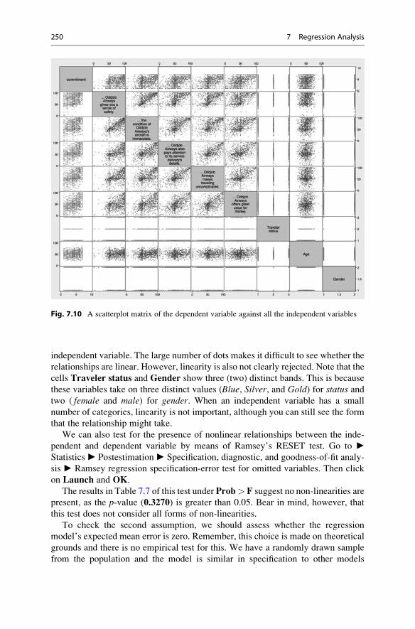
independent variable. The large number of dots makes it difficult to see whether the
relationships are linear. However, linearity is also not clearly rejected. Note that the
cells Traveler status and Gender show three (two) distinct bands. This is because
these variables take on three distinct values (Blue, Silver, and Gold) for status andtwo ( female and male) for gender. When an independent variable has a small
number of categories, linearity is not important, although you can still see the form
that the relationship might take.
We can also test for the presence of nonlinear relationships between the inde-
pendent and dependent variable by means of Ramsey’s RESET test. Go to ►Statistics ► Postestimation ► Specification, diagnostic, and goodness-of-fit analy-
sis ► Ramsey regression specification-error test for omitted variables. Then click
on Launch and OK.
The results in Table 7.7 of this test under Prob> F suggest no non-linearities are
present, as the p-value (0.3270) is greater than 0.05. Bear in mind, however, that
this test does not consider all forms of non-linearities.
To check the second assumption, we should assess whether the regression
model’s expected mean error is zero. Remember, this choice is made on theoretical
grounds and there is no empirical test for this. We have a randomly drawn sample
from the population and the model is similar in specification to other models
Fig. 7.10 A scatterplot matrix of the dependent variable against all the independent variables
250 7 Regression Analysis

explaining commitment. This makes it highly likely that the regression model’s
expected mean error is zero.
The third assumption is that of homoscedasticity. To test for this, use the
Breusch-Pagan test and go to ► Statistics ► Postestimation ► Specification,
diagnostic, and goodness-of-fit analysis ► Tests for heteroskedasticity. Then
click on Launch and OK.
The output in Table 7.8 shows the results of the Breusch-Pagan / Cook-Weisberg
test for heteroskedasticity. With a p-value (Prob > chi2) of 0.0034, we should
reject the null hypothesis that the error variance is constant, thus suggesting that the
error variance is not constant.
To test for heteroskedasticity by means of White’s test, go to ► Statistics ►Postestimation ► Specification, diagnostic, and goodness-of-fit analysis ► Infor-
mation matrix test (imtest). Then click on Launch and then OK.
As you can see in Table 7.9, the output consists of four tests. Under
Heteroskedasticity, the first element is the most important, as it gives an indication
of whether heteroskedasticity is present. The null hypothesis is that there is no
heteroskedasticity. In Table 7.9, this null hypothesis is rejected and the findings
suggest that heteroskedasticity is present. Both the Breusch-Pagan and White’s test
are in agreement. Consequently, we should use a robust estimator; this option is
shown in Fig. 7.8. as Robust. Please note that because we now use a robust
estimator, Stata no longer shows the adjusted R2 and we can only use the AIC
and BIC to compare the models.
If we had data with a time component, we would also perform the Durbin-
Watson test to check for potential autocorrelation (fourth assumption). This
Table 7.7 Ramsey’s RESET test
estat ovtest
Ramsey RESET test using powers of the fitted values of commitmentHo: model has no omitted variables
F(3, 960) = 1.15Prob > F = 0.3270
Table 7.8 Breusch-Pagan test for heteroskedasticity
estat hettest
Breusch-Pagan / Cook-Weisberg test for heteroskedasticity Ho: Constant varianceVariables: fitted values of commitment
chi2(1) = 8.59Prob > chi2 = 0.0034
7.4 Example 251

requires us to first specify a time component, which is absent in the dataset;
however, if we had access to a time variable, say week, we could time-set the
data by using tsset week. We can then use the command estat dwatson to
calculate the Durbin-Watson d-statistic and check whether autocorrelation is pres-
ent. However, since the data do not include any time component, we should not
conduct this test.
Lastly, we should explore how the errors are distributed. We first need to save
the errors to do so by going to ► Statistics ► Postestimation ► Predictions ►Predictions and their SEs, leverage statistics, distance statistics, etc. Then click on
Launch. In the dialog box that opens (Fig. 7.11), enter error under New variable
name and tick Residuals (equation-level scores), which is similar to what we
discussed at the beginning of this chapter. There are also several other types of
variables that Stata can save. The first option, Linear prediction (xb), saves the
predicted values. The other options are more advanced and discussed in detail in the
Stata Manual (StataCorp 2015).
Next, click onOK. Stata now saves the errors so that they can be used to test and
visualize whether they are normally distributed. To test for normality, you should
run the Shapiro-Wilk test (Chap. 6) by going go to ► Statistics ► Summaries,
tables, and tests ► Distributional plots and tests ► Shapiro-Wilk normality test. In
the dialog box that opens (Fig. 7.12), enter error under Variables and click onOK.
The output in Table 7.10 indicates a p-value (Prob > z) of 0.08348, suggesting that
the errors are approximately normally distributed. Hence, we can interpret the
regression parameters’ significance by using t-tests.We also create a histogram of the errors comprising a standard normal curve. To
do so, go to► Graphics► Histogram and enter error under Variable. Click on theDensity plots tab and tick Add normal-density plot. The chart in Fig. 7.13 also
suggests that our data are normally distributed, as the bars indicating the frequency
of the errors generally follow a normal curve.
Table 7.9 White’s test for heteroskedasticity
estat imtest
Cameron & Trivedi's decomposition of IM-test
---------------------------------------------------Source | chi2 df p
---------------------+-----------------------------Heteroskedasticity | 78.04 50 0.0068
Skewness | 30.73 9 0.0003Kurtosis | 6.70 1 0.0097
---------------------+-----------------------------Total | 115.47 60 0.0000
---------------------------------------------------
252 7 Regression Analysis

Fig. 7.11 Saving the predicted errors
Fig. 7.12 Test for the errors’ normality
7.4 Example 253

7.4.4 Interpret the Regression Results
Although we have already conducted a regression analysis to test the assumptions,
let’s run the analysis again, but this time with robust standard errors because we found
evidence of heteroskedasticity. To run the regression, go to ► Statistics ► Linear
models and related ► Linear regression. Under Dependent variable, enter the
dependentvariablecommitmentandaddall the independentvariables s9 s10s19s21s23i.status age gender under Independent variables. Then click on SE/Robust, select
Robust, followed by OK. Table 7.11 presents the regression analysis results.
Table 7.11 has of two parts; on top, you find the overall model information
followed by information on the individual parameters (separated by -----). In the
section on the overall model, we first see that the number of observations is 973. Next
is the F-test, whose p-value of 0.000 (less than 0.05) suggests a significant model.13
Further down, we find that the model yields an R2 value of 0.3378, which seems
satisfactory and is above the value of 0.30 that is common for cross-sectional research.
Table 7.10 The Shapiro-Wilk test for normality
swilk error
Shapiro-Wilk W test for normal data
Variable | Obs W V z Prob>z-------------+------------------------------------------------------
error | 973 0.99716 1.748 1.382 0.08348
-4
0.1
.2.3
-2 0 2 4
Residuals
Den
sity
Fig. 7.13 A histogram and normal curve to visualize the error distribution
13Note that a p-value is never exactly zero, but has values different from zero in later decimal
places.
254 7 Regression Analysis

In the section on the individual parameters, we find, from left to right, informa-
tion on the included variables (with the dependent commitment listed on top), the
coefficients, the robust standard errors, the t-values and associated p-values(indicated as P > |t|), and the confidence intervals. First, you should look at the
individual coefficients. For example, for s19, we get an effect of 0.0122601,
suggesting that when variable s19 moves up by one unit, the dependent variable
commitment goes up by .0122601 units. Under P > |t|, we find that the regression
coefficient of s19 is significant, as the p-value is smaller 0.105 is greater than 0.05.
Conversely, s9 has no significant effect on commitment, as the corresponding p-value of 0.105 is greater than 0.05. Further analyzing the output, we find that the
variables s21, s23, status Gold, age, and gender have significant effects. Note thatof all the status variables, only the coefficient of the tier status Gold is significant,
whereas the coefficient of status Silver is not. A particular issue with these categor-
ical variables is that if you change the base category to, for example, Silver, neitherGold nor Blue will be significant. Always interpret significant findings of categori-cal variables in relation to their base category. That is, you can claim that Goldstatus travelers have a significantly higher commitment than those of a Blue
Table 7.11 Regression output
regress commitment s9 s10 s19 s21 s23 i.status age gender, robust
Linear regression Number of obs = 973F(9, 963) = 80.20Prob > F = 0.0000R-squared = 0.3378Root MSE = 1.4024
------------------------------------------------------------------------------| Robust
commitment | Coef. Std. Err. t P>|t| [95% Conf. Interval]-------------+----------------------------------------------------------------
s9 | .0051594 .0031804 1.62 0.105 -.0010819 .0114007s10 | .0006685 .0032532 0.21 0.837 -.0057157 .0070527s19 | .0122601 .0032491 3.77 0.000 .005884 .0186361s21 | .0186644 .002807 6.65 0.000 .0131558 .024173s23 | .0157612 .0027849 5.66 0.000 .0102961 .0212263
|status |
Silver | .183402 .1152451 1.59 0.112 -.0427585 .4095624Gold | .4277363 .1333499 3.21 0.001 .1660463 .6894263
|age | .0102835 .003807 2.70 0.007 .0028125 .0177546
gender | -.3451731 .1029958 -3.35 0.001 -.5472952 -.143051_cons | 1.198751 .289718 4.14 0.000 .6301998 1.767303
------------------------------------------------------------------------------
7.4 Example 255

status.14 The coefficient of gender is significant and negative. Because the variable
gender is scaled 0 (female) to 1 (male), this implies that males (the higher value)
show less commitment to Oddjob Airways than females. Note that because the
gender variable is measured binary (i.e., it is a dummy variable; see Chap. 5), it isalways relative to the other gender and therefore always significant. Only when
there are 3 or more categories does the interpretation issue, which we saw regarding
status, occur. Specifically, on average, a male customer shows�.3451731 units less
commitment.
In this example, we estimate one model as determined by prior research and the
company management input. However, in other instances, we might have alterna-
tive models, which we wish to compare in terms of their fit. In Box 7.3, we describe
how to do this by using the relative fit statistics AIC and BIC.
Next, we should check the standardized coefficients and effect sizes to get an
idea of which variables are most important. This cannot be read from the t-values orp-values! To calculate the standardized β coefficients, return to ► Statistics ►Linear models and related ► Linear regression. In the Reporting tab, check the
Standardized beta coefficients and click on OK. This will produce the output in
Table 7.13. To interpret the standardized β coefficents, look at the largest absolute
number, which is .4277363 for the variable status Gold. The second highest value
relates to gender (�.3451731) and is binary. While the third-highest is s21(“Oddjob Airways makes traveling uncomplicated”). These variables contribute
the most in this order.15 Note, however, that gender is not a variable that marketing
Box 7.3 Model Comparison Using AIC and BIC
When comparing different models with the same dependent variable (e.g.,
commitment), but with different independent variables, we can compare the
models’ adequacy by means of the AIC and BIC statistics. To do this, go to
Statistics ► Postestimation ► Specification, diagnostic, and goodness-of-fit
analysis ► Information criteria – AIC and BIC. Click on Launch and then
OK. Stata will then show the output as in Table 7.12. The AIC and BIC are
respectively listed as 3429.253 and 3478.057. Remember that the AIC and
BIC can be used to compare different models. For example, we can drop ageand gender from the previous model and calculate the AIC and BIC again.
Although we do not show this output, the resultant AIC and BIC would then
respectively be 3443.283 and 3482.326, which are higher, indicating worse fit
and suggesting that our original specification is better.
(continued)
14Note that it is possible to show all categories for regression tables by typing setshowbaselevels on. This can be made permanent by typing set showbaselevels on,permanent.15Note that while the constant has the highest value (1.19), this is not a coefficient and should not
be interpreted as an effect size.
256 7 Regression Analysis

managers can change and the number of people flying determines the status.Making flying with Oddjob airways less complicated may be something marketing
managers can influence.
To obtain a better understanding of the effect sizes, we can calculate the η2.Effect sizes can only be calculated when OLS regression and not robust regression
is used. Therefore, run the regression model without the, robust option and go to
► Statistics ► Postestimation ► Specification, diagnostic, and goodness-of-fit
analysis ► Eta-squared and omega-squared effect sizes. Then click on Launch
and OK. Stata will calculate the effect sizes, as shown in Table 7.14. These effect
Table 7.13 Regression output
regress commitment s9 s10 s19 s21 s23 i.status age gender, vce(robust) beta
Linear regression Number of obs = 973F(9, 963) = 80.20Prob > F = 0.0000R-squared = 0.3378Root MSE = 1.4024
------------------------------------------------------------------------------| Robust
commitment | Coef. Std. Err. t P>|t| Beta-------------+----------------------------------------------------------------
s9 | .0051594 .0031804 1.62 0.105 .0625475s10 | .0006685 .0032532 0.21 0.837 .008328s19 | .0122601 .0032491 3.77 0.000 .1535821s21 | .0186644 .002807 6.65 0.000 .2451992s23 | .0157612 .0027849 5.66 0.000 .2083433
|status |
Silver | .183402 .1152451 1.59 0.112 .0453108Gold | .4277363 .1333499 3.21 0.001 .0859729
|age | .0102835 .003807 2.70 0.007 .0716953
gender | -.3451731 .1029958 -3.35 0.001 -.0885363_cons | 1.198751 .289718 4.14 0.000 .
------------------------------------------------------------------------------
Box 7.3 (continued)
Table 7.12 Relative measures of fit
estat ic
Akaike's information criterion and Bayesian information criterion
-----------------------------------------------------------------------------Model | Obs ll(null) ll(model) df AIC BIC
-------------+---------------------------------------------------------------. | 973 -1905.187 -1704.627 10 3429.253 3478.057
-----------------------------------------------------------------------------
7.4 Example 257

sizes can be interpreted as the R2, but for each individual variable in that specific
model. First, the overall η2 of .3378429 is identical to the model R2 as shown in
Table 7.11. We should consider the largest value of the individual variables (s21) asthe most important variable, because it contributes the most to the explained
variance (4.6% or, specifically, .0460813). Although this is the largest value,
Cohen’s (1992) rules of thumb suggest this is a small effect size.16
7.4.5 Validate the Regression Results
Next, we need to validate the model. Let’s first split-validate our model. This can
only be done by means of easy instructions in the command window. First, we need
to create a variable that helps us select two samples. A uniform distribution is very
useful for this purpose, which we can make easily by typing set seed 12345 in
the command window (press enter), followed by gen validate¼runiform() < 0.7. The first command tells Stata to use random numbers, but since we fix
the “seed,” we can replicate these numbers later.17 The second part makes a new
variable called validate, which has the values zero and one. We can use this variable
to help Stata select a random 70% and 30% of cases. This requires us to run the
regression model again and selecting the first 70% and the last 30% of the cases.
Let’s first estimate our model over the 70% of cases. Do this by going to ►Statistics ► Linear models and related ► Linear regression. Then click on by/if/
Table 7.14 Effect sizes
estat esize
Effect sizes for linear models
-------------------------------------------------------------------Source | Eta-Squared df [95% Conf. Interval]
--------------------+----------------------------------------------Model | .3378429 9 .286636 .3754686
|s9 | .0030688 1 . .0138597
s10 | .0000521 1 . .0041106s19 | .0169237 1 .0045586 .0364154s21 | .0460813 1 .0236554 .0743234s23 | .0360722 1 .016498 .0619021
status | .0107431 2 .0010116 .0259672age | .0073311 1 .0005013 .021729
gender | .0110784 1 .0017974 .0277598-------------------------------------------------------------------
16Please note that only Stata 13 or above feature built-in routines to calculate η2.17The seed specifies the initial value of the random-number generating process such that it can be
replicated later.
258 7 Regression Analysis

in and under IF:(expression) enter validate¼¼1 and click on OK. Stata will now
estimate the regression model using 70% of the observations (i.e., the estimation
sample). When repeating the process for the remaining 30%, enter validate¼¼0under IF:(expression) (i.e., the validation sample). Table 7.15 shows the results of
these two model estimations. As we can see, the models are quite similar (also when
compared to the original model), but the effect of age is not significant in the second
Table 7.15 Assessing robustness
regress commitment s9 s10 s19 s21 s23 i.status age gender if validate==1, vce(robust)
Linear regression Number of obs = 687F(9, 677) = 53.40Prob > F = 0.0000R-squared = 0.3330Root MSE = 1.3969
------------------------------------------------------------------------------| Robust
commitment | Coef. Std. Err. t P>|t| [95% Conf. Interval]-------------+----------------------------------------------------------------
s9 | .0037881 .003764 1.01 0.315 -.0036024 .0111786s10 | .0051292 .0038798 1.32 0.187 -.0024886 .012747s19 | .0095681 .0037821 2.53 0.012 .0021421 .016994s21 | .0176205 .0033582 5.25 0.000 .0110269 .0242142s23 | .0155433 .0033412 4.65 0.000 .008983 .0221036
|status |Blue | 0 (base)
Silver | .1400931 .1376231 1.02 0.309 -.1301264 .4103126Gold | .3958519 .1634049 2.42 0.016 .0750106 .7166931
|age | .0099883 .0044713 2.23 0.026 .001209 .0187676
gender | -.2638042 .124435 -2.12 0.034 -.5081291 -.0194794_cons | 1.177727 .3408402 3.46 0.001 .5084958 1.846958
------------------------------------------------------------------------------
regress commitment s9 s10 s19 s21 s23 i.status age gender if validate==0, vce(robust)
Linear regression Number of obs = 286F(9, 276) = 34.58Prob > F = 0.0000R-squared = 0.3694Root MSE = 1.4105
------------------------------------------------------------------------------| Robust
commitment | Coef. Std. Err. t P>|t| [95% Conf. Interval]-------------+----------------------------------------------------------------
s9 | .0070651 .0060363 1.17 0.243 -.004818 .0189482s10 | -.0091891 .0058937 -1.56 0.120 -.0207915 .0024132s19 | .0186433 .0063824 2.92 0.004 .0060788 .0312078s21 | .0223386 .0048513 4.60 0.000 .0127884 .0318888s23 | .0157948 .005125 3.08 0.002 .0057057 .0258839
|status |Blue | 0 (base)
Silver | .2740726 .2103388 1.30 0.194 -.1399995 .6881447Gold | .5126804 .2389762 2.15 0.033 .0422327 .9831281
|age | .0099737 .0071877 1.39 0.166 -.0041761 .0241234
gender | -.5085486 .1843601 -2.76 0.006 -.8714793 -.1456179_cons | 1.245528 .5731065 2.17 0.031 .1173124 2.373743
------------------------------------------------------------------------------
7.4 Example 259

model, although the coefficient is very similar. This suggests that the effects are
robust.
As we have no second dataset available, we cannot re-run the analysis to
compare. We do, however, have access to other variables such as country. If weadd this variable, all the variables that were significant at p < 0.05 remain signifi-
cant, while country is not significant. Based on this result, we can conclude that theresults are stable.
7.5 Farming with AgriPro (Case Study)
AgriPro (http://www.agriprowheat.com) is a firm based in Colorado, USA, which
does research on and produces genetically modified wheat seed. Every year,
AgriPro conducts thousands of experiments on different varieties of wheat seeds
in different USA locations. In these experiments, the agricultural and economic
characteristics, regional adaptation, and yield potential of different varieties of
wheat seeds are investigated. In addition, the benefits of the wheat produced,
including the milling and baking quality, are examined. If a new variety of wheat
seed with superior characteristics is identified, AgriPro produces and markets it
throughout the USA and parts of Canada.
AgriPro’s product is sold to farmers through their distributors, known in the
industry as growers. Growers buy wheat seed from AgriPro, grow wheat, harvest
the seeds, and sell the seed to local farmers, who plant them in their fields. These
growers also provide the farmers, who buy their seeds, with expert local knowledge
about management and the environment.
AgriPro sells its products to these growers in several geographically defined
markets. These markets are geographically defined, because the different local
conditions (soil, weather, and local plant diseases) force AgriPro to produce
different products. One of these markets, the heartland region of the USA, is an
important AgriPro market, but the company has been performing below the man-
agement expectations in it. The heartland region includes the states of Ohio,
Indiana, Missouri, Illinois, and Kentucky.
To help AgriPro understand more about farmers in the heartland region, it
commissioned a marketing research project involving the farmers in these states.
AgriPro, together with a marketing research firm, designed a survey, which
included questions regarding what farmers planting wheat find important, how
they obtain information on growing and planting wheat, what is important for
their purchasing decision, and their loyalty to and satisfaction with the top five
wheat suppliers (including AgriPro). In addition, questions were asked about how
many acres of farmland the respondents farm, how much wheat they planted, how
old they were, and their level of education.
This survey was mailed to 650 farmers from a commercial list that includes
nearly all farmers in the heartland region. In all, 150 responses were received,
resulting in a 23% response rate. The marketing research firm also assisted AgriPro
260 7 Regression Analysis

to assign variable names and labels. They did not delete any questions or
observations due to nonresponse to items.
Your task is to analyze the dataset further and, based on the dataset, provide the
AgriPro management with advice. This dataset is labeled agripro.dta and is avail-
able in the Web Appendix (! Chap. 7 ! Downloads). Note that the dataset
contains the variable names and labels matching those in the survey. In the Web
Appendix ( Web Appendix ! Downloads), we also include the original survey.18
To help you with this task, AgriPro has prepared several questions that it would like
to see answered:
1. What do these farmers find important when growing wheat? Please describe the
variables import1 (“Wheat fulfills my rotational needs”), import2 (“I double
crop soybeans”), import3 (“Planting wheat improves my corn yield”), import4(“It helps me break disease and pest cycles”), and import5 (“It gives me summer
cash flow”) and interpret.
2. What drives how much wheat these farmers grow (wheat)? Agripro management
is interested in whether import1, import2, import3, import4, and import5 can
explain wheat. Please run this regression model and test the assumptions. Can
you report on this model to AgriPro’s management? Please discuss.
3. Please calculate the AIC and BIC for the model discussed in question 2. Then
add the variables acre and age. Calculate the AIC and BIC. Which model is
better? Should we present the model with or without acre and age to our client?4. AgriPro expects that farmers who are more satisfied with their products devote a
greater percentage of their total number of acres to wheat (wheat). Please test
this assumption by using regression analysis. The client has requested that you
control for the number of acres of farmland (acre), the age of the respondent
(age), the quality of the seed (var3), and the availability of the seed (var4), andcheck the assumptions of the regression analysis. Note that a smaller sample size
is available for this analysis, which means the sample size requirement cannot be
met. Proceed with the analysis nevertheless. Are all of the other assumptions
satisfied? If not, is there anything we can do about this, or should we ignore the
assumptions if they are not satisfied?
5. Agripro wants you to consider which customers are most loyal to its biggest
competitor Pioneer (loyal5). Use the number of acres (acre), number of acres
planted with wheat (wheat), the age of the respondent (age), and this person’s
education. Use the i. operator for education to gain an understanding of the
group differences. Does this regression model meet the requirements and
assumptions?
6. As an AgriPro’s consultant, and based on this study’s empirical findings, what
marketing advice do you have for AgriPro’s marketing team? Using bullet
points, provide four or five carefully thought through suggestions.
18We would like to thank Dr. D.I. Gilliland and AgriPro for making the data and case study
available.
7.5 Farming with AgriPro (Case Study) 261

7.6 Review Questions
1. Explain what regression analysis is in your own words.
2. Imagine you are asked to use regression analysis to explain the profitability of
new supermarket products, such as the introduction of a new type of jam or
yoghurt, during the first year of their launch. Which independent variables would
you use to explain these new products’ profitability?
3. Imagine you have to present the findings of a regression model to a client. The
client believes that the regression model is a “black box” and that anything can
be made significant. What would your reaction be?
4. I do not care about the assumptions—just give me the results! Please evaluate
this statement in the context of regression analysis. Do you agree?
5. Are all regression assumptions equally important? Please discuss.
6. Using standardized βs, we can compare effects between different variables. Can
we compare apples and oranges after all? Please discuss.
7. Try adding or deleting variables from the regression model in the Oddjob
Airways example and use the adjusted R2, as well as AIC and BIC statistics,
to assess if these models are better.
7.7 Further Readings
Hair, J. F., Black, W. C., Babin, B. J., & Anderson, R. E. (2013).Multivariate dataanalysis. A global perspective (7th ed.). Upper Saddle River: Pearson
Prentice Hall.
This is an excellent book which, in a highly accessible way, discusses manystatistical terms from a theoretical perspective.
Nielsen at http://www.nielsen.com
This is the website for Nielsen, one of the world’s biggest market researchcompanies. They publish many reports that use regression analysis.
The Food Marketing Institute at http://www.fmi.org
This website contains data, some of which can be used for regression analysis.Treiman, D. J. (2014). Quantitative data analysis: Doing social research to test
ideas. Hoboken: Wiley.
This is a very good introduction to single and multiple regression. It discussescategorical independent variables in great detail while using Stata.
http://www.ats.ucla.edu/stat/stata/topics/regression.htm
This is an excellent and detailed website dealing with more advanced regressiontopics in Stata.
262 7 Regression Analysis

References
Aiken, L. S., & West, S. G. (1991). Multiple regression: Testing and interpreting interactions.Thousand Oaks: Sage.
Baum, C. F. (2006). An introduction to modern econometrics using Stata. College Station: StataPress.
Breusch, T. S., & Pagan, A. R. (1980). The Lagrange multiplier test and its applications to model
specification in econometrics. Review of Economic Studies, 47(1), 239–253.Cameron, A.C. & Trivedi, P.K. (1990). The information matrix test and its implied alternative
hypotheses. (Working Papers from California Davis – Institute of Governmental Affairs,
pp. 1–33).
Cameron, A. C., & Trivedi, P. K. (2010). Microeconometrics using stata (Revised ed.). College
Station: Stata Press.
Cohen, J. (1992). A power primer. Psychological Bulletin, 112(1), 155–159.Cohen, J. (1994). The earth is round (p < .05). The American Psychologist, 49(912), 997–1003.Cook, R. D., & Weisberg, S. (1983). Diagnostics for heteroscedasticity in regression. Biometrika,
70(1), 1–10.Durbin, J., & Watson, G. S. (1951). Testing for serial correlation in least squares regression,
II. Biometrika, 38(1–2), 159–179.Fabozzi, F. J., Focardi, S. M., Rachev, S. T., & Arshanapalli, B. G. (2014). The basics of financial
econometrics: Tools, concepts, and asset management applications. Hoboken: Wiley.
Green, S. B. (1991). How many subjects does it take to do a regression analysis? MultivariateBehavioral Research, 26(3), 499–510.
Greene, W. H. (2011). Econometric analysis (7th ed.). Upper Saddle River: Prentice Hall.Hair, J. F., Jr., Black, W. C., Babin, B. J., & Anderson, R. E. (2013). Multivariate data analysis.
Upper Saddle River: Pearson.
Hill, C., Griffiths, W., & Lim, G. C. (2008). Principles of econometrics (3rd ed.). Hoboken: Wiley.
Kelley, K., & Maxwell, S. E. (2003). Sample size for multiple regression: Obtaining regression
coefficients that are accurate, not simply significant. Psychological Methods, 8(3), 305–321.Mason, C. H., & Perreault, W. D., Jr. (1991). Collinearity, power, and interpretation of multiple
regression analysis. Journal of Marketing Research, 28, 268–280.Mooi, E. A., & Frambach, R. T. (2009). A stakeholder perspective on buyer–supplier conflict.
Journal of Marketing Channels, 16(4), 291–307.O’brien, R. M. (2007). A caution regarding rules of thumb for variance inflation factors. Quality
and Quantity, 41(5), 673–690.Ramsey, J. B. (1969). Test for specification errors in classical linear least-squares regression
analysis. Journal of the Royal Statistical Society, Series B, 31(2), 350–371.Sin, C., & White, H. (1996). Information criteria for selecting possibly misspecified parametric
models. Journal of Econometrics, 71(1–2), 207–225.StataCorp. (2015). Stata 14 base reference manual. College Station: Stata Press.Treiman, D. J. (2014). Quantitative data analysis: Doing social research to test ideas. Hoboken:
Wiley.
VanVoorhis, C. R. W., & Morgan, B. L. (2007). Understanding power and rules of thumb for
determining sample sizes. Tutorial in Quantitative Methods for Psychology, 3(2), 43–50.White, H. (1980). A heteroskedasticity-consistent covariance matrix estimator and a direct test for
heteroskedasticity. Econometrica: Journal of the Econometric Society, 48(4), 817–838.
References 263
Principal Component and Factor Analysis 8
Keywords
Akaike Information Criterion (AIC) • Anti-image • Bartlett method • Bayes
Information Criterion (BIC) • Communality • Components • Confirmatory factor
analysis • Correlation residuals • Covariance-based structural equation
modeling • Cronbach’s alpha • Eigenvalue • Eigenvectors • Exploratory factor
analysis • Factor analysis • Factor loading • Factor rotation • Factor scores •
Factor weights • Factors • Heywood cases • Internal consistency reliability •
Kaiser criterion • Kaiser–Meyer–Olkin criterion • Latent root criterion •
Measure of sampling adequacy • Oblimin rotation • Orthogonal rotation •
Oblique rotation • Parallel analysis • Partial least squares structural equation
modeling • Path diagram • Principal axis factoring • Principal components •
Principal component analysis • Principal factor analysis • Promax rotation •
Regression method • Reliability analysis • Scree plot • Split-half reliability •
Structural equation modeling • Test-retest reliability • Uniqueness • Varimax
rotation
Learning Objectives
After reading this chapter, you should understand:
– The basics of principal component and factor analysis.
– The principles of exploratory and confirmatory factor analysis.
– Key terms, such as communality, eigenvalues, factor loadings, factor scores, and
uniqueness.
– What rotation is.
– The principles of exploratory and confirmatory factor analysis.
– How to determine whether data are suitable for carrying out an exploratory
factor analysis.
– How to interpret Stata principal component and factor analysis output.
# Springer Nature Singapore Pte Ltd. 2018
E. Mooi et al., Market Research, Springer Texts in Business and Economics,
DOI 10.1007/978-981-10-5218-7_8
265

– The principles of reliability analysis and its execution in Stata.
– The concept of structural equation modeling.
8.1 Introduction
Principal component analysis (PCA) and factor analysis (also called principal
factor analysis or principal axis factoring) are two methods for identifying
structure within a set of variables. Many analyses involve large numbers of
variables that are difficult to interpret. Using PCA or factor analysis helps find
interrelationships between variables (usually called items) to find a smaller number
of unifying variables called factors. Consider the example of a soccer club whose
management wants to measure the satisfaction of the fans. The management could,
for instance, measure fan satisfaction by asking how satisfied the fans are with the
(1) assortment of merchandise, (2) quality of merchandise, and (3) prices of
merchandise. It is likely that these three items together measure satisfaction with
the merchandise. Through the application of PCA or factor analysis, we can
determine whether a single factor represents the three satisfaction items well.
Practically, PCA and factor analysis are applied to understand much larger sets of
variables, tens or even hundreds, when just reading the variables’ descriptions does
not determine an obvious or immediate number of factors.
PCA and factor analysis both explain patterns of correlations within a set of
observed variables. That is, they identify sets of highly correlated variables and
infer an underlying factor structure. While PCA and factor analysis are very similar
in the way they arrive at a solution, they differ fundamentally in their assumptions
of the variables’ nature and their treatment in the analysis. Due to these differences,
the methods follow different research objectives, which dictate their areas of
application. While the PCA’s objective is to reproduce a data structure, as well
as possible only using a few factors, factor analysis aims to explain the variables’
correlations by means of factors (e.g., Hair et al. 2013; Matsunaga 2010; Mulaik
2009).1 We will discuss these differences and their implications in this chapter.
Both PCA and factor analysis can be used for exploratory or confirmatory
purposes. What are exploratory and confirmatory factor analyses? Comparing the
left and right panels of Fig. 8.1 shows us the difference. Exploratory factor
analysis, often simply referred to as EFA, does not rely on previous ideas on the
factor structure we may find. That is, there may be relationships (indicated by the
arrows) between each factor and each item. While some of these relationships may
be weak (indicated by the dotted arrows), others are more pronounced, suggesting
that these items represent an underlying factor well. The left panel of Fig. 8.1
illustrates this point. Thus, an exploratory factor analysis reveals the number of
factors and the items belonging to a specific factor. In a confirmatory factor
1Other methods for carrying out factor analyses include, for example, unweighted least squares,
generalized least squares, or maximum likelihood. However, these are statistically complex and
inexperienced users should not consider them.
266 8 Principal Component and Factor Analysis

analysis, usually simply referred to as CFA, there may only be relationships
between a factor and specific items. In the right panel of Fig. 8.1, the first three
items relate to factor 1, whereas the last two items relate to factor 2. Different from
the exploratory factor analysis, in a confirmatory factor analysis, we have clear
expectations of the factor structure (e.g., because researchers have proposed a scale
that we want to adapt for our study) and we want to test for the expected structure.
In this chapter, we primarily deal with exploratory factor analysis, as it conveys
the principles that underlie all factor analytic procedures and because the two
techniques are (almost) identical from a statistical point of view. Nevertheless,
we will also discuss an important aspect of confirmatory factor analysis, namely
reliability analysis, which tests the consistency of a measurement scale (see
Chap. 3). We will also briefly introduce a specific confirmatory factor analysis
approach called structural equation modeling (often simply referred to as SEM).
Structural equation modeling differs statistically and practically from PCA and
factor analysis. It is not only used to evaluate how well observed variables relate to
factors but also to analyze hypothesized relationships between factors that the
researcher specifies prior to the analysis based on theory and logic.
8.2 Understanding Principal Component and Factor Analysis
8.2.1 Why Use Principal Component and Factor Analysis?
Researchers often face the problem of large questionnaires comprising many items.For example, in a survey of a major German soccer club, the management was
particularly interested in identifying and evaluating performance features that relate
to soccer fans’ satisfaction (Sarstedt et al. 2014). Examples of relevant features
include the stadium, the team composition and their success, the trainer, and the
Fig. 8.1 Exploratory factor analysis (left) and confirmatory factor analysis (right)
8.2 Understanding Principal Component and Factor Analysis 267

management. The club therefore commissioned a questionnaire comprising 99 pre-
viously identified items by means of literature databases and focus groups of fans.
All the items were measured on scales ranging from 1 (“very dissatisfied”) to
7 (“very satisfied”). Table 8.1 shows an overview of some items considered in the
study.
As you can imagine, tackling such a large set of items is problematic, because it
provides quite complex data. Given the task of identifying and evaluating perfor-
mance features that relate to soccer fans’ satisfaction (measured by “Overall, how
satisfied are you with your soccer club”), we cannot simply compare the items on a
pairwise basis. It is far more reasonable to consider the factor structure first. For
example, satisfaction with the condition of the stadium (x1), outer appearance of thestadium (x2), and interior design of the stadium (x3) cover similar aspects that relate
to the respondents’ satisfaction with the stadium. If a soccer fan is generally very
satisfied with the stadium, he/she will most likely answer all three items positively.
Conversely, if a respondent is generally dissatisfied with the stadium, he/she is most
likely to be rather dissatisfied with all the performance aspects of the stadium, such
as the outer appearance and interior design. Consequently, these three items are
likely to be highly correlated—they cover related aspects of the respondents’
overall satisfaction with the stadium. More precisely, these items can be interpreted
Table 8.1 Items in the soccer fan satisfaction study
Satisfaction with. . .
Condition of the stadium Public appearances of the players
Interior design of the stadium Number of stars in the team
Outer appearance of the stadium Interaction of players with fans
Signposting outside the stadium Volume of the loudspeakers in the stadium
Signposting inside the stadium Choice of music in the stadium
Roofing inside the stadium Entertainment program in the stadium
Comfort of the seats Stadium speaker
Video score boards in the stadium Newsmagazine of the stadium
Condition of the restrooms Price of annual season ticket
Tidiness within the stadium Entry fees
Size of the stadium Offers of reduced tickets
View onto the playing field Design of the home jersey
Number of restrooms Design of the away jersey
Sponsors’ advertisements in the stadium Assortment of merchandise
Location of the stadium Quality of merchandise
Name of the stadium Prices of merchandise
Determination and commitment of the players Pre-sale of tickets
Current success regarding matches Online-shop
Identification of the players with the club Opening times of the fan-shops
Quality of the team composition Accessibility of the fan-shops
Presence of a player with whom fans can
identify
Behavior of the sales persons in the fan
shops
268 8 Principal Component and Factor Analysis

as manifestations of the factor capturing the “joint meaning” of the items related to
it. The arrows pointing from the factor to the items in Fig. 8.1 indicate this point. In
our example, the “joint meaning” of the three items could be described as satisfac-tion with the stadium, since the items represent somewhat different, yet related,
aspects of the stadium. Likewise, there is a second factor that relates to the two
items x4 and x5, which, like the first factor, shares a common meaning, namely
satisfaction with the merchandise.PCA and factor analysis are two statistical procedures that draw on item
correlations in order to find a small number of factors. Having conducted the
analysis, we can make use of few (uncorrelated) factors instead of many variables,
thus significantly reducing the analysis’s complexity. For example, if we find six
factors, we only need to consider six correlations between the factors and overall
satisfaction, which means that the recommendations will rely on six factors.
8.2.2 Analysis Steps
Like any multivariate analysis method, PCA and factor analysis are subject to
certain requirements, which need to be met for the analysis to be meaningful. A
crucial requirement is that the variables need to exhibit a certain degree of correla-
tion. In our example in Fig. 8.1, this is probably the case, as we expect increased
correlations between x1, x2, and x3, on the one hand, and between x4 and x5 on the
other. Other items, such as x1 and x4, are probably somewhat correlated, but to a
lesser degree than the group of items x1, x2, and x3 and the pair x4 and x5. Severalmethods allow for testing whether the item correlations are sufficiently high.
Both PCA and factor analysis strive to reduce the overall item set to a smaller set
of factors. More precisely, PCA extracts factors such that they account for
variables’ variance, whereas factor analysis attempts to explain the correlations
between the variables. Whichever approach you apply, using only a few factors
instead of many items reduces its precision, because the factors cannot represent all
the information included in the items. Consequently, there is a trade-off between
simplicity and accuracy. In order to make the analysis as simple as possible, we
want to extract only a few factors. At the same time, we do not want to lose too
much information by having too few factors. This trade-off has to be addressed in
any PCA and factor analysis when deciding how many factors to extract from
the data.
Once the number of factors to retain from the data has been identified, we can
proceed with the interpretation of the factor solution. This step requires us to
produce a label for each factor that best characterizes the joint meaning of all the
variables associated with it. This step is often challenging, but there are ways of
facilitating the interpretation of the factor solution. Finally, we have to assess how
well the factors reproduce the data. This is done by examining the solution’s
goodness-of-fit, which completes the standard analysis. However, if we wish to
continue using the results in further analyses, we need to calculate the factor scores.
8.2 Understanding Principal Component and Factor Analysis 269

Factor scores are linear combinations of the items and can be used as variables in
follow-up analyses.
Figure 8.2 illustrates the steps involved in the analysis; we will discuss these in
more detail in the following sections. In doing so, our theoretical descriptions will
focus on the PCA, as this method is easier to grasp. However, most of our
descriptions also apply to factor analysis. Our illustration at the end of the chapter
also follows a PCA approach but uses a Stata command (factor, pcf), whichblends the PCA and factor analysis. This blending has several advantages, which
we will discuss later in this chapter.
8.3 Principal Component Analysis
8.3.1 Check Requirements and Conduct Preliminary Analyses
Before carrying out a PCA, we have to consider several requirements, which we can
test by answering the following questions:
– Are the measurement scales appropriate?
– Is the sample size sufficiently large?
– Are the observations independent?
– Are the variables sufficiently correlated?
Fig. 8.2 Steps involved in a PCA
270 8 Principal Component and Factor Analysis
Are the measurement scales appropriate?For a PCA, it is best to have data measured on an interval or ratio scale. In practical
applications, items measured on an ordinal scale level have become common.
Ordinal scales can be used if:
– the scale points are equidistant, which means that the difference in the wording
between scale steps is the same (see Chap. 3), and– there are five or more response categories.
Is the sample size sufficiently large?Another point of concern is the sample size. As a rule of thumb, the number of
(valid) observations should be at least ten times the number of items used for
analysis. This only provides a rough indication of the necessary sample size.
Fortunately, researchers have conducted studies to determine minimum sample
size requirements, which depend on other aspects of the study. MacCallum et al.
(1999) suggest the following:
– When all communalities (we will discuss this term in Sect. 8.3.2.4) are above
0.60, small sample sizes of below 100 are adequate.
– With communalities around 0.50, sample sizes between 100 and 200 are
sufficient.
– When communalities are consistently low, with many or all under 0.50, a sample
size between 100 and 200 is adequate if the number of factors is small and each
of these is measured with six or more indicators.
– When communalities are consistently low and the factors numbers are high or
are measured with only few indicators (i.e., 3 or less), 300 observations are
recommended.
Are the observations independent?We have to ensure that the observations are independent. This means that the
observations need to be completely unrelated (see Chap. 3). If we use dependent
observations, we would introduce “artificial” correlations, which are not due to an
underlying factor structure, but simply to the same respondents answered the same
questions multiple times.
Are the variables sufficiently correlated?As indicated before, PCA is based on correlations between items. Consequently,
conducting a PCA only makes sense if the items correlate sufficiently. The problem
is deciding what “sufficient” actually means.
An obvious step is to examine the correlation matrix (Chap. 5). Naturally, we
want the correlations between different items to be as high as possible, but they
will not always be. In our previous example, we expect high correlations between
x1, x2, and x3, on the one hand, and x4 and x5 on the other. Conversely, we might
8.3 Principal Component Analysis 271

expect lower correlations between, for example, x1 and x4 and between x3 and x5.Thus, not all of the correlation matrix’s elements need to have high values. The
PCA depends on the relative size of the correlations. Therefore, if single
correlations are very low, this is not necessarily problematic! Only when all the
correlations are around zero is PCA no longer useful. In addition, the statistical
significance of each correlation coefficient helps decide whether it differs signifi-
cantly from zero.
There are additional measures to determine whether the items correlate suffi-
ciently. One is the anti-image. The anti-image describes the portion of an item’s
variance that is independent of another item in the analysis. Obviously, we want all
items to be highly correlated, so that the anti-images of an item set are as small as
possible. Initially, we do not interpret the anti-image values directly, but use a
measure based on the anti-image concept: The Kaiser–Meyer–Olkin (KMO)
statistic. The KMO statistic, also called the measure of sampling adequacy
(MSA), indicates whether the other variables in the dataset can explain the
correlations between variables. Kaiser (1974), who introduced the statistic,
recommends a set of distinctively labeled threshold values for KMO and MSA,
which Table 8.2 presents.
To summarize, the correlation matrix with the associated significance levels
provides a first insight into the correlation structures. However, the final decision of
whether the data are appropriate for PCA should be primarily based on the KMO
statistic. If this measure indicates sufficiently correlated variables, we can continue
the analysis of the results. If not, we should try to identify items that correlate only
weakly with the remaining items and remove them. In Box 8.1, we discuss how to
do this.
Box 8.1 Identifying Problematic Items
Examining the correlation matrix and the significance levels of correlations
allows identifying items that correlate only weakly with the remaining items.
An even better approach is examining the variable-specific MSA values,
which are interpreted like the overall KMO statistic (see Table 8.2). In fact,
the KMO statistic is simply the overall mean of all variable-specific MSA
values. Consequently, all the MSA values should also lie above the threshold
(continued)
Table 8.2 Threshold
values for KMO and MSAKMO/MSA value Adequacy of the correlations
Below 0.50 Unacceptable
0.50–0.59 Miserable
0.60–0.69 Mediocre
0.70–0.79 Middling
0.80–0.89 Meritorious
0.90 and higher Marvelous
272 8 Principal Component and Factor Analysis

Box 8.1 (continued)
level of 0.50. If this is not the case, consider removing this item from the
analysis. An item’s communality or uniqueness (see next section) can also
serve as a useful indicators of how well the factors extracted represent an
item. However, communalities and uniqueness are mostly considered when
evaluating the solution’s goodness-of-fit.
8.3.2 Extract the Factors
8.3.2.1 Principal Component Analysis vs. Factor AnalysisFactor analysis assumes that each variable’s variance can be divided into common
variance (i.e., variance shared with all the other variables in the analysis) and
unique variance (Fig. 8.3), the latter of which can be further broken down into
specific variance (i.e., variance associated with only one specific variable) and error
variance (i.e., variance due to measurement error). The method, however, can only
reproduce common variance. Thereby factor analysis explicitly recognizes the
presence of error. Conversely, PCA assumes that all of each variable’s variance is
common variance, which factor extraction can explain fully (e.g., Preacher and
MacCallum 2003). These differences entail different interpretations of the
analysis’s outcomes. PCA asks:
Which umbrella term can we use to summarize a set of variables that loads highly on aspecific factor?
Conversely, factor analysis asks:
What is the common reason for the strong correlations between a set of variables?
From a theoretical perspective, the assumption that there is a unique variance for
which the factors cannot fully account, is generally more realistic, but simulta-
neously more restrictive. Although theoretically sound, this restriction can some-
times lead to complications in the analysis, which have contributed to the
widespread use of PCA, especially in market research practice.
Researchers usually suggest using PCA when data reduction is the primary
concern; that is, when the focus is to extract a minimum number of factors that
account for a maximum proportion of the variables’ total variance. In contrast, if the
primary concern is to identify latent dimensions represented in the variables, factor
analysis should be applied. However, prior research has shown that both approaches
arrive at essentially the same result when:
– more than 30 variables are used, or– most of the variables’ communalities exceed 0.60.
8.3 Principal Component Analysis 273

With 20 or fewer variables and communalities below 0.40—which are clearly
undesirable in empirical research—the differences are probably pronounced
(Stevens 2009).
Apart from these conceptual differences in the variables’ nature, PCA and factor
analysis differ in the aim of their analysis. Whereas the goal of factor analysis is to
explain the correlations between the variables, PCA focuses on explaining the
variables’ variances. That is, the PCA’s objective is to determine the linear
combinations of the variables that retain as much information from the original
variables as possible. Strictly speaking, PCA does not extract factors, but
components, which are labeled as such in Stata.
Despite these differences, which have very little relevance in many common
research settings in practice, PCA and factor analysis have many points in common.
For example, the methods follow very similar ways to arrive at a solution and their
interpretations of statistical measures, such as KMO, eigenvalues, or factor
loadings, are (almost) identical. In fact, Stata blends these two procedures in its
factor, pcf command, which runs a factor analysis but rescales the estimates
such that they conform to a PCA. That way, the analysis assumes that the entire
variance is common but produces (rotated) loadings (we will discuss factor rotation
later in this chapter), which facilitate the interpretation of the factors. In contrast, if
we would run a standard PCA, Stata would only offer us eigenvectors whose
(unrotated) weights would not allow for a concluding interpretation of the factors.
In fact, in many PCA analyses, researchers are not interested in the interpretation of
the extracted factors but merely use the method for data reduction. For example, in
sensory marketing research, researchers routinely use PCA to summarize a large set
of sensory variables (e.g., haptic, smell, taste) to derive a set of factors whose scores
are then used as input for cluster analyses (Chap. 9). This approach allows for
identifying distinct groups of products from which one or more representative
products can then be chosen for a more detailed comparison using qualitative
Fig. 8.3 Principal component analysis vs. factor analysis
274 8 Principal Component and Factor Analysis

research or further assessment in field experiments (e.g., Carbonell et al. 2008;
Vigneau and Qannari 2002).
Despite the small differences of PCA and factor analysis in most research
settings, researchers have strong feelings about the choice of PCA or factor
analysis. Cliff (1987, p. 349) summarizes this issue well, by noting that proponents
of factor analysis “insist that components analysis is at best a common factor
analysis with some error added and at worst an unrecognizable hodgepodge of
things from which nothing can be determined.” For further discussions on this
topic, see also Velicer and Jackson (1990) and Widaman (1993).2
8.3.2.2 How Does Factor Extraction Work?PCA’s objective is to reproduce a data structure with only a few factors. PCA does
this by generating a new set of factors as linear composites of the original variables,
which reproduces the original variables’ variance as best as possible. These linear
composites are called principal components, but, for simplicity’s sake, we refer to
them as factors. More precisely, PCA computes eigenvectors. These eigenvectors
include so called factor weights, which extract the maximum possible variance of
all the variables, with successive factoring continuing until a significant share of the
variance is explained.
Operationally, the first factor is extracted in such a way that it maximizes the
variance accounted for in the variables. We can visualize this easily by examining
the vector space illustrated in Fig. 8.4. In this example, we have five variables (x1–x5) represented by five vectors starting at the zero point, with each vector’s length
standardized to one. To maximize the variance accounted for, the first factor F1 is
fitted into this vector space in such a way that the sum of all the angles between this
factor and the five variables in the vector space is minimized. We do this to interpret
the angle between two vectors as correlations. For example, if the factor’s vector
and a variable’s vector are congruent, the angle between these two is zero,
Fig. 8.4 Factor extraction
(Note that Fig. 8.4 describes a
special case, as the five
variables are scaled down into
a two-dimensional space. In
this set-up, it would be
possible for the two factors to
explain all five items.
However, in real-life, the five
items span a five-dimensional
vector space.)
2Related discussions have been raised in structural equation modeling, where researchers have
heatedly discussed the strengths and limitations of factor-based and component-based approaches
(e.g., Sarstedt et al. 2016, Hair et al. 2017a, b).
8.3 Principal Component Analysis 275

indicating that the factor and the variable correlate perfectly. On the other hand, if
the factor and the variable are uncorrelated, the angle between these two is 90�. Thiscorrelation between a (unit-scaled) factor and a variable is called the factorloading. Note that factor weights and factor loadings essentially express the same
thing—the relationships between variables and factors—but they are based on
different scales.
After extracting F1, a second factor (F2) is extracted, which maximizes the
remaining variance accounted for. The second factor is fitted at a 90� angle into
the vector space (Fig. 8.4) and is therefore uncorrelated with the first factor.3 If we
extract a third factor, it will explain the maximum amount of variance for which
factors 1 and 2 have hitherto not accounted. This factor will also be fitted at a 90�
angle to the first two factors, making it independent from the first two factors
(we don’t illustrate this third factor in Fig. 8.4, as this is a three-dimensional space).
The fact that the factors are uncorrelated is an important feature, as we can use them
to replace many highly correlated variables in follow-up analyses. For example,
using uncorrelated factors as independent variables in a regression analysis helps
solve potential collinearity issues (Chap. 7).
The Explained Visually webpage offers an excellent illustration of two- and
three-dimensional factor extraction, see http://setosa.io/ev/principal-compo
nent-analysis/
An important PCA feature is that it works with standardized variables (see
Chap. 5 for an explanation of what standardized variables are). Standardizing
variables has important implications for our analysis in two respects. First, we
can assess each factor’s eigenvalue, which indicates how much a specific factor
extracts all of the variables’ variance (see next section). Second, the standardization
of variables allows for assessing each variable’s communality, which describes how
much the factors extracted capture or reproduce each variable’s variance. A related
concept is the uniqueness, which is 1–communality (see Sect. 8.3.2.4).
8.3.2.3 What Are Eigenvalues?To understand the concept of eigenvalues, think of the soccer fan satisfaction study
(Fig. 8.1). In this example, there are five variables. As all the variables are
standardized prior to the analysis, each has a variance of 1. In a simplified way,
we could say that the overall information (i.e., variance) that we want to reproduce
by means of factor extraction is 5 units. Let’s assume that we extract the two factors
presented above.
The first factor’s eigenvalue indicates how much variance of the total variance
(i.e., 5 units) this factor accounts for. If this factor has an eigenvalue of, let’s say
3Note that this changes when oblique rotation is used. We will discuss factor rotation later in this
chapter.
276 8 Principal Component and Factor Analysis

2.10, it covers the information of 2.10 variables or, put differently, accounts for
2.10/5.00 ¼ 42% of the overall variance (Fig. 8.5).
Extracting a second factor will allow us to explain another part of the remaining
variance (i.e., 5.00 – 2.10 ¼ 2.90 units, Fig. 8.5). However, the eigenvalue of the
second factor will always be smaller than that of the first factor. Assume that the
second factor has an eigenvalue of 1.30 units. The second factor then accounts for
1.30/5.00 ¼ 26% of the overall variance. Together, these two factors explain
(2.10 + 1.30)/5.00 ¼ 68% of the overall variance. Every additional factor extracted
increases the variance accounted for until we have extracted as many factors as
there are variables. In this case, the factors account for 100% of the overall
variance, which means that the factors reproduce the complete variance.
Following the PCA approach, we assume that factor extraction can reproduce
each variable’s entire variance. In other words, we assume that each variable’s
variance is common; that is, the variance is shared with other variables. This differs
in factor analysis, in which each variable can also have a unique variance.
8.3.2.4 What Are Communality and Uniqueness?Whereas the eigenvalue tells us how much variance each factor is accounts for, the
communality indicates how much variance of each variable, factor extraction can
reproduce. There is no commonly agreed threshold for a variable’s communality, as
this depends strongly on the complexity of the analysis at hand. However, gener-
ally, the extracted factors should account for at least 50% of a variable’s variance.
Thus, the communalities should be above 0.50. Note that Stata does not indicate
each variable’s communality but its uniqueness, which is 1–communality. Hence,
uniqueness gives the proportion of a variable’s variance that the factors do notcapture. For uniqueness the same threshold as for communality applies. Thus, the
Fig. 8.5 Total variance explained by variables and factors
8.3 Principal Component Analysis 277

uniqueness values should be below 0.50. Every additional factor extracted will
increase the explained variance, and if we extract as many factors as there are items
(in our example five), each variable’s communality would be 1.00 and its unique-
ness equal to 0. The factors extracted would then fully explain each variable; that is,
the first factor will explain a certain amount of each variable’s variance, the second
factor another part, and so on.
However, since our overall objective is to reduce the number of variables
through factor extraction, we should extract only a few factors that account for a
high degree of overall variance. This raises the question of how to decide on the
number of factors to extract from the data, which we discuss in the following
section.
8.3.3 Determine the Number of Factors
Determining the number of factors to extract from the data is a crucial and
challenging step in any PCA. Several approaches offer guidance in this respect,
but most researchers do not pick just one method, but determine the number of
factors resulting from the application of multiple methods. If multiple methods
suggest the same number of factors, this leads to greater confidence in the results.
8.3.3.1 The Kaiser CriterionAn intuitive way to decide on the number of factors is to extract all the factors with
an eigenvalue greater than 1. The reason for this is that each factor with an
eigenvalue greater than 1 accounts for more variance than a single variable
(remember, we are looking at standardized variables, which is why each variable’s
variance is exactly 1). As the objective of PCA is to reduce the overall number of
variables, each factor should of course account for more variance than a single
variable can. If this occurs, then this factor is useful for reducing the set of variables.
Extracting all the factors with an eigenvalue greater than 1 is frequently called the
Kaiser criterion or latent root criterion and is commonly used to determine the
number of factors. However, the Kaiser criterion is well known for overspecifying
the number of factors; that is, the criterion suggests more factors than it should (e.g.,
Russell 2002; Zwick and Velicer 1986).
8.3.3.2 The Scree PlotAnother popular way to decide on the number of factors to extract is to plot each
factor’s eigenvalue (y-axis) against the factor with which it is associated (x-axis).This results in a scree plot, which typically has a distinct break in it, thereby
showing the “correct” number of factors (Cattell 1966). This distinct break is called
the “elbow.” It is generally recommended that all factors should be retained abovethis break, as they contribute most to the explanation of the variance in the dataset.
Thus, we select one factor less than indicated by the elbow. In Box 8.2, we
introduce a variant of the scree plot. This variant is however only available when
using the pca command instead of the factor, pcf command, which serves as
the basis for our case study illustration.
278 8 Principal Component and Factor Analysis

Box 8.2 Confidence Intervals in the Scree Plot
A variant of the scree plot includes the confidence interval (Chap. 6,
Sect. 6.6.7) of each eigenvalue. These confidence intervals allow for
identifying factors with an eigenvalue significantly greater than 1. If a
confidence interval’s lower bound is above the 1 threshold, this suggests
that the factor should be extracted. Conversely, if an eigenvalue’s confidence
interval overlaps with the 1 threshold or falls completely below, this factor
should not be extracted.
8.3.3.3 Parallel AnalysisA large body of review papers and simulation studies has produced a prescriptive
consensus that Horn’s (1965) parallel analysis is the best method for deciding how
many factors to extract (e.g., Dinno 2009; Hayton et al. 2004; Henson and Roberts
2006; Zwick and Velicer 1986). The rationale underlying parallel analysis is that
factors from real data with a valid underlying factor structure should have larger
eigenvalues than those derived from randomly generated data (actually pseudoran-
dom deviates) with the same sample size and number of variables.
Parallel analysis involves several steps. First, a large number of datasets are
randomly generated; they have the same number of observations and variables as
the original dataset. Parallel PCAs are then run on each of the datasets (hence,
parallel analysis), resulting in many slightly different sets of eigenvalues. Using
these results as input, parallel analysis derives two relevant cues.
First, parallel analysis adjusts the original eigenvalues for sampling error-
induced collinearity among the variables to arrive at adjusted eigenvalues (Horn
1965). Analogous to the Kaiser criterion, only factors with adjusted eigenvalues
larger than 1 should be retained.
Second, we can compare the randomly generated eigenvalues with those
from the original analysis. Only factors whose original eigenvalues are larger
than the 95th percentile of the randomly generated eigenvalues should be retained
(Longman et al. 1989).
8.3.3.4 ExpectationsWhen, for example, replicating a previous market research study, we might have a
priori information on the number of factors we want to find. For example, if a
previous study suggests that a certain item set comprises five factors, we should
extract the same number of factors, even if statistical criteria, such as the scree plot,
suggest a different number. Similarly, theory might suggest that a certain number of
factors should be extracted from the data.
Strictly speaking, these are confirmatory approaches to factor analysis, which
blur the distinction between these two factor analysis types. Ultimately however,
we should not fully rely on the data, but keep in mind that the research results
should be interpretable and actionable for market research practice.
8.3 Principal Component Analysis 279

When using factor analysis, Stata allows for estimating two further criteria
called the Akaike Information Criterion (AIC) and the Bayes Information
Criterion (BIC). These criteria are relative measures of goodness-of-fit and
are used to compare the adequacy of solutions with different numbers of
factors. “Relative” means that these criteria are not scaled on a range of, for
example, 0 to 1, but can generally take any value. Compared to an alternative
solution with a different number of factors, smaller AIC or BIC values
indicate a better fit. Stata computes solutions for different numbers of factors
(up to the maximum number of factors specified before). We therefore need
to choose the appropriate solution by looking for the smallest value in each
criterion. When using these criteria, you should note that AIC is well known
for overestimating the “correct” number of factors, while BIC has a slight
tendency to underestimate this number.
Whatever combination of approaches we use to determine the number of factors,
the factors extracted should account for at least 50% of the total variance explained
(75% or more is recommended). Once we have decided on the number of factors to
retain from the data, we can start interpreting the factor solution.
8.3.4 Interpret the Factor Solution
8.3.4.1 Rotate the FactorsTo interpret the solution, we have to determine which variables relate to each of the
factors extracted. We do this by examining the factor loadings, which represent thecorrelations between the factors and the variables and can take values ranging from
�1 to +1. A high factor loading indicates that a certain factor represents a variable
well. Subsequently, we look for high absolute values, because the correlation
between a variable and a factor can also be negative. Using the highest absolute
factor loadings, we “assign” each variable to a certain factor and then produce a
label for each factor that best characterizes the joint meaning of all the variables
associated with it. This labeling is subjective, but a key PCA step. An example of a
label is the respondents’ satisfaction with the stadium, which represents the items
referring to its condition, outer appearance, and interior design (Fig. 8.1).
We can make use of factor rotation to facilitate the factors’ interpretation.4 We
do not have to rotate the factor solution, but it will facilitate interpreting the
findings, particularly if we have a reasonably large number of items (say six or
more). To understand what factor rotation is all about, once again consider the
factor structure described in Fig. 8.4. Here, we see that both factors relate to the
4Note that factor rotation primarily applies to factor analysis rather than PCA—see Preacher and
MacCallum (2003) for details. However, our illustration draws on the factor, pcf command,
which uses the factor analysis algorithm to compute PCA results for which rotation applies.
280 8 Principal Component and Factor Analysis
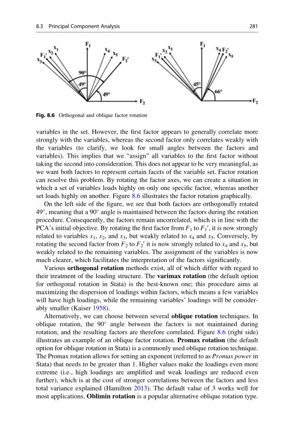
variables in the set. However, the first factor appears to generally correlate more
strongly with the variables, whereas the second factor only correlates weakly with
the variables (to clarify, we look for small angles between the factors and
variables). This implies that we “assign” all variables to the first factor without
taking the second into consideration. This does not appear to be very meaningful, as
we want both factors to represent certain facets of the variable set. Factor rotation
can resolve this problem. By rotating the factor axes, we can create a situation in
which a set of variables loads highly on only one specific factor, whereas another
set loads highly on another. Figure 8.6 illustrates the factor rotation graphically.
On the left side of the figure, we see that both factors are orthogonally rotated
49�, meaning that a 90� angle is maintained between the factors during the rotation
procedure. Consequently, the factors remain uncorrelated, which is in line with the
PCA’s initial objective. By rotating the first factor from F1 to F10, it is now strongly
related to variables x1, x2, and x3, but weakly related to x4 and x5. Conversely, byrotating the second factor from F2 to F2
0 it is now strongly related to x4 and x5, butweakly related to the remaining variables. The assignment of the variables is now
much clearer, which facilitates the interpretation of the factors significantly.
Various orthogonal rotation methods exist, all of which differ with regard to
their treatment of the loading structure. The varimax rotation (the default option
for orthogonal rotation in Stata) is the best-known one; this procedure aims at
maximizing the dispersion of loadings within factors, which means a few variables
will have high loadings, while the remaining variables’ loadings will be consider-
ably smaller (Kaiser 1958).
Alternatively, we can choose between several oblique rotation techniques. In
oblique rotation, the 90� angle between the factors is not maintained during
rotation, and the resulting factors are therefore correlated. Figure 8.6 (right side)
illustrates an example of an oblique factor rotation. Promax rotation (the default
option for oblique rotation in Stata) is a commonly used oblique rotation technique.
The Promax rotation allows for setting an exponent (referred to as Promax power inStata) that needs to be greater than 1. Higher values make the loadings even more
extreme (i.e., high loadings are amplified and weak loadings are reduced even
further), which is at the cost of stronger correlations between the factors and less
total variance explained (Hamilton 2013). The default value of 3 works well for
most applications. Oblimin rotation is a popular alternative oblique rotation type.
Fig. 8.6 Orthogonal and oblique factor rotation
8.3 Principal Component Analysis 281

Oblimin is a class of rotation procedures whereby the degree of obliqueness can be
specified. This degree is the gamma, which determines the level of the correlation
allowed between the factors. A gamma of zero (the default) ensures that the factors
are—if at all—only moderately correlated, which is acceptable for most analyses.5
Oblique rotation is used when factors are possibly related. It is, for example,
very likely that the respondents’ satisfaction with the stadium is related to their
satisfaction with other aspects of the soccer club, such as the number of stars in the
team or the quality of the merchandise. However, relinquishing the initial objective
of extracting uncorrelated factors can diminish the factors’ interpretability. We
therefore recommend using the varimax rotation to enhance the interpretability of
the results. Only if the results are difficult to interpret, should an oblique rotation be
applied. Among the oblique rotation methods, researchers generally recommend
the promax (Gorsuch 1983) or oblimin (Kim and Mueller 1978) methods but
differences between the rotation types are typically marginal (Brown 2009).
8.3.4.2 Assign the Variables to the FactorsAfter rotating the factors, we need to interpret them and give each factor a name,
which has some descriptive value. Interpreting factors involves assigning each vari-
able to a specific factor based on the highest absolute (!) loading. For example, if a
variable has a 0.60 loading with the first factor and a 0.20 loading with the second, we
would assign this variable to the first factor. Loadings may nevertheless be very
similar (e.g., 0.50 for the first factor and 0.55 for the second one), making the
assignment ambiguous. In such a situation, we could assign the variable to another
factor, even though it does not have the highest loading on this specific factor. While
this step can help increase the results’ face validity (see Chap. 3), we shouldmake sure
that the variable’s factor loading with the designated factor is above an acceptable
level. If very few factors have been extracted, the loading should be at least 0.50, but
with a high number of factors, lower loadings of above 0.30 are acceptable. Alterna-
tively, some simply ignore a certain variable if it does not fit with the factor structure.
In such a situation, we should re-run the analysis without variables that do not load
highly on a specific factor. In the end, the results should be interpretable and
actionable, but keep in mind that this technique is, first and foremost, exploratory!
8.3.5 Evaluate the Goodness-of-Fit of the Factor Solution
8.3.5.1 Check the Congruence of the Initial and ReproducedCorrelations
While PCA focuses on explaining the variables’ variances, checking how well the
method approximates the correlation matrix allows for assessing the quality of the
5When the gamma is set to 1, this is a special case, because the value of 1 represents orthogonality.
The result of setting gamma to 1 is effectively a varimax rotation.
282 8 Principal Component and Factor Analysis

solution (i.e., the goodness-of-fit) (Graffelman 2013). More precisely, to assess the
solution’s goodness-of-fit, we can make use of the differences between the
correlations in the data and those that the factors imply. These differences are
also called correlation residuals and should be as small as possible.
In practice, we check the proportion of correlation residuals with an absolute
value higher than 0.05. Even though there is no strict rule of thumb regarding the
maximum proportion, a proportion of more than 50% should raise concern. How-
ever, high residuals usually go hand in hand with an unsatisfactory KMO measure;
consequently, this problem already surfaces when testing the assumptions.
8.3.5.2 Check How Much of Each Variable’s Variance Is Reproducedby Means of Factor Extraction
Another way to check the solution’s goodness-of-fit is by evaluating how much of
each variable’s variance the factors reproduce (i.e., the communality). If several
communalities exhibit low values, we should consider removing these variables.
Considering the variable-specific MSA measures could help us make this decision.
If there are more variables in the dataset, communalities usually become smaller;
however, if the factor solution accounts for less than 50% of a variable’s variance
(i.e., the variable’s communality is less than 0.50), it is worthwhile reconsidering
the set-up. Since Stata does not provide communality but uniqueness values, we
have to make this decision in terms of the variance that the factors do not reproduce.That is, if several variables exhibit uniqueness values larger than 0.50, we should
reconsider the analysis.
8.3.6 Compute the Factor Scores
After the rotation and interpretation of the factors, we can compute the factor
scores, another element of the analysis. Factor scores are linear combinations of the
items and can be used as separate variables in subsequent analyses. For example,
instead of using many highly correlated independent variables in a regression
analysis, we can use few uncorrelated factors to overcome collinearity problems.
The simplest ways to compute factor scores for each observation is to sum all the
scores of the items assigned to a factor. While easy to compute, this approach
neglects the potential differences in each item’s contribution to each factor
(Sarstedt et al. 2016).
Drawing on the eigenvectors that the PCA produces, which include the factor
weights, is a more elaborate way of computing factor scores (Hershberger 2005).
These weights indicate each item’s relative contribution to forming the factor; we
simply multiply the standardized variables’ values with the weights to get the factor
scores. Factor scores computed on the basis of eigenvectors have a zero mean. This
means that if a respondent has a value greater than zero for a certain factor, he/she
scores above the above average in terms of the characteristic that this factor
describes. Conversely, if a factor score is below zero, then this respondent exhibits
the characteristic below average.
8.3 Principal Component Analysis 283

Different from the PCA, a factor analysis does not produce determinate factor
scores. In other words, the factor is indeterminate, which means that part of it
remains an arbitrary quantity, capable of taking on an infinite range of values (e.g.,
Grice 2001; Steiger 1979). Thus, we have to rely on other approaches to computing
factor scores such as the regression method, which features prominently among
factor analysis users. This method takes into account (1) the correlation between the
factors and variables (via the item loadings), (2) the correlation between the
variables, and (3) the correlation between the factors if oblique rotation has been
used (DiStefano et al. 2009). The regression method z-standardizes each factor to
zero mean and unit standard deviation.6 We can therefore interpret an observation’s
score in relation to the mean and in terms of the units of standard deviation from this
mean. For example, an observation’s factor score of 0.79 implies that this observa-
tion is 0.79 standard deviations above the average with regard to the corresponding
factor.
Another popular approach is the Bartlett method, which is similar to the
regression method. The method produces factor scores with zero mean and standard
deviations larger than one. Owing to the way they are estimated, the factor scores
that the Bartlett method produces are considered are considered more accurate
(Hershberger 2005). However, in practical applications, both methods yield highly
similar results. Because of the z-standardization of the scores, which facilitates the
comparison of scores across factors, we recommend using the regression method.
In Table 8.3 we summarize the main steps that need to be taken when conducting
a PCA in Stata. Our descriptions draw on Stata’s factor, pcf command, which
carries out a factor analysis but rescales the resulting factors such that the results
conform to a standard PCA. This approach has the advantage that it follows the
fundamentals of PCA, while allowing for analyses that are restricted to factor
analysis (e.g., factor rotation, use of AIC and BIC).
8.4 Confirmatory Factor Analysis and Reliability Analysis
Many researchers and practitioners acknowledge the prominent role that explor-
atory factor analysis plays in exploring data structures. Data can be analyzed
without preconceived ideas of the number of factors or how these relate to the
variables under consideration. Whereas this approach is, as its name implies,
exploratory in nature, the confirmatory factor analysis allows for testing
hypothesized structures underlying a set of variables.
In a confirmatory factor analysis, the researcher needs to first specify the
constructs and their associations with variables, which should be based on previous
measurements or theoretical considerations.
6Note that this is not the case when using factor analysis if the standard deviations are different
from one (DiStefano et al. 2009).
284 8 Principal Component and Factor Analysis

Table 8.3 Steps involved in carrying out a PCA in Stata
Theory Stata
Check Assumptions and Carry Out Preliminary Analyses
Select variables that should be reduced to a set
of underlying factors (PCA) or should be used
to identify underlying dimensions (factor
analysis)
► Statistics ► Multivariate analysis ► Factor
and principal component analysis ► Factor
analysis. Enter the variables in the Variablesbox.
Are the variables interval or ratio scaled? Determine the measurement level of your
variables (see Chap. 3). If ordinal variables are
used, make sure that the scale steps are
equidistant.
Is the sample size sufficiently large? Check MacCallum et al.’s (1999) guidelines
for minimum sample size requirements,
dependent on the variables’ communality. For
example, if all the communalities are above
0.60, small sample sizes of below 100 are
adequate. With communalities around 0.50,
sample sizes between 100 and 200 are
sufficient.
Are the observations independent? Determine whether the observations are
dependent or independent (see Chap. 3).
Are the variables sufficiently correlated? Check whether at least some of the variable
correlations are significant. ► Statistics ►Summaries, tables, and tests ► Summary and
descriptive statistics ► Pairwise correlations.
Check Print number of observations foreach entry and Print significance level foreach entry. Select Use Bonferroni-adjustedsignificance level to maintain the familywise
error rate (see Chap. 6).
pwcorr s1 s2 s3 s4 s5 s6 s7 s8, obssig bonferroni
Is the KMO � 0.50? ► Statistics ►Postestimation ► Factor analysis reports and
graphs ► Kaiser-Meyer-Olkin measure of
sample adequacy. Then click on Launch and
OK. Note that this analysis can only be run
after the PCA has been conducted.
estat kmo
Extract the factors
Choose the method of factor analysis ► Statistics ► Multivariate analysis ► Factor
and principal component analysis ► Factor
analysis. Click on the Model 2 tab and select
Principal component factor.
factor s1 s2 s3 s4 s5 s6 s7 s8, pcf
Determine the number of factors
Determine the number of factors Kaiser criterion: ► Statistics ► Multivariate
analysis ► Factor and principal component
analysis ► Factor analysis. Click on the
Model 2 tab and enter 1 under Minimumvalue of eigenvalues to be retained.
(continued)
8.4 Confirmatory Factor Analysis and Reliability Analysis 285

Table 8.3 (continued)
Theory Stata
factor s1 s2 s3 s4 s5 s6 s7 s8 pcfmineigen (1)
Parallel analysis: Download and install paran(help paran) and enter paran s1 s2 s3s4 s5 s6 s7 s8, centile (95) q allgraph
Extract factors (1) with adjusted eigenvalues
greater than 1, and (2) whose adjusted
eigenvalues are greater than the random
eigenvalues.
Scree plot: ► Statistics ► Postestimation ►Factor analysis reports and graphs ► Scree
plot of eigenvalues. Then click onLaunch and
OK.
screeplot
Pre-specify the number of factors based on a
priori information: ► Statistics ►Multivariate analysis ► Factor and principal
component analysis ► Factor analysis. Under
the Model 2 tab, tick Maximum number offactors to be retained and specify a value in
the box below (e.g., 2).
factor s1 s2 s3 s4 s5 s6 s7 s8,factors(2)
Make sure that the factors extracted account
for at least 50% of the total variance explained
(75% or more is recommended): Check the
Cumulative column in the PCA output.
Interpret the Factor Solution
Rotate the factors Use the varimax procedure or, if necessary,
the promax procedure with gamma set to
3 (both with Kaiser normalization): ►Statistics ► Postestimation ► Principal
component analysis reports and graphs ►Rotate factor loadings. Select the
corresponding option in the menu.
Varimax: rotate, kaiser
Promax: rotate, promax(3) obliqueKaiser
Assign variables to factors Check the Factor loadings (pattern matrix)
table in the output of the rotated solution.
Assign each variable to a certain factor based
on the highest absolute loading. To facilitate
interpretation, you may also assign a variable
to a different factor, but check that the loading
is at an acceptable level (0.50 if only a few
factors are extracted, 0.30 if many factors are
extracted).
Consider making a loadings plot: ► Statistics
► Postestimation ► Factor analysis reports
(continued)
286 8 Principal Component and Factor Analysis

Instead of allowing the procedure to determine the number of factors, as is done
in an exploratory factor analysis, a confirmatory factor analysis tells us how well the
actual data fit the pre-specified structure. Reverting to our introductory example, we
could, for example, assume that the construct satisfaction with the stadium can be
measured by means of the three items x1 (condition of the stadium), x2 (appearanceof the stadium), and x3 (interior design of the stadium). Likewise, we could
hypothesize that satisfaction with the merchandise can be adequately measured
using the items x4 and x5. In a confirmatory factor analysis, we set up a theoretical
model linking the items with the respective construct (note that in confirmatory
factor analysis, researchers generally use the term construct rather than factor). This
process is also called operationalization (see Chap. 3) and usually involves drawing
a visual representation (called a path diagram) indicating the expected
relationships.
Figure 8.7 shows a path diagram—you will notice the similarity to the diagram
in Fig. 8.1. Circles or ovals represent the constructs (e.g., Y1, satisfaction with the
stadium) and boxes represent the items (x1 to x5). Other elements include the
relationships between the constructs and respective items (the loadings l1 to l5),the error terms (e1 to e5) that capture the extent to which a construct does not
explain a specific item, and the correlations between the constructs of interest (r12).Having defined the individual constructs and developed the path diagram, we
can estimate the model. The relationships between the constructs and items (the
loadings l1 to l5) and the item correlations (not shown in Fig. 8.7) are of particular
Table 8.3 (continued)
Theory Stata
and graphs ► Plot of factor loadings. Under
Plot all combinations of the following,indicate the number of factors for which you
want to plot. Check which items load highly
on which factor.
Compute factor scores Save factor scores as new variables: ►Statistics ► Postestimation ► Predictions ►Regression and Bartlett scores. Under Newvariable names or variable stub* enter
factor*. Select Factors scored by theregression scoring method
predict score*, regression
Evaluate the Goodness-of-fit of the Factor Solution
Check the congruence of the initial and
reproduced correlations
Create a reproduced correlation matrix: ►Statistics ► Postestimation ► Factor analysis
reports and graphs ► Matrix of correlation
residuals. Is the proportion of residuals greater
than 0.05 � 50%?
estat residuals
Check how much of each variable’s variance
is reproduced by means of factor extraction
Check the Uniqueness column in the PCA
output. Are all the values lower than 0.50?
8.4 Confirmatory Factor Analysis and Reliability Analysis 287

interest, as they indicate whether the construct has been reliably and validly
measured.
Reliability analysis is an important element of a confirmatory factor analysis and
essential when working with measurement scales. The preferred way to evaluate
reliability is by taking two independent measurements (using the same subjects)
and comparing these by means of correlations. This is also called test-retest
reliability (see Chap. 3). However, practicalities often prevent researchers from
surveying their subjects a second time.
An alternative is to estimate the split-half reliability. In the split-half reliability,
scale items are divided into halves and the scores of the halves are correlated to
obtain an estimate of reliability. Since all items should be consistent regarding what
they indicate about the construct, the halves can be considered approximations of
alternative forms of the same scale. Consequently, instead of looking at the scale’s
test-retest reliability, researchers consider the scale’s equivalence, thus showing the
extent to which two measures of the same general trait agree. We call this type of
reliability the internal consistency reliability.
In the example of satisfaction with the stadium, we compute this scale’s split-
half reliability manually by, for example, splitting up the scale into x1 on the one
side and x2 and x3 on the other. We then compute the sum of x2 and x3 (or calculatethe items’ average) to form a total score and correlate this score with x1. A high
correlation indicates that the two subsets of items measure related aspects of the
same underlying construct and, thus, suggests a high degree of internal consistency.
Fig. 8.7 Path diagram (confirmatory factor analysis)
288 8 Principal Component and Factor Analysis

However, with many indicators, there are many different ways to split the variables
into two groups.
Cronbach (1951) proposed calculating the average of all possible split-half
coefficients resulting from different ways of splitting the scale items. The
Cronbach’s Alpha coefficient has become by far the most popular measure of
internal consistency. In the example above, this would comprise calculating the
average of the correlations between (1) x1 and x2 + x3, (2) x2 and x1 + x3, as well as(3) x3 and x1 + x2. The Cronbach’s Alpha coefficient generally varies from 0 to
1, whereas a generally agreed lower limit for the coefficient is 0.70. However, in
exploratory studies, a value of 0.60 is acceptable, while values of 0.80 or higher are
regarded as satisfactory in the more advanced stages of research (Hair et al. 2011).
In Box 8.3, we provide more advice on the use of Cronbach’s Alpha. We illustrate a
reliability analysis using the standard Stata module in the example at the end of this
chapter.
Box 8.3 Things to Consider When Calculating Cronbach’s Alpha
When calculating Cronbach’s Alpha, ensure that all items are formulated in
the same direction (positively or negatively worded). For example, in psy-
chological measurement, it is common to use both negatively and positively
worded items in a questionnaire. These need to be reversed prior to the
reliability analysis. In Stata, this is done automatically when an item is
negatively correlated with the other items. It is possible to add the option,reverse (variable name) to force Stata to reverse an item or you can
stop Stata from reversing items automatically by using, asis. Furthermore,
we have to be aware of potential subscales in our item set. Some multi-item
scales comprise subsets of items that measure different facets of a multidi-
mensional construct. For example, soccer fan satisfaction is a multidimen-
sional construct that includes aspects such as satisfaction with the stadium,
the merchandise (as described above), the team, and the coach, each
measured with a different item set. It would be inappropriate to calculate
one Cronbach’s Alpha value for all 99 items. Cronbach’s Alpha is always
calculated over the items belonging to one construct and not all the items in
the dataset!
8.5 Structural Equation Modeling
Whereas a confirmatory factor analysis involves testing if and how items relate to
specific constructs, structural equation modeling involves the estimation of
relations between these constructs. It has become one of the most important
methods in social sciences, including marketing research.
There are broadly two approaches to structural equation modeling: Covariance-based structural equation modeling (e.g., J€oreskog 1971) and partial least
8.5 Structural Equation Modeling 289

squares structural equation modeling (e.g., Wold 1982), simply referred to as
CB-SEM and PLS-SEM. Both estimation methods are based on the idea of an
underlying model that allows the researcher to test relationships between multiple
items and constructs.
Figure 8.8 shows an example path diagram with four constructs (represented by
circles or ovals) and their respective items (represented by boxes).7 A path model
incorporates two types of constructs: (1) exogenous constructs (here, satisfaction
with the stadium (Y1) and satisfaction with the merchandise (Y2)) that do not dependon other constructs, and (2) endogenous constructs (here, overall satisfaction (Y3)and loyalty (Y4)) that depend on one or more exogenous (or other endogenous)
constructs. The relations between the constructs (indicated with p) are called path
coefficients, while the relations between the constructs and their respective items
(indicated with l ) are the indicator loadings. One can distinguish between the
structural model that incorporates the relations between the constructs and the
(exogenous and endogenous) measurement models that represent the relationships
between the constructs and their related items. Items that measure constructs are
labeled x.In the model in Fig. 8.8, we assume that the two exogenous constructs satisfac-
tion with the stadium and satisfaction with the merchandise relate to the endoge-
nous construct overall satisfaction and that overall satisfaction relates to loyalty.Depending on the research question, we could of course incorporate additional
exogenous and endogenous constructs. Using empirical data, we could then test this
model and, thus, evaluate the relationships between all the constructs and between
each construct and its indicators. We could, for example, assess which of the two
Fig. 8.8 Path diagram (structural equation modeling)
7Note that we omitted the error terms for clarity’s sake.
290 8 Principal Component and Factor Analysis
constructs, Y1 or Y2, exerts the greater influence on Y3. The result would guide us
when developing marketing plans in order to increase overall satisfaction and,
ultimately, loyalty by answering the research question whether we should rather
concentrate on increasing the fans’ satisfaction with the stadium or with the
merchandise.
The evaluation of a path model analysis requires several steps that include the
assessment of both measurement models and the structural model. Diamantopoulos
and Siguaw (2000) and Hair et al. (2013) provide a thorough description of the
covariance-based structural equation modeling approach and its application. Acock
(2013) provides a detailed explanation of how to conduct covariance-based struc-
tural equation modeling analyses in Stata. Hair et al. (2017a, b, 2018) provide a
step-by-step introduction on how to set up and test path models using partial least
squares structural equation modeling.
8.6 Example
In this example, we take a closer look at some of the items from the Oddjob
Airways dataset ( Web Appendix ! Downloads). This dataset contains eight
items that relate to the customers’ experience when flying with Oddjob Airways.
For each of the following items, the respondents had to rate their degree of
agreement from 1 (“completely disagree”) to 100 (“completely agree”). The vari-
able names are included below:
– with Oddjob Airways you will arrive on time (s1),– the entire journey with Oddjob Airways will occur as booked (s2),– in case something does not work out as planned, Oddjob Airways will find a
good solution (s3),– the flight schedules of Oddjob Airways are reliable (s4),– Oddjob Airways provides you with a very pleasant travel experience (s5),– Oddjob Airways’s on board facilities are of high quality (s6),– Oddjob Airways’s cabin seats are comfortable (s7), and– Oddjob Airways offers a comfortable on-board experience (s8).
Our aim is to reduce the complexity of this item set by extracting several factors.
Hence, we use these items to run a PCA using the factor, pcf procedure in
Stata.
8.6.1 Principal Component Analysis
8.6.1.1 Check Requirements and Conduct Preliminary AnalysesAll eight variables are interval scaled from 1 (“very unsatisfied”) to 100 (“very
satisfied”), therefore meeting the requirements in terms of the measurement scale.
8.6 Example 291

With 1,065 independent observations, the sample size requirements are clearly met,
even if the analysis yields very low communality values.
Determining if the variables are sufficiently correlated is easy if we go to ►Statistics ► Summaries, tables, and tests ► Summary and descriptive statistics ►Pairwise correlations. In the dialog box shown in Fig. 8.9, either enter each variable
separately (i.e., s1 s2 s3 etc.) or simply write s1-s8 as the variables appear in this
order in the dataset. Then also tick Print number of observations for each entry,Print significance levels for each entry, as well as Use Bonferroni-adjusted
significance level. The latter option corrects for the many tests we execute at the
same time and is similar to what we discussed in Chap. 6.
Table 8.4 shows the resulting output. The values in the diagonal are all 1.000,
which is logical, as this is the correlation between a variable and itself! The
off-diagonal cells correspond to the pairwise correlations. For example, the pairwise
correlation between s1 and s2 is 0.7392. The value under it denotes the p-value(0.000), indicating that the correlation is significant. To determine an absolute
minimum standard, check if at least one correlation in all the off-diagonal cells is
significant. The last value of 1037 indicates the sample size for the correlation
between s1 and s2.The correlation matrix in Table 8.4 indicates that there are several pairs of highly
correlated variables. For example, not only s1 is highly correlated with s2 (correla-tion ¼ 0.7392), but also s3 is highly correlated with s1 (correlation ¼ 0.6189), just
Fig. 8.9 Pairwise correlations of variables
292 8 Principal Component and Factor Analysis

like s4 (correlation ¼ 0.7171). As these variables’ correlations with the remaining
ones are less pronounced, we suspect that these four variables constitute one factor.
As you can see by just looking at the correlation matrix, we can already identify the
factor structure that might result.
However, at this point of the analysis, we are more interested in checking
whether the variables are sufficiently correlated to conduct a PCA. When we
examine Table 8.4, we see that all correlations have p-values below 0.05. This
result indicates that the variables are sufficiently correlated. However, for a
concluding evaluation, we need to take the anti-image and related statistical
measures into account. Most importantly, we should also check if the KMO
values are at least 0.50. As we can only do this after the actual PCA, we will
discuss this point later.
Table 8.4 Pairwise correlation matrix
pwcorr s1-s8, obs sig bonferroni
| s1 s2 s3 s4 s5 s6 s7-------------+---------------------------------------------------------------
s1 | 1.0000 || 1038|
s2 | 0.7392 1.0000 | 0.0000| 1037 1040|
s3 | 0.6189 0.6945 1.0000 | 0.0000 0.0000| 952 952 954|
s4 | 0.7171 0.7655 0.6447 1.0000 | 0.0000 0.0000 0.0000| 1033 1034 951 1035|
s5 | 0.5111 0.5394 0.5593 0.4901 1.0000 | 0.0000 0.0000 0.0000 0.0000| 1026 1027 945 1022 1041|
s6 | 0.4898 0.4984 0.4972 0.4321 0.8212 1.0000 | 0.0000 0.0000 0.0000 0.0000 0.0000| 1025 1027 943 1022 1032 1041|
s7 | 0.4530 0.4555 0.4598 0.3728 0.7873 0.8331 1.0000 | 0.0000 0.0000 0.0000 0.0000 0.0000 0.0000| 1030 1032 947 1027 1038 1037 1048|
s8 | 0.5326 0.5329 0.5544 0.4822 0.8072 0.8401 0.7773 | 0.0000 0.0000 0.0000 0.0000 0.0000 0.0000 0.0000| 1018 1019 937 1014 1029 1025 1032|
| s8-------------+---------
s8 | 1.0000 || 1034|
8.6 Example 293

8.6.1.2 Extract the Factors and Determine the Number of FactorsTo run the PCA, click on ► Statistics ► Multivariate analysis ► Factor and
principal component analysis ► Factor analysis, which will open a dialog box
similar to Fig. 8.10. Next, enter s1 s2 s3 s4 s5 s6 s7 s8 in the Variables box.
Alternatively, you can also simply enter s1-s8 in the box as the dataset includes
these eight variables in consecutive order.
Under the Model 2 tab (see Fig. 8.11), we can choose the method for factor
extraction, the maximum factors to be retained, as well as the minimum value for
the eigenvalues to be retained. As the aim of our analysis is to reproduce the data
structure, we choose Principal-component factor, which initiates the PCA based
on Stata’s factor, pcf procedure. By clicking on Minimum value of
eigenvalues to be retained and entering 1 in the box below, we specify the Kaiser
criterion. If we have a priori information on the factor structure, we can specify the
number of factors manually by clicking on Maximum number of factors to be
retained. Click on OK and Stata will display the results (Table 8.5).
Before we move to the further interpretation of the PCA results in Table 8.5, let’s
first take a look at the KMO.Although we need to know if the KMO is larger than 0.50
to interpret the PCA results with confidence, we can only do this after having run the
PCA. We can calculate the KMO values by going to ► Statistics ► Postestimation
► Principal component analysis reports and graphs ► Kaiser-Meyer-Olkin measure
of sample adequacy (Fig. 8.12). In the dialog box that opens, simply click on OK to
initiate the analysis.
The analysis result at the bottom of Table 8.6 reveals that the KMO value is
0.9073, which is “marvelous” (see Table 8.2). Likewise, the variable-specific MSA
Fig. 8.10 Factor analysis dialog box
294 8 Principal Component and Factor Analysis

values in the table are all above the threshold value of 0.50. For example, s1 has anMSA value of 0.9166.
The output in Table 8.5 shows three blocks. On the top right of the first block,
Stata shows the number of observations used in the analysis (Number of obs¼ 921)
and indicates that the analysis yielded two factors (Retained factors ¼ 2). In the
second block, Stata indicates the eigenvalues for each factor. With an eigenvalue of
5.24886, the first factor extracts a large amount of variance, which accounts for
5.24886/8 ¼ 65.61% of the total variance (see column: Proportion). With an
eigenvalue of 1.32834, factor two extracts less variance (16.60%). Using theKaiser
criterion (i.e., eigenvalue >1), we settle on two factors, because the third factor’s
eigenvalue is clearly lower than 1 (0.397267). The Cumulative column indicates
the cumulative variance extracted. The two factors extract 0.8222 or 82.22% of the
variance, which is highly satisfactory. The next block labeled Factor loadings
(pattern matrix) and unique variances shows the factor loadings along with the
Uniqueness, which indicates the amount of each variable’s variance that the factors
cannot reproduce (i.e., 1-communality) and is therefore lost in the process. All
uniqueness values are very low, indicating that the factors reproduce the variables’
variance well. Specifically, with a value of 0.3086, s3 exhibits the highest unique-
ness value, which suggests a communality of 1–0.3086 ¼ 0.6914 and is clearly
above the 0.50 threshold.
Beside the Kaiser criterion, the scree plot helps determine the number of factors.
To create a scree plot, go to ► Statistics ► Postestimation ► Principal component
analysis reports and graphs► Scree plot of eigenvalues. Then click on Launch and
Fig. 8.11 Factor analysis dialog box (options)
8.6 Example 295

OK. Stata will produce a graph as shown in Fig. 8.13. There is an “elbow” in the
line at three factors. As the number of factors that the scree plot suggests is one
factor less than the elbow indicates, we conclude that two factors are appropriate.
This finding supports the conclusion based on the Kaiser criterion.
Stata also allows for plotting each eigenvalue’s confidence interval. However,
to display such a scree plot requires running a PCA with a different command
in combination with a postestimation command. The following syntax
produces a scree plot for our example with a 95% confidence interval
(heteroskedastic), as well as a horizontal reference line at the 1 threshold.
pca s1 s2 s3 s4 s5 s6 s7 s8, mineigen(1)
screeplot, recast(line) ci(heteroskedastic) yline(1)
Table 8.5 PCA output
factor s1 s2 s3 s4 s5 s6 s7 s8, pcf mineigen(1)
(obs=921)
Factor analysis/correlation Number of obs = 921Method: principal-component factors Retained factors = 2Rotation: (unrotated) Number of params = 15
--------------------------------------------------------------------------Factor | Eigenvalue Difference Proportion Cumulative
-------------+------------------------------------------------------------Factor1 | 5.24886 3.92053 0.6561 0.6561Factor2 | 1.32834 0.93107 0.1660 0.8222Factor3 | 0.39727 0.13406 0.0497 0.8718Factor4 | 0.26321 0.03202 0.0329 0.9047Factor5 | 0.23119 0.03484 0.0289 0.9336Factor6 | 0.19634 0.00360 0.0245 0.9582Factor7 | 0.19274 0.05067 0.0241 0.9822Factor8 | 0.14206 . 0.0178 1.0000
--------------------------------------------------------------------------LR test: independent vs. saturated: chi2(28) = 6428.36 Prob>chi2 = 0.0000
Factor loadings (pattern matrix) and unique variances
-------------------------------------------------Variable | Factor1 Factor2 | Uniqueness
-------------+--------------------+--------------s1 | 0.7855 0.3995 | 0.2235 s2 | 0.8017 0.4420 | 0.1619 s3 | 0.7672 0.3206 | 0.3086 s4 | 0.7505 0.5090 | 0.1777 s5 | 0.8587 -0.3307 | 0.1533 s6 | 0.8444 -0.4203 | 0.1104 s7 | 0.7993 -0.4662 | 0.1439 s8 | 0.8649 -0.3291 | 0.1436
-------------------------------------------------
296 8 Principal Component and Factor Analysis

Fig. 8.12 Postestimation dialog box
Table 8.6 The KMO statistic
estat kmo
Kaiser-Meyer-Olkin measure of sampling adequacy
-----------------------Variable | kmo
-------------+---------s1 | 0.9166 s2 | 0.8839 s3 | 0.9427 s4 | 0.8834 s5 | 0.9308 s6 | 0.8831 s7 | 0.9036 s8 | 0.9180
-------------+---------Overall | 0.9073
8.6 Example 297

While the Kaiser criterion and the scree plot are helpful for determining the
number of factors to extract, parallel analysis is a more robust criterion. Parallel
analysis can only be accessed through the free add-on package paran. To install the
package, type in help paran in the command window and follow the instructions
to install the package. Having installed the package, type in paran s1 s2 s3 s4s5 s6 s7 s8, centile(95) q all graph in the command window and Stata
will produce output similar to Table 8.7 and Fig. 8.14.
Table 8.7 contains two rows of eigenvalues, with the first column (Adjusted
Eigenvalue) indicating the sampling error-adjusted eigenvalues obtained by paral-
lel analysis. Note that your results will look slightly different, as parallel analysis
draws on randomly generated datasets. The second column (Unadjusted Eigen-
value) contains the eigenvalues as reported in the PCA output (Table 8.5). Analo-
gous to the original analysis, the two factors exhibit adjusted eigenvalues larger
than 1, indicating a two-factor solution. The scree plot in Fig. 8.14 also supports this
result, as the first two factors exhibit adjusted eigenvalues larger than the randomly
generated eigenvalues. Conversely, the random eigenvalue of the third factor is
clearly larger than the adjusted one.
Finally, we can also request the model selection statistics AIC and BIC for
different numbers of factors (see Fig. 8.15). To do so, go to ► Statistics ►Postestimation ► AIC and BIC for different numbers of factors. As our analysis
draws on eight variables, we restrict the number of factors to consider to 4 (Specify
the maximum number of factors to include in summary table: 4). Table 8.8
shows the results of our analysis. As can be seen, AIC has the smallest value
(53.69378) for a four-factor solution, whereas BIC’s minimum value occurs for a
Fig. 8.13 Scree plot of eigenvalues
298 8 Principal Component and Factor Analysis

two-factor solution (141.8393). However, as AIC is well known to overspecify the
number of factors, this result gives confidence that the two-factor solution as indicated
by the BIC is appropriate. Note that Table 8.8 says no Heywood cases encountered.
Table 8.7 Parallel analysis output
paran s1 s2 s3 s4 s5 s6 s7 s8, centile (95) q all graph
Computing: 10% 20% 30% 40% 50% 60% 70% 80% 90% 100%
Results of Horn's Parallel Analysis for principal components240 iterations, using the p95 estimate
--------------------------------------------------Component Adjusted Unadjusted Estimatedor Factor Eigenvalue Eigenvalue Bias--------------------------------------------------1 5.1571075 5.2488644 .091756942 1.2542191 1.3283371 .074118023 .3409911 .39726683 .056275734 .23833934 .26320842 .024869085 .22882924 .23118517 .002355936 .23964682 .19634077 -.043306057 .2775334 .19273589 -.08479758 .26333341 .14206139 -.12127203--------------------------------------------------Criterion: retain adjusted components > 1
Fig. 8.14 Scree plot of parallel analysis
8.6 Example 299

Heywood cases indicate negative estimates of variances or correlation estimates
greater than one in absolute value. In the Stata output, they are typically noted as
Beware: solution is a Heywood case.
8.6.1.3 Interpret the Factor SolutionTo facilitate the interpretation of the factor solution, we need to rotate the factors.
To initiate this analysis, go to ► Statistics ► Postestimation ► Factor analysis
reports and graphs ► Rotate factor loadings. In the dialog box that opens, select
Varimax (default) under Orthogonal rotation and click on Apply the Kaisernormalization, followed by OK. Table 8.9 shows the resulting output.
Table 8.8 Factor rotation output
estat factors, factors(4)
Factor analysis with different numbers of factors (maximum likelihood)
----------------------------------------------------------#factors | loglik df_m df_r AIC BIC ---------+------------------------------------------------
1 | -771.1381 8 20 1558.276 1596.88 2 | -19.72869 15 13 69.45738 141.8393 3 | -10.09471 21 7 62.18943 163.5241 4 | -.8468887 26 2 53.69378 179.1557
----------------------------------------------------------no Heywood cases encountered
Fig. 8.15 AIC and BIC
300 8 Principal Component and Factor Analysis

The upper part of Table 8.9 is the same as the standard PCA output (Table 8.5),
showing that the analysis draws on 921 observations and extracts two factors, which
jointly capture 82.22% of the variance. As its name implies, the Rotated factor
loadings block shows the factor loadings after rotation. Recall that rotation is
carried out to facilitate the interpretation of the factor solution. To interpret the
factors, we first “assign” each variable to a certain factor based on its maximum
absolute factor loading. That is, if the highest absolute loading is negative, higher
values of a particular variable relate negatively to the assigned factor. After that, we
should find an umbrella term for each factor that best describes the set of variables
associated with that factor. Looking at Table 8.9, we see that s1–s4 load highly on
the second factor, whereas s5-s8 load on the first factor. For example, s1 has a
0.2989 loading on the first factor, while its loading is much stronger on the second
factor (0.8290). Finally, note that the uniqueness and, hence, the communality
values are unaffected by the rotation (see Table 8.5).
Table 8.9 Factor rotation output
rotate, kaiser
Factor analysis/correlation Number of obs = 921Method: principal-component factors Retained factors = 2Rotation: orthogonal varimax (Kaiser on) Number of params = 15
--------------------------------------------------------------------------Factor | Variance Difference Proportion Cumulative
-------------+------------------------------------------------------------Factor1 | 3.41063 0.24405 0.4263 0.4263Factor2 | 3.16657 . 0.3958 0.8222
--------------------------------------------------------------------------LR test: independent vs. saturated: chi2(28) = 6428.36 Prob>chi2 = 0.0000
Rotated factor loadings (pattern matrix) and unique variances
-------------------------------------------------Variable | Factor1 Factor2 | Uniqueness
-------------+--------------------+--------------s1 | 0.2989 0.8290 | 0.2235 s2 | 0.2817 0.8711 | 0.1619 s3 | 0.3396 0.7590 | 0.3086 s4 | 0.1984 0.8848 | 0.1777 s5 | 0.8522 0.3470 | 0.1533 s6 | 0.9031 0.2719 | 0.1104 s7 | 0.9017 0.2076 | 0.1439 s8 | 0.8557 0.3524 | 0.1436
-------------------------------------------------
Factor rotation matrix
--------------------------------| Factor1 Factor2
-------------+------------------Factor1 | 0.7288 0.6847 Factor2 | -0.6847 0.7288
--------------------------------
8.6 Example 301

To facilitate the identification of labels, we can plot each item’s loading against
each factor. To request a factor loadings plot, go to► Statistics► Postestimation►Factor analysis reports and graphs ► Plot of factor loadings and click on Launch.
In the dialog box that follows, retain the default settings and click on OK. The
resulting plot (Fig. 8.16) shows two cluster of variables, which strongly load on one
factor while having low loadings on the other factor. This result supports our
previous conclusion in terms of the variable assignments.
Having identified which variables load highly on which factor in the rotated
solution, we now need to identify labels for each factor. Looking at the variable
labels, we learn that the first set of variables (s1–s4) relate to reliability aspects of
the journey and related processes, such as the booking. We could therefore label
this factor (i.e., factor 2) reliability. The second set of variables (s5–s8) relate to
different aspects of the onboard facilities and the travel experience. Hence, we
could label this factor (i.e., factor 1) onboard experience. The labeling of factors is
of course subjective and you could provide different descriptions.
8.6.1.4 Evaluate the Goodness-of-fit of the Factor SolutionThe last step involves assessing the analysis’s goodness-of-fit. To do so, we first
look at the residuals (i.e., the differences between observed and reproduced
correlations) in the reproduced correlation matrix. To create this matrix, go to ►Statistics ► Postestimation ► Factor analysis reports and graphs ► Matrix of
correlation residuals. In the dialog box that opens, select Matrix of correlation
of covariance residuals (residuals) and click on OK. Table 8.10 shows the
resulting output.
Fig. 8.16 Factor loadings plot
302 8 Principal Component and Factor Analysis

When examining the lower part of Table 8.10, we see that there are several
residuals with absolute values larger than 0.05. A quick count reveals that 8 out of
29 (i.e., 27.59%) residuals are larger than 0.05. As the percentage of increased
residuals is well below 50%, we can presume a good model fit.
Similarly, our previous analysis showed that the two factors reproduce a suffi-
cient amount of each variable’s variance. The uniqueness values are clearly below
0.50 (i.e., the communalities are larger than 0.50), indicating that the factors
account for more than 50% of the variables’ variance (Table 8.5).
8.6.1.5 Compute the Factor ScoresThe evaluation of the factor solution’s goodness-of-fit completes the standard PCA
analysis. However, if we wish to continue using the results for further analyses, we
should calculate the factor scores. Go to ► Statistics ► Postestimation ►Predictions ► Regression and Bartlett scores and Stata will open a dialog box
similar to Fig. 8.17. Under New variable names or variable stub* you can enter a
prefix name, which Stata uses to name the saved factor scores. For example,
specifying factor*, as shown in Fig. 8.17, will create two variables called factor1and factor2. Next, select Factors scored by the regression scoring method and
click on OK. Stata will produce an output table showing the scoring coefficients,
which are the weights used to compute the factor scores from the standardized data.
However, we are more interested in the actual factor scores, which we can access by
clicking on the Data Browser button in Stata’s menu bar. Figure 8.18 shows the
scores of factor1 and factor2 for the first ten observations.
Being z-standardized, the newly generated variables factor1 and factor2 have
mean values (approximately) equal to zero and standard deviations equal to 1. Thus,
the factor scores are estimated in units of standard deviations from their means. For
example, the first observation is about 1.91 standard deviations below average on
the onboard experience factor (i.e., factor 1) and about 0.91 standard deviations
above average on the reliability factor (i.e., factor 2). In contrast, the second
observation is clearly above average in terms of reliability and onboard experience.Note that if the original variables include a missing value, the factor score will also
be missing (i.e., only a “.” (dot) will be recorded).
Table 8.10 Correlation residual matrix
estat residuals
Raw residuals of correlations (observed-fitted)
--------------------------------------------------------------------------------------Variable | s1 s2 s3 s4 s5 s6 s7 s8
-------------+------------------------------------------------------------------------s1 | 0.0000 s2 | -0.0525 0.0000 s3 | -0.1089 -0.0602 0.0000 s4 | -0.0598 -0.0557 -0.0907 0.0000 s5 | -0.0174 -0.0063 -0.0029 0.0076 0.0000 s6 | 0.0046 0.0023 -0.0216 0.0159 -0.0464 0.0000 s7 | 0.0136 0.0182 -0.0118 0.0042 -0.0529 -0.0393 0.0000 s8 | -0.0056 -0.0135 -0.0056 0.0052 -0.0404 -0.0265 -0.0645 0.0000
--------------------------------------------------------------------------------------
8.6 Example 303

8.6.2 Reliability Analysis
To illustrate its usage, let’s carry out a reliability analysis of the first factor onboardexperience by calculating Cronbach’s Alpha as a function of variables s5 to s8. Torun the reliability analysis, click on ► Statistics ► Multivariate analysis ►Cronbach’s Alpha. A window similar to Fig. 8.19 will appear. Next, enter variables
s5–s8 into the Variables box.
Fig. 8.17 Saving factor scores as new variables
Fig. 8.18 Overview of factor
scores for the first ten
observations
304 8 Principal Component and Factor Analysis

TheOptions tab (Fig. 8.20) provides options for dealing with missing values and
requesting descriptive statistics for each item and the entire scale or item
correlations. Check Display item-test and item-rest correlations and click on
OK.
The results in Table 8.11 show that the scale exhibits a high degree of internal
consistency reliability. With a value of 0.9439 (see row Test scale), the Cronbach’s
Alpha coefficient lies well above the commonly suggested threshold of 0.70. This
result is not surprising, since we are simply testing a scale previously established by
means of item correlations. Keep in mind that we usually carry out a reliability
analysis to test a scale using a different sample—this example is only for illustration
purposes! The rightmost column of Table 8.11 indicates what the Cronbach’s Alpha
would be if we deleted the item indicated in that row. When we compare each of the
values with the overall Cronbach’s Alpha value, we can see that any change in the
scale’s set-up would reduce the Cronbach’s Alpha value. For example, by removing
s5 from the scale, the Cronbach’s Alpha of the new scale comprising only s6, s7,and s8 would be reduced to 0.9284. Therefore, deleting this item (or any others)
makes little sense. In the leftmost column of Table 8.11, Stata indicates the number
of observations (Obs), as well as whether that particular item correlates positively
or negatively with the sum of the other items (Sign). This information is useful for
determining whether reverse-coded items were also identified as such. Reverse-
coded items should have a minus sign. The columns item-test, item-rest, and
average interitem covariance are not needed for a basic interpretation.
Fig. 8.19 Reliability analysis dialog box
8.6 Example 305

8.7 Customer Satisfaction at Haver and Boecker (Case Study)
Haver and Boecker (http://www.haverboecker.com) is one of the world’s leading
and most renowned machine producers in the fields of mineral processing, as well
as the storing, conveying, packing, and loading of bulk material. The family-owned
group operates through its global network of facilities, with manufacturing units,
among others, in Germany, the UK, Belgium, US, Canada, Brazil, China, and India.
Fig. 8.20 Options tab for Cronbach’s alpha
Table 8.11 Reliability statistics
alpha s5 s6 s7 s8, item
Test scale = mean(unstandardized items)
averageitem-test item-rest interitem
Item | Obs Sign correlation correlation covariance alpha-------------+-----------------------------------------------------------------s5 | 1041 + 0.9211 0.8578 421.5723 0.9284s6 | 1041 + 0.9422 0.8964 412.3225 0.9168s7 | 1048 + 0.9222 0.8506 399.2565 0.9330s8 | 1034 + 0.9203 0.8620 434.3355 0.9282-------------+-----------------------------------------------------------------Test scale | 416.8996 0.9439-------------------------------------------------------------------------------
306 8 Principal Component and Factor Analysis

The company’s relationships with its customers are usually long-term oriented
and complex. Since the company’s philosophy is to help customers and business
partners solve their challenges or problems, they often customize their products and
services to meet the buyers’ needs. Therefore, the customer is no longer a passive
buyer, but an active partner. Given this background, the customers’ satisfaction
plays an important role in establishing, developing, and maintaining successful
customer relationships.
Very early on, the company’s management realized the importance of customer
satisfaction and decided to commission a market research project in order to
identify marketing activities that can positively contribute to the business’s overall
success. Based on a thorough literature review, as well as interviews with experts,
the company developed a short survey to explore their customers’ satisfaction with
specific performance features and their overall satisfaction. All the items were
measured on 7-point scales, with higher scores denoting higher levels of satisfac-
tion. A standardized survey was mailed to customers in 12 countries worldwide,
which yielded 281 fully completed questionnaires. The following items (names in
parentheses) were listed in the survey:
– Reliability of the machines and systems. (s1)– Life-time of the machines and systems. (s2)– Functionality and user-friendliness operation of the machines and systems. (s3)– Appearance of the machines and systems. (s4)– Accuracy of the machines and systems. (s5)
8.7 Customer Satisfaction at Haver and Boecker (Case Study) 307

– Timely availability of the after-sales service. (s6)– Local availability of the after-sales service. (s7)– Fast processing of complaints. (s8)– Composition of quotations. (s9)– Transparency of quotations. (s10)– Fixed product prize for the machines and systems. (s11)– Cost/performance ratio of the machines and systems. (s12)– Overall, how satisfied are you with the supplier (overall)?
Your task is to analyze the dataset to provide the management of Haver and
Boecker with advice for effective customer satisfaction management. The dataset is
labeled haver_and_boecker.dta ( Web Appendix ! Downloads).
1. Determine the factors that characterize the respondents by means a factor
analysis. Use items s1–s12 for this. Run a PCA with varimax rotation to facilitate
interpretation. Consider the following aspects:
(a) Are all assumptions for carrying out a PCAmet? Pay special attention to the
question whether the data are sufficiently correlated.
(b) How many factors would you extract? Base your decision on the Kaiser
criterion, the scree plot, parallel analysis, and the model selection statistics
AIC and BIC.
(c) Find suitable labels for the extracted factors.
(d) Evaluate the factor solution’s goodness-of-fit.
2. Use the factor scores and regress the customers’ overall satisfaction (overall) onthese. Evaluate the strength of the model and compare it with the initial regres-
sion. What should Haver and Boecker’s management do to increase their
customers’ satisfaction?
3. Calculate the Cronbach’s Alpha over items s1–s5 and interpret the results.
For further information on the dataset and the study, see Festge and Schwaiger
(2007), as well as Sarstedt et al. (2009).
8.8 Review Questions
1. What is factor analysis? Try to explain what factor analysis is in your own
words.
2. What is the difference between exploratory factor analysis and confirmatory
factor analysis?
3. What is the difference between PCA and factor analysis?
4. Describe the terms communality, eigenvalue, factor loading, and uniqueness.
How do these concepts relate to one another?
5. Describe three approaches used to determine the number of factors.
6. What are the purpose and the characteristic of a varimax rotation? Does a
rotation alter eigenvalues or factor loadings?
308 8 Principal Component and Factor Analysis

7. Re-run the Oddjob Airways case study by carrying out a factor analysis and
compare the results with the example carried out using PCA. Are there any
significant differences?
8. What is reliability analysis and why is it important?
9. Explain the basic principle of structural equation modeling.
8.9 Further Readings
Nunnally, J. C., & Bernstein, I. H. (1993). Psychometric theory (3rd ed.). New York:
McGraw-Hill.
Psychometric theory is a classic text and the most comprehensive introduction tothe fundamental principles of measurement. Chapter 7 provides an in-depthdiscussion of the nature of reliability and its assessment.
Sarstedt, M., Hair, J. F., Ringle, C. M., Thiele, K. O., & Gudergan, S. P. (2016).
Estimation issues with PLS and CBSEM: where the bias lies! Journal ofBusiness Research, 69(10), 3998–4010.
This paper discusses the differences between covariance-based and partial leastsquares structural equation modeling from a measurement perspective. Thisdiscussion relates to the differentiation between factor analysis and PCA andthe assumptions underlying each approach to measure unobservablephenomena.
Stewart, D. W., (1981). The application and misapplication of factor analysis in
marketing research. Journal of Marketing Research, 18(1), 51–62.David Stewart discusses procedures for determining when data are appropriate for
factor analysis, as well as guidelines for determining the number of factors toextract, and for rotation.
References
Acock, A. C. (2013). Discovering structural equation modeling using Stata (Revised ed.). CollegeStation: Stata Press.
Brown, J. D. (2009). Choosing the right type of rotation in PCA and EFA. JALT Testing &Evaluation SIG Newsletter, 13(3), 20–25.
Carbonell, L., Izquierdo, L., Carbonell, I., & Costell, E. (2008). Segmentation of food consumers
according to their correlations with sensory attributes projected on preference spaces. FoodQuality and Preference, 19(1), 71–78.
Cattell, R. B. (1966). The scree test for the number of factors. Multivariate Behavioral Research,1(2), 245–276.
Cliff, N. (1987). Analyzing multivariate data. New York: Harcourt Brace Jovanovich.
Cronbach, L. J. (1951). Coefficient alpha and the internal structure of tests. Psychometrika, 16(3),297–334.
Diamantopoulos, A., & Siguaw, J. A. (2000). Introducing LISREL: A guide for the uninitiated.London: Sage.
Dinno, A. (2009). Exploring the sensitivity of Horn’s parallel analysis to the distributional form of
random data. Multivariate Behavioral Research, 44(3), 362–388.
References 309

DiStefano, C., Zhu, M., & Mındria, D. (2009). Understanding and using factor scores:
Considerations fort he applied researcher. Practical Assessment, Research & Evaluation,14(20), 1–11.
Festge, F., & Schwaiger, M. (2007). The drivers of customer satisfaction with industrial goods: An
international study. Advances in International Marketing, 18, 179–207.Gorsuch, R. L. (1983). Factor analysis (2nd ed.). Hillsdale: Lawrence Erlbaum Associates.
Graffelman, J. (2013). Linear-angle correlation plots: New graphs for revealing correlation
structure. Journal of Computational and Graphical Statistics, 22(1), 92–106.Grice, J. W. (2001). Computing and evaluating factor scores. Psychological Methods, 6(4),
430–450.
Hair, J. F., Black, W. C., Babin, B. J., & Anderson, R. E. (2013). Multivariate data analysis. Aglobal perspective (7th ed.). Upper Saddle River: Pearson Prentice Hall.
Hair, J. F., Ringle, C. M., & Sarstedt, M. (2011). PLS-SEM: Indeed a silver bullet. Journal ofMarketing Theory and Practice, 19(2), 139–151.
Hair, J. F., Hult, G. T. M., Ringle, C. M., & Sarstedt, M. (2017a). A primer on partial least squaresstructural equation modeling (PLS-SEM) (2nd ed.). Thousand Oaks: Sage.
Hair, J. F., Hult, G. T. M., Ringle, C. M., Sarstedt, M., & Thiele, K. O. (2017b). Mirror, mirror on
the wall. A comparative evaluation of composite-based structural equation modeling methods.
Journal of the Academy of Marketing Science, 45(5), 616–632.Hair, J. F., Sarstedt, M., Ringle, C. M., & Gudergan, S. P. (2018). Advanced issues in partial least
squares structural equation modeling (PLS-SEM). Thousand Oaks: Sage.
Hamilton, L. C. (2013), Statistics with Stata: Version 12: Cengage Learning.
Hayton, J. C., Allen, D. G., & Scarpello, V. (2004). Factor retention decisions in exploratory factor
analysis: A tutorial on parallel analysis. Organizational Research Methods, 7(2), 191–205.Henson, R. K., & Roberts, J. K. (2006). Use of exploratory factor analysis in published research:
Common errors and some comment on improved practice. Educational and PsychologicalMeasurement, 66(3), 393–416.
Hershberger, S. L. (2005). Factor scores. In B. S. Everitt & D. C. Howell (Eds.), Encyclopedia ofstatistics in behavioral science (pp. 636–644). New York: John Wiley.
Horn, J. L. (1965). A rationale and test for the number of factors in factor analysis. Psychometrika,30(2), 179–185.
J€oreskog, K. G. (1971). Simultaneous factor analysis in several populations. Psychometrika, 36(4),409–426.
Kaiser, H. F. (1958). The varimax criterion for factor analytic rotation in factor analysis. Educa-tional and Psychological Measurement, 23(3), 770–773.
Kaiser, H. F. (1974). An index of factorial simplicity. Psychometrika, 39(1), 31–36.Kim, J. O., & Mueller, C. W. (1978). Introduction to factor analysis: What it is and how to do it.
Thousand Oaks: Sage.
Longman, R. S., Cota, A. A., Holden, R. R., & Fekken, G. C. (1989). A regression equation for the
parallel analysis criterion in principal components analysis: Mean and 95th percentile
eigenvalues. Multivariate Behavioral Research, 24(1), 59–69.MacCallum, R. C., Widaman, K. F., Zhang, S., & Hong, S. (1999). Sample size in factor analysis.
Psychological Methods, 4(1), 84–99.Matsunga, M. (2010). How to factor-analyze your data right: Do’s and don’ts and how to’s.
International Journal of Psychological Research, 3(1), 97–110.Mulaik, S. A. (2009). Foundations of factor analysis (2nd ed.). London: Chapman & Hall.
Preacher, K. J., & MacCallum, R. C. (2003). Repairing Tom Swift’s electric factor analysis
machine. Understanding Statistics, 2(1), 13–43.Russell, D. W. (2002). In search of underlying dimensions: The use (and abuse) of factor analysis
in Personality and Social Psychology Bulletin. Personality and Social Psychology Bulletin,28(12), 1629–1646.
Sarstedt, M., Schwaiger, M., & Ringle, C. M. (2009). Do we fully understand the critical success
factors of customer satisfaction with industrial goods? Extending Festge and Schwaiger’s
310 8 Principal Component and Factor Analysis

model to account for unobserved heterogeneity. Journal of Business Market Management,3(3), 185–206.
Sarstedt, M., Ringle, C. M., Raithel, S., & Gudergan, S. (2014). In pursuit of understanding what
drives fan satisfaction. Journal of Leisure Research, 46(4), 419–447.Sarstedt, M., Hair, J. F., Ringle, C. M., Thiele, K. O., & Gudergan, S. P. (2016). Estimation issues
with PLS and CBSEM: Where the bias lies! Journal of Business Research, 69(10), 3998–4010.Steiger, J. H. (1979). Factor indeterminacy in the 1930’s and the 1970’s some interesting parallels.
Psychometrika, 44(2), 157–167.Stevens, J. P. (2009). Applied multivariate statistics for the social sciences (5th ed.). Hillsdale:
Erlbaum.
Velicer, W. F., & Jackson, D. N. (1990). Component analysis versus common factor analysis:
Some issues in selecting an appropriate procedure. Multivariate Behavioral Research, 25(1),1–28.
Vigneau, E., & Qannari, E. M. (2002). Segmentation of consumers taking account of external data.
A clustering of variables approach. Food Quality and Preference, 13(7–8), 515–521.Widaman, K. F. (1993). Common factor analysis versus principal component analysis: Differential
bias in representing model parameters? Multivariate Behavioral Research, 28(3), 263–311.Wold, H. O. A. (1982). Soft modeling: The basic design and some extensions. In K. G. J€oreskog &
H. O. A. Wold (Eds.), Systems under indirect observations: Part II (pp. 1–54). Amsterdam:
North-Holland.
Zwick, W. R., & Velicer, W. F. (1986). Comparison of five rules for determining the number of
components to retain. Psychological Bulletin, 99(3), 432–442.
References 311

Cluster Analysis 9
Keywords
Agglomerative clustering • Average linkage • Canberra distance • Centroid
linkage • Chaining effect • Chebychev distance • City-block distance •
Clusters • Clustering variables • Complete linkage • Dendrogram • Distance
matrix • Divisive clustering • Duda-Hart index • Euclidean distance • Factor-
cluster segmentation • Gower’s dissimilarity coefficient • Hierarchical clustering
methods • Partitioning methods • k-means • k-medians • k-means++ •
k-medoids • Label switching • Linkage algorithm • Local optimum •
Mahalanobis distance • Manhattan metric • Market segmentation • Matching
coefficients • Non-hierarchical clustering methods • Profiling • Russel and Rao
coefficient • Single linkage • Simple matching coefficient • Straight line
distance • Ties • Variance ration criterion • Ward’s linkage • Weighted
average linkage
Learning ObjectivesAfter reading this chapter, you should understand:
– The basic concepts of cluster analysis.
– How basic cluster algorithms work.
– How to compute simple clustering results manually.
– The different types of clustering procedures.
– The Stata clustering outputs.
# Springer Nature Singapore Pte Ltd. 2018
E. Mooi et al., Market Research, Springer Texts in Business and Economics,
DOI 10.1007/978-981-10-5218-7_9
313

9.1 Introduction
Market segmentation is one of the most fundamental marketing activities. Since
consumers, customers, and clients have different needs, companies have to divide
markets into groups (segments) of consumers, customers, and clients with similar
needs and wants. Firms can then target each of these segments by positioning
themselves in a unique segment (e.g., Ferrari in the high-end sports car market).
Market segmentation “is essential for marketing success: the most successful firms
drive their businesses based on segmentation” (Lilien and Rangaswamy 2004, p. 61)
and “tools such as segmentation [. . .] have the largest impact on marketing
decisions” (John et al. 2014, p. 127). While market researchers often form market
segments based on practical grounds, industry practice and wisdom, cluster analysis
uses data to form segments, making segmentation less dependent on subjectivity.
9.2 Understanding Cluster Analysis
Cluster analysis is a method for segmentation and identifies homogenous groups of
objects (or cases, observations) called clusters. These objects can be individual
customers, groups of customers, companies, or entire countries. Objects in a certain
cluster should be as similar as possible to each other, but as distinct as possible from
objects in other clusters.
Let’s try to gain a basic understanding of cluster analysis by looking at a simple
example. Imagine that you are interested in segmenting your customer base in order
to better target them through, for example, pricing strategies.
The first step is to decide on the characteristics that you will use to segment your
customers A to G. In other words, you have to decide which clustering variableswill be included in the analysis. For example, you may want to segment a market
based on customers’ price consciousness (x) and brand loyalty (y). These two
variables can be measured on a scale from 0 to 100 with higher values denoting a
higher degree of price consciousness and brand loyalty. Table 9.1 and the scatter
plot in Fig. 9.1 show the values of seven customers (referred to as objects).
The aim of cluster analysis is to identify groups of objects (in this case,
customers) that are very similar regarding their price consciousness and brand
loyalty, and assign them to clusters. After having decided on the clustering
variables (here, price consciousness and brand loyalty), we need to decide on the
clustering procedure to form our groups of objects. This step is crucial for the
analysis, as different procedures require different decisions prior to analysis. There
is an abundance of different approaches and little guidance on which one to use in
practice. We will discuss the most popular approaches in market research,
including:
– hierarchical methods, and
– partitioning methods (more precisely k-means)
314 9 Cluster Analysis

While the basic aim of these procedures is the same, namely grouping similar
objects into clusters, they take different routes, which we will discuss in this
chapter. An important consideration before starting the grouping is to determine
how similarity should be measured. Most methods calculate measures of (dis)
similarity by estimating the distance between pairs of objects. Objects with
smaller distances between one another are considered more similar, whereas
objects with larger distances are considered more dissimilar. The decision on
how many clusters should be derived from the data is a fundamental issue in the
application of cluster analysis. This question is explored in the next step of the
analysis. In most instances, we do not know the exact number of clusters and then
we face a trade-off. On the one hand, we want as few clusters as possible to make
the clusters easy to understand and actionable. On the other hand, having many
clusters allows us to identify subtle differences between objects.
Table 9.1 Data Customer A B C D E F G
x 33 82 66 30 79 50 10
y 95 94 80 67 60 33 17
Fig. 9.1 Scatter plot
9.2 Understanding Cluster Analysis 315

Megabus is a hugely successful bus line in the US. They completely rethought
the nature of their customers and concentrated on three specific segments of
the market: College kids, women travelling in groups, and active seniors. To
meet these customer segments’ needs, Megabus reimagined the entire driving
experience by developing double-decker buses with glass roofs and big
windows, and equipped with fast WiFi. In light of the success of Megabus’s
segmenting and targeting efforts, practitioners even talk about the “Megabus
Effect”—how one company has shaped an entire industry.
In the final step, we need to interpret the clustering solution by defining and
labeling the obtained clusters. We can do so by comparing the mean values of the
clustering variables across the different clusters, or by identifying explanatory
variables to profile the clusters. Ultimately, managers should be able to identify
customers in each cluster on the basis of easily measurable variables. This final step
also requires us to assess the clustering solution’s stability and validity. Figure 9.2
illustrates the steps associated with a cluster analysis; we will discuss these steps in
more detail in the following sections.
9.3 Conducting a Cluster Analysis
9.3.1 Select the Clustering Variables
At the beginning of the clustering process, we have to select appropriate variables
for clustering. Even though this choice is critical, it is rarely treated as such. Instead,
a mixture of intuition and data availability guide most analyses in marketing
316 9 Cluster Analysis

practice. However, faulty assumptions may lead to improper market segmentation
and, consequently, to deficient marketing strategies. Thus, great care should be
taken when selecting the clustering variables! There are several types of clustering
variables, as shown in Fig. 9.3. Sociodemographic variables define clusters based
on people’s demographic (e.g., age, ethnicity, and gender), geographic (e.g., resi-
dence in terms of country, state, and city), and socioeconomic (e.g., education,
income, and social class) characteristics. Psychometric variables capture unobserv-
able character traits such as people’s personalities or lifestyles. Finally, behavioral
clustering variables typically consider different facets of consumer behavior, such
as the way people purchase, use, and dispose of products. Other behavioral cluster-
ing variables capture specific benefits which different groups of consumers look for
in a product.
The types of variables used for cluster analysis provide different solutions and,
thereby, influence targeting strategies. Over the last decades, attention has shifted
from more traditional sociodemographic clustering variables towards behavioral
and psychometric variables. The latter generally provide better guidance for
decisions on marketing instruments’ effective specification. Generally, clusters
based on psychometric variables are more homogenous and these consumers
respond more consistently to marketing actions (e.g., Wedel and Kamakura
2000). However, consumers in these clusters are frequently hard to identify as
such variables are not easily measured. Conversely, clusters determined by
sociodemographic variables are easy to identify but are also more heterogeneous,
which complicates targeting efforts. Consequently, researchers frequently combine
Fig. 9.2 Steps in a cluster analysis
9.3 Conducting a Cluster Analysis 317

different variables such as lifestyle characteristics and demographic variables,
benefiting from each one’s strengths.
In some cases, the choice of clustering variables is apparent because of the task
at hand. For example, a managerial problem regarding corporate communications
will have a fairly well defined set of clustering variables, including contenders such
as awareness, attitudes, perceptions, and media habits. However, this is not always
the case and researchers have to choose from a set of candidate variables. But how
do we make this decision? To facilitate the choice of clustering variables, we should
consider the following guiding questions:
– Do the variables differentiate sufficiently between the clusters?
– Is the relation between the sample size and the number of clustering variables
reasonable?
– Are the clustering variables highly correlated?
– Are the data underlying the clustering variables of high quality?
Fig. 9.3 Types of clustering variables
318 9 Cluster Analysis

Do the variables differentiate sufficiently between the clusters?
It is important to select those clustering variables that provide a clear-cut
differentiation between the objects.1 More precisely, criterion validity is of special
interest; that is, the extent to which the “independent” clustering variables are
associated with one or more criterion variables not included in the analysis. Such
criterion variables generally relate to an aspect of behavior, such as purchase
intention or willingness-to-pay. Given this relationship, there should be significant
differences between the criterion variable(s) across the clusters (e.g., consumers in
one cluster exhibit a significantly higher willingness-to-pay than those in other
clusters). These associations may or may not be causal, but it is essential that the
clustering variables distinguish significantly between the variable(s) of interest.
Is the relation between the sample size and the number of clustering variablesreasonable?
When choosing clustering variables, the sample size is a point of concern. First
and foremost, this relates to issues of managerial relevance as the cluster sizes need
to be substantial to ensure that the targeted marketing programs are profitable. From
a statistical perspective, every additional variable requires an over-proportional
increase in observations to ensure valid results. Unfortunately, there is no generally
accepted guideline regarding minimum sample sizes or the relationship between the
objects and the number of clustering variables used. While early research suggested
a minimum sample size of two to the power of the number of clustering variables
(Formann 1984), more recent rules-of-thumb are as follows:
– In the simplest case where clusters are of equal size, Qiu and Joe (2009)
recommend a sample size at least ten times the number of clustering variables
multiplied by the number of clusters.
– Dolnicar et al. (2014) recommend using a sample size of 70 times the number of
clustering variables.
– Dolnicar et al. (2016) find that increasing the sample size from 10 to 30 times the
number of clustering variables substantially improves the clustering solution.
This improvement levels off subsequently, but is still noticeable up to a sample
size of approximately 100 times the number of clustering variables.
These rules-of-thumb provide only rough guidance as the required sample size
depends on many factors, such as the survey data characteristics (e.g., nonresponse,
sampling error, response styles), relative cluster sizes, and the degree to which the
clusters overlap (Dolnicar et al. 2016). However, these rules also jointly suggest
that a minimum of 10 times the number of clustering variables should be considered
the bare minimum. Keep in mind that no matter how many variables are used and
1Tonks (2009) provides a discussion of segment design and the choice of clustering variables in
consumer markets.
9.3 Conducting a Cluster Analysis 319

no matter how small the sample size, cluster analysis will almost always provide a
result. At the same time, however, the quality of results shows decreasing marginal
returns as the sample size increases. Since cluster analysis is an exploratory
technique whose results should be interpreted by taking practical considerations
into account, it is not necessary to increase the sample size massively.
Are the clustering variables highly correlated?
If there is strong correlation between the variables, they are not sufficiently
unique to identify distinct market segments. If highly correlated variables are used
for cluster analysis, the specific aspects that these variables cover will be overrepre-
sented in the clustering solution. In this regard, absolute correlations above 0.90 are
always problematic. For example, if we were to add another variable called brandpreference to our analysis, it would almost cover the same aspect as brand loyalty.The concept of being attached to a brand would therefore be overrepresented in the
analysis, because the clustering procedure does not conceptually differentiate
between the clustering variables. Researchers frequently handle such correlation
problems by applying cluster analysis to the observations’ factor scores derived
from a previously carried out principal component or factor analysis. However, this
factor-cluster segmentation approach is subject to several limitations, which we
discuss in Box 9.1.
Box 9.1 Issues with Factor-Cluster Segmentation
Dolnicar and Grün (2009) identify several problems of the factor-cluster
segmentation approach (see Chap. 8 for a discussion of principal component
and factor analysis and related terminology):
1. The data are pre-processed and the clusters are identified on the basis of
transformed values, not on the original information, which leads to differ-
ent results.
2. In factor analysis, the factor solution does not explain all the variance;
information is thus discarded before the clusters have been identified or
constructed.
3. Eliminating variables with low loadings on all the extracted factors means
that, potentially, the most important pieces of information for the identifi-
cation of niche clusters are discarded, making it impossible to ever identify
such groups.
4. The interpretations of clusters based on the original variables become
questionable, given that these clusters were constructed by using factor
scores.
(continued)
320 9 Cluster Analysis

Box 9.1 (continued)
Several studies have shown that the factor-cluster segmentation reduces
the success of finding useable clusters significantly.2 Consequently, you
should reduce the number of items in the questionnaire’s pre-testing phase,
retaining a reasonable number of relevant, non-overlapping questions that
you believe differentiate the clusters well. However, if you have doubts about
the data structure, factor-clustering segmentation may still be a better option
than discarding items.
Are the data underlying the clustering variables of high quality?
Ultimately, the choice of clustering variables always depends on contextual
influences, such as the data availability or the resources to acquire additional
data. Market researchers often overlook that the choice of clustering variables is
closely connected to data quality. Only those variables that ensure that high quality
data can be used should be included in the analysis (Dolnicar and Lazarevski 2009).
Following our discussions in Chaps. 3, 4 and 5, data are of high quality if the
questions. . .
– . . . have a strong theoretical basis,
– . . . are not contaminated by respondent fatigue or response styles, and
– . . . reflect the current market situation (i.e., they are recent).
The requirements of other functions in the organization often play a major role in
the choice of clustering variables. Consequently, you have to be aware that the
choice of clustering variables should lead to segments acceptable to the different
functions in the organization.
9.3.2 Select the Clustering Procedure
By choosing a specific clustering procedure, we determine how clusters should be
formed. This forming of clusters always involves optimizing some kind of criterion,
such as minimizing the within-cluster variance (i.e., the clustering variables’
overall variance of the objects in a specific cluster), or maximizing the distance
between the clusters. The procedure could also address the question of how to
determine the (dis)similarity between objects in a newly formed cluster and the
remaining objects in the dataset.
There are many different clustering procedures and also many ways of
classifying these (e.g., overlapping versus non-overlapping, unimodal versus
2See Arabie and Hubert (1994), Sheppard (1996), and Dolnicar and Grün (2009).
9.3 Conducting a Cluster Analysis 321

multimodal, exhaustive versus non-exhaustive). Wedel and Kamakura (2000),
Dolnicar (2003), and Kaufman and Rousseeuw (2005) offer reviews of clustering
techniques. A practical distinction is the differentiation between hierarchical and
partitioning methods (especially k-means), which we will discuss in the next
sections.
9.3.2.1 Hierarchical Clustering Methods
Understanding Hierarchical Clustering MethodsHierarchical clustering methods are characterized by the tree-like structure
established in the course of the analysis. Most hierarchical methods fall into a
category called agglomerative clustering. In this category, clusters are consecu-
tively formed from objects. Agglomerative clustering starts with each object
representing an individual cluster. The objects are then sequentially merged to
form clusters of multiple objects, starting with the two most similar objects.
Similarity is typically defined in terms of the distance between objects. That is,
objects with smaller distances between one another are considered more similar,
whereas objects with larger distances are considered more dissimilar. After the
merger of the first two most similar (i.e., closest) objects, the agglomerative
clustering procedure continues by merging another pair of objects or adding another
object to an already existing cluster. This procedure continues until all the objects
have been merged into one big cluster. As such, agglomerative clustering
establishes a hierarchy of objects from the bottom (where each object represents
a distinct cluster) to the top (where all objects form one big cluster). The left-hand
side of Fig. 9.4 shows how agglomerative clustering merges objects (represented by
circles) step-by-step with other objects or clusters (represented by ovals).
Hierarchical clustering can also be interpreted as a top-down process, where all
objects are initially merged into a single cluster, which the algorithm then gradually
splits up. This approach to hierarchical clustering is called divisive clustering. The
right-hand side of Fig. 9.4 illustrates the divisive clustering concept. As we can see,
in both agglomerative and divisive clustering, a cluster on a higher level of the
hierarchy always encompasses all clusters from a lower level. This means that if an
object is assigned to a certain cluster, there is no possibility of reassigning this
object to another cluster (hence, hierarchical clustering). This is an important
distinction between hierarchical and partitioning methods, such as k-means,
which we will explore later in this chapter.
Divisive procedures are rarely used in market research and not implemented in
statistical software programs such as Stata as they are computationally very inten-
sive for all but small datasets.3 We therefore focus on (agglomerative) hierarchical
clustering.
3Whereas agglomerative methods have the large task of checking N�(N�1)/2 possible first
combinations of observations (note that N represents the number of observations in the dataset),
divisive methods have the almost impossible task of checking 2(N�1)�1 combinations.
322 9 Cluster Analysis

Linkage algorithmsWhen using agglomerative hierarchical clustering, you need to specify a linkagealgorithm. Linkage algorithms define the distance from a newly formed cluster to a
certain object, or to other clusters in the solution. The most popular linkage
algorithms include the following:
– Single linkage (nearest neighbor): The distance between two clusters
corresponds to the shortest distance between any two members in the two
clusters.
– Complete linkage (furthest neighbor): The oppositional approach to single
linkage assumes that the distance between two clusters is based on the longest
distance between any two members in the two clusters.
– Average linkage: The distance between two clusters is defined as the average
distance between all pairs of the two clusters’ members. Weighted average
linkage performs the same calculation, but weights distances based on the
number of objects in the cluster. Thus, the latter method is preferred when
clusters are not of approximately equal size.
– Centroid linkage: In this approach, the geometric center (centroid) of each
cluster is computed first. This is done by computing the clustering variables’
average values of all the objects in a certain cluster. The distance between the
two clusters equals the distance between the two centroids.
– Ward’s linkage: This approach differs from the previous ones in that it does not
combine the two closest or most similar objects successively. Instead, Ward’s
linkage combines those objects whose merger increases the overall within-
Fig. 9.4 Agglomerative and divisive clustering
9.3 Conducting a Cluster Analysis 323

cluster variance (i.e., the homogeneity of clusters) to the smallest possible
degree. The approach is generally used in combination with (squared)
Euclidean distances, but can be used in combination with any other
(dis)similarity measure.
Figures 9.5, 9.6, 9.7, 9.8 and 9.9 illustrate these linkage algorithms for two clusters,
which are represented by white circles surrounding a set of objects. Each of these
linkage algorithms can yield totally different results when used on the same dataset,
as each has specific properties:
– The single linkage algorithm is based on minimum distances; it tends to form
one large cluster with the other clusters containing only one or a few objects
each. We can make use of this chaining effect to detect outliers, as these will be
merged with the remaining objects—usually at very large distances—in the last
steps of the analysis. Single linkage is considered the most versatile algorithm.
– The complete linkage method is strongly affected by outliers, as it is based on
maximum distances. Clusters produced by this method are likely to be compact
and tightly clustered.
– The average linkage and centroid linkage algorithms tend to produce clusters
with low within-cluster variance and with similar sizes. The average linkage is
affected by outliers, but less than the complete linkage method.
– Ward’s linkage yields clusters of similar size with a similar degree of tightness.
Prior research has shown that the approach generally performs very well.
However, outliers and highly correlated variables have a strong bearing on the
algorithm.
To better understand how the linkage algorithms work, let’s manually examine
some calculation steps using single linkage as an example. Let’s start by looking at
the distance matrix in Table 9.2, which shows the distances between objects A-G
from our initial example. In this distance matrix, the non-diagonal elements express
the distances between pairs of objects based on the Euclidean distance—we will
discuss this distance measure in the following section. The diagonal elements of the
matrix represent the distance from each object to itself, which is, of course, 0. In our
example, the distance matrix is an 8 � 8 table with the lines and rows representing
the objects under consideration (see Table 9.1). As the distance between objects B
and C (in this case, 21.260 units) is the same as between C and B, the distance
matrix is symmetrical. Furthermore, since the distance between an object and itself
is 0, you only need to look at either the lower or upper non-diagonal elements.
In the very first step, the two objects exhibiting the smallest distance in the
matrix are merged. Since the smallest distance occurs between B and C (d(B,C) ¼21.260; printed in bold in Table 9.2), we merge these two objects in the first step of
the analysis.
324 9 Cluster Analysis

Fig. 9.5 Single linkage
Fig. 9.6 Complete linkage
9.3 Conducting a Cluster Analysis 325

Fig. 9.7 Average linkage
Fig. 9.8 Centroid linkage
326 9 Cluster Analysis

Agglomerative clustering procedures always merge those objects with the
smallest distance, regardless of the linkage algorithm used (e.g., single or
complete linkage).
In the next step, we form a new distance matrix by considering the single linkage
decision rule as discussed above. Using this linkage algorithm, we need to compute
the distance from the newly formed cluster [B,C] (clusters are indicated by squared
brackets) to all the other objects. For example, with regard to the distance from the
cluster [B,C] to object A, we need to check whether A is closer to object B or to
object C. That is, we look for the minimum value in d(A,B) and d(A,C) from
Table 9.2. As d(A,C) ¼ 36.249 is smaller than d(A,B) ¼ 49.010, the distance from
A to the newly formed cluster is equal to d(A,C); that is, 36.249. We also compute
the distances from cluster [B,C] to all the other objects (i.e., D, E, F, G). For
example, the distance between [B,C] and D is the minimum of d(B,D)¼ 58.592 and
d(C,D) ¼ 38.275 (Table 9.2). Finally, there are several distances, such as d(D,E)
and d(E,F), which are not affected by the merger of B and C. These distances are
simply copied into the new distance matrix. This yields the new distance matrix
shown in Table 9.3.
Continuing the clustering procedure, we simply repeat the last step by merging
the objects in the new distance matrix that exhibit the smallest distance and
calculate the distance from this new cluster to all the other objects. In our case,
Fig. 9.9 Ward’s linkage
9.3 Conducting a Cluster Analysis 327

the smallest distance (23.854, printed in bold in Table 9.3) occurs between the
newly formed cluster [B, C] and object E. The result of this step is described in
Table 9.4.
Try to calculate the remaining steps yourself and compare your solution with the
distance matrices in the following Tables 9.5, 9.6 and 9.7.
Table 9.2 Euclidean distance matrix
Objects A B C D E F G
A 0
B 49.010 0
C 36.249 21.260 0
D 28.160 58.592 38.275 0
E 57.801 34.132 23.854 40.497 0
F 64.288 68.884 49.649 39.446 39.623 0
G 81.320 105.418 84.291 53.852 81.302 43.081 0
Note: Smallest distance is printed in bold
Table 9.3 Distance matrix after first clustering step (single linkage)
Objects A B, C D E F G
A 0
B, C 36.249 0
D 28.160 38.275 0
E 57.801 23.854 40.497 0
F 64.288 49.649 39.446 39.623 0
G 81.320 84.291 53.852 81.302 43.081 0
Note: Smallest distance is printed in bold
Table 9.4 Distance
matrix after second
clustering step (single
linkage)
Objects A B, C, E D F G
A 0
B, C, E 36.249 0
D 28.160 38.275 0
F 64.288 39.623 39.446 0
G 81.320 81.302 53.852 43.081 0
Note: Smallest distance is printed in bold
Table 9.5 Distance
matrix after third clustering
step (single linkage)
Objects A, D B, C, E F G
A, D 0
B, C, E 36.249 0
F 39.446 39.623 0
G 53.852 81.302 43.081 0
Note: Smallest distance is printed in bold
328 9 Cluster Analysis

By following the single linkage procedure, the last steps involve the merger of
cluster [A,B,C,D,E,F] and object G at a distance of 43.081. Do you get the same
results? As you can see, conducting a basic cluster analysis manually is not that
hard at all—not if there are only a few objects.
9.3.2.2 Partitioning Methods: k-meansPartitioning clustering methods are another important group of procedures. As
with hierarchical clustering, there is a wide array of different algorithms; of these,
k-means is the most popular for market research.
Understanding k-means ClusteringThe k-means method follows an entirely different concept than the hierarchical
methods discussed above. The initialization of the analysis is one crucial difference.
Unlike with hierarchical clustering, we need to specify the number of clusters to
extract from the data prior to the analysis. Using this information as input, k-means
then assigns all the objects to the number of clusters that the researcher specifies.
This starting partition comes in different forms. Examples of these forms include:
– randomly select k objects as starting centers for the k clusters (K unique randomobservations in Stata),
– use the first or last k objects as starting centers for the k clusters (First Kobservations and Last K observations in Stata),
– randomly allocate all the objects into k groups and compute the means
(or medians) of each group. These means (or medians) then serve as starting
centers (Group means from K random partitions of the data in Stata), and
– provide an initial grouping variable that defines the groups among the objects to
be clustered. The group means (or medians) of these groups are used as the
starting centers (Group means from partitions defined by initial groupingvariables in Stata).
After the initialization, k-means successively reassigns the objects to other
clusters with the aim of minimizing the within-cluster variation. This within-cluster
variation is equal to the squared distance of each observation to the center of the
associated cluster (i.e., the centroid). If the reallocation of an object to another
cluster decreases the within-cluster variation, this object is reassigned to that cluster.
Table 9.6 Distance
matrix after fourth
clustering step (single
linkage)
Objects A, B, C, D, E F G
A, B, C, D, E 0
F 39.446 0
G 53.852 43.081 0
Note: Smallest distance is printed in bold
Table 9.7 Distance
matrix after fifth clustering
step (single linkage)
Objects A, B, C, D, E, F G
A, B, C, D, E, F 0
G 43.081 0
9.3 Conducting a Cluster Analysis 329

Since cluster affiliations can change in the course of the clustering process (i.e.,
an object can move to another cluster in the course of the analysis), k-means does
not build a hierarchy, which hierarchical clustering does (Fig. 9.4). Therefore, k-means belongs to the group of non-hierarchical clustering methods.
For a better understanding of the approach, let’s take a look at how it works in
practice. Figures 9.10, 9.11, 9.12 and 9.13 illustrate the four steps of the k-means
clustering process—research has produced several variants of the original algo-
rithm, which we briefly discuss in Box 9.2.
– Step 1: The researcher needs to specify the number of clusters that k-means
should retain from the data. Using this number as the input, the algorithm selects
a center for each cluster. In our example, two cluster centers are randomly
initiated, which CC1 (first cluster) and CC2 (second cluster) represent in
Fig. 9.10.
– Step 2: Euclidean distances are computed from the cluster centers to every
object. Each object is then assigned to the cluster center with the shortest
distance to it. In our example (Fig. 9.11), objects A, B, and C are assigned to
the first cluster, whereas objects D, E, F, and G are assigned to the second. We
now have our initial partitioning of the objects into two clusters.
– Step 3: Based on the initial partition in step 2, each cluster’s geometric center
(i.e., its centroid) is computed. This is done by computing the mean values of the
objects contained in the cluster (e.g., A, B, C in the first cluster) in terms of each
of the variables (price consciousness and brand loyalty). As we can see in
Fig. 9.12, both clusters’ centers now shift to new positions (CC1’ in the first
and CC2’ in the second cluster; the inverted comma indicates that the cluster
center has changed).
– Step 4: The distances are computed from each object to the newly located
cluster centers and the objects are again assigned to a certain cluster on the
basis of their minimum distance to other cluster centers (CC1’ and CC2’). Since
the cluster centers’ position changed with respect to the initial situation in the
first step, this could lead to a different cluster solution. This is also true of our
example, because object E is now—unlike in the initial partition—closer to the
first cluster center (CC1’) than to the second (CC2’). Consequently, this object is
now assigned to the first cluster (Fig. 9.13).
The k-means procedure is now repeated until a predetermined number of iterations
are reached, or convergence is achieved (i.e., there is no change in the cluster
affiliations).
Three aspects are worth noting in terms of using k-means:
– k-means is implicitly based on pairwise Euclidean distances, because the sum of
the squared distances from the centroid is equal to the sum of the pairwise
squared Euclidean distances divided by the number of objects. Therefore, the
method should only be used with metric and, in case of equidistant scales,
ordinal variables. Similarly, you should only use (squared) Euclidean distances
with k-means.
330 9 Cluster Analysis
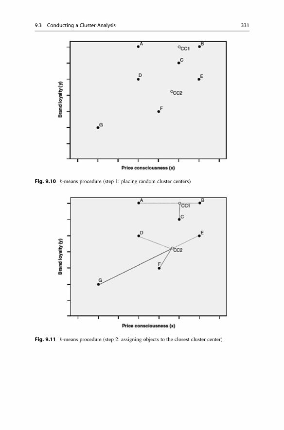
Fig. 9.10 k-means procedure (step 1: placing random cluster centers)
Fig. 9.11 k-means procedure (step 2: assigning objects to the closest cluster center)
9.3 Conducting a Cluster Analysis 331

– Results produced by k-means depend on the starting partition. That is, k-means
produce different results, depending on the starting partition chosen by the
researcher or randomly initiated by the software. As a result, k-means may
converge in a local optimum, which means that the solution is only optimal
Fig. 9.12 k-means procedure (step 3: recomputing cluster centers)
Fig. 9.13 k-means procedure (step 4: reassigning objects to the closest cluster center)
332 9 Cluster Analysis

compared to similar solutions, but not globally. Therefore, you should run k-means multiple times using different options for generating a starting partition.
– k-means is less computationally demanding than hierarchical clustering
techniques. The method is therefore generally preferred for sample sizes above
500, and particularly for big data applications.
– Running k-means requires specifying the number of clusters to retain prior to
running the analysis. We discuss this issue in the next section.
Box 9.2 Variants of the Original k-means Method
k-medians is a popular variant of k-means and has also been implemented in
Stata. This procedure essentially follows the same logic and procedure as k-means. However, instead of using the cluster mean as a reference point for the
calculation of the within cluster variance, k-medians minimizes the absolute
deviations from the cluster medians, which equals the city-block distance.
Thus, k-medians does not optimize the squared deviations from the mean as
in k-means, but absolute distances. In this way, k-medians avoids the possible
effect of extreme values on the cluster solution. Further variants, which are
not menu-accessible in Stata, use other cluster centers (e.g., k-medoids;Kaufman and Rousseeuw 2005; Park and Jun 2009), or optimize the
initialization process (e.g., k-means++; Arthur and Vassilvitskii 2007).
9.3.3 Select a Measure of Similarity or Dissimilarity
In the previous section, we discussed different linkage algorithms used in agglom-
erative hierarchical clustering as well as the k-means procedure. All these clustering
procedures rely on measures that express the (dis)similarity between pairs of
objects. In the following section, we introduce different measures for metric,
ordinal, nominal, and binary variables.
9.3.3.1 Metric and Ordinal Variables
Distance MeasuresA straightforward way to assess two objects’ proximity is by drawing a straight line
between them. For example, on examining the scatter plot in Fig. 9.1, we can easily
see that the length of the line connecting observations B and C is much shorter than
the line connecting B and G. This type of distance is called Euclidean distance orstraight line distance; it is the most commonly used type for analyzing metric
variables and, if the scales are equidistant (Chap. 3), ordinal variables. Statistical
software programs such as Stata simply refer to the Euclidean distance as L2, as it isa specific type of the more general Minkowski distance metric with argument
2 (Anderberg 1973). Researchers also often use the squared Euclidean distance,
referred to as L2 squared in Stata. For k-means, using the squared Euclidean
9.3 Conducting a Cluster Analysis 333

distance is more appropriate because of the way the method computes the distances
from the objects to the centroids (see Section 9.3.2.2).
In order to use a hierarchical clustering procedure, we need to express these
distances mathematically. Using the data from Table 9.1, we can compute the
Euclidean distance between customer B and customer C (generally referred to as
d(B,C)) by using variables x and y with the following formula:
dEuclidean B;Cð Þ ¼ffiffiffiffiffiffiffiffiffiffiffiffiffiffiffiffiffiffiffiffiffiffiffiffiffiffiffiffiffiffiffiffiffiffiffiffiffiffiffiffiffiffiffiffiffiffiffi
xB � xCð Þ2 þ yB � yCð Þ2q
As can be seen, the Euclidean distance is the square root of the sum of the
squared differences in the variables’ values. Using the data from Table 9.1, we
obtain the following:
dEuclidean B;Cð Þ ¼ffiffiffiffiffiffiffiffiffiffiffiffiffiffiffiffiffiffiffiffiffiffiffiffiffiffiffiffiffiffiffiffiffiffiffiffiffiffiffiffiffiffiffiffiffiffiffiffiffiffiffiffiffi
82� 66ð Þ2 þ 94� 80ð Þ2 ¼q
ffiffiffiffiffiffiffiffi
452p
� 21:260
This distance corresponds to the length of the line that connects objects B and
C. In this case, we only used two variables, but we can easily add more under the
root sign in the formula. However, each additional variable will add a dimension to
our research problem (e.g., with six clustering variables, we have to deal with six
dimensions), making it impossible to represent the solution graphically. Similarly,
we can compute the distance between customer B and G, which yields the
following:
dEuclidean B;Gð Þ ¼ffiffiffiffiffiffiffiffiffiffiffiffiffiffiffiffiffiffiffiffiffiffiffiffiffiffiffiffiffiffiffiffiffiffiffiffiffiffiffiffiffiffiffiffiffiffiffiffiffiffiffiffiffi
82� 10ð Þ2 þ 94� 17ð Þ2 ¼q
ffiffiffiffiffiffiffiffiffiffiffiffiffiffi
11, 113p � 105:418
Likewise, we can compute the distance between all other pairs of objects and
summarize them in a distance matrix. Table 9.2, which we used as input to illustrate
the single linkage algorithm, shows the Euclidean distance matrix for objects A-G.
There are also alternative distance measures: The city-block distance (called L1in Stata) uses the sum of the variables’ absolute differences. This distance measure
is referred to as theManhattan metric as it is akin to the walking distance between
two points in a city like New York’s Manhattan district, where the distance equals
the number of blocks in the directions North-South and East-West. Using the city-
block distance to compute the distance between customers B and C (or C and B)
yields the following:
dCity�block B;Cð Þ ¼ xB � xCj j þ yB � yCj j ¼ 82� 66j j þ 94� 80j j ¼ 30
The resulting distance matrix is shown in Table 9.8.
Lastly, when working with metric (or ordinal) data, researchers frequently use
the Chebychev distance (called Linfinity in Stata), which is the maximum of the
334 9 Cluster Analysis

absolute difference in the clustering variables’ values. In respect of customers B
and C, this result is:
dChebychev B;Cð Þ ¼ max xB � xCj j; yB � yCj jð Þ ¼ max 82� 66j j; 94� 80j jð Þ ¼ 16
Figure 9.14 illustrates the interrelation between these three distance measures
regarding two objects (here: B and G) from our example.
Research has brought forward a range of other distance measures suitable for
specific research settings. For example, the Stata menu offers the Canberra
distance, a weighted version of the city-block distance, which is typically used
for clustering data scattered widely around an origin. Other distance measures, such
as the Mahalanobis distance, which compensates for collinearity between the
clustering variables, are accessible via Stata syntax.
Table 9.8 City-block
distance matrixObjects A B C D E F G
A 0
B 50 0
C 48 30 0
D 31 79 49 0
E 81 37 33 56 0
F 79 93 63 54 56 0
G 101 149 119 70 112 56 0
Fig. 9.14 Distance measures
9.3 Conducting a Cluster Analysis 335

Different distance measures typically lead to different cluster solutions. Thus,
it is advisable to use several measures, check for the stability of results, and
compare them with theoretical or known patterns.
Association MeasuresThe (dis)similarity between objects can also be expressed by means of associationmeasures (e.g., correlations). For example, suppose a respondent rated price con-
sciousness 2 and brand loyalty 3, a second respondent indicated 5 and 6, whereas a
third rated these variables 3 and 3. Euclidean and city-block, distances indicate that
the first respondent is more similar to the third than to the second. Nevertheless, one
could convincingly argue that the first respondent’s ratings are more similar to the
second’s, as both rate brand loyalty higher than price consciousness. This can be
accounted for by computing the correlation between two vectors of values as a
measure of similarity (i.e., high correlation coefficients indicate a high degree of
similarity). Consequently, similarity is no longer defined by means of the difference
between the answer categories, but by means of the similarity of the answering
profiles.
Whether you use one of the distance measures or correlations depends on
whether you think the relative magnitude of the variables within an object
(which favors correlation) matters more than the relative magnitude of each
variable across the objects (which favors distance). Some researchers
recommended using correlations when applying clustering procedures that
are particularly susceptible to outliers, such as complete linkage, average
linkage or centroid linkage. Furthermore, correlations implicitly standardize
the data, as differences in the scale categories do not have a strong bearing on
the interpretation of the response patterns. Nevertheless, distance measures
are most commonly used for their intuitive interpretation. Distance measures
best represent the concept of proximity, which is fundamental to cluster
analysis. Correlations, although having widespread application in other
techniques, represent patterns rather than proximity.
Standardizing the DataIn many analysis tasks, the variables under consideration are measured in different
units with hugely different variance. This would be the case if we extended our set
of clustering variables by adding another metric variable representing the
customers’ gross annual income. Since the absolute variation of the income variable
would be much higher than the variation of the remaining two variables (remember,
x and y are measured on a scale from 0 to 100), this would clearly distort our
336 9 Cluster Analysis

analysis results. We can resolve this problem by standardizing the data prior to the
analysis (Chap. 5).
Different standardization methods are available, such as z-standardization,which rescales each variable to a mean of 0 and a standard deviation of
1 (Chap. 5). In cluster analysis, however, range standardization (e.g., to a range
of 0 to 1) typically works better (Milligan and Cooper 1988).
9.3.3.2 Binary and Nominal VariablesWhereas the distance measures presented thus far can be used for variables
measured on a metric and, in general, on an ordinal scale, applying them to binary
and nominal variables is problematic. When nominal variables are involved, you
should rather select a similarity measure expressing the degree to which the
variables’ values share the same category. These matching coefficients can take
different forms, but rely on the same allocation scheme as shown in Table 9.9.
In this crosstab, cell a is the number of characteristics present in both objects,
whereas cell d describes the number of characteristics absent in both objects. Cells
b and c describe the number of characteristics present in one, but not the other,
object (see Table 9.10 for an example).
The allocation scheme in Table 9.9 applies to binary variables (i.e., nominal
variables with two categories). For nominal variables with more than two
categories, you need to convert the categorical variable into a set of binary variables
in order to use matching coefficients. For example, a variable with three categories
needs to be transformed into three binary variables, one for each category (see the
following example).
Based on the allocation scheme in Table 9.9, we can compute different matching
coefficients, such as the simple matching (SM) coefficient (called Matching in
Stata):
Table 9.9 Allocation scheme for matching coefficients
Second object
Presence of a
characteristics (1)
Absence of a
characteristic (0)
First
object
Presence of a
characteristic (1)
a b
Absence of a
characteristic (0)
c d
Table 9.10 Recoded measurement data
Object Gender (binary) Customer (binary) Country of residence (binary)
Male Female Yes No GER UK USA
A 1 0 1 0 1 0 0
B 1 0 0 1 0 0 1
C 0 1 0 1 0 0 1
9.3 Conducting a Cluster Analysis 337
SM ¼ aþ d
aþ bþ cþ d
This coefficient takes both the joint presence and the joint absence of a charac-
teristic (as indicated by cells a and d in Table 9.9) into account. This feature makes
the simple matching coefficient particularly useful for symmetric variables where
the joint presence and absence of a characteristic carry an equal degree of informa-
tion. For example, the binary variable gender has the possible states “male” and
“female.” Both are equally valuable and carry the same weight when the simple
matching coefficient is computed. However, when the outcomes of a binary vari-
able are not equally important (i.e., the variable is asymmetric), the simple
matching coefficient proves problematic. An example of an asymmetric variable
is the presence, or absence, of a relatively rare attribute, such as customer
complaints. While you say that two customers who complained have something
in common, you cannot say that customers who did not complain have something in
common. The most important outcome is usually coded as 1 (present) and the other
is coded as 0 (absent). The agreement of two 1s (i.e., a positive match) is more
significant than the agreement of two 0s (i.e., a negative match). Similarly, the
simple matching coefficient proves problematic when used on nominal variables
with many categories. In this case, objects may appear very similar, because they
have many negative matches rather than positive matches.
Given this issue, researchers have proposed several other matching coefficients,
such as the Jaccard coefficient (JC) and the Russell and Rao coefficient (RR,called Russell in Stata), which (partially) omit the d cell from the calculation. Like
the simple matching coefficient, these coefficients range from 0 to 1 with higher
values indicating a greater degree of similarity.4 They are defined as follows:
JC ¼ a
aþ bþ c
RR ¼ a
aþ bþ cþ d
To provide an example that compares the three coefficients, consider the fol-
lowing three variables:
– gender: male, female
– customer: yes, no– country of residence: GER, UK, USA
4There are many other matching coefficients, such as Yule’s Q, Kulczynski, or Ochiai, which are
also menu-accessible in Stata. However, since most applications of cluster analysis rely on metric
or ordinal data, we will not discuss these. See Wedel and Kamakura (2000) for more information
on alternative matching coefficients.
338 9 Cluster Analysis

We first transform the measurement data into binary data by recoding the
original three variables into seven binary variables (i.e., two for gender and
customer; three for country of residence). Table 9.10 shows a binary data matrix
for three objects A, B, and C. Object A is a male customer from Germany; object B
is a male non-customer from the United States; object C is a female non-customer,
also from the United States.
Using the allocation scheme from Table 9.9 to compare objects A and B yields
the following results for the cells: a ¼ 1, b ¼ 2, c¼2, and d ¼ 2.
This means that the two objects have only one shared characteristic (a ¼ 1), but
two characteristics, which are absent from both objects (d ¼ 2). Using this infor-
mation, we can now compute the three coefficients described earlier:
SM A;Bð Þ ¼ 1þ 2
1þ 2þ 2þ 2¼ 0:571,
JC A;Bð Þ ¼ 1
1þ 2þ 2¼ 0:2, and
RR A;Bð Þ ¼ 1
1þ 2þ 2þ 2¼ 0:143
As can be seen, the simple matching coefficient suggests that objects A and B are
reasonably similar. Conversely, the Jaccard coefficient, and particularly the Russel
Rao coefficient, suggests that they are not.
Try computing the distances between the other object pairs. Your computation
should yield the following: SM(A,C) ¼ 0.143, SM(B,C) ¼ 0.714, JC(A,C) ¼ 0, JC(B,C) ¼ 0.5, RR(A,C) ¼ 0, and RR(B,C) ¼ 0.286.
9.3.3.3 Mixed VariablesMost datasets contain variables that are measured on multiple scales. For example,
a market research questionnaire may require the respondent’s gender, income
category, and age. We therefore have to consider variables measured on a nominal,
ordinal, and metric scale. How can we simultaneously incorporate these variables
into an analysis?
A common approach is to dichotomize all the variables and apply the matching
coefficients discussed above. For metric variables, this involves specifying
categories (e.g., low, medium, and high age) and converting these into sets of
binary variables. In most cases, the specification of categories is somewhat arbi-
trary. Furthermore, this procedure leads to a severe loss in precision, as we
disregard more detailed information on each object. For example, we lose precise
information on each respondent’s age when scaling this variable down into age
categories.
Gower (1971) introduced a dissimilarity coefficient that works with a mix of
binary and continuous variablesa.Gower’s dissimilarity coefficient is a composite
measure that combines several measures into one, depending on each variable’s
scale level. If binary variables are used, the coefficient takes the value 1 when two
9.3 Conducting a Cluster Analysis 339
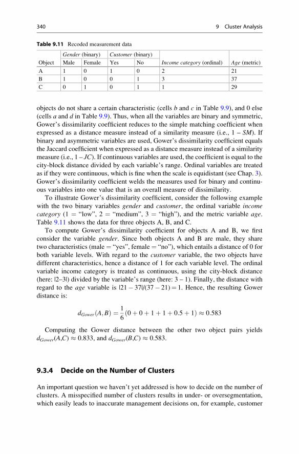
objects do not share a certain characteristic (cells b and c in Table 9.9), and 0 else
(cells a and d in Table 9.9). Thus, when all the variables are binary and symmetric,
Gower’s dissimilarity coefficient reduces to the simple matching coefficient when
expressed as a distance measure instead of a similarity measure (i.e., 1 – SM). If
binary and asymmetric variables are used, Gower’s dissimilarity coefficient equals
the Jaccard coefficient when expressed as a distance measure instead of a similarity
measure (i.e., 1 – JC). If continuous variables are used, the coefficient is equal to thecity-block distance divided by each variable’s range. Ordinal variables are treated
as if they were continuous, which is fine when the scale is equidistant (see Chap. 3).
Gower’s dissimilarity coefficient welds the measures used for binary and continu-
ous variables into one value that is an overall measure of dissimilarity.
To illustrate Gower’s dissimilarity coefficient, consider the following example
with the two binary variables gender and customer, the ordinal variable incomecategory (1 ¼ “low”, 2 ¼ “medium”, 3 ¼ “high”), and the metric variable age.Table 9.11 shows the data for three objects A, B, and C.
To compute Gower’s dissimilarity coefficient for objects A and B, we first
consider the variable gender. Since both objects A and B are male, they share
two characteristics (male¼ “yes”, female¼ “no”), which entails a distance of 0 for
both variable levels. With regard to the customer variable, the two objects have
different characteristics, hence a distance of 1 for each variable level. The ordinal
variable income category is treated as continuous, using the city-block distance
(here: |2–3|) divided by the variable’s range (here: 3 – 1). Finally, the distance with
regard to the age variable is |21� 37|/(37� 21)¼ 1. Hence, the resulting Gower
distance is:
dGower A;Bð Þ ¼ 1
60þ 0þ 1þ 1þ 0:5þ 1ð Þ � 0:583
Computing the Gower distance between the other two object pairs yields
dGower(A,C) � 0.833, and dGower(B,C) � 0.583.
9.3.4 Decide on the Number of Clusters
An important question we haven’t yet addressed is how to decide on the number of
clusters. A misspecified number of clusters results in under- or oversegmentation,
which easily leads to inaccurate management decisions on, for example, customer
Table 9.11 Recoded measurement data
Object
Gender (binary) Customer (binary)
Income category (ordinal) Age (metric)Male Female Yes No
A 1 0 1 0 2 21
B 1 0 0 1 3 37
C 0 1 0 1 1 29
340 9 Cluster Analysis

targeting, product positioning, or determining the optimal marketing mix (Becker
et al. 2015).
We can select the number of clusters pragmatically, choosing a grouping that
“works” for our analysis, but sometimes we want to select the “best” solution that
the data suggest. However, different clustering methods require different
approaches to decide on the number of clusters. Hence, we discuss hierarchical
and portioning methods separately.
9.3.4.1 Hierarchical Methods: Deciding on the Number of ClustersTo guide this decision, we can draw on the distances at which the objects were
combined. More precisely, we can seek a solution in which an additional combina-
tion of clusters or objects would occur at a greatly increased distance. This raises
the issue of what a great distance is.
We can seek an answer by plotting the distance level at which the mergers of
objects and clusters occur by using a dendrogram. Figure 9.15 shows the dendro-
gram for our example as produced by Stata. We read the dendrogram from the
bottom to the top. The horizontal lines indicate the distances at which the objects
were merged. For example, according to our calculations above, objects B and C
were merged at a distance of 21.260. In the dendrogram, the horizontal line linking
the two vertical lines that go from B and C indicates this merger. To decide on the
number of clusters, we cut the dendrogram horizontally in the area where no merger
has occurred for a long distance. In our example, this is done when moving from a
four-cluster solution, which occurs at a distance of 28.160 (Table 9.4), to a three-
cluster solution, which occurs at a distance of 36.249 (Table 9.5). This result
suggests a four-cluster solution [A,D], [B,C,E], [F], and [G], but this conclusion
is not clear-cut. In fact, the dendrogram often does not provide a clear indication,
because it is generally difficult to identify where the cut should be made. This is
particularly true of large sample sizes when the dendrogram becomes unwieldy.
Research has produced several other criteria for determining the number of
clusters in a dataset (referred to as stopping rules in Stata).5 One of the most
prominent criteria is Calinski and Harabasz’s (1974) variance ratio criterion
(VRC; also called Calinski-Harabasz pseudo-F in Stata). For a solution with
n objects and k clusters, the VRC is defined as:
VRCk ¼ SSB= k � 1ð Þð Þ= SSW= n� kð Þð Þ,where SSB is the sum of the squares between the clusters and SSW is the sum of the
squares within the clusters. The criterion should seem familiar, as it is similar to the
F-value of a one-way ANOVA (see Chap. 6). To determine the appropriate number
of clusters, you should choose the number that maximizes the VRC. However, as
the VRC usually decreases with a greater number of clusters, you should compute
5For details on the implementation of these stopping rules in Stata, see Halpin (2016).
9.3 Conducting a Cluster Analysis 341

the difference in the VRC values ωk of each cluster solution, using the following
formula:6
ωk ¼ VRCkþ1 � VRCkð Þ � VRCk � VRCk�1ð Þ:The number of clusters k that minimizes the value in ωk indicates the best cluster
solution. Prior research has shown that the VRC reliably identifies the correct
number of clusters across a broad range of constellations (Miligan and Cooper
1985). However, owing to the term VRCk�1, which is not defined for a one-cluster
solution, the minimum number of clusters that can be selected is three, which is a
disadvantage when using the ωk statistic.
Another criterion, which works well for determining the number of clusters (see
Miligan and Cooper 1985) is the Duda-Hart index (Duda and Hart 1973). This
index essentially performs the same calculation as the VRC, but compares the SSWvalues in a pair of clusters to be split both before and after this split. More precisely,
the Duda-Hart index is the SSW in the two clusters (Je(2)) divided by the SSW in one
cluster (Je(1)); that is:
Duda� Hart ¼ Jeð2ÞJeð1Þ
Fig. 9.15 Dendrogram
6In the Web Appendix (!Downloads), we offer a Stata.ado file to calculate the ωk called
chomega.ado. We also offer an Excel sheet (VRC.xlsx) to calculate the ωk manually.
342 9 Cluster Analysis

To determine the number of clusters, you should choose the solution, which
maximizes the Je(2)/Je(1) index value.
Duda et al. (2001) have also proposed a modified version of the index, which is
called the pseudo T-squared. This index takes the number of observations in both
groups into account. Contrary to the Duda-Hart index, you should choose the
number of clusters that minimizes the pseudo T-squared.
Two aspects are important when using the Duda-Hart indices:
– The indices are not appropriate in combination with single linkage clustering, as
chaining effects may occur. In this case, both indices will produce ambiguous
results, as evidenced in highly similar values for different cluster solutions
(Everitt and Rabe-Hesketh 2006).
– The indices are considered “local” in that they do not consider the entire data
structure in their computation, but only the SSW in the group being split. With
regard to our example above, the Je(2)/Je(1) index for a two-cluster solution
would only consider the variation in objects A to F, but not G. This characteristic
makes the Duda-Hart indices somewhat inferior to the VRC, which takes the
entire variation into account (i.e., the criterion is “global”).
In practice, you should combine the VRC and the Duda-Hart indices by
selecting the number of clusters that yields a large VRC, a large Je(2)/Je
(1) index, and a small pseudo T-squared value. These values do not necessar-
ily have to be the maximum or minimum values. Note that the VRC and
Duda-Hart indices become less informative as the number of objects in the
clusters becomes smaller.
Overall, the above criteria can often only provide rough guidance regarding the
number of clusters that should be selected; consequently, you should instead take
practical considerations into account. Occasionally, you might have a priori knowl-
edge, or a theory on which you can base your choice. However, first and foremost,
you should ensure that your results are interpretable and meaningful. Not only must
the number of clusters be small enough to ensure manageability, but each segment
should also be large enough to warrant strategic attention.
9.3.4.2 Partitioning Methods: Deciding on the Number of ClustersWhen running partitioning methods, such as k-means, you have to pre-specify the
number of clusters to retain from the data. There are varying ways of guiding this
decision:
– Compute the VRC (see discussion in the context of hierarchical clustering) for
an alternating number of clusters and select the solution that maximizes the VRC
or minimizes ωk. For example, compute the VRC for a three- to five-cluster
9.3 Conducting a Cluster Analysis 343

solution and select the number of clusters that minimizes ωk. Note that the Duda-
Hart indices are not applicable as they require a hierarchy of objects and
mergers, which partitioning methods do not produce.
– Run a hierarchical procedure to determine the number of clusters by using the
dendrogram and run k-means afterwards.7 This approach also enables you to find
starting values for the initial cluster centers to handle a second problem, which
relates to the procedure’s sensitivity to the initial classification (we will follow
this approach in the example application).
– Rely on prior information, such as earlier research findings.
9.3.5 Validate and Interpret the Clustering Solution
Before interpreting the cluster solution, we need to assess the stability of the results.
Stability means that the cluster membership of individuals does not change, or only
changes a little when different clustering methods are used to cluster the objects.
Thus, when different methods produce similar results, we claim stability.
The aim of any cluster analysis is to differentiate well between the objects. The
identified clusters should therefore differ substantially from each other and the
members of different clusters should respond differently to different marketing-mix
elements and programs.
Lastly, we need to profile the cluster solution by using observable variables.
Profiling ensures that we can easily assign new objects to clusters based on
observable traits. For example, we could identify clusters based on loyalty to a
product, but in order to use these different clusters, their membership should be
identifiable according to tangible variables, such as income, location, or family size,
in order to be actionable.
The key to successful segmentation is to critically revisit the results of different
cluster analysis set-ups (e.g., by using different algorithms on the same data) in
terms of managerial relevance. The following criteria help identify a clustering
solution (Kotler and Keller 2015; Tonks 2009).
– Substantial: The clusters are large and sufficiently profitable to serve.
– Reliable: Only clusters that are stable over time can provide the necessary basis
for a successful marketing strategy. If clusters change their composition quickly,
or their members’ behavior, targeting strategies are not likely to succeed.
Therefore, a certain degree of stability is necessary to ensure that marketing
strategies can be implemented and produce adequate results. Reliability can be
evaluated by critically revisiting and replicating the clustering results at a
later date.
– Accessible: The clusters can be effectively reached and served.
7See Punj and Stewart (1983) for additional information on this sequential approach.
344 9 Cluster Analysis
– Actionable: Effective programs can be formulated to attract and serve the
clusters.
– Parsimonious: To be managerially meaningful, only a small set of substantial
clusters should be identified.
– Familiar: To ensure management acceptance, the cluster composition should be
easy to relate to.
– Relevant: Clusters should be relevant in respect of the company’s competencies
and objectives.
9.3.5.1 StabilityStability is evaluated by using different clustering procedures on the same data and
considering the differences that occur. For example, you may first run a hierarchical
clustering procedure, followed by k-means clustering to check whether the cluster
affiliations of the objects change. Alternatively, running a hierarchical clustering
procedure, you can use different distance measures and evaluate their effect on the
stability of the results. However, note that it is common for results to change even
when your solution is adequate. As a rule of thumb, if more than 20% of the cluster
affiliations change from one technique to the other, you should reconsider the
analysis and use, for example, a different set of clustering variables, or reconsider
the number of clusters. Note, however, that this percentage is likely to increase with
the number of clusters used.
When the data matrix exhibits identical values (referred to as ties), the ordering
of the objects in the dataset can influence the results of the hierarchical clustering
procedure. For example, the distance matrix based on the city-block distance in
Table 9.8 shows the distance of 56 for object pairs (D,E), (E,F), and (F,G). Ties can
prove problematic when they occur for the minimum distance in a distance matrix,
as the decision about which objects to merge then becomes ambiguous (i.e., should
we merge objects D and E, E and F, or F and G if 56 was the smallest distance in the
matrix?). To handle this problem, van der Kloot et al. (2005) recommend
re-running the analysis with a different input order of the data. The downside of
this approach is that the labels of a cluster may change from one analysis to the next.
This issue is referred to as label switching. For example, in the first analysis, cluster
1 may correspond to cluster 2 in the second analysis. Ties are, however, more the
exception than the rule in practical applications—especially when using (squared)
Euclidean distances—and generally don’t have a pronounced impact on the results.
However, if changing the order of the objects also drastically changes the cluster
compositions (e.g., in terms of cluster sizes), you should reconsider the set-up of the
analysis and, for example, re-run it with different clustering variables.
9.3.5.2 Differentiation of the DataTo examine whether the final partition differentiates the data well, we need to
examine the cluster centroids. This step is highly important, as the analysis sheds
light on whether the clusters are truly distinct. Only if objects across two (or more)
clusters exhibit significantly different means in the clustering variables (or any
other relevant variable) can they be distinguished from each other. This can be
9.3 Conducting a Cluster Analysis 345

easily ascertained by comparing the means of the clustering variables across the
clusters with independent t-tests or ANOVA (see Chap. 6).
Furthermore, we need to assess the solution’s criterion validity. We do this by
focusing on the criterion variables that have a theoretical relationship with the
clustering variables, but were not included in the analysis. In market research,
criterion variables are usually managerial outcomes, such as the sales per person, or
willingness-to-pay. If these criterion variables differ significantly, we can conclude
that the clusters are distinct groups with criterion validity.
9.3.5.3 ProfilingAs indicated at the beginning of the chapter, cluster analysis usually builds on
unobservable clustering variables. This creates an important problem when work-
ing with the final solution: How can we decide to which cluster a new object should
be assigned if its unobservable characteristics, such as personality traits, personal
values, or lifestyles, are unknown? We could survey these attributes and make a
decision based on the clustering variables. However, this is costly and researchers
therefore usually try to identify observable variables (e.g., demographics) that best
mirror the partition of the objects. More precisely, these observable variables
should partition the data into similar groups as the clustering variables do. Using
these observable variables, it is then easy to assign a new object (whose cluster
membership is unknown) to a certain cluster. For example, assume that we used a
set of questions to assess the respondents’ values and learned that a certain cluster
comprises respondents who appreciate self-fulfillment, enjoyment of life, and a
sense of accomplishment, whereas this is not the case in another cluster. If we were
able to identify explanatory variables, such as gender or age, which distinguish
these clusters adequately, then we could assign a new person to a specific cluster on
the basis of these observable variables whose value traits may still be unknown.
9.3.5.4 Interpret the Clustering SolutionThe interpretation of the solution requires characterizing each cluster by using the
criterion or other variables (in most cases, demographics). This characterization
should focus on criterion variables that convey why the cluster solution is relevant.
For example, you could highlight that customers in one cluster have a lower
willingness to pay and are satisfied with lower service levels, whereas customers
in another cluster are willing to pay more for a superior service. By using this
information, we can also try to find a meaningful name or label for each cluster; that
is, one that adequately reflects the objects in the cluster. This is usually a challeng-
ing task, especially when unobservable variables are involved.
While companies develop their own market segments, they frequently use
standardized segments, based on established buying trends, habits, and
customers’ needs to position their products in different markets. The
(continued)
346 9 Cluster Analysis

PRIZM lifestyle by Nielsen is one of the most popular segmentation
databases. It combines demographic, consumer behavior, and geographic
data to help marketers identify, understand, and reach their customers and
prospective customers. PRIZM defines every US household in terms of more
than 60 distinct segments to help marketers discern these consumers’ likes,
dislikes, lifestyles, and purchase behaviors.
An example is the segment labeled “Connected Bohemians,” which Nielsen
characterizes as a “collection of mobile urbanites, Connected Bohemians
represent the nation’s most liberal lifestyles. Its residents are a progressive
mix of tech savvy, young singles, couples, and families ranging from students
to professionals. In their funky row houses and apartments, Bohemian Mixers
are the early adopters who are quick to check out the latest movie, nightclub,
laptop, and microbrew.” Members of this segment are between 25 and 44 years
old, have a midscale income, own a hybrid vehicle, eat at Starbucks, and go
skiing/snowboarding. (http://www.MyBestSegments.com).
Table 9.12 summarizes the steps involved in a hierarchical and k-means cluster-
ing when using Stata. The syntax code shown in the cells comes from the case
study, which we introduce in the following section.
Table 9.12 Steps involved in carrying out a cluster analysis in Stata
Theory Action
Research problem
Identification of homogenous groups of objects in a population
Select clustering variables to
form segments
Select relevant variables that potentially exhibit high degrees
of criterion validity with regard to a specific managerial
objective.
Requirements
Sufficient sample size Make sure that the relationship between the objects and the
clustering variables is reasonable. Ten times the number of
clustering variables is the bare minimum, but 30 to 70 times is
recommended. Ensure that the sample size is large enough to
guarantee substantial segments.
Low levels of collinearity
among the variables
► Statistics ► Summaries, tables and tests ► Summary and
descriptive statistics ► Pairwise correlations
pwcorr e1 e5 e9 e21 e22
In case of highly correlated variables (correlation coefficients
> 0.90), delete one variable of the offending pair.
Specification
Choose the clustering
procedure
If there is a limited number of objects in your dataset, rather
use hierarchical clustering:
► Statistics ► Multivariate analysis ► Cluster analysis ►Cluster Data ► Choose a linkage algorithm
cluster wardslinkage e1 e5 e9 e21 e22, measure(L2squared) name(wards_linkage)
(continued)
9.3 Conducting a Cluster Analysis 347

Table 9.12 (continued)
Theory Action
If there are many observations (> 500) in your dataset, rather
use k-means clustering:
► Statistics Multivariate analysis ► Cluster analysis ►Cluster Data ► kmeans
cluster kmeans e1 e5 e9 e21 e22, k(2) measure(L2squared) start(krandom) name(kmeans)
Select a measure of (dis)
similarity
Hierarchical methods:
Select from the (dis)similarity measure menu, depending on
the clustering variables’ scale level.
Depending on the scale level, select the measure; convert
variables with multiple categories into a set of binary variables
and use matching coefficients; Choose Gower’s dissimilarity
coefficient for mixed variables.
When the variables are measured on different units,
standardize the variables to a range from 0 to 1 prior to the
analysis, using the following commands:
summarize e1
return list
gen e1_rsdt ¼.
replace e1_rsdt ¼ (e1- r(min)) / (r(max)-r(min))
Partitioning methods:
Use the squared Euclidean distance from the (dis)
similarity menu.
Deciding on the number of
clusters
Hierarchical clustering:
Examine the dendrogram:
► Statistics ► Multivariate analysis ► Cluster analysis ►Postclustering ► Dendrogram
cluster dendrogram wards_linkage, cutnumber(10) showcount
Examine the VRC and Duda-Hart indices:
► Statistics Multivariate analysis ► Cluster analysis ►Postclustering ► Cluster analysis stopping rules.
For VRC: cluster stop wards_linkage, rule(calinski) groups(2/11)
For Duda-Hart: cluster stop wards_linkage, rule(duda) groups(1/10)
Include practical considerations in your decision.
Partitioning methods:
Run a hierarchical cluster analysis and decide on the number
of segments based on a dendrogram, the VRC, and the Duda-
Hart indices; use the resulting partition as starting partition.
► Statistics Multivariate analysis ► Cluster analysis ►Postclustering ► Cluster analysis stopping rules.
cluster kmeans e1 e5 e9 e21 e22, k(3) measure(L2squared) name(kmeans) start(group(cluster_wl))
Include practical considerations in your decision.
(continued)
348 9 Cluster Analysis

9.4 Example
Let’s go back to the Oddjob Airways case study and run a cluster analysis on the
data. Our aim is to identify a manageable number of segments that differentiates
the customer base well. To do so, we first select a set of clustering variables, taking
the sample size and potential collinearity issues into account. Next, we apply
hierarchical clustering based on the squared Euclidean distances, using theWard’s
linkage algorithm. This analysis will help us determine a suitable number of
segments and a starting partition, which we will then use as the input for k-means clustering.
Table 9.12 (continued)
Theory Action
Validating and interpreting the cluster solution
Stability Re-run the analysis using different clustering procedures,
linkage algorithms or distance measures. For example,
generate a cluster membership variable and use this grouping
as starting partition for k-means clustering.
cluster generate cluster_wl¼ groups(3), name(wards_linkage) ties(error)
cluster kmeans e1 e5 e9 e21 e22, k(3) measure(L2squared) name (kmeans) start(group(cluster_wl))
Examine the overlap in the clustering solutions. If more than
20% of the cluster affiliations change from one technique to
the other, you should reconsider the set-up.
tabulate cluster_wl kmeans
Change the order of objects in the dataset (hierarchical
clustering only).
Differentiation of the data Compare the cluster centroids across the different clusters for
significant differences.
mean e1 e5 e9 e21 e22, over(cluster_wl)
If possible, assess the solution’s criterion validity.
Profiling Identify observable variables (e.g., demographics) that best
mirror the partition of the objects based on the clustering
variables.
tabulate cluster_wl flight_purpose, chi2 V
Interpretating of the cluster
solution
Identify names or labels for each cluster and characterize each
cluster by means of observable variables.
9.4 Example 349
9.4.1 Select the Clustering Variables
The Oddjob Airways dataset ( Web Appendix ! Downloads) offers several
variables for segmenting its customer base. Our analysis draws on the following
set of variables, which we consider promising for identifying distinct segments
based on customers’ expectations regarding the airline’s service quality (variable
names in parentheses):
– . . . with Oddjob Airways you will arrive on time (e1),– . . . Oddjob Airways provides you with a very pleasant travel experience (e5),– . . . Oddjob Airways gives you a sense of safety (e9),– . . . Oddjob Airways makes traveling uncomplicated (e21), and– . . . Oddjob Airways provides you with interesting on-board entertainment,
service, and information sources (e22).
With five clustering variables, our analysis meets even the most conservative
rule-of-thumb regarding minimum sample size requirements. Specifically,
according to Dolnicar et al. (2016), the cluster analysis should draw on 100 times
the number of clustering variables to optimize cluster recovery. As our sample size
of 1,065 is clearly higher than 5�100¼ 500, we can proceed with the analysis. Note,
however, that the actual sample size used in the analysis may be substantially lower
when using casewise deletion. This also applies to our analysis, which ultimately
draws on 969 observations (i.e., after casewise deletion).
To begin with, it is good practice to examine a graphical display of the data.
With multivariate data such as ours, the best way to visualize the data is by means of
a scatterplot matrix (see Chaps. 5 and 7). To generate a scatterplot matrix, go to ►Graphics ► Scatterplot matrix and enter the variables e1, e5, e9, e21, and e22 into
the Variables box (Fig. 9.16). To ensure that the variable labels fit the diagonal
boxes of the scatterplot, enter 0.9 next to Scale text. Because there are so many
observations in the dataset, we choose a different marker symbol. To do so, click on
Marker properties and select Point next to Symbol. Confirm by clicking on
Accept, followed by OK. Stata will generate a scatterplot similar to the one
shown in Fig. 9.17.
The resulting scatterplots do not suggest a clear pattern except that most
observations are in the moderate to high range. But the scatterplots also assure us
that all observations fall into the 0 to 100 range. Even though some observations
with low values in (combinations of) expectation variables can be considered as
extreme, we do not delete them, as they occur naturally in the dataset (see Chap. 5).
In a further check, we examine the variable correlations by clicking on ►Statistics ► Summaries, tables and tests ► Summary and descriptive statistics ►Pairwise correlations. Next, enter all variables into the Variables box (Fig. 9.18).
Click on OK and Stata will display the results (Table 9.13).
The results show that collinearity is not at a critical level. The variables e1 and
e21 show the highest correlation of 0.6132, which is clearly lower than the 0.90
threshold. We can therefore proceed with the analysis, using all five clustering
variables.
350 9 Cluster Analysis

Note that all the variables used in our analysis are metric and are measured on a
scale from 0 to 100. However, if the variables were measured in different units with
Fig. 9.16 Scatterplot matrix dialog box
Fig. 9.17 Scatterplot matrix
9.4 Example 351

different variances, we would need to standardize them in order to avoid the
variables with the highest variances dominating the analysis. In Box 9.3, we explain
how to standardize the data in Stata.
Box 9.3 Standardization in Stata
Stata’s menu-based dialog boxes only allow for z-standardization (see
Chap. 5), which you can access via ► Data ► Create or change data ►Create new variable (extended). In cluster analysis, however, the clustering
variables should be standardized to a scale of 0 to 1. There is no menu option
(continued)
Fig. 9.18 Pairwise correlations dialog box
Table 9.13 Pairwise correlations
pwcorr e1 e5 e9 e21 e22
| e1 e5 e9 e21 e22-------------+---------------------------------------------
e1 | 1.0000 e5 | 0.5151 1.0000 e9 | 0.5330 0.5255 1.0000
e21 | 0.6132 0.5742 0.5221 1.0000 e22 | 0.3700 0.5303 0.4167 0.4246 1.0000
352 9 Cluster Analysis

Box 9.3 (continued)
or command to do this directly in Stata, but we can improvise by using the
summarize command. When using this command, Stata saves the mini-
mum and maximum values of a certain variable as scalars. Stata refers to
these scalars as r(max) and r(min), which we can use to calculate new
versions of the variables, standardized to a scale from 0 to 1. To run this
procedure for the variable e1 type in the following:
summarize e1
Variable | Obs Mean Std. Dev. Min Max
-----------+---–---------------------------------------------
e1 | 1,038 86.08189 19.3953 1 100
We can let Stata display the results of the summarize command by
typing return list in the command window.
scalars:
r(N) = 1038
r(sum_w) = 1038
r(mean) = 86.08188824662813
r(Var) = 376.1774729981067
r(sd) = 19.395295125316
r(min) = 1
r(max) = 100
r(sum) = 89353
Next, we compute a new variable called e1_rstd, which uses the minimum
and maximum values as input to compute a standardized version of e1 (see
Chap. 5 for the formula).
gen e1_rsdt =.
replace e1_rsdt = (e1- r(min)) / (r(max)-r(min))
Similar commands create standardized versions of the other clustering
variables.
9.4.2 Select the Clustering Procedure and Measure of Similarity orDissimilarity
To initiate hierarchical clustering, go to ► Statistics ► Multivariate analysis ►Cluster analysis ► Cluster data. The resulting menu offers a range of hierarchical
and partitioning methods from which to choose. Because of its versatility and
9.4 Example 353

general performance, we choose Ward’s linkage. Clicking on the corresponding
menu option opens a dialog box similar to Fig. 9.19.
Enter the variables e1, e5, e9, e21, and e22 into the Variables box and select thesquared Euclidean distance (L2squared or squared Euclidean) as the (dis)simi-
larity measure. Finally, specify a name, such as wards_linkage, in the Name this
cluster analysis box. Next, click on OK.
Nothing seems to happen (aside from the following command, which gets
issued: cluster wardslinkage e1 e5 e9 e21 e22, measure(L2squared) name(wards_linkage)), although you might notice that our
dataset now contains three additional variables called wards_linkage_id,wards_linkage_ord, and wards_linkage_hgt. While these new variables are not
directly of interest, Stata uses them as input to draw the dendrogram.
9.4.3 Decide on the Number of Clusters
To decide on the number of clusters, we start by examining the dendrogram. To
display the dendrogram, go to ► Statistics ► Multivariate analysis ► Cluster
analysis► Postclustering► Dendrogram. Given the great number of observations,
we need to limit the display of the dendrogram (see Fig. 9.20). To do so, select Plot
top branches only in the Branches menu. By specifying 10 next to Number of
branches, we limit the view of the top 10 branches of the dendrogram, which Stata
labels G1 to G10. When selecting Display number of observations for each
branch, Stata will display the number of observations in each of the ten groups.
Fig. 9.19 Hierarchical clustering with Ward’s linkage dialog box
354 9 Cluster Analysis

After clicking on OK, Stata will open a new window with the dendrogram
(Fig. 9.21).
Reading the dendrogram from the bottom to the top, we see that clusters G1 to
G6 are merged in quick succession. Clusters G8 to G10 are merged at about the
Fig. 9.20 Dendrogram dialog box
Fig. 9.21 Dendrogram
9.4 Example 355

same distance, while G7 initially remains separate. These three clusters remain
stable until, at a much higher distance, G7 merges with the first cluster. This result
clearly suggests a three-cluster solution, because reducing the cluster number to two
requires merging the first cluster with G7, which is quite dissimilar to it. Increasing
the number of clusters appears unreasonable, as many mergers take place at about
the same distance.
The VRC and Duda-Hart indices allow us to further explore the number of
clusters to extract. To request these measures in Stata, go to ► Statistics ►Multivariate analysis ► Cluster analysis ► Postclustering ► Cluster analysis
stopping rules. In the dialog box that follows (Fig. 9.22), select Duda/Hart Je(2)/
J2(1) index and tick the box next to Compute for groups up to. As we would like
to consider a maximum number of ten clusters, enter 10 into the corresponding box
and click on OK. Before interpreting the output, continue this procedure, but, this
time, choose the Calinski/Harabasz pseudo F-index to request the VRC. Recall
that we can also compute the VRC-based ωk statistic. As this statistic requires the
VRCk+1 value as input, we need to enter 11 underCompute for groups up to. Next,
click on OK. Tables 9.14 and 9.15 show the postclustering outputs.
Looking at Table 9.14, we see that the Je(2)/Je(1) index yields the highest value
for three clusters (0.8146), followed by a six-cluster solution (0.8111). Conversely,
the lowest pseudo T-squared value (37.31) occurs for ten clusters. Looking at the
VRC values in Table 9.15, we see that the index decreases with a greater number of
clusters.
To calculate the ωk criterion, we can use a file that has been specially
programmed for this, called chomega.ado Web Appendix (! Downloads). This
Fig. 9.22 Postclustering
dialog box
356 9 Cluster Analysis

file should first be run before we can use it, just like the add-on modules discussed in
Chap. 5, Section 5.8.2. To do this, download the chomega.ado file and drag it into
the Stata command box, and add do “ before and “ after the text that appears in the
Table 9.14 Duda-Hart indices
cluster stop wards_linkage, rule(duda) groups(1/10)
+-----------------------------------------+| | Duda/Hart || Number of | | pseudo || clusters | Je(2)/Je(1) | T-squared ||-------------+-------------+-------------|| 1 | 0.6955 | 423.29 || 2 | 0.6783 | 356.69 || 3 | 0.8146 | 100.83 || 4 | 0.7808 | 59.79 || 5 | 0.7785 | 58.59 || 6 | 0.8111 | 58.94 || 7 | 0.6652 | 47.82 || 8 | 0.7080 | 64.34 || 9 | 0.7127 | 75.79 || 10 | 0.7501 | 37.31 |+-----------------------------------------+
Table 9.15 VRC
cluster stop wards_linkage, rule(calinski) groups(2/10)
+---------------------------+| | Calinski/ || Number of | Harabasz || clusters | pseudo-F ||-------------+-------------|| 2 | 423.29 || 3 | 406.02 || 4 | 335.05 || 5 | 305.39 || 6 | 285.26 || 7 | 273.24 || 8 | 263.12 || 9 | 249.61 || 10 | 239.73 || 11 | 233.17 |+---------------------------+
Table 9.16 ωk statistic
chomegaomega_3 is -53.691omega_4 is 41.300omega_5 is 9.534omega_6 is 8.110omega_7 is 1.899omega_8 is -3.394omega_9 is 3.636Minimum value of omega: -53.691 at 3 clusters
9.4 Example 357

Stata Command window (see Chap. 5). Then click on enter. Then you should typechomega. Note that this only works if you have first performed a cluster analysis.
The output is included in Table 9.16. We find that the smallest ωk value of
�53.691 occurs for a three-cluster solution. The smallest value is shown at the top
and bottom of Table 9.16. Note again that since ωk requires VRCk-1 as input, the
statistic is only defined for three or more clusters. Taken jointly, our analyses of the
dendrogram, the Duda-Hart indices, and the VRC clearly suggest a three-cluster
solution.
9.4.4 Validate and Interpret the Clustering Solution
In the next step, we create a cluster membership variable, which indicates the
cluster to which each observation belongs. To do so, go to ► Statistics ► Multi-
variate analysis ► Cluster analysis ► Postclustering ► Generate summary
variables from cluster. In the dialog box that opens (Fig. 9.23), enter a name,
such as cluster_wl, for the variable to be created in the Generate variable(s)
box. In the dropdown list From cluster analysis, we can choose on which previ-
ously run cluster analysis the cluster membership variable should be based. As this
is our first analysis, we can only select wards_linkage. Finally, specify the number
of clusters to extract (3) under Number of groups to form and proceed by clicking
OK.
Stata generates a new variable cluster_wl, which indicates the group to which
each observation belongs. We can now use this variable to describe and profile the
clusters. In a first step, we would like to tabulate the number of observations in each
Fig. 9.23 Summary variables dialog box
358 9 Cluster Analysis

cluster by going to► Statistics► Summary, tables, and tests► Frequency tables►One-way table. Simply select cluster_wl in the drop-down menu under Categorical
variable, tick the box next to Treat missing values like other values and click on
OK. The output in Table 9.17 shows that the cluster analysis assigned
969 observations to the three segments; 96 observations are not assigned to any
segment due to missing values. The first cluster comprises 445 observations, the
second cluster 309 observations, and the third cluster 215 observations.
Next, we would like to compute the centroids of our clustering variables. To do
so, go to ► Statistics ► Summaries, tables, and tests ► Other tables ► Compact
table of summary statistics and enter e1 e5 e9 e21 e22 into theVariables box. Next,click on Group statistics by variable and select cluster_wl from the list. Under
Statistics to display, tick the first box and select Mean, followed by OK.
Table 9.18 shows the resulting output.
Comparing the variable means across the three clusters, we find that respondents
in the first cluster strongly emphasize punctuality (e1), while comfort (e5) and,
particularly, entertainment aspects (e22) are less important. Respondents in the
second cluster have extremely high expectations regarding all five performance
features, as evidenced in average values well above 90. Finally, respondents in the
third cluster do not express high expectations in general, except in terms of security
(e9). Based on these results, we could label the first cluster “on-time is enough,” the
Table 9.17 Cluster sizes
tabulate cluster_wl, missing
cluster_wl | Freq. Percent Cum.------------+-----------------------------------
1 | 445 41.78 41.782 | 309 29.01 70.803 | 215 20.19 90.99. | 96 9.01 100.00
------------+-----------------------------------Total | 1,065 100.00
Table 9.18 Comparison of means
tabstat e1 e5 e9 e21 e22, statistics( mean ) by(cluster_wl)
Summary statistics: meanby categories of: cluster_wl
cluster_wl | e1 e5 e9 e21 e22-----------+--------------------------------------------------
1 | 92.39326 75.50562 89.74607 81.7191 62.339332 | 97.1068 95.54693 97.50809 96.63754 92.844663 | 59.4186 58.28372 71.62791 56.72558 58.03256
-----------+--------------------------------------------------Total | 86.57998 78.07534 88.20124 80.93086 71.11146
--------------------------------------------------------------
9.4 Example 359

second cluster “the demanding traveler,” and the third cluster “no thrills.” We could
further check whether these differences in means are significant by using a one-way
ANOVA as described in Chap. 6.
In a further step, we can try to profile the clusters using sociodemographic
variables. Specifically, we use crosstabs (see Chap. 5) to contrast our clustering
with the variable flight_purpose, which indicates whether the respondents primarily
fly for business purposes ( flight_purpose¼1) or private purposes
( flight_purpose¼2). To do so, click on ► Statistics ► Summaries, tables, and
tests ► Frequency tables ► Two-way table with measures of association. In the
dialog box that opens, enter cluster_wl into the Row variable box and
flight_purpose into the Column variable box. Select Pearson’s chi-squared and
Cramer’s V under Test statistics and click on OK. The results in Table 9.19 show
that the majority of respondents in the first and third cluster are business travelers,
whereas the second cluster primarily comprises private travelers. The χ2-teststatistic (Pr ¼ 0.004) indicates a significant relationship between these two
variables. However, the strength of the variables’ association is rather small, as
indicated by the Cramer’s V of 0.1065.The Oddjob Airways dataset offers various other variables such as age, gender,
or status, which could be used to further profile the cluster solution. However,
instead of testing these variables’ efficacy step-by-step, we proceed and assess the
solution’s stability by running an alternative clustering procedure on the data.
Specifically, we apply the k-means method, using the grouping from the Ward’s
linkage analysis as input for the starting partition. To do so, go to:
► Statistics ► Multivariate statistics ► Cluster analysis ► Cluster data ►Kmeans. In the dialog box that opens, enter e1, e5, e9, e21, and e22 into the
Variables box, choose 3 clusters, and select L2squared or squared Euclidean
under (Dis)similarity measure (Fig. 9.24). Under Name this cluster analysis,
make sure that you specify an intuitive name, such as kmeans. When clicking on the
Options tab, we can choose between different options of how k-means should
derive a starting partition for the analysis. Since we want to use the clustering from
Table 9.19 Crosstab
tabulate cluster_wl flight_purpose, chi2 V
| Do you normaly fly| for business or| leisure purposes?
cluster_wl | Business Leisure | Total-----------+----------------------+----------
1 | 239 206 | 445 2 | 130 179 | 309 3 | 114 101 | 215
-----------+----------------------+----------Total | 483 486 | 969
Pearson chi2(2) = 10.9943 Pr = 0.004Cramér's V = 0.1065
360 9 Cluster Analysis

Fig. 9.24 k-means dialog box
Fig. 9.25 Options in the k-means dialog box
9.4 Example 361

our previous analysis by using Ward’s linkage, we need to choose the last option
and select the cluster_wl variable in the corresponding drop-down menu (Fig. 9.25).
Now click on OK.
Stata only issues a command (cluster kmeans e1 e5 e9 e21 e22, k(3) measure(L2squared) name(kmeans) start(group(cluster_wl))) but also adds a new variable kmeans to the dataset, which
indicates each observation’s cluster affiliation, analogous to the cluster_wl variablefor Ward’s linkage. To explore the overlap in the two cluster solutions, we can
contrast the results using crosstabs. To do so, go to► Statistics► Summary, tables,
and tests ► Frequency tables ► Two-way table with measures of association and
select cluster_wl under Row variable and kmeans under Column variable. After
clicking on OK, Stata will produce an output similar to Table 9.20.
The results show that there is a strong degree of overlap between the two cluster
analyses. For example, 307 observations that fall into the second cluster in the
Ward’s linkage analysis also fall into this cluster in the k-means clustering. Only
two observations from this cluster appear in the first k-means cluster. The diver-
gence in the clustering solutions is somewhat higher in the third and, especially, in
the first cluster, but still low in absolute terms. Overall, the two analyses have an
overlap of (320 + 307 + 169)/969 ¼ 82.15%, which is very satisfactory as less than
20% of all observations appear in a different cluster when using k-means.
This analysis concludes our cluster analysis. However, we could further explore
the solution’s stability by running other linkage algorithms, such as centroid or
complete linkage, on the data. Similarly, we could use different (dis)similarity
measures and assess their impact on the results. So go ahead and explore these
options yourself!
9.5 Oh, James! (Case Study)
The James Bond movie series is one of the success stories of filmmaking. The
movies are the longest continually running and the third-highest-grossing film
series to date, which started in 1962 with Dr. No, starring Sean Connery as James
Bond. As of 2016, there have been 24 movies with six actors having played James
Table 9.20 Comparison of clustering results
tabulate cluster_wl kmeans
| kmeanscluster_wl | 1 2 3 | Total-----------+---------------------------------+----------
1 | 320 107 18 | 445 2 | 2 307 0 | 309 3 | 36 10 169 | 215
-----------+---------------------------------+----------Total | 358 424 187 | 969
362 9 Cluster Analysis

Bond. Interested in the factors that contributed to this running success, you decide
to investigate the different James Bond movies’ characteristics. Specifically, you
want to find out whether the movies can be grouped into clusters, which differ in
their box-office revenues. To do so, you draw on Internet Movie Database (www.
imdb.com) and collect data on all 24 movies based on the following variables
(variable names in parentheses):
– Title. (title)– Actor playing James Bond. (actor)– Year of publication. (year)– Budget in USD, adjusted for inflation. (budget)– Box-office revenues in the USA, adjusted for inflation. (gross_usa)– Box-office revenues worldwide, adjusted for inflation. (gross_worldwide)– Runtime in minutes. (runtime)– Native country of the villain actor. (villain_country)– Native country of the bondgirl. (bondgirl_country)– Haircolor of the bondgirl. (bondgirl_hair)
Use the dataset jamesbond.dta ( Web Appendix ! Downloads) to run a cluster
analysis—despite potential objections regarding the sample size. Answer the fol-
lowing questions:
1. Which clustering variables would you choose in light of the study objective,
their levels of measurement, and correlations?
2. Given the levels of measurement, which clustering method would you prefer?
Carry out a cluster analysis using this procedure.
3. Interpret and profile the obtained clusters by examining cluster centroids. Com-
pare the differences across clusters on the box-office revenue variables.
4. Use a different clustering method to test the stability of your results.
9.6 Review Questions
1. In your own words, explain the objective and basic concept of cluster analysis.
2. What are the differences between hierarchical and partitioning methods? When
do we use hierarchical or partitioning methods?
3. Repeat the manual calculations of the hierarchical clustering procedure from the
beginning of the chapter, but use complete linkage as the clustering method.
Compare the results with those of the single linkage method.
4. Explain the different options to decide on the number of clusters to extract from
the data? Should you rather on statistical measures or rather on practical
reasoning?
5. Run the k-means analysis on the Oddjob Airways data again (oddjob.dta, Web
Appendix ! Downloads). Assume a three-cluster solution and try the different
9.6 Review Questions 363

options for obtaining a starting partition that Stata offers. Compare the results
with those obtained by the hierarchical clustering.
6. Which clustering variables could be used to segment:
– The market for smartphones?
– The market for chocolate?
– The market for car insurances?
9.7 Further Readings
Bottomley, P., & Nairn, A. (2004). Blinded by science: The managerial
consequences of inadequately validated cluster analysis solutions. InternationalJournal of Market Research, 46(2), 171–187.
In this article, the authors investigate if managers could distinguish between clusteranalysis outputs derived from real-world and random data. They show that somemanagers feel able to assign meaning to random data devoid of a meaningfulstructure, and even feel confident formulating entire marketing strategies fromcluster analysis solutions generated from such data. As such, the authors providea reminder of the importance of validating clustering solutions with caution.
Dolnicar, S., Grün, B., & Leisch, F. (2016). Increasing sample size compensates for
data problems in segmentation studies. Journal of Business Research, 69(2),992–999.
Using artificial datasets of known structure, the authors examine the effects of dataproblems such as respondent fatigue, sampling error, and redundant items onsegment recovery. The study nicely shows how insufficient sample size of thesegmentation base can have serious negative consequences on segment recoveryand that increasing the sample size represents a simple measure to compensatefor the detrimental effects caused by poor data quality.
Punj, G., & Stewart, D. W. (1983). Cluster analysis in marketing research: Review
and suggestions for application. Journal of Marketing Research, 20(2),134–148.In this seminal article, the authors discuss several issues in applications of cluster
analysis and provide further theoretical discussion of the concepts and rules ofthumb that we included in this chapter.
Romesburg, C. (2004). Cluster analysis for researchers. Morrisville: Lulu Press.
Charles Romesburg nicely illustrates the most frequently used methods of hierar-chical cluster analysis for readers with limited backgrounds in mathematics andstatistics.
Wedel, M., & Kamakura, W. A. (2000). Market segmentation: Conceptual andmethodological foundations (2nd ed.). Boston: Kluwer Academic.
This book is a clear, readable, and interesting presentation of applied marketsegmentation techniques. The authors explain the theoretical concepts of recentanalysis techniques and provide sample applications. Probably the most com-prehensive text in the market.
364 9 Cluster Analysis

References
Anderberg, M. R. (1973). Cluster analysis for applications. New York: Academic.
Arabie, P., & Hubert, L. (1994). Cluster analysis in marketing research. In R. P. Bagozzi (Ed.),
Advanced methods in marketing research (pp. 160–189). Cambridge: Basil Blackwell & Mott,
Ltd..
Arthur, D., & Vassilvitskii, S. (2007). k-means++: The advantages of careful seeding. In
Proceedings of the eighteenth annual ACM-SIAM symposium on discrete algorithms(pp. 1027–1035). Philadelphia: Society for Industrial and Applied Mathematics.
Becker, J.-M., Ringle, C. M., Sarstedt, M., & V€olckner, F. (2015). How collinearity affects mixture
regression results. Marketing Letters, 26(4), 643–659.Calinski, T., & Harabasz, J. (1974). A dendrite method for cluster analysis. Communications in
Statistics—Theory and Methods, 3(1), 1–27.Dolnicar, S. (2003). Using cluster analysis for market segmentation—typical misconceptions,
established methodological weaknesses and some recommendations for improvement.
Australasian Journal of Market Research, 11(2), 5–12.Dolnicar, S., & Grün, B. (2009). Challenging “factor-cluster segmentation”. Journal of Travel
Research, 47(1), 63–71.Dolnicar, S., & Lazarevski, K. (2009). Methodological reasons for the theory/practice divide in
market segmentation. Journal of Marketing Management, 25(3–4), 357–373.Dolnicar, S., Grün, B., Leisch, F., & Schmidt, F. (2014). Required sample sizes for data-driven
market segmentation analyses in tourism. Journal of Travel Research, 53(3), 296–306.Dolnicar, S., Grün, B., & Leisch, F. (2016). Increasing sample size compensates for data problems
in segmentation studies. Journal of Business Research, 69(2), 992–999.Duda, R. O., & Hart, P. E. (1973). Pattern classification. Hoboken: Wiley.
Duda, R. O., Hart, P. E., & Stork, D. G. (2001). Pattern classification (2nd ed.). Hoboken: Wiley.
Everitt, B. S., & Rabe-Hesketh, S. (2006). Handbook of statistical analyses using Stata (4th ed.).
Boca Raton: Chapman & Hall/CRC.
Formann, A. K. (1984). Die Latent-Class-Analyse: Einf€uhrung in die Theorie und Anwendung.Beltz: Weinheim.
Gower, J. C. (1971). A general coefficient of similarity and some of its properties. Biometrics,27(4), 857–871.
Halpin, B. (2016). Cluster analysis stopping rules in Stata. University of Limerick. Department of
Sociology Working Paper Series, WP2016-01. http://ulsites.ul.ie/sociology/sites/default/files/
wp2016-01.pdf
Kaufman, L., & Rousseeuw, P. J. (2005). Finding groups in data. An introduction to clusteranalysis. Hoboken: Wiley.
Kotler, P., & Keller, K. L. (2015).Marketing management (15th ed.). Upper Saddle River: PrenticeHall.
Milligan, G. W., & Cooper, M. (1985). An examination of procedures for determining the number
of clusters in a data set. Psychometrika, 50(2), 159–179.Milligan, G. W., & Cooper, M. (1988). A study of variable standardization. Journal of Classifica-
tion, 5(2), 181–204.Park, H.-S., & Jun, C.-H. (2009). A simple and fast algorithm for K-medoids clustering. Expert
Systems with Applications, 36(2), 3336–3341.Punj, G., & Stewart, D. W. (1983). Cluster analysis in marketing research: Review and suggestions
for application. Journal of Marketing Research, 20(2), 134–148.Qiu, W., & Joe, H. (2009). Cluster generation: Random cluster generation (with specified degree
of separation). R package version 1.2.7.
Sheppard, A. (1996). The sequence of factor analysis and cluster analysis: Differences in segmen-
tation and dimensionality through the use of raw and factor scores. Tourism Analysis, 1(1),49–57.
Tonks, D. G. (2009). Validity and the design of market segments. Journal of Marketing Manage-ment, 25(3/4), 341–356.
References 365

Wedel, M., & Kamakura, W. A. (2000). Market segmentation: Conceptual and methodologicalfoundations (2nd ed.). Boston: Kluwer Academic.
van der Kloot, W. A., Spaans, A. M. J., & Heinser, W. J. (2005). Instability of hierarchical cluster
analysis due to input order of the data: The PermuCLUSTER solution. Psychological Methods,10(4), 468–476.
Lilien, G. L., & Rangaswamy, A. (2004). Marketing engineering. Computer-assisted marketinganalysis and planning (2nd ed.). Bloomington: Trafford Publishing.
John H. R., Kayande, U., & Stremersch, S. (2014). From academic research to marketing practice:
Exploring the marketing science value chain. International Journal of Research in Marketing,31(2), 127–140
366 9 Cluster Analysis

Communicating the Results 10
Keywords
Ethics • KISS principle • Minto principle • Pyramid structure for presentations •
Self-contained figure • Self-contained table • Visual aids
Learning Objectives
After reading this chapter, you should understand:
– Why communicating the results is a crucial element of every market research
study.
– The elements that should be included in a written research report and how to
structure these elements.
– How to communicate the findings in an oral presentation.
– The ethical issues concerning communicating the report findings to the client.
10.1 Introduction
Communicating results is key in any market research project. This includes giving
clear answers to the investigated research questions and recommending a course of
action, where appropriate. The importance of communicating marketing research
results should not be underestimated. Even if the research has been carefully
conducted, the recipients will find it difficult to understand the implications of the
results and to appreciate the study’s quality if you spend too little time and energy
on communicating these. Clear communication may also set the stage for follow-up
research. If you communicate the findings effectively, the clients, who may know
little about market research and may even be unfamiliar with the specific market
# Springer Nature Singapore Pte Ltd. 2018
E. Mooi et al., Market Research, Springer Texts in Business and Economics,
DOI 10.1007/978-981-10-5218-7_10
367

research project, will understand them. Hence, the communication must be relevant
for the addressed audience and provide a clear picture of the project.
Market researchers usually present their findings in the form of an oral presenta-
tion and written report. This report is the written evidence of the research effort and
includes the details. Identifying the addressed audience is critical for both these
points, as this determines how you can best communicate the findings. In this
chapter, we discuss guidelines on how to effectively communicate research findings
orally and in writing. We first discuss written reports before listing the basics of oral
presentations. We also provide hints on how to acquire research follow-up. At the
end of the chapter, we briefly review the ethical issues related to market research.
10.2 Identify the Audience
When providing reports (and presentations), you should keep the audience’s
characteristics and needs in mind and should tailor the report to their objectives.
Imagine you are dealing with the marketing department of a company planning to
launch a new product and needing to learn more about the potential customers’
buying behavior. The knowledge and level of interest in the study might differ
greatly within the department. While the managers, who commissioned the study,
are generally familiar with its objective and design, others, who might be unaware
of the background (e.g., the marketing director or the sales staff), must be informed
about the research to allow them to understand the research findings. When
preparing the report, you should consider the following questions:
– Who will read the report?
– Why will they read the report?
– Which parts of the report are of specific interest to them?
– What do they already know about the study?
– What information will be new to them?
– What is the most important point for them to know after they have read the
report?
– What can be done with the research findings?
These questions help you determine the level of detail that should be included in
your report. Furthermore, they reveal information that requires specific focus
during the project. Remember, a successful report meets its audience’s needs!
However, not everything that you consider appropriate for your audience is appro-
priate. Nothing is worse than suggesting an idea that the audience finds unpalatable
(e.g., saying that a specific senior management behavior or attitude is a major
obstacle to success), or proposing a course of action that has been attempted before.
Informal talks with the client are therefore vital before you present the results—
never present findings formally without discussing them with the client first!
Further, you need to ask clients about their expectations and the
recommendations they think will be made early in the project. Why would clients
368 10 Communicating the Results

spend $100,000 if you merely give them the answers they expect to get? Such
discussions may help exceed clients’ expectations in a way that is useful to them.
10.3 Guidelines for Written Reports
You should always keep the people addressed in written report in mind. Decision
makers are generally unfamiliar with statistical details, but would like to know how
the findings can help them make decisions. You should therefore avoid research
jargon and state the key insights clearly without omitting important facts. There are
several major rules to consider when writing a report (Armstrong 2010; Churchill
and Iacobucci 2009):
1. The report must be complete; that is, it must contain all information that the
reader needs in order to understand the research. Technical or ambiguous terms,
as well as abbreviations and symbols, should be clearly defined and illustrated.
Although you know what terms like heteroscedasticity or eigenvalue mean, the
report reader probably won’t! In addition, the report must provide enough detail
to enable the reader to verify and replicate the findings if necessary. Bear in mind
that the staff turnover in many organizations is high and that reports should
therefore be stand-alone to allow those with little knowledge of the background
to read and understand them.
2. The report must be accurate. The readers will base their assessment of the entire
research project’s quality on the presented report. Consequently, the report must
be well written. For example, grammar and spelling must be correct, no slang
should be used, tables must be labeled correctly, and page numbers should be
included. If there are small errors, the reader may believe they are due to your
lack of care and generalize about your analysis! Therefore, proofread
(a proofreader should preferably do this) to eliminate obvious errors. Lastly,
objectivity is an important attribute of any report. This means that any subjective
conclusions should be clearly stated as such.
3. The report must be clear and language simple and concise:
– Use short sentences.
– Use simple and unambiguous words.
– Use concrete examples to illustrate aspects of the research (e.g., unexpected
findings). These can also be helpful if the audience has strong beliefs that are
not consistent with your recommendation, which are often not implemented,
because the client does not believe them.
– Use the active voice to make the report easy to read and to help
understanding.
– Avoid negative words.
– Use business language.
– Avoid exclamation marks and do not use caps unnecessarily. Avoid the use of
bold or italics for more than just a few words.
10.3 Guidelines for Written Reports 369

4. Follow theKISS principle: Keep it short and simple! This principle requires the
report to be concise. And since it needs to be action-driven, the reader must
immediately understand its purpose and the results, so start off with these. You
should present the results clearly and simply. Important details can be shown in
the appendix or appendices of the report, which should also not be overloaded
with irrelevant material. In addition, keep in mind that each section’s first
sentences are the most important ones: They should summarize the main idea
you want to convey in this section.
5. The report must be structured logically. This applies to the general structure of
the report (see Table 10.1) and to the line of argumentation in each section. Make
sure you avoid style elements that may distract the reader:
– Avoid cross-references. Having to search elsewhere for important results is
disruptive. For example, do not put important tables in the appendix.
– Use footnotes instead of endnotes and as few as possible.
– The structure should not be too detailed. As a rule of thumb, you should avoid
using more than four levels.
– A new level must include at least two sections. For example, if there is a
Sect. 3.1.1, there must also be a Sect. 3.1.2.
10.4 Structure the Written Report
When preparing a written report, a clear structure helps readers navigate it to
quickly and easily find those elements that interest them. Although all reports
differ, we include a suggested structure for a research report in Table 10.1.
Table 10.1 Suggested
structure for a written
research report
Title Page
Executive Summary
Table of Contents
1. Introduction
1.1 Problem definition
1.2 Research objectives
1.3 Research questions and/or hypothesesa
2. Methodology
2.1 Population, sampling method, and sample description
2.2 Quantitative and qualitative methods used for data analysis
3. Results
4. Conclusions and Recommendations
5. Limitations
6. Appendix
aIn practice, the word hypotheses may be replaced by research
question(s) or proposition(s)
370 10 Communicating the Results

10.4.1 Title Page
The title page should state the title of the report, the name of the client who
commissioned the report, the organization or researcher submitting it, and the
date of release. The heading should clearly state the nature and scope of the report.
It may simply describe the research (e.g., “Survey of Mobile Phone Usage”) or may
outline the objectives of the study in the form of an action title (e.g., “How to
Increase the Adoption of Wearable Technologies”).
10.4.2 Executive Summary
The executive summary should appear first and is essential, because it is often the
only section that executives read. This summary helps set the expectations of those
who read more. Hence, this section must be short to allow busy executives to read it
and should give them the essence (findings and recommendations) of the research.
As a rule of thumb, the executive summary should not exceed 150 words. It should
contain key findings and recommendations, and help the reader understand the full
study. The executive summary also requires more structure. A common way of
giving structure is to tell a story. Begin with a description of the problem, thereafter
introducing the issues that make this difficult or complicated and describing how
these give rise to a number of questions. Finally, lead the reader through your line of
reasoning to the answer:
– Situation: Background information.
– Difficulty or complication: A short window of opportunity; a change from the
previously stable situation; lack of performance due to unknown causes (i.e., the
reason for your research study).
– Question: The scope and goal of your research study.
– Answer: Your findings and conclusions (and if the client requires this, also your
recommendations).
10.4.3 Table of Contents
The table of contents helps the reader locate specific aspects of the report. The table
of contents should correspond to the main report headings. It should also include
lists of tables and figures with page references.
10.4 Structure the Written Report 371

10.4.4 Introduction
This section should explain the project context to the reader. Questions to be
answered include:
– Why was the study undertaken?
– What were the objectives and which key questions are answered?
– Is the study related to other studies and, if so, which findings did they produce?
– How is the report structured?
Besides introducing the background and purpose of the research, the introduc-
tion should briefly explain how the objectives and key questions are addressed. You
should briefly mention the hypotheses or propositions tested during the research and
how the research was approached (e.g., cluster analysis). You should ensure that
Critical terms are defined. For example, aviation terms such as CASM (cost per
available seat mile) require explanation. As a rule, the following three questions on
the research should be answered in the introduction, but should be neither too
detailed nor too technical:
– What was done?
– How was it done?
– Why was it done?
Keep in mind that the introduction should set the stage for the body of the report
and the presentation of the results, but no more than this. You should only provide a
detailed description of how you collected and analyzed the data in the next section
of the report. Lastly, you should provide a brief summary of how the report is
organized at the end of the introduction.
10.4.5 Methodology
In this section, you should describe the research procedure and the different
(statistical) methods used to analyze the data. These must be presented precisely
and coherently, allowing the reader to understand the analyses’ process and basic
principles. Always keep your audience in mind! If the audience is familiar with
research methodology, you can describe the procedures in detail and skip the basics.
If the client has little knowledge of research methodology, you should introduce
these briefly. If you have an audience of whom some have a little and others more
knowledge, you might want to move the basics to an appendix.
If not already stated in the previous section, you should define whether the study
is exploratory, descriptive, or causal by nature and whether the results are based on
primary or secondary data. If primary data are used, their source should be specified
(e.g., observation or questionnaire). If a questionnaire was used, you should state
whether it was administered by means of face-to-face interviews, telephone
372 10 Communicating the Results

interviews, or through web or mail surveys. Also explain why you chose this
specific method.
The reader should also know the demographic or other relevant characteristics of
the targeted survey population. This includes the geographical area, age group, and
gender. While it is usually sufficient to describe the population in a few sentences,
the sampling method needs more explanation: How was the sample selected?
Which sampling frames were chosen (e.g., random, systematic, stratified)? In
addition, information on the sample size, response rate, and sample characteristics
is essential, as this indicates the results’ reliability and validity.
You should include a copy of the actual instruments used, such as the question-
naire or the interview guide, the data collection protocol, and the detailed statistical
analyses of the results, in the appendix, or present them separately. Although these
are important to fully understand the characteristics of the research project, includ-
ing them in the main text would make reading the report more difficult.
10.4.6 Results
In this section, you need to present the findings and describe how they relate to a
possible solution to the research problem and how they influence the
recommendations. There are several ways of presenting the results logically. You
could, for instance, use the different research objectives as a guideline to structure
this section and then analyze them one by one.
Another way is to first summarize the overall findings and then analyze them in
relevant subgroups, such as the type of customer or geographical regions. Alterna-
tively, you can classify the findings according to the data type or the research
method if several were used. For example, you could first present the conclusions of
the secondary data collection and then those derived from an analysis of the
questionnaire.
Use tables and graphs when presenting statistical data, as they make the report
and the data more interesting. Tables and graphs also structure information, thus
facilitating understanding. Graphs often allow the researcher to visually present
complex data, which might not be possible when only using tables. However,
graphs can also be misleading, as they may be adjusted to favor a specific viewpoint
(see the next section for examples).
Results are often presented in Excel or Word format. Fortunately, Stata has
built-in capabilities to export its results to Excel by means of export exceland putexcel. You can also output results to Word, using a package called
outreg2, which is a Stata add-on. The following videos offer step-by-step
(continued)
10.4 Structure the Written Report 373

introductions to exporting results to Excel (first mobile tag) and Word
(second mobile tag):
https://www.youtube.com/watch?v¼MUQ3E8hIQZE
https://www.youtube.com/watch?v¼UemL7uYM6Lc
10.4.6.1 Window Dressing with GraphsWhile graphs have the advantage that they can present complex information in a
way that is easily understandable, they can be used to mislead the reader. Experi-
ence with generating and interpreting graphs will help you spot this. In this section,
we show examples of how graphs can mislead. By shortening the x-axis in Fig. 10.1(i.e., removing the years 2003–2007), it suggests a growth in the units sold
(Fig. 10.2).
374 10 Communicating the Results
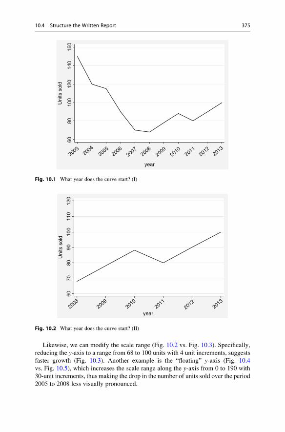
Likewise, we can modify the scale range (Fig. 10.2 vs. Fig. 10.3). Specifically,
reducing the y-axis to a range from 68 to 100 units with 4 unit increments, suggests
faster growth (Fig. 10.3). Another example is the “floating” y-axis (Fig. 10.4
vs. Fig. 10.5), which increases the scale range along the y-axis from 0 to 190 with
30-unit increments, thus making the drop in the number of units sold over the period
2005 to 2008 less visually pronounced.
20032004
20052006
20072008
20092010
20112012
2013
year
Uni
ts s
old
6080
100
120
140
160
Fig. 10.1 What year does the curve start? (I)
20082009
20102011
20122013
year
Uni
ts s
old
6070
8090
100
110
120
Fig. 10.2 What year does the curve start? (II)
10.4 Structure the Written Report 375

Data are often presented by means of three-dimensional figures, such as in
Fig. 10.6. While these can be visually appealing, they are also subject to window-
dressing. In this example, the lengths of all the edges were doubled to correspond to
the 100% increase in turnover.
However, the resulting area is not twice but four times as large as the original
image, thus presenting a false picture of the increase. These are just some common
examples; Huff’s (1993) classical text offers more on this topic.
20082009
20102011
20122013
year
Uni
ts s
old
7074
7882
8690
9498
Fig. 10.3 Shortening the y-axis
20112010
20092008
20072006
20052004
20032012
2013
year
Uni
ts s
old
6080
100
120
140
160
Fig. 10.4 The “floating” y-axis (I)
376 10 Communicating the Results

Tables are generally less susceptible to manipulation, as they contain data in
numbers, which the reader can check and understand. As a rule of thumb, each table
or graph in the report should be numbered sequentially and have a meaningful title
so that it can be understood without reading the text. This is called a self-contained
table or self-contained figure. Some rules of thumb:
– Put data to be compared in columns, not rows.
– Round data off to whole percentages, thousands or millions for sales, and two or
three digits for academic purposes.
– Highlight data to reinforce conclusions (e.g., making the key numbers bold).
– Clearly state the units of measurement.
20112010
20092008
20072006
20052004
20032012
2013
year
Uni
ts s
old
030
6090
120
150
180
Fig. 10.5 The “floating” y-axis (II)
Fig. 10.6 Doubling the edge
length quadruples the area
10.4 Structure the Written Report 377

10.4.6.2 Presenting Statistical DataIn this section, we describe various ideas that you can use to convey statistical
results in a reader-friendly manner. In the results section it is common to start
presenting the descriptive statistics first. This comprises text that is visually
supported by graphs, to offer information and context to those readers with the
required background. Graphs offer two major advantages: first, they organize and
simplify complex and dense information, which is especially useful with large data
samples (Tufte 2001); second, graphs can summarize dense information efficiently.
There are, of course, many kinds of graphs and each type has its advantages and
disadvantages. The sample size and the nature of your data may constrain the
choice of graphs. Sometimes your client may even have specific requirements.
Here are some tips to help you with the presentation of your data:
Summarize your results efficientlyGraphs, like bar charts and especially dot charts, offer a useful way of summarizing
descriptive data most efficiently; that is, by using less space (Cox 2008). Bar charts
are generally useful where the objective is to depict how the outcome variable
varies across two or more grouping variables. Figure 10.7 uses the Oddjob.dtadataset to illustrate this point by plotting the average overall satisfaction level with
the price of the airline over the (1) respondents’ gender, (2) flight frequency, and
(3) country of residence. Note that, in a complete presentation, it is important to
include a title and subtitle, to label the y-axis and the x-axis, and to list the source ofthe data below the figure. Details of the syntax used are shown in the Web
Appendix (! Downloads).
Combine several plotsStata offers many more graphical options, many of which we discussed in Chap. 5.
This chapter will therefore not review the many graphical options in Stata. How-
ever, it is worth mentioning coefplot, a practical user-written program for
plotting model estimates with Stata (Jann 2014). To install the program, type
help coefplot in the command window and follow the instructions. The
coefplot program offers many useful options for plotting statistical results
innovatively. These options range from plotting descriptive data to more complex
statistical outputs. It can also combine coefficients from different models by saving
each estimated model separately before matching the coefficients and equations in a
combined plot. Figure 10.8 offers an example and depicts the proportion of male
and female travelers with different levels of disagreement or agreement with
Oddjob Airways’ price along the seven different points of the overall satisfaction
scale. The inclusion of confidence intervals in the graph—indicated by the vertical
lines at the end of each bar—show that the proportion of differences between males
and females are not statistically significant. This is because the vertical lines of each
of the seven pairs of bars overlap. This matter could be unclear if the confidence
intervals are not included and may lead to misinterpretation by knowledgeable
readers, who assume that such differences are statistically significant. Details of the
syntax used are included in the Web Appendix (! Downloads).
378 10 Communicating the Results

Low Medium Highde
Ove
rall
satis
fact
ion
leve
l
01
23
45
Low Medium Highch
Average Overall Satisfaction Levelby Gender, Flight Frequency and Country of Reisdence
malefemale
Source: Oddjob Airways Data
Low Medium Highat
Fig. 10.7 Bar chart presentation
fem
Overall satisfaction level
_prop_1 _prop_2 _prop_3 _prop_4 _prop_5 _prop_6 _prop_7
0.1
.2
Pro
port
ion
.3.4
male total
Fig. 10.8 Combination of different estimations and charts using coefplot
10.4 Structure the Written Report 379

Consider plotting regression coefficientsIt can be useful to plot the estimated regression coefficients, rather than show them
in a table. This is not a substitute for presenting your careful data analysis in tables,
but an aid and a complement. A graphical presentation of the regression coefficient
estimates can be an efficient way of depicting both the significance and direction of
the predicted effects.
In Stata, regression coefficient estimates are plotted in three steps. First, a
regression model is estimated. Then the regression coefficients are predicted in a
second step. Third, the estimated coefficients with their corresponding confidence
intervals are plotted in a profile plot. Figure 10.9 shows the result of these steps
using the Oddjob.dta dataset. The figure depicts how commitment to fly with the
airline relates to nflightsx (flight frequency), age, and the travelers’ gender. In the
Web Appendix (! Downloads), you find details on how to plot regression
coefficients yourself.
Figure 10.9 shows that coefficients and their corresponding confidence intervals
do not cross the 0 line on the x-axis (the vertical line on the right-hand side). This
means that each coefficient has a statistically significant association (at p < 0.05)
with commitment. The figure also shows the direction of the predicted effects, with
negative effects left of the 0 line and positive effects right of the line. This means
that nflightsx and gender are negatively related to customers’ commitment, while
age is positively related.
-.5
gender
age
nflightsx
-.4 -.3 -.2
Effects on Linear Prediction
Average Marginal Effects with 95% Cls
Effe
cts
with
Res
pect
to
-.1 0
Fig. 10.9 Graphical presentation of regression coefficient estimates
380 10 Communicating the Results

Finally, coefplot is not limited to regression, but can be extended to any other
estimation method, varying from logistic regression models, in which the outcome
variable is binary by nature, to multinomial and poisson regression models with
categorical and count type outcome variables. See Jann (2014) for further details on
the program.
Make concise and clear (regression) tables with StataResearch projects often require running several analyses on the same set of data by
using slightly different settings in the data analysis technique. For example,
researchers generally run a regression analysis on multiple models, which differ
with regard to the number of independent variables or the type of dependent
variable. Typing the output tables for such multiple analyses by hand is time-
consuming and often leads to errors. Fortunately, Stata offers different ways of
creating tables that avoid such mistakes. Before showing how Stata can be
helpful in this respect, it is important to understand what the different rows and
columns of a table mean. When multiple models are estimated, these are usually
presented in adjacent columns to make comparisons easier. In regression tables,
each column represents the results of one regression analysis. The rows indicate
each independent variable’s influence on the dependent variable by means of the
(standardized or unstandardized) regression coefficient estimates. To create a clear
table, include the:
1. Model Title: A first step in any table is to label each model that you are
presenting. The label should be self-explanatory (“Commitment to Oddjob
Airlines”). For academic purposes, a model number (e.g., Model 1, Model
2, etc.) or a title that best represents the model (e.g., Baseline model; Extended
model, etc.) is sometimes used. This is particularly useful when writing up the
results as you can then refer to and compare the estimates of the different models
in the text. The choice of model name depends on the audience and the
formatting guidelines.
2. Independent variables: In a (regression) table, the rows refer to the independent
variables in the model. Give the variables a straightforward name to make it
easier for the reader to understand. Make sure that these variable names are
identical to those used in other tables and graphs (if any).
3. Coefficient estimates: Depending on your audience, the (regression) table needs
to specify whether standardized or unstandardized coefficient estimates are
being presented. This can be included as a subtitle and explained above the
table. In Table 10.2, the type of coefficient estimates is indicated as b/se.
Sometimes this is listed directly below the table.
4. Significance level: Putting asterisks (*) behind the estimated regression
coefficients is a common way of presenting the coefficients’ significance levels.
Usually, one asterisk indicates a significance level of 0.10, two asterisks a
significance level of 0.05, and three asterisks a significance level of 0.01.
Depending on the audience, researchers sometimes present only effects with a
10.4 Structure the Written Report 381

significance of 0.05. Whatever strategy you choose, make sure you add a note
below your table indicating the level of significance that the asterisks represent.
5. Standard error or t-values: In addition to the significance levels, you need to
present the corresponding t-value or standard error of the coefficient estimate,
which is usually placed in brackets below the coefficient estimates. Both presen-
tation methods are accepted and the choice depends on your audience and the
formatting criteria.
6. Sample size and degrees of freedom: For a complete presentation, you should
also include the sample size and the models’ degrees of freedom after the model
estimation. These statistics are respectively indicated as N and df_m in
Table 10.2. Reporting these statistics can reveal differences in the sample sizes
of the different estimated models, which can be due to missing values in specific
independent variables. If this happens, a comparison of the different models may
make little sense, given that the models are based on different sample sizes with
different characteristics. It is therefore important to understand what causes the
large sample size differences between the models before taking any further
action or drawing conclusions.
7. Model fit: Finally, depending on the type of estimated model, statistics indicating
the model significance, such as the R2 or η2 (eta-squared), and the relative model
fit, such as the AIC or BIC statistics, should be part of the table. In Table 10.2 we
have included the R-squared and BIC to indicate the model fit.
You can produce tables with Stata by using the user-written package estout.As with any user-written program, you can install this Stata package immediately
by typing help estout in the command window and then following the
instructions. Table 10.2 shows an example of a regression table produced by
using the estout command. It comprises three models that add several variables,
Table 10.2 A regression table made using estout
--------------------------------------------------------------------Model 1 Model 2 Model 3
b/se b/se b/se --------------------------------------------------------------------nflightsx -0.316*** -0.271*** -0.243***
(0.06) (0.06) (0.06) Age 0.022*** 0.022***
(0.00) (0.00) Gender -0.269*
(0.12) constant 4.810*** 3.614*** 4.022***
(0.14) (0.27) (0.33) --------------------------------------------------------------------R-squared 0.023 0.046 0.051 N 1065 1065 1065 df_m 1063.0 1062.0 1061.0 BIC 4189.6 4170.8 4172.7 --------------------------------------------------------------------* p<0.05, ** p<0.01, *** p<0.001
382 10 Communicating the Results

at a time, containing some of the key elements of the Table that we mentioned
earlier. These are: the model title, indicated asModel 1,Model 2 andModel 3, with
a caption indicating that the (unstandardized) type of coefficient estimates and their
pertaining standard errors b/se are presented. Next, the independent variables, with
the corresponding coefficients, standard errors (in brackets), and significance level
are listed in the first column. For example, in Model 1, the first row presents the
unstandardized coefficient for nfligtsx (�0.316), together with the pertaining stan-
dard errors (e.g., (0.06)), and significance level (***) for which a caption is
included at the bottom of the table. Next, the sample size (N) and the models’
degrees of freedom (df_m) in terms of each estimated model are shown in
Table 10.2. Finally, both the R-squared and the BIC values of each estimated
model are included to indicate the model fit.
Further information that enables you to produce similar tables yourself can be
found in the Web Appendix (! Downloads).
10.4.7 Conclusion and Recommendations
Having presented the findings, the next step is to summarize the most relevant
points and interpret them in the light of the research objectives. You should write
the conclusions in such a way that they present information that is relevant for
managerial decision-making. Keep in mind that, for the client, the quality of the
marketing research depends heavily on how well decision makers can use the
information! The research must provide the client with clear benefits, which
could lead to further research assignments.
Researchers are increasingly asked to go beyond stating facts and to provide
recommendations or to advise. Whereas conclusions based solely on the research
should be unbiased and impersonal, specific recommendations are based on a
personal and (at least partially) subjective opinion on how the results can be most
favorably used in the client’s interest. You should therefore make sure that
recommendations are recognizable as such. During the negotiations prior to the
start of a project, the client needs to determine the extent to which the research
report should include recommendations. This will also depend on the researcher’s
expertise in the area. Researchers may provide logical recommendations based up
the their findings, but these might be unrealistic or impossible for the client to
implement due to issues such as insufficient budgets, predetermined methods, or
specific policies, regulations, and politics. Make sure that you or another member of
your research team is familiar with the overall context, including the regulatory and
legal issues, to avoid such issues. Furthermore, before making recommendations,
review them with the client to determine whether these are acceptable and action-
able (see Box 10.1 for an example).
10.4 Structure the Written Report 383

Box 10.1 Bad Recommendations
A candy company wishes to know how it can increase its sales and has
commissioned a research organization to gain insights into its different
customer segments. The researchers find that teenagers are the most impor-
tant target for the given brand and suggest that vending machines in schools
would increase the company’s revenue. Although this might boost sales, the
recommendation does not help the company if vending machines are not
allowed in schools. And even if they were allowed, they might lead to
negative media reports.
10.4.8 Limitations
Finally, you should explain the extent to which the findings can be generalized. All
research studies have limitations due to time, budget, and other constraints. Fur-
thermore, errors might have occurred during the data collection. Not mentioning
potential weaknesses (e.g., the use of a convenience sample, or a small sample size)
for whatever reason reduces the research’s credibility. Not disclosing important
facts also violates common codes of industry conduct, such as those drafted by
ESOMAR. Taking all these factors into regard, the research results should always
be discussed objectively and in a balanced way. You should neither overly belittle
the importance and validity of the research, nor try to conceal sources of errors and,
hence, potentially mislead managers. Finally, some modesty is in order as, in
hindsight, many reports have been proved inaccurate or even wrong. Few, for
example, predicted the global financial crisis, the Trump presidency, or Brexit.
10.4.9 Appendix
All material not directly required for an understanding of the project, but still
related to the study, should be included in the appendix or appendices. This includes
questionnaires, interview guides, detailed data analyses, and other types of data or
material.
10.5 Guidelines for Oral Presentations
Most clients want an oral presentation to accompany the written report. One could
deliver such a presentation in the form of an interim report during the research, or at
the end to explain the findings to the management and other staff. Members of the
client staff often present the research findings to the management and do not ask the
market research company to do so. Satisfaction with the delivered report may
increase if a member of the client staff, such as an internal market researcher or
384 10 Communicating the Results

business analyst, delivers the presentation, because the client feels they know and
accept the content.
If asked to deliver an oral presentation, you should keep the principles of a
written report in mind. It is especially important to identify and understand your
audience, and to prepare the presentation thoroughly. A professional and interesting
presentation might increase interest in the written report! Furthermore, since the
oral presentation allows for interaction, interesting points can be highlighted and
discussed in more detail. However, if you are not well prepared for the presentation,
nor understand your audience’s expectations, needs, and wants, you could face an
unpleasant situation. You should always keep the following golden rule in mind:
Never deliver a presentation you wouldn’t want to sit through!
10.6 Visual Aids in Oral Presentations
It is useful to provide the audience with a written summary or a handout so that they
do not have to take notes, but can focus on the presentation. If focus group
interviews were conducted, for example, you could show excerpts from the
recordings to provide concrete examples in support of a finding. The saying “a
picture says more than a thousand words” is also true of the oral presentation.
Visual aids, such as overhead transparencies, flip charts, or computer slide shows
(e.g., PowerPoint or Prezi at http://www.prezi.com) not only help emphasize
important points, but also facilitate the communication of difficult ideas. In the
following, we summarize some suggestions (Armstrong 2010).
Use of Visual Aids:– Use a simple master slide and avoid fancy animations.
– Use a sufficiently large font size (as a rule of thumb, 16pt. or higher and never
less than 12pt.) so that everyone attending the presentation can read the slides.
– Use high contrasts for text. Use black and white. Do not write on illustrations or
wallpapers.
– Use contrasting colors to emphasize specific points, but not too many.
– Use simple graphs, diagrams or short sentences rather than tables.
Arranging Visual Aids:– Do not have too much information on one slide (generally, one key issue per
slide). Never put a block of text on a page.
– Organize the material so that the different modes reinforce one another. For
example, you do not want people running ahead of you, so either explain each
point as you discuss it on a slide, or use many simple slides.
– Use a small number of slides compared to the time available for the presentation.
The focus should be on the presenter and not on the slides. Having more slides
than minutes available is not a good idea. Good presenters often use between
3 and 5 min to discuss a slide.
– Prepare (color) handouts for all members of the audience.
10.6 Visual Aids in Oral Presentations 385

– If you intend to use media elements in your presentation, make sure that the
equipment supports them (e.g., that the sound equipment is working, or that your
video formats are supported).
10.7 Structure the Oral Presentation
Be aware that an oral presentation cannot cover the same amount of information as
a written report. You must be selective and structure the presentation content
clearly and logically. There are two ways of creating a presentation:
1. A common way of starting your presentation is by structuring the introduction in
the classic narrative pattern of story-telling (situation ! difficulty or complica-
tion ! question ! answer) introduced earlier in the context of written reports.
Limit the introduction to what the audience can accept. Nothing could be worse
than triggering resistance of what you are presenting right from the start of your
oral presentation. Next, move on to the main part of your presentation. Based on
a brief description of your major findings, capture the audience’s attention by
presenting answers to the logical questions that arise from the project, such as:
“How were these results achieved?” or “How did we reach this conclusion?”
2. An alternative is to follow the Minto principle, according to which
presentations have a pyramid structure, starting with the conclusion. This
raises question in the audience’s mind that has to be subsequently answered.
Figure 10.10 illustrates this concept by using the example of a mobile phone
study, which found that a novel smartphone should be introduced in white.
You begin by introducing the result of the study (i.e., the smartphone should be
introduced in white) and then work your way down. Begin by explaining that a
comprehensive market analysis was carried out, after which you discuss the
elements of the analysis (i.e., focus group interviews, lead user interviews, and a
customer survey). Finally, present the results of each element of the analysis (e.g.,
that lead users perceived black as too conservative, silver as too cheap, while white
was perceived as modern). Once at the bottom of the pyramid, it is time to pause
and to provide a summary, before moving from the first key line, which you have
just presented, to the next key line, and so on. This process forces you to only
provide the information relevant to the question under consideration. Moving from
top to bottom and then bottom to top, helps you answer the questions: “Why so?”
and “So what?,” while being both exhaustive and mutually exclusive regarding the
results and the concepts you have presented. Ensure you never provide findings that
do not lead to specific conclusions and do not offer conclusions not based on
findings. Ultimately, this pyramid approach helps the audience grasp the line of
reasoning better. This technique is also frequently called the Minto principle or
Minto pyramid after its creator Barbara Minto (2009).
386 10 Communicating the Results

10.8 Follow-Up
Having delivered the written report and oral presentation, two tasks remain: First,
you may need to help the client implement the findings. This includes answering
questions that may arise from the written report and oral presentation, helping select
a product, advertising agency, marketing actions, etc., or incorporate information
from the report into the firm’s marketing information system or decision support
system (see Chap. 3). This provides an opportunity to discuss other research
projects. For example, you might agree on repeating the study after 1 year to see
whether the marketing actions were effective. Second, you need to evaluate the
market research project internally and with the client. Only (critical) feedback can
disclose potential problems that may have occurred and, thus, provide the necessary
grounds for improving your work. Using uniform questionnaires for the evaluation
of different projects helps compare the feedback from different projects conducted
simultaneously or at different points in time. However, some market research
companies do not want to be involved in implementation.
New smartphoneshould be white
Competitoranalysis
Marketanalysis
Customersurvey
Lead userinterviews
Focus groupinterviews
Black:Tooconservative
Silver: Lookscheap
White:Verymodern
What has been done?
How was it done?
What was the result?
Mutually exclusive & collectively exhaustive
So
wha
t?W
hy so?
Fig. 10.10 Pyramid structure for presentations
10.8 Follow-Up 387

10.9 Ethics in Research Reports
Ethics is an important topic in marketing research, because research interacts with
human beings at several stages (e.g., during data collection and the communication
of the findings). There are two “problematic” relations that can ultimately lead to
ethical dilemmas. First, ethical issues arise when the researcher’s interests conflict
with those of the participants. For instance, the researcher’s interest is to gather as
much information as possible from the respondents, but they often require their
answers to be treated confidentially and to remain anonymous. Second, in addition
to researchers’ legal and professional responsibilities towards their respondents,
they also have reporting responsibilities.
For example, the European Society for Opinion and Marketing Research
(ESOMAR) has established a code which sets minimum standards of ethical
conduct to be followed by all researchers (ESOMAR 2007, p. 4):
1. Market researchers shall conform to all relevant national and international laws.
2. Market researchers shall behave ethically and shall not do anything which might
damage the reputation of market research.
3. Market researchers shall take special care when carrying out research among children
and young people.
4. Respondents’ cooperation is voluntary and must be based on adequate, and not
misleading, information about the general purpose and nature of the project when
their agreement to participate is being obtained and all such statements shall be
honoured.
5. The rights of respondents as private individuals shall be respected by market researchers
and they shall not be harmed or adversely affected as the direct result of cooperating in a
market research project.
6. Market researchers shall never allow personal data they collect in a market research
project to be used for any purpose other than market research.
7. Market researchers shall ensure that projects and activities are designed, carried out,
reported and documented accurately, transparently and objectively.
8. Market researchers shall conform to the accepted principles of fair competition.
In practice, researchers face an ethical dilemma. They are paid by the client and
may feel forced to deliver “good” results. In this sense, they might be tempted to
interpret results in a way that fits the client’s perspective or the client’s presumed
interests. For instance, researchers might ignore data because they would reveal an
inconvenient truth (e.g., the client’s brand has low awareness, or customers do not
like the product design).
Remember that researchers should never mislead the audience! For instance, it
would be ethically questionable to modify the scales of a graph so that the results
look more impressive, as shown in Figs. 10.1, 10.2, 10.3, and 10.4. Furthermore,
researchers have a duty to treat information and research results confidentially, to
store data securely, and to only use data for the research purpose agreed upon.
Above all, you should keep in mind that marketing research is based on trust. Thus,
when writing the report, you should respect the profession’s ethical standards in
order to maintain this trust.
388 10 Communicating the Results
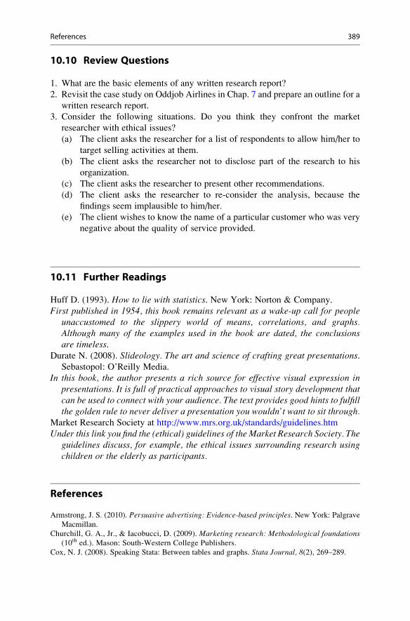
10.10 Review Questions
1. What are the basic elements of any written research report?
2. Revisit the case study on Oddjob Airlines in Chap. 7 and prepare an outline for a
written research report.
3. Consider the following situations. Do you think they confront the market
researcher with ethical issues?
(a) The client asks the researcher for a list of respondents to allow him/her to
target selling activities at them.
(b) The client asks the researcher not to disclose part of the research to his
organization.
(c) The client asks the researcher to present other recommendations.
(d) The client asks the researcher to re-consider the analysis, because the
findings seem implausible to him/her.
(e) The client wishes to know the name of a particular customer who was very
negative about the quality of service provided.
10.11 Further Readings
Huff D. (1993). How to lie with statistics. New York: Norton & Company.
First published in 1954, this book remains relevant as a wake-up call for peopleunaccustomed to the slippery world of means, correlations, and graphs.Although many of the examples used in the book are dated, the conclusionsare timeless.
Durate N. (2008). Slideology. The art and science of crafting great presentations.Sebastopol: O’Reilly Media.
In this book, the author presents a rich source for effective visual expression inpresentations. It is full of practical approaches to visual story development thatcan be used to connect with your audience. The text provides good hints to fulfillthe golden rule to never deliver a presentation you wouldn’t want to sit through.
Market Research Society at http://www.mrs.org.uk/standards/guidelines.htm
Under this link you find the (ethical) guidelines of the Market Research Society. Theguidelines discuss, for example, the ethical issues surrounding research usingchildren or the elderly as participants.
References
Armstrong, J. S. (2010). Persuasive advertising: Evidence-based principles. New York: Palgrave
Macmillan.
Churchill, G. A., Jr., & Iacobucci, D. (2009). Marketing research: Methodological foundations(10th ed.). Mason: South-Western College Publishers.
Cox, N. J. (2008). Speaking Stata: Between tables and graphs. Stata Journal, 8(2), 269–289.
References 389

European Society for Opinion and Marketing Research (ESOMAR). (2007). ICC/ESOMAR
International Code On Market And Social Research. http://www.esomar.org/uploads/public/
knowledge-and-standards/codes-and-guidelines/ICCESOMAR_Code_English_.pdf
Huff, D. (1993). How to lie with statistics. New York: W. W. Norton & Company.
Jann, B. (2014). Plotting regression coefficients and other estimates. Stata Journal, 14(4),708–737.
Minto, B. (2009). The pyramid principle: Logic in writing and thinking (3rd ed.). Harlow: Pearson.Tufte, E. R. (2001). The visual display of quantitative information (2nd ed.). Cheshire: Graphics
Press.
390 10 Communicating the Results

Glossary
α-Error occurs when erroneously rejecting a true null hypothesis. Also referred to
as type I error.α-Inflation results when multiple tests are conducted simultaneously on the same
data. The result is that you are more likely to claim a significant result when this
is not so (i.e., an increase or inflation in the type I error).
Acquiescence describes the tendency of respondents from different cultures to
agree with statements (e.g., as formulated in a Likert scale item) regardless of
their content.
Adjusted coefficient of determination is a modified measure of goodness-of-fit
that takes the number of independent variables and the sample size into account.
The statistic is useful for comparing regression models with different numbers of
independent variables, sample sizes, or both.
Adjusted R2 See Adjusted coefficient of determination.Agglomerative clustering is a type of hierarchical clustering method in which
clusters are consecutively formed from objects. It starts with each object
representing an individual cluster. The objects are then sequentially merged to
form clusters of multiple objects, starting with the two most similar.
Aggregation is a type of scale transformation in which variables measured at a
lower level are taken to a higher level.
Akaike information criterion (AIC) is a relative measure of goodness-of-fit,
which can be used to assess the various statistical models such as regression or
factor analysis. Compared to an alternative solution with a different number of
variables or factors, smaller AIC values indicate a better fit.
American Marketing Association (AMA) is the world’s leading association for
marketing professionals.
Analysis of variance (ANOVA) is a multivariate data analysis technique that
allows testing whether the means of (typically) three or more groups differ
significantly on one (one-way ANOVA) or two (two-way ANOVA) metric
dependent variable(s). There are numerous extensions to more dependent
variables and to differently scaled independent variables.
Anti-image is a measure used in principal component and factor analysis to
determine whether the items correlate sufficiently. The anti-image describes
# Springer Nature Singapore Pte Ltd. 2018
E. Mooi et al., Market Research, Springer Texts in Business and Economics,
DOI 10.1007/978-981-10-5218-7
391

the portion of an item’s variance that is independent of another item in the
analysis.
Arithmetic mean See mean.Armstrong and Overton procedure is used to assess the degree of non-response
bias. This procedure calls for comparing the first 50% respondents with the last
50% with regard to key demographic variables. The concept behind this proce-
dure is that later respondents more closely match the characteristics of
non-respondents.
Autocorrelation occurs when the residuals from a regression analysis are
correlated.
Average see mean.Average linkage is a linkage algorithm in hierarchical clustering methods in
which the distance between two clusters is defined as the average distance
between all pairs of objects in the two clusters.
Average marginal effects average change (in percentage) of one variable when
another variable increases by one unit.
β-Error occurs when erroneously accepting a false null hypothesis. Also referred
to as type II error.Back-translation is a translation method used in survey research in which a
survey is being translated and then back-translated into the original language
by another person.
Balanced scale describes a scale with an equal number of positive and negative
scale categories.
Bar chart is a graphical representation of a single categorical variable indicating
each category’s frequency of occurrence. Bar charts are primarily useful for
describing nominal and ordinal variables.
Bartlett method is a procedure to generate factor scores in principal component
analysis. The resulting factor scores have a zero mean and a standard deviation
larger than one.
Bayes information criterion (BIC) is a relative measure of goodness-of-fit,
which is similar to the AIC. Compared to the AIC, the BIC applies a greater
penalty to statistical analysis that have a greater number of variables or factors.
Big data refers to very large datasets, generally a mix of quantitative and qualita-
tive data in very large volumes.
Binary logistic regression is a type of regression method used when the depen-
dent variable is binary and only takes two values.
Bivariate statistics describes statistics that express the empirical relationship
between two variables. Covariance and correlation are key measures that indi-
cate (linear) associations between two variables.
Bonferroni correction is a post hoc test typically used in an ANOVA that
maintains the familywise error rate by calculating a new pairwise alpha that
divides the statistical significance level α by the number of comparisons made
(see also familywise error rate and α-Inflation).Box-and-whisker plot See box plot.
392 Glossary

Box plot shows the distribution of a variable. A box plot is a graph representing a
variable’s distribution and consists of elements expressing the dispersion of the
data. Also referred to as box-and-whisker plot.Breusch-Pagan test is used to test for heteroskedasticity in regression analysis.
Canberra distance is a distance measure used in cluster analysis. The Canberra
distance is a weighted version of the city-block distance, typically used for
clustering data scattered widely around an origin.
Case is an object such as a customer, a company, or a country in statistical
analysis. Also referred to as observation.Causal research is used to understand the relationships between two or more
variables. Causal research explains how variables relate.
Census is a procedure of systematically acquiring and recording information about
all the members of a given population.
Centroid linkage is a linkage algorithm in hierarchical clustering methods in
which the distance between two clusters is defined as the distance between
their geometric centers (centroids).
Chaining effect is a solution pattern typically observed when using a single
linkage algorithm in cluster analysis.
Chebychev distance is a distance measure used in cluster analysis that uses the
maximum of the absolute difference in the clustering variables’ values.
City-block distance is a distance measure used in cluster analysis that uses the
sum of the variables’ absolute differences. Also referred to as Manhattan metric.Closed-ended questions is a type of question format in which respondents have a
certain number of response categories from which to choose.
Cluster analysis is a class of methods that groups a set of objects with the goal of
obtaining high similarity within the formed groups and high dissimilarity
between groups.
Clustering variables are variables used in cluster analysis.
Clusters are groups of objects with similar characteristics.
Codebook contains essential details of a data file, such as variable names and
summary statistics.
Coefficient of determination (R2) is a measure used in regression analysis to
express the dependent variable’s amount of variance that the independent
variables explain.
Collinearity arises when two variables are highly correlated.
Communality describes the amount of a variable’s variance that the extracted
factors in a principal component and factor analysis reproduce.
Complete linkage is a linkage algorithm in hierarchical clustering methods in
which the distance between two clusters corresponds to the longest distance
between any two members in the two clusters.
Components are extracted in the course of a principal component analysis. They
are also commonly referred to as factors.
Computer-assisted web interviews (CAWI) See Web surveys.
Glossary 393

Confidence interval provides the lower and upper limit of values within which a
population parameter will fall with a certain probability (e.g., 95%).
Confirmatory factor analysis is a special form of factor analysis used to test
whether the measures of a construct are consistent with a researcher’s under-
standing of that construct.
Constant sum scale is a type of scale that requires respondents to allocate a certain
total number of points (typically 100) to a number of alternatives.
Constant is a characteristic of an object whose value does not change.
Construct scores are composite scores that calculate a value for each construct of
each observation. Construct scores are often computed by taking the mean of all
the items associated with the construct.
Construct validity is the degree of correspondence between a measure at the
conceptual level and its empirical manifestation. Researchers often use this as
an umbrella term for content, criterion, discriminant, face, and nomological
validity.
Construct measures a concept that is abstract, complex, and cannot be directly
observed by (multiple) items. Also referred to as latent variable.Content validity refers to the extent to which a measure represents all facets of a
given construct.
Correlation residuals are the differences between the original item correlations and
the reproduced item correlations in a principal component and factor analysis.
Correlation is a measure of how strongly two variables relate to each other.
Correlation is a scaled version of the covariance.
Covariance is a measure of how strongly two variables relate to each other.
Covariance-based structural equation modeling (CB-SEM) is an approach to
structural equation modeling to test relationships between multiple items and
constructs.
Criterion validity measures how well one measure predicts the outcome of
another measure when both are measured at the same time.
Cronbach’s alpha is a measure of internal consistency reliability. Cronbach’s
alpha generally varies between 0 and 1 with greater values indicating higher
degrees of reliability.
Cross validation entails comparing the results of an analysis with those obtained
when using a new dataset.
Crosstabs are tables in a matrix format that show the frequency distribution of
nominal or ordinal variables.
Customer relationship management (CRM) refers to a system of databases and
software used to track and predict customer behavior.
Data entry errors is a mistake in transcribing data during data entry. Erroneous
values that fall outside a variable’s standard range can easily be identified by
means of descriptive statistics (minimum, maximum, and range).
Degrees of freedom (df) represents the amount of information available to esti-
mate a test statistic. In general terms, an estimate’s degrees of freedom are equal
to the amount of independent information used (i.e., the number of observations)
minus the number of parameters estimated.
394 Glossary

Dendrogram visualizes the results of a cluster analysis. Horizontal lines in a
dendrogram indicate the distances at which the objects have been merged.
Dependence of observations is the degree to which observations are related.
Dependent variables are the concepts a researcher wants to understand, explain,
or predict.
Depth interview is an interview type typically used in exploratory research that
allows one-to-one probing to foster interaction between the interviewer and the
respondent.
Descriptive research is used to detail certain phenomena, characteristics, or
functions. Descriptive research often builds on previous exploratory research.
Discriminant validity ensures that a measure is empirically unique and represents
phenomena of interest that other measures in a model do not capture.
Distance matrix expresses the distances between pairs of objects.
Disturbance term see Residual.Divisive clustering is a type of hierarchical clustering method in which all objects
are initially merged into a single cluster, which the algorithm then gradually
splits up.
Double-barreled questions are survey questions to which respondents can agree
with one part but not with the other. Also refers to survey questions that cannot
be answered without accepting an assumption.
Duda-Hart index is a statistic used in cluster analysis to determine the number of
clusters to extract from the data. The statistic compares the sum of the squares in
a pair of clusters to be split both before and after this extraction.
Dummy variables are binary variables that indicate whether a certain trait is
present or not.
Durbin-Watson test is a test for autocorrelation used in regression analysis.
Eigenvalue indicates the amount of variance reproduced by a specific component
or factor.
Eigenvectors are the results of a principal component analysis and include the
factor weights.
Equidistance is indicated when the (psychological) distances between a scale’s
categories are identical.
Equidistant scale is a scale whose scale categories are equidistant.
Error is the difference between the regression line (which represents the regres-
sion prediction) and the actual observation.
Error sum of squares quantifies the difference between the observations and the
regression line.
ESOMAR is the world organization for market, consumer, and societal research.
Estimation sample is the sample used to run a statistical analysis.
Eta-squared (η2) is a statistic used in an ANOVA to describe the ratio of the
between-group variation to the total variation, thereby indicating the variance
accounted for by the sample data. There are two types of η 2: the model η 2,
which is identical to the R2, and each variable’s partial η 2, which describes the
percentage of the total variance accounted for by that variable. Eta squared also
refers to the percentage of variance explained by a single variable in regression
analysis.
Glossary 395

Ethics are a system of morals and principles which defines a research
organization’s obligations, for example, with regard to the findings they release
being an accurate portrayal of the survey data.
Ethnography is a type of qualitative research in which the researcher interacts
with consumers over a period to observe and question them.
Euclidean distance is a distance measure commonly used in cluster analysis. It is
the square root of the sum of the squared differences in the variables’ values.
Also referred to as straight-line distance.Experimental design describes which treatment variables to administer and how
these relate to dependent variables. Prominent experimental designs include the
one-shot case study, the before-after design, the before-after design with a
control group, and the Solomon four-group design.
Experiments are study designs commonly used in causal research in which a
researcher controls for a potential cause and observes corresponding changes
in hypothesized effects via treatment variables.
Exploratory factor analysis is a type of factor analysis that derives factors from a
set of correlated indicator variables without the researcher having to prespecify a
factor structure.
Exploratory research is conducted when the researcher has little or no informa-
tion about a particular problem or opportunity. It is used to refine research
questions, discover new relationships, patterns, themes, and ideas or to inform
measurement development.
External secondary data are compiled outside a company for a variety of purposes.
Sources of secondary data include, for example, governments, trade associations,
market research firms, consulting firms, (literature) databases, and social networks.
External validity is the extent to which the study results can be generalized to
real-world settings.
Extreme response styles occur when respondents systematically select the
endpoints of a response scale.
Face validity is the extent to which a test is subjectively viewed as covering the
concept it purports to measure.
Face-to-face interview See Personal interview.Factor analysis is a statistical procedure that uses the correlation patterns among a
set of indicator variables to derive factors that represent most of the original
variables’ variance. Also referred to as Principal axis factoring.Factor loading is the correlation between a (unit-scaled) factor and a variable.
Factor rotation is a technique used to facilitate the interpretation of solutions in
principal component and factor analysis.
Factors are (1) independent variables in an ANOVA and (2) the resulting
variables of a principal component and factor analysis that summarize the
information from a set of indicator variables.
Factor scores are composite scores that calculate a value for each factor of each
observation.
Factor variable is a categorical variable used to define the groups (e.g., three
types of promotion campaigns) in an ANOVA.
396 Glossary

Factor weights express the relationships between variables and factors.
Familywise error rate is the probability of making one or more false discoveries
or type I errors when performing multiple hypotheses tests (see also α-inflation).Field experiments are experiments in which the manipulation of a treatment
variable occurs in a natural setting, thereby emphasizing the external validity,
but potentially compromising internal validity.
Field service firms are companies that focus on conducting surveys, determining
samples and sample sizes, and collecting data. Some of these firms also translate
surveys or provide addresses and contact details.
Focus groups is a method of data collection in which four to six participants
discuss a defined topic under the leadership of a moderator.
Forced-choice scale is an answer scale that omits a neutral category, thereby
forcing the respondents to make a positive or negative assessment.
Formative construct is a type of measurement in which the indicators form the
construct.
Free-choice scale is an answer scale that includes a neutral choice category.
Respondents are therefore not forced to make a positive or negative assessment.
Frequency table is a table that displays the absolute, relative, and cumulative
frequencies of one or more variables.
F-test of sample variance see Levene’s test.F-test a test statistic used in an ANOVA and regression analysis to test the overall
model’s significance.
Full service providers are large market research companies, such as The Nielsen
Company, Kantar, or GfK, that offer syndicated and customized services.
Gower’s dissimilarity coefficient a dissimilarity coefficient used in cluster anal-
ysis that works with a mix of binary and continuous variables.
Heteroskedasticity refers to a situation in regression analysis in which the vari-
ance of the residuals is not constant.
Heywood cases negative estimates of variances or correlation estimates greater
than one in absolute value.
Hierarchical clustering methods develop a treelike structure of objects in the
course of the clustering process, which can be top-down (divisive clustering) or
bottom-up (agglomerative clustering).
Histogram is a graph that shows how frequently categories derived from a con-
tinuous variable occur.
Hypotheses are claims made about effects or relationships in a population.
Inconsistent answers are a respondent’s contradictory answer patterns.
Independent samples t-test a test using the t-statistic that establishes whether twomeans collected from independent samples differ significantly.
Independent variables are variables that explain or predict a dependent variable.
In-depth interview is a qualitative conversation with participants on a specific
topic.
Index consists of a set of variables that defines the meaning of the resulting
composite.
Index construction is the procedure of combining several items to form an index.
Glossary 397

Indicators See items.Interaction effect refers to how the effect of one variable on another variable is
influenced by a third variable.
Intercept is the expected mean value of the dependent variable in a regression
analysis, when the independent variables are zero. Also referred to as a constant.
Internal consistency reliability is a form of reliability used to judge the consis-
tency of results across items in the same test. It determines whether the items
measuring a construct are highly correlated. The most prominent measure of
internal consistency reliability is Cronbach’s alpha.
Internal secondary data are data that companies compile for various reporting
and analysis purposes.
Internal validity is the extent to which causal claims can be made in respect of the
study results.
Interquartile range is the difference between the third and first quartile.
Inter-rater reliability is the degree of agreement between raters expressed by the
amount of consensus in their judgment.
Interviewer fraud is an issue in data collection resulting from interviewers
making up data or even falsifying entire surveys.
Item non-response occurs when people do not provide answers to certain
questions, for example, because they refuse to answer, or forgot to answer.
Items represent measurable characteristics in conceptual models and statistical
analysis. Also referred to as indicators.Kaiser criterion is a statistic used in principal component and factor analysis to
determine the number of factor to extract from the data. According to this
criterion, researchers should extract all factors with an eigenvalue greater than
one. Also referred to as latent root criterion.Kaiser-Meyer-Olkin criterion is an index used to assess the adequacy of the data
for a principal component and factor analysis. High values indicate that the data
are sufficiently correlated. Also referred to as measure of sampling adequacy(MSA).
KISS principle the abbreviation of “keep it short and simple!” and implies that
any research report should be as concise as possible.
k-means is a group of clustering methods that starts with an initial partitioning of
all the objects into a prespecified number of clusters and then gradually
reallocates objects in order to minimize the overall within-cluster variation.
k-means++ is a variant of the k-means method that uses an improved initialization
process.
k-medians is a popular variant of k-means that aims at minimizing the absolute
deviations from the cluster medians.
k-medoids is a variant of k-means that uses other cluster centers rather than the
mean or median.
Lab experiments are performed in controlled environments (usually in a company
or academic lab) to isolate the effects of one or more treatment variables on an
outcome.
398 Glossary

Label switching a situation in which the labels of clusters change from one
analysis to the other.
Laddering is an interviewing technique where the interviewer pushes a seemingly
simple response to a question in order to find subconscious motives. It is
typically used in the means-end approach.
Latent concepts represent broad ideas or thoughts about certain phenomena that
researchers have established and want to measure in their research.
Latent root criterion See Kaiser criterion.Latent variable measures a concept that is abstract, complex, and cannot be
directly observed by (multiple) items. Also referred to as construct.Levene’s test tests the equality of the variances between two or more groups of
data. Also referred to as F-test of sample variance.Likert scale is a type of answering scale in which respondents have to indicate
their degree of agreement to a statement. The degree of agreement is usually set
by the scale endpoints, which range from strongly disagree to strongly agree.
Limited service providers are market research companies that specialize in one
or more services.
Line chart is a type of chart in which measurement points are ordered (typically
according to their x-axis value) and joined with straight-line segments.
Linkage algorithm defines the distance from a newly formed cluster to a certain
object or to other clusters in the solution.
Listwise deletion entails deleting cases with one or more missing value(s) in any
of the variables used in an analysis.
Little’s MCAR test is used to analyze the patterns of missing data by comparing
the observed data with the pattern expected if the data were missing completely
at random.
Local optimum is an optimal solution when compared with similar solutions, but
not a global optimum.
Log transformation is a type of scale transformation commonly used to handle
skewed data.Mahalanobis distance is a distance measure used in cluster analysis that
compensates for the collinearity between the clustering variables.
Mail surveys are paper-based surveys sent to respondents via regular mail.
Main effect is the effect of one independent variable (i.e., factor) on the dependent
variable, ignoring the effects of all the other independent variables in a two-way
ANOVA.
Manhattan metric See City-block distance.Manipulation checks a type of analysis in experiments to check whether the
experimental treatment was effective.
Mann-Whitney U test is the nonparametric equivalent of the independent
samples t-test used to assess whether two sample means are equal or not.
Marginal mean represents the mean value of one category in respect of each of
the other types of categories.
Market segmentation is the segmenting of markets into groups (segments) of
objects (e.g., consumers) with similar characteristics (e.g., needs and wants).
Glossary 399

Market segments are groups of objects with similar characteristics.
Matching coefficients are similarity measures that express the degree to which the
clustering variables’ values fall into the same category.
Mean is the most common method of defining a typical value of a list of numbers.
It is equal to the sum of a variable’s values divided by the number of
observations. Also referred to as arithmetic mean or simply average.Means-end approach a method used to identify the ends consumers aim to satisfy
and the means (consumption) they use to do so.
Measure of sampling adequacy (MSA) See Kaiser-Meyer-Olkin criterion.Measurement scaling refers to (1) the level at which a variable is measured
(nominal, ordinal, interval, or ratio scale) and (2) the general act of using a set
of variables to measure a construct.
Measures of centrality are statistical indices of a typical or average value of a list
of numbers. There are two main types of measures of centrality, the median andthe mean.
Measures of dispersion provide researchers with information about the variability
of the data (i.e., how far the values are spread out). There are four main types of
measures of dispersion: the range, interquartile range, variance, and standarddeviation.
Median is a value that separates the lowest 50% of values from the highest 50% of
values.
Middle response styles a systematic way of responding to survey items describing
respondents’ tendency to choose the midpoints of a response scale.
Minto principle a guideline for presentations that starts with the conclusion,
raising questions in the audience’s mind about the way this conclusion was
reached. The presenter subsequently explains the steps involved in the analysis.
Missing at random (MAR) is a missing values pattern in which the probability
that data points are missing varies from respondent to respondent.
Missing completely at random (MCAR) is a missing values pattern in which the
probability that data points are missing is unrelated to any other measured
variable and to the variable with the missing values.
Missing data occur when entire observations are missing (survey non-response) or
respondents have not answered all the items (item non-response).
Mixed mode is the act of combining different ways of administering surveys.
Moderation analysis involves assessing whether the effect of an independent
variable on a dependent variable depends on the values of a third variable,
referred to as a moderator variable.
(Multi)collinearity is a data issue that arises in regression analysis when two or
more independent variables are highly correlated.
Multi-item construct is a measurement of an abstract concept that uses several
items.
Multinomial logistic regression is a type of regression analysis used when the
dependent variable is nominal and takes more than two values.
400 Glossary
Multiple imputation is a simulation-based statistical technique that replaces
missing observations with a set of possible values (as opposed to a single
value) representing the uncertainty about the missing data’s true value.
Multiple regression is a type of regression analysis that includes multiple inde-
pendent variables.
Mystery shopping is a type of observational study in which a trained researcher
visits a store or restaurant and consumes their products/services.
Nested models are simpler versions of a complex model.
Net Promoter Score (NPS) is a measure of customer loyalty that uses the single
question: “How likely are you to recommend our company/product/service to a
friend or colleague?”
Nomological validity is the degree to which a construct behaves as it should in
a system of related constructs.
Nonhierarchical clustering methods see Partitioning methods.Nonparametric tests are statistical tests for hypothesis testing that do not assume
a specific distribution of the data (typically a normal distribution).
Non-probability sampling is a sampling technique that does not give every
individual in the population an equal chance of being included in the sample.
The resulting sample is not representative of the population.
Nonrandom missing is a missing values pattern in which the probability that data
points are missing depends on the variable and on other unobserved factors.
Null and alternative hypothesis the null hypothesis (indicated as H0) is a state-
ment expecting no difference or no effect. The alternative hypothesis (indicated
as H1) is the hypothesis against which the null hypothesis is tested.
Oblimin rotation is a popular oblique rotation method used in principal compo-
nent and factor analysis and principal component analysis.
Oblique rotation is a technique used to facilitate the interpretation of the factor
solution in which the independence of a factor to all other factors is not
maintained.
Observation is an object, such as a customer, a company, or a country, in statisti-
cal analysis. Also referred to as case.Observational studies are procedures for gathering data in which the researcher
observes people’s behavior in a certain context. Observational studies are
normally used to understand what people are doing rather than why they are
doing it.
Omega-squared (ω2) is a statistic used in an ANOVA to describe the ratio of the
between-group variation to the total variation, thereby indicating the variance
accounted for by the data. It is commonly used for sample sizes of 50 or less and
corresponds to the adjusted R2 of regression analysis. Omega squared is also
used to indicate effect sizes of individual variables in regression analysis.
One-sample t-test is a parametric test used to compare one mean with a given
value.
One-tailed tests are a class of statistical tests frequently used when the hypothesis
is expressed directionally (i.e., < or >). The region of rejection is on one side of
the sampling distribution.
Glossary 401

One-way ANOVA is a type of ANOVA that involves a single metric dependent
variable and one factor variable with three (or more) levels.
Open-ended questions are a type of question format that provides little or no
structure for respondents’ answers. Generally, the researcher asks a question and
the respondent writes down his or her answer in a box. Also referred to as
verbatim items.Operationalization is the process of defining a set of variables to measure a
construct. The process defines latent concepts and allows them to be measured
empirically.
Ordinary least squares (OLS) is the estimation approach commonly used in
regression analysis and involves minimizing the squared deviations from the
observations to the regression line (i.e., the residuals).
Orthogonal rotation is a technique used to facilitate the interpretation of a factor
solution in which a factor’s independence is maintained from all other factors.
The correlation between the factors is determined as zero.
Outliers are observations that differ substantially from other observations in
respect of one or more characteristics.
Paired samples t-test is a statistical procedure used to determine whether there is
a significant mean difference between observations measured at two points
in time.
Parallel analysis is a statistic used in principal component and factor analysis to
determine the number of factors to extract from the data. According to this
criterion, researchers should extract all factors whose eigenvalues are larger than
those derived from randomly generated data with the same sample size and
number of variables.
Parametric tests are statistical tests that assume a specific data distribution
(typically normal).
Partial least squares structural equation modeling (PLS-SEM) is a variance-
based method to estimate structural equation models. The goal is to maximize
the explained variance of the dependent latent variables.
Partial sums of squares is a statistic in an ANOVA indicating the additional
portion of variance explained when another variable is added to the analysis.
Partitioning method is a group of clustering procedures that does not establish a
treelike structure of objects and clusters, but exchanges objects between clusters
to optimize a certain goal criterion. The most popular type of partitioning
method is k-means.Path diagram is a visual representation of expected relationships tested in a
structural equation modeling analysis.
Personal interview is an interview technique that involves face-to-face contact
between the interviewer and the respondent. Also referred to as face-to-faceinterviews.
Pie chart displays the relative frequencies of a variable’s values.
Population is a group of objects (e.g., consumers, companies, or products) that a
researcher wants to assess.
402 Glossary

Post hoc tests are a group of tests used for paired comparisons in an ANOVA. Post
hoc tests maintain the familywise error rate (i.e., they prevent excessive type I
error).
Power of a test represents the probability of rejecting a null hypothesis when it is
in fact false. In other words, the power of a statistical test is the probability of
rendering an effect significant when it is indeed significant (defined by 1 � β,where β is the probability of a type II error).
Practical significance refers to whether differences or effects are large enough to
influence decision-making processes.
Predictive validity measures how well one measure predicts the outcome of
another measure when both are measured at a later point in time.
Primary data are data gathered for a specific research project.
Principal axis factoring See Factor analysis.Principal component analysis is a statistical procedure that uses correlation
patterns among a set of indicator variables to derive factors that represent most
of the original variables’ variance. Different from factor analysis, the procedure
uses all the variance in the variables.
Principal components are linear composites of original variables that reproduce
the original variables’ variance as well as possible.
Principal factor analysis See Factor analysis.Probability sampling is a sampling technique that gives every individual in the
population an equal chance, different from zero, of being included in the sample.
Profiling is a step in market segmentation that identifies observable variables (e.g.,
demographics) that characterize the segments.
Projective technique is a special type of testing procedure, usually used as part of
in-depth interviews. This technique provides the participants with a stimulus
(e.g., pictures, words) and then gauges their responses (e.g., through sentence
completion).
Promax rotation is a popular oblique rotation method used in principal compo-
nent and factor analysis and principal component analysis.
p-value is the probability of erroneously rejecting a true null hypothesis in a given
statistical test.
Pyramid structure for presentations See Minto principle.Qualitative data are audio, pictorial, or textual information that researchers use to
answer research questions.
Qualitative research is primarily used to gain an understanding of why certain
things happen. It can be used in an exploratory context by defining problems in
more detail or by developing hypotheses to be tested in subsequent research.
Quantitative data are data to which numbers are assigned to represent specific
characteristics.
R2 See Coefficient of determination.
Ramsey’s RESET test is a test for linearity used in regression analysis.
Range standardization is a type of scale transformation in which the values of a
scale are standardized to a specific range that the researcher has set.
Glossary 403

Range is the difference between the highest and the lowest value in a variable
measured, at least, on an ordinal scale.
Rank order scale is an ordinal scale that asks respondents to rank a set of objects
or characteristics in terms of, for example, importance, preference, or similarity.
Reflective constructs is a type of measurement in which the indicators are con-
sidered manifestations of the underlying construct.
Regression method is a procedure to generate factor scores in principal compo-
nent analysis. The resulting factor scores have a zero mean and unit standard
deviation.
Regression sum of squares quantifies the difference between the regression line
and the line indicating the average. It represents the variation in the data that the
regression analysis explains.
Reliability is the degree to which a measure is free from random error.
Reliability analysis is an important element of a confirmatory factor analysis and
essential when working with measurement scales. See Reliability.Research design describes the general approach to answer a research question
related to a marketing opportunity or problem. There are three broad types of
research design: exploratory research, descriptive research, and causal research.
Residual is the unexplained variance in a regression model. Also referred to as
disturbance term.Reverse-scaled items are items whose statement (if a Likert scale is used) or word
pair (if a semantic differential scale is used) is reversed when compared to the
other items in the set.
Robust regression is a variant of regression analysis used when heteroskedasticity
is present.
Russell and Rao coefficient is a similarity coefficient used in cluster analysis.
Sample size is the number of observations drawn from a population.
Sampling error occurs when the sample and population structure differ on rele-
vant characteristics.
Sampling is the process through which objects are selected from a population.
Scale development is the process of defining a set of variables to measure a
construct and which follows an iterative process with several steps and feedback
loops. Also referred to as operationalization, or, in the case of an index, indexconstruction.
Scale transformation is the act of changing a variable’s values to ensure compa-
rability with other variables or to make the data suitable for analysis.
Scanner data are collected at the checkout of a supermarket where details about
each product sold are entered into a database.
Scatter plot is a graph that represents the relationship between two variables, thus
portraying the joint values of each observation in a two-dimensional graph.
Scree plot is a graph used in principal component and factor analysis that plots the
number of factors against the eigenvalues, resulting in a distinct break (elbow)
that indicates the number of factors to extract. Following the same principle, the
404 Glossary

scree plot is also used in hierarchical cluster analysis to plot the number of
clusters against the distances at which objects were merged.
Secondary data are data that have already been gathered, often for a different
research purpose and some time ago. Secondary data comprise internal second-
ary data, external secondary data, or a mix of both.
Segment specialists are companies that concentrate on specific market segments,
such as a particular industry or type of customer.
Self-contained figure is a graph in a market research report that should be
numbered sequentially and have a meaningful title so that it can be understood
without reading the text.
Self-contained table is a table in a market research report that should be numbered
sequentially and have a meaningful title so that it can be understood without
reading the text.
Semantic differential scales is a type of answering scale that comprises opposing
pairs of words, normally adjectives (e.g., young/old, masculine/feminine)
constituting the endpoints of the scale. Respondents then indicate how well
one of the word in each pair describes how he or she feels about the object to
be rated (e.g., a company or brand).
Sentence completion is a type of projective technique that provides respondents
with beginnings of sentences that they have to complete in ways that are
meaningful to them.
Sequential sums of squares is a statistic in an ANOVA that indicates the addi-
tional portion of variance explained when a set of variables is added to the
analysis.
Shapiro-Wilk test is a test for normality (i.e., whether the data are normally
distributed).
Significance level is the probability that an effect is incorrectly assumed when
there is in fact none. The researcher sets the significance level prior to the
analysis.
Simple matching coefficient is a similarity coefficient used in cluster analysis.
Simple regression is the simplest type of regression analysis with one dependent
and one independent variable.
Single-item constructs is a measurement of a concept that uses only one item.
Single linkage is a linkage algorithm in hierarchical clustering methods in which
the distance between two clusters corresponds to the shortest distance between
any two members in the two clusters.
Skewed data occur if a variable is asymmetrically distributed. A positive skew
(also called right skewed) occurs when many observations are concentrated on
the left side of the distribution, producing a long right tail (the opposite is called
negative skew or left skewed).
Social desirability bias occurs when respondents provide socially desirable
answers (e.g., by reporting higher or lower incomes than are actually true) or
Glossary 405

take a position that they believe society favors (e.g., not smoking or drinking).
Social media analytics are methods for analyzing social networking data and
comprise text mining, social network analysis, and trend analysis.
Social networking data reflect how people would like others to perceive them
and, thus, indicate consumers’ intentions. Product or company-related social
networking data are of specific interest to market researchers.
Specialized service firms are market research companies that focus on particular
products, markets, or market research techniques.
Split-half reliability is a type of reliability assessment in which scale items are
divided into halves, and the scores of the halves are correlated.
Split-sample validation involves splitting the dataset into two samples, running
the analysis on both samples, and comparing the results.
Stability of the measurement See Test-retest reliability.Standard deviation describes the sample distribution values’ variability from the
mean. It is the square root of the variance and, therefore, a variant.
Standard error is the sampling distribution of a statistic’s standard deviation,
mostly from the mean.
Standardized effects express the relative effects of differently measured indepen-
dent variables in a regression analysis by expressing them in terms of standard
deviation changes from the mean.
Standardizing variables have been rescaled (typically to a zero mean and unit
standard deviation) to facilitate comparisons between differently scaled
variables.
Stata computer package specializing in quantitative data analysis.
Statistical inference is the process of drawing conclusions about populations
from data.
Statistical significance occurs when an effect is so large that it is unlikely to have
occurred by chance. Statistical significance depends on several factors, including
the size of the effect, the variation in the sample data, and the number of
observations.
Straight-line distance See Euclidean distance.Straight-lining occurs when a respondent marks the same response in almost all
the items.
Structural equation modeling is a multivariate data analysis technique used to
measure relationships between constructs, as well as between constructs and
their associated indicators.
Survey non-response occurs when entire responses are missing. Survey
non-response rates are usually 75%–95%.
Surveys are often used for gathering primary data. Designing surveys involves a
six-step process: (1) Determine the survey goal, (2) determine the type of
questionnaire required and the administration method, (3) decide on the
questions and (4) the scale, (5) design the questionnaire, and (6) pretest and
administer the questionnaire.
Suspicious response patterns are issues in response styles in respect of straight-
lining and inconsistent answers that a researcher needs to address in the analysis.
406 Glossary

Syndicated data are data sold to multiple clients, allowing them to compare key
measures with those of the rest of the market.
Telephone interviews allow researchers to collect data quickly and facilitate
open-ended responses, although not as well as personal interviews.
Test markets are a type of field experiment that evaluates a new product or
promotional campaign under real market conditions.
Test statistic is calculated from the sample data to assess the strength of the
evidence in support of the null hypothesis.
Test-retest reliability is a type of reliability assessment in which the researcher
obtains repeated measurement of the same respondent or group of respondents,
using the same instrument and under similar conditions. Also referred to as
stability of the measurement.Ties are identical values in a distance matrix used in cluster analysis.
Total sum of squares quantifies the difference between the observations and the
line indicating the average.
Transforming data is an optional step in workflow of data, involving variable
respecification and scale transformation.
Treatments are elements in an experiment that are used to manipulate the
participants by subjecting them to different situations. A simple form of treat-
ment could be an advertisement with and without humor.
t-test is the most popular type of parametric test for comparing a mean with a given
standard and for comparing the means of independent samples (independent
samples t-test) or the means of paired samples (paired samples t-test).Tukey’s honestly significant difference test is a popular post hoc test used in an
ANOVA that controls for type I errors, but is limited in terms of statistical
power. Often simply referred to as Tukey’s method.Tukey’s method See Tukey’s honestly significant difference test.Two-sample t-test is the most popular type of parametric test for comparing the
means of independent or paired samples.
Two-tailed tests are a class of statistical tests frequently used when the hypothesis
is not expressed directionally (i.e., 6¼). The region of rejection is on two sides of
the sampling distribution.
Two-way ANOVA is a type of ANOVA that involves a single metric dependent
variable and two factor variables with three (or more) levels.
Type I error occurs when erroneously rejecting a true null hypothesis. Also
referred to as α error.
Type II error occurs when erroneously accepting a false null hypothesis. Also
referred to as β error.Unbalanced scale describes a scale with an unequal number of positive and
negative scale categories.
Uniqueness is a statistic used in principal component analysis and factor analy-
sis that indicates the proportion of a variable’s variance that the factors do not
capture. The uniqueness equals 1 – communality.
Glossary 407

Unit of analysis is the level at which a variable is measured. Typical measurement
levels include that of the respondents, customers, stores, companies, or
countries.
Univariate statistics are statistics that describe the centrality and dispersion of a
single variable.
Unstandardized effects express the absolute effects that one-unit increases in the
independent variables have on the dependent variable in a regression analysis.
Validation sample is a random subsample of the original dataset used for valida-
tion testing.
Validity is the degree to which a researcher measures what (s)he wants to measure.
It is the degree to which a measure is free from systematic error.
Variable represents a measurable characteristic whose value can change.
Variable names should be clear and short so that they can be read in the dialog
boxes (e.g., loyalty1, loyalty2, etc.).Variable respecification involves transforming data to create new variables or to
modify existing ones.
Variance a measure of dispersion computed by the sum of the squared differences
of each value and a variable’s mean, divided by the sample size minus 1.
Variance inflation factor (VIF) quantifies the degree of collinearity between the
independent variables in a regression analysis.
Variance ratio criterion is a statistic used in cluster analysis to determine the
number of clusters. The criterion compares the within- and between-cluster
variation of different numbers of clusters.
Varimax rotation is the most popular orthogonal rotation method used in princi-
pal component analysis and factor analysis.
Verbatim items See Open-ended questions.Visual aids include overhead transparencies, flip charts, or slides (e.g.,
PowerPoint or Prezi) that help emphasize important points and facilitate the
communication of difficult ideas in a presentation of market research results.
Visual analogue scale is a type of answering scale in which respondents use levers
that allow scaling on a continuum. This scale does not provide response
categories.
Ward’s linkage is a linkage algorithm in hierarchical clustering methods that
combines those objects whose merger increases the overall within-cluster vari-
ance by the smallest possible degree.
Web surveys are less expensive to administer and can be fast in terms of data
collection, because they can be set up very quickly. Also referred to as computer-assisted web interviews (CAWI).
Weighted average linkage is a variant of the average linkage algorithm used in
cluster analysis that weights the distances according to the number of objects in
the cluster.
Welch correction is a statistical test used in an ANOVA to assess the significance
of the overall model when the group variances differ significantly and the groups
differ in size.
408 Glossary

White’s test is a statistical test that detects the presence of heteroskedasticity in
regression analysis.
Wilcoxon matched-pairs signed-rank test is the nonparametric equivalent of the
paired samples t-test.Wilcoxon signed-rank test is the nonparametric equivalent of the independent
samples t-test.Wilcoxon test is the nonparametric equivalent of the one sample t-test.Workflow is a strategy to keep track of the entering, cleaning, describing, and
transforming of data.
z-standardization is a type of scale transformation in which the values of a scale
are standardized to a zero mean and unit standard deviation.
z-test is any statistical test for which the distribution of the test statistic under the
null hypothesis can be approximated by a normal distribution.
Glossary 409

Index
AAcquiescence, 72, 101
Adaptive questioning, 68
Adjusted R2, 189, 234
Agglomerative clustering, 322, 327
Aggregating data, 33
Aggregation, 122
Agresti, A., 118
Akaike information criterion (AIC), 235, 280
α error, 158
α-inflation, 180Alternative hypothesis, 156
American Customer Satisfaction Index, 60
Analysis of variance (ANOVA), 166
Anti-image, 272
Arithmetic mean, 113
Armstrong, J.S., 385
Autocorrelation, 230
Average, 113
Average linkage, 323, 324
BBack-translation, 72
Balanced scale, 77
Bar chart, 111
Bartlett method, 284
Bayes information criterion (BIC), 235, 280
Before-after design, 88
Before-after experiment with a control
group, 89
Before measurement effect, 89
β error, 158
Between-group mean squares, 186
Between-group variation, 182–183
Big data, 57
Binary logistic regression, 220
Bivariate graphs, 115
Bivariate statistics, 117
Bonferroni correction, 187
Box-and-whisker plot, 112
Box plot, 112
Breusch-Pagan, 228
Bubble plot, 116
CCalinski/Harabasz pseudo F, 341, 356
Canberra distance, 335
Case, 28
Causality, 18
Causal research, 18, 86
Census, 43
Centroid linkage, 323, 324
Chaining effect, 324
Chebychev distance, 334
χ2-test, 108, 116CIA World Fact Book, 54
City-block distance, 334
Closed-ended questions, 71
Cluster analysis, 314
Clustering variables, 314
Clusters, 314
Cluster sampling, 45
Codebook, 123
Coefficient of determination, 232
Collinearity, 221, 276
Communality, 276, 277
Company records, 53
Complete linkage, 323, 324
Composite measure, 29, 121
Computer-assisted personal
interviews (CAPI), 66
Computer-assisted self-interviews (CASI), 66
Computer-assisted telephone interviews
(CATI), 67
Computer-assisted web interviews (CAWI), 67
Confidence interval, 189
# Springer Nature Singapore Pte Ltd. 2018
E. Mooi et al., Market Research, Springer Texts in Business and Economics,
DOI 10.1007/978-981-10-5218-7
411

Confirmatory factor analysis, 266
Constant, 28, 217
Constant sum scale, 74
Constructs, 28, 121
Construct score, 121
Construct validity, 39
Consulting firms, 55
Content validity, 40
Contingency coefficient, 119
Contingency tables, 116
Convenience sampling, 46
Conversion rate, 56
Correlation, 117
Correlation residuals, 283
Covariance, 117
Covariance-based structural equation
modeling, 289
Cox, N. J., 378
Cramer’s V, 119, 360
Criterion validity, 40, 319
Cronbach’s alpha, 289
Crosstabs, 116
Cross-validation, 238
Customer relationship management, 53
DData entry errors, 102
Degrees of freedom, 171
Dendrogram, 341, 354
Dependence of observations, 34, 35
Dependent variables, 35, 216
Depth interviews, 15
Descriptive research, 17
Directional hypothesis, 157
Directly observed qualitative data, 82
Discriminant validity, 40
Disturbance term, 218
Divisive clustering, 322
“Don’t know” option, 77
Double-barreled questions, 71
Duda-Hart index, 342, 343, 357
Dummies, 120
Dummy variables, 120, 256
Dunnett’s method, 188
Durbin-Watson (D-W) test, 230
EEffect size, 188
Eigenvalues, 276
Eigenvectors, 275
Enterprise Resource Planning, 53
Equidistance, 37
Equidistant scale, 78
Error, 218
Error sum of squares, 232
Estimation sample, 237
Eta squared, 188
Ethics, 388
Ethnographies, 16
Ethnography, 63
Euclidean distance, 333
Existing research studies, 54
Experimental design, 87
Experimental research, 86–89
Experiments, 86
Expert validity, 40
Exploratory factor analysis, 266
Exploratory research, 14
External secondary data, 54
External validity, 87
Extraneous variables, 86
Extreme response styles, 101
FFacebook, 56
Face-to-face interviews, 66
Face validity, 40
Factor analysis, 266
Factor-cluster segmentation, 320
Factor extraction, 275–276
Factor levels, 180
Factor loading, 276, 295
Factor rotation, 280
Factors, 266
Factor scores, 283
Factor variable, 163, 180
Factor weights, 275
Familywise error rate, 180, 187
Field experiments, 21, 87
Field service, 7
Finlay, B., 118
Focus groups, 15, 84
Forced-choice scale, 76
Formative constructs, 30
Free-choice scale, 76
Frequency table, 113
F-test, 232
F-test of sample variance, 164
Full factorial design, 86
Full service providers, 6
Funnel approach, 78
Furthest neighbor, 323
Fused market research, 34
412 Index

GGlobal representativeness, 42
Governments, 54
Gower’s dissimilarity coefficient, 339, 340
HHershberger, S.L., 284
Heywood cases, 299
Hierarchical clustering, 322
Histogram, 111
Hybrid market research, 34
Hypothesis, 16, 154
IInconsistent answers, 101
Independent observations, 35
Independent samples, 163
Independent samples t-test, 165, 175
Independent variables, 35, 216
In-depth interviews, 82
Index, 29, 121
Index construction, 29
Indicators, 28
Indirectly observed qualitative data, 82
Instagram, 56
Interaction effect, 190
Intercept, 217
Internal consistency reliability, 41, 288
Internal secondary data, 53
Internal validity, 87
Internet data, 56
Interquartile range, 114
Inter-rater reliability, 41
Interval scale, 37
Interviewer bias, 66, 68
Interviewer fraud, 100
Item content, 70
Item non-response, 105
Items, 28
Item wording, 71
JJaccard coefficient (JC), 338, 339
Judgmental sampling, 45
KKaiser criterion, 278, 295
Kaiser–Meyer–Olkin (KMO), 272
Kendall’s tau, 119
KISS principle, 370
k-means, 329, 330
k-means++, 333
k-medians, 333
k-medoids, 333
Kruskal-Wallis H test, 167
Kruskal-Wallis rank test, 167
LL1, 334
Lab experiments, 21, 87
Laddering, 83
Latent concepts, 28
Latent root criterion, 278
Latent variable, 28
Lead users, 103
Left-skewed, 122
Left-tailed hypothesis, 158
Levels of measurement, 35
Levene’s test, 164
Likert, 98
Likert scale, 73
Limited service providers, 7
Line chart, 116
Linfinity, 334
Linkage algorithm, 323
LinkedIn, 56
Listwise deletion, 105, 108, 109
Literature databases, 55
Little’s MCAR test, 107
Local optimum, 332
Log transformation, 122
Lower adjacent value, 112
L2 squared, 333
MMahalanobis distance, 335
Mail surveys, 68
Main effect, 190
Manhattan metric, 334
Manipulation checks, 86
Mann-Whitney U test, 167
Marginal effect, 206
Marginal means, 155
Marketing opportunities, 12
Marketing symptoms, 12
Market research firms, 54
Market segmentation, 17, 314
Matching, 337
Matching coefficients, 337
Mean, 113
Index 413
Means-end approach, 83
Measurement error, 38
Measurement scaling, 35
Measure of sampling adequacy (MSA), 272
Measures of centrality, 113
Measures of central tendency, 113
Measures of dispersion, 114
Median, 112, 113
Middle response styles, 101
Minto principle, 386
Misresponse rates, 72
Missing at random (MAR), 106
Missing completely at random (MCAR), 105
Missing data, 104
Mixed methodology, 34
Mixed mode, 69
Mobile phone surveys, 67
Moderation analysis, 237
Multicollinearity, 221
Multi-item constructs, 30
Multi-item scale, 28
Multinomial logistic regression, 220
Multiple imputation, 105, 106, 108, 109
Multiple regression, 218
Mystery shopping, 63
NNegative skew, 122
Nested models, 234
Net Promoter Score (NPS), 30
Noise, 184
Nominal scale, 36
Non-directional hypothesis, 158
Non-hierarchical clustering methods, 330
Nonparametric tests, 154
Non-probability sampling, 45
Non-random missing (NRM), 107
Normal probability plot, 165
Null hypothesis, 156
Number of answer categories, 74
OOblimin rotation, 281
Oblique rotation, 281
Observation, 28
Observational studies, 15, 62
Omega squared, 189
One-sample t-test, 165, 169
One-shot case study, 87
One-tailed test, 168
One-way ANOVA, 180
Open-ended questions, 71
Operationalization, 29
Oral presentation, 368
Ordinal scale, 36
Ordinary least squares (OLS), 223
Orthogonal rotation, 281
Outliers, 102, 231
Outside values, 112
PPage requests, 56
Paired samples, 163
Paired samples t-test, 165, 178
Parallel analysis, 279
Parametric tests, 154
Partial least squares structural equation
modeling, 289
Partial sums of squares, 183
Partitioning clustering methods, 329
Path diagram, 287
Pearson’s chi-squared, 360
Pearson’s correlation coefficient, 117
Personal interviews, 66
Phi, 119
Pie chart, 113
5-Point scales, 75
7-Point scales, 75
Population, 41
Positive skew, 122
Post hoc tests, 187
Potential Ratings Index by Zip Markets
(PRIZM), 346
Power analysis, 160
Power of a statistical test, 159
Practical significance, 159
Practice effects, 41
Predictive validity, 40
Presentations, 386
Pretest, 80–82
Primary data, 31, 62
Principal axis factoring, 266
Principal component analysis (PCA), 266
Principal-component factor, 294
Principal components, 275
Principal factor analysis, 266
Probability sampling, 43
Profiling, 344
Projective techniques, 15, 84
Promax rotation, 281
Pseudo T-squared, 343
p-value, 172
Pyramid structure, 386
414 Index

QQualitative data, 32
Qualitative research, 34, 82
Qualtrics, 67
Quantile plot, 165
Quantitative data, 32
Quantitative research, 34
Quartile, 114
Questionnaire design, 78
Question order, 78
Quota sampling, 46
RR2, 189, 232
Ramsey’s RESET test, 227
Random error, 38
Random noise, 184
Range, 114
Rank order scales, 73
Ratio scale, 37
Recoding, 120
Reflective constructs, 30
Regression method, 284
Regression sum of squares, 232
Related factors, 190
Reliability, 38
Reliability analysis, 267
Representative sample, 42
Research design, 13
Research problem, 12
Residual, 218
Respondent bias, 66
Response categories, 76
Response category labeling, 77
Response rates, 81
Reverse-scaled items, 72, 100
Right-skewed, 122
Right-tailed hypothesis, 158
Robust regression, 226
Russell and Rao coefficient, 338, 339
SSales reports, 53
Sample size, 47
Sampling, 41
Sampling error, 44, 158
Sampling frame, 43
Scale development, 29
Scale properties, 74
Scale transformation, 121
Scale types, 73
Scanner data, 17
Scatter plot, 104, 115
Scheffe’s method, 188
Scree plot, 278
Screening questions and Screeners, 78
Search engines, 58
Secondary data, 31
Segment specialists, 7
Self-selection, 88
Semantic differential scales, 73, 98
Sensory variables, 274
Sentence completion, 84
Sequential sums of squares, 183
Sessions, 56
Set the Scale, 73–78
Shapiro-Wilk test, 164
Shelf tests, 22
Significance level, 154
Simple matching (SM) coefficient, 337
Simple random sampling, 44
Simple regression, 218
Single-item constructs, 30
Single linkage, 323, 324
Skewed data, 122
Snowball sampling, 45
Social desirability bias, 70
Social media analytics, 56
Social network analysis, 56
Social networking data, 56
Solomon four-group design, 89
Spearman’s correlation coefficient, 119
Specialized service, 7
Specific representativeness, 42
Split-half reliability, 288
Split-sample validation, 237
Squared Euclidean distance, 333
Stability of the measurement, 41
Standard deviation, 115
Standard error, 169, 218
Standardized effects, 236
Standardizing, 336–337
Standardizing variables, 121
Stata, 124
Statistical significance, 154
Straight line distance, 333
Straight-lining, 100
Strata, 44
Stratified sampling, 44
Structural equation modeling, 267
Survey non-response, 104
Surveys, 64
Suspicious response patterns, 100
Syndicated data, 6, 54
Index 415

Systematic error, 38
Systematic sampling, 44
TTables, 115
Telephone interviews, 66
Ten-point scales, 75
Testing effect, 89
Test markets, 22, 63
Test-retest reliability, 41, 288
Test statistic, 155, 168
Text mining, 56
Ties, 345
Total sum of the squares, 232
Tracking cookie, 56
Trade associations, 54
Transforming data, 120
Treatments, 86
Trend analysis, 56
Tufte, E.R., 378
Tukey’s honestly significant
difference test, 188
Tukey’s method, 188
Tukey’s statistic, 188
Two-sample t-test, 165
Two-tailed test, 168
Two-way ANOVA, 180
Type I, 158
Type II, 158
Types of research problems, 13
UUnbalanced scale, 78
Unexplained variation, 183
Uniqueness, 276, 277, 295
Unit of analysis, 33
Unit non-response, 104
Univariate graphs, 110
Univariate statistics, 113
Univariate tables, 110
Unstandardized effects, 236
Upper adjacent value, 112
VVague quantifiers, 72
Validation sample, 237
Validity, 38
Variable, 28
Variable coding, 98
Variable names, 98
Variable respecification, 120
Variance, 114
Variance inflation factor (VIF), 221
Variance ratio criterion, 341
Varimax rotation, 281
Verbatim items, 71
Visual analogue scale, 75
WWard’s linkage, 323, 324
Web surveys, 67
Weighted average linkage, 323
Whisker, 112
White’s test, 228
Wilcoxon–Mann–Whitney test, 167
Wilcoxon matched-pairs signed-rank test, 167
Wilcoxon rank-sum test, 167
Wilcoxon signed-rank test, 167
Within-group mean squares, 186
Within-group variation, 183–184
Workflow, 96
Written report, 368
Zz-scores, 121z-standardization, 121
z-test, 170
416 Index


![[GSW] Windows - Stata](https://static.fdokumen.com/doc/165x107/63274b65051fac18490e2cc7/gsw-windows-stata.jpg)