The Poem and Mise-en-page
11
90 GRIST THE POEM AND MISE-EN-PAGE Michael Leong Our poems are not subtly enough made, the structure, the staid manner of the poem cannot let our feelings through. —William Carlos Williams, “The Poem as a Field of Action” If I had a gun to my head, I would readily admit that rhythm and rhetoric constitute the fundamental elements of good poetry, that musical sensitivity and tropological inventiveness are crucial, even indispensable skills. But if my neck were set across a guillotine’s lunette, if my hands were bound behind my back at the stake, I would proclaim, without batting an eye, the utmost priority of the mise-en-page, that is, the graphic look of the page— for it is this aspect of the poem that immediately frames and conditions our reception of the language, the intensity of imagery, the deployment and manipulation of figures. According to Joan M. Reitz’s Dictionary for Library and Information Science, mise-en-page refers to “[t]he overall arrangement of elements on a page in an early manuscript, including the number and width of columns and the placement of miniatures, initial letters, decorative borders, line fillers, bas-de-page scenes, etc…. The term is also used in printing to mean the arrangement and design of page elements (type, margins, illustrations, etc.).” 1 While issues of margins and spacing, of typefaces and borders, are rarely included in discussions of craft (which often focus on such workshop staples as diction, tone, and subject matter), I’d like to suggest that these issues should interest not just scholars of book history, archivists, or visionary craftsmen such as the two great Williams of fine book making, Blake and Morris, but the general writer of poetry as well. Bah, you might interrupt, what do columns have to do with poetry? After all, we’re not in the business of newsletter design… But, of course, there’s John Ashbery’s two-columned “Litany” (1979) whose split structure, according to Helen Vendler, gestures toward the bicameral mind. Similarly, Estela Lamat, the contemporary Chilean poet whom I translate, begins her second book I, theWorst
Transcript of The Poem and Mise-en-page

90
GR
IST
THE POEM AND MISE-EN-PAGEMichael Leong
Our poems are not subtly enough made, the structure, the staid manner of the poem cannot let our feelings through. —William Carlos Williams, “The Poem as a Field of Action”
If I had a gun to my head, I would readily admit that rhythm and rhetoric constitute the fundamental elements of good poetry, that musical sensitivity and tropological inventiveness are crucial, even indispensable skills. But if my neck were set across a guillotine’s lunette, if my hands were bound behind my back at the stake, I would proclaim, without batting an eye, the utmost priority of the mise-en-page, that is, the graphic look of the page—for it is this aspect of the poem that immediately frames and conditions our reception of the language, the intensity of imagery, the deployment and manipulation of figures. According to Joan M. Reitz’s Dictionary for Library and Information Science, mise-en-page refers to “[t]he overall arrangement of elements on a page in an early manuscript, including the number and width of columns and the placement of miniatures, initial letters, decorative borders, line fillers, bas-de-page scenes, etc…. The term is also used in printing to mean the arrangement and design of page elements (type, margins, illustrations, etc.).”1 While issues of margins and spacing, of typefaces and borders, are rarely included in discussions of craft (which often focus on such workshop staples as diction, tone, and subject matter), I’d like to suggest that these issues should interest not just scholars of book history, archivists, or visionary craftsmen such as the two great Williams of fine book making, Blake and Morris, but the general writer of poetry as well. Bah, you might interrupt, what do columns have to do with poetry? After all, we’re not in the business of newsletter design… But, of course, there’s John Ashbery’s two-columned “Litany” (1979) whose split structure, according to Helen Vendler, gestures toward the bicameral mind. Similarly, Estela Lamat, the contemporary Chilean poet whom I translate, begins her second book I, the Worst
91
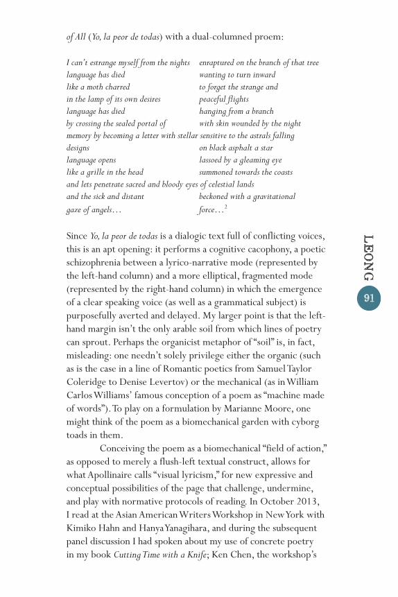
of All (Yo, la peor de todas) with a dual-columned proem:
I can’t estrange myself from the nights enraptured on the branch of that treelanguage has died wanting to turn inwardlike a moth charred to forget the strange andin the lamp of its own desires peaceful flightslanguage has died hanging from a branchby crossing the sealed portal of with skin wounded by the nightmemory by becoming a letter with stellar sensitive to the astrals fallingdesigns on black asphalt a starlanguage opens lassoed by a gleaming eyelike a grille in the head summoned towards the coastsand lets penetrate sacred and bloody eyes of celestial landsand the sick and distant beckoned with a gravitationalgaze of angels… force…2
Since Yo, la peor de todas is a dialogic text full of conflicting voices, this is an apt opening: it performs a cognitive cacophony, a poetic schizophrenia between a lyrico-narrative mode (represented by the left-hand column) and a more elliptical, fragmented mode (represented by the right-hand column) in which the emergence of a clear speaking voice (as well as a grammatical subject) is purposefully averted and delayed. My larger point is that the left-hand margin isn’t the only arable soil from which lines of poetry can sprout. Perhaps the organicist metaphor of “soil” is, in fact, misleading: one needn’t solely privilege either the organic (such as is the case in a line of Romantic poetics from Samuel Taylor Coleridge to Denise Levertov) or the mechanical (as in William Carlos Williams’ famous conception of a poem as “machine made of words”). To play on a formulation by Marianne Moore, one might think of the poem as a biomechanical garden with cyborg toads in them. Conceiving the poem as a biomechanical “field of action,” as opposed to merely a flush-left textual construct, allows for what Apollinaire calls “visual lyricism,” for new expressive and conceptual possibilities of the page that challenge, undermine, and play with normative protocols of reading. In October 2013, I read at the Asian American Writers Workshop in New York with Kimiko Hahn and Hanya Yanagihara, and during the subsequent panel discussion I had spoken about my use of concrete poetry in my book Cutting Time with a Knife; Ken Chen, the workshop’s
LE
ONG
92
GR
IST
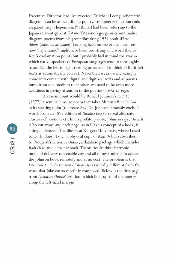
Executive Director, had live tweeted: “Michael Leong: schematic diagrams can be as beautiful as poetry. Trad poetry lineation (mis en page) [sic] is hegemonic!” I think I had been referring to the Japanese avant-gardist Katsue Kitasono’s gorgeously minimalist diagram poems from his groundbreaking 1929 book White Album (Shiro no arubamu). Looking back on the event, I can see how “hegemonic” might have been too strong of a word (hence Ken’s exclamation point) but I probably had in mind the way in which native speakers of European languages tend to thoroughly naturalize the left to right reading process and to think of flush-left texts as automatically correct. Nevertheless, as we increasingly come into contact with digital and digitized texts and as poems jump from one medium to another, we need to be even more fastidious in paying attention to the poetics of mise-en-page. A case in point would be Ronald Johnson’s Radi Os (1977), a seminal erasure poem that takes Milton’s Paradise Lost as its starting point (to create Radi Os, Johnson famously excised words from an 1892 edition of Paradise Lost to reveal alternate clusters of poetic text). In his prefatory note, Johnson says, “To etch is ‘to cut away,’ and each page, as in Blake’s concept of a book, is a single picture.”3 The library at Rutgers University, where I used to work, doesn’t own a physical copy of Radi Os but subscribes to Proquest’s Literature Online, a database package which includes Radi Os as an electronic book. Theoretically, this electronic mode of delivery can enable any and all of my students to access the Johnson book remotely and at no cost. The problem is that Literature Online’s version of Radi Os is radically different from the work that Johnson so carefully composed. Below is the first page from Literature Online’s edition, which lines up all of the poetry along the left-hand margin:
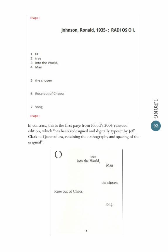
93In contrast, this is the first page from Flood’s 2005 reissued edition, which “has been redesigned and digitally typeset by Jeff Clark of Quemadura, retaining the orthography and spacing of the original”:
LE
ONG

94
GR
IST
Much meaning is lost if the above excerpt is deprived of its original spacing and typography: we lose the visual pun of the “tree” sitting neatly on top of the “World”; we lose the formality of the raised capital “O,” which initiates the insistent assonance that continues with the words “chosen” and “Rose”; and we lose the clever correlation between the words deliberately “chosen” by Johnson and the “chosen” one within the diegesis of the poem. Moreover, what Johnson calls the “single picture” of each page is radically distorted. In marketing material from 2008, LION had even boasted of the inclusion of Johnson among other “highlights”: “Essential works of Postmodern American poetry including representatives of Beat poetry (Allen Ginsberg, Gary Snyder), the Black Mountain School (Robert Creeley, Charles Olson), the New York School (Barbara Guest, Ron Padgett), Deep Image poetry (Robert Bly, Jerome Rothenberg) and Concrete poetry (Ronald Johnson).”4 But as we have seen, concrete poetry loses much of its force if it is thoughtlessly reformatted according to default settings; in fact, formatting is everything. Johnson represents just one important practitioner of concrete, typographic, or visual poetry; recent literary history abounds with poetic texts that exploit the manifold capacities of the printed page in surprising and unconventional ways. One would do well researching the typographic inventions of the historical avant-garde (writers such as Lissitsky, Marinetti, Zdanevich, et al.), the formal hijinks of E.E. Cummings, the architectonic objects found in Emmett Williams’ classic An Anthology of Concrete Poetry (1967), and the open field poetics of the Black Mountain School. And, of course, one mustn’t forget Un coup de dés (1897), which might be the single most groundbreaking text of the nineteenth century in terms of experimental spacing—a text that Mallarmé had “undertaken finally to raise a printed page to the power of the midnight sky” (Valéry). If such examples seem—and I should add that I don’t think they are—too sensational (the avant-garde), too idiosyncratic (Cummings), too gimmicky (concrete poetry), too esoteric (the Black Mountain School), or too inimitable (Mallarmé), I want to stress that every aspect of the page, from letter case to punctuation, stems from an aesthetic choice with significant consequences and such choices should never be taken for granted or cast aside for seemingly more important concerns

95
like word choice or line length. Allow me to illustrate: Two years before the first publication of Un coup de dés, on the other side of the Atlantic, Stephen Crane published The Black Riders and Other Lines (1895), which, along with Herman Melville’s Battle-Pieces and Aspects of the War (1896), is one of the most underappreciated volumes of nineteenth-century American poetry. While it has a far more understated mise-en-page than Mallarmé’s oceanic opus, it still effectively signifies through its typographical design. The text consists of a series of brief numbered sections, which are frequently compressed, enigmatic, and gnomic:
IV YES, I HAVE A THOUSAND TONGUES, AND NINE AND NINETY-NINE LIE. THOUGH I STRIVE TO USE THE ONE, IT WILL MAKE NO MELODY AT MY WILL, BUT IS DEAD IN MY MOUTH.5
Each section is isolated at the top of a single page and the capitalization gives the text a classical feel, calling to mind the Roman square capitals that were used for monuments and formal inscriptions.6 Thus, the poem is cast as a kind of funerary inscription for the “authentic lyric tongue” that dominated much of the Romantic and Victorian poetry that came previously in the century. I want to stress, however, an important caveat: formal features—whether stemming from spacing, typography, or lineation—should never be equated with a universally guaranteed set of meanings. For example, while the capital letters in The Black Riders suggest the durability of inscription, the surrealist beat poet Bob Kaufman (who was called the black Rimbaud by the French) uses capitalization in “TELEGRAM TO ALEX/BAGEL SHOP, NORTH BEACH SF” to mimic the typography of telegrams, emphasizing the immediacy of transmission rather than the aspiration to monumentality:
TOMORROW I AM GOING TO EAT ALL OF THE SUEZ AND PANAMA CANALS, SO PLEASE DO NOT USE YOUR LIGHT & GAS AND REFRAIN FROM EYEBALLING FOR TWO SECONDS, WE HAVE A NEW DEAL FOR CHUCK BAUDELAIRE, THE NEW FRENCH JUNKIE KID TO PAINT SOME TENDER
LE
ONG
96
GR
IST
BATHING SUITS ON MA & PA KETTLE…7
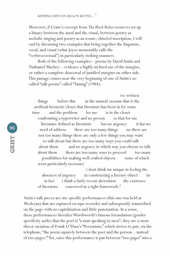
Moreover, if Crane’s excerpt from The Black Riders seems to set up a binary between the aural and the visual, between poetry as melodic singing and poetry as an iconic, chiseled inscription, I will end by discussing two examples that bring together the linguistic, vocal, and visual (what Joyce memorably calls the “verbivocovisual”) in particularly striking manners. Both of the following examples—poems by David Antin and Nathaniel Mackey—evidence a highly stylized use of the margins, or rather a complete disavowal of justified margins on either side. This passage comes near the very beginning of one of Antin’s so- called “talk poems” called “Tuning” (1984):
ive written things before this in the natural vacuum that is the artificial hermetic closet that literature has been in for some time and the problem for me is in the closet confronting a typewriter and no person so that for me literature defined as literature has no urgency it has no need of address there are too many things no there are not too many things there are only a few things you may want to talk about but there are too many ways you could talk about them and no urgency in which way you choose to talk about them there are too many ways to proceed too many possibilities for making well crafted objects none of which seem particularly necessary i dont think im unique in feeling the absences of urgency in constructing a literary object its in fact i think a fairly recent aberration the existence of literature conceived in a tight framework.8
Antin’s talk pieces are site specific performances (this one was held at Wesleyan) that are captured on tape recorder and subsequently transcribed on the page with no capitalization and little punctuation. In a sense, these performances literalize Wordsworth’s famous formulation (gender specificity aside) that the poet is “a man speaking to men”; they are a more direct variation of Frank O’Hara’s “Personism,” which strives to put, via the telephone, “the poem squarely between the poet and the person…instead of two pages.”9 Yet, once this performance is put between “two pages” into a

97
textual format, morphing from live event to “literary object” (a kind of spontaneity “transcripted in tranquility”), the deliberately orchestrated mise-en-page visually simulates both the rhythm of delivered speech (notice how the arrangement of word clusters emphasizes the repetition of the phrase “about them”) as well as the pliability of improvised thought. In a 1992 interview with Hazel Smith and Roger Dean, Antin stated:
Jazz improvisation is work that in some ways I feel very close to, because the language offers you a well-formed grammar. I am not interested in transforming English grammar, but I am interested in the full range of English and its varieties of speech-registers and its ways of movement from here to there.10
Instead of providing a regimented language with a “well-formed grammar,” “Tuning” demonstrates on the page the scattered and uneven “movement from here to there,” and the ample spacings represent turns of thought, momentary gropings for the coming phrase. Well written writing, on the other hand, tends to elide the “here” in favor of the “there”—what Antin is calling the “well crafted object.” For example, polished writing would almost never include a self-revision such as this one: “there are too many things no there are / not too many things there are only a few things.” Yet, these minute articulations, which one might mistake for sloppiness, express a useful creativity. Notice the way Antin makes a seemingly contradictory slide from “natural” to “artificial” in the beginning of the passage: “ive written / things before this in the natural vacuum that is the / artificial hermetic closet that literature has been in for some / time.” How can something be natural and artificial at the same time? But if we carefully follow Antin’s fluctuating thought, we realize that he’s concerned with literature as an ideological construction, and what is ideology other than the naturalization of the artificial and conventional? Poetry “conceived in a tight framework” assumes that the left-hand margin is the natural starting point of the poem, although, as Nathaniel Mackey points out, such a framework doesn’t adequately account for the nuances of spoken or poetic speech. This account of his own compositional practice comes from an interview that was conducted in 1997 with Charles
LE
ONG
98
GR
IST
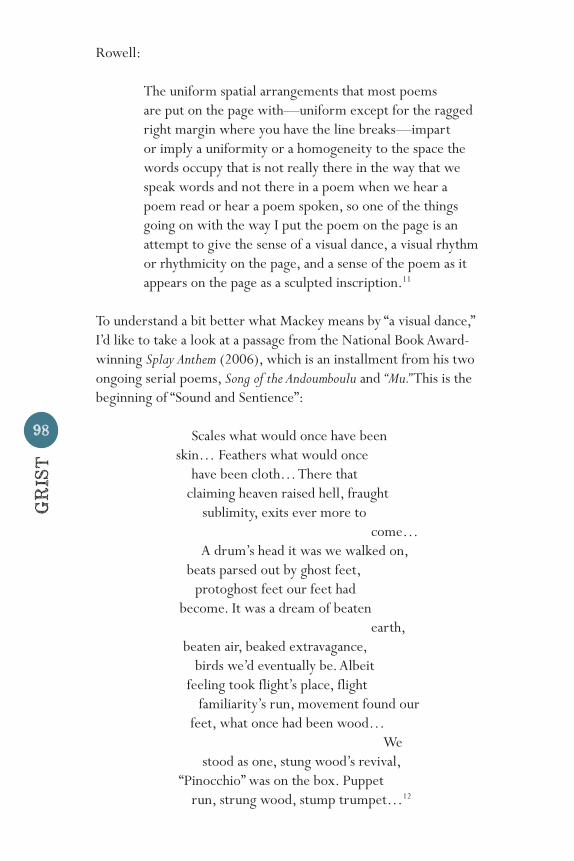
Rowell:
The uniform spatial arrangements that most poems are put on the page with—uniform except for the ragged right margin where you have the line breaks—impart or imply a uniformity or a homogeneity to the space the words occupy that is not really there in the way that we speak words and not there in a poem when we hear a poem read or hear a poem spoken, so one of the things going on with the way I put the poem on the page is an attempt to give the sense of a visual dance, a visual rhythm or rhythmicity on the page, and a sense of the poem as it appears on the page as a sculpted inscription.11
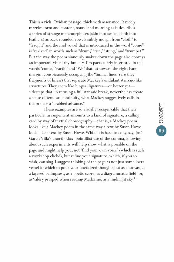
To understand a bit better what Mackey means by “a visual dance,” I’d like to take a look at a passage from the National Book Award-winning Splay Anthem (2006), which is an installment from his two ongoing serial poems, Song of the Andoumboulu and “Mu.” This is the beginning of “Sound and Sentience”:
Scales what would once have been skin… Feathers what would once have been cloth… There that claiming heaven raised hell, fraught sublimity, exits ever more to come… A drum’s head it was we walked on, beats parsed out by ghost feet, protoghost feet our feet had become. It was a dream of beaten earth, beaten air, beaked extravagance, birds we’d eventually be. Albeit feeling took flight’s place, flight familiarity’s run, movement found our feet, what once had been wood… We stood as one, stung wood’s revival, “Pinocchio” was on the box. Puppet run, strung wood, stump trumpet…12
99
This is a rich, Ovidian passage, thick with assonance. It nicely marries form and content, sound and meaning as it describes a series of strange metamorphoses (skin into scales, cloth into feathers) as back rounded vowels subtly morph from “cloth” to “fraught” and the mid vowel that is introduced in the word “come” is “revived” in words such as “drum,” “run,” “stung,” and “trumpet.” But the way the poem sinuously snakes down the page also conveys an important visual rhythmicity. I’m particularly interested in the words “come,” “earth,” and “We” that jut toward the right-hand margin, conspicuously occupying the “liminal lines” (are they fragments of lines?) that separate Mackey’s undulant stanzaic-like structures. They seem like hinges, ligatures—or better yet—sidesteps that, in refusing a full stanzaic break, nevertheless create a sense of tenuous continuity, what Mackey suggestively calls in the preface a “crabbed advance.” These examples are so visually recognizable that their particular arrangement amounts to a kind of signature, a calling card by way of textual choreography—that is, a Mackey poem looks like a Mackey poem in the same way a text by Susan Howe looks like a text by Susan Howe. While it is hard to copy, say, José Garcia Villa’s unorthodox, pointillist use of the comma, knowing about such experiments will help show what is possible on the page and might help you, not “find your own voice” (which is such a workshop cliché), but refine your signature, which, if you so wish, can sing. I suggest thinking of the page as not just some inert vessel in which to pour your poeticized thoughts but as a canvas, as a layered palimpsest, as a poetic score, as a diagrammatic field, or, as Valéry grasped when reading Mallarmé, as a midnight sky.13
LE
ONG
100
GR
IST
Endnotes1 Joan M. Reitz, Online Dictionary for Library and Information Science, < http://www.abc-clio.com/ODLIS/odlis_m. aspx>.2 Estela Lamat, I, the Worst of All (BlazeVox, 2009), p. 12. 3 Ronald Johnson, Radi OS (Flood, 2005).4 Literature Online, “What’s New?” <http://lion. chadwyck.com/marketing/whatsnew.jsp>.5 Stephen Crane, Prose and Poetry (Library of America, 1984) p. 1300.6 The Boston-based publishing firm Copeland and Day, which was inspired by the Pre-Raphaelites and the Arts and Crafts Movement, was responsible for the layout and design of The Black Riders. According to Paul Sorrentino, “Although Crane seemed pleased with the design, he had not collaborated with the publisher on the book’s production and cared little about the matter. The manuscripts of Crane’s poems reveal no special regard for layout and a completely conventional use of capitalization.” A Life of Fire: Stephen Crane (Harvard UP, 2014), p. 158.7 Bob Kaufman, Cranial Guitar (Coffee House, 1996), p. 123.8 David Antin, Tuning (New Directions, 1984), pp. 105- 106.9 The Collected Poems of Frank O’Hara, ed. Donald Allen (U of California P, 1971), p. 499.10 Hazel Smith, David Antin, and R.T. Dean, “Talking and Thinking: David Antin in Conversation with Hazel Smith and Roger Dean,” Postmodern Culture (May 1993).11 Charles H. Rowell, “An Interview with Nathaniel Mackey,” Callaloo 23.2 (Spring 2000): pp. 703-715.12 Nathaniel Mackey, Splay Anthem (New Directions, 2006), p. 86.13 If this last instance strikes you as gratuitous, see Stephanie Strickland’s tremendous digital poem V: Vniverse (http://vniverse.com/), which raises, not the page, but the computer screen “to the power of the midnight sky.”