The invention of printing - Wikimedia Commons
570
-
Upload
khangminh22 -
Category
Documents
-
view
0 -
download
0
Transcript of The invention of printing - Wikimedia Commons

U38AH.T
KMOftL
%

//<XAA~«*&/+,
>x• ;
: * „
V
1 e>,
'4/

USBAHY•CHOttL


USBAKYSCHOfL

>|f §nmitiimt nl fnnim^

U3BARYKHOftL

THE
INVENTION OF PRINTING
% €olkttxon oi Jfacts attir Opinions
DESCRIPTIVE OF
EARLY PRINTS AND PLAYING CARDS,THE BLOCK-BOOKS OF THE FIFTEENTH CENTURY,
THE LEGEND OF LOURENS JANSZOON COSTER, OF HAARLEM,AND THE WORK OF JOHN GUTENBERG
AND HIS ASSOCIATES.
KHustratetr .
WITH FAC- SIMILES OF EARLY TYPES AND WOOD-CUTS.
BY
THEO. L. DE VINNE.
Second <£Dition.
* SUrebp. tongues arc ftnotone, fctiofolebgc grotoctb, jubgmentcncreasrtfj, boobs arc bisperscb, the Scripture is scene, tfjc boctors
be rcab, stories be opencb, times compare*!, truth biscerrtcb, fals=
boob beteeteb, anb Snittj finger pointcb, anb all, as S saib, tbrougfj
tfje benefit Of printing. Fox's Acts andMonuments.
NEW-YORK:FRANCIS HART A.N D CO. 63 & 65 MURRAY STREET,
LONDON: TRUBNE'R 'AND COMPANY.
1878.
L I W R A u v
UNIVERSITY OF
CALIFORNIA.

&
ENTERED, ACCORDING TO ACT OF CONGRESS, IN THE YEAR 1876, BY
Theodore L. De Vinne,
IN THE OFFICE OF THE LIBRARIAN OF CONGRESS AT WASHINGTON.

TO
DAVID WOLFE BRUCE,
IN ACKNOWLEDGMENT
OF INSTRUCTION ABOUT TYPES, NOT TO BE HAD BY READING,
OF ASSISTANCE IN STUDIES, NOT TO BE FOUND IN PUBLIC LIBRARIES,
OF COMPANIONSHIP MORE PLEASANT THAN BOOKS,
THIS WORK IS DEDICATED
BY HIS FRIEND,
THEO. L. DE VINNE.


CONTENTS.
I The Different Methods of Printing 17
II Antique Methods of Impression and their Failure 29
III ... . The Key to the Invention of Typography 49
IV The Image Prints of the Fifteenth Century 69
V Printed and Stenciled Playing Cards 88
VI The Chinese Method of Printing 109
VII . . . The Early Printing of Italy 122
VIII . . .The Introduction of Paper in Europe 133
IX The Book-makers of the Middle Ages 146
X The Preparations for Printing 171
• XI Block-Books of Images without Text 193 .
XII . . . .Block- Books of Images with Text 230
XIII . . .The Donatus, or Boy's Latin Grammar 254
XIV. . . .The Speculum Salutis, or Mirror of Salvation 264
XV ....The Works and Workmanship of an Unknown Printer. .. .282
XVI The Period in which the Speculum was Printed 308
XVII . . . The Legend of Lourens Janszoon Coster 326
XVIII. .The Growth of the Legend 347
XIX . . .The Downfall of the Legend 360
XX . . . John Gutenberg at Strasburg 375
XXI .. . Gutenberg and his Earlier Work at Mentz 403
XXII . .The Later Work of Gutenberg 431
XXIII. .The Work of Peter Schceffer and John Fust 449
XXIV . .Alleged Inventors of Printing 480
XXV . . . The Spread of Printing 492
XXVI . .The Tools and Usages of the First Printers 514
Authorities Consulted 543
INDEX 547

ILLUSTRATIONS.
Statue of John Gutenberg. . .Frontispiece.
Surface Exposed to Impression by
Copper-plate method 21
Surface Inked and Exposed to Im-
pression by Typographic method. 21
Surface Exposed to Impression by
Lithographic method 21
Face of a large Type, showing howthe Letter is placed on the body.
.
24
Side view of Canon body 25
Small Pica, Agate and Diamond body 25
View of body inclined to show the face 25
Stamped Brick from Babylon 30
Fac-simile of Impression on brick. .
.
31
Egyptian Stamp for impressing bricks 32
Assyrian Cylinder 34
Old Roman Stamps 37
Roman Stamps 38
Roman Scrinium and rolls of papyrus 43
Types of Irregular Body 52
Punch 55
Matrix 55
Illustrations of Type-bodies 56
Type-Mould, without matrix 57
O ne-half of the Mould 57The other half of the Mould 57Type-casting as practised in 1683. .
.
59Type-casting as practised in 1564. . . 62
Print of St. Christopher 70
Print of the Annunciation 72
Print of St. Bridget 74
Flemish Indulgence Print 76
Brussels Print '. 79Berlin Print 81
Playing Card of the fifteenth century 93Print Colorer 94Engraver on Wood 95
Chinese Playing Cards 99Early French Playing Cards 103
French and German Playing Cards of
the fifteenth and sixteenth centuries 105
Fac-simile of part of a Chinese Book. 117
Chinese Types made in London. . . . 117
Mark of Jacobus Arnoldus, 1345 123
Mark of Johannes Meynersen, 1435. 123
Mark of Adam de Walsokne, 1349. . 125
Mark of Edmund Pepyr, 1483 125
Mark of an unknown person 125
Japanese Method of Making Paper. 135
Paper-Mill of the sixteenth century. 140
Scriptorium of the middle ages 149
Penmanship of the ninth century. . . 150
Manuscript of the fifteenth century. . 152
Medieval Bookbinding 153
Medieval Illuminator 154
Sumptuously Bound Book 156
Medieval Book with covers of oak. . . 157
Book Cover in Ivory, Byzantine style 158
Seal of the University of Paris 161
English Horn-Book 174
English Clog 175
Holbein's Dance of Death 183
Dance of Death, as shown in the
Nuremberg Chronicle 185
Last page of the Bible of the Poor. 197
First page of the Bible of the Poor,
as made by Walther and Hurning 209
First page of the Apocalypse 213
First page of the Canticles 217
Story of the Blessed Virgin 221
Exercise on the Lord's Prayer 223
Illustration from the Book of Kings 225
Letter K of Grotesque Alphabet... 227
Page from the Apostles' Creed 228

ILLUSTRATIONS.
Page from the Eight Rogueries 229
Page from' the Antichrist 232
Page from the Ars Memorandi 234
Page from the Ars Moriendi 237
Chiromancy of Doctor Hartlieb 240
Calendar of John of Gamundia 242
Page from the Wonders of Rome. . . 243
Pomerium Spirituale 244
Temptations of the Devil 245
Life of St. Meinrat 246
Heidelberg Dance of Death 247
German Donatus, from a block in the
National Library at Paris 258
Fragment of an early Donatus 259
Early Dutch Horarium 260
Imprint of Conrad Dinckmut 262
First page of Speculum Salutis 266
Last page of Speculum Salutis 268
Types of Speculum Salutis 277
Types in third edition of Speculum. 285
Types of Fables of Lorenzo Valla. . . 286
Types of Peculiarities of Criminal Law 287
Types of Epitaphs of Pope Pius 11 . . . 288
The Enschede Abecedarium 290
Experimental Letters drawn on wood 294Types from Experimental Letters. . . 295Frisket, Tympan and Bed of an early
European Printing Press 307
Paper-marks: seven illustrations, 309, 310
Types of Jacob Bellaert 319Types of John Brito 321
Map of the Netherlands 323Scriverius' Portrait of Coster 333Statue of Coster in Doctors' Garden. 351
Medals in honor of Coster 353, 354Statue of Coster on the monument. . 359Autograph of Laurens Janszoon 361
House of Coster 370Portrait of Laurens Janszoon Coster 371
Spurious Portrait by Van den Berg. . 372
Portrait attributed to Van Oudewater 372
The Laurens Janszoon ofMeerman . . 373
Medieval Press 395Type-mould of Claude Garamond. . 399
Types of the Donatus attributed to
Gutenberg at Strasburg 401
Types of Donatus of 1451 405
De la Borde's Illustration of Types. . 406
Holbein's Satire on the Indulgences. 407
Letter of Indulgence dated 1454 409
Types of Bible of 36 Lines 413
Abbreviations of Bible of 36 Lines . . 414
Portrait of John Fust 417
Types of Bible of 42 Lines 423
Portrait of John Gutenberg 429
Types of Letter of Indulgence of 1461 433
Types of Catholicon of 1460 435
Types of Celebration of the Mass. . . 437
Types of Mirror of the Clergy 438
Colophon written by Peter SchcefFer. 450
Types of the Psalter of 1457 453
Colophon of the Psalter of 1457 455
Types of the Rationale Durandi .... 461
Types of the Bible of 1462 462
Trade-mark of Fust and SchcefFer. . . 462
Types of Constitutions of Clement v 463
Portrait of Peter SchcefFer 469
Types of the Grammar of 1468 470
Illustration from the Book of Fables . 483
Arms of the Typothetae 489
Part of Koburger's Map of Europe. 496
The Birth of Eve, Zainer's 497
Statue of Gutenberg at Strasburg. . . 509
Type of the fifteenth century 520
Printing Office of sixteenth century. 523
Hand Press of Jodocus Badius 528
Inking Balls of sixteenth century. . . . 530
Large wood-cut of fifteenth century. 535
The Fall of Lucifer, Zainer's 537
A Print of 1475 539


I
PREFA CE.
Z*HE Invention of Printing has always been recognized
by educated men as a subject of importance : there is no
mechanical art, nor are there any of the fine arts, about whose
early history so many books have been written. The subject is
as mysterious as it is inviting. There is an unusual degree
of obscurity about the origin of the first printed books and the
lives and works of the early printers. There are records and
traditions which cannot be reconciled of at least three distinct
inventions of printing. Its early history is entangled with a
controversy about rival inventors which has lasted for more
than three centuries, and is not yet fully determined.
In the management of this controversy, a subject intrinsic-
ally attractive has been made repulsive. The history of the
invention of printing has been written to please national pride.
German authors assert the claims of Gutenberg, and discredit
traditions about Coster. DutcJi authors insist on the priority
of Coster, and charge Gutenberg with stealing the invention.
Partisans on each side say that their opponents have perverted
the records and suppressed the truth. The quarrel has spread.
English and French authors, who had no national prejudices to
gratify, and who should have considered the question without
passion, have wrangled over the subject with all the bitterness
of Germans or Hollanders. In this, as in other quarrels, there
are amusing features, but to the general reader the controversy
seems unfortunate and is certainly wearisome.
It is a greater misfortune that all the early chronicles of
printing were zvritten in a dead language. Wolf's collection

10 PREFACE.
of Typographic Monuments, which includes nearly every paper
of value written before 1740, is in Latin ; the valuable books
of Mcerman, Maittaire, and Schoepflin are also in Latin. To
the general reader these are sealed books: to the student, whoseeks exact knowledge of the methods of the first printers, they
are tiresome books. Written for the information of librarians
rather than of printers, it is but proper that these books should
devote the largest space to a revietv of the controversy or to a
description of early editions ; but it is strange that they should
so imperfectly describe the construction and appearance of early
types and the usages of the early printers. The mechanical
features of typography were, apparently, neglected as of little
importance, and beneath the dignity of history.
A failure to present accurate illustrations of early printing
is not the fault of modern authorities. Many of them are full
of facsimiles bearing the marks of minute and conscientious
care ; but they are in foreign languages, and are seldom found
in our largest American libraries. There are, it is true, a fewbooks in English on early printing wJiicJi have accurate fac-
similes ; but high prices and limited editions put them out of
the reach of the ordinary book-buyer. They zvcre written by
and for librarians only.
Valuable as all these books are, they disappoint the printer.
Some of them, though presenting fac-similes in profusion, are
not accompanied with proper explanations in the text : others
are devoted to one branch only of early printing, such as block-
books, or the printed work of one nation only. Two of them
are untrustworthy as authorities. Neither from one book, nor
from all the books, can a printer get a clear description of the
mechanical development of typography. This incompleteness
was frankly acknowledged by Dr. Dibdin, when lie said that
there was no work in the English language which deserved to
be considered as a complete general history of printing. This
was an old complaint. Nearly a hundred years before, Prosper
Marehaud had said that the history of printing, voluminous
as it then seemed, was but history in fragments.

PREFA CE. I I
The first attempt to supply this great deficiency was made
by August Bernard, in the disquisition published at Paris, in
the year 1853, under the title, De l'origine et des debuts de
l'imprimerie en Europe. His was the first book in which the
printed work attributed to Coster and Gutenberg was critically
examined from a typographic point of view. To readers who
were not content with the vague descriptions of popular books
°f typography, tne explanations of Bernard were of peculiar
value. I had reason to think that a translation of the history
of this eminent printer would be received by American printers
with some measure of the favor which the original had met
with in Europe. Impressed with this belief, I began the work.
Ifound it necessary to consult many of Bernard's authori-
ties. My admiration of the superior method and forcible style
of Bernard, an admiration still unabated, was increased by the
reading of the new books ; but the esteem in which I hold his
valuable work does not prevent the regret that, in his entire
neglect of the block-books, he should have overlooked the most
significant feature of early printing. The facsimiles of early
prints, subsequently shown in The Infancy of Book Printing
of Weigel and in The Typographic Monuments of Holtrop,
convinced me that the earliest practice of typography had its
beginning in a still earlier practice of printing from blocks,
and that a description of block-books should precede a descrip-
tion of the invention of types.
Since these books were written, all the old theories about
the origin of typography have been examined with increased
interest, and discussed with superior critical ability, by many
eminent European scholars. Discoveries of great importance
have been made; old facts have been set forth in new lights;
traditions accepted as truthful history for three hundred years
have been demolished. Of the many able men who have been
engaged in this task of separating truth from fiction, no one
has done more efficient service than Dr. A. Van der Linde of
The Hague, whose papers on the traditions of typography are
masterpieces of acute and scholarly criticism. His researches

12 PREFA CE.
and reasoning convinced me that it would be unwise to offer a
translation of any previously pnblislied book as a fair exponent
of modern knowledge about early typograpliy. The newly dis-
covered facts were opposed to early teachings ; there could be
no sewing of the new cloth on the old garment. I was led
away from my first purpose of translation, and, almost uncon-
sciously, began to collect the materials for the present volume.
Until recently, the invention of printing has been regarded
as a subject belonging almost entirely to bibliographers. The
opinions of type-founders and printers who had examined old
books have been set aside as of no value, whenever they were
opposed to favorite theories or legends. This partial treatment
of the subject is no longer approved: a new school of criticism
invites experts to examine the books, and pays respect to their
conclusions. It claims that the internal evidences of old books
are of higher authority than legends, and that these evidences
are conclusive, not to be ignored nor accommodated to the state-
ments of the early chroniclers. European critics do not hesitate
to say that the confusing and contradictory descriptions of the
origin of printing are largely due to the improper deference
Jieretofore paid to the statements of men who tried to describe
processes wliich they did not understand. They say, also, that
too little attention has been paid to the types and mechanics of
early printing. Criticisms of this character led me to indulge
the hope that I might find gleanings of value in the old field,
and that it would be practicable to present them, with tin-
newly discovered facts, in a form which would be acceptable
to the printer and the general reader. In this belief and for
this purpose, this book was written.
I would not have begun this work, if I had not felt assured
that a thorough revision of the subject was needed. The books
and papers on typography which are most popular, and are
stilt accepted as authoritative by the ordinary reader, repeat
legends which have recently been proved untrue; they narrate,
as established facts of history, methods of printing wliich are
not only incorrect but impossible. It is time that the results of
PREFACE. 13
the more recent researches should be published in the English
language. But I offer them only as the cotnpiler of accredited
facts: I have no original discoveries to announce, no specula-
tive theories to uphold. Nor shall I invade the proper field of
librarians and bibliographers. I propose to describe old types,
prints and books as they are seen by a printer, and with refer-
ence to the needs of printers and the general reader, avoiding,
as far as I can, all controversies about matters which are of
interest to book-collectors only. The historicalpart of the record
will be devoted chiefly to the printed ivork of the first half of
the fifteenth century. It will begin with descriptions of the
earliest forms of printing, as shown in image prints, playing
cards and block-books ; it will end with the establishment of
typography in Germany.
Believing that a verbal description of old books and prints,
without pictorial illustrations, would be unsatisfactory, I have
provided many facsimiles of early printing. No part of this
work zvill more fully repay examination than its illustrations,
which have been carefully selected from approved authorities,
or from originals. Reproduced by the new process of photo-
engraving, they are accurate copies of the originals, evert zvhen
of reduced size. As they are printed with the descriptive text
by the same method of typographic presswork, it is believed that
they will more clearly illustrate the subject than lithographed
fac-similes on straggling leaves.
In trying to make plain whatever may be obscure about
the mechanics of printing, I have thought proper to begin the
explanation with a description of its different methods. Anintroduction of this nature is not an unwarrantable digression.
It is important that the reader should have an understanding
of the radical differences between typography and xylography
on the one side, arid lithograpJiic and copper-plate printing on
the other, as well as some knozvledge of the construction and
uses of the more common tools of type-founders.
I do not propose to give any extended quotations in foreign
languages. Wherever an approved translation in English has

14 PREFA CE.
been found, it has been substituted for the original text ; where
translatio?is have not been approved, they have been made anew.
Writing for the general reader, I have assumed that he would
prefer, as I do, in every book to be read and not studied, a
version in English rather than the original text. Believing
that the frequent citation of authorities, especially in instances
where the facts are undisputed, or where the books are inacces-
sible, is an annoyance, I have refrained from the presentation
offoot-notes which refer to books only. I have, in a few cases,
deviated from this course where the matters stated were of a
character which seemed to require the specification of authority.
One of the greatest impediments I encountered when about
to begin the compilation of this zvork was the difficulty of access
to books of authority. I do not mention this in disparagement
of the management of our public libraries, for I know that old
books are liable to injury in the hands of the merely curious,
and that librarians have little encouragement to collect scarce
books on typography. To prove that there is small inquiry for
treatises of this character, it is enough to say that I have had
to cut open the leaves of valuable books after their rest for manyyears on the shelves of one of the largest libraries of this city.
But if these books were ever so abundant, the proper restrictions
placed on their use were a hindrance to one whose chief oppor-
tunity for consulting them is at night.
Here I am pleased to acknowledge my indebtedness to Mr.
David Wolfe Bruce. He has not only accompanied and aided
me in repeated examinations of his very valuable collection of
fifteenth century books, but has lent me all the books I desired,
and has freely given me unlimited time for their study. This
collection— replete with all the books of authority I needed, with
specimens of types, wood-cuts, and curiosities of type- founding,
which illustrate the growth of printing front its infancy— was
more admirably adapted to my needs than that ofany library on
this Continent. Deprived of Mr. Truce's generous assistance,
my work would have been greatly restricted in its scope, andshorn of its best features of illustration.

PREFACE. jc
/ began this work intending to describe only the mechanical
development of early printing, but I could not keep the matter
strictly within this limit. Hedged in this narrow space, the
story would be but half told. The true origin of typography is
not in types, nor in block-books nor image prints. These were
consequences, not causes. The condition of society at the close
of the middle ages ; the growth of commerce and manufactures
;
the enlarged sense ofpersonal liberty ; the brawls of ecclesiastics
in high station, and their unworthy behavior; the revolt of the
people against the authority of church and state; the neglect ofduty by the self-elected teachers of the people in their monopoly
of books and knowledge ; the barrenness of the edtication then
given in the schools; the eagerness of all people for the mental
diversion offered in the new game ofplaying cards; the unsat-
isfied religious appetite which hungered for image prints anddevotional books ; the facilities for self-education afforded by the
introduction ofpaper,— these were among the influences which
p7'oduced the invention of printing. They are causes which
cannot be overlooked. My inability to describe them with the
fullness which they deserve would not justify their total neg-
lect. I have devoted more space to them than is customary in
treatises on early printing, but I have to admit, with regret,
that they have been too curtly treated. I have done but little
more than record a few of the more noticeable facts—enough,
perhaps, to show that the state of education and society, in its
relation to the invention of printing, deserves a more extended
description than it has hitherto received. If I can succeed in
awakening the attention of printers, and those who look on
a knowledge of printing as a proper accomplishment of the
scholar, to the nature and extent of these influences, to the
curiosities of literature hidden in apparently dry books ofbibliography, and to the value of the lesson of patient industry
and fixed purpose taught by the life of John Gutenberg, the
object of this book will have been accomplished.

L 1 B B
UNIVERSITY OF
CALIFORNIA.
i|s JHlfenl Hdfpk ttf )prjnling.
Impression is used in many Arts. . .Printing implies the use of Ink and Paper. . .Four Methods of
Printing. . .Steel-plate or Copper-plate, the artistic method. . .Lithography, the scientific method.
Typography, the useful method . . . Xylography, the primitive method . . . Illustrations of Copper-
plate and Lithographic Printing Surfaces ... Process of Copper-plate Printing. . .Its Merits and
its Defects ... Process of Lithographic Printing. . .Its Advantages and Limitations ... Theory of
Typography, with Illustrations of the Face and Body of Types. . .Superiority of Movable Typesover Engraved Letters. . .Stereotype. . .Superiority of the Typographic Method in its Presses and
its Process of Inking. . .Xylography. . .Period when each Method was Introduced. . .A Meaningin their almost Simultaneous Introduction.
punting, ujc art, art, or practiee of impressing Utters, rfjaractcrs, or figures on
paper, rlotf), or otljer material ; tfje business of a printer ; tDpograpf);]).
SgjjograjJijn, tlje art of printing, or tfje operation of impressing letters aritJ foor&s
On forms of tgpeS. Webster.
printing, tfje iusiness of a printer ; tfje art or process of impressing letters or
foor&s; tjipograpfjj) ; tfje process of staining linen Mtfj figures.
2T21>ograpf)», tfje art of printing. Worcester.
$rtut, to press, mark, stamp or infix letters, rfjararters, forms, or figures.
Richardson.
THESE definitions of printing are based on its derivation
from the Latin, premo, to press, and on the supposition
that its most characteristic feature is impression. From a
technical point of view, the definitions are incomplete ; for
printing and typography are made synonymous, while manyleading, but totally different, methods of impressing letters,
characters and figures, are not even noticed. Impression is
employed in the manufacture of calico, paper-hangings, oil-
cloth, figured crockery, and in many other arts which have
no connection with each other. Under right conditions, the

jg the different methods of printing.
action or the impress, of light makes a photograph. Under
different conditions, the pressure of the breath makes hollow
glassware. Moulding, coining, stamping and embossing are
other methods of impression ; but the men who practise these
methods are not known as printers. The word printing has
acquired a conventional meaning not entirely warranted by-
its derivation. It means much more than impression. It is
commonly understood as a process in which paper and ink are
employed in conjunction with impression.
Printing and typography are not strictly synonymous, as
may be inferred from the definitions. Typography, although
the most useful, is not the only form of printing. Printing
on paper with ink is done by four methods. Each method
is, practically, a separate art, distinct from its rivals in its
theory, its process, and its application. These methods are
:
Steel-plate or Copper-plate printing, in which the subject
is printed from an etching or engraving below the surface of
a plate of steel or of copper.
Lithography, in which the subject is printed from a trans-
ferred engraving on the surface of a prepared stone.
Typography, in which the subject is printed from a com-
bination of movable metal types cast in high relief.
Xylography, in which the subject is printed from a design
engraved on a block of wood in high relief.
The distinct nature of the substances in use for printing
surfaces by the four methods should be enough to teach us
that the methods are entirely different. But the manner in
which the letters, designs or figures of each method are put
on the respective printing surfaces will show the differences
more noticeably. In typographic and xylographic work, the
matter to be printed is cast or cut in high relief, or above the
surface ; in lithographic work, it is put on the smooth surface
of the stone, in relief so slight that it is almost level with the
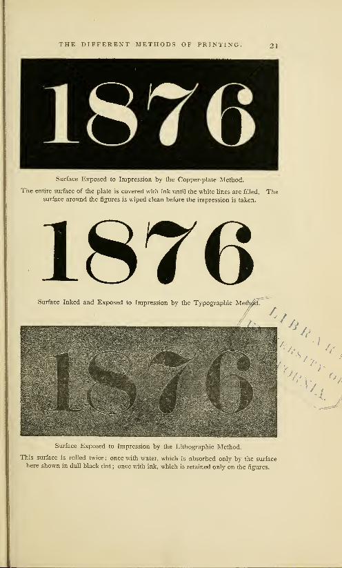
surface ; in steel and copper-plate, it is cut below the surface
which receives the impression. The illustration on the next
page shows, but in an exaggerated form, the appearance of a
^nm

THE DIFFERENT METHODS OF PRINTING. 19
single line, cut across, or in a vertical direction, when it has
been prepared for printing by each of the different methods
:
It will be seen that the line prepared for printing by the
typographic or xylographic method can be inked with facility,
and that, when compared with a similar line in lithographic
or copper-plate work, it presents but a small surface and a
slighter resistance to impression.
-B YTypography or Xylography.
A. Elevated line; the
only part of a typographic
or of a xylographic surface
which receives the ink andimpression.
B. The shoulder of the
type, or the field of the
block; it receives neither
ink nor impression.
Lithography.
C. Transferred surface
line ; the only part of the
surface which receives ink
and repels moisture.
D. The surface of the
stone, that imbibes moist-
ure and repels greasy ink
;
it receives the full force of
impression in every part.
Copper-plate or Steel-plate.
E. The line printed,
which is engraved below
the surface of the plate,
and is filled with ink.
F. The smooth face
of the plate, which makesno mark on the paper,
but which receives the full
force of impression.
The process of copper-plate printing begins with heating
the plate, and rolling it with ink, until the incised lines have
been filled. The face of the plate is then wiped clean, care
being taken that the ink in the incised lines, is not removed.
A moistened sheet of paper is then laid on the plate, and
an impression is taken by forcing it under the cylinder of a
rolling press. Under this pressure, the paper is forced in the
sunken lines filled with ink, and the ink sticks to the paper.
Copper-plate printing is, in all points, the reverse of typo-
graphic printing. The engraved lines, cut below the surface,
are filled with ink in a compact body, and not in a thin film,
liable to spread under pressure, as it may on* a type or on a
wood-cut ; the ink from a copper-plate is pressed in such a
way that it re- appears on the paper in a low relief— it is not
squeezed on and flatted out, but stands up with sharper line
and shows a greater depth of color. The slenderness of the
incised lines, the fineness and hardness of the metal, and the
peculiar method by which the ink is laid on the plate and
fixed to the paper, give to prints from engravings on steel or

20 THE DIFFERENT METHODS OF PRINTING.
on copper a sharpness of line, a brilliancy of color, a delicacy
of tone, and a receding in perspective, which have always won
for this branch of printing the preference of artists. Yet it is
a slow and expensive process. A steel-plate engraver may be
engaged for many months upon a large plate, from which but
forty perfect impressions can be taken in a day. On ordinary
work on a large plate, three hundred impressions per day is
the average performance of a copper-plate press.
Steel and copper-plate printing is largely used for bank-
notes, portraits, fine book illustrations, revenue and postage
stamps, and sometimes for commercial formularies, but it is
in every way unfitted for the printing of books. It has not
been much improved since its invention. Steel plates may
be duplicated by means of electrotyping, or by the process of
transfer to soft steel, but these duplicates cannot be made so
cheaply as typographic stereotype plates, nor so promptly as
transfers by lithography. The inking and cleansing of the
plate, always dirty and disagreeable work, has hitherto been
done only by hand. All the manipulations of copper-plate
work are slow and difficult: they present many obstacles to
the use of labor-saving machinery.
In lithography the design to be printed, which may be
engraved on stone or copper, or written with pen on paper,
is transferred by a greasy ink upon the smooth surface of a
stone of peculiar fineness and firmness. This stone, which is
found in its best state only in Bavaria, where the art was
invented, is a variety of slate, which faithfully responds in
printing to the slightest touch of a graver or a crayon, and
permits the use of fine shades and tints which cannot be
produced on wood or on copper. The transferred lines of
the design cling to and dry upon the surface of the stone,
which is then subjected to the action of a weak acid, which
hardens the ink in the transferred lines, while it slightly
etches and lowers the surface where it is unprotected. The
process of printing begins by dampening the stone with a
moist sponge, the water in which is absorbed by the unpro-
utumra
THE DIFFERENT METHODS OF PRINTING. 21
Surface Exposed to Impression by the Copper-plate Method.
The entire surface of the plate is covered with ink until the white lines are filled. Thesurface around the figures is wiped clean before the impression is taken.
1876Surface Inked and Exposed to Impression by the Typographic Methx£f'
Surface Exposed to Impression by the Lithographic Method.
This surface is rolled twice : once with water, which is absorbed only by the surface
here shown in dull black tint ; once with ink, which is retained only on the figures.

22 THE DIFFERENT METHODS OF PRINTING.
tected face of the stone, while it is repelled by the hard
greasy matter in the transferred lines. The inking roller is
then applied to the stone with a contrary result; the moist-
ened surface repels the greasy ink, but the transferred lines
attract and retain it. When an impression on paper is taken,
the only part of the paper which receives ink is that part
which touches the transferred lines. The theory of lithog-
raphy is based upon the repulsion between grease and water.
Lithographic printing is chemical printing.
Lithography is the most scientific and the most flexible
of all methods of printing. It can imitate fairly, and it often
reproduces with accuracy, a line engraving on steel, a draw-
ing in crayon, the manuscript of a penman, or the painting
in oil of an artist. By the aid of photography, it can repeat,
in an enlarged or diminished size, any kind of printed work.
It has many advantages over copper-plate and xylography.
For some kinds of work, like autograph letters and rude dia-
grams, engraving is unnecessary ; the design may be written
with oily ink on paper, and can then be transferred direct
from the written copy to a stone without the aid of a graver.
The transferring process is another peculiarity of this art
which allows the lithographer to duplicate small designs with
greater facility and economy than a similar duplication could
be effected by the stereotyper of types. These advantages
are counterbalanced by one great defect : lithography is not
a quick method of printing. The usual performance of the
lithographic hand press when applied to ordinary work, is
about four hundred impressions per day ; on the steam press,
the performance is about five thousand impressions per day.
The arts of lithography and copper- plate are useful and
beautiful methods of printing, but they do not make books
and newspapers. ' The necessity which compels them to
1 The- Daily Graphic of New paper which is done by lithography.
York, may be offered as an excep- The side which gives it value as a
tion to this assertion, but this news- newspaper is printed with ordinary
paper really confirms its correctness, printing types, and this result could
It is the illustrated side only of this be accomplished by no other method.
^MBBBH

THE DIFFERENT METHODS OF PRINTING. 23
make a new engraving for every new subject restricts themalmost exclusively to the field of art and ornament. If noother method of printing were known, encyclopedias andnewspapers would be impossibilities. "The art preservative
of all arts" is not the art of lithography nor of copper-plate.
This distinction rightfully belongs to Typography only.
The theory upon which this method is based is that of the
independence of each character, and of the mutual depend-
ence of all its characters. Every character is a separate andmovable type, so made that it can be arranged with others
in an endless variety of combinations. The types used for
this page are used for other pages in this book; they can
be re-arranged for use in the printing of many other booksor pamphlets ; they cease to serve only when they are wornout. All other methods of printing require, at the outset, the
engraving on one piece of wood or metal of all the letters
or parts of a design, which, when once combined, cannot beseparated ; they can be applied only to the object for whichthey were first made.
Typography is most successful when it is applied to the
letters of the alphabet. It fails totally when applied to maps,
or to any kind of printed work requiring irregularly varyinglines. It is only partially successful in the representation of
combined ornaments and the characters of music. Its true
field is in the representation of words and thoughts, and here
it is supreme. There is no other method of printing whichcan do this work so perfectly.
Typography has a great advantage over other branches
of printing in the cheapness of its materials. Type-metal is
cheaper by weight than copper or steel, or the finer quality
of lithographic stone : by measurement, it is cheaper than
the box-wood used by engravers. Types are cheaper thanengraved letters. A pound of the types by which this pageis printed contains about 320 pieces of metal, the cost of
which is but 48 cents. Types are made of many forms or
faces, but they are always of uniform height, and are always

24 THE DIFFERENT METHODS OF PRINTING.
truly square as to body, so that they can be fitted to each
other with precision, and can be interchanged with facility.
The expense of combining types in words is trivial, as
compared with the cost of engraving for lithographic or for
copper-plate printing. An employing printer's price for the
composition of a page like this would be, at the high rates
of New-York city, $1.10. The engraving of such a page, by
any method, would cost at least three times as much as the
types and their composition. If never so carefully done, the
engraved letters would not be so uniform, nor so satisfactory
to the general reader, as the types. The engraved letters
would cost more, but they could be used only for the work
for which they were made. In typographic printing, there
is no such restriction as to use, and no such loss of labor.
It is only the labor of composition which need be lost; the
types remain, but little more worn, or little less perfect, than
when they were first put in use.
HLetter H, from a Em, or full square Face of the letter as it
type of Canon body. of Canon body. appears on the body.
The Face of a Large Type, showing the manner in which the Letter
is placed on the Body. 1
The labor of composition is not always lost. A page of
movable types can be used for a mould, from which can be
made a stereotype plate of immovable letters. Stereotyping
is a cheap process. A plate of this page of type can be had
for about one-half the cost of the composition. The stereo-
type plate has all the advantages pertaining to an engraving
on a lithographic stone, and it is more durable and portable.
'This body of Canon type occu- to the square inch ; a square inch of
pies about four-ninths ofan American Agate, or of small advertising type,
square inch. A square inch of the contains 177 ems to the square inch.
Small-pica type, in which this text There are types so small that 447is composed, contains about 44 ems ems can be put in a square inch.

THE DIFFERENT METHODS OF PRINTING. 25
Typography has a marked advantage in the greater ease
with which printing types, are inked. In the copper-plate
process, the plate must be first blackened over the entire
surface, and then cleansed with even greater care, before animpression can be taken. This labor cannot be intrusted to
machinery, but must be done by a practised workman. Theinking of a lithographic stone is as difficult : the stone mustbe moistened before the inking roller can be applied. This
double operation of inking and cleansing, or of inking and
moistening, is required for every impression. The inking of
types is done by a much simpler method ; one passage, to
and fro, of a gang of rollers over the surface is sufficient to
coat them with ink. The types need no previous nor after
application.
Side view of Canonbody.
Small-pica
body.Agate
body.
Diamondbody.
View of body inclined
to show the face.
Bodies of Types.
The impression by which typographic surfaces are printed
is comparatively slight. The sunken lines of a copper plate
or the transferred lines of a lithographic stone can be repro-
duced on paper only by means of violent impression, whichis obtained by forcing the plate or the stone under an iron
cylinder or scraper. Only a part of the surface is printed,
but the entire surface must receive impression, which is, of
necessity, gradually applied. A direct vertical pressure, at
the same instant, over every part of the surface, would crush
the stone or flatten the plate. In printing types of ordinary
form, the area of impression surface is exactly the reverse
of that of the lithographic stone or the copper plate. It is
only the part which is printed that receives the ink and the

26 THE DIFFERENT METHODS OF PRINTING.
impression. This printed part is the raised surface, which is
rarely ever more than one-sixth of the area occupied by the
types, and is often less than one-twelfth. The resistance to
impression of types as compared with stones or plates is, at
least, in the proportion of one to six.
As relief plates or types are more quickly coated with ink,
and need less impression than lithographic stones or copper
plates, the typographic process is, consequently, better fitted
to receive the help of labor-saving machinery. The daily
performance of the typographic hand press on plain work
has been, almost from its earliest employment, about fifteen
hundred impressions, which is about four times greater than
that of the hand lithographic press. By the use of steam
and of improved machinery, this inequality is put almost
beyond comparison. The typographic single-cylinder type-
printing machine can print fifteen hundred impressions in
an hour, and the new newspaper perfecting press can print
fifteen thousand perfect sheets in an hour.
The feature which gives to typography its precedence in
usefulness over all other branches of the graphic arts is not
so much its superior adaptation to impression as its superior
facility for combining letters. Its merit is in the mobility of
its types and their construction for combination. Printing is
Typography. The printing which disseminates knowledge is
not the art that makes prints or pictures ; it is, as Bernard
has defined it, "the art that makes books." The definition
is not scientifically exact, but it gives a clear idea of the
great breadth of the art. In its perfect adaptation to this
great object, the broad generalization of the definition in the
dictionaries may be justified. The method of printing which
is most useful may rightfully claim the generic name.
Xylography is the scientific word for the art of making
engravings on a single block of wood, in high relief, for use
on the typographic printing press. A xylographic block maybe an engraving of letters only, of pictures only, or of both
letters and pictures, but in all cases the engraving is fixed on

THE DIFFERENT METHODS OF PRINTING. 27
the block. The fixedness of the design on the block is the
great feature which separates xylography 1 from typography.
The printing surfaces of the two methods are alike. Typesand xylographic engravings are printed together, by the sameprocess, and on the same press.
Printing with ink, not as an experiment, but as a practical
business, is comparatively a modern art. Lithography, the
most recent method, was discovered by Alois Senefelder, an
actor of Munich, in 1798. Unlike other methods of printing,
it was, in every detail, an entirely original invention.
The introduction of copper-plate printing is attributed to
Maso Finiguerra, a goldsmith of Florence, who is supposed to
have made his first print about the year 1452. It cannot be
proved that Finiguerra was the inventor, for prints by this
method were made in Germany as early as 1446.
The period of the invention of typography may be placed
between the years 1438 and 1450. There have been manyclaimants for the honor of the invention. Each of the follow-
ing fifteen cities or towns— Augsburg, Basle, Bologna, Dor-
drecht, Feltre, Florence, Haarlem, Lubeck, Mentz, Nuremberg,
Rome, Russemburg, Strasburg, Schelestadt and Venice— has
been specified by as many different authors as the true birth-
place of typography. The names of the alleged inventors are,
Castaldi, Coster, Fust, Gensfleisch, Gresmund, Gutenberg,
Hahn, Mentel, Jenson, Regiomontanus, Schceffer, Pannartz
and Sweinheym, and Louis de Vaelbaeske. The evidences
in favor of each claimant have been fully examined, and the
more foolish pretensions have been so completely suppressed
that it is unnecessary to review them. The limits of the con-
troversy have been greatly contracted : but four of the alleged
inventors of types, Castaldi, Coster, Gutenberg and Schceffer,
have living defenders. The legend of an invention of types
1 The word xylography is little used by bibliographers to distinguish
used by printers or engravers, with early printed work : books printed
whom the art of making engravings from types are now defined as typo-
in relief is usually known as engrav- graphic, and those printed from en-
ing on wood. It is most frequently graved blocks as xylographic.

28 THE DIFFERENT METHODS OF PRINTING.
by Castaldi, of Feltre, has never been accepted beyond Italy,
and barely deserves respectful consideration. The evidences
in favor of Schoeffer are more plausible, but they are not
admitted by the writers who have carefully investigated the
documents upon which this pretension is based. The real
controversy is between Lourens Coster of Haarlem and John
Gutenberg of Mentz.
There is no record, nor even any tradition, concerning an
invention of xylography. It is admitted by all authorities,
that xylographic prints were made during the first quarter
of the fifteenth century, and that xylographic books were in
use before typography was introduced.
Three of the four methods of printing here named were
invented or developed within a period of fifty years. If the
statements of some historians could be accepted, this period
should be contracted to thirty years. There is no disagree-
ment, however, as to the order of their introduction. Xylog-
raphy, the rudest method, was the first in use ; typography,
a more useful method, soon followed ; copper-plate printing,
the artistic method, was the proper culmination. The order
of invention was that of progressive development from an
imperfect to a perfect method.
The introduction of three distinct methods of printing,
by different persons and in different places, but during the
same period, shows that a general need of books or of printed
matter had given a strong impulse to the inventive spirit
of the fifteenth century. It may also be inferred that the
inventors of printing had been benefited, in some way, by
recent improvements or developments in the mechanical
processes of which printing is composed.

II
jDtfitjtti fts%rb$ of fmjtrmttm atth fym T{nihn+
Transfer of Form by Impression one of the Oldest Arts... The Stamped Bricks of Assyria andEgypt ... Assyrian Cylinders of Clay ... Greek Maps... Roman Theories about Combinations of
Letters. . .Roman Stamps... The Brands and Stamps of the Middle Ages. . .English Brands.
Stamping is not Printing. . .Ink then used was Unsuitable for Printing. . .Printing Waited for
Discovery of Ink and Paper. . .Romans did not Need Printing. . .Printing Depends on a multi-
tude of Readers. . .Readers were few in the Dark Ages. . .Invention of Printing was Not purely
Mechanical . . . Printing needs many Supports . . . Telegraph . . . Schools . . . Libraries . . . Expresses.
Post-Offices. . .A Premature Invention would have been Fruitless.
®fie stamp*? of tfje anrients, anir the impressions from tfie seals of metal, fourth
in Jiee&s anJj ronbejances of tfie loftier ages, probe nothing more ttjart tfjat
mankind boalkeZj for martj eenturies upon trje tortors of trjc tfoo great inbentions
of tjpograpliD anil rfialeograpfifl, fcutfjout ijabing tfic lock to oiscober either of
tfjem, anir appear neither to tiabe tab an» influence on tke origin of tkese arts,
nor to merit ang plaee in tfieir fcistorj
.
Lam/.
SOME notice of the material and moral elements needed
for the development of typography should precede a
description of the work of the early printers. We shall form
incorrect notions about the invention of printing unless weknow something about the state of the arts of paper-making,
ink- making and engraving at the beginning of the fifteenth
century. We should also know something about the books
and the book-makers of the middle ages. Nor will it be
out of place to review the mechanical processes which have
been used, almost from the beginning, for the preservation
of written language. The review will show us what elements
the inventor of typography found at his hand ready for use;
what he combined from the inventions of others, and what
he invented anew.

30 ANTIQUE METHODS OF IMPRESSION.
Engraving must be regarded as the first process in every
method of printing. The impression of engraved forms on
metal and wax, for the purpose of making coins and seals,
is of great antiquity, having been practised more than three
thousand years ago, and, by some people, with a skill which
cannot now be surpassed. There are old Egyptian seals with
faces of such minute delicacy that the fineness of the work-
manship can be fully perceived only by the aid of a magnify-
ing glass. There are coins of Macedonia which are stamped
in a relief as bold as that of the best pieces of modern mints.
In Babylonia and Assyria,
engraved forms were printed
or stamped on clay specially
prepared for this purpose.
In the ruins of the ancient
edifices of these primeval
nations there is scarcely a
stone or a kiln-burnt brick
without an inscription or a
stamp upon it. The
inscriptions on stone
appear to have been
cut with a chisel, after
the usual method of
stone-cutters; but the
stamps on the bricks were made from engravings on wood,
or by the separate impressions of some pointed instrument.
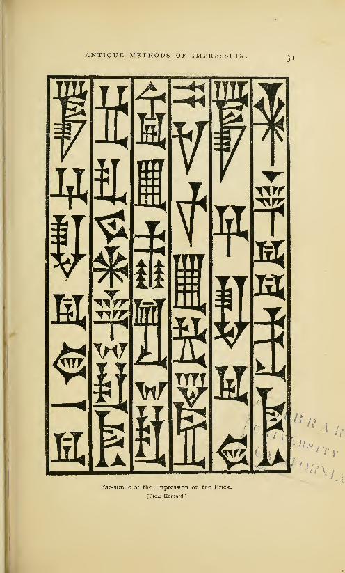
The preceding illustration is that of a stamped brick taken
many years ago from the ruins of ancient Babylon. Whenin perfect condition, it was thirteen inches square and three
inches thick. The inscription, which is in the cuneiform or
arrow-headed character, is irregularly placed on the surface,
but the letters or words arc arranged in parallel rows, and
arc obviously made t<> be read from top to bottom. The
characters of this inscription were not cu1 upon the brick,
nor were thej separately impressed. That they were made
A Stamped Brick from the Ruins of Babylon.
[I'toiii Ii.insard.]
ANTIQUE METHODS OF IMPRESSION.
a?**:
A'.s /'/
v,,Fac-simile of the Impression on the Brick.
[From Hansard.]
32 ANTIQUE METHODS OF IMPRESSION.
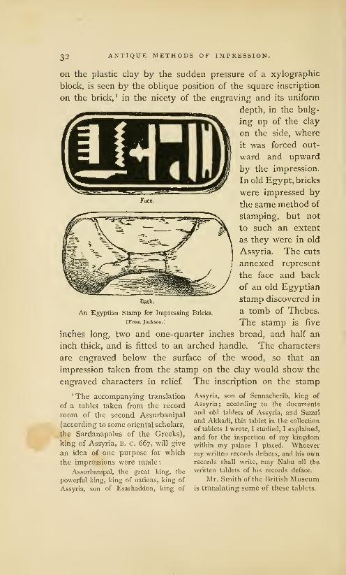
on the plastic clay by the sudden pressure of a xylographic
block, is seen by the oblique position of the square inscription
on the brick,1
in the nicety of the engraving and its uniform
depth, in the bulg-
ing up of the clay
on the side, where
it was forced out-
ward and upward
by the impression.
In old Egypt, bricks
were impressed by
the same method of
stamping, but not
to such an extent
as they were in old
Assyria. The cuts
annexed represent
the face and back
of an old Egyptian
stamp discovered in
a tomb of Thebes.
The stamp is five
inches long, two and one-quarter inches broad, and half an
inch thick, and is fitted to an arched handle. The characters
are engraved below the surface of the wood, so that an
impression taken from the stamp on the clay would show the
engraved characters in relief. The inscription on the stamp
1 The accompanying translation
of a tablet taken from the record
room of the second Assurbanipal
(according to some oriental scholars,
the Sardanapalus of the Greeks),
king of Assyria, B. C. 667, will give
an idea of one purpose for which
the impressions were made:Assurbanipal, the great king, the
powerful king, king of nations, king of
Assyria, son of Esarhaddon, king of
Back.
An Egyptian Stamp for Impressing Bricks.
[From Jackson.]
Assyria, son of Sennacherib, king of
Assyria; according to the documents
and old tablets of Assyria, and Sumriand Akkadi, this tablet in the collection
of tablets I wrote, I studied, I explained,
and for the inspection of my kingdomwithin my palace I placed. Whoevermy written records defaces, and his ownrecords shall write, may Nabu all the
written tablets of his records deface.
Mr. Smith of the British Museumis translating some of these tablets.

ANTIQUE METHODS OF IMPRESSION. 33
has been translated, Amenoph, beloved of truth. Amenoph
is supposed, by some authorities, to have been the king of
Egypt at the period of the exodus of the Israelites.
The characters on the Egyptian and Babylonian bricks
are much more neatly executed than would seem necessary
for inscriptions on so common a material as clay. But they
are really coarse, when compared with the inscriptions upon
the small cylinders of clay which were used by the Assyrians
for the preservation of their public documents. Layard men-
tions a small six-sided Assyrian cylinder that contains sixty
lines of minute characters which could be read only by the
aid of a magnifying glass. Antiquaries are not yet perfectly
agreed as to the method by which the cylinders were made.
Layard, who says that the Babylonian bricks were stamped,
thinks that the inscriptions on the cylinders were cut on the
clay. But there are many cylinders which show the clearest
indications of impression.
It is probable that they were made by both methods.
The clay was prepared for writing as well as for stamping.
Ezekiel, who prophesied by the river Chebar in Assyria, was
commanded to take a tile, and portray upon it the city of
Jerusalem. The Chaldean priests informed Callisthenes that
they kept their astronomical observations on tiles that were
subsequently baked in the furnace. Four large piles of tablets
of unburned clay were found by Layard in the library or
hall of records of Assurbanipal. Some of the tablets are the
grammars and primers of the language; some are records of
agreements to sell property or slaves; some are filled with
astronomical or astrological predictions. On one of them was
inscribed the Assyrian version of the deluge. The cylinders
contained the memorials which were then considered as of
most value, such as the proclamations of the king, or the laws
of the empire. In the museum of the East India Companyis the fragment of a clay cylinder which contains a portion of
the decrees or annals of Nebuchadnezzar. For perpetuating
records of this nature, the cylinders were admirably adapted.

34 ANTIQUE METHODS OF IMPRESSION.
They were convenient for reference, and their legibility, after
so long an exposure, shows that they were perfectly durable.
We do not know by what considerations Assyrian rulers
were governed when about to choose between engraving or
writing on clay ; but it
is not unreasonable to
assume that the inscrip-
tion was written or cut
on the clay, when one
copy only of a record
was wanted ; if numer-
ous copies were wanted,
a die or an engraving on
wood was manufactured,
from which these copies
were moulded. No surer
method of securing ex-
act copies of an original
could have been devised
among a people that did
not use ink and paper.
These cylinders are ex-
amples of printing in its
most elementary form.
The accompanying
illustration, copied from
Hansard's TypograpJiia,
represents an Assyrian
cylinder which presents
the same indications of
impression which have
been noticed upon the
bricks. This cylinder, which is seven inches high and three
inches wide at each end, was baked in a furnace until it was
partially vitrified. Around its largest circumference is a pro-
truding line, about a quarter of an inch wide, which seems
![:: ;.;:,
i::!, -.-->:
MMlilltllil'?!
An Assyrian Cylinder.
[From Hansard.]

ANTIQUE METHODS OF IMPRESSION.35
to have been made by the imperfect meeting of two mouldingstamps. If the inscription had been cut on the clay, this
defect would not appear; the vertical lines would have beenconnected, and the ragged white line would have been madesmooth.
This method of printing in clay was rude and imperfect,
but, to some extent, it did the work of modern typography.Writings were published at small expense, and records werepreserved for ages without the aid of ink or paper. Themodern printer may wonder that this skill in printing was notdeveloped. The engraving that was used to impress clay
could have been coated with ink and stamped on parchment.Simple as this application of the engraving may appear, it
was never made. So far from receiving any improvement,the art of printing in clay gradually fell into disuse. It hasbeen neglected for more than twenty-five centuries on thesoil where it probably originated. For Layard tells us that
an Assyrian six-sided cylinder was used as a candlestick by areputable Turcoman family living in the village where it wasfound. A hole in the centre of one of the ends received the
tallow candle. There is a practical irony in this base appli-
cation of what may have been a praise of "the great king,"
which has never been surpassed by Solomon or Shakspearein their reflections on the vanity of human greatness.
Engraving was used by the ancient Greeks in a mannerwhich should have suggested the feasibility of printing withink. Some of the maps of the Athenians were engraved onsmooth metal plates, with lines cut below the surface, after
the method of copper-plate printers, from which impressionson vellum, or even on papyrus, could have been taken. But,so far as we know, the impressions were not taken : for everynew map there was a new engraving.
The Assyrian method of engraving stamps for impressingclay was practised by the old Roman potters, who markedtheir manufactures with the names of the owners or with thecontents of the vessel. The potters clearly understood the

3(5 ANTIQUE METHODS OF IMPRESSION.
value of movable types. On some of their lamps of clay,
the inscriptions were made by impressing, consecutively, the
type of each letter. These types must have been movable,
and, in appearance, somewhat like the punches or the model
letters of type-founders.
There were some men in ancient Rome who had a clear
perception of the ease with which engraved letters could be
combined. Cicero, in an argument against the hypothesis of
logical results from illogical causes, has intimated that it would
be absurd to look for an intelligible sentence from a careless
mixing up of the engraved letters of the alphabet. 1 The phrase
by which he describes the assembled letters, formes literamm,
was used by the early printers to describe types. His argu-
ment implies, conversely, that if proper care were exercised,
it would be easy to arrange the letters in readable sentences.
But the speculation of Cicero did not go beyond the idea of
combination. It does not appear that he thought that the
letters could be used for printing.
Quintilian had speculations about engraved letters. Herecommended to teachers the use of a thin stencil plate of
wood, on which should be cut the letters that a boy might
be required to copy when learning to write. The boy who
traced the characters with his writing implement would have
his hand guided and formed by the outlines of the perforated
letters. The curt manner in which stencil plates are noticed
should lead us to think that they were then in common use.
We can see that stencils of this nature could have been used,
at least as an aid, in the mechanical manufacture of books
;
but it is not probable that they were so used.
'Balbus, the stoic, in replying to taposition— from such a man I cannot
Vellejus, the epicurean, opposes his understand why he should not also
atheistical argument that the world believe that if he threw together, pell-
was made by chance, and says
:
mell > a Sreat number of the twenty-one
He who fancies that a number of letters, either of gold or of some other
solid and invisible bodies could be kept material, the Annals of Ennius could
together by weight [gravitation?], and be legibly put together from the forms
that a world full of order and beauty scattered on the ground. De Natura
could be formed by their accidental jux- Deorum, book II, chap. 20.

ANTIQUE METHODS OF IMPRESSION. 17
We have some evidences that the old Romans practised,
at least experimentally, the art of printing with ink. TheBritish Museum has a stamp with letters engraved in relief,
that was found near Rome, and which seems to have been
made for the purpose of printing the signature of its owner.
The stamp is a brass plate, about two inches long and not
quite one inch wide. A brass ring is attached to the back of
the plate which may have been used as a socket for the finger,
or as a support when it was suspended from a chain or girdle.
On the face of the stamp are engraved two lines of capital
letters, huddled together in the usual style of all old Romaninscriptions, cut the reverse way, as it
CICAECILIHERMIAE. SN.
would now be done for printing, and
enclosed by a border line. An impres-
sion taken from this stamp would pro-
duce the letters in the accompanying illustration, which maybe translated, the signature of Cecilius Hermias. Of Cecilius
Hermias we know nothing. He may have been a civic official
who used this stamp to exempt himself from the trouble of
writing, or a citizen who tried to hide his inability to write.
If this stamp should be impressed in wax, the impression
would produce letters sunk below the surface of the wax in
a manner that is unlike the impressions of seals. The raised
surface on the wax would be rough where it should be flat
and smooth. This peculiarity is significant. As this rough
field unfitted it for a neat impression on any plastic surface,
the stamp should have been used for printing with ink.
The accompanying illustration is
that of a brass printing stamp in the
British Museum, which is preserved
as a specimen of old Roman work-
manship. 1 The letters were cut in
relief, in reverse order, and with a
rough counter or field. This rough-
ness proves that it could not have been used to impress wax.
1 Jackson and Chatto, Treatise on Wood Engraving, p. 8
.
An Old Roman Stamp.
[From Jackson.]

38 ANTIQUE METHODS OF IMPRESSION,
fCSCrfDoI!
Brass stamps of similar construction and of undetermined
age have been frequently found in France and Italy. All of
them are of small size, and contain names of persons only.
The illustrations an-
nexed, of two engraved
brass stamps of eccentric
shapes, were also copied
from the originals in the
British Museum. As the
letters are roughly sunk
in the metal, and are not
fitted for stamping in
wax, it is supposed that
the stamps were made
for impression with ink.
They are regarded as
Roman antiquities, of
undoubted authenticity,
[From jacksono but the meaning of the
inscriptions, the special purposes for which they were made,
and the period in which they were employed, are unknown.
The difficulty connected with the proper fixing of ink upon
these stamps of brass, of which a subsequent notice will be
made, is one of many causes which prevented the develop-
ment of this experimental form of printing.
A favorite method of making impressions was that of
branding. Virgil, in the third book of the Georgics, tells us of
its application to cattle. The old laws of many European
states tell us of its application to human beings. The cruel
practice was kept up long after the invention of typography.
During the reign of Edward VI, of England (1547— 1 553), it
was enacted that, "whosoever, man or woman, not being lame
or impotent, nor so aged or diseased that he or she could not
work, should be convicted of loitering or idle wandering by
the highwayside, or in the streets, like a servant wanting a
master, or a beggar, he or she was to be marked with a hot

ANTIQUE METHODS OF IMPRESSION. 39
iron upon the breast with the letter V [for vagabond], andadjudged to the person bringing him or her before a justice,
to be his slave for two years; and if such adjudged slave
should run away, he or she, upon being taken and convicted,
was to be marked upon the forehead, or upon the ball of the
cheek, with the letter S [for slave], and adjudged to be the
said master's slave forever."
With these evidences before us of long continued practice
in various methods of engraving and stamping, and of a fair
knowledge of some of the advantages of movable letters, the
question may be asked, Why did the world have to wait
so long for the invention of typography? This question is
based on the assumption, that the civilization of antiquity wascapable of making and preserving the invention which wasmissed through accident or neglect. Here is a grave error.
The elements of an invention are like those of a chemical
mixture. All the constituents but one may be there, exact
in quantity and quality, but, for the lack of that one, the
mixing of the whole in a new form cannot be accomplished.
Failure in one point is entire failure.
The ancients failed in many points. They were destitute
of several materials which we regard as indispensable in the
practice of printing. They had no ink suitable for the work.
Pliny and Dioscorides have given the formulas for the writ-
ing ink that was used by Greek and Roman scribes during
the first century. Pliny says that the ink of book-writers wasmade of soot, charcoal and gum. He does not say what fluid
was used to mix these materials, but he does allude to an
occasional use of acid, to give the ink encaustic property and
to make it bite in the papyrus. Dioscorides is more specific
as to the quantities. He says that one ounce of gum should
be mixed with three ounces of soot. Another formula is,
one-half pound of smoke-black made from burned resin, one-
half ounce each of copperas and ox-glue. Dioscorides further
says that the latter mixture "is a good application in cases
of gangrene, and is useful in scalds, if a little thickened, and

40 ANTIQUE METHODS OF IMPRESSION.
employed as a salve." From this crude recipe one may form
a correct opinion of the quality of the scientific knowledge
then applied to medicine and the mechanical arts.
These mixtures, which are more like liquid shoe blacking
than writing fluid, were used, with immaterial modifications,
by the scribes of the dark ages. Useful as they may have
been for their methods of writing, they could not have been
applied to the inking of a metal surface engraved in relief.
If the brass stamps described on a previous page had been
brushed over never so carefully with these watery inks, the
metal surface would not be covered with a smooth film of
color. The ink would collect in spots and blotches. Whenstamped on paper or vellum, the ink thereupon impressed
would be of irregular blackness, illegible in spots, and easily
effaced. Writing ink, thickened with gum, has but a feeble
encaustic property. It will not be absorbed, unless it is laid
on in little pools, and unless the writing surface is scratched
by a pen to aid the desired absorption. The flat impression
of a smooth metal stamp could not make a fluid or a gummy
ink penetrate below the writing surface. It was, no doubt,
by reason of the inferior appearance of impressions of this
nature that the brass stamps described on a previous page
found so limited a use.
An unsuitable ink may seem but a trifling impediment to
the development of printing, but if there had been no other,
this would have been an insurmountable obstacle. The mod-
ern printer, who sees that the chief ingredients of printing ink-
are the well-known materials smoke-black and oil, may think
that an ignorance of this mixture, or an inability to discover
it, is ridiculous and inexcusable. Modern printing ink is but
one of many inventions which could be named as illustrating
the real simplicity of a long delayed improvement. Simple
as it may seem, the mixing of color with oil was a great
invention which wrought a revolution in the art of painting.
This invention, attributed by some authors to unknown
Italian painters of the fourteenth century, and by others to

ANTIQUE METHODS OF IMPRESSION. aY
Hubert Van Eyck of Holland, at or about the beginning of
the fifteenth century, immediately preceded the invention of
types. The early typographic printers, who could not use the
ink of the copyists, succeeded only when they mixed their
black with oil. After four centuries of experience in the use
of printing ink made with oil, and after repeated experimen-tation with impracticable substitutes, it may be confidently
asserted that an invention of typography would have failed,
if this use of oil had not been understood. The invention
of types had to wait for the invention of ink.
Typography had to wait for the invention of paper, the
only material that is mechanically adapted for printing, the
only material that supplies the wants of the reader in his
requirements for strength, cheapness, compactness and dura-
bility. Paper was known in civilized Europe for at least
two centuries before typography was invented, but it wasnot produced in sufficient quantity nor of a proper quality
until the beginning of the fifteenth century.
The old Romans had no substitute for paper that could
have been devoted to printing or book-making. The papyruswhich they used was so brittle that it could not be folded,
creased and sewed like modern rag paper. It could not bebound up in books; it could not be rolled up, unsupported,like a sheet of parchment. It was secure only when it hadbeen carefully wound around a wooden roller. The scribes
of Rome and the book copyists of the middle ages preferred
vellum. It was preferred by illuminators after printing hadbeen invented. But vellum was never a favorite material
among printers. In its dry state, it is harsh, and wears types;
it is greasy, and resists ink; in its moistened state, it is flabby,
treacherous and unmanageable. The early books on vellumare not so neatly printed as those on paper. But these faults
were trivial as compared with the graver fault of inordinate
price. When we consider that the skins of more than three
hundred sheep were used in every copy of the first printedBible, it is clear that typography would have been a failure

42 ANTIQUE METHODS OF IMPRESSION.
if it had depended on a liberal supply of vellum. Even if
the restricted size of vellum could have been conformed to,
there were not enough sheep at the end of the fifteenth cen-
tury to supply the demands of printing presses for a week.
If the idea of printing books from movable types had been
entertained by an ancient Roman bookseller, or by a copyist,
during the earlier part of the dark ages, it may be doubted
whether he could have devised the mechanism that is needed
in the making of types. For types that are accurate as to
body, and economical as to cost, can be made by one method
only. It is, in the highest degree, improbable, that the scien-
tific method of making types by mechanism could have been
invented at an earlier date than the fifteenth century. There
was mechanical skill enough for the production of any kind
of ingenious hand work, but the spirit that prompted men to
construct machines and labor-saving apparatus was deficient
or but feebly exercised. There was no more of true science
in mechanics than there was in chemistry. The construction
of a suitable type-mould, with its appurtenances, during the
dark ages, would have been as premature as an invention of
the steam engine in the same period.
The civilization of ancient Rome did not require printing.
If all the processes of typography had been revealed to its
scholars the art would not have been used. The wants of
readers and writers were abundantly supplied by the pen.
Papyrus paper was cheap, and scribes were numerous; Rome
had more booksellers than it needed, and books were made
• faster than they could be sold. The professional scribes were
educated slaves, who, fed and clothed at nominal expense,
and organized under the direction of wealthy publishers, were
made so efficient in the production of books, that typography,
in an open competition, could have offered few advantages.
Our knowledge of the Roman organization of labor in
the field of book-making is not as precise as could be wished;
but the frequent notices of books, copyists and publishers,
made by many authors during the first century, teach us that

ANTIQUE METHODS OF IMPRESSION. 43
books were plentiful. Horace, the elegant and fastidious manof letters, complained that his books were too common, and
that they were sometimes found in the hands of vulgar snobs
for whose entertainment they were not written. Martial, the
jovial man of the world, boasted that his books of stinging
epigrams were to be found in everybody's hands or pockets.
Books were read not only in the libraries, but at the baths,
in the porticoes of houses, at private dinners and in mixedassemblies. The business of book-making was practised bytoo many people, and some were incompetent. Lucian, whohad a keen perception of pretense in every form, ridicules
the publishers as ignoramuses. Strabo, who probably wrote
illegibly, says that the books of booksellers were incorrect.
«nj?
Tablet with Waxed Surface.
Scrinium or Case for Manuscripts.
Manuscript Roll, with Title on the Ticket,
Papyrus Manuscript partially Unrolled.
Roman Scrinium, with Rolls of Papyrus.
The prices of books made by slave labor were necessarily
low. Martial says that his first book of epigrams was sold
in plain binding for six sesterces, about twenty-four cents of
American money; the same book in sumptuous binding wasvalued at five denarii, about eighty cents. He subsequently
complained that his thirteenth book was sold for only four
sesterces, about sixteen cents. He frankly admits that half
of this sum was profit, but intimates, somewhat ungraciously,
that the publisher Tryphon gave him too small a share. Ofthe merits of this old disagreement between the author andpublisher, we have not enough of facts to justify an opinion.
We learn that some publishers, like Tryphon and the brothers

44 ANTIQUE METHODS OF IMPRESSION.
Sosii, acquired wealth, but there are many indications that
publishing was then, as it is now, one of the most speculative
kinds of business. One writer chuckles over the unkind fate
that sent so many of the unsold books of rival authors from
the warehouses of the publisher, to the shops of grocers and
bakers, where they were used to wrap up pastry and spices;
another writer says that the unsold stock of a bookseller
was sometimes bought by butchers and trunk-makers.
The Romans not only had plenty of books but they had
a manuscript daily newspaper, the Acta Diurna, which seems
to have been a record of the proceedings of the senate. Wedo not know how it was written, nor how it was published,
but it was frequently mentioned by contemporary writers as
the regular official medium for transmitting intelligence. It
was sent to subscribers in distant cities, and was, sometimes,
read to an assembled army. Cicero mentions the Acta as a
sheet in which he expected to find the city news and gossip
about marriages and divorces.
In the sixth century the business of book-making had
fallen into hopeless decay. Ignorance pervaded all ranks of
society.1 The books that had been written were neglected,
and the number of readers and scholars diminished with every
succeeding generation. 2 The treasures of literature at Rome,
Constantinople and Alexandria which were destroyed by fire
or by barbaric invasion were not replaced. Books were so
scarce at the close of the seventh century, that Pope Martin
requested one of his bishops to supply them, if possible, from
Germany. The ignorance of ecclesiastics in high station was
'The emperor Justin (518-527) to them, were reduced to abandon
could not write, and was obliged to pursuits that could only be cultivated
sign state papers with a stencil. through a kind of education not2 When Latin ceased to be a liv- easily within their reach. Schools
ing language, the whole treasury of confined to cathedrals and monas-
knowledge was locked up from the teries, and exclusively designed for
eyes of the people. The few who the purposes of religion, afforded no
might have imbibed a taste for lit- encouragement or opportunities to
erature, if books had been accessible the laity. Hallam, Middle Ages.

ANTIQUE METHODS OF IMPRESSION. 45
alarming. During this century, and for centuries afterward,
there were many bishops and archbishops of the church whocould not sign their names. It was asserted at a council of
the church held in the year 992, that scarcely a single person
was to be found in Rome itself who knew the first element
of letters. Hallam says, "To sum up the account of ignorance
in a word, it was rare for a layman of any rank to know howto sign his name." Charlemagne could not write, and Frederic
Barbarossa could not read; John, king of Bohemia, and Philip
the Hardy, king of France, were ignorant of both accomplish-
ments.1 The graces of literature were tolerated only in the
ranks of the clergy; the layman who preferred letters to armswas regarded as a man of mean spirit. When the crusaders
took Constantinople, in 1204, they exposed to public ridicule
the pens and inkstands that they found in the conquered city
as the ignoble arms of a contemptible race of students.
During this period of intellectual darkness, which lasted
from the fifth until the fifteenth century, a period sometimes
described, and not improperly, as the dark ages, there wasno need for any improvement in the old method of makingbooks. The world was not then ready for typography. Theinvention waited for readers more than it did for types; the
multitude of book- buyers upon which its success dependedhad to be created. Books were needed as well as readers.
The treatises of the old Roman sophists and rhetoricians, the
dialectics of Aristotle and the schoolmen, and the commen-taries on ecclesiastical law of the fathers of the church, werethe works which engrossed the attention of men of letters for
many centuries before the invention of typography. Useful
as these books may have been to the small class of readers
for whose benefit they were written, they were of no benefit
to a people who required the elements of knowledge.
We may imagine the probable fate of a premature and
unappreciated invention of typography by thinking of results
that might have been and have not been accomplished byprinting among a people who were not prepared \q Jsfif Jit \^s A j v
*
\
'Hallam, Middle Ages, vol. ill, pp. 286, 287.
\ XI VKKS IT V ()
CALIFOUXJ

46 ANTIQUE METHODS OF IMPRESSION.
it should be used. Printing has been practised in China for
many centuries, but there can be no comparison between the
fruits of printing in China and in Europe. The remarkable
inefficiency of the Chinese method is the result not so much of
clumsiness of the process, as of the perverseness of a people
who are unable to improve it, and unwilling to accept the
improvements of Europeans. The first printing press brought
to the New World was set up in the City of Mexico about
one hundred years before a printing office was established in
Massachusetts. Books were printed in Constantinople, per-
haps as early as 1490, certainly before types were thought
of in Scotland. And now Scotland sends types and books
to Turkey, and Boston sends printing paper and presses to
Mexico. If the people of Turkey and Mexico are receiving
benefits from printing, the benefits have been derived from
the practice of the art abroad and not at home.In making an estimate of the service that printing has
done for the world, we frequently overlook the supports bywhich it has been upheld. It is a common belief that the
diffusion of knowledge which was so clearly manifested in the
fifteenth century was due to the invention of printing. This
belief reverses the proper order, and substitutes the effect for
the cause. It was the broader diffusion of knowledge that
made smooth the way for the development of typography.
In its infancy, the invention was indebted for its existence to
improvements in liberal and mechanical arts; in its maturity,
it is largely indebted for its success to discoveries in science,
and to reforms in government.
The magnetic telegraph is the most recent discovery, and
of the most importance, in its services to the daily newspaper
press. The circulation of leading American daily newspapers
has more than trebled since the invention of the telegraph.
The free public schools of America have done much to
promote the growth of printing. If the State did not offer
free books and free education, a large portion of the people
would grow up in ignorance. Every scholar in a public school

ANTIQUE METHODS OF IMPRESSION.47
becomes for life a reader, and to some extent, a purchaser of
books. The value of the school-books manufactured in the
United States annually, has been estimated at fifteen million
dollars. Of Webster's Spelling-Book alone, thirty-five million
copies have been sold, and a million copies are printed every
year. If printing were deprived of the support it receives
from public schools, there would at once follow a noticeable
decrease in the production of printed matter, and a corres-
ponding decrease in the number of readers and book-buyers.
To foster the tastes which have been cultivated by public
schools and newspapers, some States have established public
libraries in every school district. There are, also, a great
many valuable libraries which have been established by vol-
untary association or by individual bequest. These libraries
create books as well as readers.
Railroads, steamboats and package expresses are aids of as
great importance. The New-York daily newspaper, printed
early in the morning, is sold within a radius of three hundred
miles before sunset of the same day. Newspapers now find
hundreds of eager purchasers in places where they would not
have found one in the days of stage-coaches. The benefits
of cheap and quick transportation are also favorable to the
sale of books. A bookseller's package, weighing one hundred
pounds, will be carried from New York to St. Louis, on the
Mississippi, within sixty-five hours, at an average expense of
three dollars. When there was no railroad from St. Louis to
San Francisco, the overland charges on one hundred pounds
of books were one hundred dollars. The long delays and great
expenses of stage-coach transportation would operate almost
as a prohibition to the sale of periodicals and new books.
The greatest legislative aid that printing has received is
through the facilities which are furnished by post-offices and
mails. They create readers. Weekly newspapers are now
sent, for one year, for twenty cents, to subscribers in the most
remote corner of the Union. Books are sent three thousand
miles at the rate of one cent per ounce. The improvement

^g ANTIQUE METHODS OF IMPRESSION.
of postal facilities has increased the number of readers and
purchasers of newspapers to an amount unforeseen by the
most sanguine projector.
All these aids are, comparatively, of recent introduction.
The beginnings of the telegraph, the railroad and the express
are within the memory of the men of the present generation.
The systematic establishment of free schools and libraries is
the work of the present century. Public mails and post-offices
were introduced in 1530, but it is only within the past forty
years that their management has been more liberal for the
benefit of the people. It is by aids like these, and not by
its intrinsic merits alone, that printing has received its recent
development. It was for the want of these aids that printing
languished for many years after its invention. One has but
to consider the many supports printing has received to see
that its premature invention would have been fruitless.
If, even now, when books and readers and literary tastes
are as common as they were infrequent, it is necessary to the
success of printing that there shall be schools and libraries,
cheap and rapid methods of travel, generous postal facilities,
a liberal government and a broad toleration of the greatest
differences in opinion, what but failure could have been
expected when the world was destitute of nearly all? Print-
ing not only had to wait many centuries for improvements
in mechanical appliances, without which it would have been
worthless ; it had to wait for a greater number of readers, for
liberal governments, for instructive writers, for suitable books.
It came at the proper time, not too soon, not too late. "Not
the man, the age invents."
Ill
iljt \$y la % Jmtttttttm uf l>ij{iagrnjt}pj +
Conflicting Theories about the Invention of Typography. . .Was it an Invention or a Combination?
Errors of Superficial Observers ... Merit of the Invention is not in Impression. . .Not altogether
in Types or Composition ... Types of no value unless they are Accurate ... Hand-made TypesImpracticable. . .Merit of Invention is in the Method of Making Types... Is but One Method.
Description . . . Counter-Punch . . . Punch. . . Matrix . . . Mould. . Illustrations . . . Type-Making as
Illustrated by Moxon in 1683. . .As Illustrated by Amman in 1564. . .Notices of Type-Making by
Earlier Authors. . .Type-Mould the Symbol of Typography. . .Inventor of the Type-Mould the
Inventor of Typography. . .A Great Invention, but Original only in the Type-Mould.
St* rtararter of tupograpts is not pressing antj printing tut motivation. St*fot'ngriJ % is its SDmtoI. St* elements wutaincfr, t^e letters freeir from rberj
hontl in fotut tt* pm or tfyisd of rallicjrapter or islograpter tdo" tt*m entangled
;
tt* -cut xtaratter risen from its tomt of it* solitarn tatlrt into it* sutstantibe
life of tte rast tr.pes— ttat is ttt inbention of printing. Van dsy £,•„&.
THERE is a wide-spread belief that typography was, in
all its details, a purely original invention. A popular
version of its origin, hereafter to be related, says that it was
the result of an accidental discovery; a conflicting version
says that it was the result of more than thirteen years of
secret experiment. Each version teaches us that there was
no perceptible unfolding of the invention; that the alleged
inventor created all that he needed, that he made his types,
ink and presses, that he derived nothing of value from the
labors of earlier printers. If typography was invented by
Gutenberg, it was fitly introduced by the sudden appearance
of the printed Bible in two folio volumes; if invented by
Coster, by the unheralded publication of a thin folio of large

50 THE KEY TO THE INVENTION.
wood-cuts with descriptive text of type. If either of these
versions is accepted in the form in which it is usually told,
we must also believe that printing, in the form of perfected
typography, leaped, Minerva-like, fully equipped, from the
brain of the inventor.
There is another belief, which is strongly maintained by a
few scholars, that typography was not an original invention,
that it was nothing more than a new application of the old
theories and methods of impression which have already been
described. According to this view, the practice of engraving
is at least as old as the oldest Egyptian seal ; the publication
of written language can be traced to the Babylonish bricks;
printing with ink, as indicated by old Roman hand stamps,
was practised as early as the fifth century; the combinations
of movable letters were suggested by Cicero and St. Jerome.
All that was needed for the full development of typography-
was the invention of paper. Supplied with paper, the so-
called inventor of typography did no more than combine the
old theories and processes, and give them a new application.
He really invented nothing.
In this conflict of opinion, the critical reader will note an
inability to perceive the difference between impression and
typography. Those who believe in the entire originality of
typography ascribe its merit to the mind that first thought
of the combinations of types ; those who deny its originality
find its vital element in pressure. With one class, the merit
of the invention is in the idea of types ; with the other, it is
in the impression of types. Neither view is entirely correct.
A printer may see how these errors could be developed.
The unreflecting observer, who, for the first time, surveys
the operations of a printing office, finds in the fast presses
the true vital principle of printing. With him, prcsswork is
printing; type-setting and type-making are only adjuncts.
He was the inventor of the modern art of printing who built
the first press, and printed the first book. The conclusion is
illogical, as will be shown on another page. If a radical

THE KEY TO THE INVENTION. 51
improvement had not been made in the earliest method of
printing books, the art would have been as unproductive in
Europe as it has been in China. The fast press may do its
work admirably, but its only functions are those of inking
and impressing, and impression is not typography.
The thoughtful observer will perceive that the merit of
modern printing is not in impression; that there would be
neither fast presses, nor great books, nor daily newspapers,
if there were no types. With him, whatever of greatness
there is in printing is due to the mind that first imagined
the utility of types. The grandness of the results that have
been achieved by typography seem all the grander when he
thinks that these results have been accomplished with such
simple tools as little cubes of metal. The making of these
tools he regards as a matter of minor importance. For in
these types are visible no intricacy of mechanism as in the
power loom, no indications of a mysterious agency as in
the magnetic telegraph, no evidences of scientific skill as in
photographic apparatus. There are in types, apparently, no
more evidences of genius or science than there are in pins
or needles. The grotesque types of the fifteenth century are
rated by him, and even by many mechanics, as rude work-
manship which could have been done by a carver in wood
or a founder in metal. He who could imagine them could
make them. To think was to do. The merit of the invention
of typography is accordingly adjudged, not to the inventive
spirit which constructed the mould by which the types were
made, but to the genius which first thought of the utility of
types. This is a grave error.
Speculations like these, which assign all the merit of the
invention of typography to him who first conceived the idea
of types, are opposed to many facts and probabilities. Cicero
and Jerome could not have been the only men who thought
of the combinations of engraved letters; nor were the old
Roman lamp -makers and branders of cattle the only men
who used types. The idea of stamping with detached letters

52 THE KEY TO THE INVENTION.
could have been entertained, and practised, by hundreds of
experimenters of whom there is no tradition. It is probable
that there was such a practice, but the stamping of single
types by hand pressure was not typography, nor did it lead
to its subsequent invention. Experimental types like these,
which had been cut by hand, were of no practical value, for
they could not have been used on any extensive scale.
There is something more in types than is apparent at the
first glance. Simple as they may seem, they are evidences
of notable mechanical skill in the matter of accuracy. The
page before the reader was composed with more than 2,000
pieces of metal; the large page of a daily paper may contain
more than 150,000 of these little pieces. Whether the page
is large or small, the types are always closely fitted to each
other; they stand accurately in line, and the page is truly
square. If the types of one character,The irregularity of this com- r ,i i . , i 111 1 1
poation is caused by th« as ot the letter a, should be made theof thy letters ;i and e, which ;u<-
tSfcSSZSjSSZ&fe merest trifle larScr or smaller than itsthan nim-unr.thousandths ofan r ,, ,1 r 11 .1American inch. Tins minuto fellows in the same font, all the types,"ifference Is repeated ana in-
:;V,;:^::;;';:,^l
a!niwhen composed, will show the consc-
misuse of the large a and e quences ol the defect. I he irregularitywere contm ueci through a dozen °
wouw'bf"na^'to'undSlnJ of line that is scarcely perceptible in thewhat has beencomP°sed - c j. -n u ct • 1 i* li l.
•
first row will be offensively distinct inIllustration of Tvpes of - . Tj ... . . ,
.
irregular Body. the second. It will increase with each
succeeding row, until the types become
a heap of confusion which cannot be handled by the printer.
Advantages which might be secured from movable types are
made of no effect by an irregularity so slight that it would
be passed unnoticed in the workmanship of ordinary trades.
The illustration proves that it is not enough for types to be
movable ; they must be accurate as to body ; they must fit
each other with geometrical precision.
The accuracy of modern printing types is due more to the
nice mechanisms employed by the type-founder than to his
personal skill. He could cut types by hand, but the cost of
hand-cut types would be enormous, and they would be vastly

THE KEY TO THE INVENTION. 53
inferior to types made by the type-casting machine. Hecould make types by a variety of mechanical methods, but
they would be imperfect and unsatisfactory. A careful survey
of the impracticable inventions in type-founding, recorded in
the patent offices of this country and Great Britain, proves
that there is, virtually, but one method of making types. The
requirements of accuracy and cheapness can be met only by
making them of metal, and casting them in a mould of metal.
'
Although it is clearly understood, by all persons who have
a practical knowledge of the subject, that practical types can
be made only by casting, many popular books repeat the
old story that the first typographic books were printed with
types which had been cut by hand out of wood or metal.
Whether the mechanics of the middle ages could have done
what modern mechanics cannot do,— cut types with bodies
of satisfactory accuracy—need not now be considered. The
stories about hand-made types—about types that were sawed
out of wood blocks—about types that were cut out of wooden
rods, and skewered together with iron wires— about types
that were engraved on the ends of cubes of metal— will be
examined at greater length on an advanced page. Even if
these doubtful stories were verified, it would still remain to
be proved that the cut types had advantages over letters
engraved on wood. It would be difficult to give reasons
for their introduction. Books composed with cut types could
not be neatly printed; they would be inferior to good manu-
scripts in appearance, but not inferior in price. Cut types
'These observations apply only wood types in practical use; but
to the types used for the text letters they are much larger than our book
of books and newspapers. The large types ; they are printed in smaller
types made for the display lines of pages ; they are not obliged to stand
posters are cut on wood, but these truly in line, nor to conform to the
types of wood are used only for standards of European and Amer-
printing single lines; they are not ican printers. The cheapness of
combined with the compactness of types which have been cast, as corn-
book types, and do not require their pared with letters which have been
precision of body. The wood types engraved, has been explained on
of Japan are, probably, the smallest page 23 of this work.

54 THE KEY TO THE INVENTION.
were as impracticable in the infancy of the art as they are
now. There is no trustworthy evidence that they were ever
used for any other purpose than that of experiment.
Every method for making merchantable types, save that
of casting, is a failure. Typography would be a great failure,
if its types were not cast by scientific methods. This under-
stood, we can see that the most meritorious feature in the
invention does not belong to him who first thought of the
advantages of types, nor even to him who first made them
by impracticable methods. Its honors are really due to the
man to whose sagacity and patience in experiment we are
indebted for the type-mould, for he was the first to make
types which could be used with advantage.
It will now be necessary to explain the scientific method
of making types which is practised by every type-founder.
The first process is the making of model letters. The work
begins with the cutting on steel of a tool which is known as
the Counter-punch. The illustration represents the face of
a counter-punch for the letter H, of the size usually known
among type-founders as Double-English. This counter-
punch is an engraving, in high relief, of the hollow or
the counter of that interior part of the letter H which
does not show black in the printed impression. It has
apparently, no resemblance to the letter for which it is made.
When the proportions of the counter-punch have been duly
approved, it is stamped or impressed to a proper depth on
the end of a short bar of soft steel. Properly stamped, the
counter-punch finishes by one quick stroke the interior part
of the model letter, and does it more quickly and neatly
than it could be done by cutting tools.
The short bar of soft steel is known as a Punch. Whenit has received the impress of the counter-punch, the punch
cutter, for so the engraver of letters is called in type-foun-
dries, cuts away the outer edges until the model letter is
pronounced perfect. This is work of great exactness, for the
millions of types that may be made by means of the punch

THE KEY TO THE INVENTION. 55
Punch.
will reproduce all its peculiarities, whether of merit or defect.
The steel of the punch is then hardened until it has sufficient
strength to penetrate prepared copper. It is then
punched, by quick and strong pressure, on the flat
side of a narrow bar of cold rolled copper. This
operation makes a reversed or sunken imprint of
the letter on the punch. In this condition, the
punched copper bar is known among type-founders
as a Drive, or a Strike, or an Unjustified Matrix.
It becomes the Matrix proper, only after it has
been carefully fitted-up to suit the mould. The
exterior surface of the drive must be made truly
flat, and this flatness must be parallel with the
face of the stamped or sunken letter in the interior.
The sides of the drive must be squared, so that the
interior letter shall be at a fixed distance from the sides. The
depth of the stamped letter, and its distance from the sides,
must be made absolutely uniform in all the matrices required
for a font or a complete assortment of letters. The object of
this nicety is to secure a uniform height to all
the types, and to facilitate the frequent changes
of matrix on the mould. The justifying and
fitting of matrices to moulds is one of the most
exact operations in the art of type-founding.
For every character or letter really required
in a full working assortment of types, the type-
founder cuts a separate punch and fits up a
separate matrix ; but for all the characters or
letters which are made to be used together,
there is but one mould. Types are of no use,
as has been shown, if they cannot be arranged Matrix. >
and handled with facility, and printed in lines that are truly
parallel. However unlike they may be in face, they must be
exactly alike in body. This uniformity of body, which is as
1 The characters D, E, 1 are the
private reference marks of the type-
founder. In this position they can-
not be reproduced on the cast type.
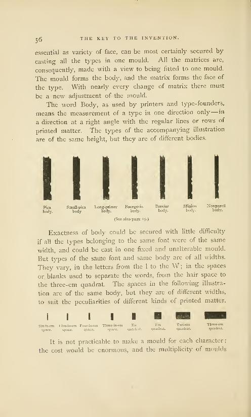
c£ THE KEY TO THE INVENTION.
essential as variety of face, can be most certainly secured by
casting all the types in one mould. All the matrices are,
consequently, made with a view to being fitted to one mould.
The mould forms the body, and the matrix forms the face of
the type. With nearly every change of matrix there must
be a new adjustment of the mould.
The word Body, as used by printers and type-founders,
means the measurement of a type in one direction only— in
a direction at a right angle with the regular lines or rows of
printed matter. The types of the accompanying illustration
are of the same height, but they are of different bodies.
Pica Small-pica Long-primer Bourgeois Brevier Minion Xonpareil
body. body. body. body. body. body. body.
(See also page ^5.)
Exactness of body could be secured with little difficulty
if all the types belonging to the same font were of the same
width, and could be cast in one fixed and unalterable mould.
But types of the same font and same body are of all widths.
They vary, in the letters from the 1 to the W ; in the spaces
or blanks used to separate the words, from the hair space to
the three-em quadrat. The spaces in the following illustra-
tion are of the same body, but they are of different widths,
to suit the peculiarities of different kinds of printed matter.
i i m m hbSix-in-em

THE KEY TO THE INVENTION.57
would lead to fatal faults in inaccuracy of body. Exactnessof body can be had only by casting all the characters in onemould, but this mould must be made to suit all the matrices.The matrices must be fre-
quently changed, but with
such nicety that the types
of every letter shall be
uniform in height, in line,
and truly square. Anymechanic will see that the
figure i- Type-Mould, without Matrix andConstruction of an adjust- with a Type in the Mould.
able mould is work of difficulty, and that the fitting-up ofa set of matrices for one mould is a very nice operation.
The Type - Mould of
modern type-founders con-
sists of two firmly screwed
combinations of a numberof pieces of steel, makingright and left halves. In
the first illustration of the
mould, Figure I, the halves
are properly connected. In Figure 2. One Half of the Mould.
this form it is not practicable to represent the interior, butit may be understood that the interior faces fit each othersnugly in every part but the
centre, in which provision is
made for a small opening whichcan be increased or diminished
in a lateral direction only. Oneend of this opening is closed
by the matrix ; the other endis the jet, or the mouth-piece
through which the melted metal FiSure 3- The Other Half of the Mould.
is injected. In this opening, which is indicated by the letter
H in the cut, the body of type is cast. The matrix whichforms the face of the type is snugly fitted between the jaws on
58 THE KEY TO THE INVENTION.
either side of this letter H. It does not appear in the cut ; for
the matrices, although indispensable parts, are always looked
upon by founders as attachments to the mould.
Figures 2 and 3 represent the interior sides of the mould.
For the purpose of clearer illustration, the half of the mould,
Figure 2, is shown reversed, or upside down ; but when this
half is connected with its mate, the two halves appear as they
do in Figure 1. These two halves differ from each other only
in a few minor features. They are so constructed that, whenjoined, the sides which determine the body of the types are
in exact parallel, and at a fixed and unalterable distance from
each other. In Figure 2, the ridges which make the nicks are
noticeable; in Figure 3 the cast type is shown as it appears
before it is thrown from the mould, with jet attached. 1
Although the two sides of the mould are fixed so as to
be immovable in the direction which determines the body
of the type, they have great freedom of motion and nicety
of adjustment in the direction which determines its width.
They can be brought close together, so as to make a hair
space, or can be fixed wide apart, so as to cast a three-em
quadrat, but they always slide on broad and solid bearings,
between guides which keep them from getting out of square.
In the construction of the mould and adjustment of the
matrices, every care is taken to insure exactness of body.
The illustration on page 52 may be again referred to as an
example of the necessity for minute accuracy. We there see
that the feasibility of typography depends upon the geomet-
rical exactness of its tools, and that types are of no practical
use, if they cannot be readily combined and interchanged.
The casting or founding of types, in a mould constructed
like that of the engraving, is now accomplished by a complex
machine, the invention of Mr. David Bruce, Jr., of New-Yorkcity, and by him patented in the year 1838. Before this date
1 The superfluous metal which the Jet. The finishing of the types
adheres to the cast type, and is is comparatively simple work which
afterward broken off, is also called does not require explanation.

THE KEY TO THE INVENTION. 59
all types were cast by hand, from a hand-mould, and by a
process which received no noticeable improvement for two
centuries. The following illustration, taken from an engraving
Type-Casting as Practised in 1683.
[From Moxon.]
published by an early English type-founder, 1 can be offered
as a substantially correct representation of the method of
casting which was practised by all type-founders in the first
quarter of this century.
The type-caster took in his left hand the mould, which
was imbedded in a wood frame, and shielded about the jet,
1 Mechatiick Exercises, or the Moxon, Member of the Royal Soci-
Doctrine of Handy-Works, applied ety, and Hydrographer to the King,
to the Art of Printing. By Joseph etc. London, 1683.

60 THE KEY TO THE INVENTION.
to protect him from accidental splashes of melted metal.
Then, with his right hand, he took from the melting pot a
spoonful of the hot metal, which he quickly poured into the
jet or mouth of the mould. At the same instant, with a
sudden jerk, he threw up his left hand, so as to aid the
melted metal in making a forcible splash against the matrix
at the bottom of the mould. This sudden jerk or throw
was needed, in the casting of small letters, to make a good
face to the type. If it was not done, the metal would cool
too quickly, and would not penetrate the finer lines of the
matrix. Long practice enabled the type- caster to do this
work with apparent carelessness; but the trick of making
this throw or cast with the left hand, at the right time and
in the right manner, was slowly acquired—by some strong
men, never acquired at all. In all cases, hand-casting was
hard work. To face types, writes August Bernard, the type-
caster must make the contortions of a maniac. It was slow
work. Fournier the younger, writing in 1764, says that the
performance of the type-caster of ordinary book types would
vary from two thousand to three thousand types per day.
When this throw was made, the type-caster removed the
matrix with his right hand, and, giving the mould a toss,
threw out the type. The matrix was then replaced on the
mould, and the operations which have been described were
repeated in the casting of every subsequent type.
It must be confessed that this method of making types
is not simple. It is too circuitous in its processes, and too
complex in its machinery, to be regarded as the fruit of the
first lucky thought of the inventor. It is a scientific process,
manifestly the result of thought and protracted experiment.
In its series of impressions, it is an emblem of the art which
it has created. The counter-punch impresses the punch, the
punch impresses the matrix, the melted metal impresses the
matrix and mould. One model letter on the punch is the
instrument by which millions of types are made ; one letter
on a type may serve in the printing of millions of words.

THE KEY TO THE INVENTION. 6l
The punch, matrix and mould are old inventions, but they
are still in use in all type-foundries. They have not been
changed in any important feature since they were explicitly
described and illustrated for the first time, by Joseph Moxon.
As Moxon did not claim these implements as his own inven-
tion— as we find in the writings of the authors who preceded
him notices of the art of cutting letters, and mention of tools
"which they called matrices," and of "making types in brass"
[matrices or moulds], we have some reason for the belief that
there has never been any radical change in the processes of
type-making.
Unfortunately, we have no minute description of the art
of type-making as it was practised before Moxon. Those
who were competent to describe the work, refrained from
description, either because they thought that the subject was
trivial or technical, or because they intended to conceal the
process. The authors who did undertake to describe the art
were incompetent; they did not thoroughly understand the
subject, and have treated it slightingly and incorrectly. But
we are not entirely in the dark.
Our most authentic information is contained in a queer
little book by Jost Amman, which is known to modern book-
collectors as The Book of Trades, 1 and which was published
at Frankfort-on-the-Main, in the year 1564. The title of the
book, with text in German, describes it as Hans Sacks' Correct
Description of all Arts, Ranks and Trades, with printed illus-
1 The Book of Trades was popu- has its representative. There are also
lar. Two editions in Latin verse not a few which it would be difficult
were published, one in 1568, and an- t0 reduce to any distinct class, as they
other in 1574, with descriptions by are nei*eJ^ J
101 h°nest ?«**-tt . , ,-, .
.
sions. Of these heteroclytes is theHartmann Schopper. Chattosays: „, . . . ^ . .™ . . .rr
, / Meretricicm procurator, or, as CaptainInis is, perhaps, the most curious ^ u t» 1 * n. * • ?
, . .r
. , -, ., • • Dugald Dalgetty says, the captain ofand interesting series of cuts, exhibiting ., T , , .-,,; . . .
., . °, , ,' % the queans. [ackson and Chatto, Athe various ranks and employments of ^ . y/r j r
., . ... , / . Ireatise on Wood Iinsrravm?, p. 409.men, that ever was published. Among T . . ! ,
the higher orders ...... are the Pope, JOSt Amman WaS 0ne °f the manyEmperor, King, Princes, Nobles, Priests
famous German designers on wood.
and Lawyers; while almost every branch The publishers of Nuremberg and
of labor or trade then known in Ger- Frankfort esteemed his ability highly
many, from agriculture to pin-making, and gave him constant employment.

62 THE KEY TO THE INVENTION.
trations. The descriptions, so called, which were written in
verse, by Hans Sachs, the cobbler poet, are of no value for
this inquiry : they describe nothing. To men seeking trust-
worthy information about art or manufactures, all the merit
of the book is in its numerous engravings on wood, which
may be accepted as faithful illustrations of the methods and
usages observed during the sixteenth century.
Among the illustrations is the schriftgiesser, or the type-
founder, with the accessories of his art about him. We see
the furnace for melting the metal, the bellows, the tongs and
the basket of charcoal. That the man is founding types is
apparent, not only from the bowl of cast types on the floor
before the stool, but
from his position with
spoon in hand. Here
we begin to note dif-
ferences. The type-
caster of 1683 stands
up to his work ; the
schriftgiesser of Am-man is sitting down.
The mould of 1683,
like the hand moulds
that were in use forty
years ago, is provided
with a wire spring,
to keep the matrix
firmly in position; the
mould ofAmman has
no spring of iron wire
and it is nested in a... . . Type-Casting as Practised in T-r,|.
pyramid-Shaped bOX, [From Jost Amman.]
which seems to be used as a protection to the hand. How the
mould was nested in the box, how the matrix was attached
to the mould, how the cast types were dislodged from the
mould, is not shown in the engraving. We have to regret
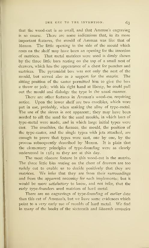
THE KEY TO THE INVENTION. 63
that the wood- cut is so small, and that Amman's engraving
is so coarse. There are some indications that, in its more
important features, the mould of Amman was like that of
Moxon. The little opening in the side of the mould which
rests on the shelf may have been an opening for the insertion
of matrices. That metal matrices were used is dimly shown
by the three little bars resting on the top of a small nest of
drawers, which has the appearance of a chest for punches and
matrices. The pyramidal box was not only the nest of the
mould, but served also as a support for the matrix. The
sitting position of the caster permitted him to give the box
a throw or jerk ; with his right hand at liberty, he could pull
out the mould and dislodge the type in the usual manner.
There are other features in Amman's wood-cut requiring
notice. Upon the lower shelf are two crucibles, which were
put in use, probably, when making the alloy of type-metal.
The use of the sieves is not apparent ; they may have been
needed to sift the sand for the sand moulds, in which bars of
type-metal were made, and in which large initial types were
cast. The crucibles, the furnace, the mould, the position of
the type-caster, and the single types with jets attached, are
enough to prove that types were cast, one by one, by the
process subsequently described by Moxon. It is plain that
the elementary principles of type-founding were as clearly
understood in 1564 as they are at this day.
The most obscure feature in this wood-cut is the matrix.
The three little bits resting on the chest of drawers are too
rudely cut to enable us to decide positively that they are
matrices. We infer that they are from their surroundings
and from the apparent necessity for such implements ; but it
would be more satisfactory to know, and not infer, that the
early type-founders used matrices of hard metal.
There are no engravings of type-founding of earlier date
than this cut of Amman's, but we have some evidences which
point to a very early use of moulds of hard metal. We find
in many of the books of the sixteenth and fifteenth centuries

g. THE KEY TO THE INVENTION.
occasional allusions to type-making. Considered separately,
they arc of little importance ; considered together, they are
ample proof that types were made of fluid metal in moulds
and matrices of brass, not less than one hundred years before
Amman made his wood-cuts.
In 1507, Ivo Wittig put up a stone to the memory of
John Gutenberg, on which he had engraved that Gutenberg
was the first to make printing letters in brass. We do not
find in any record of authority that Gutenberg printed books
by types cut out of brass. There are difficulties connected
with the cutting and use of brass types which would make
such an assertion incredible. If we accept the literal trans-
lation of the Latin epitaph, and supplement it with a little
knowledge of type-founding, we shall then understand what
Wittig meant— that Gutenberg, by using melted metal, made
types in brass moulds.
Trithemius, writing in 1514, observes that Gutenberg and
Fust " discovered a method of founding the forms of all the
letters, which they called matrices, from which they cast metal
types." The statement of the bishop is somewhat confused,
and his specification of Fust as an inventor is, probably, incor-
rect, but every typographer who reads his description cannot
fail to see that he has endeavored to describe the established
method of making types— the method in use to this day.
Peter Schceffer, in a book printed by him in 1466, makes
the book metaphorically say, " I am cast at Mentz." He says.,
the types were cast, although he elsewhere praises himself as
a more skillful cutter of letters than Fust or Gutenberg.
Bernard Cennini, writing at Florence in 1471, says that
the letters of his book were first cut and then cast.
• Nicholas Jenson, who calls himself a cutter of books, says
in one of them, published in 1485, that the book, meaning
the types of the book, was cut and cast by a divine art.
llusncr of Strasburg, in the imprint of a book made by
him in 1473, says (translating his language literally) that it
was printed " with sculptured letters from brass," or, as it

THE KEY TO THE INVENTION, 65
could be more clearly construed, with letters in high relief,
made from brass matrices. That Husner did not mean to
say that his printing types were cut out of brass, is more
clearly shown in the imprint of another book printed by
him in 1476, in which he says, literally, that it was printed,
" without doubt, with sculptured letters, scientifically begun
in brass." 1
That the cutting, so frequently mentioned by the early
printers, was the cutting of punches, is apparent to every
modern typographer who knows that, in the manufacture of
types, punch-cutting is not only the first process in order
of time, but first in order of artistic importance. That the
types said to be made of brass were made in brass moulds
and matrices could, in the absence of other proof, be inferred
from the appearance of the books of the fifteenth century.
These types often show varieties of the same letter and have
other peculiarities disagreeable to modern tastes, but there
is strict uniformity in each variety, and an accuracy of body
which could have been secured by no other method than
'The text of the Speculum Du- is here used in contradistinction to
raridi, the book of 1473, \s exsculptis insculptis, sculptured in, or cut in,
cere litteris ; the text of the Prcecep- as in engraving on a copper plate.
torum Nideri, the book of 1476, It defines typographic work from
is litteris exsculptis artificiali certe copper-plate printing. The phrase
conatti ex are. The language is artificiali certe conatu ex Gere, meansplain and cannot be construed to something more than skillful en-
mean cut types. When these books graving; it suggests the use of
were printed, the arts of typography mechanism, and of a beginning of
and copper-plate printing were new the work in brass, which can be
and had not yet received distinctive clearly understood only by constru-
names. The reading public knew ing ex cere, from or in a brass mould,
nothing of the theory or practice of The phrase here translated in brass
either process, and confounded the has been rendered of brass, but the
productions of one art with those of language will not bear this construc-
tive other. The early printers had tion. The phrase ex <zre, in, or
to define the respective arts as they out of, or from brass, was frequently
best could, with words made from used by many early printers. I have
Latin. A close examination of the rarely met the form ceris, of brass,
words selected by Husner will show To represent that early types were
their propriety. The word exsculptis, of brass is as much a violation of
sculptured, or cut out in high relief, history as it is of grammar.

66 THE KEY TO THE INVENTION.
Prices of Material for the
Type-Foundry.
Steel, . . .
Metal, (Antimonyf)
Brass, .
Copper, .
Tin,
Lead, .
Iron Wire,
Tuscan AmericanCurrency Currencyper pound. per pound.
lir. 280 $2.18
11 o
12 o
6 8
8 o
2 4
8 o
.50
•54
•30
•36
.ioj
•36
that of casting them in moulds and matrices of hard metal.
There is other evidence which is even more direct. In the
Magliabechi library at Florence is preserved the original Cost
Book of the Directors of the Ripoli Press of that city, for
the interval between the
years 1474 and 1483. ' In
this book may be found,
among other papers of
value, a list of the prices
which were then paid for
the supplies or materials
used in the type-foundry
connected with the Ripoli
Press. In this list we see
the names of the metals
that are used in all modern
type-foundries. There can be no question of the statement
that the types of this foundry were cast in metal moulds.
It would not be difficult to present additional evidence
tending to prove that the punch, the matrix and the mould
of hard metal were used by the earliest typographers, but
this evidence will be given with more propriety in another
chapter. On this page, it is enough to record, as the result
of the future inquiry, that printing types have always been
made by one method. The significance of this fact should
not be overlooked. It has been shown that printing, as we
now use it, could not exist without types, and that there
would be no types if we did not know how to make them in
adjustable type-moulds. In this type-mould we find the
key to the invention of typography. It is not the press, nor
the types, but the type-mould that must be accepted as the
origin and the symbol of the art. He was the inventor of
'This book was edited and repub- currency of the Tuscan lira is cal-
lished in the form of an octavo pam- culated from a formula given with
phletof fifty-six leaves, by Signor P. great minuteness by Blades in his
Vinccnzio Fincschi, at Florence, in Life and Typography of William
1781. The equivalent in American Caxton, vol. II, p. sex.

THE KEY TO THE INVENTION. Qj
typography, and the founder of modern printing, who made
the first adjustable type -mould.
It is a curious circumstance, and not creditable to the
sagacity of the historians of typography, that the importance
of this implement, upon which the existence of typography
depends, has never been fully appreciated. That the type-
mould was first made by the inventor of typography need
not be discussed. We have no knowledge that any method
of founding different sizes and forms from an adjustable mould
was attempted before the fifteenth century. There was no
need for such a mould in any other art. But we have indirect
evidences in abundance that the early printers considered
their method of making types as a meritorious and original
invention. Peter Schceffer described it as a new and unheard-
of art ; Bishop Trithemius said that it was found out only
through the good providence of God;Jenson said it was a
divine art ; Husner said it was a scientific method ; Wittig
said that the inventor has deserved well of the wide world.
It would be useless to attempt to add anything to these
tributes— quite as useless to attempt to break their force.
Typography, made practicable and perfect by means of the
type-mould, was an original and a great invention. If the
inventor had produced nothing more than the type-mould,
this would be enough to entitle him to the highest honor.
It is tribute enough to acknowledge that the inventor of
the type-mould was the inventor of typography. It is not
logical nor truthful to attribute to him the introduction or
the rediscovery of the simple elements of relief printing. It
is not derogatory to his honor to confess that his labors were
materially lightened by the services of men who had gone
before him and had prepared materials for his use. The
inventor of the type-mould did not invent paper, for that had
been known for two centuries before ; he did not originate
engraving on wood, nor impressions from relief surfaces, for
both processes were known before paper was made ; he was
not the first to print upon paper, for printed matter, in the

68 THE KEY TO THE INVENTION.
forms of playing cards and prints of pictures, was a merchant-
able commodity before he was born. He was not the first
to make printed books ; it is not certain that he made the
first printing press ; it is not probable that he was the first
to think of movable types. His merits rest on a securer
basis. While others dreamed and thought, and, no doubt,
made experiments, he was the first to do practical and useful
work— the first to make types that could be used— the first
to demonstrate the utility of typography. The first practical
typographer, but not the first printer, he was really at the
end of a long line of unknown workmen whose knowledge
and experience in ruder forms of printing were important
contributions toward the invention of the perfect method.
The contributions made by the men who practised ruder
forms of printing demand a fuller description. The merit of
printing with types cannot be fully appreciated until it has
been contrasted with the printing that preceded types. It
will be an instructive lesson to trace the origin of a great
art to its sources.

IY
ftp fmags Jxlnk txl llje l[iflnml{j Sentunj*
Were Engtaved on Wood. . Print of St. Christopher. . . Print of Annunciation. . .Print of St Bridget.Other German Engravings on Wood. . .Flemish Indulgence Print... The Brussels Print... TheBerlin Print... All Image Prints from Germany or the Netherlands. . .How were they Printed?Not by the Frotton. . . Methods of taking Proof now used by Engravers and Printers. . .Imagescopied from Illustrated Manuscripts. . .Not made by Monks. .. Images highly prized by thePeople. . .The Beginning of Dissent in the Church ... Preceded by Ruder Prints.
Book printing anb picture printing kabc fcotf) tke same inner cause for tkeir origin,
nanuln, tke impulse to make cack mental gain a .common ilessing. Not mcrclnprirucs anb rick notles focre to kabe the privilege of aborning tljtir pribate xkapclsanb apartments toitk ieautiful religious pictures; trjc poorest man boas also to
kabe kis beligkt in ifjat iokick the artist kab llcbiselj anb probureb. It baas notsufficient for kim bofjen it stoob in tke cfturck as an altar serine, bisikle to fjim
anb to tke congregation from afar. &t besireli to kabe it as §is ofon, to carrn it
aiout toitfj kirn, to iring it into kis obw kome. Ww granb importance of tooob
engrabing anb copper-plate is not sufficiently estimated in kistorical inbestiga-
tions. ®ken foere not alone of use in the abbance of art ; tften form an epock in
ike entire life of minb anb culture. ©lie ibca emkobteb anb multiplicb in pictures
ierame like tkat emiobieb in tke printeb boorb, ike k*ralb of eberg intellectual
mobement, anb ronquereb tke boorlb. woitmann
ONE of the purposes to which early printing was applied
was the manufacture of engraved and colored pictures
of sacred personages. These pictures, or image prints, as
they are called by bibliographers, were made of many sizes;
some of them are but little larger than the palm of the hand,
others are of the size of a half sheet of foolscap. In a few
prints there are peculiarities of texture which have provokedthe thought that they may have been printed from plates of

7o IMAGE PRINTS OF THE FIFTEENTH CENTURY.
soft metal like lead or pewter ; but this conjecture has never
been verified. We find in many of the prints the clearest
indications that they were taken from engravings on wood.
With a few exceptions, these prints were colored ; some were
painted, but more were colored by means of stenciling, as
is abundantly proved by the mechanical irregularities which
are always produced by the occasional slipping of the stencil.
The colors are gross, glaring, and so inartistically applied that
the true outlines of the figures are frequently obscured. The
quality of the engraving is unequal ; some prints are neatly,
and others are rudely
cut, but in nearly all
of them the engraving
is in simple outline.
We seldom see any
shading tints, or any
cross-hatchings, rare-
ly ever any attempt to
produce a perspective
by the use of fine or
faint lines. The ab-
sence of shading lines
is not entirely due to
the imperfect skill of
the engravers. The
engravings seem to
have been cut for no
other purpose than
that of showing the
colors of the stencil
painter to advantage,
by giving a definite edge to masses of color. The taste for
prints in black and white had not then been developed. To
the print-buyer of the fifteenth century, the attraction of the
image print was not in its drawing, but in its vivid color,
and its supposed resemblance to the paintings that adorned
The Print of St. Christopher.' Size of original, 8S4 by 11 ^ inches.

IMAGE PRINTS OF THE FIFTEENTH CENTURY. 71
the walls of churches and monasteries. The image print of
the fifteenth century was the prototype of the modern chromo.
The St. Christopher, a bold and rude engraving on wood,
which represents the saint in the act of carrying the infant
Saviour across a river, is one of the most remarkable of the
image prints. This print was discovered in the cover of an
old manuscript volume of 14 17, among the books of one of
the most ancient convents of Germany, the Chartreuse at
Buxheim, near Memmingen, in Suabia. 1 The monks said that
the volume was given to the convent by Anna, canoness of
Buchau, who is known to have been living in 1427. Thename of the engraver is unknown. This convent is about fifty
miles from Augsburg, a city which seems to have been the
abode of some of the early engravers on wood. The date is
obscurely given in Roman numerals at the foot of the picture.
Cimstofcri factem ttie imatunquc turn's, JSillcsimo cccc,
JHla nemjie Die morte mala mm moricris. yr^ tertto.
In whatsoever day thou seest the likeness of St. Christopher,In that same day thou wilt at least from death no evil blow incur. 1423.
The date 1423 is evidence only so far as it shows that the
block was engraved in that year. The printing could havebeen done at a later date. As it is printed in an ink that
is almost black (in which feature it differs from other early
image prints, that are almost invariably in a dull or faded
brown ink), there is reason to believe that this print wasmade some time after the engraving, when the method of
making prints with permanent black ink was more common.1 Heineken, Idee generate d'une first his weight was what might be
collectio7i co?nplette d'estampes, avec expected from his infant years; butune dissertation, etc., p. 250. presently it began to increase, and
According to the legend, it was kept increasing, until the ferrymanthe occupation of Saint Christopher staggered under his burden. Thento carry people across the stream on the child said, "Wonder not, mythe banks of which he lived. He is friend ; I am Jesus, and you haveaccordingly represented as a man of the weight of the sins of the wholegigantic stature and strength. One world on your back." St. Chris-evening a child presented himself topher was thus regarded as a sym-to be carried over the stream. At bol of the church.

7 2IMAGE PRINTS OF THE FIFTEENTH CENTURY.
This engraving has its merits as well as its absurdities.
Chatto says that the design is better than any he has found
in the earlier type-printed books ; that the figure of the saint
and that of the youthful Christ are, with the exception of the
extremities, designed in such a style that they would scarcely
discredit Albert Durer himself.
The accessories are grotesquely treated. One peasant is
driving an ass with a loaded sack to a water-mill; another
is toiling with a bag of grain up a steep hill to his house
;
another, to the right, holds a lantern. The relative propor-
tions of these figures are but a little less absurd than those
made famous in Hogarth's ironical study of false perspective.
These faults of
drawing are coun-
terbalanced by real
merits of engraving.
There is a notice-
able thickening and
tapering of lines in
proper places, a bold
and a free marking
of the folds of drap-
ery, and a general
neatness and clever-
ness of cutting that
indicate the hand
of a practised and
judicious engraver.
This engraving of
St. Christopher is
obviously not the
first experiment of
an amateur or anThe Annunciation,
untaught inventor.
In the book which contained this print of the St. Chris-
topher was also found, pasted down within the cover, another

IMAGE PRINTS OF THE FIFTEENTH CENTURY. 70
engraving on wood, that is now known as the Annunciation.It is of about the same size as the print of St. Christopher.
It is printed on the same kind of paper, with the same dull
black ink. There is some warrant for the general belief that
both engravings were executed at or about the same time,
but they are so unlike that they cannot be considered as the
work of the same designer nor of the same engraver. Thelines of the Annunciation are more sharply cut; the drawinghas more of detail; there are no glaring faults of perspective.
The Virgin is represented as receiving the salutation of
the angel Gabriel; the Holy Spirit descends in the shape of
a dove proceeding from a part of the print which has beendestroyed, and in which was some symbol of the Almighty.The black field in the centre of the print was left unroutedby the engraver, apparently for no other purpose than that
of lightening the work of the colorist, who would otherwisehave been required to paint it black. This method of pro-
ducing the full blacks of a colored print was practised bymany of the early engravers. Full black shoes on the feet
of human figures may be noticed in many of Caxton's wood-cuts while other portions of the print are in outline. Thereare portions of this print in which the practical engraver will
note an absence of shading where shades seem to be needed.The body of the Virgin appears as naked, except where it
is covered by her mantle. It was intended that an inner
garment should be indicated by the brush of the colorist.
What the early engravers on wood could not do with the
graver, they afterward did with the brush. They not onlyprinted but colored their prints, and the colored work wasusually done in a free and careless manner.
These prints do not contain internal evidences of their
origin. They were found in Germany, but there is nothingin the designs, nor yet in their treatment, that is distinctively
German. The faces and costumes reveal to us no national
characteristics; the legends are in Latin; the architecture ofthe Annunciation is decidedly Italian.
10
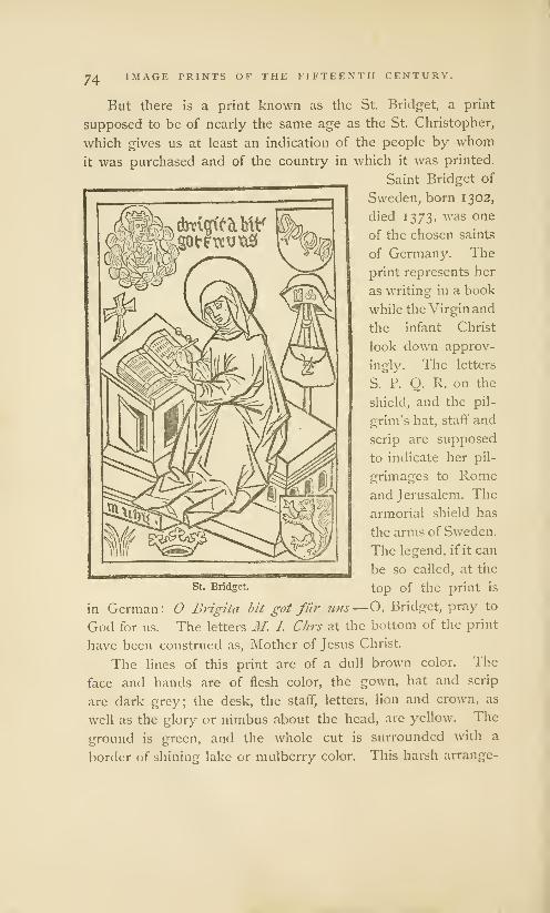
74 IMAGE PRINTS OF THE FIFTEENTH CENTURY.
But there is a print known as the St. Bridget, a print
supposed to be of nearly the same age as the St. Christopher,
which gives us at least an indication of the people by whomit was purchased and of the country in which it was printed.
Saint Bridget of
Sweden, born 1302,
died 1373, was one
of the chosen saints
of Germany. The
print represents her
as writing in a book
while the Virgin and
the infant Christ
look down approv-
ingly. The letters
S. P. O. R. on the
shield, and the pil-
grim's hat, staff and
scrip are supposed
to indicate her pil-
grimages to Romeand Jerusalem. The
armorial shield has
the arms of Sweden.
The legend, if it can
be so called, at the
St. Bridget. top of the print is
in German: O Brigita bit got fur 11ns—O, Bridget, pray to
God for us. The letters M. I. Chrs at the bottom of the print
have been construed as, Mother of Jesus Christ.
The lines of this print are of a dull brown color. The
face and hands are of flesh color, the gown, hat and scrip
are dark grey; the desk, the staff, letters, lion and crown, as
well as the glory or nimbus about the head, are yellow. The
ground is green, and the whole cut is surrounded with a
border of shining lake or mulberry color. This harsh arrange-

IMAGE PRINTS OF THE FIFTEENTH CENTURY. 75
ment of the colors is a proper illustration of the inferiority of
the workmanship of the colorist to that of the designer.
Other prints in European libraries have been attributed to
unknown engravers of Germany, who are supposed to have
practised their art between the years 1400 and 1450. One
of these prints, to which is attached a short prayer and the
date of 1437, and which was discovered in a monastery in the
Black Forest near the border of Suabia, 1 represents the mar-
tyrdom of St. Sebastian. These prints are rare : of the St.
Christopher only three copies are known
;
2 of the St. Bridget
and Annunciation there is but one copy each. All of them
were discovered in German religious houses, in which places
it seems that they have been preserved ever since they
were printed. They were found in a part of Germany that
is famous as the abode of early engravers on wood, and
as the birthplace of several great German artists. Prints
of a similar nature were subsequently made in Germany in
greater quantity than in any other part of Europe. The
legend of St. Bridget is in German ; the costumes of the
archers in St. Sebastian are German. They are trustworthy
evidences in favor of the hypothesis that engraving on wood
was first practised in Germany.
This hypothesis has been disputed. It is opposed by
several contradictory theories, which may be stated in the
following words: (1) that engraving on wood was applied to
the manufacture of playing cards in France at the end of the
fourteenth century; (2) that it was derived from China; (3)
that it was invented in Italy; (4) that it was practised in the
Netherlands before it was known in Germany. As the
theories of French, Chinese and Italian origin have no early
1 The Suabia of the fifteenth cen- 2 As these three copies have never
tury was separated by the Rhine been compared side by side, it has
from Switzerland and France on the not been proven that they are im-
south and west ; its eastern bound- pressions from the same block. The
ary was Bavaria ; its northern bound- copy described on a preceding page
ary, Franconia and the Palatinate has some peculiarities not found in
of the Rhine. the others.

yS IMAGE PRINTS OF THE FIFTEENTH CENTURY.
image prints to offer, they need not now be considered. But
the arguments in favor of an early practice of engraving in
the Netherlands are based almost entirely upon these prints.
£oe won*bw toapewn am fat/ ^8wJjiu$ft03Cdc fim
iBtldanfeectr $ fmebmctt%w&iw \\\ ftitc utwtcu£iiwudm lierftt tm CHtcti torn ^iiwirw«cw5*($crm<$; j&w $ii t<4 WBprW? iWraW Bio 3aev
t
crauen eeiacK wc^c$n ^ Miopcti fees srttee 'Bit nmfl)
The Flemish Indulgence Print.
[From Pc la Bordc]

IMAGE PRINTS OF THE FIFTEENTH CENTURY. 77
The illustration on the opposite page is the reduced fac-
simile of an old print once known as the Indulgence Print of
1410, and then considered as of greater age than the print of
Saint Christopher. The inscription at the foot of the indul-
gence, which is in old Dutch or Flemish, is to this effect
:
Whoever, regarding the sufferings of our Lord, shall truly repent
of his sins, and shall thrice repeat the Pater Noster and the AveMaria, shall be entitled to fourteen thousand years of indulgence,
which have been granted to him by Pope Gregory, as well as by two
other popes and by forty bishops. [This has been done so that] the
rich as well as the poor may try to secure this indulgence.
That this print was made in Flanders is apparent from
the language, as well as from the peculiar shape of the letter
t at the end of words. The perpendicular bar dropping from
the top of this t was so seldom used in Germany that it may-
be regarded as the mannerism of a Flemish copyist. The
Pope Gregory here mentioned is undoubtedly Pope Gregory
XII, who reigned from 1406 to 141 5. It was once believed
that the two other popes mentioned in the indulgence were
the Anti-pope Benedict XIII at Avignon and the lawful Pope
John XXIII at Rome. It was supposed that this print was
published during the life-time of Gregory, 1 and for this reason
it has been usually described as the Indulgence Print of 14.10.
'A book printed at Delft in 1480, them; and, finally, that Pope Inno-
says that when St. Gregory was pope, cent vm, after adding seven morehe celebrated mass in the church prayers, and two more of the Pater
Porta Cruris. As he was consecrat- Noster and the Ave Maria, again
ing the bread and wine, Christ ap- doubled the length of the indulgence,
peared to him as represented in the so that the sum total amounted to
engraving, with all the accessories at least 70,000 years—according to
to his passion. Robert of Cologne, other computations, to 92,000 years,
who wrote a treatise on indulgences, or 112,000 years. Holtrop, Monu-published at Zutphen in 15 18, adds, ments typographiques, p. 13. There
that Pope Gregory kindly granted is but one copy of this print, which
14,000 years of indulgences ; that recently belonged to the remarkable
Pope Calixtus, after requiring the collection of Theodor O. Weigel of
repetition five times of the prayers, Leipsic, who published a fac-simile
again doubled the years of indul- of it in colors, in his great work,
gence; that Pope Sixtus IV, adding The Infancy of Printing, plate 113,
two more prayers, again doubled vol. I.

78 IMAGE PRINTS OF THE FIFTEENTH CENTURY.
M. Wetter, a learned German critic, has pointed out the
absurdity of the belief that three popes at enmity with each
other should unite in the promulgation of this document. 1
It is now understood that the two other popes mentioned
in the indulgence are Pope Nicholas V, who reigned from
1447 to 1455, and Pope Calixtus III, who reigned from 1455
to 1458. The publication of the indulgence is therefore
placed between the years 1455 and 1471. Consequently, the
print is of no value as an evidence of Flemish priority, for
it was made more than thirty years after the St. Christopher.
A much more satisfactory evidence of the great age of
Flemish engraving on wood is afforded by the Brussels Print,
which was discovered in 1 848 by an innkeeper, pasted down
on the inside of an old chest. It was bought by an archi-
tect of the town of Mechlin, who sold it for five hundred
francs to the Royal Library of Brussels, where it is now
preserved. This print bears the date 141 8, but the validity
of the date has been challenged. It was alleged that the
numerals that form the date had been repaired with a lead
pencil in such a manner as to provoke doubts of its gen-
uineness; that the true date is 1468, instead of 141 8; that
an alteration was made, by scratching out the L from the
middle of the numerals [thus, MCCCC(l)xviii] and by substi-
tuting a period— a fraud that puts the date backward fifty
years. The charge of fraud has been denied with ability, and
seemingly with justice. The print has passed the ordeal of
hostile criticism, and is now accepted as a genuine print of
1418. It represents the Virgin and infant Saviour, when
surrounded by St. Barbara, St. Catharine, St. Veronica and
St. Margaret. The design is somewhat stiff and mechanical,
but the composition is not devoid of merit. The lines of the
engraving were purposely broken, for it was intended that the
print should be more fully developed by the bright colors
'Wetter says that all letters of by monks and ignorant traveling
indulgence for thousands of years priests for no other purpose than
are spurious; that they were made to allure simple people to church.
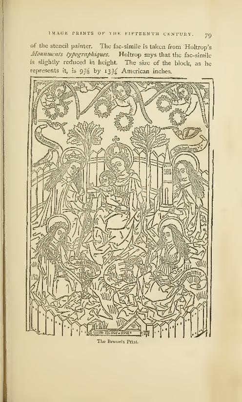
IMAGE PRINTS OK THE FIFTEENTH CENTURY. 79
of the stencil painter. The fac-simile is taken from Holtrop's
Monuments typographiqties. Holtrop says that the fac-simile
is slightly reduced in height. The size of the block, as herepresents it, is 9^3 by 13^ American inches.
The Brussels Print.

So IMAGE PRINTS OF THE FIFTEENTH CENTURY.
The Flemish origin of the Brussels Print is established by
an image, in the Cabinet of Engravings at Berlin, now known
as the Bcrliii Print. It is of the same size as the Brussels
Print, and is, apparently, the work of the same designer, for in
these prints a remarkable similarity of treatment in designing
and engraving may be noticed in the wings of the angels, in
the figure and position of the angel who crowns the Virgin, in
the crowns of St. Catharine and the Virgin, in the flowing hair
of the three saints, and that of the Virgin, and in the collars
on the doves. This print represents the Virgin as carrying
in her arms the infant Saviour. It is described in the cata-
logue as an early xylographic engraving, printed by friction
about the middle of the fifteenth century. It is without date
or name of artist. The language of the legend is Flemish.
The Virgin holds in her right arm the infant Jesus, and in
her left hand an apple. The child caresses the chin of his
mother with one hand, while he drops a rose from the other.
The Virgin, enshrined in an aureole of glory, encircled by four
angels and four doves, placidly stands upon a crescent. The
legend in the four corners is in metre, and is an exhortation
to the reader to serve the Virgin, and imitate her example.
Who is this queen who is thus exalted?
She is the consolation of the world.
What is her name ? tell me, I pray
!
Mary, blessed Mother and Virgin.
How did she attain this exaltation?
By love, humility and charity.
Who will be uplifted with her, on high?
Whoever knows her best in life.
Connoisseurs in prints disagree as to the age and merit of
this print. Passavant says that the Berlin Print, which he
describes as of fine execution, is undoubtedly of Dutch origin,
but he thinks it is the design of a German artist. He places
its date in the same period as that of the Brussels Print,
which, according to him, is 1468. Renouvier says that the
outlines of the Berlin Print are in the style of well-known
Dutch or Flemish prints. He hazards no conjecture as to

IMAGE PRINTS OF THE FIFTEENTH CENTURY. 81
the exact date of its publication, but intimates that it mayproperly be classified with the older prints of the Netherlands.
The Berlin Print.
Holtrop says that the language of the legend in the
Berlin print decides its origin; the design is of the Nether-

82 IMAGE PRINTS OF THE FIFTEENTH CENTURY.
landish school; the language is Flemish, and not Dutch.
He further says : "These two prints (of Berlin and Brus-
sels) complement each other; the print of Berlin shows their
common origin; the print of Brussels indicates their date.
It may be said that they were engraved in the Nether-
lands, probably in Flanders, and perhaps in Bruges, at the
beginning of the fifteenth century."
The prints herein described are the earliest prints with
dates, but they are not, necessarily, the earliest of all. There
are prints known to collectors as the Crucifixion, the Last
Judgment and the St. Jerome, which are regarded by many
bibliographers as the work of unknown engravers at or about
1400. There is a print of St. George which competent judges
say was done in the thirteenth century. None of the prints
contain the name or the place of the engravers, but it is plain
that they were made in the Southern Netherlands, as well as
in Southern Germany. It would be premature to assume that
they were made nowhere else ; but it must be acknowledged
that there are no image prints on paper which can be ascribed
to any engraver in France, Italy, Spain, Holland or England,
during the first fifty years of the fifteenth century. There
is a plausible statement on record, which will be reviewed on
another page, that artistic engravings on wood were made in
Italy before this period. We find, also, a more questionable
statement, that engraving on wood was practised in France
before the year 1400—a statement based entirely on a print
in the public library of the city of Lyons, with a printed date
which has been represented as that of the year 1384. The
age of this print has been denied. It is alleged, with every
appearance of probability, that there is mistake or fraud in
the numerals, for the costumes of the figures prove that the
print should have been made in the sixteenth century.
The question whether image prints were first made in the
Netherlands or in Suabia need not now be considered. It is
enough to say that, although the Brussels print bears the
earliest date, the manufacture of these image prints was more
IMAGE PRINTS OF THE FIFTEENTH CENTURY. 83
common in Germany, not only in the first but in the latter
half of the fifteenth century. That these few accidentally
discovered prints represent the half, or even one-tenth, of
the images then published, is not at all probable. We have
good reason for the belief that they were as abundant in
Southern Germany during the year 1450 as cheap lithographs
were in the United States during the year 1830. That the
greater part of these image prints have been destroyed and
forgotten may be explained by the improved taste of the
succeeding generation. The artistic copper-plate prints which
came in fashion soon after swept away as rubbish the once
admired image prints, just as the chromos of this period have
supplanted the painted lithographic prints of 1830.
How were these images printed? Almost every author
who has written on printing has said that they were printed
by friction, with a tool known as the frotton, which has been
described as a small cushion of cloth stuffed with wool. It
is said that when the block had been inked, and the sheet of
paper had been laid on the block, the frotton was rubbed over
the back of the sheet until the ink was transferred to the
paper. We are also told that the paper was not dampened,
but was used in its dry state. The shining appearance on
the back of the paper is offered as evidence of friction. This
explanation of the method used by the printers of engraved
blocks has been accepted, not as a conjecture, but as the
description of a known fact. I know of no good authority for
it. I know no author who professes to have seen the process.
I know no engraver who has taken impressions with a cloth
frotton. I doubt the feasibility of the method. The reasons
for this doubt will be apparent when this conjectural methodis contrasted with the methods used by modern printers and
engravers for taking proofs off of press.
The modern engraver on wood takes his proofs on thin
India paper. He uses a stuffed cushion to apply the ink to
the cut. The ink, which is sticky, serves to make thin paper
adhere to the block. He gets an impression by rubbing the
84 IMAGE PRINTS OF THE FIFTEENTH CENTURY.
back of the paper after it is laid on the block, with an ivory
burnisher. If he is careful, he can take with a burnisher a
neater proof than he could get from a press. But the only
point of similarity between the imaginary old process and
the present process is in the method of rubbing or friction.
The materials are different: the modern paper is thin and
soft, the old was coarse and harsh ; modern ink is glutinous,
medieval ink was watery ; the burnisher is hard, the frotton
was very elastic ; the burnisher will give a shining appearance
to the back, the soft frotton will not. If the modern engraver
should attempt to use coarse, thick, dry paper, fluid ink, and
a cloth frotton, he could not keep the sheet in place on the
block during the slow process of rubbing. No care could
prevent it from slipping when rubbed with an elastic cushion.
The least slip would produce a distorted impression.
The modern printer takes his proof on dampened paper
with a tool known as the proof-planer. This proof-planer
is a small thick block of wood, one side of which is perfectly
flat and covered with thick cloth. When the paper, which
must be dampened, has been laid on the inked type or
engraving, the printer places the planer carefully on the
paper, holding it firmly with his left hand ; with a mallet,
held in his right hand, he strikes a strong hard blow on the
planer. He then lifts his planer carefully and places it over
the nearest unprinted surface and repeats the blow. In like
manner he repeats the blow until every part of the type
surface has been printed. Rude as this method may seem,
a skillful workman can obtain a fair print with the planer.
Although the wet paper clings to the type, and the ink is
sticky, great care is needed to prevent the slipping of the
sheet, and the doubling of the impression. The back of a
thick sheet printed in this manner often shows a shining
appearance in the places where the blow was resisted by the
face of the type or by the engraved lines.
It will be seen that the printer's method of taking proof
differs in all its details from the supposititious method of the

IMAGE PRINTS OF THE FIFTEENTH CENTURY 85
early engravers. We have soft, clamp paper, sticky ink, and
a sudden fiat pressure against a hard surface shielded with
cloth, in opposition to fluid ink, dry paper, rubbing pressure
and an elastic printing tool.
As we can find no positive knowledge of the method of
printing which was adopted by the early printers of engrav-
ings on wood, it is somewhat hazardous to offer conjectures
in place of facts. It is begging the question to assume that
they were not printed by a press. The presswork of early
prints is coarse and harsh, and could have been done with
simple mechanism, with rude applications of the screw or
of the lever, that could have been devised by any intelligent
workman. It is more reasonable to assume that the early
prints were made by a press, or with some practicable tool
like a proof-planer, rather than with the impracticable frotton.
One cannot resist the suspicion that the chronicler of early
block printing who first described the frotton attempted to
describe what he did not thoroughly understand — that he
mistook the engraver's inking cushion for the tool by which
he got the impression.
It should be noticed that all these old prints are of a
religious character. Portraits of remarkable men or women,
landscapes, representations of cities or buildings, caricatures,
illustrations of history or mythology—none of these are to be
found in any collection of the earliest prints. The early
engravers were completely under the domination of religious
ideas. Their prints seem to have been made with the per-
mission, and possibly under the direction, of proper clerical
authority. The designs are of much greater merit than any
that could have been created by amateurs in the art of
engraving on wood. They were, undoubtedly, copied from
the illuminated books of piety which were then to be found
in all large monasteries. Ecclesiastics of this period were
careful of their books and jealous of their privileges, and not
disposed to allow either to become cheap or common, but
they must have favored an art that multiplied the images of

86 IMAGE PRINTS OF THE FIFTEENTH CENTURY.
patron saints. It was an age of great disbelief, and the image
prints were of service as reminders of religious duty.
There is no evidence that these prints were made by the
monks themselves. There is a statement current in German
books of bibliography that one Luger, a Franciscan monk in
Nordlingen, engraved on wood at the end of the fourteenth
century. But this statement needs verification. It is not at
all certain that the word which is here translated engraver on
wood was written with clear intention to convey this meaning.
The earliest typographers were not monks, nor were they
favored with the patronage of the church. 1It is not probable
that any monk who had been educated for the work of a
copyist or an illuminator, would forsake his profession for the
practice of engraving on wood or printing. Prints, as then
made, were coarse, mechanical copies of meritorious originals.
The artistic scribe rightfully felt that engraving was beneath
him. He must have looked on the people who bought image
prints with the same pitying scorn that a true artist feels for
the uneducated taste of those who now buy glaring litho-
graphs of sacred personages, and he must have felt as little
inducement to engage in their manufacture.
And yet the multitude received them gladly. Wealthy
laymen who could afford to buy gorgeous missals, and priests
who daily saw and handled manuscript works of art, might
put the prints aside as rubbish; but poor men and women,
whose work-day lives were unceasing rounds of poverty and
drudgery, unrelieved by art, ideality or sentiment, must have
hailed with gladness the images in their own houses which
shadowed ever so dimly the glories of the church and the
rewards of the righteous. The putting-up of the image print
on the wall of the hut or the cabin was the first step toward
1 Sweinhcym and Pannartz, who marked, that they did not thrive
were invited, in 1464, to establish a under clerical favor, for they soon
printing office in the monastery of found it expedient to remove to the
Subiaco near Rome, were the first city of Rome, where they were
printers connected with any ccclesi- equally unfortunate in their efforts
astical institution. It may be re- to find purchasers for their hooks.

IMAGE PRINTS OF THE FIFTEENTH CENTURY. 87
bringing one of the attractions of the Catholic church within
the domestic circle. It was the erection of a private shrine,
an act of rivalry, pitiable enough in its beginning, but of
great importance in its consequences. For it was the initi-
ation of the right of private judgment, and of the independ-
ence of thought which, in the next century, made itself felt
in the formidable dissent known in all Protestant countries
as the Great Reformation.
Our knowledge of the origin of engraving on wood has
not been materially increased by the recent discovery of
the Berlin and Brussels Prints. We see that wood-cuts of
merit were made during the first quarter of the fifteenth
century, but we see also that they could not have been the
first productions of a recently discovered or newly revived
art. They present indications of a skill in engraving which
could have been acquired only through experience. One has
but to compare them with wood-cuts made by amateurs in
typographic printing in Italy, Germany and Holland between
the years 1460 and 1500, to perceive that the manufacturers
of the image prints were much more skillful as engravers. If
there were no other evidences, we could confidently assume
that this skill could have been acquired only by practice on
ruder and earlier engravings. Of this preliminary practice-
work we find clear traces in the stenciled and printed playing
cards which were popular in many parts of Europe before
the introduction of images.
L1BH AUY^IVKUSITY OF
i-A Ui' nuNl \

JVwliit nxfo jSbmBbtt }f$ai|mg @nrb$ +
Playing Cards not made by the Frotton. . .Their Manufacture an Industry of Importance. . .Decree
of the Senate of Venice prohibiting the Importation of Cards. . .Early Notices of Card-Making in
Germany. . Probable Method of Manufacture. . .Illustrations of a Playing Card of the Fifteenth
Century... Jost Amman's Illustrations of a Print Colorer and an Engraver on Wood ... Playing
Cards made from Engraved Blocks. . . Early Notices of Card Playing in France. .Cards Prohibited
to the People in France and Spain. . .Introduced in Italy in 1379. Not Invented in Germany.
An Oriental Game. . Illustrations of Chinese Cards. . .Originated in Hindostan. ..Transmitted
to Europe through the Saracens. . .Popularity of Cards in Europe. Cards Denounced by the
Clergy...New Forms and New Games of Cards, with Illustrations. . .Unsuccessful Attempts to
make Cards a Means of Instruction. . Cards not an Unmixed Evil. . .Induced Respect for Letters
and Education. . .Cards probably made before Images. . .Made by Block-Printing. ..Most largely
made by this process in Germany.
glfter innumtratte experiments aixb Disappointments, ujt art so tagerln sought antrso
sorcln nceocb ioas at last bisroberefc. Stnb fohat is strange, although in accorbancc
foitf) tfje rapriciousness of indention, tfjis art tfjat tab tluitU all the efforts anil
aspirations of intelligence, teas fcistoccreo" in makers of raros. 3Jt to as ic them,
anir for the peculiar requirements of tfjrir toorfe, tijat xijlograpfjn toas inbentefc.
Bibliophile Jacob,
THE hypothesis, for it is nothing more, that all the early
prints were produced by the frotton does not satisfac-
torily explain the large production of merchantable printed
matter during the first half of the fifteenth century. Friction
would have served then, as it does now, for trial proofs or
experiments, but it was a method altogether too slow and
uncertain to meet the requirements of an extended business.
The playing cards and prints so common during this period
must have been made by a quicker method. That there was
an established international trade in playing cards and in
other kinds of printed work, as early as the year 1441, may
be inferred from the following decree of the senate of Venice:

PRINTED AND STENCILED PLAYING CARDS. 80
1441, Oct. 11. Whereas, the art and mystery of making cards
and printed figures, which is in use at Venice, has fallen to decay,
and this in consequence of the great quantity of printed playing cards
and colored figures which are made out of Venice, to which evil it
is necessary to apply some remedy, in order that the said artists, whoare a great many in family, may find encouragement rather thanforeigners : Let it be ordained and established, according to the peti-
tion that the said masters have supplicated, that from this time in
future, no work of the said art that is printed or painted on cloth or
paper— that is to say, altar-pieces, or images, or playing cards, or
any other thing that may be made by the said art, either by painting
or by printing— shall be allowed to be brought or imported into this
city, under pain of forfeiting the work so imported, and thirty livres
and twelve soldi, of which fine one-third shall go to the state, one-
third to Giustizieri Vecchi, to whom this affair is committed, and one-third to the accuser. With this condition, however, that the artists
who make the said works in this city shall not expose the said worksfor sale in any other place but their own shops, under the penaltyaforesaid, except on the day of Wednesday at S. Paolo, and onSaturday at S. Marco. 1
The engraved images here noticed were probably prints
of saints or sacred personages like those of which engraved
illustrations have been given on previous pages. The altar-
pieces were prints upon cotton or linen cloth, of a similar
character, but of much larger size.2
Playing cards, which are twice mentioned in the decree,
seem to have been considered as of equal importance with
images and altar-pieces. The specification of three distinct
kinds of printed work, coupled as it is with the allusion to
"any other thing that may be made by the said art," is an
intimation that the manufacturers, "who were a great many1
1 have used the translation as I2 Weigel, in his Infancy of'Print-
find it in Ottley's Inquiry into the ing, plate 10, presents the fac-simile
Origin and Early History of En- of an old printed altar-piece, aboutgraving, vol. 1, p. 47. The original eight inches wide and twenty inchesis given by Temanza, Lettere Pit- long, which contains a representation
toriche, vol. V, p. 321. Temanza of the Virgin and the infant Christ,
found this decree in an old book The engraving is in outline only,
of regulations which belonged to a The interior was colored by stencils.
fraternity of Venetian printers. like the image prints.

90 PRINTED AND STENCILED PLAYING CARDS.
in family," were even then applying the art of printing and
colored stenciling to many other purposes.
The decree says that the art had fallen to decay. Whenit was in its most prosperous condition in Venice cannot be
ascertained from the record, nor from any other source. The
author 1 who found this document says that he had fragments
of coarse engravings on wood which represented some parts
of the city of Venice as they appeared before the year 1400.
He thinks these rude engravings must have been cut in the
latter part of the fourteenth century. That they could have
been made at this time is not improbable, but the direct
evidence is wanting. There are, however, abundant reasons
for the belief that engravings on wood were made in Venice,
not experimentally, but in the way of business, many years
before the decree of 1441. And they must have been made
elsewhere. The printers of playing cards and colored figures
must have been many in family beyond as well as in Venice.
If the foreign printers had not been formidable competitors,
there would have been no request for the prohibitory decree.
Nothing is said in the decree about the nationality of the
foreign competitors, but we may get this knowledge from
another source. An authentic record of the town of Ulm in
Germany contains a brief entry which tells us that playing
cards in barrels were sent from that city to Sicily and Italy,
to be bartered for delicacies and general merchandise.
-
1 Temanza had some old Vene- passed all their competitors. This
tian playing cards of unknown date, pre-eminence was maintained manywhich he believed were made at or years after the invention of typog-
about the time of the publication of raphy. The earlier books of Venice
this decree. They were of large size, are famous for the whiteness of their
on thick paper, and elaborately dec- paper and the beauty of their types,
orated with gold and colors. The as well as for admirable presswork
early Venetian playing cards were, and solid bindings,
probably, more expensively made, 2 Heineken, Idie generate, page
and were offered at higher prices 245. He does not give the date,
than the German cards. In the field The record from which he quotes,
of art and ornament, and even in the Red Book of Ulm, so called
the trades which called for a higher bi be initials were in that
degree of skill, the Venetians sur- color, ends with the year 1474.

PRINTED AND STENCILED PLAYING CARDS. 91
The same book contains a defense of the game of playing
cards under the date of 1397. Another old German record,
the Burgher Book of Augsburg for the year 141 8, specifically
notices card-makers. The Tax Book of Nuremberg, for the
years 1433 and 1435, names Eliza, a card-maker. The same
book, for the year 1438, mentions Margaret, the card-painter.
The words kartenmacherin, card-maker, and kartenmalerin,
card-painter, which are found in these books, do not clearly
specify the process. It has been suggested that these cards
could have been drawn and painted by means of stencil plates.
The word formschneider, form-cutter, the word now used
in Germany as the equivalent of engraver on wood, appears
for the first time in the year 1449, in the books of the city of
Nuremberg. The same records mention one Wilhelm Kegler,
briftrucker, or card - printer, under the date of 1420. They
also mention one Hans Formansneider, in the year 1397, but
Formansneider should not be construed as engraver on wood.
It should be read Hans Forman, Schneider or tailor. In this,
as in some other cases, it will be seen that the facility of the
German language for making new words by the compounding
of old ones, is attended with peculiar disadvantages. Themanufactured words are susceptible of different meanings.
These notices of card-making are not enough to prove
that the process employed was that of xylography. They
prove only that card-making was an industry of note in the
towns of Ulm, Augsburg and Nuremberg. But when these
notices of early card-making are considered in connection with
early German prints, like the St. Christopher of 1423, which
were discovered in the vicinity of these towns, there is no
room for doubt. If prints of saints were made by engraving
on wood, cards should have been made by the same art.
The connection of cards and image prints in the decree of
the Senate of Venice is evidence that they were made by
the same persons and by the same process.
It may seem strange that the little town of Ulm, in the
heart of Germany, should establish by a long sea route a trade

92 PRINTED AND STENCILED PLAYING CARDS.
in playing cards with cities on the Mediterranean and the
Adriatic. It is but one of many evidences of the growing
spirit of commercial enterprise which pervaded all the cities
of Germany. It is not more strange than the fact that, in
1505, merchants of Augsburg, a city at a great distance from
navigable waters, joined with the Portuguese in an extensive
traffic with the eastern coast of Africa.
Playing cards may have been made at as early dates in
other countries besides Germany and Italy. We shall soon
see that they were in common use in many parts of Europe
at the beginning of the fifteenth century, but we have no
certain knowledge that they were made from engraved blocks
in other places. Our knowledge of the fact that they were
printed in Italy and Germany is based entirely on occasional
notices in old manuscript records. We have indications that
they were printed, but we lack the proof. There are no cards
in existence which can be offered, with any degree of confi-
dence, as specimens of the block-printing of 1440. The xylo-
graphic cards of which fac-similes are most common in books
which treat of pastimes, are of the sixteenth century ; the
copper-plate cards described and illustrated by Weigel and
Breitkopf were made either during the latter half of the
fifteenth or in the sixteenth century.
The engraving on the following page is a fac-simile of
one of a set of forty-eight playing cards now preserved in
the British Museum. The entire set, printed on six separate
sheets of paper, eight cards to each sheet, was found in that
great hiding-place of discarded sheets, the inner lining of a
book cover, for which, to adopt the bookbinder's phrase, it
served as a stiffener. The sheets may have been rejected for
imperfections, and put in the book cover because they were
unsalable. The book in which they were found was printed
and bound by some unknown or undescribed printer before
the year 1500.' If rudeness of engraving could be considered
1
Singer's Researches into the His- abounds in curious information andtory of Playing Cards. This book has many valuable fac-similes.

PRINTED AND STENCILED PLAYING CARDS. 93
as sufficient proof of superior antiquity, this card should be
rated as one of the oldest pieces of engraving on wood.
The cutting of this block could have been done by any carver
on wood, or even by a carpenter. But the quality of the
engraving is not a proper criterion of the condition of the
art of engraving on wood during the period in which it was
made. It is obviously a cheap card, made for the uses of
people who could pay but a small price. There may have
been other reasons for the rudeness of the work. The stiff
and conventional manner of drawing the figures may have
been as popular then as a similar method of designing playing
cards is at this day.
Dull red and dark green
were the only colors used in
illuminating this set of cards.
They were laid on with brush
and stencil. The stencil is
one of the oldest forms of
labor-saving contrivance for
abridging the labor of writing
or drawing. It was used, as
has been stated, in the sixth
century by a Roman emperor
who could not write; it was
used for the same purpose by
Theodoric, king of the Ostro-
goths, and by the emperor
Charlemagne. It is used to
this day by merchants who
mark boxes, in preference to
writing, printing, branding, or painting. It has advantages
of cheapness and simplicity that commend it to all manufac-
turers. It is even used by publishers of books for tinting
maps, fashion plates, and illuminated pamphlet covers.
Jost Amman, in his Book of Trades, has presented us a
representation of the print stenciler, as he practised his work
A Playing Card of the Fifteenth Century.[From Singer.]

94 PRINTED AND STENCILED PLAYING CARDS.
in 1564. The method here shown is, probably, the method
in general use in 1440, for the coloring of playing cards and
image prints. We see the bowls that contain different colors,
with their proper brushes, on top of the chest. The colorer
is sweeping the brush over the perforated metal plate, and
filling up the outlines
of the print. The
neat pile of sheets
before him and near
his right hand shows
that he is working
with precision and
with system. Stencil
painting was work of
care and neatness, but
it was so simple that
we can clearly under-
stand that it could
have been done by
women in Nurem-
berg as effectively as
it is done now. 1
The illustration of
the engraver on wood[From jost Amman.] which appears in the
same Book of Trades puts before us a man in a richer dress,
plainly a workman of higher grade than the stencil painter.
He seems to be tracing outlines on the block. The technical
accessories about this engraver are the same as those in use
at this day— the graver, the whetstone, and, possibly, a water
globe lens in the corner near the window casement.
-
' Brcitkopf says that the stencil
painting of prints was done withgreat rapidity by the medieval col-
orist. He alludes to an old Ger-man saying of "painting the twelve
apostles with one stroke," which,
no doubt, refers to the expeditious
painting of a once popular image
print, of which there is now no frag-
ment in existence.'
l Some antiquarians say that this
print is a representation of Amman.

PRINTED AND STENCILED PLAYING CARDS. 95
Playing cards and engraving on wood bear to each other
a curious relation. The introduction of the cards in Europe
was soon followed by the revival, or as Bibliophile Jacob of
Paris characterizes it, by the invention, of engraving on wood.
Whatever differences of opinion may exist as to whether the
art was revived or invented, it is certain that playing cards
were the means by which early printing was made popular.
Cards were the only kind of printed work which promised
to repay the labor of engraving. People who could neither
read nor write, and
who had no desire to
be taught either ac-
complishment, deriv-
ed great pleasure from
them. There was no
other kind of printed
matter, not even the
image prints, which
found so many buyers
in every condition of
society. The fixing
of the earliest practice
as a regular business
of engraving on woodin Europe depends, in
some degree, on the
fixing of the date of
the first introductionr * • i -T-i
The Engraver on Wood.ot playing cards. The [Frora jost Amman.]
determination of this date has been made a national question,
and the theme of books containing much curious information.
Ambrose Firmin Didot 1 quotes a scrap of poetry from a
French romance of 1328, which alludes to the folly of gamesof dice, checkers and cards. Other French writers maintain
that playing cards were in use in France as early as 1350.1 Didot, Essai stir la typographic, p. 564.

o6 printed and stenciled playing cards.
Bullet says that playing cards were used in France in the
year 1 376. But the testimony in confirmation of these dates
is ambiguous and insufficient. The first unequivocal notice
of playing cards in France is to be found in an account book
for the year 1392, kept by one Charles Poupart, treasurer to
Charles VI. In this book is an entry to this effect: "Paid
to Jacquemin Gringonneur, painter, for three packs of cards,
gilded, colored, and ornamented with various designs, for the
amusement of our lord the king, 56 sols of Paris." The mind
of Charles VI had been seriously affected by sunstroke, and
these cards were provided for his lucid intervals during which
he suffered from melancholy. We are not told how these
cards were made—whether they were first drawn by hand,
or whether they were printed from cut blocks before they
were painted. The price paid was not small : fifty-six sols of
Paris in 1392 would be equivalent to one hundred and eighty
francs in 1874. In 1454, a pack of cards purchased for the
Dauphin of France cost but five sous of Tours, the equivalent
of twelve or thirteen francs of modern French money. 1 The
difference in these prices is some indication of a cheapened
manufacture.
The earliest and most convincing evidence of the popu-
larity of playing cards in Paris is contaihed in an order of
the provost of that city, under the date of 1397, in which
order he forbids working people from indulging in games of
tennis, bowls, dice, cards, or nine-pins on working days.
That the game was then comparatively new is inferred from
the omission of playing cards in an ordinance of the city of
Paris, for the year 1369, in which other popular games were
minutely specified.
The Cabinet of Prints attached to the National Library at
Paris contains seventeen cards which are supposed to be the
relics of the three packs made for Charles vi by Gringonneur
;
but these cards were, without doubt, drawn by hand. This
cabinet has no printed cards which can be attributed to the
•Bibliophile Jacob, CuriosiUs de Vhistoire des arts, etc, p. 48.

PRINTED AND STENCILED PLAYING CARDS. 97
fourteenth century. Its oldest relics of this kind are eighteen
printed cards which may have been made in France during the
reign of Charles VII, or between the years 1442 and 1461.1
Playing cards seem to have been popular in Spain before
they were known in France. They were supposed to be so
demoralizing to the people, that John I, king of Castile, in
the year 1387, thought it necessary to prohibit them entirely.
To have acquired this popularity, the cards should have been
made by some process as economical as that of printing.
We have, however, no knowledge that the cards were printed.
They could have been made by stencils. Chatto says that
the relics of playing cards which he thought were the oldest
were made exclusively with stencils.
Cards were known in Italy as early as 1379. An old
manuscript history of the town of Viterbo, which states this
fact, says that "In this year, a year of great distress [occa-
sioned by the war between the anti-pope Clement VII and the
pope Urban VI ], was brought into Viterbo, the game of cards,
which came from the land of the Saracens, and by them is
called Naib."
1 One of the cards bears the name January, 1392, in which masquerade
of the maker, F. Clerc. The cos- the king and five of the gentlemen
tumes of the figures are* French, and of the court took the parts of savages.
of the fashion of the court of Charles The costumes were made by encas-
VII. One of the queens is a rude ing the actors in tight-fitting linen
copy of the well known portrait of garments, covered with warm pitch
the queen Marie of Anjou ; another and tow. In this uncouth attire, and
queen is from an authentic portrait linked together with clanking chains,
of the king's mistress, Gerarde Cas- they danced in the ball-room to the
sinel. The robe of one of the kings amusement of the men and the
is plentifully sprinkled with \kvefleiir- terror of the ladies. Wishing to dis-
de-lis ; the figure of another king is cover one of the maskers, the Dukethat of a hairy savage with a torch of Orleans snatched a torch from
in his hand. These singular cards the hand of a servant, and thrust it
illustrate a frightful accident which too near an unhappy masker's face,
made a profound impression on the In a moment he was covered with
people of France. To divert the a blaze which quickly spread to his
half-crazed king Charles VI, a mas- fellows. The king was rescued in
querade was planned for a ball given time, but four of the masqueraders
by Queen Blanche, on the 29th of were burned to death.
g8 PRINTED AND STENCILED PLAYING CARDS.
Many German authors claim that playing cards were in
common use throughout Germany at a much earlier period.
Breitkopf quotes the following passage from a book called
the Golden Mirror, said to have been written about the middle
of the fifteenth century by a Dominican friar of the name of
Ingold: "The game is right deceitful, and, as I have read, was
first brought in Germany in the year 1300." l Another writer
quotes an old chronicle, that describes the emperor Rudolph
as amusing himself with cards in the old town of Augsburg
at some undefined time before his death in 1291. It cannot
be proved that the cards here mentioned were true playing
cards. It is more probable that the amusement noticed was
the game of king and queen, which was forbidden to the
clergy by the synod of Worcester in 1240, and which has
sometimes been erroneously understood as a game of cards.
The notices of card -makers and card -printers in the town
books of Nuremberg and Augsburg should be" regarded as
the earliest records of the use of playing cards in Germany. 2
n A review of the dates proves that playing cards were not
popular in any part of Europe before the last quarter of the
fourteenth century. The Italian record which attributes their
derivation to the land of the Saracens is fully corroborated by
other testimony of authority. Students of oriental literature
assure us that the Saracens were taught the uses of playing
cards by the inhabitants of Hindostan, in which country they
were invented. 3 Playing cards were made in China from
printed blocks long before the game was known in Europe.
'Breitkopf, VersuchdenUrsprung do not mention cards. For the
der Spielkartcn, p. 9, note g. The period between 1380 and 1384, they
fac-similes of playing cards in this are both mentioned and permitted,
book are exceedingly grotesque.3 In Singer's Researches into the
1 Cards are not mentioned in a History of Playing Cards may be
specification of popular games in found many fac-similes of early Hin-
the Stadtholdt Book of Augsburg dostanee cards, some of which, we
for the year 1274. The ordinances are told, were engraved on plates of
of the town of Nuremberg for the ivory. These fac-similes show that
period between the years 1286 and the primitive game was a modifica"
1299 prohibit gambling, but they tion of the old Indian game of chess.

PRINTED AND STENCILED PLAYING CARDS. 99
Chinese Playing Cards.
[From Breitkopf.]
The
has
who
who
l1 l« '111 Ull.llA.UpiiJ
introduction of this oriental pastime in civilized Europe,
been attributed to the Moors of Spain, to eastern Jew^' ( ) : j
traded on the shores of the Mediterranean, to Gypsies
made their appearance in Germany at the beginning

iOO PRINTED AND STENCILED PLAYING CARDS.
of the fifteenth century. Whether they were introduced by
Moor, Christian, Jew or Gypsy is of minor importance. It
concerns us more to know how they were received. We have
abundant evidence that the cards supplied a universal want,
and that they soon became as popular with the poor and
ignorant as they had been with the rich and noble. While
the Duke of Milan found amusement, as he did in 141 5, with
a suite of cards elaborately painted by artists of renown on
plates of ivory, at a cost of fifteen hundred crowns, and while
Flemish nobles were playing at games of hazard with cards
engraved on silver plates, the working people of France and
Spain, soldiers in Italy, and traveling mechanics in Germany
were diverting themselves in wine-shops and public gardens,
in huts and by the road-side, with similar games, played with
greasy cards which had been printed or stenciled on coarse
paper. The cards were adapted to all tastes, and there was
a fascination in them which made men neglectful of duty.
The evil results of this infatuation were soon perceived.
Playing cards were denounced not only by kings and the
provosts of cities, but by the more zealous and conscientious
priests of the church. At the synod of Langres held in
1404, the fathers of the church forbid all games of playing
cards to the clergy. On the fifth day of May, in the year
1423, St. Bernard of Sienna preached against playing cards
from the steps of the Church of St. Peter, with such effect,
that his hearers ran to their houses, and brought therefrom
all the games of hazard that they owned— cards, dice and
checkers—and burnt them in the public square. One card-
maker, who felt that his business had been ruined by the
sermon, went in tears to the saint, and said, "Father, I am a
card maker, and know no other trade. You have forbidden
me to make cards and have consequently condemned me to
die from starvation." Whereupon the ready priest said, "If
you know how to paint, paint this image"— showing him the
figure of Christ, with the monogram I. H. S. in the centre of
a halo of glory. The card- maker, we are told, followed the

PRINTED AND STENCILED PLAYING CARDS. IOI
judicious advice. The proper sequel is not wanting: virtue
had proper reward ; the converted image-maker soon became
rich. In 1452, the monk John Capistan preached for three
hours in Nuremberg with a similar result. The conscience-
stricken people brought into the market-place "76 jousting
sledges, 3,640 backgammon boards, 40,000 dice, and cards
innumerable," and burnt them in the market-place.
The attacks of the clergy had no permanent effect. At
the end of the fifteenth century, playing cards were more
popular than ever. Other games were invented, and new
forms of cards of quainter or of more graceful patterns were
produced. Sometimes they were engraved on copper plates,
and were painted with all the delicacy of fine miniatures.
Despairing of success in their attempts to entirely abolish
the practice, moralists undertook to divert cards from their
first purpose, and to make them a means of instruction as
well as of amusement. Of this character is an old pack of
fifty cards engraved on copper plates, and supposed to be the
work of Finigue'rra, which has been preserved in an Italian
library. One of the cards bears the printed date, 1485. The
pack is divided in five suites : the first suite contains cards
that represent, by figures and words in the Venetian dialect,
the various conditions of men from the pope to the beggar;
the second suite contains the names and figures of the nine
muses, with Apollo added to make the complement; the
third illustrates branches of polite learning from grammar
to theology; the fourth exhibits cardinal virtues, like justice
and prudence ; the fifth, displays the heavenly bodies, the
Moon, Saturn, the stars, Chaos and the First Cause. This
game, obviously made up for the benefit of young collegians,
was, probably, no more popular with them than the scientific
story books of 1820-30 were with the boys of that period.
The combination of abstruse sciences with a frivolous amuse-
ment may rightfully be considered a problem of despair.
The illustration on the next leaf is the reduced fac-simile
of a suite of twenty-two playing cards, intended, apparently,

102 PRINTED AND STENCILED PLAYING CARDS.
to convey solemn religious truths in the form of a game of
life and death. We do not know how the game was played
:
we have to accept the figures upon the cards as their own
explanation and commentary. In the figures of Jupiter and
of the Devil, we see the powers which shape the destinies of
men. The Wheel of Fortune is emblematic of the fate which
assigns to one man the condition of a Hermit, and to another
that of an Emperor. The virtues of Temperance, Justice and
Strength which man opposes to Fate, the frivolity of the Fool,
the happiness of the Lover (if he can be happy who is cajoled
by two women), and the pride of the Empress, are all domi-
nated by the central card bearing an image of the skeleton
Death— Death which precedes the Last Judgment and opens
to the righteous the House of God. In these cards we have
a pictorial representation of scenes from one of the curious
spectacle plays of the middle ages, which were often enacted
in the open air to the accompaniments of dance and music.
The union of fearful mysteries with ridiculous accessories, and
the ghastly suggestion of the fate of all men, as shown in
the card of Death the reaper— these were the features which
gave point and character to the series of strange cartoons
popular for many centuries in all parts of civilized Europe
under the title of the Dance of Death.
This was but one of the many innovations proposed as
substitutes for the older oriental games. In the latter part
of the fifteenth century, playing cards were made in Italy
with figures which represented the four great monarchies of
the ancient world, with which a childish game was played in
imitation of war and conquest. Suitable marks on the cards
designated the four different classes of society ; hearts were
the symbol of the clergy ; spades (from the Italian spada, a
sword) were for the nobility ; clubs stood for the peasantry ;
and diamonds represented the citizens or burghers.
Thomas Murner, a professor of philosophy at Cracow in
1507, undertook to make use of playing cards for teaching
high scholastic science. He published a book which he called

PRINTED AND STENCILED PLAYING CARDS. I03
Reduced Fac-Simile of French Copper-plate Playing Cards of the Sixteenth Century.[From Breitkopf.]

J04 PRINTED AND STENCILED PLAYING CARDS.
Logical Playing Cards, or Logic Realized and Made Compre-
hensible through Pleasant Exercises with Pictures. The cards
were filled with mysterious symbols intended as keys to the
entire art of reasoning. The difficult science was adapted to
the meanest capacity, by puerile methods which subsequently
provoked the contempt of Erasmus. Each card had some
pedantic name like Proposition, Predicate or Syllogism. Could
there be a more unattractive game ?
Eminent German artists—among them Martin Schongauer
and the Master of 1466— undertook to supplant the stiff and
barbarous figures that had been used on playing cards, with
designs of merit. They drew and engraved new face figures
of most extraordinary character, in which satirical and poetic
fancies were strangely blended. The amorousness of the
monks and the coquetry of the ladies, the quarrels of terma-
gants among the peasantry, the revenge of hares who are
roasting their enemy man and his friend the dog, are the
subjects of some cards. On other German cards of this
period are represented, in startling contrast, the sweet and
saintly faces of pure women, heroic men riding in triumph,
and filthy sows with their litters.
Jost Amman 1 designed, and perhaps engraved, a full pack
of cards which was published in book form with explanatory
verses in Latin and German. Rejecting the established forms
of hearts, clubs, spades and diamonds for the designation of
the suites, he substituted books, printers' inking balls, wine
pots and drinking cups. The moral that he endeavored to
inculcate was the advantages of industry and learning over
idleness and drunkenness. But the intended moral is not as
clear as it should be. Some of the figures are exceedingly
gross, although they are drawn with admirable skill and spirit.
These innovations had but a transient popularity. The
people played cards, not for instruction in art, science or
1 The industry of Jost Amman pupil George Keller, that during
was as remarkable as his skill. The the four years in which Keller lived
old historian of 1 arly painters, Sand- with him, Amman produced designs
raart, says, on the authority of his enough to load a wagon.

French Card of the Fifteenth Century.[From Lacroix.]
German Card of the Sixteenth Century.[From Lacroix.]
German Card of the Sixteenth Centi;
[ From Lacroix.]
~ German Card of the Fifteenth Century.
CALIFORNIA.

106 PRINTED AND STENCILED PLAYING CARDS.
morality, but for amusement, and they would not suffer the
games to be diverted from their first purpose of the pleasure
of hazard. The old games and the old figures were deeply
rooted in their memories and habits. They would have no
changes, and there have been none of any importance. The
hard conventional figures of king, queen and jack which are
to be found on the oldest playing cards have been repeated
almost without alteration in the popular cards of every suc-
ceeding century. We can readily understand the reasons why
the scholastic and scientific games were rejected, but it would
be difficult to account for the preference always manifested for
coarse outlines and clumsy drawing in the figures.
Although playing cards led to gambling, and to forms
of dissipation which required restraint,1their general use was
not an unmixed evil. To the common people, they were a
means of education; a circuitous and a dangerous means, no
doubt, but not the less effectual. The medieval churl whose
ignorance was so dense that he failed to see the advantages
of education, and who would have refused to learn his letters
by any persuasion, did perceive that there was amusement in
playing cards, and did take the trouble to learn the games.
With him, as with little children, the course of instruction
began with bright-colored little pictures and the explanation
of hidden meanings in absurd-looking little spots or symbols.
In the playing of the game, his dull mind was trained to a new
and a freer exercise of his reasoning faculties, and he must
have been inspired with more of respect for the dimly seen
utility of painted or printed symbols. To the multitude of
early card players, cards were of no other and no greater
benefit as a means of mental discipline. To men of thought
and purpose, they taught a more impressive lesson of the
value of paper and letters. They induced inquiries that led
1 The ordinances of Nuremberg bows, cards, shovel boards, tric-trac
between the years 1380 and 1384 and bowls, at which a man may bet
permitted gambling and betting, but from two pence to a groat." Yonin moderation: ''Always excepting Murr, as quoted by Chatto, Treatise
horse-racing, shooting with cross- on Wood Engraving, p. 42.

PRINTED AND STENCILED PLAYING CARDS. IG 7
to important resolves. If a few arbitrarily arranged signs onbits of paper could greatly amuse a party of friends during along evening, would not the letters of the alphabet as theywere combined in books, furnish a still greater and an unfailing
source of amusement?
The meagre notices of card -makers and card -painters in
old town-books of Germany and in the decree of Venice donot tell us whether cards were made before or after imageprints. Those who have written most learnedly on this
subject, 1tell us that the cards were made before the images
;
that at first they were drawn and painted by hand ; that theywere afterward colored by stencils; that when this methodwas found too slow, blocks were engraved and printed; andthat the image prints were subsequently introduced for thepurpose of counteracting the evil influences of cards. Thesepropositions are ingenious, but it must be confessed that wehave no certain knowledge that the improvement was madein this order. This theory of gradual development is basedon conjecture, and its best support is derived from a consid-eration of the fact that cards were in common use before wehave any indications of the existence of image prints. Thatthe cards should have been made by engraving before theimages seems reasonable when we consider that the work-manship of the cards was of a much ruder nature. Theexperimenting amateur who knew that he was unable to cut
a block like that of the St. Christopher, would readily under-take to engrave the spots and face figures of the earlier cards.
Breitkopf, an expert type-founder and a writer of author-
ity, stands almost alone in his opinion that playing cards were1 Having visited many convents in of figures of saints, which, distributed
Franconia, Suabia, Bavaria, and the Aus- and lost among the laity, were carefullytrian States, I everywhere discovered in preserved by the monks, who pastedtheir libraries many image prints engrav- them on the inner covers of the booksed on wood and pasted either in the with which they furnished their libraries,
beginning or the end of old volumes of After the engravers had succeeded inthe fifteenth century. These facts taken making prints of saints, they found it
together confirm me in the opinion that very easy to engrave historical subjects,the next step of the engraver on wood, with explanations in words. Heineken,after playing cards, was the engraving Idee generate, etc., p. 251.

io8 PRINTED AND STENCILED PLAYING CARDS.
made after the image prints. He says that the engravers who
made cards also made images, and he adds the curious fact
that in some places cards and images were called by the
same name. 1
The curt and careless manner in which the business of
card -making is mentioned in the old records is an indication
that the process used was not novel." We do not find in the
writings of any author of the fifteenth or sixteenth centuries
a statement that the earliest playing cards were made by a
new art. That they were made by block - printing at the
beginning of the fifteenth century in Italy and Germany seems
clearly established. That they were made at a corresponding
period in Spain and France, where cards were as common,
cannot be proved. It is probable that the Germans derived
their knowledge of cards from Italy, but the evidences of
an early manufacture by printing are decidedly in favor of
southern Germany, a district in which the most famous image
prints have been found, and which, at a later period, was the
birthplace of many eminent engravers on wood.
1 Wood-cuts of sacred subjects were
known to the common people of Suabia,
and the adjacent districts, by the name
of Halgen or Halglein, saints or little
saints, a word which, in course of time,
was also applied to prints of all kinds.
meaning. The maker of prints was
known as a. dominotier, whether he madeprofane cards or pious images. In time
the word so far declined from its first
meaning that it was applied not only to
printers of cards and images, but to theWOO UlbU iipjJllCU IU puma <->l ail rmiuo. ^y.inv.»o v,. ~m ^.., t...„ ;,~-j —In France also, the earliest prints were makers of fancifully colored wall-papers,
known as dominos, or lords, a word Vcrsiich dot Ursprung dcr Spielkartcn,
which was intended to convey the same etc., vol. II, p. 174.

YI
Antiquity of Printing among the Chinese. . .Statement of Du Halde. . .Its Perversion. . .First Chinese
Method, the Gouging of Letters. . .Didot's Hypothesis. . .Second Method, of Xylography. . Third
Method, a Combination of Xylography and Typography ... A Peculiarly Chinese Invention.
Method now used. . .Its Advantages over Types. . .Chinese Paper. . . Performance of Pressmen.
Curious Method of Binding. . .Expense of Engraving no hindrance to Chinese Printing ... TheXylographic Method necessary . . . Chinese Practice in Typography . . . Cheapness of Chinese
Books ... Similarity between the Chinese and the European Methods of Block - Printing. . .The
Hypothesis of its Transmission to Europe through Marco Polo, or other Venetian Travelers.
In intij arte, inritinof an& printing; alike, tTjc <&%ivitst fiafo remained stiff, jstolitr,
artfi immobaiilt at tljt first sttp, fottfj tfj* rbarartmstu uncfjangtatnlitj of tijt
2fIloS») XKttS of BaStMIl fLsia. £>. F. Bacon.
MANY eminent authors are of the opinion that we are
indebted to China not only for playing cards, but for
the means of making them. They tell us that playing cards
could not have been popular, as they were at the beginning of
the fifteenth century, if they had not been made by a cheaper
process than drawing by hand. The inference attempted is
that block-printing and playing cards were brought to Europe
together. The reasons presented in support of this opinion
are far from conclusive, but they are based on many curious
facts which deserve consideration.
^The Chinese claims for priority in the practice of block
printing have been disallowed by some critics, chiefly because
they have been presented in the form of perverted translations.
That oriental people practised printing before this art was
applied to any useful purpose in Europe is admitted by all
who have studied their history. Du Halde, a learned Jesuit
father, who traveled in China during the earlier part of the

HO THE CHINESE METHOD OF PRINTING.
eighteenth century, was the first author who furnished Euro-
peans with a description of Chinese printing. He quotes the
following extract from a Chinese book, supposed to have been
written in the reign of the emperor Wu-Wong, who was living
1 1 20 B. c. "As the stone me (Chinese for blacking), which
is used to blacken the engraved characters, can never become
white, so a heart blackened by vices will always retain its
blackness." 1 This is an allusion to some primitive method of
blackening incised characters, for the purpose of making them
more legible. It is a method which is still observed in the
inscriptions on memorial stones in churches and graveyards.
But it is an allusion to engraving and blackening only. There
is no mention of printing ink, and no suggestion of printing.
Du Halde quoted it only to show the antiquity of engraving,
yet it has been used by many authors as a warrant for the
assertion that printing was practised in China eleven hundred
years before the Christian era. If we could accept this state-
ment, we should have to believe that printing was invented
in China but a few years after the siege of Troy, before Romewas founded, before Homer wrote and Solomon reigned. DuHalde's words do not warrant this statement. He says, with
due caution, "In printing, it seemeth that China ought to
have the precedence of other nations, for, according to their
books, the Chinese have made use of this art for sixteen
hundred years," or since the first century.
n. The practice of blackening characters was not printing,
but it may have led to its development. Du Halde says that
the Chinese printed not only on wood blocks, but on tables
of "stone of a proper and particular kind." The writing or
design to be printed, while it was still wet with ink, was
transferred by pressure from the paper upon which it was
written to the smooth surface of a slab of stone. When the
'This method is still in use in rubbed over the leaf; the places
many parts of the East Indies. A scratched are filled with atoms of
dried leaf is written on with a point- charcoal, which make the writing as
ed steel which scratches the smooth legible as it would have been if
surface. A bit of charcoal is then written with fluid ink.

I
THE CHINESE METHOD OF//
PRINTING. -/ , lit <\>f
black lines of the writing or design were firmly set on the
stone, the paper was peeled off. The black transferred lines/ywere then cut out, or cut below the surface, as they are now *
,
done in the copper-plate process. The surface was inked, _
paper was laid on the stone, and an impression was taken.
The result was, the appearance on the paper of the writing or
design in white on a field of solid black. This method of
cutting out the lines, so that they should appear white in the -
printed impression, is the simplest form of engraving. It is
like that of the boy who cuts his name in the bark of a tree.
He finds it easier to gouge out the letters than it is to raise
them in high relief. Reasoning from probability, we should
say that it should have been the earliest of the methods.
Didot believes that it was known to the old Romans. 1 DuHalde says that this method of printing on stone was used
chiefly for "epitaphs, pictures, trees, mountains and such like
things." He does not fix the date of its invention, but it was
probably the earlier method. Didot says that he had in his
1 In support of this opinion hequotes the following from Pliny
:
It would be improper to omit the
notice of a new invention. We have
been accustomed to preserve in our
libraries, in gold, silver, or bronze, the
personages whose immortal spirits speak
to us from distances of leagues and cen-
turies. We create statues of those whoare no longer living. Our regrets in-
vest them with features which have not
been given to us by tradition, as, for ex-
ample, is shown in the bust of Homer.The idea of making a collection of these
portraits is due to Asinius Pollio, whowas the first to throw open his library,
and to make these men of genius the
property of the public. That the love
for portraits has always existed is suffi-
ciently proven by Atticus, the friend of
Cicero, who published a book on the
subject, and also by Marcus Varro, whohad the enlarged idea of inserting in his
numerous books not only the names,but, by the aid of a certain invention,
the images of seven hundred illustrious
persons. Varro wished to save their
features from oblivion, so that the length
of centuries would not prevail against
them. As the inventor of a benefit
which will fill even the gods with jeal-
ousy, he has clothed these persons with
immortality. He has made them knownover the wide world, so that everywhere
one can see them as if they were present.
Pliny, book XXXV, chap. II.
This invention has never been
clearly explained. A new invention,
which exhibited in books the features
of seven hundred men, which multi-
plied them so that they were knownover the wide world, and preserved
them for posterity, should have beenthe invention of printing. Pliny
speaks of it as a well-known fact,
but no other writer of his age makesany mention of it. Why did not
Pliny describe the new art instead
of praising it?

II2 THE CHINESE METHOD OF PRINTING.
library the portraits of four Chinese emperors of a dynasty
which began A. D. 618, and ended during the ninth century,
and also some fac-similes of the imperial writings, which were
made by the same process. 1
Sir John Francis Davis, for many years British Minister
to China, and author of two valuable books on that country,
places the invention of block -printing in China in the tenth
.century of the Christian era. He attributes the discovery of
the art to Foong-Taou, the Chinese minister of state, who had
been greatly hindered in the discharge of his duties by his
inability to procure exact copies of his writings. After many
trials and failures, he dampened a written sheet of paper, and
pressed it on a smooth surface of wood until he had produced
a fair transfer. He then cut away every part of the surface
that did not show the transferred lines, and thus produced a
block in relief. The lines in relief were next brushed with
ink; a sheet of paper was laid on the block, and impression
was applied. The result was, a true fac-simile of his writing,
and the birth of block- printing.
^ There was another Chinese method, which, paradoxical
as it may seem, was a combination of xylography and typog-
raphy. It was invented A. D. 1041, by an ingenious Chinese
blacksmith, named Pi-Ching, whose process is thus described
by Davis. The inventor rTrst made a thick paste of porcelain
clay, and moulded or cut it in little oblong cubes of proper
size. On these cubes he carved the Chinese characters that
were most frequently used, thereby making movable types.
The next process was to bake them in an oven until they were
hardened. But the types so made were irregular as to height
and as to body. In printers' phrase, they would not stand
together: some would be larger than the standard, others
would be too high to paper, and all would be crooked. This
difficulty could be remedied only by fixing the types firmly
on a surface or bed-plate of unequal elevation. This surface
was formed by pouring a melted mixture of wax, lime and
1 Didot, Essaisurla typographies p. 563.

THE CHINESE METHOD OF PRINTING. 113
resin on a plate of iron. Pi-Ching then took a stout frame
of the size of the page he proposed to print, filled with iron
wires in narrow parallels, and placed it on the prepared bed-
plate. The types of clay were next forced between the iron
wires on the mixture, and pressed close together. Then the
plate was put on a furnace and heated until the composition
became soft. A planer was put upon the face of the types, to
force them down in the composition until they were firmly
secured at a uniform height. So treated, the composed types
were made as solid as a xylographic block or a stereotype
plate. The form was then ready for printing. The methodof printing was like that subsequently used for printing blocks
engraved on wood, a method that will be described hereafter.
When the form had been printed, heat was again applied;
the types were withdrawn from the composition, cleaned of
ink and adhering composition by the aid of a brush, and put
back into a case for future use. Signs and unusual characters
not in constant use were wrapped up in paper.
There is nothing incredible in this curious story : on the
contrary, it bears internal evidences of its probability. Theselection, for printing purposes, of so unpromising a material
as clay, the patient labor given to each character before it
reached the condition of a type, the sagacity that foresaw and
evaded the difficulty of irregular bodies and heights by the
use of iron parallels, and a yielding bed-plate— all these are
characteristic of the eccentricities of Chinese invention. Theprocess was ingenious, but it was not entirely practical. It
depended for its success more on the zeal and ability of Pi-
Ching than it did on its own merits. When Pi-Ching died,
his process died with him. His friends preserved his types
as mementos of his ability, but none of them were able to
use his method with success.
\The present Chinese method is, practically, the methodoriginally used by Foong-Taou. For the purpose of block-
printing, Chinese printers select the wood of the pear-tree,
which has close fibres that yield readily and sharply to the

U4 THE CHINESE METHOD OF PRINTING.
touch of the graver. Contrary to western usage, the blocks
are cut from wood sawed in boards, or sawed parallel with
the fibres. The thickness of the boards or blocks is about a
half-inch, but, in the Chinese method, it is not important that
the blocks be made of uniform thickness.1 Each block is
cut large enough to contain two pages, and is carefully planed
and truly squared. The surface is then sized with a thick
solution of boiled rice, which saturates the pores of the wood.
When the sizing is hard, the block is ready for the engraver.
The writing or design to be engraved is neatly drawn or
written on thin, strong, transparent paper, and is transferred,
face downward, to the surface of the block. The rubbing of
the back of the paper permanently transfers the writing in its
inverted position to the block. , The engraver then cuts away
the field, leaving the transferred lines in high relief. If the
graver slips and spoils a letter, the defective part is cut out;
the vacant space is plugged with new wood, on which plug
the letter is redrawn and cut. Labor is cheap, and skill is
abundant: the cutting of a block of Chinese characters which
conveys as many ideas as a page of large Roman book types
costs no more, often less, than the composition of the types.
The block has advantages over metal types or stereotypes.
It is, practically, a stereotype : correct to copy, it needs no
proof-reading; light, portable, and not so liable to damage
as the stereotype, it can be used for printing copies as they
are needed from time to time.
For printing the block, a press is not needed. The block
is adjusted upon a level table, before which the printer stands,
with a bowl of fluid ink on one side, and a pile of paper, cut
to proper size, on the other. In his right hand the printer
holds two flat-faced brushes, fixed on the opposite ends of the
same handle. One brush is occasionally dipped into the ink,
1 American engravers on wood perpendicular to the touch of the
use box which has been cut across graver and to the line of impression,
the fibres in flat disks, ninety-two can be engraved with more delicacy,
hundredths of an inch thick. Wood and, for printing, has more strength
so cut, with its fibres like columns, than wood cut in line with the fibres.

THE CHINESE METHOD OF PRINTING. I 1
5
and afterward swept over the face of the block. This done,
the printer places a sheet on the block ; he then reverses the
position of the wet brush, and sweeps the paper lightly, but
firmly, with the dry brush at the other end of the handle.
This light impression of the brush is all that is needed to
fasten the ink on the paper. The success of this operation
depends largely on the quality of the paper, which is soft,
thin, pliable, and a quick absorbent of fluid ink.1 If American
book papers were substituted for Chinese paper, the process
of printing by the brush and with fluid ink would be found
impracticable: the sheet would not adhere to the block; the
ink would smear on the paper; the brush would not give
enough pressure to transfer the ink.
Chinese presswork is done with rapidity. Du Halde said
that a printer could perfect, without exertion, ten thousand
sheets within one day. As this performance, about thirteen
impressions in a minute, for a working day of twelve hours, is
really greater than that of ordinary book-printing machines
in modern printing offices, this part of the description of DuHalde may be rejected as entirely untrustworthy. We must
believe that the good father did not count the work, and that
his credulity was imposed upon by some Chinese braggart.
Davis, with more reason, says that the usual performance of
the Chinese printer is two thousand sheets per day, which is
about one-fourth more than the daily task of an American
hand-pressman. The simple nature of the work favors speed.
The sheets are printed on one side only, and the printer is
not delayed by the setting-off, or smearing of the ink, on the
back of the white paper.
Although the Chinese book is printed on paper of the-^
size of two leaves, in pairs of two pages, it is not stitched
through the back or centre of the double leaf. The paper
is folded between the pages, and the fold is made the outer
edge of the book ; the cut edges are the back of the book,
1 The buff-tinted wrappers around fairly represent the quality of the
fire-crackers and Chinese silks will paper used for Chinese books.

Il6 THE CHINESE METHOD OF PRINTING.
through which the stitching is done. Clumsy as this methodof binding may seem to our standards of propriety, it is done
in China with a neatness and thoroughness which are almost
beyond criticism.
'
The labor of engraving separate blocks for every work,
which would be regarded as an insuperable difficulty in the
Western World, is esteemed but lightly by the patient and
plodding Chinese, and is no hindrance to a very broad devel-
opment of printing. A daily newspaper, known to European
residents as the Peking Gazette, has been printed in Peking
for centuries. This paper, which is made up chiefly of the
orders of the emperor and the proceedings and papers of his
general council, is printed from a composition of hard wax,
which can be more quickly engraved or indented than wood.
The presswork, as might be expected, is inferior to that done
from engraved wooden blocks. The cost, in China, of engrav-
ing a full page, about twice the size of the fac-simile opposite,
would be about forty-five cents; a careful imitation of the same
page by a competent engraver on wood in New-York would
cost about thirty-five dollars.
Adherence to old usages, in neglect of improved methods,
is a true oriental trait, but the preference of the Chinese for
block-printing is not altogether unreasonable. Their written
language is an almost insurmountable obstacle to the employ-
ment of types. Chinese characters do not stand for letters
or sounds ; they represent complete words or ideas. As their
vocabulary contains a great many of these words, estimated
by some at 80,000, and by others at 240,000, it is impracti-
cable, by reason of its expense, to cut punches for all these
characters. European type-founders, at various times, have
made up an assortment of Chinese characters for printing
the New Testament, and for other books requiring a limited
1
I have before me a thick Chi- to that of American or Europeannese pamphlet which is bound in sewed pamphlets. The most famousthis style. In the essential points bookbinder would be justly proudof strength, flexibility and conven- of the combination of firmness andience, this binding is much superior elasticity in the sewing.

THE CHINESE METHOD OF PRINTING. 117
-K&mWtiaFac-Simile of part of a Page from a Chinese Book.
number of words, but a complete collection has never been
attempted beyond the Chinese Empire.
The type-foundry attached to the National Printing Office
at Paris, which founded types for 43,000 distinct characters,
has, probably, reached the highest practicable number; but
j.. 1=» .+*. ,-v, x-r- « . , ._ .^ this performance was
B^^MMMM^^U^. accomplished only by
1 M S3 toifc^ >Ig1 i£ ^ fch^ "^,
Ib*J ^XiMT_ffl.>7iBi»T^|^rriSr 1^ Tar punches and matrices.
^2IS|A?ll,JS|lg*» The punches were cut
Mt^& ^|# J^S'&.tt'fi Jl on wood, and pressed in
Wt&1$M%%&—A *|
H
prepared plaster. The
^lST#J^^p^BM£,£ matrices so made were
^C rfll T^T gj ^ |p| f,§ |f f^^ -S& broken when a sufficient
ajJpTH^S^ST H#J quantity of types had
Chinese Types Made in London. been Cast from them.[Furnished by Mr. John F. Marthens of Pittsburgh.] gy shorteninP" OT Cut-
ting off a line or lines, the old punches were altered to form
new characters. The matrices, also, after they had received
the prints of these punches, were sometimes altered by the

Il8 THE CHINESE METHOD OF PRINTING.
separate prints of dots, lines, or angles, which gave them a
different meaning. The imperfection of the process is obvious,
for it required the destruction of many matrices and punches.
The difficulties in the Vay of using types, if they could
be made with advantage, are too great to be overlooked
:
they could not be classified nor handled with economy. The
American compositor picks types from cases with boxes for
152 characters, and covering an area of 1088 square inches;
but experts in type-setting say that the American case is too
large, and that the speed of the compositor would be much
increased by reducing the area of the case. The performance
of the compositor decreases with an increase in the size of
case and in the number of characters. To provide for 80,000
Chinese characters, cases covering an area of 550,000 square
inches would be required. In other words, the Chinese com-
positor would need the room occupied by five hundred cases
;
he would unavoidably waste the largest portion of his time
walking through alleys in search of types, and vainly trying to
recollect the places where he had distributed them.
The Chinese are not entirely insensible to the advantages
of European typography. There is a story current in books
on printing, that Jesuit missionaries, during the latter part
of the seventeenth century, cast 250,000 Chinese characters
in the form of movable types. 1 Here is an obvious error: if
we consider the work done afterward with these types, the
quantity stated is altogether too small for the types and
too large for the punches. It is further said that the Jesuit
missionaries, with the permission of the reigning emperor,
1 To this description of Chinese cannot be explained. I cannot find
typography is usually added the un- a copy of the original statement,
true statement that the types were which was, no doubt, in Latin. Themade of copper. Why the Jesuit phrase, types of copper, is, probably,
missionaries, who were amateurs in an incorrect translation, a repetition
type-founding, should add to their of the error explained in a note on
labors by the use of such a trouble- page 65 of this book. The mission-
some and slowly melted metal as aries intended to say, and no doubt
copper, when European type-found- did say, that they made types in
ers preferred lead, tin and antimony, copper, or in copper matrices.

THE CHINESE METHOD OF PRINTING. ng
printed a collection of ancient and standard works in six
thousand octavo volumes. Of this edition, there are now in
Paris, the History of Music in sixty volumes, the History ofthe Chinese Language in eighty volumes, and the History ofForeign Peoples in seventy-five volumes. 1 A printing office,
in which movable types of cast metal are used, has been in
operation in Peking since the year 1776. The types of this
office are of home manufacture, made from punches of hard
wood and matrices of baked porcelain. There may be other
instances of an occasional use of types for special purposes,
but they are exceptions to the general practice.
Ever since their invention of the art, the largest part of
Chinese printed work has been done, as it is now done, byxylography. So long as they continue to use these peculiar
characters, this simple method of printing must be preferred
for its great cheapness and simplicity. We may smile at the
clumsiness of the method, but we should not overlook the
fact that it is efficient. "Every one," Du Halde says, "haththe liberty to print what he pleaseth, without the supervising,
censure or licence of any one, and with so small charge, that
for every hundred letters perfectly engraved in the mannerabove said, they pay four pence half-penny, yet every letter
consists of many strokes." In no country are books so cheap
and so abundant as they are in China. The American bookor pamphlet in paper cover, sometimes sold for seventy-five
cents, more frequently for one dollar, seems of exorbitantly
high price when contrasted with a Chinese book of similar
size, which can be had in China for the equivalent of eight
or ten cents. If the Chinese have not derived great benefits
from printing, it is obvious that their failure has not been
produced by the high price of printed work.
There are many points of similarity between the Chinese
method of printing and the early European practice of the
art. The preliminary writing or drawing in ink of a design
on paper ; the transfer of lines from the paper upon the wood,1 American Encyclopedia of Printing, p. 104.
120 THE CHINESE METHOD OF PRINTING.
and the cutting away of the field; the use of a fluid writing
ink; the fashion of printing upon one side only of the sheet:
these were features in use by both peoples. If we had a more
thorough knowledge of the processes of the early European
engravers on wood, other points of similarity might be found.
These resemblances seem still more significant when they are
considered with the fact that playing cards, supposed to be of
oriental origin, were among the earliest productions of Euro-
pean engravers on wood. They have been regarded as a
sufficient warrant for the hypothesis that our knowledge of
engraving on wood must have been taken from China. It is
the belief of many that block-printing was introduced in
Europe by Venetian travelers of the thirteenth century, who
had acquired a full knowledge of all the details of printing
through long residence in China. This is a specious proposi-
tion, but it will not bear close examination.
Venice took the lead of all European cities in the estab-
lishment of commercial intercourse with China. Venetian
merchants, in 1189, occupied an allotted street in Constanti-
nople, from which port they sent vessels through the Black
Sea, with bales of merchandise, which accompanying agents
introduced into Thibet, Tartary and China. To promote this
traffic, Venice sent to the courts of the Eastern potentates
some of her most reputable citizens as diplomatic and com-
mercial agents. Marco Polo, the most distinguished of these
embassadors, resided more than twenty years in the great
empire of Cathay, or China, in high favor with the emperor,
and provided with every facility for acquiring a knowledge of
the arts and industry of the country. Soon after his return
to Venice, in 1295, he dictated a narrative of his travels, but
his statements were received with general disbelief, and they
have usually been considered as extravagant and improbable.
Of late years, the travels of Marco Polo have been defended
as substantially truthful, but his most zealous defenders have
to confess that he was remarkably credulous. It is a note-
worthy circumstance that he does not describe printing or
THE CHINESE METHOD OF PRINTING. 121
printed books, although he does mention the paper money
of China, formally stamped in red ink with the imperial seal.
This paper money must have been printed, but he does not
say anything about the printing. 1 The commercial relations
between Venice and China were continued many years, and
it is possible that other travelers may have acquired some
knowledge of the peculiarities of Chinese printing, and may
have communicated this knowledge; but it was a communi-
cation of details only, and not of the principle of printing.
Printing could not have been a novelty, for we have manyevidences that it was practised in Italy before Marco Polo was
born. The mechanics of Europe had nothing to learn of the-''
theory, and but little of the practice, of the art of xylography.
All they needed was something to print, and something to
print on. They were waiting for paper and for playing cards.
1 Polo was more deeply interest- pain of death. The Book of Ser Marco
ed in the simplicity of the financial Polo, the Venetian. Translated and
method by which the Emperor fillededited b^ HeinT Vale
'L°ndon, 1871.
his impoverished treasury. With all his power, the Great
He transferred the bark of the mul- Khan met the fate which comes to
berry-tree into something resembling every financier who tries to fill upsheets of paper, and these into money, a depleted treasury by the issue of
which cost him nothing at all: so that paper money. In a very short timeyou might say he had the secret of the notes were worth but one-half ofalchemy to perfection. And these pieces thdr or_nal value , But the Em_
of paper he made to pass current uni- , . ., mF*, „,.,., j peror was equal to the emergency
:
versally over all his kingdoms and prov- r n ° J
a * •» ««. „„a ki^^c^r^ when the notes fell to one-fifth ofmces and territories, and whithersoever
his power and sovereignty extended. the nominal value, he called them
And nobody, however important he in, and exchanged five old for one
thought himself, durst refuse them on new note of the same denomination.

VII
>\$ Jiarihj frwtbj rf fWtj*
Printing with Ink in Italy during the Twelfth Century. . .Printed Initials in Manuscripts...Printed
Signatures and Monograms, with Illustrations . . . Medieval Trade-Marks, with Illustrations.
Engraved Initials probably made by Copyists who could not draw. . .Texts of Books printed from
Engraved Letters. . .The Codex Argenteus of Sweden. . .Weigel's Fac-Similes of Printing on Silk
and Linen Cloth ... Probable Method of Printing ... Printed Fabrics made in Spain, Sicily and
Italy. . .Art not derived from China. . .Antiquity of Stained Cloths. . .No Connecting Link between
Hand-Stamping and Card-Printing. . .No Early Italian Image Prints ... Story about the Two
Cunios. . .Its Improbability. . .No Early Notices of Engraving on Wood. . .Not considered a NewArt, nor a Great Art ... Its Productions of Paltry Nature . . . Early Engravers had nothing to print on.
Nor is it anji proof or strong argument against trjt antiquity of printing, that
autfjmtir spttimtns of tooob engrabing of irjost carle tinus art not to it founb.
®hfi t merits as roorns of art iotxt not surf) as to rtn&rr tfcm pnsrrbation at all
proiatlc. ottUy-
AT the beginning of the seventeenth century, a student of
_ old Italian books called the attention of bibliographers
to the strange uniformity of the initial letters in many old
manuscripts, 1 some of which had been made as early as the
ninth century. Each ornamental letter, wherever found or
however often repeated in the same book, was of the same
form. He reached the conclusion that this uniformity had
been produced by engraved stamps. The announcement of
this discovery induced other persons to make similar exami-
nations, the result of which confirmed the original statement.
1 Papillon, Traite historique et Passavant (Le peintre-graveur, p.
pratique de la gravure en dois, vol. l, 18) says that the initials of like
PP- 76, 77- Papillon does not name character which have been found in
this student. Lanzi describes him as German manuscript books of the
the ecclesiastic Padre della Valla, twelfth century, were printed.

THE EARLY PRINTING OF ITALY. 123
It was proved that there was a uniformity in the shapes of
the letters which could not have been made by drawing.
The statement that a rude method of printing had been
practised three centuries before its supposed invention, was
received by the bibliographers with incredulity. Authors who
had advocated theories of a Chinese, a German or a Nether-
landish discovery of printing would not admit that printing
with ink could have been done at an earlier period. They
said that the initials were made by stenciling, or by tracings
The Mark of
Jacobus Arnoldus, 1345.[From Jackson.]
The Mark of
Johannes Meynersen, 1435.[From Jackson.]
taken from a model letter. But they had a peculiarity which
could not have been produced by stenciling, for they showed
the marks of hard indentation in the parchment. Papillon, a
practical engraver on wood, accepted the indented letters as
the impressions of wood-cuts ; Lanzi, the historian of Italian
fine arts, said that the initials were certainly printed.
Signatures which show all the mechanical peculiarities of
impressions from engravings on wood have also been found
on Italian documents of the twelfth century. Printed signa-

124 THE EARLY PRINTING OF ITALY.
turcs or monograms of notaries, which seem to have been
made to serve the double purpose of signature and seal, in
imitation of the kingly practice of affixing the signet, were
frequently used in Italy, Spain and Germany from the ninth
to the fourteenth century. It was customary, also, for the
manufacturer or merchant 1 to stamp or brand merchandise
with a sign or mark through which its origin could be traced.
It does not appear that merchants made use of these trade-
marks instead of signatures on paper or parchment, but manyof them could neither read nor write. Yet there was an
active trade between Italy and the Levant, between England
and Germany, between Spain and the Netherlands, which
could not have been carried on without accounts, correspond-
ence, and the employment of duly authenticated signatures.
It may be supposed that the use of stamped or printed signa-
tures would not be confined to the notaries and copyists, and
that this printing would be practised by merchants, as muchfor reasons of necessity as of convenience. The merchant
who knew the advantages derived from branding boxes or
cattle, and the respect paid to the stamp of a notary, would
also see the utility of an engraved and stamped signature on
a letter of credit or a bill of lading.
The initials printed in manuscripts were probably made
for scribes who could write, but could not draw the floriated
initials then placed in all books of value. They may have
been cut by calligraphers, who tried to expedite their work,
or may have been made to the order of copyists who desired
to free themselves from their dependence on the calligrapher.
In either case there would have been sufficient reason for the
engraving. These initials are, for the most part, of unusually
intricate design, but they were engraved in outline only, so
1. . . If he was a wool-stapler, he hall ; if he made a gift to a church or a
stamped it on his packs; or if a fish- chapel, his mark was emblazoned on
curer, it was branded on the end of the windows, beside the knight's or the
his casks. If he built himself a new nobleman's shield of arms ; and whenhouse, his mark was frequently placed he died, his mark was cut upon his
between his initials over the principal tomb. Jackson and Chatto, Treatise on
doorway, or over the fireplace of the Wood Engraving, -pp. 17, 18.

THE EARLY PRINTING OF ITALY. 125
that they could be filled in with bright color, by hand-painting
or by stenciling. They were printed with a fluid writing ink,
which may have been black, but is now of a dingy brown.
A recent Italian author, D. Vincenzio Requeno, who has
published an essay on this subject, tells us that the employ-
ment of engraved letters by the Italian book-makers of the
middle ages was not confined to floriated initials. He says
that they were sometimes used for the texts of books, and
that many so-called manuscripts were printed by stamping
cut letters one after another upon the page. This method
of printing a book, letter by letter, could have been made a
quicker process than that of careful writing. Not more than
sixty-six engraved characters would have been required for
the copying of any ordinary manuscript. A skillful workman,
Mark of Adam de Walsokne, Mark of Edmund Pepyr, Mark of an unknown personwho died 1349. who died 1483. from a tomb in Lynn.
[From Jackson.]
who had the characters before him, fitted up as hand-stamps,
lettered so that he could select them at a glance, resting on
a surface which kept them coated with ink, could take them
up one after another, and produce on paper the impressions
of letters faster than they could be produced by the penmanwho was obliged to carefully draw each letter and to paint
or fill in its outlines with ink. 1
In a library at Upsal, Sweden, is a volume known as the
Codex Argentetis, or the Silvered Book, which seems to have
been made exclusively by this method of stamping one letter
' The letters in the most merito- form of writing most in fashion wasrious manuscript books of the middle a spurred or pointed Gothic of re-
ages were not made with running markable blackness. Each letter washand, closely connected, like the let- separate, carefully drawn, angled andters of modern penmanship. The painted, by many strokes of the reed.

126 THE EARLY PRINTING OF ITALY.
after another. The book is so called because the letters are
in silver, and present a brilliant appearance, like the glittering
letters of bookbinders, on their leaves of purple vellum. The
Codex Argentcas presents many indications of hand-printing:
the letters are depressed on one side of the leaf, and raised
on the other, as if made by indentation. Under the letters
that have been too rudely pressed with the stamp, the vellum
is thin; in some parts the leaf has been broken by pressure
and patched with bits of vellum. Occasionally, letters are
found turned upside down— an error possible to a hand-printer,
but not to a penman. John Ihre, who described the book, in
a pamphlet published at Upsal in 1755, says the silver leaf of
the letters was affixed to the vellum by means of sizing, and
that the letters were produced by stamping on the leaf with
engraved punches of hard metal, which had been heated and
used as bookbinders now use gilding tools. The use of heat
has not been proved, but the blemishes of the work are most
satisfactorily explained by the hypothesis that the book was
printed letter by letter.1
This explanation of the method by which the book was
made has not been generally accepted. It was said that silver
letters are found in medieval books made entirely by writing.
But this is negative evidence, for these books do not present
the mechanical imperfections of the Codex Argeniais. There
has, evidently, been a vague apprehension that the admission
of an early use of single types for printing would invalidate all
subsequent claims to the invention of typography. One can
hardly imagine a grosser error, for the hand-printing of single
types is not typography. It is even farther removed from it
than the printing of letters on engraved blocks.
1 The text of the Codex is a trans- the year 1587, in an abbey in West-
lation of the four Gospels, written in phalia, and was taken to Prague,
the Gothic character, by Ulphilas, When that city was captured by the
bishop of the Goths, about the year Swedes in 1648, the book was sent
370. This book, which is supposed as one of the trophies of war to
to have been made not later than Queen Christina. It has ever since
the sixth century, was discovered in been regarded as a great curiosity.

THE EARLY PRINTING OF ITALY. 127
The doubts that once existed as to the genuineness of the
printed initials in manuscript books have been dissipated by-
recent investigation in another direction. It has been conclu-
sively proved that woven fabrics of silk and of linen, orna-
mented with designs printed in bright colors, not unlike those
of modern chintzes and calicoes, were produced between the
twelfth and fifteenth centuries. The designs or patterns wereprinted in ink from engraved blocks of wood, by the tedious
process of hand-stamping. Of this curious primitive printed
work, there are, in several European collections, fragments of
images, priests' robes, altar cloths, and ecclesiastic apparel of
like nature. The genuineness of these relics of early printing,
and the process by which the printing was done, have beenestablished in the most satisfactory manner Weigel, in his
valuable work on the Infancy of Printing, has illustrated this
part of his subject with fac-similes of these fragments whichprove that Italian workmen not only knew how to print, butthat they printed in colors with great precision.
The modern printer who fairly appreciates the difficulties
of printing colors in register, and the force required to secure
a clear impression from a large, flat surface, may be puzzled
by the neatness of this early printing. His experience tells
him that these designs should have been printed upon strong
and accurately adjusted presses, and from large surfaces, in
sections or forms of two or more square feet. But the methodof the Italian printers was quite different; the designs wereengraved on many pieces of wood of small size, made to fit
each other with accuracy, and each piece was separately inked
and struck by hand, or by a mallet, on the fabric. A careful
workman could readily connect the different impressions of
different blocks, keeping the colors in true register, and could
pursue the pattern in a neat manner over any surface, how-ever large. The work was tedious, but not more so thanthat of finishing, or gilding by hand tools, in ornamental book-binding, which is now done by a similar method. Slow as it
may seem when compared with the rapidity of modern calico-

128 THE EARLY PRINTING OF ITALY.
printing, it was an improvement on all methods then known,
and much quicker and more exact than any form of stenciling
or hand-painting.
The fragment adjudged by Weigel the oldest of the ten
specimens illustrated in his book, is a bit of red silk, woven
and printed during the last ten years of the twelfth century.
He says that we must search for its origin where silk fabrics
were most extensively manufactured; that it must have been
made by Moorish artisans of Almeria, Grenada and Seville in
Southern Spain, or by Saracens in Sicily in the rich manu-
facturing cities of Palermo 1 and Messina. Printed fabrics of
silk, cotton, linen, and woolen stuffs were subsequently made
in Lucca, in Genoa, and the free cities of Northern Italy.
The art of staining cloth with colors is older than history.
Homer writes about the magnificent colored cloths of Sidon;
Herodotus mentions the garments of the people of Caucasus,
which he says were covered with figures of animals ; Pliny
describes the decorated linens of the old Egyptians. 2 The
Spanish invaders of Mexico brought back statements that all
the people of the New World were clothed in cotton cloths
1 Moorish authors tell us that in His conclusions seem reasonable
the clays of the last Norman kings when we consider how largely en-
of Sicily, ten thousand silk looms graved stamps were used by the
were in active operation in Palermo
;
Egyptians for printing upon clay, and
but this statement is an oriental how short was the step from print-
exaggeration of a fact that required ing on clay to printing on cloth. Theno embellishment. Others say that art of staining, printing or stencil-
Jewish and Italian traders carried ing cloth with bright colors by dif-
these silks to Italy, Germany, and ferent processes, has been practised
the North of Europe. The earliest in Hindostan from a very early
silk-weavers of Palermo were the period. The antiquity of the Indian
captured inhabitants of Greece who manufacture may be inferred from
had been taken there in 1 147. the European adoption of Indian2 Pliny says that the colors were names. The English word chintz,
produced by dyeing, but the gar- and its German synonym siiz, are
ments described by Herodotus could derived from a Hindostance wordnot have been made by this process, that means both a colored printed
We have to infer that they used cloth and a flower. The word calico
some form of impression. Breitkopf is from Calicut, the town on the
tells us that the colored cloths of the Malabar coast from which calico was
Egyptians were made by printing, first exported to Europe.

THE EARLY PRINTING OF ITALY. 129
of brilliant colors, which Stephens says were certainly printed.
Cook, the discoverer of islands in the Pacific, says that the Poly-
nesians beautified their garments by a method of stamping.
It is not even necessary to attribute the early Italian practice
of printing upon woven fabrics to the Saracens of Sicily; the
Italian practice may have been the revival of a disused but
unforgotten Roman art— a revival made possible through the
growth of commerce and manufactures.
There is no connecting link between the Italian hand-
stamps of the thirteenth and the Venetian playing cards of
the fifteenth century. There are no Italian prints of images,
and no Italian block-books, which can be attributed to this
period. Papillon, the author of a treatise on engraving, is
the only person who has attempted to supply this deficiency
in the record. He gives a description of eight large prints,
which he thinks were made at Ravenna, in the year 1286,
by a twin brother and sister, known as the two Cunios:
When I was a young man, and employed by my father almost
every week-day in different places, to paste or arrange our papers for
the hanging of rooms, it happened that, in 1719 or 1720, I was sent
to the village of Bagneux, near Mount Rouge, to a Mr. De Greder, a
Swiss captain, who there possessed a very pretty house. After I hadpapered a closet for him, he employed me to paste certain papers in
imitation of mosaic upon the shelves of his library. One day after
dinner, he found me reading in one of his books, and was, in conse-
quence, induced to show me two or three very ancient volumes whichhad been lent to him by a Swiss officer, one of his friends, that hemight examine them at his leisure. We conversed together about the
prints contained in them, and concerning the antiquity of engraving
on wood. I will now give the description of these ancient volumes,
such as I wrote in his presence, and as he had the goodness to dictate
to me :" Upon a cartouche, or frontispiece, decorated with fanciful
ornaments, which, although Gothic, are far from disagreeable, andmeasuring about nine inches in width by six inches in height, with
the arms, no doubt, of the family of Cunio at the top of it, are
rudely engraved the following words, in bad Latin, or ancient GothicItalian, with many abbreviations
:
"The Heroic Actions, represented in Figures, of the great andmagnanimous Macedonian King, the bold and valiant Alexander,

*3o THE EARLY PRINTING OF ITALY.
dedicated, presented, and humbly offered to the most holy father
Pope Honorius 1 1, the glory and support of the Church, and to
our illustrious and generous father and mother—by us, Allessandro
Alberico Cunio, cavalier, and Isabella Cunio, twin brother and sister
— first reduced, imagined, and attempted to be executed in relief,
with a small knife, on blocks of wood, and made even and polished
by this dear sister, and continued and finished by us together, at
Ravenna, from eight pictures of our invention, painted six times
larger than here represented, engraved and explained by verses, and
thus marked upon the paper, to perpetuate the number of them, and
to enable us to present them to our relatives and friends, in testi-
mony of gratitude, friendship and affection. All this was done and
finished by us when only sixteen years of age." 1
The book was, apparently, in its original binding of thin
plates of wood, covered with leather, but without any gilding,
ornamented only by crossed divisions marked with a heated
iron. Papillon says that the engravings were cut in a crude,
experimental manner, and that they appear to have been
printed by rubbing the palm of the hand or a frotton manytimes over the paper. The tint of the ink was a pale, faded
blue, mixed as water color. The field of the engravings was
badly routed out; projections that soiled the paper appeared
in several places, obscuring words, which had subsequently
been written on the margin. Neither the engravings, nor the
memoir bound with them, furnish us with dates ; but there
can be no doubt as to the period in which the engravings
were ostensibly made, for Pope Honorius occupied the papal
chair only between April 2, 1285, and April 3, 1287.
There is nothing improbable in the statement that prints
like these could have been made in 1285. There may be a
substratum of truth under the exaggerations raised by family
pride and a love for the marvelous; but the memoir of the
lives of the two Cunios, and the details furnished by Papillon
about the appearance of the engravings, are altogether unsatis-
factory. Whatever opinion may be formed of the credibility
'Papillon, Traits kistoriqtte et and full of irrelevant matter. I have
pratique de la gravure en bois, vol. I, made use of the translation of Ottley,
p. 89. His description is very prolix but have abridged it.

THE EARLY PRINTING OF ITALY. 131
of the story of the two Cunios, 1it must be admitted that their
prints had no known influence in the development of engrav-
ing on wood. They were not imitated. The interval between
the years 1285 and 1440 is almost an absolute blank in the
annals of Italian engraving, for it yields few indications of
a probable practice of the art. The oldest authentic Italian
engravings on wood are in The Meditations of John of Turre-
cremata, a book printed at Rome in 1467; but these engrav-
ings cannot be confidently claimed as illustrations of the
development of the Italian practice, for they were designed
and cut by or for Ulrich Hahn, a German printer.
This silence of the early chroniclers should not be con-
strued as evidence that there was no engraving on wood ; it
is evidence only of the trivial nature of the work done. Tospecify the work is to justify the neglect. It consisted, so far
as we know, only of stamps for the use of notaries, autographs
for those who did not write, trade-marks for merchants'
packages, outlined initials for inexpert scribes, and engraved
blocks for manufacturers of textile fabrics. This paltry workseems specially inappropriate for the initiation of a great art
destined to make a revolution in literature.
Engraving on wood was not considered as a great art bythe earlier engravers. As it appeared to them, it was but a
makeshift, a mechanical method of evading the labor of dim-
cult drawing or of abridging its drudgery. To the chroniclers
of this period, engraving was entirely unworthy of notice. Noone could see that it had any marked merit. So far from
deserving praise, the art of engraving and printing letters was
'This version of the origin of it." But Humphreys (History ofblock-printing in Europe has been the Art of Printing, second issue,
accepted by many authors, who find page 209) submits the substance ofin it, or profess to find in it, the evi- a letter from a Russian book-col-
dence that printing was derived from lector, who asserts that, in 1861, heChina and was first used in Italy, had seen, in the possession of aThe wisest judgment passed upon its Mr. Herdegen of Nuremberg, sevenmerits is that of Lanzi, who merely prints which agreed precisely with
recites the legend, and concludes those described by Papillon. I find
that " it is safest to say nothing about no other description of these prints.

132 THE EARLY PRINTING OF ITALY.
regarded as a confessed acknowledgment of inability to draw,
more deserving of censure than of praise. There were in the
thirteenth century workmen, now unknown, who produced
exquisite workmanship in the carving of wood and stone, in
the chasing of gold and silver, and in the copying of manu-
scripts. If these men were thought unworthy of notice, the
rude engravers on wood would be entirely forgotten. The
paltriness of the printed matter, and the perishable nature of
the substances on which the printing was done, will account
for the disappearance of most of the early prints. Nobody
cared to preserve a bit of printed cotton cloth as evidence
of the method of printing then in fashion. Nobody could
foresee that it would be of any interest.
The trivial nature of the work cannot be considered as an
evidence of the incompetency of the engravers to do work of
merit. They left us no printing of permanent value, because
they knew of no proper substance to print upon. The only
materials available were parchment, papyrus and stiff cotton
paper, all of which were unsuitable. Printing can be done
to advantage only on paper, but paper was sparingly used in
the fourteenth century. When paper came, printing followed.

LIBBAK V
[YKUS1TY OF
VIII
>{p |n)rnimtfem uf JPajmr in Jntcrp+
Paper Invented in China in the First Century. . . Paper-Making in Japan, with Illustration. . .Descrip-tion of Process... An Illustration of Oriental Book-Making. . .The European Process like theOriental ... Paper known in Europe in the Fifth Century. . .Not used for Writing. . .Made ofCotton ... Earliest Notice of Linen Paper. .Differences of Opinion concerning its Introduction.Different Methods of Preparing Pulp... Early European Paper-Mills. . .Illustration of Paper-Millby Jost Amman ... Mills in Spain, France, Sicily and Italy. . .Possible Antiquity of the EuropeanProcess. . Paper not used by Copyists. . .Its Inferiority. . .Vellum Preferred. . .Palimpsests. . .Gov-ernment Interference with Manufacturers of Paper. . .Changes of Fashion in Paper. . .Paper camein Proper Time.
Et is peculiarly characteristic of all tfje prctenu-eb- histohtxits of the mib-cjle ages, tfiat
tomtit ific historians mention tftem for tfic first time, ujcii treat tfjcm as rhinos fa
general use. Neither cjunpoboo-cr, nor the .compass, nor tfje Uraoic numerals, norpaper, arc anDfofjerc spoken of as biscooerics, anir jet tfjen must fait brought atotal eftangc in toar, in naiijjation, in science an& in education. Sismondi.
N̂ A CCORDING to Chinese chronology, paper was invented in
-£*- China at the close of the first century, or one hundred
and forty-five years 1after the Chinese invention of printing.
All the printing that had been done before the invention of
paper was on sheets or leaves of cotton or silk. This version
of the antiquity of the Chinese invention is in some degree
corroborated by a Japanese chronicle, which says that paper
was exported from the Corea to Japan between the years
280 and 610 A. D. In time, the Japanese paper was madeso superior to the Chinese, that there was no further need for
importation. This superiority has been maintained to this
day. In some branches of paper-making, the Japanese are
1 Du Halde, as quoted by Ottley graving, p. 9. There is anotherin his Inquiry into the Origin ofEn- version placing the date at 170 B. c.

134 THE INTRODUCTION OF PAPER IN EUROPE.
without rivals in either the eastern or western world. Two
hundred and sixty-three kinds of paper are now made in
Yeddo. Some of them may have their origin in reasons
of habit, caprice or fashion, but most of them are made for
x specific uses. Papers are manufactured not only for writing
and printing, but for hats, umbrellas, lanterns, clothing, dolls'
dresses, twine, candle-wick, and an endless variety of useful
or ceremonious purposes. An anonymous author has wisely
remarked: "When a people contrive to make saucepans that
are used over charcoal fires, fine pocket-handkerchiefs, and
sailors' water-proof overcoats out of paper, they may be con-
sidered as having pretty thoroughly mastered the subject."
The illustration on the opposite page is the reduced fac-
simile of the engraving of a Japanese artist who has attempted
to show how paper was made in his country in the eighteenth
century. The grim old man who may be seen at the upper
part of the illustration, with a leg in one page, and with head
and body in another, is beating paper stock to a pulp.1 His
only tool is a forked club, with which he pounds on the stone,
and macerates the leaves and inner bark of various trees that
have been previously saturated in an adjoining tub that is
supposed to contain a solution of caustic alkali. How the
stock could be reduced to the requisite smoothness for paper
pulp by this rough manipulation is a problem that no Ameri-
can paper-maker will undertake to solve. We only know that
it is done and well done. The long tank in the centre of the
left-hand page contains the pulp dissolved in water. Two
men are taking out the pulp upon paper-moulds, or sieves
of bamboo splints which have been wire-drawn and boiled
in oil. The water taken up with the pulp is drained through
the holes in the sieve, leaving upon the woven splints a thin
and flabby web of paper pulp. The web is then couched on
1 The artist was not restricted by ness of its impropriety, proceeds to
the scant space that allowed him to draw the head and body on the fol-
show only the leg of the pulp-beater lowing page, which, in the Japanese
on the first page. He does this, and book from which this was taken, is
then, with an amusing unconscious- the other side of the leaf.

THE INTRODUCTION OF PAPER IN EUROPE. i?t
V R A R

I36 THE INTRODUCTION OF PAPER IN EUROPE.
a surface of cloth or felt, or of some substitute of similar nature,
on which, in turn, another layer of felt and pulp is placed.
When the pile is of sufficient height it is pressed, until all
the water that can be expelled by pressure is removed. The
two attendants on the paper-makers near the tank are engaged
in the work of interleaving the web and carrying it to be
pressed. This done, the sheet is firm enough to be handled.
It is then laid upon a smooth board where it stays until it is
dry. The operation of surfacing or polishing the sheet of
paper, by burnishing it with a smooth shell, is not shown
in the engraving. But this finish was not given to all papers.
The neatly corded bales show that paper was made in large
quantities.
This engraving is of service as an illustration of oriental
book-making. These two pages were engraved and printed
together on one side of the paper. The sheet was then folded
through the centre : the folded edge was made the outer edge,
while the two cut or raw edges were neatly stitched together
and made the back of the book. This method of sewing
through the cut edges, instead of through the fold, began
with the use of the cut leaves of silk or cotton, which were
used in printing the earliest Chinese books before paper was
made. If the cut edges of silk or cotton were made the outer
edges of the book, the leaves would soon fray or ravel out
in threads ; if they were made the inner edges, the integrity
of the leaf would necessarily be more secure. Like other
habits and fashions, this curious mode of binding has been
continued when the necessity for it has ceased to exist.
Although this engraving was made in the eighteenth cen-
tury, it may be accepted as a correct representation of paper-
making as it has always been practised in China and Japan.
Rude as this process may seem, it is, in its more important
features, excepting that of pulp-beating, the process that was
used in Europe until the invention of the cylinder and Four-
drinicr paper-making machines. Nor is this process entirely
out of fashion. There are paper-makers yet living who have

THE INTRODUCTION OF PAPER IN EUROPE. 137
taken pulp out of the vats with hand moulds and deckle, and
have couched it on felts, substantially by the same method
that was in use in Asia fifteen hundred years ago.
"s. Oriental paper-makers do not use rags nor raw cotton for
making their pulp. They select different kinds of bamboo,
and the bark and leaves of various trees, which they combine
in unequal proportions, so as to produce for different kinds
of paper the different qualities of strength, smoothness and
flexibility. These materials are saturated in lime water, and
are sometimes boiled to free them from useless matter. Barks
are sometimes triturated with pestles in a mortar. While the
greatest care is taken to prevent the cutting of the fibres in
too short lengths, every expedient is made use of to split upthe fibres in the finest threads. The result of this care is the
production of papers of wonderful strength and flexibility.
^•It is admitted by all historians that the early European
practice of paper-making was derived from Asia. How the
knowledge of the art was transmitted to us from China, Persia
or India, and where and when paper was first made in Europe
are questions of controversy. The difficulty we encounter
in an inquiry concerning its derivation is aggravated by the
discovery that two kinds of paper— one, said to be made of
cotton, and another, said to be made of linen or rags—were
used in Europe at a very early period—a period in which
we find no traces of the existence of a European paper-mill.
Proteaux says that a thick card or card-like paper came in
use during the fifth century, 1 when the manufacture of papyrus
was declining. But its first use was not as a substitute for
papyrus or parchment. It was called charta damascena, the
card of Damascus; charta gossypina, or the cotton card; charta
bombycina, or the silk-like card; serica, or the silky fabric. It
was usually mentioned as a card; for it was so thick, and so
unlike papyrus, that it was regarded as a different thing, and1 Proteaux, Practical Guide for the fifth century, but it is not at all
the Manufacture of Paper, Paine's improbable that a card-like papertranslation, p. 17. He does not name was then made for some other pur-his authority for fixing the date in pose than that of writing.

138 THE INTRODUCTION OF PAPER IN EUROPE.
was defined by a different name. This cotton card or cotton
paper was thick, coarse, woolly, yellow and somewhat fragile.
It was so inferior to papyrus, parchment or linen paper as a
writing surface, and was so generally neglected by professional
copyists, that all the earlier chroniclers of paper-making have
passed it by as unworthy of notice.
The linen paper, so called, came in use at a much later
period, but there is great disagreement among authorities as
to the date. Meerman, the author of a learned book on the
origin of printing, offered a reward for the earliest manuscript
on linen paper, which, he decided, could not have been used in
Europe before 1270. Montfaucon, a learned antiquary, says
that he could find no book nor leaf of linen paper of earlier
date, but he thinks that it was known and used in Europe
to a limited extent before 1270. Gibbon, citing the authority
of Arabian historians, says that a linen paper was made in
Samarcand in the eighth century, and leaves his reader to
form the inference that not long after, paper found its way to
Europe. Casiri, a Spanish author, who made a catalogue of
the Arabian manuscripts in the Escurial, says that in this
collection are many old manuscripts of the twelfth century on
linen paper, including one of the year 1100. But we are
not told that this paper was made in Spain ; it may have
been brought from the East. Tiraboschi, an Italian historian,
says that linen paper was the invention of an Italian, Pace
de Fabiano of Treviso ; but this statement is in opposition
to many established facts. Peter Mauritius, abbot of a French
monastery at Cluny, in a treatise written by him in 1 1 20
against the Jews, says, "The books we read every day are
made of the skins of sheep, goats and calves [parchment],
of oriental plants [papyrus], or of the scrapings of old rags,
or of any other compacted refuse material." 1It would be
a hopeless task to attempt to gather from these discordant
'The phrase ex rasuris veterttm paper, in opposition to the "com-pannornm, here translated as the pacted refuse material," which is
scrapings of old rags, has been con- supposed to be cotton, or, at least,
strued by many authors as linen a mixture of cotton and cordage.

THE INTRODUCTION OF PAPER IN EUROPE. 139
statements a satisfactory explanation of the origin or of the
introduction of paper in Europe.
The modern paper-maker, who produces paper pulp from
mixtures in variable proportions of all kinds of textile rub-
bish, will doubt the ability of any antiquary to distinguish
linen from cotton paper, especially when Tiraboschi admits
that cotton paper was made in Italy during the fourteenth
century so closely resembling linen paper that only a paper-
maker could perceive the difference. The microscope that
enables the educated investigator to detect the characteristic
features of every kind of vegetable fibre is really the only
safe test1for determining the constituents of paper; but it
does not appear that this instrument was ever used by the
authors who have undertaken to discriminate between linen
and cotton paper. The explanation of these contradictory
statements must be sought in another quarter.
The peculiarities of the so-called linen and cotton papersare due more to their distinct methods of manufacture than to
the material used. The earliest notice of the manufacture of-
paper in Europe clearly specifies the practice of two unlike
methods. We are told that, in the year 1085, a paper-mill at
Toledo, which had been operated by the Moors, passed into
the hands of Christians, probably Spaniards, who made great
improvements in the manufacture. The Moors made paperpulp by grinding the raw cotton, a process which hastenedthe work, but it shortened and weakened the fibres, makinga paper that was tender and woolly. The Spaniards stampedthe cotton and rags into a pulp, by pestles or stamps driven
by water power, a method which preserved the long fibres
that gave the fabric its strength. This paper, now known as
linen paper, was then known as parchment cloth. The cottonpaper of the antiquarians is, apparently, the paper that had its
fibres cut by grinding; the linen paper was the paper madefrom pulp that had been beaten.
1 See the American Encyclopedia of microscopic enlargements of someof Printing, p. 329, for engravings of the fibres used for paper.

140 THE INTRODUCTION OF PAPER IN EUROPE.
VThe first European paper-mills seem to have been estab-
lished by the Moors or Saracens who had direct intercourse
with the East. Paper was made at Xativa, Valencia, and at
other towns of Spain, by Moors and Spaniards, and the paper
made at Xativa was much commended for its whiteness. Wefind mention, also, of a family of paper-makers in the island
of Sicily in the year 1102. For many years the Moors were
not only the largest manufacturers,, but the largest consumers.
In various cities of Spain, seventy libraries were opened for
the instruction of the public, during a period when all the
rest of Europe, without books, without learning and without
cultivation, was plunged in the most disgraceful ignorance. 1
In this illustration,
which was first pub-
lished by Jost Ammanin his Book of Trades,
we see something of
the mechanism always
used for preparing the
pulp for paper. Large
water-wheels, partially
seen through the win-
dow, set in motion a
wooden cylinder even-
ly spiked with projec-
tions. As the cylinder
revolved, these projec-
tions tilted up, and then
dropped heavy stamp-
ers of hard wood that
beat against the tornPaper-Mill of the Sixteenth Century. °
[Fmm jost Amman.] and well-soaked rags
lying within the tank. The stamping was continued until the
macerated rags were of the consistency of cream. The stuff
thus made was then transferred to tubs, at one of which a1 Sismondi, Literature ofthe South of Europe, chap. 2.

THE INTRODUCTION OF PAPER IN EUROPE. 141
paper-maker is at work. The dipping out of the pulp with
hand mould and deckle, the couching of the web on inter-
leaving felts, and its transfer to be pressed by the brisk little
boy, are the same processes in all points as those that have
been described in the Japanese engraving. The processes of
sorting and washing the rags, and of bleaching the half-made
stuff are not shown in the cut, but they were not neglected.
The screw press behind the paper -moulder is the only inno-
vation of importance.
\ The development of paper-making in Europe cannot be
traced with any degree of certainty. There are Italian authors
who assert that linen paper was made in Lombardy and Tus-
cany as early as the year 1300, and that the Italian knowledgeof the art was derived not from Spain or Sicily, but through
the Greeks at Constantinople, who had been taught how to
make paper by the Saracens. The earliest authentic mentionof an Italian paper-mill is that concerning the mill of Fabiano,
which had been in operation for some years before 1340, andwhich produced at that time nothing but the cotton card-
paper. There is no record of paper-mills in the Netherlands
during the fourteenth century. Paper was made at Troyes,
France, in the year 1340. In the British Islands there wasno paper-mill before that of John Tate, who is supposed to
have established it in the year 1498. In Germany, a paper-
mill was established at Nuremberg by Ulman Stromer about
the year 1390.1 But the different paper-marks in the home-
made paper of German manuscripts of this period are indica-
tions that there were paper-mills in many German towns.
1 The jealousy with which trades ably thought that this extension ofwere then guarded is illustrated by the works would give him a mon-the policy of Stromer. He obliged opoly, and would deprive them of all
all his workmen to take an oath that opportunity of obtaining work fromthey would not reveal the process, any rival manufacturer. The mutin-nor practise it on their own account, eers were brought before the magis-He had two rollers and eighteen trates and sent to prison. Theyafter-stampers, and was about to put in ward submitted and returned to work,another roller, when he was opposed but were allowed to renounce theirby his Italian workmen, who prob- oath of obligation.

142 THE INTRODUCTION OF PAPER IN EUROPE.
The gradual development of paper-making in Europe is
but imperfectly presented through these fragmentary facts.
Paper may have been made for many years before it found
chroniclers who thought the manufacture worthy of notice.
The Spanish paper-mills of Toledo which were at work in the
year 1085, and an ancient family of paper-makers which was
honored with marked favor by the king of Sicily in the year
1 102, are carelessly mentioned by contemporary writers as if
paper-making was an old and established business. It does
not appear that paper was a novelty at a much earlier period.
The bulls of the popes of the eighth and ninth centuries were
written on cotton card or cotton paper, but no writer called
attention to this card, or described it as a new material. It
has been supposed that this paper was made in Asia, but it
could have been made in Europe. A paper-like fabric, made
from the barks of trees, was used for writing by the Longo-
bards in the seventh century, and a coarse imitation of the
Egyptian papyrus, in the form of a strong brown paper, had
been made by the Romans as early as the third century. The
art of compacting in a web the macerated fibres of plants
seems to have been known and practised to some extent in
Southern Europe long before the establishment of Moorish
paper-mills.
xThe Moors brought to Spain and Sicily not an entirely
new invention, but an improved method of making paper, and
what was more important, a culture and civilization that kept
this method in constant exercise. It was chiefly for the lack
of ability and lack of disposition to put paper to proper use
that the earlier European knowledge of paper-making was so
barren of results. The art of book-making as it was then
practised was made subservient to the spirit of luxury morethan to the desire for knowledge. Vellum was regarded bythe copyists as the only substance fit for writing on, even
when it was so scarce that it could be used only for the most
expensive books. The card-like cotton paper once made bythe Saracens was certainly known in Europe for many years

THE INTRODUCTION OF PAPER IN EUROPE. 143
before its utility was recognized. Hallam says that the use
of this cotton paper was by no means general or frequent,
except in Spain or Italy, and perhaps in the South of France,
until the end of the fourteenth century. Nor was it much
used in Italy for books. 1
Paper came before its time and had to wait for recognition.
It was sorely needed. The Egyptian manufacture of papyrus,
which was in a state of decay in the seventh century, ceased
entirely in the ninth or tenth. Not many books were written
during this period, but there was then, and for at -least three
centuries afterward, an unsatisfied demand for something to
write upon. Parchment was so scarce that reckless copyists
frequently resorted to the desperate expedient of effacing the
writing on old and lightly esteemed manuscripts. It was not
a difficult task. The writing ink then used was usually made
of lamp-black, gum, and vinegar; it had but a feeble encaustic
property, and it did not bite in or penetrate the parchment.
The work of effacing this ink was accomplished by moistening
the parchment with a weak alkaline solution and by rubbing it
with pumice-stone. This treatment did not entirely obliterate
the writing, but made it so indistinct that the parchment could
be written over the second time. Manuscripts so treated are
now known as palimpsests. All the large European public
libraries have copies of the palimpsests which are melancholy
illustrations of the literary tastes of many writers or book-
makers during the middle ages. More convincingly than by
argument, they show the utility of paper. Manuscripts of the
Gospels, of the Iliad, and of works of the highest merit, often
of great beauty and accuracy, are dimly seen underneath
stupid sermons, and theological writings of a nature so paltry
1 Paper, whenever or wherever in- vast importance of the invention wasvented, was very sparingly used, and just beginning to be discovered. It is
especially in manuscript books, among to be added that the earliest linen paper
the French, Germans or English, or linen was of very good manufacture, strong
paper even among the Italians, until and handsome, though perhaps too muchnear the close of the fourteenth century, like card for general convenience. Lit-
Upon the study of the sciences it could erature of Europe in the Middle Ages,
as yet have had very little effect. The chap. I, sec. 65.

144 THE INTRODUCTION OF PAPER IN EUROPE.
that no man living cares to read them. In some instances the
first writing has been so thoroughly scrubbed out that its
meaning is irretrievably lost.
N^Much as paper was needed, it was not at all popular with
copyists. Their prejudice was not altogether unreasonable,
for it was thick, coarse, knotty, and in every way unfitted for
the display of ornamental penmanship or illumination. The
cheaper quality, then known as cotton paper, was especially
objectionable. It seems to have been so badly made as to
need governmental interference. Frederick II of Germany,
in the year 122 1, foreseeing evils that might arise from bad
paper, made a decree by which he made invalid all public
documents that should be put on cotton paper, and ordered
them within two years to be transcribed upon parchment.
Peter II, of Spain, in the year 1338, publicly commanded the
paper-makers of Valencia and Xativa to make their paper of
a better quality and equal to that of an earlier period.
The better quality of paper, now known as linen paper,
had the merits of strength, flexibility and durability in a high
degree, but it was set aside by the copyists because the fabric
was too thick and the surface was too rough. The art of
calendering or polishing papers until the}- were of a smooth,
glossy surface, which was then practised by the Persians, was
unknown to, or at least unpractised by, the early European
makers. The changes of fashion in the selection of writing
papers are worthy of passing notice. The rough hand-made
papers so heartily despised by the copyists of the thirteenth
century are now preferred by neat penmen and draughtsmen.
The imitations of medieval paper, thick, harsh, and dingy,
and showing the marks of the wires upon which the fabric
was couched, arc preferred by men of letters for books and
correspondence, while highly polished modern plate papers,
with surfaces much more glossy than an)- preparation of
vellum, are now rejected by them as finical and effeminate.
There is a popular notion that the so-called inventions of
paper and xylographic printing were gladly welcomed by

THE INTRODUCTION OF PAPER IN EUROPE. H5
men of letters, and that the new fabric and the new art wereimmediately pressed into service. The facts about to be pre-
sented in succeeding chapters will lead to a different conclu-
sion. We shall see that the makers of playing cards and of
image prints were the men who first made extended use of
printing, and that self-taught and unprofessional copyists werethe men who gave encouragement to the manufacture of
paper. The more liberal use of paper at the beginning of
the fifteenth century by this newly created class of readers
and book-buyers marks the period of transition and of mentaland mechanical development for which the crude arts of
paper-making and of block-printing had been waiting for
centuries. We shall also see that if paper had been ever so
cheap and common during the middle ages, it would haveworked no changes in education or literature; it could not
have been used by the people, for they were too illiterate; it
would not have been used by the professional copyists, for
they preferred vellum and despised the substitute.

IX
lip JWk-ftafars xtf % fljtbbfe jig®*
Education controlled by the Church... All Books in Latin ... Ecclesiastics the only Scholars and
Book-Makers. . .Copyists in Constantinople ... In Ireland. . Charlemagne's Educational Policy.
Copyists of France and their Work... The Scriptoriums of Monasteries .. Errors of Copyists.
Illuminators of Books. . .Bookbinders. . .Profuse Ornamentation of Books. . .Neglect of Books and
Copying by Monks. . .Copyists and Book-Makers appear among the Laity. . Regulations of the
University of Paris about Copyists ... Character of Medieval Books. . .Universal Appreciation
of Pictures. . .General Use of Abbreviations. . .Paper Used only for Inferior Books . .Rise of the
Romance Literature. . .Its Luxurious Books. . .Book-Collecting a Princely Pastime. . .High Prices
paid for Books of Merit. . .Fondness for Expensive Books retarded the Development of Printing.
aEttb that of tf)f ioke Iosmbt totxt ifjc riaspis:
®i)j marijmt toas illumsnib all butt) flolbtb raillts
gUb ij>st, mputurib foiif) srtssoppts anb toaspis,
SSSitt uutttrflsis an!) frtsijf p«:otkc tajlis,
35u£loriiJ Saoitti floforis anb stom^ snajlte;
36nu2uilJ picturis bull tobocftiir anb quiklj;
It fonlbt fjaux mate a man foolt tfjat tab it rBfifit SikfLj,
©o itfjolbc toto it boas samsstljjb anb bounce,
3Sntoutrb£ outr baitf) cjolb of tisstu S$ni ;
©fit daspis anb iullpna torn boortf) a tfjousanbe pounbe
;
Sltitj) ialassis anb tharfcuiults tfu oorbm. bib sfjjne
;
(Mitt aurum mosaixum tbtrj otfar I^nt
Mas forgtin. Skelton.
FROM the sixth to the thirteenth century, the ecclesiastics
of the Roman Catholic church held all the keys of scho-
lastic knowledge. They wrote the books, kept the libraries,
and taught the schools. During this period there was no
literature worthy of the name that was not in the dead lan-
guage Latin, and but little of any kind that did not treat of
theology. A liberal education was of no value to any one
who did not propose to be a monk or priest. Science, as we

THE BOOK-MAKERS OF THE MIDDLE AGES. 147
now understand the word, and classical literature, were sadly-
neglected. Scholastic theology and metaphysical philosophy
were the studies which took precedence of all others. Theknowledge derived through these narrow channels may have
been imperfect, but it was a power. The church kept it to
and for itself; hedging it in with difficulty and mystery, and
making it inaccessible to poor people. The study of Latin
would have been neglected, and its literature forgotten, if this
dead language had not been the language of the Scriptures,
of the canons and liturgies of the church, and of the writings
of the fathers. Ecclesiastics were required, by virtue of their
position, to study Latin, but there were many in high station,
even as late as the fourteenth century, who were barely able
to read, 1 and many more who could not write.
The manufacture by professional copyists of the books of
devotion required for the services of the church, which had
died of neglect in Rome, and which had been driven out of
Constantinople by the hostility of the iconoclastic emperors,
re-appeared in Ireland, with unprecedented elegance of work-
manship. It does not appear that the diligence of the monksat Iona was of any permanent benefit to Ireland, but it was
of great value to the corrupted religion and waning civiliza-
tion of Western Europe. Irish missionaries founded schools
and monasteries in England, and taught their Anglo-Saxon
converts to ornament books after a fashion now known and
described as the Saxon style. Books of great beauty, admira-
1 Lewis Beaumont, an illiterate At an entertainment given at Rome,French nobleman, made bishop of during the same century, by the
Durham in 1330, was so inexpert at bishop of Murray, the papal legate
reading, that he could not read the from Scotland, the bishop so blun-
bulls written for his people at his con- dered in his Latin when he was say-
secration. The word metropoliticce ing grace, that his holiness and the
occurred : the bishop paused, tried cardinals could not refrain fromin vain to repeat it, and at last said, laughing. The disconcerted bishop" Let us suppose that read." Then testily concluded in Scotch-English,
he came to the word cenigmate, before by wishing "all the false carles to
which he stopped in a fine wrath, and the devil," to which the company,said, "By St. Lewis, he was no gen- who did not understand the dialect,
tleman who wrote this stuff." .... unwittingly responded, Amen.

I48 THE BOOK-MAKERS OF THE MIDDLE AGES.
bly 1 written by unknown Irish copyists, are still preserved in
Germany, France and Switzerland, to which countries Irish
missionaries were sent from Iona between the sixth and ninth
centuries. These missionaries revived the taste for letters.
Flaccus Alcuin, an Englishman and a graduate of Anglo-
Saxon schools, the teacher and adviser of Charlemagne, was
authorized by the great emperor to institute a policy which
would multiply books and disseminate knowledge. It was
ordered that every abbot, bishop and count should keep in
permanent employment a qualified copyist who must write
correctly, using Roman letters only, and that every monastic
institution should maintain a room known as the scriptorium,
fitted up with desks and furnished with all the implements
for writing. The work of copying manuscripts and increas-
ing libraries was made a life-long business. Alcuin earnestly
entreated the monks to zealousness in the discharge of this
duty. " It is," he writes, " a most meritorious work, more
beneficial to the health than working in the fields, which
profits only a man's body, whilst the labor of the copyist
profits his soul." On another occasion, Alcuin exhorted the
monks who could not write neatly to learn to bind books.
1 At a period when the fine arts may a curt description of the famous Book of
be said to have been almost extinct in Kells, says that he tried to make a copy
Italy and in other parts of the Continent, of some of its ornaments, but broke
namely, from the fifth to the end of the down in despair. " In one space of
eighth century, a style of art had been about a quarter of an inch superficial,
established and cultivated in Ireland he counted, with a magnifying glass, no
absolutely distinct from that of all other less than one hundred and fifty-eight
parts of the civilized world. In the interlacements of a very slender ribbon
sixth and seventh centuries the art of pattern, formed of white lines, edged by
ornamenting manuscripts of the sacred black ones, upon a black ground." In
scriptures, and more especially of the this book, which he studied for hours,
gospels, had attained a perfection in he never detected a false line or an
Ireland almost marvelous. Westwood, irregular interlacement. Giraldus Cam-PalcEographia Sacra Pictoria, Book of brensis, a learned Welsh ecclesiastic of
Kells, page 1. Westwood further says, the twelfth century, who had carefully
that in delicacy of handling, and minute examined some of the Irish manuscripts
but faultless execution, the whole range at Kildare, says that the writer of this
of palaeography offers nothing that can Book of Kells made the drawings from
be compared to these early Irish manu- designs furnished by angels through the
scripts, and those that were produced intercession of St. Bridget. Timms and
by their pupils in England. Wyatt, in Wyatt, Art of Illumination, p. 14.

THE BOOK-MAKERS OF THE MIDDLE AGES. 149
The copyists of the middle ages may be properly divided
in two classes: the class that considered copying an irksomeduty and that did its work mechanically and badly; the class
that treated book-making as a purely artistic occupation, andgave the most time and care to ornamentation. The book-makers who made search for authentic copies, comparing the
The Scriptorium.
[From Lacroix.]
different texts of books and correcting their errors, did not
appear until after the invention of printing. The mechanical
drudges, who were always most numerous, not only repeated
the errors of their faulty copies, but added to them. .Errors
became so frequent that some of the more careful and con-
scientious copyists thought it necessary to repeat at the end
of every book the solemn adjuration of Irenaeus:
I adjure thee who shall transcribe this book, by our Lord Jesus
Christ, and by his glorious coming to judge the quick and dead,

i5o THE BOOK-MAKERS OF THE MIDDLE AGES.
that thou compare what thou transcribest, and correct it carefully
according to the copy from which thou transcribest, and that thou
also annex a copy of this adjuration to what thou hast written.
The illustration annexed, the fac-simile of a few lines from
a Latin Bible written in the ninth century, is a fair example
of the carelessness of many mechanical copyists. The words
In Mo tempore are not to be found in correct copies of the
Vulgate; 1 the very awkward writing, the running together of
words, the unnecessary contractions, and the misuse of capital
letters, are flagrant blemishes that call for no comment.
EI^jILoTCfRnornmef/jnvncepfiudeornm*
Hjctwntt'xwifmitvocTerSec'dijceir'The Penmanship of a Copyist of the Ninth Century.
[From Lacroix.]
The letters of this book are of the Roman form, as had
been commanded by Charlemagne; but this form of writing
gradually went out of use, not only in France, but even in
Italy and Spain. The unskillful writers who could not prop-
erly produce the plain lines and true curves of Roman letters,
tried to hide the ungainliness of their awkwardly constructed
characters by repeated touches of the pen, which made them
bristle with angles. In the golden age of pointed architecture
and superfluous ornamentation, this fault became a fashion.
The pointed letters became known as ecclesiastic letters, and
then there seemed to be a special propriety in putting finials
and crockets on the letters of books of piety. It is to the
failing skill and bad taste of inexpert copyists more than to
their desire to construct an improved form of writing, that
1 The text as it now appears in Nicodemus nomine, princeps Judce-
authorized copies of the Vulgate orum. Hie venit ad Jesum node,
is: Erat autem liomo ex Pharisceis, et dixit ci. John in, i.
+

THE BOOK-MAKERS OF THE MIDDLE AGES. 151
we may trace the origin of the Black or Gothic letter,1 which,
under a great many names and modifications, was employed
in all books until supplanted by the Roman types of Jenson.
The copyists and calligraphers were stimulated to do their
best by the religious zeal of wealthy laymen who frequently
gave to religious houses large sums of money for the copying
and ornamentation of books. It was taught that the gift of
an illuminated book, or of the means to make it, was an act
of piety which would be held in perpetual remembrance. For
the medieval books of luxury thus made to order, the finest
vellum was selected. The size most in fashion was that now
known as demy folio, of which the leaf is about ten inches
wide and fifteen inches long, but smaller sizes were often
made. The space to be occupied by the written text was
mapped out with faint lines, so that the writer could keep
his letters on a line, at even distance from each other and
within the prescribed margin. Each letter was carefully
drawn, and filled in or painted with repeated touches of the
pen. With good taste, black ink was most frequently selected
for the text; red ink was used only for the more prominent
words, and the catch-letters, then known as the rubricated
letters. Sometimes texts were written in blue, green, purple,
gold or silver inks, but it was soon discovered that texts in
bright color were not so readable as texts in black.
When the copyist had finished his sheet, he passed it to
the designer, who sketched the border, pictures and* initials.
The sheet was then given to the illuminator, who painted it.
Petrarch's detestation of pointed always giddy, admirers of frivolity, de-
letters and their admirers is amus- spisers of useful things, have adopted the
ing. After complaining of the dim- fashion of writinS in bristling and unde-
,. u . • ..• r • cipherable letters, of which accomplish-culty he met in getting a fair copy F
,_ d ' , „, \._ , . . . ° ° . , ment they are very proud, lo me, these
of his writings, he commends the „ , , - \J c 1 j 1 t(.
'. medleys and jumbles of angled letters,
workmanship of a copyist to whom riding one on another> make nothing buthe applied, a penman who wrote a mess of confusion which the writer
Roman letters with great neatness, himself must read with difficulty. Who-His writing is not labored and tor- ever buys work of this character, buys
tured. It is suitable for our age, and, not a book, but an unreadable farrago
indeed, for all ages. Young people, of letters.

152 THE BOOK-MAKERS OF THE MIDDLE AGES.
cs/r^
The ornamentation of a medieval book of the first class is
beyond description by words or by wood-cuts. Every inch
of space was used. Its broad margins were filled with quaint
ornaments, sometimes of high merit, admirably painted in vivid
colors. Grotesque initials, which, with their flourishes, often
spanned the full height
<S _3 . c ?r>=*sa"' °f the Pa£e >
or broad
.^^^S^|Sp|fe(tC bands of floriated tra-
llpSit^mc^to Km? cery that occupied its
J^^iC^^mntrliitt^^CntrV entire width, were the
pt^iTi^owqne^tet^^ie only indications of the
..|^l^iy^'ait0imty(
ltCe^tC:C^ changes of chapter or
n^XempvfeTe^t^tneiteftMf of subject. In printers'
TinxmtAly&KCritltf^XlC&yii phrase, the composi-
toMmtetmelxntte ({moitMoh t jon was -dose-up and
j9^US/fabttt# ^XlicCtcitXCl^U^ solid "to the extreme
WCfcf^biCtlil 4Ft ^tntt/mtOl^U^ degree of compactness.
COntyWi(Cm&&&ftey$mi CCt The uncommonly free
t&aUOW(M&X (pit tiy OtaiteS^. use of red ink for the
3tt& Ztlftirtf:ia>i# fat}£ Cttt Cj}tX smaller initials was not
CfcOXt afp^lCC flCflbftUa. li fl C\\\dLl altogether a matter of
tltC fiyit$ ITtOttftt te^VCOtWent taste; if the page had
tn$ft<Xi^VfrXb\fay&Vt&WXl been written entirely
tl?tUitt& qU^lt?J?n>fCtVt fftm^jgi in black ink, it would
8* XOtXXC^ have been unreadable
through its blackness.
This nicety in writing
consumed much time, but the medieval copyist was seldom
governed by considerations of time or expense. It was of
little consequence whether the book he transcribed would be
finished in one or in ten years. It was required only that he
should keep at his work steadily and do his best. His skill
is more to be commended than his taste. Many of his initials
and borders were outrageously inappropriate for the text for
which they were designed. The gravest truths were hedged
in with the most childish conceits. Angels, butterflies, gob-
A French Manuscript of the Fifteenth Century.[From Lacroix.]

THE BOOK-MAKERS OF THE MIDDLE AGES. 153
lins, clowns, birds, snails and monkeys, sometimes in artistic,
but much oftener in grotesque, and sometimes in highly offen-
sive positions, are to be found in the illuminated borders of
copies of the gospels and the writings of the fathers.
The book was bound by the forwarder, who sewed the
leaves and put them in a cover of leather or velvet; by the
finisher, who ornamented the cover with gilding and enamel.
The annexed illustra-
tion of bookbinding,
published by Ammanin his Book of Trades,
puts before us manyof the implements still
in use. The forward-
er, with his custom-
ary apron of leather,
is in the foreground,
making use of a plow-
knife for trimming the
edges of a book. The
lying-press which rests
obliquely against the
block before him con-
tains a book that has
received the operation
of backing-up from a
queer-shaped hammerlying upon the floor. The workman at the end of the roomis sewing together the sections of a book, for sewing was
properly regarded as a man's work, and a scientific operation
altogether beyond the capacity of the raw seamstress. The
work of the finisher is not represented, but the brushes, the
burnishers, the sprinklers and the wheel-shaped gilding tools
hanging against the wall leave us in no doubt as to their use.
There is an air of antiquity about everything connected with
this bookbindery which suggests the thought that its tools
Medieval Bookbinding.
fFrom Jost Amman.]

154 THE BOOK-MAKERS OF THE MIDDLE AGES.
\
and usages are much older than those of printing. Chevillier
says that seventeen professional bookbinders found regular
employment in making up books for the University of Paris,
as early as 1292. Wherever books were produced in quanti-
ties, bookbinding was set apart as a business distinct from
that of copying.
The poor students who copied books for their own use
were also obliged to bind them, which they did in a simple
but efficient manner, by sewing together the folded sheets,
attaching them to narrow parchment bands, the ends of which
were made to pass through a cover of stout parchment, at
the joint near the back. The ends of the bands were then
pasted down under the stiffening sheet of the cover, and the
book was pressed. Sometimes the cover was made flexible
by the omission of the
stiffening sheet; some-
times the edges of the
leaves were protected
by flexible and over-
hanging flaps which
were made to project
over the covers; or by
the insertion in the
covers of stout leather
strings with which the
two covers were tied
together. Ornamenta-
tion was entirely ne-
glected, for a book
of this character was
made for use and not
for show. These meth-
ods of binding wereThe Medieval Illuminator.
mman. mostly app 1 iledJo smah
books_juiended for the pocket: the workmanship was rough,
but the binding was strong and serviceable.

THE BOOK-MAKERS OF THE MIDDLE AGES. 155
Books of larger size, made for the lecturn, were bound up
in boards— not an amalgamation of hard-pressed oakum, tar,
and paper-pulp, but veritable boards of planed wood, which
were never less than one-quarter inch, and sometimes were
two inches in thickness. 1 The sheets encased in these boards
were gathered in sections usually of five double leaves. The
sections were sewed on rounded raw-hide bands protected
from cutting or cracking by a braided casing of thread. Awell-bound medieval book is a model of careful sewing: the
thread, repeatedly passed in and out of the sections and
around the bands, sometimes diagonally from one corner of
the book to the other, is caught up and locked in a worked
head at the top and bottom of the back. The- bands, often
fan-tailed at their ends, were pasted and sometimes riveted in
the boards. The joints were protected against cracking bybroad linings of parchment.
For a book that might receive rough usage, and that did
not require a high ornamental finish, hog-skin was selected
as the strongest and most suitable covering for the boards.
The covers and the back were decorated by marking themwith fanciful patterns, lightly burnt in the leather by heated
rolls or stamps, from patterns and by processes substantially
the same as those used in manufacturing modern account-
books. For a book intended to receive an ornamentation of
gilded work, calf and goat-skin leathers were preferred. Thegilding was done with care, elaborately, artistically, with an
excess of minute decoration that is really bewildering, whenone considers the sparsity and simplicity of the tools in use.
To protect the gilding on the sides, the boards were often
paneled or sunk in the centre, and the corners, and some-times the entire outer edges of the cover, were shielded with
thick projecting plates of brass or copper. A large boss of
1 These boards were sometimes taining in an interior panel a silver
paneled from the inside of the cover, crucifix. Hansard says that he hadScaliger tells us that his grandmother seen an old book which containedhad a printed psalter, the cover of in a similar recess a human toe,
which was two fingers thick, con- obviously a sacred relic of value.

156 1 H K BOOK-MAKERS OF THE MIDDLE AGES.
brass in the centre, with smaller bosses or buttons upon the
corners, was also used to protect the gilding from abrasion.
On the cheaper books,
bound in hog-skin, iron
corners and a closely set
studding of round-head-
ed iron nails were used
for the same purpose.
To prevent the covers
from warping outward,
two clasps of brass were
attached to the covers.
The book thus bound
was too weighty to be
held in the hand; it was
so full of angles and
knobs that it could not
be placed upon a flat
table without danger of
scratching it. For the
A Sumptuously Bound Book. 1
[From Chambers.]
safety of the book and the convenience of the reader, it was
necessary that the book should be laid on an inclined desk
or a revolving lecturn, provided with a ledge for holding it
up and with holdfasts for keeping down the leaves. The
lecturn was really required for the protection of the reader.
Petrarch, when reading an unwieldy volume of the Epistles
of Cicero, which he held in his hands, and in which he was
1 This is one of the finest existing
specimens of antique bookbinding in the
National Library at Paris. It is a workof the eleventh century, and encases abook of prayers in a mass of gold, jewels
and enamels. The central object is sunklike a framed picture, and represents the
Crucifixion, the Virgin and St. John on
each side of the cross, and above it the
veiled busts of Apollo and Diana; thus
exhibiting the influence of the older
Byzantine school, which is, indeed, visible
throughout the entire design. This sub-
ject is executed on a thin sheet of gold,
beaten up from behind into high relief,
and chased upon its surface. A rich
frame of jeweled ornament surrounds
this object, portions of the decoration
being further enriched with colored en-
amels ; the angles are filled in with
enameled emblems of the evangelists
;
the ground of the whole design enriched
by threads and foliations of delicate
gold wire. Chambers, Book ofDays.

THE BOOK-MAKERS OF THE MIDDLE AGES. 157
profoundly interested, repeatedly let the book slip and fall,
and so bruised his left leg that he feared, for some time, that
he would have to submit to its amputation.
When the book was not in use, it was laid sidewise on
the shelf with the flat side fully exposed, showing to best
advantage the beauty of the binding. Its metal-studded sides
prevented it from being stood upright on the shelf. The
book made for common use was frequently covered with oak
boards banded with iron. When exposed in church, it was
secured to a post or pillar with a chain.
The ornamented cover of the sumptuous book was even
more resplendent than its illuminated text. Gilders, jewelers,
silversmiths, engravers, and painters took up the work which
the binder had left, and lavished upon it all the resources of
their arts. A copy of the Evangelists presented by Charle-
magne to a church in France, was covered with plates of gold
and silver, and studded
with gems. To another
church the pious sister of
Charlemagne gave abook
glittering with precious
stones, and with appro-
priate engraving upon a
great agate in the centre
of the cover. We read
of another book of devo-
tion covered with plates
of selected ivory, upon
which was sculptured,
in high relief, with ques-
tionable propriety, an
illustration of the Feast
of Bacchus. The Cluny Museum at Paris contains two book-
covers of enameled brass, one of which has on the cover a
very elaborate engraving of the Adoration of the Wise Men.
Books like these called for the display of a higher degree of
A Medieval Book
with Covers of Oak.
[From Chambers.]
The mortise in the cover to the left was for the insertion of
the hand when the book was held up for reading.

i 5 8THE BOOK-MAKERS OF THE MIDDLE AGES.
skill than could be found in monasteries. The mechanics who
were called in to perfect the work of the copyists soon became
familiar with all the details of book-making. Little by little
they encroached on the province of the copyist, and in time
became competent to do all his work.
During the twelfth century the ecclesiastical monopoly of
book-making began to give way. Literary work had grown
irksome. The church had secured a position of supremacy
in temporal as well as spiritual matters; it had grown rich,
and showed disregard for the spiritual and educational means
by which its successes had
been made. It began to
enjoy its prosperity. The
neglect of books by manyof the priests of the thir-
teenth century was au-
thorized by the example
and precepts of Francis
d'Asissi, who suffered none
of his followers to have
Bible, breviary or psalter.
This new form of asceti-
cism culminated in the es-
tablishment of the order
of the Mendicant Friars,
which, in its earlier days,
was wonderfully popular.
Founded for the purpose
of supplying the spiritual
administrations which had
been sadly neglected by
the beneficed clergy, whowere not only ignorant but corrupt, 1 the new order ultimately
1 Wicklifi'e says that, in 1380, ne understand a verse of it." Thethere wire in England many " un- author of the Plowman's Talc ac-
able curates that kunncn not the ten cuscs the clergy of faults worse than
commandments, ne read theirsauter, that of ignorance.
Book-Cover in Ivory, Byzantine Style.
[From Berjeau.]

THE BOOK-MAKERS OF THE MIDDLE AGES. 159
became even more neglectful of duty, more ignorant and more
immoral. The leaders of the friars were men of piety, and
some of them, disregarding the precept of the zealous founder
of the order, were students and collectors of books; but the
inferior clergy, with few exceptions, were extremely ignorant.
They not only exerted a mischievous influence upon the
people, but they showed to priests of other orders that the
knowledge to be had from books was not really necessary.
The class of monks who had devoted their lives to the
copying, binding and ornamenting of books, imitated as far as
they could the example set by the pleasure-loving, ignorant
friars, and sought opportunities for relaxation. 1 The care of
libraries was neglected for pleasures of a grosser nature. The
duties of copyists and librarians passed, gradually and almost
imperceptibly, into the hands of the laity.
The business of selling books, which had been given up
during the decline of the Roman empire, re-appeared in the
latter part of the twelfth century in the neighborhood of the
new Italian universities of Padua and Bologna. To have the
privilege of selling books to the students, the booksellers were
1 Boccaccio, one of the enthusiasts of
the fourteenth century in the labor of
collecting the forgotten manuscripts of
classical authors, has told the following
characteristic story about the neglect of
libraries and the abuse of books by the
constituted conservators of literature.
When traveling in Apulia, Boccaccio was
induced to visit the convent of MountCassino and its then celebrated library.
He respectfully addressed a monk whoseemed the most approachable, begging
that he would open to him the library.
But the monk, pointing to a high stair-
case, said, in a harsh voice, " Go up ; the
library is open." Ascending the stair-
case with gladness, Boccaccio came to a
hall, to which there was neither door nor
bar to protect the treasures of the library.
What was his astonishment when he
saw that the windows were obstructed
with plants which had germinated in the
crevices, and that all the books and all
the shelves were thickly covered with
dust. With still greater astonishment,
he took up book after book, and discov-
ered that in a large number of classical
manuscripts entire sections had been
torn out. Other books had their broad,
white margins cut away to the edges of
the text. Full of grief, and with eyes
filled with tears, at this sad spectacle of
the destruction of the works of wise andfamous men, he descended the staircase.
Meeting a monk in a cloister, he asked
why the books were so mutilated. Themonk answered, "This is the work of
some of the monks : to earn a few sous,
they tear out the leaves and make little
psalters, which they sell to the children.
With the white margins they make mass-
books, which they sell to the women."Benvenuto da Immola, as quoted byDidot, Essai s/er la typographic', p. 567.

l60 THE BOOK-MAKERS OF THE MIDDLE AGES.
obliged to submit to a stringent discipline. The restrictive
legislation of the University of Paris, for four centuries the
greatest school of theology and the most renowned of the
European universities, may be offered as a suitable illustra-
tion of the spirit shown to booksellers by all the schools of
the middle ages. Through its clerical teachers, the church
claimed the right to control the making, buying and selling
of books. It extended its authority over parchment-makers,
bookbinders, and every other class of mechanics that contrib-
uted in any way to their manufacture. The rules made by
this university reveal many curious facts concerning book-
making, and teach us, as a recent imperialist author has truly
said, that the censorship of books is older than printing.
We command that the stationers, 1 vulgarly called booksellers,
shall each year, or every other year, as may be required by the
university, take oath to behave themselves honestly and faithfully in
all matters concerning the buying, keeping or selling of books. In
the year 1342, they were required, touching the price of books, to tell
the truth, pure and simple, and without deceit or lying.
No bookseller could buy a book for the purpose of sale, until
it had been exposed for five days in the Hall of the University, and
its purchase had been declined by all the teachers and scholars.
The prices of books sold by the booksellers were fixed by four
master booksellers appointed by the university. Any attempt to get
a higher price entailed a penalty. No one could buy or sell books,
or lend money on them, without a special permit from the university.
The profit of the bookseller upon the sale of a book was fixed
at four deniers when sold to a teacher or scholar, and six deniers
when sold to the public.
No pots-de-vin, or drink-money, nor gratuities of any kind, were
to be exacted by the bookseller in addition to the fixed price.
Books should be made correct to copy, and be sold as correct
in good faith. The bookseller should be required to make an oath
as to their entire accuracy. Whoever sold incorrect books would be
obliged to make the corrections, and would be otherwise punished.
1 The word stationer which has been in a station, shop or store, in contradis-
adopteil in the English language has lost tinction to a class of peddlers or clerks
its first meaning in the French. It is who had no store or place of business,
here used to define a trader who sold but who acted as couriers or agents
books and all kinds of writing materials between the buyer and maker.

THE BOOK-MAKERS OF THE MIDDLE AGES. 161
No bookseller should refuse to lend a book to the student whowished to make a new copy from it, and who offered security andcomplied with the terms fixed by the university. 1
Seal of the Masters and Scholars of the University of Paris.
[From Lacroix.]
Before any newly written book could be offered for sale, it must
be submitted to the rector of the university, who had the power to
suppress it,2 or correct it, and who, if it was approved, fixed its price.
'The prices allowed to stationers in
1303 for the use of their copies seem
pitiably small. A treatise on the Gospel
of Matthew, 37 pages, was priced at 1
sol ; Gospel of Mark, 20 pages, at 17
deniers ; St. Thomas on Metaphysics, 53pages, at 3 sols ; a treatise on Cation
Law, 120 pages, at 7 sols; St. Thomason the Soul, 19 pages, at 13 deniers.
2 If the book was objectionable, it
was burned and the author was impris-
oned. According to the Roman law,
the condemnation of death attached not
only to the author and buyer of a pro-
scribed book, but to him who chanced
to find it and did not burn it. In 1328,
Pope John xxn condemned two authors
who had written a book in eight chap-
ters, full of grievous heresies—for they
had undertaken to prove that the Em-peror Louis of Bavaria had the right to
discipline, install or depose the pope at
his own pleasure, and that all the prop-
erty of the church was held by it through
the sufferance of the Emperor. Lacroix,
Histoire de Vimprimerie, p. 26.

1 62 THE BOOK-MAKERS OF THE MIDDLE AGES.
It does not surprise us to learn that the stationers did not
thrive. Under the hard pressure of taxation and censorship,
the imposition of arbitrary prices and compulsory loans, they
found it very difficult to earn a living. They were obliged
to add another business to that of book-publishing. A few
became notaries; some sold furs, while their wives in the same
shop sold "fripperies and like haberdashery"; others became
the dressers of parchments and binders of books. Against
these innovations the regents of the university made unavail-
ing protest, severely censuring the base booksellers who "did
not uphold the dignity of their profession, but who mixed it
up with vile trades." But the necessities of the half-starved
booksellers compelled the university to overlook the offense.
The best and largest books of the stationers were always
of a theological nature. In a list given by Chevillier of the
books sold in the fourteenth century by the booksellers to the
university, are found in the foremost place, books on the
Canon Lata, the Homilies of St. Gregory, the Book of Sacra-
ments, the Confessions of St. Augustine, the Homilies of St.
Augustine, the Compendium of Thomas Aquinas? and St.
Thomas on Metaphysics, on Physics, on Heaven and Earth, on
the Soul. Copies of the Gospels or the Scriptures, or even
of the works of classical authors, were not in high request.
The most popular books were elementary works on grammar
and philosophy, for the use of students, and devotional works
like creeds, catechisms, and prayers, which were largely bought
by the more pious part of the people that were able to read.
The copyists made books for the more ignorant priests,
books containing a synopsis of Christian faith and doctrine,
or descriptions of important events recorded in the Scriptures.
As an additional refreshment of the memory, and to makethem more enticing to the buyer, these books were profusely
illustrated with pen-and-ink drawings. The Bible of the Poor,
and the Mirror of Man's Redemption, afterward popular as
' Erasmus, caustically, but truth- man can carry it about with him,fully, said of this huge book, "No nor even get it in his head."

THE BOOK-MAKERS OF THE MIDDLE AGES. 163
printed books, are favorable specimens of a class of illustrated
manuscripts in common use among the inferior clergy as far
back as the tenth and eleventh centuries. They were sold to
the unlearned of the laity and to friars who could not read,
but who could understand the allegories taught through the
pictures. An increasing fondness for ornamentation and for
pictorial illustration may be noticed among both learned and
unlearned. Manuscripts of every description were adorned
with pictures.1 Abstruse theological writings and treatises on
geometry and philosophy were often decked out with floriated
borders and gaudily painted illustrations which would now be
considered as suitable only for children. It would seem that
it was through the pictorial attractions of a book, more than
through its text, that men were led to admire literature.
The copyists made books of small size which were sold to •
students for trifling sums. Psalters, with leaves no larger than
the palm of the hand, were sold for a sol. Elementary school-
books, like the Logic of Boethius, were sometimes copied in a
minute style of penmanship, and were still further contracted
with abbreviations until the writing had the appearance of
microscopic stenography. The minute penmanship may be
regarded as evidence of the great scarcity of parchment, and
the abbreviations as indications of the weariness of the writer.
The arbitrary order of the university, which compelled the
booksellers to lend their books to scholars, shows that it was
customary for a student or a poor man of letters to copy the
books he needed. The little books sold for a sol were mani- -
festly made for readers who could not even buy the vellum
1 The National Library at Paris the value of this book would be
possesses two manuscript Bibles, of 82,000 francs, exclusive of the cost
which one volume contains 5,122 of parchment, binding and copying,
pictures. Each picture is explained By the same estimate, the value of
by two lines, one in Latin and one the second volume would be 50,000
in French ; each line is decorated by francs. Didot pertinently asks the
an initial and a finial in gold and question : Where can we find, in
bright colors. If the cost of each the printed work of our day, an
picture with its lines be estimated at equal prodigality in illustration ?
sixteen francs (Didot's valuation), Essai sur la typographic, p. 715.

1 64 THE BOOK-MAKERS OF THE MIDDLE AGES.
required for a book of the usual size. It was necessary that
books sold at this price should be of the cheapest materials,
and that the text should be abbreviated by contractions 1 so
that it would occupy but little space. The despised fabric of
paper, and the remnants of vellum rejected by professional
copyists after the skin had been cut up for leaves of folio or
of quarto size, were cheerfully accepted by readers who valued
a book more for its contents than for its appearance.
>vThe scarcity of vellum in one century, and its abundance
in another, are indicated by the size of written papers during
the same periods. Before the sixth century, legal documents
were usually written upon one side only; in the tenth century
the practice of writing upon both sides of the vellum became
\common, During the thirteenth century, valuable documents
were often written upon strips two inches wide and but three
and a half inches long. At the end of the fourteenth century
these strips went out of fashion. The more general use of
paper had diminished the demand for vellum and increased
the supply. In the fifteenth century, legal documents on rolls
of sewed vellum twenty feet in length were not uncommon.
All the valuable books of the fourteenth century were written
on vellum. In the library of the Louvre the manuscripts on
1 Abbreviations which deformed
written language to such an extent
that it is almost undecipherable to
modern readers, were once esteemed
a positive merit. The habit of mak-ing them was continued after printing
was invented. In 1475, a printer of
Lubec said, in commendation of one
of his own books, that he had madefree use of abbreviations, to get the
whole work in one volume instead of
two—a procedure, he thought, that
deserved special praise, for he said
that the contractions made the book
more readable. The modern reader
will be of a different opinion. TheLogic of Ockham, in folio, printed
at Paris in 1488, by Clos-Bruneau,
contains, among other abbreviations,
this bewildering passage
:
(The text as printed.)
Sic fiic c fal snt qU aD simplv a r pou*ctuilr a Deo g a et sflv fjic a n 3 a n c
ptiuribilr a Do.(With words in full.)
Sicut hie est fallacia secundum quid ad sim-
pliciter. A est producibile a Deo. Ergo A est.
Et similiter hie. A non est. Ergo A non est
producibile a Deo.
In 1498, John Petit, of Paris, pub-
lished a dictionary which professed
to be A Guide to the Reading of
Abbreviations. It was not published
too soon, for the practice of makingcontractions had increased to such
an extent that books with abbrevia-
tions were legible only to experts.
THE BOOK-MAKERS OF THE MIDDLE AGES. I6 5
paper, compared to those on vellum, were as one to twenty-
eight; in the library of the Dukes of Burgundy, one-fifth of
the books were of paper. The increase in the proportion ofx
paper books is a fair indication of the increasing popularity
of paper; but it is obvious that vellum was even then con-
sidered as the more suitable substance for a book of value.
The esteem with which books were regarded by priests **
and scholars during the fourteenth century was shared by menof wealth, who coveted books, not so much for their contents
as for their pictures, and as evidences of wealth and culture.
A remarkable impulse had been given to literature and to
the making of books by the troubadours of Southern France.
Their songs of love and devotion to women, their encomiums
of chivalry, and stories of battle and adventure, which were
of their own age, fresh and full of life, and untainted by the
influence of withered classical models, had most unbounded
popularity in every grade of society. Uncultivated people,
who would have yawned over the reading of Homer or the
Odes of Horace, would listen with a keen delight to the songs
of a Provencal minstrel, or to the reading of romances about
Charlemagne and his Paladins, about Arthur and Merlin, and
the Knights of the Round Table. To men who had regarded
books only as dull treatises about theology, these romances
were revelations of an unsuspected attractiveness in literature.
How much these romances increased the respect for books,
and led to the making of new copies, and to a more general
knowledge of reading and writing, cannot be exactly stated;
but their influence on the people was vastly greater than that
of the books of the schools. During the fourteenth and -*
fifteenth centuries, books about love and chivalry constituted
the greater part of the secular literature of Europe. The
most popular books of Caxton, the first English printer, and
of the early printers of Paris, were of this character. To the
ladies of France, the books of love and song were especially
attractive. It was largely through their admiration that the
workmanship of a new order of book-makers came in fashion.

1(56 THE BOOK-MAKERS OF THE MIDDLE AGES.
n,To please their dainty tastes, copies were made with refine-
ments of calligraphy never before attempted; the unwieldy
sizes of folio and quarto were supplanted by small and handy
duodecimos, and bindings of a more delicate character were
introduced.
The nature of the new literature, and the effeminate taste
of the newly made class of readers, seemed to call for changes
in the old methods of making books. It was necessary that
the massiveness and barbaric splendor of the monastic books
should be supplanted by workmanship combining elegance,
lightness and delicacy. It was necessary that the illustrations
made for the lady's missal, or for a book of romance, should
be designed, not by sonje grim old monk whose imagination
had been cramped by his solitary life, and whose narrowness
and severity were visible in all his workmanship, but by a
courtier, an artist, and man of fashion, Avho knew the world,
who knew how to please it, and how to paint it. To this
class of men, the forerunners of courtly artists like Durer,
Holbein and Rubens, the manufacture of the new books was
intrusted. The new artists in book-making organized a nicer
division of labor, and supervised and directed the work at
every stage of its progress. A copyist selected for his skill
wrote the text in prescribed places on the sheets, and, by the
uniformity of his penmanship, gave character and connection
to the work ; one designer sketched the borders, and another
outlined the initials; an illuminator filled in the outlines with
gold-leaf and bright colors. Then came the artist, or minia-
turist, who drew the illustrations and painted the fine pictures
which gave the book its great charm. The artists were called
miniaturists because their illustrations were miniature pictures,
as artistically designed, and always more carefully painted
than larger paintings made for the adornment of churches,
halls and picture galleries. Avoiding the hard outlines and
glaring pigments of the illuminator, the miniaturist painted
in low tints, and with the nicest attention to harmony of color.
The beauty of the work, which has been but little affected

THE BOOK-MAKERS OF THE MIDDLE AGES. \Qj
by time, is recognized to this day. The sheets which had
been so artistically painted were as elegantly bound. They
were covered with silk, velvet, satin, or bright-colored leather,
embroidered with gold and pearls, studded with buttons of
gold, banded on the corners with shields, and secured with
clasps of precious metals engraved and enameled in the very
finest style of decorative art. Admirable as the books are,
they do not give us a high opinion of the intelligence of the
artists, nor of the culture of their owners, for they are full of
anachronisms and absurdities in the pictures and in the text.
This taste for elegant books, which began in the thirteenth
century, became a princely amusement. In 1373, Charles V
of France was the owner of more tljan nine hundred 1 books,
most of which were written on fine vellum, superbly bound,
and adorned with precious stones and clasps of silver or gold.
His brothers fostered the same taste. Philip the Bold, Duke
of Burgundy, gathered around him artists, authors, copyists,
and bookbinders, and established a great library. His son,
John the Fearless, largely increased it, but the most costly
additions were made by Philip the Good, who, at the middle
of the fifteenth century, enjoyed the distinction of possessing
the most magnificent books in Western Europe. Books of
equal beauty were also made in Italy, but there was no part
of Europe where calligraphers, miniaturists and ornamental
bookbinders found a higher appreciation of their skill than in
Burgundy and the Netherlands. Nor did this taste for fine
1 From a catalogue still extant, it middle ages. Coins were frequently
appears that this library was com- clipped to light weight by knavish
posed chiefly of romances, legends, traders, and were oftener debased
histories, and treatises on astrology, at the mint when the royal treasury
geometry and chiromancy. It was was low. Sellers everywhere knewthen valued at 2323 French livres, that the value of a coin was not in
rather more than the same number its stamp, but in its quantity of silver,
of pounds sterling. At this time, and they altered prices to meet the
the price of a cow was about eight altered value of coin. But even in
shillings, and of a horse about twenty its most debased form, the silver coin
shillings.—It is difficult to ascertain of the middle ages had a very high
the real value of the money of the purchasing capacity.

i68 THE BOOK-MAKERS OF THE MIDDLE AGES.
books soon go out of fashion. The business of making fine
manuscript books was not entirely destroyed by the invention
of printing. Lacroix, a French antiquary, 1 has shown us that
copyists, illuminators, designers and painters found employ-
ment in the embellishment of books even as late as the last
quarter of the seventeenth century.
During the middle ages, books of merit were everywhere
sold at enormous prices. Illustrated and illuminated volumes
in elegant bindings seem specially exorbitant, when we con-
sider the greater purchasing capacity of money. Daunou
says, that in a computation of the value of a large library of
the fourteenth century, the average price of each manuscript
book should be fixed at about 450 francs. Didot says that,
of three hundred books contained in the library at Ratisbon,
during the year 123 1, the average price of each book was 600
francs. What proportion should be allowed for binding and
illumination is not stated, but it can be proved that copying
could not have been the labor of greatest expense. In the
fourteenth century the price of copying a Bible at Bologna,
exclusive of the value of binding, parchment and illumina-
tion, was 80 Bolognese livres. In the fifteenth century, the
price of copying was steadily declining, while the prices of
illuminating and binding were increasing.
Books were expensive, not so much through the labor of
the copyist, who did the simplest and cheapest part of the
work, but through the extravagant ornamentation put on
1 He has given an extract from an
ecclesiastical account book in which
arc found the items of expense for
the making, binding, and presenta-
tion of the manuscript book RoyalChants to Princess Louise of Savoy.
To Jacques Plastcl, for sketching
the designs for forty-eight pictures,
45 livres; to Jehan Pichon, illumi-
nator, for coloring the designs, 80
livres; to workmen of Jehan Pichon,
50 sols, and for vin die marche (in
colloquial English, treating or drink
money) with illuminator Pichon, 24
sols ; to Jean de Beguincs, priest, for
engraving the ballads, 12 livres; to
Guy-le-Flamcnc, for illuminating the
large initial letters, 13 livres, 3 sols;
for vellum, 3 livres, 12 sols; for the
binding, expenses of presentation to
Louise of Savoy, and the journey to
Amboisc, 68 livres, 8 sols. Sumtotal, 366 livres. Lacroix, Hlstoire
dc Pimprimcric, p. 47.

THE BOOK-MAKERS OF THE MIDDLE AGES. I69
them by the illuminator and the binder. The true office of
the book was perverted. It was regarded, not as a medium
of instruction, but as a means for the display of wealth and
artistic tastes. The reader was really taught to value it more
for its dress than for its substance; the book-maker was most
appreciated when he made books so expensive that they were
out of the reach of ordinary buyers. To the modern book-
buyer, the prices asked for books of size and merit during
the middle ages seem excessive, and especially so when they
are contrasted with the prices then paid for food or labor.1
At the end of the fourteenth century, books of instruction
were larger, more ornamental, and, to the unschooled reader,
more pedantic and more forbidding than ever. We do not
find in them any valuable contributions to knowledge, nor do
we discover in the writers or teachers of the day any disposi-
tion to make knowledge easy to be acquired. The love of
great books during this period, frequently noticed as one of
the evidences of a true revival of literature, is, when critically
examined, evidence only of the artistic tastes of book-buyers
and of the exclusiveness of scholars. So far from paving the
way for the introduction of printing, this trifling with litera-
— The Mirror of History, a work
in four volumes, was sold at Paris
in 1332, with great formalities, for
'Stow says that a Bible "fairly
written" was sold in 1274, in Eng-
land, for 50 marks, equal to about
33 pounds. At this time a laborer's
wages were i}£d. per day, and a
sheep could be had for a shilling.
— Roger Bacon, who died in 1292,
said that he had spent more than
2,000 pounds for books. At this
time the annual income of an Eng-
lish curate was £3 6s. 8d. — In 1305,
the priory of Bolton gave 30 shillings
for The Book of Sentences, by Peter
Lombard. Hallam says that the
accounts of the priory show that
the jolly monks bought but three
books in forty years. He estimates
the equivalent in modern money of
this 30 shillings at near 40 pounds.
40 livres of Paris. — In 1357, The
Scholastic History was sold to the
Earl of Salisbury for 100 marks, or
about 67 pounds. At this time the
pay of the king's surgeon was fixed
at £$ 13s. 4d. per annum and a
shilling a day besides. — Wickliffe's
translation of the New Testament
was sold in 1380 for 4 marks and 40
pence.— Pierre Plaont bequeathed,
in 141 5, to the regents of the Uni-
versity of Paris, a big quarto Bible,
which he said was worth 15 pounds.
Chevillier says that a printed Bible
of the same size in the seventeenth
century could be had for 6 francs.
170 THE BOOK-MAKERS OF THE MIDDLE AGES.
turc was one of the most formidable impediments in its path.
It made despicable even the thought of an attempt to pro-
duce books by the simpler method of printing, then in its
first stage of practical development.
The princely patrons of literature, the learned doctors of
the universities, the copyists and stationers, the illuminators
and miniaturists, must have seen the playing cards and prints
then sold in all large cities, and, to some extent, must have
known the process by which they were made. But they
looked on them with a pitying contempt for the coarse tastes
which could be satisfied with such rude workmanship. Thedistance in degrees of merit between printed playing cards
and finely illuminated manuscript books seemed infinite. If
the cards conveyed a suggestion of the possibility of printed
books, the suggestion was rejected. To the dainty tastes of
book-makers printing was a barbarous trade ; to the wealthy
book-buyer, a printed book would have been the degradation
of art and literature. One may look in vain among the book-
makers and scholars of the fourteenth century for any sign
that heralded the coming of printing. Makers and buyers of
books seem to have been fully satisfied with things as they
were—with the established methods of book-making, with the
organization of society and the state of education. And the
professed patrons of literature would have been forever satis-
fied with this state of affairs. Under their exclusive patronage,
books would have been made more and more sumptuously,
and put more and more out of the reach of the people.

X
lip JVijraraitrots for Jfrinlmg*
Imperfect Preparation of the People of Southern Europe ... Repression of Education in England.
Early Gropings after Knowledge by English People... The Hom-Book and Clog. . .Injurious
Effects of the Use of Latin in Books. . .Beginnings of Common Schools ... Their Usefulness in
Germany and Flanders. . .Indications of Mental Activity in the Arts ... Favorable Condition of
Germany as Compared with other States. . .Profligacy of the Clergy. . .Growth of Heresy. . .Early
Translations of the Bible ... Appreciation of Pictures by the Illiterate. . .The Dance of Death.
Neglect of the People by their Constituted Teachers . . . Growing use of Paper . . . Increase of
Self-taught Copyists. . .Guilds of Book-Makers in the North of Europe. . .Printing as an Aid to
Writing. . .Printing Delayed by Considerations of Expense. . .Could not be Introduced until there
were a Multitude of Readers. . .Books of Pictures preceded Books of Letters.
No great fart, no serial state, makes its appearance .complete an& at onte ; it is
formed slofols, succcssiicls ; it is Ujc result of a multitude of Different facts of
different Partes anfr origins, faorjitrj moMfB anfr combine tljcmsclbcs in a tftousanb"
foajs tcfore constituting a iwrjolt, presenting itself in a clear anfo a sjstcmatu
form, receiiing a special name, anil standing tfjrougt a long life. Guizot
TO THE careless observer of the growth of learning and
the state of the mechanical arts at the beginning of the
fifteenth century, Italy might be regarded as the nation best
prepared to receive and maintain any new method of book-
making. The neatly engraved initial letters in manuscript
books, the designs printed in many colors on woven fabrics,
and the extended manufacture of images and playing cards,
prove that the Italians knew how to print from blocks, and
that they had mechanical skill in abundance. In spite of her
civil wars, Italy was rich and prosperous, and famous all over
the world, not only for her universities and learned men, but

172 THE PREPARATIONS FOR PRINTING.
for the cultured tastes of her people. It would appear that
all the conditions for the coming of block-book printing had
been filled, and that its introduction should have followed as
a consequence. But the conditions were only partly met.
\To be ultimately successful, it was requisite that printing
should begin with the plainest work, and that it should be
adapted to the demands of very plain people ; but the tastes
of Italians were refined, and they could not tolerate rudeness
in any form. With all its skill, wealth and culture, there was
in Italy no true middle class, and, consequently, no suitable
basis for the upholding of an art like xylography. The spirit
which Woltmann has specified as the basis of printing,—"the
impulse to make each mental gain a common blessing,"— was
entirely wanting. As the professional book-makers, who were
of the people, did nothing for the advancement of their order,
the development of Italian printing had to stop with printed
cards, cloths and images. The skill of Italian engravers cul-
minated, not, as it did in Germany, in popular block-books,
but in the more artistic and exclusive branch of copper-plate
printing. The efforts of Italian scholars to revive the study
of classical authors, however useful they may have been to the
people of other countries, ended in Italy with a widening of
the gulf that separated the ignorant from the educated. For
the benefits of printed books, Italy is indebted to the skill of
German printers, whose early productions had been excluded
from Venice at the petition of her querulous card-makers.
^It may seem equally strange that block-book printing was
not invented in Spain, where textile fabrics were printed, and
where paper was more largely made and used than in any
portion of Europe. We there find schools, libraries, and signs
of great mental activity. In poetry, architecture, music and
other fine arts, the people of Spain were as advanced as the
French or Italians. But the love of books, and the culture
that comes only from their study, were not firmly rooted in
the life and habits of common people. The education and
social elevation of the few had been secured at the expense
#

THE PREPARATIONS FOR PRINTING. I 73*
of the many, and literature and the literary arts had been so
refined that they were in decay. Nothing seems to have been
done to pave the way for the introduction of xylographic
printing by attempts to educate the people.
xThe intellectual development of France resembled that of
Italy and Spain— it was a development of the literature of
the church, and of effeminate tastes among the wealthy, but
from these the people derived no benefit. France was then
passing through the horrors of what French historians call
the "Hundred Years' War" with England, during which her
population decreased at an alarming rate, and many of her
arts and industries were irreparably injured. The princes and
nobles were waging against each other a war of treason and
assassination ; the peasantry, on whom feudal laws pressed
more severely than they did on any other people, broke out
in the insurrection of the Jacquerie. In 1407, the pope laid
the kingdom under interdict, and the withdrawal of the min-
istrations of the church were added to the horrors of civil and
servile war and the miseries of foreign invasion. It was not a
time for cultivating the arts of peace. There is, therefore, no
block-book of the fifteenth century in the French language,
and there is no reason to believe that any block-book printer
ever attempted to establish his business on French territory.
Of all the states of Western Europe, England seems to
have been most unfitted for the reception of printing. There
were a few ecclesiastics who saw the importance of books, and
who tried to found libraries, but the greater part of the clergy
were very ignorant. They would not learn, nor would they
allow common people to be taught. It was unlawful, even as
late as 141 2, for laborers, farmers and mechanics to send their
children to school. A great opportunity for popular education
was presented in Wickliffe's translation of the Bible, which
could have been made an effective means for diffusing the
knowledge of letters among a religious people. But in 141
5
it was enacted that they who read the Scriptures in the mother
tongue should be hanged for treason, and burned for heresy.
»

174 THE PREPARATIONS FOR PRINTING.
In spite of all these impediments, there was a slow but
positive diffusion of knowledge among English people. Howthe knowledge was com-
municated is not clear,
for notices of commonschools in England, and
indeed on the Continent,
are infrequent and un-I ab rt> ft oo m\ «» be b? bo b^l £LM . . ... .
however, some curious
relics of the substitutes
for books used by the
people. One of them
is the Horn-Book, x by
which the children were
taught their letters and
the Lord's Prayer. Theengraving annexed rep-
resents a book that is of
no earlier date than the
reign of Charles I, but
it is a trustworthy illus-
tration of the construc-
tion, if not of the matter,
of the horn-books in use
in the fifteenth century.
Another of these substi-
tutes is the Clog, a rude
contrivance for marking the order of coming days, which maybe considered as the forerunner of the printed almanac.
db rt> ft oo wn ^ be bj bo b^
aft pa il 05 *wij a& Dt l\ «f> fct^,
Injk name tf ihtMUx mo of
>m ftatfefwbWj att xwtee\;bm.])aUoi»j^ be tbyJBtemdIwWngOo^wcat fflyp will bu
aoncineattb ft*rtj*fnfceafira
"Int)fotiW*u#ou?wfwiffe?a»g
tisanM^u^Taottnto temptaitionJ^iilMftettj^ from &iL
An English Horn-Book.
[From Chambers.]
' The horn-book was the primer of
our ancestors, established by commonuse. It consisted of a single leaf, con-
taining on one side the alphabet, large
and small, In black letter or in Roman,with, perhaps, a small regiment of mono-syllables, and the words of the Lord's
Prayer. This Leaf was usually set in a
frame of wood, with a slice of diaphanous
horn in front— hence the name horn-
book. Generally, there was a handle to
hold it by, and this handle had usually a
hole for a string, whereby the horn-book
was slung to the girdle of the scholar.
1 1 was frequently noticed by early chron-
iclers. Chambers, Book of Days.

THE PREPARATIONS FOR PRINTING. 175
The standard of English education was low, even in the
universities. An eminent Italian man of letters, in England
in 1420, complains of the
scarcity of good books,
and is not at all respect-
ful to English scholars.1
The Universities of Ox-
ford and Cambridge had
been established rather
more than three hundred
years, but they taught
bad Latin. There were
few books of merit in
the English language
:
Wickliffe's translation of
the Bible, and the poems
of Chaucer, Lydgate and
Gower, are all that de-
serve any notice. There
was, as yet, no univer-
sally spoken English lan-
guage : French was the
language of the English
nobility and of English
courts and books of law,
as late as the year 1362;
merchants and mercan-
tile companies kept their
books in French ; boys at school were required to translate
The Clog. 2
[From Chambers.]
1 Men given up to sensuality we mayfind in abundance, but very few lovers of
learning, and those barbarous, skilled
more in quibbles and sophisms than in
literature. Poggio, as quoted by Hallam.2 It was a square stick of hard wood,
and about eight inches long. The entire
series of days constituting the year wasrepresented by notches running along
the angles of the square block, each side
and angle thus presenting three months
;
the first day of a month was marked bya notch having a patulous stroke turnedup from it, and each Sunday was dis-
tinguished by a notch somewhat broaderthan usual. The feasts were denotedby symbols resembling hieroglyphics.
Chambers, Book of Days.
lyQ THE PREPARATIONS FOR PRINTING.
Latin into French. 1 The habitual employment of French as
the language of the nobility, and of Latin as the language of
literature, shut the doors of knowledge on those who spoke
English only. In all countries the elementary text books of
the schools were in Latin. To learn arithmetic, grammar or
geography, the scholar must begin with the study of Latin.
The dead language was the path to all knowledge : it was a
circuitous and a wearisome path, but it was traveled by every
student destined for the church, or for the profession of law
or medicine.
At a very early period the bishops of the Catholic church
tried to establish schools for children, but not so much for the
teaching of secular as of religious knowledge. In the year
800 a synod at Mentz ordered that parochial priests should
establish schools in all towns and villages to teach letters to
children. These orders were repeated by other councils, but
they could be enforced only in the larger cities. In manyrural districts common schools were entirely unknown. Asthe clergy grew corrupt, they were neglected in cities.
2 Theprimary schools were not always taught by ecclesiastics, but
the church claimed the right to supervise them, and madesure that its doctrines and dogmas should be fully taught.
1 An entry in the books of the idiom, but in others, to wit, the Latin
Brewers' Comp~any during the reign and French, before these times used,
of Henry V (1415-1430), states the they do not in any wise understand; for
reasons why this change was made which causes' with man y others
' il beinS
from French to English.considered how that the greater part of
„., .f the lords and trusty commons have begunWhereas our mother tongue, to wit, . .. . / , , ,
b., ._. ,. , , , ., . , to make their matters to be noted downthe English language, hath in modern ., , .
j 1. . . 1. 11 1 j in our mother tongue, so we also, in ourdays begun to be honorably enlarged . r ,, . . , .
j j j r j. * \ n *.own craft, following in some manner their
and adorned, for that our most excellent . . , . -
v- „ , ., • •.• i u • steps, have decreed in future to commitKing Henry V hath, in his letters mis- .
r., . r , . . ...
. , . ,. „ . ,. ,. to memory the needful things which con-sive, and in divers affairs, touching his ' °
. . cern us.own person, more willingly chosen to
declare the secrets of his will ; and, for 2 In 1446, a petition was presented to
the better understanding of the people, the English parliament, to consider the
hath, with a diligent mind, procured the great number of grammar schools that
common idiom, setting aside others, to sometime were in divers parts of this
be commended by the exercise of writ- realm, besides those that were in
ing; and there are many of our craft of London, and how few there are in
brewers who have the knowledge of these days. Knight, The Old Printer
writing and reading in the same English and Modern Press.

THE PREPARATIONS FOR PRINTING. 177
These schools seem to have been most useful where they
were not overshadowed by great institutions of learning. In
the German countries that bordered on the Rhine, and more
especially in the Netherlands, where there were no universities,
and where the people had a large measure of personal liberty,
we find many evidences of a steady progress in education, 1
and of improvement in social condition. The simple teach-
ings of the schools were received by a plain but utilitarian
people who put the knowledge to practical use. The newly
developed mental activity did not run to waste, as it did in
the universities, in unprofitable metaphysical speculations; it
was at once applied to the varied requirements of art, trade
and manufactures. When printing came, the common people
were fully prepared for it, prepared not only to read books,
but to make them. The invention was developed in proper
order, and was preceded by improvements in mechanical arts.
As illustrations of this mental activity, it is not out of
place to mention some of the many inventions of the men
who had studied books only to aid them in studying things.
We find gunpowder and fire-arms, glass windows and mirrors,
clocks and watches, and numerous contrivances that add to
the comforts of social life, some of which, like the tinning of
iron, and the putting of chimneys to fireplaces, have seemed
too paltry to deserve notice. Trivial as they may seem, when
in contrast with the steam engine and railroad, the chimney
and window were of the highest service as aids in bringing
men from a qualified barbarism to civilization. It cannot be
1 In the Netherlands we find the century in fifteen editions. . . . Thirty-
earliest development of the high school, four editions of the New Testament in
The schools of the Brethren of the Life- that language alone appeared within the
in-Common, founded by Gerard Groot same period There can be no sort
of Deventer, in 1385, which were forty- of comparison between the number of
five in number in 1430, and thrice that these editions, and consequently the
number in 1460, were the first nurseries eagerness of the people of the Lowof literature in Germany. The fruits of Countries for biblical knowledge, con-
this attention to education were freely sidering the limited extent of their lan-
gathered in the fifteenth and sixteenth guage, and anything that coidd be found
centuries. The entire Bible was printed in the Protestant States of the [German]
in the Flemish or Dutch language within Empire. Hallam, Literature ofEurope,
the first thirty-six years of the sixteenth chap, vi, sec. 38.

I78 THE PREPARATIONS FOR PRINTING.
proved that these contrivances were invented in Germany,
but it is certain that they were there appreciated and used
when they were entirely unknown in parts of Europe then
supposed to be much more enlightened. 1
The Germans and Flemings were regarded as a boorish
people by the more polished Italians. In the artistic educa-
tion that can be acquired only from intimate association with
men of genius and works of art, the Northern people were
deficient; but in the knowledge of useful arts, in originality
of invention, in patience and thoroughness as manufacturers,
they were superior. The Germans made linen, glass, carved
wooden-ware, and useful articles of all kinds needed in home
life. In the construction of fine mechanisms, like clocks and
curious automatons, they had no rivals. The Flemings were
celebrated as weavers, cutlers, goldsmiths, armorers, engrav-
ers of silver- ware, and as carvers of wood and stone. They
were more than skillful mechanics. 2 Hubert and John Van
Eyck, founders of the Flemish school of painting, and instruct-
ors of eminent Italian artists, may be regarded as represent-
atives of the practical Flemish character, for they considered
no branch of the arts of design as unworthy their attention;
they painted on glass as well as on wood or canvas; they
illuminated missals, and, as many bibliographers believe,
made designs on wood for the engravers of block-books.
'vEneas Sylvius (subsequently foreign trade and the variety of its
Pope Pius 11), writing near the mid- industry. It was not uncommondie of the fifteenth century, said that for one hundred and fifty ships in
the kings of Scotland would rejoice one day to enter the port of Bruges,
to be as comfortably lodged as the in which city were mercantile agents
second class of citizens of Nurem- from seventeen different nations,
berg. Hallam says that Pope Pius Flanders was full of industries, but
also praised their well-furnished and its great business was the making
splendid dwellings, their easy mode of cloth. All the world, wrote an
of living, the security of their rights enthusiastic chronicler of the period,
and the just equality of their laws, is clothed by Flanders. Ghent had* Flanders, during the fifteenth fifteen thousand workmen employed
century, was the richest and most on stuffs of wool; Ypres had four
densely populated part of Europe, thousand makers of cloth; Courtray
It was famous for the extent of its had six thousand drapers.

THE PREPARATIONS FOR PRINTING. 179
The steady progress made by the people of Flanders and
Germany in arts and manufactures was largely due to their
liberty. They were not altogether exempt from the bondage
of feudalism : there was some discord in Germany, and never-
ceasing strife between the nobles and middle class, but the
German burgher maintained his independence and lived in
comfort. 1 The need of peace and personal liberty as prepa-
rations for the introduction of printing may be more clearly
perceived in a glance at the social condition of the people.
The discontent of common people at their treatment by
constituted authorities was never greater than during the last
twenty years of the fourteenth century. Southern Europe
was afflicted by sanguinary wars, into which the rulers of the
people dragged their unwilling peasantry. 2 Armed bands of
wonderful example of the sudden
development of successful legislative
and executive ability among men of
'As early as the twelfth century,
the emperor Henry v undertook to
curb the exactions of feudalism by
the establishment of free cities, and
by the grant of extraordinary privi-
leges to mechanics and manufact-
urers. To the nobility and petty
princes of Germany these privileges
were a constant offense, and the oc-
casion of many local strifes ; but the
burghers were industrious and pub-
lic-spirited, and took care of their
rights. To protect their trade from
the rapacity of the princes on the
Elbe and the coast, the cities of Ger-
many, in the year 1239, established
a mercantile organization, known as
the Hanseatic League. In the fif-
teenth century, this league was con-
stituted of traders from all parts of
the Netherlands and Germany. It
was so powerful that it monopolized
the trade of Northern Europe: by
threat of war it compelled Edward
VI of England to grant extraordinary
concessions ; it made successful war
against Sweden, Norway and Den-
mark. The Hanseatic League is a
little or no culture, who till then had
been excluded from every position of
honor in the state.
2 Peasants could not claim exemp-
tion from arbitrary arrest or military
servitude. They had no liberty to
choose a residence, to learn a trade,
to travel, to go to school, to marry,
to keep property, to transact bus-
iness, or to associate with others in
any peaceable enterprise. Practi-
cally, they were but little better than
slaves. Beaumanoir, a French jurist
of the thirteenth century, defines the
nature of their servitude in the plain-
est words. He says that
:
The third estate of man is that of such
as are not free ; and these are not all of
one condition, for some are so subject to
their lord, that he may take all they have,
alive or dead, and imprison them when-
ever he pleases, being accountable to
none but God ; from others the lord can
take nothing but the customary pay-
ments, though at their death all they
have escheats to him.

l80 THE PREPARATIONS FOR PRINTING.
discharged soldiers roamed about, robbing and murdering at
will. Nobles secure in their castles sent out soldiers to make
forays in adjacent districts, with no more pretext of law than
is claimed by pirates. Outside of large cities there was no
safety for life or property. To add to the general misery,
famine desolated the most fruitful countries, and in some dis-
tricts, the awful pestilence of the black death swept away half
the population. Where the suffering was greatest, the people
rebelled, but to no purpose. In France, the insurgents of the
Jacquerie, in 1358, were massacred with savage ingenuity in
cruelty; 1in England, the Wat Tyler revolt of 1381 was put
down with violence, and the people were remanded to the
old villeinage.2 In countries where there was no outbreak, a
sullen resentment grew up against all authority, but more
especially against that of the established church. The exac-
tions and scandalous manners of the superior clergy afforded a
sufficient provocation. There were two popes— one at Romeand one at Avignon ; in many dioceses were rival bishops,
holding authority under the rival popes. The heads of the
church were at enmity with each other, and they ruled over
God's heritage with the weapons and the spirit of temporal
princes. The tribute of money which had been delayed or
refused by recusant bishops, and the tribute of homage which
had been denied by excommunicated kings or emperors, were
paid in the misery and blood of the people. In the prolonged
disputes between pope and king, and pope and anti-pope, the
pious and loyal, who had been taught to honor those who
were in authority, were unable to discern which of the two
contestants was the true and which the false pope or bishop.
1 The determination to keep the of chivalry, admired this exhibition
peasants enslaved was stronger than of magnanimity. For the sufferings
all enmities. During the insurrec- of the peasants he has no sympathy,
tion of the Jacquerie, the English 2 " Villeins you have been, vil-
knights who accompanied King Ed- leins you are, and shall be,"— said
ward ill in his invasion of France King Richard to the miserable peas-
made truce with the French nobles, antry of Essex, after the killing of
and joined them in putting down this Wat Tyler,— "not as before, but in
rebellion. Froissart, the chronicler a bondage much more bitter."

THE PREPARATIONS FOR PRINTING. 181
From the teachings of each pretender the good turned away.
The religious sentiment which had been shocked at the outra-
geous behavior of the anointed teachers forsook the old altars.
It sought out new faiths and founded new sects.1
The teachers of the new sects were unwittingly preparing
the people for the coming of printing by enforcing the duty
of more careful reading and study of the Holy Scriptures. In
the year 1380, Wickliffe completed a translation in English of
the entire Bible. At the beginning of the thirteenth century,
copies of a translation of the Scriptures in Provencal French,
made by or under the direction of Peter Waldo, a wealthy
merchant of Lyons, and the founder of the Waldenses, were
circulated in Burgundy and upon the borders of the Rhine.
There were many new translations, or at least of the gospels
and psalms, in other European languages. 2 Men and women
1 The ecclesiastical history of the
thirteenth and fourteenth centuries,
says Hallam, teems with sectaries
and schismatics, various in their
aberrations of opinion, but all con-
curring in detestation of the estab-
lished church. The heresy which
began during the twelfth century, or
earlier, with the Manichees of Bul-
garia, was made more and more
formidable by the Albigenses of
Languedoc, by the Waldenses of
France and Germany, by the Vau-
dois of the Alps, by the Lollards of
the Netherlands and England, and
afterward by the disciples of John
Huss of Bohemia, until the faith of
the mass of the people was uprooted
from its foundation. In Germany,
enthusiastic but mystical priests like
Eckhardt, Tauler and Suso, keep-
ing themselves within the pale of
the church, weakened its rigid dis-
cipline by preaching against the
arrogant prerogatives of the clergy,
and by commanding a higher wor-
ship of the heart and life.
2 The British Museum contains
a Bible in Flemish verse, known as
the Rym Bible, written by Jacob von
Maerlandt of Damne, near Bruges
in Flanders. It is a manuscript of
the fifteenth century, upon vellum,
with ornamented capitals, and is
one of many copies of a version of
the Scriptures made in the year 1270.
Except the Waldensian translation
in the Provencal language, this version
is, consequently, the most ancient in
existence, in the vernacular, and must
have preceded by a century the versions
of Raoul de Presles, of John Trevisa or
the Hermit of Hampole TheBritish Museum had another manuscript
in prose, of parts of a Bible in Flemish,
written in the fifteenth century. It is
part of a translation made in the early
part of the fourteenth century, and was
the text used for the Bible printed in
Delft in 1477. Sotheby, Principia Typo-
graphical vol. in, p. 123.
The British Museum has, also,
a manuscript in Flemish of five
books of the Old Testament, madein the fourteenth century.

182 THE PREPARATIONS FOR PRINTING.
gathered together in secret places to hear them read. 1 The
timid and irresolute, alienated from the church, and deterred
from frequenting prohibited associations, set up altars of the
most unpretentious character within their own houses. Too
poor to buy books, and perhaps too ignorant to read them,
they sought from the formschneiders and image-makers the
emblems they needed as visible symbols of their faith. In
this hungering after the instruction or consolation afforded by
religious pictures, we see the origin of the block-books. Agrowing fondness for pictures is a marked peculiarity in the
intellectual development of the age. It was not confined to
the buyers of printed images: it was manifested in the paint-
ings on the walls and windows of magnificent churches, in the
pictorial playing cards then in the hands of all people, gentle
and simple, and more than all in the fearful pictures of the
Dance of Death upon the walls of convents, in the arcades of
burying-grounds, and in market-places and town halls. In
these hideous paintings, the saint saw the necessity of prepa-
ration for death ; the sinner interpreted them as an assertion
of the equality of all men and the final punishment of the
1It is a noteworthy fact that the
first complaint of an unauthorized
reading of the Bible came from the
city where the Bible was first printed.
Pope Innocent ill, alarmed at the
consequences of this innovation, and
writing at the beginning of the thir-
teenth century, says he had been in-
formed by the bishop of Mentz that:
No small multitude of laymen and
women, having procured the translation
of the Gospels, Epistles of St. Paul, the
Psalter, Job and other books of Script-
ure to be made for them into French,
meet in secret conventicles to hear them
read and to preach to each other, and
having been reprimanded for this by
some of their parish priests, have with-
stood them, alleging reasons from the
Scriptures why they should not be so
forbidden. Some of them, too, deride
the ignorance of their ministers, and
maintain that their own books teach
them more than they can learn from the
pulpit, and that they can express it better.
Although, Innocent proceeds, the de-
sire of reading the Scriptures is rather
praiseworthy than reprehensible, yet they
are to be blamed for frequenting secret
assemblies, for usurping the office of
preaching, for deriding their own minis-
ters, and for scorning the company of
those who do not concur in their novel-
ties. He presses the bishop and chapter
to discover the author of this translation,
which could not have been made without
a knowledge of letters. He wished to
know what were his intentions, and what
degree of orthodoxy and respect for the
holy see those who used it possessed.
In another letter Innocent complains
that some of the members of this asso-
ciation continued refractory, and refused
to obey either the bishop or the pope.
Ilallam, Middle Ages.

THE PREPARATIONS FOR PRINTING. 183
The Abbot. The Mendicant Friar.
Death despoils the Abbot of his mitre and crozier, He is about to enter his convent with his money-box
and drags him away. The Abbot resists, and is and wallet, when Death seizes him by the cowl,
about to throw his breviary at his adversary. and compels him to leave the world.
The Preacher. The Knight.
Death, with a stole abouthis neck, stands behind the After escaping' perils in numerous combats, the
Preacher, and holds a jaw-bone over his head, inti- Knight ineffectually resists the onset of Death,
mating that he is the more forcible teacher. and is vanquished by one thrust of the spear.
Holbein's Illustrations of the Dance of Death.[From Douce.]

1 84 THE PREPARATIONS FOR PRINTING.
unjust. In the inexorable impartiality of the grinning and
stalking skeleton who rudely dragged away the resisting noble
and protesting priest, there was a ghastly irony which was
keenly appreciated even by the illiterate.
The signs of awakening intelligence, as manifested in the
general appreciation of pictures, images, playing cards and
books, were entirely disregarded by the authorized teachers
of the age, who could have used the method of xylographic
printing by which images and playing cards were made, and
could have led people from the contemplation of images and
allegories of the Dance of Death, 1 to the study of books and
letters. They had all the means within reach. There were
engravers and printers in Venice in 1400 ; there is an obscure
notice of image-cutters or engravers on wood in the records
of the fraternity of St. Luke in Paris 2 for the year 1391. But
'At the beginning of the fifteenth
century, paintings of the Dance of
Death were in all the large cities of
Europe. Woltmann has distinctly
stated the causes which gave popu-
larity to these horrible compositions.
The misery and unhappiness which
at this period more than any other visited
the nations o'f the West, increased more
and more the ascetic views on the subject
of death. The great aims and ideas of
medieval life had passed away, and the
ideas of the new period were now fast
beginning to form themselves
Licentiousness prevailed in all lands
;
immoderate festivity and boundless ex-
cesses of sensuality gained more and
more the upper hand Upon this
life of self-will and self-indulgence, of
riot and revelry, the terrors of death
burst all the more fearfully. In addi-
tion to the constant wars, the acts of
violence and the shedding of blood which
prevailed among men, we find the most
various alarms in nature. Famine and
desolating pestilences, and in the middle
of the fourteenth century the Black
Death, made their fearful and triumphal
progress through Europe. To escape
the dread and thought of this misery, mengave themselves up on the one side all
the more passionately to the intoxication
of the senses ; but on the other they
believed themselves struck by the ven-
geance of God, and sought for safety
in contrition and repentance, which often
led them into the most repulsive forms
of ecstasy. But the most forcible ser-
mons exhorting to repentance, the ser-
mons that spoke to the people in the
most intelligible form, were the figura-
tive representations which proclaimed
the almighty power of death. Holbein
and his Time (Bunnett's translation),
p. 248.
s Taillcrcs ymagiers, the words
of the record, may be construed as
engravers on wood, or as carvers of
wooden statuettes ; but the taillcrcs
were, probably, engravers. The fra-
ternity of St. Luke consisted chiefly
of men who made or contributed to
the making of books: an engraver
would properly belong to the guild.
The words taillcrcs ymagiers suggest
engraving quite as clearly as form-
schneider does in German.
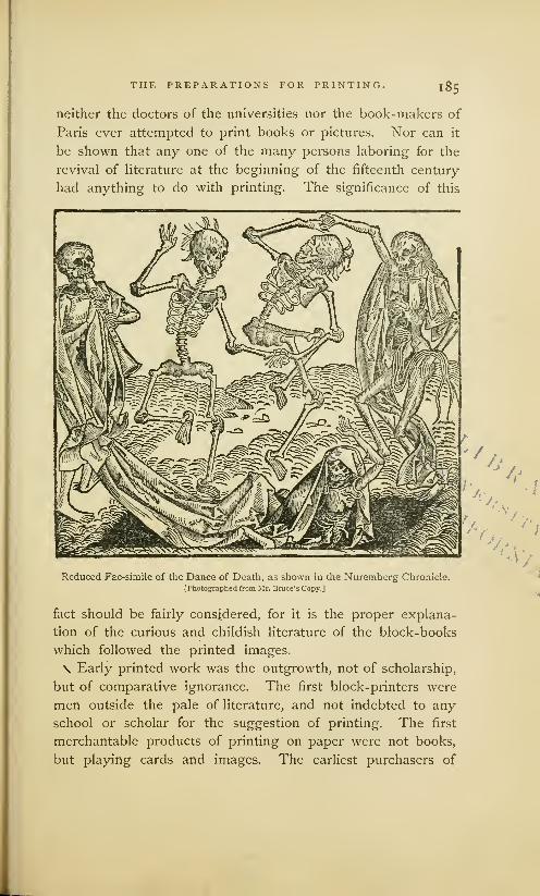
THE PREPARATIONS FOR PRINTING, I8 5
neither the doctors of the universities nor the book-makers of
Paris ever attempted to print books or pictures. Nor can it
be shown that any one of the many persons laboring for the
revival of literature at the beginning of the fifteenth century
had anything to do with printing. The significance of this
Reduced Fac-simile of the Dance of Death, as shown in the Nuremberg Chronicle.[Photographed from Mr. Bruce' s Copy.]
fact should be fairly considered, for it is the proper explana-
tion of the curious and childish literature of the block-books
which followed the printed images.
\ Early printed work was the outgrowth, not of scholarship,
but of comparative ignorance. The first block-printers were
men outside the pale of literature, and not indebted to any
school or scholar for the suggestion of printing. The first
merchantable products of printing on paper were not books,
but playing cards and images. The earliest purchasers of

1 86 THE PREPARATIONS FOR PRINTING.
printing were men who could neither read nor write. The
card-makers, who labored for the amusement of boyish tastes,
were the ignorant nurses of an art which has preserved the
learning of the world. They have had grand success. The
once despised fabric of paper has displaced vellum ; types do
the work of reed and pen, and the work of perpetuating the
literature of the world is done by mechanics. 1 Nor has this
great revolution been restricted to mechanical processes in
book-making. Medieval books are more than out of date
:
they are dead, beyond all revival. They are known to book-
lovers chiefly by reputation. The writings of Anselm, DunScotus, Abelard, Peter Lombard, Albertus Magnus, Thomas
Aquinas and Ockham, are read only through curiosity; they
are as obsolete as the works of the old Greek philosophers. 2
"—Although much had been done to prepare Germany and
Flanders for the reception of printing, one thing was lacking.
Printing waited for a wise appreciation of the utility of paper.
For centuries paper had been regarded as a plebeian writing
surface, unfitted for books, but good enough for shopkeepers,
mechanics, and children who had or sought a smattering of
education. It was necessary that the prejudices in favor of
vellum should be uprooted, and that the practical superiority
of paper should be recognized by men of higher authority
than card-printers or poor scholars. This change in fashion
was effectually made by the rich merchants of Flanders and
\ Germany. The paper rejected of professional book-makers
was not so strong nor so attractive as parchment, but it was
flexible, durable, and much cheaper. There was no legislative
intermeddling with its sale3 as there had been with parchment.
1 Dc la Borde, a brilliant French reputation ; the dust accumulating upon
writer on early printing, who traces these untouched volumes speaks as forci-
the origin of printing to playingbly as the grass that waves ov-er the ruins
. , . 7 ,, of Babylon. Hallam, Middle A^ts.cards, acknowledges its very ignoble
3The University of Parjs made noorigin with evident mortification :
—opposition to the frce sale of paper.
"What a mother for such a son !
"
i t was not subjected to taxes or duties2 The history of literature, like that in France, not even when oppressive
of Empire, is full of revolutions ; our taxes were levied on most manufactures,
public libraries arc cemeteries of departed Didot, Essai sur la typographic, p. 730.

THE PREPARATIONS FOR PRINTING. 187
Everybody was free to buy and use it at his pleasure. The
consequences of this contemptuous abandonment of paper to
the people, who were supposed to be almost unfit to use it,
were unexpected. Those who knew how to read and write \^
found in paper a ready means of communicating their knowl-
edge. The number of readers grew. With this increase of
readers came also an increase of self-taught copyists and of
unprofessional book-makers. In the commercial cities, where
copyists were not subjected to the censorship of the univer-
sities, the practice of making books became as common as it
had been exclusive. Book-making became a distinct trade,
and shops were established for the sale of alphabets, primers,
prayer books, creeds, and elementary text books for schools,
all adapted, both in price and in subject, to the very humblest
readers. 1 The names of some nooks and corners in London,
Paternoster Row, Creed Lane, Amen Corner, Ave Maria Lane,
show that these were the places in that city where manuscripts
of a religious character were largely made and sold.
As the sale of these books and tracts increased, Northern
copyists combined with each other for purposes of mutual
protection, after the usage of all the tradesmen of the middle
ages. We find a mention of the existence of the Companyof Stationers of London in 1405. There were guilds of book-
makers at Augsburg in 141 8, at Nordlingen in 1428, at Ulmin 1441, at Antwerp in 1441, at Bruges in 1454. These are
the years in which the guilds were first mentioned ; but it is
probable they were incorporated at earlier dates. The book-
1 A school ordinance of Bautzen in century, from which we may gather a
Saxony, dated 1418, gives the names clear notion of the books that were most
and prices of some of these books. For salable among the people. His cata-
&R.A B C and Pater Nostcr, etc., I gros- logue begins with the Deeds of the
chen ; for a good Donatus, or child's Romans, with illustrations. Then fol-
grammar, 10 groschen; for a complete low poetical works, romances of chivalry,
Doctrinal, 1 half-mark; for the First biblical and legendary works, edifying
Fart, 8 groschen. There has also been books, religious books, books for the
preserved the advertisement of one Dy- people, fortune-telling books, and other
pold Lauber, a teacher and copyist of works of like character. Van der Linde,
books at Hagenau in Germany, who Haarlem Legend of the Invention of
lived during the middle of the fifteenth Printing, pp. 2, 3.

l88 THE PREPARATIONS FOR PRINTING.
making fraternities of St. Luke, in Venice and in Paris, were
constituted of copyists, calligraphers, illuminators and book-
binders; but the more practical Northern guilds admitted to
membership printers and engravers, and every worker, how-
ever humble his work, who contributed to the making of a
Xbook. But this combination of copyists with engravers and
printers did not at once lead to the printing of books. It did
no more than pave the way for its introduction, by making
people familiar with paper and printing. For a long time the
workmanship of the rival arts was kept distinct ; the copyist
transcribed books, while the printers made images. But the
time came when the copyist had to ask help from the printer.
The printing of books began, not as an independent art,
but as an aid to the art of writing. A publisher 1 of London
recently described and offered for sale a curious old book,
partly printed and partly written, which illustrates the close
alliance of labor once maintained between the copyist and the
engraver. He describes the book as a folio of 17 leaves of
vellum, on which are printed 69 engravings, twelve of them
bearing legends, " representing scenes of Christian mythol-
ogy, figures of patriarchs, saints, devils, and other dignitaries
of the church, all colored and illuminated with oxidized gold,
impressed in the midst of a manuscript text in German."
The engravings of this book are small, about 3 inches long
and 2}£ inches broad. They are enclosed by a double border
of black lines, and are printed on the left side of the page.
The designer of the illustrations was obviously an inexpert,
not accustomed to drawing the letters of the inscriptions in
reverse order on the block, for some of the letters are turned
the wrong way. The engravings were printed before the
descriptive text was written. The language of the text, old
High German, contains obsolete words which were out of use
before typography was invented. Quaritch attributes this
1 Bernard Quaritch, Catalogue of as he gives it, is Ein Vorrede das
Block-Books, 8vo. October, 1873, pp. Puch haist wcchenlich Andacht zu
1373— 1375. The title of the book, Seligkayt der weltlichen Menschen.

THE PREPARATIONS FOR PRINTING. 189
book to unknown monks of Southern Germany, " about the
year 1400." This copy of the Weekly Meditations is a favor-
able specimen of the combined workmanship of the copyist
and the printer; but it is not the only one. Copies or frag-
ments of manuscript books 1 with printed illustrations are in
the British Museum, and in many European libraries.
These specimens of book-making during the period of its
transition from writing to printing, give us some notions of
the estimation in which the process of printing was held by
the men who manufactured chap-books. It does not appear
that they made use of printing because they thought it was
a labor-saving process. They used it mainly, if not entirely,
to supplement the deficient skill of the copyist. It was then
as it is now— many could write, but few could draw. If the
copyist who wrote the text had been competent to draw, the
pictures would not have been engraved. Nor would these
engravings have been made for one nor even for one dozen
copies. We may properly suppose that enough copies were
printed to justify the expense of engraving.
While it was expedient to engrave the pictures, it was
inexpedient to engrave the text of a book. In many books,
the letters constituted the largest part of the work, and to
the engraver it was the more difficult part—the expense of
engraving would more than offset all the advantages that
might have been gained from printing. A full suite of blocks
for the text would cost more than the writing of a hundred
copies. To the stationer who could sell but few books, xylo-
graphic printing was not an economical process : the prelim-
inary cost of engraving was too great. It would be an
extravagant estimate to assume that the writer of the Weekly
Meditations made one hundred copies of this book ; but one
'They were common during the historique et pratique de la gravure
first quarter of the fifteenth century, sur dots, vol. 1, p. 101. Guichard,
Bernard, De Vorigine de Vimprim- Notice surle Speculum, p. 118. Theyerie, vol. 1, p. 102. Fournier, De have been noticed also by Passavant.
Vorigine et des productions de Vim- It is plain that copyists everywhere
primerie, p. 176. Papillon, Traite recognized the utility of engraving.
190 THE PREPARATIONS FOR PRINTING.
hundred copies would have been an edition much too small
to justify the engraving of its text of seventeen pages. Wemust accept this as the reason why printing was so sparingly
used by the early book-makers. They did not engrave blocks
and print books, because there were not enough book-buyers
to warrant the expense. This feature of printing— its entire
dependence upon a very large number of book-buyers—mayrequire a more extended explanation.
The small prices for which all popular modern books and
newspapers are sold lead many into the error that printing
is, necessarily and under all circumstances, a much cheaper
method of making books than that of writing. As compared
with writing, presswork, or the operation of impressing the
types on the sheet, is much the quicker and cheaper process
;
but presswork is not the main branch of the art of printing.
Before one impression can be taken, or one copy be made,
types must be composed or blocks engraved at very great
expense. The composition and stereotyping of the pages
of an ordinary duodecimo book may be worth six hundred
dollars. On an edition of ten copies the cost of such a book
would be, for making plates only, sixty dollars per copy. If
there were but one hundred copies, the expense of the plates
would be six dollars per copy. Under these conditions few
books would be published. But if an edition of one thousand
copies should be printed, the cost of the plates would be
only sixty cents a copy. In this instance, printing would be
much cheaper than writing, but this reduced rate would not
necessarily justify the expenses of printing. The risk of sale
must be hazarded. No publisher would undertake at his ownrisk to print even one thousand copies,—much less a smaller
number,— if he did not fully believe that the edition could
be promptly sold. But the early book-maker did not have
this confident belief in large and speedy sale. There were,
comparatively, few book-buyers, and the publication of a book
by the method of engraving and printing must have seemed
very hazardous

THE PREPARATIONS FOR PRINTING. 191
It can be clearly seen that the cost of printing a book is
in inverse ratio with the number printed. When the number
is small, the cost per copy is great ; when the number is great,
the cost per copy is small. Printing is an economical process
only for books of many copies. If there were not a very great
number of book-readers and book-buyers, printing could not
be practised to advantage.
In the fourteenth century this multitude of book-readers
had not been created. One hundred copies would have been
considered a great edition, and the engravers or printers who
took such a hazard would have waited many years for pur-
chasers. Their unwillingness to take an unwise risk has been
often regarded as an evidence, not of their sagacity, but of
their stupidity. There are writers who have taught that the
project of a printed book was a grand conception, not to be
imagined by any but a great inventor— an idea far above the
capacity of any printer of playing cards or images ; but the
legends in the image prints teach us that the early engravers
knew how to engrave the letters, and that they could have
engraved entire books of letters if they had thought it expe-
dient. The advantages or disadvantages of engraving books
were considered by them as they would be by publishers of
our own time, purely as an economical question. The early
engravers decided that books of letters could be appreciated,
and would be purchased, only by the educated, a class too
small to reward the labor of the engraver. For the making
of books, printing was not regarded as an economical process,
and books were consequently made by the cheaper process
of writing.
While it was unprofitable to engrave letters for books, it
was profitable to engrave designs for printed fabrics, images
and playing cards. On work of this character, the relations
of cost and sale were completely reversed. The expenses for
engraving one design, one image, or one suite of cards, was
small ; but the sale of the work printed from the blocks was
generally very large. Fabrics that could be worn, cards that
192 THE PREPARATIONS FOR PRINTING.
could amuse, and images that would serve as decorations or as
aids to devotion, had attractions for all people, and especially
for the poor and illiterate. Whoever printed merchandise of
this nature could rightfully expect that it would be sold in
such large quantities that the cost of engraving would be
inappreciable.
The world was not ready at the beginning of the fifteenth
century to apply its knowledge of printing with ink to the
making of books. It was regarded as too expensive a process.
It bided its time, waiting for more readers and book-buyers,
for paper in greater supply and of better quality, for higher
skill on the part of the engravers, printers and ink-makers.
If there were no other evidences than those afforded by the
partly printed and written books, it could be safely assumed
that when the early engravers did begin to print books, they
would be, not books of letters, but books of pictures. >

LI BRA if v
i'NlVKKsiTY ()F
CALIFi
XI
PottJSsafo uf fttrages tm%ut Sid*
General Appreciation of Pictures. . .Beginning of the Block-Books. . .Popularity during the FifteenthCentury.
..Neglected afterward.
. .Childish in Character. . .The Bible of the Poor. . .Its Age as aManuscript.
..Its Popularity. The First Edition. . .Its Designs and Engravings. . .Explanations
of Fac-similes.. .Description of Printing. . .Not Printed by the Frotton. . .Anachronisms in Design.
Dissimilarity of the Copies.. .Blocks destroyed in 1488. . .Price of Copies. .. Description of German
Edition of 1470. ..The Apocalypse. .. Description of Illustrations. . .Probably of German Origin.The Canticles.
..Description of Fac-simile. . .Its Anachronisms. . .Its object .Quality of Engrav-
ing ... The Story of the Blessed Virgin... Its Object. . .Description of Fac-simile. .. Its Absurdities.Exercise on the Lord's Prayer ... Description of Fac-simile ... Singular Perversion of the Prayer.The Book of Kings ... Description and Fac-simile ... The Grotesque Alphabet. . .A MysteriousBook... The Apostles' Creed... The Eight Rogueries.
3E nrtsunu tfiat nothing is in tfjis life more useful to a titan tftarc to acfmofolrtrge
fit's (Creator, fit's ronbition, fit's ofcm firing, £rfjoIars man leant tfjia front tfje
.Striatum, anb tfie Ianmett sfiall fie taugfit fin tfjt fiooks of tfie lanmcn, tfiat is fin
tfie pictttwa. iJIfierefore 3E fiabe tfjoujgfjt fitfixiitf) tfie firip of (Kob~ to rompile tfiu?
fioofe for lanmcn to tfjc glorn of (Sob-, anb as an instruction for tfjjc unlearneb, in
orbcr tfiat it man fit a Usson fiotfj to clerks anb to lanmcn.
Preface to the Speculum Salutis.
THE sumptuary laws of the middle ages, which were madeto restrain common people from imitating the dress and
equipage of the nobility, were not extended to the making ofbooks. The copyist or calligrapher was at liberty to decoratebooks according to his own fancy. There was no occasion forrestrictive legislation. The admirable romances and books ofprayer upon which the miniaturist had lavished his talentswere beyond the skill of the vulgar copyist and beyond themeans of the plebeian book-buyer. Only an artist could paintthem
;only a prince or patrician could buy then* But these
books, although far removed from the multitude by price andrarity, were not above the capacity of the ordinary reader.The illiterate man who could find no attraction in a book ofletters would readily acknowledge the charm of the pictures

194 BLOCK-HOOKS WITHOUT TEXT.
in a book like the Bedford Missal. In this universal appre-
ciation of pictures, some of the early engravers of cards and
N images saw an opportunity. Men who would not buy books
of letters would buy books of pictures. Books of the latter
class were not only sure of sale, but they could be engraved
on blocks at a comparatively small expense. They could be
printed in quantities much more cheaply, and, above all, with
. more accuracy and uniformity than they could be drawn byhand. They could be painted or illuminated by stencil plates,
and made acceptable to men of simple tastes. Here was the
beginning of the block-books.
The term Block-Book is used to define the book printed
entirely from engraved blocks, in contradistinction to the book
printed from movable types. Bibliographers divide the block-
books in two distinct classes : books of pictures without text,
in which words descriptive of the picture are engraved at the
foot of the page, or in cartouches proceeding from the mouths
of the principal figures ; and books of pictures with text, in
which the explanations of the pictures are given in the form
of a full page of text, which was commonly printed on the
page opposite the picture.
It is admitted by all writers on typography that block-
books of both classes were made before and after the inven-
tion of typography. That they were manufactured in large
quantities by many printers, and in many cities or towns,
during the fifteenth century, does not admit of doubt. It is
claimed by one bibliographer that there are eight editions of
the Ars Moriendi; by others, that there are six editions each
of the Bible of the Poor and of the Apocalypse, and four of
the Mirror of Man's Redemption. In some instances, the so-
called later editions are reprintings, with slight alterations, of
the same blocks that were used for the first edition ; in other
instances, the later editions were printed from blocks m-w ly
engraved. The number and variety of the editions are proof
that there must have been a very large demand for the books;
the alterations in the engravings are presumptive evidence of
15

BLOCK-BOOKS WITHOUT TEXT. I95
repairs to blocks badly worn by long use ; the newly engraved
blocks are evidently the replacement of a suite completely
worn out ; an edition different from the others in design may
be accepted as the work of a rival or competing printer.
The few block-books known in the seventeenth century
were regarded by bibliographers as prejudicial to the claims
of contestants for the honor of the invention of typography.
They were annoying facts which could neither be rejected
nor accepted without hurt to favorite theories. There was a
disposition on all sides to belittle them in number as well as
in importance. The first writer who called attention to their
value as relics could describe but nine block-books. Sotheby,
writing about them in 1858, described in the Principia Typo-
graphica twenty-one block-books— not different editions of a
few books, but twenty-one distinct works. Even with these
additions, the list cannot be considered complete : it is pos-
sible that more will yet be found, but it is certain that manyhave been irretrievably lost.
The neglect of the block-books by early librarians seems
almost justifiable when we consider their great inferiority to
the typographic books that followed them. From a literary
point of view, they were of no importance as works of instruc-
tion or authority. They were published during the fifteenth
century, but they really belong to the twelfth and thirteenth
centuries, during which period most of them were composed.
The legends that explain their illustrations were written in
Latin, but they are adapted to readers in a child-like state
of development. It is not strange that they should have been
put aside by the world when it had outgrown them. Childish
as these books are, they are of high value to those who wish
to note the growth of printing. They indicate the attainments
of their authors and readers, and the artistic abilities of their
designers and engravers. They show the quality of the paper,
'nk, and workmanship of the period. They prove that the art
of printing from blocks was practised by many persons during
the second and third quarters of the fifteenth century.
>


""uumiuminniniuiiiJlDIHII I Illlii
,
^^^^«3v^iUiliVUummirujun....-
rmw\% YHUiiimiiuiiiiiiniiiJiUi/
7"% ^liMMUHMrillDlllliJU
iiiunmiiiwimniiiir
TBfnrIs
&IS
I*
sgl,
Jig ASf1
198 B L O C K - B O O K S WITHOUT TEXT.
THE BIBLIA PAUPERUM, OR BIBLE OF THE POOR.
-^ This is the most famous and the most creditable specimen
of the early block-book. 1 The title, Bible of the Poor, seems
to have been used at an early period to distinguish it from
the Bible proper, a fair manuscript copy of which was sold
in France, in the year 1460, for five hundred crowns of gold.
The Bible proper, as then made, in two or more stout folio
volumes of fine vellum, was the Bible of the rich ; its epitome,
in the shape of the book of forty pages of engravings, about
to be* described, was the Bible of the poor.
The author of the Bible of the Poor is unknown, but the
designer of the illustrations was not the writer of the texts
that explained the designs. There are frequent incongruities
between the words and the pictures, which fully shpw that
the author did not always understand the intent of the artist.
It is probable that the illustrations were made first, and that,
in the beginning, the Bible of the Poor was a book of pictures
only. 2 Some German antiquarians say that the book, in its
1 The engraver or the printer of
the book published it, as all other
books of this kind were published,
without a printed title. It has been
described by different authors under
these titles: Types and Antitypes
of the Old and the New Testament;
The Histories and the Prophecies
of the Old Testamentj The Typical
Harmony of the Bible ; Typical
Illustrations of the Old Testament,
and A ntitypical Illustrations of the
New, or the Story of Jesus Christ
as told by Engravers. Chatto calls
it the Bible for Poor Preachers, andclaims that it was written especially
for their use. He objects to the title,
Bible of the Poor, as leading to the
erroneous opinion that the book was
bought by the poor of the laity, who,
he says, were unable to read in their
own language, much less in Latin.
This observation is true, yet Chatto's
addition to the old title is not really
needed. He overlooks the fact that
the charm of the book was in its
pictures, which could be appreciated
by the poor of the laity as well as by
poor preachers. In this sense, it was
truly the Bible of the Poor.2 The British Museum has a
French manuscript, entitled Figures
de la Bible, in which the illustrations
occupy nearly all the page, leaving
room for little more than the text
that describes the cuts. The same
library has two copies in Latin verse
of an abridgment of the Bible, in
which the text occupies nearly all the
page, while the illustrations are in
miniature. These manuscripts of
the fourteenth century are not Bibles
of the Poor, but they show the fond-
ness for books with biblical pictures.
BLOCK-BOOKS WITHOUT TEXT. I99
original form, was designed and explained by a monk namedWernher, who was living in 1180, and was famous during his
lifetime both as a painter and a poet. Other German author-
ities put the origin of the first manuscript as far back as the
ninth century, attributing the work to Saint Ansgarius, first /
bishop of Hamburg. It seems to have been a popular man-
uscript, for copies written before the fifteenth century have
been found in many old monasteries. These copies are not
alike. Nearly every transcriber has made more or less alter-
ations and innovations of his own ; but the general plan of
the book— the contrasting of apostles with prophets, and of
the patriarchs of the Old Testament with the saints of the
Christian Church— has been preserved in all the copies.
At least four distinct xylographic editions—two in Latin
and two in German— of the Bible of the Poor have been dis-
covered. Three of them were printed in Germany after the
invention of typography. 1 The edition acknowledged as the
first,2 and supposed to have been printed before the invention
of types, is in Latin, without date, place, or name of printer.
Those who favor the theory of a German invention of print-
ing say that it was printed in Germany between the years
1440 and 1460. Those who believe in the priority of Dutchprinting say that it must be regarded as the work of someprinter of Holland. This is the opinion of Berjeau, who re-
published the book in fac-simile. He says that the designs
for the original editions must have been made in the Neth-
erlands, probably by Van Eyck, between 141 o and 1420.
' 1 . An edition in Latin, of fifty2 Fifteen copies are known of the
pages, and supposed to have been edition here specified as the first,
engraved and printed by Melchior Heineken, noticing little dissimilar-
Wohlgemuth of Nuremberg, be- ities of design and engraving in
tween the years 1450 and 1460. many of these copies, says that theyOnly one copy of this book is known, prove the existence of five distinct
2. An edition in German, of forty editions. For similar reasons, Soth-pages, by Friedrich Walther and eby says that there are six editions.
Hans Hiirning, at Nordlingen, 1470. The weight of authority favors the
3. An edition in German, attributed classification of these fifteen copiesto Sporer, at Erfurth, in 1475. m one edition.

200 BLOCK-BOOKS WITHOUT TEXT.
The illustration on the preceding page, which is the exact
size of the original, gives a faithful representation of the last
page of the first edition of this curious book.
Unlike most of the block-books, the Bible of the Poor was
designed with architectural symmetry. An open frame-work
divides each page in nine distinct panels or partitions, five of
which are devoted to pictorial illustrations, and four to their
explanation in words. The three large panels in the middle
of the page illustrate historical subjects drawn from the Bible,
of which the central panel is, in theological phrase, the type,
and is taken from the New Testament. The pictures on either
side are known as the antitypes, and are oftenest taken from
the Old Testament. The texts that explain the pictures are
placed in the corners of the page, or in scrolls near the figures.
To most readers the explanatory text is undecipherable.
The obscurity is not only that of a dead language: a trained
Latin scholar will always grope and often stumble in attempt-
ing to make a translation. All the letters are carelessly drawn
and cut ; the words are badly spaced, and are deformed with
abbreviations. These faults appear more noticeable when the
letters are contrasted with the designs. Whoever designed the
figures on the wood drew with the bold and free hand of an
artist who had proper confidence in his ability. Whoever
engraved the figures cut the clean firm line that can be made
only by an expert. But the cutting of the letters, although
probably done by the engraver of the figures, is really
barbarous. It is obvious that the designer, skillful as he was
with figures, had no experience in drawing letters, and that
the engraver was equally unsuccessful at a new kind of work.
The text and translation appended are the version of Dr.
Home, author of the Introduction to the Study of Bibliography,
who has corrected the contractions of the original Latin. It is
copied from the Typographia of Hansard.
Each page contains four busts—two at the top, and two lower
down ; together with three historical subjects. The two upper busts
represent certain prophets, or other eminent persons, whose names are

BLOCK-HOOKS WITHOUT TEXT. 201
added beneath them. Of the three historical subjects, the chief type,
or principal piece, is taken from the New Testament, and occupies
the centre of the page, between the two antitypes, or subordinate
subjects, which are allusive to it. The two busts, placed in the middle
of the upper part of the page, represent David and Isaiah between
two texts of the Bible, with brief explanations. The former of these,
on the left of the Prophets, is from the Song of Solomon, Chapter iv, 7
:
3Ugitttr in Cantico Canticorum, quarto In the fourth chapter of the Song of
fapitc, quotl sponsus alloquitur sport- Solomon it is read, That the bride-
gam, ft tam fiumenoo iJixtt : QJota groom addresses the bride, and re-
pulrijra ts, amira ntfa, ft macula rton ceiving her, says, Thou art all fair,
fSt in tf. Vtni, arnica nua, bfni, my love, and in thee is no spot,
foronabtrt. J5ponSUS bnus istf fSt Come, my love; come, thou shalt
(Wjrtstus, pi lit assunurtbo .earn sport- be crowned. The real bridegroom is
Sam, qua JCSt aninta Situ marula Christ, who, in receiving the bride,
omnis pfcrati, ft mtro&tuti tarn tit which is the soul without spot of sin,
requiem actcrnam; ft foronat turn tor- also conducts her to eternal rest, and
Otta immortalitatis. crowns her with the crown of immor-
tality.
The second passage, on the right of David and Isaiah, is partly
taken from the Book of Revelation, and runs thus
:
3Ugttur in fSporalspst xxi° xanitc, quo& In the twenty-first chapter of the Reve-
augclus 3D" apprtrjertfJtt 3rjoaitncm lation it is read, That the Angel of
3S&angeIi'stam turn fSSft in JSpiritu, God took John the Evangelist whenft fcolens stiit ostmbere arcfjana J§ct, he was in the Spirit, and willing to
ain't air turn, Unxi, ft jostfttbam tiit show him the mysteries of God, said
sponsam, uxorfttt agnt. Ungclus lo- to him, Come, and I will show thee
quttur abi onuum gnurattontm ut it- the bride, the wife of the Lamb,
niant arjr ausrultanbum in sponsum, The Angel speaks to every genera-
agnum iitnocmtcm (Christum antmas tion, that they come and hearken
tnnoccntfS toroitantcm. to the bridegroom, the pure LambChrist, crowning innocent souls.
Under the bust of David, which is indicated by his name, is a
scroll proceeding from his hand, inscribed
:
3Enim tamquam sponsus faominus pro- Even as a bridegroom cometh out of
tetons &f tfialamo SUO. his chamber. Ps. xix, 5.
Beneath the corresponding compartment containing a bust of
Isaiah, is the word Ysaye, and also the ordinal number lxi, referring
to the sixty-first chapter of that prophet ; and from the hand of the
figure proceeds a label containing
:
©amquam sponsus liccorabit nu .corona. As a bridegroom, he hath adorned mewith a crown, lxi, 10.
Toward the bottom of the plate are two other busts, similar to
those at the top, and which represent the Prophets Ezekiel and
_

202 BLOCK-BOOKS WITHOUT TEXT.
Hosea. From the figure that occupies the left-hand compartment
extends a scroll, at one end of which is the word (Ezeciel, with a
number referring to the twenty-fourth chapter ; and in the other part
are the words
:
(Corona ttta capitc Ii^ata fict, ft xaicia- Thy tire shall be bound upon thine
mmta ill ptoiiuiS. bend, and thy .shoes upon thy feet.
xxiv, 17.
The corresponding scroll, attached to the other figure, contains,
at one end, Ozce, with a reference to the second chapter; and in the
other part are the words :
Sponsaio tf miTjt in SfnuHtfrnunt. I will betroth thee unto me forever.
11, 19.
In the central compartment, between the upper and lower busts,
is depicted the Type, or principal subject. It represents the reward
of righteousness in heaven ; the designer having introduced the
Redeemer as bestowing the Crown of Life upon one of the elect
Spirits. The antitype, on the left, is the Daughter of Zion crowned
by her spouse, with the following leonine verse underneath
:
5Laus ammc bcrc, O soul divine ! it rightly knew,
SSponsum icnc scnsit fi^cvc. To have the spouse was glory true.
The other antitype, on the right, represents an Angel addressing
St. John, having beneath it this verse
:
SponsuS amat sponsam, And Christ, the bridegroom, far above
(£)jristuj3 ntmi'jsf ft B$tciosam. Conception, the fair bride doth love.
And in the bottom space is this verse
:
QLunt saufomt amine Biii quail&O foonum Then souls rejoice with great delight,
ialur omnf. When given is the diadem bright.
^The first edition of the book contains forty engravings on
wood, printed on one side only of the leaf. The prints face
each other ; two pages of illustrations are always followed by
two pages of blank paper. The book was put together in
sections of two leaves, a method of making a book contrary
to prevailing usage. Manuscript books of that period were
usually made up in sections of four double leaves, which were
nested together in one section. This deviation from estab-
lished usage was, apparently, caused through the error of the
engraver, who cut, on the same block, the two pages which
faced each other. It was, consequently, impossible to nest

BLOCK-BOOKS WITHOUT TEXT. 203
the leaves, or make them up in thick sections. Cracks in the
wood block, which have made open seams or white gaps in
the print, and which extend in straight lines over both pages,
show conclusively that two pages were engraved on one block.
The book is without folios or paging figures to guide the
reader, and also without signatures to guide the binder. The
proper order of the pages was made manifest by engraving on
each page a letter of the alphabet. Pages I to 20 are marked
in alphabetical order from a to v; pages 21 to 40 have the
same letters, but with a dot before and after each, .a. to .v.
^ The paper of the fifteen known copies of this edition of
the book is of variable quality. Of itself, this variability is
not sufficient indication that the paper was made by different
makers, and printed at different times, but the different designs
of the paper-marks lead directly to such a conclusion. Some
copies have but one kind of paper-mark ; others have two
and three kinds ; taking all copies together, there are at least
fourteen distinct paper-marks. If each decided variation of
the same design could be considered the mark of a different
maker, the number could be doubled.
That the substance used for these engravings was wood,
is clearly indicated by the occasional feathering or flatting out
of border-lines, which, when crushed, show the fibres of wood
in the impression. It seems that the engravings were cut on
flat plates or blocks, that had been sawed or split on a line
parallel with the fibres.
The ink is of a dull or rusty-brown color ; on some pages
light, and on others of darker tint, rarely ever of uniform tint
on the same page. It has the appearance of a paste or a
thick water color. This unevenness in color was produced by
some imperfect method of inking the block— possibly by a
hard-faced brush which shed color irregularly.
The shining appearance of the backs of the prints, in all
places where the raised lines of the wood-cut have indented
the paper, has been considered as sufficient evidence that the
impressions were taken, not by a press, but by means of a

204 BLOCK-BOOKS WITHOUT TEXT.
frotton, or by friction, or by rubbing in some form or other.
One writer of rare simplicity has hazarded the opinion that
the back of the paper, or the frotton, may have been soaped
to facilitate the work. But these methods of printing books
are imaginary and entirely impracticable. The shining appear-
ance on the back of the paper does not prove that the prints
were made by friction. The gloss could have been produced
by any press which gave a hard impression against a harder
surface. It could have been produced by rubbing or smooth-
ing down with a burnisher the indentations of the lines on the
back of the paper, as is sometimes done by pressmen of this
day when they take too hard an impression. Some copies of
the book show the results of hard impression. Two of the four
copies of the Bible of the Poor in the possession of the British
Museum present lines deeply sunk in the paper, as if they had
been printed from a press. Jackson, a practical engraver on
wood, who had large experience in proving wood- cuts, has
unwillingly accepted the unauthorized tradition of presswork
by friction, but he has candidly stated its difficulties.
" Considering the thickness of the paper on which the block-books
arc printed— if I may apply this term to them— and the thin-bodied
ink which has been used, I am at a loss to conceive how the early
wood engravers have contrived to take off their impressions so cor-
rectly; for in all the block-books which I have seen, where friction
has evidently been the means employed to obtain the impression, I
have noticed only two subjects in which the lines appear double in
consequence of the shifting of the paper. From the want of body in
the ink, which appears in the Apocalypse to have been little more
than water color, it is not likely that the paper could be used in a
damp state, otherwise the ink would run or spread : and even if this
did not exist, the paper in a damp state could not have borne the
excessive rubbing which it appears to have received in order to obtain
the impression. Even with such printer's ink as is used in the present
day—which, being tenacious, renders the paper in taking an impres-
sion by means of friction, much less liable to slip or shift— it would
be difficult to obtain clear impressions on thick paper from blocks the
size of those which form each page of the Apocalypse, or the History of
the I 'irgin. ... A block containing.only two pages [of the History of
///< Virgin, a block of smaller size than that used for the Bible of the

BLOCK-BOOKS WITHOUT TEXT. 205
Poor] would be about seventeen inches by ten, allowing for inner
margins ; and to obtain clear impressions from it by means of friction,
on dry thick paper, and with mere water color ink, would be a task of
such difficulty that I cannot conceive how it could be performed.
No traces of points, by which the paper might be kept steady on
the block, are perceptible; and I unhesitatingly assert, that no woodengraver of the present day could, by means of friction, take clear
impressions from such a block on equally thick paper, and using mere
distemper, instead of printer's ink. As the impressions in the History
of the Virgin have unquestionably been taken by means of friction, it
is evident to me that if the blocks were of the size that Mr. Ottley
supposes, the old wood engravers, who did not use a press, must
have resorted to some contrivance to keep the paper steady with
which we are unacquainted." 1
This last hypothesis of an imaginary contrivance that kept
the paper steady, is as untenable as the proposition that blocks
were unquestionably printed by friction. The feat which is
impossible now was impossible then. There is nothing in the
appearance of the presswork of the block-books really incon-
sistent with the theory, that the books were printed under a
rude press which was deficient in many attachments that are
needed by the printer. The peculiar appearance of the press- if
work of this and of other block-books will be most satisfac-
torily explained by the hypothesis that they were printed on
a press. The hypothesis of printing by friction is a conjecture
for which there is no good authority. It seems to have been
invented for a purpose. If the early chroniclers of printing
had not been so anxious to magnify the merits of the early
typographers, and to belittle the printers of block-books, we
should have heard nothing of printing by friction.
The designs of the first edition have more merit than those
of the earlier manuscript copies—more than those of subse-
quent editions printed by imitators. Neither the rudeness of
the engravings, nor the flagrant anachronisms in architecture
and in the costumes of the figures, are gross enough to conceal
the ability of the designer, whose skill in grouping figures is
manifest on almost every page.
1 Jackson and Chatto, Treatise on Wood Engraving, pp. 78-80.

206 BLOCK-BOOKS WITHOUT TEXT.
The illustrations have merit, but they are in the realistic
and commonplace style of the designers of Germany and of
Flanders during the fifteenth century. The want of ideality
is painful. The designer certainly had no thought of irrever-
ence, but many of the designs are really ludicrous. Some of
the anachronisms are : Gideon arrayed in plate armor, with
medieval helmet and visor and Turkish scimitar; David and
Solomon in rakish, wide-brimmed hats bearing high conical
crowns ; the translation of Elijah in a four-wheeled vehicle
resembling the modern farmer's hay-wagon. Slouched hats,
puffed doublets, tight-legged breeches and pointed shoes are
seen in the apparel of the Israelites who are not represented
as priests or soldiers. Some houses have Italian towers and
some have Moorish minarets, but in none of the pictures is
there an exhibition of pointed Gothic architecture. The old
Dutch stair-like gable is often delineated, and so is the round
arch and latticed window of the Flemish house of the four-
teenth century. With all its absurdities, this edition of the
Bible of the Poor commanded the respectful attention of great
artists like Albert Durer and Lucas von Leyden, who did not
scruple to appropriate many of its designs.
One of the most puzzling peculiarities of the first edition
of the Bible of the Poor is the dissimilarity of the copies. In
some copies the dissimilarity is in the details of the frame-
work ; in others, it is in the foliage of trees, but it is, for the
most part, confined to a few immaterial points. These differ-
ences seem to warrant the opinion stated by Sotheby that
there were six distinct editions, each printed from a separate
set of blocks; but this opinion cannot be reasonably defended.
In all important features the copies are alike. The pages of
the so-called different editions have the marks, even in little
blemishes, of impressions from the same block— a uniformity
which could not have been produced if each block had been
re-engraved for each new edition. Why the various copies
of the book should be alike in important, and unlike in minor
features, cannot be explained. It has been suggested that the

BLOCK-BOOKS WITHOUT TEXT. 207
dissimilarities are the evidences of accident and repair ; that
when the block was injured, it was plugged, as is frequently
done with wood-cuts in our own day, and the newly inserted
plug was re-engraved with a new design. The explanation is
not plausible. The differences generally appear in the same
relative position on every page, and there are too many of
them to be attributed to accident; they seem to have been
made for some unknown purpose. Irregularities of like nature
have been noticed in copies of the typographic books of the
fifteenth century which are known to be of the same edition.
We do not certainly know when and where these blocks
were engraved, but we do know when they were destroyed.
Two books, published by Peter Van Os of Zwoll, in Holland,
in 1488 and 1489, contain seventy-seven engravings on wood
which were certainly cut from the blocks that had been used
to print the original edition of the Bible of the Poor. To get
the little cuts he needed to illustrate texts of movable type,
Van Os must have partly destroyed the original blocks. In
this act of destruction, we have a fact and a date which give a
clue to the origin of the book. Copies of the first edition in
folio form must have been printed before 1488. At this date,
and perhaps for some time before, the blocks in folio form had
no mercantile value ; there was no longer any demand for the
book in the neighborhood in which it had been made. That
the country in which this first edition was printed and sold
was Holland, seems probable when we find that the blocks
were used for the last time, and in a mutilated form, in a town
of Holland. This opinion is strengthened by the facts that
the Bible of the Poor in folio form was then, and afterward, a
salable book in Germany and in other countries, but it was
not subsequently reprinted in the Netherlands in any form.
The Dutch and Flemish architectural features in the designs,
and the legends which attribute the work to Dutch engravers
and printers, are of themselves unsatisfactory evidences of the
origin of the book; but they cannot be entirely overlooked
They lead to the conclusion that the book was printed in Hoi-

208 BLOCK-BOOKS WITHOUT TEXT.
land, but they do not fix the date of printing, which may-
have been as early as the year 1425, or as late as 1450.1
The illustration on the following page is a fac-simile, but
reduced in size, of the first page of the edition published in
the year 1470, at Nordlingen, by Walther and Hurning. Thepanel in the centre of this fac-simile represents the Annun-ciation ; on the left is the Temptation of Eve ; on the right is
Gideon with the Fleece. The busts at the top are those of
Isaiah and David ; at the foot, Hezekiah and Jeremiah. This
edition, like the one previously noticed, was printed in rusty
brown ink upon one side of the paper. The adherence of the
printers to a rough method of printing seems strange whenwe consider that typographic books, printed with black ink
and on both sides of the paper, were then known and sold in
every part of civilized Europe. Walther and Hurning were,
probably, printers of cards and images who tried to compete
with typography. 2 Incompetent to practise the new art, and
unable to make fine books, they made a German translation
of the Bible of the Poor, and tried to sell it to German people.
The Nordlingen edition is an obvious imitation of the Latin
edition previously described, but it is a very feeble imitation.
The designer was incompetent to his task, and the engraver
was clumsy. The workmanship of this book is one of many1 The Bible of the Poor has always printed:— 1. An edition by Albert
been considered as one of the most Pfister, at Bamberg, in 146 1. In
valuable of block-books, but copies this edition, the engravings are small
have been sold at widely varying and coarsely cut. 2. An edition byprices, as may be seen in the annexed Anthoine Verard, in Paris, about
statement, compiled from Sotheby's 1500. This edition is a close imita-
Principia Typogj-aphica : tion, beautifully printed, of the first
Willet copy, 1813 245 guineas, xylographic edition, with explana-Inglis copy, 1826 36/. i$s. tions in French on the back of theWillet copy, 1833 36/. 15J. engraved pages and on supplemen-Lucca copy, 1848 89/. 5*.
t lc;uvs An cdition ofStevens copy, 1849 11/. 5^ ,.'
. , i,
c , _„J
, ? , . different arrangement, having 118Sykes copy, 1S24 18/. ifs. 6</. „ ,
&. , , _. °
Rendorp copy, 1825 17/. 8,. 6 /.sma11 w°°d-cuts, printed by Giovanni
Devonshire copy, 1S15 . . .210/. Andrea Vavassore dctto Vadaguino
'Three typographic editions of of Venice, between 1515 and 1520.
the Bible of the Poor have been Berjeau, Biblia Pauperum, p. 17.

BLOCK-BOOKS WITHOUT TEXT. 209
<^RtH^fgg|^P<2m H<nVfl w^ fc«* tr^
<$cf>m o*n -man Qf^!
I-feednasf T<ne**ii^Lii
an liftAtn Vucfy fc& $etcl;o
^ ffUrn 111 C $}00t~$w ijtrz,^
epCfu£&mi#t o*i41tcV)h $W
[te fcfyxitt vrib bit Q6£ga
First Page of the Bible of the Poor as made by Walther and Hurning of Nordlingen, 1470.
The size of this print, in the original, is 7 by 10^3 American inches.
[From Heineken.]

2IO BLOCK-BOOKS WITHOUT TEXT.
evidences which might be offered to prove that coarseness of
engraving in undated block-books is by no means proof of
their greater age. The facts point the other way. The block-
books which contain engravings of high merit are, as a rule,
the oldest ; those made in the third or fourth quarter of the
fifteenth century show decided decline in skill. Mean as this
book is, it does not fully show the degradation that printing
subsequently suffered from the hands of unskillful engravers.
THE APOCALYPSE OF ST. JOHN.
This is the name of an early block-book almost as famous
as the Bible of the Poor, and of which there are at least six
distinct xylographic editions. Some of them have fifty, and
others have forty-eight leaves, printed upon one side only of
the leaf. The dissimilarities in the designs and the engraving
of these editions are decided and unmistakable : they are, no
doubt, impressions from different suites of blocks, and each
edition may be regarded as the work of a different printer.
As a literary production, the Apocalypse has small merit.
It is not, as might be supposed, the text or an abridgment
of the Book of Revelation. It is, in fact, only a book of pict-
ures, and these pictures in many points border very closely
on the ridiculous. One cannot shut his eyes to the ludicrous
points, but neither can he overlook the fact that the designs
of the book are not the work of an ignorant artist. Rudely
as they have been cut, and badly as they were printed, there
is strong character in the faces, and much artistic skill in the
grouping of the figures. The designs are vigorous, but they
arc unlike the works of Van Eyck, or of the German artists
of the period. There is nothing in the costumes or archi-
tecture which can be rated as decidedly German or Dutch.
Chatto says the designs were probably intended to represent
Mahomet as the Antichrist of the Book of Revelation, and
that they may have been made by an exiled Byzantine artist
who had been driven out of Constantinople after the taking
of that city by the Turks in 1453. But this conjecture is not

BLOCK-BOOKS WITHOUT TEXT. 211
approved by careful bibliographers. It is generally supposed
that the designs are of an earlier period. Maittaire, who says
that it is the oldest 1 of all block-books, calls attention to the
singular simplicity of the engraving, which is in almost plain
outline. In this particular the Apocalypse is much inferior to
the Bible of the Poor, for we see no attempt to give appear-
ance of roundness to the limbs by curved shading lines, nor
are there proper marks to indicate the shadows and folds in a
dress. But the ruder workmanship of the engraver is more
clearly shown in the letters. It may be that they were badly
drawn upon the block, but it is plain that the engraver has
frequently broken connecting lines. Bad presswork and bad
ink have materially aggravated the fault ; as printed, the lines
of the engraver appear thicker than they were cut.
Each page has two illustrations with explanatory legends.
Some of these illustrations represent the visions of St. John,
but the designer has drawn them with the same disregard of
time and place which may be noticed in the wood-cuts of the
Bible of the Poor. The architecture is that of Germany in the
fourteenth century ; the men wear breeches and coats, con-
ical, flat-topped and broad-brimmed hats ; the soldiers are
in chain or in plate armor, with the helmets and battle-axes
of the middle ages. Nor do the improprieties stop here
:
many of the illustrations represent events in the life of the
apostle which the artist did not find in the New Testament.
The illustration on page 213, which is a reduced copy of
the first page in one edition of the Apocalypse, seems to have
been derived from the fabulous life of St. John, supposed to
have been written by Abdias, bishop of Babylon. Drusiana, a
1 The great prices paid for copies Wilks copy, 1847 47/.
of the book seem to show that this is Brienne- Laire copy 600 francs.
a very general belief. Sotheby has Lan§ C0W> l828• 45'-
wisely put some of them on recordVerdussen copy. ... .
340 florins.
,- „ . . , . ~, , ,,. Corser copy, 1873 (Quanteh), 550/.in his Principia Typographica. j ,.
ry '^ *- " jj
Gaignat copy 300 francs. British Museum copy, 1845. . 160/.
La Valliere copy 800 " Quaritch's, 1873 200/.
Crevenna copy 510 florins. Stowe copy, 1849 91/.
2i2 BLOCK-BOOKS WITHOUT TEXT.
married lady of Ephesus, and one of the many converts of
St. John, is an important personage in this fabulous life and
in the illustration annexed. In the upper picture, St. John
is represented as preaching to a magnate, whose robe or
mantle is held by two attendants. Drusiana stands behind
them. This picture is described in the legend:
(Donbtrsiab iljolisptrpnljuacioiuminati Through the preaching of St. John, I
jloftannis Srustana ft .cetera. have turned from idols Drusiana and
others.
In the lower picture, St. John is represented as baptizing
Drusiana in the Christian temple of Ephesus. Drusiana is
judiciously abbreviated to suit the size of the baptismal font.
Six armed men are before the barred door, endeavoring, by
violence, to gain entrance, or to witness the ceremony. The
picture is explained by the words
:
StS Johannes iaptisans 33rusiana. St. John baptizing Drusiana.
Cultorcs jiolorum fiploranits facta The worshipers of idols watching his
fjus. [St. John's] proceedings.
>^The edition of the Apocalypse named by Heineken as the
first was planned by a practical book-maker, and was made
up in sections of eight double leaves. The first and last pages
of each section were probably engraved together on one block.
They were certainly printed together by the following plan
:
i— 16 3— 14 5— 12 7— 10
2— 15 4— 13 6— 11 8— 9
Page 1 was engraved on the right, and page 16 on the left end
of the block. Page 2 was on the left, and 15 on the right.
This alternation was maintained on all sheets of the section. 1
The printed sheets, 1,3,5 anc* 7 were folded with the printed
work on the inside ; while sheets 2, 4, 6 and 8 were folded
with the printed work on the outside. When the sheets were
properly collected, two printed pages faced each other, and
were followed by two pages of blanks. This method of making
'A section consists of two or more five quarter quires of letter papersheets folded together, so that one were sewed together, and bound, the
leaf will be within another, as sheets book so bound, in binders' phrase,
of folded letter paper are nested. If would have five sections.
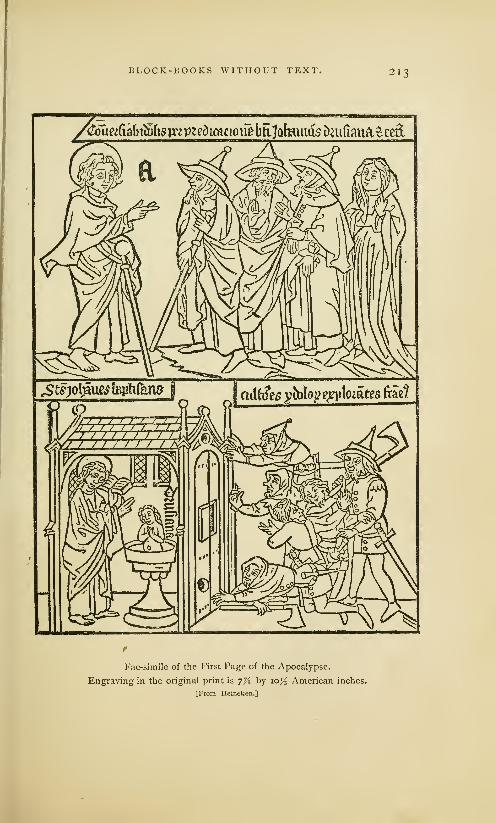
BLOCK-BOOKS WITHOUT TEXT, 213
<
/^Tiee(iabi^(ig^p?cDLcaciQU^btlJQbuiQgDnirimia^ced
Fac-simile of the First Page of the Apocalypse.
Engraving in the original print is 7% by io>$ American inches.
[From Heineken.]

214 BLOCK-BOOKS WITHOUT TEXT.
up the book must have given the printer and the binder a
great deal of trouble, but it was an efficient method, and the
only one that should have been employed.
In most editions of the book, the ink is of the same rusty
brown color that has been observed in the Bible of the Poor.
In some copies it is almost gray; in others, nearly black. The
first edition has engravings of the greatest merit, but it is
badly printed. The paper-mark is a bunch of grapes, similar
in design to that of a print in the collection of M. Weigel,
entitled The Adoration of the Three Kings, which, it is claimed,
was printed about the year 1425. But paper-marks are mis-
leading evidences. We do not certainly know the date nor
the country in which any edition of the book was printed.
German bibliographers say that it was printed in Southern
Germany ; Dutch bibliographers say that it was printed in
the Netherlands, probably by Coster of Haarlem ; but all
evidences that have been adduced to establish a certain date
for the earlier editions of the book, or to prove that, they were
done at any time or by any printer, are unsatisfactory. Somecopies of the book are interleaved with manuscript explana-
tions, which are sometimes in the Dutch, and sometimes in the
German language. The greater part of the copies have been
found in Germany, and it is the opinion of the most eminent
bibliographers that the first edition of the book, and most of
the editions, were printed in Germany.
The catalogue of the library of Dr. Kloss contains the
following note under the specification of a ragged copy of the
Apocalypse : "At the end of this volume is a short note,
written by Pope Martin V, who occupied the papal chair from
1417 to 143 1." This indirect attestation to the age of the
book has never been considered as trustworthy.
Another copy of the book, known as the Spencer copy,
is bound up with a copy of the Bible of the Poor, and has on
the binding an inscription to this effect: "Hound in the year
of our Lord 1467 by mc, John Reichenbach, in Gyllingen."
The inscription is undoubtedly authentic.

BLOCK-BOOKS WITHOUT TEXT. 215
Dibdin 1 alludes to an English clergyman who said that
he was once the owner of one copy each of the Apocalypse,
the Bible of the Poor, and the Ars Moricndi, all bound in one
volume, on the cover of which was stamped an inscription
certifying that "this volume was bound for the curate of the
church in 142-." The last figure the clergyman had forgotten,
but he was sure that the book was in its original binding,
and that it must have been bound, and consequently printed,
before 1430. The testimony is unsatisfactory.
THE CANTICLES.
This is a block-book 3 of sixteen pages, of small folio size.
It is one of the few block-books which may be unhesitatingly
pronounced as of Netherlandish origin. In general appear-
ance it closely resembles the books previously noticed. The
impressions are in brown ink, and on one side of the sheet
;
there are two illustrations on each page, and the two printed
pages face each other ; the explanations of the designs are in
Latin, and are engraved in scrolls that surround the figures.
According to some bibliographers, there are three editions of
the book; according to others, the trifling variations which
have been seized upon to justify the existence of a second
and a third edition are only alterations or repairs that have
been sustained by the original block. One edition contains at
the head of the first page an engraved line, in the low Dutch
or Flemish language, which may be translated thus :" This
is the Prefiguration of Mary, the Mother of God, which, in
Latin, is called The Canticles." Explanatory titles in block-
books, and even in the earlier typographic books, are unusual.
For this reason the genuineness of the inscription has been
challenged, but it has been generally accepted as a true part
of the original block.
1 Bibliotheca Spenceriana, vol. 1, as The History of tke Virgin Mary,p. 4, as quoted by Ottley, p. 99. or The Prefiguration of the Virgin
2 This book is sometimes described Maryfrom the Song ofSongs.
2l6 BLOCK-BOOKS WITHOUT TEXT.
The illustration opposite is the fac-simile, reduced in size,
of the first page of the Canticles. The design is imperfectly
explained by the legends in the engraving.
quia Let him kiss me with the kisses of his
mouth, for thy love is better than©stulctur mt osrulo oris sui;
mcltora sunt ukra tua birto.
I am come into my garden, my sister,
my spouse : I have gathered mymyrrh with my spice.
Thine head is like Carmel; thy neck is
like a tower of ivory.
I am black but comely, O ye daughters
of Jerusalem ; As the tents of Kedar,
as the curtains of Solomon.
Tint in fjortum mrum, soror mca spon-
sa mtssui miirrfjam nuum rum arom-
atihus nuis.
(Caput tuum ut Carmclus ; rollum tuum
strut funis tkirnta.
Nigra sum, srlJ formosa, filia 3trusa-
Itm, situt takrnaxula rc&ar, situt
ptllrs Solomonis.
The agriculturists of the upper illustration are in monastic
habits : some are cutting and threshing grain ; one is pound-
ing the grain in a mortar and another is grinding it in a hand
mill. In the open little house before the monk with a pestle,
is a desk with two books. In this combination of agricultural
work with the emblem or suggestion of study, Harzen sees
an illustration of the daily work of the Brethren of the Life-
in-Common, to whom he attributes the engraving and printing
of this book. The brethren of this order were eminent as
students and copyists of books, and had some distinction in
the last quarter of the fifteenth century as printers, but their
connection with this book cannot be established. 1
The words at the top of one of the cuts are not the only
Dutch feature in the book : the style of design is that of the
Netherlandish school of art. The blocks have been drawn and
engraved with much more care than those of the Apocalypse, or
the Bible of the Poor. There is more of grace in the attitudes
and draperies of the female figures of the Canticles, and less of
that gross and unimaginative treatment of sacred personages
which borders both on the ludicrous and the profane. But
'It is probable that the cowled ted to wear the dress and share some
farmers represent the lay brothers,
then very numerous in nearly every
thrifty monastery. The farmers,
butchers, bakers, carpenters and
useful mechanics were often permit-
of the privileges of the monks, on
condition that they should do the
servile work, and accept as a full
reward the rich blessings of monas-
tic prayers and masses.
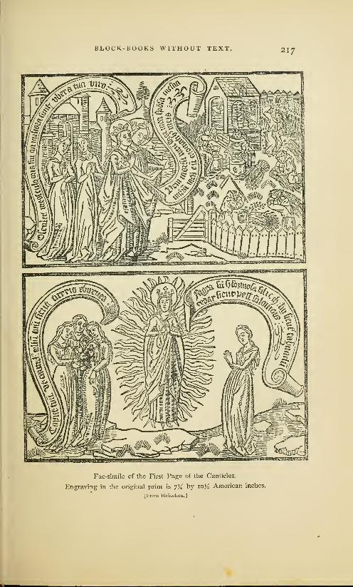
BLOCK-BOOKS WITHOUT TEXT. 217
Fac-simile of the First Page of the Canticles.
Engraving in the original print is 7% by 10K American inches.
IFrom Heineken.]
2l8 BLOCK-BOOKS WITHOUT TEXT.
the designer of the book presents the oriental love story to
his readers with Dutch accessories. The bride of the Song of
Solomon wanders about the streets of a city supposed to be
Jerusalem, but the dwellings have high-peaked roofs, Dutch
gables, and overhanging upper stories ; she is assaulted by
an armed and helmeted cavalier who carries on his shield the
heraldic black eagle of some unknown German potentate; the
pope, two cardinals and a bishop, with drawn swords in their
hands and shields on their arms, look with great composure
over Gothic battlements on the assault below. Writers whoare skilled in heraldry say that there is a peculiar significance
in the presentation of the devices and the arms on shields
which are found in many places in the book. Some German
authors see in these devices the arms of the German Empire, of
Wittemburg and of minor German principalities. Those who
believe that the book was printed in the Netherlands, see in
the shields the arms of Burgundy, of Alsace, and of Flemish
towns and cities. From these trivial evidences, the conclusion
has been drawn by one class of partisans that the designer
must have been a German, and, by another class, that he must
have been a Hollander. 1
1 These devices give us no certain It was believed that this schism in
clue to the engraver or printer of the the church would have been closed
book, but they are of value in assist- by the action of the Council of Con-
ing us to ascertain the purpose for stance, which terminated in 1418;
which the book was made. There but this result was not accomplished
are no old manuscript copies of the until 1449, when Nicholas v becamebook, but there are many evidences the only pope. The designer of the
that it was designed and produced pictures has treated the return of
for the first time in the fifteenth Christendom to the rule of one popecentury. It would seem that this as the reconciliation of Christ with
pictorial version of the Canticles was the church. To give special signifi-
designed, not so much to illustrate cance to the subject, he has intro-
the prefiguration of the Virgin Mary, duced the armorial shields of the
as the termination of a great schism magnates at the councils. It maywhich had divided the Catholic be that the engravings were madechurch between the years 1378 and in 1420, but it could be maintained
1449. Christendom had been scan- with plausibility that they were madedalizcd by the rule of two, and, for after the dissolution of the Council
a short period, of three rival popes, of Basle in 1448.

BLOCK-BOOKS WITHOUT TEXT. 219
The engraved letters of this book are much more legible
than those of the Apocalypse or the Bible of the Poor. The
Dutch final / is frequently introduced. The paper-marks most is
frequently observed are the unicorn, the bull's head, and the
letter P; but no information of value can be derived from the
paper- marks, and but little from the designs and engravings.
Although we do not know whether the Canticles was
printed in the second or third quarter of the fifteenth century,
it may be admitted that it was printed in the Netherlands.
We see the last trace of the blocks in the hands of the same
printer who destroyed the engravings of the Bible of the
Poor. A book, bearing the imprint of Peter Van Os, of Zwoll,
1494, has for its frontispiece the upper half of the first plate.
THE STORY OF THE BLESSED VIRGIN.
This is the bibliographic title1 of a block-book which may
be offered as a proper specimen of the popular religious litera-
ture of the fifteenth century. Sotheby mentions four distinct
editions of the work. The one that has been most frequently
described (whether first or last, is not known) consists of six-
teen leaves, with four illustrations on each leaf, and a brief
explanatory text in Latin. The designs have no artistic merit;
the engraving is coarse, and evidently the work of a novice;
the letters are legible, but they betray great inexperience in
the use of the graver, and they do not, in any feature, resem-
ble those of the block-books previously described. Some of
them have mannerisms like those of Gutenberg's Bible. It is
possible that the letters of one edition of the book are those
of movable types, or that they were engraved on wood from
a transfer taken from an impression of movable types. In all
editions the letters have German peculiarities, but there is
no edition which has the appearance of a first experiment in
1 The full title of the book is, as Illustrated by Engravings. Dibdin
given by Heineken, The Story of the calls it, The Defense ofthe Immacu-Blessed Virgin Mary, collectedfrom late Conception of the Blessed Virgin
the Evangelists and the Fathers, and Mary.

220 BLOCK-BOOKS WITHOUT TEXT.
printing. It is probable that all the editions were printed in
Germany, and after the invention of typography.
X The edition from which the annexed illustration was taken
was roughly printed on one side of the paper, but in a very
black ink. In other editions, which were printed from entirely
different blocks, differing both in the size of the block and in
the positions of the figures, the ink is of the customary rusty
brown. The copy in black is supposed to have been printed
on a press, and at a later date.
The object of the book is to show the reasonableness of
the story of the Incarnation, and to defend the dogma of the
Immaculate Conception. The bad taste of the author is more
signally shown in the text than in the pictures. Arguments
in support of the dogma are wrested from sacred history and
heathen mythology, and the writings of the fathers of the
church. The book is a curious compend of piety and uncon-
scious irreverence, of high scholarship and gross stupidity, as
will be more clearly shown by the following translation of the
legends that explain the pictures on the opposite page.
Temple of Venus, with a man gazing A man gazing at water that reflects
at a lamp. If the light at the temple the moon. If Seleucus in Persia finds
of Venus cannot be extinguished, why [reflected] light from the moon, whyshould not the Virgin generate without should not the Virgin, pregnant by a
the seed of Venus? Augustine de Civ- beautiful star, generate? Augustine de
itate Dei, xxi, 7. Civitate Dei, XX, 6.
Two Human Figures and a Statue. Two men sawing a stone on which
If a human being can be changed into appear two human heads. If man can
stone, why, by divine power, should not be painted on stone by the power of
the Virgin generate ? Albertus de Min- heaven, why should not the Virgin gen-
oralium, 1, in fine. erate by the assistance of the HolySpirit? Albertus de MinoraHum, II, 1.
The book begins with representations of St. Ambrose, St.
Jerome, St. Gregory and St. Augustine. St. Ambrose, who is
duly quoted from his Hcxamcron, book II, chapter 41, assigns
reasons for the Immaculate Conception, by illogical reference
to a bird without a mate. St. Augustine, who is represented as
seated at a table, reading from his work, De Mirabilibus, bookIII, chapter 12, asserts the Immaculate Conception because
many animals are produced without mating. St. Jerome and
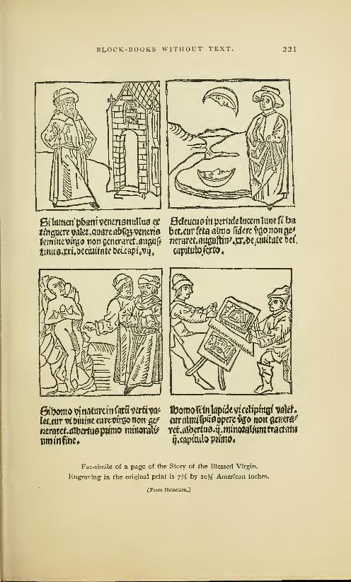
BLOCK-BOOKS WITHOUT TEXT. 221
61taoi'pbani venertsnullus w Befeucuaitt petitdc tacemlune ft ba
tfttgaere wlet.qoareab^cntria beccur fete almo (iderc *gonon ge^
femittevirgo tion ecnerarct.aufluf? tteraref.auguftinW^e.cimtatc fcei.
tmuaotxUectuifate &«.capi>ij, capitulo.fcrto,
Gibdmo^tiafttrcmfamuerttw tbomoriittkpidivicelipmfli ?ateh
letcuT trt tnittitc curetftre© nott wt fltralnufpuaopercfao non gc^era^
nerarekatbertuapwmo minoral^ Yct.a1beitu9.^.mmoft|iyttmtractat«
uminfine* ij.capimlo panto.
Fac-simile of a page of the Story of the Blessed Virgin.
Engraving in the original print is 7^ by io% American inches.
[From Heineken,]

222 BLOCK-BOOKS WITHOUT TEXT.
St. Gregory expound the same doctrine. Fifty-four illustra-
tions follow, each explained by a proposition that enunciates
with great formality some of the marvels of natural science.
We are told of bees without fathers, of birds impregnated by
the bill, of geese born from trees, of asbestos that burns forever,
of pearls made fruitful by the dew, of the phcenix restored
by fire, and of many other absurdities. The authorities cited
seem to have been selected with a truly catholic spirit: wefind among them Valerius Maximus, Peter Comestor, Terence,
Boethius, Job, Livy, and Isidore.
One edition of this work contains an imprint in sprawling
and almost unreadable characters, which bibliographers inter-
pret as the letters F. W. 1470. The letters F. W. were no
doubt the initials of Frederich Walther of Nordlingen.
The quality of the science taught in this History of the
Blessed Virgin enables us to form a just idea of the real
value of the scholastic philosophy then regarded as the per-
fection of wisdom. The silly speculations set forth in the
book were the husks upon which a devout people were fed.
AN EXERCISE ON THE LORD'S PRAYER.
This is the translated title of a thin block-book of ten
leaves, which was intended to explain the Lord's Prayer by
illustration. The blocks are printed in brown ink on one side
of the paper. The Exercise is in the popular form of dialogue.
In the illustration No. I, the monk 5. Thy will be done. The Almighty
Frater begs the angel Oratio to teach in the clouds, and before him the Angel
him the Lord's Prayer. And these are and the Monk kneeling. On the right,
the lessons that are taught
:
a good Christian and an Angel. In the
2. Our Father who art in Heaven. centre, two bad men who are rejecting
Christ, the Monk, and the Angel kneel. the Eucharist. In the foreground, the
3. Hallowed be thy name. The Monk, Jews and Pagans throw down the cup
the Angel, Christ, and the Church repre- and are pouring out its contents.
seated by a female figure, are kneeling. Scroll in A ro. 5. Frater and Oratio
On the right the Virgin and Holy Child. kneeling before God. jfiat boluntas tUH
4. Thy kingdom come. A represen- sicut tit rcclo ct in term. Let Thy will
tation of Purgatory: in the upper part, be done in Heaven as on earth The
the wicked surrounded by flames; in Angel to the right. ©,ui Stat bi&cat nc
the lower part, Jews and Pagans in the tallat. Let him who may stand take
fiery lake. heed lest he fall. . . The Good Christian.
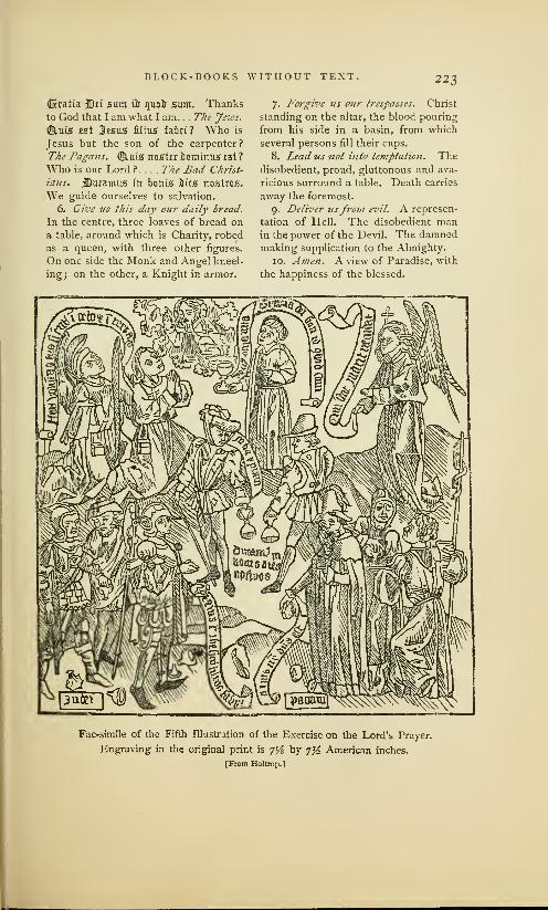
BLOCK-BOOKS WITHOUT TEXT. 223
(Bcratia 3Stt sum ft quou" sum. Thanksto God that I am what I am. . . The yews.
©,uis tst 3csus filing fahri ? Who is
Jesus but the son of the carpenter?
The Pagans. <2£tuis riostcr llominus isi ?
Who is our Lord ? . . . . The Bad Christ-
ians. jSutamus fit bonis hits nostros.
We guide ourselves to salvation.
6. Give us this day our daily bread.
In the centre, three loaves of bread on
a table, around which is Charity, robed
as a queen, with three other figures.
On one side the Monk and Angel kneel-
ing; on the other, a Knight in armor.
7. Forgive us our trespasses. Christ
standing on the altar, the blood pouring
from his side in a basin, from which
several persons fill their cups.
8. Lead us not into temptation. Thedisobedient, proud, gluttonous and ava-
ricious surround a table. Death carries
away the foremost.
9. Deliver usfrom evil. A represen-
tation of Hell. The disobedient manin the power of the Devil. The damnedmaking supplication to the Almighty.
10. Amen. A view of Paradise, with
the happiness of the blessed.
Fac-simile of the Fifth Illustration of the Exercise on the Lord's Prayer.
Engraving in the original print is 7% by 7% American inches.
[From Holtrop.]

224 BLOCK-BOOKS WITHOUT TEXT.
Santander says that the book bears all the marks of the
highest antiquity. Holtrop says that there is one copy of
this work in which the Latin text is translated, and explained
by engraved lines in Flemish at the bottom of each cut.
Guichard describes a series of engravings on wood, consist-
ing of eight designs like those just described, with a manu-
script text in Flemish. It is, without doubt, a Flemish book.
Of the many extraordinary commentaries which have been
made on the Lord's Prayer, this, surely, is the most singular
perversion. The prayer which begins with a recognition of
the brotherhood of mankind, which tells us to believe in the
all-embracing love of the Father, which teaches lessons of
dependence, forgiveness and protection, is made the text for
a denunciation of Jews and Pagans, and for the teaching of
doctrinal notions about the Eucharist.
THE BOOK OF KINGS.
In this book, two separate illustrations, with their explan-
atory text, are printed together on each page. The Book of
Kings might, therefore, be classified among the block-books
without separate pages of text, but it really has a text of
unusual length for a book of this class. In other features, it
resembles the block-books previously described ; its twenty
pages are printed on one side of the leaf; the illustrations face
each other, and are in the customary brown ink. The designs
are rudely drawn, and are as full of anachronisms in archi-
tecture as the illustrations of the Bible of the Poor, but the
architecture most frequently shown is in the pointed Gothic
style. The engraving is coarse ; every object is cut in bold
and heavy outline; tints and shading lines are timidly used,
and always in a crude manner. It was obviously intended
that the illustrations should be developed by painting or by
stenciling. The letters are drawn and engraved with more
care than the pictures, but they are irregular in size and form.
One of the peculiarities of the lettering is the final cross
given to the small letter t, a peculiarity which is frequently

BLOCK-BOOKS WITHOUT TEXT. 225
*6w lib ymkmfos&mtagX fuottmate uotuuir ptWmUMa;
, ._* vswroi naiujuif aaup.iuu^atmtUu nqtil^abtt^ouir Douiiuo 0.&Rnt&br6iui cDiumo uacctmm Otio awr^%» cactus \»iF rti&4tpc(bborpfflettt
ftUn uoauiitrp imuicuau& Cttiuna
tolrrf tdjlartmtccatfrunt abtog
luumiaOootinleoiuuttwlo.lmi^mc la/u mtulo r^tujirqntettuu ti ct>
s
tartc&otuifi: ninxiutiutt?ajJiU)tir
to luuuftTtuiew ctjnfpcttu Douumticcuutue tphcMuiro . tftp:onm
-
batata rtC^ati|l^tt$timiW
^w»
Mto Muii uGLp^Oicto-fuer^yat upu (a/a*
joFuuua fibur ouuu fur fiirurcuptrcjnlp tttmi rrmionx uit;aXcmt Ootuvtmo apCaiun?lcw fiontnrn6>tumttui;
plo Dm tuctua ci4Fcttcp Cuthmba aOuufirm jbrti otaia que to aitusuuu (hp
oouui ciaa.p^iFi ria a fjvuiOicattn^
cflKri Ooummctus utctcuurj cr wufc
ccwpmfc eoe.ftveoxe autetu facto mittwmitfeuwcthm'ouui&s fmuoucetnn£t ai^.hth.fftrt^ ^ouiuui'equoo
bouu tfhmi^tmi&^raitaiittaifanmdtt,C02itouiti^mu^j)toftimCaa^jrtmrttc&g<mm&>
An Illustration from the Book of Kings.
Original is 7 by %% inches.
[From Sotheby.J

226 BLOCK-BOOKS WITHOUT TEXT.
noticed in some of the typographic work of Dutch printers.
The leaves were not nested in sections one within another as
was customary: each sheet of two leaves was engraved, printed
and folded separately, so as to make a book of ten sections.
The book was intended to illustrate the more important
events of the life of David as recorded in the books of Samuel,
and in the First and Second Books of Kings. The fac-simile
on the preceding page illustrates Hannah presenting Samuel
to the priests in the house of the Lord, and Samuel called by
the Lord out of sleep. Sotheby classifies it with the block-
books of Holland, but Falkenstein attributes it to Germany.
THE GROTESQUE ALPHABET.
This is a curious block-book of twenty-four pages, of the
original edition of which not one perfect copy is known. The
leaves of the copy now on the shelves of the British Museum
xare 3^ inches wide and 6 inches high. Sotheby, who has
carefully examined its construction, says that the twenty-four
pages were printed in sections of eight pages on three sheets
of paper, with a thin watery ink of a sepia tint. The margins
and blanks have been written on with an ink of nearly the
same color as that of the printed cuts.
Another copy of this work has been found at Basle, in
which, 'on the letter A (not found in the London copy), may
be seen the date 1464. Another copy, in a library at Dres-
den, has the same date. Renouvier says that these copies,
by German engravers, and of inferior execution, are transfers
of the original, which was engraved in the Netherlands.
The history of the book in the British Museum is unknown,
but it has many evidences of long/ise in English hands. The
cover or binding consists of a double fold of thick parchment,
upon the inside of which, between the folds, is written in large
English characters, " Edwardus Lowes." On one side of the
last leaf is the rough draft of a letter in the English language.
The writing, which is found in scraps all over the book, is of

BLOCK-BOOKS WITHOUT TEXT. 227
the period of Henry VIII. Upon a sword-blade in the cut of
the letter L is written in small characters the word London.
In another place in the same cut are letters which are read
by some as Westmistre—by others as Bethemsted. It is full
of English writing, but it has not been proved that the cuts
are the work of an English engraver. Chatto says of them:
They were neither designed nor engraved by the artists who
designed and engraved the cuts in the Apocalypse, the History of
the Virgin and the Poor Preachers' Bible With respect to drawing,
engraving and expression, the cuts of the Alphabet are decidedly
superior to those of every block-book, and generally to all wood
engravings executed before the year 1500, with the exception of such
as are by Albert Durer, and those contained in the Hypnerotomachia,
printed by Aldus at
Venice in 1499. . . .1
perceive nothing in
them to induce meto suppose that they
were the work of a
Dutch artist; and I
am as little inclined
to ascribe them to a
German. The style
of the drawing is not
unlike what we see
in illuminated French
manuscripts of the
middle ofthe fifteenth
century; and as the
only two engraved
words which occur
in the volume are in
French, I am rather
inclined to suppose
that the artist whomade the designs was
a native of France.
The costume of the
female to whom the
words are addressed appears to be French; and the action of the lover
kneeling seems almost characteristic of the nation. No Dutchman
Letter K of Grotesque Alphabet.
Original is 3% by 4^ inches.
[From Holtrop.]
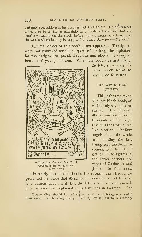
228 BLOCK-BOOKS WITHOUT TEXT,
certainly ever addressed his mistress with such an air. He holds what
appears to be a ring as gracefully as a modern Frenchman holds a
snuff-box, and upon the scroll before him are engraved a heart, and
the words which he may be supposed to utter: Mon atne—My soul. 1
The real object of this book is not apparent. The figures
were not engraved for the purpose of teaching the alphabet,
for the designs are quaint, elaborate, and above the compre-
hension of young children. When the book was first made,
the letters had a signifi-
cance which seems to
have been forgotten.
THE APOSTLES'CREED.
This is the title given
to a lost block-book, of
which only seven leaves
remain. The annexed
illustration is a reduced
fac-simile of the page
that tells the story of the
Resurrection. The four
angels about the circle
are sounding the last
trump, and the dead are
coming forth from their
graves. The figures in
the lower corners are
those of Zacharias and
Judas. In this book,
and in nearly all the block-books, the subjects most frequently
presented are those that illustrate the marvelous and terrible.
The designs have merit, but the letters are badly engraved.
The pictures are explained by a few lines in German. Thet
'The reading should be, Mon i the word heart being represented
cceur avez,— you have my heart,— not by letters, but by a drawing.
A Page from the Apostles' Creed.
Original is 5% by 8^ inches.
[From Dibdin.]

BLOCK-BOOKS WITHOUT TEXT. 229
copy of the book described by Dibdin has on the fly-leaf the
written memorandum V. W. 1471, but it is not probable that
this writing has any reference to the date of printing.
THE EIGHT ROGUERIES.
This is a small block-book of eight leaves. Weigel places
it among the earliest specimens of engraving on wood. The
language in which the
1$ fem^iett^»^ic«le«»VtlVwg>| pictures are explained is
fci #1 *Jrt fatf ^libCtferr^flCUiy High German. The pic-
vfo Vtiib Va id?Wfrfct?&*S test
j
l tures illustrate the Go-
fiB tlttrtCfc fratttM W$i [
"""H between, the Liar, the
Cheat, the Counterfeit
Goldsmith, the Cheating
Merchant, the Church
Robber, the Cheating
Rope-maker, the Black-
smith that sells iron for
steel. The designs are
rude, but they are full
of spirit and character,
and the cutting of the
figures has been done
with ability and intelli-
gence. The paper was-
printed on one side onlyA Page from the Eight Rogueries.
d.
d][ fe.^
Original is 4 by 5% inches.
[From Faikenstein.] This book was found in
the neglected library of an old South German monastery, in
the heart of the neighborhood in which we find the earliest
notices of printers and painters of images. As it is the only
block-book of a decidedly non-religious character, it may be
ascribed to some maker of playing cards, who practised the
art of engraving before it was placed under the control of
the Church.

XII
Patk-Jiu-trta nl fmage* uttllj Iferh
The Antichrist, with Facsimile ...How to Remember the Evangelists, with Fac-simile . ..How to
Die Becomingly, with Fac-simile. . .Other Editions of this Work. ..Chiromancy of Doctor Hartleib,
with Fac-simile. . .German Planetarium and Calendar, with Fac-simile. ..Wonders of Rome, with
Fac-simile. . Pomerium Spirituale, with Fac-simile. . .Temptations of the Devil, with Fac-simile.
Life of St. Meinrat, with Fac-simile. . .Dance of Death, with Fac-simile ... Mechanical Peculiar-
ities of the Block-Books. . .All of Religious Character. . .Made for Priests, but seen by the People.
Not Adapted to the Needs of the People. . .The Period of the Block-Books. ..Made in Germany
and the Netherlands. . .Dates and Printers of the Books Unknown. . .Probably Made in the First
Quarter of the Fifteenth Century. . .An Established Business before the Invention of Typography.
W&ts, that is forittm in tfcis little took, ouojfjt tfjc priests to learn an& tear!) to tfieir
parishes : anil it is also neressarj for simple priests tfjat unterstanlj not trjc
Srripturrs, an& it is mate for simple people iij cause tljat for to tear examples
sttrretf) anfl" motetf) tte people tijat ten simple more to tebotion tfjan great autfjoriis
of SriettCe. Carton's Preface to tJie Doctrinal o/SaPyence.
DER ENDKRIST, OR THE ANTICHRIST. This book seems
to have been written to warn men against the snares of
heresy. Two distinct editions are known; each was printed
from a different suite of blocks and by a different printer. The
copy about to be described has thirty-eight leaves, twenty-
six of which are devoted to the life of Antichrist, and eleven
to a separate treatise known as the Fifteen Signs, which was
bound up with the Antichrist, and of which it seems to be
the proper sequel. The book is printed on one side of the
leaf, in brown ink, and the illustrations face each other. The
text begins with the words "Here beginneth of Antichrist,
taken and drawn out of many books, how and of whom he

BLOCK-BOOKS WITH TEXT. 231
shall be born." After a half-page wood-cut, which represents
with needless grossness the birth of Antichrist, follow other
engravings illustrating the more notable events of his life.1
The fac-simile on the following page gives a correct notion
of the lawlessness of the designs 2 of the book. It is obvious
that they were not made by the artist who drew the illustra-
tions for the Bible of the Poor or for the Canticles: The text
which explains the wood-cuts is in the German language, but
it is in a very careless form of German writing.
1 The' following synopsis of the
work is condensed from the trans-
lation of the text of the book, as
given by Sotheby in his Principia
Tyfiographica, vol. II, pp. 38-45 :
Antichrist is born in Babylon. Heyields himself to lust of women at Beth-
saida. He is circumcised, and announces
himself as the Messiah. He is instructed
in magic and all sorts of evil. Elias and
Enoch come down from Heaven and
preach against him. Antichrist deceives
the world by superior eloquence ; he
performs miracles ; his apostles preach
to the kings of Lybia and Ethiopia, and
"the queen of the Amazons, and the
Red Jews." All the kings of the world
are converted to Antichrist ; he con-
demns unbelievers to strange tortures;
he kills Elias and Enoch. He repeats
the history of the resurrection ; he bids
the whole world witness his ascent to
Heaven from the Mount of Olives.
The Almighty then gives the order
—
"Michael, strike him dead; I will no
longer bear with the unjust." Antichrist
is carried to Hell, where he is received
by the Devil and his allies. Antichrist
being dead, princes and people become
Christians, and there is only one faith.
But the people fear the Day of Judg-
ment. These are some of the signs of
the great and terrible day: The sea shall
rise forty ells above the mountains ; it
shall then sink away and vanish. Thesea shall burn. Trees and plants shall
sweat blood. There will be earthquakes.
buildings and trees shall fall down in
hopeless ruin. Stones shall fly up in
the air. Wild beasts grow tame with
fright, and run to men for help. Thedead arise. Stars fall from Heaven.
Heaven and earth are burnt up and
chaos comes again. At this point the
imagination of the designer was ex-
hausted : he had done his best. Thepage following, which should have been
filled with an illustration, is judiciously
left blank. The last engraving is that
of the resurrection of the blessed.
•2 The central figure in the lower
illustration, the meek and priestly
personage who, surrounded by gam-
boling devils, and with a monkeyperched upon his back, walks with
measured pace and uplifted eyes, is
the Antichrist. This is the intro-
duction to the explanatory text
:
Antichrist is instructed by adepts,
who teach him to make gold, the art of
magic, and all sorts of evil. And this
takes place at the city named Corosaym.
And this stands also written in the
Compendium Theologice. And our Lord
curses the said city in his gospel, and
says thus : "Woe to thee, Corosaym! "
Here, we see Antichrist goes from
Capernaum to Jerusalem, and he there
announces himself as holy. And hereof
is also written in the book CompendiumTheologia. And our Lord, in the gospel,
also curses this city, and speaks thus
concerning it: "Woe to thee, Caper-
naum! "

232 BLOCK-BOOKS WITH TEXT.
rOcr CinuNtnlt balbcxi ™•nva.\ftcr • pie na*n"n gBl^iuX^Vii^inS^
%auinrp \md pos U|)t) :Vu^od bcfrijuljl- m fc*r -Star gcnairt Coio lapm. I
Pnfl tag ftct flucf) jcfc^itentti Compctt&xo -CIkoIojw ."Vni) Vnfcrljevr
Fac-simile, reduced, of a Page of the Antichrist.
[From Hclnelceu.]

BLOCK-BOOKS WITH TEXT. 233
The thirty-eight leaves of one edition are made up in one
section. This bungling method of making up a book is suffi-
cient evidence that the printer or engraver who placed these
pages together had no education in practical book-making.
But the bad method shown in the plan does not prove that
the book is of great age. The copy under notice contains, in
the German language, the imprint of Junghannis, priffmaler,
or painter of cards, Nuremberg, 1472. Whether this Jung-
hannis was the designer, printer or engraver is not known.
HOW TO REMEMBER THE EVANGELISTS.
This block-book 1 was, no doubt, intended for men, but a
modern observer would say that it had been made for children.
The time-honored method, still used for the child's alphabet,
A was an apple, is the method of the Ars Memovandi. Com-
pared with the block-books previously noticed, it is a book of
high merit. It is a thin folio of thirty pages, fifteen of which
contain a text of very large, clumsily drawn and compactly
arranged letters within a rule-bordered frame; the remaining
fifteen pages have full-page illustrations. The edition from
which the annexed illustration was copied is in brown ink.
The designs are more eccentric than those of any known
block-book, but the designer has shown no artistic ability in
the grouping of his figures. The four Evangelists are symbol-
ized— St. John by an eagle, St. Matthew by an angel, St. Luke
by a bull, St. Mark by a lion—but they are presented to us
in uncouth attitudes, and are surrounded or overlaid by some
of the familiar objects frequently mentioned in the Gospels.
These objects are numbered with Arabic figures referring to
explanations in the text. The dove, for it must be so consid-
ered, although it looks like an owl, perched on the head of the
symbolized St. John, may be accepted as the emblem of the
Deity. The two heads beside the eagle are to be understood as
those of Moses and of Christ. The musical instruments, a lute
and three bells, on the breast of the eagle, indicate the contents
'The Latin title is Ars Metnorandi, notabilisperfiguras evangelistarutn.

234 BLOCK-BOOKS WITH TEXT.
Fac-simile of a Page of the Ars Memorandi.
Engraving in the original print is 6% by 9K American inches.
[From Heineken.l

BLOCK-BOOKS WITH TEXT. 235
of the second chapter, the marriage at Cana. The fish recalls
the pool of Bethesda. The numeral 3 points to the conversa-
tion with Nicodemus; the water-bucket and the crown refer
to the woman of Samaria at the well ; the five loaves and the
two small fishes to the feeding of the multitude. The cross
in the circle is the consecrated wafer of the Roman Catholic
Church. The letters in the pages of text are unusually large;
they are clearly cut, but are so compactly arranged that they
frequently interfere with each other. The descriptive text is
in Latin, but of very objectionable grammar and orthography.
The knowledge it conveys of the Gospel is imperfect to the
last degree, as may be more clearly seen in the following
literal translation of the text provided for this illustration.
The Gospel of St. John has twenty- Fourth Chapter. How Jesus asked the
one chapters. First Chapter. In the Samaritan woman to give him to drink
beginning was the Word, from the eter- near the well of Jacob, and about the
nity of the Word and the Trinity. Second law. Fifth Chapter. About the miracle
Chapter. Nuptials were made in Cana in the fish pool, when Jesus told the
of Galilee, and how Christ overturned lame man, Take up thy bed and walk,
the tables of all the money-changers. Sixth Chapter. About the feeding with
Third Chapter. But there was a man five loaves and two fishes, and about
among the Pharisees named Nicodemus. the Eucharist.
The Ars Memorandi is considered by Schelhorn as one of
the oldest of block-books, "if not the first, among the first."
Von Aretin says that " it is worthy of observation that this
book, one of the earliest of its kind, should be devoted to the
improvement of the memory, when it was to be rendered of
little consequence by the art of printing."
HOW TO DIE BECOMINGLY. 1
At least ten distinct xylographic editions of this popular
block-book have been identified, seven of which are in Latin
and three in German. The text of the book is substantially
the same in all editions, but the designs are dissimilar, and the
engraving and printing are of unequal merit. Some copies
are in black and others in brown ink ; some are printed on
'The bibliographic title is Ars described by the paraphrase How to
Moriendi, or, literally, The Art of Die Becomingly. It is also knownDying, but the work is more clearly as The Temptations of Demons.

236 BLOCK-BOOKS WITH TEXT.
one side and others on both sides of the paper. The origin
of the book is not known, but it was a popular work long after
types had been invented; before the year 1500, it had been
printed either from types or from blocks, in Nuremberg, Paris,
Rome, Florence, Verona, Lyons, Utrecht, Delft and Zwoll.
The edition about to be described, which Heineken names
as the fourth, is a folio of twenty-four leaves. It is printed in
brown ink, on one side, with printed pages facing each other.
Eleven pages have illustrations, and thirteen pages are given
to the text. The book is made up in workmanlike manner,
in four sections of six leaves. The illustrations are crowded
;
the figures are grouped inartistically; the engraving is coarse.
The object of the book is to present the temptations that
beset the dying. The first illustration represents the dying
man as tempted by devils concerning his faith. The next
illustration shows the good angels who enable him to remain
steadfast. In like manner he is tempted by devils to despair,
to impatience (in which the moribund is vigorously kicking an
attendant), to vainglory, and to avarice ; but through help of
the angels, he triumphs over all his adversaries. The ninth
illustration, which is reproduced on the following page, shows
the dying man as resisting the last assaults of three emissaries
of the devil. The vigorous action of these hideous goblins is
in marked contrast with the composure of the relatives, whostand at a respectful distance. The horse and hostler show
that the man on the death-bed was rich. The moral of the
design is the vanity of riches. One of the devils, the one at
the head of the bed, maliciously suggests, Provideas amicis—you should provide for your friends. Another devil, pointing
to the house, calls out with grim irony
—
Intende thesauro—pay attention to your treasures. This illustration is followed
by another in which a ministering angel exhorts the dying
man to discard the devil's advice, and not leave his property
to his relatives, but to give it to the church. In the last illus-
tration, the spirit of the dying man exhales from his mouth in
the shape of a manikin, which is received by the angels. The

BLOCK-BOOKS WITH TEXT. 237
sssssssss^^
Fac-simile of a Page of the Ars Moriendi.
Engraving in the original print is 6% by %% American inches.
[From Heineken.]

238 BLOCK-BOOKS WITH TEXT.
baffled devils make some frightful contortions and then depart.
It is not a pleasant book. But the hideousness of the devils
in the illustrations is not so revolting as the craftiness of the
author who devised these ghastly scarecrows. The ostensible
purpose of the book was the preparation of men for another
world; its real object was the aggrandizement of the church,
and for this purpose the writer of the book recommended the
sacrifice of the desire to provide for one's family. It does not
increase our respect for the piety or intelligence of the people
to learn that this book was popular for more than a century.
The xylographic editions of this work which contain the
names of the printers are in the German language. One of
them has these words, Hans Sporer, 1473 ;another has the
imprint of J. W. Presbrm, of Nuremberg; another is dated
Leipsic, 1496. One of the typographic editions, dated 1473, is
attributed to John Gensberg, of Rome ; another, dated 1478,
bears the imprint of Ratdolt, of Venice. An edition with a
typographic text was printed in 1488 by Peter Van Os, of
Zwoll, the same printer who last owned the blocks of the
Bible of the Poor. In this edition the words in the scrolls
are in the Flemish language, and the text is in Latin. The
use of Flemish in the engraved blocks seems to warrant the
belief that there must have been an earlier edition, entirely
xylographic, but no such edition has been discovered.
THE CHIROMANCY OF DOCTOR HARTLIEB.
This is a folio of fifty-two pages, badly printed, in dark
gray ink, on both sides of the paper. The designs are puerile
and the engraving is coarse. The text of the book is in the
German language. Some copies of the book contain at the
foot of one page and outside of the border the name
Other copies of the book have, in the same position, the
name itDft fcrtpff )il rtttflf|Mtr«t. The spelling is different,

BLOCK-BOOKS WITH TEXT. 239
and the shapes of the letters are different. No satisfactory
explanation can be offered for these differences in books that
are supposed to be printed from the same blocks. It may-
be that the name, inserted in a very exposed place, broke
down under impression, and was carelessly re- engraved. This
variation is a specimen of some of the perplexing changes to be
found not only in block-books but even in early typographic
books. The name is usually read as George Schapff, of Augs-
burg, who is supposed to have been the engraver and printer
of the book in 1448. The workmanship is not to his credit:
Chatto says "more wretched cuts were never chiseled out by
a printer's apprentice as a head-piece to a half-penny ballad."
The matter is worthy of the manner. The book professes
to teach the science of palmistry, or the telling of fortunes by
wrinkles in the palm of the hand. The first page contains the
title, in large letters, over a piece of ornamental border and
lattice-work. The page that follows contains this dedication
:
" The hereinafter written Book of the Hand was made German by
Doctor Hartlieb, through the Prayer and Bidding of the serene high-
born Princess Dame Anna, nee Brunswick, and Wife of the virtuous,
blessed Prince, Duke Albert, Duke of Bavaria and Count of Voburg.
This has come to pass on the Friday after the Conception of Mary,
the most glorious Virgin. 1448."
The language is not clear: the date here given may be
that of the translation, or of the engraving, or of the printing.
The rudeness of design and engraving might lead an ordinary
observer to the conclusion that the book was printed at an
earlier date than 1448; but the insertion of a separate title-
page, the printing of the pages on both sides of the paper,
and the method of gathering the book in sections of eight
leaves, teach us that the book should have been printed at a
later date, when these improvements were in general use.
Doctor Hartlieb apprises his readers that he foretells the
destiny of man by his right, and that of woman by her left
hand. For this purpose he furnishes, on as many pages, forty-
four large illustrations of the human hand, each covered with

§8
I nSIC a
*• s° I
1p.

BLOCK-BOOKS WITH TEXT. 24I
mystical characters, that are almost illegible by reason of bad
printing. The illustration annexed, which is the first in the
book, is intended to represent events that happen to people
who have certain marks upon the palms of their hands. At
one end of the picture are hanging and murder ; at the other
end, a kind deity is showering gold on the head of a bewil-
dered peasant.
The childish book is an illustration of the intelligence of
the ordinary reader of the period. It may be that the restric-
tive phrase, ordinary reader, is not warranted, for Doctor John
Hartlieb was probably an honored graduate from a medieval
university, and the Princess Anna, no doubt, was more care-
fully educated than the ladies of her court. Chiromancy was
considered a science. Adrien Sicler dedicated a book on this
subject to Camille de Neuf-Ville, Archbishop of Lyons and
Primate of France. Books on chiromancy were printed at
Lyons in 1492, at Strasburg in 1534, and at Bologna in 1504.
The church tolerated the books of palmistry which did not
interfere with the doctrine of moral responsibility, and which
did not teach astrology or magic arts.
GERMAN PLANETARIUM AND CALENDAR.
These are two distinct works, which were often printed
and bound together. The Planetarium, which is in German,
describes, through a text in rhyme and by engraved illustra-
tions, the influence of the planets on the destinies of mankind.
The Calendar, which is in Latin, occupies but four pages, and
contains at the end of the month of February the inscription,
Magister Johannes Gamundia} On another page is found the
1 John of Gamundia was a mathe- after old prints, the late R. Z. Becker,
matician and professor of astronomy, of Gotha, discovered one of the
At his death, in the year 1442, he original blocks of a placard or poster
was chancellor of the University of edition of the Calendar of John of
Vienna. The calendars made by Gamundia. He describes it as about
him we're highly esteemed, and were 10^ inches wide, 15X inches long
engraved and printed for many years and i^ inches thick. The block
after his death. In his researches was engraved on both sides.
31

242 BLOCK-BOOKS WITH TEXT.
date 1468. There is a copy of the German Planetarium in the
British Museum which contains only twelve printed pages.
Berjeau describes it as a small quarto, and says, that although
it is printed on both sides of the paper, it presents the appear-
ance of impression by the frotton. The fac-simile illustration
that is given underneath represents the influences of the planet
Mercury. The artist before the easel is painting a Madonna
;
his servant is mixing colors with a muller ; in the middle of
An Illustration from the Calendar of John of Gamundia.
[From Berjeau.J
the print is an organ-maker ; to the right is a copyist ; at his
back are two gourmands; in the foreground is a sculptor at
work on a statue; to the left is a goldsmith before his anvil.
The descriptions of these works that have been given by the
early German bibliographers are not clear. They represent
the book as consisting of twenty-six pages printed on one

BLOCK-BOOKS WITH TEXT. 243
side of the sheet, with the blank pages pasted together. Thesize of the page, the color of the ink, and the method used
in gathering the sheets are not stated. It seems that there
were at least two editions of each work, one in German and
one in Latin, and that
portions of the different
editions were sometimes
bound up in one book.
Von der Hagen says that
the first page of the copy-
examined by him con-
tained an imperfect im-
pression of one of the
pages of the Anticlirist.
A Page from the Wonders of Rome,Original is 3% by 5% inches.
THE WONDERS OFROME.
This small quarto of
one hundred and eighty-
four engraved pages is
an example of patience
in obscure letter-cutting
that ismore characteristic
of China than of Europe.
The text is in German,
and is fairly printed in
black ink on both sides
of the paper. The book
is enlivened by a few
illustrations which have
The Wonders of Rome is an ecclesi-
[From Sotheby.]
small merit as designs,
astic's description of the more important shrines of the holy
city, with their consecrated relics. The first page of the bookcontains an engraving of the handkerchief of Saint Veronica,
which, according to the legend, was placed on the face of
Christ to wipe away the blood that dripped from the crown

244 BLOCK-BOOKS WITH TEXT.
of thorns, and received therefrom the impress of his features.
Under this design the papal arms and the triple crown, the
crossed keys, and the letters S. P. Q. R. The arms of the
pope are those of Pope Sixtus IV, who occupied the papal
chair from 1471 to 1484, within which period it is supposed
that the book was engraved and published for German readers.
POMERIUM SPIRITUALE, OR SPIRITUAL NURSERY.
3*£\"tapwfut tabwexubs
.
An Illustration from the Pomerium Spirituale.
Original is 4^ by 5 inches.
[From Holtrop.]
The rightful place of this work is among the manuscripts
that are partly written and partly printed, for its pictures were
engraved and its text was written. The book contains twenty-

BLOCK-BOOKS WITH TEXT. 245
six leaves of small folio, made up in one section. At the
beginning of each of its twelve written chapters is the impres-
sion of an engraving on wood. The date 1440 is found in two
of the engravings. The only known copy of this book is held
by the Royal Library of Brussels. It is a curious circumstance
that this copy, possibly in its original binding, which contains
a printed date earlier than that of any other block-book,
should also contain two printed leaves of the Bible of the Poor.
Holtrop says that the book was composed by Henry Bogaert,
canon of a monastery near Brussels, who was born in 1382
and died in 1469. He was the author of many small religious
books, of which the Exercise on the Lord's Prayer is one. The
illustrations of this book and of the Pomerium Spirituale were
probably made at the same time and by the same engraver.
THE TEMPTATIONS OF THE DEVIL.
This is not a book, but a print on a single sheet eleven
inches wide and sixteen inches high. It differs from the image
prints in the pettiness of its cuts and the abundance of its text,
for which reason it may properly be described among the
tfiSTsjabol* moieuthioMimotto tasWWtttt i^fs'}3'
A Fragment of the Temptations of the Devil.
Original is 10 inches wide.
[From Koning.]
block-books with text. The nature of the work is clearly
set forth in the preface, The Temptations of the Devil, as he
tempteth men to the Seven Mortal Sins. The Devil, who, with
a claw-hook in his hand, stands in the corner to the left, has
beneath him the list of these seven sins. The tempted man is

246 BLOCK-BOOKS WITH TEXT.
the monk near the centre of the print, who supplicates the aid
of the angel, who hastens to his rescue. Below the angel are
appropriate quotations from the Scriptures, which show that
this print is but a medieval paraphrase of the story of Christ
tempted by the Devil, as related by St. Matthew. It was
engraved and printed in the form of a placard, that it might be
fastened against a wall for the contemplation of the devout.
The illustration shows only a portion of the upper part of this
curious print, of which
the British Museum has
the only known copy. It
is supposed to have been
printed in the Nether-
lands.
THE LIFE OF ST.
MEINRAT.
This book, which has
an introduction of two
pages in German, and
forty-eight pages of il-
lustrations, with brief
descriptions below the
pictures, tells the story
of two bad men whomurdered St. Meinrat,
and who were immedi-
ately thereafter pursued
by two crows. The il-
lustration here presented
represents the murderers
on their way to execu-
fifrfleir&
A Page from the Life of St. Meinrat.
Original is 31/» by 5% inches.
[From Dibdin.]
tion, accompanied by the unrelenting crows. On the pages
that follow are engravings of the murderers suffering under
torture ; it is shown how they were dragged at the heels of
horses, and were broken and burnt on the wheel. The moral
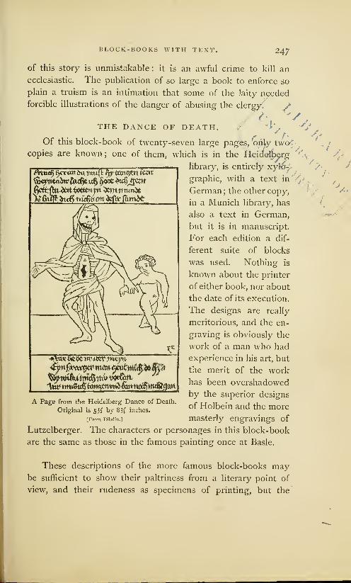
BLOCK-BOOKS WITH TEXT. 247
of this story is unmistakable : it is an awful crime to kill an
ecclesiastic. The publication of so large a book to enforce so
plain a truism is an intimation that some of the laity needed
forcible illustrations of the danger of abusing the clergy.
THE DANCE OF DEATH. 4Of this block-book of twenty-seven large pages, 'only two<
/
copies are known; one of them, which is in the Heidefb
Attu^ $cr <xn m* muft ^rtanQCtt felt
fountain?fadjtxxfy $<sx$u$J$!&t
*\tt« &e& Ttr *tevm^5
A Page from the Heidelberg Dance of Death.
Original is 5y2 by 8% inches.
[From Dibdin.]
Lutzelberger. The characters or personages in this block-book
are the same as those in the famous painting once at Basle.
library, is entirely xyro—
graphic, with a text in
German; the other copy,
in a Munich library, has
also a text in German,
but it is in manuscript.
For each edition a dif-
ferent suite of blocks
was used. Nothing is
known about the printer
of either book, nor about
the date of its execution.
The designs are really
meritorious, and the en-
graving is obviously the
work of a man who had
experience in his art, but
the merit of the work
has been overshadowed
by the superior designs
of Holbein and the more
masterly engravings of
/,-
/< ./
These descriptions of the more famous block-books maybe sufficient to show their paltriness from a literary point of
view, and their rudeness as specimens of printing, but the

248 BLOCK-BOOKS WITH TEXT.
books described are not enough in number to give us a cor-
rect notion of the activity of the early block-printers. It is
probable that many books have been lost and forgotten; but
we have, however, enough to warrant the belief that block-
printing was an industry of some repute even as early as 1430.
\ One mechanical peculiarity of the block-books deserves
a specific notice : all the block-books were printed on paper.
The printers soon discovered that vellum was an intractable
material, and they preferred paper as much for its convenience
as for its cheapness. An apparent dislike of black ink is
equally noticeable ; the color in different books varies from a
blackish gray to a dingy brown. But their most characteristic
feature is the method of printing upon one side of the sheet.
One chronicler says that the leaves were so printed that the
blank sides might be pasted together. That this is not the
true reason is apparent when we discover that very few of the
^.books have pasted leaves. It is more reasonable to suppose
that the earlier block-printers could not print on both sides
of the paper. It is plain that they could not produce a neat
impression even on one side— could not regulate the force of
the impression, which was so harsh and violent that it some-
N» times spread the ink, and deeply indented the paper. As the
margins are uneven, we have to infer that the printers could
not place the sheets with uniform accuracy upon the blocks.
Consequently, they could not print in register, and place the
second page truly on the back of the first. Some authorities
say that the paper was printed dry, but this is only a conjec-
v ture, made to suit the theory of printing by the frotton. The
paper must have been dampened, for it was very thick, and
as strong and as coarse as modern manila wrapping ; it could
not have been legibly printed until it had been softened.
With few exceptions, the block-books are of a religious
character; but the religion taught is dogmatic and doctrinal
more than devotional. We may safely assume that they were
written by ecclesiastics in high station for the instruction of
the ignorant monks, mendicant friars, and " unable curates."
BLOCK-BOOKS WITH TEXT. 249
Illiterate priests, to whom the descriptions or the legends of
the pictures had been read, must have understood their his-
torical and spiritual meaning, and must have found the pictures
an aid to the memory, and suggestive of topics for preaching.
Although made for priests, they were not beyond the reach of
the people. As far back as the twelfth century, an English
abbot sternly forbade, under penalty of excommunication, the
lending of any books, "neither the large books with pictures,
nor the small books without pictures." But the mandate was
disregarded. Sooner or later, the books found their way to
the hands of laymen, whose ignorance of Latin did not pre-
vent them from admiring the pictures ; and this admiration
must have inspired many a reader with the desire to learn
the strange language and to own the coveted book.
The Life of St. Meinrat is the only book which seems to
have been written especially for the people. There are two,
the Antichrist and the Exercise on the Lord's Prayer, which
were, apparently, written to furnish suggestions to preachers
against heresy. There was need for books of this character.
The church was fermenting with dissent ; a very large portion
of the people had abandoned the old faith, and there was a
general complaint among all priests that the churches were
neglected. To recover this lost allegiance, and as an antidote
to infidelity and heresy, 1 the church gave its assent to the
circulation of image prints and block-books among the laity.
The poverty of the spiritual diet prepared for men who
hungered for instruction and who leaned to heresy cannot
be passed by without notice. It is strange that, in an age of
1 Chatto says that the practice of the latter class, representing the shrine
distributing pictures or prints of a of Notre Dame de Hal, colored in the
religious character at monasteries most wretched taste with brick-dust red
and shrines to those who visit them and shjnin§ ^ee,1
> is'^v WnS before
. „ me. It was erven to a gentleman whois not yet extinct in Europe. . .. , „ ,, u , r 1 • l0„„
, ', . . . ... . , j visited Halle, near mussels, in 1029.In Belgium it is still continued, and, _ . , r , . -7
_ , ,.&
, . „ „ , It is nearly 01 the same size as many ofI believe, also 111 France, Germany and . . . i . . , ,
'
T , ' . , 'J the old devotional wood-cuts of Uer-
Italy. The figures, however, are not . . . , . . ,. , ,1
.
6. , ,111 man}-, being about lour inches nigh by
generally impressions from wood blocks, ^ ^ three ters wide> Trmtiscbut are for the most part, wholly exe- ;fW Engraving, pp. 57, 58.cuted by means of stencils. One of "* *' rr J" J

250 BLOCK-BOOKS WITH TEXT.
growing disbelief, nothing was written for the people which
can now be considered as of importance. We look in vain
over the earlier block-books for a copy, in any language that
the common people could read, of a book containing appro-
priate selections from the Scriptures. The Lord's Prayer was
published but once, published in Latin, and strangely per-
verted from its true purpose. The Ten Commandments, in
block-book form, were printed in German, but not before the
last quarter of the sixteenth century. We find no selections
from the Psalms or Evangelists. The stories of the Bible,
always with a Latin text, were obviously prepared, not to
teach lessons of piety to the people, but to instruct the priests
in the mysteries of dogmatic theology. All are orthodox:
there is no block-book that has the slightest taint of heresy.
N It does not appear that any of these block-books were
made by monks. The block-printers of a later period were
laymen, and men of no note, and it seems probable that the
earlier books, without names, places or dates, were also made
by laymen, by the printers of cards and images. It is possi-
ble that they were made at the instance, and perhaps under
the direction, of the ecclesiastics. But we find no evidences
that they were printed in monasteries ; the lazy habits and
coarse tastes of the monks, and their general avoidance of
every form of mechanical labor as beneath their sacred call-
ing, make this conjecture inadmissible. 1
The literary merit of the block-books was small, and their
shabby mechanical execution made them contemptible. To
readers accustomed to handle great books of tinted vellum,
admirably written in letters that are yet as sharp and legible
as modern types, these miserable little pamphlets on dingy
paper, and with muddy letters, scarcely deserved the name of
books. By the educated readers of the fifteenth century they
'The Brotherhood of the Life-in- estcd in the production of books,
Common may, perhaps, be regarded and that they had a printing office
as an exception. Madden in his in a monastery at Cologne; but he
Lettres d'un bibliographe has shown has not yet made it appear that they
that this fraternity were much inter- did the manual labor.

BLOCK-BOOKS WITH TEXT. 251
were rated as literary rubbish. Professors in the universities
looked on them with the same contemptuous spirit which
men of letters afterward manifested toward early newspapers.
The attempts of early printers to furnish these poor substi-
tutes for books to common people, so far from receiving any
encouragement from scholars, met with their disdainful neg-
lect. There were, indeed, a few praiseworthy exceptions, but
the scholarship of the middle ages took sides with rank, in
upholding all the conventional distinctions of society. They
wished illiterate people to understand that books were the
right of the educated only. 1
The period in which block-books were printed cannot be '
fixed within exact limits. They did not go out of fashion
when types were invented: the illustrated block-book Opera
Nova Contemplativa, the Italian adaptation of the Bible of the
Poor, was printed in Venice about 15 12; but block-books of
inferior merit were made after this date. Berjeau describes
one, the Innocentia Victrix, probably engraved in China at the
order of the Jesuits, which was printed in 1671. But these
books are really the last specimens of a dying art ; in the six-
teenth century, they were practically obsolete. The period'
of their greatest popularity may be fixed between the years
1 Southey says that, at the begin-
ning of the sixteenth century, manyeducated men complained that the
reputation of learning, its privileges
and rewards, were lowered when it
was thrown open to all men. It was
seriously proposed in Italy to pro-
hibit the publication of any book
costing less than three soldi.
The amusing insolence manifest-
ed by authors, scholars and readers
toward the early development of
literature in any new field, or by a
new method, is a subject that could
be amply illustrated. The city of
New-York furnishes a comparatively
recent example in the field of jour-
nalism. The daily newspapers of
1835, which were then sold for six
cents each, refused to recognize the
rightful existence of the new daily
then sold for one cent. So strong a
prejudice was created against "the
penny paper," that many timid menwere afraid to be seen with the de-
spised sheet in their hands : the six-
penny papers were respectable, and
the penny paper was vulgar. Thesame contemptuousness was mani-
fested when duodecimos supplanted
the folios and quartos— when books
bound in cloth took the place of
books bound in leather. The de-
spised forms of printing have had
their revenge. The rod of Aaron
has swallowed its rivals.
252 BLOCK-BOOKS WITH TEXT.
1440 and 1475. As we approach the latter date, we find
block-books containing the names and places of the printers.
We see that they were made at Ulm, Nuremberg, and Augs-
burg,— the towns which have the earliest records of manu-
facturers of playing cards,— in the district in which old image
prints like the St. Christopher have been oftenest discovered.
It is probable that block-books were printed in Southern
Germany at or near the time when the St. Christopher was
printed, but we have no positive proof that any block-book
was printed in 1423. The German book with earliest printed
date is the Chiromancy, but its date of 1448 is not certainly
the date of printing.
The evidences in favor of an early practice of block-book
printing in the- Netherlands are, in some features, even more
incomplete. No early Dutch or Flemish block-book reveals
the name of its printer. There are not many notices in old
Flemish town-books concerning card- makers, or printers or
painters of images. Yet there was, without doubt, an early
practice of block-printing in the Netherlands. The Dutch
traditions about early printing are more circumstantial than
those of Germany; the Brussels Print dated 141 8 is older by
five years than the print of St. Christoplicr; the date of 1440
as printed in the wood-cuts of the Exercise on the Lord's
Prayer is eight years earlier than the date of the Chiromancy.
The books themselves do not tell us, neither directly nor
indirectly, whether they were first printed in Flanders or in
Germany. They have been critically examined by many able
men, but the unbiased reader will not fail to note that most
inquirers have found only what they wanted to find. To the
German critic, all the early block-books are German ; to the
Dutch critic, they are surely Dutch. To recite the arguments
advanced by partisans, or even to state the facts wrested to
the support of the arguments, would provide a tedious task
for the reader. Nor would the fullest presentation of the facts
lead to certain knowledge. The language oftenest found in
the block-books is Latin, the language of the Church and of

BLOCK-BOOKS WITH TEXT. 253
scholars in all countries during the middle ages, and it gives
us no clue to the place where they were printed. The paper-
marks have been carefully scrutinizo^in the hope that they
would reveal the manufacture of the paper at some date or in
some place, but reasonings made from paper-marks are now
regarded as uncertain and of no practical value. We learn
nothing through the study of the shapes or fashion of the
engraved letters, for German-like characters have been found
in block-books known to be Dutch, and peculiarities sup-
posed to be Dutch have been found in German books. Nor
can we glean anything'" of real value from a critical exam-
ination of the designs, which could have been copied from
manuscripts, or drawn in one country and printed in another.
The only mechanical feature which leads to positive con- x
elusions as to age is the manner in which they were printed.
The books printed in black ink and on both sides of the paper
were certainly printed after the invention of typography, and
by typographic apparatus. The books in brown ink and on
one side of the paper are of an earlier period. There is a
peculiar rudeness about the books in brown ink which is not
to be found in typographic work, a rudeness which we knowbegan with the makers of cards or printers of images. If
we consider, as we must, that the block-books are only collec-
tions of image prints, which were put in the form of books as
soon as paper became cheap and popular,We may conclude
with confidence that they could have been matle, and prob-
ably were made, in the first quarter of the fifteenth century.
The great popularity of the block-books even after 1450,
when types had been invented, proves that the business of
making them was then firmly established, and that it was not
checked by the superior advantages offered by types. It is
obvious that the block-printers of 1450 had long practice in
the older method, that they were firmly attached to it, and
would not abandon it in favor of the new invention. Their
preference for the older method of xylography is very plainly
shown by the numerous editions of the Donatus.
XIII
Ifp J)atrcht$t nr JSmj^ Jmiin Grammar*
A Very Old Book. . .A Favorite with the Early Xylographers . . . Frequently Printed. . . Scarcity of
Fragments ... Printed by Typographic Process. . .Printed before and after Invention of Typog-
raphy. . .Testimony of the Cologne Chronicle. . . Of Accursius . . .Of Scaliger. . .Of Sweinheym and
Pannartz . . . Fac-simile of a German Donatus ... Of a Dutch Donatus . . . The Arrangement of Wordsin the Donatus ... Obscurity of the Letters. . .Fac-simile of a Dutch Horarium. . .Xylographic
Editions are Imitations of Typographic Editions. . .Irregularities of Engraved Letters. . .The
Donatus a Relic of the Past... Shows the Retrogressive Tendencies of the teachers of the
Period. . .The Pettiness of all Block-Books. . .An Evidence of the Limitations of Xylography.
SUtijoMjf) tlji art of prirttirts, as fas itm sail!, foas Mscobmu' at ^Hmt?, fit tfjt
manntr as it is noio jjcncrallD ustis, jut tfa first prcfiguration inas fourth in
j^ollanlj, in tfa S onanists toijitf) iam printtb trjtrt ficforc tfjat timt. Situ-
from
tljtst ©onatusts tf)t itginnins of tfa art foas tafetn. Colore ChronuU of\t,^.
THE only block-book without pictures of which we have
any knowledge is the Donatus? or Boy's Latin Grammar.
It received its name from its author, ^Elius Donatus, a Romangrammarian of the fourth century, and one of the instructors
of St. Jerome. The block-book is but an abridgment of the
old grammar: as it was usually printed in the form of a thin
quarto, it could, with propriety, be classified among primers
rather than with books. When printed in the largest letters,
it occupied but thirty-four pages ; when letters of small size
were used, it was compressed within nine pages. As the most
popular of small works, and one constantly needed in every
1 The full title of the book is Do- Speech. It is sometimes designated
natus de octibus partibus orationis, as Donatus pro puerilis, or the Do-
or Donatus on the Eight Parts of natus for Little Boys.

THE DONATUS, OR BOY'S LATIN GRAMMAR. 255
preparatory school, it met the conditions then required by the
early publisher: it could be engraved at little cost, and the
printed copies could be sold in very large quantities. Howmany xylographic editions of the book were printed has never
been ascertained, but we are led to believe that the number
was large when we learn that more than fifty editions were
printed from types before the year 1500.
Fragments of the xylographic Donatus are scarce, and they
are, for the most part, in a shabby condition. Many of them
are the remnants of badly printed leaves which were rejected
as spoiled by the printer. If it had not been for the frugal
habits of the binders, who used them as stiffeners in the covers
of books, we should have few specimens of this book. These
waste leaves were put to this use because they were printed
on parchment and had more strength than paper. And here
we have to notice a remarkable difference between the block-
books of images and the xylographic Donatus.
All the block-books are printed on paper, and the greater
part are printed on one side of the sheet in brown ink. All
copies of the xylographic Donatus are printed on parchment,
on both sides of the leaf, and in black ink. Parchment was, no
doubt, selected to adapt the book to the hard usage it would
receive from careless school-boys, but the method of printing
in black ink and on both sides is the typographic method,
which was not in use, so far as we can learn, before the middle
of the fifteenth century. We have to conclude that all copies
of the Donatus printed in this manner were printed after the
invention of types. The most trustworthy authorities say that
there is no known fragment of an engraved Donatus that can
be attributed to the first half of the fifteenth century.
In the manufacture of this grammar, the block-book print-
ers competed successfully with type-printers for many years.
But typography improved while xylography declined ; at the
end of the fifteenth century, the copies made from type were
decidedly superior. The engraved copies of the book were
gradually cast aside as rubbish, for they contained no pictures,

2 C6 THE DONATUS, OR BOY'S LATIN GRAMMAR.
and had no features to justify their preservation. We cannot
wonder that copies of the engraved Donatus are scarce, but
we must not infer from their present scarcity that they were
not common before the year 1450. It is probable that more
copies were printed of this than of any pictorial block-book;
although we find no copies, we have trustworthy evidences
that the Donatus was printed before types were made.
That the Donatus was engraved and printed before the
invention of typography is distinctly stated in the book now
known as the Cologne Chronicle, which was published in that
city by John Koelhoff, in the year 1499. The name of the
author is unknown, but he writes with the confidence of a
clear-minded thinker and a candid chronicler. He says that
the following statement was communicated to him, by word
of mouth, "by Master Ulric Zell, of Hanau, now a printer in
Cologne, through whom the art was brought to Cologne.'''
Although the art [of printing], as has been said, was discovered at
Mentz, in the manner as it is now generally used, yet the first pre-
figuration was found in Holland, in the Donatuses which were printed
there before that time. From these Donatuses the beginning of the
said art was taken, and it was invented in a manner much more
masterly and subtle than this, and became more and more ingenious.!
Mariangelus Accursius, a learned Italian of the fifteenth
century, made a similar acknowledgment of the indebtedness
of the men whom he regarded as the inventors of typography
to the unknown printers of the Donatus in Holland. He says:
John Fust, a citizen of Mentz, and the maternal grandfather of
John Schceffer, was the first who devised the art of printing with types
from brass, which he subsequently invented in lead. Peter Schceffer,
his son, added many improvements to the art. The Donatus and
Confessionalia were printed first of all, in the year 1450. But the
suggestion [of typography] was certainly made by the Donatuses that
had been printed before in Holland, from wooden blocks.
This extract first appeared in an Appendix to the Library
of the Vatican, which was written by Angelo Rocca, and pub-
'This extract is from the chapter en- printing books? " It contains statements
titled, "When, where, and by whom was of value, which will he quoted at greater
found out the unspeakably useful art of length on an advanced page.

THE DONATUS, OR BOY'S LATIN GRAMMAR. 257
lishcd at Rome in 1 591. Rocca says that this statement is
in the handwriting of Mariangelus Accursius, who affixed his
name to it. On this page it is not necessary to point out the
many errors of Accursius about the origin of the invention at
Mentz; it is enough to show that he believed that the Donatus
was printed in Holland before types were made in Germany.
It is not known, however, whether he acquired this informa-
tion from the Cologne Chronicle or from another source.
Joseph Justus Scaliger, an eminent scholar of the sixteenth
century, says that printing was invented in Holland, and that
the first block-book with text was a breviary or manual of
devotion. It seems that this book was like the Horarium, of
which a fac- simile will be shown on an advanced page.
Printing was invented at Dordrecht, by engraving on blocks, and
the letters were run together as in writing. My grandmother had
a psalter printed after this fashion with a cover two fingers thick.
Inside of this cover was a little recess in which was placed a little
crucifix of silver. The first book that was printed was a breviary or
manual, and one would have thought that it had been written by
hand. It belonged to the grandmother of Julius Caesar Scaliger. Alittle dog destroyed it, much to his vexation, for the letters were
conjoined, and had been printed from a block of wood, upon which
the letters were so engraved that they could be used for this book
and for no other. Afterward was invented a method of using the
letters separately.
This record is of interest for its specification of Dordrecht
in Holland as the birthplace of block-books, but it does not
give any date, nor the name of the first printer. As it has not
been corroborated by the testimony of any other chronicler, it
is now regarded by the historians of typography as imperfect
evidence— incorrect, probably, in its assertion of the priority
of the breviary, but trustworthy so far as it shows that this
learned antiquarian had some really valuable evidences con-
cerning a very early practice of block-printing in Holland.
Sweinheym and Pannartz, the German printers, who intro-
duced typography in Rome, and published more books than
they could sell, in the year 1472 petitioned Pope Sixtus IV

258 THE DONATUS, OR BOY'S LATIN GRAMMAR.
for relief. In the catalogue accompanying their petition they
describe this Donatus as the " Donatus for Boys, from which
we have taken the beginning of printing." Their language is
not clear, for it may be interpreted as the first book printed
by Sweinheym and Pannartz, or as the first book made by
the art of printing.
The National Library at Paris has two very old xylo-
graphic blocks 1 of this book, which some bibliographers sup-
pose were made about the middle of the fifteenth century.
ttematijteiignif mtio\f
tmmttmytet autroarsr
fifmnee iitttrafuo: litatr*a«uTi antr
,
Fac-simile of part of a Block of the Donatus in the National Library at Paris.
[From Lacroix.]
The letters on these blocks were more carefully drawn and
sharply engraved than the letters of any known block-book.
The wood is worm-eaten, but the letters are neat and clear,
and do not show any evidences of wear from impression.
One of these blocks has been attributed to John Guten-
berg, for its letters resemble those of the Mazarin Bible. It
'There can be no doubt wh.it- many, about two hundred years ago,
ever about the genuineness of these by Foucault, the minister of Louis
blocks. They were bought in Ger- xiv of France.
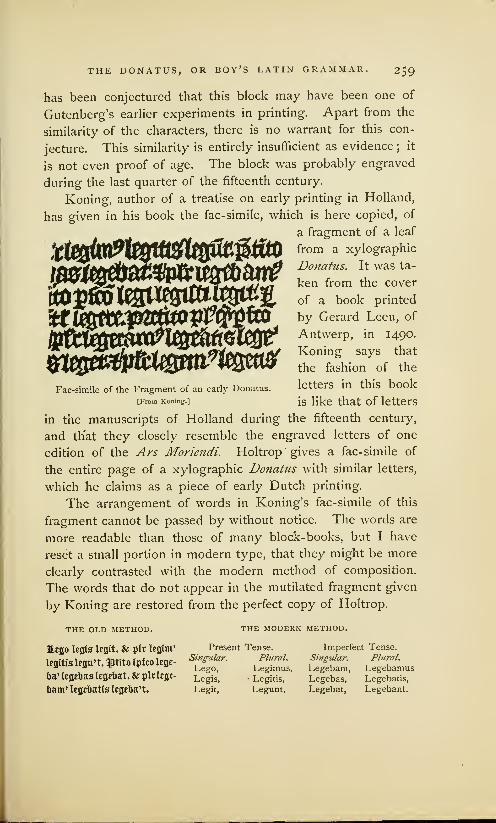
THE DONATUS, OR BOY'S LATIN GRAMMAR. 259
has been conjectured that this block may have been one of
Gutenberg's earlier experiments in printing. Apart from the
similarity of the characters, there is no warrant for this con-
jecture. This similarity is entirely insufficient as evidence ; it
is not even proof of age. The block was probably engraved
during the last quarter of the fifteenth century.
Koning, author of a treatise on early printing in Holland,
has given in his book the fac-simile, which is here copied, of
a fragment of a leaf
fi&tftofrom a xylographic
Donatus. It was ta-
ken from the cover
of a book printed
by Gerard Leeu, of
Antwerp, in 1490.
Koning says that
the fashion of the
letters in this book
is like that of letters
in the manuscripts of Holland during the fifteenth century,
and that they closely resemble the engraved letters of one
edition of the Ars Moriendi. Holtrop gives a fac-simile of
the entire page of a xylographic Donatus with similar letters,
which he claims as a piece of early Dutch printing.
The arrangement of words in Koning's fac-simile of this
fragment cannot be passed by without notice. The words are
more readable than those of many block-books, but I have
reset a small portion in modern type, that they might be more
clearly contrasted with the modern method of composition.
The words that do not appear in the mutilated fragment given
by Koning are restored from the perfect copy of Holtrop.
$^Jf#&(pitW^Fac-simile of the Fragment of an early Donatus.
[From Koning.]
THE OLD METHOD.
Hego legta legit. & jilr legim'
legitts legu't, $tito ipfco lege-
ba' legebas legehat.& jplvlegi-
bam' legebatis legeba't.
THE MODERN METHOD.
Present Tense.Singular. Plural.
Lego, Legimus,Legis, • Legitis,
Legit, Legunt.
Imperfect Tense.
Singular. Plural.
Legebam, LegebamusLegebas, Legebatis,
Legebat, Legebant.

26o THE DONATUS, OR BOY'S LATIN GRAMMAR,
mm.
mm®wpwv3®&§kwKnaiimMfattmtfsama
)tmpw&®mwm.
This fac-simile gives an imperfect notion of the abbrevi-
ations, the blackness and obscurity of a page of the Donatus,
but it is a fair specimen of the forbidding appearance of all the
printed work of the fifteenth century. The illustration of the
modern method of arranging the same letters shows the supe-
rior perspicuity of modern types and of modern typographic
method. Not every reader of this age has a just idea of the
extent of his obligation
to what may be called
the minor improvements
of typography. It may
be safely said that many
men owe much of their
scholastic knowledge to
the systematic arrange-
ment and the inviting
appearance of modern
types and books. The
school-boy who glances
over this fac-simile will
quickly see the depth of
the quagmire from which
he has been delivered by
the invention of types.
To support his the-
ory that this fragment
of the DonatJis is but aFac-simile ot an early Dutch Horanum.
part of one of the many [From Boning.]
copies of the book which were printed in Holland before the
invention of typography, Koning submits the fac-simile of a
page from an old Hovarium, or manual of devotion, which was
copied by him from the original block. He says that this
block once belonged to Adrien Rooman, a Haarlem printer
of the seventeenth century, who had received it from one of
the descendants of Coster. That Coster engraved or printed
this block is highly improbable, but it is, without doubt, a
i
'Minmmm

THE DONATUS, OR BOY'S LATIN GRAMMAR. 26l
very old piece of engraving. It can be fairly attributed to the
fifteenth century, but no good evidence has been adduced to
show that it was made before the invention of types. The
block is practically worn out: the letters have been so flat-
tened by impression that many of them are illegible.
It must here be noticed that the letters of this Horarium
do not interlock, as they do in many of the block-books. Aruled line drawn between the printed lines will show only a
few and unimportant interferences of letters. This evenness
in lining, which is properly regarded as one of the peculiarities
of typography, seems out of place in an early block- book.
But it is not confined to the Horarium. There are copies of
the xylographic Donatus that closely resemble typographic
editions of the same period. They agree, line with line, page
with page, and almost letter for letter, with the typographic
model. That these xylographic copies were made from the
engraved transfers of some typographic model is proved not
only by the uniformity and parallelism of the letters, but by
the square outline to the right of every page. These pecu-
liarities are never produced in the workmanship of men who
draw letters on a block.
It is not strange that the block-book printers should have
imitated the work and the mannerisms of the typographers.
It was easier to transfer the letters than to draw them ; easier
to cut the letters for a book of twenty or thirty pages than to
cut the punches, make the moulds, and cast and compose the
types. The blocks having been engraved, the block-printer
had the superior advantage. His blocks, like modern stereo-
type plates, were always ready for use. He could print a
large or small edition at pleasure. And what was of much
more importance, he could print more legibly from his smooth
plates of wood than the amateur typographer could from his
uneven surface of lead.
The significance of the fact that letters were engraved by
block-printers after typographic models will be more plainly
seen when we examine the editions of the Speculum Salutis,

262 THE DONATUS, OR BOY'S LATIN GRAMMAR.
a book which has been claimed by Dutch historians as the
first production of the newly invented art of typography.
The irregular manner in which all the early xylographers
drew and engraved letters on the block is fairly shown in this
fac-simile of the imprint of Conrad Dinckmut, of Ulm, who
affixed it to a Donatus printed by him in 1480. It will be
seen that parallel lines ruled between the printed lines would
interfere with almost every ascending or descending letter.
Reduced Fac-simile of the Imprint of Conrad Dinckmut.
[From De la Borde.]
The Donatus clearly shows the retrogressive tendencies of
the teachers of that age. It was originally written for scholars
who spoke in Latin, and who, when the book was first placed
in their hands, knew the meaning of almost every word. In
the fifteenth century Latin was a dead language, but the book
that had been written a thousand years before received no
modification adapting it to the capacities of the German or
Dutch boys, to whom Latin was as strange as Chinese. 1 The
'Van der Linde says that the Do-
natus and Abecedarian, a religious
primer hereafter to be noticed, are
used in all the religious schools of
Italy to this day.
I look with melancholy respect at
an Abecedarian, a little octavo of four
leaves, 11 Sillabario, printed in our time
in 1862, at Asti. Beneath the heading,
Jesus Maria, the Alphabet follows, andafter that the Pater noster, Ave, andCredo. Beside the Sillabario, I have a
little grammar entitled Donate ad itso
delle scuole secondarie. Nnova editions
accreseiuia e riformata. Pinerolo, &c,
1865. . . . The esteem in which these
Catholic school-books, those foul springs
from which, for instance, Erasmus drew
the first elements of Latin, were held, was
so great that the first efforts of the hu-
manists to improve them were regarded
as heresy, and heaven and earth were
moved against such dangerous destroy-
ers. . . . Donatuses were printed in
every place where schools were estab-
lished, and where the art of printing was
introduced. The Haarlem Legend, p. 3.
THE DONATUS, OR BOY'S LATIN GRAMMAR. 26.3
rules and the explanations, as well as the text, were in Latin.
The boy who began to study the book was compelled to trans-
late the words and rules before he knew the simplest elements
of the language. The difficulty of the task will be understood
if we imagine an American boy beginning the study of Ger-
man, not with a German grammar in which the explanations
are in English, but with the grammar that is now used in the
schools of Germany. We find no trace of any other school-
book in the form of a block-book. There was no other book
of equal popularity. To the scholar of the middle ages there
was no science that could be compared with Latin ; there was
no knowledge like that of the words of the dead language.
Words were held of more value than facts. The teachers of
the fifteenth century clung to this obsolete book, and com-
pelled their pupils to go through the same barren course of
study that had been used in the fifth century. In this fixed
purpose we see something more than the force of habit : there
was a general unwillingness to make the acquisition of knowl-
edge in any way attractive.
The limitations of xylography are plainly set forth in this
review of the more famous block-books. During the first half
of the fifteenth century, labor was cheap, skill in engraving
was not rare, paper was in abundant supply, the art of block-
printing was known all over civilized Europe, and there was a
growing demand for printed work, but this rude art of block-
printing was limited to the production of pictures. It was
never applied to the production of books of size or merit.
The Wonders of Rome, with its text of one hundred and sixty-
eight pages, is its most ambitious attempt; but large as this
work may seem when it is put in contrast with other block-
books, it is really insignificant when compared with the works
of the first typographers.

XIV
>{ja JSpedtam JMWfe, or Hp ^irror of jlafoaltosu
Its Popularity as a Manuscript Book. . .Made for Mendicant Friars. . .Description of the Text. . .Fac-
similes of Wood-cuts on First and Last Pages... Its Curious Theology. . .Four Editions of the
Book... Their Peculiarities. . .Twenty Engraved Pages in one Edition. . .Strange Blemishes.
Opinions of Bibliographers concerning the Date and Printer. . .Text of the Book Printed from
Types. . .Fac-simile of the Types. . .Different Bodies of Types in Different Editions. . Engraved
Pages were Transferred from Types... Book Printed in Four Kinds of Ink... By Two Methods
of Impression. ..Types and Cuts could not be Printed together. . .Opinions about the Quality of
the Presswork ... Strange Faults of Presswork. . .All Editions were Printed in Holland ... Wood-cuts used for the last time by Vcldener in 1483. . .Not Probable that Veldener Printed the Earlier
Editions. . .Veldener did not use the Types. . .The Speculum is the Work of an Unknown Printer.
HBbcrrjtking atoout tkc toook is uncertain. £t man toe tfjat tfje toook teas printed
from cngrabcir blocks. ®kerc arc persons toko sari that it teas cngrabel); tkerc is
a librarian toko sans tfjat it boas torittcn ton rjantj I sutomitttt) the toook to
a tppc-tounfotr, to an engraber, an& to a printer, toko DecibctJ that tijc toook toas
printed toitlj mobatolc metal inpes that kai) tocen cast in a moulij. Andri ChtmBUr.
THE Speculum Sahttis^ was popular as a manuscript for at
least two centuries before the invention of typography.
I Icineken describes a copy in the imperial library of Vienna,
which he attributes to the twelfth century. He says, such was
the popularity of the work with the Benedictines that almost
every monastery possessed a copy of it. Of the four manu-
script copies owned by the British Museum, one is supposed
to have been written in the thirteenth century, another copy
is in the Flemish writing of the fifteenth century. The printed
1 Sometimes described under the title of Speculum Humamc Salvationist

THE SPECULUM SALUTIS. 265
book contains forty-five chapters of barbarous Latin rhymes,
the literary merit of which is clearly enough set before us
in Chatto's faithful translation of four lines of the preface:
prtbittum profjtmi'um fjuius Iiirt lit tontmiis .compliant
35 1 propttr pauptrts prtiritatorts fiot appontrt turant
dEtut st fortt nquttrunt totum lihxi siii tomparart
$Q&eunt ti ipso profjtmto si stiuttt fn'storias prt&itatt.
This preface of contents, stating what this book's about,
For the sake of all poor preachers I have fairly written out.
If the purchase of the book entire should be above their reach,
This preface yet may serve them, if they know but how to preach.
'
In many features, the Speculum resembles the Bible of
the Poor. As the designs are in the same style, and as the
engravings show the same mannerisms, it has been supposed
that both books were made by the same printer; but this
conjecture is opposed by many facts and probabilities.
The illustration at the beginning of this chapter is a fac-
simile of the upper part of the first pictorial page. In the
compartment to the right may be seen the Fall of Lucifer.
The rebellious angels having been transformed into devils, and
by swords and spears thrust over the battlements of Heaven,
are falling into the jaws of Hell, which is here represented,
in the conventional style of medieval designers, as the mouthof a hideous monster filled with forks of flame. In the next
compartment is the Creation of Eve in the garden of Eden.
Here we see that the designer has modified the biblical narra-
tive to suit his own notions : Eve is not formed from the rib
of Adam, but is emerging from his side. At the bottom of
this picture is this legend in abbreviated Latin, God created
man after his own image and likeness.
1 Jackson and Chatto, Treatise on Wood sources, they felt the want of homiletic
Engraving, p. 83. and catechetical assistance as an aid to
The book was written for the instruc- their understanding and memory. Pic-
tion of the traveling mendicant friars who ture books, with a brief explanatory text,
had, since the thirteenth century, gradu- were the best means of supplying this
ally monopolized preaching and the pas- want. Hence originated representations
toral work of the settled clergy. Pro- of the mystic relation between the Oldvided with nothing but a little Church and the New Testament, of which the
Latin, and therefore too ignorant to Biblia Pauperum is the first fruit. Vanderive their discourses from original der Linde, Haarlem Legend, p. 3.

Mb

THE SPECULUM SALUTIS. 267
An illustration on the last page of the book represents the
Parable of the Ten Virgins, to which is added the legend,
The Kingdom of Heaven is likened unto Ten Virgins. The
five foolish virgins are sadly descending into the mouth of the
monster that represents Hell. Another illustration represents
the prophet Daniel interpreting the writing on the wall.
Hessels' free translation of a large portion of the preface is
really needed to show the theological teachings of the book.
This is the preface of the Spieghel
onser behoudenisse, which will teach manypeople righteousness, and to shine as
the stars in eternal eternities. It is for
this reason that I have thought ofxom-
piling, as an instruction for many, this
book, from which those who read it will
give and receive instruction. I pre-
sume that nothing is in this life more
useful to a man than to acknowledge
his Creator, his condition, his own being.
Scholars may learn this from the Script-
ures, and the layman shall be taught
by the books of the laymen, that is by
the pictures. Wherefore I have thought
fit, with the help of God, to compile
this book for laymen to the glory of
God, and as an instruction for the un-
learned, in order that it may be a lesson
both to clerks and to laymen. It will be
sufficient to explain the matter briefly.
I mean first to show the fall of Lucifer
and the angels. Then the fall of our first
parents and their posterity. Thereupon,
how God delivered us by his assuming
flesh, and with what figures he whilom
prefigured this assuming. It is to be
observed that many histories are given
in this work, which could not be ex-
plained from word to word, for a teacher
does not want to explain more of the
histories than he thinks necessary for
their meaning. And in order that this
may be seen better and clearer, I give
this parable There was an abbey,
in which stood a large oak, which, on
account of the narrowness and small-
ness of the town, they were compelled
to cut down. When it was cut down,
the workmen came together, and each
of them chose whatever he thought
would suit his trade. The smith cut off
the undermost block, which he thought
suitable for a forge; the shoemaker took
the bark for making leather ; the swine-
herd, the acorns for feeding pigs ; the
carpenter, the straight wood for a roof;
the shipwright, the crooked wood; the
miller digs the roots up, as they are fit,
on account of their solidity, for the mill
;
the baker uses the thin twigs for his
oven ; the sexton of the church, the
leaves for decorating the church at fes-
tivals ; the butler, the branches for bar-
rels and mugs ; the cook, the chips for
the kitchen Just now, as here
every one chose his liking from the
hewn tree, so they do with Holy Writ.
The same method has been followed
regarding the histories which will be
explained. Every teacher collects from
them what he thinks proper and useful.
I shall follow the same way with regard
to this work, leaving out altogether
some part of the histories, that it maynot offend those who will hear and read
it. Let us also observe that Holy Writ
is like soft wax, which assumes the shape
of all forms impressed upon it. Does,
for instance, the stamp contain a lion ?
the soft wax will contain the same ; and
if it bears an ear, the soft wax will bear
the same figure. So one thing signifies,
sometimes the Devil, and sometimes
Christ. However, we ought not to be
astonished at this manner of the Script-
ures, for divers significations may be
ascribed to the divers performances of
a thing or a person. When David, the
king, committed both adultery and man-


THE SPECULUM SALUTIS. 269
slaughter, he represented not Christ but
the Devil. And when he loved his ene-
mies, and did them good, he bore
within him the figure of Christ and not
of the Devil This is why I have
noticed these remarkable things here,
for I thought it useful to those whostudy the Holy Scriptures, that they
should not judge me, if they happened
to find such things in this book, for the
manner of translation and exposition is
so. O good Jesus, give me works and
a Christian devotion which may please
thee. * * " *
Equally curious is the explanation of
the marriage of the mother of God with
Joseph. It appears from this, that it
was not thought superfluous to justify a
fact somewhat strange in regard to the
doctrine of the supernatural incarnation
of the second person of the Godhead.
The author of the Speculum assigns eight
reasons for this marriage. The first
was, that Mary should not be suspected
of unchastity ; the second, that she might
want the help of a man during her travels
as well as elsewhere ; the third, that the
Devil might not become aware of the
incarnation of Christ; the fourth, that
Mary could have a witness of her purity;
the fifth, that God wished that his mother
should be married ; the sixth, to prove
the sanctity of marriage; the seventh, to
prove that marriage is no impediment to
blessing ; the last, that married people
should not despair of their salvation.
Catholicism had already brought the
world to the possibility of that despair.
Van der Linde, Haarlem Legend of the
Invention of Printing, p. 4.
The Speculum was printed at different times and places
during the fifteenth century, 1 but the copies of greatest value
are those which belong to four correlated editions—two in
Latin, and two in Dutch— all without date, name, or place of
printer. In these four editions the illustrations are obviously
impressions from the same blocks ; but each edition exhibits
some new peculiarity in the shape or disposition of the letters.
Those who favor the theory of an invention of typography
in Holland maintain that these letters are the impressions of
the first movable types, and that the curious workmanship
of the book marks the development of printing at the great
turning-point in its progress when it was passing from xylog-
raphy to typography. As important conclusions have been
drawn from the peculiarities of each edition, it is necessary
that they should be described with precision. The order in
which the four editions were actually printed is not certainly
known. Six eminent bibliographers have arranged them in
as many different orders. The order assigned to them here
'There is an edition, with a text some without dates, and others with
in Latin and in German, which was dates of 1476, 1492, and 1500; a
printed at Augsburg in 147 r ; there Flemish edition by Veldenerin 1483;
are many editions in German only, and various editions in French.

2yo THE SPECULUM SALUTIS.
is purely conjectural, but it is based on the supposition that
that should be the first edition in which the wood-cuts show
the sharpest lines, and that the last in which the types and
wood-cuts show the strongest marks of wear.
^ The First Edition is in Latin. Each copy of the book is
made up of sixty-three leaves of small folio printed upon one
side of the paper, but with printed pages facing each other,
after the style of the block-books. The space occupied by the
printed page is about 7^ inches wide, and 10^ inches high.
The preface, in rhyme, is composed in broad measure, and
occupies five pages. The fifty-eight pages of text that follow
are also in rhyme; but they are made up with two columns to
the page. At the top of each page is an engraving on wood,
containing, on one block, two distinct designs, separated from
each other by the pillar of an architectural frame-work. At
the bottom of each design, and engraved upon the same block,
is a line in Latin, which explains the design, and which serves
as the text for the verses underneath. The letters of the pref-
ace and the text are impressions from Pointed Gothic types of
the Flemish style. Every line of verse begins with a capital
letter. The only mark of punctuation is the period, but it is
rarely used. The book is without title, paging-figures, signa-
tures, or catch-words. The wood-cuts are in brown, and the
types in black ink. The brown ink is a water color which can
be partially effaced by rubbing with a moist sponge; the black
ink is an oil color, for it has stained the paper with the pale
greenish tinge of badly prepared oil. As the back of every
printed wood-cut is smooth and shining, while the back of every
type-printed page is rough and deeply indented, it is obvious
that the types of the text were not only printed with a dif-
ferent ink, but by a separate impression, and, perhaps, by a
process different from that employed in printing the pictures.
^The two pages that appear on the same sheet were printed
together, as may be inferred from their irregularities ;if one
page is out of register, or out of square, its mated page is out
of register to the same degree. The engravings were printed

THE SPECULUM SALUTIS, 271
before the types, as is clearly proved by the discovery that on
some pages the types slightly overlap the cuts.1
The Second Edition is in Latin, and is like the first, with
this odd exception : twenty pages of the text are printed from
engraved blocks of wood. These xylographic pages are dis-
tributed in irregular order, as if by accident, as will be shown
by the italic figures, which represent these pages, in the fol-
lowing table. It should be noticed that the xylographic pages,
First

272 THE SPECULUM SALUTIS.
tions in the composition and spelling of words, which prove
that they must have been recomposed for this edition.
The Third Editioji is in Dutch prose. The types are like
those of the previous editions, with the exception of pages 49and 60, which are printed in types of a smaller body. Theface of the smaller types has all the peculiarities of the types
of the earlier editions, and is apparently the work of the same
letter- cutter. In the few known copies of this edition there
are differences in typographic arrangement which show that
types were altered between the first and the last impression.
The Fourth Edition is also in Dutch prose. All knowncopies of this edition are so badly printed that they have the
appearance of spoiled or discarded sheets. Many authors have
supposed that this must have been the first edition, and, per-
haps, the first experiment with types ; but a closer examina-
tion proves that the bad printing is owing, not so much to
ignorance and to inexperience as to worn types and careless
presswork— that this edition is really the last. The copy that
is preserved by the city of Haarlem shows, in the handwrit-
ing of the sixteenth century, this inscription in Dutch: "TheSpeculum Salutis, the earliest production of Lourens Coster,
the inventor of typography, who printed at Haarlem about the
year 1440." Between the second and the third leaf has been
inserted a portrait of Lourens Coster, "engraved by Vander-
velde after Van Campen," with the words, in Latin, " Lourens
Coster, of Haarlem, first inventor of the typographic art about
the year 1440." Underneath this inscription is a Latin verse
by Scriverius, in which he extols Coster as indisputably the
inventor of typography. As the writing, the portrait, and the
inscription were added a long time after the book had been
printed, these additions cannot, consequently, be accepted as
evidences of any real value.
Junius, the historian of Holland, writing in 156S, was the
first to call attention to the Speculum. He noticed but one
edition : it is not probable that he knew of the others. Hesaid it was made by Coster from types of wood, in Haarlem,
THE SPECULUM SALUTIS. 273
before the year 1440. Scriverius, a Dutch author, writing in
1628, said that it was printed by Coster from founded or cast
types in or about 1428. Heineken, a German bibliographer,
intimates that the blocks of the Speculum were engraved, and
that the two Latin editions were printed in Germany after the
invention of typography ; but he concedes, rather grudgingly,
that the Dutch editions were printed in Holland. Santander
says that the book was printed in the Netherlands, but not
before the year 1480.
The disagreements of bibliographers concerning this book
have not been restricted to controversies about its date and
printer. Some have said that there were no types in any of
the editions, and that the letters, like the pictures, were cut on
solid blocks of wood. This error is almost pardonable. The
superficial observer of our own time will say that the char-
acters of this book are not types, but badly engraved letters.
They seem to lac^ the most distinguishing feature of types.
The letters are not at all alike, as may be seen in the accom-
panying fac-simile. The variations in the shapes of the letters
are so frequent that a modern printer would at once decide
that the dissimilar letters could not have been cast in the same
matrix. This is a curious defect, but it can be shown that the
letters are types, and founded types. "The existence of a
positive fact," says Chatto, "can never be affected by any
arguments which are grounded on the difficulty of accounting
for it." It is plain, however, that the types of the book were
carelessly made by an inexpert type-maker, and perhaps by
a clumsy method now out of use. Instead of making all the
types of one character from one punch or original, the printer
of this book made them from two, four, or six punches or
originals. At this point it is not necessary to consider whyso many punches were made. It is enough to say that there
is real uniformity in the midst of all this diversity—that each
letter is a duplicate, more or less faithful according to the wear
it has received, of its own original. Careful tracings on trans-
parent paper have been repeatedly made of a selected letter

274 THE SPECULUM SALUTIS.
for the purpose of testing its agreement or disagreement with
letters of the same kind on other pages, and the comparison
establishes the fact that the letters are founded types. 1
The errors of the Speculum are those of types. They
show the inversion of letters in positions which preclude the
possibility that they could have been formed upon engraved
blocks. The occasional occurrence of a c for an e, of an n
for a u, of an f for an/", and the " turning upside down " of
other letters, are examples of errors which can be made only
by compositors.
The unequal perspicuity of the letters in the Speculum is
that of unequally worn types. Of two adjoining letters, one
will be distinct, black, and deeply indented in the paper ; the
other will be of dull color, and of indistinct outlines. The
distinct letter is a new and high type, which has received the
full force of impression ; the indistinct letter is an old and worn
type which has been touched but feebly by impression. If all
the letters had been engraved on one plate, they would have
been of equal height, and should have been equally legible, or
nearly so, under impression.
The four editions of the Speculum are, of themselves, pre-
sumptive evidence that each edition was printed from types.
It is improbable that the printer would re-engrave blocks for a
second edition when those of the first were in existence. If
the first edition had been printed from types, and the types
had been distributed, as is customary, the printer was obliged
to reset them in order to make the second edition.
These four editions were certainly the work of the same
printing office, and, without doubt, of the same printer, for
'Ottley, selecting one letter for peculiar blemishes of this letter re-
examination from a great number appeared in other letters on manyof letters of the same kind, found pages. This precision of form is the
that it was always the same where- peculiarity of typography : it proves
ever it occurred, not only in the first, that the letters of unvarying unifor-
but in the second edition. Koning mity could not have been made byandEnschede, pursuing a badly cast any engraver on wood, but mustor defective letter, found that the have been produced by a mould.

THE SPECULUM SALUTIS. 275
the engravings are the same, and the types, ink, paper, and
workmanship have similar defects and peculiarities. The first
edition shows pages of types only; the next edition has types
and blocks, but the types are like those of the first; then
comes a third edition in the same types, but with two pages
of types differing somewhat as to body and face; lastly an
edition entirely in the old types, in a worn condition. Each
edition has more or less connection with the others. 1
The body or dimension of the types used in the
Speculum approximates the size known to all British
and American printers as English ; but it is rather
larger than any of the modern standards. It is really
intermediate between the body English and the little-
used body of Two-line brevier or Columbian.2
The appearance of twenty engraved pages in the second
edition of the Speculum cannot be explained with satisfaction.
Bernard thinks that these pages are the relics of an earlier
edition engraved, or at least attempted, on wood, which, for
some unknown reason, were temporarily substituted for types.
English.
Two-lineBrevier.
1 The Latin and Dutch editions of the
Speculum maintain such a remarkable
conformity with each other in the en-
gravings, in the types, in the quality of
the paper, in the presswork, and in
every typographic feature, that it is evi-
dent that the four editions were pub-
lished in the same country and by the
same printer. As all bibliographers,
whatever theory they may have con-
cerning the origin of printing, attribute,
without hesitation, the Dutch edition of
the Speculum to Holland, the Latin edi-
tions should also be attributed to Hol-
land. Guichard, Notice sur le Speculum,
pp. 118 and 119. This is the opinion of
all bibliographers except Heineken.
2 The fac-simile given by Holtrop in
his Monuments typographiques pre-
sents the following measurements,
in American inches : In the Latin
edition, described in this book as the
first, 25 lines measure 5^ inches.
In the Dutch edition, here described
as the third, 27 lines measure 5^inches. In the Dutch edition, here
described as the fourth, 26 lines
measure $% inches. As we find no
indication of the use of leads or thin
blanks to increase the distance be-
tween lines, it would seem that the
types of the three editions were cast
in different moulds. Sotheby's fac-
similes, which seem to have been
made with equal care, do not exactly
agree with those taken from Hol-
trop's book. There are, no doubt,
differences of size, not only in the
fac-similes, but in the original copies
of the book. Allowance must be also
made for the unequal shrinkage on
different leaves of the very thick
paper, which may have been un-
equally dampened, and unequally
extended before printing.
276 THE SPECULUM SALUTIS.
No trace of this imaginary edition has been discovered. It has
been claimed that the engraver of these xylographic blocks
was the probable inventor of typography. It is supposed that
he matured the ideas he had cherished about movable types
when he was engraving and printing the first edition of the
book ; that when he became fully convinced of their feasibility,
he stopped the engraving of the blocks, and finished the work
with types which were made for the purpose. This hypothesis
is not reasonable. If the printer of the book suddenly aban-
doned blocks for types, the change would be abruptly marked
in his work. The twenty pages at the beginning of the book
would be xylographic, and all following would be typographic.
But it will be perceived that the twenty pages are scattered,
without any order, throughout the book. Instead of being the
relics of an earlier edition, it is demonstrable that these xylo-
graphic blocks were cut from transfers obtained from a typo-
graphic edition. A traced drawing upon transparent paper,
taken with accuracy from the first edition of the Speculum, and
carefully laid over a corresponding xylographic page in the
second edition, will show an agreement in the length of lines,
in the abbreviation of words, and in the copying of little errors
or blemishes, which could have been produced only by means
of transferred drawing. 1 With this fact before us, the suppo-
sition of the priority of an engraved edition of the book is
untenable. Dutch authors say that these xylographic blocks
corroborate a Hollandish legend, in which it is stated that the
materials of the printer of the Speculum were stolen. They
suppose that the first typographer was obliged to engrave
'When a new engraving on wood, of the ink is thereby liberated, so
in imitation of an old one, is desired, that it can be completely removed by
the modern engraver does not re- firm pressure. The print so treated
draw, but transfers the subject, sub- is then laid, face downward, on the
stantially by the following process : block, and the free black is transfer-
The back of the print to be copied red to the block by the pressure of a
is moistened with a solution of alkali, burnisher, or of a press. The black
or ofbenzine, which, soaking through re-appears on the block, but in a
the paper, forms a new combination properly reversed position, ready for
with the oil in the ink. The black the tool of the engraver.

THE SPECULUM SALUTIS. 277
«sft>0tf»o? mtVtz dim Sfoatftiwftuft*
€« asa mismg&godo »ta fo?8$m iteiflft
#S &*igM i 9OK »t@tattatMfctfr#
^«M mvmt f§0 i s&rattotte tft fltefi*
©Utm I aprtttf 0fWbi8 tt^pgtttsima'pmf nSttS t#0*l£ & fa^itr fiufi %«*?«€ti»pW CM t» pfWa tpgfe igftsei fptoiU
3« fjjnagS g§ot stowage tsbto rpol&uiS
<£R jfnt wawta$te* I-Oft q&tW eJSBttmtiS
»seta£ ntf ate£tjft« plwttt t&ifl 1 wwgtflS
©U tfltffW| tttfetolfitilf tNAigbflf«m ilK
SjafcgtfliftiUittMfe «imm afega^ s miopias
<H|f8t008Mlfltyr**ttot#att$W*eatf&egilte#isiWttfiM apetwfm tfll awttttifl
36|s( ffettusoga ti$w# <wwm* &pbaiop
91 qttaftmm* ia fStapaGagfldetwattJ
$8mimmmS$M * »»£Wwl
Fac-simile of part of a Page of the Speculum Salutis.

278 THE SPECULUM SALUTIS.
these twenty blocks to complete his imperfect edition. This
hypothesis does not accord with other facts : the appearance
of three successive editions of the book, each with a text of
types, proves that the practice of typography was continued.
The provision of black ink for the types and brown ink
for the cuts seems unnecessary, but Van der Linde's explana-
tion of this peculiarity is plausible. He says that the oily
black ink used on the types may have been rejected for the
cuts because its greasy surface interfered with the brush of
the colorist. It does not appear that the inquiry has ever
been made, whether the brown ink of block-books was always
brown. It is probable that this brown ink was once black.
The variability of the color, so frequently remarked in all
block-books, is the certain indication of a faded black writing
ink. It was the fluidity of this writing ink that prevented
its use on the types of the Speculum ; the fluid collected in
globules on the metal, spreading under impression, and blot-
ting the paper. Oily ink was required for a surface of metal.
The unequal indentation of the letters indicates that the
types were not of a uniform height. Nor is it probable that
the engravings at the head of every page were always truly
flat and of precisely the same height as the types. They
were pieces of flat boards, which must have warped with
every change from heat to cold, or from dampness to dry-
ness.1 In these irregularities we find the probable reason
for the employment of two distinct methods of impression.
Two impressions were needed as much as two kinds of ink.
'The neglect of engraving on some printers engraved large illus-
wood by the early typographers has trations on separate pieces of wood,
frequently been noticed as a strange which were roughly fitted to each
fact. It was, no doubt, induced by other, but not conjoined. Other
the difficulties encountered in trying printers printed the wood-cuts of
to print wood-cuts with types. The their books by a separate impres-
blocks would warp and crack in spite sion. As these illustrations were
of all precautions. The evil was but printed in the same black ink which
partially checked by diminishing the was used for the text, the double im-
size of the blocks. To evade the an- pression is rarely ever noticed, not
noyance produced by warped blocks, even by the practical printer.
THE SPECULUM SALUTIS. 279
The types required strong, and the wood-cuts weak impres-
sion. If the impression had been graduated to suit the wood-
cuts, the print of the types would not have been visible ; if
enough impression had been given to face the types, the
wood- cuts, if in the same form, would have been crushed.
The quality of the presswork of the Speculum has been
strangely misrepresented. Sotheby, who tries to establish the
priority of Dutch printing, says that the ink in one edition
is brilliant ; that its types have great beauty and sharpness
;
that its presswork is equal in clearness to that of Gutenberg's
Bible. In this high praise no other author joins : most critics
say it is but a shabby piece of presswork. The Dutch authors,
who wish to show the imperfections of typography in its
infancy, call especial attention to the illegibility of the fourth
edition in Dutch, which they claim as the first, and for that
reason they rate it as an unusually clumsy piece of printing.
Van der Linde says that the presswork of the Speculum does
not differ materially from that of many books printed in the
Netherlands during the last quarter of the fifteenth century. 1
The wood-cuts were printed by the unknown process then
made use of by all block-printers; the types were printed on
a press which was fitted with at least one of the appliances
of a well-made printing press ; but the two editions in Latin,
which are in verse, with lines of irregular length, show typo-
graphical blemishes of an extraordinary nature. In the blank
spaces at the ends of the short lines are found impressions of
letters never intended to be seen or read—of letters that do
'The Dutch folio of Jan de Mande- in Augsburg in 1557, and says: "If the
ville, placed by Holtrop about 1 470, as a name of the engraver on wood and the
work of printing, is so bad that the ear- date had not been found, one might
liest editions of the Speculum are master- think that this was the oldest book in
pieces by the side of it. The work of an the world." In the series of the differ-
unknown Schiedam printer of the latter ent Dutch incunabula of this kind, the
part of the fifteenth century is equally Speculum presents itself very favorably
;
bad. The Brussels incunabula of the it is not badly, but well printed; it is
Brotherhood of the Life-in-Common are not a first experiment, but the fruit of
bad; those of Arnold ter Hoorne at Co- practice. Dr. Van der Linde, Haarlem
logne (1471-83) are sometimes barbar- Legend of the Invention of Printing,
ous. Heineken mentions a book printed p. 37.
23o THE SPECULUM SALUTIS.
not belong to the text— of letters not printed with ink, but
embossed or jammed in the paper. On some pages entire
words are found. These words and letters, which are always
found within the square of the printed page, and in line with
the types printed in black, are, undeniably, embossings of
types from the same font. The printer who critically examines
these embossed letters will be convinced that the types making
them were used as bearers at the ends of the short lines, to
shield adjacent types from hard impression: he will also know
that they were printed on a press provided with a frisket.1
The period in which the early editions of the Speculum
were printed will be the subject of the next chapter, but it
may here be told when the wood-cuts were destroyed. In the
year 1483, one John Veldener, then a printer at Culenburg,
printed two editions of the Speculum, in the Dutch language,
and in small quarto form. One edition contained 116 and
another 128 illustrations, printed from the wood-cuts that had
been previously used in the four notable editions. To make
these broad wood-cuts, which had been designed for pages in
folio, serve for pages in quarto, Veldener cut away the archi-
tectural frame-work surrounding each illustration, and then
sawed each block in two pieces. Mutilated in this fashion, it
was impossible afterward for any printer to use these blocks
in the production of an edition in folio like any of those that
have been previously described. Veldener's editions were not
made by the method used by the printer of the earlier edi-
tions : the types and the wood-cuts were printed together,
'The frisket of the modern hand- For this purpose, every part of the
press is a light frame-work of iron, page to be printed is neatly cut out
which is covered like a kite, with a of the paper mask pasted on the fris-
sheet of paper pasted to the edges, ket. Every part of the sheet that
Just before the act of impression, this should remain imprinted is masked
frisket is placed between the form of or covered by the uncut paper of the
inked types and the sheet of paper frisket. When the impression is
prepared to receive the impression, taken, the sheet receives only the
The office of the frisket is to prevent impression from the type, and is un-
the sheet from being blackened by soiled by the ink that accumulates
anything but the face of the types, about the types and their fixtures.

THE SPECULUM SALUTIS. 281
in black ink and upon both sides of the leaf. The blocks
were badly worn before they were mutilated : the finer lines
of the engraving are flattened out, and retain too much ink,
producing an effect of blackness and muddiness not shown in
the impressions of the earlier editions. The fault is certainly
in the cuts, and not in the presswork, for Veldener was an
able printer. The wood-cuts printed by him in other books,
at Louvain and at Utrecht, show neater presswork, although
they are of feeble design and meanly engraved.
Although Veldener made use of the wood-cuts, he did not
use any of the types of the Speculum. His book types are
well known : as they are of different bodies and faces, they
may be regarded as conclusive evidence that Veldener was
not the printer of the early editions. It is probable that he
bought from the printer of the first editions, or from his suc-
cessors, the wood-cuts only. We may suppose that the types
were worn out, and that the punches and matrices were also
worn out or obsolete, for we find no traces of them in the
books of any later printer. We have, therefore, to attribute
all the books in which these types are found to a printer who
preceded Veldener. We do not know the name of this printer,
nor can we fix the date when he began to print, but it is
evident that he was one of the earliest if not the first typo-
graphic printer in the Netherlands.
UNIVKKSITY Ok'

XV
lip H[tdb nnh t^crkimmdjijt rjfmtl(nktcum ^rxnlcr.
The Speculum not the Work of an Experimenter. . .Improbable that this was his only Typographic
Book ... Twelve Books, Eight Faces of Types and Forty-two Editions attributed to him or his
Successors.. .Hessels' Classification of these Types. . .Facsimile of the Types of the Speculum.
Fac-simile of the Fables of Lorenzo Valla . . . Fac-simile of the Peculiarities of Criminal Law.Fac-simile of the Epitaphs of Pope Pius II... The Donatus. . .Fac-simile of the Abecedprium.
The Eight Faces of Types were made by the same Printer... An Indication that he Wore out
Types rapidly. . .That he Sold many Books. . .Trivial Character of the Books. . .His Types not
Made of Wood. . .Illustrations of Types of Wood. . .Their Impracticability Demonstrated. . .Books
not made from Cut Types. . .Cause of the Dissimilar Appearance of the Types. . .Were Founded.
The Press of the Unknown Printer. . .Its Defects . .Indications of the Use of a Frisket.
If ami shall suggest, trjat some of tfje ^Enquiries fjerc insi'steb" upon (as partirularln
tfjose about the letters of the SUpfjabet) &o seem too minute aub" tribial for an»
prubent man to bestofo rjis serious thoughts anb time about, smb. persons magknob ttiat the bisrobern of tbe true nature ant) eause of ann tfje most minute
tiling trott) promote real knotolebgc, anb therefore tannot be unfit for anj jttan's
tnbeabours. Bishop wukuts, 1668.
IFthe printer of the Speculum was the rightful inventor of
typography, his workmanship, as shown in the different
editions of the book, clearly proves that he had passed the
shoals of experiment, and was on the broad sea of successful
practice. We can see, even without the help of the legends
or chronicles, that he cut punches, made moulds and founded
types of different faces and bodies ; that he compounded ink
in a proper manner, and printed his types upon a press con-4structed for the needs of his work ; that he was successful both
as a publisher and a printer. He practised printing not for
amusement, nor in the way of scientific experiment, but as
a business. Rude as his workmanship may appear, it fairly
included all departments of the art: it was not experimental,
but practical typography.

THE WORKS OF AN UNKNOWN PRINTER. 283
With these facts before us, it would seem proper to pass
at once to the examination of the statements that have been
made about the supposed printer of the book. But an exam-
ination at this point would be premature, for we have not, as
yet, all the facts that are required. The four editions of the
Speculum do not furnish enough evidence. It is not reason-
able to suppose that two or three distinct fonts of type were
made for no other purpose than the printing of four editions
of this book. It is probable that the printer printed other
books. But the early chronicles of Dutch printing tell us
very little about these books. They are not only meagre in
their recital of the more important facts connected with the
invention, but are notoriously incorrect in their description of
the minor details. They are unsafe guides. The books them-
selves, which reveal, to some extent, the process by which they
were printed, are now regarded as of higher authority. Wecan accept the chronicles only so far as they corroborate the
internal evidences of the books. It is proper that the books
should be examined first.
The number of these books is greater than has been sup-
posed, even by those who have favored the Dutch version of
the invention of typography. Forty-three editions of twelve
different works, printed from eight faces of types, are now
attributed to the unknown printer of the Speculum or to his
successors. In eleven works, the types resemble those of the
Speculum, but the books are different as to character. They
are in the form of small quarto or octavo, and are entirely
destitute of illustrations. They are without name or place of
printer, and, with one exception, are without date ; they have
no literary and no historical value ; they differ but little, in a
mechanical point of view, from numerous undated works of
similar nature that have been assigned by bibliographers to
the latter part of the fifteenth century. The places where
these books or their fragments were found, and some of their
peculiarities of workmanship, furnish evidences of value in an
inquiry concerning their printer.

284 THE WORKS OF AN UNKNOWN PRINTER.
These books have been carefully classified according to
their types, by J. H. Hessels, the translator in English of Vander Linde's Haarlem Legend, from which work the classifica-
tion following has been copied. The types have been specified
by numbers, and have been arranged according to the order
in which they are described by Holtrop in his Monuments
typographiques. It is not pretended that the order of these
numbers indicates the order in which the types were made;
numbers have been assigned to them only for convenience in
reference and for the purpose of accurate classification.
Type I. In this character1 the four notable editions of
the Speculum were printed. In the same character were found
the relics of six editions of the Donatus. The single leaf by
which one edition of this book was identified, was pasted in
a volume which once belonged to Sion Convent, at Cologne,
and which contained several treatises printed by Ulric Zell, of
Cologne. One of these treatises is dated 1467. Another leaf,
now in the city hall of the city of Haarlem, was found in the
original binding of an account book for the year 1474, which
book was kept in the cathedral of that city. The account
books of this church for the years 1476, 1485 and 15 14, con-
tain cuttings of leaves from the same edition. The first entry
in the record of 1474 is to this effect: "Item. I have paid
six Rhine florins to Cornells the binder, for the binding of
books." 2 Fragments of other little books printed in the types
of the Speculum have been found:
An abridgment of the Liturgy, then known as the Little
Hook of the Mass? a small quarto, with pages of twelve lines.
1 For a fac-simile (from Holtrop) the covers or binding of any manu-of this face of type see page 277. script book of earlier date than 1467.
2A fuller notice of Cornells the 3This work was in use as late as ll>e
binder will be given in the chapter reiSn of Charles v. It was enjoined by
on the Legend of Coster, in whichh
,
,m that a printer should furnish without
1 1 .• , . . ... , alteration "the little book commencinghis relations to early printing will be .., ., . , , , ., ,.„, , . ,. ,
, ., , * r,b
,with the alphabet, the little book which
described. Attention may be calleddirccts how to bkss the table (grace at
to the significance of the fact that no meals), and the little book which directs
fragments of any book in the types how to answer at the holy mass." Vanof the Spec 11turn have been found in der Linde, Haarlem Legend, p. 2.

THE WORKS OF AN UNKNOWN PRINTER. 285
A Dutch version of the Seven Penitential Psalms, in the
form of a very small quarto, containing but eleven lines to the
page, printed on vellum, on one side only of the leaf. The
only known copy of this work was found in Brussels.
Fragments on vellum of three editions of the Doctrinal of
Alexander Gallns, a Latin grammar in rhyme, noticed by Vander Linde as the shabby compilation, by a priest of Brittany
who lived in the thirteenth century, of the old Latin grammar
of Priscianus. One of these fragments was found within the
lining of a book printed at Deventer in 1495.
Four leaves of the Couplets of Cato, a small quarto which
was then very popular in the schools.
TYPE II. The Dutch edition of the Speculum, which is
described in this book as the third, contains, on pages 49 and
60, types which resemble those of other editions, and which
v-: v
tefttacf#&etf(^ %t&&to*m g!j*ija£ <8#fiu$ hrtft din*mm y/
Vfe^M MSthmt &$ minm\)$ %mm was
feo* &gfe fcnUp$i tetuwx \)m totoc $*Type IT. Fac-simile of the Small Types in the Third Edition of the Speculum.
[From Holtrop.]
seem to be the workmanship of the same letter-cutter. As
these types are of a smaller face and body, they must have
been founded in another mould. No fragments of any book
in this smaller type have been found.
Type III. The types of this face are newer, but they
resemble those of Type II ; some capitals are identical, but
others have differences which establish it as a distinct face.
As it is of a larger body, it should have been founded in an
M

286 THE WORKS OF AN UNKNOWN PRINTER.
enlarged mould. A book which contains the Fables of Lorenzo
Valla and the Witty Speeches of Great Men, two little works
of some popularity in the fifteenth century, is the only known
specimen of this type. The paper of this book, which is like
that of the Speculum, contains many of the strange blemishes,
previously described, of useless letters embossed in the white
£aterititt<nflU$ta»tenlii tjattettfis
aft c&pv$ $*ccu$ pec* fctfturn iatwn
fcu ttanfiaiufc inttyintftftUtiut
A
ttiio atnofto ftmsltete falut?
^5ttmu&*£ mtp*e mt tikiwlotto* tjuaa ipe \mtatua effem ntif
(Mta*&es tapttt tJt twmo tttnatiki
fctfottH? tOtfl potfertuafc JttttattmlType III. Fac-simile of the Types of the Fables of Loren.70 Valla.
[From Koning.]
lines and near the margins. As the written preface of the
author is dated May, 1438, it is apparent that the book must
have been printed subsequently to this date.
Type IV. Of this face, the fragments of four copies, and
presumably of four distinct editions, of the Donatus have been
found. This type, which does not closely resemble the faces
previously described, was founded on a body a little larger
than Paragon. The largest book in this type is a treatise on
the Roman Law, apparently an abridgment of the fifth book
of the Pandects of Justinian. It is described in the preface
as The Peculiarities of CriminalLaw, by Lewis of Rome. This
treatise, which consists of forty-four pages, is printed in the
form of small folio, twenty-six lines to the page. It was the
largest book and contains the largest type of the unknown
printer.

THE WORKS OF AN UNKNOWN PRINTER. 28/
TYPE V. The forty-fifth page and all subsequent pages of
the book previously described are devoted to a Treatise and
Epitaphs by Pope Pius u, and a Eulogy on Lorenzo Valla. In
these names we find sure indications of the probable age of
the book : Cardinal Piccolomini
or iEneas Sylvius was made Pope ^TiSSt ^X 'C?*^**Pius II in the year 1458; Lorenzo ^'5<m-1 9 SfValla died in 1457. The book ^^ £C* X£ w^must have been written and print- , S gjfe £J «Ep 2lt"
ed after these dates. The work- ^ J<j% S^ *&> £2. <£manship of this part of the book <j £* _^ ^»* «%£5*is of superior character: the types ^ £* £f *£ V> ctwere fairly founded on a body £ jbj <* ^^ C* **<about the size of Great-primer
;
I <Eft £? ty CJ» ^^they were decently printed in 2, V5- g««^ w* j*'
good black ink and on both sides o *tl$ C* O 2 *-*
of the paper, but the remarkable ^ 0^*S fiT S*defect of embossed letters which 1 " <g *£ £3 rt Sihas been noticed as one of the § ~ ^ C3r ££ 5?* 8.
K ^ rami ^ tjf >*"5 f> '*%
blemishes of the Specuhim is also -™
$gfS 5* w i?"
noticeable in this book. I CL ^WfiV^y ^This Type V seems to have |. W 3" sf »T> £$
been more frequently used than 2 1S>| JjJ J3J «»< 3any other type in the list, but it J £*V I^O
3 ©as «*was always on petty books or
pamphlets. One book printed in S 2£ fy C £? $s^it has only twenty-four pages, but ET 51*,^? *** <"-^ **it is made up of four distinct S*§. Jf* Stracts : William of Saliccto on the 33 55* 3 2 *"*Health of the Body ; Torquemada 55 2 {£"" £* f^B00 ^ £fe»/M 0/ ///£ £<?«/; ^4 S § & j& S4Treatise on Love, etc., by Pope
Pius ii; The Iliad of Homer, or more definitely, a commen-dation of the Iliad. Two editions of this book have been dis-
covered. A fragment of one edition was found in the binding
of a work printed by Jan Andrieszoon, of Haarlem, in the year

2 88 THE WORKS OF AN UNKNOWN PRINTER.
i486. Another book in the same type, which consists of ten
leaves, contains an abridgment or an epitome of the Iliad,
with a preface by Pius II in praise of Homer. Of this book
two editions were printed. Six editions of the Donatus, four
editions of the Doctrinal of Alexander Callus, and one edition
of the Couplets of Cato were also printed in this type.
mttux fttatoitQttt04>fitsi roluifupoauf
Coptf* 018 £o0t$•(wmfe Iigont tnftnu
€g iapns paffi^ntt t&to.tt§nUtMtmmt lat tt« fegroa'paftuatg «tiKa fltlf
(Epfmp&tumjihtttf taUS tttftom*.
I'fttsuu et *futrtone Jetott&ttt mgtntf &n$gjngfitfama0i$«ft.ttraig crta.ntt ttnqtift
gifitiflumc QuOtiiomfelpsPtaJi tOCtoa pu&U*
Type V. Fac-simile of the Types of the Epitaphs of Pope Pius 11.
[From Koning.]
TYPE VI. An edition of the Donatus, twenty-seven lines
to the page, is the only known book in this type, which was
founded on Great-primer body.
Type VII. Four leaves of a Donatus on vellum, taken
from the binding of a book printed in Strasburg in the year
1493, and belonging to a convent in North Brabant, are all
that is known of this type, which closely resembles the char-
acter described as Type V.
Type VIII. 1 Impressions from this face of type have been
found in the fragments of only two books. Two broad bands
of parchment printed upon one side only with the text of a
'Hessels does not describe this Abecedarium, which are printed in
as Type VIII, but as the Type ofthe this face], to a certain extent, from
Enschcde Abecedarium. He thought the others" but he admits that the
it "advisable to separate these two types of these books bear the family
little works [the Donatus and the likeness and cannot be omitted.

THE WORKS OF AN UNKNOWN PRINTER. 289
Donatus, which were discovered in the cover linings of a
manual of devotion, printed at Delft in 1484, are the only
known relics of one of these books. The types are barbarous,
of singularly ungraceful cut, of uneven height and out of line,
evidently founded by a man who had no skill in type-found-
ing. They are printed in pale ink which is readily removed
by the application of water. The presswork is as slovenly as
the type-founding, but the composition was done with somecare and intelligence. The lines of type are nearly even as
to length, and the words, when broken, are properly divided
in syllables. It is evident that the compositor knew how to
space and divide words, but the font of type that he used was
not provided with hyphens or marks of punctuation. Thefashion of the letter is in the Dutch style as may be seen in
the final t with the perpendicular bar.
The other fragment in this type is a little pamphlet of eight
pages, printed on parchment and upon one side only. It is
described by some as a Horarium, or a little book of prayers
;
by others as an Abecedarium, or a child's primer. It contains
the Alphabet (all the small letters but not the capitals), the
Lord's Prayer, the Ave Maria, the Apostles' Creed, and two
prayers. The Alphabet has the k, a letter that was not used
in the Latin language; it has no w, this letter being formed
by the union of the two characters v. Holtrop says that the
types seem to have been made for the Dutch language.
The " turning upside down " of four letters on the second
page of this little work proves that the letters are impressions
from movable types.
Line 2. Paue should be Pane. Line 5. nobis should be nobis.
Line 3. Cotidiaun should be Cotidianu. Line 6. nostra should be nostra.
This little tract was discovered in 175 1 by the celebrated
type-founder Enschede, of Haarlem, in a manuscript breviary
of the fifteenth century, among the books of the descendants
of John Van Zuren, a printer of Haarlem in 1561.
If barbarous type-founding and shabby printing could be
accepted as conclusive evidence of the superior antiquity of

290 THE WORKS OF AN UNKNOWN PRINTER.
4ut# in ci
cicctnt ttoml t*uttt*
ju&wniflfc trcgtttt tit
Mm tfiaft wlnma*First Page.
The Enschede Abecedarium.
[From Holtrop.]
the book in which these faults occur, the Abecedarium should
be the oldest piece of printed matter. One cannot imagine
a printed book with more slovenly workmanship. Its types
present all the irregularities of
the Donatus previously described.
The pages have but nine lines of
types to each page, yet they are
very crooked. This crookedness
was partially produced by an un-
skillful fastening, or locking-up of
the types, but it is plain that the
types were of irregular size as to
body, and that the letters were
badly adjusted upon the bodies.
Some types are high and others
low to paper, and there are types
that are legible at one end of the
face and not at the other. The presswork is wretched : we
see the evidences of too weak and badly distributed ink and
of uneven impression. The text shows many faults of compo-
sition in the division of syllables.
To the observer who is not an
expert in typography, the work-
manship of the book seems that
of a man who had no experience
in any department of printing
:
the faults do not appear to be
those of a badly taught printer,
but those of an experimenter.
For this reason the Abeceda-
rium has been claimed by the
Dutch historians of typography
as the first production of the in-
ventor of the art. They say that
it was printed before any edition of the Speculum, and prob-
ably in the first quarter of the fifteenth century. A closer
iutccra paue noltritm tottinatifi &aHOWS fto&ic fitc V\
ittttt* goto* Wbfca
ftimtttimus Wbitori
bus ttoCcris £ti ueno* tiftw&# item?
SCCODd l'agc.
The Enschede Abecedarium.
IFrom Holtrop.)

THE WORKS OF AN UNKNOWN PRINTER. 291
examination of the book does not lead to this conclusion : the
printer of the book was, no doubt, a careless workman, but he
had been taught the trade. The fragments of the tract are in
four pieces, but they were printed in one form of eight pages,
and by one impression. This artificial arrangement of the
pages, in the arbitrary position which allows them to be folded
together in regular order, reveals an expertness in little tech-
nicalities on the part of this early printer which is somewhat
unexpected. The method of printing sheets imposed in forms
of eight pages was not in fashion before it was adopted byAldus Manutius, of Venice, in his edition of Virgil dated 1501.
It is not an invention of the first, but of the last quarter of
the fifteenth century, to which period this book belongs. 1
The types of the book were not set up by an experimenter
or ignoramus. The comparatively even outline to the right
of every page shows that the compositor tried to space out
his lines and to give every page an appearance of uniform
squareness. As full and even-spaced lines are not to be found
in any edition of the Speculum, nor in any of the first books
of the early printers, we may conclude that the Abecedarium
was printed at a later date, when this improvement had been
adopted by all printers.
It has been maintained that the book must be very old,
because it is printed on one side only, after the fashion of the
block-printers. This is an improper inference, for each frag-
ment has the appearance of a spoiled impression which was
rejected before the sheet had been perfected by printing on
the other side. The unfilled space for the initial letter shows
that the work on the sheet was never completed.
'Berjeau, who accepts this Abe- inconclusive. It was the argumentcedarium as one of the first products of the courtiers with Columbus after
of the invention, says that imposi- he had stood the egg on its end.
tions of eight pages seem more com- Anybody can do it. Simple as the
plex than they really are— that the process may seem, the imposition of
printer had but to fold a sheet, to eight pages of type in one form was
mark the pages and then unfold the not done by any of the early printers,
sheet, to see the method at a glance, and we have to infer that they did not
This reasoning is specious, but it is know how to do it.

292 THE WORKS OF AN UNKNOWN PRINTER.
The eight faces of types show their relation to each other,
not only by common features, but by the occasional appear-
ance of two faces in one book. That they were never used by
any printer of Germany, nor by any known printer of the
Netherlands, is acknowledged even by those who dispute their
age. That they were founded and used in the Netherlands,
and probably in Holland, may rightfully be inferred from the
language of two editions of the same book, from the Dutch
fashion of the letters in all the books, and from the fact that
all existing copies or fragments of works in these types have
been discovered in the Netherlands. That they were the
work of one printer, or of the successors of that printer, is
highly probable. But this admission involves difficulties.
These eight faces of types were founded on as many different
bodies: four of these faces are on bodies nearly the size of
English ; two of them are on bodies about the size of Great-
primer. The modern printer is at a loss to imagine why his
unknown predecessor should have cut so many punches and
made so many fonts of types with faces closely resembling
each other, yet so unlike that they could not be used together.
His perplexity is increased when he discovers, after careful
measurement, that each face on English body and each face on
Great-primer body was cast in a new or different mould. It
would seem that the unknown printer of the Speculum not
only incurred the needless expense of cutting new punches
and making new moulds for every new font of types, but that
he intentionally introduced in his printing office bodies so
nearly alike that they could not, in the shape of single types,
be distinguished apart.
The questions at once arise, Why were so many faces and
bodies of types that could be readily mistaken for each other,
and were so liable to be mixed together, allowed in one office ?
Why were so many punches cut for such trivial differences of
face, and so many moulds made for such slight differences of
body ? These questions can be answered only by conjectures
fairly derived from the remarkable workmanship of the books.

THE WORKS OF AN UNKNOWN PRINTER. 293
The harsh indentation of the types in the paper shows very
clearly that the types were roughly used, and that they wore
out rapidly. We can see, also, that the method of making
types was as imperfect as the method of obtaining impression.
It is possible that the matrices and. moulds wore out as fast as
the types, but they could not have been renewed if they had
not been made by a much quicker and cheaper method than
that of modern type-founders. It is not at all probable that
these different types were in use together. We may suppose
that as soon as a font of types was worn out, it was replaced
by another font, which may have been cast from new matrices
and a new adjustment of mould. A new font made in imita-
tion of the old one, but made without scientific method, and
without regard to exact accuracy, would show the difference
in face and body which seems so strange to the modern printer.
These eight fonts of type seem all the more unnecessary
when we consider the trivial nature of the unknown printer's
works. 1 The Speculum is the only book of respectable size;
the others are so diminutive that they could be classified as
pamphlets. They were cheaply made, adapted, apparently, to
the wants of school-boys, and were probably sold for small
sums. It is evident that the books met with ready sale. Wefind four editions of the Speculum in two faces of type and in
two languages; nineteen editions of the Donatus in six faces
of type ; six editions of the Doctrinal in two faces ; and twelve
editions of other books.
From the character of the books, one might judge that
they had been printed for the use of some school, and at the
suggestion, or under the direction, of the authorities of the
church. The Abecedarium was a primer for small children.
The books most frequently published, the Donatus and the
Doctrinal, were those most needed by very young scholars.
'Caxton, who printed thousands for thirty years, did his work with
of pages in folio, made use of but not more than six fonts of type,
eight fonts. Blades, Life and Typog- Schceffer, who was a printer and
raphy of Caxton, vol. II, p. xxvii. publisher for forty-three years, made
Gutenberg, who practised printing use of but six fonts.
Im

294 THE WORKS OF AN UNKNOWN PRINTER.
The Couplets of Cato, the curt treatise on the Roman Law,and the Praise of the Iliad, are, in size and subject, the books
that would be suitable for a boy's school in the middle ages.
The Treatises of Saliceto and Torquemada, the Witty Sayings
of Great Men and the Eulogy of Pope Pius II, may also be
included in the list of books that were intended to be used
in schools for the teaching of morals. The character of these
works is more juvenile
than that of any other
typographic printer of
that century. Whoevercompares them with the
ponderous theological
works that were printed
by Mentel, Gutenberg
and Schceffer, and by
numerous printers in
Germany, and subse-
quently in the Nether-
lands, will at once see
that this unknown printer made books for boys where other
printers made books for men. Probably he could secure no
other buyers. His workmanship was so rude that it could not
be sold to an intelli
rrnntnmmmmmm mmwm
racecccccccaaRRRRRRRaaaa i
H9 13^ E£3 E2 IS E913 E3B as si
i. Experimental Letters Drawn on Wood.
[From De la Borde.]
1gent or critical read-
er. His process was
suitable only for the
cheapest work and
the simplest tastes.
It is unnecessary
to prove that the
types of these books,
like the types of the
Speculum, were founded in a mould. They show the same
features, and must have been made by the same process. It
is, however, necessary to show that neither these types, nor
Experimental Letters Drawn on Wood.
[From De la Borde.]

THE WORKS OF AN UNKNOWN PRINTER. 295
any types made in the infancy of the art, could have been
cut on wood or metal. There is a tradition, which has found
its way in many popular treatises on typography, and even in
encyclopaedias, that the first types were cut or sawed out of
wood. We are told that separate letters, drawn at graduated
distances, were engraved on blocks of wood, and that a saw
cutting through the intervening spaces separated the fixed
letters and made movable types. According to Meerman,
the uncouthness of the types of the Abcedarium is fully
explained by the acceptance of this tradition. It is necessary,
at the outset, to show the impracticability of these imaginary
types of wood. This can be done in no better way than by
presenting the illustrations of Leon De la Borde, one of the
most eminent defenders of the theory. In these engravings,
we see how the letters were drawn on the blocks, how lines
were marked out to guide the saw that cut them apart, and
how the dissected letters were recombined in new positions.
Re*veea nuedte Zite* rteefleee 'Veeeee mtuReeemee aeemee Cemee^ Rm^ Reeee meee
Redact Rete^a Cittern Cm* Re^e* v*Ceme Cum Ccvm C*>oc Ctc* Ctvvt mfc^ce
3. Types made from the Experimental Letters. 1
[From De la Borde.]
But this illustration really proves the reverse of what was
intended: it proves that types may be cut out of wood, but
that they cannot be used after they have been cut. In this
third illustration, the lines of type are separated by leads,2
but the types stand more unevenly in line than the letters of
any xylographic book. It is obvious to every printer that
they could not have been printed at all, if they had not been
1 Leon De la Borde, Debut de Vim- the lines of types to increase the
primerie a Strasbourg, pp. 70, 72. distance between the lines, and to2 Leads are very thin pieces of give the printed page a more open
metal which are inserted between and inviting appearance.

296 THE WORKS OF AN UNKNOWN PRINTER.
leaded. As an imitation, the illustration is of no value, for
it illustrates a method of arranging types which was never
practised by the unknown printer, whose types were always
composed without leads. This pretended demonstration must
be put aside as a complete failure.1
Those who have written in defense of types of wood have
failed to see that the cutting of the faces is the least difficult
part of the work. The real difficulty is in the cutting of the
bodies— in making bodies so accurate that they can be inter-
changed with facility, in all kinds of combinations, without
showing distortion in the line of the face. In small types
made of wood this accuracy is not possible. Even if it were
possible to cut them, it would be impossible to use them. Nocare could keep them from warping. Types must be wet with
ink, and they must be cleansed with lye or water ; they must
be exposed to changes from heat to cold, from dampness to
dryness. Under these influences, the little skewers of wood,
for so they must be regarded, would soon be twisted out of
shape, and unfitted for future service. It is in this liability to
warp that types of wood fail most signally. It is not enough
that they can be made to serve for one experiment ; the only
demonstration of practicability that a printer can accept is
1 This apparently easy method of wood with a similar result ; but he
demonstrating the practicability of showed a practical disbelief in his
types of wood has been attempted by own theory, by engraving all the fac-
many writers. Wetter, the author similes of the alleged types of wood
of a valuable history of printing, upon plates of copper. The substitu-
published in his book a page printed tion of copper for wood was, virtually,
from types of wood, which he offered an acknowledgment of the impracti-
as conclusive evidence that types of cability of wood types. Schinkel, a
wood could have been made and were Dutch printer, was more successful
made by the early printers. But his than either Mccrman or Wetter in
types of wood are larger than those obtaining a good impression from
of the Speculum, and they arc also small types of wood, but he sub-
provided with leads to keep them in sequcntly admitted that his success
line. Notwithstanding these precau- was but a trick, and that it did not
tions, they are more out of line than prove that they could be used in the
the types of the Speculum. Meer- ordinary practice of printing. Leon
man, in his Origines Typographic^, De la Borde afterward conceded that
printed a few words from types of types ofwood would be impracticable.

THE WORKS OF AN UNKNOWN PRINTER. 2Q7
that of repeated distribution and recomposition, a feat which
has never been done. That types of wood were tried by the
inventor of typography is probable ; that single leaves were
printed, experimentally, is possible; but the statement that
any printer used them repeatedly in the printing of books,
cannot be admitted. No book was ever printed in Europewith small types of wood. It is time, says Van der Linde,
that criticism made a bonfire of these imaginary types. 1
The hypothesis of types of wood has been given up reluct-
antly. It was considered that the singular variety of letters,
so noticeable in all the books of the unknown printer, and so
contrary to the usage of the modern type-founder, could have
been produced only by engraving the types. A demonstra-
tion of the impracticability of bodies of wood seemed to
1 The impracticability of types of
wood is cleverly stated by Enschede
:
" I have exercised printing for about
fifty years, and I have cut letters and fig-
ures for my father's and my own printing
office in wood of palm, pear, and medlartrees ; I have now been a type-founder
for upwards of thirty years ; but to dosuch things as those learned gentlemen
[Junius and Meerman] pretend that
Laurens Coster and his heirs have done,
neither I nor Papillon [the most clever
wood-engraver of France] are able to
understand, nor the artists Albrecht Du-rer, De Gray, and Iz. Van der Vinneeither; but such learned men who dreamabout wooden movable letters make Lau-rens Janzoon Coster use witchcraft, for
the hands of men are not able to do it.
To print a book with capitals of the size
of a thumb, as on placards, House andGround, which are cut in wood, andwhich I have cut myself by hundreds,
would be ridiculous ; to do it with woodenletters of the size of a pin's head is im-
possible. I have made experiments with
a few of a somewhat larger size. I madea wooden slip of Text Corpus [a bodyabout the size of Long-primer], anddrew the letters on the wood or slip;
thereupon I cut the letters. I had left a
space of about the size of a saw betweeneach letter on purpose, and I had no wantof fine and good tools ; the only question
now was to saw the letters mathemati-
cally square off the slip. I used a very
fine little saw, made of a very thin spring
of English steel, so cleverly made that I
doubt whether our Laurens Tanszoon hada saw half as good ; I did all I could to
saw the letters straight and parallel, but
it was impossible ; there was not a single
letter which could stand the test of being
mathematically square. What now to do ?
It was impossible to polish or file them.
I tried it, but it could not be done by our
type-founder's whetstones, as it wouldhave injured the letters. In short, I sawno chance, and I feel sure that no en-
graver is able to cut separate letters in
wood, in such a manner that they retain
their quadrature, for that is the most im-portant part of the work of type-casting.
If, however, I wished to give my trouble
and time to it, I should be able to execute
the three words, SpiegelonzerBehoiidinis,
better than the Rotterdam artist has donein the Latin works of M. Meerman ; butit is impossible, ridiculous, and merelychimerical, to print books in this man-ner. " Van der Linde, Haarlem Legend,
PP- 72 > 73-
2o8 THE WORKS OF AN UNKNOWN PRINTER.
destroy with it the only reasonable explanation of the greatest
peculiarity of these types. To place this imaginary method
of making types on unassailable ground, Meerman offered a
modification of the theory. He supposed that the first printers
of Germany founded little cubes of metal, with truly squared
bodies, upon one end of which the faces were subsequently
engraved. The misconstruction of the language of a chron-
icler of the sixteenth century—who, in trying to explain the
process of making types, carelessly placed the cutting of the
punch after the founding of the type— seemed a full warrant
for this conjecture. It is, however, but a conjecture : there is
no credible authority for the statement that the printers first
cast the bodies and then cut the faces. Cut types, if made
at all, were made only in the way of preliminary experiment.
The method is as impracticable as it is absurd. " He must
have been an imbecile," says Bernard, "who could not see
that the process of founding in a mould which made the body
would also make the face."
The allusions to letter-cutting that are so frequent in all
the earlier notices of type-making can be readily explained.
The cutting is not that of types used for printing, but of the
punches by which the printing types were made. The types
of the early printers were made by two classes of workmen
:
he who poured the melted metal was the founder; he who
made the model letters was the cutter. Performing the more
artistic and the more difficult part of the work, the punch-
cutter was properly regarded as the maker of the types.
The variety of faces in the types of the unknown printer
can be explained in a much more satisfactory manner than by
attributing them to the accidental slips or deviation of the
graving tool. The letters of the manuscript books of that
century were not uniform ; it was not necessary that printed
letters should be uniform. The fashion of the day did not
require it. On the contrary, it did seem desirable that the
letters should be printed with the variety of shapes to which
readers were accustomed. Whether this variety of shape in

THE WORKS OF AN UNKNOWN PRINTER. 299
type was the result of design, of accident, or of necessity need
not now be considered ; in this place it is enough to say that
all the early printers made many varieties of the letters which
they most frequently used.1
It should, however, be noticed
that this apparent taste for variety of form was confined to the
small or lower-case letters. Two forms of a capital letter are
rarely found in the same book, but the same form of capital
is occasionally used with two faces of lower-case types that
are decidedly different.
The dissimilarity of the small types has been made greater
by faults of type-founding and of presswork. In all copies
of the Speculum the careful observer will see the impressions
of types with imperfect faces. There are many half-formed
letters, with little peculiarities of appearance which can be
satisfactorily explained only by the conjecture that the types
in leaving the mould, carried with them the impress of defects
in the matrices. We can see that the types were unequal in
height, and that the over-high types have been flattened out
under impression. This flattening-out of the soft metal has
produced a strange appearance of compactness, making letters
that were really separate seem connected. The ink, which
Pierre Fournier, the younger, a type-
founder of Paris, commended the
Greek types of his own manufacture
as much less complicated than any
Greek types then in use. But I count
776 characters in the font. More
than 300 of Fournier's contractions,
once esteemed as admirable graces,
have been rejected by modern type-
founders. Blades, who has madea careful analysis of the characters
used by Caxton, shows that in the
face described by him as 1 there are
at least 167 distinct characters. But
24 of these are capitals and 81 are
double letters. In faces 2 and 2*
there are 280 characters, exclusive
of figures, spaces and marks of
punctuation.
1 This taste for variety in the shape
of letters was more clearly exhibited
in Greek and German than in Ro-
man types. The Greek types of the
sixteenth century are so full of liga-
tures and variants, that they are un-
decipherable to the scholar who has
been taught the language only in
modern text books. So far from try-
ing to make letters readable, the lit-
erati of that period tried to make
them obscure : they were evidently
determined not to make the acqui-
sition of the language easy for their
successors. When Francis I ofFrance
established the royal printing office,
he engaged a skillful Greek penman
to design additional varieties of con-
tractions. Two centuries afterward,

300 THE WORKS OF AN UNKNOWN PRINTER.
was sometimes thin and gray and sometimes thick and strong
black, was applied by an imperfect method which has filled
the counters of some letters until they are almost illegible,
while it has not fairly covered the faces of other letters. The
singular irregularities of a collection of types, apparently new
on one page and worn-out on another, which have provoked
the astonishment of many critics, are chargeable, not to the
condition of the types, but to faulty methods of inking and
impression. Few persons have a proper notion of the changes
that can be given to the appearance of the best modern types
by substituting wet for dry paper, hard for light impression,
and thin for thick ink.1
How the types of these and of other early books were
founded cannot be learned from the vague descriptions of the
early chroniclers of typography. We have to conjecture the
process from the workmanship of the books. The discrepan-
cies in the bodies and the imperfections of the faces indicate
that the process was rude and unscientific, and that the mould
was not of metal. It is possible that the maker of these types
followed the example of other founders in metals, and made
types in moulds of sand. 2 There are some peculiarities in his
types which almost confirm this conjecture. The difficulty
encountered in fitting matrices to these moulds, or in adjusting
the mould of the face of the letter in proper position on the
body, a difficulty that calls for no explanation, may be the
reason why the types are so often out of line, crookedly set on
body and of irregular height to paper. The feebleness of the
sand mould, its liability to damage, and the necessity for its
frequent renewal are, possibly, the reasons why we find in the
"Blades, in his Life and Typog- that in which the mould is made
raphy of William Caxton, has given of calcined gypsum or plaster. The
a practical illustration of these same material is used by type-found-
changes in Plate IX B, which also ers in the manufacture of the largest
illustrates the feasibility of types of types of metal. The cheapness of
pure lead, for a notice of which see sand, and the ease with which it can
next page. be worked, make it the most ser-
•The most approved process in viceable of materials for all founders
the modern art of stereotyping is who wish to produce cheap castings.
THE WORKS OF AN UNKNOWN PRINTER. 301
impressions of the unknown printer types of so many bodies,
and with such singular defects.1 The rounded edges, spotted
stems and deficient lines of many of the letters seem the faults
of types unskillfully founded in moulds of sand, from metal
insufficiently hot, poured in without the force that is needed
to make it penetrate all the finer lines of the matrix. 2
Koning, the author of a prize essay on the invention of
typography by Coster, expresses his belief in the theory that
the types of the Specukim were made from punches of wood
and were founded in matrices of lead. His belief in the use
of these rude implements is based on the well known fact that
matrices of lead were frequently used by the earlier German
and Dutch printers. Enschede of Haarlem had in his type-
foundry matrices of lead, which he claimed were used by Peter
Schceffer in the fifteenth century. Firmin-Didot, the eminent
1 To satisfy his own doubts as to
the feasibility of casting small types
in moulds of sand, Bernard, of Paris,
gave to a brass-founder the types of
a few Roman capital letters as the
models from which he requested
founded duplicates. He charged the
founder not to dress nor finish the
face of the founded letters, nor to
give them more than ordinary care.
The founded letters so made were
printed by Bernard in his history as
practical illustrations of the feasi-
bility of sand moulds. They lack
the finish of types made by the pro-
fessional type-founder ; they look
like badly worn types, but they are
legible. The brass-founder assured
Bernard that a workman could make
one thousand similar types in one
working day. Bernard then gave to
this founder separate types ofa word
in Gothic letters and requested him
to furnish duplicates of these types
founded on one body. The dupli-
cates returned showed the very de-
fects of the types of the Speculum;
the thick lines were spotted, and the
letters were out of line. Bernard's
impression shows that the movable
types which made the word were
jostled or trivially disturbed at the
instant of moulding. A disturbance
of this nature would explain the
irregularity of line and the rounding
of the edges. The spotted and rag-
ged edges of the founded word were
probably caused by the roughness
of the moulding sand, or by the
sticking fast to the mould of bits of
metal. It is a proper inference that
in both cases the defects were the
imperfections of the same process.
The experiment of Bernard fully
proved the feasibility of making
small types in sand moulds.2 In the sand mould, the hot metal
is poured in; in the metal mould,
whether worked by hand or machine,
the hot metal is forced or cast in.
The phrase "casting type," which
implies a sudden throw or violent
jerk, has entirely supplanted the
older phrase of "founding type."
—
302 THE WORKS OF AN UNKNOWN PRINTER.
type-founder of Paris, says that punches of wood and matrices
of lead were used in his type-foundry for the casting of large
ornamental types even as late as the beginning of the present
century. His description is as curious as it is instructive.
... I have often made use of this process, . . . which is to sink in
lead, a character cut on wood, at the instant when, melted by heat,
thelead is about to harden. Matrices of lead made by this process
are subsequently justified for height and for lining, like other matrices,
Then, by the ordinary process of stereotyping, one may take from
this matrix, a duplicate in metal, which, after having been dressed, is
replaced in the matrix in Jead, and fitted up to a mould. The melted
metal poured in this mould, not only makes the body of the type, but
at the same time solders itself to the stereotype [nested in the matrix]
which makes the face of the type. By this process one may take
from a matrix in lead, a type as perfect as that which is obtained in
the ordinary manner. But these matrices in lead will only make a
limited number of stereotypes By taking the precaution to cool
occasionally a matrix in lead, one can obtain from sixty to eighty
types, without being obliged to re-enter the old matrix with the punch
of wood, or to make a new matrix from the same punch. For vowels,
and for the letters that are more frequently used, it is necessary to
increase the number of matrices. But whenever the punch re-enters
the matrix, the form of the punch undergoes some alteration from the
effects of the pressure and the heat. It often happens that the punch
is burned during the little time that it is buried in the hot metal. It
then becomes necessary to re-engrave the punch. These are the
reasons why differences in shape are to be found in the letters that
are most frequently used. 1
Whether the types of the unknown printer were founded
entirely in sand, or in matrices of lead, cannot be positively
determined from the appearance of the letters, for it seems
that either method of founding would produce types showing
similar defects. It is probable that the punches were cut on
wood, and sunk in hot metal as described by Didot, and that
the types of the Speculum were not only cast in lead matrices,
but that the matrices were sometimes conjoined, and that two
or more letters were cast together on one body. There is a
closeness of fitting in some of the words which cannot be
'Didot, Essai stir la typographic, p. 607.

THE WORKS OF AN UNKNOWN PRINTER. 303
explained with entire satisfaction by the hypothesis that this
closeness is the result of flattening out under pressure. Oneis strengthened in this belief when he discovers that it was not
an uncommon practice in the type-foundries of the fifteenth
century to join the matrices. Six of the matrices owned by
Enschede, and by him attributed to Schceffer, were made to
be combined. These leaden matrices were pierced through
their sides with a gimlet-hole, in which an iron wire was
inserted to bind them together, and keep them securely on
the mould. The method was faulty, for it could not keep
the matrices in proper position ; it could not produce types
uniform as to height and true as to line.1
The thick faces and flattened lines of the types in manyof the unknown printer's books show that his types were of
very soft metal, probably of pure lead. To satisfy his doubts
on this subject, Enschede cast in some of his antique moulds
types composed almost entirely of lead. The experiment suc-
ceeded : he was convinced that practical types of lead could
be founded in matrices of lead. 2 Blades carried this experi-
ment to a more successful conclusion, for he put the types
to practical use. He had cast for him a collection of types in
1 The process seems impractica-
ble, but whoever carefully studies
the British and American patent re-
ports, will find specifications of in-
ventions in typography that are
much more absurd. There can be
no doubt of their use. Koning cites
one M. Fleischman, who had not
only seen conjoined matrices in the
type-foundry of C. Hardwich, of
Nuremberg, but had experimentally
cast types from them in an old
mould that appears to have been
made for this express purpose.
Speckelinus, Paul Pater, Meerman,Schoepflin, Spiegel, and other early
chroniclers, have specifically men-tioned types pierced with a hole, andbound together with wire. These
so-called types were either punchesor matrices. Koning, POrigine, etc.,
de Pimprimerie, p. 12.2 Benjamin Franklin, in his auto-
biography, has given a curious de-
scription of his attempt to supply his
defective printing office with types
cast in matrices of lead
:
" Our printing house often wantedsorts, and there was no letter-foundry
in America; I had seen types cast at
James's in London, but without muchattention to the matter; however, Icontrived a mould, and made use of
the letters we had as puncheons, struck
the matrices in lead, and thus supplied in
a pretty tolerable way all deficiencies.
I also engraved several things on occa-
sion; made the ink; I was warehouse-
man, and, in short, quite a factotum."

304 THE WORKS OF AN UNKNOWN PRINTER,
" unmixed lead," with which he printed five hundred impres-
sions on rough and dry paper. He says that the types showed
no appreciable wear; but this is not surprising, for we have
evidences that they were printed by an expert pressman on
an iron press provided with every appliance requisite for a
nice adjustment of the impression.
\ It is not at all probable that the press of the unknown
printer had these handy appliances. All the printing presses
made before the nineteenth century had wooden frames, with
beds of slate or stone, and platens or pressing surfaces of wood.
Impression was given by the direct action of a screw, the force
applied being regulated only by the discretion of the press-
man. Knight, in his essay on Caxton, says the press of that
printer was a modification of the cheese-press, provided with
an attachment that permitted the form of types to be moved
in and out of the press. German authors say that the first
printing press was a modification of the wine-press. Bernard
says it was, probably, an improved form of coining or stamp-
\ing press. But these are only conjectures. We can find no
engraving nor any verbal description of the form of the print-
ing press in use during the fifteenth century. The general
neglect by all artists and writers of this important auxiliary
to printing is an indication that no importance was attached
either to the mechanism of the press or to the principle of
impression. It seems to have been generally understood that,
whatever merit there might have been in the invention of
printing, no noteworthy inventive skill had been shown in
the construction of the press. It was not only a rude but
an old contrivance.
\ Wc have many evidences that the press of the unknown
printer was of the rudest construction. Some pages have the
marks of strong pressure in one corner and of weak impres-
sion in another— manifestly the result of the printer's inability
to regulate or control the force he exerted. The margins of
the Speculum are of unequal width ; the type-work is rarely
ever parallel with the engraving at the head or at a proper

THE WORKS OF AN UNKNOWN PRINTER. 305
distance from it. On some pages, the types overlap or bite
on the wood-cuts ; on other pages they are too near or too
far from them. One of the reasons why the Speculum was
printed on one side only was the deficiency in this press of
any contrivance for determining the proper position of the
sheet before the impression was taken. The pressman could
not print one page truly and squarely on the back of another
page. Koning says that the printer did not have the least
idea of the means to be used for accomplishing this result.1
This defect of the press can be seen in the pages of the small
books without illustrations : they were printed on both sides,
but the modern printer would condemn the work as seriously
out of register.
The most remarkable peculiarity in the presswork of the
Speculum is the embossed letters at the ends of the short lines.2
They are most noticeable in the two Latin editions, which
contain lines of unequal length. To the modern printer the
purpose to be accomplished by the use of the old and worn
types that produced these embossed letters is apparent at a
glance. They served as bearers or guards to shield newer and
better types in exposed positions from an impression which
1 Dissertation sur Porigine, Vin-
vention, etc., de Vimprinterie, p. 18.2It has been shown that book
types must be on square bodies.
As a necessary consequence every
form of types must be squared.
If the lines of types in any pageare not of uniform length in the
metal, and the page is not truly
squared, the form cannot be han-
dled nor printed. But although the
lines are of uniform length in the
metal, they do not always appear so
in print. The last line of a para-
graph is frequently short; lines of
poetry are always of an irregular
length. To make the form square,
and yet produce this desired irregu-
larity at the end of every short line,
the compositor inserts metal blanks,
technically known as quadrats. Asthese blanks are about one-third
shorter than the letters, they are not
touched by the inking roller ; they
receive no ink and take no impres-
sion, and are consequently invisible
to the reader. Quadrats are nowregarded as an indispensable part of
every font of types, but the appear-
ance of the Speculum shows that
the printer of the book had to dohis work without them. That heknew the utility of quadrats is
apparent, for he used low types as
spaces between words. His imper-
fect press compelled him to reject
quadrats at the end of short lines,
and to fill the blanks with bearers.
306 THE WORKS OF AN UNKNOWN PRINTER.
could not be regulated. This exposed position was at the
ends of the long lines ; the types that projected beyond their
fellows received the hardest impression, and the printer knew
no better method of shielding them than by the insertion of
worn types at the ends of the shorter lines above and below. 1
This expedient was insufficient. On the margins of manycopies of the Speculum can be detected (for the grain of wood
is unmistakable) the marks of impressions against wood. It
seems that the pages of types were fastened in a mortised
block of wood of the same height as the types. This block
of wood not only served as a chase to hold the types, but
as a bearer to shield the types from uneven impression. It
steadied the descent of the platen, and diffused the impression
equally over the entire surface. These bearers shielded the
types from undue impression, but they made a new difficulty,
for they were of the same height as the types. The inking of
a form so constructed must have blackened with equal impar-
tiality the types of the text, the worn types used as bearers,
and the wooden chase. To lay a sheet of white paper over
such a form would smear and blacken it at the ends of short
lines and in the margins where no color was required. It
became necessary to put a mask over these bearers, so that
the ink on the bearers would not be transferred to the paper.
This mask was substantially the same contrivance which
modern printers call the frisket. It shielded the white sheet
from contact with ink where ink was not required, but could
not shield it from impression. It really strengthened and
deepened the impression, producing the embossed letters in
the short lines and the marks of wood in the margins. On
1 To protect types in places simi- were printed on hand presses during
larly exposed, stereotypers insert at the first half of this century, press-
the extreme ends of short lines types men sometimes pasted on or tacked
of flat face expressly designed for on thin strips of wood around the
this object, which are usually known forms of types to shield the ends of
as guards. When the plates have lines from injury. It is a strange
been made perfect in other points, surprise to encounter this modern
the guards are no longer needed, method of protecting types from in-
and are cut away. When books jury in one of the earliest books.

THE WORKS OF AN UNKNOWN PRINTER. 307
some pages the slipping or displacement of this paper mask
caused the false letters to be printed in black; on one other
page the mask slipped so trivially that one-half of the false
types was printed in black, while the other half was embossed
in white ; on another page the mask
slipped over the text type, and ob-
scured the end of the line. These
were exceptional errors; the general
execution of this part of the work
shows that the printer was a manof some intelligence, and that with /
imperfect materials he performed a /
very difficult task. -/-_
A C The Frisket.
C B The Tympan.
B D The Bed.
The Frisket, Tympan and Bed of a European Hand Printing Press.
The operation of presswork begins
with inking the form on the bed of the
press, which, in this illustration, is sup-
posed to contain a form not unlike that
of the Speculum, nested in a chase type-
high. The sheet is laid on the tympanagainst guides that keep it in place. Thefrisket, containing the paper masks cut
out to sink the irregularities of the form,
is folded down in the line A B, partially
covering the paper on the tympan. Thetympan is then folded over on the line
C D, which operation brings the paperdown on the face of the form, ready to
receive the impression. These are the
appliances of a modern press. The fris-
ket of the unknown printer was of muchsimpler construction, probably nothing
more than a mask of paper laid on the
form of types by hand.

XYI
ijp Jmt& In tulpdj % jEpotlmtt um$ ^ritttth*
The Paper-Marks of the Speculum, with Fac-similes. . Not Evidence of Age. . .The Earliest Dated
Annotation. . Earliest Known Manuscript copy in Dutch. . .Indications that the Book was Printed
at Utrecht. . .Probably Printed in the Last Half of the Fifteenth Century. . Review of the Evi-
dences. . .The Cambray Record. . .Printers of the Fraternity of St. John at Bruges. . .Testimony
of Zell in the Cologne Chronicle. .. All Unsatisfactory. . .Discordant Opinions. . Dutch Printing
probably Xylographic. . .No Evidence of an Early Use of Types in Holland. . .Early Printing in
Haarlem. . .Jacob Bellaert. . .Fac-simile of his Types... His Successors ... Brito of Bruges, with
Fac-simile of his Types... Was not an Inventor. . .Netherlandish Knowledge of Printing came
from Cologne, . .Map of the Netherlands. . .Not probable that Types were Used there before 1463.
©fjt uttlitD ano" efjarm of fjistorical researrlics &o not fcepeno- upon tfje exactness
of tljcir results. Inasmucf) as error is misfortune, so examination is profitable,
titn tjjat fohicf) &oes no more tfjan beware as ebi&ent tfje opinion toljirf) tab
ieen rejjar&cft as plausitle. Dawwu.
THE paper-marks 1 of the Speculum and of other works of
the unknown printer have been repeatedly examined in
the belief that they would reveal the place where and the time
when the paper was manufactured. A Dutch author has said
that these marks enable us to determine when the books in
which they are to be seen were printed. An English author,
1 A paper-mark is an opaque de- Are no longer used. Foolscap once
sign on the web of the paper, placed bore the mark of a fool's head with
there to enable the buyer to identify cap and bells ; Post once had the
a particular manufacture. It is made mark of a post-boy's horn. Paper-
by bending the wires on which the marks are now made chiefly for
moist pulp is couched in some pecu- the finer qualities of writing papers,
liar shape which leaves its impression The illustrations of old paper-marks,
on the paper when it is perfected, on the following pages, were taken
Certain sizes of paper are even now from Koning, and are about one-
known by the names of marks that eighth of the original size.

THE PERIOD OF THE SPECULUM. 309
who devoted the larger part of a folio volume to a review of
the paper-marks of the block-books, undertook to prove from
them that the Speculum must have been printed before 1440.
All known copies of the Speculum contain a variety of dis-
similar paper-marks. Among them are the hand, the dolphin,
the lily, the unicorn, bulls' heads, the letter P, the letter
Y, the letters M A, the spurred wheel, and the papal
keys. Many of these marks are found in the paper of
the Canticles and the Bible of the Poor. It is evident
that papers bearing so great a variety of paper-marks
were not made at one mill, and probably not in the
same district. They were not made in Holland, at
least not during the first half of the fifteenth century, for there
were then no paper-mills in that country. The early records
of the treasury of the city of Haarlem, which are
written on papers containing paper-marks like those
of the Speculum, show that the paper was bought at
Antwerp. Koning thinks that the Speculum, and the
block-books which are printed on the same paper, must have
been printed between 1420 and 1440; that the paper of the
books was made in Brabant; and that manyof the paper-marks are the initials or arms of
the house of Burgundy. According to Kon-
ing, the letter P stands for Philip the Good,
Duke of Burgundy, who reigned from 141 9 to
1467; the letter Y stands for Ysabella of Portugal,
who married Philip in 1430; M A stand for Margaret,
who was countess of Holland before that state was ceded to
Philip in 1433. These are very confident assumptions; they
require a careful examination.
A closer investigation has elicited these facts: the letter Phas been found in the accounts of the Count of Holland at
the Hague for the year 1387; paper bearing the same P was
used by many printers of the Netherlands, by one printer in
Paris, and by several printers in Germany in the last quarter
of the fifteenth century. It is found in paper made before and

3IO THE PERIOD OF THE SPECULUM.
after the reign of Philip, and in cities over which Philip never
ruled. Paper containing the letter Y was used in 1395, before
Ysabella was born ; it was in use for many years after
she was dead;paper with the letters M A joined to
the arms of Bavaria must have been made before her
daughter Jacqueline was married, or, in other words,
before 1422, an earlier date than can be claimed for any typo-
graphic book. The rude paper-mark of the bull's head was in
frequent use between the years 1370 and 1523
in the Netherlands and in Germany; it is found
in the great Bible of Gutenberg. It is, there-
fore, of no value in an inquiry concerning the
date of any book in which it has been found.
The paper-mark of the lily was used even in the fourteenth
century ; in the fifteenth it was as common as the bull's head.
It is found in books that were printed in Cologne and in Paris,
in Utrecht, Gouda, Delft, Louvain and Deventer.
Paper marked with the unicorn was frequently
used by the later Netherlandish printers. It did
not go out of use until 1620. It is found in so
many shapes that it is impossible to determine by it the date,
or the printer, of any book on which it was used.
When we find that these marks were used in manuscripts
before the fifteenth century, and in printed books at the end
of the fifteenth century, we have to conclude that they are
almost worthless as evidence 1in an inquiry concerning the
printer of the Speculum. Instead of proving that the Spec-
ulum must have been printed between 1420 and 1440, they
really show, so far as paper is connected with the question,
that the various editions of the book could have been printed
in the third, and perhaps in the fourth, quarter of the century.
1 Water-marks have much less weight cannot be used as evidence either of the
in bibliography than some writers have date when, or place where, they passed
attributed to them. In very few instances through the press. Blades, William
can a prime limit be fixed for their use; Caxton, vol. II, p. XVIII. — The results
and, as the marks might be repeated, of the examination of the paper-marks
and the paper itself kept for any length are, for the present, mostly negative,
of time, and imported to any place, they Van der Linde, Haarlem Legend, p. 86.
THE PERIOD OF THE SPECULUM. 3 1 I
We have a clearer indication of the period of the unknown
printer in the fragments of his work that have been discovered
in the cover linings of manuscript and printed books bound
in the latter part of the fifteenth century. It is obvious that
the fragments are older than the bindings, but it is not proba-
ble that they are much older, for no fragment has been found
in any book made before the year 1467. The larger portion
came from bindings made after 1470.
A copy of William of Saliceto on the Health of the Body
contains a written memorandum or annotation to this effect:
"This book was bought by Lord Conrad, abbot of this place,
XXXIIII [?], who died in the year I474-" Conrad du Moulin
was abbot between the years 1471 and 1474 only. Another
inscription in the same book states that it once belonged to
the Convent of St. James at Lille.1 These inscriptions have
been cited to show that the unknown printer preceded every
other typographic printer in the Netherlands; but the pre-
cedence claimed is unimportant, for we know that Ketelaer
and De Leempt printed books at Utrecht in 1473.
In a public library at Haarlem is a manuscript copy of a
version of the Speculum in the Dutch language—an admira-
bly illustrated book of 290 leaves of vellum— which contains
these inscriptions: "This book was finished in the year of our
Lord 1464, on the 16th day of July. ... An Ave Maria to God
for the writer This book belongs to Cayman Janszoen of
Zierikzee, living with the Carthusians near Utrecht." 2 Van
der Linde says that the text of the two editions in Dutch
described on a previous page, is really an abridgment of the
text of this Utrecht manuscript of 1464.
This fact established, the claim that the Dutch editions of
the book were printed before this date becomes untenable.
Nor is there positive evidence that the book was printed any-
where out of Utrecht. Utrecht was the residence of David,
a prince of Burgundy and a notable patron of literature; it
was also the residence of the bishop of the diocese; it had a
1 Hessels, Haarlem Legend, p. xvii. * Haarlem Legend, p. 35.

312 THE PERIOD OF THE SPECULUM,
gymnasium (as the high school of the time was then desig-
nated) of some reputation; it was a favorable location for an
early printer; it was in Utrecht that the mutilated blocks of
the Speculum were printed by John Veldener in 1483.
The book containing the Eulogy on Pope Pius II, which
must have been printed after the year 1459, and the Abece-
darium, with its evenly spaced lines and its arrangement in
octavo, are specimens of the typography, not of the second,
but of the third, quarter of the fifteenth century. The Latin
editions of the Speculum were, no doubt, printed before the
Dutch editions; but when we consider the activity of nearly
all the early printers, and their frequent publication of pop-
ular books, it is hazardous to concede to the Latin editions a
priority of more than five years. But Dutch bibliographers
claim that the earlier editions of the book were printed at
least thirty-three, perhaps fifty, years before the arrival of
German printers in the Netherlands. To support this claim,
they refer to passages or annotations in old manuscript books,
which seem to show that printed books were common in the
Netherlands during the middle of the century. These passages
and annotations demand critical examination.
There is an entry in an old diary which, on its first read-
ing, produces the impression that printed books were sold in
Bruges as ordinary merchandise in the first half of the fifteenth
century. This entry was made by one Jean le Robert, abbot
of St. Aubert in Cambray, then a city of Burgundy.
Item. For a doctrinal gette en ?nollc, which I sent to Bruges for
in the month of January, 1445, from Marquart, the first copyist at
Valenciennes, for Jacquart, twenty sous, currency of Tours. Little
Alexander had a similar copy for which the church paid.
Item. Procured at Arras a doctrinal for the instruction of the
Lord Gerard, which had been bought at Valenciennes, and which was
jettcz en molle, and which cost twenty-four groots. He [Lord GerardJ
returned to me this doctrinal on All Saints' Day, in the year '51,
saying that he set no value on it, and that it was altogether faulty.
He had bought another copy in paper for ten patards.
'
Bernard, Dc Vorigin* tides debuts de Vimprimerie, vol. 1, pp. 97 and 98.

THE PERIOD OF THE SPECULUM. 313
The importance of this document depends entirely upon
the construction of these words, gette en molle. Bernard says
that they have always been regarded in France as the equiv-
alent of printing, or of printed letters.1 The literal meaning of
the words is, cast in mould. So construed, no words could
more clearly define founded types. This construction of the
phrase would prove the existence of a typographic printer in
Bruges at least as early as 1445. The dry, matter-of-fact way
in which the words were used would show that books of this
description were not novelties; that they were sold in Arras
and in Bruges; that book-buyers were critical about their
workmanship, and knew how they were made.
This construction of the phrase has been keenly disputed.
Van der Linde says that the books were printed, but not from
types—from blocks that had been gette en mollc, or put into
form, or put into readable shape, by the art of engraving. He
cites authorities showing that the word molle or mould had
been applied to forms of manuscript. 2
Dr. Van Meurs proposes a new construction—that gette en
mollc has nothing to do either with types or blocks. "Whodoes not perceive, while reading the Cambray document, that
in 145 1, the term gette en molle is used in contradistinction to
in paper? Do not these terms make us rather think of books
in loose sheets as opposed to sheets that are bound ? What
can molle mean but form ? What is a book gette en molle but
a book brought together in a form, or in a binding, in oppo-
1 Bemard,Z>e I'origineetdes debuts faced, more careless and more pop-
de IHmprimerie, vol. I. p. 98. ular form" of letters, named by him2 The phrase could be applied to as lettres de somme. To this day,
the forms of the letters in the books, carefully written but disconnected
without regard to the quality or any letters, whether upright or inclined,
peculiarity of the printing or the are colloquially known as print let-
binding. Two forms of writing were ters. The doctrinal which was put
then in use: one, a black angular, in form may have been written in
and somewhat condensed form of lettres de forme. The phrase gette
Gothic character, which is defined in en molle could have been fairly
Fournier's Manuel typographique applied to these precise letters, in
as lettres de forme, or letters • of contradistinction to the more care-
precision : the other, a round, light- less shapes of the lettres de somme.

314 THE PERIOD OF THE SPECULUM.
sition to another book in paper, or in a paper cover?" This
conjecture is reasonable. No one knows of an early edition of
this book from engraved blocks. As the seller of one copy-
was a copyist we may conclude that both copies were written.
Equally unsatisfactory to an unprejudiced reader is the
misconstruction of the word printer in the list of the different
arts or trades embraced by the Confraternity of St. John the
Baptist, at Bruges. It has been inferred that the printers here
noticed were printers of types, and that typographic printing
was done in 1454, when the following list was written i
1
Librariers en boeckverkopers, or booksellers.
Vinghettemakers, or painters in miniature.
Scrivers en boucscrivers, or scriveners and copyists of books.
Scoolemeesters, or schoolmasters.
Prentervercoopers, or image sellers.
Verlichters, or illuminators.
Prenters, or printers.
Boucbinders, or bookbinders.
Riemmakers, or curriers who prepare skins for parchment-makers.
Perkementmakers en fransynmakers, or makers of parchment.
Guispelsniders, or makers of decorations for bound books.
Scoolevrowen, or schoolmistresses.
Lettersnyders, or engravers of letters.
Scilders, or painters.
Drochscherrers, or shearers of cloth.
Beeldemakers, or makers of images. 2
We have here a careful and, probably, a complete specifi-
cation of all trades contributing to the manufacture of books,
but there is no mention of type-makers nor of typographers.
1 Leon de Burbure, in a paper pub- ment, in the sum of 2 pounds 12
lished in the Bulletins de Vacademie shillings 4 pence, for which he boundroyale de Belgique, 2d series, vol. himself and his chattels. It seems
VIII, No. 11, shows that printing that this Jan the printer received a
was practised at Antwerp as early very liberal credit, for there are other
as 1417. He submits an extract from acknowledgments of obligations for
the records of the city in which it larger amounts, all incurred in 1417.
appears that one Jan the printer After this date his name does not
publicly acknowledged, August 5th, again appear on the record.
[417, that hewas indebted to William *Van der Meersch, Imprimeurs
Tserneels, manufacturer of parch- Beiges et Neirlandais}vol. I, p. 92.

THE PERIOD OF THE SPECULUM. 3 1
5
In 1442 there was an organized society of book-makers in
the city of Antwerp, known as the Fraternity of Saint Luke.
Like the association of Bruges, it comprised every trade that
contributed to the making of books. The trade of printer is
in their list, as it is in that of the Confraternity of Saint John
of Bruges ; but in this list there is no mention of the makers
or printers of types. The printers of the fraternities were, no
doubt, the printers of playing cards, images and block-books.1
The earliest notice of book-printing in the Netherlands is
that of the Cologne Chronicle of 1499, which is to this effect:
This highly valuable art was discovered first of all in Germany, at
Mentz on the Rhine. And it is a great honor to the German nation
that such ingenious men are found among them. And it took place
about the year of our Lord 1440, and from this time until the year
1450, the art, and what is connected with it, was being investigated.
And in the year of our Lord 1450 it was a golden year [jubilee], and
they began to print, and the first book they printed was the Bible in
Latin; it was printed in a large letter, resembling the letter with which
at present missals are printed. Although the art [as has been said]
was discovered at Mentz, in the manner as it is now generally used,
yet the first prefiguration [die erste vurbyldung\ was found in Holland
[the Netherlands], in the Donatuses, which were printed there before
that time. And from these Donatuses the beginning of the said art
was taken, and it was invented in a manner much more masterly and
subtile than this, and became more and more ingenious. One named
Omnibonus, wrote in a preface to the book called Quinctilianus, and
in some other books too, that a Walloon from France, named Nicol.
Jenson, discovered first of all this masterly art ; but that is untrue, for
1 Some of the evidences that have been Ludwig, that "He was one of the first
adduced to prove the priority of typo- who discovered the method of Stamping
graphic printing in the Netherlands are which is in use to this day." Desroches
really ludicrous. In 1777, Desroches, a construed the word Siampien as printing,
member of the Academy of Brussels, But the context shows that this Ludwig
published a pamphlet, in which he under- was a fiddler, and that he had invented
took to prove that the art of printing nothing more than a method of beating
books was practised in Flanders in the time by stamping with the foot. In other
be°inning of the fourteenth century, examples which might be adduced, it is
His authority was an old rhymed chron- plain that the word translated as print-
icle of Brabant, written by Nicholas, ing doe^s not mean printing with ink.
clerk of the city of Antwerp. In that This word has been made to serve in
part of the chronicle which narrated notices of embossing, stamping, stencil-
events before 1313, it is stated of one ing and moulding.
3i6 THE PERIOD OF THE SPECULUM.
there are those still alive who testify that books were printed at Venice
before Nicol. Jenson came there and began to cut and make letters.
But the first inventor of printing was a citizen of Mentz, born at
Strasburg, and named Junker Johan Gutenberg. From Mentz the art
was introduced first of all into Cologne, then into Strasburg, and after-
ward into Venice. The origin and progress of the art was told meverbally by the honorable master Ulrich Zell, of Hanau, still printer
at Cologne, anno 1499, and by whom the said art came to Cologne. 1
Ulric Zell is a candid and a competent witness, yet he
narrates not what he had seen, but what he had heard. Hewas but a mere child, possibly unborn, when Gutenberg began
to experiment with types at Strasburg about the year 1436,
or sixty-three years before this chronicle was printed.
Zell's statement is the earliest acknowledgment of the
priority of book-printing in Holland, but it is an incomplete
and unsatisfactory acknowledgment. He names Gutenberg,
but he does not name the printer of the Donatus. He specifies
the period between 1440 and 1450 as the time, and Mentz as
the place, and the great Latin Bible as the first product, of the
German invention; but he does not specify the year nor the
city in which the Donatus was first printed. The only specifi-
cations are— in Holland,2 before Gutenberg, and by an inferior
method. It is apparent that Zell did not have exact knowl-
edge of the details of early Dutch printing, and that he could
not describe its origin nor its peculiarities with accuracy.
We cannot supplement Zell's imperfect description of early
Dutch printing with knowledge or with inferences that might
'Hessels' translation, as given in literary arts, during the first half of
The Haarlem Legend of Van der the fifteenth century, were in their
Linde, p. 8. most flourishing condition in the
'Van der Linde takes exception cities of Bruges, Antwerp, Brussels
to this part of the chronicle. He and Louvain, all of the Southern
says that Zell's knowledge of geog- Netherlands, while they were com-raphy was confused, and that he paratively neglected in Haarlem,
wrote Holland where he should have Leyden, Delft and Utrecht, of the
written the Netherlands. His rea- Northern Netherlands. At that
sons for suggesting this correction period Holland had not taken its
are, that the manufacture of block- place as the foremost state of
books and the prints of images, and Europe, in its championship of lib-
trie cultivation of literature and of crty and civilization.
THE PERIOD OF THE SPECULUM. T) l 7
be derived from a critical examination of the Dutch Donatuses.
These books, described by him as the prefiguration of typog-
raphy, have been destroyed. There is no known copy of the
Donatus, neither typographic nor xylographic, which can be
attributed to a period before that of Gutenberg's first experi-
ments in Strasburg. The early typographic copies have the
full-spaced lines, which were not in use before 1460 in any
book; the xylographic copies are about as old, and, for the
most part, are imitations of the typographic editions. Guided
by these facts we have to conclude that it is not probable that
the Donatuses of Zell were printed from types.
The frequent repetition of the statement that the art was
invented in Germany shows there was no confusion in the
mind of the writer concerning the relative importance of the
German and the Dutch method of printing. He clearly per-
ceived, although he obscurely described, two distinct methods
of book-printing : the first, the method used for printing the
Donatus, which method was imperfect and but a prefiguration;
the second, the method that was more masterly and subtile, the
method that now is used. The second method was, without
doubt, the making of accurate types in metal moulds, and the
printing of great books. It was not the second invention, but
the invention, inasmuch as it was the only invention that had
a practical value. The Donatus was printed, but it was not
printed by the art. It was the art as it is now used, the only
practical art of making types and books, of which Gutenberg
was the first inventor.
According to German historians, the first method was
xylography. They say that it was the sight of some lost or
now unknown copy of an engraved Donatus, which gave to
Gutenberg the suggestion of the more subtile invention of
movable types; that this Donatus was not taken as a model
for imitation— it served only as the suggestion of an entirely
new method. Dutch historians say that it is unreasonable to
assume that this Donatus was engraved on wood. There is
force in the argument that it is not probable that Ulric Zell,

->l3 THE PERIOD OF THE SPECULUM.
the printer, who furnished the writer of the chronicle with his
facts, and who, as a German, was proud that typography was
a German invention, would have ascribed the first rude prac-
tice of printing to Holland, if this practice had been nothing
but xylography. It cannot be supposed that Gutenberg was
so ignorant of the productions of German formschneiders that
he believed xylographic printing was done only in Holland.
They say that the suggestive Donatus which was made in
Holland should have been a typographic book, printed as
the Speculum was printed, from types founded by an inferior
method— a method that was never imitated.
It will be seen that the statement of the Cologne chronicler
is so ambiguous that it can be wrested to the benefit of either
side of the question. It can be used to support the hypothesis
that there were two inventions of typography—one Dutch,
one German—one of little and the other of great merit—both
alike in theory, but unlike in process and in result. But it is
not worth while to consider the probability of a very early
invention of typography in Holland until we can find the
evidences which will compensate for the deficiencies of Zell.
This evidence is wanting. The statement attributed to
Ulric Zell is the only acknowledgment made by any writer,
Dutch or German, during the fifteenth century. In view of
the pretensions subsequently made, the silence of the earliest
Dutch writers and printers seems unaccountable. Many of the
printers were learned and patriotic men, proud of their art and
of their country, but in none of their books do we find any
claim for Holland as the birthplace of typography. Nor was
this claim made by any of the great men of Holland. Eras-
mus, the scholar, the guest and corrector of the press for John
Froben, the friend and correspondent of Thierry Martens, first
scholarly printer in the Netherlands, should have known some-
thing of the introduction of typography in his native country;
but the only mention that he made of the origin of the art
was to attribute its invention to Germany. Before the year
1480, three chronicles of the events of the century had been

THE PERIOD OF THE SPECULUM. 319
printed in Holland, but in none of them is any notice made
of early printing in Holland. The printers of Holland who
followed their business in other cities never claimed Haarlem
as the birthplace of typography. Before the year 1500, there
were Dutch printers who put on record, in imprints attached
to their books, 1 their belief in the statement that printing had
been invented in Germany. It does not appear that there was
then any knowledge of the legend of Haarlem.
At this point it may be proper to record what is exactly
known about the old printing offices of this town. The first
Haarlem book with a printed date is of the year 1483. It is
a little religious
_ fattpnMhrtbmhwth%Qtit' book that contains
mmattfyG\omM8mmmm* thirty-two wood-
piie&ptm det* tong^ei!immimom ^uts and a pecu r
face of type that
had been used the
totmhmtbewtepnbttztymlemin Gerard Leeu of
Reliant tet mn go&?0 cube om lerim Gouda The prin-
&ty£bitmenktyznmnmMezM32$ ter S name is not
€l0j&0£JlM{ft£B&tfWg Can5e> given, but a col-
£JjC5^« ophon at the end
Fac-simile of the types of Jacob Bellaert. of the book dis-
[From Hoitropo tinctly says that it
was printed at "haerlem in hollant." From the same press,
by the same printer, and with the same types, seven other
books were printed before the year i486. In one of these
books, dated 1485, is printed the name of the printer, Jacob
Bellaert of Zierikzee. There is no evidence that he had been
taught typography in Haarlem, nor that he succeeded to any
old printing office in that town. Bellaert was from Zierikzee;
his types and his wood-cuts had been procured from Gerard
Leeu of Gouda. The types are of a condensed form, superior
to those of the Speculum, fairly lined, obviously cast in moulds
'Van der Linde, Haarlem Legend, p. 66.

320 THE PERIOD OF THE SPECULUM.
of metal, entirely unlike those of the unknown printer. The
engravings have many peculiarities of design and cut which
are not to be found in any known block-book.
Jan Andrieszoon was the second printer of Haarlem. In
1485 he opened a printing office with a stock of old and worn
types, printed seven books, four with and three without a date.
There is no evidence whatever that connects him or his works
with the unknown printer. The competition of two rival
printers in a small town produced the usual result. As no
book can be found with the imprint of either printer after
i486, we have to infer that the printers closed their offices
and abandoned typography.
The imprint of Haarlem does not again appear on any
book before 1507. The name of the third printer is supposed
to be Hasback, who, in 1506, had an office in Amsterdam,
which he removed to Haarlem. His enterprise was unsuc-
cessful, for no book of a later date can be attributed to him.
There is neither record nor tradition of any typographic
printer in Haarlem between the years 1507 and 1561. The
account books of the treasury of the town contain entries
which show that its typographic work was done at Leyden.
Coornhert and Van Zuren, "sworn book-printers at Haarlem,"
were also unsuccessful, for we have no evidences of their work
after the year 1562.
In 15-81, Anthonis Ketel was in possession of a printing
office in Haarlem, but typography cannot be considered as
securely established in that town before 1587, in which year
one Gillis Rooman began to print. He continued to work as
printer until 161 1, when he was succeeded by Adrien Rooman.
There is nothing in this list of unsuccessful printers which
assures us that typography had been invented or cherished in
Haarlem. Nor is there even any recorded evidence of an
early printing of block-books. There was, at an early date, in
Haarlem a guild composed of painters, goldsmiths, sculptors,
and of other artisans ; but we can find no engraver on wood,
no prenter or figuersnyder among the members. "The harvest

THE PERIOD OF THE SPECULUM. 32I
of history," writes Dr. Van der Linde, concerning Haarlem,
"on the field of typography may be scanty; on the field of
xylography it does not yield anything."
This recital of the names and the fortunes of the earlier
printers of Haarlem is not altogether irrelevant; it furnishes
a proper introduction to the legend of Haarlem. The first
printer in Haarlem, Jacob Bellaert, whose art must have been
a wonder to simple people, closed his office after two or three
years of unsuccessful labor, and probably went to some other
place. The printers who followed him at long intervals were
equally unsuccessful. Van der Linde thinks that it is around
the first printing office of Haarlem that the vague traditions
have clustered.
In none of the notices of early Netherlandish printing do
we find any mention of Coster of Haarlem, or any description
of printing by types. There is extant, however, an allusion,
which cannot be passed by unnoticed, to the printed work of
one Brito of Bruges, who, about 1481, printed a little book
entitled The Book of Doctrine for the Instruction of Christians.
The first page of this book says that it is a copy of two great
tablets in the Church of Our Lady of Terouanne; the last
page has this inscription in six lines of faulty Latin rhyme y/ .
/ /
^mptmtit fye <foio fatgefc 0ti6>'H5ws^ttttamfr arte^ntiKo mwfitdte witfflcm
Q(nfkimtefo <jt$oc$f not) \ninm &u1$ ftuptfh
Fac-simile of the Types of John Brito. 1
[From Holtrop.]
behold what favor is due to the John Brito, a citizen of Bruges, prints
writing! Compare work with work and these works, having discovered a very
examine copy with copy [i. e. notice the wonderful art, nobody having instructed
uniformity of the letters]. Consider how him, and the very astonishing implements
clearly, how neatly, how handsomely, also, not less praiseworthy.
o 2 2 THE PERIOD OF THE SPECULUM.
Brito was a member of the Fraternity of Saint John the
Baptist, between the years 1454 and 1494, but he was not
industrious as a printer, for Campbell can attribute but four
books to him. Van Praet 1 says that he was engaged by the
bishop of the church to paint or to affix this Book of Doctrine
on the great tablets, which he did by the wonderful art of
stenciling, with the very astonishing instruments of perforated
letters, nobody having instructed him. Proud of his work, he
attached this inscription. When he printed the composition
in the form of a book he repeated the inscription. It is not
possible that Brito intended to convey the notion that he had
invented typography. So far from inventing types, Brito did
not even make the types that he used in this book. They
are the types of Veldener of Utrecht. 2
From the early records we can glean nothing which will
demonstrate that typography was practised in any part of the
Netherlands before 1472. The workmanship of all known
Netherlandish printers after this date is of every degree of
merit and of demerit, but in all their books it shows the
impressions of types founded in moulds of hard metal, and
properly printed on a press, on both sides of the paper, and
in black ink. As it is a style of workmanship entirely unlike
that of the unknown printer, it is a proper inference that
typography came into the Netherlands, as it did into all other
countries, through the pupils and by the method of Gutenberg.
The table annexed will show how late was the beginning
of typography in the Netherlands. It also shows that printing
" by the art that is now used," was introduced almost simulta-
neously in three different towns of the Netherlands. In the
year 1473, John of Westphalia's pupil Thierry Martens was at
•Van Praet says that the word 2 The same face of types was used
imprimit, or printed, was frequently by Machlinia of London. It would
used by the scribes and copyists of seem that Veldener was not only
that period as the equivalent of working as a printer, but that, even
scripsit, or wrote. It was also used at this date, he was doing business,
to describe painting by stencils, to some extent, as a manufacturer
Notice sur Colard Mansion, p. 11. of types for the trade.
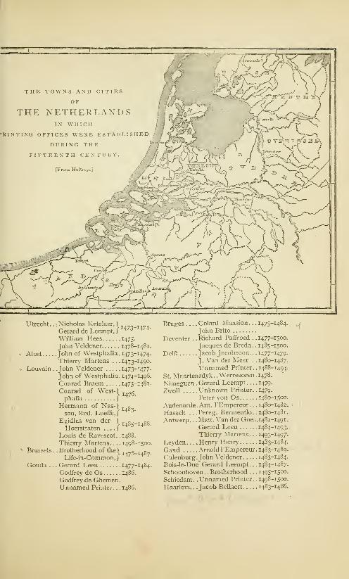
Utrecht . . . Nicholas Ketelaer, \Gerard de Leempt,/ 473 474
William Hees 1475-
John Veldener 1478-1481
Alost John of Westphalia. 1473-1474
Thierry Martens . . . 1473-1490
Louvain . .John Veldener 1473-1477
John of Westphalia. 1474-1496,
Conrad Braem 1475-1481
Conrad of West-1 g
phalia j
Hermann of Nas-1 »
sau, Rud. LoeffsJ4 3 '
Egidius van der "^ c «„
Heerstraten j4 ^
Louis de Ravescot . . 1488.
Thierry Martens 1498-1500
Brussels . . Brotherhood of the) ._g, .g7Life-in-Common, /
Gouda . . . Gerard Leeu 1477-1484
Godfrey de Os i486.
Godfrey de Ghemen
.
Unnamed Printer. . .i486.
Bruges .... Colard Mansion. . . 1475-1484.
John Brito
Deventer . .Richard Paffroed . .1477-1500.
Jacques de Breda. .1485-1500.
Delft Jacob Jacobzoon. . . 1477-1479.
J.Van der Meer. . .1480-1487.
Unnamed Printer. .1488-1494.
St. Maartensdyk . . Werrecoren . 1478.
Nimeguen . Gerard Leempt 1479.
Zwoll Unknown Printer. .1479.
Peter von Os 1480-1500.
Audenarde.Arn. l'Empereur. . .1480-1482.
Hasselt . ..Pereg. Bermentlo. .1480-1481.
Antwerp. . .Matt. Van der Goes, 1482-1491.
Gerard Leeu 1484-1493.
Thierry Martens. . .1493-1497.
Leyden Henry Henry 1483-1484.
Gand Arnold l'Empereur. 1483-1489.
Culenburg.John Veldener 1483-1484.
Bois-le-Duc . Gerard Leempt . . . 1484-1487.
Schoonhoven. .Brotherhood . . .1495-1500.
Schiedam. .Unnamed Printer. .1498-1500.
Haarlem. . Jacob Bellaert 1483-14S6.

324 THE PERIOD OF THE SPECULUM.
Alost ; the partners Ketelaer and De Leempt were at Utrecht
;
and Veldener was at Louvain. Ketelaer and De Leempt were
Netherlanders, but there is no evidence to confirm the con-
jecture that they had been instructed by the unknown printer.
Veldener of Wurtzburg, John of Westphalia, Colard Mansion,
William Caxton, Arnold Ter Hoorne, Conrad of Westphalia,
Richard Paffroed, Conrad Braem, and Hermann of Nassau
were, apparently, graduates from printing offices at Cologne. 1
It is possible that Thierry Martens also was taught typography
in the same city. We have many evidences that Cologne was
the school of typography for the Netherlands.
We have no evidences that the unknown printer acquired
his poor knowledge of typography through any other channel.
His unequal workmanship is an indication that his instruction
was imperfect; the neat presswork of his wood-cuts is that
of an expert printer of block-books, who, no doubt, had abun-
dant practice in this field before he undertook to print with
types; the rudeness of his typographic work is that of one
who had never received regular instruction in typography.
It is possible that he received only a verbal explanation of
the processes of the art,2 and that he tried, unaided, to graft the
new into the old method. His workmanship seems to be that
of an imitator, a curious mixture of skill and of ignorance, but
its inferiority to the workmanship of other printers of his time
is not proof of its greater age or of his originality; it proves
only his imperfect instruction or greater incapacity. So far
from showing the first steps in an immature invention, his
books truly show the degradation of a perfect method. They
show the ignorance of a badly taught typographic printer, and
1 The date usually assigned for to make types by men who had no
the introduction of printing in Co- experience in type-founding. Ben-
logne is 1466, but some authors sup- jamin Franklin's experiment is men-
pose, and Hessels and Madden say tioned in the note on page 303.
it is probable, that Ulric Zell began In 1794, Wing and White of Hart-
to print there as early as 1462. ford, men entirely ignorant of type-
*We have in this country two founding, undertook to make type,
remarkable illustrations of attempts never having seen a type-mould.

THE PERIOD OF THE SPECULUM. 325
the prejudices of an old block-printer who had adopted the
newer method with reluctance. We have seen that Walther's
edition of the Bible of the Poor is every way inferior to the
first edition, and have drawn from it the conclusion that there
was a wonderful degradation of the art of engraving on wood.
When we establish a comparison between the great Bible
of Gutenberg and the Speculum of the unknown printer we
have similar premises, and have to form the similar conclu-
sion, that the arts do not always improve with age, and that
the pupil or the imitator is often inferior to the master.
The evidences in favor of the priority of the unknown
printer are very slight. It may be conceded that he was the
first printer of the Netherlands, but it has not been proved,
nor is it probable, that he printed with types earlier than the
year 1463. Still more improbable is the assumption that he
was an independent inventor of printing. We have to judge
of the merits of this pretended invention as we do of every
other—by its fruits. It had no fruit. The facts that this un-
known printer made no mark on his age— that he left no work
worthy of his alleged invention— that neither he nor his printed
work was noticed by any of the chroniclers of his day— that
he had no pupils, no successors, no imitators— should be suffi-
cient to prove that he was not an inventor but an imitator.
By many authors the question of his possible priority has
been decided, not from an examination of known and proved
facts, but from the assertions of prejudiced and untrustworthy
witnesses. The frequent presentation of the statement of the
Cologne Chronicle, and of the legends that find their support
in it, has not been without effect. There is a general belief in
the tradition that types were first made in Haarlem by Coster,
and that the German method was the outgrowth of the Dutch
method. This proposition has been repeated so frequently
and so confidently that it becomes necessary to give a critical
examination to the legend of printing in Haarlem.

*
L 1 B K A It Y
r N I V KKS ITV OF
OALIFOKNJ
XYII
Coornhert's Notice of Printing in Haarlem. . .Notice by Van Zuren. . .By Guicciardini. . .The State-
ment of Junius . . . Fac-simile of Scriverius's Portrait of Coster . . . Sketch of Junius's Life and Works.
Examination of his Statement. . .Vagueness of the Date. . .Junius's Story is Incredible. . .Wood
Types could not be Used . . . Metal Types made too soon . . . This story an Imitation of a Spurious
German Story. . .Fust was not the Thief. . .Absurdity of the Accusation ... Evidence of Cornelis.
Our knowledge of Cornelis from other Sources. . .Cornelis not an Eye-Witness. ..Talesius not a
Satisfactory Witness ... Disappearance of the Art more Wonderful than its Invention ... Legend
Cherished for Patriotic Reasons. . .Its Growth and its Exaggerations.
jtle iorjo is satisfa*, as rtgarbs a fart like that of tfa infantum of tjposrapfiri, iaitfj
tfa simpU assertion of jptopk torjo talk of irjinCjS rofad) art saifc to tjafa rjappnui)
mort than a xenturj fafore ifatr time, is fastitutt of srixntifU moralitj : fa is
ignorant of tfa passion of truth ; in short, fa falongs to tfa plcfaians. Wit fjafa
not onls tfa risfa to rrject tfa faile fairixairo- fcj Junius, ... tut as honest mmtot an ODUnil to 1J0 it. Van d«r Lbule.
IN the year 1 561, Jan Van Zuren and Dierick Coornhert,
with other partners, set up a printing office in Haarlem.
Van Zuren was a native and burgomaster of the town of
Amsterdam; Coornhert, who was a notary and an engraver,
is said to have been the instructor of the famous engraver
Goltzius. Their first book was an edition of Cicero de Officiis,
to which they prefixed the following quaint dedication
:
To the burgomaster, sheriffs and councilors of the town of Haarlem,
D. V. Coornhert wishes as his honorable and commanding masters,
salvation to soul and body.
"I was often told, in good faith, honorable, wise, and prudent
gentlemen, that the useful art of printing books was invented first of
all here at Haarlem, although in a very crude way, as it is easier to,
improve on an invention than to invent; which art having been

THE LEGEND OF COSTER. 327
brought to Mentz by an unfaithful servant, was very much improved
there, whereby this town, on account of its first having spread it,
gained such a reputation for the invention of this art, that our fellow-
citizens find very little credence when they ascribe this honor to the
true inventor, as it is believed by many here on incontestable infor-
mation, and is undoubtedly known to the elder citizens. Nor am I
ignorant that this fame of Mentz has taken so deeply root in the
opinion of all, by the heedless carelessness of our forefathers, that no
proof, however apparent, however clear, however blameless it may
be, would be capable of removing this inveterate impression from
the hearts of the people. But— for truth is no less truth when known
only to a few, and because I implicitly believe what I have said before,
on account of the trustworthy evidence of very old, dignified, and
grey heads, who often told me not only the family of the inventor,
but also his name and surname, and explained the first crude way of
printing, and pointed with their finger the house of the first printer
out to me— I could not help mentioning this in few words, not as an
envier of another's glory, but as a lover of truth, and to the promotion
of the honor of this town; which proper and just ambition seems to
have also been the cause for the re-establishment and recommence-
ment of this printing office (as a shoot from the root of an old tree).
For it often happened, when the citizens talked to each other about
this case, that they complained that others enjoyed this glory unjustly,
and (as they said) without anybody contradicting them, because no
one exercised printing in this town." 1
The claim of Haarlem to the invention of printing is confi-
dently stated, but Coornhert has neglected to give the name
or describe the process of the inventor, to fix the date of the
invention, or to specify any of its products. He and his ven-
erable informants, the "honorable, wise and prudent gentle-
men," knew all these matters, but Coornhert prudently kept
silence. It is worthy of notice that Coornhert admits that,
in 1 561, "the fame of Mentz" had taken so deep a root in
the minds of many people that no proof could remove it.
A full notice of the details of early printing might have
been considered out of place in the preface to a classic text
book, but it would have been pertinent in a "Dialogue on the
First Invention of the Typographic Art" which was the title
of a book said to have been written by Jan Van Zuren. Of
'Hessels' translation as given in the Haarlem Legend, p. 50.

328 THE LEGEND OF COSTER.
this dialogue nothing is known but the introduction. Whetherthe author grew weary of his task, and abandoned it before
completion, or whether the manuscript was destroyed, as is
alleged, during the siege of Haarlem in 1573, cannot now be
ascertained. All we know of this manuscript is through Peter
Scriverius, who, diligently gleaning every scrap of history that
favors the Haarlem invention, has preserved the preface. It
is too long and rambling for a literal translation ; this is the
substance, which Van Zuren approached with great delicacy:
He does not wish to deprive Mentz of its rightful honors, but hewill see that the honors of Haarlem are not altogether lost. Thetown of Mentz, so justly lauded, first introduced this art, received
from us, in public life. The first crude foundations of this excellent
art were laid in our town of Haarlem. Here the art of printing wasborn. No doubt it was here carefully cultivated and improved;here it remained during many years, until at last it accompanied a
foreigner and made, at last, its public appearance at Mentz.
Here again is a noticeable absence of names, dates, books,
evidences and authorities. 1 From beginning to end there is
nothing in this statement but naked assertion.
One fact of real value may be gleaned from the preface of
Van Zuren and the dedication of Coornhert. There was even
then in Haarlem a strong prejudice against Mentz; there was
a wavering belief among some of the townsfolk that printing
had been invented in Haarlem, and that the pretension of
1 The comments of a modern belief. And what shall we say of the
critic on the strange omissions of this burgomaster Van Zuren ? He writes a
positive statement are to the point: special treatise to retrieve the glory of
"Thisforgetfulness of Coornhert hasthe invention to the honor of the city
always seemed to me one of the most of wmch he ls a magistrate, but it never
striking peculiarities of the Haarlem occurs to mm that he should honor the
legend. How can it be! Here is a memory of the inventor— I will not say
man, very learned, very patriotic, who hy a monument of some kind, for that
appreciates the importance of the dis- might be demanding altogether too
covery, who contends with zeal to cstab- much— but at least by a mention, bylisli for his country the honor of being some souvenir, by giving his name to
the cradle of the greatest of modern in- some street, or still less, by a simpleventions. He knows the name, the record in a book. It is not possible to
family name and the family of the in- find another example of a forgetfulness
ventor, and he does not divulge them so incredible." C. Ruelens, Bibliophileto his fellow-citizens! This surpasses Beige, vol. in, 1868.

THE LEGEND OF COSTER. 329
Mentz was unfounded. Whether this prejudice had been fos-
tered by the obscure language of Zell, or whether it took its
rise in the conceit of the simple people of the town, who mayhave thought that Bellaert, the first printer at Haarlem, was
also the first printer in the world, cannot now be ascertained.
There was a prejudice, and Van Zuren and Coornhert thought
that it would be to their interest as printers to propitiate it.
The publication of these mysterious allusions to an early
printer in Haarlem strengthened the belief of Hollanders in
the legend. It was imposed as veritable history on intelligent
foreigners who were unable to disprove it. Luigi Guicciardini,
a Florentine nobleman, for many years resident of Antwerp,
and who there wrote and published in 1567 a Description of
the Low Countries, was the first author of distinction who gave
a world-wide publicity to the legend. In his book he says
:
According to the common tradition of the inhabitants and the
assertion of other natives of Holland, as well as the testimony of
certain authors and records, it appears that the art of printing and
stamping letters and characters on paper in the manner now used, was
first invented in this place [Haarlem]. But the author of the inven-
tion happening to die before the art was brought to perfection and
had acquired repute, his servant, they say, went to reside at Mentz,
where, giving proofs of his knowledge in that science, he was joyfully
received, and where, having applied himself to the business with
unremitting diligence, it became at length generally known, and was
brought to entire perfection, in consequence of which the fame after-
ward spread abroad and became general that the art and science of
printing originated in that city. What is really the truth I am not
able, nor will I take upon me to decide, it sufficing me to have said
these few words that I might not be guilty of injustice toward this
town and this country. 1
The story is told as it had been heard, without comment,
and without hearty belief. It will be noticed that no really
important fact has been added to supplement the previous
story. We are still in the dark as to the name of the printer,
the date of the invention, and the titles of his books. The
authors mentioned by Guicciardini were probably Coornhert
'Ottley's translation as quoted in Johnson's Typographia, vol. I, p. 12,

330 THE LEGEND OF COSTER.
and Van Zuren; the inhabitants who gave him information
were probably the same men who had previously given it to
these printers. Guicciardini's story differs from theirs in one
point only. His description of the translation of typography
from Haarlem to Mentz does not impute dishonesty to the
workman who carried it thither. The insinuated accusation
of theft was not repeated by the scrupulous Italian.
Guicciardini's book, which was of marked merit, was pub-
lished in an age of credulity. It was translated and reprinted
in many languages. This legend of an unnamed inventor at
Haarlem was taken up by other writers. It was published as
valid history by George Braunius of Cologne, in his geog-
raphy, dated 1570-88; by Michael Eytzinger of Cologne, in
a book on the Netherlands, dated 1584; by Matthew Ouade of
Cologne, in a compend of history and geography dated 1600;
by Noel Conti of Venice, in a universal history, dated 1572.
These authors have been frequently quoted as men who had
examined and confirmed the legend ; but it is obvious that
they copied the statements of Guicciardini without investiga-
tion. Their approval of the legend must be considered as an
exhibition of credulity rather than cf knowledge.
The specification of the name of the alleged proto-typog-
rapher of Haarlem was made for the first time in a book now
known as Batavia, which was published in 1588, and of which
Hadrianus Junius or Adrien de Jonghe was the author. The
story of the invention, as here related, is far from complete,
but it is positive and definite : it gives the time, the place,
the book and the man. It can be fairly presented only in
an unabridged translation of the author's words
:
About one hundred and twenty-eight years ago, there dwelt in a
house of some magnificence (as may be verified by inspection, for it
stands intact to this day) in Haarlem, near to the market, and opposite
the royal palace, Laurentius Joannes, surnamed ^Editus or Gustos, by
reason of this lucrative and honorable office, which by hereditary right
appertained to the distinguished family of this name. To this manshould revert the wrested honor of the invention of the typographic
art, which has been wrongfully enjoyed by others. A just judgment

THE LEGEND OF COSTER. 33I
should give to him before all others, the laurel which he has deserved
as the most successful contestant.
When strolling in the woods near the city, as citizens who enjoyed
ease were accustomed to do after dinner and on holidays, it happened
that he undertook as an experiment to fashion the bark of a beech tree
in the form of letters. The letters so made he impressed the reverse
way, consecutively, upon a leaf of paper, in little lines of one kind
and another, and the kindness of his nature induced him to give them,
as a keepsake, to the grandchildren of his son-in-law [Thomas Pieter-
zoonj. He had succeeded so happily in this that he aspired to greater
things, as became a man of cultivated and enlarged capacities. By
the aid of his son-in-law, Thomas Pieterzoon, to whom were left four
children, most of whom attained the dignity of burgomaster (I say
this that all the world may know that this art was invented in a repu-
table and honorable family, and not among plebeians), he invented,
first of all, an ink thicker and more viscid than that of the scribes, for
he found that the common ink spread or blotted. Thereupon he made,
by the addition of letters, explanations for pictures engraved on wood.
Of this kind of printing I myself have seen some stamped block-
books, the first essays of the art, printed on one side only, with the
printed pages facing each other, and not upon both sides of the leaf.
Among them was a book in the vernacular, written by an unknown
author, bearing the title of Spieghel onzer behoudenis [the edition in
Dutch of the Speculum Salutis\. This book was among the a b c's of
the art— for an art is never perfected at its inception—and the blank
sides of the leaf were united by paste, to hide the uncouthness of the
unprinted pages. He subsequently changed the beech-wood letters
for those of lead, and these again for letters of tin, because tin was a
less flexible material, harder, and more durable. To this day may
be seen in the very house itself, looking over on the market-place as
I have said (inhabited afterward by his great-grandchild, Gerrit
Thomaszoon, who departed this life but a few years since, and whom
I mention only to honor), some very old wine flagons, which were
made from the melting down of the remnants of these very types.
The new invention met with favor from the public, as it deserved,
and the new merchandise, never before seen, attracted purchasers from
every direction, and produced abundant profit. As the admiration of
the art increased, the work increased. He added assistants to his
band of workmen; and here may be found the cause of his troubles.
Among these workmen was a certain John. Whether or not, as sus-
picion alleges, he was Faust 1— inauspicious name for one who was
1 An attempted play or pun on the printer's name was not Faust, but Fust.
Latin faustus, happy. But the German This pun was the origin of the error.

332 THE LEGEND OF COSTER.
equally unfortunate and unfaithful to his master— or whether he was
another of the same name, I shall not trouble myself to ascertain— for
I am unwilling to disturb the shades of the dead, inasmuch as they l
must have suffered from the reproaches of conscience as long as they
lived. This man, although bound by oath to [preserving the secrets
ofJ
the typographic art, when he knew himself to be perfectly skilled
in the operations of type-setting, in the knowledge of type-founding,
and in every other detail appertaining to the work, seized the first
favorable opportunity—and he could not have found a time more
favorable, for it was on the night of the anniversary of the nativity
of Christ, when all, without distinction, are accustomed to assist at
divine service—and flew into the closet of the types, and packed up
the instruments used in making them that belonged to his master, and
which had been made with his own hands, and immediately after slunk
away from the house with the thief. He went first to Amsterdam,
thence to Cologne, and finally regained Mentz, as it were to an altar
of safety so it is said, and as if beyond all possibility of a recapture,
where, having opened his office, he reaped an abundant reward from
the fruits of his theft. That is to say, within the space of a year, or
about 1442, it is well known that he published by the aid of the same
types which Laurentius had used in Haarlem, the Doctrinal of Alex-
ander Gallus, the most popular grammar then in use, and also the
Treatises of Peter of Spain, which were his first publications.
These are the facts. Nearly all of them are from old men worthy
of belief, who, each in turn, have accepted and transmitted them, as
they would pass a lighted torch from hand to hand. I knew these
facts long time ago, and have positive knowledge from other sources
which have attested and confirmed them. I remember that Nicholas
Gallius, the preceptor of my boyhood, a man of tenacious memory,and venerable with gray hairs, narrated these circumstances to me.
He, when a boy, had more than once heard Cornells, an old book-
binder and an under workman in the same printing office, when not
an octogenarian and bowed down with years, recite all these details
as he had received them from his master, embracing the inception of
the enterprise, the growth and cultivation of the rude art, and other
transactions connected therewith. But as often as he made mentionof the theft, he involuntarily would burst into tears at the recollection
of the infamy of the sequel; and then, the anger of the old man1 In Junius's description of the thief, two thieves. This substitution of they
there is a strange confusion of singular for he is not a typographical error, norand plural. Beginning with the specifi- is it a slip of the pen. It seems to havecation of one John as the thief, the story been intended to sustain the insinuation
ends with an intimation that there were of the complicity of Fust in this theft.

THE LEGEND OF COSTER.333
7it1ru£ Effigies qfLa.urem Ians-''KoBter.DelineatedJyvm. his Moniuncntall ' S-fonc <StatiteJlrecictL at
Harlem.
JVlEMORI/c.SACRVM*XAVRENTIOCOS TIRO,
HAEiEMETJSI,ALTERI CADMO
ETAHTISTIPO GBAEHIC2,CERCA AX.DCijr.M.CCCCXXX•INVENTOEIPRIMO f
IBENE DE UTERISAC ToTO OBJ3EIMERENTXHA2JC^X.Cq.
- TATVAM,QVIAMEAAYTMAft-MUZREADI ETJT,TROJfo>TV3tE>r-To •POSVTTCITO.S1
GEATIS SIMV5
[From Moxon.]
334 THE LEGEND OF COSTER.
would flash up, as he thought of the glory of the invention that had
been stolen with the other theft; and he wished, if his life had been
spared, that he might have been able to set forth the thief in irons,
ready to be pronounced a subject for the executioner; and then again
he was wont to consign his sacrilegious head to the direst punishment,
and to curse and execrate the nights which he had passed upon the
same bed for many months with that villain. These details do not
disagree with the words of Quirinius Talesius, burgomaster; for I
acknowledge that a long time ago I received nearly the same story
from him as was received from the mouth of the bookbinder. 1
The story of Junius is the
legend of Haarlem. All that
little value; all that has been
nation of its obscurer features.
1 The full title of the book from
which this translation was made is
Hadriani Ivnii Hornani, Medici
Batavia. In qua prater gentis &*
insula antiquiiatem, originem, de-
cora, mores, aliaque, ad earn histo-
riant pertinantia, declarahir quafuerit vetus Batavia. Ex. offic.
Plan/iniana, 1588, 4to. Hadrianus
Junius was born at Hoorn, in the
year 15 11. His education, as a boy,
was received at a grammar school in
Haarlem; as a young man at the
university of Louvain. In 1537, with
one Martin Costerus, he made a tour
in foreign countries. In 1540 he
obtained from the university of Bo-
logna the degree of doctor of medi-
cine. Two years afterward he wasliving in Paris. In 1543 he went to
England, and for six years succeed-
ing, he was employed as physician
to the duke of Norfolk. Soon after
the death of the duke, he published
in London a Greek lexicon, whichenhanced his reputation as a scholar,
but did not mend his fortunes. In
1559 he returned to Haarlem, wherehe married a lady of wealth. Threeyears after his marriage he accepted
real foundation of the modern
had been written before is of
written since is but in expla-
Before any criticism is given
the appointment of tutor to the
crown prince of Denmark, but find-
ing that the position or the climate
was disagreeable, he resigned the
office. In 1563 he was appointed
town physician, and rector of the
Latin grammar school at Haarlem,
which . appointments he held until
1569. About this period he wrote
Nomenc/a/or, a lexicon in eight lan-
guages, and Batavia, a description
of Holland. At various times he
was formally invited to enter the
service of the kings of Hungary,
Poland and Denmark. William of
Orange sent from Delft for his ser-
vices as a physician: at a meeting
of the deputies from the States, he
nominated Junius as the historian
of Holland. In 1574 he was madetown physician at Middleburg, with
a liberal salary and a free living.
When Haarlem was captured in
1573 by the Spaniards, the library of
Junius was plundered, and many of
his manuscripts were destroyed. Hetook this calamity greatly to heart,
and died at Arnemuiden in 1575.
Justus Lipsius said he was the most
learned Netherlander after Erasmus.

THE LEGEND OF COSTER.335
to this important document, the capability and credibility of
the learned author of Batavia should be considered.
The learning of Junius cannot be questioned; but Junius
must be judged not by his dead reputation, but by his living
performance. Batavia, although written in unexceptionable
classical Latin, is not a valuable, nor even a mediocre book.
The author was not above the pedantry and the bad taste of
his age. His book is full of classical allusions, lugged in, not
to illustrate the subject, but to display the author's omnivorous
reading; 1his style is rhetorical, and his arrangement of facts
is bewildering. These faults would be overlooked, if we could
be sure of his so-called facts; but one cannot read many pages
of Batavia without being convinced of the credulity of the
author, and of the thorough untrustworthiness of many of his
'The publication of Batavia, the
work upon which the fame of Junius
rests, seems to have been suggested
to William of Orange by Junius him-self, who expected to receive fromthe States a salary for his services
as historian. In 1565, the question
of salary, first named at 200 poundsof 40 groots, was put to vote. Theprudence of the Dutch character
is shown in the deliberations of the
deputies. Haarlem, Delft, Leyden,
and Gouda assented; Dordrecht andAmsterdam requested time for its
consideration. Dordrecht afterward
consented, but on condition that the
money should be paid out of the
taxes; that Junius should publish a
volume every year: and that he
should publish nothing without the
approval of the States. In the
meantime other States receded from
their action, saying that the publi-
cation was ill-timed during a period
of general distress. After someinfluences had been used, the States
gave a grudging and qualified assent.
In 1570, Junius petitioned for the
payment of 200 guilders, as he hadthen finished the first book of the
history. The petition was not favor-
ably received, and its consideration
was postponed for one year, at whichtime it was finally decided by the
deputies to pay Junius 300 guilders,
to prohibit him from publishing
the first volume of the book with
a dedication to the States, and to
release him from all obligation to
continue the work. This disparag-
ing treatment of the author pre-
vented the publication of the bookwith the completeness and at the
time Junius had proposed. After
his death the manuscripts of Bataviawere collected and transcribed by his
son Peter, who, with Peter Douza,undertook the publication. Thebook was published during 1588, fromthe office of Christopher Plantin, at
Antwerp. The selection of a printer
in a neighboring city shows that
there was then no competent printer
at Haarlem. It is another evidence
of the indifference of the people of
Haarlem toward typography.

33$ THE LEGEND OF COSTER.
descriptions. His defenders must confess that the book would
have been of higher authority, if he had been more chary of
rhetoric and more exact in description. 1
The fixing of the period in which the inventor lived seems
to have been made with a studied carelessness and intended
obscurity. If we deduct the 128 years from the year 1568,
the year in which the manuscript of Batavia was completed,
we have the date 1440. In this year Coster lived. When he
was born, when he died, and how long he had been occupied
with the practice of printing, is not related. If we infer that
Junius intended that this year 1440 should be considered as
the year of Coster's death, the inference is purely conjectural.
He does not say so. It may be supposed, but it is not said,
that Coster printed with types before 1440. Whatever mayhave been the intention of Junius, the year 1440 was at first
accepted by the authorities of Haarlem as the true date of the
1 He relates not as a legend, but
as veritable history, that the virgin
Soter, who possessed but three pen-
nies, gave them for the building of
a church in Dordrecht. Other three
pennies were miraculously and regu-
larly found in her purse, and were
as regularly bestowed, until the
church was built. He repeats, with
simplicity, the story of the eleven
thousand virgins of Cologne, whocame from England to the now un-
known port of Verona in Holland.
He says that a certain stone in a
church in Leyden was once a loaf
of bread, and that the transubstan-
tiation was made by a curse. Heformally records the delivery by one
Margaret, countess of Hennenberg,
of 365 babies— a miracle, writes Vander Linde, "that makes you think
of an upset pot of shrimps." Junius
adds that this would be a miracle
beyond belief, if it had not been
attested by the authority of public
monuments .... but he accepts the
common belief. These examples
of the credulousness of the author
of Batavia warn us not to accept
his criticisms on other traditions.
Junius begins his description of
printing at Haarlem with a solemn
declaration of his intention to tell
the truth. The declaration of candor
is not needed: what the reader of
Batavia does need is, not the prot-
estation of the intention of the
author to tell the truth, but someconvincing evidence of his ability to
distinguish the true from the false.
His preface is long, pedantic, and
in every way irrelevant, as may be
inferred from a glance at the fol-
lowing classical names which he has
sprinkled in the first paragraph:
Carneades, the Daughter of Time,
Democritus, Phoenicians and Egyp-
tians, Cadmus, Athenians, Greeks
and Thebans, Cecrops, Philostratus,
Linus, Tacitus, Palamedes, Hygi-
nus, Carmenta, Evander, Crassus,
ScKvola and Plutarch
!

THE LEGEND OF COSTER. 337
invention of typography. 1It was thought that the fixing
of the invention within this year would sufficiently establish
the priority of Coster, for the year 1442 was the date then
assigned to the rival invention in Germany. The authority
of Junius for the year 1440 was, no doubt, a pedigree of the
Coster family, of which he makes no mention.
There are troublesome entanglements connected with this
date of 1440. Subsequent defenders of the legend, who tried
to supply the deficiencies and correct the errors of Junius,
made discoveries which compelled them to acknowledge that
Lourens Janszoon (supposed by them to be Lourens Jans-
zoon Coster) died in the year 1439. If he died in 1439, and
if we believe that the invention was made in 1440, then he
did his typographic work in the year after his death. 3 Theabsurdity of this date was clearly perceived when it was after-
ward discovered that Gutenberg had been engaged as early as
1436 in experiments with printing. To preserve the appear-
ance of probability, the date of the invention was removed to
1423, so as to allow Coster time for experiment and for the
perfection of his invention.
The name of the inventor is as uncertain as the date of
the invention. Junius names him Laurentius Johannes, sur-
named ^Edituus, or Custos. In the pedigree, the name was
'In the year 1630, Adrien Roo- is invented complete in one day.
man, of Haarlem, published a print The vague language of Junius haswhich contained the engraved rep- been used as a proper warrant for a
resentation of a printing office, to very liberal construction of the date,
which he put the words—"Invented When Van Lennep objected, in 1823,
at Haarlem about 1430;"—but "The to the chimerical year of the inven-
magistrates and citizens of Haar- tion, 1423, fixed upon by a Haarlemlem, in everlasting remembrance of committee, the synod enjoined him:the event and the man," erected a "If he will again carefully read the
monument in front of the Coster account of Junius, and not forsake,
house, with an inscription on it, out of his prejudice, all commonwhich fixed the date at 1440. sense, he will plainly see himself,
2 Lambinet caustically observes and be obliged to acknowledge, that
that the romance of Junius obeys Junius said not a single word aboutthe dramatic law of unity, in time, the time of the invention." Van der
place, and hero: the typographic art Linde, The Haarlem Legend, p. 68.

338 THE LEGEND OF COSTER.
written Lourens Janssoens Coster. Surnames were not then
in common use ; the son was identified through a name which
described him in words as the son of his father. Lourens
Janssoen Coster is literally, Lourens, son of John, the keeper,
or the sexton. 1 He is most widely known in typographical
literature by the name of Coster.
By the record, it appears that Coster was both a printer
and a publisher. He cut blocks and made types, he mixed
printing inks, he printed books, he employed many workmen,
he had an honorable reputation as a printer, he reaped abun-
dant profit from the sale of his merchandise. These state-
ments are inconsistent with the eulogy which represents him
as an idle man who experimented with types for amusement. 2
That Coster knew nothing whatever about printing when
he took his walk in the wood may be properly inferred from a
careful reading of the story. His experiments with bark seem
to have surprised and amused him as much as they did his
'There has been much dispute
concerning the functions of this
keeper. Junius says that this Lou-
rens Janszoon was the keeper of a
church ; that this keepership was an
honorary office which belonged to
Coster's family by hereditary right.
The duties of the office seem to
have been those of a church trustee.
Some writers say that this custos
was nothing more than a sexton, but
it is of no moment whether custos
means sexton or trustee. The care
with which Junius introduces evi-
dences of the respectability of Cos-
ter's house and the dignity of his
family implies his fear that there
might be, on the part of a heedless
reader, some doubt concerning the
social position of a custos. Nothing
is said of the ancestors of Coster.
Probably, there was reason for this
omission. Coster's distinction in
Haarlem was not that of patrician
blood. His wealth was not, so far
as we can learn, derived from any
inheritance, nor could it have been
acquired through the emoluments
of a custos, which was an honorary
but not a lucrative office. He hadbeen engaged in some occupation
which Junius considered derogatory
to his dignity. Of this occupation
we shall hear more hereafter.2 The assurances of his wealth,
leisure and respectability seem to
have been provoked by the pub-
lished statements, with which Junius
was familiar, that Gutenberg, the
rival German inventor, was of noble
birth. It is not the only instance in
which the Dutch legend is the echo
of the German history. The first
coincidence is that Coster, like Fust,
was indebted to his son-in-law for
valuable assistance in perfecting
typography. And both sons-in-law
were named Peter.

THE LEGEND OF COSTER. 330
grandchildren. There is nothing unreasonable in this part of
the legend, but faith fails us when Junius says that Coster
printed his book with types of wood. 1 The statement must
be put aside as entirely unworthy of belief, for it has been
shown that types of wood are impracticable, and that the
types of every known edition of the Speculum were made of
founded metal.
No part of Junius's statement is more incredible than his
description of the ease with which Coster solved the problem
of typography. Coster knew nothing of printing ; but having
carved a few letters on bark, and having cherished the idea
that books could be printed from single types, he undertook
to make— not types, but wood- cuts. Eager to realize his
idea of typography, he began work' with a formidable task of
engraving. Here is an absurdity. To design, engrave, and
print the illustrations of the Speculum was a task almost as
great as that of making the types. If the engravings were not
in the possession of Coster before he made this experiment
(and Junius does not authorize this hypothesis), it is not possi-
ble that he could have added to his task by attempting so
many large wood-cuts. What follows is equally incredible.
He passed from the work of cutting letters and pictures to
that of making types without hesitation or experimentation;
1If Junius had not said that ward described types with clearness.
Coster changed the characters of There was obviously some confusion
wood for letters of lead and of tin, in the mind of Junius. It is notand that the false workman was certain that he clearly understoodexpert in composing letters and in the broad difference between typog-
founding types, there might be some raphy and xylography ; it is certain
doubt whether these characters of that he intended to convey the idea
wood were made disconnected or that Coster was the inventor ofconjoined. His language is obscure, printing in its broadest sense— the
for he has used the words form and inventor of printing from blocks as
character as the equivalent of type, well as from movable types. Thewhere these words could be applied absurdity of this broad claim mustwith equal propriety to a letter be obvious to all who have readengraved on a block. This obscu- about early image prints and play-
rity was not caused by the poverty ing cards and the printed fabrics ofof the Latin language, for he after- Italy and Sicily.

340 THE LEGEND OF COSTER.
he struck out the correct method of making the types at the
outset. His only mistake with types was in the selection of
materials ; wood was laid aside for lead, and tin supplanted
lead ; his greatest difficulty was encountered in the manufac-
ture of the ink. If this story is true, then typography was
invented through inspiration, for its origin was unlike that of
all great mechanical inventions.
Junius describes this pretended invention of typography,
not as he knew it was done, but as he thought it should have
been done. Ignorant of the necessity for that strict accuracy
of body which is the vital principle of typography, and which
can be secured only by the most ingenious mechanism, he
thought, as thousands have thought, that the merit of the
invention consisted in the conception of the idea. The con-
struction of the mechanism he has skipped over as a little
matter of mechanical detail entirely unworthy of notice. Hetells us nothing about it. He shows the extent of his reading
and the weakness of his judgment by treading in the footsteps
of German authors who attempted to describe the German
invention of typography, not from positive knowledge, but
through the exercise of a lively imagination. He makes Coster
follow the road which they say was taken by Gutenberg : first,
the types of wood; then, engraved letters on blocks of wood;
next, types of lead ; lastly, types of tin.1
The artful insinuation that John Fust was the false work-
man is discreditable. Junius does not unequivocally say that
Fust was the thief, but his language authorizes the calumny.
That John Fust of Mentz could not have stolen the imple-
ments of Coster will be positively established by records of
'The wine-flagons of Thomaszoon to be despised. Useless as proofs
may have had some features which of the credibility of the legend of
carried conviction to the observer Junius, they illustrate to some extent
of the seventeenth century, but the the pedigree of the Coster family,
modern reader of the story will fail a pedigree with which Junius wasto sec that they should have been well acquainted, but for which hemade of worn-out types. But the could find no place in his legend,
tin wine-flagons and the noticeable These wine-flagons were the pewter
house on the market-place are not pots of a tavern about a century old.

THE LEGEND OF COSTER. 341
the highest authority. The Dutch historians of typography
who defend the story of Junius, say that Junius did not know
the name of the real thief, but that the name of Fust is prop-
erly inserted, because Fust was honored as the inventor of
typography in Mentz ; that there was, probably, a complicity
between Fust and the false workman, and that Fust was, for
that reason, properly mentioned as the real offender. 1
The determination of Junius to fasten this theft on Fust
is shown in his statement that the thief regained or returned
to Mentz, as to "the altar of safety." At that time Paris,
Rome and Venice had more schools and scholars, more book-
readers and buyers than Mentz, and offered greater induce-
ments for the founding of a printing office. These were the
cities to which printers from Mentz subsequently went, and
to which a thievish printer from Haarlem should have gone.
But Junius finds it necessary to send him to Mentz to explain
the introduction of typography in Germany.
The charge of theft is not corroborated by the discoveries
of bibliographers. The two books which Junius says were
printed in Mentz in 1442 with the types of Coster cannot
be traced to Mentz. Fragments of a copy of the Doctrinal of
Alexander Gallus, the work of some unknown printer, have
been found, not in Mentz, but in the Netherlands. The types
'There were many Johns among ferent surnames—JohanGensfleisch,
the early printers of Mentz: John the elder, and Johan Gutenberg, the
Fust, John Gutenberg, John Peter- younger; and that it was the elder
sheim, John Meydenbach. When brother who betrayed Coster and
it was thought proper to acquit Fust revealed the secret to John Guten-
of this accusation, John Gutenberg berg. It was a weak artifice. Ger-
was selected as the man; but the man historians have fully proved
discovery of records which proved that Gutenberg's brother Frielo hadthat Gutenberg was making experi- nothing to do with typography; that
ments in typography at Strasburg John Gensfleisch, the elder, was an
during the year 1436, compelled the uncle, not a brother,— old, rich and
withdrawal also of this accusation, blind— of all men, most incapable
Meerman, with a skill in casuistry of any attempt at the purloining or
equal to the occasion, then under- practising of an intricate art like
took to prove that there were two printing. There is no evidence to in-
Gutenbergs—brothers, but with dif- culpate Petersheim or Meydenbach.

342 THE LEGEND OF COSTER.
of this book resemble those of the Speculum, but they are
sufficiently unlike to establish the fact that they could not
have been cast from the matrices used for the Speculum. This
edition of the Doctrinal could not have been printed at Mentz.
The zealous indignation of Cornelis does not compensate
us for his mysterious concealment of the name of the thief.1
His evidence is extremely unsatisfactory. Cornelis, who was in
the employ of Coster when the theft was made, who knew the
process, who bound the printed work, who was an old resident
of Haarlem, who had business relations with every printer that
succeeded Coster, of all men, should have been the one most
Junius was not the first, nor the
last, to use this discreditable but ef-
fective method of making-up a case.
There is an old French record which
'The story of theft is not only-
improbable, but it is unsupported by
external evidence. Jacobus Koning,
a diligent searcher in the archives
of Haarlem, discovered that, on and
after Christmas day, 1440, the con-
stabulary of Haarlem were often
sent to Amsterdam upon important
business. The inference attempted
is that the constables were in search
of the workman who stole Coster's
implements. The records do not
say that they were sent for a thief.
Their business was of another na-
ture. There had been a great mor-
tality in Haarlem, and the officers
of the town had left it while the pes-
tilence was raging. The journeys
of the constables were made to the
temporary residences of the magis-
trates who, from a more healthy
city, sent directions for the govern-
ment of the town. Koning knewthis fact but suppressed it.
The accusation of unfair prac-
tice, is frequently made by men whohave been defeated in a fair contest.
Whenever such an accusation is ac-
companied, as it was in this instance,
with dramatic details, it effects a
lodgment in the popular belief, from
which it is not easily removed.
narrates how Nicholas Jenson was
sent from Paris to Mentz in the year
1458 to get a knowledge of the Ger-
man invention. Jenson did acquire
this knowledge, and became an emi-
nent printer. His detractors say that
he stole the secret; his eulogists say
that he learned nothing, that he
was the real inventor.—The story
of Richard Atkyns about the Eng-lish theft is too full of absurdities for
criticism.—Sometime between 1560
and 1589, Daniel Specklin wrote a
chronicle of Strasburg, in which he
relates that printing was invented at
that city in the year 1440, by JohnMentel ; that Mentel's unfaithful ser-
vant, one John Gensfleisch, stole
the secret, not the punches, and
took it to Mentz.—There is a popu-
lar legend in Italy that Pamphilo
Castaldi invented printing types at
Feltre in the year 1450; that JohnFust, who happened to be in the
town, abstracted the knowledge of
the invention, carried it to Mentz,
and arrogated all the honors of the
rightful inventor.

THE LEGEND OF COSTER. 343
competent to describe the work of Coster. But the infor-
mation that he has furnished through Junius is ridiculously
trivial, scanty as to facts and dates, inconsistent, and, in some
points, entirely untrue.
Before we accept all that Junius has said about Cornelis,
it will be well to learn what we can about him from other
sources. The first entry in an account book of the cathedral
of Haarlem for the year 1474 is to this effect: "Item. ... I
have paid to Cornelis, the binder, 1 six Rhine florins for binding
books." Similar items, describing Cornelis as a bookbinder,
are found in similar account books between the years 1485
and 15 15. Payments were also recorded to Cornelis for color-
ing the initial letters of the "bulls of the indulgences." After
the year 1 5 1 5 his name appears no longer as a bookbinder ; in
1 5 1 7 another binder did the work of the church. Seiz men-
tions an old book, printed by Jacob Bellaert of Haarlem in
1485, on the last leaf of which was written: "Bought at
Haarlem in the Cruysstraet, of Cornelis the bookbinder, in
May, 1492." The register for the year 1522 contains this
entry: "Cornelis the bookbinder was buried in the church.
For the making of his grave, twenty pence." There can be
no doubt that there was a bookbinder Cornelis at Haarlem,
and that the Cornelis of Junius is the Cornelis of the church
record. The dates in these records will enable us to test the
accuracy of one portion of the chronology of the legend.
Junius said that Cornelis told his story before he was an
octogenarian. Eighty years might properly be considered as
the limit of his life, which, according to the record, ended in
1522. If, to ascertain the date of the birth of Cornelis, wededuct eighty years from 1522, the result would show that he
must have been born in 1442. But this was at least one year,
perhaps two years, after the alleged theft. If Cornelis lived
to the age of ninety years, the allowance of ten years morewould not reconcile the discrepancy. Cornelis would have
'It was on the inner cover or the fragment of a typographicalbinding of this account book that Donatus was found. See page 259.

344 THE LEGEND OF COSTER.
been a child of eight years of age ; but the story of Junius
requires, not a child, nor even a boy, but a man, an under-
workman, the associate and room-mate of the false workman.
To call it by the mildest name, here is a grievous blunder.
The blunder is not in the record of the church, in which the
chronology is consistent, for it represents Cornells as beginning
to work for the church when he was about thirty-two years
of age. It would be a waste of time to show that the chro-
nology of Junius is impossible : it is enough to say that the
first link in the attempted chain is broken, and that Cornells
could not have been an intelligent eye-witness of the facts.1
It is a suspicious circumstance that the testimony of Cor-
nells should be recorded for the first time nearly half a cen-
tury after his death. Hasback, Andrieszoon and Bellaert, the
early printers of Haarlem, should have heard from Cornelis
this story about Coster and his invention. The people of
Haarlem, we are told, were proud of Coster, and envious of
the honors conceded to Gutenberg. Why the printers and
the people of Haarlem allowed the important testimony of
Cornelis to remain unpublished for so long a time is a ques-
tion that cannot be answered.
At this late day, it is impossible to discover the kernel of
truth that may be concealed in the heart of so great a husk
of fiction. It may be that Cornelis, who seems to have been
a simple-minded man, and who appears as a binder in the
church record about nine years before Bellaert opened his
printing office, imagined that this first printing office in Haar-
lem was the first printing office on the globe. There mayhave been a theft of types and of secrets from the office of
Jacob Bellaert at or about 1485. Cornelis blundered about
dates, and his inaccuracies have been exaggerated by the
gossip of the next generation. These are possible conjectures.
'Lambinet had reason to speak of Junius as "a story in which all
of the aged witnesses, Cornelis, Gal- the authorities hear the principal
lius and Talesius, as "walking and facts in their infancy, but only to
talking centuries." Van der Linde communicate them to each other in
characteristically describes the story their second childhood."

THE LEGEND OF COSTER. 345
But we must remember that this story of Cornelis is not told
by himself, but by Junius.
One of the authorities referred to by Junius is Talesius,
burgomaster of Haarlem when Junius was writing Batavia.
In referring to him, Junius is careful in his choice of words.
" My account does not disagree with that of Talesius. ... I
recollect that I have heard from him nearly the same story."
This is a timid assertion— one that Talesius could have modi-
fied in some of its features. Talesius himself has not spoken.
Talesius was, in his youth, the secretary, and, in mature age,
the intimate friend of Erasmus, to whom he must have spoken
about the legend, but he did not make Erasmus believe it.1
The mysterious disappearance of the practice of the art
from Haarlem is even more wonderful than its introduction.
The tools may have been stolen, but the knowledge of the
art must have remained. Coster may have died immediately
after the theft, but his son-in-law Thomas Pieterzoon, and the
workmen, who knew all about the details of typography, were
living, and able to go on with the work. 2 The making of
books may have been temporarily suspended, but the curious
1 Erasmus says :
'
' All those who practicers of the art is confirmed by
apply themselves to the sciences are many and strong evidences." But
under no small obligations toward De Vries offers conjectures for evi-
the excellent town of Mentz, on dences. History is silent about the
account of the excellent and almost printing office that was conducted
divine invention of printing books by the sons of Coster. This office
with tin letters, which, as they as- and these printers were really created
sure us, was born there." by Meerman to fill a disagreeable2 To satisfy these doubts, and to gap in the story of Junius—a gap not
bridge the chasm between Coster of seen by any of his numerous com-
1440 and Bellaert of 1483, Meerman mentators from Scriverius to Seiz.
undertook to show that Coster's There is no book that bears their
three grandsons, Peter, Andrew and names; there is no record that men-Thomas, continued the practice of tions them as printers ; there is not
typography and printed many small even a tradition that they had any-
works. Dr. De Vries maintained thing to do with printing. If their
that "there was after Coster's death, names had not appeared upon the
until about 1470. an uninterrupted, pedigree of Gerrit Thomaszoon, wecarefully concealed practice of print- should know nothing of them. Theing. . . .That there existed in Holland typographical successors of Coster
for many years a seminary of the are as fictitious as their progenitor.

346 THE LEGEND OF COSTER.
public who clamored for them should have persuaded Coster's
successors to fill their wants. The new art of printing which
found so many admirers should not have been completely
forgotten fifty years afterward. There is nothing in the story
of Junius to satisfy these doubts. If we accept his account
of the invention, we must rest contented with the belief that
typography in Haarlem died as suddenly as it was born,
leaving behind as its only relics one edition of the Speculum
and the old wine-flagons of Thomaszoon. The same strange
fatality followed the alleged thief John who fled to Mentz
and printed two books in 1442. Immediately after, his types,
his peculiar process and his printed books disappear forever.
The improbable features of this legend were not seen in
the uncritical age in which Batavia was* written. Patriotic
Dutchmen did not wish to see them. Holland, at the close
of the sixteenth century, was flushed with pride at her suc-
cessful resistance to the power of Spain. Grateful to the men
who had made her famous, she exaggerated the services of all
her eminent sons. Coster was not forgotten. The name of
Junius gave authority to the Haarlem legend, and the story
of Coster was read and believed throughout the Netherlands.
There were dramatic features connected with it which pleased
the imagination and fastened themselves to the memory. To
people who had no opportunity to examine the evidences, the
legend of Haarlem soon became an article of national faith, to
disbelieve which was to be disloyal and unpatriotic. But this
enthusiasm would have subsided if it had not been nourished.
If subsequent writers had added nothing to this legend of
Junius, it would not be necessary to write more about it.
Long ago it would have been put aside as untrue. But the
legend has grown : it has been almost hidden under the addi-
tions that have been made to it. The snow-ball has become a
snow-heap. It is necessary to expose the falsity of the addi-
tions as well as of the legend, and to show how recklessly this
chapter of the history of typography has been written.

XVIII
){p irautllj of Ifp ]bgsnfc*
Perversion by Bertius. . .Romance of Scriverius. . .Date of Invention removed to 1428. . .Illustration
of First Statue to Coster. . .Date of 1420 given by Boxhorn. . . Rooman's Date of 1430. . .History
and Chronology of Seiz.
. . Doubts of Hollanders . . Discrepancies in the Dates on Medals . . . Meer-
man and his Unsatisfactory System . Fac-similes of Medals . .Koning and his Prize Essay . .Dr.
De Vries's Theory. . Radical Disagreements of the Authors .AH Versions Enlargements of the
Legend as given by Junius. . .An Article of Patriotic Faith in Holland. . .Monuments to Coster.
Illustration of Last Statue.
itf)o is tfjcrc that has not opinions plantctj in him od timatfon time out of minlJ,
fohirh 1)D that means rame to tie as the municipal Iafcos of the country, tohich must
not ie questioned, hut are to he lookeb on imtfi reberencc . . . tohen these opinions
are but the traditional grabe talk of those into reeeibe them from ijanin to hanly
baittjout eber examining them? Locke.
AT the end of the sixteenth century, the legend had two
L strong supports— the authority of an eminent scholar,
and the patriotic pride of the Hollanders, who accepted it
as truthful history. It did not, however, pass the ordeal of
criticism unharmed : the weaker points of the legend were
exposed by many German authors, and the weight of their
objections compelled Dutch writers to attempt new explana-
tions. Bertius, 1 writing in 1600, and evidently perplexed bythe carelessness with which Junius had noticed Coster's first
experiments, says, but without producing any proof, that
"Coster invented the art of printing with engraved blocks
or xylography .... the three-fold villain John Faust stole the
invention." Here we see the unavoidable result of Junius's
'Wolf, Monumenta Typographical vol. 1, pp. 193 and 621.

348 THE GROWTH OF THE LEGEND.
malignant innuendo: Bertius does not hesitate, as Junius did,
to name Fust as the false workman who stole Coster's tools.
Peter Scriverius thought it necessary, in 1628, to enlarge
and embellish the story of Junius. He wrote a new version
of the invention, which appeared with a curious poem called
the Laurccrans} This, says Scriverius, was the manner of it:
In the year 1428, Laurens Coster, then a sheriff of Haarlem,
strolled in the Haarlem wood. He took up the branch of an
oak-tree, cut a few letters in relief on the wood, and after a
while wrapped them up in paper. He then fell asleep, but
while he slept, rain descended and soaked the paper. Awak-
ened by a clap of thunder, he took up the sheet, and, to his
astonishment, discovered that the rain had transferred to it
the impress of the letters. Here was the suggestion of xylog-
raphy, which he at once followed to a successful conclusion.
He printed a great many block-books and a Donatus, but
finding to his surprise that letters cut upon a solid block could
not be used for other work, he thereupon invented typog-
raphy. John Gutenberg, who had been employed as a work-
man, stole the tools and the secret. Disheartened with this
misfortune, Coster abandoned printing and died. He proceeds:
It is my opinion that the art was first invented ten or twelve years
before the year of our Lord 1440 (in which the most trustworthy
authors agree), in Holland, at Haarlem. Junius has told its beginning
and progress before us. And although he discovered some particulars
about the invention, yet he has (I may be allowed to say it without
disturbing his ashes) his errors, and may not be pronounced free from
inadvertence. To-day (a. d. 1628) is just two centuries since the excel-
1 Laurecrans voor Laurens Coster von Wolf's Monumenta Typographica,vo\.
Haarlem, eerste Vinder von de Boeck- 1, pp. 209-451. The poetry of Scriverius
druckery, etc. Haarlem, 1628. Reprinted is as whimsical as his prose. Here is his
in Dutch, with description in Latin, in charge of theft against John Gutenberg:
Ah, rascal! ah, are you there? is it you Hans Gutenberger?
Why does this name become you? Yes, two-fold rascal, and worse!
Notorious by theft, oh shameless man!This word is still too mild for your villainy.
Because you concealed Laurens' good and carried it away,
Ami stole it falsely: so hear we now speak
Of Goedenbergher's praise; however they disguise it,
By the Gocden-berg they betray the Guyten-(rogue)berg.

THE GROWTH OF THE LEGEND. 349
lent and valuable art of printing made its appearance (a. d. 1428).
Not in the manner that is used now, with letters cast of lead and tin.
No, it did not go on like that; but a book was cut, leaf for leaf, on
wooden blocks .... We must not think that every letter was cut
separately on wood, and that these letters were collected and put
together to a line, and in a certain number of lines Our acute
Laurens first cut the letters, twisted and close to each other, in the
manner of writing on wood or tin ; but afterward, when he was so
successful, he changed his method of working, and, having invented
the matrices, cast his letters. (!)
I will not say further how the noble art of engraving and printing
of engravings is connected with the invention of printing, which arose
afterward. But just as the dexterous Jan Fuyst imitated the appro-
priate art of printing, so the excellent and talented printers and
designers, who also handled the artistic chisel and knife, contrived
to multiply and publish their engravings, cut after the printing of
the Haarlem figures. And all have been instructed by, and got their
first experience from, our clever and talented Laurens Koster. 1
Scriverius has given dates and new details, but he has not
thrown any clear light on the subject. He has not made the
story of Junius more credible, but he has exposed himself as
a romancer and a fabricator. In trying to mend the legend,
he has destroyed it. If the story of Scriverius is true, then
that of Junius is false, for they contradict each other. The
statements of Junius were based on the pedigree and the
gossip of the old men of Haarlem; the statements of Scri-
verius were based on nothing, for he had no authorities which
the most lenient critic could accept.
Scriverius said that Lourens Janszoen or Laurens Koster
was the inventor of xylography as well as of types. After an
examination of the Speculum, he had wit enough to see what
Junius did not, that the printer of the book must have had
practice with blocks, and that printing on blocks necessarily
preceded printing with types. His description of the growth
of the new art is not at all satisfactory. The careless manner
in which he skips over the invention of matrices and the
making of the moulds is that of a man who knows nothing
'Condensed from Hessels' translation in Haarlem Legend, pp. 1 13-14.

35o THE GROWTH OF THE LEGEND,
about type-founding, neither from instruction nor observation.
Encouraged by the praise which Scriverius had received for
his performance, Marcus Zuerius Boxhorn undertook to place
the date of the invention eight years earlier. In his Disser-
tation on the Invention of Typography, printed by Vogel at
Leyden in the year 1640,1 Boxhorn says that the invention
was made in 1420. Here we encounter a curious fact. The
story of Junius had been published less than fifty years, yet
the writers disagreed concerning the date of the invention.
Believers in the legend had been taught by one teacher that
typography was invented in 1440—by another, in 1428—by
another, in 1420. And it is a noticeable circumstance that
the authors farthest removed from the date of the invention
were the most positive in their statements. The later writers,
who knew the least, give us the earlier dates.
Adrien Rooman, a printer of Haarlem, and apparently a
conservative and conciliatory man, thought that these differ-
ences could be most satisfactorily adjusted by fixing the date
midway between the extremes. He was not in the possession
of any newly discovered facts, and had no authority for the
arbitrary selection, but this incompetency did not prevent him
from publishing a portrait of Coster, with an inscription which
made the year 1430 the date of the invention.
To the thinking men of Haarlem the assumptions of Box-
horn were as unsatisfactory as those of Junius and Scriverius.
There was an air of improbability, or at least of uncertainty,
about the statements of all the authorities, which filled their
minds with doubts as to the truth of the legend. The statue
to Coster, which was soon after put up in the Doctors' Gar-
den, had no date of invention on the pedestal. To remove
these doubts, Seiz 2 undertook, in 1742, to furnish "a true and
rational account of the invention" by Coster. The truth and
reason of this new description of the invention of Coster are
most strikingly illustrated in its chronology.
Wolf, Monumenta Typograph- 2 Seiz, Annus Tertius Saculoris
tea, vol. 1, pp 813 868. Inventa Artis, etc. Haarlem, 1742.
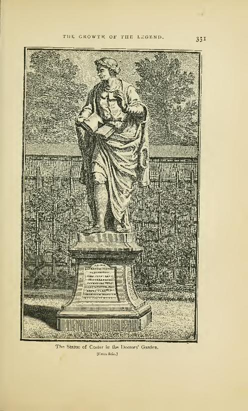
THE GROWTH OF THE LEGEND.351
^^^^^S^^Slliii^^The Statue of Coster in the Doctors' Garden,
[From Seiz.J

352 THE GROWTH OF THE LEGEND.
1428 . . Laurens Coster engraved a few letters upon the bark of a tree.
1429 . . He gave one year to experimental engraving on wood.
1431 . . He printed the Temptations of Demons or Ars Moriendi.
1432 . . Printed the Bible of the Poor.
1435 . . He began to engrave and print an edition of the Donatus.
1436 . . He cut separate letters or single types out of lead.
1437 . . After prolonged experiment, he abandoned this method.
1438 . . He invented a method of casting types of lead.
1439 • • He Degan to print an edition of the Donatus, and the Dutch
edition of the Speculum. In this year Gutenberg took ser-
vice with Coster, and began to print for him, by which he
earned the title of the Book-printer of Haarlem. (!)
1440 . . Gutenberg absconded with some knowledge of the invention.
He was able to cut, but not to cast types. (!)
1441 . . He established a printing office in Mentz.
1442 . . Gutenberg printed an A b c book, the Doctrinal of Alexander
Gallus and the Treatise of Peter of Spain. By this time
Coster had repaired the damages of the theft.
1443 . . Coster printed the second edition of the Speculum in Dutch.
1444 . . Coster printed a Latin edition of the Speculum.
1446 . . Gutenberg also induced Gensfieisch, called afterward Faust, (!)
and Meydenbach to join him in printing a Latin Bible.
1457 . . Coster's art was well known, and excited the envy of the Arch-
bishop of Canterbury and of King Henry vi of England.
1457 . . The Archbishop persuaded the king to get a knowledge of the
art from Gutenberg, the first book printer of Haarlem. (!)
1459 . . Tumour and Caxton, who were sent on this mission, bribed
Frederick Corsellis, a workman of Coster, to run away from
Haarlem in disguise. To prevent his escape, Corsellis was
taken to Oxford, in which town he began to print in 1468.
1467 . . Coster died, about the same time that Gutenberg and Faust
died. (!) His printing office ceased to exist.1
Seiz has not told us where he obtained this curious infor-
mation, but we shall make no mistake if we attribute it to an
imagination disordered by national pride. His chronology is
so absurd that serious criticism would be a waste of time.
Notwithstanding the strong efforts of Seiz to remove the
impression created by the contradictory accounts of his pre-
decessors, the citizens of Haarlem seemed to be involved in
1 Condensed from Hcsscls' translation in Haarlem Legend, p. 123.
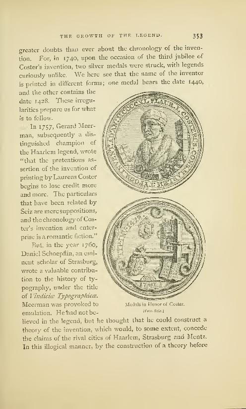
THE GROWTH OF THE LEGEND. 353
greater doubts than ever about the chronology of the inven-
tion. For, in 1740, upon the occasion of the third jubilee of
Coster's invention, two silver medals were struck, with legends
curiously unlike. We here see that the name of the inventor
is printed in different forms; one medal bears the date 1440,
and the other contains the
date 1428. These irregu-
larities prepare us for what
is to follow.
In 1757, Gerard Meer-
man, subsequently a dis-
tinguished champion of
the Haarlem legend, wrote
"that the pretentious as-
sertion of the invention of
printing by Laurens Coster
begins to lose credit more
and more. The particulars
that have been related by
Seiz are mere suppositions,
and the chronology of Cos-
ter's invention and enter-
prise is a romantic fiction."
But, in the year 1760,
Daniel Schoepfiin, an emi-
nent scholar of Strasburg,
wrote a valuable contribu-
tion to the history of ty-
pography, under the title
of Vindicice Typographies.
Meerman was provoked to
emulation. He had not be-
lieved in the legend, but he thought that he could construct a
theory of the invention, which would, to some extent, concede
the claims of the rival cities of Haarlem, Strasburg and Mentz.
In this illogical manner, by the construction of a theory before
Medals in Honor of Coster.
I.From Seiz.]

354 THE GROWTH OF THE LEGEND.
he was in possession of the facts, he began to write the Origines
Typographical. The entire book was published in 1765, with
a portrait of Lourens Coster by the eminent Dutch engraver
Houbraken, and a portrait of Meerman himself by Daulle. In
the matter of scholarship,
Meerman was thoroughly
qualified for his task. Hewrote in a clear style and
with admirable method.
But he knew nothing of
the mechanics of printing
nor of type-founding, and,
unfortunately, he was too
conceited to accept cor-
rection or instruction even
from the hands of experts
like Enschede, Fournier
and others. In trying to
make facts suit theories, he
went so far as to order the
engraver of a fac-simile to
stretch the vellum of a Do-
natits so that the types
used upon this Donatitsshould appear to be the
same as the types of the
Speculum.
These are the conclu-
sions submitted by Meer-
man as the result of his
study of, and reflection on,
the legend of Haarlem:Medals in Honor of Coster.
[From Sciz.
]
Typography was invented
by I .ouwerijs Janszoen, also known as Laurens Coster, who, at various
times between 1422 and 1434, filled the offices of sheriff, treasurer and
sacristan. He was of noble blood, but a bastard of one of the

THE GROWTH OF THE LEGEND. 355
Brederodes. He died sometime between 1434 and 1440. Heinvented typography about 1428 or 1430, using only movable types
of wood. All that Junius has written about an invention of lead and
tin types by Coster is incorrect. He thinks it useless to consider the
engraving of letters upon solid wood-blocks, for this is not typography,
and is not printing as we now understand it. Laurens was robbed
on Christmas night, 1440, by Johan Gensfleisch the elder, who carried
the art to Mentz. The son-in :law and heirs of Coster continued his
business for some time after his death, but with little appreciation, as
they were overshadowed by the superior invention of Gutenberg and
Schoeffer. Coster printed but one edition of the Speculum from types
of wood. His successors printed the other Dutch edition and the
two Latin editions from engraved metal types. The contributions of
different inventors toward the perfect invention are acknowledged
in this manner: Laurens Coster was the first to demonstrate the
feasibility of typography by his use of wood types; John Gensfleisch
was the first to make cut or engraved metal types; Peter Schcener
was the inventor of cast or founded metal types; John Gutenberg
and John Fust were printers who invented nothing.
Meerman had fair warning from the type-founder and
printer John Enschede that his theories of wood types1 and
of cut metal types were preposterous. He did not heed the
warning. He wrote, not for printers, but for bibliographers
who believed in the practicability of wood types, and he did
not mistake his readers. The bibliographers, who knew little
or nothing of the theory or practice of type-making, were
not competent to criticise the mechanical part of his theory.
He hoped to disarm the prejudices of German authors by his
frank acknowledgment of the contributions of Schoefifer and
Gensfleisch as co-inventors. The novelty of his theory, the
•John Enschede then said that the types and the printing, which
"Jansen Koster used no wooden inferiority, he maintained, had been
movable letters, as later, and still produced by wood types and want
living scholars [Meerman] assert— of experience in presswork. Four-
scholars who know nothing of the nier told him truly that the types of
mechanism of type-founding—and his alleged first edition were metal
who, therefore, gently swerve from types; that the printing of the book
the path of simple truth." Meer- was inferior because the types were
man's reason for rating this Dutch worn out; that his first edition had
edition of the Speculum as first of all the signs of a last edition— but
all was the inferior appearance of Meerman refused this explanation.
•5c6 THE GROWTH OF THE LEGEND.
judicial equity with which he decreed to Coster, Gensfleisch
and Schceffer what he said was their share in the honors of
the invention, the temperate tone and calm philosophic spirit
in which the book was written, the breadth of scholarship dis-
played in exact quotations from a great number of authors,
won admirers in all countries. The theory of Meerman about
a contributive invention need not be examined here: it has
been entirely refuted by many French and German authors
;
it was abandoned even by Hollanders1at the beginning of the
present century. The authority of the book is at an end.
The conviction that all previously written defences of the
legend were untenable caused a scientific society of Holland
to offer a prize for the best treatise on the invention. Jacobus
Koning was the successful competitor. In 1816, he published,
under the sanction of the society, the essay that had won the
prize, under the title of "The Origin, Invention and Develop-
ment of Printing." It was an inquiry of more than ordinary
merit— the first book on the subject which showed evidences
of original research. Koning tried to supplement the many
deficiencies of Junius with extracts from the records of the
old church and town of Haarlem, which he had studied with
diligence. He brought to light a great deal of information
about one Laurens Janszoon, whom he confounded, as Meer-
man had done, with Lourens Janszoon Coster. This is the
substance of his discoveries and of his conclusions therefrom:
Koning describes the inventor as Laurens Janszoon Koster, and
not as Lourens Janszoon. He says that Koster was born about 1370;
that there are no records of his early life, and that his name does not
appear on any of the registers of Haarlem, municipal or ecclesiastical,
until he became a man of middle age. After this period of his life,
notices are frequent. He was the sacristan of a church from 142
1
to 1433. He was, at different times, alderman and presiding alder-
man, treasurer of the town, lender of money to the city, officer in
the citizens' guard, member of the grand council, and deputy to a
Dr. De Vries, the most eminent very judicious Meerman had done more
defender of the legend in this century, injury to the cause of Haarlem than the
said : "The work of the learned but not writings of all other antagonists."

THE GROWTH OF THE LEGEND. 357
convocation of the States—clearly a man of wealth and distinction.
There was a great pestilence in Haarlem in the latter part of the year
1439, and Koning says it seems probable that Koster was one of its
many victims. Koster's only child was a daughter named Lucette,
who married Thomas, the son of Pieter Pieterzoon—the Peter men-
tioned by Junius. Pieterzoon had three children, but with them the
family name was lost. This Laurens Janszoon Koster invented xylog-
raphy and typography. He experimented with types of wood, but
did not use them for practical work. His types were founded in
matrices of lead, and in moulds of metal; he invented printing ink,
and printed his books with inking balls on a press. His materials
were rude, but the process was substantially the same as that of
modern printers. He printed the first edition of the Speculum'm 1430,
and sixteen other books before his death. His business as a printer
was continued for some years, but in a feeble manner, by his grand-
sons. The thief of Koster's process was Frielo Gensfleisch.
In the town records Koster is not noticed as a printer,
but Koning described his method of printing, his punches,
moulds, matrices, presses, inking balls, ink, types, and printing-
office furniture, with as much boldness as if he had been eye-
witness to the entire process. Nor was this his only error.
It has since been proved that he willfully suppressed manyimportant facts in the records which are of great importance
in an examination of the life and services of Coster. It is
plain that he was more intent on pleasing the national pride
than on revealing the truth.
The speculations of Koning were destroyed by the keen
criticisms of the authors who followed him. Dr. Abraham
De Vries1 set aside impatiently nearly all the ingenious theo-
ries devised by former commentators. He repudiated the
statement that Coster had been a sexton or sacristan, or that
he invented engraving on wood. Warned by the failures of
his predecessors, he advanced no new theory about the peculi-
arities of Coster's typographic process; he professed to be
satisfied with the bald statement of Junius, and dogmatically
maintained that Coster "was the inventor of typography, of
the proper art of printing, the first who invented and practised
xEclaircissemens sur Vhistoire de Pinventioti de Vimprimerie. 1843.
358 THE GROWTH OF THE LEGEND.
the art of printing with movable and cast letters, and so gave
the example to Mcntz. ... In the beginning, the art was
secretly practised as a trade in manuscripts, not only during
the lifetime of the inventor, but by his successors after his
death." De Vries placed the invention about 1423.
It is not necessary to protract this review of the different
versions of the legend, nor yet to point out the fatal disagree-
ments and inaccuracies of these versions. It is plain that all
the authors who have maintained the claims of Coster have
taken their leading facts from Junius. It is equally plain that
they have been dissatisfied with his statements and have tried
to fill up the gaps in the evidence with conjectures. But
they have not made the legend any more credible. The exact
nature and date of the invention, the name of the inventor,
his method of making types, the books he printed, the thief
who stole his process, the fate of his printing office, the total
disappearance of the knowledge of the new art— these and
other features of the positive statement first made by Junius
are enveloped in as complete a mystery as they were when
Batavia was written.
With all its inconsistencies and improbabilities, the legend
has been accepted as essentially truthful by many eminent
bibliographers in France and England. Of late years it has
encountered but feeble opposition from German writers. In
many modern books on printing, Coster has been recognized
either as the inventor or as one of the co- inventors of the*
art. There has been a general belief that, however absurd
the legend might be in some minor matters of detail, it had
a nucleus of truth. Coster's place in typographical history,
at the middle of the present century, seemed almost as firmly
fixed as that of Gutenberg.
In Holland, this legend of the invention of printing by
Coster was an article of national faith which only the bold man
dared to deny. It has produced results which could never
have been foreseen by the vain old man Gerrit Thomaszoon,
in whose conceit the fable originated. Haarlem is dotted with

THE GROWTH OF THE LEGEND- 359
monuments to the memory of Coster. Certain days in June
and July are observed as festivals in commemoration of the
invention. In the Hout, or Haarlem Wood, where Coster is said
to have received his first sugges-
tion of types, an imposing ceno-
taph has been placed. Carved on
this stone are the arms of the
sheriff Laurens Janszoon, and the
year 1423, which is offered as the
date of this suggestion. An ac-
knowledgment of Coster as the
inventor of typography may be
seen in the ancient cathedral of
Haarlem, on a black marble tablet,
which was put in place during
the month of June, 1824, by King
William I. In almost every well
appointed public office or private
house of Haarlem is some picto-
rial recognition of Coster as the
inventor of printing.
In the year 185 1, an associa-
tion of patriotic Hollanders placed ™
in front of the rebuilt Coster house
a memorial stone with this inscrip-
tion: "The house of Coster: the
birthplace of typography." The
date of this birth is judiciously
omitted. The tablet of the old
Coster house contained an inscrip-
tion in honor of "Laurens Coster,
sheriff, of Haarlem, inventor of typography about the year
1430." The vitality of the legend has also been preserved by
the issue of a great many medals, prints and papers, and
by the repeated assertion of the civic authorities that Coster
was the original and unquestionable inventor of typography.
The Statue on the NewMonument to Coster.
[From Noordziek.]

XIX
Ifp Jkttm&tH af i{p Jegentu
The Vague Inscription on the Last Monument. . .Relics in the Costerian Museum ... Fac-simile of
Janszoon's Autograph. . .The Coster Pedigree. . .Made by Gerrit Thomaszoon. . .Legend began
with the Pedigree. . .Pedigree has been Falsified, and is of No Authority. . Search by Van der
Linde for Records concerning Coster. . .Archives of the Town and Church of Haarlem represent
Coster as a Tallow-Chandler and Innkeeper. . .Coster living at Haarlem in 1483. . .The Record
of the Chair-Book. . .No Evidence that Coster was a Printer. . .Lourens Coster has been Con-
founded with Laurens Janszoon .Illustration of the House of Coster. . .Other Fac-similes of
Portraits of Coster. . .Their Curious Dissimilarity. . .Absurdity of the Legend.
iJe see trt a square at ^aarlem the monument of tije fictitious personage 3Laurens
(Coster. It presents a sab" figure. JSehinu' tijis statue, sneering in mockerc, is
another eolossal monument, toljicf) dominates tints belittles it— a statue bisible
to us, hut to j^ollanliers inoisiijle— tije statue of &i&ieule. Hdbig.
INthe year 1856, on the sixteenth day of July, the day
accepted as the anniversary of the invention, a statue
of Coster was put up in Haarlem. The tablets of the ped-
estal bear inscriptions which are thus translated by Hessels:
LOU RENS JANSZOON COSTER. INVENTOR OFTHE ART OF PRINTING
HOMAGE OF THE WITHNETHERLAND NATION. MOVABLE LETTERS
MDCCCLVI. CAST OF METAL.
The date of the invention and the profession or position
of the inventor are omitted. We cannot ascertain from the
monument whether Coster was a sheriff or a sexton, whether
he invented printing in 1423 or 1440. It may be inferred
that there had been disagreements among the eminent menwho erected this work of patriotism, and that they could not

THE DOWNFALL OF THE LEGEND. 36l
Autograph of Laurens Janszoon.
[From Koning.]
heartily accept the date of any version of the legend. Onthis great occasion the Costerian Museum 1 of Haarlem was
enriched with a pedigree of the Thomaszoon family, an old
document frequently referred to by some defenders of the
legend as an incontestable evidence of its truth. The pedi-
gree was, without doubt, a genuine relic. Its dingy vellum
surface, written over in many handwritings, was surrounded
by an embroidered border blackened with age. Its history
could be traced through three centuries. Gerrit Thomaszoon,
the aged descendant of Coster mentioned by Junius with such
marked respect, was the person by or for whom this pedigree
was made in or about
the year 1550.2 This
Gerrit Thomaszoon had
kept an inn in the house
once occupied by Cos-
ter, and it is supposed
that the pedigree was one of the decorations of a wall in his
house. There is a special significance in this date of 1550.
This pedigree, which describes Coster as the inventor of
printing, was written at least one hundred years after the
discovery of the invention and the death of the inventor. It
was written when Cornells, the only eye-witness known to
'This Museum then contained,
among other relics, copies of the
Apocalypse, the Ars Moriendi, the
Canticles, the Donatus, the Specu-
lum, the Temptations of Demons,
and other printed works that have
here been noticed in the chapter
on The Works and Workmanshipof an Unknown Printer, most of
which were claimed as the work of
Coster's office. The wood block of
the Horarium (see page 260), some
official documents, some autographs
of the sheriff Louwerijs Janszoon, a
picture said to be a likeness of
Coster, several engravings of Coster
(curiously dissimilar, and one of
which is an undeniable forgery), are
also contained in this Museum. Vander Linde denounced the Museumas a municipal show -booth. TheHaarlem Legend, p. 164.
2 Gerrit Thomaszoon died about
1563 or 1564. In the year 161 1, the
pedigree belonged to Adrien Roo-
man, the town printer at Haarlem.
At his death it fell into the hands
of Dr. John Vlasveld. For nearly
two centuries it was unknown to the
public. In 1809, it was sold at auc-
tion, Jacobus Koning paying for it,
and for an old wood-cut, supposed
to be the work of Coster, four hun-
dred guilders.

362 THE DOWNFALL OF THE LEGEND.
history, had been dead nearly thirty years. It is, however,
and too much stress cannot be laid on this fact, the oldest
document in which mention is made of Coster as a printer.
There are valid reasons for the belief that Coster's merit as
an inventor had never been recognized in any way before the
record was made on this pedigree. When we consider the
order of the dates, it is obvious that it was from this much
suspected document that Coornhert derived the information
he published in 1 561. "The old, dignified and grey heads"
described by Van Zuren in 1561, "the aged and respectable
citizens" of Guicciardini (1566) and Junius (1568), were Gerrit
Thomaszoon and his friends, among whom we may properly
include Gallius and Talesius. And it may be added that the
more circumstantial story of Junius was first published when
Gallius and Talesius were dead, and when there was no manliving who could controvert or modify any part of his story.
There can be no doubt that the legend began with this
pedigree. It is not at all probable that the vain old manGerrit Thomaszoon, who was proud of the ancestor in whose
house he lived, kept his friends in ignorance of it. It was
not unknown to Junius. There is a similarity of uncertainty
between an ambiguous date (1440 or 1446) on this pedigree
and the mysterious circumlocution of Junius in his use of the
words " about one hundred and twenty-eight years ago," or
1440, which is enough to show that Junius had not only seen
the pedigree, but that he took it as an authority for this date.
Whether Scriverius saw it cannot be confidently maintained;
he does not mention it. Gerard Mcerman knew of its exist-
ence, but he did not reprint it. He made use of it, however,
in the construction of a new genealogy of the Coster family,
in which he added and altered items in the most unwarrant-
able manner. Koning studied it with diligence: he frequently
alluded to it as a document of the highest importance, but
he did not reprint it, nor even describe it in general terms.
The withholding of this pedigree from public examination,
and the evasion of its description by the authors who had

THE DOWNFALL OF THE LEGEND. 363
examined it, are suspicious circumstances. We see that men
who wrote hundreds of pages of speculations to support the
claims of Coster— men who translated and reprinted many-
columns of irrelevant chaff for the sake of one little kernel of
grain— willfully suppressed what they maintained was a most
convincing evidence of the truth of the legend. It was not
suppressed because it was too long: the entire pedigree can
be printed in two pages.
The reasons for withholding the pedigree were apparent
when it was put in the Museum. The reading of the words in
the first row at once produced the impression that its import-
ance had been vastly overrated; that its information was of
little value ; that it was almost worthless as evidence of the
priority of Dutch typography. Dr. Van der Linde, who made
a critical examination of the writing soon after it was placed
in the Museum, revealed the astonishing fact that the most
important entry had been falsified. This entry, which contains
the only portion of any interest in an inquiry concerning the
invention of printing by Coster, consists of the following lines
:
"Sijn tweede wijff was Lourens "His [Thomas Pieterzoon's] sec-
Janssoens Costers dochter die ond wife was Lourens Janssoen's
deerste print in die werlt Coster's daughter who brought
brocht Anno 1446." the first print in the world in
the year 1446."
The date first written was 1446, but in this column, and
in others, objectionable entries have been effaced and falsifica-
tions have been attempted. The figure 6 has been partially
rubbed out; it has been replaced by a o, so that the careless
reader will construe the date as 1440. There can be no hesi-
tation whatever on this point; the figures first written surely
were 1446. "We see here a fable arise before our very eyes.
A Haarlem citizen has a pedigree made for him, probably to
put it up in his inn But the frame wants lustre, and so
the pedigree is linked by the probably totally fictitious Lucye,
the second wife, to a Haarlemer— to a Haarlemer who (the
awkwardness and naivete of the expression may not surprise

304 THE DOWNFALL OF THE LEGEND.
us at all in such a product of family vanity) brought the first
print in the world." !
We may waive all criticism of the faulty grammar of the
pedigree and proceed to more important matters. It may be
conceded that the pedigree was written by an ignorant manwho intended to say that it was Coster, and not his daughter,
who brought the first print in the world. By the word print
Thomaszoon may have meant a playing card, the engraved
figure of a saint, a block-book, or a book made from movable
types. If he meant any product of xylographic printing, the
statement is totally false, and deserves no consideration. If
he meant typography, his failure to express that meaning is
unfortunate. But his intention is really of but little import-
ance. A bald statement on a pedigree, written by an ignorant
and conceited man, about one hundred years after the great
event he professed to record, of the details of which he obvi-
ously knew nothing, cannot be used to overthrow established
facts in the history of typography.
It is unsatisfactory in other points. The alteration of the
date, and the unexplained erasures have destroyed whatever
validity the document may have had. It may be put aside
;
as an authority it is worthless. Its obscure notice of the
invention of printing is but a frail foundation for the colossal
superstructure which Junius erected. It is plain that Junius
must have been conscious of its weakness as a basis for the
legend ; he had doubts of its accuracy, and dared not refer
to it. He preferred the oral testimony of the dead Cornelis.
The discovery of this falsification induced Dr. Van der
Linde to make, "with a zeal and patience worthy of a better
cause and of a better reward," a laborious investigation in
the archives of the town and church of Haarlem for authentic
'Van der Linde, The Haarlem description which may be observed
Legend of the Invention of Print- in all the authorities. It is moreing, p. 42. In the singular words than an indication that the story of
"who brought the first print in the Junius is based on the pedigree andworld" \vc may find the cause of on information derived from Thom-that mysterious indefiniteness of aszoon and his friends.

/ s
THE DOWNFALL OF THE LEGEND.
>'/,. '4
W'jinformation concerning Coster. He had cause to think that
history had been falsified by other historians of the legend.
Through the study of the archives, Van der Linde ascertained
that there lived in Haarlem, in the fifteenth century, a citizen
whose name was Lourens Janszoon Coster, the son of one Jan
Coster who died in 1436. The results of the search were as
curious as they were unexpected, as will be fully understood
after an examination of this translation of the originals:
1441 . . On the evening of the 13th, settled with lou koster for 15
pounds and 12 pounds of oil, each pound an ancient but-
drager, and 34 pence for soap and tallow candles, together
22 guilders 3 pence.
1441 . . Louwerijs Janssoen, for 72 pounds of candles, which have been
burnt by the guards in the town hall during the year— for
each pound an ancient butdrager.
144 1 . . Louwerijs Jans, aforesaid, for the candles burnt in the tower in
honor of Our Lady, during this year, as was agreed with him.
1442 . . Lourijs Coster, paid for having repaired the lantern of Our
Lady in the tower.
1442 . . Lourijs Coster, for 40 pounds of tallow candles which the guards
in the town hall burnt; cost each pound an ancient butdrager.
1442 . . Paid to lou coster 8 guilders for oil and soap.
1442 . . To lou coster for soap, candles and other things, 15 pence.
1447 . . On the 14th day of March, paid to Louwerijs Coster for 5
pounds of candles burnt in the tower in honor of Our Lady.
There can be no mistake about the business of this man.
The Lourens Janszoon Coster described on the old pedigree
as the famous man who brought the first print in the world,
and in Batavia as a wealthy citizen, a, man of leisure and of
enlarged mind, and the inventor of engraving on wood and
typography, was certainly an obscure tallow-chandler, who
sold oil and candles. 1 The anti-climax is sufficiently absurd,
but worse remains. The archives give us more than a clue to
the origin of Coster's wine-flagons. It seems that, some time
1 There is, of course, no reason tastes of the man, as shown in his
why a chandler could not have in- selection of a new business, is enough
vented typography, but we have no to prove that he was not at all like the
evidence that this chandler invented later chandler, Benjamin Franklin,
anything. Our knowledge of the with a leaning to types and letters.
O, J-

366 THE DOWNFALL OF THE LEGEND.
after 1447, this Lourens Janszoon Coster gave up the busi-
ness of chandler in favor of his sister Ghertruit Jan Costers-
dochter, and that he chose for his new occupation the duties
of a tavern-keeper. Van der Linde found this fact clearly-
stated in the treasury accounts of the town of Haarlem.
145 1 . .Lou coster 1 paid, for two menghelen of wine which were sent
to the burgomaster a year ago.
1454.. A dinner was offered to the count of Oostervant on the 8th
day of October, 1453, at lou coster's; indebted to him for
it xvn guilders.
1468 . . Louris Coster and other citizens are summoned to the Hague.
1474 . . Louris Janszoon Coster pays war taxes.
1475 • • Louris Janszoon Coster pays a fine for "buyten drincken " (to
drink beyond the premises).
1483 . . Received of Louris Janszoon Coster for ferry toll for his goods
when he left the town, 8 rex guilders.
We here see that the name of Louris Janszoon Coster was
recorded in the town-book for the last time under the date of
1483, when he paid ferry toll for his goods, and was allowed
to leave the town. It is not known where he went or where
he died, but it is plain that the story of his death in 1439, as
related by Meerman and Koning, must be untrue.
There might have been a doubt as to the identity of the
chandler with the innkeeper, if Van der Linde had not inves-
tigated in another direction, and made gleanings from the
books of an old association, whose records are as trustworthy
as those of the archives of the town and the church. This
association, which still exists, under the name of the Holy
Christmas Corporation, is thus described by Van der Linde :
It is one of those fraternities which had the lofty aim of eating
and drinking. This corporation is already very old, for it celebrated
its third jubilee in 1606. Its fifty-four brethren and sisters preserved
each a chair for their meetings. According to these statutes, these
chairs, if they were not disposed of by a last will, were inherited by
1 The variable orthography of the spelling of his name \vhich are to be
name of Coster, which is here copied found in all the authorities. I have
literally from the- records, is a sufficient adopted the orthography as I find it in
explanation of the irregularities in the the book of Van der Linde.

THE DOWNFALL OF THE LEGEND. 367
the eldest and nearest blood relation in the branch from which they
came The corporation remaining in existence, the right of property
in the chairs continued, by uninterrupted transmission, until our time.
In the register of the names of the occupants of the chairs
are found the following entries under the heading of chair 29
:
142 1 . .Jan Coster, by. . .
.
1436 . . Lourijs Coster, by inheritance.
1484 . . Frans Thomas Thomasz, by '
1497 . . Gerret Thomas Pieterz, by inheritance from his father.
1564 . . Cornells Gerritz, by inheritance from his father.
1589 . . Anna Gerritsdr., by purchase from her cousin.
The names of the successive owners of chair 29 are con-
tinued in the book, but they are of no interest in this inquiry.
The archives of the church and town of Haarlem contain
the names of other Costers, but there is no other Coster who
will answer the description of Junius and Thomaszoon. The
Lourens Janszoon Coster of the pedigree, the Louwerijs Jans-
soen (so called only after the year 1441) or Lourijs Coster of
the archives, and the Lourijs Coster of the chair-book are,
without doubt, the different names of the same man. This is
the man who, according to Thomaszoon and Junius, brought
the first print in the world. But he appears as a printer only
in the pedigree. The archives and the chair-book do not so
describe him ; they tell us nothing of his invention, nor of the
alleged stealing of his types, nor of his death in 1439. The
town-book says that he was living in 1483. In none of these
documents does he appear as sheriff, sexton, or treasurer.
It is obvious that the legend of Coster the printer rests
entirely upon the pedigree and its amplifications by Junius.
'The exact nature of the rela- left Haarlem in 1483— of Thomastionship between Laurens Janszoon Pieterszoon (probably the son-in-law
Coster and Gerrit Thomaszoon is of Coster), sheriff, who died in
not clearly defined, but the archives 1492— of Gerrit Thomaszoon (ac-
of the town and the vellum pedi- cording to the pedigree, a great-
gree corroborate each other in estab- great-grandson of Lourens Janszoon
lishing the existence— of Lourens Coster), a sheriff and an innkeeper.
Janszoon Coster (son of Jan Coster), He was, also, a sacristan or church-
tallow chandler and innkeeper, who warden.
3^8 THE DOWNFALL OF THE LEGEND.
But the pedigree is of no authority. Its information is not
confirmed by the records ; its falsifications and its suspected
history compel every candid reader to reject its evidence alto-
gether. We have to accept in preference the testimony of the
archives, and have to admit that there is no credible evidence
that Coster printed anything at any time. The Lourens Jans-
zoon Coster of typographical history is as fictitious a person-
age as the Cadmus of Greek mythology. He is really more
fictitious, for he is the representative of two men.
The revelations of Dr. Van der Linde show that Lourens
Janszoon Coster has been confounded with Laurens Janszoon
or Louwerijs Janszoon, 1 who was a man of some distinction,
a wine merchant, innkeeper, councilor, sheriff, treasurer and
governor of the hospital. He is the man of civic offices, of
wealth and high social position, who has been described by
Koning. He is the man whom Meerman represented as an
'For this unwarrantable confu-
sion of the names and deeds of the
two men Junius and Scriverius are
responsible. Junius, who wrote in
Latin, caught at the word Coster,
which he found in the pedigree, as a
subject for the display of his critical
ability. He explains and expounds
it: "Lourens Janszoon, surnamed
Coster, by reason of the office which
belonged to the family by hereditary
right." There was no need for this
absurd expansion of the meaning of
the word custos. This attribution of
an honorable office to an insignifi-
cant man was purposely made to
give him a dignified position. Gerrit
Thomaszoon, who knew that Coster
was a man of no note, gave him only
the distinction of the first printer.
This was not enough for Junius, whothought that he would be deficient
in patriotism if he did not makeCoster as reputable as his rival Gut-
enberg, who was represented as of
noble blood. The word Coster was
his opportunity, and he made the
most of it. It is not probable that
Junius studied the archives of Haar-
lem for the purpose of getting ex-
act information about Coster, but it
is possible that he had read or heard
of Lourens Janszoon, the wealthy
man, and that he confounded himwith Coster, the chandler. Whetherhe made this confusion with intent
or in ignorance cannot now be
ascertained, but we can see that the
wealth and respectability of Janszoon
were attributed to. Coster. Scriv-
erius perpetuated the blunder. Hefound a document signed by Lou-
werijs Janszoon, as sheriff, in 143 1.
Without further research, he leaped
to the conclusion that this man whodied in 1439, wno had. nothing in
common with Coster but similarity
of name and similarity of occupation
as innkeeper, was the very Lourens
Janszoon Coster who, according to
Junius, invented types and practised
printing in 1440.

THE DOWNFALL OF THE LEGEND. 369
unrecognized member of the noble family of Brederodes. But
he is, certainly, not the man described on the pedigree as the
Coster who brought the first print in the world. He is not
the man described by Junius who lived " about one hundred
and twenty-eight years ago," or in 1440, for the records of
the church of St. Bavo prove that Laurens Janszoon died and
was buried in 1439. It is not at all probable that Thomaszoon
or Junius made any mistake in the name, and that it was this
Louwerijs Janszoon who brought the first print in the world.
There is no more evidence in favor of Janszoon as an inventor
of printing than there is in favor of Coster. The most careful
searching of the records fails to bring to light any evidence
that he was engaged in the practice of printing.
That Lourens Coster kept a tavern may also be inferred
from the fact that the house he lived in was always known as
a tavern. The engraving of this house on the following page
shows how the edifice appeared in 1740. Junius said that
it was a house of some pretension in 1568, and that it stood
on the market-place near the royal palace; but Van Zuren
had previously noticed it as a house falling to decay. In
1628, Scriverius said that the house had been "changed and
was divided among three masters:" the part supposed to be
the Coster residence was called The Golden Bunch of Grapes,
and it was even then used as a tavern. When John Bagford
first saw the house, in 1706, it was a cheese shop. In 1761,
Moses Van Hulkenroy, a printer, lived in part of it, and the
other part was occupied as an inn, then known as The Golden
Fleece. In 181 3, the centre building was used as a public
house. It fell into ruins on the 13th of May, 18 18, but it has
since been rebuilt, and a tablet inserted in memory of Coster.
It is probable that this house was an inn when Junius wrote
Batavia, and that he refrained from mentioning this circum-
stance lest it might degrade Coster. But we now know that
Coster, and Pieter Thomaszoon, his son-in-law, who succeeded
him in business, and that Gerrit Thomaszoon, the author of
the pedigree, were all innkeepers. The wine-flagons, to which

asa

THE DOWNFALL OF THE LEGEND. 371
Junius points so triumphantly, were a proper portion of the
furnishings of an inn. To the modern reader, who has been
informed that a part of this house has always been a drinking
tavern for the refreshment of the men of Haarlem, these pew-ter mugs, or flagons, as Junius names them, are not, as hewould have us believe, indisputable evidence that their first
owner must have been a printer.
The falsity of the legend is abundantly established by the
dissimilarity of the many engraved likenesses, which from
time to time have been presented as portraits of Coster. Theearliest representation of
the alleged inventor was
published by Scriverius, 1
not quite two centuries
after Coster is said to
have died. The only at-
test to the accuracy of
the portrait is Scriverius
himself, and it need not
be said that he is not
a trustworthy witness.
There have been manyvariations of this well-
known engraving. Vander Linde suggests that
this engraving by Scriv-
erius may be a portrait of
Gerrit Thomaszoon, ap-
propriated for the exi-
gency. There is a peculiarity in the engraving which plainly
proves that the portrait could not have been painted during
the lifetime of Coster. The "true effigies of Laurenz" carries
in his right hand a matrix of the letter A of the Roman form,
but letters of Roman form were not used at Haarlem in 1440.Books attributed to Coster have letters in the Gothic style.
'Moxon's copy of this engraving is shown on page 333 of this book.
Laurens Janszoon Coster.[From Maittaire.J

372 THE DOWNFALL OF THE LEGEND.
In 1630, a new portrait of Coster was published by Adrien
Rooman, with Latin and Dutch verses attached. Boxhorn
mentioned this engraving in such a manner
that strangers were led to
believe it was a statue that
had been erected to Coster.
Jacob Van Campen was
induced to make another
painting of the grim feat-
ures in a more truly artistic
style. His idealized head
of Coster was engraved byCornells Koning, whose re-
production of the painter's
fancy has ever since been
accepted as an authentic portrait. 1 The round cap, the furred
A Spurious Portrait
by Van den Berg.
[From Koning.]
A Portrait attributed to
Van Oudewater.
[From Koning.]
1 Van der Linde tells a curious
story about Hollandish credulity:
The most amusing imitation was that
of an amateur artist of the last century,
C. Van den Berg, who wished to play
the collector J. Marcus a trick. Heengraved a small wood-cut after the
portrait of Van Campen, with the nameLaur' yassoe, in old-fashioned style, un-
derneath. With a little soot and dirt, he
gave the copies an antique appearance,
and made Marcus happy for a fewweeks. The poet Langendijk, the type-
founder Enschede, and other amateurs,
each got a copy. Van den Berg was too
honest to mean anything more than fun
;
he told afterward to Marcus himself the
value of that antique wood-cut. Al-
though every investigator could andought to have known these things, yet
Jacobus Koning was bold enough, in the
second nomenclature of his collection ofrare books and manuscripts, to describe
a copy of this portrait as "printed by,
or at the time of, Lourens JanszoonKoster." The Haarlempainter L. Van der Vinne, in his youth,
painted, in the beginning of the former
century, a study, after a drawing of VanCampen. But lo ! in 1762, this picture
is offered for sale by Van Damme at
Amsterdam (the same who produced the
false inscriptions respecting the imagin-
ary Corsellis of Oxford), provided at the
back with a very old inscription, Loursyans to Harlem MCCCCXXXIII, and the
monogram A O, which was explained to
mean Albert Van Oudewater. Excellent
discovery ! Here was a genuine contem-
poraneous portrait by a painter of the
fifteenth century ! A trifle, however,
was wanted to make the joy perfect.
Albert Van Oudewater, who had painted
the celebrated inventor of printing in
1433, was born in 1444! This history
is full of despairing irony from beginning
to end. Just as the sheriff Lourens
Janszoon invents the art of printing after
his death; just as Cornells works at
Donatuses before his birth ; just as the
chandler Lourens Janszoon Koster en-
tirely forgets his invention during his
lifetime; so the painter Albert VanOudewater becomes a zealous Costerian
long before he was born. '
' Van der Linde,
The Haarlem Legend, p. 145.

THE DOWNFALL OF THE LEGEND. 373
robe, and the matrix in the extended hand, are the features of
the Scriverius portrait; but the head is that of another man.
The stony face which Scriverius presented as the image of
Coster was somewhat softened by the pencil of Van Campen,
but after he had exhausted upon it all the resources of his art,
it still remained a grim and unsatisfactory head, a head with-
out any expression of genius or even of culture—the head
of a hard inn-
keeper, but not
of an inventor.
It was a biting
satire upon the
story of Junius,
all the more of-
fensive because
the portrait had
as strong claim
to authenticity
as the legend.
Meerman re-
fused to accept
this head as a
faithful portrait.
He produced a
new likeness of
the inventor, and
claimed for it a
superior truth-
fulness. In the
same year, 1765, Van Osten de Bruyn published an engraving
of the same head, with this explanation: "Laurens Janszoon,
sheriff, of the town of Haarlem, inventor of the noble art of
printing . . . after an old picture bought from William Cornel-
iszoon Croon, the last descendant of Laurens Janszoon, who
died, unmarried, at Haarlem in 1724." We find no vouchers
for the authenticity of this portrait Croon was the man by
The Laurens Janszoon of Meerman.
[From Meerman.]

374 THE DOWNFALL OF THE LEGEND.
or for whom the vellum pedigree was continued. He was
equally interested with the originator of the pedigree, Gerrit
Thomaszoon, in upholding the legend. Whether Croon was
ignorant of the fact that Laurens Janszoon, the sheriff, was
not Lourens Janszoon Coster, is not so clear; but it is clear
that the portrait submitted by Croon does not resemble the
portrait furnished by Scriverius. Gockinga asserts that the
engraving made by Meerman (after Croon's portrait) is like
the engraved head of Sir Thomas More of England. Vander Linde says that the Coster of Meerman closely resembles
the engraved portrait of a once celebrated inquisitor, one
Ruard Tapper of Enkhuizen. 1 The Coster of Scriverius and
the Coster of Meerman are certainly different men.
Everywhere but in Holland 2 and Belgium, Dr. Van der
Linde's exposure of the spuriousness of the legend has been
accepted as the end of all debate. Coster must hereafter be
regarded as one of the heroes of fiction and not of history.
With the downfall of Coster, fall also all the speculations
concerning an early invention of printing 3in the Netherlands
by an unknown or unnamed printer.
'The striking dissimilarity be- 2 In Holland, Dr. Van der Linde's
tween the calm philosophic face of book has been denounced as impol-
the Coster of Meerman and the sour itic and unpatriotic, but it has not,
look and misanthropic features of as yet, met with a suitable answer,
the Coster of Scriverius is neatly The indignation manifested toward
explained by Dr. Abr. De Vries
:
tne author has been so violent that
The portrait given by Scriverius he, a native Hollander, has found it
was painted from a sketch or study made expedient to remove to Germany,after Coster's death, and was, necessa- 'The only positive evidence whichrily, gloomy and cadaverous ; but no seems to give a color of probabilityportrait, however beautiful, unless it was to the assertion that typography wasa true and genuine likeness, could satisfy
first pract iSed in the Netherlands isthe truth-loving Scriverius The truth the foct that an unkm)wn interwas to be well founded if he endorsed , , . , ., ,....
r, ,
i» tuo „ a u j .i. ihad printed there some little books
it. ine cadaverous hue and the marks . - , .,..,,, ,
of death in Van Campen's picture arebefore the amval of Ketelaer and
strong evidences for the genuineness De Lcempt, in 1473. Whoever this
and faithfulness both of the original printer may have been, it still re-
representation and of Van Campen's mains to be proved that he did anycopy
!
typographic work before 1463.

XX
|dpt SuWforg ni jllra$fotrg>
Gutenberg's Place as an Inventor. . .His Birth at Mentz ... Subsequent Residence in Strasburg.
Early Suits at Law . . . His Probable Marriage ... Is Sued by Claus Dritzehen . . . The Judge's State-
ment. . Testimony of the Witnesses. . .Gutenberg the Chief of an Association. . .Engaged in a
Secret Art. . .Notices of a Press and of a Mysterious Tool of Four Pieces. . .Notices of Forms
that were Melted, and of Printing. . Decision of the Judge. . .Gutenberg's Reputation for Knowl-
edge of Curious Arts. . Polishing Stones. . .Making Mirrors. . .The Secret Art was Printing with
Founded Types . . . Secret was not in the Press . . . Illustration of Old Screw Press . Testimony
of the Earlier Authors ... Tool of Four Pieces was a Type-Mould ... Fac-simile of Garamond's
Mould ... Fac-simile of an Early Donatus. . .Gutenberg's Financial Embarrassments and Failure.
But fofiQeber iotn the inbenters of tfjts &rt, or, (as some &utf)ors foil! fjaie it,)
.gtienre, nap, JScienre of Scunxcs (sap tfjep), rertain it is, tfjat in all its Brattrij.es
it tan it ijeemeft little Itss tfjart a Srietue. . . JFor mp part, I foe igfjelj it boell in
mg tfjougfjts, art& I firt& . . . tfjat a ^ppograpfjer outfit to it a mart of .grim*.
Bp a ^ppograprjer, 3E &o not mean a ^rinttr. . . 5 mean surf) a one, Sxtfjo ip fits
obrn Judgment from solilj reasoning toitfj fjimself, tan eitfjer perform, or oirrrt
others to perform, from tfje tieginning to the enrj, all rfce ^anb-p-fcoorks anil ail
tf)« pfjpsiral ©perations relating to ®ppograpf)ie. Surij a SrietttirUk mart boas
foouitless It Sxifjo boas the first Enbenter of ^ppograpfjie. Joseph Moxon, 1683.
MOXON did not overrate the rank of typography among
the arts. It is a science, and, like all sciences, is the
fruit of the knowledge which comes only by study. Like
all sciences, it came in the fullness of time, when the world
had been prepared for it, but it came only to him who had
qualified himself for its handiworks from beginning to end.
In the description of the worl£ of John Gutenberg about to be
related, imperfect as it must be by reason of our ignorance
of his thoughts and plans, we shall clearly see that the inven-
tion of typography was not, as Junius would have us believe,
the result of a happy thought or of a flash of inspiration. It

376 JOHN GUTENBERG AT STRASBURG.
was not born in a day. To use the sound language of an old
chronicler, it was thought out and wrought out.
The work of Gutenberg will require a treatment different
from that given to the work of Coster. It is not necessary to
introduce the subject by a description of his books, by proof
of his existence from writings made a century after his death,
and, by a train of fine speculative reasoning, to show that he
should have been the printer of the books ascribed to him
by conjecture. Our knowledge of Gutenberg is incomplete,
but it is positive as far as it goes. He did not put his nameon any book, but he certainly printed many books; it does
not appear that he ever boasted that he was the inventor
of typography, but this honor was conceded to him by manyprinters soon after his death. His antagonists in courts of
law, as well as the friends who put up tablets to his memory,
have told us, as plainly as could be desired, that he was a
master of many curious arts, and that he had made a broad
and unmistakable mark on his time.
There is no record of the birth of Gutenberg, 1 but it is the
belief of his German biographers that he was born at Mentz
about the year 1 399. His parents were, Frielo Gensfleisch and
Else Gutenberg. Their two2 children were, John Gutenberg,3
named after his mother, and Frielo Gensfleisch. Frielo junior
was always called Gensfleisch, but John, whose relation to the
Gensfleisch family must have been well known, was sometimes
described as John Gensfleisch, junior. A legal document of
1 There is no known authentic documents which set forth that Gut-
autograph of Gutenberg. In his enberg had a brother, Conrad, and
day the name was written by other two sisters, Hebele and Bertha,
persons, Guttemburg, Gudenburch, Helbig says that these documents,
Goodenberger, Guthembergius, Gu- as reprinted by Fischer, are spurious,
denbergh, Kuttenberg, and in many 3It seems that Else Gutenberg
other ways. The form of spelling was the last surviving member of
used in this book is the one that is pre- her family. According to a Germanferred by the German bibliographers, custom prevailing at that time, a
Gensfleisch, in German, is goose- son was, under certain circumstances,
flesh; Gutenberg is good hill. permitted to take the name of his
*Bodmann, a librarian at Mentz, mother when it was feared that her
said that he had discovered two old family name might become extinct.
JOHN GUTENBERG AT STRASBURG. 377
the city of Strasburg names him John, called Gensfleisch, alias
Gutenberg, of Mentz. 1
The infancy and youth of Gutenberg were passed amid
scenes of strife. In Mentz, as in many other cities of Ger-
many, the burghers made persistent encroachments on the
privileges of the noblemen, and met with as persistent resist-
ance. The municipal disorder which followed their frequent
collisions was seriously aggravated by the disputes of the
rival archbishops who held office under rival popes. The
burghers, as the larger body, claimed the larger share of the
city offices, and the right to take the lead on occasions of
ceremony and in the administration of affairs. In the year
1420, the burghers of Mentz made preparation for the enter-
tainment of the Emperor, on the occasion of his visit to the
city. Circumvented by the action of the noblemen, who
greeted the Emperor first, the burghers retaliated by the
destruction of the houses and goods of the more obnoxious
nobles. In their rage, they demanded of them humiliating
guarantees, and put them under restrictions so galling, that
Frielo Gensfleisch and many others preferred to go in exile.2
'The name of the brother of childish dispute about precedence
Frielo Gensfleisch, senior, was John seems an insufficient cause for the
Gensfleisch, senior. He is the man quarrel. It was, probably, the occa-
improperly described by Meerman sion, but not the cause. It was the
as the elder brother of John Gut- spark which set on fire the stifled
enberg. The identity of his baptis- resentment of the burghers against
mal name with that of the inventor a long course of neglect and of
of printing has been the occasion misgovernment. The Gensfleisch
of many mistakes. The uncle has families seem to have been always
been confounded with the nephew, prominent in the civil disturbances
The family was wealthy: it had, of Mentz. Gutenberg's great-great
in or near Mentz, three houses or grandfather took sides with one of
estates, known as Zum Gudenberg, the rival archbishops, and, in 1332,
Zura Jungen and Zum Gensfleisch. aided him in burning some con-
The members of the family were vents, for which he was put under
sometimes called Sulgeloch or Sor- ban by the Emperor Louis. In the
genloch, from a property on which same year, he and other noblemen
they resided outside of Mentz. made themselves so offensive to the
2 This is the version of chroniclers burghers that they were obliged to
in the interest of the nobles. The flee for their lives.

378 JOHN GUTENBERG AT STRASBURG.
It is not known where the Gensfleisch family took refuge.
It is supposed that Strasburg was the city selected, for this is
the city in which we find the earliest notice of Gutenberg.
In 1430, the Elector Conrad III granted a full amnesty to
many of the exiled citizens of Mentz, and summoned them
to return. Johan Gutenberg was specifically named in the
proclamation, but he continued to dwell abroad. During this
year, his mother Else, then a widow, negotiated, through her
son, for her pension of fourteen guilders which had been
allowed to her by the magistrates of Mentz. In 1432, he
visited Mentz, probably on business relating to this pension.
These are the only known records of his early manhood.
Nothing is known about his education. Some writers
have represented him as an engraver on wood or a printer
of cards or of block-books at an early age. It is possible
that he may have received instruction in the arts of block-
printing and engraving, and that he may have traveled far
and wide in quest of greater knowledge, 1 as was and is cus-
tomary with German artisans ; but we have no evidence on
this point. It must be confessed that the first thirty years
of his life are virtually blank.
The most important actions of his after life would have
been obscured quite as thoroughly, if it had not been his fate
to appear many times, either as complainant or defendant,
before the courts of his country. It is from the records of
these courts that we glean the story of his life. He first
appears as complainant in a suit at law which shows his high
1 Charles Winaricky, a learned that he acquired his knowledge of
Bohemian, wrote a dissertation on metallurgy from the metal workers
the birthplace of Gutenberg— Jean of that old mining town; and that
Guttenberg, ne en 14 12 a Kuttenberg his proficiency in many curious arts
en Boheme, i2mo. Brussels, 1847
—
was the result of his Bohemian cdu-
in which he tried to prove : that cation. Winaricky's book abounds
Gutenberg was born in the year with curious information, but his
141 2, in the town of Kuttenberg in reasoning is largely based on con-
Bohemia, from which town he de- jecture. It cannot be used to dis-
rived his name ; that he was a grad- credit the positive dates and facts
uate of the university of Prague; of many German records.

JOHN GUTENBERG AT STRASBURG. 379
spirit and audacity. The magistrates of Mentz had neglected
or refused to pay to Gutenberg the sum of money which he
claimed as his due. Gutenberg, waiting for his opportunity,
caused to be arrested the clerk or recorder of the city of
Mentz, who happened to be in Strasburg. This sudden arrest
seems to have been a great annoyance to the magistrates of
Strasburg, who feared that it would endanger the friendly
relations of the two cities. At their request he consented to
relax his hold on the unfortunate clerk.1 This is the first
plain proof we have of his residence in Strasburg in 1434.
In the same year he formally authorized his mother to
act for him in the adjustment of some business between him
and his brother Frielo. This authorization, which is recorded
in the city books of Mentz and of Frankfort, would imply
that he was, or intended to be, absent.
In 1436 he appeared as defendant before the tribunal of
Strasburg. Anne, called Zur Isernen Thur (Anne of the Iron
Gate), sued Gutenberg for a breach of promise of marriage.
The judgment of the court is not given. Most writers on the
subject believe that the suit was withdrawn, and that the case
was closed by marriage. After this suit, the name of Ennel
Gutenberg, who, according to Schoepflin, is none other than
this Anne, appears on the tax- roll of the city of Strasburg.
It does not appear that Anne had any noticeable influence
1 This is the form of complaint
:
penheim, before the following Whitsun-
" I, Johan Gensfleisch, the younger, also tide. I acknowledge, by this letter, that
called Gutenberg, declare by this letter, the burgomaster and council of Stras-
that the worshipful sage burgomaster burg have induced me to relieve of my
and the council of the town of Mentz own free will, in honor and love of them,
owe me every year a certain interest, ac- the said M. Nicolaus from his impris-
cording to the contents of letters which onment, and from the payment of the
contain, among other things, that, if they 31° guilders. Given on Sunday (12th
do not pay me, I am at liberty to seize of March), 1434.
"
and imprison them. As I have now to The ease with which Gutenberg
claim much rent in arrears from the said relinquishes his monetary claim, and
town, which they were hitherto not able which at once shows him to be a bet-
to pay me, I caused M. Nicolaus, secre- ter knight than financier, exhibits a
tary of Mentz, to be seized, whereupon trait of character which explains much
he promised me and swore to give me in his later fate. Van der Linde, Haar-
310 valid Rguilders, to be paid at Op- lent Legend, p. 13.

5g0 JOHN GUTENBERG AT STRASBURG.
over his subsequent life ; she did not follow him to Mentz
;
it is not certain that she was living in 1444.
In the year 1439, John Gutenberg again comes before the
court, and again as defendant. The testimony brought out
on this trial reveals Gutenberg to us as an experimenter and
inventor. The official record 1is long, and full of matter that
seems irrelevant, but it presents a curious picture of the time
which deserves study. This is the judge's statement of the
case, as delivered by him on the 12th day of December, 1439:
We,2 Cune Nope, master and counselor at Strasburg, hereby makeknown to all who shall see this writing, or shall hear the reading
thereof, that George Dritzehen, our fellow-citizen, has appeared before
us in proper person, and with a full power of attorney for his brother
Claus Dritzehen, and has cited John Gensfieisch, of Mentz, called
Gutenberg, our fellow-resident, and has deposed that the late AndrewDritzehen, his brother, had inherited from his deceased father valuable
effects, which he had used as security, and from which he had realized
a considerable sum of money ; that he had entered into copartnership
with John Gutenberg and others, and [with them] had formed a com-pany or association, and that he had paid over his money to Guten-
berg [the chief] of this association ; and that for a certain period of
time they had carried on and practised together their business, from
which they had reaped a good profit; but that, in consequence of the
speculations of the association, Andrew Dritzehen had made himself
personally liable, in one way and another, for the lead and other
materials which he had purchased, and which were necessary in this
art, or trade, and which he [George] would also have been responsible
1 For more than three hundred years written in an almost obsolete Germanthis important document, with other dialect hard to be understood, reprinted
records of the courts of Strasburg,'rested it in full, accompanied with a translation
unknown and undisturbed in the old in Latin, which has been censured as
tower Pfennigthurm, in which place it inaccurate. Dr. Dibdin, and a few carp-
was discovered by Wenkler, the keeper ing bibliographers, who looked with dis-
of the records. He communicated this favor on all newly discovered documents
fact to Schoepflin, who, perceiving its which obliged them to revise their ownvalue, made it the great feature of the theories, have tried to throw discredit
VindicuE Typographiccr. The record is on this record, but its authenticity is
imperfect, for it does not contain all the now recognized as beyond controversy.
testimony of all the witnesses. Whether The records were placed in the Library
tin- deficiency is due to the neglect of of Strasburg for safety, but they were
the recorder, or to the decay or mutila- destroyed by the Prussians during the
tion of the record, has not been fully siege of that city in 1870.
explained. Schoepflin, who says it is2 Conventionally used for I.

/
o ;•', 4JOHN GUTENBERG AT STRASBURG. •7 3$ I ' /*
for and would have paid ; but inasmuch as in this interval Andrew^ *
rJ ,
r
.
had died, he [George] and his brother Claus had requested with
importunity of John Gutenberg that he should receive them in the
association in the place of their late brother, or else, that he should
account to them for the money that he [Andrew] had put in the asso-
ciation; but that he [Gutenberg] was unwilling to comply with their
request, alleging, as an excuse, that Andrew Dritzehen had not, as
yet, paid his proper quota into the association. Now he, George
Dritzehen, believed that he was abundantly able to prove that this
agreement was just as he had represented : he had pleaded that Gut-
enberg should take him and his brother Claus in the association, in
place of their late brother, for they were his lawful heirs, or that Gut-
enberg should return the money which their late brother had invested,
or that he should at least give the reason why he would not accede
to their demand.
In answer, John Gutenberg had replied that the complaint of
George Dritzehen seemed to him very unjust, inasmuch as he could
sufficiently establish, through many notes and writings (the nature of
which George and his brother Claus could have learned after the
death of Andrew Dritzehen), under what rules the association was
formed. In truth, Andrew Dritzehen came to him many years ago,
and had asked him to communicate and to teach to the said Andrew
many secrets: it was for this reason, and to comply with his request,
that he had taught him how to polish stones, from which art Andrew
Dritzehen had derived a good profit. Afterward, after a long interval
of time, he [Gutenberg] had made agreement with Hans Riffe, mayor
of Lichtenau, to work up a secret for the fair at Aix-la-Chapelle, and
they were associated together after this fashion : Gutenberg was to
have two shares of the business, and Hans Rifle one share. This
agreement came to the knowledge of Andrew Dritzehen, who begged
Gutenberg to communicate and teach him this secret also, for which
Andrew Dritzehen promised to be his debtor, on Gutenberg's own
terms. In the meantime, the elder Anthony Heilmann had made the
same request in favor of his brother Andrew Heilmann ; whereupon
he [Gutenberg] had considered these two applications, and he had
promised, at their solicitation, to make known to them the secret, and
also to give and grant to them the half of the profits, in this wise:
that they two should have one share, Hans Riffe one share and he
[Gutenberg] one share; but that, as a consideration, the two should
give to him [Gutenberg] 1 60 guilders for the trouble that he would
have in teaching them, and for the communication of the secret, and
that they should, afterward, each give him 80 guilders additional. At
the time when they were determining their agreement it was under-

•?g2 JOHN GUTENBERG AT STRASBURG.
stood that the fair would be held that same year, but when they were
all ready, and prepared to work out the secret \i. e. to manufacture
the merchandise intended for the fair] the fair was postponed to the
following year. Thereupon, they [Anthony and Andrew] had made
request that Gutenberg would hide nothing from them which he knew
or would discover of secrets and inventions, and they at once pro-
posed to him to name his terms; and it was then agreed that they
should add to the sum first named 250 guilders, making in all 410
guilders; and that they should at once pay 100 guilders in cash— of
which sum, at that time, Andrew Heilmann paid 50, and Andrew
Dritzehen paid 40— so that Andrew Dritzehen remained a debtor to
the amount of 10 guilders. It was also understood that the two part-
ners should pay the 75 guilders due and unpaid, at three different
dates which were stipulated; but before the expiration of these dates
Andrew Dritzehen had died, still in debt to Gutenberg. At the time
when the agreement was made, it had been decided that the accom-
plishment of their secret [the duration of copartnership] should
occupy five entire years : in the event of the death of any one of the
four partners, during this five years, all the implements pertaining to
the secret, and all the merchandise that had been manufactured,
should be vested in the remaining partners, and that the heirs of the
partner who had died should receive, at the end of five years, 100
guilders. Consequently, and because the contract, which is expressed
in these very terms, and which contract was found at the house of
Andrew Dritzehen, fully set forth all these stipulations, and those that
preceded it, as he John Gutenberg hopes to prove by good witnesses,
he demands that George Dritzehen and his brother Claus should
deduct the 85 guilders which were still due to him from their late
brother, from the 100 guilders, and then he would consent to return to
them the 15 guilders, although he was still fairly entitled, according to
the terms of the contract, to several years, before this money should
be payable. As to the declaration made by George Dritzehen that
the late Andrew Dritzehen, his brother, had taken much money by
the pledge of his goods and of his inheritance from his father, he
did not think it worth consideration, for he [Gutenberg] had not
received from the goods or inheritance anything more than he had
before first stated, except a half-omen of wine, a basket of pears, and
a half-fuder of wine, which Andrew Dritzehen and Andrew Heilmann
had given to him ; that, moreover, the two men had consumed the
equivalent of this and more besides at his house, for which they had
never been asked to pay anything. Moreover, when he, George
Dritzehen, demanded to be admitted in the partnership as an heir, he
knew very well that this claim was no better founded than any other;
JOHN GUTENBERG AT STRASBURG. 38:
and that Andrew Dritzehen had never been security for him, neither
for lead, nor for any other matter, except on one occasion before
Fritz von Seckingen ; but he had, after his death, satisfied this obli-
gation ; and it is for the purpose of establishing the truth of these
assertions that he demands that the depositions should be heard.
The depositions contain the most curious portions of the
pleadings, for it will be noticed that Gutenberg and Dritzehen
have not described the secret. Gutenberg did not wish to
divulge it, and Dritzehen probably hoped to discover it in
the evidence, which begins mysteriously and dramatically.
Barbel von Zabern, the mercer, tes-
tified that on a certain night she had
talked with Andrew Dritzehen about
various matters, and that she had said
to him :" But will you not stop work,
so that you can get some sleep ?" Hereplied to her, " It is necessary that I
first finish this work." Then the wit-
ness said, " But, God help me, what a
great sum of money you are spending !
That has, at least, cost you 10 guilders."
He answered, " You are a goose ;you
think this cost but 10 guilders. Lookhere ! if you had the money which this
has cost over and above 300 guilders,
you would have enough for all your life
;
this has cost me at least 500 guilders.
It is but a trifle to what I will have to
expend. It is for this that I have mort-
gaged my goods and my inheritance."
"But," continued the witness, "if this
does not succeed, what will you do
then?*' He answered, "It is not pos-
sible that we can fail; before another
year is over, we shall have recovered
our capital, and shall be prosperous :
that is, providing God does not intend
to afflict us."
This dialogue puts two of the partners in a clear light
:
the domination of Gutenberg and the faith of Dritzehen are
perfect. Unmoved by the cold distrust of shrewd Madame
Zabern, Dritzehen persists in his work, trusting confidently
in the genius of Gutenberg and the success of the process.
"It is not possible that we can fail." In the testimony of
the next witness we find the first clue to the secret.
Dame Ennel Dritzehen, the wife of
Hans Schultheiss, dealer in wood, tes-
tified that Lorentz Beildick [personal
servant to Gutenberg] came on a cer-
tain day to her house, where Claus
Dritzehen, her cousin, happened to be,
and said to the latter, " Dear Claus Drit-
zehen, the late Andrew Dritzehen had
four pieces lying in a press, and Guten-
berg begs that you will take them away
from the press, and that you will sepa-
rate them, so that no one can see what
it [the tool or implement made of four
pieces] is. for he does not wish that any-
one should see it." This witness also
testified that when she was with AndrewDritzehen, her cousin, she had assisted
him night and day when he was on this
work. She also said that she knew very
well that Andrew Dritzehen, her cousin,
had, during this period, mortgaged his
capital ; but as to how much of it he
had devoted to this work, she knewnothing.

384 JOHN GUTENBERG AT STRASBURG.
The nature or the purpose of this tool of four pieces lying
in the press is not explained by any of the witnesses. It seems
that Gutenberg feared that it would, when fitted together, be
readily understood, and would reveal the secret. His inqui-
etude about it is also set forth by Hans Schultheiss.
Hans Schultheiss testified that Lo-
rentz Beildick came one day to his house
with Claus Dritzehen, where this wit-
ness had conducted him. It was at or
about the time of the death of AndrewDritzehen ; Lorentz Beildick said, " Yourlate brother, Andrew Dritzehen, hasy^wr
pieces lying down in [or underneath] a
press, and Gutenberg begs that you will
take them out and separate them, so that
no one will be able to see what it is."
Claus Dritzehen searched for the pieces,
but could not find them. This witness
heard, a long time ago, from AndrewDritzehen that the work had cost himmore than 300 guilders.
It is obvious that these four pieces were not a part of
the press. Properly put together, they constituted one tool.
Another witness repeats the story, describing this tool as it.
Conrad Sahspach testified that An-
drew Heilmann came to him one day
when he was in the market square and
said : " Dear Conrad, Andrew Dritzehen
is dead, and as you are the man whomade the press, and know all about the
matter, go there, and take the pieces out
of the press, and separate them, so that
nobody can know what it is. " But whenthis witness went to look after the press
(it was on St. Stephen's day last) the
thing [it] had disappeared. This wit-
ness said that Andrew Dritzehen had
once borrowed money from him, which
he used for the work. He knew that he
had mortgaged his property.
It does not appear that there was any secret about the
construction of the press. Sahspach, who was not one of
the partners, was authorized, not to disjoint the press, but to
remove and disconnect the form of four pieces in the press,
which seems to have been the key to the secret.
The poverty and the subsequent despondency of Andrew
Dritzehen are described by Hans Sidenneger, who testified
that Andrew had mortgaged all his property. His honesty is
acknowledged by Werner Smalriem, who testified that he
had lent him money and had been repaid. His anxiety about
his debts, and his death, which seems to have been the result
of overwork, are briefly related by Mydehart Stocker.
Mydehart Stocker deposed that the
late Andrew Dritzehen fell sick on St.
John's Day, or about Christmas time.
When he fell sick, he was laid upon a
bed in the room of this witness. Andthis witness went to him and said, "An-
drew, how are you? " And he answered,
" I believe that I am on my death-bed.

JOHN GUTENBERG AT STRASBURG. 385
If I am about to die, I wish that I had
never been connected with the associa-
tion." Witness said, " Why so ? " Heresponded, " Because I know very well
that my brothers will never agree with
Gutenberg. " Witness said, " Is not your
partnership governed by a written agree-
ment ? Are there not evidences of the
nature of your obligations?" Andrewsaid, " Yes. Everything has been done
properly by writing." Witness then
asked how the association had been
formed. Dritzehen then told him howAndrew Heilmann, Hans Riffe, Guten-
berg and himself, had formed a partner-
ship, to which Andrew Heilmann and
himself had brought 80 guilders, at least,
so far as he recollected. When the part-
nership had been made, Andrew Heil-
mann and himself went one day to the
house of Gutenberg at Saint Arbogastus.
When there, they discovered that Guten-
berg had concealed many secrets which he
had 7iot obligated himselfto teach to them.
This did not please them. Thereupon
they dissolved the old partnership, and
formed a new one. [Here follows a
repetition, substantially, of the statement
made by Gutenberg, concerning the in-
debtedness of each partner. ]
The insolvency of Andrew Dritzehen is set forth in the
testimony of the priest who attended him before his death.
Herr Peter Eckhart, curate of St.
Martin, said [as a priest, he was not
sworn], that the late Andrew Dritzehen
sent for him during Christmas week that
he might have his confession. When he
came to his home, he found him ready
to confess. He [the priest] asked himif there was debt due by him to any per-
son, or if any person owed him, or if he
had given or done anything which it wasnecessary that he should reveal. ThenAndrew Dritzehen told him that he was
in partnership with many persons, with
Andrew Heilmann and others, and that
he had incurred an obligation in an
enterprise to the amount of 200 or 300
guilders, and that, at that time, he was
not worth a stiver.
Gutenberg's need of money, and Dritzehen's liability for
money lent to the association, are proved by another witness.
Thomas Steinbach deposed that
Hesse, the broker, once came to him,
asking him if he knew where he could
place some money, with little risk of
loss. Witness had recommended him to
John Gutenberg, Andrew Dritzehen and
Anthony Heilmann, who needed money.
Witness took up for them 14 lutzelber-
gers, but he really lost \2% guilders bythe transaction. Fritz von Seckingen
was their surety, and his name was in-
scribed [as endorser] on the books of
the house of commerce [probably somekind of banking-house].
The most explicit evidence concerning this form of four
pieces is given by Lorentz Beildick, the servant of Gutenberg.
two buttons, so that the pieces would be
detached one from the other; that these
pieces should be afterward placed in the
press or on the press; that when this
had been done, no one could comprehend
its purpose. Gutenberg also requested
Claus Dritzehen, if he should leave his
house, that he should at once repair to
his house [John Gutenberg's], who had
Lorentz Beildick testified that John
Gutenberg, on a certain day, sent him to
the house of Claus Dritzehen, after the
death of Andrew, his brother, with this
message— that he should not show to
any person the press in his care. Wit-
ness did so. Gutenberg had instructed
him minutely, and told him that Claus
should go to the press and should turn

3 86 JOHN GUTENBERG AT ST R AS BURG.
some things to tell to him in person.
This witness remembers perfectly that
John Gutenberg was not indebted to the
late Andrew, but that, on the contrary,
Andrew was indebted to John Guten-
berg. Witness also testified that he had
never been present at any of their meet-
ings since Christmas last. Witness had
often seen Andrew Dritzehen dining at
the house of John Gutenberg, but he
had never seen him give to Gutenberg
as much as a stiver.
The bold manner in which Beildick denied the payment
of money by Andrew Dritzehen, seems to have greatly exas^
perated George Dritzehen, who threatened him with a prose-
cution for false evidence, or perjury. There was a scene in
the court. George Dritzehen cried out, sarcastically, "Wit-
ness, tell the truth, even if it takes us both to the gallows."
Beildick complained to the judge of this intimidation, but it
does not appear that the affair had further consequences.
Reimboldt, of Ehenheim, testified
that he was at the house of Andrew be-
fore Christmas, and asked him what he
intended to do with the niee things with
which he was busy. Andrew told himthat they had atready cost him more than
joo guilders, but that lie hoped, whenthe work was perfected, to make a great
deal of money, with which he would paywitness, and would also receive a proper
reward for his labor. Witness lent him8 guilders, for he was then very needy.
Witness's wife had also lent money to
Andrew. Andrew once came to her
with a ring, which he valued at 30 guild-
ers, and which he had pawned to the
Jews at Ehenheim for 5 guilders. Wit-
ness further said that he knew very well
that Dritzehen had prepared two large
barrels of sweet wine, of which he gave
one-half omen to Gutenberg, and one-
half omen to Mydehart. He had also
given Gutenberg some pears. On a
certain occasion Andrew had requested
witness to buy for him two half-barrels
of wine, and Dritzehen and Heilmann,jointly, had given one of these half-
barrels to Gutenberg.
That the work on which Dritzehen was engaged was of a
novel nature may be inferred from the fact that his visitors
could not give names to his tools or his workmanship. Theyspeak of it, tltat tiling, the nice tilings, the form offour pieces,
etc. Madame Zabern is surprised at the cost of that thing;
Reimboldt wonders what he intends to do with these nice
things. It is obvious that this mysterious work is not that
of polishing stones or gems, nor the making of mirrors, for it
cannot be supposed that these witnesses, and one of them a
woman, would be ignorant of the purpose of a mirror, or
would grossly underrate the value of gems, or polished stones.
But there is one witness who testifies that Dritzehen said
his enterprise was that of making mirrors.
JOHN GUTENBERG AT STRASBURG. 387
Hans Niger von Bischoviszheim
testified that Andrew Prii/ehcn came to
him and told him that he was in great
need of money, for he was deep in an
enterprise which taxed his resources to
the utmost. Witness asked him whathe was doing. Dritzehen then informedhim that he was making mirrors. When
witness threshed his grain, he took it to
market at Molsheim and Ehenheim, and
sold it, and gave Dritzehen the money.
This witness also corroborated the testi-
mony of Reimboldt as to the giving of
wine to John Gutenberg. He took the
wine in his own cart to Gutenberg, whowas then at Saint Arbogastus.
It may be inferred from this testimony that Dritzehen was
still deriving some profit from the old work of making mirrors.
Fritz von Seckingen testified that
Gutenberg had borrowed money of him,
and that Anthony Heilmann was on his
bond. Andrew Dritzehen, who should
have done so, evaded this obligation,
and never signed the bond at all. Gut-
enberg paid up the entire sum at the
time of the last fair during Mid-Lent.
Gutenberg's partner gives some curious details about the
partnership, and intimates that the forms were of metal.
Anthony Heilmann testified that,
when he learned that Gutenberg wishedto take Andrew Dritzehen as a third
[partner] in the company formed for the
sale of mirrors at the fair of Aix-la-Cha-
pelle, he begged him with importunity
to take also his brother Andrew, if hewished to do a great favor to him,
Anthony. But Gutenberg told him that
he feared that the friends of Andrewwould pretend that this business [or se-
cret] was that of sorcery, an imputation
he wished to avoid. Heilmann persisted
in his request, and finally obtained a
document, which he was obliged to showto the two future partners, and about
which they found it necessary to have a
consultation. Gutenberg took the docu-
ment to them, and they decided that they
would comply with its terms, and in this
way the affair [of partnership] was set-
tled. In the midst of these negotiations,
Andrew Dritzehen begged this witness
[Anthony Heilmann] to lend him somemoney, and he then said that he would
willingly oblige him, if he would give
good security. And he lent Dritzehen
90 pounds, which Dritzehen took to Gut-
enberg, at Saint Arbogastus Thewitness asked him, " What do you wish
to do with so much money? You do
not need more than 80 guilders." Drit-
zehen replied that he had need for moremoney; that it was but two or three
days before the [vigil of] Annunciation
(March 25), on which day he was boundto give 80 guilders to Gutenberg. [Herefollows an elaborate explanation of the
financial standing and the rights of each
partner. ] After that, Gutenberg said to
this witness that it was necessary that
he should draw his attention to an es-
sential point [in the agreement], whichwas, that all the partners were on a foot-
ing of equality, and that there should be a
mutual understanding that each should
conceal nothing from the others; and that
this arrangement would be for the com-mon benefit. The witness was content
with this proposition, and communicatedit with praises to the other two. Sometime after this, Gutenberg repeated his
words, and the witness responded with
the same protestations as before, andsaid that he intended to be worthy of the
trust. After this, Gutenberg drew upan agreement as the expression of this
proposition, and said to this witness:
"Consult well among yourselves, andsee that you are agreed on this matter."
They did so consult, and they discussed
for a long time on this point, and even
sought the advice of Gutenberg, who, onone occasion, said :
" There are here now
388 JOHN GUTENBERG AT STRASBURG.
many things ready for use, and there are
many more in progress; the goods you
acquire are almost equal to your invest-
ment in money. In addition to all this,
you get the knowledge of the secret art."
So they soon came to an agreement, and
it was decided that the heirs of the de-
ceased partner should have for that part-
ner's investment, for the forms, and for
all the materials, I oo guilders ; but they
should have it only after the five years.
Gutenberg said that this provision would
be of great advantage to them, for, if he
chanced to die, he would abandon to themeverything to which he was entitled, as
his share of the property ; and yet they
would be obliged to give to his heirs only
the ioo guilders, as they proposed to do
with each other. It was also decided
that in case of the death of any one of
the partners, the others should not in
any wise be obliged to teach, to show,
or to reveal the secret to his heirs. It
was a provision as favorable to one as to
another. . . . This witness also testified
that Gutenberg, a little while before
Christmas, sent his servant to the two
Andrews, to fetch all tlie forms. These
forms were melted before his eyes, which
he regretted on account of sez>eralforms.
When Andrew Dritzehen died, there
were people who would have willingly
examined the press. He told Gutenberg
to send and prevent it from being ex-
amined. Gutenberg, in effect, did send
his servant to put it in disorder, and to
tell the witness that, when he had the
time, he wished to talk with him.
Hans Diinne, the goldsmith, testified
to this effect : within the past two or
three years he had received from John
The testimony of the last witness is the shortest, and it
is remarkable as the only testimony which defines the work.
Gutenberg about ioo guilders, which
sum had been paid to him exclusively
for work connected with printing.
The testimony of eighteen other witnesses was taken, 1 but,
according to Schoepflin, Dunne's is the last testimony on the
official record. The judge gave the following decision :
We, master and counselor, after having heard the complaint and
answer of the parties, the depositions and the testimony . . . and
after having examined the contract and the agreement. . . Considering
that there is a contract which fully establishes the manner in which
these arrangements were projected and carried out : We do commandthat Hans Riffe, Andrew Heilmann and Hans Gutenberg shall make
an oath before God that the matters that have transpired are warranted
by the contract that has been cited; and that this contract had but
one supplementary agreement, under seal, which would have been
Heinrich Olse, Hans Riffe' The eighteen witnesses were Master
Hirtz, Jacob Imerle, Midhart Honowe,Heinrich Bisinger, Wilhelm von Schut-
ter, the wife of Lorentz Beildick, M.Jerge Saltzmiitter, Stosser Nese von
Ehenheim, Martin Venver, Heinrich
Seidenneger, M. Gosse Sturm, of Saint
Arbogastus, Hans Ross, the goldsmith,
and his wife, Andrew Heilmann, Claus
Heilmann,
and Johan Dritzehen. Their testimony
is not on the record. It is unfortunate
that we have lost the testimony of M.
Gosse Sturm, of Saint Arbogastus, and
Ross, the goldsmith. It is probable that
these men, who had intimate relations
with Gutenberg, could have described
this secret art with greater clearness.

JOHN GUTENBERG AT STRASBURG. 389
agreed to by Andrew Dritzehen if now living ; and that Hans Guten-
berg shall also .take oath that the 85 guilders have not been paid to
him by Andrew Dritzehen ; and from this time this amount of 85
guilders shall be deducted from the sum of 100 guilders, about which
there has been controversy ; and he [Gutenberg] shall pay to George
and Claus Dritzehen 15 guilders; and, in this manner, the 100 guilders
will be paid in conformity to the contract that has been cited.
The oath, according to this form, has been taken before us by
Hans Riffe, Andrew Heilmann and Hans Gutenberg, with this qualifi-
cation on the part of Hans Riffe, that he was not present at the first
meeting [of the partners] ; but that, as soon as he did meet with
them, he had approved of their action or agreement.
The taking of this oath, and the payment of the fifteen
guilders by John Gutenberg, terminated the suit in his favor.
The record is enough to give us a clear idea of the char-
acter and position, if not of the process, of John Gutenberg.
At this time, December, 1439, and for some time previous,
Gutenberg was neither in poverty nor in obscurity. He had
already acquired a local reputation for scientific knowledge.
He did not seek for partners or pupils ; they came to him.
Among the number we find Hans Riffe, the mayor of Lich-
tenau, whose confidence in Gutenberg, after three years of
partnership, is implied in his testimony. Anthony Heilmann,
the lender of money, seems to have been equally satisfied with
his brother partner. The action of the judge, in accepting
Gutenberg's oath as conclusive, proves that he was a man of
established character. The deference paid to him by all the
witnesses shows that he was not merely a mechanic or an
inventor, but a man of activity and energy, a born leader,
with a presence and a power of persuasion that enabled him
to secure ready assistance in the execution of his plans. His
reputation had been made by success. George Dritzehen said
that his brother had received a good profit from his connec-
tion with Gutenberg. The eagerness and the faith of Andrew,
the pertinacity with which his brothers pressed their claim to
be admitted as partners, the solicitation of Heilmann on behalf
of his brother, are indications that the men were sanguine as

goo JOHN GUTENBERG AT STRASBURG.
to the success of Gutenberg's new invention. The expected
profit was attractive, but it was not the only advantage.
In that century it was not an easy matter to learn an art
or a trade of value : no one could enter the ranks of mechanics
even as a pupil, without the payment of a premium in money;
no one could practise any trade unless he had served a long
period of apprenticeship. These exactions hopelessly shut out
many who wished to learn ; but men who had complied with
all the conditions were often unwilling to teach, or to allow
others to practise. Many trades were monopolies. In some
cases they were protected by legislative enactments, like that
accorded to the Venetian makers of playing cards. So far as
it could be done, every detail of mechanics was kept secret,
as may be inferred from the old phrase "art and mystery,"
still retained in indentures of apprenticeship in all countries.
One of the consequences of this exclusiveness was that manymechanical arts were invested with unusual dignity. ' The
sharply defined line which, in our day, separates art from
trade and mechanics did not then exist.
The testimony shows that Gutenberg had a knowledge of
three distinct arts. The one earliest practised, from which
Dritzehen derived a good profit, was the polishing of stones
or gems. The second was that of making mirrors. Guten-
berg was not the inventor of this art, but he was one of the
'After the development of the towns, the valuation of coin, of the assize of
all members of the nobility did not seek weights and measures, or offices for the
their occupation exclusively in deeds of exchange of money and of the sale of
knighthood. Industry, art, and the re- gold and silver staves to the mint. Such
finement of town life gradually super- employment brought them chiefly in
seded the warlike spirit of the nobility, connection with the goldsmiths, whoseto whom the town offered distinguished work consisted, at that time, of onedignities and situations, while enter- of the most considerable trades, whichprises of commerce and industry gave comprised mechanics and chemistry,
them distinction and riches. The privi- nay, the whole dominion of plastic andlege of coining money, especially, was graphic art, in its application to metals,
often farmed out to an association of whether separate or in conjunction with
ancient families. At Mentz this associa- diamonds and other precious materials,
tion consisted of twelve families (Miin- They were mostly patricians who estab-
zer-Hausgenossen), among whom was lished powder-mills, paper-mills andalso the family of Gensfleisch. They similar new manufactories. Van der
possessed, moreover, the privileges of Linde, Haarlem Legend, p. 17.
JOHN GUTENBERG AT SIR AS BURG. 3OI
first to practise it.1 The early German mirrors were small,
but they had broad frames, and were richly gilt and adorned
with carved or moulded work in high relief. Ottley thinks
that the press was used for pressing mouldings for the frames
of mirrors, and that the lead was used for the metallic face.
The third art is imperfectly described. If Diinnc's testi-
mony had been lost, it would not appear that this art was
printing, for there is no mention of books, paper, ink, types,
or wood- cuts. The lead, the press, and the goldsmith's work
on things relating to printing, could be regarded as materials
required in the art of mirror-making. But " the thing," and
"the nice things," which provoked exclamations of surprise at
their great cost, could not have been looking-glasses.
Dunne said, very plainly, that this art was printing ; but
Dunne's testimony could be set aside, and Gutenberg's con-
nection with typography at the period of this trial could be
inferred from other evidence. The thoroughness of the work-
manship in the books printed by Gutenberg after 1450 is a
thoroughness which could have been acquired only by prac-
tice. Before he began this practice he must have devoted
much time to experiment and to the making of the tools he
needed. No inventor, no printer can believe that the skill
1 Glass mirrors, almost unknown berg, convex mirrors were made by
in the fourteenth century, were re- blowing with the pipe in the glass bub-
garded as novelties in the fifteenth. ble whiIe il was sti11 hot a metallic mixt-
It seems that they were first made m"e *** a little salts of tartar-
When„ , 1T - 11 ,. the bubble had been covered and cooled,
in Germany. Winaricky lavs great . t . „ , . ,™_
stress on the fact that the Bohemi-
ans were the earliest and the most
it was cut in small round mirrors. These
small convex mirrors were called ochsen-
augen, or ox-eyes. They were set in askillful workers in glass, and that round board> and had a very broad bor_
they also excelled as lapidaries and der or margin. One of them in my pos-
metallurgists. He says, but without session is two and a half inches in diam-
proof, that the art of polishing stones eter. . . . This art is an old German
and making mirrors was acquired by invention, for it is described by Porta
Gutenberg in Bohemia. The learned aild Ganzoni, who both lived in the be-
Beckmann says that ginning of the sixteenth century, and
« Early German mirrors were made who both expressly say that the art was
by pouring melted lead or tin over a then common in Germany. Curious for-
glass plate while yet hot as it came from eig"ers often attempted to learn it, and
the furnace. In and around Nurem- imagined that Germans kept it a secret."

392 JOHN GUTENBERG AT STRASBURG.
he subsequently showed as a printer could have been attained
by the labor of a few months or years. If it is also con-
sidered that Gutenberg was poor, and that he collected the
money he needed with great delay and difficulty, the doubt
may assume the form of denial. It is a marvel that he was
so well prepared at the end of the ten years which Zell says
were given up to investigation.
It would be gratifying to know the form in which the idea
of typography first presented itself to Gutenberg; but there
is in this case, no story like that of Franklin and the kite,
or of Newton and the apple. Zell, in the Cologne Chronicle,
says that the first prefiguration of Gutenberg's method was
found in the Donatuses published in Holland before 1440.
That the xylographic Donatus, the only block-book without
cuts, was the forerunner of all typographic books, may not be
denied. That some stray copy of a now lost edition of the
book may have suggested to Gutenberg the superior utility
of typography is possible, but the suggestion was that of
the feasibility of a grander result by an entirely different
process. For, although typography took its beginnings in
an earlier practice of xylography, it was not the outgrowth 1
of that practice. It took up the art of printing at a point
1 The most common prejudice is the
supposition, a priori, legitimated strictly
scientifically by nothing, that printing
with movable types was only an im-
provement on that with wooden blocks
on which the letters were cut; that it
was a development of it, an extension, a
fortunate application, the highest step of
the ladder, consisting of playing cards,
images of saints, pictures with super, sub
and other scriptions, texts without pict-
ures. In short, xylography, in a tech-
nical, logical and reformatorical sense,
would be the mother of typography.
But it is such only in the sense of an ex-
ternal impulse, of an external push to
meditating on quite another means than
wood or metal engraving, or another
mode of obtaining books. Zell finds
that push in the block-Donatuses, but
the inspiration of genius, the first in-
vention of a quite independent art, of a
totally new principle, which has nothing
in common with wood and metal en-
graving, he ascribes ... to Guten-
berg. In Gutenberg's mind, the grand
idea arose that all words, all writing, all
language, all human thoughts, could be
expressed by a small number, a score
of different letters, arranged according
to the requirements; that, with a large
quantity of those different letters, united
as one whole, a whole page of text could
be printed at once, and, repeating this
process continually, large manuscripts
could be swiftly multiplied. . . . This
thought, this idea, begot the invention
of typography. . . . Every other ex-
planation is at once unhistorical and un-
psychological. Haarlem Legend,^. II.

JOHN GUTENBERG AT STRASBURG. 393
where xylography had failed, and developed it by new ideas
and new methods. Typography was an invention pure and
simple. In the theory and practice of block-printing, there
was nothing that could have been improved until it reached
the discovery of the only proper method of making types.
It may have been from his experience in the melting and
pouring of lead, in the engraving of designs for the frames of
his mirrors, in the use of a press for the moulding of the
designs for these frames, that Gutenberg derived his first
practical ideas of the true method of making types. What-
ever the external impulse which led Gutenberg to printing, it
was so strong that it compelled him to abandon the practice
of all other arts. After this trial we hear no more of him as
a maker of mirrors, or a polisher of gems.
The record of the trial before Cune Nope is not the only
evidence we have that Gutenberg's unknown art was that of
typography. Wimpheling, one of the most learned men of
his age, and nearly contemporary with Gutenberg, gives the
following testimony concerning early printing in Strasburg: 1
In the year of our Lord 1440, under the reign of Frederic hi,
Emperor of the Romans, John Gutenberg, of Strasburg, discovered
a new method of writing, which is a great good, and almost a divine
benefit to the world. He was the first in the city of Strasburg who
invented that art of impressing which the Latin peoples call printing.
He afterward went to Mentz, and happily perfected his invention.
In another book, in which Wimpheling pays compliment
to the intelligence of the people of Strasburg, he writes
:
Your city is acknowledged to excel most other cities by its origi-
nation of the art of printing, which was afterward perfected in Mentz.
The Chronicle of Cologne 2is as explicit as to date, but
not as to place. It specifies 1440 as the date of the discovery
of printing " in the manner that is now generally used."
1 Wolf, Monumenta Typograph- was discovered, but the specification
tea, vol. 1, p. 586. of the period between 1440 and 14502 See page 3 1
5 of this book. The as that in which '
' the art was being
chronicler is in error in specifying investigated" by John Gutenberg is
Mentz as the place where the art sustained by other testimonies.

394 JOHN GUTENBERG AT STRASBURG.
The evidence of the witnesses on the trial agrees with
the testimony afforded by the chronicles: it is plain that
Gutenberg had not perfected his invention in 1439. From
his lonely room in the ruined monastery of Saint Arbogastus,
to which he retreated for the sake of secrecy, Gutenberg gave
work to Dunne, the goldsmith, to Saspach, the joiner, and to
Dritzehen, his old workman. It would seem that they were
not producing work for sale, but were making tools which
required a great deal of labor. Dritzehen worked night and
day, Madame Schultheiss helping him. At the death of
Dritzehen, the work expended on the art had cost a great
deal of money, but it was still incomplete. The testimony
shows that it had been intended that the salable work to
be produced by the partnership should be exposed for sale
at the great fair of Aix-la-Chapelle in the summer of 1439.
The postponement of this fair1
to the year 1440 was a grave
disappointment. If the object of the partnership was the
making of popular books of devotion, we can understand the
reasonableness of the hopes of great profit when the books
should be laid before the pious pilgrims. The sudden death
of Andrew Dritzehen was the occasion of more delay. Gut-
enberg, fearing that the public, or George Dritzehen, would
get possession of the secret, melted the forms and suspended
the work. Then followed a litigation which lasted nearly one
year, during which period it seems no work was done.
n» There are many conflicting opinions about the character
of the printing so obscurely mentioned in the testimony of
the witnesses. Schoepflin says it was block-printing. In the
four pieces lying in the press, he sees four pages of engraved
1 The pilgrimage to ancient Aix-la- pilgrims were counted in the town, andChapelle took place every seventh year, So,ooo guilders in the offering boxes onand, commencing on the 10th of July, one day. Aix-la-Chapelle possessed rel-
lasted fourteen days, during which time ics of the first rank, as the swaddling-
the ordinary service in the church did clothes of Christ, his body-cloth at the
not take place, but a free market was Crucifixion, the dress worn by Mary at
held. The concourse of people was un- his birth, and the cloth on which St.
commonly great on that occasion, so that, John the Baptist was beheaded. Vanfor instance in the year 1496, 142,000 der Linde, Haarlem Legend, p. iS.

JOHN GUTENBERG AT STRASBURG, 395
blocks ; in the two buttons, whimproperly translated by him
chase that held the four pages
together. This conjecture is
in every way improbable. All
the processes of block-print-
ing should have been as well
known at that time in Stras-
burg as they were in Venice,
Augsburg and Nuremberg.
Something more novel than
this form of printing would
have been required to secure
the cooperation of shrewd menlike Riffe and Heilmann. Theenthusiasm of Dritzehen, and
the eagerness of all parties to
learn the new art, and to have
a share in its profits, cannot
be satisfactorily explained by
the conjecture that this art
was simple block-printing. 1
1 There is no evidence that Gut-
enberg had been taught xylography,
or any of the many branches ofbook-
making. He was not, for that rea-
son, incompetent to invent an en-
tirely new branch. The history of
great inventions shows that manyinventors never received a thorough
technical instruction in the arts or
trades which they undertook to re-
construct. Jacquard, inventor of
the automatic loom, was, in his boy-
hood, a bookbinder and a type-
founder. Arkwright, inventor of
the spinning jenny, was a barber
until he was thirty years of age.
Stephenson, inventor of the locomo-
tive, tended a steam boiler, but had
ich Dr. Van dcr Linde says are
as two screws, he finds a screw
A Medieval Press.
[ From Duverger. ]
not served time as a machinist nor as
a carriage-builder. Fulton, inventor
of the steamboat, was not a sailor,
machinist nor ship-builder. Morse,
inventor of the electric telegraph,
was an artist, not a mechanician, nor
even a man of science. Koning,
inventor of the cylinder printing ma-chine, was not a printer. The great-
est inventions have been made bymen not within, but without, the arts
they improved. It would seem that
a thorough technical education in
any art or trade cramps the inventive
faculties, disqualifying the expert
from making any attempt at radical
changes, permitting him to attempt
improvement in the details only.

396 JOHN GUTENBERG AT STRASBURG.
Gutenberg may have begun his experiments in typography by
the use of engraved types or punches of wood; 1 but he must
have soon discovered the defects and limitations of xylog-
raphy and have reached the unalterable conclusion that useful
types could be made of metal only.
There is no plausibility in the theory of Fischer, that the
thing of four pieces was a form of four pages or columns of
types of wood. Nor is there any evidence that Gutenberg
had then done any practical work. The practice of printing in
Dritzehen's house cannot be inferred from the presence of a
press, for there is no notice of paper, printed sheets or books.
It does not seem that there was a mystery about the press.
It was not the press, but what was in it, concerning which
the people were curious. It was the imperfectly described
implement of four pieces which gave the partners anxiety.
1 Some authors will not admit
that Gutenberg derived any benefit
from xylography. Bernard treats
block-printing as an art so paltry,
that he refused to describe the
block-books, or to admit that xy-
lography had any noticeable influ-
ence, direct or indirect, on the in-
vention of types. Van der Linde
says that history knows nothing of
Gutenberg as a xylographer— that
there is no documentary evidence
that he ever cut or printed a block.
These disclaimers— obviously pro-
voked by the absurd statements of
other authors that Gutenberg in-
vented xylography, that he printed
with types of wood, that typographyis the natural outgrowth of xylog-
raphy— cannot be accepted with-
out qualification. The fact remainsthat Gutenberg, his associates andpupils, were benefited by the high-
est technical skill of that time in all
the processes of engraving in relief,
in the compounding of inks, in the
construction and use of presses, and
in the manipulation of paper. Com.pared with the invention of the type-
mould, these may seem trivial mat-
ters, but the success of Gutenberg's
new ideas about printing dependedupon his attention to every process
that promised aid. It is not prob-
able that the man who hired joiners
and goldsmiths could have neglect-
ed to avail himself of whatever skill
the block-printers possessed. Theexperience in printing acquired by
the block-printers was far from con-
temptible, but the educating influ-
ences they had exerted over the
book-buying public were of great im-
portance. It was Gutenberg's dis-
cernment of the fact that the block-
printers had created a demand for
printed work which could never be
satisfied by the method of xylog-
raphy, which gave him the impulse
to seek for a more scientific method.
Block-printing, although in no sense
the mother of typography, was its
forerunner, and for that reason alone
demands respectful consideration.

JOHN GUTENBERG AT STRASBURG./ /
Nor was the tool of four pieces the only object of* value.
Gutenberg assured the partners that the things had cost hint
nearly as much as he asked of them for their shares in the'
enterprise, but more were to be made. In the event of the
death of a partner, his heirs were to be paid their claim on the
forms and tools. When Dritzehen died, Gutenberg sent for
all the forms, which were melted before his eyes,1 which act
he subsequently regretted on account of the forms. It was
a rash act, but Gutenberg's fears were aroused, and he pre-
ferred to destroy the tools rather than allow George Dritzehen
to get a knowledge of his secret.
In the practice of printing, the word form means a collec-
tion of composed types, arranged in readable order, secured
together as one piece, in an iron band or chase, and prepared
to receive impression. 2 In all printing offices it has this mean-
ing. That the forms so frequently mentioned in this record
of the trial were of metal is clearly implied in the statement
1 This passage has been translat-
ed by Ottley : Gutenberg sent "to
fetch all the forms that they might
be loosened, and that he might see
it [done], and that the joinings of
some of the four pieces might be re-
newed." This translation makes the
action of Gutenberg unintelligible.
Bernard's translation is : "Guten-
berg sent to get the forms, so that
he could be sure that they had been
separated; these forms had given
him a great deal of solicitude." This
is obviously a very free and evasive
translation. Wetter, who interprets
the passage as descriptive of block,
printing, says that "the words are
too obscure for us to infer anything
definite from them. We are in no
case to understand by the word
formen separate letters, but whole
blocks." This is an unwarrantable
assumption, and in contradiction to
the statement that the forms were
melted. Van der Linde says that
"the words are plain. Translators
have stopped at the words zurlossen
and ruwete. Zurlossen, or zerlas-
sen, means melting, and ruwete is
dialect for reuete, repented."2 The commonest meaning of the
word form, in most European lan-
guages, is a shape or figure pre-
pared by carving; but it has also
been applied, colloquially, to the
mould made from this carved shape,
and also to the article made from the
mould. A type-founder's punch is
the form of a letter; the mould in
which the type is cast is the form or
former of the letter ; the types pre-
pared for printing are also known as
the form. On a future page it will
be shown that the word formen as
used in the trial, was also used at a
later date to describe the most im-
portant tools in Gutenberg's printing
office at Eltvill.
398 JOHN GUTENBERG AT STRASBURG.
that Gutenberg melted them. These forms, or formens, were,
without doubt, implements connected with typography; but
whether they were types, or matrices, or moulds, or a collec-
tion of types, is not so clear. If they were types, it will seem
strange that they were not accurately described as letters of
metal by some of the witnesses who saw them. If we regard
them as matrices, they may have been "the nice things"
alluded to by Reimbolt, the use of which he did not under-
stand. 1It is possible that Dritzehen was making matrices
and fitting them to the mould. If the forms were matrices,
they and the punches could have cost five hundred guilders.
If the "nice things" were matrices, there must have been
a type-mould, and it was this mould which was the key to
the invention. The mould was the only implement connected
with typography which would at once lay open to an intelli-
gent observer the secret of making types. Of all his tools,
this was the one that had received the greatest amount of
care and labor, and it should have been the one that Gutenberg
would be anxious to conceal. It may be supposed that the
thing of four pieces that was opened by two buttons was the
mould. 2 Why it should have been kept in or under the press
cannot be explained. But if Dritzehen was fitting up matrices,
it was proper that he should have the mould at hand. The
conjecture that the thing of four pieces was a type-mould, is
not free from difficulties, but it seems the only one that makes
intelligible the action of the witnesses.
1 Here we may recall the surprise 2It could not have been four
of Madame Zabern at the cost of the pages of metal types, for types dis-
work. She would not have hazarded connected and put in disorder, in or
the low estimate of ten guilders, if under the press, would have betrayedDritzehen had been surrounded by the secret almost as plainly as if they
many types or printed sheets. The had been in order. Nor could it
only tools appertaining to typogra- have been any attachment to a press
phy, which have a value out of all like the frisket or tympan. It is
proportion to their apparent cost, are impossible to name any jointed or
the punches, matrices and moulds, buttoned tool of four pieces, connect-
The modern inexpert would under- ed with composition or presswork,rate the value of a similar collection which would suggest to an inexpert
as grossly as did Madame Zabern. the secret of typography.

JOHN GUTENBERG AT STRASBURG. 399
The gravest difficulty in the way of this conjecture is, that
the type- mould of modern type-founders has, including the
matrix, but three detachable pieces. As this mould is sub-
stantially of the same form as that known to have been used
by Claude Garamond, the eminent type-founder of Paris, in
1540, it has been supposed, and properly, that this mould of
three pieces must have been used before Garamond, by all
Fac-simile of the Type-mould of Claude Garamond.a. The place where the body of the type was cast. *. c. The mouth-piece in which the fluid metal was poured.
d. The type as cast, with the metal formed in the mouth-piece adhering to it.
[From Duverger.]
the early printers. But it was not the only form of mould.
At the beginning of this century every type-founder found
it expedient to use at times, a type-mould somewhat different
in its construction— a mould which, with the matrix, consisted
of four detachable pieces. The merit of this mould was its
adaptability, within limits, to any size of body. Its disad-
vantages were its difficulty of nice adjustment and its liability
to inaccuracy— faults which have obliged all American type-
founders of this day to discontinue its use entirely. It is,
without doubt, a very old form of mould, but it was never
a popular one, having been used chiefly for casting bodies of
irregular size.1 Mr. Bruce has showed me one of these early
moulds— a mould long out of use, preserved only as one of
the earlier relics of his old type-foundry. Its construction is
'Bernard gives this form of type- [1853] in use, is constructed with twomould a passing notice. He says: kinds of knees [or squares] enabling the
M. de Berny showed me one of type-maker to adjust it in various waysthese primitive mechanisms in his own so as to cast any body desired. Defoundry. This mould, which is still Vorigine, etc. vol. 1, p. 44, note.

400 JOHN GUTENBERG AT STRASBURG.
too complex for description by words, or even by engraving;
but it may be sufficient to say that, with the matrix, it con-
sisted of four. pieces, and was so constructed as to allow of
an enlargement and nice adjustment in either direction of the
space provided for casting the body of the type. The pieces
were held together by stiff springs, but buttons could have
been used for the same purpose. When these pieces were
connected it would be plain to any mechanic that it was a
mould; disconnected, its purpose would be a riddle. This
peculiarity, coupled with the well known fact that Gutenberg
subsequently made at Mentz, three fonts of types on bodies of
different size, but closely approximating each other, lead meto the belief that this tool of four pieces should have been
some kind of an adjustable type-mould.
The only book which can be offered with plausibility as
the work of Gutenberg in Strasburg is a Donatus, of which
four leaves are now preserved in the National Library at Paris.
This Donatus is a small quarto, containing twenty-seven lines
to the page. The similarity of the types of this book, both in
face and body, to those of the Bible of 42 lines, suggests the
thought that both books were the work of the same printer;
but the cut of the letters, the founding of the types and the
printing of the book are vastly inferior.
It is possible that Gutenberg may have printed some
books at Strasburg, but we do not know anything about them.
There were many difficulties connected with the proper devel-
opment of typography, and he may have labored over them
many years without any satisfactory result.1 His earlier ex-
perience could not have been materially different from that
of other inventors: he may have been kept for years on the
threshold of success, vainly trying to remove some obstruc-
tion which blocked up his way. If we suppose that Gutenberg
'The inability to produce any before the Institute, that Strasburgbook printed by Gutenberg at Stras- was the cradle of printing. Schaabburg was the occasion of the follow- interrupted him, "Yes, but it is aing pithy answer : Koch had asserted cradle without a baby.
"

JOHN GUTENBERG AT STRASBURG, 40I
began, as a novice would probably begin, by founding types
of soft lead in moulds of sand, the printer will understand why
he would condemn the types made by this method. If he
afterward made a mould of hard
metal, and founded types in mat-
rices of brass, we can understand
that, in the beginning, he had
abundant reason to reject his first
types for inaccuracies of body
f|J|£"lift
and irregularities of height and
lining. To him as to all true in-
ventors, there could be no patch-
ing up of defects in plan or in
construction. It was necessary
to throw away all the defective
work and to begin anew. Experi-
ments like these consume a great
deal of time and quite as much
of money. The testimony shows
that the money contributed by
some of the partners in the asso-
ciation had been collected with
difficulty. We may suppose that
when this had been spent to no
purpose, they were unable or un-
willing to contribute any more.
It may be that the failure of
the Strasburg associates was due
solely to the audacity of Gut-
enberg, whose plans were always
beyond his pecuniary ability.
Even then he may have purposed
the printing of the great Bible of
36 lines in three volumes, which
he afterward completed in an admirable manner. In trying
to accomplish much, he may have failed to do anything of
3 B.
sb si
fill
A02 JOHN GUTENBERG AT STRASBURG.
value. Whatever the reason, it is certain that his partners
abandoned Gutenberg and his invention. We read no more
of Riffe and Heilmann in connection with typography.
There is evidence that Gutenberg was financially embar-
rassed after the trial. On the second day of January, 1441,
Gutenberg and the knight Luthold von Ramstein gave secu-
rity for the annual payment of five pounds to the Chapter of
St Thomas at Strasburg, in consideration of the present sum
of one hundred pounds paid by the chapter to Gutenberg. Onthe fifteenth day of December, 1442, John Gutenberg and
Martin Brether sold to the same corporation for the present
sum of eighty pounds, an annual income of four pounds, from
the revenues of the town of Mentz. Gutenberg had inher-
ited this income from his uncle, Johan Lehheimer, secular
judge of that city. The tax-book of the city shows that he
was in arrear for taxes between the years 1436 and 1440.
In the tax-book for 1443, it is plainly recorded that Guten-
berg's tax was paid by the Ennel Gutenbergen who is sup-
posed to have been his wife. Gutenberg had reason to be
disheartened. He had spent all his money; had alienated
his partners; had apparently wasted a great deal of time in
fruitless experiments; had damaged his reputation as a man
of business, and seemed further from success than when he
revealed his plans to his partners.
It is the common belief that Gutenberg went direct from
Strasburg to Mentz. Winaricky, on the contrary, says that
he forsook Strasburg for the University of Prague, at which
institution he took the degree of bachelor of arts in 1445, and
in which city he resided, until it was besieged, and he was
obliged to leave, in 1448. There is no trustworthy authority
for either statement. The period in his life between 1442
and 1448 is blank, but it is not probable that he was idle.

XXI
Gutenberg appears in Mentz as a Borrower of Money... Was then Ready to Begin as a Printer.
Donatus of 1451. . .Letters of Indulgence of 1454 and 1455 . .Made from Founded Types. . .Cir-
cumstances attending their sale .. Fac-simile of Holbein's Satire ... Fac-simile of the Letter dated
1454, with a Translation ... Almanac of 1455. . .Gutenberg's two Bibles ... Dates of Publication
Uncertain . . . Bible of 36 lines, with Fac-simile . . . Evidences of its probable Priority . . . Apparently
an Unsuccessful Book... John Fust, with Portrait ... Fust's Contract with Gutenberg in 1450.
Probable Beginning of the Bible of 42 lines . . . Description of Book, with Fac-simile . . . Colophon of
the Illuminator. . .Must have been Printed before 1456... Fust brings Suit against Gutenberg.
Official Record of the Trial. . .Gutenberg's Inability to pay his debt. . Suit was a Surprise. . .Por-
trait of Gutenberg . . . Fust deposes Gutenberg and installs Schceffer at the head of the Office.
QDftcre is material tit tfji's cbcnt for an affecting fotama: a genial inbentor, CnMati-
gablfl occupiro in realising an ifcea, an usurious ana" rraftj) moncn-Icn&er, abusing
tf)j financial carelessness of a genius, to get fjint more anto more into ])is poboer ; a
etebcr serbant courting the foaugfiter of tfjc usurer, anti conspiring boitf) fjim against
tt-e great master; tfje inbentor robbco of all t^e fruit of ijis exertions during manjjtars, at tf)t moment tfcat it boas ripe to be gatfjertlJ. Van der Linde.
Gutenberg's last act upon record in Strasburg was the
selling out of the last remnant of his inheritance. The
first evidence we have of his return to Mentz is an entry, on
the sixth day of October, 1448, in a record of legal contracts,
in which he appears as a borrower of money. It seems that
Gutenberg had persuaded his kinsman, Arnold Gelthus, to
borrow from Rynhard Bromser and John Rodenstein, the sumof 150 guilders, for the use of which Gutenberg promised to
pay the yearly interest of S}4 guilders. Gutenberg had no
securities to offer ; Gelthus had to pledge the rents of some
houses for this purpose. How this money was to be used
is not stated, but it may be presumed that Gutenberg needed
it for the development of his grand invention. His plans,

4-04 JOHN GUTENBERG AT MENTZ.
whatever they were, met with the approbation of his uncle
John Gensfleisch, by whose permission he occupied the leased
house1 Zum Jungen, which he used not only for a dwelling,
but as a printing office.
At this time Gutenberg was, no doubt, nearly perfect in
his knowledge of the correct theory of type-founding, and
had also acquired fair practice as a printer. Helbig thinks
that he had ready the types of the Bible of 36 lines. Madden
says that he was then, or very soon after, engaged in printing
a small edition of this book. There is evidence that these
types were in use at least as early as 145 1. Two leaves of
an early typographic edition of the Donatus, 27 lines to the
page, printed on vellum from the types of the Bible of 36lines, have been discovered near Mentz, in the original binding
of an old account book of 145 1.2 In one word the letter i is
reversed, a positive proof that it was printed from types, and
not from blocks. The ink is still very black, but Fischer says
that it will not resist water. 3 As this fragment shows the
large types of the Bible of 36 lines in their most primitive
form, it authorizes the belief that it should have been printed
by Gutenberg soon after his return to Mentz.
During the interval between 1440 and 145 1, about which
history records so little, Gutenberg may have printed manytrifles. He could not have been always unsuccessful: he could
not have borrowed money for more than ten years, without
'Schaab says that there is on
record in Mentz a document which
proves that John Gensfleisch leased
this house in October, 1443. Rea-
soning from the two disconnected
facts, that this house was used byGutenberg for a printing office, andthat it had been leased by Gens-
fleisch in 1443, careless readers have
assumed that John Gensfleisch was
of Mentel. It is not necessary to
repeat what has been written con-
cerning the impossibility of a theft
from the fictitious Coster, nor about
the absurdity of representing the
uncle as a printer.2 Fischer, Essai sur les monu-
ments typographiques, p. 70.3 Bernard refuses this statement.
He says that the fragments of other
the first printer in Mentz, and that editions of the Donatus in this type,
he was either the true inventor of supposed to be of the same period,
printing, or the unfaithful workman which he inspected in the British
who stole the invention of Coster or Museum, show ink that is permanent.
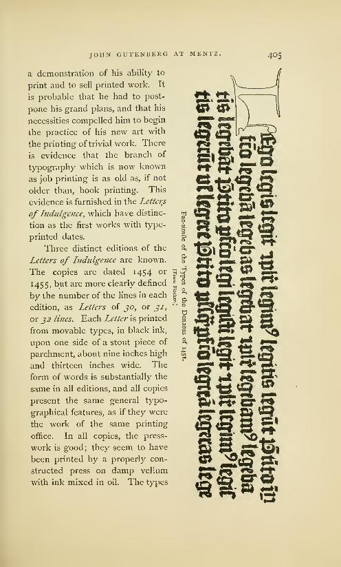
JOHN GUTENBERG AT MENTZ. 405
a demonstration of his ability to
print and to sell printed work. It
is probable that he had to post-
pone his grand plans, and that his
necessities compelled him to begin
the practice of his new art with
the printing of trivial work. There
is evidence that the branch of
typography which is now known
as job printing is as old as, if not
older than, book printing. This
evidence is furnished in the Letters
of Indulgence, which have distinc-
tion as the first works with type-
printed dates.
Three distinct editions of the
Letters of Indulgence are known.
The copies are dated 1454 or
1455, but are more clearly defined
by the number of the lines in each
edition, as Letters of 30, or 31,
or 32 lines. Each Letter is printed
from movable types, in black ink,
upon one side of a stout piece of
parchment, about nine inches high
and thirteen inches wide. The
form of words is substantially the
same in all editions, and all copies
present the same general typo-
graphical features, as if they were
the work of the same printing
office. In all copies, the press-
work is good; they seem to have
been printed by a properly con-
structed press on damp vellum
with ink mixed in oil. The types
SWirE
£2t£0 w Qa *9> Srto22* f«* n" •**
llfl.^S ^» ** f^ 1

406 JOHN GUTENBERG AT MENTZ,
Pica
Body.
ParagonBody.
of the three editions have a general resemblance, 1 yet they
differ seriously as to face and body. They were cer-
_ tainly cast from different matrices and adjust-
ments of the mould,2 and were composed by
different compositors. In the edition of jo
mm lines, the types of the text are on a body
Enj^h smaUer than English, and those of the large
Body, lines are on Paragon body; in the edition of Double-pica
j/ lines the types of the text are on English body, Body *
and those of the large lines approximate Double-pica body.
The types on Double-pica body are those of the
Donatus of 145 1 and the
Bible of36 lines; the types
on Paragon body are those
of the Bible of 4.2 lines.
[From De ia Borde.] The appearance of these
types in the Bibles is presumptive evidence that the printer
of the Bibles was the printer of the Letters. The small types
are unique; they were never used, so far as we know, for
any other work. The large initials may have been engraved
on wood, but the text and the display lines were founded
1 The text letters are of the form
known to librarians as lettres de
somme, or letters of account, which
may be understood as the carelessly
made letters then used in books of
account. The letters of the large
lines are of the form known as let-
ires de forme, or letters of precis-
ion, the angular and carefully madeletters of fine books. The lettres de
somme will be defined in this bookunder the name of Round Gothic;
the lettres de forme, under the nameof Pointed Gothic.
2 Deceived by the close fitting-up
of the matrices, earlier writers said
that the letters were xylographic.
The comments of Dr. Van der
Linde on this error are pertinent:
.... It was thought necessary to
find the wooden letters of the imagina-
tion, and hence bibliography presents
the dismal spectacle that almost all
monuments of the excellent invention,
that fruit of a vigorous mind, of a sim-
ple, but ample and grand idea, have beendeclared by would-be connoisseurs one
by one to be xylographic. This caused
the double trouble of first making out,
with much verbosity and an air of per-
spicuity, incontrovertibly typographical
masterpieces to be wood, and then after-
ward putting aside this pedantry and
returning to the simple truth. Theorigin of typography presents nowhereanything narrow-minded, worthless, or
trifling, for it belongs to the grand facts
of history, but trifling minds have soiled
it with their own littleness. HaarlemLegend, p. 77.
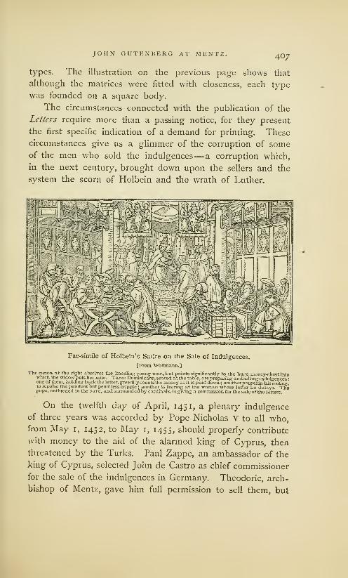
JOHN GUTENBERG AT MENTZ. 4O7
types. The illustration on the previous page shows that
although the matrices were fitted with closeness, each type
was founded on a square body.
The circumstances connected with the publication of the
Letters require more than a passing notice, for they present
the first specific indication of a demand for printing. These
circumstances give us a glimmer of the corruption of someof the men who sold the indulgences— a corruption which,
in the next century, brought down upon the sellers and the
svstem the scorn of Holbein and the wrath of Luther.
Fac-simile of Holbein's Satire on the Sale of Indulgences.
[From 'Woltmaiin.]
The canon at the right absolves the kneeling young man, but points significantly to the huge money-chest intowhich the widow puts her mite. Three Dominicans, seated at the table, are preparing andselling indulgences
:
one of them, holding back the letter, greedily counts the money as it is paid down; another pausesin his writing,to repulse the penitent but penniless cripple ; another is leering at the woman whose letter he delays. Thepope, enthroned in the nave, and surrounded by cardinals, is giving a commission for the sale of the letters.
On the twelfth day of April, 145 1, a plenary indulgence
of three years was accorded by Pope Nicholas V to all who,from May 1, 1452, to May 1, 1455, should properly contribute
with money to the aid of the alarmed king of Cyprus, then
threatened by the Turks. Paul Zappe, an ambassador of the
king of Cyprus, selected John de Castro as chief commissioner
for the sale of the indulgences in Germany. Theodoric, arch-
bishop of Mentz, gave him full permission to sell them, but

408 JOHN GUTENBERG AT MENTZ.
held the commissioner accountable for the moneys collected.
The precaution was justified. When the dreaded news of the
capture of Constantinople (May 29, 1453) was received, John
de Castro, thinking that Cyprus had also been taken, squan-
dered the money he had collected. De Castro was arrested,
convicted and sent to prison, but the scandal that had been
created by the embezzlement greatly injured the sale of the
indulgences. As the permission to sell indulgences expired
by limitation on May 1, 1455, Zappe, the chief commissioner,
made renewed and more vigorous efforts to promote the sale.
It was found that, in the limited time allowed for sale, the
customary process of copying was entirely too slow. There
was, also, the liability that a hurried copyist would produce
inexact copies ; that an unscrupulous copyist or seller would
issue spurious copies. These seem to have been the reasons
that led Zappe to have the documents printed, which was
accordingly done, with blank spaces for the insertion of the
name of the buyer and the signature of the seller.
The typography of this Letter of ji lines is much better
than that of the Donatns, but it has many blemishes. The
text is deformed with abbreviations; the lines are not evenly
spaced out; the capital letters of the text are rudely drawn
and carelessly cut. The white space below the sixteenth line,
and the space and the crookedness in the three lines at the
foot, are evidences that the types were not securely fastened
in the chase. These faults provoke notice, but it must be
admitted that the types were fairly fitted and stand in decent
line. They were obviously cast in moulds of metal; it would
be impracticable to make types so small in moulds of sand.
Eighteen copies of these Letters of Indulgence are known,
all bearing the printed date of 1454 or of 1455. The places
where they were sold having been written on the document
by the seller, we discover that they must have been sold over
a large territory, for one was issued at Copenhagen, another
at Nuremberg, and another at Cologne. The large number
of copies preserved is evidence that many copies must have

jiifltmi Regis Cppti ffpac £tc £>a(utc"m-2>no Cu SbacrilRm? Tjcpo pr ^ 5 ne nf.lme Auola'' oiufa j>uioetia.papa\>9. affbctiSi Re
»
gniCppn mtfhicoioifeT spatics.contiajftoiflio* «uci» ?fpi ijoftcs.'Cljcuaos -* £>aiaceno6 gratis coceftlt ofnib; y,p^fi&elib)\>buil>ct
2itttutt& tpos £ afjjfioncm (agios bin ra\ it)i» £pt pie cxbojtSboqui infra tricniua pjimaeie 00aiianmbm03cc«litinclpl^nbum,
# bercn(ioceatl)ohcffibei nRegnipbictiJc fa.CHUittibjfuismagw^>cl minfyjout »p?«">oiJ)cbtfi?rcicnrii6.pjo«rinb{"t>clriucii6Subj
rtimtt»pieerogaiwiwt^tOnfeirojcep&0nciftcuiaK6\^
3pTicc rcfeutati* exceflibj enmity atqi oelicftsqtMruewqj gjauibj p^onaSoice tarn" ocbita abfolutionc tnvpeWie ^ peniteua lalutojc
imugae flccuo fi tb fyullitcr petiwft ipijsaqutbufcuq) c^cSieahortu fufpenfionu ^)nt«oic£ 3lu(i& fentctiiseeTuiis * penis ccciefia =
fitcis alujc^ocl ab tjofc ymulgatit quib? fatjao mncbati qartut abfolucie .InnTctoy mobo culpc pemtSia falutaii^oclalu& quebe Imeruejmtimugcnba flceis "©ejcpctiitctibp eonfcmVoel ft fosfan propter amiflionem loquelcoftteri non poteiiittfigna^tiiv
rionis oftenbenoo plciffimaown Pc'oif (««:u be qutbj oje afeflU eoibc srjiti rH«f» InSulgetia ac plcaiiaroniflionc"CineJin>itact
let inmo2ti5aiticuloipie auctcapTieaacec^A^alcatJsat^Actbcj co&fcfa.lifuj?ui;*«int aut£ coi^ tjcjcbc&fi tune uaajjint £>ktii.q' pop inoultu accflum £>0nu anu (ingulis fc,xri* f«ii&"W quaba aliabie icimwUegitw itnpe&imcto srclelic pcepto Regufaiiobleatati^pma invueta'ttotc. uej alio* non obftafuGt tpis impebitis in bicto ano uel ciu? pattc anno fequcnti ue( alias quam *
ptimu potciint ieiuuabwit.6tn 7 aUquo auoi^deoai patte Merit leiurtiit camobe abimpleie nequiu-aint Cwtfcflor <\b ib elcctu*
in aliaamuraic potent cantoris opm que-ipffawx «ia teneaffcumobo in eje 3fioentiarf»flio»is |)mo\ quob abfit pcccaic nonjMdumant alioqm bicta conccflio quo a& plcnaiia rcmifficmem monis aniculo ct rcmiflio quo ao pcfa qe ?fibcntJa"\>t pmittit*smifTa nulli? Tint roboiia uel momcti6t quia bcuotiih Juoout6 ott moh ayfpaeli — —)uyta oietu inoulturn be facultatibu* |ui% pie e:ogav\ir- -.meiito butulmooi mouigentiis gau5>«e oebet 7n"«en(ati» teTtinw *
nium^igitlum ao ^ocojbinarum pjercntibjlittcjisteftimonialibj eftajpenfum t>atunv AVotjuntic* [ub 2Uuio ciii O0cc«cJIyiii
fcic uao vlrm\<v QOenfi9<&cccni6nb J£ t=*
ifo:ma plmiffimt abfoltttionfe rtrrariffhmisin tjtm
UllltlUil Ilil at cDHsnfi^efu6?;p§E lualcfifllmaef piinTmamia;tcabroIua< Gtauefcipi?beat«i,q^.peftt#piu<li
ilptozj ei' dc diicte aplua micbi 3mi(fa ct libi ?ccf(a£go te obfoluo ab oniibjpefis tuis jtritis pfcllis *i oblitisGtid ab cmiibj ea/lb9 eycelfib^ crimibt atq? Micris quatuciim giauib? ScJit ilptice refciuatis flecnon a qutburaiiq| e^coieaticniu (iifpenfioii et inte:J>ictl
illiiiq; fnusecfuris -\ pcmsecctiafiias a)ltr<N)el abb<ne ymulgatts f.quastitcu:rirti banio tibi plei(ltma ofm pcfo^ fu07; mcvti s
Setitia ^ remiffiotte"3nq%i(»tuclaues (ancte maniscatie in bac ptc fe cjntenout. Jn nomine patris i filii et (piritus (Uneri amtn .
jYy ^mapImmitamifliomammiKnsararulo^S^nn^wtUT tUt ?t t)n* nofWj ut flipm Ggo te ablbtuo ab omtb? pcfistuis stritis jfeflis i oblitis refrinienoofc \tntta
3
li fibelm i facratncnttseceticReTnittCnbo tibipenaspwgatoriiquaspJopterculpaset offenfasnicujrifti bani>o tibipUnaiiant,
^fmpcf«ujM9jg_r«raiIEaiC.)nqu4tii slaw«5ft«.mijs«fcli« in feac fatak tfWniut»1n nofc pne etftlu ct (puo fancn amot
.
jo'atja'r^onafteui pn />u*cftw?t
ab promi|joi ^cpvtili5*^~T^-'*
Reduced Fac-simile of a Letter of Indulgence, dated 1454.
[From De la Borde.]
To all the faithful followers of Christ who may read this letter, PaulZappe, counselor, ambassador, and administrator-general of hisgracious majesty, the king of Cyprus, sends greeting :
Whereas the Most Holy Father in Christ, our Lord, Nicholas V, bydivine grace, pope, mercifully compassionating the afflictions of thekingdom of Cyprus from those most treacherous enemies of the Crossof Christ, the Turks and Saracens, in an earnest exhortation, by thesprinkling of the blood of our Lord Jesus Christ, freely granted to allthose faithful followers of Christ, wheresoever established, who, withinthree years from the first day of May, in the year of our Lord 1452,should piously contribute, accordirg to their ability, more or less, as it
shouldseem good to their own consciences, to the procurators, or theirdeputies, for the defense of the Catholic religion and the aforemen-tioned kingdom,—that confessors, secular and regular, chosen by them-selves, having heard their confessions for excesses, crimes, and faults,however great, even for those hitherto reserved exclusively for theapostolic see to remit, should be licensed to pronounce due absolutionUpon them, and enjoin salutary penance ; and, also, that they mightabsolve those persons, if they should humbly beseech it, who, perchancemight be suffering excommunication, suspension, and other sentences,Censures, and ecclesiastical punishments, instituted by canon law, orpromulgated by man,—salutary penance being required, or other satis-faction which might be enjoined by canon law, varying according to thenature of the offence ; and, also, that they might be empowered byapostolic authority to grant to those who were truly penitent, and con-fessed their guilt, or if perchance, on account of the loss of speech, theycould not confess, those who gave outward demonstrations of contrition—the fullest indulgence of all their sins, and a full remission, as wellduring life as in the hour of death—reparation being made by themif they should survive, or by their heirs if they should then die: Andthe penance required after the granting of the indulgence is this—thatthey should fast throughout a whole year on every Friday, or some otherday of the week, the lawful hindrances to performance being prescribedby the regular usage of the Church, a vow or any other thing not stand-ing in the way of it ; and as for those prevented from so doing in thestated year, or any part of it, they should fast in the following year," '1 any year they can ; and if they should not be able conveniently
to fulfill the required fast in any of the years, or any part of them,the confessor, for that purpose shall be at liberty to commute itfor otheracts of charity, which they should be equally bound to do : And allthis, so that they presume not, which God forbid, to sin from theassurance of remission of this kind, for otherwise, that which is calledconcession, whereby they are admitted to full remission in the hour ofdeath, and remission, which, as it is promised, leads them to sin withassurance, would be of no weight and validity : And whereas thedevout Judocits Ott von Apspach, in order to obtain the promisedindulgence, according to his ability hath piously contributed to theabove-named laudable purpose, he is entitled to enjoy the benefit ofindulgence, of this nature. In witness of the truth of the above con-cession, the seal ordained for this purpose is affixed. Given at Mentzin the year of our Lord 1454, on the last day of December.The Fullest form of Absolution and remission During
Life: May our Lord Jesus Christ bestow on thee his most holy andgracious mercy ; may he absolve thee, both by his own authority andthat of the blessed Peter and Paul, His apostles ; and by the authorityapostolic committed unto me, and conceded on thy behalf, I absolvethee from all thy sins repented for with contrition, confessed and for-gotten, as also from all carnal sins, excesses, crimes and delinquenciesever so grievous, and whose cognizance is reserved to the Holy See,as well as from any ecclesiastical judgment, censure, and punishment,promulgated either by law or by man, if thou hast incurred any,—giving thee plenary indulgence and remission of all thy sins, inasmuchas in this matter the keys of the Holy Mother Church do avail. Inthe name of the Father, and the Son, and the Holy Ghost. Amen.THE PLENARY FORM OF REMISSION AT THE POINT OF DEATH :
May our Lord fas above]. I absolve thee from all thy sins, with contri-tion repented for, confessed and forgotten, restoring thee to the unityof the faithful, and the partaking of the sacraments of the Church,releasing thee from the torments of purgatory, which thou hastincurred,by giving thee plenary remission of all thy sins, inasmuch as in thismatter the keys of the Mother Church do avail. In the name of theFather, and the Son, and the Holy Ghost. Amen.
Joseph, abbot 0/ the Monastery of Saint Kurckard,Drily qualified to make this engagement.

4IO JOHN GUTENBERG AT MENTZ.
been printed. It is probable that Gutenberg was required
to compose and print the form at three different times; but
we do not know why he found it necessary to make a new
face of text type for the second and third editions,1 for it is
very plain that the types of the first edition were not worn out.
The Appeal of Christianity against the Turks, sometimes
called the Almanac of 14-55, is another small work attributed
to Gutenberg. It is a little quarto of six printed leaves, in
German verse, in the large type of the Bible of j6 lines. Asit contains a calendar for the year 1455, it is supposed that it
was printed at the close of 1454. Its typographical appear-
ance is curious: the type was large, the page was narrow, and
the compositor run the lines together as in prose, marking the
beginning of every verse with a capital, and its ending by a
fanciful arrangement •:• of four full points. It is the first typo-
graphic work in German, and the first work in that language
which can be attributed to Gutenberg. But one copy of this
book is known.
Gutenberg's fame as a great printer is more justly based
on his two editions in folio of the Holy Bible in Latin. The
breadth of his mind, and his faith in the comprehensiveness
of his invention, are more fully set forth by his selection of
a book of so formidable a nature. There was an admirable
propriety in his determination that his new art should be
fairly introduced to the reading world by the book known
1It is possible that other books, known name in Mentz, supposed by
now lost and forgotten, may have him to have been either the false
been printed in the small types, but workman described by Junius, or
Helbig thinks that the types were some graduate or seceding malcon-made expressly for the Letters of tent of Gutenberg's printing office.
Indulgence, as bank-notes are now But we have no evidence of a typo-
made, with the intention that the graphical printer before Gutenberg,copies of each edition should be ex- Jack has endeavored to prove that
actly alike in appearance, and that two Letters were printed by Pfister of
they should be difficult of imitation. Bamberg. De la Borde thinks oneBernard dissents from the belief of the faces of type used in the Let-
that the letters of Indulgence were ters was cut by Schceffer in a friendly
printed by Gutenberg. He attrib- competition with Gutenberg. Theseutes them to some printer of un- conjectures cannot be made plausible.

JOHN GUTENBERG AT MENTZ. 41 1
throughout Christendom as The Book. These two editions of
the Bible are most clearly defined by the specification of the
number of lines to the page in the columns of each book
:
one is the Bible 0/42 Hues, 1in types of Paragon body, usually
bound in two volumes; the other is the Bible of j6 lines,2in
types of Double-pica body, usually bound in three volumes.
It is not certainly known which was printed first. Each
edition was published without printed date, and, like all other
works by Gutenberg, without name or place of printer. They
were not accurately described by any contemporary author.
In the sixteenth century they were obsolete, and the tradition
that they had been printed by Gutenberg was entirely lost.
When a copy of the Bible of 42 lines was discovered in the
library of Cardinal Mazarin, and was identified as the work
of John Gutenberg, it was not known that there was another
edition. The Bible of 4.2 lines was consequently regarded as
the first— as the book described by Zell, which, he says, was
printed in 1450. This belief was strengthened by the subse-
quent discovery, in another copy of this edition, of the cer-
tificate of an illuminator that, in the year 1456, he had fin-
ished his task of illumination in the book. More than twenty
copies of this edition (seven of which are on vellum) have
been found, and they have generally been sold and bought
as copies of the first edition.
The Bible of j6 lines was definitely described for the first
time by the bibliographer Schwartz, who, in 1728, discovered
a copy in the library of a monastery near Mentz. In the old
manuscript catalogue of this library was a note, stating that
this book had been given to the monastery by John Guten-
1It is sometimes described as the to Albert Pfister, a printer of Bam-
Mazarin Bible, and sometimes as berg; as the Schelhom Bible, be-
Gutenberg>s First Bible. cause it was fully described by the
2 This is known as the Bamberg bibliographer of that name ; as Gut-
Bible, because nearly all the known enberg's Second Bible, because it is
copies of this edition were found in the belief of many authors that it
the neighborhood of the town of should have been printed by Guten-
Bamberg; as Pfster's Bible, because berg about 1459, after his rupture
it has been attributed, incorrectly, with John Fust.

412 JOHN GUTENBERG AT MENTZ.
berg and his associates. Schwartz said that this must have
been the first edition. A still more exact description of this
edition was published by Schelhorn in 1760, under the title
of The Oldest Edition of the Latin Bible. He said that this
must have been the edition described by Zell.
v^The Bible of 36 lines is a large demy folio of 1 764 pages,
made up, for the most part, in sections of ten leaves, and usu-
ally bound in three volumes. Each page has two columns of
36 lines each. .In some sections, a leaf torn out, possibly on
account of some error, has been replaced by the insertion of
a single leaf or a half sheet. The workmanship of the first
section is inferior : the indentation of paper by too hard pres-
sure is very strongly marked ; the pages are sadly out of
register; on one page the margins and white space between
the columns show the marks of a wooden chase and bearers,
which were used to equalize impression and prevent undue
wear of types. This section has the appearance of experi-
mental or unpractised workmanship. It is apparent, almost
at a glance, that the printer did not use a proper chase and
bearers, nor a frisket, nor points for making register.1 All
other sections were printed with the proper appliances, with
uncommon neatness of presswork, in black ink, with exact
register, and with a nicely graduated impression, which shows
the sharp edges of the types with clearness.
The types of this book closely resemble, in face and body,
many letters being identically the same, the types of the dis-
play line in the Letter of Lndulgcnce of 31 lines, and of the
Donatus of 14.31. In some features they resemble the types
of the Bible of 42 lines. It is possible that the types of each
edition were designed and made by the same letter cutter, and
that they were made for and used by the same printer. This
opinion is strengthened after an inspection of the mannerisms
of the composition, which are those of the Bible of 4.2 lines.
The colon, period, and hyphen are the only marks of punct-
uation. The lines of text are not always full: the hyphen
'Bernard, De Porigine et des debuts de Pimprimerie, vol. II, p. 30.
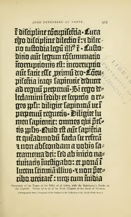
JOHN GUTENBERG AT MENTZ. 413
Inirriplmftotupiftma^umt$a Difnpltnr iJilfttio t:*&ila>
no mflotiiakgu flip f £ufta-
imioailtljgummfiimmatto
fcortuptinrastftrintortupflD r
aMaiittOfe^mrotaj*£atu*ptftraaitacpfapmidcft&ratt
afcregtiupriimuu'&tttgote
Itrtammtft&ibmrcepttfe nrr*
gee fpfit nfligtte fapraitta tit i
petpmwretjimiVfcajgiteta
imufaprasrit: mnmstilnprC*tie ipfts-^mts iftaft fapifda
re qufaoiimUi! fatMittxfrea
* non abfcmtJsara a nobis ra-
rtanwttaiw: fc& abimriona*
rimradsfutftiffabotttjmnaf
lurnnfiimriatUmB^nnnpti^ribaiitritate : n?q?mmmftua
Fac-simile of the Types of the Bible of 36 Lines, with the Rubricator's Marks on
the Capitals. Verses 17 to 22 of the Sixth Chapter of the Book of Wisdom.
[Photographed from a Fragment of the Original in the Collection of Mr. David Wolfe Bruce.]

414 JOHN GUTENBERG AT MENTZ.
is frequently seen projecting beyond the letters. A blank
space was left for every large initial which, it was expected,
would be inserted by the calligrapher. Red ink was not used
by the printer ; the rubricated letters were dabbed over with
a stroke from the brush of the illuminator.
One copy of the book contains a written annotation dated
1 46 1. An account book of the Abbey of Saint Michael of
Bamberg, which begins with the date March 21, 1460, has in
its original binding some of the waste leaves of this Bible.
These, the earliest evidences of date, prove that this edition
could not have been printed later than 1459. That it was
done in 1450, as asserted by Madden, has not been decisively
proved, but the evidence favoring this conclusion deserves
consideration. Ulric Zell's testimony that the first Bible was
printed in 1450 from missal-like types, 1 points with directness
itpiP2?r mm? frpi $et nun con pp per us s contractions Pro
Some of the Abbreviations of the Bible of 36 lines.
[From Duverger.]
to the Bible of j6 lines, for there is no other printed Bible to
which Zell's description can be applied. Its close imitation
of the large and generous style in which the choicer manu-
scripts of that period are written marks the period of transi-
tion between the old and the new style of book- making. The
prodigality in the use of paper seems the work of a man who
had not counted the cost, or who thought that he was obliged
to disregard the expense. As not more than half a dozen
copies are known, it is probable that the number printed was
small. Nearly all the copies and leaves of this edition were
found in the neighborhood of Bamberg. This curious circum-
stance may be explained by the supposition that the entire
edition, probably small, had been printed at the order of, or
1 In the year of our Lord 1450, they printed in a large letter, resembling the
began to print, and the first book they letter with which, at present, missals are
printed was the Bible in Latin : it was printed. Cologne Chronicle of 1499.

JOHN GUTENBERG AT MENTZ. 415
had been mortgaged to, one of the many ecclesiastical bodies
of that town. There is evidence that Gutenberg frequently
borrowed money from wealthy monasteries. The imperfect
workmanship of the first section is, apparently, the work of a
printer in the beginning of his practice, when he had not
discovered all the tools and implements which he afterward
used with so much success. 1
The Bible of 36 lines should have been in press a long
time, for it cannot be supposed that Gutenberg had the means
to do this work with regularity. His office was destitute of
composing sticks and rules, iron chases, galleys, and imposing
stones. Deprived of these and other labor-saving tools, with-
out the expertness acquired by practice, frequently delayed
by the corrections of the reader, the failures of the type-
founder and the errors of pressmen, it is not probable that
the compositor perfected more than one page a day. Hemay have done less. Even if, as Madden supposes, two or
more compositors were engaged on this, as they were uponother early work, the Bible of 36 lines should have been in
press about three years. 2
The newness of the types seems to favor the opinion that
this must be the earlier edition. The same types, or types
cast from the same matrices, were frequently used in little
books printed between the years 145 1 and 1462, but they
always appear with worn and blunted faces, as if they had
1 In the first essays of printing, great In nearly all the popular treatisesdifficulties were encountered. For when n printing, the Bible of 42 lines is
they [the first printers] were printing specified as the first book of Guten-the Bible, they were obliged to expend u Q-~ k.,<- ;«- :*. *i,« u^i,„r„r _ r
d '3
, ,„ . , , berg, but it is the belief of many ofmore than four thousand florins before ., . , , ,., ,. ,
they had printed three sections. Trith-*e ^t learned bibliographers,
emius, as reprinted by Wolf, Monumenta from ZaPf to Dldot and Madden,
Typographical vol. II, p. 654.that the Blble °f36 hnes ls tne older
2 These evidences, which seem to edition. The theory that it must
favor the theory of the priority of have been printed by Gutenberg
the Bible of36 lines, combine many between 1457 and 1459, and the
features of probability, but they are proposition that it may have been
not free from objections. Too little printed by Albert Pfister of Bambergis known about the book to warrant at or soon after that time, will be
a positive statement as to its age. examined on an advanced page.

4i6' JOHN GUTENBERG AT MENTZ.
been rounded under the long-continued pressure of a press,
or had been founded in old and clogged matrices.
Gutenberg deceived himself as much as he did his Stras-
bourg partners, in his over-sanguine estimate of the profits of
printing and the difficulties connected with its practice. His
printed work did not meet with the rapid sale he had antici-
pated, or the cost of doing the work was very much in excess
of the price he received. The great success which Andrew
Dritzehen hoped to have within one year, or in 1440, had not
been attained in 1450. During this year Gutenberg comes
before us again as the borrower of money. If he had been
only an ordinary dreamer about great inventions, he would
have abandoned an enterprise so hedged in with mechanical
and financial difficulties. But he was an inventor in the full
sense of the word, an inventor of means as well as of ends,
as resolute in bending indifferent men as he was in fashioning
obdurate metal. After spending, ineffectually, all the money
he had acquired from his industry, from his partners, from
his inheritance, from his friends,— still unable to forego his
great project,— he went, as a last resort, to one of the pro-
fessional money-lenders of Mentz. "Heaven or hell," says
Lacroix, "sent him the partner John Fust." 1
The character and services of John Fust have been put
'His name is often improperly
written as Faust. In all the books
subsequently printed by Fust and
his partner, Schceffer, the name
appears as Fust. It was so written
and printed by all his contempo-
raries, and is so seen, wherever it
occurs, in the record of the famous
trial he instituted. It is so spelt in
the church record of his burial.
During his lifetime, and for at least
thirty years after his death, the name
is always given as Fust. The noto-
rious reputation subsequently made
by Dr. John Faust, who was born in
Wurtemberg in 1480 (several years
after the death of Fust), who studied
magic in Cracow, and, by his learn-
ing and wickedness, horrified wise
men like Luther and Melancthon
;
whose life, deeds and death are in-
volved in a mystery that dramatists
have turned to such good account,
has been transferred by carelessness
to John Fust, the printer. Theconfusion has been perpetuated by a
legend. The fable, not yet weeded
out of treatises on printing, that
Fust was arrested in Paris for selling
bibles, supposed to have been man-
ufactured at the instigation of the
devil, has served to foster the error.

JOHN GUTENBERG AT MENTZ. 417
before us in strange lights. By some of the earlier writers he
was most untruly represented as the inventor of typography,
as the instructor, as well as the partner, of Gutenberg. Byanother class of authors he has been regarded as the patron
and benefactor of Gutenberg, a man of public spirit, who had
the wit to see the great value of Gutenberg's new art, and
the courage to unite his fortunes with those of the needy
inventor. This latter view
has been popular : to this
day, Fust is thoroughly
identified with all the hon-
ors of the invention. The
unreasonableness of this
pretension has sent other
writers to the opposite ex-
treme. During the present
century, Fust has been fre-
quently painted as a greedy
and crafty speculator, who
took a mean advantage of
the needs of Gutenberg,
and basely robbed him of
the fruits of his invention. 1
It is possible that Gutenberg knew John Fust, the money-
lender, through business relations with Fust's brother, James,
the goldsmith; for we have seen that, during his experiments
in Strasburg, Gutenberg had work done by two goldsmiths.
What projects Gutenberg unfolded to John Fust, and what
allurements he set forth, are not known; but the wary money-
lender would not have hazarded a guilder on Gutenberg's
invention, if he had not been convinced of its value and of
Gutenberg's ability. John Fust knew that there was some
risk in the enterprise, for it is probable that he had heard of
1 Those who favor this view of his name, Fust— in German, fist,
Fust's character, find a peculiar sig- the symbol of all that is hard, close,
nificance in the radical meaning of grasping, and aggressive.
John Fust.
[From Maittaire.]

418 JOHN GUTENBERG AT MENTZ.
the losses of Dritzehen, Riffe and Heilmann. In making an
alliance with the inventor, Fust neglected none of the pre-
cautions of a money-lender. He really added to them, insist-
ing on terms through which he expected to receive all the
advantages of a partnership without its liabilities.1
The terms were hard. But Gutenberg had the firmest
faith in the success of his invention: in his view it was not
only to be successful, but so enormously profitable that he
could well afford to pay all the exactions of the money-lender.
The object of the partnership is not explicitly stated, but it
was, without doubt, the business of printing and publishing
text books, and, more especially, the production of a grand
edition of the Bible, the price of a fair manuscript copy of
which, at that time, was five hundred guilders. The expense
that would be made in printing a large edition of this work
seemed trivial in comparison with the sum which Gutenberg
dreamed would be readily paid for the new books. But the
expected profit was not the only allurement. Gutenberg was,
no doubt, completely dominated by the idea that necessity
was laid on him—that he must demonstrate the utility and
grandeur of his invention,—and this must be done whether
the demonstration beggared or enriched him. After sixteen
years of labor,, almost if not entirely fruitless, he snatched
at the partnership with Fust as the only means by which
he could realize the great purpose of his life. The over-
ruling power of the money-lender was shown in the begin-
1 These were the terms of the when the aforesaid tools and materials
contract, made in August, 1450: should be made, Fust should, every year,
The partnership between Gutenberg furnish Gutenberg with 300 guilders to
and Fust should be for five years, in provide for the payment of the paper,
which time the work projected by Guten- vellum, ink, wages and the other materi-
berg should be completed.— For the als that would be required for the exe-
purposes of this partnership, not speci- cution of the work.—For these advances
fied, Fust should advance to Gutenberg Fust should have one-half of the profits
800 guilders, at 6 per cent, interest, made from the sale of the products of the
The tools and materials made by Guten- partnership.—Fust should be exemptedberg for the uses of the partnership from the performance of any work or
should remain mortgaged to Fust, as service connected with the partnership,
security for this loan of 800 guilders, and should not be held responsible for
until the whole sum should be paid.
—
any of its debts.

JOHN GUTENBERG AT MENTZ. 419
ing of the partnership. Gutenberg had ready the types of
the Bible of 36 lines, and had, perhaps, printed a few copies
of the work—too few to supply the demand. Another edition
could have been printed without delay, but it was decided
that this new edition should be in a smaller type and in two
volumes. It was intended that the cost of the new edition
should be about one-third less than that of the Bible of 36
lines. Gutenberg was, consequently, obliged to cut a new
face and found a new font of types, which, by the terms of
the agreement, were to be mortgaged to Fust.
Fust did not assist Gutenberg as he should have done.
Instead of paying the 800 guilders at once, as was implied
in the agreement, he allowed two years to pass before this
amount was fully paid. The equipment of the printing office
with new types was sadly delayed. At the end of the two
years, when Gutenberg was ready to print, he needed for
the next year's expenses, and for the paper and vellum for
the entire edition, more than the 300 guilders allowed to
him by the agreement of 1450. Fust, perceiving the need of
Gutenberg, saw also his opportunity for a stroke in finance,
which would assist him in the designs which he seems to
have entertained from the beginning. He proposed a modi-
fication of the contract— to commute the annual payment of
300 guilders for the three successive years by the immediate
payment of 800 guilders. As an offset to the loss Guten-
berg would sustain by this departure from the contract, Fust
proposed to remit his claim to interest on the 800 guilders
that had been paid. Gutenberg, eager for the money, and
credulous, assented to these modifications.
The delays and difficulties which Gutenberg encountered
in the printing of this edition were great, but no part of the
work was done hastily or unadvisedly. He may not have
received practical education as a book-maker, but he had the
rare good sense to accept instruction from those who had.
The Bible of 4.2 lines was obviously planned by an adept in
all the book-making skill of his time. It was laid out in 66

420 JOHN GUTENBERG AT MENTZ.
sections, for the most part of 10 leaves each. To facilitate
the division of the book in parts (so that it could be bound,
if necessary for the convenience of the reader, in ten thin
volumes), some of the sections have but 4, some 1 1, and some
12 leaves. The book proper, without the summary of con-
tents, consists of 1282 printed pages, 2 columns to the page,
and, for the most part, with 42 lines to the column. 1
A wide margin was allowed for the ornamental borders,
without which no book of that time was complete, and large
spaces were also left in the text for the great initial letters.
It was expected that the purchaser of the book would have
the margins and spaces covered with the fanciful designs and
bright colors of the illuminator. In some copies, this work
of illumination was admirably done; in others it was badly
done or entirely neglected. The rubrics were roughly made
by dabbing a brush filled with red ink over a letter printed
in black. On the pages of 40 lines, the summaries of chap-
ters were printed in red ink; on other pages the summaries
were written, sometimes in red and sometimes in black ink.
1 There are two kinds of copies, that the 40-line pages were reset bywith differences which seem to justify Peter Schceffer after Fust had ac-
the opinion that they belong to two quired the unsold copies of the Bible,
distinct editions. In one kind, all with intent to lead the purchaser of
the copies have 42 lines to the col- the book to form the belief that it
umn, and all the summaries of chap- was an entirely new edition. Other
ters are written and not printed. In writers suggest that a portion of the
the other kind, the first eight pages first section may have been spoiled,
of the first section have 40 lines to and replaced by a subsequent re-
the column; the ninth page has 41 printing. But the differences are
lines; the tenth and all other pages not confined to the first section. In
(except two 40-line pages in the book many other sections there are differ-
of Maccabees) have 42 lines; and the encesin the spelling and abbreviation
pages of 40 and 41 lines have their of words which clearly prove that
five summaries printed in red ink. the two kinds of copies were printed
The same face of type is used in from separately composed and dis-
both kinds of copies, but the pages tinct forms. The double composition
of 40 and 41 lines occupy the same of every page for the same edition
space as the pages of 42 lines, begin- seems a ridiculous waste of labor,
ing and ending, for the most part, but the proofs of this double labor
with the same words. Bernard says are unmistakable.

JOHN GUTENBERG AT MENTZ. 421
It would seem that it was Gutenberg's original intention to
print all the summaries in red ink, and that he was obliged,
for some unknown reason, to have them written in.
The general effect of the typography is that of excessive
blackness,—an effect which seems to have been made of set
purpose, for the designer of the types made but sparing use
of hair lines. It may be that the avoidance of hair lines was
caused by difficulties of type-founding. The type-founding
was properly done: the types have solid faces and stand in
line. The letters are not only black but condensed, and are
so closely connected that they seem to have been spread bypressure. Double letters and abbreviations were freely used.
Judged by modern standards, the types are ungraceful; the
text letters are too dense and black, and the capitals are of
rude form, obscure, and too small for the text. The press-
work is unequal: on some vellum copies, the types are clearly
and sharply printed; on other copies, they show muddily
from excess of ink. On the paper copies, the ink is usually
of a full black, but there are pages on paper and on vellum,
in which, for lack of ink and impression, 1 the color is of a
grimy gray-black. Van der Linde and others say that the ink
will not resist water, but the ink on the fragments of vellum
belonging to Mr. Bruce stood a severe test by water, with-
out serious change of color. The register on the paper copies
is very good; on the vellum copies it is offensively irregular,
a plain proof that the vellum had been dampened, and had
shrunk or twisted before the second side was printed.
It has been said that this Bible of 4.2 lines was printed
with intent to cheat purchasers, so that it might be sold as
a manuscript. There is a legend that Fust did attempt the
cheat at Paris, but there is no good authority for the libel,
which scarcely deserves examination. There were, no doubt,
during the fifteenth century, many who could not perceive
'Bernard says that over-colored unequal blackness to imperfections
and under-colored pages are by in the inking implements. De Pori-
no means rare. He attributes this gine de Pimprimerie, vol. I, p. 182.

422 JOHN GUTENBERG AT MENTZ.
the dissimilarities between manuscript and printed books, but
these men were not book-buyers. To the intelligent book-
buyer, the features of dissimilarity were conspicuous. 1 It is
not at all probable that Gutenberg entertained any thought
of deception: he imitated his manuscript copy only because
it was in an approved style of book-making.
Although the types of this Bible are obsolete, there is
something pleasing in their boldness and solidity to a reader
who is wearied with the small trim letters, light lines and
apparently paler ink of modern books. The effect of rugged
strength is relieved by the flowing lines, vivid colors and
complex ornamentation of the odd borders and initials which
have been added by designer and illuminator. How much
of the pleasure derived from an inspection of the work is due
to the skill of the printer, and how much to the art of the
illuminator, has not always been judicially weighed by those
who represent the book as a specimen of perfect printing.
It cannot be denied that the most attractive features of the
book are those made, not by printing, but by illumination,
but it is plain that the designs and ornamentation are not
of a character appropriate to the text. They would not be
allowed in any modern edition of the book.
The workmanship of the printer in his own proper field
is wonderful when we regard the circumstances under which
it was done, but it would not satisfy the requirements of a
modern publisher or book-buyer. It is of its own time, with
the faults of that time, in manner and matter. The promise
of legibility, which seems warranted by the bold and black
types, is delusive. The ordinary Latin scholar cannot read
the book, nor refer to any passage in it, with satisfaction. It
is without title and paging figures. The blank spaces which
indicate changes of subject, and give relief to the eye, were
seized by the illuminator. Verse follows verse, and chapter
follows chapter, and one line chases another with a grudg-
1 See the fac-similes of Sotheby maries of this Bible, as they present
and Humphreys. The written sum- them, are unlike the printed text.
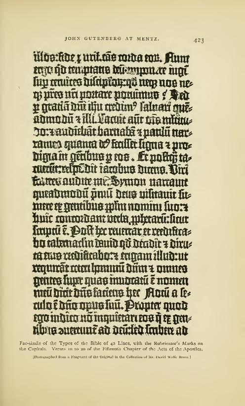
JOHN GUTENBERG AT MENTZ. 423
iftSgfitKj uritiaemim am. jflumttrfon&ttbptane ifeitmur iugtfugmutes tjifiip&}p$ trapnoem>
aomofiu \ilMmkmtmtmui'3m auriMthamM tpmsiixmn>ramtiipiaraa^&auWtgna^pra*fct0iamgftAuag ras, ftpofiftfcaiKtafpf&t iambus imm&iuaitateauout nt£&ymrot narraatt
ijumijwuiju prou ijtus yifttauit fit*
Mfipittojpfttromtm fuo:?
fonit ranroitsattt utrta^j^tasurfiait
litqttui^oB^emimactcreeotfica^
totafemadwsaui&ijtsBea&st 3 fciru*
tajwstecotfitataingamiUulmttttq^irgtrctmlpmrau fjfiuu omnesgmttsuipi ijuasmumatu fnoramimu fcrntimsfariras^c jHoul a fr*
mlofistopusuulf^raptfc quoit
tgotnttittritoimpifftanomj| t| gen*
Fac-simile of the Types of the Bible of 42 Lines, with the Rubricator's Marks onthe Capitals. Verses 10 to 20 of the Fifteenth Chapter of the Acts of the Apostles.
[Photographed from a fragment of the Original in the Collection of Mr. David Wolfe Bruce.]

424 JOHN GUTENBERG AT MENTZ.
ing of white space and of true relief which is not atoned for
by the dabs of red in the rubrics, nor by the profuse wealth
of ornamentation in the centre column and margins. The
composition is noticeably irregular: the lines are not always
of uniform length. When a word was divided, the hyphen
was allowed to project and give to the right side of the column
a ragged appearance. When there were too many letters for
the line, words were abbreviated. The measure was narrow,
and it was only through the liberal use of abbreviations that
the spacing of words could be regulated. The period, colon
and hyphen were the only points of punctuation.
The manuscript taken for copy was not strictly accurate,
and the errors of the scribe were repeated by the compositor.
The liberties taken by scribe and compositor in the making
of abbreviations, and in the spelling out of abbreviations, were
a prolific source of error. It was quite as much on account
of the frequency of these errors, as the obsoleteness of the
types, that this famous edition was so soon laid aside and
was so quickly forgotten. It was supplanted by the editions
of the more scholarly printers of the sixteenth century, who
collated a great many manuscript and printed copies before
they prepared a new copy for the printer.
It is unfortunate that Gutenberg did not, as was custom-
ary with the book-makers of that time, put his name and
the date of printing on the book. The omission was partially
supplied by an illuminator who suffixed the following colo-
phons or subscriptions to his copy of the book
:
First Volume. Here endeth the First Part of the Old Testament
of the Holy Bible, which was illuminated, rubricated and bound byHenry Albech, or Cremer, on Saint Bartholomew's Day (August 24),
in the year of our Lord 1456. Thanks be to God. Hallelujah.
Second Volume. " This Book was illuminated, bound and perfected
by Henry Cremer, vicar of the Collegiate Church of Saint Stephen in
Mentz, on the Feast of the Assumption of the Blessed Virgin (August
15), in the year of our Lord 1456. Thanks be to God. Hallelujah.
As the second volume was illuminated nine days before
the first volume, it may be supposed that, on this copy, the

JOHN GUTENBERG AT MENTZ. 425
work of illumination was started on the sheets, as soon as
they had been printed and before they were bound. It is
possible that the last sheet was printed in 1456, but it is a
more general belief that the work was completed in 1455.
There is no tradition about the number printed. At the
close of the century, three hundred copies were regarded by
printers of Italy as a proper number for an edition in folio.
It is not probable that Gutenberg printed so large a number.
Unbound copies were sold at different times and places, not
long after publication, for various sums ranging from twelve
guilders to sixty crowns. 1It does not appear that the books
provoked any enthusiasm: no chronicler of that time thought
it worth while to give them even a passing mention. Wehave to suppose that they attracted no more attention than
the books of a copyist. It appears, also, that the Bible 0/4.2
lines, from a mercantile point of view, was a very unsuccessful
enterprise. This is the evidence.
On the sixth day of November, 1455, Fust brought a suit
for the recovery of the money advanced to Gutenberg. As
Gutenberg was unable to pay the demand, we may suppose
that the Bible had not been completed, or, had not met with
a ready sale. The suit of John Fust has been the occasion
of discordant criticism. Dibdin fully justifies his action, and
intimates that Gutenberg was really a trickster, who would
have defrauded Fust if he had not resorted to summary pro-
ceedings. The defenders of Fust, who are few, have to admit
that he here appears as a keen man of business, destitute of
sentiment, and of ungenerous disposition. Sympathizers with
Gutenberg denounce Fust as a cunning schemer, who had
made the terms of the partnership rigorous with the secret
determination to get possession of the invention through
Gutenberg's inability to keep his contract.
This is the record of the proceedings before the court:
1 At the sale of the Perkins library was sold for ,£3,400, and a copy on
near London, June 6, 1873, a copy paper for £2,690— more than the
of the Bible of 42 lines, on vellum, first printers got for all the copies.

426 JOHN GUTENBERG AT MENTZ.
Instrument of a certain day, when Fust produced an account and
confirmed it by an oath. In the name of God. Amen. Be it
known to all who shall see this public document or hear it read, that,
in the year of our Lord 1455, on Thursday, the 6th of November,
between eleven and twelve at noon, at Mentz, in the large dining-hall
(refectorium) of the convent of bare-footed friars, appeared before me,
notary, and the witnesses to be mentioned hereafter, the honorable and
prudent man Jacob Fust, citizen of Mentz, and has, in behalf of Johan
Fust his brother, also present, shewn, said and exposed, that to the
said Johan Fust on the one side and Johan Gutenberg on the other,
should be administered the oath, according to judgment passed on
both the parties, and for which this day and this hour had been fixed
and the hall of the convent assigned. In order that the friars of the
said convent, who were still assembled in the hall, should not be
disturbed, the said Jacob Fust did ask through his messenger, whether
Johan Gutenberg, or any one for him, were present in the convent, in
order to finish the matter. At this message came into the said refec-
torium the reverend Heinrich Gunther, pastor of St. Christopher's at
Mentz, Heinrich Keffer, and Bertolf von Hanau, a servant of Johan
Gutenberg, and when they had been asked by Johan Fust whether
they had been authorized by Johan Gutenberg, they answered that
they had been sent by Junker Johan Gutenberg to hear and see what
should happen in this case. Thereupon Johan Fust begged leave to
conform to the stipulations of the verdict, after he had waited for
Johan Gutenberg till twelve o'clock, and was still waiting for him.
He reads the sentence passed on the first article of his claim, from
word to word, with its pretension and response, which runs as follows:
First, that he, according to the written agreement, should lend JohanGutenberg about 800 florins in gold, with which he was to finish the
•work, and whether it would cost ?nore or less was no matter to Fust
;
and that Johan Gutenberg was to pay six per cent, interest for this
money. He had indeed lent him these 800 guilders on a bond, but
Gutenberg was not satisfied, but complained that he had not yet
received the 800 guilders. For that reason, Fust, being desirous of
doing him some service, lent him 800 guilders more than he was
bound by his contract to do, for which 800 guilders Fust had to pay
forty guilders as interest. And, although Gutenberg had bound him-
self by contract to pay six per cent, interest on the first 800 guilders,
yet he had not done so for a single year, but Fust had to pay this
interest himself to the amount of 250 guilders. For, at present,
Gutenberg having never paid interest, and Fust having been obliged
to borrow this interest from Christians and Jews, for which he hadpaid about thirty-six florins, his payments, together with the capital,

JOHN GUTENBERG AT MENTZ. 427
amount to about 2,020 guilders, of which he demands reimbursement.
Thereupon, Johan Gutenberg answered that Johan Fust had agreed
to lend him 800 guilders, with which money he was to arrange and
make his tools, and that these tools should remain as security for Fust.
But Fust had moreover agreed to give him every year 300 guilders for
expenses, and to advance also wages, house-rent, vellum, paper, ink,
etc. If, afterward, they did not agree, Gutenberg should then pay
the 800 guilders back, and the tools should be free from mortgage ; it
should be understood, that with the 800 guilders he had to make the
machine, which was to be a pledge. He hopes not [that any one shall
pretend] that he was obliged to spend these 800 guilders on the ivork
of the books [/. e., on vellum, paper, etc.] And, although it is said in
the contract that Gutenberg was to pay six per cent, interest, Fust had
told him that he had no intention of accepting this interest from him.
Moreover, he had not received the 800 guilders in full and at once
according to agreement, as Fust had pretended in the first article of
his claim ; and as for the second 800 guilders, he is ready to give an
account of them, but declines to give him interest or usury for them,
and hopes that he is not bound by law to pay them. We pass, there-
fore, sentence according to pretension and response: When Johan
Gutenberg has submitted an account of all receipts and disbursements
spent on the work to their common profit [i. e., printing], this work shall
be added to the 800 guilders; if he has spent more than the 800
guilders, which did not belong to their common profit, he should pay
it back ; if Fust is able to prove, on oath or by witnesses, that he has
borrowed the money on interest, and did not lend it out of his ownresources, then Gutenberg is bound by contract to pay it.
Now, after this sentence had been read in presence of the aforesaid
witnesses, Johan Fust has, with raised fingers, in the hands of me,
public notary, taken the oath by all the saints, that everything was
comprised according to truth and sentence, in an act which he placed
in my hands. He confirmed it on oath, as truly as God and the saints
may help him ; and the contents of this document were as follows
:
I, Johan Fust, have borrowed 1,550 guilders, which have been
received by Johan Gutenberg, and spent on our common work, for
which I have paid an annual interest, and still owe a part of it.
Therefore, I count for every hundred guilders which I have borrowed
in this way, six guilders per annum ; and for the money spent on our
common work, I demand the interest according to judgment passed.
The said Johan Fust demands from me, public notary, one or more
public acts of this matter, as many and as often as he should want
them; and all these matters recorded here, happened in the year,
indiction, day, hour, papacy, month, and town aforesaid, in the pres-

428 JOHN GUTENBERG AT MENTZ.
ence of the honest men, Peter Grauss, Johan Kist, Johan Knoff,
Johan Yseneck, Jacob Fust, citizens of Mentz ; Peter Gernsheim and
Johan Bone, clerks of the city and diocese of Mentz, asked and sum-
moned as witnesses. And I, Ulrich Helmasperger, clerk of the
diocese of Bamberg, by imperial authority, public clerk of the HolySee at Mentz, sworn notary, have been present at all the aforesaid
transactions and articles with the witnesses mentioned. Therefore,
being requested to do so, I have signed with my hand, and sealed
with my common seal, this public act, written by another, as testimony
and true record of all the aforesaid matters.
'
Ulricus Helmasperger, Notary.
The suit brought by Fust was, apparently, a surprise, for
it cannot be supposed that Gutenberg would have been so
completely unprepared to meet his obligation if he had not
been led to believe that Fust would postpone the collection of
his claim. The enforcement of this claim before the book was
published, or at least before money had been derived from its
sale—taken in connection with the facts that the delay in the
publication of the book, and Gutenberg's inability to pay his
debt, were largely due to the delay of Fust in furnishing the
money as he had promised—seems to warrant the charge that
Fust meditated the despoilment of Gutenberg at the formation
of the partnership. Gutenberg's defense before the court was
very feeble : it is that of a man who knew he had no hope of
success. He did not appear in person, but trusted his case
to his workmen. Fust was more adroit; he was voluble and
positive, and his relative, Jacob Fust, was one of the judges.
But the fates were against Gutenberg : the hard terms of the
contract he had signed compelled an adverse decision.
That Fust did Gutenberg a grievous wrong is very plain;
that Gutenberg had managed the business of the partnership
with economy and intelligence is not so clear. At no period
of his life did the great inventor show any talent for financial
administration. He was certainly deficient in many qualities
that should be possessed by a man of business, and Fust mayhave thought that he was fully justified in placing his money
1 Hessels' translation, as printed in the Haarlem Legend, pp. 24 and 25.

XXII
Up Jmbr Wfivk txi GuinAcrg*
Establishes a New Printing Office. . .Calendar of 1457. ..Not probable that the Bible of 36 lines wasprinted at this time . . . Gutenberg Embarrassed by Debts . . . Letter of Indulgence of 1461 , with Fac-
simile . . Catholicon of 1460, with Fac-simile and Colophon . . . Indifference of Gutenberg to Fame.Pamphlets attributed to Gutenberg. . .Celebration of the Mass, with Fac-simile . .Mirror of the
Clergy, with Fac-simile. . .The War between the Rival Archbishops .. The Siege and Sack of
Mentz . . . Gutenberg's Office removed to Eltvill . . . Gutenberg made a Gentleman of Adolph's
Court ..End of Gutenberg's Labors... His Death in 1468 ... Disposition of his Types... His
Sen-ices not fully Appreciated . . . True Nature of his Invention . . His Merit acknowledged byWriters of his Time. . .Tablets of Gelthus and Wittig. . .Permanency of Gutenberg's Invention.
£tf)p sfioulo" toe talk atiout monuments of tronjc or martle to rommemorate tfje
serbLces of (fiutenfcerg ? ${i5 is a monument tofjirf), more frail than an» other,
toill surbibe item all: it is tfjc Book. Madden.
GUTENBERG had been legally deprived of his printing
office and of the exclusive right to his great invention,
but he was not left friendless and utterly impoverished. Nor
was his spirit broken by this great calamity. The reflection
that Fust was owner of the materials made for printing the
Bible of 4.2 lines, ^.nd was about to enjoy all the emoluments
of the new art, aroused Gutenberg to rivalry. He was nearly
sixty years of age, but he was vigorous in mind, if not in
body, and evidently retained all his old power of persuasion.
When he determined to found a new printing office, he found
helpers: Conrad Humery, a physician, and also clerk of the
town of Mentz, provided him with the means, and some of
his old workmen came over to join his fortunes.
Gutenberg had some materials toward the equipment of
a new office. Fust's mortgage covered only the materials

432 THE LATER WORK OF GUTENBERG.
made with Fust's money for the common profit; it did not
cover the large types on Double-pica body, which were used
upon the Bible of 36 lines, and other materials which might
have been made in Strasburg. As these types were subse-
quently used in several little books which may be attributed
to Gutenberg, we may conclude that he retained the punches
and matrices in his own possession.
We have indirect evidence that the new printing office of
Gutenberg was in operation at the close of the year 1456.
With the types of Double-pica body he printed on one side
of the paper, obviously made to be pasted on a wall, a broad-
side, now known as the Calendar of 14.57. Of this curious
document, only the half of a copy has been found— a frag-
ment which contains the festivals and notable days for six
months. It is fairly printed in black ink on coarse paper.
It is the belief of several historians that Gutenberg, hot
with anger at the bad faith of Fust, in wresting from him the
honor of printing the first Bible, immediately undertook in
his new office to publish a rival edition of the same book, or
the edition herein described as the Bible of 36 lines. The
annotation in one copy of the book of the year 1459, which
is supposed to be the date of publication, accords with the
conjecture that the book begun in 1456 could have been
finished in three years. But there is no evidence that it was
begun in 1456, while there are many indications that it was
done or should have been done in 1450. Gutenberg had
earned fame as a printer 1in 1458, but no writer of that time
has said that he was then at work on the Bible of 36 lines.
1 Philip de Lignamine, in a book is an error of memory or of typog-
entitledA Continuation of'the Chron- raphy, and the mention of Stras-
icles of the Popes, which he printed burg as Gutenberg's birthplace is
in Rome in 1474, writes concerning incorrect, but the statement that he
the year 1458: "Jacob Gutenberg printed in 1458 is, no doubt, true.
of Strasburg, and another called It seems the testimony of a printer,
Fust, very skillful in the art of print- whose knowledge of the facts had
ing with characters of metal on been derived either from personal
parchment, each printed three hun- observation, or from the reports of
dred leaves daily at Mentz." Jacob workmen once employed at Mentz.

THE LATER WORK OF GUTENBERG, 433
We have evidence, also, that he was embarrassed by his
debts. After the year 1457 he was unable to pay the four
pounds annually to the chapter of St. Thomas at Strasburg,
as he had agreed to do in 1442. The chapter summonedhim to appear before a court at Rottweil in Suabia, in 1461,but to no purpose, for he was unable to satisfy this debt.
His printing materials were owned by Conrad Humery, andnot liable to seizure. It is by no means clearly established
that he was, even then, carrying on business in his own name.Helbig thinks it was the fear of legal proceedings, if he had
B-^ otttfflrflTwimugpnyg rare twpsEuw^ 4um —
—
&ioc V10 repacom ecdfe flutSufefT ct a$ op? fabrics rpj9 infatttu gopio ouotecim fcieb? fcifporn ^oHlt-)&coq5paHiccps)n5ufgcnoa^ in
brim nrm pium papa fcom cocKfTa^ c(Tc feebebit viteliec>q>eligc pomentis Mrticulo 9feflToror» Vfconeum q cum ab omib9$enrencvj$ tmquas nonou incifciffo &clarat9 efV/lecno it ab omib^ crim\b9 p<#cafib9 cria fcfci aplTce rejniatis abfblui et plenaria remifftone aucte
poffirSic rri q> fahfFariat fi alian £ eu fatifFactio tmpcn&efcafit €t f
vC loco fcxte ftme qn aliunde m ilia ieiunar* renerur alio oie in fcf
pierarie iuxra ©ictamen fui confefforis maxie a& fabricam oicte ccc
faciar £t in obeoieria fan* aplfce ac pfari (ctlfHrni Sni nri pij pap1
bulla fct'eti fcm papc p:j pleni9 conrterurjn cui9 reftitfommSi<jillU
Ret>nfoa20u£pm ac tUioolpbunv'&scapJi voo2ma^j®r*)pio badnd 1
a dicto bno pio fumo ponrifke eft cava facultas pnribus eft appe
OOiilefimoquabrlngen^rimolcxa^rimopzimoFac-simile of the Types of the Letter of Indulgence of 1461.
[From Bernard.]
made himself very conspicuous, that prevented him from
putting his name on his books. This omission has made it
difficult to specify the books and pamphlets which are sup-
posed to have been printed by him about this time.
One of these works is The Letter of Indulgence of 1461,
an indulgence granted by Pope Pius II to all who should
contribute to the restoration of a church at Neuhausen. It
is printed in a new face of type, which should have been
made before 1460. The types of this indulgence resemble
those of the Letters of Indulgence of 30 lines and of j/ lines,
but they were cast from different matrices and in a different
434 THE LATER WORK OF GUTENBERG.
mould. They seem to be the production of an incompetent
punch-cutter; the letters were rudely cut, the matrices were
not properly fitted up, and the types do not line. The press-
work, upon new types, is good.
In the same face of type, but upon a body a little larger,
Gutenberg printed the Catholicoi? of 14.60, a great folio of
748 pages of double columns, with 66 lines to each column.
In some copies of the Catholicon, the summary of contents is
printed in red ink, and ornamented with an engraving which
fills one side of the first page. The composition is as rude
as that of the Bibles; the right side of each column is always
ragged from careless spacing. The colophon annexed states
that the book was printed at Mentz in 1460, but it does not
give the name2 of the printer. The silence of Gutenberg con-
cerning his services is remarkable, all the more so, when
this silence is contrasted with the silly chatterings of several
printers during the last quarter of the fifteenth century,—of
whom Peter Schceffer may be considered as the first, and
Trechsel of Lyons the last,—each insisting that he, whatever
others might have done before him, was the true perfecter
of printing. There is no other instance in modern history,
excepting possibly that of Shakespere, of a man who did so
much and who said so little about it This colophon is the
only passage in this book, and, indeed, in any of his works,
which can be attributed to Gutenberg:
'This Catholicon was written, or
edited, as the title informs us, byJohn of Genoa, of the fraternity of
preachers, or mendicant friars. It
contains an elaborate Latin gram-
mar and an etymological dictionary
in five divisions. It was a text bookof authority in the higher schools.
2 Van Praet says that Gutenberg,
as a noble, dared not advertise his
connection with a mechanical art.
This is absurd, for Gutenberg's con-
nection with printing in Mentz hadbeen known for at least ten years,
and printing was not then regarded
as a business derogatory to the stand-
ing of a noble. Wetter says that
Gutenberg was humiliated by the
superior workmanship of Fust andSchceffer. But the work of these
printers was not of such unquestion-
able superiority. Helbig's conjecture
seems most plausible, but Guten-
berg may have been so intent on the
personal satisfaction he derived from
the realization of his ideas, that he
was comparatively indifferent to the
gratification derived from notoriety.
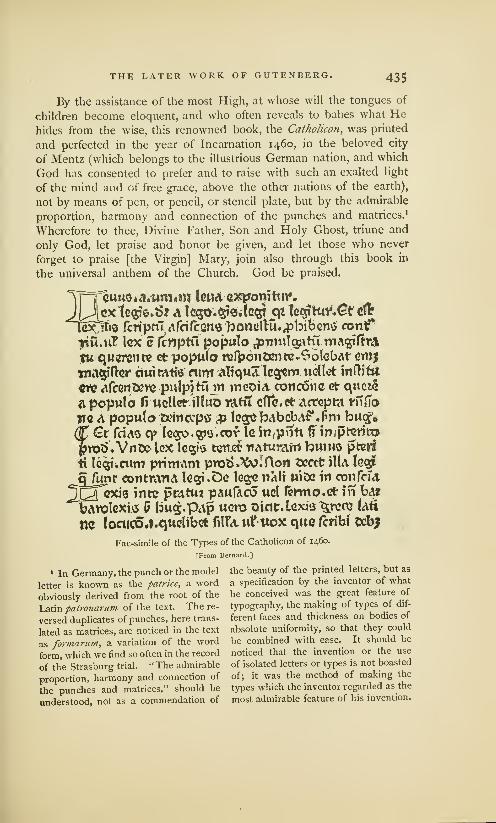
THE LATER WORK OF GUTENBERG. 435
By the assistance of the most High, at whose will the tongues of
children become eloquent, and who often reveals to babes what Hehides from the wise, this renowned book, the Catholicon, was printed
and perfected in the year of Incarnation 1460, in the beloved city
of Mentz (which belongs to the illustrious German nation, and which
God has consented to prefer and to raise with such an exalted light
of the mind and of free grace, above the other nations of the earth),
not by means of pen, or pencil, or stencil plate, but by the admirable
proportion, harmony and connection of the punches and matrices. 1
Wherefore to thee, Divine Father, Son and Holy Ghost, triune and
only God, let praise and honor be given, and let those who never
forget to praise [the Virgin] Mary, join also through this book in
the universal anthem of the Church. God be praised.
=
3uuQ»A.'um«ni lend eaajomtur.
^ex tecjte.S? A Ic<30.§te.lG$j <p teoriHir^r clfr
[exjITio fcriptu afrifcGns faonelK**«pbibem> contf
iriu.nT lex c Icnptu poputo £muTgptu.magifh&tu querents ct poputo rerpdn&mte^olelMt cmjjnagifar cmimtfe nint atiqua legem wellct inOifct
«n? <*fcer»s?)t» pulpiKnn inooia. cotieone ct c\uci§
a poputo fi uoUct iltuo rant effect* actopm riilTo
WQ A poputo txinccpff p te^bAbebAf*f>m bucf.
(t €r feus q> lc<3o.$i$.cof Ic fn,pnti (? impt-erito
jjr©<5 '«Vnt>e> lex Ig^is tuttefc tutu-ram bumo pter§
*i legttcum primam pro*>»XvIflon tccct iUa tcar#
SJunr cotitmrU 1g<5? .Do legs iiali U)De in 0011 Pom.
^yexjg intc pratuz pAufaco uol fermo.et in ba*
barolexis £ bu£.p<\p ucro tricic.lcxi'3 %rcc\2 (<\H
tic loaicOJ.qttclibetfil?<tiiVttoxqucfcribJ Oebj
Fac-simile of the Types of the Catholicon of 1460.
[From Bernard.]
1 In Germany, the punch or the model the beauty of the printed letters, but as
letter is known as the patrice, a word a specification by the inventor of what
obviously derived from the root of the he conceived was the great feature of
Latin patronarum of the text. The re- typography, the making of types of dif-
versed duplicates of punches, here trans- ferent faces and thickness on bodies of
lated as matrices, are noticed in the text absolute uniformity, so that they could
as formariim, a variation of the word be combined with ease. It should be
form, which we find so often in the record noticed that the invention or the use
of the Strasburg trial. " The admirable of isolated letters or types is not boasted
proportion, harmony and connection of of; it was the method of making the
the punches and matrices," should be types which the inventor regarded as the
understood, not as a commendation of most admirable feature of his invention.

436 THE LATER WORK OF GUTENBERG.
The dignified and reverential language of this colophon,
so unlike the vainglorious imprints of Fust and Schceffer and
the commonplace subscriptions of Pfister, is almost enough
of itself to show that the printer of the Catholicon was John
Gutenberg. That he should attribute the invention to the
assistance and favor of the Almighty, might be expected from
a man thoroughly imbued with religious sentiment, but why
Gutenberg should, in this and in all other books, neglect to
mention himself as the man through whom the invention was
accomplished is an irregularity which cannot be explained.
This neglect is strange, for Fust and Schceffer had boasted,
in an imprint to the Psalter of 14.57, of their skill as printers.
Five little pamphlets with texts in a new face of Round
Gothic on English body, and with chapter headings in types
resembling the text types of the Bible of 42 lines, have been
attributed to Gutenberg. They are : A Treatise on the Cele-
bration of the Mass, 1 a book of 30 leaves; A Calendar, or AnAlmanac for 1460, in Latin, a quarto of 6 leaves; The Mirror
of the Clergy, by Hermann of Saldis, "happily perfected and
printed at Mentz," a quarto of 16 leaves; A Treatise on the
Necessity of Councils, etc., a quarto of 24 leaves; A Dialogue
between Cato, Hugo and Oliver about Ecclesiastical Liberty,
were eager to know more of the life
and labors of Gutenberg. In his
treatise on the Typographic M07111-
ments of Gutenberg, Fischer, on the
authority of Bodmann, printed the
copy of a verbose document which
set forth that John Gutenberg and
Frielo Gensfleisch assented to the
action of their sister Hebele in con-
veying to the Convent of Saint
Clare, of which she was then a nun,
her share in the paternal inherit-
ance. It also recites that John Gut-
enberg will give to the convent a
copy of every book to be printed by
him. This document, which is dated
1459, is not accepted as genuine bydiscreet bibliographers.
1 This work is attributed to Gut-
enberg, chiefly on the authority of
this inscription, which was found in
a copy in the possession of the Car-
thusian Friars at Mentz:
The Carthusian Friars near Mentz,
through the liberality of John Guten-
berg, own this book, which was madeby his wonderful art, and by the skill of
John Nummeister, clerk. In the year
of our Lord 1463, on the 13th calend
of July [June 19].
Helbig doubts the genuineness
of this annotation, and intimates
that it may be the work of Bod-mann, a librarian at Mentz, who has
been suspected of attempts to foist
spurious documents on those who

THE LATER WORK OF GUTENBERG. 437
a quarto of 20 leaves.1
It is possible, but not certain, that
Gutenberg printed these books. A Treatise on Reason andConscience, 2 by Matthew of Cracow, a small quarto of 22
leaves, and A Summary of the Articles of Faith, by ThomasAquinas, a quarto of 12 leaves, printed in the types of the
CatJwlicon, may be confidently accepted as the work of Gut-
enberg. But one copy or fragment of some of these works
is known. Gutenberg may have printed many other works
which have been destroyed and forgotten. 3
^omtmca^cinupft &i£afceitR6isfcmoflmu&ilicale£xaudivptoht$ cufuffrafcrjsbuofo Wa»5*<T"tia.etpfo,coete fc^o afomfioni&nccno (Sftain excelfis Otfoefcikinif*fafrmcaliter bwtor.
Fac-simile of the Types of the Treatise on the Celebration of the Mass.
[From Fischer.]
The existing copies or fragments of pamphlets and books
printed before 1 462 are enough to prove that printing met
1 Bernard says that some of these reclaimed it. . . ." Henry Kepfer
works were probably printed by an was one of Gutenberg's workmenunknown printer at Mentz (not the who appeared for him on the trial,
printer ofthe Indulgenceof31 lines); 3 Fischer says that a library at
but this conjecture of two printing Mentz once contained several pam-offices, about which history and tra- phlets printed by Gutenberg in the
dition are silent, which never pro- large types of the Bible of36 lines.
duced any work of value, cannot be He gives fac-similes of the illumi-
accepted. nated initials in one of these pam-2A copy of this book in the Na- phlets, which closely resemble those
tional Library at Paris has an anno- of the Psalter of 1457. This simi-
tation which sets forth that "Henry larity is more than an indication that
Kepfer of Mentz put this book in the letters of this Psalter were madepledge for twelve days, and has not by Gutenberg.
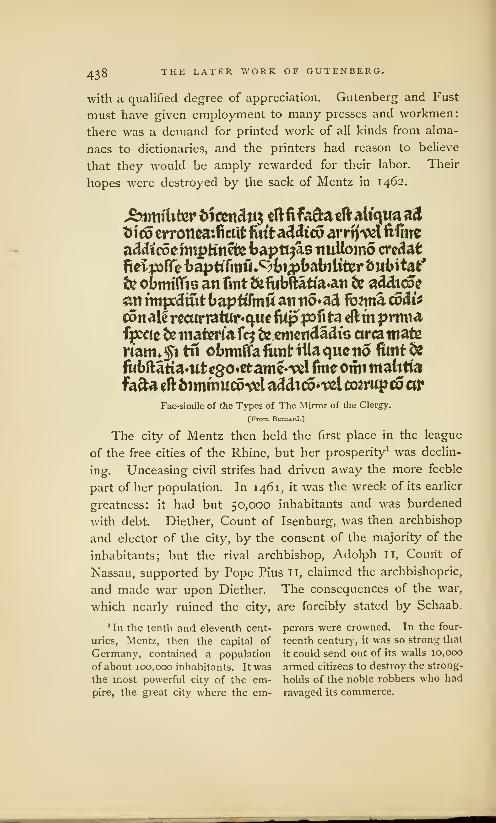
438 THE LATER WORK OF GUTENBERG.
with a qualified degree of appreciation. Gutenberg and Fust
must have given employment to many presses and workmen:
there was a demand for printed work of all kinds from alma-
nacs to dictionaries, and the printers had reason to believe
that they would be amply rewarded for their labor. Their
hopes were destroyed by the sack of Mentz in 1462.
Similiter titm&ifo dlfifa&acftali'qwaad
fcitfp erronea:fictit firfta&ftco arrfl'Vfcl fifine
addicoennpfcinete baptt^as nuttomo credafc
fieipffe fcaptffmiLc>fct;pbat>ilifcer bubtt&ffe obmilTis an fint &fabftatia*an & addtcoe
on rmjxciuitbapttfinu an tio^ad fb?ma codit
eonal£recurratur*quefiipp3fita eftmprmiafpceie tie materiafq ie.cmeifdadts areamateriant*$1 tn obrmffafiinHtiaqueno funt&ftbftatianttcgo^ttame^l fmeomi malitiafafta eftfcimmucotel adcUc6*tfcl coarwp co ar
Fac-simile of the Types of The Mirror of the Clergy.
[From Bernard.]
The city of Mentz then held the first place in the league
of the free cities of the Rhine, but her prosperity1 was declin-
ing. Unceasing civil strifes had driven away the more feeble
part of her population. In 1461, it was the wreck of its earlier
greatness: it had but 50,000 inhabitants and was burdened
with debt. Diether, Count of Isenburg, was then archbishop
and elector of the city, by the consent of the majority of the
inhabitants; but the rival archbishop, Adolph II, Count of
Nassau, supported by Pope Pius II, claimed the archbishopric,
and made war upon Diether. The consequences of the war,
which nearly ruined the city, are forcibly stated by Schaab.
1 In the tenth and eleventh cent- perors were crowned. In the four-
uries, Mentz, then the capital of teenth century, it was so strong that
Germany, contained a population it could send out of its walls 10,000
of about 100,000 inhabitants. It was armed citizens to destroy the strong-
the most powerful city of the em- holds of the noble robbers who had
pire, the great city where the em- ravaged its commerce.

THE LATER WORK OF GUTENBERG. 439
This enmity between two archbishops was the cause of one of the
most terrible days to the town of Mentz. It was the 28th of October,
1462, the day on which Christianity celebrated the anniversary of the
apostles Simon and Judas. Mentz had remained faithful to the arch-
bishop Diether. Adolph therefore tried to conquer it by stratagem
and treason. Traitors were gained over in the town, who entailed
upon a half thousand of their fellow-citizens death, and endless misery
on many more. By the treachery of some wicked persons the town
was assaulted during the night between the 27th and 28th of October,
1462, by the followers of Adolph; its noblest citizens were murdered,
the most of them robbed of their possessions, and driven from the
town. All kinds of mischief were committed toward those whoremained behind. Neither age, rank, nor sex was exempted. The
booty was sold publicly in the cattle-market, and the money divided
between the soldiers. ' Of the expelled citizens only a few gradually
returned in secret to their relations. But the town, so populous
before, remained empty, and all industry was destroyed. The elector
Adolph 11 found it necessary, on the Saturday after St. Thomas's day
of the same year, to issue a proclamation whereby he promised to all
who wished to trade or to exercise a profession in Mentz, protection
for their persons and possessions, to induce a few to return. A town,
a short time before flourishing with commerce and industry, had been
robbed in a few days of its privileges and utterly destroyed. 3
In the general sack of the city, the house of Fust was
burned, and his printing materials were destroyed. During
the three years that followed no books of value were printed
in Mentz. We do not know how Gutenberg was affected:
we find no authoritative statement that his printing office was
destroyed ; it is not even certain that his office was then in
the city of Mentz. In the year 1466, the printing office which
contained his types was in active operation at Eltvill, a village
not far from the city. As this was the place where Gutenberg's
mother was born, and where she had an estate, it is probable
that Gutenberg found some advantage in making it his resi-
dence, soon after his separation from Fust. Eltvill was also
1 Helbig says that all the larger nobles of his army claimed the
houses that had not been destroyed second; the soldiers, "a band of
by fire were confiscated. The booty mercenary savages, "took the remain-
was divided in three parts: Adolph der. Notes et dissertations, p. 52.
took the first and the best part, the 2 Hessels' translation.
440 THE LATER WORK OF GUTENBERG.
the place which Adolph II had selected for his residence
before he made his attack on Diether. It may be presumed
that Eltvill was the place where Adolph first knew of Guten-
berg and his works.
In 1465, Adolph II made Gutenberg one of the gentlemen
of his court for "agreeable and voluntary service rendered
to us and our bishopric." The nature of the service is not
defined. Gutenberg was certainly not a soldier. His German
biographers do not believe that, as diplomatist or politician, he
had favored the cause of the destroyer of the liberties of his
native city. Helbig thinks the words used are purely conven-
tional, and that this distinction was conferred on Gutenberg
because he was connected with the old nobility of the city. It
is a more common and a more reasonable belief that Adolph
recognized, to some extent, the utility of Gutenberg's inven-
tion, and took this method to honor the inventor.
We, Adolph, elected and confirmed archbishop of Mentz, acknowl-
edge that we have considered the agreeable and voluntary service
which our dear and faithful Johan Gutenberg has rendered to us and
our bishopric, and have appointed and accepted him as our servant
and courtier. Nor shall we remove him from our service as long as
he lives; and in order that he may enjoy it the more, we will clothe
him every year, when we clothe our ordinary suite (unsem gemeinen
hoffgesind)\ always like our noblemen, and give him our court dress;
also every year twenty mout of corn and two voer of wine for the use
of his house, free of duty, as long as he lives, but on condition that he
shall not sell it or give it away. Which has been promised us in good
faith by Johan Gutenberg. Eltvill, Thursday after St. Antony, 1465.1
1 Schaab says that an aristocratic ap- put a check to this excess by special
pointment at the court procured this orders. The elector Johan Schweikard
nobleman a comfortable life. Volun- von Kronenberg ordered, even in the
tarily he followed the princely court, year 1605, to leave the grossen Sauma-where he had a free table and fodder for gen— this was the name of the cups then
his horses. Even for his dress he re- used— for the future at home. . . . How-ceived cloth in the court colors, and ever comfortable and German -like all
generally wore a kind of mantle, called this may look, miserable were these
Tabard. It was in accordance with the court-wages, this dress, these alms pre-
morals of that time to carouse at court, sented to the inventor of typography.
They went there with empty cups and But no, it is perfectly in harmony with
returned with full ones. The princes the general course of earthly things,
tried not before the sixteenth century to Van der Linde, Haarlem Legend, p. 29.
THE LATER WORK OF GUTENBERG. 441
The man who had invented an art which promised to
renew the literature of the world, who had printed two great
Bibles, a Latin Dictionary, and many minor works relating to
religion, had surely rendered service to the first ecclesiastical
dignitary of Germany.
Here Gutenberg's work ends. If not disqualified by the
infirmities of age from the management of his printing office,
his position as courtier must have compelled his attendance at
the court of the archbishop. Possibly, the rules of the court
required Gutenberg to withdraw from business. Whatever the
reason, we see that the printing office at Eltvill passed into
the hands of his relatives by marriage, the brothers Henry and
Nicholas Bechtermuntz. It does not appear that these men
had been formally instructed as printers in Mentz. As they
acquired no rights of proprietorship in this office, as they were
men of middle age, rich, of noble birth and of high civic posi-
tion, it may be supposed that they took charge of the office
to oblige Gutenberg and the archbishop, and, perhaps, from
a pure love of the new art.
In the year 1467, this printing office at Eltvill produced
a book now known as the Vocabularium ex quo, called so
because these first words of the work serve to distinguish it
from other vocabularies. It is an abbreviation of the Cathol-
icon, and for that reason is described in the colophon as an
opusculum, or a little work ; but it is a heavy quarto of 330
pages. It is printed with the types of the Catholicon, and
shows the same peculiarities of composition. The colophon
says that "this little book was made, not by reed, nor pen, nor
stencil plate, but by a certain new and subtile invention ... by
Henry Bechtermuntz, of blessed memory. l... Nicholas Bech-
termuntz, and Wygand Spyess of Orthenburg." :
Gutenberg could not have abandoned his printing office
with much regret. He had abundantly demonstrated the
1 Henry Bechtermuntz had died in the same types and in the same
before the book was finished. form, in the years 1469, 1472, and2 The Vocabularium ex quo was 1477. Only one copy is known of
reprinted by Nicholas Bechtermuntz, the first edition of the book.

442 THE LATER WORK OF GUTENBERG.
utility of his invention and his own ability as a printer by the
publication of two great books and many pamphlets. His art
had been adopted in five German cities: it was then making
its entry in Rome; it was eagerly sought for by the king of
France. A future of unbounded popularity and usefulness was
before it. The young men to whom Gutenberg had taught
the practice of printing had so improved that they were his
equals and superiors, and the old man of quite seventy years
could not cope with these competitors. His ambition for pre-
eminence in his own art, or for the wealth that should have
been derived from its practice, if he ever had such aspirations,
had to be given up. It was time that he should quit the stage.
Gutenberg did not long enjoy the leisure or the honors
of a courtier. In February, 1468, he was dead. Nothing is
known of the cause or the circumstances of his death, nor is
there any mention of a surviving family. We have to con-
clude that John Gutenberg, the inventor of the greatest of
modern arts, died, weighed down by debts, and unattended
by wife or child. The disposition of his printing office is
stated in the following document
:
1
Ithe undersigned, Conrad Humery, doctor, acknowledge by this
, writing, that his eminence the prince, my gracious and dear lord
Adolphus, archbishop of Mentz, has generously delivered to me cer-
tain formen [matrices or moulds], characters [types], instruments,
utensils, and other implements connected with printing, which JohnGutenberg left after his death, which materials belonged and still
belong to me: 3 but, for the honor and the satisfaction of his emi-
nence I am bound, and I pledge myself, by this document, never to
put them to use but in the city of Mentz, and further, to sell them,
at a fair price, to a citizen of Mentz in preference to any other. In
testimony whereof, I have put my seal to these presents, which havebeen made in the year of our Lord 1468, on the Friday after Saint
Matthew's day [26th of February].
1 From the preface to a curious and who owned the printing office, had neg-
little-known poem entitled Emomion lected to properly record or establish his
Chalcographicr, by Arnold Bergellanus, title. It was through the grace of the
as reprinted by Wolf in his Monutnenta archbishop, who understood the matter,
Typographica, vol. I, p. 5. that he was spared the trouble of re-es-2 It appears from this, that Humery, tablishing his right by legal process.

THE LATER WORK OF GUTENBERG. 443
In this strange document we again find the word format,
and the format are specified first, as if they were the most
valuable tools. As types are specifically described, it is plain
that these format must have been matrices or moulds.
Humery kept his word. The types and tools of Guten-
berg remained with Nicholas Bechtermuntz until his death.
They were then transferred to the custody or the possession
of the Brothers of the Life-in-Common, who had a printing
office at Marienthal, near Eltvill, as early as 1468. That this
place was regarded as a part of Mentz may be inferred from
the imprint they put on their first book, which is to this effect
:
Dated in our city of Mentz on the last day of August, 1468.
Eltvill was the chosen residence of the archbishop, and under
his jurisdiction, and might properly be considered as a depen-
dency or a part of the city of Mentz.
For some unknown reason these Brothers of the Life-in-
Common made no use of the types of Gutenberg. In the
year 1508, they were sold to Frederic Hauman of Nurem-
berg, who established a printing office in Mentz, and whoused these types in many of his books. 1 The house that had
been occupied by Hauman as a printing office was subse-
quently used for the same purpose by Albinus, a printer of
1 One day when I was reading this enberg that could have been employed
interesting passage [of Bodmann, con- in the books that proceeded from the
cerning the types of Gutenberg], the presses of Eltvill, but also the types that
idea presented itself to me that it would had been used in the Letters of Indul-
be well to examine with care a certain gence of 1454 and 1455, in the Appeal
volume printed by Frederic Hauman, against the Turks of 1455, tne Calendar
which was in a neglected corner of my of 145? described by Fischer, the Bible
library. I took it up, not thinking that of 3b lines, and all the characters of
I should make any discovery. I knew Albert Pfister— or, to be brief,—whenthat the last productions of the presses I recognized the most ancient types of
of Nicholas Bechtermuntz were printed John Gutenberg. Helbig, Une decouverte
with other types than those of Guten- pour Vhistoire de Fimprimerie, p. 4.
berg, and that, among the known im- Helbig gives a list of seven books,
pressions of the Brothers of the Life-in- of little value, printed by Hauman, in
Common at Marienthal, none were exe- these types of Gutenberg. He expresses
cuted with these characters. But judge his astonishment that they had not be-
of my astonishment, of my joy, perhaps, fore been identified, but he offers no
when I recognized in this neglected book explanation of the singular fact that
not only the types of the Catholicon of these types were not used by any prin-
1460, the only ones appertaining to Gut- ter between 1469 and 1506.

444 THE LATER WORK OF GUTENBERG.
the seventeenth century. The types of Gutenberg were in
this house at the end of the sixteenth century, for Serarius,
in his History of Mentz, says that he had seen them there.1
Humery's promise that, in the sale of the printing mate-
rials then contemplated, he would give preference to a citizen
of Mentz, was obviously made at the request of the arch-
bishop. It follows that the types of the dead printer were
then regarded as relics of value of which the city should be
proud. This request, which would not have been made with-
out occasion, seems to confirm the conjecture that Gutenberg
had previously sold the types, or at least the matrices, of the
Bible of 36 lines to Albert Pfister, of the monastic town of
Bamberg. It is not probable that the deed of gift would have
been clogged with this stipulation, if there had been no sale.
This request of the archbishop is the only evidence we
have that Gutenberg's work was appreciated, but the appre-
ciation came when he was dead. No contemporary writer
noticed the Bible of 42 lines, and no one during his lifetime
suitably honored Gutenberg as a great inventor. The arch-
bishop, who knew the merit of the man, and pitied his mis-
fortunes, had not a word to say in the document that made
him a courtier of his services as an inventor or printer.
This indifference or want of perception seems inexcusable,
but it was not altogether without cause. The readers of that
time were somewhat familiar with printed impressions in the
form of block-books, and the Bible of 42 lines may have
seemed to them but a block-book of larger size and of higher
order. Knowing that engraving, ink, paper, and impression
upon surfaces in relief, were used in both processes, the ordi-
nary book-buyer could have inferred that type-printing was
the natural outgrowth of the older and well-known art of
block-printing. According to this view, Gutenberg invented
little or nothing; he did but little more than combine some
old and well-known processes ; he distinguished himself more
by the great size of his books than by the novelty or merit
'Helbig, Une decouvertepour Vhistoire de Vimprimerie, p. 4, note.

THE LATER WORK OF GUTENBERG. 445
of his process. It is but proper to expose this sophistry, for
it is perpetuated to this day in several books on typography.
This grave error did not originate with the first printers,
who knew the full difference between type and block-printing.
They knew that Gutenberg was indebted to the earlier block-
printers for a great deal of his knowledge, but they knew as
well that his system of printing was a great and an original
invention, for they clearly understood, what the ordinary book-
reader did not, the value of its characteristic feature. And
here it may be repeated, for the error is common and it is
necessary to be emphatic, that the merit of Gutenberg as an
inventor is not based upon his supposed discovery of the
advantages of movable types, but upon the system by which
he made the movable types. All the printers of that period
recognized the fact that Gutenberg's method of making the
types, or the type-mould, with its connections, was the proper
basis or starting-point of the invention. Schceffer, who first
printed a notice of the new art, speaks of it as the "masterly
invention of printing and also of type-making," implying that
the art of printing was inseparably connected with that of
type-making. John Gutenberg, in the Catholicon, has not a
word to say about isolated types, nor about a combination
of types : the admiration which he invokes for the masterly
invention should, in his view of the matter, be bestowed on
its system of making the types, or on the " admirable propor-
tion, connection and harmony of the punches and matrices."
Gutenberg made no effort to secure for himself his rightful
honors as the inventor of printing, but his friends who knew
the nature and value of his services were not neglectful. Wehave abundant evidence that Gutenberg was the man, and
Mentz the place, where printing was invented.
Trithemius, from information furnished by Peter Schceffer,
said, in a book written before 1490, "About this time (1450),
the admirable and then unheard-of art of composing and print-
ing books, by means of types, was conceived and invented at
Mentz, by a citizen of Mentz, named John Gutenberg."

aa6 THE LATER WORK OF GUTENBERG.
Matthias Palmer, in 1474, said that John Gutenberg, a
knight of Mentz, had invented the art of printing books.
Ulric Zell's testimony, given in 1499, is equally explicit.1
Polydore Virgil, in his treatise on Inventions, says, in the
first edition, that printing was invented by one Peter [prob-
ably Peter Schceffer], but in the second edition of 15 17, he
corrected the error, and attributed the invention to Gutenberg.
Wimpheling, in 1499, wrote and published at Heidelberg
some verses praising Gutenberg, in which he said, "Blessed
Gensfleisch! through you Germany is famous everywhere.
Assisted by Omniscience, you John, first of all, printed with
letters in metal. Religion, the wisdom of Greece, and the
language of the Latins, are forever indebted to you." Two
professors at Heidelberg, at an earlier date (i494-)> had written
panegyrics on Gutenberg as the inventor of typography, in
which he is honored above all the great men of antiquity. 2
Two friends of Gutenberg who, no doubt, knew all about
his invention, put up tablets to his memory, in which his merit
as an inventor is distinctly acknowledged. The inscriptions on
these tablets have not received the attention which they merit.
The tablet first placed was put up not long after his death by
his relative, Adam Gelthus, near his tomb in the church of
St. Francis. This is a translation of the inscription:
To John Genszfleisoh, inventor of the art of printing, and deserver
of the highest honors from every nation and tongue, Adam Gelthus
places this tablet, in perpetual commemoration of his name. His
remains peacefully repose in the church of St. Francis of Mentz. 3
1 See pages 315 and 316 of this book, which first of all printed with metal let-
2 Many authors who do not mention ters." Van der Linde, Haarlem Legend,
Gutenberg speak of Mentz as the city p. 32.
in which printing was first practised. 3 In the year 1742, the Jesuits, who
Van Laar, at Cologne, in 1478; Caxton, then had control of the church of Saint
at Westminster, in 1482; the archbishop Francis, tore it down in order to rebuild
Berthold of Mentz in i486; Meyden- another edifice upon the same ground,
bach of Mentz in 1494— these are a few The tablet and the tomb of Gutenberg
of the many writers who have certified were destroyed. The inscription on this
to this fact. A cloud of witnesses, says tablet was published for the first time in
Van der Linde, join in the song of Celtes: a book printed by Peter Friedburg at
"You wind yourself, already, O broad- Mentz in the year 1499. Helbig, Notes
waved Rhine! to the town of Mentz, et dissertations, p. 10.

THE LATER WORK OF GUTENBERG. 447
Gelthus properly describes Gutenberg's invention as the
art of printing. In a practical view, there was no other.
Equally instructive is the pithy inscription on the second
tablet, which was put up by Ivo Wittig, 1in the court of the
house of the Gensfleisch family, where Gutenberg is supposed
to have died, 2 and which was then used as a law school.
To John Gutenberg, of Mentz, who, first of all, invented printing
letters in brass [matrices and moulds], and by this art has deserved
honor from the whole world, Ivo Wittig places this stone in com-
memoration, 1508. 3
Ivo Wittig, who had probably known Gutenberg, and who
clearly understood his process, is not content with a para-
phrase of the Gelthus inscription. In plain words, he specifies
the key of the invention : Gutenberg, first of all, made types
in brass moulds and matrices. In other words, it was only
through the invention of matrices and the type-mould in brass
that printing became a great art. This inscription shows that
'Ivo Wittig was an ecclesiastic
of eminence, chancellor and grand
rector of the University of Mentz,
to which he gave his large library
of books and manuscripts. Whenthe Swedes approached Mentz, this
precious library was removed. Un-fortunately, it was put on a boat of
the Rhine which was wrecked, and
his rare collection of books was lost.
Helbig says it is an irreparable loss,
for Wittig was deeply interested in
printing, and his collection, no doubt,
contained materials of the highest
importance concerning its history.2 This is an error. This house is
not connected with the history of
printing in any other way than in
being the residence of Gutenberg
when a child. When the Gens-
fleisch family were sent or went in
exile, their houses were confiscated.
It is not probable that Gutenberg
died in the house bearing his name.
3The Jesuit Serarius says that hesaw this tablet one hundred years
after it was erected. Between 1632
and 1636, when the Swedes were in
Mentz, this house was sacked, but
the tablet was spared. In 1741, it
was taken down and placed in the
wall in the court of a house belong-
ing to the University. But this
monument, which escaped the bar-
barity of the Swedish soldiers, wasdestroyed by the conscripts of the
French republic, who were lodged
in this house between the years 1 793and 1797. Helbig says it is prob-
able that these ruffians suspected
John Gutenberg of aristocratic ten-
dencies. They did not know that
the old citizen of Mentz was, unwit-
tingly, the leader of all democrats,
revolutionists and reformers, the
man above all others, who, by his
invention, had paved the way for
the French revolution.
448 THE LATER WORK OF GUTENBERG.
Wittig, then professor of history in the University, and prob-
ably the most learned man in Mentz, regarded John Guten-
berg as the true inventor of printing.
Considered from a mechanical point of view, the merit of
Gutenberg's invention may be inferred from its permanency.
His type-mould was not merely the first; it is the only prac-
tical mechanism for making types. For more than four hun-
dred years this mould has been under critical examination,
and many attempts have been made to supplant it. Con-
trivances have been invented for casting fifty or more types
at one operation; for swaging types, like nails, out of cold
metal; for stamping types from cylindrical steel dies upon
the ends of thin copper rods—but experience has shown that
these and like inventions in the department of type-making
machinery are impracticable. There is no better method than
Gutenberg's. Modern type-casting machines have moulds
attached to them which are more exact and more carefully
finished, and which have many little attachments of which
Gutenberg never dreamed, but in principle and in all the
more important features, the modern moulds may be regarded
as the moulds of Gutenberg.
Gutenberg's merit as an original inventor, although never
properly recognized during his life, was never denied. But
this merit was disallowed and set aside after his death by the
sons and friends of Peter Schceffer. They said that printing
was only half invented by Gutenberg, and that the complete
invention is really due to Gutenberg's assistant and successor.
As this claim has been repeated by many authors, it is neces-
sary, for the vindication of Gutenberg, to review the work and
workmanship of Peter Schceffer and John Fust.
XXIII
Schoeffera Copyist at Paris in 1449. . .Fac-simile of his Writing. . .Enters the Service of Gutenberg.
Psalter of 1457, with Fac-simile of Types and Initials in Colors ... Accurate Register of Initial
made by Painting the Cut. . .Evidences of Painting. . .Fac-simile of Colophon in Colors. . .Dif-
ferent Theories concerning the Method of Printing. . .Schceffer's First Claim as an Inventor.
Psalter probably Planned by Gutenberg . . Fac-similes of the Types of the Rationale Durandi and
of the Bible of 1462 . Trade-Mark of Fust and Schoeffer. . Fac-simile of the Types of the Con-
stitutions. . Jenson's Mission to Mentz. . .Printing not a Secret. . Death of Fust. . .Partnership of
Schoeffer and Conrad Fust . . . Fac-simile of Types of 1468 . . . Schoeffer becomes a Judge .. . Schceffer's
Claim to the Invention of Matrices.. .Statements of John Schoeffer and of Trithemius. . .Their
Improbability. . .Statement of Jo. Frid. Faustus. . Its Untrustworthiness.
©ije man into enter* tfje serbire of (fcutenberg an& jFust at |ffientj after 14-50, fofjen
tfce ittt>.ent tort boas romplettfo, an& ijas get tfie rourage to hetlare in 1168, ifjat fje,
|)etrus, entered first of all tfje sanctuarg of tfje art, is, notirjitrjStan&ing all fcis
technical atiilits as a topographer, a iragger, against fofjose information foe ougfit
to 6e on our guarfc. Van der Linde.
PETER SCHOEFFER was born at Gernszheim, a little village
situated on the Rhine, near Mentz, about the year 1430.
Before he was twenty years of age, he was copying books at
Paris, as is clearly enough shown in the colophon of an old
manuscript book, which says that "this book was completed
by me, Peter, of Gernszheym, or of Mentz, during the year
1449, in the most glorious University of Paris." This isolated
fact is the only authority for the assertion that Schoeffer was
a calligrapher, engaged by Gutenberg to design the letters
and ornaments of the Bible of 42 lines. He may have been
qualified for this service, but the thin letters and angular
ornaments of his colophon are not like the thick types and
flowing lines of Gutenberg's Bible. Like all poor students

45° THE WORK OF SCHCEFFER AND FUST.
of his time, Schoeffer was a copyist, but we have no evidence
that he was a calligrapher or an illuminator. As a student
of the University of Paris, he was qualified to read and correct
the proofs of a Bible in Latin, and this may have been the
duty for which he was engaged. If so,
he was not really needed in the printing
office until the types were founded, or
until 1453; but whether he came then
or before, it is obvious that he entered
the printing office as a boy from school,
and that all he knew of printing was
taught him by Gutenberg. He proved
an apt scholar. Fust's confidence in his
ability is enough to show that he had
added skill to his knowledge, and that,
when Gutenberg departed, he was com-
petent to supervise and manage all the
departments of the printing office.
Bernard thinks that Schceffer's first
work in his new place was to change
the appearance of the Bible of 4.2 lines1
by the cancellation of eight pages of 42
lines, and the substitution of pages of 40
lines, with summaries printed in red ink.
The extraordinary licence then enjoyed by copyists allowed
the compositor to abbreviate the words of a manuscript copy
fimm-iiim^
iwiif-lour-iD
H&fifPIMfetepjjflflft,
fttsio
Reduced Fac-simile of a Col
ophon written by Schoeffer.
[From Madden.]
1 Bernard's conjectures as to the
reason for this change are plausible.
He says : The sales of the Bible had
not been so great as Fust had ex-
pected. Envious copyists had prob-
ably fostered a prejudice against the
printed Bible as purely mechanical
copying, and for that reason, or on
account of its known errors, inferior
to the ordinary manuscript. Fust
hoped to remove these objections,
and to attract purchasers by giving
the unsold copies the appearance
of a new edition. Madden does not
accept this hypothesis. He thinks
that the two kinds of copies were
composed at the same time by dif-
ferent compositors, who, setting their
types from dictation, not seeing the
manuscript copy, made their abbre-
viations without uniformity, and, as
a necessary consequence, produced
pages of unequal length. This ex-
planation is quite as reasonable.
i^v-

THE WORK OF SCHCEFFER AND FUST. 451
of 42 lines, until they were crowded into the space of 40
lines. The page was made of full length by leading out, or
by widening the lines with bands of stout parchment.
The first book published by Fust, after his separation from
Gutenberg, was the Psalter 1
of 1457, a folio of 175 leaves,
which is almost as famous as the Bible of 42 lines. Only
seven fair copies of the edition of 1457 are known, and all
of them are on vellum. The leaves of this book are nearly
square, smaller in size than those of the Bible of 4.2 lines,
but, like that book, they are made up, for the most part, in
sections of ten nested leaves. The size of the printed page
is irregular, but most pages are about 8 inches wide and 12
inches high. The Psalms are printed in types of Double-
paragon body, and the introductory or connecting text in
types of Double-great-primer body. 2 As the cut or fashion
of these types is like that of the Bibles of Gutenberg, it is
possible that they were designed by the same hand. The
leaf was not broad enough for the large-sized types, but a
very large portion of it was given up to the initial letters and
their pendants, which are of unusual dimensions. The space
allotted to the print is small : but a few lines of the large types
could be put on a page, and on many pages it was necessary
to use small types. The fault of uneven or ragged outline
on the right side of the page, which has been noticed in the
Bible of 4.2 lines, is repeated more strikingly in the Psalter.
Here and there spaces were made for plain chant notes of
music, parts of which appear in printing ink, while other parts
seem to have been retraced with a pen.
It is obviously an imitation not only of the copyist's but
of the illuminator's work upon a fine manuscript. It was
intended that the book should show the full capacity of the
newly discovered art. Letters and lines in red ink are to
'It could, with more propriety, 2The rubricated capital letters
be called a ritual. The psalms are on the larger body, which are very
followed by prayers, collects, litanies, large and square, might be regarded
the service for the dead, hymns, etc. as another incomplete font, for which
But it is always described as a psalter, small letters had not been provided.

452 THE WORK OF SCHCEFFER AND FUST.
be found on every page, and there are many very large and
profusely ornamented initials in red and blue inks. To the
young reader who is accustomed to the severe and colorless
style of modern printing, the boldness and blackness of the
stately text types of this Psalter, the brightness of its rubrics,
and the graceful forms of its two-colored initials, are really
bewildering. They lead him to the belief that the workman-
ship of the book is of the highest order. This has been the
opinion of many eminent authors
;
l the Psalter of 14.57 has
been called the perfection of printing.
The initial letter B, the largest in the book, which is at the
beginning of the first Psalm, Beatus vir, has been often repro-
duced, and commended as an example of skillful engraving,
brilliant color and faultless register. The design is beautiful,
and admirably fitted for relief printing, but it is not in the
Gothic or German style : the palm-leaf fillet-work is oriental,
and was probably copied from some Spanish manuscript, the
illuminator of which had been taught in the Moorish schools.
In a few copies, the letter is red and the ornament is blue ; in
other copies, the colors are reversed. In all copies the thin
white line which separates the red from the blue is always of
uniform thickness : there is no overlapping or meeting of the
adjacent colors. The register is without fault in all the copies.
The quality of the ink has been greatly praised : we are told
1 Savage said, before he had crit- proper places in a sheet, with a degree
ically examined the ink of the book
:
of accuracy and sharpness of impression
It is a curious fact that, under Fust &** I have never seen equaled in mod-
and Gutenberg, the process [of printing ern workmanship. Decorative Printing,
in colors] should be carried nearly toLondon, 1822, pp. 6 and 7.
perfection; for some of the works they After a closer inspection, Savage
printed, both in the quality of the ink discovered that the red was painted,
and in the workmanship, are so excellent Papillon declared that the red ink
that it would require all the skill of our was of the most perfect beauty. Chat to
best printers, even at the present day, to said that this earliest known production
surpass them in all respects : and I do [of the press of Fust and Schceffer] re-
not hesitate to say, that, in a few years mains to the present day unimpaired as
after, the printers were actually superior a specimen of skill in ornamental print-
to us in the use of red ink, both as to ing. The art of printing was perfected
color and as to the inserting of a great by Fust and Schceffer. Jackson and
number of single capital letters in their Chatto, Wood Engraving, p. 168.

3
VI
? 2 fttloS«'0'2PS
, ftSua
B &tS&»
1L>3

454 THE WORK OF SCHCEFFER AND FUST.
that the black of the text is very deep and glossy, that the
red has a vividness of color, and the blue a delicacy of tint,
not to be found in the productions of any modern printer.
It has been asserted that this Psalter is more neatly printed
than any modern book; that Schceffer, with rudely made
types, a rough press of wood, and with small experience in,
or scientific knowledge of, ink-making, succeeded in producing
presswork that has never been excelled on modern presses.
These bold assertions require careful examination.
The few experts in printing who have examined copies
of this book have been so cowed by the rulings of eminent
bibliographers that they have not, apparently, dared to trust
their own observation. Savage was the first to refuse the
dictum of authorities and tell us what he saw with his owneyes. He distinctly says that the blackness of some notes
of music was made by retracing with a pen 1 the faded lines
of a paler printed color. Bernard 2 and Humphreys 3 plainly
say that in the fine copy of the Mentz Psalter at the British
Museum, some lines of text have been written in by hand.
Humphreys thinks that this filling in of lines may have been
done when the book was published. We have here trusty
evidence that the printing of the Psalter was imperfect: that
in some places the ink was too weak,4 and that the deeper
1 He says the ink was dull yellow:
On some of the leaves where music is
given there is an appearance as if the
oil in the ink had penetrated through
the vellum and tinged the opposite side
of the leaf with a dingy yellow. This
had been supposed to be the case, but
I find that the original tune had been
printed with a dull yellow ink, and that
subsequently a different one had been
written in over the first, with black ink
to match the color of the text; and so
exactly is this effect produced that, if it
were not for the remains of the printing
of the original tune, it might pass unsus-
pected of being any other than the pro-
duction of the press. Practical Hints
on Decorative Printing, pp. 49 and 51.
2De Vorigine, etc., vol. I. p. 225.3 History of Printing, p. 85.4 Some writers say that the ear-
liest printing inks were gum-water
colors, which could be washed off
the vellum with a wet sponge. But
the ink of the Psalter was a true
printing ink, a smoke-black mixedwith oil. The modern pressman,
who has ineffectually tried to makeordinary printing ink stick to parch-
ment imperfectly cleansed of oily
matter, will at once attribute this
failure of the printer of the Psalter
to the oiliness of the vellum and
the weakness of his printing ink.

* *v
*fl3 *.^f S» *5? r5 <Sf
** f£» A r£5 (Sj« S « is^
o .5
U 8
s *
'WO¥S
45°" I' 111 WORK OF SCHCBFFER AND FUST.
color was produced by painting the letters with a pen. The
brilliancy of the black ink has consequently been unwisely
praised, for it is a triumph not of printing, but of painting.
The same observation may be applied to the colored ink
of the great initials. Savage denies the statement of Papillon
that the red ink is of the most perfect beauty : he says that
"it is a very heavy brick-dust color." Heineken says it is a
dull red. A closer examination of the book revealed the fact
to Savage that the initials also had been retraced or painted.
I could not avoid expressing my astonishment at seeing in some
pages two distinct red inks: one. the dull color before spoken of. and
the other, a red which, in printing, might fairly be called of the most
perfect beauty; and I had nearly left it with the belief that there were
two inks, red and blue, used in the printing of the book, which, for
brilliancy of color, would set at defiance all the efforts of the present
day to equal them. Some accidental circumstance caused me to view
the book in a different light, when I discovered that the beautiful red
was not printed but written in, so exactly like the type that it could
only be ascertained by the want of indentation in the paper, which is
invariably produced by pressure in the process of printing. By the
same means. I also ascertained that the fine delicate blue was painted.
Thus the colors produced by printing in the capital letters are reduced
to two. namely, dull blue and dull red. 1
It is not difficult to explain this curious circumstance. The
red and blue printing inks first used by Schceffer were so dull
and faded that he would not suffer them to be compared with
the brighter colors of fair manuscripts. He was compelled to
brighten the colors by painting. Although sold as a printed
book, the Psalter was the joint work of the printer and the
illuminator, and the features which the modern bibliographer
most admires are those made by the illuminator.
The process employed by the printer of the Psalter for
securing an exact register of the colors was just as irregular.
It is an error to assume that the two-colored initials were
printed as similar work is now printed, by two impressions.
Bernard says that the red and the blue blocks of the initials,
1 Practical Hints on V* Printing, p. 50.

THE WORK OF SCHOZFFtR AND FUST. 457
each engraved on a separate piece of wood, were made to fit
each other, so that the red block should fit accurately in the
mortised blue block. In the process of printing, each block
was separately inked, but the red block was dropped in the
mortise of the blue block before impression was taken. 1 After
these painstaking preparations, exact register was inevitable.
Blades does not accept this explanation. He thinks that
the engraving for the red and the blue ink was done on one
block, which was not printed with ink, but was embossed in
the paper as a guide to the colorist. He says that his ex-
amination of the two-colored initial letters of a Bible made
by Sweynheim and Pannartz in 1467 proves that they were
not printed, but embossed, in the white paper; that the paper
mask on the frisket was left uncut over the engraving, so as
to shield the white paper from the ink, and to deepen the
indentation of the engraved lines; and that the illuminator
made use of this indentation, as he would of a pencil drawing,
to guide his pen or brush when laying on the colors. Hefurther says 2 that a similar operation was carelessly done in
parts of the Psalter 0/14.57; that some of the spiral lines, finials
and ornaments were left uncolored, but that the process was
plainly exposed by the indentation of the engraved lines.
It is not necessary to accept Blades' opinion that the col-
oring was done entirely with pen or brush: the few uncolored
lines in the initials of the Mentz Psalter may be regarded
as blemishes occasioned by an accidental overlapping of the
mask on the frisket Savage's statement that the blocks were
printed with ink is too positive to be disputed. Nor is it
necessary to accept the hypothesis of Bernard that the blocks
B engraved in two pieces and mortised, that they might
be printed by one impression. We may rightfully suppose
'This method of printing in col- ofSpecifications relating to Printing,
ors was patented by Solomon Henry London, 1859. Improvements in
of Great Britain in 1786, and in machine presses have put out of use
another form by Sir William Con- these methods of printing in colors,
e in 18 19, and by him applied to * Life and Typography of Wil-
the printing of maps. Abridgment liam Caxton, vol. II, p. liii, note.
458 THE WORK OF SCHCEFFER AND FUST.
that Schceffer tried to imitate the work of the illuminator by
the imitation of his method. To engrave the initial and the
ornament around it on one block, to paint the letter in one
color and the ornament in another, and to print both colors
by one impression, seemed the surest way to do the work.
That this was the intention of the designer of the letters is
evident from the manner in which the colors are divided.
Contrary to the usage of the illuminators, who were fond of
interweaving colors, each color was kept apart in a mass, that
it might be inked with greater facility. And this inking was
probably done with a brush. Blue ink was painted on the
letter, and red ink on the ornament, at a great sacrifice of
time, but with neatness and without any interference of the
colors.1
It should not surprise us that exact register was
secured, but it was more a feat of painting than of printing.2
Setting aside the colors, the workmanship of the Psalter is
not neater than that of the Bible of 42 lines. The right side
of every page is much more ragged 3 through bad spacing;
typographical errors 4 are more frequent; the lines are often
bowed or bent in the centre from careless locking up. The
presswork is not good; the pages are dark and light from
uneven inking, and the types have a grimy appearance, as if
'Blades shows fac-similes of the
printed work of Colard Mansion, in
which we see that his red and black
were printed by the same impression.
Life and Typography of IVi/tiam
Caxton, vol. I, p. 43- Also, plates
III and VIII.2 The modern printer who may
regard this method of color-printing
as puerile and wasteful of time, must
be reminded that, slow as it maynow seem, it was a quicker method
than that of hand-drawing and paint-
ing. The difference between the
old and the modern process of print-
ing in colors will be fully stated, by
saying that Schceffer printed, prob-
ably, but forty copies of this initial
in one day, and that the modern
pressman on a machine press would
be required to produce, from two
impressions, about twenty-five hun-
dred copies in one day. Far from
being a specimen of the skill of the
early printers, this initial B is a fla-
grant example of their inexperience
and the rudeness of their methods.3 See fac-simile, plate 15, Hum-
phrey's History of Printing.4 See fac-simile on page 455 for
the frequent transposition of the
letters t and c. Also in first line of
same fac-simile, Pns spalmorum for
Presetispsalmorum.

THE WORK OF SCHCEFFER AND FUST. 459
they had been inked with foul balls and printed on over-wet
vellum. The colophon or imprint attached to this book says
:
This book of Psalms, decorated with antique initials, and suffi-
ciently emphasized with rubricated letters, has been thus made by the
masterly invention of printing and also of type-making, without the
writing of a pen, and is consummated to the service of God, through
the industry of Johan Fust, citizen of Mentz, and Peter Schceffer of
Gernszheim, in the year of our Lord 1457, on the eve of the Assump-
tion [August 14].
This imprint is ingeniously worded. Fust and Schceffer
do not say, in plain words, that they were the inventors of
printing ; they invite attention to the red ink and the two-
colored initials which were here used in printing, with fine
effect. They speak of rubricated printing and of the invention
of printing as if they were inseparable. They suppress the
name of Gutenberg, and induce the reader to believe that Fust
and Schceffer were not only the first to print with letters in red
ink, but the first to discover and use the masterly invention.
This insinuated pretense had the effect which was, no doubt,
intended. By many readers of that century, Peter Schceffer
was regarded as the man who planned and printed the Psalter,
the man who made the types, not only of this book, but of
the Bible of 4.2 lines. Made bold by the silence of Gutenberg,
Schceffer allowed, if he did not positively authorize, the state-
ment to be made by his friends, that he was the true inventor
of printing ; that he took up the art where Gutenberg left it
incomplete, and perfected it.
Before this assertion can be examined, it will be proper
to consider the date of 1457 in the imprint of the Psalter. If
Schceffer planned and printed the book, he did all the work in
the twenty-one months following Gutenberg's expulsion from
the partnership. This is an unreasonable proposition, for the
book should have been in press or in preparation as long as
the Bible 0/42 lines. It is quite probable that the Psalter was
planned and left incomplete by Gutenberg. The types, which
are like those of Gutenberg's Bible, are unlike any types sub-

460 THE WORK OF SCHCEFFER AND FUST.
sequently made by Schoeffer. The great initials in colors are
of the same design as the initials of the Donatuses shown by
Fischer, and by him attributed to Gutenberg. The careful
manner in which they were engraved indicates experience as
well as skill on the part of the engraver; but it is not possible
that the engraver was Schceffer, or any workmen attached to
his office, for Schceffer never after printed any engravings on
wood of equal merit. 1 The sumptuous style of the Psalter is
unlike that of any book afterward made by Schoeffer; it is in
a style which he did not originate, and could not sustain. Hereprinted it in 1459, in 1490, and in 1502, but the later editions
were not printed so well as the first.2 The inferiority of the
later workmanship is evidence that the master mind whoplanned the work was not at the head of the printing office.
On the sixth day of October, 1459, Fust published the
Rationale Dnrandi, or the exposition, by Durandus, of the ser-
vices of the church. It is a folio of 160 leaves, 2 columns to
the page, in types on English body, 63 lines to the column.
It has many rubricated letters and lines, and ends with a colo-
phon, in red ink, worded like the Psalter of 1437, but with the
addition of the words, "clerk of the diocese of Mentz," after
the name of Peter Schceffer. The statement in the colophon,
that it was made without the writing of a pen, is not entirely
true. There are two kinds of copies: one has printed capitals
like those of the Psalter, the other has illuminated initials.
To provide suitable spaces for these written initials, which are
of large size, the types were overrun and re-arranged.
If Schoeffer had been an able calligrapher, he would have
1 Fournier thinks that all the let-2 The last edition of the book,
ters of the Psalter were cut on wood, printed by his son, John Schceffer,
De Porigine, etc., de Vimprimerie, in 15 16, shows the great initial Bp. 231. But Bernard says: "After entirely in red ink. It proves that
a careful study of many copies, I the letter previously printed in twodeclare that this book is certainly colors was engraved on one block,
printed with types of founded metal, It proves also that the original meth-and founded, too, with admirable od of painting the letter in two colors
precision." De Porigine et des de- had been found expensive and im-buts, etc., vol. I, p. 224. practicable.

THE WORK OF SCHCEFFER AND FUST. 461
demonstrated his ability by the production of types of finer
proportions than those of Gutenberg. If he was an expert
type-founder, and the inventor of the type-mould, he should
have proved his skill by casting types of neater finish. The
first types made by him or by his order after his separation
from Gutenberg are exhibited in the Rationale Durandi, but
they do not warrant the opinion that he was a very skillful
designer or an ingenious type-founder. The combination of
Gothic and Roman which he there exhibited is evidently an
imitation of the Round Gothic face used by Gutenberg in the
Letters of Indulgence and the Catholicon. Schceffer's types
present no features of superiority: they show mannerisms of
engraving so like those of Gutenberg's types as to lead to
the opinion that both were made by the same punch-cutter.
?ceuto loco*pafcafcere? hhdicc£C'w$ fep
e«$ c cp 1 priopto offtci/tot?iti eccfo&j tgfe
e^tmgpu.iiiOMftie lapitepcuflo cucalil®
^>fej?cftaUo ftiiobtcctaty elictTte fariMCtofoucri
jg-m&'tetf'VetcfS fi^ftcatteg^cut? fig-wciti motfc
jtpx copletefuerc*atfceo *\»l»t cjctmAc ceflae fcetwc^
t£t*§ te lapitfc id 1 te ppo+qiiie (apis angulan8*qj
"Vevbe cwciapcufluslpitifciii nobis eflfudit'Vel to
cwftallo inter Jolemalrnianicdiatsad clH*po qui
Fac-simile of the Text Types of the Rationale Durandi.
[From Bernard.]
In the following year (1460), Schceffer and Fust finished
a stout folio, which was printed in a Round Gothic face on the
larger body of Great-primer. This book, the Constitutions (or
Body of Divinity) of Pope Clement V, with the Commentaries
of Bishop John Andrew, has been much admired by bibli-
ographers for its composition. The fac-simile on a following
page shows the text of the pope nested in the commentaries
of the bishop—truly "a rivulet of text in a meadow of notes."
In some pages the text occupies about one-third, in other
pages about one-sixth, of the space assigned to the print.

462 THE WORK OF SCHCEFFER AND FUST.
The composition of pages so unevenly balanced must have
taxed the ingenuity of the compositor, but he was materially
aided by the licence permitting frequent use of abbreviations.
These types are cast in evener line than the types of the
Rationale, but the face is not of neater cut. The presswork
is not good. The colophon, which is like that of the Psalter,
states that the red letters have been printed by the masterly
invention of type-making; but the red letters are the ones
interspersed in the text. The great initials were not printed;
jSn* bocppufculuj finituae copietu*et adewfebiaj fceittiduflfcern auitate 0J)agunt rj
|xr}obatinc Hrft aue-ct Jbetrii rdpifttwr&gemfbeptn clcncu t>ioteF etufd^ eft confix
matii.Arnio mcarnacoi's t>nice^*cc<c»lxif
"JtivigrMa aflumpcais gtofewgimsmane.Fac-simile of the Types of the Bible of 1462.
[From Bernard.]
the blank space left for them was filled up by the illuminator.
This book was even more popular than the Psalter; it was
reprinted four times, but always in the same form.
In 1462 Schcefifer printed a new edition of the Latin Bible,
in the Great-primer types of the Constitutions, in folio form,
two columns to the page, and 48
lines to the column. It is the first
Bible with printed date. According
to modern taste, Schoeffer's change
from Pointed Gothic to Round Gothic
was not happy, for the new face is
inferior in design and execution. ButThe Mark of Fust and Schceffer.
the Round Goth jc permitted the com .
pression of the book within fewer pages, and was a more
economical letter for the printer. The second volume has,
in some copies, a colophon worded like that of the Psalter of

{jAdid-no fuffiett£ atari nifi e#pntatid qtfadfhiam audte*©amffq fen-fine ap.rdanli*<ntecu e;e edc6»fa.6 tef&cu oil*
lit n.ta to.et otu-cu qui* |i-vvna fi # fn fumarfjs fcwtiustii alrjs
gfo»y«cimd fi lata*
gl|n IcpfcB^fvmt qtf
eil/j etbuius pttanujtsnebat e£i«mfox no*tut*; efaa to lu e*viilluaf-$bi tx» plan o»etj? fcoc
ri o. fcuo iti qtwfo? oueni*
lintiflc etaliecaufe'll
<y mb»ia ncce fit toiflFt^
tritiam in fcpftvpferri*
*Jte cp tudejc fiein altfs
itainbijs bjillam pfe*
ip(u;pFerre>ettcutro*
c0 (atts no«te fen-ct re
iudi'C-ft;K*viubividc*
aschdfttJt:§ fcriptura*
^hiifcinrrifs re^ritur
©^placoncmmdias inv
bijs rau£pt£rmittt»/ne
fcidoting-efc dccuItaH
veritate<jpalata.eth1
iadiaotrimfmta.etp oiidviA»e ndiculoU?^fru(Tia fnw\p^s
cdTufltttdido labozafleyefltus in bn's caup ad alias que rcq
CJ Static hi boetmtetiu* runt ftguia tudicioy que FembebetaHtdiccredciitc«trqUovit3cwd»nip6.t3ec'fi-t3ei«uidili «vitrt
Siopcnr^tvitJiqbufdabocnidua^apFolumiUudvbulcpiano utfrfri in pnbuiufi ptis*efc Btenebate«-int«c\iK>uit.
^Cbdufionc-iltalfavit52VGUcq7nialn8cauflBrcqiurciitib>figuiamdicioi/:ncccnariafitodufiO'€fcteocfoncbabcfur*s«
te^pcu-auditie-tecaufopof. paftoaalis.etm cofKumonecu*
Fac-simile of a part of a Page of the Constitutions of Pope Clement v.
The paragraph marks were written in red ink.
[From Humphreys.]
^[^ent£tiamvcro biffing
tiuaataris ad id licet nonpcmptonVptiteitircripftf
et<put magpie fibiplacue
rit*et fta$ ucl rcdfe4pFcrat
criamfi cividcbiturodufi^
one no Fca^ ut ex jxticoe
etj>baias»cfalias acWtarif
in caulafuertt faciendum.
^£C3ueomia e&am tn illia
cafifo in quitep alia o(K>j
<>•/
ri•t m/ *
7/ :/>
V

4^4 THE WORK OF SCHCEFFER AND FUST.
1457, setting forth that "this little book was made by the
masterly invention of printing and of type-making, without
any writing of a pen;" in other copies, obviously of the same
edition, this clause does not appear. This is but one of many
variations in this book which can be satisfactorily explained
only by Madden's theory of a double composition.
The war between Diether and Adolph for the possession
of the electorate of Mentz was the occasion of some curious
proclamations which were printed in the types of Schceffer. 1
Two editions, one in Latin, one in German, of a Bull of Pope
Pius 11 against the Turks, dated October 22, 1463, have also
been attributed to Schoeffer.
The capture and sack of Mentz brought great misfortune
to Fust and Schceffer. We are told that the house and mate-
rials of Fust were burned; but it is plain that he saved his
punches and matrices, for we see that the old faces of type
were used in all the later books of Fust and Schoeffer. The
printed proclamations of Adolph show that Fust soon refur-
nished his office, and began to print. With his fellow-citizens,
he suffered from the paralysis to industry inflicted by the war.
There was no encouragement for enterprise. There is no
book bearing the imprint of Fust and Schoeffer between the
years 1462 and 1464. The unemployed workmen of Fust and
1 The one first printed is dated lamations were bulls or briefs in
April 6th, 1462: it is a manifesto,
from Diether, notifying all people
that he is the lawful ruler, and that
Adolph is the usurper. This docu-
ment, which is in German, contains
106 lines of Great-primer type, and
is printed on a sheet of the size 12^by 17X inches. But when Adolphcaptured Mentz, he issued counter
proclamations. First of all was a
proclamation dated August 8, 1461,
from the Emperor Frederic ill, an-
nouncing the deposal of Diether.
It was printed on a half sheet, in
German, and in the types of the
Bible of 14.62. The other proc-
Latin, against Diether, from Pope
Pius II, dated at Tivoli. All of
them are in Round Gothic types on
English body. The first bull warns
the people to shun Diether as they
would a pestilent beast; the second
is the warrant for the installation of
Adolph ; the third orders the clergy
to obey Adolph ; the fourth orders
the people to obey Adolph, and
releases them from allegiance to
Diether. The fifth buU relates to a
different matter: it sets forth the un-
successful mission of Cardinal Bes-
sarion to the Turks. Bernard, DeVorigine, etc., vol. I, p. 242.

THE WORK OF SCHCEFFER AND FUST. 465
Schoeffcr were obliged to leave the city. In leaving it, they
carried with them the knowledge of the new art, which, in a
few years, they established in all the larger cities of Europe.
The Bible of 14.62 found few purchasers in Mentz. The
demand in the city had already been supplied with the Bibles
ofj6 Hues and of 42 lines, and buyers from abroad shunned
a city subject to siege and to civil war. Leaving Schceffer to
take care of the business of the printing office, Fust took the
unsold Bibles to Paris, where he believed they would find a
more generous appreciation. For it seems that, in 1458, the
king of France had sent Nicholas Jenson to Mentz to get a
knowledge of the practice of typography, the fame of which
had then reached France, and it is supposed that Jenson gave
to Fust the information that there was a demand for printing
in Paris. This is the official record of the proposed mission. 1
On the third day of October, 1458, the king [Charles vn], having
learned that Messire Guthemburg, chevalier, a resident of Mentz in
Germany, a man dexterous in engraving and in types and punches, had
perfected the invention of printing with types and punches, curious
concerning this mystery, the king ordered the chiefs of the mint to
nominate some persons of proper experience in engraving of a similar
nature, so that he could secretly send them to the said place, to
obtain information about the said form [type-mould] and invention,
there to hear, to consider, and to learn the art. This mandate of the
king was obeyed, and it was directed that Nicholas Jenson should
make the journey, by means of which the knowledge of the art and
its establishment should be achieved in this realm, and it should be
his (Jenson's) duty to first give the art of printing to the said realm. 2
1 Bernard, De Voriginc, vol. II, p. 273. been deeply interested in the mission of
2 We do not know whether Jenson Jenson, but he had formed a strong dis-
acquired his knowledge of printing se- like to all the officers that had been ap-
cretly or openly— in the office of Guten- pointed by his father, and began his
berg or Schceffer, or elsewhere, but he reign by dismissing the court favorites,
succeeded in his undertaking. Nor is Jenson was treated as one of their num-
the date of his return to Paris known, ber. All his efforts to get a suitable
Madden thinks that Jenson was taught recompense for what he had done, and
the art not in Mentz, but in Cologne, money to establish an office in Paris,
During his absence, Charles vn died, were unavailing, and he was obliged to
On the 15th August, 146 1, Louis xi, his abandon Paris. He went to Venice, and
son, was crowned at Rheims. A lover made himself famous by his new design
of books, and the founder of the great of Roman letter, and by the admirable
National Library, the king should have presswork of his books.

466 THE WORK OF SCHCEFFER AND FUST.
The description of printing here given is singularly exact.
It is not surprising that the existence of the new art was then
known in Paris, for the colophon to the Psalter of 14.5J had
announced the masterly invention; but it is strange that this
document specified its characteristic features—the formen, or
the matrices and type-mould, the types, punches and engrav-
ing. We see that the secret was revealed; that Frenchmen in
1458 had a correct idea of the vital principle of printing, and
that all they required was a knowledge of its manipulations.
Eager to prevent the threatened rivalry of Jenson, Fust
appeared in Paris, in 1462, with copies of the Bible, 1 while
Jenson was ineffectually soliciting the new king to aid him.
So far from being persecuted in Paris, Fust was received with
high consideration, not only by the king, but by the leading
men of the city. He was encouraged to establish in Paris a
store for the sale of his books, and to repeat his visit.
In 1465, Schceffer printed the Decretals of Boniface vm,
a folio of 141 leaves, each page containing a text in large
types, surrounded by notes in small types. Red letters and
lines are introduced, but there are no engravings, and the
presswork is in no point better than that of the Bible of 14.62.
The colophon exhibits an unscrupulous appropriation of the
unaccountable. Meanwhile Fust was
still offering for sale other copies,
and all were exactly alike. As it
was clearly impossible that any copy-
ist could write so many books with
this precision, it was obvious that
Fust was in league with the Devil,
and that the Bibles were their joint
production. The logical process by
which this conclusion was reached
is not stated; but we are told that
complaint was made, that Fust was
arrested, and thrown in prison, from
which he was not released until he
had revealed the secret. The ab-
surdity of the story is transparent.
Bernard has shown that it rests on
no valid authority.
1 These Bibles have been the oc-
casion of an incredible legend which
was first told by one John Walchius.
It would not deserve repetition here
if it had not so often appeared in
modern literature. He says that
Fust offered one copy of this Bible
to the king for sixty crowns, andanother copy to the archbishop for
fifty crowns. To tempt indifferent
purchasers, he abated his price until
it was but forty crowns, a price so
small and so insufficient as to excite
the greatest wonder. The purchasers
of different copies, fearing trickery,
compared their copies. Instead of
discovering imperfection, they found
an unvarying uniformity which was

THE WORK OF SCHCEFFER AND FUST. 467
words of the colophon of the CatJiolicon of 14.60 ;
x but, unlike
the printer of that book, Fust and Schoeffer here advertise
themselves as the men most intimately connected with the
great invention. We can plainly see their strong desire to
be regarded as the first printers, but there is as yet no clear
statement that Schceffer was the real inventor of printing.
In the same year was printed by Fust and Schceffer an
edition of The Offices of Cicero, a small quarto of 88 leaves, in
their smaller size of Round Gothic types. To make the book
of proper thickness, and perhaps to improve the appearance
of the types, which show signs of wear, Schceffer put thick
leads, about one-tenth of an inch thick, between the lines. Asit is the first book in which leads of perceptible thickness were
used, this real improvement in printing may be attributed to
Schceffer. This edition of Cicero is also distinguished as the
first book in which Greek letters were printed ; but these let-
ters were not types—they were engraved on wood in a rude
manner. 2 This edition of Cicero has the following colophon:
This very celebrated work of Marcus Tullius, I, John Fust, a
citizen of Mentz, have happily completed, through the hands of
Peter, my son, not with writing ink, nor with pen, nor yet in brass,3
but with a certain art exceedingly beautiful. Dated 1465.4
The Cicero was reprinted on February 4, 1466. Soon after
its publication, Fust made another journey to Paris.5 Before
he could perfect his arrangements for the sale of his books,
Paris was depopulated by the plague, and it is the common
'See page 435 of this book. 4 The use of the words, Peter,2 In this year Conrad Sweinheym my son, may be understood as the
and Arnold Pannartz, who had es- first acknowledgment by Fust of the
tablished a printing office in the marriage of his daughter to Schoeffer.
monastery of Subiaco, near Rome, 6 The Library of Geneva has a
printed an edition of Lactantius, in copy of this edition of Cicero, which
which Greek types were used. contains, in his own handwriting,3 The phrase, neque area, must the acknowledgment of Louis de
be understood as, not by engraving Lavernade, first president of Lan-
in brass or copper plates, or not by guedoc, that the book had been
the process then employed by the presented to him in Paris, by Johncopper-plate printers. Fust, in July, 1466.

468 THE WORK OF SCHCEFFER AND FUST.
belief that Fust was one of its victims. This is not certainly
known, but he was dead on the thirtieth day of October, 1466,
the date of the first mass instituted for him at the Church of
Saint Victor at Paris, where his body was buried. 1
After Fust's death, Peter Schceffer took his place at the
head of the printing house. It seems, however, that he had
a partner, one Conrad Fust, or Conrad Hanequis, who was, no
doubt, the Henlif mentioned in the record of the Church of
Saint Victor.2 A book belonging to the Church of Saint Peter
of Mentz contains the following record of their application for
the manuscript of a book to which they wished to refer
:
On Tuesday evening, January 14, 1468, the dean and the canons
of the chapter being assembled in the court of Rhingrave, the discreet
man, Conrad Fust, citizen of Mentz, respectfully requested of their
reverences that they would be pleased to lend to him, and also to
Peter, the husband of his daughter, a book from, the library of our
church, to be used as a copy, namely: the Saint Thomas [of Aquinas],
entitled Liber super quarto sententiarum, and of which they wish to
make many copies. The canons, considering that this request was
just and pious, and that it would be productive of good, consented
to the request, on condition, however, that he should replace this
book, together with the Decretals of Boniface, and further, that he
should give proper security to the canons. It was so done. 3
1 The record of this church says that
the mass was instituted to John Fust,
printer of books, "by Peter Scofer and
Conrad Henlif," who gave to the church
the Epistles of Saint Jerome, printed on
parchment, and valued at 12 crowns of
gold. In 1473, SchoerTer established an-
other mass for Fust and his wife Mar-
garet, with the Dominicans at Mentz, for
which he gave a copy of the Epistles ofJerome and of the Constitutions of Pope
Clement v. As two books were here
required, it shows that the price of books
was rapidly depreciating.2 Bernard says that this Conrad was
the son of John Fust, and that Christina
Fust, who married SchoerTer, was Con-rad's daughter. The only evidence that
this Christina was Conrad's daughter is
the statement in the application, which
is printed above. But this statement is
not enough to overturn the contradictory
statements of other writers of that day,
who had better knowledge of the true
relationship of all the parties. Wetter
thinks that Conrad was another son-in-
law to Fust. We know very little about
him. It does not appear that he had
any thing to do with printing before the
death of Fust, nor did he exercise any
known influence as a printer. His nameis not to be found in any of Schoeffer's
books. It is not known when he died.3 This manuscript was returned, as
had been agreed. It was probably used
to collate the text of their edition of this
book, a big folio of 548 double-columned
pages in types on English body, which
was completed by Schoeffer and Conrad
Fust, June 13th, 1469.

THE WORK OF SCHGEFFER AND FUST. 469
Soon after Gutenberg's death, Schceffer put forth this art-
ful claim for recognition as one of the inventors of the new art
:
Moses, in the plan of the tabernacle, and Solomon, in the plan of
the temple, did nothing more than imagine a meritorious work. Themerit of constructing the temple was greater than Solomon's thought.
Hiram and Beselehel, greater than Solomon, improved on the plans
of Solomon and Moses. He who is pleased to endow mighty menwith knowledge has given us two distinguished masters in the art of
engraving, both bearing the
name of John, both living in
the city of Mentz, and both
illustrious as the first printers
of books. In company with
these masters, Peter hastened
toward the same end. 1 Thelast to leave, he was the first
to arrive; for he excelled in
the science of engraving,
through the grace of Himonly who can give genius and
inspiration. Hereafter every
nation may procure proper
types of its own characters,
for he excels in the engraving
of all kinds of types. It would
be almost incredible were I to
specify the great sums which
he pays to the wise men whocorrect his editions. He has
in his employ, the professor Francis, the grammarian, whose methodi-
cal science is admired all over the world. I, also, am attached to
him, not by any greed of filthy lucre, but by my love for the general
good, and for the honor of my country. Oh that they who set the
types and they who read the proofs would free their texts from errors!
The lovers of literature would certainly reward them with crowns
of honor when with their books, they come to aid the students in
thousands of schools. 2
Portrait of Peter Schceffer.
[From Dahl.]
'This passage is an allusion to the
running of the disciples to the sepulchre
where Christ had been laid. " So they
ran both together; and the other disci-
ple did outrun Peter, and came first to
the sepulchre .... yet went he not in.
.... Then cometh Simon Peter follow-
ing him, and went into the sepulchre."
St. John, xx, 4, 6.
2 Institutes of Jtistinian, 1468.

470 THE WORK OF SCHCEFFER AND FUST.
In this colophon, Schcefifer claims superior skill as a letter-
cutter. This pretension must be tested by his works. His
first types, on English body, appeared in 1459, at least four
years after Gutenberg's expulsion from the partnership; his
next types, on Great-primer body, appeared in 1462; his last
types, a very bold-faced Round Gothic on English body, were
first shown in 1462, and this new face is but a font of small
letters fitted to the capitals of the English of 1459.1 These
are the only types made by Schceffer. If we compare them
with the types of Gutenberg, it will be perceived that they are
fewer in number and of inferior design and execution. It is
absurd for Schceffer to claim even equal merit with Gutenberg
either as letter-cutter or type-founder. Schceffer's real merit
is to be found in
his eminence as a
man of business.
He was, no doubt,
chosen as Guten-
berg's successor,
for his presumed
ability as a man-
ager and a sharp
f tioiaquedagtamaticeYUztJtmcta cctto P oidmi tw*ttiero podereetmenfaram
<vnu eobercemsrctilaboc conatwf ft!
quobifcitis ct certio*mensftemiabFac-simile of the Types of the Latin Grammar of 1468.
A bold-faced Round Gothic on English Body.[From Bernard.]
financier. This presumption was warrantable. His subse-
quent management of the printing office shows that he was a
thorough man of business— a born trader. He has not shown
that he was a mechanic or an inventor. Like John Fust, he
practised printing, not because he loved it for its own sake,
but because he loved its excitement and its promised rewards.
'It seems that this was done to
avoid the expense of making a newmould, and to save the labor of cut-
ting new capital letters— an evasion
of duty not at all creditable to the
alleged inventor of the type-mould.
Gutenberg made four sizes of Pointed
Gothic— the Paragon of the Bible
of 42 lines, the Double-pica of the
Bible of 36 lines, the Double-great-
primer and Meridian of the Psalter
of 1457— and three sizes of RoundGothic, the large English of the
Letter of Indulgence of ji lines, the
small English of the Letter ofIndul-
gence ofjo lines, and the Pica of the
Catholicon of1460. They were cast
on seven distinct bodies. Schceffer's
three faces of types, one of themimperfect, were cast on two bodies.
THE WORK OF SCHCEFFER AND FUST. 471
Schoefifer established agencies for the sale of his books in
Lubec 1 and Frankfort,'2 and probably in other cities. He sold
not only his own books, but those of other printers. 3 We have
many evidences that he was unwearied in the prosecution of
his business, which seems to have been attended with much
risk of loss.4 His prosperity was at its highest point in 1476,
in which year he printed four large books. After 1480, his
interest in the printing office began to decline. Between 1490
and 1502, but six books were issued from his office. It is
worthy of note that his last book was the fourth edition of the
Psalter, the book with which he began his typographical career.
During his later years, Schceffer was made a judge. His
official duties prevented him from giving close attention to his
printing office ; but printing was neglected by him because it
had almost ceased to be profitable. He had competitors, not
only in Rome, Paris and Venice, but in all the larger cities of
Germany, and even in Mentz and Strasburg— competitors who
were more skillful as printers and more shrewd as publishers.
They had perceived that the art of printing would be of little
advantage to them, and of little service to the world, if its
practice was confined to the servile imitation of manuscript
books, or if it expected to derive a generous support exclu-
sively from the rich, or from men of taste and men of letters.
The younger printers saw that it was necessary that books
1 He consigned his books to one before he had been made a citizen.
Hans Bitz of Lubec, who died, leav- According to the French law, all his
ing the debt unpaid. effects reverted to the crown. The2 To become a freeman of the city books of Schceffer were seized by
of Frankfort, Schceffer paid a tax of the king's commissioners, and were
10 pounds 4 shillings. scattered and sold before his partner3 There is in Paris a treatise by Conrad Fust, or Henlif, could make
Dun Scotus, printed by Anthony a reclamation. He appealed to the
Koburger of Nuremberg in 1474, king, Louis XI, who ordered that
which contains a bill of sale written Schceffer should be recompensed by
by Peter Schceffer, which states that the payment of 2,425 crowns. This
the book was sold to one John Henry was a large sum for that day : it was
for three crowns of gold. nearly four times as large as the sum'His agent in Paris was Hermann fixed on in a valuation of all the
Stathoen, who died there in 1474, books in the Louvre in 1459.

472 THE WORK OF SCHOSFFER AND FUST.
should be made more cheaply, and in more convenient forms.
With this end in view, they introduced the cheaper size of
octavo, which was much handier than the unwieldy folio or
quarto. The rubricated letters and lines were supplanted by
initials and borders engraved on wood and printed with the
types in black ink. The fashion of surrounding a text with
notes, and of making notes and text in measures of different
width and length on every page, was abandoned: the text
was put at the top and the notes at the bottom. Signatures,
catch-words, paging-figures, blank spaces between chapters,
and the division of matter in paragraphs, were introduced.
But the greatest innovation was in the letters themselves.
When Nicholas Jenson introduced Roman types, and proved
the superior legibility of light and simple lines, the popularity
of the sombre Gothic in Southern Europe came to an end.
The new fashions were adopted by many printers in Germany,
but they were not approved by Schceffer, who resisted them
till his death. In his judgment, the only model for a printed
book was the Gothic manuscript copy, and he copied it as
closely as he could, with all its imperfections.1
This curt review of the works and workmanship of Peter
Schceffer should be enough to show that his reputation as the
father of letter-founders, and the inventor of matrices and the
type-mould, is entirely undeserved. His types show that he
had no skill as a letter-cutter or mechanic. It is not possible
that a man who has shown such feeble evidences of mechan-
ical ability could have been the first inventor of the matrices
and the type-mould. While Gutenberg and Fust were living,
Schceffer never made the claim that he was the inventor, or
even a co-inventor, of printing. But when they were buried,
he claimed that he was superior to both, and that he was
really the first to enter the sanctuary of the art. In 1468, he
'His son, John Schceffer, who used in his later works. We may
had some control over the printing suppose that the father disliked the
office before his father's death, tim- innovation. The invention of leads
idly and tardily introduced paging- is the only improvement that can be
figures, but they were not regularly attributed to Schceffer.

THE WORK OF SCHGEFFER AND FUST. 473
falsely said that although Gutenberg was the first inventor, he
was the man who perfected the art. It seems that he must
have told his friends many things about his pretended services
which he was unwilling to print. In 1503, John Schceffer
said in his first book that he was a descendant of the inventor
of the almost divine art of printing. In 1509, he says in
another book that his grandfather was the first inventor of
printing. In 15 IS,1 he printed this extraordinary statement:
The printing of this chronicle was completed in the year of our
Lord 1 5 15, in the vigil of the Virgin Margaret, in the noble and famous
city of Mentz, where the art of printing was first developed, by John
Schceffer, descendant of the honest man, John Fust, citizen of Mentz,
and inventor of the before-mentioned art. It was in the year 1450,
in the 13th indiction, under the reign of the very illustrious RomanEmperor Frederic m, the very reverend father in Christ, Lord The-
odoric, grand cup-bearer of Erpach, prince elector, occupying the
archiepiscopal chair in Mentz, that this John Fust began to devise,
and finally invented, solely through his own genius, the art of printing.
Aided by divine favor, in the year 1452, he had so far improved and
developed his art, that he was able to print ; in which work, however,
he was indebted for many improvements to the ingenuity of Peter
Schceffer of Gernszheim, his workman and his adopted son, to whom,
in acknowledgment of his many services and his skill, he gave the
hand of his daughter, Christina Fust. These two men, John Fust and
Peter Schceffer, carefully retained to their own advantage the secrets
of the art; and for this purpose, they demanded from their workmen
and servants an oath that they should not in any way divulge the
process. Notwithstanding this precaution, in the year 1462 the
knowledge of the art was carried by their workmen to distant coun-
tries, and printing thereby secured a wide development.
l Ten years before, John Schceffer cost and by the work of John Fust and
had conceded full justice to Gutenberg, of Peter Schceffer ..." This acknowl-
and had told the story with more truth, edgment did not prevent the Emperor
In the dedication of an edition of Livy, from making a subsequent official decla-
printed by him in 1 505, John Schceffer ration, in the privilege or copyright for
uses this language : " Will your Majesty a grand edition of Livy, published by
[addressing the Emperor Maximilian] the same printer, and dated December
deign to accept this book, printed in 9, 15 18, that the grandfather of John
Mentz, the city in which the admirable Schceffer had invented printing {_chal-
art of typography was invented, in the cographia\ So much for the strength
year 1450, by the ingenious John Guten- of audacious falsehood! Bernard, Zfc
berg, and was afterward perfected at the Vorigine et des debuts, vol. I, p. 309.

474 THE w ORK OF SCHGEFFER AND FUST.
The thorough dishonesty of this statement is abundantly
proved by its suppression of the name and services of Guten-
berg. It is also evident that the writer could not, or dared not,
point out the improvements which he alleges were made by
Schceffer. This deficiency was soon supplied by a more credu-
lous writer. About 15 14, Trithemius, 1 one of the most learned
men of that century, wrote the following description of the
invention, which he says he had from Peter Schceffer himself:
It was at this period (1450) in Mentz, a city of Germany on the
Rhine, and not in Italy, as some people have falsely asserted, that this
admirable, and till then unheard-of, art of printing books by the aid
of types was planned and invented by John Gutenberg, a citizen of
Mentz. When he had spent all his property in his search after this
art, and was almost overwhelmed with difficulties, unable to find relief
from any quarter, and meditating the abandonment of his project,
Gutenberg was enabled by the counsel and by the money of John
Fust, also a citizen of Mentz, to finish the work which he had begun.
They first printed, with engravings of letters on blocks of wood,
arranged in proper order in the manner of ordinary manuscripts, the
vocabulary then called the Catholicon; but with the letters on these
blocks they were not able to print anything else, for the letters were
not movable, but fixed and unalterable upon the blocks, as has been
stated. To this invention succeeded another much more ingenious.
They discovered a method of founding the forms of all the letters of
the Latin alphabet, which they called matrices, from which [matrices]
they again founded types, either in tin or in brass, strong enough for
any pressure, which [types ?] before this had been cut by hand. In
right earnest, I was told, nearly thirty years ago, by Peter Schceffer
of Gernszheim, citizen of Mentz, the son-in-law of the first inventor,
that this art of printing had encountered, in its first essays, great diffi-
culties. For, when they were printing the Bible, they were obliged to
expend more than 4,000 florins before they had printed three sections
[sixty pages]. But the Peter Schceffer already mentioned, at that time
a workman, but afterward son-in-law, as has been said, of the first
inventor, John Fust, a man skillful and ingenious, devised a more easy
method of founding types, and thus gave the art its present perfection.
And the three men kept secret among themselves, for a while, this
method of printing, up to the time when their workmen were deprived
of the work, without which they were unable to practise their trade, by
whom it was divulged, first in Strasburg, and afterward in other cities.
1 Annates Hirsaugienses, vol. 11, p. 421.

THE WORK. OF SCHCEFFER AND FUST. 475
There are many inaccuracies in this statement. Gutenberg
and Fust are represented as foolishly squandering money in
vain efforts to invent xylography, a method of printing then
in common use in many cities of Germany, Italy and Holland.
The Catholicon, which is mentioned as one of the productions
of block-printing, was printed from metal types in 1460. In
the beginning, Gutenberg is acknowledged as the inventor of
printing, yet, a few lines further, we are told that Fust was the
first inventor. And it seems that Gutenberg could do nothing
with his invention until helped by the advice, as well as the
money, of John Fust. After the improved invention,1 Guten-
berg and Fust fell in hopeless difficulties, having spent four
thousand florins before they had completed sixty pages of the
Bible. From these difficulties they were extricated by Peter
Schceffer, "son-in-law of the first inventor," who invented a
more easy method of making types, and who gave the art its
present perfection, and without whose aid the earlier inventions
would have been of little value. The intention of the writer
is plain : Gutenberg, Fust and Schceffer may be regarded as
co-inventors, but Schceffer did the most effective service.
It is a curious fact that this paper, which has been so often
quoted as evidence in favor of Schceffer's invention of matrices,
1 The description of the more in- of tin, for his memory failed him,
genious method of "founding the and he could not recollect that it
forms of all the letters of the Latin was the matrix which should have
alphabet, which they called mat- been of brass, and the type of tin.
rices, from which [matrices] they The characters "which before this
again founded types, either in tin or had been cut by hand" may be re-
in brass," has been denounced by garded not as types, but as punches
many writers on typography as the of soft metal. They would necessarily
confused statement of a man who be damaged by pressure in the semi-
did not thoroughly understand what fluid metal selected for making the
he related, and who has reversed matrices. The tools which Trith-
the proper order of the process of emius vainly tried to describe were
type-making. A more careful read- the punch of steel and the mould
ing will show that Trithemius at- and matrices of brass. That punches
tempted to describe the process of and matrices of wood or of soft metal
matrix-making, which is set forth in unequal to hard pressure were used
page 302 of this book. He says the by the earlier printers is proved by
types were made either of brass or the variable shapes of their types.
476 THE WORK OF SCHCEFFER AND FUST.
positively says that matrices had already been used by Fust
and Gutenberg. Before SchoefTer's name is mentioned, it is
said that "they" [Fust and Gutenberg] discovered a method
of making matrices. Trithemius says that SchcefTer's contri-
bution to the invention was " a more easy method of founding
types, by which he gave the art its present perfection." He
does not explain this easy method. We do not know whether
his claimed improvement was in the mould or matrix, in its
construction or in its manipulation ; but it was not origination
or invention, it was improvement only. The passage which
seems to say that the first types were cut by hand does not
require much comment. Trithemius may have misunderstood,
and incorrectly reported, what he heard, or Schceffer may have
misrepresented the facts. It is evident that Trithemius is in
error ; for cut types, cut either as to body or as to face, never
were, never could have been used. The most trustworthy
evidences tell us that the earliest types were cast in a mould. 1
If the word formen, which is found in the record of the
trial of Strasburg, be construed as the same word must be
construed in the colophon to the Catholicon of 1460, in the
acknowledgment of Dr. Humery in 1468, and in the order of
the King of France in 1458, then we have the most complete
evidence that the matrices and the accompanying type-mould
were used by Gutenberg long before he knew Schceffer.
It was not necessary that Trithemius should have told us
that he derived this curious information from Peter Schceffer.
In these perversions of truth we may see the vanity of the
man who had already boasted that he was the first to enter
the sanctuary of the art. The unreasonableness of his claim
•The impressions of Gutenberg, gence and of the Bible of36 lines
which clearly show that his types were in use by Hauman at the end
were cast and not cut, should out- of the fifteenth century. If these
weigh the statements of all the types had been cut, they would
chroniclers; but it may be proper to have been soon worn out. The re-
call attention to the fact that the appearance of these faces fifty years
types of the Bible of 42 lines were after they were first used shows that
used by Schceffer in 1476, and that the types of Hauman must have been
the types of the Letters of Indul- cast from the matrices of Gutenberg.

THE WORK OF SCHCEFFER AND FUST. 477
to the invention of matrices, or to the perfection of printing,
may be inferred from the fact that, although he was a judge,
a man of distinction, and a successful publisher for more than
forty years, during the period when the value of printing was
fully appreciated, he was never noticed in any way as a great
benefactor. Neither the emperor nor elector gave him any
distinction as the founder of a great art; no one put up a
stone to his memory, honoring him as an inventor; no printer
of that century regarded him as aught more than a thrifty
publisher. His reputation has been created entirely by his
own boasts and those of his family; and it is a most damaging
circumstance that these boasts were not made until Guten-
berg and Fust were dead, and that the statement written by
Trithemius was not published until all the witnesses to the
invention were dead, and there could be no contradiction.
There are many facts which show the falsity of Schceffer's
claim. Setting aside the evidences in favor of the probable
priority of the types of the Bible of j6 lines, the record of
the lawsuit between Gutenberg and Fust virtually tells us that
the types of the Bible of 4.2 lines had been made, perhaps
in 1452, but not later than 1453. That these types were
founded in matrices, were of neater cut, more exact as to body,
and better founded than any afterward made by Schceffer, is
apparent at a glance. They prove that the true method of
type-making had already been found. If Schceffer invented
the matrices from which these types were made, he should
have perfected this invention in 145 1. But Schceffer was a
copyist at Paris in 1449, and it is not certain that he was
with Gutenberg before 1453. Here we encounter an impos-
sibility. It cannot be supposed that a young collegian, fresh
from books, without experience in mechanics, could invent,
off-hand, a complicated method of type-making, upon which
Gutenberg had been working for many years.
There is still another version of this invention of matrices
by Schceffer, the version of Jo. Frid. Faustus, which has been
often paraded as conclusive testimony in Schceffer's favor.

478 THE WORK OF SCHCEFFER AND FUST.
John Fust, of Mentz, was the first to perceive the losses suffered
by scholars through the scarcity of books. He labored diligently to
invent some new method of multiplying them, so that they could be
furnished to readers at reduced and reasonable prices. High Heaven,
kindly favoring his sincere prayers and his most laudable intention,
revealed to this excellent man the most approved form and mainstay
of his invention. In the beginning, he cut the letters of the alphabet
for children, on a block of wood, in high relief. With much loss of
time and labor, he waited for the invention of a more suitable ink ; for
writing ink blotted and made the printed letters unintelligible. Heexperimented with soot from a candle, with which he was able to
print, but the impression would not adhere to the paper. At last he
invented an ink which was black, adhesive and permanent. Thenhe began to print on a press and to publish little books for children,
which everybody bought, for the price was trivial, and buyers praised
the printer. Fust was stimulated to attempt larger work, and he
thereupon printed the Dojiatus in exactly the same manner. But the
engraved pages of this book, cut out of the solid block, displayed
many imperfect letters, and many copies were worthless. It then
occurred to the inventor, at the right time, that he might print books
with separate types, and that it was not at all necessary that the let-
ters should always be cut on solid blocks. Whereupon he cut up the
wood blocks, and saving all the types that had escaped injury, he
made new combinations with them. This is the true origin of the
composition of movable types. This new method of making types
called for a great expenditure of time and labor ; it delayed the work,
hindered the development of the new art, and made many miserable
difficulties for the inventor.
Fust had many workmen, who assisted him in making ink and
types, and in other work. Among them was Peter Schoeffer of Gerns-
zheim, who, when he perceived the difficulties and delays of his mas-
ter, was seized with an ardent desire to accomplish the success of the
new art. Through the special inspiration of God, he discovered the
secret by which types of the matrix, as they are called, could be cut,
and types could be founded from them, which, for this purpose, could
be composed in frequent combinations, and not be singly cut as they
had been before. Schoeffer secretly cut matrices of the alphabet, and
showed types cast therefrom to his master, John Fust, who was so
greatly pleased with them, and rejoiced so greatly, that he imme-
diately promised to him his only daughter, and soon after he gave
her to him in marriage. But even with this kind of type, great diffi-
culty was experienced. The metal was soft and did not withstand
pressure, until they invented an alloy which gave it proper strength.

'K\THE WORK OF SCHCEFFER AND FUST./> "'4^,9 *"/
'-A JV '
/j
/
As they had happily succeeded in this undertaking, Fust and Sch^ceffer" /• /bound their workmen by oath to conceal the process with the greatest /*
secrecy; but they showed to friends, whenever it pleased them, the
first experimental types of wood, which they tied up with a string
and preserved. My uncle, Doctor John Fust, testified that he had
seen, with the manuscripts which were bequeathed by the inventor, *
these experimental types of wood, and that he had held in his hands
the first part of his edition of the Donatus. '
The unknown author further says that John Gutenberg
was one of the friends to whom Fust and Schoeffer showed
the wood types ; that Gutenberg, professing to admire their
ingenuity, took a great interest in their enterprise, and lent
Fust and Schoeffer money, thereby entangling them in an
agreement, from which they could not extricate themselves
until Gutenberg had acquired a right to use the invention,
by which use he wrongfully enjoys the honor of first inventor.
Here we may stop. It would be a waste of time to expose,
one by one, the falsehoods of a statement so flatly contradicted
by many unimpeachable evidences. It is very clear that the
writer had no new facts to tell us about the invention. Hehas told us not how it was made, but how he wished it had
been made that it might redound to the honor of the Fusts.
What later writers have said about the value of Schceffer's
services need not be considered, for they also have produced
no new facts : they have based their opinions entirely on the
incorrect information of Faustus, Trithemius and Schoeffer.
We may pass, without further delay, to the examination of
the claims made for other alleged inventors of printing.
1 This version is found in Wolf's clearly established. It is probableMonumenta Typographical vol. I, that the statement was written by a
pp. 466 and 469, under the heading descendant of John Fust, who wasof The Statement of an Unknown predisposed to magnify his services
Author, and is attributed by Wolf and those of his partner. Van derto one Jo. Frid. Faustus of Aschaf- Linde calls the writer an arch liar,
fenburg (who died in 1620), or to Bernard rejects the entire statementhis son. Wolf admits (p. 452, note) as unworthy of credit, or even of
that the identity of the author is not notice.
XXIY
jBEbrjab |numlur$ cf Jfrinfrng*
Piscovery of the Book of Four Stones, with Imprint of Albert Pfister. . .Its Types the same as those
of the Bible of 36 lines. . Pfister regarded as an Inventor of Printing. . .Description of Book of
Four Stories ..Its Colophon .Book of Fables. . Colophon and Fac-simile ... Other Books byPfister . . Pfister not a Type-founder . Probably an Engraver on Wood . . . Could not have Printed,
the Bible of 36 lines .. Pfister probably got his Knowledge of Printing from Gutenberg. . .Paul of
Prague's Notice of Printing at Bamberg .Sebastian Pfister .. Pamphilo Castaldi. . Absurdity
of the Legend. . .John Mentel and his Epitaph . Gebwiler's Statement. . .Fac-simile of the Armsof the Typotheta?. . . Spec':lin's Statement. . .Plain Falsifications of History. ..Known Facts about
Mentel and his partner Henry Eggestein.
3Et is, ptritaps, possiilt to sfioixi of all mbttttiotts tfjat sottufoficn somtiiobn must
!jai>£ inn iexja mar to ft. ®o assert of ann iitbmtion totattbtr, tfjat it r.ouI&
or s"iouIu" Tiabe itm irtbtitttb- lotto; ago, is no if) ing tut tfjitattc: toz ate to probe,
inxontrobertiilD, tfjat it teas really ittbetrteo-, or else It silent. Lessing-.
SCHELHORN's opinion that the Bible of 36 lines was the
Bible described by Zell— the book printed by Gutenberg
in 1450— did not meet with the approval of those who had
copies of the Bible of 4.2 lines. Men who had paid very
large prices for the copies of an edition supposed to be the
first, were loth to have it degraded to the inferior place of a
second edition. The testimony of Zell was unceremoniously
set aside; the written date of 1460 in one copy of the Bible
of j6 lines- was regarded as indicating the date of printing,
and the book was declared the work of Gutenberg between
1455 and 1460. Another hypothesis was soon presented. In
1792, Steiner, a clergyman at Augsburg, announced the dis-
covery of the Book of Four Stories with the imprint of Albert

ALLEGED INVENTORS OF PRINTING.
Pfister, Bamberg, 1462. Soon after, Camus read before the
National Institute at Paris, a critical description of the book,
in which he proved the identity of its types with those of the
Bible of 36 lines. Thereupon, incautious readers rushed to
the hasty inference that, as Pfister had made use of the types
of the Bible of36 lines, the Bible must have been printed by
Pfister. Critics of authority did not hesitate to say that Albert
Pfister, a printer unknown for three centuries, and of whomthere is no tradition, might have been an inventor of printing,
the rival, and perhaps the predecessor and teacher, of John
Gutenberg. As we know Pfister only through his books, it
will be proper to examine their workmanship before this
hypothesis can be considered. They are not numerous: six-
teen books and pamphlets have been attributed to him, but
his claim to eight has been disproved. 1
The Book of Four Stories, a thin folio of 60 leaves—
a
version made for childish readers of the biblical descriptions
of Joseph, Daniel, Esther and Judith—may be offered as the
most characteristic specimen of Pfister's style. The types of
this book are those of the Bible of 36 lines, but they are muchworn. If they were not the identical characters, they were
cast in the mould and matrices that had been used for the
types of the Bible, for the types of both books agree in face
and in body. The Book of Four Stories has fifty-five engrav-
ings on wood, six of which are repeated, each occupying the
space of about eleven lines, or 2^ inches, of the text. Theengravings are coarse; they have no artistic merit, and are
in every way inferior to those of the Bible of the Poor or the
Speculum Salutis ; they abound in puerile absurdities, and
seem to be the work of a maker of cards or images. The
text of the book is in German rhyme, but the lines follow
each other, without break, as in a text of prose. A capital
1 Five of the disputed works are
the Donatus 0/1451, the Bible of36lines, the Letters of Indulgence of
145S, the Calendar of 1457 and the
Almanac of 1455. The chief reason
for attributing these works to Pfister
is that they exhibit the types of the
Bible of36 lines.

482 ALLEGED INVENTORS OF PRINTING.
letter indicates the beginning- of each line of poetry, and a
lozenge-shaped period denotes its ending. The presswork
is decidedly inferior: the deeply indented paper shows that the
printer could not regulate the pressure on the types; the
muddiness of the letters comes from the use of a thin ink,
and the faulty register from a shackly press. The colophon
or subscription of this book, a translation of which is sub-
mitted, specifies the date, the place of printing and the printer:
Every man, in his heart, desires to be learned and well read.
Without books and without teacher, this cannot be. If it were other-
wise, all of us would know Latin. These reflections have engaged
me for a long time. To good purpose have I sought out and gathered
the four stories of Joseph, Daniel, Judith, and also of Esther. Godgranted protection to these four personages, as He always does to the
good. This little book, which is intended to teach us how to amend
our lives, was completed in Bamberg, in which city Albert Pfister
printed it, in the year which is numbered one thousand four hundred
and sixty-two,— which is the truth,— soon after the day of Saint Wal-
purgis, who is able to obtain for us grace abundant, peace, and ever-
lasting life. May God give them to all of us. Amen.
The Book of Fables, a folio of 88 leaves, printed with the
types of the Bible of 36 lines, is another work which fairly
exhibits the style of Pfister. It contains eighty-five fables,
each illustrated with a coarse engraving on wood, in which
monkeys represent men. The text is in rhyme, but the lines
follow each other without break. The colophon says :
At Bamberg this little book was finished, after the Nativity of
Jesus Christ, as one counts, one thousand four hundred years and
sixty and one,—such is the truth,—on the day of Saint Valentine.
God save us from His sufferings.
Another book attributed to Pfister is known as Belial,
or the Consolation of the Sinner. It is a folio of 95 leaves,
which exhibits on the last leaf the words Albrecht Pfister zu
Bamberg. Pfister also printed two editions of the Bible of
the Poor, one in Latin and one in German, each containing
eighteen engravings. His treatment of the old block-book
is that of a mechanic and not of an artist : the designing,

ALLEGED INVENTORS OF PRINTING. 4«3
engraving and printing are of the lowest order. He also
printed the Complaint against DeatJi, and the Judgment of
a
„ 3
g w
J/«« after Death. All were printed with the types of the
Bible of j6 lines, and they were, apparently, his only types.

/j.84 ALLEGED INVENTORS OF PRINTING.
That Pfister was not a type-founder seems clearly enough
established through the fact that he did all his typographic
work with only one size and face of type. In all his books,
the letters of the Latin alphabet appear old and worn, but
the w, k, and z, characters of the German alphabet, are new
and sharp. The types had evidently been used before for
books in Latin, but not by Pfister, for the Bible of the Poor
seems to have been the only book he printed in that language.
The Book of Fables bearing the date of 1461 seems the
earliest of Pfister's books, but it was published without any
explanation stating that it was made by a new art. It maytherefore be presumed that he began to print with types
before 1461. The profusion of wood-cuts in his books is an
indication that he was an engraver on wood—probably a
maker of playing cards, images, and block-books, who had
profited by an early opportunity to perceive the advantages
of types. As a seller and maker of chap-books, he would
prefer the types because they explained his pictures more
cheaply than the slower process of engraving letter by letter;
but his persistent use of types which other printers would
have condemned as worn out, shows that he did not make
and could not renew them. It is not probable that a manwho seems to have rated his wretched wood- cuts as the most
meritorious feature of his books could have invented types.
It is possible, however, that an image printer of low aims and
slender ability could have perceived the economical advan-
tages of types, and may have purchased a discarded font for
the sole purpose of printing explanations to his engravings.
And this seems the only conjecture that will explain Pfister's
ownership of the types of the Bible of j6 lines.
The conjecture that Pfister printed the Bible of j6 lines
will not bear a critical examination. It is not enough to
show that our first positive knowledge of the types and the
copies of this book begins with Pfister and Bamberg. It still
remains to be proved that Pfister made the types and printed
the copies. The proof is wanting and the probabilities are

ALLEGED INVENTORS OF PRINTING. 485
strongly adverse. The Bible of 36 lines is unlike any book
of Pfister's in size, character, and workmanship. It is not
possible that the man who began his career as a printer with
an admirable edition of the Latin Bible in three volumes folio,
could have ended it with the publication of shabby little books
in German, intended for children. A declension like this is
without a parallel in typographical history.
It has been supposed that Pfister got his types and his
imperfect knowledge of typography from Gutenberg after
the dissolution of the partnership between Fust and Guten-
berg, but Pfister could have gotten them before. There is
a blank in Gutenberg's history between the years 1442 and
1448, about which we know nothing. That he was then at
work on his problem; that he must have communicated more
or less of his secrets to the many unknown workmen and
associates who succeeded Dritzehen, Saspach, Heilmann and
Dunne; that he may have been induced to try his fortunes at
Bamberg before he went to Mentz; that Albert Pfister mayhave been one of his workmen who followed him to Mentz
and acquired some skill in the art,— these are conjectures that
deserve consideration. But they are conjectures only: we have
no exact knowledge concerning the introduction of typog-
raphy in Bamberg. It is plain, however, that the appearance
at Bamberg, in 1461,— a year before the sack of Mentz, the
date usually fixed on as that of the dispersion of the printers,
and the general divulgement of the secret,— of a book printed
in the worn types of the Bible of 36 lines, and the subse-
quent discovery near this city of many copies of this book,
which could not have been printed by Pfister, are indications
that Gutenberg must have had business relations with Bam-
berg which are of importance in the history of printing.
The only documentary evidence which seems to favor the
hypothesis that Pfister might have printed the Bible of36 lines
is the following curious notice of early printing, which was
written about 1463, by Paul of Prague, for a contemplated
but unfinished encyclopedia of arts and sciences:

486 ALLEGED INVENTORS OF PRINTING.
The libripagus 1 is an artisan who skillfully engraves on plates of
copper, iron, hard wood, or other substances, images, writing, or any-
thing he fancies, and afterward quickly prints them on paper, or on
a wall, or on a smooth board. He cuts whatever he pleases, and is
a man who can apply his art to pictures. When I was at Bamberg,
a man engraved the whole Bible upon plates, and in four weeks skill-
fully preserved this engraving of the whole Bible on thin parchment.
Pfister's name is not mentioned, but he was, probably,
the libripagus here noticed. The story is not credible. The
whole Bible was not printed in four weeks, neither at Bam-
berg nor elsewhere; nor was it ever engraved upon plates.
The only book of Pfister's to which this statement could be
applied, is his edition of the Bible of the Poor.
We do not know when Pfister died; his last dated work
is of the year 1462. Sebastian Pfister, who is supposed to
be Albert's son, was at the head of a printing office at Bam-
berg in the year 1470, and then printed a little book which
seems to have been his first and last venture in printing.
Pamphilo Castaldi of Feltre, Italy, to whom a statue was
erected in 1868, has also received the undeserved honor of
an inventor of printing. This commemoration of the man by
the people of a great nation seems to require in this book
at least a statement of the legend on which his claims are
based. This is the legend, abridged from a long panegyric
on Castaldi's services by one of his countrymen:
Pamphilo Castaldi was born in Feltre, of noble parents, at the
end of the fourteenth century. He was highly educated and intelli-
gent. Although a poet and a lawyer of good reputation, his love for
literature induced him to open a school for polite learning, which soon
became famous, and attracted students from foreign countries. Noneof his pupils acquired greater fame than John Fust, who is called by
the historians of Feltre, Fausto Comesburgo. This Faust resided with
'There is no English equivalent for excusores and protocharagniatici. Mostlibripagus, which means a workman who writers called printers impressores, or
is an engraver, a printer, and a stenciler. impressors, from the process of impress-
Like other writers of his day, Paul of ing types. This word, which was finally
Prague had to coin a word to define accepted in all European languages, has
printers, who for many years after were served to foster the error that the vital
called typograpki, typotheta, chakographi, principle of printing is impression.

ALLEGED INVENTORS OF PRINTING. 407
Castaldi in Feltre as early as 1454. In the year 1442, Castaldi had
seen a proof of Gutenberg's attempts at the invention of typography.
Gutenberg at that time (1442) was supported by the money of Faust
and the skill of Schoeffer, his partners. After ten years of experiment,
Gutenberg had done nothing more than print from blocks of wood
and with metallic characters. He had not yet invented movable
types, for the Bible 0/1456 should be classified with the block-books.
Castaldi, more ingenious or more fortunate, had already discov-
ered movable types before the arrival of Faust in Feltre. It is well
known that, a century before the publication of the Mentz Psalter of
1457, initial letters and capital letters formed of glass were manufact-
ured at Murano, and used in Italy. These glass letters were, prob-
ably, the invention of Pietro de Natali, bishop of Equilo. Castaldi
had noticed that these letters were of advantage to the scribes, whoprinted them in their manuscript books. He at once saw that it
would be possible to print entire books, instead of occasional letters,
with movable types. The facility with which this discovery had been
made caused him to undervalue its importance. He gave the idea
to Faust, who, returning to his partners in 1456, or a little before,
enabled them to appropriate the invention of Castaldi. They greedily
adopted this invention, and, in 1457, they produced the Psalter, the
first book printed with movable characters of wood. 1
The only portion of this absurd story which has any claim
to respect is that about the early use in Italy by copyists of
engraved or moulded initial letters. That they were, or could
have been, made by the glass-blowers of Murano, and that
Castaldi may have amused himself with experiments in stamp-
ing consecutive letters or lines, is possible. All else is pure
fiction. It does not appear that Castaldi printed anything of
value : we have no relics of his experiments in the form of a
book, or even of a leaf, a line, or a letter. Nor did his dreams
or teachings about the possible value of types ever incite any
of his Italian pupils to make and use types.
To those who think that the merit of the invention of
printing is in the conception of the idea of movable types,
this legend about Castaldi is instructive. It reveals to us a
man who is represented as having a very clear idea of the
1Ticozzi, Stefano, Storia del lette- delta Piave, Belluno, 1 8 13. See, also,
rati e degli artisti del dipartimento Vimprimerie, No. 58, October, 1868.
438 ALLEGED INVENTORS OF PRINTING.
importance of types, who did nothing with his great discovery.
His discovery, if it can be so called, was useless. He cannot
be rated as an inventor of printing, for he printed nothing.
John Mentel, of Strasburg, who died in December, 1478,
and was buried in the great cathedral of that city, has there a
tablet to his memory, which contains the following inscription
:
Here I rest : I, John Mentel, who, by the grace of God, was the
first to invent, in Strasburg, the characters of typography, and to
develop this art of printing, which should be perpetuated to the end
of the world, to such a degree of perfection that a man can nowwrite as much in a day as another could have done in a year. It is
but just that thanks should be rendered to God, and without vanity,
to me myself; but as this homage could not otherwise be rendered in
a proper manner, God has ordained, as the reward for my invention,
that the stones of this cathedral should serve for my mausoleum. 1
The claim that Mentel was the inventor of typography
was first made in 1520 by John Schott,2 son of Martin Schott,
who had married Mentel's daughter and inherited his business.
'Bernard, De Vorigine, vol. II,
p. 94. This vain and scandalous in-
scription was probably made by one
of Mentel's descendants. It is not
stated when this tablet was erected.
Bernard supposes that it is a second
tablet, which was put up in place of
one made soon after his burial.2It was probably provoked by
the false assertion of John Schceffer,
that Peter Schceffer, his father, and
John Fust, his grandfather, were the
proper inventors, to the exclusion
of Gutenberg. Schott, knowing that
Mentel's claims as an inventor were
as valid as those of Fust or Schceffer,
placed on his books, after 1520, an
armorial shield containing a crowned
lion, with this inscription: "Arras
of the Schott family, granted by the
Emperor Frederic in to John Men-tel, the first inventor of typography,
and to his heirs, in the year 1466."
There are doubts concerning; this
patent of nobility. When it was
demanded many years afterward, it
could not be produced [De Vorigine,
vol. II, p. 69]. It may have been
granted to Mentel, not as the first
printer, but as the first printer in
Strasburg. Schcepflin, who speaks
of this document as if he had seen
the original, denies that it gave to
Mentel the title of inventor of print-
ing [ VindicicB Typographic^, p. 98,
note]. There was a tradition that
the Emperor Frederic ill had given
to a corporation of master printers
known as the Typothetas, an heraldic
shield, representing an eagle hold-
ing in one claw a composing-stick,
and in the other claw a copy-guide,
surmounted by a griffin distribut-
ing ink with two balls. But these
are not the arms displayed by Schott,
nor did Mentel, nor his successor
Flach, make any display of them in
their books.

ALLEGED INVENTORS OF PRINTING. 489
In the year 1521, Jerome Gebwiler, misled by the assertions
of Schott, undertook to controvert the pretensions of Fust and
Schoeffer as the first printers. He writes that printing was
practised in Strasburg by John Mentel, who had obtained the
new art of chalcography, or of making books with tin pens
(types) about the year 1447 ; that Mentel, and Eggestein, his
partner, made an agreement that they should keep secret the
new art ; that John Schott, whom he praises, showed him a
manuscript book, without date, written by Mentel, in which
were drawings of typographic in-
struments, and observations on the
manufacture of printing ink. It was
by similar methods that John Schott
induced James Spiegel to declare, in
a book printed in 1531, that John
Mentel invented printing in Stras-
burg in the year 1444.1 John Schott
is also the authority for the following
version of the invention which was
found in an old manuscript chronicle
attributed to Daniel Specklin.
In the year 1440, the admirable art of printing was discovered in
Strasburg by John Mentel. His son-in-law, Peter Schoiffer, and Martin
Flach at once made use of the discovery; but a servant of Mentel,
called John Gensfleisch, after stealing the secret, fled to Mentz, where
he soon established the new art, through the help of Gutenberg, a
very rich man. Mentel was so affected with grief by this perfidy that
it caused his death. In honor of the art, he was buried in the monas-
tery or cathedral church, and a representation of his press was cut
on his tombstone. God swiftly punished the servant Gensfleisch, bystriking him with blindness for the remnant of his life. I have seen
the first press (of Mentel) and the types cut on wood, which were of
syllables and words. They were pierced through the sides, that they
could be conjoined by a wire and kept in line. It is to be regretted
that these types, the first of the kind, should have been lost. 2
1 In another book Spiegel says 1442. Strasburg at the close of the sixteenth
* Meerman, Origincs Typographies, century, is the author of this statement,
vol. 11, p. 199. It is not clearly proved Bernard says that this version contains
that Specklin, who was a magistrate of about as many errors as words.
The Arms of the Typothetae.
f From Hansard.]

4gO ALLEGED INVENTORS OF PRINTING.
These impudent falsifications of history would have been
soon forgotten if they had not been renewed in the seven-
teenth century, by one James Mentel, a physician of Paris,
the supposed descendant of John Mentel, who published two
little books on the history of printing, in which he enlarged
and distorted the versions of Gebwiler, Spiegel and Specklin.
To support his claim, he did not scruple to alter the text and
pervert the meaning of the authors from whom he pretended
to quote. 1It was a useless work, for no impartial critic can
accept the statements of Mentel or of his predecessors. For
these statements, like those in behalf of Coster, Castaldi and
Schceffer, were made, for the first time, long after the inven-
tion had been perfected, by men who had the desire and the
temptation to misrepresent the facts. All of them are tainted
with the same calumny— the accusation that Gutenberg stole
his knowledge of the invention— and all of them are contra-
dicted by public records of undoubted authority.
Neither Mentel's books nor the records of Strasburg give
any warrant to the hypothesis that Mentel was an inventor
of printing. His name appears for the first time on the tax
list of the city of Strasburg, in the year 1447. He is called a
goltschriber, and is enrolled with the goldsmiths. In another
record of the city, for the same year, his name appears in a
list of artists and painters, but he is not described as a printer.
The earliest notice of him as a printer was made by Philip
de Lignamine of Rome, who said, in 1474, that John Mentel
of Strasburg, since 1458, had there a printing office, in which
he printed three hundred sheets a day, "after the manner of
Fust and Gutenberg." By this statement we may suppose
that Mentel practised printing soon after the dissolution of
the partnership between Fust and Gutenberg. It was, no
doubt, from Mentz that he got a knowledge of typography,
for it cannot be shown that he was taught the art by any of
Gutenberg's early associates in Strasburg, nor is there any
reason to believe that he was an independent inventor. We1 Lichtenbcrgcr, Initio. Typographica, p. 56.

ALLEGED INVENTORS OF PRINTING. 491
have no evidence that he experimented with types, or that
he printed anything in Strasburg between 1439 and 1457.
It is not even established that Mentel was the first practical
printer in Strasburg, for there is evidence that he began to
print there in partnership with one Henry Eggestein, whowas a man of superior ability and of greater distinction, a
master of arts and philosophy. 1
Mentel did not affix his name to any of his books before
1473, but he had then printed many large theological works. 2
Schoepflin says that he soon made himself rich by his industry
and his sagacity in the selection of salable books. He was
a shrewd publisher, the first who issued a descriptive cata-
logue, and employed agents for the sale of his works.
1 The first book printed at Stras-
burg with a date was a copy of the
Decretals of Gratianus, a folio in two
volumes, which bears this imprint:
"By the venerable Henry Eggestein,
master of liberal arts, and citizen of
the renowned city of Strasburg, in
the year 147 1." This was not his
first book, for in another book print-
ed in the same year, he tells the
reader that he has printed "innu-
merable volumes of law, philosophy
and divinity." He printed two or
three editions of the Bible in Latin,
and one in German, and many other
books in folio. The types of these
books are unlike those used by Men-tel. Eggestein was recorded in the
tax list among the city officers, andwas afterward bishop's chancellor in
the court of Strasburg. The part-
nership between Mentel and Egges-
tein was of short duration. The date
of Eggestein's death is not known:his name is not found in any books
printed with his types after 1472.2It is supposed that he printed
the Bible in German and in Latin,
Questions of Conscience, A Concord-
mice of the Bible, The Epistles ofSaint Jerome, The City of God, TheSpecula of Vincent of Beauvais. All
these books are thick folios— manyof them in types on English body.
Some are in two, and the last namedin eight, volumes. Other works have
been attributed to him, but Maddensays that some of them (books with
a curious form of the letter R—which others say were the work of
Zell) were printed at the Monastery
of Weidenbach.

XXY
i]p JSpmtir xtf JPrttritmj*
First Printers of Germany ... Mentel at Strasburg. . .Zell at Cologne ... Keffer and Koburger at
Nuremberg . . . Fac-simile of a part of Koburger's Map . . . Zainer at Augsburg . . . Fac-simile of
Zainer's Birth of Eve... John of Westphalia and Martens at Louvain ... Mansion at Bruges.
Gerard Leeu at Antwerp. . .First Printers of Italy. . Sweinheym and Pannartz at Rome. . DeSpira at Venice. . .Jenson's Types ... Venice famous for Printing. . Cennini at Florence ... TheRipoli Press . . . Zarot at Milan . . . Appearance of Publishers . . . First Printers of France . . . Gering,
Crantz and Friburger at Paris. . .The Printers of Elegant Boeks. . .First Printers in Spain andPortugal. . .In England. . .Caxton at Westminster. . .Printing did not find a general Welcome.Made Popular by the Cheapness of Books. . .Injudicious Selection of Books for Publication.
Demand for Books in the Vernacular. . .First Check on the Liberty of the Press.
SLiout Ujis time, tfie traftc of ISnprsntflng foas l$rsti founire in magouncc in
gUmajnt, fcoijul) rrafte is multiflmh tfjrougf) tfjt foorliJ itt ntanri places, an&ioofees im i)afc grttt rijtpc anfr in cjtetc nomtrt bjo tsust of i\>t same craftc.
Caxton, 1482.
IN CENTRAL AND NORTHERN EUROPE.
WHEN two rival printing offices had been established at
Mentz it was no longer possible to keep secret the
processes. Every printer who handled the types and every
goldsmith who helped to make the tools must have felt a
weakening of the obligation of secrecy. The sack of Mentz
was a greater misfortune, for it dissolved all obligations and
sent the printers to other cities to found new offices. Not
one of these printers has told us when and how he began
to print on his own account. All we know about the intro-
duction of printing in many of the large cities has been
gathered from the dates of books and the chance allusions
of early chroniclers. It is from these imperfect evidences

THE SPREAD OF PRINTING. 493
that the following tables of the spread of printing have been
made up. They are based on the chronological arrangement
of Santander's Dictionary, but the names and dates have been
collated with those of Cotton's TypograpJiical Gazetteer, and
other works of authority, and some alterations have been made.
Mentz John Gutenberg 1450Bamberg Albert Pfister
Strasburg Mentel and Eggestein. 1458
Cologne Ulric Zell 1462
Augsburg Gunther Zainer 1468
Nuremberg. . . . Henry Keffer 1469Munster in Argau. . Helyas Helye 1470Spire Peter Drach 1471
Ulm John Zainer 1473Buda (Hungary). .Andrew Hess 1473Mersburg Lucas Brandis 1473Laugingen 1473Esslingen Conrad Fyner 1473Marienthal Bros, of Life-in-Com . 1474Lubec Lucas Brandis 1475Burgdorf 1475Blaubeuren .... Conrad Mancz 1475Pilsen 1475Rostock Bros, of Life-in-Com . 1476Geneva Ad. Steynschauer. . . .1478
Prague 1478Eichstadt M. and G. Reyser. . . 1478Wurtzburg . . . .Dold, Ryser, et al. . . .1479Leipsic Marcus Brand 1481
Aurach Conrad Fyner 1481
Erfurt Wider de Hornbach. . 1482
Memmingen. . .Albert de Duderstadt. 1482
Passau Stahl, Mayer, et al. . . 1482
Place. Printer. Date.
Reutlingen John Ottmar 1482
Vienna John Winterburg 1482
Magdeburg Rauenstein et al 1483Stockholm John Snell 1483Winterberg . . . John Alacraw 1484
Heidelberg Fred. Misch 1485Ratisbon John Sensenschmidt.1485Brinn Stahl & Preinlein i486
Munster John Limburg i486
Sleswick Stephen Arndes i486
Frisia 1488
Kuttenberg. . . .Von Tischniowa 1489
Ingolstadt John Kachelofen 1490Hamburg
J. and T. Borchard. . .1491
Wadstein 1491Czernigov Tzernoevic 1492Zinna 1492Fribourg Kilianus Piscator 1493Luneburg John Luce 1493Copenhagen ..Gothof. de Ghemen..i493Oppenheim 1494Freisingen John Schasffler 1495Offenburg 1496Tubingen John Ottmar 1498Cracow John Haller 1500Munich John Schobser 1500Olmutz De Baumgarten 1500
Pfortzheim . . . .Thomas Anselmus. . .1500
This is but a brief list for the vast and populous country
north of Italy and east of France and the Netherlands. 1 Not
less remarkable is the fact that some cities now deservedly
famous for their printing were among the last to acquire a
knowledge of the art, and those that gave it feeble support.
The master printers at Mentz before 1500, not previously
named, were: Erhardus Reuwich, whose first book was dated
i486; Frederic Misch, who began after 1490; Jacob Meyden-
bach (a witness at the trial of 1455), between 149 1 and 1496;
and Peter Friedburg, between 1494 and 1497. There may
'For a table of the chronological lished in the Netherlands, see page
order in which printing was estab- 323 of this book.

494 THE SPREAD OF PRINTING.
have been others, whose names are lost, but the printers are
few ; they cannot be compared, either in number or in influ-
ence, with those of many smaller cities during the same period.
Long before Schoeffer died, 1 Mentz had ceased to be a great
school and centre of printing.
STRASBURG. The statement of Lignamine, that Mentel
printed at Strasburg after 1458, has been corroborated by the
recent discovery in the Freiburg . library of a Latin Bible in
two volumes folio, which is known to have been printed by
Mentel, and which contains the subscriptions of the illumi-
nator and the written dates, in one volume of 1460, in the
other of 1461.2 As this book should have been in press at
least two years, it may be regarded as evidence that printing
was practised here as early as in Bamberg. Strasburg gave
greater encouragement to printers than Mentz, for sixteen
master printers were working there before 1500.
Cologne. The first printer at Cologne was Ulric Zell.
He was an industrious printer for more than forty years, but
he never printed a book in German, nor did he adopt any
of the improvements of the printers of Italy. He adhered
rigidly to the severe style of his master, Schceffer, printing all
his books from three sizes of a rude face of Round Gothic
types. He was not^a skillful nor even a correct printer, but
he was a shrewd publisher, and accumulated a large property.
Madden supposes that he went to Cologne in 1462, and
'The high reputation of Schcef-
fer's office was fairly sustained by his
son John, who died in 1 53 1. Peter
Schoeffer, junior, another son, wasequally able, for he printed books in
Hebrew, Latin, German and English.
He found no proper encouragementat Mentz, and had to establish his
office successively at Worms, Stras-
burg and Venice. His last knownwork, with date 1542, was printed at
Venice, where it is supposed he died.
Ives Schceffer, son of Peter, junior,
who succeeded John Schceffer in the
management of the office at Mentz,
was an industrious publisher from
153 1 to 1552, the supposed year of
his death. Victor, the son of Ives,
gave up the business, and the nameof Schceffer disappeared from the
roll of printers at Mentz. Helbig,
Notes et dissertations, etc., p. 47-50.2A description of this Bible, with
other particulars of importance, wasgiven by Dr. Dziatzko, the librarian
at Freiburg, in a letter to Hessels,
and by him printed in the introduc-
tion to the Haarlem Legend, p. XXII.

THE SPREAD OF PRINTING. 495
was engaged by the Brotherhood of the Life-in-Common at
Weidenbach, near that city, to assist them with his new art
of printing in their pious task of making books. 1 His name
appears for the first time in a book dated 1466, which date
may be accepted as indicative of the time when he left the
monastery and began to print on his own account in the city.
At the close of the fifteenth century, twenty-two printing
offices had been established at Cologne. Among them was
that of Arnold Ter Hoorne, who, despite his occasional bad
presswork, deserves special notice as one of the first printers
who made use of Arabic figures.
Nuremberg. Henry Keffer, who appeared as a witness
for Gutenberg in the suit at law in 1455, is supposed to have
established himself as a printer at Nuremberg about 1469.
His name appears, for the first time, in the imprint of a book
dated 1473, from which it seems that he was hired by John
Sensenschmidt, a wealthy man of that city,2 who aspired to be
a publisher. In 1473, Anthony Koburger began to print at
Nuremberg. In a few years he acquired great reputation as
printer and publisher : he had twenty-four presses at Nurem-
berg and offices at Basle and at Lyons. Lichtenberger says
that he printed twelve editions of the Bible in Latin and one
in German. That he merited his honors is implied by the
testimony of Jodocus Badius, his rival at Paris, who frankly
said he was an honest merchant and the prince of printers.
The success of Koburger did not materially interfere with the
1 The Brotherhood were forbid- a publishing house, but a prominent
den by the vows they had taken to school of typography, and that there
ask for alms or accept gifts, and are reasons for believing that it gave
were required to live by the labor instruction to Caxton, Jenson, Man-of their hands. They devoted them- sion and other eminent printers,
selves to the duties of teaching school 2 This John Sensenschmidt sub-
and copying books. At Weiden- sequently went to Bamberg, and in
bach they were remarkably success- 148 1 there published the Bci7nberg
ful. They built a church in 1490 Missal, with a text in Pointed Gothic
with the money they had made from types of five-line pica body, probably
the sale of manuscript and printed the largest text types ever used in a
books. Madden says that the mon- book. It was admirably printed andastery of Weidenbach was not only rubricated.

aq6 the spread of printing.
prosperity of his rivals, for there were seventeen master type-
printers and many block-printers at Nuremberg before 1500.
Koburger's most curious book is the Nuremberg Chronicle
Fac-simile, reduced, of part of Koburger's Map of Europe.
[Photographed from Mr. Brace's copy of the Nuremberg Chronicle.]
of 1493, a large and thick folio, edited or compiled by Hart-
mann Schedel, as a summary of the history, geography and
wonders of the world. It contains more than two thousand

THE SPREAD OF PRINTING. 497
impressions 1 of wood-cuts, "made by Wolgemuth and Pley-
denwurff, mathematical men, and cunning as designers."
AUGSBURG. The practice of typography was brought to
Augsburg in 1468 by Gunther Zainer of Reutlingen, who is
'--//,,The Birth of Eve, from Zainer's Edition of the Speculum Salutis.
[From Heineken.]
supposed to have been taught at Strasburg. He was the first
printer in Germany who printed a book in Roman characters.
Y
''>
1 These two thousand impressions
were taken from about three hundred
cuts— for the cut that served for the
portrait of Paris of Troy was used
for Odofredus of Germany and the
poet Dante of Italy. Wood-cuts
professing to represent cities and
battles in Greece and Syria were
repeated for battles and cities in
France and Germany, with an in-
difference to the anachronisms and
a cool disregard of the incredulity
of the reader that are amazing. Theauthor had a keen relish for the
marvelous— for men with one eye,
with immense ears, with enormous
legs, and like monstrosities. TheDance of Death, which is reproduced
on page 185 of this book, is one of
the most meritorious designs, but
most of them are of small value.
The fac-simile of Koburger's map on
the opposite page should be con-
trasted with the map of Germany in
any modern atlas. It is presented as
an illustration of the medieval notion
of geography, and as one of the first
attempts at map-printing.

4gg THE SPREAD OF PRINTING.
He and his rivals, Bamler, Schussler and Sorg, 1 illustrated their
books so freely with wood-cuts as to provoke the remon-
strance of the fraternity of block-printers of Augsburg.2 This
opposition may have caused Zainer's retirement from busi-
ness in 1475, but it did not check the business of the others. 3
There were twenty master printers at Augsburg before 1500.
IN THE NETHERLANDS.
UTRECHT. It is probable that the unknown printer of
the four notable editions of the Speculum was at Utrecht
before the arrival of Ketelaer and De Leempt in 1473.4
LOUVAIN. John of Westphalia came to Louvain in 1472,
with some matrices of Round Gothic and Roman types which
he had acquired in Venice, and began to fit up a printing
office. In 1473, he published his first book. During the
twenty-two years he was in business, he printed 120 works.
Many were editions of the classics, and all were selected with
reference to the requirements of the University, from which
he received the honorary title of Master of Printing. John
Veldener, who began to print at Louvain in 1473, received a
similar title. He boasted that he was expert in all branches
of the graphic arts, but his skill was that of a mechanic. As
'In 1477, Sorg printed the first
illustrated edition of the whole Bible
;
in 1483, a description of the council
of Constance, containing nearly one
thousand engravings.2 Representing that the use of
wood-cuts by typographers was an
infringement on the vested rights of
the guild, the block-printers induced
the magistrates to pass a law com-
manding printers not to use wood-
cuts. Not deriving the benefits they
expected from this restriction, the
block-printers proposed to concede
to the typographers the right to use
as many cuts as they pleased, provid-
ing they would agree to use only the
wood-cutsmadeby regular engravers.3 In 1472, Melchior of Stanheim,
abbot of the monastery of St. Ulric
at Augsburg, established a printing
office in his monastery, buying types
and tools from other printers. Hebought five presses of Schussler for
73 florins, and had five other presses
made for him by a joiner of Augs-
burg. The equipment of his office
cost 702 florins, which was then
regarded as a large sum.4 See chapter xv and pages 322-
325 of this book for a fuller descrip-
tion of the works of this printer.
THE SPREAD OF PRINTING. {^9\. 'y,
a publisher, he could not compete with John of Westphalia. 1
£>
Thierry Martens, of Alost, was employed by John of West-
phalia, probably as editor, soon after he arrived at Louvain.
After receiving suitable instruction, Martens was allowed to
print some little books at Alost in 1473. He began to print
at Alost in his own name in ' 1487. Necessity or the love
of change compelled him to move his printing office manytimes between Louvain and Antwerp. In 1529, he forsook
printing and retired to Alost, where he died in 1534, at the
age of eighty-eight years. In his business life of almost sixty
years he printed, beside many other works, about 150 books
in Greek, Hebrew and Latin. He had a critical knowledge of
six languages, and his ability as an editor was acknowledged
by many scholars who were his friends and correspondents.
Erasmus wrote his epitaph, and the town of Alost has put
up a statue to commemorate his worth.
BRUGES. The name of Colard Mansion, a calligrapher of
high merit and afterward the first typographer at Bruges, is
found in the records of a corporation of book-makers, between
the years 1454 and 1473. As his name does not re-appear
before 1482,3
it is supposed that he abandoned the guild and
learned printing. In 1476, he printed a little book in a newface of type in the French style. He was a skillful but not
a prosperous printer, for he was obliged to eke out his
scant income as a printer by occasional jobs of illumination.
Soon after 1484, he left Bruges. It is not known where he
went or when he died. John Brito, who succeeded Mansion,
was for many years the only typographic printer at Bruges.
This neglect of printing in a city renowned for the elegance
of its manuscripts and the skill of its calligraphers shows
that the professional book-makers regarded printing as an
inartistic and mechanical method of making books.
1 See notes on pages 281 and 322. that he was self-taught, or taught by2 Many bibliographers say that he some unknown printer, and that, as
went to Cologne in 1473. Madden early as 1472, he began his typo-
regards him as a pupil of the mon- graphic work at Bruges, in which heastery at Weidenbach. Blades thinks was assisted by William Caxton.

t00 THE SPREAD OF PRINTING.
GOUDA and Antwerp. Gerard Leeu, the most indus-
trious1 printer of his time, began to print at Gouda in 1477,
but he went to Antwerp in 1484, where he continued to print
until his death in 1493. Imitating Verard of Paris, he gave
his later years to the translation and printing of romances
and popular books. In 1493, he began to print Caxton's
Chronicle of England, in English and obviously for sale in
England, but he died before the work was finished.2
IN ITALY.
This is the order in which printing was established in Italy:
Place. Printer. Date.
Subiaco Sweinheym & Pannartz. .1465
Rome Sweinheym & Pannartz. .1467
Venice John de Spira 1469
Milan Anthony Zarot 1470
Foligno John Nummeister 1470
Trevi John Reynard 1470
Verona John of Verona 1470
Treviso. . . .Gerard de Lisa 1471
Bologna . . . Balthazar Azzoguidi 1471
Ferrara Andrew Belfort 1471
Naples .... Sixtus Riessinger 1471
Pavia Antonio de Carcano 1471
Florence . . . Bernard Cennini 1471
Fivizano. . .Jacobus and others 1472
Padua Bait, de Valdezochio .... 1472
Mantua Pietro Adam de Michael. .1472
Place. Printer. Date.
Mondovi . . .Antonio Mathiae, etal. . .1472
Jesi Frederic Veronensis 1472
Cremona. . . Paravisinus, et al 1472
Parma Andrew Portiglia 1473Brescia Thomas Ferrandus 1473
Messina . . .Henry Aiding 1473
Vicenza .... John de Reno 1473
Como De Orcho, et al 1474Turin Fabri and John de Petro . 1474Genoa Matthew Moravus, et al. . 1474
Modena. . . John Vurster 1475
Trent Hermann Schindeleyp. . .1476
Palermo . . .Andrew de Wormatia. . . . 1477Ascoli William de Linis 1477
Lucca Bart, de Civitali 1477
Casal William de Canepa 1481
Cotton, in his Typographical Gazetteer, specifies thirty-seven
other places in Italy in which printing was done before 1500.
1 He printed eight books in 1478;
seven in 1479; nine in 1480; ten
in 1482. In fifteen days he printed
three books, one of 85, and another
of 305 leaves. During the seventeen
years he was in business he printed
150 books. His last book at Goudawas dated June 23, 1484; on the
1 8th of September, 1484, he pub-lished at Antwerp, a book of 400pages. Fifteen days after, he com-pleted another book. During the
first six months of 1485, he published
one volume each month. One of
these books had 34, and another 76
engravings specially cut for the work.2 The colophon of this book is a
queer piece of mysterious English :
. . . Enprentyd in the duchye of Bra-
band, in the town of Andewarpe, in the
yere of our Lord M. cccc. xcmi. Bymaistir Gerard de Leew, a man of grete
wysedomin all maner of kunyng: whychnowe is come from Lyfe unto the doth,
which is grete harme for many of poure
man. On whas sowle God almythy for
hys hygh grace haue mercy. Amen.Van der Meersch, Imprimeurs Beiges
et Ne'erlandais, vol. I, p. 119.
THE SPREAD OF PRINTING. 50I
Subiaco and Rome. Conrad Sweinheym and Arnold
Pannartz, two printers from Germany, set up a press in the
monastery of Subiaco, near Rome, and there produced in
1465 the books first printed from types in Italy. To please
the tastes of their Roman readers they made a new font of
Roman types. It was not a successful effort, for the traces
of Gothic mannerisms are noticeable in almost every letter.
Not meeting with the encouragement they desired, the two
printers removed to Rome in 1467. They began to print on
a grand scale, making new fonts of Roman, Greek and Round
Gothic types, enlisting the services of Bishop John Andrewas reader and corrector, and undertaking the publication of
many large classical works. They did not prosper. In the
year 1472, they petitioned the pope for relief, setting forth
that they had printed 11,475 copies of twenty-eight works,
a very large portion of which had not been sold, and that
they were in great distress. In 1473, Sweinheym withdrew
from the partnership, and began to engrave on copper maps
for an edition of Ptolemy's Geography. He died before the
book was published, in 1478. Pannartz died in 1476.
Ulrich Hahn, a printer of Bavaria, went to Rome in 1465,
and began to print there in 1467. His first book was in
Round Gothic types, but his Italian readers induced him to
make for his second book a rude form of Roman types. Heemployed Campanus, an eminent scholar, as reader and cor-
rector, and associated himself with Simon Nicholas de Lucca,
who acted as editor and publisher of his books. At this time
there were in Rome many printing offices, and the number
increased, notwithstanding the complaints of Sweinheym and
Pannartz, and also of Philip de Lignamine, that more books
were printed than could be sold. Before the year 1500, there
v/ere or had been thirty-seven master printers at Rome.
Venice. John de Spira, so called from Spire, the city in
which he was born, was the first typographer at Venice. Hebegan in 1469, by the publication of the Letters of Cicero in
types of Roman form. Soon after, he published an edition in

502 THE SPREAD OF PRINTING.
folio of the Natural History of Pliny, which is regarded as
one of the finest specimens of the printing of the fifteenth
century. Proud of his fine work, but fearing competition, DeSpira solicited and obtained from the senate, September 18th,
1469, exclusive rights as a printer in Venice for five years.
The privileges seem to have been forfeited by his death in
1470; but his printing office was managed with ability by his
brother Vindelin, who succeeded to the business.
Nicholas Jenson, the "man skilled in engraving," who had
been sent to Mentz in 1458, and who, according to Madden,
had thoroughly qualified himself in the monastery of Weiden-
bach, seems to have been the first of several printers whohastened to Venice to profit by the forfeiture of De Spira's
privilege. In 1 471, he published his first book, 1 the Decor
Puellarum, in neat light-faced Roman types on Great-primer
body. His experience at the mint of Tours as an engraver
gave him a decided advantage over all his rivals. Romantypes had been made before by Sweinheym, De Spira and
Hahn, but never before had punches been so scientifically
engraved, nor types so truly aligned. It is not surprising
that the efforts of his predecessors should pass for naught,
and that Jenson has ever since been regarded as the intro-
ducer of Roman types. But Jenson discovered, as Hahn and
De Spira had done, that, to secure buyers in Germany, it
was necessary to print books in Gothic characters. With this
object in view, he cut several fonts of Round Gothic, one on
Bourgeois and one on Brevier body, the smallest sizes of types
made in the fifteenth century.
As a printer, Jenson is entitled to high praise. None of
his competitors showed so much taste and skill in the details
of book-making. It is noticeable in every feature— in the
tint and texture of his paper, in the glossy blackness of his
ink, in the clearness and solidity of his impressions, in the
1 The printed date of this book is begin with an error which makes his
M.CCCCLXI. It is a curious circum- first publication appear ten years
stance that this exact printer should earlier than it was.
THE SPREAD OF PRINTING. 503
uniformity of register and of color on every page. Jenson's
merits were recognized by Pope Sixtus IV, who, in addition
to other marks of favor, bestowed upon him the title of
count palatine. He died in 1482. His printing office passed
into the hands of an association of which Andrew Torresani
of Asola was the manager. In time, Aldus Manutius, a part-
ner in this association, married a daughter of Torresani, and
got control of the office, the reputation of which he increased
by his scholarship, by his numerous editions of the classics,
and by his introduction of Italic types, but not by superior
skill as a typographer. As a type-founder, printer and ink-
maker, Jenson had no rival and left no proper successor.
At the close of the fifteenth century, Venice took the lead
of all cities, not only in the number of its printing offices, but
in the beauty of its types and printing. Printers in other
countries knew that they would secure for their types the
highest commendation by announcing them as the true Vene-
tian characters. Santander specifies 201 master printers who
had been in business at Venice before 1500. Bernard esti-
mates the number of books then and there printed at two
million volumes.
FLORENCE. Bernard Cennini, an eminent goldsmith of
Florence, began to print with types at that city in the year
147 1. He said that he and his sons Peter and Dominic made
the tools and types and did all the work without instruction,
but the exact manner in which Cennini describes the cutting
of punches and the founding of types makes this statement
doubtful. Cennini never earned any reputation as a typog-
rapher, for it does not appear that he printed any book after
147 1. Santander names twenty-two master printers at Flor-
ence before 1500. The most noticeable of the number is
Dominic de Pistoia, an ecclesiastic who founded a printing
office in 1474, which is known in history as the Ripoli Press.
Dominic was the abbot of a monastery, but he proved an
active and intelligent publisher. He deserves notice chiefly
for his care in keeping his accounts, which give us our most

504 THE SPREAD OF PRINTING.
trustworthy information concerning the materials and usages
of the early printers. 1
Milan. Anthony Zarot began to print at Milan in 1470
or 147 1, having been hired by Philip de Lavagna, who seems
to have been a capitalist and a publisher. In 1472, Zarot
persuaded four citizens of Milan to unite with him in a new
association for the printing and publishing of books. The
articles of agreement are curious, and deserve preservation. 2
The association seems to have been remarkably prosperous,
for in 1472 it had seven presses at work. In 1473, the pub-
of the presses and other implements,
which should become his property at
the termination of the partnership.
Current expenses should be paid out
of the general fund from the profits
of sales. The priest Gabriel (a part-
ner) should be the agent, treasurer
and general manager. He should
have one copy of every book printed.
Books for publication should be se-
lected at a general meeting of all
partners. The corrector and the
copyists should be paid in printed
books. Every workman should be
bound by oath to keep the secrets
of the partners, and was forbid to
give any book to any other master
printer of the city. If any partner
wished to print a book on his ownaccount, and could not agree with
his associates, he would be permitted
to have it done elsewhere.— Peter
and Nicholas de Burgo immediately
asked for the use of three presses or
more, for works on common and civil
law and medicine, they providing andpaying for the presses and for work-
ing them, and half the current ex-
penses ofthe office. They also agreed
to give one-fourth of the profits, to
pay a bonus of 25 ducats, and one
copy of each book, provided the soci-
ety would not sell it under price.
1 In 1479, Dominic made this con-
tract for printing a book The pub-
lisher Boniface should furnish the pa-
per, and should pay 10 livres for 200
copies of a book of 23 or 24 leaves
of royal octavo or ordinary quarto.
If he printed more than 200 copies,
he should forfeit all claims for workdone. In another contract, made in
1480, Dominic agreed to print 100
copies of a book of 100 or 120 pages
for 4 florins in gold. The prices for
printing seem insufficient, but the
cost of labor was small. The com-positors of the Ripoli Press were the
sisters of a convent.2The partnership should be for
three years. Zarot bound himself
to furnish all the types, Latin and
Greek, Roman and Gothic, and to
make all the ink. The four associates
were to furnish the money. One of
them, De Burgo, should advance 100
ducats as soon as they could keep
four presses steadily at work. If any
partner should obstruct the business,
he should lose all his rights. Rentshould be paid out of the general
fund. Profits should be divided in
three parts, of which Zarot should
have one part, and the four associates,
two parts. Zarot should pay the
associates one third the actual cost

THE SPREAD OF PRINTING. 505
Usher Philip de Lavagna and his new partner Montanus madean agreement with Christopher Valdarfer, another printer at
Milan, for the exclusive use of two presses.1
There was no part of Europe in which so great an enthu-
siasm was shown for printing as in Italy.2 The only open
opposition which the new art encountered was made in 1472,
by the copyists of Genoa, who complained that the typog-
raphers were greedy, and that they deprived the copyists of
their livelihood by undertaking to print little books.
IN FRANCE.
Place. Printer. Date.
Hagenau . . . Henry Grau 1489
Dol Peter Metlinger 1490
Grenoble 1490
Orleans .... Matthieu Vivian !490
Dijon Peter Metlinger 1491
Angouleme 1491
Cluny Michael Wenssler 1493
Nantes .... Etienne Larcher 1493
Limoges . . . John Berton 1495
Provins . . . .G. Tavernier 1496
Tours Matthieu Lateron 1496
Avignon . . . Nicol Lepe 1497
Treguier 1499
Guienne 1500
Perpignan .J.Rosembach 1500
Place. Printer. Date.
Paris Ulrich Gering, et al 1469
Lyons Buyer and Le Roy 1476
Angers .... De Turre and Morelli. . . . 1477Chablis Pierre le Rouge 1478
Poitiers J. Boyer and G. Bouchet. 1479Toulouse 1479Caen Ferrandus and Quijone. .1480
Vienne .... Pierre Schenck 1481
Promentour. . Loys Guerbin 1482
Troyes .... Guillaume le Rouge 1483Chambery . Antonius Neyret 1484Breand-Loudthac. . R. Foucquet 1484
Rennes .... Pierre BelleesculOe 1484
Abbeville . . Dupr6 and Gerard i486
Rouen Guillaume le Talleur 1487
Besanoon 1487
Paris. About the close of the year 1469, Ulrich Gering,
Michael Friburger and Martin Crantz began to print at Paris.
To please the classic tastes of the doctors of the university
who had invited them, their first book appeared in types of
Roman form. They were not skillful printers, for Chevillier
says that letters half formed and half printed are noticeable
'It will be seen that the business of 38 to 9, voted to pay the priest
of publishing is almost as old as that Clement, a professional calligrapher
of printing. Valdarfer agreed to set and bookbinder (who had applied
up the types of the books produced for the means to go to Venice and
at the rate of 24 imperials (?) for
every 20 pages. The wary publish-
ers took the precaution to specify in
the agreement that the blank pages
should not be counted.2 The Senate of Lucca, by a vote
get a knowledge of the art), a sub-
vention of two florins monthly, on
condition that he should practise
his art as a public officer, teaching
all who wished to learn. Clement
declined the offer.

506 THE SPREAD OF PRINTING.
in their earlier works, but they were industrious publishers.
Like Jenson, they found it expedient to cut and cast types
of the Round Gothic fashion, for the Roman character was
most admired by scholars. In 1477, Crantz and Friburger
abandoned printing, but Gering continued to print until his
death in 15 10. He willed a large property to the university.
In 1473, Peter Keyser and John Stol, after a three years'
service with Gering, set up a rival printing office, the result
of which was a reduction in the price of books. 1 This compe-
tition did not prevent other printers from founding offices in
Paris, but it did compel some to improve the quality of their
work, and to seek a new class of readers. Antoine Verard in
1480, and Phillipe Pigouchet in 1484, founded a new school
of printing, when they undertook to make prayer-books and
romances in imitation of the style of the miniaturists. 2 Thiel-
mann Kerver, who commenced to print in 1497, was almost as
famous as a printer of ornamental books. The growing taste
for fine books did not prevent the publication of solid litera-
ture. In 1495, Jodocus Badius, a printer of great learning,
who had been proof-reader for his father-in-law, Trechsel of
Lyons, established an office at Paris, and began to print for
men of education. In the following year came the famous
Henry Stephens, first of a long line of printers eminent for
their scholarship and diligence as editors and publishers of
classical and critical text books. Before the year 15 OO, there
were, or had been, sixty-nine master printers in Paris.
Lyons. Lyons must have offered unusual inducements
to master printers, for there were forty printing offices in that
city before the year 1500. The printers of Lyons were busy
1 Gering reprinted the books of ferent pages, but always in new com-Keyser and Stol as soon as he could binations, so as to present someprocure copies. Each house boasted feature of novelty. The ground-
of the superior accuracy and greater works of the borders were generally
cheapness of its own publications. stippled. The large illustrations in2 In this style the pages were sur- the text were in outline, obviously
rounded by narrow pictorial borders intended for coloring. Red letters
in pieces of irregular length. These were often printed on every page,
pieces were repeatedly used on dif- but the larger initials were painted.

THE SPREAD OF PRINTING. 507
publishers, and their competitors in Italy complained with
reason of their piratical editions. They made liberal use of
engravings on wood and copper-plate illustrations. They were
also the first printers to sell cheap books in showy bindings.
IN SPAIN AND PORTUGAL.
Place. Printer. Date.
Barcelona. .N. Spindeler 1473 or 1478Valencia . . . Cordova and Palomar . . . 1474Saragossa. .Matthew Flandrns 1475Seville A. Martinez, et al 1476
Segorbe 1479Tolosa Henry Mayer 1480
Burgos . . . .De Basilea 1485
Salamanca 1485
Soria Eliezar ben Alanta 1485
Xerica 1485
Toledo John Vasquez i486
Place. Printer. Date.
Murcia Juan de Roca 1487
Tarragona .John Rosembach 1488
Lerida 1488
San Cucufute des Valles 1489
Lisbon R. Samuel Zorba 1489
Pampeluna 1489
Zamora x490Leiria Abraham Dortas 1492
Grenada . . . Meynard Ungut 1496Madrid 1499Montserrat . John Luchner 1499
IN GREAT BRITAIN.
The first book printed in English, the Recuyell of the His-
toryes of Troye. a stout folio of 3 5 1 leaves, does not contain the
date of printing, nor the name and place of the printer, but
it appears from the introduction that it was translated from
the French by William Caxton between the years 1469 and
1 47 1. When and where it was printed is a vexed question. 1
The monogram which was exhibited by Caxton in his
later books— S 2121. 74. &. t— is interpreted by Madden as
William Caxton, 14.74, Sancta Colonia. It is an indication
that a notable event in his life was represented by the year
1474 and the city of Cologne, and it seems to authorize the
conjecture that at this time and place he published his first
book. In 1475, Caxton printed, in the office of Mansion at
'Blades thinks that it was printed
at Bruges by Colard Mansion and
William Caxton, about 1472. Mad-
den thinks it was printed at the mon-
astery of Weidenbach by Mansion
and Caxton, who went there about
1474 to learn practical typography.
Other bibliographers say that it was
printed by Zell at Cologne. Thetypes of this Recuyell are thoroughly
French, and are like the larger types
used by Mansion. Bernard thinks
that these types were made and first
used at Cologne, by the order of the
Duke of Burgundy for the French
edition of the same work.

508 THE SPREAD OF PRINTING.
Bruges, The Game and Playe of the Clicsse. In 1477, he was
"in the abbey of Westminster, by London," and then and
there published The Dictcs and Sayings of Philosophers. Hewas then a very old man, but he did good service as a printer
before his death in 1491. Blades estimates the entire product
of his press at 18,000 pages, nearly all of which were of folio,
size. Compared with his great rivals on the Continent, Cax-
ton cannot be accorded high rank as editor or publisher, but
there was no printer of his time who labored more diligently.
In 1480, Lettou and Machlinia began to print at London.
Wynken de Worde, Richard Pynson, Julian Notary and Wil-
liam Faques were also printers of that city before 1500.
In 1480, Theodoric Rood, of Cologne, printed at Oxford.
In the same year, an unnamed printer, known to bibliogra-
phers as The ScJwol-master of St. Albans, was at Saint Albans.
The first printing press in Scotland was put up at Edin-
burgh in 1507; the first in Ireland at Dublin in 155 1.
Printing was first practised in the New World in the city
of Mexico, by Juan Cromberger, or his agent Pablos, between
1536 and 1540.1 The second printing press in North America
was put up by Stephen Daye at Cambridge, in 1638, and the
first work printed on it, the Freeman's Oath, was dated 1639.
The German origin of printing is fairly showa by the
names, unquestionably German, of nearly all the men who
introduced printing in Southern Europe. The workmanship
of these men leads to the same conclusion, for the expert
will see in their books evidences of the use of the punch,
1 Thomas, in his History ofPrint- in existence, and the correctness of
ing, said that printing was done in this date has not been proved. Har-
Mexico before 1569. . The subse- risse quotes an author who says that
quent discovery of Mexican books printing was taken to Mexico in 1532,
with earlier imprints has compelled by the Viceroy Mendoza, and that
a gradual putting back of the date Pablos was the first printer. But
to 1540, which is that of the earliest Mendoza did not go to Mexico until
existing book. There is a tradition 1535. Pablos was the foreman of
about a Mexican book said to be Cromberger, who had one office in
printed in 1536, but the book is not Seville and one in Mexico.

Statue of Gutenberg at Strasburg.
[From St. Nicholas.]

5io THE SPREAD OF PRINTING.
mould, press, and frisket. Whether done well or ill, printing
was done with the tools and by the methods of Gutenberg.
Printing did not meet with general welcome, but the neg-
lect or opposition it encountered did not come largely from
the copyists. The business of the copyist of cheap books
was injured, but the only complaint that I have met came
from the copyists of Genoa. The calligrapher was indifferent
to the growth of the new art, for his skill was never in higher
request nor more handsomely rewarded than at the close of
the fifteenth century. So far from injuring the business of
the calligrapher, printing really improved it, for it largely
increased the production of books intended for illumination.
The neglect of literary men to note the Bible of 42 lines and
the Catholicon of Gutenberg, the delayed establishment of a
printing office at Paris, the indifference shown to printing in
the great book-making town of Bruges, and the insufficient
patronage bestowed on the early printers at Rome, are evi-
dences that there was, in the beginning, a prejudice against
printed books much more powerful than that of the copyists.
The bibliophiles of the time looked on printed books as the
productions of an inartistic trade. The admiration which has
been recently invoked for the Bible of 42 lines as a book
of nearly perfect workmanship was not expressed by any
early book-buyer. It does not appear that any book-lover
of that period regarded this work, or the art by which it
was made, as of high merit. The error seems pardonable, for
the printed book was not as attractive as the manuscript, and
no one foresaw the future of printing. Gutenberg may have
had a clearer idea than any man living of its capabilities, but
it is not probable that he foresaw the wheels within wheels
which his types would put in motion, or heard the clash and
roar of the innumerable presses for which there should be no
night and scarcely a Sunday of rest, or dreamed that books,
schools, libraries, newspapers and readers were yet to appear
in a world then undiscovered, in numbers so great that they
could not be counted.

THE SPREAD OF PRINTING. JH
The activity of the early printers is remarkable. The task
of preserving the literature of the world was fairly done at a
very early date. There were not many books that promised
to be salable and profitable, and some of them were scarce,
and copies were obtained with difficulty—but nearly every
valuable book was found and printed. Naude, the librarian
of Cardinal Mazarin, said that, before the year 1474, all the
good books, however bulky, had been printed two or three
times, to say nothing of many worthless works which should
have been burned. The same work was often printed in the
same year by four or five rival printers in as many different
cities. The catalogue of Hain very minutely describes 16,290
editions, which, at the low estimate of 300 copies for each
edition, represents a total production of 4,887,000 books. 1
The attention of the literary world was first arrested, not
by the possibilities of future usefulness in printing, but by the
growing cheapness of books. The early printers offered their
books at less than the market prices of manuscripts, but in
a few years they were obliged to reduce the prices still lower.
The market was soon glutted, and the prices fell rapidly and
irretrievably. Chevillier says that, at the close of the century,
the price of many books had been reduced by four-fifths.
In the preface to a book printed at Rome in 1470, John
Andrew, the bishop of Aleria, addressing Pope Pius II, says:
" It reflects no small glory on the reign of your holiness that a
tolerably correct copy of such a work as formerly cost more than a
hundred crowns may now be purchased for twenty; those that were
worth twenty, for four at most. It is a great thing, holy father, to
say, that in your time the most estimable authors are attainable at
a price little exceeding that of blank parchment or paper."
This is Hallam's enumeration of the If allowance be made for the books that
books printed in large cities before 1500: are lost, these numbers are too small,
Florence 300 Nuremberg 382 but the list will give a correct idea of
Milan 629 Leipsic 351 the comparative activity of the early
Bologna 298 Basle 320 printers at different places. During this
Rome 925 Strasburg 526 period were published 291 editions of
Venice 2835 Augsburg 256 Cicer0j 95 f Virgil, 57 of Horace, 91 ofLondon x3° Louvain 116
th(j LaUn Bibk and many hundreds of
^ s 75 1 ^entz; If the decretals and digests of canon law.
Cologne 530 Deventer 161 b

512 THE SPREAD OF PRINTING.
The failure of many early printers to make their business
profitable was largely caused by their injudicious selection for
publication of bulky theological writings which cost a great
deal of money to print, and were salable only to a small class.
It was unwisely supposed that printing would receive its great
support from the ecclesiastics. With this object in view, the
first printers printed almost exclusively in Latin, and gene-
rally in the expensive shape of folio, the books which could
be read only by the learned, and bought only by the wealthy. 1
The printers' hopes of profit were rarely ever realized. Only
a few like Zell, Mentel and Schoeffer became successful mer-
chants of books on dogmatic theology. It was soon discov-
ered that printing could not be supported by ecclesiastics.
The printers who had been induced to set up presses in mon-
asteries did not long remain there, nor did the printing and
publishing offices which they left prosper for many years.
Books of devotion were never in greater request, but books
published by the church did not fully meet the popular want.
Nearly all the books printed by Gutenberg and Schoeffer
were in the Latin language. Whether they overlooked the
fact that there was an actual need for books in German, or
whether they were restrained in an attempt to print in Ger-
man, cannot be decided. Other publishers saw the need, and
disregarded the restraint, if there was any, to the great in-
quietude of ecclesiastics, who seem to have had forewarning
of the mischief that would be made by types. On the fourth
'The Bishop of Angers in 1470 at Paris for 15 crowns of gold. Apaid 40 crowns of gold for a copy of manuscript of similar size was sold for
the Bible of 1462. The Catholicon 10 crowns. It is difficult to form just
of Gutenberg sold for 41 crowns of conclusions from these prices, for the
gold in 1465. A copy of Mansion's bindings of the books have not beenedition of the Consolation of Philos- described. Hallam says that the
ophy by Boethius, brought 40 crowns florin was worth about four francs of
in 148 1. A missal was sold in 148
1
present money, equivalent, perhaps,
for 18 gold florins. Bernard notes a to twenty-four in commodities, andsale in which a printed copy brought that the crown was worth rather more,
a higher price than a manuscript. Another estimate allows to the moneyA copy on vellum of the Summary of the fifteenth century eight times
of St. Thomas by Schceffer, was sold its present purchasing power.

THE SPREAD OF PRINTING. 513
day of January, i486, Berthold, the archbishop of Mentz,
issued a mandate in which he forbade all persons from print-
ing, publishing, buying or selling books translated from the
Greek or Latin, or any other language, before the written
translation had been approved by a committee which should
be appointed for the purpose from the faculty of the Uni-
versity of Mentz. The penalties were excommunication, con-
fiscation of the books, and a fine of 100 florins of gold. 1
In Italy the revival of classical literature opened a new
field for the publisher, but the demand for Latin authors was
limited. In this country, and in others, eagerness for books
in the native language was manifested; for books that plain
people could read; for books that represented the life and
thoughts of the living and not of the dead. The world was
getting ready for new teachers and for a new literature—for
Luther and Bacon, for Galileo and Shakespeare.
'The mandate is too long for
an unabridged translation, but the
following extracts will fairly set forth
the reasons for his action
:
Although, by a certain divine art
of printing, abundant and easy access
is obtained to books in every science
. . . yet we have perceived that certain
men, led by the desire of vainglory or
money, do abuse this art; and that which
was given for the instruction of humanlife is perverted to purposes of mischief
and calamity. For, to the dishonoring
of religion, we have seen in the hands
of the vulgar certain books of the divine
offices and the writings of our religion
translated from the Latin into the Ger-
man tongue. . . . Some volumes on this
subject, certain rash unlearned simple-
tons have dared to translate into the
vulgar tongue, whose translation . . .
many learned men have declared unin-
telligible, in consequence of the very
great misapplication and abuse of words.
. . . Let such translators, if they pay any
regard to truth, say whether the Germanlanguage be capable of expressing that
which excellent writers in Greek and in
Latin have most accurately and argu-
mentatively written on the sublime spec-
ulations of the Christian religion and the
knowledge of things. They must ac-
knowledge that the poverty of our idiom
renders it insufficient, . . . they must cor-
rupt the sense of the truth in the sacred
writings . . . which, from the greatness
of the danger attendant upon it, wegreatly dread; for who would leave it to
ignorant and unlearned men and to the
female sex, into whose hands copies
of the Holy Scriptures may have fallen,
to find out the true meaning of them ?
This was not the first restriction
imposed on the liberty ofthe printers,
for the University of Cologne in 1479had assumed the right to control the
printing of books by Quentell and
Winters.

XXYI
Punches made by Goldsmiths . . . Styles of Types imitated from Manuscripts . . .Popularity of the
Gothic. . Moulded Matrices. . .Types made without any System. . .From an Adjustable Mould.
Appearance of Early Types . . . Large Fonts made . . . Importance of Mould . . . Rudeness of Early
Composition . . . Method of Dictation . . . Faults of Compositors . . Slowness of Improvement . . . Con-
struction of the Hand-Press, with illustration . . . Inking Balls, with illustration . . . Slowness of Press-
men ... Printing in Colors ... Printing Ink. . .Ingredients used by the Ripoli Press. . .Moxon's
Complaints about Ink. . .Neglect of Engraving on Wood. . .Peculiarities of Paper. . .The Degra-
dation of Engraving. . .Proof-reading at Weidenbach. . .Faults of First Editions. . .Superiority of
Printed as compared with Manuscript Books . . Permanence of Gutenberg's Method.
%\l intention is p rojjressibe. . . . (SSfljen a nefo marline is prorjucei, foe to not sari,
Sltf)2, it duIb .consists of a numoer of fofjeels anfc tgUnlttr*, therefore, sureln tljerc
is notfjincj nefo in it! 2UI tfje parts mag it olb, antr get ±1)C xomtination it quite
nefo. ®o analyse an intention into its seberal parts, iooulfo it equivalent to
fin&ino; tijat a poem ixias onlj eomposeir of tfje letters of tfjc alphabet, or ttje toorfos
in a itUtionarj. Dircks.
THE first processes in the practice of typography— the
cutting of punches and making of moulds—demanded
a degree of skill in the handling of tools and of experience
in the working of metal rarely found in any man who under-
took to learn the art of printing. They were never regarded
as proper branches of the printer's trade, but were, from the
beginning, set aside as kinds of work which could be prop-
erly done by the goldsmith only. Jenson, Cennini, Swein-
heym and Veldener seem to have been the only printers of
the fifteenth century who had the preliminary education that
would warrant them in attempting to cut punches with their
own hands.

THE TOOLS OF THE EARLY PRINTERS. 515
Not every goldsmith1 could do this work with neatness,
and for this reason, as well as for the sake of economy, manybeginners bought their matrices from the printers who ownedpunches. In some cases the types were bought outright, but
matrices which gave the means of renewing a worn-out font
must have been preferred. That there was a trade in matrices
before type-foundries for the trade were established is shown
by the appearance of the same face of type in many offices.
The Round Gothic types cut by Jenson were frequently used
by printers in France and Germany. Certain faces of types
used by Caxton and by Van der Goes, by Leeu and Bellaert,
by Machlinia and Veldener, are identically the same, and must
have been cast from matrices struck from the same punches.
The styles of the early types were not invented by printer
or punch-cutter. The Pointed Gothic letters of Gutenberg's
Bibles and of the Psalter of 1457 are like those of the choice
ecclesiastical manuscripts of that period. The Round Gothic
letters of the CatJiolicon and of the Letters of Indulgence are
of the form then used by German copyists in popular books.
In Italy, the first types were cut in imitation of the popular
form of Roman letters, or in the southern fashion of RoundGothic ; in the Netherlands, they present the peculiarities of
Flemish writing ; in France and Burgundy, they were, for the
most part, in the favorite French style of Bdtarde ancienne.
In no instance did the printer invent a new style: he did
1 Gutenberg's employment of the Peter had experience in this branch
goldsmith Dunne at Strasburg, and of typography. The Ripoli Press
the payment to him of a big sum for bought of him, in 1477, the matrices
work connected with printing, can of a full font of Roman, for 10 florins
be most satisfactorily explained by in gold. John Peter was not the only
the conjecture that Dunne was hired punch-cutter. In 1478, the Ripoli
to cut punches and make a mould. Press paid the goldsmith Benvenuto
I find no mention of punch-cutting no livres for the punches of three
or mould-making at Mentz, but there fonts— two of which were of Romanis, in the accounts of the Ripoli Press, and one of Gothic face. In 1481,
an unequivocal notice of one John another goldsmith, Banco, made a
Peter of Mentz, who was selling mat- sale to the manager of the Ripoli
rices to the printers of Florence in Press, of "100 little letters, 3 big
1476. It is evident that this John letters, and 3 vignettes on copper."
5 i6 THE TOOLS OF THE EARLY PRINTERS.
no more than direct his punch-cutter to imitate, as closely
as he could, the letters of a meritorious manuscript. In this
matter, as well as in the arrangement of types, he followed
the fashion set by an approved copyist or calligrapher. The
peculiar characters 1 of different languages were produced as
they were required, somewhat slowly and of unequal merit, by
different printers. The limitations of typography were not
fully perceived, and many unsuccessful attempts were made
to produce types and sectional wood-cuts that could be used
in the construction of maps, ornaments and pictures. 2
The Gothic character was more popular than the Roman,
but there were mechanical reasons why many printers pre-
ferred it. It was not so quickly cut, but its broad face, free
from hair-lines, was more readily founded. It could be inked
with facility and printed with more evenness of color, and it
would not show wear as soon as the Roman. Early printers,
who had no Roman, were loud in their praises of the Gothic. 3
It was preferred by Verard, Pigouchet, Kerver, arid riearly
all French and Flemish printers. It did not entirely go out
of fashion in Southern Europe nor in France until the close
1 Square notes of music, partly
written, partly printed, are seen in
the Psalter of 1457. Greek letters
were made by Schceffer and Swein-
heym, but the first book in Greek was
printed by Paravisinus at Milan in
1476. Hebrew types were made at
Soncino in 1488. At the close of the
century, a German printer at Paris
made an imitation of writing, but the
letters were not connected, and the
only penmanlike features were in the
capitals. About 1500, Manutius hadthe engraver Francis of Bologna cut
punches for Italic types, in imitation
of the handwriting of Petrarch.2 Jacob Bellaert of Haarlem com-
bined isolated engravings, cut for the
purpose, in the belief that each com-bination would seem a new engrav-
ing. Kerver tried to give variety to
his pages by varying combinations
of detached pictorial borders. Butit was quickly demonstrated that
typography could deal successfully
with letters only. The large orna-
mental initial letters of books were
not cast, but cut, sometimes on wood,
oftener on metal. Small and orna-
mented capital letters were cast byMentel of Strasburg, and by Ratdolt
of Venice in 1477.3 Colonna and Manthen at Venice
said that their Gothic was a "sublime
letter." John Herbort, in 1483, said
his was "a most captivating letter,
unquestionably excelling all others."
Nicholas Prevost said his book was
printed "in types the most beautiful
and most becoming for polite litera-
ture." Chevalon said his Gothic was
"the polite and fashionable letter."

THE TOOLS OF THE EARLY PRINTERS.
of the sixteenth century. It might have been supplanted by fj >
Roman characters in Germany, if there had not been at this
time a strong prejudice against Roman customs and fashions
of all kinds. Attempts at change were frequently made, but
they were always unsuccessful.
The steel bought for the type-foundry of the Ripoli Press
was probably intended for punches. The use of this metal
in other type-foundries may be inferred from the sharpness,
when new, of many fonts of early types. That the moulds
were of brass is indicated by the allusions of early writers
and printers to types made in brass. The matrices were of
copper, but it is not probable that they were struck in cold
metal, for it required great force and still greater discretion
to strike the punch truly, and the risk of breaking it had to
be hazarded. For the matrices of the large types of Guten-
berg's Bibles and the Psalter of 1457, copper softened byheat 1 should have been, and probably was, provided.
When the secrets of type-making had been divulged, the
printers who found difficulties in making or buying matrices
tried to evade its necessary conditions and cheapen its proc-
esses. The types of wood with holes for wire, described bySpecklin and others, must have been punches of wood which
had been made in the belief that it would be cheaper to cast
words than to cast and compose single letters. The matrices
of lead noticed by Enschede were probably made by striking
the punch of wood in half-melted metal, after the process
described by Didot. The punch of wood, burned by contact
with hot metal, was repaired, altered and renewed; the matrix
of lead,2 clogged by the adhesion of metal, became defaced,
and was soon worn out. Every change in punch or matrix
produced a corresponding change in the cast type.
In France, the punches are struck will bean alteration in the mould; the
in hot copper to prevent their breakage, finer lines will disappear and ruder lines2 1 know by experience that the ordi- be presented. This will account for the
nary metal used for types can be cast in differences that the same letters present
a matrix of lead to the number of 125 or on every page. Magazin Encyclop. de
150 types before the matrix will be de- Millin, 1806, vol. I, p. 74, as quoted bystroyed. After 50 or 60 castings, there Bernard, vol. 1, p. 299.

5i8 THE TOOLS OF THE EARLY PRINTERS.
The types of the fifteenth century were made without
system. The dimensions of each body and the peculiarities
of each face were determined chiefly by the manuscript copy
which had been selected as the model. No printer had any
idea of the advantages to be derived from a series of regu-
larly graduated sizes, nor of the beauty of a series of uniform
faces, nor of the great evils they would impose on themselves
and their successors by the use of irregular bodies. 1 A classi-
fication by scale of the types of any printer of this period
will show that there are often wide gaps between the larger,
and confusing proximities between the smaller, bodies. 2
As the size of every body is determined by the mould
in which it is cast, it would seem that there must have been
a separate mould for every distinct body. 3 But this inference
is encumbered with fatal objections. The type-mould of hard
metal is, and always has been, a very expensive tool, and it
cannot be supposed that any early printer made two or four
moulds for one body when one mould would have served. It
1 Gutenberg's larger bodies were
irregularly graduated and of Pointed
Gothic face ; his smaller bodies were
not separated at proper distances,
and were of Round Gothic face. Theunknown printer had four faces and
four bodies of the size English. Cax-
ton had two faces and two bodies
each of the sizes Paragon, Great-
primer and English. The types of
many printers at Paris and Venice
show irregularities of body which
seem remarkable and inexplicable
to the modern printer.2 The smallest sizes which I have
met in any book of the fifteenth cent-
ury are in the Decretals of Gregory,
printed in black and red by AndrewTorresani at Venice in 1498, in which
book the text is in Bourgeois and the
surrounding notes are in Brevier.
Nonpareil was first made by Gara-
mond of Paris about the middle of
the sixteenth century. Diamond was
made by Jannon of Sedan about
1625. Nothing smaller was attempt-
ed until 1827, when Henry Didot,
then 66 years old, cut a font on the
French body of 2^ points— a bodyknown to American printers as Brill-
iant, or Half-nonpareil—about twen-
ty-five lines to the American inch.3It has been suggested that these
distinct bodies were founded in sand
moulds; that a new pattern for the
body was made every time a newfont was cast ; and that the irregulari-
ties in body are the results of unin-
tended or undetected variations in the
pattern. But this hypothesis cannot
be accepted. The small bodies, the
sharp edges, close fitting-up and even
lining of the types, are peculiarities
which could not have been produced
by a sand mould, nor by a mouldof any plastic material.

THE TOOLS OF THE EARLY PRINTERS. 519
is much more probable that he tried to make one mould serve
for two or more bodies. The inventor of the mould may have
thought that it should be constructed with adjustments, so
that it should cast different bodies as well as different widths
of types. The practicability of a mould of this description is
properly demonstrated by the old-fashioned adjustable mould
for irregular bodies, or by the mould used for casting leads,
which can be so enlarged or diminished that it will cast many
bodies or thicknesses. If we suppose that this mould was used
by Gutenberg for casting the two bodies of the Letters of
Indulgence, and by the unknown printer of the Netherlands
for his four bodies of English, and that it was, of necessity,
newly set or adjusted each time a new font was cast, we shall
at once have a precise explanation of irregularities which are
unaccountable under any other hypothesis. Casting types
without the system, standards and gauges which modern type-
founders use, it is not surprising that the first printers made
types with differences of body. It was the impracticability
of casting in this primitive mould, at different times, types of
uniform body, that compelled later type-founders to discard
it, and to use instead a mould for each body.
The casting of the types, which was always done in the
printing office, was then adjudged a proper part of a printer's
trade. The earlier chroniclers said the first types were made
of lead and tin. The Cost Book of the Ripoli Press specifies
these metals, and obscurely mentions another which seems
to have been one of the constituents of type-metal. If this
conjecture can be accepted, types were probably made in the
fifteenth century, as they are now, of lead, tin and antimony. 1
Not one of the millions of types founded during the fifteenth
1 See page 66 of this book. Was been printed at Cologne, before the
this obscure metal antimony? The year 1473, plainly describes anti-
text books say that antimony was, mony as a metal frequently used and
for the first time, set apart as a dis- much abused by many monks of the
tinct metal in 1490, by Basil Valen- thirteenth century in their pharma-
tine, a monk of Erfurt. But Madden ceutical preparations. Lettres d'un
says that a book supposed to have bibliographe, 4th series, p. 115.

520 THE TOOLS OF THE EARLY PRINTERS.
century has been preserved, nor is there in any old book an
engraving or a description of a type. This neglected informa-
tion has been unwittingly furnished by a careless pressman
in the office of Conrad Winters, who printed at Cologne in
1476. This pressman, or his mate, when inking a slackly
justified form, permitted the inking ball to pull out a thin-
bodied type, which dropped sideways on the face of the form.
The accident was not noticed; the tympan closed upon the
form, and the bed was drawn under the platen. Down came
the screw and platen, jamming the unfortunate type in the
form, and embossing it strongly in the fibres of the thick wet
paper, in a manner which reveals to us the shape of Winters'
types more truthfully than it could have been done even by
IxJtiflimStttifiqnaUttmtoarozcmnoim fe
p?o*tusmi>a flaiimtecjimnlmba bt !
ttie^ipfe otmtg vifcemt toifct:mgtpt
A Type of the Fifteenth Century. 1
[From Madden.]
special engraving. The height 2 of this type is a trifle less than
one American inch. The sloping shoulder, or the beard, as
it was once called, was made to prevent the blackening of
the paper, for it would have been blackened if the shoulder
had been high and square. 3 The circular mark, about one-
1 Lettres d'un bibliographe, 4th this century, was discarded to meet
series, p. 231. the requirements of the new art of2It agrees exactly with the old stereotyping. It was found that
French standard (of 1723) for height these sloping shoulders made pro-
of type, which was 10 >£ geometric jections in the plaster mould, which
lines, or, by modern French measure, imperiled the making of an accurate
24 millimetres. Fournier, Manuel cast. The blackening of the sheet
typographique, vol. I, p. 125. from square shoulders was prevented3 The sloping shoulder, which was by altering the mould and placing
in general use in the first quarter of the shoulder lower on the body.

THE TOOLS OF THE EARLY PRINTERS. 52I
tenth of an inch diameter, on the side of the type, was firmly
depressed in the metal, but did not perforate it. As this type
had no nick on the body, it is apparent that the circular
mark was cast there to guide the compositor. When the type
\Kas put in the stick with the mark facing outward, the com-
positor knew, without looking at the face, that it was rightly
placed. There is no groove at the foot. Duverger says that
the early types had no jet or breaking-piece; that the super-
fluous metal was cut off, and the type made of proper height
by sawing. 1 These details may seem trifling, but they are of
importance: they show that, in the more important features,
the types of the early printers closely resembled ours.
There is a disagreement among bibliographers about the
quantity of types ordinarily cast for a font by the early print-
ers. Some, judging from appearances which show that one
page only was printed at an impression, say that they cast
types for two or three pages only; others maintain that they
must have had very large fonts. That the latter view is cor-
rect seems fully established after a survey of the books known
to have been printed by Zell, Koburger, Leeu, and others. It
would have been impossible to print these books in the short
period in which we know they were done, if the printer had
not been provided with abundance of types.2 As the types
were made in the printing office, by a quick method, from
an alloy which could be used repeatedly for the same pur-
pose, the supply was rarely limited by fear of expense.
The trades of compositor and pressman, and possibly that
of type-caster, were kept about as distinct then as they are
now. There were more compositors than pressmen, and the
1 See page 399 of this book. This would be the method adopted2 Bernard believes that Gutenberg by the modern printer, and it may-
cast for the Bible of 42 lines at least have been the method of Gutenberg,
120,000 types, or enough for two but it is probable that the difficulties
sections, or forty pages. He sup- connected with the new art compelled
poses that twenty pages were per- him to print the book more slowly,
fected, and ready for press or under and with imperfect system. But
press, while the succeeding twenty the printers who followed him cer-
pages were in the compositor's hands, tainly used quick methods.

522 THE TOOLS OF THE EARLY PRINTERS.
compositors, says Madden, in the heroic age of printing,
were not boys, but men of education and intelligence. The
early printers who were taught the business that they might
become masters had to pay a premium for their education. 1
In the brief time that they gave to the work, their education
must have been more theoretical than practical. As the
branch of composition required the largest number of work-
men, and more intelligence, and less manual labor than any
other, it was usually selected by the pupil for practice. Of
type-casting and presswork he learned no more than was
sufficient to enable him to direct the labors of his future work-
men. The knowledge of the trade which the pupil coveted
was the ability to practise it on his own account, and this
knowledge was, in most instances, satisfactorily acquired when
he got a theoretical knowledge of its secret processes.
The frequent specification of the formen in the earliest
notices of printing shows that the mould, with its accompany-
ing matrices, was regarded as the key to the knowledge and
practice of the art. As the moulds were made by master
mechanics, not bound to secrecy, and as the earlier composi-
tors had some knowledge of the process of type-casting, it
was not difficult for a journeyman to become a master printer.
When he had bought a type-mould and matrices, he could go
to any city and begin to print books. He could cast types
and mix ink as he needed them; he could buy paper and
the constituents of type-metal in any large town; properly
instructed, any joiner could make the press. 2
The annexed illustration, a fac-simile of one of Amman'sengravings of a printing office, is from his book dated 1564.
'Caxtonsaid that he had "prac- change which seems unaccountabletysed & learned at [his] grete charge to the modern printer, who knowsand dispense to ordeyne this said how expensive it is to move a print-
booke in prynte." ing office. The roving habits of the2 Many ofthe early master printers masters will not seem so strange
practised their trade for a few years when it is known that the equipmentin one place, and a few years in of the early office was simple, andanother, roving about from town to that the more expensive tools couldtown with a seeming indifference to be carried with little difficulty.

THE TOOLS OF THE EARLY PRINTERS. 523
The case for the type is of one piece and is resting on a rude
frame. All the boxes are represented as of the same size, but
this is probably an error, for it is an error which is frequently
made by designers of this day. 1 In this, and in many other
early illustrations of type-setting, the compositors are seated
on stools. In Italy and in Paris, women were employed as
compositors. In the
wood-cut used by Jo-
docus Badius 2 for a
trade-mark, we see a
hard-featured dame
before a narrow case,
composing types with
judicial deliberation.
She has in her left
hand a narrow com-
posing stick, made to
hold but two or three
lines of small types.
The early stick was
not like the neatly
finished iron tool of
our time, with steel
composing rule and
an adjustable screw
and knee adapting
it to any measure.
It was a real stick of wood, a home-made strip of deal, with
the side and end-piece tacked on. For every measure, a new
stick or a retacking of the movable piece was required. The
date of the introduction of the stick cannot be fixed, but it
was used, without alteration for many years, by the printers
of all countries. It is possible that some of the early printers
1 The engravings of cases shown would teach any compositor that his
by Moxon have boxes of unequal size, case must have a larger box for the
No doubt, they were so made from letter e than for the letter x.
the beginning, for a day's experience * See page 528.
Presswork and Composition as done in 1564.
[From Jost Amman.]
524 THE TOOLS OF THE EARLY PRINTERS.
had no sticks. The peculiar workmanship of the unknown
printer and of Albert Pfister shows that the types were taken
direct from the case and wedged in the mortised blocks of
wood which served for chases. Blades attributes the uneven
spacing and irregular endings of lines in the early printed
books of Caxton and of other printers, to their ignorance of
the advantages of a composing rule, without which types
could not be readily moved to and fro, and adjusted. 1
In the following illustration, the compositor has the copy
before her in the shape of a book, but Conrad Zeltner, a
learned printer of the seventeenth century, said that this was
not the early usage; that it was customary to employ a reader
to read aloud to the compositors, who set the types from
dictation, not seeing the copy. He also says that the reader
could dictate from as many different pages or copies to three
or four compositors working together. 2 When the compositors
were educated, the method of dictation may have been prac-
tised with some success; when they were ignorant, it was sure
to produce many errors. Zeltner said that he preferred the
old method, but he admits that it had to be abandoned, on
account of the increasing ignorance of the compositors.
1 Bernard says that sticks of woodwere used by Christopher Plantin,
"king of printers." It is character-
istic of the taste of his time, that
Plantin had sticks of wood, although
he boasted that some of his types
were cast in [matrices of] silver.
2 Madden, in his first collection of
Lettres d'un bibliographe,—the mostcurious piece of analytical criticism
that has appeared in typographical
literature—has demonstrated that the
method of dictation was practised in
the office at Weidenbach. In this
series of letters he critically examinesthree books, printed at this office
with the same types, and at the sametime, and points out the peculiar
errors of three different compositors,
who, not seeing the copy, were mis-
led by their misapprehension of the
dictated words. He claims that these
books were the practice work ofthree
amateur compositors who were then
learning the trade. Each compositor
had copies of his own workmanship
printed as evidences of his skill, or
as a memento of his errors. Novel
as they may seem, I am inclined to
accept the conclusions of Madden.
Many copies of early printed books,
known to be of the same edition, or
done at the same time, show varia-
tions in the typographical arrange-
ment which cannot be explained byany other hypothesis than that of a
double composition by compositors
working from dictation.

THE TOOLS OF THE EARLY PRINTERS. 525
No feature of early printing is more unworkmanlike than
that of composition. Imitating the style of the manuscript
copy, the compositor huddled together words and paragraphs
in solid columns of dismal blackness, and sent his forms to
press without title, running-titles, chapter-heads and paging-
figures. The space for the ornamental borders and letters
of the illuminator seems extravagant when contrasted with
the pinched spaces between lines and words. The printer
trusted to the bright colors of the illuminator to give relief to
the blackness of the types, not knowing that a purer relief
and greater perspicuity would have been secured by a wider
spacing of the words and lines. The obscurity produced by
huddled and over-black types was increased by the neglect
of simple orthographical rules. Proper names were printed
with or without capitals, apparently to suit the whim of the
compositor. The comma, colon and period, the only points
of punctuation in general use, were employed capriciously and
illogically. Crooked and unevenly spaced lines and errors
of arrangement or making-up were common. Madden has
pointed out several gross blunders, caused by the transposition
of lines and pages and an erroneous calculation of the space
that should be occupied by print. Words were mangled in
division, and in the display of lines in capital letters, in a
manner that seems inexcusable. But no usage of the early
compositor is more annoying than his lawless use of abbre-
viations. Imitating the example of Procrustes, he made the
words fit, chopping them off on any letter or in any position,
indifferent to the wants of the reader or to the proprieties of
language. 1 Whatever opinion may be entertained concerning
1 The composition of Schcefifer's frequent contractions make the work
edition of the Decretals has been in- almost unreadable. This book has
judiciously praised by Bernard. In been highly commended for its even
the fac-simile on page 463, it will be spacing; but it is a sufficient answer
noticed that the page is crooked, and to say that any printer could space
that the justification and making-up admirably, even in the narrowest
are very faulty. In a copy of Torre- measure, if allowed to mangle words
sani's edition of the Decretals, the to suit his convenience.

526 THE TOOLS OF THE EARLY PRINTERS.
the deterioration of printing in other branches, it is, beyond
all cavil, certain that in the art of arranging types so that the
meaning of the author shall be made lucid, the modern com-
positor is much the more intelligent mechanic.
Improvements were made slowly. The method of spacing
out lines so as to produce a regular outline at the right side
of every page had been practised before, but it was not in
general use even as late as 1478. Arabic figures, instead of
Roman numerals, were first used by Ter Hoorne of Cologne,
and by Helye of Munster in 1470. Signatures to guide the
binder in putting together in order the different sheets of a
book were first used in printed books by Zarot of Milan in
1470. As the alphabetical letters of these signatures often
had to be doubled, and sometimes quadrupled in thick books,
it became necessary to print a full list of the signatures at
the end of every book as an additional guide to the binder.
This list, registnim chartarum, seems to have been first used
by Colonna at Venice in 1475. The clumsiness of doubled
alphabetical letters should have led to the use of Arabic fig-
ures for signatures, and should have suggested paging, but
these reforms were not adopted for many years afterward. 1
A table of errata, two pages folio, was exhibited by Gabriel
Peter of Venice in 1478. The first full title, if a few lines in
compact capital letters can be so called, was made by Ratdolt
of Venice in 1477, but his example was not rapidly followed
by rival printers. Running-titles and open chapter-headings
are innovations of the next century. The printers of the fif-
teenth century who wished to free themselves from depend-
ence on the illuminator filled up the white spaces about
chapter-headings with bits of engraving on wood or metal.
1 The statement made by Lacroix But thiswas not the common practice,
that one book was paged in 1469 does In the Statius of Aldus, printed at
not prove that this was the usage. Venice in 1502, and in the Italian
In some books printed at Venice dur- translation of the Commentaries ofing the last ten years of the fifteenth Julius Ceesar, printed by Bernard
century, the leaves (not the pages) Venetus of that city in 15 17, neither
are numbered on every odd page, leaves nor pages are numbered.

THE TOOLS OF THE EARLY PRINTERS. 527
Galleys, or trays of wood to keep in place the composed
types, were not known; the types were placed line after line,
perhaps letter by letter, in the mortised block of wood which
served for the chase. Nice justification was impossible. If
two pages were put in one mortise, one of these pages would
often be out of square—an irregularity which has led some
bibliographers to think that each page was separately printed
from a separate form. The locking-up or tightening of the
types, which was roughly done, often made the types crooked,
springing them off their feet and making the spaces work up. 1
The neglect of the early printers to praise their presses is
remarkable when contrasted with their frequent praises of the
marvelous art of type-making. It is inferential evidence that
the press was then regarded as an old contrivance, and not
worthy of notice, but this conclusion cannot be unreservedly
accepted. The principle of pressure was old, and for that
reason, was undervalued by printers, but the mechanism of
the press was new. That the printing press was an invention
of merit will be perceived at a glance when it is compared
with the screw press which is supposed to have served as the
basis of construction.2 That a proper method of doing press-
work was devised in the infancy of the art may be inferred,
not only from the permanency of the primitive form of press,
all the important features of which are still preserved in the
modern hand-press, but from the meritorious presswork of the
first books. The Bibles of Gutenberg were certainly printed"'
on a press which quickly gave and quickly released its press-
ure, and which had the attachments of a movable bed, tympan
and frisket, and contrivances for neatly inking the types and
for keeping the paper in position.
Jodocus Badius of Paris was the first printer who pub-
lished engravings of the printing press. It cannot be asserted
'Some early chases held their the pages are fastened by screws
types not with quoins, but by the perforating the chase. Quoins and
pressure ofscrews. A German print- bevels were not an early invention,
er's hand-book, dated Leipsic, 1743,2 See page 395 for illustration of
has diagrams of imposition in which primitive screw press.

528 THE TOOLS OF THE EARLY PRINTERS.
that they are minutely accurate representations of the press
then in use, but they will serve to show its general construc-
tion. Two features provoke hostile comment. Contrary to
modern usage, the piles of white paper and printed paper are
unhandily placed on the off-side of the press, and the stalwart
pressman pulls home the bar with both arms. The platen
Presswork and Composition as done in 1520.
[From Blades' fac-simile of the print of Badius.]
Two upright beams, or cheeks, supporting a thick cross-piece, or cap, made the frame-work. The cap held in
place the screw and spindle which gave the impression, and the descent of the spindle was steadied by the large
square collar, or till, which was supported by the cheeks. The point of the spindle pressed against the impressing
surface, or platen, which was held in place by iron rods connecting i t with the collar. The bed of the press and the
form of types are concealed by Hie tympan drawer, which, with tympan and frisket, have been folded down andrun under the platen. See illustration on page 307, and explanation on page 2S0, for the uses of these parts.
The bed was of stone, but every other large piece was of wood. Iron was used only for the spmdle, the core
of the bar-handle, for nuts and bolts, and the minor pieces for which no other material would serve.

THE TOOLS OF THE EARLY PRINTERS. 529
seems altogether too small when contrasted with the great
screw, the heavy frame, and the two-handed pull of the press-
man. The smallness of this platen was not an error of the
designer. Moxon, who has minutely described the press of
his time, says that the platen of an ordinary press should
be of the size 9 by 14 inches, and that the coffin, or trough
in which the bed was placed, should be 28 inches long and
22 inches wide. In other words, the platen was purposely
made so that it could impress less than half the surface of the
bed; it could print only one-half of one side of the sheet. 1
Small as this platen may seem, it was large enough for the
frame-work of wood. It gave great resistance under pull, and
severely taxed the strength of the pressman. A platen of
double size would have defied the pressman; it would have
sprung under pressure and have broken the bed of stone.
The types were inked by balls, an appliance which is not
more than fifty years out of fashion. These balls were made
of untanned sheepskin, stuffed hard with wool, and mounted
with handles. The gluey ink was evenly distributed by for-
cibly rocking their curved surfaces against each other. This
done, the balls were then beaten upon the types in the form.
When we learn that the early presses were made almost
entirely of wood, and put together by ordinary joiners, we
may infer that many were unscientifically built,2 and shackly.
v Mechanick Exercises, vol. I, pp.2 There should have been a grad-
52, 69. To the printer who has seen ual improvement in the construction
only the press in which the platen of the press, as there was in the mak-
eovers the bed this may seem an ing of the types, but there was no
absurd method, but it was a method decided change for two centuries,
in general use even as late as the Moxon, in 1683, commending the
beginning of this century. Men are "new fashion" presses of Blaew,
yet living who have printed books denounced the "old fashion presses
by the method shown in the cut—pull- as make-shift, slovenly contrivances
ing down the bar when one-halfofthe practised in the minority of this art."
form was under the platen— releas- Nor was Blaew's press perfect. To
ing the pressure— running the other insure proper register, Jackson (who
halfof the bed under the platen—and undertook, at Venice in 1 745 , to print
finishing the presswork of the other wood-cuts in colors) was obliged to
half of the sheet by a second pull. reconstruct the press of Blaew.

53Q THE TOOLS OF THE EARLY PRINTERS.
All the materials for presswork were imperfect. The types,
cut to length by a saw, were of uneven height; the paper
was usually of very rough surface and of irregular thickness;
\the platen of wood, rarely ever truly flat, must have given
unequal pressure at different corners. It was necessary that
some substance should be put between the platen and the
white sheet which would compensate for these irregularities.
This substance was a woolen blanket, in two or more thick-
nesses, which spread or diffused
the impression. The wetting
of the paper, which made it soft
and pliable, materially aided
the pressman, but his great
reliance seems to have been on
strong impression. All the old
cuts of presses represent the
pressman tugging at the bar
with a force which seems out
of all proportion to the size
of the form.
The early press was rude,
and the method of printing was
unscientific, but in many offices
the pressman was superior to
his press and his method. Bydoing his work slowly and care-
Early inking Balls.fully he often did
'
lt admirably.
[From a Playing Card of Sixteenth Century.] It WaS always done slowly, with
a waste of time which, if allowed in the modern practice of
printing, would make books of excessive price. Some notion
of this waste may be had after an examination of the letters
of the Psalter of 14.57, in which exact work was produced by
painting, not by printing proper. That the performance of
the press even on ordinary black work was slow, is indicated
by the great number of presses used by the early printers,
and is proved by the plain statement of Philip de Lignamine,

THE TOOLS OF THE EARLY PRINTERS. 531
who said that the printers of Mentz printed three hundred
sheets a day. This seems a small performance. 1
The accurate register of the first books was produced by
placing the white sheet on four fixed points which perforated
the four corners of the leaf when the first side was printed.
In printing the back of the page, the half-printed sheet was
hung on the same points, from the same point-holes, and
was impressed in the same position. Blades notices the four
point-holes in some of Caxton's books, and it is probable that
the mysterious pin-holes in other books are the marks of
points. It was soon discovered that register could be had
with two points, which were placed in the centre of the sheet
where the marks would be hidden by the binder. 2
1It must also be remembered that
on the early printing press two press-
men were required for the work
—
one to beat or to ink, and one to pull
or to print. The ordinary task of the
hand-pressman ofNew-York in 1840
was rated at 1500 impressions, but
these impressions were made by one
man (working an inking machine)
and one pull on forms of large size.
Considering the surface printed, the
performance of one hand-pressman
in 1 840 was about eight times more
than that of one pressman in 1458.2 Words and lines were some-
times printed in red in a text of
black, with a nicety of register rarely
equaled by any printer during the
first years of this century. The early
method of printing red with black,
has been described by Moxon. Theblack form was first printed with
quadrats in the places that should be
occupied by the red words or lines.
This done, the form remaining on
press, the quadrats were taken out
and the vacant space partially filled
with "underlays" of reglet, about
one-sixth inch thick. On these un-
derlays the types to be printed in red
were placed, which adjusting madethem about one-sixth of an inch
higher than the types of the black
form. The bearers were then raised,
the impression was readjusted, a newfrisket was put on, and the pressman
was ready to print red as he had
printed the black. This method of
printing red with black, a clumsy
method at best, which can be prac-
tised only on small forms on the
hand-press, has been out of fashion
for many years.—The color work of
the early printers has been over-
praised. Superior, no doubt, to that
of printers of the last century, whotried to do more work in less time,
it cannot be compared with the color
work of our time. The rubricated
Book of Common Prayer printed by
Welch, Bigelow & Co. ofCambridge,
Massachusetts, the Specimen Book of
Charles Derriey of Paris, the French-
English Dictionary of John Bel-
lows of Gloucester, England, may be
offered as specimens of modern color
presswork which show an exactness
of register and a purity of color and
of impression not to be found in any
early book.

532 THE TOOLS OF THE EARLY PRINTERS.
The printing ink of the fifteenth century, as we now see
it, is of unequal merit. In the books of Jenson it appears as
an intense, velvety, glossy black ; in the Bibles of Gutenberg
it is a strong, permanent black, without gloss ; in the Psalter
of 1457 it appears in some places as a glossy black, and in
others as a faded color which had to be retouched with the
pen; in the works of the unknown printer it is a dingy and
smearing black; in the books of some printers it is a paste
color which can be rubbed off with a sponge; in nearly all, it
is uneven, over-black on one page and gray on another. 1
The general impression that early printing ink is blacker
and brighter than modern ink is not always correct. Early
ink seems blacker, because it is shown in greater quantity,
for the early types were larger, of broader face, without hair
lines, and could be over-colored without disadvantage. 2 The
same ink applied to the small thin Roman types of our time,
1 This unevenness does not prove
the use of two distinct inks. In some
instances, it was caused by the neg-
ligence of the pressman who applied
an unequal quantity of ink upon dif-
ferent pages. In many instances, it
was produced by the variable quali-
ties or conditions of the paper or
vellum. If the paper laid out for
one form differed from that used for
other forms in being too coarse or
too dry, or over-wet, or if the vellum
had been polished too much or too
little, or had not been entirely freed
from lime and grease, it would take
up from the types, during each con-
dition, a variable quantity of color,
and produce prints of a different
degree of blackness. These varia-
tions in color are most noticeable in
books of vellum. In a prayer bookprinted by Kerverin 1507, the ink is
black wherever the vellum is smooth,
and gray where it is rough. In an-
other edition of the same book on
paper, printed by Kerver in 1522,
the ink is not so black as it appears
on the smooth vellum, but the color
is more uniform. Equal carefulness
seems to have been taken with each
book, and the ink was, no doubt,
substantially the same. Some of the
early printers sorted their sheets
after printing, separating the under-
colored from the over-colored and
binding each together.2 In trying to avoid the gloomi-
ness of early printing, modern print-
ers have gone too far in the opposite
direction. The fault of imperfect
blackness which is justly censurable
in many modern books is largely due
to what Hansard calls the "razor-
edged" hair lines and thin stems of
modern types which give the printer
no opportunity to show black color.
Readers have been taught to prefer
a feminine elegance in types, a weak
and useless imitation of copper-plate
effects, to the masculine boldness,
solidity and readableness of the old-
style letter of the last century.

THE TOOLS OF THE EARLY PRINTERS. 533
Ingredients of Printing Ink
used by the rlpoli press.
Tuscan AmericanCurrency. Currency.
would seem dull and gray. The microscopic examination of
any early ink will show that the black is not fine and not
thoroughly mixed with proper drying oil. But this imperfec-
tion is comparatively unimportant. It is a graver fault in
some early inks that they are not firmly fixed to the paper. 1
There is no trustworthy account of the invention of print-
ing ink, but the types and the inks were undoubtedly invented
together. One was the proper complement of the other. It
may be supposed that Guten-
berg acquired the knowledge
of the newly found properties
of boiled linseed oil2 from
German painters. It is cer-
tain that he used oil as the
basis of his ink, and that it
was also used by his pupils
and successors. And it has
been in use ever since, for
there is no substitute.
We have not been told
how the ink was compound-
ed. Our nearest approach to
this knowledge is through the Cost Book of the Ripoli Press
for 1 48 1, which specifies and prices the materials. As no
Ingredients.
Linseed Oil, bbl. .lir. 3 10 o $3. 17
Turpentine, lb.
Pitch, Greek. . . .
Pitch, Black
Marcassite
Vermilion
Rosin
Varnish, hard. . .
Varnish, liquid .
.
Nutgalls
Vitriol
Shellac
4 o
4 o
1 8
3 °
5 o
3 o
8 o
12 o
4 o
4 o
3 °
18
18
VA13X22^
13H36
54
18
18
13/z
l Mr. Ticheborne, a recent con-
tributor to Chambers' Journal, says
that the older printing inks are more
easily saponified and washed off by
alkalies than those of the last cent-
ury. Some of the old inks he found
so sensitive, that on introducing
them to a weak solution of ammo-
nia, the printed characters instantly
floated off the surface of the pages.
His explanation, that the oil had not
been properly prepared by boiling,
and was not changed into an insol-
uble varnish, and "resinned," is,
no doubt, correct. A practical ink-
maker, in a series of papers to Dim-primerie (vol. I, p. 129), says that
in many books of the fifteenth cent-
ury, the adhesion of the color to the
paper is very weak, and that the ink
can be made pale or washed off with
a moist sponge.2 Lanzi refers to an Italian manu-
script of 1437 in which it is asserted
that the new method of painting in
oil, as practised by the Germans,
must begin with the process of boil-
ing linseed oil. History ofPainting
in Italy. Bohn's edition, 1852, vol.
1, p. 86.

t-lA THE TOOLS OF THE EARLY PRINTERS.
mention is made of smoke-black, we have to infer that pitch
was burnt to make this black. Linseed oil, as the most bulky
ingredient, very properly occupies the first place. The real
value of nutgalls and vitriol is not so apparent: they were
important ingredients in writing ink, and the Italian printer
may have thought them indispensable in printing ink. Shellac
and liquid varnish were used to give a glossy surface.
Printers soon discovered that printing was an art of too
many details, and that the manufacture of printing ink was
its most objectionable duty. There was risk of fire in the
boiling of linseed oil; discomfort and dirt were connected with
the manipulation of the ingredients ; and in inexpert hands,
waste and failure were of frequent occurrence. In all large
cities, ink-making was set apart and practised as a distinct
trade. As a necessary consequence, the quality deteriorated
through the competition that followed. Moxon's criticism of
ink made in England in 1683 could be applied without any
injustice to much of the ink of the fifteenth century. 1
•Our Inck-makers to save charges,
mingle many times Trane-Oyl among
theirs and a great deal of Rosin ; which
Trane-Oyl by its grossness Furs and
Choaks up a Foiin, and by its fatness
hinders the Inck from drying; so that
when the Work comes to the Binders, it
Sets-off; and besides is dull, smeary and
unpleasant to the eye. And the Rosin,
if too great a quantity be put in, and the
Form be not very Lean-Beaten, makes
the Inck turn yellow: And the same
does the New Linseed-Oyl. Secondly.
They seldom BoyI or Burn it to that con-
sistence the Hollanders do, because they
not only save labour and Fewel, but have
a greater weight of Inck out of the same
quantity of Oyl when less Burnt away
than when more Burnt away; which
want of Burning makes the hick also,
though made of good old Linseed-Oyl,
Fat and Smeary, and hinders its Drying;
so that when it comes to the Binders it
also Scts-off. Thirdly. They do not
use that way of clearing their Inck the
Hollanders do, or indeed any other waythan meer Burning it, whereby the Inck
remains more Oyly and Greasie than if it
were well clarified. Fourthly. They,
to save the Press-man the labour of Rub-bing the Blacking into Varnish on the
Inck-Block, Boyl the Blacking in the
Varnish, or at least put the Blacking in
whilst the Varnish is yet Boyling-hot,
which so Bams and Rubifies the Black-
ing, that it loses much of its brisk and
vivid black complection. Fifthly.
Because Blacking is dear, and adds lit-
tle to the weight of the Inck, they stint
themselves to a quantity which they ex-
ceed not; so that sometimes the Inck
proves so unsufferable Pale, that the
Press-man is forced to Rub in moreBlacking upon the Block ; yet this he is
often so loth to do, that he will rather
hazard the Content the Colour shall give,
than take the pains to amend it : satisfy-
ing himself that he can lay the blame
upon the Inck-maker. Moxon, Median-ick Exercises, vol. II, pp. 76, 77.

THE TOOLS OF THE EARLY PRINTERS. 535
Gutenberg, Schoeffer, Zell, Mentel and many early printers
of France and Italy neglected engraving on wood. 1
It maybe that this neglect originated in the difficulties of printing
Reduced Fac-simile of a large Wood-cut, said to be of the Fifteenth Century.
[From Jackson.]
types and wood-cuts together,2 or in a despisal of the rude
productions of the block-printers, 3 and in the intention of the
'No exception need be made for
the initial letters of the Psalter of
1457. The thin curved lines of the
ornamental portions of these letters
could not have been cut on the flat
boards then used by all engravers on
wood. The absence of cracks andbroken lines, after long service, in
every print taken from these cuts is
presumptive evidence that they were
cut on metal. The ornamentation
is unlike that of the professional en-
gravers of block-books and at once
suggests the thought that they were
cut on brass or type-metal by the
hand that cut the types of the text.2 That the early printers did en-
counter serious difficulties in the use
of wood-cuts in type forms is proved
by their selection of blocks of smaller
size. Full-page cuts are rare in the
books of Koburger, Leeu and Vel-
dener. Von Os of Zwoll cut up the
blocks of the Bible ofthe Poor. Blades
says that Colard Mansion printed the
types and wood-cuts that appearedon the same page by two impressions.
Sad experience in the warping andcracking of blocks of wood in formsof types was, no doubt, the reason for
this extra labor. This difficulty seemsto have been avoided by Pigouchet,
Kerver and the printers of ornamen-tal books, whose cuts have all the
mannerisms of engraving on metal.3 The disconnection between the
arts of engraving on wood and typog-
raphy is fairly indicated by the quar-
rel between the type-printers andblock-printers of Augsburg.

t-ifi THE TOOLS OF THE EARLY PRINTERS.
typographers to make emphatic the superiority of their branch.
Wood-cuts were freely used by typographers in the heart
of Germany and in the Netherlands, the districts where we
find the earliest notices of block-printing, but they are gen-
erally of a low order. Many of them are barbarous, as faulty
in cutting as in drawing, and pleasing only to uncultivated
tastes. It is probable that, about this time, many of the more
skillful engravers and designers 1 abandoned the practice of
xylography, attracted, no doubt, by the superior advantages
offered by the newly invented art of copper-plate printing.
The art of engraving on wood, although it afterward enlisted
the services of artists like Durer and Holbein, could not com-
pete with this formidable rival. It suffered a long eclipse,
from which it did not emerge until the days of Bewick.
VThe quality of the paper in early books is as unequal as
the printing. In the Bible of j6 lines, the paper is thick
and strong, of coarse fibre, yellowish, apparently made from
sun-bleached flax ; in the books of Schceffer, and of the later
German printers, the paper is thinner, but dingy and harsh;
in the books of the Venetian printers, it is often very thin,
usually of smooth surface and a creamy white tint that seems
to have been unchanged by time. Different qualities are often
•n noticeable in the same book. There were many paper-mills
from which the printers drew their supplies, and every mill
made different qualities. Blades says that it was the practice
to sort the paper before printing, separating the rough from
the smooth, and the thin from the thick, and to print and
bind together sheets of similar quality. The sizes required
^by printers were small. The books first made were printed
on sheets about 16 by 21 inches, one leaf of which was as
large as could be printed by one pull of the press. The sizes
15 by 20, 14 by 18 and 12 by 15 inches were common, and
1 Some engravers on wood who interior walls. Becker has published
would not work with typographers a collection of these large prints,
undertook a new branch ofprinting— taken from the original blocks, some
the making of prints, thirty or forty of which he says were made before
inches long, for the decoration of 1500. See cut on page 535.
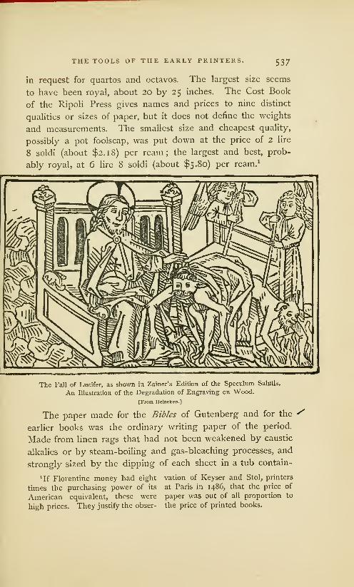
THE TOOLS OF THE EARLY PRINTERS. 537
in request for quartos and octavos. The largest size seems
to have been royal, about 20 by 25 inches. The Cost Book
of the Ripoli Press gives names and prices to nine distinct
qualities or sizes of paper, but it does not define the weights
and measurements. The smallest size and cheapest quality,
possibly a pot foolscap, was put down at the price of 2 lire
8 soldi (about $2.18) per ream; the largest and best, prob-
ably royal, at 6 lire 8 soldi (about $5.80) per ream. 1
The Fall of Lucifer, as shown in Zainer's Edition of the Speculum Salutis.
An Illustration of the Degradation of Engraving on Wood.
[From Heineken.]
The paper made for the Bibles of Gutenberg and for the *earlier books was the ordinary writing paper of the period.
Made from linen rags that had not been weakened by caustic
alkalies or by steam-boiling and gas-bleaching processes, and
strongly sized by the dipping of each sheet in a tub contain-
lIf Florentine money had eight vation of Keyser and Stol, printers
times the purchasing power of its at Paris in i486, that the price of
American equivalent, these were paper was out of all proportion to
high prices. They justify the obser- the price of printed books.

538 THE TOOLS OF THE EARLY PRINTERS.
ing a thin solution of glue, it was strong and of hard surface.
But the qualities which commended the paper to the copyist
were objectionable to the printer. The hard surface caused
harsh impression, and strong sizing made the damp sheets
\stick together. It was soon discovered that unsized paper,
which, according to Madden, was about half the price of the
sized, was easier to print. It would take a clearer impression,
and more thoroughly imbibe the oily ink. These advantages
could not be overlooked, and, consequently, hard-sized papers
went out of fashion. By far the largest part of the books
printed during the last quarter of the fifteenth century were
of unsized or half-sized paper.
\The early printer tried to gratify luxurious tastes by print-
ing copies on vellum, but its inordinate price, and the great
difficulties then encountered in printing, obliged him to give
it up as an impracticable material. When book-lovers found
that able printers like Kerver and Pigouchet printed paper
more neatly and evenly in color, vellum 1 went out of fashion.
We do not know what system or method was observed in
early proof-reading. Madden has pointed out many curious
errors in three distinct copies of a book printed at Weidenbach
about 1464, which seem to show that the compositor of each
copy read the proof of his own work, and read it badly. Pos-
sibly this was the method of many of the amateur printers
of that century, whose books, according to Schelhorn, bristle
with horrid and squalid errors. It could not have been the
method of Gutenberg, whose Bibles, although not free from
faults, were obviously read with care. Nor was it the method
of careful printers, for there is evidence that many of them
•Vellum was made out of the The skin, when freed from hair, was
dressed skins of very young kids and put in a lime-pit, until it was de-
lambs ;parchment from the skins of prived of its fat. It was then stretch-
sheep and goats. The vellum was ed on a frame, pared with a knife,
very thin, flexible and highly polish- rubbed with lime and pumice-stone,
ed; the parchment was thick and and repeatedly dried and wet, and
horn-like ; but each substance was rubbed and stretched, until the sur-
prepared by nearly the same process, face was made faultlessly smooth.

THE TOOLS OF THE EARLY PRINTERS. 539
enlisted the services of eminent scholars as proof-readers or
correctors of the press. 1 These correctors did a double duty;
they corrected the errors of the compositors and those of the
A Print of 1475, probably the work of an amateur engraver.
[From Heineken.]
'<
manuscript copy. 2 From the frequency and earnestness of
the complaints then made concerning faulty manuscript texts,
1 See page 469 for the testimony
of Schoeffer's proof-reader.2 The copyists, underpaid by the
stationers, did their work recklessly,
abbreviating words so freely that it
was often impossible to discover the
meaning of the author. The faults
of the calligrapher, who preferred
beauty to accuracy, and of the youngscholar, who rashly undertook to
correct errors— tended to the same
/
result. Fichet, a professor of the
University of Paris, who seems to
have been the first man of letters whoesteemed printing, said, in a com-plimentary letter to Gering, Crantz
and Friburger, that books were be-
coming barbarous through the faults
of the copyists. Bouhier, a later
president of the University, said that
the books of the copyists were mon-strous, and often unintelligible.

54Q THE TOOLS OF THE EARLY PRINTERS.
it seems that the copyists needed correction more than the
compositors. But the correctors were not always equal to
the task. Some of them were grossly incompetent, and still
further corrupted the texts they undertook to improve. 1 Con-
sidering the difficulties the early printers encountered in get-
ting correct copies and competent readers, it is surprising that
their books are not more full of faults. The errors of early
printed books have been frequently commented on, but the
remarks of Prosper Marchand are, perhaps, the most emphatic:
It is a prejudice altogether too common, a prejudice which dealers
in old books have kept alive and profited from, to think that the
editions of the fifteenth century are more accurate because they were
printed from manuscript copies. Many of these editions were printed
from faulty texts, picked up by chance, or selected without judgment
by printers who were unable to see their faults, and were still further
corrupted by the ignorance and rashness of their editors and cor-
rectors. I know that this is a kind of literary blasphemy, but it is
warranted by respectable authority. . . . They are deceived who think
that books are accurate in proportion to their age. For the most
part, the older they are, the more inaccurate they are. 2
1 Marchand quotes at length an author
who says that John Andrew, the corrector
for Sweinheym and Pannartz, was a very
presumptuous meddler with texts. Whenhe met a word he did not understand, he
printed it in Latin, or put in words at a
venture, often making the text moreunintelligible than ever. Another eccle-
siastical reader, Bishop Nicholas Perotti,
was quite as great an offender.2 Marchand, Histoire de Pimprimerie,
vol. I, pp. 97-103, and notes. In sup-
port of this assertion he cites the opinions
of Schelhorn, Maittaire, Naude, and other
eminent bibliographers, and gives manyspecifications of the inaccuracies of the
early printers from Fust and Schceffer to
Froben. Not even Aldus Manutius es-
capes, for Marchand quotes at length the
accusation of Erasmus that the Homer,Cicero, and Plutarch of Aldus were de-
pravatissima. This criticism is hardly
warranted by the errors of these editions,
and is decidedly unjust in its reflection
on a printer whose industry and care-
fulness as an editor have never been sur-
passed, and who, in his edition of Plato
of 15 13, offered a gold coin for every
mistake that should be discovered. This
damaging accusation would probably
never have been made if Erasmus hadnot quarreled with Aldus, and had not
thought it necessary to deny with muchasperity that he had served as a corrector
of the press in the Aldine office. As a
corrector, Erasmus was not beyond re-
proach, as will be more clearly seen in
his reading of the Greek Testament. Fro-
ben's lamentation over the two pages
of errata in this book (published by him,
but corrected by Erasmus) shows howmuch easier it is to discover errors after
commission than it is to correct them in
time. Stung by the taunts of critics,
Erasmus said that if the Devil did not
preside over typography, there musthave been a diabolical malice on the part
of the compositors.

THE TOOLS OF THE EARLY PRINTERS. 541
Inaccurate as early printed books may have been, they
were more correct than those of the copyists. The errors
of a faulty first edition were soon discovered and the faulty
editions were supplanted by the perfect. It is not the least
of the many benefits of printing that it has effectually pre-
vented the accidental or intentional debasement of texts.
The inferiority of the tools of the early printing office
could be plainly exhibited by contrasting them with those
of our time— the early hand-press with the modern cylinder
printing machine— the entire collection of types made in the
fifteenth century with the specimen book of any reputable
modern type-founder. But the pride of the young printer in
improvements that have been most largely made in this cent-
ury should be modified by the reflection that there has been
no change in the theory, and there have been but few changes
in the elementary processes of printing. The punch, matrix
and mould, the tympan, frisket and points, the use of damppaper and oily ink, of curved surfaces for applying the ink,
and of blankets for diffusing the impression, are still in fash-
ion. Printing is done quicker, cheaper, with more neatness
and accuracy, with more regard for the convenience of the
reader, with many new features of artistic merit, and in varie-
ties and quantities so vast that there can be no comparison
between early and modern productions— but it is the samekind of work it was in the beginning. It has not been madeobsolete by lithography or photography, nor by any other
invention of our time. The method invented by Gutenberg
still keeps its place at the head of the graphic arts.

AUTHORITIES CONSULTED.
Beckmann John. A History of Inventions, Discoveries and Origins. Trans-
lated by William Johnston, i2mo. 2 vols. London, 1846.
Berjeau J. Ph. Biblia Pauperum. Reproduced in Fac-siimle with an
Historical and Bibliographical Introduction. Folio. London, 1859.
Le Bibliophile Illustre for 1861. Imperial 8vo. London, 1862.
Book-worm for 1866. Imperial 8vo. London, 1866.
Bernard Aug. De l'origine et des debuts de Pimprimerie en Europe. 8vo.
2 vols. Paris, 1853.
Bibliophile Belge Bulletin du. 8vo. Vols. 1 to ix. Brussels, 1845—1852.
Blades William. The Life and Typography of William Caxton, England's
First Printer, etc. Royal 4to. 2 vols. London, 1861—1863.
Breitkopf Joh. Gottl. Imman. Versuch den Ursprung der Spielkarten, die
Einfiihrung des Leinenpapieres, und den Anfang der Holzschneidekunst
in Europa. 4to. 2 vols, in one. Leipsic, 1784.
Campbell M.-F.-A.-G. Annales de la typographic Neerlandaise au xve
siecle. 8vo. La Haye, 1874.
Camus. Notice d'un livre imprime' a Bamberg en 1462. 4to. Paris, an vn.
Crapelet G.-A. fitudes pratiques et litteraires sur la typographic 8vo.
Paris, 1837.
Daunou P. C. F. Analyse des opinions diverses sur l'origine de Pimprimerie.
8vo. Paris, an xi.
De La Borde Leon. Debuts de Pimprimerie a Strasbourg, ou recherches
sur les travaux myst£rieux de Gutenberg dans cette ville, et sur le proces
qui lui fut intente en 1439 a cette occasion. 8vo. Paris, 1840.
Debuts de Pimprimerie a Mayence et a Bamberg, ou description
des lettres d'indulgence du pape Nicholas V pro regno Cypri, im-
primees en 1454. Royal 4to. Paris, 1840.
De Vries A. Eclaircissemens sur Phistoire de Pinvention de Pimprimerie.
8vo. La Haye, 1843.
Didot M. Ambroise Firmin. Essai sur la typographic 8vo. Paris, 185 1.
Douce Francis. Holbein's Dance of Death. . .with a Dissertation, etc. i2mo.
London, 1872.
Falkenstein Karl. Geschichte der Buchdruckerkunst in ihrer Entstehung
und Ausbildung. 4to. Leipsic, 1840.
v- Fischer Gotthelf. Essai sur les monuments typographiques de Jean Gut-
enberg, mayencais, inventeur de Pimprimerie. 4to. Mayence, an X.

544 AUTHORITIES CONSULTED.
Fournier le jeune P. S. Manuel typographique. i6mo. 2 vols. Paris,
1764— 1766.
Greswell William Parr. Annals of Parisian Typography, etc. 8vo.
London, 181 8.
Hain L. Repertorium Bibliographicum, in quo Libri Omnes ab Arte Typo-
graphica Invenla usque ad Annum MD. typis expressi, etc. 8vo. 2 vols.
Stuttgardt, 1826—1838.
Hallam Henry. Introduction to the Literature of Europe in the Fifteenth,
Sixteenth and Seventeenth Centuries. 8vo. 2 vols. New-York, 1841.
View of the State of Europe during the Middle Ages. 8vo.
3 vols. Boston, 1853.
Hansard T. C. Typographia: an Historical Sketch of the Origin and Pro-
gress of the Art of Printing, etc. 8vo. London, 1825.
Heineken C. H. Idee generale d'une collection complette d'estampes, avec
une dissertation sur l'origine de la gravure et sur les premiers livres
d'images. 8vo. Leipsic and Vienna, 1771.
Helbig Henri. Une decouverte pour l'histoire de Pimprimerie. Pamphlet,
8vo. Brussels, 1855.
Notes et dissertations relatives a l'histoire de Pimprimerie. Pamphlet,
8vo. Brussels, without date. (From Vol. xvni of the Bibliophile Beige.)
Holtrop Joh. Guil. Catalogus Librorum Saeculo xv° Impressorum, quotquot
in Bibliotheca Regia Hagana asservantur. 8vo. Hagae-Comitum, 1856.
Monuments typographiques des Pays-Bas au quinzieme siecle.
Folio. La Haye, 1868.
Humphreys H. Noel. A History of the Art of Printing from its Invention,
etc. Folio. Second Issue. London, 1868.
Jackson John and Chatto W. A. A Treatise on Wood Engraving, etc.
Second Edition. 8vo. London, 1861.
Jacob P. L. (Lacroix.) Curiosit.es de l'histoire des arts. i6mo. Paris, 1858.
Johnson J. Typographia, or the Printers' Instructor, including an Account
of the Origin of Printing. 24mo. 2 vols. London, 1824.
Koning Jacques. Dissertation sur l'origine, Pinvention, et le perfectionnement
de Pimprimerie. 8vo. Amsterdam, 181 9.
Lacroix Paul (Bibliophile Jacob), E. Fournier et F. Sere. Histoire de
Pimprimerie et des arts et professions, etc. Imperial 8vo. Paris, 1852.
La Caille Jean de. Histoire de l'imprimerie et de la librarie ou Pon voit
son origine et son progres jusqu'en 1689. 4to. Paris, 1689.
Lambinet P. Recherches historiques, litt£raires et critiques sur l'origine de
l'imprimerie. 8vo. Brussels, an VII.
Lanzi Abate Luigi. The History of Painting in Italy, etc. Translated by
Thomas Roscoe. i2mo. 3 vols. London, 1852.
Madden J.-P.-A. Lettres d'un bibliographe. Series I to IV. Royal 8vo.
Versailles and Paris, 1868— 1875.
Maittaire M. Annales Typographic! ab Artis Inventse Origine ad annum
mdclxiv. 4to. 5 vols. Hagae-Comitum, 1719—174 1 -
Marchand Prosper. Histoire de l'origine et des premiers progres de Pim-
primerie. 4to. La Haye, 1 740.

AUTHORITIES CONSULTED. 545
Meerman G. Origines Typographies. 4to. 2 vols. Hagae-Comitum, 1765.
MERLIN R. Origine des cartes a jouer, etc. 4to. Paris, without date.
Moxon Joseph. Mechanick Exercises: or the Doctrine of Handy-Works.
Applied to the Art of Printing. Small 4to. London, 1683.
Minsell Joel. A Chronology of Paper and Paper Making. 8vo. Albany,
1870.
Nichols John. The Origin of Printing, etc. 8vo. London, 1774.
Ottley William Young. An Inquiry into the Origin and Early History
of Engraving upon Copper and on Wood. 2 vols. 4to. London, 1816.
An Inquiry concerning the Invention of Printing, etc., with an
Introduction by J. Ph. Berjeau. 4to. London, 1863.
Passavaxt J. D. Le Peintre-Graveur. 8vo. 6 vols. Leipsic, i860.
Ringwalt J. Luther. American Encyclopaedia of Printing. Imperial 8vo.
Philadelphia, 1S71.
SANTANDER Serna de la. Dictionnaire bibliographique choisi du quinzieme
siecle. 8vo 3 vols. Brussels, 1805—1807.
Savage William. Practical Hints on Decorative Printing. 4to. London, 1S22.
Schoepflin Jo. Daniel. Vindicise Typographicse. 4to. Strasburg, 1760.
Seiz J. C Annus Tertius Sascularis Inventae Artis Typographicse. 8vo.
Haarlem, 1743.
Sismondi J. C. L. Simonde de. Historical View of the Literature of the
South of Europe. i2mo. 2 vols. New-York, i860.
Sotheby S. Leigh. The Typography of the Fifteenth Century, etc., exem-
plified in a Collection of Fac-similes. Folio. London, 1845.
Principia Typographica. The Block-Books, or Xylographic
Delineations, etc. Folio, 3 vols. London, 1858.
Skeen William. Early Typography. 8vo. Colombo, Ceylon, 1872.
Thomas Isaiah. History of Printing in America, etc. . . . with a concise view
of the discovery of the art. 8vo. 2 vols. Worcester, 1810.
Timperley C. H. A Dictionary of Printers and Printing, etc. Royal 8vo.
London, 1839.
Tymms W. R. and Wyatt M. D. The Art of Illumination as Practised in
Europe from the Earliest Times. Royal 8vo. London, without date.
VAN der Meersch P. C. Recherches sur la vie et les travaux des imprimeurs
Beiges el Neerlandais, etc. Royal 8vo. Gand et Paris, 1856.
Van der Linde. The Haarlem Legend of the Invention of Printing by Lourens
Janszoon Coster Critically Examined. From the Dutch by J. A. Hessels,
with an Introduction, etc. 8vo. London, 1871.
Weigel T. O. and Zesterman. Die Anfange der Druckerkunst in Bild und
Schrift, etc. Imperial 4to. 2 vols. Leipsic, 1866.
Wetter J.Kritische Geschichte der Erfindung der Buchdruckerkunst durch
Johann Gutenberg zu Mainz. 8vo. 1836.
Woltmann Alfred. Holbein and His Time. Translated by F. E. Bunnett,
8vo. London, 1872.
Wolf Jo. Christian. Monumenta Typographica, qvse Artis hujus prsestan-
tissimpe Originem, Laudem et Abusum posteris produnt, etc. l6mo. 2 vols.
Hamburg, 1740.


INDEX.
Abbreviations, excessive use of. 164, 525" of Bible of 36 lines .
.
414
.
Abecedarium of Enschede 289, 290Accuracy in types, importance of. .
.
52Accursius Mariangelus 256Acta Diurna of old Rome 44Adolph, count of Nassau 438
« his patronage of Gutenberg. 440^Eneas Sylvius, Pope Pius 11 287Aix-la-Chapelle, fair of 394Aldus Manutius 291, 503, 540Amman Jost, the artist 61Anachronisms 206, 211, 218, 497Andrieszoon Jan, of Haarlem 320Annunciation, print of 72Antichrist, the block-book 231Antimony, probable use of 66, 519Antwerp, early type-printing at 500
" first block-printer at 314Apocalypse of St. John, block-book. 210
« evidences of its age. ..
.
214" prices paid for 211
Apostles' Creed, the block-book 228Appeal against the Turks 410Arabic figures, first use of 526Ars Memorandi, the block-book 233Ars Moriendi, the block-book 235Association of printers at Milan 504
a n at Strasburg 381Assyrian Cylinders 33Augsburg, early printing at 497
Babylon, bricks of 33Badius Jodocus, of Paris 506Bamberg, Bible of, see Bible of 36 lines.
« early printing at 485/' Missal 495
Batavia of Adrian Junius 335« its authority considered. ..
.
336Bearers of early printing press 306Bechtermuntz, Henry and Nicholas. 441Beildick Lorentz, testimony of 385Bellaert Jacob, of Zierikzee 319Berlin print 80Bernard August, history of 11
Bible, early translations of 181// first with wood-cuts 498a reading of prohibited 182
Bible, Mazarin, see Bible of 42 lines.
Bible of 1462 (48 lines) 462
Bibles of Mentel at Strasburg 491Bible of 36 lines, description of 412
// " its discovery 411« " not printed by Pfister 484« « peculiarities of 414« « possibly the first 412« a Schelhorn's view of.
.
480" « speculations about.
.
432" " when printed 415
Bible of42 lines, description of 419a a annotations in 424» « cost of 474a n defects of 422« « ornamentation of 422« « prices paid for 425» « probably of slow sale. 425« « two kinds of copies.
.
450« w workmanship of 421
Bible of the Poor, editions from types 208« " xylographic editions of199« " description of 200a a Nordlingen edition.
.
208" « prices paid for 208" " printing of 203
Blemishes in books, how corrected.
.
271Block-books, Antichrist 230
a Apocalypse 210" Apostles' Creed 228» Ars Memorandi 233« Ars Moriendi 235* Bible of the Poor 198" Book of Kings 224« Canticles 215* Chiromancy of Hartlieb 239a Dance of Death 247« Donatus 254« Eight Rogueries 229n Exercise Lord's Prayer 222n German Planetarium.. 241a Grotesque Alphabet. .
.
226« Life of St. Meinrat 246« Pomerium Spirituale.. 244a Story of the Virgin. ..
.
219« Temptations of Devil. 245" Wonders of Rome. . .
.
243" absurdities in 222" advantages of 261« definition of 194« disregarded by scholars 251* earliest date in 245
548INDEX.
Block-books, great number of. . 194, 248a inferiority of 195« literary merit of 250« made for priests 248a obscurity of 260« period of 251« permitted to people... 249« popularity of 238, 249a where made 252
Block-printers, many in number.... 248a faulty work of 248a unknown 252
Block-printing an established trade. 253» early notices of 91a in Holland 256a not Gutenberg's secret. 395a process of 83// slighted 86, 184
Blocks used for engraving 114Bodies, irregularities of, explained.. 519Bodies of types, cuts of. 25, 56, 275, 406
a a in Speculum 275// a not made by rule 518« " of Caxton 293w « of unknown printer. . 292
Bodman's spurious documents 436Book of Kings 224Book of Trades 61
Book-binding, Chinese 116« of middle ages 153" prices paid for 168« sumptuous forms of. . 156
Book-collecting, a princely hobby. . . 167Book-making, as done in old Rome. 42
a an ecclesiastical art. . 148« becomes a trade 187« given up to copyists. 159// in Ireland 14711 in monasteries 148« oriental method of. . . 136
Book of Four Stories 481Book of Fables 482Books, printed, changes in style of. . . 472
// Chinese, cheapness of 119a common in old Rome 43a demand for cheapness in. .. . 187« early printed, cheapness of. . 511a early printed, prices of 512" medieval 150« « character of 162« " cheap forms of. 154, 163a a large size of 156" " made by artists.... 166« a made for the rich . . . 170" " neglected by clergy. 159" « obsoleteness of 186« a of romance 165" " sale of regulated. . . 160" " sumptuousness of. . 168" of dark ages 45« of monasteries 216" of pictures 163« of unknown printer 284« number printed before 1500. . 511« the right of the educated 251a injudiciously selected 512a written and printed 188
Book-sellers of Paris 160
Book-selling restricted 162Boxhorn, Marcus Zuerius 350Branding in middle ages 38Brass moulds or matrices 61Brass stamps of middle ages 38Brass types impracticable 65Brethren of Life-in-Common, 177, 250, 443Bricks, stamped, antiquity of 30Brito John, of Bruges 321Brotherhood of the Life-in-Common
at Weidenbach 250, 495Bruges, early printing at 499
a guild of book-makers at. .. . 314Brussels print 78Bull of Pope Pius 11 against the Turks 464Burnisher of engravers 84
Calendar of 1457 432Calendar or Almanac of 1460 436Calico-printing, early 127Calligraphy, early 148, 166Cambray, record of 312Canticles, the block-book 215Card-makers, early 91Case of early compositors 523Castaldi Pamphilo 28, 486Catholicon of 1460 434Caxton William, of England 507Celebration of the Mass 436Cennini Bernard 503Chases of wood 306, 527Chinese printing, early method of. . . in
« language not fit for types. . 11611 paper, invention of 133
Chiromancy of Dr. Hartlieb 238Cicero, his speculations on types. . . 36Clog of England 175Codex Argenteus 125Cologne as a school for printers, 324, 495Cologne Chronicle of 1499 315Cologne, early printing at 494Color work of Peter Schcefter 456Complaint against Death 483Composing rules, early ignorance of. 524Composition as done in 1564 523
// by dictation 524" double, indications of. . 464a in imitation of writing. . 525« imperfections of 525
Composition of types in China 118a n a test of age. 312" " cost of 24
Compositors often men of education. 522a sometimes women 523
Condition of medieval society 179Confraternity of St. John the Baptist. 314Consolation of the Sinner 482Constitutions of Pope Clement V. . . 461Coornhert and Van Zuren 320Copper-plate printing, process of. . . 19
» 11 invention of. 27Copyists, faults of 539
/' fond of pictures ... 163« of middle ages 149a of old Rome 42a of Paris 162
Cornells, the binder 284, 332, 343Correctors of the press 540
INDEX. 549
Coster, Lourens Janszoon 326Coster, as described by Junius 331
« a by K.oniug 356« « in archives 365« » in chair book. . 367a a in treasury book 366» as a printer 339« as a sexton 338« as a tallow-chandler 365» as a tavern keeper 369« confounded with Janszoon. 368* alleged descendants of .... 345a portraits of 371, 374a statues of 351, 359« tablets to 359, 360
Costerian Museum 361Counter-punch, use of 54Couplets of Cato 285, 288
Cuneiform inscriptions 30Cunio, the story of the two 129Cylinders of Assyria 34
Dance of Death, Holbein's designs. . 183in Nuremberg Chronicle. 185popularity of 184the block-book 247
Decretals of Boniface vin 466Desroches, his story about Ludwig. . 315De Vries Abraham, on Coster 357Dialogue between Cato, Hugo, et al. 436Dictation, Madden's theory of. 450, 524Diether, Count of Isenburg 438Dissertation on Invention, Boxhorn's 350Doctor Hartlieb, Chiromancy of 238
Doctrinal of Alexander Gallus. 285, 288
« of Cambray 312
Donatus noticed by Zell 256, 315« ascribed to Gutenberg. 258, 401» imitations of type-work 261
« of Gutenberg at Mentz 404« of Koning 259/ suggested typography 392« of Sweinheym 257» of unknown printer 284« popularity of the book 254
Dordrecht, tradition of printing at. . . 257Dritzehen Claus, complaint of. 380
» Andrew, death of 384» « services of 387a Ennel, testimony of 383« George 386
Dunne Hans, testimony of 388
Education, state of in Xivth century. 172
Education of schools in middle ages . 176« afforded by block-books. 249a early, made difficult 263« modern, aided by types. . 260
Eggestein Henry, of Strasburg 491Eight Rogueries, the block-book 229Eltvill, printing done at 439
" a suburb of Mentz 443Embossed types of unknown printer. 280
« « of Codex Argenteus. 126
Endkrist, the block-book 230Engravers, early, jealousy of 498Engravers on wood, early, notices of 184
Engraving an aid to the invention. . . 396
Engraving decadence of 536n large blocks of 536a often done on metal 535« ofPfister 484« at Augsburg 498// at Nuremberg 496» not mother of typography 392// not practised at Haarlem . 321« of playing cards 91// of punches 65, 514» on wood, by the Cunios. . 130» « Chinese practice. 116« a early forms of . . . . 132
11 11 rudeness of. . 239, 536« « Italian practice of. 131
n a merit of early work 71
// « neglect of. . . 278, 535// » of letters 20011 a origin considered. 75« a used by copyists . . 124
Enschede on wood types 297, 355Epitaphs ot Pope Pius 11 287Erasmus, his version of the invention 345
// as a corrector 54°Errata, first appearance of 526Errors of early books 54°
a typographical, frequency of458, 525Eulogy on Lorenzo Valla 287
Exercise on the Lord's Prayer 222
Fables, Book of, by Pfister 482
Fables of Lorenzo Valla 286
Faust John, as described by Junius. 331
Faustus Jo. Frid., testimony of 478Finiguerra Maso 27Flanders, early importance of 178
Flemings, their skill in the arts 178
Flemish block-printing 215, 252, 314Florence, early printing at 503Form, ambiguity of the word 397Formen 397. 443. 466, 476, 522
Forms of metal, notices of 387a melted by Gutenberg 397» were probably matrices. 398, 443
Four pieces, the tool of 398Fraternity of St. John the Baptist. . . 314
of St. Luke 3 J5Friction, press-work by 204
Frisket, early use of 280
Frotton of engravers on wood 83« not used by block-printers. . 204
Fust John, conflicting views about.. 417a a death of 468
« a his suit against Gutenberg 425« » his victory over Gutenberg 430« « was not Faust 4l6
a Conrad 468
// Jacob, the judge 42%
Fust's sale of Bible in Paris 466
Gebwiler, testimony of 489Gelthus Adam, tablet of 446
Gensfleisch John, not a printer 404// family of 377
Gering Ulrich 5°5
German Planetarium and Calendar. 241
Germany, its progress in education. . 177» a in useful arts. 178
i

55o INDEX.
f molle. meaning of the tern :
as punch-cutters . .
: character, popularity of 516Gothic letters, origin of 150
t popularity of 5161 Tar 106» Petri- r ::' 15:
Grotesque Alphabet, the block-book. 227Guilds of middle ages i36, 390
/ of book-makers 187
Bfc of 377* as ilnmi ill 1 419
as a court:er 440a as a financier 379/ as an engraver _:i =
3jfi
/ as an inventor. . 331, 416 _ I
/ as an organizer 3891 books printed by 4.33
1 careless of fame 434/ Catholicon of \
\
'
•• courage of 431» death of 44s* experiments of 4021 memorials of 44$ 447/ partnership of, at Soasburj 3 !
-
a partnership of, at Mentz. - -i •
a planned the Psalter _ 5
:
/ poverty of 355, 40c ^:_:
n probable marriage of 379/ supplanted by Schcefler- 43 :
» trials of, at Strasburg 379, 3801 ' at Mentz 425/ unknowxi work of _
3 J
Gutenberg s types, history of . .
.
/ defense aga
:
fa J
1 idea of typography. .
.
— :
1 place in history 44S
Haarlem, first notice of legend of 3271 known printers at 319
neglected printing. -5 396Hahn UMch 501Haneqms Conrad 468
r - . 179Hasback of Haarlem 320Hauman Frederic 443Heflmann Anthony, testimony of. . . 387Hessels J. H. , writings of 284Holland, early printing of . . . . -z- 25 G
a confounded with C; 316
a not the birthplace of inventic 3 :•
Horarium of Scahger 25
-
« of Adrian Rooman 260Horn-book of England :
"-
How to Die Becomingly 2 :
: Remember the Evangelists . . 233Humery Conrad, friend to Gutenberg 431
' iknowledgment :
Ignorance, prevalence of in dark ax' 1: - 147
Iliad of H.;- : )
Illuminated books of middle ages . . . 152Illuminators and calligraphers 166Impress; 3D by different methods. ... 26
» doubling of 278« not typo graphy 50m on bricks 30
Impression on early hand press, 30:» on paper and vellum
.
1 on textile fabrics 127Image prints all devotional 83
A:in n : v: : I ft
1 Berlin print 80/ Brasses f dm j I
» Indulgence print 77» St. Christopher -
:
preceded books 69/ 83« made for stenciling 70* merit of 87» not done by friction 84» not made by monks 86/ origin of 69
popularity of 86a where made 82
5 of eight pages 291letters of Italy isa 4 1
-
1 1 of early printers 516Inking balls, how made - - -
: - "rices 25
Ink Printing, affected by pape r 539• deterioration of }-j.
1 1 early, faults of» " early, unstableness 1 i
' 1 inequality ofHI1 j of Bible of ^2 In s . . 421/ of Doaatus of Mentz _ -
1 a of Jenson 5321 h of Psalter of Mentz
.
1 - of the block- ».. 2031 / of the Psal'rr -:':-_-- 45a* of the Ripoli pvh 1 of unknown prir.- raj
' 'ths - "
:
I - s 5 :
3
Ink writing, antiquity of1 rintmg
Invention, merit of, not in idei. 445 -I-
Inventions not the work of experts.
.
395Invention of paper in China 133
Invention of press, not noticed 304r why neglected 5:"
Dn of Prir
« early notices of _^i
1 a great discovery 671 came at the right time 45
different methods of 28a key of in the type-mould.
.
67- merit of, not in the idea. .
.
51/ 1 in the type-mou.u not pa 3941 proba :
" at
1 wai:^ . rs 45version of Benius 347
' ' C : : " 327- » De Vriesh 1 gin 1» 1
. 3: :
Guicciardini . . . 329* j Jo. Frid. Fa -
* 1 Junius 330m
* * Meerman. 35:» Sea . 257
» John Schceffer» » Scriverius 34^

INDEX.
Invention of Printing,
version of Seiz 352* Trithem: nm Van Z uren 328m Wimpheling. .
.
393Zell 315
Invention of printing ink . . .40. 331, 533Inventions of the middle ages 177Invention of types, not boasted of. .
.
435» alleged thefts of 332, 342
Ireland, the book-makers of UQ-rimers of 500
its enthusiasm for the art 505
Jan, the printer at Antwerp 314Janszoon not Janszoon Coster. 356, 368Japan, paper of 133Jenson Nicholas 465
m j as a type founder. . . 502John of Gamundia, calendar of 241John of Westphalia, as a publisher. . 498Judgment of Man after Death 483Junius Hadrian, sketch of his life. . . 334
» credulousness of. . . 336* * history of 335
Kepfer (or Kefren Henry 437, 495Ketel Anthonis, of Haarlem 320Kecelaer and De Leempt 498Kerver Thielman, of Paris 506
r Pe:er, of Paris 506edge, acquisition of, difficult. . 263
.-'. edge a monopoly i_ :
Koburger Anthony, of Nure— ier; 495Koning's book on the invention 356K ; s :er Lourens Janszoon, see Coster.
Labor, division of, by printers 32:
Latin language, why preserved. ... :_-
m abbreviations of. . . . 164.
m
Lanrecrans of Scriverius
Lead used by Gutenberg 380Leads first used by Schceffer 467Lecrurn of the middle agesLeeu Gerard, industry of 500Legend of Haarlem 326
» began with pedigree 362contradictions of. . . 358early meagreness of. 328
» echo of false tester
» exposure of 363' improbability of 346a unfixed dates of 350, 357
Legend of "Walchius about the sale
of first printed books at Paris 466rs engraved, peculiarities of 262
m m imperfections of. . 200Lettres de somme or Round Gothic. 313
• de forme or Pointed Gothic. . 313of Indulgence of 1461 433
Letters of Indulgence of 1454 405» Holbein s satire c:
m * popularity of* * translation of
Libraries, early, neglect of
in France and Burgundy. 167Life of St. Meinrai 246
Literature, decline of in old Rome. -» neglect of by the Church. 147m of popular books 187» of die romance books 165* revolutionized by printing 186* the privilege ofa class, 17;
Lithography, process of 20invention of 27
Little Book of the Mass 284London, early printing at 508Louvain, early printing at 408Lyons, early printing at 506
M£-: -.r--~ -ii';~ i:r.e 3x3
Mansion Colard, of BrugesM .--.-._=:":= fi'il-ines: :
:* _-_:
as Aldus 503as an editor
Mir: :;-:'. ; i :es - ;: ::::•; :"•::; :.:
jf notaries 123!'.:.:--- . :.
----- _::
r printers, changes of. 522— of printing, how acquired. . 522. lis early, imperfections of 530
"•-:: 15 ii-ir.zzi'z .-':..-.; ±-~
Mi :-;es of lead '. .. 301, 303, 517» of copper : :
"
* conjoined 303» early method of mak: _ 5 :
-
* early trade in _-: =
* made of soft metal 302 | -5
: description of 55» early use of
Mechanics in middle ages 178M ; :-. '--.:r.:: ::" T : 5:7: 3:: 354Meerman Gerard, book of. j 3 5
Memorials to Coster 359enberg
Mendicant friars 158
m m alleged invention of. . . 4S9» as a printer
«• 490Mentz, revolt of burghers at 377
* capture and sack of 439: Is of printing 18, 317
:- ::' ;;:
Milan, early printing at 504Miniaturists of middle ages 166!.;.-;--~ikr.; - 3 err: i.-y :::
Mirror of Salvation '. 264Mirror of the Clergy 436Mould, modern, description of 5
-
' adjustable, notice of 39c 5
» early , description of 62of Gutenberg 39S —
-
h for .3: 3 re
:: of early printing —r .-lands, block-printers of . .3:-
rype-printersof28i,323. 498block-printing of 252
— apers of old Rome _* China 116
:r. ;:" :::
Nnmmeister, John 436, 500— berg, early printing at 405.-berg, Chronicle of 496

552 INDEX.
Offices of Cicero 467Order of King of France to Jenson. 465Origines Typographicae 354Ornamentation of manuscript books . 152
Painting of printed letters 456Palimpsests *43Pandects of Justinian 286
Paper approved by the people 187•i as made in Japan 134« » in middle ages 140« « in Spain 139« came before its time 143/> disliked by calligraphers 144// earliest notices of 137, 142« early, badly made 144a great price of 537// linen and cotton 138* made of many qualities 536a neglected by copyists 144, 186
a of early typographic printers. . 537a preceded printing 41" preferred to vellum by printers 538" selected for block-books 248a sizes of 537
Paper-making, growth of 141
Paper-marks not a guide to age 310« of unknown printer. . . . 308" why made 309
Paper-mills, early notices of 141
Paper money of China 121
Papillon's story of the Cunios 129Papyrus not fit for printing 41Parchment, how made 538Paris, reception of printing at 466
" first printers at 505Paul of Prague, testimony of 486Peculiarities of Criminal Law 286
Pedigree of Coster family 361w « its exposure. . . 363// a its forgery 364« « its insufficiency 363
Pfister Albert, our first knowledge of . 481a as a block-printer 484» as an inventor 484« Sebastian 486
Pi-Ching, an early Chinese printer. . 112
Pictures came before books 69" general fondness for 182, 249
Pigouchet Phillipe, of Paris 506Platen, smallness of 529Playing Cards, Chinese 98
date ofintroduction 99, 108
denounced by clergy. . 100
early, cost of 96, 100
early forms of 104early notices of . . . . 91, 95manufacture of 89of France and Italy. .96, 97of Germany 91popularity of 95preceded image prints 107rudely made 107strange games of 101
suggestive of printing. 106Pliny's notice of portraits in books. . IllPoints for making register 531Polishingofgemstaughtby Gutenberg 390
Pomerium Spirituale 244Pope Pius II, treatises of 287Presswork, early method of 529
alters appearance of types 300as done in China 114daily performance of. 115, 531early, in colors 531early practice of 530imperfections of 529of block-books 248of Colard Mansion 458of early type printers 530of Gutenberg. . . 412, 421, 434of Schoeffer 454, 462of unknown printer 305on textile fabrics of Italy. 127process of 307
Prices ofmanuscript books in old Rome 43« of medieval books 169« of printed books 512// paid for printing 504, 505
Print-coloring, early practice of 94Printers, early, activity of 511Printers, early names for 486
« armorial shield of 488u at Mentz before 1500 493» earliest in Germany 493« a Central Europe .... 493// // Great Britain 507a a France 505// a Italy 500« a New World 508« // Spain, etc 507
Printing, ambiguity of the word. .17, 315// aided by painting 456a by friction 83a a difficulties of. . . 204w Chinese method of 115a depends on other aids 47« derivation of from China. . 120a different methods of 18
« early, in Netherlands 314« early prejudices against 450, 510// from engraved stamps 37a German origin of 508a in clay 34« not always economical.... 190a not generally welcomed... 510« of Psalter of 1457 452a on one side, reason of. 248, 291// on textile fabrics 128a permanence of the art.... 541« benefit from 541a waited for readers 172, 191// with a brush 115
Printing Press, construction of 528// " Lignamine's notice of 530// « operation of 529
Printing Presses, cost of 498Proof-planer, use of 84Proof-reading, early notice of 469
11 how done 539Psalter of 1457, beauty of 452
» « colophon of 459« a editions of 460« « the designer of 459
Publishers of old Rome 43a in Italy 5°5

INDEX. 553
Punch, description of 55Punch-cutters were goldsmiths 514Punch-cutting not done by printers. . 514
« importance of 54Punches of steel 517
» of wood 301« of Gutenberg 435
Quadrats, substitutes for 28011 proper use of 305
Quintilian's notice of stencils 36
Rationale Durandi 460Register, means used for making. . . 531
« of colors, how done. . . 456, 531a a in Psalter of 1457 . 458
Register of pages, early, how done. . 531Registrum chartarum 526Reimboldt, testimony of 386Religious dissensions 180
Ripoli Press at Florence 503« « materials used by . . 66, 533
Rome, early printing at 501Rooman Gillis and Adrien 320Rubricated books of middle ages 152
// // of early printers . . 531
Sahspach Conrad, testimony of 384Sand moulds 3OI > 5*8Savage on the Psalter of 1457 456Scaliger J. J.,
about Horarium 257Schoeffer Peter, as a copyist 449
» as a judge 471« as a printer 458a as a punch-cutter. . . . 461, 470« as a trader 470// as a type-founder 461// as an inventor 469, 477// borrows a book 468// descendants of 494// false claims of 469, 472// memory of, neglected 477a pupil of Gutenberg 450« succeeds Gutenberg 430« vanity of 469
Schoeffer John, testimony of 473Schoepflin Daniel 353Schott John, claims of 488School books of middle ages 187
Schools of the middle ages 177Schultheiss Hans, testimony of 384Scriptorium of monasteries 148
Scriverius Peter 348Secrets of printing stolen 332, 342Section, definition of term 212
Seiz and his book 350Senefelder Alois, the lithographer. . 27Sensenschmidt John 495Seven Penitential Psalms 285Sewing of books 154Sidenneger Hans, testimony of 384Signatures, early use of 526Spacing out of lines 291, 526Specklin Daniel 489Speculum Salutis, a Dutch book 275
a as noticed by Junius 331n blocks of destroyed 280a description of 264
Speculum Salutis, translation of 311// editions of 269a its workmanship 270// not an experiment 282a printed from types 274// probably printed at Utrecht 311« teachings of the book 267a variable letters of 273« when printed 311
Spira John de, of Venice 501Spyess Wygand 441Stamping of single letters 126
a on textile fabrics 127Stamps of Babylon and Assyria 30
a copyists 125Egypt 32
« middle ages 38« Romans 37a printers of textile fabrics. 127
Stationers of Paris 160St. Bridget, print of 74St. Christopher, print of 70Steel-plate printing, process of 18
Steinbach Thomas, testimony of 385Stencil-plates of old Romans 93
« of card-makers 94Stereotype moulds 300Stereotyping, its advantages 24Stick of early compositors 523Stocker Mydehart, testimony of 384Story of the Blessed Virgin 219Strasburg, early printing at 490, 494St. Thomas of Aquinas, book of 468Suabia, abode of early engravers. . . 75Surfaces, varieties of in printing 18
Sweinheym and Pannartz 501
Temptations of the Devil 245Thomaszoon Gerrit 361, 367Title-page, first appearance of 526Tool of four pieces, mysterious 384
a a not a press 397a a not types nor pages . 398« a probably a mould . . 399
Torquemada on Health of Soul 287Torresani Andrew 503Trade-marks of middle ages 124Trades early, secrecy of 390Transferring, by Chinese method. . . 112
Transferring, process of 276Treatise on Celebration of Mass 436
« on Love 287// on Necessity of Councils. . . 436» on Reason and Conscience . 437
Trial of Gutenberg at Strasburg 380Trial of Gutenberg at Mentz 425Trithemius, testimony of 474Two pages printed in one form 270Tympan of hand press 307Type-casting, as done in 1564 62
» as done in 1683 59a modern, by machine... 58« slowness of hand-work. 60
Type-founding, relationof Trithemius 474» a ofFaustus. . . 478« an art of slow growth .. . 516" in sand moulds 301« as done by Didot 302
,

554
Type-founding, as done by Franklin 303a by novices 324, 517« early notices of . . . . 435, 459
Type-making a secret art 61* in China 113, 118
Type-metal, ingredients of 66, 519Type-mould, the key to the invention 67Type-mould, adjustable 399, 519
a made by goldsmiths. .. 514// of early printers. . . 59, 517n of Garamond 399« of Gutenberg 401» of sand 300
Types ofwood, Junius's description of 339/' « as made in Japan 53
Types of wood, experimental. . 479, 489a a De la Borde's theory of. 295a a limitations of 53a a Specklin's description of 489// as made by Conrad Winters . 520// Chinese, early forms of 112// a modern » 117// early, cast and not cut. . 298, 476« early faces of 515« early speculations about 36« engraved, impracticable. 53, 295a Gothic, popularity of 516" how made 521« of Jenson 502" made by one method only. . . 53a made in sand moulds 301a must be accurate 52" not made with system 518« of brass, notices of 651 of glass 487« of Gutenberg 443a of lead, as made by Blades . . 300« " a Coster. . 339a of porcelain 112" of Schceffer 470« quantity of usually cast 521« smallest sizes in 15th century 518« unknown printer 284a variations of form explained . 298
Typography, advantages of 23, 26a cheapness of method. . 23// Chinese method of 113a claimants of invention. 27a depends on other aids. 47« erroneous ideas about. 49" is a science 375« not fruit of engraving. . 395" period of its invention. 27« why it was delayed 39
Typothetas, arms of 488
Uneven spacing in early printing. .
.
451University of Paris 160Unknown printer of Netherlands... 282
" " period of 325
Unknown printer, workmanship of. . 324Utrecht, early printing of 498
" Speculum traced to 311
Valdarfer Christopher 505Van der Linde's Haarlem Legend. . 11
a a exposure of fraud . . 374Van Eyck Hubert 41Veldener John 280, 281, 498Vellum, how made 538
« early scarcity of 164« not suitable for printing, 41, 538
Venice, early printing in 501" famous for printing 503" playing cards of 89" relations of with China 120" the school of typography. . . 503
Verard of Paris 506Vindiciae Typographical 353Vocabularium ex quo 441Von Bischoviszheim, testimony of. . 387Von Seckingen, testimony of 387Von Zabern Barbel, testimony of 383
Weidenbach, printing at 495William of Saliceto, Treatise of . 287Wimpheling, testimony of 393Winaricky's book on Gutenberg 378Wine-flagons of Coster 340Witnesses on trial at Strasburg 388Wittig Ivo, tablet of 447Witty Speeches of Great Men 280Wonders of Rome, the block-book.
.
243Wood-cuts, early, merit of 68
« difficult to print with types
.
278« dissimilarities of 206, 239" early, designed by artists.
.
227" later, inferiority of 536« liability to warp 535» mutilations of. .. .207, 219, 280" neglected by early printers 535" not printed with types.... 271
Wood types, impracticability of 295" Enschede's remarks on.
.
297" experiments with 295
Wood used by early engravers 203
Xylography, limitations of 26, 263a Chinese method of 114// first method of 317« not applicable to books . 263" not Gutenberg's art. . . . 396« not practised at Haarlem 320
Zainer Gunther 497Zappe Paul, the ambassador 407Zarot Anthony 504Zell Ulric, about the Donatus. . 315, 256
« " as a printer 494

ADDITIONAL NOTES AND CORRECTIONS.
Page 27. The exact date of the perfect inven-
tion of copper-plate printing is unfixed. Vasari
says that Finiguerra's discovery was made in 1450,
but that the Italian practice of making plate prints
began about 1460. It is obvious that the alleged
discovery in 1450 of the fact that the blacking
placed in incised lines could be transferred to
paper by pressure was not the perfect invention
of copper-plate printing. Much more had to be
done. The earliest dated Italian print by this
method is of the year 1465. The earliest authentic
German print is dated 1446. There are others
attributed to the years 1422, 1430, 1440, but they
are not accepted as genuine by Passavant. See
Peintrc-Gravetir, vol. 1, pp. 192-197.
Senefelder's first suggestion of lithography was
entertained in 1796, but his vague notions about
printing from stone did not assume a practical
shape before 1798. He did not receive, and per-
haps was not entitled to, his patent before 1800.
64. On page 447, the date of the erection of
this stone by Wittig is put down at 1508, which
is the date given by Bernard and by many others.
But Wetter, from whose book this statement was
taken, knowing that Wittig was dead in 1507,
altered the date to 1507. Helbig does not accept
either date. He thinks that it should be 1504.
Notes et dissertations, pp. 10, 11.
64 and 67. The title given to Trithemius is in-
correct. He was an abbot, not a bishop.
65. A learned contributor to Typologie-Tuckcr
(probably Dr. Madden, to whose research and
scholarship I am already largely indebted for
materials in the compilation of this work) says
that the word ces does not necessarily mean
brass or bronze ; that it was used by the printers
of the fifteenth century to name or define alloys
of all kinds of metals ; and that it could have
been used in the passages quoted to describe
type-metal. The definition of the word which he
submits in an extract from the Catholicon 0/14.60
is conclusive as to the point that tes means alloys,
but I fail to see that in the passages I have
quoted, as or are means type-metal. In these
passages it is asserted, not that the types were
arts, of alloyed metal, but ex cere, out ofmetal of
some kind, <ycfrom metal, or by means of metal.
The difference between the genitive and ablative
cases is important, and, as I think, justifies the
conclusion that the types were made in a metal
mould. That the early mould of Germany wasof brass, bronze, or copper may be inferred from
other evidence. Fournier says that in his time
the moulds of France and England were of steel,
but that nearly all the pieces in the moulds of
Holland, Flanders and Germany were of cast
copper. Manuel typographique, etc., vol. T, pp.
197, 302. See also plate vn, in vol. n of same
work. I am told by type-founders that types
are more easily cast in brass than in any other
metal. It is little used now, but chiefly for its
want of durability. It is not probable that the
early type-founders were ignorant of or neglected
its advantages.
82. It is possible that engraving on wood was
done in England in the first half of the fifteenth
century. Ottley, in his Inquiry concerning the
Invention of Printing, page 198, describes an
English print of the crucifixion, with legend in
English, which he says may be as old as the St.
Christopher. This is the legend :" Seynt Gregor.
with oyer [other] popes & bysshoppes yn seer,
Haue graunted of pardon xxvi. mill yeer. Toyeym yat befor yis fygur on yeir knees Devoutly
say .v. paternoster .&. v. Auees." Weigel has
given other fac-similes of early English engraving.
218. The date of the termination of the Great
Schism is usually put at 1447, but it was not fully
ended until Pope Felix v abdicated the papal
chair in 1449, and ordered the church to submit
to Nicholas v.
250. Passavant (vol. 1, p. 50) says that there
is in the library at Heidelberg a copy of a xylo-
graphic edition of the Lord's Prayer, a block-
book of ten leaves, which may be attributed to
the fifteenth century.
378. A document has been recently discovered
at Strasburg which proves that Frielo Gensfleisch,
the elder brother of John Gutenberg, was in Stras-
burg in 1429. This document is the signature of
Frielo to a receipt for 26 florins due him on an
annuity. See Book-worm for January, 1868.
397. It is not probable that this tool of four
pieces was the press. Ottley, who thinks that
Gutenberg's secret was not that of printing
(Inquiry concerning Invention, p. 41), says
556 ADDITIONAL NOTES AND CORRECTIONS.
"there can be no doubt that presses of different
kinds were known long before the invention of
typography" (p. 37), and that " five of the wit-
nesses, none of whom were partners, knew all
about the press" (p. 40). It may also be added
that the repetition by different witnesses of the
order to separate the four pieces and put them
in a disjointed form in the press, or on or under
the press, is evidence that the four pieces did
not constitute the press nor any part of it. Nor
can iafce supposed that Gutenberg had sent to
his home a bulky press to have, as has been
asserted, its "joinings renewed." This work
should have been done by Sahspach, the joiner
who built it. Although I believe that Gutenberg
afterward invented the printing press, with its
attachments of tympan, frisket, points, etc., I
think that the press here mentioned was nothing
more than the screw press of the carpenter—the
wooden vise or press of a workman who needed
it when using a file. A printing press would not
be needed until the types were made, which it
appears were not even then ready. The fact that
Gutenberg, Dritzehen, Dunne, and Sahspach
worked apart is proof that the proposed printing
office was not furnished—that the men were
making tools, and the tools were probably moulds
and matrices. I have accepted Van der Linde's
translation of zurlossen as melting, for it is
warranted by the evidences that the tool of four
pieces and the fortnen were of metal. Ottley's
translation, making zurlossen mean a loosening
or unjointing, or breaking-up, with a view to
renewal or reconstruction, could also be accepted.
405. Bernard questions the accuracy of the
date of the Donatus of 1451, but it is the belief
of Fischer and of many others that it was printed
in 1451.
413. Compare the spacing in the Bibles of Gut-
enberg with that of the Psalter 0/1437, as shown
in pages 453 and 455. In Gutenberg's Bibles,
there are some evidences of attempts to keep the
lines even ; in the Psalter, the nicety of full lines
or of even spacing was disregarded.
451. Madden admits that Schoeffer was a copy-
ist at Paris, but doubts the inference that he was
a student of the University. His doubt seems to
be based on the faulty Latin of the colophon.
455. I am not entirely satisfied with the fac-
simile of types on this page. It is a copy of the
fac-simile made by Falkenstein, the only one
accessible to me of the edition of 1457. It is, nodoubt, a correct representation of form and of
general appearance, but the outlines of the letters
are suspiciously sharp. They do not accord in
this feature with the types shown on page 453.
In Falkenstein's fac-simile, the ornamental workabout the letter P is a dull bluish purple, so madeby printing deep blue over lines previously printed
in dull red. I have not attempted to imitate this
dull purple color (of which I find no notice save
in the book of Papillon), for I believe that this
use of purple was exceptional. It was probably
caused by an imperfect cleansing of the red block,
the after application of the blue, the consequent
commixture on the block of both colors, and the
production of a dull purple.
465. Madden doubts the genuineness of the
record of the proposed mission ofJenson to Mentz.
467. I have accepted the statement of Bernard
that leads were first used in 1465 in the Offices of
Cicero, but a re-examination of the fac-simile
in Sotheby's Typography (No. 90) of the Trea-
tise on Reason and Conscience convinces methat the types of this work were leaded. AsGutenberg abandoned printing in 1465, it is
probable that the Treatise is really older than
the Offices. If so, Gutenberg may be regarded
as the first to use leads.
498. Some bibliographers regard Martens as
the predecessor of John of Westphalia, and as a
graduate of one of the typographical schools at
Cologne. Holtrop thinks that Martens was the
pupil of John of Westphalia, his corrector and
associate, but not his partner or predecessor.
503. There is some uncertainty about the date
of Jenson's death. Bernard says (De Vorigine,
etc., vol. 11, p. 195) it is probable that Jenson died
in September, 1481, but it is certain that he was
dead on the third day of February, 1482.
506. La Caille and Santander say that Gering
died in 1510; Van der Meersch says 1520.
508. In the brief notice on this page I have
done scant justice to Caxton. The charming
simplicity and unselfishness shown by this good
old man in all his writings make him the most
lovable of early printers. Nee de la Rochelle, in
the appendix to his Life of Stephen Dolet, has
wisely said that Caxton printed not to makemoney, but to educate and benefit his country-
men. He should be held in grateful remem-
brance as the first printer who diverted the art
from its exclusive service to the wealthy and
educated and made it beneficial to commonpeople. Other printers began to print in Latin
;
Caxton began and continued to print in his
native language. His efforts have had abundant
reward, for printing is nowhere more warmly
cherished, nor more generously supported, than
among English-speaking people.
524. I have been advised by Dr. Madden that
Zeltner was not a printer, but a Protestant min-
ister. Zeltner was the author of a curious book,
entitled the Gallery of Learned Men who have
excelled in the Honorable Art of Typography
(printed at Nuremberg in 1716) in which he
shows so much knowledge of the usages of
printers and the technicalities of printing that he
desires to be regarded as at least an uncommonly
well-qualified theoretical printer.
52g. The weakness of the early press is abun-
dantly proved by the smallness of the forms and
the absence of large and black wood-cuts in all
books printed before 1800. The inability of the
hand-press (even when made of iron, as it was in
1824) is set forth by Johnson in his Typographia,
ADDITIONAL NOTES AND CORRECTIONS. 557
vol. ii, p. 548. It is there stated that an engraver
who had been at work for three years on a wood-
cut 11% by 15 inches, was dismayed by the
discovery, after a fair trial, that his block was too
large to be properly printed on any variety of
English press then in common use. The Clymerpress, just introduced, was then tested. Bylengthening the bar, and getting two men to pull,
a few fair impressions were obtained, but the
block soon broke under pressure. This wood-
cut was only about half the size of the two-page
cuts which are now regularly and easily printed
for the popular illustrated papers on machines
at the rate of 1,000 an hour.
The peculiar construction of the early hand-
press with bed twice as large as the platen
should enable us to decide the vexed question
whether it was the usage of the early printers to
print in forms of one page or of two or more
pages. The bed of the press was made to hold
two or more pages, and we may be sure that the
two pages of a double leaf were always sent to
press together. But when these pages were of
folio size, each page was printed by a separate
pull of the bar. The occasional inequalities of
the inner margins in some books, which have
been generally regarded as the result of printing
from forms of single pages, could have been pro-
duced by the slipping or "buckling-up" of the
sheet on a baggy tympan. Printing from single
pages would have been exceedingly difficult—so
difficult that, as Bernard has judiciously remarked,
it would have nearly nullified all the advantages
of typography.
530. The most admirable feature of the best
early printing is its simplicity. The types were
uncouth, but they were made with singlfl^urpose,
to be easily read, not to show the skill ofthe punch-
cutter. This object would have been fully ac-
complished if the compositor had refrained from
abbreviations and had spaced his words with intel-
ligence. The pressman did his part of the work
fairly, and honestly impressed the types on the
paper with unexceptionable firmness and solidity.
The readable method of doing presswork is, un-
fortunately, out of fashion. A perverted taste
requires the modern printer to use thin types, dry
glossy paper, as little ink and as weak an
impression as is consistent with passable legi-
bility. This general fondness for delicacy is
not at all favorable to the production of read-
able books.

-


HMH^M
4 r>JUL
$%
U.C. BERKELEY LIBRARIES
MunnmC027M675Ht3
1 I