
test two writing task 1
37
剑三 TEST TWO WRITING TASK 1 You should spend about 20 minutes on this task. The charts below show the number of Japanese tourists travelling abroad between 1985 and 1995 and Australia’s share of the Japa nese tourist market. Write a rep ortfo r a university lecturer describing the inf ormation shown below. You should write at least 150 words http://bbs.iyuce.com/ 我预测论坛
-
Upload
khangminh22 -
Category
Documents
-
view
2 -
download
0
Transcript of test two writing task 1
剑三
TEST TWO WRITING TASK 1
You should spend about 20 minutes on this task.
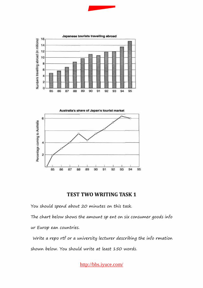
The charts below show the number of Japanese tourists travelling
abroad between 1985 and 1995 and Australia’s share of the Japa
nese tourist market.
Write a rep ortfo r a university lecturer describing the inf ormation
shown below. You should write at least 150 words
http://bbs.iyuce.com/
我预测论坛
TEST TWO WRITING TASK 1
You should spend about 20 minutes on this task.
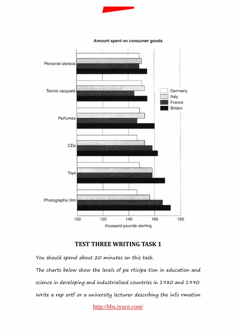
The chart below shows the amount sp ent on six consumer goods info
ur Europ ean countries.
Write a repo rtf or a university lecturer describing the info rmation
shown below. You should write at least 150 words.
http://bbs.iyuce.com/
我预测论坛
TEST THREE WRITING TASK 1
You should spend about 20 minutes on this task.
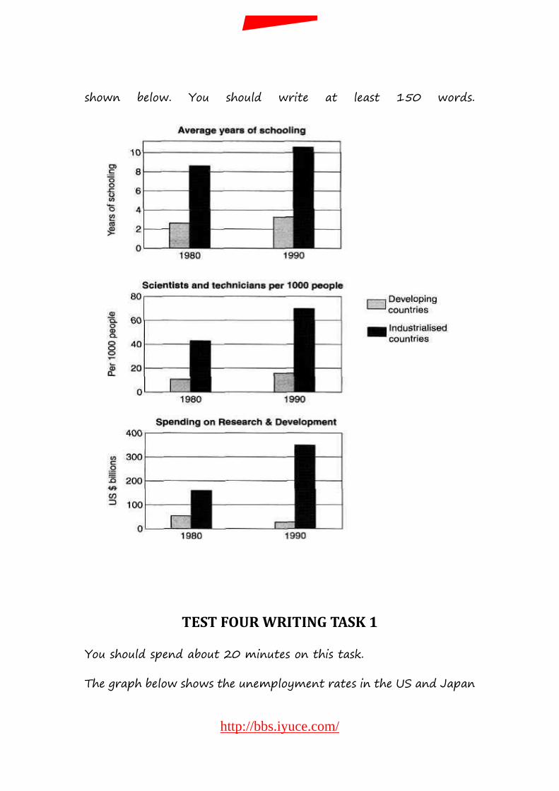
The charts below show the levels of pa rticipa tion in education and
science in developing and industrialised countries in 1980 and 1990.
Write a rep ortf or a university lecturer describing the info rmation
http://bbs.iyuce.com/
我预测论坛
shown below. You should write at least 150 words.
TEST FOUR WRITING TASK 1
You should spend about 20 minutes on this task.
The graph below shows the unemployment rates in the US and Japan
http://bbs.iyuce.com/
我预测论坛
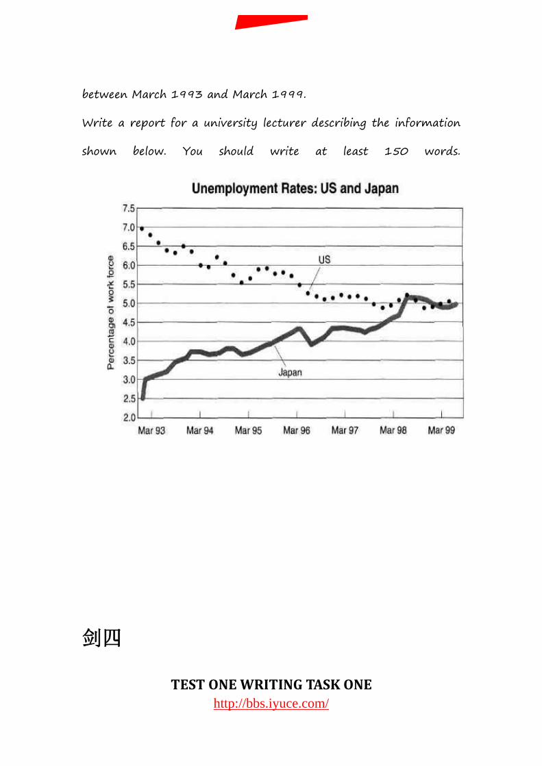
between March 1993 and March 1999.
Write a report for a university lecturer describing the information
shown below. You should write at least 150 words.
剑四
TEST ONE WRITING TASK ONE http://bbs.iyuce.com/
我预测论坛
You should spend about 20 minutes on this task.
The table below shows the proportion of different categories of families
living in poverty in Australia in 1999.
Summarise the information by selecting and reporting the main
features, and make comparisons where relevant.Write at least 150
words.
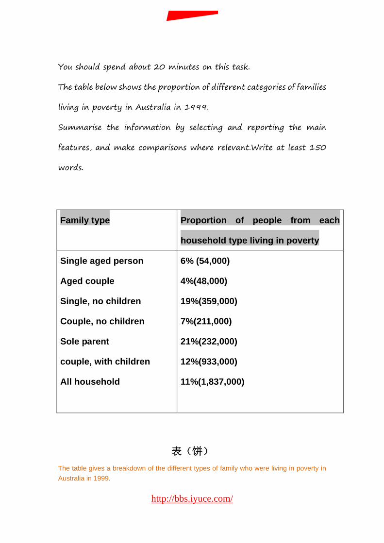
表(饼) The table gives a breakdown of the different types of family who were living in poverty in Australia in 1999.
Family type Proportion of people from each
household type living in poverty
Single aged person
Aged couple
Single, no children
Couple, no children
Sole parent
couple, with children
All household
6% (54,000)
4%(48,000)
19%(359,000)
7%(211,000)
21%(232,000)
12%(933,000)
11%(1,837,000)
http://bbs.iyuce.com/
我预测论坛

On average, 11% of all households,comprising almost two million people, were in this position. However, those consisting of only one parent or a single adult had almost double this proportion of poor people, with 21% and 19% respectively. Couples generally tended to be better off, with lower poverty levels for couples without children(7%) than those with children(12%). It is noticeable that for both types of household with children, a higher than average proportion were living in poverty at this time. Older people were generally less likely to be poor, though once again the trend favoured elderly couples(only 4%) rather than single elderly people(6%). Overall the table suggests that households of single adults and those with children were more likely to be living in poverty than those consisting of couples.
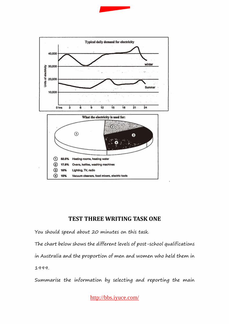
TEST TWO WRITING TASK ONE
You should spend about 20 minutes on this task.
The graph below shows the demand for electricity in england during
typical days in winter and summer. The pie chart shows how
electricity is used in an average English home.
Summarise the information by selecting and reporting the main
features, and make comparisons where relevant.Write at least 150
words.
http://bbs.iyuce.com/
我预测论坛
TEST THREE WRITING TASK ONE
You should spend about 20 minutes on this task.
The chart below shows the different levels of post-school qualifications
in Australia and the proportion of men and women who held them in
1999.
Summarise the information by selecting and reporting the main
http://bbs.iyuce.com/
我预测论坛
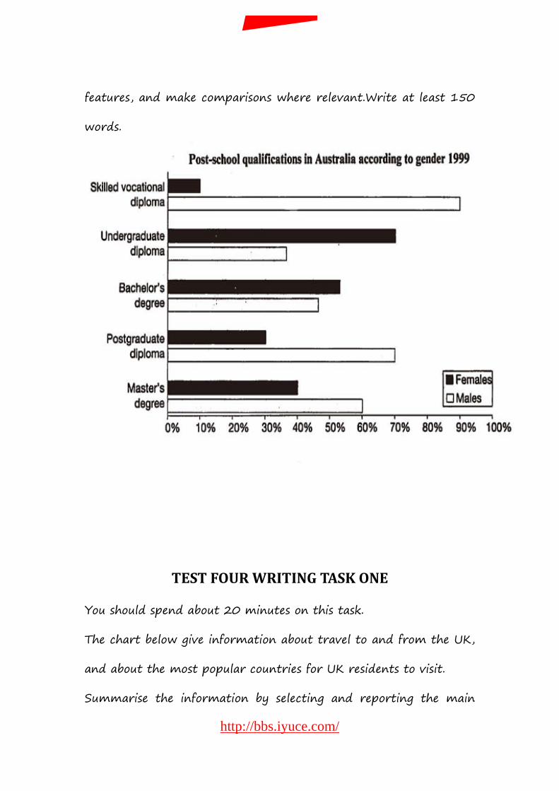
features, and make comparisons where relevant.Write at least 150
words.
TEST FOUR WRITING TASK ONE
You should spend about 20 minutes on this task.
The chart below give information about travel to and from the UK,
and about the most popular countries for UK residents to visit.
Summarise the information by selecting and reporting the main
http://bbs.iyuce.com/
我预测论坛
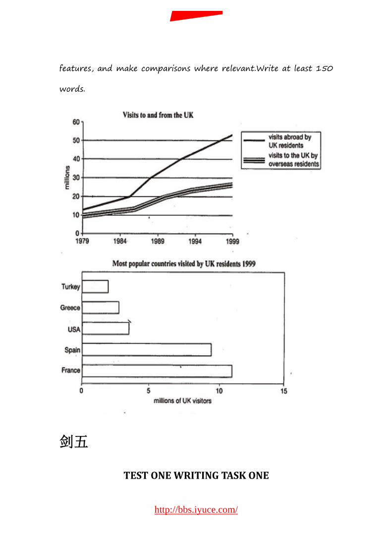
features, and make comparisons where relevant.Write at least 150
words.
剑五
TEST ONE WRITING TASK ONE
http://bbs.iyuce.com/
我预测论坛
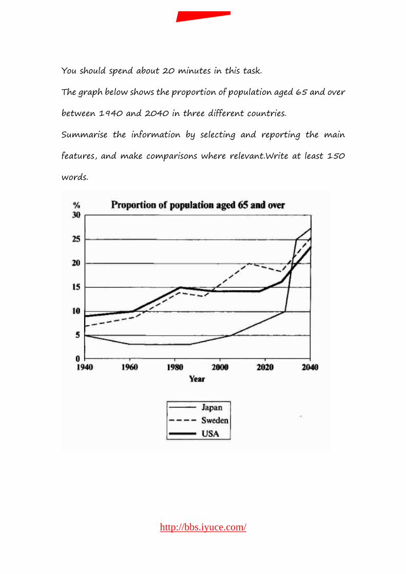
You should spend about 20 minutes in this task.
The graph below shows the proportion of population aged 65 and over
between 1940 and 2040 in three different countries.
Summarise the information by selecting and reporting the main
features, and make comparisons where relevant.Write at least 150
words.
http://bbs.iyuce.com/
我预测论坛
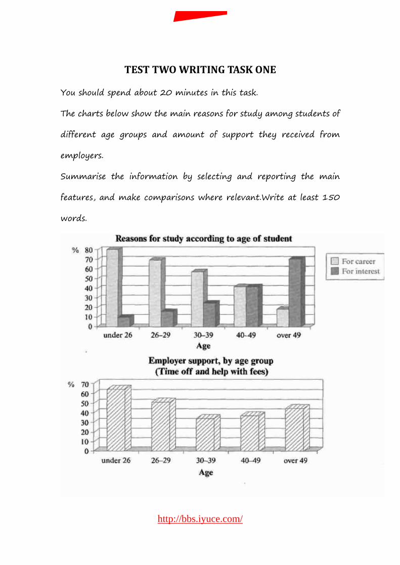
TEST TWO WRITING TASK ONE
You should spend about 20 minutes in this task.
The charts below show the main reasons for study among students of
different age groups and amount of support they received from
employers.
Summarise the information by selecting and reporting the main
features, and make comparisons where relevant.Write at least 150
words.
http://bbs.iyuce.com/
我预测论坛
柱状 The first graph shows that there is a gradual decrease in study for career reasons with age. Nearly 80% of students under 26 years, study for their career. This percentage gradually declines by 10-20% every decade. Only 40% of 40-49 yr olds and 18% of over 49yr olds are studying for career reasons in late adulthood. Conversely, the first graph also shows that study stemming from interest increases with age. There are only 10% of under 26 yr olds studying out of interest. The percentage increases slowly till the beginning of the fourth decade, and increases dramatically in late adulthood. Nearly same number of 40-49yr olds study for career and interest. However 70% of over 49yr olds study for interest in comparison to 18% studying for career reasons in that age group. The second graph shows that employer support is maximum(approximately 60%) for the under 26yr students. It drops rapidly to 32% up to the third decade of life, and then increases in late adulthood up to about 44%. It is unclear whether employer support is only for career-focused study, but the highest level is for those students who mainly study for career purposes.
TEST THREE WARITING TASK ONE
You should spend about 20 minutes in this task.
The table below gives information about the underground railway
systems in six cities.
Summarise the information by selecting and reporting the main
features, and make comparisons where relevant.Write at least 150
words.
http://bbs.iyuce.com/
我预测论坛
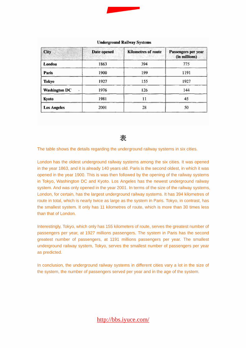
表 The table shows the details regarding the underground railway systems in six cities. London has the oldest underground railway systems among the six cities. It was opened in the year 1863, and it is already 140 years old. Paris is the second oldest, in which it was opened in the year 1900. This is was then followed by the opening of the railway systems in Tokyo, Washington DC and Kyoto. Los Angeles has the newest underground railway system. And was only opened in the year 2001. In terms of the size of the railway systems, London, for certain, has the largest underground railway systems. It has 394 kilometres of route in total, which is nearly twice as large as the system in Paris. Tokyo, in contrast, has the smallest system. It only has 11 kilometres of route, which is more than 30 times less than that of London. Interestingly, Tokyo, which only has 155 kilometers of route, serves the greatest number of passengers per year, at 1927 millions passengers. The system in Paris has the second greatest number of passengers, at 1191 millions passengers per year. The smallest underground railway system, Tokyo, serves the smallest number of passengers per year as predicted. In conclusion, the underground railway systems in different cities vary a lot in the size of the system, the number of passengers served per year and in the age of the system.
http://bbs.iyuce.com/
我预测论坛
TEST FOUR WRITING TASK ONE
You should spend about 20 minutes in this task.
The map below is of the town of Garlsdon. A new supermarket(S) is
planned for the town. The map shows two possible sites for the
supermarket.
Summarise the information by selecting and reporting the main
features, and make comparisons where relevant.Write at least 150
words.
http://bbs.iyuce.com/
我预测论坛
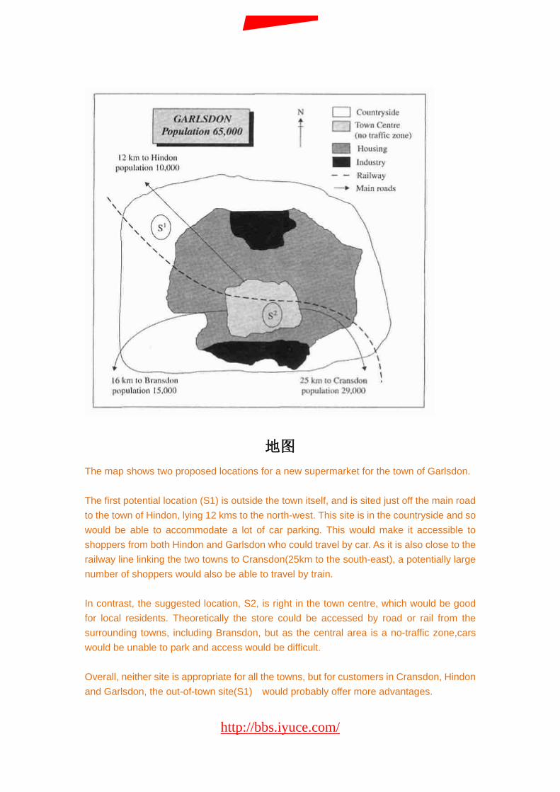
地图 The map shows two proposed locations for a new supermarket for the town of Garlsdon. The first potential location (S1) is outside the town itself, and is sited just off the main road to the town of Hindon, lying 12 kms to the north-west. This site is in the countryside and so would be able to accommodate a lot of car parking. This would make it accessible to shoppers from both Hindon and Garlsdon who could travel by car. As it is also close to the railway line linking the two towns to Cransdon(25km to the south-east), a potentially large number of shoppers would also be able to travel by train. In contrast, the suggested location, S2, is right in the town centre, which would be good for local residents. Theoretically the store could be accessed by road or rail from the surrounding towns, including Bransdon, but as the central area is a no-traffic zone,cars would be unable to park and access would be difficult. Overall, neither site is appropriate for all the towns, but for customers in Cransdon, Hindon and Garlsdon, the out-of-town site(S1) would probably offer more advantages.
http://bbs.iyuce.com/
我预测论坛
剑六
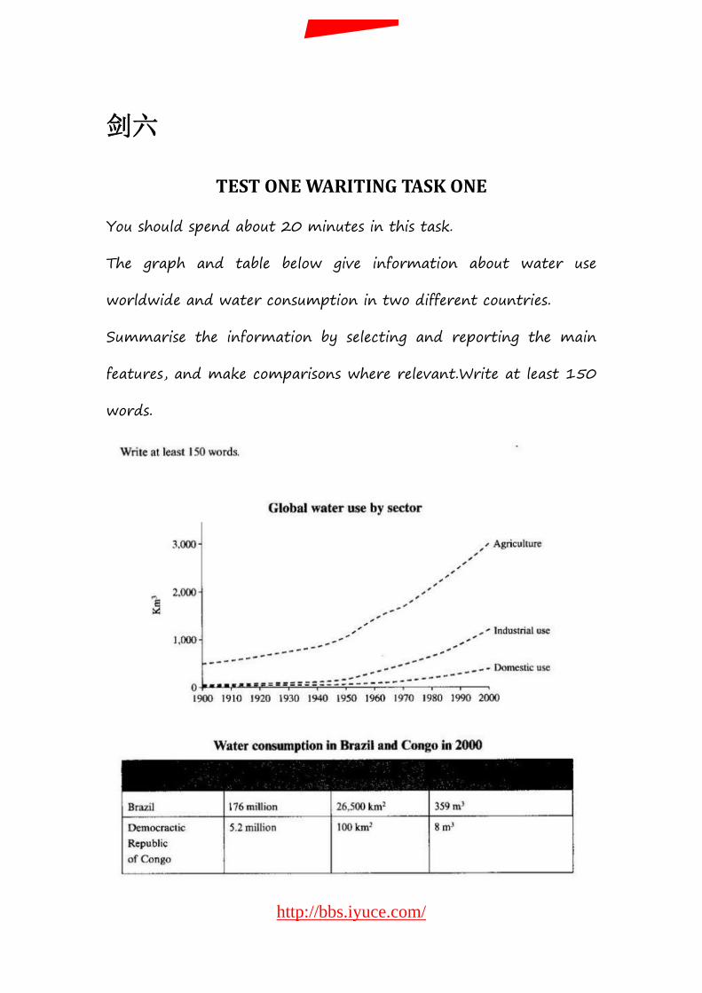
TEST ONE WARITING TASK ONE
You should spend about 20 minutes in this task.
The graph and table below give information about water use
worldwide and water consumption in two different countries.
Summarise the information by selecting and reporting the main
features, and make comparisons where relevant.Write at least 150
words.
http://bbs.iyuce.com/
我预测论坛
The graph shows how the amount of water used worldwide changed between 1900 and 2000. Throughout the century, the largest quantity of water was used for agricultural purposes, and this increased dramatically from about 500km to around 3000 km in the year 2000. Water used in the industrial and domestic sectors also increased, but consumption was minimal until mid-century. From 1950 onwards, industrial use grew steadily to just over 1000km, while domestic use rose more slowly to only 300km, both far below the levels of consumption by agriculture. The table illustrates the differences in agricultural consumption in some areas of the world by contrasting the amount of irrigated land in Brazil(26500km) with that in the D.R.C (100km). This means that a huge amount of water is used in agriculture in Brazil, and this is reflected in the figures for water consumption per person: 359m compared with only 8m in the Congo. With a population of 176 million, the figures for Brazil indicate how high agricultural water consumption can be in some countries.
TEST TWO WARITING TASK ONE
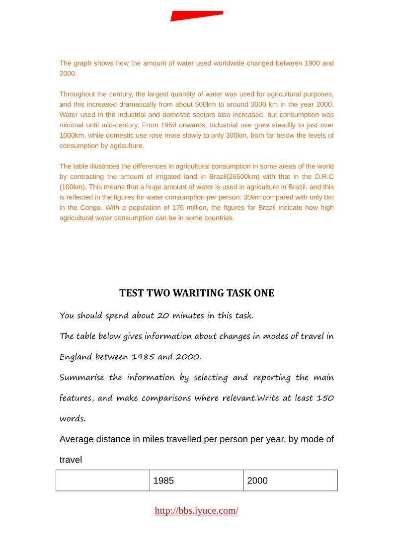
You should spend about 20 minutes in this task.
The table below gives information about changes in modes of travel in
England between 1985 and 2000.
Summarise the information by selecting and reporting the main
features, and make comparisons where relevant.Write at least 150
words.
Average distance in miles travelled per person per year, by mode of
travel
1985 2000
http://bbs.iyuce.com/
我预测论坛
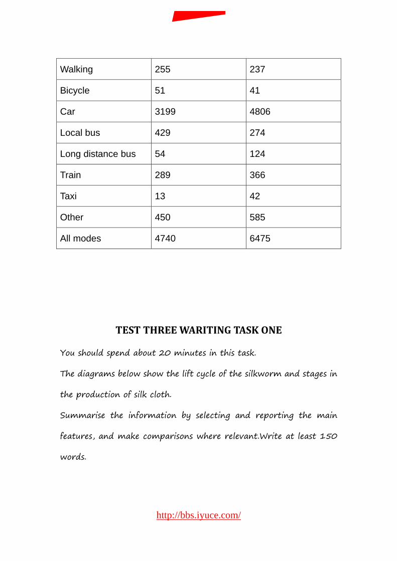
Walking 255 237
Bicycle 51 41
Car 3199 4806
Local bus 429 274
Long distance bus 54 124
Train 289 366
Taxi 13 42
Other 450 585
All modes 4740 6475
TEST THREE WARITING TASK ONE
You should spend about 20 minutes in this task.
The diagrams below show the lift cycle of the silkworm and stages in
the production of silk cloth.
Summarise the information by selecting and reporting the main
features, and make comparisons where relevant.Write at least 150
words.
http://bbs.iyuce.com/
我预测论坛
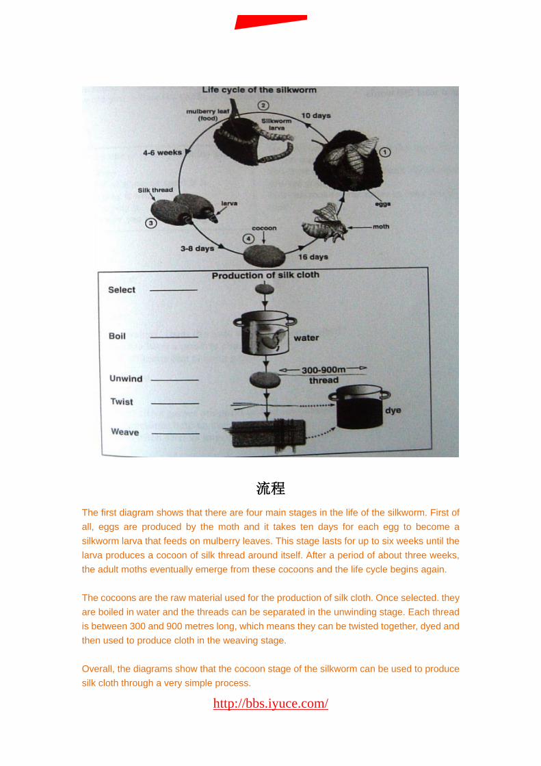
流程 The first diagram shows that there are four main stages in the life of the silkworm. First of all, eggs are produced by the moth and it takes ten days for each egg to become a silkworm larva that feeds on mulberry leaves. This stage lasts for up to six weeks until the larva produces a cocoon of silk thread around itself. After a period of about three weeks, the adult moths eventually emerge from these cocoons and the life cycle begins again. The cocoons are the raw material used for the production of silk cloth. Once selected. they are boiled in water and the threads can be separated in the unwinding stage. Each thread is between 300 and 900 metres long, which means they can be twisted together, dyed and then used to produce cloth in the weaving stage. Overall, the diagrams show that the cocoon stage of the silkworm can be used to produce silk cloth through a very simple process.
http://bbs.iyuce.com/
我预测论坛
TEST FOUR WARITING TASK ONE
You should spend about 20 minutes in this task.
The charts below give information about USA marriage and divorce
rates between 1970 and 2000, and the marital status of adult
Americans in two of the years.
Summarise the information by selecting and reporting the main
features, and make comparisons where relevant.Write at least 150
words.
http://bbs.iyuce.com/
我预测论坛
柱状+折线 We are given two charts which show us a few sets of data about the marital status of the Americans between 1970 and 2000. The first chart compares the number of marriages and divorces in the United States of America between 1970 and 2000. We can see that data is given for each decade; the number of people who are getting married decreased slightly since 1980, as well as the divorces one. Nevertheless, divorces increased between 1970 and 1980. The second chart is more precise about the different martial status of the Americans between the 1970 and 2000. The number of divorced people has risen more than the double during this two years, and the data for the never married people has also increased significantly. However , less and less people are married,as the first chart showed us; the widowed American number is also decreasing. As a conclusion, we can say that the marital status background of the Americans has maybe known the greatest change it had ever seen.
http://bbs.iyuce.com/
我预测论坛
剑七
TEST ONE WARITING TASK ONE
You should spend about 20 minutes in this task.
The table below gives information on consumer spending one different
items in five different countries in 2002.
Summarise the information by selecting and reporting the main
features, and make comparisons where relevant.Write at least 150
words.
http://bbs.iyuce.com/
我预测论坛

TEST TWO WARITING TASK ONE
You should spend about 20 minutes in this task.
The graph below shows the consumption of fish and some different
kinds of meat in a Eurpoean country between 1979 and 2004.
Summarise the information by selecting and reporting the main
features, and make comparisons where relevant.Write at least 150
words.
http://bbs.iyuce.com/
我预测论坛
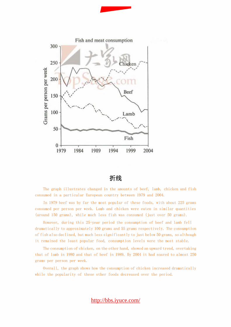
折线 The graph illustrates changed in the amounts of beef, lamb, chicken and fish
consumed in a particular European country between 1979 and 2004.
In 1979 beef was by far the most popular of these foods, with about 225 grams
consumed per person per week. Lamb and chicken were eaten in similar quantities
(around 150 grams), while much less fish was consumed (just over 50 grams).
However, during this 25-year period the consumption of beef and lamb fell
dramatically to approximately 100 grams and 55 grams respectively. The consumption
of fish also declined, but much less significantly to just below 50 grams, so although
it remained the least popular food, consumption levels were the most stable.
The consumption of chicken, on the other hand, showed an upward trend, overtaking
that of lamb in 1980 and that of beef in 1989. By 2004 it had soared to almost 250
grams per person per week.
Overall, the graph shows how the consumption of chicken increased dramatically
while the popularity of these other foods decreased over the period.
http://bbs.iyuce.com/
我预测论坛
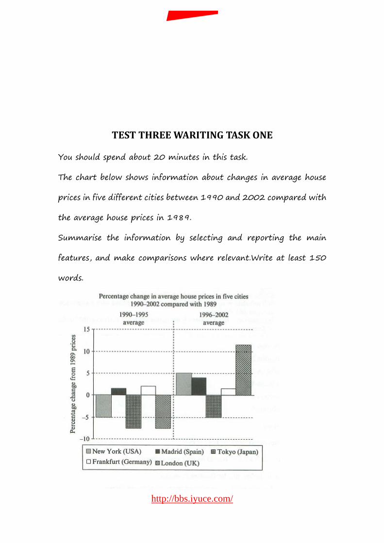
TEST THREE WARITING TASK ONE
You should spend about 20 minutes in this task.
The chart below shows information about changes in average house
prices in five different cities between 1990 and 2002 compared with
the average house prices in 1989.
Summarise the information by selecting and reporting the main
features, and make comparisons where relevant.Write at least 150
words.
http://bbs.iyuce.com/
我预测论坛

TEST FOUR WARITING TASK ONE
You should spend about 20 minutes in this task.
The pie charts below show units of electricity production by fuel source
in Australia and France in 1980 and 2000.
Summarise the information by selecting and reporting the main
features, and make comparisons where relevant. Write at least 150
words.
http://bbs.iyuce.com/
我预测论坛
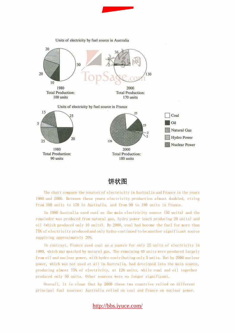
饼状图 The chart compare the sources of electricity in Australia and France in the years
1980 and 2000. Between these years electricity production almost doubled, rising
from 100 units to 170 in Australia, and from 90 to 180 units in France.
In 1980 Australia used coal as the main electricity source (50 units) and the
remainder was produced from natural gas, hydro power (each producing 20 units) and
oil (which produced only 10 units). By 2000, coal had become the fuel for more than
75% of electricity produced and only hydro continued to be another significant source
supplying approximately 20%.
In contrast, France used coal as a source for only 25 units of electricity in
1980, which was matched by natural gas. The remaining 40 units were produced largely
from oil and nuclear power, with hydro contributing only 5 units. But by 2000 nuclear
power, which was not used at all in Australia, had developed into the main source,
producing almost 75% of electricity, at 126 units, while coal and oil together
produced only 50 units. Other sources were no longer significant.
Overall, it is clear that by 2000 these two countries relied on different
principal fuel sources: Australia relied on coal and France on nuclear power.
http://bbs.iyuce.com/
我预测论坛
剑八
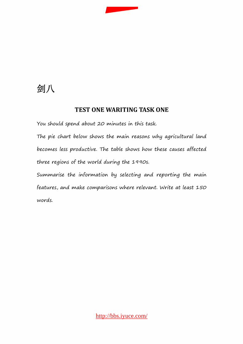
TEST ONE WARITING TASK ONE
You should spend about 20 minutes in this task.
The pie chart below shows the main reasons why agricultural land
becomes less productive. The table shows how these causes affected
three regions of the world during the 1990s.
Summarise the information by selecting and reporting the main
features, and make comparisons where relevant. Write at least 150
words.
http://bbs.iyuce.com/
我预测论坛
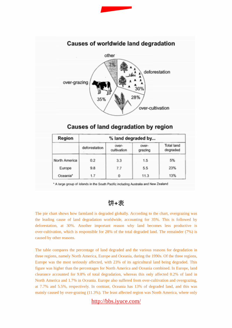
饼+表 The pie chart shows how farmland is degraded globally. According to the chart, overgrazing was the leading cause of land degradation worldwide, accounting for 35%. This is followed by deforestation, at 30%. Another important reason why land becomes less productive is over-cultivation, which is responsible for 28% of the total degraded land. The remainder (7%) is caused by other reasons. The table compares the percentage of land degraded and the various reasons for degradation in three regions, namely North America, Europe and Oceania, during the 1990s. Of the three regions, Europe was the most seriously affected, with 23% of its agricultural land being degraded. This figure was higher than the percentages for North America and Oceania combined. In Europe, land clearance accounted for 9.8% of total degradation, whereas this only affected 0.2% of land in North America and 1.7% in Oceania. Europe also suffered from over-cultivation and overgrazing, at 7.7% and 5.5%, respectively. In contrast, Oceania has 13% of degraded land, and this was mainly caused by over-grazing (11.3%). The least affected region was North America, where only
http://bbs.iyuce.com/
我预测论坛
5% of land was degraded, mainly due to over-cultivation (3.3%) and overgrazing (1.5%). In summary, overgrazing is the most serious threat to farmland worldwide and Europe was the biggest victim of land degradation in the 1990s.
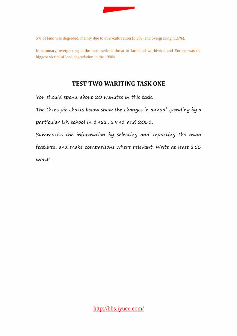
TEST TWO WARITING TASK ONE
You should spend about 20 minutes in this task.
The three pie charts below show the changes in annual spending by a
particular UK school in 1981, 1991 and 2001.
Summarise the information by selecting and reporting the main
features, and make comparisons where relevant. Write at least 150
words.
http://bbs.iyuce.com/
我预测论坛
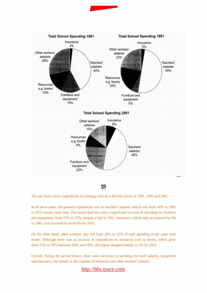
饼 The pie charts show expenditure on running costs by a British school in 1981, 1991 and 2001. In all three years, the greatest expenditure was on teachers’ salaries, which rose from 40% in 1981 to 45% twenty years later. The period had also seen a significant increase in spending on furniture and equipment, from 15% to 23%, despite a fall in 1991. Insurance, which only accounted for 2% in 1981, rose fourfold to reach 8% by 2001. On the other hand, other workers’ pay fell from 28% to 15% of total spending in the same time frame. Although there was an increase in expenditure on resources such as books, which grew from 15% to 20% between 1981 and 1991, this figure dropped steeply to 9% by 2001. Overall, during the period shown, there were increases in spending for staff salaries, equipment and insurance, but mostly at the expense of resources and other workers’ salaries.
http://bbs.iyuce.com/
我预测论坛
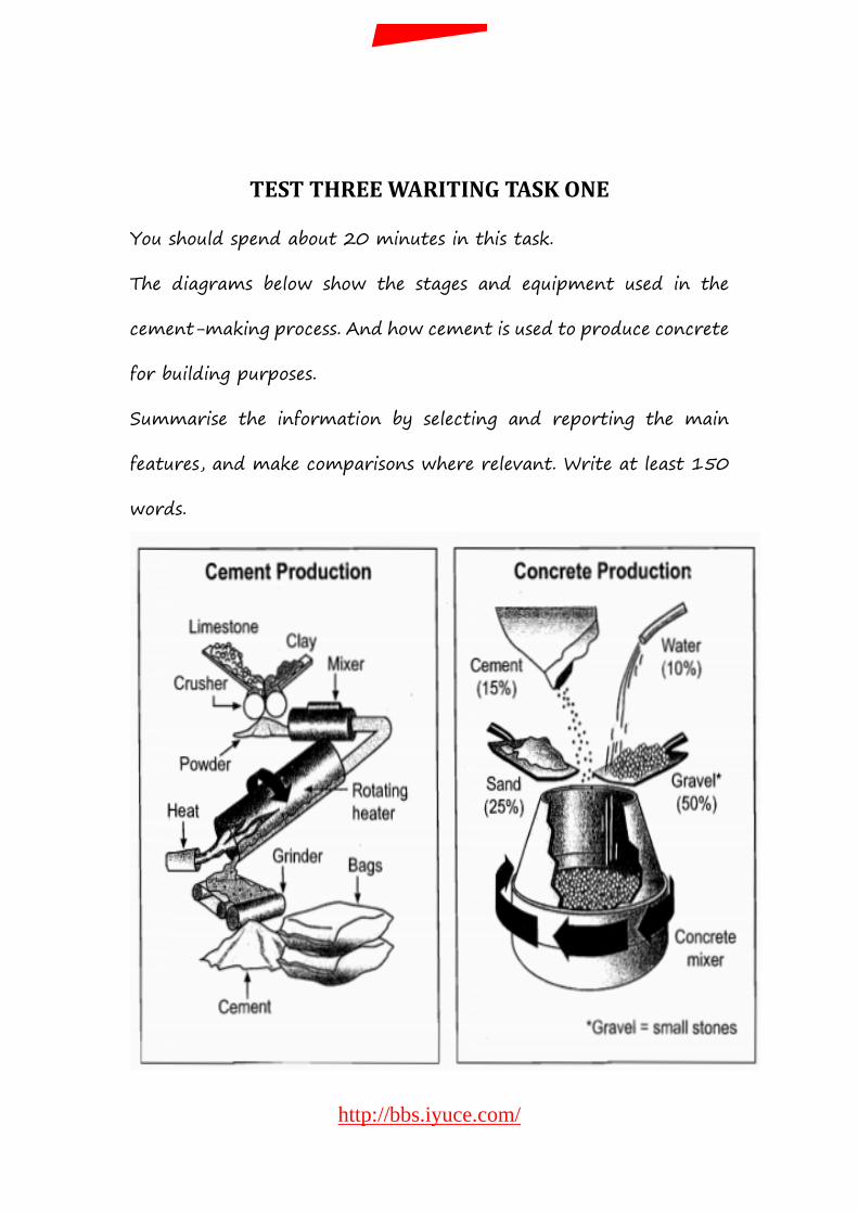
TEST THREE WARITING TASK ONE
You should spend about 20 minutes in this task.
The diagrams below show the stages and equipment used in the
cement-making process. And how cement is used to produce concrete
for building purposes.
Summarise the information by selecting and reporting the main
features, and make comparisons where relevant. Write at least 150
words.
http://bbs.iyuce.com/
我预测论坛
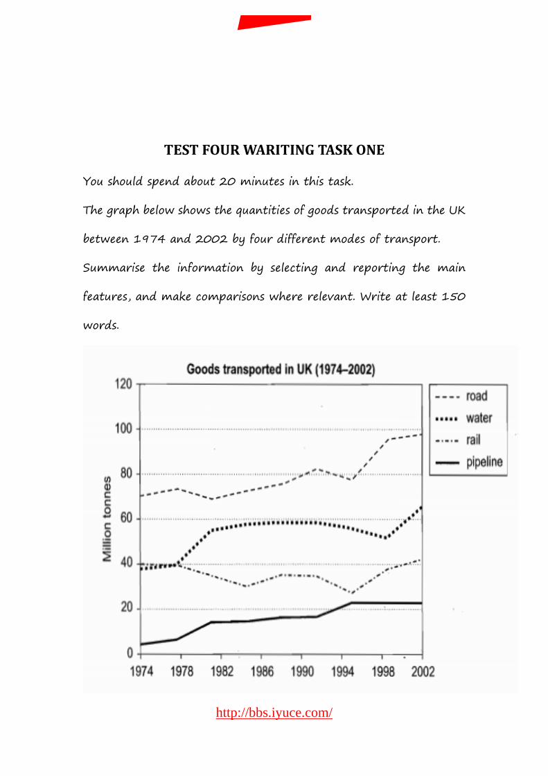
TEST FOUR WARITING TASK ONE
You should spend about 20 minutes in this task.
The graph below shows the quantities of goods transported in the UK
between 1974 and 2002 by four different modes of transport.
Summarise the information by selecting and reporting the main
features, and make comparisons where relevant. Write at least 150
words.
http://bbs.iyuce.com/
我预测论坛