
Supporting the Design of Custom Static Node-Link Graph ...
120
UNIVERSIDADE FEDERAL DO RIO GRANDE DO SUL INSTITUTO DE INFORMÁTICA PROGRAMA DE PÓS-GRADUAÇÃO EM COMPUTAÇÃO ANDRE SUSLIK SPRITZER Supporting the Design of Custom Static Node-Link Graph Visualizations Thesis presented in partial fulfillment of the requirements for the degree of Doctor of Computer Science Advisor: Prof. Dr. Carla Maria Dal Sasso Freitas Coadvisor: Prof. Dr. Jean-Daniel Fekete Porto Alegre August 2015
-
Upload
khangminh22 -
Category
Documents
-
view
3 -
download
0
Transcript of Supporting the Design of Custom Static Node-Link Graph ...

UNIVERSIDADE FEDERAL DO RIO GRANDE DO SULINSTITUTO DE INFORMÁTICA
PROGRAMA DE PÓS-GRADUAÇÃO EM COMPUTAÇÃO
ANDRE SUSLIK SPRITZER
Supporting the Design of Custom StaticNode-Link Graph Visualizations
Thesis presented in partial fulfillmentof the requirements for the degree ofDoctor of Computer Science
Advisor: Prof. Dr. Carla Maria Dal Sasso FreitasCoadvisor: Prof. Dr. Jean-Daniel Fekete
Porto AlegreAugust 2015
CIP – CATALOGING-IN-PUBLICATION
Spritzer, Andre Suslik
Supporting the Design of Custom Static Node-Link GraphVisualizations / Andre Suslik Spritzer. – Porto Alegre:PPGC da UFRGS, 2015.
120 f.: il.
Thesis (Ph.D.) – Universidade Federal do Rio Grande do Sul.Programa de Pós-Graduação em Computação, Porto Alegre, BR–RS, 2015. Advisor: Carla Maria Dal Sasso Freitas; Coadvisor:Jean-Daniel Fekete.
1. Graph visualization. 2. Node-link diagrams. 3. Interactivelayout manipulation. 4. Infographics. 5. Graphic design. 6. Staticvisualizations. I. Freitas, Carla Maria Dal Sasso. II. Fekete, Jean-Daniel. III. Título.
UNIVERSIDADE FEDERAL DO RIO GRANDE DO SULReitor: Prof. Carlos Alexandre NettoVice-Reitor: Prof. Rui Vicente OppermannPró-Reitor de Pós-Graduação: Prof. Vladimir Pinheiro do NascimentoDiretor do Instituto de Informática: Prof. Luis da Cunha LambCoordenador do PPGC: Prof. Luigi CarroBibliotecária-chefe do Instituto de Informática: Beatriz Regina Bastos Haro

ACKNOWLEDGMENTS
The first person I would like to thank is my longtime advisor, Prof. Carla Freitas. She has
been along for the ride ever since my time as an undergrad and has opened many doors for me.
It was through her that I ended up in the world of visualization and it was often with her help
that I navigated the sometimes-murky waters of the seas of academia. I believe we have made a
great team in the 11 years we have worked together and I hope we will continue to collaborate
in the future.
I would also like to thank my coadvisor, Prof. Jean-Daniel Fekete, who welcomed me with
open arms to Aviz, his research team in Paris. Jean-Daniel is as brilliant as he is approachable,
his input and feedback being some of the key ingredients that helped shape and define this
work. My time working with him and the Aviz team was an amazing experience, giving me the
opportunity of meeting and collaborating with many talented, hard-working people.
Besides my advisors, I would like to thank the members of my jury, professors Hugo
Alexandre Dantas do Nascimento, Maria Cristina Ferreira de Oliveira, and Marcelo Soares
Pimenta. Their feedback was very valuable, making this work stronger and more complete.
Thanks must be given as well to all the people with whom I’ve collaborated during the
course of my PhD: Benjamin Bach, Jeremy Boy, Pierre Dragicevich, Evelyne Lutton, Fabio
Petrillo, Lucas Seadi, and Alberto Tonda. It was a pleasure to work with them and our collabo-
rations are definitely reflected in the work that is presented in this thesis.
I also want to thank everyone from the Brazilian UFRGS Computer Graphics, Interaction,
and Visualization group and the French Aviz and InSitu teams. Even if they haven’t all been
directly involved with this work, they have all contributed to it by means of the friendly and
productive work environment they created, as well as the many discussions, experiments, coffee
breaks, lunches, dinners, meetings, train rides, conferences, and other activities, both curricular
and extra-curricular, that we have experienced together. It is impossible to name everyone
here (literally, as the list would be positively huge and I don’t want to run the risk of leaving
anyone out), but it should be said that I have learned I lot with these people and that, more than
colleagues, many of them have become great friends.
Last, but by no means least, I would like to thank my friends and family for their support
and understanding throughout all these years. They helped me stay connected to the outside
world throughout all these years while showing a great deal of patience for all the times I was
unavailable due to pressing deadlines and other work-related reasons. This work wouldn’t have
been possible without them.
ABSTRACT
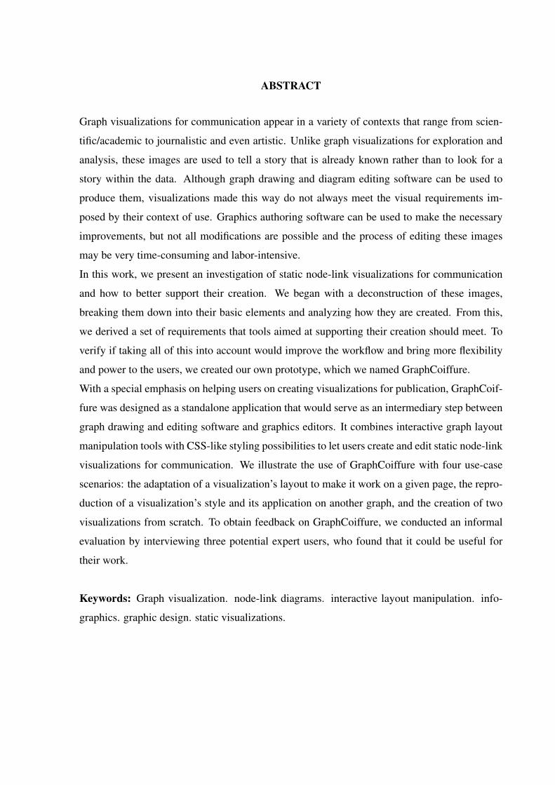
Graph visualizations for communication appear in a variety of contexts that range from scien-
tific/academic to journalistic and even artistic. Unlike graph visualizations for exploration and
analysis, these images are used to tell a story that is already known rather than to look for a
story within the data. Although graph drawing and diagram editing software can be used to
produce them, visualizations made this way do not always meet the visual requirements im-
posed by their context of use. Graphics authoring software can be used to make the necessary
improvements, but not all modifications are possible and the process of editing these images
may be very time-consuming and labor-intensive.
In this work, we present an investigation of static node-link visualizations for communication
and how to better support their creation. We began with a deconstruction of these images,
breaking them down into their basic elements and analyzing how they are created. From this,
we derived a set of requirements that tools aimed at supporting their creation should meet. To
verify if taking all of this into account would improve the workflow and bring more flexibility
and power to the users, we created our own prototype, which we named GraphCoiffure.
With a special emphasis on helping users on creating visualizations for publication, GraphCoif-
fure was designed as a standalone application that would serve as an intermediary step between
graph drawing and editing software and graphics editors. It combines interactive graph layout
manipulation tools with CSS-like styling possibilities to let users create and edit static node-link
visualizations for communication. We illustrate the use of GraphCoiffure with four use-case
scenarios: the adaptation of a visualization’s layout to make it work on a given page, the repro-
duction of a visualization’s style and its application on another graph, and the creation of two
visualizations from scratch. To obtain feedback on GraphCoiffure, we conducted an informal
evaluation by interviewing three potential expert users, who found that it could be useful for
their work.
Keywords: Graph visualization. node-link diagrams. interactive layout manipulation. info-
graphics. graphic design. static visualizations.
Permitindo o design de visualizações nodo-aresta de grafos estáticas personalizadas
RESUMO
Visualizações de grafos para comunicação aparecem numa variedade de contextos que vão do
acadêmico-científico até o jornalístico e até mesmo artístico. Diferente de visualizações de
grafos para exploração e análise de dados, essas imagens são usadas para “contar uma história”
que já se conhece ao invés da “procura de uma nova história” nos dados. Apesar de ser possível
usar software para desenho de grafos e edição de diagramas para produzí-las, visualizações
feitas dessa forma nem sempre preenchem os requisitos visuais impostos pelos seus contextos
de uso. Programas de edição de imagens podem ser usados para fazer as melhorias necessárias,
mas nem todas as modificações são possíveis e o processo de editar essas imagens pode exigir
muito tempo e esforço.
Neste trabalho, apresentamos uma investigação de visualizações nodo-aresta estáticas para co-
municação e de como facilitar sua criação. A partir de uma desconstrução dessas imagens,
identificando seus elementos essenciais, e analisando como são criadas, derivamos um conjunto
de requisitos que ferramentas para a criação dessas visualizações devem preencher. Para veri-
ficar o efeito da metodologia na melhora do fluxo de trabalho de designers, com mais poder e
flexibilidade, foi concebido e implementado um protótipo chamado GraphCoiffure.
Com um foco especial em auxiliar usuários na criação de visualizações para publicação, Graph-
Coiffure foi projetado como uma aplicação standalone que seria usada como um passo inter-
mediário entre programas de desenho e edição de grafos e editores gráficos. Ele combina fer-
ramentas para manipulação interativa de layouts com estilização similar a CSS para permitir
que usuários criem e editem visualizações nodo-aresta estáticas. Ilustramos o funcionamento
de GraphCoiffure com quatro casos de uso: a adaptação do layout de uma visualização para
fazê-la funcionar em uma dada página, a reprodução do estilo de uma visualização e sua aplica-
ção em outro grafo, e a criação integral de duas novas visualizações. Para obter feedback sobre
GraphCoiffure, conduzimos uma avaliação informal através de entrevistas com três potenciais
usuários, que disseram achar que GraphCoiffure beneficiaria seu trabalho.
Palavras-chave: visualização de grafos, diagramas nodo-aresta, manipulação interativa de
layouts, infográficos, design gráfico, visualizações estáticas.
LIST OF FIGURES
Figure 1.1 A typical node-link diagram, using circles to represent nodes............................... 12Figure 1.2 Hand-made sociogram made by the Stasi (East German secret police) that
shows the social connections of a poet they were spying on. ......................................... 15Figure 1.3 Graph shown by the PA Consulting Group to the US military in a PowerPoint
presentation about the situation in Afghanistan.............................................................. 15Figure 1.4 A sociogram made with Gephi by Nataliya Dmytriyeva for her website for an
online social network analysis course. ............................................................................ 16Figure 1.5 An egocentric sociogram hand-drawn by Ben Discoe in 2003 illustrating his
network of friends on online social network Friendster.................................................. 16Figure 1.6 “Dada Visualization I” by artist Mario Klingemann. ............................................. 17Figure 1.7 A prime example of graph visualization as art, this is one of Mark Lombardi’s
several hand-drawn graphs illustrating crime and conspiracy networks (LOMBARDI;HOBBS; RICHARDS, 2003). Over 20 of these works are included in the collectionof the Museum of Modern Art (MoMA), in New York City. ......................................... 18
Figure 1.8 Huge visualization of biochemical pathways made by pharmaceutical com-pany Roche. It is available online, but a wall chart version can be purchased. .............. 19
Figure 1.9 Infographic by the New York Times depicting an overview of the Euro Crisis,by Bill Marsh. An interactive version also appears on the newspaper’s website. .......... 20
Figure 1.10 Infographic by British newspaper the Guardian depicting UK governmentspending by department in 2011–2012. .......................................................................... 21
Figure 1.11 Infographic made by now-extinct company Loku illustrating the differenttypes of coffee and the different personalities of the people who drink them. ............... 22
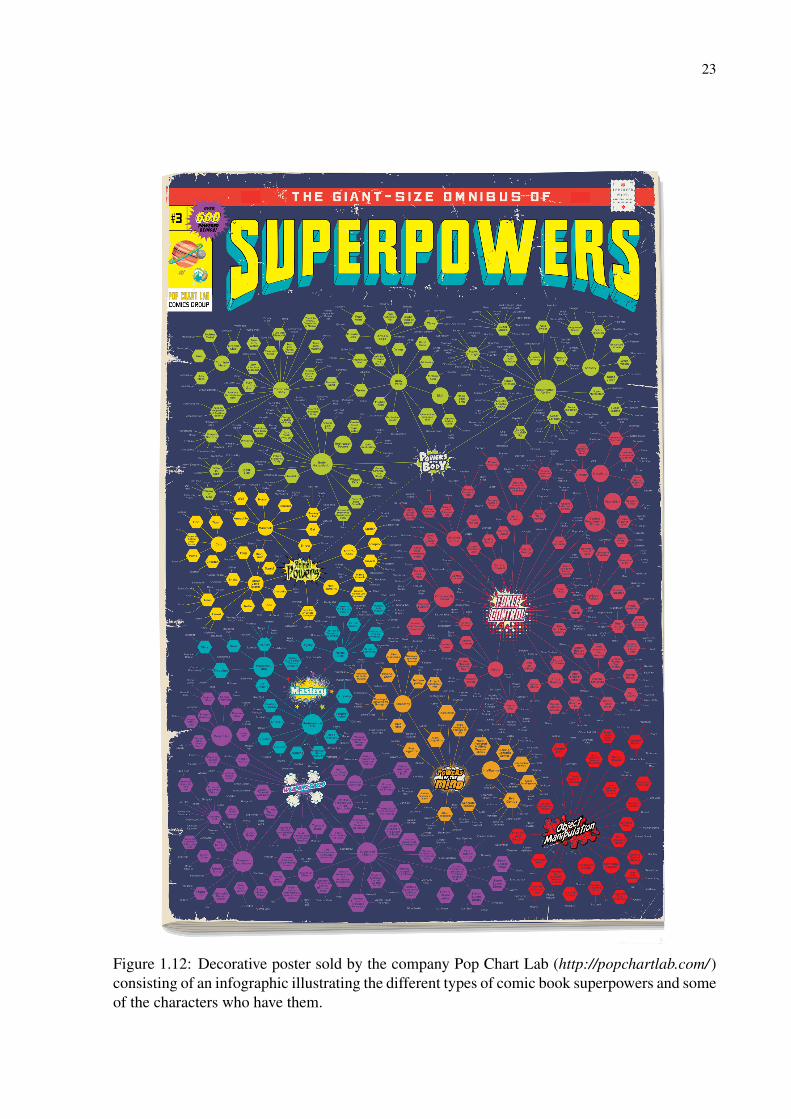
Figure 1.12 Decorative poster sold by the company Pop Chart Lab consisting of an info-graphic illustrating the different types of comic book superpowers and some of thecharacters who have them. .............................................................................................. 23
Figure 1.13 Kitchen apron sold by Pop Chart Lab featuring an infographic graph depict-ing the different types of kitchenware............................................................................. 24
Figure 1.14 “Map of Science” poster made in 2006 by Kevin Boyack, Dick Klavans, andW. Bradford Paley. It appeared in many publications, including the 2006 galleryof the scientific journal Nature (MARRIS, 2006) and several magazines. It is alsoavailable as a poster, given away for free at Paley’s Information Esthetics web-site. Paley also features this image on his website, in a section dedicated to hisvisualizations of scientific knowledge. ........................................................................... 25
Figure 1.15 Another poster made by W. Bradford Paley and Dick Klavans. It illustrateshow different nations emphasize different topics of scientific research. ........................ 26
Figure 2.1 Common graph layouts. From left to right: polylines, straight line segments,orthogonal drawing, and grid layout. .............................................................................. 28
Figure 2.2 Sugiyama and Misue’s magnetic-spring layout (1994, 1995). ............................... 30Figure 2.3 Sample layout generated using the Eades spring-embedder technique (1984). ..... 30Figure 2.4 Fruchterman-Reingold layout (1991). .................................................................... 31Figure 2.5 Fruchterman-Reingold layout (1991) of the largest component of the co-authorship
graph of the AVI conference (26 nodes and 78 edges). .................................................. 32Figure 2.6 The elements of a grid. ........................................................................................... 34
Figure 4.1 Visual representation of magnets and their attracted nodes.................................... 42Figure 4.2 Boundary shapes..................................................................................................... 44Figure 4.3 Magnet intersection. ............................................................................................... 45
Figure 4.4 Types of behavior of intersecting nodes. ................................................................ 45Figure 4.5 Magnet hierarchy: a magnet and its child. ............................................................. 46Figure 4.6 Using the MagnetViz tools on a small graph.......................................................... 47Figure 4.7 Using MagnetViz on a larger graph........................................................................ 49Figure 4.8 Transforming the 2009 UFRGS Informatics Institute co-authorship graph to
emphasize the computer graphics group......................................................................... 50
Figure 5.1 Teresa Elms’ visualization of the lexical distance among the languages ofEurope (2008). ................................................................................................................ 53
Figure 5.2 Close-up of two e-diaspora graphs as seen on the print version of Dana Dimi-nescu’s e-Diasporas project (2012b). .............................................................................. 55
Figure 5.3 Two pages of the print version of Dana Diminescu’s e-Diasporas project (2012b).Each page is organized as a grid of e-diaspora graphs.................................................... 56
Figure 6.1 Visualization of the lexical distance among European languages, by TeresaElms (ELMS, 2008) ........................................................................................................ 65
Figure 6.2 Reproducing the lexi-graph with GraphCoiffure.................................................... 66Figure 6.3 Node group deformations of nodes representing Germanic languages. ................. 70Figure 6.4 Using physics-based tools on the lexi-graph .......................................................... 70Figure 6.5 Applying layout algorithms on a node group ......................................................... 71
Figure 7.1 From page template to page layout schema............................................................ 75Figure 7.2 Moving and scaling the graph................................................................................. 75Figure 7.3 Adjusting the layout................................................................................................ 76Figure 7.4 The finished page.................................................................................................... 77Figure 7.5 Page layout schema with a movable element (in blue)........................................... 78Figure 7.6 Layout made using GraphCoiffure groups. ............................................................ 78Figure 7.7 Layout made using node groups and the application of a circular layout algo-
rithm on a subgraph......................................................................................................... 79Figure 7.8 Making the lexi-graph reproduction look like the coffee infographic.................... 80Figure 7.9 In our visualization of the UFRGS 2011 coauthorship network we used this
stylized depiction of a person as the shape of the nodes. This image was in SVGformat. ............................................................................................................................. 81
Figure 7.10 Applying a stylesheet on the 2011 UFRGS coauthorship network. ..................... 82Figure 7.11 Manipulating the UFRGS coauthorship network to make the CG group stand
out.................................................................................................................................... 84Figure 7.12 Finalizing the visualization of the 2011 UFRGS coauthorship network.............. 85Figure 7.13 Our first Rotten Tomatoes infographic. ................................................................ 87Figure 7.14 Our second Rotten Tomatoes infographic. ........................................................... 88Figure 7.15 Examples of real-world visualizations given by the third researcher we in-
terviewed representative of situations where he thought GraphCoiffure would havebeen useful. ..................................................................................................................... 91
Figure A.1 The GraphCoiffure prototype’s graphical user interface. ...................................... 99Figure A.2 Selection panels ..................................................................................................... 99Figure A.3 Stylesheet editor................................................................................................... 100Figure A.4 A sample page layout schema containing two placeholder elements, one fixed
(in red) and one movable (in blue). ............................................................................... 101Figure A.5 A graph and a page layout schema on GraphCoiffure......................................... 101Figure A.6 A graph visualization using GraphCoiffure’s default stylesheet and no layout
modification. ................................................................................................................. 103Figure A.7 The node shape manager...................................................................................... 103

Figure A.8 Using stylesheets and SVG to change node appearance: nodes of our repro-duction of Elms’s graph (2008) are drawn using the “mushroom” image and scaledproportionally to their “speakers” attribute................................................................... 106
Figure A.9 Declarations are added to the “node” rule on the stylesheet to define the ap-pearance of labels on our reproduction of Elms’s graph (2008). .................................. 106
Figure A.10 Node shapes of our reproduction of Elms’s graph (2008) are changed byusing stylesheet declarations that alter the default stroke/pen. ..................................... 110
Figure A.11 The SVG ids of individual elements of node shapes are used to change thelook of the nodes of our reproduction of Elms’s graph (2008) by altering the brush/-fill that is used to paint the upper part of the mushrooms. ............................................ 110
Figure A.12 Adjusting graph size and node spacing by scaling. ........................................... 114Figure A.13 A node group. .................................................................................................... 115Figure A.14 Scaling a node group. ........................................................................................ 115Figure A.15 Node group rotation. .......................................................................................... 116Figure A.16 Application of a force-directed layout on a node group. ................................... 117Figure A.17 An edge group comprising edges ‘Ger’-‘Lat’, ‘Lit’-‘Lat’, ‘Hun’-‘Lat’, and
‘Est’-‘Lat’...................................................................................................................... 117Figure A.18 A repeller being used to create some space between nodes. ............................. 118Figure A.19 A magnet attracting the nodes labeled ‘Dut’, ‘Ger’, ‘Lit’, ‘Sb’, ‘Alb’, ’Rom’,
and ’Grk’. ...................................................................................................................... 119

LIST OF TABLES
Table A.1 Stylesheet declarations concerning node size. ...................................................... 105Table A.2 Stylesheet declarations concerning node label. ..................................................... 108Table A.3 Stylesheet pen declarations. .................................................................................. 111Table A.4 Stylesheet brush declarations. ............................................................................... 112
CONTENTS
1 INTRODUCTION................................................................................................................ 121.1 Motivation......................................................................................................................... 131.2 Objectives and contribution............................................................................................ 141.3 Structure of the text ......................................................................................................... 142 BACKGROUND................................................................................................................... 272.1 Basic Concepts.................................................................................................................. 272.2 Graph Drawing ................................................................................................................ 282.3 Graphic Design: the Grid................................................................................................ 323 RELATED WORK .............................................................................................................. 353.1 Graph editors ................................................................................................................... 353.2 Interactive layout manipulation ..................................................................................... 373.3 Attribute-based graph visualization............................................................................... 384 PREVIOUS WORK: MAGNETVIZ.................................................................................. 414.1 The Technique .................................................................................................................. 424.1.1 The Magnet ..................................................................................................................... 424.1.2 The Boundary Shape....................................................................................................... 444.1.3 Magnet Intersection ........................................................................................................ 444.1.4 Magnet Hierarchy ........................................................................................................... 454.2 The MagnetViz Prototype Application .......................................................................... 464.3 The Evolution of MagnetViz ........................................................................................... 474.4 Examples........................................................................................................................... 484.5 Discussion ......................................................................................................................... 485 NODE-LINK VISUALIZATIONS FOR COMMUNICATION ...................................... 525.1 Elements of static node-link graph visualizations......................................................... 575.2 High-level tasks for the creation of communicative node-link diagrams.................... 596 GRAPHCOIFFURE ............................................................................................................ 616.1 GraphCoiffure’s concept ................................................................................................. 626.2 Workflow using GraphCoiffure...................................................................................... 626.3 Touching up a graph with GraphCoiffure..................................................................... 646.3.1 Using stylesheets to define visual attributes ................................................................... 656.3.2 Annotations ..................................................................................................................... 686.3.3 Manipulating the layout .................................................................................................. 696.3.4 Selection.......................................................................................................................... 696.3.5 Node-group-based manipulation..................................................................................... 696.3.6 Physics-based tools ......................................................................................................... 706.3.7 Page layout schemas ....................................................................................................... 716.4 Implementation ................................................................................................................ 726.5 Limitations........................................................................................................................ 737 EVALUATING GRAPHCOIFFURE ................................................................................. 747.1 Usage scenarios................................................................................................................. 747.1.1 Adapting the lexi-graph for the page .............................................................................. 747.1.2 Reproducing a style......................................................................................................... 767.1.3 Creating a coauthorship visualization............................................................................. 817.1.4 Rotten Tomatoes infographics ........................................................................................ 837.2 User evaluation: interviews with expert users .............................................................. 868 CONCLUSION .................................................................................................................... 92REFERENCES........................................................................................................................ 93
A USING THE GRAPHCOIFFURE PROTOTYPE........................................................... 98A.1 User interface................................................................................................................... 98A.2 Planning for a page layout............................................................................................ 100A.3 Customizing Visual Attributes With Stylesheets........................................................ 102A.3.0.1 Changing the Appearance of Nodes.......................................................................... 104A.3.1 Changing the Appearance of Node Shapes.................................................................. 107A.3.2 Changing the Appearance of Edges ............................................................................. 109A.4 Working with Graph Layouts ...................................................................................... 112A.4.1 Adjusting Graph Size and Node Spacing..................................................................... 113A.4.1.1 Groups....................................................................................................................... 113A.4.2 Physics-based tools ...................................................................................................... 118A.5 Presentation Aids .......................................................................................................... 119A.6 Generating the Output Image...................................................................................... 120A.7 Implementation ............................................................................................................. 120
12
1 INTRODUCTION
A graph is an abstract mathematical structure that is used to represent information consist-
ing of objects (the graph’s nodes) and the relationships between them (its edges). Graphs are
used by researchers from fields as varied as social science, biology, chemistry, urbanism, and
computer science, representing datasets that range from the relationships of students in a class-
room to chemical pathways and computer networks. To analyze and understand these datasets,
researchers count on a variety of graph properties, metrics, techniques, and algorithms.
Visualization also plays an essential role in graph analysis. It can be far easier to understand
the structure of a graph by looking at its visual representation than by reading a purely verbal
description. This has led researchers to devise a multitude of graph visualization techniques
that combine visual representations with interaction schemes to allow for a deeper exploration
and understanding of these datasets (BASTIAN; HEYMANN; JACOMY, 2009; HERMAN et
al., 2000; MCGUFFIN; JURISICA, 2009; SCHMIDT et al., 2010; TAMASSIA, 2014).
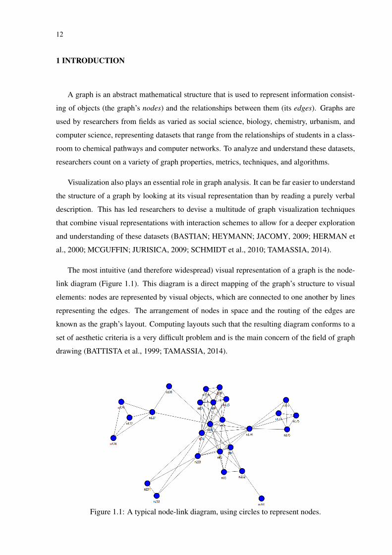
The most intuitive (and therefore widespread) visual representation of a graph is the node-
link diagram (Figure 1.1). This diagram is a direct mapping of the graph’s structure to visual
elements: nodes are represented by visual objects, which are connected to one another by lines
representing the edges. The arrangement of nodes in space and the routing of the edges are
known as the graph’s layout. Computing layouts such that the resulting diagram conforms to a
set of aesthetic criteria is a very difficult problem and is the main concern of the field of graph
drawing (BATTISTA et al., 1999; TAMASSIA, 2014).
Figure 1.1: A typical node-link diagram, using circles to represent nodes.
13
1.1 Motivation
Static node-link diagrams are an effective way of communicating information. As seen in
Figures 1.2–1.15, they come in many very distinct styles and appear in media as varied as text-
books, papers, scientific posters, newspapers, and magazines, being often used by researchers
to present their findings, by journalists to illustrate their stories, and by artists to express them-
selves.
These visualizations are of an inherently different nature from those meant for exploration
and analysis. Instead of helping us look for a story within the data, they let us tell a story that we
already know or that we have previously discovered through exploration. A social scientist, for
instance, may use a static node-link diagram depicting a social network (a sociogram, in social
network analysis jargon) to communicate particular points about some of its actors (e.g., show
the similarities or differences in the relationships of two groups of children in a classroom).
Creating static node-link visualizations for communication is not an easy task. To begin
with, the contexts where they appear impose many constraints, ranging from stylistic choices
(i.e., the image’s “look-and-feel”) to medium limitations (e.g., size, color palette, etc.) and
whoever creates them must have a clear understanding of the underlying data and of the message
the diagram should convey. This requires skills that are not necessarily possessed by a single
person.
Currently available approaches for creating custom static node-link diagrams are also a
problem as they tend to be too labor-intensive, time-consuming, or inflexible. For example,
creating a node-link diagram from scratch in a graphics editor can be painstaking and is only
feasible for graphs of very limited size—such software only deal with pixels and/or vectors and
are agnostic to the data. As an alternative, analysis-centric software can be used, but these rarely
allow the necessary flexibility to conform with the aesthetic requirements of communication-
centered contexts. Similarly, graph editors and graph drawing applications can produce nice-
looking visualizations, but they too lack flexibility for visual encoding and layout and are truly
practical only if the visualizations can be used “as is.” A final alternative is to code visual-
izations, but this is impractical, time-consuming, and requires programming skills, which not
everyone has.

14
1.2 Objectives and contribution
To adequately support the creation of custom static node-link diagrams for publication, it
is necessary to approach this problem from the ground up, fully understanding what these im-
ages consist of and the workflow of the people who create them. The goal of this work is
to do precisely that, laying the necessary groundwork for techniques and applications aimed
at supporting the creation of these diagrams, with an emphasis on tools for interactive layout
manipulation. It includes the following contributions:
1. a breakdown of static node-link diagrams into their basic elements from a graphic design
perspective based on a study of representative example visualizations (Chapter 5);
2. an analysis of the workflow of the designers/storytellers who create these visualizations
(Chapter 5);
3. a set of high-level tasks that these users may need to perform in order to create the dia-
grams (Chapter 5);
4. a set of techniques for interactive layout manipulation that take into account the graph and
its associated data (i.e., node and edge attributes), as well as the visualization’s semantics
and context of use (Chapter 6);
5. a stylesheet-based technique for the definition of a node-link diagram’s visual attributes
(Chapter 6);
6. a discussion of how the proposed techniques fit into and enhance the workflow of creators
of node-link visualizations for communication (Chapters 6 and 7).
The proposed techniques were implemented as a proof-of-concept prototype called Graph-
Coiffure (SPRITZER et al., 2015), which is detailed in Chapters 6 and 7 and in the Appendix.
1.3 Structure of the text
In the following chapters we briefly review basic concepts (Chapter 2) and describe the
related work (Chapter 3). Then, we present a technique, MagnetViz, which was designed for
the manipulation of node-link layouts based on queries over graph datasets (Chapter 4). This
technique served as inspiration and laid the groundwork for the design and development of
GraphCoiffure (Chapters 5, 6, and 7). Finally, Chapter 8 presents our conclusions and the
Appendix details specific functionalities of the GraphCoiffure prototype.
15
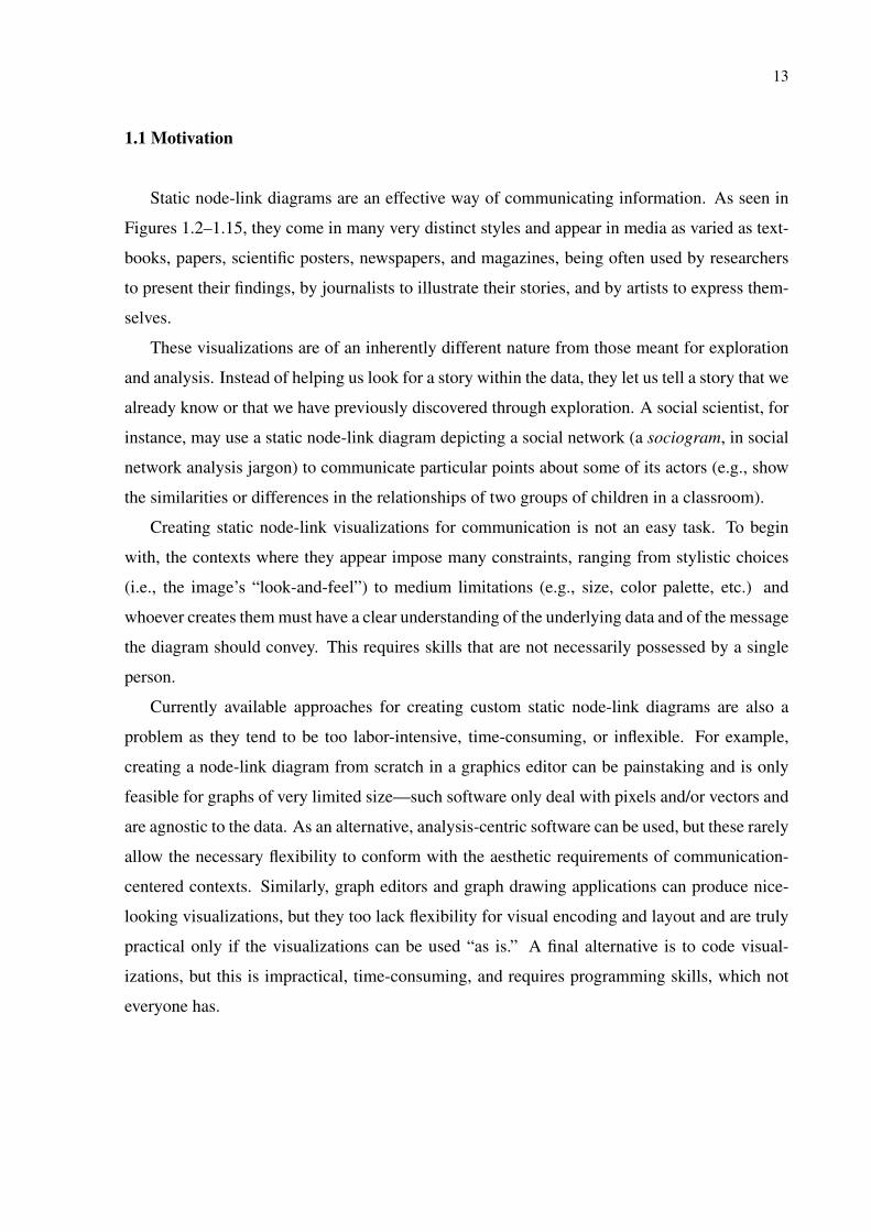
Figure 1.2: Hand-made sociogram made by the Stasi (East German secret police) that showsthe social connections of a poet they were spying on (http://www.propublica.org/article/how-the-stasi-spied-on-social-networks).
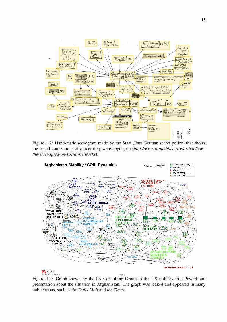
Figure 1.3: Graph shown by the PA Consulting Group to the US military in a PowerPointpresentation about the situation in Afghanistan. The graph was leaked and appeared in manypublications, such as the Daily Mail and the Times.

16
Figure 1.4: A sociogram made with Gephi by Nataliya Dmytriyeva for her website for an onlinesocial network analysis course (http://http://sna433.weebly.com/ ).
Figure 1.5: An egocentric sociogram hand-drawn by Ben Discoe in 2003illustrating his network of friends on online social network Friendster(http://www.washedashore.com/people/friendster/friendster1.html).

17
Figure 1.6: “Dada Visualization I” by artist Mario Klingemann (http://mario-klingemann.tumblr.com/ ). This was one of the pieces the author made in 2009 for theData Art Show at the Pink Hobo Gallery, in Minneapolis. These pieces were a pun on whathe described as “the new craze for data visualization.” Instead of using Photoshop or otherimaging tools, he crafted these images by making up his own data to ensure that his “generativealgorithms” would give him his desired visual results.

18
Figure 1.7: A prime example of graph visualization as art, this is one of Mark Lombardi’sseveral hand-drawn graphs illustrating crime and conspiracy networks (LOMBARDI; HOBBS;RICHARDS, 2003). Over 20 of these works are included in the collection of the Museum ofModern Art (MoMA), in New York City.
19
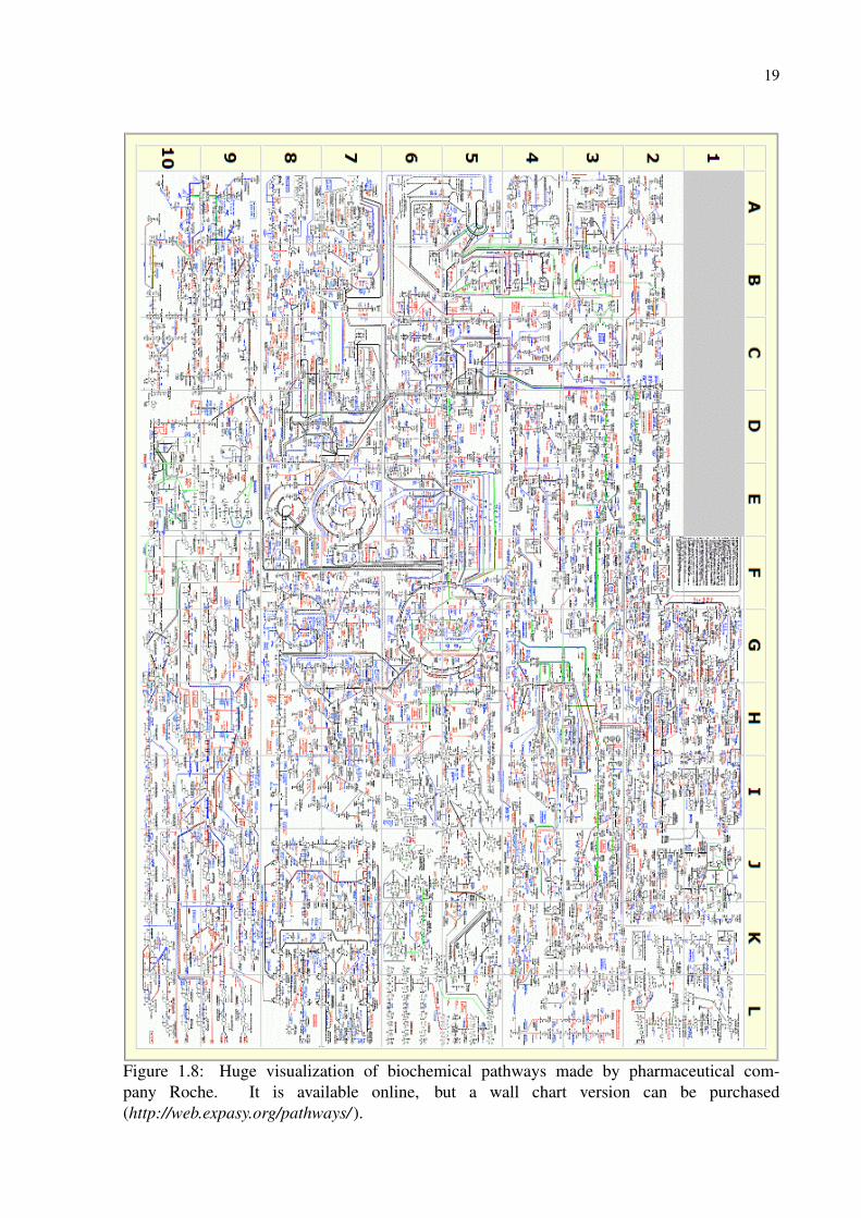
Figure 1.8: Huge visualization of biochemical pathways made by pharmaceutical com-pany Roche. It is available online, but a wall chart version can be purchased(http://web.expasy.org/pathways/ ).
20
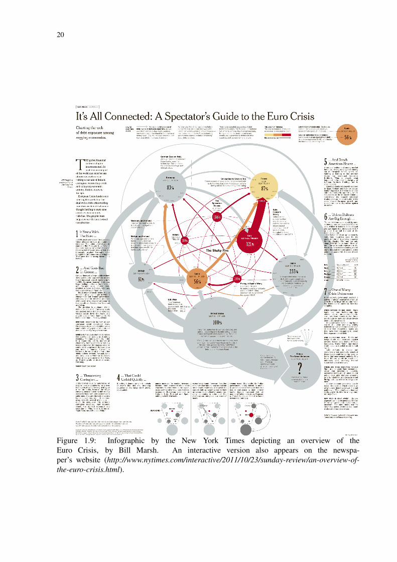
Figure 1.9: Infographic by the New York Times depicting an overview of theEuro Crisis, by Bill Marsh. An interactive version also appears on the newspa-per’s website (http://www.nytimes.com/interactive/2011/10/23/sunday-review/an-overview-of-the-euro-crisis.html).
21
Total sp
end
ing, 20
11-12
£69
4.8
9bn
-1.58% change after
inflation
on 20
10-11
Security an
d intelligence services
£1.99
bn +0
.6%
Crow
n Prosecu
tion Service £58
9m
-6.1%
Nu
clear D
ecomm
issioning
Au
thority
Green
Deal £20
6m
-57.6%
En
ergy legacy £199
m
+7.2%
Clim
ate change £14
8m
-50
.1%
Adm
in £14
4m
+19.3%
Ren
ewable H
eat Incentive £11m
C
oal Au
thority £31m
-60.8%
Secure en
ergy £5m-97%
Com
mittee on
Clim
ate Ch
ange £4m
-16.5%
Civil N
uclear Police A
uth
ority £2m-12.5%
Dep
artmen
t of En
ergy and
Clim
ate Ch
ange
£5.53bn-22.9%
£6.12bn
-26.3%
Dep
artmen
t for Intern
ational D
evelopm
ent
Cou
ntryprogram
mes
Africa
£1.84bn
+4.3%
Eu
rope£1.36bn
+2.2%
Internation
al finance
£1.8bn
-9.3%
Internation
al relations
£1.67bn +5.2%
World B
ank
£953m
-4.9%
Global fun
ds£39
6m-32.4%
Debt relief £9
1m -28.3%
Policy & research
£826m
-4.4%
UN
& C
omm
onwealth
£307m
+22.4%
£7.87bn
+1.8%
£3.42bn
+5%
Region
al development
banks £267m
+35.1%
Asia, C
aribbean &
Overseas T
erritories £76
5m
Western
Asia &
Stabilisation
division £414m
Security &
hu
manitarian
& M
iddle E
ast division £39
9m
UK
Statistics Au
thority
£325m +4.7%
Hou
se of Com
mon
s [11] £230
m +37.3%
Nation
al Savings and Investm
ents £174m
+4.4%
Debt in
terest [1]
£48
.20bn
+8.7%
Health
Protection
Agen
cy £161m
-11%
Indepen
dent Parliamentary
Standards A
uth
ority[8
] £146
m +10
.5%
UK
Trade &
Investment
(UK
TI) £8
2m -6.2%
Hou
se of Lords £10
9m
+38.0%
Nation
al Au
dit Offi
ce £70
m -1.5%
Food Standards A
gency
£89
m +21%
Offi
ce of Fair T
rading (OFT
) £62m
+3.8%
Prisons &
probation (N
ational
Off
ender M
anagem
ent Service)
Crim
inal legal aid £1.1bn
-4.8%
HM
Cou
rts & tribu
nals service
£1.12bn -23.5%
Civil legal aid £1.0
2bn +1.5%
Policy, corporate services &A
ssociated offices
£1.06bn
+88.6%
Youth
Justice B
oard £378
m -18.9%
Corporate Services &
Associated O
ffices
£249m
-19.3%
Crim
inal In
juries C
ompensation
Auth
ority£20
2m -45.6%
High
er judicial salaries £142m
-3.2%
Legal services comm
ission adm
in£9
7m -17%
Central fu
nds £10
1m +25.9%
Parole Board
£10m
-28.1%
Min
istry of Justice
£8.55bn
-10.7%
Offi
ce for Legal Com
plaints £1m +99.3%
Inform
ation C
omm
issioner’s O
ffice
£5m -25.6%
Judicial A
ppointments C
omm
ission £5m
-21.1%
Crim
inal C
ases Review
Com
mission
£6m
-12.7%
£3.58bn
-15.6%
Ch
ild trust fu
nd
£106m
-54.2%Person
altax credits
Ch
ildben
efit£12.22 bn
-0.9%
HM
Reven
ue
& C
ustom
s [8]
£46
.59bn
-0.6%
D
evolved sp
end
ing for N
orthern
Ireland
£10.33bn
-2.2%Ju
stice £1.21bn -3.2%
Em
ployment an
d learning £78
7m -3.7%
Social development £50
5m -5.3%
Region
al development £50
8m
-4%A
gricultu
re & ru
ral development
£220m
-4.4%
Fin
ance an
d personn
el £189
m +0
.7%
Cu
lture, arts an
d leisure £112m
-3.4%
Environ
ment £127m
-4.3%
Offi
ce of the F
irst Min
ister & D
eputy F
irst Min
ister£79
m -4.3%
North
ern Irelan
d Assem
bly £47m -6.2%
Enterprise, trade an
d investment £20
7m +1.4
%
Health, social services
& Pu
blic safety £4
.38bn
-0.5%
£1.89
bn-3.4%
Edu
cation
Fin
ance &
sustain
able grow
th
Edu
cation &
lifelong learn
ing
Infrastru
cture &
capital investm
ent £2.13bnJu
stice £1.26bn
-1.6%
Ru
ral affairs &
the environ
ment £54
1m -16.0
%
Offi
ce of the F
irst Min
ister £255m -15.5%
Cu
lture &
external aff
airs £246
m
Crow
n offi
ce and procu
rator fiscal £108
m -11.3%
Adm
in £236
m -12.1%
Scottish parliam
ent and A
udit Scotlan
d £96
m -18.0
%
£8m
£33.52bn-5.2%
Devolved
sp
end
ing
for Scotland
Health
&w
ellbeing
£11.47bn-5.8%
LocalG
overnm
ent
£11.23bn-7.7%
£3.7bn-38.6%
£2.6bn
-10
.8%
Social justice &
Local governm
ent
Environ
ment, su
stainability &
housing £6
69m -17.7%
Ru
ral affairs £137m
-0.2%
Heritage £159
m-15.2%
Health
& social
services
Ch
ildren, edu
cation,
lifelong learning &
skills£2.1bn
-6%
Econ
omy &
transport £883m
-18%
£15bn-7.6%
Devolved
spen
din
g for W
ales
£6.27bn
-7.4%
£4.39
bn-4.1%
Central services &
admin £332m
-14.3%
Public services
& perform
ance
£64m +4.5%
Dep
artmen
t for Work
& Pen
sions [4]
£166
.98
bn+1.9%
Ben
efit sp
end
ing
in G
reat Britain
£159bn+1.1%
State pension
s
Incom
esu
pport
Incapacity
benefit
Cou
ncil
tax benefit
Jobseeker'sallow
ance
Atten
dance
allowan
ce
Statutory sick &
matern
ity pay
£16.9
4bn
+5.2%
£12.57bn+3.3 %
£8.11bn
-4.8%
£6.9
2bn-13.2%
R
entrebates
£5.45bn
+0.8%
£5.34bn
-0.3%
£4.9
4bn
-13.3%
£4.9
1bn+7.6%
£4.8
3bn-1.7%
£3.58bn
+55.9%
£74.22bn
+3.7%
Disability
living allowan
ce
Hou
singben
efit
Social Fun
dexpen
diture
Carers
allowan
ce
£2.55bn+1.2%
£2.37bn-39.2%
£1.73bn+7.7%
Fin
ancial
assistance
schem
e£1.24bn
184.6%
Pension
credit & m
inimu
min
come gu
arantee
Em
ployment &
su
pport allowan
ce
UK
Border A
gency £1.5bn
-21.7%
Police superan
uation
£1.01bn
+37%
Offi
ce for security &
cou
nter-terrorism£9
70m
-1.3%
Non
-departmental pu
blic bodies £930
m -8.2%
Central H
ome O
ffice £30
0m
+46.5%
Area-based grants £67m
-7.8%
Eu
ropean solidarity m
echan
ism £1m
Govern
ment equ
alities office £9
m-26.7%
Nation
al fraud au
thority £6
m +46.5%
£10.1bn
-5.4%
Hom
e Offi
ce
Crim
inal R
ecords Bureau
£9m
+75.8%
Offi
ce of the G
as & E
lectricity M
arkets (OFG
EM)
£0.6
74m
-5.5%
UK
Atom
ic Energy A
uth
ority pension
schem
e£20
0m
Foreign an
d C
omm
onwealth
Offi
ce £2.2bn
-4.9% [6
]
Adm
in£1.12bn
+0.8%
Peacekeeping£40
2m -3.8%
Oth
er grants £194m
-35.6%
BB
C W
orld Service £255m -6%
British
Cou
ncil £180
m -7%
Con
flict prevention£132m
+21.6%
AM
E program
me £35m
+144.2%
Taxes & licen
ce fees £26m +20
.9%
ND
PBs £5m
-18.6%
NH
S pen
sionsch
eme
£6.9
bn
£7.5bn
Teachers’
pension
schem
e
Wales O
ffice (W
O)
£5m+4%
Scotland O
ffice (SO
) £21m
[13]
North
ern Irelan
d Offi
ce (NIO
) £22m
-44.7%
Offi
ce of Rail R
egulation
£29m
-1.1%
Offi
ce for Bu
dget Respon
sibility £2m
-2.3%
Water Services R
egulation
Au
thority
(Ofw
at) £19m
+7.1%
Electoral C
omm
ission £8
6m
+258.3%
£100
m
Offi
ce for Standards
in E
ducation
(Ofsted)
£166
m -10
.7%
Departm
ent
forE
du
cation
£56.27bn
-5.7%Teach
ing Agen
cy£6
60
m -25.9%
Pupil prem
ium
£556m new
item
School infrastru
cture
£730m
-81.1%
Adm
in£270
m-2.3%
Edu
cation, stan
dards, cu
rriculu
m &
qualification
s £26
0m
-62.7%
Nation
al college£110
m-2.3%
Ch
ildren, you
ng people & fam
ilies£2.6
6bn -17.3%
Edu
cation fu
nding
agency (sch
ools)
£51.54bn
+2.8%
£5.3bn+190
.8%
£46
.24bn
-4.3%
Schools
(exc academies)
Standards an
dT
esting Agen
cy£20
m
Ch
arity Com
mission
for En
gland an
d Wales £27m
-10%
Crow
n Prosecu
tion Service
Inspectorate £4m
+2.5%
Attorn
ey general's offi
ce (see also LSLO) £4m
-7.8%
£1.6bn
NH
S & teach
ers pen
sion sch
eme
in Scotlan
dN
orthern
Ireland execu
tive pen
sion sch
eme
£1bn
Tran
sport for London
Local auth
ority transport
£1.93bn
+61%
Bu
s subsidies &
concession
ary fares £6
19m
-21.5%
Oth
er railways £577m
+161.7%
Motoring agen
cies £226m +1,642%
Crossrail £517m
+129.5%
Adm
in £146
m -25.7%
Maritim
e & C
oastguard A
gency £145m
+8%
Tolled crossings £59m
+165.3%
Sustain
able travel £71m -39.4%
Science, research
& su
pport fun
ctions £30
m -31%
High
Speed 2 £21m
£12.73bn+0
.8%
Departm
ent for T
ransp
ort
Aviation
, maritim
e, security &
safety £32m-75.8%
Netw
orkR
ail
£3.69
bn-9%
£3.34bn
+1.8%£3.24
bn+14.2%
Highw
aysA
gency
Cabin
et Offi
ce£4
61m
-21.9%
Mem
bers of the E
uropean parliam
ent £3m +46.5%
Execu
tive ND
PBs £1m
-96.7%C
omm
ittee on stan
dards in pu
blic life £1m +17.2%
Con
stitution
group £12m
+95.4%
Cabin
et Offi
ce £234m +15.4%
Offi
ce for Civil Society £18
5m +50
.6%G
overnm
ent digital service (Directgov) £28
m +24
.3%C
abinet O
ffice u
tilisation of provision
s £13m 217.4%
Cabin
et Offi
ce service concession
£12m +6.6%
£32.73bn-15%
Neigh
bourh
oodsLocalism
London
governance
£63m +28.7%
£2.62bn
-54.3%
£26.55bn
+0.5%
Spending by local
governm
ent
£1.13bn-62.1%
Dep
artmen
t of C
omm
un
ities an
d L
ocal G
overnm
ent
Principal civil
service pension
schem
e£5.1bn
£29.91bn
+1.2%
Inn
ovation, enterprise &
busin
ess £666m -49.3%
Free and fair m
arkets £650m
-12.5%
Govern
ment as sh
areholder £40
4m +580
.7%
Professional su
pport £335m -10
.4%
Science research
coun
cils £50m
+6%
£13.57bn-7%
High
eredu
cation
£5.61bn
-5.5%£3.9
4bn
-17.7%
Science
& research
£21.34bn
-7.9%
Departm
ent
for Bu
siness,
Inn
ovation an
dSkills
Furth
er edu
cation
HE
FCE
£6.8
4b
n-10
.7%
NO
TES
SOU
RCES: GU
ARDIAN
DATA, D
EPARTMEN
TAL ACCOU
NTS, IN
STITUTE FO
R FISCAL STU
DIES, PU
BLIC EXPEND
ITURE STATISTICAL AN
ALYSES (PESA), O
FFICE FOR BU
DG
ET RESPON
SIBILITY (OBR), H
OU
SE OF CO
MM
ON
S LIBRARY
RESEARCH: SIM
ON
ROG
ERS, KOO
S COU
VEE, MO
NA CH
ALABI, GEM
MA TETLO
W
GRAPH
IC: JENN
Y RIDLEY, M
ICHAEL RO
BINSO
N
The figures give a picture of major expenditure but exclude local governm
entspending not controlled by central governm
ent. We don't have room
to showeverything —
some program
mes are just too sm
all to go here, but this gives afl
avour of where your tax pounds go. It also excludes governm
ent departments
that are predominantly financed bytheir incom
e, such as the Crown Estate or
the Export Credits Guarantee D
epartment. The totals here add
up to more than the total budget, because som
e of the smaller
government departm
ents are funded via the larger ones, such as the Parliam
entary Counsel Offi
ce, funded via the Cabinet Offi
ce.A
LL % CHA
NG
ES CALCULATED
USIN
G IN
FLATION
RATE OF 2.38%
[1] Interest paid on the public debt. Treasury spending in 2008-09 and 2009-10 w
as dominated by the
impact of interventions in the financial sector —
the figure shown here is
gross spending. In fact, in 2010-11 the net effect of financial stability
activities was to yield incom
e to the Treasury. Loans to financial institutions
[2]
were repaid to the Treasury in 2010-11 and there w
as no further purchase ofshares and other assets in the year —
so we have show
n the core department
spending separately. The increase is due to the provision for Equitable Life. The Rural Paym
ents Agency distributes CAP payments —
covered bytransfers from
EU so do not show
up as net spending here. [3]
[4] Benefit spending excludes child benefit, guardians' allow
ance, widow
s’pensions, statutory paternity pay, statutory adoption pay —
these paid by H
MRC, M
oD, BIS respectively. Excludes spending on fam
ily health services. GP running cost includes
salaries, hospitality budgets, home and overseas accom
modation costs.
[5]
[6] D
ata from Treasury CO
INS database, operations spending
in Libya, Iraq & Afghanistan paid for separately out of Treasury
special reserve and details from H
ouse of Comm
ons library The am
ount of government funding from
BIS and DCM
S, rest from
licence fees from broadcasters and m
edia organisations.[7]
[8] M
Ps’ expenses now adm
inistered by the Independent Parliam
entary Standards Authority (IPSA). O
verall contribution, includes the effects of the U
K's rebate, w
ithout which the 2011-12 contribution w
ould be £15.6bn. This cash is distributed to 'good causes'. This financial year
£135m w
ent to the Olym
pics and Paralympics - on top of m
ore than £750m in April 2012.
Increase due to the 2010 election: the absence of MPs during the cam
paign reducing costs substantially. Took over from
Arts Council of Scotland this year. Includes non-voted costs of elections in Scotland – w
ithout which spending w
as £7.1m
[9]
[10]
[11][14]
[12]
Academ
ies
Crim
e &
policing
£5.63bn
-6.6%
UK
Finan
cial Investments £5m
+70.6%
[5]
Primary
health
care
£21.64
bn
-1.2%
GP
services
Dental
Opth
almic
£491m
+0.2%
Pharm
acy£2.14bn
+3.9%
£7.76bn
-1.4%
£2.86
bn-0
.9%
Prescriptions
£8.25bn
-2.7%
Secondary
health
care(h
ospitals etc)
Gen
eral & acu
te
Com
mu
nityh
ealth£6
8.76
bn
+1.6%
£40
.20bn
+0
.9%
Eu
ropeanU
nion
[9]
£6.9
7bn-14.9%
War pension
s£916m
-4.3%
Min
istry of D
efence [6]
£37.25bn-4.5%
Qu
angos &agen
cies£178
m-2%
NH
S£9
7.46
bn-0.9%
Learning
difficu
lties
Mental
illness
Matern
ity
A &
E
Oth
ercontractu
al
£2.71bn +2.4%
£3.17bn
+1%
£8.61bn
+0.4%
£9.12bn +5.9%
£2.62bn
+1.1%
£2.33bn +2.1%
Adm
in £153m
-5.6%
Coin
age £38m +21.6%
Debt M
anagem
ent Offi
ce £12m -23.2%
Ban
king & gilts registration
services £11m +2.4%
Treasu
ry [2]£228
m -86.6%
Fin
ancial
stability/fin
ancial
institu
tions
£16.14
bn
M
oney in
Adm
in£3.53bn
-3.4%
Parliamen
tary Cou
nsel O
ffice £9
m -15.6%
Offi
ce of Qu
alifications an
d Exam
ination
s Regu
lation (O
FQU
AL)
£16m +3.2%
Dep
artmen
t for Environ
men
t, Food an
d R
ural A
ffairs [3]
Environ
mental risk an
d emergen
cies£167m
-24.3%
Environ
ment £9
87m +14.7%
Environ
ment A
gency £19
9m -21.7%
Natu
ral Englan
d £633m
-5.6%
Departm
ent £361m
+2.7%
Ru
ral Payments A
gency £20
5m -2.7%
£2.33bn-0
.2%
Dep
artmen
t of H
ealth
£106
.66
bn-1.2%
Offi
ce of Com
mu
nications (O
fcom) [7] from
governm
ent fu
ndin
g (rest from licen
ce fees) £109m
-15.2%
Olym
pics £89
9m
+69.3%
Mu
seum
s and galleries £40
7m-19.6%
Arts £39
8m
-14.2%
Olym
pic Lottery Distribu
tion Fu
nd £315m
-22.8%
Sport and R
ecreation £174m
-7.8%A
rchitectu
re & th
e Historic E
nvironm
ent £131m-19.6%
Libraries £113m-5.3%
S4C
£91m-12.3%
Broadcasting an
d Media £58
m+46.8%
DC
MS A
dmin
istration £49m
-1.5%M
useu
ms Libraries an
d Arch
ives Cou
ncil £47m
-26%
Tourism
£45m-0
.3%
Occu
pied Royal Palaces &
other h
istoric buildings £19
m+16.6%
Royal parks £16m
-5.8%
Gam
bling & licen
sing (alcohol) &
Horseracing £10
m +461.8%
Listed places of worsh
ip £7m -69.8%
Research
surveys an
d other services £3m
-13.2%
VAT
relief on m
emorials that are n
ot buildings £1m +534.9%
Dep
artmen
t for Cu
lture, M
edia an
d Sp
ort
Nation
al Lottery Distribu
tion Fu
nd expen
diture [10
]
£7.62bn
+10.5%
£1.49bn
+21.8%
£3.31bn+13%
Broadcast licen
ce revenu
e
Arts C
oun
cil Englan
d £461m
-1.5%E
nglish H
eritage £170m
-9%
Sport Englan
d £105m
-9.6%
Olym
pic Delivery A
uth
ority £74m +75.5%
UK
Sport £68m +27.4%
VisitB
ritain £50
m +29.1%
Nation
al Lottery Com
mission
(ru
nn
ing costs) £5m -4.6%
Arts C
oun
cil Wales £36m
-1.3%
Creative Scotlan
d£76m
[12]
Security In
dustry Au
thority (SIA
) £28m
-1.6%
Serious O
rganised C
rime A
gency (SO
CA
) £470m
+12.1%
Nation
al Policing Improvem
ent Agen
cy (NPIA
) £360m
- 11.1%E
quality &
Hu
man
Rights C
omm
ission £40
m -13.7%
Indepen
dent Police Com
plaints Com
mission
(IPCC
) £30m
-3.2%Seriou
s Fraud O
ffice (SFO
) £30m
-19.1%In
dependent Safegu
arding Au
thority (ISA
) £13m -3.3%
Offi
ce of the Imm
igration Service C
omm
issioner (O
ISC) £4m
+6.3%Cou
ncil for R
eserveForces an
d Cadets
Association
£98
m
Com
monw
ealthW
ar Graves
Com
mission£47m
Mu
seum
s(R
AF, N
avy, Arm
y)£17m
Royal H
ospitalC
helsea
£11mA
fghan
istan£3.6
bn -15%
Iraq£95m
-72.9%
Libya£247m+996.6%
Operation
s and
Peacekeeping£3.18
bn-14%
Defen
ce capability(A
rmy, N
avy, RA
F)
£32.93bn
-3.5%
Free sch
ools£75m
+1,121%
Fin
ancial Services A
uth
ority£492m
+4.9%
Wh
ere your taxes w
ent th
is year – and
wh
ere the cu
ts were m
ade Pu
blic spendin
g by the U
K's cen
tral governm
ent departm
ents, 20
11-12
[13]
Total department expenditure from
Core table 1 of the DH
annual report. Betw
een 2010-11 and 2011-12 Personal Social Services grants (of approx £1.52bn) w
ere transferred from D
H to the D
CLG. If this am
ount were excluded from
the 2010/11 published spending total, then the percentage change for total depart-m
ental spending from year to year w
ould be +0.3%. The NH
S total is unaffected
[14]
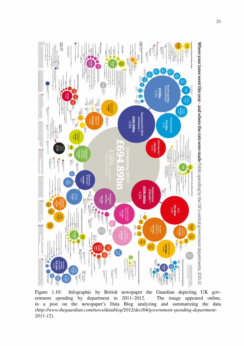
Figure 1.10: Infographic by British newspaper the Guardian depicting UK gov-ernment spending by department in 2011–2012. The image appeared online,in a post on the newspaper’s Data Blog analyzing and summarizing the data(http://www.theguardian.com/news/datablog/2012/dec/04/government-spending-department-2011-12).

22
Figure 1.11: Infographic made by now-extinct company Loku illustrating the different types ofcoffee and the different personalities of the people who drink them.
23
Figure 1.12: Decorative poster sold by the company Pop Chart Lab (http://popchartlab.com/ )consisting of an infographic illustrating the different types of comic book superpowers and someof the characters who have them.

24
Figure 1.13: Kitchen apron sold by Pop Chart Lab (http://popchartlab.com/ ) featuring an info-graphic graph depicting the different types of kitchenware.

25
Figure 1.14: “Map of Science” poster made in 2006 by Kevin Boyack, Dick Kla-vans, and W. Bradford Paley. It appeared in many publications, including the 2006gallery of the scientific journal Nature (MARRIS, 2006) and several magazines. Itis also available as a poster, given away for free at Paley’s Information Esthet-ics website (http://informationesthetics.org/node/20). Paley also features this imageon his website, in a section dedicated to his visualizations of scientific knowledge(http://wbpaley.com/brad/mapOfScience/index.html).
26
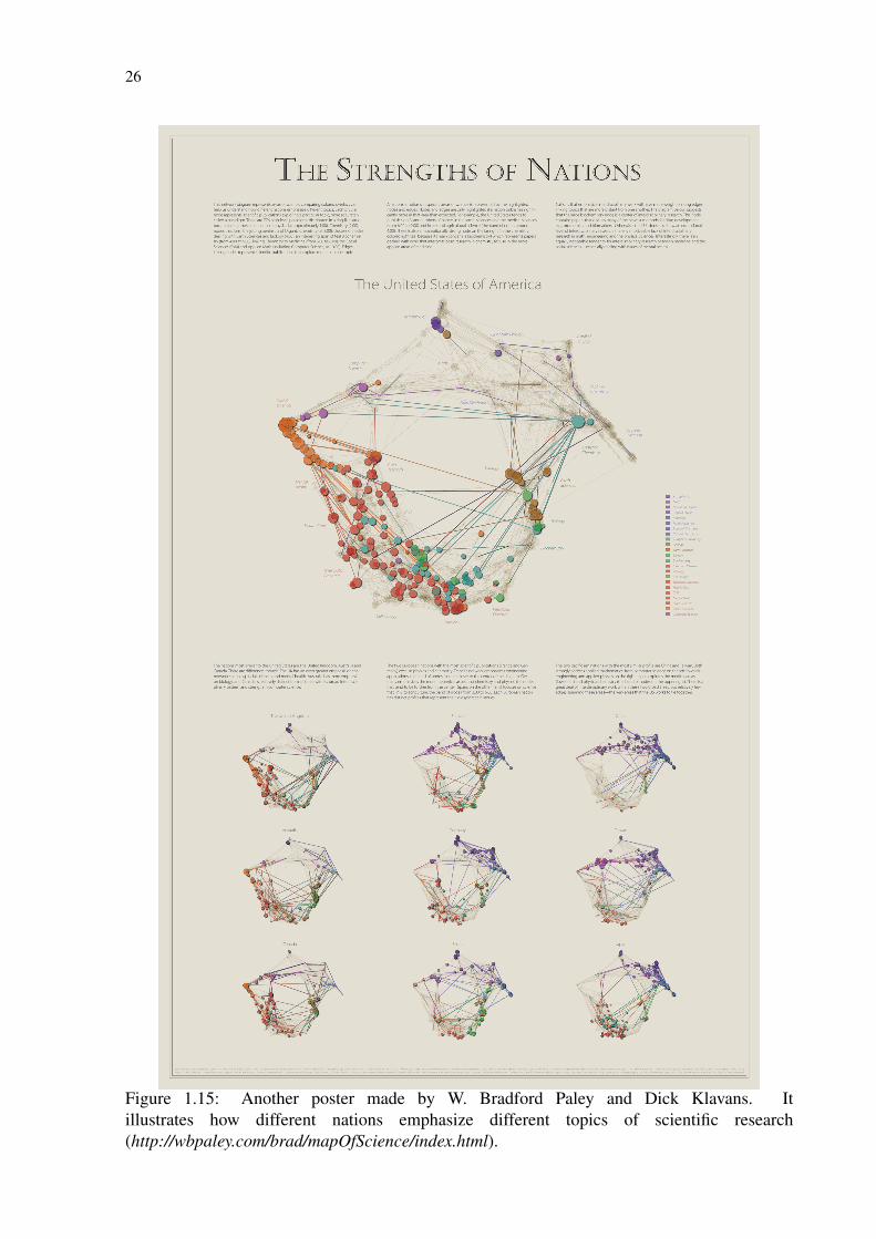
Figure 1.15: Another poster made by W. Bradford Paley and Dick Klavans. Itillustrates how different nations emphasize different topics of scientific research(http://wbpaley.com/brad/mapOfScience/index.html).
27
2 BACKGROUND
2.1 Basic Concepts
In many fields it is often necessary to represent objects and the relationships between these
objects. Graphs provide a very simple, powerful and intuitive way of doing so and are thus
vastly used in fields ranging from software engineering, databases and artificial intelligence to
medical science, biology, chemistry and many others. In computer science, graphs are one of
the most commonly used data structures.
Formally, a graph can be simply defined as a finite set of nodes and a finite multi-set of
edges, with the former standing for the objects and the latter for the relationships between those
objects. An edge is defined as a pair of nodes. If both nodes of an edge are the same, it is said
to be a self-loop. If an edge occurs more than once, it is called a multiple edge. If a graph has
no loops and no multiple edges, it is known as a simple graph. Two nodes that are a part of the
same edge are adjacent to each other. The neighbors of a node are the nodes adjacent to it and
its degree is the number of its neighbors. A graph is said to be non-directed if the edges are
unordered pairs of nodes, and is said to be regular if all its nodes have the same degree.
A directed graph (or digraph) is a graph in which each edge is defined as an ordered pair of
nodes. In a digraph, an edge that goes from node A to node B is an outgoing edge of A and an
incoming edge of B. Nodes may have no incoming or no outgoing edges, in such cases being
respectively known as sources and sinks.
In a digraph, a path is a sequence of nodes in which there is always an outgoing edge of
a node to the one that immediately follows it (except for the last node of the sequence). If
the paths form cycles (paths that begin and end with the same node), the graph is known as
cyclic. Otherwise, it is acyclic. If there is a path for each pair of nodes, the graph is said to be
connected.
An important special case of a graph is the tree, which is used to represent hierarchical
structures and is so called due to its resemblance to biological trees. A tree is a graph in which
every two nodes are connected by at most one path, thus being connected and acyclic. An
important type of tree is the rooted tree, in which each node (with the exception of the root),
has one parent node and may have children nodes. If a node has no children, it is a leaf node.
28
2.2 Graph Drawing
Graph drawing algorithms are of course essential to graph visualization techniques. Here
we present a short background on the subject. For a more detailed study of graph drawing, the
reader can refer to the books by Di Battista et al. (1999) and Tamassia et al. (2014).
The problem that graph drawing techniques attempt to solve can be very simply stated: given
a graph, calculate the position of its nodes and the curve to be drawn for each edge (HERMAN
et al., 2000). Finding a solution to this problem, though, is not as trivial.
Many layout algorithms have been developed (BATTISTA et al., 1999; TAMASSIA, 2014)
and are widely used in graph visualizations. Each algorithm takes into account different aes-
thetic criteria, such as minimizing the number of bends in an edge, line crossings, or the size of
the area occupied by the drawing, and very often will only work on specific types of graphs.
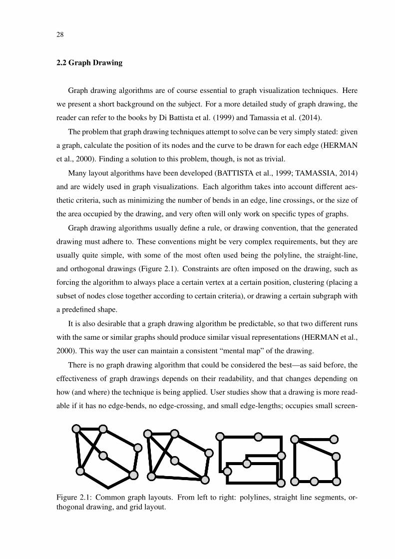
Graph drawing algorithms usually define a rule, or drawing convention, that the generated
drawing must adhere to. These conventions might be very complex requirements, but they are
usually quite simple, with some of the most often used being the polyline, the straight-line,
and orthogonal drawings (Figure 2.1). Constraints are often imposed on the drawing, such as
forcing the algorithm to always place a certain vertex at a certain position, clustering (placing a
subset of nodes close together according to certain criteria), or drawing a certain subgraph with
a predefined shape.
It is also desirable that a graph drawing algorithm be predictable, so that two different runs
with the same or similar graphs should produce similar visual representations (HERMAN et al.,
2000). This way the user can maintain a consistent “mental map” of the drawing.
There is no graph drawing algorithm that could be considered the best—as said before, the
effectiveness of graph drawings depends on their readability, and that changes depending on
how (and where) the technique is being applied. User studies show that a drawing is more read-
able if it has no edge-bends, no edge-crossing, and small edge-lengths; occupies small screen-
Figure 2.1: Common graph layouts. From left to right: polylines, straight line segments, or-thogonal drawing, and grid layout.
29
space; displays symmetries; and satisfies application-specific constraints such as clustering and
alignment (BATINI; FURLANI; NARDELLI, 1985; COHEN et al., 1994; PURCHASE; CO-
HEN; JAMES, 1997). It is usually the case that those readability criteria cannot all be satisfied
simultaneously, so trade-offs must be made.
There are many different types of graph drawing algorithms, with the force-directed or en-
ergy minimization approach being of particular interest to us. These algorithms rely on math-
ematical equations that act as constraints for the drawing (e.g., minimization of edge crossings
or edge bends) and are passed to a “solver" that tries to optimize them (BATTISTA et al., 1999).
The algorithms are very customizable and can be applied on all types of graphs, usually produc-
ing “organic-looking” layouts. They are also interesting for allowing users to see the drawing
being built in real-time by rendering the intermediary steps of the layout computation process.
The main drawbacks of algorithms of this type are that they tend to be very computationally
expensive (especially with larger graphs) and that they are often not deterministic.
For the user to be able to interact with the graph in real-time it is very important that a graph
drawing algorithm be efficient. Due to more sophisticated algorithms and faster, multi-core
CPUs and GPUs, however, performance is gradually ceasing to be a problem.
Of the optimization-based techniques, the ones that are of particular interest to us are the
force-directed algorithms. Their pleasing visual results, relative ease of implementation and
flexibility as to the inclusion of new aesthetic criteria make them a staple of graph visualization
in general.
The basic idea of a force-directed algorithm is to treat the graph as a physical system, as-
signing forces to the nodes and edges, and minimizing its energy until reaching a stable layout.
The forces will work to rearrange the positions of the nodes until the system finds itself in a
state of mechanical equilibrium.
One interesting property of force-directed algorithms is that most of them support the ap-
plication of constraints. A position constraint can be established by forcing nodes to remain
within a certain region, while other types of constraints can be used if they can be expressed
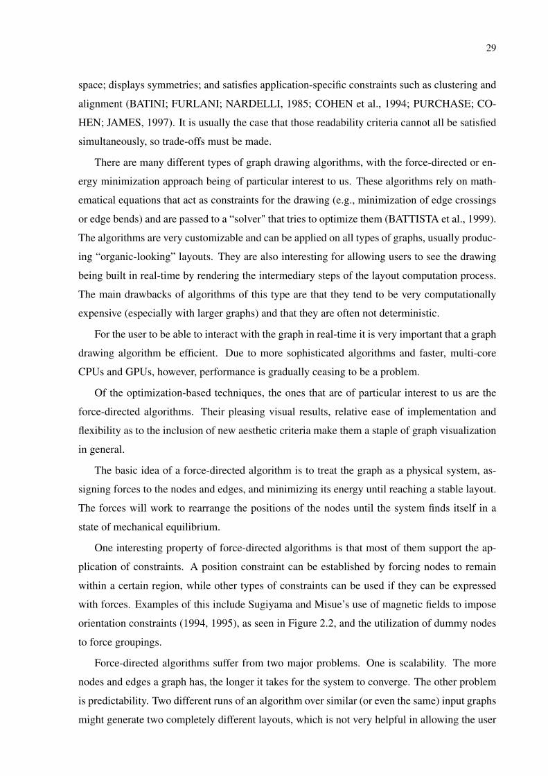
with forces. Examples of this include Sugiyama and Misue’s use of magnetic fields to impose
orientation constraints (1994, 1995), as seen in Figure 2.2, and the utilization of dummy nodes
to force groupings.
Force-directed algorithms suffer from two major problems. One is scalability. The more
nodes and edges a graph has, the longer it takes for the system to converge. The other problem
is predictability. Two different runs of an algorithm over similar (or even the same) input graphs
might generate two completely different layouts, which is not very helpful in allowing the user
30
Figure 2.2: Sugiyama and Misue’s magnetic-spring layout (1994, 1995).
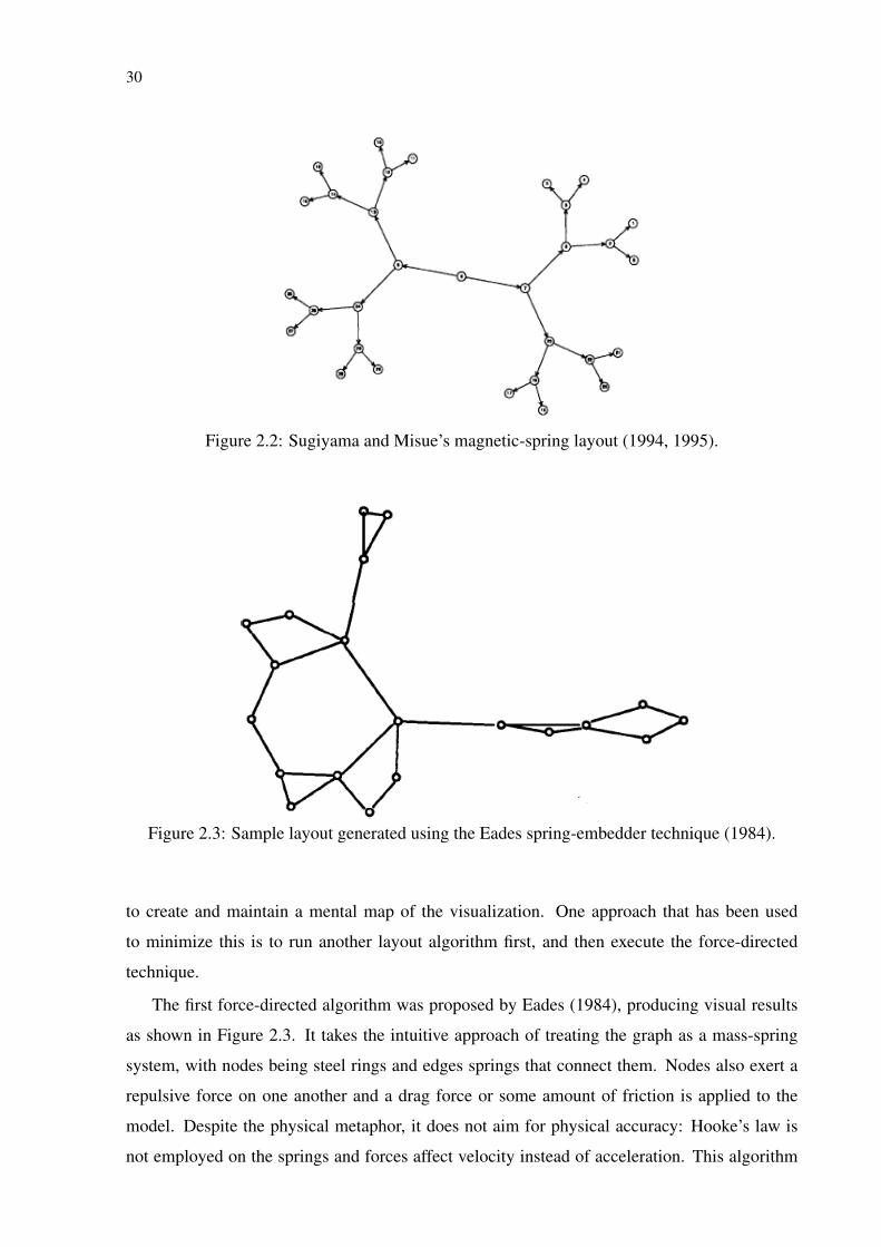
Figure 2.3: Sample layout generated using the Eades spring-embedder technique (1984).
to create and maintain a mental map of the visualization. One approach that has been used
to minimize this is to run another layout algorithm first, and then execute the force-directed
technique.
The first force-directed algorithm was proposed by Eades (1984), producing visual results
as shown in Figure 2.3. It takes the intuitive approach of treating the graph as a mass-spring
system, with nodes being steel rings and edges springs that connect them. Nodes also exert a
repulsive force on one another and a drag force or some amount of friction is applied to the
model. Despite the physical metaphor, it does not aim for physical accuracy: Hooke’s law is
not employed on the springs and forces affect velocity instead of acceleration. This algorithm
31
results in an optimization process, since it minimizes the energy within the physical system.
The layouts it generates have uniform edge lengths and are able to depicting graph symmetry.
This technique is very simple to implement and it is also generically applicable. Bertault (2000)
managed to make a more deterministic version of it by preserving edge crossings.
Many other algorithms extended the basic idea presented by Eades. The one most relevant
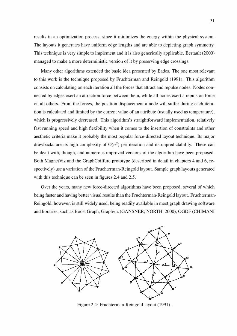
to this work is the technique proposed by Fruchterman and Reingold (1991). This algorithm
consists on calculating on each iteration all the forces that attract and repulse nodes. Nodes con-
nected by edges exert an attraction force between them, while all nodes exert a repulsion force
on all others. From the forces, the position displacement a node will suffer during each itera-
tion is calculated and limited by the current value of an attribute (usually used as temperature),
which is progressively decreased. This algorithm’s straightforward implementation, relatively
fast running speed and high flexibility when it comes to the insertion of constraints and other
aesthetic criteria make it probably the most popular force-directed layout technique. Its major
drawbacks are its high complexity of O(n2) per iteration and its unpredictability. These can
be dealt with, though, and numerous improved versions of the algorithm have been proposed.
Both MagnetViz and the GraphCoiffure prototype (described in detail in chapters 4 and 6, re-
spectively) use a variation of the Fruchterman-Reingold layout. Sample graph layouts generated
with this technique can be seen in figures 2.4 and 2.5.
Over the years, many new force-directed algorithms have been proposed, several of which
being faster and having better visual results than the Fruchterman-Reingold layout. Fruchterman-
Reingold, however, is still widely used, being readily available in most graph drawing software
and libraries, such as Boost Graph, Graphviz (GANSNER; NORTH, 2000), OGDF (CHIMANI
Figure 2.4: Fruchterman-Reingold layout (1991).
32
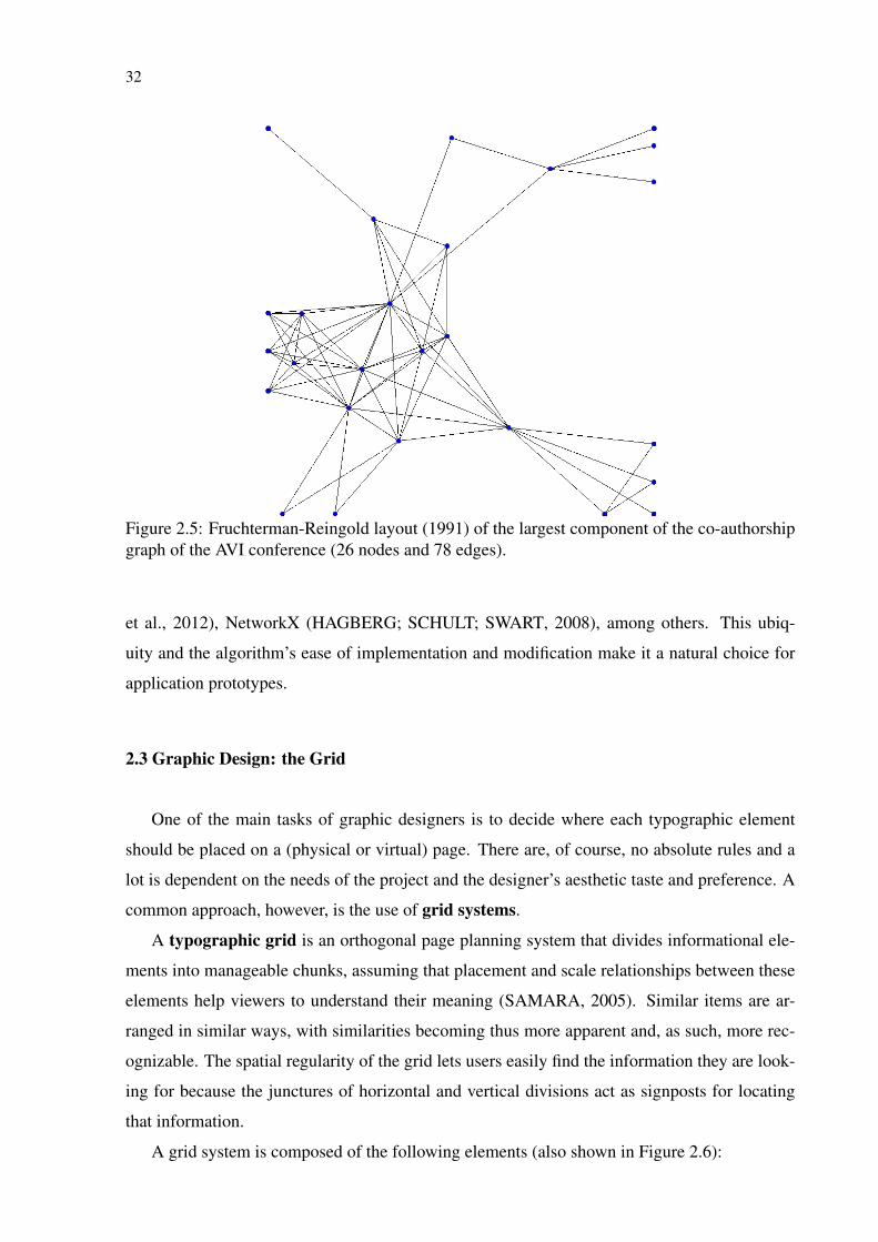
Figure 2.5: Fruchterman-Reingold layout (1991) of the largest component of the co-authorshipgraph of the AVI conference (26 nodes and 78 edges).
et al., 2012), NetworkX (HAGBERG; SCHULT; SWART, 2008), among others. This ubiq-
uity and the algorithm’s ease of implementation and modification make it a natural choice for
application prototypes.
2.3 Graphic Design: the Grid
One of the main tasks of graphic designers is to decide where each typographic element
should be placed on a (physical or virtual) page. There are, of course, no absolute rules and a
lot is dependent on the needs of the project and the designer’s aesthetic taste and preference. A
common approach, however, is the use of grid systems.
A typographic grid is an orthogonal page planning system that divides informational ele-
ments into manageable chunks, assuming that placement and scale relationships between these
elements help viewers to understand their meaning (SAMARA, 2005). Similar items are ar-
ranged in similar ways, with similarities becoming thus more apparent and, as such, more rec-
ognizable. The spatial regularity of the grid lets users easily find the information they are look-
ing for because the junctures of horizontal and vertical divisions act as signposts for locating
that information.
A grid system is composed of the following elements (also shown in Figure 2.6):
33
• Margins
Negative spaces between the edge of the page and the content (the area where text and
images appear). Their proportions help establishing the visual tension of the composition,
and they can be used to focus attention, as a resting place for the eye, or for complemen-
tary information (e.g., running heads, page numbers, annotations, etc.).
• Columns
Vertical alignments of text and images that create horizontal divisions between the mar-
gins of the page. There is no limit to how many columns a grid may have.
• Flowlines
Horizontal lines used to align text and images vertically on the page, breaking it into
horizontal bands as serving as guides for the eyes.
• Module
Individual units of space delimited by the crossings of columns and flowlines.
• Spatial zones
Groups of one or more modules that together can be assigned a specific information el-
ement (e.g., a long horizontal field can be used for the title of a page or an image, long
vertical fields can be used as columns of text, etc.).
• Gutter
Optional columns and lines of whitespace between modules that help make the content
easier to read.
• Markers
Placement indicators for complementary information that occupy only one location in any
layout. They can be used for elements such as running heads, page numbers, etc.
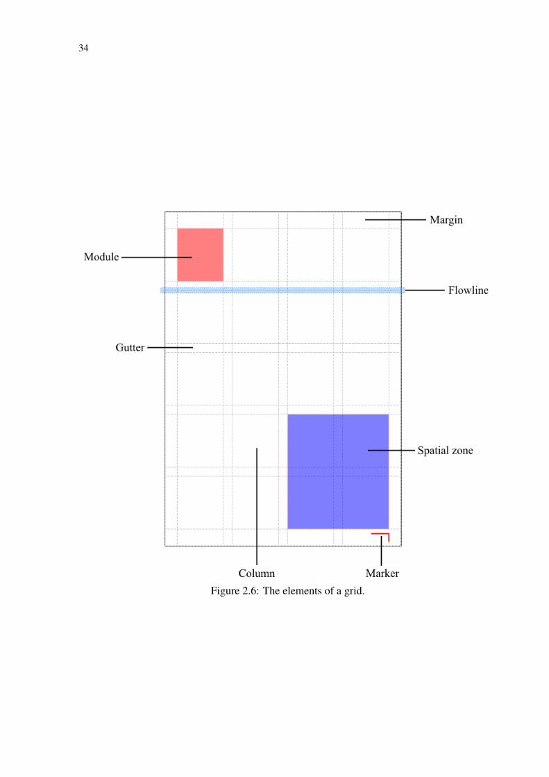
34
Figure 2.6: The elements of a grid.
35
3 RELATED WORK
Our related work can be divided into three categories: graph editors (Section 3.1), tech-
niques for interactive layout manipulation (Section 3.2), and techniques for attribute-based
graph visualization (Section 3.3).
3.1 Graph editors
Gephi (BASTIAN; HEYMANN; JACOMY, 2009) is a free graph editor that lets researchers
import their own data to create node-link diagrams. Gephi provide users with tools for selecting
a layout algorithm and changing some visual attributes, such as node and edge color and edge
type (e.g., curved or straight). There is, however, not much support for different node shapes and
edge styles (e.g., dotted, dashed, different arrowheads, etc.). In terms of layout modification,
users can select groups of nodes and turn them into metanodes, making what is essentially
a hierarchical visualization. Gephi also supports the visual encoding of some of the graph’s
semantics by providing metrics that can be calculated and encoded as visual attributes such as
node size and color. After customizing the graph’s look using the provided features, users can
export it to an image file.
Somewhat similar to Gephi is yEd (YED, 2014), another free graph editor. The emphasis of
yEd, though, is more on diagrams such as UML, flowcharts, and entity-relationship diagrams.
As such, it has better support for node shapes and edge styles, allowing for more customization.
Another difference is a property mapper, which lets users encode any property of the nodes and
edges as a visual attribute.
Cytoscape (SHANNON et al., 2003) is an open-source platform for network analysis. It is
similar in visual power to the graph editors, and despite its focus on analysis, Cytoscape can
be effectively used to create static images of graphs. It lets researchers customize many of the
graph’s visual properties, such as node and edge shape, color, and opacity. It also supports the
graph’s semantic information, allowing users to map any attribute of the data (e.g., name, type,
degree, etc.) to a visual property (e.g., color, size, font type, etc.). Another feature is its ability
of handling multi-level visualizations by means of nested graphs.
NodeXL (SMITH et al., 2010) is an open-source network analysis and visualization tem-
plate for Microsoft Excel. It supports common network formats, such as Pajek, UCINet and
matrix formats (e.g., adjacency matrices, edge lists) and includes tools to import networks from
social networking platforms, such as e-mail, Twitter, YouTube, and Flickr. It draws graphs us-
36
ing well-known force-directed algorithms and lets users customize visual attributes (e.g., size,
color, line style, etc.) and map graph metrics to these attributes. It also provides filters to de-
termine what the visualization will show. In terms of layout manipulation, NodeXL lets users
move nodes around by clicking and dragging, supports the separation of connected components
by size (e.g., to emphasize the main, largest component of a graph over several smaller ones),
and allows for the creation of metanodes formed by nodes that have common attributes. While
it can be used to generate static graph visualizations, these do not look as good as those made
with more specialized software, such as Gephi and yEd. Due to the metrics it includes, its
support for popular formats, its integration with Excel and its ease of use, NodeXL is popular
among social network analysts.
Tulip (AUBER, 2003) is a framework for the analysis and visualization of graphs. It was
designed to support developers in creating new tools and also includes a GUI that provides
access to its already implemented set of metrics, algorithms, and visualization tools. Tulip has
been designed with a plug-in architecture so that new tools written in Python or C++ can be
integrated into the platform. Out of the box, it can import graphs from several formats (CSV,
UCINet, Pajek, GML, among others), and supports different visualizations, which include node-
link diagrams, for which several layout algorithms are included. Users can modify the visual
encoding by mapping metrics to color and size, choosing among predefined node shapes, and
making the edge color and thickness be interpolated from the nodes. Custom node-shapes can
only be added as plug-ins. In terms of layout, it supports moving nodes around by clicking and
dragging, editing edge bends, and hierarchical graphs with metanodes containing subgraphs. It
can export images, though its focus is more on in-software exploration and analysis, and the
images do not look as good as those made with software such as Gephi and yEd, for instance.
Another option for creating static graph visualizations is Graphviz (GANSNER; NORTH,
2000), a software package and library specific for graph drawing. Graphviz features many
layout algorithms (including the flagship dot algorithm) and a lot of flexibility in how nodes
and edges are displayed (i.e., shape, color, style, etc.). Graphviz also includes DOT, a powerful
language for the description of graphs and how they should be drawn (i.e., which layout to use,
position of individual nodes, appearance of nodes and edges, etc.). Programs that use Graphviz
are run from the command line and output image files. There is no graphical user interface
for a more WYSIWYG approach. So, the only way to change a computed visualization is to
regenerate it after entering different parameters to the drawing algorithm. Another problem is
that the graph itself, its layout and its visual style are all defined together, in the same script,
making reproduction of this style across different graphs not very practical.
37
Also worth a mention is the web-based Visual Investigative Scenarios, or VIS (<https://vis.
occrp.org>), which lets journalists create infographics of business and criminal networks. It is
effective within its journalistic context, but far less visually flexible than the others.
One common drawback of all of these tools is that none provides much support for layout
manipulation. After choosing a layout algorithm and setting its parameters, there is not much
users can do beyond moving individual nodes or grouping nodes together as metanodes. A little
more layout flexibility can be achieved with constraint-based layouting applications, such as
Ryall et al.’s GLIDE (1997) and Dwyer et al.’s Dunnart (2008), but even they are very limited, as
they only let users apply some constraints to layouts that are otherwise automatically generated.
Another big drawback is that these tools only support a very limited degree of visual cus-
tomization, especially when compared to specialized graphics editors like Adobe Illustrator or
Adobe Photoshop. While not always an issue, for users requiring more visual sophistication
this can be very problematic. Graphics editors, however, are visually powerful but are still far
from ideal for creating visualizations. Although they give users complete control over the im-
ages through features that range from image processing algorithms to interactive drawing and
image manipulation, they only process pixels and vectors, providing no link to the underlying
data. With this, all visual mappings having to be made by hand, which can make it impractical,
when not downright impossible, to use them to create visualizations.
3.2 Interactive layout manipulation
Graph drawing techniques such as those described by Di Battista et al. (BATTISTA et al.,
1999) and Tamassia (TAMASSIA, 2014) can be used to generate high-quality node-link layouts
from the graph topology. However, this is not always enough. Some users have specific needs
that would require them to manipulate the layouts to make graphs more meaningful or under-
standable. Yet, only few graph visualization applications feature manipulation that goes beyond
manually moving nodes around (MCGUFFIN; JURISICA, 2009; SPRITZER; FREITAS, 2012;
WONG; CARPENDALE; GREENBERG, 2003; WONG; CARPENDALE, 2007).
Some of the techniques that provide more substantial layout manipulation focus on the repo-
sitioning of nodes. For example, McGuffin and Jurisica’s approach lets users alter a node-link
diagram by applying a chosen layout algorithm on a selection of nodes instead of on the entire
graph (MCGUFFIN; JURISICA, 2009). In contrast to this local approach, our own MagnetViz
technique (SPRITZER; FREITAS, 2008; SPRITZER; FREITAS, 2012), allows users to manip-
ulate the entire layout by reorganizing it through the insertion of virtual magnets that attract
38
nodes that fulfill some given criteria.
Besides altering the position of nodes, there are also techniques that let users to modify a
layout by changing how the graph’s edges are drawn. Riche et al. (RICHE et al., 2012) clas-
sify the design space of such techniques through six design dimensions based on characteristics
of user interaction (i.e., how users interact and how the interaction affects the visualization).
They illustrate these dimensions by describing four families of techniques, namely, interactive
bundling, interactive edge fanning, edge magnets (an extension to edges of the approach taken
by MagnetViz), and interactive edge legends (the use of edge curvature to represent informa-
tion). Other techniques that let users modify edges are EdgeLens (WONG; CARPENDALE;
GREENBERG, 2003), EdgePlucking (WONG; CARPENDALE, 2007), and Schmidt et al.’s
techniques for multi-touch surfaces (SCHMIDT et al., 2010), which allow users to interactively
bundle edges together or change their curvature. Another pertinent technique is Nascimento and
Eades’s User Hints (2002), which let users provide the layout generating system with “hints”
that help it emphasize specific characteristics, gearing the visualization into one that is more
suited to their needs. Hints can also be used with the goal of speeding up the generation of a
high quality layout from a combinatorial optimization point of view.
Despite having the common trait of interactive manipulation of layouts as a very significant
feature, all the techniques mentioned above were designed with a focus on the exploration of
graphs. While several are able to export static images that can be used elsewhere, they were not
explicitly designed for the creation of visualizations that can stand on their own, independent
of interaction, and also do not provide users with much flexibility in customizing many of the
graph’s visual attributes.
3.3 Attribute-based graph visualization
In most graph visualization techniques, attributes are handled in a complementary fashion.
They can serve as labels, be encoded as different shapes, colors and sizes for nodes and edges,
or be used for filtering and selection. The most influence attributes usually have on a layout
is when they are used to create metanodes in order to decrease the visualization’s cognitive
overload. These metanodes often contain other metanodes, becoming a graph hierarchy that can
be explored by users by means of interaction and navigation techniques (PATTISON; VERNIK;
PHILLIPS, 2001).
While most graph visualization techniques are still focused on topology, recent years have
witnessed a growth of attribute-based techniques. These techniques build visualizations based
39
on the attributes with the topology serving only in a limited way (if used at all), borrowing
heavily from the field of multidimensional data visualization (WATTENBERG, 2006; SHNEI-
DERMAN; ARIS, 2006; ARIS; SHNEIDERMAN, 2007; BEZERIANOS et al., 2010).
A recurring theme in attribute-based visualization is the use of scatterplots, like the ones
provided in techniques such as Wattenberg’s PivotGraph (WATTENBERG, 2006), Aris and
Shneiderman’s semantic substrates (SHNEIDERMAN; ARIS, 2006; ARIS; SHNEIDERMAN,
2007) and Bezerianos et al.’s GraphDice (BEZERIANOS et al., 2010). In essence, the basic
approach consists in displaying nodes as points in a scatterplot that has as its axes two user-
chosen attributes, with edges shown as lines connecting the nodes. Despite the same basis,
these scatterplot-based techniques have important differences.
PivotGraph (WATTENBERG, 2006) displays one scatterplot at a time, with nodes that have
the same value for the same categorical attribute being aggregated in metanodes that are rep-
resented as points with size proportional to the number of nodes they contain. The semantic
substrates technique (SHNEIDERMAN; ARIS, 2006; ARIS; SHNEIDERMAN, 2007), on the
other hand, uses no aggregation but displays several scatterplots simultaneously. Nodes are
placed into regions, each containing a scatterplot, and users are provided with controls to de-
fine the visibility of edges. Yet another approach is taken by GraphDice (BEZERIANOS et al.,
2010), which has two panes, one that displays the main plot and another for an overview matrix
of all possible scatterplots (rows and columns containing all attributes and a thumbnail of each
scatterplot drawn at the intersections). The main plot changes by navigating in the scatterplot
matrix, with animation providing smooth transitions from one layout to the next. None of these
techniques actually handles edge attributes.
While scatterplots are so far the predominant approach to attribute-based graph visualiza-
tion, they are not the only option. Pretorius and van Wijk (PRETORIUS; WIJK, 2006) proposed
a technique for the visualization of transition graphs based on hierarchical attribute-based clus-
tering. Clusters are positioned linearly, with their hierarchy shown as a tree-like node-link
diagram and edges shown with a superimposed arc diagram. Later on, the same authors pro-
posed another system for multivariate graph visualization based on recursive attribute-based
clustering (PRETORIUS; WIJK, 2008). The cluster hierarchy is displayed on the left and right
sides of the screen, respectively representing the source and target nodes, while the edge labels
are displayed in the center, with lines linking source and target nodes to their respective edge
labels.
The aforementioned approaches have three major issues:
• They focus too much on the attributes in detriment of the topology. This is illustrated by
40
the scatterplot techniques: by using purely scatterplots to lay out a node-link diagram, the
structure of the graph is not necessarily made clear, since the positioning is based only on
node attributes.
• They pay too little attention to edges and their attributes.
• They are either simple but limited or powerful but too complex. In terms of power and
cognitive load, visualizations such as PivotGraph are simple to use and comprehend, but
they are limited in what they can actually show, while others, such as semantic substrates
(SHNEIDERMAN; ARIS, 2006; ARIS; SHNEIDERMAN, 2007) and Pretorius and van
Wijk’s techniques (PRETORIUS; WIJK, 2006; PRETORIUS; WIJK, 2008), are powerful
but a lot more complex, requiring a more specialized user.
Aside from these “purely” attribute-based techniques, there are some others that take a
middle-ground approach, trying to balance topology and attributes. One such technique is
GrouseFlocks (ARCHAMBAULT; MUNZNER; AUBER, 2008), which builds a topology-based
layout on top of an attribute-based cluster hierarchy refined by the users. Another “middle-
ground’ technique is MagnetViz (SPRITZER; FREITAS, 2008; SPRITZER; FREITAS, 2012),
which provides users with tools to manipulate a layout according to their own criteria, either in
terms of the graph’s topology or meta-information (attributes of nodes and/or edges). We give
more details about MagnetViz in the next chapter.
41
4 PREVIOUS WORK: MAGNETVIZ
The semantics of a graph is what the graph means to the people who will use it, consisting
of its context of use, the attributes of its nodes and edges (i.e., its meta-information), and the
knowledge these people already have about the data it represents. While a graph’s topology is
undoubtedly its main feature, its semantics is often important for numerous fields, ranging from
social science and biology to chemistry and urbanism. Nevertheless, works in graph visualiza-
tion (and node-link layout algorithms, in particular) have—with few exceptions—given little
emphasis to semantics, focusing almost uniquely on topology.
Topology-based layout algorithms are very effective at producing visualizations that are of
high aesthetic quality. These techniques are generic and can thus be applied in a wide gamut of
fields. This generic quality, however, may also be a disadvantage, since users may not neces-
sarily get the best layout for their needs if something more context-sensitive is called for. As a
result, some users may wish to make modifications on these layouts to make them more useful
for their specific applications.
As seen in the related work (Chapter 3.2), several graph visualization techniques and ap-
plications allow for some level of interactive layout manipulation, but only a handful feature
manipulation schemes that are more sophisticated than simply manually moving nodes around.
Even when possible to manipulate the layout in a deeper way (e.g., applying a different layout
on a subset of nodes), usually only the graph’s topology is used by the manipulation techniques.
On top of that, these techniques are designed for a context of graph exploration and navigation
and as such are particularly well suited for the creation of a layout for presentation.
In a previous work (SPRITZER; FREITAS, 2008) we introduced MagnetViz, a technique
for node-link layout manipulation. MagnetViz was designed with the goal of letting users inter-
actively manipulate a force-directed graph layout into one more suitable to their needs by using
tools that seize both on the graph’s topology and application-specific semantics. The resulting
layout can lead to a more expressive visualization that may provide new insight into the dataset
and serve as a starting point for further exploration of the graph. MagnetViz was designed
for exploration, but by observing the subjects of our user tests during the validation process
(SPRITZER; FREITAS, 2012), we realized its potential as a tool for communication, since it
could effectively be used to help users create layouts that emphasized some specific known as-
pect of the graph. This line of thought made us aware of the potential need for techniques for
the creation of graph visualizations for communication, which led us to what would eventually
become GraphCoiffure.
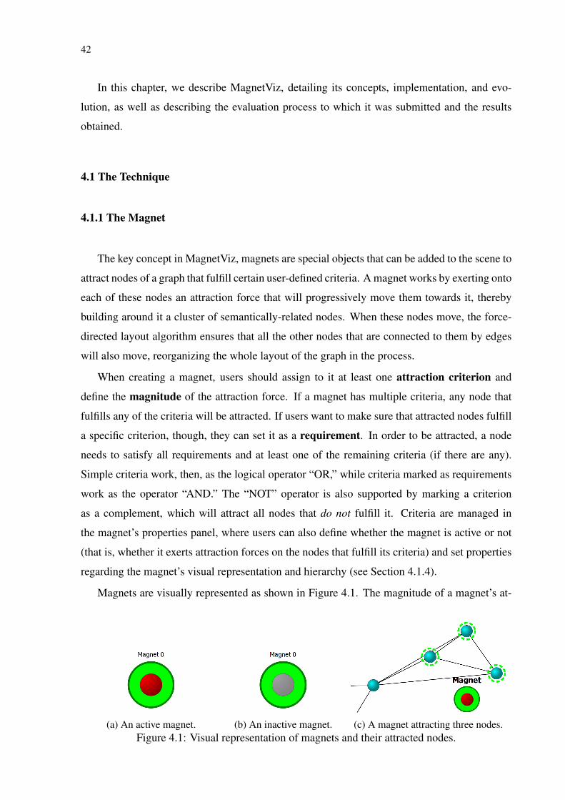
42
In this chapter, we describe MagnetViz, detailing its concepts, implementation, and evo-
lution, as well as describing the evaluation process to which it was submitted and the results
obtained.
4.1 The Technique
4.1.1 The Magnet
The key concept in MagnetViz, magnets are special objects that can be added to the scene to
attract nodes of a graph that fulfill certain user-defined criteria. A magnet works by exerting onto
each of these nodes an attraction force that will progressively move them towards it, thereby
building around it a cluster of semantically-related nodes. When these nodes move, the force-
directed layout algorithm ensures that all the other nodes that are connected to them by edges
will also move, reorganizing the whole layout of the graph in the process.
When creating a magnet, users should assign to it at least one attraction criterion and
define the magnitude of the attraction force. If a magnet has multiple criteria, any node that
fulfills any of the criteria will be attracted. If users want to make sure that attracted nodes fulfill
a specific criterion, though, they can set it as a requirement. In order to be attracted, a node
needs to satisfy all requirements and at least one of the remaining criteria (if there are any).
Simple criteria work, then, as the logical operator “OR,” while criteria marked as requirements
work as the operator “AND.” The “NOT” operator is also supported by marking a criterion
as a complement, which will attract all nodes that do not fulfill it. Criteria are managed in
the magnet’s properties panel, where users can also define whether the magnet is active or not
(that is, whether it exerts attraction forces on the nodes that fulfill its criteria) and set properties
regarding the magnet’s visual representation and hierarchy (see Section 4.1.4).
Magnets are visually represented as shown in Figure 4.1. The magnitude of a magnet’s at-
(a) An active magnet. (b) An inactive magnet. (c) A magnet attracting three nodes.Figure 4.1: Visual representation of magnets and their attracted nodes.
43
traction force is visually encoded as the magnet’s radius, being always proportional to it and
altered by dragging the mouse with the shift key and left mouse button pressed. The magnet’s
inner circle’s fill color is red when the magnet is active (Figure 4.1a) and gray when it is inac-
tive (Figure 4.1b). The outer color is the "magnet color", which is also used in a dashed ring
that appears around attracted nodes (Figure 4.1c). When a node is attracted by more than one
magnet, rings corresponding to each of the magnets are displayed around it (see Section 4.1.3).
MagnetViz’s flexibility in layout manipulation comes in great part from the different types
of attraction criteria that can be employed. We list below example criteria that we included
in the proof-of-concept prototype we implemented to test MagnetViz. These criteria are just
a subset of what MagnetViz conceptually supports and were chosen because they are easy to
implement and allow for a considerable amount and variety of operations, being thus good tools
to illustrate the technique.
Topology-based
• Degree: Attracts nodes based on degree (i.e. edge amount).
• Adjacent Nodes: Attracts nodes based on its number of adjacent nodes. Note that this
differs from degree as there may be more than one edge between two nodes.
• Edge Amount: Attracts nodes based on the amount of edges they have to a given target
node.
• Path: Attracts nodes based on the topological distance of their paths to a target node.
• Connected Component: Attracts connected subgraphs (maximally connected or not)
based on the number of nodes they should have or on a specific node they should contain.
Attribute-based
• Node/Edge Has Attribute: Attracts nodes/edges that possess a chosen attribute, with
any value.
• Node/Edge Has Attribute With Numerical Value: Attracts nodes/edges based on their
value for a chosen numerical attribute.
• Node/Edge Has Attribute With Substring: Attracts nodes/edges that for the chosen
textual attribute have a value containing a user-provided substring.
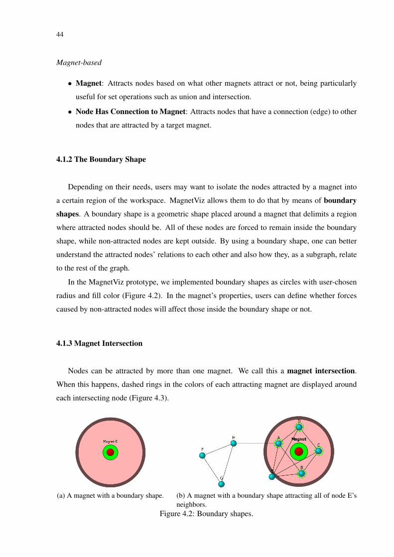
44
Magnet-based
• Magnet: Attracts nodes based on what other magnets attract or not, being particularly
useful for set operations such as union and intersection.
• Node Has Connection to Magnet: Attracts nodes that have a connection (edge) to other
nodes that are attracted by a target magnet.
4.1.2 The Boundary Shape
Depending on their needs, users may want to isolate the nodes attracted by a magnet into
a certain region of the workspace. MagnetViz allows them to do that by means of boundary
shapes. A boundary shape is a geometric shape placed around a magnet that delimits a region
where attracted nodes should be. All of these nodes are forced to remain inside the boundary
shape, while non-attracted nodes are kept outside. By using a boundary shape, one can better
understand the attracted nodes’ relations to each other and also how they, as a subgraph, relate
to the rest of the graph.
In the MagnetViz prototype, we implemented boundary shapes as circles with user-chosen
radius and fill color (Figure 4.2). In the magnet’s properties, users can define whether forces
caused by non-attracted nodes will affect those inside the boundary shape or not.
4.1.3 Magnet Intersection
Nodes can be attracted by more than one magnet. We call this a magnet intersection.
When this happens, dashed rings in the colors of each attracting magnet are displayed around
each intersecting node (Figure 4.3).
(a) A magnet with a boundary shape. (b) A magnet with a boundary shape attracting all of node E’sneighbors.
Figure 4.2: Boundary shapes.
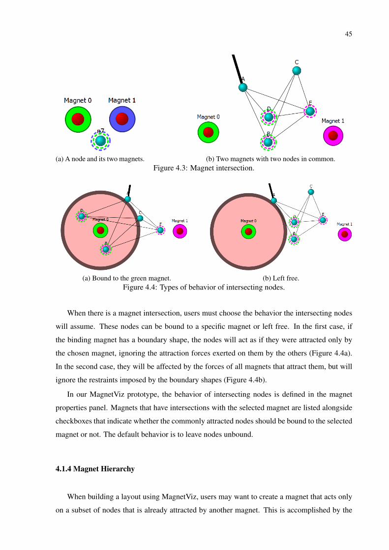
45
(a) A node and its two magnets. (b) Two magnets with two nodes in common.Figure 4.3: Magnet intersection.
(a) Bound to the green magnet. (b) Left free.Figure 4.4: Types of behavior of intersecting nodes.
When there is a magnet intersection, users must choose the behavior the intersecting nodes
will assume. These nodes can be bound to a specific magnet or left free. In the first case, if
the binding magnet has a boundary shape, the nodes will act as if they were attracted only by
the chosen magnet, ignoring the attraction forces exerted on them by the others (Figure 4.4a).
In the second case, they will be affected by the forces of all magnets that attract them, but will
ignore the restraints imposed by the boundary shapes (Figure 4.4b).
In our MagnetViz prototype, the behavior of intersecting nodes is defined in the magnet
properties panel. Magnets that have intersections with the selected magnet are listed alongside
checkboxes that indicate whether the commonly attracted nodes should be bound to the selected
magnet or not. The default behavior is to leave nodes unbound.
4.1.4 Magnet Hierarchy
When building a layout using MagnetViz, users may want to create a magnet that acts only
on a subset of nodes that is already attracted by another magnet. This is accomplished by the

46
Figure 4.5: Magnet hierarchy: a magnet and its child.
creation of child magnets, which act only on the nodes attracted by the parent. The connection
between a parent and a child magnet is shown as a dotted line with an arrow in the child’s end
linking it to the parent (Figure 4.5). The intersection between parent and child is handled as
all others and child magnets can have children themselves. A child magnet is created in the
properties panel of its parent magnet. When a parent is deleted, all of its children are as well.
4.2 The MagnetViz Prototype Application
In order to illustrate MagnetViz’s features and concepts and conduct an evaluation cycle,
the prototype of a graph visualization tool was developed. A standard node-link representation
was used, with multiple edges between two given nodes being represented by single edges with
variable edge thickness. Along with the above described features, the prototype also supports
standard interaction and exploration techniques (selection, zoom, pan, etc.) and a simple system
for color coding and labeling of nodes.
For the graph’s layout algorithm, an approach similar to Tunkelang’s (TUNKELANG, 1999)
was used. Tunkelang’s technique is an adaptation of the widely-known Fruchterman-Reingold
algorithm (FRUCHTERMAN; REINGOLD, 1991), producing the same visual results while
reducing its complexity from O(n3) to O(n2). This method was chosen as a basis for the pro-
totype for mostly practical reasons: it generates aesthetically pleasing layouts and is easy to
implement and integrate with MagnetViz. In our version, we added to Tunkelang’s method
a small, user-definable gravitational force that pulls nodes slightly towards the center of the
workspace and used Verlet’s integration method (VERLET, 1967) to keep the physics engine
running all the time in order to dynamically respond to the changes in forces that might occur
while users interact. An extra step was also added to deal with the position constraints imposed
by the boundary shapes. It is important to reinforce that MagnetViz as a concept is independent
of the choice of force-directed algorithm—any other algorithm could be easily used instead of
Fruchterman-Reingold.
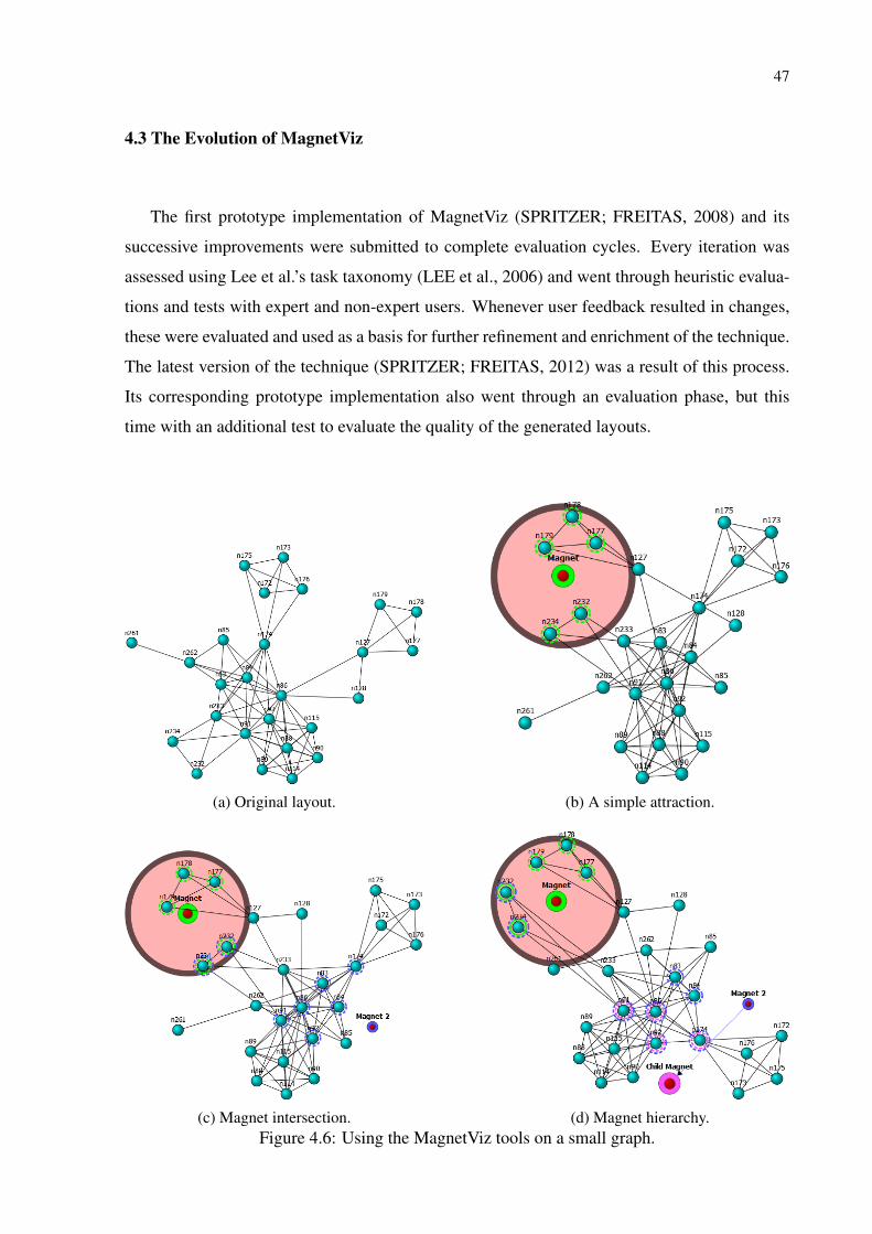
47
4.3 The Evolution of MagnetViz
The first prototype implementation of MagnetViz (SPRITZER; FREITAS, 2008) and its
successive improvements were submitted to complete evaluation cycles. Every iteration was
assessed using Lee et al.’s task taxonomy (LEE et al., 2006) and went through heuristic evalua-
tions and tests with expert and non-expert users. Whenever user feedback resulted in changes,
these were evaluated and used as a basis for further refinement and enrichment of the technique.
The latest version of the technique (SPRITZER; FREITAS, 2012) was a result of this process.
Its corresponding prototype implementation also went through an evaluation phase, but this
time with an additional test to evaluate the quality of the generated layouts.
(a) Original layout. (b) A simple attraction.
(c) Magnet intersection. (d) Magnet hierarchy.Figure 4.6: Using the MagnetViz tools on a small graph.
48
4.4 Examples
In this section we show examples of how graphs can be manipulated with MagnetViz. Figure
4.6 illustrates how a small graph (Figure 4.6a) can be manipulated with magnets. In Figure 4.6b
a magnet has been inserted to attract all nodes with degree 3. This magnet’s boundary shape
is visible and configured as to allow inner nodes to be affected by outside forces (i.e., if a
node outside the boundary shape shares an edge to a node that is inside, they will attract each
other). In Figure 4.6c, a second magnet has been added to attract nodes that have a connection
to node n233. Since two of the nodes attracted by the first magnet also fulfill this criterion,
an intersection happens. This intersection is dealt with by binding the two magnets’ common
nodes to the first’s boundary shape. As a result of this, intersecting nodes are kept within the
boundary shape. Finally, in Figure 4.6d, we give Magnet 2 a child magnet that attracts nodes
with degree higher or equal to 10. Notice that this magnet attracts only the nodes that are
attracted by its parent, Magnet 2.
An example of MagnetViz in use with a larger graph is given in Figure 4.7. Figure 4.7a
shows the original layout, while in Figure 4.7b several magnets are used to separate the con-
nected components of the graph according to how many nodes they have.
A more semantically complex example can be seen in Figure 4.8. Here, we show how we
used magnets to reshape the graph of the UFRGS Informatics Institute co-authorship network
to emphasize the computer graphics group and its relationships. Figure 4.8a shows the original
layout of the network, which includes publications by students, faculty members, and external
collaborators. The graph has 438 nodes and 1989 edges, with nodes representing the authors and
edges being their common publications. Color-coding was used, with pink nodes being faculty
members, yellow nodes being students and blue nodes being external collaborators. Figure
4.8b shows the transformed graph: magnets were used to clean out the layout by disentangling
smaller connected components from the main one, and to make the computer graphics group
stand out by pulling it slightly towards the center, making its connections to the rest of the graph
clearly visible.
4.5 Discussion
It is easy to see that using MagnetViz to create or manipulate a layout has important advan-
tages over simply using topology and attribute-based techniques. In contrast to attribute-based
techniques, MagnetViz does not discard the graph’s structural information and uses a visual
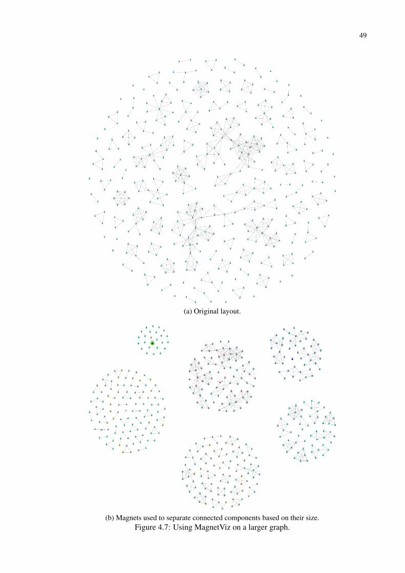
49
(a) Original layout.
(b) Magnets used to separate connected components based on their size.Figure 4.7: Using MagnetViz on a larger graph.
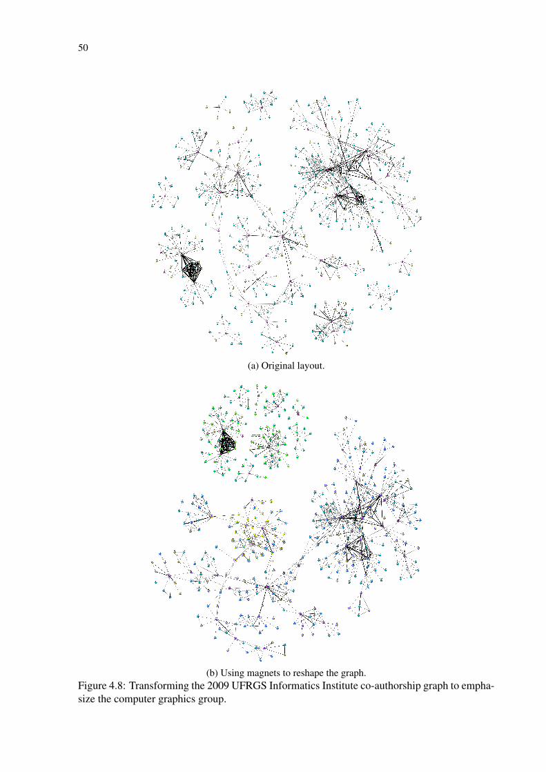
50
(a) Original layout.
(b) Using magnets to reshape the graph.Figure 4.8: Transforming the 2009 UFRGS Informatics Institute co-authorship graph to empha-size the computer graphics group.
51
representation that is already very familiar to users (node-link diagrams laid out with force-
directed algorithms). In contrast to typical topology-based visualizations, MagnetViz allows
users to perform a large-scale modification of the layout based on both the graph’s topology
and semantics (in contrast to McGuffin and Jurisica’s more localized technique (2009)). Mag-
netViz’s emphasis on combining topology and semantics through the criteria system is a partic-
ularly significant advantage over other techniques for interactive layout modification, allowing
users to bring about much more meaningful change than simply moving nodes around or fixing
some of them to specific positions.
It is important to note that the quality of the layouts that can be made with MagnetViz de-
pends as much on users as on the technique itself. As such, MagnetViz can be used to generate
meaningful, clean layouts, but it can also be used to produce misleading, cluttered visualiza-
tions. A boundary shape, for instance, can either make a visualization clearer by isolating
attracted nodes, or cause clutter if it is too small for the nodes it contains. This high flexibility
and dependence on user skill can be thus considered both an advantage and a disadvantage.
This duality is also present in GraphCoiffure, as the produced visualizations are direct results
of how users use the tools provided.
For a full evaluation of MagnetViz, see our 2012 extended paper (SPRITZER; FREITAS,
2012), in which we verify the effectiveness of the technique’s visual abstraction and interaction
schemes. The evaluation process included user studies and a thorough assessment against a
graph-specific task taxonomy.

52
5 NODE-LINK VISUALIZATIONS FOR COMMUNICATION
There are many examples of graph visualizations that are used to communicate information
on a computer screen or in print. An interesting set of visualizations for printed media can be
found on the posters sold by the company Pop Chart Lab (POPCHARTLAB, 2014). Among
their many infographics, several consist of beautiful artistic graph visualizations. These graphs
depict topics as varied as kitchenware (Figure 1.13), dog breeds, superpowers (Figure 1.12), the
many varieties of beer, the different types of pasta, hip-hop names, the evolution of different
types of objects (video-games, bicycles, etc.), among others. The visualizations were all made
by graphic designers using graphics authoring software, with the graphs they depict having
probably been laid out entirely by hand.
Other examples can be found among the hundreds of network visualizations available both
online and in print at Visual Complexity (LIMA, 2013; LIMA, 2014). Each of these visualiza-
tions is in some respect unique, be it in how the graphs are visually depicted or in the choice of
a subject. Visualizations of all types are included in this collection: interactive, static, artistic,
designed for the screen, part of museum installations, etc. A common denominator among all
of them, however, is their focus on communication and their attempt to make the graphs not
only meaningful, but also beautiful.
We selected three examples that were specifically designed to tell a story to a general au-
dience. The first is Andrew Odewahn’s visual study of the historical behavior of US senators
(ODEWAHN, 2010). In this study, Odewahn built a social network based on which senators
voted together and showed how this graph changed over time (from 1991 to 2009). For his
visualizations, he colored nodes according to the political parties (blue for Democrats, red for
Republicans, green for independents) and let the (force-directed) layout tell the story, with sen-
ators that voted together the most being visually closer to one another. This work appeared in
print as a chapter of a book about beautiful visualizations (STEELE; ILIINSKY, 2010).
The second example is Teresa Elms’ visualization of the lexical distance among the lan-
guages of Europe (2008), shown in Figure 5.1. This simple, yet effective visualization was
posted by the author on her website. It serves to illustrate many of the decisions that go behind
designing a visualization. In this graph, the nodes stand for the languages and the edges stand
for how similar they are to one another. The graph is laid out in a clear, balanced way. Language
families are made visually distinct from one another by their placement (nodes of the same fam-
ily are placed closer together and some space between the families keep them visually separate
from one another), with annotations giving the name of each family. Family identification is
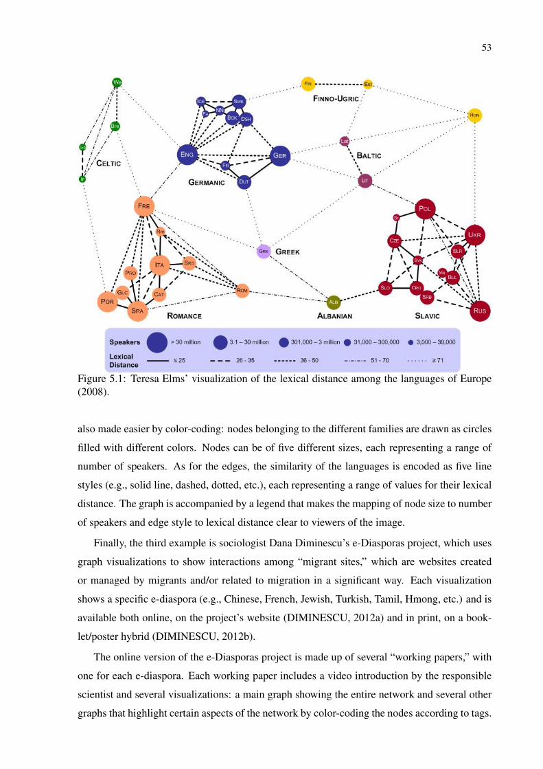
53
Figure 5.1: Teresa Elms’ visualization of the lexical distance among the languages of Europe(2008).
also made easier by color-coding: nodes belonging to the different families are drawn as circles
filled with different colors. Nodes can be of five different sizes, each representing a range of
number of speakers. As for the edges, the similarity of the languages is encoded as five line
styles (e.g., solid line, dashed, dotted, etc.), each representing a range of values for their lexical
distance. The graph is accompanied by a legend that makes the mapping of node size to number
of speakers and edge style to lexical distance clear to viewers of the image.
Finally, the third example is sociologist Dana Diminescu’s e-Diasporas project, which uses
graph visualizations to show interactions among “migrant sites,” which are websites created
or managed by migrants and/or related to migration in a significant way. Each visualization
shows a specific e-diaspora (e.g., Chinese, French, Jewish, Turkish, Tamil, Hmong, etc.) and is
available both online, on the project’s website (DIMINESCU, 2012a) and in print, on a book-
let/poster hybrid (DIMINESCU, 2012b).
The online version of the e-Diasporas project is made up of several “working papers,” with
one for each e-diaspora. Each working paper includes a video introduction by the responsible
scientist and several visualizations: a main graph showing the entire network and several other
graphs that highlight certain aspects of the network by color-coding the nodes according to tags.

54
Each of these color-coded visualizations is accessed on a page that also shows the distribution
of the encoded tags. From this page, users can also access filtered graphs that show only nodes
that have the given tags. All of a working paper’s visualizations use the same layout algorithm,
with the only differences between them being the colors and visibility of the nodes.
In an interview, Dana Diminescu gave us a good description of how hard it is to create such
visualizations aimed at communication. She and her team created the images by first loading the
graphs they had built into graph editor Gephi (see Section 3.1 for more information on this tool).
For each graph, they applied a force-directed layout and customized some visual properties,
such as the use of curved edges and the mapping of degrees to node radii and tags to colors.
The graphs were then exported as SVGs and given to a team of graphic designers, who improved
them on Adobe Illustrator and integrated them into a larger printed document. Examples of the
individual graphs can be seen in Figure 5.2, while two pages of the poster/booklet are shown in
Figure 5.3.
The end-results looked good, but Dana and her team felt somewhat frustrated. The chosen
layout algorithm caused some problems for the print version due to the limited space available
for each graph: some nodes ended up too far from the rest of the graph and larger graphs often
needed to be reduced or cropped to fit into their areas. Some layouts were also very dense,
making it difficult for viewers to understand the structure of the graphs. More problems came
from the impossibility of planning graph layouts for their specific page layout: descriptive text
often had to be placed over parts of the diagrams and there was frequently either too little or too
much whitespace.
Beyond these specific technical issues, it seemed the main frustration came from a difference
of perspective and an inability of going back and forth between design stages. The graphic
designers had most likely focused on more global visual communication aspects, while the
sociologists had mainly focused on the legibility of each individual graph.
According to Baur (BAUR, 2013), a graphic designer tries to solve problems of identifica-
tion, orientation, and information, and, to this end, uses the design of visual elements just as
much as any other form of creative expression that is necessary for the production of a coher-
ent presentation. Here, identification concerns the more or less immediate comprehension of
the major function or purpose of a given object (in this case, the printed document was sup-
posed to communicate information about social sciences); orientation concerns the signs on
the surface of that object that communicate how the object works (in this case, the way in which
the document should be read); and information concerns the content itself, i.e., what is be-
ing communicated (in this case, the “information” conveyed by the graphs and the text). Put

55
Figure 5.2: Close-up of two e-diaspora graphs as seen on the print version of Dana Diminescu’se-Diasporas project (2012b).

56
Figure 5.3: Two pages of the print version of Dana Diminescu’s e-Diasporas project (2012b).Each page is organized as a grid of e-diaspora graphs.

57
simply, these three levels could be respectively translated into the questions: “What is this?”,
“How does it work?”, and “What does it mean?” This reveals that, from a graphic design per-
spective, there is a clear hierarchy among these levels, prioritizing identification and orientation
over information. This conflicts directly with the hierarchy considered by researchers, which
emphasizes information. In the case of e-diasporas, this clash of perspectives was exacerbated
by the fact that once the work was done, it was impossible to go back, since the cost would
have been too great (both time-wise and expense-wise), as the diagrams would have had to be
remade almost from scratch.
In this work, we focus on bridging these different perspectives. Our main motivation is to
develop a tool that will help researchers and other content providers modify a static node-link
diagram at any moment to bring forward the information aspect of the communication, while
allowing graphic designers to bring forward the identification and orientation aspects of the
final document. As a first step in this direction, in the next section (Section 5.1) we present
a breakdown of these visualizations into their essential elements. Based on this and on our
analysis of the creation process behind these images, we derived a set of high-level tasks that
users may need to perform in order to create them (Section 5.2).
5.1 Elements of static node-link graph visualizations
To better understand the components of communicative node-link diagrams, we surveyed
203 diagrams, sorting them into categories such as journalistic infographics, fun infographics,
works of art, hand-drawn, etc. Despite the graphs’ variety, we were able to identify in them six
distinct but interconnected components which we relate to the different levels of graphic design.
1. Information
The data is the graph that is being visualized. This includes not only its topology (i.e.,
its nodes and edges), but also nodes’ and edges’ associated attributes. These attributes
are part of what gives meaning to the network and often have implications in its visual
encoding. In an academic co-authorship graph, for instance, node attributes could in-
clude author information (e.g., name, affiliation, etc.) and edge attributes could include
information about the papers they have co-written (e.g., title, conference, etc.).
The message of a visualization can be defined as the information it should communicate
to its audience. The message can be anything the author wants it to be. It can be factual
(i.e., stick to the data), higher-lever (i.e., report non-trivial insights), or even go beyond the

58
data, ignoring it altogether (e.g., for use in art and design) or being purposely inconsistent
with it (e.g., to misinform the audience about the data).
2. Orientation
The layout of a node-link diagram consists of the arrangement of nodes in space and
how edge lines or curves are routed (i.e., the path of the edge from one node to another).
Coming up with good layouts is a formidable problem and is the subject of the field of
graph drawing. Many layout algorithms and techniques have been proposed (BATTISTA
et al., 1999; TAMASSIA, 2014) and researchers have also investigated how effective
these are from a human-cognitive point of view (PURCHASE; COHEN; JAMES, 1996;
PURCHASE, 1997; PURCHASE; PILCHER; PLIMMER, 2012; WARE et al., 2002;
ARCHAMBAULT; PURCHASE; PINAUD, 2010).
The presentation aids are accessory visual elements that enhance the diagram’s commu-
nicative power (e.g., annotations, legends, grids, convex hulls, etc).
3. Identification
The visual attributes define the appearance of the elements of the diagram (e.g., colors,
node shapes, line styles, label fonts, etc.). Along with the layout, they are what gives a
diagram a distinct style.
The communication context is how the diagram will be used. This includes considera-
tions such as the medium in which it will appear (e.g., book, billboard, t-shirt, website,
etc.), its purpose (e.g., an illustration on a news article, a whole-page infographic poster,
a decorative work of art, etc.), and its intended audience (e.g., scientists, general public,
children, etc.).
There may be intersections between these components, as communicative node-link dia-
grams are dependent on both the message and the communication context, which in turn are
dependent on the layout and the visual attributes. Diagrams meant for print, for instance, may
be subject to restrictions of space and color while having to conform with aesthetic require-
ments meant to give them a specific “look-and-feel” (e.g., to make it congruent with the other
elements of a page or to give it a desired visual identity).
The way each component affects the visualization and the dependencies that the elements
can have on one another can be clearly seen in the examples described in the previous section.
In Odewahn’s visual study of the historical behavior of US senators (2010), for instance, it is
easy to see how data (historical votes of US senators) and message (how similar are the sen-
ators’ votes and how this changed over time) are tightly connected to layout (force-directed
layouts that position similar-voting senators closer together) and visual attributes (the represen-
59
tation of senators as circles, the visual mapping of their parties to their respective colors, the
choice to draw edges as straight, solid black lines). The e-Diasporas project is also interesting
for showing how much the constraints and requirements imposed by the communication context
can affect layouts (in the print version, due to limited space and the impossibility of modifying
the automatically-generated layouts, graphs were sometimes partly superimposed by blocks of
text or had to be cropped or reduced). The lexical distance visualization (ELMS, 2008), in turn,
is particularly didactic: while quite effective on the information and orientation levels, it clearly
fails on the interpretation level. Indeed, data and message are made quite clear, as nodes repre-
sent languages, which are grouped into visually distinct “families,” and edges show how similar
languages are to one another. The layout allows for simple visual exploration of nodes and
links, and labels and a legend provide clear presentation aids. However, the nature of the data
is quite abstract (languages) and the visual attributes do not convey much semantic information
about it. A reader who only looks at this graph for a short instant (i.e., without taking the time
to read all the labels) will most probably not understand what the topic is. Furthermore, the
“look and feel” of this graph is quite generic and would need some additional styling to suit a
specific communication context. Finally, integrating this diagram in a specific document would
require shifting all other elements in the document to fit around its overall rectangular shape,
which may be challenging and sub-optimal when designing a full page layout.
Essentially, the difference between designing node-link visualizations for communication
and exploration/analysis comes from the consideration (or not) of the orientation and identifi-
cation attributes. As discussed in the introduction (Chapter 1), though, these considerations do
not need to emanate from the same person—that is, the work can be collaborative.
5.2 High-level tasks for the creation of communicative node-link diagrams
Based on our analysis of how static communicative node-link diagrams are usually created,
on our study of the 203 graphs, and on our breakdown of these graphs into their essential
components, we derived a set of high-level tasks that users may need to perform in order to
create such diagrams. Some of these tasks can be performed with image authoring programs
and graph/diagram editors, while others are unique to static communicative node-link diagrams
and are not directly supported by these programs. The tasks are:
• t1: Apply a graph layout algorithm on the diagram.
• t2: Manipulate the diagram’s layout to make it conform to the communication context

60
and to ensure it has the intended aesthetics and adequately communicates the intended
message.
• t3: Manipulate the diagram’s visual attributes to make it conform to the communication
context and to ensure it has the intended aesthetics and adequately communicates the
intended message.
• t4: Reproduce the style of another diagram (e.g., to create a series of visualizations with
the same “look-and-feel”).
• t5: Map information components into orientation components (i.e., use the data and the
message to affect both the diagram’s layout and visual attributes).
• t6: Add presentation aids that make the diagrams easier to read (e.g., annotations, high-
lights, convex hulls, visual landmarks, legends, grids, background images, etc.).
There is no single application that supports all of these tasks by itself and, as seen in the
related work (Chapter 3), none has been designed to even work as a part of a workflow specific
to the design of custom static node-link visualizations for communication. The design of such
visualizations has remained highly artisanal, with the typical workflow consisting of an often
not-so-smooth combination of different tools and processes, each covering to varying degrees
one or more of the elicited requirements. As described in the Introduction (Chapter 1) and seen
in the examples detailed in the beginning of this chapter, this approach is potentially highly
limiting and inefficient.
With the above tasks in mind, we designed a set of techniques for creation and manipula-
tion of static communicative node-link diagrams and implemented them as a proof-of-concept
prototype named GraphCoiffure, which is intended to bridge the gap between graphics editors
and graph drawing software. GraphCoiffure is introduced and detailed in the following chapter.
61
6 GRAPHCOIFFURE
As discussed in Chapters 1 and 5, the process of designing custom static node-link graph
visualizations for publication can be cumbersome and time-consuming, as there are currently
no applications that have been made specifically for this purpose. In Chapter 5, we identified
the basic elements of these visualizations and derived from these elements a set of high-level
requirements that an application needs to meet in order to adequately support the design of these
images. We hypothesized that these elements and requirements can be used as a basis for the
creation of applications, tools, and techniques that are tailor-made for this purpose, simplifying
and speeding up the process and potentially providing users (graphic designers, researchers,
journalists, among others) with a wider palette of tools. To test this hypothesis, we decided
to build our own prototype application aimed at supporting the creation and editing of custom
static node-link graph visualizations.
Creating visualizations for communication and publication is primarily a work of graphic
design, making graphic designers our primary target users. As such, our goal was to smoothly
integrate support for the creation and editing of node-link diagrams into these users’ typical
workflow. Designers very often work with vector graphics editors such as Adobe Illustrator.
For this reason, our initial idea was to create our prototype as a plugin for Illustrator, bring-
ing graph-awareness and graph-based operations to this application’s powerful imaging tools.
Unfortunately, this proved to be too technically impractical due to the difficulty of dealing
with Illustrator’s plugin architecture, which exposed limited functionality and was unneces-
sarily complicated to use. Since our aim was to illustrate our approach rather than make a
full-fledged application, we decided to change our strategy, creating instead a standalone pro-
totype that would serve as a bridge between graphics editors and graph drawing and editing
software. Our prototype, which we named GraphCoiffure, aimed at being an extra step that
would give designers the layout and visual attribute flexibility they lack in graph editing and
drawing software while minimizing the amount of changes and refinements that would have to
be done by hand in a graphics editor that has no data-awareness (SPRITZER et al., 2015).
Most graph editors and graph drawing software can export graphs to standard formats such
as dot and GraphML. These exported files often contain layout data (node positions, descrip-
tion of the edge curves) and even descriptions of visual attributes (node shapes and colors, edge
drawing style, edge arrow shape for directed graphs). The idea behind GraphCoiffure was that
users would be able to import these graphs and beautify them, with graph beautification be-
ing defined as touching up a node-link graph visualization to enhance its communicative power

62
or make it conform to a desired aesthetics. Here, we use the term “aesthetics” in a broader
sense than what is usual in the graph drawing community (BATTISTA et al., 1999; WARE et
al., 2002; BENNETT et al., 2007; PURCHASE et al., 2010)—our concern is not only to find
nice-looking, easy to read positions for nodes, but also to address the entire “look-and-feel” of a
diagram. This requires considering the different visual attributes that compose a diagram (e.g.,
node shapes, colors, label fonts, etc.). In GraphCoiffure, users can beautify a graph’s node-link
diagram by working with all of its three components (orientation, information, and identifica-
tion), modifying the layout and visual attributes to better reflect the message and achieve the
desired aesthetics.
6.1 GraphCoiffure’s concept
The GraphCoiffure prototype was designed as a standalone application that can create a
bridge between graph drawing and editing software and image authoring applications. Com-
bining tools for interactive graph layout manipulation with CSS-like styling possibilities, it sup-
ports both creation and modification of node-link visualizations, integrating automatic layout
algorithms with manual authoring and allowing for an extensive manipulation of visual vari-
ables, giving users extra freedom to convey information, messages, and even emotion. Graph-
Coiffure preserves visual mappings and lets users make modifications based on the semantics of
the graphs. It also supports importing and manipulating SVG images and using these images as
the nodes’ shapes, reducing the time and effort that has to be spent touching up the final image
on graphics editors before it is ready for use. Another feature of GraphCoiffure is the possibility
of importing a page layout schema, which allows users to design or touch up a graph to ensure
that the visualization will work with the layout of the page in which it is intended to appear. It
is important to note that GraphCoiffure preserves all visual mappings, making it easier for users
to perform topology, attribute, or context-based modifications.
6.2 Workflow using GraphCoiffure
We now describe what would be a typical workflow of a visualization designer using Graph-
Coiffure to beautify a graph. This workflow includes steps that are taken before GraphCoifure,
in GraphCoiffure, and after its use. The steps described below are not necessarily linear—users
may go back-and-forth between them or conduct them in a different order.

63
Before GraphCoiffure
• Create/extract the graph
Users export the graph as a GraphML file from a third party software (e.g., a graph/dia-
gram editor).
• Design a page layout
Users decide where each element will be placed on the publication’s page. This includes
the graph visualization itself as well as other images, text, and white space. If the page
layout is grid-based, users may opt to create a page layout schema as a specially-formatted
SVG file that can be imported into GraphCoiffure and used to guide the beautification to
ensure that the visualization will work with the layout of the page in which it will appear
(see Section 2.3 for more on page grids and section A.2 for more on these SVG files).
• Design node shapes
By default, GraphCoiffure represents nodes as circles. If desired, however, users may
create their own representations in their preferred graphics editor and export them as
SVGs that can be used in GraphCoiffure. Visual properties of these SVG images can
be altered within GraphCoiffure using its CSS-like styling language and the XML ids of
these images’ components.
In GraphCoiffure
• Import the graph
Users import the graph from the GraphML file. If the file contains layout information
(i.e., node positions), the graph is drawn using this layout. If not, a default force-directed
layout is used. When first loaded, the default stylesheet is applied, drawing nodes as blue
circles and edges as simple black lines.
• Define the visual attributes
Users can change the way nodes and edges look by editing or importing a GraphCoiffure
stylesheet. These stylesheets are based on the standard CSS stylesheets, having a similar
syntax and functionality, but also some extra features that are specific to GraphCoiffure.
The stylesheet system is described in Section 6.3.1 and thoroughly detailed in Section
A.3.
• Import the page
Users can import into GraphCoiffure the page layout schema they created and use it as a
guide to make sure their visualization will work well on their page. Section 6.3.7 shows
64
how this can be done while Section A.2 provides further details.
• Touch up the layout
When first imported, a graph is drawn using either the layout information contained in
its corresponding GraphML or a default force-directed layout algorithm. Once the graph
is loaded, users can manipulate its layout in many ways: they can interactively deform
subgraphs (i.e., stretch and rotate them), apply layout algorithms on specific subgraphs, or
even use physics-based tools to completely reshape the layout. Section 6.3.3 shows how
this can be done, while Section A.4 provides specific details on GraphCoiffure’s tools for
layout manipulation.
• Add presentation aids
In the current prototype, annotations are the only type of presentation aid directly sup-
ported by GraphCoiffure. Annotations can be bound to the graph or to a group, with
its position being always relative to whatever it is bound to. More on GraphCoiffure’s
support for presentation aids can be seen in Sections 6.3.2 and A.5.
• Export the diagram
Once users are happy with the diagram, they can export it as an image file that can be
placed on a page or further enhanced, if necessary. Currently, GraphCoiffure exports the
images as SVG files.
After GraphCoiffure
• Add finishing touches
GraphCoiffure not being a full-blown graphics editor, it may be sometimes necessary to
further refine the visualization on a graphics editor. These enhancements can be of any
nature—from purely aesthetic (e.g., special effects, backgrounds, etc.) to functional (e.g.,
legend, grid, etc.).
• Placing the image on the page
After users are done with their visualization, they place it on its alloted space on the page
in which it will be published.
6.3 Touching up a graph with GraphCoiffure
We illustrate GraphCoiffure’s features by describing our personal reproduction of Theresa
Elms’s lexical distance graph (ELMS, 2008) (described in detail in Chapter 5 and shown again
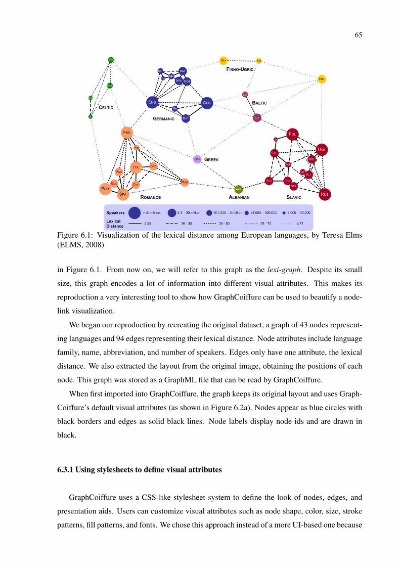
65
Figure 6.1: Visualization of the lexical distance among European languages, by Teresa Elms(ELMS, 2008)
in Figure 6.1. From now on, we will refer to this graph as the lexi-graph. Despite its small
size, this graph encodes a lot of information into different visual attributes. This makes its
reproduction a very interesting tool to show how GraphCoiffure can be used to beautify a node-
link visualization.
We began our reproduction by recreating the original dataset, a graph of 43 nodes represent-
ing languages and 94 edges representing their lexical distance. Node attributes include language
family, name, abbreviation, and number of speakers. Edges only have one attribute, the lexical
distance. We also extracted the layout from the original image, obtaining the positions of each
node. This graph was stored as a GraphML file that can be read by GraphCoiffure.
When first imported into GraphCoiffure, the graph keeps its original layout and uses Graph-
Coiffure’s default visual attributes (as shown in Figure 6.2a). Nodes appear as blue circles with
black borders and edges as solid black lines. Node labels display node ids and are drawn in
black.
6.3.1 Using stylesheets to define visual attributes
GraphCoiffure uses a CSS-like stylesheet system to define the look of nodes, edges, and
presentation aids. Users can customize visual attributes such as node shape, color, size, stroke
patterns, fill patterns, and fonts. We chose this approach instead of a more UI-based one because
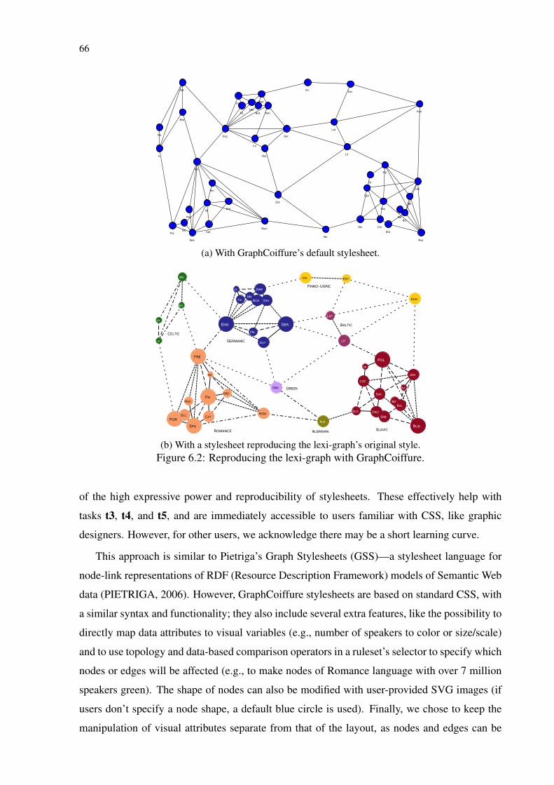
66
Swe
Ukr
Ice
Fa
Ga
Cat
Lit
Pro
Dut
Hun
Pol
Bok
Por
Ger
Bre
Rm
NN
Spa
We
SrbRom
Dsh
Blr
Srd Svk
Alb
Ma
Cro
Rus
Slo
Fin
Grk
Ir
Lat
Ita
Bul
Fre
Eng
Cze
Fri
Glc
Sr
Est
(a) With GraphCoiffure’s default stylesheet.
Ga
Rom
Por
Est
Fa
Srd
Ita
Ice
Ukr
Dut
Alb
Pro
Spa
Bre
NN
Svk
Srb
Slo
Rus
Lit
Cro
Swe
Lat
Dsh
Ma
Ger
Blr
Fre
Glc
Fri
Sr
Eng
Cze
Fin
Bok
We
Rm
Cat
Grk
Bul
Ir
Hun
Pol
Celtic
Germanic
Finno-Ugric
Greek
Romance Albanian
Baltic
Slavic
(b) With a stylesheet reproducing the lexi-graph’s original style.Figure 6.2: Reproducing the lexi-graph with GraphCoiffure.
of the high expressive power and reproducibility of stylesheets. These effectively help with
tasks t3, t4, and t5, and are immediately accessible to users familiar with CSS, like graphic
designers. However, for other users, we acknowledge there may be a short learning curve.
This approach is similar to Pietriga’s Graph Stylesheets (GSS)—a stylesheet language for
node-link representations of RDF (Resource Description Framework) models of Semantic Web
data (PIETRIGA, 2006). However, GraphCoiffure stylesheets are based on standard CSS, with
a similar syntax and functionality; they also include several extra features, like the possibility to
directly map data attributes to visual variables (e.g., number of speakers to color or size/scale)
and to use topology and data-based comparison operators in a ruleset’s selector to specify which
nodes or edges will be affected (e.g., to make nodes of Romance language with over 7 million
speakers green). The shape of nodes can also be modified with user-provided SVG images (if
users don’t specify a node shape, a default blue circle is used). Finally, we chose to keep the
manipulation of visual attributes separate from that of the layout, as nodes and edges can be
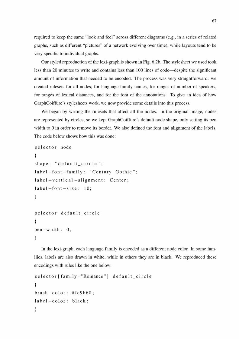
67
required to keep the same “look and feel” across different diagrams (e.g., in a series of related
graphs, such as different “pictures” of a network evolving over time), while layouts tend to be
very specific to individual graphs.
Our styled reproduction of the lexi-graph is shown in Fig. 6.2b. The stylesheet we used took
less than 20 minutes to write and contains less than 100 lines of code—despite the significant
amount of information that needed to be encoded. The process was very straightforward: we
created rulesets for all nodes, for language family names, for ranges of number of speakers,
for ranges of lexical distances, and for the font of the annotations. To give an idea of how
GraphCoiffure’s stylesheets work, we now provide some details into this process.
We began by writing the rulesets that affect all the nodes. In the original image, nodes
are represented by circles, so we kept GraphCoiffure’s default node shape, only setting its pen
width to 0 in order to remove its border. We also defined the font and alignment of the labels.
The code below shows how this was done:
s e l e c t o r node
{
shape : " d e f a u l t _ c i r c l e " ;
l a b e l −f o n t−f a m i l y : " Cen tu ry G o t h i c " ;
l a b e l −v e r t i c a l −a l i g n m e n t : C e n t e r ;
l a b e l −f o n t−s i z e : 1 0 ;
}
s e l e c t o r d e f a u l t _ c i r c l e
{
pen−wid th : 0 ;
}
In the lexi-graph, each language family is encoded as a different node color. In some fam-
ilies, labels are also drawn in white, while in others they are in black. We reproduced these
encodings with rules like the one below:
s e l e c t o r [ f a m i l y =" Romance " ] d e f a u l t _ c i r c l e
{
brush−c o l o r : # fc9b68 ;
l a b e l −c o l o r : b l a c k ;
}
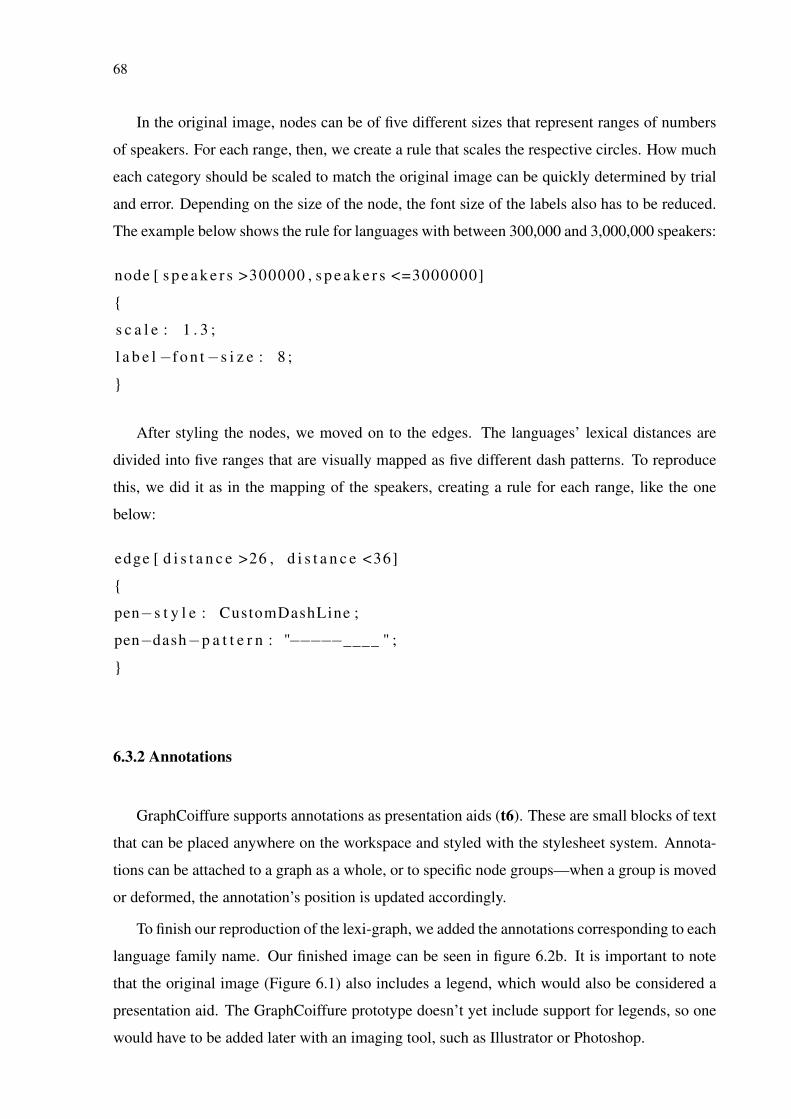
68
In the original image, nodes can be of five different sizes that represent ranges of numbers
of speakers. For each range, then, we create a rule that scales the respective circles. How much
each category should be scaled to match the original image can be quickly determined by trial
and error. Depending on the size of the node, the font size of the labels also has to be reduced.
The example below shows the rule for languages with between 300,000 and 3,000,000 speakers:
node [ s p e a k e r s >300000 , s p e a k e r s <=3000000]
{
s c a l e : 1 . 3 ;
l a b e l −f o n t−s i z e : 8 ;
}
After styling the nodes, we moved on to the edges. The languages’ lexical distances are
divided into five ranges that are visually mapped as five different dash patterns. To reproduce
this, we did it as in the mapping of the speakers, creating a rule for each range, like the one
below:
edge [ d i s t a n c e >26 , d i s t a n c e <36]
{
pen−s t y l e : CustomDashLine ;
pen−dash−p a t t e r n : "−−−−−____ " ;
}
6.3.2 Annotations
GraphCoiffure supports annotations as presentation aids (t6). These are small blocks of text
that can be placed anywhere on the workspace and styled with the stylesheet system. Annota-
tions can be attached to a graph as a whole, or to specific node groups—when a group is moved
or deformed, the annotation’s position is updated accordingly.
To finish our reproduction of the lexi-graph, we added the annotations corresponding to each
language family name. Our finished image can be seen in figure 6.2b. It is important to note
that the original image (Figure 6.1) also includes a legend, which would also be considered a
presentation aid. The GraphCoiffure prototype doesn’t yet include support for legends, so one
would have to be added later with an imaging tool, such as Illustrator or Photoshop.
69
6.3.3 Manipulating the layout
Besides standard click-and-drag actions, GraphCoiffure has many tools for layout manipu-
lation that were designed to help with t1, t2, and t5. These tools are divided into two categories:
node group-based and physics-based. Many of them are based on selections, so we will begin
by explaining how this can be done in GraphCoiffure.
6.3.4 Selection
GraphCoiffure supports three types of node selection: manual, topology-based, and attribute-
based.
Manual selections are the standard click-to-select, control-key + click to add selections, and
click-and-drag to activate rubberband selections. Filters can also be used to target specific types
of objects (e.g., only nodes, only edges, etc.).
Topology-based selections take two steps: users first manually select a group of nodes, then
choose a topology-based operation from a menu (select neighbors, add neighbors to the current
selection, select connected components).
Attribute-based selections use panels to select nodes or edges based on data attributes and
topological properties (e.g., degree, connected component, etc.). These panels show nodes and
edges in a table that can be filtered—this makes it easy, for instance, to select all languages of a
given family in the lexi-graph. Selection panels are described in detail in Appendix A.
6.3.5 Node-group-based manipulation
To make localized layout manipulation easier, a node group can be created from a selection
of nodes. Groups are represented by light gray bounding boxes around nodes, with a name
(given upon creation) displayed at the top-left corner. Users can move groups by clicking and
dragging and can stretch and rotate them by clicking and dragging on manipulator handles.
Stretching consists in a uniform or non-uniform scaling of the nodes’ positions, while rotation
rotates their positions around the center of the group’s bounding box. The graph itself is treated
as a special type of node group that can also be scaled as a whole (users can toggle the option to
scale the whole graph or only node positions on a menu). Figure 6.3 demonstrates node group
deformations. Note that edge groups can also be created, but they are not used for layout mod-
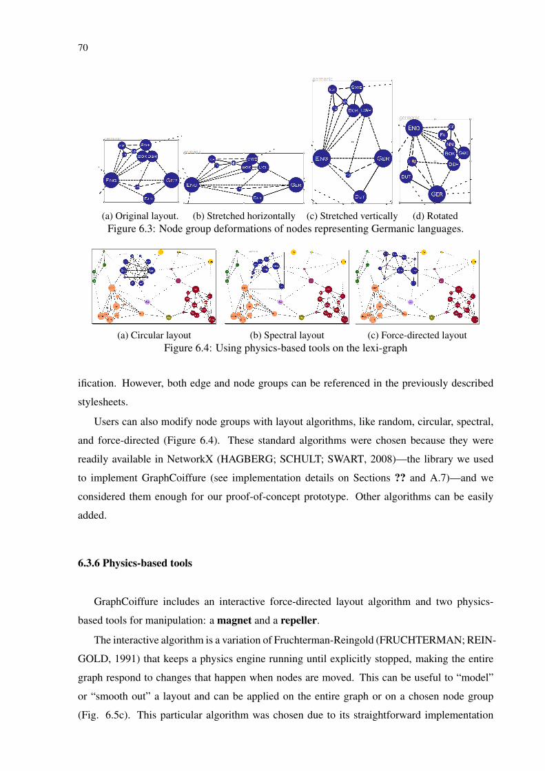
70
(a) Original layout. (b) Stretched horizontally (c) Stretched vertically (d) RotatedFigure 6.3: Node group deformations of nodes representing Germanic languages.
(a) Circular layout (b) Spectral layout (c) Force-directed layoutFigure 6.4: Using physics-based tools on the lexi-graph
ification. However, both edge and node groups can be referenced in the previously described
stylesheets.
Users can also modify node groups with layout algorithms, like random, circular, spectral,
and force-directed (Figure 6.4). These standard algorithms were chosen because they were
readily available in NetworkX (HAGBERG; SCHULT; SWART, 2008)—the library we used
to implement GraphCoiffure (see implementation details on Sections ?? and A.7)—and we
considered them enough for our proof-of-concept prototype. Other algorithms can be easily
added.
6.3.6 Physics-based tools
GraphCoiffure includes an interactive force-directed layout algorithm and two physics-
based tools for manipulation: a magnet and a repeller.
The interactive algorithm is a variation of Fruchterman-Reingold (FRUCHTERMAN; REIN-
GOLD, 1991) that keeps a physics engine running until explicitly stopped, making the entire
graph respond to changes that happen when nodes are moved. This can be useful to “model”
or “smooth out” a layout and can be applied on the entire graph or on a chosen node group
(Fig. 6.5c). This particular algorithm was chosen due to its straightforward implementation
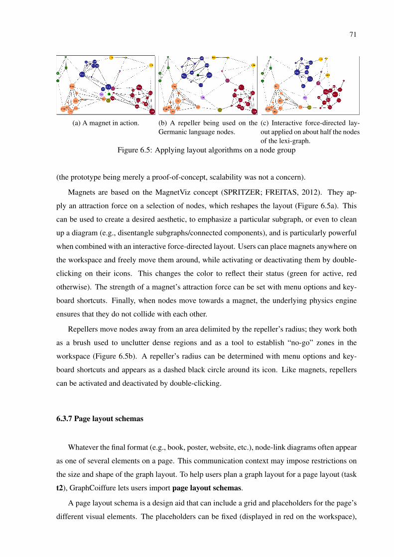
71
(a) A magnet in action. (b) A repeller being used on theGermanic language nodes.
(c) Interactive force-directed lay-out applied on about half the nodesof the lexi-graph.
Figure 6.5: Applying layout algorithms on a node group
(the prototype being merely a proof-of-concept, scalability was not a concern).
Magnets are based on the MagnetViz concept (SPRITZER; FREITAS, 2012). They ap-
ply an attraction force on a selection of nodes, which reshapes the layout (Figure 6.5a). This
can be used to create a desired aesthetic, to emphasize a particular subgraph, or even to clean
up a diagram (e.g., disentangle subgraphs/connected components), and is particularly powerful
when combined with an interactive force-directed layout. Users can place magnets anywhere on
the workspace and freely move them around, while activating or deactivating them by double-
clicking on their icons. This changes the color to reflect their status (green for active, red
otherwise). The strength of a magnet’s attraction force can be set with menu options and key-
board shortcuts. Finally, when nodes move towards a magnet, the underlying physics engine
ensures that they do not collide with each other.
Repellers move nodes away from an area delimited by the repeller’s radius; they work both
as a brush used to unclutter dense regions and as a tool to establish “no-go” zones in the
workspace (Figure 6.5b). A repeller’s radius can be determined with menu options and key-
board shortcuts and appears as a dashed black circle around its icon. Like magnets, repellers
can be activated and deactivated by double-clicking.
6.3.7 Page layout schemas
Whatever the final format (e.g., book, poster, website, etc.), node-link diagrams often appear
as one of several elements on a page. This communication context may impose restrictions on
the size and shape of the graph layout. To help users plan a graph layout for a page layout (task
t2), GraphCoiffure lets users import page layout schemas.
A page layout schema is a design aid that can include a grid and placeholders for the page’s
different visual elements. The placeholders can be fixed (displayed in red on the workspace),
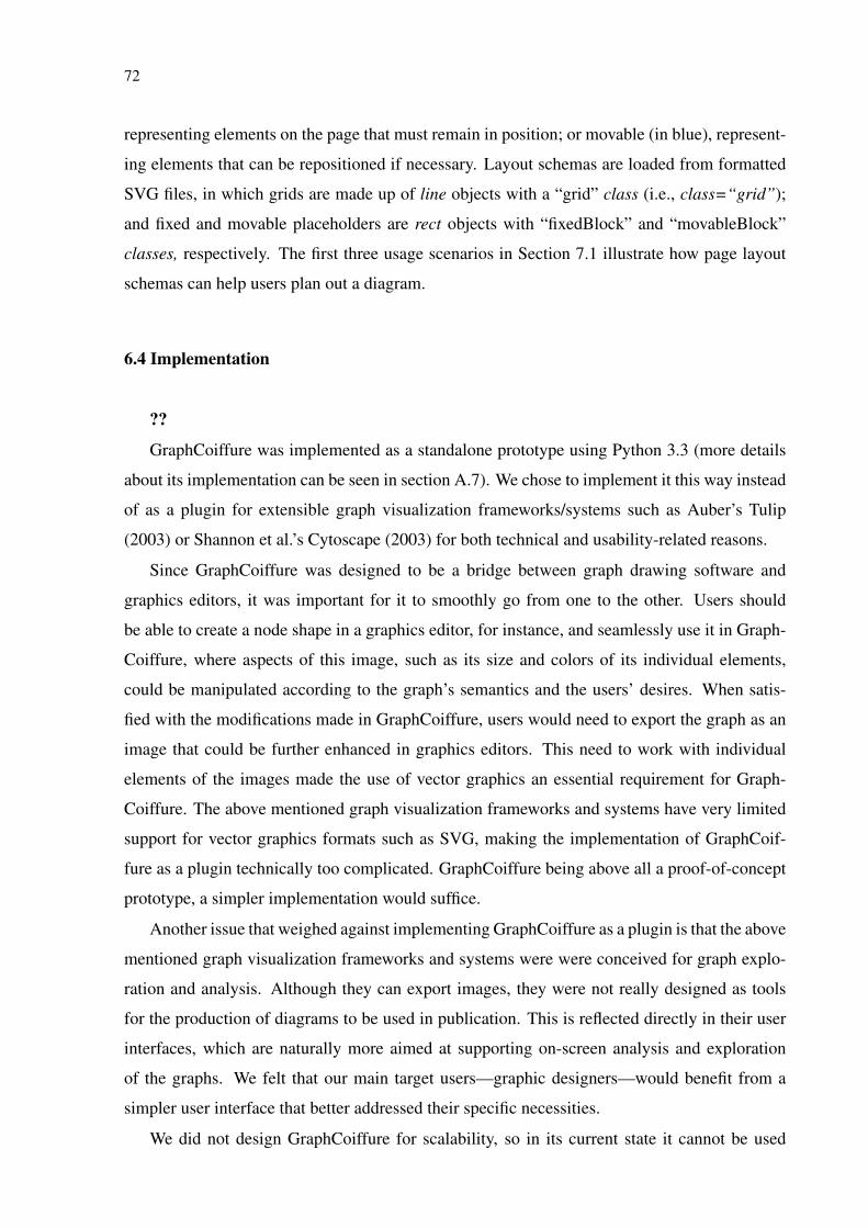
72
representing elements on the page that must remain in position; or movable (in blue), represent-
ing elements that can be repositioned if necessary. Layout schemas are loaded from formatted
SVG files, in which grids are made up of line objects with a “grid” class (i.e., class=“grid”);
and fixed and movable placeholders are rect objects with “fixedBlock” and “movableBlock”
classes, respectively. The first three usage scenarios in Section 7.1 illustrate how page layout
schemas can help users plan out a diagram.
6.4 Implementation
??
GraphCoiffure was implemented as a standalone prototype using Python 3.3 (more details
about its implementation can be seen in section A.7). We chose to implement it this way instead
of as a plugin for extensible graph visualization frameworks/systems such as Auber’s Tulip
(2003) or Shannon et al.’s Cytoscape (2003) for both technical and usability-related reasons.
Since GraphCoiffure was designed to be a bridge between graph drawing software and
graphics editors, it was important for it to smoothly go from one to the other. Users should
be able to create a node shape in a graphics editor, for instance, and seamlessly use it in Graph-
Coiffure, where aspects of this image, such as its size and colors of its individual elements,
could be manipulated according to the graph’s semantics and the users’ desires. When satis-
fied with the modifications made in GraphCoiffure, users would need to export the graph as an
image that could be further enhanced in graphics editors. This need to work with individual
elements of the images made the use of vector graphics an essential requirement for Graph-
Coiffure. The above mentioned graph visualization frameworks and systems have very limited
support for vector graphics formats such as SVG, making the implementation of GraphCoif-
fure as a plugin technically too complicated. GraphCoiffure being above all a proof-of-concept
prototype, a simpler implementation would suffice.
Another issue that weighed against implementing GraphCoiffure as a plugin is that the above
mentioned graph visualization frameworks and systems were were conceived for graph explo-
ration and analysis. Although they can export images, they were not really designed as tools
for the production of diagrams to be used in publication. This is reflected directly in their user
interfaces, which are naturally more aimed at supporting on-screen analysis and exploration
of the graphs. We felt that our main target users—graphic designers—would benefit from a
simpler user interface that better addressed their specific necessities.
We did not design GraphCoiffure for scalability, so in its current state it cannot be used
73
to generate visualizations for graphs of more than a few hundred nodes and edges. This isn’t
really a problem, though, as our focus was more on printed visualizations, which have a natural
limit on the amount of data that can be depicted due to the finite and non-interactive nature of
physical surfaces.
6.5 Limitations
Being a proof-of-concept prototype, GraphCoiffure naturally has some limitations, not hav-
ing some features that would add to it from a practical point of view. These features include
support for directed graphs, curved edges, options for edge routing, alternative edge draw-
ings, metanodes, CSS gradients, history management, and the possibility of loading graphs
from formats other than GraphML (Graphviz’s dot, in particular). In terms of its requirements,
GraphCoiffure currently provides only one presentation aid (annotations). GraphCoiffure also
lacks a way to select nodes and edges based on more complex queries (e.g., select neighbors
of a given node, select edges to nodes that have a certain property, etc.), as done in MagnetViz
(SPRITZER; FREITAS, 2008; SPRITZER; FREITAS, 2012).
It is also worth mentioning that GraphCoiffure as a concept has an inherent limitation when
it comes to reuse: although the stylesheet system makes it easy to use the same visual attributes
on many graphs, layout modifications cannot be reproduced so easily. Other unsolved problems
related to layout include reconfiguring a layout in a way that it remains recognizable while
conforming to specific requirements (e.g., fitting into a given shape or morphing to another
layout style while still being recognizably the same graph).
Another important limitation of GraphCoiffure concerns the workflow itself. As described
in Section 6.2, users provide their graphs (with or without a layout) as input to GraphCoiffure,
which exports them as images to be further enhanced in graphics editors. Ideally, users would
be able to go back and forth between GraphCoiffure and the image editor. This is a considerable
problem, since it would involve somehow extracting the editable graph visualization from an
image that has lost its data mappings (i.e., what was once a node, for instance, became simply
a circle in the conversion from GraphCoiffure to image). One way to get around this problem
would be to add features to graphics editors that would let them add or keep metadata to SVG
files which would then be used by GraphCoiffure to extract the enhanced graphs—this, however,
is outside the current scope of GraphCoiffure.
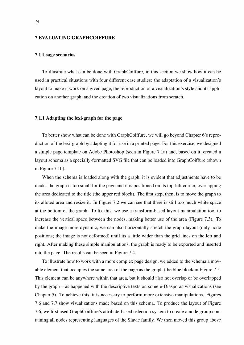
74
7 EVALUATING GRAPHCOIFFURE
7.1 Usage scenarios
To illustrate what can be done with GraphCoiffure, in this section we show how it can be
used in practical situations with four different case studies: the adaptation of a visualization’s
layout to make it work on a given page, the reproduction of a visualization’s style and its appli-
cation on another graph, and the creation of two visualizations from scratch.
7.1.1 Adapting the lexi-graph for the page
To better show what can be done with GraphCoiffure, we will go beyond Chapter 6’s repro-
duction of the lexi-graph by adapting it for use in a printed page. For this exercise, we designed
a simple page template on Adobe Photoshop (seen in Figure 7.1a) and, based on it, created a
layout schema as a specially-formatted SVG file that can be loaded into GraphCoiffure (shown
in Figure 7.1b).
When the schema is loaded along with the graph, it is evident that adjustments have to be
made: the graph is too small for the page and it is positioned on its top-left corner, overlapping
the area dedicated to the title (the upper red block). The first step, then, is to move the graph to
its alloted area and resize it. In Figure 7.2 we can see that there is still too much white space
at the bottom of the graph. To fix this, we use a transform-based layout manipulation tool to
increase the vertical space between the nodes, making better use of the area (Figure 7.3). To
make the image more dynamic, we can also horizontally stretch the graph layout (only node
positions; the image is not deformed) until its a little wider than the grid lines on the left and
right. After making these simple manipulations, the graph is ready to be exported and inserted
into the page. The results can be seen in Figure 7.4.
To illustrate how to work with a more complex page design, we added to the schema a mov-
able element that occupies the same area of the page as the graph (the blue block in Figure 7.5.
This element can be anywhere within that area, but it should also not overlap or be overlapped
by the graph – as happened with the descriptive texts on some e-Diasporas visualizations (see
Chapter 5). To achieve this, it is necessary to perform more extensive manipulations. Figures
7.6 and 7.7 show visualizations made based on this schema. To produce the layout of Figure
7.6, we first used GraphCoiffure’s attribute-based selection system to create a node group con-
taining all nodes representing languages of the Slavic family. We then moved this group above
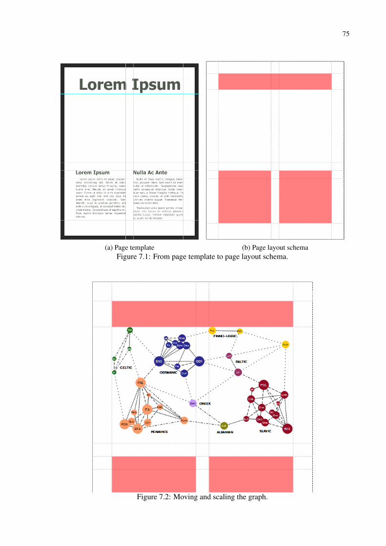
75
(a) Page template (b) Page layout schemaFigure 7.1: From page template to page layout schema.
Figure 7.2: Moving and scaling the graph.

76
Figure 7.3: Adjusting the layout.
the blue element and scaled and rotated it to adjust its positions. Finally, we manually adjusted
the positions of the nodes surrounding it. For Figure 7.7, we created node groups for most of
the families and moved, rotated, and scaled them into a satisfactory layout. We also applied a
circular layout to the node group of the Celtic family, giving this subgraph a more square-like
shape.
7.1.2 Reproducing a style
The infographic in Fig. 7.8a was made by former company Loku; it shows different types
of coffee and the different personalities of the people who drink them. In this subsection,
we describe how we reproduced this diagram’s style and applied it to the lexi-graph using
GraphCoiffure.
As mentioned in our proposed workflow, we began outside GraphCoiffure by creating a page
layout schema based on the coffee diagram’s page. We also created the node shape SVGs in
Adobe Illustrator, reproducing the two ways nodes are drawn. We then loaded our reproduction
of the lexi-graph in GraphCoiffure and wrote a stylesheet that used our recreated node shapes.
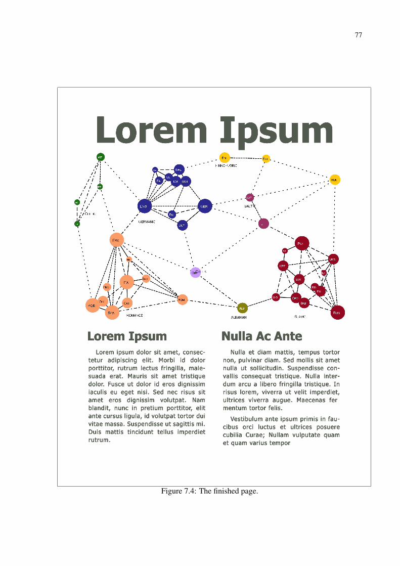
77
Lorem Ipsum Nulla Ac Ante
Lorem Ipsum
Lorem ipsum dolor sit amet, consec-tetur adipiscing elit. Morbi id dolor porttitor, rutrum lectus fringilla, male-suada erat. Mauris sit amet tristique dolor. Fusce ut dolor id eros dignissim iaculis eu eget nisi. Sed nec risus sit amet eros dignissim volutpat. Nam blandit, nunc in pretium porttitor, elit ante cursus ligula, id volutpat tortor dui vitae massa. Suspendisse ut sagittis mi. Duis mattis tincidunt tellus imperdiet rutrum.
Nulla et diam mattis, tempus tortor non, pulvinar diam. Sed mollis sit amet nulla ut sollicitudin. Suspendisse con-vallis consequat tristique. Nulla inter-dum arcu a libero fringilla tristique. In risus lorem, viverra ut velit imperdiet, ultrices viverra augue. Maecenas fermentum tortor felis.
Vestibulum ante ipsum primis in fau-cibus orci luctus et ultrices posuere cubilia Curae; Nullam vulputate quam et quam varius tempor
Figure 7.4: The finished page.
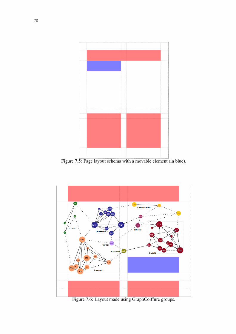
78
Figure 7.5: Page layout schema with a movable element (in blue).
Figure 7.6: Layout made using GraphCoiffure groups.
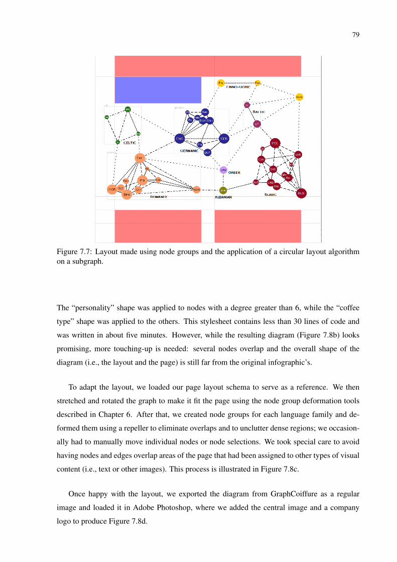
79
Figure 7.7: Layout made using node groups and the application of a circular layout algorithmon a subgraph.
The “personality” shape was applied to nodes with a degree greater than 6, while the “coffee
type” shape was applied to the others. This stylesheet contains less than 30 lines of code and
was written in about five minutes. However, while the resulting diagram (Figure 7.8b) looks
promising, more touching-up is needed: several nodes overlap and the overall shape of the
diagram (i.e., the layout and the page) is still far from the original infographic’s.
To adapt the layout, we loaded our page layout schema to serve as a reference. We then
stretched and rotated the graph to make it fit the page using the node group deformation tools
described in Chapter 6. After that, we created node groups for each language family and de-
formed them using a repeller to eliminate overlaps and to unclutter dense regions; we occasion-
ally had to manually move individual nodes or node selections. We took special care to avoid
having nodes and edges overlap areas of the page that had been assigned to other types of visual
content (i.e., text or other images). This process is illustrated in Figure 7.8c.
Once happy with the layout, we exported the diagram from GraphCoiffure as a regular
image and loaded it in Adobe Photoshop, where we added the central image and a company
logo to produce Figure 7.8d.
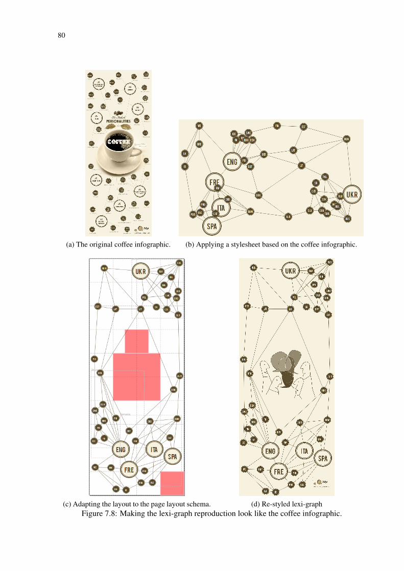
80
(a) The original coffee infographic. (b) Applying a stylesheet based on the coffee infographic.
(c) Adapting the layout to the page layout schema. (d) Re-styled lexi-graphFigure 7.8: Making the lexi-graph reproduction look like the coffee infographic.

81
Figure 7.9: In our visualization of the UFRGS 2011 coauthorship network we used this stylizeddepiction of a person as the shape of the nodes. This image was in SVG format.
7.1.3 Creating a coauthorship visualization
Another interesting case study is the creation of a visualization for the 2011 coauthorship
network of the professors and students of the Federal University of Rio Grande do Sul, Brazil,
and their external collaborators. This graph is much larger, with 619 nodes and 2909 edges,
and is also very semantically rich, since it can be used to tell many different stories about the
people that compose it. To further illustrate GraphCoiffure, we focus on one of these possible
stories: designing a visualization centered on this university’s computer graphics group and
how it relates to the other members of the network.
Our data did not include layout information, so we based our visualization on GraphCoif-
fure’s default force-directed algorithm. The graph as it appears when first loaded into Graph-
Coiffure can be seen in Figure 7.10a. Our first step after loading the graph was to define the
visual attributes of the nodes and edges with a stylesheet. Instead of the default circle, we opted
to use for the node shape an SVG image of a stylized person (seen in Figure 7.9), to make it
clear that the visualization consists of a network of people. We decided to use color and size
to encode the different types of participants. Since professors are the most permanent members
of the university, they were colored in red to be more visible in the image. Students, in turn,
were colored in dark blue, while external collaborators were rendered in light blue. This was
achieved with rules similar to those described in the previous subsection, using selectors such
as node[Category="Professor"]. As for the use of size, to make it easier to see the authors
that collaborate the most we encoded node degree to node scale factor. This is done with the
following code:
node
{
shape : " p e r s o n _ p e r s o n " ;
s c a l e −a t t r i b u t e : " d e g r e e " ;
max−s c a l e : 1 ;
min−s c a l e : 0 . 2 ;
}
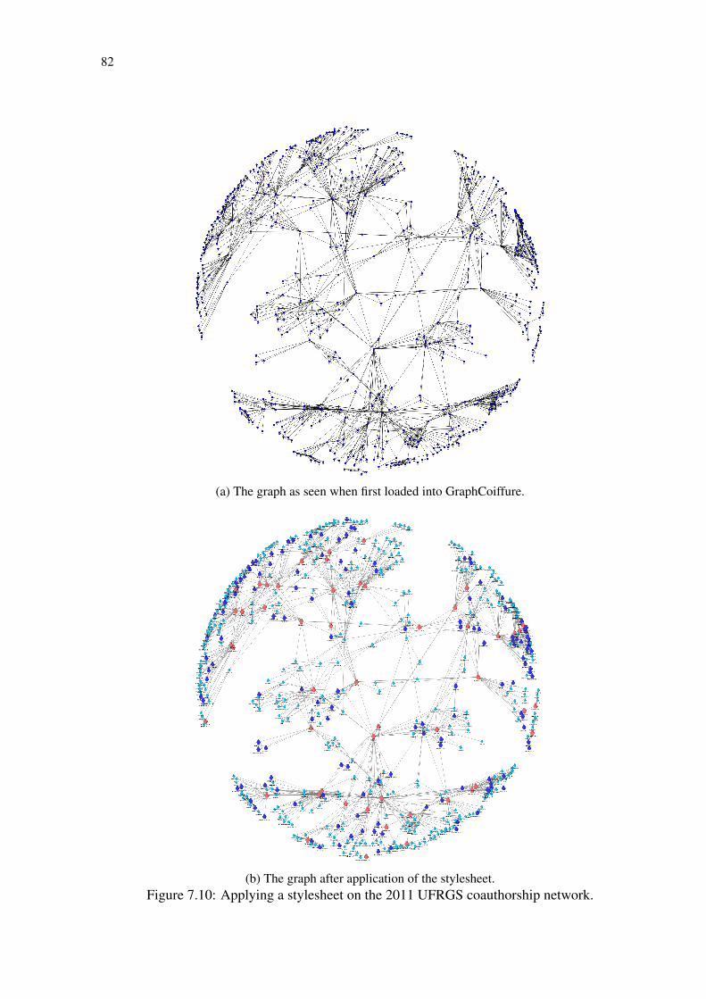
82
(a) The graph as seen when first loaded into GraphCoiffure.
(b) The graph after application of the stylesheet.Figure 7.10: Applying a stylesheet on the 2011 UFRGS coauthorship network.
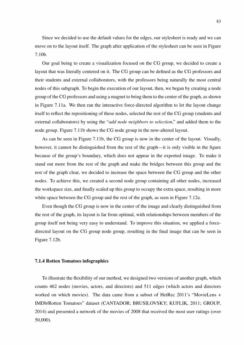
83
Since we decided to use the default values for the edges, our stylesheet is ready and we can
move on to the layout itself. The graph after application of the stylesheet can be seen in Figure
7.10b.
Our goal being to create a visualization focused on the CG group, we decided to create a
layout that was literally centered on it. The CG group can be defined as the CG professors and
their students and external collaborators, with the professors being naturally the most central
nodes of this subgraph. To begin the execution of our layout, then, we began by creating a node
group of the CG professors and using a magnet to bring them to the center of the graph, as shown
in Figure 7.11a. We then ran the interactive force-directed algorithm to let the layout change
itself to reflect the repositioning of these nodes, selected the rest of the CG group (students and
external collaborators) by using the “add node neighbors to selection,” and added them to the
node group. Figure 7.11b shows the CG node group in the now-altered layout.
As can be seen in Figure 7.11b, the CG group is now in the center of the layout. Visually,
however, it cannot be distinguished from the rest of the graph—it is only visible in the figure
because of the group‘s boundary, which does not appear in the exported image. To make it
stand out more from the rest of the graph and make the bridges between this group and the
rest of the graph clear, we decided to increase the space between the CG group and the other
nodes. To achieve this, we created a second node group containing all other nodes, increased
the workspace size, and finally scaled up this group to occupy the extra space, resulting in more
white space between the CG group and the rest of the graph, as seen in Figure 7.12a.
Even though the CG group is now in the center of the image and clearly distinguished from
the rest of the graph, its layout is far from optimal, with relationships between members of the
group itself not being very easy to understand. To improve this situation, we applied a force-
directed layout on the CG group node group, resulting in the final image that can be seen in
Figure 7.12b.
7.1.4 Rotten Tomatoes infographics
To illustrate the flexibility of our method, we designed two versions of another graph, which
counts 462 nodes (movies, actors, and directors) and 511 edges (which actors and directors
worked on which movies). The data came from a subset of HetRec 2011’s “MovieLens +
IMDb/Rotten Tomatoes” dataset (CANTADOR; BRUSILOVSKY; KUFLIK, 2011; GROUP,
2014) and presented a network of the movies of 2008 that received the most user ratings (over
50,000).
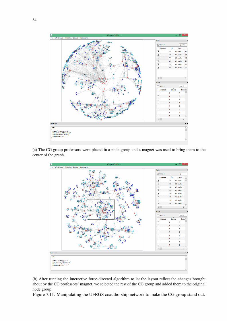
84
(a) The CG group professors were placed in a node group and a magnet was used to bring them to thecenter of the graph.
(b) After running the interactive force-directed algorithm to let the layout reflect the changes broughtabout by the CG professors’ magnet, we selected the rest of the CG group and added them to the originalnode group.Figure 7.11: Manipulating the UFRGS coauthorship network to make the CG group stand out.
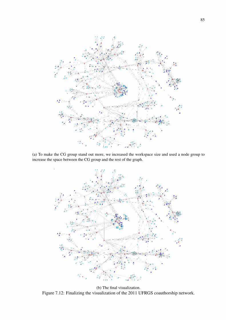
85
(a) To make the CG group stand out more, we increased the workspace size and used a node group toincrease the space between the CG group and the rest of the graph.
(b) The final visualization.Figure 7.12: Finalizing the visualization of the 2011 UFRGS coauthorship network.

86
We loaded the graph in GraphCoiffure and applied an initial force-directed layout to get an
idea of its general aspect. After that, we started working on the stylesheet: we encoded movies
as ellipses, actors as stars, and directors as director’s chairs—each accompanied with labels
showing their titles and names. We mapped movies’ Rotten Tomatoes audience scores to their
width and their top critics score to their height; actors’ average ranks (their “importance” in a
movie) to their size; and actors’ ranks in each of their movies to the thickness of their connecting
edges. We then defined the fonts and colors.
We then worked on the graph’s layout. We activated the interactive force-directed layout
and used a magnet to clean up the layout by separating smaller connected components from the
largest one (with 367 nodes). As we wanted the infographic’s title to appear inside the diagram
instead of above it, we placed a repeller with a relatively large radius in a central region between
the many smaller connected components and the largest one, forcing the layout to reshape itself
around this region (effectively creating a hole in the layout). After the physics engine had done
its work, we stopped it and used the node group tools to stretch the graph horizontally to give
the infographic a landscape aspect ratio. After making some minor tweaks by manually moving
some nodes to ensure their labels were readable, we exported the diagram as an SVG file and
opened it in Adobe Illustrator. Finally, we added the title, a background image, and made some
last adjustments for the color of the objects. The final graphic is shown in Figure 7.13.
Next, to give a better idea of GraphCoiffure’s flexibility, we created a second infographic for
the same dataset, keeping the encoding of actors as stars and directors as chairs, but changing
the encoding of movies so that they also take their genre into account. Movies are now shown
as either tomatoes (fresh) or green blobs (rotten). Inside these icons, we added theater masks to
represent the genres; and audience score was encoded as node size. Once again we separated
smaller components from the large one, but we did not insert a “hole” for the logo in the center,
as we decided on a different design. We also decided to keep the original proportions of the
diagram. To produce the final image, we exported it and placed it over a background previously
created in Illustrator. This image is shown in Figure 7.14.
7.2 User evaluation: interviews with expert users
To obtain feedback on GraphCoiffure, we conducted an informal evaluation with three po-
tential expert users: a physicist who researches epidemiological and metabolic networks and
two computer scientists who work on coauthorship networks. We believed these researchers
would benefit from GraphCoiffure, as they often need to communicate their findings to their
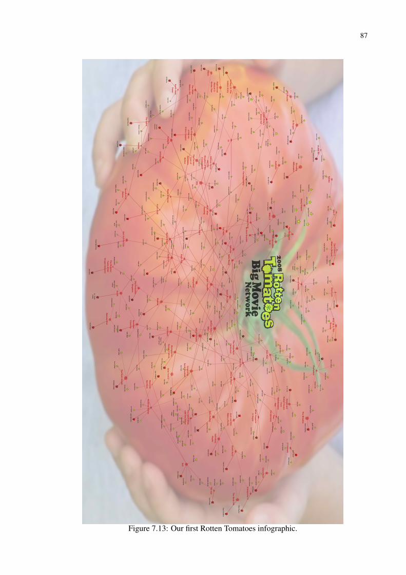
87
Armand Schultz
Frank Miller (II)
Andy Richter
Jessica Alba
Andrew Stanton
Burn A
fterR
eading
Diane Lane
Bedtim
e Stories
Jon Favreau
Aaron Eckhart
Tilda Swinton
FourC
hristmases
John Cho
The Strangers
Ryan Reynolds
Brendan Fraser
Kellan Lutz
Lynn Cohen
Scarlett Johansson
John Travolta
Alan Arkin
Peter Billingsley
Cam G
igandet
John Malkovich
Collin Chou
Susan Sarandon
David M
oreau
Kyle Chandler
Nelson M
cCormick
Will Arnett
David Koechner
Jesse Plemons
Speed Racer
Hancock
Phyllida Lloyd
M. N
ight Shyamalan
Thomas
Kretschmann
David Fincher
Stana Katic
Justin Chadwick
Joseph Cross
Jackie Chan
Mos D
ef
George Clooney
The Eye
Timur
Bekmam
betov
Andrew Adam
son
Paul Dooley
Matthew
McConaughey
The Curious
Case of
Benjam
inB
utton
Paul W.S. Anderson
The Dark K
night
Steven Spielberg
Ian McShane
Nick N
olte
Adrianne Palicki
What H
appensin V
egas
Forest Whitaker
Liam N
eeson
Cameron D
iaz
Sex and the City
Jay Phillips
Louis Leterrier
Seann William
Scott
Paul Weiland
Nicholas Stoller
Paul Rudd
Charlize Theron
Edward N
orton
Donald Sutherland
Will Ferrell
Seth Rogen
Christina Ricci
Meryl Streep
Changeling
Jason Bateman
Gregory H
oblit
Robert Dow
ney Jr.
Ben Stiller
Chloe Moretz
Get Sm
art
Samuel L. Jackson
Philip Seymour
Hoffm
an
Sarah Paulson
Pierce Brosnan
Emile H
irsch
Valerie Azlynn
Mary-Louise Parker
John C. Reilly
Madison Pettis
Mila Kunis
Kenny Ortega
Brian Huskey
Joseph Moore
Kevin Spacey
Christine Jeffs
Tom Vaughan
Colin Hanks
Jeff Bridges
Rob Minkoff
ForgettingSarah M
arshall
Fool's Gold
The Bank Job
Georgie H
enley
Spencer Garrett
Doug Lim
an
D.W
. Moffett
Kristin Davis
Amber H
eard
Eddie Izzard
Shia LaBeouf Jeff Garlin
Brad Pitt
Jim Sturgess
Amy Adam
s
Kristen Stewart
Seth Gordon
Ariel Winter
Zooey Deschanel
Chris RockBilly Burke
Guillerm
o del Toro
Patrick Dem
psey
Elissa Knight
Quantum
ofSolace
Chris William
s
SunshineC
leaning
André Benjamin
Steve Carell
Kristen Bell
Kim D
ickensD
ennis Quaid
Brad Leland
Scott Porter
The ForbiddenK
ingdom
Fred WillardP
rom N
ight
Twilight
Bill Hader
Dan Fogler
Christian Bale
Gw
yneth Paltrow
Janine Turner
Horton H
ears aW
ho!
Kevin Sussman
Leslie Bibb
Matt W
alsh
The Mum
my:
Tomb of the
Dragon Em
peror
Mathieu Am
alric
Jimm
y Hayw
ard
Sayed Badreya
Selma Blair
Jason Segel
Cate Blanchett
Made of H
onor
Kevin Smith
Werner D
aehn
Sarah Jessica
Parker
Taraji P. Henson
Minka Kelly
Andy Wachow
ski
Adam M
cKay
Never B
ackD
own
Natalya Rudakova
Kate Bosworth
Be K
ind Rew
ind
Ron Perlman
John Hurt
Peter Segal
Olga Kurylenko
Gabriele M
uccino
Michael M
cCullers
The Spirit
21
Nick Sw
ardson
Mam
ma M
ia!
Milk
John Stevenson
Jet Li
Catherine
Hardw
icke
The Chronicles
of Narnia:
Prince C
aspian
Russell Brand
A H
ard Rain's
Gonna Fall
Bolt
Terence Stamp
Untraceable
Jason Statham
Hayden Christensen
Christian Oliver
Pete Travis
D.J. Caruso
Tom Cruise
Parker Posey
Paul Bettany
Richard Jenkins
Bryan Bertino
Seven Pounds
Zac Efron
Pierre Morel
Mark W
ahlberg
Heath Ledger
Harold and
Kum
ar Escapefrom
Guantanam
oB
ay
Step Brothers
Daniel Craig
Rob Corddry
Tim G
uinee
Sean Penn
Marc Forster
Meet the
Spartans
Jason Friedberg
Kung Fu P
anda
Anatole Taubman
Jeff Wadlow
WA
LL·E
Guy Pearce
Transporter 3
Michael Patrick King
Maura Tierney
Toby Metcalf
Jum
per
The Spiderwick
Chronicles
Keri Russell
Ethan Coen
Mark W
aters (VIII)
Michelle M
onaghan
Carmen Electra
High SchoolM
usical 3:Senior Y
ear
Eric Christian Olsen
Jack Black
Jason Sudeikis
Miley Cyrus
Will Lym
an
Eric Bana
Bill Smitrovich
Greg Kinnear
Yes M
an
Reese Witherspoon
Natalie Portm
an
Rob Cohen
Matthew
Fox
Baby M
ama
Sigourney Weaver
David Schw
imm
er
Angelina Jolie
Valkyrie
Sean Faris
The IncredibleH
ulk
Gus Van Sant
Amanda Seyfried
Paulie Litt
Zach Gilford
Faran TahirEric Darnell
Vantage P
oint
Indiana Jonesand the
Kingdom
of theC
rystal Skull
Hellboy II: TheG
olden Arm
y
Dustin H
offman
Dana W
heeler-
Nicholson
Wanted
Harrison Ford
Woody H
arrelson
Kim Cattrall
Jon Hurw
itz
Terrence How
ard
Jim Carrey
Tropic Thunder
Will Sm
ith
Vince Vaughn
Semi-P
ro
Skandar Keynes
John Leguizamo
David W
ain
The Other
Boleyn G
irl
Saffron Burrows
William
Fichtner
Definitely,M
aybe
Kevin Mckidd
Derek Luke
Taken
Eagle Eye
Taylor KitschW
illiam H
urt
Jonah Hill
Peyton Reed
Jamie Bell
Michael W
axman
Kal Penn
Jeremy Sum
pter
Olivier M
egaton
Gran Torino
Mary Steenburgen
Kate Hudson
Harvey Friedm
an
Freddie Highm
ore
Bryan Singer
Connie Britton
James M
cAvoy
Christopher Nolan
Susie Essman
Ken Davitian
Doug Jones
Kent Alterman
Andrew D
aly
Doubt
Adam Shankm
an
Lucas Grabeel
Isla Fisher
Andy Tennant
Diedrich Bader
Robert Duvall
Ashton Kutcher
Iron Man
Shaun Toub
"Dw
ayne ""The
Rock"" Johnson"
Ken Jeong
Brittany Snow
Michel G
ondry
The Happening
Ahney Her
Death R
ace
Clark Gregg
François Berléand
Tina Fey
John Patrick
Shanley
Gabriel M
acht
Emily Blunt
Sean O'Bryan
Alessandro Nivola
Amy Poehler
Craig Robinson
Rosario Daw
son
Adam Brooks
Trieu Tran
Bee Vang
Peter Berg
Zack and Miri
Make a P
orno
Denis O
'Hare
Waldem
ar Kobus
Roger Donaldson
Ray Winstone
Aimee Teegarden
Robert Luketic
Sean MaG
uire
Elizabeth Banks
Clint Eastwood
Anne Hathaw
ay
Tyrese Gibson
Role M
odels
Carol Burnett
Liv Tyler
Madagascar:
Escape 2 Africa
Morgan Freem
an
David M
ackay
Nicole Kidm
an
Australia
Danny Boyle
Meagan G
ood
Ace of H
earts
Being H
uman
Chris Carter
Camilla Belle
Malin Akerm
an
Philip Cabrita
Marisa Tom
ei
Amanda Peet
Jason Watkins
Matthew
Harrison
David W
enham
Michael Cram
10,000 BC
Brendan Gleeson
Steven Strait
Amy Jo Johnson
Briana Evigan
Daniel Boileau
Colin Farrell
Kimberly Peirce
Ryan Phillippe
Kasey Kieler
Katherine Heigl
Roland Emm
erich
Britt McKillip
Dave Lantaigne
Ruth Marshall
Mark Taylor
Tattiawna Jones
Sinead Keenan
David D
uchovny
David Paetkau
In Bruges
Will Kem
p
Stephen Daldry
Channing Tatum
Slumdog
Millionaire
Anne Fletcher
Dean Cain
Hugh D
illon
David H
ackl
Lyndsey Marshal
The X Files: I
Want to B
elieve
Jessica Lucas
Robert Hoffm
an
T.J. Miller
Step Up 2: The
Streets
Connor Dunn
Burkely Duffield
Donald Sum
pter
David Kross
Flashpoint
Mark Fleischm
ann
Hugh Jackm
an
Cliff Curtis
Stephen Surjik
Kate Winslet
David Patrick G
reenLenora Crichlow
Jon Chu
Mickey Rourke
Russell Tovey
Martin M
cDonagh
Mike D
opud
The Wrestler
Nathan Clark
Saw V
Ralph Fiennes
Gillian Anderson
Dev Patel
Matt Reeves
Sonny LittD
arren Aronofsky
Tobin Bell
Aidan Turner
Julie Benz
Lizzy Caplan
Cloverfield
27 Dresses
Stop-Loss
Baz Luhrmann
Sylvester Stallone
The Reader
C.J. Jackman-
Zigante
Enrico Colantoni
Ram
bo
James M
arsden
Anne Marie D
eLuise
Sergio Di Zio
Abbie Cornish
zohan
You D
on't Mess
with the Zohan
Adam Sandler
Michael Buffer
Dave M
atthews
Kevin Nealon
Robert Smigel
Rob Schneider
Dina D
oron
John Turturro
Dennis D
ugan
Daoud H
eidami
Lainie KazanCharlotte Rae
Ido Mosseri
Emm
anuelle
Chriqui
Figure 7.13: Our first Rotten Tomatoes infographic.
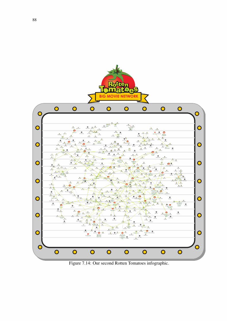
88
Figure 7.14: Our second Rotten Tomatoes infographic.
89
peers or to a general audience. These potential users are all from a technical/scientific back-
ground and a more thorough evaluation would also include other types of users, such as graphic
designers, journalists, and artists. However, GraphCoiffure was designed with direct input from
a graphic designer, so we felt feedback from these users was already adequate for the evaluation
at this moment.
The evaluation process consisted of one session with each researcher. In each session, we
gave them a live demonstration of the prototype while exchanging ideas and obtaining their
feedback.
The first session held was with the physicist. During our conversation, he said that in his
field visualization is not traditionally used, but that this is starting to change. So far, however,
the few colleagues of his who use visualization still use it more to explore graphs than to com-
municate information about them. He also said, though, that a technology like GraphCoiffure
could be very useful in communicating the spread of epidemics—particularly when used to cre-
ate several similar-looking graphs that could be used as snapshots of an epidemic at a certain
time and presented as a small multiples visualization. Throughout our conversation, he could
think of how GraphCoiffure could be used in his actual research, as a tool for exploration. He
considered, for instance, of how mapping data attributes to visual attributes could help uncover
new findings. His focus on exploration hearkens back to our Chapter 5 discussion of how con-
tent providers and visualization designers tend to have different perspectives on how to design
visualizations.
Our second interview was with one of the computer science researchers, a university pro-
fessor who works with, among other topics, information retrieval, recommender systems, and
social network analysis. Within this latter topic, he works with academic coauthorship net-
works and frequently has to create visualizations for his publications, be they reports on the
evolution of the university’s collaboration network or images to be used in posters and papers
to convey scientific findings. For this, he has usually turned to Gephi (see Section 3.1), but has
been disappointed by its lack of flexibility. Seeing GraphCoiffure, he liked how it was able to
easily encode semantic information and data attributes into visual attributes. He also liked the
idea of applying a single stylesheet on many graphs to create, for instance, a small multiples
visualization of the evolution of a coauthorship network through time. For the improvement
of GraphCoiffure, he suggested as a feature the possibility of using similarity-based clustering
to simplify graphs. Throughout our conversation, he expressed a wish to use GraphCoiffure to
create material for his classes and presentations.
The final interviewee, the second computer scientist, is a professor at another university. His
90
research is focused on bibliographic data mining; coauthorship networks being thus a major
topic of interest. He was particularly enthusiastic about GraphCoiffure as he often needs to
create static node-link diagrams for publications and presentations and found it frustrating that
tools such as Gephi and Cytoscape had very limited support for manual layout customization
after the application of a layout algorithm, making the creation of visualizations very artisanal
and time-consuming. He presented us with several examples of his work where he thought
GraphCoiffure would have been useful (two of them reproduced in Figure 7.15). He pointed
out that he felt page layout schemas and the possibility of manipulating subgraphs (groups)
and applying layouts on them would have been particularly useful in the composition of his
visualizations. He also liked the idea of using magnets to reshape layouts based on semantic and
data attribute information. For the improvement of GraphCoiffure, he suggested the possibility
of saving a graph’s layout information and reusing it on another, similar graph to be able to
create, for instance, a small multiples visualization of the evolution of a graph in a way that
differences in layout between each step could be clearly seen, as one step’s layout would build
on the layout of the previous step. Another suggestion was the inclusion of a tool that would
apply different layouts for each subgraph and present the user with several options that attempt
to conform to a page’s shape and content (as specified in a page layout schema).
Overall, we find the results from these interviews very useful: all subjects found that Graph-
Coiffure could be useful in their research and also provided us with examples and suggestions.
Many of the suggestions are already included in our future research plan.

91
(a) This node-link diagram depicting a coauthorship network had to be manually adapted for the pageand results were unsatisfying. According to the researcher, page layout schemas and the manipulation ofnode groups would have been useful to make this diagram better.
(b) On this social network, the researcher believed applying circular layouts on groups of collaboratorsand reorganizing the layout would have made for a clearer diagram.Figure 7.15: Examples of real-world visualizations given by the third researcher we interviewedrepresentative of situations where he thought GraphCoiffure would have been useful.
92
8 CONCLUSION
Our previous experience with MagnetViz (SPRITZER; FREITAS, 2008; SPRITZER; FRE-
ITAS, 2012) had already alerted us to the need some users may have of refining automatically
generated layouts of node-link diagrams. The present work, in turn, has made it evident that
this need is real and important, but also that it is part of a much deeper need of beautifying (as
in the definition given in Chapter 6) node-link diagrams to make them more effective as tools
for communication.
Our study of the process behind the creation of static node-link diagrams for communication—
and in particular our interview with sociologist Dana Diminescu—emphasized the importance
of considering the differences of perspective of the different people who may collaborate to
create these images (Chapter 5). Dana’s reported experience with the e-diaspora’s project was
a real example of this, revealing how graphic designers value visual aspects over information,
while researchers value the opposite. We designed GraphCoiffure with this in mind, to help
bridge these different points of view. GraphCoiffure helps individual users or collaborators
transition between graph editors and graphics software, allowing them to beautify graphs.
Although it is already powerful, we can think of several extra features that would imme-
diately increase the practical utility of GraphCoiffure; these are support for directed graphs,
curved edges, options for edge routing, alternative edge drawings, a more sophisticated label
positioning strategy, metanodes, stylesheet gradients, history management, loading graphs from
formats other than GraphML (e.g., Graphviz’s dot), and other presentation aid types (e.g, high-
lights, convex hulls, visual landmarks, legends, etc.).
In addition, while we have already included several layout manipulation tools, we believe
there is space for the development of new techniques for deforming and reshaping layouts. This
could provide users with even more power and control over the image they are composing.
Another extension to our work could be to find ways to transform an image depicting a graph
back into an editable diagram. Finally, it should prove interesting to fully investigate how design
elements can help increase the communicative power of a visualization.
Overall, we acknowledge that GraphCoiffure is merely a first step into facilitating the tran-
sition between content generators and designers when attempting to produce high quality static
communicative node-link diagrams. However, our proof-of-concept prototype already helps
users make quality diagrams that can be smoothly moved from screen to page, as can be seen
in our usage scenarios (Section 7.1).
93
REFERENCES
ARCHAMBAULT, D.; MUNZNER, T.; AUBER, D. Grouseflocks: Steerable exploration ofgraph hierarchy space. IEEE Transactions on Visualization and Computer Graphics, IEEEEducational Activities Department, Piscataway, NJ, USA, v. 14, n. 4, p. 900–913, 2008. ISSN1077-2626.
ARCHAMBAULT, D.; PURCHASE, H. c.; PINAUD, B. The readability of path-preservingclusterings of graphs. Computer Graphics Forum (Proc. EuroVis 2010), v. 29, n. 3, p.1173–1182, 2010.
ARIS, A.; SHNEIDERMAN, B. Designing semantic substrates for visual network exploration.Information Visualization, Palgrave Macmillan, v. 6, p. 281–300, December 2007. ISSN1473-8716.
AUBER, D. Tulip: A huge graph visualisation framework. P. Mutzel and M. Junger, 2003.105-126 p. Available from Internet: <http://hal.archives-ouvertes.fr/hal-00307626>.
BASTIAN, M.; HEYMANN, S.; JACOMY, M. Gephi: an open source software for exploringand manipulating networks. In: ICWSM: International AAAI Conference on Weblogs andSocial Media. [S.l.: s.n.], 2009. p. 361–362. Http://www.gephi.org.
BATINI, C.; FURLANI, L.; NARDELLI, E. What is a good diagram? a pragmatic approach.In: Proceedings of the Fourth International Conference on Entity-Relationship Approach.Washington, DC, USA: IEEE Computer Society, 1985. p. 312–319. ISBN 0-444-87951-X.
BATTISTA, G. D. et al. Graph Drawing. Upper Saddle River, NJ: Prentice Hall, 1999.
BAUR, R. Les 101 Mots du Design Graphique à l’Usage de Tous. [S.l.]: Archibooks, 2013.
BENNETT, C. et al. The aesthetics of graph visualization. In: Proceedings of the ThirdEurographics Conference on Computational Aesthetics in Graphics, Visualizationand Imaging. Aire-la-Ville, Switzerland, Switzerland: Eurographics Association, 2007.(Computational Aesthetics’07), p. 57–64. ISBN 978-3-905673-43-2.
BERTFAULT, F. A force-directed algorithm that preserves edge-crossing properties. Inf.Process. Lett., Elsevier North-Holland, Inc., Amsterdam, The Netherlands, The Netherlands,v. 74, n. 1-2, p. 7–13, 2000. ISSN 0020-0190.
BEZERIANOS, A. et al. Graphdice: A system for exploring multivariate social networks.Computer Graphics Forum (Proc. EuroVis 2010), v. 29, n. 3, p. 863–872, 2010.
CANTADOR, I.; BRUSILOVSKY, P.; KUFLIK, T. 2nd workshop on informationheterogeneity and fusion in recommender systems (hetrec 2011). In: Proceedings of the 5thACM conference on Recommender systems. New York, NY, USA: ACM, 2011. (RecSys2011).
CHIMANI, M. et al. The open graph drawing framework (ogdf). In: . Handbook ofGraph Drawing and Visualization. [S.l.]: CRC Press, 2012. To appear.
COHEN, R. F. et al. Three-dimensional graph drawing. In: Graph Drawing. [S.l.: s.n.], 1994.p. 1–11.
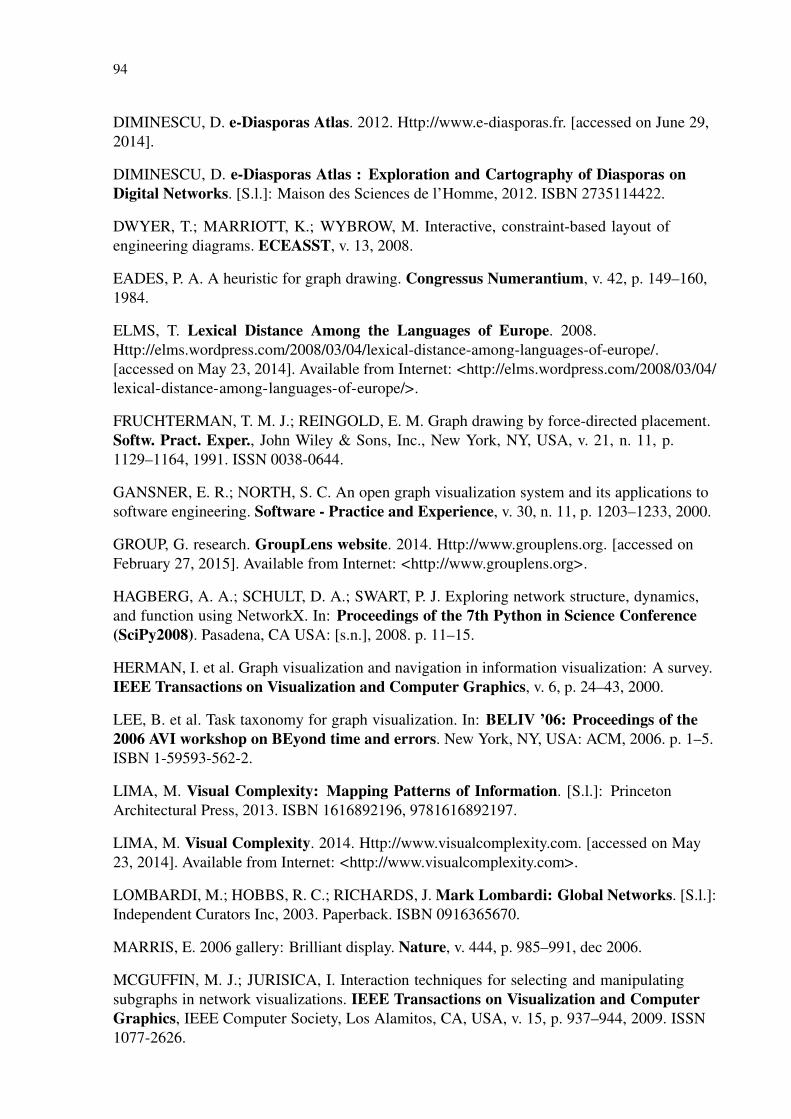
94
DIMINESCU, D. e-Diasporas Atlas. 2012. Http://www.e-diasporas.fr. [accessed on June 29,2014].
DIMINESCU, D. e-Diasporas Atlas : Exploration and Cartography of Diasporas onDigital Networks. [S.l.]: Maison des Sciences de l’Homme, 2012. ISBN 2735114422.
DWYER, T.; MARRIOTT, K.; WYBROW, M. Interactive, constraint-based layout ofengineering diagrams. ECEASST, v. 13, 2008.
EADES, P. A. A heuristic for graph drawing. Congressus Numerantium, v. 42, p. 149–160,1984.
ELMS, T. Lexical Distance Among the Languages of Europe. 2008.Http://elms.wordpress.com/2008/03/04/lexical-distance-among-languages-of-europe/.[accessed on May 23, 2014]. Available from Internet: <http://elms.wordpress.com/2008/03/04/lexical-distance-among-languages-of-europe/>.
FRUCHTERMAN, T. M. J.; REINGOLD, E. M. Graph drawing by force-directed placement.Softw. Pract. Exper., John Wiley & Sons, Inc., New York, NY, USA, v. 21, n. 11, p.1129–1164, 1991. ISSN 0038-0644.
GANSNER, E. R.; NORTH, S. C. An open graph visualization system and its applications tosoftware engineering. Software - Practice and Experience, v. 30, n. 11, p. 1203–1233, 2000.
GROUP, G. research. GroupLens website. 2014. Http://www.grouplens.org. [accessed onFebruary 27, 2015]. Available from Internet: <http://www.grouplens.org>.
HAGBERG, A. A.; SCHULT, D. A.; SWART, P. J. Exploring network structure, dynamics,and function using NetworkX. In: Proceedings of the 7th Python in Science Conference(SciPy2008). Pasadena, CA USA: [s.n.], 2008. p. 11–15.
HERMAN, I. et al. Graph visualization and navigation in information visualization: A survey.IEEE Transactions on Visualization and Computer Graphics, v. 6, p. 24–43, 2000.
LEE, B. et al. Task taxonomy for graph visualization. In: BELIV ’06: Proceedings of the2006 AVI workshop on BEyond time and errors. New York, NY, USA: ACM, 2006. p. 1–5.ISBN 1-59593-562-2.
LIMA, M. Visual Complexity: Mapping Patterns of Information. [S.l.]: PrincetonArchitectural Press, 2013. ISBN 1616892196, 9781616892197.
LIMA, M. Visual Complexity. 2014. Http://www.visualcomplexity.com. [accessed on May23, 2014]. Available from Internet: <http://www.visualcomplexity.com>.
LOMBARDI, M.; HOBBS, R. C.; RICHARDS, J. Mark Lombardi: Global Networks. [S.l.]:Independent Curators Inc, 2003. Paperback. ISBN 0916365670.
MARRIS, E. 2006 gallery: Brilliant display. Nature, v. 444, p. 985–991, dec 2006.
MCGUFFIN, M. J.; JURISICA, I. Interaction techniques for selecting and manipulatingsubgraphs in network visualizations. IEEE Transactions on Visualization and ComputerGraphics, IEEE Computer Society, Los Alamitos, CA, USA, v. 15, p. 937–944, 2009. ISSN1077-2626.
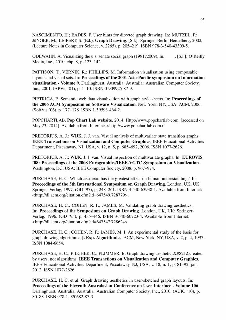
95
NASCIMENTO, H.; EADES, P. User hints for directed graph drawing. In: MUTZEL, P.;JüNGER, M.; LEIPERT, S. (Ed.). Graph Drawing. [S.l.]: Springer Berlin Heidelberg, 2002,(Lecture Notes in Computer Science, v. 2265). p. 205–219. ISBN 978-3-540-43309-5.
ODEWAHN, A. Visualizing the u.s. senate social graph (1991?2009). In: . [S.l.]: O’ReillyMedia, Inc., 2010. chp. 8, p. 123–142.
PATTISON, T.; VERNIK, R.; PHILLIPS, M. Information visualisation using composablelayouts and visual sets. In: Proceedings of the 2001 Asia-Pacific symposium on Informationvisualisation - Volume 9. Darlinghurst, Australia, Australia: Australian Computer Society,Inc., 2001. (APVis ’01), p. 1–10. ISBN 0-909925-87-9.
PIETRIGA, E. Semantic web data visualization with graph style sheets. In: Proceedings ofthe 2006 ACM Symposium on Software Visualization. New York, NY, USA: ACM, 2006.(SoftVis ’06), p. 177–178. ISBN 1-59593-464-2.
POPCHARTLAB. Pop Chart Lab website. 2014. Http://www.popchartlab.com. [accessed onMay 23, 2014]. Available from Internet: <http://www.popchartlab.com>.
PRETORIUS, A. J.; WIJK, J. J. van. Visual analysis of multivariate state transition graphs.IEEE Transactions on Visualization and Computer Graphics, IEEE Educational ActivitiesDepartment, Piscataway, NJ, USA, v. 12, n. 5, p. 685–692, 2006. ISSN 1077-2626.
PRETORIUS, A. J.; WIJK, J. J. van. Visual inspection of multivariate graphs. In: EUROVIS’08: Proceedings of the 2008 Eurographics/IEEE-VGTC Symposium on Visualization.Washington, DC, USA: IEEE Computer Society, 2008. p. 967–974.
PURCHASE, H. C. Which aesthetic has the greatest effect on human understanding? In:Proceedings of the 5th International Symposium on Graph Drawing. London, UK, UK:Springer-Verlag, 1997. (GD ’97), p. 248–261. ISBN 3-540-63938-1. Available from Internet:<http://dl.acm.org/citation.cfm?id=647549.728779>.
PURCHASE, H. C.; COHEN, R. F.; JAMES, M. Validating graph drawing aesthetics.In: Proceedings of the Symposium on Graph Drawing. London, UK, UK: Springer-Verlag, 1996. (GD ’95), p. 435–446. ISBN 3-540-60723-4. Available from Internet:<http://dl.acm.org/citation.cfm?id=647547.728624>.
PURCHASE, H. C.; COHEN, R. F.; JAMES, M. I. An experimental study of the basis forgraph drawing algorithms. J. Exp. Algorithmics, ACM, New York, NY, USA, v. 2, p. 4, 1997.ISSN 1084-6654.
PURCHASE, H. C.; PILCHER, C.; PLIMMER, B. Graph drawing aesthetics—createdby users, not algorithms. IEEE Transactions on Visualization and Computer Graphics,IEEE Educational Activities Department, Piscataway, NJ, USA, v. 18, n. 1, p. 81–92, jan.2012. ISSN 1077-2626.
PURCHASE, H. C. et al. Graph drawing aesthetics in user-sketched graph layouts. In:Proceedings of the Eleventh Australasian Conference on User Interface - Volume 106.Darlinghurst, Australia, Australia: Australian Computer Society, Inc., 2010. (AUIC ’10), p.80–88. ISBN 978-1-920682-87-3.
96
RICHE, N. H. et al. Exploring the design space of interactive link curvature in networkdiagrams. In: Proceedings of the International Working Conference on AdvancedVisual Interfaces. New York, NY, USA: ACM, 2012. (AVI ’12), p. 506–513. ISBN978-1-4503-1287-5.
RYALL, K.; MARKS, J.; SHIEBER, S. An interactive constraint-based system for drawinggraphs. In: Proceedings of the 10th Annual ACM Symposium on User InterfaceSoftware and Technology. New York, NY, USA: ACM, 1997. (UIST ’97), p. 97–104. ISBN0-89791-881-9.
SAMARA, T. Making and Breaking the Grid. [S.l.]: Rockport Publishers, 2005. 208 p.ISBN 9781592531257.
SCHMIDT, S. et al. A set of multi-touch graph interaction techniques. In: ACM InternationalConference on Interactive Tabletops and Surfaces. New York, NY, USA: ACM, 2010. (ITS’10), p. 113–116. ISBN 978-1-4503-0399-6.
SHANNON, P. et al. Cytoscape. 2003. Http://www.cytoscape.org. [accessed on June 29,2014].
SHNEIDERMAN, B.; ARIS, A. Network visualization by semantic substrates. IEEETransactions on Visualization and Computer Graphics, IEEE Educational ActivitiesDepartment, Piscataway, NJ, USA, v. 12, n. 5, p. 733–740, 2006. ISSN 1077-2626.
SMITH, M. A. et al. NodeXL: a free and open network overview, discovery andexploration add-in for Excel 2007/2010. 2010. Http://nodexl.codeplex.com/ from the SocialMedia Research Foundation, http://www.smrfoundation.org. [accessed on June 29, 2014].
SPRITZER, A. et al. Towards a smooth design process for static communicative node-linkdiagrams. Computer Graphics Forum (Proc. EuroVis 2015), 2015. [to appear].
SPRITZER, A. S.; FREITAS, C. M. D. S. A physics-based approach for interactivemanipulation of graph visualizations. In: Proceedings of the Working Conference onAdvanced Visual Interfaces. New York, NY, USA: ACM, 2008. (AVI ’08), p. 271–278. ISBN978-1-60558-141-5.
SPRITZER, A. S.; FREITAS, C. M. D. S. Design and evaluation of magnetviz - a graphvisualization tool. IEEE Transactions on Visualization and Computer Graphics, IEEEComputer Society, Los Alamitos, CA, USA, v. 18, n. 5, p. 822–835, 2012. ISSN 1077-2626.
STEELE, J.; ILIINSKY, N. Beautiful Visualization: Looking at Data Through the Eyes ofExperts. 1st. ed. [S.l.]: O’Reilly Media, Inc., 2010. ISBN 1449379869, 9781449379865.
SUGIYAMA, K.; MISUE, K. Graph Drawing by Magnetic-Spring Model. [S.l.], 1994.
SUGIYAMA, K.; MISUE, K. A simple and unified method for drawing graphs: Magnetic-spring algorithm. In: GD ’94: Proceedings of the DIMACS International Workshop onGraph Drawing. London, UK: Springer-Verlag, 1995. p. 364–375. ISBN 3-540-58950-3.
TAMASSIA, R. Handbook of Graph Drawing and Visualization. Boca Raton, FL: CRCPress, 2014.

97
TUNKELANG, D. A Numerical Optimization Approach to General Graph Drawing.Thesis (PhD) — School of Computer Science, Carnegie Mellon University, 1999.
VERLET, L. Computer "experiments" on classical fluids. i. thermodynamical properties oflennard-jones molecules. Phys. Rev., American Physical Society, v. 159, n. 1, p. 98, Jul 1967.
WARE, C. et al. Cognitive measurements of graph aesthetics. Information Visualization,Palgrave Macmillan, v. 1, n. 2, p. 103–110, jun. 2002. ISSN 1473-8716.
WATTENBERG, M. Visual exploration of multivariate graphs. In: CHI ’06: Proceedings ofthe SIGCHI conference on Human Factors in computing systems. New York, NY, USA:ACM, 2006. p. 811–819. ISBN 1-59593-372-7.
WONG, N.; CARPENDALE, S. Supporting interactive graph exploration using edge plucking.In: Society of Photo-Optical Instrumentation Engineers (SPIE) Conference Series. [S.l.:s.n.], 2007. (Society of Photo-Optical Instrumentation Engineers (SPIE) Conference Series,v. 6495).
WONG, N.; CARPENDALE, S.; GREENBERG, S. Edgelens: an interactive methodfor managing edge congestion in graphs. In: Proceedings of the Ninth annual IEEEconference on Information visualization. Washington, DC, USA: IEEE ComputerSociety, 2003. (INFOVIS’03), p. 51–58. ISBN 0-7803-8154-8. Available from Internet:<http://dl.acm.org/citation.cfm?id=1947368.1947382>.
YED. 2014. Http://www.yworks.com/yed. [accessed on June 29, 2014].

98
APPENDIX A USING THE GRAPHCOIFFURE PROTOTYPE
The following sections describe in detail all features of the GraphCoiffure prototype.
A.1 User interface
GraphCoiffure’s user interface, shown in Figure A.1, consists of the following elements:
menu bar, workspace, node and edge selection panels, and stylesheet editor.
The menu bar gives users access to most of the system’s functionality. It consists of the
following menus: File, Workspace, Selection, Layout, and Appearance.
The GraphCoiffure workspace consists of a virtual page containing a WYSIWYG node-link
view of a graph loaded from a GraphML file. If the file already includes layout information (i.e.,
node positions), it is used to draw the graph; otherwise the Fruchterman-Reingold force-directed
algorithm (FRUCHTERMAN; REINGOLD, 1991) is used to generate the initial visualization.
Layout information can be read from GraphML files if the position of each node is encoded
as a “pos” attribute formatted as “x, y” (e.g., <data key=“pos”>790,65</data>) in the node’s
respective tag. Workspace size is automatically computed when the graph is loaded, but can
be manually redefined by the users with the corresponding option in the Workspace menu.
Zooming in or out is performed with the mouse wheel, while panning the view is done with the
scrollbars.
Clicking on an item in the workspace will select it and movable items (such as nodes)
can be repositioned by clicking and dragging. Multiple items can be selected by holding the
control key and clicking on the desired objects or by clicking on an empty area and dragging
to activate a rubber band selector box. To make sure only items of certain types are selected,
selection filters can be turned on or off by checking or unchecking the respective options on
the Selection menu. Selected objects can be identified by a bounding rectangle that will appear
around them. Multiple selected items can be moved around by clicking and dragging on any
of the items. Special topology-based node selection tools are also accessible from the Selection
menu, allowing users to select the neighbors of currently selected nodes, add the neighbors of
the currently selected nodes to the current selection, or select the connected components of the
currently selected nodes.
The node and edge selection panels (Figure A.2) provide an alternative, content-based way
to select nodes and edges, allowing for semantics-based operations. These panels contain tables
that show the attributes and some useful properties (e.g., degree, connected component, size of
99
Figure A.1: The GraphCoiffure prototype’s graphical user interface.
Figure A.2: Selection panels
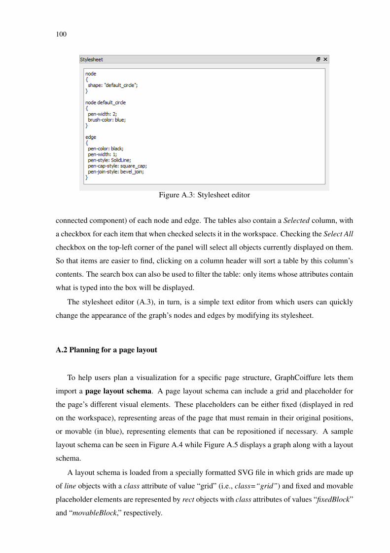
100
Figure A.3: Stylesheet editor
connected component) of each node and edge. The tables also contain a Selected column, with
a checkbox for each item that when checked selects it in the workspace. Checking the Select All
checkbox on the top-left corner of the panel will select all objects currently displayed on them.
So that items are easier to find, clicking on a column header will sort a table by this column’s
contents. The search box can also be used to filter the table: only items whose attributes contain
what is typed into the box will be displayed.
The stylesheet editor (A.3), in turn, is a simple text editor from which users can quickly
change the appearance of the graph’s nodes and edges by modifying its stylesheet.
A.2 Planning for a page layout
To help users plan a visualization for a specific page structure, GraphCoiffure lets them
import a page layout schema. A page layout schema can include a grid and placeholder for
the page’s different visual elements. These placeholders can be either fixed (displayed in red
on the workspace), representing areas of the page that must remain in their original positions,
or movable (in blue), representing elements that can be repositioned if necessary. A sample
layout schema can be seen in Figure A.4 while Figure A.5 displays a graph along with a layout
schema.
A layout schema is loaded from a specially formatted SVG file in which grids are made up
of line objects with a class attribute of value “grid” (i.e., class=“grid”) and fixed and movable
placeholder elements are represented by rect objects with class attributes of values “fixedBlock”
and “movableBlock,” respectively.
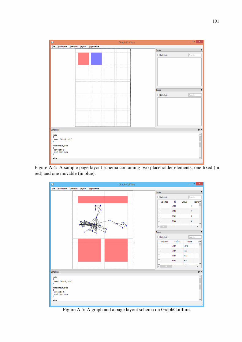
101
Figure A.4: A sample page layout schema containing two placeholder elements, one fixed (inred) and one movable (in blue).
Figure A.5: A graph and a page layout schema on GraphCoiffure.
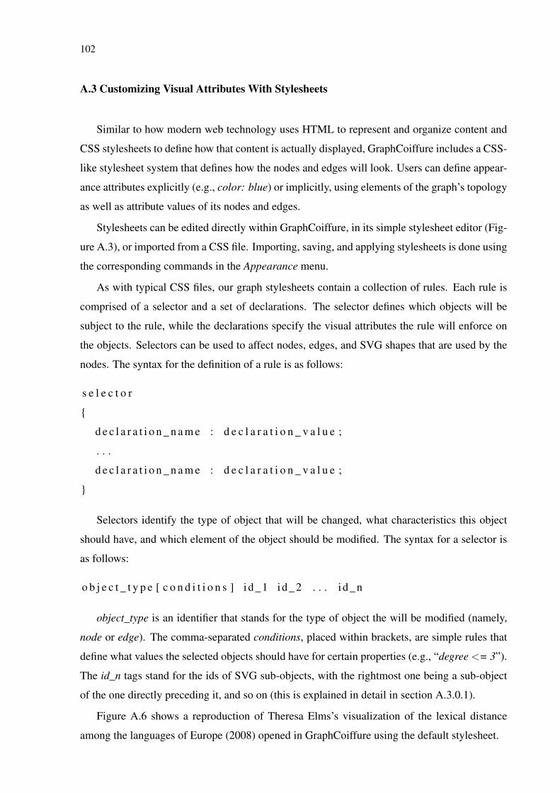
102
A.3 Customizing Visual Attributes With Stylesheets
Similar to how modern web technology uses HTML to represent and organize content and
CSS stylesheets to define how that content is actually displayed, GraphCoiffure includes a CSS-
like stylesheet system that defines how the nodes and edges will look. Users can define appear-
ance attributes explicitly (e.g., color: blue) or implicitly, using elements of the graph’s topology
as well as attribute values of its nodes and edges.
Stylesheets can be edited directly within GraphCoiffure, in its simple stylesheet editor (Fig-
ure A.3), or imported from a CSS file. Importing, saving, and applying stylesheets is done using
the corresponding commands in the Appearance menu.
As with typical CSS files, our graph stylesheets contain a collection of rules. Each rule is
comprised of a selector and a set of declarations. The selector defines which objects will be
subject to the rule, while the declarations specify the visual attributes the rule will enforce on
the objects. Selectors can be used to affect nodes, edges, and SVG shapes that are used by the
nodes. The syntax for the definition of a rule is as follows:
s e l e c t o r
{
d e c l a r a t i o n _ n a m e : d e c l a r a t i o n _ v a l u e ;
. . .
d e c l a r a t i o n _ n a m e : d e c l a r a t i o n _ v a l u e ;
}
Selectors identify the type of object that will be changed, what characteristics this object
should have, and which element of the object should be modified. The syntax for a selector is
as follows:
o b j e c t _ t y p e [ c o n d i t i o n s ] i d_1 id_2 . . . i d_n
object_type is an identifier that stands for the type of object the will be modified (namely,
node or edge). The comma-separated conditions, placed within brackets, are simple rules that
define what values the selected objects should have for certain properties (e.g., “degree <= 3”).
The id_n tags stand for the ids of SVG sub-objects, with the rightmost one being a sub-object
of the one directly preceding it, and so on (this is explained in detail in section A.3.0.1).
Figure A.6 shows a reproduction of Theresa Elms’s visualization of the lexical distance
among the languages of Europe (2008) opened in GraphCoiffure using the default stylesheet.
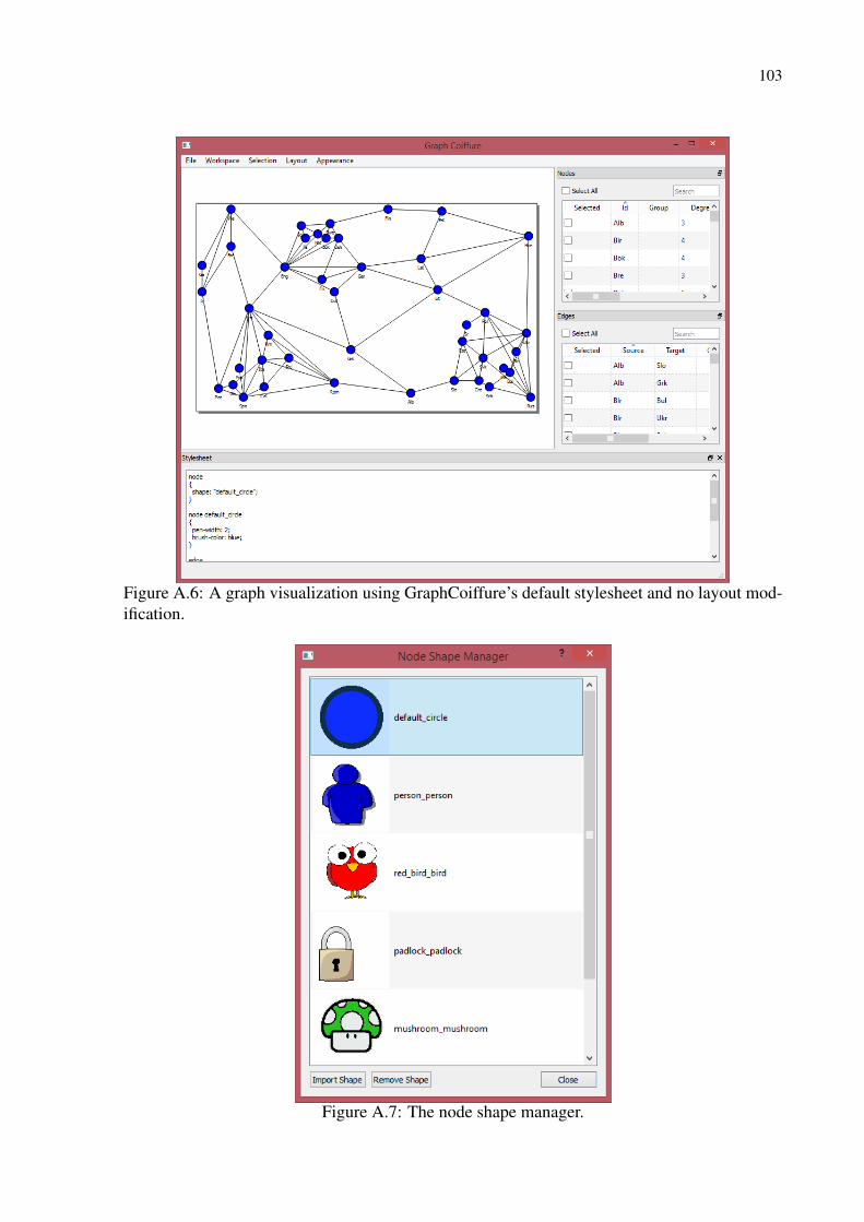
103
Figure A.6: A graph visualization using GraphCoiffure’s default stylesheet and no layout mod-ification.
Figure A.7: The node shape manager.
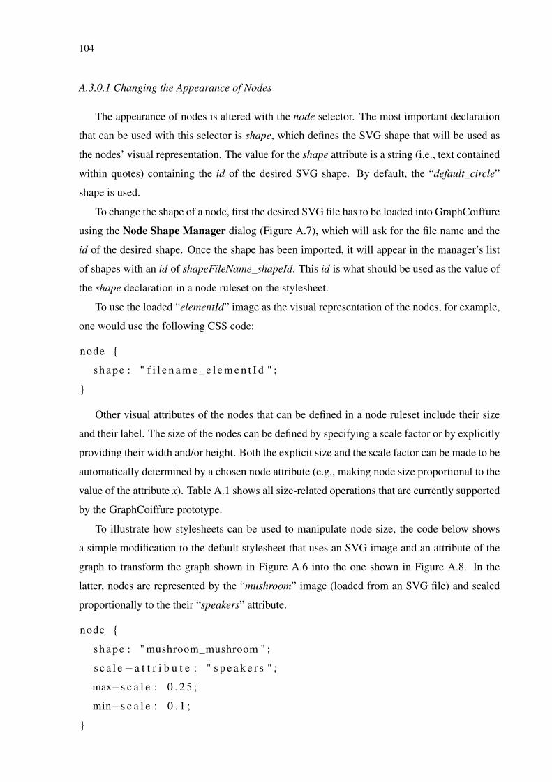
104
A.3.0.1 Changing the Appearance of Nodes
The appearance of nodes is altered with the node selector. The most important declaration
that can be used with this selector is shape, which defines the SVG shape that will be used as
the nodes’ visual representation. The value for the shape attribute is a string (i.e., text contained
within quotes) containing the id of the desired SVG shape. By default, the “default_circle”
shape is used.
To change the shape of a node, first the desired SVG file has to be loaded into GraphCoiffure
using the Node Shape Manager dialog (Figure A.7), which will ask for the file name and the
id of the desired shape. Once the shape has been imported, it will appear in the manager’s list
of shapes with an id of shapeFileName_shapeId. This id is what should be used as the value of
the shape declaration in a node ruleset on the stylesheet.
To use the loaded “elementId” image as the visual representation of the nodes, for example,
one would use the following CSS code:
node {
shape : " f i l e n a m e _ e l e m e n t I d " ;
}
Other visual attributes of the nodes that can be defined in a node ruleset include their size
and their label. The size of the nodes can be defined by specifying a scale factor or by explicitly
providing their width and/or height. Both the explicit size and the scale factor can be made to be
automatically determined by a chosen node attribute (e.g., making node size proportional to the
value of the attribute x). Table A.1 shows all size-related operations that are currently supported
by the GraphCoiffure prototype.
To illustrate how stylesheets can be used to manipulate node size, the code below shows
a simple modification to the default stylesheet that uses an SVG image and an attribute of the
graph to transform the graph shown in Figure A.6 into the one shown in Figure A.8. In the
latter, nodes are represented by the “mushroom” image (loaded from an SVG file) and scaled
proportionally to the their “speakers” attribute.
node {
shape : " mushroom_mushroom " ;
s c a l e −a t t r i b u t e : " s p e a k e r s " ;
max−s c a l e : 0 . 2 5 ;
min−s c a l e : 0 . 1 ;
}
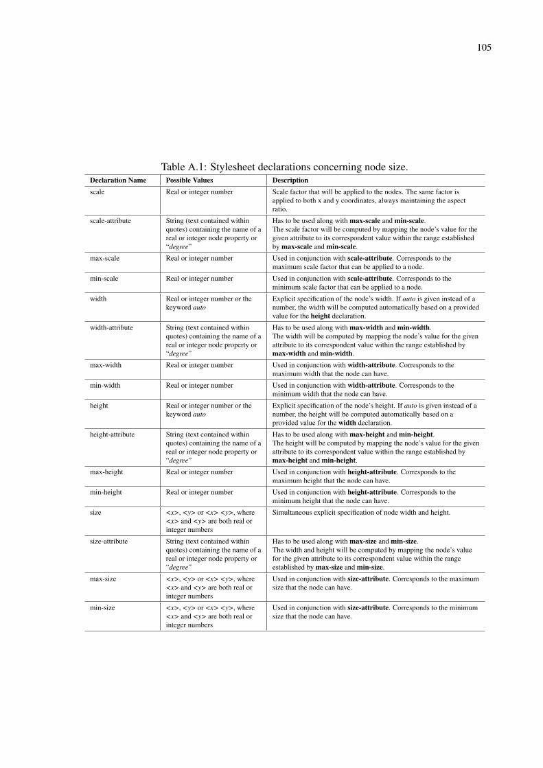
105
Table A.1: Stylesheet declarations concerning node size.Declaration Name Possible Values Descriptionscale Real or integer number Scale factor that will be applied to the nodes. The same factor is
applied to both x and y coordinates, always maintaining the aspectratio.
scale-attribute String (text contained withinquotes) containing the name of areal or integer node property or“degree”
Has to be used along with max-scale and min-scale.The scale factor will be computed by mapping the node’s value for thegiven attribute to its correspondent value within the range establishedby max-scale and min-scale.
max-scale Real or integer number Used in conjunction with scale-attribute. Corresponds to themaximum scale factor that can be applied to a node.
min-scale Real or integer number Used in conjunction with scale-attribute. Corresponds to theminimum scale factor that can be applied to a node.
width Real or integer number or thekeyword auto
Explicit specification of the node’s width. If auto is given instead of anumber, the width will be computed automatically based on a providedvalue for the height declaration.
width-attribute String (text contained withinquotes) containing the name of areal or integer node property or“degree”
Has to be used along with max-width and min-width.The width will be computed by mapping the node’s value for the givenattribute to its correspondent value within the range established bymax-width and min-width.
max-width Real or integer number Used in conjunction with width-attribute. Corresponds to themaximum width that the node can have.
min-width Real or integer number Used in conjunction with width-attribute. Corresponds to theminimum width that the node can have.
height Real or integer number or thekeyword auto
Explicit specification of the node’s height. If auto is given instead of anumber, the height will be computed automatically based on aprovided value for the width declaration.
height-attribute String (text contained withinquotes) containing the name of areal or integer node property or“degree”
Has to be used along with max-height and min-height.The height will be computed by mapping the node’s value for the givenattribute to its correspondent value within the range established bymax-height and min-height.
max-height Real or integer number Used in conjunction with height-attribute. Corresponds to themaximum height that the node can have.
min-height Real or integer number Used in conjunction with height-attribute. Corresponds to theminimum height that the node can have.
size <x>, <y> or <x> <y>, where<x> and <y> are both real orinteger numbers
Simultaneous explicit specification of node width and height.
size-attribute String (text contained withinquotes) containing the name of areal or integer node property or“degree”
Has to be used along with max-size and min-size.The width and height will be computed by mapping the node’s valuefor the given attribute to its correspondent value within the rangeestablished by max-size and min-size.
max-size <x>, <y> or <x> <y>, where<x> and <y> are both real orinteger numbers
Used in conjunction with size-attribute. Corresponds to the maximumsize that the node can have.
min-size <x>, <y> or <x> <y>, where<x> and <y> are both real orinteger numbers
Used in conjunction with size-attribute. Corresponds to the minimumsize that the node can have.
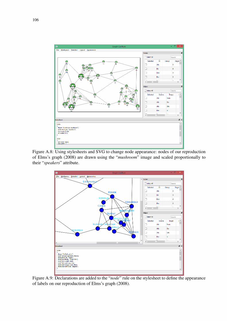
106
Figure A.8: Using stylesheets and SVG to change node appearance: nodes of our reproductionof Elms’s graph (2008) are drawn using the “mushroom” image and scaled proportionally totheir “speakers” attribute.
Figure A.9: Declarations are added to the “node” rule on the stylesheet to define the appearanceof labels on our reproduction of Elms’s graph (2008).
107
Every aspect of how node labels appear can also be defined in a node rule, from the attribute
that is used as its text to its font and alignment. As with the size declarations, the label’s color
can be set to be determined based on a node attribute. A color range is given by the user and
the property value is automatically mapped to a color within this range. Optionally, users can
also choose an easing curve for the color interpolator, with the default one being a linear curve.
Table A.2 describes all node label declarations that can be used. The following code, in turn,
uses our reproduction of Elms’s graph (2008) to illustrate how these declarations can be used in
practice, with results being shown in Figure A.9:
node {
shape : " d e f a u l t _ c i r c l e " ;
l a b e l −v e r t i c a l −a l i g n m e n t : Above ;
l a b e l −a t t r i b u t e : " name " ;
l a b e l −f o n t−f a m i l y : " T r a j a n Pro " ;
l a b e l −f o n t−we ig h t : Bold ;
l a b e l −f o n t−p o i n t−s i z e : 1 2 ;
l a b e l −c o l o r−r a n g e : cyan , b l u e ;
l a b e l −c o l o r−a t t r i b u t e : " d e g r e e " ;
}
Note that in the above snippet labels are configured to be positioned above the nodes’ visual
representations, using the nodes’ “name” attribute as their text, which is to be rendered with a
12-point boldfaced Trajan Pro font. The color of the labels, in turn, are set to be interpolated
between cyan and blue according to each node’s “degree” attribute. Since no easing curve was
specified, a default linear interpolation is used.
A.3.1 Changing the Appearance of Node Shapes
As with regular CSS files, in GraphCoiffure stylesheets, SVG elements can be accessed by
their id and have their visual attributes (i.e., their stroke and fill) changed. In the current version
of the prototype, the stroke is referred as the pen and the fill as the brush. This nomenclature
was used instead of the CSS-standard “stroke” and “fill” to simplify implementation (since
these terms match the underlying Qt-based code) and can change in subsequent iterations of the
prototype.
As with node size and label color (see section A.3.0.1), the width of the pen and the color of
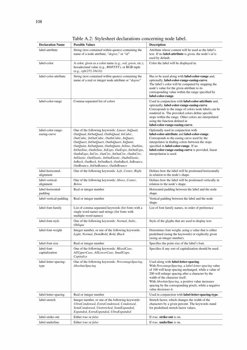
108
Table A.2: Stylesheet declarations concerning node label.Declaration Name Possible Values Descriptionlabel-attribute String (text contained within quotes) containing the
name of a node attribute, “degree,” or “id”Attribute whose content will be used as the label’stext. If no label-attribute is given, the node’s id isused by default.
label-color A color, given as a color name (e.g., red, green, etc.),hexadecimal value (e.g., #00FFFF), or RGB tuple(e.g., rgb(255,184,0))
Color the label will be displayed in.
label-color-attribute String (text contained within quotes) containing thename of a real or integer node attribute or “degree”
Has to be used along with label-color-range and,optionally, label-color-range-easing-curve.The label’s color will be computed by mapping thenode’s value for the given attribute to itscorresponding value within the range specified bylabel-color-range.
label-color-range Comma-separated list of colors Used in conjunction with label-color-attribute and,optionally, label-color-range-easing-curve.Corresponds to the range of colors node labels can berendered in. The provided colors define specificstops within the range. Other colors are interpolatedusing the function defined inlabel-color-range-easing-curve.
label-color-range-easing-curve
One of the following keywords: Linear, InQuad,OutQuad, InOutQuad, OutInQuad, InCubic,OutCubic, InOutCubic, OutInCubic, InQuart,OutQuart, InOutQuart, OutInQuart, InQuint,OutQuint, InOutQuint, OutInQuint, InSine, OutSine,InOutSine, OutInSine, InExpo, OutExpo, InOutExpo,OutInExpo, InCirc, OutCirc, InOutCirc, OutInCirc,InElastic, OutElastic, InOutElastic, OutInElastic,InBack, OutBack, InOutBack, OutInBack, InBounce,OutBounce, InOutBounce, OutInBounce
Optionally used in conjunction withlabel-color-attribute and label-color-range.Corresponds to the easing curve used by theinterpolator in finding colors between the stopsspecified in label-color-range. If nolabel-color-range-easing-curve is provided, linearinterpolation is used.
label-horizontal-alignment
One of the following keywords: Left, Center, Right Defines how the label will be positioned horizontallyin relation to the node’s shape.
label-vertical-alignment
One of the following keywords: Above, Center,Below
Defines how the label will be positioned vertically inrelation to the node’s shape.
label-horizontal-padding
Real or integer number Horizontal padding between the label and the nodeshape.
label-vertical-padding Real or integer number Vertical padding between the label and the nodeshape.
label-font-family List of comma-separated keywords (for fonts with asingle word name) and strings (for fonts withmultiple-word names)
List of font family names, in order of preference
label-font-style One of the following keywords: Normal, Italic,Oblique
Style of the glyphs that are used to display text.
label-font-weight Integer number, or one of the following keywords:Light, Normal, DemiBold, Bold, Black
Determines font weight, using a value that is eitherpredefined (using the keywords) or explicitly given(using an integer number).
label-font-size Real or integer number Specifies the point size of the label’s font.
label-font-capitalization
One of the following keywords: MixedCase,AllUpperCase, AllLowerCase, SmallCaps,Capitalize
Specifies if any sort of capitalization should be used.
label-letter-spacing-type
One of the following keywords: PercentageSpacing,AbsoluteSpacing
Used along with label-letter-spacing.With PercentageSpacing, a label-letter-spacing valueof 100 will keep spacing unchanged, while a value of200 will enlarge spacing after a character by thewidth of the character itself.With AbsoluteSpacing, a positive value increasesspacing by the corresponding pixels, while a negativevalue decreases it.
label-letter-spacing Real or integer number Used in conjunction with label-letter-spacing-type.
label-stretch Integer number, or one of the following keywords:UltraCondensed, ExtraCondensed, Condensed,SemiCondensed, Unstretched, SemiExpanded,Expanded, ExtraExpanded, UltraExpanded
Stretch factor, which changes the width of thecharacters by a given percent. The keywords standfor predefined stretch factor values.
label-strike-out Either true or false If true, strike-out is on.
label-underline Either true or false If true, underline is on.

109
both the pen and the brush can be defined explicitly or by mapping user-chosen node attributes
to values within user-given ranges. Pen and brush declarations are described in detail in tables
A.3 and A.4, respectively.
As previously mentioned, node shapes are SVG elements. They can as such be accessed by
their ids. The code snippet below shows how pen declarations can be used in our reproduction
of Elms’s graph (2008) to change the way nodes are drawn. Namely, we make their borders
thicker, set them to be drawn as dotted lines instead of straight lines, and change their color to
red. Notice that “default_circle” appears in the selector after the node keyword, indicating that
we are manipulating the SVG element that has “default_circle” as its id. Results of applying
this code on the graph can be seen in Figure A.10.
node d e f a u l t _ c i r c l e {
pen−wid th : 4 ;
pen−s t y l e : DotLine ;
pen−c o l o r : r e d ;
}
As an example of the brush declarations, the following code shows how they can be used
to change the appearance of elements of node shapes based on their SVG ids. In the code,
the “head_background” element of the “mushroom” is made to have its color dependent on
each node’s degree, interpolating among blue, white, and red. Results of the application of the
stylesheet with these modifications on Elms’s graph (2008) can be seen in Figure A.11.
node mushroom_mushroom head_background {
brush−c o l o r−a t t r i b u t e : " d e g r e e " ;
brush−c o l o r−r a n g e : b lue , whi te , r e d ;
}
A.3.2 Changing the Appearance of Edges
The edge selector is responsible for defining the appearance of edges. Since edges are lines
from a source node to a target node, edge rulesets include only pen (i.e., stroke) declarations (de-
scribed in detail in Table A.3). Support for curved and directed edges and for more customized
drawing styles may be added to GraphCoiffure in the future.
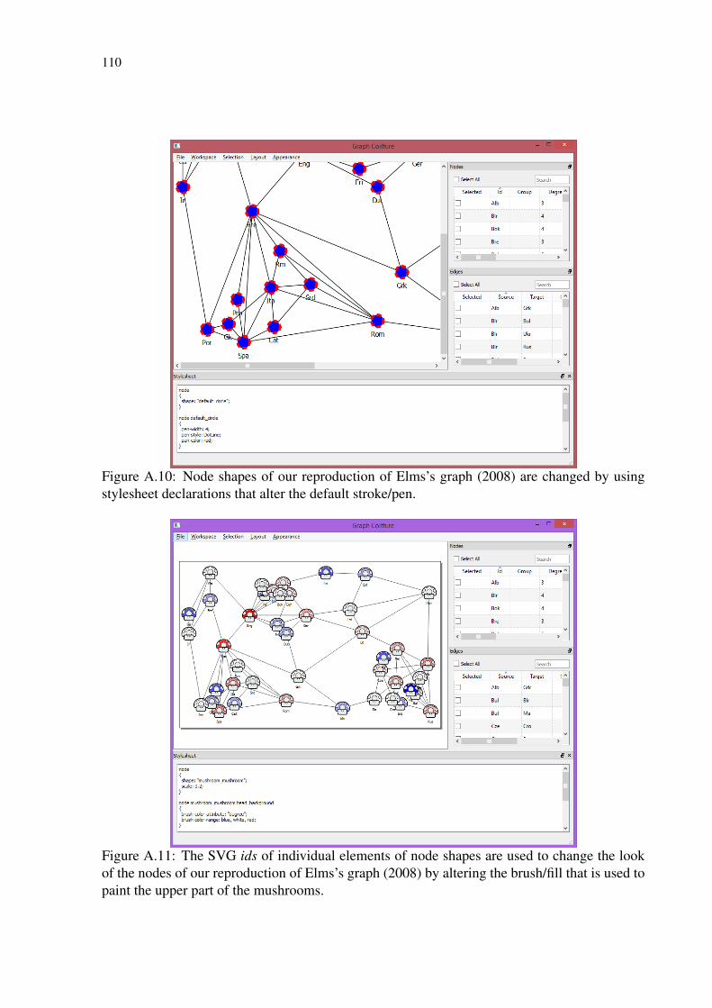
110
Figure A.10: Node shapes of our reproduction of Elms’s graph (2008) are changed by usingstylesheet declarations that alter the default stroke/pen.
Figure A.11: The SVG ids of individual elements of node shapes are used to change the lookof the nodes of our reproduction of Elms’s graph (2008) by altering the brush/fill that is used topaint the upper part of the mushrooms.
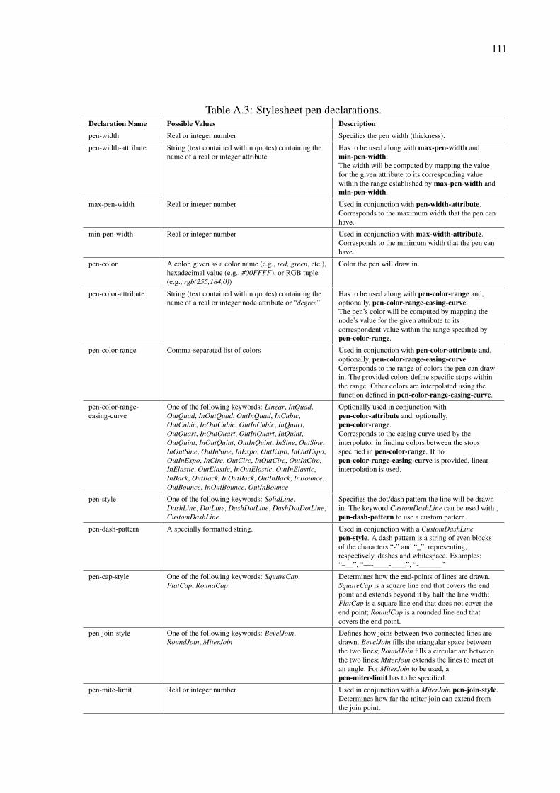
111
Table A.3: Stylesheet pen declarations.Declaration Name Possible Values Descriptionpen-width Real or integer number Specifies the pen width (thickness).
pen-width-attribute String (text contained within quotes) containing thename of a real or integer attribute
Has to be used along with max-pen-width andmin-pen-width.The width will be computed by mapping the valuefor the given attribute to its corresponding valuewithin the range established by max-pen-width andmin-pen-width.
max-pen-width Real or integer number Used in conjunction with pen-width-attribute.Corresponds to the maximum width that the pen canhave.
min-pen-width Real or integer number Used in conjunction with max-width-attribute.Corresponds to the minimum width that the pen canhave.
pen-color A color, given as a color name (e.g., red, green, etc.),hexadecimal value (e.g., #00FFFF), or RGB tuple(e.g., rgb(255,184,0))
Color the pen will draw in.
pen-color-attribute String (text contained within quotes) containing thename of a real or integer node attribute or “degree”
Has to be used along with pen-color-range and,optionally, pen-color-range-easing-curve.The pen’s color will be computed by mapping thenode’s value for the given attribute to itscorrespondent value within the range specified bypen-color-range.
pen-color-range Comma-separated list of colors Used in conjunction with pen-color-attribute and,optionally, pen-color-range-easing-curve.Corresponds to the range of colors the pen can drawin. The provided colors define specific stops withinthe range. Other colors are interpolated using thefunction defined in pen-color-range-easing-curve.
pen-color-range-easing-curve
One of the following keywords: Linear, InQuad,OutQuad, InOutQuad, OutInQuad, InCubic,OutCubic, InOutCubic, OutInCubic, InQuart,OutQuart, InOutQuart, OutInQuart, InQuint,OutQuint, InOutQuint, OutInQuint, InSine, OutSine,InOutSine, OutInSine, InExpo, OutExpo, InOutExpo,OutInExpo, InCirc, OutCirc, InOutCirc, OutInCirc,InElastic, OutElastic, InOutElastic, OutInElastic,InBack, OutBack, InOutBack, OutInBack, InBounce,OutBounce, InOutBounce, OutInBounce
Optionally used in conjunction withpen-color-attribute and, optionally,pen-color-range.Corresponds to the easing curve used by theinterpolator in finding colors between the stopsspecified in pen-color-range. If nopen-color-range-easing-curve is provided, linearinterpolation is used.
pen-style One of the following keywords: SolidLine,DashLine, DotLine, DashDotLine, DashDotDotLine,CustomDashLine
Specifies the dot/dash pattern the line will be drawnin. The keyword CustomDashLine can be used with ,pen-dash-pattern to use a custom pattern.
pen-dash-pattern A specially formatted string. Used in conjunction with a CustomDashLinepen-style. A dash pattern is a string of even blocksof the characters “-” and “_”, representing,respectively, dashes and whitespace. Examples:“–__”, “—-____-____”, “-______”
pen-cap-style One of the following keywords: SquareCap,FlatCap, RoundCap
Determines how the end-points of lines are drawn.SquareCap is a square line end that covers the endpoint and extends beyond it by half the line width;FlatCap is a square line end that does not cover theend point; RoundCap is a rounded line end thatcovers the end point.
pen-join-style One of the following keywords: BevelJoin,RoundJoin, MiterJoin
Defines how joins between two connected lines aredrawn. BevelJoin fills the triangular space betweenthe two lines; RoundJoin fills a circular arc betweenthe two lines; MiterJoin extends the lines to meet atan angle. For MiterJoin to be used, apen-miter-limit has to be specified.
pen-mite-limit Real or integer number Used in conjunction with a MiterJoin pen-join-style.Determines how far the miter join can extend fromthe join point.
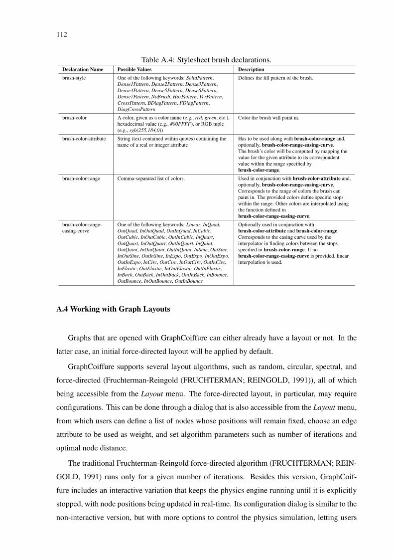
112
Table A.4: Stylesheet brush declarations.Declaration Name Possible Values Descriptionbrush-style One of the following keywords: SolidPattern,
Dense1Pattern, Dense2Pattern, Dense3Pattern,Dense4Pattern, Dense5Pattern, Dense6Pattern,Dense7Pattern, NoBrush, HorPattern, VerPattern,CrossPattern, BDiagPattern, FDiagPattern,DiagCrossPattern
Defines the fill pattern of the brush.
brush-color A color, given as a color name (e.g., red, green, etc.),hexadecimal value (e.g., #00FFFF), or RGB tuple(e.g., rgb(255,184,0))
Color the brush will paint in.
brush-color-attribute String (text contained within quotes) containing thename of a real or integer attribute
Has to be used along with brush-color-range and,optionally, brush-color-range-easing-curve.The brush’s color will be computed by mapping thevalue for the given attribute to its correspondentvalue within the range specified bybrush-color-range.
brush-color-range Comma-separated list of colors. Used in conjunction with brush-color-attribute and,optionally, brush-color-range-easing-curve.Corresponds to the range of colors the brush canpaint in. The provided colors define specific stopswithin the range. Other colors are interpolated usingthe function defined inbrush-color-range-easing-curve.
brush-color-range-easing-curve
One of the following keywords: Linear, InQuad,OutQuad, InOutQuad, OutInQuad, InCubic,OutCubic, InOutCubic, OutInCubic, InQuart,OutQuart, InOutQuart, OutInQuart, InQuint,OutQuint, InOutQuint, OutInQuint, InSine, OutSine,InOutSine, OutInSine, InExpo, OutExpo, InOutExpo,OutInExpo, InCirc, OutCirc, InOutCirc, OutInCirc,InElastic, OutElastic, InOutElastic, OutInElastic,InBack, OutBack, InOutBack, OutInBack, InBounce,OutBounce, InOutBounce, OutInBounce
Optionally used in conjunction withbrush-color-attribute and brush-color-range.Corresponds to the easing curve used by theinterpolator in finding colors between the stopsspecified in brush-color-range. If nobrush-color-range-easing-curve is provided, linearinterpolation is used.
A.4 Working with Graph Layouts
Graphs that are opened with GraphCoiffure can either already have a layout or not. In the
latter case, an initial force-directed layout will be applied by default.
GraphCoiffure supports several layout algorithms, such as random, circular, spectral, and
force-directed (Fruchterman-Reingold (FRUCHTERMAN; REINGOLD, 1991)), all of which
being accessible from the Layout menu. The force-directed layout, in particular, may require
configurations. This can be done through a dialog that is also accessible from the Layout menu,
from which users can define a list of nodes whose positions will remain fixed, choose an edge
attribute to be used as weight, and set algorithm parameters such as number of iterations and
optimal node distance.
The traditional Fruchterman-Reingold force-directed algorithm (FRUCHTERMAN; REIN-
GOLD, 1991) runs only for a given number of iterations. Besides this version, GraphCoif-
fure includes an interactive variation that keeps the physics engine running until it is explicitly
stopped, with node positions being updated in real-time. Its configuration dialog is similar to the
non-interactive version, but with more options to control the physics simulation, letting users
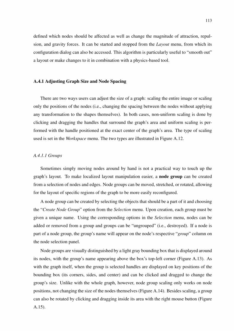
113
defined which nodes should be affected as well as change the magnitude of attraction, repul-
sion, and gravity forces. It can be started and stopped from the Layout menu, from which its
configuration dialog can also be accessed. This algorithm is particularly useful to “smooth out”
a layout or make changes to it in combination with a physics-based tool.
A.4.1 Adjusting Graph Size and Node Spacing
There are two ways users can adjust the size of a graph: scaling the entire image or scaling
only the positions of the nodes (i.e., changing the spacing between the nodes without applying
any transformation to the shapes themselves). In both cases, non-uniform scaling is done by
clicking and dragging the handles that surround the graph’s area and uniform scaling is per-
formed with the handle positioned at the exact center of the graph’s area. The type of scaling
used is set in the Workspace menu. The two types are illustrated in Figure A.12.
A.4.1.1 Groups
Sometimes simply moving nodes around by hand is not a practical way to touch up the
graph’s layout. To make localized layout manipulation easier, a node group can be created
from a selection of nodes and edges. Node groups can be moved, stretched, or rotated, allowing
for the layout of specific regions of the graph to be more easily reconfigured.
A node group can be created by selecting the objects that should be a part of it and choosing
the “Create Node Group” option from the Selection menu. Upon creation, each group must be
given a unique name. Using the corresponding options in the Selection menu, nodes can be
added or removed from a group and groups can be “ungrouped” (i.e., destroyed). If a node is
part of a node group, the group’s name will appear on the node’s respective “group” column on
the node selection panel.
Node groups are visually distinguished by a light gray bounding box that is displayed around
its nodes, with the group’s name appearing above the box’s top-left corner (Figure A.13). As
with the graph itself, when the group is selected handles are displayed on key positions of the
bounding box (its corners, sides, and center) and can be clicked and dragged to change the
group’s size. Unlike with the whole graph, however, node group scaling only works on node
positions, not changing the size of the nodes themselves (Figure A.14). Besides scaling, a group
can also be rotated by clicking and dragging inside its area with the right mouse button (Figure
A.15).
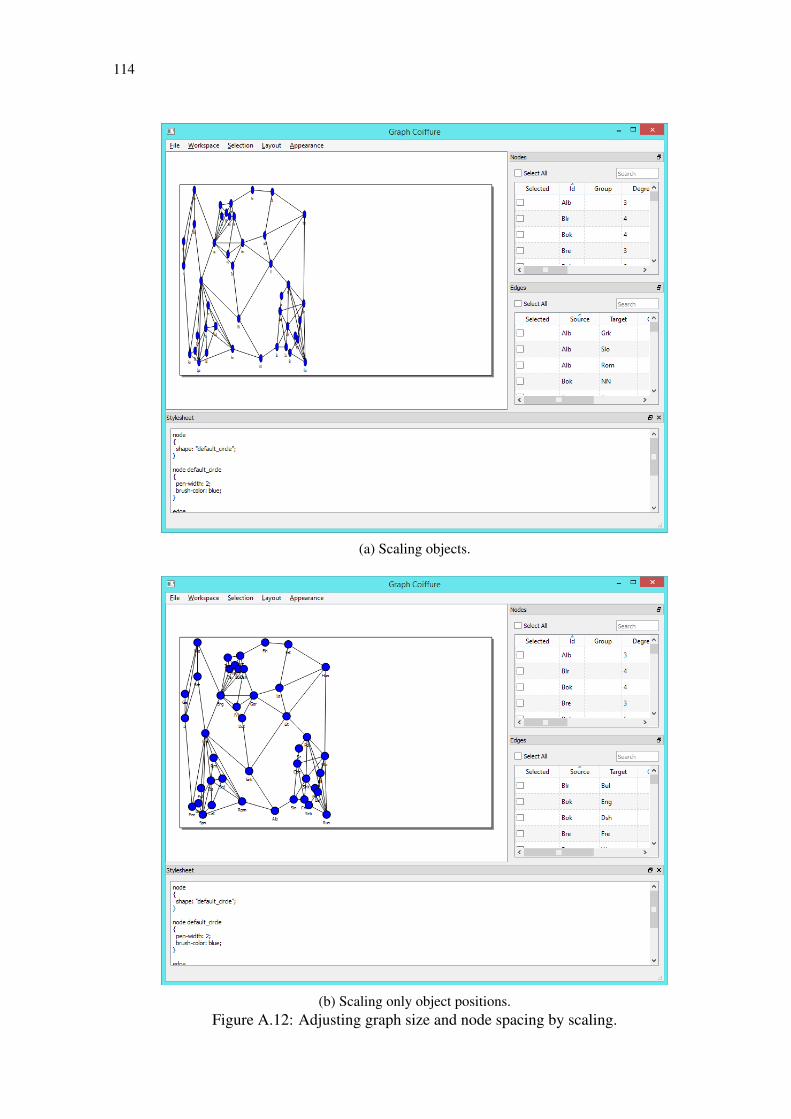
114
(a) Scaling objects.
(b) Scaling only object positions.Figure A.12: Adjusting graph size and node spacing by scaling.
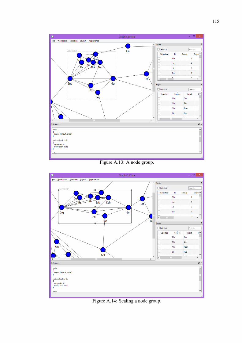
115
Figure A.13: A node group.
Figure A.14: Scaling a node group.

116
Figure A.15: Node group rotation.
Users may sometimes wish to apply a layout algorithm on a particular subgraph. This can
be done with node groups, by first selecting the group that contains the nodes of the desired
subgraph and then choosing a layout from the Layout menu. Edges to nodes outside the group
will be ignored and the new layout will use the group’s original area as a basis for its size and
position. An example of a layout algorithm applied to a node group can be seen in Figure A.16).
It is important to note that edge groups can also be created. Since the position of edges
is dependent of their nodes, however, these groups cannot be used to manipulate the layout
(i.e., they cannot be moved and rotated and their layouts cannot be altered). They can be useful,
though, for manipulating the graph’s appearance, as can be seen in section A.3. Edge groups are
displayed as red bounding boxes. Creation, destruction, and addition and removal of elements
of edge groups are analogous to these operations with node groups. An edge group can be seen
in Figure A.17.

117
Figure A.16: Application of a force-directed layout on a node group.
Figure A.17: An edge group comprising edges ‘Ger’-‘Lat’, ‘Lit’-‘Lat’, ‘Hun’-‘Lat’, and ‘Est’-‘Lat’.

118
A.4.2 Physics-based tools
GraphCoiffure offers two interactive physics-based tools to manipulate layouts: repellers
and magnets. These tools are special items that seize on a force-directed engine to affect the
graph’s layout.
Repellers make all of the nodes that are within its radius move away from it and from one
another. Once an item is outside the repeller’s radius, it ceases to be affected by it. Repellers
may be useful to unclutter regions of the graph that are particularly dense with nodes and edges,
making them easier to understand. A repeller is activated and deactivated by double-clicking
on it. Its radius can be changed from the menu or using the ’+’ and ’-’ keys when it is selected.
Upon its creation, a dialog box asks users to choose whether it will affect the entire graph or a
single node group. A repeller can be created by choosing the corresponding command from the
Layout menu. An example of a repeller in use can be seen in Figure A.18.
Magnets, in turn, attract a selection of nodes. Attracted nodes are kept from overlapping
one another by repulsion forces that are exerted on them by each node of the graph. Particularly
when used in conjunction with the interactive force-directed layout, magnets can be help users
reorganize a graph’s layout based on the attributes of the nodes and edges or any criteria users
Figure A.18: A repeller being used to create some space between nodes.
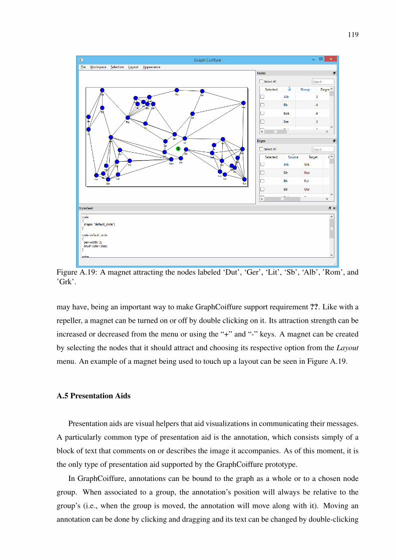
119
Figure A.19: A magnet attracting the nodes labeled ‘Dut’, ‘Ger’, ‘Lit’, ‘Sb’, ‘Alb’, ’Rom’, and’Grk’.
may have, being an important way to make GraphCoiffure support requirement ??. Like with a
repeller, a magnet can be turned on or off by double clicking on it. Its attraction strength can be
increased or decreased from the menu or using the “+” and “-” keys. A magnet can be created
by selecting the nodes that it should attract and choosing its respective option from the Layout
menu. An example of a magnet being used to touch up a layout can be seen in Figure A.19.
A.5 Presentation Aids
Presentation aids are visual helpers that aid visualizations in communicating their messages.
A particularly common type of presentation aid is the annotation, which consists simply of a
block of text that comments on or describes the image it accompanies. As of this moment, it is
the only type of presentation aid supported by the GraphCoiffure prototype.
In GraphCoiffure, annotations can be bound to the graph as a whole or to a chosen node
group. When associated to a group, the annotation’s position will always be relative to the
group’s (i.e., when the group is moved, the annotation will move along with it). Moving an
annotation can be done by clicking and dragging and its text can be changed by double-clicking
120
on it.
Annotations are created from application menu, but their styling is defined in the stylesheet
with the annotation selector. To define the appearance of annotations having a specific identifier
or belonging to a specific group, the annotation[id=<id>] and annotation[group=<group_name>]
variations of the selector are respectively used. Annotation properties include color and font
properties analogous to those of node labels. Since annotations are not directly linked to nodes
or edges, attribute-based properties are not available.
Support for other types of presentation aids, such as legends describing what different visual
attributes mean or providing indications of the location of specific nodes/edges in the visualiza-
tion, may be added in the future.
A.6 Generating the Output Image
Visualizations made with the GraphCoiffure prototype can be exported to SVG files. This
format was chosen for its flexibility. It is a vectorial (and thus resolution-independent) stan-
dard that is supported by most graphics authoring tools, facilitating modifications beyond those
possible with GraphCoiffure and being highly usable for most applications.
It is important to note that exported SVG files include only the graph and presentation aids.
Page structure schemas, group boundaries, and items such as magnets and repellers do not
appear in the generated image.
A.7 Implementation
The GraphCoiffure prototype was developed in Python 3.3 using the PySide bindings for
the C++ Qt framework. For GraphCoiffure’s graphs, the NetworkX library was used. The
stylesheet system was implemented with the TinyCSS library, while Qt’s XML classes and the
pyparsing library were used for the SVG parser. The physics engine, in turn, was implemented
using the numpy and scipy libraries.