
Style Space: How to Compare Image Sets and Follow Their Evolution
44
Style Space: How to compare image sets and follow their evolution Draft text by Lev Manovich (August 4-6, 2011). All projects and visualizations are created by members of Software Studies Initiative (credits appear under the images on Flickr) Batch image processing software: Sunsern Cheamanunkul and Jeremy Douglass. ImagePlot visualization software: Lev Manovich, Jeremy Douglass, Nadia Xiangfei Zeng. ImagePlot documentation: Tara Zepel. Statistical analysis of manga images and data: Sunsern Cheamanunkul, Bertrand Grandgeorge, Lev Manovich. Research described in this article was supported by Calit2 UCSD Division, Center for Research in Computing and the Arts (CRCA), NEH Office of Digital Humanities, and National University of Singapore. ---------------------------- style is a "...distinctive manner which permits the grouping of works into related categories." Fernie, Eric. Art History and its Methods: A critical anthology. London: Phaidon, 1995, p. 361. ----------------------------
Transcript of Style Space: How to Compare Image Sets and Follow Their Evolution
Style Space: How to compare image sets and follow their evolution Draft text by Lev Manovich (August 4-6, 2011).
All projects and visualizations are created by members of Software Studies Initiative
(credits appear under the images on Flickr)
Batch image processing software: Sunsern Cheamanunkul and Jeremy Douglass.
ImagePlot visualization software: Lev Manovich, Jeremy Douglass, Nadia Xiangfei Zeng.
ImagePlot documentation: Tara Zepel.
Statistical analysis of manga images and data: Sunsern Cheamanunkul, Bertrand
Grandgeorge, Lev Manovich.
Research described in this article was supported by Calit2 UCSD Division, Center for
Research in Computing and the Arts (CRCA), NEH Office of Digital Humanities, and
National University of Singapore.
----------------------------
style is a "...distinctive manner which permits the grouping of works into related
categories."
Fernie, Eric. Art History and its Methods: A critical anthology. London: Phaidon, 1995, p.
361.
----------------------------
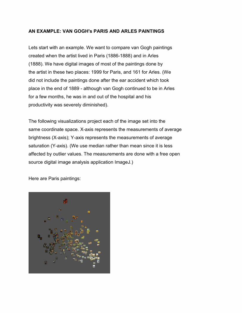
AN EXAMPLE: VAN GOGH's PARIS AND ARLES PAINTINGS
Lets start with an example. We want to compare van Gogh paintings
created when the artist lived in Paris (1886-1888) and in Arles
(1888). We have digital images of most of the paintings done by
the artist in these two places: 1999 for Paris, and 161 for Arles. (We
did not include the paintings done after the ear accident which took
place in the end of 1889 - although van Gogh continued to be in Arles
for a few months, he was in and out of the hospital and his
productivity was severely diminished).
The following visualizations project each of the image set into the
same coordinate space. X-axis represents the measurements of average
brightness (X-axis); Y-axis represents the measurements of average
saturation (Y-axis). (We use median rather than mean since it is less
affected by outlier values. The measurements are done with a free open
source digital image analysis application ImageJ.)
Here are Paris paintings:
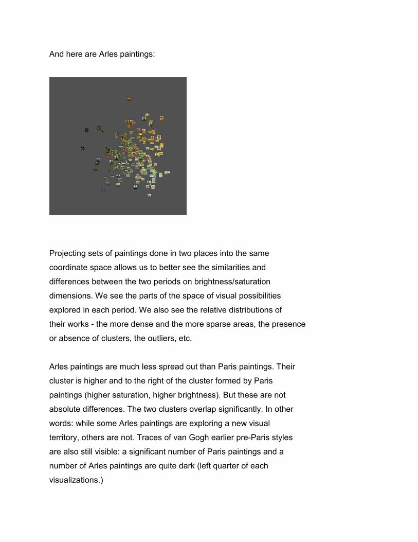
And here are Arles paintings:
Projecting sets of paintings done in two places into the same
coordinate space allows us to better see the similarities and
differences between the two periods on brightness/saturation
dimensions. We see the parts of the space of visual possibilities
explored in each period. We also see the relative distributions of
their works - the more dense and the more sparse areas, the presence
or absence of clusters, the outliers, etc.
Arles paintings are much less spread out than Paris paintings. Their
cluster is higher and to the right of the cluster formed by Paris
paintings (higher saturation, higher brightness). But these are not
absolute differences. The two clusters overlap significantly. In other
words: while some Arles paintings are exploring a new visual
territory, others are not. Traces of van Gogh earlier pre-Paris styles
are also still visible: a significant number of Paris paintings and a
number of Arles paintings are quite dark (left quarter of each
visualizations.)

STYLE SPACE: DEFINITION
A style space is a projection of quantified properties of a
set of cultural artifacts (or their parts) into a 2D place. X and Y
represent the properties (or their combinations). The position of
each artifact is determined by its values for these properties.
Since the rest of this discussion deals with images, we can rephrase
this definition as follows: A style space is a projection of
quantified visual properties of images into a 2D plane. In the
example above, X axis represents average brightness, and Y axis
represents average saturation. We can also use three visual
properties to map images in a three-dimensional space. Of course,
two or three properties can't capture all the aspect of a visual style.
Since images have many different visual properties, we can create
many 2D visualizations, each using a different combinations of
visual properties.
We are not claiming that such representations can capture all
aspects of a visual style. A "style space" representation is
a tool for exploring image sets. (It is particularly effective for
large sets.) It allows us compare all images in a set (or sets)
according to their visual values. For instance, the two
visualizations above compare van Gogh's Paris and Arles paintings
according to their average brightness and average saturation.
Separating a "style" into distinct visual dimensions and
organizing images according to their values on these dimensions
allows us to see more clearly how differences between the images
in a set. Visual differences are translated into spatial distances.
Images which are visually similar will be close; images which
are different will be further away.
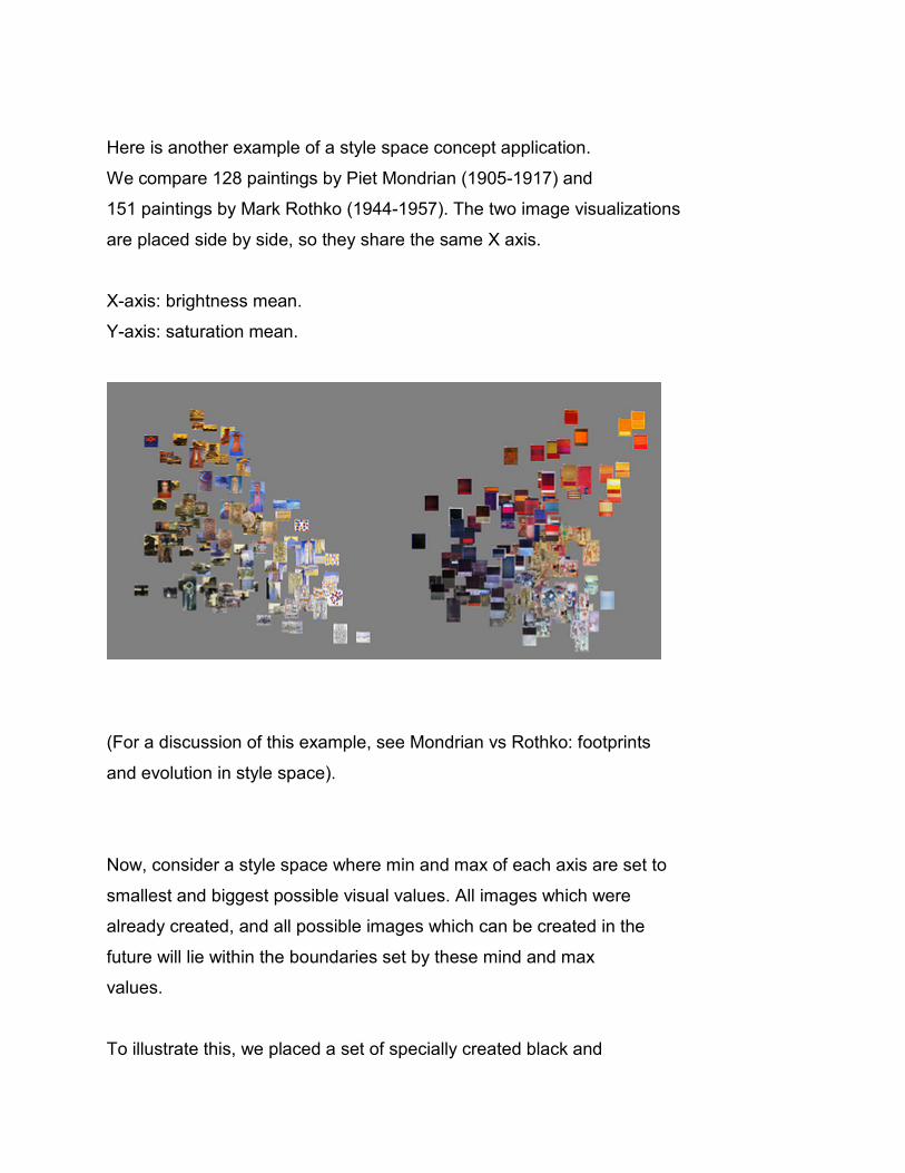
Here is another example of a style space concept application.
We compare 128 paintings by Piet Mondrian (1905-1917) and
151 paintings by Mark Rothko (1944-1957). The two image visualizations
are placed side by side, so they share the same X axis.
X-axis: brightness mean.
Y-axis: saturation mean.
(For a discussion of this example, see Mondrian vs Rothko: footprints
and evolution in style space).
Now, consider a style space where min and max of each axis are set to
smallest and biggest possible visual values. All images which were
already created, and all possible images which can be created in the
future will lie within the boundaries set by these mind and max
values.
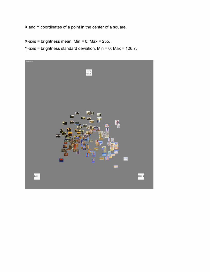
To illustrate this, we placed a set of specially created black and
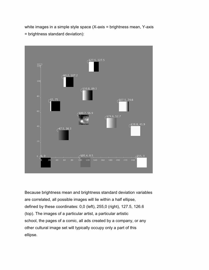
white images in a simple style space (X-axis = brightness mean, Y-axis
= brightness standard deviation):
Because brightness mean and brightness standard deviation variables
are correlated, all possible images will lie within a half ellipse,
defined by these coordinates: 0,0 (left), 255,0 (right), 127.5, 126.6
(top). The images of a particular artist, a particular artistic
school, the pages of a comic, all ads created by a company, or any
other cultural image set will typically occupy only a part of this
ellipse.
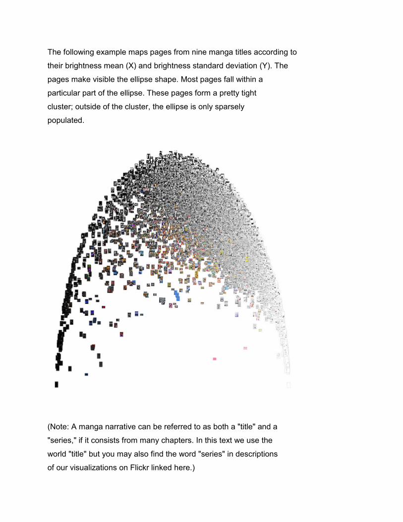
The following example maps pages from nine manga titles according to
their brightness mean (X) and brightness standard deviation (Y). The
pages make visible the ellipse shape. Most pages fall within a
particular part of the ellipse. These pages form a pretty tight
cluster; outside of the cluster, the ellipse is only sparsely
populated.
(Note: A manga narrative can be referred to as both a "title" and a
"series," if it consists from many chapters. In this text we use the
world "title" but you may also find the word "series" in descriptions
of our visualizations on Flickr linked here.)
We can refer to a particular part of a style space occupied by a set
of images as a footprint of this set. Informally, we can
characterize a footprint using its center and shape.
Formal descriptions are available in statistics. If we consider
measurements of a single visual dimension (i.e a single visual
property such as brightness mean), we can characterize their
distribution, the central tendency and the dispersion
(see http://en.wikipedia.org/wiki/Descriptive_statistics.)
If we want to analyze multiple features together, we can apply the techniques of
multivariate statistics.
FEATURES
The visualizations above use simple visual features - brightness and
saturation. Digital image processing allows us to measure images on
hundreds of other visual dimensions: colors, textures, lines, shapes,
etc. In computer science, such measurements are often called "image features."
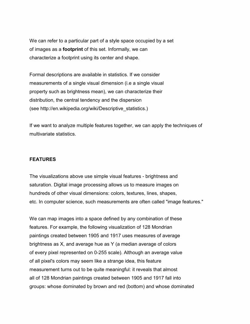
We can map images into a space defined by any combination of these
features. For example, the following visualization of 128 Mondrian
paintings created between 1905 and 1917 uses measures of average
brightness as X, and average hue as Y (a median average of colors
of every pixel represented on 0-255 scale). Although an average value
of all pixel's colors may seem like a strange idea, this feature
measurement turns out to be quite meaningful: it reveals that almost
all of 128 Mondrian paintings created between 1905 and 1917 fall into
groups: whose dominated by brown and red (bottom) and whose dominated
by blue and violet (top).
IMAGE FEATURES AND STYLE
To what extent basic properties of visual cultural artifacts (i.e.,
features) represent "dimensions" of style? In many cases, the basic
"low-level" properties correspond to "high-level" stylistic
attributes. For instance, in the case of many modern abstract artists
such as Mondrian and Rothko, measurements of color saturation and hues
are meaningful and can reveal interesting patterns in the evolution
of the artists.
Here is another example of how a low-level feature captures a
high-level style attribute. This feature is entropy
- a measure of unpredictability. If an image has lots of details
and/or textures, it will have high entropy (since it is hard to
predict the values of a pixel based on the values of its its
neighbours). If an image consists mostly from flat areas - i.e. a
singular gray tone or color without much variation or texture - it
will have low entropy.
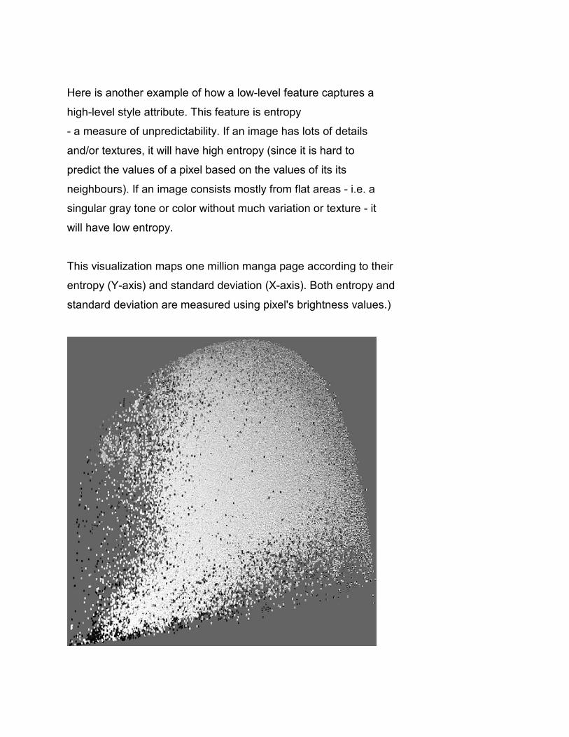
This visualization maps one million manga page according to their
entropy (Y-axis) and standard deviation (X-axis). Both entropy and
standard deviation are measured using pixel's brightness values.)
The pages in the bottom part of the visualization are the most graphic
and have the least amount of detail. The pages in the upper right have
lots of detail and texture. The pages with the highest contrast are on
the right, while pages with the least contrast are on the left. In
between these four extremes, we find every possible stylistic
variation.
In other words: the footprint of our sample of one million pages
almost completely covers the complete space of possible values in
entropy/standard deviation space. In addition, the large part of this
footprint is very dense, i.e., the distances between neighbour pages
are very tiny. We can call this dense area a "core."
This suggests that our concept of “style” as it is commonly maybe not
appropriate then we consider large cultural data sets. The concept
assumes that we can partition a set of cultural artifacts works into a
small number of discrete categories. In the case of our one million
pages set, we find practically infinite graphical variations. If we
try to divide this space into discrete stylistic categories, any such
attempt will be arbitrary."
How does the statement that "our basic concept of 'style' maybe not
appropriate then we consider large cultural data sets" we just made
fits with the concept of a "style space"? A "style space" is simply a
space of all possible values of particular visual features (either
single features or their combinations) mapped into X and Y. Since we
can measure visual properties of any images, we can represent any
image set in such a space. Such a visualization reveals if it is
meaningful to speak about a "style" shared by this image set (or its
parts), or not. If an image set is spread out across the space, we
can't talk about their distinct style. If an image sets forms a
cluster which only occupies a small part of the space, we may be able
to.
In the case of one million manga images, they completely fill the
whole range of possible values on entropy dimension (little
texture/detail - lots of texture/detail). But with Mondrian and Rothko
image sets, the paintings produced by each artist in a particular
period we are considering only cover a smaller area of
brightness/saturation space, so it is meaningful to talk about a
"style" of each period. (If we measure and visualize numbers and
characteristics of shapes in paintings of each artist produced in
their later years, the footprints will be even smaller.)
(For more details about our manga data set, see
Douglass, Jeremy, William Huber, Lev Manovich. 2011. Understanding scanlation:
how to read one million fan-translated manga pages.)
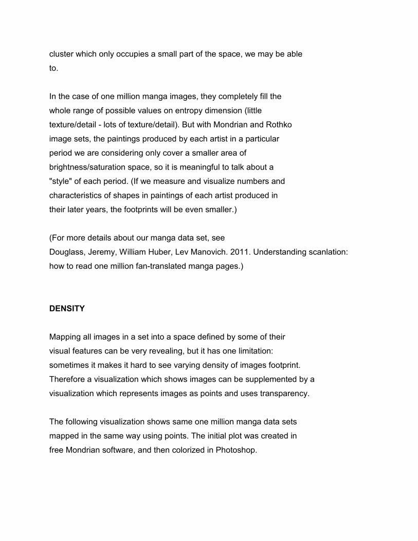
DENSITY
Mapping all images in a set into a space defined by some of their
visual features can be very revealing, but it has one limitation:
sometimes it makes it hard to see varying density of images footprint.
Therefore a visualization which shows images can be supplemented by a
visualization which represents images as points and uses transparency.
The following visualization shows same one million manga data sets
mapped in the same way using points. The initial plot was created in
free Mondrian software, and then colorized in Photoshop.
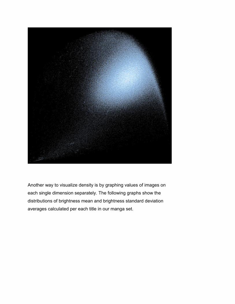
Another way to visualize density is by graphing values of images on
each single dimension separately. The following graphs show the
distributions of brightness mean and brightness standard deviation
averages calculated per each title in our manga set.
(In statistical terms, each feature is a "random variable."
The values of a single features of all images in a given set can be
descrbed using univarite statistics: measures of central tendency such as mean or
median;
measures of dispersion such as range, variance, and standard deviation;
graphs of frequency distribution.
If we can fit a data to some well-known distribution such as normal
distribution, we can characterize what we informally called
"density" more precisely using probability density function.)
(Note: when using statistics to describe measures of visual features,
we need to always be clear if we treat our image set as a
complete population or as a sample
from a larger population. For example, we can think of one million
manga pages as a sample of a larger population of all manga. In the
case of van Gogh paintings, a set of all his paintings can be taken as
a complete population.)
PATTERNS IN STYLE SPACE
if we visualize all van Gogh paintings according to their brightness
and saturation values, what is the shape of their distribution?
According to the estimates, van Gogh produced approximately 900 paintings.
The following visualization plots images of 776 paintings (%86 of
the total estimated number) which were created between 18881 and 1890.
X-axis = brightness median.
Y-axis = saturation median.
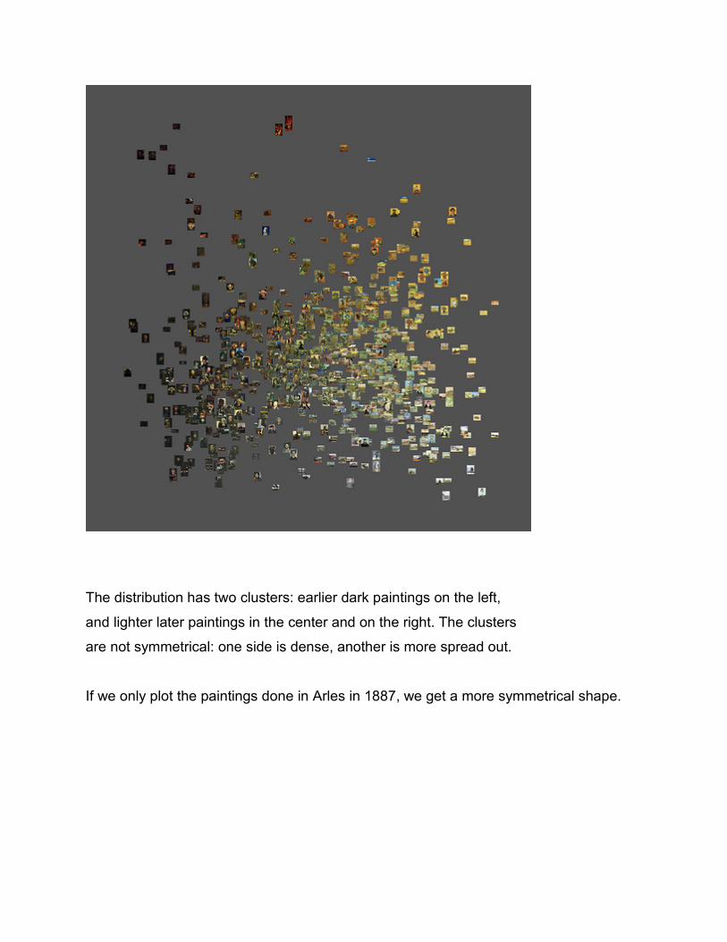
The distribution has two clusters: earlier dark paintings on the left,
and lighter later paintings in the center and on the right. The clusters
are not symmetrical: one side is dense, another is more spread out.
If we only plot the paintings done in Arles in 1887, we get a more symmetrical shape.
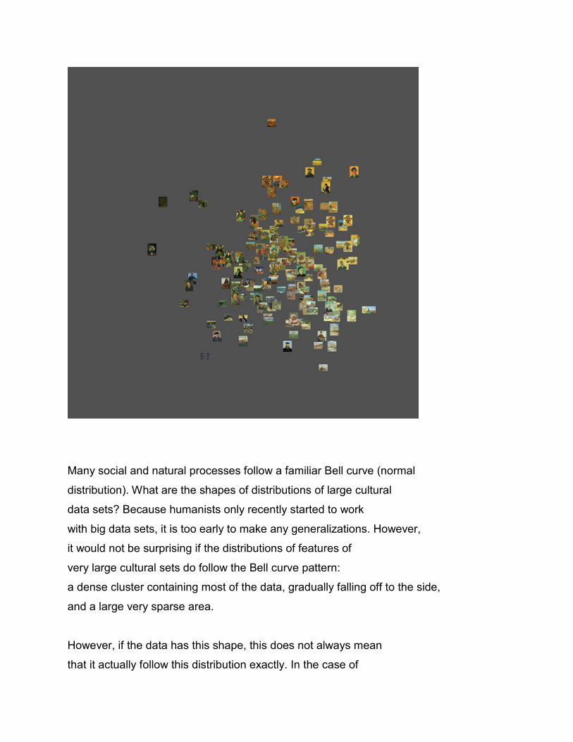
Many social and natural processes follow a familiar Bell curve (normal
distribution). What are the shapes of distributions of large cultural
data sets? Because humanists only recently started to work
with big data sets, it is too early to make any generalizations. However,
it would not be surprising if the distributions of features of
very large cultural sets do follow the Bell curve pattern:
a dense cluster containing most of the data, gradually falling off to the side,
and a large very sparse area.
However, if the data has this shape, this does not always mean
that it actually follow this distribution exactly. In the case of
one million manga pages data set we analyzed in our lab, many feature
distributions do look like a normal distribution, but normality tests show
that they are actually not. (See this graph
showing distributions of values of eight visual features for 1,074,625 manga pages.)
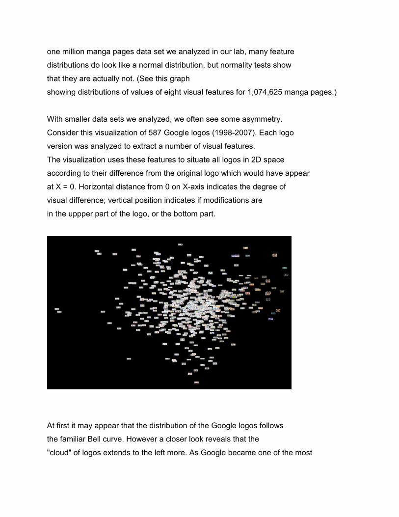
With smaller data sets we analyzed, we often see some asymmetry.
Consider this visualization of 587 Google logos (1998-2007). Each logo
version was analyzed to extract a number of visual features.
The visualization uses these features to situate all logos in 2D space
according to their difference from the original logo which would have appear
at X = 0. Horizontal distance from 0 on X-axis indicates the degree of
visual difference; vertical position indicates if modifications are
in the uppper part of the logo, or the bottom part.
At first it may appear that the distribution of the Google logos follows
the familiar Bell curve. However a closer look reveals that the
"cloud" of logos extends to the left more. As Google became one of the most
recognized brands in the world, the designers started taking more
chances with the logo, modifying it more dramatically. The function of
the Google logo changed: from identifying the company to surprising
Google users by how much designers can depart from the original logos.
These "anti-logos," so to speak, started to appear after 2007; in our
visualization they occupy the right most part, breaking the symmetry of the
previously established bell-shaped pattern of graphic variability.
VISUALIZING AN IMAGE SET IN RELATION TO A SPACE OF ALL POSSIBLE IMAGES
If we want to visually compare two or more image sets to each other in
relation to two visual properties, we can project them into a 2D space
defined by these visual properties as we did with Piet Mondrian's and
Mark Rothko's paintings in part 1. Using min and max values of the measured
properties of all images in out sets combined as the boundaries of the
visualization will allow us to use the visualization area most
efficiently.
However, if we want to understand the footprint of each image set in
relation to the absolute mix and max - i.e. lowest and highest
possible values of visual features of all possible images - we need to
map our images differently. Mix and max of X and Y in the
visualization should be set to their lowest and highest absolute
possible values. For example, if we measure brightness on 0-255 scale,
mix should be set to 0, and max should be set to 255.
The following visualizations of Mondrian and Rothko paintings uses
this idea. To make visualizations easier to see, we have added small
white squares in the corners; black text inside each square indicates
X and Y coordinates of a point in the center of a square.
X-axis = brightness mean. Min = 0; Max = 255.
Y-axis = brightness standard deviation. Min = 0; Max = 126.7.
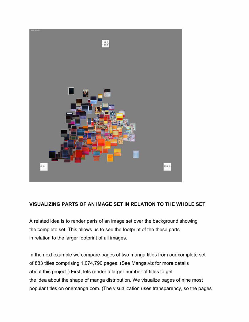
VISUALIZING PARTS OF AN IMAGE SET IN RELATION TO THE WHOLE SET
A related idea is to render parts of an image set over the background showing
the complete set. This allows us to see the footprint of the these parts
in relation to the larger footprint of all images.
In the next example we compare pages of two manga titles from our complete set
of 883 titles comprising 1,074,790 pages. (See Manga.viz for more details
about this project.) First, lets render a larger number of titles to get
the idea about the shape of manga distribution. We visualize pages of nine most
popular titles on onemanga.com. (The visualization uses transparency, so the pages
rendered first remain visible; the drawback is that the contrast of every page is
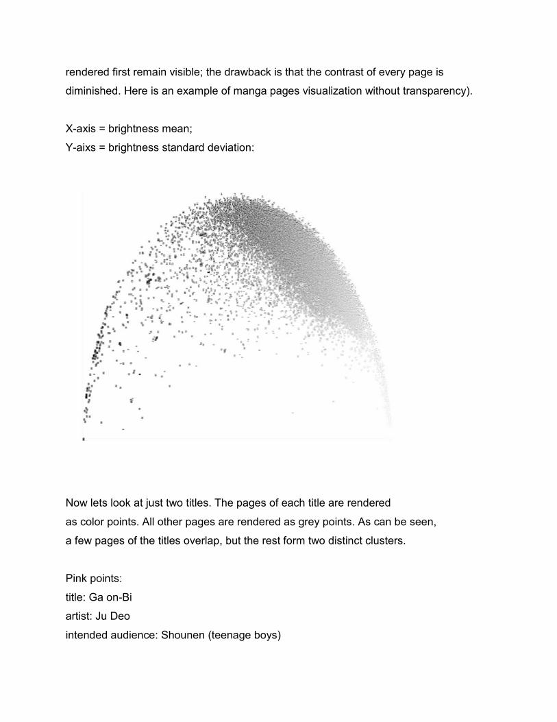
diminished. Here is an example of manga pages visualization without transparency).
X-axis = brightness mean;
Y-aixs = brightness standard deviation:
Now lets look at just two titles. The pages of each title are rendered
as color points. All other pages are rendered as grey points. As can be seen,
a few pages of the titles overlap, but the rest form two distinct clusters.
Pink points:
title: Ga on-Bi
artist: Ju Deo
intended audience: Shounen (teenage boys)
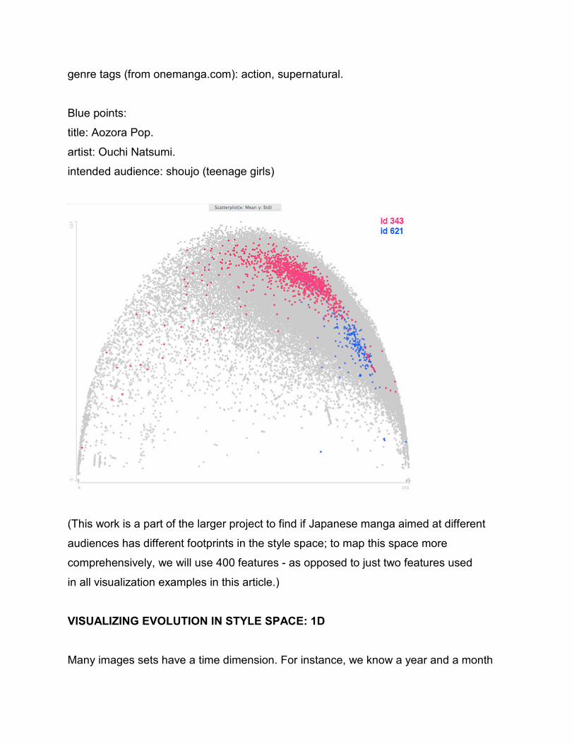
genre tags (from onemanga.com): action, supernatural.
Blue points:
title: Aozora Pop.
artist: Ouchi Natsumi.
intended audience: shoujo (teenage girls)
(This work is a part of the larger project to find if Japanese manga aimed at different
audiences has different footprints in the style space; to map this space more
comprehensively, we will use 400 features - as opposed to just two features used
in all visualization examples in this article.)
VISUALIZING EVOLUTION IN STYLE SPACE: 1D
Many images sets have a time dimension. For instance, we know a year and a month
for most of van Gogh's paintings; for manga titles, we know the position of each page in
the title sequence.
How can we see study temporal patterns across a sequences which may contain
thousands of images? We can map images positions in a sequence mapped into X-axis,
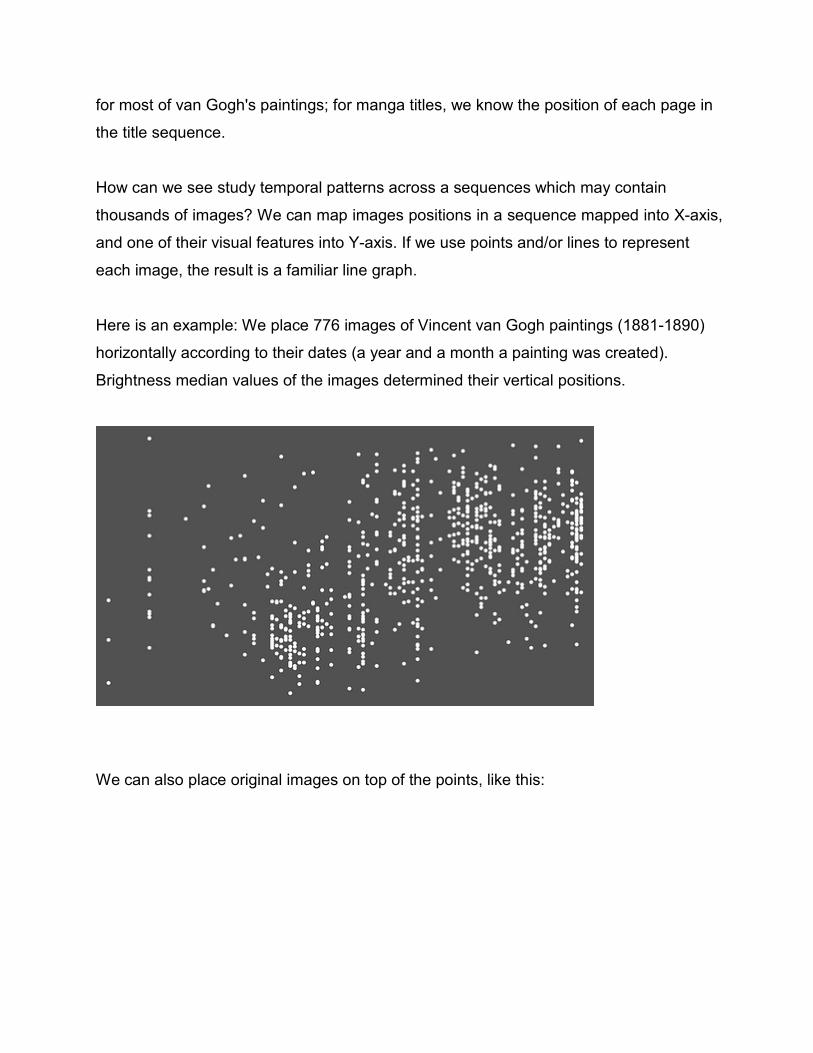
and one of their visual features into Y-axis. If we use points and/or lines to represent
each image, the result is a familiar line graph.
Here is an example: We place 776 images of Vincent van Gogh paintings (1881-1890)
horizontally according to their dates (a year and a month a painting was created).
Brightness median values of the images determined their vertical positions.
We can also place original images on top of the points, like this:
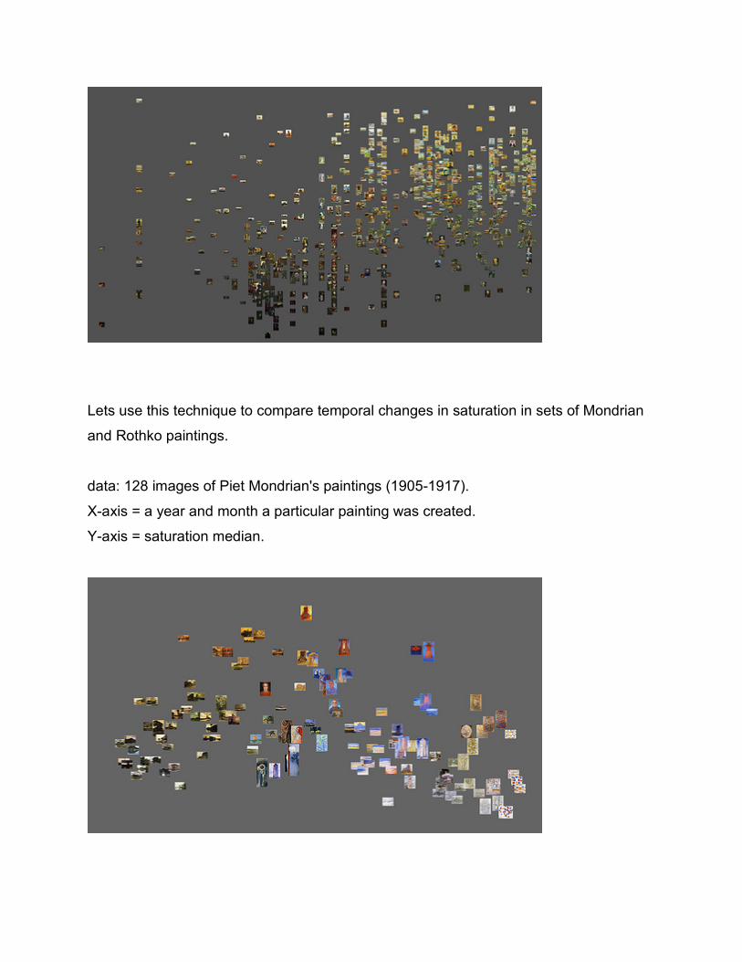
Lets use this technique to compare temporal changes in saturation in sets of Mondrian
and Rothko paintings.
data: 128 images of Piet Mondrian's paintings (1905-1917).
X-axis = a year and month a particular painting was created.
Y-axis = saturation median.
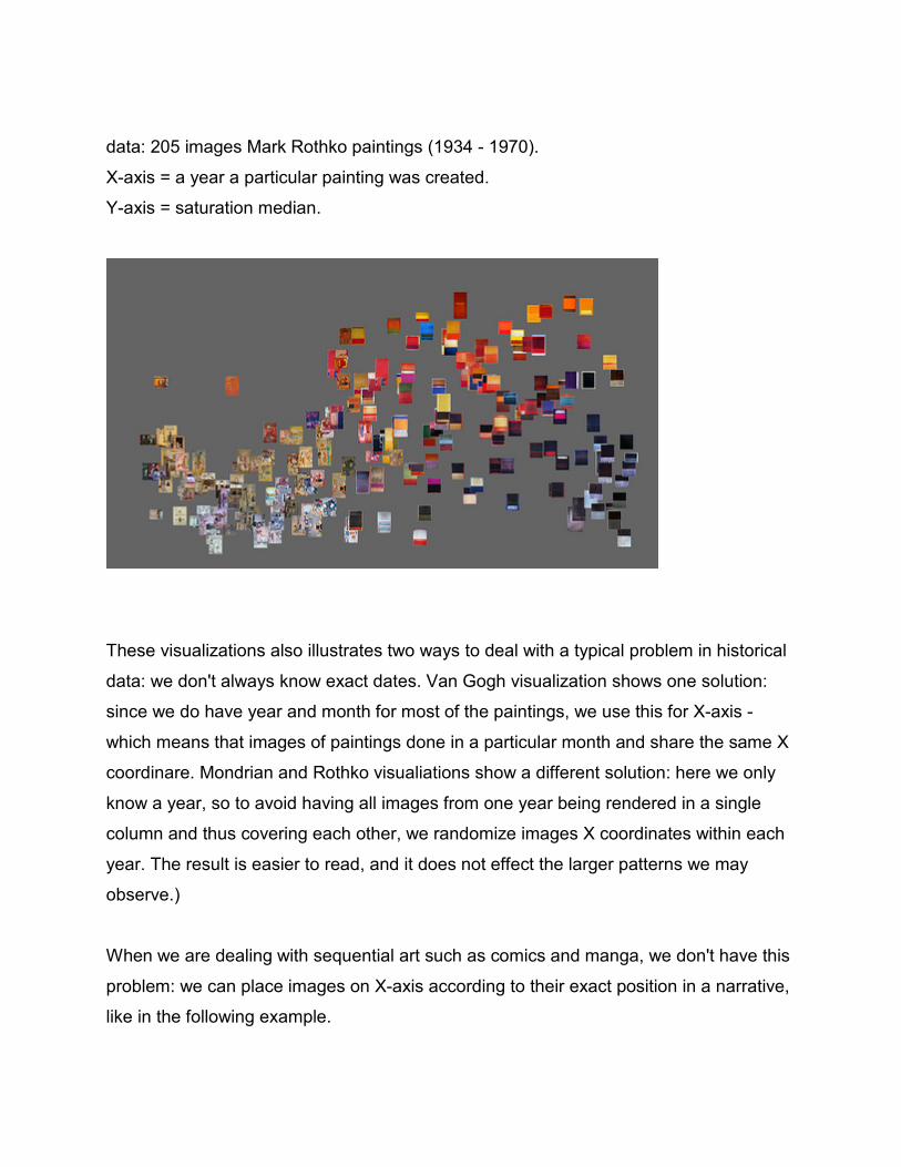
data: 205 images Mark Rothko paintings (1934 - 1970).
X-axis = a year a particular painting was created.
Y-axis = saturation median.
These visualizations also illustrates two ways to deal with a typical problem in historical
data: we don't always know exact dates. Van Gogh visualization shows one solution:
since we do have year and month for most of the paintings, we use this for X-axis -
which means that images of paintings done in a particular month and share the same X
coordinare. Mondrian and Rothko visualiations show a different solution: here we only
know a year, so to avoid having all images from one year being rendered in a single
column and thus covering each other, we randomize images X coordinates within each
year. The result is easier to read, and it does not effect the larger patterns we may
observe.)
When we are dealing with sequential art such as comics and manga, we don't have this
problem: we can place images on X-axis according to their exact position in a narrative,
like in the following example.
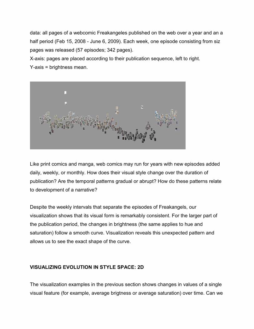
data: all pages of a webcomic Freakangeles published on the web over a year and an a
half period (Feb 15, 2008 - June 6, 2009). Each week, one episode consisting from siz
pages was released (57 episodes; 342 pages).
X-axis: pages are placed according to their publication sequence, left to right.
Y-axis = brightness mean.
Like print comics and manga, web comics may run for years with new episodes added
daily, weekly, or monthly. How does their visual style change over the duration of
publication? Are the temporal patterns gradual or abrupt? How do these patterns relate
to development of a narrative?
Despite the weekly intervals that separate the episodes of Freakangels, our
visualization shows that its visual form is remarkably consistent. For the larger part of
the publication period, the changes in brightness (the same applies to hue and
saturation) follow a smooth curve. Visualization reveals this unexpected pattern and
allows us to see the exact shape of the curve.
VISUALIZING EVOLUTION IN STYLE SPACE: 2D
The visualization examples in the previous section shows changes in values of a single
visual feature (for example, average brigtness or average saturation) over time. Can we
visualize evolution of an image sequence along two dimensions (i.e., two features)?
Lets look again at our earlier "style space" visualizations. They are 2D scatter plot with
(optionally) images rendered on top of the points. The visual features of images
analyzed automatically with digital image processing software become X and Y
coordinates of the points.
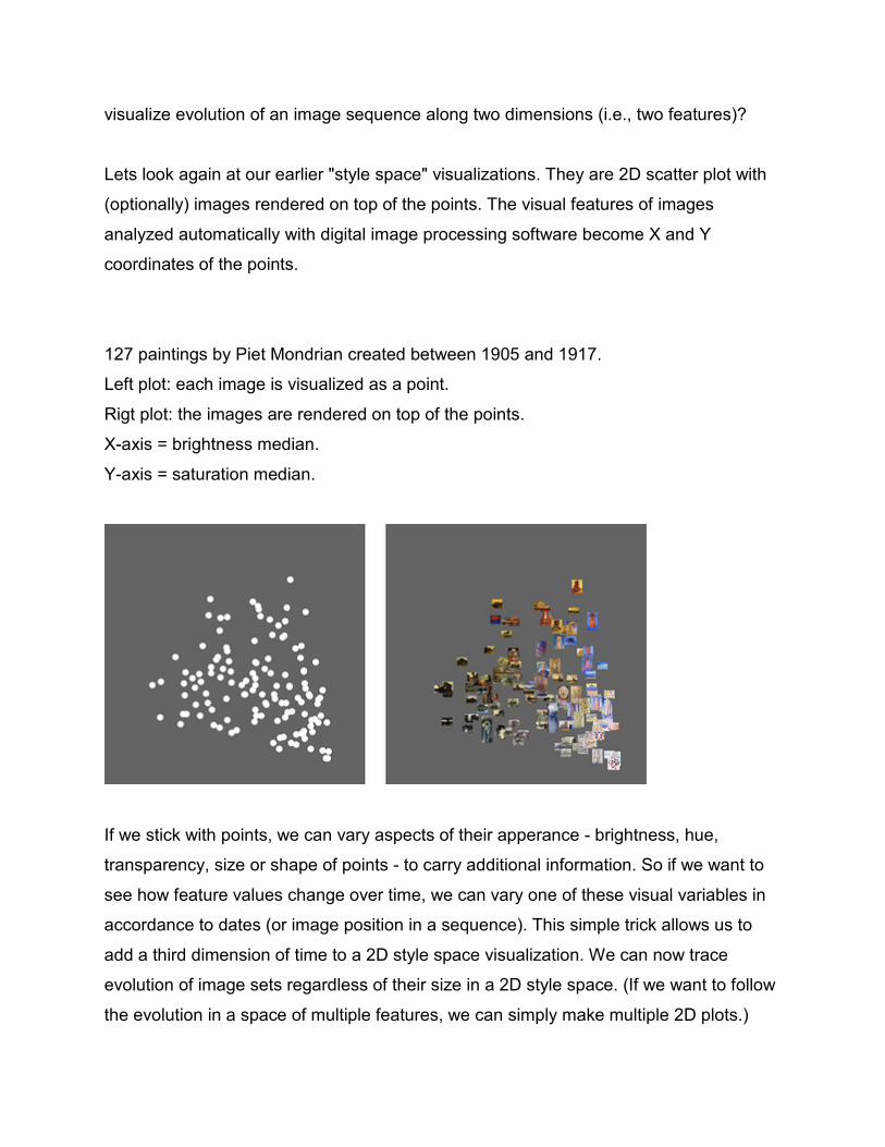
127 paintings by Piet Mondrian created between 1905 and 1917.
Left plot: each image is visualized as a point.
Rigt plot: the images are rendered on top of the points.
X-axis = brightness median.
Y-axis = saturation median.
If we stick with points, we can vary aspects of their apperance - brightness, hue,
transparency, size or shape of points - to carry additional information. So if we want to
see how feature values change over time, we can vary one of these visual variables in
accordance to dates (or image position in a sequence). This simple trick allows us to
add a third dimension of time to a 2D style space visualization. We can now trace
evolution of image sets regardless of their size in a 2D style space. (If we want to follow
the evolution in a space of multiple features, we can simply make multiple 2D plots.)
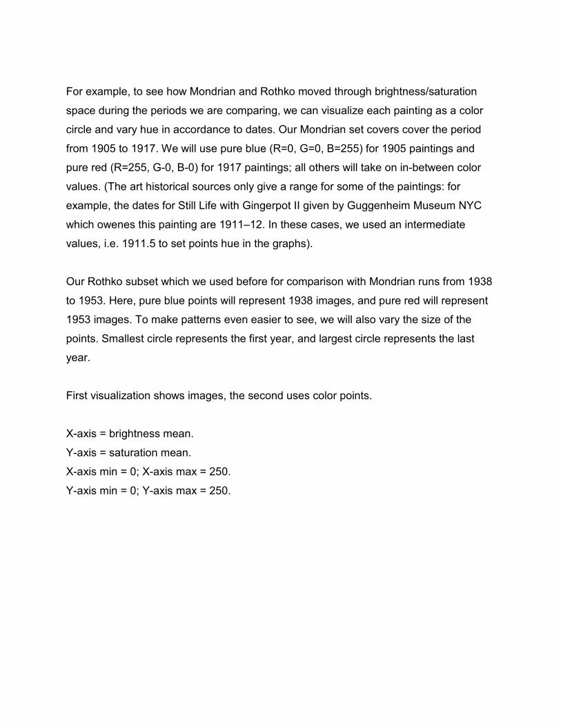
For example, to see how Mondrian and Rothko moved through brightness/saturation
space during the periods we are comparing, we can visualize each painting as a color
circle and vary hue in accordance to dates. Our Mondrian set covers cover the period
from 1905 to 1917. We will use pure blue (R=0, G=0, B=255) for 1905 paintings and
pure red (R=255, G-0, B-0) for 1917 paintings; all others will take on in-between color
values. (The art historical sources only give a range for some of the paintings: for
example, the dates for Still Life with Gingerpot II given by Guggenheim Museum NYC
which owenes this painting are 1911–12. In these cases, we used an intermediate
values, i.e. 1911.5 to set points hue in the graphs).
Our Rothko subset which we used before for comparison with Mondrian runs from 1938
to 1953. Here, pure blue points will represent 1938 images, and pure red will represent
1953 images. To make patterns even easier to see, we will also vary the size of the
points. Smallest circle represents the first year, and largest circle represents the last
year.
First visualization shows images, the second uses color points.
X-axis = brightness mean.
Y-axis = saturation mean.
X-axis min = 0; X-axis max = 250.
Y-axis min = 0; Y-axis max = 250.

Using color to represent time reveals that Rothko starts his explorations in late 1930-
1940s in the same same part of brightness/saturation space where Mondrian arrives by
1917 - high brightness/low saturation area (the
right bottom corner of the plot). But as he develops, he is able to move beyond the
areas already “marked” by his European predecessor (i.e., Mondrian). (Keep in mind
that these visualizations are only meant to illustrate the idea of a style space and the
different techniques to visualize it. If we want to reach more definite conclusions, we will
need to extend our Mondrian and Rothko image sets to ideally include all paintings from
their complete careers.)

We can also apply this technique to sequential art scuh as comics and manga. For
instance, lets visualize "Tetsuwan Girl" manga title by Takahashi Tsutomu (1094 pages).
First, we will plot all pages as images. We will use the same features as in our earlier
visualization of the complete set of one million manga pages: standard deviation (X-axis)
and entropy (Y-axis). These features allow us to capture an important stylistic
dimension. The pages that are more graphic, have high contrast, little detail, and no
texture end up in the upper right of the visualization; the pages which are visually
opposite (significant amounts of texture and detail, more gray tones) end up in the lower
part; all intermediate pages position between these two extremes.
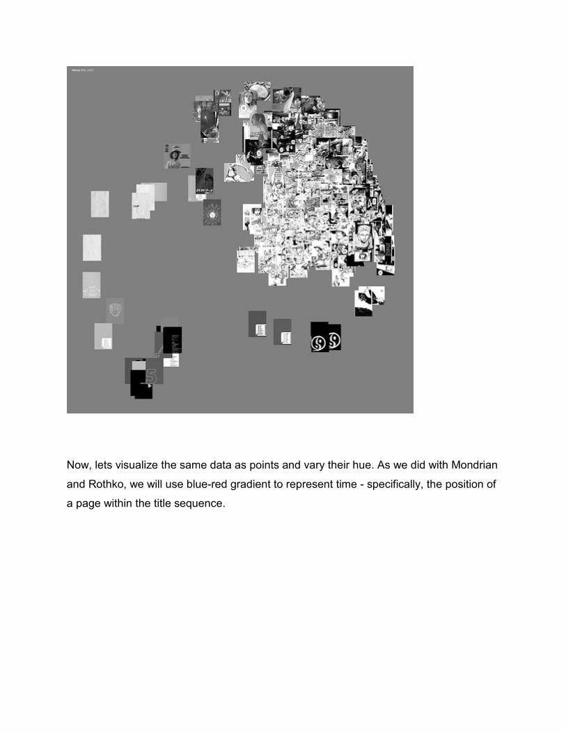
"Tetsuwan Girl" manga by Takahashi Tsutomu (1094 pages).
X-axis = standard deviation
Y-axis = entropy.
Both features are calculated over grayscale values of all pixels in each page.
Now, lets visualize the same data as points and vary their hue. As we did with Mondrian
and Rothko, we will use blue-red gradient to represent time - specifically, the position of
a page within the title sequence.
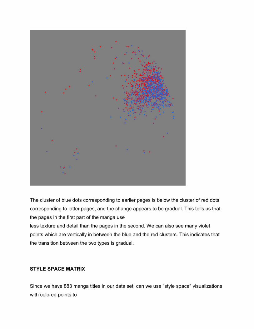
The cluster of blue dots corresponding to earlier pages is below the cluster of red dots
corresponding to latter pages, and the change appears to be gradual. This tells us that
the pages in the first part of the manga use
less texture and detail than the pages in the second. We can also see many violet
points which are vertically in between the blue and the red clusters. This indicates that
the transition between the two types is gradual.
STYLE SPACE MATRIX
Since we have 883 manga titles in our data set, can we use "style space" visualizations
with colored points to
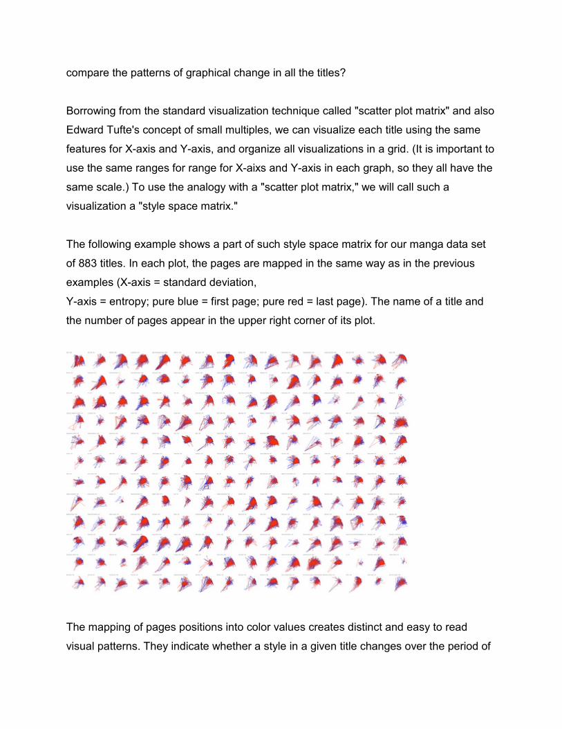
compare the patterns of graphical change in all the titles?
Borrowing from the standard visualization technique called "scatter plot matrix" and also
Edward Tufte's concept of small multiples, we can visualize each title using the same
features for X-axis and Y-axis, and organize all visualizations in a grid. (It is important to
use the same ranges for range for X-aixs and Y-axis in each graph, so they all have the
same scale.) To use the analogy with a "scatter plot matrix," we will call such a
visualization a "style space matrix."
The following example shows a part of such style space matrix for our manga data set
of 883 titles. In each plot, the pages are mapped in the same way as in the previous
examples (X-axis = standard deviation,
Y-axis = entropy; pure blue = first page; pure red = last page). The name of a title and
the number of pages appear in the upper right corner of its plot.
The mapping of pages positions into color values creates distinct and easy to read
visual patterns. They indicate whether a style in a given title changes over the period of
its publication. You can quickly scan the style space matrix to see which titles have
unusual patters and should be investigated more closely. You can also divide titles into
different groups depending on their graphical development in time: no or very little
development, gradual change over time, significant and fast changes, and so on.
(Of course, remember that we are only using two visual features which capture some
but not all stylistic dimensions.)
All visualizations are created with free open-source ImagePlot software developed by
Software Studies Initiative. The distribution also includes a set of 776 images of van
Gogh paintings, and the tools that were used to measure their image properties.
HOW STYLES CHANGE
I introduced "Style space" concept to suggest that a "style" of a particular set of cultural
artifacts is not a distinct point or a line in the space of possible expressions. Instead, it is
an area in this space.
In joining words "style" and "space" together, I wanted to evoke this image of an
extension, a range of possibilities. Rather than imagining an artist's development like a
road moving through a hilly landscape, let's think of it instead as a cloud that gradually
shifts above this landscape over time. This cloud may have different densities in
different regions and its shape may also be changing as the artist develops. And just
like with real clouds, our cloud can't just suddenly jump from one area to another; in the
overwhelming majority of cases, cultural evolution proceeds through gradual slow
adjustments. (While we may expect to find some special cases of sudden changes, so
far all the cultural data sets we looked at in our lab display gradual changes.)
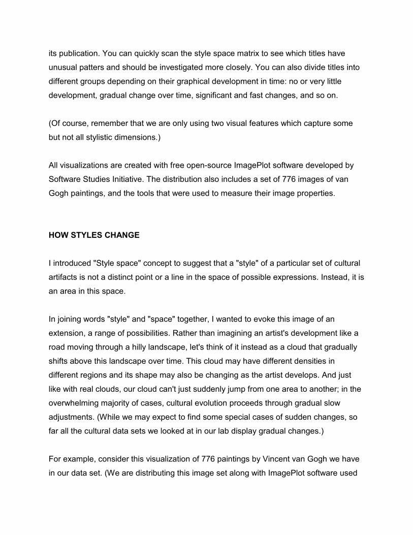
For example, consider this visualization of 776 paintings by Vincent van Gogh we have
in our data set. (We are distributing this image set along with ImagePlot software used
to make all visualizations in this article.)
X-axis = dates (year and month).
Y-axis = median brightness.
Regardless of what period we may select - spring 1887, summer 1888, all paintings
done in Paris (4/1886 - 3/1886), all paintings done in Arles (3/1888 - 3/1889), etc. - their
average brightness values cover a significant range.
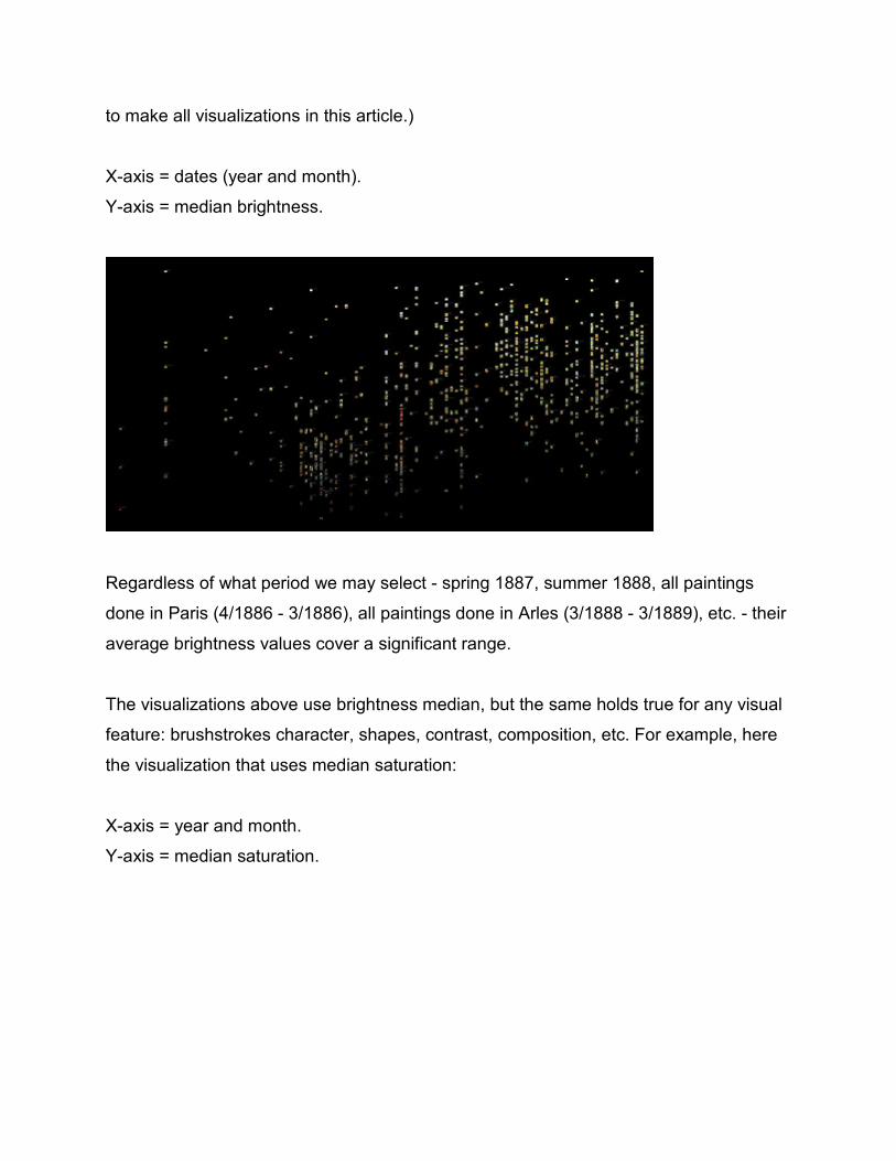
The visualizations above use brightness median, but the same holds true for any visual
feature: brushstrokes character, shapes, contrast, composition, etc. For example, here
the visualization that uses median saturation:
X-axis = year and month.
Y-axis = median saturation.
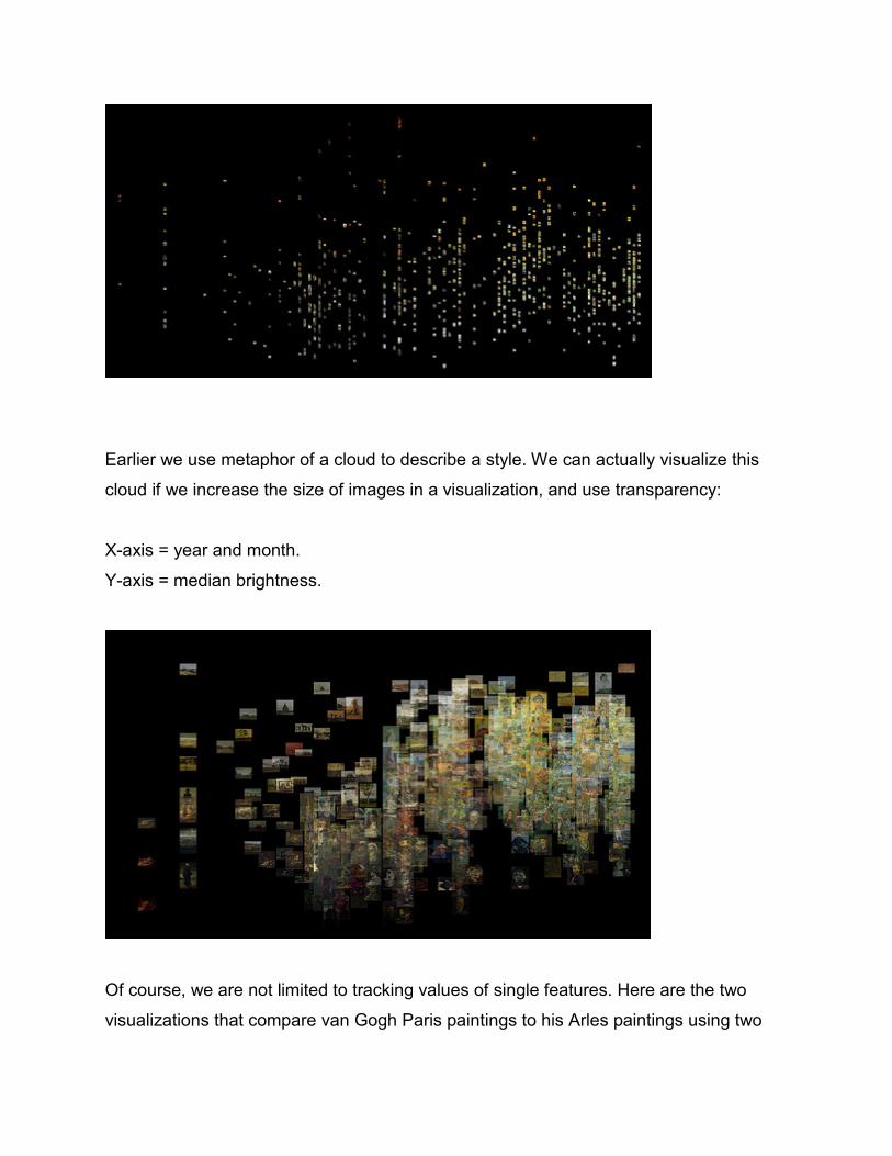
Earlier we use metaphor of a cloud to describe a style. We can actually visualize this
cloud if we increase the size of images in a visualization, and use transparency:
X-axis = year and month.
Y-axis = median brightness.
Of course, we are not limited to tracking values of single features. Here are the two
visualizations that compare van Gogh Paris paintings to his Arles paintings using two

features: average brightness and average saturation:
X-axis = median brightness.
Y-axis = median saturation.
Paris period (4/1886 - 3/1886): 199 paintings.
Arles period (3/1888 - 3/1889): 161 paintings.
These visualizations show that in regards of the two features used (average brightness
and average saturation), the difference between two periods is only relative, rather than
absolute. The center of the "cloud" of Arles painting is displaced to the left (brighter),
and to the top (more saturated) in comparison to the "cloud" of Paris paintings; it is also
smaller, indicating less variability in Arles paintings. But the larger parts of the two
clouds overlap, i.e. they cover the same area of the style space.
To summarize this discussion:
1) Values of visual features that characterize "style" within a particular time period
typically cover a range.
2) The values typically shift over time in a gradual manner. This means that in any new
"period" we may expect to see some works that have feature values that did not occur
before, but also works with features values that already were present previously (i.e.
these are works in "old style.")
For instance, if look at the lowest band of images in the visualization above which uses
median brightness, you will notice that between 8/1884 and 9/1885 van Gogh produced
many really dark paintings. You may expect that after he moves to Paris where, to
quote Vincent van Gogh museum web site, "His palette becomes brighter," these dark
works will disappear, but this is not true. Along with very light paintings similar in values
to impressionists's works produced around the the same time, van Gogh still sometimes
makes the paintings which are as dark as the ones he favored in 1884-1995. And then
later, in Arles, he still ocassionally "regresses" to his dark style. The same applies to to
highest vertical band where van Gogh's lightest paintings lie. While most of these works
were done after 1886, a few can be also found earlier.
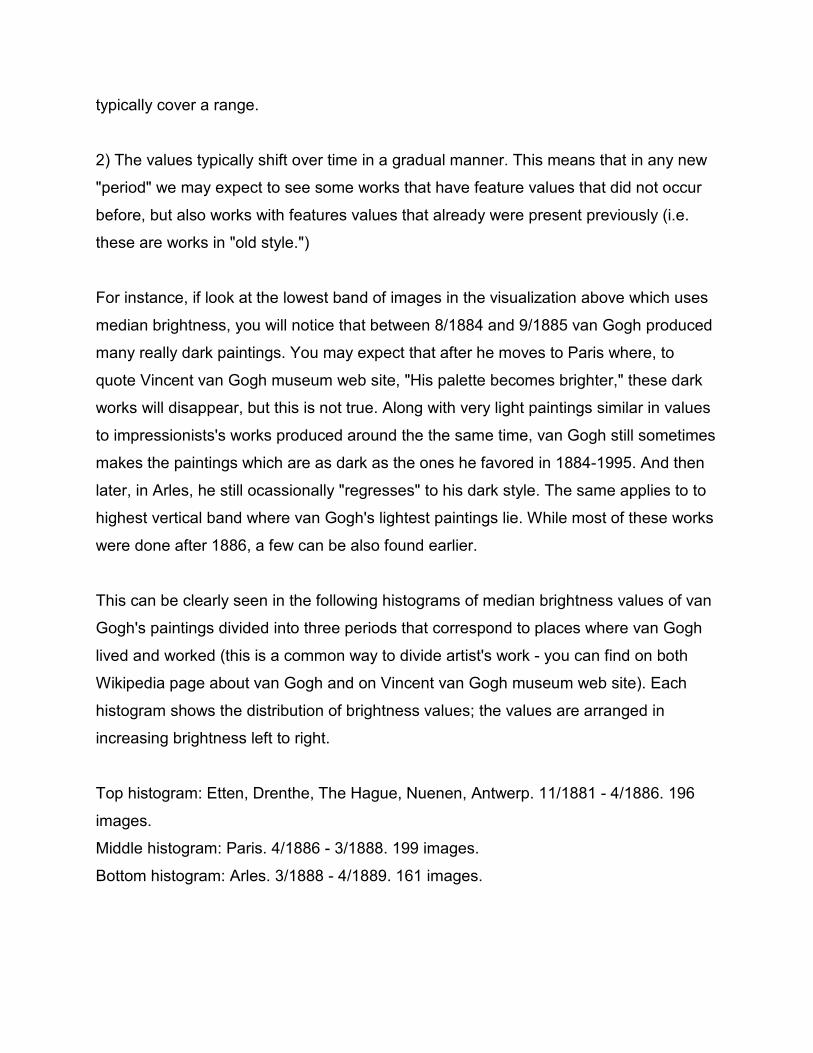
This can be clearly seen in the following histograms of median brightness values of van
Gogh's paintings divided into three periods that correspond to places where van Gogh
lived and worked (this is a common way to divide artist's work - you can find on both
Wikipedia page about van Gogh and on Vincent van Gogh museum web site). Each
histogram shows the distribution of brightness values; the values are arranged in
increasing brightness left to right.
Top histogram: Etten, Drenthe, The Hague, Nuenen, Antwerp. 11/1881 - 4/1886. 196
images.
Middle histogram: Paris. 4/1886 - 3/1888. 199 images.
Bottom histogram: Arles. 3/1888 - 4/1889. 161 images.
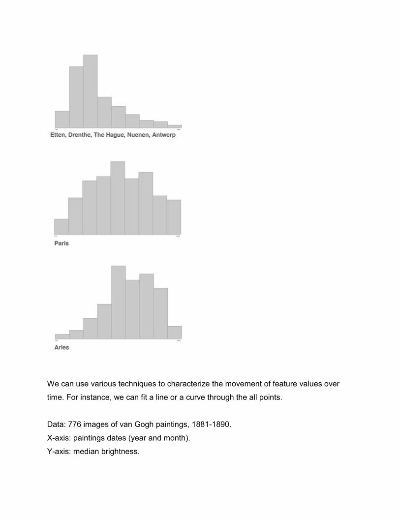
We can use various techniques to characterize the movement of feature values over
time. For instance, we can fit a line or a curve through the all points.
Data: 776 images of van Gogh paintings, 1881-1890.
X-axis: paintings dates (year and month).
Y-axis: median brightness.
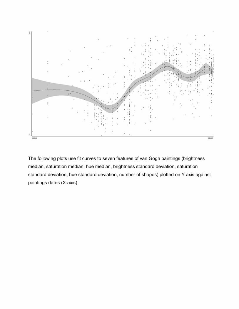
The following plots use fit curves to seven features of van Gogh paintings (brightness
median, saturation median, hue median, brightness standard deviation, saturation
standard deviation, hue standard deviation, number of shapes) plotted on Y axis against
paintings dates (X-axis):

Or, we can divide the paintings into temporal periods (months, seasons, etc.) and
calculate measures of central tendency and variability for each period. (Mean and
median are popular measures of central tendency; standard deviation is the popular
measure of variability.) This will tell us both how the center of a style "cloud" shifts over
time, and also how wide or narrow it is in any period. Here are these measures for a few
features; the "periods" correspond to the places where van Gogh worked (note that our
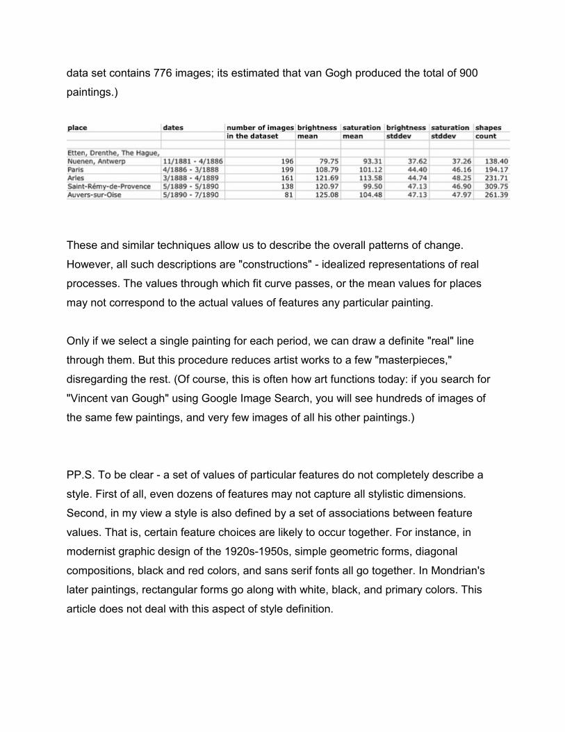
data set contains 776 images; its estimated that van Gogh produced the total of 900
paintings.)
These and similar techniques allow us to describe the overall patterns of change.
However, all such descriptions are "constructions" - idealized representations of real
processes. The values through which fit curve passes, or the mean values for places
may not correspond to the actual values of features any particular painting.
Only if we select a single painting for each period, we can draw a definite "real" line
through them. But this procedure reduces artist works to a few "masterpieces,"
disregarding the rest. (Of course, this is often how art functions today: if you search for
"Vincent van Gough" using Google Image Search, you will see hundreds of images of
the same few paintings, and very few images of all his other paintings.)
PP.S. To be clear - a set of values of particular features do not completely describe a
style. First of all, even dozens of features may not capture all stylistic dimensions.
Second, in my view a style is also defined by a set of associations between feature
values. That is, certain feature choices are likely to occur together. For instance, in
modernist graphic design of the 1920s-1950s, simple geometric forms, diagonal
compositions, black and red colors, and sans serif fonts all go together. In Mondrian's
later paintings, rectangular forms go along with white, black, and primary colors. This
article does not deal with this aspect of style definition.