
Structuring Displays: a psychological guide
76
The ICS Project Interacting Cognitive Subsystems This material has been developed by MRC Applied Psychology Unit, Cambridge, UK Department of Psychology, University of Sheffield, UK Department of Psychology, University of Copenhagen, Denmark. Modelling multimodal interaction: A theory-based technique for design analysis and support An INTERACT’97 tutorial presented by Jon May This tutorial material has been developed by Jon May, Sophie Scott and Phil Barnard March 1997
Transcript of Structuring Displays: a psychological guide

The ICS ProjectInteracting Cognitive Subsystems
This material has been developed byMRC Applied Psychology Unit, Cambridge, UK
Department of Psychology, University of Sheffield, UKDepartment of Psychology, University of Copenhagen, Denmark.
Modelling multimodal interaction:A theory-based technique
for design analysis and support
An INTERACT’97 tutorial presented by
Jon May
This tutorial material has been developed byJon May, Sophie Scott and Phil Barnard
March 1997


—i—
Timetable
This half-day tutorial is divided into three sessions, each of which will last about an hour.
Session 1: The cognitive framework
This session will introduce the Interacting Cognitive Subsystems (ICS) framework, and show how thenotion of levels of mental representation and information flow can be used to understand a range ofeveryday tasks.The ideas of information structure and transformation will be introduced, and multimodal phenomenaused to illustrate the different routes that information can take through the overall architecture, and thedifferent consequences that this can have for perception.
Session 2: Application to HCI
The cognitive framework introduced in session one will be applied to a range of HCI scenarios.The aim here is to show how an understanding of the cognitive resources required to use an interfacecan help the designer to anticipate usability problems and, more importantly, can help them identifydesign resolutions.
Session 3: Tools and Techniques
The handbook will be introduced, and the notational techniques developed for the analysis ofrepresentational structure will be described. These will be illustrated through visual structures, taskstructures and acoustic structures.


—iii—
AbstractThis Guide is intended to help people who design computer interfaces to use psychological principles to construct theappearance of computer interface objects, their arrangement on the display, their behaviour, and their relationship to theusers’ tasks.
There are many books that provide ‘guidelines’ for designing interfaces – some tell you how and when to use differentcolours and typefaces, how to format columns and tables, and how to make your designs aesthetically appealing. This isnot one of those books.
Although they provide a valuable service, and sometimes also try to explain why they are providing the advice that theydo, guidelines are intended to be prescriptive – telling you what you should do for each part of an interface. You canfollow all of the advice that they provide for every individual part of your interface, and still find that you produce adesign that is not ‘easy to use’. Books of guidelines cannot tell you how to decide for yourself whether an interface willbe usable, nor how to identify the problematic parts of the design so that you can improve them. That is what this Guidetries to do.
It will introduce you to some psychological ideas about perception and cognition – the processes by which people seeobjects in the world, recognise them, search between them, and use them to reach their goals. The techniques this Guideteaches you will let you decide how difficult it will be for people to group objects together, to tell objects apart, to searchfor objects, and to switch their attention from one part of the display to another. You don’t need to be a psychologist toread this Guide, but when you have read it, you should be able to use these ideas to analyse your interface designs.
Organisation of the GuideThe Guide is organised into several sections. Each section introduces you to some ideas about cognition, with someexamples, and shows you how these ideas can be seen to affect the usability of interface designs. The key points in eachsection are highlighted like this:
this is a key point,and a key term is shown like this.
These key points are summarised at the end of the Guide, so you can use these as an index to refer to particular issues. Atseveral points in the Guide there are exercises for you to try, to check that you understand how the ideas can be used inpractice.
The sections build on each other, introducing the simpler ideas first and the more complicated ideas later, and so this isn’ta book that you can ‘dip into’, like a collection of guidelines might be. You have to read it through section by section –but when you have done that, we hope that you’ll have learnt enough to put your new skills into practice, withoutneeding to keep the Guide by your side.

Presenter Biography
Jon May graduated in psychology from Exeter University in 1983, from wherehe also obtained his PhD on ‘The Cognitive Analysis of Flexible Thinking’ in1987. After working with Prof. Andrew Mathews on attentional biases inclinical anxiety at St. George’s Hospital Medical School, London, he movedto Germany in 1989 to work as a full time researcher in Human-ComputerInteraction with Alcatel, a multinational telecommunications company. Hewas employed on a number of EU funded projects, including the RACE projectGuidance (as Deputy project manager) and the Esprit project Amodeus (as sitemanage). In 1992 he returned to the UK, to work with Phil Barnard at theMRC Applied Psychology Unit in Cambridge (as manager of the UserModelling research package within the Esprit project Amodeus-2).
In 1995 he was appointed Lecturer in the Department of Psychology at theUniversity of Sheffield, where he teaches Research Methods & Statistics,Thinking, Reasoning & Problem Solving, and Philosophical Issues inPsychology. His recent research has focused on ways of introducingpsychological theory into the design process, to produce more usablecomputing and telecommunication technologies, and to use the complex taskstypical within the HCI domain to advance psychological theory. A particulartheme has been the development of cognitive models that can be expressedformally, facilitating the combined use of psychologically valid models of theuser and formal system models.
http://www.shef.ac.uk/psychology/may/http://www.shef.ac.uk/~pc1jm/
Jon May

—v—
Contents•1• Techniques for analysing structure
Perception is active............................................... 7The structure of visual scenes.................................. 8Psychological subjects and transitions...................... 9Using diagrams to analyse a display........................10
•2• A framework for cognitionLevels of mental representation..............................12Propositional representations.................................12The complete cognitive system..............................15Nine subsystems.................................................16Interacting Cognitive Subsystems...........................18
•3• How objects form groupsObjects and groups...............................................19Psychological Subjects pop-out..............................20Pop-out of groups................................................22
•4• Searching through structuresPragmatic Subjects and Icon search.........................24An object’s structure affects grouping......................27
•5• The role of knowledgeKnowledge can affect structure................................29Learning the meaning of objects.............................30Competing groupings...........................................32
•6• The user’s taskTasks have structure too........................................35Ambiguity in task structures..................................36Conceptual structures...........................................39Complex multiwindow displays.............................40
•7• Multimedia PerceptionRelationships between levels.................................44Blending sight and sound.......................................46Propositional Blending.........................................47Implicational Blending..........................................49Consequences of blending......................................51
•8• Applying the techniquesIcons for multivariate information...........................52Dynamic changes in structure.................................53
Summary...........................................................56Hints for structuring displays.................................56Sources of examples.............................................71Index of Exercises................................................72Acknowledgments................................................72Index of key points..............................................73


—7—
•1• Techniques for analysing structure
Perception is active
Our visual environment is made up of objects rather than features. When we look around a room we see differentobjects, for instance, some books on a desk. It is hard for us to ‘see’ the pile of books as an area of different huesand shades, although that is what is represented by the pattern of light that is arriving at our eyes. The process ofperception is one of structuring the sensory information that we receive from objects in the environment so that wecan interact with them. We need to be able to see a set of differently coloured planes and surfaces as belonging to asingle object, a book, that is distinct from the other planes and surfaces that represent the desk and the other books.If we pick up a book, we expect all of the parts of the sensory world that ‘belong’ to it to move together in apredictable way, and for all of the parts that belong to the ‘desk’ to stay where they are. If we try to pick up a stackof books, we know that the individual books might not remain as a stack, and that the stack cannot be treated in thesame way as the individual books that it is made of.
These details about the structure of objects and theirinter-relationships are not explicitly contained in thevisual information. It must be interpreted, bycombining the visual information with knowledgeabout the world, which we have learnt through ourlifelong experience of interacting with it. This is whywe can say that perception is active process, blendingknowledge and sensation. The structure of theperceived world affects our interactions with it, and ourinteractions with the world affect our subsequentinterpretations of its structure.
Computer displays are just like the rest of the world inthis respect. Figures 1.1 and 1.2 show two groups oficons - one of these is a group of different icons, theother a collection of very similar icons. In Figure 1.1, if the user knows what a particular icon in the first arraylooks like, the dissimilarity will make it easier to locate - it may even seem to ‘pop-out’ from the array. But if theydo not know what an icon looks like, and have to read all of the names, they may find it difficult to ‘separate’ thetext labels from the ‘background’ of icons.
In Figure 1.2 the icons are all very similar, and so even if the user knows what the icon of the document they aresearching for looks like, they may find it harder to locate than in the previous figure. However, the very similarityof the individual icons makes it much easier for the user to ‘group’ them as a single, ordered array, and for them toform a ‘background’ against which the text labels stand out. In this figure, the information provided by theappearance of each icon is less important than the fact that they cluster together to say “we’re all documents”: thisbecomes an attribute of the group rather than just anattribute of each separate icon.
Designing a computer display is all about choosingthe form of objects and arranging them within a two-dimensional area of the screen. As Figures 1.1 and1.2 show, a correct choice of form and arrangementcan affect the way that objects are perceived and dealtwith by the user of the computer. Further than this,you need to think about the structure of tasks, andabout the relationships between objects on the screenand any sounds that the system makes.
In this Guide we will explain some ideas that canhelp you to think about the way that people perceiveinterfaces, and teach you techniques which you canuse to analyse designs. We’ll start by looking atvisual scenes, and then introduce some psychological ideas to help you understand the way that people perceive,think and act. This will let us extend the techniques to multimodal interfaces.
Figure 1.1: an array of different icons
Figure 1.2: an array of structurally similar icons

Modelling multimodal interaction
– 8 –
The structure of visual scenes
Although computer displays are produced on two dimensional, flat screens, we use the same perceptual processes toperceive them as we do to perceive the real, three dimensional world. When we look at a visual scene, whether it istwo or three dimensional, the features, colours, and textures in the sensory information that we receive from our eyesgroup together to form objects. The scene as a whole is a structure of objects. The objects have certain qualities -they stand out from their background and are discrete entities, which can often be named. If we look closely at anobject, though, we can see that it also has a structure, and may be composed of other objects. We can perceive the
world at several different scales, from aglobal level, down through many levels ofdetail. You could stand at the door of theroom in Figure 1.3 and see ‘an office - aroom with objects in it’. You could thenfocus your attention towards the far wall,which is a plane surface with items offurniture superimposed on it. Within thislevel you could see the window, a chair anddesk. Within the region of the desk youcould see a pad of paper. The pad has apencil resting on it, and is written upon.You could look at the text on the page bymoving down into the structure of the pad,and moving down again you could see theindividual words that make up the text (ifyou were near enough).
This hierarchy can be represented as astructure diagram, as in Figure 1.4, wherethe different horizontal groups in the figurerepresent different levels of visual structure.At each of these levels, sensory patterns oflight are interpreted as forming a group ofindividual objects. Each object itself‘contains’ visual details that can be furtherinterpreted as another group of objects. Thedotted lines indicate that some objects havefurther structural details that we have notincluded.
What we actually perceive from moment tomoment is limited by the level at whichwe are analysing the scene. While attendingto the pad of paper we can be aware of therelationships it has to the other objectswithin its own ‘group’ – the stacks ofpaper, and the books – and we can be awareof their shared relationship to the desk. Wecan also be aware that the pad itself hassome structural details and, if we wantedto, could attend to some object of thisstructure; perhaps looking at a line of text.
The hierarchical structure of the visualscene, as represented in Figure 1.4, constrains the direction of visual search. After having attended to the far wall,the words of text cannot be reached by looking at the structure of the window. We have to successively focus in tothe desk, the pad and then the text before we can attend to the words. Likewise, after attending to a line of text,attending to a book requires a movement back up the structure, to an object that is at the same level of visual detailas the book (here, the pad of paper).
Book 1
Figure 1.3: a visual scene – an office
office
word
tree
word word word word
lineline line
textpencil
pad stack ofpaper
stack ofpaper
book bookcloudtree
deskwindow
chair
far wallleft wall floor right wallroof
Figure 1.4: a structure diagram of the office scene

•1• Techniques for analysing structure
—9—
The structure of the scene constrains the way people can search through it.
These two ideas – the structure of visual scenes, and the transitions of attention between objects – are the tools thatwe will use to analyse the composition of displays. In general, a well composed display will be constructed so thatthe user can attend to the appropriate object easily. These tools help us to assess the ease with which a user canmove their focus of attention around between objects. In the next section we will describe how they are derived.
Psychological subjects and transitions
To describe the way that we change the focus of attention, it isuseful to think of the object that is being attended to as the‘psychological subject’. In the office example of Figure 1.3, thereare several different objects on the desk. We can focus our attentionon any of these objects, and we can shift our attention betweenthem. Any one of them can be the psychological subject atdifferent times. Other objects at the same level of decompositionin the visual scene form its context, and can be used todiscriminate it from other similar or identical objects. Becausethese other objects provide information about the subject, they arecollectively called its ‘predicate’.
The object that is being attended to is thepsychological subject. Other objectsin the same group form its predicate .
Figure 1.5 shows part of the office – the group of objects that are on the desk - as attention switches from the padto a stack of paper, and then to a book, as indicated by arrows. Adding a lot of arrows to the structure diagram wouldmake it rather complicated, especially if attention repeatedly moved back to the same object, and so we need to use arepresentation that can include time as a dimension.
Figure 1.6 is an example of a ‘transition path diagram’ that describesthe transitions in attention made in Figure 1.5. Each row represents adifferent moment in time, and a new focus of attention. One object isshown on a black background: this is the psychological subject atthat moment. In the first row it is the pad, and the other objects formits predicate, and are listed in a group to its right. As successivetransitions are made from object to object, each in turn moves left tobecome the subject, as shown by the second and third rows. The linesbetween the rows show the visual transitions that are made asattention shifts between the objects.
Figure 1.6 might not seem to offer many advantages overFigure 1.5, but that is because the transitions were quite simple. Aswell as shifting attention between objects within a group, it is alsopossible to ‘zoom in’ and ‘zoom out’, attending to an object’sgroup - the larger object it belongs to - or to a part of its structure - an object that it visually contains, surrounds,or is made up of. We need to be able to represent these possible transitions as well.
Structure diagrams show the hierarchical relationships between objects.Transition Path diagrams show changes in the psychological subject and predicate in time.
Figure 1.7 shows how these ‘up’ and ‘down’ transitions can also be represented in a transition path diagram. Aswell as showing the predicate of the psychological subject, each row includes (on the left) the group that the objectsbelong to, and (on the right) the constituent structure of the psychological subject. This diagram now contains all ofthe objects that could become the subject following a transition in attention. In the first row the pad of paper isagain the subject, but the transition that is made next is ‘up’ the structure, to the desk. The ‘U’ shape linking thefirst row to the desk indicates that the transition is ‘up’ the structure from many objects (the pad and its predicate) toa single object (the desk).
textpencil
pad stack ofpaper
stack ofpaper
book book
desk
Figure 1.5: transitions in attention betweenobjects on the desk
stack ofpaper
stack ofpaper
book book
pad stack ofpaper
book book
pad stack ofpaper
stack ofpaper
book
stack ofpaper
pad
book
Figure 1.6: a transition path diagramshowing the shifts in attention made in
Figure 1.5

Modelling multimodal interaction
– 10 –
In the second row the desk is shown as thesubject. Now the predicate consists of theother objects that are at the same level ofdecomposition as the desk - the windowand the chair – and the ‘far wall’ is shownas the group that they belong to. The pad,the stacks of paper and the books, that werethe active level of the previousrepresentation, are now shown as the desk’sconstituent structure. They have moved tothe right, as has the desk. Each time atransition is made ‘up’ a structure, the oldgroup moves right to become the newsubject, and the old subject-predicate levelmoves right to become the new constituent
structure. In the third row a ‘within level’ transition is made to the window, so that it becomes the subject: thegroup remains the same, but the constituent structure changes, to show which transitions ‘down’ the structure arenow possible from the window. The previous subject has become part of the predicate. A point to notice here is thatthe objects within the predicate are ‘unordered’ - they are all equally able to become the subject. The second and thirdrows are linked by a plain line, to show that the transition is just from one object to another, within the samegroup. Finally, in the bottom row a transition is made to a tree – one of the objects that the window ‘contains’ inits structure. The group of objects that was on the right of the third row has moved left to become the ‘active level’of the representation in the fourth row. The subject is the tree that is being attended to, the predicate consists of theother objects in the window’s structure, and the tree’s constituent structure must be included on the right of the row.The window has also moved left, to become the group. Each time a transition is made ‘down’ a structure, the oldsubject moves left to become the new group, and its constituent structure moves left to become the newsubject-predicate level. The ‘inverted-U’ linking the third and fourth rows now indicates that the transition has beenfrom a single object, the window, to the many objects in its structure.
Transition path diagrams help to make it clear how simple or how complicated it will be for users to move theirattention from object to object within a display. On each row, all of the objects that could be attended to following atransition are indicated. A transition ‘up’ the structure makes the group and subject-predicate move right in the row.A transition ‘down’ makes the subject and its constituent structure move left in the row. In Figure 1.7, it took threetransitions to look up from the pad, and to look at a tree. It might take a user of a computer several transitions tomove their focus of attention from the document they are reading on-screen to locate an icon in a menubar,depending on the structure and grouping of all of the objects. In analysing a display, it is helpful to construct astructure diagram first, and then to use it to draw transition path diagrams for particular tasks that a user will want tocarry out. The next section shows how this can be done for a typical computer display.
Using diagrams to analyse a display
The ‘office’ example was a real-world, three dimensional structure, but the structural and transition path diagrams canbe used to analyse two dimensional computer displays. The only differences between the two ‘control panels’ inFigure 1.8 are the boxes that have been drawn around the groups of words and buttons. This might be an aspect ofthe design that is left to a designer’s aesthetic judgement, or it might be constrained by the interface software‘toolbox’.
On Off
Room 124
Room 128
Room 133
Room 167
LightingOn Off
Room 124
Room 128
Room 133
Room 167
Heating
Figure 1.8: two ‘control panels’ that differ in the way the objects have been grouped by the designer
chairdesk
stack ofpaper
stack ofpaper
book book pencil textdesk
chairwindowfarwall
tree cloud
window
stack ofpaper
stack ofpaper
book bookpad
farwall
tree
cloud tree branch trunk branch
pad
desk
window
tree
Figure 1.7: transitions as attention ‘zooms out’ and ‘zooms in’

•1• Techniques for analysing structure
—11—
The ‘lighting panel’ has boxes that relate objects together functionally, so each room label is linked to its own onand off buttons. In the ‘heating panel’, the objects have been linked by type, so that all of the room labels, onbuttons and off buttons each form different groups. This is a fairly small difference, and if anything, the heatingpanel looks more aesthetically appealing. The structure diagrams for the two panels (Figure 1.9) show the differencethat these boxes make to the grouping of the objects. The lighting panel is made up of four ‘groups’, one for eachroom, each containing a room label and an empty and filled button. The heating panel consists of three groups, oneof four similar room labels, and two groups of mixed circles.
"room124"
empty filled
group 124
lightingpanel
group 128 group 133 group 167
"room128"
empty filled
"room133"
empty filled
"room167"
empty filled
"room124"
"room128"
"room133"
"room167"
rooms on-buttons off-buttons
filled empty empty filled
heatingpanel
empty filled filled empty
Figure 1.9: structure diagrams of the two control panels
If we draw transition path diagrams for a user who has to turn the lights and heat on in Room 133, we can see thedifference that these groupings have made to the panels’ ‘ease of use’. For the lighting panel, the task is quitesimple, as the diagram in Figure 1.10 shows. The button that turns the lights on is part of the predicate of the labelfor ‘room 133’ and so only one transition is necessary. The transition is made within a single group, and so theobject to the left of the subject does not change. The empty circle has no constituent structure, and so when it is thesubject nothing is shown to the right of the row, to indicate that no further transitions could be made ‘down’ thestructure.
The situation is quite different for the ‘heatingpanel’. Now the room label and the button are indifferent groups, and the user has to momentarilymove their attention up the structure to the ‘rooms’group, across to the on-buttons, and then down againto the third button (Figure 1.11). Here threetransitions are needed instead of one, and so for thisparticular task, we can saythat the ‘lighting panel’will be easier to use thanthe ‘heating panel’.
The idea of ‘task’ is veryimportant, of course. Ifinstead of a task thatrequired the use of theroom label and a button,the user had to operate oneach of the on-buttons insequence, regardless of theroom labels, the ‘heatingpanel’ might be found to have an advantage. Suppose the user just had to make sure that all the heaters were on.Once the user had located the group of on-buttons, and attended to one of the buttons, the other buttons would all bepart of the predicate. This task would require fewer transitions than the equivalent task of turning on all of the lights.
This example shows that it is vital to make the grouping of screen objects correspond to the task that the user isgoing to perform, because this determines the way that they will have to move their attention between the objects.In choosing between different possible forms for objects and different ways of arranging them, the designer isattempting not just to make an aesthetically pleasing interface, but one which helps the user perform a particulartask.
empty filled "room" "133"row 133
"room 133" filledrow 133
"room 133"
empty
Figure 1.10: a transition path diagram for the lighting panel
"room" "133"rooms "rm 167""rm 128""rm 124"
panel off-buttonson-buttons "rm 133" "rm 167""rm 128""rm 124"
panel rooms off-buttons filled empty empty filled
on-buttons filled empty filled
"rm 133"
rooms
on-buttons
empty
Figure 1.11: a transition path diagram for the heating panel

—12—
•2• A framework for cognition
Levels of mental representation
In the previous section we have seen that sensory, visual information about the world needs to be interpreted as an objectbased structure for us to make any sense of it. Both visual and object structures are mental representations, but at differentlevels of information. The visual level is derived from the raw sensory data obtained from the eyes, whereas the objectlevel is derived from the combination of the visual representation and the perceiver’s knowledge and experience of theworld. This means that there must be a set of mental processes that convert the visual representation into an object
representation, and that there must be other processes that allowmemory to influence the object representation.
The shapes in Figure 2.1 look odd, because they are parts of a largermodel of human cognition, which we are going to describe piece bypiece. When all of the parts are in place, their shapes will becomemore meaningful. The part of the overall model shown in this figureillustrates the process of perception that we have described so far.Sensory information about the world is detected by the eyes, and turnedinto a visual representation that contains a wealth of detail aboutcolours, shades, contrasts, angles and edges. A mental process then‘interprets’ this information, transforming it into an objectrepresentation, which contains information about lines, shapes, depth,position and orientation.
Sensory information from the eyes forms a visualrepresentat ion.
Perceptual information is contained in an objectrepresentat ion.
It is important to remember this distinction between the sensory level of information in the visual representation, and theperceptual level of information in the object representation. One advantage of making this distinction is that it helps usanalyse what people will subjectively think about a display design (their object representation) as well as what isobjectively presented to them on the computer screen (their visual representation). The transformation from a visual to an
object representation involves the structuring of sensory data intoobjects, and the grouping together of those objects.
The visual-to-object transformation is affected by the clarity ofthe visual representation, so that detailed, high-resolutiondisplays will be easier to convert into object representations thanjagged, low resolution displays. It also develops with experience,so that familiar visual patterns can be converted into objectstructures more accurately than novel patterns - essentially, themore often a representation has been transformed in the past, theeasier it becomes to transform in the future. This is one way thatexperience can affect perception. Another way is shown inFigure 2.2.
The visual-to-object transformation processstructures and groups the visual scene
Propositional representations
Just as the visual-to-object transformation interprets the visual representation to produce a more abstract, but morestructured object representation, the object representation can be interpreted to produce an even more abstract andstructured ‘propositional’ level of representation. This new level contains factual, everyday knowledge about the objects -their names and properties, and the way that they can be expected to relate to each other and to interact. In the same waythat the visual-to-object transformation added structural information that wasn’t necessarily present in the sensory data, so
visviseye obj
visual level ofrepresentation
visual-to-objecttransformation
object level ofrepresentation
Fig 2.1: sensory information is transformedfrom a visual level of representation into an
object level
two inputs to the objectlevel of representation
visviseye obj
proppropositional levelof representation
propositional-to-objecttransformation
object-to-propositional-transformation
Figure 2.2: the exchange of representationsbetween the object and propositional levels

•2• A Framework for cognition
—13—
the object-to-propositional transformation adds a meaningful identification of objects that isn’t necessarily present in theobject representation.
For example, a pattern of light and shade can be interpreted by the visual-to-object transformation as a set of flat, squaresurfaces belonging to two separate but overlapping objects, and the object-to-propositional transformation can theninterpret this as a book placed on top of a notepad. It too develops with experience, so that familiar objects in theirnormal positions are more easily recognised than unfamiliar objects, and than objects in strange orientations. The endresult of this sequence of mental processing is that we are able to recognise and identify objects, and to access knowledgeabout the way they behave and what they do.
The object-to-propositional transformation process identifies and relates objects
The remaining part of Figure 2.2 is perhaps the most important. It shows a third transformation process taking place,this time a propositional-to-object transformation. Although all transformations develop with experience, and so allow aslow form of learning to take place, the addition of this third transformation provides a more immediate way forknowledge and expectations about the world to influence perception. It takes the propositional representation, andinterprets it to feed a new object representation back to be combined with the visually derived object representation. Theobject representation that results is therefore really a blend of external data obtained by the senses from the world, andinternal data constructed from a mental, propositional representation of the world.
The propositional-to-object transformation process feeds back information about object structure
The ‘active nature of perception’ that we began this guide with is becoming much more active: with the addition of thisfeedback loop, it becomes possible for the object representation that a viewer forms at one moment to influence theobject representation that is formed the next moment. The object representation is receiving information from both thevisual-to-object transformation and the propositional-to-object transformation.
The object representation that is perceived is a blend of information from visual and propositional sources.
The representation that the object-to-propositional transformation actually uses is a result of these two inputs beingblended together: the parts that match reinforce each other, and parts that don’t match are discarded. This can be of greatbenefit in perception, where the sensory, visual level of representation is often incomplete or distorted. When thevisual-to-object transformation is unable to produce a clear object representation, the contribution of propositionalknowledge allows the viewer’s expectations and knowledge about the world to clarify matters. We’ll go into more detailabout different sorts of blending in Section 7, but for now we will concentrate onits effects at the object level.
The object in Figure 2.3 has the identity ‘teddy bear’ for a viewer who has alreadylearnt the propositional representation of such an item, and knows that teddy bearsgenerally have a head with ears that stick out, and limbs that are spread out. Assoon as the object-to-propositional transformation produces an identification of theshape as a teddy-bear, however weak, the viewer’s propositional knowledge ofteddy-bears can be brought into play. The propositional-to-object transformationcan produce details about what teddy-bears ought to look like. Where these matchthe visually derived data, the shape can be interpreted as fitting the propositionalidentification. Slight differences between the propositionally derived representationsand the visually derived representations cancel each other out, and do not form partof the object representation. The gaps in the outline, for example, becomeunimportant. The object-to-propositional transformation now has an even morebear-like representation to work with, and so the feedback between object andpropositional levels of representation becomes progressively stronger.
Propositional representations can fill in gaps in objectrepresentations derived from incomplete visual representations.
Even if the viewer of this Figure has no idea of what they are about to see, theextreme familiarity of this outline enables the feedback between the object andpropositional representations to settle on this interpretation very rapidly, perhaps
Figure 2.3: propositionalknowledge helps to ‘complete’ the
object representation of thisfigure

Modelling multimodal interaction
– 14 –
ignoring any visual features that did not quite ‘fit’. People have a strong tendency to give objects nameable identities ifthey possibly can, reflecting the extraction of propositional knowledge. These names then affect the way the objects areperceived. The propositional influence on the perception of familiar forms like this is very resistant to distortions in theshape, provided that key invariants between the objects are met. If Figure 2.3 is looked at upside-down, for example, adifferent teddy bear can be perceived (or perhaps the longer ‘ears’ now make it look like a rabbit).
For someone who has never seen a teddy bear, and who has no other propositional representation that ‘leaps in’ toinfluence the perception of a single object, the form may appear to be a number of overlapping circles and ovals, but theabsence of arcs in the centre of the form completing or even continuing these circles means that it is much more likely to
be seen as a single, irregular shape.
The feedback loop between the propositional and object levels ofrepresentation tries to settle on one consistent interpretation of afigure. The form in Figure 2.4 can be seen as either a rabbit (lookingto the left) or a bird (looking to the right), but it cannot be seen asboth at the same time: the perception must ‘reverse’ between the twointerpretations. Notice that the propositional identity given to theFigure constrains the structure of the object representation – the beakbecomes a pair of ears, and the direction that the eye is lookingchanges. These structural changes in an object representation that hasbeen derived from a single visual representation are indicative ofpropositional knowledge being brought to bear.
Propositional representations help the object representation settle on one interpretation of ambiguous figures
Once an object has been propositionally identified, we are able to ‘go beyond’ the available sensory data to use ourknowledge about the world to enhance its object representation. If we are told that an object is ‘round’, or has a ‘hole’,then we can combine the sensory information that is available now with information that we have experienced in the pastas being common to ‘round’ or ‘holed’ objects (Figure 2.5). If we were told that it was ‘round’, we might actuallyinterpret it as ‘spherical’, even if the appropriate sensory information (such as shading) is not immediately available. Ifwe were told that it was a ‘hole’, we might be able to perceive some visual features as belonging to another object that isvisible through it.
The perception of ambiguous figures depends on what the viewer knows, and what they expect to see.
If it were not for the contribution of propositionally derived knowledge about objects, we would be unable to use simpleverbal labels like ‘book’ or ‘desk’ in the structure diagrams of Section 1. We’d have to use descriptions like ‘flattened
Figure 2.4: ambiguous form
“round”+ =
“hole”+ =
visualrepresentation
objectrepresentation+ =
propositionalrepresentation
Figure 2.5: the same visual representation can result in different object representations, depending uponthe contribution of the propositional representation

•2• A Framework for cognition
—15—
cuboid with one side convex along one axis and the opposite side concave and slightly ridged’, or ‘flat horizontal rectanglewith four thin vertical blocks attached underneath at each corner’.
These long-winded descriptions are more like the actual products of the visual-to-object transformation, which can identifyshapes and group them together structurally, but cannot identify what they are. Of course, the structure diagrams andtransition path diagrams would be impractical to draw if we tried to use such detailed descriptions, and so we use thepropositionally-based labels instead, but the examples we presented earlier all contained object representations.
The psychological subjects and the parts of the predicate were all objects, and the point of constructing them was toidentify how people would be able to move their focus of attention between objects in the world, whether they were realobjects, or representations of objects presented on a computer screen.
The complete cognitive system
The three levels of mental representation that we have described so far are sufficient to deal with the perception of visualobjects, but they cannot deal with other important aspects, such as the perception of sound, or the use of language, northe individual’s physical actions. To account for these aspects we will have to add more levels of representation, and moreprocesses.
The complete cognitive system is shown inFigure 2.6, which contains the visual and objectlevels at the bottom, and the propositional level inthe middle. The different levels of representation arenow linked together in a ‘network’ to show that theycan exchange information with each other.
At the top of the figure are two levels that resemblethe visual and object levels, but which deal withacoustic information (‘ac’) and ‘morphonolexical’information (‘mpl’) respectively. The acoustic leveldoes the same for sensory information from the earsthat the visual level does for sensory informationfrom the eyes, and just as the object level is a moreabstract, structured representation of visualinformation, so the ‘morphonolexical’ level is amore abstract, structured representation of sound. Itsname reflects the fact that it contains informationabout all sorts of sounds, particularly our humanspeciality, language. It is also crucial in theperception of other structured noises, such as thetones and rhythm of music, as well as the beepsmade by computers.
The acoustic and visual levels both encode sensoryinformation, or the ‘input’ to our minds. On theright of the figure are two levels that encode ourmind’s ‘output’, the ‘articulatory’ and ‘limb’ levels(‘art’ and ‘lim’). Both these levels represent physical,motor actions that we intend to produce. Thearticulatory level specialises in controlling thedetailed motion of the mouth, lips and tonguerequired for us to produce sound output such asspeech, while the limb level controls other physical actions, such as hand and eye movements.
As their positions in the diagram show, the representations at these levels are mainly produced by transformations of themorphonolexical and object levels, but they also receive information from the ‘body state’ level (‘bs’), which is a thirdsource of sensory information. This information represents all of the touch, smell and taste sensations that our bodydetects, as well as information from internal sensations such as the position of our arms and legs, and the state of ourmuscles.
→speechac
vis
mpl
implic
obj
art
bs
lim
→
obj→→
mplimplic→
→→ →
→→→
→→→
→→→
→→
propart
prop
proplimmpl
implic
mplobj
art
lim
somvisc
…etc
…etc
hand
←←
←
som
visc
handmouth
…etc
←←←
implicprop
implic
ac
vis
Fig 2.6: the complete set of mental levels and transformations

Modelling multimodal interaction
– 16 –
The transformations of this level of representation are important in providing ‘feedback’ to regulate and co-ordinate ourphysical actions, because the limb and articulatory levels are representations of intended actions that have been mainlyproduced from the morphonolexical and object levels, but which have been blended with information from the body statelevel. If you’ve ever had a tooth filled, for example, you’ll know how difficult it is to rinse your mouth out while theanaesthetic is preventing you using the body state information to detect the position of your lips - even if you are gratefulfor the absence of pain from your tooth.
The three sensory levels of representation, and the propositional level, can all be used to produce the final level ofrepresentation we need, the ‘implicational’ level (‘implic’). This is the most abstract level of all, and it represents thegeneral meaning of information. So if you see something red, the visual-to-implicational transformation produces arepresentation of all the things that you have learnt red to mean – not just the fact that the object is red. If you aresimultaneously hearing a continuous bell ringing, the acoustic-to-implicational transformation will be producing arepresentation of the general meaning of the sound of bells – not just the fact that you are hearing a bell. The ‘facts’ arepropositional; their meaning is implicational.
When the outputs of these to transformations are blended together to form a single implicational representation, all of thecommon elements combine, in the same way that the object representations derived from visual and propositionalrepresentations could be combined. In the example of ‘redness’ and ‘bells’, you would hopefully form the implicationalrepresentation of ‘dangerousness’. The implicational-to-propositional transformation could then turn this into a direct,propositional fact that there is something dangerous around.
Figure 2.6 also shows transformation processes that turn the implicational representations into physical effects withinour body, and so can affect our moods (‘som’ means somatic, and ‘visc’ means visceral). The way we interpret the worldcan interact with the way we feel, which can in turn affect the way that we interpret the world. When you are feeling tiredand stressed, working to complete a piece of work before a deadline, your computer’s ‘beep’ can seem very much moreannoying than when you are feeling fresh and alert.
Nine subsystems
Figure 2.6 includes many more transformations than we have described so far – all of the shaded triangles indicate apossible transformation from one level of mental representation to another. To keep the diagram simple, we have notincluded all of the arrows that link the different levels together. The object level of representation, for example, can beused for three different transformations. As well as the object-to-propositional transformation that we have alreadydescribed, there is the object-to-limb transformation that controls motor actions, and an object-to-morphonolexicaltransformation, which develops as we learn to read fluently, and enables us to ‘hear’ words in our mind as we look at text.
For convenience we can think of all of the transformations that can be made from a given level of representation as partof the same cognitive subsystem, there being one subsystem corresponding to each level of mental representation. Eachof these subsystems receives the representations it is specialised for, possibly from a variety of sources, and can produce avariety of representations for other subsystems to receive.
A schematic picture of a typical subsystem is shown in Figure 2.7. It receives representations from the left, and each ofthe shaded triangles indicates a different transformation process, with the transformed representations passing out to theright. The shaded rectangle indicates an additional process, but instead of transforming the incoming representations, thisprocess copies them, unaltered, into memory.
→ transform to X→ transform to Y→ transform to Z
copy to memory
memory
Iincomingrepresentations
Fig 2.7: the components of each cognitive subsystem

•2• A Framework for cognition
—17—
Each level of mental representation is processed by a different cognitive subsystem .
As you can see from Figure 2.6, each of the nine individual subsystems has such a copy process, and each has its ownmemory. These memories allow each subsystem to learn about the representations that they receive, so that if arepresentation ‘looks like’ something that has been received before, it can revive a representation in memory. The revivedrepresentation can then be used by one of the transformation processes instead of the incoming representation.
All nine subsystems have a common architecture , including their own memory.
So if your object subsystem receives a representation of ‘ball’ from the propositional subsystem, you can produce amental image of all sorts of balls from memory, without having to use any visual representations at all. Similarly, thepropositional subsystem can produce a morphonolexical representation of the word ‘ball’, and you can imagine the wordball being spoken in many different voices - but normally, you would hear it in your own voice, since that is the voicethat you hear most often, and so your morphonolexical memory is mainly filled with it.
This example makes the point that the same propositional representation, the concept of a ball, can be used to revivequite different sets of memories, depending upon the level of representation that it is transformed into, and whichsubsystem’s memory is subsequently accessed. Since the subsystems process different levels of representation, theirmemories contain different types of information.
The content of a memory depends upon the subsystem in which it is stored.
While each of the levels of representation contains a different sort of information, all representations are structured in thesame general way as the object representations, and can all be thought of as having a group, subject-predicate andconstituent structure. The spectrographic image of the energy at different frequencies within a fragment of speech shownin Figure 2.8 reveals this structure in an acoustic representation. The generic structure of information, regardless of thelevel of representation, is one of the consequences of the common architecture of the subsystems. It means that the sametechniques of structural analysis, using structure diagrams and transition path diagrams, can be used to understandcognition whatever the level of representation.
All levels of representation can be described as having groups, subject-predicate and constituent structures.Structure diagrams and Transition Path diagrams can be used for all levels of representation.
group subject predicate constituentstructures
th igh s igh sh y“ ”
Figure 2.8: a spectrographic image of speech reveals the structural organisation

Modelling multimodal interaction
– 18 –
Interacting Cognitive Subsystems
Each of the nine subsystems is continually receiving representations, copying them into its own memory, andtransforming them into other representations, and they all act in parallel with each other. The nature of the informationthat each subsystem processes is summarised in Figure 2.9. As the examples we have used in this section haveemphasised, it is the combination of representations from different sources, and the exchange of representations betweenlevels of representation, that provides human cognition with its elaborate and complex richness.
The framework of cognition that we have described is called ‘Interacting Cognitive Subsystems’, or ICS, since it is theinteraction between the subsystems, rather than their individual action, that is seen as most important in understandingthe way that we perceive, think and act.
To understand how people will perceive, learn about, and use an interface design, it helps to think about all of the sourcesof information that they will be using as their cognitive processes operate. The interactions between the subsystemsmean that all of the perceptual and central subsystems are influenced by more than one source of information. Theimplicational level is built up from a blend of transformations from sensory inputs and the current propositionalrepresentation. The propositional representation takes some input from the implicational level, some from the structureof the visual information, and some from the structure of the sound information. Sound is structured according partly toaspects of the raw sensory data, partly from the propositionally-based expectation about what we are hearing, and alsopartly from the interpretation of the object level, if we happen to be looking at text or other linguistically relatedinformation (including lip movements). Similarly, understanding object representations means considering the visualdetails as well as the contribution of the propositional subsystem.
All perceptual and central subsystems receive representations from more than one source.
In the following sections we will look in more detail at some of the ways that visual information can be used to addstructure to an object representation, before moving on to look at the way that propositional information can be blended.This will introduce us to blending at other levels of representation.
Sensory subsystems:Acoustic: sound frequency (pitch), timbre, intensity
what we hear in the worldVisual light wavelength (hue), brightness, saturation
what we see in the worldBody State stimulation type, location, intensity
what we feel in our body
Perceptual subsystems:Morphonolexical Abstract structure of sounds, especially speech
what we hear in our head, our mental voiceObject Abstract structure of visual objects, their position and motion
what we see in our head, our mind’s eye
Central subsystems:Propositional the identities of objects, their relationships, and facts about them
what we know as facts about the worldImplicational ideas about the real ‘meanings’ of events, situations and emotions
what we know as ‘feelings’ or ‘impressions’
Effector subsystems:Articulatory force, target positions and timings of vocal and gestural muscles
what we intend to say, subvocal speech and gestureLimb force, target positions and timings of skeletal muscles
what we intend to do, physically.
Figure 2.9: the nine cognitive subsystems, the types of information that they each deal with, and theirsubjective qualities (italics).

—19—
•3• How objects form groups
Objects and groups
In the lighting and heating control panels shown in Figure 1.8, objects were grouped explicitly, with boxes. Objects canalso be grouped according to their appearance or spatial arrangement. Figure 3.1 shows a similar panel that has noexplicit grouping cues. As you can see, though, the names and buttons still do form groups, even though there are noboxes. This means that when you are designing an interface, you cannot simply avoid the question of grouping objects,because if you don’t try to design grouping into the interface, the user’s perceptual processes will still try to impose astructure on the display - and it might not be the structure you want. In Figure 3.1, the room names and the buttonsform vertical groups, similar in structure to the Heating panel. As we saw in Section 1, this might be good for turningall of the ventilation on or off, but not for controlling specific rooms.
The structure of the object representation that isn’t explicitly there inthe visual information is being added by the visual-to-objecttransformation, as described in section 2. In this section we will lookat some of the principles that affect the way that this transformationprocess operates to create implicit structure. Many of these principleshave been known for a long time, and you might know of them as‘Gestalt’ rules.
Figure 3.2 shows how four triangles can be grouped in different waysdue to:
• proximity (being very near to each other)• sharing a colour• sharing a boundary• sharing a junction.• collocation (being superimposed or intersecting)
These are ‘physical’ relationships that can be derived from the visualinformation, and in some cases the groups that result appear more‘obvious’ than the original triangles.
Visual information can affect the way that objects form groups
If you had to describe the ‘junction’ or ‘collocation’ parts of this figure, without having seen the rest of it, you wouldprobably not make any mention of triangles. Instead of calling the junction group ‘two triangles joined at one corner’,you might call it ‘an hour-glass’ or ‘a bow-tie’; and you might call the collocation group ‘a six-pointed star, slantingbackwards’. In both of these instances, you are describing the ‘group’ that is composed of the two triangles, and not thetriangles themselves. We can take this point further still, because even in the ‘ungrouped’ instance, we perceive‘triangles’, and not individual horizontal, vertical and oblique lines. In terms of the basic processes of visual perception, itis even arguable that we actually ‘see’ lines as ‘end-points’, ‘corners’ and ‘middles’ – but while this may be what we ‘see’in our visual representations, it is clearly not what we ‘perceive’ with our object representations.
On Off
Room 124
Room 128
Room 133
Room 167
Ventilation
Fig 3.1: a control panel similar to the ‘light’ and‘heating’ panels, but without explicit grouping
cues
collocation
proximity
colour
boundary
junction
ungrouped
Figure 3.2: Primitive relationships between visual features affect grouping.

Modelling multimodal interaction
– 20 –
Exercise Set 1
Draw structure diagrams for these sets of objects – start each with a group called ‘set’ at the top level of the structureand use up to four levels. Describe the visual attribute that ‘causes’ each group.
(1) (2) (3) (4)
(5) (6)(7)
Psychological Subjects pop-out
One way to approach the problem of deciding when objects form groups and when they don’t is to consider thephenomenon of ‘pop-out’. This happens when there are several objects forming a group, and one object that doesn’t jointhe group. In Figure 3.3, for example, there are three groups of circles. If you just look at the left hand group, all of the
circles are exactly the same, and none ofthem stand out any more than the others.Because of their ‘proximity’, they are allmembers of the same group, and if wewere to draw a structure diagram, eachcircle would be represented at the same‘level’ of the structure as the others(shown in the left hand part ofFigure 3.4).
The central and right hand groups aredifferent. In these groups all of the circlesare the same size, but one of them is a
different colour. You have no difficulty in noticing which one it is, because it seems to ‘pop-out’ from the others – andthe structure diagrams for these two groups, shown in the central and right hand parts of Figure 3.4, represent this.
Figure 3.3: pop-out of the psychological subject
whitegroup
black circle
group ofwhite circles
circle circle circle white circlesubgroup ofblack circles
blackcircle
blackcircle
blackcircle
blackgroup
subgroup ofwhite circles
whitecircle
whitecircle
whitecircle
figure
Figure 3.4: structure diagrams of Figure 3.3

•3• How objects form groups
—21—
The circles that share the same colour all form a subgroup, to which the different circle does not belong. Both thesubgroup of similar circles and the different circle are part of a larger group, and so we see them as related, but when wefocus on the whole group to see the objects that it is made up of, we perceive the single circle and the group of circles.
Objects that are spatially close to a group, but not part of it, seem to ‘pop-out’
If we drew a transition path diagram for someone viewing the central group, we would show them attending to theFigure as a whole, with the central group as their psychological subject. This would be followed by a transition to itsstructure that made the white circle the psychological subject, and the subgroup of black circles its predicate. In this case,the effect of pop-out is so strong that it almost forces the viewer to make the white circle the subject as soon as theyattend to the structure of the central group. Even if the viewer wants to look at one of the black circles, they have toattend momentarily to the white circle, and then make additional transitions to the subgroup, and then into its structure tofind a black circle. It doesn’t matter whether the odd-one-out is black or white: as long as it is different, it becomes thepsychological subject and pops-out, simply because it is different. As with the triangles in Figure 3.2, there is nothingin the sensory information that explicitly tells us that the black circles in the central part of Figure 3.3 all form a group,to which the white circle does not belong. At a visual level, they are all just areas of varying colour. The structuralinformation that relates them together as members or non-members of groups is added by the process that transforms thevisual representation into an object representation.
If four of the circles in a group were black and four were white, then there would be two equally sized subgroups andneither would pop-out. If there were subgroups of five and three circles, the effect would not be as strong, but it is likelythat the smaller subgroup would form the psychological subject, and the larger group would be its predicate. The visual-to-object transformation ‘favours’ the part of the visual scene that is different, and produces representations organised withthem as the psychological subject.
In Figure 3.4 we have drawn the ‘different’ circle in each group in whitetext on a black background, to show that it pops-out. At the level above,we have indicated that the ‘black’ group pops-out in the same way, becauseit is different in ‘colour’ to the other two groups. When you look at the‘whole figure’, the black group pops-out; but once you have attended to it,its white circle pops-out. Of course, it isn’t just colour that can makethings different to their neighbours. Figure 3.5 shows that pop-out can alsohappen for shapes.
Again, it doesn’t matter why the shape is ‘different’. You might say that theoblongs are all the same, and have just been rotated, but this is enough tomake them different in the visual representation. As long as a shape isdifferent, the visual-to-object transformation picks it out as thepsychological subject, and the other objects form a group that becomes itspredicate. If you think about looking for objects in the real world, this biasof perception makes sense: more often than not we are searching for objectsagainst a background, looking for one particular object that is different tothe rest of the scene. Whether it is a ripe red apple in a tree of green leaves and green apples, or an icon on a computerscreen, it often has some visual feature that makes it stand out from the background.
The pragmatic subject is the object that will become the psychological subject when the structure of its group attended to, because of its visual features..
While higher mental processes could spend time and energy making transitions through a representation to locate thecorrect object, it is generally economical for the visual-to-object transformation to pick up the implicit information fromthe sensory data and to make the odd-one-out the one that gets attended to first. We make use of this tendency in thetransition path diagrams, by drawing the psychological subject against a black background: it immediately pops-out fromthe diagram and orients you to the part of the Figure we are likely to be describing. We have also been using thisconvention in the structure diagrams, to indicate an object that pops-out to become the psychological subject. Unlike thetransition path diagrams, which indicate the object that actually is the psychological subject at any moment, the structurediagrams aren’t showing ‘processing’, but just the structure. The objects that pop-out aren’t always psychologicalsubjects, but will be if their level is attended to. To distinguish these ‘potential’ psychological subjects from ‘actual’psychological subjects, we’ll use the term ‘pragmatic subject’ – this means that the object can be expected to become thepsychological subject for pragmatic reasons.
Figure 3.5: pop-out of shapes

Modelling multimodal interaction
– 22 –
Exercise Set 2
1. Draw transition path diagrams for Figure 3.3, showing the transitions that are needed to look at a white circle ineach subgroup (you can base them on the structure diagrams from Figure 3.4).
2. Draw a structure diagram for Figure 3.5, indicating which object forms the pragmatic subject of each group.
3. Using this structure diagram, make transition path diagrams to show how a ‘horizontal oblong’ would be locatedin the first, second and fourth group (there isn’t a horizontal oblong in the third group!)
Pop-out of groups
Colour and orientation aren’t the only sensory cues that thevisual-to-object transformation can use to pick out part of ascene as a pragmatic subject. Other attributes can also beused – but in a different way. In the two arrays inFigure 3.6, the size of the circles is varied.
Although it is still easy to find the small circle among thebig ones, it is not quite as easy as finding the big circleamongst the small ones. The big circle amongst the littlecircles is the pragmatic subject of its array, but the groupof big circles is the pragmatic subject of the other array
(Figure 3.7). To make the small circle the psychological subject, a transition from the group is needed. While colour andorientation were symmetrical (black and white being equally able to pop-out) and it was an object’s ‘difference’ that wasthe cue, here the attribute is ‘asymmetrical’, and the visual-to-object transformation always favours the larger-sized
objects.
The same asymmetry can be seen with the length of linesin Figure 3.8. The reason for this asymmetry is that thesize of a visual object is related to its closeness to us – ingeneral, the larger an item is, the nearer it is. Thevisual-to-object transformation is now choosing the closerobject as more likely to be of interest, and so makes it thepragmatic subject. Again, this seems to make sense interms of the real world: if you are in a tree picking apples,the ones that are visually larger are more likely to bewithin reach than the ones that are visually smaller. Thesame rule of thumb applies to contrast and brightness,since as things get closer to us they reflect more light, and
are less obscured by anything that is in the air.
In many situations computer interface designs can takeadvantage of this bias towards difference and nearness. Likethe white-on-black convention that we have adopted forrepresenting the psychological and pragmatic subject, wordsand icons that are ‘selected’ usually become highlighted insome way, partly to provide feedback about the selection, butalso to make sure that the user is actually attending to thepart of the display that they have acted on.
Objects or groups that are larger or brighterappear nearer and can be pragmatic subjects.
Options on menus and in dialogues that are unavailable areshown ‘greyed out’ by reducing their contrast – this indicates
their unavailability, and also makes them less likely to be attended to, since they will no longer form part of the groupthat is the psychological subject when the menu or dialogue is viewed. In Figure 3.9, for example, a set of commandsthat operate on Tables in a word-processor are greyed out when the user has selected an ordinary paragraph of text – the
Figure 3.6: asymmetry of pop-out for different size
big circlesubgroup ofsmall circles
smallcircle
smallcircle
smallcircle
group ofcircles
small circlesubgroup ofbig circles
bigcircle
bigcircle
bigcircle
group ofcircles
Figure 3.7: structure diagrams for Figure 3.6
Figure 3.8: asymmetry of pop-out for line length

•3• How objects form groups
—23—
other paragraph formatting commands are still black, and so they form a pragmatic subject that immediately grabs theuser’s attention.
Use of these attributes can also help people to discriminate objects by guiding their attention to the part of its structurethat distinguishes it from other objects. Figure 3.10 contains an array of four abstract icons, each of which is made of adiagonal cross and an upright cross. In (a) both crosses are shown by lightly dashed lines, but in the others one of thecrosses is drawn as a bold, solid outline. Looking at each icon in turn it is clear that these changes affect the way thatthey are interpreted.
The icon (a) could be seen as two dashed crosses superimposed on one another at an angle, as four dashed lines, or as aneight pointed star. To its right, icon (b) has one dashed cross and one solid diagonal cross – the size of this cross makesit more salient, as it forms the pragmatic subject and the dashed upright cross becomes its predicate. The next icon, (c)has the same visual structure, but has been turned through 45°. This change in orientation is sufficient to render thissolid, upright cross as an object that is different to the solid, diagonal cross of (b). Finally icon (d) has a large blackdiagonal cross – again the size of the diagonal cross makes it the pragmatic subject of this icon, but its colour alsomakes the icon that it belongs to likelyto form the pragmatic subject of thewhole array.
If this array is attended to, it is probablethat (d) may be the pragmatic subject, asits black solid cross is both ‘nearer’ thanthe thinner dashed crosses and ‘different’to the solid, white crosses. The nature ofthe group of crosses that is icon (d) isdefined predominantly by the nature ofits pragmatic subject – because if it islooked at, the pragmatic subject is thefirst part of its structure that will beattended to.
The ‘appearance’ of an object is determined by its pragmatic subject
Exercise Set 3
1. Draw transition path diagrams for the location of a big circle and a small circle in each part of Figure 3.6.
2. Draw structure diagrams for both parts of Figure 3.8, and transition path diagrams for the location of a smalland a large line in each part.
3. Draw structure diagrams for each of the icons in Figure 3.10.
4. Draw transition path diagrams for Figure 3.10, showing the transitions necessary to attend to the diagonalcrosses of each icon. Which cross is hardest to attend to?
Figure 3.9: the ‘greyed out’ options are unavailable, leaving the black options as a more salient group
(a) (b) (c) (d)
Figure 3.10: four abstract icons

—24—
•4• Searching through structures
Pragmatic Subjects and Icon search
As the number of icons on an interface increases, and the range of functions that have to be represented proliferates, thereis a tendency to design the icon to ‘represent’ the function in an almost pictorial way. This has a clear advantage when theicon is presented to users on its own, because it is easy for them to ‘see’ the relationship between the icon and itsfunction (Figure 4.1). What is not so clear-cut is the effect upon the icons ‘findability’.
Figure 4.1 shows representational and abstract icons that have both been used to stand for the same set of word-processing commands. The representational icons all look like pages of a document, with lines of text and arrows orboxes indicating the result of their function. The abstract icons are much simpler, and although they too provide somesort of semantic link between their appearance and their function, you really have to know what the possible functions areto work out what each icon might do. This sort of information, of course, is represented at a propositional level.
In experiments where the position of the icons in the array varied, people using the representational set took longer tofind the one they wanted than did people using the abstract set. If the icons were kept in the same position from trial totrial, so that users could remember the rough location within the array of each icon, and could ‘look’ straight for themwithout searching, the differences between the icon sets narrowed markedly.
The structure diagrams in Figure 4.2 show four of the icons from Figure 4.1: the two from each set that represented‘insert line’ and ‘delete line’. The icons from the representational set clearly have a more detailed structure than the iconsfrom the abstract set, but they also have the same pragmatic subject as each other. To tell them apart, the user has toattend to their predicate as well as to the subject.
Abstract IconsRepresentational Icons
Figure 4.1: the representational and abstract sets of word-processing icons
Line(horizontal,
dotted)
Cross
Lines(horizontal,
dotted)
Line(horizontal,
solid)
Page Lines(horizontal,
dotted)
Space Arrow (right)
Line(horizontal,
solid)
Page Lines(horizontal,
dotted)
Arrow (left)
Cross
Insert Line:
Delete Line:
Representational Icons Abstract Icons
Figure 4.2: structure diagrams of two representational and abstract icons

•4• Searching through structures
—25—
When the time that it took people to findeach icon was compared with its internalstructure, a clear relationship was found(Figure 4.3). The greater the degree ofsimilarity that the icon’s structure had toother icons in its set, the longer it took tofind an icon. This suggests that users usetheir propositional-to-objecttransformation to access their knowledgeabout the icon, or about its meaning. Thisprovides them with an object level mentalimage of the ‘target’ icon that they arelooking for, and they can then compare‘candidate’ icons from the array with thisinternal mental image to see if theymatch.
An icon in an array would be a candidate ifit had the right pragmatic subject, and itwould match the target if it also had theright predicate. Icons that needed moreobjects of their predicate to be evaluated tobe discriminated from other potentialcandidate icons would take longer, overall,to locate.
People can search for a target rapidly by looking for objects that have its pragmatic subject
This helps explain why the representational icons took longer to find – it wasn’t because they were representational, butbecause they were all so similar – and even within the sets, it was possible to show that the more complex thediscrimination, and the more candidates that shared its pragmatic subject, the longer it took to locate an icon. In theabstract icons the pragmatic subjects are mainly different, which means that the search can be carried out at the level ofthe icon, using the more salient information. You might remember a similar effect of the pragmatic subject from the veryfirst figures in this guide (Figures 1.1 and 1.2). Figure 4.4 again shows an array where all the icons in the window havedifferent pragmatic subjects.
These icons form a group of icons in anarray, but their visual structures do notlead the user to see them as forming anysubgroups. When an icon is searched forin this array, the icons can bediscriminated from one another by theirpragmatic subjects, without their structureneeding to be evaluated. As you look fromicon to icon in this array, you make thevisual transitions represented inFigure 4.5.
None of the icons in this array have anyreal advantage over each other: if you‘know’ what icon you are searching for,and can form an ‘object’ image of thetarget, then you can probably locate itquite rapidly. Try finding the icon inFigure 4.4 that looks like a dog sittingnext to a Macintosh computer.
a b c d e f
1000
1200
1400
1600
1800
2000
2200
2400
search time(milliseconds)
a b c d
Abstract Icons Representational Icons
Figure 4.3: the more complex the discrimination, the longer it took to findan icon.
Figure 4.4: icons with different psychological subjects, in a MacintoshWindow

Modelling multimodal interaction
– 26 –
In contrast, try finding the icon in Figure 4.6 that contains a picture of a Macintosh computer. Now the subjects ofmany of the icons are similar, and you have to evaluate more information about each icon, as with the representational
icons of Figure 4.1. The correspondingtransitions are shown in Figure 4.7.
The pragmatic subject of each icon is the‘slider box’ that surrounds each icon’scontents, and so it is not possible to ignorethem and locate the Macintosh directly. Eachtime an icon is attended to, a transition mustbe made away from the pragmatic subject toexamine the rest of the icon’s contents.Again, none of the icons have much of anadvantage over each other, but this array isharder to search than the one shown inFigure 4.4, because more transitions arerequired to search through its structure. InFigure 4.7, three icons are searched beforethe correct one is found – with 12 icons, theaverage number of icons that would beevaluated in this way would be 6.5!
As with the circles of different colour, and thelines of different orientation, when one iconin an array has a completely different
iconarray
Mosaic SoundEdit
...etc
Canvas SoundEdit
...etciconarray
CanvasMosaic SoundEdit
...etciconarray "HTML" Hand Text DiamondS-Shape
HTML
HTML
"Canvas" Hand Pens GridStack
"Mosaic" WorldS-shape
iconarray
iconarray
window titlebar
horizontalscrollbar
verticalscrollbar
MosaicSound
Edit ...etccanvas HTML
HTML
canvas
Mosaic
iconarray
Figure 4.5: a transition path diagram showing the search for an icon in Figure 4.4
Figure 4.6: different icons that share subjects
iconarray squares
"Inter-national"
sliderbox
iconarray
iconarray
controlpanels
titlebar
horizontalscrollbar
verticalscrollbar
...etcInter-national
ViewsSharingSetup
...etcViews SharingSetup
International slotthumb keysquares "International"
International squaresslider box
iconarray squares "Inter-
national"sliderbox
iconarray
...etcViewsSharingSetup Labels
International grid letters empty"International"slider box
iconarray
Inter-national
slider box
squares
"International"
Inter-national
Figure 4.7: the transitions required to locate an icon in the ‘Control Panels’ array of Figure 4.6

•4• Searching through structures
—27—
pragmatic subject to the others, pop-out happens, andthat particular icon is very easy to find - this is shownin Figure 4.8. The icon that does not belong to thegroup of ‘Word’ document icons pops out from thearray. Even though the Word icons are not allidentical, and have different text labels, they aredifficult to search through. The Word icon that is‘different’ to the others still has the same subject (thedocument shape) and also shares a predicate object (thelarge ‘W’) and so is nothing like as easy to locate asthe ‘ψ’ icon.
To summarise, if you are designing an array of iconsthat people will have to search frequently, it issensible to give them different pragmatic subjects,rather than different predicates. However, havingdifferent pragmatic subjects will make the icons ‘look’different, and so the array itself might be harder to pickout.
An object’s structure affectsgrouping
The examples of pop-out we have seen so far have shown that changing one attribute of an object can affect the structureof the scene, by determining which other objects it will or will not form a group with. As well as changes to attributes,changes to an object’s own internal structure can also affectgrouping: structure affects structure!
The arrays (a) and (b) in Figure 4.9 contain two types of object.One is a simple circle, the other is an incomplete circle – asmall part of the circumference is missing. When the incompletecircle is placed amongst an array of complete circles (a), it iseasy to see the incomplete circle. The opposite is not true – inarray (b) it is much harder to locate the complete circle amongsta number of incomplete circles.
When we draw structure diagrams for these two sets of circles,we have to show the incomplete circle in set (a) forming apragmatic subject, to make it clear that it pops-out. For set (b),we have to show the complete circle as part of the same groupas the incomplete circles, because it doesn’t pop-out.Figure 4.10 shows how these groups are composed (not all ofthe circles are shown). In the Figure we have described the incomplete circles as ‘circles plus gaps’ – in effect, we aresaying that they actually have two components to their structure, while the complete circles are just circles, and have nofurther structure.
When most of the objects within a group are simple,and do not have a structure, a similar object that doeshave a structure cannot form a group with them atthe same level. The simple objects form a subgroup,and the complex object becomes a pragmatic subject,as in Figure 4.9(a). In contrast, when most of theobjects within a group are complex, with a commonpragmatic subject and a structure, simple objects thatconsist of the same pragmatic subject but nothingelse, are able to join the group: as in Figure 4.9(b),they are simply perceived as similar to the otherobjects, but less complex. They are able to ‘hide’amongst the noise of the other objects’ complexity.
Figure 4.8: pop-out in an array of icons
(a) (b)
Figure 4.9: asymmetry of pop-out due to structuraldifferences
group ofcircles
circle circle
circle gap
circle
circle gap
group ofcircles
circle circle circle gap
circle subgroup ofcircles
(a) (b)
Figure 4.10: complexity of structure affects pop-out

Modelling multimodal interaction
– 28 –
Complex objects that do have a structure pop out from simple objects that do not have a structure.
Simple objects can ‘hide’ amongst more complex ones, if they have the same pragmatic subject.
Exercise Set 4
1. Draw structure diagrams for each of these abstract icons (ignore the words):
delete line word search
replace word scroll right
2. Draw a structure diagram for the array of icons in Figure 4.8 (ignore the text labels and the ‘frame’ of thewindow), with the ‘document shape’ as the pragmatic subject of the icons that have one.
3. Draw another structure diagram for the icons in Figure 4.8, this time assuming that the ‘W” of each icon was itspragmatic subject.
4. On the basis of the two diagrams you have drawn for Figure 4.8, would it be easier to find the ‘blending text’icon if it had the ‘document’ or the ‘W’ as its pragmatic subject?

—29—
•5• The role of knowledge
Knowledge can affect structure
We have now seen that structural information can determine pragmatic subjects – it isn’t all to do with lines and colours.Pop-out also occurs with items whose size, shape and colour are the same, but whose structures are different, as inFigure 5.1(a). The ‘cube’ that points the ‘other way’ stands out. You might think that this is just because it has beenrotated, but there is no pop-out with similar objects that contain the same number of lines, angles, and so on, as inFigure 5.1(b).
Pop-out for the objects in Figure 5.1(a) must be due their grouping in the way that is shown in Figure 5.2. Lack ofpop-out for the objects in Figure 5.1(b) must be due to their forming a single group, which needs to be searched throughfor the ‘different’ object to be found.
This is a good example of how the propositional knowledge thata person has access to can affect how they perceive the display.If you are told that the objects in Figure 5.1(b) show the end ofa megaphone, or an empty box ‘descending’ into the display (asin Figure 5.3), then you can form a mental image of a three-dimensional depth relationship between the lines on the screen.Nothing has changed visually, but now the one item ‘facing’ theother way pops out of the display.
Seeing it as three-dimensional has made its ‘direction’ obvious,and it has been grouped separately from the other ‘empty boxes’.You have almost certainly seen lots of pictures of cubes likethose in Figure 5.1(a), and so you were able to see them asthree-dimensional straight away, but the use of perspective inthe objects of Figure 5.1(b) is unconventional, and so you hadto be given a hint as to how to interpret them as three-dimensional.
(a) (b)
Figure 5.1: two very similar sets of objects with different pop-out effects
cube 'up'subgroup of
cubes 'down'
cube
group ofcubes
cube cube
Figure 5.2: the structure diagram of the 3-Dcubes.
Figure 5.3 - reinterpreting the structure of the objects in Figure 5.1(b)

Modelling multimodal interaction
– 30 –
Exercise Set 5
1. Draw the structure diagram for Figure 5.1b, showing the representations formed without any propositionalknowledge, so that objects are perceived as 2d.
2 Draw the structures with propositional input, so that they are perceived as ‘empty boxes’. Which object is thepragmatic subject?
3. Look back to the structure diagrams that you drew for questions 2 and 3 in Exercise Set 4 (for the documenticons). Which of the document icons is the most ‘complex’?
4. Draw structure diagrams for these two arrays of icons, and identify which icon, if any, is the pragmatic subject:
Learning the meaning of objects
A computer user who was searching through the abstract and representational icon arrays of Figure 5.1 had to generatemental images of ‘target’ icons that they then compared the ‘candidate icons against. Before the experiment could begin,the users had to learn what each of the icons ‘meant’ – propositional knowledge. When they were then asked to ‘find theicon for delete line’, they were able to retrieve their propositional knowledge and use it to generate an objectrepresentation of the icon that they were looking for, without any visual information.
In practice, users can never be given exhaustive training on computer programs, to make sure that they know exactlywhat every icon looks like and means, nor what the structure of every dialogue box is going to be. What users will learnabout the structure of interface objects depends on how they use them, as was shown by two hypertext databases that usedversions of the same display design, with one slight difference (Figure 5.4).
The prototype ‘visitors guide’ had been built to let people read text and see pictures of York. They could navigate byclicking on ‘hot spots’ in the text, or by using a set of buttons at the foot of the screen. In Version A of the interface,these buttons allowed them to access a schematic ‘map’ of all of the screens, an alphabetic ‘index’ of the screens’ titles,
Welcome to York
MAP INDEX BACK ONE RESTART
Welcome to York
MAP BACK ONE RESTART
(a) (b)
Figure 5.4: The two versions of the York Hypertext interface

•5• The role of knowledge
—31—
to go ‘back-one’ to the previous screen they had seen (rather like anundo function), or ‘restart’ to go right back to the first screen.
Version B was the same, except that the ‘index’ button was omitted.People were shown how all of the functions worked, and then givensome questions about York that they had to find the answers for inthe hypertext. A typical pattern of exploration involved the usersselecting a screen, and then realising that it didn’t offer them anyhelp, and so they would use the ‘back-one’ button to retrace theirsteps. Sometimes they would get completely lost, and ‘restart’.
In Version A the navigation buttons were presented together as ablock at the bottom of the screen, and since they had similar shapesand colour, they formed a group on the screen (Figure 5.5). Toattend to any one of these buttons, people first had to attend to thegroup as a whole, and then make a transition into the group’sstructure.
When they did ‘zoom in’ to the structure of the groups, theindividual objects were the four buttons, but since they were all identical (apart from the textual labels), none of them‘popped out’ as a pragmatic subject according to shape or colour. In these circumstances, users would be most likely toscan across the buttons from left to right, reading the labels as they would normal text. A transition path that would berequired to find the ‘restart’ button in this interface is shown in Figure 5.6.
After people had answered all of the test questions, they were asked about the various functions and buttons, and whatthey all did. Most of the people who had used Version A were found to understand that the map and index buttons couldhelp them navigate around the system, even if they had not actually used them (they had, after all, been shown them inthe introduction). Surprisingly, the people who had used version B were found to have less knowledge about the purposeand use of the ‘map’ button. A look at the structure of the interface shows why this might be (Figure 5.7).
In Version B, the gap left by the omission of the ‘index’ button breaks up the group of navigation buttons. Now the‘map’ button stands on its own - and depending upon the size of the picture, might actually be associated structurallywith it instead of with the other buttons. When people had to use ‘back one’ or ‘restart’, they no longer had to encounterthe ‘map’ button (the transition path is shown in Figure 5.8). This meant that as they used the system, they did notencounter the ‘map’ button while they were navigating, and so the information they had been given at the start of thesession about its function was not integrated into their propositional understanding of the system’s functionality.
screen
title picture text buttons
map index back one restart
Figure 5.5: the structure of Version A, withthe ‘map’ button forming the subject
following a transition into the structure of thenavigation buttons
screen A picture buttonstext
textpicturetitlescreen A map index back-one restart
buttons
buttons
buttons
buttons
index back-one restart
map back-one restart
map index restart
map index back-one
title
map
index
restart
buttons
back one
Figure 5.6: transitions required when using the buttons in Version A

Modelling multimodal interaction
– 32 –
The transition path diagram for Version B shows that it isindeed easier for the users to find and use the back-one andrestart buttons, but it is at the cost of their understanding ofthe map button. A conclusion we can draw from this exampleis that grouping items together visually not only helps usersto locate them as a group when they need to use them, but italso helps them to generalise about their commonfunctionality.
Objects that are grouped together can come toshare propositional meaning, with experience
Propositional knowledge about one of the group will tend to‘rub off’ on the others. Of course, this can only be beneficialto users if there really is some similarity in the functionalityof the grouped buttons. If the ‘map’ button had actuallyshown a geographical map of York, rather than of thehypertext, it would not have helped them to navigate aroundthe system at all, and so it would have been misleading to
place it with the other navigation buttons, even though they are all ‘objects the user can press’.
Functionality is ‘what the user does with a system’, not ‘what the system could do’
screen B picture map-buttontext
textpicturetitlescreen B back-one restart
buttons
buttons
restart
back-one
buttons
map-button
title
buttons
back-one
restart
Figure 5.8: visual transitions when using buttons in version B
Competing groupings
The contribution of propositional knowledge to perception might seem to make the task of display design a whole loteasier: after all, if users can be told what to look for, and can learn how to group objects, why should it matter what thevisual information is like? The pop-out examples shown earlier in this guide should convince you why this argumentfails: for example, even when you know that all of the circles are just circles, a differently coloured circle still pops-out.
screen
title picture text buttonsmap
back one restart
Figure 5.7: the structure of Version B, with the ‘backone’ button forming the subject following a transition
into the structure of the navigation buttons.
Figure 5.9: Colour dominates shape

•5• The role of knowledge
—33—
Those examples were selected especially because they showed the effects of pop-out very strongly, of course. They weregenerally very simple, with only one attribute changing to influence grouping. Even in more complex arrangements, thedominance of the visual contribution to object representations can be just as convincing.
The left hand array in Figure 5.9 shows again how strongly colour can determine the grouping of objects. It is easy tosee this as a group of black objects and a group of white objects, even though the objects themselves have differentshapes. In the right hand array, where the objects are arranged by shape, it is not so easy to see two distinct groups.
Here the randomness of the colour dominates the orderliness of shape, preventing the visual-to-object transformationforming a pragmatic subject in the structure of the array. Figure 5.10 shows structure diagrams of the two arrays. In theleft hand array, there is an ‘intermediate’ level of grouping between the array and the individual objects, but this ismissing in the right hand array. Once you ‘know’, propositionally, that there are two ‘shape’ groups in the right handarray, you can impose this structure on the object representation, but it seems to require continual mental effort to do so.As soon as you look away and back, the randomness of the colours dominates once again.
The arrays (a) and (b) in Figure 5.11 show pop-out due to the shape of the oblongs. In both (a) and (b) the object in thearray that does not have the same shape as the others becomes the pragmatic subject and pops out. In (c) one object differsin colour, and the pop-out effect is enhanced. As in Figure 5.9, colour is stronger than shape, for in (d) the white,horizontal object pops-out, while the black, vertical form does not. This is despite the fact that the white object has thesame shape as the black objects, while the black object has a different shape: so colour dominates shape.
Arrays (e) and (f) introduce a new attribute, texture. Texture is defined as a regularly spaced, repetitive pattern where eachof the objects of the pattern is individually perceptible, but where the objects are much smaller than the whole that theyfill. Although it is common to think of texture and colour as very similar, since they appear to be properties of thesurface of objects, visually they have quite different properties. Unlike colour, texture does not dominate shape.
black group white group
square
array
circle square square circle squarewhite
squareblack
squarewhite
squarewhitecircle
blackcircle
blackcircle
array
Figure 5.10: the structure diagrams of Figure 5.13
a) shape pops out b) shape pops out c) colour pops out
d) colour dominates shape e) texture pops out f) shape dominates texture
Figure 5.11: varying combinations of colour, shape and texture

Modelling multimodal interaction
– 34 –
In (e) the oblong with a different texture (direction of stripes) to the other oblongs does pop out weakly, but in (f), theupright oblong that has the same direction stripes as the other oblongs stands out instead. There is a horizontal,differently textured oblong in the array, but it is much harder to locate now than in (e). Clearly the ‘difference’ of thetexture is not as influential as that of colour. Like size, brightness and contrast, texture is also a ‘depth cue’, with objectsof a finer texture appearing further away than objects of a coarse texture (Figure 5.12).
A coarse texture, like a larger size and increased brightness, makes an object look close.
Although the textures in Figure 5.11 were differently sloped, they were equally bright, and so they did not suggest thatany of the oblongs were any nearer or further away than any of the others. This meant that the texture attributes did notforce them to join separate groups, allowing the shape to dominate.
In grouping objects, colour and shape (‘difference’) dominate closeness.
The grouping of objects on the basis of attributes like colour, size and shape is such a pervasive part of design that wetend to take it for granted in many circumstances. Text is a good example. Letters that are written in the same font andface are easily grouped into words, even if they do not actually spell recognisable words. Changing the attributes of lettersmakes the words much harder to read, because their component objects become more ‘visible’ than the whole word(Figure 5.13), even though the word boundaries (spaces) are still there.
Exercise Set 6
1. Draw a structure diagram for parts c, d, e and f of Figure 5.11.
2. Identify the pragmatic subject of the main group in each diagram.
3. Which of the subgroups also have pragmatic subjects?
4. According to the answers that you have given for question 3, is it easier to locate the differently shaped oblongin part d, or the differently textured icon in part f?
Figure 5.12: objects with coarse texture appear closer than objects with fine texture.
Figure 5.13: similar attributes of letters help them form easily readable words, even if they are nonsense,but letters with dissimilar attributes are harder to group into words, even if they make sense

—35—
•6• The user’s task
Tasks have structure too
The first displays that we analysed at in this guide required users to operate ‘control panels’ for lighting and heating(Figure 1.8). The two designs differed in the way the on and off buttons were grouped: as columns of similar buttons, orin rows with the room label. Although we suggested that the ‘rows’ design was better for a user who had to controlrooms individually, someone who had to check that the lights or heating were on or off in the whole building wouldbenefit from the column grouping. This showed that it was necessary to consider the task that the user was performing,because this would affect the order in whichthey would want to move between the screenobjects.
Figure 6.1 uses a structure diagram to showthe difference between these two tasks. To‘check a room’, the user has to find the room,and then check the buttons. To ‘check thebuilding’, the user needs to successivelycheck buttons, but doesn’t need to look at theroom numbers.
Having used the structure diagram to representthese tasks, we could also use the transitionpath diagram to show the sequence in whichthe steps of the task are carried out(Figure 6.2). These are particularly simpletasks, and as we have shown them, just require one transition ‘down’ into the structure of the task before the separatesteps are carried out. By explicitly showing the order that those steps are carried out, they do give us the information thatwe need to choose between the ‘row’ and ‘column’ designs of the control panels.
In the first task, the user has to first find a room, and so the display must be structured to support a visual transition fromthe panel to the room numbers, followed by a transition from the room numbers to the related buttons. In the secondtask, the user has to locate the set of relevant buttons, and then must be able to make a sequence of transitions throughthem.
Until now we have emphasised that the structure diagrams and transition path diagrams represent the ‘objects’ that theuser is perceiving on the display, and have linked this to the concept of a mental object representation. Clearly, the stepsof a task are not objects, and yet we have shown that they can also be represented by the diagrams.
find room check button
check a room
check button 3
check building
check button 1 check button 2 check button 4
Figure 6.1: the structure of the tasks involved in using the ‘controlpanels’ of Figure 1.8
check room check buttonfind room
check room check buttonfind room
check room check button find room
checkbutton 1
checkbuilding
checkbuilding
checkbuilding
checkbutton 2
checkbutton 3
checkbutton 4
checkbuildingcheck
button 1check
button 2check
button 3check
button 4
checkbuildingcheck
button 2check
button 1check
button 3check
button 4
etc.
Figure 6.2: transition path diagrams for the tasks involved in using the ‘control panels’ of Figure 1.8

Modelling multimodal interaction
– 36 –
In our discussion of the icon search task, where people had to locate an abstract or representational icon from the arraysshown in Figure 5.1, we explained that a propositional representation of the ‘target’ icon was used to control the search:each icon was compared against it until a match was found. We went on to describe how propositional ‘knowledge’ couldaffect the perceived object structure, and showed how the use of two different button layouts in a hypertext (Figure 5.4)affected the propositional knowledge that people developed. As you might expect, task structures are also propositionalrepresentations. We can use the structure diagrams to represent the breakdown of tasks into steps (and task steps intosmaller steps, if necessary) in the same way that objects can be broken down into smaller, component parts.
Task structures are propositional representations, and can be analysed using structure diagrams and transitionpath diagrams.
This is important in designing displays because of the feedback loop between propositional and object representations, asshown in Figure 2.2. Many of the examples we have shown in the last few sections have indicated that the propositionalexpectations about a visual figure can affect the object that is actually perceived. These examples were equivalent tosingle-step tasks, where the propositional representation was just some expected shape. In tasks that have several steps,the subject of the propositional representation will change to represent each step in turn. Just as transitions can be madethrough an object structure, zooming-in to objects and stepping through their component parts, transitions can also bemade through a propositional structure, as the user concentrates on the steps of a task and tries to carry them out in theright order.
The design of the display can help the user make these transitions by providing object representations that match thestructure of the task. When the user needs to choose one from several task steps, a display that has the appropriate screenelement forming the psychological subject of the user’s object representation will be providing helpful informationthrough the object-to-propositional transformation.
An object representation that matches the task structure can help users form the appropriate propositionalrepresentation of the task
This is the reason why the ‘lighting controls’ of Figure 1.8 are better suited for the task of controlling individual rooms,while the ‘heating controls’ are better for controlling the whole building. The rows in the lighting controls support thetransition from the room label to the relevant button, while the columns in the heating controls support the transitionfrom button to button, as indicated in Figure 6.2. As the evidence from the use of the hypertext system showed, the waythat users will come to think about a task can be influenced by the display structure. Designers of displays can takeadvantage of this to help users from propositional task structures that will be easy to recall, as the next few exampleswill show.
Ambiguity in task structures
Imagine someone who uses an ordering system in which they receive requests and have to process them, in a strict order(this system is one that has been used in experiments, but is based on real applications). The requests contain four piecesof information that need to be ‘established’ (e.g., copied into another form) and ‘actioned’ (e.g., sent to anotherdepartment). The eight steps are:
1. Display the time the message was received2. Stamp the order with this time3. Locate the originator’s address4. Confirm receipt of the order to the originator
5. Index the register number of the ordered item6. Store the register number on the order form7. Identify the address of the recipient8. Dispatch the order to the recipient
The bold word in these steps is a command name that the user has to type into the system to perform the operation.Figure 6.3 shows two ways that the user could do this task. In the first structure, the user establishes each piece ofinformation and actions it immediately before going on to the next piece, as in the sequence given above. This producesfour ‘pairs’ of task steps, which we have labelled with the piece of information that is being established and actioned ineach pair (shown in italics in the sequence above). In the second structure, the user carries out four ‘establish’ operationsto get all of the pieces of information from the message (steps 1, 3, 5 and 7 above), and then ‘actions’ them all (steps 2,4, 6 and 8). Either of these sequences seems plausible, but the system must be designed so that only one is allowed:which one should be chosen?
To answer this, look at the two transition path diagrams that correspond to the use of these structures (Figures 6.4and 6.5). These show that the ‘two groups of four’ structure requires thirteen transitions overall, while the ‘four pairs’structure requires seventeen transitions. At first sight it might seem that carrying out all the establish operations first, and

•6• The user’s task
—37—
then the action operations, is the shortest, and so best solution, because the user doesn’t have to make so manytransitions up and down the structure. This is not the whole story, though: as with transitions through an objectstructure, we need to consider how‘difficult’ each transition is.
In Figure 6.4, the first transitionis from the task overall to thegroup of ‘establish’ operations. InFigure 6.3 we have shown this asthe pragmatic subject, because youhave to establish informationbefore it can be actioned. Thismeans that the transition will bemade directly to that part of thetask. In other words, it isunambiguous. The next fourtransitions must be made into andthen between the four establishsteps (display, locate, index, andidentify). There is no pragmaticreason why any of these stepsshould be performed before any ofthe others: the user simply has tolearn their order.
If the user cannot remember whatorder these four steps are in, theymight make an error. Of course,you might expect them toremember one or more of the steps,but the more options there are, thegreater the chance of their makingan error by missing one out orchoosing the wrong one. For thefirst transition, there are four stepsto choose from, and so inFigure 6.4 we have indicated thisby the number 4 to the left of thetransition. This is a measure of the‘ambiguity’ of the transition. Ifthey get the first step right, there are then three options to choose from for the second step, and if they get this right,
ordering
time originator recipientregister
display locate index identifystamp confirm store dispatch
display locate index identify stamp confirm store dispatch
establish actions
ordering
Figure 6.3: two ways of structuring the ‘ordering system’ task.
ordering establish actions display locate index identify
establish locate index identifydisplay
establish display index identifylocate
establish display locate identifyindex
establish display locate indexidentify
ordering establish actions display locate index identify
ordering establishactions stamp confirm store dispatch
actions confirm store dispatchstamp
ordering establish actions
actions stamp store dispatchconfirm
actions stamp confirm dispatchstore
actions stamp confirm storedispatch
ordering establishactions stamp confirm store dispatch
ordering establish actions
4
3
2
1
1
4
3
2
1
1
1
1
1
ambiguity of each transition
Figure 6.4: a transition path diagram for the ‘two fours’ task sequence,showing the 'ambiguity' of each transition

Modelling multimodal interaction
– 38 –
there are then two left for the third step.Of course, if they get the first threesteps correct, there is only one option tochoose from for the fourth step, and sothis step would be unambiguous (i.e., ithas an ambiguity of 1).
The next two transitions are back ‘up’to the establish group, and ‘across’ tothe actions group. Both of these areunambiguous - in each case there isonly one alternative to choose from.Then there are another four transitionsthrough the action steps (stamp,confirm, store and dispatch). Again,there is no pragmatic reason for these tobe carried out in the required order, andthe ‘ambiguity’ of each of thesetransitions is 4, then 3, then 2 and then1, as for the ‘establish’ steps. Tocalculate the ‘chance’ of a user gettingall of these steps right simply byguessing at each transition, we have tomultiply all of the ambiguity valuestogether. For Figure 6.4, ignoring the1s, this is 4 x 3 x 2 x 4 x 3 x 2 ,which makes 576. This means that ifyou tried to guess the task sequence forthe ‘two fours’ condition, there are 576different plausible sequences, only oneof which is correct.
Looking at Figure 6.5, we can see thatalthough the ‘four pairs’ structureresults in the same eight steps beingcarried out, the ‘ambiguous’ transitionshappen at different points in the paththrough the task sequence. Now the firsttransition, from the ordering task downto the first pairing, ‘time’, has anambiguity of 4, since there are fourpairs to choose from. The next twotransitions, through its two steps, are
unambiguous, because the ‘action’ (stamp) cannot be performed until its information has been ‘established’ (display).There is then a transition back up, which is unambiguous (the steps only belong to the ‘time’ group) and one across tothe next pair, ‘originator’. This transition has an ambiguity of 3, since there are three remaining pairs that could bechosen. Again, the transitions through the ‘locate’ and ‘confirm’ pair, and than back up to ‘originator’ are unambiguous.There is now a choice of two remaining pairs, and so the ambiguity of the transition to ‘register’ is 2, but all of theremaining transitions are unambiguous, including the transition to the final pair, ‘recipient’, since it is the last one left.This gives a total ambiguity of the path of 4x3x2, or 24, much less than the ‘two fours’ path.
The ambiguity of a transition is a rough guide to the difficulty users will have in making it correctly
These ambiguity measures are only rough guides to the difficulty that users will have in remembering a path through asequence, but they do allow different options to be compared by emphasising the amount of support the user will requireto ‘disambiguate’ their choices at each transition. In some cases, choices can be supported by the use of ‘pragmatic’knowledge about options, such as the constraint that ‘establish’ steps must come before ‘action’ steps. In other cases,users can be supported by the structure of information on the display. If, instead of simply having to type the eight steps
ordering time originator recipientregister
display
locate
index
identify
stamp
confirm
store
dispatch
ordering time originator recipientregister
time display stamp
time displaystamp
ordering
ordering
ordering
originator recipientregistertime
originator recipientregister time
originatorrecipient registertime
register
originator
originator
register
recipient
recipient
locate confirm
confirm locate
index store
store index
identify dispatch
dispatch identify
ordering time originator recipientregister
identify dispatchordering originatorrecipient registertime
index storeordering originator recipientregister time
locate confirmordering originator recipientregistertime
display stampordering time originator recipientregister
4
3
2
1
1
1
1
1
ambiguity of each transition
1
1
1
1
1
1
1
1
1
Figure 6.5: a transition path diagram for the ‘four pairs’ task sequence.showing the 'ambiguity' of each transition

•6• The user’s task
—39—
in the ordering task, users could click on buttons, the ordering of the buttons on the display could be used to provideinformation about the required order of the commands.
In practice, you don’t always need to construct the complete transition path diagrams to calculate a task structure’sambiguity. The numbers to be multiplied can be obtained directly from the structure diagrams. We drew the transitionpath diagrams here to show what the measure really meant in terms of the demands that the interface design was placingon the user’s cognition – and they could equally well help in teasing apart difficulties in more complex situations, or inpersuading other designers about a problem.
Conceptual structures
An important point to note about propositional representations is that the clustering of task steps into groups can bepurely ‘conceptual’: the middle level in the structures of Figure 6.3 has no command or button-press associated with it.This level simply reflects the way that the users have been taught the task. It is part of their mental model of the task,not part of the real world. All the computer system cares about is receiving the eight commands in the right order.
Because people can learn the structure of tasks, it can be beneficial to give different tasks within a system a commonstructure. This can reduce ambiguity by removing the need for users to choose between different structures. Imagine aCash Machine that, once the user’s card has been inserted and their secret PIN number verified, allows people to eitherpress a button to accept out a default amount of money (£50), or to press another button to request a specific amount(e.g., £30 or £60). This requires people to learn two task structures, depending on whether they want the default amountor a different amount, as shown in Figure 6.6.
There is no ambiguity in this task structure, since the order of each of the steps is constrained for pragmatic reasons. Itdiffers from the ‘ordering’ system in that not all of the steps have to be carried out: only one of the two sub-tasks needsto be carried out each time the Cash Machine is used. This is fine for users who want to ‘get usual amount’, since as it isthe most frequent action that perform with the machine, it will be the pragmatic subject. On the occasions that they don’twant £50, though, they will have to remember to carry out a different set of steps, but one that is not immediately
get usualamount
acceptdefault proceed…
ATM task
refusedefault
alteramount
get novelamount
starttransaction
starttransaction proceed…
get usualamount
starttransaction
acceptdefault proceed…
get usualamount
ATM task
starttransaction
acceptdefault proceed…
acceptdefault proceed…
get usualamount
starttransaction
acceptdefault proceed…
get usualamount
starttransaction
acceptdefault proceed…
proceed… acceptdefault
get novelamount
get novelamount
starttransaction
refusedefault proceed…
get novelamount
ATM task
starttransaction
refusedefault proceed…
get novelamount
starttransaction
get novelamount
refusedefault
alteramount
alteramount
proceed…alter
amount
get novelamount proceed…
refusedefault
starttransaction
starttransaction
alteramount proceed…
refusedefault
alteramount
get usualamount
Figure 6.6: the task structures and transition path diagrams for accepting the default amount of cashor rejecting it and requesting a different amount.

Modelling multimodal interaction
– 40 –
different. In fact, once they have gone throughthe ‘start transaction’ step, they may simplycarry on with the rest of the most frequentsequence, and ‘accept default’, even though itisn’t what they wanted.
Suppose the machine were redesigned, so thatinstead of pressing one button to accept thedefault, and another to go on to a differentdialogue where they could specify a differentamount, both tasks were merged into one. In themachine shown in Figure 6.7, the user can pressthe middle button to get the amount shown, orthey can press the upper or lower buttons to
increase or decrease the amount shown, and then press the middle button.
This combines the task structures for taking default and novel amounts into one structure, as shown in Figure 6.8. Usersalways have to start the transaction (i.e., insert their card and PIN number) and then ‘operate on default’ before proceedingto take their card, receipt and cash. The task is no more complicated on the occasions that people want the default amountshown, but the transitions through the task structure now require them to make a visual transition to the amount,whether they want the default or not. Once they have done this, they are more likely to ‘notice’ whether it is the amountthat they want, and so will be less likely to slip into accepting it when it is not.
Complex multiwindow displays
The displays we have looked at in the examples so far have been comparatively simple, with only a few objects or groupsof objects on the screen at a time. Many displays are, of course, more complex than this, particularly those with severaldifferent windows, which can be rearranged or resized by the user. Letting the user position groups of objects on thedisplay clearly reduces the designer’s ability to control the structure, but the techniques that we have presented can stillprovide some support. In particular, the contents of different windows can be compared with the tasks that the user willbe carrying out, to ensure that they can easily move from window to window without having to laboriously search for theinformation that they want.
The interface shown in Figure 6.9 is a system that lets travellers make enquiries about internal flights in America.Travellers can use a mouse and keyboard to enter information, and can also input speech by holding down a button (Themicrophone icon in the ‘Record’ window). The translated speech input is shown in the ‘Recognition’ window. Themultimedia aspects of this interface are not at issue here. We are going to consider the visual structure of the interface andthink how this might affect the user’s tasks.
Figure 6.10 shows the first level of a structural diagram for this screen. Because all of the windows can be moved around,resized, and repositioned by the user, we can’t really tell anything about the groupings that they might form in practice(in Figure 6.9, for example, there is a cluster at the upper right, a cluster in the centre, and a group along the bottom of
£50
more
less
press when correct
Figure 6.7: a redesigned Cash Machine with a single task structure
operate ondefault proceed…
starttransaction
ATM task
ATM task starttransaction
operate ondefault proceed…
acceptdefault
proceed…start
transactionoperate on
defaultproceed…
acceptdefault proceed…start
transactionproceed… operate on
default
ATM task
ATM task
Figure 6.8: the combined task structure and transition path diagram

•6• The user’s task
—41—
the screen). The arrangement of the windows within the screen has been maintained in the structure diagram, to help youidentify the screen objects that they refer to. This can be a useful technique for complicated displays, but it only reallyworks for showing one level of a single object’s structure at a time.
If we just look for now at the requests, which are on the left of the screen, we can produce a structure diagram of one ofthem (Figure 6.11). In this diagram we have included several levels of structure, and so have not been able to maintainthe spatial organisation of the objects, as we could in Figure 6.10. We have been able to indicate which object withineach level, if any, forms a pragmatic subject.
The window consists of the heading (whichcontains the name of the request and a close box),the icons (one to start a search, the other to clearthe form), and the request form itself. This has ascrollbar and a list of search criteria, that each havea title and a slot, which will all be empty when anew request is created, but which will be filled inby the user. In this Figure we’ve just shown thestructure of the ‘From’ and ‘Arr Time’ slots, butthe others have similar structures.
Figure 6.9: the MATIS screen display
notepad/annotationrequest history
results of request
request 2 list oficons
RecordOffice Managerrequest tools
screen
Recognition
request 3
matis
Figure 6.10: the top-level structure of MATIS, treating eachwindow as a unit within the screen.

Modelling multimodal interaction
– 42 –
What can you tell about the use of this structure? To begin with, the icons are likely to form the pragmatic subject of theform’s structure, since as a group they pop out from the textual content of the rest of the objects. This is good, becausein searching for this particular form, this group discriminates it from all other windows within the display – none ofthem contain this group or the two objects it is composed of. The user will be able to form the mental image of, say, ‘a
book’, and will be able to reject anyother windows as soon as they look atthem.
Once they have found this window,they will probably want to find theslot that they have to enter a specificpiece of information in. Most requestswill be to find a flight from one city toanother. These two slots are the onesthat are most likely to be filled first ona form. The names of these two slotsappear at the top of the list on the leftof the window, and since peopleusually read from left to right and fromthe top of a column down, we cansuggest that the ‘From’ slot will bethe pragmatic subject of this group,and so the easiest one to find –consistent with the users’ mostfrequent task.
The ‘granularity’ that you need to useto describe a structure depends upon theway that people will have to use it. As
we have seen with icons, the structure of objects might need to be considered if they have to be discriminated from oneanother, but it may be sufficient to describe, for example, three lines just as ‘lines’ without further decomposing theminto ‘line + line + line’. In Figure 6.11, you’ll see that we haven’t decomposed words into their constituent letters, northe ‘book’ and ‘arrows’ icons into their structures, since in both cases the pragmatic subject of each of them would besufficient to discriminate it from the other objects within its group. If you didn’t know what these icons meant, though,and were searching for a textual label that meant ‘start a search’, you might have difficulty locating it, since it is part ofthe predicate of an icon, whose pragmatic subject (a book) is not usually associated with the task of searching.
Figure 6.12 shows a transition path that a user might make to fill in a request form (that is already open), to enter theinformation about the city they want to fly from. We can tell from the structural description that people need to readdown the list of slot-names, and then make a transition to the slot. One thing that might make it easier for this lasttransition to be made is if the slot names were right justified, rather than left justified, but this in turn might break up thevisual structure of the list, and make the name harder to find in the first place.
form
"searchinformation"
clearbutton
"clear therequest"
close-box
heading
list scrollbar
From To Dep Time Arr Time Airline Meal
request
"requestform"
searchbutton
icons
arrowsbook
"From" slot "Pittsburgh" slot"Arr Time"
Figure 6.11: the structure of the MATIS request form.
matisrequest3
screen request2
results ofrequest ... etc icons formheading
request3
icons formheading open-book arrow-triangle
request3
iconsform heading list scrollbar
form list scrollbar From To Dep time Arr Time Airline Meal
list From To Dep time Arr Time Airline Meal
From "From" slot "Pittsburgh"
"From" slot "Pittsburgh"
From "From" slot"Pittsburgh"
Figure 6.12: a transition path for the use of the request form

•6• The user’s task
—43—
Looking at the items within the list, you can also see that in an empty form, they all have the same structure. As soonas they get filled, their structure becomes more complex - an additional part is added. As with the ‘circles’ and ‘circlesplus gaps’, the filled slots stand out from the empty slots, and so are more noticeable.
Exercise Set 7
1 Draw structure diagrams for the ‘Request Tools’ and ‘Results of request’ windows shown in Figure 6.9 – butdon’t go into too much detail.
2. Complete the structure diagram of the Requests window by adding the contents of each filled and empty slot.
3 Suppose the user had just entered ‘Pittsburgh’ into the ‘from’ slot of the Request form, and ‘Boston’ into the ‘to’slot, so that they are now looking at the word ‘Boston’ (and the rest of the slots are empty). Draw a transitionpath diagram to show how they would:a) locate the search button to carry out the requestb) find a flight that departs before midday from the ‘results of request’ window (which will be the one shown inFigure 6.9).
4 Consider the task steps the user will be making at each moment in this transition path diagram (that is, beforemaking each transition), and so what propositional representation will be guiding their search.At one point the object representation provided by the display does not correspond to the propositionalrepresentation. Can you spot a simple change that you would recommend to improve this display?
5. Suppose all of the slots had been filled in – does this change the way the ‘list’ object is structured? Draw a newstructure diagram for the ‘list’ object.

—44—
•7• Multimedia PerceptionMost of this guide deals with the design and layout of objects on the display, since this is by far the commonest form ofcomputer interface. As you have seen from the previous section on tasks, the same structural analysis and diagrams thatwe introduced for object representations can be used to look at the propositional level of representation. This is because ofthe assumption in our psychological framework, ICS, that each of the nine cognitive subsystems operates in a similarfashion, even though the information they each process is different in nature. This also means that the blending ofpropositional and visual inputs at the object subsystem can be used as a guide to help us understand blending of otherlevels of representation, opening up the way to an analysis of multimedia interfaces.
Relationships between levels
We have used structure diagrams to show how the focus of attention can move between different objects, and transitionpath diagrams to show how the structure of the object representation changes over time as attention moves. Objects thathad been part of the psychological subject’s constituent structure could be focused on, in which case the wholerepresentation shifted down a level in the structure. Conversely, the representation could shift up a level if the group wasmade the new subject.
A similar change happens as representations are transformed between the different subsystems in ICS, although this doesnot correspond to a change in attention, since it is happening continuously, and in parallel. Each time a sensoryrepresentation (acoustic or visual) is transformed to a perceptual representation (morphonolexical or object), thepsychological subject moves up a level - so whatever was the group in the sensory representation becomes the subject ofthe perceptual representation, and the subject and predicate become its constituent structure. The constituent structure ofthe sensory representation is lost in this transformation - which is why as representations are transformed in this way,they become more abstract, and contain less sensory detail.
Transformations from sensory to perceptual levels move up a level in the structure of the information
Figure 7.1 illustrates this process happening as a fragment of speech is comprehended. The sound of the word “shy” iscomposed, at the acoustic level, of a subject (“the sound of the phoneme “sh”) and a predicate (the sound of the phoneme“eye”). Each of these phonemes have a constituent structure made up of patterns of sound energy that are called“formants”.
When the acoustic-to-morphonolexical transformation operates on this representation, the formats are discarded, and thesubject of the new representation becomes the whole word, “shy”. Its constituent structure is now made up of the subject-
shythe boy
“sh”
“eye”
"the shy boy"
“shy” definitearticle
Boy(shy) Kissed
Kissed(Agent:Boy(shy);Object:Girl)
Girl
behaviouraltrait
male,young
acousticrepresentation
morphonolexicalrepresentation
propositionalrepresentation
Figure 7.1 : the transformations required to understand speech produce successively more abstractrepresentations by moving up the structure

•7• Multimedia Perception
—45—
predicate level of the acoustic representation, although because this is a different level of representation, the nature of theinformation has changed. The transformation has also added a group to the structure, binding the word “shy” in with therest of the speech that has been heard - for convenience, we have shown here the next word that will be heard, as well.
A similar process occurs when representations are transformed by the object and morphonolexical subsystems intopropositional representations, and then by the propositional-to-implicational transformation. All of these transformationsmake the group of the incoming representation the subject of the output representation. In Figure 7.1, the phrase “theshy boy” becomes a single ‘fact’ in the overall propositional representation of a sentence. The individual parts of speechnow form the constituent structure. A further transformation would produce an implicational representation that wouldhave the ‘scene’ of a shy boy kissing a girl as its subject, and the group that would be added might be something like“embarrassing situation”, allowing propositional predictions to be made about what the girl might do next.
As you might expect, transformations from implicational to propositional, then to object and morphonolexical, and thento articulatory and limb representations all have the opposite effect on the structure. These make less abstractrepresentations by discarding the group, making the subject the group, part of the constituent structure the subject, andadding a new level of information as its constituent structure.
Transformations from central to perceptual levels move down the structure of the information
You can imagine a similar sequence of transformations as those shown in Figure 7.1 happening for the production ofspeech. A propositional representation that had a phrase or a clause as its subject would be used by the propositional-to-morphonolexical transformation to produce a structure that had the individual words as its subject and predicate. Thistransformation would have to add the new constituent structure of these units, so adding in an image of the sound of theoverall word - which is the speech that we can ‘hear in our mind’ when we try to plan what to say. This representationwould then be used by the morphonolexical-to-articulatory transformation to produce a representation of each of thesounds in the words. Unlike Figure 7.1, of course, this would represent the intended sounds, rather than the sensorysound of the acoustic level, and it would control the muscles used in speaking.
bird's head
eye skull beak
roundoutline
darkcentre
roundoutline
upperbill
lowerbill
object
eye outline rightform
circle darkcircle
roundform
upperoval
loweroval
bird's head
eye skull beak
figure
Identity(Of: Figure; Is: bird's head)
eye outline rightform
circle darkcircle
roundform
upperoval
loweroval
propositional representation
visual representation
object representations
Figure 7.2: the propositional and visual subsystems producing similar object representations fromdifferent sources of information

Modelling multimodal interaction
– 46 –
In summary, there is a sequence of abstraction as information is received and interpreted by the cognitive subsystems, anda complementary sequence of elaboration as feelings produce ideas, which are used to form mental images, which controlbehaviour. This sequence provides us with a key to understanding the blending of different sources of information into asingle representation, because although the representations at each source will necessarily contain different types ofinformation, the group at one level can correspond to the constituent level at another.
Figure 7.2 illustrates what might happen if you have just read that “Figure 2.4 is a bird’s head”. The constituentelements of the propositional representation include ideas about the structure of a bird’s head. When you look at thefigure, your visual representation identifies where all of the lines and circles are and groups them into possible objects tomake an object representation. At this point the object representation that the visual subsystem has produced is rich invisual description, but only one of the features, the eye, is identifiable. In contrast, the propositional subsystem hasproduced a vague description of a bird’s head, but is lacking visual detail.
We have used this example because the structure of both object representations is very similar, and, in particular, thesubject is identical. The similarity in structures means that the visual objects picked out by the visual subsystem caneach be matched with a corresponding label provided by the propositional subsystem, so that the resulting blended objectrepresentation is much richer than either individual input.
Representations from different sources can blend if their structures are consistent
This example used information from a single sensory modality, which was being blended with an existing propositionalidea, but the same process underlies the blending of sound and vision. The possibilities are more complex, however,because blending could potentially occur at any of the four perceptual or central subsystems. In fact, blending could beoccurring at any of them simultaneously.
Blending sight and sound
The examples we have been discussing so far have all dealtwith blending of object representations. Figure 7.3 shows themost direct routes by which acoustic and visual informationcan reach the object subsystem. Notice that while the visualsensations can be transformed directly into objectrepresentations (by the visual-to-object transformation), thereis no corresponding acoustic-to-object transformation.
The sounds must first be structurally interpreted as morphono-lexical representations, and then identified propositionally,before the propositional-to-object transformation can producerepresentations at the appropriate level. Similarly, theimplicational representations of the general meaning of sightsand sounds cannot affect the object level of representationdirectly, for there is no implicational-to-object transformation.These too must be propositionally interpreted first (this is notshown in the figure).
Sound cannot directly produce mentalvisual images
The consequence of this is that the object subsystem does notreceive direct inputs of multimodal origin, and that ourperception of the visual world is not directly affected by thesounds we hear. However, as Figure 7.4 shows, there can beeffects of our visual perception upon the way we interpretsound.
Like the object subsystem, the morphonolexical subsystemreceives representations from the propositional subsystem and from its sensory partner (the acoustic subsystem), but italso receives input from the object subsystem. This asymmetry in the communication between the perceptual subsystems
→speechac
vis
mpl
implic
obj
art
bs
lim
→
obj→→
mpl
implic→→→ →
→→→
→→→
→→→
→→
propart
prop
prop
limmpl
implic
mplobj
art
lim
somvisc
…etc
…etc
hand
←←
←
som
visc
handmouth
…etc
←←←
implicprop
implic
ac
vis
Figure 7.3: the routes by which acoustic and visualinformation can reach the object subsystem
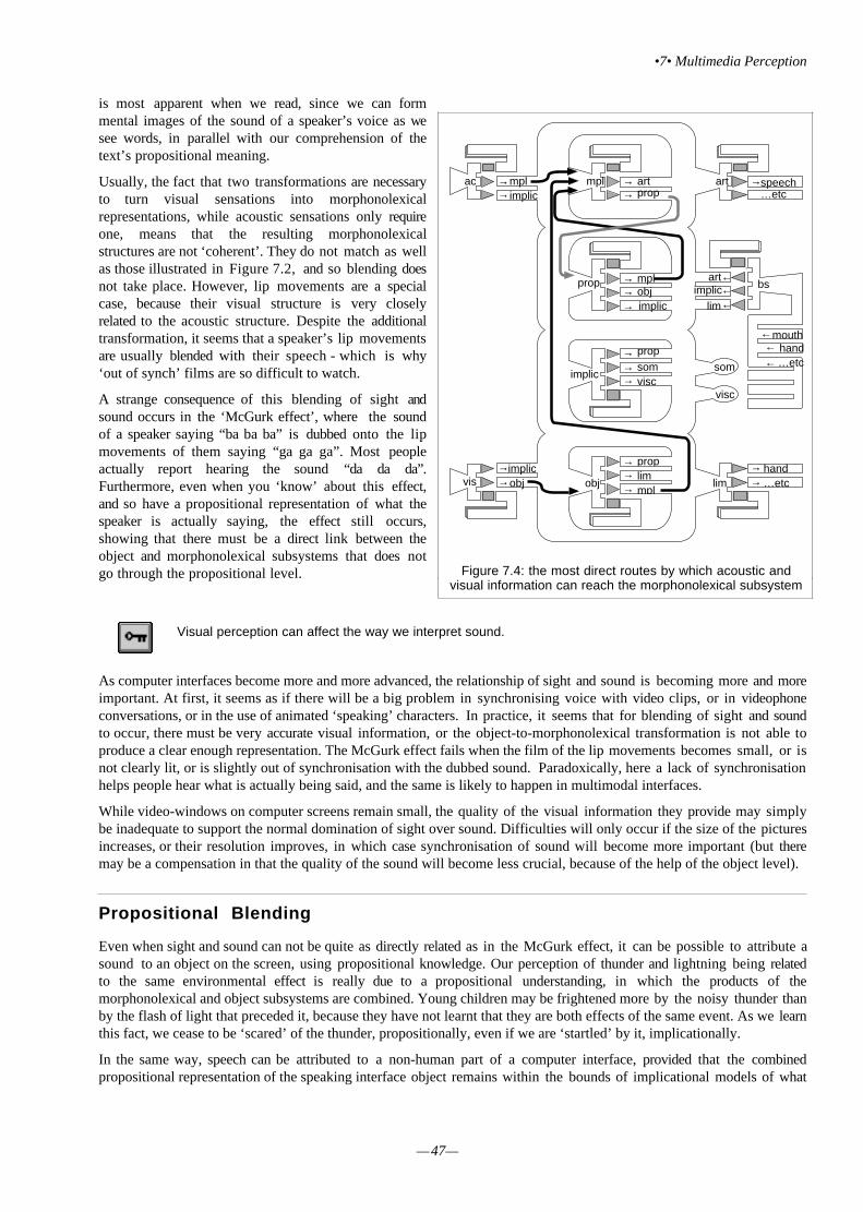
•7• Multimedia Perception
—47—
is most apparent when we read, since we can formmental images of the sound of a speaker’s voice as wesee words, in parallel with our comprehension of thetext’s propositional meaning.
Usually, the fact that two transformations are necessaryto turn visual sensations into morphonolexicalrepresentations, while acoustic sensations only requireone, means that the resulting morphonolexicalstructures are not ‘coherent’. They do not match as wellas those illustrated in Figure 7.2, and so blending doesnot take place. However, lip movements are a specialcase, because their visual structure is very closelyrelated to the acoustic structure. Despite the additionaltransformation, it seems that a speaker’s lip movementsare usually blended with their speech - which is why‘out of synch’ films are so difficult to watch.
A strange consequence of this blending of sight andsound occurs in the ‘McGurk effect’, where the soundof a speaker saying “ba ba ba” is dubbed onto the lipmovements of them saying “ga ga ga”. Most peopleactually report hearing the sound “da da da”.Furthermore, even when you ‘know’ about this effect,and so have a propositional representation of what thespeaker is actually saying, the effect still occurs,showing that there must be a direct link between theobject and morphonolexical subsystems that does notgo through the propositional level.
Visual perception can affect the way we interpret sound.
As computer interfaces become more and more advanced, the relationship of sight and sound is becoming more and moreimportant. At first, it seems as if there will be a big problem in synchronising voice with video clips, or in videophoneconversations, or in the use of animated ‘speaking’ characters. In practice, it seems that for blending of sight and soundto occur, there must be very accurate visual information, or the object-to-morphonolexical transformation is not able toproduce a clear enough representation. The McGurk effect fails when the film of the lip movements becomes small, or isnot clearly lit, or is slightly out of synchronisation with the dubbed sound. Paradoxically, here a lack of synchronisationhelps people hear what is actually being said, and the same is likely to happen in multimodal interfaces.
While video-windows on computer screens remain small, the quality of the visual information they provide may simplybe inadequate to support the normal domination of sight over sound. Difficulties will only occur if the size of the picturesincreases, or their resolution improves, in which case synchronisation of sound will become more important (but theremay be a compensation in that the quality of the sound will become less crucial, because of the help of the object level).
Propositional Blending
Even when sight and sound can not be quite as directly related as in the McGurk effect, it can be possible to attribute asound to an object on the screen, using propositional knowledge. Our perception of thunder and lightning being relatedto the same environmental effect is really due to a propositional understanding, in which the products of themorphonolexical and object subsystems are combined. Young children may be frightened more by the noisy thunder thanby the flash of light that preceded it, because they have not learnt that they are both effects of the same event. As we learnthis fact, we cease to be ‘scared’ of the thunder, propositionally, even if we are ‘startled’ by it, implicationally.
In the same way, speech can be attributed to a non-human part of a computer interface, provided that the combinedpropositional representation of the speaking interface object remains within the bounds of implicational models of what
→speechac
vis
mpl
implic
obj
art
bs
lim
→
obj→→
mplimplic→
→→ →
→→→
→→→
→→→
→→
propart
prop
proplimmpl
implic
mplobj
art
lim
somvisc
…etc
…etc
hand
←←
←
som
visc
handmouth
…etc
←←←
implicprop
implic
ac
vis
Figure 7.4: the most direct routes by which acoustic andvisual information can reach the morphonolexical subsystem

Modelling multimodal interaction
– 48 –
is reasonable. It is perfectly acceptable to understand acartoon tree as speaking to you, but it would take veryspecial circumstances for you to feel comfortablespeaking to a real tree.
Implicational knowledge ensures thatpropositional blending is ‘sensible’.
Figure 7.5 details the sources of representations thatarrive at the propositional subsystem. As well as theperceptual contributions from the morphonolexical andobject subsystems, this figure shows representationsarriving from the implicational subsystem. These arelargely the result of the loop of reciprocal processingbetween the propositional and implicational levels, and soserve to keep our propositional understanding of the worldstable from moment to moment, so that we generally donot flip between contradictory interpretations of theperceptual data, nor are we prone to accept bizarreinterpretations. This feedback loop ensures that, for themost part, we our experiences of the world fit with ourexpectations. The propositional subsystem is closelyinvolved in our use of language, since it produces themorphonolexical representations that are our ‘mentalvoice’, and is where the referential meaning of sound isassimilated. Normally, when people talk, they also makeall sorts of gestures. This habit is so ingrained thatpeople will even continue to gesture when they can’t beseen, such as when using the phone.
The origin of these gestures lie in our use of externalreferences when we point to things in the real world and say ‘that tree’ or ‘this rock’. The combination of pointing withverbal utterances is called ‘deixis’, and as we become highly practiced in our use of language, we are also able to use it to‘point’ to things that are not really visibly identifiable, such as ‘that direction’, ‘this big’, and ‘this shape’. These sorts ofgestures are a vital part of our communication – try to imagine how difficult it would be to describe things without everusing gesture – and they show the ready blending of propositional representations derived from the morphonolexicalinterpretation of speech, and the object interpretation of gestures.
Language is comprehended through propositional blending .
With the development of speech recognition technology, computer systems that attempt to make use of deixis arebecoming available. The MATIS system described in the previous section is an example, for it allows the user to fill in afield of their query form by saying ‘this city’ while pointing the mouse at a city name displayed elsewhere on the screen,as indicated in Figure 7.6.
→speechac
vis
mpl
obj
art
bs
lim
→
obj→→
mplimplic→
→→ →
→→→
→→→
→→→
→→
propart
prop
proplimmpl
implic
mplobj
art
lim
somvisc
…etc
…etc
hand
←←
←
som
visc
handmouth
…etc
←←←
implicprop
implic
ac
vis
implic
Figure 7.5: the converging propositional products of theobject, morphonolexical and implicational subsystems
OSLO
From
To
Dep Time
Arr Time
Airline
LONDON
MANCHESTER
Search Clear
Query 1
From
To
Dep Time
Arr Time
Airline
Search Clear
Query 2
MANCHESTER
'... to Oslo'
From
To
Dep Time
Arr Time
Airline
LONDON
Search Clear
Query 1
From
To
Dep Time
Arr Time
Airline
Search Clear
Query 2
'Show me flights from this city ...'
MANCHESTER
Figure 7.6: the MATIS system supports deixis

•7• Multimedia Perception
—49—
These systems are interesting to consider for a number of reasons. For one thing, pointing with a mouse is quite differentto the normal sort of gestures that we use when speaking, and so despite the apparent similarity of the concept, this sortof deixis would take some practice to be able to use naturally. At the moment speech recognition systems take asignificant amount of time to identify a word and to provide feedback to the user what it has understood, and even when‘trained’ on the target words, also have significant rates of misidentification. The delays may well be crucial in preventingtheir users from being able to make propositional blends of their speech and the results that they see on the screen.
Even if the delays can be avoided by better and faster systems, an analysis of the cognitive processes required for to usethis sort of deixis raises a problem. To point to a city name, users have to locate the text on the screen. Just like the userwho is searching for an icon, this means that they have use propositional knowledge to form a target of therepresentation, but this time the target is a word rather than a shape, and so the incoming visual information must becompared with the target at the morphonolexical subsystem, rather than at the object subsystem (or else the user wouldfind themselves searching for the word in a particular font). However, the morphonolexical subsystem also controls theexplicit production of speech, via the articulatory level, so once the propositional-to-morphonolexical transformation hasproduced the target word, they could proceed to speak it straight away, without waiting to locate it, or to move the mouseto it.
With advanced videoconferencing facilities, pointing and gesturing may have much less precision than that normallyattained even with a mouse. Figure 7.7 shows a graphical workspace that is shared between this screen and anotheruser’s, combined with a video window of the other user. Because each user can see the workspace and the other user, asthey can in normal situations, they may be encouraged to use deictic reference – in fact, in these ‘computer supportedco-operative work’ systems, the use of video-presence is supposed to enhance communication in just this way. However,when this user points at a shape and says ‘move this to here’, it is not at all clear what he wants you to do, because theinadequate object representation cannot be used to derive a propositional representation of sufficient detail.
Implicational Blending
Figure 7.7: A mock-up of a ‘shared drawing’ application that encourages users to make deicticreferences.

Modelling multimodal interaction
– 50 –
As well as intentional gestures such as pointing,people also make smaller, suggestive gestures thatemphasise or otherwise colour their speech, withoutreally being deictic in the sense of indicating areferent. These gestures cannot be said to beinfluencing the propositional meaning of our speechby their structural, object level interpretation. It ismore likely that they are understood by thetransformation of the sensory representation intoimplicational representations, followed by animplicational-to-propositional transformation. In thesame way, facial expression can indicate the mood ofthe speaker, and provide clues about a listener’sreactions to what you are saying.
Figure 7.8 shows the routes by whichrepresentations can reach the implicational level,which controls such attributions of qualitativemeaning. Again, this figure includes the reciprocalloop between implicational and propositional levelsof meaning. As we have already mentioned inSection 2, the general contextual sense that theimplicational-to-propositional transformationprovides can affect our interpretation of events,turning a ‘beep’ from a helpful informative act by aninterface into an annoying and frustrating one,according to the user’s mood.
Qualitative aspects of sound and sight are detected through implicational blending
The direct transformation of properties of acoustic and visual representations into implicational representations allowsthis subsystem to pick up contextual information from the environment in subtle ways which are often hard to identify,and are attributed to ‘feel’ or ‘style’. As an example, look at the shapes in Figure 7.9.
When asked ‘which shape is Takete and which is Uloomo’, most people point to the form composed of round elements asUloomo, and the angular form as Takete. The shapes appear to ‘fit’ this way around, and not the other – Takete ‘sounds’sharp and pointy, while Uloomo ‘sounds’ round and comfortable. The very difficulty people have in justifying theirassessments is characteristic of the involvement of implicational representations, set apart as they are from verbalisation
without the mediation of the propositional level.
Forms with implicational qualities have long been usedin all sorts of interfaces from traffic signs (warningsigns are triangular, ‘requests’ for drivers to obey arecircular) to military radar displays (Figure 7.10). Theuse of shape to provide implicational representationsdirectly can be an extremely useful way ofcommunicating abstract information rapidly, but it isalso very difficult to quantify and to prescribe.
Because the sensory subsystems provide implicationalrepresentations directly, it can become available beforethe perceptual and propositional subsystems haveprocessed the explicit meaning of information. The
affective tone of information may be interpreted and fed back to the propositional subsystem in advance of the perceptualsubsystems’ contribution. This is how the fine nuances of gesture, intonation and facial expression can affect our
→speechac
vis
mpl
obj
art
bs
lim
→
obj→→
mplimplic→
→→ →
→→→
→→→
→→→
→→
propart
prop
proplimmpl
implic
mplobj
art
lim
somvisc
…etc
…etc
hand
←←
←
som
visc
handmouth
…etc
←←←
implicprop
implic
ac
vis
implic
Figure 7.8: the routes by which information reaches theimplicational subsystem
Figure 7.9: Two shapes with implicational meanings

•7• Multimedia Perception
—51—
interpretation of speech, preparing us for the desired propositional interpretation of otherwise ambiguous linguisticphrases.
While the use of facial or intonational cues isuseful when it is accurately related to the intendedmeaning of language, there can obviously beproblems if it is unrelated. Computer-generatedspeech is notoriously lacking in intonation, andthis has limited its widespread use as an outputmedium, despite its apparent advantages in manysituations. Its only real application at the momentis in systems that provide automated responses viathe telephone, such as banking services andspeaking clocks, where the range of language isgenerally unambiguous, and would not benefit fromintonational fluency.
Automated faces face the same problems.Figure 7.11 shows two very slightly differentversion of a face that was used to accompanyspoken instructions to some people filling in aquestionnaire by computer. Users who were askedthe questions by the ‘stern’ version on the rightspent longer writing their answers, wrote more, and made fewer mistakes than the people who saw the ‘neutral face’, butthe liked the experience and the face less. The affective content of the face changed the way that users interpreted thequestionnaire session as a whole, with the negative implications produced by the stern face giving an innocent questionand answer session the characteristics of aninquisition.
Consequences of blending
In this section we have described different ways inwhich multimodal information can be combined,reflecting the four central levels of representation inICS. In designing interfaces that do use multimodalfeatures, it is important to identify the level thatthey are intended to be blended at, and to select theway that the information is presented accordingly.The use of sound in addition to visual objects willonly help if the morphonolexical-to-objecttransformation is able to produce propositionalrepresentations that can be blended with those fromthe object-to-propositional transformation.
In general, we can say that there are two classes ofmultimedia interface. One relies on the blendingtogether of implicational representations that havebeen produced directly from sensory information bythe visual and acoustic subsystems. Because theseresult in an implicational representation, this is aqualitative sort of perception, that can give rise toan awareness of the general meaning of events in the world.
The second sort of multimedia interface relies on the structural interpretation of sensory information to produce object andmorphonolexical representations, which are then used to produce propositional representations. When these are blended,the sound and vision can be attributed to a single event in the world, which can be named or identified.
Multimedia interfaces rely on either propositional or implicational blending
Figure 7.10: a schematic view of a military radar showing ‘friend’and ‘enemy’ formations
Figure 7.11: ‘neutral’ (left) and a ‘stern’ (right) faces used toaccompany auditory questions to computer users

—52—
•8• Applying the techniques
Icons for multivariate information
Some designers have tried to make use of our skills in the recognition and identification of complex graphical forms torepresent complex ‘multivariate’ data with icons. Multivariate data is obtained when things are measured on severalvariables at the same time. For example, a house can be measured on its price, number of bedrooms, distance from thestation, and so on. These measurements could be shown quite concisely in a numerical table, with a row for each house,and a column for each measurement, but trends that involve more than one variable are hard to detect from numbers alone.House price may be directly related to the number of bedrooms, or the distance from the station, for example.
Graphs that plot one measurement on the horizontal axis and another on the vertical axis are better, since the spatialgroupings and positions within the area of the graph directly show the relationships between two variables. Even fourmeasurements require six graphs to show all of the pairwise relationships: and they cannot show relationships that
involve more than three variables at all.
The icon solution tries to represent each measurement by a differentattribute of an object, and then rely on the viewers’ ability to usepropositional knowledge to concentrate on the relevant parts. InFigure 8.1, each of the ‘faces’ has three attributes that can change: thesize of the nose, the curve of the mouth, and the angle of the eyes caneach vary independently. If the nose represented a house’s price, themouth its number of bedrooms, and the eyes its distance from thestation, the viewer of this array could use their propositionalknowledge to generate a mental image (an object representation) of, forexample, a medium nosed, flat mouthed, slant-eyed face, and thensearch the array for that icon. In practice this system has proved hard touse. If we look at the structure of these faces, they resemble thecontrol-panel icons of Figure 4.6 and the representationalword-processing icons of Figure 4.1: they all have the same general‘shape’ and border. The faces therefore form an array, but no subgroups,
and require search within the structure of each face to get information about how the faces differ, and therefore about thevariables that the users are required to judge. As with the control-panels and word-processing icons, this predicate searchrequires transitions up and down within the structure of each icon, as well as transitions between the faces, which slowssearch down. The search and comparison of the face icons is represented in Figure 8.2.
Figure 8.1: multivariate data presentationusing faces
array of faces face 2 face 3 face 4 ... etc head eyes nose mouth
face 1 nose mouth
face 1 nose mouth
face 1 eyes mouth
face 1 eyes nose
array of faces face 2 face 3 face 4 ... etc head eyes nose mouth
array of faces face 1 face 3 face 4 ... etc head eyes nose mouth
face 2 nose mouth
... etc
face 1
head eyes
headeyes
headnose
headmouth
face 1
face 2
head eyes
Figure 8.2: the transition path required to make decisions about the attributes of a multivariate face icon

•8• Applying the techniques
—53—
This is an example of the visually derived object representationbeing too strong for the propositionally derived knowledge toinfluence. With practice, users of the face icons can certainlygenerate a target image to search for, but it simply isn’t possiblefor them to group the faces according to any particular attribute orcombination of attributes.
A second family of icons to present multivariate data uses thestructures of stick men (Figure 8.3). In this system the differentdimensions are represented by varying the head size, body size andslant of limbs. We have shown that attributes like these can affectgrouping in very simple visual items. In experiments, this systemof representation is easier for subjects to use.
Because these stick men have no pragmatic subject, thepropositional knowledge can now influence the objectrepresentation. Any one of the different attributes could form thepsychological subject. In practice, this means that a stick-man (ora group of stick-men) with a different value to its neighbours forany one of its attributes can be made to pop-out, and be easilyidentifiable, provided that the user of the array is ‘concentrating on’that attribute. Furthermore, an object representation of the target will now have as its subject the same attribute that hasbeen used to group the objects in the array. This representation can then be used to drive the search, rather than letting itbe constrained by the visual features of the array. This reduces the need for predicate depth search and shortens search time.
If propositional representations can be used to group objects as well as to generate a target to search for, search easier and quicker.
Dynamic changes in structure
The examples so far have concentrated on static screen displays – ones inwhich nothing moves. Clearly, motion affects the structural attributes ofdisplays: one moving object against a static background is very likely topop out, and grab people’s attention, regardless of its other attributes. Ifmany objects move in an unco-ordinated fashion, the result is just going tobe confusing, and very hard to make sense of. Between these extremes youmight be able to see how the principles of grouping that we have presentedfor static attributes can also apply to dynamic attributes.
Consider a group of people walking along a street. Unless they are an armymarching in step, they will all move at slightly different speeds, and yet wecan perceive them as a group, because they all move in roughly the samedirection, at roughly the same general speed. Similarly, a few screen objectswith similar attributes of motion can be perceived as a single ‘group’moving on the screen.
Other attributes can also vary over time - an object might change colour,size, or shape, for example. This is a key principle in animation, and allowsus to see differently drawn views of an object as the ‘same thing’ changing,rather than as ‘different things’, replacing each other. For this to workperceptually smoothly, the viewer must be able to construct a smoothlychanging object representation, and so the visual changes must not be toogreat. In the top row of Figure 8.4, a ball changes shape over time. If thiswere an animation, we would easily see this as a single, changing ball,rather than as separate balls replacing each other. In the middle row, itscolour changes but its shape remains constant. Again, it is easy for us to seeit as a single, changing ball.
In the lower row, both of these attributes change at the same time. Now it is harder (although still possible) for us to seeit as a single ball. This sequence of changes, if animated, appears much less ‘smooth’, and it feels as if we are seeing
Figure 8.3: multivariate data presentation usingstick men
Figure 8.4: a dynamically changing ball can beseen as such (top two rows) if the changes over
time are not too great (lower row).

Modelling multimodal interaction
– 54 –
several different balls. This is because the overall change in the attributes of the ball has become too great for thevisual-to-object transformation to produce an object representation that can coherently blend with ongoing processing, inparticular the product of the propositional-to-object transformation, which was based on the object representation of theprevious ball.
Objects that change over time can be perceived as the same object, if the changes can be propositionally blended.
Animation is a familiar example of dynamic, changing objects that can move on the screen. Ordinary films also tell ussomething about the management of dynamic changes in display design. Over the last century, film-makers havedeveloped editing techniques that allow them to cut from camera to camera, dramatically changing the structural contentsof the visual scene, without confusing or misleading the viewers of their films. They can jump spatially between differentviewpoints within a scene, or temporally, skipping over periods when nothing interesting is happening. They can even
intercut different scenes without confusing us.
Many of the rules of thumb that film-makers followwhen cutting films together have to do with thecontent of the narrative, but others have to do withstructural details of the shots either side of the cut.When a film-maker cuts from a view of someone firinga gun, to a view of his victim falling, a conventionalcut will place the victim in roughly the same screenlocation as the gun (Version A of Figure 8.5).
Before the cut, viewers will have been watching theman raise the gun, and they are likely to have had thegun as the psychological subject of their objectrepresentation. When the cut occurs, they will belooking directly at the falling man, and so this willform the immediate pragmatic subject. Since this fitscoherently with their ongoing propositionalcomprehension of the scene, providing ‘thematiccontinuity’, the cut makes sense and seemsperceptually smooth.
Version B of Figure 8.5 shows an unconventional cut.The falling man is not ‘collocated’ with the gun, andso following the cut, the viewer has to search the sceneto find an object that makes propositional sense. This
cut feels less perceptually smooth. This type of cut is more likely to be ‘noticed’ as a perceptual ‘jump’ because it doesnot provide thematic continuity.
Thematic continuity , through collocation of objects that are visually or propositionally related, helps users orientthemselves over screen changes.
A similar use of collocation is made when film-makers zoom-in to a scene to provide greater detail on some object. Herethe rule is that the same object should be the subject of the before and after shots, and that it should be collocated withitself. Clearly, to do this the film-maker needs to ‘know’ what it is that the viewer is going to be looking at, and so theywill often try to direct the viewers’ attention towards the object that they are going to zoom-in to. An actor might pickthe object up, or direct their gaze towards something, so that the viewers also look at it.
Many applications need to change screen displays, so that all of the information changes. The advice of film-makerswould be to provide some thematic continuity over the screen change, just as they do over cuts. An example of this sortof design problem can be seen in Figure 8.6, where a tourist information system was being implemented on a PC. Thescreen had to display a large scale overview of the whole area (the left screen), and allow people to ‘zoom-in’ by clickingon a particular place (right screen)
greyman
stripedman
gun head house
greyman
gun head house
stripedman
fallingman
fallingman
Figure 8.5: successful cutting in films is dependent uponthematic continuity in the structures.

•8• Applying the techniques
—55—
Baden-baden
NordheimA
B
C
D
E
1 2 3 4 3
E
spa hotel
Schloß
Marktplatz
Kirche
P
P
P
PGasthof
D
click
Baden-baden
Figure 8.6: when the user clicks to zoom-in, the display provides thematic continuity
Just before the user clicks, they will have moved the cross-hair to the area they are interested in, and will be attending tothat part of the screen (perhaps to the name of the city, to the blob marking its position, or to the road layout). After thescreen zooms-in, the display preserves some of these objects, and collocates them. If the user had been attending to thename or to the road junction, then these objects would still form the psychological subject, even though their size hasincreased (Figure 8.7).
This would give a sensation of ‘getting closer’, as well as providing thematic continuity, so that they would not have tosearch around the screen to find out what had happened. The ‘city blob’ has disappeared, of course, so if they had beenattending to this they might be a little less sure of what had happened, but several objects of the predicate would remain(the name and the junction), and these too could provide some thematic continuity.
leftcolumn
scalemark
"baden-baden"
cityblob
crosshair
Y-junction
"nord-heim"
screen
toprow
leftcolumnmap
maparea
cityblob
crosshair
Y-junction
"nord-heim"
maparea
crosshair
Y-junction
spahotel
maparea
toprow
"baden-baden"
"baden-baden"
mapareamaparea
map
Figure 8.7: a transition path across a screen change (dashed line) in Figure 8.6 shows how the subject is maintained

Modelling multimodal interaction
– 56 –
SummaryThis Guide has provided an overview of a framework for understanding human perception and cognition. The framework,ICS, consists of nine independent cognitive subsystems, which each operate on a different level of mental representation.Each subsystem has a common architecture, with a memory and set of processes that transform their level ofrepresentation into other levels. The flow of information between the different levels, and the interaction of the cognitivesubsystems, gives rise to the richness of human cognition and perception. Because of the common architecture, each levelof representation can be analysed using the same structural techniques. All representations consist of a group, subject-predicate and constituent structures. Structure diagrams and transition path diagrams can be used to show how the focus ofprocessing can move over time, and how representations from different sources can be combined.
Our visual perception is a result of a blend of information that is derived from visual sensory representations andpropositional knowledge. Our perception of sound is a result of a blend of representations from acoustic, propositionaland also object sources. The propositional subsystem blends the perception of sight and sound with our implicationalunderstanding of the situation. Our implicational understanding is based on a blend of propositional knowledge andqualities derived from sensory information, including the state of our bodies.
Understanding the interactions between these levels of representation can help interface designers. Screen displays can bedesigned so that objects group together to match the structure of the user’s tasks. Task structures can be designed to avoidambiguous steps. Multimodal interfaces can be designed so that sight and sound can blend appropriately, eitherpropositionally or implicationally.
Hints for structuring displays
1 Consider what objects you want to appear on the display.Does the presentation on the screen actually form these objects?Are the individual objects recognisable as propositionally nameable entities?
2 Do the objects on the display form groups, or a hierarchy of groups?Do you have an array of icons, or a display containing smaller windows which in turn contain further structures?Draw the Structural Diagram , and be careful to consider the structure of the different objects, and whetherthese contain smaller objects that the user can interact with.
3 If the user has to search for objects in the display, what mental image (object representation) will they form?What attributes of an object can they use to discriminate it from its neighbours?Do these attributes help the target pop out from the background?Remember that a user might use different propositional knowledge, and so the structure of the objectrepresentation might vary.
4 When the structure diagram is drawn, think about the visual transitions users will make, and draw aTransition Path Diagram .What sequences of tasks are users going to perform with the display?What will the transition paths look like?Are there ways you could speed up the tasks by avoiding transitions between levels of structure?
5. How is the user’s task structured?Where is the most ambiguous part of the transition path diagram going to occur?Can the ambiguity be reduced by changing the task?Check again that the object structure and the propositional structure match.
6. Does the system use sound as well as a display?Will the sound perceived be affected by the display?Can the sound be propositionally blended with the interpretation of the display?Do the qualities of the visual and acoustic information provide any implicational cues that might affect theuser’s propositional interpretation or mood?

—57—
Answers to Exercises
Exercise Set 1
These figures are intended to show that although there may be several possible ways of structuring the groups, there isusually one 'perceptually obvious' way. Here we only include the structure of this obvious grouping. The less obviousstructures are not 'wrong', but they require effort to impose upon the groups.
Note also that we have not always included every single circle and square in the figures - just enough to make it clearwhat ought to be represented.
The precise terms that are shown in the diagrams are not important - we have shown each as starting with 'set', but thewords themselves are not crucial. Group, Array, or Pattern would all serve just as well, and there are undoubtedly manyother synonyms. These are just 'labels': what is being described is more important. In some cases we have drawn theobjects themselves rather than use words.
(1) circle
set
horizontalrow
horizontalrow
horizontalrow
horizontalrow
circle circle circle circle circle circle circle
Here the attribute that is 'causing' the circles to be grouped into rows isproximity.
(2)
set
circle square circle square circle square circle square
blackvertical row
whitevertical row
greyvertical row
whitevertical row
In this and the next figure, the similarity of the shapes in each row suggeststhat the second level of the structure could be rows – but in this figure thecolour of the columns predominates.
(3) circle
set
circle square square circle circle square square
horizontalrow
horizontalrow
horizontalrow
horizontalrow
When the colour is removed from (2), the similarity of shape dominates thestructure, and the rows become the second level of structure.

Modelling multimodal interaction
– 58 –
(4) circle
set
column column column column
8 shape 8 shape 8 shape 8 shape 8 shape 8 shape 8 shape 8 shape
circle circle circle
This figure has circles grouped by collocation into 'figures of eight' or '8shapes', but the grouping of these shapes is ambiguous. You might representthem as columns, wavy horizontal rows, or even groups of four (in arhombus). There is some structure there though, so the diagram should havefour levels.
(5)
group
set
horizontalrow
horizontalrow
group group group
square square square square square square square square
Here the squares are joined at their boundary into groups, and these groupsthen form rows due to their proximity to each other. Note that if the slighthorizontal offset of each square were not present, the eight groups would looklike rectangles with a line across the middle, not two squares.
(6)
set
oblique row oblique rowoblique rowoblique row oblique row
Now the junction of the squares links them into five oblique or diagonalrows, although some rows have two and some four elements. The presence ofthe 'pairs' at each end might lead you to see the centre three rows as also beingcomposed of two pairs, adding another level of structure to the diagram.
(7)
set
oblique row oblique row
group
square square
group
square square
group
square square square square
groupgroup group group group
This figure is exactly the same as (6), except that a slight gap has beenintroduced into the middle of the three central rows. Instead of just breaking thestructure up into eight pairs, two new diagonal rows emerge (proximity).This figure shows that there are often several different grouping principlescompeting to provide organisation, and that when one is weakened, anothermay take over.

Answers to exercises
—59—
Exercise Set 2 Question 1
This exercise shows how the transition path diagrams represent the more complex search in the right hand group. Thepresence of the black circle makes it harder to 'zoom-in' to the substructure of the white group distractor.
figure
group subject predicate constituent structure
group ofwhite circles
blackgroup
whitegroup
group ofwhite circles
whitecircle
whitecircle
whitecircle
whitecircle
whitecircle
whitecircle
whitecircle
blackgroup
group subject predicate constituent structure
blackgroup
figure group ofwhite circles
whitegroup
whitecircle
subgroup of black circles
whitecircle
subgroup ofblack circles
whitegroup
blackcircle
subgroup of white circles
group subject predicate constituent structure
blackgroup
figure group ofwhite circles
whitegroup
whitegroup
blackcircle
subgroup of whitecircles
subgroupof whitecircles
whitecircle
whitecircle
whitecircle
whitecircle
blackcircle
subgroup of white circles
whitecircle
whitecircle
whitecircle
Exercise Set 2 Question 2
rectangle rectangle
verticalrectangles
verticalrectangles
figure
horizontalovals
subgroup ofvertical
rectangles
horizontalrectangle
subgroup ofhorizontalrectangles
verticalrectangle
rectangle rectanglerectangle
horizontalrectangles
oval ovalrectangle rectangle
subgroup ofvertical
rectanglessubgroup ofhorizontal
ovals
horizontaloval vertical
rectangle
rectangle
ovalrectangle

Modelling multimodal interaction
– 60 –
Exercise Set 2 Question 3
circles horizontalrectangle
group subject predicate constituent structure
horizontalrectangles
figure verticalrectangles
horizontalovals
subgroup ofvertical rectangles
verticalrectangles
subgroup ofvertical rectangles
horizontalrectangle
group subject predicate constituent structure
horizontalrectangle
horizontalrectangle
horizontalrectangle
horizontalrectangles
subgroup of horizontalrectangles
verticalrectangle
subgroup of horizontalrectangles
verticalrectangle
horizontalrectangles
figure verticalrectangles
horizontalovals
verticalrectangles
horizontalrectangles
subgroup ofhorizontalrectangles
horizontalrectangle
horizontalrectangle
horizontalrectangle
subgroup of horizontalrectangles
verticalrectangle
horizontalovals
group subject predicate constituent structure
verticalrectangles
horizontalrectangles
figure verticalrectangles
horizontalovals
horizontalrectangle
subgroup ofhorizontal ovals
horizontalrectangle
subgroup ofhorizontal ovals

Answers to exercises
—61—
Exercise Set 3 Question 1
group subject predicate constituent structure
leftgroup
figure
bigcircle
subgroup of small circles
right group
leftgroup
bigcircle
subgroup of smallcircles
group subject predicate constituent structure
bigcircle
subgroup of small circles
bigcircle
subgroup ofsmall circles
smallcircle
subgroupof smallcircles
smallcircle
smallcircle
smallcircle
leftgroup
figure right group bigcircle
subgroup of smallcircles
smallcircle
smallcircle
smallcircle
leftgroup
leftgroup
group subject predicate constituent structure
rightgroup
left groupfigure subgroup ofbig circles
small circle
subgroup ofbig circles
small circle
subgroup ofbig circles
bigcircle
bigcircle
bigcircle
bigcircle
rightgroup
bigcircle
bigcircle
bigcircle
group subject predicate constituent structure
subgroup ofbig circles
smallcircle
subgroup ofbig circles
small circlerightgroup
group ofcircles
rightgroup
left groupfigure subgroup ofbig circles
small circle
bigcircle
bigcircle
bigcircle

Modelling multimodal interaction
– 62 –
Exercise Set 3 Question 2
line line line line lineline
subgroup oflong lines
short line
left group
figure 19
group subject predicate constituent structure
longline
subgroup oflong lines
short line
right groupfigure leftgroup
leftgroup
longline
longline
subgroup oflong lines
short line
subgroup oflong lines long line
longline
longline
group subject predicate constituent structure
longline
subgroup oflong lines
short line
right groupfigure leftgroup
leftgroup
longline
longline
subgroup oflong lines
short line
leftgroup short line subgroup of long lines
line line line line lineline
subgroup ofshort lines
long line
right group
figure 19
group subject predicate constituent structure
longline
subgroup oflong lines
short line
subgroup oflong lines
left groupfigure rightgroup
leftgroup
longline
longline
subgroup oflong lines
short line
longline
longline
longline
group subject predicate constituent structure
longline
subgroup oflong lines
short line
left groupfigure rightgroup
leftgroup
longline
longline
subgroup oflong lines
short line
leftgroup short line subgroup of long lines

Answers to exercises
—63—
Exercise Set 3 Question 3
dashed diagonalcross
dashedupright cross
A
vertical line
dashdashdash dashdashdash
horizontal line
left slanted line
dashdashdash dashdashdash
right slanted line
diagonal whitecross
dottedupright cross
B
vertical dotted line
dashdashdash dashdashdash
horizontal dotted line
dotteddiagonal cross
C
vertical dotted line
dashdashdash dashdashdash
horizontal dotted line
upright whitecross
dottedupright cross
D
vertical dotted line
dashdashdash dashdashdash
horizontal dotted line
diagonal blackcross
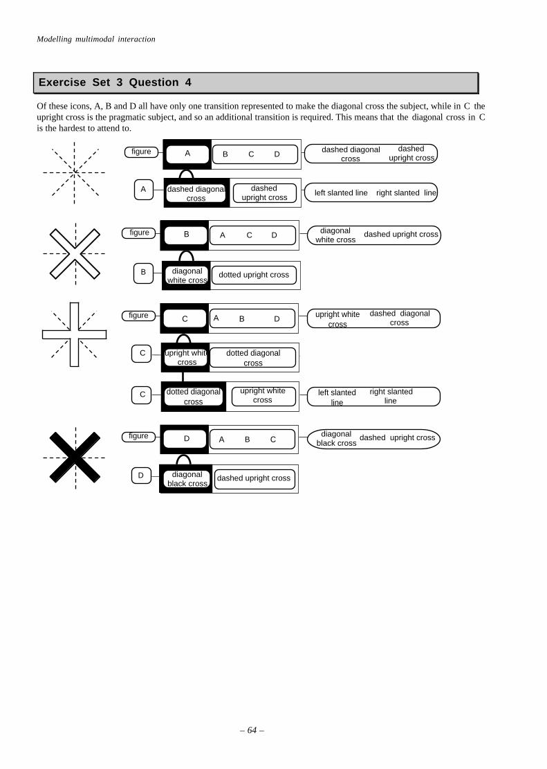
Modelling multimodal interaction
– 64 –
Exercise Set 3 Question 4
Of these icons, A, B and D all have only one transition represented to make the diagonal cross the subject, while in C theupright cross is the pragmatic subject, and so an additional transition is required. This means that the diagonal cross in Cis the hardest to attend to.
A B C Dfigure
A
dashed diagonalcross
dashedupright cross
dashed diagonalcross
dashedupright cross
left slanted line right slanted line
B A C Dfigure
B diagonalwhite cross
dotted upright cross
diagonalwhite cross
dashed upright cross
right slantedline
left slantedline
C
dotted diagonalcross
upright whitecross
Cfigure A B Ddashed diagonal
crossupright white
cross
dotted diagonalcross
upright whitecross
C
D diagonalblack cross
dashed upright cross
D A B Cfigure diagonalblack cross
dashed upright cross

Answers to exercises
—65—
Exercise Set 4 Question 1
delete line
linelineline
icon
group ofdiagonallines
horizontal line
word searchlinecircle
icon
replace word
linecross linesquare
left right
icon
scroll right triangle
icon
rectangle
Exercise Set 4 Question 2 & 3
psiicon
group of icons
subgroup ofdocument icons
icon icon
"W" icon
diamond shape"W"
"W"document document
textbox
box of text
psiicon
group of icons
subgroup ofdocument icons
icon icon
"W" icon
diamond shape"W"
"W"document document
textbox
box of text

Modelling multimodal interaction
– 66 –
Exercise Set 4 Question 4
The document shape is common to all of the document icons, and so having it as the pragmatic subject does not helpdistinguish between them. Additional transitions are required to examine the distinguishing features of each icon (or thetextual label, although we are not including these in the structure here). The 'blending text' icon differs in the location ofthe W and the 'box of text', and so if either of these were the pragmatic subject then the icon could be found easily, sincethe discriminating feature could be found without a transition. Since it has a different pragmatic subject to the rest of thesubgroup, it may actually 'pop-out' from the others. We have shown this in the answer to 4.3 by highlighting the 'icon'that it belongs to – you could also add in another subgroup for all of the other document icons, to make this pop-outeffect obvious.
Exercise Set 5 Question 1 & 2
groupof square icons
arrow tailpointing up
square square square square square
arrow tailpointing up
arrow tailpointing up
arrow tailpointing up
arrow tailpointing down box
groupof icons
group of empty boxespointing top left
empty box pointingbottom right
box box box box
Exercise Set 5 Question 3
The 'blending text' icon is the most complex, and so even when the document shape is the pragmatic subject it still'pops-out' to a certain extent, although we have not shown this happening in the answer for Exercise 4.
Exercise Set 5 Question 4
"W" icon
diamond"W"lines
document
rectangle
lines
document
rectangle
group ofdocuments
"W" icon
diamond"W"lines
document
rectangle
document
document
"W" icon
diamond
group
"W"document
lines
subroup ofplain
documents
document
lines"W"
document
rectangle rectanglelines
document
rectangle

Answers to exercises
—67—
Exercise Set 6 Questions 1-4
As the figures below show, only the subgroup in part d has a pragmatic subject, which stands out from the rest of theblack group on account of its different shape. It is therefore easier to find this oblong than the differently textured oblongin part f, which does not form a pragmatic subject (texture here not being a grouping cue).
bar
group
verticalwhilte bar
subgroup ofvertical black bars
bar bar bar bar bar
bar
group
horizontalwhilte bar
subgroup of black bars
bar bar bar bar bar
subgroup of horizontal black bars
verticalblack bar
bar
group
vertical /// bar
subgroup ofvertical \\\ bars
bar bar bar bar bar
\\\ bar
vertical\\\ bar
subgroup ofhorizontal bars
\\\ bar \\\ bar \\\ bar
/// bar
group
subgroup ofhorizontal bars

Modelling multimodal interaction
– 68 –
Exercise Set 7 Question 1
request tools
heading
request tools close box
window
icons
citybutton
building "city"
timebutton
clock "time"
Flight No.button
board "Flight No"
Miscbutton
flag "Misc"
Airline Co.button
tail "Airline Co."
Farebutton
dollar query "Fare"
Mealbutton
pie "Meal"
emptybox
results of request
fromcolumn
Tocolumn
"to" text
Arrivecolumn
Airlinecolumn
Flightcolumn
Stopscolumn
Flyingcolumn
Leavecolumn
"from" text no.s"arrive"
"Airline"
"flight" text
"stops"
"flying"
"leave"
heading
close box
window
list scrollbar
no.s no.s
no.s
no.s
"results of request"

Answers to exercises
—69—
Exercise Set 7 Question 2
list
From To Dep Time Arr Time Airline Meal
"From"
slot
"PITTSBURGH"
"Meal"
slot
"MEAL"
"To"
slot
"BOSTON"
slot
"Dep Time"
slot
"Arr Time" "Airline"
slot
"US AIR"
Exercise Set 7 Question 3a
To To slot"Boston"
list To From Dep time Arr Time Airline Meal To slot "Boston"
form list scrollbar From To Dep time Arr Time Airline Meal
request3
iconsform heading list scrollbar
request3
icons form headingsearch button
clearbutton
searchbutton
icons clear button book "search information"

Modelling multimodal interaction
– 70 –
Exercise Set 7 Question 3b
To To slot"Boston"
list To From Dep time Arr Time Airline Meal "To" slot "Boston"
form list scrollbar From To Dep time Arr Time Airline Meal
request3
iconsform heading list scrollbar
matisrequest3
screenrequest
2results ofrequest
... etc icons formheading
matisrequest
3screenrequest
2results ofrequest
... etc heading window
results ofrequest
window heading column column ... etc
"From"column
window"To"column
"PIT" "PIT" "PIT""Leave"column
... etc
"From"column
window "To"column
"710" "841" "1200""Leave"column
... etc
"710" "841" "1200""Leave"column
... etc
Exercise Set 7 Question 4
Having just filled in the 'Dep Time' slot, the user will still have a mental image of this phrase. The correspondingcolumn in the results window is headed 'Leave', and so they may not realise that it is the one they want. Making the labelfor the slot in the Request and Results column correspond to each other would be best, whether they both say 'Dep Time'or 'Leave'.
Exercise Set 7 Question 5
list
labels slots
slot slot slot slot slot slot
"From" "Meal""To" "Dep Time" "Arr Time" "Airline"
"PITTSBURGH" "MEAL""BOSTON" "US AIR""7.10" "8.39"
values

Acknowledgments
—71—
Sources of examplesThe icon arrays shown in Figures 1.1, 1.2, 4.4, 4.6, and 4.8 are all taken from the Macintosh Finder, System 7.1.1.
The menu shown in Figure 3.9 is a (customised) version of one found in Microsoft Word 5.1a for Macintosh.
The representational and abstract icon sets shown in Figure 4.1 were first used by:Arend, U., K-P. Muthig and J. Wandmacher (1987) ‘Evidence for global feature superiority in menu selection by icons’,Behaviour and Information Technology, 6, 411-426.
Other experiments carried out using these icons are reported in:Green, A.J.K. and P.J. Barnard (1990) ‘Icon Interfacing: The role of icon distinctiveness and fixed or variable screenlocation’, in D. Diaper, D. Gilmore, G. Cockton and B. Shackel (Eds) Proceedings of Interact ’90, Amsterdam: ElsevierScientific Publishers B.V., pp 457-462
The analysis of the structure of the icons, and the graph shown in Figure 4.3, appeared in:May, J., Barnard, P.J. and A. Blandford. (1993) ‘Using Structural Descriptions of Interfaces to Automate the Modellingof User Cognition’, User Modelling and Adaptive User Interfaces, 3, 27-64.
The ‘cube’ and ‘empty box’ objects shown in Figure 5.1 were first described by:Enns, J.T. & Resnick, R.A. (1992) A model for the rapid interpetation of line drawings in early vision. In D. Brogan(Ed.), Visuial Search II, pp. 73-89. London: Taylor & Francis.
The hypertext database shown in Figure 5.4.was developed by researchers at the University of York, and is described in:Myers, K.J. and N.V. Hammond (1991) ‘Consolidated Report of workshop on scenario matrix analysis’. Esprit 3066‘Amodeus’ Deliverable D9, Dept. of Psychology, Univ.of York, UK
The experimental study that used the ‘ordering system’ described in Section 6 and Figure 6.3 is reported in:Barnard, P.J., MacLean, A., and Hammond, N. (1984) User representations of ordered sequences of command operations.In B. Shackel (ed), Proceedings of INTERACT'84. London: IEE.
The ‘MATIS’ system shown in Figure 6.9 is described in:Nigay, L. & J. Coutaz, (1995). A generic platform for addressing the multimodal challenge. In Proceedings of CHI’95.ACM: New York (in press).
The ‘shared drawing’ experiment in Figure 7.7 is reported in:Barnard, P.J., May, J., and Salber, D. (1995) Deixis and points of view in media spaces: an empirical gesture. Behaviourand Information Technology , 15, 37-50.
Takete and Uloomoo were first described by:Davis, R. (1961) The fitness of names to drawings. British Journal of Psychology, 52, 259-268.
The faces in Figure 7.11 are taken from:Walker, J.H. & Sproull, L & Subramani, R. (1994) Using a human face in an interface. Proc. CHI’94, pp.85-91. ACM:New York.
The ‘face icons’ of Figure 8.1 were described in:Chernoff, H. (1973) The use of faces to represent points in k-dimensional space graphically. Journal of the AmericanStatistical Association, 68, 361-368.
The ‘stick men’ icons of Figure 8.3 were developed by:Pickett, R.M. & Grinstein, G.G. (1988) Iconographic displays for visualising multidimensional data. Proceedings of theIEEE International Conference on Systems, Man and Cybernetics. Beijing and Shenyang, PRC: IEEE.

Modelling multimodal interaction
– 72 –
Index of Exercises
Exercise Set 1................................................. 20
Exercise Set 2................................................. 22
Exercise Set 3................................................. 23
Exercise Set 4................................................. 28
Exercise Set 5................................................. 29
Exercise Set 6................................................. 34
Exercise Set 7................................................. 43
AcknowledgmentsThe authors of this guide would like to thank Anker Jørgensen and Annette Aboulafia of the Psychology Department ofCopenhagen University, and their many HCI students for their help in the development and evaluation of earlier drafts.
This is the fourth distributed edition of the Guide.
The third edition was used by the Mennesks-Maskine Interaktion Course of the University of Copenhagen, In Autumn1996.
The second edition was prepared for a tutorial at Eurographics’95 in Maastricht, and has been published as:May, J., Scott, S. and Barnard, P. (1995) Structuring Displays: a psychological guide. Eurographics Tutorial NotesSeries. EACG: Geneva
The first edition of this Guide was written as part of the AMODEUS project: ESPRIT basic research action 7040, supportedby the Commission of the European Union.

Index of key points
—73—
Index of key points
The structure of the scene constrains the way people can search through it................................................... 9
The object that is being attended to is the psychological subject. Other objects in the same group formits predicate ............................................................................................................................. 9
Structure diagrams show the hierarchical relationships between objects. Transition Pathdiagrams show changes in the psychological subject and predicate in time........................................... 9
Sensory information from the eyes forms a visual representation. .......................................................... 12
Perceptual information is contained in an object representation. ............................................................ 12
The visual-to-object transformation process structures and groups the visual scene................................... 12
The object-to-propositional transformation process identifies and relates objects..................................... 13
The propositional-to-object transformation process feeds back information about object structure .............. 13
The object representation that is perceived is a blend of information from visual and propositional sources.......... 13
Propositional representations can fill in gaps in object representations derived from incomplete visualrepresentations. ........................................................................................................................ 13
Propositional representations help the object representation settle on one interpretation of ambiguousfigures............................................................................................................................... ...... 14
The perception of ambiguous figures depends on what the viewer knows, and what they expect to see................. 14
Each level of mental representation is processed by a different cognitive subsystem . ................................ 17
All nine subsystems have a common architecture , including their own memory. ......................................... 17
The content of a memory depends upon the subsystem in which it is stored. ................................................. 17
All levels of representation can be described as having groups, subject-predicate and constituentstructures. Structure diagrams and Transition Path diagrams can be used for all levels ofrepresentation........................................................................................................................... 17
All perceptual and central subsystems receive representations from more than one source. .............................. 18
Visual information can affect the way that objects form groups..................................................................... 19
Objects that are spatially close to a group, but not part of it, seem to ‘pop-out’ .............................................. 21
The pragmatic subject is the object that will become the psychological subject when the structure of itsgroup is attended to, because of its visual features.. ........................................................................ 21
Objects or groups that are larger or brighter appear nearer and can be pragmatic subjects. .............................. 22
The ‘appearance’ of an object is determined by its pragmatic subject ............................................................. 23
People can search for a target rapidly by looking for objects that have its pragmatic subject .............................. 25
Complex objects that do have a structure pop out from simple objects that do not have a structure................. 28
Simple objects can ‘hide’ amongst more complex ones, if they have the same pragmatic subject. ................... 28
Objects that are grouped together can come to share propositional meaning, with experience ............................ 32
Functionality is ‘what the user does with a system’, not ‘what the system could do’........................................... 32
A coarse texture, like a larger size and increased brightness, makes an object look close. .............................. 34
In grouping objects, colour and shape (‘difference’) dominate closeness........................................................ 34

Modelling multimodal interaction
– 74 –
Task structures are propositional representations, and can be analysed using structure diagrams andtransition path diagrams. ............................................................................................................. 36
An object representation that matches the task structure can help users form the appropriate propositionalrepresentation of the task............................................................................................................ 36
The ambiguity of a transition is a rough guide to the difficulty users will have in making it correctly .................... 38
Transformations from sensory to perceptual levels move up a level in the structure of the information................ 44
Transformations from central to perceptual levels move down the structure of the information.......................... 45
Representations from different sources can blend if their structures are consistent ....................................... 46
Sound cannot directly produce mental visual images .................................................................................. 46
Visual perception can affect the way we interpret sound.............................................................................. 47
Implicational knowledge ensures that propositional blending is ‘sensible’. ....................................................... 48
Language is comprehended through propositional blending ................................................................... 48
Qualitative aspects of sound and sight are detected through implicational blending ................................... 50
Multimedia interfaces rely on either propositional or implicational blending................................................ 51
If propositional representations can be used to group objects as well as to generate a target to search for,search is easier and quicker. ........................................................................................................ 53
Objects that change over time can be perceived as the same object, if the changes can be propositionallyblended. ............................................................................................................................... .... 54
Thematic continuity , through collocation of objects that are visually or propositionally related, helpsusers orient themselves over screen changes. ................................................................................ 54