Secret Life of Art - NGV
19
MAGAZINE Secret Life of Art Unravel the secret lives and mysteries in the NGV Collection ‘e unfinished sketches found on the reverse of paintings offer important insights into artistic practice.’ Michael Varcoe-Cocks, NGV Head of Conservation
-
Upload
khangminh22 -
Category
Documents
-
view
0 -
download
0
Transcript of Secret Life of Art - NGV

MAGAZINE
Secret Life of ArtUnravel the secret lives and mysteries in the NGV Collection
‘The unfinished sketches found on the reverse of
paintings offer important insights into artistic
practice.’ Michael Varcoe-Cocks, NGV Head of Conservation

7 Verso: Revealing the secret life of paintingsBY MICHAEL VARCOE-COCKS AND LAURIE BENSON
11 The story of a dressBY PAOLA DI TROCCHIO
17 Hidden behind the candlelightBY CARL VILLIS
21 Unfinished businessBY CARL VILLIS
25 The archer c. 1897BY PETRA KAYSER
29 Zaha Hadid’s wave sofa 1988BY SUZI SHAW
32 The paper boy 1888BY MICHAEL VARCOE-COCKS
CONTENTS
Joseph Wright of Derby Anna Romana Wright reading by candlelight c. 1795 (detail). Gift of Alina Cade in memory of her husband Joseph Wright Cade, 2009
3 NGV MAGAZINE2 NGV MAGAZINE

INTRODUCTION
Ellen Rubbo Ovens Valley, Bright c. 1946. Purchased, 1949
Welcome to NGV Magazine Collected Editions, an NGV Magazine series available exclusively on NGV Magazine Online. NGV Magazine draws from the many events, perspectives, stories, lived and imagined experiences within the NGV Collection and exhibitions to offer what I hope is engaging and thoughtful reading. NGV Magazine is published bimonthly as a print and digital magazine, and it has become a terrific way to connect audiences with the richness and diversity of the NGV Collection, from home, school, work or as part of an NGV visit. The NGV Magazine Collected Editions bring together regular NGV Magazine series features, including in this edition, Secret Life of Art. I find it fascinating to consider how different people might approach or look at a work of art or design; for example, observing elements such as colour, shape, composition, or thinking about the intention of its maker, or the narrative, if any, they are directing through the work. In Secret Life of Art we take a slightly different approach again and consider works of art and design as lived and experienced objects. This might mean exploring the unique considerations required for restoring a functional object made more than thirty years ago, such as Dame Zaha Hadid’s Wave sofa, 1988, presented by Denton Corker Marshall through the Australian Government’s Cultural Gifts Program, or discovering that a 1897 dress, gifted to the NGV Collection by Krystyna Campbell-Pretty AM and the Campbell-Pretty Family, is the same dress as one depicted in a photograph by artist Yvonne Todd (Werta, 2005), as explored in ‘The story of a dress’.
We also interpret the concept of a ‘secret life of art’ as the discoveries made through conservation and research, such as paintings hidden within paintings, evidence of artists’ processes in thinking about and planning compositions, or even revealing the true author of a work. Then there is the life of an artwork to be considered, as something that is created as a part of, and therefore reflects a specific moment in a time and place, such as two recent Australian acquisitions: The paper boy, 1888, by Florence Ada Fuller and Mortimer Menpes’s The archer, c. 1897, both gifted to the Gallery by Krystyna Campbell-Pretty AM and Family. It reminds me that there is always something surprising to learn and there are new discoveries to be made when engaging with art, whether it is something contemporary or made long ago. Thank you for reading NGV Magazine.
Elisha Buttler Deputy Editor, NGV Magazine Audience Engagement Manager
5 NGV MAGAZINE4 NGV MAGAZINE

Verso: Revealing the secret life of paintings
Erich Heckel Great dancing pair (Grosses tanzpaar) 1923. Purchased with funds donated by John Downer AM and Rose Downer, 2015
Erich Heckel Landscape on the fjord(Landschaft an der Förde) 1939. Purchased with funds donated by John Downer AM and Rose Downer, 2015
A story of hidden identities and dual personalities is revealed in the NGV’s first acquisition of a German Expressionist painting, by Erich Heckel, enabled through the generous support of John Downer AM and Rose Downer. Likewise, the NGV team of conservators can glean valuable information from examining the reverse side of paintings created during wartime periods.
BY LAURIE BENSON AND MICHAEL VARCOE-COCKS
Erich Heckel, Landscape and Great dancing pair (Grosses tanzpaar)—By Laurie Benson
This painting is as fascinating as it is indicative of the German Expressionist artist Erich Heckel’s personal history and artistic development. It features two fully worked compositions – Great dancing pair (Grosses tanzpaar), from 1923, and on the back of the canvas is a landscape that he painted in 1939. It features the countryside around Flensburg in the far north of Germany where Heckel spent time during the Second World War.
The earlier Great dancing pair is a confident expression of the relatively high spirits felt in Germany at the height of the Weimar Republic. Progressive artists expressed their creativity with a degree of freedom at a time when Germany was again prosperous following the difficulties and depravation it suffered after the First World War, and before the rise of Fascism. Heckel’s work was markedly more decorative than his prewar and wartime Expressionist paintings and prints. In this work, Heckel is observes a scene of two excited dancers; however, there is a sense of frenzy and tension expressed by the strong colours, hard angularity of the dancers’ pose and their rigid facial expressions. The way Heckel has treated the band seen in the background of the painting is reminiscent of the work of his close colleague Ernst Ludwig Kirchner.
In 1905 Heckel was a co-founder of the German Expressionist Die Brücke group in Dresden with Karl Schmidt-Rottluff, Fritz Bleyl and Kirchner. When the Nazis came to power in 1933, Heckel was immediately declared a Degenerate Artist. His works were removed from German art galleries and some of his paintings were included in the exhibition of Degenerate Art (Entartete Kunst) that toured Germany in 1937. The aim of that exhibition was to ridicule modern art and incite hatred against progressive thinking. He was also legally forbidden to practise his profession after 1933, although he did continue to paint. Unable to sell their works, and with art supplies critically scarce, it was
common for artists to paint over old canvases or use the back of works they were no longer able to sell legally.
At some point Heckel decided to hide Great dancing pair by covering it with a layer of distemper, which was only removed recently. As many of Heckel’s paintings were destroyed during the Second World War – including almost half the paintings he made before 1919 – the discovery of this work marks a wonderful addition to our knowledge of Heckel’s oeuvre. Great dancing pair was thought to have been lost or destroyed, so its reemergence is significant. The landscape painted in 1939 would have been considered relatively safe and non-con-fronting in the eyes of the authorities. Many of Heckel’s works at this time were landscapes and still lifes. This landscape still displays German Expressionist qualities through its use of bold colours, which sharply define many distinct areas of the well-worked countryside. Because
the painting remained in Heckel’s possesion until he passed away in 1970 it must have been of great personal value to the artist, and he included it in many exhibitions after the war.
The painting is also of particular significance to the National Gallery of Victoria. While the Gallery boasts many prints by German Expressionist artists, including Heckel himself, this is the very first painting by a member of that important movement to enter the Collection.
LAURIE BENSON IS NGV CURATOR, INTERNATIONAL ART.
7 NGV MAGAZINE6 NGV MAGAZINE

The unique relationship between materiality and artistic expression—By Michael Varcoe-Cocks
One of the less acknowledged yet captivating aspects of historical paintings is their unseen backs, often referred to as the reverse, or ‘verso’. Although delegated to face the wall, the opposing side of a
two-dimensional work often accumulates valuable information that helps research-ers understand more about an artist’s practice, a work’s provenance and issues of authenticity. While it is common to find labels, stamps, hand-written inscriptions or even misplaced items wedged behind a work, the most treasured versos reveal additional images.
The NGV’s collection of paintings includes an assortment of images that remain obscured from view. The reasons as to why an artist might need to use both sides of a support when only one can be shown will vary, but availability and cost of
materials are primary considerations. It is therefore not surprising that recycled supports are particularly prevalent during the early decades of the twentieth century, notably during war eras.
A good example is William Rothenstein’s An artist in France, 1918, purchased directly from the artist in 1921. The picture that appears on display is a self-portrait of the artist in a desolate snow-covered landscape; however, on the other side is a more intimate portrait of an
unidentified man in civilian clothing. When the painting was examined by x-radiogra-phy, further portraits were discovered between the two outer paintings. This illustrates Rothenstein’s willingness to abandon established compositions, and a need to recycle the canvas for different sitters before ultimately choosing his own image as the final work.
Sometimes it is location that necessi-tates practicality; when the Melbourne-based painter Ellen Rubbo travelled to north-east Victoria and painted Ovens Valley, Bright, c. 1946, she chose hard-board as a lightweight support that was
easy to transport, and also accommo-dated working on both sides. On the back a plein air sketch records the artist and her co-travellers with easels positioned on the side of an alpine road. Ovens Valley, Bright was a finalist in the prestigious Wynne Prize, and the sketch that has survived on the reverse of its surrogate helps document the collegial environment of the modernist movement at the end of the Second World War.
In many cases it is simply the artist’s prerogative to paint on the verso of a work, and it is common to observe idiosyncratic patterns of behaviour across a group of works by an individual artist. Some practitioners show a fastidious attention to material preparation that would never accommodate the informal recycling of an existing work. In contrast, in the case of Sidney Nolan’s Wimmera series, 1942–44, there is a speed of execution and spirit of experimentation that lends itself to unexpected results. While assigned to a military supply company, Nolan captured the surround-ing landscape and its inhabitants with strong colouring and minimal form, as seen in Lagoon, Wimmera, 1943. The reverse of this board holds a second scene depicting a military figure watering a lawn, while in the distance a railway line leads to industrial buildings set against a barren landscape. Nolan observed the diffraction of light in the sprayed water similarly to the way he recorded reflec-tions in the lagoon of the final work. The consciously primitive style adopted by Nolan makes it difficult to determine whether the reverse composition was ever completed and, unfortunately, it was later partly obscured by white paint.
Although not destined for display, the unfinished sketches found on the reverse of paintings offer important insights into artistic practice. They survive as physical remnants of an editorial process that show decisions and priorities otherwise not recorded. Examples such as these are a reminder of the unique relationship between materiality and artistic expres-sion that forms the basis of art.
MICHAEL VARCOE-COCKS IS NGV HEAD OF CONSERVATION. THIS ARTICLE WAS ORIGINALLY PUBLISHED IN THE NOV–DEC 2015 ISSUE OF NGV MAGAZINE.
(left) Sidney Nolan Lagoon, Wimmera 1943. Gift of Sir Sidney and Lady Nolan, 1983
(above) William Rothenstein An artist in France 1918. Felton Bequest, 1921
(below) Ellen Rubbo Ovens Valley, Bright c. 1946. Purchased, 1949
9 NGV MAGAZINE8 NGV MAGAZINE

THE STORY OF A
DRESSThe journeys of inanimate objects can sometimes be evocative and compelling – where they began, their transformations along the way, the countries they travelled and the ‘lives’ they had. This is certainly the case in the story of an antique dress in the NGV Collection, which reveals a rich history and a surprising link to the Gallery.
BY PAOLA DI TROCCHIO
Unknown Visiting dress 1897 National Gallery of Victoria, Melbourne Gift of Krystyna Campbell-Pretty and the Campbell-Pretty Family through the Australian Government’s Cultural Gift Program, 2019
10 NGV MAGAZINE

WHAT IS A VISITING DRESS?
The visiting dress, or toilette de visite, was worn in the nineteenth century for paying polite visits to friends and relatives during the daytime. Worn with a hat or bonnet, it was elegant and subdued, so as not to embarrass one’s host, and typically quite covered as visiting involved a certain amount of travelling outdoors. Skirts did not have trains to assist with walking. It reflected seasonal changes but did not incorporate warm overgarments, which could be worn then removed upon arrival. The visiting dress was in use until the early twentieth century, when it was replaced by the afternoon dress.
Yvonne Todd Werta (2005) National Gallery of Victoria, Melbourne Purchased NGV Foundation, 2013 © Yvonne Todd
(p. 14) Krystyna Campbell-Pretty AM(p. 15) April Calahan
NGV supporter Krystyna Campbell-Pretty AM first saw Visiting dress, 1897, in late 2018 at an auction house for vintage fashion and textiles in London. Since 2014, Krystyna has been a major supporter and patron of the NGV, adding more than 200 outstanding fashion pieces to the Gallery’s collection. The charming nineteenth-century dress, though unlabelled, had a strong graphic design and a distinctive 1890s silhouette featuring a cinched waist, high lace collar, puffed leg-of-mutton sleeves and a long flowing skirt hugging tightly at the hips to emphasise the curved silhouette. It was reflective of its era’s high-fashion silhouette.
The NGV Fashion and Textiles department was keen to know more, and through correspondence received a short and intriguing note from the vendor of Visiting dress:
I am the vendor…and am delighted to hear that it’s now in the NGV collection. I’m an artist based in New Zealand and coincidentally the NGV has the artwork that features the dress in its collection … I’m pleased that the gown and photograph have been brought together in this rather serendipitous way.
The vendor was New Zealand photographer Yvonne Todd. In 2013, the NGV purchased Todd’s 2005 photograph, Werta. The traditional-style portrait features a woman staring disconcertingly into the camera while wearing exagger-ated make-up and hair, historic dress and a blue sash across her décolletage reminiscent of a 1980s beauty queen. Todd’s stylised portraits often comment on female archetypes in order to question stereotypes and femininity – costuming is essential to her portraits and helps form her characters.
Remarkably, the dress worn in Werta was the dress that Krystyna had just purchased in London, unknowingly reuniting it with Todd’s portrait at the NGV. Todd said she had purchased the gown in 2005 from an antique-fashion website where she had bought a number of pieces to use in her works over the years:
I was drawn to the piece because of the graphic quality of the fabric and the lace cummerbund, which I styled differently (and incorrectly!) for my photograph. It was part of a series called Vagrants Reception Centre, which consisted of portraits of pre-teen girls wearing Victorian costumes.
Visiting dress became an essential component of Todd’s photograph, communicating an aspect of the pre-teen’s character and her role as the too-old, too-soon victim. It was modelled by a young girl, as it was so small by
modern standards. With the mounting pressures of storing and maintaining her many costumes, Todd needed to cull her collection. A representative of the auction house shares the story of receiving Visiting dress from Todd:
From memory my client emailed me images of a number of garments that she had used in her photographs. Many of them were too late for us or looked too altered. I selected this dress and also a plain silk from the late 1820s or 30s. I didn’t mention in the cataloguing the provenance because … most collectors hate the idea of antique dress being worn – as it can cause damage to the clothes. The date and description I assigned after inspecting it. I was drawn to it by the wonderful shape – silhouette, the tiny waist and the frivolity of the flounced decorations around the neck and shoulders. The fabric is superb – a really abstract weave which still looks cutting edge and contemporary today. The original owner must have been a very stylish girl.
On receiving news of the work entering the NGV Collection, the London auction house was ‘astonished and pleased’ to read that the dress had been reunited with the artist’s work: ‘Who would have imagined it? That’s the wonderful thing with auctions – you never quite know what is going to happen or where things will go’.
PAOLA DI TROCCHIO IS NGV CURATOR, FASHION AND TEXTILES.
13 NGV MAGAZINE12 NGV MAGAZINE

Where did your love of fashion come from?I was brought up to appreciate the importance of dressing well, even in modest circumstances. An only child, I migrated to Australia with my parents in 1957 in the post-war migration program, when this country welcomed migrants. I was born in rural England to an English mother and a father who was a refugee from Poland. We came to Melbourne with almost nothing. But no matter the circumstances, my parents impressed on me the importance of always dressing well. It was a matter of self-respect and also respect for others. I observe the same attitude today among new migrants from many cultures.
How did your personal interest transform into philanthropy?Destiny – that’s the truth. A few months after I lost my husband, Harold, NGV Director Tony Ellwood showed me an amazing binder holding a detailed summary and photos of a collection of French haute couture fashion numbering 130 pieces from the 1890s through to the early 2000s. This amazing collection assembled by haute couturier Dominique Sirop was being offered in its entirety to the NGV, but unfortunately the gallery had no budget for the acquisition. I became enthralled and I quickly realised that this was a must-acquire collection. The collection addressed many gaps in the NGV Collection in one hit – it was transformational.
Importantly, I also remembered Harold’s words in a conversation just a
few months before he passed away: ‘One day something will come up that we can acquire for the Gallery that will really make a difference’. Clearly this was it. From that point, I realised that this was just the beginning of the journey.
How do you select the pieces you want to purchase?I work closely with the fashion curators at the NGV so I know the gaps in the Collection where we need increased representation. But it again goes back to destiny and what presents itself. The supply of garments in the top condition required for a museum is limited. I have a good personal knowledge of what I would call iconic pieces and when I find them, I pounce!
Why is it important for museums to acquire and exhibit fashion?Fashion reflects everything about the way people live and have lived. Their values, their relative wealth, their aesthetic tastes, the way women are perceived by themselves and by men. It’s a kind of physical expression of living history. It’s all part of an integrated history of human cultural history.
Today, fashion is a major museum crowd pleaser. Young people, in particu-lar, are enthralled by fashion and design, which are closely intertwined. Exhibiting fashion is an important way of keeping museums in touch with, and relevant to, the public.
What do you want visitors to take away from The Krystyna Campbell-Pretty Fashion Gift exhibition?I hope that everyone will experience beauty, fascination or surprise, whatever it might be. That is one of the wonderful things about fashion exhibitions – they are multi-faceted and strike people at many levels. For some it’s the sheer beauty of the design or line. For others it’s the exquisite workmanship in embroidery, lace or beading; or the memory of seeing mothers, grandmothers, movie stars … in similar dreamy garments. Above all, I would like visitors to leave with a feeling that fashion matters. It’s not vanity, it’s beauty, just as in art or nature. It’s social and economic history. It’s life and the human condition.
What have been your significant recent acquisitions for the NGV?That is hard to answer, but easier if I focus on garments that changed society. Perhaps not surprisingly, they are all by Yves Saint Laurent: Saharienne – jacket, pants and belt from 1968, and Le Smoking, 1966–68 – the female version of the tuxedo for men. These garments redefined the role of women, femininity and female power. There was a shock when they were launched. And, of course, there was an instant clamour among smart and stylish women who welcomed the freedom of this direction. Saint Laurent changed society especially in relation to gender identity and androgyny. He was so far ahead of his time. If I were to focus on the pinnacle of workmanship and craft, one of the most significant recent acquisitions would be the Yves Saint Laurent Hommage à ma maison (Tribute to my couture house) jacket from 1990, one of only two that were made.
Interview with NGV Foundation Board Member, NGV Council of Trustees Member and philanthropist Krystyna Campbell-Pretty AM
How did you become a fashion historian and what do you think fashion can teach us? I studied art history as an undergraduate and had been working as a gallerist for nearly a decade when someone hap-pened to gift me a catalogue produced by the Kyoto Costume Institute. I was transfixed! I consumed the 700-page book in two days. It was a revelation to me that the way we dress is also the history of politics, technology and shifting cultural ideas about gender and morality. I immediately started looking into programs where I could study fashion history.
Do you have a favourite historical fashion period or person?If pressed, I would have to say the 1910s. It is a wonderfully whimsical period when fashion becomes truly modern. We go from incredible decadence, such as gigantic platter hats – think Titanic – to widespread rejection of artifice and the giving up of the corset. It was a turning point when women began defining themselves on their own terms.
You work as the Special Collections Curator at the Fashion Institute of Technology (FIT), overseeing an extensive and varied archive of books, prints, design sketches and more. What are some of the highlights of this collection and which objects get you most excited? We lovingly refer to our collection as an embarrassment of riches! We have more than 10,000 rare books, over 600 rare periodical titles and more than 500,000
original works of art on paper. I make it a point to start my day by looking at something in the collection I have never seen before. One of my favourite areas is our collection of materials related to the successful English couturière Lucile, or Lady Duff Gordon as she was also known. We possess original sketches and photographs of her designs that she produced after she expanded her operations to New York and Chicago during the First World War.
You co-produce a podcast called Dressed: The History of Fashion with Cassidy Zachary in which you discuss an array of historical fashion topics. What was the impetus for the podcast and how do you both decide what to cover?Cassidy and I had been working together for a few years on book projects when the company How Stuff Works approached me about developing a podcast. Taking fashion history mainstream in a relatable way was something we had already been thinking about. With the success of fashion exhibitions in museums, we knew it was the right moment. Our working process is very collaborative. We develop the concepts together and then one of us will spearhead each episode, which can sometimes take up to 30 hours to produce. One of my favourite episodes is one of the very first we recorded, on the 1920s and ’30s American designer Elizabeth Hawes, who was an iconoclast in every sense of the word. The first American designer to become a house-hold name, Hawes wrote nine books on fashion and beauty and was a staunch and frank advocate for progressive social reform.
You’ve recently published two books on fashion imagery – one about historical fashion plates and another about the pochoir (stenciling) tech-nique and fashion illustration in the early twentieth century. What is the fascination of this material for you and what was the most interesting thing you discovered during the course of your research? I’ve realized that it is indeed possible to study the history of fashion without ever physically looking at the clothes
themselves. So much printed fashion media exists in the world! That being said, I am also a staunch object/experi-ence-based researcher. Primary sources – things from the actual time period – are the key to understanding the past.
You recently presented a lecture for the NGV on fashion and modernity in the early twentieth century and three influential French couturières, Jeanne Paquin, Jeanne Lanvin and Madeleine Vionnet. What do you think is their biggest legacy? I think there is a distinct way in which these early twentieth-century couturières considered the body and the role that clothing played in their clients’ daily lives. As fashionable modern women them-selves, they had insight into women’s wants, needs and desires. We see this legacy alive and well today in the work of designers like Donna Karan, Diane von Furstenberg and Norma Kamali, who design beautiful sportswear for the active woman. Their designs are easy and utilitarian, but also chic beyond reproach.
THIS ARTICLE WAS ORIGINALLY PUBLISHED IN THE MAR–APR 2019 ISSUE OF NGV MAGAZINE.
Interview with fashion historian, author and curator, April Calahan
15 NGV MAGAZINE14 NGV MAGAZINE ISSUE 22
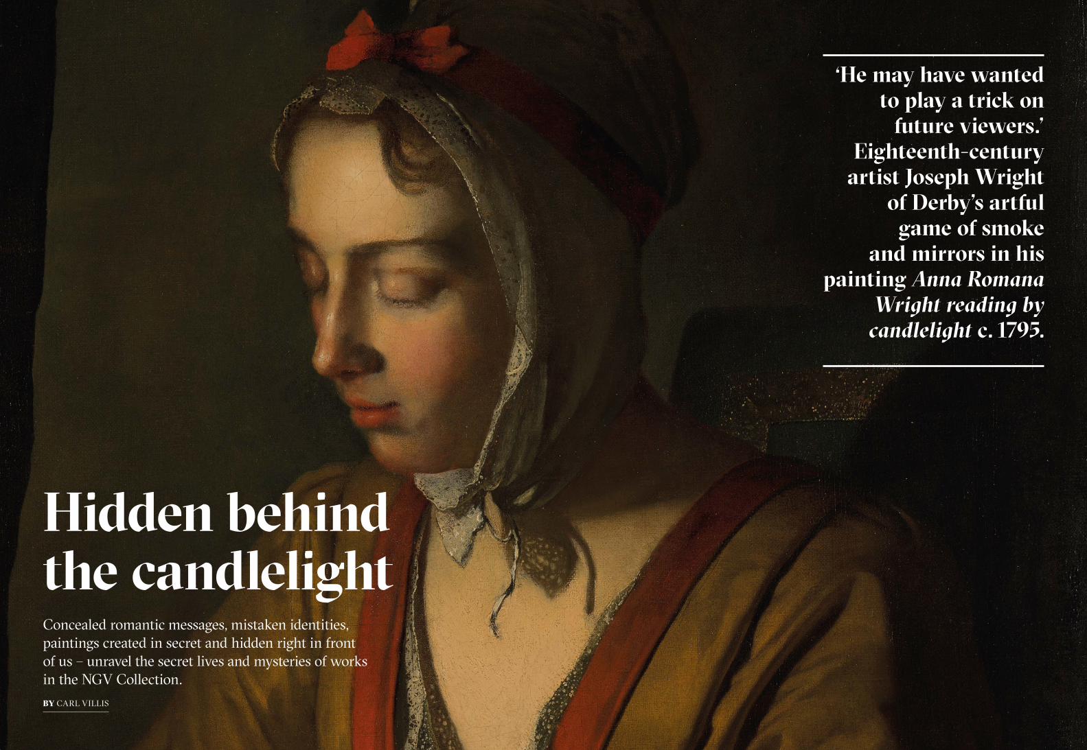
Hidden behind the candlelightConcealed romantic messages, mistaken identities, paintings created in secret and hidden right in front of us – unravel the secret lives and mysteries of works in the NGV Collection.BY CARL VILLIS
‘He may have wanted to play a trick on
future viewers.’Eighteenth-century
artist Joseph Wright of Derby’s artful
game of smoke and mirrors in his
painting Anna Romana Wright reading by
candlelight c. 1795.

T he National Gallery of Victoria is home to four paintings by Joseph Wright of Derby (1734–97), one of
the most talented and innovative English painters of the eighteenth century. Two of those works – a dashing self-portrait from the 1760s and a hushed candlelit portrait of his daughter Anna Romana – were presented to the NGV in 2009 by Mrs Alina Cade in memory of her late husband, Joseph Wright Cade, a descendant of the painter.
The two donated portraits were probably intended as mementoes, a purpose for which they served the artist’s family for over two hundred years. Living as he did in an era before public art galleries came into existence, Wright could never have imagined that these two family portraits would end up in a major art museum on the other side of the world. Nor could he have predicted that they might one day be investigated with techniques that would enable viewers to learn what lies beneath their surfaces. Had he known, Wright might well have chuckled to himself in the knowledge that Anna Romana’s portrait contained some peculiar characteristics certain to confuse future viewers and researchers.
The first major discovery came via radiography, which revealed that the finished work covered an earlier painting, evidently another portrait, probably of a male subject.
The ghostly head of the sitter in the earlier portrait, lying directly beneath that of Anna Romana, is lit from the left and appears to be surrounded by long curls of hair. This hairstyle was not in keeping with fashions during Wright’s time, raising the possibility that the artist had recycled an older canvas for his own use. Wright presumably had access to old, unwanted paintings through his occasional work as a picture restorer. It is possible that the earlier painting was no longer presentable because of damage or deterioration to its surface: transmitted infrared photography of the painting revealed a partially degraded paint surface in the lower left, which may have affected its appearance. Another scenario is that an old canvas may have simply been
available to Wright, saving him the cost of purchasing new materials.
Wright’s penchant for reusing old canvases by other artists has been previously documented, most notably in a landscape from the 1790s entitled Cut through the Rock at Cromford, which was painted over an earlier landscape. A bizarre feature of the Cromford painting is that Wright retained particular details – two horses and a wagon – from the previous painting, incorporating them into his own new composition. A close examination of the paint layers of the Anna Romana portrait found this to also be the case, where much of the dark olive-green background behind the subject was actually the same back-ground of the earlier portrait. It is a mystery why Wright would choose to do this when it would have been far easier to start afresh by covering the entire surface of the earlier painting with a new priming layer. If his choice
stemmed from a wish to save on materials and time, this surely would be a false economy given the extra effort required to blend together the old and new parts of the composition. It is not uncommon to find examples of paintings applied over older composi-tions but it is very rare for the artist to incorporate parts of the older painting with the new one, particularly when the earlier work is by a completely different artist.
How could we know for sure that the earlier portrait was by another artist? Because Wright carefully and deliberately left the earlier artist’s signature on the painting! Undiscovered until recently, and barely visible in normal viewing light is an inscription in black paint, neatly encased by Anna Romana’s jewellery box painted by Wright. It reads: ‘H: Vander Myn’.
This inscription is in fact a signature corresponding to that of the Dutch
painter Herman Van der Myn (c. 1684– 1741). Van der Myn was a painter of portraits as well as floral and history paintings who was active in London between 1721 and 1741. The canvas repurposed by Wright is similar in many respects to Van der Myn’s own self-portrait, with the long-haired sitter illuminated from the left, shown wearing a similar white stock tied
around the neck. Van der Myn’s self-portrait is on a canvas almost identical in size to the one used for the painting of Anna Romana.
The fact that Wright retained Van der Myn’s signature and did not leave one of his own suggests that he may have wanted to play a trick on future
viewers. Indeed, our first response on discovering the signature was to examine the possibility that the painting was not actually by Wright but Van der Myn, however it quickly became clear that there was no confus-ing the styles and techniques of the two artists.
A final curious aspect to the Anna Romana portrait is Wright’s evident reworking of the flesh tones. Close study of the paint surface reveals two contrasting techniques at work, suggesting the painter returned to the work at a considerably later date. The earliest passages, which include the arms, eyelids, nose and around the mouth are all applied in relatively thin, carefully blended layers of paint, creating a porcelain-like finish. By contrast, the brightly lit forehead, brow and chest of the sitter were applied over existing flesh tone in brushy textured
paint, creating a stronger contrast in tone. Though integrated with skill, they suggest that some considerable time elapsed between the start and comple-tion of this family portrait. Wright’s correspondence has revealed that the painter’s working life was interrupted during the last decades of his life by bouts of depressive illness, and that he was prone to reworking, or to use his term, ‘cooking up’ older, unfinished works. The NGV’s portrait bears hallmarks of being ‘cooked up’ by Wright.
Joseph Wright was famously interested in scientific and technologi-cal advances in the age of the Industrial Revolution. Though we can only speculate as to his motivations for the many unusual features in his daughter’s portrait we can be sure that he would have been an amused and interested onlooker to our modern efforts to bring his idiosyncratic painting process and hidden secrets to light.
CARL VILLIS IS NGV SENIOR CONSERVATOR OF PAINTINGS. THIS ARTICLE WAS ORIGINALLY PUBLISHED IN THE MAY–JUN 2019 ISSUE OF NGV MAGAZINE.
(previous and left)Joseph Wright of DerbyAnna Romana Wright reading by candlelight c. 1795 (detail)National Gallery of Victoria, MelbourneGift of Alina Cade in memory of her husband Joseph Wright Cade, 2009
(above)Hidden signature of Herman van der Mijn behind Joseph Wright of Derby’s Anna Romana Wright reading by candlelight c. 1795.
(below)X-Ray of Joseph Wright of Derby’s Anna Romana Wright reading by candlelight c. 1795 National Gallery of Victoria, Melbourne Gift of Alina Cade in memory of her husband Joseph Wright Cade, 2009
19 NGV MAGAZINE18 NGV MAGAZINE

Unfinished Business
I n all of Venice’s long and sumptuous history there is no other painter who has so vividly portrayed that city’s incomparable
style and glamour like Paolo Veronese. Active during the golden years of the sixteenth century, Veronese was not just the creator of the most lavish advertisements for Venetian luxury and colour, but also served as an inspiration to painters for centuries to come with his ability to create ingenious compositions populated with effortlessly graceful figures.
The National Gallery of Victoria is home to a rare example of Veronese’s art. Nobleman between Active and Contemplative Life (c. 1575) came to the NGV in 1947 via through the Felton Bequest as one of the last available examples of Veronese’s highly coveted allegory paintings. In common with most European painters of the time,
Veronese mostly focused on biblical themes; however, some of his most prized works are a relatively small group of allegories concerning moral or spiritual life choices. In these allegories a central figure is typically confronted with a choice between two distinct pathways in life, such as vice or virtue, with each option represented by a symbolic figure placed to the subject’s left and right.
In the allegory of this work, the central nobleman faces a more compli-cated choice because he has before him not two but three options, which take the form of goddesses from the ancient world: Minerva on the left, representing wisdom, art and music; Juno in the middle, representing duty to the state; and Venus on the far right, synonymous with beauty and sensuality. This three-way allegory has its origins in the ancient Greek story of the Judgement of
Paris (pictured following page), in which the male figure of Paris is asked to select the loveliest of the three goddesses. He ends up choosing Venus.
We know that Veronese had the Judgement of Paris on his mind while he worked on the painting, because two of his figures – the nobleman and Juno – derive from an engraving of the Paris story originally designed by Raphael.
However, in our painting Venus is not the victor. Instead, Veronese changes the course of the story by having the nobleman turn to Minerva, thereby choosing a life of intellectual and artistic dedication over one of sensual satisfaction or political duty. This theme has led some viewers to speculate that the figure of the noble-man might actually be an allegorical self-portrait of the artist.
For much of its known history a number of uncertainties have
A painting left unfinished by Italian Renaissance painter Paolo Veronese raises questions about the artist’s intentions.
BY CARL VILLIS
21 NGV MAGAZINE20 NGV MAGAZINE

surrounded the painting, not least whether the canvas was in fact painted by Veronese. Over the past 100 years it has been variously attributed to Veronese, to his workshop, or even to a later follower working in Veronese’s style. This debate was recently laid to rest with the rediscovery of an impor-tant early reference to the painting. The first biography of the artist was written in 1646 by the Venetian historian Carlo Ridolfi and was commissioned by Veronese’s grandson. In it, Nobleman between Active and Contemplative Life is described in unmistakable detail as a
work by Veronese himself. Even more tantalising is the fact that Ridolfi listed the allegory as one of a small group of paintings that Veronese kept as part of his personal collection in his home up until his death in 1588.
This suggests the NGV painting carried some special personal signifi-cance to the painter, though probably not as a self-portrait, since Ridolfi described the nobleman as a member of Venice’s powerful Mocenigo family.
Determining Veronese’s exact intentions with the painting is compli-cated by technical findings made during the painting’s recent conservation treatment. The first was that Veronese left the painting in an unfinished state. This is unusual in itself because Veronese had a busy family workshop that continued to make paintings in his style after his death in 1588. The painting in the NGV Collection is one of very few unfinished Veronese paintings in existence. Examples of the incompleteness of this work can be seen across the painting, most notably in the
sky, where the painter left only a foundation layer of azurite blue and lead white.
Several of the figures are in differing states of completion. The resting cupid in the lower centre of the painting was completed to Veronese’s typically high level of finish while, to the left, the cupid carrying the violone string instrument is laid in with looser, impressionistic strokes of paint. The violone itself has no strings. Even more jarring is the figure of Venus on the right side of the painting, who is left trapped between two contrasting poses, with her right leg turned around too far to properly connect to her hip, suggest-ing that the painting was abandoned as Veronese was deciding which way her torso should face.
Looking further into the painting with x-ray and infra-red imaging enabled us to establish some further changes with the number of goddesses, and the activities of the cupids sur-rounding Minerva and the nobleman.
The x-ray images revealed that Veronese began making his allegory
(previous) Paolo Veronese Nobleman between Active and Contemplative life c. 1575 (details) Felton Bequest, 1947(left, above) Paolo Veronese Nobleman between Active and Contemplative life c. 1575 (details) Felton Bequest, 1947(left, below) Marcantonio (engraver) Raphael (after) The Judgement of Paris 1690−1710 (detail). The British Museum, London(above) Infrared photograph detail of lower left corner of Paolo Veronese, Nobleman between Active and Contemplative life c. 1575
intending to have two rather than three goddesses. The central goddess, Juno, was not part of the original plan for the painting. She was the only figure to have been painted on top of the architectural background, indicating she was added as an afterthought. This suggests that the artist’s initial plan was to develop another theme entirely, as changes to several of the figures suggest.
Two of the cupids on the left side of the painting were originally shown engaging in musical activities. At the far left, the cupid shown bringing the instrument to the nobleman has been painted over an earlier cupid who can be seen plucking the strings of another violone, while another cupid by the nobleman’s leg appears to have been
playing some sort of keyboard.One of those arms was painted out
and replaced by another one reaching up to the nobleman’s leg. On the far right, the goddess who ended up as Venus wears straps around her shoul-der, as if she may have carried a quiver for arrows. If so, this would indicate that Veronese originally planned for her to be the hunting goddess Diana, suggesting that the painting originally depicted a direct contrast between indoor and outdoor pursuits.
Another major change was the shifting of the background architecture to allow more of the sky into the composition. The earlier composition saw the architectural interior occupy the left and central background of the painting, but Veronese then placed the
division between exterior and interior through the middle of the nobleman, as if to emphasise the magnitude of his choice.
As a result of all of this newly discovered information, we have a better understanding than ever before about how the painting was made and where it has come from, yet we are still left with some intriguing questions. Why did Veronese choose not to finish the painting, and why did he keep it in his personal collection until his death? Further research may one day reveal the answers to those questions; however, in the end we might have to accept that on this score we will be kept in permanent suspense.
CARL VILLIS IS NGV SENIOR CONSERVATOR OF PAINTINGS. THIS ARTICLE WAS ORIGINALLY PUBLISHED IN THE JUL–AUG 2019 ISSUE OF NGV MAGAZINE.
‘For much of its known history a number of uncertainties have surrounded the painting, not least whether the canvas was in fact painted by Veronese.’— CARL VILLIS
23 NGV MAGAZINE22 NGV MAGAZINE

Mortimer Menpes was born in Adelaide in 1855. He left Australia at the age of twenty to forge an artistic career in England, and on the ship he met Rosa Grosse, whom he married shortly after they arrived, in 1875. Her recently inherited wealth enabled the couple to live in comfort when they settled in London, and allowed Menpes to study at the National Art Training School in Kensington. Within a few years he was exhibiting and meeting artists such as James McNeill Whistler and Walter Sickert.
Whistler, in particular, became a close friend and important mentor to Menpes. Both artists were fascinated by Japan and adopted elements of Japanese aesthetics in their works. Curious to see Japan for himself, and study its artistic techniques, Menpes embarked on his first trip to Japan in 1887, visiting numerous cities over a nine-month period. He had been invited to meet the famous artist Kawanabe Kyōsai, and was particularly interested in his application of watercolour to capture the effects of light. After watching Kyōsai paint, Menpes described the experience as the finest lesson in watercolour painting he
ever received. One of the techniques that Menpes learned from Kyōsai was to sketch rapidly on the spot, using quick descriptive marks.
When he returned to London, Menpes exhibited his Japanese works – 137 paintings in oil and watercolour, and forty prints – at Dowdeswell Galleries in 1888. All of the works sold, and the exhibition launched his career. Following this success, Menpes spent the next few years travelling extensively to paint in exotic locations including India, Burma, Morocco, Egypt and Mexico. Between 1891 and 1895, he held annual exhibitions of works inspired by his travels.
In 1896 he returned to Japan, this time with his wife and five children, staying for eight months and spending the majority of his time in Tokyo and Kyoto. During this visit, Menpes intended to record the culture and customs of Japan, and painted numerous portraits of children, geishas and archers in their ceremonial garments. The resulting 100 paintings and thirty works on paper were exhibited in Menpes’s second Japan exhibition, held in 1897 at Dowdeswell Galleries, and The
archer was almost certainly included here. The private viewing prior to the opening of the exhibition was attended by around 900 guests, including artists such as Sir Edward Burne-Jones and Sir Seymour Haden, as well as the actor Sir Henry Irving and members of the German nobility.
The archer is closely related to another watercolour by Menpes, The archers, 1896–97, which is reproduced in the book Japan: A Record in Colour, 1901. This was the first in a series of books in which Menpes published a selection of his paintings, accompanied by travel anecdotes and observations recorded by his daughter Dorothy Menpes. The figure on the left in this work is identical to the archer in the NGV Collection work. Menpes probably painted The archers first, and then developed the more densely worked watercolour and gouache of the single archer.
While The archers is painted in translucent watercolour, with some areas of wash bleeding into one another in the top right, the technique employed in the NGV Collection work is much more
The archerA luminous watercolour and gouache painting by Mortimer Menpes, The archer, c. 1897, was recently donated to the NGV by Trustee Krystyna Campbell-Pretty AM. Its Japanese motifs and European aesthetics are just the beginning of a story about an Australian artist whose enduring passion for Japan brought him international fame but cost him his friendship with fellow artist and mentor James McNeill Whistler.
BY PETRA KAYSER
24 NGV MAGAZINE

27 NGV MAGAZINE
painterly. Here, Menpes used an unusual method that he developed while in Japan: he soaked the paper, which he kept wet while applying gouache pigments and scrubbing them into the surface of the softened paper. This resulted in thick, rich strokes that blend at the edges and, when dry, form a smooth, unified surface. The figure, trees and grass were then painted over this layer of pigment.
When the NGV’s paper conservators looked at the painting under a micro-scope, they confirmed that this was the process Menpes used to create the rich undertones in blue and yellow that give the picture its atmospheric glow. They took detailed photographs of the surface, and in the process found the artist’s fingerprint in the top-right corner of the image.
In The archer, Menpes employed another technique he had learned in Japan. In the ‘flying white’ technique, a dry brush is used to apply traces of white gouache to the surface of a painting. This creates the appearance of reflected light on the archer’s garment and the pale pink highlights between the trees in the background.
Menpes’s attention to detail can be seen in all aspects of his work. Inspired by the aesthetic sensibilities of his friend James McNeill Whistler, his interest in aesthetics extended beyond the picture to the framing of the works, and the way in which they were displayed on gallery walls. Menpes hung his Japanese works in asymmetrical groups, and chose wall colours in light hues, which was in stark contrast to the sombre colours of Victorian-era interiors.
Reviews of Menpes’s exhibitions in newspapers frequently commented on the display and framing of the works. From these sources we know that his second Japanese exhibition of 1897, in which The archer was very likely included, featured four types of frames made according to Menpes’s specifications.1 The archer is in its original fluted frame, with four abstract
floral motifs in the corners, which the conservator and frame historian John Payne has described as ‘a striking combination of Pre-Raphaelite and Japanese style’.2
Menpes’s first trip to Japan in 1887 had significant consequences, not only for his work and career, but for his close relationship with Whistler. The two artists had diverging views on how the art and aesthetics of Japan should be studied, and Menpes’s decision to spend most of that year in Japan, and the success of his subsequent exhibition, brought about the acrimonious end of the friendship.3
The writer Oscar Wilde was a friend of both Whistler and Menpes, and in his essay ‘Intentions: The decay of lying’, published in 1891, Wilde mocked Menpes’s belief that he could understand Japanese culture by travelling there:
One of our most charming painters went recently to the Land of the Chrysanthemum in the foolish hope of seeing the Japanese. All he saw, all he had the chance of painting, were a few lanterns and some fans. He was quite unable to discover the inhabitants, as his delightful exhibition at Messrs. Dowdeswell’s Gallery showed only too well.4
Siding with Whistler in this argument, Wilde added, ‘If you desire to see a Japanese effect, you will not behave like a tourist and go to Tokyo. On the contrary,
you will stay at home, and steep yourself in the work of certain Japanese artists’, and this will lead to the absorption of ‘the spirit of their style’ and ‘their imaginative manner of vision’.5
In the eyes of the majority of art patrons, however, Menpes succeeded in introducing the national character of Japan to an English audience. And perhaps Wilde’s criticism was directed as much at the readiness of Menpes’s audience to believe that they were gaining insight into the ‘real’ Japan, as at Menpes himself.
In the 1890s Menpes built a house in Chelsea. Its interior design was inspired by his love for all things Japanese, and many of the furnish-ings and fittings were made by Japanese craftsmen commis-sioned by Menpes during his 1896 trip. Although he did not return to Japan again, he had recreated what he loved about the culture in his own home. Menpes welcomed numerous international visitors to his Chelsea house, including Australian composer Percy Grainger and
Australia’s first Prime Minister Sir Edmund Barton, and frequently wore a kimono when he was entertaining or working in his studio, where many distinguished sitters had their portraits painted.
PETRA KAYSER IS NGV CURATOR, PRINTS AND DRAWINGS.
Mortimer Menpes’s painting The archer, c. 1897, complete with its original frame, is a significant addition to the NGV Collection. The painting and frame are outstanding individually, but when together as conceived by the artist, they form a truly exceptional insight into the artist’s ideas.
Menpes was part of a nineteenth- century trend in which some artists selected and designed specific frames for their works, intending them to be integral to the artwork. He regarded the framing and presentation of his works to be of great importance, and this is reflected in the large number of Menpes works that retain their original frames today.
Like the frames on many of Menpes’ works, The archer’s is influenced by Japanese aesthetics as well as traditional European forms. The style is related to a cassetta, or entablature, frame, which originated in Renaissance Italy and saw a revival in the nineteenth century. Finely crafted in timber, it consists of a narrow, stepped outer section with mitre joints at the corners, strengthened with very fine
wood fillets. This encloses a frieze decorated with narrow channels running at right angles to the slightly raised moulding at the inside edge of the frame. The inner moulding extends to form square reposes at each corner, decorated with a flower design incised into the wood. These floral designs are reminiscent of traditional Japanese heraldic emblems known as mon, particularly those representing chrysanthemum flowers. The frame retains its original gilded surface, which was produced using gold leaf applied with oil size to the timber. Menpes is known to have specified the shade of gold for his frames. In this case, a ‘lemon gold’ was used.
Its maker remains unknown, but it is possible the frame, or at least its compo-nents, were made in Japan. During Menpes’s first visit to Japan in the 1880s he ordered 200 frames from Japanese craftsmen. It is likely these frames were supplied in raw timber and gilded in London. They consist of a narrow outer frame section enclosing panels of one of two types, including those decorated with
evenly spaced narrow channels. Although the style and joint construction for these frames differs to that on The archer, the similarities in the refinement of the construction and the type of fluting suggests that the woodwork may have originated in Japan.
The condition of the frame, consider-ing it has been protecting the painting for more than a century, is remarkable. Examination and minor treatment of this frame prior to display has both increased our understanding of this unique artefact and the original setting for The archer, as well as Menpes’ presentation aesthetic more broadly.
HOLLY MCGOWAN-JACKSON IS NGV SENIOR CONSERVATOR OF FRAMES AND FURNITURE. THIS ARTICLE WAS ORIGINALLY PUBLISHED IN THE NOV–DEC 2019 ISSUE OF NGV MAGAZINE.
Framing the archer
(previous) Mortimer Menpes The archer c. 1897. Gift of Krystyna Campbell-Pretty AM and Family through the Australian Government's Cultural Gifts Program, 2019(above) Mortimer Menpes The archers 1896–97, watercolour, plate 35 in Japan: A Record in Colour, published by Adam and Charles Black, London, 1901.
The archer also includes its original, finely crafted timber frame.
BY HOLLY McGOWAN-JACKSON
Mortimer Menpes The archer (detail) in its original frame. Gift of Krystyna Campbell-Pretty AM and Family through the Australian Government's Cultural Gifts Program, 2019
Endnotes on p. 37
26 NGV MAGAZINE

Zaha Hadid WAVE SOFA
Launched in a Milan nightclub in 1988 as part of a collection of three, the late Dame Zaha Hadid’s Wave sofa embodies the designer’s predilection for fluid architectural forms. This work eventually found its way to Melbourne, first in the studio of an architectural firm, then into the NGV Collection, where its complex design presented unique challenges for the conservation team.
BY SUZI SHAW

In architecture circles, Iraqi-British architect Dame Zaha Hadid is renowned. Her premature death at the age of 65 in 2016 meant the loss of one of the most visionary and experimental architects of our time. However, few people know of her work as a painter, homewares and furniture designer. In 2015, John Denton, on behalf of the Melbourne architectural firm Denton Corker Marshall (DCM), generously donated to the NGV Wave sofa designed by Zaha Hadid, which had been in its ownership since 1988.
Born in Baghdad, Hadid studied mathematics before moving to London with her family in 1972, where she enrolled in training at the Architectural Association School of Architecture, London’s oldest architecture school. She began her own practice in London in 1980 and was soon lauded, before any of her designs had even been realised.
The initial design of Wave sofa was part of a commission begun in 1985 to create a residential interior and furniture for timber importer William Bitar’s townhouse at 24 Cathcart Road, Kensington, London. The challenge was to create furniture with minimalist appearance and maximum impact, while seeming light, as though defying gravity itself.
Hadid’s design philosophy references the influence of Le Corbusier’s ‘Five points of Architecture’, including to liberate a building from the ground. It is no coincidence that Hadid used architectural theory in her furniture designs, as both modern furniture and modern architecture shared the same guiding principle of requiring a lot of detail and attention in order to achieve a look of minimal detail.
For the Bitar sofa commission, Hadid produced rough drawings, then, following a period of experimentation, constructed detailed models for the client’s approval. The result was a unique curvilinear sofa that floated and provided several perspective points, as well as multiple
uses. Two moulded fibreglass frames create a boomerang-like shape, sup-ported on a tapered foot and coated in black futuristic-looking gloss lacquer. On top of this sits a long, narrow cushion upholstered in a distinct yellow wool, with a removable triangular cushion around the curve. This connects to a matte black painted curve jutting out at right angles to create a private nook. Describing the work in 1987, Hadid said, ‘the sofa is not just a sofa, but also acts as a partition or shield. The [smaller] seat is not only a seat; it could also be a tray’. The sofa’s name-sake derives from the back cushion, which is separately attached to the wall behind – a long, rectangular, grey wool- upholstered framework with unevenly positioned undulations.
The furniture and working drawings for the Bitar apartment were displayed in London at the Architectural Association’s Bar and Members’ Room in early 1988. One room included Hadid’s working drawings for Wave sofa, which convey the mathematical relationships that created the boomerang curve and the uneven waves of the backrest. In 1985, when Hadid commenced design of the original sofa, French curves were one of the main tools used by architects, as the use of computers in design (such as CAD) did not exist yet; this makes her designs from this period all the more impressive.
When the client moved overseas the Bitar furniture was relocated to Hadid’s own apartment. By her account, Wave sofa was rarely used, as her friends were too scared to sit on it for fear of damaging the piece. After architect-designer Massimo Morozzi saw the Bitar furniture in Hadid’s apartment, he approached her about reproducing the works, just as they were, despite their imposing and somewhat impractical size. Morozzi had just joined Edra, a small, family-run Tuscan furniture company, as the creative director.
Established in 1987 by Valerio Mazzei, Edra’s philosophy was to support designers in creating innovative and unique furniture, often blending experi-mental technology with manually intensive construction methods. For its first collaboration, Edra commissioned Hadid to develop three sofas for production: Wave, Whoosh and Project in Red.1 Hadid stayed with the Mazzei family over the summer months drawing, testing, making and troubleshooting with Edra staff.
Hadid and Edra launched the Wave Collection at a Milan nightclub in September 1988, as part of Milan Furniture Fair. The cavernous room was dimly lit, and the three sofas making up Edra’s inaugural collection were presented under dramatic coloured spotlights. The success of this project gave Edra the confidence to continue working on avant-garde projects, including collaborations with Masanori Umeda and Francesco Binfaré.
So how did the sofa end up in Australia? Not all of Hadid’s three sofa designs developed for Edra became commercially available. Wave sofa was produced in a limited edition of seven, while Project in Red was produced in smaller numbers, with Whoosh sofa being the most commercially successful design.
DCM purchased Wave sofa directly from Edra’s director, Morozzi, a friend who had already acquired DCM’s 1989 Adelphi range of a table and chairs, which is still in production today, for Edra’s product range. Three examples of DCM’s original furniture, designed as part of its Adelphi Hotel renovation in 1989, have been recently acquired for the NGV Collection. These works provide an engaging comparison to Hadid’s work.
Wave sofa was placed in DCM’s directors’ studio at the firm’s Melbourne office. The functional nature of furniture means that, when works enter a museum collection, they are often acquired with
evidence of use. In the example of Wave sofa there was uneven fading and discolouration of the backrest upholstery (presumably from light exposure), minor stains to the seat upholstery, and small chips to the edges of the fibreglass components. These signs of wear were visually distracting from the overall conceptual view of the sofa, so we approached Edra for replacement fabric to reupholster the sofa. Liaising with Edra’s Australian distributor Space Furniture, we eventually acquired the fabric from rural Italy, a process that took several months.
A common problem with upholstery from the 1950s onwards is the use polyurethane foam cushions. The upholstery in Wave sofa is now over thirty years old and the inherent instability of this foam is starting to show: it is losing resilience, some permanent denting has occurred, and cracking from embrittle-ment has begun. Close inspection of the foam cushions reveals their bespoke construction – layers of foam glued together and moulded on top of a plywood panel, with a hand-cut, angled join between the two cushions. The decision to remove original materials, such as upholstery fabrics or foams on works of art, requires consultation with the
relevant curatorial department. In this case, the Conservation team consulted with curators Simone LeAmon and Ewan McEoin from the NGV Department of Contemporary Design and Architecture. Due to the complex and unique shapes of Hadid’s cushions, the decision was made to not replace the upholstery foam at this stage.
Once the fabric arrived, the supplier’s preferred upholsterers were contracted to reupholster the three cushions under the guidance of a conservator. Photographs were taken of the original stitching, folds and tucks of the upholstery. These covers were then removed and used as patterns for the new covers. Previously hidden construction methods and markings from the original makers were also docu-mented for future reference. The original Velcro® cushion attachment strips and Edra-branded lining fabric were re-used when the last few seams were sewed at the NGV Conservation studio. The next step involved ensuring the best fit of the covers, replicating the original number of folds and tucks at corners, using stainless steel staples to secure the new uphol-stery, and handstitching the final seam closed just as in the original. While the sofa’s treatment is completed for now, the work remains in a fragile condition due to
the natural degradation of the upholstery foam, which may require replacement in the future.
The NGV is fortunate to have acquired this design from architecture’s ‘Queen of the Curve’ thanks to the generous gift by Denton Corker Marshall, presented through the Australian Government’s Cultural Gifts Program. With the NGV Contemporary Design collection quickly growing; through the generos-ity of donors including Gordon Moffatt AM and the NGV Supporters of Fashion & Textiles, we have since added additional designs such as a Genesy lamp, 2009, and Nova shoes, 2013, a work co-de-signed with Rem Koolhaas, to expand on the remarkable story of Hadid’s radical and diverse design experience and influence.
SUZI SHAW IS NGV CONSERVATOR OF FRAMES & FURNITURE. ZAHA HADID’S WAVE SOFA WAS PRESENTED BY DENTON CORKER MARSHALL THROUGH THE AUSTRALIAN GOVERNMENT’S CULTURAL GIFTS PROGRAM. © ZAHA HADID FOUNDATION. THIS ARTICLE WAS ORIGINALLY PUBLISHED IN THE SEP–OCT 2019 ISSUE OF NGV MAGAZINE.
(previous) Zaha Hadid (designer) Wave sofa 1988. Presented by Denton Corker Marshall through the Australian Government’s Cultural Gifts Program, 2018(left) Keith Rogers of Alexander J. Cook worked with NGV Conservation department staff to reupholster the cushions, copying the original manufacturing methods of stapling, replicating the same fabric folds and tucks, and hand stitching the last seams.(above) Zaha Hadid in her London office c. 1985 Photo: Christopher Pillitz / Getty Images
Endnotes on p. 37
31 NGV MAGAZINE30 NGV MAGAZINE

Florence Fuller was born in Port Elizabeth, South Africa in 1867 and, at an early age, immigrated with her family to Melbourne. Her parents encouraged artistic pursuits and two of her sisters, Amy and Christie, became singers of note. By the age of thirteen Fuller had commenced painting lessons with the Impressionist Jane Sutherland and briefly attended the National Gallery School, but the tutor that influenced her the most was her uncle Robert Dowling. In early 1884, Dowling had returned to Australia as the country’s most distinguished living artist following a successful twenty-seven years working
abroad. His international standing and association with leading artists of the time made him a senior figure in Melbourne’s artistic circle and the city’s most sought-after portraitist. Dowling employed his niece as a governess and made available to her the large and highly fashionable studio on Collins Street, Melbourne, which he adorned with exotic furnishings collected from the time he spent in Egypt. Throughout her life, Fuller was plagued by ‘very delicate health’1 and at times was unable to sustain work but prospered from the benefit of her uncle’s support and guidance.
In early 1886, Dowling suddenly passed away in England, where he was visiting. In need of new circumstances, Fuller opened her own modest studio at Planet Chambers at the top of Collins Street, a popular address with artists including her neighbour the French-trained Monsieur De la Crouée who Fuller credited as being a lasting influence. Success at the Melbourne exhibitions began to follow; first, was her portrait of Dowling and then a posthumous collabo-ration with her uncle when she completed his unfinished portrait of Lady Elizabeth Loch, wife of the Governor of Victoria.
Fuller went on to exhibit four works at the inaugural Victorian Artists Society (VAS) exhibition in May 1888 held at the National Gallery, where she was awarded the prize for ‘Best portrait in oil’. Unfortunately, the lack of historical descriptions or a continuous provenance has meant that the title of this recent work to enter the NGV Collection is undocu-mented. However, a likely possibility is that it is number twenty-three from the VAS catalogue, The Herald Boy, which The Age declared a ‘capital study of a street boy’.2 Before joining the NGV Collection the painting was owned for nearly a century by a family who referred to the work as The paper boy and this remains the title.
Between 1888 and 1889, Fuller produced a group of portraits that addressed the theme of disadvantaged children; The paper boy is an early example of this. Most of the works were painted in a sentimental genre style and illustrated in tragic settings, but this delicate study is a dignified portrayal that subtly alludes to the hardship of the sitter’s circumstances. His rough-cut hair, avoidant stare and heavy clothing purposely invoke a sympathetic response. The weathered face of boyish features are modelled with small square brushwork, vigorous and direct in application, qualities that Fuller attributed to the influence of De la Crouée.
Newspaper boys were a prominent part of Melbourne street life. In the late-nineteenth century they were enlisted from the vast disadvantaged and neglected youth who were a by-product of
Florence Ada Fuller is an artist scarcely recognised today. However, as illustrated in The paper boy, 1888, a recent gift to the NGV by Krystyna Campbell-Pretty AM and Family, Fuller was a highly gifted portrait painter who had an innate ability to capture the qualities of her sitter with great naturalism. This depiction of an unknown child approximately twelve years of age celebrates the talent of an under-acknowledged artist and recalls a history of adolescent workers active in Melbourne during the time Australia prepared to celebrate its centenary.
BY MICHAEL VARCOE-COCKS
The paper boy 1888
32 NGV MAGAZINE

the rapid economic and urban expansion of the post gold rush era. Papers were purchased at 8 pence per dozen and then sold as individual issues for minor profit. Working the busy Melbourne streets until late in the night meant the children were open to exploitation and criminal influ-ences. Most boys were under the age of fifteen with no education certificates or alternate options. Some supported single mothers, their siblings or survived independently in an attempt to avoid reform schools. Others were parentless, but not necessarily orphaned, and either slept on the streets or when able, stayed at boarding houses, such as the Model Lodging House located in King Street. This establishment alone supported over 53,000 lodgers in the first half of 1888.
The increasing concern for the plight of aimless and unattended children led to the formation of the Herald Boys’ Try-Excelsior Classes – first established informally in Fitzroy by a Mr William Groom and separately in Toorak by Mr William Foster, who would become the Try movement’s figurehead. The classes provided temporary relief and motivational activities for the boys in a controlled social environment. These attempts at social reform were in part prompted by the death of Major-General Charles George Gordon whose passing created an outpouring of public grief and memorial activities to acknowledge his support for disadvan-taged youth of London. In 1885 Foster added a dedicated Try-Excelsior Class for the Melbourne Herald boys; he was motivated by concerns over the perils of temptation that boys experienced during idle times while waiting for the evening editions.3 The class headquarters were initially located in Little Collins Street in the same block as Fuller’s studio and close to Treasury Gardens where a Memorial statue of Gordon was soon erected and remains today. A small entrance fee was requested and although an evening lecture was given, the class primarily functioned as a club with the boys electing their own council. Donated reading material, games and gymnasium equipment attempted to stimulate the adolescent workers and encourage a path to self-improvement. A reporter
visiting the Herald boys’ class described them as ‘hungry ragged little mortals with bare elbows, many barefooted and clothes either too big or too small’.4 An earlier visit to a Try class also noted ‘… many wore a loosely-tied comforter or pocket-handkerchief around their collarless necks’5, the same as worn by the sitter in Fuller’s painting.
The boys started a fund that meant penniless members could still attend class and later a system to provide relief income for the boys in times of illness. By 1887 there were 200 members of the
Herald boys’ class, which was later renamed the Newsboy Try-Excelsior Class.6 In the same year, the Neglected Children’s Act of 1887 authorised the detainment of vagrant or neglected children, which placed additional pressure on the Try-Excelsior movement. Fortunately, the refining influences of the classes were soon publicly celebrated
and admiration peaked when the Herald boys reciprocated the public’s support by hosting concerts to raise funds for affected families and orphaned children from Australia’s worst mining accident at the Mount Kembla Mine in Bulli, New South Wales. In return, the financial support allowed for the construction of a new facility called The Gordon Institute, built to feed, bath and, in part, house the unfortunate urchins of ‘Marvellous Melbourne’; the founding stone was laid, while Fuller’s Herald boy was being exhibited at the VAS.
Fuller continued to receive portrait commissions and produced narrative compositions, landscapes and still lifes to ongoing acclaim. In 1896 her success enabled a chance for international travel, returning first to her birthplace of South Africa and a year later to study in Paris and London. For several years she lived in lean circumstances and would exhibit at
both the Salon, Paris, and the Royal Academy of Arts, London, with favourable mentions in the press. By 1904 she had established herself in Western Australia and became heavily devoted to the Theosophical Society – an eastern-influ-enced religious movement formed in the late-nineteenth century. Fuller would relocate to the Society’s headquarters in Adyar, India, and later resided at their Mosman residence in Sydney while her professional practice somewhat sidelined. Health continued to be a problem, limiting her output and, to a degree, her career until eventually she required permanent institutional care where she spent the final two decades of her life. She passed away, having chosen not to marry, but pursuing a life much travelled, eventful and self- determined through her own means.
This beautiful portrait is a rare example of Florence Fuller’s early Melbourne work and a significant institutional acquisition of an important female artist. The morally minded Fuller purposely chose a sitter who could offer no payment other than the image of his circumstance. We know nothing of the child other than he was born without privilege, was motivated to work and presented himself as best he was able – in his white neck comforter. In 1888 the path of this Newspaper boy and Florence Fuller probably crossed only momentarily. The painting survives as an important reference to the social diversity in Melbourne’s past.
MICHAEL VARCOE-COCKS IS NGV HEAD OF CONSERVATION. THE PAPER BOY WAS ACQUIRED THROUGH THE GENEROUS SUPPORT OF KRYSTYNA CAMPBELL-PRETTY AM AND FAMILY. THIS ARTICLE WAS ORIGINALLY PUBLISHED IN THE JAN–FEB 2020 EDITION OF NGV MAGAZINE.
Marvellous Melbourne‘Marvellous Melbourne’ was a city of miraculous growth in the 1880s. The Melbourne Stock Exchange passed the £2 million mark, the population almost doubled between 1880 and 1888 and, for a time, Melbourne was the world’s second largest city after London although had higher property prices. Land speculation naturally boomed as the suburbs increasingly expanded with new railway lines providing affordability options for the quarter-acre block. The city centre was populated by skyscrapers as high as twelve stories, and elaborate banks, theatres and private mansions pushed industry outwards. Melbourne was known to have more decorative cast iron than any other city in the world.
The phones rang, with Melbourne being the host of the first telephone exchange in the country, and the streets now glowed at night under the electric lights and the cable trams ferrying people from to one coffee palace to the next. A rich city needed rich taste and in 1888 the Royal Exhibition Building hosted the Melbourne Centennial Exhibition showcasing artistic, scientist and industrial progress to around two million visitors. Notable National Gallery acquisitions in 1888 include G. F. Watts Alfred Tennyson, 1858, Lawrence Alma-Tadema The vintage festival, 1871, and J. M. W. Turner Dunstanburgh Castle, north-east coast of Northumberland, sunrise after a squally night, 1798 – all of which are currently on display on Level 2 at NGV International.
‘This delicate study is a dignified portrayal that subtly alludes to the hardship of the sitter’s circumstances. His rough-cut hair, avoidant stare and heavy clothing purposely invoke a sympathetic response.’— MICHAEL VARCOE-COCKS
(previous) Florence Fuller The paper boy 1888. Gift of Krystyna Campbell-Pretty AM and Family through the Australian Government’s Cultural Gifts Program, 2020(above) Frederick McCubbin Melbourne 1888 1888. Gift of Mr Hugh McCubbin, 1960
35 NGV MAGAZINE34 NGV MAGAZINE

LIST OF REPRODUCED WORKS AND END NOTES
p. 3Joseph Wright of Derby(Anna Romana Wright reading by candlelight) c. 1795oil on canvas on canvas75.2 × 62.2 cm (image) 76.2 × 63.5 cm (canvas)National Gallery of Victoria, Melbourne Gift of Alina Cade in memory of her husband Joseph Wright Cade, 2009
p. 5Ellen RubboOvens Valley, Bright c. 1946oil on cardboard45.7 × 61.2 cmNational Gallery of Victoria, MelbournePurchased, 1949© Rubbo Family
p. 7Erich HeckelLandscape on the fjord 1939(Landschaft an der Förde)oil on canvas 96.5 × 121.2 cm (image) 103.2 × 128.1 cm (canvas)National Gallery of Victoria, MelbournePurchased with funds donated by John Downer AM and Rose Downer, 2015© Erich Heckel/Bild-Kunst, Bonn. Licensed by Copyright Agency, Australia
p. 9Sidney NolanLagoon, Wimmera 1943enamel paint on cardboard63.5 × 75.9 cmNational Gallery of Victoria, MelbourneGift of Sir Sidney and Lady Nolan, 1983© the Artist’s Estate. All Rights Reserved / Bridgeman Images
p.10(above)William RothensteinAn artist in France 1918oil on canvas76.2 × 63.2 cmNational Gallery of Victoria, MelbourneFelton Bequest, 1921
(below)Ellen RubboOvens Valley, Bright c. 1946oil on cardboard45.7 × 61.2 cmNational Gallery of Victoria, MelbournePurchased, 1949© Rubbo Family
p. 12Unknown Visiting dress 1897 National Gallery of Victoria, Melbourne Gift of Krystyna Campbell-Pretty and the Campbell-Pretty Family through the Australian Government’s Cultural Gift Program, 2019
p.13Yvonne ToddWerta 2005lightjet printed. 3/4National Gallery of Victoria, MelbournePurchased NGV Foundation, 2013© Yvonne Todd
pp. 17–8Joseph Wright of Derby(Anna Romana Wright reading by candlelight) c. 1795 (detail)oil on canvas on canvas75.2 × 62.2 cm (image) 76.2 × 63.5 cm (canvas)National Gallery of Victoria, MelbourneGift of Alina Cade in memory of her husband Joseph Wright Cade, 2009
p. 19Joseph Wright of Derby (Anna Romana Wright reading by candlelight) c. 1795 oil on canvas on canvas 75.2 × 62.2 cm (image) 76.2 × 63.5 cm (canvas) National Gallery of Victoria, Melbourne Gift of Alina Cade in memory of her husband Joseph Wright Cade, 2009
p. 21Paolo VeronesePaolo Veronese (studio of)Nobleman between Active and Contemplative life c. 1575 (details)oil on canvas134.0 × 204.5 cmNational Gallery of Victoria, MelbourneFelton Bequest, 1947
p. 23(above)Paolo VeronesePaolo Veronese (studio of)Nobleman between Active and Contemplative life c. 1575 oil on canvas134.0 × 204.5 cmNational Gallery of Victoria, MelbourneFelton Bequest, 1947
(below)Marcantonio (engraver)Raphael (after)The Judgement of Paris 1690−1710 (detail)etching22.7 cm × 30.9 cmThe British Museum, London
p. 26Mortimer MenpesThe archer c.1897watercolour and gouache on paper on card29.5 ×22.5 cmNational Gallery of Victoria, MelbourneGift of Krystyna Campbell-Pretty AM and Family through the Australian Government’s Cultural Gifts Program, 2019
p. 28Mortimer MenpesThe archer c.1897 (detail)watercolour and gouache on paper on card29.5 ×22.5 cmNational Gallery of Victoria, MelbourneGift of Krystyna Campbell-Pretty AM and Family through the Australian Government’s Cultural Gifts Program, 2019
pp. 29–30Zaha Hadid (designer)Wave sofa 1988fibreglass, plywood, polyurethane foam, wool, (other materials), velcro, metal(a-b) 119.7 × 357.7 × 238.8 cm (variable) (overall)National Gallery of Victoria, MelbournePresented by Denton Corker Marshall through the Australian Government’s Cultural Gifts Program, 2018© Zaha Hadid Foundation
p. 34Florence Fuller The paper boy 1888 oil on canvas 59.0 × 45.0 cm National Gallery of Victoria, Australia Gift of Krystyna Campbell-Pretty AM through the Australian Government’s Cultural Gifts Program, 2020
p.36 Frederick McCubbin Melbourne 1888 1888 oil on canvas 120.5 × 102.0 cm National Gallery of Victoria, Melbourne Gift of Mr Hugh McCubbin, 1960
END NOTES
pp. 25–28 The archer1. John Payne, ‘What’s in a frame: The
borders of Mortimer Menpes’, in Julie Robinson, The World of Mortimer Menpes: Painter, Etcher, Raconteur, Art Gallery of South Australia, Adelaide,2014, p.185.
2. Ibid. A similar frame was used for Menpes’s pastel drawing Portrait of the actor Ichikawa Danjuro IX,18 9 6 –7, held in the British Museum.
3. Rosemary Smith, ‘Japan and beyond’, in The World of Mortimer Menpes: Painter, Etcher, Raconteur, pp.55 – 61.
4. Oscar Wilde, Intentions: The Decay of Lying, Brentano’s, New York,1905 edition, p.47.
5. Ibid.
pp. 29–32Zaha Hadid1. Wave is also known as Wavy and
Wavy back sofa; Whoosh is written both with and without the initial ‘h’; and Project in Red has also been called the Projection sofa and Red sofa.
2. ‘Interview: Alvin Boyarsky Talks with Zaha Hadid’, in Zaha Hadid, exh. cat., Solomon R. Guggenheim Museum, New York,2006, p.48.
pp. 33–6The paper boy 18881. ‘Miscellaneous’, The Herald, 5 Mar.
1891, p. 4. 2. ‘The Victorian Society of Artists’
Exhibition’, The Age, 30 Apr. 1888, p. 6. 3. ‘Our Melbourne Letter’, The Horsham
Times, 2 Oct. 1885, p. 3. 4. ‘An evening among the Newsboys’,
The Herald, 4 Jul. 1887, p. 4 5. ‘Boys in the Slums’, Weekly Times, 18
Oct. 1884, p. 4. 6. ‘Newsboys’ Try-Excelsior Class,’ The
Herald, 25 Jun. 1887, p. 4
36 NGV MAGAZINE