Recommended Formatting Parameters for E-Study Materials*
7
8 Recommended Formatting Parameters for E-Study Materials* Kristine Mackare 1, , Anita Jansone 2 1, Liepaja University, Faculty of Science and Engineerin 2 Liepaja University, Faculty of Science and Engineering E-mail: [email protected], [email protected] Abstract Technology is all around us. The use of modern technology is increasing in the process of acquiring knowledge as it provides greater opportunities and e-study is becoming as important as traditional education or even more significant.During literature research, it has been found that there is no unambiguity about all formatting parameters. A survey was made to research users' habits and preferences concerning different text formatting parameters for e- study materials. Application and browser research about developers’ imposed default formatting settings of font type, size and colours in the most popular applications and browsers was done. There are recommendations presented for a user-oriented e-study material design - style, size, spacing, position, colour - to reach the user information must be presented in a comprehensible and easy to remember way. These recommendations have been developed for e-studying materials for one target group - young adults (16-38 y.o.) - without reading difficulties and any significant vision problems. Keywords: e-study, e-study materials, formatting parameters, technologies, visual perception 1.Introduction Nobody is surprised at the use of technologies and their rapid development and growth nowadays. There are a variety of purposes – work, education, entertainment, personal use, etc. – of different technology screen use for all - even young and elderly people. And such usability is only rising. It is not surprising that many of them serve us in delivering visual and textual information. Increasingly, screens are used for learning - in extra-curricular education and self-education and in the integration of technology in everyday standardized full-time education and there is a widespread use of e-learning and e-study. Research of screen reading has been going for a long time. [1] Differences in reading from the screen and paper have been identified. Reading digital texts and materials from a computer screen is much more difficult than reading a printed text. [2] On the computer screen the text is read 25% slower than from paper. [3] Therefore text formatting parameters which improve reading on the screen are essential. Studies indicate that the text presentation of the parameters to be used are those that are easy and comfortable to be received and natural for people's eyes and human mental development level. [2] But still there are lots of incomprehensible things. There have been viewed and analysed more than 100 different literature sources: the recommendations of web development and statistics on the most important parameters which are used in the e- environment, and recommendations and guidelines for e-study courses and e-learning materials, as well as various studies in which researchers have tried to find out the best solution. [4] Analysis of suggested formatting parameters: font, font size for body text and heading, line spacing, and colour were made. During literature research, it has been revealed that many recommendations of the screen texts continue to rely on the printed material developed parameters. It was found that there is no unambiguity about all formatting parameters. Sans-serif fonts are mostly mentioned in references as recommended for use. Most mentioned sans-serif fonts are Arial, Verdana, Helvetica, Trebuchet MS, and Calibri. The most commonly referred serif fonts are Georgia and Times New Roman. For body text in different sources it is advised to use a font size of 8 pt and 28pt. However, the most common - from 12pt to 19pt. For Headlines, of course, it is recommended to use larger font size, but about this there is much less information. [5] In the literature, letter size from 12pt to 32pt can be found. In the literature line spacing is displayed in units and px, and mm, and the percentage of the font size. In units, it varies from 1.15 to 2, and most commonly it is recommended to use from 1.5 to 1.6. As the percentage varies from 90 to 160%, the most commonly recommended to use is at least 120% line spacing. [4] Colour choice is more complicated as there are in need to consider more aspects: not only best solution for easy perception and visual processes, but also for helping the learning process and facilitating memorization as well as psychological colour perception aspects and situations of use. Most often it is recommended to use a dark text on a light background. [6] A black text on a white background is always a good solution, [7] it is visible and legible, [8] A green text on a white background is being considered
-
Upload
khangminh22 -
Category
Documents
-
view
0 -
download
0
Transcript of Recommended Formatting Parameters for E-Study Materials*
8
Recommended Formatting Parameters for E-Study Materials*
Kristine Mackare1,, Anita Jansone2
1,Liepaja University, Faculty of Science and Engineerin 2Liepaja University, Faculty of Science and Engineering
E-mail: [email protected], [email protected] Abstract Technology is all around us. The use of modern technology is increasing in the process of acquiring knowledge as it provides greater opportunities and e-study is becoming as important as traditional education or even more significant.During literature research, it has been found that there is no unambiguity about all formatting parameters. A survey was made to research users' habits and preferences concerning different text formatting parameters for e-study materials. Application and browser research about developers’ imposed default formatting settings of font type, size and colours in the most popular applications and browsers was done. There are recommendations presented for a user-oriented e-study material design - style, size, spacing, position, colour - to reach the user information must be presented in a comprehensible and easy to remember way. These recommendations have been developed for e-studying materials for one target group - young adults (16-38 y.o.) - without reading difficulties and any significant vision problems. Keywords: e-study, e-study materials, formatting parameters, technologies, visual perception
1.Introduction
Nobody is surprised at the use of technologies and their rapid development and growth nowadays. There are a variety of purposes – work, education, entertainment, personal use, etc. – of different technology screen use for all - even young and elderly people. And such usability is only rising. It is not surprising that many of them serve us in delivering visual and textual information. Increasingly, screens are used for learning - in extra-curricular education and self-education and in the integration of technology in everyday standardized full-time education and there is a widespread use of e-learning and e-study. Research of screen reading has been going for a long time. [1] Differences in reading from the screen and paper have been identified. Reading digital texts and materials from a computer screen is much more difficult than reading a printed text. [2] On the computer screen the text is read 25% slower than from paper. [3] Therefore text formatting parameters which improve reading on the screen are essential. Studies indicate that the text presentation of the parameters to be used are those that are easy and comfortable to be received and natural for people's eyes and human mental development level. [2] But still there are lots of incomprehensible things. There have been viewed and analysed more than 100 different literature sources: the recommendations of web development and statistics on the most important parameters which are used in the e-environment, and recommendations and guidelines for e-study courses and e-learning materials, as well as various studies in which researchers have tried to find out the best solution. [4] Analysis of suggested formatting parameters: font, font size for body text and heading, line spacing, and colour were made. During literature research, it has been revealed that many recommendations of the screen texts continue to rely on the printed material developed parameters. It was found that there is no unambiguity about all formatting parameters. Sans-serif fonts are mostly mentioned in references as recommended for use. Most mentioned sans-serif fonts are Arial, Verdana, Helvetica, Trebuchet MS, and Calibri. The most commonly referred serif fonts are Georgia and Times New Roman. For body text in different sources it is advised to use a font size of 8 pt and 28pt. However, the most common - from 12pt to 19pt. For Headlines, of course, it is recommended to use larger font size, but about this there is much less information. [5] In the literature, letter size from 12pt to 32pt can be found. In the literature line spacing is displayed in units and px, and mm, and the percentage of the font size. In units, it varies from 1.15 to 2, and most commonly it is recommended to use from 1.5 to 1.6. As the percentage varies from 90 to 160%, the most commonly recommended to use is at least 120% line spacing. [4] Colour choice is more complicated as there are in need to consider more aspects: not only best solution for easy perception and visual processes, but also for helping the learning process and facilitating memorization as well as psychological colour perception aspects and situations of use. Most often it is recommended to use a dark text on a light background. [6] A black text on a white background is always a good solution, [7] it is visible and legible, [8] A green text on a white background is being considered

9
for use because the human eye has a natural tendency to green colour, as well as the rays are converged on the retina of the eye without the lens adjustment and adaptation that might induce eye fatigue. [9] A grey background increases the saturation of any colour in its foreground. [10] A black text on a grey background is also advisable. [11] Also, it is recommended to use other colours for text and background: there is found a wide range of suggestions, but not all is good to use. To choose a good colour combination for tables and different chart types is even harder. There are in need to consider different aspects of colour perception [12] but also colour characteristics and possibility to combine from artistic basic principles of colour [13] and both psychological [12] and artistic point of view. On-screen colour perception also is affect by screen technical parameters. Mostly, there are found suggestions from only one aspect or point of view. For good e-materials there are need to find best solutions based on all aspects that can affect formatting parameters and colour perception. 2.Method Survey. Research on users' habits and choices preferences was done by a survey. For this purpose, two e-surveys were made. They are closed-ended questions surveys. For this research, there was selected an e-questionnaire because it was appropriate not only because it can be quickly carried out, but also because the third part of the questionnaire could be viewed and accurate choices could be made. It had to be done directly on the computer screen. E-survey in this case had a positive effect on the results, as the respondents could act whenever they wanted and in familiar surroundings – at their own screen without additional conditions. Survey No.1 consisted of several parts. During the first part, there was obtained general information about the respondents - gender, age, education level and occupation. The second part consisted of questions about respondents' technology usage habits and knowledge of e-materials. Third, the main part consisted of questions about formatting options of e-materials where respondents had to provide answers of their own choice. The fourth and the final part was to obtain additional information about respondents' eye health and reading difficulties, if they had any, to be accurately interpreted the responses received. It was a closed-ended questions survey. Survey No.2 consisted of two parts. During the first part, there was obtained general information about the respondents - gender, age, education level and occupation. The second part consisted of questions about tablets and graphs colour formatting options of e-materials where respondents had to provide answers of their own choice. Respondents. Survey No.1 involved 50 respondents aged 16 to 38 (Mean = 24.8, SD = 4.6) years old. From those 6 were men and 44 - women. 24 participants had vision correction. Survey No.2 involved 50 respondents aged 16to 38 (Mean =25.4, SD = 1.5) years old. From those 4 were men and 16 - women. 12 participants had vision correction. In both surveys respondents were young people with different levels of education and different current occupation. Respondents were without significant visual defects and without reading difficulties. They joined the survey on a voluntary basis. 3.Findings Samples for survey questions were made based on information from previous literature research. Text samples can be seen on web-page http://www.phd-km.lv/fonti.php and colour combination samples - http://phd-km.lv/aptauja2/. Survey No.1. Font. There was presented a text sample by 14pt size. Respondents were shown a text in 5 different fonts - Times New Roman (TNR), Arial, Verdana, Georgie, Calibri. They had to take a look at all 5 examples from which respondents had to choose 3 fonts that seemed the most acceptable to use for on-screen text. In general, Top3 fonts are Verdana (n = 35) Arial (n = 34), Georgia (n = 33). There is near also the TNR (n = 28) that had the greatest number of choices as the first choice, and it coincided with the Arial (n = 15). (Fig. 1) Font size. Each participant had to see the text where each of the previously used 5 fonts were displayed in 4 sizes

10
- 10pt, 12pt, 14pt un 16pt. Respondents had to choose one size for each font that seemed the most acceptable to use for on-screen text. In general, most respondents chose 14pt size (n = 87) and 12pt size (n = 81), but it was different for each of the fonts. TNR - 14pt (n = 20) and Arial - 12pt (n = 19), Georgia - 14pt (n = 18), Verdana - 12pt (n = 20) and Calibri - 14pt (n = 20) (Fig. 2) Line spacing. Each participant had to see the text where each of the previously used 5 fonts were displayed in 14pt size, but line spacing was changed - 1.0, 1.15, 1.5 and 2.0. Respondents had to choose one line spacing size for each font that seemed the most acceptable to use for on-screen text. In general, most preferred were 1.15 (n = 126) and 1.5 (n = 103) The size of the space between the lines, but the choice was different for each of the fonts. TNR - 1.15 (n = 31) Arial - 1.15 (n = 26), Georgia - 1.5 (n = 28), Verdana - 1.5 (n = 20) and Calibri - 1.15 (n = 29). (Fig. 3) Colour. Each participant had to see the text written with TNR 14pt font size, each of the options changed text font colour and background colour combination. It was created in 7 different versions: black text on a white background, white - on black, grey - on white, blue on white, green - on white, green – on blue and yellow - on a red background. Respondents had to choose 3 colour combination that seemed the most acceptable to use for on-screen text. In general, Top3 colour combination is black and white (n = 40) grey to white and green (n = 32) and white (n = 21). 9 respondents decided that there are only two options, which should be applied when displaying text on the screen. (Fig. 4) There were too few male respondents to compare data and to draw statistically significant conclusions by sex impact on parameter choice but it is possible to raise some hypotheses:
1. The least popular font for males were Times New Roman, whereas for females it was the 3rd preferred font. 2. The second preferred font size after 14pt for males is 12pt but for females – 16pt. 3. As the third-choice males prefer blue letters on white background, whereas females prefer green letters on white background.
Fig.1 Respondents’ font choice
Fig. 2 Respondents’ font size choice

11
Fig. 3 Respondents’ line spacing choice
Fig. 4 Respondents’ colour choice Applications’ and browsers’ research. The research was made about developers’ imposed default formatting settings of font type and size in the most popular applications and browsers. The most popular applications were found: Microsoft Office, OpenOffice.org and LibreOffice products, and open access web editors available online: Google, Zoho, Quip products. The most interesting products were word processors, spreadsheets, and presentation programs. After that analysis based on the elaborated recommendations was made. A similar analysis was performed in the most popular browsers - Google Chrome, Mozilla, Microsoft Edge, Opera, and also Safari. There is no single standard to be applied by developers. There can be observed a use of different fonts and sizes for both body text and headings in applications and browsers. It is shown in table 1 un table 2.

12
Table 2 Browsers default formatting settings DEFAULT FORMATTING SETTINGS
BROWSERS Standard font Serif font Sans-serif font
Google Chrome TNR 12pt TNR 12pt Arial 12pt
Mozilla TNR 16pt TNR 16pt Arial 16pt
Microsoft Edge Segoe UI 12pt
Opera TNR 12pt TNR 12pt Arial 12pt
Safari TNR 16pt
Survey No.2. Colour combinations. There were presented 10 different samples of colour combinations
that are in PowerPoint default formatting suggestions: 1) Office, 2) Organic, 3) Gallery, 4) Integral, 5) ION, 6) ION Boardroom, 7) Retrospect, 8) Slice, 9) Wisp un 10) Facet – original, without colour changes. Respondents need to look on them and ranked they preference choice from 1 to 10 (1 – colour combination like the most and 10 – colour combination likes the least).
Tables. There were presented 10 different samples of table colour combinations. Respondents rank highest 1st, 2nd and 4th sample. (Fig.5.1)
Column charts. There were presented 10 different samples of column charts colour combinations. Respondents rank highest 1st, 2nd and 7th sample. (Fig.5.2)
Circle diagrams. There were presented 10 different samples of circle diagrams colour combinations. Respondents rank highest 1st, 2nd and 9th sample. (Fig.5.3)

13
Fig.5 (5.1., 5.2., 5.3.) Respondents choice rank of tables colour combination
Fig. 5.1 tables Fig. 5.2 column chart
Fig. 5.3 circle diagrams
4.Results, Conclusions, and Recommendations
The most popular choices for different formatting parameters have been found: font, font size, line spacing, text and background colour, and table, charts colour combinations for screen use.
It has been found that respondents’ choice does not match with the most popular recommendations from literature. Also, most respondents chose a larger font size, even young people, by survey No.1. This shows that for e-materials there cannot be used standard printed material recommendations directly.
There were recommendations for guidelines prototype developed based on literature study of the recommended parameters of different sources and on survey data collected, and on results of previous studies and vison science-based research. These recommendations have been developed for e-learning materials and studying for one target group - young people - without reading difficulties and without any significant vision problems. Recommendations are shown in table 3.
Table 3 Formatting recommendations FORMATTING RECOMMENDATIONS FORMATTING RECOMMENDATIONS
PARAMETERS PARAMETERS
Font Body text: Line spacing 1,15 or 1,5
Arial, Verdana, Georgia un TNR Heading: Can use also other fonts
Size Body text – min. 14pt Colour Black text on white background
Headings – min. 18pt Grey text on white background
Green text on white background
14
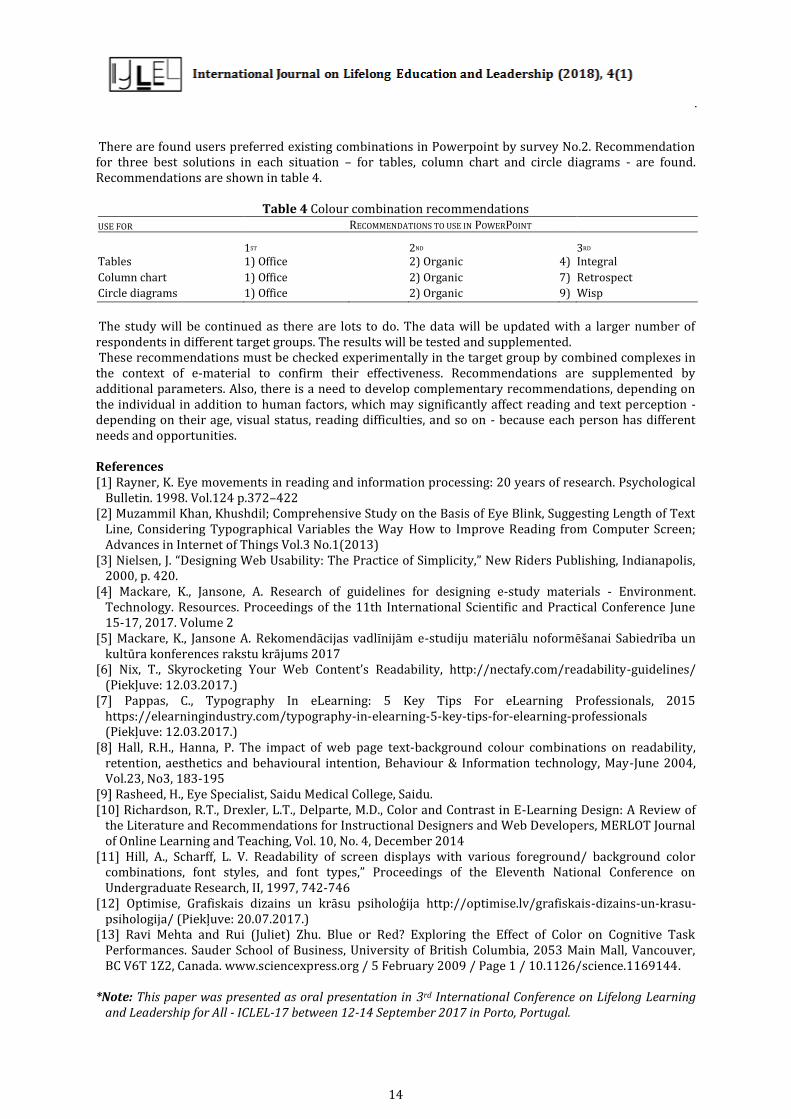
There are found users preferred existing combinations in Powerpoint by survey No.2. Recommendation for three best solutions in each situation – for tables, column chart and circle diagrams - are found. Recommendations are shown in table 4.
Table 4 Colour combination recommendations USE FOR RECOMMENDATIONS TO USE IN POWERPOINT
1ST 2ND 3RD
Tables 1) Office 2) Organic 4) Integral
Column chart 1) Office 2) Organic 7) Retrospect
Circle diagrams 1) Office 2) Organic 9) Wisp
The study will be continued as there are lots to do. The data will be updated with a larger number of respondents in different target groups. The results will be tested and supplemented. These recommendations must be checked experimentally in the target group by combined complexes in the context of e-material to confirm their effectiveness. Recommendations are supplemented by additional parameters. Also, there is a need to develop complementary recommendations, depending on the individual in addition to human factors, which may significantly affect reading and text perception - depending on their age, visual status, reading difficulties, and so on - because each person has different needs and opportunities. References [1] Rayner, K. Eye movements in reading and information processing: 20 years of research. Psychological
Bulletin. 1998. Vol.124 p.372–422 [2] Muzammil Khan, Khushdil; Comprehensive Study on the Basis of Eye Blink, Suggesting Length of Text
Line, Considering Typographical Variables the Way How to Improve Reading from Computer Screen; Advances in Internet of Things Vol.3 No.1(2013)
[3] Nielsen, J. “Designing Web Usability: The Practice of Simplicity,” New Riders Publishing, Indianapolis, 2000, p. 420.
[4] Mackare, K., Jansone, A. Research of guidelines for designing e-study materials - Environment. Technology. Resources. Proceedings of the 11th International Scientific and Practical Conference June 15-17, 2017. Volume 2
[5] Mackare, K., Jansone A. Rekomendācijas vadlīnijām e-studiju materiālu noformēšanai Sabiedrība un kultūra konferences rakstu krājums 2017
[6] Nix, T., Skyrocketing Your Web Content’s Readability, http://nectafy.com/readability-guidelines/ (Piekļuve: 12.03.2017.)
[7] Pappas, C., Typography In eLearning: 5 Key Tips For eLearning Professionals, 2015 https://elearningindustry.com/typography-in-elearning-5-key-tips-for-elearning-professionals (Piekļuve: 12.03.2017.)
[8] Hall, R.H., Hanna, P. The impact of web page text-background colour combinations on readability, retention, aesthetics and behavioural intention, Behaviour & Information technology, May-June 2004, Vol.23, No3, 183-195
[9] Rasheed, H., Eye Specialist, Saidu Medical College, Saidu. [10] Richardson, R.T., Drexler, L.T., Delparte, M.D., Color and Contrast in E-Learning Design: A Review of
the Literature and Recommendations for Instructional Designers and Web Developers, MERLOT Journal of Online Learning and Teaching, Vol. 10, No. 4, December 2014
[11] Hill, A., Scharff, L. V. Readability of screen displays with various foreground/ background color combinations, font styles, and font types,” Proceedings of the Eleventh National Conference on Undergraduate Research, II, 1997, 742-746
[12] Optimise, Grafiskais dizains un krāsu psiholoģija http://optimise.lv/grafiskais-dizains-un-krasu-psihologija/ (Piekļuve: 20.07.2017.)
[13] Ravi Mehta and Rui (Juliet) Zhu. Blue or Red? Exploring the Effect of Color on Cognitive Task Performances. Sauder School of Business, University of British Columbia, 2053 Main Mall, Vancouver, BC V6T 1Z2, Canada. www.sciencexpress.org / 5 February 2009 / Page 1 / 10.1126/science.1169144.
*Note: This paper was presented as oral presentation in 3rd International Conference on Lifelong Learning
and Leadership for All - ICLEL-17 between 12-14 September 2017 in Porto, Portugal.