User Interface Design, Prototyping, and Evaluation! Lecture 06
Upload
independentCategory
view
0download
0
PRINCIPLES OFUSER INTERFACE
DESIGN
Submitted To,
Prof. Viswanathan.P
Submitted By,
ANUSHA K 11MSE0136
APPLICATION : WINDOWS 8
DESIGN STYLE : FLAT DESIGNA more simplified, classically digital aesthetic.
The main aim of designing a user interface is to make the users comfortable and utilise all features effectively, efficiently andat ease.
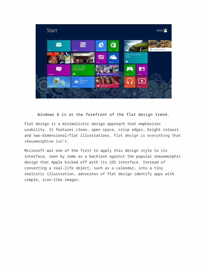
Windows 8 is at the forefront of the flat design trend.
Flat design is a minimalistic design approach that emphasizes usability. It features clean, open space, crisp edges, bright colours and two-dimensional/flat illustrations. Flat design is everything thatskeuomorphism isn’t.
Microsoft was one of the first to apply this design style to its interface, seen by some as a backlash against the popular skeuomorphicdesign that Apple kicked off with its iOS interface. Instead of converting a real-life object, such as a calendar, into a tiny realistic illustration, advocates of flat design identify apps with simple, icon-like images.

1. No Added Effects: Nothing is added to make elementslook more realistic, such as tricks designed to make items appear3D in skeuomorphic design projects. It has a distinct look and feel without all the extras. It relies on a clear sense of hierarchy in the design and placement of elements to make successful projects easy for users to understand and interact with.
2. Simple Elements: Flat design uses many simple user interface elements, such as buttons and icons. Designers often stick to simple shapes, such as rectangles, circles or squares and allow each shape to stand alone. Shape edges can be perfectly angular and square or include curvature.
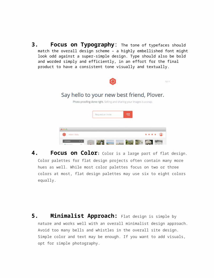
3. Focus on Typography: The tone of typefaces should match the overall design scheme – a highly embellished font mightlook odd against a super-simple design. Type should also be bold and worded simply and efficiently, in an effort for the final product to have a consistent tone visually and textually.
4. Focus on Color: Color is a large part of flat design.Color palettes for flat design projects often contain many more hues as well. While most color palettes focus on two or three colors at most, flat design palettes may use six to eight colors equally.
5. Minimalist Approach: Flat design is simple by nature and works well with an overall minimalist design approach.Avoid too many bells and whistles in the overall site design. Simple color and text may be enough. If you want to add visuals, opt for simple photography.
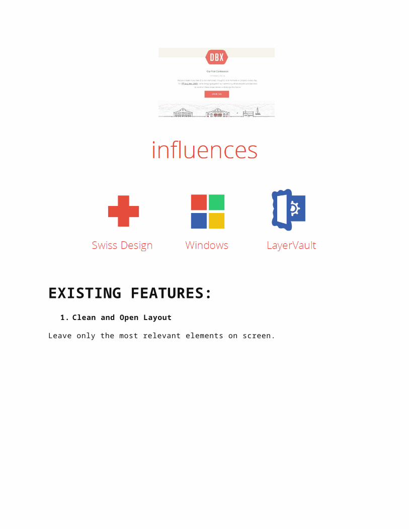
EXISTING FEATURES:1. Clean and Open Layout
Leave only the most relevant elements on screen.
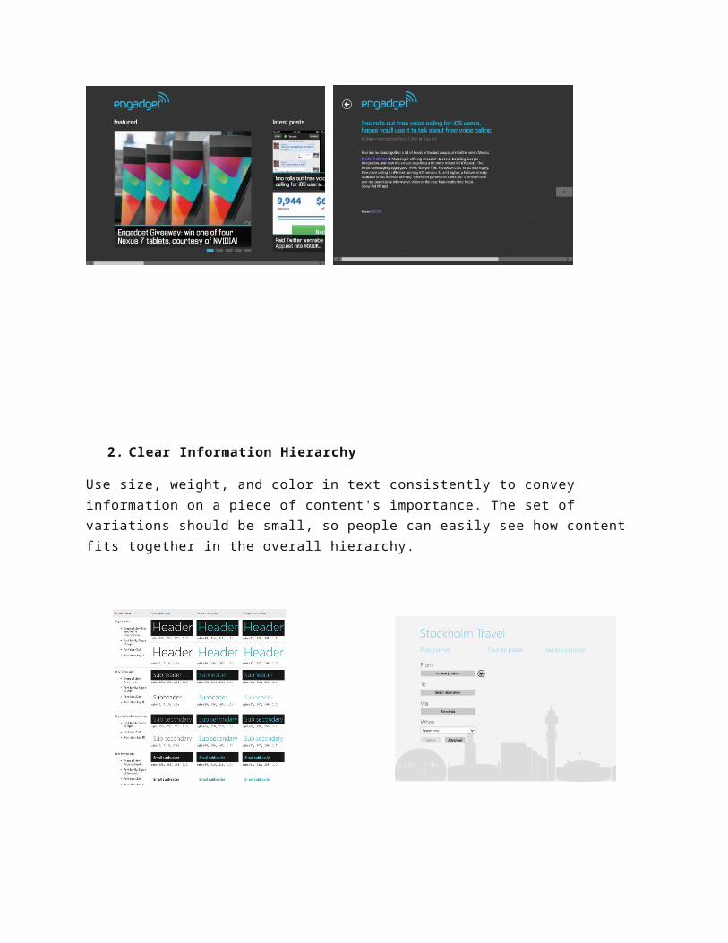
2. Clear Information Hierarchy
Use size, weight, and color in text consistently to convey information on a piece of content's importance. The set of variations should be small, so people can easily see how content fits together in the overall hierarchy.
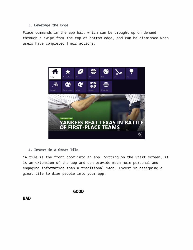
3. Leverage the Edge
Place commands in the app bar, which can be brought up on demand through a swipe from the top or bottom edge, and can be dismissed whenusers have completed their actions.
4. Invest in a Great Tile
“A tile is the front door into an app. Sitting on the Start screen, itis an extension of the app and can provide much more personal and engaging information than a traditional icon. Invest in designing a great tile to draw people into your app.”
GOOD BAD

5. Design for Touch and Be Fast and Fluid
Think Mobile First. How would I interact with this design on my Phone or Tablet?
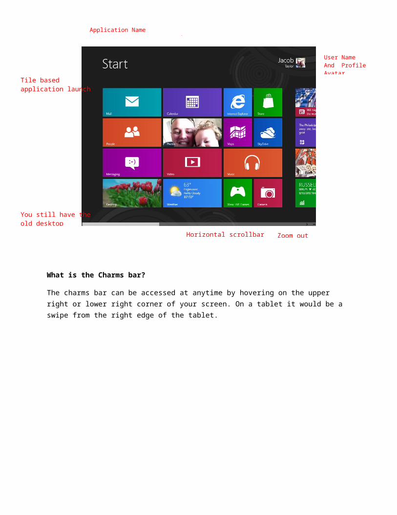
What is the Charms bar?
The charms bar can be accessed at anytime by hovering on the upper right or lower right corner of your screen. On a tablet it would be a swipe from the right edge of the tablet.
Application Name
User Name And Profile Avatar
Tile based application launch
You still have the old desktop
Horizontal scrollbar Zoom out
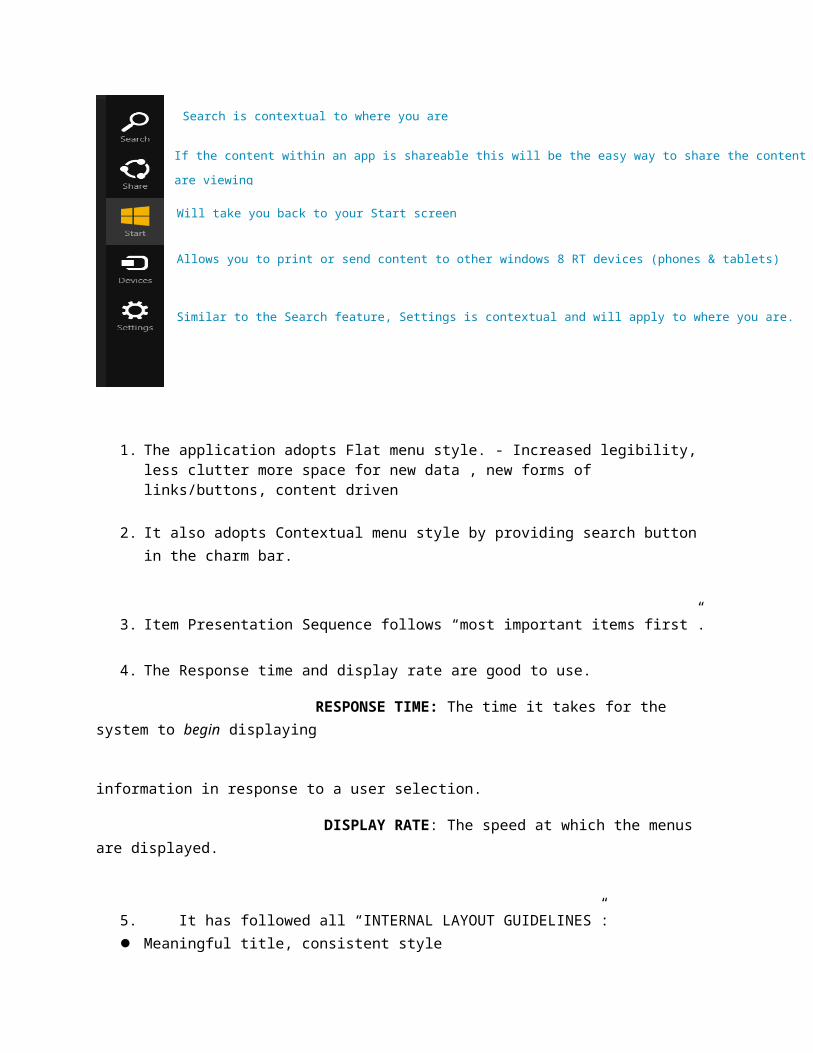
1. The application adopts Flat menu style. - Increased legibility, less clutter more space for new data , new forms of links/buttons, content driven
2. It also adopts Contextual menu style by providing search button in the charm bar.
3. Item Presentation Sequence follows “most important items first”.
4. The Response time and display rate are good to use.
RESPONSE TIME: The time it takes for the system to begin displaying
information in response to a user selection.
DISPLAY RATE: The speed at which the menus are displayed.
5. It has followed all “INTERNAL LAYOUT GUIDELINES”: Meaningful title, consistent style
Search is contextual to where you are
If the content within an app is shareable this will be the easy way to share the content you
are viewing
Will take you back to your Start screen
Allows you to print or send content to other windows 8 RT devices (phones & tablets)
Similar to the Search feature, Settings is contextual and will apply to where you are.

Top-left to bottom-right sequencing
Clustering and emphasis
Consistent layouts (margins, grid, whitespace, lines, boxes)
Consistent terminology, fonts, capitalization, justification
Standard buttons (OK, Cancel)
Error prevention by direct manipulation
6. It has been designed to ensure Workplace satisfaction, High performance and low error rates.
7. It helps prevent websites from becoming overwhelmed with advertisements and unnecessary graphics
8. UI design doesn’t use visual effects such as gradients and shadows, which can cause compatibility problems between different browsers.
9. A flat UI also tends to be easier on the user’s eyes due to the lack of depth and bright colors that can cause eye strain. The use of well-designed buttons alsomakes flat UIs simpler to navigate than traditional UIs, since these interfaces have fewer clickable widgets.
PITFALLS : New computer users are often put often by a flat UI,
which doesn’t display information that experienced users already know such as navigation instructions.
The lack of visual effects also means that a designer can’t easily conceal imperfections in the design.
The interface must be crisp and sharp for all users, sothat all components on the interface are clearly visible to everyone.
Forcing the user to blindly interact with this UI can also cause adverse effects such as accidentally moving or deleting data, andthen not knowing how to get it back. Error prevention is a core usability heuristic that may not be as easy to implement with some flat UI designs.
Many users have grown accustomed to and have enjoyed interacting with objects that have a sense of realism to them Providing a good user experience involves making your UI fun to interact with. This is often referred to as “delighting” your users/customers. That’s one of the main reasons that we use technology in the first place.
FEATURES THAT CAN BE CHANGED:1. Providing a great visual, auditory, or even tactical
experience(s) is what can help delight a user and make them more attached to your design
2. Design with content over chrome in mind, make use of
typography and good imagery
3. Follow all guidelines for displaying an error message to theusers. Do not use poor, commanding or more general error messages.
DESIGN PRINCIPLES OF WINDOWS: Pride in craftsmanship Do more with less Fast and fluid Authentically digital Win as one

7 LAWS OF USER INTERFACE DESIGN
1. Law of clarity - The user will avoid interface elements without a clear meaning.
2. Law of preferred action - The user will feel more comfortable when they understand what the preferred action is.
3. Law of context - The user expects to see interface controls close to the object he wants to control.
4. Law of defaults - The user will rarely change default settings.
5. Law of guided action - The user will probably do something if he is asked to do it.
6. Law of feedback - The user will feel more confident if you provide clear and constant feedback.
7. Law of easing - The user will be more inclined to perform a complex action if it’s broken down into smaller steps.
CONCLUSION :

The primary purpose of flat UI design is to create websites with a clean, modern appearance, although these characteristics won’t appeal to all users. UI designers generally believe that flat UI design is here to stay ratherthan just a passing fad. Flat UIs should continue to appear in more websites and influence graphic designers.
Copyright © 2022 FDOKUMEN