Portuguese Animation Platform - Sapientia
91
TATIANA KIKOT Portuguese Animation Platform Digital Platform development for the Animation Sector 2020
-
Upload
khangminh22 -
Category
Documents
-
view
0 -
download
0
Transcript of Portuguese Animation Platform - Sapientia
TATIANA KIKOT
Portuguese Animation Platform Digital Platform development for the Animation Sector
2020

TATIANA KIKOT
Portuguese Animation Platform Digital Platform development for the Animation Sector
Scientific Report
Mestrado em Design de Comunicação para o Turismo e Cultura
Work made under the supervision of:
PhD, Professor Marina Estela de Vasconcelos Gonçalves Graça
Escola Superior de Educação e Comunicação
PhD, Assistant Professor Marielba Silva de Zacarias
Faculdade de Ciências e Tecnologia
2020

i
Portuguese Animation Platform
Digital Platform development for the Animation Sector
Work Authorship Declaration
I declare to be the author of this work, which is unique and unprecedented. Authors and
works consulted are properly cited in the text and are in the listing of references included.
Tatiana Kikot
…………………………………………………………………..…………
ii
Copyright
© Copyright: Tatiana Kikot
The University of Algarve, in accordance to the policy of Law Code Copyright and Related
Rights, reserves the right to file, reproduce and publish this work by any means. The
disclosure of this thesis is made available for scientific repositories and for educational,
research and noncommercial purposes. Therefore, copies as well as distribution are admitted
given that due credit is acknowledged to the author and respective editor.

iii
Acknowledgements
It has been a time of intensive learning that has influenced me a lot. I believe that I have not
only grown on a scientific level, but as a person as well.
I would like to express my gratitude to all the people who were around me during this
investigation and encouraged me to complete this journey.
First, I would like to thank my supervisor Dra. Marina Estela de Vasconcelos Gonçalves
Graça for her time and patience that let this investigation be completed.
Secondly, I would like to thank my second supervisor Dra. Marielba Silva de Zacarias for
guiding and giving me great advice on the technical part of this project.
I am grateful to my family that allowed me to write and complete this work. During my years
of study, there have been a lot of moments I have missed with them. I would not have been
able to finalize this work without any of you.
I would like to thank all the students of the Moving Image course (UAlg) for their friendly
behavior and valuable contribution to this research.
I greatly appreciate I had the opportunity to learn and grow along this path.
Thank you all!

iv
Abstract
Today, Portuguese Animation has proved to be an important part of national cultural
heritage. The medium received more than 200 awards and honorable mentions in the
most prestigious festivals. Portuguese Animation has a great potential in becoming an
industry that can provide not only economic benefits, but also become a medium known
by everyone locally and be acknowledged internationally.
One of the actual problems is the absence of specific media able to give visibility to the
people working in this area. In order to fill this gap, the development of a new digital
platform, still missing, has been suggested to the author to resolve the real problem.
Connecting a problem with Communication Design brought out the research question: “Can
digital platform contribute to knowledge sharing for the students and professionals in the
Animation sector, while enhancing engagement?” To answer the research the concept of
“the practice-based approach” was used, where the development of a design project is not
the objective, but is the integral part of the process, and techniques such as: literature review,
case studies, and usability testing with in-person observations. In the end the functional
prototype was developed to prove the hypothesis.
Portuguese Animation Platform is a digital platform designed to be a repository for the
artworks of students and professionals in the Animation sector. This platform allows rapid
and efficient communication and knowledge sharing for the users. For the research the
characteristics of target public was studied, the User Interface (UI) and the User Experience
(UX) aspects through the usability testing. The gathered data outcome enabled the
identification of some issues and revealed what necessary improvements had to be made. All
the participants expressed the excitement and strongly believe it can provide them a better
experience. So the research question was positively answered and proved the hypothesis,
suggesting that digital platform can contribute to knowledge sharing while enhancing
engagement. This research and its practical outcome might contribute to a more sustainable
growth of the Animation sector.
Keywords: Animation, Digital Platforms, Communication Design, Interaction Design, Software
Engineering, Usability Test.

v
Resumo
Hoje, a Animação Portuguesa provou ser uma parte importante do património cultural
nacional. O meio recebeu mais de 200 prémios e menções honrosas nos festivais de
maior prestígio. Os anos 90 deram origem a obras notáveis como: “Os Salteadores”
(1993) de Abi Feijo, “Estória do Gato e da Lua” (1995) de Pedro Serrazina, “A Suspeita”
de José Miguel Ribeiro e “ História Trágica com Final Feliz” (2005) de Regina Pessoa. A
Animação Portuguesa tem um grande potencial para se tornar uma indústria que pode
oferecer, não apenas benefícios económicos, mas também tornar-se num meio valorizado
por todos internamente e ter o reconhecido internacional. Nos últimos anos, em
resultado de um desenvolvimento contínuo e de uma melhoria geral da qualidade técnica,
a animação tornou-se muito mais proeminente. O avanço da tecnologia e o aparecimento
de novas ideias, permitiram que a animação em Portugal tivesse uma evolução
significativa.
A Casa da Animação, Associação Cultural com sede no Porto, foi criada em 2001. A
principal missão da associação é criar, promover e apoiar a Animação Portuguesa em
todo o mundo. A Casa da Animação é dada a conhecer ao público principalmente através
do seu site na Internet, e da sua página de Facebook. No entanto, o site não fornece
informações completas sobre os profissionais, estúdios ou as suas produções. Os filmes
de animação são exibidos em festivais, mas neste caso, os espectadores são muito
específicos, o que não contribui para a divulgação do meio entre a generalidade do
público. A dificuldade em aparecer nos canais nacionais ou nos cinemas, reduz o
reconhecimento e a noção do património cultural já construído, impedindo assim a sua
evolução natural
Outra área da animação são os jogos digitais. Os animadores que colaboram em jogos
assinam contratos de confidencialidade ou promovem-se em grupos fechados. Os jogos não
têm folhas de créditos acessíveis para ver quem trabalhou neles.
Um dos problemas que se revela importante, é a ausência de um meio específico, capaz
de dar visibilidade às pessoas que trabalham nesta área. Para preencher esta lacuna, foi
sugerido ao autor o desenvolvimento de uma nova plataforma digital.

vi
O Design de Comunicação e a investigação, desempenham um papel importante no
desenvolvimento das ferramentas de informação adequadas, para garantir que a mensagem
chega ao público-alvo.
O Design de Comunicação desenvolve a relação entre o visualizador e os recursos visuais. O
seu objetivo é criar uma mensagem visual, clara e objectiva, que chame a atenção
imediatamente, e seja percebida mais rapidamente do que um texto. Além do Design de
Comunicação, o trabalho focou-se também no UI (Interface do Utilizador), de modo a
melhor adequar as características da plataforma ao utilizador. No aspecto da UX
(Experiência do Utilizador) foi dada atenção à forma e qualidade da interação com o
utilizador, nomeadamente na resposta intuitiva à sua atividade dentro da plataforma e
experiência visual durante a utilização.
Para poder propor a solução mais adequada e eficiente para esta área, será necessário analizar
os conceitos atualmente aplicados nas plataformas existentes em Design de Comunicação e
Interação, e descobrir quem são os usuários potenciais, para estabelecer as principais
funcionalidades da plataforma.
Para resolver o problema levantou-se uma questão de pesquisa: “A plataforma digital pode
contribuir para a partilha de conhecimentos entre estudantes e profissionais do setor da
Animação, enquanto ao mesmo tempo melhora a interação entre eles?”
Para responder à questão de pesquisa foi utilizado o conceito de “abordagem baseada em
situações práticas ”, onde o desenvolvimento de um projeto de design não é o objetivo, mas
sim parte integrante do processo. Para ter uma visão completa dos valores e opiniões dos
utilizadores foram utilizadas técnicas como: revisão de literatura, estudos de caso, e testes de
usabilidade com observações pessoais. No final, utilizando toda esta informação, para provar
a hipótese, foi desenvolvido o protótipo funcional.
Algumas das características e objetivos desta plataforma já foram pré-estabelecidas antes
do início da pesquisa. Devido à limitação de tempo e recursos, este estudo concentra-se
nas duas áreas: Projetos e Artistas, deixando as outras para exploração futura. Por esse
motivo, a recolha de dados foi organizada em duas partes.
Antes de dar início ao trabalho, havia a necessidade de validar as características e funções
pré-estabelecidas da plataforma. O primeiro passo foi reunir as opiniões reais dos
especialistas da área. Os profissionais do setor da Animação foram convidados a participar

vii
na pesquisa, onde avaliaram as características pré-estabelecidas da plataforma e contribuiram
com sugestões.
Depois do desenvolvimento da plataforma e da construção de um protótipo funcional,
foram tidas em consideração as principais características, e os aspectos da Interface do
Usuário (UI) e da Experiência do Usuário (UX), através de testes de usabilidade e entrevistas
semi-estruturadas. Aqui, a avaliação qualitativa foi combinada com a exploração da
plataforma, afim de obter informações sobre uma área, e encontrar desafios que
necessitavam mais investigação. Os estudantes que frequentavam a graduação no curso de
Imagem Animada da Universidade do Algarve (UAlg) foram convidados a participar num
teste de usabilidade da plataforma. Depois de experimentar a plataforma pela primeira vez,
cada participante respondeu às perguntas semi-abertas. Cada um dos participantes
compartilhou os seus pensamentos durante uma sessão individual. As perguntas foram
planeadas de modo a fornecer informações relevantes sobre a usabilidade da plataforma.
Portuguese Animation Platform é um software digital desenvolvido para ser um
repositório dos trabalhos de estudantes e profissionais do setor da Animação. Esta
plataforma permite a comunicação rápida e eficiente, e a partilha de conhecimento entre
os usuários. O protótipo funcional possui muitos recursos importantes para atender às
necessidades do utilizador, como: Registro, Login / Logout, área Usuário e Upload do
Projeto. Além disso, a plataforma permite a navegação e a pesquisa por vários tipos de
projeto ou por artista.
Os participantes deram uma resposta muito positiva sobre a sua experiência de uso da
plataforma. Todos os participantes demonstraram uma grande curiosidade em usar este
produto e conseguiram concluir todas as tarefas. Embora a maioria dos participantes não
tivesse necessidade de ajuda, houve alguns que fizeram perguntas. Todos os participantes se
mostraram entusiasmados com a ideia e acreditam firmemente que a plataforma lhes poderá
vir a proporcionar uma melhor experiência na divulgação dos seus projetos.
Assim, podemos concluir que a questão de pesquisa foi respondida positivamente e
comprovou a hipótese, assegurando que a plataforma digital pode contribuir para a
partilha de conhecimento e, ao mesmo tempo, aumentar o envolvimento dos usuários. A
análise dos dados recolhidos permitiu a identificação de alguns problemas, e revelou
quais as melhorias necessárias. Esta pesquisa e o seu resultado prático podem contribuir
para um crescimento mais sustentável do setor da Animação.

viii
Este projeto permitiu combinar o conhecimento dos princípios e processos fundamentais
de Design e os meios usados na comunicação moderna. Esta pesquisa e seus resultados
práticos podem contribuir para um crescimento e expansão mais sustentável do setor da
Animação, aumentando significativamente seu público no futuro.
Palavras-chave: Animação, Plataformas Digitais, Design de Comunicação, Design de Interação,
Engenharia de software, Usabilidade, Teste de usabilidade;

ix
Contents
Acknowledgements ................................................................................................................ iii
Abstract .................................................................................................................................... iv
Resumo ..................................................................................................................................... v
Index of Figures ..................................................................................................................... xi
Index of Tables ..................................................................................................................... xiii
Index of abbreviations .........................................................................................................xiv
CHAPTER 1. Introduction ............................................................................................................... 15
1.1. Scope, object of study and motivation .......................................................................15
1.2. Relevance of the problem and research question .....................................................15
1.3. Aims, objectives and project design ............................................................................17
1.4. Adopted methodology ..................................................................................................18
1.5. Scientific report structure .............................................................................................19
CHAPTER 2. Animation .................................................................................................................... 21
2.1. Animation: on its way to become a valued medium .................................................21
2.2. A brief historical note about Portuguese Animation. ...............................................23
2.2.1. Limitations in development .................................................................................24
CHAPTER 3. Communication Design............................................................................................. 25
3.1. Communication design .................................................................................................25
3.2. Interaction Design .........................................................................................................28
3.2.1. Usability ..................................................................................................................31
3.3. User Experience Design ...............................................................................................31
3.4. Interface Design .............................................................................................................33
3.5. Designing for the Web ..................................................................................................34
3.5.1. Elements in interface design ................................................................................34
3.6. Analyze of existing and analogous solutions .............................................................35
3.6.1. Case studies ............................................................................................................37
3.6.2. Summary .................................................................................................................45
CHAPTER 4. Proposal- Portuguese Animation Platform ............................................................ 47
4.1. Objective .........................................................................................................................47
4.1.1. The platform specific objectives: ........................................................................47
4.2. The structure ..................................................................................................................48
4.3. Brand identity .................................................................................................................48
4.3.1. Name .......................................................................................................................48
4.3.2. Behind the logo......................................................................................................49
4.4. Interface Design characteristic .....................................................................................49
4.4.1. Style .........................................................................................................................49

x
4.4.2. Color pallet .............................................................................................................50
4.4.3. Typeface ..................................................................................................................50
4.5. Design elements .............................................................................................................51
4.5.1. Home Page .............................................................................................................51
4.5.2. Navigation ..............................................................................................................53
4.5.3. Layout .....................................................................................................................54
4.5.4. Card Design ............................................................................................................54
4.5.5. Member profile ......................................................................................................55
4.5.6. Project Profile. .......................................................................................................57
4.5.7. Links and active elements ....................................................................................58
4.5.8. System Inputs .........................................................................................................58
4.6. Development ..................................................................................................................59
4.6.1. RESTful API ..........................................................................................................59
4.6.2. Programming Environment .................................................................................60
4.6.3. Other Tools ............................................................................................................61
4.7. Implementation ..............................................................................................................62
4.7.1. Data Flow ...............................................................................................................62
4.7.2. Prototype ................................................................................................................63
4.7.3. Web Platform Functionality ................................................................................63
CHAPTER 5. Evaluation Procedure ................................................................................................ 65
5.1 Survey with Professionals ..............................................................................................65
5.1.1 Survey design ..........................................................................................................65
5.1.2 Diagnosis/Findings ................................................................................................65
5.1.3 Summary ..................................................................................................................65
5.2. Prototype evaluation......................................................................................................67
5.2.1 Evaluation ................................................................................................................67
5.2.2 Usability test ............................................................................................................68
5.2.3. Semi-Structured Interviews ..................................................................................68
5.2.4 Results ......................................................................................................................68
5.3. Discussion .......................................................................................................................71
CHAPTER 6. Conclusions ................................................................................................................. 73
6.1. Competencies acquired in the process ........................................................................74
6.2. Future Work ...................................................................................................................75
Bibliography .......................................................................................................................................... 77
Annex A. ................................................................................................................................................ 81
Annex B. ................................................................................................................................................ 82
Annex C. ................................................................................................................................................ 89

xi
Index of Figures
Figure 1. Schematic representation of the cyclic parts of the research process. ......................... 19
Figure 2. Animation devices available during the XIXth century ................................................. 22
Figure 3. “Os Salteadores” (1993) by Abi Feijo, “Estória do Gato e da Lua ” (1995) by Pedro
Serrazina, “A Suspeita” by José Miguel Ribeiro and “História Trágica com Final Feliz” (2005)
Regina Pessoa ........................................................................................................................................ 23
Figure 4. Adopted from Ralph and Wand (2009, p.108) ................................................................ 26
Figure 5. Adopted from Dan Saffer (2007, p.21) ............................................................................ 29
Figure 6. Adopted from Liddle (2007, p.244) .................................................................................. 30
Figure 7. User experience concerned areas. Adapted from: Cooper et al., 2014, p.xxxi. .......... 32
Figure 8. Main page Women who Draw. .......................................................................................... 37
Figure 9. Menu Women who Draw. .................................................................................................. 37
Figure 10. Redirection to artist page ................................................................................................ 37
Figure 11. Main Page Folio belas-artes ulisboa ................................................................................ 39
Figure 12. Project overview page Folio belas-artes ulisboa ........................................................... 40
Figure 13. Member overview page Folio belas-artes ulisboa ......................................................... 40
Figure 14. Main page Gobelins L´ École de L´Image .................................................................... 41
Figure 15. Menu Gobelins L´ École de L´Image ............................................................................ 42
Figure 16. Project Presentation Gobelins L´ École de L´Image ................................................... 42
Figure 17. Main page Catalogue des vidéos à la demande.............................................................. 43
Figure 18. Visualization of projects Catalogue des vidéos à la demande ..................................... 44
Figure 19. Project page Catalogue des vidéos à la demande .......................................................... 44
Figure 20. PAP Structure .................................................................................................................... 48
Figure 21. Logo Portuguese Animation Platform ........................................................................... 49
Figure 22. Primary and secondary colors .......................................................................................... 50
Figure 23. Montserrat family .............................................................................................................. 51
Figure 24. PAP Home page (section 1) ............................................................................................. 52
Figure 25. Scroll (Sliding effect) ......................................................................................................... 52
Figure 26. PAP Home page (section 2) ............................................................................................. 52
Figure 27. Navigation. Main Menu .................................................................................................... 53
Figure 28. Sub-navigation Projects .................................................................................................... 53
Figure 29. Sub-navigation Members .................................................................................................. 53
Figure 30. Projects layout 4 column grid .......................................................................................... 54
Figure 31. Project card ......................................................................................................................... 55

xii
Figure 32. Member card ...................................................................................................................... 55
Figure 33. Member profile (section 1) ............................................................................................... 55
Figure 34. Member profile (section 2) ............................................................................................... 56
Figure 35. Member profile (Complete version) ............................................................................... 56
Figure 36. Project profile. .................................................................................................................... 57
Figure 37. White flash. Duration 1.4 seconds. ................................................................................. 58
Figure 38. Input for “film” project .................................................................................................... 59
Figure 39. User are: Project upload ................................................................................................... 59
Figure 40. Data main flow .................................................................................................................. 62
Figure 41. Data main flow (simplified) ............................................................................................. 62

xiii
Index of Tables
Table 1. A summary table of the selected platforms, each of which was numbered, with
columns for the name, subject, and content ............................................................................ 36
Table 2. Overview of the usability test participants. ............................................................... 69
Table 3. Overview of the suggestions 1. ................................................................................... 69
Table 4. Overview of the suggestions 2. ................................................................................... 70

xiv
Index of abbreviations
API
CLI
CSS
DBMS
DOM
HTML
HTTP
IDE
IP
JSON
MVP
NPM
ODM
PAP
REST
URL
Application Programming Interface
Command Line Interpreter
Cascading Style Sheets
Database Management System
Document Object Model
HyperText Markup Language
HyperText Transfer Protocol
Integrated Development Environment
Internet Protocol
JavaScript Object Notation
Minimum Viable Product
Node Package Manager
Object Data Modeling
Portuguese Animation Platform
Representational State Transfer
Uniform Resource Locator

15
CHAPTER 1. Introduction
1.1. Scope, object of study and motivation
Opportunity to spread information, to be seen and recognize, and reach both local and global
audiences is an important part of people working in any industry nowadays, animation is not
an exception here. One of the actual problems is the absence of specific media able to give
visibility to the people working in this area. In order to feel this gap, the development of a
new digital platform, yet missing, has been suggested to the author to resolve the real problem.
Communication Design and research are playing an important role within information
development and problem-solving, ensuring the message reaches the target audience. Hence,
to be able to propose the most adequate and efficient solution, it is necessary to understand
the foundations of Communication Design with some examples of Communication and
Interaction Design, find out who the potential users are and establish main functionalities of
the platform.
Additionally, the motivation for this project was to develop skills and competencies that allow
creating a digital interface that corresponds to the actual standards in the web design and
needs of the area. More, as the author of this project prefers ideas to have their practical
application and has a background and some experience in computer engineering, implement
these skills to develop a functional prototype. The reason is to become more competent and
comprehend the balance between what helps users perform well and what users actually like
to perform with. This includes understanding the importance of web design, learning design
conventions and ethics, and building relationships between web development and web design.
1.2. Relevance of the problem and research question
Casa da Animação, Associação Cultural, based in Porto, has been created in 2001. The main
mission of this association is to create, promote and support Portuguese Animation
worldwide. Casa da Animação is represented to the public mainly through the website and the
Facebook page.
However, the website is outdated and does not provide full information on professionals,
studios and their production. The main reason is the absence of maintenance and support to
update the website. Nonetheless, animation films run at festivals, yet the audience is so
specific and limited making it difficult to spread and propagate films among the public.
Animators who collaborate in games sign confidentiality contracts or promote themselves in

16
closed groups. Again, the games do not have accessible datasheets to see the people who
worked on them.
Therefore, having detected this problem, there was a request to create a platform that would
help to overcome this obstacle for professionals working in the Animation sector.
This followed up by personal motivation for accepting and taking this project for
development. Since I wanted to deepen my previous education in Computer Engineering, I
was interested in building a complete product, taking care of various sides of it. And to focus
not only on project interface itself but also on its functionality. In this project, I therefore
wanted to create something that would allow me to connect a back-end to the application and
enable controlling it.
Thus, considering this a real problem, participation in this project development has been
accepted, as it can give a valuable knowledge and experience. As for me, success in product
development has always come from solving one of personal existing needs.
On the whole, the work was oriented towards developing a new platform that is easy to
maintain, access and use. The final product should be allocated to UAlg in order to support
alumni of the Moving Image course, students of other study cycles with professional
performance in animation, and other professionals in the industry.
In order to benefit this sector, this project proposes the development of a digital repository
that will allow rapid and efficient communication and knowledge sharing for the users. It is an
open-source service with low maintenance level and multiple tools for searching and
observing information. Consequently, the research is trying to answer the following question:
Can digital platform contribute to knowledge sharing for the students and professionals in the Animation
sector, while enhancing engagement?
17
1.3. Aims, objectives and project design
The aims of this investigation are two:
01- To create a platform through the development of a project in Communication Design
(practice-based approach) in order to solve a problem;
02- To build competencies in Communication Design. Furthermore, to critically frame the
practice-based approach and results in order to understand and evaluate the principles and the
methods used;
In order to approach this intricate and complex aim, the project is organized according to
different objectives. These intend to acknowledge each “sub-dimension” in order to facilitate
the analysis and provide better outcomes. Therefore, they are:
Critically frame the project question and methodology within Communication Design
in order to consider its elements, processes, and constraints;
To identify and to analyze existing similar solutions and their implementation,
considering its set of specifications;
To identify Communication Design principles in order to organize the layouts of the
platform, to maximize effectiveness both as a communication device and as digital
repository;
To understand how to lower the level of maintenance;
To implement a prototype;

18
1.4. Adopted methodology
Over three decades consideration that design is distinct from the sciences and humanities
became an accepted issue (Saikaly, 2019). However, the nature of design research was in the
center of debates (Saikaly, 2019, p.2). Poggenpohl and Sato (2003) support the scientific
approach to design research. They describe three models: empirical research, theoretical
research, and methodological. Margolin (1999) argues for the humanities approach. But there
are others who focus on the nature of design practice and its relationship to design research
(Saikaly, 2019, p.5; Franz, 1998).
Saikaly (2019, p.2) treating the design as a “the third area” of human knowledge that is
“concerned with the making and doing aspects of human activity…” (Archer, 1979, p.19). In
justifying the existence of “the third area” Archer (1979, p.19) argues for the existence of a
different approach of knowing- a “designerly mode of inquiry”. Which is comparable, but
distinct from the scientific, humanistic and social modes of inquiry.
The investigation conducted by Saikaly (2003, p.8) shows the existence of three major
approaches to design research: “the sciences and humanities approaches”, “the practice-
centered approach”, and “the practice-based approach”.
As for the methodology of this research, it is framed around the concept of “the practice-
based approach”, where the development of a design project is not the objective, but is the
integral part of the process (Saikaly, 2003, p.9). The development is conducted in the context
of theoretical and practical evolution that surrounds the author’s areas of concern. This allows
to demonstrate the author´s contribution to design knowledge, through his ability, awareness,
and expertise (Glanville & Schaik, 2003, p.37).
The research phases have a cyclic nature (Figure 1). The project development is combined to
all major phases of the research. Each cycle represents a component of the project and its
relative theoretical context that further leads to a better understanding of the general research
problem.
19
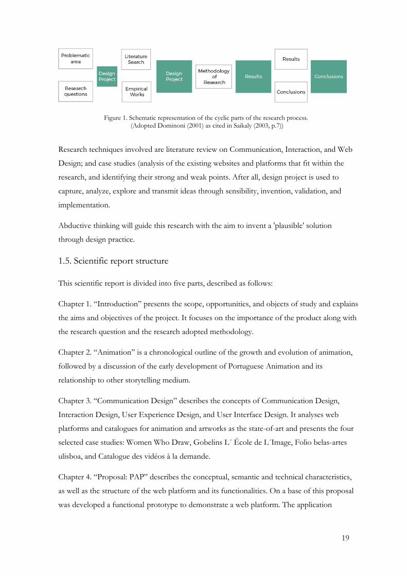
Figure 1. Schematic representation of the cyclic parts of the research process. (Adopted Dominoni (2001) as cited in Saikaly (2003, p.7))
Research techniques involved are literature review on Communication, Interaction, and Web
Design; and case studies (analysis of the existing websites and platforms that fit within the
research, and identifying their strong and weak points. After all, design project is used to
capture, analyze, explore and transmit ideas through sensibility, invention, validation, and
implementation.
Abductive thinking will guide this research with the aim to invent a 'plausible' solution
through design practice.
1.5. Scientific report structure
This scientific report is divided into five parts, described as follows:
Chapter 1. “Introduction” presents the scope, opportunities, and objects of study and explains
the aims and objectives of the project. It focuses on the importance of the product along with
the research question and the research adopted methodology.
Chapter 2. “Animation” is a chronological outline of the growth and evolution of animation,
followed by a discussion of the early development of Portuguese Animation and its
relationship to other storytelling medium.
Chapter 3. “Communication Design” describes the concepts of Communication Design,
Interaction Design, User Experience Design, and User Interface Design. It analyses web
platforms and catalogues for animation and artworks as the state-of-art and presents the four
selected case studies: Women Who Draw, Gobelins L´ École de L´Image, Folio belas-artes
ulisboa, and Catalogue des vidéos à la demande.
Chapter 4. “Proposal: PAP” describes the conceptual, semantic and technical characteristics,
as well as the structure of the web platform and its functionalities. On a base of this proposal
was developed a functional prototype to demonstrate a web platform. The application

20
developed is a Minimum Viable Product (MVP). The MVP can later be developed to cover
different other aspects of an online platform.
Chapter 5. “Evaluation Procedure” consists of two parts. In the first one described the
process of problem validation with professionals in the Animation sector. The second part
includes a presentation of the final experiment conducted with the students of the Moving
Image course in UAlg, along with procedures, results, and discussion of the results.
In the final chapter 6. “Conclusions”, are presented conclusions as well as the answer to the
research question. It describes the contributions of the web platform and recommendations
for future work.

21
CHAPTER 2. Animation
2.1. Animation: on its way to become a valued a medium
Animation, as a concept, has been around for a long time. Archeological artifacts prove
that the idea to graphically capture motion has existed as long as humans have been
creating visual representation. Noticeable examples from ancient times include several
undated Paleolithic cave paintings showing animals with multiple limbs in an attempt to
depict motion (Thomas, 1958).
The general consensus is that modern animation began in the 18th and 19th centuries with
the spread of the Industrial Revolution in Europe and North America (Plateau, 1832,
p.291). Experimentations with machines managed to make images appear to move. The
first meaningful step came with the invention of the phenakistoscope (Figure 2a), a
spinning disc that made it look like pictures were moving. This was followed by the
invention of the zoetrope (William George Horner, 1834) (Figure 2b), a hollow drum that
housed images on long interchangeable strips that spin and made the images appear to
move. Later, the zoetrope has been updated into a praxinoscope (Charles-Emile Reynaud,
1877) (Figure 2d), with an inner circle of mirrors. In between, the spread of the flip-book
(Figure 2c), also known as the kineograph (Latin for "moving picture"), was recognized as
the first use of a linear sequence of images– like in booklet instead of circular drums.
All these inventions played a significant part in popularizing the idea of animation and
developing technologies closer to what it is today. The depiction of movement was
continually improving making longer-lasting animation available in the future.
a) PHENAKITOSCOPE 1831
Invented by Joseph Plateau, Belgian physicist
b) ZOETROPE 1834 Invented by William George Horner, British mathematician

22
c) FLIP-BOOK 1868
Patented by John Barnes Linnett, British lithograph
d) PRAXINOSCOPE 1877
Invented by Charles-Émile Reynaud, French inventor
Figure 2 Animation devices available during the XIXth century
From now on, animation would progress extremely rapidly. In 1892, Charles-Émile
Reynaud, the French educator and inventor of the praxinoscope (Figure 2d), projected his
own personal animated project, Pauvre Pierrot, at a museum in Paris, by using the ‘Théâtre
Optique’ (1988), another device of his own invention. This helped to realize that animation
could be used as a medium for entertainment (Meyer, 2016).
The early 20th century marks the beginning of theatrical showings of cartoons, especially in
the United States and France. Animation would go from an unexplored to a medium
known by everyone. The true animation revolution in the United States, often known as
the “Golden Age of Animation” (1940’s and 1950´s) gave birth to many of the most iconic
characters of a generation. The films and cartoons made during that era, more than most
live-action films, endured in the hearts and minds, remaining popular enough to be released
and updated year after year.
In the 21st century, computer-generated imagery revolutionized animation and the medium
become ever more diverse and specialized in tone and content. New ideas become more
accepted and old ones have been refined. Animation production became accessible to
everybody and techniques ceased to be limited to the photographic register of drawings
and volumes to include 3D computer-generated imagery.
Overall animation has evolved intensely since the beginning. Today, the production of
animation has become a fundamental activity in different media. Animation is found in
cinema; television and audiovisual products; and interactive products like games and other
information on digital platforms. Animation cannot be avoided, it will only continue to
grow and mature as the 21st century continues.

23
2.2. A brief historical note about Portuguese Animation.
Portuguese Animation has its own path of development throughout the last century. The
equipment was quite expensive and only available for those who worked in big studios.
Education in the area did not exist. Therefore, it was difficult to develop artistic or
commercial production in the area. Animation, as a professional activity in Portugal, began
in the 60s in the studio of Mario Neves. At that time, there simply was not much room for
or interest in animation in Portugal. There were certainly limiting factors facing the
medium that come from its nature.
The position of animation improved when in 1973 the first Portuguese Film Institute
(Instituto Português de Cinema) was founded, that allowed financing. After that, over two
decades (1970-1990), the idea of Portuguese Animation began to develop under a different
angle. It grew up into progressive sector with more professionals, more resources and more
economic and cultural impact. The 90s gave birth to the most notable masterpieces as: “Os
Salteadores” (1993) by Abi Feijo, “Estória do Gato e da Lua ” (1995) by Pedro Serrazina,
“A Suspeita” by José Miguel Ribeiro and “História Trágica com Final Feliz” (2005) by
Regina Pessoa (Figure 3).
Figure 3. “Os Salteadores” (1993) by Abi Feijo, “Estória do Gato e da Lua ” (1995) by Pedro Serrazina, “A Suspeita” by José Miguel Ribeiro and “História Trágica com Final Feliz” (2005) Regina Pessoa.

24
The beginning of 21st century was celebrated with the foundation of Casa da Animação.
The main mission of this association is to create, promote and support Portuguese
Animation worldwide.
Though only a decade and a half of the 21st century has passed, Portuguese Animation has
already undergone significant change. The medium becomes ever more diverse, as new
ideas become more accepted. Animation has become cheaper and easier to create and
distribute. With more accessible computer-generated imagery and Internet experimental
films, student animation, online web series, and other niche works have proliferated greatly.
During the last years, continued development and increase of quality made animation much
more prominent. Increasing technological improvement, development of ideas and vision
allowed animation to move forward. Today, Portuguese Animation proved to be an
important part of national cultural heritage (AaVv, 2010). The medium received more than
200 awards and honorable mentions in the most prestigious festivals (AaVv, 2010).
Portuguese Animation has a great potential in becoming an industry that can provide not
only economic benefits but also become a medium known by everyone on the local market
and be acknowledged internationally.
2.2.1. Limitations in development
Portuguese Animation has changed greatly since its beginning. But overall, has not
succeeded so spectacularly to be appreciated and broadcasted as it should be. There are
serious constraints that prevent it to proliferate within Portugal. Among them are reduction
of funds and support, lack of human resources and training, absence of promotions and
exhibitions, lack of distribution channels and weak visibility (AaVv, 2010, p.7). All these
made an impact upon the way the medium is perceived and what contributions it makes.
The difficulty to be broadcasted on national channels, cinemas reduce the recognition and
awareness of cultural heritage that is already built. Consequently, preventing it from its
natural evolvement (AaVv, 2010, p.8).
It is essential to accept animation as a dynamic element within national cultural industries
(AaVv, 2010, p.10). And provide it appropriate and serious attention.

25
CHAPTER 3. Communication Design
Considering that the area of research of this project is Communication Design, it is
necessary to explain the critical framework that grounds its investigation.
Conceptualization of Communication Design becomes extremely complex due to its various
disciplines and influence over multiple areas. It is essential to get to the core of this concept
in order to comprehend what brings together so many contrasting practices onto the same
field.
3.1. Communication design
Today the term Communication Design might be interpreted in various ways (Frascara,
2004, p.1). Since there is not yet a unified theory, it is necessary to confront concepts of
Design, proposed by different authors to understand the concept of Communication
Design.
Moggridge (2007) proposed one of the most satisfying descriptions of design "a plan for
arranging elements in such a way to accomplish a particular purpose in the best way" (p.648).
The author emphasizes that design employs tacit knowledge of the unconscious mind rather
than explicit knowledge of logically expressed thoughts. This is a reason why it is easier to
“recognize the solution than to explain it” when creating Communication Design
(Moggridge, 2007, p.650).
Back in the 90's Escorel (1999, p.62) admitted that design was a complex term covering
various disciplines, from fashion to industrial production. The author emphasized that after
almost a century of its development, the activity of design remained controversial and little
known. The design has been all simultaneously: art, project practice, technological or
scientific field, activity to support marketing techniques and many more (Escorel, 1999).
For Ralph and Wand (2009, p.108) design is an activity in which an agent, usually a human
being that practices/manifests design through the specification of an object, which may have
a physical or immaterial nature. The environment is the context where the intended object
exists or operates. Goals represent what design object should achieve – the impacts that the
object must have on its environment. Requirements are the structural or behavioral
properties that the design objects must possess. The constraints are the limitations (Figure
4).

26
Figure 4. Adopted from Ralph and Wand (2009, p.108)
Despite thinking of design as something complex, Moggridge (2007) believes that the
designer should not only be logical while working with functions but go beyond focusing
on the receiver. According to this researcher, the design processes comprises five
competencies: to create a solution from the constraints; to understand what will make the
difference for the final result; to reformate problems and objectives; to create view and
select alternatives; to view and make a prototype of what is intended (Moggridge, 2002,
p.729). These competencies are part of a design process, which can follow or not this
order. This process might be repetitive sometimes, and usually is unstructured, taking
different directions.
In turn, Communication Design is seen as “the action of conceiving, programming,
projecting, and realizing visual communications that are usually produced through
industrial means and aimed at broadcasting specific messages to specific sectors of the
public” Frascara (2004, p.2). It is a mixed discipline that is deeply connected with
Psychology, Sociology, and Marketing as well as with Visual Communication (Frascara,
2004, p.57).
According to Frascara (2004), Communication Design is made with three elements:
method (design), an objective (communication), and a medium (vision). For Frascara
(2004) "Design is to invent, to project, to program, to coordinate a long list of human and
technical factors, translating the invisible into visible, and communicating” (p.2).
Frascara (2004) denotes four key principles for design process: Perception and meaning;
Language and Signification; Communication; Aesthetics. These principles are fundamental
points of advice for making easy-to-use and pleasurable designs.

27
1) Perception and meaning
According to Frascara (2004), the attention of the viewer must be focused on the
perception and the meaning of the visual design. Aspects of projects as clarity of form and
content, facilitation and stimulation of reading and consideration of cultural, social,
economic, technological, and ecological.
2) Language and signification
Language mediates between the communicator and the decoder, and between referred
'things' and meanings (what is formed in the recipient's head). And it must be understood
according to a series of parameters.
The objective of the design is to be very careful and reasonable in selecting the content and
the language. As requirements differ from project to project, Frascara (2004), advises
making a checklist with the prerequisites with the user needs.
3) Communication
Frascara (2004, p.63) states that Communication is the reason for the existence of Visual
Communication Design. Communication strives for a perception- a search for meaning.
There are two fundamental components in any perception: the search for meaning, and the
construction of meaning based on the incentives. To perceive is not just to receive
information passively. The process involves searching, selecting, relating, organizing,
establishing connections, remembering, and identifying, and defining hierarchies, judging,
learning, and interpreting.
4) Aesthetics
As Frascara remarks, the importance of aesthetics is deeply connected with the
understanding of the audience that communication is intended to reach. Aesthetics should
be suitable and appropriate to the public, product, and message that it conveys. Here the
languages and personal preferences of the target population play a major role. After all,
design goes far beyond the primary needs that objects want to deliver (Maslow, 1970).
According to Sudjic (2008, p.52), design is the DNA of society, as the social context,
human nature, economic systems, technologies, and emotional and cultural values can be
better perceived through and experienced. This displays an extreme connection between
design and culture, as a producer of goods as well as cultural events.
28
3.2. Interaction Design
Today Communication Design should also be more and more enjoyable, attending not only
to engineering, ergonomics, and production but also to the user's own experience. Under
this aspect, there must be attention to the form and quality of interaction.
Until the mid-1990s Interaction Design was not recognized as a field of knowledge. For a
long time, human behavior was considered apart from design. During this period, the term
was linked to the usability and engineering of human factors to support the task (Lowgren,
2013, p.1).
Moggridge and Verplank are considered the founders of Interaction Design, starting to
give presentations on the subject during the '80s. Moggridge (2007) explains his feelings:
I felt that there was an opportunity to create a new design discipline, dedicated
to creating imaginative and attractive solutions in a virtual world, where one
could design behaviors, animations, and sounds as well as shapes. This would
be the equivalent of industrial design but in software rather than three-
dimensional objects. Like the industrial design, the discipline would start from
the needs and desires of the people who use a product or service, and strive to
create designs that would give aesthetic pleasure as well as lasting satisfaction
and enjoyment. (p.14)
Later, with the collaboration of Verplank, the concept was settled eventually as
“Interaction Design”. Verplank (2009) defines the central concern of Interaction Design
“how to design for people – for their physical and emotional needs and increasingly for
their intellect” (p.5).
Donald Norman also arguably deserves acknowledgment as a pioneer in Interaction
Design. Norman (2006, p.217) emphasizes that although Interaction Design does not use
words, it is an act of communication, sharing and exchanging meanings between designer
and user/receiver.
Interaction designers are trying to define and analyze communication among users and
technology and consequently simplify the interactions between them. Control of this
communication may be accidental or intentional, but good design tries not to leave artifacts
thrown at random (Norman, 2004). Thus, "the design is used to shape perceptions of how

29
objects are to be understood" (Sudjic, 2008, p.51) promoting the understanding of meaning
through clues, or as Norman refers (2004, p.12), through signifiers.
In turn, for Moggridge (2002), Interaction Design was so young that there is very little
established knowledge so far. The chances to satisfy all functional constrains and let alone
with aesthetics are still low. Moggridge (2002) defines Interaction Design as “The design of
the subjective and qualitative aspects of everything that is both digital and interactive,
creating designs that are useful, desirable, and accessible” (p.659).
In sequence Saffer (2010, p.20) stresses that Interaction Design is still trying to find its
place among similar disciplines such as architecture information, industrial design, visual
(or graphic) design, User Experience Design, and human factors (Figure 5).
Figure 5. Adopted from Dan Saffer (2007, p.21)
According to Saffer (2010), there are three currents with a distinct focus on Interaction
Design. The first is technology-centered and tries to make it more usable, useful and
enjoyable. What has been produced by engineers is transformed and shaped to the pleasant
combination of functionality and need of people. The second current is behavioral-
centered. It takes into account the functionality and feedback of the products, according to
the action of the people. The third one, social Interaction Design, aims to facilitate
communication between humans and products. From this point of view, technology is less
relevant, any products can make the connection between people.

30
Liddle (2007) referred to three stages of approval progress in Interaction Design: enthusiastic
phase, professional phase (development) and consumer phase (interaction) (Figure 6). The
enthusiastic phase is adoption, where starts the first communication and exploration of
primary capacities of artifacts. The process concerns the product and technology itself. The
professional phase is a professional usage, where technology is used at work for the
performance of a task. Here the user often is not the buyer. Thus, the usage factor is left
out by price, payment terms, performance specifications or after-sales support. At this
stage, the technological complexity is welcome, as the purchasers are not concerned about
the difficulty level. As the more elaborate the performance, the more their work will be
valued. In this case, users do not mind spending much time learning how to use it. The
consumer phase is related to the consumers, where people are less interested in the
technology itself, but focus on what they can do with it. Users do not want to spend too
much time learning how to use it and do not like to feel unaware. The sine qua non of
acquisition is simplicity in the handling of the tool. Thus, at this stage Interaction Design
acts by making the technology usable and pleasurable to the user. This phase is more
challenging for production, which must be created for the most varied types of people,
rather than focusing on specialists who should know how to use them.
Figure 6. Adopted from Liddle (2007, p.244)
Therefore, Crampton (2007) stresses that: “Interaction Design is about shaping our
everyday life through digital artifacts—for work, for play, and for entertainment” (p. XI).
The author emphasizes the importance of five requirements for interaction designer:
usability, utility, satisfaction, communication, and sociability. Usability is only the first step
that is expected of a system, it needs to be useful by being appropriate to the goals and

31
desires, satisfying the user. While communication should occur during use, without the
need for instructions. Sociability shows that social experiences are made possible by the
network, bringing greater meaning to the object. This is the stage in which we live with
websites, and it is therefore so important that we rely more and more on Interaction
Design.
Interaction Design involves not only the focus on interaction but also on all other
processes that influence it (Cooper et al., 2007; Crampton, 2007; Lowgren, 2013; Saffer,
2010). Some of them focus on solving problems and performing tasks, that is, on a
restrictive idea of usability.
3.2.1. Usability
Usability is initially thought through the statement: “easy to learn, easy to use” (Carroll,
2013, p.27). More comprehensively, this concept means to concern on functionalities
desired by the users with common skills and without previous experiences (Krug, 2006).
The importance of Usability cannot be devalued, this is a sine qua non condition for the
success of any interface. If a site is difficult to use, people will leave it (Nielsen, 2013) or
they will not spend much time on it (Krug, 2006). According to Krug (2006), the user only
looks, does not read the details, and looks for key figures such as titles, subtitles or images.
After all, a desktop computer screen is not a suitable medium for long readings, along with
the mobile phone (p.22). The user looks at the screen as in a hurry, not needing to read
everything, just looking for clues of interest, so not everything on a page will call to in-
depth reading.
Krug (2006) explains the Usability principle as follows: “if something requires a large time
investment - or seems to require - is less likely to be used" (p.19). And this is the reason for
the author's first law: “do not make me think!” (Krug 2006, p.11). Therefore, pages need to
be obvious, requiring no effort. In most situations, things must go into the obvious, having
links, buttons easily perceived.
3.3. User Experience Design
The use of technology has changed dramatically, people started to use digital means out of
work and away from the task environment, bringing technology to leisure. Thus,
functionality and usability is not enough. Hassenzahl (2003) denotes that customers quite
frequently take functional characteristics and product quality as granted, now they want
32
products that can touch their feelings and trigger their minds. Therefore, products must
have an emotional component, so they have life and transform the process of use to highly
exiting (Preece, Rogers, & Sharp, 2005; Saffer, 2010). With this in mind arise the idea of
User Experience which captures a series of aesthetic, formal and emotional approaches
(Preece et al., 2005).
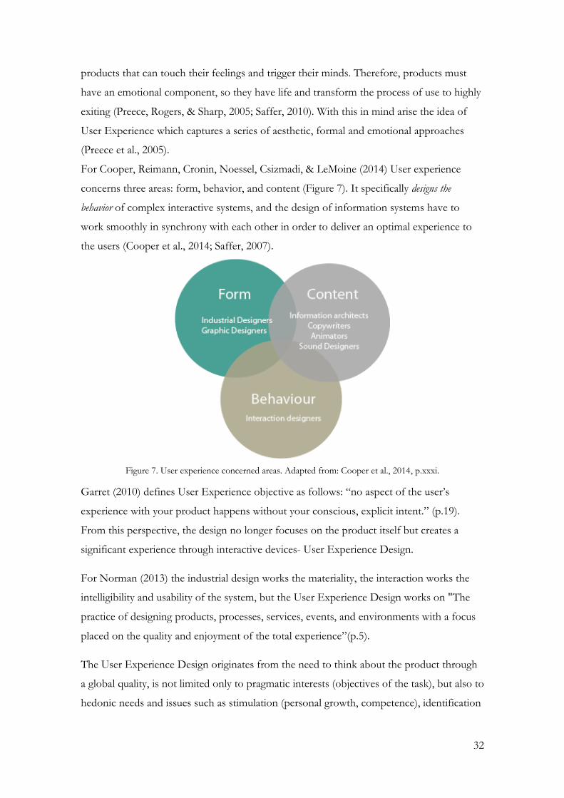
For Cooper, Reimann, Cronin, Noessel, Csizmadi, & LeMoine (2014) User experience
concerns three areas: form, behavior, and content (Figure 7). It specifically designs the
behavior of complex interactive systems, and the design of information systems have to
work smoothly in synchrony with each other in order to deliver an optimal experience to
the users (Cooper et al., 2014; Saffer, 2007).
Figure 7. User experience concerned areas. Adapted from: Cooper et al., 2014, p.xxxi.
Garret (2010) defines User Experience objective as follows: “no aspect of the user’s
experience with your product happens without your conscious, explicit intent.” (p.19).
From this perspective, the design no longer focuses on the product itself but creates a
significant experience through interactive devices- User Experience Design.
For Norman (2013) the industrial design works the materiality, the interaction works the
intelligibility and usability of the system, but the User Experience Design works on "The
practice of designing products, processes, services, events, and environments with a focus
placed on the quality and enjoyment of the total experience”(p.5).
The User Experience Design originates from the need to think about the product through
a global quality, is not limited only to pragmatic interests (objectives of the task), but also to
hedonic needs and issues such as stimulation (personal growth, competence), identification

33
(self-expression, interaction with others) and recall, self-maintenance) (Hassenzahl, 2003,
p.31).
The Hassenzahl' model (2003) assumes that each user adds some characteristics to a
product or service when using it. User Experience is the result of these characteristics,
which are different for each user, depending on the situation in which the product is used.
The key elements of User Experience can all be grouped into four categories: manipulation,
identification, stimulation, and evocation. On a higher level, categories can be grouped into
pragmatic and hedonic attributes. Whereas the pragmatic characteristics relate to the
practical usage and functions of the product. The hedonic characteristics relate to the user’s
psychological well-being. Understanding this segregation can help to design products with
respect to User Experience.
3.4. Interface Design
The scope of the present investigation is the interface design that receives multiple
influences from both the Interaction Design (Cooper et al., 2007) and User Experience
Design (Garret, 2010).
The interaction between man and artifact takes place through the interface. In this case, the
interface is an intermediary that connects the user with digital products.
The interface design should be based on principles of visual communication, which are the
strategies for graphic behavior and information. Therefore, working on aesthetics in
interface design is as valid as usability and functionality. Norman (2008) states: “To be truly
beautiful, wondrous, and pleasurable, the product has to fulfill a useful function, work well,
and be usable and understandable” (p.41).
According to Cooper et al. (2007), the interface design begins to work when you need to
produce something graphic based on the designer's expression. This establishes a certain
behavior that allows creating a style that is obtained through the characteristics of the
brand, the objectives of the business and the needs and desires of the user.
For Cooper et al. (2014), when creating an interface, the following elements must be taken
into account: context, shape, dimension, color (value/hue/saturation), orientation, texture,
position, text, and typography. The author defines principles that help to create an
interface. These not only reduce and organize the cognitive load but also promote analysis
that will serve as a foundation for usability and user experience.

34
3.5. Designing for the Web
Complex interfaces have many goals and messages to convey on a single screen; what
makes it challenging is to provide order, direction and pattern to obtain meaning. The
number of applications and platforms that are developed now has resulted in a set of
rapidly evolving standards and patterns; even though, there is no single pattern and no
unified visual language for designing an application (Schlatter & Levinson, 2013, Bandura,
1986, Norman, 2013).
There are more than a hundred principles, laws, and guidelines for interface design
(Schlatter & Levinson, 2013; Norman, 2013, Lidwell, 2003). However, this project and its
investigation have time constraints and lack of long training in the area. For this reason,
principles have been selected in order to match mostly the projects' objectives. The
following has been selected from a variety of design disciplines, as they mostly affect
connecting form with function and aesthetic with usage:
Consistency
Hierarchy
Affordance
Personality
Feedback
Color
In order to be more efficient in interpreting, these principles are going to be analyzed along
with the platforms chosen to be referenced in the scope of this project in the following
chapter.
3.5.1. Elements in interface design
Users examine a new site with the hope that it will match their expectations (Nielsen, 2013;
Nielsen & Loranger, 2007). Thus, it is crucial for delivering a website efficiently and
effectively, without frustration. In this way, it is the designer’s job to leave cues for the
user, to help interact with the system.
According to Tidwell (2011), these cues and commonly incorporated solutions are
patterns/standards. Each pattern can be incorporated and adapted in a variety of ways,
depending on the context, needs, and expectations. For Tidwell (2011) standards are more
concrete and less general than the principles. In fact, they try to fill in and solve what the

35
principles proposed. Patterns are not individual elements, but the relationship between
them, which are configured using a tool.
According to Tidwell (2011), the layout structure conventions are arranged in the following
dimensions:
1. Page layout;
2. Fundamental elements of page design: logotype;
3. Navigation;
4. Resources often included;
5. Graphics and multimedia;
6. Advertising;
7. Typography.
Further, the attention will be concentrated on the first five dimensions. Typography is left
out of research due to its complexity and Advertising due to its irrelevance to the study.
3.6. Analyze of existing and analogous solutions
For a better understanding of usability and interaction patterns and to draw concrete
conclusions about the effectiveness of interface design for the web, the analysis of some
web platforms that fit within the thematic follows. In total were chosen 4 platforms
(Tab.1). Two represent the gateway for students’ artworks from the Folio Belas Artes,
University of Lisbon (Universidade de Lisboa, Portugal) and Gobelins School of the Image
(Gobelins L'École de L'Image, Paris, France). Both provide the most complete specter of
the content of the artworks and quite popular among the students. One is a National
Center for Cinema and Moving Image (CNC) which was created to allow access and give
financial aid to French Cinema and Audiovisual production sector. And one is a portal for
women in art which represents a more modern approach for artist visibility. The selection
was based on the purpose to understand what has been done already in order to critically
frame and help to implement and improve this project. The analysis is based on the
concepts explored in the following chapter, according to Interaction Design principles
along with the patterns and elements, structure of the contents and main graphic elements

36
as typography, imagery, color, and layout. The device used for the analysis of applications
was a desktop 24 inch with Intel operating system.
Name Theme Content Observations
1
1
1. WomenWhoDraw
www.womenwhodraw.com
Access: 18 November 2018
An open directory of
female illustrators
Female artworks One-page website, where
content accessible through
the links. The links on the
main page lead to the
artists’ individual galleries
and websites.
2 2. Gobelins L´ École de
L´Image
www.gobelins.fr
Access: 25 November 2018
Digital Archive of
Gobelins L´ École de
L´Image
Content presents
artworks of
students of
Gobelins L´ École
de L´Image
Website is quite complete
at the level of
information, with the use
of icons on the pages, and
with details of each
project.
3 3. Folio belas-artes ulisboa
www.folio.belasartes.ulisboa.pt
Access: 17 November 2018
Digital Archive of
Faculty Belas-Artes
ulisboa
Content presents
artworks of students
of Belas-Artes
Ulisboa
Website is quite
complete at the level of
information, with the use
of icons on the pages,
and with details of each
project.
4 4. Catalogue des vidéos à la Demande www.vod.cnc.fr Access: 01 November 2018
National Center for
Cinema and Moving
Image (CNC) France
Referencing engine to
more than 10 000
films
Video on-demand with or without a subscription.
Table 1. A summary table of the selected platforms, each of which was numbered, with columns for the name, subject, and content
37
3.6.1. Case studies
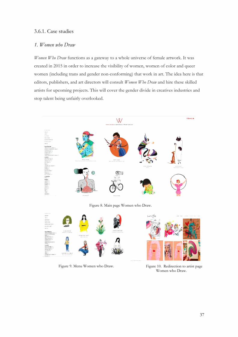
1. Women who Draw
Women Who Draw functions as a gateway to a whole universe of female artwork. It was
created in 2015 in order to increase the visibility of women, women of color and queer
women (including trans and gender non-conforming) that work in art. The idea here is that
editors, publishers, and art directors will consult Women Who Draw and hire these skilled
artists for upcoming projects. This will cover the gender divide in creatives industries and
stop talent being unfairly overlooked.
Figure 8. Main page Women who Draw.
Figure 9. Menu Women who Draw.
Figure 10. Redirection to artist page Women who Draw.
38
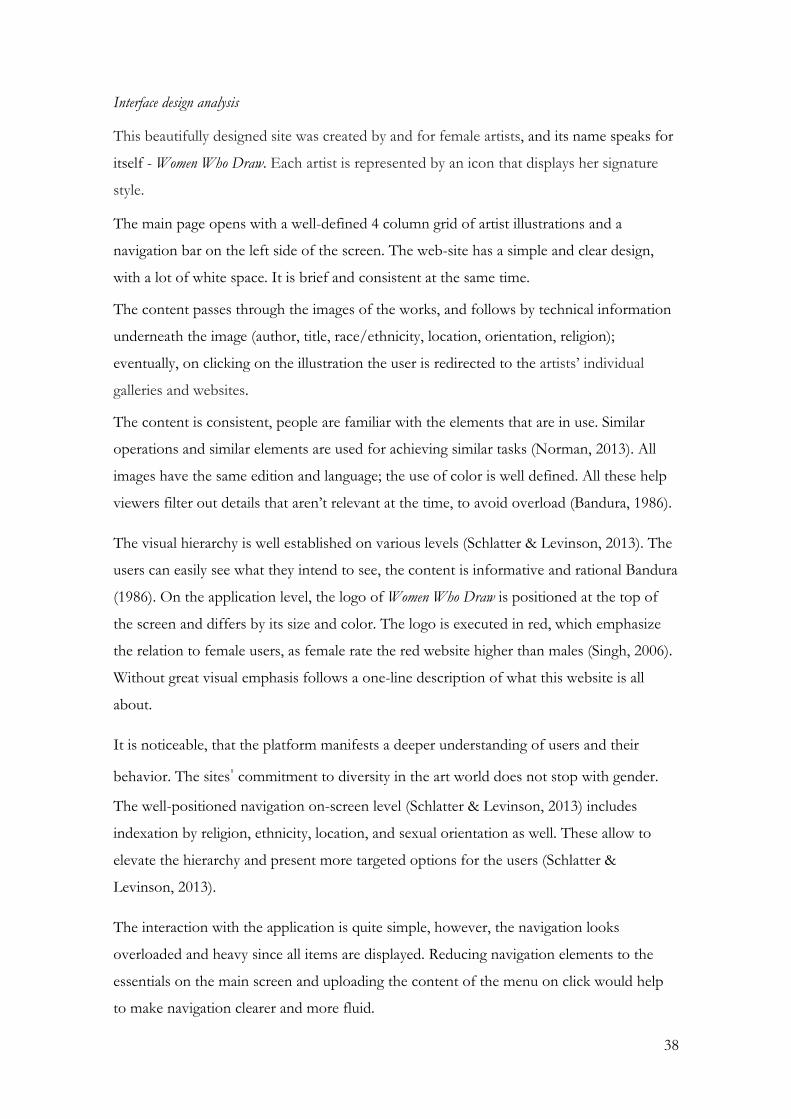
Interface design analysis
This beautifully designed site was created by and for female artists, and its name speaks for
itself - Women Who Draw. Each artist is represented by an icon that displays her signature
style.
The main page opens with a well-defined 4 column grid of artist illustrations and a
navigation bar on the left side of the screen. The web-site has a simple and clear design,
with a lot of white space. It is brief and consistent at the same time.
The content passes through the images of the works, and follows by technical information
underneath the image (author, title, race/ethnicity, location, orientation, religion);
eventually, on clicking on the illustration the user is redirected to the artists’ individual
galleries and websites.
The content is consistent, people are familiar with the elements that are in use. Similar
operations and similar elements are used for achieving similar tasks (Norman, 2013). All
images have the same edition and language; the use of color is well defined. All these help
viewers filter out details that aren’t relevant at the time, to avoid overload (Bandura, 1986).
The visual hierarchy is well established on various levels (Schlatter & Levinson, 2013). The
users can easily see what they intend to see, the content is informative and rational Bandura
(1986). On the application level, the logo of Women Who Draw is positioned at the top of
the screen and differs by its size and color. The logo is executed in red, which emphasize
the relation to female users, as female rate the red website higher than males (Singh, 2006).
Without great visual emphasis follows a one-line description of what this website is all
about.
It is noticeable, that the platform manifests a deeper understanding of users and their
behavior. The sites' commitment to diversity in the art world does not stop with gender.
The well-positioned navigation on-screen level (Schlatter & Levinson, 2013) includes
indexation by religion, ethnicity, location, and sexual orientation as well. These allow to
elevate the hierarchy and present more targeted options for the users (Schlatter &
Levinson, 2013).
The interaction with the application is quite simple, however, the navigation looks
overloaded and heavy since all items are displayed. Reducing navigation elements to the
essentials on the main screen and uploading the content of the menu on click would help
to make navigation clearer and more fluid.

39
The application does not require much attention from the user, as it does not contain much
information, except the menu, neither have visually appealing and potentially distracting
elements.
The website does have a personality, and in addition, colorful illustrations bring a lot of
expressiveness and cheerfulness to it. Both the text and the commands are grayscale and
black, the interactive icons are in red. Altogether the design has simplicity and well
organized and harmonious in color.
This application is a good example of consistent design that respects visual hierarchy and
has a very discreet personality, excellent not to divert attention from exposures.
2. Folio belas-artes ulisboa
This platform displays students’ artworks of the Faculty of Fine Arts of the University of
Lisbon (Universidade de Lisboa). The website is an endless source of inspiration to the
occasional visitor and experienced artist. This is an open web platform that allows
registered students to publish their artworks.
Figure 11. Main Page Folio belas-artes ulisboa
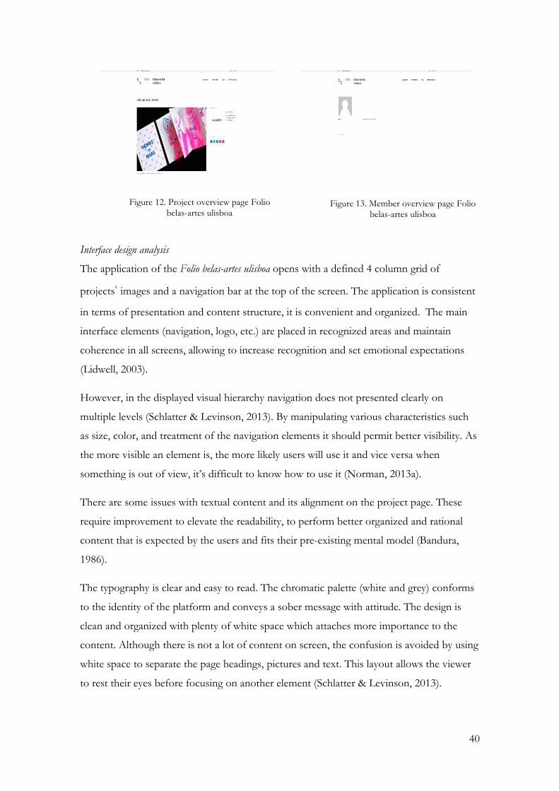
40
Figure 12. Project overview page Folio belas-artes ulisboa
Figure 13. Member overview page Folio belas-artes ulisboa
Interface design analysis
The application of the Folio belas-artes ulisboa opens with a defined 4 column grid of
projects' images and a navigation bar at the top of the screen. The application is consistent
in terms of presentation and content structure, it is convenient and organized. The main
interface elements (navigation, logo, etc.) are placed in recognized areas and maintain
coherence in all screens, allowing to increase recognition and set emotional expectations
(Lidwell, 2003).
However, in the displayed visual hierarchy navigation does not presented clearly on
multiple levels (Schlatter & Levinson, 2013). By manipulating various characteristics such
as size, color, and treatment of the navigation elements it should permit better visibility. As
the more visible an element is, the more likely users will use it and vice versa when
something is out of view, it’s difficult to know how to use it (Norman, 2013a).
There are some issues with textual content and its alignment on the project page. These
require improvement to elevate the readability, to perform better organized and rational
content that is expected by the users and fits their pre-existing mental model (Bandura,
1986).
The typography is clear and easy to read. The chromatic palette (white and grey) conforms
to the identity of the platform and conveys a sober message with attitude. The design is
clean and organized with plenty of white space which attaches more importance to the
content. Although there is not a lot of content on screen, the confusion is avoided by using
white space to separate the page headings, pictures and text. This layout allows the viewer
to rest their eyes before focusing on another element (Schlatter & Levinson, 2013).

41
Interaction is a weak part of this application, the poor attribution of visual properties to an
interactive element and poor use of interaction patterns decrees the level of engagement.
The application with interactive content must match what is perceived in the characteristics
of that content or element corresponding to the expected communication by not changing
completely the type of response.
In general, the application does have a quite good visual hierarchy, however, it needs small
adjustments to make the visualization process more engaging, and also the use of size,
color or higher color contrast could help a better hierarchy and platform in whole.
3. Gobelins L´ École de L´Image
This web platform is very similar to Folio Belas-Artes Ulisboa. It introduces to the
students’ artworks of Gobelins L´ École de L´Image. The difference is that it does not exist
independently, it is part of the Gobelins School website. It is also an open web platform,
however, to register and publish artworks user should be a student of the faculty.
Figure 14. Main page Gobelins L´ École de L´Image

42
Figure 15. Menu Gobelins L´ École de L´Image
Figure 16. Project Presentation Gobelins L´ École de L´Image
This platform has a strong identity and maintains coherence on all the pages and screens.
The initial page meets users with a nice and stylish dark grey background and white
lettering. The logo is situated in the middle of the menu, and slightly bigger than the rest of
the content, helping to keep it always in focus.
The gallery is a part of the Gobelins L´ École de L´Image main website and the gallery
content placed under the main navigation. On application level, we can find the main
navigation of the Gobelins L´ École de L´Image, and on-screen level - navigation of the
gallery. Although the navigations have a different visual representation, all together they
make the layout a little bit confusing. Changing their size and color on different levels will
permit better visibility and greater hierarchy (Norman, 2013a). These will allow to highlight
and clarify to the viewers the most relevant parts are at the time.
The social menu bar is placed on the right part of the screen, and it remains in the same
position on all pages, it does not get too much attention from the exposure objects, but at
the same time is easily noticeable, when the user needs it.
The portfolio is presented through the asymmetric grid, which makes things more
interesting, while still sticking to a grid to keep things ordered. The used technique is a
masonry layout. The page is divided into regular columns along the horizontal plane, but
the content blocks within those columns are of differing heights. The columns can be of
double or triple width, or an individual element may take up two or more column widths,
but it will always be divisible by the single column width. Here it is also applied the other
way round—as in, content blocks of differing widths arranged into regular height rows.

43
The use of color and typography remains to be the same throughout all pages. Different
shades of grey are used along with different typography to increase visibility.
In terms of interaction, the application offers simple and clear self-evident elements, uses
common navigation patterns (buttons and interactive icons) and offers a good response to
user interaction, for example, it is easy to reach the desired page.
The design of the application conveys a strong and dynamic personality mainly due to the
exclusive use of black and white tones. In short, there are some inconsistencies at various
levels, which may lead to longer learning time of the interface but it presents a reasonable
visual hierarchy.
4. Catalogue des vidéos à la demande
National Center for Cinema and Moving Image (CNC) is wholly dedicated to the French
cinema. In 2015 the Center launched an online engine allowing access "to the entire legal
offer in France” (Wojciak, 2015). Thus, via vad.cnc.fr, the user can from a simple request
(the title of a film, or a name of the director, actor or a year of production) find a video on
demand with or without a subscription, with an option to download or to stream.
Figure 17. Main page Catalogue des vidéos à la demande

44
Figure 18. Visualization of projects Catalogue des vidéos à la demande
Figure 19. Project page Catalogue des vidéos à la demande
Interface design analysis
The CNC platform opens with the search bar and video presentation of what CNC is. The
bar offers the choice of four types of projects or invites users to start a search by the
project’s name. By choosing any of these options the user is taken to the screen which
functions as a list with potential choices.
The weaker part of this design is the layout as it is not balanced and well organized. One
half of the screen is quite heavy with all the information concentrated there, and the other
is completely empty. This organization affects the letter size, as it is very small and not
comfortable to read, needing to increase the percentage of the screen. The same problems
can be found on other pages. The solution could be the creation of the two to four-column
grid that allows making the layout attractive and readable.
The visual hierarchy also needs attention, as it is hard to understand how elements are
connected. The typography is poorly executed, all text is rendered using the same typeface
and size, leaving the user to struggle where to look for certain information.
The multi-colored, organically flowing shapes of the CNC display is undoubtedly eye-
catching. It makes good use of color, the blue-violet gradient as a screen color with white
text and white background with black text in the main area.
In short, the platform maintains internal coherence but could be much better if a certain
grid and hierarchy are applied.
45
3.6.2. Summary
After research in chapter 3, as well as analysis of web applications, it is possible to establish
some practical guidance that is recommended to be applied or should be avoided in the
creation of applications.
Bad practices
The use of a grid or a layout and its usage throughout the application should be well
defined. It is best to keep a simple grid that allows seeing each element of its content well,
avoiding overload of the visual space and the cognitive load of the user, who may feel
disoriented with too much content in the minimum space. The absence of a grid can make
it difficult to maintain consistency.
Interaction of an application and poor attribution of visual properties to an interactive
element are not corresponding to the expectation of the user and change the type of
response. The lack of response from an interface or a response different from what is
expected by the user implies spending more time to learn how to use that interface, which
in turn can leave the user impatient and leave the application.
In terms of hierarchy, an arbitrary arrangement of the elements on the screen makes it
impossible to identify information priority and correct relations between the elements what
in the end causes confusion, time consumption, and represents a great distraction, example
CNC. The hierarchy can be established by means of several characteristics of the elements,
and it is necessary to consider its application. For example, a small size of an element that
allows an understanding that it has little importance can result in an unpleasant experience,
such as the poor response (or lack thereof) of a button because it is too small, as in the
Folio belas-artes ulisboa application.
In order to reduce confusion, frustration, discomfort, and disorientation, which may lead to
the abandonment of the application and to achieve the maximum efficiency of time, the
following must be avoided:
• Inconsistencies or redundancies;
• Lack of a good hierarchy; • Unnecessary mental load;
• Application of inappropriate affordances for an element;

46
• An absence of feedback;
• A high number of actions to perform a task;
• Any sources of distraction.
Good practices
Like any product, digital or not, an application must be consistent at all times, maintaining
a line of reasoning and interaction that the user can follow within the product. It is good
practice to reflect the image of the institution in the application, which can be achieved by
creating a good personality - faithful to the institution's message and values. A well-defined
and presented personality of the product allows captivating the user more, due to the
emotional character of the projected personality.
It is essential that the new technologies available to the public, whether hardware or
software, are simple and easy enough that the user does not waste much time to realize
how they work. The solutions are to maintain an interface with few elements, reduced to
the essential, or in the words of Maeda (2006) "the simplest form of achieving the
simplicity is through reduction weighted” (p.1).
A strong visual hierarchy allows for better visualization and apprehension of content. This
can be achieved with the help of several features, whose strength can be evidenced by
contrast (scale, chromatic or typographic weight), as we can see in the application of
Gobelins L´ École de L´Image and Women who Draw- red text on white background or white
text on black background, for example. White space is also a good way to create contrast
on the page, helping to place more emphasis on-screen content, which will be highlighted
in the "blank". In the hierarchy, the relative importance of each element must be easily
discernible, so essential information must occupy a prominent place, keeping the rest of the
content subordinate.
The conclusions confirm that websites have positive and negative aspects, nevertheless, on
the whole, they are relatively successful. Parallels are drawn with regards to layout and
typography; however, imagery is visually more appealing and the color is more considered
on Gobelins L´ École de L´Image and Women Who Draw.

47
CHAPTER 4. Proposal- Portuguese Animation Platform
4.1. Objective
The main objective of this research is the development of a digital platform that will allow
rapid and efficient communication and knowledge sharing for the alumni of the Moving
Image course of UAlg, students of other study cycles and other professionals in the
Animation. It will increase the visibility of artists and help them to be hired for the
upcoming projects. The platform will help to explore artworks and provide information on
the artists. Further in Chapter 5, will be presented results of usability testing with the student
of the Moving Image course UAlg.
4.1.1. The platform specific objectives:
At the beginning of this investigation, the understanding of the user requirements was pre-
established (Annex A). During the investigation process, these preliminary design ideas were
evaluated and modified, and more features were added correspondingly:
Introduce the artworks;
Introduce the artists;
Navigate users throughout the platform;
Offer a quick search;
Filter projects by type, name and date;
Create a user account to save projects;
Provide artist information with links to their websites with more detailed information;
Present artworks with a quality photos and description;
Present similar projects of the selected project;
Present works on the artist page;
To give visibility to Portuguese Animation agents (one of which is the University of
Algarve) and their production.

48
4.2. The structure
As mentioned earlier, this platform intends to concentrate all information on artists and
their projects in one place, so the content must allow easy understanding, and be able to
provide a good experience using Interaction Design.
With the definition of tasks, it was possible to establish an organization of the content,
where are set up two main areas: consultation by artists and consultation by projects
(Figure 20). The platform is designed in such a way that all necessary data could be
accessed within a few clicks on the screen. The platform includes login. To be more
specific, the login page fulfills the requirement of information security, through which a
registered user is allowed to access his/her user area, where can visualize portfolio and
upload the projects
Figure 20. PAP Structure
4.3. Brand identity
4.3.1. Name
The name refers directly to the theme of Animation. For better identification the name
accompanied by "Portuguese Animation Platform", a short version of the name -
Abbreviation PAP.

49
4.3.2. Behind the logo
All artists have their own drive, have their own ambitions, and many of them share the
ambition to make a small contribution in this world, making it better. The idea is to
determine the visual identity with the users (Figure 21).
Figure 21. Logo Portuguese Animation Platform
The logo is based on the combination of a geometric structure made of the rectangulars
and the text. The repetitive rectangular emphasize not only connection with animation, but
constant development of the platform’s activities: its specializations are constantly evolving
have no defined boundaries. The rectangular and strict text represent the platform’s serious
intentions and technological advancement.
4.4. Interface Design characteristic
4.4.1. Style
For the PAP platform has been chosen a modern look as its focus put firmly on the
content. Here style tries to create engagement and builds expectations and emotions in
users regarding an application’s functionality and for whom and what it is intended.
(Bandura, 1986). The choice of colors, typography, and some graphic elements emphasize
modernity and dynamism.
The content layout is in such a way that no single element distracts attention from the
visual hierarchy. Low level of interactivity, lack of complex elements, and a small amount
of text bring simplicity to design, making it look friendly and approachable to users.
Modern design characterized mainly as a minimal, white-based, and open; simple yet
effective helping users concentrate on the most essential information. The simplicity of
information architecture, carefully selected interactive elements prevent the user from
misleading. Graphic and text elements convey simple and cool ideas with a clear and visible

50
form. Presenting a clear and engaging interface like minimalism, design stripe away all non-
essential elements exposing essential functionality of visual elements.
4.4.2. Color pallet
The audience of PAP can be segmented in several different ways - interest, age,
demographics, and behavior. Visual perception is quite individual for everyone. The color
effect may be different because of factors such as age, culture, and gender. In order to
increase brand recognition and loyalty, and decrease risks of being misconceived has been
chosen a dark grey and white pallet. Dark grey is normally associated with intelligence,
professionalism, mourning, and mystery. And white is safe and open.
More, the contrast of dark grey on white is the most readable and practical color scheme;
dark grey over white or vice versa are enough to catch the viewer’s eye.
According to Lidwell (2003) to bring the balance into composition, the colors should be
combined in the proportion of 60%–30%–10%. The biggest part goes to the dominant
white color, and a third of the composition takes secondary grey color and 10% percent
goes to the color which helps to make the accents is fuchsia (Figure 22).
Figure 22. Primary and secondary colors
4.4.3. Typeface
The purpose of the PAP is to be readable. The selection of the typeface was based on
aesthetic preference. Montserrat possesses the geometric simplicity of the letters and can be
used as functional and informational at the same time. Montserrat is released under the SIL
Open Font License making it is free software and is applicable across browsers and
computers, what allows the website to be displayed correctly without awkward results on
different devices (Figure 23).

51
Figure 23. Montserrat family
4.5. Design elements
4.5.1. Home Page
The homepage (Figure 24) of the platform meets users with the message instantly
describing the main purpose of the platform: “Share Your Knowledge, Share Your Work,
Share Your Ideas.” Sliding down there is a brief note expressing why the platform has been
created and what the cultural and creative objectives are. These two elements (message and
a note) playing the role of a storyteller that tries to engage an audience to experience a set
of functionalities and events (Lidwell, 2003). Further down follows the gallery of the
recently uploaded projects. The content is divided into three sections respectively. In order
to allow people to know how to use it was applied to an interactive element (Figure 25),
allowing to increase affordance (Lidwell, 2003). The applied fade-in and fade-out scroll
transition between the sections adds a little magic to the platform.

52
Figure 24. PAP Home page (section 1)
Figure 25. Scroll (Sliding effect)
Figure 26. PAP Home page (section 2)

53
4.5.2. Navigation
Figure 27. Navigation. Main Menu
Navigation exists to help users find content and it should be simple and intuitive. To
increase visibility (Lidwell, 2013) is used the dark grey bar at the corresponding location of
the top menu helping users to easily recognize the purpose and objectives of the platform
(Figure 27).
Navigation stands out and is consistent on all pages of the platform (Lidwell, 2013). The
logo is placed in the top left corner and linked back with the home page.
To increase the visibility of hierarchical relationship within the platform, the navigation
offers two main areas of interest where information is displayed: Projects and Members
(Lidwell, 2003). Further, they are subdivided by the project's type and member type (Figure
28, Figure 29). This helps the user to gain faster knowledge about the structure of a
platform while maximizing its clarity and effectiveness.
Figure 28. Sub-navigation Projects
Figure 29. Sub-navigation Members
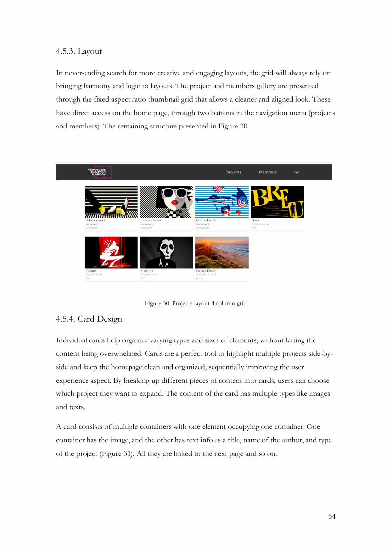
54
4.5.3. Layout
In never-ending search for more creative and engaging layouts, the grid will always rely on
bringing harmony and logic to layouts. The project and members gallery are presented
through the fixed aspect ratio thumbnail grid that allows a cleaner and aligned look. These
have direct access on the home page, through two buttons in the navigation menu (projects
and members). The remaining structure presented in Figure 30.
Figure 30. Projects layout 4 column grid
4.5.4. Card Design
Individual cards help organize varying types and sizes of elements, without letting the
content being overwhelmed. Cards are a perfect tool to highlight multiple projects side-by-
side and keep the homepage clean and organized, sequentially improving the user
experience aspect. By breaking up different pieces of content into cards, users can choose
which project they want to expand. The content of the card has multiple types like images
and texts.
A card consists of multiple containers with one element occupying one container. One
container has the image, and the other has text info as a title, name of the author, and type
of the project (Figure 31). All they are linked to the next page and so on.

55
Figure 31. Project card
Figure 32. Member card
4.5.5. Member profile
Member profile has the most essential information about the user as image, professional
name, education, experience, etc., and offers the redirection to the personal pages on social
media or websites of the author. Also in the very bottom, the author most recent works are
displayed.
Here, the usual discreet boxes of images and text begin to overlap and converge, creating
beautifully unexpected juxtapositions of bitmap (Figure 33).
The content of the profile also divided into section allowing the transition between content
in a rollover.
Figure 33. Member profile (section 1)

56
Figure 34. Member profile (section 2)
Figure 35. Member profile (Complete version)

57
4.5.6. Project Profile.
Project profile, same to the member profile, offers the most essential information on the
project. But here the layout is more intuitive and content depending on the type of project
in order not to overwhelm the page. The information includes a reference to the author
(Figure 36).
Figure 36. Project profile.

58
4.5.7. Links and active elements
On every website, it is necessary to label active elements. In PAP platform active elements
are text, images and tabs. To allow them to be more usable and recognized they are
expressed in a similar way (Lidwell, 2003). To help active elements be more eye-catchy a
flash effect was used. It manipulates the opacity of the active element at different stages to
form a white flash effect (Figure 37).
When hovering over other active items cursor changes to a pointer. The links used are
standard, easily recognizable stages as active and visited states.
Figure 37. White flash. Duration 1.4 seconds.
4.5.8. System Inputs
Lidwell (2003) emphasizes that the quality of system output is dependent on the quality of
system input. Problems occur when the incorrect type of input is fed into a system. The
primary strategies for minimizing problems of type are affordances, constraints, and
feedback. They improve User Experience and make user satisfaction more pleasurable and
clear, explaining how the system works. These strategies structure input and minimize the
frequency and magnitude of garbage input. Platform input designed in such a way that the
user is never left alone to guess about what results are coming after an action has been
taken (Norman, 2013b). Here the system inputs have a clear relationship between controls
and carefully guide the user to the appropriate next action.
The primary strategies for minimizing problems of quality are previews and confirmations.
These strategies allow the consequences of actions to be reviewed and verified prior to
input. Thus, to simplify the input PAP platform suggests various forms depending on the
project type. Users can easily choose the category of the project to type the most adequate
information (Figure 38, Figure 39).
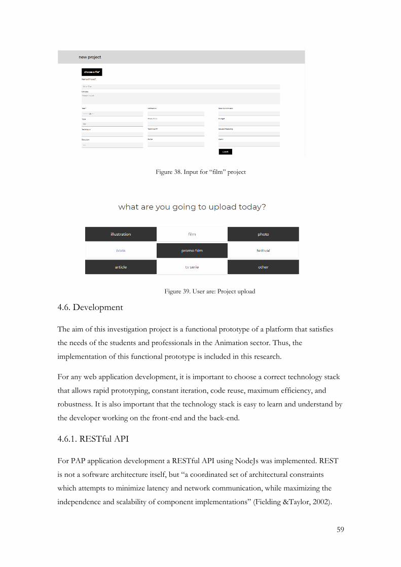
59
Figure 38. Input for “film” project
Figure 39. User are: Project upload
4.6. Development
The aim of this investigation project is a functional prototype of a platform that satisfies
the needs of the students and professionals in the Animation sector. Thus, the
implementation of this functional prototype is included in this research.
For any web application development, it is important to choose a correct technology stack
that allows rapid prototyping, constant iteration, code reuse, maximum efficiency, and
robustness. It is also important that the technology stack is easy to learn and understand by
the developer working on the front-end and the back-end.
4.6.1. RESTful API
For PAP application development a RESTful API using NodeJs was implemented. REST
is not a software architecture itself, but “a coordinated set of architectural constraints
which attempts to minimize latency and network communication, while maximizing the
independence and scalability of component implementations” (Fielding &Taylor, 2002).

60
The acronym API comes from Application Programming Interface. An API is a set of
functions and procedures that fulfill one or many tasks for the purpose of being used by
other software. It allows implementing the functions and procedures that conform to the
API in another program without the need for programming them back.
As RESTful systems usually communicate with the Hypertext Transfer Protocol (HTTP), a
REST API is a library-based completely on the HTTP standard. It is used to add
functionality to a software somebody already owns safely. The functionality of an API is
usually limited by the developer, so no more functionality can be added.
RESTful systems apply the four basic functions of persistent storage, CRUD (Create, Read,
Update, Delete), to a set of resources. In terms of the HTTP standard, those actions can be
translated to the HTTP methods (also known as verbs): POST, GET, PUT, and DELETE.
In case of PAP platform has been implemented with only GET and POST methods.
4.6.2. Programming Environment
Node.JS is an open-source framework built on top of Google’s v8 JavaScript engine for
Google Chrome (Teixeira, 2013). JavaScript is a light-weight programming language often
used in Web browsers. Also, Node.JS has built-in modules with support for file system
operations, HTTP services, and many others.
Node.js is an open-source JavaScript environment that hangs JavaScript code. JavaScript
was used primarily for client-side, where scripts are installed in a webpage's HTML and run
client-side in the user's web browser. Node.js allows to use JavaScript to write Command
Line tools and to construct dynamic web page content for server-side. Node.js represents a
"JavaScript everywhere" paradigm (Wikipedia, 2018) bringing together web application
development around a single programming language, instead of various languages for
server-side and client-side scripts.
NPM is a package manager for the JavaScript programming language. It is the default
package manager for the JavaScript runtime environment Node.js. The package manager
NPM allows easy installation and publishing of third-party modules from a large and
growing repository (Rauch, 2012; Teixeira, 2013). Each module has a manifest file that
describes its name, version details and dependencies (Teixeira, 2013).
For the realization of the API described in this thesis, version 7 of the JavaScript is used,
and it can be downloaded from the Node.js official page for free.

61
Finally, an Integrated Development Environment (IDE) is used for source code editing.
The IDE chosen is JetBrains WebStorm because it includes a JavaScript compiler and
interpreter. The version of WebStorm IDE used is 2018.2.3.
4.6.3. Other Tools
Additionally to the programming environment, other tools are also needed for the
development of the API.
Git is a distributed version control system. Its usage along with gitBucket (an online project
hosting) keeps the project in an organized manner and allows to view, revert or commit
changes.
cUrl is used for the purpose of making HTTP requests and test the system and its final
functionality. It allows transferring data with URL syntax.
MongoDB is used for storing data. MongoDB is a free and open-source cross-platform
document-oriented database program. Classified as a NoSQL database program,
MongoDB uses JSON-like documents with schemas.
Jade is a template engine for Node.js. At running time, Jade replaces variables in our file
with actual values, and then send the resulting HTML string to the client.
The project does not use any other APIs to perform additional actions.
The communication between components is made through representations of resources. In
this API, the format of those representations is JSON.
JavaScript Object Notation (JSON) is a lightweight data-interchange format. It was derived
from the ECMAScript Programming Language Standard (ECMA-404 2013; RFC
7159.2014). JSON structure is an ordered list of objects (array of objects), where these
objects represent a collection of name/value pairs separated by colons (:).
The utilization of JSON instead of another standard format like XML is due to its
simplicity. Both XML and JSON are human-readable, but JSON does not need closing tags
and is easier to read and is less dense.

62
4.7. Implementation
4.7.1. Data Flow
The diagram below represents the main flow of data and things that need to be
implemented when handling an HTTP request/response Figure 40 and Figure 41.
Figure 40. Data main flow
Figure 41. Data main flow (simplified)
"Routes" to forward the supported requests (and any information encoded in request
URLs) to the appropriate data from the models, create an HTML page displaying the data,
and return it to the user to view in the browser.
“Model” is a schema that maps to a MongoDB collection and defines the shape of the
documents within that collection. A Mongoose schema defines the structure of the
document, default values, validators, etc., whereas a Mongoose model provides an interface
to the database for creating, querying, updating, deleting records, etc.
“Views” (templates) used to render the data.

63
4.7.2. Prototype
In much of computer science literature, it is realized that what works on paper does not
necessarily work in the real world (March & Smith, 1995). The development of systems can
be thought of as proof by demonstration. According to March and Smith (1995),
Information Technology (IT) researchers deal with artificial phenomena in studies that can
be classified into natural science and design science. Natural science is aimed at
understanding the reality and includes research in physical, biological, social, and behavioral
domains. Design science instead attempts to create things that serve human purposes.
Natural scientists develop concepts and language to characterize phenomena and create
theories. Design scientists produce and apply knowledge of tasks and situations in order to
create effective artifacts that can be constructs, models, methods and implementations.
4.7.3. Web Platform Functionality
The web platform has the following functionality.
• Registration
On the main view, there are options for login and becoming a member. When the latter is
chosen, the user is redirected to the registration view. He fills in his username, email, and
password and member information. If no validation errors occur, such as the username or
email are already in the database or the password is too short (must be at least 8 symbols),
the user is redirected to the Login page.
• Login (Authorization token)
The user logs in on the main login view using the username and password. After successful
login user is redirected to the map view. If login is unsuccessful, the error message is
shown.
• Add a new project
The user, while being logged, can add a new project by tapping “Add project” in the User
Area page. When on the project creation view, the user can choose between various types
of projects.
The user can attach a picture to a project by tapping on “Add an image.” Next, the user is
offered to choose an image from the photo gallery of the device. In the case, his object is

64
empty the user is shown a warning message telling him to go to the website and add objects
to his gallery.
• User area
The user taps on the menu sign in the top left corner to enter to the User area. In the User
area, there is submenu with the list of activities including view projects.
• Logout
The user pulls the left side of the screen or taps on the menu sign in the top left corner to
open the menu. There is a logout option, which when pressed logs the user out and
redirects him to the login view.

65
CHAPTER 5. Evaluation Procedure
The platform´s major objective was always to unite the information not only with
professionals in the Animation sector, but with students of the area as well. To make it
independent of age, gender, level of proficiency, and focus on talent.
5.1 Survey with Professionals
As the idea to create the platform appeared before this research started, some of the
characteristics and functionalities had been pre-established (Annex A). Due to the limitation
of time and resources, this study is focused on two areas: Projects and Artists, leaving the
other for future exploration.
In order to validate this information, the pilot questionnaire with professionals (Annex B)
was launched. Individual questionnaires were considered as an appropriate strategy for data
collection and researching, as their responses can provide active data for research (Gall, M,
Gall, J. & Borg, 2003).
5.1.1 Survey design
Professionals’ questionnaire (18 questions) is structured as follows:
• section one (participant profiling- 10 queries): biographical information, gender, age,
academic and professional background, prior experience with social and communication
platforms;
• section two (platform environment- 8 queries): includes the professional’s awareness, as
well as assessment of the communication platform´s basic features and characteristics, their
perception of usefulness, constraining factors for acceptance or rejection and willingness to
try out a new communication environment in the future;
5.1.2 Diagnosis/Findings
The survey was designed through the LimeService platform and sent to 6 professionals in
the Animation sector in March of the 2018 academic year. The survey was kept completely
anonymous. Respondents did not provide their names, although they provided their sex and
age. From these 6 invitations to participate in the survey, 3 were received; however, 1 was
incomplete, which resulted in a response rate of 30 percent.

66
Profile
Both of the respondents are between 51-60 years old, with superior academic degree in
Communication Design and Graphic Design. Both have professional experience as
Animators and Directors. In addition, the queries related to the technology usage, revealed
the following results: both of the participants use laptops, computers, and smartphones.
When asked about the platforms that are used for communication, the most popular reply
was Facebook and YouTube, followed by Vimeo.
Professionals experience.
In the second session of the survey participants were asked to evaluate the platforms
functional characteristics that were initially pre-established. Under the most important
characteristics were declared “Projects publication” and “Opportunity to spread projects
between colleges and professionals of the area”. “News visualization” and “Information on
courses in the area” were rated as moderate importance.
Regarding the most frequent activities the “The project publication”, “News of the area
visualization”, and “Artist search” were rated as frequent ones. Regarding the project details
to be displayed both respondents agreed on major characteristics as synopsis, realization,
production etc. to be public.
Only the budget was considered as private information by one of the respondents.
5.1.3 Summary
The survey response rate (30%) might be questioned; however, it validates the author’s
opinion regarding the existence of such a platform.
Summing up, the professionals’ answers denote that there is a need for a new
communication tool for professionals working in the Animation sector. The professionals
confirm the necessity to spread information on artists and their projects. And expect that it
will allow to increase a higher exploration of Animation. This helps to gain insight into the
area and find challenges that need further investigation (Jarvinen, 2000).

67
5.2. Prototype evaluation
Usability evaluation is recommended as an essential step for product creation and
improvement. Usability testing is a method of testing the functionality of a website, app, or
other digital product by observing real users as they attempt to complete tasks on it. The
goal is to reveal areas of confusion and uncover opportunities to improve the user
experience. Rubin and Chisnell (2008) developed a list of basic elements for usability test
that were followed in this research:
• Use of a representative sample of end users;
• Representation of the actual work environment;
• Observation of end users who either use or review a representation of the product;
• Controlled interviewing and probing of the participants by the test moderator;
• Collection of qualitative performance and preference measures;
• Recommendation of improvements to the design of the product;
5.2.1 Evaluation
The PAP was created to serve as a proof by demonstration, allowing later to give the
answers to the research questions. Furthermore, obtaining feedback from other
perspectives was also important in order to provide a more sufficient discussion about the
implementation choices. Therefore, students attending graduation in Moving Image at the
University of Algarve (UAlg) were invited to participate in a platform usability test in order
to have feedback. Each of the participants shared their thoughts during the individual
session.
Firstly, participants were introduced to the PAP platform, to the background of the project,
its aims and objectives. Next, they were presented to a number of tasks and encouraged to
explore the platform. They were not explained how to use the platform, but they were
aware of the testing observation during their experience. When the session was completed,
each student took part in semi-structured individual interviews to obtain feedback and
discuss their thoughts and recommendations for future improvements.

68
5.2.2 Usability test
The evaluation was conducted with six participants and featured approximately a thirty-
minute individual session. This was done in order to capture the real thoughts of the
participants and avoid influencing each other. During each session the participants were
given the following tasks:
1. Explore the platform: home page, projects, and members;
2. Create an account;
3. Upload and publish a project;
These tasks were presented verbally to the participants as a list of goals that were
encouraged to complete them before the session was over. The participants were given
advice if they requested it. Further, by answering the participants’ questions, it was possible
to form an impression of how each participant progressed during the session.
5.2.3. Semi-Structured Interviews
After having tried the platform for the first time, each participant answered semi-open
questions. The questions had been carefully planned in order to reveal relevant usability
information about the platform. The reason for choosing this method was to have richer
conversations with each of the participants yielding reflections and ideas for improvement.
During the interviews, the participants were asked questions about their experience during
the experiment session and how they valued the characteristics and elements of the
platform. They were also asked to suggest how the platform could be improved based on
their experience. The survey consisted of 6 open-ended questions (see Annex C).
5.2.4 Results
Moving Image (UAlg) students, with no prior exposure to the project, were invited to
participate in this evaluation. Both sexes were represented among the participants, with the
age between 19 and 25 years old. Three of the participants were first-year students, two
were second-year students, and one was a third-year student. Also, two of the students
were representatives of their classes. In this report, the participants were given other names
to allow them to be anonymous. A more detailed overview of the participants is listed in
the table:

69
Name Age Genre
1 Lisa 20 female
2 António 25 male
3 André 20 male
4 Carolina 20 female
5 Mika 19 male
6 Sandra 19 female
Table 2. Overview of the usability test participants.
The participants gave very positive feedback regarding their using experience with the
platform. All participants showed a great curiosity using this product and managed to
complete all the tasks. While some of the participants did not ask for help, others only
requested help a couple of times.
At first, the participants were invited to explore Home, Projects and Members pages.
Generally, identifying the Projects and Members content did not present a problem,
regarding the observation of the participants during the test. They did not have any doubts.
The easiest content to identify was the Projects, where all the respondents were successful.
They considered the profile quite informative. Nonetheless, they suggested to add the
following information:
Description Participant
1 Storyboard #3 #2
2 Concept Art #1 #2
3 Software #2
4 Timing (Time spent on development) #2
5 Trailer #4 #6
6 Gallery #1 #6 #3 #5
Table 3. Overview of the suggestions 1.
Additionally, everybody liked the section with similar projects below the chosen project.
The participant #4 commented that it would be nice to have more than 4 projects
proposed to view.

70
On the next open-ended question, participants were asked to explore the Members page.
The member profile information was considered as appropriate and adequate. Here, all the
participant suggested to add more personal information to the profile:
Description Participant
1 Telephone number (private/studio) #1#2
2 E-mail #1 #2 #6
3 Links to platforms (Twitter, Art Station, Deviant Art,
Amino, and Instagram etc.)
#1 #2 #3 #4 #5
#6
Table 4. Overview of the suggestions 2.
After getting familiar with the platform, participants were asked to create an account and to
upload a project. When asked about how easy or not it was to create a new account, all of
the respondents confirmed that they did not have any difficulties to find the button menu
to proceed to sign up section. Students managed to input the data easily and add project
characteristics to the platform. However, sometimes it felt that they needed extra guidance
or additional self-exploratory tags on input fields. Meanwhile, they commented that it
would be nice to leave some information for future input in order to make the initial
registration easier and faster. Participant #6 commented that it was a bit difficult to find
login in the navigation menu, as the used font was not clear and visible enough for her.
The next question was meant to gather the opinion of user experience. Respondents
considered the platform very useful, very accessible, with visually clear designed. Also
found the platform very aesthetical, pleasurable and easy to navigate. All participants and
especially participant #5 commented on plain and simple design that helps to focus on the
most essential parts. Majority of the participant enjoyed the transition effect (fade-in and
fade-out while scrolling) between sections on each page. Participant #6 remarked that it
felt as the platform was alive.
The last three questions were orientated on future intentions. Firstly, participants answered
if they believed that the platform could provide better visibility for them as artists. All
participants replied positively to this question. Respondent #2 expressed that he liked very
much the idea to build the platform and that it definitely can provide visibility for the users
in the area, as well as increase visibility.
On the next open-ended question, participants were asked if they would use the PAP for
their activity in the future. All participants expressed a definite desire to use it.

71
The last question that was proposed, was asking for any suggestions they might have for
the platform. What they would add or change so order that we could improve for them in
the future. All the respondents stated they think the platform has sufficient characteristics
and elements for successful user experience.
5.3. Discussion
The aim of usability test is to validate that the platform meets the requirement of end-user
and understand if every component of the platform operates well together on the system
level. Here, the qualitative evaluation was combined with platform exploration helping to
gain insight into an area and find challenges that need further investigation (Jarvinen, 2000).
Due to the limitation of time and resource, this test was first conducted once with the
students of the Moving Image course (UAlg) at the end of the lecturing period of 2019.
The platform was positively received by the participants. With regard to the structure and
design of the platform, the participants found it difficult to suggest improvements.
However, it was proposed to add some characteristics of the Projects´ and Members´
datasheet.
All the participants evaluated positively the experience of using the platform. Furthermore,
it was emphasized by participant #2 that he liked how the platform was organized, and
how he could navigate through its content. He also added that he liked the idea of creating
this product, as he felt confident that he would use it.
Lastly, the login was a most time-consuming task, mostly because the respondents did not
have any “walkthrough” guidance and did not know what to expect. With some guidance
and sub-questions, they continued with success.

72

73
CHAPTER 6. Conclusions
Today, the demand for animation has expanded with the increase in targeted broadcasting
hours by cable and satellite TV, availability of low-cost internet access, penetration of
mobile devices along with the growing popularity of streaming video and video games. In
addition, the demand for Animation to power immersive experiences such as Augmented
Reality and Virtual Reality is growing exponentially. The rapid advancement of technology
has made animation, available to the masses, and this industry has become one of the
fastest growing segments in the global media and entertainment market. Despite the
reduced support and difficulty in the internationalization and commercialization of the
Portuguese Animation, new filmmakers, producers, and animators emerged, who won
credits across borders, such as Regina Pessoa, Abi Feijó, José Miguel Ribeiro, and
Humberto Santana among others.
The potential of Communication Design to solve issues is well recognized. To grow the
sector is the task of the professionals working in this area. However, Communication
Design can help to extend the recognition of Animation professionals. Help not only to
stay afloat but to evolve, expand and prosper. Thus, this research connects Animation and
culture with Communication Design.
In this investigation project, the purpose was to develop a new digital platform that allows
the possibility to promote and popularize Portuguese Animation. It is a modern tool, which
has been created according to the carefully selected solutions for a good Interaction Design
where users can enjoy appropriate content and functional experience. The interface
supports quality visual and sensorial content, which can be useful and accessible by every
student and professional in the Animation sector.
The platform is designed in such a way that all the necessary data could be accessed within
a few clicks on the screen. The platform includes login. To be more specific, the login page
fulfills the requirement of information security, through which a registered user is allowed
to access his/her user area, where can visualize portfolio and upload the projects. To sum
up, there are notable benefits of PAP for the students and professionals in the Animation
sector.
The usability test concluded that the development of a digital platform is satisfying the
needs of animators, as they can share their experience, access quality information, and
discover new professionals in this sector through the platform. As a result, usability test

74
confirmed that this platform can contribute to Portuguese Animation. The platform was
positively received by the students and described as being simple to use. The users strongly
believe this platform can provide them positive and extensive experience, and they would
undoubtedly use PAP to place and spread their projects.
Thus, validating the prototype, it is responding positively to the research question
suggesting that digital software can contribute to the knowledge sharing for the students
and professionals in the Animation sector while enhancing engagement.
6.1. Competencies acquired in the process
This research covers the sphere of Communication Design which is an interdisciplinary
field by nature. The project development involved in this study required a great critical
reflection of the related social, cultural, and economic practices, as well as an investment of
time and effort into this new task and research.
Alongside this expressive work, were developed a greater awareness and in-depth
knowledge of the sociological and ethical implications of the created communications. To
broad the understanding of the practical side of the field, were studied the fundamentals of
Communication Design. This project allowed to combine knowledge of fundamental
design principles and processes, and the media used in modern communication. Were
cultivated skills on how to conceptualize, develop, and refine design. Has been developed
ability to work scientifically and apply proven methods to solve problems and design new
solutions which enable to succeed in dynamic interdisciplinary contexts.
Finally, the motivation that prevailed in this study was to lay stable and firm foundations
for future possibilities. The primary aim was to apply a comprehensive understanding of
design to real tasks and processes and discover new insights on the topic of a choice. In
this work were practiced all phases of complex communication projects, including project
management, design, execution, and presentation. Were improved proficiency in graphic
design as well as the latest computer graphics programs. Were expanded skills in a rich
variety of design production tools, including web design and integrated new media.
This project allowed sharpening practical skills while also helping to gain broad practical
experience that will be valuable in the future.

75
6.2. Future Work
The platform has shown potential as a tool for users. It was received positively by the
students involved in the evaluation process. Still, it has room for improvements.
According to the feedback from testing and user evaluation, a couple of phenomena should
be taken care of, and even modified, such as more detailed datasheet of the member and
project, popup notifications during the input stage to avoid errors.
And more features need to be designed and implemented (Annex A), including the
adoption of the platform to the multi-language versions; The PAP could be and should be
extended to a mobile application which provides no boundaries at any time and any place.
Furthermore, the monitoring of more platforms could be considered to extend PAP.

76

77
Bibliography
Archer, B. (1979). Whatever became a design methodology? Design Studies, 1 (1),17-18.
AaVv (2010). Reflexões sobre a Animação Portuguesa- contributo para estratégia de desenvolvimento.
Lisboa. Retrieved from https://www.researchgate.net/project/Understanding-and-
identifying-animation-production-strategies (15.02.2019)
Bandura, A. (1986). Social Foundations Of Thought And Action: A Social Cognitive Theory.
Englewood Cliffs, N.J: Prentice-Hall.
Carroll, J.M. (2013). Human Computer Interaction - brief intro. In: M. Soegaard, R.F. Dam
(Ed.), The Encyclopedia of Human-Computer Interaction, 2nd Ed. Aarhus,
Denmark, The Interaction Design Foundation, 21 – 62. Retrieved from
https://www.interaction-design.org/literature/book/the-encyclopedia-of-human-
computer-interaction-2nd-ed/human-computer-interaction-brief-intro (05.10.2018).
Cooper, A. Reimann, R. Cronin, D. Noessel, C. & Csizmadi, J., LeMoine, D. (2014). About
Face: 4: The Essentials of Interaction Design. Indianapolis, Indiana: Wiley Publishing.
Crampton, G. S. (2007). Foreword. In: B., Moggridge (Ed.), Designing interactions, pp. 8-19,
Boston: MIT Press.
Crawford, C. (2003). The art of interactive design. San Francisco: No Starch Press.
Cyr, D., Head, M., & Larios, H. (2010). Colour appeal in website design within and across
cultures: A multi-method evaluation. International journal of human- computer studies,
68(1), 1-21.
Escorel, A. L. (1999). O efeito multiplicador do design. 3. Ed. São Paulo: Senac
Franz, J. (1998). A Phenomenographic Study of Design in the Interior Design Context (Doctoral
dissertation). Queensland, University of Technology.
Frascara, J. (2004). Communication Design. Principles, methods and practice. (1st ed. p. 2.). New
York, NY: Allworth Press.
Hassenzahl, M. (2003). The thing and I: understanding the relationship between user and
product. In: M. Blythe, C. Overbeeke, A.F, Monk, & P.C. Wright ed. Funology: From
Usability to Enjoyment, Dordrecht, Kluwer, pp. 31 – 42.
Gall, M., Gall, J., & Borg, W. (2003). Educational research an introduction. Boston, MA: Allyn
and Bacon.

78
Garrett, J. J. (2010). The elements of user experience. Berkeley: New Riders.
Glanville, R., & Schaik, V. (2003). Designing reflections:Reflections on Design. In D.
Doorling, & K. Sugiyama, Doctoral Education in Design (pp. 35-42). Tsukuba:
University of Tsukuba.
Graça, M. E. (2017). Animação Portuguesa: Épocas E Identidade. Faro: Centro de
Investigação em Artes e Comunicação.
Hassenzahl, M. (2013). User Experience and Experience Design. In: M. Soegaard & R.F.
Dam (Ed.), The Encyclopedia of Human-Computer Interaction, 2nd Ed., Aarhus
Denmark,
Retrieved from http://www.interactiondesign.org/encyclopedia/
user_experience_and_experience_design.html (05.01.2019).
Jarvinen, P. (2000). Research questions guiding selection of an appropriate research
method. ECIS 2000 Proceedings 26, Retrieved from
https://pdfs.semanticscholar.org/28d2/411dec9ab007c9d9faf563bff363e19ab8fd.p
df (05.01.2019).
Krug, S. (2014). Don´t make me think, Revisited. A common sense approach to web
usability, New Riders.
Liddle, D. (2007). Adopting Technology. In: B. Moggridge (Ed.), Designing
Interactions. Boston: MIT Press, pp.237-257.
Lidwell, W., Kritina, H., & Butler, J. (2003). Universal Principles of Design. Massachusetts:
Rockport Publishers.
Lowgren, J. (2013). Interaction Design - brief intro. In: M. Soegaard & R.F. Dam (Ed.), The
Encyclopedia of Human-Computer Interaction, 2nd Ed., Aarhus, Denmark, The
Interaction Design Foundation. Retrieved from www.interactiondesign.
org/encyclopedia/interaction_design.html (06.10.2018).
Maslow, A. H. (1970). Motivation and Personality. New York: Harper & Row.
March, S., & Smith, G. ( 1995). Design and natural science research on information
technology. Decision support systems, 15(4):251–266.
Margolin, V. (1999). History, Theory, and Criticism in doctoral education. In R. Buchanan,
& D. L. Doordan, Doctoral Education in Design. Pittsburg: The School of Design
Carnegie Mellon University.

79
Moggridge, B. (2007). Designing Interactions. Boston: The MIT Press.
Meyer, A. (2016:6). Animation or Cartoons: An American Dilemma, Seattle Pacific University.
Nielsen, J., & Loranger, H. (2007). Usabilidade na Web, projetando websites com
qualidade. São Paulo: Elsevier.
Nielsen, J. (2013). Mobile Site vs. Full Site. Retrieved from
http://www.nngroup.com/articles/mobile-site-vs-full-site (15.03.2019).
Norman, D. (2004). Affordances and Design. Don Norman: Designing For People. Retrieved from
http://www.jnd.org/dn.mss/affordances_and_desi.html (18.11.2018).
Norman, D. (2006). A Time For Standards, Retrieved from
https://jnd.org/a_time_for_standards/ (19.11.2018).
Norman, D. (2008). Signifiers, not affordances. Don Norman: Designing For People.
Retrieved from http://www.jnd.org/dn.mss/affordances_and_desi.html
(19.11.2018).
Norman, D. (2013a). The Design of Everyday Things. New York: Basic Books.
Norman, D. (2013b). Great Design Always Means Great Style. Retrieved from
http://www.jnd.org/dn.mss/great_design_always_.html (19.11.2018).
Norman, D. (2014). Design as Communication. Retrieved from
http://www.jnd.org/dn.mss/design_as_communicat.html (19.11.2018).
Nunamaker, J. F., Chen, M., & Purdin, T. D. M. (1990). Systems development in
information systems research. Journal of Management Information Systems, 6(4), 89-106.
Plateau, J. (1832). Museum for the History of Sciences, Corresp. Math. Phys. VII p.291
Retrieved from http://www.sciencemuseum.ugent.be/engl-plat5.html
(20.02.2019).
Poggenpohl, S. H., & Sato, K. (2003). Models of dissertation research in design.
Proceedings from 3rd Doctoral education in Design Conference. University of Tsukuba
Tsukuba, Japan.
Preece, J., Rogers, I., & Sharp, H. (2005). Interaction Design: beyond human-computer interaction.
New York, NY: John Wiley & Sons, Inc.
Ralph P., & Wand Y. (2009). A Proposal for a Formal Definition of the Design
Concept. In: K., Lyytinen, P., Loucopoulos, J., Mylopoulos & B. Robinson

80
(Ed.), Design Requirements Engineering: A Ten-Year Perspective. Lecture Notes in
Business Information Processing, 14. Berlin: Springer, pp. 103-136.
Rauch, G. (2012). Smashing Node. js: JavaScript Everywhere. New York, NY: John Wiley &
Sons, Inc.
Saikaly, F. (2019). Approches to Design Research: Towards the Designerly Way. Retrieved from
https://pdfs.semanticscholar.org/dd2a/
56a6b770dd817030ce58ee6b784fbc7ad889.pdf (19.11.2018).
Singh, S. (2006). Website colour research. Edinburgh: The University of Edinburgh.
Saffer, S. (2010). Designing for interaction, Creating Innovative Applications and Devices.
Berkeley: New riders.
Schlatter, T. & Levinson, D. (2013). Visual Usability: Principles and Practices for Designing Digital
Applications. Waltham: Morgan Kaufmann Publishers Inc.
Sudjic, D. (2010). A linguagem das coisas. Rio de Janeiro: Intrínseca.
Teixeira, P. (2013). Instant Node. js Starter. Birmingham: Packt Publishing.
Tidwell, J. (2010). Designing Interfaces, 2nd Ed. Sebastopol: O'Reilly Media.
Thomas, B. (1958). Disney’s Art of Animation. Los Angeles/New York City: Golden Press.
Verplank, B. (2009). Interaction design sketchbook. Retrieved from
http://billverplank.com/CiiD/IDSketch.pdf. (19.1.2018).
Ware, C. (2013). Information Visualization: Perception for Design. Waltham: Elsevier: Morgan
Kaufmann.
Wikipedia (2018, 12 07). Node.js. Retrieved from https://en.wikipedia.org/wiki/Node.js
(20.02.2019).
Wojciak, T. (2015). Le CNC lance un moteur recherche des films en vod et svod.
Retrieved from https://www.cbnews.fr/digital/image-cnc-lance-moteur-recherche-
films-vod-svod-9911 (19.07.2019).

81
Annex A.
Pre-established characteristics of the platform.

82
Annex B.
The survey for professionals in the Animation sector in Portuguese.

83

84
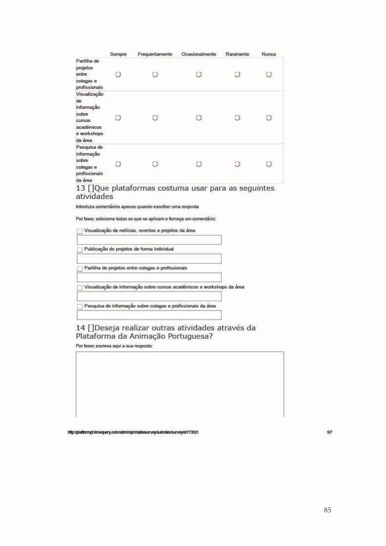
85

86

87

88

89
Annex C.
Questions for Semi-Structured Interviews with alumni of the Moving Image course of UAlg.