Constitutional objections to the government of Ireland by a separate ...
Upload
khangminh22Category
view
0download
0
THE WILLIAM DAVIDSON INSTITUTE AT THE UNIVERSITY OF MICHIGAN BUSINESS SCHOOL
Not Separate, Not Equal: Poverty and Inequality in Post-Apartheid South Africa
By: Johannes G. Hoogeveen and Berk Özler
William Davidson Institute Working Paper Number 739 January 2005
1
Not Separate, Not Equal:
Poverty and Inequality in Post-Apartheid South Africa
Johannes G. Hoogeveen and Berk Özler*
World Bank, 1818 H Street NW, Washington DC, 20433, USA
October 12, 2004
Abstract – As South Africa conducts a review of the first ten years of its new democracy, the question
remains as to whether the economic inequalities of the apartheid era are beginning to fade. Using new,
comparable consumption aggregates for 1995 and 2000, this paper finds that real per capita household
expenditures declined for those at the bottom end of the expenditure distribution during this period of low
GDP growth. As a result, poverty, especially extreme poverty, increased. Inequality also increased,
mainly due to a jump in inequality among the African population. Even among subgroups of the
population that experienced healthy consumption growth, such as the Coloureds, the rate of poverty
reduction was low because the distributional shifts were not pro-poor.
Key Words: Poverty, Inequality, South Africa
JEL Classification Numbers: D63, I32
* Both researchers are economists at The World Bank. The authors would like to thank Miriam Babita, Harry Thema, and Nozipho Shabalala for help with the construction of the data set used in the analysis. We are also grateful to Harold Alderman, Kathleen Beegle, Francois Bourguignon, David Dollar, Peter Lanjouw, Martin Ravallion and three anonymous referees for comments. These are the views of the authors, and need not reflect those of the World Bank or any affiliated organization. Corresponding author: Berk Özler, [email protected], phone: 202-458-5861, fax: 202-522-1153, mailing address: The World Bank, 1818 H Street, NW, Washington, DC, 20433, Mail Stop MC3-306.
2
I. Introduction
Apartheid in South Africa came officially to an end with the democratically held
elections in 1994, and in its wake left a population with vast inequalities across racial groups.1
Using a poverty line of 322 Rand (in 2000 prices), at least 58% of all South Africans, and 68%
of the African population was in poverty in 1995, while poverty was virtually non-existent for
Whites.2 The Gini coefficient of expenditures was 0.56, making South Africa one of the most
unequal countries in the world. The country also inherited vast inequalities in education, health,
and basic infrastructure, such as access to safe water, sanitation, and housing. For instance,
while only a quarter of Africans had access to piped water in their houses, Asians and Whites
had universal access.
Many other aspects of the South African economy are equally challenging. Crime is so
prevalent that it leads to emigration of South African professionals of all ethnic groups (Dodson,
2002), possibly also discouraging investment and stifling growth. The broad unemployment rate
is estimated to be between 30-40% and has been steadily increasing since 1995, making South
Africa’s unemployment rate one of the highest in the world. Many communities in the former
homelands have little economic activity to speak of – mean unemployment rates in these
communities approach 75%.3 The share of the workforce in the informal sector is no more than
approximately 15% in South Africa, a figure that is remarkably small when compared with, say,
Latin American countries (Rama, 2001; Kingdon and Knight, 2004). According to UNAIDS,
HIV prevalence increased from 10.5% in 1995 to 22.8% in 1998.4 Human Sciences Research
Council projected that more than 375,000 South Africans would die from HIV/AIDS in 2003, a
30% increase from the estimated number of deaths in 2000.5
Faced with these enormous challenges, the new government introduced the
Reconstruction and Development Program (RDP) in 1994, self-described as an integrated,
coherent socio-economic framework. RDP set ambitious goals, such as job creation through
public works programs, redistribution via land reform, and major infrastructure projects in
housing, services, and social security. The Growth, Employment, and Redistribution (GEAR)
1 In this paper, we refer to four major population groups: Africans, Coloureds, Asians/Indians, and Whites. We use “ethnic, racial, and population groups” interchangeably. For brevity, we refer to the Asians/Indians as Asians. 2 Authors’ calculations using the Income Expenditure Survey (1995). 3 Authors’ own calculations using the 1996 population census. 4 http://www.unaids.org/hivaidsinfo/statistics/fact_sheets/pdfs/Southafrica_en.pdf 5 Mail and Guardian, February 7, 2003. http://www.mg.co.za/Content/l3.asp?ao=10925
3
program of 1996, which presented a formal macroeconomic framework for growth, followed the
RDP and aimed to increase growth and stimulate job creation. It was an export-led
macroeconomic strategy that included “…anti-inflationary policies, including fiscal restraint,
continued tight monetary policies and wage restraint.”6 Under the program, the average annual
GDP growth rate was to increase from a base projection of 2.8% to 4.2% between 1996-2000
and the deficit to be reduced to a target rate of 3% of GDP.7 The main goals of the RDP were
reiterated in GEAR, including reforms to make the labor markets more flexible, to improve
productivity, and to increase training and employment of the unskilled.
During this period prices were stable, spending levels in education and pension programs
were adequate, and access to certain basic services and infrastructure improved significantly.
However, GDP per capita grew at an annual rate of roughly 0.6% that is more in line with
baseline projections rather than the Integrated Scenario projections of GEAR, and unemployment
kept increasing steadily. 8 9 Final consumption expenditure by households also grew by less than
1% per capita annually between 1995 and 2000.10
The failure of the economy to grow and create enough jobs gave way to an
“…interrogation of the compatibility between GEAR and the labour legislation and a growing
concern with rising unemployment and poverty.” (Leibbrandt, van der Berg, and Bhorat, 2001)
The government stated its commitment to GEAR again at the Presidential Jobs Summit in 1998,
which brought together government, organized labour and the business sector. Despite
consensus on the need for occupational training and job creations schemes, significant changes in
labour market legislation did not follow. Nor did any significant land reform materialize,
although it was identified as a source of improvement for long-term employment and rural
income growth.
Narrow unemployment rate increased from 17% to 24% between 1995 and 1999, while
the broad unemployment rate, which includes the so-called “discouraged workers” increased
from 29% to 38% during the same period (Klasen and Woolard, 2000). During the same time
period, the demand for high-skilled labor increased, while it declined for low-skilled labor, a
6 Leibbrandt, van der Berg, and Bhorat (2001), page 16. 7 Government of South Africa (1996). 8 Authors’ calculation using “gross domestic product at constant 1995 prices (time series code KBP6006Y)” data from the South African Reserve Bank, http://www.reservebank.co.za/ 9 Annual population growth in South Africa was approximately 2% during this period.
4
trend that Rama (2001) relates, to some extent, to trade liberalization. Rama (2001) also reports
a tendency towards outsourcing in the manufacturing sector, which led to an increase of workers
who are in the informal sector between 1995 and 2000. Bhorat (2003) reports that the expansion
of the informal sector accounted for 84% of the 1.1 million jobs created between 1996-1999.
However, the labor force expanded by 3.1 million over the same period, causing the increase in
the rate of unemployment. Employers in manufacturing perceived labor market regulations as a
major hindrance to hiring workers (Rama, 2001; Economist, Jan. 15, 2004)
The result is a segmented labor market, the high-skill tier of which is characterized by
excess demand (Rama, 2001), while the low-skill tier displays large excess supply.11
Unemployment is very high in rural areas, highlighting not only the lack of economic activity in
former homelands, but also the fact that unemployed individuals stay in or move back to rural
areas to attach themselves to households with adequate public or private support (Klasen,
Woolard, 2000). Under these circumstances, one would expect an increase in inequality due to
rising incomes for a small group of educated and skilled South Africans and stagnant or
declining incomes for a much larger group of low-skilled individuals.12
Given this backdrop of very high levels of poverty and inequality in what is essentially an
upper-middle-income country, knowledge of what happened to the national distribution of
household expenditures since the end of the apartheid is important, but somewhat inadequate.13
Various studies using the panel data generated by the Kwazulu-Natal Income Dynamics Study
(KIDS), report on changes in welfare in Kwazulu-Natal, a large province of South Africa that is
home to roughly one fifth of its population. Carter and May (2001) find that poverty rates
among the non-white population in Kwazulu-Natal increased from 27% to 43% between 1993
and 1998. Furthermore, they find that approximately 70% of the poor may be dynamically so,
unable to escape poverty. Using the same data source, but utilizing income data instead of
expenditures, Fields et al. (2003) do not present any figures on absolute poverty, but report that
10 Authors’ calculation using “final consumption expenditure by households (time series code KBP6007Y)” data from the South African Reserve Bank, http://www.reservebank.co.za/ 11 According to the Economist (Jan 15, 2003), blacks with sought-after skills are typically paid 15-20% more than similarly qualified whites, as private companies compete for these workers in their effort to make their workplace more “demographically representative.” 12 Old age pensions, child support grants and unemployment insurance that provide social support to some families may counter these impacts. 13 The PPP-adjusted GDP per capita for South Africa (in current international $) was $8642 in 1995 and $9580 in 2000. Source: World Bank, International Comparison Programme database.
5
the Gini coefficient increased from 0.515 to 0.543 in Kwazulu-Natal. Also using income data
from the same data sources used in this paper (1995 and 2000 Income Expenditure Surveys),
Lam and Leibbrandt (2003) find that incomes deteriorated for most South Africans. They also
report that inequality within racial groups increased substantially while between group inequality
declined only slightly, as a result of which total inequality increased in South Africa between
1995 and 2000.
In this paper, we build on the literature before us and make three main contributions.
First, we utilize consumption aggregates in both the 1995 and 2000 IES that are carefully built so
as to be as comparable to each other as possible. Second, using price data for each food item
collected in the monthly Consumer Price Surveys conducted by Statistics South Africa (STATS
SA), we not only construct provincial and inter-temporal price indices, but also draw normative
poverty lines to assess poverty in South Africa using the “cost-of-basic-needs” approach.
Finally, in addition to describing changes in real mean household expenditure, poverty, and
inequality across all of South Africa and for various sub-groups of the population for the 1995-
2000 period, we also investigate whether the observed changes in welfare are due to changes in
endowments, or changes in the returns to those endowments.
We find that the annual per capita growth rate of household expenditures between 1995
and 2000 is 0.5% – very much in line with the GDP growth and the growth of final consumption
expenditure by households.14 Echoing Lam and Leibbrandt (2003), we find a deterioration of
expenditures at the bottom end of the distribution, as a result of which poverty, especially
extreme poverty, increased significantly. There were approximately 1.8 million (2.3 million)
more South Africans in 2000 living with less than $1/day ($2/day) than there were in 1995.
However, these losses were not uniform: Coloureds made significant gains against poverty over
this period, so did several provinces, such as Western Cape, Northern Cape, and Free State.
Inequality also increased, mainly due to a sharp increase among the African population. The fact
that the growth rate was low and that the materialized growth was not pro-poor were the main
reasons for the lack of progress against poverty in this period.
The next section briefly discusses the data and methodology, while section 3 presents the
changes in poverty and inequality in South Africa, and provides breakdowns by ethnic group,
14 According to our household survey data, per capita household expenditures went from 534 Rand in 1995 to 547 Rand in 2000. However, this annual increase of 0.5% is not statistically significant.

6
province, and type of area. Section 4 discusses the sensitivity of our results with respect to the
assumptions on sampling weights, the importance of home-grown food consumption, and
urban/rural price differentials. Section 5, using a multivariate regression framework, addresses
the question of whether changes in endowments or returns to endowments are responsible for the
results reported in this paper. Section 6 provides discusses some remaining puzzles and
concludes the paper.
II. Data and Methodology
In constructing household consumption aggregates to analyze changes in welfare in
South Africa, we followed standard practice, in particular the guidelines put forth by Deaton and
Zaidi (2002), Lanjouw (1996) et al., and Ravallion (2001).15 Instead of discussing the
construction and comparability of the consumption aggregates, the normative poverty lines, and
the spatial and inter-temporal price adjustments in great detail, we refer the readers to Babita et
al. (2003), which provides a very detailed account of these issues. Below, we briefly discuss the
data and deviations we had to make from standard practice – mainly due to data constraints –
that may affect our welfare estimates.
The data utilized in this paper come from two surveys, each of which was conducted by
Statistics South Africa (STATS SA) in both 1995 and 2000. The first is the OHS that is
collected annually. The second is the Income and Expenditure Survey (IES), which is held every
5 years among households surveyed by the OHS. Combined, these surveys provide information
on household income and expenditure, along with information on other household
characteristics, such as demographics, work, access to services and housing characteristics for
roughly 30,000 households in each of the survey years. Recently the annual OHS was
transformed into a biannual Labor Force Survey (LFS) with a rotating panel. We utilize OHS
1995, IES 1995, LFS 2000:2 and IES 2000 to build comparable welfare indicators for 1995 and
2000.
The income and expenditure modules in the IES have hardly changed between 1995 and
2000, and hence it is possible to build comparable consumption aggregates based on a large set
15 The literature on the choice of income vs. expenditure to measure household welfare is well-established and we abstract from that debate here. We believe, for empirical and theoretical reasons, that using data on household expenditures is preferable to using data on incomes.
7
of common items that are included in both the 1995 and 2000 data.16 The consumption
aggregate includes the following expenditure categories: food, beverages, and cigarettes
(excluding home-grown foods); housing (imputed rental value of residence and utilities);
compensation for domestic workers; personal care, household services, and other household
consumer goods; fuel (excluding firewood and dung); clothing and footwear; transport
(excluding cost of purchased vehicles); communication; education; reading matter, cost of
licenses and other rental charges, and cost of insurance.17 Rental values for housing were
imputed in the same manner for each year using hedonic regressions.18
We used the “cost-of-basic-needs” approach to draw normative poverty lines for our
analysis (Ravallion 1994, 2001). According to these calculations, a reasonable poverty line for
South Africa must lie between 322 Rand (lower-bound poverty line) and 593 Rand (upper-bound
poverty line) per capita per month in 2000 prices. In this paper, we report poverty using the
lower-bound poverty line as well as the $2/day poverty line, which is equivalent to 174 Rand per
capita per month. The $2/day poverty line is close to the poverty line used by Deaton (1997),
and also reasonably close to our food poverty line of 211 Rand.19 While it is significantly lower
than our preferred poverty line for South Africa, it is useful for international comparisons, and to
describe what happened to the welfare of those at the bottom end of the distribution. Using these
poverty lines, we report the Foster-Greer-Thorbecke (FGT) measures of headcount rate, poverty
gap, and poverty gap squared. We also present three inequality measures for South Africa: the
Gini index, the Theil index, and the Mean Log Deviation.
The data have three possible shortcomings that might bias the results presented in this
paper. First, the issue of sampling weights for the 1995 and 2000 IES data has been a source of
much controversy. Because of problems with the sampling frame for the 1995 OHS and IES, we
report results using a set of sampling weights that was recalculated by STATS SA using
16 However, there are two main shortcomings associated with the IES. First, it is an expenditure survey as opposed to a consumption survey, making it difficult to deduce that the purchased amount was consumed during the period of recall. Second, the IES lacks the necessary information to impute reliable values of durable goods and as a result this item was excluded from the consumption aggregate. 17 Important categories of expenditures we have excluded from the consumption aggregate are: water; firewood and dung; health; imputed value of household durables; food consumption from home production; lobola/dowry, funerals, religious or traditional ceremonies, gambling; lumpy expenditures, such as furniture, appliances, vehicles, sound and video equipment, etc. See Babita et al. (2003) for details. 18 Again, see Babita et al. (2003) for details. 19 Deaton (1997) uses 105 Rand per capita in 1993 prices as a poverty line. This is very close to 174 Rand in 2000 prices.
8
information from the 1996 Population Census.20 However, there is also reason to fear that the
2000 sampling weights might be inadequate (Simkins, 2003). Second, the IES lack the
necessary information to impute a comparable value for consumption of home-grown products.
In many countries, consumption of home-grown products is a significant component of the
household consumption aggregate and hence its omission can lead to poverty being
overestimated and the cross-sectional and inter-temporal poverty profiles to be biased.21 Third,
the IES neither collects information on quantities purchased to allow the construction “unit
values”, nor does it collect information on prices of various food items in the markets in the
communities sampled. Hence, the price data we utilize to transform nominal household
expenditures into real expenditures come from the price surveys STATS SA conducts on a
monthly basis. The Consumer Price Survey covers only metropolitan and urban areas
throughout the nine provinces of South Africa. The lack of rural price data may cause an
overestimation of poverty in rural areas, as well as biases in inter-temporal comparisons. For
each of the potential problems discussed above, we perform sensitivity analysis and report the
results in Section 4.
III. Results
Absolute Poverty
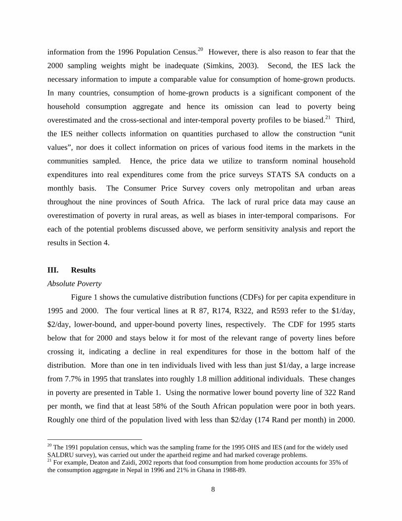
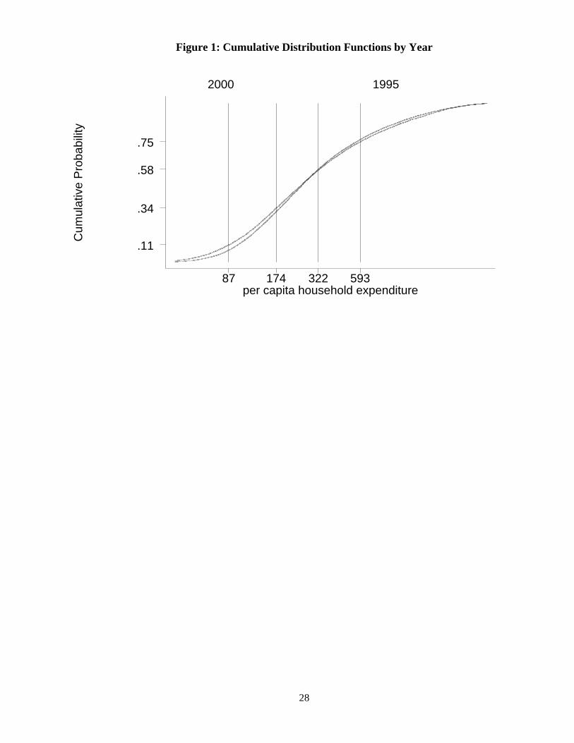
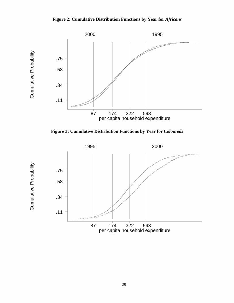
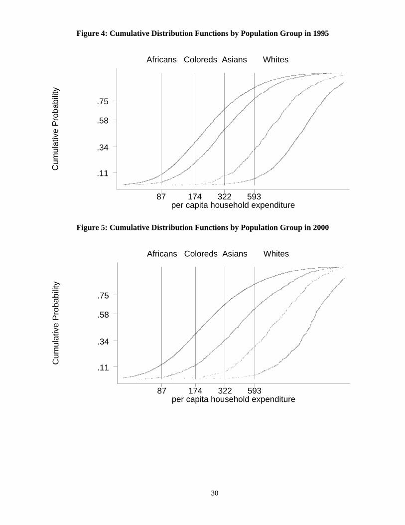
Figure 1 shows the cumulative distribution functions (CDFs) for per capita expenditure in
1995 and 2000. The four vertical lines at R 87, R174, R322, and R593 refer to the $1/day,
$2/day, lower-bound, and upper-bound poverty lines, respectively. The CDF for 1995 starts
below that for 2000 and stays below it for most of the relevant range of poverty lines before
crossing it, indicating a decline in real expenditures for those in the bottom half of the
distribution. More than one in ten individuals lived with less than just $1/day, a large increase
from 7.7% in 1995 that translates into roughly 1.8 million additional individuals. These changes
in poverty are presented in Table 1. Using the normative lower bound poverty line of 322 Rand
per month, we find that at least 58% of the South African population were poor in both years.
Roughly one third of the population lived with less than $2/day (174 Rand per month) in 2000.
20 The 1991 population census, which was the sampling frame for the 1995 OHS and IES (and for the widely used SALDRU survey), was carried out under the apartheid regime and had marked coverage problems. 21 For example, Deaton and Zaidi, 2002 reports that food consumption from home production accounts for 35% of the consumption aggregate in Nepal in 1996 and 21% in Ghana in 1988-89.
9
For any poverty line below 322 Rand per capita per month, the poverty gap and poverty severity
(poverty gap squared) indices are significantly higher in 2000 than they were in 1995. These
increases in poverty accompanied positive expenditure growth that was statistically insignificant.
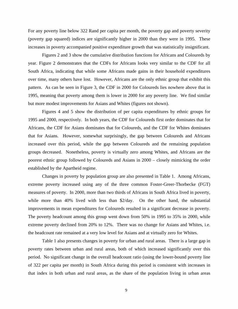
Figures 2 and 3 show the cumulative distribution functions for Africans and Coloureds by
year. Figure 2 demonstrates that the CDFs for Africans looks very similar to the CDF for all
South Africa, indicating that while some Africans made gains in their household expenditures
over time, many others have lost. However, Africans are the only ethnic group that exhibit this
pattern. As can be seen in Figure 3, the CDF in 2000 for Coloureds lies nowhere above that in
1995, meaning that poverty among them is lower in 2000 for any poverty line. We find similar
but more modest improvements for Asians and Whites (figures not shown).
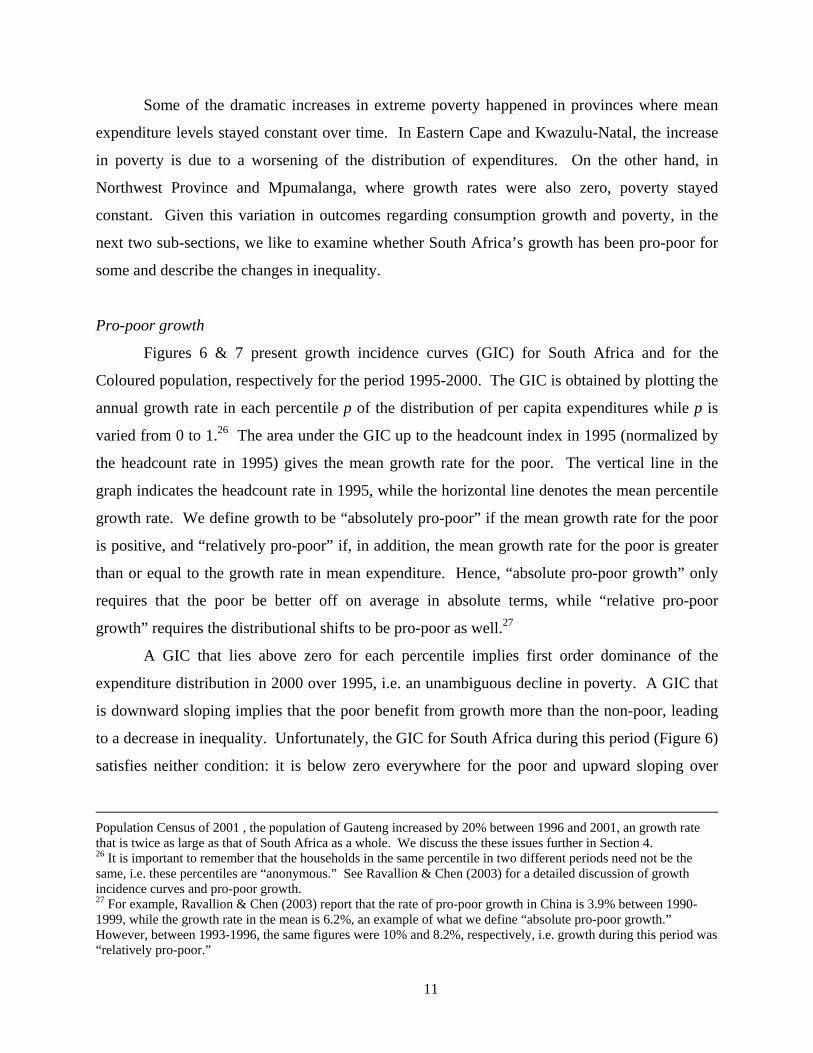
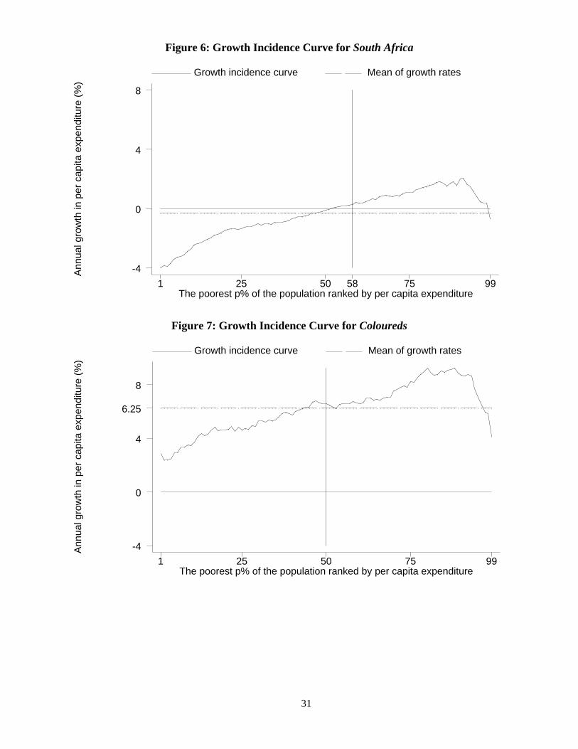
Figures 4 and 5 show the distribution of per capita expenditures by ethnic groups for
1995 and 2000, respectively. In both years, the CDF for Coloureds first order dominates that for
Africans, the CDF for Asians dominates that for Coloureds, and the CDF for Whites dominates
that for Asians. However, somewhat surprisingly, the gap between Coloureds and Africans
increased over this period, while the gap between Coloureds and the remaining population
groups decreased. Nonetheless, poverty is virtually zero among Whites, and Africans are the
poorest ethnic group followed by Coloureds and Asians in 2000 – closely mimicking the order
established by the Apartheid regime.
Changes in poverty by population group are also presented in Table 1. Among Africans,
extreme poverty increased using any of the three common Foster-Greer-Thorbecke (FGT)
measures of poverty. In 2000, more than two thirds of Africans in South Africa lived in poverty,
while more than 40% lived with less than $2/day. On the other hand, the substantial
improvements in mean expenditures for Coloureds resulted in a significant decrease in poverty.
The poverty headcount among this group went down from 50% in 1995 to 35% in 2000, while
extreme poverty declined from 20% to 12%. There was no change for Asians and Whites, i.e.
the headcount rate remained at a very low level for Asians and at virtually zero for Whites.
Table 1 also presents changes in poverty for urban and rural areas. There is a large gap in
poverty rates between urban and rural areas, both of which increased significantly over this
period. No significant change in the overall headcount ratio (using the lower-bound poverty line
of 322 per capita per month) in South Africa during this period is consistent with increases in
that index in both urban and rural areas, as the share of the population living in urban areas

10
increased significantly during this period.22 More than three quarters of the population in rural
areas lived in poverty in both years, while the share living with less than $2/day increased from
45% in 1995 to more than half of the rural population in 2000. Poverty in urban areas also
increased – from 36% to 40%.
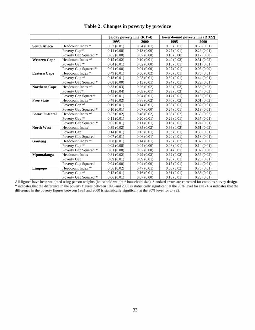
Table 2 presents the changes in poverty for the nine provinces of South Africa. There is
substantial variation in levels and changes in poverty across provinces. The only provinces that
have experienced significant growth in their mean household expenditure levels – Western Cape,
Northern Cape, and Free State – have had significant declines in poverty. In fact, by 2000,
Western Cape had the lowest poverty headcount rate in South Africa, replacing Gauteng. The
declines in poverty in the Northern Cape and Free State were mainly driven by rural sector
growth.23 That Western Cape and Northern Cape are also the two provinces in which Coloureds
form the majority of the population is consistent with the significant reduction in poverty
Coloureds experienced. However, it wasn’t just Coloureds who benefited from poverty
reduction in these provinces – the poverty headcount among Africans went down from 75% to
62% in Northern Cape and from 62% to 55% in Western Cape.
While a few provinces made progress, a number of provinces have seen dramatic
increases in poverty. In Eastern Cape, already the poorest province in South Africa in 1995, the
extreme poverty rate increased from 49% to 56%, while the poverty gap and poverty severity
have also gotten significantly worse. Limpopo, mainly a rural province, has seen the most
dramatic increase in its poverty incidence, with approximately three-quarters of its population in
poverty by 2000 compared with 65% in 1995. Poverty has increased also in Kwazulu-Natal
where close to half of the population lived with less than $2/day by 2000.24 Finally Gauteng, the
wealthiest province in 1995, has experienced large increases in poverty, where more than one
third of the population lived in poverty by 2000, up from less than a quarter five years prior to
that.25
22 In our samples for the IES in 1995 and 2000, the share of population living in urban areas is 44.3% and 56.7%, respectively. 23 Rural poverty headcount declined from 87% to 76% in Free State, and from 70% to 49% in Northern Cape between 1995-2000. 24 This increase is consistent with the results reported in Carter and May (2001) on changes in poverty in Kwazulu-Natal between 1993-98. 25 There is reason to believe that the sampling problems that plagued the 1995 survey were the most severe in Gauteng, leading to an undercount of the population there, especially Africans. Hence, part of the increase in poverty in Gauteng during this period may be due to an underestimation of poverty in 1995. Another factor likely to be contributing to this increase is migration to Gauteng from poorer provinces after 1994. According to the
11
Some of the dramatic increases in extreme poverty happened in provinces where mean
expenditure levels stayed constant over time. In Eastern Cape and Kwazulu-Natal, the increase
in poverty is due to a worsening of the distribution of expenditures. On the other hand, in
Northwest Province and Mpumalanga, where growth rates were also zero, poverty stayed
constant. Given this variation in outcomes regarding consumption growth and poverty, in the
next two sub-sections, we like to examine whether South Africa’s growth has been pro-poor for
some and describe the changes in inequality.
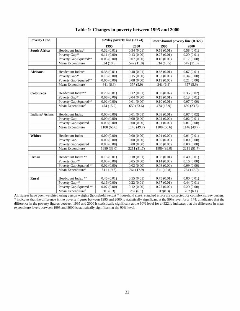
Pro-poor growth
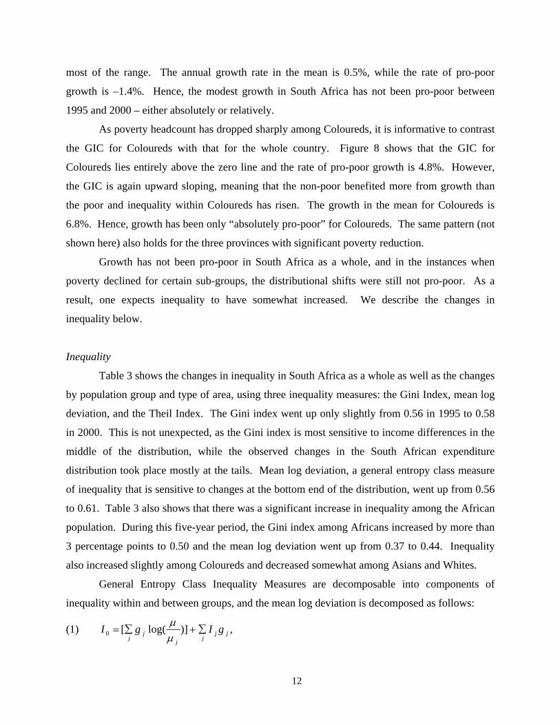
Figures 6 & 7 present growth incidence curves (GIC) for South Africa and for the
Coloured population, respectively for the period 1995-2000. The GIC is obtained by plotting the
annual growth rate in each percentile p of the distribution of per capita expenditures while p is
varied from 0 to 1.26 The area under the GIC up to the headcount index in 1995 (normalized by
the headcount rate in 1995) gives the mean growth rate for the poor. The vertical line in the
graph indicates the headcount rate in 1995, while the horizontal line denotes the mean percentile
growth rate. We define growth to be “absolutely pro-poor” if the mean growth rate for the poor
is positive, and “relatively pro-poor” if, in addition, the mean growth rate for the poor is greater
than or equal to the growth rate in mean expenditure. Hence, “absolute pro-poor growth” only
requires that the poor be better off on average in absolute terms, while “relative pro-poor
growth” requires the distributional shifts to be pro-poor as well.27
A GIC that lies above zero for each percentile implies first order dominance of the
expenditure distribution in 2000 over 1995, i.e. an unambiguous decline in poverty. A GIC that
is downward sloping implies that the poor benefit from growth more than the non-poor, leading
to a decrease in inequality. Unfortunately, the GIC for South Africa during this period (Figure 6)
satisfies neither condition: it is below zero everywhere for the poor and upward sloping over
Population Census of 2001 , the population of Gauteng increased by 20% between 1996 and 2001, an growth rate that is twice as large as that of South Africa as a whole. We discuss the these issues further in Section 4. 26 It is important to remember that the households in the same percentile in two different periods need not be the same, i.e. these percentiles are “anonymous.” See Ravallion & Chen (2003) for a detailed discussion of growth incidence curves and pro-poor growth. 27 For example, Ravallion & Chen (2003) report that the rate of pro-poor growth in China is 3.9% between 1990-1999, while the growth rate in the mean is 6.2%, an example of what we define “absolute pro-poor growth.” However, between 1993-1996, the same figures were 10% and 8.2%, respectively, i.e. growth during this period was “relatively pro-poor.”
12
most of the range. The annual growth rate in the mean is 0.5%, while the rate of pro-poor
growth is –1.4%. Hence, the modest growth in South Africa has not been pro-poor between
1995 and 2000 – either absolutely or relatively.
As poverty headcount has dropped sharply among Coloureds, it is informative to contrast
the GIC for Coloureds with that for the whole country. Figure 8 shows that the GIC for
Coloureds lies entirely above the zero line and the rate of pro-poor growth is 4.8%. However,
the GIC is again upward sloping, meaning that the non-poor benefited more from growth than
the poor and inequality within Coloureds has risen. The growth in the mean for Coloureds is
6.8%. Hence, growth has been only “absolutely pro-poor” for Coloureds. The same pattern (not
shown here) also holds for the three provinces with significant poverty reduction.
Growth has not been pro-poor in South Africa as a whole, and in the instances when
poverty declined for certain sub-groups, the distributional shifts were still not pro-poor. As a
result, one expects inequality to have somewhat increased. We describe the changes in
inequality below.
Inequality
Table 3 shows the changes in inequality in South Africa as a whole as well as the changes
by population group and type of area, using three inequality measures: the Gini Index, mean log
deviation, and the Theil Index. The Gini index went up only slightly from 0.56 in 1995 to 0.58
in 2000. This is not unexpected, as the Gini index is most sensitive to income differences in the
middle of the distribution, while the observed changes in the South African expenditure
distribution took place mostly at the tails. Mean log deviation, a general entropy class measure
of inequality that is sensitive to changes at the bottom end of the distribution, went up from 0.56
to 0.61. Table 3 also shows that there was a significant increase in inequality among the African
population. During this five-year period, the Gini index among Africans increased by more than
3 percentage points to 0.50 and the mean log deviation went up from 0.37 to 0.44. Inequality
also increased slightly among Coloureds and decreased somewhat among Asians and Whites.
General Entropy Class Inequality Measures are decomposable into components of
inequality within and between groups, and the mean log deviation is decomposed as follows:
(1) jjjj
jj
gIgI ∑+∑= )]log([0 µµ ,
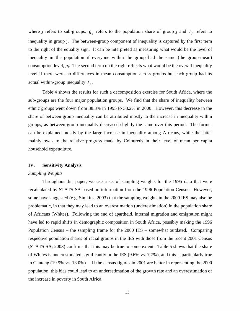
13
where j refers to sub-groups, jg refers to the population share of group j and jI refers to
inequality in group j. The between-group component of inequality is captured by the first term
to the right of the equality sign. It can be interpreted as measuring what would be the level of
inequality in the population if everyone within the group had the same (the group-mean)
consumption level, µj. The second term on the right reflects what would be the overall inequality
level if there were no differences in mean consumption across groups but each group had its
actual within-group inequality jI .
Table 4 shows the results for such a decomposition exercise for South Africa, where the
sub-groups are the four major population groups. We find that the share of inequality between
ethnic groups went down from 38.3% in 1995 to 33.2% in 2000. However, this decrease in the
share of between-group inequality can be attributed mostly to the increase in inequality within
groups, as between-group inequality decreased slightly the same over this period. The former
can be explained mostly by the large increase in inequality among Africans, while the latter
mainly owes to the relative progress made by Coloureds in their level of mean per capita
household expenditure.
IV. Sensitivity Analysis
Sampling Weights
Throughout this paper, we use a set of sampling weights for the 1995 data that were
recalculated by STATS SA based on information from the 1996 Population Census. However,
some have suggested (e.g. Simkins, 2003) that the sampling weights in the 2000 IES may also be
problematic, in that they may lead to an overestimation (underestimation) in the population share
of Africans (Whites). Following the end of apartheid, internal migration and emigration might
have led to rapid shifts in demographic composition in South Africa, possibly making the 1996
Population Census – the sampling frame for the 2000 IES – somewhat outdated. Comparing
respective population shares of racial groups in the IES with those from the recent 2001 Census
(STATS SA, 2003) confirms that this may be true to some extent. Table 5 shows that the share
of Whites is underestimated significantly in the IES (9.6% vs. 7.7%), and this is particularly true
in Gauteng (19.9% vs. 13.0%). If the census figures in 2001 are better in representing the 2000
population, this bias could lead to an underestimation of the growth rate and an overestimation of
the increase in poverty in South Africa.
14
To test the robustness of our results, we employ a crude ex-post re-weighting scheme.28
Using population shares from the 2001 Census at the province level for each racial group, we re-
weight our 2000 IES sample so that the population share in each of the 36 province/race cells (9
provinces times 4 racial groups) is identical to that from the 2001 Census. The re-estimated
welfare measures are presented in Table 6. Using the adjusted weights, mean expenditure grows
from 534 Rand to 587 Rand over this period, a per capita growth rate of 1.9% per year. This is
more than double the GDP growth rate, and as such we can treat it as an upper limit on growth of
per capita household expenditures over this period.
Despite this expenditure growth, the effect of re-weighting on poverty changes is
minimal. The conclusion that poverty increased between 1995 and 2000 remains true for a wide
range of poverty lines, especially for the poverty gap and poverty severity measures. On the
other hand, inequality is higher using these adjusted sampling weights. These results are not
completely surprising. As the population share of Whites – who are clustered at top end of the
expenditure distribution – is significantly higher than originally estimated by the IES alone, the
rate of growth and the level of inequality increase but poverty levels are not significantly
affected.
While our results with respect to changes in poverty and inequality generally hold
regardless of the sampling weights used in the analysis, the magnitudes of some of these changes
are different. For example, using the adjusted weights for 2000, the headcount index for
Gauteng still increases significantly, but only to 33.8% instead of 36.8%. We conclude that
adjustments to sampling weights alone cannot reverse the main conclusions reached in this
paper.
Consumption from home-grown production
The importance of consumption from home-grown production seems to be small in South
Africa compared with other countries. Deaton and Zaidi (2002) reports that the budget share of
this item was 2.2% in South Africa in 1993, compared with 6.7% in Brazil or 16.8% in Vietnam.
We have obtained the South Africa Integrated Household Survey, 1993 (SAIHS) – the same data
set used by Deaton and Zaidi – and replicated this figure ourselves. Further examination of these
28 Introducing ex-post inflation factors into surveys in this way is not uncommon. See, for example, Deaton (1997).
15
data revealed no significant differences in the share of consumption from home-grown
production across per capita expenditure deciles.
To examine whether this pattern has significantly changed over time, we calculated the
share of maize consumption from home-grown production using our datasets for 1995 and
2000.29 We use the market price of maize in each province to value home consumption. We find
that while only 3% of the population was consuming maize from own-production in 1995, this
figure went up to approximately 11% by 2000. The share of maize consumption from home
production in the consumption aggregate also increased from approximately 0.5% in 1995, to
roughly 1.5% by 2000. Furthermore by 2000, home-grown maize consumption constituted 3%
of the poorest quintile’s consumption and virtually none of the richest quintile’s, suggesting that
home production of food may have become more important for the poor over this period.
However, these figures are still very small. Table 7 compares the poverty figures for
2000 using a consumption aggregate that includes home-grown maize (column 5) with those
without this consumption item for 1995 (column 3) and 2000 (column 4). While poverty (and
inequality) is slightly less in 2000 when this consumption of home grown maize is accounted for,
the changes in the poverty gap and poverty gap squared measures over this period remain
significant. We conclude that our general conclusions regarding inter-temporal comparisons of
the mean growth rate, poverty and inequality are robust to the inclusion of home-grown food
products. This conclusion remains the same regardless of whether we use the published
sampling weights in the IES 2000, or the adjusted ones discussed above.
Rural/Urban Price Differentials
Data on rural prices in South Africa is poor. As mentioned before, the IES data do not
allow the calculation of unit values and there are no community price surveys. To get a basic
idea of the rural/urban food price differentials, we again draw from the SAIHS of 1993. We fix a
food bundle that makes up roughly 80% of the food consumption in the 2000 IES and use the
mean national urban and rural prices of these items from the SAIHS community questionnaire to
construct crude rural and urban price indices for South Africa.30 We find that the cost of this
29 Among the home-grown products for which data are collected, maize is by far the most important item grown and consumed by households in our surveys. 30 This bundle includes mealie meal/maize flour, rice, bread, beef, mutton, pork, lamb, potatoes, tomatoes, cabbage, soft drinks, milk, milk powder, eggs, vegetable oil, margarine, butter, and sugar.
16
bundle in urban areas is approximately 4.5% higher than that in rural areas in 1993. This
difference would lead to a slight overestimation of poverty in South Africa in general and the
relative poverty of rural households in particular.
There is no data source available to us that can shed light on whether this small difference
has changed between 1995 and 2000.31 However, there is evidence from other countries on
divergence of price indices between urban and rural areas. For instance, Friedman and
Levinsohn (2002) report a co-movement of rural and urban prices in Indonesia over a 12-year
period between 1984 and 1996.32 Deaton and Tarozzi (2000) report that urban prices were
11.4% higher than rural prices in India in 1987-88 and this difference increased to 15.6% by
1993-94. These numbers do not suggest a large divergence in rural/urban price differentials over
time.
There are yet other factors to suggest that the small rural/urban price differentials are not
likely to effect our results significantly. According to information collected on the area of
purchase of goods and services in the 2000 IES, households in rural areas report buying a
significant amount of food items and most of their non-food items in nearby urban areas.33
Nonetheless, we simulate the effect of changes in the urban/rural price differential over time and
report the results in Table 8. We present revised poverty and inequality figures under three
hypothetical scenarios: that the base rural/urban price differential increased from a reasonable
5% in 1995 to 10%, 15%, or 20% in 2000. We note that if we had assumed a 5% price
differential between urban and rural areas in 1995, the poverty figures would not be significantly
lower than those reported in section 3 (column 3). The table also shows that the increase in
various FGT measures of poverty between 1995 and 2000 become insignificant only if the
rural/urban price differential quadrupled in the five-year period between 1995 and 2000
(columns 4-6).
V. Correlates of Household Expenditure
In this section, we investigate the underlying factors for the changes in household
expenditures described in the previous section. We show that changes in the distribution of
31 Carter and May (2001) use separate costs for rural and urban areas of Kwazulu-Natal province that are borrowed from Potgieter (1993), but we were not able locate this study. 32 Specifically, they report that the rural prices increased by 182% while urban prices increased by 187%. 33 For example, approximately 60% of rural households reported purchasing grain products in nearby urban areas.
17
welfare between 1995 and 2000 are mostly attributable to changes in returns to endowments,
such as education, and not to changes in the endowment levels themselves. In a manner that is
analogous to wage regressions (e.g. Lam 1999), we estimate a regression model to explain the
variation in per capita household expenditures.34
Endogeneity – either as a result of reverse causality (e.g. current household expenditure
may effect decisions regarding the formation of new households) or due to omitted variables
(e.g. quality of education) – is a cause for concern. We try to minimize this concern through a
careful selection of explanatory variables and the use of location fixed effects. Household size
and composition, for instance, are responsive to the availability of resources, such as the receipt
of old-age pension, in South Africa (Klasen and Woolard, 2000; Edmonds, Mammen and Miller,
2001; Dieden, 2003). The convention, however, is to include household size in regressions such
as ours (see, for instance, Maluccio, Haddad and May, 2000; Leibbrandt and Woolard 2001).
We include household size and composition in our regressions for two reasons. First, predicted
poverty estimates (reported in Table 10) derived from the regression coefficients are closer to the
‘true’ poverty estimates for the regressions with household size included than without. Second,
the remaining coefficients in the regression model are robust to the inclusion of household size
and composition.
To estimate these regressions, we pool the data for 1995 and 2000 and regress the natural
logarithm of per capita household consumption, ln yid, for the ith household in district d on its
characteristics, Xid, and a set of district dummies, νd. To capture changes over time, all
household characteristics are interacted with a time dummy for year 2000. The model can be
written as follows:
(2) idididid tXXy ενγβ +++= ''ln ,
where εi is an i.i.d. error term, and t a dummy taking the value one if the observation is from
2000 and zero otherwise. β is the vector of coefficients pertaining to 1995, and (β + γ) is the
vector of parameter estimates for the year 2000.
34 Van de Walle and Gunewardena (2001) presents a similar regression model to identify the determinants of living standards in Vietnam
18
The explanatory variables can be divided into three categories: demographics, education,
and location effects. Demographic characteristics include household size, age and ethnic origin
of the head of household, and whether the head of household is female or widowed. We also
include variables reflecting the fraction of dependents in the household and distinguish between
those aged 17 and below and those of pensionable age (65 for men, 60 for women).35
For heads of households that did not report obtaining a diploma or schooling certificate,
we include dummies for each year of education between 2 and 10 years.36 For those with high
levels of education, i.e. those that obtained a diploma, dummy variables are included, and the
years of education is set to zero.37 All education variables are interacted with ethnic group
dummies, as quality of education-received conditional on attainment may differ for these groups
(Case and Deaton, 1999), and because there may be discrimination in the marketplace.
Finally, geographic effects, such as living in a former homeland, agro-ecological factors,
access to markets, local institutions, and infrastructure could be sources of variation in household
consumption. We experimented with province, district, and primary sampling unit (PSU) level
fixed effects, and settled for the inclusion of 362 district dummies.38 We present two separate
regression models for urban and rural areas.39 There are very few Asians in rural areas and they
are classified as Whites in the rural regression model.40
Table 9 presents the regression results. The adjusted-R2 is 0.68 for the urban regression
and 0.67 for the rural one.41 Turning first to the results for 1995, we find that in both rural and
urban areas, household size is negatively correlated with per capita expenditure.42 The
coefficient for the age of the household head reflects the expected life cycle effects. Living in a
household that is non-white, that includes young dependents or that is female-headed is
35 This old-age pension is arguably the most important social transfer in South Africa (Case and Deaton, 1998). In 2000, the maximum pension benefit was R 549 (or 1.7 times the lower-bound poverty line) per month per pensioner; the maximum disability grant was slightly larger: R 685. 36 However, in our sample, the number of Whites with low levels of education was very small. Hence, the omitted education group for Whites is 5 years and below, rather than 0 or 1 year of education for other population groups. 37 We distinguish between four diploma types: (i) diploma obtained with Standard 9 or lower, (ii) diploma obtained with Standard 10, (iii) university degree and (iv) other diplomas and certificates (including postgraduate diplomas). 38 The results are also robust to the inclusion of time-variant geographic fixed-effects. 39 We tested whether the correlates of poverty in rural areas are different from those in urban areas by including interaction terms for urban households for all variables. The null hypothesis that the interaction terms are jointly equal to zero was rejected. 40 Asians made up less than 0.3% of the rural population in both years. 41 The high R2 may partly be attributable to the (endogeneity) of household size. If household size is excluded from the regressions, the R2s drops to around 0.5. 42 This result is robust to the choice of different parameters for adult equivalence and economies of scale.
19
negatively correlated with per capita expenditure. This comes over and above the negative
correlations associated to household size. There is no correlation between households with a
dependent of pensionable age and log per capita consumption for those living in rural areas, but a
negative and significant correlation exists in urban areas. The fact that this coefficient is
negative in urban areas, despite eligibility to a transfer, confirms a finding by Case and Deaton
(1998), who report that median per capita income in pensioner households is lower than in
households without a beneficiary of this transfer.
The parameter estimates for the education variables are consistently positive and
significant, but vary significantly across ethnic groups and rural and urban areas. Note that the
parameter estimates for education between Whites and non-Whites are not directly comparable
as the omitted groups are different. Returns to education for Africans and Whites seem to be
higher in rural areas than in urban areas in 1995. We also observe sheepskin effects in all
population groups at 10 years of education, as well as for degree holders and certificate holders
with Standard 10.
Turning to the results for 2000, we find that in the rural and urban regression the set of
2000 interactions are jointly significant, suggesting that a structural change took place.43 The
pattern of change, especially with respect to education, is strikingly different between rural and
urban areas. In rural areas the year-interacted terms for demographic characteristics are all
negative and mostly significant, implying an across the board worsening of these parameters. In
urban areas, the results are similar but the declines in parameters are less significant statistically.
More interesting are the changes in education coefficients. In urban areas, while the coefficients
on education have not changed significantly for Whites, Asians, or Coloureds, they have
increased for Africans. These gains are particularly large for Africans with high education, such
as degree, certificate, and other diploma holders. In rural areas, however, the picture is different.
The year-interacted education parameters for Whites and Coloureds are mostly negative,
although statistically insignificant, while those for Africans are mixed. As in urban areas, there
were some small gains in returns to low levels of education (2-3 years), there were declines in
those for higher levels (9-10 years).
43 A potential concern is that changes in the estimated parameters pick up measurement error or changes in the omitted variables rather than structural changes (see for instance Malucio, Haddad, and May, 2000, who report large changes in the return to social capital between 1993 and 1998 in KwaZulu-Natal). As it is not clear how this could be addressed, we assume changes in measurement error are random and the observed parameter changes structural.
20
Since this is a household-level analysis and education reflects the level of education of
the head of household, we cannot make definitive statements about the returns to education,
however, one can interpret the education coefficients to capture the composite impact of
differences in the quality of education and various trends in the labor market. Increasing
unemployment since 1995, increased labor market opportunities for skilled laborers,
deteriorating conditions for unskilled workers, and the decline of labor market discrimination are
likely to have affected the education coefficients in various ways.
The results confirm a decline in the ethnic gap in education coefficients, a phenomenon
some (e.g. Mwabu and Schultz, 1996 and Moll, 2000) attribute to the decline in labor market
discrimination. The result that the returns to education accrued mostly to urban Africans with
high levels of education – something documented also by Lam and Leibbrandt (2003) is
consistent with the high and rising demand for skilled workers, and an erosion of demand at the
bottom end of the labor force. Note that the consequence of such a trend is a greater inequality
within Africans, and a decline in inequality between ethnic groups, consistent with our earlier
findings on changes in inequality.
In view of these results, it is natural to ask how much of the changes in poverty described
in earlier can be attributed to changes in the coefficients as opposed to the changes in household
endowments. To address this question, we construct counterfactual consumption distributions
and examine the difference in the poverty headcount between the original and counterfactual
distributions.44 Table 10 presents the different counterfactuals, and the associated predicted
poverty numbers.
Starting with rural areas, counterfactuals 1 and 4 demonstrate that the changes in poverty
are entirely due to changes in the parameters and not in the endowments. Poverty headcount
would have been remained the same in rural South Africa if only the endowments changed but
the coefficients remained the same between 1995 and 2000 (counterfactual 4). Similarly, the
poverty headcount in 2000 would be the same if only the parameters changed (counterfactual 1).
Examining further which parameters are responsible for the increase in poverty in rural areas, we
find that the decline in the parameters for demographic characteristics (counterfactual 3) and not
those for education (counterfactual 2) are responsible for this change.
44 A detailed description of how we derive predicted poverty rates for each counterfactual is presented in Appendix 1.
21
In urban areas, the picture is slightly different. Again, counterfactual 4 shows that if only
the endowments changed, but the parameters stayed the same, poverty in urban areas would be
roughly the same in 2000 as in 1995. However, if only the parameters changed (counterfactual
1), poverty would have increased (from 37.0% to 39.6%), but not as much as the realized poverty
increase between 1995 and 2000 (from 37.0% to 41.5%). Interestingly, and consistent with the
finding that there were increases to returns to education in urban areas, the direction of change in
poverty due to a change in education parameters is different than that due to a change in “other”
parameters. If only the education parameters changed between 1995 and 2000 (counterfactual
2), poverty would have actually declined to 34.7% in urban South Africa. However, these
potential gains were cancelled by declines in other parameters: if only the “other” parameters
changed between 1995 and 2000, then poverty would increase to 42.0% – very close to the
realized poverty headcount of 41.5%. Interestingly, poverty would have been highest in urban
areas in 2000 if only education parameters remained unchanged between 1995 and 2000.
Given the central importance of education, it may be useful to consider what happens to
poverty if inequalities in education are reduced, as they are likely to translate to inequalities in
per capita expenditure. This notion is intuitively appealing, although whether it holds depends
on how education outcomes are mapped into welfare outcomes (Lam, 1999). A legacy of the
apartheid, the education gap between racial groups still exists in 2000 but it is closing due to
improvements in educational attainment, especially by Africans and Coloureds (Lam &
Leibbrandt, 2003).
To explore how increases in educational attainment and returns to education might affect
poverty reduction, we perform more simulations. For example, all else equal, if every household
head with less than 7 years of education attained 7 years of education, then poverty would
decline by about 8 percentage points in rural areas and 5 percentage points in urban areas.45 If,
in addition, the return to education for those with some education but without a diploma
increased by 50%, the poverty would decline by 16 percentage points in rural areas and by about
14 percentage points in urban areas.
We conclude that most of the trends in poverty observed between 1995 and 2000 can be
attributed not to the changes to household endowments, but rather to the returns to those
45 This is the average level of education for the most recent cohort of household heads, defined as those aged 30 or below.
22
endowments. Although there was some improvement in educational attainment over this period,
these changes were not large for Africans.46 In urban areas, where returns to education seem to
be improving, these returns improved mostly for the highly educated – a very small percentage
of the African population. The education parameters reflect the composite influence of
education quality, labor market opportunities, and (wage) returns to education. Disentangling
these effects is beyond the scope of this paper. However, we can say that micro-economic
policies that focus on improving quality educational attainment for the poor, addressing labor
market rigidities, and providing safety nets are urgently needed if the trend of increasing poverty
and inequality in South Africa is to be reversed in the short to medium-run.47
VI. Policy Discussion & Conclusions
This paper assesses the changes in poverty and inequality in South Africa between 1995-
2000, the period that covers the first five years after the official end of the apartheid in 1994.
Consistent with GDP growth, we find that there was little growth in per capita household
expenditures during this period. Roughly 60% of all South Africans, and two thirds of the
African population was poor in either year. The depth and severity of poverty increased as a
result of declining expenditures at the bottom end of the expenditure distribution, and inequality
among Africans rose sharply. By 2000, there were approximately 1.8 million more South
Africans living with less than $1/day and 2.3 million more with less than $2/day.
While substantial progress was made in other areas, such as access to safe water and
sanitation, or coverage for social transfers like the old-age pension program, the government’s
macroeconomic strategy failed to generate the projected growth and create enough jobs to bring
down the high rate of unemployment. Even if the projected growth rates were achieved, it
should not be assumed that substantial reductions in poverty would follow. Without a
progressive shift in the expenditure distribution, even if South Africa grew at a remarkable
annual rate of 8% per capita – similar to China’s growth rate in the 1990s – it would take
46 Average education levels for Africans remained roughly the same in urban areas between 1995 and 2000, possibly due to migration by low-skilled individuals from rural to urban areas. In contrast, the improvements in education were larger for Coloureds in both urban and rural areas. 47 Kingdon and Knight (1999) finds a negative relationship between wages and local unemployment rates in South Africa, concluding that wages are flexible with respect to unemployment, but not those of unionized workers.
23
approximately 10 years for the average poor household to escape poverty.48 Hence, it is unlikely
that growth alone – without explicit poverty reduction strategies – could have lifted many South
Africans out of poverty. South Africa needs to grow in a way that also improves the distribution
of incomes if it is to make significant progress against poverty in the short to medium run.
Some puzzles remain. First, what explains the divergent paths taken by the African and
the Coloured populations? The substantial decline in poverty experienced by the Coloureds is
consistent with the finding that Western Cape and Northern Cape – the two provinces where
Coloureds form the majority of the population – also saw their poverty rates decline significantly
during this period. The fact that African residents of these provinces also benefited from these
reductions in poverty, suggests a geographic rather than an ethnic explanation for this change,
although we cannot provide any evidence as to whether there was a common underlying cause
for poverty reduction in these areas for both population groups, or some positive spillover effects
of the gains by the Coloureds for Africans.
Second, what explains the losses at the bottom end of the distribution? It is difficult to
answer this question without further research, but it seems fair to say that the reasons behind
these changes are complex. Gains in the levels and returns to education during this period seem
to have been offset by demographic as well as labor market shifts. It is undisputed that the labor
force growth was far higher than employment growth, causing the already high initial
unemployment rates to swell. On the demographic side, there was a smaller number of adults
per household in 2000 than in 1995, while the percentage of female-headed households was
higher in 2000. It seems that there were more women without the necessary education or skills
in the labor market in 2000 than there were in 1995. One possible explanation for this
demographic shift could be the high prevalence of HIV/AIDS. HIV affects the African
population in South Africa more than any other population group, and adult mortality (or
morbidity) leads to the loss of assets and income-earners, causing other adults in the family,
sometimes women who have never participated in the labor force before, to seek work outside
the home. HIV could also partly explain the sluggish overall growth performance of South
Africa during this period (Bell, Devarajan, and Gersbach, 2003).
48 Authors’ own calculation. With a more reasonable growth rate of 5% per year (3% per capita), it would take more than 23 years for an average poor household to get out of poverty, assuming that the Lorenz curve stays unchanged.
24
Detailed answers to these questions are beyond the scope of this paper. Future research
that analyzes the microeconomics of the complex distributional dynamics in South Africa is
called for.
25
References
Babita, Miriam, Berk Özler, Nozipho Shabalala, and Harry Thema (2003). Changes in Poverty and Inequality in South Africa: 1995-2000. Unpublished manuscript. Bell, Clive, Shantayanan Devarajan, and Hans Gersbach (2003). The Long-Run Economic Costs of AIDS: Theory and an Application to South Africa. Policy Research Working Paper No. 3152, The World Bank. Bhorat, Haroon (2003). The Post-Apartheid Challenge. Labour Demand Trends in the South African Labour Market, 1995-1999. DPRU Working Paper 03/82. Blinder, A. S. (1973). Wage Discrimination: Reduced Form and Structural Estimates. Journal of Human Resources 8(4):436-455. Butcher, Kristin, and Cecilia Rouse (2001). Wage Effects of Unions and Industrial Councils in South Africa. Industrial and Labor Relations Review 54(2): 349-374. Carter, Michael R., and Julian May (1999). Poverty, Livelihood and Class in Rural South Africa. World Development 21(1): 1-20. Carter, Michael R., and Julian May (2001). One Kind of Freedom: Poverty Dynamics in Post-Apartheid South Africa. World Development 29(12): 1987-2006. Case, Anne, and Angus Deaton (1998). Large Cash Transfers to the Elderly in South Africa. Economic Journal 108(450): 1330-1362. Case, Anne, and Angus Deaton (1999). School Inputs and Educational Outcomes in South Africa. Quarterly Journal of Economics 114(3): 1047-1084. Datt, Gaurav, and Dean Joliffe (2001). Poverty in Egypt: Modeling and Poverty Simulations. Unpublished manuscript. Deaton Angus (1997). The Analysis of Household Surveys. A Microeconometric Approach to Development Policy. Baltimore: Johns Hopkins University Press. Deaton, Angus, and Alessandro Tarozzi (2000). Prices and Poverty in India. Unpublished Manuscript. Deaton, Angus, and Salman Zaidi (2002). Guidelines for Constructing Consumption Aggregates for Welfare Analysis. LSMS Working Paper No. 135, World Bank, Washington. Dieden S. (2003). South African Household’s Integration into the Core Economy –Micro Level Covariates. Unpublished manuscript. Dodson, Belinda. 2002. Gender and The Brain Drain from South Africa. The Southern African Migration Project. Migration Policy Series No. 23. Edmonds E., K. Mammen and D. Miller (2001). Rearranging the Family: Household composition changes to Large Pension Receipts: Unpublished manuscript.
26
Fields, Gary S., Paul L. Cichello, Samuel Freije, Marta Menendez, David Newhouse (2003). For Richer or for Poorer? Evidence from Indonesia, South Africa, Spain, and Venezuela. Journal of Economic Inequality, 1(1): 67-99. Friedman, Jed, and James Levinsohn (2002). The Distributional Impacts of Indonesia’s Financial Crisis on Household Welfare: A “Rapid Response” Methodology. The World Bank Economic Review 16(3): 397-423. Government of South Africa (1996). Growth, Employment and Redistribution: A Macroeconomic Strategy. Hentschel, Jesko, Jean Olson Lanjouw, Peter Lanjouw and Javier Poggi (2000). Combining Census and Survey Data to Trace the Spatial Dimensions of Poverty. The World Bank Economic Review 14(1): 147-65. Kingdon Geeta and J. Knight (2004). Unemployment in South Africa: The Nature of the Beast. World Development 32(3): 391-408. Kingdon Geeta and J. Knight (1999). Unemployment and Wages in South Africa: A Spatial Approach. Working Paper WPS99-12. Center for Study of African Economies, Department of Economics, University of Oxford. Klasen, Stephan, and Ingrid Woolard (2000). Surviving Unemployment without State Support: Unemployment and Household Formation in South Africa. IZA Discussion Paper No. 237. Lam, D. (1999). Generating Extreme Inequality: Schooling, Earnings and Intergenerational Transmission of Human Capital in South Africa and Brazil. University of Michigan, PSC Research Report No: 99-439. Lam, David, and Murray Leibbrandt (2003). What’s Happened to Inequality in South Africa Since the End of Apartheid? Unpublished manuscript. Lanjouw, Peter, Giovanna Prennushi, and Salman Zaidi (1996). Building Blocks for a Consumption-Based Analysis of Poverty in Nepal. The World Bank. Unpublished manuscript. Leibbrandt M., and I. Woolard (2001). The Labour Market and Household Income Inequality in South Africa: Existing Evidence and New Panel Data. Journal of International Development 13: 671-689. Leibbrandt, Murray, Servaas van der Berg, and Haroon Bhorat (2001). Introduction, in Bhorat et al. (eds.) Fighting Poverty. UCT Press. Maluccio, J., L. Haddad and J. May (2000). Social Capital and Household Welfare in South Africa, 1993-98. Journal of Development Studies 36(6): 54-81. Moll, Peter G. (2000). Discrimination is Declining in South Africa but Inequality is Not. Studies in Economics and Econometrics 24(3): 91-108.
27
Mwabu, Germano, and T. Paul Schultz (1996). Education Returns across Quantiles of the Wage Function: Alternative Explanations for the Returns to Education by Race in South Africa. American Economic Review 86(2): 335-339. Oaxaca R. (1973). Male-female wage differentials in urban labor markets. International Economic Review 14: 693-709. Rama, Martin (2001). Labor Market Issues in South Africa. The World Bank. Unpublished manuscript. Ravallion, Martin (1994). Poverty Comparisons. Harwood Academic Publishers. Ravallion, Martin (2001). Poverty Lines: Economic Foundations of Current Practices. The World Bank. Unpublished manuscript. Ravallion, Martin, Emanuela Galasso, Teodoro Lazo, and Ernesto Philipp (2003). Do Workfare Participants Recover Quickly from Retrenchment? Policy Research Working Paper No. 2672. The World Bank. Ravallion, Martin, and Shaohua Chen (2003). Measuring pro-poor growth. Economic Letters 78: 93-99. Ravallion, Martin, and Quentin Wodon (1999). Poor Areas, or Only Poor People. Journal of Regional Science 39(4): 689-711. Simkins, Charles (2003). A Critical Assessment of the 1995 and 2000 Income and Expenditure surveys as Sources of Information on Incomes. Unpublished manuscript. Statistics South Africa (2001). South Africa in Transition. Selected Findings from the October Household Survey of 1999 and Changes that have occurred between 1995 and 1999. Statistics South Africa (2003). Census 2001: Census in Brief. Second Edition. The Economist (January 15, 2004). Africa’s Engine. Survey: Sub-Saharan Africa. Van de Walle Dominique, and Dileni Gunewardena (2001). Sources of Ethnic Inequality in Vietnam. Journal of Development Economics 65: 177-207.
28
Figure 1: Cumulative Distribution Functions by Year
Cum
ulat
ive
Pro
babi
lity
per capita household expenditure
2000 1995
87 174 322 593
.11
.34
.58
.75
29
Figure 2: Cumulative Distribution Functions by Year for Africans
Cum
ulat
ive
Pro
babi
lity
per capita household expenditure
2000 1995
87 174 322 593
.11
.34
.58
.75
Figure 3: Cumulative Distribution Functions by Year for Coloureds
Cum
ulat
ive
Pro
babi
lity
per capita household expenditure
1995 2000
87 174 322 593
.11
.34
.58
.75
30
Figure 4: Cumulative Distribution Functions by Population Group in 1995
Cum
ulat
ive
Pro
babi
lity
per capita household expenditure
Africans Coloreds Asians Whites
87 174 322 593
.11
.34
.58
.75
Figure 5: Cumulative Distribution Functions by Population Group in 2000
Cum
ulat
ive
Pro
babi
lity
per capita household expenditure
Africans Coloreds Asians Whites
87 174 322 593
.11
.34
.58
.75
31
Figure 6: Growth Incidence Curve for South Africa
Ann
ual g
row
th in
per
cap
ita e
xpen
ditu
re (%
)
The poorest p% of the population ranked by per capita expenditure
Growth incidence curve Mean of growth rates
1 25 50 58 75 99-4
0
4
8
Figure 7: Growth Incidence Curve for Coloureds
Ann
ual g
row
th in
per
cap
ita e
xpen
ditu
re (%
)
The poorest p% of the population ranked by per capita expenditure
Growth incidence curve Mean of growth rates
1 25 50 75 99-4
0
4
6.25
8
32
Table 1: Changes in poverty between 1995 and 2000
Poverty Line $2/day poverty line (R 174) lower-bound poverty line (R 322) 1995 2000 1995 2000
Headcount Index* 0.32 (0.01) 0.34 (0.01) 0.58 (0.01) 0.58 (0.01) Poverty Gap*ª 0.11 (0.00) 0.13 (0.00) 0.27 (0.01) 0.29 (0.01)
South Africa
Poverty Gap Squared*ª 0.05 (0.00) 0.07 (0.00) 0.16 (0.00) 0.17 (0.00) Mean Expenditure 534 (10.5) 547 (11.0) 534 (10.5) 547 (11.0)
Headcount Index* 0.38 (0.01) 0.40 (0.01) 0.68 (0.01) 0.67 (0.01) Poverty Gap*ª 0.13 (0.00) 0.15 (0.00) 0.32 (0.00) 0.34 (0.00)
Africans
Poverty Gap Squared*ª 0.06 (0.00) 0.08 (0.00) 0.19 (0.00) 0.21 (0.00) Mean Expenditureb 341 (6.8) 357 (5.9) 341 (6.8) 357 (5.9)
Headcount Index*ª 0.20 (0.01) 0.12 (0.01) 0.50 (0.02) 0.35 (0.02) Poverty Gap*ª 0.06 (0.00) 0.04 (0.00) 0.19 (0.01) 0.13 (0.01)
Coloureds
Poverty Gap Squared*ª 0.02 (0.00) 0.01 (0.00) 0.10 (0.01) 0.07 (0.00) Mean Expenditureb 474 (15.9) 659 (23.6) 474 (15.9) 659 (23.6)
Headcount Index 0.00 (0.00) 0.01 (0.01) 0.08 (0.01) 0.07 (0.02) Poverty Gap 0.00 (0.00) 0.00 (0.00) 0.02 (0.00) 0.02 (0.01)
Indians/ Asians
Poverty Gap Squared 0.00 (0.00) 0.00 (0.00) 0.01 (0.00) 0.01 (0.00) Mean Expenditure 1108 (66.6) 1146 (49.7) 1108 (66.6) 1146 (49.7)
Headcount Index 0.00 (0.00) 0.00 (0.00) 0.01 (0.00) 0.01 (0.01) Poverty Gap 0.00 (0.00) 0.00 (0.00) 0.00 (0.00) 0.00 (0.00)
Whites
Poverty Gap Squared 0.00 (0.00) 0.00 (0.00) 0.00 (0.00) 0.00 (0.00) Mean Expenditureb 1989 (39.0) 2211 (51.7) 1989 (39.0) 2211 (51.7)
Headcount Index *ª 0.15 (0.01) 0.18 (0.01) 0.36 (0.01) 0.40 (0.01) Poverty Gap *ª 0.05 (0.00) 0.05 (0.00) 0.14 (0.00) 0.16 (0.00)
Urban
Poverty Gap Squared *ª 0.02 (0.00) 0.02 (0.00) 0.08 (0.00) 0.09 (0.00) Mean Expenditureb 811 (19.8) 764 (17.9) 811 (19.8) 764 (17.9)
Headcount Index *ª 0.45 (0.01) 0.55 (0.01) 0.75 (0.01) 0.80 (0.01) Poverty Gap *ª 0.16 (0.00) 0.22 (0.01) 0.37 (0.01) 0.44 (0.01)
Rural
Poverty Gap Squared *ª 0.07 (0.00) 0.12 (0.00) 0.22 (0.00) 0.29 (0.00) Mean Expenditureb 313(8.3) 262 (6.1) 313(8.3) 262 (6.1)
All figures have been weighted using person weights (household weight * household size). Standard errors are corrected for complex survey design. * indicates that the difference in the poverty figures between 1995 and 2000 is statistically significant at the 90% level for z=174. a indicates that the difference in the poverty figures between 1995 and 2000 is statistically significant at the 90% level for z=322. b indicates that the difference in mean expenditure levels between 1995 and 2000 is statistically significant at the 90% level.
33
Table 2: Changes in poverty by province
$2/day poverty line (R 174) lower-bound poverty line (R 322) 1995 2000 1995 2000 South Africa Headcount Index * 0.32 (0.01) 0.34 (0.01) 0.58 (0.01) 0.58 (0.01) Poverty Gap*ª 0.11 (0.00) 0.13 (0.00) 0.27 (0.01) 0.29 (0.01) Poverty Gap Squared *ª 0.05 (0.00) 0.07 (0.00) 0.16 (0.00) 0.17 (0.00)
Headcount Index *ª 0.15 (0.02) 0.10 (0.01) 0.40 (0.02) 0.31 (0.02) Poverty Gap *ª 0.04 (0.01) 0.02 (0.00) 0.15 (0.01) 0.11 (0.01)
Western Cape
Poverty Gap Squared*ª 0.01 (0.00) 0.01 (0.00) 0.07 (0.01) 0.05 (0.00) Headcount Index * 0.49 (0.01) 0.56 (0.02) 0.76 (0.01) 0.76 (0.01) Poverty Gap *ª 0.18 (0.01) 0.23 (0.01) 0.39 (0.01) 0.44 (0.01)
Eastern Cape
Poverty Gap Squared *ª 0.08 (0.00) 0.13 (0.01) 0.24 (0.01) 0.29 (0.01) Headcount Index *ª 0.33 (0.03) 0.26 (0.02) 0.62 (0.03) 0.53 (0.03) Poverty Gap*ª 0.12 (0.04) 0.09 (0.01) 0.29 (0.02) 0.24 (0.02)
Northern Cape
Poverty Gap Squaredª 0.05 (0.01) 0.04 (0.01) 0.17 (0.01) 0.13 (0.01) Headcount Index *ª 0.48 (0.02) 0.38 (0.02) 0.70 (0.02) 0.61 (0.02) Poverty Gap *ª 0.19 (0.01) 0.14 (0.01) 0.38 (0.01) 0.32 (0.01)
Free State
Poverty Gap Squared *ª 0.10 (0.01) 0.07 (0.00) 0.24 (0.01) 0.19 (0.01) Headcount Index *ª 0.32 (0.02) 0.46 (0.02) 0.63 (0.02) 0.68 (0.02) Poverty Gap *ª 0.11 (0.01) 0.20 (0.01) 0.28 (0.01) 0.37 (0.01)
Kwazulu-Natal
Poverty Gap Squared *ª 0.05 (0.01) 0.11 (0.01) 0.16 (0.01) 0.24 (0.01) Headcount Indexª 0.39 (0.02) 0.35 (0.02) 0.66 (0.02) 0.61 (0.02) Poverty Gap 0.14 (0.01) 0.13 (0.01) 0.33 (0.01) 0.30 (0.01)
North West
Poverty Gap Squared 0.07 (0.01) 0.06 (0.01) 0.20 (0.01) 0.18 (0.01) Headcount Index *ª 0.08 (0.01) 0.14 (0.01) 0.23 (0.02) 0.37 (0.02) Poverty Gap *ª 0.02 (0.00) 0.04 (0.00) 0.08 (0.01) 0.14 (0.01)
Gauteng
Poverty Gap Squared *ª 0.01 (0.00) 0.02 (0.00) 0.04 (0.01) 0.07 (0.00) Headcount Index 0.31 (0.02) 0.29 (0.02) 0.62 (0.02) 0.59 (0.02) Poverty Gap 0.09 (0.01) 0.09 (0.01) 0.28 (0.01) 0.26 (0.01)
Mpumalanga
Poverty Gap Squared 0.04 (0.00) 0.04 (0.00) 0.15 (0.01) 0.14 (0.01) Headcount Index *ª 0.36 (0.02) 0.47 (0.01) 0.65 (0.02) 0.76 (0.01) Poverty Gap *ª 0.12 (0.01) 0.16 (0.01) 0.31 (0.01) 0.38 (0.01)
Limpopo
Poverty Gap Squared *ª 0.06 (0.01) 0.07 (0.00) 0.18 (0.01) 0.23 (0.01) All figures have been weighted using person weights (household weight * household size). Standard errors are corrected for complex survey design. * indicates that the difference in the poverty figures between 1995 and 2000 is statistically significant at the 90% level for z=174. a indicates that the difference in the poverty figures between 1995 and 2000 is statistically significant at the 90% level for z=322.
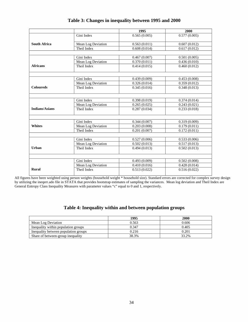
34
Table 3: Changes in inequality between 1995 and 2000
1995 2000 Gini Index 0.565 (0.005) 0.577 (0.005)
Mean Log Deviation 0.563 (0.011) 0.607 (0.012)
South Africa Theil Index 0.608 (0.014) 0.617 (0.012)
Gini Index 0.467 (0.007) 0.501 (0.005) Mean Log Deviation 0.370 (0.011) 0.436 (0.010)
Africans Theil Index 0.414 (0.015) 0.460 (0.012)
Gini Index 0.439 (0.009) 0.453 (0.008) Mean Log Deviation 0.326 (0.014) 0.359 (0.012)
Coloureds Theil Index 0.345 (0.016) 0.348 (0.013)
Gini Index 0.398 (0.019) 0.374 (0.014) Mean Log Deviation 0.265 (0.025) 0.243 (0.021)
Indians/Asians Theil Index 0.287 (0.034) 0.233 (0.018)
Gini Index 0.344 (0.007) 0.319 (0.009) Mean Log Deviation 0.203 (0.008) 0.179 (0.011)
Whites
Theil Index 0.201 (0.007) 0.172 (0.011)
Gini Index 0.527 (0.006) 0.533 (0.006) Mean Log Deviation 0.502 (0.013) 0.517 (0.013)
Urban Theil Index 0.494 (0.013) 0.502 (0.013)
Gini Index 0.493 (0.009) 0.502 (0.008) Mean Log Deviation 0.410 (0.016) 0.428 (0.014)
Rural Theil Index 0.513 (0.022) 0.516 (0.022)
All figures have been weighted using person weights (household weight * household size). Standard errors are corrected for complex survey design by utilizing the ineqerr.ado file in STATA that provides bootstrap estimates of sampling the variances. Mean log deviation and Theil Index are General Entropy Class Inequality Measures with parameter values “c” equal to 0 and 1, respectively.
Table 4: Inequality within and between population groups
1995 2000 Mean Log Deviation 0.563 0.606 Inequality within population groups 0.347 0.405 Inequality between population groups 0.216 0.201 Share of between-group inequality 38.3% 33.2%
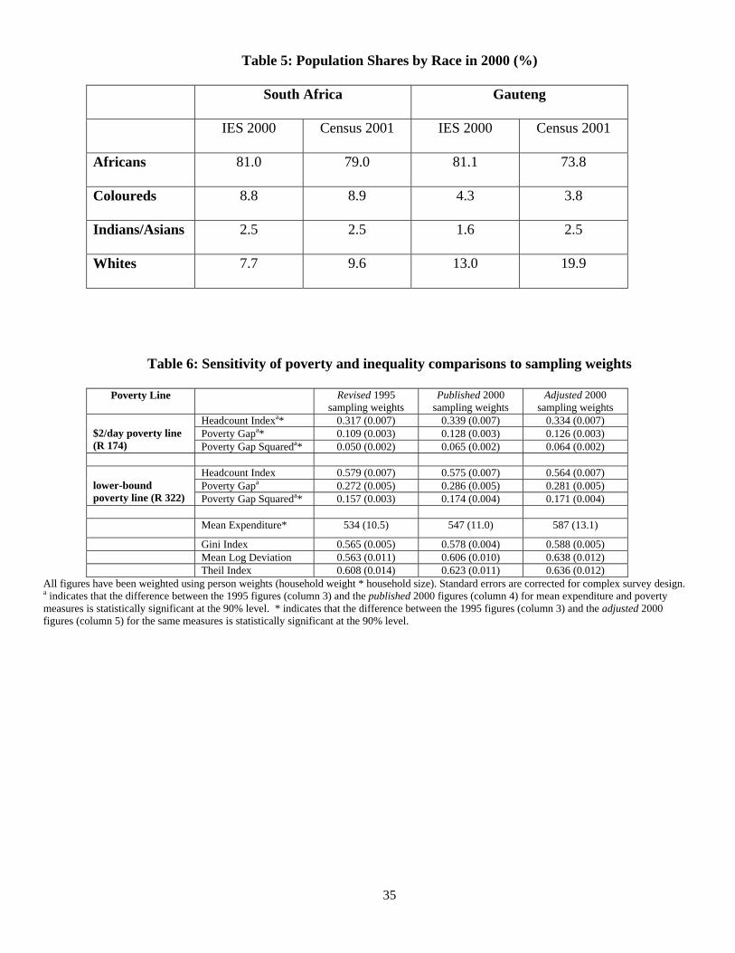
35
Table 5: Population Shares by Race in 2000 (%)
South Africa Gauteng
IES 2000 Census 2001 IES 2000 Census 2001
Africans 81.0 79.0 81.1 73.8
Coloureds 8.8 8.9 4.3 3.8
Indians/Asians 2.5 2.5 1.6 2.5
Whites 7.7 9.6 13.0 19.9
Table 6: Sensitivity of poverty and inequality comparisons to sampling weights
Poverty Line Revised 1995 sampling weights
Published 2000 sampling weights
Adjusted 2000 sampling weights
Headcount Indexa* 0.317 (0.007) 0.339 (0.007) 0.334 (0.007) Poverty Gapa* 0.109 (0.003) 0.128 (0.003) 0.126 (0.003)
$2/day poverty line (R 174) Poverty Gap Squareda* 0.050 (0.002) 0.065 (0.002) 0.064 (0.002)
Headcount Index 0.579 (0.007) 0.575 (0.007) 0.564 (0.007) Poverty Gapa 0.272 (0.005) 0.286 (0.005) 0.281 (0.005)
lower-bound poverty line (R 322) Poverty Gap Squareda* 0.157 (0.003) 0.174 (0.004) 0.171 (0.004) Mean Expenditure* 534 (10.5) 547 (11.0) 587 (13.1)
Gini Index 0.565 (0.005) 0.578 (0.004) 0.588 (0.005) Mean Log Deviation 0.563 (0.011) 0.606 (0.010) 0.638 (0.012) Theil Index 0.608 (0.014) 0.623 (0.011) 0.636 (0.012)
All figures have been weighted using person weights (household weight * household size). Standard errors are corrected for complex survey design. a indicates that the difference between the 1995 figures (column 3) and the published 2000 figures (column 4) for mean expenditure and poverty measures is statistically significant at the 90% level. * indicates that the difference between the 1995 figures (column 3) and the adjusted 2000 figures (column 5) for the same measures is statistically significant at the 90% level.
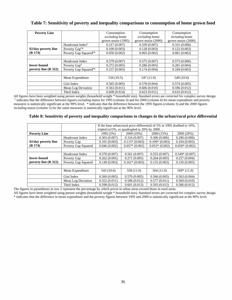
36
Table 7: Sensitivity of poverty and inequality comparisons to consumption of home grown food
Poverty Line Consumption excluding home
grown maize (1995)
Consumption excluding home
grown maize (2000)
Consumption including home
grown maize (2000) Headcount Indexa 0.317 (0.007) 0.339 (0.007) 0.331 (0.006) Poverty Gapa* 0.109 (0.003) 0.128 (0.003) 0.122 (0.003)
$2/day poverty line (R 174) Poverty Gap Squareda* 0.050 (0.002) 0.065 (0.002) 0.061 (0.002)
Headcount Index 0.579 (0.007) 0.575 (0.007) 0.573 (0.006) Poverty Gapa 0.272 (0.005) 0.286 (0.005) 0.281 (0.004)
lower-bound poverty line (R 322) Poverty Gap Squareda* 0.157 (0.003) 0.174 (0.004) 0.169 (0.003) Mean Expenditure 534 (10.5) 547 (11.0) 549 (10.6)
Gini Index 0.565 (0.005) 0.578 (0.004) 0.574 (0.005) Mean Log Deviation 0.563 (0.011) 0.606 (0.010) 0.596 (0.012) Theil Index 0.608 (0.014) 0.623 (0.011) 0.610 (0.012)
All figures have been weighted using person weights (household weight * household size). Standard errors are corrected for complex survey design. a indicates that the difference between figures excluding maize for 1995 (column 3) and for 2000 (column 4) for mean expenditure and poverty measures is statistically significant at the 90% level. * indicates that the difference between the 1995 figures (column 3) and the 2000 figures including maize (column 5) for the same measures is statistically significant at the 90% level.
Table 8: Sensitivity of poverty and inequality comparisons to changes in the urban/rural price differential
If the base urban/rural price differential of 5% in 1995 doubled to 10%, tripled to15%, or quadrupled to 20% by 2000…
Poverty Line 1995 (5%) 2000 (10%) 2000 (15%) 2000 (20%) Headcount Index 0.303 (0.007) 0.316 (0.007) 0.306 (0.006) 0.296 (0.006) Poverty Gap 0.101 (0.003) 0.115* (0.003) 0.109* (0.003) 0.104 (0.003)
$2/day poverty line (R 174) Poverty Gap Squared 0.046 (0.002) 0.057* (0.002) 0.053* (0.002) 0.050* (0.002)
Headcount Index 0.570 (0.007) 0.561 (0.007) 0.555 (0.007) 0.549* (0.007) Poverty Gap 0.262 (0.005) 0.271 (0.005) 0.264 (0.005) 0.257 (0.004)
lower-bound poverty line (R 322) Poverty Gap Squared 0.149 (0.003) 0.161* (0.003) 0.155 (0.003) 0.150 (0.003) Mean Expenditure 543 (10.6) 558 (11.0) 564 (11.0) 569* (11.0)
Gini Index 0.560 (0.005) 0.570 (0.005) 0.566 (0.005) 0.563 (0.004) Mean Log Deviation 0.552 (0.011) 0.586 (0.012) 0.577 (0.011) 0.569 (0.010) Theil Index 0.598 (0.012) 0.601 (0.013) 0.593 (0.012) 0.586 (0.012)
The figures in parantheses in row 2 represent the percentage by which prices in urban areas exceed those in rural areas. All figures have been weighted using person weights (household weight * household size). Standard errors are corrected for complex survey design. * indicates that the difference in mean expenditure and the poverty figures between 1995 and 2000 is statistically significant at the 90% level.
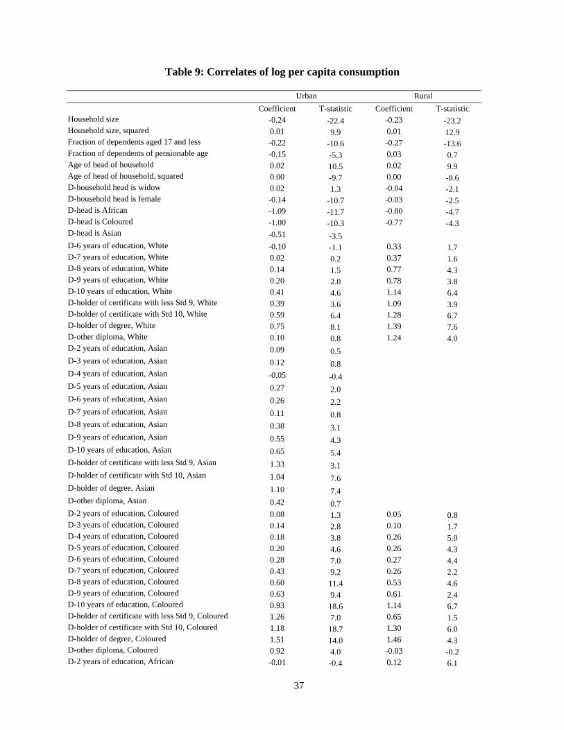
37
Table 9: Correlates of log per capita consumption
Urban Rural Coefficient T-statistic Coefficient T-statistic Household size -0.24 -22.4 -0.23 -23.2 Household size, squared 0.01 9.9 0.01 12.9 Fraction of dependents aged 17 and less -0.22 -10.6 -0.27 -13.6 Fraction of dependents of pensionable age -0.15 -5.3 0.03 0.7 Age of head of household 0.02 10.5 0.02 9.9 Age of head of household, squared 0.00 -9.7 0.00 -8.6 D-household head is widow 0.02 1.3 -0.04 -2.1 D-household head is female -0.14 -10.7 -0.03 -2.5 D-head is African -1.09 -11.7 -0.80 -4.7 D-head is Coloured -1.00 -10.3 -0.77 -4.3 D-head is Asian -0.51 -3.5 D-6 years of education, White -0.10 -1.1 0.33 1.7 D-7 years of education, White 0.02 0.2 0.37 1.6 D-8 years of education, White 0.14 1.5 0.77 4.3 D-9 years of education, White 0.20 2.0 0.78 3.8 D-10 years of education, White 0.41 4.6 1.14 6.4 D-holder of certificate with less Std 9, White 0.39 3.6 1.09 3.9 D-holder of certificate with Std 10, White 0.59 6.4 1.28 6.7 D-holder of degree, White 0.75 8.1 1.39 7.6 D-other diploma, White 0.10 0.8 1.24 4.0 D-2 years of education, Asian 0.09 0.5 D-3 years of education, Asian 0.12 0.8 D-4 years of education, Asian -0.05 -0.4 D-5 years of education, Asian 0.27 2.0 D-6 years of education, Asian 0.26 2.2 D-7 years of education, Asian 0.11 0.8 D-8 years of education, Asian 0.38 3.1 D-9 years of education, Asian 0.55 4.3 D-10 years of education, Asian 0.65 5.4 D-holder of certificate with less Std 9, Asian 1.33 3.1 D-holder of certificate with Std 10, Asian 1.04 7.6 D-holder of degree, Asian 1.10 7.4 D-other diploma, Asian 0.42 0.7 D-2 years of education, Coloured 0.08 1.3 0.05 0.8 D-3 years of education, Coloured 0.14 2.8 0.10 1.7 D-4 years of education, Coloured 0.18 3.8 0.26 5.0 D-5 years of education, Coloured 0.20 4.6 0.26 4.3 D-6 years of education, Coloured 0.28 7.0 0.27 4.4 D-7 years of education, Coloured 0.43 9.2 0.26 2.2 D-8 years of education, Coloured 0.60 11.4 0.53 4.6 D-9 years of education, Coloured 0.63 9.4 0.61 2.4 D-10 years of education, Coloured 0.93 18.6 1.14 6.7 D-holder of certificate with less Std 9, Coloured 1.26 7.0 0.65 1.5 D-holder of certificate with Std 10, Coloured 1.18 18.7 1.30 6.0 D-holder of degree, Coloured 1.51 14.0 1.46 4.3 D-other diploma, Coloured 0.92 4.0 -0.03 -0.2 D-2 years of education, African -0.01 -0.4 0.12 6.1
38
Urban Rural Coefficient T-statistic Coefficient T-statistic D-3 years of education, African 0.04 1.0 0.08 4.1 D-4 years of education, African 0.13 4.0 0.14 6.9 D-5 years of education, African 0.12 4.2 0.22 10.9 D-6 years of education, African 0.24 8.9 0.30 14.2 D-7 years of education, African 0.27 8.2 0.39 13.2 D-8 years of education, African 0.40 12.0 0.42 14.0 D-9 years of education, African 0.42 11.2 0.54 13.6 D-10 years of education, African 0.69 21.4 0.74 19.0 D-holder of certificate with less Std 9, African 0.78 9.3 0.78 10.3 D-holder of certificate with Std 10, African 1.06 24.5 1.24 22.3 D-holder of degree, African 1.18 19.7 1.41 11.6 D-other diploma, African 0.21 2.7 0.35 4.6
Interaction terms with D-2000 Household size 0.01 1.1 -0.05 -3.5 Household size, squared 0.00 -0.7 0.00 2.1 Fraction of dependents aged 17 and less -0.10 -3.3 -0.09 -3.0 Fraction of dependents of pensionable age -0.02 -0.4 -0.09 -1.7 Age of head of household 0.00 -0.8 -0.01 -1.8 Age of head of household, squared 0.00 1.9 0.00 2.7 D-household head is widow 0.00 0.0 -0.02 -0.7 D-household head is female -0.03 -1.4 -0.08 -4.3 D-head is African -0.16 -1.0 -0.37 -1.1 D-head is Coloured 0.02 0.1 -0.16 -0.5 D-head is Asian 0.07 0.3 D-6 years of education, White 0.06 0.4 -0.30 -0.8 D-7 years of education, White 0.04 0.2 -0.23 -0.5 D-8 years of education, White 0.00 0.0 -0.11 -0.3 D-9 years of education, White 0.14 0.8 -0.70 -1.4 D-10 years of education, White 0.08 0.5 -0.27 -0.8 D-holder of certificate with less Std 9, White 0.15 0.8 0.03 0.1 D-holder of certificate with Std 10, White 0.06 0.4 -0.43 -1.2 D-holder of degree, White 0.00 0.0 -0.20 -0.6 D-other diploma, White 0.73 3.9 -0.07 -0.2 D-2 years of education, Asian 0.24 1.1 D-3 years of education, Asian -0.20 -0.9 D-4 years of education, Asian 0.03 0.2 D-5 years of education, Asian -0.37 -1.9 D-6 years of education, Asian -0.10 -0.6 D-7 years of education, Asian -0.04 -0.2 D-8 years of education, Asian 0.07 0.4 D-9 years of education, Asian -0.03 -0.2 D-10 years of education, Asian -0.07 -0.5 D-holder of certificate with less Std 9, Asian -0.49 -1.1 D-holder of certificate with Std 10, Asian -0.13 -0.7 D-holder of degree, Asian 0.00 0.0 D-other diploma, Asian 0.41 0.6 D-2 years of education, Coloured 0.06 0.7 -0.11 -1.1 D-3 years of education, Coloured 0.02 0.2 0.06 0.7 D-4 years of education, Coloured -0.08 -1.1 -0.13 -1.7 D-5 years of education, Coloured 0.03 0.5 -0.12 -1.3 D-6 years of education, Coloured 0.06 1.0 0.04 0.5 D-7 years of education, Coloured 0.10 1.4 0.10 0.8
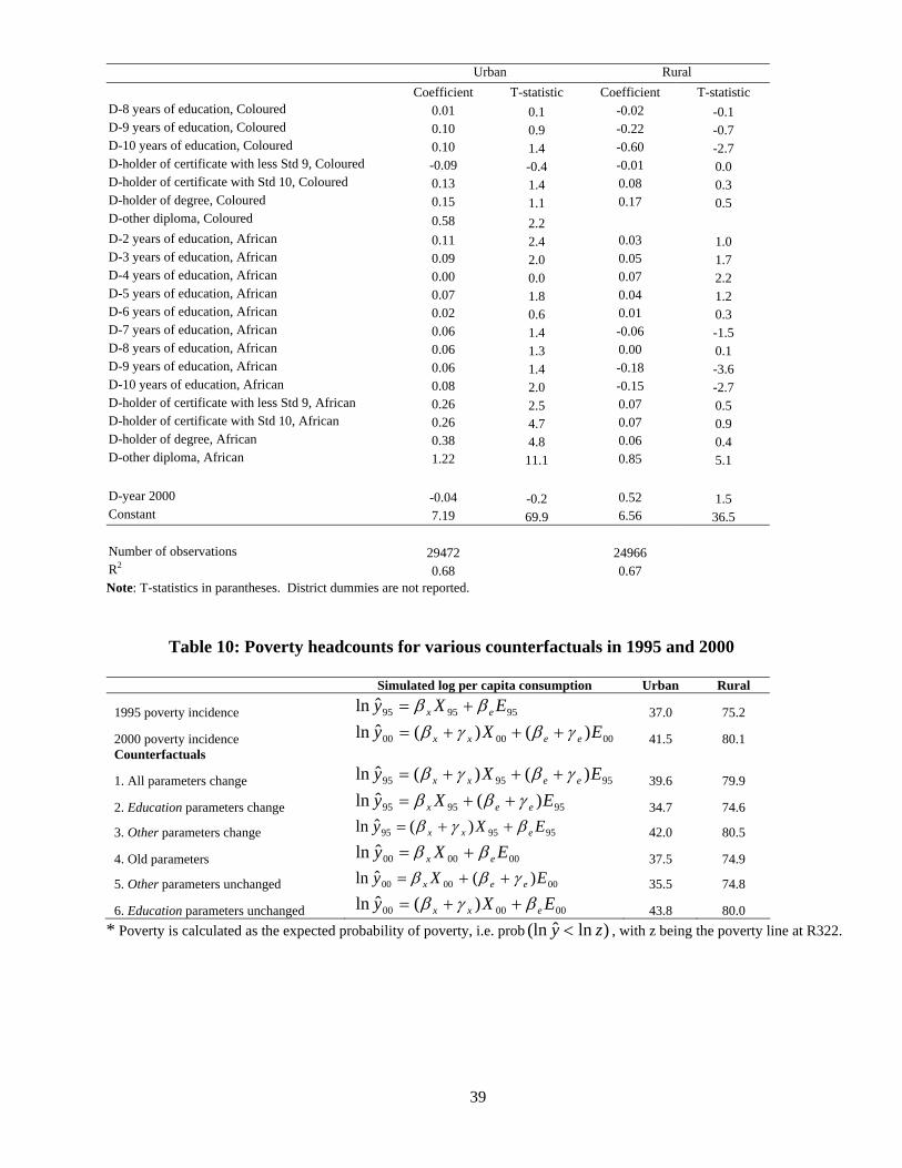
39
Urban Rural Coefficient T-statistic Coefficient T-statistic D-8 years of education, Coloured 0.01 0.1 -0.02 -0.1 D-9 years of education, Coloured 0.10 0.9 -0.22 -0.7 D-10 years of education, Coloured 0.10 1.4 -0.60 -2.7 D-holder of certificate with less Std 9, Coloured -0.09 -0.4 -0.01 0.0 D-holder of certificate with Std 10, Coloured 0.13 1.4 0.08 0.3 D-holder of degree, Coloured 0.15 1.1 0.17 0.5 D-other diploma, Coloured 0.58 2.2 D-2 years of education, African 0.11 2.4 0.03 1.0 D-3 years of education, African 0.09 2.0 0.05 1.7 D-4 years of education, African 0.00 0.0 0.07 2.2 D-5 years of education, African 0.07 1.8 0.04 1.2 D-6 years of education, African 0.02 0.6 0.01 0.3 D-7 years of education, African 0.06 1.4 -0.06 -1.5 D-8 years of education, African 0.06 1.3 0.00 0.1 D-9 years of education, African 0.06 1.4 -0.18 -3.6 D-10 years of education, African 0.08 2.0 -0.15 -2.7 D-holder of certificate with less Std 9, African 0.26 2.5 0.07 0.5 D-holder of certificate with Std 10, African 0.26 4.7 0.07 0.9 D-holder of degree, African 0.38 4.8 0.06 0.4 D-other diploma, African 1.22 11.1 0.85 5.1 D-year 2000 -0.04 -0.2 0.52 1.5 Constant 7.19 69.9 6.56 36.5 Number of observations 29472 24966 R2 0.68 0.67 Note: T-statistics in parantheses. District dummies are not reported.
Table 10: Poverty headcounts for various counterfactuals in 1995 and 2000
Simulated log per capita consumption Urban Rural
1995 poverty incidence 959595ˆln EXy ex ββ += 37.0 75.2
2000 poverty incidence 000000 )()(ˆln EXy eexx γβγβ +++= 41.5 80.1 Counterfactuals
1. All parameters change 959595 )()(ˆln EXy eexx γβγβ +++= 39.6 79.9
2. Education parameters change 959595 )(ˆln EXy eex γββ ++= 34.7 74.6
3. Other parameters change 959595 )(ˆln EXy exx βγβ ++= 42.0 80.5
4. Old parameters 000000ˆln EXy ex ββ += 37.5 74.9
5. Other parameters unchanged 000000 )(ˆln EXy eex γββ ++= 35.5 74.8
6. Education parameters unchanged 000000 )(ˆln EXy exx βγβ ++= 43.8 80.0 * Poverty is calculated as the expected probability of poverty, i.e. prob )lnˆ(ln zy < , with z being the poverty line at R322.

40
Appendix 1: Poverty Simulations
To calculate poverty incidence from the regressions we allow for the fact that even if
predicted per capita consumption, iy , exceeds the poverty line, z, there is a non-zero probability
that the household is in fact poor. Hence we derive a household’s probability of being poor, and
calculate the incidence of poverty as the mean of the household-specific probabilities (see
Ravallion and Wodon (1999), Hentschel et al. (2000) and Datt and Joliffe (2001)).
Using the model’s parameters the expected probability of being poor Pi for each
household i, can be written as:
(A1) )lnˆ(ln)ˆ,ˆ,ˆ,ˆ,|( zyprobXPE idii <=σνγβ
where σ indicates the predicted standard error of the regression. Assuming normally distributed
errors, the expected probability Pi is non-zero for every household and given by:
(A2) =)ˆ,ˆ,ˆ,ˆ,|( σνγβ dii XPE
⎥⎥⎦
⎤
⎢⎢⎣
⎡ ++−Φ=<++
σνγβ
νγβˆ
)ˆˆˆ(ln)lnˆˆˆ( dii
diiXXz
ztXXprob
with Φ indicating the cumulative standard normal distribution. The predicted incidence of
poverty P* for a group of households i with observable characteristics Xi and households weights
wi is then:
(A3) ∑
∑
=
== N
ii
N
iiii
w
XPEwP
1
1*)ˆ,ˆ,ˆ,|( σγβ
.
DAVIDSON INSTITUTE WORKING PAPER SERIES - Most Recent Papers The entire Working Paper Series may be downloaded free of charge at: www.wdi.bus.umich.edu
CURRENT AS OF 1/18/05 Publication Authors Date No. 739: Not Separate, Not Equal: Poverty and Inequality in Post-Apartheid South Africa
Johannes G. Hoogeveen and Berk Özler
Jan 2005
No. 738: The Marketing Structure in Agribusiness during the Transition in Bulgaria
Steve Murray, Yordan Staykov, and Valentin Katzerov
Jan. 2005
No. 737: Passive Creditors Koen Schoors and Konstantin Sonin
Jan. 2005
No. 736: From a currency board to the euro: Public attitudes toward unilateral euroization in Bulgaria
Neven T. Valev Jan. 2005
No. 735: Dictators and Their Viziers: Agency Problems in Dictatorships Georgy Egorov and Konstantin Sonin
Jan. 2005
No. 734: Foreign Investment, Corporate Ownership, and Development: Are Firms in Emerging Markets Catching Up to the World Standard?
Klara Sabirianova, Jan Svejnar, and Katherine Terrell
Jan. 2005
No. 733: Businessman Candidates: Special-Interest Politics in Weakly Institutionalized Environments
Scott Gehlbach and Konstantin Sonin
Dec. 2004
No. 732: Measuring the Institutional Change of the Monetary Regime in a Political Economy Perspective
Nikolay Nenovsky and Yorgos Rizopoulos
Dec. 2004
No. 731: Impact of Regulated Price Adjustments on Price Variability in a Very Low Inflation Transition Economy: Case of Armenia
Aghassi Mkrtchyan
Nov. 2004
No. 730: Reform, FDI and Economic Growth: Tale of the Tortoise and the Hare
Bruno Merlevede and Koen Schoors
Nov. 2004
No. 729: The Effects of Transition and Political Instability On Foreign Direct Investment Inflows: Central Europe and the Balkans
Josef C. Brada, Ali M. Kutan, and Taner M. Yigit
Nov. 2004
No. 728: Institutional Distance and International Business Strategies in Emerging Economies
Delia Ionascu, Klaus E. Meyer, and Saul Erstin
Nov. 2004
No. 727: Explaining Patterns of Corruption in the Russian Regions Phyllis Dininio and Robert W. Orttung
Nov. 2004
No. 726: The Politics of Institutional Learning and Creation: Bank Crises and Supervision in East Central Europe
Gerald A. McDermott Nov. 2004
No. 725: International Business and Development Economics: A Winning Combination
Tamir Agmon Nov. 2004
No. 724: Importing High-Risk Capital and Revealing Hidden Comparative Advantages
Tamir Agmon Oct. 2004
No. 723: Which entrepreneurs expect to expand their businesses? Evidence from survey data in Lithuania
Ruta Aidis and Tomasz Mickiewicz
Oct. 2004
No. 722: Russia from Bust to Boom: Oil, Politics or the Ruble? Bruno Merlevede and Koen Schoors
Oct. 2004
No. 721: Distance to the Efficiency Frontier and FDI Spillovers Klara Sabirianova Peter, Jan Svejnar, and Katherine Terrell
Sept. 2004
No. 720: An Analysis of Gender Wage Differentials in Russia from 1996-2002
Rita Hansberry Sept. 2004
No. 719: Returns to Schooling in Russia and Ukraine: A Semiparametric Approach to Cross-Country Comparative Analysis
Klara Sabirianova Peter and Yuriy Gorodnichenko
Sept 2004
No. 718: The emergence of large shareholders in mass privatized firms: Evidence from Poland and the Czech Republic
Irena Grosfeld and Iraj Hashi Aug. 2004
No. 717: Wage Determination Under Communism and In Transition: Evidence from Central Europe
Swati Basu, Saul Estrin and Jan Svejnar
Aug. 2004
No. 716: The Evolution of Cross-Region Price Distribution in Russia Konstantin Gluschenko July 2004 No. 715: Languages in the European Union: The Quest for Equality and its Cost
Jan Fidrmuc and Victor Ginsburgh
July 2004
No. 714: Voice of the Diaspora: An Analysis of Migrant Voting Behavior
Jan Fidrmuc and Orla Doyle July 2004
No. 713: International Coercion, Emulation and Policy Diffusion: Market-Oriented Infrastructure Reforms, 1977-1999
Witold J. Henisz and Bennet A. Zelner and Mauro F. Guillen
July 2004
Copyright © 2022 FDOKUMEN