Modern American Art in the Collection of John and Joanne ...
101
Bryn Mawr College Bryn Mawr College Scholarship, Research, and Creative Work at Bryn Mawr College Scholarship, Research, and Creative Work at Bryn Mawr College Books, pamphlets, catalogues, and scrapbooks Bryn Mawr College Publications, Special Collections, Digitized Books 2014 A Century of Self-Expression: Modern American Art in the A Century of Self-Expression: Modern American Art in the Collection of John and Joanne Payson Collection of John and Joanne Payson Students of Exhibiting Modern Art 360 2013-2014 Laurette McCarthy Bryn Mawr College John Payson Joanne Payson Brian Wallace Bryn Mawr College, [email protected] Follow this and additional works at: https://repository.brynmawr.edu/bmc_books Part of the Fine Arts Commons, and the History of Art, Architecture, and Archaeology Commons Let us know how access to this document benefits you. Custom Citation Custom Citation Laurette McCarthy, Steven Levine, John Payson, Joanne Payson, and Brian Wallace, A Century of Self- Expression: Modern American Art in the Collection of John and Joanne Payson (Bryn Mawr, PA: Bryn Mawr College, 2014). This paper is posted at Scholarship, Research, and Creative Work at Bryn Mawr College. https://repository.brynmawr.edu/bmc_books/24 For more information, please contact [email protected].
-
Upload
khangminh22 -
Category
Documents
-
view
4 -
download
0
Transcript of Modern American Art in the Collection of John and Joanne ...

Bryn Mawr College Bryn Mawr College
Scholarship, Research, and Creative Work at Bryn Mawr College Scholarship, Research, and Creative Work at Bryn Mawr College
Books, pamphlets, catalogues, and scrapbooks Bryn Mawr College Publications, Special Collections, Digitized Books
2014
A Century of Self-Expression: Modern American Art in the A Century of Self-Expression: Modern American Art in the
Collection of John and Joanne Payson Collection of John and Joanne Payson
Students of Exhibiting Modern Art 360 2013-2014
Laurette McCarthy Bryn Mawr College
John Payson
Joanne Payson
Brian Wallace Bryn Mawr College, [email protected]
Follow this and additional works at: https://repository.brynmawr.edu/bmc_books
Part of the Fine Arts Commons, and the History of Art, Architecture, and Archaeology Commons
Let us know how access to this document benefits you.
Custom Citation Custom Citation Laurette McCarthy, Steven Levine, John Payson, Joanne Payson, and Brian Wallace, A Century of Self-Expression: Modern American Art in the Collection of John and Joanne Payson (Bryn Mawr, PA: Bryn Mawr College, 2014).
This paper is posted at Scholarship, Research, and Creative Work at Bryn Mawr College. https://repository.brynmawr.edu/bmc_books/24
For more information, please contact [email protected].

1
A Century of
Self-Expression
Modern
American Art
in the Collection
of John and
Joanne Payson


A Century of
Self-Expression
Modern
American Art
in the Collection
of John and
Joanne Payson


A Century of
Self-Expression
Modern
American Art
in the Collection
of John and
Joanne Payson
February 28 –June 1, 2014Bryn Mawr College
Class of 1912 Rare Book Room Gallery
Canaday Library
O r g a n i z e d b y
Exhibiting Modern Art 3602013–14 faculty and students
E s s a y s b y
Laurette McCarthyJohn and Joanne Payson
Steven LevineBrian Wallace

Contents
The Spectacle of Modern Life Steven Z. Levine 6
Thinking with Walls and Thinking with Texts Brian Wallace 8
The Dealer and the Collector Speak John and Joanne Payson 10
From the 1913 Armory Show to the Present: A Century of Modern American Art
in the Collection of John and Joanne Payson Laurette E. McCarthy 13
A r t w o r k s
James Abbott McNeill Whistler, Venice at Sunset Sarah Bochicchio 22
Augustus Saint-Gaudens, Diana of the Tower Nava Streiter 24
Max Weber, Bathers Steven Z. Levine 26
Arthur B. Davies, Untitled (Nudes in Woods) Nava Streiter 28
Maurice Prendergast, Bathers Micaela Houtkin 30
William Glackens, Woman at a Window Mariann Smith 32
John Sloan, The Picture Buyer Wendy Chen 34
William Zorach, Landscape with Cottage by the Sea Wendy Chen 36
Rockwell Kent, Moonlit Landscape Brian Wallace 38
Isabel Bishop, Union Square during Expansion of the Fourteenth Street Subway Station Mariann Smith 40
Mabel Dwight, Life Class Jon Sweitzer-Lamme 42
Reginald Marsh, The Barker Megan Russell 44
Jo Davidson, Bust of Joan Whitney Payson Nava Streiter 46
Berenice Abbott, New York Stock Exchange Alexander Lee 48
Jack Levine, Card Game Micaela Houtkin 50
Walt Kuhn, Coney Island Steven Z. Levine 52
4

Paul Cadmus, Preliminary Study for Aspects of Suburban Life: Main Street Mariann Smith 54
Paul Cadmus, Shore Leave Megan Russell 56
Reginald Marsh, Coney Island: Girl Standing in Front of Barker and Clown Micaela Houtkin 58
Isabel Bishop, Lunch Hour Isabel Andrews 60
Walt Kuhn, The Show Is On Haley Martin 62
John Sloan, A Thirst for Art Wendy Chen 64
Paul Cadmus, To E. M. Forster Lily Lopate 66
Walt Kuhn, Clown with White Tie Haley Martin 68
Jack Levine, American in Paris Lily Lopate 70
Jacob Lawrence, Market Place No. 1 Rebekah Keel 72
Red Grooms, Metro Mombo Haley Martin 74
Louise Nevelson, Sky Garden Cryptic I Jon Sweitzer-Lamme 76
Yvonne Jacquette, A Glimpse of Lower Manhattan (Night) Isabel Andrews 78
Yvonne Jacquette, Motion Picture (Times Square) Sarah Bochicchio 80
Yvonne Jacquette, George Washington Bridge at Night Rebekah Keel 82
Paul Cadmus, Have Fun, Drive Carefully Mariann Smith 84
Paul Cadmus, Reclining Nude, NM232 Joanna Kessler 86
Jacob Lawrence, Fantasy: Stretched Limousine Alexander Lee 88
Jack Levine, Man in Red Turban (After van Eyck) Brian Wallace 90
Yvonne Jacquette, Mixed Heights (View of Southern Tip of Manhattan) Joanna Kessler 92
Checklist of the Exhibition 94
Acknowledgments 95
5

The Spectacle of Modern Life
Over the course of more than twenty-five years, Joanne and John Payson have opened their
homes in Florida, New York, and Maine to a host of Bryn Mawr events, and this exhibition
represents the culmination of that generosity. During a tour of the college’s collections,
Joanne (A.B. 1975, M.A. 2009) suggested that she and John would be pleased to loan selected works
from their personal collection to help advance Bryn Mawr’s exhibition and gallery program. The
Paysons and I had often discussed the possibility that I might organize a seminar around the paintings
in their collection, and the centennial of the 1913 International Exhibition of Modern Art in New York
City, commonly known as the Armory Show, has now provided the perfect occasion to look back at the
century of modern American art represented by the works in the Payson Collection.
Essential to the realization of our project was the support of many officers of the college, notably
Interim President Kim Cassidy, Interim Provost Mary Osirim, and Director of Library Collections Eric
Pumroy, who encouraged Brian Wallace and me to offer a fall 2013 and spring 2014 sequence of
courses in the context of our interdisciplinary 360º program. These courses would give students the
unique opportunity to undertake both historical research and its practical implementation according
to the different perspectives of the art historian and the curator. The task of teaching a course on
the Armory Show and its aftermath, writing a catalog with student curators, and installing an exhi-
bition in Canaday Library demanded a complex set of collaborations among faculty, staff, students,
and outside professional consultants on the history of art exhibitions and on the actual practice of
devising, installing, and programming an exhibition in a constrained gallery setting today. Agreeing to
be without many of their beloved works of art for many months while our students did research and
wrote catalog entries and exhibition labels about their paintings, sculptures, drawings, and prints,
the Paysons have afforded the college community a rich opportunity to delve deeply into the history
of a collection that spans more than a century of modern American art—from a pastel of the city of
Venice viewed from a boat by James Abbott McNeill Whistler around 1880 to a pastel of the city of New
York viewed by Yvonne Jacquette from an airplane in 1988. In between these terminal works of modern
self-expression unfolds a changing spectacle of architecture, technology, and social relations through
which we human beings have become the complicated urban and suburban creatures we are today. We
are immensely grateful to John and Joanne Payson for allowing us to discover ourselves in the mirror of
their art.
John Payson is a representative of one of America’s premier families in the patronage of the arts in
the later nineteenth and twentieth centuries. He is the great-grandson of John Hay (1838–1905), private
secretary of Abraham Lincoln, ambassador to Great Britain, and secretary of state under Theodore
Roosevelt; grandson of Helen Hay Whitney (1876–1944), poet, children’s book author, and Armory
Show patron; great-nephew of Gertrude Vanderbilt Whitney (1875–1942), sculptor and founder of the
Whitney Museum of American Art; nephew of John Hay Whitney (1904–1982), publisher of the New York
Herald Tribune, ambassador to Great Britain, and president of the Museum of Modern Art; and son of
6

Joan Whitney Payson (1903–1975), horse breeder, art collector, trustee of the Metropolitan Museum
of Art, and founder and owner of the New York Mets baseball team. Continuing in the steps of his
ancestors, John Whitney Payson has carried on for more than forty years his family’s long stewardship
of the arts in America. Having been associated with the Midtown Galleries in Manhattan as a subdealer
prior to purchasing the gallery in 1985, John took over the stable of artists that Mary Gruskin and her
late husband, Alan D. Gruskin, had nurtured since the founding of the gallery in 1932, including such
luminaries of modern American realism as Isabel Bishop and Paul Cadmus. John expanded the portfolio
of the gallery by acquiring the estate of Walt Kuhn, one of the primary organizers of the Armory Show,
as well as the representation of two of the most distinguished Social Realists of the Downtown Gallery,
Jack Levine and Jacob Lawrence.
Acting with John to consolidate the engagement of the gallery with the history of modern realism in
American art was his wife, Joanne D’Elia Payson. Joanne’s senior thesis in the Department of History at
Bryn Mawr College analyzed the artistic interests of John Hay, portrait subject of John Singer Sargent
in oil and of Augustus Saint-Gaudens in bronze. Her subsequent master’s thesis in the Department of
History of Art rigorously historicized her intimate involvement with the legacy of Joan Whitney Payson
on the basis of extensive research in public and private archives.
It has been for me a rare privilege to count John and Joanne Payson among my dearest friends.
Steven Z. Levine
Leslie Clark Professor in the Humanities and Professor of History of Art
7

Thinking with Walls and Thinking with Texts
Thinking with walls” and “thinking with texts”: These phrases were passed back and forth by the
faculty and students jointly organizing the exhibition documented in this catalog. They suggest
the range of approaches to theory and practice that we explored together while conducting
research into the art collection, loaned to Bryn Mawr College by John and Joanne Payson, that has
galvanized this unique course-and-exhibition project.
From the time of our initial research visits to the Paysons’ homes and through a semester of close
looking and comparative observation in seminar and collection viewing spaces and museums, we have
experienced these artworks as physical objects. We have viewed them in conjunction with a range of
print and digital reproductions, we have examined extensive related documentation, we have read his-
torical and current accounts and analyses of the works, and we have even had conversations with the
collectors, with art historians, and with other experts, but all of these encounters are, in some ways,
secondary to the extensive, even intimate, access to original artworks that has been provided to us.
The exhibition selected from the Payson Collection represents one result of this sustained contact.
Several different organizing ideas were generated out of hours of group interactions with the art-
works: Observing proper procedures (and training our students as we worked), faculty, staff, and
students moved works around our seminar/collection space, placing works next to—or across from, or
one or two or more works away from—one another. We grouped and ungrouped works; we compared
and contrasted objects by placing them in close physical proximity; we were able to test, challenge,
reformulate, and retest our ideas about the works and about the connections among them. Because of
this intensive access to this set of artworks, this group of a dozen people was able to reach consensus
on a workable, solid, evocative exhibition theme on a tight deadline.
The catalog entries in this volume represent another result of this sustained contact. Students selected
two or more artworks, examined them in group and solo sessions with faculty and collections staff, and
embarked upon a round of researching, drafting, and reviewing the short but densely packed entries
in collaboration with faculty, staff, and, in some cases, outside experts on the artist, period, subject, or
art medium at hand. Students—and others who wrote entries—had to look very, very closely at “their”
artworks because their writing depended, ultimately, on these observations. Whether developed in
response to subtleties of technique on the front of a canvas or information transcribed from a note
adhered to the back of a frame, ideas had to be generated out of and checked against what is actually
present in the objects. These ideas then had to be expressed in terms of the theories of observation and
analysis developed by scholars of art history, aesthetics, and visual culture. In producing these catalog
entries, our students connected their own thinking to—and contributed to—larger bodies of thought.
The objects at our disposal have also served to convene and shape two significant conversations. Our
interactions with Dr. Laurette McCarthy have been profoundly influenced by the intimacy with which
“
8

we have been able to discuss her research. This scholar’s writings and curatorial projects are familiar—
indeed, they are of critical importance—to our students. We have read several of McCarthy’s essays on
artists and the Armory Show and the essay in this publication; we have participated in tours of several
of the museum exhibitions that she has curated; our courses and the exhibition have been shaped
by her scholarship. However, it was the time we spent examining works from the Payson Collection
while discussing McCarthy’s ongoing research into the history of the period with her that most clearly
conveyed the combined passion and discipline that make for compelling and meaningful insights into
objects and ideas.
Too, our conversations with John and Joanne Payson about their cultural stewardship have been
informed by the opportunity we have had to constantly refer to the objects of their work. The art
collector in a democracy occupies a complicated position: Aspirations toward expertise, exclusivity,
and sophistication can run counter to narratives of self-reliance and practicality, but the Paysons’
dedication to art and artists—and to the discovery and promulgation of knowledge—as expressed by
their forthright words, as evidenced by the congenial nature of their homes, and as embodied in their
generous collection of objects, rings true.
The works from the collection that we chose to include in this exhibition, while varied in means, intent,
and impact, all offer complicated visual-narrative relationships that contain startlingly bold pictures
of what artists think about the twentieth century. Observe this period as it is represented in the works
in the exhibition and in the writing in this book: rapidly proliferating categories of knowledge and
information; capital- and resource-intensive nation-size corporations; surging and shifting populations;
accelerating rates of change in nearly every measurable category of endeavor.
Whether referring to artistic practice in 1913 or 2013, it can be said that artists just after the turn of
the new century might glorify, challenge, shy away from, and otherwise embrace or reject this new
world—they’ve been grappling with the psychological, visual, social, and economic effects of urban
industrialization from its advent—but they can’t escape it or ignore it. They are expressing those
effects in their works.
Brian Wallace
Curator and Academic Liaison for Art and Artifacts Collections
9

The Dealer and the Collector Speak: Excerpts from an Informal Classroom Conversation with John and Joanne Payson, October 7, 2013
John: You’ll notice that there are no papers in front of me because I am a combination of poor mem-
ory and lots of BS. Even though I’m not going to be selling pictures anymore, I’m going to be working on
behalf of the arts for as long as I possibly can.
When I decided to get into the arts, my mother sat me down. She said, “Johnny, I want you to prom-
ise me two things. One, I want you to promise to never take advantage of your artists and never take
advantage of your clients.” Perhaps one of the reasons I closed up shop in New York in 1995 was . . .
some of the things going on there I could not do, and I did not want to compete on that level.
Joanne: In order for them to survive because they weren’t earning money—their art wasn’t selling
quickly enough—we gave some of the artists a regular pay system. They needed money to pay for the
things they needed, and a place to sleep, so we would help subsidize their living expenses. . . . A dealer
in the twentieth century acts as a patron, as much as he or she can.
John: Being a realist dealer, I was having a great difficulty finding good, young realists. I did not want
to be just handling artists in their seventies, eighties, and nineties, even though they were key to
the success of the gallery. We needed young blood too, so I was for many years on the board of the
Skowhegan School in Maine, and they could sometimes be found there.
My mother was a woman ahead of her time. My wife has done a lot of research on her, and actually,
she used her master’s thesis to do this. My mother was the first woman ever to start her own baseball
team. She was the first woman to start her own venture capital company in 1945.
She did two things for me. When I was younger, she took me on a gallery walk in Palm Beach. We
walked down Worth Avenue, which was just full of galleries, and we walked past one of the galleries. I’d
better not mention which gallery because the guy I’m talking about is still there, still has a lawyer. But
I said, “Why aren’t we going in there, Mom?” And she said, “Johnny, never set foot in that gallery. They
sold more Utrillos than Utrillo ever dreamed of painting.” And that was a very early lesson from her.
Secondly, when I was a little bit older, she took me around our collection in our house and asked me
which of them I liked best. And when she died, those paintings were left to me in the will. And I found
out she’d done the same with my sisters—they ended up with things that they wanted. I try to operate
my life within her strictures.
Joanne: In my case, in the latter part of my collecting, I’ve looked for things that have a connection to
us or something to do with us; either they were owned by Joan Whitney Payson or her brother, John
Hay Whitney, or by Gertrude Vanderbilt Whitney. Depending on what the work is, it still has to speak to
me in some manner.
10

There are some works that I’ve never been able to acquire for some reason or another—mostly money. I have
a Max Weber—the minute I saw it, I knew I wanted it, I knew that it was connected to Prendergast, but also it
was connected to Cézanne. And I fell in love with it. It’s a beautiful painting, it’s a theme that I love, but to me
that’s a modernist feeling.
The thing you want to look at, from my perspective, would be the interaction between things that came from
Joan Whitney Payson and what you have here—even these smaller ones and how they interact with objects
that we’ve acquired—because to me they were an inspiration for those acquisitions.
John: I consider myself a dealer first, and Joanne is a collector first. Somebody asked if we ever had conflicts.
And probably the biggest conflict we would have was when we would do a show of an artist, and Jo would
take a look at a painting and say, “I really want to take it home.” And I would say, “Nu-uh. Not until the end of
the show. And then if it’s still available, we’ll do it.”
So as a dealer, sometimes you have to do things like that—you have to play a multiplayer game. That part of
it I miss—I miss that and I miss the artist studio visits. I mean, that was just like a charge—you charge your
phone battery, your car battery, and it lasts longer. That’s what it was like for me—you go into an artist’s stu-
dio and come out all charged up.
Joanne: I’m hoping that anyone who has an interest in the multigenerational collecting activities of this
family will look at this. This is an article that came out in The Magazine Antiques [October 2002], and this is the
home that Stanford White designed for John’s grandparents, the Whitneys, and you can see some of the art
that they collected with Stanford White, and it was very different from their daughter’s collecting, very dif-
ferent from the grandson’s collecting. But it’s wonderful to look at it over this great hundred-year span—from
1902 to the present. I don’t know how John feels, but I feel inspired by this because they’re not my immediate
ancestors.
John: That’s an interesting question, and I don’t know if I can answer it or not. I do feel a very personal debt
to my mother, as I mentioned earlier, and I do visit her grave every year, my parents together. And it is a
burden, and it’s also a burden that can be hard, especially with the gallery—we tried to merge it, we tried to
find a buyer for it because I hated closing up. We held on to it for a long time because I feel that that is the
legacy too.
And I think at dinner we’re going to divvy you up. Those of you more interested in history, this is the lady you
want to talk to, and if you want to hear more BS, talk to me.
11

12

Mabel Dwight
Life Class (detail)
1931
Lithograph
16 1/8” x 20 1/2”
13
From the 1913 Armory Show to the Present:
A Century of Modern American Art
in the Collection of John and Joanne Payson
L A u R E T T E E . M C C A R T h y, P h . D .
The art collection of John and Joanne Payson showcases a wide range of subjects, styles,
and media by artists who participated in the famous 1913 International Exhibition of
Modern Art, better known as the Armory Show, and by those who were born after the
show became a legend; however, like all American artists, those represented in the
Payson Collection were affected in one way or another by this groundbreaking and
divisive event in the history of American art and culture. The Armory Show, which opened at the 69th
Regiment Armory in Manhattan and traveled to the Art Institute of Chicago and the Copley Society in
Boston, has long been recognized as the first large-scale exhibition of modern art in the United States.1
Though much has been written about the show, a large portion of that existing scholarship tends to
locate modernism in the vanguard stylistic developments of the European, mainly French or Paris-
based, artists who participated in the show, and most especially in the art of Marcel Duchamp, Henri
Matisse, and Constantin Brancusi. Yet, as recent scholarship has noted, modernism can be interpreted
in many ways, and as scholar Marian Wardle observed, “Both avant-garde European art and adventur-
ous modes of realism were labeled modernist in early twentieth-century America.”2 Additionally, as art
historian Ilene Susan Fort wrote, “To be progressive definitely did not require an artist to be concerned
solely with abstraction. Modernity was not so monolithic a concept. For Americans it meant an open-
ness toward subject matter, style, cultural ideals, and personal beliefs and attitudes.”3
While the aims of the Association of American Painters and Sculptors (AAPS), the group that organized
the Armory Show, were complicated, one of the primary goals of the organizers was to create a perma-
nent annual international exhibition in which all artists had the opportunity to show their works free of
the jury and prize system of the National Academy of Design in New York and free of any restrictions
of style, subject matter, or media. Furthermore, the organizers stated, “The Association particularly
desires to encourage all art work that is produced for the pleasure that the producer finds in carrying
it out. In this way the Association feels that it may encourage non-professionals, as well as professional
artists to exhibit the result of any self-expression in any medium that may come most naturally to the
individual.”4 Unlike conservative critics, such as painter Kenyon Cox, who warned against individual-
ism in art, members of the AAPS embraced it.5 Statements such as the aforementioned suggest that
members of the AAPS and others associated with the exhibition strove to be inclusive, and within
that inclusivity, they also sought diversity not only of methods and materials but also in the ages,
gender, ethnicity, and backgrounds of the artists who participated in the Armory Show, especially in

14
the American section. For example, of the almost two hundred Americans in the show, forty-five were
women, yet only five out of the nearly one hundred Europeans were female. Many nationalities were
represented in both the European and American sections; among those from the United States were
English Americans, Italian Americans, Norwegian Americans, German Americans, Asian Americans,
Jewish Americans, and one African American artist, Frank M. Walts.
Additionally, the AAPS wrote, “In the forthcoming International Exhibition of Modern Art, the dominant
feature of the foreign exhibit is not so much its novelty as its distinct individuality of expression and
forceful manifestation of the creative power. For this reason it is held to be the more desirable that our
home exhibit be equally conspicuous in like feature. The Domestic Exhibition Committee is therefore
addressing this note to such artists upon its list of invited exhibitors as it deems most essential to have
represented, with the request that the prospective exhibitor expose works in which the personal note
is distinctly sounded.”6 Individualism was seen by the AAPS and many American artists in the early twen-
tieth century as a positive mark of modernism; however, others viewed this ideal in a less favorable
light. By looking not only at the works of art included in the 1913 Armory Show but also at the artists
themselves, one can conjecture that for members of the AAPS as well as for other American artists
who participated in the exhibition, there was a variety of definitions and understandings of modern
art, and so the organization strove to present this plurality of modern art in the final exhibition. If mod-
ern art was merely a matter of style, then many art historians have convincingly demonstrated from
the visual evidence currently available that some of the American art in the Armory Show was indeed
modern. Yet, if one reenvisions modern art to be more inclusive, then there were other paintings, sculp-
tures, and works on paper by American artists in the show that could be construed as modern without
necessarily partaking in the visually vanguard aesthetic and style of the European moderns.
Among the primary goals of mounting the Armory Show were to expand the market for contemporary
American and European art in the United States and to place New York on the world stage as a power
player in the international art scene. Much has been written about the commercial art market in the
United States in the years immediately before and after the Armory Show, particularly in New York.
Numerous scholars have discussed the role that Alfred Stieglitz’s 291 Gallery played in the promotion of
both European and American modern art before the Armory Show, and past and recent research has
furthermore noted that there were many other venues for the display and sale of modern American
art in Manhattan as well.7 After the Armory Show there was an explosion of interest in modern art
and, more especially, in the contemporary work of the European artists. This surge in interest was
demonstrated by an increased number of commercial establishments representing the Europeans,
often to the detriment of American artists, such as Arthur B. Davies and Walt Kuhn, who had organized
the show in the first place. Most of the galleries handling modern art had not dealt in it before, but
none wanted to miss the opportunity for sales generated by the newfound interest in contemporary
works. In addition, new galleries opened that focused specifically on modern art. After World War I and
through the 1920s and 1930s, many artists, both European and American, reverted to more represen-
tational styles in their art, while others remained committed to radical, modern experimentation.
When the Great Depression hit, the art market in the United States had already been shifting, and by
the early 1930s, modern European art was beginning to wane somewhat in popularity. Simultaneously,
F R O M T H E 1 9 1 3 A R M O R Y S H O W T O T H E P R E S E N T

15
there was a growing interest in American art in general and in art that was more realistic and less
abstract in style.
Collecting habits and the system of patronage and support for American art in the United States
were also changing throughout the early decades of the twentieth century, and the 1913 Armory Show
certainly made an impact in this area. Of the approximately 275 works that were sold, most were by
Europeans, but about fifty-five works were by Americans. Major collectors, such as Gertrude Vanderbilt
Whitney and Lillie Bliss, were deeply involved with the Armory Show and continued their support of
modern American and European art thereafter. These and other collectors, whom Davies and Kuhn
knew, helped establish prestigious art institutions, including the Whitney Museum of American Art and
the Museum of Modern Art. A major boost to American artists was the opening of the Whitney Museum
of American Art in New York in 1931, an institution that was focused exclusively on the art of the United
States. The Museum of Modern Art also hosted several exhibitions of American art between its found-
ing in 1929 and its Exhibition of American Painting and Sculpture, 1862–1932, held from October 31, 1932, to
January 31, 1933. This show included works ranging in date from James Abbott McNeill Whistler’s 1882
painting Portrait of the Artist’s Mother to paintings and sculptures by Walt Kuhn, Rockwell Kent, Maurice
Prendergast, John Sloan, Max Weber, Reginald Marsh, Jo Davidson, and William Zorach. Additionally,
during the 1930s, the numerous Public Works of Art Projects established under Franklin Delano Roosevelt’s
Works Progress Administration (WPA) employed thousands of American artists across the country,
including many of the artists represented in the Payson Collection. While much of the art created through
these programs was realistic, representational, and what came to be referred to as Regional or American
Scene art, there were no stylistic strictures imposed on the artists involved. All of these efforts served to
increase the appreciation of American art and artists.
Midtown Galleries was established in 1932, during the height of the Great Depression, by Alan D.
Gruskin as a venue for the display and sale of realistic or abstract American art by living artists, and
thus, its mission was similar both to the aims of the artists who organized the Armory Show in 1913
and to the ideologies behind the WPA. As Gruskin’s wife, Mary, observed, “It wasn’t the fact that they
were abstract or realistic. The fact was that they were good paintings and well organized, and rich in
color and rich in design.”8 Alan Gruskin had studied with Paul Sachs at the Fogg Art Museum at Harvard
University, and when he first arrived in New York, he worked for a dealer of Old Master paintings but
soon left to open his own establishment. “He started the gallery without a penny,” his wife recalled,
without even an actual space. Gruskin wrote, “The dark days of the early thirties had made deep
inroads in the New York galleries when Midtown Galleries opened in February 1932 to show the work
of living artists. It was admittedly a foolhardy venture in that year. . . . The optimism of youth, however,
managed to overcome hazards.”9 Eventually, with some monetary support from his family, he opened
his first gallery space at 559 Fifth Avenue at Forty-Ninth Street, where it remained for three years.10
Other homes to the gallery were 605 Madison Avenue from 1935 to 1951, 17 East Fifty-Seventh Street
from 1951 to 1962, and 11 East Fifty-Seventh Street from 1962 to 1985.
In 1985 John and Joanne Payson acquired Midtown Galleries, and they changed its name to Midtown
Payson Galleries in 1990. Although the owners may have changed, the gallery’s commitment to show-

16
casing the best of American art did not, and the Paysons continued to promote many of the same
artists that the original owners exhibited, such as Paul Cadmus and Isabel Bishop. In addition, the
Paysons acquired the estate of Walt Kuhn from the painter’s daughter as well as the representation of
distinguished Downtown Gallery artists Jack Levine and Jacob Lawrence.
Starting in the 1970s, John Payson did business with Mary Gruskin in his capacity as a subdealer for a
number of the artists in the Midtown lineup. Among them was the landscape painter William Thon,
whom Alan Gruskin wanted “to join his group and give him exclusive rights to everything,” which was
not unusual for the time. Thon spoke fondly of Gruskin, recalling that he was “very sincere, quiet,
self-contained, sympathetic, reticent. . . . He was kind of a father figure. You could depend on him. He
would give good advice, it was very sound, never overstepping any borders. He was a wonderful, love-
able man whose entire interest was in American art . . . he was completely involved in American paint-
ing and furthering it every chance he could get.”11 Thon recalled that at their first meeting at his studio
Gruskin brought a contract, the terms of which included a 40 percent commission to the dealer—a bit
higher than that of other dealers—that would include such services as advertising and mounting exhi-
bitions. Exhibitions are the lifeblood of any gallery, and from the start the Midtown Galleries arranged
an impressive array of solo and group shows. In the first years of the gallery’s existence it functioned as
a cooperative, with each artist paying five dollars a month for an opportunity to show his or her work,
but as the decade continued and economic times improved, the gallery began to function more pro-
fessionally and to grow a stable of artists who often remained with the gallery for their entire careers.
Gruskin wanted to give American artists whom he felt had remained true and connected to a personal
and progressive representation of modern life a place to show and sell their art.
“To bring art to the average public who weren’t too familiar with American art,” to promote art by
living American artists, and to educate the American people and foster in them a better understanding
of the art of the day were the main aims behind the founding of the Midtown Galleries—goals almost
identical to those of the organizers of the Armory Show.12 To reach beyond the narrow ribbon of the
East Coast and the confines of the gallery walls for that matter and to democratize and decentralize
art were powerful and potent ideas that stemmed, in large measure, from the 1913 Armory Show. The
founders of the AAPS and Gruskin shared the belief that it is only in seeing art firsthand and repeat-
edly that people can develop their eye and make informed decisions about art. Gruskin was very
innovative in his approaches to connect with new and wider audiences. For example, the gallery “used
the medium of radio to advantage. On a program entitled ‘Art Appreciation For All,’ presented over a
National Broadcasting Company network, leaders in the art world were interviewed. Round-table dis-
cussions by artists were an interesting feature of the series. Prize awards were announced, the opening
of national exhibitions presented, and discussions of current shows were heard over these broadcasts.
. . . A Sunday-afternoon series of broadcasts on famous paintings called ‘The Story Behind the Picture’
[written by Gruskin] in 1935 for Station WOR, drew thousands of requests for copies of the broadcast.”13
Like the founders of the AAPS, Gruskin envisioned exhibitions of contemporary and historic American
and sometimes European art that would tour the United States, yet unlike his predecessors, he suc-
ceeded in mounting these annual traveling shows regularly, beginning around 1935. The biggest, most
F R O M T H E 1 9 1 3 A R M O R Y S H O W T O T H E P R E S E N T

17
successful, and most widely reviewed of these shows was The Central Illinois Art Exposition, held at what
is now the Bloomington Center for the Performing Arts from March 19 through April 8, 1939. Much like
the aims of the organizers of the Armory Show, one of the primary goals of this exhibition was to bring
great art to the average American.14 Hailed by Time magazine as “the biggest and best exhibition of fine
paintings ever held in a U.S. city of that size,” the show was curated by Gruskin, who chose Old Masters,
such as El Greco and Rembrandt, as well as more modern painters, such as Gauguin, Manet, and
Renoir.15 Additionally, there was a section of historic American art, including works by George Inness,
Winslow Homer, and Thomas Eakins. Finally, there was what Gruskin referred to as the “Contemporary
Group.” This group consisted of several artists whose works were included in the 1913 Armory Show as
well as some who are also represented in the Payson Collection, such as John Sloan, Isabel Bishop, Paul
Cadmus, and Reginald Marsh.
The works of art in the current exhibition from the Payson Collection not only reflect the ideals behind
the founding of the Midtown Galleries and its successor, the Midtown Payson Galleries, but also revel
in the spirit behind the original 1913 Armory Show. The collection comprises paintings, sculptures, and
works on paper that range in date from a pastel by James Abbott McNeill Whistler to a pastel by con-
temporary artist Yvonne Jacquette, spanning one hundred years from the birth of the former in 1834 to
that of the latter in 1934 and encompassing the last century from the Armory Show to the present. As
with the 1913 Armory Show, there is diversity of subject and media in the Payson Collection, and there
is also a strong representation of women artists. Early-American modernists whose work appears in
the collection are Arthur B. Davies, Maurice Prendergast, Rockwell Kent, Max Weber, and Walt Kuhn.
Philadelphians William J. Glackens and John Sloan, two of the more realist painters of modern life in
the early twentieth century, are also represented. There is great depth in the Payson Collection, as
there was in the Midtown Galleries, in American art of the 1930s and 1940s, with wonderful examples
by such icons as Berenice Abbott, Isabel Bishop, Mabel Dwight, Jack Levine, and Reginald Marsh. In
addition, what has been called the Magic Realism of Paul Cadmus is well represented in the collection.
Building on the luminaries of American art whose work was shown at Midtown Galleries, the Midtown
Payson Galleries expanded beyond the first half of the twentieth century to include works from the
1950s as well as more contemporary paintings, prints, and sculpture by artists such as Mary Frank, Abby
Shahn, and Cynthia Knott.
Most of the art in the current exhibition is both representational and modern in style, with recogniz-
able subject matter derived from traditional Western art history’s emphasis on the human figure—its
physical form, its experiences and interactions with others, and its relation to the world around it,
whether the natural or the built environment. Virtually all American artists in the first half of the
twentieth century, including those who participated in the 1913 Armory Show, those represented by
Midtown Galleries, and those in the Payson Collection, dealt with these themes. Additionally, the
majority of American artists represented here attended formal art schools or academies either at
home, mainly in the New York area, or in Europe, where studying the nude human form was an essen-
tial part of the curriculum. The nude, particularly the female figure, has been a dominant theme in
Western art from its beginning, enduring throughout the twentieth century and into the twenty-first
as well; however, how that form was depicted has varied greatly. One of the foundations of the aca-

18
demic system of art education was, and continues to be, the life class, where students draw the nude
figure as accurately as possible from the live model, as depicted in Mabel Dwight’s 1931 print of the
same name, Life Class. We also see the academic tradition of drawing from the live male model in Paul
Cadmus’s Reclining Nude of 1991.
Several artists in this exhibition were instructors and/or pupils at the legendary Art Students League
(ASL) of New York, including John Sloan, Max Weber, Isabel Bishop, and Louise Nevelson, and those of
the Armory Show generation mentored those who followed in their footsteps.16 Sloan was among the
most renowned teachers of his day at the ASL. A founding member of the AAPS, the group that orga-
nized the 1913 Armory Show, Sloan was a highly regarded printmaker as well as a well-known painter,
and several of his etchings, including The Picture Buyer of 1911, were in the Armory Show. In The Picture
Buyer and A Thirst for Art from 1939, Sloan portrayed the market side of the art world. The Picture Buyer
depicts renowned American art dealer William Macbeth’s gallery, and as Sloan observed of this print:
“William Macbeth hopes to make a sale. Casual visitors to his gallery tiptoe about, awed by the pres-
ence of purchasing power.”17 The depiction of the distinguished older gentleman seated before the
easel, perhaps the financier J. Pierpont Morgan, who appears to being giving serious attention to the
work of art before him, is quite different in tone from the portrayal of the bevy of well-dressed women
in his print A Thirst for Art. There, the women are more focused, as the artist notes, on the cocktail
glasses in their hands than on the paintings hanging askew on the walls behind them. Although an art
gallery is the setting in A Thirst for Art, Sloan noted: “Enthusiasm resulting from the lifting of prohibition
prevails over interest in Art.”18 Sloan used the human figure as a foil to comment on the affected airs
and attitudes sometimes found in the seemingly rarefied art world of New York.
The study of past masters, whether the Old Masters of centuries ago or the more recent modern
masters of the late nineteenth and early twentieth centuries, played a crucial role in the development
of many American artists’ oeuvres, including those in the Payson Collection. From the 1900s through
the 1940s, numerous American artists were greatly impacted by the figurative traditions of French
masters, and we can see the influence of Post-Impressionist painters, such as Édouard Vuillard, Pierre
Bonnard, Pierre-Auguste Renoir, and Paul Cézanne, in several of the works in the Payson Collection. For
example, the patterns, textures, and domestic setting of Armory Show organizer William Glackens’s
pastel Woman at a Window are quite reminiscent of those in the works of the Parisian painters known as
the Nabis, which included Édouard Vuillard, whose prints were on view in and popularly collected from
the 1913 Armory Show.19 The simplification of forms and emphasis on geometric shapes in both Maurice
Prendergast’s and Max Weber’s paintings entitled Bathers were undoubtedly inspired by Cézanne’s and
Renoir’s scenes of bathers and other female nudes in the landscape, although Weber includes archi-
tectural features in his work. In a different but nonetheless related way, the somewhat abstracted and
ethereal forms of the nude women in Arthur B. Davies’s Untitled (Nudes in Woods) of around 1910 reflect
Cézanne’s art as well as that of French artist Pierre Puvis de Chavannes, who was represented in the
1913 Armory Show. Rockwell Kent’s evocative Moonlit Landscape of 1926 also seems to allude to paintings
of male bathers by Cézanne. Jack Levine, known for his satirical depictions of modern life, was surely
influenced by Cézanne’s famous paintings of card players from the 1890s when he painted his own
Depression-era version of the subject around 1935.
F R O M T H E 1 9 1 3 A R M O R Y S H O W T O T H E P R E S E N T

19
The modern and contemporary world and the daily events, rituals, pastimes, and spectacles of
urban and suburban life proved inspiring subjects for many painters and printmakers represented by
Midtown Galleries and in the Payson Collection. Isabel Bishop came to the Midtown Galleries quite
early in her career and remained with the gallery for the rest of her life. There are numerous works by
her in the Payson Collection, principal among them Lunch Hour of 1939, one of the artist’s most impres-
sive paintings, showing modern women office workers quietly enjoying ice cream cones during their
lunch break.
The depiction of the leisure activities of average Americans had been common in art since the nine-
teenth century, and such themes continued to appeal to artists throughout the first half of the
twentieth century. Coney Island, on the south shore of the western end of Long Island, was a resort
destination for New Yorkers for generations, yet with the advent of the electrified steam railroads con-
necting Brooklyn to Manhattan via the Brooklyn Bridge in the early twentieth century, it rapidly became
accessible to urban dwellers hoping to escape the often oppressive heat of the city pavement and
crowded tenements. While open air and ocean breezes were a big draw, the boardwalk and amusement
parks were equally important attractions. Reginald Marsh was one of the best-known painters of the
Coney Island scene, and his etching The Barker of 1931 and later painting of a similar subject are prime
examples of his work. Both of these images focus not on the beach, but on the performers and specta-
tors alike who have flocked to see and be seen and experience the spectacle that was the boardwalk.
In sharp contrast are two paintings by Walt Kuhn. Coney Island, 1934, shows the unpopulated side of the
resort town; just the tops of the tents are in view, with their flags waving above the seemingly quiet
and calm beach, while Clown with White Tie, 1946, is removed from the trappings of the theater, and the
clown’s performance appears detached and somewhat melancholy.
Many of the artists who came of age during the years after the 1913 Armory Show worked under
the Public Works of Art Project, which was organized under Franklin Delano Roosevelt’s presidency
to aid American artists during the depths of the Great Depression. Among those in the present
exhibition who partook of many of its programs were Paul Cadmus, Berenice Abbott, Isabel Bishop,
Mabel Dwight, Jack Levine, Reginald Marsh, Jacob Lawrence, and Louise Nevelson. In 1936 Cadmus
was commissioned to execute a series of mural paintings for the Port Washington post office in Long
Island, New York, and he chose Aspects of Suburban Life as his theme; however, the sarcastic tone of his
paintings, which included Main Street, was deemed objectionable and the murals were never exe-
cuted. Instead, the Treasury Relief Art Project accepted easel-sized versions of his pictures, of which
the Payson oil and tempera sketch Aspects of Suburban Life: Main Street served as a preliminary study.20
Shortly after this controversy, Cadmus had his first solo show at the Midtown Galleries and was repre-
sented by the Gruskins and the Paysons for decades.
While many of the works in the Payson Collection are figurative, several focus on natural and built
environments; some have overt references to the presence of people, and others contain only hints of
human habitation. In Whistler’s Venice at Sunset, the tiny outline of the watery city is seen in the distant
horizon, while small ships in the foreground seem to be guided by human hands, but it is the water,
sun, and atmosphere that are the real subjects of the painting. While no humans can be seen in William

20
Zorach’s Landscape with Cottage by the Sea, 1916, the sails are hoisted in the boat in the harbor and the
neatly tended house reveals someone’s care. By contrast, the edifices, streets, trucks, cars, limousines,
and subways of Manhattan’s built environment are the primary protagonists in works such as Berenice
Abbott’s New York Stock Exchange, Jacob Lawrence’s Fantasy: Stretched Limousine, and Yvonne Jacquette’s A
Glimpse of Lower Manhattan (Night). Even Louise Nevelson’s black wooden box entitled Sky Garden Cryptic I
alludes to the building materials of the modern metropolis.
Most of the artists who were associated with Midtown Galleries at its humble beginnings in the 1930s
and throughout their careers were committed to art that was consciously engaged with the contem-
porary world around them, and thus they used a modern representational style to create paintings,
sculptures, and prints that portrayed the people, cities, and landscapes of the modern era and the
contemporary, often urban, environment. While radical modernist art has often been equated with
abstraction, this formal characteristic presents merely one understanding of modernism, and many of
the American artists represented at Midtown Galleries and in the Payson Collection reveal yet another
vein of modern art in the United States. Virtually all of these various strains of modern art can trace
their roots, in one way or another, to the Armory Show.
The standard narrative of Western art history as a neatly packaged, continually unfolding develop-
ment of art from academic naturalism to modernist abstraction fails to allow for the multifaceted and
overlapping encounters of artists with all types of art. This evolutionary determinist model of modern
art was at the core of Walter Pach’s essays on modern art, and it served as his model when he curated
the European section of the 1913 Armory Show and designed the didactic installation of the French
art, which was displayed in chronological order from drawings by Jean-Auguste-Dominique Ingres to
paintings by Marcel Duchamp, thereby giving physical form to this popular concept of Western art
history.21 A chart published in the 1913 issue of Arts & Decoration and attributed to Arthur B. Davies out-
lined a similar path and was most likely based, at least in part, on Pach’s writings.22 Yet, this theory of art
history, with one generation of artists rebelling against the style of its predecessors and overthrowing
the old for the new, is but one point of view on the subject. In addition, the trajectory of modern art as
a logical and lineal progression, with France as the fountainhead from which modernism flowed until
the advent of Abstract Expressionism in the United States in the 1940s, is but one concept of modern
art and, therefore, presents an incomplete understanding of the subject. Instead of the view of mod-
ern art as a series of successive developments, one necessarily dependent on the next, perhaps a more
accurate view would be to see it as less structured, more ambiguous, and ever expanding, with multi-
ple ideas being experimented with simultaneously. This understanding of modern art can, therefore,
include painters as widely divergent in style as Whistler, Kuhn, Prendergast, Bishop, Cadmus, Levine,
Lawrence, Jacquette, and others who are wonderfully represented in the Payson Collection. All of
these artists owe a debt to the 1913 International Exhibition of Modern Art for broadening the concept
of modernity in the arts of the United States. For those Americans who organized the Armory Show
and those countless others involved with this most significant exhibition of modern art in the United
States, the locus of modernity was in their fundamental beliefs in individuality, inclusivity, diversity, and
complete and total freedom of artistic expression regardless of an artist’s professional status, gender,
age, or ethnicity. These beliefs were often at odds with those of the conservative critics and the aca-
F R O M T H E 1 9 1 3 A R M O R Y S H O W T O T H E P R E S E N T

21
NOTES
1. Laurette E. McCarthy, Walter Pach (1883–1958): The Armory Show and the Untold Story of Modern Art in America (University Park, PA: Pennsylvania State University Press, 2011); Gail Stavitsky, Laurette E. McCarthy, and Charles H. Duncan, The New Spirit: American Art in the Armory Show, 1913 (Montclair, NJ: Montclair Art Museum, 2013); and Marilyn Satin Kushner and Kimberly Orcutt, eds., The Armory Show at 100: Modernism and Revolution (New York: New York Historical Society, 2013) are the most recent studies on the 1913 Armory Show.
2. Marian Wardle, “Thoroughly Modern: The ‘New Women’ Art Students of Robert Henri,” in American Women Modernists: The Legacy of Robert Henri, 1910–1945, ed. Marian Wardle (New Brunswick, NJ: Rutgers University Press, 2005), 1.
3. Ilene Susan Fort, “Introduction,” in The Figure in American Sculpture: A Question of Modernity, ed. Ilene Susan Fort and Mary L. Lenihan (Los Angeles: Los Angeles County Museum of Art, 1995), 20.
4. The Association of American Painters and Sculptors, New York, First International Exhibition, Circular invitation, Artists and Lenders Correspondence: Domestic, A–D, 1912–1913, Box 1, Folder 9, #4, Armory Show Records, Archives of American Art, Smithsonian Institution, Washington, DC (hereafter cited as AAA).
5. Kenyon Cox, “The New Art” (1913), in Documents of the 1913 Armory Show: The Electrifying Moment of Modern Art’s American Debut (Tucson, AZ: Hol Art Books, 2009), 19–25.
6. Note to invited artists from the Domestic Exhibition Committee, January 4, 1913, Artists and Lenders Correspondence: Domestic, A–D, 1912–1913, Box 1, Folder 9, #6, Armory Show Records, AAA.
7. Kevin Murphy, “Economics of Style: The Business Strategies of American Artists and the Structure of the Market, 1850–1910” (unpublished diss., University of California, Santa Barbara, 2005), and Laurette E. McCarthy, “American Artists and the Armory Show,” in Stavitsky, McCarthy, and Duncan, The New Spirit.
8. Mary J. Gruskin, oral history interview by Gail Stavitsky, October 27, 1992. Original sound recording in archives, written transcript appears online, AAA.
9. Alan D. Gruskin, Painting in the U.S.A. (Garden City, NY: Doubleday, 1946), 150.
10. Gruskin, interview.
11. William Thon, oral history interview by Robert Brown, December 15–16, 1992. Original sound recording, online transcript, AAA.
12. Gruskin, interview.
13. Gruskin, Painting in the U.S.A., 168.
14. “Depression-era art show was really one for the ages,” accessed August 16, 2013, http://www.pantagraph.com/news/local/depression-era-art-show-was-really-one-for-the-ages/article_25d3d866-346c-11df-b9dd-001cc4c03286.html.
15. Ibid.
16. The Art Students League of New York, accessed August 27, 2013, www.theartstudentsleague.org/About/History.aspx.
17. John Sloan, A Retrospective Exhibition of Etchings, February 16–March 13, 1945, The Renaissance Society at the University of Chicago, accessed September 16, 2013, http://renaissancesociety.org/site/Exhibitions/Works.John-Sloan-A-Retrospective-Exhibition-of-Etchings.433.html, and Peter Morse, John Sloan’s Prints: A Catalogue Raisonné of the Etchings, Lithographs and Posters (New Haven, CT: Yale University Press, 1969).
18. Ibid.
19. Marilyn Satin Kushner, “Revisiting Editions: Prints in the Armory Show,” in Kushner and Orcutt, The Armory Show at 100, 313–323.
20. Paul Cadmus, Aspects of Suburban Life: Polo, Smithsonian American Art Museum website, accessed December 18, 2013, www.americanart.si.edu/collec-tions/search/artwork/?id=3606.
21. McCarthy, Walter Pach, 50.
22. Arts & Decoration: Special Exhibition Number 3 (March 1913): 150.
demics, and then, as now, there were disagreements about the value of an individual’s self-expression.
Yet, it is these very ideals that made the Armory Show a revolution, made it modern, and remain the
greatest legacy of an exhibition that changed forever the course of modern American art and that has
reverberated throughout the past century to the present and will continue to impact art and artists for
generations to come.

The Massachusetts-born James Abbott McNeill Whistler was the oldest American artist to be rep-
resented at the 1913 Amory Show. His interest in art started at an early age when he had his first art
lessons in St. Petersburg, Russia, and at the age of twenty-one, he moved to Europe to pursue art as
a career. In 1855 Whistler entered the École Impériale et Spéciale de Dessin in Paris and studied at the
independent studio of the Swiss artist Charles Gleyre. Whistler settled in London in 1859, where he
would spend most of his life. During the 1860s Whistler became interested in transferring the qualities
of music into painting, reaching for a “harmony of sound [and] color” and titling many of his works with
musical terms, such as “symphony,” “arrangement,” and “nocturne.”1 After being declared bankrupt in
1879, he traveled to Venice, with a commission for a set of etchings in an effort to reestablish himself
as an artist. While in Venice, he started to work with pastels and a more delicate hand, delighting “in a
transitory and fragmentary mood.”2 Throughout his career, Whistler worked in formats varying from
easel painting and watercolor to interior decoration. Encouraging his contemporaries to explore the
urban landscape and helping to bring modern French art to Britain and the United States, Whistler
marked a transition toward aesthetic harmony and elegance.
Although commissioned to create the etchings in Venice, Whistler also worked with pastel on paper,
and it was during that time that Venice at Sunset was most likely produced. Venice at Sunset features a
hazy, soft layering of coral, lemon, and ice-blue pastel on a mellow gray paper. On the canal float two
gondolas, imprecisely though elegantly drawn. The delicacy of the image is emphasized by the light
touch of pastel and the visibility of the paper underneath. The imprecision of the pastel exemplifies
the movement away from the purely representational toward the more abstract. Whistler wrote in
1878, “As music is the poetry of sound, so is painting the poetry of sight, and subject matter has noth-
ing to do with harmony of sound or color.”3
Anticipating the analogy between art and music that Walter Pach and Francis Picabia would articulate
at the Armory Show in 1913, Whistler creates a harmony with subtle plays of light and form. The colors
are not blended but are instead layered with restraint, creating a tranquil arrangement that recalls
the melody of a fairyland, as he described the city of lagoons. As the gray comes in around the edges
and through the pale, gossamer strokes of pastel, it feels as though quietness is taking over. There is
stillness, a peace, and the viewer can begin to feel Venice and its calm.
Sarah Bochicchio
J a m e s a b b o t t m c N e i l l W h i s t l e r
B. 1834, LOWELL,
MASSAChuSETTS
D. 1903, LOnDOn, EnGLAnD
Venice at Sunset
Circa 1879–1880
Pastel
17”x 22”
1. Margaret F. MacDonald,
“Whistler, James McNeill,”
Grove Art Online. Oxford Art
Online, Oxford University Press,
accessed October 24, 2013,
http://www.oxfordartonline.
com/subscriber/article/grove/
art/T091375.
2. Denys Sutton, James McNeill
Whistler: Paintings, Etchings, Pastels
& Watercolours (London: Phaidon
Press, 1966), 6.
3. MacDonald, “Whistler,” Oxford
Art Online.
22

23

Augustus Saint-Gaudens rose from humble origins to become one of the most celebrated American
sculptors. His family emigrated from Dublin to New York when he was an infant, and he began to
work for a cameo cutter at age thirteen. He took night classes at the Cooper Union and the National
Academy of Design before moving to Paris, where he studied at the École des Beaux-Arts. By the 1870s,
he began to make full-length sculptures and secured prestigious commissions in the United States.
His career was punctuated by many impressive public projects, and he portrayed members of the
American social elite, including Gertrude Vanderbilt (later Gertrude Vanderbilt Whitney), in a bas-relief
portrait of her as a child, and John Hay, in a bronze bust.
In his later career, Saint-Gaudens became an important public figure, helping to found the National
Sculpture Society in New York and the American Academy in Rome, both in 1893. He taught at the Art
Students League of New York for more than a decade and was celebrated as a generous teacher, a role
he also assumed at the Cornish Art Colony, in New Hampshire, which he founded and ran.
Saint-Gaudens’s work is often associated with the so-called American Renaissance, during which
artists—perhaps responding to a new sense of national confidence—strove to assume the legacies
of classical and Renaissance art. He particularly admired the early Renaissance artists Verrocchio,
Ghiberti, and Pisanello, whose medallions he displayed as casts in his studio.1 Saint-Gaudens’s work
follows theirs in its combination of noble idealism and representational realism and in its expression of
heroic but reserved feeling.2 Saint-Gaudens worked within an explicitly moral framework in which, as
he described, true artists reach “beyond the cold mechanics of the accurate rendering of nature to an
appreciation of the beauty and nobility inherent in the person or scene before him and awaken in the
observer these uplifting emotions.”3
Saint-Gaudens’s small bronze Diana of the Tower is a reduced detail of a much larger gilded copper
statue that shows the classical goddess of the hunt striding forward and aiming a large bow. This
statue was produced in several versions, the largest of which served as a weather vane atop New York's
Madison Square Garden from 1891 to 1892 and then as an ornament at the 1893 World's Columbian
Exposition in Chicago. It is now lost. A lighter, more mobile thirteen-foot version was installed above
Madison Square Garden in 1893 and presided over the New York skyline until 1925. It now graces the
Great Stair at the Philadelphia Museum of Art. Although our tiny reduction bears the artist’s monogram
and copyright, the estate probably cast the bust after the artist's death in 1907.4
Diana’s head was modeled after that of Saint-Gaudens’s mistress, Davida Johnson Clark, but the artist
treats it in an impersonal style that appeals to traditional ideals of beauty. Although the work of Saint-
Gaudens was not included in the Armory Show in 1913, his Diana embodied the modern spirit as the first
architectural sculpture to be illuminated at night by electric lights.
Nava Streiter
B. 1848, DuBLIn, IRELAnD
D. 1907, CORnISh,
nEW hAMPShIRE
Diana of the Tower
After 1907
Bronze
7 1/2” x 3 1/2” x 2 1/2”
a u g u s t u s s a i N t - g a u d e N s
1. Thayer Tolles, “Augustus Saint-
Gaudens in the Metropolitan
Museum of Art,” Metropolitan
Museum of Art Bulletin 66, no. 4
(Spring 2009): 14, 16.
2. John Wilmerding, “Foreword,”
in John H. Dryfhout, The Work of
Augustus Saint-Gaudens (Hanover,
NH: University of New England,
1982), ix–x.
3. Dryfhout, Augustus Saint-Gaudens,
26.
4. Dryfhout, Augustus Saint-Gaudens,
205–210.
24

25

26
Born in the same year as Picasso, whom he knew well in Paris, Max Weber was one of America’s premier
modernists in the years preceding the Armory Show. Living in Paris from 1905 to 1908, Weber exhibited
his work at the Salon des Indépendants, attended the salon of the expatriate writer Gertrude Stein,
befriended the self-taught painter Henri Rousseau, studied in the studio of Henri Matisse, and visited
the 1907 posthumous exhibition of the paintings of Paul Cézanne. Cézanne’s formative influence is
deeply registered in this colorful and dynamic oil painting of nine nude female bathers. The bathers are
seen disporting themselves in a variety of postures on the wooded shore of a body of water and on the
deck of an arched bathing pavilion. The importance of this small painting to Weber is indicated by his
lithographic reprise of the composition in 1931 in both black-and-white and hand-colored versions.1
At the age of ten, Weber immigrated to America with his family, and he later studied design theory
at the Pratt Institute in Brooklyn. Perhaps this painting bears reminiscences of his youthful sightings
of local bathing beauties entering and exiting the Coney Island bathhouses, but Weber’s modernist
composition is first and foremost an homage to the bather paintings of Cézanne. One such painting
by Cézanne, in which six nudes are posing on the banks of a river or pond, was formerly owned by Joan
Whitney Payson and bequeathed by her to the Metropolitan Museum of Art in 1975.2 Weber is also test-
ing his personal transformation of Cézanne’s legacy against the rival bather paintings of Picasso and
Matisse. In the solid geometric abstraction of the forms of the naked human body, we may see here, as
well, the influence of tribal African figurines. These figurines thrilled Weber when he first saw them in
the company of his fellow modernists in the ethnographic museum in Paris.
Back in New York in 1909, Weber met Arthur B. Davies and Alfred Stieglitz, both of whom supported
his modernist orientation. Stieglitz gave Weber his first one-person show in 1911 at the 291 Gallery on
Fifth Avenue, and Davies encouraged Weber to participate in the Armory Show. However, the hanging
committee’s allocation of only two works caused Weber to withdraw from the exhibition entirely. In the
years immediately following the Armory Show, Weber based some of his most abstract compositions
on the rhythmic patterns of the streets and skyscrapers of New York.
Besides being a painter and sculptor, Weber was a poet and scholar, vitally cognizant of the debt
borne by twentieth-century modernism to the ancient traditions of visual culture from around the
globe: “The ancients afford us an endless source for the study of the most superb craftsmanship,
logic and law of design, and structure of form and use of color.”3 After the death of his father in 1918,
Weber increasingly turned his modernist vocabulary of pictorial form to the task of celebrating his
Orthodox Jewish heritage.
Steven Z. Levine
B. 1881, BELOSTOk, RuSSIA
(nOW BIALySTOk, POLAnD)
D. 1961, GREAT nECk,
nEW yORk
Bathers
1909
Oil on canvas
21” x 18”
1. See “Nineteenth and Twentieth-
Century Prints and Drawings,”
accessed January 11, 2014, http://
catalogue.swanngalleries.com/
asp/fullCatalogue.asp?-
salelot=2272+++++357+&ref-
no=++656025&saletype=.
2. Paul Cézanne, Bathers, 1874–1875,
accessed January 11, 2014,
http://www.metmuseum.org/
Collections/search-the-collec-
tions/435867.
3. Max Weber, personal statement,
in Louis Lozowick, One Hundred
Contemporary American Jewish
Artists (New York: YKUF Art
Section, 1947), 192.
m a x W e b e r

27

28
Arthur B. Davies studied art in Chicago as a young man, before working briefly as an industrial draftsman
and illustrator. By the mid-1880s he was living in New York and taking classes at the Gotham Art Students
School and the Art Students League. In the following decade, he traveled to Europe, where he was influ-
enced by the historical traditions of Western painting from the Renaissance to Post-Impressionism.
Davies helped introduce modernism to American audiences through his involvement in several important
exhibitions and cultural institutions.1 In 1908 he showed his work with a group called The Eight, which was
composed of eight Americans who rejected the conservatism and exclusivity of the National Academy
of Design. In 1912 he became president of the newly founded Association of American Painters and
Sculptors, which organized the Armory Show. Davies was instrumental, along with Walt Kuhn and Walter
Pach, in choosing works for that show that included art by the most advanced European modernists.
Through his efforts as an organizer, he gained the support of several important patrons, including Lillie
Bliss, Mabel Dodge, and Helen Hay Whitney as well as Gertrude Vanderbilt Whitney, whose early collec-
tion was particularly shaped by the art of The Eight.
Despite his interest in modernism, Davies’s art is generally more aligned with Romanticism or Symbolism,
which shared modernism’s interest in individual self-expression.2 It often centers on images of nude
bodies and timeless landscapes arranged in dreamy, rhythmic compositions, and its lyrical idealism tends
to override its concern with realism.3 Although themes from classical mythology appear regularly in
his work, they are often treated in unusual and personal ways. For a brief time after the Armory Show,
Davies experimented with modernist forms of abstraction that bespoke a new break with tradition, but
he soon returned to his older styles.4
This untitled painting shows a central female nude sitting in a lush Arcadian glade, either supporting
or gesturing toward a smaller nude figure, whose posture seems derived from classical statuary. Other
female nudes cavort gracefully in the background. The use of cool, white drapery further suggests a
classical subject.
The painting is mysterious in several ways. The unusual composition and the difference in the scale of
the foreground figures suggest that it depicts a particular narrative, but none has been identified. The
painting is undated, which is not unusual for Davies’s work, since he often revisited and reworked his own
compositions. Even the style and paint finish are vague in several places. Areas of relatively high detail
contrast sharply with areas where the paint is almost transparent, and traditionally important elements,
such as faces, remain unfinished. Sketchy red-orange lines sit harshly against naturalistic flesh tones in
several places.
These formal features illuminate the artist’s role in making the painting. Although the scene can be
understood in terms of a long-standing visual tradition extending from Poussin to Cézanne, its idiosyn-
crasies make it particularly personal to Davies. In its style, and especially in its use of different surface
finishes, it reveals his painting process, highlighting his subjective and innovative use of materials and
forcing viewers to question what constitutes a finished work of art.
Nava Streiter
B. 1863, uTICA, nEW yORk
D. 1928, FLOREnCE, ITALy
Untitled (Nudes in Woods)
Circa 1910
Oil on canvas
33 ¾” x 28 ¾”
a r t h u r b . d av i e s
1. Judith Zilczer, “Arthur B. Davies:
The Artist as Patron,” American
Art Journal 19, no. 3 (Summer
1987): 54–83.
2. Royal Cortissoz, Arthur B. Davies
(New York: Whitney Museum of
American Art, 1931), 7–12. See
also Mahonri Sharp Young, The
Eight (New York: Watson-Guptill
Publications, 1973), 62–63.
3. Joseph S. Czestochowski, Arthur
B. Davies: A Catalogue Raisonné of
the Prints (Newark, DE: University
of Delaware Press, 1987), 52–53.
4. Kimberly Orcutt, “The Problem
of Arthur B. Davies,” in The Eight
and American Modernisms, ed.
Elizabeth Kennedy (New Britain,
CT: New Britain Museum of
American Art, 2009), 23–42.

29

m a u r i c e P r e N d e r g a s t
Maurice Prendergast was an American artist known especially for his oils and watercolors of the parks
and riverbanks of Boston, a city that would become a recurring theme in his work. In 1891 he traveled to
Paris and studied at the Atelier Colarossi and the Académie Julian under the guidance of artists from
the École des Beaux-Arts. His greatest influences at that time were James Abbott McNeill Whistler, an
American artist who focused primarily on color and form rather than the three-dimensional represen-
tation of the landscape, as well younger French artists such as Pierre Bonnard and Édouard Vuillard.
In 1908 Prendergast became a member of The Eight, a group of modern American painters whose
work diverged greatly from the academic illusionism of the National Academy of Design. He was well
prepared to serve as a member of the selection committee for American and foreign art at the Armory
Show; he himself exhibited seven works in his “colorful, Expressionist style.”1 In 1914 Prendergast and
his brother Charles moved to New York and spent time with old friends from The Eight, such as Arthur
B. Davies, as well as new friends, such as Walter Pach and Walt Kuhn, whom he knew from the Armory
Show.
Maurice Prendergast’s Bathers is a watercolor painted by the artist around 1910. At that time, modern
art in America was characterized by two main tendencies: the depiction of raw urban life by the Ashcan
School artists around Robert Henri and the representation of the modern landscape in the manner
of the French Impressionists. The bathers theme is a traditional one—often revisited by Renoir and
Cézanne—and was found frequently among the exhibits at the Armory Show. Prendergast paints four
naked female figures with a thick black outline, filling in three of the bodies with a flesh tone and
leaving the skin of the fourth to be indicated by the blank paper. The mountains in the background
are also thickly outlined in blue, and the trees and landscape are outlined in black, in the same manner
as the four figures. The painting evokes a sense of fluidity and motion through smooth, swift brush-
strokes. This work is representative of his application of color in “rapidly painted distinct patches.”2
Prendergast did not paint this scene from life but rather drew inspiration from the artists of the bather
tradition and his own imagination. Thus, it is a scene of nature, painted from the perch of the city. That
is to say, Prendergast painted a vision of nature by going into the cities of Boston and New York, where
the works of Old and Modern Masters were on display in the same museums in which his works are
displayed today.
Micaela Houtkin
B. 1859, ST. JOhn’S,
nEWFOunDLAnD
D. 1924, nEW yORk,
nEW yORk
Bathers
Circa 1910
Watercolor
16 ⅞” x 15 1/2”
1. Carol Clark and Nancy Mowll
Mathews, “Prendergast,”
Grove Art Online. Oxford Art
Online, Oxford University Press,
accessed October 26, 2013,
http://www.oxfordartonline.
com/subscriber/article/grove/
art/T069490.
2. Ibid.
30

31

W i l l i a m g l a c k e N s
William Glackens started his career as an artist-reporter for the Philadelphia Press, functioning as
photojournalists do today. In this capacity, Glackens served as an embedded reporter, traveling with
American troops in Cuba on a commission from McClure’s Magazine. When he returned, he associated
with a group of artists in New York who became known as the Ashcan School. Informally led by Robert
Henri, with whom Glackens shared a studio in the late nineteenth century, they were interested in
painting the spectacle of the city and its inhabitants. While other colleagues, such as John Sloan and
George Luks, often chose to paint the lower classes and their neighborhoods, Glackens preferred to
show fashionable life and people at leisure. In this pastel, for example, a young woman wearing a negli-
gee lounges in an elegant parlor.
Glackens’s work reflects his interest in French Impressionism, which he first saw in person on a visit
to Europe in 1895. Here, the bright white light streaming in the window creates vivid highlights on
the woman’s left side and in the mirror behind her. Repeated shades enliven and unite the composi-
tion: The orange of the flowerpot and the curtain appear also on the mirror and mantel cover; the
yellow of the mirror frame and carpet are echoed in small dabs on the seat; the green plant matches
touches on the floor. This interest in color and shimmering light, along with his preference for pleas-
ing themes, earned him the nickname “the American Renoir.”
Glackens played an important role in changing the course of American art in the twentieth century.
In 1908 he and his colleagues coordinated an independent exhibition at New York’s Macbeth Gallery;
in doing so, they were some of the first artists to challenge the control of the conservative National
Academy of Design. Glackens also participated in the 1913 Armory Show, exhibiting his large Renoir-
like Family Group (National Gallery of Art, Washington, DC), which is very similar in setting to the
pastel in the Payson Collection, and serving as chairman of the committee responsible for selecting
works by American artists.
In 1912 Glackens traveled to Paris to purchase modern French paintings for the collection of his
patron, Albert C. Barnes, who later remarked: “The most valuable single educational factor to me has
been my frequent association with a life-long friend who combines greatness as an artist with a big
man’s mind.”1
Mariann Smith
B. 1870, PhILADELPhIA,
PEnnSyLvAnIA
D. 1938, nEW yORk,
nEW yORk
Woman at a Window
Circa 1910–1915
Pastel
21” x 16 1/2”
1. The Barnes Foundation website
on the occasion of the exhibi-
tion William Glackens, on view
November 8, 2014–February 2,
2015, http://www.barnesfounda-
tion.org/exhibitions/upcoming/
glackens/.
32

33

John Sloan studied at the Pennsylvania Academy of the Fine Arts and worked as an illustrator for the
Philadelphia Inquirer before moving to New York in 1904. Along with fellow Pennsylvanians Robert Henri
and William Glackens, Sloan was a member of the Ashcan School of urban realists, who rejected the
established trends of academic art and American Impressionism. In the company of Arthur B. Davies
and Maurice Prendergast, Sloan and his Philadelphia colleagues were among the rebels of “The Eight,”
who, in 1908, organized an independent exhibition at the Macbeth Gallery in Manhattan in direct oppo-
sition to the dominance of the National Academy of Design. A member of the Association of American
Painters and Sculptors, Sloan exhibited two paintings and five etchings, including The Picture Buyer, at
the Armory Show in 1913.
Although the paintings of Duchamp and Picasso taught him to appreciate the value of modern artistic
forms, Sloan did not jump on the “bandwagon of modernism” where “too many followers picked up
little formulas for abstraction.”1 He was a humanist, according to his wife, and an artist-spectator of life.
We know from his diary entries that he made it a daily excursion to walk the streets of New York City
so that he could depict the experience of a rapidly changing metropolis. Coming from a background in
newspaper illustration and having served on the editorial board of the socialist magazine The Masses,
he possessed a keen awareness of the economic and social disparities of the city, which he gleaned
from the simple act of looking.
Sloan was familiar with the work of draftsmen-printmakers such as Dürer and Daumier, but as an
etcher, he most admired Rembrandt. He made over sixty images of the city etched on metal, which
express antipathy for the privileged and sympathy for the poor. Sloan did not use a camera to collect
ideas, but composed his works from imagination and the emotional reserves of memory. In each image
he captures a mood or moment by selecting characteristic elements of modernity and immersing him-
self in the spectacle of the city.
The first collector who took an interest in Sloan’s etchings was John Quinn, the lawyer of the organizers
of the Armory Show. On this impression of The Picture Buyer, Sloan inscribed “purchased by John Quinn
in 1911.” Although Sloan sold his works to collectors, he was often in a precarious financial situation
because he believed that those who were “swayed by the whims of commercial success in the art
market”2 compromised their artistic integrity. Sloan describes The Picture Buyer as “an incident in the
galleries of William Macbeth,” where Macbeth is shown “purring in the ear of the victim,”3 a wealthy
collector in a fur-trimmed coat. Sloan expresses his disapproval of the commodification of art and the
deferential behavior that may be required to make a sale.
Wendy Chen
B. 1871, LOCk hAvEn,
PEnnSyLvAnIA
D. 1951, hAnOvER,
nEW hAMPShIRE
The Picture Buyer
1911
Etching
10 ⅞” x 12 ⅞”
J o h N s l o a N
1. Helen Farr Sloan, John Sloan:
New York Etchings 1905–1949
(New York: Dover Publications,
1978), 9.
2. Sloan, John Sloan, 9.
3. Sloan, John Sloan, 16.
34

35

W i l l i a m Z o r a c h
William Zorach came to the United States when he was four years old and settled with his family in
Cleveland, Ohio. Upon completing his apprenticeship in lithography in 1907, Zorach moved to New
York and studied at the National Academy of Design. After finding the Academy’s emphasis on tradi-
tional representation to be stultifying, in 1908 he traveled to Paris and enrolled in La Palette, a school
where students could learn to paint in the new modern manner. It was there that he met Marguerite
Thompson, who would later become his wife. In Paris he viewed the latest trends in Fauvism and
Cubism, whose influence, however, he resisted. Thompson and Zorach were married in 1912, and they
returned to New York prior to the opening of the Armory Show. In 1916 Zorach and Thompson spent
the summer in Provincetown, Cape Cod, where they became involved with the Provincetown Players,
a theater group from the avant-garde community of Greenwich Village that exemplified freedom,
creativity, and the rebellious new spirit. Zorach’s works at that time took on some of the abstract
formal elements of modernism. It was a period characterized by a high degree of artistic and social
experimentation, when artists were inventing aesthetic styles and workers and women were seeking
freedom from authority.
Zorach created Landscape with Cottage by the Sea during his summer in Provincetown, where he painted
boats in the harbor using the forms and colors of French Post-Impressionism. In the painting, a ship in
the distance is visible through the opening in a scenic pathway. The tiny ship, floating across the calm
waters, looks like a torn shard of traditional illusionism that has now set sail and is gradually becoming
obsolete. The immediate foreground of the painting is drawn with sparing use of color, and the lack of
sculptural definition seems to illustrate the fleeting and fragmentary sense of time in modern life. On
the left, the cottage roof and chimney top are integrated into the painting’s simplified, yet imagina-
tively cohesive space. The juxtaposition of the substantive world of the past and the transparent world
of the present may indicate a transitional moment of uncertain new beginnings. Zorach observed
that “modern art has developed a consciousness of the inner meaning of gesture. . . . Two figures,
two things, two colors approach each other, meet, interlace, pass, leaving vacuums.” What we have
in Landscape with Cottage by the Sea is the meeting of “movement and stillness,”1 of two aesthetic styles
brushing shoulders and two interlaced periods of the past and present mediated through his own per-
sonal expression. The year 1917 would be the peak of Cubist influence on Zorach’s paintings, and in that
year, he began his first experimentation with sculptural works. In 1922 he made a permanent transition
to sculpture, which would come to dominate the rest of his life’s work.
Wendy Chen
B. 1887, EuRBuRG, RuSSIA
(nOW yuRBARkAS,
LIThuAnIA)
D. 1966, BATh, MAInE
Landscape with Cottage by
the Sea
1916
Watercolor
24 ¼” x 20 1/2”
1. Donelson F. Hoopes, William
Zorach: Paintings, Watercolors,
and Drawings, 1911–1922 (Brooklyn:
Brooklyn Museum, 1968), 14.
36

37

r o c k W e l l k e N t
Rockwell Kent was a modern artist from the start of his long and complex career. He was capable of
synthesizing disparate aesthetic and personal influences into a variety of expressive modes. These
forms of expression ranged from commercial art—which, while successful as mass advertising,
remained unique and evocative—to hybrid forms, such as writing and illustrating both popular and
more arcane literary works. His work also included paintings, drawings, and murals that ranged—
across the entire body of work and, occasionally, within individual works—from a near-obsessive inten-
sity of observational acuity to a mystical and symbolic abstraction of form that, while wildly evocative,
nonetheless held itself apart from Surrealism’s indulgences.
Kent was born to privilege and endowed with ample drive, intellect, and talent. Over the course of
three summers in his late teens, he took outdoor painting classes with William Merritt Chase. Under
Chase’s tutelage, Kent learned visual acuity in the handling of subject matter and paint along with
the importance of a carefully cultivated artistic persona. After initial training in architectural drawing
at Columbia University, Kent attended the New York School of Art for an intensive course of study
under Robert Henri in 1902.1 Henri’s strong emphasis on the acquisition and mastery of traditional
techniques—and stubborn adherence to aesthetic and political principles—no doubt influenced Kent’s
approach to art and to living as a public, cultural figure.
In the Payson watercolor, painted in 1926, a pallid figure reclines within the forms of a nocturnal scene.
The figure is not quite lying on or in the landscape. Rather, in the same way that the landscape does
not quite remain simply a backdrop for a languid figure, the recumbent body echoes and amplifies
the visual and symbolic elements of the overall composition. The other compositional elements—the
blocky, receding masses of hill, mountain, water, and sky; the paired bright sections representing
moon and flower; the semi-visible root structures of the plant—are imbued with a simple intensity that
implies the presence of meanings beyond the mere representation of a scene. Kent’s figure is closely
observed enough to appear convincingly corporeal, as suggested by the flesh at the back of the thigh
just above the knee. It is also rendered in a simplified manner as an androgynous form, depicted with
simple lines and areas of color. These features allow it to be read as idealized, or—in conjunction with
the rest of the composition—dream-like or visionary.
While figures by luminous bodies of water had been a part of Kent’s compositional arsenal since his
first journey to Monhegan Island, in Maine, in 1905,2 Kent “initially incorporated mythic imagery in
his work during his 1918 sojourn on Fox Island in Resurrection Bay, Alaska.”3 In all likelihood, he was
prompted by immersion in a volume of the works of William Blake and Alexander Gilchrist’s Life of
William Blake, two of the small number of books Kent brought with him on this journey. By 1927 Kent was
producing works that incorporated imagery explicitly related to myths and legends, including Sergei
Rachmaninoff’s Russian Mass and Igor Stravinsky’s The Firebird.4 That these latter works were a commis-
sion for the Steinway Piano Company only underscores Kent’s ability to identify and align powerful
visual and narrative materials in an unusually wide variety of media, styles, and settings and to create
singular and compelling works from them.
Brian Wallace
1. Jake Milgram Wien, Rockwell
Kent: The Mythic and the Modern
(Manchester, VT: Hudson Hills
Press, 2005), 110.
2. Constance Martin, “Rockwell
Kent’s Distant Shores: The Story
of an Exhibition,” Arctic 55, no. 1
(March 2002): 101, 103.
3. Wien, Rockwell Kent, 118.
4. Wien, Rockwell Kent, 120–122.
B. 1882, TARRyTOWn,
nEW yORk
D. 1971, SABLE FORkS,
nEW yORk
Moonlit Landscape
1926
Watercolor
20 ¼” x 24 1/8”
38

39

i s a b e l b i s h o P
When sixteen-year-old Isabel Bishop began to study illustration at the New York School of Applied
Design for Women, she was planning to pursue a career in commercial art. Her plans changed when,
two years later, she enrolled at the Art Students League of New York. There, she studied with artists
whose preferred subject matter was the people and places of New York. Bishop soon began to focus
on the everyday life of the modern city. In 1926 she moved to the first of two studios that looked out
on Manhattan’s Union Square and discovered subject matter that inspired her for the remainder of her
long career.
Union Square today is bordered by Fourteenth Street to the south, Seventeenth Street to the north,
Union Square West on the west side, and Union Square East on the east side. In the 1920s it was trans-
formed from one of the most depressed areas of the city into a crowded commercial, political, and
entertainment hub. In 1928 plans were devised to improve subway service by connecting the Broadway
line with the Fourteenth Street eastern line, which required raising the elevation of the park, building a
retaining wall around the square, relandscaping, and relocating some of the park’s statues.1 Although
Bishop is best known for her images of the people who frequented Union Square, especially women,
her somber palette and sober Renaissance perspective in this scene bear dignified witness to the
upheaval of urban renewal, which continued until 1938 as a result of the Depression.
In this painting, sketchily rendered workers excavate near the Temperance Fountain. Mining magnate
Daniel Willis James donated the fountain to the city in 1881 to encourage people to drink its free and
clean water as an alternative to beer. This example features a personification of Charity and two chil-
dren; the water flowed from four lions’ heads on the basin and was drunk from tin cups on chains. The
white tower in the right background, constructed in 1909, was the headquarters of the Metropolitan
Life Insurance Company. It was the world’s tallest building until 1913.
Paintings were painstakingly difficult for Bishop, and they could take months or even years to create.
Although she once said that there was almost never a point at which she felt a painting was “finished,”
she explained, “What I ask of a painting is that it speak to me—if it doesn’t it’s no good and I have to
start again.”2 Bishop’s paintings continue to speak to us today, telling us stories about the spectacle of
modern New York during a time of fast-paced social and technological change.
Mariann Smith
B. 1902, CInCInnATI, OhIO
D. 1988, nEW yORk,
nEW yORk
Union Square during
Expansion of the Fourteenth
Street Subway Station
1930
Oil on canvas
22 ⅜” x 26 ⅜”
1. Ellen Wiley Todd, The “New
Woman” Revised: Painting and
Gender Politics on Fourteenth
Street (Berkeley: University of
California Press, 1993), 105–106,
http://ark.cdlib.org/ark:/13030/
ft9k4009m7/.
2. Karl Lunde, Isabel Bishop (New
York: Harry N. Abrams, 1975), 15.
40

41

m a b e l d W i g h t
Mabel Dwight was an American lithographer. She began printing in her fifties and was quickly recog-
nized as one of the leading printmakers of the late 1920s and early 1930s. Her works focused on the
human comedy of life, especially in New York City. While her works were popular for their satirical
nature, her work also exhibited her radical streak.
Dwight invented her last name. She was born Mabel Williamson and chose the name Dwight after the
end of her marriage to Eugene Higgins, another artist. During her marriage, which lasted from 1906 to
1917, she withdrew from the art world, but she reentered it in 1918, five years after the Armory Show.
She began printmaking in 1927, studying in Paris under Edouard Dûchatel, and quickly rose to promi-
nence upon her return to the United States.
During the Great Depression, Dwight worked for the Federal Art Project of the Works Progress
Administration (WPA) and became an active leftist, making prints that represented her socialist views.
As she argued, “Art has turned militant. It forms unions, carries banners, sits down uninvited, and gets
underfoot. Social justice is its battle cry. War, dictators, labor troubles, housing problems all appear on
canvas and paper.”1 Her art displayed anti-Fascist themes as early as 1933.
In Life Class, Dwight reverses the traditional drawing of the nude. An Ingres-like reclining female nude
is present in the foreground, facing away from the viewer. However, the emphasis of the lithograph is
on a group of artists drawing the nude model. These artists are mostly balding male smokers with pads
propped on chairs or stools, scowling dutifully at their papers or at the model. Two female sketchers
are also included. Dwight’s work could be seen as representing the feminist idea of the male gaze: The
reversal of the focus from the model to the artists means that the model is depicted as looking back on
the artists as much as the artists are looking at her.
Her work satirizes the New York artistic community of the time. The artists in the scene are recogniz-
able and include Jacob Getlar Smith, Richard Lahey, Jan Matulka, Joseph Pollet, Edward Hopper, and
Yasuo Kuniyoshi.2 In addition, she included, on the back wall of the studio, several Cubist-style drawings.
Rather than directly participating in the avant-garde styles of the time, she presents them. She is not
interested in pushing the boundaries of representation but rather prefers to observe the group of
artists doing such work. She is an outsider, looking in at others.
This print fits with a theme of Dwight’s: Other prints, such as Houston Street Burlesque, 1928, echo the
theme of women being observed by a primarily male audience. Our attention is drawn to the faces
of the artists sketching the nude, which serve as the focus of the piece. Their reactions, and Dwight’s
exaggerations of their facial features, are placed at the fore. Despite the provocative nature of the
burlesque and the nude model, Dwight imbues the model with a dignity that is missing in the artists
and audience.
Jon Sweitzer-Lamme
B. 1875, CInCInnATI, OhIO
D. 1955, SELLERSvILLE,
PEnnSyLvAnIA
Life Class
1931
Lithograph
16 1/8” x 20 1/2”
1. Helen Langa, Radical Art:
Printmaking and the Left in 1930s
New York (Berkeley: University of
California Press, 2004), 10.
2. Susan Barnes Robinson and John
Pirog, Mabel Dwight: A Catalogue
Raisonné of the Lithographs
(Washington, DC: Smithsonian
Institution Press, 1997), no. 52, 95.
42

43

44
r e g i N a l d m a r s h
Reginald Marsh was an unlikely chronicler of the underclass population in New York in the 1930s. Born
in Paris to American artists, Marsh came to America with his parents when they moved to New Jersey in
1900. Showing artistic proficiency at a young age, Marsh became an illustrator for the college magazine
while at Yale. He was hired by the New York Daily News in 1922 to make cartoon reviews of vaudeville and
burlesque shows, two recurring settings of his later work. Living in the bohemian art community of
Greenwich Village, Marsh enrolled in 1927 in the Art Students League of New York, where he studied
under the painter Kenneth Hayes Miller, who encouraged Marsh to paint the lives of the underpriv-
ileged in New York. Marsh had his first one-man studio show of oils and watercolors at the Whitney
Studio Club in 1924, but it was a trip to Europe in 1925 that renewed his affection for the Old Masters
and subsequently informed his urban compositions.
Marsh was inspired by the ability of Renaissance and Baroque painters to organize large figure groups
against landscape or architectural backdrops in order to achieve drama and monumentality. He was
particularly interested in tangled bodies, wrestling men, and writhing women: “I like to go to Coney
Island because of the sea, the open air and the crowds—crowds of people in all directions, in all posi-
tions, without clothing, moving like the great compositions of Michelangelo and Rubens.”1
In this way, the past and the present are entwined in Marsh’s work, in scenes that are both realistic and
yet fantastical. For a country reeling from the economic ravages of the Great Depression, Coney Island
was an inexpensive distraction. In The Barker, much of the etching is claustrophobically filled with fig-
ures and forms. The subjects nearest the viewer are at eye level, indicating that by observing the scene,
we enter into its frenzied world. On an elevated stage at the center are larger-than-life showgirls
advertising some sort of staged performance, complete with a sword, that the barker is endeavoring
to sell to the passing throng.
But we do not focus on the show, as the real spectacle is the crowd itself. The space is shallow, and
there is a sense that we are being pulled into the dense pictorial space. Marsh’s figures are grotesque,
as they gnaw carnival food and sneer in our general direction, reproving us for our voyeurism. The
disorienting experience of Coney Island is felt in every inch of Marsh’s etching—crowded, alive, and out
of control: a perfect metaphor for New York City in the 1930s.
Megan Russell
B. 1898, PARIS, FRAnCE
D. 1954, DORSET, vERMOnT
The Barker
1931
Etching
16 1/2” x 14”
1. Marilyn Cohen, Reginald Marsh’s
New York: Paintings, Drawings,
Prints, and Photographs (New York:
Dover Publications, 1983), 21.

45

J o d av i d s o N
Jo Davidson was born into a poor Russian Jewish family on New York’s Lower East Side. As a young
man, he received scholarships to study at the Art Students League of New York and at Yale’s recently
founded School of Art, where he first took up sculpture. In 1907 he moved to Paris, where he attended
the École des Beaux-Arts, became a fixture in the artistic community, and exhibited in the Salon. His
career was established quickly with exhibitions in London and New York, and his sculpture appeared in
the Armory Show, which he helped to organize.1 Although time has diminished Davidson’s reputation,
his work is still held by major collections, and there is a small permanent exhibition of his sculptures in
the Smithsonian’s National Portrait Gallery.
Davidson’s work largely follows the classicizing tradition of academic portraiture, which balances
realism and idealism. It also exceeds that tradition through a lively modeling and rough surface texture
that have been associated with the work of the famous French modern sculptor Auguste Rodin.2
However, more than Rodin, Davidson liked to work quickly and from life, and he emphasized the impor-
tance of individuality and personality in his portraits. For this reason, he did not ask his subjects to pose
formally and tried to connect with them through conversation. As he explained in his autobiography,
this was often a fascinating experience since, over the course of a very prolific career, he sculpted
many of his generation’s most important cultural and political figures, including Gertrude Stein,
Franklin Delano Roosevelt, Gandhi, and Mussolini.3 Davidson’s work combines an appeal to established
classical tradition with a modern, and perhaps very American, effort to enshrine character in appar-
ently spontaneous and momentary expressions. Despite the many upheavals of twentieth-century
American art, his output remained fundamentally consistent across a long and successful career.
Davidson’s bust of Joan Whitney Payson was sculpted at the height of his success and represents his
style well. A sketch for the finished marble portrait that is also in the Payson Collection, the terra-cotta
head faces forward, confronting the viewer with a reserved but direct expression. Its hairstyle recalls
the 1930s, but it is otherwise unornamented, as Davidson’s busts often were. The rough surface model-
ing of the pale terra-cotta creates a subtle but lively system of shadowing that changes under different
light conditions. This ephemeral quality tempers the portrait’s underlying adherence to the unchanging
conventions of classical form. It also makes the artist’s hand and the process of art-making apparent
in a sculpture that would otherwise seem entirely about its subject. The sculpture is neither heroic nor
monumentalizing but is concerned with expressing the personality both of its model and of its artist.
The bust speaks to Davidson’s artistic output and to its subject, but it also preserves an important his-
tory of social engagement. Davidson had a special connection to the Whitney-Payson family through
Gertrude Vanderbilt Whitney, herself a sculptor, who was a friend and early supporter of his work.4 His
early bust of her is on display in the National Sculpture Gallery. He also made another portrait of her,
after she had become Mrs. Harry Payne Whitney, and a posthumous portrait of her husband.
Nava Streiter
B. 1883, nEW yORk,
nEW yORk
D. 1952, TOuRS, FRAnCE
Bust of Joan Whitney Payson
1932
Terra-cotta
12 1/2” x 7” x 7 1/2”
1. Janis Conner and Joel
Rosenkranz, Rediscoveries in
American Sculpture: Studio Works,
1893–1939 (Austin: University of
Texas Press, 1989), 11–18.
2. Robert K. Tarbell, “The Impact of
the Armory Show on American
Sculpture,” Archives of American
Art Journal 18, no. 2 (1978): 2.
See also John F. Kienitz, “Jo
Davidson,” Wisconsin Magazine of
History 31, no. 3 (March 1948): 268.
3. Jo Davidson, Between Sittings:
An Informal Autobiography of Jo
Davidson (New York: Dial Press,
1951), 174, 226, 264, 275.
4. Davidson, Between Sittings, 49–50,
271–72. See also Avis Berman,
Rebels on Eighth Street: Juliana
Force and the Whitney Museum
of American Art (New York:
Atheneum, 1990), 75, 102, 153–154.
46

47

As a student of sculpture in New York City after World War I, Berenice Abbott encountered Marcel
Duchamp, the most notorious celebrity of the Armory Show, and his friend Man Ray. In 1921 she
traveled to Europe, where she studied at the Académie de la Grande Chaumière in Paris and the
Kunstschule in Berlin, before working for Man Ray in Paris from 1924 to 1926. It was there that Abbott
first saw photographs by Eugène Atget that romanticized the street scenes and architecture of Paris.
Enamored with photography, she studied it avidly and displayed her work at the gallery Le Sacre du
Printemps in 1926.
Upon her return to New York City in 1929, Abbott conceived the idea to track the changes of New York
City. Though she did not get funding from the Federal Art Project (FAP) until 1935, Abbott voraciously
photographed New York City, which culminated in her opus Changing New York (1939). Though New York
Stock Exchange (1933) precedes this publication, it shows the development of her style. In the photo-
graphs of New York, she moved “away from beauty and the pursuit of universal ideals and toward . . .
the patterns of unexceptional daily life,”1 capturing, in her words, the “romantic . . . dreadful reality” of
the metropolis, whose spectacle of progress and wealth was obliterated after the Wall Street Crash
of 1929.2
Completed in the neoclassical style in 1903, the New York Stock Exchange is documented here through
a uniquely modern medium. Six Corinthian columns support a neoclassical pediment that displays the
frieze entitled Integrity Protecting the Works of Man (1905). Abbott believed that “photography means
drawing with light,” whereas “color and atmosphere are . . . qualities of painting.”3 Here, her use of
black and white cleverly riffs on the Renaissance technique of chiaroscuro, or light and shade.
Looming over the pedestrians and automobiles in the street, the Stock Exchange dominates the pic-
ture. Yet, the immediately adjacent skyscraper looms over the Stock Exchange, and a shadowy statue
commands the foreground. There is a clear juxtaposition between modern and classical, old and new,
and between living men and women and their monumental works. Twenty years after the Armory
Show, Abbott shows that America was still in the midst of radical change. Skyscrapers replaced low-rise
apartments, automobiles replaced horse-drawn carriages, and stock market gyrations replaced finan-
cial stability.
Having endured four years of economic hardship by the time she made New York Stock Exchange, Abbott
lends a wry reverence to the building. The classical frieze proposes that the integrity of business rela-
tions will protect the works of man, but the shadowy men within the modern cathedral worshipped
money too highly and gambled away people’s life fortunes. Abbott captures a “vanishing instant” in
front of the Stock Exchange as the men and women move brusquely about their day.4 Life appears to
be moving on despite the economic hardship. Does Abbott use the composition to critique capitalism,
or is she merely documenting the changes that are happening within New York?
Alexander Lee
1. Terri Weissman, The Realisms of
Berenice Abbott: Documentary
Photography and Political
Action (Berkeley: University of
California Press, 2011), 1.
2. Berenice Abbott, Berenice
Abbott, Photographer: A Modern
Vision: A Selection of Photographs
and Essays (New York: New York
Public Library, 1989), 25.
3. Abbott, Berenice Abbott, 26.
4. Abbott, Berenice Abbott, 25.
B. 1898, SPRInGFIELD, OhIO
D. 1991, MOnSOn, MAInE
New York Stock Exchange
1933
Photograph
36 ¾" x 30 ⅝"
b e r e N i c e a b b o t t
48

49

J a c k l e v i N e
Jack Levine was raised by immigrant parents in an area of Boston described by the artist as “skid row.”1
Levine’s love of art was nurtured from an early age: He was sent to children’s classes at the Boston
Museum of Fine Arts, where students were encouraged to draw from imagination and memory,
but he “favored the Old Masters.”2 As a young man in the 1930s, he worked for the Works Progress
Administration, and in 1936 several of his paintings, including Card Game, were selected to be on view at
the Museum of Modern Art. It was during this time that his “moral outrage at political and commercial
corruption”3 led him to depict the social issues of the day in an unapologetically blunt and satirical man-
ner. Levine’s art remained much admired until the Abstract Expressionists began to dominate American
art after World War II.
Jack Levine’s Card Game was painted during a tumultuous time in American history. As Milton Brown
writes, “The United States was racked by unprecedented economic, ideological, and cultural tensions
. . . artists were . . . moved to political expression.”4 Twenty years after the Armory Show, “modernism
was hardly dead, but representational art had returned to dominance.”5 Card Game is a work featuring
the oft-visited theme of men playing cards, as in the well-known paintings by Cézanne. Keeping within
an earth-toned palette, Levine uses rich browns and reds to organize the painting, which wrestles
between traditional three-dimensional illusionism and flattened modernist form. Form can be seen as
a priority in the right figure’s coat, which is depicted through pats of color and visible brushstrokes.
Content dominates form in the left figure’s arm, which appears almost sculptural. Throughout the
work, Levine simplifies and distorts the picture plane of the great tradition. Whereas in Renaissance
perspective, all lines point to a vanishing point, Levine’s tablecloth features some lines leading to a
vanishing point and some threatening to guide themselves elsewhere.
Levine is also preoccupied with imparting social commentary. Here, the three figures wear the garb of
Depression-era workers. When comparing Card Game to two of his later works, titled The Card Players of
1940 and 1941, one sees that Levine’s sense of objective accuracy is emphasized. The later paintings are
caricatures, more characteristic of his bitterly sardonic work. They feature grotesque men with over-
sized heads and fleshy bodies who are depicted in an unflattering light. This is not so with the earlier
Card Game, which conveys an enduring sense of respect and dignity. This same sentiment is conveyed in
an early watercolor study of the subject in the collection of Bryn Mawr College.6
Micaela Houtkin
B. 1915, BOSTOn,
MASSAChuSETTS
D. 2010, nEW yORk,
nEW yORk
Card Game
Circa 1933–1935
Oil on canvas
21” x 26”
1. Milton W. Brown and Jack Levine,
Jack Levine (New York: Rizzoli,
1989), 18.
2. Brown and Levine, Jack Levine, 19.
3. Pennsylvania Academy of the
Fine Arts, 1805–2005: 200 Years
of Excellence (Philadelphia:
Pennsylvania Academy of the
Fine Arts, 2005), 254.
4. Brown and Levine, Jack Levine, 9.
5. Brown and Levine, Jack Levine, 10.
6. The Card Players, circa 1927,
Bryn Mawr College, Special
Collections, X. 75, accessed
January 7, 2014,
http://triarte.brynmawr.edu/
Obj162224?sid=17830&x=2151305.
50

51

Wa lt k u h N
Inspired by the provocative modern art of Marcel Duchamp and Francis Picabia at the Armory Show
in 1913, Joseph Stella responded with his own uniquely American version of their Parisian Cubism
and Futurism with his huge canvas entitled Battle of Lights, Coney Island, Mardi Gras (Yale University Art
Gallery, 1913–1914). Swirling with abstract waves of vibrant color and rhythmic movement, Stella’s Coney
Island promised an accelerated future for American art, far speedier than the staid, horse-drawn car-
riages of the National Academy of Design. The prim seaside attractions of the modest Brooklyn beach
had been literally electrified by the prolific nocturnal illuminations of Luna Park, first opened in 1903. By
subway and by train, the masses of the city flowed by the hundreds of thousands to enjoy the mighty
mechanical spectacle of the Wonder Wheel and the Thunderbolt roller coaster, opened in 1918 and
1925, respectively. In the aftermath of World War I, these purely superfluous conveyances declared to
the world that America would preside at the center of a new transatlantic world of boundless pleasure
and technological progress.
How very disillusioned is Walt Kuhn’s Coney Island of 1934. Unlike his colleagues in this exhibition, Paul
Cadmus and Reginald Marsh, who reveled in “the living spectacle of modernity”1 on the beach and
boardwalk at Coney Island, Kuhn turned his back on the turbulence of the Wonderland Circus Sideshow.
As a result, he framed a melancholy view of the resort at a moment of suspended inactivity. The true
action in the painting is that of Kuhn’s eye and hand, painstakingly matching a series of visual percep-
tions of sand, cloth, and cloud to their counterpart representations in strokes and streaks of colored
paint on a small, flat board. Barely fluttering above the bathing huts and tents is the French flag. Its
tricolor bands of red, white, and blue seem less attributable to any actual internationalism of the place
than to a reminiscence of all those flag-flying paintings of the preceding sixty years by Claude Monet
and his Post-Impressionist successors, such as Kuhn’s friend André Derain. Kuhn had recently traveled
to France in 1925, 1931, and 1933, and his Armory Show lessons from the terse, formal vocabulary of
Cézanne, Picasso, and Matisse have now clearly been remade in a solid geometry of cubes, cones, and
pyramids of his own.
At a 1931 exhibition of Kuhn’s landscape drawings, poet and critic Genevieve Taggard wrote: “The com-
position, the putting together, on which this adept hand has waited, shows years of composing. . . . I see
years of clarity, years of intuitive meditation, years of metaphysical study and feeling.”2 This exhibition
was at the Marie Harriman Gallery in New York, where Kuhn showed his work between 1930 and 1942.
The wife of Averell Harriman, future governor of New York, Marie Harriman was the former wife of
Cornelius Vanderbilt Whitney, and it was through these Harriman-Whitney connections that Walt
Kuhn wound up spending the winter of 1947 in Hobe Sound, Florida. While there, he may have met Joan
Whitney Payson, who purchased his works and directly and indirectly passed on her keen feeling for
Kuhn’s art to her son, John, and her future daughter-in-law, Joanne.
Steven Z. Levine
B. 1877, BROOkLyn,
nEW yORk
D. 1949, nEW yORk,
nEW yORk
Coney Island
1934
Oil on board
13 1/8” x 15 ⅜”
1. Meyer Schapiro, “Rebellion in
Art,” in America in Crisis: Fourteen
Crucial Episodes in American
History, ed. Daniel Aaron (New
York: Alfred A. Knopf, 1952), 234.
Schapiro’s brilliant essay on the
Armory Show provided the basic
conceptual framework for the
Bryn Mawr College course on
which this exhibition is based.
2. Genevieve Taggard, Landscape
Drawings by Walt Kuhn (New York:
Marie Harriman Gallery, 1931),
in Gail Stavitsky and Ralph
Sessions, Walt Kuhn: American
Modern (New York: DC Moore
Gallery, 2013), 68.
52

53

Pa u l c a d m u s
The Aspects of Suburban Life series was commissioned by the Treasury Relief Art Project (TRAP), which
was established as part of the New Deal to help struggling artists during the Depression of the
1930s. Cadmus’s series was intended for the post office in Port Washington, New York, the model for
F. Scott Fitzgerald’s village East Egg in The Great Gatsby and the area of Long Island where the family
of Joan Whitney Payson had an estate. After viewing the preliminary studies, the officials at TRAP
decided not to continue with mural-sized works, but they did commission half-size easel paintings of
the scenes. The studies were sent to decorate the billiard room of the American Embassy in Ottawa,
Canada; Main Street was soon returned to Cadmus, with a note stating that it was “unsuitable for a
federal building.”1 Although satire did not always please patrons, Cadmus once said, “I am a satirist
by nature. Satire is the clearest medium I know to express my love of society and my desire, through
criticism, to improve it.”2
The setting for Main Street reflects typical suburban structures, including a pharmacy advertising pre-
scriptions and soda, a movie theater showing a film starring Greta Garbo, and an F. W. Woolworth Bros.
store. A man repairs a car on the right, and on the left a policeman stops traffic to allow a conserva-
tively dressed woman with a parasol and a mother and child with a black-and-white dog to cross the
street. Their dog is barking at a dachshund, which strains at its leash to the amusement of the young
man perched on the fire hydrant to smoke a cigarette. The dachshund’s mistress, an extremely con-
fident young woman dressed in shorts designed to attract attention, walks next to a couple carrying
tennis rackets, one of whom turns to give her an admiring smile. Around the corner in front of the phar-
macy, two additional men, one black and one white, turn to stare. An elderly woman wearing hat and
gloves, perhaps Cadmus’s aunt, might be looking disapprovingly at the young woman’s scanty attire.
Mariann Smith
B. 1904, nEW yORk,
nEW yORk
D. 1999, WESTOn,
COnnECTICuT
Preliminary Study for
Aspects of Suburban Life:
Main Street
1935
Oil and tempera on paper
12” x 18 ¾”
1. Lincoln Kirstein, Paul Cadmus
(San Francisco: Pomegranate
Artbooks, 1992), 34.
2. Philip Eliasoph, Paul Cadmus:
Yesterday and Today (Oxford, OH:
Miami University Art Museum,
1981), 22.
54

55

Paul Cadmus was born in New York to artistically gifted parents. His father was a commercial lithogra-
pher who created advertising images, and his mother illustrated children’s books. At the age of fifteen,
Cadmus became a student at the National Academy of Design (1919–1926) and continued his studies at
the Art Students League of New York until 1928.
Before creating a national spectacle in 1934 with The Fleet’s In!, a satirical painting commissioned by the
Public Works of Art Project that features sailors on leave, Cadmus was a little-known, but not unsuc-
cessful, commercial artist. Cadmus used the proceeds from his commercial work to join his companion
and fellow artist, Jared French, on a sojourn to Majorca, an island off the coast of Spain. The two used
this untethered opportunity to work, visit museums, and paint without pressure from the art world.
While in Europe, he painted several important works, including Shore Leave, a 1933 composition set in
New York’s Riverside Park, which he created from memory.
Upon his return to New York in 1934, Cadmus began a series of etchings based on the paintings
he made in Majorca. The medium was not unfamiliar to Cadmus, who had studied under Joseph
Pennell, the distinguished lithographer and biographer of Whistler. Beginning in 1924, Cadmus began
to experiment in dry-point etching, and by 1925 he had been elected to the Brooklyn Society of
Professional Printmakers.
The 1935 etching depicts sailors on leave and the men and women they encounter in Riverside Park.
Speaking in reference to his recurrent fascination with sailors, Cadmus said: “I always enjoyed watching
them when I was young. I somewhat envied the freedom of their lives and their lack of inhibitions. And
I observed. I was always watching them.”1 In this lively and disorienting work, the figures are engaged
in a jocular composition of anatomy and expression. The men and women have clearly been drinking,
to the dismay of a dignified older onlooker, a recurring character based on Cadmus’s aunt, but beyond
that, their behavior seems to be quite harmless.
The figures and architecture of Shore Leave are more stylized than those of his previous works, and they
also demonstrate his foray into satire. Recalling Renaissance compositions of armored male bodies,
the figures in Shore Leave are a rolling tangle of biceps, deltoids, and pectorals, constrained by the
tight-fitting uniforms, the fabric of which imitates the conventions of epic nudity. In a playful choreog-
raphy of movement, the women are lifted into the air like the dancers he would study during the 1940s
and 1950s. Men and women gaze at and hold one another—there is a comic element that infuses the
“savage minutiae of average conduct” with something fantastical.2 Here, Cadmus transforms Social
Realism into Magic Realism. The effect is enhanced from painting to etching, as the lack of color block-
ing exacerbates the frenzied tangling of limbs. The viewer is left to try to make sense of the ambiguity
of forms, knowing that each body possesses only four limbs apiece, yet struggling to organize the
figural composition.
Megan Russell
B. 1904, nEW yORk,
nEW yORk
D. 1999, WESTOn,
COnnECTICuT
Shore Leave
1935
Etching
17 ⅝" x 18 1/2"
1. Richard Meyer, Outlaw Represen-
tation: Censorship & Homosexuality
in Twentieth-Century American
Art (Oxford: Oxford University
Press, 2002), 57.
2. Lincoln Kirstein, Paul Cadmus
(New York: Imago Imprint,
1984), 42.
Pa u l c a d m u s
56

57

r e g i N a l d m a r s h
In 1925 Reginald Marsh traveled to Europe with his wife, Betty Burroughs, daughter of the curator
of painting at the Metropolitan Museum of Art, to study the Old Masters. He especially appreciated
Rubens, Rembrandt, and Michelangelo for their skill in arranging large figure groups, and he often did
so in the demanding technique of tempera. In the mid-1930s, Marsh created murals for government
buildings in Washington, DC, and New York City, and his work was widely reproduced on greeting cards
and in the New York Evening Post, the New York Herald, Vanity Fair, and Harper’s Bazaar.
Coney Island: Girl Standing in Front of Barker and Clown is a painting in tempera on Masonite from around
1936. Here, at the most famous amusement park of the early twentieth century, Marsh depicts a
pretty young woman standing before a barker in the midst of performing his duties and a rather
ghoulish-looking clown. One can see the influence of the Old Masters in the triangular composition
he employs. He draws upon Rubens’s female figures in his treatment of the girl; she has soft curves
and a fleshy, sensuous appearance. There is a sense of motion and excitement in both the artist’s
brushwork and the scene he depicts: The barker is in the midst of a scream, waving his arm about;
the clown is madly grinning; the girl looks to be swaying in place; and a cutoff figure lurches into the
frame at the right.
Marsh loved living in New York City as much as he did painting it: “He went to the theater, dance halls,
the subway and, of course, Coney Island to find his favorite subject matter, crowds of people and
bodies in motion.”1 As evidenced by this work, Marsh had a talent for capturing the spectacle of the city
while simultaneously expressing his personal delight.
Micaela Houtkin
1. Nicole Eisenman, Audio
Guide Stop for Reginald
Marsh, Negroes on Rockaway
Beach, 1934, Whitney Museum
of American Art, accessed
December 5, 2013, http://
whitney.org/WatchAndListen/
Artists?play_id=452.
B. 1898, PARIS, FRAnCE
D. 1954, DORSET, vERMOnT
Coney Island: Girl Standing
in Front of Barker
and Clown
Circa 1936
Tempera on Masonite
25 ⅞” x 22”
58

59

In a 1959 interview with the Archives of American Art, Isabel Bishop described the New York of her
student days, stating, “When I came here the world was airy and churning of tremendous turmoil . . .
you see, the Armory Show had been in 1913. . . . And I came here in about 1918, at the age of sixteen and
it was a very exciting business indeed. The school I went to was academic . . . gave an academic training
but I read about the temporary developments in Europe and went to the Societé Anonyme and I felt
that really it was extraordinarily vivid at the time.”1 Despite the modern influences of the Armory Show,
Bishop’s work adhered to a more traditional style. The figural force of Bishop’s work recalls the work
of European masters, such as Rubens and Rembrandt, whose paintings she saw on a trip in 1931. She
had her first show at Midtown Galleries in 1933. In 1934 she married a successful neurologist, and this
enhanced financial situation allowed for more professional freedom. Bishop maintained a rigorous
work schedule throughout her life, focusing on everyday subjects of the city. She is best known for her
paintings of modern young working women on the streets and subways of New York City—a new sub-
ject often neglected by her contemporaries in the era of the Great Depression. Bishop’s works, accord-
ing to art historian Ellen Wiley Todd, embodied contemporary “perceptions of mobility and femininity
assigned to the young, deferential office worker, whose proper working life was a transitional space
between the public and the domestic spheres.”2
In her 1939 oil and tempera painting Lunch Hour, Bishop depicts two women treating themselves to ice
cream cones during their lunch break. Lunch Hour exemplifies her figural repertory with its profession-
ally dressed, young, female subjects. The influence of the Old Masters can be seen in this work in its
richly colored, solidly figurative depiction, but the painting is modernized by Bishop’s unique style of
urban realism. Unlike the masters, who emphasized the illusion of depth, Bishop affirms the flatness
and materiality of the painted canvas. Her active brush animates her subjects with what she calls a
“painterly mobility.”3 The figures are painted vividly, especially the woman on the right, against a plain
background, with only the slight image of a railing to place the subjects in some kind of urban setting.
The nearly blank background draws the viewer’s focus to the two young ladies, who are revealed in the
vitality of their youth through Bishop’s meticulous but vibrant brushstrokes.
Isabel Andrews
B. 1902, CInCInnATI, OhIO
D. 1988, nEW yORk,
nEW yORk
Lunch Hour
1939
Oil and tempera
on gesso panel
36" x 26 1/2"
i s a b e l b i s h o P
1. Smithsonian Institution, “Oral
history interview with Isabel
Bishop, 1959 Apr. 15,” Archives of
American Art, http://www.aaa.
si.edu/collections/interviews/
oral-history-interview-isabel-
bishop-12208.
2. Ellen Wiley Todd, “Isabel Bishop:
The Question of Difference,”
Smithsonian Studies in American Art
3, no. 4 (Autumn 1989): 40.
3. Todd, “Isabel Bishop,” 30.
60

61

Wa lt k u h N
Walt Kuhn is an American artist best known for his central role in the organization of the Armory Show
and for his expressive portraits of vaudeville performers. From an early age, Kuhn often found himself
backstage at the theater, fascinated by the behind-the-scenes world of the performers. As the painter
would later say, “I love show people and would rather sit in a dingy dressing room with a hoke comic
than share caviar with Mrs. Van der Plush.”1
Kuhn started his art career as a cartoonist in California. His “Western Odyssey shaped his sense of
adventure and his concept of American life as tough, competitive, independent, and masculine.”2 In
1901 Kuhn traveled to Munich, where he trained at the Royal Academy. When Kuhn returned to New
York, he found that most of America’s leading art institutions favored traditional representational art
and denied progressive modern artists opportunities to exhibit their work. In 1912 Kuhn, with Arthur
B. Davies, formed the Association of American Painters and Sculptors. During a lightning trip abroad,
Kuhn selected many of the most modern Fauve and Cubist works for the Armory Show and subse-
quently headed its publicity campaign.
After the Armory Show, Kuhn’s work was criticized for its lack of individual style and for merely echoing
the work of artists such as Matisse and Picasso. Kuhn lost hold in the art world and suffered from a
“feeling that he was neglected.”3 Consequently, Kuhn spent the majority of his time working with the
circus, “chiefly as a publicity man sketching acts.”4
Kuhn’s painting The Show Is On has been previously assigned the approximate date of 1915–1925, but it
closely resembles a painting in the Ringling Museum in Sarasota, Florida, entitled Ready to Go On and
dated 1939. Here, Kuhn’s fascination with circus performers is very evident. Against a blackish-gray
backdrop, circus actors and animals appear to float across the canvas. A dark parade of elephants
threatens to stampede, an acrobat in a bright orange and blue costume with wings flies through the
air, and a uniformed rider in a blue cape and bicorne hat gallivants on a white horse. According to critic
Michael Kimmelman, “Kuhn concocted a fantastical scene in which tumblers, dogs, elephants, clowns, a
mounted guardsman and a winged Valkyrie seem to float freely, as if in a dream.”5
The vibrant colors of the actors’ costumes contrast with the dark and ambiguous background and jolt
the viewer’s perception. Despite the disjunction of color, Kuhn provides compositional organization by
grouping several characters in a single plane at the bottom of the canvas. An acrobat in an acidic-green
suit lies on his back on the ground and raises his muscular legs in the air, while a small white dog jumps
down from a large red ball. Kuhn frames his chaotic scene by depicting similar profile images of giant
grotesque heads at the top left and lower right of the canvas.
Haley Martin
B. 1877, BROOkLyn,
nEW yORk
D. 1949, nEW yORk,
nEW yORk
The Show Is On
Circa 1939
Oil on canvas
20 ⅝” x 22 ¾”
1. Ralph Sessions, “Walt Kuhn:
Showman,” in Gail Stavitsky
and Ralph Sessions, Walt Kuhn:
American Modern (New York: DC
Moore Gallery, 2013), 39.
2. Gail Stavitsky, “Walt Kuhn:
Underappreciated Artist and
Armory Show Organizer,” in
Stavitsky and Sessions, Walt
Kuhn, 12.
3. Garnett McCoy, “The Walt Kuhn
Papers,” Archives of American Art
Journal 5, no. 4 (October 1965): 6.
4. Frank Getlein, Walt Kuhn,
1877–1949 (New York: Kennedy
Galleries, 1967), unpaginated.
5. Michael Kimmelman, “Small-
Scale Works on Paper by
Gerhard Richter,” New York Times,
December 29, 1989, http://www.
nytimes.com/1989/12/29/arts/
review-art-small-scale-works-
on-paper-by-gerhard-richter.
html?pagewanted=all&src=pm.
62

63

J o h N s l o a N
Whereas in The Picture Buyer of 1911 John Sloan satirizes the elitism of the art market in the years prior to
the Armory Show, here, in A Thirst for Art of 1939, Sloan expresses a sardonic perspective on the shallow
democratization of the art market in the years after the Great Depression. In Sloan’s composition, we
see a crowded gallery of a dozen men and women, each one holding a cocktail glass and ignoring the
framed works of art. The women are adorned with animal furs, feather boas, hats, and heels, and the
men are attired in suits and ties. The prime focus of the etching is on the three drinkers in the center,
who are seeking the attention of the man wielding the cocktail shaker. Sloan remarked disapprov-
ingly, “They don’t see the pictures at all, knocking them crooked on the wall with their shoulders.”1
Sloan is presenting more than just a camera-like documentation of an event that he may have actually
observed; he is presenting an imaginative interpretation of a typical scene of human conduct. “Many
people think of the artist as a recluse,” Sloan wrote in The Gist of Art, originally published in 1939. “I think
that an artist is a spectator who not only sees but interprets. He has to be alone to interpret, but he has
to be abroad to see.”2
Wendy Chen
B. 1871, LOCk hAvEn,
PEnnSyLvAnIA
D. 1951, hAnOvER,
nEW hAMPShIRE
A Thirst for Art
1939
Etching
10 ⅞” x 12 ⅞”
1. “John Sloan,” Rona Schneider
Fine Prints, 2008, accessed
December 10, 2013, http://
ronaschneiderprints.com/
C20_SloanThirstForArt.htm.
2. John Sloan, John Sloan on Painting
and Drawing: The Gist of Art
(Mineola, NY: Dover Publications,
2000), 14.
64

65

Pa u l c a d m u s
Paul Cadmus was a master of Magic Realism. In the 1930s he worked for the Public Works of Art
Project of the Works Progress Administration (WPA) and had his first exhibition at Midtown Galleries
in 1937. Throughout his career he held “artistic allegiances to the erotic idealization of the male body,
to the painterly traditions and techniques of the Italian Renaissance, and to the pictorial protocols of
social satire.”1
In the second half of his career, Cadmus’s works became less populated by street scene theatrics and
more focused on the male nude in solipsistic isolation. This 1943 drawing showcases a division between
the young woman, dressed in a dark blouse and trousers, and the young man, who is shirtless and
turned away from her. Lying on a blanket on a desolate beach, the figures appear distant from each
other. A suggestion of the man’s homosexuality is made, perhaps, by his indifference to her female
form. His hand engages with her only so far as to point to the pages of the E. M. Forster novel she is
reading. The penciled chiaroscuro of the foreshortened figure reiterates the “vigorous physicality”
seen in Renaissance paintings.2
Cadmus described himself as a “literary painter” who strived to depict “complex human scenarios with
the economy of an E. M. Forster novel.”3 Forster was a contemporary of Cadmus, and they shared a cir-
cle of artists and writers. Forster and Cadmus formed a mutual admiration society—each committed to
portraying the human condition with candor. The dedication of this drawing is not the last one Cadmus
would pen to Forster. In 1947 Cadmus entitled a painting after Forster’s 1938 essay, “What I Believe.”
E. M. Forster wrote about love in the modern age and implored his readers to “only connect.”4 Cadmus
wrestled to apply Forster’s humanistic ideal of connection in his work. If Forster was the optimist,
Cadmus was the realist—highlighting points of inevitable disconnect, even in company. A wary quality
of distrust haunts this spatial relationship, a suggestion that any expression of self and sexuality can
pose an alienating risk. This drawing engrosses, charms, and disheartens its viewer.
The lack of physical engagement sketches how the topic of sexuality can be met with unease and a ten-
sion-filled tolerance. The strain visible in each of the figures gives this piece a reserved, chaste quality,
as if their “volatile forces of desire”5 are stifled by social sexual mores. If Cadmus was choreographing a
confession, it is implicit, not yet divulged. His challenge to adopt a disinterested gaze shows how he is
a formalist first, in the European academic tradition, and a social commentator second.
Lily Lopate
B. 1904, nEW yORk,
nEW yORk
D. 1999, WESTOn,
COnnECTICuT
To E. M. Forster
1943
Pencil and egg tempera
on hand-toned paper
13 1/2” x 15 1/2”
1. Richard Meyer, “Paul Cadmus,”
Art Journal 57, no. 3 (Autumn
1998): 81.
2. Meyer, “Paul Cadmus,” 81.
3. Phillip Eliasoph, “A Tribute to
Paul Cadmus,” American Art 14,
no. 3 (2000): 92.
4. Edward Morgan Forster, Howards
End (London: E. Arnold, 1910), 3.
5. Meyer, “Paul Cadmus,” 81.
66

67

Wa lt k u h N
In 1925 Walt Kuhn became ill from an ulcer. “What mattered to him was not death but the lack of endur-
ing achievement, the failure, so far, to find himself in art.”1 Kuhn devoted the next two years of his life
to painting, during which time he began increasingly to focus on solitary figures of circus performers,
the subject he continued to paint up until his death in 1949. In the mid-1940s, Pablo Picasso, who first
met the American in 1912, called Walt Kuhn ‘’the strongest painter in the U.S.A.”2
In Walt Kuhn’s Clown with White Tie, a man dressed as a clown sits alone against a black background and
stares directly at the viewer. The dark palette of blacks, blues, and grays projects a serious mood. The
expression on the clown’s face makes it clear that this is not a joyous or superficial painting; rather,
Kuhn is making visible the internal tensions of a hardworking man dressed up as a playful, yet mocked
figure. Despite the grayish-white paint and red lipstick on the man’s face, the exposed flesh of his
ear and chest remind the viewer of the figure’s humanity. Comparison of this portrait with Kuhn’s Trio
(1937) at the Fine Arts Center of Colorado Springs and Acrobat in White and Silver (1944) at the Wichita
Art Museum suggests that the model is a Ringling Brothers Circus performer named Frank Landy.
“Interesting fellow,” Kuhn said of his model, who “had ideas besides being an acrobat.”3
The pictorial properties of Kuhn’s painting reflect “the ongoing assimilation of modernist principles
of flattened space, broadened planes of unmodulated colors, and simplified forms.”4 The painting
is broken into larger and smaller planes of color—the black backdrop, the cylindrical gray hat and
gray-colored face, the undecorated and simplified blue suit, and the white accents of his tie and
undershirt. The flattening of the form creates a painting that is classical in its geometry yet realistic
in its expression of feeling. “There is a genuine Cézanne sense of form reduced to its most economical
statement.”5 Here, Kuhn incorporates European modernist conventions into a popular American subject
in this independent, intense, and somber portrait.
Haley Martin
B. 1877, BROOkLyn,
nEW yORk
D. 1949, nEW yORk,
nEW yORk
Clown with White Tie
1946
Oil on canvas
26” x 22”
1. Frank Getlein, Walt Kuhn,
1877–1949 (New York: Kennedy
Galleries, 1967), unpaginated.
2. Michael Kimmelman, “Small-
Scale Works on Paper by
Gerhard Richter,” New York Times,
December 29, 1989, http://www.
nytimes.com/1989/12/29/arts/
review-art-small-scale-works-
on-paper-by-gerhard-richter.
html?pagewanted=all&src=pm.
3. Walt Kuhn, Statement in
registrar’s files, Wichita Art
Museum, accessed January 7,
2014, http://wichitaartmuseum.
org/acm/detail.php?ac-
tion=v&id=1387598745580588.
4. Gail Stavitsky, “Walt Kuhn:
Underappreciated Artist and
Armory Show Organizer,” in Gail
Stavitsky and Ralph Sessions,
Walt Kuhn: American Modern (New
York: DC Moore Gallery, 2013), 21.
5. Getlein, Walt Kuhn.
68

69

J a c k l e v i N e
The work of Jack Levine reflects the social experience of the twentieth century with his “satiric tableaus
and sharp social commentary directed at big business, political corruption, militarism and racism, with
something left over for the comic spectacle of the human race on parade.”1 Many of his works gesture
to the “European tradition and the great painting of the past”2 and can be seen as an ode to the Old
Masters, especially Rembrandt and Goya. In paintings and prints, Levine felt a responsibility to depict
social realities and thus render his pictures with gritty pathos.
Levine’s work was featured in exhibitions at the Museum of Modern Art (1935–1937), the Downtown
Gallery (1939), the Whitney Museum of American Art (1940–1945), and the Midtown Galleries (1995). His
reputation, at its height from 1939 to 1949, receded against the onset of Abstract Expressionism, and
by 1965 his socially conscious style was no longer in vogue: “I saw so many painters I knew jumping on
the bandwagon. I thought it was absolutely unscrupulous.”3
By the early 1960s, printmaking became a primary occupation. To get closer to Old World printmaking,
Levine traveled to Paris and worked alongside Abe Lublin, a New York Graphic Society associate who
owned a small press, the Atelier Le Blanc. An adroit draftsman, he etched American in Paris with a lift-
ground aquatint technique—a form of intaglio printing in which the image is incised into a surface of
copper. The incised metal plate is then covered with an acid-resistant ground and immersed in acid—
the result resembling a chiaroscuro of pen or brushwork.
A latecomer to Paris, Levine may be mocking himself for retracing the steps of the twenties’ Lost
Generation at a time when the counterculture of the 1960s was beginning to overtake America and
England. Levine’s nostalgic return can be seen as a reminiscence of a younger self, bespectacled, intel-
lectual, presumably still in love with French culture. This double portrait encapsulates a drama of two
figures—a man and an angelic muse, each with a tilted head—at cross-purposes. There is perceptible
melancholy in the composition, part exultant, part deflated, alongside a blithe humor that points to
the folly of idealizing. The lack of definition in the figure of the female nude indicates that she is not a
concrete subject but a conjured image. Though the gendered halves are delineated at the Eiffel Tower’s
midpoint, she is suspended higher—her crown blurring into white clouds while his charcoal torso
hovers closer to street level. Together they straddle an awkward meeting point between heaven and
earth—separated yet eternally bound.
Levine’s dialogue with tradition lends a lively narrative to his work, as he inscribes this poignant, sar-
donic letter to his muse, with the hope of translating the ancient myth of Pygmalion—of woman as
goddess and man as her despondent lover—into contemporary terms.
Lily Lopate
B. 1915, BOSTOn,
MASSAChuSETTS
D. 2010, nEW yORk,
nEW yORk
American in Paris
1965
Etching and aquatint
14” x 12 ⅜”
1. William Grimes, “Jack Levine, a
Painter Who Twinned Realism
and Satire, Dies at 95,” New York
Times, November 9, 2010, http://
www.nytimes.com/2010/11/10/
arts/10levine.html?pagewant-
ed=all&_r=0.
2. Kenneth W. Prescott and Emma-
Stina Prescott, The Complete
Graphic Work of Jack Levine (New
York: Dover, 1984), v.
3. Prescott and Prescott, Complete
Graphic Work, viii.
70

71

J a c o b l aW r e N c e
Jacob Lawrence is one of the most distinguished African American painters of the twentieth century.
While studying at the Harlem Art Workshop and Community Art Center, and at the studio of Charles
Alston, Lawrence was able to meet with African American artists, writers, and philosophers who were
influential in the Harlem Renaissance. In the 1930s he attended the American Artists School in New
York, received funding from the Federal Art Project, and then began working on a series of narrative
scenes that depicted the history and everyday life of African Americans. Lawrence is best known for
painting thematically linked series of paintings in bright, vibrant colors that sharply contrast with the
browns and blacks of his stylized figures. Lawrence describes the “inexpensive throw rugs” that deco-
rated his childhood home as an influence for his “bright patterns.”1
In 1962 Lawrence traveled to Africa to exhibit his work and found the experience to be “stimulating,
both visually and emotionally.”2 He returned to Africa in 1964 “to steep [him]self in Nigerian culture so
that [his] paintings . . . might show the influence of the great African artistic tradition.”3 His immersion
in African culture reflects the social movement of the 1960s among African Americans to rediscover
and connect with their African heritage. This painting is the manifestation of his memories of the
vibrancy of color and life in a Nigerian market.
He describes his palette as “pure colors . . . three reds, three yellows, two blues, black, brown, white,
two greens,” and through these colors he depicts a vivid pattern of two-dimensional forms.4 The two
background colors are mustard yellow, for the ground, and light blue, for either sky or water. The sub-
dued nature of these tones allows for a greater contrast with the rest of the brilliantly colored scene.
His stylization of the human form is apparent in the similarity of the C-shaped clutch of the hands of
four of the central women. The repetition of the grip is not entirely congruent with the actions the
women are performing: two women delicately hold up the corners of a piece of blue striped fabric,
another clutches a chicken that is visibly startled by her tight grip, and the fourth only grasps air. The
effect of Lawrence’s stylization gives the women and the one man in the scene a sense of grace as they
conduct their business through a choreography of rhythmic movements.
The main scene is framed by two rows of wooden structures that house bolts of fabric. The alternating
dark brown and light red boards of the roofs establish a steady rhythm, with only one break in the
longer note of the sweeping blue awning. The contrast between light and dark colors is further empha-
sized by Lawrence’s repetition of squares, large dots, long, broad strokes, and curling swirls of color
that depict a bright array of patterned fabrics. The colors form overlapping shapes that are organized
by a balance of vertical and horizontal elements. The shifting directionality of these shapes recalls the
rhythmic interweaving of the beat of the warp and weft of an African rug.
Rebekah Keel
B. 1917, ATLAnTIC CITy,
nEW JERSEy
D. 2000, SEATTLE,
WAShInGTOn
Market Place No. 1
1966
Tempera and gouache
on paper
19” x 23”
1. Leslie King-Hammond, “Inside-
Outside, Uptown-Downtown,
Jacob Lawrence and the
Aesthetic Ethos of the Harlem
Working-Class Community,”
in Over the Line: The Art and
Life of Jacob Lawrence, ed.
Peter T. Nesbett and Michelle
Dubois (Seattle: University of
Washington Press, 2001), 73.
2. Ellen Harkins Wheat, Jacob
Lawrence: American Painter
(Seattle: University of
Washington Press, 1986),
107–108.
3. Wheat, Jacob Lawrence, 108.
4. Elizabeth McCausland, “Jacob
Lawrence,” Magazine of Art 38,
no. 7 (November 1945): 250–254.
72

73
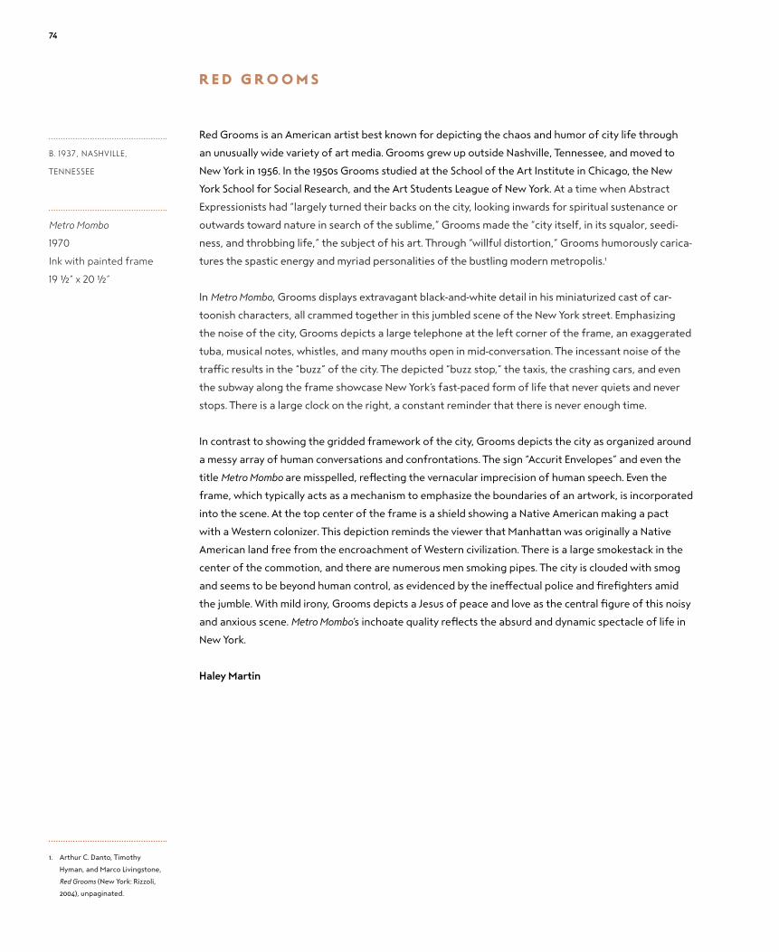
r e d g r o o m s
Red Grooms is an American artist best known for depicting the chaos and humor of city life through
an unusually wide variety of art media. Grooms grew up outside Nashville, Tennessee, and moved to
New York in 1956. In the 1950s Grooms studied at the School of the Art Institute in Chicago, the New
York School for Social Research, and the Art Students League of New York. At a time when Abstract
Expressionists had “largely turned their backs on the city, looking inwards for spiritual sustenance or
outwards toward nature in search of the sublime,” Grooms made the “city itself, in its squalor, seedi-
ness, and throbbing life,” the subject of his art. Through “willful distortion,” Grooms humorously carica-
tures the spastic energy and myriad personalities of the bustling modern metropolis.1
In Metro Mombo, Grooms displays extravagant black-and-white detail in his miniaturized cast of car-
toonish characters, all crammed together in this jumbled scene of the New York street. Emphasizing
the noise of the city, Grooms depicts a large telephone at the left corner of the frame, an exaggerated
tuba, musical notes, whistles, and many mouths open in mid-conversation. The incessant noise of the
traffic results in the “buzz” of the city. The depicted “buzz stop,” the taxis, the crashing cars, and even
the subway along the frame showcase New York’s fast-paced form of life that never quiets and never
stops. There is a large clock on the right, a constant reminder that there is never enough time.
In contrast to showing the gridded framework of the city, Grooms depicts the city as organized around
a messy array of human conversations and confrontations. The sign “Accurit Envelopes” and even the
title Metro Mombo are misspelled, reflecting the vernacular imprecision of human speech. Even the
frame, which typically acts as a mechanism to emphasize the boundaries of an artwork, is incorporated
into the scene. At the top center of the frame is a shield showing a Native American making a pact
with a Western colonizer. This depiction reminds the viewer that Manhattan was originally a Native
American land free from the encroachment of Western civilization. There is a large smokestack in the
center of the commotion, and there are numerous men smoking pipes. The city is clouded with smog
and seems to be beyond human control, as evidenced by the ineffectual police and firefighters amid
the jumble. With mild irony, Grooms depicts a Jesus of peace and love as the central figure of this noisy
and anxious scene. Metro Mombo’s inchoate quality reflects the absurd and dynamic spectacle of life in
New York.
Haley Martin
B. 1937, nAShvILLE,
TEnnESSEE
Metro Mombo
1970
Ink with painted frame
19 1/2” x 20 1/2”
1. Arthur C. Danto, Timothy
Hyman, and Marco Livingstone,
Red Grooms (New York: Rizzoli,
2004), unpaginated.
74

75

l o u i s e N e v e l s o N
Born Leah Berliawsky, the American sculptor Louise Nevelson is widely regarded as one of the most
important sculptors of the twentieth century. Referring to herself as “the original recycler,”1 Nevelson
constructed monochromatic black wood sculptures from large and small wooden objects, largely
found on the streets of New York.
As a child in 1905, she emigrated with her family from the Ukraine to settle in Rockland, Maine. After
moving to New York City, she, like many of the important artists of the twentieth century, attended
the Art Students League of New York. As one of the most celebrated artists with roots in Maine, she
was commissioned in 1981 by Maine resident John Payson to create a work for Westbrook College in
Portland, Maine—Moonscape I.
Her work in this exhibition, Sky Garden Cryptic I, is atypical of works in the Payson Collection in rejecting
the representational style entirely. Nevelson was influenced by monumental Mayan art, but she was also
heavily informed by Picasso, whom she credits with “giving us the cube.”2 She described the Cubist move-
ment as “one of the greatest awarenesses that the human mind has ever come to.”3 In this regard, she
differs from most of the other artists in this show: The inspiration for her work comes explicitly from
the “Chamber of Horrors” in the Armory Show—the room that contained Duchamp’s Nude Descending a
Staircase, No. 2 and other Cubist paintings and sculptures. In contrast, most other works in this exhibition
draw upon the more representational strains of modernism, also on view at the Armory Show.
Nevelson’s use of black in her works is one of her signatures. In her words, black is the “total color. It
means totality. It means: contains all.”4 Her use of black and of monumental scale in her art moved
1950s’ sculpture into the same league as the work of her contemporaries, the Abstract Expressionists.
Like them, she saw her art as the self-expression of the artist rather than as a representation of the
world at large. Nevelson explicitly rejected any characterization of her work as feminist, arguing
instead that she was an artist who happened to be a woman.
Her work valorizes the unconscious. She was heavily influenced by Mayan monumental sculpture in
much the same way that Cubists, Fauvists, and Primitivists turned to non-Western sources for inspira-
tion, believing them to represent the unconscious and to stand in opposition to the classical tradition
of Western art. Part of her title, Sky Garden, may refer to the Mayan ruins she visited in the 1950s. Her
early drawings are a clear indication of this strand of her work, including many nudes with stylistic
echoes of Matisse and Picasso.
The work exhibited here is much less monumental than the work she is best known for. However, it is
one of a series of at least nine similar pieces, and it fits into the category of the “box” in her oeuvre.
A box approximately the size of a briefcase, it is hinged on its short end. The tension in this sculp-
ture, which is painted entirely black, stems from the contrast between the exterior of the box and its
interior—the exterior is covered in right angles and hard lines, while the wood lining the interior is
much more curved and soft, even egg-like in form. A modern Pandora’s box, it is a representation of the
cryptic: its contents defy easy categorization or visual interpretation.
Jon Sweitzer-Lamme
1. Pedro E. Guerrero, A
Photographer’s Journey with Frank
Lloyd Wright, Alexander Calder, and
Louise Nevelson (Princeton, NJ:
Princeton Architectural Press,
2007), 171.
2. Brooke Kamin Rapaport, ed.,
The Sculpture of Louise Nevelson:
Constructing a Legend (New
Haven, CT: Yale University Press,
2009), 35.
3. Rapaport, Nevelson, 8.
4. Louise Nevelson, Dawns and
Dusks: Taped Conversations with
Diana MacKown (New York: Simon
& Schuster, 1980), 125.
B. 1899, kIEv, ukRAInE
D. 1988, nEW yORk,
nEW yORk
Sky Garden Cryptic I
1978
Painted wooden box
3 1/2” x 12” x 15 1/2”
76

77

Y v o N N e J a c q u e t t e
Raised in Stamford, Connecticut, Yvonne Jacquette attended the Rhode Island School of Design from
1952 to 1956. She is best known for her dizzying aerial views of cities and rural landscapes. Much of
her work focuses on New York City, where she currently resides, but her subjects vary from urban
panoramas seen from vantage points atop skyscrapers to aerial landscape views of Maine, where she
spends her summers. Her interest in aerial views stems from a 1969 flight to San Diego. This journey led
to subsequent commercial flights around the country as well as chartered flights on which she uses a
tray of pastel crayons to sketch the view from her window. She initially studied cloud formations and
weather patterns but shifted to intricate aerial views of the landscape after experiencing a flight on
a crystal-clear night. Jacquette presents these aerial views in a variety of mediums, from preliminary
pastel drawings to finished oil paintings to subsequent lithographs and woodcut prints. According
to William Corbett, Jacquette creates “a painted world in which the values of colour and texture that
paint imparts are real to the eye in a way the actual views never are.”1 Jacquette’s creations hark back
to painterly influences such as those of Pierre Bonnard and Édouard Vuillard, who used similarly vivid
textures and brilliant colors. Jacquette combines elements of reality and fiction, as she works from
observational sketches as well as from memory.
This lithographic print, set in a Plexiglas box, provides a prime example of Jacquette’s work. The litho-
graph depicts a nighttime view of Lower Manhattan, angled slightly toward the east, with the World
Trade Center just out of view on the left. The bright colors and feathered marks made from the layers
of print evoke the strokes of pastel, the medium in which Jacquette first sketches her aerial views. The
colors of the headlights and brake lights on the highway blend together into a single stream, much as
these same lights might appear to a nocturnal viewer. The bright orange and red lights of the traffic
seem almost like a time-lapse photograph of a highway, recalling the chronophotographic effects of
the Cubist paintings exhibited at the 1913 Armory Show, such as Duchamp’s Nude Descending a Staircase,
No. 2. In addition to the lights of the moving traffic, Jacquette emphasizes the brightness of the electric
lights in the buildings and on the bridges. These lights pierce through the dark night with vibrant blues,
yellows, whites, and reds and are mirrored in reflections on the East River.
The print is made of a layering of twelve colors applied with separate plates.2 It is part of a series of
three views of the same location, the other two being a view at dawn and a view during the day. The
other two versions use the same plates but with an altered palette—the dawn view is achieved with
pale blues and whites, and the day view with soft yellows and light peach. The work is displayed in a
Plexiglas case with a lithographic frame, making it appear as if we are looking at the city through an
airplane window.
Isabel Andrews
B. 1934, PITTSBuRGh,
PEnnSyLvAnIA
A Glimpse of Lower
Manhattan (Night)
1987
Color lithograph in
Plexiglas box
20 1/2” x 15” x 3 ¾”
1. William Corbett, “Tall Storeys:
Yvonne Jacquette’s New York
Night Views,” Modern Painters 12,
no. 1 (Spring 1999): 84.
2. Hilarie Faberman, Aerial Muse: The
Art of Yvonne Jacquette: Including a
Catalogue Raisonné of Prints (New
York: Hudson Hills, 2002), 147.
78

79

Y v o N N e J a c q u e t t e
Because of her fascination with aerial cityscapes, Yvonne Jacquette has been sometimes classified as
a modern realist, but her works display independent formal elements such as the grid-like patterns of
abstraction and pointillist-style strokes.1 Relying on both her imagination and the scenes she observes,
she has spent her life displaying the “evidence of the impact of human life” by depicting both natural
and architectural landscapes.2 Jacquette has painted views of Philadelphia, Tokyo, Hong Kong, and San
Francisco, but New York City has remained her most significant focus. Her work has become part of the
permanent collections of more than forty museums, including the Metropolitan Museum of Art, the
Museum of Modern Art, and the Philadelphia Museum of Art.
In Jacquette’s color woodcut, Motion Picture (Times Square), she transforms the noisy bustle of the
city into a work of quiet incandescence. With luminous shades of red, yellow, and green to express
its liveliness, the image shows a high view of Times Square in the dark night, electrified with color.
Jacquette’s depiction of the famous Coca-Cola advertisement recalls a 1947 photograph of that land-
mark logo in Astor Place, taken by Jacquette’s husband, the Swiss-born filmmaker and photographer
Rudy Burckhardt.3 In her depiction of the advertisement and surrounding area, she works in “staccato”
strokes of similar length and speed, strokes that articulate the fast-paced tempo of the city.4 In an
interview, Jacquette once said that her strokes aim for “a certain kind of energy, the action of these
cars moving up this road and an energy flow.” In the night, the three-dimensional structure of the land-
scape is dematerialized in favor of the “headlight markings,” which emphasize the abstraction of line
rather than the realistic representation of the subject.5
Jacquette’s landscape is reminiscent of the muted and flattened cityscapes of Édouard Vuillard and
Pierre Bonnard, first shown to public acclaim in America at the Armory Show. Known for his use of color
and expressive lines, Bonnard stole a glimpse of a narrow Parisian street from above in his Rue Vue d’en
Haut (1898). Bonnard’s lithograph evokes a peaceful silence on a cloudy day, similar to the woodcut by
Jacquette. In Motion Picture (Times Square), there is an almost Whistlerian quiet in a usually throbbing
and chattering section of New York. Jacquette zooms in on the particles of light and focuses on the
harmony of her expressive and painterly lines. She emphasizes the dynamic makeup of the city and
the energy it evokes, but it is muted. Although the elevated image covers a very bright part of the city
that hundreds of thousands of people pass through every day, there is something intimately engaging
about it. Despite its bird’s-eye view, it almost feels as though Times Square belongs to the viewer and
the city has harmonized its elements in order for him or her to get a better look.
Sarah Bochicchio
B. 1934, PITTSBuRGh,
PEnnSyLvAnIA
Motion Picture
(Times Square)
1987
Color woodcut
24 ¾” x 31 ⅞”
1. William Zimmer, “Cityscapes
Caught on Canvas: Conquests
Made from the Sky,” New York
Times, March 16, 2003, accessed
November 14, 2013, http://
www.nytimes.com/2003/03/16/
nyregion/art-review-cityscapes-
caught-on-canvas-conquests-
made-from-the-sky.html.
2. Susan Boulanger, “Yvonne
Jacquette’s Dragon Cement
Co., Thomaston Maine, II at the
Portland Museum of Art,” Art
New England 27, no. 6 (October/
November 2006): 7.
3. Karen Rosenberg, “Views of
the City, His and Hers, with
Lens and Brush,” New York Times,
February 1, 2008, accessed
November 26, 2013, http://www.
nytimes.com/2008/02/01/arts/
design/01pict.html?_r=0.
4. Mark D. Cohen, “The Hudson
River Museum/Yonkers: Yvonne
Jacquette: Aerial Muse,” Art
New England 24, no. 4 (June/July
2003): 33.
5. “Yvonne Jacquette: An
Interview” (1981), Video Data
Bank, accessed November 16,
2013, http://www.vdb.org/titles/
yvonne-jacquette-interview.
80

81

Y v o N N e J a c q u e t t e
Yvonne Jacquette’s art is largely defined by its aerial depiction of the landscape below. She has stated
that she “always felt very involved with the landscape, even as a child” and that “it started to seem like
the only real subject matter for me with a kind of absolute finality.”1 According to the critic John Yau, “In
her carefully chosen views, Jacquette synthesizes solitariness and specificity, the anonymous and the
particular, as well as further inflects this postmodern condition by making us feel as if we have lost our
basic connection to the earth, and are floating or hanging somewhere in the air.”2 She began painting
her nocturnal scenes in the 1970s, and these works explore the use of bright colors as part of the illumi-
nation by and reflection of lights at night.
This colorful nocturnal pastel is the result of her initial observation from a plane, and she registered
her visual experience on dark purple paper. The small study led to a larger oil painting in the Payson
Collection that is similar to the pastel but not an exact re-creation of it. The scene shows the New
York side of the George Washington Bridge seen at an angle such that the circular on- and off-ramps
appear to be elliptical.
The color of the paper offers a stark contrast, a theme of the drawing, to the short and long strokes of
bright red, yellow, and orange representing sources of light. The headlights and taillights of cars are
depicted in yellow and red as dots of color. The longer lines of color in yellow, orange, and white that
surround the indistinct shapes of the cars seem to indicate the illumination by the headlights in the
darkness, the reflection of light, and the speed at which the vehicles are moving. The almost blurred
movement on the bridge suggests that the scene does not represent a single moment but rather
shows an observation that occurred over an elapsed period of time.
The rectilinear structures in the pastel are distinctly different from the curving and flowing nature of the
traffic on the bridge. The superstructure of the bridge rises in straight and diagonal lines that represent
its three-dimensional structure in a light gray-blue that becomes darker as the bridge extends down to
the highway below. The buildings in the middle and the background of the drawing are fairly uniform in
size and are basic three-dimensional structures. The windows display lights of yellow, white, and orange in
an irregular pattern that reverberates with the fast-paced rhythm of traffic on the bridge.
The Hudson River and the trees on its bank are depicted in the lower portion of the drawing. This area
creates a contrast between the built landscape and nature. The river is depicted in the left corner, and
the waves of the water are drawn in dark, overlapping strokes. The trees are drawn in varying shades
of green so that the dark mass that initially appears indistinct can be seen to contain individual trees.
The darkness of this area of the drawing emphasizes the disconnection between the artificial light of
the city and the dark of the natural landscape.
Rebekah Keel
B. 1934, PITTSBuRGh,
PEnnSyLvAnIA
George Washington Bridge
at Night
1988
Pastel on paper
21 1/8” x 23 1/8”
1. “Yvonne Jacquette: An Interview”
(1981), Video Data Bank, accessed
January 7, 2014, http://www.vdb.
org/titles/yvonne-jacquette-
interview.
2. “Recent Paintings and Pastels by
Yvonne Jacquette Announced
at the DC Moore Gallery,” ADM
Gallery and Studio, last modified
January 24, 2010, http://artdaily.
com/news/35826/Recent-
Paintings-and-Pastels-by-Yvonne-
Jacquette-Announced-at-DC-
Moore-Gallery#.UqiL--K1hB4.
82

83

Pa u l c a d m u s
Have Fun, Drive Carefully is a declaration of care and concern for a loved one. The driver, whose image is
reflected in the side mirror, holds car keys on which are inscribed the artist’s name, CADMUS. There is
an intimate and protective quality to the composition, with the older man’s reflected face surrounded
by his companion’s head, upper body, and hands. Comparing this image to photographs and painted
portraits, we recognize that the driver is Paul Cadmus and the other man is his partner, model, and
muse of thirty-five years, Jon Andersson. In 1991, when this double portrait was created, Cadmus was
eighty-six years old and Andersson fifty-four. Its place in the Payson Collection testifies to Joanne
Payson’s love of classical draftsmanship and to John Payson’s love of automobiles.
In the 1984 documentary produced by David Sutherland, Paul Cadmus: Enfant Terrible at 80, Cadmus said
that he asked Andersson—at the time a cabaret star—to pose for him as an excuse for the two to
meet.1 Andersson was Cadmus’s primary model for the rest of the artist’s life, but he said, “In drawing
sometimes . . . I try to disguise the fact that Jon is my regular model, because I think people might get
sick of seeing the same model all the time.”2
Although Paul Cadmus was one of the earliest openly gay artists, he rarely spoke frankly about being
gay; nor did he often discuss his and Andersson’s relationship beyond that of artist and model. He once
said, “Gayness is not the raison d’être of my work,” and did not want to be used as a symbol by the
younger, more radical generation of gay artists; rather, he wanted the attention focused on the art.3
This image, along with several other works in which the two men are depicted together through the
clever use of mirrors, might be seen to express various aspects of their relationship. In Study for David
and Goliath (1971), Andersson is the youthful David, lying naked on a bed with a slight grin on his face; all
that can be seen of Cadmus is his smiling head sticking up above his drawing portfolio at the bottom of
the composition. On a nearby table, Cadmus includes a book with a black-and-white reproduction of a
painting by seventeenth-century Italian artist Caravaggio entitled Amor Vincit Omnia, “Love conquers all.”
Mariann Smith
B. 1904, nEW yORk,
nEW yORk
D. 1999, WESTOn,
COnnECTICuT
Have Fun, Drive Carefully
1991
Crayons on Canson
paper
25 ¼” x 23 ¼”
1. Scott Gargan, “Paul Cadmus and
Jon Anderson [sic] the focus of
‘Muse’ at Westport Arts Center”
(ctpost.com, November 8, 2012),
http://www.ctpost.com/enter-
tainment/article/Paul-Cadmus-
and-Jon-Anderson-the-focus-of-
Muse-4019788.php.
2. Archives of American Art, Oral
history interview with Paul
Cadmus, March 22–May 5, 1988,
http://www.aaa.si.edu/collec-
tions/interviews/oral-history-
interview-paul-cadmus-12619.
3. Philip Eliasoph, “A Tribute to Paul
Cadmus,” American Art 14, no. 3
(Fall 2000): 94.
84

85

Pa u l c a d m u s
Paul Cadmus began producing drawings as finished works of art in 1943. Since the grand entrance of
Cubism and Fauvism at the 1913 Armory Show, nonrepresentational imagery had become increasingly
pervasive in American art and came to be synonymous with modernism. In this respect, Cadmus’s classi-
cal draftsmanship was “provocatively anachronistic.”1 Such anachronism was heightened by the artist’s
frequent choice to depict male nudes as his subjects. Unlike in previous eras in art, the depiction of the
male nude in the twentieth century was accompanied by a heightened “degree of self-consciousness.”2
Cadmus’s depiction of the “male nude has always been at the center of Cadmus’s creative vision.”3
While Cadmus came to be known for the satirical quality in his paintings, his drawings result from
an entirely different set of motives. Over the course of his career, Cadmus produced relatively few
paintings in comparison to his innumerable finished drawings. Jean-Auguste-Dominique Ingres, whom
Cadmus consistently refers to with near reverence, claims “drawing is the probity of art.”4 In Reclining
Nude, NM232, the figure has adopted a horizontal contrapposto, allowing for an exaggerated torsion.
NM, for “Nantucket Man,” is an acronym Cadmus used to denote that the model is Jon Andersson, his
partner of many years, whom Cadmus first met in Nantucket in 1964. Andersson, a trained dancer,
and Cadmus would engage in lengthy discussions, experimenting with different poses before one was
decided, leading Cadmus to describe these drawings as a “collaboration.”5 Years later, Andersson would
liken the drawing sessions with Cadmus to being in “a parallel world . . . of feelings.”6 Characteristic of
Cadmus’s use of the medium, this drawing is intimate, capturing the complex emotional relationship
between model and artist. The model is depicted in isolation from his context, refusing any distraction
from the depiction of human drama.
Richard Meyer notes that Cadmus’s work challenges the way we understand “the ‘modern’ with respect
to modern American art.”7 Modern artists such as Picasso and Matisse abandoned classical techniques
in order to reclaim the canvas as a territory of self-expression. Alternatively, Cadmus utilizes the objec-
tive forms of classicism but sheds their traditional theoretical framework in exchange for his own, and
in doing so, he demonstrates the modern plasticity of these forms.
Joanna Kessler
B. 1904, nEW yORk,
nEW yORk
D. 1999, WESTOn,
COnnECTICuT
Reclining Nude, NM232
1991
Crayons on Canson
paper
19 1/2” x 27 ¾”
1. Justin Springer, Paul Cadmus: The
Male Nude (New York: Chameleon
Books, 2002), 12.
2. David Rodgers and Dimitris
Plantzos, “Nude,” Grove Art
Online. Oxford Art Online, Oxford
University Press, accessed
December 18, 2013, http://
www.oxfordartonline.com/
subscriber/article/grove/art/
T062999.
3. Richard Meyer, “Paul Cadmus,”
Art Journal 57, no. 3 (Autumn
1998): 83.
4. Beverley Schreiber Jacoby and
Marjorie Shelley, “Drawing.”
Grove Art Online. Oxford Art
Online, Oxford University Press,
accessed December 18, 2013,
http://www.oxfordartonline.
com/subscriber/article/grove/
art/T023557.
5. Springer, Paul Cadmus, 52.
6. Springer, Paul Cadmus, 25.
7. Meyer, “Paul Cadmus,” 81.
86

87

J a c o b l aW r e N c e
Jacob Lawrence is the painter of modern Harlem. Formal art classes and informal observation of the
rhythm and spectacle of the city constituted his teachings. Embracing the concept of the New Negro,
Lawrence blended a critical Social Realism with, in his own words, a dynamic Cubism that reflected the
ebb and flow of Harlem during his youth. “Some of it was not pleasant,” his wife, Gwendolyn Knight,
recalled, but he persevered in his art and never lost this frank, observational attitude.1
Fantasy: Stretched Limousine blends all of these elements into one compelling work. Black, red, blue, and
yellow pencil marks glide across the paper, depicting a rich variety of movement through an imagined
Harlem neighborhood. A shop owner extends his awning in preparation for the day’s work, a dog leaps
from the street to the sidewalk, and pedestrians walk determinedly through the city block. The figures
are primarily depicted in black and white, with colorful accents highlighting shadows and boundaries
of objects. Facial expressions are masked, somewhere between a grimace and a smile. Unsettlingly, a
figure standing at the center of the composition has a skull in place of a head. The city, Lawrence says,
contains “passion . . . energy . . . vitality,” and Fantasy: Stretched Limousine comes alive with jagged charac-
ters charged with energy and motion.2
The Armory Show introduced the idea of painting as visual music, and Lawrence’s fascination with jazz
is reflected in this work. Lawrence said that some of his paintings were derived from “memories of
the Apollo Theater at 125th Street,” and in them he was trying to create “a staccato-type thing—raw,
sharp, rough.”3 The sharp lines emphasize the love of staccato, and their rhythm imparts a syncopated
movement to Lawrence’s composition.
Simmering under the rhythmic lines and pulsating colors of Fantasy: Stretched Limousine there is a gritty
Social Realism that tempers its beauty. Lawrence comments, “My pictures express my life and experi-
ence . . . the things I have experienced extend into my national, racial and class group.”4 Two black men
sit casually in the back of the limousine while a white man drives. Their blasé demeanor is challenged
by the skulled figure looming ominously in the background and the grimaces etched onto people’s
faces. These juxtapositions posit scathing social questions. Is it a fantasy that two black men would
be driven in a limousine? Does the skull represent white oppression? Do the grimaces of the people
outside the limousine remind viewers that, though some have escaped poverty, the African American
population remains in an economically precarious state? Attracted by the formal beauty of Fantasy:
Stretched Limousine, Lawrence’s viewers must also ask uncomfortable questions about the progress of
African Americans in our century.
Alexander Lee
B. 1917, ATLAnTIC CITy,
nEW JERSEy
D. 2000, SEATTLE,
WAShInGTOn
Fantasy: Stretched
Limousine
1992
Colored pencil on paper
14 1/2” x 22”
1. Gwendolyn Knight, Audio
Guide Stop for Jacob Lawrence,
Tombstones, 1942, Whitney
Museum of American Art,
accessed January 7, 2014,
http://whitney.org/Education/
ForTeachers/Collection/
JacobLawrence/4314.
2. Jacob Lawrence and Henry Louis
Gates, Jr., “An Interview with
Jacob Lawrence by Henry Louis
Gates, Jr.,” MoMA 19 (Spring
1995): 15.
3. Patricia Hills, Painting Harlem
Modern: The Art of Jacob Lawrence
(Berkeley: University of
California Press, 2009), 221.
4. Ellen Harkins Wheat, Jacob
Lawrence: American Painter
(Seattle: University of
Washington Press, 1986), 192.
88

89

J a c k l e v i N e
Jack Levine’s works reflect his lifelong and intense focus on the study of art fundamentals. This
artist was lauded early in his career as a major American exponent of an expressive form of Social
Realism—a figurative expressionism. However, this branch of modernist art must be understood in
the context of other modernisms—indeed, we have to acknowledge the presence of multiple, equally
valid artistic modes during a mid-century period all too often simplistically understood as dominated
by one—if we are to make any sense of a narratively and technically intense work such as Man in Red
Turban (After van Eyck). In short, while “figurative” can seem, from our perspective, to be a mere modi-
fier of “expressionism,” it is the figurative tradition—a set of artistic techniques and aesthetic values
deeply rooted in tradition—that significantly defines Levine’s work.
Levine was born to immigrant Jews and raised to be self-aware, self-sufficient, and self-critical.1 He
trained in Boston with a series of teachers/artists who intuited and responded to his quest for knowl-
edge. Levine wanted to know as much as possible about the technical and aesthetic connections
between and among a wide variety of stylistically and chronologically defined sorts of art practice.2
His first teacher, Harold Zimmerman, built upon the young artist’s abiding interest in disciplined draw-
ing. Zimmerman worked relentlessly with Levine and fellow student Hyman Bloom on observational/
memorization exercises: not drawing from life but, rather, drawing accurately from the memory of
scenes seen.3 His second teacher, Harvard University professor Denman Waldo Ross, sensed in Levine
talents and sensibilities that diverged from the abstractions that defined successive avant-garde
movements centered in Paris and, increasingly, in New York. Ross fostered Levine’s (as well as Bloom’s
and Zimmerman’s) knowledge of German and northern European art by arranging for several years’
worth of access to the galleries, the collections, and a fully stocked studio in the Harvard University
art museum. Ross also sought to teach Bloom and Levine what he saw as a universal, hierarchical, and
organized model of art and art instruction; while the young artists—they were only in their mid-teens—
eventually developed their own approaches, Levine noted that Ross’s efforts “put me in touch with the
European tradition and the great painting of the past at an early age, when I knew nothing about it. He
gave me roots a long way back. . . . I owe Ross what I’m interested in—continuity.”4
Like many of Levine’s later works, this small but powerful painting is composed of layers upon layers
of translucent paint and a final application of lines of dark pigment. Disrupting the jewel-like qualities
of the work, these dark lines act both to distance the depicted image from the viewer and to suggest
that the artist might still be working on the painting. An alternative possibility is that the lines are
corrections made by a teacher. And who is the subject of all this attention—the model for this por-
trait? Levine himself. The likeness is unmistakable, and, just as clearly, the subject evokes the 1433 oil
on oak Portrait of a Man (Self-Portrait?) by Jan van Eyck, now in the National Gallery in London, England.
This, it must be emphasized, is not just any self-portrait; it is admired as an acute, unsparing, yet gen-
erous self-image. Moreover, it is widely thought of as the first self-portrait by an artist in the modern
Western canon, and so, when we look at Jack Levine’s painting, what we are looking at is a palimpsest
of self-portraits, self-portraiture, and the traditions that bind all of them—all artists, all subjects, all
means used to figure and express them—together.
Brian Wallace
B. 1915, BOSTOn,
MASSAChuSETTS
D. 2010, nEW yORk,
nEW yORk
Man in Red Turban
(After van Eyck)
Circa 1992–1993
Oil on canvas
12 1/2” x 14 1/2”
1. Judith Bookbinder, Boston
Modern: Figurative Expressionism
as Alternative Modernism
(Lebanon, NH: University of New
Hampshire, 2005), 64.
2. “Jack Levine: The Last Interview,”
New England Journal of Aesthetic
Research, November 11, 2010,
http://gregcookland.com/
journal/2010/11/11/jack-levine-
the-last-interview/.
3. Bookbinder, Boston Modern, 70.
4. Bookbinder, Boston Modern, 81.
90

91

Y v o N N e J a c q u e t t e
After leaving the Rhode Island School of Design for the New York City art scene in 1956, Yvonne
Jacquette gravitated to the artists who would provide her closest companionships and greatest
influences. The photographer Rudy Burckhardt, whom she married in 1964, shared her obsession
with the city and with the people, architecture, and telescoping views from subways to skyscrapers.
Through Burckhardt, Jacquette came to know Mimi Gross and Red Grooms, and the respective couples,
with their young sons, spent a summer together in a rented cottage in rural Maine. It was there that
the group of artists would venture out with their paints in the moonlight, resulting in what the artist
describes as her first night picture.
Jacquette’s further exploration into night pictures began in 1976, when she sketched the dim tableau
from a hospital window during her nighttime visits to a sick friend. She explored the colors of black,
first with oil paints, learning to layer ground colors underneath darker hues and introducing a variety
of varnishes to capture the range of luminosity in the blacks. She also worked with black pastels on
black paper, and later in printmaking, she layered different shades of black ink on the same print.
She went to Japan and studied printmaking and also worked at an experimental print studio in
San Francisco.
Jacquette’s night pictures allowed her to explore the duality of loneliness. After the death of
Burckhardt in 1999, Jacquette produced a series of black-and-white woodcuts of the city. Jacquette
would hire helicopters to take her above New York City, where she would fly with the door open, the
aircraft leaning at extreme angles. “I’ve been a Buddhist for a long time and there’s a lot of teaching
about emptiness, which isn’t nothingness, but fullness. You can take that in any direction you want, or
need to. I’ve been interested in playing with how much is there; how much do I need to feel comfort-
able, or excited, or, to accept that, ‘OK, this [is] pretty lonely, but that’s the way it is.’”1
Joanna Kessler
B. 1934, PITTSBuRGh,
PEnnSyLvAnIA
Mixed Heights
(View of Southern Tip
of Manhattan)
2002
Woodcut
32” x 27 ⅜”
1. “In Conversation: Yvonne
Jacquette with John Yau,”
The Brooklyn Rail, February
6, 2008, accessed January 7,
2014, http://www.brook-
lynrail.org/2008/02/art/
yvonne-jacquette-with-john-yau.
92

93

Abbott, BereniceNew York Stock Exchange1933Photograph36 ¾” x 30 ⅝”On loan courtesy of Mr. and Mrs. John W. and Joanne D. Payson
Bishop, IsabelUnion Square during Expansion of the Fourteenth Street Subway Station1930Oil on canvas22 ⅜” x 26 ⅜”On loan courtesy of Joanne D. Payson
Bishop, Isabel Lunch Hour1939Oil and tempera on gesso panel36” x 26 1/2”On loan courtesy of Mr. and Mrs. John W. and Joanne D. Payson
Cadmus, PaulPreliminary Study for Aspects of Suburban Life: Main Street1935Oil and tempera on paper12” x 18 ¾”On loan courtesy of Mr. and Mrs. John W. and Joanne D. Payson
Cadmus, PaulShore Leave1935Etching17 ⅝” x 18 1/2” On loan courtesy of Joanne D. Payson
Cadmus, PaulTo E. M. Forster1943Pencil and egg tempera on hand-toned paper13 1/2” x 15 1/2” On loan courtesy of Joanne D. Payson
Cadmus, PaulHave Fun, Drive Carefully1991Crayons on Canson paper25 ¼” x 23 ¼”On loan courtesy of John W. Payson
Cadmus, PaulReclining Nude, NM2321991Crayons on Canson paper19 1/2” x 27 ¾”On loan courtesy of Mr. and Mrs. John W. and Joanne D. Payson
Davidson, JoBust of Joan Whitney Payson1932Terra-cotta12 1/2” x 7” x 7 1/2” On loan courtesy of Joanne D. Payson
Davies, Arthur B.Untitled (Nudes in Woods)Circa 1910Oil on canvas33 ¾” x 28 ¾”On loan courtesy of Mr. and Mrs. John W. and Joanne D. Payson
Dwight, MabelLife Class1931Lithograph16 1/8” x 20 1/2” On loan courtesy of Joanne D. Payson
Glackens, WilliamWoman at a WindowCirca 1910–1915Pastel21” x 16 1/2”On loan courtesy of Mr. and Mrs. John W. and Joanne D. Payson
Grooms, RedMetro Mambo1970Ink with painted frame19 1/2” x 20 1/2” On loan courtesy of Joanne D. Payson
Jacquette, YvonneA Glimpse of Lower Manhattan (Night) 1987Color lithograph in Plexiglas box20 1/2” x 15” x 3 ¾”On loan courtesy of John W. Payson
Jacquette, YvonneMotion Picture (Times Square)1987Color woodcut24 ¾” x 31 ⅞” On loan courtesy of Joanne D. Payson
Jacquette, YvonneGeorge Washington Bridge at Night1988Pastel on paper21 1/8” x 23 1/8” On loan courtesy of Joanne D. Payson
Jacquette, YvonneMixed Heights (View of Southern Tip of Manhattan)2002Woodcut32” x 27 ⅜” On loan courtesy of Joanne D. Payson
Kent, RockwellMoonlit Landscape1926Watercolor20 ¼” x 24 1/8” On loan courtesy of Joanne D. Payson
Kuhn, WaltConey Island1934Oil on board13 1/8” x 15 ⅜” On loan courtesy of Mr. and Mrs. John W. and Joanne D. Payson
Kuhn, WaltThe Show Is OnCirca 1939Oil on canvas20 ⅝” x 22 ¾” On loan courtesy of Joan Whitney Payson
Kuhn, WaltClown with White Tie1946Oil on canvas26” x 22”On loan courtesy of Mr. and Mrs. John W. and Joanne D. Payson
Lawrence, JacobMarket Place No. 11966Tempera and gouache on paper19” x 23”On loan courtesy of Joanne D. Payson
Lawrence, JacobFantasy: Stretched Limousine1992Colored pencil on paper14 1/2” x 22”On loan courtesy of John W. Payson
Levine, JackCard GameCirca 1933–1935 Oil on canvas21” x 26”On loan courtesy of Mr. and Mrs. John W. and Joanne D. Payson
Levine, JackAmerican in Paris1965Etching and aquatint14” x 12 ⅜”On loan courtesy of Joanne D. Payson
Levine, JackMan in Red Turban (After van Eyck)Circa 1992–1993Oil on canvas12 1/2” x 14 1/2” On loan courtesy of Mr. and Mrs. John W. and Joanne D. Payson
Marsh, ReginaldThe Barker1931Etching16 1/2” x 14”On loan courtesy of Mr. and Mrs. John W. and Joanne D. Payson
Marsh, ReginaldConey Island: Girl Standing in Front of Barker and ClownCirca 1936Tempera on Masonite25 ⅞” x 22”On loan courtesy of Joanne D. Payson
Nevelson, LouiseSky Garden Cryptic I1978Painted wooden box3 1/2” x 12” x 15 1/2”On loan courtesy of John W. Payson
Prendergast, MauriceBathersCirca 1910Watercolor16 ⅞” x 15 1/2”On loan courtesy of Mr. and Mrs. John W. and Joanne D. Payson
Saint-Gaudens, AugustusDiana of the TowerAfter 1907Bronze7 1/2” x 3 1/2” x 2 1/2”On loan courtesy of Joanne D. Payson
Sloan, JohnThe Picture Buyer1911Etching10 ⅞” x 12 ⅞”On loan courtesy of Joanne D. Payson
Sloan, JohnA Thirst for Art1939Etching10 ⅞” x 12 ⅞”On loan courtesy of Joanne D. Payson
Weber, MaxBathers1909Oil on canvas21” x 18”On loan courtesy of Joanne D. Payson
Whistler, James Abbott McNeillVenice at SunsetCirca 1879–1880Pastel17” x 22”On loan courtesy of Mr. and Mrs. John W. and Joanne D. Payson
Zorach, WilliamLandscape with Cottage by the Sea1916Watercolor24 ¼” x 20 1/2” On loan courtesy of Mr. and Mrs. John W. and Joanne D. Payson
C h e c k l i s t o f t h e E x h i b i t i o nThe dimensions of two-dimensional artworks include their frames.
94

This catalog is published on the occasion of the exhibition A Century
of Self-Expression: Modern American Art in the Collection of John and Joanne
Payson, organized by the students and instructors participating in the
Bryn Mawr College “Exhibiting Modern Art” 360o course cluster.
The exhibition is on view in the Bryn Mawr College Class of 1912 Rare Book
Room Gallery, Canaday Library, from February 28 through June 1, 2014.
The organizers wish to acknowledge many individuals and groups for their
support of this project and are pleased to begin these thanks with a warm
expression of gratitude to Joanne D’Elia Payson (A.B. 1975, M.A. 2009) and
John Whitney Payson for the loan of their artworks and the gift of their
expertise, for their many kindnesses throughout the many months that
this project has been in the making, for their generous support of the
college over many years, and for their donation of important artworks to
the Art and Artifacts Collections. Very special thanks are also extended to
Jeanne de Guardiola Callanan (1993), scholar of art history and philanthro-
pist, for her support of the college’s ambitious investigation of new curric-
ular and co-curricular initiatives supporting Bryn Mawr students’ drive to
succeed academically, professionally, and as global citizens.
Special thanks are extended to the many expert collaborators who
have joined us to work on this project: Laurette E. McCarthy, indepen-
dent scholar; Yvonne Jacquette, artist; Nanette Bendyna-Schuman,
copy editor; Blake Bradford, Bernard C. Watson Director of Education,
The Barnes Foundation; Russell Castro, exhibition installation spe-
cialist; Jenifer Dismukes, managing editor, Archives of American Art,
Smithsonian Institution; Rick Echelmeyer, photographer; Linda Ferber,
senior art historian and director emerita, New-York Historical Society;
Tim Joffe, Payson property manager; Marilyn Kushner, curator and
head, Department of Prints, Photographs and Architectural Collections,
New-York Historical Society; Andrew McClellan, professor of art history,
Tufts University; Shari Osborn, museum educator, Samuel F. B. Morse/
Locust Grove National Historic Site; Sally Preslar, manager, Midtown
Payson Gallery; Kelly Quinn, Terra Foundation Project Manager for
Online Scholarly and Education Initiatives, Archives of American Art,
Smithsonian Institution; Gail Stavitsky, chief curator, Montclair Art
Museum; Beth Tinker, museum assessment consultant and lecturer in
museum studies at the University of the Arts; Steve Tucker, exhibition
designer; and Phil Unetic, graphic designer.
Within the Bryn Mawr College community, special thanks are also
extended to Kimberly E. Cassidy, interim president; Ruth Lindeborg,
secretary of the college; Mary Osirim, interim provost and professor
of sociology; and Eric Pumroy, associate chief information officer and
Seymour Adelman Director of Special Collections, all of whom have
provided extensive support for this project as sensitive and determined
senior administrators and through their leadership of the Museum
Studies Working Group. Thanks also go to faculty colleagues Catherine
Conybeare, professor of Greek, Latin, and classical studies and director
of the Graduate Group; Alison Cook-Sather, Mary Katherine Woodworth
Chair and Professor in the Bryn Mawr/Haverford Education Program;
Lisa Kraus, coordinator, Performing Arts; Matthew Ruben, lecturer
in English and the Emily Balch Seminars; and Lisa Saltzman, chair and
professor of history of art. In the Development Office and the Alumnae
Association, gratitude is extended to Wendy M. Greenfield, executive
director of the Alumnae Association; Bob Miller, interim chief develop-
ment officer; Dianne Johnson, director of Major and Planned Giving;
and Anna S. Kamstra, senior associate director of Donor Relations and
Stewardship. From College Communications, help was provided by
Alyssa Banotai, associate director of College Communications, and Tracy
Kellmer, interim chief communications officer. In the Provost’s Office,
Sarah Theobald, academic program administrator, provided assistance.
In Library and Information Services, sincere appreciation goes to Gina
Siesing, chief information officer and director of libraries; Gillian Claire
Baillie, service desk and circulation intern; Jeremy Blatchley, reference
librarian; Eileen Cassidy, secretary; Olivia Castello, outreach and educa-
tion technology librarian; Helen Hyun Chang, research support education
technician; Emily Croll, former curator and academic liaison for Art and
Artifacts; Melissa Kramer Cresswell, director of planning and communi-
cation; Ralph A. Del Giudice, coordinator, multimedia; Katie Feno, man-
ager of public service desks, information services; Marianne H. Hansen,
curator and academic liaison for Rare Books and Manuscripts; Camilla
M. MacKay, head, Carpenter Library and Visual Resources; Richard D.
Matthews, AV and PC support technician, multimedia; Rodney Matthews,
computer and multimedia specialist; Evan McGonagill, assistant director
for The Albert M. Greenfield Digital Center for the History of Women’s
Education; Mariann W. Smith, special collections curatorial assistant;
Marianne Weldon, collections manager for Art and Artifacts; and Arleen
A. Zimmerle, reference and media librarian. Thanks also to student
interns and workers Joelle Collins, Ph.D. candidate in archaeology; Nicki
Colosimo, Ph.D. candidate in archaeology; Anna Moblard Meier, history
of art graduate assistant and Graduate Group in Archaeology, Classics,
and History of Art McPherson Curatorial Fellow; Rachel Starry, Friends of
the Bryn Mawr College Library graduate intern; and Nava Streiter, history
of art graduate assistant.
The Friends of Bryn Mawr College Library, the offices of the President
and the Provost, the 360o course cluster program, the Museum Studies
Working Group, and Library/Information Services have provided invalu-
able support for this project.
A c k n o w l e d g m e n t s
95

Copyright © 2014 by Bryn Mawr College. All
rights reserved. No part of this publication may
be reproduced or transmitted in any form or by
any means, electronic or mechanical, without
permission from Bryn Mawr College.
ISBN xx PHIL: ISBN TO COME LATER
Front cover
Walt Kuhn, Clown with White Tie, 1946,
oil on canvas, 26” x 22”
inside front and back covers
Paul Cadmus,
To E. M. Forster, 1943, pencil and egg tempera on
hand-toned paper, 13 ½” x 15 ½”
Frontispiece
Jo Davidson, Bust of Joan Whitney Payson (detail),
1932, terra-cotta, 12 ½” x 7” x 7 ½”
back cover
Yvonne Jacquette, George Washington Bridge
at Night (detail), 1988, pastel on paper,
21 1/8” x 23 1/8”
Edited by Steven Levine and Brian Wallace
Copy edited by Nanette Bendyna-Schuman
Designed by Phillip Unetic, UneticDesign.com
Printed by Brilliant Graphics, Exton, PA
96


101 north Merion Avenue, Bryn Mawr, Pennsylvania, 19010


![John Alden Carpenter Collection [finding aid]. Music Division ...](https://static.fdokumen.com/doc/165x107/63283a2be491bcb36c0baaac/john-alden-carpenter-collection-finding-aid-music-division-.jpg)