maestros del arte en el cartel - Raw Arty
303
-
Upload
khangminh22 -
Category
Documents
-
view
3 -
download
0
Transcript of maestros del arte en el cartel - Raw Arty


“MAESTROS DEL ARTE EN EL CARTEL”COLECCIÓN JOSELUIS RUPÉREZ
PRODUCCIÓN:CAJA DE AHORROS DEL MEDITERRÁNEOOBRAS SOCIALES
COLABORACIÓN ESPECIAL:JOSÉLUIS RUPÉREZ
COMISARIADO:JOSÉ PIQUERAS MORENO
TEXTOS:EDUARDO ARROYOLLUÍS BASSATJOSÉ PIQUERAS
DIRECCIÓN:CARLOS MATEO MARTÍNEZ
COORDINACIÓN Y ORGANIZACIÓN:MARÍA DEL CARMEN GASCÓN PALASÍ
IMAGEN Y DISEÑO:LLORENÇ PIZÀ
DIRECCIÓN DE MONTAJE:JOSÉ PÉREZ FLORES
RESTAURACIÓN Y ENTELADO:PALOMA DE LA CRUZCRISTINA AMOROTOANA AZAGRAMERCEDES RAMBAU
FOTOGRAFÍA:ANTONIO ALAY
DIGITALIZACIÓN DE IMÁGENES:SERAPIO CARREÑO
ENMARCADO:ARTELEMA
REALIZACIÓN DE KIOSCOS Y EXPOSITORES:ODEON
PRODUCCIÓN DE LA COLECCIÓN:SOPHIE DUCOURET
ADMINISTRACIÓN DE LA COLECCIÓN:ROCÍO MORA
IMPRESIÓN DIGITAL DE PANELES:ZYAN
EMPRESA DE MONTAJE Y TRANSPORTE:EXPOMED, S.L.
SEGUROS:MEDITERRÁNEO CORREDURÍA DE SEGUROS.GRUPO CAM
IMPRESIÓN DEL CATÁLOGO:GRÁFICAS ANTAR
DEPÓSITO LEGAL:
ISBN:
© TEXTOS Y DISEÑO: AUTORES
© IMÁGENES: AUTORES Y PROPIETARIOS
© EDICIÓN: CAJA DE AHORROS DEL MEDITERRÁNEO
imac24
Cuadro de texto
A-507-2004
imac24
Cuadro de texto
84-609-1275-2

MURCIA
VALENCIA
PALMA DE MALLORCA
ALICANTE
BARCELONA
IBIZA
MADRID
2004 - 2006

La colección de Joseluis Rupérez constituye un conjunto de bellos e interesantes
carteles que aspira a ser entendida como un mapa de las relaciones entre el arte y la
publicidad gráfica, entre la pulsión de la belleza y las contingencias de lo funcional a
lo largo de más de un siglo de “arte en la calle” elaborado por autores internacionales
de primera fila.
Producida y organizada por la Obra Social de la Caja de Ahorros del
Mediterráneo, la exposición “Maestros del Arte en el Cartel” comienza con algunos
affiches de finales del siglo XIX, la denominada “edad de oro” del cartel (Toulouse-
Lautrec, Chéret, Steinlen, Mucha, Beardsley, Hardy, Bonnard, Riquer, Casas...) y acaba
ayer mismo (Gordillo, Barceló, Mariné...), abarcando diferentes períodos y circunstan-
cias a través de unos ciento setenta y cinco carteles elaborados por casi otros tantos
artistas, lo que permite entender bien los grandes momentos del cartel contemporáneo
y su relación con los movimientos artísticos (Art Nouveau, cubismo, déco, surrealismo,
pop-art...) Uno de los conceptos expositivos incide en lo que se conoce como affiche
d’artiste; carteles en los que, más allá de su función publicitaria, destaca el prestigio
otorgado por un autor de renombre no necesariamente relacionado con la comunica-
ción gráfica, pero con la que establece una fructífera relación (Picasso, Braque,
Matisse, Dufy, Chagall, Delaunay, Léger, Dalí, Calder, Lichtenstein, Rauschenberg,
Wesselman, Chillida, Tàpies, Saura, Arroyo...) o influye claramente en ella (Magritte,
Warhol, Hockney...)

Esta muestra de carteles tiene entre sus objetivos convertirse en una historia del
arte contemporáneo dibujada en piedras litográficas, en pantallas de serigrafía y otros
procedimientos de estampación, por artistas de primer orden fascinados por la difusión
de sus imágenes mediante un soporte tan efímero como el papel. También recoge la
obra de cartelistas en sentido estricto, la de aquellos que ejercieron la actividad gráfica
y publicitaria como algo importante e incluso primordial, con una creatividad y un sen-
tido artístico tan desbordantes que su obra ha trascendido las iniciales funciones per-
suasoras –sobre todo en el caso de la publicidad comercial– y se ha convertido tam-
bién en un referente fundamental del arte y del diseño del siglo XX (Cappiello,
Cassandre, Carlu, Colin, Loupot, Penagos, Ribas, Renau, Savignac, Prieto, Lenica,
Folon, Glaser...)
Ante la calidad de los carteles y sus autores parece difícil acometer una síntesis
de estos materiales, no ya sólo desde el punto de vista crítico sino incluso desde las
mínimas exigencias didácticas de una exposición dirigida a un amplio público cada
vez más interesado por la expresión gráfica y artística. Entre los distintos objetivos de
esta muestra no hay que olvidar el que se propone transmitir una parte de la pasión
que el coleccionista ha depositado tanto en la búsqueda y adquisición, como en la res-
tauración de estas obras impresas sobre un soporte tan delicado como el papel. Todo
para que el espectáculo que antes estuvo en las calles ahora llegue con su “afirmación
de optimismo”, su potencia visual y su imaginación a nuestra mirada agradecida.
Dedicadas al affiche d’artiste, destacamos dos importantes muestras internaciona-
les: Word and Image, 1968, MOMA, N.Y. y Le Peintre et l’ Affiche. De Lautrec à
Warhol, 1988, Musée de l’Affiche et de la Publicité, París. Hoy, nos congratula ofrecer
esta bella y completa muestra a los públicos de la Comunidad Valenciana, Región de
Murcia, Islas Baleares, Barcelona y Madrid.
VICENTE SALA BELLÓ
PRESIDENTE CAJA DE AHORROS DEL MEDITERRÁNEO


Pour Sophie
Agradecimientos:
A todos los amigos con mecate, que me han acompañado por el mundo y me han ayu-
dado a reunir esta colección.
Para Gloria Violan y Ricardo Borja –mis marchantes españoles–, para los United Parcel
en Miami, Paris, La Habana, Londres y Palma de Mallorca: Luis & Silvia, Melissa,
Sergio, Tony & Liudmila, Maitane, Hasnae y Joan Bibiloni.
También para todos aquellos galeristas que casi consiguen arruinarme: Philip Williams,
Chisholm & Larson, Swaan Galleries (NYC), Dominique De Lattre, Intemporele y Anne
Pfeffer (Paris), David Droumond y John Barnicoat (Londres), International Poster
(Boston), Oldpaperville (Aspers), Poster Connection (West Hollywood), Soller y Llach
(Barcelona) y el Mercado del Malecon (La Habana).
Especialmente a mis amigos y maestros cubanos: Eladio Rivadulla, Alfredo Rostgaard,
Jorge Bermúdez y Pedro Contreras.
Y por supuesto a Eduardo Arroyo, Oscar Mariné, Lluis Bassat, Iban Ramón, Joan Carles
Gomis, Pepe Esteban, Carlos Mateo, Francisco Moreno Sáez, Mª Carmen Gascón,
José Pérez Flores, Pepe Piqueras, Llorenç Pizà y a Germán que viaja en los guacales.
JOSÉLUIS RUPÉREZ


Joseluis Rupérez, pacientemente pero sin pausa, ha ido reuniendo carteles por el
mundo entero. Esta colección que aquí se presenta es excepcional, pues creo que nunca
se ha agrupado una selección tan completa de lo que yo llamaría “carteles de artista”,
es decir carteles producidos exclusivamente por artistas, no precisamente especialistas
de las artes graficas o de la publicidad.
La mayor parte de ellos ha sido ejecutada en tiempos más o menos remotos cuan-
do la cartelística aún no estaba turbada por la fotografía, los art directors y los espe-
cialistas de la comunicación y el comercio.
En aquella época un pintor tenia la obligación de hacer de todo, mientras que hoy
vivimos en el mundo papanatas, de la especialización, en el reino de una sola cosa. El
pintor aprendía a hacer carteles haciéndolos, que es como se puede hacer carteles o
cualquier otro tipo de arte.
Por todas estas razones, gracias a esta extraordinaria colección, nos podemos inte-
resar por los encargos que se confiaron en su día a artistas tan potentes como lo fueron,
Calder, Cocteau o Max Ernst. Unos artistas que siempre salían fortalecidos de la expe-
riencia del encargo.
Creo que Joseluis Rupérez debería continuar sus búsquedas y fortalecer su colec-
ción. Este catálogo razonado de los carteles de artista, es ya un deleite para todos los
aficionados.
EDUARDO ARROYO


No hay nada que comunique tanto, tan bien, y en tan poco tiempo, como un buen
cartel. Se puede argumentar que un anuncio en televisión es más completo porque añade
movimiento y sonido, pero necesita normalmente entre quince y veinte segundos como
mínimo para ser entendido, mientras que el impacto de un cartel, como se ha dicho ya,
es como un puñetazo en un ojo. En uno, dos, o tres segundos, te puede llegar al cere-
bro... o al corazón.
Los carteles han sido imprescindibles en la comunicación comercial, pero todavía
más en la comunicación institucional y política. El tradicional pistoletazo de salida de las
campañas políticas es, precisamente, la pegada del primer cartel a las cero horas del pri-
mer día de campaña. Lástima que todavía hoy, muchos políticos recurran a grandes tópi-
cos en vez de recurrir a grandes profesionales como los que podemos ver en este libro.
El cartel es la esencia de la comunicación y hay que cuidarlo como ese perfume
extraordinario que no puede ir en cualquier frasco de cristal ni en cualquier caja de car-
tón. Todo lo que lo envuelve tiene que estar enormemente cuidado. Y más aún, todas las
partes de las que está compuesto: la imagen (la ilustración, la fotografía, la pieza de
arte...). El texto (la frase, cada palabra, la puntuación, el sentido, el doble sentido, si lo
tiene...). La tipografía (las mayúsculas y las minúsculas, los espacios, los pesos de cada
una de las palabras...) Y por descontado, el conjunto de todo ello. Porque aquí sí que
la suma de los factores puede alterar el producto. Una imagen perfecta, un texto per-
fecto, y una tipografía perfecta no dan, necesariamente, un cartel perfecto.
Por eso, cada vez que veamos carteles tan extraordinarios como los que se exhi-
ben en la Exposición MAESTROS DEL ARTE EN EL CARTEL, hagamos un pequeño gesto,
aunque sea mental, y saquémonos el sombrero en honor del que los hizo.
LLUIS BASSAT

MAESTROS DEL ARTE EN EL CARTELCOLECCIÓN JOSELUIS RUPÉREZ
JOSÉ PIQUERAS MORENO
I. DE “LA EDAD DE ORO DEL CARTEL” HASTA LA I GUERRA MUNDIAL .................... 13
II. EL IMPULSO DE LA MODERNIDAD ENTRE DOS GUERRAS (1918-1945) ................ 69
III. DE 1945 A 1968, O EL GRAN CAMBIO GENERACIONAL ............................... 127
IV. LAS ÚLTIMAS DÉCADAS Y LAS RECIENTES DERIVAS (1969 - 2004) .................... 195

The collection of Joseluis Rupérez constitutes a set of beautiful and important posters which
seeks to be understood as a map of the relationships between art and graphic publicity,
between the impulse of beauty and the contingencies of functionality throughout more than a
century of “art on the streets” produced by first rate international artists.
Produced and organised by the Obra Social de la Caja de Ahorros del Mediterráneo, the exhibition
“The Great Artists in Posters” begins with some affiches from the end of the nineteenth
century, the so-called “golden age” of the poster (Toulouse-Lautrec, Chéret, Steinlen, Mucha,
Beardsley, Hardy, Bonnard, Riquer, Casas...) and finishes just yesterday (Gordillo, Barceló, Mariné...),
spanning different periods and circumstances through 175 posters produced by nearly as many
artists, which allows a thorough understanding of the great moments of the contemporary
poster and its relationship with the artistic movements (Art Nouveau, cubism, déco,
surrealism, pop-art...) One of the concepts of the exhibition is what is known as the affiche
d’artiste; posters in which, beyond their advertising function, highlight the prestige granted by
a great author, not necessarily related to the graphic communication, but with which he or she
establishes a fruitful relationship (Picasso, Braque, Matisse, Dufy, Chagall, Delaunay, Léger, Dalí,
Calder, Lichtenstein, Rauschenberg, Wesselman, Chillida, Tàpies, Saura, Arroyo...) or has a clear
influence on it (Magritte, Warhol, Hockney...)
This sample of posters counts among its objectives that of becoming a history of
contemporary art drawn on lithographic stones, on serigraphy screens and other printing
processes, by first class artists fascinated by the diffusion of their images via such an
ephemeral support as paper. It also includes the work of those who are, strictly speaking,
poster artists, who carry out graphic and advertising activity as something fundamental, with
such overflowing creativity and artistic sense that their work has gone beyond its initial
persuasory functions – especially in the case of advertising – and has also become a
fundamental reference of the art and design of the twentieth century (Cappiello, Cassandre,
Carlu, Colin, Loupot, Penagos, Ribas, Renau, Savignac, Prieto, Lenica, Folon, Glaser...)
Faced with the quality of the posters and their authors it seems difficult to undertake a
summary of these materials, not only from a critical point of view but even with regard to the
minimum didactic requirements of an exhibition intended for the general public. Among the
different objectives of this sample, we must not forget that which sets out to transmit the
passion that the collector has brought both to the search and acquisition, and to the
restoration of these works printed onto such a delicate support as paper. All so that the show

which was previously on the streets may now arrive with its “affirmation of optimism”, and its
imagination before our grateful gaze.
We must mention two important international exhibitions dedicated to the affiche d’artiste:
Word and Image, 1968, MOMA, N.Y. and Le Peintre et l’ Affiche. De Lautrec à Warhol,
1988, Musée du Louvre, Paris. Today, we are pleased to offer this beautiful and complete sample
to the public of the Valencian Community, the Region of Murcia, the Balearic Islands, Barcelona
and Madrid.
Vicente Sala Belló
Presidente Caja de Ahorros del Mediterráneo
2.
Joseluis Rupérez, patiently but without pause, has collected posters all from over the world. The
collection which is presented here is exceptional, since I believe that never before has such a
complete collection been assembled of what I would call “artists’ posters”, that is to say
posters produced exclusively by artists, not precisely specialists in the graphic arts or
advertising.
The majority of them were produced in somewhat remote times when the poster artist was
still not worried by photography, art directors and specialists in communications and commerce.
In that era, a painter was obliged to do everything, whereas today we live in a simplistic world,
that of specialisation, in the kingdom of one single thing. The painter learnt how to make
posters by making them, which is how one can make posters or do any other kind of art.
For all these reasons, thanks to this extraordinary collection, we can take an interest in the
commissions which were given in their day to artists as powerful as Calder, Cocteau or Max
Ernst. Artists who were always strengthened by the experience of the commission.
I believe that Joseluis Rupérez should continue his searches and strengthen his collection. This
detailed catalogue of artists’ posters, is already a delight for all enthusiasts.
Eduardo Arroyo
3.

There is nothing that communicates so much, so well, and in such a short time, as a good
poster. One can argue that an advertisement on television is more complete because it has
movement and sound, but it normally needs at least between fifteen and twenty seconds to be
understood, whereas the impact of a poster, as has already been stated, is like a punch in the
eye. In one, two, or three seconds, it can reach your brain... or your heart.
Posters have been indispensable in commercial communication, but even more in institutional and
political communication. The traditional starting signal for political campaigns is, precisely, the
hanging of the first poster at zero hours on the first day of the campaign. It is a pity that still,
today, many politicians turn to great clichés instead of turning to great professionals such as
those we can see in this book.
The poster is the essence of communication and should be cared for like that extraordinary
perfume which cannot go in just any glass bottle or just any cardboard box. Everything which
surrounds it must be carefully chosen. And moreover, all the parts of which it is composed: the
image (the illustration, the photograph, the piece of art...). The text (the phrase, each word, the
punctuation, the sense, the double sense, where appropriate...). The typography (the capital and
small letters, the spaces, the thickness of each of the words...) And naturally, the sum of those
parts. Because here, the sum of the factors can indeed alter the product. A perfect image, a
perfect text, and a perfect typography do not, necessarily, give a perfect poster.
Therefore, each time we see such extraordinary posters as those exhibited in the exhibition
THE GREAT ARTISTS IN POSTERS, we make a little gesture, albeit mental, and we raise our hats in
honour of those who made them.
Lluis Bassat

FROM “THE GOLDEN AGE OF THE POSTER” TO THE FIRST WORLD WAR

1
THE GREAT ARTISTS IN POSTERS. José Piqueras Moreno
I. From “The Golden Age of the Poster” to the First World War
Background
The invention of the printing press began an authentic revolution in the mid fifteenth
century. A simple technical advance allowed an extraordinary progress towards the
diffusion of all kinds of ideas thanks to the publication of philosophical, literary and religious
works which would see their readership multiply within a very short time. It is no wonder,
therefore, that the first posters have been associated with the incipient activity that
editors and booksellers began to develop in a few city centres of a fragmented Europe
whose population was mainly illiterate. These publishers’ posters were no more than
sheets in which a text, accompanied by an allusive image, summarised the content of the
book and indicated where and how it could be obtained, as in the poster by Geraert Leeu,
Antwerp, 1491 (1). They had certain expressive and artistic limitations due to the rigid
processes of engraving and printing used, since the images were xylographic, previously
carved with a gouge and blade on a wooden matrix. As from the 16th century the poster
assumed other advertising purposes, such as the diffusion of lotteries, singing schools or
various private activities. In Spain the early history of the poster includes some notable
examples such as that which shows the anecdote of a painter, Simó, who offers advice to
a tailor on how to avoid being swindled (“Abre el ojo”, s. XVI). (2)
During the 17th and 18th centuries a new procedure took over for the obtaining of
images, which would be used in posters: calcographic engraving. This allowed a softer
engraving and a greater richness of lines and details both with the use of direct
techniques of incision in the metal sheet (dry point, burin, mezzotint), and with indirect
processes via the use of acids (aqua fortis, resins, aquatint). This greater technical
freedom, occasionally expressed in formats of up to nearly a metre, is evident in a series
of posters for all kinds of shows; theatre, circus – poster of Geneva, 1625 – stagecoach

2
transport, shops, sale of parasols, army recruitment offers and even the sale of black
slaves “recently arrived by boat from Sierra Leone” in 1769 in the ports of the
United States of America. Advertising activity was ever more organised and thus, in 1722, a
body of “afficheurs royaux” was created in France by decree. These “civil servants”,
who wore a plaque proclaiming their activity, had to be able to read and write, to keep a
register of posters and to send an example to the Chamber of Booksellers and Printers.
If there is an autochthonous genre of poster in Spain, it is that of bullfighting. As
for its origins, José Mª de Cossío points to 1761 for the Real Maestranza of Seville. These
were typographical posters, in black and white, with little text and decorated with borders
and later vignettes related to the art of bullfighting.
In 1796 an event of great significance occurred, with the invention of lithography by
Aloïs Senefelder (1771-1834), registered a little later in London. This publisher of his own
works, investigating cheaper processes than typography, discovered the principles of a
new system of printing with flat presses in which the matrices were thick blocks of
limestone, appropriately dampened and treated, onto which the drawing had previously been
transferred by means of pencils and greasy inks. Lithography spread rapidly throughout
Europe thanks to its versatility and the quality of its results, which led to an important
breakthrough in the serialisation of images. From the beginning of the 19th century
lithographic processes were gradually perfected, as in the case of Géricault, Delacroix or
Daumier. In Spain, too, there was an interest in lithography and thus the Catalonian, Carles
Gimbernat, learnt with Senefelder at the beginning of the 19th century and Rafael Cardano,
of Madrid, learnt near Munich. Upon his return he founded a lithographic studio linked to the
Imprenta Real which explains how Goya himself was able to practise the new techniques
at the end of his career (“Toros en Burdeos”, 1825). However, the beginnings of
lithography were very limited in Spain, due to the lack of a market for its consumption and
the late arrival of the industrial revolution. In 1830 the first steam-powered lithographic
presses began to function, with a print run of more than a thousand copies in black and
white per hour. Little by little the use of this process for publicity and graphic
advertisements, generally in folio and A3 size, spread, with the most noteworthy being
illustrations for books by artists such as Deveria, Gavarni, Grandville and Bertall.

3
Although some lithographic advertisements had been hand painted and published in
colour, chromolithography strictly speaking began in 1840, arising from the perfection and
dissemination of the technical processes for colour lithography, patented in 1837 by G.
Engelmann. In the early days of printing in different colours, some posters contained up to
twenty printed inks, which is a long way from the modern selection using four colour
process. From the middle of the century lithographed almanacs, such as “Pronostich Català
y Balear per a l’any 1861 per D. Lino Soler”, became fashionable. Also, from 1850 the first
zinc plaques began to be used instead of stones for lithographic printing. And, although
colour advertisements were still produced using other processes, as in the xylographic
posters of Jean-Marie Rouchon (“La République. Journal du Matin”, 1848), chromolithography
eventually became the accepted printing process. From the middle of the 19th century
several painters entered the world of the advertising poster, without a great deal of
awareness of its communicative dimensions. In this sense, the lithographs of Eduard Manet
should be remembered, among others, with his poster for “Champfleury-Les Chats”, 1868.
These painters were encouraged by various factors, including the novelty of the
lithographic techniques, printing in full colour, the possibility of drawing directly onto the
stone, the ever-larger formats and, above all, the great diffusion of works of art in the
streets, which became authentic galleries of images. The poster was also seen as an
alternative to the official academicism of the time and many artists and critics greeted
with enthusiasm the new aspect that the posters bestowed on the cities. Urban
development favoured the creation of space and wide boulevards, such as those of
Haussmann in Paris, susceptible to the placing of publicity and the early graphic designers
and advertisers tried out strategies making use of walls and all kinds of ingenious ideas
such as sandwich-men, “a piece of human flesh between two slices of plywood”, as Charles Dickens described them in mid-century.
The merits of the large circus posters from the middle of the 19th century in Europe
and especially in the USA derived from the importance given to the pictures – rather naive,
but charming with their clumsily drawn lions and “fierce Bengal tigers” – in detriment of
the text, since this meant a bid in favour of the visual impact of these advertisements
which wanted to carry the show itself to the advertising medium, as in the posters “Five
Celebrated Clowns”, 1856, by Joseph Morse and the later “Walter L. Main Shows”, from the

4
collection of the MOMA in New York, one of the first institutions which, conscious of the
artistic quality and museum-worthiness of posters, devoted space to these materials.
As for the bullfighting poster in Spain during the major part of the 19th century,
some curious and exceptional examples stand out, such as that of Madrid of March 1856 in
which the circular space of a bullring is represented with its rows of seats full of
spectators. Before the end of the century, with lithography in colour and the first artists
already dedicated to its renewal, the bullfighting poster was looking for its own rules. As
for commercial art, some novelties made their appearance, such as the small poster made
in 1875 by the Madrid artist Francisco Ortego for “Chocolates y Dulces Matías López”, which
became very famous for its humorous sequence (“before and after eating chocolate...”) being known as the “fat and thin” poster.
Chéret and the Fin de Siècle in France.
At the end of the 19th century the poster existed, but the art of advertising had
not yet been born. A talented artist was needed who was, moreover, an expert in
lithography: this was to be Jules Chéret (1836-1932). One of his great contributions was
the incorporation of the large format and vibrant colours. Chéret was a virtuoso of
lithography with a solid, London training thanks to the support of the perfumer, Rimmel,
who assisted him with the opening of a studio in Paris in 1866. Here, he installed English
machinery in order to work with large lithographic stones and produced more than a
thousand posters in about twenty years, according to Maindron, the author of Affiches Illustrées in 1896. His technique was both brilliant and efficient. First he printed the blacks
in order to fix the design; later the reds and, finally, the different tones of the background
in graduation: greens, blues, yellows and oranges. At the beginning of the eighties he
formed a partnership with the printing house Chaix, which produced posters such as
“Grands Magasins Aux Buttes Chaumont”, of 1892 [p. 34] and with which he merged, giving
rise to Imprimerie Chaix (Ateliers Chéret), situated in rue Bergére in Paris, where posters
such as “L’Andalousie au Temps des Maures”, of 1900 [p. 35] were printed.
Considered to be the “father of the artistic poster”, Chéret summarised some of
the rules of the contemporary poster: formal styling and simplification in the design, the

5
daring use of colour which gives strength to the foreground, the surprising layout, the
conciseness of the text and the adoption of current artistic styles. These features could
already be seen in one of his first successes: the poster “Bal Valentino”, of 1868, in which
the characters overflowed with friendliness and joie de vivre. Captivated by the paintings
of Fragonard and Watteau – giving rise to the nickname “Watteau des murs” – and
especially the frescos of Tiépolo, with their late baroque layout which should be seen from
below, Chéret was a pioneer in the creation of posters intended to be art in the streets
(“the frescos of our times”, according to Matisse) which are also part of the legacy of
impressionist painting. He set out to practise a popular art which invited the pedestrian to
stop and contemplate the forms of smiling, floating girls – the famous “chérettes” – who
marked the rhythm of Parisian life in the splendid and mythical era of the Belle Époque.
Just as “nature learns from art”, according to Proust, it seemed as though the young
Parisiennes were prepared to imitate the model proposed by Chéret and who was none
other than the Danish actress and dancer, Charlotte Wiehe. This figure was the central
motive of his posters, whether for shows, commercial establishments, restaurants, food,
drinks and beauty products or newspapers. The unanimous approval of critics and public
towards Chéret was evident at the Exposition Internationale of Paris in 1889 where his
work was exhibited “hors concours”. In a very well-known photograph in which the
backdrop of the Salle Ambassadeurs in Paris appears covered with posters, in 1895, we can
see that the majority are by Chéret. The production and influence of this Maître de l’Affiche increased during the last decade of the 19th century in France, the true “golden
age of the poster” in which other young artists coincided, and which had its continuity in
the rest of Europe and the USA.
The success of Chéret encouraged the appearance of various artists who adopted
or imitated his style, constituting a nucleus of disciples in his own studio. Among them, as
well as Alfred Choubrac (“Cycles Humber”, 1896) it is worth mentioning Lucien Lefèvre,
Lucien Baylac, Pal – with symbolist reminiscences in his “Rayon d’Or”, of 1895 – Georges
Meunier (“Loïe Fuller”, 1891) and Maurice Tamagno represented in this exhibition by his work
“Cachou Lajaunie”, c. 1900 [p. 36] in which can be seen the same festive tone as in his
other creations, sometimes strange and ingenuous as in the poster for “Terrot, Cycles
Automobiles”, of 1898.

6
The intellectual climate of the “esprit nouveau”, with its tendency for the
synthesis of artistic disciplines, favoured the artistic appreciation of the poster. For the
younger generation, the affiche seemed to bring art closer to life. Lithographic prints
with commercial intent were something more than a fashion at the turn of the century.
As Cristophe Zagrodzki states, the advertiser with artistic aspirations in the bourgeois
era “was still inclined to believe that art was the best reason for a sale” (3).
The symbolist trend occasionally approached the poster and here we have the work
of authors such as Carlos Schwabe, Eugène Carrière and Pierre Puvis de Chavannes (1824-
1898), the latter being represented in the collection by the poster “Galerie Rapp. Centenaire
de la Lithographie”, of 1895 [p. 37], so different from the others – such as the elegant and
fashionable F. Hugo d’Alési – in the commemorative exhibition of this revolutionary printing
system. This work by Puvis de Chavannes represents a discreet place in the history of the
poster occupied by symbolism, the bridge between romanticism and surrealism, frequently
despised by the formalist positions within the history of modern art and insufficiently
vindicated. In reality, Puvis de Chavannes did not accept the “symbolist” label, which can be
better appreciated in artists such as Gustave Moreau or Odilon Redon, but his work was
venerated by the young symbolists from the decade of the 1880s. This lithography, dated a
few years before his death, has all the allegoric and formal characteristics of a painting
with “literary” vocation, idealised figures, nude or dressed in white linen, idyllic surroundings
and, above all, the poetic image of the whole.
In the last decade of the 19th century numerous young artists approached the
poster due to the influence of Japanese printing, the importance that this work could
acquire among the general public and the possibility of earning some money. The nabis
made posters, and among them we should remember Édouard Vuillard (“Ciclistes, prenez
Bécane”, 1890), Sérusier, Félix Vallotton (“La Pépinière”, 1893), Jacques Villon, Roussel,
Maurice Denis and, above all, Henri-Gabriel Ibels, author of numerous works for the show
business world (“Mévisto. Concert la Gaîeté”, 1892). One of these young artists, Pierre
Bonnard (1867-1947), made his debut with a large poster for “France-Champagne” in 1891,
which appears in Sagot’s 1893 catalogue with the comment “curious poster executed in the Japanese style”. Considered today as one of the masterpieces of art and
commercial publicity, it achieved great success in its day – which reinforced Bonnard’s
7
decision to devote himself to art – and its influence was comparable to that of the
posters of Chéret himself. For Toulouse-Lautrec an authentic revelation led him to enter
the world of lithography and the affiche, led by the printer Ancourt, publisher of Bonnard.
In the beautiful poster “La Revue Blanche” (1894) [p. 40], with its muted colours, destined to
promote the Natansons’ publication, the expressiveness is evident in the mysterious
figures silhouetted against a wall full of covers of the same magazine which are repeated
and barely insinuated with a few small strokes. Later, the magic and sense of colour would
be the support and the expression of his intimist universe.
An important artist of this generation, Henri de Toulouse-Lautrec (1864-1901)
represents the symbiosis between painting and posters, the field to which he took his own
pictorial world, that is to say, his own lived experiences as the privileged witness of all
kinds of cafés, cabarets and brothels with his protagonists, marginal characters
represented with an expressive sincerity that reflects his vision of the nocturnal
atmosphere of Paris at the end of century. As John Barnicoat states, Toulouse-Lautrec
“dramatised his own personal experience and used the poster as the means to express it”. (4) His approach to the poster occurred when Zidler, the manager of the
Moulin Rouge, proposed that he design one to replace another by Jules Chéret. The result
was “Moulin Rouge. La Goulue” (1891), his first poster, in which he already introduced striking
graphic and visual effects, such as the rhythmical repetition of the name of the club or the
vibration of some yellow street lights within a dynamic composition to which he
frequently returned. In ten years his passion allowed him to produce hundreds of
lithographs, of which more than thirty are posters, the majority of which he drew directly
himself on the lithographic stones. Undoubtedly, Toulouse owes a great deal to the posters
of Chéret, but he does something really new by dissociating them from the pictorial models
of the past and inserting them within the evolution of contemporary art, specifically in his
own postimpressionist era. Also, unlike Chéret, he gives great importance in the graphic
resolution to the value of black to achieve vigorous outlines, but without excluding the
expressiveness of colour.
His sharp and direct style did not leave his contemporaries indifferent. The
caricatural, ironic and satirical elements of his pictures, reinforced with an expressive
lineality and intention, were not always well-received. Yvette Guilbert – whom Toulouse

8
replaced as the star of the show in “Divan Japonais” in benefit of a spectator, his friend
Jane Avril – considered these posters “horrible”, while the British critic, Hiatt, described
them as “half attractive, half repellent”. An admirer of Degas and Japanese printing,
Toulouse exercised influence over the German expressionists and young authors who
worked in Paris at the time, such as the Spaniards Ramón Casas and Picasso (“4 Gats”) in
whose “Habitación azul” (c. 1900) appears a reproduction of his well-known poster “May
Milton” of 1895. But his work hardly had followers in French poster production, strongly
opposed to his expressionism, and only a few authors such as Steinlen (“Mothu et Doria.
Scènes impressionnistes”) or Lucien Metivet (“Eugénie Buffet. Ambassadeurs”) can be cited
as coming close to his sensitivity. More than a century later, Toulouse-Lautrec – the man
and his work – is every bit a modern legend, something which the young artists of the
1960s vindicated in their psychedelic posters.
Regarding the poster “Jane Avril” [p. 38], there are two versions: the first with the
words “Jane Avril” and another with the added text “Jardin de Paris”, the name of a club
opened in 1893 in which she acted. A friend of Toulouse-Lautrec, her fame is linked to the
poster the painter made for her with the intention of promoting her work. Jane Avril was
already known by the name of Mélinite and it was said that she “danced like a delirious orchid” due to her slightly disordered leg movements. As with other posters, its excellent
composition draws the attention. Jane Avril appears in the scene irregularly framed by the
prolongation of a cello, and the whole poster is an excellent example of his vigorous,
Japanese style lineal graphics, although the typography is slightly careless. In 1899 Toulouse
made another spectacular poster for Jane Avril, in which the star lifts her arms to her
feather hat and around her long, black dress winds a snake, formed by a large arabesque, a
real visual “whiplash”. The other poster chosen for the exhibition, “Le Matin”, of 1893 [p.
39], was prepared for the Memoirs of Father Faure, chaplain of the prison of la Roquette,
which were published in the newspaper Le Matin, and in which an expressive hardness is
evident in the image of the person who is to be guillotined.
Théophile-Alexandre Steinlen (1859-1923) follows in the wake of Toulouse-Lautrec,
but although he learnt from him – and from Chéret – he made his own important
contribution to the history of the poster. Steinlen, a fine French artist of Swiss origin,
reflected in his posters a society which was less exciting but more popular. One of his

9
famous posters, “Lait pur de la Vingeanne stérilisé” for Guillot Frères (1894), shows the
tender scene of a little blonde girl dressed in red drinking milk while three kittens await
their turn. His interest in animals reached the heights of majesty and graphic synthesis with
the striking black cat of “Tournée du Chat Noir”, one of his best posters. Steinlen was a
talented illustrator with natural expressiveness and great descriptive capacity, as can be
observed in the poster “Le Rêve”, of 1902 [p. 41]. His social sensitivity can be appreciated
above all in the posters for the campaigns for solidarity with the victims of the
aftermath of the First World War.
At the end of the 19th century an artistic language appeared with diverse
denomination according to the country (Art Nouveau, Modern Style, Jugendstil, Secession, Modernismo, Liberty...) and pervaded all the arts, from architecture to
painting, from sculpture to the “beaux arts” and especially the poster. Various magazines
in different countries reproduced the new images in which the symbolic elements took
precedence over the narrative: La Revue Blanche, The Poster, Harper’s... Even
taking into account the differences between the Mediterranean modernism and the
Scottish, Austrian and American nuclei, the modernist spirit carried a clear wish for
renewal and a desire to become the new language of a cultured middle class, interested in
reconciling art and industry, in the style of William Morris (1834-1896) and his Arts and Crafts. Based on an aesthetic substratum and on symbolist ideals, art nouveau undertook
its desire to transform the surroundings in which people lived, to redesign objects and
images, taking as its models the stem of a lily or the movement of a whip in the air. Based
on a rejection of the industrial, opposing eclecticism and historicist solutions, art nouveau,
in its desire for authenticity and sincerity approached the morphology of a nature not
divorced from imagination and freedom. And thus it would transform, from the entrance of
a metro station in Paris (Héctor Guimard) or Viena (Otto Wagner), to the benches of a park
in Barcelona (Antoni Gaudí) or the base of a staircase in a house in Brussels (Víctor Horta),
a lamp, a salamander, printed material, glass, jewellery or ex-libris. Art nouveau gave rise
to a holistic conception of design, which would be evident in the work of various
architects who heralded the evolution of design in the twentieth century (Behrens, Van de
Velde, Mackintosh...)

10
The Swiss Eugène Grasset (1841-1917), who arrived in Paris in 1871, introduced the
modernist ingredient in the French poster. Grasset wished to stylise forms until they were
reduced to symbols, taking up the models of mediaeval craftsmen. To this end, he took as
his inspiration the flora and fauna of France, interpreting the lesson offered by nature and
transferring it to his “decorative applications”. Grasset used a beautiful contour line in his
posters, which are designed as though they were stained-glass windows with flat colours.
Women with long hair, surrounded by stylised floral elements, are the archetypes of an
idealised beauty and confer an evocative intention on the poster. Grasset achieved great
success and made affiches for shows (“Sarah Bernhardt”,1890), for cultural and artistic
circles (“Salon des Cent”, 1894) as well as for a wide range of commercial activities. His
work was also requested outside France, as in the case of the poster for the “Exposición
Internacional de Madrid” in 1893.
Alphonse Mucha (1860-1939), another of Paris’s adopted sons, was born in Ivancice,
Moravia, and arrived in the French capital in 1887, where he worked as a lithographer until
he began to take an interest in the art of the poster in 1894. It was then that the stage
star and myth, Sarah Bernhardt, unhappy with her poster designers, demanded a new image
for her interpretation of “Gismonda” in the Renaissance Theatre. Her manager asked the
director of Lemercier printers to look for an artist and, finally, he gave the commission
to Mucha. The delicate and rupturist work pleased the prima donna, who saw the visible
representation of her greatness and majesty as an actress. For several years Mucha
provided her with very careful designs for posters, dresses, jewellery and stage sets. The
format of the posters is similar, vertical and very long with text above and below, warm
and attractive colours, as well as gold, bronze and silver, muted shadows and delicate inks
(“La Dame aux Camélias”, 1896; “La Samaritaine”...) Mucha took some elements from
Symbolism and the French Art Nouveau but contributed his own original solutions. His
style can be compared to that of Eugène Grasset, but without his coldness and rigidity,
surpassing him too in his drawing skills and in the use of colour. His idealised women,
surrounded by a sharp and sinuous line, transmit a great sensuality. Mucha usually drew
these clear figures using as a base photographs taken previously of his models. And, around
everything, he created exuberant decorative backgrounds with motifs of vegetation,
stars and all kinds of interlacing streamers which denote the influence of Byzantine,

11
oriental and Central European elements. All these decorative aspects explain the current
interest for his work, especially since his return to favour in the 1960s. His style, paradigm
of the brilliant Art Nouveau, splendid but perhaps inexpressive, was widely imitated in
Europe and in the United States. His commercial posters, published by F. Champenois (5),
included all kinds of commissions: “Job” (1896); “Champagne Ruinart” (1896), or “Bénédictine”
(1898), the latter including a special blue colouring in the dresses of the girls which
contrasts with the warm tones of the background, lending it a special three dimensional
effect [p. 42].
The International Panorama up to 1914
Away from the French scene, the artistic poster in Belgium offers some important
names (Khnopff, Van Rysselberghe, Toussaint...) related to culture and the publishing of
avant-garde magazines, such as La Libre Esthétique or Le Sillon, which also served
as a medium for the spread of art nouveau. The work of T. Privat-Livemont (1861-1936),
one of the most significant art nouveau artists in Belgium, is close to that of Mucha with
similar female models and a well developed sense of the ornamental, assisted by perfect
drawing (“Bitter Oriental”, 1897). Away from this “evocative” concept, the Flemish artist
Enrick Cassiers offered posters with popular scenes such as the series for “Red Star Line”
(1898) in which the figures of sailors who observe the movement of the liners are now
classics of the genre. Also worthy of mention is the architect Henri van de Velde (1863-
1957), theorist and inspirer of the group Les Vingt, in the field of visual communication via
the creation of a brand image and the development of a complete graphic line – including
posters – for a food product, “Tropon”, in 1898. The novelty offered by Van de Velde was
to provide shapes in the form of three flowers which were twisted and unrecognisable,
almost abstract but in the art nouveau style. In Holland, art nouveau has a local version
with the work of J. G. van Caspel (“Ivens & Co. Foto-Artikelen”, 1899, with the image of a
photograph) and Jan Toorop (1858-1928), with posters such as (“Delftsche Slaolie”, 1895)
with a sense of curvilinear arabesque which is so exaggerated that it seems to overstep
the limits of style.

12
The British scene at the end of the 19th century offers us the image of streets or
railway stations invaded by ugly posters with little aesthetic interest. The precursors of
the artistic poster, such as that made by Fred Walker (1840-1875) for the book “The Woman
in White” (1871), in small format and related to the iconography of pre-Raphaelite art, had
no major consequences in an atmosphere in which bad painters “designed bad posters”. The
illustrator Dudley Hardy (1866-1922) achieved success just at a moment and in a country in
which graphic images were still expected to have a realist and academic appearance.
Hardy, inspired by the work of the French pioneers Chéret and Toulouse-Lautrec became
one of the remodellers of the British scene thanks to work which is outstanding for its
colour, sense of humour and an overflowing graphic “joy”. His posters, like those of
Hassall, recuperated a popular language full of freshness and humour and, in this sense,
were the antithesis of the Beggarstaff, offering warm and lively solutions, while being at
the same time vigorous and well constructed. His best posters were created for the
theatre, the London opera and musical successes such as A Gaiety Girl, 1895 [p. 43] and
these formed his habitual working environment. As an artist already acclaimed in The
Poster in the 1890s, his posters drew attention in the streets of London just before the
end of the 19th century, as can be appreciated in photographs of the time. Another great
British poster artist, John Hassall (1868-1948) also worked in the theatrical genre, such as
“A Runnaway Girl”, 1898 [p. 45]. He produced an everyday style of posters and with a sense
of humour which brought him great success. His posters for tourism, such as the genial
poster “Skegness is SO Bracing”, 1909, or the prize-winning “Barcelona Ciudad de Invierno”,
in 1911 are well-known.
The work of Aubrey Beardsley (1872-1898), although limited by his early death, was
also fundamental for the renewal of the British scene on which he acted like an enema. His
style marked a whole generation and his influence even extended to the other side of the
Atlantic. He introduced a linear graphic style, elegant, refined, flat, Japanese and floral with
which British art nouveau was presented. He achieved an important reputation as
illustrator of Mallory’s works and, above all, for his brave and modern illustrations for
Salomé by Oscar Wilde. Many of his drawings were covers of magazines and in these we
are surprised by the beauty of the line, the balance of the chiaroscuro between black and
white, the consideration of the empty spaces and the criteria for composition, considered

13
in strictly graphic terms, which is even more evident in his posters such as “Avenue
Theatre” (1894) and “Keynotes Series” (1896). He also showed his publishing side in Yellow
Book, 1895 [p. 44].
A curious case is that of William Nicholson (1872-1949) and James Pryde (1866-1941),
brothers-in-law and friends since the time they studied in Paris. They developed some
anticipatory graphic proposals at the end of the 19th century after deciding to become
poster artists precisely “to allow themselves the luxury of painting pictures”. It was then that they adopted the name of The Beggarstaff – after discovering it by chance
on a sack – as a pseudonym for signing their commercial assignments with the intention
of protecting and defining their pictorial activity. They admired the posters of Chéret and
Toulouse-Lautrec as well as the refreshing posters and illustrations of Frederic Walker,
Aubrey Beardsley and Dudley Hardy. The originality of their posters stems from a process
which must have surprised at the time and which consisted in sticking paper cut-outs onto
a board to achieve a visual economy based on chromatic contrasts instead of relying on
the values of the contour and the line. Their posters are authentic collages in which there
was no title or advertising phrase because they thought that these could be added
afterwards if a client was interested. At that time it was quite common to print posters
avant la lettre, that is to say, images onto which an overprinted text was added later
and which could be sold as prints with no “publicity” or “communicative” ends before a
client took a commercial interest in them. The works of the Beggarstaff are
masterpieces, but it is a sad fact that commercial openings were, at the time, scarce.
Their famous theatrical poster for “Don Quixote” at the Lyceum, never made the billboard
because Sir Henry Irving, the manager, didn’t like it. The majority of their posters had more
sentimental than commercial success: “A trip to China Town”; “Cinderella”; “Girl on a sofa”,
1895; “Sarah Bernhardt”, 1897 [p. 46], although they served as inspiration for other creators
who believed later in the virtues of formal simplicity and conciseness of expression, like
Bernhard. We cannot leave the panorama of the British poster in this period without
mentioning the graphic work of the architect Charles Rennie Mackintosh (1868-1928), of the
Glasgow school, who linked Scottish and Austrian art nouveau, with a common interest
for geometrisation, formal purification and the structure of composition, as in his poster
“The Scottish Musical Review” (1896).

14
In Germany at the end of the 19th century the same tensions existed between art
and industry. Some publications took on the role of catalyst for the new aesthetic ideas,
as can be appreciated in the modernist illustrations of their covers: Josef Sattler, for
Pan (1895) in Berlin and Von Zumbusch for Jugend (1897) in Munich. The exceptional case
of Thomas Teodor Heine (1867-1948), the “German Lautrec”, should be mentioned for the
novelty and daring of his graphic language, as expressed in his illustrations for
Simplicissimus (1898), the most satirical and popular Munich magazine, with the image of
a dog who breaks his chains and confronts the spectator. His expressive lines were
probably better understood by his colleagues than by the advertisers, which led these
artists to a marginal style of poster art. A very different case is that of the architect
Peter Behrens (1868-1940) who began his work in the orbit of the Jugendstil in Munich. He
was a co-founder of the Deutsche Werkbund and one of the pioneers of the Modern
Movement with great influence over the maestros of the Bauhaus. In 1907 he was
named Head of Design at AEG to assess and coordinate what we understand as the
“integral design” of the company, and his project activity ranged from the workers’ homes
and the turbine factory, to the concept of the products (lamps, electrical appliances...) and
its graphic communication, the corporate image and the design of posters, among which
the most outstanding is “AEG Metallfadenlampe”, which seems to be a prelude to geometric
abstraction and the vibratory effects of the optical. To complete the description of the
German scene it is necessary to mention artists such as Ludwig Hohlwein (1874-1949), who
achieved great success with his commercial posters in which he combined professionalism,
elegance and cosmopolitanism (“Confection Kehl”, 1908); also Hans Rudi Erdt and Lucien
Bernhard (1883-1972). The latter, an Austrian in Berlin, was even further from Art Nouveau and developed a simple and rigorous style that connected with the advertisers
since, rather than artistic posters, what he produced were simple advertisements, that is
to say, pure visual communication. To this end, he situated the objects alone, with a text
reduced to the maximum – the brand – thus giving prominence to the products, whether
they were matches (“Priester”, 1906), a piano (“Steinway”, 1910) or spark plugs (“Bosch”,
1914), applying his typographic talent to well-formed images and eliminating the superfluous.
Bernhard’s object-poster – el Sachplakat – was to have a great influence on later
publicity.

15
In the intellectual and artistic atmosphere of the end of century in Vienna the
modernist nucleus of the Secession is outstanding. From 1898 to 1903 the magazine Ver Sacrum devoted space to the work of Hoffmann, Klimt, Moser, Olbrich, Roller and others.
These architects and painters turned to the genre of the poster with the initial intention
of advertising their own exhibitions. In these graphic proclamations they showed their
interest for prioritising geometric and decorative order, rigorous composition and
lettering which, like the rest, does not seem to serve the overall legibility of the poster.
Among other artists it is necessary to mention Gustav Klimt (1862-1918), one of the
modernist painters who continues to enjoy lasting popularity. He was the author of the
classicist and symbolic poster – partially rejected after the censoring of the masculine
nude – of the 1st Exhibition of the Secession (1898), with the mythological scene of
Theseus and the Minotaur drawn in the upper part, Minerva on the right and a large blank
space in the centre. Although he made very few posters, “the eroticism and the sumptuousness of Klimt’s creations constitute a never-ending source for designers of publicity” in the present.(6)
Koloman Moser (1868-1918) was the artist of beautiful posters (“Frommes Kalender”,
1903) which seem to approach the most curvilinear versions of art nouveau – as in the
small poster “Albertina”, 1910 [p. 48] – although in others (“Ver Sacrum V. Jahr”, 1902) he
develops all the geometrising features which relate the Secession to the Scottish
modernism of C. R. Mackintosh and his wife M. Macdonald, which is also evident in the work
of Josef Olbrich and, especially, in that of Alfred Roller (1864-1935), whose virtuosity and
graphic feats are very advanced for the time, as can be seen in the rhythms and optical
illusions of his poster “XIV Ausstellung Secession Wien”, of 1902.
The development of the Italian manifesto was closely linked to the renaissance
tradition itself and, even more, to the baroque, with images in which the study of anatomy
and the interest for chiaroscuro are linked to a spectacular treatment of the layout,
especially in the most autochthonous posters, such as those of the operatic genre (Adolfo
Hohenstein: “Tosca”, by Puccini) or with literary echoes (Leopoldo Metlicovitz: “Cabiria”, by
Gabrielle d’Annunzio, 1914). Some transition artists, such as Marcello Dudovich (“Fisso l’idea”,
1911) would travel the road from the last modernist images to the elegant new world of
the interwar years (posters for “Fiat”, 1934).

16
In the USA, in the last third of the 19th century the most outstanding examples are
the large format illustrated posters (mammoth posters) dedicated to the world of the
show – theatre, circus... – chromolithographed with impeccable technique although the
artistic quality is low, perhaps due to the lack of exigency by the public to whom they
were directed. In the last decade there was a change led by the media groups which, to
increase their readership figures, decided to make a larger graphic offer and thus assigned
the covers of their magazines to prestigious artists – such as Harper’s Magazine to
Eugène Grasset, in 1897 – as well as publishing a small artistic poster as a gift, which was
very well received by the readers who began to take an interest in collecting these
prints. Among these artists we should remember the New Yorker, Edward Penfield (1866-
1925), who made several of these miniposters for Harper’s, specifically, one per month
from 1893 to 1899. His original talent owed a lot to the French masters and the European
modernist currents, and his posters featured flat colours and well defined contours. His
images are scenes from American high society, with a touch that is between distinguished
and sporting, in which the characters in the foreground read and in which can be seen
small sparks of humour and everyday calm, as in “Harper’s March”, 1897 [p. 47]. The formula
spread and several artists (Gould, Rhead) produced similar prints for other magazines. One
of the first well-known poster artists, Ethel Reed, stood out for her work related to
childhood. Finally, we must remember the many sided work of Will Bradley (1868-1962), the
main exponent of American art nouveau, who has been called the follower of the British
artist, Beardsley, author of such memorable works as “The Chap Book”, 1898, with a truly
anticipatory sense of chromatic vibration and formal rhythm.
In Mexico, José Guadalupe Posada (1852-1913), was the admired engraver and
illustrator of the popular publications published by Antonio Vanegas Arroyo at the turn of
the century. The mural artist Orozco remembered him later: “Posada worked in public view, behind a window which overlooked the street, and I would stop for a few minutes, enchanted (...) This was the first stimulus that awoke my imagination, the first revelation of the existence of the art of painting”. (7)
Posada, considered to be the precursor of Mexican design, made thousands of illustrations
of printed texts on leaflets and in pamphlets. He also engraved all kinds of “skulls, ballads, ‘examples’, crimes, ‘happenings’, political caricature and religious

17
prints.” (8) which were sold for a few cents. Among the pamphlets, the song books stand
out – collections of lyrics and music – such as “La Maderista”, of 1911, in which a girl
with a hat, a cartridge belt and a pistol sings one of the songs that became popular in the
Mexican Revolution.
One of these illustrations by Posada corresponded to the march “Cuba Libre”,
1898. This country, after its independence from Spain, knew the work of quality illustrators
like Jaime Valls (1888-1955), of Catalonian origin, who travelled to Havana at the beginning
of the century with his parents and settled in Cuba, where he illustrated textbooks and
collaborated on El Fígaro. Before his journey to Paris, in 1927, he was already known as an
advertising illustrator for the best magazines and newspapers of Havana with work in
which fantasy and sensuality are conspicuous within the renewed visual codes of the era
which would serve as a bridge between art nouveau and art-déco. Valls took advantage
of the persuasive capacity of art as a means of publicity, as in “Perfumes Mercedes”, 1913
[p. 49], with a woman as the protagonist of an anecdotic or traditional situation in which
the man almost always appeared as a partner. “The solidity of the composition and a rigorous linear economy, based on more or less sensual drawing, stylised or sharp, but always modern and elegant, complete the success”, according to
professor Jorge R. Bermúdez.
Spanish Posters
In Spain, the bullfighting poster – “the poster” par excellence – continued to develop
with somewhat recurrent graphic norms in its exaggerated authenticity, as in the poster
“Toros en Valencia”, 1895, by Honorio Romero Orozco which is featured in this exhibition [p.
50]. The bullfighting poster continued to evolve until it reached a certain “artistic”
category. However, the kind of scenes from the fiesta, in themselves traditional, with the
representation of the different stages of the bullfight and the effigies of the matadors,
became configured from the end of the 19th century as a stereotyped genre of poster,
oblivious to innovating trends and firmly anchored in traditional formulas.
In 1888, the 1st Exposición Universal Española, held in Barcelona – with the
academic official poster of Jose Luis Pellicer – offered the Catalonian bourgoisie the

18
chance to make their productive capacity known to the rest of the world in an
international showcase which rewarded the quality of products such as Vichy Catalán or
Calisay. At this time there were some good lithographers, such as Eusebi Planas
(“Almacenes El Siglo”, h. 1890) or Lluís Labarta, but the artistic poster arrived in Spain a
little later “riding on the train of modernism”, A. Weill explained, led by young artists
such as Casas, Rusiñol, Riquer, Picasso or Utrillo who knew the Parisian artistic scene
perfectly. Catalonia, open to Europe, soon felt the impact of the French poster. In 1896
Alexandre de Riquer travelled to Paris and London and made his first posters (“III Exposición General de Bellas Artes e Industrias Artísticas”, 1896) and
collaborated with the Sala Parés in Barcelona in a great exhibition of the most well-know
European artists: Chéret, Grasset, Toulouse-Lautrec, Steinlen, Dadley Hardy, Beardsley,
Hassall... Others, such as Ramón Casas, who had lived for years in Paris, occasionally
approached the poster along the lines of Toulouse-Lautrec with his excellent talents for
drawing and painting. The club Els Quatre Gats, in Barcelona, in 1897 came to be the
equivalent of the Chat Noir in Paris and the young avant-garde artists assembled there. In
April 1898 an article appeared in La Publicidad signed by Josep M. Jordá with the title
“Now we have Spanish posters!” which gave a pat on the back to the high standard
attained by these young artists, invoking their position on the international scene. These
were years of splendour, especially in the Catalonian nucleus. Some prizes (Anís del Mono,
Codorníu, Cigarrillos París...) with their generous rewards, attracted worthy artists,
consolidating the popularity and interest awakened by these graphic proclamations. Various
dealers served this fashion for posters, importing and exporting the best of the moment;
some collectors began to bring together pieces by European and American artists, such as
those exhibited in the Cercle Artístic of Sant Lluc by Lluís Plandiura in 1901 and certain
Spanish posters fetched high prices in other countries.
The painter and wonderful drawer Ramón Casas (1866-1932) represents in his posters
the trend closest to Toulouse-Lautrec, and in a style further from modernismo. He had
travelled to France for the first time at the age of 16, and lived the bohemian and artistic
Parisian atmosphere, which is evident in the posters he made upon his return to Barcelona,
for the Chinese shadow show at the bar of Pere Romeu, who appears standing beside
some friends (“Quatre Gats. Barcelona”, 1897). If his paintings, award winners at official

19
exhibitions, have a great value as historical documents (“La Huelga”), his drawings,
especially the magnificent charcoal portraits of his painter and writer friends (Picasso,
Baroja...), constitute an extraordinary collection, as do the illustrations for the magazine
Pèl & Ploma, which he financed himself. In 1898 he won the first prize (1000 pesetas of the
time) in the hard-fought competition for Anís del Mono, held by Vicente Bosch, for a poster
with the motto “Mona y mono” in which a traditionally dressed Spanish lady, wearing an
embroidered Manila shawl, is holding a monkey by the hand, and in which the well-known
bottle of aniseed liqueur had to be incorporated in the definitive version. Despite some
criticisms of the unsuitability of this “españolada” for a Catalonian anis, the poster was
a resounding success. A packet of two hundred copies sent by Ramón Casas to the dealer
Edmond Sagot, in Paris, was sold rapidly and its price – fifteen francs – was only equalled
by artists such as Chéret or Toulouse-Lautrec. The poster was transferred to other
items such as enamelled metal or tiles which lengthened its advertising life for more than
half a century. Ramón Casas had entered in the competition – this was the usual method to
obtain advertising commissions in Spain – three other excellent versions of the poster in
the same “flamenco” line [p. 51]. He later used these for a very different subject (“Sífilis”,
1900). Finally, his great versatility as an author could be seen in other posters at the
beginning of the century, such as “Codorniu” (2nd prize in the competition), “Cigarrillos
París” (3rd prize, behind A. Villa y Metlicovitz), or “Vino de Rioja-Haro”, with an elegant lady
driver.
The modernist Alexandre de Riquer (1856-1920), painter, illustrator, art critic, poet,
engraver of ex-libris – a speciality which he introduced in Catalonia – was an artist with a
cosmopolitan training who applied his art to books, magazines and posters. Influenced by
Grasset, Mucha and the English, he developed an autochthonous style in which it is not
difficult to find mediaeval and renaissance echoes (“Quarta Exposició Circol de Sant Lluch”,
1899 or “Antigua Casa Franch”) in a Mediterranean atmosphere. With a flat and clear form,
Riquer was enthusiastic about ornamental solutions of a floral nature or interlaced
streamers. In “Salon Pedal” (1899), a real success of modern poster design, a lady is
presented on a bicycle, treated with great delicacy. One of the posters for the “Fábrica
de Salchichón de Vich de J Torra” (1899) [p. 52] presents in diagonal the figure of a young
slaughter man hard at work. In the other poster, a suggestive atmosphere envelopes the

20
bucolic scene of a pig keeper as she watches her animals. In both cases he presents an
idealised naturalness which avoids the connotations connected with the product
advertised.
Miguel Utrillo (1861-1934), a friend of Casas and of Rusiñol, among his few posters
made one to advertise the publication of a book of poetic prose by the latter with a
synthetic and not very well achieved poster: “Santiago Rusiñol. Oracions”, 1897 [p. 53].
Utrillo, who “stood out more as a critic and promoter of important artistic initiatives than as a painter or drawer” (9), also designed an occasional modernist
poster with the Hellenic accents required for the theme (“Ifigènia a Tàurida”, 1898). Another
important personality of the modernist Catalonian scene was Adrià Gual (1872-1944), writer
and theatre director, but also painter and drawer who made posters for the theatre (“La
culpable”, 1899), others of a cultural nature (“Orfeó Català”, 1901 [p. 54] and even
commercial posters (“Cosmopolis Cycles”, 1901), as well as some for his own literary work
(“Llibre d’Hores”, 1899). Joan Llimona (1860-1926), was a painter and muralist who came late
to posters, developing work of an academic style in “Ajuntament de Barcelona. V Exposició
Internacional d’Art”, of 1907 [p. 55] or with certain symbolist overtones, such as the
poster for the exhibition of Antonio Utrillo, cousin of Miguel, also a poster artist (“Cassadó
& Moreu”) and printer. Other artists complete the rich Catalonian panorama, whose peak
finished in the middle of the first decade of the 20th century, such as Santiago Rusiñol
himself (“Fulls de la vida”, for his own work in prose), Gaspar Camps, Joan Llaverías (“Vinos
Maristany”), Carlos Vázquez (“Sala J. B. Parés”, 1904), Francisco de Cidón (”Perfumería
Ladivfer”, 1903), Josep Triadó (“Sindicato Alella Vinícola”, 1906) or Xavier Gosé (“Cigarrillos
París”, 1901). The latter was an artist with an elegant style and exquisite taste, who
worked in Paris with success in the fashion sector and his work is of the ornamentalist
line, belonging more to the 20th century.
However, the insertion of academic images was habitual in these graphic materials,
with great ignorance of the requirements of the medium. In several cases we find well-
drawn “authentic” posters, with images of pretty Andalusian girls and rather repetitive
themes, as in “Ponche Ruiz”, 1902, by José Mongrell [p. 56]. In Madrid, unlike the Catalonian
nucleus, there was no important artistic transformation. For example, the illustrations for
Blanco y Negro, with the exception of Eulogio Varela’s modernist illustrations, were full

21
of “anecdotic realisms” still very close to academic considerations although, in general, of
good quality, such as those by Mariano Benlliure, Cecilio Plá and Juan Gris himself before he
went to Paris. The Valencian, Arturo Ballester (1892-1981), joined the tradition of festive
posters with works such as “Grandes Fiestas y Feria de Valencia”, of 1913, with a curious
text in Esperanto [p. 57].
The Artistic Vanguards of the First Decades of the Twentieth Century
At the beginning of the 20th century Paris was a city to which artists of different
countries felt attracted and in which the first new tendencies arose. These were
presented as movements of artistic rupture. This was a period of intense creativity and,
while the graphic arts took part in a process of reinvention of reality, they discovered
previously unknown terrains. In 1905, in the Salon d’Automne, a group of painters seemed
to have something in common: an exultant use of colour which knew no limits: Matisse,
Dérain, Vlaminck, Marquet, Dufy, van Dongen... This provoked an ironic comment from the
critic Louis Vauxcelles which ended up being used as the designation for the group: the
fauves. They shared an interest in chromatism and the arbitrary use of colour which
signalled “joie de vivre” or the search for harmony, be it formal, compositive or musical.
With the fauves appeared large areas coloured with an uncommon intensity which
reminds us of the large posters of the era. In this sense, outstanding works include “Vallas
en Trouville” (1906), painted by Raoul Dufy (1877-1966) and “Carteles en Trouville” (1906), by
Albert Marquet (1875-1947) in which can be appreciated his admiration for the spectacle of
the images which emerged from the new supports in the street and, especially, the
explosion of colour that advertising brought to the urban environment. In the conquest
of colour which took place at the turn of the century, art in the streets appeared to
steal the march on the galleries, with the complicity of some painters. If we admire in
André Derain (1880-1954) the great chromatic brilliance of his fauve phase, as well as the
elegance and decorative construction of his work, we must also point out the great
influence that would be held by Henri Matisse (1864-1954), a leader among these painters,
with his conception of art and his expressive tone which exude plastic beauty, serenity,

22
contemplation, pleasure and, above all, the joy of life. He would continue his passion for
colour beyond the fauve period, adding an interest in Islamic art. The final synthesis, with
his papiers collés of the forties, would achieve an outstanding presence in the history
of posters.
Expressionism, in the strict sense, is a term applied in Germany at the beginning
of the 20th century to a cultural movement and an innovative art style that included an
“intense chromatism, agitated brush-strokes and disjointed spaces”. German
expressionism appeared as a visionary and spiritual art, like a scream torn from an artist
who lived emotionally with the tension and anguish of social rigidity. The group “Die
Brücke”, set up in Dresden in 1905 around the figure of Ernst Ludwig Kirchner, produced a
large number of posters (“KG Brücke in Galerie Arnold”, 1905), for the group’s own
exhibition, engraved in wood, following the mediaeval tradition. These posters clearly
show their conception of the artistic act as a search for authenticity and a transmission
of their own lived experiences via closed and angular forms which still seem to be
endowed with great freshness, in spite of their unpolished graphics and brusque colouring.
The Austrian, Oskar Kokoschka (1886-1980), was strongly influenced by Klimt’s Jugend, but
was also an admirer of Van Gogh and Munch. His lithography “Madonna”, 1895, with its duality
of “Eros” and “Thanatos” was reinterpreted by Warhol nearly a century later and he would
produce work in the expressionist style, including important posters, such as “Kunstschau.
Wien” (1908), of surprising modernity, together with others which were truly dramatic such
as the wounded figure that advertised an issue of the magazine “Der Sturm” (1911). That
same year “Der Blaue Reiter”, the other expressionist nucleus before the war, was
founded and the spirituality of the “blue horseman” would appear on the cover of its
almanac with a xylography in colour by Wassily Kandinsky, a leading spirit of the group,
together with Franz Marc, who takes us to the popular legends of his travels through
Russia.
With cubism, advertising images became the protagonists of works of art from
1912. Among the fragmented flat shapes of the pictures of Picasso, Braque and Juan Gris
can be seen letters, figures, brands, newspaper headlines, advertising slogans of leaflets
and wrappers prepared to circulate in a new empty and weightless space. Signs were
inserted for the first time in the painted landscape, as in the “Paisaje de los carteles”, 1912,

23
by Picasso, in which the brands Kub – note the play on words with cubism – Léon and
Pernod appear.(10) First painted, then glued, the words move comfortably, as though
modernity could indeed be “a deconstruction of languages in the infinity of empty space which allows an accelerated circulation of signs”.(11) From the collage
phase with which synthetic cubism began – precursor of the interest for the object in
contemporary art – still life incorporated forms, labels and small adverts but always with
an ambiguity between the real item and its representation (“Bodegón de Anís del Mono”,
Juan Gris, 1914; “Bodegón de Gillette”, Braque, 1914) in a non-homogenous pictorial space.
The cubist movement of the second decade of the century showed a great interest in
advertising images with artists such as Fernand Léger and Robert Delaunay (“El equipo de
Cardiff”, 1913) who understood the extent of the penetration of publicity in modern life.
But, in its turn, cubism influenced the decorative arts, renewing the forms, transforming
everyday scenes.
The Italian “futurist manifestos”, from the first one published in Le Figaro by
Marinetti in 1909, were in themselves a proclamation of the poetic and of advertising
procedures which broke, in passing, with the elitist circles of culture. The plastic surface
was invaded by parole in libertá, as in the collage “Interventionist manifesto”, by Carlo
Carrá, of 1914. The noises of the street and its visual punches were hurried forms of the
energy that the futurists set out to incorporate in their work. The poster was
considered a real “picture”, destined not for the museums but for the street. In the same
way, futurism gave to the language of advertising its typographic revolution so that the
words and images moved around freely. Of all these artists, Fortunato Depero, committed
to his investigations, would turn to commercial publicity after the war with the same
avant-garde enthusiasm. His work for “Campari” is well-known, with its mascots and its
three dimensional constructions, as are his posters (“Il nuovo teatro futurista”, 1924). In
1931, after his American adventure when he made illustrations for the magazines Vanity Fair and American Printer, he published his manifesto Futurism and the art of publicity.

24
Cappiello and the Transition Towards the Modern Poster
The posters of Leonetto Cappiello (1875-1942) hold an important place in commercial
publicity of the first third of the 20th century. Cappiello exemplifies the transition between
Chéret and contemporary poster art. Of Chéret, he appreciated the confluence between
art and advertising efficiency while Chéret, in turn, valued Cappiello’s great talent. This new
generation, with Cappiello to the fore, would bring to bear with its contributions a great
influence among the young artists of the inter-war years, as is recognised by Cassandre
or Jean Carlu himself who commented that he had begun by imitating Cappiello, the “king of
the poster”. The first posters for the theatre by this Italian who had lived in Paris since
1898, are like enlarged caricatures with figures that aim to be friendly and pleasant (“Frou-
Frou”, 1899), but his renewal in order to adapt himself to the new advertising requirements
would convert him into one of the “indisputable maestros” before the First World War. The
purpose of the poster is to sell and those of Cappiello “talk” and apply themselves to their
task. Seduced by the idea-symbol more than by the object, he concentrated on elegant
allegory with figures that possess an enchanting and surprising sense of humour. His style
was so forcefully imposed, that “all the traders wanted a Cappiello” (12) and his
technique of friendly or magic mascot characters associated with a brand, produced with
lively colours and contrasts against dark or neutral backgrounds was openly copied.
Cappiello signed his first contract with the printer P. Vercasson in 1900 and from that
moment developed his career as a poster artist with affiches such as “Chocolat
Klaus”,1903; “Thermogène”, 1907; “Fernet-Branca”, 1909; “Cinzano”, 1910 and “Uricure”, 1920
[p. 58]. His production crossed the French border and in Spain, for example, there were
posters by Cappiello for “Agua de Solares” and “Agua de Vilajuiga”. In 1919 he began his
collaboration with the publisher Devambez, but his previous printer hired artists who would
work in the Cappiello style. Some advertising agencies, such as MAGA, worked with poster
artists such as Sepo, heavily influenced by the style of Cappiello, whom he admired. Jean
D’Ylen, a successful divulger of the Cappiello style, made posters for the printer
Vercasson, such as “Bière Allary”, of 1914, [p. 59] and in his works we find the stamp of the
master, although without his creative “touch”. The style of working is similar, giving free
reign to the imagination, achieving ingenious and appreciated works, such as that of “Spa-

25
Monopole. L’eau qui pétille” (1924) or the spirited “Shell” horse, of 1924, which seems to
border on surrealist imagery.
The Posters of the First World War and its Aftermath
In 1914 war broke out. Until this moment, the different governments had acted with
complete visual sobriety in the issuing of communiqués (laws, edicts...) aimed at their
citizens. The “Ordre de Mobilisation Générale” decreed by the President of the French
Republic on 2 August 1914 is printed typographically with no other image than two small
crossed flags. As the war unfolded, morale and resources began to diminish. In this
context, the poster was recovered by the governments for the war effort. On the
Russian side, at the beginning of the war Kasimir Malevich (1878-1935) was asked to make
some propagandistic images against the Germans, who had just invaded the country. The
painter introduced in his “patriotic luboks” scenes alluding to the situation with Russian
peasants spiking the German soldiers with their pitchforks, defending themselves from
them or raising the alarm over their presence. These lithographs in five colours were
accompanied by some texts which have been attributed to the poet Maiakovskiy: “¡Hey!
Look, the Visla is close: the Germans are swelling, this is turning bitter”, 1914 [p. 60]. During
these same years, with his “non objective” conception of art, Malevich became one of the
mainstays of contemporary abstraction. His suprematist works, carried to the limits of
representation (“Black square”, 1914) marked the conceptual barriers of the art of his
times.
When the USA entered the war in 1917, the European struggle took on worldwide
dimensions. The poster “went to war” with propagandistic functions, planned in similar
terms to commercial advertising, but with the required tone of gravity, a conventional
figuration and a scarce presence of artistic references. Important poster artists and
illustrators participated on one side or the other (Hohlwein, Bernhard, Steinlen, Flagg,
Penfield, Leyendencker...). In a conflict understood as a crusade the posters had a heroic
tone that did not admit doubts or nuances. There was a desire to take the drama out of
the situation and not to show the consequences of disaster on the battle field, which led
to a tendency to symbolise the contenders in order to lower the emotional temperature.

26
However, the graphic messages are clear and forceful and appeal to our sentiments: we
must win; it is our duty to commit ourselves with those who are fighting; we must
support them, economically and socially and, if necessary, spill our own blood. As Max Gallo
states “the art of the poster was simplified, reason retreated, words disappeared”.(13)
The typology of posters aimed at recruitment or the request for support and
economic effort, is very similar in the different countries. The war led to a militarisation
of daily life and patriotism became an integral part of family values, so that the
propaganda was also based on the defence of the home against the foreign enemy: male
pride was called upon with images of women and children who admired the solders
departing for the frontline (B.E. Pike: “Will You Help?”, 1915). The bravery of the citizens was
called upon so that they would enlist and more perverse strategies were followed to
convince the undecided (Savile Lumley: “Daddy, what did YOU do in the Great War”, 1915, one
of the most well-known and reproduced in England; Fred Spear: “Enlist”, 1915). But the most
forceful posters were those in which a gesture, a direct look or a finger requested
voluntary enlisting or direct support, leaving no doubts as to the intention of the
message, especially in the poster by Alfred Leete (“Your Country Needs YOU”, 1914) or the
one by James Montgomery Flagg (1887-1960), “I Want YOU for the U.S. Army”, 1917, a true
emblem of the era and a potent image that has kept its influence until today. The
exhibition includes the poster by this artist, “I am telling you”, of 1917 [p. 62], with the
iconography of Uncle Sam – his face is a self portrait of the painter – which calls for the
incorporation of the citizen in the war. The more amiable side, with the image of a young
woman dressed as a sailor, is offered by Howard Chandler Christy (“Gee! I wish I where a
man. I’d join the Navy”, USA, 1917).
The war drew on and the bravery of the numerous soldiers was no longer enough.
Economic mobilisation was needed, together with an unprecedented productive effort in
arms production – canons, ships, aeroplanes... – for which money was requested in the
form of loans (“bonds for freedom”) to end the war. Within this trend, we can mention
some very significant posters, such as that of Aquille Mauzan (“Fatti tutti il vostro
dovere”, 1917). In some cases there is an insistence on the exorbitant cost of war
materials and the relationship between economic support and victory is stressed (Girus:

27
“Date denaro per la vittoria: la vittoria è la pace”). Regarding the poster “On les aura!”,
1916 [p. 61] by Jules-Abel Faivre (1867-1945), it should be said that this is a well drawn image
which appeals to the sentiments of freedom and victory, slightly within the realms of
romantic imagery and it has been pointed out that it bears a formal relationship with the
figure of “Liberty guiding the people”, 1830, by Eugène Delacroix. Indeed, the impetus and the
decisive gesture of the soldier give the poster that aura of heroism and enthusiasm of
one who feels that he is backed by reason and by the support of his compatriots, from
whom he requires the subscription of loans for national defence.
Apart from graphic campaigns to obtain more food, promote energy saving (Coles
Phillips: “Light Consumes Coal...”, 1917), or cultivate one’s own vegetable garden, there were
also many posters requesting solidarity with the victims of war: widows, orphans,
refugees, prisoners, the wounded, the hungry population ... In this sense the posters
“Journée du Poilu” (1915), “En Belgique les belges ont faim. Tombola Artistique” (1918) and
“Journée des Régions Libérées”, of 1919 [p. 63], all by Théophile-Alexandre Steinlen, are
significant with the sensitivity of this committed illustrator and his great temperament
for vigorous drawing which renounces colour in these posters. On the German side,
identical proclamations were produced such as the poster “Krieger Heim Stätten in
Wurttem Berg”, 1917, calling for hostels for combatants [p. 64], by Ludwig Hohlwein (1874-
1949), also present in the collection.
The depression spread throughout Europe during the post war period, which was
marked by civil unrest and great social upheaval mixed with a serious economic crisis
especially in the defeated Germany and the bordering countries. Some posters constitute
dramatic humanitarian pleas, such as those by Vèrles (“Austria’s Agony”, 1919) or desperate
cries of solidarity, like the lithographs of Käthe Kollwitz (1867-1945) in “Wien Stirbt!”, 1920,
in support of Austrian orphans, and “Nie Wieder Krieg”, 1924, strongly anti-war, with direct
emotional images characteristic of the most critical and committed expressionism. Some
of these German painters produced posters calling for strikes or in defence of the
revolution (Pechstein), while the bourgeois called on poster artists such as Hohlwein to
resolve the issues. The allied countries, too, suffered the problems of the times – hunger,
unemployment ... – which is reflected in posters such as “Yesterday–The Trenches” and
“To-Day–Unemployed”, 1922, by Gerald Spencer Pryse, which take up drawings already

28
published before the war. The succession of events after the Soviet revolution and the
corresponding international ideological and political tensions also marked these years.
These situations were featured in some of the posters of the era, as in “Nieder mit dem
Bolschewismus”, 1919, by Oskar Kokoschka (1886-1980), that support the struggle against
Bolshevism, which “brings war, destruction, hunger and death” [p. 65] via the image
of a young German fighting like a contemporary Laocoonte against a snake, although the
academic style used distances this from his previous works.

36 MAESTROS DEL ARTE EN EL CARTELCOLECCIÓN JOSÉLUIS RUPÉREZ
JULES CHÉRET
“Grands Magasins Aux Buttes Chaumont”, 1892Imp. Chaix, Paris. 244 x 87 cm

37MAESTROS DEL ARTE EN EL CARTELCOLECCIÓN JOSÉLUIS RUPÉREZ
JULES CHÉRET
“L’Andalousie au Temps des Maures”, 1900Imprimerie Chaix (Ateliers Chéret), Paris. 120 x 82 cm

38 MAESTROS DEL ARTE EN EL CARTELCOLECCIÓN JOSÉLUIS RUPÉREZ
MAURICE TAMAGNO
“Cachou Lajaunie”, 1900B. Sirven, Toulouse-Paris. 129,5 x 98 cm
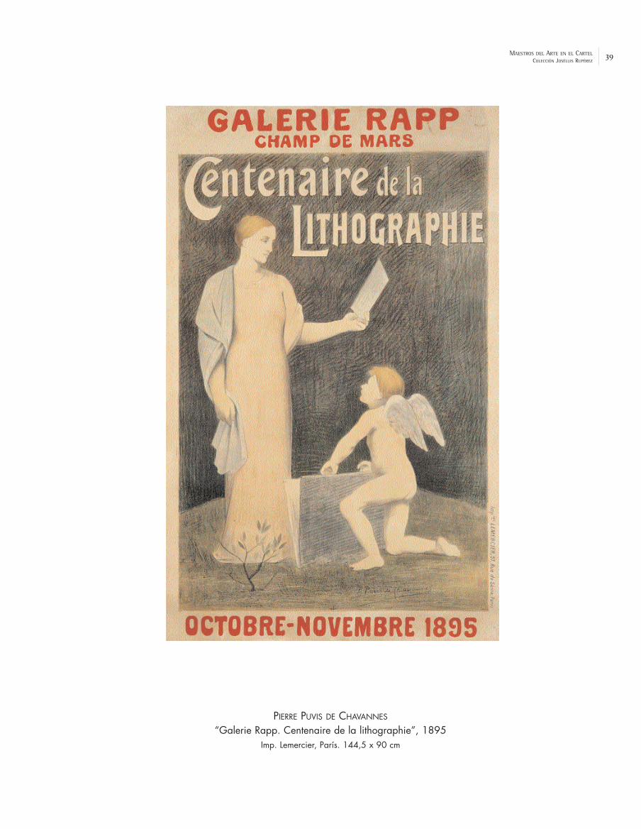
39MAESTROS DEL ARTE EN EL CARTELCOLECCIÓN JOSÉLUIS RUPÉREZ
PIERRE PUVIS DE CHAVANNES
“Galerie Rapp. Centenaire de la lithographie”, 1895Imp. Lemercier, París. 144,5 x 90 cm

40 MAESTROS DEL ARTE EN EL CARTELCOLECCIÓN JOSÉLUIS RUPÉREZ
HENRI DE TOULOUSE-LAUTREC
“Jane Avril”, 1893Imp. Chaix, Paris. 130 x 94 cm

41MAESTROS DEL ARTE EN EL CARTELCOLECCIÓN JOSÉLUIS RUPÉREZ
HENRI DE TOULOUSE-LAUTREC
“Le Matin”, 1893Imp. Chaix, Paris. 83 x 61 cm

42 MAESTROS DEL ARTE EN EL CARTELCOLECCIÓN JOSÉLUIS RUPÉREZ
PIERRE BONNARD
“La Revue Blanche”, 1894Imp. Ancourt, Paris. 76 x 60 cm
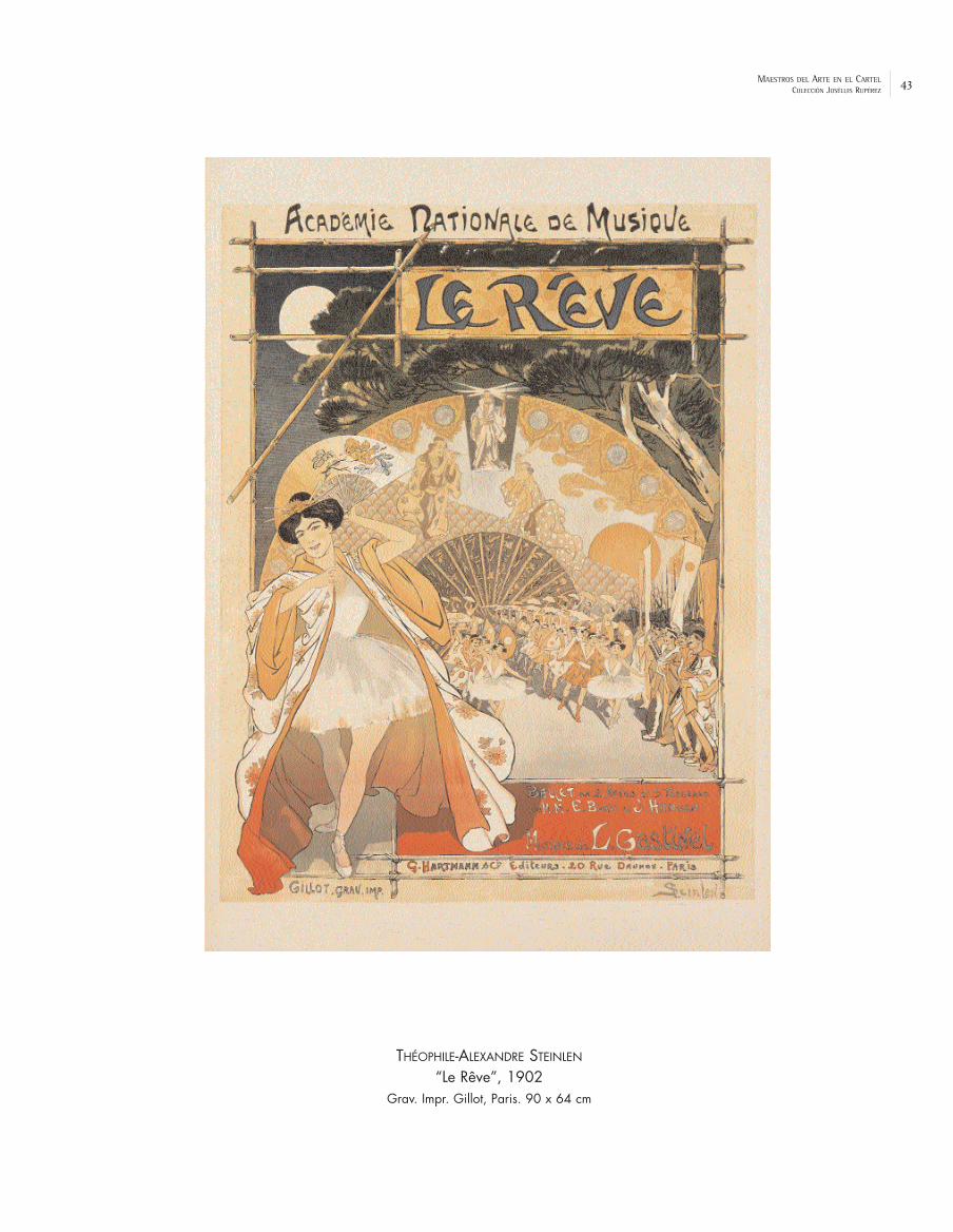
43MAESTROS DEL ARTE EN EL CARTELCOLECCIÓN JOSÉLUIS RUPÉREZ
THÉOPHILE-ALEXANDRE STEINLEN
“Le Rêve”, 1902Grav. Impr. Gillot, Paris. 90 x 64 cm

44 MAESTROS DEL ARTE EN EL CARTELCOLECCIÓN JOSÉLUIS RUPÉREZ
ALPHONSE MUCHA
“Bénédictine”, 1898Imp. F. Champenois, Paris. 207,5 x 76 cm

45MAESTROS DEL ARTE EN EL CARTELCOLECCIÓN JOSÉLUIS RUPÉREZ
DUDLEY HARDY
“A Gaiety Girl”, 1895Waterlow & Sons Ltd., Lithographers, London. 78,5 x 51 cm

46 MAESTROS DEL ARTE EN EL CARTELCOLECCIÓN JOSÉLUIS RUPÉREZ
AUBREY BEARDSLEY
“The Yellow Book”, 1895Copeland and Day, Boston. 51 x 32 cm

47MAESTROS DEL ARTE EN EL CARTELCOLECCIÓN JOSÉLUIS RUPÉREZ
JOHN HASSALL
“A Runnaway Girl”, 189877 x 52 cm
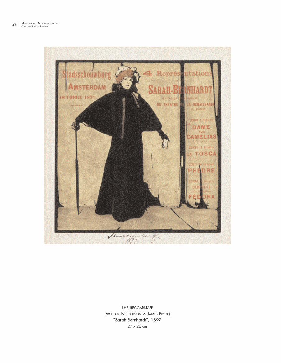
48 MAESTROS DEL ARTE EN EL CARTELCOLECCIÓN JOSÉLUIS RUPÉREZ
THE BEGGARSTAFF
(WILLIAM NICHOLSON & JAMES PRYDE)“Sarah Bernhardt”, 1897
27 x 26 cm

49MAESTROS DEL ARTE EN EL CARTELCOLECCIÓN JOSÉLUIS RUPÉREZ
EDWARD PENFIELD
“Harper’s March”, 1897Ricordi, Milano. 69 x 50 cm

50 MAESTROS DEL ARTE EN EL CARTELCOLECCIÓN JOSÉLUIS RUPÉREZ
KOLOMAN MOSER
“Albertina”, 1910Ed. Gerlach & Schenk, Viena. 30 x 24 cm

51MAESTROS DEL ARTE EN EL CARTELCOLECCIÓN JOSÉLUIS RUPÉREZ
JAIME VALLS
“Perfumes Mercedes”, 1910Propaganda Artística Valls. 34 x 26,5 cm

52 MAESTROS DEL ARTE EN EL CARTELCOLECCIÓN JOSÉLUIS RUPÉREZ
HONORIO ROMERO OROZCO
“Toros en Valencia”, 1899R. Silvestre, lit. Imp. Lit. Ortega, Valencia. 272 x 123 cm

53MAESTROS DEL ARTE EN EL CARTELCOLECCIÓN JOSÉLUIS RUPÉREZ
RAMÓN CASAS
“Anís del Mono”, 1898Lit. Henrich y Cía, Barcelona. 217 x 107,5 cm

54 MAESTROS DEL ARTE EN EL CARTELCOLECCIÓN JOSÉLUIS RUPÉREZ
ALEXANDRE DE RIQUER
“Salchichón de Vich”, 1896Thomas & Cía, Barcelona. 181 x 71 cm

55MAESTROS DEL ARTE EN EL CARTELCOLECCIÓN JOSÉLUIS RUPÉREZ
MIGUEL UTRILLO
“Santiago Rusiñol. Oracions”, 1897Imp. Utrillo. 62 x 44 cm

56 MAESTROS DEL ARTE EN EL CARTELCOLECCIÓN JOSÉLUIS RUPÉREZ
ADRIÀ GUAL
“Orfeó Català”, 1901Lit. Henrich y Cía, Barcelona. 69,5 x 101 cm

57MAESTROS DEL ARTE EN EL CARTELCOLECCIÓN JOSÉLUIS RUPÉREZ
JOAN LLIMONA
“Ajuntament de Barcelona. V Exposició Internacional d’Art”, 1907 Lit. A. Utrillo, Barcelona. 150 x 98 cm

58 MAESTROS DEL ARTE EN EL CARTELCOLECCIÓN JOSÉLUIS RUPÉREZ
JOSÉ MONGRELL
“Ponche Ruiz. Jerez de la Frontera”, 1902Imp. Lit. Ortega, Valencia. 81 x 37,5 cm

59MAESTROS DEL ARTE EN EL CARTELCOLECCIÓN JOSÉLUIS RUPÉREZ
ARTURO BALLESTER
“Grandes Fiestas y Feria en Valencia”, 1913Lit. Durá, Valencia. 280,5 x 135 cm

60 MAESTROS DEL ARTE EN EL CARTELCOLECCIÓN JOSÉLUIS RUPÉREZ
LEONETTO CAPPIELLO
“Uricure”, 1920Imp. Pub. Vercasson, Paris. 138,5 x 97,5 cm

61MAESTROS DEL ARTE EN EL CARTELCOLECCIÓN JOSÉLUIS RUPÉREZ
JEAN D’YLEN
“Bière Allary”, 1914Vercasson, Paris. 55 x 35 cm

62 MAESTROS DEL ARTE EN EL CARTELCOLECCIÓN JOSÉLUIS RUPÉREZ
KASIMIR MALEVICH
“Lubok patriótico”, 191456 x 38 cm

63MAESTROS DEL ARTE EN EL CARTELCOLECCIÓN JOSÉLUIS RUPÉREZ
JULES-ABEL FAIVRE
“On les aura!”, 1916Devambez, Paris. 112,5 x 79 cm

64 MAESTROS DEL ARTE EN EL CARTELCOLECCIÓN JOSÉLUIS RUPÉREZ
JAMES MONTGOMERY FLAGG
“I am telling you”, 1917The Torch of Liberty. 76,5 x 51,5 cm

65MAESTROS DEL ARTE EN EL CARTELCOLECCIÓN JOSÉLUIS RUPÉREZ
THÉOPHILE-ALEXANDRE STEINLEN
“Journée des Régions Liberées”, 1919Lapina Imp., Paris. 115 x 79 cm

66 MAESTROS DEL ARTE EN EL CARTELCOLECCIÓN JOSÉLUIS RUPÉREZ
LUDWIG HOHLWEIN
“Krieger Heim Stätten in Wurttem Berg”, 1917U. Levy, Stuttgart. 68,5 x 49 cm

67MAESTROS DEL ARTE EN EL CARTELCOLECCIÓN JOSÉLUIS RUPÉREZ
OSKAR KOKOSCHKA
“Nieder mit dem Bolschewismus”, 191977,5 x 100,5 cm
imac24
Cuadro de texto
OTTO VON KURSELL


THE IMPULSE OF MODERNITY BETWEEN THE WARS (1918-1945)

29
II. The Impulse of Modernity Between the Wars (1918-1945)
The outcome of the First World War was a new world, the birth of a new century.
The crisis of war and its aftermath opened the way to a period of greater optimism in
Europe, America and Asia, and even economic prosperity, at least until the Wall Street
crisis. The “roaring twenties” were the scene of an emerging modern, cosmopolitan and
elegant society which had the ability to consume new products and a renewed interest in
sport, travel and parties; who acquired a new concept of leisure and free time, and who
demanded a modern image, in accordance with the new times. The incorporation of avant-
garde art to the poster was scarce but necessary to prepare the way for the daily
evolution of graphic materials which were calling for the incorporation of new
repertoires of images, new typographic layouts, new compositional concepts and new
technical resources, such as photography or the airbrush. After the war, non-
representative art; abstraction, arose as a new force for the young artists who
affirmed that it was not necessary for an image to be recognisable for visual
communication. Furthermore, the poster must attract the attention not only of the
pedestrian but also of the modern motorist, and so a visual shorthand was situated both in
the cities and on the roads. Advertisements on large hoardings, frequently considered to
be a desecration of the landscape, extended this popular language. New agencies and
professionals appeared and advertising seemed to establish itself as a science so that, by
discovering and stimulating the desires of the consumer, it could accelerate the market
and multiply the profits. In this context the graphic designer was born, with the
requirement for dynamism, invention and creativity. Some advertisers accepted
spectacular proposals, such as the neon advertisements of Osram or the aeroplanes with
banners for Citroën...
Art-Déco
Discredited for years due to its frivolous and hedonist features, or even its
sophisticated and slightly kitsch aspects, art-déco has recently recuperated part of its
glamour and occupies a similar position to that of art nouveau. Art-déco is the decorative,

30
elegant and cosmopolitan style which best characterises this period and it should be
understood as a reply to the new social reality and the new values which arose after the
Great War. The Exposition Internationale des Arts Décoratifs et Industriels Modernes in Paris, in 1925, confirmed this aesthetic renewal and its impact was felt in
the different artistic fields. It was impossible to stand in the way of this effect of
renewal which was felt in the fine arts, architecture, interior design, fashion, jewellery,
furniture, ceramics, textiles, photography and advertising design. In this desire to
substitute those products which had been imposed by modernism we can see the
expression of a well-off middle class who looked for the “bon ton”. In cinemas, the
interior of buildings, hotels and skyscrapers an exquisite decoration was imposed on a
rationalist structure. Some features of déco poster art are linked to formal stylisation,
geometrisation and eclecticism in the presence of contemporary artistic references of
which it proposes a partial assimilation (post-cubism, futurism, constructivism, surrealism...),
as well as the introduction of ornamental and exotic elements from other cultures,
yielding to material quality, ostentation and luxury. Déco graphics popularised its features
via designs for book covers, press advertisements, illustrations for magazines such as
Vogue, with covers by Benito before photography made its definitive leap, D’Ací i d’Allà, weeklies like Blanco y Negro, with covers by Baldrich or Penagos, and above all
commercial and artistic posters.
The French Poster. The Spirit of Paris
In the 1920s the spirit of Paris, still the capital of art, was maintained. All the “isms”
converged on the city, including dadaism and surrealism, with their magazines and
manifestos. But it was also the capital of fashion and shows and the international focus
for the decorative arts, as was made evident in the above-mentioned exhibition of 1925
which gave its name to the style of the era, art-déco. The artists were like graphic
heralds of the new society and its way of life. The music-hall stars demanded their own
poster artists: Paul Colin, for Josephine Baker; Charles Kiffer, for Maurice Chevalier and
Edith Piaf; Charles Gesmar and Zig, for Mistinguett... Jazz and the Russian ballets of Nijinski
and Diaghilev also caused a furore among the artists, who would design their sets,
costumes and posters (Léon Bakst, Cocteau, Picasso, Derain...) Many avant-garde Paris

31
painters produced posters for the dances which were organised continuously, such as
André Lothe (Fête de nuit à Montparnasse”, 1922), Auguste Herbin (“Bal de la Grande Ourse”,
1925), Léonard Foujita (“4ème Bal de l’Aide Amicale Aux Artistes, les cheveux longs”, 1926) and
Natalia Gontcharova. Émile-Othon Friesz (1879-1949) a painter friend of Dufy with whom he
shared the aesthetic of les fauves, also produced posters within this theme such as “Bal
Travesti. Aide Amicale Aux Artistes”, 1923 [p. 87]. Kees van Dongen (1877-1968), a painter with
a fauve tradition who later evolved to achieve social success, produced remarkable
posters of this genre in the 1920s such as “Bal des petits lits blancs à l’Opéra”, 1927, with
rapid graphics and direct brush strokes, as well as some sorties into commercial
advertising (“Chaussures Cecil”, 1929). Finally, Erté (Romain de Tirtoff, 1892-1990) contributed
with his personal poster art for the shows in this happy Parisian atmosphere: “Chatelet
Yana. Opérette à grand spectacle”, de 1926 [p. 89].
In cinema posters, the most avant-garde painters had little to do – apart from
exceptions like the German expressionist or the Russian constructivist cinema – since the
preferred style was removed from the artistic movements, with images of scenes or of
actors which efficiently illustrated the content of the films. Frequently, the artists applied
their creativity to the posters of their exhibitions, as in the case of the Norwegian Per
Krohg (1889-1965), (“Vostilling Per Krohg. Dansk Kunst Handel”, 1918) [p. 82] who was trained
in Paris, where he accompanied his father, the painter Christian Krohg, and whose first
works are scenes of the city expressed with a fauve colouring and a dadaist
expression.
It was also the moment of the French fashion designers whose activity attracted
designers and artists. The shops and department stores (Le Bon Marché, Les Toilettes
d’Hiver...) required the activity of poster artists such as René Vincent and Marty. In this
atmosphere the painter Raoul Dufy designed materials and tapestries (“Feuilles”) which are
in the orbit of art-déco, while his posters (“Au Printemps 9ème Petite Foire des Arts
Décoratifs Modernes”, 1930) translate his own pictorial universe assisted by agile brush
strokes. In the world of fashion and decoration a mannerist precocity was accepted and,
in this sense, it is appropriate to mention the posters produced by Umberto Brunelleschi
(1879-1949) for the Parisian stores of M. Dufayel (“Palais de la Nouveauté”,1923) [p. 88] in
order to present the latest novelties. In these posters, the linear style of transition
32
characteristic of the style of illustration of Brunelleschi – a cosmopolitan, imaginative and
very refined illustrator – adopts a strange setting with somewhat dislocated figures not
lacking in exoticism of colour in a completely déco atmosphere. Sports such as tennis,
golf, sportive driving are reflected in excellent posters (“Golf de Sarlabot”, de René
Vincent), but it was tourism which provided a lifeline to the artists of the era. Many of
these posters are true “pictures” painted with the tourist destinations as the central
theme, but slowly the images became more and more sober, more constructive (“Marseille.
Porte de l’Afrique du Nord”, by Roger Broders; “Vichy”, by Chauffar). Finally, other icons
would prevail – the “machine”: the train, the boat, the car – instead of nature (“SS. Côte
d’Azur”, 1931, Cassandre), without excluding diverse themes such as festivals or artistic
heritage (“Bordeaux”, 1937, de Jean Dupas).
The work of Loupot, Colin, Carlu y Cassandre – known as “the four musketeers”,
although they had little in common – occupies a central place among the posters of the
interwar years. Fascinated by modernity, these “set designers of the street” influenced
by Cappiello and by the art of the moment threw themselves into the art of the poster
with the intention of elaborating synthetic messages in accordance with the new times.
Although each one had his own style, they shared the vibrant use of colour, elegance and
order in their composition, technical virtuosity and successful plastic solutions. During
these years Cappiello still triumphed with some very well-known posters, such as “Kub”
(1931), but his images began to give way to a new generation which, however, recognised
him as their master: his “Dubonnet” of 1932 would be replaced by the poster in three
sequences in the style of an animated comic “Dubo/ Dubon/ Dubonnet” by Cassandre in 1934.
Charles Loupot (1892-1962), the artist of posters characterised by “a vigorous explosion of forms and colours that does not exclude discipline”, according to
Carlu, began his activity in Lausanne during the war and in 1922 he moved to Paris to work
with the publisher Devambez. The following year his affiches for “Automobiles Voisin”
shaped a personal style of free but voluntarily controlled drawing which would take shape
in work such as the poster for the “Exposition des Arts Décoratifs” of 1925 [p. 90],
“Jouets au Bon Marché” and “Peugeot” (1926), in the line of synthesis and formal purity
derived from post-cubism which he would develop later with “Valentine” (1928), or “Thé
Twining” (1930), published by Les Belles Affiches. In that year he founded L’Alliance

33
Graphique with Cassandre and the printer Moyrand. Perhaps the most outstanding of
Loupot’s activity was his work for Quinquina St. Raphaël for two decades beginning in 1937,
redesigning the brand image – the two waiters, red and white, with their trays – and
developing their programme of publicity (posters, stationery, objects, handkerchiefs, cars...)
with a wide variety of solutions, including the fragmentation of the identifying signs during
a restrictive moment in French legislation on the advertising of alcoholic drinks.
The painter Paul Colin (1892-1985) began designing posters and scenery for the world
of the show in the Théatre des Champs Élysées de Paris. Some works, such as “La Revue
Nègre au Music-Hall” (1925) with Josephine Baker as the star gave him a rapid rise to fame
which provided him with many commissions for posters, scenery and costumes for ballets,
revues, theatrical works and other productions at a time when Paris experienced a sudden
craze for the music and rhythms of coloured artists, reflected by Colin himself in the album
Le tumulte Noir. His decorative style – like superimposed flat shapes – was very close
to post-cubism and was reflected in real jewels of poster art such as “Lisa Duncan” (1927)
and “Tabarin” (1928). His poster work was shown in a retrospective exhibition organised by
the Musée des Arts Décoratifs in Paris in 1945.
The graphism of Jean Carlu (1900-1997) was very much influenced by the cubist
painting of Gris and Gleizes. Since 1918, after an accident in which he lost his right arm, he
re-educated his left hand in order to continue making posters in which “the graphic expression of the idea” soon gave striking results: “Monsavon” (1925), “Aquarium de
Monaco” (1926) or “Havana Larrañaga cigars” (1929). Carlu applied gouache with a rag to
obtain a granulated effect and used templates to mark the limits of the flat shapes of
colour. Moreover, he preferred closed geometric compositions and formal, simple schemes
so that the poster would remain impressed on the mind of the passer-by. Like Cassandre,
Loupot and Colin, he joined the UAM (Union des Artistes Modernes) in 1930 and was the
spokesman of its graphic artists. Later he made the poster for the “Exposition
Internationale Paris 1937. Arts et Techniques”, with the image of a synthetic white face
seen in profile with a background of colourist flags [p. 91]. His social and political
commitment led him to found the office of Propagande pour la Paix where he created
important posters with a cause such as “Pour le désarmement des nations” (1932) based on
photomontages along the lines of Heartfield. From 1940 to 1953 he lived in the USA, where

34
he produced an extraordinary series of posters for the war effort in the Second World
War.
The younger and better-known Cassandre (pseudonym of Adolphe Jean Marie Mouron,
1901-1968) was born in Jarkov and he settled in Paris in 1915. Cassandre belonged to that
generation which was fascinated by “modernity personified by technology, the machine and
speed” and he began to produce posters with a very vigorous style, an art with a
utilitarian vocation which set out to approach the spectator (14). In the Exhibition of
Decorative Arts in 1925 he won the poster grand prix and soon produced some of his best
work, in which one can detect the influence of cubism (“Au Bûcheron”, 1923), futurism and a
concept of space between metaphysic and surrealist. In the poster for the newspaper
“l’Intransigeant” (1925) it seems that “we can hear the news being shouted” and
that “we can see the speed with which it is transmitted”. With Cassandre the
machine found its herald, especially the railway. In “Étoile du Nord”, 1927 [p. 92], the image of
the rails disappearing into infinity just in the vanishing point occupied by the star offer us a
powerful invitation to travel. His geometric and architectonic method can also be admired
in “Nord Express”, 1927 [p. 93], in which the constructive rigor and perspective directionality
newly reflect the idea of the reliability and efficiency of these trains. An amplified view in
the foreground of the roaring connecting rods and wheels of the locomotive at full speed
takes us to abstraction and constructivism, as in other posters produced for the British
railways (“LMS”, 1928,). He also entered other genres (cars, sports, tourism, fashion,
gastronomy, music, shoes...) as well as voyages by boat, with pictures of huge liners, with
their enormous hulls (“Normandie”, 1935) or with amplified details of their smoking chimneys
(“Côte d’Azur”, 1931), always with the advantage of the air brush and a spectacular layout.
Apart from “Dubonnet” (1934), another success in drink advertising was his version for
“Nicolas” (1935), which respected the icon of the cellarman with bottles, on the Dransy
poster (1922) but included some contrasting and vibrating strips that predated the
investigations of op-art. In 1935 he signed an exclusive contract with the printer Draeger
and in 1936 the MOMA (New York) organised an exhibition with his posters. His designs for
the advertising of Ford (“Watch the Fords Go By”) date from 1937.
The style and icons of Cassandre had a great influence in the era and it is inevitable
to think of the influence projected over artists inside and outside France (Francis Bernard,

35
Fix-Maseau, Zenobel, Giralt-Miracle...). The graphic activity of the Japanese artist, Munetsugu
Satomi, in the 1930s is in the style of the times and very close to the universe of
Cassandre, with very well constructed messages (“Orient Calls”, 1936) [p. 94]. Satomi had
studied fine arts in Paris, where he settled in 1922, and worked in advertising until 1939. In
these works his command of skill allows him to transmit wonderfully the sensation of
great speed of the train as though we were the traveller and we were looking through
the window and living the sensation of the posts leaning in the curves, or experiencing
the same flight of the landscape in the retina (“Japan. Japanese Government Railways”,
1937) During the war he was in Thailand as a cultural adviser under the orders of the
Japanese government, returning to France in 1952 where he returned to advertising.
The New Rationalist Formalism. De Stijl, Bauhaus. The European Poster
Around the magazine De Stijl (1917-1928) was a group of creators (Théo van
Doesburg, Piet Mondrian, Bart van der Leck, Vilmos Húszar, Rietveld...) who aspired to an art
and a culture that contributed to the development of a “new aesthetic consciousness” to
build a new society upon the pillars of a non-individualistic art. Mondrian, who elaborated of
the theory of neo-plasticism and was immersed in a formal abstraction that aimed to
make visible the essence of reality, developed constructive painting, more and more
unadorned until only the vertical and horizontal lines remained to limit the smooth zones of
primary colours (red, blue, yellow) with symbolic values. The Dutch evolved independently but
were not unaware of the works of the Bauhaus – and vice versa – from which they were
separated only by small differences. The De Stijl designs were exhibited in Weimar in 1923,
where Doesburg was a teacher. Some posters show the aesthetic links to De Stijl, such
as that of van der Leck for his exhibition in Utrecht (1918), the graphic publicity for
“Bruynzeel” (1931), by Húszar and especially the posters and the investigations of Piet
Zwart (“Nederlandsche Kabelfabriek”, 1928), H.N. Werkman, Mart Stam and Paul Schuitema. The
introduction of photomontages, the typographic fantasies and the freedom of
composition gave a new dimension to words intended as images. (15)

36
The Bauhaus school of art and architecture was the principle centre of design in
Germany from 1919 to 1933 with various phases (Weimar, Dessau, Berlin) marked by
important internal and external tensions. It subsequently exercised a great influence. It
sought to merge the different arts, promoting the aspects of craftsmanship. Its first
director, Walter Gropius had artists and teachers such as Itten, Feininger, Klee, Schlemmer,
Kandinsky, Albers and Moholy-Nagy. After the initial “spiritualist” period, the constructive
tendencies were emphasised, the posters of this period being essentially typographic, such
as those of Fritz Schleifer (“Bauhaus Austellung”, 1923), at the same time as Bayer and
Albers created experimental alphabets. Although there was not, in a strict sense, a
“Bauhaus style”, various artists created austere and clean posters with the modern
asymmetric graphics, angular and dynamic compositions, new sans serif typographies –
clear, without decoration – sometimes all in lower case, and the ornamental use of basic
geometric forms, like Joost Schmidt (“Bauhaus Exhibition. Weimar”,1923), Herbert Bayer
(“Kandinsky”, 1926), László Moholy-Nagy (“Pneumatik”, 1926) and Max Burchartz (“Kunst der
werkbund”, 1931). Other posters show a great interest for photography together with
non-representational elements (especially Moholy-Nagy) so that at the end of the 1920s
this had become one of the favourite means of expression of the European avant-garde
artists although its application to the poster came somewhat later. In Dessau the
atmosphere was more receptive and the actual Bauhaus building, with its extremely
rational prefabricated structure, marked a change of direction in the school from a
conception of craftsmanship to a now industrial functionality. In 1928 Joost Schmidt would
run the “Print” studio –renamed “Commercial Art” and later “Publicity” – and he was
interested, like Bayer, in three dimensional publicity, with designs for kiosks and publicity
stands.
In other cities there were centres and artists far from Bauhaus who carried out
parallel investigations, alone. This is the case of the poster artist and great typographer
Jan Tschichold, of Leipzig, with cinema posters such as “Phoebust-Palast” and “Der Frau
ohne Namen” (1927) in which photography is associated with asymmetric typography. On the
other hand, advertising could count on artists such as Jupp Wiertz, in Berlin, who cultivated
a charming and delicate style in posters for beauty products with images of elegant
women (“Kaloderma”). In cities such as Munich, poster art had maestros whose path
37
changed very little, such as the great Ludwig Hohlwein, with advertisements for “Pelikan”,
“Zeiss” and “Tintas Arnhemia”(1925), as well as artists like Engelhardt, who approached the
French déco rather more. A large quantity of posters belonged to the cultural field,
festivals (Zietara, “Carnaval”, 1929), cinema or sports, such as the poster “VI International
University Games. Darmstadt”, 1930 [p. 95], by Otto Schneider.
The presence of other tendencies in art and in the poster in Germany at that time
should also be mentioned. After the war, the dadaist group formed in Zurich in 1916
dispersed, forging connections across the Atlantic (Duchamp, Stieglitz, Picabia, Man Ray),
with nuclei in Düsseldorf, Berlin and Cologne. This rupturist, nihilist movement, which
favoured the absurd rather than the “rational” values which made the war possible,
represented the “anti-art” and renounced style or any artistic path, which shocked more
than a few artists of the formalist vanguards. However, their provocations and syntactic
dislocation constituted material which was subject to graphic innovations, which they
showed in their magazines, and with different unorthodox processes such as the
photomontages of Max Ernst or the typographic collages of Schwitters. The works of
Duchamp which are quoted as an example of artistic demystification – “LHOOQ, 1919”, the
Mona Lisa with moustache – predate similar phenomena of the contemporary trivialisation
of publicity. Man Ray, the creator of the rayograph, incorporated an intentional advertising
into his photographs and made very original proposals like “Keeps London Going”, comparing
the trademark of the London Underground with a planet. The German John Heartfield (1891-
1968), was a pioneer of the photomontage together with George Grosz and Raoul
Hausmann. A founder member of the KPD, he joined the dada group in Berlin (1920) and
published his first works there. His posters of social and political criticism requesting
votes for the Communist Party (1929) or against Hitler and nazism (“Adolf, der
übermensch...”, 1932) in which he bravely attacked their growing warmongering, figure
among the best of the genre. His militant and emotional art had a great influence on
various European artists.
After the war, a renewed expressionism was seen in the posters for the new
German cinema, also expressionist, as in “Das Kabinet des Dr. Caligari”, 1920, by Otto Stahl-
Arpke or in “Der Golem”, 1924, by Hans Poelzig, with their delirious spaces and tormented
characters. In the last phase of German expressionism and connected to the dada in Berlin,

38
the new expressionist realism known as the New Objectivity (Neue Sachlichkeit) had as its main exponents from 1924 Grosz, Dix and Beckmann and adopted a militant and
committed position in the post war panorama. The anti-military and anti-capitalist work of
George Grosz (1893-1954) constituted a sarcastic criticism of the yearning for power of
the middle and ruling classes in Germany. Grosz finally went into exile in the USA. In his
watercolour “Manhattan”, 1931 [p. 96], one of his themes, the metropolis, reappears but
without the dramatic and expressionist edges of his earlier paintings. The arrival of nazism
caused a fatal blow to all of these efforts: The Bauhaus closed its doors in Berlin; a large
number of the vanguard emigrated; the forms and images of the poster retreated. In Italy
there was, from the 1930s, a presence of fascist ideology in the political poster and a
certain incidence in the graphic proclamations of Fiat, but commercial publicity used avant-
garde language thanks to the contributions of Nizzoli, Depero, Munari and Carboni.
In Austria there were two important names in the posters of the interwar years:
Julius Klinger and Joseph Binder, who finally left for the USA (“New York World Fair”, 1939).
The neutral Switzerland, which assimilated French and German influences followed its own
path with the recognised quality of its printing. Baumberger, Birkhauser and Stoecklin
developed a “hyper-realist” poster style in the “new objectivity” for several customers,
among which must be mentioned the department stores PKZ who always showed exquisite
taste in entrusting their advertising to the best artists of the moment. The Swiss artist,
Niklaus Stoecklin (1896-1982) (16), astonished with the versatility of his posters, adopted
solutions that ranged from the geometric shape (“Gaba”, 1927), extreme objectivity
(“Cluser Transmissionen”, 1925), and subtle, almost surreal irony (“PKZ”, 1923-1934) to the
historicist graphics of the poster “Der Kalender in alter und neuer Zeit”, of 1924. Herbert
Matter (1907-1984) included photography in his posters for tourism in the mid 1930s
(“Engelberg”, 1935; “Für schöne Autofahrten die Schweiz”, 1935) which constituted a real
revolution, which his dynamic composition and efficient contrasts. Matter, enthused by the
cinema and chromophotography, emigrated to the USA in 1936 where he worked as a
photographer for Vogue. From 1941 he developed posters relating to the war and later
designs for Knoll, adding the visual clarity of the Swiss school to American design.
To bring this European summary to a close, it is necessary to mention the starring
role of the British advertising groups and companies determined to achieve a high standard

39
of quality in communication with their customers. Thus, the image of the London
Underground changed radically from 1908 thanks to Frank Pick who instigated a remarkable
poster campaign, converting the stations into real windows of current events where
information was available on anything from museums to picturesque sites. All this with a
high standard of design, since dozens of top artists were contracted, such as Cooper,
Nash, Dupas, Moholy-Nagy, Man Ray and, especially, Edward Macknight Kauffer (1890-1954). This
vorticist American painter, who had lived in London since 1914, applied himself successfully
to advertising with avant-garde creations for all kinds of advertisers before returning to
the USA in 1940. Other companies that exercised patronage in poster activity were the
petrochemical industries (Shell-Mex, BP), and the railways (LNER, LMS...) with commissions for
artists such as the elegant Tom Purvis – artist of “LNER East Coast Joys” 1935 –
Cassandre, Austin Cooper or the Belgian Léo Marfurt.
The Poster in Soviet Russia
From those “ten days that astonished the world” in October 1917, the Russian
revolution formed part of a whirlwind of events which would change the social and
ideological order of Russia and the international political panorama. It should be said that,
from the beginning – with Lenin and Lunatcharsky – they tried to reconcile the
revolutionary content of the messages with the avant-garde form. The initial
commitment of the artists (Malevich, Tatlin, Punin, Rodchenko, Rozanova, Kandinsky,
Lissitzky...) would continue in this double direction and with the opportune propagandistic
directives they undertook the production of an avant-garde art directed at the public, in
which the posters and other graphic materials served to transmit very simple ideas or
instructions to the peasants and proletariat (“Factories for workers”...) at a time when
hunger, civil war and the international blockade were decisive. The propaganda images set
out to provoke rather than to demonstrate or analyse and, as they were placed in the
windows of shops which were empty or had few products on sale, they were given the
name of Rosta posters or Rosta windows (referring to their issuer, the Russian
Telegraphic Agency).

40
There was a generalised enthusiasm expressed by El Lissitzky, one of these artists:
“The traditional book should be thrown in all directions, multiplied by a hundred, colourist, and in the form of posters displayed in the streets”. The
immediacy and speed of communication of these posters, produced with a few vividly
coloured stokes, is remarkable, as is the structure of the composition which shows the
influence of constructivism (Lebedev: “It is necessary to work with a rifle by one’s side”,
1920, and Kozlinski: “The Paris Commune”, 1921) The Russian artistic vanguard, assumed
initially by the political leaders, also had links with the parallel investigations of Dutch neo-
plasticism, and the German Bauhaus and dadaists. The intention behind these images was to
form the basis of a popular art which would cross the linguistic barriers of an extended
multinational state, although the most radical proposals from the formal point of view,
such as “Strike the whites with the red wedge”, 1920, by El Lissitzky, considered to be the
first abstract poster in history, did not achieve its objective of reaching the majority of
the population, who were still a long way from these avant-garde ideas. El Lissitzky
(Eleazar Marcovich, 1890-1941) after some posters such as “Pelikan” (1924), which bore a
relationship with Man Ray’s rayographs, produced the striking poster for the Russian
exhibition in Zurich (“Russische Ausstellung”) of 1929 [p. 97], with a photograph of the
melting faces on the modern Soviet pavilion. The propaganda for Stalin’s great five year
development plans would have in Gustav Klutsis an excellent backer with his
photomontages. Previously, the Bolshevik political posters (17) seem to have gone in two
directions: one more satirical, led by Viktor Deni, and the other more heroic, which
corresponded to the work of Dimitri S. Moor. This artist made a well known poster “Have
you enlisted as a volunteer?” (1920), which follows the scheme of the implicative poster
already practised by Leete and Flagg in the First World War, and “Help!” (1921), a really
synthetic work with a dramatist content. The exhibition features the poster “The black
ravens are preparing to raid the USSR. Proletarians, be alert!” of 1930 [p. 98].
The extraordinary Russian cinema posters produced from the mid 1920s to the
beginning of the 1930s still surprise us with their modernity. The poster artists (Rodchenko
– the pioneer of photomontage – Anton Lavinsky, Anatoly Belski, N. Prusakov and, especially,
the Stenberg brothers) used the same audacious techniques as the film makers that they
advertised: Close-ups, changes of scale, shots from below and all kinds of montage

41
techniques, cutting and joining with great compositional freedom. Constructivism here
made use of photography, bright colours, experimental typography and the creativity of
these artists to serve avant-garde Russian cinema – “The Battleship, Potemkin”, 1925, by
Eisentein; “A Sixth of the World”, 1926, by Dziga Vertov – and the silent American and
European films that arrived in the Soviet Union (18). The Sovkino, state cinema company,
supervised the production of posters via Reklam whose representative surrounded himself
with talented artists. Among these the brothers, Georgii Stenberg (1900-1933) and Vladimir
Stenberg (1899-1982), whose father was Swedish and who became Soviet citizens in 1933,
stand out. These young and advanced constructivists, teachers at the Institute of
Architecture in Moscow, worked together producing costumes and sets for the theatre.
From 1923 they produced about three hundred posters for the cinema, among which some
of the most outstanding are “The poet and the tsar”, 1925, “Society games”, a film by Carl
Froelich, 1927, and “The man with the camera”, by Dziga Vertov (1929) which reproduces the
special whirlwind generated by the cinema operator himself. The Stenberg brothers’
posters are exceptional productions with original photographic solutions and spectacular
typographic layouts. In 1927 they made a poster for the film “Ninish” [p. 99] by Victor Janson
(1924), with a close-up of the face of the star, the German silent film actress Ossi
Oswalda. In another version of the same poster, the Stenbergs created two circles in
which the names of the film and the actress were repeated like an echo.
The Posters of the Twenties and Thirties in Spain
The bullfighting poster evolved far from the artistic currents of the era with the
contribution of artists like Roberto Domingo (1883-1956), whose poster “Plaza de Toros de
Madrid” of 1920 [p. 100] is featured in this exhibition, and who worked within the purist and
typical tradition. His works receive equal amounts of praise and criticism: “horrid bullfighting posters with the stink of vulgar rabble and despicable ruffians”. The Alicante artist Carlos Ruano Llopis (1878- 1950), the author of hundreds of bullfighting
posters painted with large and urgent brushstrokes in oil and later produced by lithography,
also contributed from his first works (“Plaza de Toros de Valencia”, 1913) in codifying a
model for the poster which would dominate the bullfighting poster scene for several
decades, culminating in “a pictorial bullfighting tradition, genuinely Valencian,

42
practised by historically renowned poster artists such as Cecilio Pla and Roberto Domingo” (19) Trained in the Escuela de Bellas Artes of Valencia, he developed a
very personal style based on folkloric elements (typically Spanish women, flamenco-style
men, Goyaesque characters, guitars, tambourines, banderillas, combs, carnations...) in the
same bullfighting scene, displayed with a lavish use of colour in a narrow vertical format
(“Toros en Alicante”, 1926...) Many of these posters were printed by the prestigious
lithography printers, Ortega of Valencia, who served the demand distributing throughout
Spain lithographic prints made from one general model with no text, or with the legend
“Bulls in …” to be customised according to the exact destination. Carlos Ruano, who “was awfully keen on flamenco singing and slept in the opera”, tackled one of his
favourite themes in the poster “Carmen”, [p. 101] dedicated to Carmen Amaya.
The generation that marked the transition towards the poster and illustration of
the 1920s has three main names: Penagos, Ribas and Bartolozzi. The interwar years were a
“silver age” of Spanish culture and probably also for the poster, watchful of avant-garde
tendencies. Rafael de Penagos (1889-1954), a young and precocious artist, was the
consecutive winner of several first prizes in the prestigious Poster Competition for the
Masked Ball of the Círculo de Bellas Artes in Madrid. He studied fine arts and in 1913 took a
scholarship in Paris, from where he sent three posters for the Competition of the Casa
Amatller, winning the first, second and fourth prizes (“Chocolate Amatller). From 1914,
integrated in the intellectual atmosphere of Madrid, he collaborated in several magazines
(La Esfera, Nuevo Mundo, ABC and Blanco y Negro) and designed the covers of
novels, illustrations for Calleja and various posters. His elegant work, optimistic and
excellently drawn, is a prototype of Spanish déco. The “Penagos girls”, fashionable, with
stylised forms, authentic “prodigies of graphic seduction”, became an (erotic) sign of
the times, adding to the joy of the city with their bobbed hair, short skirts and “the smoke of the first cigarettes”, according to Gómez de la Serna. The posters of
Penagos reflect a pleasant scene, “an ideal world, characterised by comfort, in which the negative aspects of society had no place”.(20) His posters covered
various genres: “Sudoral”, 1922; “Comed Fruta española”, 1926; “Exposición General
Española”, 1926; “San Sebastián. La Playa Real”, 1927 [p. 102]. A teacher of drawing at the

43
Instituto Cervantes in Madrid in 1935, he made some posters for the republican side and lived
in Santiago de Chile and Buenos Aires from 1948 to 1952.
Federico Ribas (1890-1952) was one of the three prize winners in 1916 together with
Penagos and Bartolozzi in the competition of Perfumería Gal, of which he was artistic
director and for whom he made thousands of designs. Ribas made some inroads into the
déco with cubist roots, but in his own way. In the critique of his exhibition “Mujeres de
Ribas”, of 1926, it was stated: “Federico Ribas, one of the best designers of our times (...) paints light headed and lightly dressed ladies (...) so mischievously that they look a treat”.(21) In 1928 he led the agency “Veritas” together with Prat Gaballí.
At the beginning of the civil war he travelled to Argentina, where he created stage
designs, and returned to Madrid in 1950. As with Penagos, one can speak of the eroticism
of Ribas’ women, but his unmistakable style made him seem a “frivolous” designer of joyful
girls. In his illustration “Perfumería Gal”, c. 1940 [p. 103] he reminds us slightly of Colin, of
“Bal Nègre”, with his friendly sympathy and coloured characters in scenes of dance and
enjoyment. Other excellent illustrators of women, with international renown such as the
Peruvian Alberto Vargas, are also present in the collection (“Summer Beauty”, 1934).
Salvador Bartolozzi (1882-1950), after his stay in Paris, was a brilliant illustrator of
popular “moral tales” and “children’s amusement” for the publisher Calleja, of which he would
be artistic director from 1917 (“Pinocho detective” ), as well as creating comic characters
with a great sense of humour. He won numerous poster competitions (“Jabón La Toja”),
including some very distinguished such as the Masked Ball of the Círculo de Bellas Artes in
Madrid, 1919, for which his entry was considered disrespectful, and the genial and successful
“Ceregumil Fernández” (1925), produced in collaboration with Tono. The poster for tourism
which features in this exhibition (“Besucht Spanien. Salamanka. Die Ruhmreiche Stadt der
Renaissance”, 1929 [p. 105] approaches a more international language and concords with
the chromatic and decorative subtlety of some of the gouaches of these years. After the
war, exile took him to Paris and, in 1941, to Mexico.
Various painters (Pascual Capuz, Hipólito Hidalgo de Caviedes...) responded with their
images to the poster commissions of the Patronato Nacional de Turismo, and these
constitute real graphic joys of the era. One of them was Daniel Vázquez Díaz (1882-1969),
the post-cubist and great constructive painter of portraits, landscapes and mural-type

44
compositions, a professor of fine arts in Madrid, who enjoyed great influence for decades.
His poster “Spain. The Land of Romance”, 1929, uses the poetic, monumental landscape of
Segovia [p. 106]. The great Canary Islands painter Néstor de la Torre (1887-1938) painted a
landscape which was, at the same time, both imposing and very sensitive, with a strange
chromatic combination for the poster “Tenerife. Las Islas Afortunadas”, 1929, also for the
Patronato Nacional de Turismo [p.107]. The genre of tourism in the poster, whether with
images of attractive landscapes, such as “Cuevas-Artá-Mallorca”, 1923, [p. 104] by Erwin
Hubert for the Fomento de Turismo de Palma, or with posters of fiestas which are
considered tourist “attractions”, provided excellent examples during these years with
works by young painters looking to gain money and prestige: “Alicante. Fiestas”, 1926, by
the painter Emilio Varela; “Alicante. Fogueres de San Chuan”, 1933, by Ramón Gaya; “Alcoy.
Feria y Fiestas Populares”, 1936, by José J. Arjona...
From the second decade of the century some international agencies, such as Maga,
of Bologna, provided Spanish manufacturers with graphic material by prestigious artists
such as Cappiello or anonymous illustrators – “Limpiametales Netol”, “Freixenet”. The life of
some images was prolonged when they were placed on longer-lasting supports such as
ceramic tiles (“Michelin”, by Roussillon; “Cinzano”, by Cappiello; “Anís del Mono”, by Casas;
“Chocolates Amatller”, by Penagos...), and some places – metro stations, walls, shop
façades... – acquired a spectacular decorative dimension. Illumination was incorporated into
advertising and the posters “moved”, occupying new places on the sides of trams and
buses and, especially, on the roads.
Of the Spanish artists of the 1920s we should also mention Félix Vázquez (“Sudoral”,
1924), Félix Alonso (“Cigarrillos Turcos”, 1920) and the acclaimed painter Julio Romero de
Torres, a paradigm of artistic traditionalism who produced occasional poster commissions
(“Unión Española de Explosivos”, 1924) which transport the viewer to his pictorial universe
of sensual “dark-haired women”. Among the Valencian painters and poster artists Pascual
Capuz and José Segrelles (1885-1969) stand out. The latter, a great illustrator and water
colourist, undertook some commercial posters with a pictorial touch in the style of
Sorolla (“Jabones Barangé. Barcelona”, 1924, with the well known figure of the child
blowing bubbles on the beach), other commemorative posters (“Bodas de Plata del F.C.
Barcelona. 1899-1924”) and some for fiestas, such as “Valencia. Festividad de San José.
45
Típicas Fallas”, 1929 [p. 108]. Luis García Falgás during these years worked on his poster
“Tintes Iberia”.
In the 1930s the graphic and poster work of a series of artists was developed –
among which the Catalonian focus stands out – such as Josep Alumà, Ricard Fàbregas,
Josep Obiols, Lluís Muntané, Josep Morell, José Espert, Lau (Nicolau Miralles), Antonio Clavé,
Evarist Mora, Emili Ferrer, Martí Bas, Josep Renau, Teodoro Delgado and Antonio Moliné. With
these were incorporated some graphic designers and photographers of great worth, such
as Josep Sala, Llovet and Pere Catalá Pic, who introduced the new European tendencies on
the Catalonian graphics scene of the time in magazines, leaflets and all kinds of items. In
1929, the Exposición Internacional de Barcelona gave rise to the entry into Spain of the
ideas of the Movimiento Moderno with the presence of the German pavilion of Mies
van der Rohe and his declaration of rationality in architectonic design. Many posters
announced the exhibitive event, such as those which reflect the spectacle of the luminous
fountains of Montjuic. Francesc d’Assís Galí (1880-1965), director of the Escola d’Art and
assessor of the exhibition, was the author of the official posters of the event in a
“noucentista” graphic style – a fusion of classicist and Mediterranean ingredients within
the Catalonian tradition – in which some déco features were incorporated. In the poster
“Exposición Internacional de Barcelona. El Arte en España”, 1929 [p. 109], Galí made a historic
synthesis representing the caves of Altamira, the Catalonian Romanic heritage and the city
of Toledo.
The Catalonian Emilio Vilá (1887-1967) was working in Paris as a lithographic designer
(Atelier Vila) and made posters such as “Bal Hispano Americain”, organised by the Casa de
España in 1926 [p. 110]. Vilá planned the scenes previously in photographic sessions with
young models and then adapted the images for elegant and delicious illustrations, for
advertising commissions for perfumes or fashion (“Girl with background of seagulls”, 1925).
Upon his return to Catalonia, with the same scheme of previous photographic support, he
produced various posters, among them one for his exhibition in the Sala Parés, in 1929.
Josep Morell (1899-1949), perhaps the most important Catalonian poster artist of the
interwar years and winner of various competitions, was widely admired and imitated to the
point that – according to a critic of the time – many professionals “made morells” with a
brush and an airbrush. His highly admired work before the war was characterised by the

46
synthesis of the idea, the constructive layout and the elimination of the superfluous, that
is to say, by the more “modern” features of European graphics of the time. He produced
posters for tourism and others for local demand, such as “Funicular Aéreo de Montserrat”
(1933). A very emblematic advertisement is that of “Molfort’s” socks (1932) with the genial
character who is wearing them creating a great diagonal in the tradition of
constructivist déco. He was also a political poster artist in the service of the Lliga
Catalana with notable results such as the poster “No passaràn. Voteu el Front Catalá
d’Ordre” for the elections of February 1936, with the image of a man in white who bars
the way to the members of the Front d’Esquerres. In the war he made the occasional
poster for the nationalist side (“Ha llegado España”) and in the post-war he continued his
work as a poster artist and illustrator, especially in the genre of tourism, but adopting in
some cases a very different aesthetic tone, a monumental academicism somewhat
anachronistic, as in his large religious prints: “Creación”, 1939 [p. 115]. For his part, the
Barcelona painter Emili Grau Sala (1911-1975) kept an amiable decorative style in the posters
of the 1930s, with a profusion of floral and colourist details in posters such as “Doña
Rosita o el lenguaje de las flores”, by García Lorca or for the “Festa Major. El Prat de
Llobregat”, 1935 [p. 111], which had a certain influence in that era.
Antoni Clavé (1913), one of the important Spanish painters and printers who have
developed their work after being exiled, began by being a good poster artist influenced by
Morell. At the beginning of the 1930s he produced some constructive, synthetic and
powerful works such as that destined for a newspaper “Llegiu L’Opinió”, 1933 or “Obrer,
estalvia”, this one for the Caja de Pensiones, which seemed to anticipate the language of
republican poster art in the war. His large posters for the façades of cinemas, ephemeral
but of high quality (“El aristócrata” 1935), have been singled out. The poster for the
“Associació d’Artistes Independents. Primer Saló 1936”, which is featured in this exhibition [p.
113] is very delicate and classicist.
The Valencian Josep Renau (1907-1982) appears to bring together the influences of
French déco and Russian constructivism with a solid pictorial and technical education in his
extraordinary posters of the 1930s. One of the most remarkable examples is that made
for the spa “Las Arenas”, 1931 [p. 112], whose composition relates it to cinematographic
language, which, moreover, he also approached on many occasions as a producer of
47
posters for Soviet (“Tchapaief, the Red Warrior”) and, later, Mexican films. Renau made an
original and refreshing bullfighting poster (“Gran Corrida de la Asociación de la Prensa”,
1935) and a spectacular proposal for the “3ª Olimpiada Obrera, Barcelona” (1936).
The Posters of the Spanish Civil War
Renau and Clavé were two of the most outstanding artists of the republican poster
during the war. The messages required by the propaganda left little margin for aesthetic
values but, even so, there is a multitude of examples, especially on the republican side (22),
which show the survival of the innovative graphics forged at the beginning of the 1930s.
In the posters for the elections of February 1936 (Arteche: “Vota pel Front d’Esquerres”;
Ambros: “Votad a las derechas”) the conflictive tone could be appreciated. Later,
propaganda was subject to wartime discipline. The majority of the poster artists belonged
to a union and their activity was influenced by military objectives. However, the poster –
as an artistic product – was signed and in some cases proclaimed the importance of the
activity itself, as in “El arte por nuestra independencia”, 1937, by Bardassano, in which a
huge pencil transfixes the bodies of Hitler and Mussolini. On the nationalist side the radio
was used more widely than graphic propaganda.
In the important nucleus of Catalonian posters various artists stand out, such as
Carles Fontseré (“UGT. Treballa per als que lluiten”), whose Memoirs (23) have contributed
to a better knowledge of the period. Antoni Clavé created the emblematic poster with
patriotic intentions “Catalans! 11 setembre, 1738-1938” [p. 114] and on the Huesca front in
1938 he produced the album Diez dibujos de guerra with Martí Bas, who was another of
the great creators of republican posters with clear and efficient messages (“Defensar
Madrid és defensar Catalunya”). Helios Gómez, whose style was closely related to the
vanguard, was general secretary of the Union of Professional Designers (SDP) and an
active communist militant. Other Catalonian poster artists were Lorenzo Goñi (“¡tú? Que
has fet per la victòria?”), Josep Subirats, Enrique Ballesteros (Henry), Frederic Lewy (LY) and
José Luis Rey Vila (Sim).
The most representative artists of the republican poster in Madrid were Mauricio
Amster, Arteche, Bartolozzi, Briones, Oliver, Parrilla, Puyol, Bardassano and Emeterio

48
Melendreras (1905-1996), who ran the Drawing Studio of the Union of Fine Arts during the
war. Penagos, Ribas and Bartolozzi also made posters, but without great importance.
Josep Renau, a communist militant, was already a renowned artist and intellectual and
played an important role in the war poster as artist and promoter from the political posts
he occupied (Director General of Fine Arts, September 1936; Director of Graphic Propaganda
of the State, 1938). One of his official responsibilities was to safeguard the national
artistic heritage, including the Prado Museam, whose works he transferred to Valencia. The
will to transform, which he attributed to the poster, was formulated in various documents
(Función social del cartel, 1937). As well as his cultural and political role in the Republic,
Renau was a great muralist and a master of photomontage in the style of Heartfield
(“American way of Life”) while in exile.
It is not easy to summarise the richness of wartime poster art (24), which is a
reflection of history itself, but it is significant that one of the most widely invoked
concepts of the republican poster from 1937 was that of union, since the duplicity of
military forces in the front, together with the ideological, political and syndical plurality in
the rearguard, created an exaggerated wastage. The republican media spoke as one voice
to encourage union, an indispensable condition for victory, although each party claimed
leadership (Josep Renau: “El Comisario, nervio de nuestro ejército popular”, 1937). Other
themes in the posters stress the role of the protagonists of war (Arturo Ballester: “Un
marino: un héroe”, 1937). The poster repeated the message that to win the war it was
necessary to increase production (Carles Fontseré: “La Industria, L’agricultura. Tot per al
front”, 1936). The cinema had a surprising diffusion on both sides, since together with the
other shows it allowed the appearance of a normalised rearguard. However, in the daily
life of the republican side, Soviet cinema was emphasised, with poster versions of the
most representative films (Puyol, “The Battleship Potemkin”, 1937)
The photographic poster gives an account of the moral sense of the conflict and
its international connections “Axaifem el feixisme” (1938), by Catalá i Pic, in which a
Catalonian peasant crushes the Nazi swastika with his espardenya. For his part, Joan
Miró produced his well-known and colourist “Aidez l’Espagne” (1937) to arouse social
solidarity and support for the republican cause.
49
The propaganda had an opposite focus on each side. On the nationalist side, with
decidedly fewer posters, political union was stressed as opposed to the ideological
pluralism of the republican posters and the issuing of messages was centralised in the
Jefatura de Propaganda de la Falange and the Servicio Nacional de Propaganda. The use of
radio from the first moment by the nationalists allowed them to reach, with less effort,
the population in their territory as well as those who dared listen to them on the
republican side. Nationalist poster production began in 1938 and although the artistic quality
and the quantity of posters was inferior, some artists stood out, such as Juan Cabanas
(“Ya presentimos el amanecer en la alegría de nuestras entrañas”) and, especially, Carlos
Sáenz de Tejada (1897-1958) with posters like “Viva la Patria”, 1939. Before the war, after a
long stay in Paris, he produced illustrations for La Libertad, La Esfera, Blanco y Negro and ABC. On the 18 July he found himself in the nationalist zone and this fact
conditioned his artistic career, since he had no political antecedents which could predict his
destiny as official illustrator for the nationalists. His unmistakable style with long and
idealised heroic-symbolic characters filled the scenes which emphasised the ideology of the
winners (“En nuestra justicia está nuestra fuerza”, 1939). His quality as an illustrator would
be developed in the immediate post war period (“Historia de la Cruzada Española”, 1940-44)
Posters of the Second World War
In the mid 1930s, the pre-war atmosphere was forged in a mad race for armaments
in different countries, with the hardening of political discourse, the rise of Nazism and the
Spanish conflict, which appeared to be the prelude to an even greater struggle. All this is
reflected in the posters of the era, frequently with spectacular images which show the
military and airborne power of the nations: “Deutsche Lufthansa”, by Ludwig Hohlwein, 1936,
on the occasion of the Olympic Games in Berlin; “Imperial Airways”, by A. Brenet, 1937. Later,
as in the First World War, the poster became an indispensable means of communication in
the great conflict which fractured the world from 1939 to 1945. The governmental
propaganda coincided in its messages about patriotic public spirit, security, production and
economic support. The graphic symbols of patriotism which were deployed in the posters
included the use of the flags and symbols of the contestants (hammer and sickle, red star,
swastika...) avoiding figurative references with the intention of playing down and lowering

50
the emotional temperature of the conflict. In this sense, such posters should be mentioned
as “Give it Your Best!”, 1942 [p. 116] by Charles Coiner (1898-1989), with the text positioned
as another stripe of the US flag. But also those of Leo Lionni (“Keep ’Em Rolling!”, 1941), in
which the idea of production is associated with that of patriotism, Joseph Binder (“Air
Corps U.S. Army”, 1941), an uncluttered graphic proposal, Herbert Matter (“America Calling”,
1941), even an anonymous poster without text of 1944, in which some urgent brush
strokes simulating the French flag are superimposed onto an image of the swastika stuck
onto the bricks of a wall, thereby crossing it out. In the anti-nazi poster of Henrion, in
which the image of four arms break the swastika without the need for any kind of
written text, the will of the alliance is evident as is the union between the allies.
One of the rules of war is to know how to keep quiet. Silence is fundamental for
national defence and this would be made known via posters which combined realistic
images with photomontages creating very clear scenes and cold instructions which left
no room for doubt, as in the posters of Glen Grohe (“He’s Watching You”, 1942), Paul Colin
(“Silence. L’ennemi guette vos confidences”, 1940) and Bocasile (“Il nemico vi ascolta) in
which the enemy is listening to conversations. This obsession with spies was sometimes
treated with eloquent drama (“Your Talk may kill Your Comrades”, Abram Games, 1942), irony
(“Award for careless Talk”, Stevan Dohanos, 1943) and even a certain humour, such as that
used by the American cartoon artist Milton Caniff (1907-1988) in his genial, onomatopoeic
poster “Silence Helps Haunt Hitler!!”, of 1943, produced as a comic strip in black and white [p.
117].
These images speak of an internal war without arms, preventive and insidious, which
seeks to unite civilian society against the enemy. Although in general the posters appeal
to bravery and fraternity to unite the population around an ideal, in some cases the enemy
is the protagonist and is presented as somebody capable of all kinds of evil (rape,
destruction, murder...) so as to illustrate all the horror which should be inspired by the
other, the stranger and – on the German side – the Jews. This genre of posters includes
“This is the Enemy”, 1942, by Koehler and Ancona, with the image of the impassive and evil
nazi in whose glasses a hanging is reflected. In “El Nuevo Orden del Eje”, 1942, a poster
printed by the US government for the Spanish speaking American countries, Edward
McKnight Kauffer (1890-1954) represents the face of the enemy as a wicked, rabid beast [p.

51
118]. For his part, the Italian Gino Bocasile presents the enemy as the treacherous image of
death and destruction in the poster “Vostro amico?”, 1944, treated with a very didactic,
allegoric figurativism [p. 119]. Finally, some anti-Semitic posters such as “Les juifs
assassinent dans l’ombre”, by Michel Jacquot, illustrate well this dark page in history.
A very different treatment of the enemy, more reflexive and ideological, is found in
the posters of Ben Shahn (1898-1969). This artist of Lithuanian origin arrived in the United
States at the age of twenty and had worked for government departments in different
campaigns (“Years of Dust”, 1937, Resettlement Administration). The author of excellent
illustrations for the most important magazines (Time, Fortune...), he was already very
well-known when he began to produce war posters, such as “We French workers warm
you... defeat means slavery, starvation, death”. In some of them, such as “This is Nazi
Brutality”, 1942, [p. 120] he shows – apart from a remarkable talent for drawing with a
particular use of the expressiveness of textures in the absence of flat colours – his
communicative efficiency with resources such as the text of a teleprinter (“Radio Berlin. Oficial announcement: all the men of Lidice, Czechoslovakia, have been shot; the women, deported to a concentration camp; the children, sent to special centres. The name of the city has been eliminated.”) from a
calculated informative and emotional distance, which gives authenticity and immediacy to
the graphic message.
To win the war, a great economic effort is needed. Money would be requested in
the form of bonds, relating victory with freedom, as in the poster “85 Million Americans
hold War Bonds”, 1942, in which a hand flourishes a fist full of dollars parallel to another
hand, that of the monument which grips the torch of liberty. This parallel was also
established between the war effort and production, as in the excellent poster of Jean
Carlu “Give ’em Both Barrels”, 1941. Others, such as “America’s answer! Production”, 1942, by
the same French artist living in the United States, urge an increase in production since the
duration of the war depends on it. These images and arguments are common to all the
contestants, used in all kinds of inducements from Russia to Italy.
The New Yorker Norman Rockwell (1894-1979), illustrator of the Saturday Evening Post, reproduced in unsurpassable scenes all the aspects of the American way of life with
detailed images with which people truly identified and in which they recognised their own

52
lifestyle and values. With this positive message, close and patriotic, Rockwell wanted to
contribute to the war effort by illustrating the spiritual, material and emotional reasons
that existed for defending freedoms (“Four Freedoms” series, 1943), inspired in the speech
of Franklin Delano Roosevelt in Congress two years earlier (25). One of these illustrations,
referring to the freedom of expression, presents the image of a respectable worker
“who publicly defends his ideas without fear of censure or reprisals” (26).
Published previously in the Post, these images were massively reproduced as posters for
the Office of War Information to be distributed on the European front and used to obtain
the economic support of the citizens (“Save Freedom of Speech. Buy War Bonds”, 1943) [p.
121]
The worldwide stage of the war is also reflected in the production of posters in
farther off places. In Cuba, the great artist Conrado Massaguer (1888-1965) created an
impressive gallery of personalities of the era via his caricatures, among which the most
popular during World War II was the scene of the leaders of the opposing nations playing a
game of dominoes which Hitler and Mussolini are conscious that they have no possibility of
winning, known as “El doble nueve” and produced in 1944 [p. 122]. Massaguer was the editor
of emblematic magazines such as Social (1916-1938), one of the pioneers in the use of
offset as a printing process and an organ of expression of the artistic and cultural
vanguard of the republican period. Another Cuban, Enrique García Cabrera (1893-1949), was a
successful artist with his popular illustrations of voluptuous women and his posters, press
advertisements or magazine covers, which he also applied to civic causes in the context
of the war, such as the national anti-tuberculosis campaign (“Pro Hospitales Infantiles”,
1944) with true academic images which reveal his great skill [p. 123]. The quality of the
work of this “Cuban Federico Ribas” does not justify the oblivion into which he has fallen
together with other excellent graphic artists from before the Revolution of 1959, such as
Valls or Massaguer himself. (27)

88 MAESTROS DEL ARTE EN EL CARTELCOLECCIÓN JOSÉLUIS RUPÉREZ
PER KROHG
“Vostilling Per Krohg. Dansk Kunst Handel”, 1918Chr. Cato, Copenhagen. 90 x 66 cm

89MAESTROS DEL ARTE EN EL CARTELCOLECCIÓN JOSÉLUIS RUPÉREZ
ÉMILE-OTHON FRIESZ
“Bal Travesti. Aide Amicale Aux Artistes”, 1923Maeght, París. 120,5 x 81,5 cm

90 MAESTROS DEL ARTE EN EL CARTELCOLECCIÓN JOSÉLUIS RUPÉREZ
UMBERTO BRUNELLESCHI
“Palais de la Nouveauté”, 1923Imp. H. Chachoin, Paris. 80 x 59,5 cm

91MAESTROS DEL ARTE EN EL CARTELCOLECCIÓN JOSÉLUIS RUPÉREZ
ERTÉ (ROMAIN DE TIRTOFF)“Chatelet Yana. Opérette à grand spectacle”, 1926
160 x 116 cm

92 MAESTROS DEL ARTE EN EL CARTELCOLECCIÓN JOSÉLUIS RUPÉREZ
CHARLES LOUPOT
“Exposition des Arts Décoratifs”, 1925Les Éditions de l’Image de France, Paris. 60,5 x 40,5 cm

93MAESTROS DEL ARTE EN EL CARTELCOLECCIÓN JOSÉLUIS RUPÉREZ
JEAN CARLU
“Exposition InternationaleParis 1937. Arts et Techniques” Imp. Jules Simon, París. 40 x 27 cm

94 MAESTROS DEL ARTE EN EL CARTELCOLECCIÓN JOSÉLUIS RUPÉREZ
A.M. CASSANDRE
“Étoile du Nord”, 1927Hachard et Cie, Paris. 106,5 x 76 cm

95MAESTROS DEL ARTE EN EL CARTELCOLECCIÓN JOSÉLUIS RUPÉREZ
A.M. CASSANDRE
“Nord Express”, 1927Hachard et Cie, Paris. 107 x 75 cm

96 MAESTROS DEL ARTE EN EL CARTELCOLECCIÓN JOSÉLUIS RUPÉREZ
MUNETSUGU SATOMI
“Orient Calls”, 1936The Toppan Printing Co., Ltd. 99 x 63 cm

97MAESTROS DEL ARTE EN EL CARTELCOLECCIÓN JOSÉLUIS RUPÉREZ
OTTO SCHNEIDER
“VI International University Games. Darmstadt, Frankfurt, Heidelberg”, 1930
Druck von Heedt & Ganss, Darmstadt. 90,5 x 60,5 cm

98 MAESTROS DEL ARTE EN EL CARTELCOLECCIÓN JOSÉLUIS RUPÉREZ
GEORGE GROSZ
“Manhattam”, 1931Hermann, New York. 65,5 x 51 cm

99MAESTROS DEL ARTE EN EL CARTELCOLECCIÓN JOSÉLUIS RUPÉREZ
EL LISSITZKY
“USSR. Russische Austellung”, 1929Reprint Swiss, 1981. 127 x 92 cm

100 MAESTROS DEL ARTE EN EL CARTELCOLECCIÓN JOSÉLUIS RUPÉREZ
DIMITRI S. MOOR
“Los cuervos negros preparan una incursión bandidesca a la USSR ¡Proletarios, estad atentos!”, 1930
108 x 63,5 cm

101MAESTROS DEL ARTE EN EL CARTELCOLECCIÓN JOSÉLUIS RUPÉREZ
HERMANOS STENBERG (GIORGII Y VLADIMIR) “Ninish”, 1927109,5 x 74 cm

102 MAESTROS DEL ARTE EN EL CARTELCOLECCIÓN JOSÉLUIS RUPÉREZ
ROBERTO DOMINGO
“Plaza de Toros de Madrid”, 1920Gráficas Reunidas, Madrid. 175 x 114

103MAESTROS DEL ARTE EN EL CARTELCOLECCIÓN JOSÉLUIS RUPÉREZ
CARLOS RUANO LLOPIS
“Carmen”, 1939Gráficas Valencia. 204 x 99 cm

104 MAESTROS DEL ARTE EN EL CARTELCOLECCIÓN JOSÉLUIS RUPÉREZ
RAFAEL DE PENAGOS
“San Sebastián. La Playa Real”, 1926Gráficas Laborde y Labayen, Tolosa. 100 x 70,5 cm

105MAESTROS DEL ARTE EN EL CARTELCOLECCIÓN JOSÉLUIS RUPÉREZ
FEDERICO RIBAS
“Perfumería Gal”, s/f47 x 36 cm

106 MAESTROS DEL ARTE EN EL CARTELCOLECCIÓN JOSÉLUIS RUPÉREZ
ERWIN HUBERT
“Cuevas-Arta-Mallorca”, 1923Imp. J. Barguñó, Barcelona. 96,5 x 69,5 cm

107MAESTROS DEL ARTE EN EL CARTELCOLECCIÓN JOSÉLUIS RUPÉREZ
SALVADOR BARTOLOZZI
“Besucht Spanien. Salamanka. Die Ruhmreiche Stadt der Renaissance”, 1929. 101,5 x 62 cm

108 MAESTROS DEL ARTE EN EL CARTELCOLECCIÓN JOSÉLUIS RUPÉREZ
DANIEL VÁZQUEZ DÍAZ
“Patronato Nacional de Turismo Spain. The Land of Romance”, 1929Imprenta Seix y Barral Hnos, Barcelona. 95 x 61 cm

109MAESTROS DEL ARTE EN EL CARTELCOLECCIÓN JOSÉLUIS RUPÉREZ
NÉSTOR DE LA TORRE
“Patronato Nacional de Turismo Tenerife. Las Islas Afortunadas”, 1929Lit. Voluntad, Madrid. 103 x 67,5 cm

110 MAESTROS DEL ARTE EN EL CARTELCOLECCIÓN JOSÉLUIS RUPÉREZ
JOSÉ SEGRELLES
“Valencia. Festividad de San José. Típicas Fallas”, 1929Imp. Lit. Ortega, Valencia. 162,5 x 115 cm

111MAESTROS DEL ARTE EN EL CARTELCOLECCIÓN JOSÉLUIS RUPÉREZ
FRANCESC D’ASSÍS GALÍ
“Exposición Internacional de Barcelona”, 1929Ed. Seix & Barral, Barcelona. 100,5 x 68 cm

112 MAESTROS DEL ARTE EN EL CARTELCOLECCIÓN JOSÉLUIS RUPÉREZ
EMILIO VILÁ
“Bal Hispano Americain”, 1926Atelier Vila, Paris. 149,5 x 107,5 cm

113MAESTROS DEL ARTE EN EL CARTELCOLECCIÓN JOSÉLUIS RUPÉREZ
EMILI GRAU SALA
“Festa Major. El Prat de Llobregat”, 1935I.G. Viladot, Barcelona. 99 x 70,5 cm

114 MAESTROS DEL ARTE EN EL CARTELCOLECCIÓN JOSÉLUIS RUPÉREZ
JOSEP RENAU
“Las Arenas”, 1931Gráficas Valencia. 100 x 69,5 cm

115MAESTROS DEL ARTE EN EL CARTELCOLECCIÓN JOSÉLUIS RUPÉREZ
ANTONI CLAVÉ
“Associació d’Artistes Independents. Primer Saló”, 1936Atlántida A.G., Barcelona. 99,5 x 68 cm

116 MAESTROS DEL ARTE EN EL CARTELCOLECCIÓN JOSÉLUIS RUPÉREZ
ANTONI CLAVÉ
“Catalans! 11 setembre 1714-1938”, 1938Grafos, Barcelona. 101 x 68 cm

117MAESTROS DEL ARTE EN EL CARTELCOLECCIÓN JOSÉLUIS RUPÉREZ
JOSEP MORELL
“Creación”, 1939Edit. Vilamala, Barcelona. 101 x 71,5 cm

118 MAESTROS DEL ARTE EN EL CARTELCOLECCIÓN JOSÉLUIS RUPÉREZ
CHARLES COINER
“Give it your Best!”, 1942Office of War Information, Washington, USA. 51,5 x 72,5 cm

119MAESTROS DEL ARTE EN EL CARTELCOLECCIÓN JOSÉLUIS RUPÉREZ
MILTON CANIFF
“Silence Helps Haunt Hitler !!”, 1943U.S. Govern, Printing Office. 49 x 31 cm

120 MAESTROS DEL ARTE EN EL CARTELCOLECCIÓN JOSÉLUIS RUPÉREZ
EDWARD MCKNIGHT KAUFFER
“El Nuevo Orden del Eje”, 1942U.S. Govern, Printing Office. Publ. Coordinador Asuntos Interamericanos. 60,5 x 47,5 cm
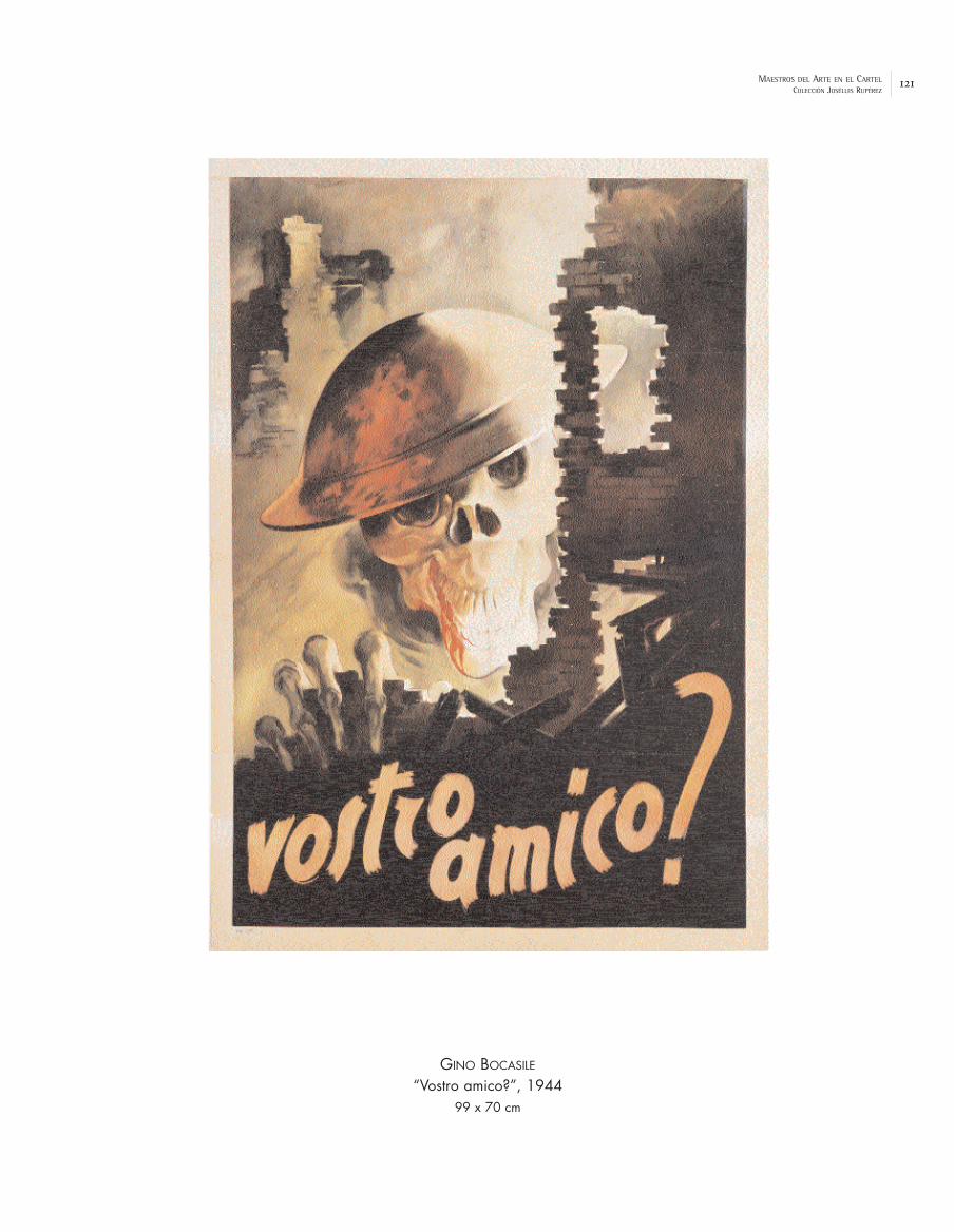
121MAESTROS DEL ARTE EN EL CARTELCOLECCIÓN JOSÉLUIS RUPÉREZ
GINO BOCASILE
“Vostro amico?”, 194499 x 70 cm

122 MAESTROS DEL ARTE EN EL CARTELCOLECCIÓN JOSÉLUIS RUPÉREZ
BEN SHAHN
“This is Nazi brutality”, 1942U.S. Govern, Printing Office. 97 x 71 cm

123MAESTROS DEL ARTE EN EL CARTELCOLECCIÓN JOSÉLUIS RUPÉREZ
NORMAN ROCKWELL
“Save Freedom of Speech”, 1943US. Government Printing Office. 142 x 102 cm

124 MAESTROS DEL ARTE EN EL CARTELCOLECCIÓN JOSÉLUIS RUPÉREZ
CONRADO MASSAGUER
“Doble-nueve”, 1944Compañia Litográfica de La Habana. 61,5 x 51,5 cm

125MAESTROS DEL ARTE EN EL CARTELCOLECCIÓN JOSÉLUIS RUPÉREZ
ENRIQUE GARCÍA CABRERA
“Pro Hospitales Infantiles”, 1944Compañía Litográfica de La Habana. 60,5 x 48 cm


FROM 1945 TO 1968, OR THE GREAT GENERATIONAL CHANGE

53
III. From 1945 to 1968, or the Great Generational Change
After the Second World War the poster seemed to forget its regional differences
and was converted into a medium with transnational vocation. In those years the visual
languages proceeding from the artistic investigations of the interwar years were
consolidated although with a certain ambiguity between abstraction and realism, between
functionalism and decoration, between rationality and emotion. These were difficult years
of reconstruction and the conditions for the development of graphic activity were to
change substantially. Meanwhile, the advertising structure itself revolutionised the circuits
of the commercial poster, which would not be able to resist the pressure of the new
supports and advertising media, especially after the rise of television and its seductive
advertisements. Sometimes the poster would serve for no more than to reinforce or to
act as a reminder for a TV advertisement and in media planning it only represented a
minimum percentage. The large hoardings, heirs of poster art, were filled with
advertisements with large format photographs. The advertising agencies, following the
American road, would acquire almost total control over the activity while the professional
poster artists of the old school began to suffer in their independence and to weaken, in
spite of themselves, becoming one more piece of the advertising “system”. Moreover, the
debate between the “artistic” poster and the “scientific” poster took place in the 1950s.
One of the complaints was directed at the growing presence of photography in the
poster, which sometimes gave rise to a certain rivalry between artists and
photographers – “The artist can dream. The camera, never.” – but the problem
was a false one and the agencies knew it. The poster increasingly took refuge in the
cultural and artistic field, in the “civic” poster and great social causes, as well as
institutional campaigns for tourism, health, education or various preventive actions for
social problems, road accidents ...
Art and Artists’ Posters
The collaboration of a renowned artist was frequently requested and, although
some posters were far from achieving their objectives, the advertiser enjoyed the

54
prestige provided by the author. Closer to art than to publicity, these “artists’ posters”
served different causes, as well as being used as a visual presentation of their own
exhibitions – which really constitutes another genre: the “gallery posters” – as in the
affiche for the exhibition of Wassily Kandinsky (1866-1944) “Période Parisienne, 1934-1944”
at the Maeght Gallery, published in 1969 [p. 146], based on the painting “Forme Rouge”.
The painting of one of these great artists, the “prince” of the fauves Henri Matisse
(1864-1954) was purified to synthesis in his maturity – especially with his collages of
painted and cut out paper, such as those for the book “Jazz”, 1947, which would have a
great influence in later art and design – but he did not lose one jot of his joie de vivre.
Some of these posters are adaptations of his most well-known paintings, such as “Still
life with pomegranate”, 1947, for the poster “Nice. Travail & Joie”, of the same year. In
other cases, the cut out papers are the protagonists of the poster, as in “Creole Dancer”
for “Nice. France. Côte d’Azur”, 1950, [p. 148] or the more geometric design used to
advertise an exhibition of posters by Mourlot of a commemorative nature (“Affiches
d’Expositions réalisées depuis 25 ans par l’Imprimerie Mourlot”, 1952) [p. 149], described as
“one of the first and major successes of abstract art published for the general public”. The work of this printer was primordial for the production of original posters by
the important painters of the moment, who worked directly on the lithography or
entrusted their works to master lithographers. This situation would change in a few years
due to the pressure of techniques such as offset, which were quicker and cheaper but of
lower quality.
Some posters from the later production of Raoul Dufy (1877-1966) feature in this
exhibition, such as “Planetarium”, 1950, [p. 150] which carries the musicality and sense of
rhythm of his particular graphics and, as we have already discussed with reference to his
fauve phase at the beginning of the century, his chromatic and decorative joy, which is
evident in other posters for the theatre and for tourism, such as “Normandie”, 1954,
commissioned by the Société Nationale des Chemins de Fer Français. The invitation to
travel, the suggestion of the dreamed of show, form the hypnotic material of these
posters. These nationalised companies, the SNCF and Air France – which carried the best of
French advertising art across the world – and other private companies would perform a
labour of patronage via commissions to artists of such high standing as Dalí, Georges

55
Mathieu or the Japanese, Léonard-Tsuguharu Foujita (1886-1968), who offered an idyllic and
seductive landscape in his poster “Normandie. Société Nationale des Chemins de Fer
Français”, 1958, [p. 151].
The later, suggestive work of one of the creators of cubism, Georges Braque
(1882-1963), was also published in posters, such as the impressive “Salon d’Automne”, of 1956
[p. 152]. His initial interest in the organisation of space in the landscapes of l’Estaque via
constructive brush strokes in the tradition of Cézanne, gave way to the first cubist
collages. Finally, Braque tended towards a tactile intimism with a muted palette of greys
and ochres. His still life compositions, progressively more austere and sober, give
prominence to everyday objects whose thin material seems to facilitate the passage of
the light between them. After the Second World War, when he was internationally known,
he developed his central themes – his favourite metaphors – such as the figure of the bird,
the face of the model or the painter’s palette, which were also the motifs of the posters
for his own exhibitions, such as “L’atelier de Braque”, of 1961.
After the liberation of France, Pablo Picasso (1881-1973) joined the communist party in
France believing, like others, in the Soviet alliance and he made, in accordance with this
ideology, several political and pacifist posters. One of the most well-known is that of the
lithographed dove which he used in the poster “Congrès Mondial des Partisans de la Paix.
Paris”, of 1949, published at the height of the cold war between the USSR and the USA, when
Germany was divided into two blocks. The different communist parties, under the auspices
of the USSR, had created in 1948 the Mouvement de la Paix with the support of
intellectuals and artists like Léger or Picasso himself, and its first congress was that of
the said poster. And although the “gentle” dove was one of the cruelest animals, according
to Picasso, it finally achieved an unexpected success and was converted into one of the
global symbols of peace. Regarding the militant images with the same objective, in 1954 the
Swiss Hans Erni produced the well-known poster “Atomkrieg Nein” in which the planet
Earth, crowned by nuclear explosion, is transformed into the head of death, and which is a
counterpoint to Picasso’s iconography. The image of the dove was repeated by Picasso in
various posters such as “Amnistía”, 1959, published by the national committee for
assistance to the victims of Francoism; “Paix. Désarmement”, 1960” [p. 154]; “Congrés
National du Mouvement de la Paix”, 1962; “España. Solidaridad”, 1971..., and was even used on
56
occasion without his consent. Picasso was also the author of many posters for different
commissions for shows and tourism (“Toros en Vallauris”, 1955; “Côte d’Azur”, 1962) [p. 155],
and for his own exhibitions.
Fernand Léger (1881-1955), originally connected with a cubism of the “contrast of
forms” (1913) which predated the “tubular” solutions favoured by Malevich, was always
observant of the life which flowed socially with all kinds of people such as the drivers of
breakdown lorries, bricklayers, mechanics, ballet dancers, circus performers or cyclists. His
images fulfilled a political commitment in posters such as “Art et Solidarité”, of 1957 [p. 153],
an exhibition promoted by a Parisian association to collect funds for the orphans of the
Resistance. Léger, a member of the communist party since the Second World War was
already well-known as one of the great masters of modernity as much for his painting as
for his writing and teaching in Europe and the USA, where he had remained in exile for some
years before his return to France in 1946. At the end of his career, Léger applied himself to
a nouveau réalisme populated with characters that, like those of “The trip to the
country” of 1954, appear already synthesised, flat and colourist in his final posters
(“Fernand Léger. Musée de Lyon”, 1955).
Le Corbusier, (Charles Édouard Jeanneret,1887-1965), developed a certain pictorial
activity in parallel with his spatial creations and projects which converted him into a
symbol of contemporary architecture and urban planning, with critics and enthusiastic
admirers. Initiated in the machinist and constructive aesthetic – the house, as a “machine
for living in” – he denounced, together with Ozenfant, the phenomenon of “popularisation”
of avant-garde language due to advertising, specifically due to the poster by Cassandre
“Au Bûcheron”, of 1923, which he accused of “false cubism”. Le Corbusier produced
posters for his own exhibitions, giving account in these of his plastic anxieties and his
search in pursuit of the “lyricism of staging”, as in “Le Corbusier - poème de l’angle
droit”, 1955 and “Le Corbusier. Musée National d’Art Moderne”, of 1962, present in this
collection [p.156].
With the poster “Orphée”, 1963, [p. 157] the poet, writer, filmmaker, musician, artist,
dramatist and above all “Greek” aesthete Jean Cocteau (1889-1963) turned to one of the
great myths, already developed in his film of 1959 “Le testament d’Orphée”, for which he
also made the poster. Other drawings by the imaginative Cocteau have appeared in posters

57
for a very different purpose, such as “Exposition Nice-Côte d’Azur”, 1954 and “Edinburgh
International Festival”, 1961, and in all of these there is an intentional and fragile synthesis
of avant-garde and Mediterranean classicism, specifically in their Picasso-style linear
viewpoint.
The extensive poster production (28) of Marc Chagall (1887-1985) includes, apart from
images for his own exhibitions, works for the promotion of tourism (“Vence”, 1954) and
for cultural events (“Maïakovski”, 1963; “Metropolitan Opera Lincoln Center”, 1966), always
with his particular world of beautiful images, like dreams. The lithography “Bahía de los
Ángeles” serves as a base for the poster “Nice. Soleil. Fleurs”, 1962, [p. 158] commissioned
by the French tourism office, of which five thousand copies were made with text, as well
as seventy-five numbered proofs signed by the author. The poster “Paris. L’Opéra. Le
plafond de Chagall”, 1965 [p. 159], of which the image was drawn by the master lithographer
Charles Sorlier, interprets lithographically the detail of a scene from Romeo and Juliet, in
homage to Berlioz, against the background of the Place de la Concorde and the Arc de
Triomphe of the paintings commissioned by André Malraux from Chagall for the roof of the
Ópera de París. At the inauguration, in September 1964, the paintings were illuminated and
Ravel’s Daphnis et Chloë was performed with set and costumes by Chagall himself. The
tourism poster also had as stars painters such as Kees van Dongen (“Deauville”) and Marcel
Gromaire (“París”).
Max Ernst (1891-1976), a painter of German origin nationalised as a US citizen in 1948
and French in 1958, formed a bridge between dada and the surrealists at the beginning of
the 1920s. At this time he began to explore new processes such as collage and
photomontage, combining cuttings of old illustrations out of their original context like a
magic trick that accentuated the contradictions, although it is the concept of reality that
is really at play in the work of Ernst. In 1922 he moved to Paris initiating a whole series of
thematic ruptures – “Two little girls threatened by a nightingale, 1924” – from which
spaces of convulsive beauty (or identity) (29), hallucinatory scenes and transfigured
landscapes emerged. Ernst started various processes such as frottages or rubbings with
black lead on coloured paper placed on top of diverse objects and textures. For Max Ernst,
some “squares which wanted to come out into the light” made him discover this
method: “I began to experiment with surprise ... and before my eyes appeared

58
human heads, a battle which finishes with a kiss, rocks, the sea and the rain, an earthquake”. His posters are windows onto his own plastic universe, as in “Atelier
Mourlot”, of 1960 [p. 160], produced the year following his great retrospective exhibition at
the National Museum of Modern Art in Paris.
The American Man Ray (1890-1976) was an outstanding figure in the international
vanguard. Since 1915, after meeting the advanced photographer, gallery owner and
publisher Alfred Stieglitz, he became interested in photography and participated in the
creation of the dada group in New York in 1917 together with the French painter, Marcel
Duchamp. He worked with new materials and techniques, such as painting with an airbrush
onto glass and other surfaces. His ready-mades –such as “Gift”,1921, a paradoxical plank
with nails in the bottom – are based on everyday mass-produced objects which have been
manipulated. He developed rayographs (1922), photographic images of negative shadows,
by placing objects between light sensitive paper and source of light, without the use of a
camera. This technique led him to create advertising proposals, such as “Danger”. He also
experimented in his portraits with solarisation to alter the margins of light and shade in
the photograph. The expressive possibilities of this technique interested him more and
more, and can be seen in the superb nude seen from behind and converted into “The violin
of Ingres”, of 1924, which was used as a poster for the exhibition “Dada Foto” of 1979.
From 1940 to 1951 he was in the USA where he worked as a photography teacher in
California. Finally, in France, he experimented with colour photography. Man Ray painted
when he felt like it and created flamboyant icons such as that of some huge lips that fly
above the landscape (“Les Amoureux”, 1932) which appear in the poster for his exhibition
“Man Ray. Los Angeles County Museum of Art ”, of 1966 [p. 161].
The Belgian surrealist painter René Magritte (1898-1967) alternated for several years
between designing for advertisements and his own painting. Influenced by the metaphysical
painting of De Chirico he began to work in this direction. With his first surrealist picture
“The lost horseman”, of 1926, he briefly left drawing for publicity and joined the French
surrealist group. He returned to Brussels in 1930, where he created the publicity studio
Dongo, working with his brother, Paul, and there he produced advertisements in the déco style, such as “La Primevère” (1926) or “Cigarrillos Belga” (1935), although in his memoirs he
has no doubts about describing them as “travaux imbéciles”. Meanwhile, he developed his

59
great surrealist work, increasingly valued, in which he played with the contrast of
concepts: the unusual and the everyday, the erotic and the macabre, reality and
appearance, as well as many semantic games (“Ceci n’est pas une pipe”, 1928; “The key to
the fields”, 1933; “The call of the peaks”, 1942...) In 1946 he distanced himself from Breton’s
group and the following year he also left the Belgian communist party. In 1947 he produced
the well-known poster “Festival Mondial du Film et des Beaux-Arts. Bruxelles”, [p. 162] with
the screen repeated on the face of a “blind” spectator who invites us to dream with the
assistance of other eyes. The image of the poster can be understood as a tribute to
Giorgio de Chirico due to its similarity with the plaster bust of “The song of love” (1914),
the picture which had impressed him so much. But there is, above all, a direct relationship
with his pictorial universe (“The memory” series,) and its multiple suggestions. His work is
still a source of inspiration for numerous contemporary designers who have profited from
his continuous shift from reality to poetry and from poetry to mystery (30). Publicity
discovered in Magritte – and in surrealism in general – one of its favourite strategies,
with a tendency to provoke “convulsion” in the spectator, who sees his or her notion of
reality abruptly displaced although he ends up accepting, as in a fantastic game, the
coexistence of different “realities”.
Very close to surrealism – although it was never admitted by the Parisian group –
and to the supposedly realistic style in the line of Magritte, the work of Felix Labisse
(1905-1982) is very enigmatic with its visual paradoxes and a certain cold eroticism. Labisse
designed many sets for the theatre and his poster for the film by Jean Boyer, “Le Passe
Muraille”, 1951, [p. 163] is a real classic of the genre.
The poster is not only an ephemeral means of communication and information, since
it frequently acquires a documentary value which illustrates historical events with all kinds
of images. An example of a poster: the civil aviation services in France had been
interrupted during the war and, after reconstructing the national network, Air France
opened a line to South America. The poster “Air France. Amérique du Sud”, 1948 [p. 147], by
Victor Vasarely (1908-1997) tells us, with corporate pride, about the new service. The
image shows one of the big, new propeller-driven aircraft built by Lockheed, a
Constellation, which is about to arrive at its destination after crossing the Atlantic. The
reflection of the evening sun in the sea allows Vasarely to introduce some of his graphic
60
investigations so that a set of curved and interwoven lines in bright colours create
almost abstract, repetitive rhythms and optical vibrations which predate his well-known
plastic proposals of normative and kinetic character. Vasarely, a Hungarian who had taken
French nationality, worked initially in commercial publicity, working for Havas and Draeger,
professionally undertaking all kinds of commissions (“Domremy, La Lorraine”, 1946). From the
mid 1940s his plastic investigations with artistic intention began to dominate until he
became an international reference of abstraction and optical-art.
The Smiling Poster and the Elegant Poster
At the end of the 1940s some poster artists incorporated the force of what has
been called the “visual gag”, that is to say, the graphic current which looked for the
complicit smile of the spectator, frequently achieved via the combination of friendly
humour and a point of surrealism which accentuated the shocking nature of the situations
of the characters. In reality this approach already existed before the war, but it was now
rediscovered and welcomed by a public who, due to the difficulties of this moment in
history, seemed to apply the saying “look on the bright side”. People wanted to forget
and enjoy themselves, this being, perhaps, the key to understanding the success of these
images which, in the end, became a commercial recipe. The real master of this trend in the
graphic expression of publicity via popular and surprising humour was the Parisian Raymond
Savignac (1907), trained in different advertising agencies, and a student and assistant of
Cassandre between 1935 and 1938. He began to enjoy great success from the moment of
publication of his well-known poster of the “Monsavon” (My soap) cow, in 1949, for L’Oréal
which had curiously been rejected a few years earlier (31).
The artist himself stated: “if I express myself via gags, jokes, capers; if my posters are graphic clowning, it is above all because the public gets so bored with daily life, that I think publicity should amuse them”. A whole series of
posters such as “Formaggio del Bel Paese”, 1950; “Perrier. L’eau qui fait pschitt”, 1951 or “Il
Giorno”, 1965 [p. 165], speak of the happy inventiveness of the prolific artist, upon whom
commissions rained down from several countries, who dealt with all kinds of products
(food, tourism, the press, cinema, transport...) and who was widely imitated until the mid

61
sixties. Other authors of this trend for posters with “good humour” and a complicit wink
to the spectator would fill the walls with friendly images in different European cities. Of
the same generation, and with great suggestive power in his posters, we should
remember the Frenchman, Bernard Villemot (1911-1989), with his series for “Rhum Negrita”,
the SNCF and Air France. He was president of l’Alliance Graphique Internationale, fundamental
for the development of the European poster due to the artists who belonged and the
activities carried out. It is also necessary to mention Hervé Morvan – artist of the well-
known poster for “Gitanes” – and Paul Colin himself, who continued with his school of
graphic arts and his purist poster art for the SNCF and other customers (“Le Progrès.
Journal Républicain Quotidien”, 1954). [p. 164] Jean Carlu adopted the friendly line in posters
for “Pschtt” (1954) with some figures of colourist clowns. Outside France, we should
mention the work of the British artists Abram Games, Thomas Eckerley (“Gillette”, 1949)
and John Gillroy, who had been working in the humorous line for the agency Benson’s since
the 1930s. For his part, the Swiss Herbert Leupin (1918-1999) was the author of truly
friendly posters (“Suze”, 1955) as well as an imaginative series for “Bata” [p. 166] with
sequences of steps to show the quality of the shoes.
René Gruau (1909), born in Rimini in an aristocratic family, abandoned his paternal
surname of Zavagli and adopted that of his mother, with whom he went to live in Paris at
the beginning of the 1930s after working as a drawer for Italian fashion magazines, a
labour which he continued for Marie-Claire and Vogue, even combining this with
designs for collections of clothes. In 1939 his first fashion advertisements appeared. After
the war he worked with his friend Christian Dior who opened his maison de couture and
entrusted him with the publicity for his first perfume, Miss Dior, in 1947. In New York he
worked for Harper’s Bazaar and in Hollywood he designed costumes. He worked for
advertisers in the world of fashion, beauty products, lingerie and footwear (“Biancherie e
calze Ortalion”, 1962) [p. 167]. Gruau also made posters for the shows (“Lido pour vous”,
1961) with his elegant, chic and aristocratic ladies who appeared to take up again the
traditions of Grün, Chéret and Toulouse – to whom he played homage in his poster for the
film “French Cancan”, by Jean Renoir, 1955.
Gruau conferred great importance on the line and the arabesque, the silhouette,
which suggested movement and sensuality. His colours – especially whites, reds and blacks

62
– accentuated symbolic values, as in “Rouge Baiser” (1949) and “Cinzano” (1950). Gruau was
a master of perfect drawing in just one line, for which he prepared a good composition,
audacious settings and intelligent games of shadow, in which the influence of Japanese art
and printing is obvious, perhaps like those he remembered from his childhood. Gruau worked
initially with models in movement and his drawings, which bear a certain relationship to the
linear posters of Van Dongen, are identifiable at first sight. As a “brush” designer he did not
suffer from the harassment of photography, which little by little replaced drawings, since
for him the fundamental element was “style”, something that photography could not
provide. The “Gruau woman” retained the freshness and dynamism of his models, with her
slim silhouette and “the triumphant smile that lights up a face with fine features, an often enigmatic look, high cheek bones”.(32)
Posters in Spain
In Spain, the generation from before the war had practically disappeared. Many
artists had had to go into exile (Clavé, Martí Bas, Renau...), while others played a difficult and
discreet role inside the country (Ballester, Mora, Giralt-Miracle...) The young Josep Artigas
(1919-1992) produced some very promising and emblematic works such as “Polil”, 1948, with
the image of an invisible man who is horrified to discover a big hole in his overcoat, and
which was used to publicise a moth repellent product by Cruz Verde. The poster connected,
with its surprising and surreal humour, with the “visual gag” trend and constituted an
“eloquent symbol of the tragedy of the Spanish post-war period”, according to
Enric Satué. Artigas finally went to Switzerland in 1955, where he undertook an important
graphic labour for Nestlé during a decade. For his part, the creative genius of Luis Seoane,
a Galician exiled in Buenos Aires, showed his artistic talent in posters like “Cinzano”, c.
1960, which bore a relation to post-pictorial abstraction.
One of the great artists of the 1950s was the painter and medal designer Manolo
Prieto (1912-1991) whose famous black bull for Osborne’s “Veterano” cognac with its
omnipresent, tenebrous silhouette which has stood beside Spanish roads since 1956 – finally
pardoned upon attaining the category of collective icon – seems to have unfairly eclipsed
the rest of his production. The congeniality and good work of Manolo Prieto (“Digestinas”,

63
1950; “Neveras Chas”, 1955; “Festivales de España 1956. Cartagena”...) were applied to all
kinds of commissions, without neglecting his principle theme, as in “Gran Corrida de la
Beneficencia”, 1956 [p. 169], with an imposing animal charging and seen from the front, one
of Prieto’s favourites although it was rejected earlier in other competitions. From the
beginning of the 1950s Prieto synthesised a formula in which the staring role belonged
exclusively to the bull – sometimes alone – and the bullfighter, embroiled in the stages of
the fight. This great artist fled from traditionalism and the somewhat folkloric anecdote
of the traditional bullfighting poster and emphasised the exciting aspects of the
confrontation.(33)
With regard to Spanish art, the abandoning of cultural isolation had begun in the mid
1950s. The regime, with pragmatic criteria and as a launching point for other objectives,
instigated the Bienales Hispanoamericanas, creating an “official” track for artistic
promotion and opening the way to the most advanced trends. This “opening” process
meant that the great abstract generation of the end of the fifties could exhibit their
work in international fora. The painters of the Madrid group El Paso (1957-1960)
introduced informalism in Spain, although with notable differences of style between them,
and they obtained immediate recognition with the mythologising of the “dramatic” aspects
of their work. The critical undertone of the painting by Antonio Saura (1930-1998), one of
the key figures in El Paso, is evident in his monochrome, gestural, and impudent works
(“Retratos imaginarios”...) as well as in some of the posters he produced in the era, such
as “Memorias del subdesarrollo”, for the Cuban film by Gutiérrez Alea, of 1964. His
expressive forms are finally transformed into beings full of life, dramatism and irony,
midway between figuration and abstraction, as in the work of Asgern Jorn, of the Cobra
group, and Willem De Kooning. From the young Feito, the collection includes an interesting
poster in the post-cubist and geometrising style for the “Congreso Nacional de
Estudiantes”, 1953 [p. 168].
The development of industrial production and consumption, as well as the changes
brought about by emigration and tourism, one of the motors of Spanish economic
development, brought with it an economic euphoria and a degree of social and cultural –
but not political – opening which would be evident in the posters of the era, especially in
the large advertising posters of four by three metres which were displayed profusely in

64
the cities since the beginning of the 1960s. Anonymous teams of graphic artists and
advertising professionals collaborated with more or less notable results on these new
supports which would occupy all kinds of useful spaces by the 1970s. Graphic activity, due to
its global character, tends towards the integration and merger of its different
specialities, including the poster. Artists such as Josep Pla-Narbona (“Ronda de Mort a
Sinera”, by Salvador Espriu, 1966), Tomás Vellvé (“Punto Blanco”, 1968), Fermín Garbayo
(“Feria Internacional del Calzado de Elda”, 1963), Teodoro Delgado (posters for the Office of
Tourism) and Cruz Novillo (for the Jefatura Central de Tráfico) served the varied demands
that came to their studios in the form of commissions, and also participated in frequent
competitions with pictorial style posters that obtained various prizes, such as that
obtained by Ernest Moradell with “La combinación perfecta. Nescafé-La Lechera”, 1962,
which elevated the prestige of Spanish designers to the international level. Together with
other artists such as Alberto Schommer, Francesc Català Roca applied his photographic
work to a great series of posters for the new image of Spanish tourism (“Avez-vous vu
l’Espagne”?, 1961). Finally, faced with a cultured clientele, new advertising strategies and a
renewal of aesthetic codes would be necessary, especially in graphic design and publishing
(Erwin Bechtold – a German established in Ibiza – for his weekly publication Destino, 1957;
Daniel Gil, covers for Alianza Editorial in the seventies).
European Panorama: Art and the Poster
Many of the cultural and commercial posters of the era are pervaded by the
evolution of the plastic arts, which translates into vivid colour (“Musica Viva”, 1954, by the
German Helmut Jürgens) and the presence of the elements of 1950s abstraction (“Holland
Festival”, 1961, by Dick Effers), although many poster artists were highly influenced by the
constructivism of the interwar years. The Swiss graphic arts school was a good example
of this situation, with artists like Max Bill, Max Huber and Josef Müller-Brockmann. The
latter, also a theorist and teacher, developed the hypothesis of a truly international style
applied in his case to campaigns of a social nature, with a strongly didactic sense (“Schützt
das Kind”, 1958; “Weniger Lärm”, 1960), in which a sans serif typography made the message
easy to understand and where the photography – with the collaboration of Ernst Albert
Heiniger – played a staring role, reinforcing an expanding genre: the Fotoplakate (34). We

65
must also remember Karl Gerstner and his weighty political posters produced with
photographic images (“Auch Du bist liberal”, 1959).
In Italy, the renewal of graphic design, favoured by entrepreneurs such as Olivetti
and other large industrialists, was led by artists who combined a rigorous sense of
composition with great activity and a considerable artistic talent. Many of them also
worked on the design of corporate image and the influence of the artistic trends of the
moment is frequently visible, especially geometric abstraction and, in the 1960s, op-art:
Bruno Munari (“Campari”, 1965), Giovanni Pintori (“Olivetti Tetractys”, 1957), Marcello Nizzoli (
“Olivetti” brand, 1956) and Massimo Vignelli. The latter, a teacher at the Institute of Design
in Chicago and author of manifestos like “31B XXXI Biennale Internazionale d’Arte”, Venice,
1962), designed corporate identity programmes for various international firms (American
Airlines, Cinzano, Xerox...) with some poster applications (“Knoll International”, 1967). Op-art
was very popular among some Italian graphic artists such as Franco Grignani (publisher’s
poster “Alfieri & Lacroix”, 1964), Pino Tovaglia (“Cinturato”, 1967) or Francesco Saroglia (
“Pure New Wool” image). It also achieved international renown thanks to posters such as
that of the XIX Olympic Games, “Mexico ’68”, by Eduardo Terrazas and Lance Wyman, very
close to the optical vibrations of Bridget Riley. Finally, it is necessary to mention some
Japanese artists, real virtuosos of op-art in the cartel, such as Mitsuo Katsui, Hirokatsu
Hijikata (“No more Hiroshimas!”, 1968), Shigeo Fukuda (“Monna Lisa”, 1970) and Yusaku
Kamekura (“ICSID ’73 Kioto”).
Posters in America
In the United States a very important factor was the presence of avant-garde
European artists who settled there to flee from nazism and the war (Bayer, Matter, Carlu,
Binder, Lionni...), as well as the new talents incorporated after the war, and we must also
remember their training in various universities. In this rich context of art and design a
new generation of American artists arose who would offer great novelties to the
graphic scene from the 1950s, thanks in part to the patronage of some companies, such
as Container Corporation, who set out to raise the quality of their graphic

66
communication. However, commercial publicity, sustained upon a scientific base and
rigorous market studies, had, for a long time, travelled in a different direction.
Some artists, such as the illustrator and engraver Rockwell Kent (1882-1971)
continued with a very personal work (“It’s Me, O Lord”, 1955), with a realism forged a long
time previously and with a great dominion of the art of incision (illustrations for “Moby
Dick” or the works of Shakespeare). Many of his works reflect his travels, from Alaska to
Tierra del Fuego. His membership of the socialist party caused him to swell the black lists in
the McCarthy era. In the cultural poster various graphic artists stand out, as well as the
above-mentioned Ben Shahn (“Ballets U.S.A.”, 1959). With the New Yorker Saul Bass (1920-
1996) we witness one of the most important innovative lines of the cinema poster in the
mid 1950s. The cinema industry maintained the tradition of requesting a selection of stills
or illustrations of a descriptive nature to present their films graphically. Saul Bass, who
was working in the art department of Warner Brothers, soon left because he preferred
to maintain his independence in order to summarise the most essential themes instead of
resorting to the traditional clichés of the genre. This symbolic language enjoyed a great
visual potential, capable of expressing the central idea of the film, and he applied it to two
posters for films by Otto Preminger, specifically “The Man with a Golden Arm”, 1955 – the
exhibition features the poster “El hombre del brazo de oro”, an Argentinian version of the
film– [p. 170], and “Anatomy of a Murder”, 1959. The strength of the images stems from the
original composition of figures and planes of colour in the line of the American post-
pictorial abstraction of the era (Colorfield Painting), created with simple paper
cuttings. Finally Saul Bass undertook, at the request of Preminger, the mobile sequences
for the film credits, which supposed a veritable renewal of the animated graphic arts of
the time. Bass, apart from his usual work as a professional designer, produced other
posters for films such as “West Side Story”, by Wise and Robbins, in 1961. Other outstanding
artists of the American poster were Paul Rand (“The International Design Conference in
Aspen”, 1966) and Erik Nitsche, the latter with a series of posters – “The atom in the
service of peace”, 1953 – for General Dynamics with the idea of detaching the image of
atomic energy from its wartime past. We must add to this group of designers and poster
artists the names of Herb Lubalin, and the team formed in 1960 by Ivan Chermayeff and
Thomas Geismar, the authors of the well-known image for “American Graphic Arts”, 1963.

67
In Mexico, the painter and illustrator Miguel Covarrubias (1904-1957), self-taught and
with a style similar to the work of the great muralists such as Diego Rivera, began as a
caricaturist. In 1923 he moved to New York where he produced the majority of his work,
with illustrations for “Fortune”, “Vanity Fair” and “The New Yorker”. In 1938 he painted
various murals for Treasure Island World and some very colourist posters featuring
Mexican folklore, such as “Oaxaca”, in 1948 [p. 172], for his country’s Department of
Tourism.
The painter José Vela Zanetti (1913-1999), from Burgos, after fighting on the
republican side went into exile in the Dominican Republic in 1939. He went to several
countries before returning to Spain in 1960 ("I am from where I went, from where I was allowed to paint. Therefore, I am from Burgos, from León, from the Dominican Republic, from New York, from Florence, from Geneva...”) Renowned for his murals, such as that relating to “Human Rights” for the UN in New York
(1953), his figures transmit suffering and wounded dignity. During his time in the Dominican
Republic he produced the poster “Feria de la paz y confraternidad del mundo libre”, 1955,
“year of the benefactor of the patria” according to the legend [p. 173], with flamboyant
and topical images. Upon his return, he painted Spanish peasants with wrinkles like scars and
simple fragments of daily life in his country.
The Italo-Argentine Lucio Fontana (1899-1968), grand prix of the Biennial of Venice in
1966, had already proposed a new concept of space in his White Manifesto of 1946. Hi
two- and three-dimensional games are achieved by cutting the surface of the picture.
These torn, perforated and cut canvasses are the culmination in minimalist key of the
action painting or gestural art, but with a spatial reflection of a spiritual nature, which
positions him close to Rothko. In the poster for his exhibition “Fontana. Alexandre Iolas”,
1960 [p. 171] the perforations and cuts affect the support itself.
Neoconfigurative Trends. Pop-Art and the Poster
The turning towards new forms of realism and neoconfiguration was one of the
characteristics of art in the 1960s. For the figuratives the era of abstraction had
already finished and now was the moment to “count things” with recognisable forms,

68
fleeing from “art for art’s sake” or even using figuration as a political tool within a
certain critical realism. Some of these proposals made it to the poster. The French
artist Bernard Lorjou (1908-1986) represents a trend of a figurative nature, marked by
expressionism and one of his peculiar faces is the star of “Lorjou vous invite au Bal des
Fols”, 1959 [p. 174]. Lorjou was required for the production of a famous poster for the UN’s
World Campaign against hunger, in 1968, with the title “To beat hunger is to win peace”, in
which a white dove flies over the head of a famine victim.
The French painter, Bernard Buffet (1928-1999), cultivated expressive figuration in
the post-war era and won, together with Bernard Lorjou, the Prix de la Critique in 1948. His
successful career – with a very personal and showy style in which he synthesised various
influences – culminated in 1973 with the creation of a museum near Mishima, in Japan. Tragic
themes, expressed with large black brush strokes and sombre colours, his angular faces
with hard features, such as that for the poster “Carmen”, 1950 [p. 175] characterise his
work, in which the landscapes follow a rhythm of vertically insistent graphics, like his own
signature.
Moreover, the reaction against abstract expressionism and against all versions of
informalism had begun to occur simultaneously on both sides of the Atlantic with the
common claim of a new “popular” culture, although in the United States this pop art took
on a more spectacular nature and was immediately accepted by the people. The ironic
defining notes of pop-art, written by the creator of one of its foundational icons, the
British artist Richard Hamilton, are well-known: “popular, fleeting, dispensable, cheap, mass produced, young, fun, sexy, fantastic, glamorous and good business”. The critic, Alloway defended pop as an art attentive to cultural changes in the
mass media, before the accusations of elitist critics who described these manifestations
as “pseudo-culture” and kitsch. The multitude of consumable signs and symbols served
via films for the general public, musical idols, magazines, objects for daily use (the car as a
desired item!) and publicity were giving rise to an aesthetic doctrine of abundance, of
great vitality, although its purpose was to fall quickly into disuse. (35) This popular culture,
which took from the fine arts its role of creator of myths, also had its influence on the
poster, used by the authors of British pop as a continuation of their own work, as in the
case of Eduardo Paolozzi, manipulator of advertising images from the end of the 1940s.

69
Robert Rauschenberg (1925) was the author who clearly marked the rupture with
abstract expressionism in the USA. In his Combine Painting of the mid 1950s – in his
own words, works “between art and life” – he already mixed all the materials and old
objects that he could collect on the streets of New York, constructing his large
assemblages in which he mixed daubed canvasses and images from the mass-media
with a great sense of humour that prevented the spectator from becoming bored or
remaining unmoved. Using image transfer methods, Rauschenberg slid towards the flat
surface of canvas, lithography and posters. The graphic production of this incessant
accumulator of images who won the grand prix at the XXXII Biennial in Venice, is
remarkable and is another manifestation of his artistic work. Colour and rhythmic effects
characterised the poster “St Louis Symphony Orchestra”, 1968 [p. 176] where the elements
of photomontage and the typography are mixed with apparent disorder although they are
in harmony, placed on a plan of the city which gives the poster its metropolitan character.
Rauschenberg, a music lover, would return to this theme in other posters, such as his
work for “Cage”, 1982. One of his most important works was the poster for the Olympic
Games in Los Angeles in 1984 in collaboration with the designer R. Runyan.
For his part, his friend and another precursor of pop-art, Jasper Johns (1930)
reduced his iconography to elementary emblems such as maps, targets or the American
flag, painted across the whole surface of the picture, where reds, whites, blues, stars and
stripes come out of their context to function as visual elements of the work of art and
not as the symbol of a nation. His posters also touch upon this world of forms and
colours (“Merce Cunningham and Dance Company”, 1968, taken from a piece of work with a
target and some fragments of faces in the upper part already published as a cover of the
Art News en 1958) [p. 177]
After these forerunners, the artists who exhibited in the New Realists collective
(Sidney Janis Gallery, New York, 1962) formed the historic nucleus of American pop-art
(Lichtenstein, Oldenburg, Rosenquist, Wesselman and Warhol, who is also present in this
poster exhibition). Roy Lichtenstein (1923-1997) relies on language, graphic technique –
especially the careful reproduction on a large scale of the mechanical line of BD points –
and American comic characters. His initial success stems precisely from that inspiration in
the universe of mass culture, with its leisurely and carefree aspects, less and less in

70
conflict with high culture. These pieces of work were not always a simple enlargement
and colouring of pieces of existing comics, since the author subsequently introduced the
irony or enigma of the fragmented conversations of its characters, authentic social
stereotypes, which have subsequently been taken up again by more recent graphic
publicity. His well-known work for cultural posters denotes, moreover, a great force of
composition, as in “Lincoln Center. New York. Film Festival”, 1966 [p. 178] or in “Aspen Winter.
Jazz”, 1967.
James Rosenquist (1933) had previously worked as an advertising painter for
hoardings, while he studied. Accustomed to the large dimensions of urban advertisements
(“I live within a visual inflation”, he said), his work combined juxtaposed fragments of
gigantic forms, as seen in close-up, which gives them a new significance and spectacular
appearance. His formal, compositive and chromatic discoveries are based on his pictorial
work (“Marilyn Monroe”, 1962; “Blinkers for a horse”, 1968) and his posters for the cultural
field, such as “Aspen Easter. Jazz”, 1967. [p. 179]
The star, Andy Warhol (1928-1987) began playing with images of popular products and
brands (cans of Campbell’s soup, Coca-Cola, detergents...) and later with icons of the time
(Marilyn, Liz Taylor, Elvis Presley, Mao, Superman, the dollar...) and even with images of
violence (“Electric chair”, 1971) via paintings and serigraphy treated photographically, of
which the processes and spectacular chromatic results were very close to the graphic
publicity with which, as a graphic artist, he had initially worked in New York after finishing
his art studies in Pittsburgh in 1949. But Warhol was above all an artist who moved in the
centre of the media, author and target of scandal, reference and leader of a way of
understanding modernity, underground film maker..., as well as a lucid and ironic observer
of American life. His graphic production includes hundreds of works, generally in
serigraphy,(36) among which are various posters such as “Fifth New York Film Festival-
Lincoln Center”, 1967”, [p. 180] in a large ticket format and published as a commemoration
by the Leo Castelli gallery in a limited edition of two hundred copies, signed and numbered.
The idea of imitating supports which were unknown in the poster tradition was also used
in the “Paris Review”, 1967, based on a printed note for orders and invoices. Later, in 1985,
he published a portfolio with a limited edition comprising ten screen prints in the form of
posters among which the most outstanding are those dedicated to Judy Garland, Ronald
71
Reagan and especially Chanel, based on the packaging of the legendary perfume, Nº 5. The
image was recently used again in international advertising campaigns for this brand. In 1983
he produced an excellent series of serigraphies based on the image of a bottle of Perrier
mineral water. One of these prints, used as a poster for a French advertising campaign
was awarded the Grand Prix de l’Affiche Française of that year.
Robert Indiana (1928), unlike other pop artists did not work with images, but with
geometric figures, stars and words painted with perfectly sharp outlines in the style of
Elsworth Kelly, the leader of Hard Edge Painting, a trend which insisted on coloured
shapes as “shapes” rather than as fields of colour. Indiana articulated text, typography and
pictorial surface via a saturation of colour and daring harmonies of contrast which came
to be seen as emblems (“Love”, 1968). Some of his posters, such as “25 New York City
Center”, 1968 [p. 181) and “Portland Symphony Orchestra”, 1974, published by The American
Poster Co., include silvers and golds.
The Psychedelic Poster
In the United States, from the end of the 1950s a generation gap could be seen. San
Francisco was the pole of attraction for all kinds of rebels and the young seemed to
subvert traditional values, proposing new ways of thinking and conducting relationships,
new habits, new myths, new music. Some graphic artists began to create beautiful half-
sized images, posters detached from the idea of commercial publicity, which would enjoy
great success among the youth of the 1960s, whose bedrooms were converted into small
galleries with the icons of their generation, among which they also included reproductions
of the myths of cinema and politics, posters of exhibitions or even modernist artists, such
as Mucha or Toulouse-Lautrec, now back in favour. This postermania of the Anglo Saxon
world finally extended throughout Europe and the rest of the world, revitalising the
artistic poster.
Víctor Moscoso (1936) was one of the “inventors”, together with Wes Wilson,
Stanley Mouse, Alton Kelley and Rick Griffin, of the “psychedelic posters” with their wild
forms, the explosive treatment of colour and the challenge to the limits of legibility of
the text. The overloaded musical posters of these artists were very fashionable and

72
entailed the synthesis of various ingredients including Art Nouveau, surrealism, the
languages of the comic, optical-art, as well as the colour and part of the imagery of pop,
all mixed with a certain innocence and in which the ultimate aim was a great visual
explosion, like an expression of other hallucinations. Wilson (“The Association”, “Birds, Birds,
Birds”, 1967), Mouse (“Mothers of invention”, 1967) and Kelly had no doubts about reinventing
the arabesques of art nouveau. The American of Spanish origin, Víctor Moscoso, created
formidable spasms of energy to be consumed rapidly in the street by his fans (“Blue Cheer”,
1967; “Junior Wells and His Chicago Blues Band”,1966; “Poster Show. Dallas”, 1966; “Clean-In”,
1967...) [p. 182]
On the East Coast the same phenomenon of “graphic answer” occurred with similar
aesthetic forms as in San Francisco. Milton Glaser (1929) one of the great contemporary
designers, with great inventiveness and a capacity for experimentation with various
influences – from surrealist to pop, which he integrated with great graphic irony – founded
in New York, together with Seymour Chwast, the mythical graphic studio The Push Pin Studio in 1954. In 1968 he was the artistic director of the New York Magazine and
some of his proposals for visual communication (“I love NY”) became a reference in a new
global language. With the poster “Dylan”, 1966 [p. 184] designed for Columbia Records, Milton
Glaser constructed an icon of great significance for one of the mythical singers and
musicians of the last third of the twentieth century. He was inspired by the “Self portrait
in profile” by Marcel Duchamp and in ornamental curvilinear motifs of Middle Eastern origin
with shades of art nouveau. The side-view silhouette of the singer is projected like a
quiet, dark shadow, but his coloured hair vibrates with uncontained joy. A generation of
young hippies shared this impulse and dreamed of non-violence and freedom at the end of
the sixties, proclaiming the virtues of marihuana and LSD to open the doors to a briefly
found paradise. Seymour Chwast offered in his ironic designs some truly ingenious
solutions, with a great stylistic freshness (“With a song in my Art”, 1967). The sixteen year
duration of The Push Pin Studio, whose members included Paul Davis (“The Spirit of Che
lives in the new Evergreen!”, 1967), overturned the prevailing graphic language of its era.
Another of the artists who worked in New York was the American of German
origin, Peter Max (1937), who spent his childhood in Shanghai and finally emigrated to the USA
in 1953, after a family tour through China and Israel. The influences in the work of Peter

73
Max, who set out to “redecorate the world”, range from American comics to yoga, since
he was a very inventive author. His well-known and admired posters (“Toulouse Lautrec”,
1967; “Love”, 1969) with a colourful “rainbow”, drawing with clear lines and some very
personal stylistic keys, caused a great impact and influenced subsequent graphic design. At
the end of the decade he began, in line with current events, a series dedicated to outer
space, with images of the earth from the moon, or greeting the great space adventure
(“Apollo XI”, 1969) [p. 183]
Other authors, such as Bradbury Thompson (“Flower Child”, 1967) or the British
artists, Michael English (“Love Festival”, 1967) and Alan Aldridge enriched the panorama of
this type of poster which also arrived in Europe, especially in London (exhibitions and
psychedelic atmosphere in the underground club UFO). Another of the artists of the poster
boom in Great Britain was the Australian, Martin Sharp, who created one of the icons of
the era with his poster “Mister Tambourine Man”, 1967, in homage to Bob Dylan. Peter Blake
designed the cover of “Sgt. Pepper” by The Beatles (1967). A photographic variant of the
“icon posters”, but of European musical myths of the era, consisted of posterised and
intensely coloured images of the four members of this British group, of which “John
Lennon” 1967, is exhibited here, made by Richard Avedon (1923) [p. 185], one of the great
photographers who, like Helmut Newton, were in demand in those years by the fashion
magazines (Vogue...)
The Polish Poster
In the 1960s, the Polish, Czechoslovakian and East German artists gave a great
boost to the cultural poster, which acquired great interest, unlike the political and
commercial images. The Polish poster, which had always been very attentive to
international graphic innovations, was finally liberated from the shackles of socialism as
from the events of 1955-56. The Polish school touched with great imagination upon black
humour, the surreal and the absurd in posters for the theatre, cinema and opera. One of
the great masters was Henryk Tomaszewsky (1914 ), professor at the Warsaw Academy
of Fine Arts, who enjoyed a strong influence among the new generations of Polish poster
artists and his work has been recognised internationally. His style, free and without

74
precedent, pretendedly ingenuous and childlike, incorporated varied elements of popular
iconography with an undisciplined and gestural brushstroke. His great production, especially
cultural and theatre posters (“Amadeusz”, 1981; “Manekiny”, 1985) [p. 186] could be admired at
his exhibitions at the Stedelijk Museum of Amsterdan in 1991.
Jan Lenica (1928-2001) was Tomaszewsky’s assistant at the School of Fine Arts in
Warsaw and worked in Paris from 1963. For many, the name of Lenica is associated more
with his original cinema productions than with his graphic work, with animated films such as
“Labyrinth”, 1961. His very well-known poster “Alban Berg. Wozzeck”, 1964 [p. 187] reflects
the anguish of the drama told by Büchner in 1837 – which inspired Berg’s opera nearly a
century later – that tells of the disgrace and the process of destruction of the soldier,
Woyzeck, condemned to death after a dark murder. The poster for this drama in three
acts which debuted at the Wielski theatre in Warsaw carries us, with its dramatic
expressionism, to the vertigo of “The Scream” by Edward Munch, but its rhythmic and
sinuous linearity also remind us of Hundertwasser, although the inspiration for the poster
is due, according to the author, exclusively to the musical resonances of Berg. The
progressive annihilation of the character who shouts numbly, begging for compassion in a
liquid space like blood cut rhythmically by black lines was an absolute success for Lenica.
Later he made powerful and expressive posters for the film “Casanova” (1891) by Fellini or
the poster for the Seville Expo in 1992.
The latter is very different, certainly, from the poster “Polonia en la Exposición
Universal. Sevilla 1992”, by Roman Cieslewicz (1930-1996), who also worked in Paris from
1963, being artistic director of Elle and a collaborator of the Pompidou Centre. He made
daring and synthetic colourist posters (“Aida”, 1966) and explored the possibilities offered
to the poster by deformed and symmetric photographic images (“Zoom contre la pollution
de l’oeil”, 1971). Other artists, such as Urbaniec, Czerniawski, Pluta, Gorka, Swierzy and
Górowski elevated the quality of the Polish poster to international recognition.

75
The Cuban Poster
The Cuban poster of the Revolution played an important role in the cultural sphere –
especially in relation to the cinema, which was projected to the population – and in
ideological and political propaganda. From 1959 painters began to abandon painting and to
concentrate on graphics, the creative space reserved for them by the new revolutionary
order. The discourse of abstract art or avant-garde trends was no longer suitable for
the propaganda needs of the Revolution. Its main stylistic references came from a Cuban a
school of poster artists of international importance, which arose in spite of the blockade
and the shortage of materials. Their communicative efficiency was frequently sustained by
the maximum formal simplicity (“Canción Protesta”, Alfredo Rostgaard, 1967). Eladio Rivadulla
was one of the precursors of the Cuban poster with posters such as “26 de julio. Fidel
Castro”, of 1959. Since then, the unavoidable presence on large hoardings of words in the
service of ideas has characterised a very interesting period in the history of international
graphics.(37)
The painter Raúl Martínez (1927-1995), creator of a very personal baroque imagery,
was the author of the splendid cinema poster “Lucía”, 1968 – published by the ICAIC (Instituto
Cubano de Arte e Industria), the governmental organisation which produced all Cuban films
and distributed foreign films – and of the equally spectacular poster “Cuba” [p. 189],
designed as a colourist mosaic with the busts of popular and mythical characters (Fidel
Castro, Che Guevara, Camilo Cienfuegos) from the revolutionary history of Cuba.
The ICAIC had a team of graphic artists to whom they entrusted these posters,
produced quickly after they had seen the film. They are impeccably printed via serigraphy
and were produced in short runs, of about five hundred copies, in eight or ten colours. The
ICAIC looked for a certain coherence among the artists, not only with regard to formats,
techniques and care in production, but also in the connection between the poster and the
content of the film. Among these artists the most outstanding – apart from Raúl Martínez
– were Antonio Pérez Ñico, Bachs, Félix Beltrán, René Azcuy, Rostgaard, Antonio Reboiro
and Julio Eloy. Regarding political posters, generally in a small format, published in several
languages by the OSPAAAL (Organización de Solidaridad con los Pueblos de África, Asia y

76
América Latina), they were not always signed by the artists responsible and were directed
at the peoples of the Third World who were struggling against imperialism or looking for
independence (“Semana de Solidaridad con el Vietnam”).
The painter and illustrator René Portocarrero (1912-1985), was an author with a very
important career before the 1960s. His colourist, overflowing painting, of linear and formal
complexity (“Catedral en amarillo”, 1961) was dedicated to different themes, such as the
colonial, the Caribbean atmosphere, Affro-Cuban deities, women and carnival. When he
began to produce posters favoured by the Revolution, Portocarrero expressed himself via
compositions in many colours, with ample black outlines and complex linear graphics, as in
“Primer Congreso Nacional de Escritores y Artistas” (1961) far from current iconography,
and from cinema posters like “Soy Cuba” (1964) and “I Semana de Cine Polaco”, of 1967 [p.
188]. It is not possible to simplify the Cuban poster art of the Revolution, but some
features have been noted by Antonio Saura (38) which it is appropriate to mention. As well
as the initial influence of Polish posters, the Cubans showed a great interest in
iconography derived from the mass media, including the comic, along the lines of pop-art
(“El caso Mattei”, Ñico, 1974). The aesthetics and the modular Warholian composition and
the incorporation of some of the visual findings of optical-art connected them, in some
cases, with the contemporary trends of the “rebellion” poster and psychedelia (Peter Max,
Milton Glaser). John Barnicoat underlines precisely the talent that stems from “the duality of some posters which are inspired by the West for their style and by the East for their message”.(39)
Frequently, fleeing from personal graphism, they turned to the appropriation and
modification of photographic images (“Y el cielo fue tomado por asalto”, Ñico, 1973), to the
photomontage, the enlargement of areas and above all to the technique of
photocontrast, that is to say the posterisation or tonal separation of the images in
order to achieve the maximum radicalisation of the inks, but solved pictorially, as in the
anonymous and legendary poster of “Che” (1967) published by Feltrinelli and based on the
famous photograph by Alberto Korda, or the poster “Libertad para Ángela Davis” (1971), by
Félix Beltrán. This author, principal graphic artist of the DOR (Departamento de Orientación
Revolucionaria), received important training in Europe and enjoyed great international

77
prestige. He made all kinds of posters of a social nature, reduction of accidents and an
imaginative graphic campaign: “Clik. Ahorro de energía es ahorro de petróleo” (1969)
Protest Posters. Posters Against the Vietnam War
In the 1960s, the student protest movements in favour of freedom of expression
were not the only conflicts that shook American society and public opinion. (40) The
revolts in the black districts of cities like Detroit took on the dimensions of an authentic
racial conflict, with tens of deaths, and questioned the “American dream”. This radicality
gave way to the speeches of the leaders, the creation of defence groups like the Black Panthers or the vindication of Black Power, which used the ceremony of the Olympic
Games of 1968 as a worldwide stage. One of the emblematic posters of this conflict is
“Black Power - White Power”, 1967, by Tomi Ungerer which constitutes a reflection of the
absurdity of hate with a moving symmetrical image and a posture between cynicism and
pessimism.
The Vietnam war caused increasingly vociferous protests all over the world. Young
poster artists who worked in studios in different cities, including the United States would
publish, in an echo of the anti-Vietnam postures, posters of political “protest” with the
slogan “Yankee go Home” or with an expressive “Cry Freedom”, as in the poster from
which a shouting face emerges through some press cuttings with news of the war taken
from The Saigon Post, in 1967. An important contribution to this cause, due especially to
the relevance of the artist who signed it, is the poster “Pour le Viet Nam”, 1967, [p. 192] by
Alexander Calder (1898-1976), also the author of other posters expressing solidarity during
those years, although more in accordance with his happy and colourist language (“ORTF à
tous”, 1968; “Safe Return. Artist’s Auction for Amnesty”, 1975).
A truly eloquent poster is the synthetic “Vietnam”, 1968, by Paul Rand (1914- 1996),
constructed as a “vanitas”, contemporary and flat with the skull that carries a frog in its
mouth, like a “dove of death” that interpellates us with an absurd and pessimist gesture [p.
193]. For his part, Ben Shahn, one of the veteran graphic artists who, after the war, made
posters in the service of peace and in favour of different causes, defended progressive
positions such as campaigns in favour of McCarthy and against the Vietnam war

78
(“McCarthy. Peace”, 1968). Other outstanding posters in this theme are “End bad breath”,
1967, by Seymour Chwast, which takes up the image of Uncle Sam and transforms it into a
powerful bill of indictment; “Moratorium”, 1969, by Jasper Johns, with the flag as an
argument perhaps to defend himself from the accusations of anti-patriotism that the
American authorities were spreading about these protesting authors; and the photographic
poster “And the babies?”, by R. L. Haeberle and Peter Brandt, 1970.
Posters of Rebellion. The French May
The events of May ’68 in Paris, understood as a struggle against the established
order, were marked by an exceptional poster-producing activity in reply to the censoring
of information imposed by the radio and television. The poster became the only free and
rapid medium of communication and had as its issuer a collective formed around the Atelier Populaire, whose militants were mostly students, but also workers and some artists and
writers, all of them committed to ideals which had to be pushed from utopia to political
reality: “Art has died, let’s set our daily lives free” is one of the phrases moulded at
that time. After meetings of the members, the militants designed and produced, in the
studios of the School of Fine Arts, urgent and striking posters intended as ideological
pamphlets. These simple images were printed with a great economy of means, mainly with
serigraphy screens or via stencilled monochromes of cheap inks on re-used paper, with
phrases and instructions so suggestive that they are now history. Their destiny, as
“graphic newspapers” was the walls of the faculties or any street, where “the most beautiful sculpture is the granite cobblestone”, according to one of the phrases
created during those critical weeks.
Some extraordinary pieces came from the Atelier Populaire des Beaux-Arts
destined for the walls and not for collectors (“Mai 68 début d’une lutte prolongée”, “Sois
jeune et tais toi”, “Je participe, tu participes... ils profitent”), but from June they began to
be reprinted and recovered for cultural history. Some artists who were close and
committed to the student struggle made suggestive and expressionist posters, such as
those signed by Karel Appel (“Dans l’action ils ont montré la source de leur beauté”, 1968)
and Pierre Alechinsky (“L’Imagination prend le pouvoir”, 1968), old members of the Cobra

79
group. Finally, many of these phrases with an ideological sense (“Prohibition prohibited”) as
well as those proceeding from other sources of protest (“Make love not war”) have
swelled the ranks of slogans of the mass media to become, in spite of themselves,
pursuasory phrases in commercial advertising
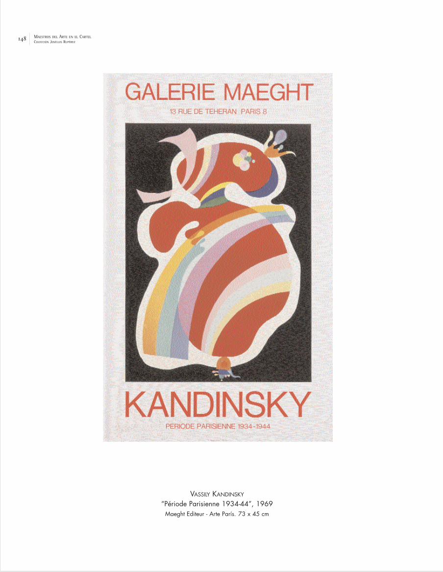
148 MAESTROS DEL ARTE EN EL CARTELCOLECCIÓN JOSÉLUIS RUPÉREZ
VASSILY KANDINSKY
“Période Parisienne 1934-44”, 1969Maeght Editeur - Arte París. 73 x 45 cm

149MAESTROS DEL ARTE EN EL CARTELCOLECCIÓN JOSÉLUIS RUPÉREZ
VÍCTOR VASARELY
“Air France. Amérique du Sud”, 1948Perceval, Paris. 50 x 31,5 cm

150 MAESTROS DEL ARTE EN EL CARTELCOLECCIÓN JOSÉLUIS RUPÉREZ
HENRI MATISSE
“Nice. France. Côte d’Azur”, 1950Imp. Mourlot, Paris. 100 x 63 cm

151MAESTROS DEL ARTE EN EL CARTELCOLECCIÓN JOSÉLUIS RUPÉREZ
HENRI MATISSE
“Affiches d’Expositions réalisées depuis 25 ans par l’Imprimerie Mourlot”, 1952Imp. Mourlot, Paris. 66 x 50 cm

152 MAESTROS DEL ARTE EN EL CARTELCOLECCIÓN JOSÉLUIS RUPÉREZ
RAOUL DUFY
“Planetarium”, 1950Berto Lith.; Imp. Mourlot, París. 68 x 45,5 cm

153MAESTROS DEL ARTE EN EL CARTELCOLECCIÓN JOSÉLUIS RUPÉREZ
LÉONARD-TSUGUHARU FOUJITA
“Normandie. Société Nationale des Chemins de Fer Français”, 1958Ed. Paul Martial, París. 99,5 x 62,5 cm

154 MAESTROS DEL ARTE EN EL CARTELCOLECCIÓN JOSÉLUIS RUPÉREZ
GEORGES BRAQUE
“Salon d’Automne”, 1956Imp. Mourlot, París. 160 x 115,5 cm
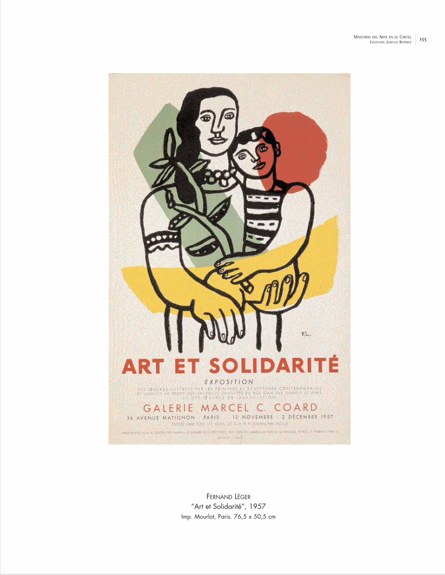
155MAESTROS DEL ARTE EN EL CARTELCOLECCIÓN JOSÉLUIS RUPÉREZ
FERNAND LÉGER
“Art et Solidarité”, 1957Imp. Mourlot, Paris. 76,5 x 50,5 cm

156 MAESTROS DEL ARTE EN EL CARTELCOLECCIÓN JOSÉLUIS RUPÉREZ
PABLO PICASSO
“Paix. Désarmement. Pour le succès de la Conférence au Sommet”, 1960Imp. Mourlot, París. 119,5 x 80,5 cm

157MAESTROS DEL ARTE EN EL CARTELCOLECCIÓN JOSÉLUIS RUPÉREZ
PABLO PICASSO
“Côte d’Azur”, 1962Henri Deschamps, Lith.; Imp. Mourlot, Paris. 99 x 66,5 cm

158 MAESTROS DEL ARTE EN EL CARTELCOLECCIÓN JOSÉLUIS RUPÉREZ
LE CORBUSIER
“Le Corbusier. Musée National d’Art Moderne”, 196262 x 45 cm

159MAESTROS DEL ARTE EN EL CARTELCOLECCIÓN JOSÉLUIS RUPÉREZ
JEAN COCTEAU
“Orphée”, 196375 x 54 cm

160 MAESTROS DEL ARTE EN EL CARTELCOLECCIÓN JOSÉLUIS RUPÉREZ
MARC CHAGALL
“Nice. Soleil. Fleurs”, 1962Imp. Mourlot, París. 100 x 63 cm

161MAESTROS DEL ARTE EN EL CARTELCOLECCIÓN JOSÉLUIS RUPÉREZ
MARC CHAGALL
“Paris. L’Opéra. Le plafond de Chagall”, 1964Lith: Charles Sorlier / Imp. Mourlot, París. 98 x 64 cm

162 MAESTROS DEL ARTE EN EL CARTELCOLECCIÓN JOSÉLUIS RUPÉREZ
MAX ERNST
“Atelier Mourlot”, 1960Imp. Mourlot, París. 75 x 55 cm
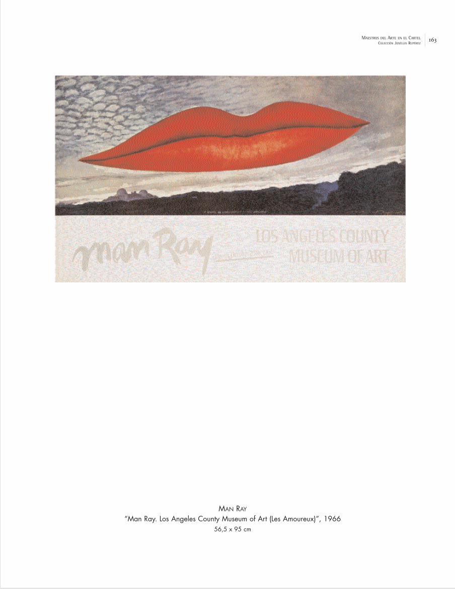
163MAESTROS DEL ARTE EN EL CARTELCOLECCIÓN JOSÉLUIS RUPÉREZ
MAN RAY
“Man Ray. Los Angeles County Museum of Art (Les Amoureux)”, 196656,5 x 95 cm

164 MAESTROS DEL ARTE EN EL CARTELCOLECCIÓN JOSÉLUIS RUPÉREZ
RENÉ MAGRITTE
“Festival Mondial du Film et des Beaux-Arts. Bruxelles”, 1947Établ. O. de Ricker, S.A., Bruxelles. 79,5 x 60 cm
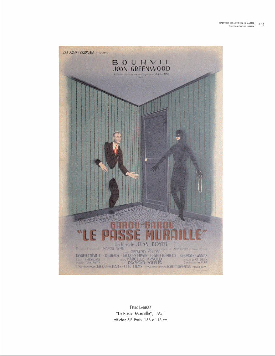
165MAESTROS DEL ARTE EN EL CARTELCOLECCIÓN JOSÉLUIS RUPÉREZ
FELIX LABISSE
“Le Passe Muraille”, 1951Affiches SIP, Paris. 158 x 113 cm

166 MAESTROS DEL ARTE EN EL CARTELCOLECCIÓN JOSÉLUIS RUPÉREZ
PAUL COLIN
“Le Progrés. Journal Républicain Quotidien”, 1954. Imp. Courbet, París. 79 x 58 cm
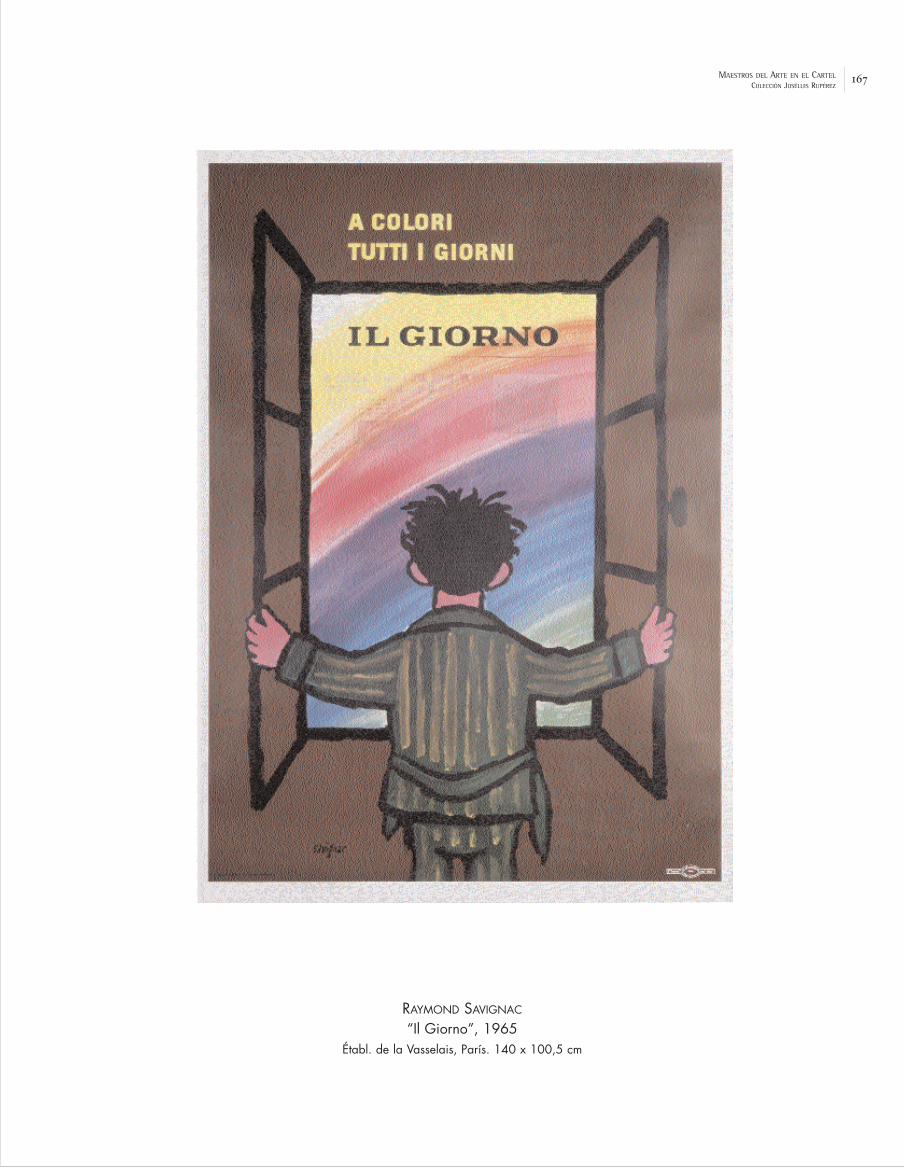
167MAESTROS DEL ARTE EN EL CARTELCOLECCIÓN JOSÉLUIS RUPÉREZ
RAYMOND SAVIGNAC
“Il Giorno”, 1965Établ. de la Vasselais, París. 140 x 100,5 cm

168 MAESTROS DEL ARTE EN EL CARTELCOLECCIÓN JOSÉLUIS RUPÉREZ
HERBERT LEUPIN
“Bata”, 1962Lienhard & Ritell, Basel. 126 x 88,5 cm

169MAESTROS DEL ARTE EN EL CARTELCOLECCIÓN JOSÉLUIS RUPÉREZ
RENÉ GRUAU
“Biancherie e calze Ortalion”, 1962Imp. Mourlot, París. 199 x 140 cm

170 MAESTROS DEL ARTE EN EL CARTELCOLECCIÓN JOSÉLUIS RUPÉREZ
LUIS FEITO
“Congreso Nacional de Estudiantes”, 195388 x 61 cm

171MAESTROS DEL ARTE EN EL CARTELCOLECCIÓN JOSÉLUIS RUPÉREZ
MANOLO PRIETO
“Gran Corrida de la Beneficencia”, 1956Imp. Altamira, Madrid. 138,5 x 99 cm

172 MAESTROS DEL ARTE EN EL CARTELCOLECCIÓN JOSÉLUIS RUPÉREZ
SAUL BASS
“El hombre del brazo de oro”, 1956Industria Argentina, Lito Fénix, Medrano, Buenos Aires. 110,5 x 75 cm

173MAESTROS DEL ARTE EN EL CARTELCOLECCIÓN JOSÉLUIS RUPÉREZ
LUCIO FONTANA
“Lucio Fontana. Alexandre Iolas”, 1960 Sergio Tosi, Milano. 90 x 68 cm

174 MAESTROS DEL ARTE EN EL CARTELCOLECCIÓN JOSÉLUIS RUPÉREZ
MIGUEL COVARRUBIAS
“Oaxaca. México”, 1948Offset Salas, México. 95 x 68 cm

175MAESTROS DEL ARTE EN EL CARTELCOLECCIÓN JOSÉLUIS RUPÉREZ
JOSÈ VELA ZANETTI
“Feria de la paz y confraternidad del mundo libre”, 1955Seix & Barral, Barcelona. 63 x 41,5 cm

176 MAESTROS DEL ARTE EN EL CARTELCOLECCIÓN JOSÉLUIS RUPÉREZ
BERNARD BUFFET
“Carmen”, 1950Berto Lith. 77 x 56 cm

177MAESTROS DEL ARTE EN EL CARTELCOLECCIÓN JOSÉLUIS RUPÉREZ
BERNARD LORJOU
“Lorjou vous invite au Bal des Fols”, 1959Imp. Mourlot, París. 75,5 x 53,5 cm

178 MAESTROS DEL ARTE EN EL CARTELCOLECCIÓN JOSÉLUIS RUPÉREZ
ROBERT RAUSCHENBERG
“St Louis Simphony Orchestra”, 1968Poster Originals Ltd. 76 x 64,5 cm

179MAESTROS DEL ARTE EN EL CARTELCOLECCIÓN JOSÉLUIS RUPÉREZ
JASPER JOHNS
“Merce Cunningham and Dance Company”, 196889 x 60 cm

180 MAESTROS DEL ARTE EN EL CARTELCOLECCIÓN JOSÉLUIS RUPÉREZ
ROY LICHTENSTEIN
“Lincoln Center. Film Festival”, 1966Amalgamated Litographers, Nueva York. 116,5 x 76,5 cm

181MAESTROS DEL ARTE EN EL CARTELCOLECCIÓN JOSÉLUIS RUPÉREZ
JAMES ROSENQUIST
“Jazz. Aspen”, 196767 x 67 cm

182 MAESTROS DEL ARTE EN EL CARTELCOLECCIÓN JOSÉLUIS RUPÉREZ
ANDY WARHOL
“Fifth New York Film Festival - Lincoln Center”, 1967List Art Foundation Inc., Nueva York. 115,5 x 76 cm

183MAESTROS DEL ARTE EN EL CARTELCOLECCIÓN JOSÉLUIS RUPÉREZ
ROBERT INDIANA
“25 New York City Center Anniversary”, 1968List Art. 89 x 63,5 cm

184 MAESTROS DEL ARTE EN EL CARTELCOLECCIÓN JOSÉLUIS RUPÉREZ
VÍCTOR MOSCOSO
“Clean-In”, 1967Neon Rose. 35,5 x 52 cm

185MAESTROS DEL ARTE EN EL CARTELCOLECCIÓN JOSÉLUIS RUPÉREZ
PETER MAX
“Apollo 11”, 1969Moon Landing. 61,5 x 91 cm

186 MAESTROS DEL ARTE EN EL CARTELCOLECCIÓN JOSÉLUIS RUPÉREZ
MILTON GLASER
“Dylan”, 196684 x 56 cm

187MAESTROS DEL ARTE EN EL CARTELCOLECCIÓN JOSÉLUIS RUPÉREZ
RICHARD AVEDON
“John Lennon”, 1967NEMS Enterprises Ltd., New York. 79 x 58, 5 cm

188 MAESTROS DEL ARTE EN EL CARTELCOLECCIÓN JOSÉLUIS RUPÉREZ
HENRYK TOMASZEWSKY
“Manekiny”, 1985W.Z. Graf. 97 x 66 cm

189MAESTROS DEL ARTE EN EL CARTELCOLECCIÓN JOSÉLUIS RUPÉREZ
JAN LENICA
“Alban Berg. Wozzeck”, 196497 x 68,5 cm

190 MAESTROS DEL ARTE EN EL CARTELCOLECCIÓN JOSÉLUIS RUPÉREZ
RENÉ PORTOCARRERO
“I Semana Cine Polaco”, 1967ICAIC, Cuba. 82,5 x 54 cm

191MAESTROS DEL ARTE EN EL CARTELCOLECCIÓN JOSÉLUIS RUPÉREZ
RAÚL MARTÍNEZ
“Cuba”, 1968ICAIC, Cuba. 151 x 93 cm

192 MAESTROS DEL ARTE EN EL CARTELCOLECCIÓN JOSÉLUIS RUPÉREZ
ALEXANDER CALDER
“Pour le Viet Nam”, 1967Impr. Arte, Paris. 76,5 x 44,5 cm

193MAESTROS DEL ARTE EN EL CARTELCOLECCIÓN JOSÉLUIS RUPÉREZ
PAUL RAND
“Vietnam”, 196891,5 x 61,5 cm


THE LAST DECADES ANDRECENT DEVIATIONS (1969 - 2004)

80
IV. The Last Decades and Recent Deviations (1969 - 2004)
Man landed on the moon in 1969 and our world, our social and cultural expectations
have changed a lot since then. In the 1970s the creation of commercial advertising in
Europe stopped being the business of one person, of an artist, and became that of the
“creation departments” of the advertising agencies, teams co-ordinated by an “artistic
director”. The professionals of graphic art now received the name of graphic designers
and some authors complained of the loss of personality in the poster.
During these decades the poster has finally moved towards the cultural, festive,
ideological and artistic fields with great creativity but without offering resistance to the
undeniable strength of the new supports and advertising media of commercial
communication. This does not imply a renunciation, but a reordering of its old functions. In
the Spanish case we should note the splendour of the cultural poster and the public
interest which developed at the beginning of the 1980s, in connection with the democratic
and autonomic development. The poster – and other graphic supports – has thus reinforced
its role as a vehicle for different campaigns of public utility or social interest.(41)
Moreover, corporations and public administrations continue to call renowned artists
who respond, offering a version of their own plastic universe, which implies an added plus
for the product. The “artist’s poster” continues to divulge the evolution of different
personal adventures and recent artistic movements via commissions for all kinds of
cultural and sporting events. The technological innovations are so overwhelming and
spectacular in the field of information and in that of the creation of digital images, that
our posters are becoming a little anachronistic as the new century advances, although
vulgarisation tends to damage the quality of the designs. The disintegration of the graphic
codes inherited from the Modern Movement and the uninhibited eclecticism of the last
decades configure a panorama of hybrid images derived from the fusion between
technology and graphic design, a long way from conventional street poster art.
It is increasingly difficult to hang a poster on a wall, in a shop window or in a
municipal showcase, but millions are “hung” on the net in a virtual space never before
imagined, with all kinds of creative and critical intentions as exercised by citizen-artists

81
from any computerised spot on the planet, without forgetting the anti-system actions of
the adbusters or the “dissident” designs and proposals from some web sites. (42)
The Artist’s Poster. Institutional Commissions
The collection includes various examples of “artists’ posters” made by the great
artists of the 20th century who are still active. The avant-garde artist of Russian origin,
Sonia Delaunay (1885-1979), was dazzled by the magic of the words and trademarks that she
incorporated into some of her works, such as “Zenith” and “Dubonnet”, both of 1914. Sonia
always used colours, rhythms and forms with liberty; her simultaneous contrasts have
been articulated since the second decade of the century like double discs that entwine
endlessly like multicoloured serpents. Interested in fashion, the design of costumes and
sets, she shared with Robert, her husband, the passion for circular forms in the
abstraction key and the “exaltation of colour”.(43) In the exhibition her “Fête de l’Humanité.
Les Peintres et l’Art du Livre”, (1970) is exhibited [p. 212].
The book Los carteles de Miró (44), includes about a hundred and twenty
examples by the great Catalonian painter and sculptor Joan Miró (1893-1983), from the
already quoted “Aidez l’Espagne”, of 1937, to those edited in 1980. The majority correspond
to his own exhibitions, such as those at the Maeght gallery in Paris from 1948 or his
retrospective of 1978 in “Sa Llotja” [p. 215]. In the lithographic posters, Miró frequently
wrote the text in his own handwriting. In these, his world appears surreal, primitive and
colourist with large black strokes, pure informal stains, his magic “women”, “trees”,
“birds”, “constellations”, “stars”, “moons”, “eyes”..., that is to say his personal code of
essential symbols with which to metamorphose reality. His images were used for the
promotion of tourism in the Balearic Islands, as in “Mallorca” (1973) and “Das Andere Palma de
Mallorca” [p. 214]. The most significant group of posters are those that vindicate
Catalonian identity at the end of franquismo and in the Transition: “Per un Teatre a
Catalunya” (1973); “Ja ajudeu la cultura catalana?”(1974); “Barça. Fútbol Club Barcelona” (1974);
“Avui. Diari en català”, in 1976; “Congrés de Cultura Catalana” (1977); “Volem l’Estatut” (1977);
and “La Caixa-75 anys” (1979). The Caixa would finally adopt one of his images as its visual

82
identity, after image assessment by the Landor group. His international commissions were
for “Droits de l’Homme”, Unesco, 1974 and “Amnesty International”, 1976.
With the poster “Exposition-Vente d’œuvres d’artistes au profit du Théâtre du Soleil”,
1974 [p. 220], Alexander Calder (1898-1976) returned to one of his favourite themes, the
circus and the show which was the origin of his first artistic games with wires which
were converted into happy sculptures, similar in a way to a personal “solar system” in the
1930s; his “stables” and above all his “mobiles”, which seem to come to life thanks to the
gentle movement of the air which surrounds the rods and coloured plaques.
The series entrusted to Salvador Dalí (1904-1989) for the French railways is
composed of curious touristic proposals centred on different cities and regions such as
“Paris” or “Roussillon. Chemins de Fer Français”, de 1969 [p. 210]. He situated in these his
declared artistic references, such as “Ángelus” by Millet, among some enigmatic and
hazardous butterflies. In his extensive production of posters Dalí includes the themes of his
pictorial work and exploits with a sense of spectacle his surreal world, more or less
systematised thanks to the “paranoic-critical” method, audaciously exhibiting his own
obsessions, with his admirable sense of detail and the use of trompe l’oeil. However, the
uncontrolled print runs of his graphic work, the “false Dalís”, impaired the reputation of an
author who nourished the image of the eccentric and brilliant artist. “España” (1969) is
another of his posters which features in this exhibition [p. 211].
The painter of Cuban origin Wifredo Lam (1902-1982), lived in Spain until 1937 before
going to Paris. His work turns our gaze to childhood myths and to folklore brought from
Africa, to a world of fantastic images, black divinities and strange beings with heads of
stars in an unreal space with suffocating vegetation. This primitivism, reinforced in a
surreal key after his contact with Breton, combined authenticity and fantasy. His plastic
universe was fed by anthropomorphous figures and vegetables, totems and masks which
appear to occupy a place beyond real events. He spent a large part of his life in Europe,
where he developed an important lithographic production and some posters, such as
“Artistes du monde contre l’apartheid”, 1982 [p. 246].
The contemporary Olympic games, like other sporting and cultural events with
different objectives from the point of view of economics and public image, have been a

83
motor for graphic activity. In the case of the Munich Olympic Games of 1972, various
artists of international prestige (Albers, Hockney...) were called upon for the posters. Thus,
the Italian sculptor Marino Marini (1901-1980), in his “Olympische Spiele München” (1972)
developed some of his favourite themes, horses, with classic reminiscences in a colourist
key. Of this author, the exhibition features the poster for the opera “La Traviata”, of 1978
[p. 223].
Abstraction and Gesture in the Poster
In 1970 informalism – gestural, lyrical and matieristic – had fulfilled its cycle, but it
was now that many of these abstract painters began to be known to the general public.
In France, Georges Mathieu (1921) was one of the pioneers and he applied the colour directly
from the tube, giving importance to speed and the process of execution, creating large,
informal calligraphs, which he later developed in his posters. One of his commissions was
the series for Air France from which a poster has been selected for this exhibition:
“Espagne. Air France”, 1971 [p. 216], in which there is an allusion to the painting of El Greco.
His poster for the “Union Internationale des Chemins de Fer” of 1972, in which he simulated a
network of rail traffic with some luminous lines, was circulated throughout the world with
great success. The Belgian, Pierre Alechinsky (1927), of the Cobra group (1948-1951), has
maintained in the graphic production of the last decades the same chromatic
expressiveness and the particular “informal” figuration with surreal glimmers of his own
painting, as in the posters “Festival d’Automne à Paris”, 1972 and “5e Festival de Jazz de
Paris”, 1984 [p. 245].
The work of Jean Dubuffet (1901-1985), the creator of art brut, implied a reply to
the cruelty and misery of the post-war period, and his interest for marginalized art caused
a great impact. Dubuffet inclined towards an informal and matieristic abstraction from
which emerged all kinds of violent and caricaturesque configurations. From the 1960s he
constructed characters interlinked with parallel stripes of colour which occupied the
whole surface. With the poster “Coucou Bazar” [p. 217] we see the graphic version that
announced his work “Coucou Bazar. Bal de l’Hourloupe”, debuted in New York and Paris in 1973

84
with a sculptural and theatrical dimension due to its conception as an “animated picture” in
a scenic setting with its actor-dancers, its temporal development and its music.(45)
The effects of the consumer society are obvious in the work of the Dutch artist
Willem de Kooning (1904-1997), who also collected the propositions of psychic, surrealist
automatism with overflowing energy. As from 1950 his series “Women” gave him a
reputation as one of the masters of North American abstract expressionism. His
“predatory” women with large breasts could be an action painting version of the
models, converted into icons, from the field of advertising imagery. The exhibition
features his poster “Devil at the Keyboard”, 1976 [p. 221], – a tribute to the jazz pianist
Thelonious Monk – in which the violence of the gesture seems to give way to the lyricism
of colour.
After the surreal stage of the Dau al Set Group (1948-1953), Antoni Tàpies (1924)
drifted towards informalism via the surprising manipulation of unorthodox and humble
materials attached to the surface of the picture. In this he freely included all kinds of
imprints, incisions, letters, crosses, bars, stains, graphology... The work of Tàpies – subtle
and brazen – became an emblematic voice of Catalonian culture and a reference of the
new art. His poster production, which transcribes the sobriety and force of his painting,
has served official causes and all kinds of events in the last few decades: “Fira del Llibre”,
1974; “Congrés de Cultura Catalana”, 1976; “Festival d’Automne à Paris”, 1984; “Barcelona’92”
and the recent “Festes de la Mercé”, 2002 [p. 265].
Another Catalonian, the painter, Josep Guinovart (1927), made contact with Dau al Set and founded the group Tahull in 1955, an era in which he designed sets for the
theatre, illustrations and posters. Guinovart has created multidirectional work, in which he
alternated organic accumulations and waste objects, matieristic manipulation, gesturalism
and the plastic intensity of the brush stroke. Guinovart has produced attractive posters
with a great sense of colour and a scriptural typography, as in “Exposición anti
imperialista”, 1979 [p. 231]; “Festes de la Mercè”, 1978 and “Barcelona ’92”, the year in which
he received the Premio Nacional de Artes Plásticas.
The visual poet, Joan Brossa (1919-1998), founder of the Catalonian group Dau al Set together with Tàpies, Cuixart, Ponç, Tharrats and Arnau Puig, created his first objects

85
with poetic and surreal intentionality from materials found in daily life –padlocks, playing
cards, glasses, light bulbs... – and he developed and defined them little by little. The humour,
word plays, hieroglyphics and ludic style are at the base of his visual, stenographic and
surprising manipulations, as in the poster “Setmana Internacional del Mim”, de 1978 [p. 221].
The work on paper of Antonio Saura (1930-1998) acquired great importance in the
1960s and his interest for this support and for the diffusion of images with a political
intention led him to participate in the group Estampa Popular with an unorthodox
abstraction based on figurative and torn pretexts of a symbolic nature. Saura illustrated
various books at the beginning of the 1980s and made numerous drawings and prints. With
his usual reduced palette he made the poster “Copa del Mundo de Fútbol. España” [p. 244] in
1982, the year in which he received the Gold Medal for Fine Arts from the Ministry of
Culture, which meant recognition by the young Spanish democracy of an artist with
international projection.
Another of the great artists of informal abstraction, Manuel Hernández Mompó
(1927-1992), developed a sense of optimist poetry derived from “cordial contact with reality” which he was able to transform into fresh, spontaneous and happy painting,
where the material became transparent. His production can be described as the informalism
of lyrical signs, very well received by the collectors. The Conselleria de Cultura de la
Generalitat Valenciana commissioned various of his works which were transformed into
first class posters. In the poster “Xàtiva. Fira d’Agost”, 1988, [p. 256] the desires of the
painter seem to be fulfilled: to transform the surface into light and ludic chromatism.
The Basque sculptor Eduardo Chillida (1924-2002), winner of the Grand Prix for
sculpture at the Biennial of Venice (1958), began a vigorous reflection of space and light
(“Elogio de la luz” series, 1962-65) which would accompany him throughout his long and
distinguished international career. Chillida developed, at the same time, an important graphic
work in the form of drawings, collages, engravings and posters in which he reduces his
three dimensional universe to a flat and monochrome projection, with great force and
capacity of synthesis. As an international artist his work has been requested for cultural
posters and social causes, such as the poster for “Amnesty International”, 1986 [p. 252] .

86
The Constructive and Geometric Poster
The abstract currents of a geometric, neoconstructive and technological nature
were based on the analytic correction of the abstract expressiveness of the 1960s, but
its investigative impulse has continued in the following decades with an intermittent
intensity. More than providing a testimony of the world in which they happened to live, the
“artists of reason” seemed to propose the construction of new worlds. To
commemorate half a century since the creation of the Bauhaus, the pioneering institution
of some of these approaches, Herbert Bayer (1900-1985) designed the poster “50 Jahrs
Bauhaus Ausstellung” (1968) [p. 75] with the formal, typographic and visual elements that
provided the focus for the teaching of this centre. These “poster maker-architects”
rather than “poster maker-artists” have set the standard for much of contemporary
design. Josef Albers (1898-1976) incorporated in the poster “Olympische Spiele München”,
1972 [p. 218], his geometric and abstract forms, simplified to a flat “minimalism” in which the
rectangles are assembled with subtle tonal variations which respond to his interest for
chromatic interaction. This former teacher of the Bauhaus, director of the Design
department at Yale in the 1950s, developed at the same time as his teaching and creative
activities.
The poster for the “Trophée Lancôme” for golf, of 1988, features one of the
modular variations of Victor Vasarely (1908-1997), recognised as one of the great figures
of op-art and of kineticism since the 1960s. His striking images, which act as a “blinking screen of great luminous and chromatic intensity”, cause the spectator to move
visually between them.
The Valencian sculptor, Andreu Alfaro (1929), knew Oteiza and Vasarely, with whom he
shared a sense of form and constructive intention. A radical purist, he affirmed that
“nothing is as beautiful as nothing” and soon found the possibility of a “minimalist”
expression which succeeded his “generatrices” from the 1970s. The four red, concentric
arches which suggest the dawn over the Mediterranean sea are a metaphor of his
Valencian identity (poster “9 d’octubre”, 1986) [p. 255], and one of the emblems of his work
as are the repetitive curves that he produced in 1984 for the monumental “Puerta de la
Ilustración”, constructed in Madrid in 1990. With Alfaro, programmed and industrial art take
on poetic and commemorative dimensions in contact with public space.

87
The impact of simplicity was the necessary counterpoint of an excessive era and
its formal vocabulary was an advance – or a renunciation – on the road to geometry,
abstraction, silence and the minimum expressiveness. Form was reduced to a simple
configuration, not very expressive, themeless, with an impersonal construction. “What you see is what you see,” Frank Stella would say. The repetitive structure of his
pictures, with their “strips of paint” and their flat bands travelled to his posters, as in
“Democratic National Convention”, 1980 [p. 238]
The Wake of Pop and the New Figuration. Other Artistic Gestures
During these years the masters of pop developed all their creative potential. Jim
Dine (1935) developed his work in the atmosphere of the happenings of Cage, with the
participation of the public and an interest in incorporating sensations – sounds, smells,
touch – other than that specific to the visual field. One of his favourite themes is the
world of objects and tools in the absence of man, before their use, which confers a high
degree of conceptuality on his works and a lack of interest for stylistic coherence in
favour of emotional intensity, as in the posters “Metropolitan Opera Centennial” and “City
Center. Gilbert & Sullivan” [p. 243], both of 1983.
Beginning with the colourist, erotic and decorative series “Great American nude”,
Tom Wesselmann (1931) incorporated real objects (telephones, showers, radiators, radios,
televisions…) and later, flat and brilliant colours, with cut-out figures all of great simplicity
as in the image of a foot in the foreground of the poster “Olympische Spiele München”,
1972 [p. 219]
The British artist, David Hockney (1937), settled in Los Angeles in 1963 where he
collected some themes (swimming pools, architecture, portraits of a rich and superficial
society) which would lend to his work a great sense of decorativeness. Hockney was
soon conscious of the expressive potential of the imagery of the mass media, including
exterior publicity, and diversified his language to incorporate photography in some of his
posters, such as “Drawing with a Camera”, 1982; “XIV Olympic Winter Games”, 1984. As well
as posters for his own exhibitions (“David Hockney Photographer”), he made cultural
posters (“Spoleto Festival”...). This exhibition features one of the two versions he made

88
of “Parade. Metropolitan Opera N.Y.”, 1981 [p. 242], specifically the larger one. (46) This
poster connects with the themes and the treatment of characters – the harlequin doing
a pirouette – and objects – stairs, curtains... – of the series of drawings for the theatre
already exhibited in Tokyo in 1983.
Richard Lindner (1901-1978) was very close to pop-art, with themes related to
publicity and the mass-media. He made illustrations in Munich and later in the USA (Vogue,
since 1942; Harper’s Bazaar; Fortune...) His portraits and ironic figures of prostitutes,
gangsters, and other characters – sometimes treated as inhabitants of a circus of the
absurd – appear in his posters, as in “Der Rosenkavalier. Metropolitan Opera”, 1978. [p. 227]. In
these beings with slit eyes, seen from the front or the side, static and with defined
contours in which can be seen the fetishism of the objects and the clothing there is
certain social criticism which brings us back to the German New Objectivity.
The assimilation of influences from pop-art and the graphic arts acquired an
international dimension. In the case of the Japanese artist Tadanori Yokoo (1936) his
preoccupation for stylistic variations and his absolute eclecticism should be stressed. His
interest in the cartoon made him combine the ingenuity of comic strips and the cultural
references of Europoean sources of iconography (Tiziano, Bonnard, Ingres) with Japanese
engravings. In Tadanori Yokoo there is an oscillation between the banal (even kitsch) and
the esoteric, between death and eroticism. From his ample and successful production (47)
with frequent surrealist compositions, this exhibition features the poster for “Hidetaro
Kataoka”, 1974 [p. 226], a kabuki theatre actor who interpreted female roles. Tadanori
made a linear portrait, drawn not photographed, to capture the essence of the actor,
rather than his physical appearance.
Close to pop and in the orbit of the European Nouvelle Figuration, the Italian
painter, Valerio Adami (1935), is present in the collection with his poster “Journées
Shakespeare. Centre Georges Pompidou”, 1979 [p. 228], in which he eliminated the coloured
surfaces. The black line limits and forcefully seizes hybrid characters and objects in
compositions in which he integrates words and title. Adami gives importance to the
drawing which encloses smooth colours, with a very attractive visual language, between
comic and publicity, and with a mural projection.

89
In France, the Nouveau Réalisme was a movement opposed to abstraction –
co-ordinated by the critic Pierre Restany – which from 1960 advocated a new focus on
daily surroundings in a society which was increasingly developed, technological and
consumerist. One of its members, Jean Tinguely (1925-1991), constructed his sculptures on
the basis of objects that he found – like Duchamp – and assembled, activating them with a
motor to provoke parody and spectacle. This art of accumulation, overflowing,
fragmentary and gestural occurs in posters such as “Comité International Olympique”, 1980
[p. 239]. Another author of this trend, the Italian painter and décollagista Mimmo Rotella
(1918 ), like the French artist Villeglé, tears down and manipulates advertising posters,
subsequently reconstituting them onto material. Rotella, fascinated by publicity and pop
myths, as in “Marilyn”, 1979 [p. 229], tries to incorporate his own creativity by chance.
The French painter, Roger Bezombes (1913-1994), curious and investigative, with
great technical knowledge, was the author of multidimensional works: mural painting,
ceramics, tapestries, theatrical sets, lithography, posters... In 1981 he produced “Mur de Son.
Air France”, 1981 [p. 241], a true graphic prodigy.
The artist of Bulgarian origin, Christo (Christo Javacheff, 1935), began in Paris at the
end of the 1950s to wrap up all kinds of objects until he arrived at the ephemeral wrapping
of public buildings and natural surroundings, such as “The Wrapped Coast”, in Australia (1969)
or the performance “Surrounded Islands”, in Miami, where he wrapped some islets with pink
material in the style of large water lilies (1983). The wrapping with polypropylene of the
Reichstag building in Berlin (1971-1995) was carried out after voting by the German
parliament. Millions of visitors contemplated this great temporary sculpture. (48) The
production cost thirteen million dollars, financed by Christo and his partner Jeanne-Claude
thanks to the sale of drawings, collages, models, posters and reproductions of the project
[p. 224].
The German, Joseph Beuys (1921-1986), an unusual artist whose personal vicissitudes
are evident in the conceptual intentionality of his work, was the author of
performances or striking artistic dramatisations in which he introduced corpses of
hares or locked himself in with a coyote, as in the René Block gallery in New York in 1974.
The influence of his ideas and artistic gestures has been determinant on younger artists.

90
His social preoccupations can be seen in posters such as “Tag X”, 1985 [p. 247], against the
transport of radioactive waste.
Masters of Illustration and Graphic Design
The American of Romanian origin, Saul Steinberg (1914-1999) appears as one of the
great international artists, with covers and illustrations for publications such as
Harper’s Bazaar and The New Yorker after his arrival in the USA in 1941. The most
important galleries of New York have shown his work since the 1960s, as have various
museums, among them the IVAM in 2002. Steinberg’s suggestive poster “Nuits de la
Fondation Maeght”, 1970 is illustrated [p. 213].
The illustrators of the Push Pin Studio in New York have exercised a great
international influence since the 1970s, as much for their designs as for their teaching
(Milton Glaser’s courses in Europe). From the left hand of the imaginative artist Seymour
Chwast, come real surprises like “Coitus tipograficus” or genial stagings like “Song by
Song”, 1980 [p. 240]. The young illustrator, Paul Davis (1938), collaborator of the Push Pin
(“The Spirit of Che Guevara”, 1968), made the poster “Three Penny Opera” in 1976 [p. 222] for
the performance on Broadway of the well-known piece by Bertolt Brecht and in it he
takes up the tradition of the German Neue Sachlichkeit of the 1020s, without taking
into account the roots of American realism and their dose of acidity.(49)
In Europe, the graphic work of the Jean-Michel Folon (1934) soon achieved
international recognition. The great delicacy of his watercolours transmits the absurdity
of the human condition via subtle and powerful images, like his labyrinths and walking
characters, which form part of an enigmatic visual poetry. The exceptional graphic
language of Folon is applied to posters such as: “Against the death penalty”, 1978; “Lily,
aime-moi”, a film by Maurice Dugowson, and “Voices of Peace. Royal Circus of Brussels”, 1997
[p. 260]
The multidisciplinary artist, Roland Topor (1938-1997), French with Polish parents,
founded with Arrabal, Jodorowsky, Sternberg and Savary the group, Panique, of surreal
influences with ingredients of humour, disorder, terror and euphoria. As well as his activity
as a poster artist and illustrator of numerous books, his work includes the cinema, the

91
theatre, television and literature. Outstanding among his posters is “Le Tambour”, 1979 [p.
230], for the film by Schlöndorf.
The graphic work of the Swiss artist, Niklaus Troxler (1947), applied to the world of
jazz, constitutes an exemplary collection due to his extreme versatility, dedication and skill
(50). Different styles and influences appear in these posters, from radical gesturalism
(“Jazz Festival Willisau”, 1991) to rigorous typographic constructions (“Dave Holland Bass
Solo”, 1995); from humour (“Marthy Ehrlich Quartet”, 1994) to the most enigmatic and
surreal solutions (“Cecil Taylor Solo”, 1989) [p. 260].
Artists and Posters in Spain
In the 1960s and the beginning of the 1970s numerous artists developed their active
commitment to the anti-Franco struggle. Their link to realismo crítico derived from a
militancy which would lead them to use their art as an instrument of accusation,
conforming to a testimonial current or a chronical of reality. With his Multitudes – “an anonymous human mass subject to a coercive order of terror”, according to
Alberti – Joan Genovés (1930) created one of the icons most identified with the historical
moment in Spain, which appeared in the poster on various occasions. Now with other
intentions, his characters in movement are the collective protagonists in posters such as
“Xàtiva. Fira d’Agost”, 1994 [p. 257].
In 1958, after finishing his studies in journalism, the Madrid artist, Eduardo Arroyo
(1937), went to Paris with the intention of becoming a writer, but he finally channelled into
painting his need to express himself. The roots of this astute manipulator and inventor of
dazzling images-as-words are precisely in his uprooting, the central idea of his later
reflections. Since the 1960s Arroyo has constructed, in exile, corrosive images against
any form of conservatism, via lithography and serigraphy (51). The poster production of
Arroyo in the last decades is considerable (“Roland Garros”, 1981; “Madrid 1982”; “9
d’Octubre”, 1986; “Wagons Lits”, 1987; “Médecins du Monde”, 1987; “Baile de Máscaras”, 1989...)
The exhibition features the subtle and striking “Nanterre Amendiers”, 1992 [p. 259].
Rafael Solbes and Manolo Valdés, the young authors of the Equipo Crónica, another
of the milestones of Spanish pop, opted to reinterpret and demystify art and history with

92
a critic and ironic spirit, making use of images proceeding from the mass media with a
great display of narrative mechanisms and the rhetoric of the image. Some of these
arrive later in posters such as “Selección de Fondos para el Museo de la Solidaridad
Salvador Allende” (1991). After the death of Solbes in 1981, Manolo Valdés (1942) has
conducted his pictorial and sculptural work with great mastery and success, with the
occasional poster such as “Homenatge Sanchis Guarner”, commissioned by the Generalitat
Valenciana in 1985 [p. 254].
Eduardo Úrculo (1938-2003) representative of the pop of Madrid, was loyal to this
aesthetic style to the end. During the 1970s his work was centred on erotic and satirical
themes. From the 1980s, he appears in his pictures himself, wearing a hat and with his back
to us, like the romantic characters of Friedrich overcome by the magnitude of nature. The
metaphor of the traveller, now ironically faced with the cities, was reduced to a few
identifying objects such as the jacket, the hat or the suitcase. In the poster “Veranos de la
Villa”, 1999 [p. 263] the figures of some bathers against the silhouette of the great city
suggest to the painter – whose signature-hat is in the foreground – desire and sensuality.
Luis Gordillo (1934), represents a new concept of figuration with diverse influences,
including pop. Gordillo made some personal “automatic” drawings at the beginning of the
l970s which held a great attraction and influence over the younger artists. His work from
the 1980s progressively abandoned the representational style and acquired a greater
symbolic charge with a touch of irony, evident in his poster “Baile de Máscaras. Círculo de
Bellas Artes”, 1994 [p. 262].
The Portuguese artist, Luis Pinto Coelho (1942), has worked in Madrid since 1961 with
various supports and artistic disciplines. Known as an important portrait painter of great
personalities, he created at the same time a freer work, endowed with irony and
theatricality. One of his favourite themes, bullfighting – “La capea” series, 1993 – is also
featured in posters, incorporating some novelties in the Spanish tradition as in “Feria del
Toro. Pamplona. San Fermín”, 1979 [p. 233].

93
New Posters on the Other Side of the Atlantic
The Mexican Artist, Rufino Tamayo (1899-1991), synthesised the primitive world and his
indigenous roots with the most refined of contemporary art after his arrival in Europe in
1938, where he received the influence of surrealism and of Picasso, the author of Guernica.
A great muralist (Unesco, París), he maintained an unorthodox line with respect to Mexican
muralism. His characters have great pictorial materiality, with their reds and deep earth
colours. The popular and the traditional are expressed with great lyricism and collective
history seems to recuperate tracks in the image of the poster “Tamayo. “Two Hundred
Years of American Growth”, 1976 [p. 232]
The dream world of the Chilean, Roberto Matta (1911-2002,) and the importance given
to chance led him to participate in the surrealist group from 1938 until 1949. Matta soon
created some totem style characters via sketched forms, parting from stains in which
the exterior space and the psychic merge in more or less abstract images. The degree of
political compromise which was prolonged in his paintings and which had various scenes
(Algeria, Vietnam, Cuba, the Chile of Allende...) is relevant. His work implies an exaltation of
freedom in tune with the universe. His trips to Cuba and his ideological closeness is related
to the poster “Cinema Cubano”, published by the ICAIC in 1991 [p.237], produced with great
gestural freedom and a notable graphic modernity.
The Colombian Fernando Botero (1932), who began as an illustrator, spent time in
Madrid and Mexico, where he assimilated the influence of muralism, perhaps determinant in
his peculiar treatment and exaltation of the volume of human figures, not exempt from
criticism and irony, almost childlike. His poster “Botero Posters”, 1978 [p. 144], gives an
account of his internationally recognised activity.
This exhibition includes various examples of the new generation of Cuban graphic
artists and painters, which corroborates the great interest and appreciation of Joseluis
Rupérez for the graphics of this “island of paper”, according to his own expression.
Alfredo Sosabravo (1930), was the creator of the powerful and attractive poster for the
Polish film “A Scream”, 1990 [p. 236] in which a double influence seems to be manifest: that
of Edvard Munch and that of Jan Lenica. Of the Cuban painter and poster artist, Manuel
Mendive Ayala (1944) the exhibition features “Carifesta. Cuba. 3er Festival de las Artes del

94
Caribe”, 1979 [p. 234], an Africanist style poster of great magic and decorative sense. For
his part, Nelson Domínguez (1944), a painter and teacher at the Instituto Superior de Pintura
de La Habana, confronts with great expressivity and colourfulness the poster “Cuba en
Venecia”, 1984 [p. 235], a city where he would exhibit on other occasions, resolved via an
efficient mixture of figuration and gestural intentionality.
The Brazilian Romero Britto (1963), a precocious artist, in 1987, after spending time in
Europe, contacted some friends in Florida and opened his own art gallery. Two years later
he was called to integrate his work in the designs for Absolut Vodka, which catapulted his
career. Romero Britto has committed himself to projects of solidarity, from Amnesty
International to the American Cancer Society. His particular and colourist pop imagery,
which takes the resources of the comic to extremes with a language close to geometric
abstraction, transmits the brilliance of sounds and musical notes in his poster for the “1st
Annual Latin Grammy Awards”, de 2000 [p. 264]
Postmodernity and International Neoexpressionism
The exhibition also includes some authors from the diverse postmodernist and
neoexpressionist options of the 1980s.(52) The work of the American David Salle (1952)
seems to be linked to Bad Painting, a figuration which mixes the conceptual, the iconic
and the abstract with the intention of reacting against “good” taste in painting. Salle
belongs to a current close to the European – together with Julian Schnabel – which
searches for warm pictorial references and a return to figuration with various
connections and ingredients. His eclecticism seems to be implicated in a process of
deconstruction of images, which are superimposed in the form of transparent layers and
of which it is difficult to suppose that they live well together. Different icons appear
simultaneously – drawings from comics, nudes – diverse styles and techniques. In his poster
“Paris Review”, 1982 [p. 248], the typography itself emerges from the subtraction practised
in a foreground of little opacity, previous to the layer occupied by the graphics of faces
and figures.
The collection includes posters by the American graffitists, authors with a meteoric
artistic career, soon absorbed by the art market from which they imagined themselves to

95
be marginalised. One of these street youths, Jean-Michel Basquiat (1960-1988), prototype of
the romantic genius, wild and finally dead from an overdose, made his tags and graffiti with all kinds of undecipherable messages on the walls and urban furniture of New York.
Fascinated by the expressionist abstract painting of De Kooning, Rauschenberg and
Dubuffet, he produced work of great plastic quality in which the gestural abstraction is
mixed with images of primitive cultures, masks, words, homage-portraits... His friendship
with Warhol and his amazing success facilitated his inclusion in great exhibitions, even in
Europe with other authors. The poster “France-États Unis. Figuration Libre. Comme des
Félins”, 1985 [p. 250], corresponds to one of these collective samples.
Keith Haring (1958-1990), trained in the conceptual art of Joseph Kossuth, made
pictographs and drawings with white chalk on the blackboards of the New York subway.
These ephemeral works with characters from comics and other invented characters, such
as pregnant women, occupied thousands of metres with figures jumping or shouting. Little
by little he achieved success with his automatic writing, his dancing figures, dogs or
television screens expressed with a linear and schematic style. Haring had a meteoric
career. The poster “Free South Africa”, 1991 [p. 251], is very significant within his
production.
One of the artists of the transvanguard, Francesco Clemente (1952) is also present
in this exhibition with his poster for “The Paris Review”, 1990 [p. 249]. These artists of the
eclectic postmodernity, supported by the critic Achile Bonito Oliva, form the tendency in
Italian art with the most international projection of the 1980s. The Neapolitan, Francesco
Clemente, spent various years in Madras and the Hindu conception of life pervaded a large
part of his work from the end of the 1970s. In 1982 he settled in New York where his
constant cultural and personal references were valued as a defining feature of his
essentialist artistic search.

96
The Young Artists of the Eighties in Spain
The Spanish generation of the eighties, with a discourse centred on the new values
of postmodernity, was promoted via some exhibitions and the work of new art critics,
sometimes from peripheral starting points, such as the show Cota Cero sobre el nivel del mar, Alicante, Sala de la CAAM, 1987, hosted by Kevin Power. In the show Art espagnol actuel, of 1984 in Toulouse, among other important names of the new young
art, such as Broto, García Sevilla and Barceló, the multidisciplinary artist, Robert Llimós
(1943), participated. He was also present in Barcelona Paris New York, 1985-86, which
established the cosmopolitan vocation of young Catalonian art. Llimós was working in New
York from 1975 to 1983. Outstanding among his early graphic activity is one of the posters
for the first phase of the Catalonian theatre company, Els Joglars (“Mims”, 1962-68). The
poster “Canal 33”, 1989, which features in this exhibition [p. 253] vindicates chromatic
expressivity with large parallel brush strokes. For the Barcelona Games of 1992 he was
commissioned to produce a “painter’s poster”, designed as two hands which represent
different cultures and races playing with the Olympic rings. (53) The other “artists’
posters” for this Olympiad were made by Arroyo, Clavé, Chillida, Folon, Guinovart, Saura and
Pérez Villalta, by whom this exhibition features the illustration avant la lettre for his
Olympic poster: “Barcelona ’92” [p. 258]. Guillermo Pérez Villalta (1948) abandoned his
architectural studies to concentrate on painting, drawing and engraving. In his
neofigurative work, different from the neoexpressionist currents of his generation, can
be seen classical and Mediterranean traditions, mythology, an interest for narration and
the value of the metaphoric. He does not neglect the setting and the architectonic use of
space with all kinds of games of perspective (“Grupo de artistas en una terraza”, 1976).
The references to his friends, the social gatherings, the self portraits, are frequent in his
pictorial work, later carried to the poster, as in “Baile de Máscaras del Círculo de Bellas
Artes” (1990).
Of the generation of the eighties, perhaps Miquel Barceló (1957) is the author
closest to the international currents of postmodernity, with an eclectic approach in
relation to his artistic “beacons” and with a continuous dialogue with the history of art
and culture (the “libraries” and “Louvre” series). His neoexpressionism of uncontrolled brush
strokes and the interest for matieristic treatment is taken to some of his posters, as in

97
the dense graphic proposal for his exhibition “Barceló. MACBA, 1998” [p. 261] His language –
not his intentionality – became colder and more conceptual after his vital and artistic
experience in Mali, from 1988, visible in the change of style which seems to be transferred
to posters of social and environmental commitment “Porto Colom. Perill de mort”, 1989.
Recent Posters. Digital Poster Production
In the posters for the Spanish Nuevo Cine – after the generation of the well-known
“Jano” and “Mac”, with a realist and popular style – new, innovative proposals arose,
although the cinema industry has not been very sensitive to these offerings. The film
director and poster artist Iván Zulueta is an extraordinary case, since both facets
coincide in his work, with some notable examples such as the poster for his own film “Un,
dos, tres... al escondite inglés” (1969), with psychedelic and pop aesthetics very much of its
time. The film director, Pedro Almodóvar, has known how to surround himself with
remarkable illustrators and artists for his films, such as Ceesepe (“Pepi, Luci, Bom...”), Iván
Zulueta, the Argentinian Juan Gatti (“Tacones lejanos”, with photography by Javier
Vallhonrat and “Kika”, with his Warholian touch, among others) and Oscar Mariné. The
poster for “Todo sobre mi madre” (1999), with the fresh and suggestive drawing of the
actress Cecilia Roth by Mariné, has gone around the world with hardly any changes, from
the United States to Japan. This author, included in the proposals of a well-known brand –
“Absolut Mariné” (1995) – has designed other posters for the cinema, such as “El día de la
bestia” (1996), by Álex de la Iglesia and “Tierra”, by Julio Medem, with solutions in the line of
Bass.
It is necessary to reflect in this period on the appearance of “stars” of
international design who have begun to develop the possibilities offered by Apple Macintosh
computers, with the substitution of the drawing board by new tools, by artists such as
the Americans, Malcolm Garrett (1956) and April Greiman (1948) – one of the pioneers of
digital design – and the British Neville Brody (1957), who achieved spectacular results with
graphic design programs in the 1990s ( “Fuse” magazine, 1994). Brody intervened in the
posters for the trilogy of the Catalonian director, Bigas Luna, perhaps emphasising the
image of the Osborne bull for one of these films, “Jamón, Jamón” (1994). However, the

98
powerful tools of information technology have frequently confused their users (and
consumers) and have originated a certain devaluation and a justified suspicion of this
activity, too occupied in visually “hunting” spectators. However, as can be seen in the
most important international poster competitions, as in the Biennials of Warsaw, Lahti
(Finland) and Mexico (the last in San Luís Potosí, 2003), the technical and conceptual
panorama is quite promising. (54)
Since the 1980s a great generation of all-round designers has become established in
Spain, who also produce posters. Among the artists worthy of mention from Madrid, are
Alberto Corazón, Mariné, Roberto Turégano, Carlos Rolando and Javier Romero. The latter,
with a New York studio, was the author of a poster for the “Seville ’92” Expo and of a
proposal for the brand “Absolut” (1993), soon using the resources of information
technology to create eclectic and post-déco images. Of the important Catalonian
nucleus it is necessary to mention the designers Claret Serrahima, Pere Torrent Peret –
author of the poster for the Dutch pavilion at the Seville ’92 Expo – Pati Núñez, Juli Capella
& Quim Larrea, América Sánchez and Enric Satué. The latter, Premio Nacional de Diseño, is
also one of the references for the diffusion and awareness of Spanish graphic design,
with various fundamental publications. It is also necessary to mention Javier Mariscal,
designer of the Olympic mascot, a graphic artist of great inventiveness and an important
international projection.
Within the creative focus of Valencia, it is important to remember the group La
Nave (Paco Bascuñán, Daniel Nebot, Nacho Lavernia...), responsible for the colourist road
sign-posters on the Mediterráneo motorway in 1985, the great illustrator Miguel
Calatayud, as well as the painters and designers Jordi Ballester and Artur Heras, author of
the poster “Congreso Internacional Miguel Hernández”, 2003 [p. 196]. The renewal of the
Valencian poster is obvious in the proclamations for festivals, such as Fira de Xàtiva or
the traditional festes de Moros i Cristians d’Alcoi, with posters by artists like Manolo
Boix (1985), Artur Heras, Antoni Miró, A. Soler, M. Calatayud, Enric Solbes and Joan Genovés
(1998). In Alicante high quality materials have been produced in relation to fiestas and
various contests for the cinema, theatre, music or poetry organised by public institutions,
the University or the Caja de Ahorros del Mediterráneo savings bank, as well as the new
poster phase of the Misteri d’Elx, with commissions for prestigious artists.

99
The exhibition closes chronologically with the emblem-poster “11M04” by Oscar
Mariné Brandi (1951) designed for a special edition published by El Pais Semanal of 11 April
in memory of the victims of the terrorist attack of 11 March 2004 in Madrid and lent by the
author for this occasion. This icon, based on the ribbon of solidarity and emotion from
other causes, also leads us to the visual synthesis of contemporary design.
NOTES
(1) Weill, Alain: L’Affiche dans le monde, Ed. France-Loisirs, 1991 (Éditions d’Art Somogy, Paris)
(2) Satué, Enric: El diseño gráfico en España. Historia de una forma comunicativa nueva. Alianza
Forma, Madrid, 1997
(3) Zagrodzki, Cristophe: Le Peintre et l’Affiche. De Lautrec à Warhol. Cat. Expos. Musée de l’Affiche et
de la Publicité, París, 1988
(4) Barnicoat, John: Los carteles. Su historia y lenguaje. Ed. Gustavo Gili, Barcelona, 1972 (1º edic.)
(5) Rennert, Jack: Mucha. La Collection Ivan Lendl. Posters Please Inc. Ed. Syros / Alternatives, Paris,
1989
(6) Fliedl, Gottfried: Gustav Klimt, Taschen, 1991.
(7) Orozco, José Clemente: Autobiografía, ed. Era, México, 1970
(8) López Casillas, Mercurio: José Guadalupe Posada, ilustrador de cuadernos populares, ed. RM,
México, 2003
(9) Jardí, Enric y Manent, Enrique: El cartelismo en Cataluña, ed. Destino, Barcelona, 1983
(10) Daix, Pierre: “Le cubisme de Picasso, Braque, Gris et la publicité”, en Art & Publicité 1890-1990, cat.
expos. Centre Georges Pompidou, París, 1991
(11) Abram, Joseph: “Architecture, espace, publicité”, en Art & Publicité 1890-1990, cat. expos. Centre
Georges Pompidou, París, 1991
(12) R. Bargiel-Harry, R.: Cappiello, Cat. Expos. Grand Palais, París, 1981
(13) Gallo, Max: L’Affiche, miroir de l’histoire, miroir de la vue, ed. Mondadori / Robert Laffont, 1973
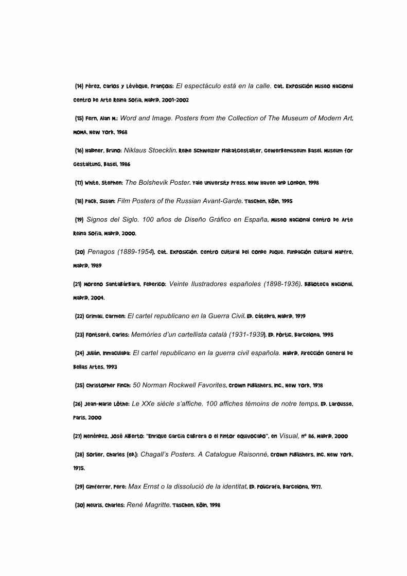
100
(14) Pérez, Carlos y Lévèque, François: El espectáculo está en la calle. Cat. Exposición Museo Nacional
Centro de Arte Reina Sofía, Madrid, 2001-2002
(15) Fern, Alan M.: Word and Image. Posters from the Collection of The Museum of Modern Art,
MOMA, New York, 1968
(16) Haldner, Bruno: Niklaus Stoecklin. Reihe Schweizer Plakatgestalter, Gewerbemuseum Basel. Museum for
Gestaltung, Basel, 1986
(17) White, Stephen: The Bolshevik Poster. Yale University Press. New Haven and London, 1998
(18) Pack, Susan: Film Posters of the Russian Avant-Garde. Taschen, Köln, 1995
(19) Signos del Siglo. 100 años de Diseño Gráfico en España, Museo Nacional Centro de Arte
Reina Sofía, Madrid, 2000.
(20) Penagos (1889-1954), Cat. Exposición. Centro Cultural del Conde Duque. Fundación Cultural Mapfre,
Madrid, 1989
(21) Moreno Santabárbara, Federico: Veinte Ilustradores españoles (1898-1936). Biblioteca Nacional,
Madrid, 2004.
(22) Grimau, Carmen: El cartel republicano en la Guerra Civil. Ed. Cátedra, Madrid, 1979
(23) Fontseré, Carles: Memòries d’un cartellista català (1931-1939). Ed. Pòrtic, Barcelona, 1995
(24) Julián, Inmaculada: El cartel republicano en la guerra civil española. Madrid, Dirección General de
Bellas Artes, 1993
(25) Christopher Finch: 50 Norman Rockwell Favorites, Crown Publishers, Inc., New York, 1978
(26) Jean-Marie Lôthe: Le XXe siècle s’affiche. 100 affiches témoins de notre temps, Ed. Larousse,
Paris, 2000
(27) Menéndez, José Alberto: “Enrique García Cabrera o el pintor equivocado”, en Visual, nº 86, Madrid, 2000
(28) Sorlier, Charles (ed.): Chagall’s Posters. A Catalogue Raisonné, Crown Publishers, Inc. New York,
1975.
(29) Gimferrer, Pere: Max Ernst o la dissolució de la identitat, Ed. Polígrafa, Barcelona, 1977.
(30) Meuris, Charles: René Magritte. Taschen, Köln, 1998

101
(31) Lelier, Anne-Claude y Bachollet, Raymond: Savignac affichiste, Cat. Expos. Bibliothèque Forney, Paris,
2001
(32) René Gruau, Col. “L’Art de la Publicité”. Le Cherche Midi éditeur, Paris, 1999
(33) Torres, Begoña: “El cartel taurino en Manolo Prieto”, en Manolo Prieto y el Toro Osborne, cat.
Exposición, Ed. Asociación Cultural “España Abierta”, Madrid, 1995.
(34) Müller-Brockmann, Josef & Wobmann, Karl: Fotoplakate. Von den Anfängen bis zur Gegenwart.
AT Verlag Aarau, Stuttgart, 1989
(35) Les Années Pop. 1956-1968, Centre Pompidou, Paris, 2001
(36) Feldman, Frayda y Schellmann, Jörg: Andy Warhol Prints. A catalogue raisonné 1962-1987. Ed.
Schellmann / Ronald Feldman Fine Arts / The Andy Warhol Foundation for the Visual Arts, München-New York,
1997.
(37) Vézina, Raymond: Affiches de Cuba 1959-1996, Université de Quebec, Montreal, 1996
(38) Saura, Antonio: Culture et Révolution. L’Affiche Cubaine Contemporaine. Centre Georges
Pompidou, Paris, 1977
(39) Barnicoat, John: Los carteles. Su historia y su lenguaje. Gustavo Gili, Barcelona, 1976
(40) Rickards, Maurice: Posters of Protest and Revolution. Adams & Dart, Bath, Somerset, 1970
(41) Carteles españoles de utilidad pública (1977-1990), Cat. Exposición. Umésu / Primavera del
Disseny, Barcelona, 1991
(42) Mann, James Henry: Carteles contra una guerra. Signos por la paz. Gustavo Gili, Barcelona, 2003
(43) Llorens, T.; Léal, B.; Rousseau,P.: Robert y Sonia Delaunay. 1905-1941. Cat. Exposición. Museo
Thyssen-Bornemisza, Madrid, 2002
(44) Corredor-Matheos, José: Los carteles de Miró. Ed. Polígrafa, Barcelona, 1980
(45) Jean Dubuffet, L’Atelier ‘Coucou Bazar’, Cat. Expos. Musée d’Unterlinden, Colmar, 2002
(46) Shanes, Eric: Hockney Posters. Harmony Books, New York, 1987
(47) Tanikawa, Koichi: 100 Posters of Tadanori Yokoo. Images Graphiques, Inc. New York, 1978.
(48) Baal-Teshuva, Jacob: Christo and Jeanne-Claude. Taschen, Köln-New York, 2001

102
(49) Gersten, Bernard; Davis, Paul: Paul Davis. Posters & Paintings. E.P. Dutton, New York, 1977
(50) Jazz Blvd. Niklaus Troxler Posters. Lars Müller Publishers, Baden, 1999
(51) Eduardo Arroyo. Obra gráfica. Cat. Expos., IVAM Centre Julio González, Valencia, 1989
(52) Guasch, Anna Maria: El arte último del siglo XX. Del posminimalismo a lo multicultural, Alianza
Forma, Madrid, 2002
(53) Els Cartells Olímpics / Los Carteles Olímpicos, Ed. COOB’92, Barcelona, 1992(54) Bermúdez,
Xavier: “VII Bienal Internacional del cartel en México”, en Experimenta, nº 44 Madrid, mayo 2003.
1.
The collection of Joseluis Rupérez constitutes a set of beautiful and important posters
which seeks to be understood as a map of the relationships between art and graphic
publicity, between the impulse of beauty and the contingencies of functionality throughout
more than a century of “art on the streets” produced by first rate international artists.
Produced and organised by the Obra Social de la Caja de Ahorros del Mediterráneo, the
exhibition “The Great Artists in Posters” begins with some affiches from the end of the
nineteenth century, the so-called “golden age” of the poster (Toulouse-Lautrec, Chéret,
Steinlen, Mucha, Beardsley, Hardy, Bonnard, Riquer, Casas...) and finishes just yesterday
(Gordillo, Barceló, Mariné...), spanning different periods and circumstances through 175
posters produced by nearly as many artists, which allows a thorough understanding of the
great moments of the contemporary poster and its relationship with the artistic
movements (Art Nouveau, cubism, déco, surrealism, pop-art...) One of the concepts of
the exhibition is what is known as the affiche d’artiste; posters in which, beyond their
advertising function, highlight the prestige granted by a great author, not necessarily
related to the graphic communication, but with which he or she establishes a fruitful
relationship (Picasso, Braque, Matisse, Dufy, Chagall, Delaunay, Léger, Dalí, Calder, Lichtenstein,
Rauschenberg, Wesselman, Chillida, Tàpies, Saura, Arroyo...) or has a clear influence on it
(Magritte, Warhol, Hockney...)
This sample of posters counts among its objectives that of becoming a history of
contemporary art drawn on lithographic stones, on serigraphy screens and other printing

103
processes, by first class artists fascinated by the diffusion of their images via such an
ephemeral support as paper. It also includes the work of those who are, strictly speaking,
poster artists, who carry out graphic and advertising activity as something fundamental,
with such overflowing creativity and artistic sense that their work has gone beyond its
initial persuasory functions – especially in the case of advertising – and has also become a
fundamental reference of the art and design of the twentieth century (Cappiello,
Cassandre, Carlu, Colin, Loupot, Penagos, Ribas, Renau, Savignac, Prieto, Lenica, Folon,
Glaser...)
Faced with the quality of the posters and their authors it seems difficult to undertake a
summary of these materials, not only from a critical point of view but even with regard
to the minimum didactic requirements of an exhibition intended for the general public.
Among the different objectives of this sample, we must not forget that which sets out
to transmit the passion that the collector has brought both to the search and acquisition,
and to the restoration of these works printed onto such a delicate support as paper. All
so that the show which was previously on the streets may now arrive with its
“affirmation of optimism”, and its imagination before our grateful gaze.
We must mention two important international exhibitions dedicated to the affiche d’artiste: Word and Image, 1968, MOMA, N.Y. and Le Peintre et l’ Affiche. De Lautrec à Warhol, 1988, Musée du Louvre, Paris. Today, we are pleased to offer this
beautiful and complete sample to the public of the Valencian Community, the Region of
Murcia, the Balearic Islands, Barcelona and Madrid.
Vicente Sala Belló
Presidente Caja de Ahorros del Mediterráneo
2.
Joseluis Rupérez, patiently but without pause, has collected posters all from over the
world. The collection which is presented here is exceptional, since I believe that never
before has such a complete collection been assembled of what I would call “artists’

104
posters”, that is to say posters produced exclusively by artists, not precisely specialists in
the graphic arts or advertising.
The majority of them were produced in somewhat remote times when the poster artist
was still not worried by photography, art directors and specialists in communications and
commerce.
In that era, a painter was obliged to do everything, whereas today we live in a simplistic
world, that of specialisation, in the kingdom of one single thing. The painter learnt how to
make posters by making them, which is how one can make posters or do any other kind of
art.
For all these reasons, thanks to this extraordinary collection, we can take an interest in
the commissions which were given in their day to artists as powerful as Calder, Cocteau
or Max Ernst. Artists who were always strengthened by the experience of the
commission.
I believe that Joseluis Rupérez should continue his searches and strengthen his collection.
This detailed catalogue of artists’ posters, is already a delight for all enthusiasts.
Eduardo Arroyo
3.
There is nothing that communicates so much, so well, and in such a short time, as a good
poster. One can argue that an advertisement on television is more complete because it
has movement and sound, but it normally needs at least between fifteen and twenty
seconds to be understood, whereas the impact of a poster, as has already been stated, is
like a punch in the eye. In one, two, or three seconds, it can reach your brain... or your
heart.

105
Posters have been indispensable in commercial communication, but even more in
institutional and political communication. The traditional starting signal for political
campaigns is, precisely, the hanging of the first poster at zero hours on the first day of
the campaign. It is a pity that still, today, many politicians turn to great clichés instead of
turning to great professionals such as those we can see in this book.
The poster is the essence of communication and should be cared for like that
extraordinary perfume which cannot go in just any glass bottle or just any cardboard box.
Everything which surrounds it must be carefully chosen. And moreover, all the parts of
which it is composed: the image (the illustration, the photograph, the piece of art...). The
text (the phrase, each word, the punctuation, the sense, the double sense, where
appropriate...). The typography (the capital and small letters, the spaces, the thickness of
each of the words...) And naturally, the sum of those parts. Because here, the sum of the
factors can indeed alter the product. A perfect image, a perfect text, and a perfect
typography do not, necessarily, give a perfect poster.
Therefore, each time we see such extraordinary posters as those exhibited in the
exhibition THE GREAT ARTISTS IN POSTERS, we make a little gesture, albeit mental, and we
raise our hats in honour of those who made them.
Lluis Bassat

210 MAESTROS DEL ARTE EN EL CARTELCOLECCIÓN JOSÉLUIS RUPÉREZ
SALVADOR DALÍ
“Roussillon. Chemins de Fer Français”, 1969Draeger Imp., París. 99 x 63 cm
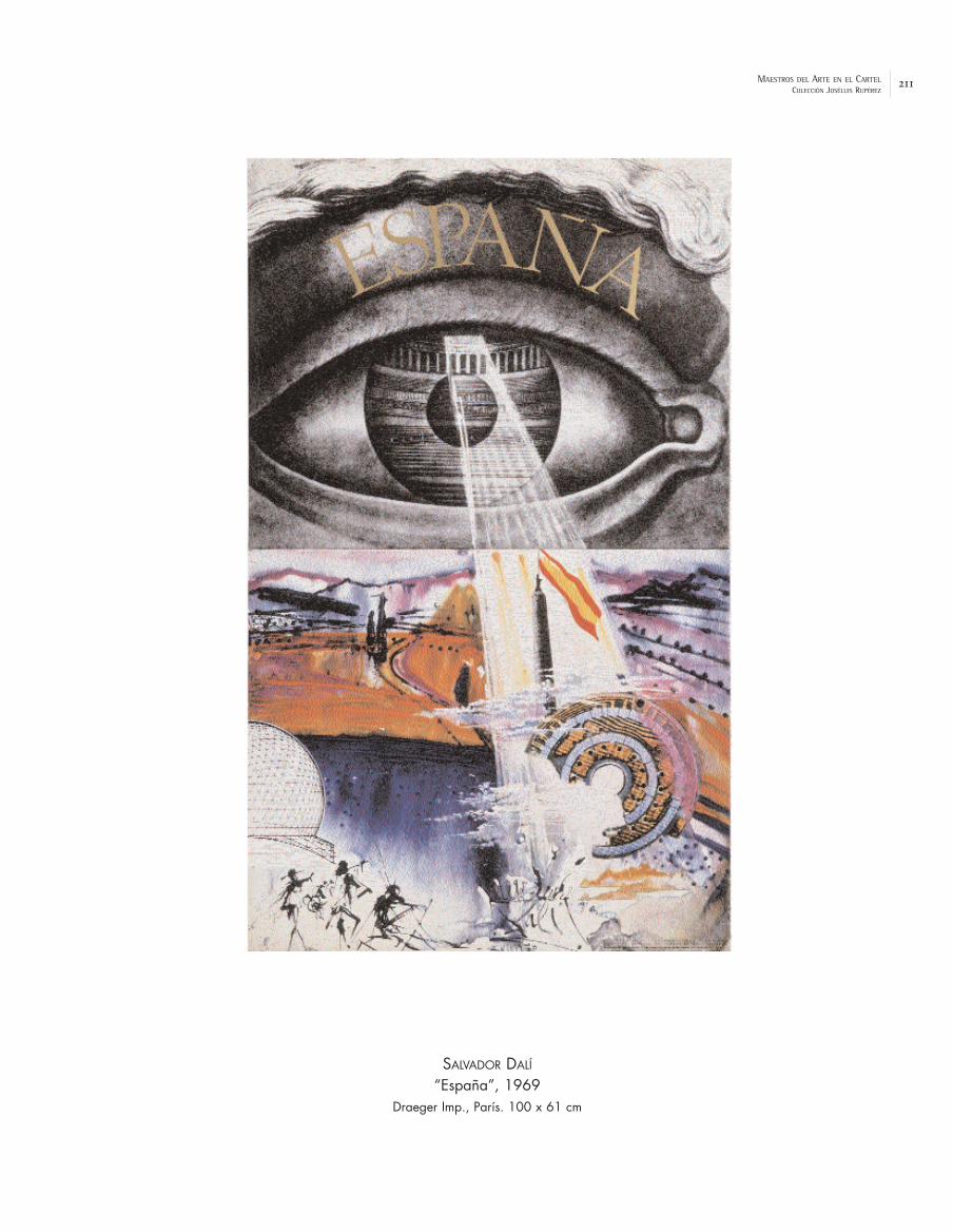
211MAESTROS DEL ARTE EN EL CARTELCOLECCIÓN JOSÉLUIS RUPÉREZ
SALVADOR DALÍ
“España”, 1969Draeger Imp., París. 100 x 61 cm

212 MAESTROS DEL ARTE EN EL CARTELCOLECCIÓN JOSÉLUIS RUPÉREZ
SONIA DELAUNAY
“Fête de l’Humanité. Les Peintres et l’Art du Livre”, 1970Ars Litho Paris. 65 x 51 cm

213MAESTROS DEL ARTE EN EL CARTELCOLECCIÓN JOSÉLUIS RUPÉREZ
SAUL STEINBERG
“Nuits de la Fondation Maeght”, 1970Imp. Arte, París. 89 x 58,5 cm

214 MAESTROS DEL ARTE EN EL CARTELCOLECCIÓN JOSÉLUIS RUPÉREZ
JOAN MIRÓ
“Das Andere Palma de Mallorca. Miró. Mallorca”, 197383,5 x 61 cm

215MAESTROS DEL ARTE EN EL CARTELCOLECCIÓN JOSÉLUIS RUPÉREZ
JOAN MIRÓ
“Sa Llotja”, 1978Litografías Artísticas Damià Caus, Barcelona. 92 x 64 cm

216 MAESTROS DEL ARTE EN EL CARTELCOLECCIÓN JOSÉLUIS RUPÉREZ
GEORGES MATHIEU
“Espagne. Air France”, 1971Imp. Courvet. 100 x 61,5 cm

217MAESTROS DEL ARTE EN EL CARTELCOLECCIÓN JOSÉLUIS RUPÉREZ
JEAN DUBUFFET
“Cou Cou Bazar”, 1973Pace Editions Inc. 100 x 70 cm

218 MAESTROS DEL ARTE EN EL CARTELCOLECCIÓN JOSÉLUIS RUPÉREZ
JOSEF ALBERS
“Olympische Spiele München”, 1972Impr. Ives Sillman, USA. 102,5 x 65 cm

219MAESTROS DEL ARTE EN EL CARTELCOLECCIÓN JOSÉLUIS RUPÉREZ
TOM WESSELMANN
“Olympische Spiele München”, 1972Edition Olympia. 103 x 64 cm

220 MAESTROS DEL ARTE EN EL CARTELCOLECCIÓN JOSÉLUIS RUPÉREZ
ALEXANDER CALDER
“Exposition-Vente d’oeuvres d’artistes au profit du Théatre du Soleil”, 1974Pace Editions Inc. 78 x 51,5 cm

221MAESTROS DEL ARTE EN EL CARTELCOLECCIÓN JOSÉLUIS RUPÉREZ
WILLEM DE KOONING
“Devil at the Keyboard”, 197690,5 x 63,5 cm

222 MAESTROS DEL ARTE EN EL CARTELCOLECCIÓN JOSÉLUIS RUPÉREZ
PAUL DAVIS
“Three Penny Opera”, 1976107 x 56 cm

223MAESTROS DEL ARTE EN EL CARTELCOLECCIÓN JOSÉLUIS RUPÉREZ
MARINO MARINI
“La Traviata”, 197893 x 62,5 cm

224 MAESTROS DEL ARTE EN EL CARTELCOLECCIÓN JOSÉLUIS RUPÉREZ
CHRISTO
“Wrapped Reichtag - Berlin”, 197863 x 97,5 cm

225MAESTROS DEL ARTE EN EL CARTELCOLECCIÓN JOSÉLUIS RUPÉREZ
JOAN BROSSA
“Semana Internacional del Mim”, 1978La Polígrafa, Barcelona. 70 x 50,5 cm

226 MAESTROS DEL ARTE EN EL CARTELCOLECCIÓN JOSÉLUIS RUPÉREZ
TADANORI YOKOO
“Hiderato Kataoka”, 1974104 x 71,5 cm

227MAESTROS DEL ARTE EN EL CARTELCOLECCIÓN JOSÉLUIS RUPÉREZ
RICHARD LINDNER
“Der Rosenkavalier. Metropolitan Opera”, 1978Circle Gallery / Met. Opera. 91,5 x 62 cm
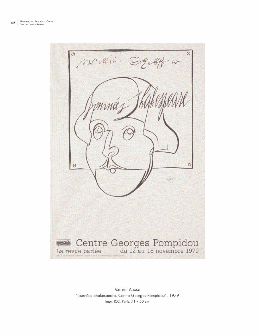
228 MAESTROS DEL ARTE EN EL CARTELCOLECCIÓN JOSÉLUIS RUPÉREZ
VALERIO ADAMI
“Journées Shakespeare. Centre Georges Pompidou”, 1979Impr. ICC, París. 71 x 50 cm

229MAESTROS DEL ARTE EN EL CARTELCOLECCIÓN JOSÉLUIS RUPÉREZ
MIMMO ROTELLA
“Marilyn”, 1979W. McKee. 67 x 69 cm

230 MAESTROS DEL ARTE EN EL CARTELCOLECCIÓN JOSÉLUIS RUPÉREZ
ROLAND TOPOR
“Le tambour”, 1979158 x 113 cm

231MAESTROS DEL ARTE EN EL CARTELCOLECCIÓN JOSÉLUIS RUPÉREZ
JOSEP GUINOVART
“Exposición anti Imperialista”, 197963 x 44,5 cm

232 MAESTROS DEL ARTE EN EL CARTELCOLECCIÓN JOSÉLUIS RUPÉREZ
RUFINO TAMAYO
“Two Hundred Years of American Growth”, 1976Imp. Mourlot, París. 66 x 50 cm

233MAESTROS DEL ARTE EN EL CARTELCOLECCIÓN JOSÉLUIS RUPÉREZ
LUIS PINTO COELHO
“Feria del Toro. Pamplona. San Fermín”, 1979Castuera I.G., Burlada, Navarra. 99,5 x 59,5 cm

234 MAESTROS DEL ARTE EN EL CARTELCOLECCIÓN JOSÉLUIS RUPÉREZ
MANUEL MENDIVE AYALA
“Carifesta. Cuba”, 197974,5 x 50 cm

235MAESTROS DEL ARTE EN EL CARTELCOLECCIÓN JOSÉLUIS RUPÉREZ
NELSON DOMÍNGUEZ
“Cuba en Venecia”, 1984FCBC. 67,5 x 44,5 cm
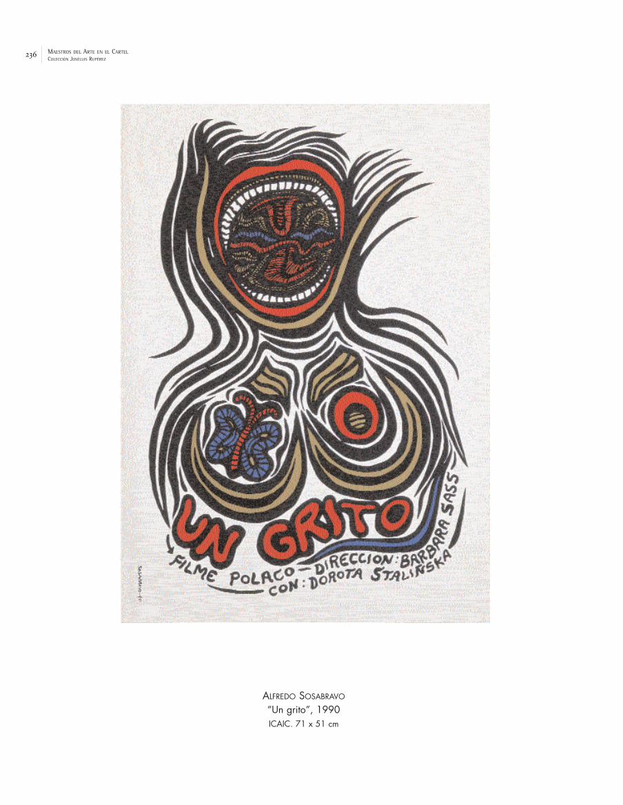
236 MAESTROS DEL ARTE EN EL CARTELCOLECCIÓN JOSÉLUIS RUPÉREZ
ALFREDO SOSABRAVO
“Un grito”, 1990ICAIC. 71 x 51 cm

237MAESTROS DEL ARTE EN EL CARTELCOLECCIÓN JOSÉLUIS RUPÉREZ
ROBERTO MATTA
“Cinema Cubano”, 1991ICAIC. 70,5 x 44 cm

238 MAESTROS DEL ARTE EN EL CARTELCOLECCIÓN JOSÉLUIS RUPÉREZ
FRANK STELLA
“Democratic National Convention”, 1980Petersburg Press. 95,5 x 71 cm

239MAESTROS DEL ARTE EN EL CARTELCOLECCIÓN JOSÉLUIS RUPÉREZ
JEAN TINGUELY
“Comité International Olympique”, 198070 x 50,5 cm

240 MAESTROS DEL ARTE EN EL CARTELCOLECCIÓN JOSÉLUIS RUPÉREZ
SEYMOUR CHWAST
“Song by Song”, 1980117 x 77 cm

241MAESTROS DEL ARTE EN EL CARTELCOLECCIÓN JOSÉLUIS RUPÉREZ
ROGER BEZOMBES
“Mur du Son. Air France”, 1981Imp. Mourlot, París. 100 x 60 cm

242 MAESTROS DEL ARTE EN EL CARTELCOLECCIÓN JOSÉLUIS RUPÉREZ
DAVID HOCKNEY
“Parade. Metropolitan Opera N.Y.”, 1981205,5 x 104,5 cm
243MAESTROS DEL ARTE EN EL CARTELCOLECCIÓN JOSÉLUIS RUPÉREZ
JIM DINE
“City Center. Gilbert & Sullivan”, 198395 x 71 cm

244 MAESTROS DEL ARTE EN EL CARTELCOLECCIÓN JOSÉLUIS RUPÉREZ
ANTONIO SAURA
“Copa del Mundo de Fútbol. España”, 1982S.P. des Affiches Maeght, París, 95 x 61,5 cm

245MAESTROS DEL ARTE EN EL CARTELCOLECCIÓN JOSÉLUIS RUPÉREZ
PIERRE ALECHINSKY
“5e Festival de Jazz de Paris”, 1984A. Karcher. 84 x 63,5 cm

246 MAESTROS DEL ARTE EN EL CARTELCOLECCIÓN JOSÉLUIS RUPÉREZ
WIFREDO LAM
“Artistes du monde contre l’apartheid”, 1982Société Nouvelle de l’IML, París. 85 x 61 cm

247MAESTROS DEL ARTE EN EL CARTELCOLECCIÓN JOSÉLUIS RUPÉREZ
JOSEPH BEUYS
“Tag X”, 198551,5 x 43 cm

248 MAESTROS DEL ARTE EN EL CARTELCOLECCIÓN JOSÉLUIS RUPÉREZ
DAVID SALLE
“Paris Review”, 1982107 x 77 cm

249MAESTROS DEL ARTE EN EL CARTELCOLECCIÓN JOSÉLUIS RUPÉREZ
FRANCESCO CLEMENTE
“The Paris Review”, 199083 x 59 cm

250 MAESTROS DEL ARTE EN EL CARTELCOLECCIÓN JOSÉLUIS RUPÉREZ
JEAN-MICHEL BASQUIAT
“France-États Unis. Figuration Libre. Comme des Félins”, 1985Impr. Arte, París. 81,5 x 64 cm

251MAESTROS DEL ARTE EN EL CARTELCOLECCIÓN JOSÉLUIS RUPÉREZ
KEITH HARING
“Free South Africa”, 1991124 x 121,5 cm

252 MAESTROS DEL ARTE EN EL CARTELCOLECCIÓN JOSÉLUIS RUPÉREZ
EDUARDO CHILLIDA
“Amnesty International”, 198675 x 51 cm

253MAESTROS DEL ARTE EN EL CARTELCOLECCIÓN JOSÉLUIS RUPÉREZ
ROBERT LLIMÓS
“Canal 33”, 1989Jovic Litográfica, Barcelona. 75,5 x 56 cm

254 MAESTROS DEL ARTE EN EL CARTELCOLECCIÓN JOSÉLUIS RUPÉREZ
MANOLO VALDÉS
“Homenatge Sanchis Guarner”, 1985Imp. Bello, Valencia. 84 x 54 cm

255MAESTROS DEL ARTE EN EL CARTELCOLECCIÓN JOSÉLUIS RUPÉREZ
ANDREU ALFARO
“9 d’octubre”, 1986Artes Gráficas Vicent, Valencia. 98 x 68 cm

256 MAESTROS DEL ARTE EN EL CARTELCOLECCIÓN JOSÉLUIS RUPÉREZ
MANUEL HERNÁNDEZ MOMPÓ
“Xàtiva. Fira d’Agost”, 1988Martín Impresores. 96 x 65 cm

257MAESTROS DEL ARTE EN EL CARTELCOLECCIÓN JOSÉLUIS RUPÉREZ
JOAN GENOVÉS
“Xàtiva. Fira d’Agost”, 199497,5 x 68 cm

258 MAESTROS DEL ARTE EN EL CARTELCOLECCIÓN JOSÉLUIS RUPÉREZ
GUILLERMO PÉREZ VILLALTA
“JJOO. Barcelona 92”, 199077 x 56 cm

259MAESTROS DEL ARTE EN EL CARTELCOLECCIÓN JOSÉLUIS RUPÉREZ
EDUARDO ARROYO
“Nanterre Amandiers”, 1992Atelier le Roseau. 152 x 102 cm

260 MAESTROS DEL ARTE EN EL CARTELCOLECCIÓN JOSÉLUIS RUPÉREZ
JEAN-MICHEL FOLON
“Voices for Peace”, 199779,5 x 58 cm

261MAESTROS DEL ARTE EN EL CARTELCOLECCIÓN JOSÉLUIS RUPÉREZ
MIQUEL BARCELÓ
“Barceló. MACBA”, 1998Item, Paris. 101 x 70,5 cm

262 MAESTROS DEL ARTE EN EL CARTELCOLECCIÓN JOSÉLUIS RUPÉREZ
LUIS GORDILLO
“Baile de Máscaras. Círculo de Bellas Artes”, 199499 x 69 cm

263MAESTROS DEL ARTE EN EL CARTELCOLECCIÓN JOSÉLUIS RUPÉREZ
EDUARDO ÚRCULO
“Veranos de la Villa”, 1999Artes Gráficas Municipales, Madrid. 98 x 69,5 cm

264 MAESTROS DEL ARTE EN EL CARTELCOLECCIÓN JOSÉLUIS RUPÉREZ
ROMERO BRITTO
“1ST Annual Latin Grammy Awards”, 200062, x 45,5 cm

265MAESTROS DEL ARTE EN EL CARTELCOLECCIÓN JOSÉLUIS RUPÉREZ
ANTONI TÀPIES
“Festes de la Mercé”, 200292,5 x 63 cm

266 MAESTROS DEL ARTE EN EL CARTELCOLECCIÓN JOSÉLUIS RUPÉREZ
ÓSCAR MARINÉ
“11M04”, 2004130 x 94 cm

267MAESTROS DEL ARTE EN EL CARTELCOLECCIÓN JOSÉLUIS RUPÉREZ
SE ACABÓ DE IMPRIMIR
EN ALICANTE
EL DÍA 28 DE MAYO DE 2004 EN LOS TALLERES DE
GRÁFICAS ANTAR

268 MAESTROS DEL ARTE EN EL CARTELCOLECCIÓN JOSÉLUIS RUPÉREZ