Lecture 2: User-Centered Design
29
1 Fall 2004 6.831 UI Design and Implementation 1
-
Upload
khangminh22 -
Category
Documents
-
view
12 -
download
0
Transcript of Lecture 2: User-Centered Design

1
Fall 2004 6.831 UI Design and Implementation 1
�������������� ��������������

2
Fall 2004 6.831 UI Design and Implementation 2
������������� ��������� ��
Source: Interface Hall of Shame
Sybase PowerBuilder is an application development environment, not unlike Microsoft Visual Basic. Users of PowerBuilder construct forms by drawing controls (buttons, listboxes, graphical objects) on the form.
Controls are selected by pulling down a menu from a toolbar icon. The menu actually looks like a palette, but it behaves like a pulldown menu in that once you make a selection, it disappears. After a control is selected, its icon is shown in the toolbar, and clicking on the form drops the control where you clicked.
This design solves some interesting problems. Most of the time, the palette is hidden, saving screen real estate that the user might prefer to use to view the form being created. It makes it easy to drop multiple instances of the same kind of control on the form – an array of textboxes, for example, or several command buttons. The current palette mode is displayed even when the palette isn’t visible.
But that last feature leads to the unfortunate problem with this design: the toolbar icon is different every time the user tries to find it! Even frequent PowerBuilder users report the disconcerting feeling of hunting around for this button. The button is always in the same place, but that doesn’t make it easy to find, since it’s located in the midst of other toolbar buttons. Shape is the best discriminator here, but the icon keeps changing shape.
A task that probably seemed trivial to PowerBuilder’s developers – the user must know where that button was, since they’ve already used it! – turns out not to be trivial at all.

3
Fall 2004 6.831 UI Design and Implementation 3
����� ����!���
� Iterative Design
� Task Analysis
Design
ImplementEvaluate
Today’s lecture concerns two topics.
First, we’ll look at UI design from a very high-level, considering the shape of the process that we should use to build user interfaces. Iterative design is the current best-practice process for developing user interfaces. It’s a specialization of the spiral model described by Boehm for general software engineering. Your term project is structured as an iterative design.
Second, we’ll look at how to get started with UI design – how to start the crank and get the UI design cycle going. Task analysis is the process by which you discover the characteristics of your target users and the tasks that they need to solve.

4
Fall 2004 6.831 UI Design and Implementation 4
����������������"����#�����������$�������
% ���������&����
Requirements
Design
Code
Integration
Acceptance
Release
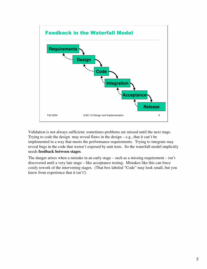
The waterfall model was one of the earliest carefully-articulated design processes for software development. It models the design process as a sequence of stages. Each stage results in a concrete product – a requirements document, a design, a set of coded modules –that feeds into the next stage. Each stage also includes its own validation: the design is validated against the requirements, the code is validated (unit-tested) against the design, etc.
The biggest improvement of the waterfall model over previous (chaotic) approaches to software development is the discipline it puts on developers to think first, and code second. Requirements and designs generally precede the first line of code.
If you’ve taken 6.170 (or a similar software engineering course), you’ve experienced this process yourself. The lecturers handed you a set of requirements for the software you had to build --- e.g. the specification of GizmoBall or Antichess. (In the real world, identifying these requirements would be part of your job as software developers.) You were then expected to meet certain milestones for each stage of your project, and each milestone had a concrete product: (1) a design document; (2) code modules that implemented certain functionality; (3) an integrated system.
5
Fall 2004 6.831 UI Design and Implementation 5
����'��(��������% ���������&����
Requirements
Design
Code
Integration
Acceptance
Release
Validation is not always sufficient; sometimes problems are missed until the next stage. Trying to code the design may reveal flaws in the design – e.g., that it can’t be implemented in a way that meets the performance requirements. Trying to integrate may reveal bugs in the code that weren’t exposed by unit tests. So the waterfall model implicitly needs feedback between stages.
The danger arises when a mistake in an early stage – such as a missing requirement – isn’t discovered until a very late stage – like acceptance testing. Mistakes like this can force costly rework of the intervening stages. (That box labeled “Code” may look small, but you know from experience that it isn’t!)

6
Fall 2004 6.831 UI Design and Implementation 6
% ���������&��������)���������������
� User interface design is risky�So we�re likely to get it wrong
� Users are not involved in validation until acceptance testing�So we won�t find out until the end
� UI flaws often cause changes in requirements and design�So we have to throw away carefully-written
and tested code
Although the waterfall model is useful for some kinds of software development, it’s very poorly suited to user interface development.
First, UI development is inherently risky. UI design is hard for all the reasons we discussed in the previous lecture. (You are not the user; the user is always right, except when the user isn’t; users aren’t designers either.) We don’t (yet) have an easy way to predict how whether a UI design will succeed.
Second, in the usual way that the waterfall model is applied, users appear in the process in only two places: requirements analysis and acceptance testing. Hopefully we asked the users what they needed at the beginning (requirements analysis), but then we code happily away and don’t check back with the users until we’re ready to present them with a finished system. So if we screwed up the design, the waterfall process won’t tell us until the end.
Third, when UI problems arise, they often require dramatic fixes: new requirements or new design. We saw last lecture that slapping on patches doesn’t fix serious usability problems.

7
Fall 2004 6.831 UI Design and Implementation 7
�������*��������
Design
ImplementEvaluate
Iterative design offers a way to manage the inherent risk in user interface design. In iterative design, the software is refined by repeated trips around a design cycle: first imagining it (design), then realizing it physically (implementation), then testing it (evaluation).
OK – but this just looks like the worst-case waterfall model, where we made it all the way from design to acceptance testing before discovering a design flaw that forced us to repeat the process! What’s the trick here?

8
Fall 2004 6.831 UI Design and Implementation 8
�������*�������������% �����% ��
� Every iteration corresponds to a release�Evaluation (complaints) feeds back into
next version�s design
� Using your paying customers to evaluate your usability�They won�t like it�They won�t buy version 2
Unfortunately, many commercial UI projects have followed this model. They do a standard waterfall design, produce a bad UI, and release it. Evaluation then takes place in the marketplace, as hapless customers buy their product and complain about it. Then they iterate the design process on version 2.

9
Fall 2004 6.831 UI Design and Implementation 9
�!�����&����
Design
ImplementEvaluate
The spiral model offers a way out of the dilemma. We build room for several iterations into our design process, and we do it by making the early iterations as cheap as possible.
The radial dimension of the spiral model corresponds to the cost of the iteration step – or, equivalently, its fidelity or accuracy. For example, an early implementation might be a paper sketch or mockup. It’s low-fidelity, only a pale shadow of what it would look and behave like as interactive software. But it’s incredibly cheap to make, and we can evaluate it by showing it to users and asking them questions about it.
10
Fall 2004 6.831 UI Design and Implementation 10
#�����$������!��� ������������'������
$��'��� �
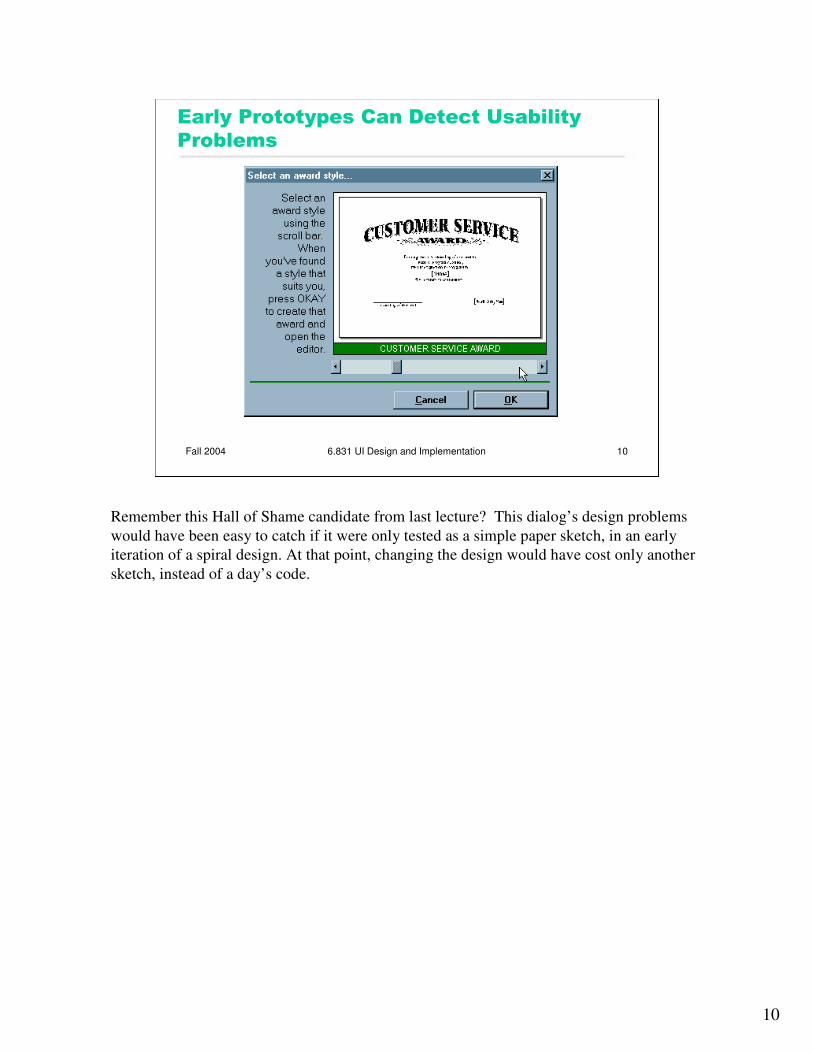
Remember this Hall of Shame candidate from last lecture? This dialog’s design problems would have been easy to catch if it were only tested as a simple paper sketch, in an early iteration of a spiral design. At that point, changing the design would have cost only another sketch, instead of a day’s code.

11
Fall 2004 6.831 UI Design and Implementation 11
�������*��������������������������
� Early iterations use cheap prototypes� Parallel design is feasible: build & test multiple
prototypes to explore design alternatives
� Later iterations use richer implementations, after UI risk has been mitigated� More iterations generally means better UI� Only mature iterations are seen by the world
Why is the spiral model a good idea? Risk is greatest in the early iterations, when we know the least. So we put our least commitment into the early implementations. Early prototypes are made to be thrown away. If we find ourselves with several design alternatives, we can build multiple prototypes (parallel design) and evaluate them, without much expense.
After we have evaluated and redesigned several times, we have (hopefully) learned enough to avoid making a major UI design error. Then we actually implement the UI – which is to say, we build a prototype that we intend to keep. Then we evaluate it again, and refine it further.
The more iterations we can make, the more refinements in the design are possible. We’re hill-climbing here, not exploring the design space randomly. We keep the parts of the design that work, and redesign the parts that don’t. So we should get a better design if we can do more iterations.

12
Fall 2004 6.831 UI Design and Implementation 12
���� ��������������
� Iterative design� Early focus on users and tasks�user analysis: who the users are� task analysis: what they need to do� involving users as evaluators, consultants,
and sometimes designers� Constant evaluation�Users are involved in every iteration�Every prototype is evaluated somehow
Iterative design is a crucial part of user-centered design, the design process for user interfaces that is widely accepted among UI practicioners. A variety of brand-name user-centered design techniques exist (e.g., GUIDE, STUDIO, OVID, LUCID). But most have three features in common:
- iterative design using rapid prototyping
- early focus on users and tasks
- evaluation throughout the iterative design process.

13
Fall 2004 6.831 UI Design and Implementation 13
���� ������������������+,-./
1. Task analysis2. Design sketches3. Paper prototype4. In-class user testing5. Computer prototype6. Heuristic evaluation7. Implementation8. User testing
Design
ImplementEvaluate
1234 56 78
The term project’s milestones are designed to follow a spiral model:
1. task analysis (1 week): collecting the requirements for the UI, which we’ll discuss in the second half of this lecture.
2. design sketches (1 week): paper sketches of your UI design
3. paper prototype (2 week): an interactive prototype made of paper and other cheap physical materials
4. in-class user testing (1 day): one day during the paper prototype assignment, we’ll spend the lecture using each others’ prototypes
5. computer prototype (2 weeks): an interactive software prototype that you plan to throw away
6. heuristic evaluation (1 week): we’ll exchange software prototypes and evaluate them as usability experts would
7. implementation (3 weeks): you’ll build a real implementation that you plan to keep
8. user testing (1 week): you’ll test your implementation against users and refine it
Notice that the part you did in 6.170 – step 7 – is only one milestone in this class!
14
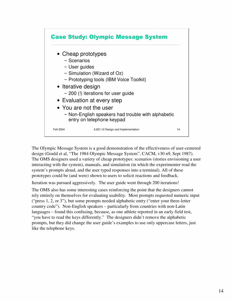
Fall 2004 6.831 UI Design and Implementation 14
����������0��� !���&�������������
� Cheap prototypes� Scenarios � User guides� Simulation (Wizard of Oz)� Prototyping tools (IBM Voice Toolkit)
� Iterative design� 200 (!) iterations for user guide
� Evaluation at every step� You are not the user� Non-English speakers had trouble with alphabetic
entry on telephone keypad
The Olympic Message System is a good demonstration of the effectiveness of user-centered design (Gould et al, “The 1984 Olympic Message System”, CACM, v30 n9, Sept 1987). The OMS designers used a variety of cheap prototypes: scenarios (stories envisioning a user interacting with the system), manuals, and simulation (in which the experimenter read the system’s prompts aloud, and the user typed responses into a terminal). All of these prototypes could be (and were) shown to users to solicit reactions and feedback.
Iteration was pursued aggressively. The user guide went through 200 iterations!
The OMS also has some interesting cases reinforcing the point that the designers cannot rely entirely on themselves for evaluating usability. Most prompts requested numeric input (“press 1, 2, or 3”), but some prompts needed alphabetic entry (“enter your three-letter country code”). Non-English speakers – particularly from countries with non-Latin languages – found this confusing, because, as one athlete reported in an early field test, “you have to read the keys differently.” The designers didn’t remove the alphabetic prompts, but they did change the user guide’s examples to use only uppercase letters, just like the telephone keys.

15
Fall 2004 6.831 UI Design and Implementation 15
����1����(�2�������
� First step of user-centered design� User analysis: who is the user?� Task analysis: what does the user need
to do?
We’ve seen that UI design is iterative – that we have to turn the crank several times to achieve good usability. How do we get started? How do we acquire information for the initial design?
The process of collecting information for the first design is called user and task analysis. In these steps, we ask who the users are, and what it is that they’re trying to accomplish.

16
Fall 2004 6.831 UI Design and Implementation 16
3��" ��������
� Identify characteristics of target user population� Age, gender, ethnicity� Education� Physical abilities� General computer experience� Skills (typing? reading?)� Domain experience� Application experience� Work environment and other social context� Relationships and communication patterns
The reason for user analysis is straightforward: since you’re not the user, you need to find out who the user actually is.
User analysis seems so obvious that it’s often skipped. But failing to do it explicitly makes it easier to fall into the trap of assuming every user is like you. It’s better to do some thinking and collect some information first.
Knowing about the user means not just their individual characteristics, but also their situation. In what environment will they use your software? What else might be distracting their attention? What is the social context? A movie theater, a quiet library, inside a car, on the deck of an aircraft carrier; environment can place widely varying constraints on your user interface.
Other aspects of the user’s situation include their relationship to other users in their organization, and typical communication patterns. Can users ask each other for help, or are they isolated? How do students relate differently to lab assistants, teaching assistants, and professors?

17
Fall 2004 6.831 UI Design and Implementation 17
&����!��� ��������������
� Many applications have several kinds of users� Example: Olympic Message System�Athletes�Friends & family�Telephone operators�Sysadmins
Many, if not most, applications have to worry about multiple classes of users. Do a user analysis for every class.

18
Fall 2004 6.831 UI Design and Implementation 18
��" �����������2�������
� Techniques� Questionnaires� Interviews� Observation
� Obstacles� Developers and users may be systematically
isolated from each other� Tech support shields developers from users� Marketing shields users from developers
� Some users are expensive to talk to� Doctors, executives, union members
The best way to do user analysis is to find some representative users and ask them. Straightforward characteristics can be obtained by a questionnaire. Details about context and environment can be obtained by interviewing users directly, or even better, observingthem going about their business, in their natural habitat.
Sometimes it can be hard to reach users. Software companies can erect artificial barriers between users and developers, for their mutual protection. After all, if users know who the developers are, they might pester them with bugs and questions about the software, which are better handled by tech support personnel. The marketing department may be afraid to let the developers interact with the users – not only because geeks can be scary, but also because usability discussions may make customers dissatisfied with the current product. (“I hadn’t noticed it before, but that DOES suck!”)
Some users are also expensive to find and talk to. Nevertheless, make every effort to collect the information you need. A little money spent collecting information initially should pay off significantly in better designs and fewer iterations.
19
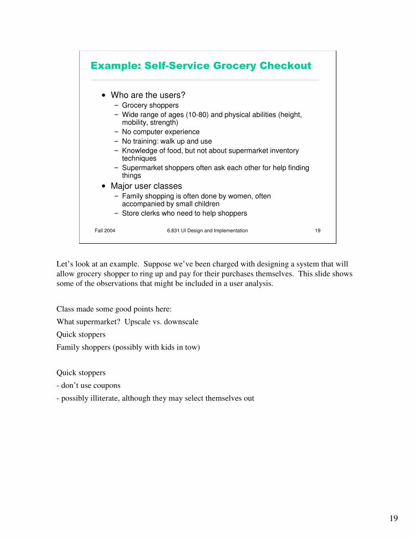
Fall 2004 6.831 UI Design and Implementation 19
#4�� !�����������*����5������� ���(���
� Who are the users?� Grocery shoppers� Wide range of ages (10-80) and physical abilities (height,
mobility, strength)� No computer experience� No training: walk up and use� Knowledge of food, but not about supermarket inventory
techniques� Supermarket shoppers often ask each other for help finding
things� Major user classes� Family shopping is often done by women, often
accompanied by small children� Store clerks who need to help shoppers
Let’s look at an example. Suppose we’ve been charged with designing a system that will allow grocery shopper to ring up and pay for their purchases themselves. This slide shows some of the observations that might be included in a user analysis.
Class made some good points here:
What supermarket? Upscale vs. downscale
Quick stoppers
Family shoppers (possibly with kids in tow)
Quick stoppers
- don’t use coupons
- possibly illiterate, although they may select themselves out

20
Fall 2004 6.831 UI Design and Implementation 20
���(�2�������
� Identify the individual tasks the program might solve� Each task is a goal (what, not how)� Often helps to start with overall goal of the
system and then decompose it hierarchically into tasks� Overall goal: shoppers pay for their own groceries� Tasks:� Enter groceries into register� Bag groceries� Pay
The next step is figuring out what tasks are involved in the problem. A task should be expressed as a goal: what needs to be done, not how.
One good way to get started on a task analysis is hierarchical decomposition. Think about the overall problem you’re trying to solve. That’s really the top-level task. Then decompose it into a set of subtasks, or subgoals, that are part of satisfying the overall goal.

21
Fall 2004 6.831 UI Design and Implementation 21
#���������$�����������(�2�������
� What needs to be done?� Goal
� What must be done first to make it possible?� Preconditions� Tasks on which this task depends� Information that must be known to the user
� What steps are involved in doing the task?� Subtasks� Subtasks may be decomposed recursively
Once you’ve identified a list of tasks, fill in the details on each one. Every task in a task analysis should have at least these parts.The goal is just the name of the task, like “send an email message.”The preconditions are the conditions that must be satisfied before it’s reasonable or possible to attempt the task. Some preconditions are other tasks in your analysis; in the grocery checkout example, entering all the groceries is a precondition to paying. Other preconditions are information needs, things the user needs to know in order to do the task. For example, in order to send an email message, I need to know the email addresses of the people I want to send it to; I may also need to look at the message I’m replying to.Preconditions are vitally important to good UI design, particularly because users don’t always satisfy them before attempting a task, resulting in errors. Knowing what the preconditions are can help you prevent these errors, or at least render them harmless. For example, a precondition of starting a fire in a fireplace is opening the flue, so that smoke escapes up the chimney instead of filling the room. If you know this precondition as a designer, you can design the fireplace with an interlock that ensures the precondition will be met. Another design solution is to offer opportunities to complete preconditions: for example, an email composition window should give the user access to their address book to look up recipients’ email addresses.Finally, decompose the task into subtasks, individual steps involved in doing the task. If the subtasks are nontrivial, they can be recursively decomposed in the same manner.

22
Fall 2004 6.831 UI Design and Implementation 22
#4�� !�����������*����5������� ���(���
� Goal�Enter groceries into register
� Preconditions�All the groceries you want are in your cart
� Subtasks�Enter prepackaged item�Enter loose produce
Here’s the continuation of our grocery cart example, looking at the first task we identified.

23
Fall 2004 6.831 UI Design and Implementation 23
0�����6������������2�(�2'���������(
� Where is the task performed?� Front of supermarket, standing up
� How often is the task performed?� At most a few times a week
� What are its time or resource constraints?� A minute or two
� How is the task learned?� By trying it� By watching others� By being shown how by store personnel
� What can go wrong? (Exceptions, errors, emergencies)� Barcode is missing or smudged� Shopper wants to buy alcohol or cigarettes
� Who else is involved in the task?
There are lots of questions you should ask about each task. Here are a few, with examples from the grocery checkout.

24
Fall 2004 6.831 UI Design and Implementation 24
��" ������������(�2�������
� Interviews with users� Direct observation of users performing
tasks
The best sources of information for task analysis are user interviews and direct observation. Usually, you’ll have to observe how users currently perform the task. For the grocery checkout example, we would want to observe store cashiers checking out groceries in order to understand the grocery checkout task. We would also want to interview grocery store shoppers, in order to understand better their goals in the task.

25
Fall 2004 6.831 UI Design and Implementation 25
��������������(�2�������
� Duplicating a bad existing procedure in software� Failing to capture good aspects of
existing procedure
One danger of task analysis derived from observation is that it may give too much weight to the way things are currently done, even if they’re inefficient or could be done completely differently in software. Suppose we did a task analysis by observing users interacting with paper manuals. We’d see a lot of page flipping: “Find page N” might be an important subtask. We might naively conclude from this that an online manual should provide really good mechanisms for paging & scrolling, and that we should pour development effort into making those mechanisms as fast as possible. But page flipping is an artifact of physical books! It would pay off much more to have fast and effective searching and hyperlinking in an online manual. That’s why it’s important to focus on why users do what they do, not just what they do.
Conversely, an incomplete task analysis may fail to capture important aspects of the existing procedure. In one case, a dentist’s office converted from manual billing to an automated system. But the office assistants didn’t like the new system, because they were accustomed to keeping important notes on the paper forms, like “this patient’s insurance takes longer than normal.” The automated system provided no way to capture those kinds of annotations. That’s why interviewing and observing real users is important.

26
Fall 2004 6.831 UI Design and Implementation 26
����������)����������1����(�2�������
� Questions to ask�Why do you do this? (goal)�How do you do it? (subtasks)
� Look for weaknesses in current situation�Goal failures, wasted time, user irritation
� Contextual inquiry� Participatory design
When you’re interviewing users, they tend to focus on the what: “first I do this, then I do this…” Be sure to probe for the why and how as well, to make your analysis more abstract and at the same time more detailed.
Since you want to improve the current situation, look for its weaknesses and problems. What tasks often fail? What unimportant tasks are wasting lots of time? It helps to ask the users what annoys them and what suggestions they have for improvement.
There are two other techniques for making user and task analysis more effective: contextual inquiry and participatory design.

27
Fall 2004 6.831 UI Design and Implementation 27
����4�������7����
� Observe users doing real work in the real work environment� Be concrete� Establish a master-apprentice
relationship�User shows how and talks about it� Interviewer watches and asks questions
� Challenge assumptions and probe surprises
Contextual inquiry is a technique that combines interviewing and observation, in the user’s actual work environment, discussing actual work products. Contextual inquiry fosters strong collaboration between the designers and the users. (Wixon, Holtzblatt & Knox, “Contextual design: an emergent view of system design”, CHI ’90)

28
Fall 2004 6.831 UI Design and Implementation 28
$������!������������
� Include representative users directly in the design team� OMS design team included an Olympic
athlete as a consultant
Participatory design includes users directly on the design team – participating in the task analysis, proposing design ideas, helping with evaluation. This is particularly vital when the target users have much deeper domain knowledge than the design team. It would be unwise to build an interface for stock trading without an expert in stock trading on the team, for example.

29
Fall 2004 6.831 UI Design and Implementation 29
8�4����� ��������"����2�����������
� �Model-View-Controller� paper