I know how to draw a pie chart when I have a set of data ...
11
-
Upload
khangminh22 -
Category
Documents
-
view
2 -
download
0
Transcript of I know how to draw a pie chart when I have a set of data ...


Success Criteria
Aim
Success Criteria
AimI know how to draw a pie chart when I have a set
of data (information).
• I know which calculations will give me the correct angles for each of my sectors.• I can use a protractor to construct the
angles required by my pie chart.

Pie charts or pie graphs are a great way to show the sizes of
groups within one data set.You can draw them yourself by
following these steps.Give it a shot!

Imagine children at BCNS collected the following information (data) about the eye colour of 60 people and we want to show this in a pie chart:
1. Collect or identify your data
Eye Colour Number of People
Green 22Blue 13Brown 17Other 8Total 60

2. Understand the process
We know from learning about angles that a circle is a full turn of 360˚.
To find out how big each section (sector) of the pie chart should be, we need to find out how many degrees to use for each piece of information (data).

Divide 360 by the total size of your sample to calculate how many degrees each eye-colour group is equal to.
3. Convert the data to degrees
360 ÷ 60 = 6˚ per person.
Eye Colour Number of People
Green 22
Blue 13
Brown 17
Other 8
Total 60
Eye Colour Number of People
Calculation Degrees in Pie Chart
Green 22 22 x 6 132
Blue 13 13 x 6 78
Brown 17 17 x 6 102
Other 8 8 x 6 48
Total 60 60 x 6 360
Multiply the number of people in each data set by 6 to calculate the size of the angle for their sector in the pie chart.

1. Draw a circle.
4. Drawing your pie chart
2. Mark the radius by joining the centre of the circle to the edge.
3. Place a protractor on the radius and measure the angle for your first data ‘slice’.
4. Draw the line in to complete the sector.
5. Repeat for your remaining data.
6. You should find that you don’t need to measure your last sector!
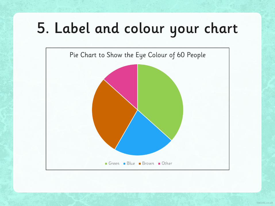
5. Label and colour your chart

6. Calculating Sector Data Using Pie chart Angles
The process also works backwards, meaning you can calculate the value of any sector provided the total data size is known.
Look at this Chart to show the favourite pizza flavours of 200 children.
How many children chose Hawaiian?
360 ÷ 200 = 1.8 degrees per child.
Hawaiian sector measures 81 degrees.
81 ÷ 1.8 = 45 children
VegetarianHawaiian
MargheritaPepperoni
Roast Chicken

Success Criteria
Aim
Success Criteria
AimI know how to draw a pie chart from a given set of
data.
• I can use a protractor to construct the angles required by my pie chart.
• I know which calculations will give me the correct angles for each of my sectors.