Data • Circle Graph or Pie Chart • Organising ... - SelfStudys
16
DATA HANDLING CONTENTS Data Circle Graph or Pie Chart Organising Data Grouping Data Definitions Chance And Probability Outcomes As Events Probability of An Event DATA The information collected by observation for experiments is called data. Data can represented graphically, by (i) Picto Graph (ii) Bar Graph (iii) Double Bar Graph (iv) Histogram (v) Polygon (Class IX) and also tabular form, by (i) Raw data (ii) Frequency distribution table, and by Pie Chart Pictograph : Pictorial representation of data using symbols. Ex.1 =100 balloons One symbol stands for 100 balloon July August Sept. =250 denotes 1/2 of 100 =300 =? (i) How many balloons were produced in the month of July ? Ans. 250 (ii) In which month were maximum number of balloons produced ? Ans. September A bar graph : A display of information using bars of uniform width, their heights being proportional to the respective values. Ex.2 No. of students in Class VIII 350 300 250 200 150 100 50 2003-04 2004-05 2005-06 2006-07 2007-08 Academic years O Note : Bar heights give the quantity for each category. Bars are of equal width with equal gaps in between.
-
Upload
khangminh22 -
Category
Documents
-
view
5 -
download
0
Transcript of Data • Circle Graph or Pie Chart • Organising ... - SelfStudys

DATA HANDLING
CONTENTS
Data
Circle Graph or Pie Chart
Organising Data
Grouping Data
Definitions
Chance And Probability
Outcomes As Events
Probability of An Event
DATA
The information collected by observation for
experiments is called data.
Data can represented graphically, by
(i) Picto Graph
(ii) Bar Graph
(iii) Double Bar Graph
(iv) Histogram
(v) Polygon (Class IX)
and also tabular form, by
(i) Raw data
(ii) Frequency distribution table, and by Pie Chart
Pictograph : Pictorial representation of data
using symbols.
Ex.1 =100 balloons One symbol stands for 100 balloon
July
August
Sept.
=250 denotes 1/2 of 100
=300
=?
(i) How many balloons were produced in the
month of July ?
Ans. 250
(ii) In which month were maximum number of
balloons produced ?
Ans. September
A bar graph : A display of information using
bars of uniform width, their heights being
proportional to the respective values.
Ex.2
No.
of
stud
ents
in C
lass
VII
I 350
300
250
200
150
100
50
2003-04 2004-05 2005-06 2006-07 2007-08
Academic years
O
Note : Bar heights give the quantity for each
category.
Bars are of equal width with equal gaps in
between.

(i) What is the information given by the bar
graph ?
Ans. About students of class VIII in academic
years
(ii) In which year is the increase in the number of
students maximum ?
Ans. 2004-05
(iii) In which year is the number of students
maximum?
Ans. 2007-08
(iv) State whether true or false :
'The number of students during 2005-06 is
twice that of 2003-04.
Ans. False (2005-06 250, 2003-04 100)
Double Bar Graph : A bar graph showing
two sets of data simultaneously. It is useful
for the comparison of the data.
Ex.3
Mar
ks o
btai
ned
by a
stu
dent
20
10
Maths
Subject
30
40
5060
70
80
S.Science Science English Hindi
2005-06 2006-07
(i) What is the information given by the double
bar graph ?
Ans. Marks of a student in various subjects in two
successive academic years.
(ii) In which subject has the performance
improved the most ?
Ans. Maths
(iii) In which subject has the performance
deteriorated?
Ans. English
(iv) In which subject is the performance at par ?
Ans. Hindi
Ex.4
Class Interval Frequency
0-10 2
10-20 10
20-30 21
30-40 19
40-50 7
50-60 1
Total 60
Ans.
2
4
6
8
10
12
14
16
18
20
22
10
2119
7
1
10 20 30 40 50 60
Num
ber
of s
tude
nts
2
O
Marks of the students
The height of the bars show the frequency of
the class-interval. Also, there is no gap
between the bars as there is no gap between
the class-intervals.
The graphical representation of data in this
manner is called a histogram.
Note :
Bars of equal width with no gaps in between.
Height of bar gives the number of data items
in a particular group and is the frequency.

1
2
3
4
5
6
7
4
3
2
20 25 30 35 40 45
Num
ber
of te
ache
rs
5
6
5
50
Age in years
Jagged line( )(or broken line) (or kink) has been used along the horizontal line to indicate that we are not showing the numbers between 0 to 20.
Age of 25 teachers of a school
The range is divided in equal intervals (of 5 years in the case)
CIRCLE GRAPH OR PIE CHART
This is a very clourful way. A pie chart would
mean that the data is represented in a circle and
not as bars or lines. A circle has a centre and the
angle around the centre is 360º. So all the data
will be represented in terms of angles. The circle
is divided out into different parts. Each part is
called a sector and the angle at the centre is the
central angle.
O
B A
AOB is a sector where OA and OB are the radii
and AOB is the central angle.
Reading a Pie Chart Ex.5 Let us consider the following pie chart. It
represents the number of students speaking different languages in the 3 sections of Std VIII in a school.
The pie chart reads.
Language Angle
Hindi 150º
Punjabi 90º
Tamil 60º
Bengali 20º
Telugu 40º
If the total number of students surveyed is
252, find the number of students for each
language.
Sol. Here, we observe that 252 students are
represented by 360º
20º Tamil
Telugu 40º
150º Hindi Punjabi
Bengali
60º
90º
1º represents 360
252 = 0.7 students.
Hence, the number of students are :
Language Central
Angle
No. of students
Hindi 150º
360
252×150 = 105
Punjabi 90º
360
252 × 90 = 63
Tamil 60º
360
252 × 60 = 42
Bengali 20º
360
252 × 20 = 14
Telugu 40º
360
252 × 40 = 28
Total 360º 252
Note : When the number of students in each
category is added, the total should be the same as
total students surveyed.
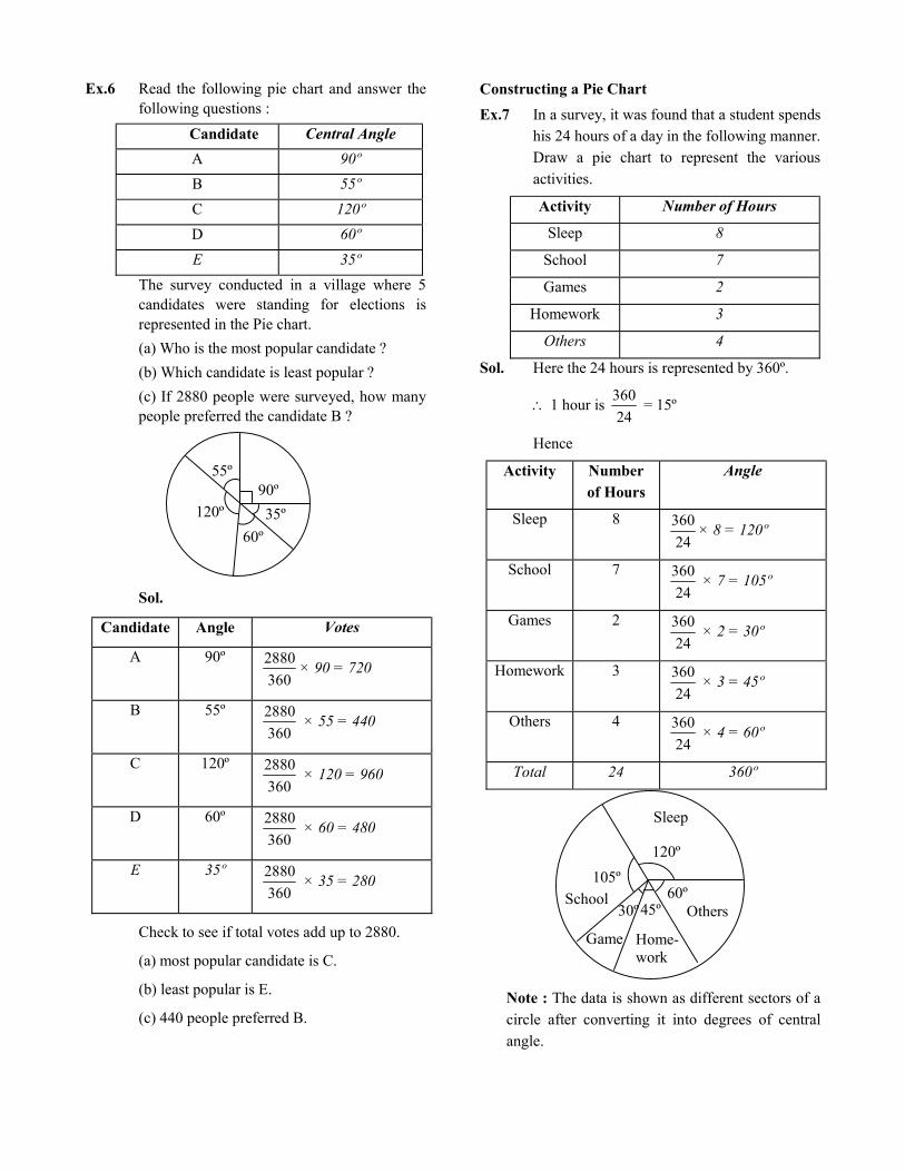
Ex.6 Read the following pie chart and answer the following questions :
Candidate Central Angle
A 90º
B 55º
C 120º
D 60º
E 35º
The survey conducted in a village where 5 candidates were standing for elections is represented in the Pie chart.
(a) Who is the most popular candidate ?
(b) Which candidate is least popular ?
(c) If 2880 people were surveyed, how many people preferred the candidate B ?
120º
55º 90º
60º
35º
Sol.
Candidate Angle Votes
A 90º
360
2880× 90 = 720
B 55º
360
2880 × 55 = 440
C 120º
360
2880 × 120 = 960
D 60º
360
2880 × 60 = 480
E 35º
360
2880 × 35 = 280
Check to see if total votes add up to 2880.
(a) most popular candidate is C.
(b) least popular is E.
(c) 440 people preferred B.
Constructing a Pie Chart
Ex.7 In a survey, it was found that a student spends his 24 hours of a day in the following manner. Draw a pie chart to represent the various activities.
Activity Number of Hours
Sleep 8
School 7
Games 2
Homework 3
Others 4
Sol. Here the 24 hours is represented by 360º.
1 hour is 24
360 = 15º
Hence
Activity Number of Hours
Angle
Sleep 8
24
360× 8 = 120º
School 7
24
360 × 7 = 105º
Games 2
24
360 × 2 = 30º
Homework 3
24
360 × 3 = 45º
Others 4
24
360 × 4 = 60º
Total 24 360º
Sleep
120º
60º 45º 30º
105º
School
Game Home- work
Others
Note : The data is shown as different sectors of a
circle after converting it into degrees of central angle.

Ex.8 Adjoining pie chart gives the expenditure (in percentage) on various items and savings of a family during a month.
Education for children 15%
Food25%
Clothes 10%
Savings 15%
Others 20%
Transport 5%
House rent 10%
(i) On which item, the expenditure was
maximum?
(ii) Expenditure on which item is equal to the total savings of the family ?
(iii) If the monthly savings of the family is Rs 3000, what is the monthly expenditure on clothes?
Sol. (i) Expenditure is maximum on food.
(ii) Expenditure on Education of children is the same (i.e. 15%) as the savings of the family.
(iii)15% represents Rs. 3000
Therefore, 10% represents
Rs. 15
3000×10 = Rs. 2000
Ex.9 On a particular day, the sales (in rupees) of
different items of a baker’s shop are given
below.
ordinary bread : 320
fruit bread : 80
cakes & pastries : 160
biscuits : 120
others : 40
––––––––––––––––– Total : 720
Draw a pie chart for this data.
Sol. We find the central angle of each sector.
Here the total sale = Rs 720. We thus have
this table.
Item Sales
(in Rs.)
In
Fraction
Central Angle
Ordinary
Bread
320
720
320=
9
4
9
4×360º=160º
Biscuits 120
720
120=
6
1
6
1×360º=60º
Cakes &
pastries
160
720
160=
9
2
9
2×360º=80º
Fruit Bread 80
720
80=
9
1
9
1×360º=40º
Others 40
720
40=
18
1
18
1×360º=20º
Now, we make the pie chart
Biscuits 60º
Cakes & Pastries 80º
Fruit Bread 40º
Others 20º
Ordinary Bread 160º
ORGANIS ING DATA
Data available to us is in an unorganised form
called raw data. To draw meaningful inferences,
we need to organise the data systematically. For
example, a group of students was asked for their
favourite subject. The results were as listed
below :
Art, Mathematics, Science, English, Mathematics,
Art, English, Mathematics, English, Art, Science,
Art, Science, Science, Mathematics, Art, English,
Art, Science, Mathematics, Science, Art.
Which is the most liked subject and the one least
liked ?
It is not easy to answer the question looking at the
choices written haphazardly. We arrange the data
in Table using tally marks.

Table
Subject Tally marks
Art
Mathematics
7
Science
English
Number of students
5
6
4
The number of tallies before each subject gives
the number of students who like that particular
subject.
This is known as the frequency of that subject.
Frequency gives the number of times that a
particular entry occurs.
From Table
Frequency of students who like English is 4
Frequency of students who like Mathematics is 5
The table made is known as frequency
distribution table as it gives the number of times
an entry occurs.
GROUPING DATA
The data regarding choice of subjects showed the
occurrence of each of the entries several times.
For example, Art is liked by 7 students.
Mathematics is liked by 5 students and so on
(Table). This information can be displayed
graphically using a pictograph or a bargraph.
Sometimes, however, we have to deal with a large
data. For example, consider the following marks
(out of 50) obtained in Mathematics by 60 students
of Class VIII.
21, 10, 30, 22, 33, 5, 37, 12, 25, 42, 15, 39, 26,
32, 18, 27, 28, 19, 29, 35, 31, 24, 36, 18, 20, 38,
22, 44, 16, 24, 10, 27, 39, 28, 49, 29, 32, 23, 31,
21, 34, 22, 23, 36, 24, 36, 33, 47, 48, 50, 39, 20,
7, 16, 36, 45, 47, 30, 22, 17.
If we make a frequency distribution table for each
observation, then the table would be too long, so,
for convenience, we make groups of observations
say, 0-10, 10-20 and so on, and obtain a frequency
distribution of the number of observations falling
in each group. Thus, the frequency distribution
table for the above data can be.
Groups Tally marks
0 - 10 2
Frequency
10
21
7
10 - 20
20 - 30
30 - 40
40 - 50
50 - 60
19
1
Total 60
Data presented in this manner is said to be
grouped and the distribution obtained is called
grouped frequency distribution. It helps us to
draw meaningful inferences like-
(1) Most of the students have scored between 20
and 40
(2) Seven students have scored more than 40
marks out of 50 and so on.
Each of the groups 0-10, 10-20, 20-30, etc., is
called a Class Interval (or briefly a class).
DEFINITIONS
1. Upper limit & Lower limits :
The value of classes from above examples 0, 10,
20, 30, 40, 50 are lower class limits and 10, 20,
30, 40, 50, 60 are called upper class limits.
i.e. 0 – 10
Lower Upper
*Upper limit element is always count in next
class.

2. Class Interval : (Upper limit-Lower limit) is
called class interval. In above eg. class interval is
10 for all classes. This interval is called class
width or size of class.
3. Class marks or mid points :
The mean number of both upper limit & lower
limit for each class.
If a class is "x – y" then class mark = 2
yx
Ex.10 Find class marks of 112.7 – 119.9
Sol. Class mark = 2
9.1197.112
= 2
6.232 = 116.3
4. Range :
The range of frequency distribution data is equal
to upper limit of last class – lower limit of first
class.
Ex.11 Study the following frequency distribution
table and answer the questions given below.
Frequency Distribution of Daily Income of
550 workers of a factory.
Class Interval
(Daily Income in Rupees)
Frequency
(Number of workers)
100 – 125 45
125 – 150 25
150 – 175 55
175 – 200 125
200 – 225 140
225 – 250 55
250 – 275 35
275 – 300 50
300 – 325 20
Total 550
(i) What is the size of the class ?
Ans. ‘125 – 100 = 25’
(ii) Which class has the highest frequency ?
Ans. ‘200 – 225’
(iii) Which class has the lowest frequency ?
Ans. ‘300 – 325’
(iv) What is the upper limit of the class interval
250-275?
Ans. ‘275’
(v) Which two classes have the same frequency ?
Ans. ‘150 – 175, 225 – 250’
Ex.12 Construct a frequency distribution table for
the data on weights (in kg) of 20 students of a
class using intervals 30-35, 35-40 and so on.
40, 38, 33, 48, 60, 53, 31, 46, 34, 36, 49, 41,
55, 49, 65, 42, 44, 47, 38, 39
Sol.
Classes Frequency Tally marks
30-35
35-40
40-45
45-50
50-55
55-60
60-65
65-70
3 4
4
5
1 1
1
1
CHANCE AND PROBABILITY
Experiment : An operation which can produce
some well defined outcome(s)
Types of experiment :
(i) Deterministic experiment
(ii) Random experiment
(i) Deterministic experiment : which have a fixed
outcome or result no matter any number of
times they are repeated, are known as
deterministic experiment.

Eg. from the set of all s in a plane if is
choosen then even without knowing the three
angles, we can definitely say that the sum of the
measures of the angles is 180º.
(ii) Random experiment : If an experiment, when
repeated under identical conditions, do not
produce the same outcome every time but the
outcome in a trial is one of the several possible
outcomes then such an experiment is known as
random experiment or an experiment whose
outcomes cannot be predicted in advance is
called a random experiment.
Outcomes : The possible results is/are called
outcome for any experiment.
Elementry events: If a random experiment is
performed, then each of its outcomes is known as
an elementry events.
Sample space: The set of all possible outcomes
of a random experiment is called the sample
space.
Ex.13 A coin is tossed find the outcomes and make sample space.
Sol. Head(H) and Tail(T) are outcomes and sample space S = {H, T}
Ex.14 If a die is thrown. Find its outcomes and make sample space.
Sol. 1,2,3,4,5,6 are outcomes
Sample space : {1, 2, 3, 4, 5, 6}
Equally likely outcomes: If chance is same for
each result or outcome then it is called equally
likely outcomes.
Eg. From a well shuffled deck of cards, we put a card
Eg. From tossing a fair coin, getting H or T.
Eg. By throwing a die whose two faces having
number 4 and other four faces having 1, 2, 3, 5
then these are not equally likely outcomes.
OUTCOMES AS EVENTS
Each outcome of an experiment or a collection of outcomes make an event.
For example in the experiment of tossing a coin, getting a Head is an event and getting a Tail is also an event.
In case of throwing a die, getting each of the outcomes 1, 2, 3, 4, 5 or 6 is an event.
Is getting an even number an event ? Since an even number could be 2, 4 or 6, getting an even number is also an event.
Ex.15 What will be the probability of getting an
even number on through a die.
Sol. 3
6
Number of outcomes that make the event.
Total number of outcomes of the experiment.
Ex.16 A bag has 4 red balls and 2 yellow balls. (The
balls are identical in all respects other than
colour). A ball is drawn from the bag without
looking into the bag. What is probability of
getting a red ball ? Is it more or less than
getting a yellow ball ?
Sol. There are in all (4 + 2 =) 6 outcomes of the
event. Getting a red ball consists of 4
outcomes.
Therefore, the probability of getting a red ball
is 6
4 =
3
2. In the same way the probability
of getting a yellow ball = 6
2 =
3
1
Therefore, the probability of getting a red ball
is more than that of getting a yellow ball.
PROBABILITY OF AN EVENT
For any event A, probability of getting A is
P(A) = outcomesTotal
outcomesFavourable
and for not getting A, P )A( = 1 – P(A)
1)A(P)A(P

EXERCISE # 1
Q.1 For which of these would you use a histogram
to show the data ?
(a) The number of letters for different areas
in a postman's bag.
(b) The height of competitors in an athletics
meet.
(c) The number of cassettes produced by 5
companies.
(d) The number of passengers boarding
trains from 7 : 00 a.m. to 7 : 00 p.m. at a
station.
Give reasons for each.
Q.2 The shoppers who come to a departmental
store are marked as : man (M), woman(W),
boy(B) or girl(G). The following list gives
the shoppers who came during the first hour
in the morning :
W W W G B W W M G G M M W W W W
G B M W B G G M W W M M W W W M
W B W G M W W W W G W M M W W M
W G W M G W M M B G G W
Make a frequency distribution table using
tally marks. Draw a bar graph to illustrate it.
Q.3 The weekly wages (in Rs) of 30 workers in a
factory are.
830, 835, 890, 810, 835, 836, 869, 845, 898,
890, 820, 860, 832, 833, 855, 845, 804, 808,
812, 840, 885, 835, 835, 836, 878, 840, 868,
890, 806, 840
Using tally marks make a frequency table
with intervals as 800-810, 810-820 and so on.
Q.4 Draw a histogram for the frequency table
made for the data in Question 3, and answer
the following questions.
(i) Which group has the maximum number of
workers ?
(ii) How many workers earn Rs 850 and more ?
(iii) How many workers earn less than Rs 850 ?
Q.5 The number of hours for which students of a particular class watched television during holidays is shown through the given graph.
Answer the following (i) For how many hours did the maximum
number of students watch TV ? (ii) How many students watched TV for less
than 4 hours ? (iii) How many students spent more than 5
hours in watching TV ?
4
8
12
16
20
24
4
1 2 3 4 5 6
Num
ber
of s
tude
nts
28
32
8 8
7
Hours of TV watched per day
22
32
6
Q. 6 A survey was made to find the type of music that a certain group of young people liked in a city. Adjoining pie chart shows the findings of this survey.
Light40%
Folk 30%
Semi Classical 20%
Classical 10%
From this pie chart answer the following : (i) If 20 people liked classical music, how
many young people were surveyed ? (ii) Which type of music is liked by the
maximum number of people ? (iii) If a cassette company were to make 1000
CD's, how many of each type would they make ?

Q.7 A group of 360 people were asked to vote for
their favourite season from the three seasons
rainy, winter and summer.
Season No. of votes
Summer
Rainy
Winter
90
120
150
(i) Which season got the most votes ?
(ii) Find the central angle of each sector.
(iii) Draw a pie chart to show this
information.
Q.8 The adjoining pie chart gives the marks
scored in an examination by a student in
Hindi, English, Mathematics, Social Science
and Science. If the total marks obtained by
the students were 540, answer the following
questions.
S.Science
Hindi
Mathematics
English
Science 80º
65º90º
55º70º
(i) In which subject did the student score 105
marks ?
(Hint : for 540 marks, the central
angle = 360º. So, for 105 marks, what is the
central angle ?)
(ii) How many more marks were obtained by the
student in Mathematics than in Hindi ?
(iii) Examine whether the sum of the marks
obtained in Social Science and Mathematics
is more than that in Science and Hindi.
(Hint : Just study the central angles)
Q.9 The number of students in a hostel, speaking
different languages is given below. Display
the data in a pie chart.
Language Number of students
Hindi 40
English 12
Marathi 9
Tamil 7
Bengali 4
Total 72
Q.10 List the outcomes you can see in these
experiments.
B
D
C A
A
(a) Spinning a wheel
(b) Tossing two coins together
Q.11 When a die is thrown, list the outcomes of an
event of getting
(i) (a) a prime number
(b) not a prime number
(ii) (a) a number greater than 5
(b) a number not greater than 5
Q.12 Find the
(a) Probability of the pointer stopping on D
in (Question 1-(a)) ?
(b) Probability of getting an ace from a well
shuffled deck of 52 playing cards ?
(c) Probability of getting a red apple.(see
figure below)
G R R
R G R
G
Q.13 Numbers 1 to 10 are written on ten separate
slips (one number on one slip), kept in a box
and mixed well. One slip is chosen from the
box without looking into it. What is the
probability of-
(i) getting a number 6 ?
(ii) getting a number less than 6 ?
(iii) getting a number greater than 6 ?
(iv) getting a 1-digit number ?
Q.14 If you have a spinning wheel with 3 green
sectors, 1 blue sector and 1 red sector, what is
the probability of getting a green sector ?
What is the probability of getting a non blue
sector ?
Q.15 In a pack of cards there are 52 cards. 4 suits-2
black, 2 red. So each suit has 13 cards. What
is the probability of drawing a red card ?

ANSWER KEY EXERCISE # 1
1. (b), (d). In all these cases data can be divided into class intervals.
2.
Shopper Tally marks
W
M
28
B
G
Number
15
5
12
3.
Interval Tally marks
800 - 810 3
Frequency
2
1
5
810 - 820
820 - 830
840 - 850
850 - 860
860 - 870
870 - 880
880 - 890
890 - 900
Total
830 - 840 9
1
3
1
1
4
30
4. (i) 830 – 840 (ii) 10 (iii) 20 5. (i) 4 – 5 hours (ii) 34 (iii) 14
1 2 3 4 5 6 7 8 9
10
Num
ber
of w
orke
rs
Wages (in Rs)
6. (i) 200 (ii) Light music (iii) Classical – 100, Semi classical – 200, Light – 400, Folk - 300 7. (i) Winter (ii) Winter – 150º, Rainy – 120º,
Summer – 90º (iii)
Summer 90º
Winter 150º
Rainy 120º
8. (i) Hindi (ii) 30 marks (iii) Yes 9.
Bangla 20º
Hindi 200º
English60º
Tamil 35º
Marathi 45º
10. (a) Outcomes A, B, C, D (b) HT, HH, TH, TT (Here HT means Head on
first coin and Tail on the second coin and so on).11. Outcomes of an event of getting (i) (a) 2, 3, 5 (b) 1, 4, 6 (ii) (a) 6 (b) 1, 2, 3, 4, 5 12. (a) 1/5 (b) 1/13 (c) 4/7 13. (i) 1/10 (ii) 1/2 (iii) 2/5 (iv) 9/10
14. Probability of getting a green sector = 5
3,
probability of getting a non-blue sector = 5
4
15. 2
1

EXERCISE # 2
Q.1 Read the following pie chart and answer the
questions that follow :
Game Angle
Cricket 90º
Football 70º
Table Tennis 80º
Tennis 30º
Hockey 90º
If the school spent Rs 72000 on sports,
90º 80º
30º
70º 90º
(a) how much did they spend on cricket ?
(b) how much more was spent on table tennis
than tennis ?
(c) how much did they spend on football ?
Q.2 The marks in different subjects of a student of
Class VIII are given in the pie chart. If the
total marks is 600, find his marks in each
subject.
Subject Angle
Maths 150º
English 60º
Science 84º
Social Science 36º
Language 30º
36º 60º 84º
150º 30º
Q.3 A survey was conducted on the expenses that
an average man incurs through the year. Read
the given pie chart and answer the questions
given
Item Angle
Food 80º
Clothing 60º
Others 120º
Education 65º
Rent 35º
120º 80º
60º
65º 35º
If his annual income is Rs 360000, find
(a) the amount spent on Education.
(b) how much did he spend on food ?
(c) whether the amount spent on others is
more or less than that spent on food and
clothing and by how much ?
Q.4 The following pie chart represents the
expenses of a school in the month of June.
Calculate the central angle in each case.
Item Expenses (Rs)
New equipment 40000
Furniture 6000
Lib. books 10000
Sports 12000
Others 4000
New equipment
Others
Sports Dept. Lib.
books

Q.5 From the pie chart given below, find the
amount spent on different sports in a club for
the year. The total expense is Rs 720000.
Item Angle
Athletic team 120º
Football team 85º
Volleyball team 50º
Cricket team 45º
Hockey team 60º
60º 120º
85º 45º 50º
Q. 6 The pie chart depicts the marks obtained by a
student in his final exams. Write what
percentage he got in each subject.
Item Angle
Maths 90º
Science 90º
Lang. 50º
English 40º
Soc. Science 90º
Soc. Science
Maths
Lang. Science
English
Q.7 Fill in the blanks in the following data :
(a)
Item Angle Expenses
Clothing – 2800
Rent 90º –
Education – 1800
Food – 3600
Travel 65º –
Total 360º 14400
(b)
Item Students Angle
Bus 120 –
Cycle – 90º
Car – 40º
Van 240 –
Scooter – 50º
Total 720 360º
(c)
Item Angle No. of
students
Bhangra 90º –
Odissi – 180
Kathak 80º –
Kathakali – 150
Bharatanatyam – 240
Total number of students learning dance is
1080.
Q.8 Find the probability of a 6 appearing when a
dice is thrown.
Q.9 What is the probability of drawing a red ball
in a bag with 6 red balls, 8 white and 4 blue
balls ?
Q.10 Cards are marked with the letters
M, A, T, H, S and shuffled well.
What is the probability of M being taken out?
Q.11 The letters of the word 'experiment' are
marked on cards. Find the probability of
drawing the following cards marked :
(a) e (b) m (c) t
Q.12 A spinner, circular in shape, is divided into 8
equal sectors. The colours red, blue, green
and white are marked on two sectors each.
Find the probability of the pointer showing
white.

Q.13 What is the probability of getting a sum of 3
when two dice are thrown together ? Write
the favourable outcomes.
Q.14 Write the sample space when two coins are
thrown together.
Q.15 What is the probability of getting one head
when two coins are thrown together ?
Q.16 Fill in the blanks with the probability in each
of the following cases of :
(a) A dice
P(4) = ___________
(b) A spinner with 18 markings
P(7) = __________
(c) A pack of cards
P(Red K) = __________
P(K) = ___________
(d) Two dice
P(Sum 5) = ___________
(e) A bag of 3 red, 2 white, 4 yellow balls
P(White ball) = ______________

ANSWER KEY EXERCISE # 2
1. (a) Rs 18000 (b) Rs 10000 (c) 140000
2. Maths = 250, English = 100, Science = 140, SST = 60, Language = 50
3. (a) Education = Rs 65000 (b) Food = Rs 80000 (c) more by Rs 80000
4. New equipment = 200º, Furniture = 30º, Library books = 50º, Sports = 60º, Other = 20º
5. Athletic = Rs 240000, Football = Rs 170000, Volleyball = Rs 100000,
Cricket = Rs 90000, Hockey = Rs 120000
6. SST = 25%, Maths = 25%, English = 11.11%, Sc = 25%, Language = 13.88 %
7. (a) 70º, 3600, 45º, 90º 2600 (b) 60º, 180, 80, 120º, 100 (c) 270, 60º, 240, 50º, 80º
8. 1/6 9. 6/18 10. 1/5 11. (a) 3/10 (b) 1/10 (c) 1/10 12. 2/8
13. 36
2{(2, 1), (1, 2)} 14. {HT, TH, HH, TT} 15. 2/4
16. (a) 1/6 (b) 1/18 (c) 2/52, 4/52 (d) 4/36 (e) 2/9