I don't care what it is for, I want it!
204
3 “I don’t care what it is for, I want it”* The flow of meaning of ‘high design’ in Flanders from 1980-2010, through the dynamics between producer, media and consumer Hilde Bouchez Promotor: Prof. dr. Leo De Ren Co-promotor: Prof. dr. Yves Schoonjans Proefschrift aangeboden tot het verkrijgen van de graad van Doctor in de Kunstwetenschappen Katholieke Universiteit Leuven Afdeling Kunstwetenschappen Faculteit Letteren Academiejaar 2012-2013
Transcript of I don't care what it is for, I want it!

3
“I don’t care what it is for, I want it”*
The flow of meaning of ‘high design’ in Flanders from 1980-2010, through the
dynamics between producer, media and consumer
Hilde Bouchez
Promotor: Prof. dr. Leo De Ren
Co-promotor: Prof. dr. Yves Schoonjans
Proefschrift aangeboden tot het verkrijgen van de graad van Doctor in de Kunstwetenschappen
Katholieke Universiteit Leuven
Afdeling Kunstwetenschappen
Faculteit Letteren
Academiejaar 2012-2013
5
TABLE OF CONTENT
Acknowledgments 11
I. INTRODUCTION 13
1. “I don’t care what it is for, I want it”* 15
1.1. Design 15
1.2. Popularisation 17
1.3. Identification 19
2. Hypothesis and research question 21
3. Methodology and structure 23
3.1. A biography of things 23
3.2. Three moments 27
3.2.1. Production 27
3.2.2. Mediation 29
3.2.3. Consumption 31
3.3. Paradigm shift 31
3.4. Geographic and historical scope 33
II. THEORETICAL FRAMEWORK: FROM USE-VALUE TO SIGN-VALUE 37
1. Introduction 39
2. The coded object 41
3. The distinctive object 43
4. Aestheticization as a code for distinction 47
5. Creative appropriation: doing 53
6. The extended self: dreaming 57
7. Things with attitude: an historical account of the mediation of design aesthetics 61
7.1. MoMA’s Department of Architecture and Industrial Art 63
7.2. Pioneers of modern design 65
7.3. The sculptural design of the fifties 67
7.4. The aesthetic representation as collective memory 69
7.5. Postmodernism as a continuation of modernism 75
8. Conclusion 83
III. CASE-STUDIES 85
Case 1: Alessi: The postmodern myth as pre-packed meaning 87
1. Introduction 87
2. A short company history 87
3. Mediating a pre-packed high design meaning 89
3.1. Tea and Coffee Piazza, 1983 89
3.2. Officina Alessi, 1983 97
3.2.1. Rarety 99
3.2.2. Historical authority 99

7
3.2.3. Form over function 105
3.3. Starring Michael Graves’ Kettle 9093, 1985 109
4. Negotiated meaning 113
4.1. Alessi props in advertising 113
4.2. The Juicy Salif, 1990 123
5. Addressing new consumers: going popular through affective codes 127
5.1. Form Follows Fiction, 1991 127
5.2. A new distribution model 131
6. Conclusion 133
Case 2: Vitra and its pluralistic symbolic language 135
1. Introduction 135
2. A subtle adaptation of meaning 135
2.1. Meeting the Eameses, 1953 137
2.2. Vitra Edition, 1986 137
2.3. The Eames legacy, 1996 139
3. The collage-effect: a multi-layered meaning 149
3.1. The Eameses’ multiple eye 149
3.2. Vitra Home Collection, 2004 153
3.3. Attracting a new consumer group 155
3.4. The liminal space between high and popular culture 159
3.5. Vitra’s pluralistic symbolic landscape 161
3.6. A particular example of the flow of meaning: La Chaise 177
4. Vitra Campus 181
5. Conclusion 189
Case 3: TECTA: Design is garbage 191
1. Introduction 191
2. Rewriting history 191
3. The art-directors 195
4. Cultural branding 197
5. TECTA in ‘Weekend Knack’ 201
6. Conclusion 207
Case 4: ‘Weekend Knack’ 219
1. Introduction 219
2. The magazine as mythmaker 219
3. ‘Weekend Knack’ between 1984-2008 225
4. Editorial formats: from the real to the ideal 227
4.1. Interior articles: staged domestic as real home 229
4.2. Styling pages: the semiotic message of the editor 237
4.3. Editorial writing: from functional design to designart 241
4.3.1. From furniture to sculpture, ‘Knack’ 1980 243
4.3.2. Furnished museum for sale, ‘Weekend Knack’ 1988 257

9
4.3.3. Black is beautiful, ‘Weekend Knack’ 1987 257
5. The marginal role of advertising 257
6. Conclusion 263
Case 5: Keeping up with the Janssens 265
1. Introduction 265
2. Research method 269
3. Design is artistic, exclusive and expensive 271
4. Having and Being 277
4.1. Respondents who do not wish to be identified with design 277
4.2. Respondents who do recount buying design 281
4.3. Respondents who desire design, but cannot afford it 289
5. Doing: designing the home as a process 289
6. Conclusion 307
Case 6: ‘Yes we’re Open’. A paradigm shift? 309
1. Introduction 309
2. Open Design 311
3. ‘Yes, we’re Open’ 319
3.1. A new design model, by Thomas Lomeé 319
3.2. Designregio Kortrijk (DRK) 323
3.3. Media 327
4. Re-framing high design 337
4.1. Droog and its postmodernist heritage 337
4.2. Ikeasis 341
4.3. Design-led vernacular 347
5. Conclusion 353
IV. CONCLUSION 355
1. Summary 357
2. Conclusion 361
V. BIBLIOGRAPHY 369

11
ACKNOWLEDGMENTS
I thank my supervisors for their generous support. Leo De Ren for advising on the smallest details and the practicalities of doing a PhD. Yves Schoonjans for always being available, even the last five minutes before his summer holiday, and for the continuous critical and stimulating advice. And special thanks to Guy Julier, who closely followed the trajectory of this research and injected it with his knowledge and indispensable advice, and who with very few words especially knew how to keep triggering me to think laterally.
Javier Gimeno Martinez for having pushed me kindly into this adventure, Johan Verbeke for giving me this chance, Jana Malfroid for many hours of scanning in the cellars of the library. Zelda Vose for not only combing the entire manuscript for last mistakes, but especially for reading and adding her thoughts as a critical non-specialist.
All my neighbours for opening their homes and sharing their private thoughts and feelings on what they like, what they buy and how they ideally would like to live.
My family, friends and colleagues for providing me with their own stories and experience with design, their encourage-ment and especially the good laughs. Special attention in particular to Bruno for sharing the side-effects of doing a PhD, Bhakti for her energy and her healing hands, Katrien for supplying cigarettes, wine and hugs, and Marij for always being Marij and always being there.
I want to specially thank Stef for supporting, inspiring and encouraging me through this long and often arduous journey, even though my head was mostly stuck in my books.
I am greatly indebted to Arvind, for pulling me out of those books, and reminding me everyday that love is more important than a PhD or any other material thing. And for encouraging me through the last months of this adventure with his matchless calm and trust that in the end everything will be all right... And of course I am very thankful for his proficiency in molding text and photos into a beautiful manuscript.
Finally I want to pay special homage to my two lovely daughters, Jozefien and Marthe, who went through puberty with an often absent-minded, studying mother. I believe at times they experienced this as very convenient, but at too many others they had to do without me... Thank you both for having managed, practically on your own, to turn into two inspiring young woman!

13
I. INTRODUCTION

15
1. “I don’t care what it’s for, I want it.”*In the July 2005 issue of the magazine ‘Wallpaper*’ a promotional subscription leaflet attracts my attention. The post-card depicts an organic object with subtle white stripes, against a white background, accompanied by the quote: “I don’t care what it’s for, I want it”*. (Fig. 1)
Nowhere on the leaflet is a reference made to what the object might be, nor who designed it and produced it. Moreover, the object - which is the Fungo lamp, designed in 1955 by Massimo Vignelli for Venini,1 - is represented in such a manner that its function is blurred. The object looks more like a vase than a lamp. The technical aspects, such as an electrical wire for example, seem to be deliberately hidden in order to stress the message: I do not know what it’s for. I want it.For the editors of ‘Wallpaper*’, design is not to be understood as an innovation driven practice, with the intrinsic value and desire to improve things.2 Design products have become mere signs by which the consumer wants to be identified. This message stands as an example for the evolution in the meaning of design, which I experienced personally while working as a free-lance design journalist.3 When I started writing for magazines and newspapers in the early 1990’s the field of design was fairly new within the lifestyle press, and as a journalist I was very free to cover whatever subject, from whatever angle. Over the years however, design became a booming industry and the maga-zines started to demand a particular kind of article, very much related to trends and fashion, with a growing stress on the formal aspects of design. In particular, the distinctive character of design was to be brought forward.
1.1.Design Concerning what the word design means exactly, there is no consensus within the academic field, nor within the design practice field.4 John Heskett compares the complex meaning of the word design, with that of the word love, both are used differently within different contexts.5 In this research study, the word design will be used with a gen-eral meaning, following Judy Attfield who claims that design is just one type of ‘thing’ among the collectivity of material culture in general.6 What that type of thing is exactly, seems to be in constant negotiation. (Fig. 2) In the everyday, design is considered to be a style, a genre within a material cultural framework.7 This style is considered generally as more exclusive and more influential than a trend and is often more expensive. The sign-value of prod-ucts belonging to this style has become more important than the use-value. Because this research study wants to understand in particular this shift in value, it will focus on the meaning that is given to design in a popular context, and thus focus on a particular type or group of design products, mainly labelled as high design. Guy Julier defines high design as oppositional to anonymous design, which is
a category wherein objects, spaces and images are conceived and shaped by professional designers or people from other backgrounds taking on a designer’s role, but, crucially, the etiquette of designer is not formallyrecognized.(…)Attheotherendofthescalewefind‘highdesign’whereconsciousdesigner intervention and authorship, along with the price tag, play a large role in establishing the cultural and aesthetic credentials of an artefact.8
1 See (C. Fiell & P. Fiell 2005). 2 See (Julier 2008, p.3).3 As a free-lance journalist (1993-2005) I wrote articles on design for ‘De Standaard Magazine’, de ‘Financieel Economische Tijd’ and made interior reports with different photographers, which were published worldwide in magazines such as ‘Elle Décor’, ‘Case da Abitare’ and ‘Weekend Knack’. 4 Terrence Love has identified at least 650 fields in which design is employed, see (Krippendorff 2006, p.31).5 See (Heskett 2002).6 See (Attfield 2000, p.29).7 See (Chaney 1996; Bousteau & Fayolle 2004; Hara 2007; Burdek 2008).8 See (Julier 2008, p.77).
Fig. 1Promotional subscription leaflet for the magazine ‘Wallpaper*’.Source: Wallpaper* 2005, n ° 7.

17
This research will show that, even in the generic meaning of design, individual users negotiate on the meaning of this type of object and adjust it to their own practice. In some cases for example, the term design classics emerged as a label for objects with a historically proven high-value.9 This label however is quite problematic in its use, because it is not history in itself, but a constructed narrative, often initiated by the design manufacturers who give special authority to an object, which has surpassed time. Throughout the PhD when using the word design this refers to a particular group of design products, which could best be catalogued under high design, but also to anony-mous design, which has a similar design-style.
Along with the use of the word design as a noun, it will also be used as a verb, implying the practice of designing. This is considered as not only the creative process of making an industrial artefact, but also, in the more popular sense, of adding a certain style to an existing object or space. 1.2. Popularisation Since the early 1980’s there has been an increasing interest in design in general.10 Guy Julier even speaks of cit-ies such as Barcelona, or city-zones such as in Manchester and Hull as urban designscapes,11 where the symbolic capital of design is conveyed in the identification and differentiation of these cities. In Flanders, the governmental organisation DesignVlaanderen conducted a consumer research study in 2006 on the perception of design in this region. They concluded that design has become generic and the consumption has moved from products for the lucky few to popularised items, which play a major role in a designed surrounding.12 Within this popularisation of design, it is especially goods within the aesthetics or style of pre- and postwar modernism, which receive large attention in the media as in the public space. (Fig. 3) The popularised design ‘style’ is very much driven by the canonised re-issues and vintage pieces by figures such as Le Corbusier, Mies van der Rohe, Marcel Breuer, Arne Jacobsen, Ray and Charles Eames, Jean Prouvé, George Nelson, Verner Panton … . As a journalist I witnessed how post-war modernist design was picked up on by the media and promoted as the next big thing, from the mid 1990’s onwards. The names of Eames, Prouvé or Panton were as good as unknown to the editors in chief of the early 1990’s. For example, when I did a report in 1993 on a New York based artist who collected Eames furniture, no particular media attention was being given to these designs, whereas from the late 1990’s onwards, we witnessed a real Eames mania.13
Most of these modernist products were designed within a socially engaged context, with an explicit aim to be free of any kind of status symbol. The main drive for the designers was to create a functional tool for the modern man. Today however, these products are promoted as icons of high culture. In this new context, their sign-value has often becomes oppositional to the original intention of the designers. The products seem directly or indirectly to be consumed as status symbols, where functionality becomes secondary. Hal Foster regards this process as the inflationofdesign.Branding and the way producers create a perpetual, personal identification system in the com-munication of the product are identified as responsible. Every product has become a mini-me. Another main reason Foster gives as to why design has become a superficial practice is the increased centrality of media industries to the economy.14 Parallel with the increasing interest in design, over the past decennia there has been a substantial growth in the number of popular interior and design magazines.15 These magazines address different peer groups, but most of them promote modern living. As for the earlier mentioned example of ‘Wallpaper*’, each magazine strives to
9 On the term design classic, see also (Julier 2008, pp.78–79).10 See for example (Lash & Urry 1994; Chaney 1996; Julier 2008; Featherstone 2007; McFall & du Gay 2002; Mort 1996; Foster 2002; Wernick 1991).11 See (Julier 2005). A designscape is the establishment of multiple coordinates for the networked reproduction of (…) cultural information, (Julier 2008, p.14).12 See DesignVlaanderen, 2006, research conducted by Compagnie.13 See also (Williams 2006).14 See (Foster 2003, pp.20–21).15 See for example (Bell & Hollows 2006; Bell & Hollows 2005; Aynsley & Grant 2006; Bousteau & Fayolle 2004).
Fig. 2Promotional, free magazine for the chain of perfume shops, Planet Parfum.
The age of design. You only have to look around to realise that the world is no longer the same and continuously changes. In the United States there are no longer any hairdressers or undertakers, today they are called hair designers and funeral designers. So it seems, a little language monster has taken over. A monster we love and cannot get enough of. One that is made up of six letters and means everything and nothing. It has to be said, what exactly does the word design mean ?Source: PLANET PARFUM magazine 2007, p. 55.

19
inform its public about a certain lifestyle,16 which follows certain trends, comparable to the fashion world. In the changes of trends there seems to be a general agreement on what is in and what is out.17
Local and international magazines promote with almost identical timing, the work of one particular designer. The products, or in some cases only one iconic piece, are not only promoted through the editorials, but also appear in advertising campaigns of other products who want to be linked with the success of the particular object.18 As already mentioned, one of the most striking examples of these dynamics in media interest and taste formation was the renewed focus on some of the designs of Ray and Charles Eames. After their success in the 1950’s and 1960’s, their furniture disappeared in the media until the mid-nineties when Vitra launched an exhibition and a cat-alogue on the Eames’ work. Due to this incentive, magazines started to focus on the work of the Eameses, through specific articles, promotional shopping pages and a central focus on their furniture in interior articles.19 There is a direct link between the promotional strategies of Vitra and the attention the products receive in the press. Vitra has been promoting Ray and Charles Eames as artists,20 and their work has been collected and archived according to the 19th century museum principles of high-art.21 By giving the everyday products of the Eameses a classification as icons of high culture, the cultural capital of the product accumulates,22 and the consumer identifies with the sign-value of the object. The role of the media in this identification process is therefore of great importance. It is not merely the branding of a product that leads to changing narratives and augmented consumption. The process is more complex.
1.3. IdentificationThe dynamics of identification can be driven by a need for social participation within a certain group or class, or for reasons of individuality as an act of self-creation. Interesting within the dynamics of social identification is the introduction of the Creative Class by Richard Florida. This new class is, according to its deviser, fast growing and, at the moment, economically the most powerful group. This growth is more important than that of previously organised social groups seeking an identity because:
(…) in this new world, it is no longer the organizations we work for, churches, neighbourhoods or even familytiesthatdefineus.Instead,wedothisourselves,definingouridentitiesalongthevarieddimensionsof our creativity. Other aspects of our lives - what we consume, new forms of leisure and recreation, ef-forts of community building - then organize themselves around this process of identity creation. Further-more, when we think about group identity in this new world, we must rethink our notion of class. We often tend to classify people on the basis of their consumption habits or lifestyle choices, or, more crudely, by their income level. For instance, we often equate middle income with middle class. Though I view these thingsassignificantmarkersofclass,theyarenotitsprimarydeterminants.Aclassisaclusterofpeoplewho have common interests and tend to think, feel and behave similarly, but these similarities are funda-mentally determined by economic function -by the kind of work they do for a living. All the other distinc-tions follow from that. And a key fact of our age is that more of us than ever are doing creative work for a living.23
16 The meaning of lifestyle is largely based on the work of Giddens and Chaney, and is elaborated upon in part II, see (Giddens 1991; Chaney 1996).17 See (Bousteau & Fayolle 2004). 18 See (Bourdieu 1993).19 Case 2 will look substantially into this.20 See for example (Windlin & Fehlbaum 2008).21 See (Cummings & Lewandowska 2000).22 See (Bourdieu 1984).23 See (Florida 2004, p.7).
Fig. 3Campaign by the Catholic Church. This billboard was hung in every parish in Flanders in 2008.
I have been waiting for you for a long time - GodSource: http://www.sintpaulus.be/images/chaisenl.pdf, consulted 20.07.2009.

21
If Florida is correct, there could be a direct link between the success of this class in the new knowledge economies and the recent popularisation of design, due to the needs of this growing social group to acquire cultural capital as part of the formation of their identity.24
Besides the individual identity and the group identity, also nations can make use of design as a means for national identity. The research of Javier Gimeno Martinez shows how, since the 1980’s, the Flemish community has pro-moted design as high culture.25 Martinez explains how this process has led to a legitimization of design as a sym-bol of identity for the Flemish community. These different levels of identity make it clear that design can be an ideal medium for identity formation. It is therefore readily used by producers and the media, under the pretext of lifestyle advice.
2. Hypothesis and research questionAs a result of the aforementioned initial observations, plus a preliminary research on the existing literature at the start of this PhD, several hypotheses arose.
1. Design as understood in a popular sense is linked to products with a particular form, and a particular way of being presented inherent to a modernist style-code. This form and presentation has become dom-inant in the general perception of what design is. It is a style which has become generic : consumer cul-ture is seemingly totally designed according to this dominant style code, from general goods to homes, from our food to our bodies. We can speak of an aestheticization of the everyday, within a modernist style language.
2. Design has been deviated from modernist functionalism due to postmodernism, which emphasises form as a sign over function. The modernist adagio form follows function shifts to form follows fiction, whereby the message or the meaning content is more important than the actual use-value of a commodity. Al-though postmodernism arose from a critique on the consumer logic of modern commodities, it evened the road for design to move into the realms of art.
3. There seems to be a particular dynamic between the producer and the media, as cultural intermediar-ies. This relationship is stimulated through the promotion of the cultural industries from the 1980’s onwards, which has resulted in the blurring of economy and culture. This new logic, in coherence with a general growing focus on creativity in the neo-liberal economy, has led to the popularisation of high de-sign goods, ideal in the bridging of culture and economy.
4. Whereas branding and advertising have been stipulated as the prime mechanisms in creating desires and needs within this new logic, the growing importance of the lifestyle media seems to play a crucial role. The promotional narratives of the producers are enforced and reach the consumer via detailed life-style advice, which is experienced as natural and real.
5. The consumer appropriates the mediated messages of producers and media, and adopt them as a way to communicate identity within the new social order, which has very much been deprived of traditional structures. This would explain the fact that by the mid 2000’s high design is omnipresent, as a particular style with a high status value.
6. Subsequently, a strong critique is being formulated by the design practice itself, against the generic un-derstanding of design as synonymous with high design. High design is only a minor aspect of the large field in which the design practice operates, and this idea thus discriminates against design on the whole.
7. Within the identity formation of the consumer it is expected that the commodified high design is to shortly fall from its pedestal, due to an inherent strive for differentiation, or the logic of the trickle down effect.
24 Inspired by Florida’s concept, Flanders District of Creativity was founded in 2005, with the aim to instigate and research creative industries in Flanders. See http://www.flandersdc.be/en consulted 22.07.2012.25 See (Gimeno Martinez 2006).

23
The hypothesis described above reads as a process in which different dynamics and agents are at stake. The main research question is to understand how design as status symbol has become the dominant narrative in our design con-scious times. It is the aim of this PhD to map the dynamics and agents and to look into the often subtle changes or em-phases in the constructed narratives at different moments in the life cycle of high design objects.
3. Methodology and structure
3.1. A biography of thingsTo understand the different actors, their inherent dynamics, and the resulting flow or flux of meaning, this research is approached using a circuit of culture logic. This line of reasoning considers the relationship between production and consumption of an object as part of a circular path. In the flow of meaning of a design object there are three major moments:26 production, mediation and consumption, which are not objectives in themselves and which are in constant negotiation during the trajectory.27 In this sense this research study hopes to bridge a Marxist approach, where the consumer is reduced to a passive dupe, with an anthropological approach, by which the meaning in-tended by the producer is denied and to link in also the visual culture and art historical perspective, which tends to focus merely on the visual features of the objects. By drawing on the concept of a circuit of culture this PhD wishes to examine how high design products have been rep-resented, objectified and identified in the different stages of the circuit. By reflecting on how these different dynamics interrelate, we can start to understand the complex layers, agents and outcomes of one particular aspect of design cul-ture, a concept instigated by Guy Julier, by which he means:
(…)aculturallyspecificpracticewhichisdrivenalmostentirelybystrategiesofdifferentiation.Thisprocess appropriates and employs a wide range of discursive features: not just ones of modernity, but also risk, heritage, subculture,publicspace,Europeanity,consumerempowermentandmanyothers.Designcultureisnotfixed, homogeneousorhomogenizing;ratheritembracesacomplexmatrixofhumanactivities,perceptionsand articulations.Carefulanalysisofitsvisual,material,spatialandtextualmanifestationsprovidesroutesinto thiscomplexity.28
As already mentioned, the meaning of design is constantly negotiated over in the everyday world,29 or as Don Slater explains through Hebdige’s Meaning of Style that consumer goods are polysemic, meaning that things can have many different, changing and contradictory meanings.30 As a result, things can be the sites of struggle over meaning in and through which people contest, invert, reinvent, appropriate things in line with their own developing social practices.31 Arjun Appadurai explains in The Social Life of Things how objects with an economic value or commodities have social lives, just like people.32 The economic value as it is understood according to Georg Simmel consistsnotonlyinex-changingvaluesbutintheexchangeofvalues. Things are in a continual process of being and becoming.33 In this re-spect Igor Kopytoff suggests that in order to fully understand the cultural meaning of things and their relationship to so-ciety, one should opt for a processual view of things. Objects have a biography just as living things do, especially within the process of commodification. He compares commodified goods with slaves, whom he considers to be commodifiedhumans. Both have a social life in which their status can be changed: being de-commodified or re-commodified. Just like the biography of a slave, the changes in the biography of an object have an impact on the user of the commodity, through the changing cultural meaning of the commodity.
26 See (Hebdige 1991).27 See (Du Gay 1997). 28 See (Julier 2008, p.3).29 See for example (Edensor 2002).30 See (Slater 1997, p.166).31 See (Slater 1997, p.167).32 See (Appadurai 1986).33 See Georg Simmel 1978: 80 (1907), quoted in (Woodward 2007, p.103).

25
These changes also naturally have an impact on the status of the commodity itself. Peter Corrigan illustrates this process through the life history of a cat.34 In Western societies cats have been domesticated and commodified: they can be sold and bought via market exchange in a pet shop for example. During this period, the cat is commodified. When a consum-er buys the cat and takes it home, the animal is de-commodified in the process of becoming a family cat. If one chose to resell the cat, it would be considered re-commodified.In the life course of an object there can be different reasons to single it out and de-commodify it.
According to Kopytoff this process of singularisation, can be on both a cultural and an individual level. In other words, singularisation can occur at the production and the mediation moment, as well as at the moment of consumption.35 Ad-ditionally, Arjun Appadurai suggests that trajectories of things are two-fold.36 There can be a customary path where the use and context of the object stays relatively coherent. Or there can be diversion where the cultural use path is disrupt-ed. This last schema is not reserved solely for high design objects, but can just as well be applied to everyday things, as Dick Hebdige points out in his seminal work.37 For example, in the Punk culture of the 1970’s, the cultural meaning of a safety pin became very different and was considered shocking when used by this subculture for piercing the nose.Based on an anthropological concept introduced by Max Gluckman, in the context of royal property of the Lozi, in Northern Rhodesia, Appadurai applies the term kingly things to exclusive objects that represent power, status or wealth.38 A meaning the average consumer has given to design. Case 5 shows that all but one respondent describe de-sign in general to be: expensive,exclusiveandartistic.39 Guy Julier follows Peter Dormer’s categories of heavenly goods and tokens in an attempt to grasp what exactly high design is. Heavenly goods are objects for the rich to buy and tokens are objects bought by the ‘wish-they-were-rich’.40 This research study however will show that the average consumer claims not to be interested in buying design, quite on the contrary. Where Alessi goods once stood as examples of desirable high design, consumers today name the brand as an example of design which is exclusive, artistic and especially non-functional. Design is not desired by the majority of the respondents because of this non-functionality. Whatever name is given, high design, heavenly goods or kingly things are mainly appraised as a positional good, whose value resides in the ability to mark social position.41 An object can be considered to be in constant flux when its meaning is negotiated over at all three moments (production, mediation and consumption) in its life history. Scott Lash, for example, differentiates between flow and flux. He de-scribes flux as autotelic and reflexive, determent by struggle & conflict and flow as free from tension and experienced as smooth.42 During the years covered by this research, it can be considered that the meaning of high design has been flowing rather than fluctuating. The symbolic value of high design has been constantly increasing and the popularisation of design as understood by the general public, along with it. It is only from 2008 onwards, in coherence with the ecolog-ical and economic crisis, that a critique of this meaning and value of design appears in the media, reflecting a paradigm shift within the design practice and a change in the appropriation of design by the consumers. Case 6 however shows how producers and, in response, the media are dealing with this shift and how they have reframed high design, with a similar outcome: high value and exclusivity. In other words, this moment of flux, created by the shift in meaning from 2008 onwards is somehow moulded into a smooth flow and in accordance with the conclusion of Scott Lash: Toputfluxintoflowistoputreflexivity(fluxisalwaysreflexive)intoglobalization.43
34 Corrigan 1997 quoted in (Woodward 2007, p.103).35 Appadurai, Kopytoff and Hebdige refer to the second moment as the distribution moment. This PhD will argue that the role of the lifestyle media is of particular interest in the distribution moment, and is therefore in this research referred to as the moment of mediation. 36 See (Appadurai 1986).37 See (Hebdige 1991(1979)).38 See (Appadurai 1986, p.22).39 See Case 5.40 See (Julier 2008, p.77).41 See (Slater 1997, p.156), see also (Molotch 2003, p.17).42 See (Lash 2010, pp.37–40).43 See (Lash 2010, p.40).

27
The changes in meaning are thus experienced as a flow rather than as a flux within the logic of consumer culture. The use of flow also refers to Zygmunt Bauman who describes our contemporary modernity as liquid.44 Likewise the Span-ish sociologist Manual Castells argues for the concept of flow in the understanding of our network society. As Castells explains, flows are the expression of several dynamics, determined through economics, social realities and symbolic life.45
3.2. Three momentsBecause of the complexity and the contemporary character of the research question, it will be addressed through several case-studies, which will be both descriptive and explanatory and will follow the concept of a circuit of culture.46 The research on the different cases is linked to a theoretical framework, which looks into different approaches concerning mediation of meaning at the three moments, and is embedded in a historical discourse.47
In order to explain the life-story of an object, the changing meanings and values of this object will be mapped through the infused narratives and labels.48 Within the lifespan of a design good, different narratives accompany the product and different labels are attached. The narratives and labels are generated at the before mentioned moments.
3.2.1. ProductionThe moment of production implies the designing of the object, the actual industrial production and the positioning of the object on the market. This research does not look into the actual designing, nor the industrial manufacturing of the artefacts. It merely focuses on the moment the industrial producer, through different marketing strategies, gives mean-ing to the manufactured objects. In this sense the CEO of these companies is compared to an art dealer, who positions the work of art on the market, and in so doing transforms the object into a commodity. The comparison with the art-dealer is borrowed from Roberto Verganti,49 and stresses the role of a company’s decision maker in adding value within the commodification process. The role of the manufacturer rather than the designer, or the art dealer rather than the artists, in adding meaning and value to an object is also stressed by Bourdieu in his analysis of The Field of Cultural Production,50 as will be explained in the next part, and exemplified in Cases 1 to 3.In Economies of Sign and Space, Lash and Urry claim that in our global economy there is a tendency to reduce hierar-chical distinctions between culture and economy.
Economic and symbolic processes are more than ever interlaced and interarticulated; that is, that the economy is increasinglyculturallyinflectedandthatcultureismoreandmoreeconomicallyinflected.Thustheboundaries between the two become more and more blurred and the economy and culture no longer function in regard to one another as system and environment.51
It is this interconnectedness between economy and culture and the dynamics at play at the moment of production that will be looked at. The marketing of a product and the branding of a company is in essence the creation and capturing of value.52 Value can be generated through different means. Creating cultural meaning is one of them. Part II explores the idea that design as a signifier of the aesthetic and of other symbols has become central in the production of today’s cul-tural economy. Lash and Urry use the term reflexiveaccumulation as a new information structure and production sys-
44 Bauman explains postmodernity as a liquid modernity: the passage from the ‘solid’ to a liquid’ phase of modernity: that is, into a condition in which social forms (structures that limit individual choices, institutions that guard repetitions of routines, patterns of acceptable behaviour) can no longer (and are not expected to) keep their shape for long, because they decompose and melt faster than the time it takes to cast them (…). See (Bauman 2007).45 See (Castells 2000).46 The methodology of the case-studies in this PhD based on (Yin 1994).47 See part II.48 The indicators narratives and labels as vehicles in the construction of meaning are borrowed from the anthropological perspective in the construction of identity, see (Pinxten & Verstraete 1998, p.8). 49 See (Verganti 2009, p.223).50 See (Bourdieu 1993).51 See (Lash & Urry 1994, p.64).52 According to Clifton & Maughan a brand is a mixture of tangible and intangible attributes, symbolized in a trademark, which, if properly managed, creates influence and generates value. See (Clifton & Maughan 2000, p.VII), see also (Molotch 2003).

29
tem, referring to the reflexive character of the cultural message inherent to cultural industries and their aim of economic accumulation.53 Lash and Urry speak in this sense of the semioticization of consumption.54
Advertising has generally been considered the pre-eminent meaning maker in the circuit of culture.55 The case-studies however will argue that companies of design goods have found different ways of making meaning with a more pro-found outcome than advertisement. The three cases studied: Alessi (Case 1), Vitra (Case 2) and TECTA (Case 3) show a similar approach in their marketing strategies. Already in 2002, Grace Lees-Maffei pointed out the role of catalogues, books and museum exhibitions as significant aspects of Alessi’s marketing.56 This research shows that Alessi is not unique in this approach. All three companies studied mainly invest in cultural projects in the accumulation of cultural capital as a branding strategy, and thus add to the blurring of the boundaries between culture and economy. Over the last decades, branding has become increasingly important and from the marketers’ point of view is considered to be the bridge of trust between the consumer and the producer.57 Inspired by management thinker Charles Hardy who often uses theatre as a metaphor for brands, brands just like theatres need a cast, and a play or a narrative to perform a big idea. Branding is think script, think drama, think story.58 The creation of this story or metanarrative is comparable to Roland Barthes notion of myth, which he considers a metalanguage. Like myth the corporate narratives are decontextu-alized signifiers, derived from art, history, psychology and sociology. And as Barthes explains about myth: (it) prefers to workwithpoor,incompleteimages,wherethemeaningisalreadyrelievedofitsfat,andreadyforasignification,suchas caricatures, pastiches, symbols, etc.59 The researched producers have all three generated a specific metanarrative not only mediated through coded advertisements, but as the core meaning of their entire business. Case 1, 2 and 3 will look into the applied strategies and the resulting narratives on the specific goods of the researched companies, but also on the meaning of high design in general. The flow between the cultural branding at the moment of production and the cultural intermediaries at the moment of mediation, especially through lifestyle magazines, strongly influences the success of the brand, which will be explained in Case 4.Alessi and Vitra were chosen as research topics because both brands became popular in the past decennia and epito-mise the way economy and culture have merged. The brand Alessi is well known to the general public,60 and knew its heyday in the 1980’s. Vitra expanded its market from the 1990’s onwards to become popular mainly with the design of the Eamses. Both design companies reflect a different design style. Alessi’s success sprouted from postmodern design, whilst Vitra evoked a revival of post-war modernist design. The third company, TECTA is researched because of its trajectory and marketing approach similar to Alessi and Vitra, but with a completely different outcome. Although this German based company applied similar strategies, such as publications, a museum, a direct link with high-cultural ar-chitects … the company is fairly unknown in the Flemish designscape.61 The fact that TECTA produced the products of Jean Prouvé prior to Vitra, made this case even more interesting in the mapping of a flow of meaning. A third reason is the collection itself. TECTA mainly produces pre-war modernist pieces from Bauhaus masters, Rietveld and Mies van der Rohe, ... The three companies reflect in this respect the canonical history of design.
3.2.2. MediationOnce the initial narratives and labels of the producers are mapped, the research continues in the mapping of the strate-gies applied, and the narratives and labels generated in a popular lifestyle magazine. Case 4 looks into the Flemish magazine ‘Weekend Knack’ between 1980-2008. This kind of lifestyle-magazines proves to be an ideal medium for enforcing the promotional narratives of the producers and presenting them as factual rather than promotional. 53 See (Lash & Urry 1994, pp.60–65).54 See (Lash & Urry 1994, p.64).55 See for example (Lash & Urry 1994; Williamson 1978; Wernick 1991; McCracken 2005; Leiss 1990; McFall 2002; Baudrillard 1996).56 See (Lees-Maffei 2002). 57 See (Clifton & Maughan 2000, p.20; Baudrillard 2001, p.28).58 See Viewpoint 23, p.41.59 See (Barthes 2000, p.127).60 See Case 4.61 See Case 2.

31
‘Weekend Knack’ presents high design products in its editorial, in a seemingly non-commercial way, and the informa-tion is thus considered as professional style advice. The editorial statements are enforced through visual implementa-tions, such as shopping-pages. An important strategy in the mediation is the interior report. These are non-fictional visual narratives of real people’s homes. Even though they represent real stories, the photographer and stylist create a visual narrative of a real-life situation that endorses the editorial message. Disturbing elements of real-life, or rogue elements,62 are erased from the decors. Case 4 shows that these interior stories are constructed realities.
Beside the visual narratives, the discourse in the written texts of the magazine changes over the years from an informa-tional, often art-critical language into a promotional lifestyle language, with a growing focus on form above content and an overall aestheticization. These and other methods reside not so much in an obvious creation of needs, but in the pro-motion of the consumption of high design. As will be explained, the aim is to bridge the gap between the real and the ideal.
3.2.3. ConsumptionThe third part of the research, where the narratives and labels appropriated or negated by the consumers are analyzed, is the most complex. It is not within the reach of this PhD to do quantitative research on consumers.To trace the moment of consumption, case study 5 was primarily inspired by the work of anthropologist Daniel Miller whose research focuses on the way objects give social meaning. Several of his studies use ethnographic research in one geographical area: for example one street or one housing estate.63 Case study 5 was conducted in one particular street in the city of Ghent. 23 inhabitants were questioned on what design means to them and how they consume design. The narratives used and the way design is appropriated by taking the goods home and displaying them,64 is compared to the narratives generated by the producer and the media. The preliminary hypothesis of this PhD was that the consumers willingly adopt the mediated commercial narratives and buy into the highly-promoted high-design objects. However, this case study provided an unexpected outcome, in contradiction to that idea. On the one hand, the research showed that consumers did accept the instigated positional narrative of high design, however, the majority of consumers did not want to be associated with this sort of conspicuous consumption of status-laden goods.65 On the other hand, without labelling it as designing, the respondents identified much more with the practice of design. By rebuilding or refurbishing their home, thus by doing, they showed a more active approach than through the simple buying of design. The having, as was suggested in 2005 by the Wallpaper narrative: I want it seems comparatively less important to them. This case study was conducted in 2009 and indicates the meaning and appropriation of design at that particular given moment. This moment coincides with a change in emphasis in the design practice, with the introduction of design thinking and service design, stressing design as a process, as a service to the consumer.66 Also in 2008, a first critical article on de-sign as a status symbol was published in ‘Weekend Knack’. These observations led to the insertion of an extra case study.
3.3 Paradigm shiftIn 2006, Klaus Krippendorf published The semantic turn, claiming that industrialdesignfindsitselfatacriticalturningpoint because of design’s identity crisis. At this point in history he insists:
(…) that design can no longer afford to continue on its well-trodden path. Design has to shift gears from shaping the appearance of mechanical products that industry is equipped to manufacture to conceptualising artefacts, material or social, that have a chance of meaning something to their users, that aid larger communities, and that support a society that is in the process of reconstructing itself in unprecedented ways and at record speeds.67
62 See (Attfield 2000, p.32).63 See for example(Miller 1990; Miller 2001; Miller 2008; Miller 2010).64 Silverstone & Haddon speak of the conversion moment, indicating the display of the goods, see (Silverstone & Haddon 1996).65 On conspicuous consumption see (Veblen 2006 (1899)). 66 See for example (Brown 2009). 67 See (Krippendorff 2006, p.3 of introduction).

33
Therefore Krippendorf urges the design practice to invest in products and services which make sense and have social signifi-cance. In so doing, he calls for a radical shift in the practice from technology-centered design to human-centered design. In 2008 more than 300 design researchers gathered at the Changing the change conference in Torino,68 and addressed diverse new meanings for design within a socially responsible and sustainable context. From the side of the design prac-tice and also from the academic field, a shift in the meaning and especially the future of design is a fact.
In congruence with the observed doing, or DIY (Do It Yourself) activity of the respondents of Case 5, Case 6 looks into an exhibition made by Belgian designer Thomas Lommée on open design. This new movement within the design dis-course emphasises the role of the active consumer, and aims for more democratic and sustainable production using an open economic model.69 As a result of the new possibilities of the interactive Web 2.0., consumers have found short cuts to becoming professional amateurs and creating their own products. Many new possibilities are developing in activities such as photography, web design, blogging … The radical change of the music industry is a good example. It seems that the design goods industry will be next. By looking into the mediation of Lommée’s project, new dynamics within the field of design are explained, and the resulting new strategies of the media corresponding to this new meaning of design are mapped.With the rise in interest in DIY activities and in open design, mediated worldwide as a new trend, ‘Weekend Knack’ subsequently introduces a new narrative in accordance with a concept created by author Douglas Coupland: Ikeasis. It reflects the desire of the consumer to cling to “generically” designed objects. This need for clear, unconfusing forms is a means of simplifying life amid an onslaught of information,70 and supports the findings of Case 5. At first glance, this new meaning epitomizes DIY and everydayness. However, looking more closely at the circuit of production and con-sumption involved, it in fact again can be seen to be a constructed meaning, emphasizing the same message of design as exclusive and therefore ideal in the formation of a distinctive lifestyle.
3.4. Geographic and historical scopePrevious to this research, three PhD’s were recently published on the role of intermediary organisations in the promo-tion of modernism in Flanders. Sofie de Caigny researched the period before the Second World War.71 Fredie Floré worked on the years 1945-1958.72 Els De Vos continued the research from 1960-1980.73 Although all three have a dif-ferent approach, the mutual theme is the way advice on subjects such as architecture, interior architecture and various goods for the home has been mediated. In this sense this research could be seen as a logical continuation. However, this PhD stems from a different kind of questioning and focuses on design rather than architecture and interior architecture. In the previous PhD’s each researcher focussed on the most important mediators of the modernist ideals. Likewise, this thesis maps eminent mediators between 1980-2010, which are producers and magazines, as explained above. It does not particularly research the promotion of modernism, although it does look into the modernist aesthetic emphasised in today’s high design.74 Furthermore, little evidence is to be found today of the social and ideological ideals that the pre-vious PhD’s focussed on. Modernist design was not known in Flanders until after the Second World War.75 Several institutional programs became active from 1945 onwards in the promotion of a better and modern way of living and a movement for social furniture that evolved in the footsteps of socially inspired, Belgian pre-war modernists such as De Koninck and Baugniet. Par-ticularly interesting in the framework of this PhD is Floré’s research on the work of art and design critic K. N. Elno (1920-1993), which also shows that in Flanders in the fifties modernist design was mediated as an extension of art. Part II of this PhD explores the historical continuation since modernism of the construction of a high cultural narrative, due
68 See (Fuad-Luke 2009).69 See (Maldini 2012).70 See http://www.nytimes.com/2010/09/13/opinion/13coupland.html, consulted 20.01.2011.71 See (De Caigny 2007).72 See (Floré 2006).73 See (De Vos 2008).74 See (Julier 2008, p.47).75 See (Wilms 1997; De Caigny 2007).

35
to the instigated link with art. The findings of Floré on the Flemish situation will be shown to be in coherence with the narratives originating from cultural institutions such as the Museum of Modern Art in New York, or producers such as Knoll International.
Els De Vos highlights in her PhD that in 1961 the publication of the Catholic mediating workers organisation (KAV) decided to dedicate several articles to the question How would we like to live?, referring to the plurality of possibilities within the rising consumption culture of that time. In the sixties several books on interior advice were published and the popular women’s magazine ‘Libelle’ launched in 1968 a section called: SOS-Décor, in which an interior architect an-swered questions raised by the readers, concerning their home. In the opening sentence the editors emphasised the role the home plays in the representation of the personality of its inhabitants.76 This exemplifies a democratisation of design matters, and a blurring of the dichotomy between high culture and low culture. According to Veronique Patteeuw this also led to a period with a repudiation of architectural culture in Flanders.77 Architectural magazines seemed to show more interest in the wishes and creativity of the inhabitants than in the architecture. The DIY idea, very much intro-duced in the sixties through the anti-consumer movements, is again apparent today, as exemplified in Case 5. De Vos concludes that during the sixties and seventies the role of intermediaries changed fundamentally. Until the late fifties, mediators focussed on ideological advice based on modernist ideals, which were formulated by a cultural elite, whereas in the sixties and seventies, mediators paid more attention to the needs and desires of their target group. The advice focussed on responsible consumption with a stress on comfort (rather than luxury), and ideology was taken off the agenda.
A fourth PhD, by Javier Gimeno Martinez on the role of the Creative Industries as a tool in the construction of a Flem-ish identity, gives an insight on how the link between culture and economy in Flanders has also been responsible for the popularisation of design in the last 20 years. In the 1990s,78 with the devolution of Belgium, design and fashion played an important role in the state-building strategies of Flanders. Gimeno Martinez states that, during the Belgian federation process, Flanders went from being the province to the north of the metropolitan area of Brussels, to becoming the most chic area of the country. This rise in status was reflected in, among other aspects, a redefinition of its material produc-tion. From 1993 onwards, design, architecture and fashion were introduced as players in the promotion of the Flemish artistic scene.79 The title of Cultural Ambassadors, was introduced by the Minister of Economy and Foreign Affairs, and the Minister of Culture in the aim to promote the interaction between economy and culture.80 Gimeno Martinez shows how gradually design emerged as a cultural phenomena within the political arena. This meant that design also became subsidised through the Ministry of Culture,81 and through the Ministry of Economy via the Artistic Crafts Department of VIZO, which changed names in 1999 to the Design Department.82 This PhD and that of Gimeno Martinez can be considered complimentary in the mapping of the Flemish designscape. This PhD however does not further elaborate on political or other identity building strategies from governmental organi-sations. Case 6 briefly looks into a regional initiative, which is linked to a political agenda and the distinctive identity formation of that region, but nevertheless, it does not look into these dynamics and networks precisely.In short, this PhD hopes to offer an understanding of the complex and often very subtle dynamics underlying the negoti-ated meaning of contemporary design in the everyday life of the Flemish consumer, through the mapping of the mo-ments of mediation by the producers, the media and the consumer.
76 See (De Vos 2008, pp.22–23).77 See Veronique Patteeuw quoted in (De Vos 2008, p.31).78 The 1990s began with putting into practice the decentralization measures announced by the third reform of 1988-89, though it was not until 1993 that the fourth federal state reform would start. For this, the Constitution was modified in order to declare Belgium a federal state and transmit greater powers to the administrative regions. See (Gimeno Martinez 2006, p.180). 79 See (Gimeno Martinez 2006, p.193).80 See (Gimeno Martinez 2006, p.192).81 From 1995 on, see (Gimeno Martinez 2006, p.195).82 The Design Department of VIZO evolved in 2005 into DesignVlaanderen, as an independent agency under the Ministry of Economy.

37
II. THEORETICAL FRAMEWORK FROM USE-VALUE TO SIGN-VALUE

39
1. IntroductionThe contemporary success of design should be understood in the context of a rapidly changing society. This research is therefore based on theoretical and empirical literature on material culture in general, and is particularly indebted to so-cial theory, psychological studies, consumer research and a large body of anthropological concepts to of contemporary consumption.1
Although the semiotic approach of de Saussure,2 and of Roland Barthes,3 which underlines the intertwining of object and sign in a cultural language or a system of communication is a premise of this PhD, this research does take a more open approach towards the meaning-making capacities of objects and does not apply a strict semiotic model.Going back to the initiation of structural anthropology by Claude Lévi-Strauss,4 and the work of Mary Douglas and Baron Isherwood,5 the basic presupposition of this research is the concept that people construct a universe of meaning through objects. Analysing the relationship between human beings and commodities is effective in the understanding of contemporary culture. The study of design as a particular part of our material culture therefore not only brings forward new insights into the field of design in itself, it also comments on our contemporary social world and in particular on the dynamics between producers, media and consumers.
Lauren Langman speaks of the transformation from workers into modern consumers in a global market-place as one of the greatest social changes since industrialisation.6 Social stratification is, according to most social theorists, no longer dictated by the work we do, but rather by the things we buy. Or as Barbara Kruger puts it in her eloquent art piece from 1987: I shop therefore I am.7
Leaving behind the Marxist idea that consumers are exploited and are cultural dupes, this PhD looks into theories of consumption. In the historiography of cultural theories, there is a changing focus from production,8 to consumption and accordingly a changing approach from the consumer as a passive victim,9 to a focus on consumption as a self-reflexive action.10 However, these theories question the role of producers and media in the creation and the promotion of styles, tastes and the popularisation of design. As the PhD will show, this brings a specific narrative along, which does not coincide with the understanding of design from an academic or design practice approach.
The following section focuses on different cultural theories that help us understand the process of giving meaning to things in general, and how high cultural value, or status laden meaning is added to high design objects. Although most theories are applicable to goods ranging from objects for daily use to high status laden art productions, the emphasis is on the relevance within the field of design.
1 See for example Viviana Narotzky who points out that the hybrid nature of design engenders openness to interdisciplinary study, (Narotzky 2002).2 See (Saussure 2006).3 See (Barthes 2000).4 See (Lévi-Strauss 1979; Lévi-Strauss 1969).5 See (Douglas & Isherwood 1979).6 See (Langman 1992).7 Barbara Kruger, Untitled (I shop therefore I am), 1987,© Thomas Ammam Fine Art AG, Zurich. See http://www.tate.org.uk/liverpool/exhibitions/ shopping/kruger.htm consulted on 12.10.2010.8 See for example Marx’s critique in his theory of commodity fetishism and the Frankfurt School’s critical theory (Marx 2007; Adorno 2005; Strinati 1995, pp.51–85). 9 See for example (Bourdieu 1984; Bourdieu 1993; Baudrillard 1998; Baudrillard 1994).10 See for example (Douglas & Isherwood 1979; Certeau 1984; Fiske 1989; Featherstone 2007). McCracken shows through examples of historic research by McKendrick (1982), Williams (1982) and Mukerji (1983) how consumption has probably been, since the 16th century onwards, a new practice in establishing social difference and position and self-identity (McCracken 1988).

41
2. The coded objectAs meaning is given to things, this implies that things not only have an exchange- value and a functional-value, but also a sign-value or a symbolic-value. In the course of the short history of theories on cultural production, the Frankfurter Schule saw the expansion of capital-ist production as a result of the commodification of culture, through the culture industries. A mechanism reinforced by the media and advertising.11 In their reasoning, Horkheim and Adorno (1971) started from the fetishization of commodi-ties and the defeat of the use-value in favour of the exchange–value. The French sociologist Jean Baudrillard, explains in his first publication in 1970 why the productivist metaphor of Marxism no longer holds true and introduces a semio-logical approach in understanding contemporary culture. This approach stresses the sign-value as the most important element of consumption. With this publication, Baudrillard shifts the focus from production to consumption.
Consumption is a system of meaning like a language (...) commodities and objects, like words (...) constitute a global, arbitrary and coherent system of signs, a cultural system (...) marketing, purchasing, sales, the acqui-sitionofdifferentiatedcommoditiesandobjects/signs–allofthesepresentlyconstituteourlanguage,acodewith which our entire society communicates and speaks of and to itself.12
Starting from a critique on Marxism,13 Baudrillard positions himself within postmodern writing, elaborated through-out his career on a systematic study of consumption. Although he is largely criticised for a shallow writing style and inaccurateness,14 his first publications are still taken into account for their sociological insights into material culture and into cultures of consumption in general.15 In The System of Objects,16 and The Consumer Society,17 Baudrillard argues that, since the evolution of the economy towards mass production of commodities, the natural use-value of goods has devaluated into a mere sign in the Saus-surean sense.18 The meaning of commodities has become dependent on a self-referential system, which he compares to language. In his theory on material culture, he establishes a theory of object signs claiming that consumption means an activity consisting of the systematic manipulation of signs.19 Consumers don’t buy things for their real function, but rather for their symbolic meaning, which leads to a society based on simulations. Everyday consumer goods can turn into luxuries, artworks, or other distinctive signs, possibly in contradiction to their original use-value. Due to the media, consumers are overwhelmed with information, which is reduced to a homogeneous, non-critical, spectacular form. Ba-udrillard refers to this as the universality of the news item. The media doesn’t present reality, but the dizzying whirl of reality [le vertige de la réalité].
Thecontentofthemessages,thesignifiedsofthesignarelargelyimmaterial.Wearenotengagedinthem,andthe media do not involve us in the world, but offer for our consumption signs as signs, albeit signs accredited with the guarantee of the real.20
From a neo-marxist perspective, Baudrillard sees consumer culture as an intermediate state between the power of pro-duction and the destruction of capitalism as a whole. From this pessimistic view, he regards all production without use as waste, and thus comes to the conclusion that it is not utility, but wastage which, in its essence, lays down the psycho-logical,sociologicalandeconomicalguidelinesforaffluence.21
11 See (McFall 2002, p.534). 12 See (Baudrillard 2001, p.45).13 The productivist metaphor in Marxism was according to Baudrillard no longer employable in the post-second war period, (Baudrillard 2001).14 See for example (Lane 2000). 15 See for example Butler, who calls these works observational, empirical, scientific in comparison to the publications post 1977 (Butler 1999, p.5). 16 See (Baudrillard 1996). 17 See (Baudrillard 1998). 18 See also (Woodward 2007, p.61).19 See (Baudrillard 1996, p.200).20 See (Baudrillard 1998, p.34).21 See (Baudrillard 1998, p.45).

43
At the base of what Baudrillard calls a perpetual calculated ‘suicide’ of consumer culture he sees the fashion system, or more precisely the role of advertising. Advertising achieves the marvellous feat of consuming a substantial budget with the sole aim not of adding to the use-value of objects, but of substracting value from them (…).22 From a society where functionality was central we have moved to a state of hyperfunctionality meaning a functionality that is not linked to the real use of the goods, but rather to novelty and imaginary desires.23
In later publications by Baudrillard, the role of the media is also cited as crucial in establishing the logic of sign-value which leads to a hyper-real world, a world of human fantasy and fake desires.24
Although Baudrillard moves the focus from production towards consumption, he still holds a very pessimistic view and considers the consumer to be a victim of the postmodern consumption culture. He does not take into account a change in the sign-value, through the agency of the consumer. Along with his focus on the evolution of the use-value towards the contemporary logic of the sign-value, Baudrillard’s main contribution to this research is his perseverance in the unremitting role of the media in the creation of dominant sign-values. However, one opponent of Baudrillard’s deterministic view is John Fiske.25 He develops de Certeau’s belief in individual effort,26 to transform the vocabularies of established languages as poets of their own affairs into guileful ruses of different interests and desires.27 Fiske argues that objects only become culturally meaningful through the agency of the consumer, thereby totally reducing the role of the producers and media as suppliers of meaning. The ethnographic research of this PhD on the meaning of design for consumers shows that, indeed, consumers are not helpless victims who buy the products promoted by the media. Never-theless dominant narratives on design in general and on specific products in particular, and certain promoted styles, do find their way to consumers and influence taste and meaning. Through this research, certain dynamics between produc-ers and other cultural mediators become apparent in the manipulation of symbolic meaning. Therefore a concentration solely on the media, and a neglect of the strategies employed by the producers does not seem apt.
3. The distinctive objectAs suggested by Baudrillard the fundamental conceptual hypothesis for a sociological analysis of “consumption” is (…)symbolicexchangevalue,thevalueofsocialprestation,ofrivalryand,atthelimit,ofclassdiscriminants.28 The symbolic value of goods thus requires a skill in reading the possible messages accurately, in order to use them in social representation. In other words, making consumer choices is a skill, or as Zygmunt Bauman puts it a duty,29 required for people who live in a consumer society. In order to make consumer choices, every social individual is, according to so-ciologist Pierre Bourdieu, appropriated to his taste (which he refers to as manifested preferences). This is because taste isthebasisofallthatonehas–peopleandthings-andallthatoneisforothers,wherebyoneclassifiesoneselfandisclassifiedbyothers.30 Bourdieu investigates the process by which consumers give value to objects in the course of dis-tinguishing themselves from others.
22 See (Baudrillard 1998, p.46).23 See (Baudrillard 1996). 24 See especially (Baudrillard 1994). 25 See (Fiske 1989). 26 De Certeau initiates the idea that consumers play a part in the meaning of things, but doesn’t neglect the role of the producers. For de Certeau the role of both producers and consumers is determinative (Certeau 1984).27 See (Certeau 1984, p.34).28 See (Baudrillard 1981, p.30).29 See (Bauman 1988). In a more recent publication, Bauman even goes further, presenting the consumer as a commodity himself. Based on a quote by Simmel on the evenly flat and grey tone of all things, Bauman suggests: The task of the consumer therefore, and the principal motive promoting them to engage in incessant consumer activity, is the task of lifting themselves out of that grey and flat invisibility and insubstantiality, making themselves stand out from the mass of indistinguishable objects ‘floating with equal specific gravity’ and so catching the eye of (blasé!) consumers (…). See (Bauman 2007).30 See (Bourdieu 1984).

45
Bourdieu’s foundational work Distinction,31 on taste, consumption and preferences is based on surveys and interviews conducted in France in the 1960-ies. Through this exhaustive empirical work he demonstrates the Kantian idea, of taste and aesthetic disposition as a gift of nature, to be false. As diverse authors before him (Veblen1992 (1899), Russell, 1980 (1954) Goffman (1951), Gans 1999(1974)) Bourdieu argues that pure taste and the aesthetic interpretation of Kant is based on a dominant bourgeois aesthetic. Implying that taste is the result of class and education, and applicable to all personal and social domains across all social groups. Bourdieu introduces in this respect the concept of habitus, which he explains as a system of dispositions (…) characteristic of the different classes and class fractions.32 The habitus is de-fined by the capacity to produceclassifiablepracticesandworks, and the capacity to differentiate and appreciate these practices and products.33 This last capacity is referred to as taste. Participation in the social world requires communica-tion through taste. In his research Bourdieu maps particular combinations of cultural goods and practices along with the level of cultural and economic capital, dependent on the habitus. Consumption, which is decided by taste, is a symbolic activity based on being able to decipher the sign-value of things and activities. This mastery of deciphering Bourdieu terms as cultural capital, which one obtains through education in a specific habitus. Therefore taste and lifestyle choices made, appear as and feel natural. The idea of cultural capital being as important as economic capital is particularly interesting in this research. Accord-ing to Bourdieu, parallel to economic capital there is a process of accumulating cultural capital and thus power, - (1) through cultural knowledge (in its institutional state), - (2) through a certain style of presentation (in its embodied state), or – (3) through the accumulation of actual cultural goods (in its objectified state).
In Bourdieu’s analysis, different social classes relate to different cultural objects and activities. Bourgeois consumption is an artistic endeavour with a flair for cultural consumption. The working class on the other hand is dominated by a rejection of the non-functional and the artistic and, in general, of rejects the aestheticization of the everyday.34 Working class consumers are according to Bourdieu generated by the taste for necessity.35
In his mapping, Bourdieu describes the graduation of taste as going downward from abstract to real. The higher the social class, the more abstract the taste and the closer to the Kantian description of the pure gaze. The lower the social class, the closer to functional necessity the goods are. For Bourdieu, key markers in consumption decisions are not only which goods are consumed, but how they are consumed. As Bell and Hollows explain: (…) our class habitus not only shapesourpreferencesforcertaingoods;italsoshapeswhether,forexample,weareinterestedintheformofgoods,orin their function.36
The next chapters will argue how producers of design and intermediaries have played upon this logic of what Bourdieu calls thefieldofculturalproduction, in their aim to shift the symbolic value of mere functional goods towards icons of high culture, with a focus on the artistic assets rather than the functional. In this sense, producers raise the cultural capi-tal of goods with the purpose of attracting a group of consumers which is as large as possible, who buy into high design as a means of identifying with the high status value of the objects. Intermediaries like museums, in the aim to attract a larger audience, and popular media, in the aim to upscale their own cultural capital, happily authorise this high design narrative.37 Bourdieu gives the role of cultural intermediary to the class of the new petite bourgeoisie who are mainly the producers and consumers of a goods and practices with a high cultural meaning. They are the taste-makers, who play a central role in the process of distinction.
31 See (Bourdieu 1984).32 See (Bourdieu 1984, p.6).33 See (Bourdieu 1984, p.170).34 See (Featherstone 2007).35 See (Bourdieu 1984, p.374).36 See (Bell & Hollows 2006, p.11).37 See also Case 1 on the Design museum Gent.

47
They make public judgements about taste, which leads to the devaluation of certain things and the revaluing of others: (…) the new taste-makers propose a morality which boils down to an art of consuming, spending and enjoying.38 Or as Julier explains, cultural intermediaries (…) broker modern ideas and aesthetics, both in the work they do, and in the way they consume. Thus the acquisition of high design is a necessary component in the particular system of distribution to which this class adheres.39 Although Bourdieu’s sociological approach to taste-cultures is still referred to and applied by many cultural theorists,40 he is criticised in his analysis by presenting consumers as trapped in a social position from which they cannot extricate themselves. Certain authors even claim that our contemporary society has changed so much since Bourdieu’s research that his classificatory analysis is outdated.41 Some American authors especially have written the whole idea of social class off. 42 The distinction of high and low culture has been replaced by no brow culture,43 implying the loss of the old social classes.44 Case 2 will look into Bourdieu’s particular distribution model and confront it with the concept of the Creative Class introduced by Richard Florida,45 and the notion of Peterson and Kern,46 that contemporary consumers can no longer be strictly categorised in a phlegmatic class system as proposed by Bourdieu. Rather, they see contempo-rary consumers as omnivorous in their taste.
4. Aestheticization as a code for distinction Baudrillard stresses the fact that, in the course of history, society has moved to a material culture with an emphasis on sign-value and a loss of use-value. Also Bourdieu stresses the underlying symbolic meaning and structuring of social reality, through the appropriation of artefacts. Although this PhD agrees with the importance of the cultural meaning of objects from a semiotic point of view, it shares the notion that objects are polysemic,47 and that the symbolic function (connotation) of an object is not less functional than the denotation. In contemporary society, the symbolic connotations of goods are as important as the pure functional denotations. In this sense the sign-value is also a use-value. It is particu-larly beneficial as a communicative property in the expression and negation of identity. In contradiction to Bourdieu and Baudrillard, this application of sign-value does imply reflexivity of the consumer.
Mike Featherstone elaborates on the findings of Bourdieu and Baudrillard, but takes a more positive position on the reflexive impact of the consumer. Directly referring to Bourdieu he claims:
Ratherthanunreflexivelyadoptingalifestyle,throughtraditionorhabit,thenewheroesofconsumerculturemakelifestyle a life project and display their individuality and sense of style in the particularity of the assemblage of goods,clothes,practices,experiences,appearanceandbodilydispositionstheydesigntogetherintoalifestyle.Themodern individual within consumer culture is made conscious that he speaks not only with his clothes, but with his home,furnishings,interiordecoration,carandotheractivitieswhicharetobereadandclassifiedintermsofthepresence and absence of taste.48
He argues that it is still possible to read bodily presentation and lifestyles as indicators of social status and thus agrees with Bourdieu, but he adds itisclearthatthegameismuchmorecomplexnow.49
In an argument against the determinant view of culture in general and against the view of social class by Bourdieu in particular, Chaney claims:
38 See (Bourdieu 1984, p.311).39 See (Julier 2008, p.86).40 See for example (Featherstone 2007; Anon 1998; Lash & Urry 1994; Bell & Hollows 2006).41 See for example (Frow 1995; Chaney 1996)(Frow, Chaney).42 See for example (DiMaggio 1987).43 Based on the publication of (Seabrook 2001), and criticized by Hal Foster, see (Foster 2009).44 See also the research of (Bennett et al. 1999), based on the questionnaires and interviews of Bourdieu conducted in Australia in 1990’s.45 See (Florida 2004).46 See (Peterson & Kern 1996).47 See (Slater 1997).48 See (Featherstone 2007, p.84).49 See (Featherstone 2007, p.108).

49
Toassumethatobjectifications(ofculturalcapital)areonlydisplaysofalesserorgreatermasteryofculturalcodesistopresumethatthereisapre-existingandunchanginghierarchyofcodes–orperhapsmoreaccu-rately, it is to presume that culture is an inescapable environment which envelops social action in the way that socialstructuresenvelopindividualexperience.50
In agreement with Featherstone, Chaney sees significance in lifestyles as the supersession of the old notion of class in the new context of the late-capitalist consumer society.51 Contemporary consumerism offers possibilities to individuals to negotiate the constraints of class and other structured inequalities such as gender and race. Thus Chaney interprets lifestyles as creative projects in the negotiation of identity. Identity in this respect is reflexively constructed, rather than merely given. Although this research endorses the role of the cultural intermediaries, as introduced by Bourdieu, Case 5 will show how consumers are using and adding meaning to design objects and design ideas in the realisation of their ideals and thus their ideal identity.
Within a reflexive identity formation, through the adoption and creation of a particular lifestyle, Featherstone sees an emphasis on the aesthetic aspects of goods. In this respect, Featherstone interprets Baudrillard’s thinking not only as a triumph of simulacra, but especially as a tri-umph of the artistic and thus aesthetic sign-value:
Consumer culture for Baudrillard is effectively a postmodern culture, a depthless culture in which all values have become transvalued and art has triumphed over reality.52
Featherstone thus describes the aestheticization of the everyday as a postmodern phenomenon inherent to the evolution from a use-value driven to a sign-value driven economy.
(…) postmodernism (…) favours an aestheticization of the mode of perception and the aestheticization of everydaylife.Artandaestheticexperiencesthereforebecomethemasterparadigmsforknowledge,experienceand sense of life-meaning.53
He sees aesthetics and the drive for beauty as a constitutive element of the growing importance of sign-value in our material culture. Case 4 which looks into the narratives of a life-style magazine will show how this aestheticization has expanded from art and design subjects towards all aspects of lifestyle, such as for example the presentation of food. Case 5 in turn shows that this aestheticization has also reached the private home. Beautifying the home according to the mediatised images and practices has become a major aspect of design appropriation and consumption. Through the course of the different case studies, it becomes clear how aestheticization has become a code for distinction. Impor-tantly, this distinctive character has been exploited as a narrative inherent to the history of design since modernism and is thus not at all merely linked to postmodernism. The design practice and especially the way design goods have been presented is an impetus in the aestheticization of the everyday.
Case 6, which reports on a shift in narratives by the designer, the producer and the media, shows how the generic aes-theticization has recently lead to a reframing of aesthetics as a means to differentiate. Whereas the high design products have since their heyday been presented in an aestheticized, emptied-out environment, in the last few years (circa 2008) producers and media flirt with a cluttered everyday décor.
50 See (Chaney 1996, pp.66–67).51 Featherstone in this respect speaks about a postmodern society.52 See (Featherstone 2007, p.83).53 See (Featherstone 2007, p.83).

51
This can be explained by the persistent need for change, and is also linked to the trickle down effect.54 Throughout the PhD it will become clear how this beautifying has indeed become a master paradigm in adding mean-ing to the everyday and how the popularisation of design is linked to it.
Guy Julier points out that, in the last decades, the growth area for design has not just been in the manufacturing of prod-ucts but mainly
(…) in design for the service sector in general and the mediation and distribution of goods and services in particular. Retaildesign,packagingandcorporateidentity,annualreportdesign,eventsandexhibitiondesignwerethe real boom areas.55
In this context he points out that there is an evolution from a visual culture into a design culture and argues for the use of the term designscape.56 Design as service plays a particularly decisive role in the mediation of the aestheticization of the everyday. It could even be argued that the aestheticization is largely design-led. Julier,57 as well as Lash and Lury see a paradigm shift from a two dimensional visual culture towards a more-dimensional design culture, with a focus on dynamics and flows between goods and services, actors and generated meaning. Lash and Lury,58 speak of a thingifica-tion of culture and stress the fact that this new global economy not only gives meaning through form and the related signs,59 but also through a generative and creative structure constitutive to the way for example brands communicate and the way actors/consumers relate in and to the virtual structures of brandscapes and mediascapes. The last decennia design has mainly been concerned with the shaping of the appearance of things,60 and it has thus played a crucial role in the aestheticization of the everyday. The emphasis has been on a very particular aesthetic, which in this PhD will be referred to as design-style.61
As Chaney underlines, the more consumers look for an identity and are thus self-reflexive, the more important the sym-bolic code of products becomes. In this evolution, he sees an important role for design as a mediating profession in itself.62
Designers’useoflanguageofstyletoironicallyevokeorplaywithothercontextsofusemakesstyleareflexivemedium: a way of talking about itself and a way of talking about modernity. The logic of a process in which the self-consciousnessorreflexivityofdesigngrowsmoreimportantisthatthegoodsofeconomicexchangebegintoloseanyfoundationinintrinsicvalueorfunction(...)Itseemsthataninevitableconsequenceofareflexivityof production is that style comes to supersede substance; style or design becomes more important than function.63
54 The trickle down theory by Simmel (1904) resolves around two conflicting principles. Subordinate social groups seek for a higher status by imitating the status markers of a higher social group. As a result the superordinate group abandons its original status marker and adopts a newer one, which leads to a continuous process of trends and fashions, instigated by the consumer and the producer. See for example (McCracken 1988, pp.93–103; Fine 1993, pp.138–147).55 See (Julier 2008, p.26).56 See (Julier 2006).57 See (Julier 2005; Julier 2008, p.14).58 See (Lash & Lury 2007).59 See (Lash & Urry 1994).60 See for example (Krippendorff 2006, p.3 of introduction).61 See for example (Chaney 1996, p.150), who points out that design in its form-consciousness and its normative character symbolises modernity. The designers style language refers to the process of modernity. The symbolic value of the style becomes more important than the value. The style language, or the aesthetic of design has become emblematic in itself. The reason for this can be found in the mediation of the modernist style over history as will be explained in the next part. See also (Hara 2007, p.242).62 Designers belong to Bourdieu’s cultural intermediaries and play in this respect an important role in the meditation of the aestheticization, as explained by Featherstone.63 See (Chaney 1996, p.150).

53
Harvey Molotch in the much praised Where stuff comes from, shows how, since the 1990’s, advertisements have been graphically depicting goods as design accomplishments. Products are, more and more, shown context free, free of social connotations, and mainly presented as a sculpture. He refers to this practise as the people-out, art-in trend.64 The aes-theticized, or designed forms in themselves have become the narrative of distinction. He concludes:
By the time this book comes out, all this may have faded; the rage for design, per se, may be “unmasked” as just another form of capitalist manipulation or self-serving hypocrisy. Or people may just be bored with it completely. But if it does wither away, some other discourse will have taken its place as the way to make some goodsexceptionallyappropriate.65
Featherstone and Lash and Urry emphasise the role of the new cultural intermediaries in actively promoting and popu-larizing an aesthetic lifestyle to a larger audience.66 And as Molotch presumes, and has already been articulated in the introduction of this PhD, over the researched years the consumer did get bored with the highly mediated, distinctive design aesthetic. In response, producers did find ways to create a different narrative, which, at first glance, seems to be coherent with the desires of the consumers. However the different narrative likewise mediates the design goods again as positional.
5. The consumers’ creative appropriation: doingThe above theoretical approaches are embedded mainly in sociological studies. Since the seminal publication of Doug-las and Isherwood, and of Daniel Miller, material culture studies tend to emphasise a more anthropological approach. Consumption is more than just a part of social communication, it is constitutive to the anthropological approach, which considers that consumers are reflexive and can add their own meaning at the moment of appropriating the consumed good. Whilst Douglas and Isherwood instigated this view, Miller established a new approach in academic study, expli-cating the fundamental role of the consumer in the giving of meaning to objects.
Consumptionasworkmaybedefinedasthatwhichtranslatestheobjectfromanalienabletoaninalienablecondition; that is, from being a symbol of estrangement and price value to being an artefact invested with par-ticular inseparable connotations.67
With the changed academic emphasis from production to consumption, new insights have been formulated on how con-sumers read into the different meanings of things, how they decipher the codes linked to the symbolic meaning and how, through the acquisition of the goods, they not only create an identity and take a social position, but can also change the meaning of the goods.
Miller’s empirical approach based on ethnographic research methods, especially led to new insights. Besides their changing symbolic value, goods are tokens to give meaning to a social and personal reality through practice and mean-ing construction. For Miller, research on the meaning of things goes beyond the shopping-malls check-out. This pro-cess, which he calls objectification is the engagement between the consumer and the object once it is brought home into the daily practice of reality.68 Gaston Bachelard also describes this in The Poetics of Space as follows: For our house is ourcorneroftheworld.Ashasoftenbeensaid,itisourfirstuniverse,arealcosmosineverysenseoftheword.69 For Bachelard the house is a place of memory and dreams. In a research context, going beyond the checkout-point into the home enables new insights on how consumption creates meaning, beyond the structural or sometimes nihilistic analysis of sociologists.
64 See (Featherstone 2007, p.84).65 See (Molotch 2003, p.215).66 See (Lash & Urry 1994).67 See (D. Miller 1987, p.190).68 See (D. Miller 1987, pp.161–162).69 See (Bachelard 1994, p.4).

55
For example Miller’s research on the dwellers of a council estate (lower middle and working class owned flats), and the state of their kitchen, shows that renovating a kitchen means much more than a strive towards upward social mobility through the consumption of more expensive or fashionable goods. According to Miller it is about the transformation of something alien, a kitchen one did not choose, nor relate to, into a meaningful and personal space.70 For Miller con-sumption is a form of creative appropriation in the aim of making an idea into reality.71 It is the way we enhance our capacity as human beings.72 Material possession is much more than a static form of symbolism, it is a dynamic interplay between alienation and appropriation. In the quest for truly understanding the meaning of material culture, research beyond the meaning appropriated by producers and mediators is essential.73
Attfield uses the term personal “effects” referring to the transformation of an object from a commodity to a personal property with new meaning: superimposingonelayerofexperienceoveranothersothattheoriginalpubliclysharedmeaning becomes obscured.74 In what she calls the post-commodity phase, objects not only get new meanings through direct personal experience, but also in the passing of time as a result of being incorporated into the life of an individual world together with all the changes that take place in a life cycle.75 While Attfield sees this change in meaning espe-cially in the consumption of clothing, the consumption of furniture is even more complex. While clothing is for most of the time packed away in a closet, or only experienced for a short period (new combinations can be experimented for a few hours), furnishings must immediately relate to an existing context of other goods. Consumers thus have to have the capacity to arrange and order objects in a personal or stylish way.76 Not only do decisions of symbolic value have to be taken, but also decisions of style and cohesion, of necessity and practicality, compromises concerning the tastes of partners and children,77 and ultimately the representations of an ideal.78 In his latest publication, Miller brings forward the various meanings of the word accommodating in order to explain our need to come to terms with the agency of stuff itself, particularly in the home.79 Miller points out that in the case of the home, people are often not the agents behind the material world they live in. This is not only the case of tenants, but also of home-owners who might for example be intimidated by the existing historical style of the house. As he explains, first of all there is the need to findaccommoda-tion, meaning finding a place to live. Secondly this involves a process of accommodating through the appropriation of the home. This is reciprocal because it can imply the changing of the home towards our needs and tastes, but it might also imply our need to change ourselves in order to be able to reside in it. Thirdly we have to accommodate towards the others who live with us, or towards the owner of the house and even towards our neighbours. In considering this wide range of accommodations inherent to dwelling, Miller stresses that we cannot interpret the home as a thing, or a collec-tion of things, but should address it as a process.
It is interesting to make a sidestep to the Diderot effect,80 described by McCracken. This refers to an essay written by Di-derot Regrets on Parting with My Old Dressing Gown, in which he describes the process through which the changing of his study-room took place.
70 See (D. Miller 1990).71 See (D. Miller 1994, p.81).72 See (D. Miller 2010, p.59).73 In this respect Guy Julier argues for an autonomous Design Culture Studies, see (Julier 2006).74 See (Attfield 2000, p.143).75 See (Attfield 2000, p.145).76 See for example (Shove 1999). 77 See (Putnam 1999). 78 See (Clarke 2001).79 See (D. Miller 2010, pp.79–109).80 See (McCracken 1988, pp.118–129)McCracken118-129. Douglas and Isherwood make a comparable analysis in what they refer to as a cosmology of things. Exemplified through an abstract of The Ambassadors, by Henry James, in which different rooms are described: To try to know the meaning of every one of these objects in any of the three rooms would have been a silly enterprise. The meaning of each is in its relation to the whole. See (Douglas & Isherwood 1979, p.XIII).
57
After receiving a new dressing gown from a friend he gradually felt the urge to transform the whole room, due to an imperious scarlet robe (which) forced everything else to conform with its own elegant tone.81 Research in the consumers homes in Case 5, shows that for several respondents the consumption of a design object, for example a Bulthaup kitchen, or a design-style wallpaper led to a completely new interior. McCracken calls to attention that the Diderot unity can be seen as the concept of lifestyle as a means of capturing unified patterns of data within consumption. To understand this unity, McCracken goes back to the inherent symbolic properties products have. Here it is important to stress again the role of the cultural intermediaries and in particular the lifestyle press in creating and bringing together these symbolic similarities. A magazine like ‘Weekend Knack’ is constantly instructing its readers on which things go together, in the aim of creating a totally aestheticized look.Although the media does encourages its readers to buy into a design-lifestyle, and conform to a stylish unity of goods, most middleclass consumers buy products in the course of creating a home that reflect their personality and their sense of creativity. Especially because the home is considered to be the major playground for the creative process of produc-ing the ideal way of living. This PhD research on the meaning consumers give to objects is only based on a fraction of time. It is not possible to understand the changes in meaning over a complete life cycle of goods. However, this study agrees that Miller’s notion of creative appropriation is probably more important than status consumption in the con-struction of identity in the everyday life of consumers.
Case 5 will show that consuming and appropriating domestic goods is far more complex than the deciphering of status-laden, identificatory codes, as suggested for example by Baudrillard and Bourdieu.
6. The extended self: dreamingWith his research on commercial communication and the most important drives of consumers, Giep Franzen explains how every one of us has an idea of who we would like to be: the ideal self. He explains this as a system of criteria and standards by which the concept of the self is in constant negotiation. We automatically and constantly compare who we are and who we would like to be. If the discrepancy between both is small or inexistent, we have a feeling of self-fulfilment and happiness. If the discrepancy is large we try to change ourselves. This leads to a new comparison, and an eventual change until the ideal and the real match. The ideal self works like a permanent guide in our consumption choices.82 According to different authors on consumer behaviour, we are what we have.83 Interesting is how Russell Belk refers to our material possessions as part of our self in terms of an extendedself.
Itseemsaninescapablefactofmodernlifethatwelearn,define,andremindourselvesofwhowearebyourpossessions.Developmentalevidencesuggeststhatthisidentificationwiththingsbeginsquiteearlyinlifeasthe infant learns to distinguish self from environment and then from others who may envy our possessions. Emphasis on material possessions tends to decrease with age, but remains high throughout life as we seek to expressourselvesthroughpossessionsandusematerialpossessionstoseekhappiness,remindourselvesofex-periences, accomplishments and other people in our lives, and even create a sense of immortality after death. Our accumulation of possessions provides a sense of past and tells us who we are, where we have come from, and perhaps where we are going.84
81 See (McCracken 1988, p.119), referring to Diderot 1964, p.311.82 See (Franzen 2004, pp.112–114).83 See for example (Langman 1992; Bauman 1988). 84 See (Belk 1988, p.160).

59
In this respect, design products mediate identities. Anthony Giddens,85 sees in late-modernity a substantial increase of consumption practices in the construction of the self.86 Self-identity he considers areflexiveorganisedendeavour.Thereflexiveprojectoftheself,whichconsistsinthesustainingofcoherent,yetcontinuouslyrevised,biographicalnarra-tive,takesplaceinthecontextofmultiplechoiceasfilteredthroughabstractsystems.87 These consumption choices add up to a specific lifestyle. This is, according to Giddens, a new aspect of our contemporary society, very much stressing the fact that the consumer has a clear choice in creating a specific lifestyle, rather than passively making choices direct-ed by the status system, as suggested by Bourdieu’s habitus.
Lifestyle is not a term which has much applicability to traditional cultures, because it implies choice within a plurality of possible options, and is ‘adopted’ rather than handed down’. Lifestyles are routinised practices, the routinesincorporatedintohabitsofdress,eating,modesofactingandfavouredmilieuxforencounteringoth-ers;buttheroutinesfollowedareself-reflexivelyopentochangeinthelightofthemobilenatureofself-identi-ty.Eachofthesmalldecisionsapersonmakeseveryday–whattowear,whattoeat,howtoconducthimselfatwork,whomtomeetwithlaterintheevening–contributestosuchroutines.Allsuchchoices(aswellaslargerand more consequential ones) are decisions not only about how to act but who to be. The more post-traditional the setting in which an individual moves, the more lifestyle concerns the very core of self-identity, its making and remaking.88
In this choice however, Giddens points out the role of the lifestyle media as crucial guides in constructing projects of the self. He states that media do not mirror realities but in some part form them; but this does not mean that we should draw the conclusion that the media have created an autonomous realm of ‘hyperreality’ where the sign or image is eve-rything.89 Although Giddens rejects Baudrillard ‘s idea, it is clear that the media is creating a narrative, through what he refers to as a collage technique,90 which is mainly: buy these sets of products to create your self through an adopted lifestyle. This collage effect, by which Giddens means the bringing together of different elements which in themselves have nothing in common but the timely and consequential, is an effective technique applied by the lifestyle media as will be elaborated upon in Case 4. Different elements: goods, ideas, colours, artworks, people … are meticulously po-sitioned into a narrative of natural coolness and hipness. This strategy is also applied by producers. Vitra for example, even uses the same term: the collage technique as an ideal means to create a personal lifestyle, referring in a sense to Miller’s creative appropriation. Vitra derives the name collage technique from the Eameses as will be further elaborated on in Case 2. In the flexible nature of the self-identity, choice is according to Giddens a very important aspect.
All individuals actively, although by no means always in a conscious way, selectively incorporate many ele-mentsofmediatedexperienceintotheirday-to-dayconduct.Thisisneverarandomorpassiveprocess,con-trarytowhattheimageofthecollageeffectmightsuggest.Anewspaper,forexample,presentsacollageofinformation, as does, on a wider scale, the whole bevy of newspapers, which may be on sale in a particular area or country. Yet each reader imposes his own order on this diversity, by selecting which newspaper to read –ifany-andbymakinganactiveselectionofitscontents.91
Lifestyle is constantly negotiated over. Nevertheless, it is not unusual that the media offers access to consumer choices and practices, with which the individual may never personally come into contact. To quote Giddens, Yet, through medi-atedlanguageandimagery,individualsalsohaveaccesstoexperiencesrangingindiversityanddistancefarbeyondanything they could achieve in the absence of such mediations.92
85 See (Giddens 1991).86 Giddens refers to post-modernity or post-fordism as late modernity or high modernity.87 See (Giddens 1991, p.5).88 See (Giddens 1991, p.81).89 See (Giddens 1991, p.27).90 See (Giddens 1991, p.27). By collage effect he means the bringing together of different elements which in themselves have nothing in common but the timely and consequential as for example in the daily television news. This collage effect is also applied in the lifestyle media. See Case 4. 91 See (Giddens 1991, p.188).92 See (Giddens 1991, p.169).

61
In this sense, identity is not only constructed through the consumption of goods, but also through the aspiration for cer-tain kinds of goods within social mobility. Although as readers and consumers of magazines, we are convinced that we read the magazine to be informed about cultural matters such as design and fashion, the main characteristic of lifestyle magazines is, nevertheless, the promotion of commodified consumption, based on a created reality.93 Here it is also important to stress the fact that the magazines mediate narratives that are coherent with the target group. According to Giddens:
Thecommodificationofconsumption(…)isnotjustamatterofthereorderingofexistingbehaviourpatternsor spheres of life. Rather, consumption under the domination of mass markets is essentially a novel phenom-enon, which participates directly in processes of the continuous reshaping of the conditions of day-to-day life. Mediatedexperienceiscentrallyinvolvedhere.Themassmediaroutinelypresentsmodesoflifetowhich,itisimplied,everyoneshouldaspire;thelifestylesoftheaffluentare,inoneformoranther,madeopentoviewandportrayed as worthy of emulation. More important, however, and more subtle, is the impact of the narratives the media convey. Here there is not necessarily the suggestion of a lifestyle to be aspired to; instead stories are developed in such a way as to create narrative coherence with which the reader or viewer can identify.94
Following this line of reasoning, this research study aims to understand the role of the media, not just in advising and promoting a certain consumption, but also in the creation of dreams, linked to the aspirations of consumers in a continu-ously revised realisation of the self. An additional line of thought that will be looked at is McCracken’s theory of displaced meaning,95 by which he explains how the pursuit of particular objects can be used to connect the situation people actually live in and the ideal situation they hope for, or in other words, how consumers bridge the gap between the real and the ideal.
7. Things with attitude: an historical account of the mediation of design aestheticsKingly things are things that represent power, status or wealth as introduced by Appadurai. This concept is applicable to all sorts of objects, both to material culture or consumer culture in general, and not only to what Attfield calls things with an attitude, referring to objects with a strong visual statement, which are part of high design. The fact that design often has a strong status-laden connotation is undoubtedly linked to its artistic character. Not meaning creativity, which is at the core of designing, but rather design which is naturally experienced as belonging to the realms of high art. Design historian Penny Sparke sees this tendency as a direct consequence of the postmodern movement in design.96 This thesis however argues that the premises for the artistic asset of design goods go back to the early promotion of modern design. Although this reasoning is not within the historical framework of this research, the present study wants to emphasise a logical continuity in the course of design history. This is especially important since it is primarily mod-ernist (pre- and postwar) products that have become popular.97 As Lash and Urry see the aestheticization of the everyday rooted in the practices and aesthetics of modernism, it is likewise enlightening in the case of design to go back to the heyday of modernism. This allows us to understand how the promotion of modernist goods precedes the postmodern logic, where goods according to Lash and Urry have primarily an aesthetic content.98
This is interesting especially in the way certain types of industrial goods have been represented and mediated from their early existence, throughout the forties and fifties to become the backbone of today’s canon of design. This helps to elu-cidate the generic perception of design today.
The early keepers of design are at the very core of what Hal foster calls the Gordian knot of modernism, referring to the fact that the design goods inspired by social thinking have become the new status-symbols of the rich. Different
93 See Case 4. 94 See (Giddens 1991, p.199).95 See (McCracken 1988).96 See (Sparke 2009).97 As Molotch claims: (...) the Bauhaus idiom influenced virtually all producers, (Molotch 2003, p.75).98 See (Lash & Urry 1994, p.4).

63
authors,99 see the Bauhaus as essential in the generating of objects with a strong status laden value. However, this PhD, inspired by the work of Beatriz Colomina, takes the stance that it is not the Bauhaus masters, nor the early modernists, (some of whom were even Marxists) who take responsibility for the bad dream of modernism.100 It was the mediators rather than the designers, who were labelling the objects with a particular message, as it is still the case today.101 Colomina explains how the post-war American presentation of modernism, following the ‘Modern Architecture’ exhi-bition in the MoMa, generated a meaning contradictory to the ones instigated by its initial actors. The following part explains how the mediation of modernist design, over the years has dominated the generic understanding of what design stands for.
7.1. MoMA’s Departement of Architecture and Industrial ArtThe collective memory of design aesthetics is rooted in the history of modern architecture, which Beatriz Colomina also calls the history of the showroom,102 implying a history of the blending of architecture and exhibition.
The 1932 exhibition ‘Modern Architecture’ introducing the work of Le Corbusier, Oud, Gropius and Mies van der Rohe to the United States erased the mundane and social aspects of modernism as a narrative. Henry-Russell Hitchcock and Philip Johnson, who curated the show and wrote the subsequent catalogue, translated the modern movement into an aesthetic style: the International Style, devoid of its original social, ethical and political content. This American inter-pretation of the European modern has indisputable consequences, even up to today. Colomina explains: (…) where for Le Corbusier this contemporary103 style was to be found precisely in the everyday object and the industrial product, that is,intheunselfconsciousanonymousdesign,forJohnsonandHitchcocktheInternationalStylewasspecificallyes-tablishedbyafewmastersandmasterpieces,“thecanonofexecutedworks”,104 Shortly after the 1932 exhibit, MoMA opened a department of Architecture and Industrial Art,105 and, only two years later, at the ‘Machine Art’ show, a com-parable exhibition on industrial objects was presented. The curators were the founding director of MoMA, Alfred H. Barr and Philip Johnson. Machine-made objects, from working tools to household objects and furniture, were exhibited like sculptures, on white pedestals against white walls, thedecontextualizedobjectswereinstalledwiththesamefocusand drama that was reserved for sculpture,106 according to Paola Antonelli. She describes both shows to be a warning of what was to follow, within the museum grounds, but also outside. The way everyday products were shown within the authority of an art museum and with an aura of art would have alastinginfluencethroughoutthetwentiethcentury.107 It is interesting to consider the fact that the museum, with its architecture and design department constructed itself by detaching the modern movement from everyday life so that it became available for appropriation by high culture.108 A permanent bond between art and design was established, and accordingly, the priority of sign-value over use-value. In her account of the modern movement and the International Style Colomina ascribes an interesting role to design ob-jects. Although the International Style isolated the modern movement from its everyday narrative, it did paradoxically transform the design goods of the movement into commodities. In the wake of Le Corbusier’s propaganda for his aes-thetic and technical theories,109 Johnson’s intention was to promote the new style to a much larger public than that which can afford art.110
99 See for example (Baudrillard 1981, p.186). Molotch refers to (Baynes 1969 and Benton 1975), see (Molotch 2003, p.75).100 See (Foster 2003).101 See also (Clarck 1999).102 See (Colomina 2007, p.108).103 The curators of the exhibition emphasised the fact that the International Style was almost over in 1932. See (Colomina 1994, p.202).104 See (Colomina 1994, p.202).105 It was renamed in 1949 to Department of Architecture and Design, see (Antonelli 2003).106 See (Antonelli 2003, p.11). Paola Antonelli is presently senior curator of the architecture and design departement of MoMA.107 See (Antonelli 2003, p.11).108 See (Colomina 1994, p.203).109 See (Colomina 1994, p.211).110 See (Colomina 1994, p.206).

65
First of all there was extensive publicity for the show through publications in newspapers and magazines, and through the catalogue, which was designed as a propagandistic tool, rather than as a documentary source. Secondly, the exhibi-tion travelled for about 7 years throughout the United States. In the whole scheme, the private house was presented as a privileged item and singled out as a vehicle in the popularisation of the new architecture. The audience was to be the department store public, middleclass and mainly female, since not only the house itself was promoted, but also rela-tively affordable products for mass consumption. Included in the exhibition were the designer objects that were part of the private houses, such as chairs, tables, lamps, rugs,… Colomina concludes that
(… )thepublicitycampaignlaunchedbytheMuseumofModernArtparadoxicallyreturnedmodern architecture to everyday life by transforming it into a commodity, a fashion to be consumed by a worldwide and(toalargeextent)middleclass-market.111
This ambiguity is still apparent. Nevertheless, it has been up to today the curators’ ambition in their collection to con-tinue to the construction of a modern ideal in a continuous evolution.112 The modern ideal represents, according to An-tonelli, the highest synthesis of the arts, which so inspired Barr and Johnson.113
7.2. Pioneers of modern designWith the publication of Nikolaus Pevsner’s Pioneers of the Modern Movement: from William Morris to Walter Gropius first published in 1936, MoMA append an external voice to their view on the products of the modern movement.114 In 1949 they published an up-dated, re-titled and more lavishly illustrated version of the book. In the foreword to this sec-ond edition, Pevsner thanks Johnson, Kaufman Jr., Henry-Russell Hitchcock and Barr for suggestions and alterations.Guy Julier and Viviana Narotzky point out the dangers of Pevsner’s linear and progressive perception of design history with a focus on three-dimensional objects of a certain type.115 Although many contemporary design historians take a critical stance towards the Pevsnerean representation of history, it is today the accepted model for popular publications on design, see for example the many Taschen publications on iconic design. This system supports what John Walker calls the canon of design, whereby,
(…) thebatonofgeniusoravant-gardeinnovationpassesfromthehandofonegreatdesignertothenextinan endless chain of achievement.’ Nonethe less it remains the designer’s dream to appear in this kind of book, which is the worst thing possible.116
Julier speaks of historicity,117 in the way that designers continue to work in the dominant Pesvernian paradigm in order to legitimate their own activities. Case 2 will show how a producer such as Vitra plays an important role in the creation of a historical narrative in cohering with the Pevsner publication.
In the understanding of how design objects with a strong visual asset, designed within the modernist but also postmod-ern adagio, have generally become accepted as a form of art (with its subsequent status), it is important to see that this is not only due to the historical writings of, for example, Pevsner, but also due to the way design objects have been medi-ated to the larger public, outside the academic discourse.
111 See (Colomina 1994, p.211).112 See (Antonelli 2003, p.21).113 See (Antonelli 2003, p.13).114 See also (Julier & Narotzky 1998, p.3).115 See (Julier & Narotzky 1998) With objects of a certain type, the authors mean product design and especially furniture, which accounts for only 8% of the design business in 1995-6.116 See (Walker 1989), quoted in (Julier & Narotzky 1998, p.4).117 See (Julier 2008, pp.48–49), referring to the work of the French sociologist Alain Touraine, explaining that historicity is concerned with the creation of historical experience, and not of a position in historical evolution. According to Julier, it is thus subjective and open to contestation.

67
MoMa initiated a link between art and design and this has lead to myth and fetishisation, which still commands the meaning of design today. Important here is the continuous mediation of ideal design through other channels. Producers, such as for example Knoll International,118 and also magazines played an important role in the process of generating the aesthetic model still referred to today. In this sense, the role of Vitra and Alessi, and of ‘Weekend Knack’ as mediators, largely illustrated in the forthcoming case-studies, is a continuation of an already existing strategy.
7.3. The sculptural design of the fiftiesIn 1949, in an article on modern furniture in ‘Interiors’ magazine, George Nelson suggests that art and design derive from a similar creative force.119 Using a collage with almost abstract elements from furniture designs by Eames, Nogu-chi, Kiesler and others, which were presented in a manner comparable to the abstract paintings of Miró, Arp or Gorky, and referring to the sculptural forms of Brancusi, Moore and Calder, he made the visual comparisons between modern design and modern art explicit. Interesting here is that all the suggested furniture pieces in his collage are part of the canon of modern design initiated by Edgar Kaufman, Jr. in What is Modern Design (1950), published by the Museum of Modern Art, when Kaufman was director of the Department of Industrial Design.120 In Kaufman’s 12 basic rules that the modern ideal must satisfy, he strictly adhered to the old modernist adage of form follows function. The role of art was to reduce the sources of inspiration for design into a single entity: Moderndesignshouldbenefitfromcontemporaryadvancesinthefineartsandpurescience.121
In his article for ‘Interiors’, Nelson equally claimed that design is not art. On the collage, however he wrote,
Theformsproducedbythefurnituredesignershowthatheissubjecttothesameinfluencesastheartist,for they are less related to function, technique, materials, production, etc., than to ...,122
thereby suggesting that design must in the first place convey a strong visual statement. In a second article, which he published in the same magazine a year later (1950), he went a step further in emphasising form over function. Referring to changed interiors, with their open layouts and large windows, Nelson believed designers had to conceive a different kind of furniture, intended to be freely positioned in architectural space. This led to design that is independent of the architecture and that relates to the space as a kind of work of art:
Becauseofthenewproblempresented,allsortsofobjectsarere-examinedandthenredesignedsothatthey can stand clear of all walls, whether opaque or transparent. At which point, of course, they become sculpture. The fact that you may still sit in some of them, as in Eero Saarinen’s big chair, or park your drinks on others, such as the Noguchi or Armbruster coffee tables, is relatively inconsequential. Regardless of their ultimate use, these objects are designed as sculpture is designed.123
With this statement, no doubt intended to be cynical, Nelson broke with Bauhaus functionalism and expressed a new, almost purely formalist approach to design, characteristic of this period. His contemporaries, such as Saarinen, Noguchi and Bertoia, were trained as artists and effectively emphasised the sculptural qualities of their designs. The Eameses however, despite their direct connections with the art world and the art training that Ray Eames had enjoyed, designed relatively affordable furniture in organic forms, using new materials and techniques, primarily as a consequence of their socially engaged approach.124 Their choice of manufacturer was striking.
118 See (Cacciola 2008), this research underlines the role of Knoll in systematically inducing museum-status to their products. From 1968 onwards Knoll openly refers to MoMa in their company publications and campaigns. On a campaign image of 1964-67 of the re-edition of the Barcelona chair it reads: In 1992, Mies van der Rohe designed the Barcelona Chair. See it at the Museum of Modern Art in New York, and buy it through Knoll Showrooms in 28 countries (Cacciola 2003, p.189).119 See (Nelson 1948).120 Kaufman was director from1956-199. See (Antonelli 2003, p.16).121 See (Marcus 1998, p.9).122 See (Nelson 1950).123 See (Nelson 1950, p.62).124 See (Kirkham 1995).

69
They did not wish to work with the prestigious company Knoll, whom they felt had an overly elitist attitude towards design. They decided to collaborate with the Miller company, where Nelson was director of design.125 In an interview in 1980 with Ruth Bowman, Ray Eames arguments the decision to work with Miller. Charles was drawn to the DePrees because he thought they were very straightforward, honest business people, as opposed to the Knoll idea of “image” and “international design”.126 In another interview, a year later she says: what works good is better than what looks good, because what works good lasts.127 They are clearly distancing their work from the status and image laden ap-proach of Knoll.
Although Nelson did link art and design in the above-mentioned article, as a designer he never considered himself an artist. Besides, he was known as a negative and sometimes self-destructive personality, who not only in his daily life, but especially in his articles, formulated strong criticism and sometimes painful analyses of the creative society he belonged to.128 In this cynical article, the reason why design has become mere sculpture is to be found in the new archi-tecture and not within a changed mentality with his contemporaries. Colomina goes even further and states that, by the second half of the fifties, architecture was reduced to simply a frame for attracting objects, a kind of shelf, a storage and displaysystemsooverflowingwithobjectsthatthearchitectureitselfdissolved.129 Design critic George Marcus on the other hand claims that in the post war period the link between art and design became completely embedded, through the fact that designers focussed more on the artistic value than on the technical aspects or the materials.130 He sees the new status of design as art solidified in 1954 at the Milan Triennale. One of the ten themes was devoted to the collaboration of art and industrial production.131 The criterion for the Compasso d’Oro award, established the same year, was based on the aesthetic of the product. For Marcus this proves that design was considered as art and benchmarked in the same way. He also finds reasons to believe that design worked as an intermediary between the hermetic world of the high art and the general public.132
7.4. The aesthetic representation as collective memoryReferring to the fact that the modern designs of his day had received a new status and had become icons, Nelson pointed out that design objects were habitually attracting attention in architectural and interior design magazines.133 Whenever an architect wanted to see his project published, according to Nelson, all he needed was a station wagon in which to transport modern design objects and a rubber plant, in order to subsequently integrate a mise en scene in his interior. Here, he criticises the glamorous interior and architectural photography of the time, in which the emphasis lay on the icons of modern design.
In this context, the British architect and critic, Peter Smithson, spoke of a dematerialised glamour, referring to the im-ages of projects by Richard Neutra.134 This modernist insisted that in photographs, his residences be stripped of all life. Reports about his work are a stylistic exercise in visually constructing the ideals of post-war modernism. In photographs of his interiors, only those pieces of furniture to which Nelson referred were visible, or indeed, there was no furniture at all. The tastes of any actual inhabitants were skilfully removed from the image.135 Moreover, in the reports on interiors in prominent magazines, the sparse furnishings were placed in a systematic, graphic fashion. The Dutch critic Simo Mari Pruys,136 took a similar stance in an article in 1965.
125 See (Demetrios 2001, p.41).126 See (Demetrios 2001, p.41).127 See (Demetrios 2001, p.110).128 See (Whiton & Abercrombie 2002, p.238).129 See (Colomina 2007, p.7).130 Leslie Jackson takes a similar stance, see (Jackson 1991; Jackson 1994). 131 See also (Sparke 2009, p.15).132 See (Marcus 1998, pp.107–114).133 See (Nelson 1957).134 See (Vanderpoorten 2008, p.67).135 See also Case 6.136 See (Pruys 1971, pp.128–132).
Barcelona Pavilion, published in the ‘Deutsche Bauzeitung’ in 1929.Source: Standaert 2008, p. 31.

71
He went even further, questioning if the success of modernist interiors and architecture was not merely based on a pho-tographic misapprehension, due to the way the homes were photographed, free of any elements of daily life.137
The dematerialised and often over-dramatized images of that time period were likewise applied in the promotion strate-gies of certain producers. Especially Knoll, who embodied the values of modernist furniture by arranging their furniture pieces in showrooms, advertisements and interiors in an identical aestheticized way. On predominately light-coloured floors and walls, the furniture seems to float in its surroundings. Like sculptures, the pieces are displayed in a sterile living environment or office that subconsciously refers to the gallery or museum. This concept goes directly back to the mediatised interiors, of for example Mies van der Rohe, who worked on projects such as the Brno Villa or the Barcelona Pavilion. The arrangement for the Barcelona Chair is a prime example.138 The image of the two chairs, placed neatly alongside one another in front of the coffee table, has become so generic that a photograph of the Barcelona Pavilion with the chairs arranged in a circle makes an extremely strange impression.139 (Fig. 1) This photograph shows that in this sense not only the image of the architecture is undermined as explained by Nelson, but also that the pieces of fur-niture in this arrangement seem less sculptural or monumental. By presenting them in white museum/showroom like spaces, they automatically render a high art value. Tom Wolfe describes poignantly the status and identity role the Bar-celona chair played in an American middleclass 1950’s interior. Interesting is that not only the chair in itself, but also the position of the two chairs in the interior is of significance.
Everyonedesignedthesame...box...ofglassandsteelandconcrete,withtinybeigebrickssubstitutedocca-sionally.ThisbecameknownasTheYaleBox(…)Everyyoungarchitect’sapartment,andeveryarchitecturestudent’sroom,wasthatboxandthatshrine.Andinthatshrinewasalwaysthesameicon(…)Atoneendofthe rug, there it would be ... the Barcelona chair (…) When you saw that holy object on the sisal rug, you knew youwereinahouseholdwhereafledglingarchitectandhisyoungwifehadsacrificedeverythingtobringthesymbolofthegodlymissionintotheirhome.Fivehundredandfiftydollars!Shehadevengivenupthediaperservice and was doing the diapers by hand. It got to the point where, if I saw a Barcelona chair, no matter where,Iimmediately–intheclassicstimulus-responsebond-smelleddiapersgonehigh.But if they already had the chair, why was she still doing the diapers by hand? Because one chair was only halfway to Mecca. Mies always used them in pairs. The state of grace, the Radiant City, was two Barcelona chairs,oneoneitherendofthesisalrug,beforetheflushdoorcouch,underthelightoftheheat-lampreflectors.140
The aestheticized representation of the modern ideal found its way to Europe firstly through the American architectural magazines, which were distributed overseas, as well as in the articles promoting the International Style, in advertise-ments for especially Knoll International and in advertising for other companies using Knoll furniture pieces as props.141 Secondly, through the local showrooms of Knoll and exhibitions featuring the products of Knoll.142 Thirdly, local archi-tecture magazines also featured articles as advertisements showing the aestheticized ideal. Research of these different sources show that by the 1950’s Knoll was omnipresent.143 Interesting here is that the magazines who largely published Knoll furniture, hardly showed interest in the concurring company Miller.144
137 See also Case 4.138 See (Standaert 2008).139 See (Standaert 2008, p.31). 140 See (Wolfe 1981, pp.60–61).141 After the Second World War, a new tendency in advertising, called new advertising is largely applied in advertising for modern furniture and product design. Herbert Matter directed the print advertising for Knoll International from the later 1940’s until the 1960’s. He is praised for his highly aestheticstyle, within the new advertising. See (Raizman 2004, pp.251–245).142 With the collaboration between Knoll and the Kortrijk based company De Coene, Knoll products were exhibited on several occasions in Flanders, in exhibitions such as Industrial Design (Liege, 1954), Design for Home and Decorative Use (Gent & Oostende, 1954), Nationaal Salon van het Moderne Sociale Meubel (1955, Gent), see (Vanderpoorten 2008, p.231), and Vormen van Heden (Knokke,1957), see (Floré 2005, p.93).143 Also in ‘Architectural Forum’, ‘Achitectural Record’ as ‘Progressive Architecture’, see (Vanderpoorten 2008).144 See (Vanderpoorten 2008, pp.64–65).

73
This had to do with the representation model of the company. Nelson, who was head of design at Miller, started to work with Ray and Charles Eames in 1946. Besides designing products, they were responsible for the showroom settings and much of the advertising.145 In contradiction to the typical configuration and aestheticized model applied by Knoll, they introduced what they called a functional decoration, which stood in opposition to the modernist ethos of ornament und verbrechen.146 Typical of their style was to take objects out of their usual context in order create an extra-culturalsurprise.147 Their new language was clearly not much appreciated in the international architectural press. Where Miller received hardly any press attention, some magazines did write about the products of the Eameses, but mainly illustrated with clean-cut images of the products, rather than the photographs created by the couple.148 In 1966 Peter Smithson claimed in a special issue of ‘Architectural Digest’ that the Eameses had drastically changed the ground rules of mod-ernist aesthetics. Robert Venturi applauded the Eameses a couple of years later for what he called the reinvention of good Victorian clutter. Modern architects wanted everything neat and clean and they came along and spread eclectic assemblages over an interior.149 Pat Kirkham,150 refers to Dick Hebdige,151 to point out that accretion and proliferation are typical elements for postmodernism. In this sense Venturi recognised far more than the Eameses themselves that their style was an antithesis of modernism.152
Another example of resistance towards the approach of design as the artistic, sculptural representation inaugurated by MoMA and popularised during the fifties by companies like Knoll,153 is the exhibition of Bernand Rudofsky in the American Pavilion of the Brussels Expo of 1958.
Rudofsky had previously made two quite controversial exhibitions for MoMA,154 after having won a prize in the Organ-ic Design Competition in 1941. As curator for the interior exhibits and for four specific installations at the World Expo of 1958 in Brussels, he was given the task of creating a portrait of the American Way of Life. The whole intervention was the most controversial of his career. In his presentation, he clearly distinguishes himself from the by then largely mediated image of the modern way of life, promoted by magazines and producers. In the exhibition ‘Islands of Living’ he showed a fragmented house. Although he pointed out that there was no such house in the United States, his intention was simply to get away from clichés of popular magazines.155 Lesley Jackson and George Marcus both argue that mod-ern design, originating from European modernism, became in the post-war period in the United States a popular style.156 It is especially the visual impact of this style that Rudolfsky considered emblematic. That the representational format of the International Style had become collective memory can be concluded from the fact that the Brussels Expo exhibition was closed down and reorganised. President Eisenhower even sent an envoy to investigate, since most American visi-tors couldn’t recognize their way of life and reacted with bewilderment and anger.157 Although Rudolfsky’s American home was propped with the popular modern American furniture of that time: Eames, Saarinen, Nelson,… the objects of displayfailed(orperhapsweshouldsayrefused)tosignifyculturalnormsortopresentexpectedimagesofAmericanprogress, wealth, and ideals.158 The objects were not at all presented in the familiar way, on a pedestal, in museum-like white surroundings, and were thus stripped of their accustomed art and sculpture status.
145 See (Kirkham 1995, p.166).146 See (Loos 1998).147 See (Kirkham 1995, p.143).148 Images, which are today largely published through the mediation of Vitra, see Case 2.149 See (Hiesinger et al. 1983, p.188). 150 See (Kirkham 1995, p.167).151 See (Hebdige 1988, p.191).152 Case 3 will show how this particular language of the Eameses has very succesfully been used by Vitra to attract the creative consumer of the 2000’s.153 In March 1957 Architectural Forum publishes: The Knoll interior is as much a symbol of modern architecture as Tiffany glass was a symbol of the architecture of the Art Nouveau. See (Vanderpoorten 2008, p.63).154 Firstly, the architect proposed an exhibition with photographs of vernacular architecture of the 1920’s and 1930’s. This was rejected, according to Rudofsky because it was thought to be anti-modern and not in tune with the stylistic repacking of European modernism, see (Rudofsky 1987). On Rudofsky’s interpretation of the vernacular, see also Case 6.155 See (Getty Research Institute & Scott 2007, p.203).156 See (Jackson 1994).157 See (Getty Research Institute & Scott 2007, p.203).158 See (Getty Research Institute & Scott 2007, p.203).

75
This was a narrative that, according to Fredie Floré, was also being mediated in post-war Flanders. Parallel with the good design propaganda in the US, Flanders had its own patrons of artistic taste.159 In 1954 the Museum of Decorative Arts showed the travelling exhibition ‘American design for home and decorative use’ of the MoMA in New York. Three hundred good design objects were on display in the museum of Ghent.160 The critics of that time, Pierre-Louis Flouquet, Leon Louis Sosset and especially K.N. Elno strongly support the modern ideal and good design. Floré shows how for K.N. Elno the link between art and functional products is primordial. As an art critic he sees a con-tinuing conflict between the architect and the artist. This leads to a loss of harmony between art and the everyday. He is convinced that design can play a new role in his aspiration to bring art into the home. In good design he sees the social rescue of modern art. In 1957, together with the artist Luc Peire he organizes the exhibition ‘Forms of Today’, in which the furniture designs and textile work of Knoll International are on show in combination with abstract artworks. Just as Nelson had suggested some years earlier that art forms can inspire objects of use, Elno and Peire wanted to emphasise the sculptural link between art and design. The scenography of this exhibition was modelled according to the typical aesthetic model of Knoll and thus referred more to a museum and showroom than to a home. In his strive for education in good taste, Elno criticizes prestige, even in a modern interior, and objects to consumer modernism. Elno’s intentions were based on social engagement, however his alliance with the canon of design, and the promotion of design as art, did add to the way design is perceived today. We can conclude that, in Flanders, the cross-fertilization between art and design, the modernist canon, and the aesthetic representation instigated by the International Style, was introduced to the public in the fifties.161
7.5. Postmodernism as a continuation of modernismFrom the mid 1960’s in Italy radical design movements such as Archizoom (formed in 1966), Superstudio (formed in 1966) and Gruppo 9999 (formed in 1969) sought for a new meaning in design and architecture, freed from the mod-ernist dictum in as much a normative, as an aesthetic way. They were the forerunners of the postmodernist movement, which not only challenged the aesthetics of modernism, but most importantly added a new level of meaning to design. In the USA architects Robert Venturi and Denise Scott Brown formulated new concepts in architecture and urbanism as an answer to the new consumer society and in accordance with the interest in the everyday of Pop Art, where the early modernist principles had proven to be outdated.162 They were particularly inspired by the thinking of The Independent Group who were the first to flatten three-dimensional artwork into the two-dimensionality of pop. This lead according to Richard Hamilton to a move from visual art to visual culture, characterised by a flattened media. According to Lash and Lury163, Ventury and Scott Brown’s decorated shed exemplifies a paradigm shift towards the flattening of beauty and towards the highlighted role of decoration and the emphasis of form over function. Thedecoratedshedflattensclassicalform;sodoesLearningfromLasVegas,inwhichneonandsignagecarry outasimilarflatteningofform.Withneonandsignage,formcomestoresemblethemedia.Thecityscape flattensintoaninterface,a‘mediascape’,oroftena‘brandscape’.Thebuiltenvironmentflattensintoamedia environment, a brand environment.164
In the products of the global culture industry Lash and Lury see especially a ‘flattening-out’throughthe‘emptyingoutof use-value’. The use isflattenedtothe‘style’oftheaccessory.
159 See (Floré 2005, p.231), where she explains how the director of the Museum of Decorative Arts hoped to educate the consumer towards an artistic,respectable taste concerning the consumption of goods for the home. 160 See (Floré 2005, p.233). The exhibition was earlier that year on display in Oostende.161 Although design was not as popular as today, the premises of how we perceive design from the 1980’s onward were already present.162 See (Venturi et al. 1977). 163 See (Lash & Lury 2007).164 See (Lash & Lury 2007, p.195).

77
From 1978 to 1993 Robert Venturi also concentrates on the design of furniture, decorative arts and textiles for different producers. His designs are part of his architectural and theoretical work and according to Kathryn Hiessinger deeply indebted to historical precedent and deeply modern.165 In 1978 Venturi addresses a letter to Nan Swid, a design director at Knoll, stating:
I think it is time for an evolutionary change in Modern furniture (…) What I propose is chairs, tables, and bureaus that adapt a series of historical styles involving wit, variety, and industrial process, and consisting of aflatprofileinadecorativeshapeinafrontaldimension.Likeabuildingwitha“false”façade,youseethe“real” structure from the side and you attribute a symbolic rather than an authentic quality to the ornamen-tal surface in front. For this reason I consider this furniture to be a variety of Modern furniture, an evolution within the Modern movement.166
Venturi explicitly refers to the typical postmodern cross-referencing through the attribution of symbolic meaning. But also explicitly sees his oeuvre in a continuation of modernity through the use of Loos’ historical furniture in the interi-ors of Venturi’s Vienna residential projects and with an inclination similar to Le Corbusier for eclectic combinations of equipment and commonplaceelements,suchastheThonetchair,theofficer’schair,castironradiators,andotherindus-trial objects.167 Likewise the functional decoration of the Eameses is a source of inspiration. Hiesinger claims that:
(…) theprinciplesofcomplexandunconventionaljuxtapositions,thechangeofscale,andtheexpressionofwit“to surprise the mind and the eye” (…)thenlargelyunknowninmoderninteriors,influencedhimatthattime.168
By the end of the seventies different design manufacturers showed interest in the new postmodern star-architects.169 In 1979 Venturi designed the new Knoll showroom in New York and in 1984 the Venturi’s chair collection was launched. In the press release from Knoll Process and Symbol in the Design of Furniture for Knoll it reads:
Our historical referents are intended to be used symbolically and representationally, not accurately. The his-toricalrepresentationisapictureofastyle.Itisnotintendedtofoolyou.Theprofileisabstractedandgener-alizedtostresssilhouette.Ouraimisexemplificationandrepresentation,notreproduction.170
Knoll is promoting the narratives of the new avant-garde architects. From the producers point of view there is no dis-continuity between modernism and postmodernism, since it is not the intention or the statement of the designer that is important, but the high status of the object. Although it was the aim of postmodern thinkers to end modernist avant-garde status, a new avant-garde was clearly created by the producers.171 Notable in this statement is the aim of the ar-chitects to stress the silhouette. Where in early modernism form was deduced from the machine, in the post-war period form was linked to the organic free line of the visual arts. From the 1980’s onwards, flattened form represents an idea and becomes in this sense a symbol. In the 1985 Milan Triennale catalogue, Venturi describes his design (the William and Mary bureau) as
(…) a piece of furniture … that employs symbolism involving historical associations (…) This kind of symbol-isminvolvesexaggeratedscale,color,andpatternfurthertopromotethesenseofrepresentation,topromotetensionamongtheelementswiththedesignandtoaccommodatetheexaggeratedstimuliourmodernsensibili-ties are attuned to.172
165 See (Brownlee & Hiesinger 2001, p.183).166 See (Brownlee & Hiesinger 2001, pp.201–202).167 See (Brownlee & Hiesinger 2001, p.185).168 See (Brownlee & Hiesinger 2001, p.188).169 See (Wolfe 1981).170 See (Brownlee & Hiesinger 2001, p.188).171 Case 6 shows how a changing narrative in favour of the everyday instigated by the consumer and the design practice, is similarly adapted from 2008 onwards by the producers and the media in order to continue the promotion of the high status-value of design.172 See (Brownlee & Hiesinger 2001, p.219).

79
In Italy, Alessandro Mendini, Ettore Sottsass and Andrea Branzi developed new collectives out of the radical design movement of the sixties, that would rejuvenate design after modernism, with an emphasis on popular culture, kitsch, historical perspective and decoration leading to objects with exaggerated visual statements. On the one hand as a cri-tique on modernism, and on the other hand as a plea for understanding design as art. The work of Memphis especially received international attention and was recognised as the definitive end of modernism. Their products were often marketed as New International Style.173 It is obvious that the language of postmodern design introduced new stimuli, through a focus on, and sometimes an exaggeration of, form. In the Flemish magazine that was researched for this study, this new language gets the attention of the art-critics, who write about the objects in an art-critical voice.174 In all the publications, the stress is laid upon the artistic value. The authors explicitly remark that the function of these objects is secondary. This feature was especially successful in smaller design products,175 which were less expensive and could more easily follow the fashion-logic. When postmodern architects and members of the Memphis group were asked by Alessi to think up some household objects, a new culture of taste evolved. The new style came from museum floors, via boutique shelves and into living rooms, and especially into the homes of the newly affluent yuppies, giving them and their freshly acquired capital a new cultural status based on this new language of form. The objects of the modern ideal were gradually replaced by furniture pieces and functional objects, which screamed for attention. These pieces moreover vacillate between absurdity and usability. While in the days of the modern ideal, the high status of owning a Barcelona chair was a confirmation of good taste, owners were at least still able to use their furniture to quietly read the newspaper, watch television or entertain friends. Anyone buying a highly cultural piece of postmodern furniture was not necessarily able to actually sit in it with any semblance of respectability. Although a kind of self-evidence has emerged through the popularised mediatisation of the modern ideal that a good design object must have strong visual value, with the new postmodern status symbols, there is a reverse proportionality between function and status: the less functional an object is, the more status it has. Philippe Starck’s Juicy Salif is a prime example.176 And in this sense a new logic emerged: “Idon’tcarewhatitisfor,Iwantit!”
From the 1980’s this new emphasis within design became applicable to modernist as well as postmodernist designs. While postmodern architects based their new style on historical elements, heritage awareness characterized the 1980’s. Along with an Art Nouveau and Art Deco revival,177 there was likewise a resurrection of early modernist masters. Al-ready in 1965 Cassina started reproducing designs by Le Corbusier, Charlotte Perriand and Pierre Jeanneret in the Mas-ters series.178 In the course of the 1980’s many more modernist products were re-issued. From the mid 1980’s a counter-reaction from a new generation of modernist designers became apparent. Craig Miller subdivides this movement into Geometric Minimal style and Biomorphic design.179 He sees Jasper Morrison and the Flemish designer Maarten Van Severen as leading figures in the Minimal style, which was strongly linked to the early modernist movement. Along with the Minimal style, came minimal interior architecture. In lifestyle magazines, this new style was widely published and photographed in a similar way to the dramatic, aestheticized images of post-war, American so-called contemporary style.180 In an article in ‘De Witte Raaf’, Bart Verschaffel writes about these interiors in a strikingly similar way to Nel-son in the 1950’s.
173 See (Woodham 1997, p.161).174 See Case 4.175 Alessi and Swatch were probably the most successful companies, who tuned the business model to the new niche markets, see (Sparke 2009, p.26).176 See (Sweet 1999; Heibrunn 2003).177 See (Sparke 2009, p.24).178 See (Woodham 1997, p.159; Julier 2008, p.79).179 See (R. C. Miller 2009, p.113).180 See (Jackson 1994).

81
Verschaffel states that in our modern, contemporary homes, which he compares to a White Cube, (…) everything becomes art. The neutrality of empty space and white surroundings work like a pedestal on whichanobjectisisolatedanddisplayed,anddoessoinexactlythesamewayinahomeasitdoesina display window or a museum. Everything displayed in this manner automatically becomes art.181
Moreover, according to Verschaffel, this arrangement leads to a photogenic image.
The interior is just waiting for the photographer, and this way of laying out an interior appears to be inseparablefromthewayartisexhibitedinamuseum—andviceversa.182
Our contemporary interiors beg, as it were, for combinations of newly-autonomous pieces of furniture brought together because of their visual characteristics. These interiors are moreover ideally suited to being reproduced in the mushroom-ing lifestyle magazines that have appeared since the 1980s.183 In contemporary interior reports, architecture seems to be just a decor in which the stylized furniture can optimally come into its own. This is in a sense not very different to Colomina’s description of post-war architecture.184 She claims that without realising it, we have become accustomed to the falsified, purist conceptualisation Le Corbusier already exposed to the architectural world in his magazine, ‘L’Esprit Nouveau’.185
In the same way that the White Cube works in homes and showrooms, white space works in magazines. David Raizman,186 explains how Fabion Baron, art director for several magazines,187 and also for fashion-house products,188 since the 1990’s continues the aesthetic approach of the modernist graphics of Mehemed Fehmy Agha, art director of ‘Vogue’ and ‘Vanity Fair’ from the late 1920’s onwards. In 1929 Agha was asked by Condé Nast to become Art Director for the ‘American Vogue’, hoping that he would bring a feelingformodernityseenatthe1925‘ExpositiondesArtsDéco-ratifs et Industriels Modernes’ in Paris. Barbara Usherwood’s research on ‘Elle Decoration’ reveals a similar evolution.189
The striking visual style and the dramatic use of photographic image, which characterises ‘Elle Decoration’, have a rigid adherence to a modernist-inspired design code. Both, Usherwood and Raizman emphasize the role of unprinted white space as a basic element of the graphic code of simplicity. In accordance with the use of a rigid grid that stresses the semioticconnotationofquality(…)opposedtothecomplexityofVictoriandesign.190 Likewise, the highly fashiona-ble magazine ‘Wallpaper*’was in its early years undisputedly indebted to the dramatic images of Julius Shulman.191 The highly constructed photographs glamorized post-war modernism and inspired many contemporary interior photogra-phers. We cannot ignore the fact that many lifestyle magazines of the late eighties and early nineties adopt in their visual style the graphic code of simplicity, based on the modernist graphic principles.192 This again implies a continuation of the dominant style-code generated in the modernist era.
181 See (Verschaffel 2006, p.3).182 See (Verschaffel 2006, p.3).183 See Case 4.184 See (Colomina 1994, p.38).185 See (Colomina 1994, p.107).186 See (Raizman 2004).187 ‘Italian Vogue’, ‘Harper’s Bazaar’, ‘Interview’. 188 For example Calvin Klein and Ralf Lauren.189 See (Usherwood 1997).190 See (Usherwood 1997, p.186).191 See (Shulman 2002). See also Case 4. 192 See also (Usherwood 1997). See also Case 4.
83
Today, ironically enough, modernist aesthetics applied to goods and services have become the language of the largely mediated, consumer-orientated lifestyle. Unintentionally, the combination of the focus on the formal qualities of objects, the museum status already initiated in the 1930s, plus the popular publications (books and magazines) with a stress on the succession of aesthetic icons, all presented in a modernist style-code, has led to an evolution in design that we ex-perience as natural. We have gone from design with a functional value and a social programme to design with a purely symbolic value, formulated in a particular style. Therefore, in the particular case of high design we should not speak of discontinuity or of a paradigm shift neither in the 1980’s, nor even earlier, at the end of the fifties. The high cultural status of design today is the result of a continuous process… There is however no doubt that the popularity of design has largely been accumulated since the design conscious years of the 1980’s and that the introduction of postmodernism has emphasised form over function.
8. ConclusionThis chapter introduces several theories, which are applied in the research methodology. Primarily there is the bio-graphical approach with the adoption of a mediation model. Although since postmodernism the focus of the theoreti-cal discourse within design theories is on consumption rather than production, we argue for a focus on the ways de-sign has been mediated throughout the circuit of culture, and thus at the different moments of production, mediation and consumption.In this mediation model, the sign value captures the attention. Although broadly speaking, postmodernity situates sign value within the emergence and convergence of economy and culture, this chapter wants to point out that, in the case of design, the shift from use-value to sign-value has a historical continuity. This continuity was introduced through the mediation of the International Style, stressed in the post-war period, and accelerated from the 1980’s onwards. Modern-ist aesthetics and postmodern ornamentation led to a generic image of a design-style, or a particular design language. The following cases will look into the dynamics underlying the proliferation of this particular metanarrative of design. In 2008, after the credit crisis, ‘Weekend Knack’ formulated for the first time a criticism of the generated meaning of design as status value. This could mark the end of an era. From an academic point of view, Richard Buchanan empha-sised already in 1998 that design should be understood as an authentic activity in rethinking and transforming existing situations (goods and services) to preferred ones.193 2008, we believe, could be a turning point from where a new mean-ing for design is introduced to the public.194
The following chapters look into the dynamics and flow between different actors in the mediation and the experience of the design aesthetic, and into the meaning of design in Flanders between 1980-2008. The first three case studies map the mediating role of the producers in the emphasised sign-value of design. Case 4 looks into the strategies of the lifestyle media and Case 5 provides an insight into the narratives appropriated by the consumer. Finally Case 6 elucidates on a possible paradigm shift in the meaning of design.
193 Buchanan is quoted in (Julier 2008, pp.51–52).194 See Case 6.

85
III. CASES
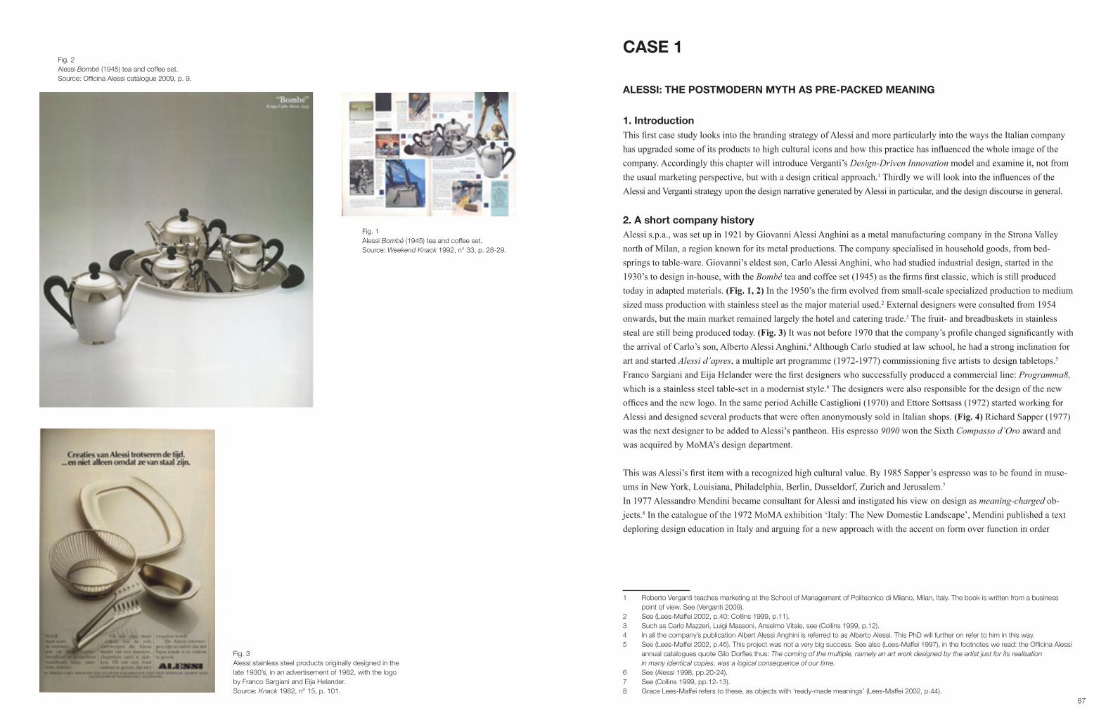
87
Fig. 1Alessi Bombé (1945) tea and coffee set.Source: Weekend Knack 1992, n° 33, p. 28-29.
Fig. 2 Alessi Bombé (1945) tea and coffee set.Source: Officina Alessi catalogue 2009, p. 9.
CASE 1
ALESSI: THE POSTMODERN MYTH AS PRE-PACKED MEANING
1. IntroductionThis first case study looks into the branding strategy of Alessi and more particularly into the ways the Italian company has upgraded some of its products to high cultural icons and how this practice has influenced the whole image of the company. Accordingly this chapter will introduce Verganti’s Design-Driven Innovation model and examine it, not from the usual marketing perspective, but with a design critical approach.1 Thirdly we will look into the influences of the Alessi and Verganti strategy upon the design narrative generated by Alessi in particular, and the design discourse in general.
2. A short company historyAlessi s.p.a., was set up in 1921 by Giovanni Alessi Anghini as a metal manufacturing company in the Strona Valley north of Milan, a region known for its metal productions. The company specialised in household goods, from bed-springs to table-ware. Giovanni’s eldest son, Carlo Alessi Anghini, who had studied industrial design, started in the 1930’s to design in-house, with the Bombé tea and coffee set (1945) as the firms first classic, which is still produced today in adapted materials. (Fig. 1, 2) In the 1950’s the firm evolved from small-scale specialized production to medium sized mass production with stainless steel as the major material used.2 External designers were consulted from 1954 onwards, but the main market remained largely the hotel and catering trade.3 The fruit- and breadbaskets in stainless steal are still being produced today. (Fig. 3) It was not before 1970 that the company’s profile changed significantly with the arrival of Carlo’s son, Alberto Alessi Anghini.4 Although Carlo studied at law school, he had a strong inclination for art and started Alessi d’apres, a multiple art programme (1972-1977) commissioning five artists to design tabletops.5 Franco Sargiani and Eija Helander were the first designers who successfully produced a commercial line: Programma8, which is a stainless steel table-set in a modernist style.6 The designers were also responsible for the design of the new offices and the new logo. In the same period Achille Castiglioni (1970) and Ettore Sottsass (1972) started working for Alessi and designed several products that were often anonymously sold in Italian shops. (Fig. 4) Richard Sapper (1977) was the next designer to be added to Alessi’s pantheon. His espresso 9090 won the Sixth Compasso d’Oro award and was acquired by MoMA’s design department.
This was Alessi’s first item with a recognized high cultural value. By 1985 Sapper’s espresso was to be found in muse-ums in New York, Louisiana, Philadelphia, Berlin, Dusseldorf, Zurich and Jerusalem.7
In 1977 Alessandro Mendini became consultant for Alessi and instigated his view on design as meaning-charged ob-jects.8 In the catalogue of the 1972 MoMA exhibition ‘Italy: The New Domestic Landscape’, Mendini published a text deploring design education in Italy and arguing for a new approach with the accent on form over function in order
1 Roberto Verganti teaches marketing at the School of Management of Politecnico di Milano, Milan, Italy. The book is written from a business point of view. See (Verganti 2009).2 See (Lees-Maffei 2002, p.40; Collins 1999, p.11).3 Such as Carlo Mazzeri, Luigi Massoni, Anselmo Vitale, see (Collins 1999, p.12).4 In all the company’s publication Albert Alessi Anghini is referred to as Alberto Alessi. This PhD will further on refer to him in this way.5 See (Lees-Maffei 2002, p.46). This project was not a very big success. See also (Lees-Maffei 1997), in the footnotes we read: the Officina Alessi annual catalogues quote Gilo Dorfles thus: The coming of the multiple, namely an art work designed by the artist just for its realisation in many identical copies, was a logical consequence of our time.6 See (Alessi 1998, pp.20-24).7 See (Collins 1999, pp.12-13).8 Grace Lees-Maffei refers to these, as objects with ‘ready-made meanings’ (Lees-Maffei 2002, p.44).
Fig. 3Alessi stainless steel products originally designed in the late 1930’s, in an advertisement of 1982, with the logo by Franco Sargiani and Eija Helander.Source: Knack 1982, n° 15, p. 101.

89
to tighten the link between culture and the industry.9 A few years after this influential exhibition, Mendini had the chance to realise some of his ideas at Studio Alessi. Through collaborations with a pool of internationally renown archi-tects and designers, mainly involved in the postmodern movement, he managed to bring out a collection of objects with spectacular forms and associative meanings, which not only became very popular, but somehow influenced the genera-tive meaning of design in general.10
3. Mediating a pre-packed high design meaning Design historian Grace Lees-Maffei introduces the term pre-packed meaning to describe the process of injecting fixed meanings to design goods in the case of Alessi. She indicates that Alessi brings goods onto the market with a fixed sign-value to which the consumer does not have to add any meaning.11 From a marketing and management perspective Roberto Verganti exhaustively researched the business-model of Alessi.12 He sets the company as an example of what he refers to as design-driven innovation. In this model the producer does not start from existing consumer needs, but the producer creates needs through the innovation of meaning, which should be understood as the creation of a product with a particular visual language assessed through the genius of the interpreter of culture, thus the designer. Both the design historian as well as the marketing specialist present Alessi as a producer of meaning. The following part will in analogy to the successive collections and projects explain how a high-cultural meaning was created and fixed.
3.1.Tea and Coffee Piazza, 1983As a direct result from Mendini’s involvement in ‘Italy: The New Domestic Landscape’ Alessi started in 1979 a re-search group with the name Programma6 to debate the current wave on postmodernism in architecture and design.13 Eleven international architects, including Mendini, were to think of domestic landscapes in the form of tea and cof-fee services. Being very much involved in the postmodern thinking it was only logical that the chosen architects had a similar attachment to the new movement. Mendini’s choice included the Americans Robert Venturi and Michael Graves and the Austrian Hans Hollein who had already been active in postmodern architecture and writing at that time. (Fig. 5) Alberto Alessi saw the input of international architects as a necessity to rejuvenate Italian design.
It was his aim to take an important part in the history of design in the 1980’s,14 through a new canon of forms. The new design language introduced in Italy by Alchimia and Memphis rejected the machine aesthetics and its sober, rational forms and antiseptic surfaces as evidence of the objects industrial origins. Both movements, in anticipation of previous anti-design movements in Italy,15 strived for a radical design representing the conflation of high art and popular culture. Inspired by the local traditional crafts and the ritual and symbolic meanings of objects in India,16 a new form-language was introduced. Playfulness and light-heartedness were combined with a range of possible meanings. Highly decorated objects with an emotional, rather than a rational appeal were to bring consumption back to a useful ritual. The products were to attract the general public as well as the artistic elite. Influenced by semiotics, the function of design moved from a practical utensil to a communication-tool, as Enzo Mari stated at the
9 See (Mendini 1972). Thirteen years later, Nancy Bellati brings a very positive view on the Italian education system and sees it as the main reason for the resurgence of Italian design in the 1980’s. The success lays in the fact the Italian design is not considered as just a division of industry, but an institution in its own. Bellati in this way adds with her account to the Italian myth, her writing is in no sense critical (Bellati 1990, p.15). Lees-Maffei regards the differentiation between the creative work of the designer and the practical necessities in the production process a typical Italian approach. 10 Case 5 shows how respondents from different social and educational backgrounds use the company name Alessi as example of what design means to them.11 See (Lees-Maffei 2002; Lees-Maffei 1997).12 See (Verganti 2009; Verganti 2006).13 See (Collins 1999, p.13).14 See (Sweet 1988, p.24).15 See for example (Prina 2008).16 See for example (Radice 1984).
Fig. 4Alessi 5070 condiment set (1978), designed by Ettore Sottsass. The publication of 1985 does not mention the name of the designer.Source: Weekend Knack 1985, n° 16, p. 86.
Fig. 5Alessandro Mendini for Studio Alessi.Source: Alessi 1998, pp. 44-45.

91
Italy:TheNewDomesticLandscapeexhibition. Theoneexactthingan‘artist’candoisaresearchoflanguage–whichmeans: a critical research of the communication systems already in use.17 The Italian radical groups saw themselves as experimental groups of artists. Especially in Italy where most post-war designers had been educated as architects, the design profession was considered a high art form linked to avant-garde movements. Considering design as research and designers as artists is paradigmatic for post-war Italy.18 From 1954, with the tenth Triennial, explicit links between industry and art were brought forward and La Rinascente introduced the prestigious Compasso d’Oro award with its criterion for excellence based on the aesthetics of the products.19 As an enterprise, Olivetti played an outstanding role in bestowing artistic freedom on the designers and investing in artistic experiments.20 It was thus, in the Italian context, not unusual for a company like Alessi to work with consultant designers, who were treated as artists.21 Olivetti had proved this method to be successful.22 Alessi, however took it a step further by not only giving artistic freedom to its design-ers, but through the marketing of the artistic and the emphasis on the new postmodern approach. While, the radical anti-design groups hadn’t really managed to produce goods that reached the homes of the masses, and thus in essence didn’t bridge high and low culture, Alessi did. Many of their kitchen utensils became very popular and at the same time attained museum status.
Ten architects who had not before designed objects to be industrially produced came up with each a coffee- and tea-set based on their ideas about architecture and the piazza as the urban centre of culture.23 Bruno Munari, who designed the catalogue, renamed the project Tea and Coffee Piazza.24 (Fig. 6) All the architects aimed to design a product that could be industrially produced, but in the end none of the designs were. The complexity of the objects was too high, and all were handmade in silver and brought on the market as a limited edition of 99 numbered and signed, plus three preuve d’artistes.25 Although the architects had the intention to design a product, Alessi didn’t invest in the coordination be-tween the architects and trained product designers with the aim of arriving at manufactured products. On the contrary, Alberto Alessi proudly stresses in most of the company’s publications and interviews the total artistic freedom of the architects with the underlying aim to create high-cultural goods. In the 1983 catalogue one can read:
Wewishtorealizeexperimentsherethatarecompletelyindependentfromtherestrictionsthatusuallyresultfrom serial production and which, in their form, function, and production procedures, are innovative to the highest degree. It is our intention to offer to an open-minded, culturally interested audience a wide range of objects that can include clever industrial technologies as well as a high level of craftsmanship.26
From the debut of the project it was Mendini and Alberto Alessi’s aim to generate publicity and marketing for the brand.27 In their marketing strategy in general, cost, functionality, communicativeness and evocativeness are essential. For this project they concentrated exclusively on the latter two: communication and evocation.28 They did not relate to formal product testing or market research, which was a risk solved through a quite new approach: creating a demand for useful kitchen utensils with a high cultural meaning, affirmed by their design.29
17 See for example (Dormer 1993, p.132; Fischer 2005, p.41).18 See for example (Dormer 1993; Lees-Maffei 2002; Kircherer 1990).19 See (Marcus 1998, p.109; Lees-Maffei 2002, pp.45-46).20 See for example (Kircherer 1990).21 In the catalogues and publications they are referred to as Maestro’s. 22 Also Cassina successfully injected culture into business with the Cassina i Maestri collection, see (Lees-Maffei 2002, p.52). See also (Cacciola 2008).23 The ten selected architects were: Robert Venturi, Kazumasa Yamashita, Charles Jencks, Aldo Rossi, Paolo Portoghesi, Michael Graves, Oscar Tusquets, Hans Hollein, Stanley Tigerman, Richard Meier and Alessandro Mendini, see (Alessi 2003).24 See (Collins 1999, p.13).25 See (Sweet 1988, p.24; Collins 1999, p.14).26 See (Lees-Maffei 2003).27 See (Lees-Maffei 2002, p.47; Verganti 2009, p.175).28 See (Verganti 2009).29 See also (Moon e.a. 2004).
Fig. 6 Alessi Tea and Coffee Piazza (1983).Source: Officina Alessi catalogue 2009, p. 63.

93
Marketing today is widely understood as a tool to create meaning, which directly addresses the customer. The major concern of a brand is to create and capture value through a certain meaning that consumers want to be identified with. McCracken even uses the term meaning-management to describe marketing.30
In his much applauded book Design-Driven Innovations, within marketing and business circles,31 Roberto Verganti explains through several case-studies how a design-driven marketing model can lead to success.32 According to his analysis it is not consumer demand and consumer cost that should be considered, but the actual creation of a consumer demand. Executiveswhohaveinvestedinradicalinnovationsofmeaningacknowledgethatratherthanstartwithuserneeds, the process goes in the opposite direction: the company proposes a breakthrough vision.33 In an interview with Verganti, Alberto Alessi even literally compares his business to the art-business:
There is a way of doing design that is giving people what they ask, which is never something innovative. And there is a way of doing design that is more artistic and poetic. It is like commercial art (‘commercial’ because it needs to be approved by the audience; eventually people need to love it) … When Picasso painted, he never thought about a target audience. He didn’t have a target segment of users in mind. But eventually he was not onlyagreatartist.Thosewhodiscoveredhimmadealsoagreatbusiness.Thereisanenormous(andunexploit-ed) business potential in this type of innovation.34
Verganti sees the radical group Memphis as the initiator of the three-phase process of design-driven innovation,35 with Alessi as excellent example.36 The first phase is to absorb or to listen.37 Out of the experiments of Memphis, Alessi understood that a sort of research laboratory would lead to innovation and would bring about the next generation of designers with a novel language. Pro-gramma6 was in the case of Alessi the research laboratory. Verganti emphasises the role of the designers as socio-cultur-al interpreters. He sees them not just as star-designers, however key interpreters according to Verganti are Mendini, Ron Arad, Michael Graves, Philippe Starck,… who are given carte blanche by the company’s.38 A second phase in the process is to Interpret. Before new products with a complete new approach should be presented to the public, the ground has to be prepared. The new language and groundbreaking postmodern forms would otherwise not be making sense in a world where design is still very much dominated by the notions of Good Design. The idea was to leverage the seductive power of the interpreters to start diffusing the new language and emotion of postmodern de-sign applied to kitchenware.39 In effect, in creating a position in the market Alessi took some well-decided steps. Firstly, they exhibited the results of the Tea and Coffee Piazza-project worldwide, in several renowned museums and other high cultural institutions.40 (Fig. 7)
30 See (McCracken 2005, pp.175-191).31 See for example the publication in the Harvard Business Review (Verganti 2006).32 See (Verganti 2009). Other companies are brought in as examples, such as Artimede and Apple, but most examples are related to Alessi. In an article in the Harvard Business Review (Verganti 2006) Verganti solely uses Alessi as case, to explain his model. 33 See (Verganti 2009, p.47).34 Alberto Alessi in an interview with Verganti (12 October 2006), published in (Verganti 2009, p.48).35 See (Verganti 2006).36 The process does make sense and is similar to the analysis made by design historians on the Alessi success, see for example (Dormer 1993; Collins 1999; Julier 2008; Lees-Maffei 1997; Lees-Maffei 2002).37 In the 2006 publication Verganti uses the term absorb. In the publication of 2009 he’s adressing this phase as listening.38 Such as Flos, Kartell, Molteni, B&O. See (Verganti 2009, pp.162-166).39 See (Verganti 2009, p.176). With Interpreters he refers to in the case of Alessi to the role of Mendini and the other 10 designers of the Tea and Coffee Piazza. He sees them as leading figures in interpreting culture as a whole and giving innovative meanings to products.40 In the San Francisco museum of Modern Art, the Smithsonian, Boymans-Van Beuningen in Rotterdam, … See for example (Verganti 2006; Alessi 1998).
Fig. 7 Alessi Tea and Coffee Piazza (1983). Source: Weekend Knack 1985, n° 18, pp. 87-88.

95
After taking advantage of the methodology of design as a form of research, created by a kind of artist already in place in Italy at the time, the Alessi firm first brought the designed objects to the museum, to only later bring them to the shop in adapted forms, materials and prices, but with a similar meaning. The designs for the shops, as for example the 9091 kettle by Richard Sapper is an example of interpreting. (Fig. 8)The third phase according to Verganti is to address the new language to the members of the design discourse. Here Verganti points out the role of cultural intermediaries as museums or press.41 In preparing the ground for a new range of products Verganti stresses for example the fact that a book on the prototypes was internationally distributed to design decision makers, the prototypes were on show not only in museums but also in department stores around the world,42 and especially a close relation with the international press was established.43 (Fig. 9)
Before bringing actual products on the market, Alessi ensured that through the publicizing of the prototypes and the concept behind them the public was introduced to a new style and would associate this newness to the Alessi brand. The explicit and unusual forms of the Alessi goods contained in this sense a pre-packed fixed meaning of high cultural capi-tal enhanced by the company and authorized through high cultural institutions.
In Flanders the role of the Design museum Gent is substantial in the promotion of Alessi. Barbara Usherwood argues in an article on the Design Museum in London that there is an obvious blurring of the distinction between the commercial world and the role of the cultural institution.44 The intertwining of economy and culture has become germane for design museums worldwide, with Vitra as one of the most publicized design museums of Europe as prime example.45 In the case of Alessi, Lees-Maffei observes that many small museums even show products of Alessi to exemplify the postmod-ern movement because it is cheaper to acquire, than for example Memphis or Alchimia pieces.46 The Design museum Gent has since 1985 acquired 86 different pieces and collections from Alessi.47 Most prestigious are the four Tea and Coffee Piazza’s, three of the Coffee towers,48 and La Giostra, a miniature carousel designed by Mendini with Alessi’s most iconic commercial products on display.49 (Fig. 10) Alessi had this carousel especially made for the museum in Ghent. In an interview, museum director Lieven Daenens states that if he had the budget, he would collect the complete Tea and Coffee Piazza. Daenens considers Alessi as a key player of the postmodern movement: it is a company that wrote history.50 From 1975 on, with Lieven Daenens as the new director, the museum became very much involved in the new move-ments in Italy. Most of the 20th century pieces bought between 1985 and 1995 were related to Italian postmodernism.51 Although he followed the new radicals very closely, there was according to him, no stage for it in Flanders. The Studio Alchimia and Memphis objects were not represented by any Flemish gallery, and shop owners didn’t dare to invest in the commercial products related to the movement. According to Daenens, Alessi took an enormous step in in-vesting as a commercial enterprise in this new and unknown form-language. Thanks to the fact that the objects were not as expensive as the limited editions and products of Memphis and Alchimia, the new forms found their way to the market.52
41 See (Verganti 2006, p.6).42 In a similar way Colomina explains that some of the furniture of the International Style was shown in many department stores around the USA (Colomina 1994).43 See for example (Lees-Maffei 1997, p.81; Julier 2008, p.80). The role of the press will be focussed upon in Case 4.44 See (Usherwood 1995). In this paper she brings forward the influence of commerce on the Design Museum, London, in particular the role of Tenence Conran and first chief executive of the museum Stephen Bayley who was a long-time associate of Conran. 45 See also (Ryan 2008; Lee 2008; Lai 2008) and see Case 2.46 See (Lees-Maffei 1997).47 See collection list from the museum obtained from Bernadette De Loose on 19.04.2011.48 Three Tea and Coffee Piazza’s (Rossi, Hollein, Meier and Tusquets) and Four Tea and Coffee Towers, see collection list from the museum obtai- ned from Bernadette De Loose on 19.04.2011. See also (Daenens 2010, pp.216-222) in this publication there are only 3 Tea and Coffee Piazza’s mentioned. 49 La Giostra became part of the collection in 2001. See also http://www.alessi.com/en/catalog/thematicpaths/museum, consulted on 01.08.2010.50 See interview Lieven Daenens, 23.03.2010.51 See (Verlinden 2008).52 See interview Lieven Daenens, 23.03.2010.
Fig. 8Alessi 9091 kettle (1983) by Richard Sapper. Source: Officina Alessi catalogue 2009, p. 17.
Fig. 9Personal letter, press release, 2009.Source: Personal archive Bouchez.

97
From all the museums worldwide, Ghent has the second largest collection.53 The museum also featured several exhibi-tions curated by Alessi.54 Case 4 shows how ‘Weekend Knack’ amplified the pre-packed high-cultural value of Alessi, authorized by the Design museum, through articles on the museum shows.
3.2. Officina Alessi, 1983 The success of the Tea and Coffee Piazza led to a new trade-mark: OfficinaAlessi with by 2009 about one hundred pro-jects of more than seventy designers.55 In this impressive collection, all of the objects come with a story, and although most of the goods have not been mediated extensively, this collection is the company’s cultural backbone allowing it to maintain a high cultural status. After the new language is created, Verganti sees as the third action in the design-driven innovation approach, a proac-tive investment aimed at facilitating the understanding, and adoption of the new meaning.56 As in the case of Alessi through museum shows, book publications and a good contact with the press. Verganti states that in this third phase advertising is not the ideal medium.57 To address the larger audience, the new language has to be promoted through, what he calls cultural prototypes,
(…) such as books,exhibitions,culturalevents,conceptproductsshownatfairs,journalarticles,presentations atconferences,thefirm’sshowrooms,aWebsite,specialproductsforlandmarkpioneeringprojects,anddesign competitions. (…) A cultural prototype is a medium that embeds the result of a manufacturer’s research. It codifiesanddiffusesthecompany’snewinterpretationandvision.Itiscultural,becauseratherthanbeinga specificproduct(whichthecompanymaynotyethaveconceived),itisanarticulationofanewmeaningor language.58
The OfficinaAlessi collection is a prime example of such a cultural prototype. (Fig. 11) In his publication, Verganti as-sumes that a new vision, a new meaning or a new language is the base for success. Applying some of the concepts of Bourdieu on this cultural prototype however, gives a more layered, and probably more realistic account of the dynamics and success of the marketing decisions of Alessi. In a continuous process the Italian company charged its brand with high cultural meaning to keep up the high cultural ranking. Of the Officinacollection, all the objects are presented as artworks,59 with as major characteristics: (1) rareness, (2) historical authority and a stress on (3) form over function, three elements of cultural distinction.
53 From all the museums worldwide, summed on the Alessi website, Ghent has the second largest collection, just after the Thessaloniki Design Museum, who has 69 pieces, none from the limited editions. According to the museum archives Ghent has on 16.04.2011, 86 pieces in collec- tion, which does place them first. However there is no updated information of the Greeck collection. According to Alessi, third in row is the Gro- ninger Museum, designed by Mendini, hosting 42 Alessi objects, of which the complete Tea and Coffee Piazza. The Centre Pompidou has 22 Alessi-pieces in collection, the London Design Museum 16 and Victoria and Albert museum 18. See http://www.alessi.com/en/catalog/the maticpaths/museum, consulted 01.08.2010.54 1986: Tea and Coffee Piazza, 1990: Alessi: not in production - next to production, 1992: 100% make up (100 vases), 2001: presentation La Giostra. 2004: Tea and coffee towers, loans for the Christopher Dresser exhibition, see personal mail De Loose, 13.08.2010. 55 See (Alessi 2009). The View on Spring-Summer, catalogue introduces 15 new products for 2010.56 See (Verganti 2009, p.190).57 See (Verganti 2009, p.191).58 See (Verganti 2009, p.194).59 On the website this collection is subtitled as art and poetry.
Fig. 10Alessi, La Giostra, a miniature carousel designed by Mendini.Source: Weekend Knack 2001, n° 38, p. 12.

99
3.2.1. RarityIn the introduction of the catalogue one reads that the compilation:
(…) will serve as an interesting cross-section of a certain way of seeing and understanding the product design ofthepastquartercentury.Anoftenelitistwayofseeing,sometimeshermetic,exclusive,forexpertsonly.(…)This is the precise opposite of the mass media attitude of today, which seeks success in the short-term consen-sus that comes from the facile satisfaction of the most mediocre tastes of the masses. Every now and then we wonder if it was worth the trouble to have dedicated so much energy to a product cata-logue for so few. To which we invariably respond with another question: what would our culture be today had thepossibilitynotexistedtopublish,sometimesinjustafewhundredcopies,theworkofthegreatpoetsofthe20th century?60
Continuously, throughout the catalogue Alberto Alessi reminds us not only of the philanthropic aims of the company and the historical importance of their cultural investment, but also of the exclusive character of the art goods. The silver tea and coffee sets from the 1983 Tea and Coffee Piazza have first of all a financial distinctiveness. They are on sale as limited edition for approximately 25,000 dollars each.61 The Preuve d’Artiste are even more exclusive. On the Alessi website one can read: ThethreecraftsmanproofsarestampedP.A.,terriblyexpensiveandthusvirtuallyrestrict-edtomuseumsandextremelywealthycollectors.62 In his discourse on the stratification through cultural capital, within the field of cultural production Bourdieu stresses rarity as symbolic of profit or distinction.
Becausethedistinctivepowerofculturalpossessionsorpractices-anartifact,aqualification,afilmculture-tendstodeclinewiththegrowthintheabsolutenumberofpeopleabletoappropriatethem,theprofitsofdistinctionwouldwitherawayifthefieldofproductionofculturalgoods,itselfgovernedbythedialecticofpretension and distinction, did not endlessly supply new goods or new ways of using the same goods.63
Sales director of Alessi in Flanders, Marc Standaert, explains that most of the Officina Alessi products are produced for marketing reasons.64 They are indeed, only sold to a very small public and not only the limited editions as the Tea and Coffee Piazza and other prestigious series produced over the past 25 years,65 but the majority of the objects.
3.2.2. Historical authority Next to the rarity in the economic disposition of actually buying the good, Bourdieu aims at the intellectual dispositions and competences needed to appropriate cultural goods . By reducing the actual buyers of the Preuve d’Artiste to art collectors and museums, Alessi directly links these objects with a high intellectual property, only really valued by the cultural elite. For the consumer, lower on the hierarchy, the catalogue in itself is presented as a cultural encyclopaedia of the important designs of the last 25 years. Accompanying texts position the designs and stress the philanthropic role Alessi plays in the creation of historically important goods.
60 See (Alessi 2009, p.2).61 See (Verganti 2009, p.5).62 See http://www.alessi.com/en/3/1405/silver-objects/tea-and-coffee-service, consulted on 22.07.10.63 See (Bourdieu 1984, p.230). Alessi is mainly producing new exclusive and expensive goods with often limited editions as a solution for the trickle down effect, Vitra’s strategy is to create new ways of meaning of the same existing goods, see Case 2.64 See interview Marc Standaert 11.03.2010.65 Such as for example the continuation project Tea and Coffee Towers (2003) or the re-issues of historical designs such as the tea and coffee set of Marianne Brandt, 1985(1924) or the designs of Christopher Dresser, 1991 (1864) on 99 pieces in sterling silver and 3 artists proof. See (Alessi 2009).
Fig. 11Article on Tea and Coffee Piazza in Design museum Gent in the art pages.Source: Weekend Knack 1986, n° 23, p. 9.

101
The language applied in the catalogue and other Alessi publications is comparable to the apprehensible tone of the life-style magazine: personal, easy and loaded with anecdotes,66 and often brings a distorted view on history. On the collabo-ration with Aldo Rossi for example, Alberto Alessi writes:
I like reminding people of the fact that a talent capable of leaving such an enduring mark on late 20th-century design practised the discipline as a mere hobby, his true lifelong passion being architecture. And that it was design which made him well-known and popular enough that, during the ‘80s and ‘90s, a period too brief and too intense for him, he was able to poetically practise his passion all over the world.67
In other words, Aldo Rossi thanks his architectural career to Alessi. Reading this in a company’s catalogue it is not difficult to recognise as promotional propaganda. Nevertheless, a few pages further, one reads in the same catalogue a letter from Marianne Brandt and a text of Klaus Weber on the metal workshop of the Bauhaus. (Fig. 12, 13) By bring-ing together archive fragments of historical important designers and texts written by specialists such as Weber who is a collaborator at the Bauhaus archive, with the personal writings of Alberto Alessi, confusion about historical importance and correctness is created. Furthermore, this strategy of blurring facts and promotion is likewise applied in several publications about Alessi. According to Lees-Maffei, people working for the company have produced the three most in depth studies on the company.68 This leads inevitably to a flattened out historical discourse primed to the general public. The popular and widespread publications on Alessi are void of any criticism or deeper content, which is according to Wernick essential to our contemporary promotional culture. Through a sort of semiological complexity distinctions in the different domains of symbolic meaning are erased and an empty layer of culture overgilds commercial aims.69
It is clearly not the aim of Alessi to support the consumer with expertise, or cultural knowledge, but rather with taste as-sumptions through cultural ranking.70 Bourdieu indicates that consumption choices are made upon personal taste, which is a matter of being able to read into the symbolic meaning of goods with an equivalent social ranking, thus implying a homology between goods and groups. The institutions which authorise the ranking, be it museums, magazines, crit-ics,… are ranked according to the same principle and define thus their own position in the field.71 Museums, magazines and even authors take over the narrative instigated by Allesi and authorise them through their position.Bourdieu speaks in this respect about culturalallodoxia, allthemistakenidentificationsandfalserecognitionswhichbetray the gap between acknowledgement and knowledge,72 for which he holds the new cultural intermediaries
66 See also Case 4.67 See (Alessi 2009, p.68).68 See (Lees-Maffei 2003, p.50): Patrizia Scarzella, author of Steel and Style was an employee of the company; Alessi: The Design Factory is a collection of writings by people working for Alessi; Paesaggio Casalino is by Mendini, Alessi design consultant.69 See (Wernick 1991), see also (Du Gay 1997; Taylor 2005).70 See (Bourdieu 1984, p.231): Taste classifies, and it classifies the classifier. Social subjects, classified by their classifications, distinguish them selves by the distinctions they make, between the beautiful and the ugly, the distinguished and the vulgar, in which their position in the objective classifications is expressed or betrayed.71 See (Gans 1999, p.151). Gans points out that since boundaries between subgroups of the middle class are easily crossed, high cultural institutions such as museums put on exhibitions that attract the large lower middle class, through more apprehensible shows. See also (Heskett 2002, p.41).72 See (Bourdieu 1984, p.323). Cultural allodoxia is symptomatic for middlebrow culture (petit bourgeois), which uncritically venerates the aristo- cratic traditions of the past. Bourdieu sees it as a heterodoxy experienced as orthodoxy. The petit bourgeois takes for example light opera for serious music, popularisation for science.
Fig. 12Text by Klaus Weber on the metal workshop of the Bauhaus, in the Officina Alessi catalogueSource: Officina Alessi catalogue 2009, p. 79
Fig. 13 Alessi re-issues of 90040 and 90041 (1995 (1928))by Marianne Brandt.Source: Weekend Knack 1995, n° 25, p. 25.

103
responsible. These cultural workers are devoted to the production and the dissemination of symbolic goods adding to the cultural capital of middle class. As cultural interfaces in a bid to educate the public they formulate an art of living whichprovidesthemwiththegratificationsandprestigeoftheintellectualattheleastcost(…)theyadoptthemostex-ternal and most easily borrowed aspects of the intellectual lifestyle (…) and apply it to not-yet-legitimate culture.73
These goods to which high cultural and historical vignettes are dropped upon are abletofulfil functions of distinction by makingavailabletoalmosteveryonethedistinctivepose,thedistinctivegamesandotherexternalsignsofinnerrichespreviously reserved for intellectuals.74 Alessi, in this respect makes the reading of the symbolic, high cultural aspects of their products extremely easy. No background information, no knowledge of design history is necessary to read into the Alessi philosophy. In this pro-cess they create flattened out design histories, which are easily manageable for a large public.75 (Fig. 14) Nevertheless it is very cleverly brought. The company posits itself at the very core of the postmodern movement, which they stress in their publications. As Guy Julier observes, some of the essays on the meaning of their products are derived from theories of post-structuralism, but twisted around towards a multiplicity of meaning created by the producer and not the consumer. In this sense interpretation is self-generated, articulated and disseminated as a pre-emptive strike on the consumer before he or she makes his or her own mind up.76 From 1990 on the Alessi Research Centre plays an important role in the creation of meaning, linked to academic rea-soning. The aim of the centre is to broaden theoretical research on object-related issues and to collaborate with design students from different universities. Laura Polinoro has, according to Alberto Alessi, refined the theoretical framework in which the company likes to position itself. (Fig. 15)
Laura has brought to Alessi the intuition and semiological training garnered at the school of Eco and Fabri. (…) Laura started the arduous process of shaking Alessi out of its contentedness with a certain type of high-flowItaliandesign.ThroughherwehavebroughtnewdisciplinetobearatAlessi,anthropologyandsemiologyto name but two.77
Alongside the postmodern aura,78 Alessi invents a design heritage. Through the issuing designs of Bauhaus masters and even Christopher Dresser, often considered as the grounding father of design, they create an historical trajectory and present the company as maecenas since the heydays of design. In Alessi: The Design Factory, Daniel Weil states:
The Alessi catalogue (…) has taken on the characteristics of an archaeological dig through a century of design. All the different strata are showing, stretching back from postmodernism through the Modern Movement, to the Bauhaus and Arts and Craft, right back in fact to Christopher Dresser who is widely acknowledged as the world’sfirstindustrialdesigner.79
In fact, through the reproduction of artefacts, which were up to this point exclusively part of museum collections and archives, Alessi again positions itself as manufacturer of rare, historical, high cultural objects.80 Michael Collins, based on Baudrillard even suggests that the going back to Marianne Brandt and Christopher Dresser could be attempts to ap-point a mother and a father figure.81 (Fig. 16)
73 See (Bourdieu 1984, p.370).74 See (Bourdieu 1984, p.371). See also on the role of the new intermediary in the promotion of garden aesthetics (Taylor 2005). Case 4 will look into the role of the media in authorising the historical accounts created by Alessi and Vitra (Case 2).75 In his Mythologies, Barthes underlines that the consumer reads the myth as a factual system, and that myth turns historical realities into natural image of this reality, with a loss of the historical qualities, see (Barthes 2000, p.131). See also Case 2.76 See (Julier 2008, p.80), see also (Lees-Maffei 1997, p.87).77 See (Alessi 1998, p.95).78 Collins even argues that Alessi might become eponymous to postmodern design, see (Collins 1999, p.15).79 Quoted in (Lees-Maffei 2003, pp.51-52).80 See (Collins 1999, p.15).81 Collins refers to Baudrillard who explains a fascination with historical consumer objects as an aim to return to childhood and to find a Mother, which represents origin and a Father, which stands for authenticity. See (Collins 1999, pp.16-17).
Fig. 14Alessi La Cupola (1990) by Aldo Rossi.Source: La Cucina Alessi magazine, p. 21.
Fig. 15Laura Polinoro and the Alessi Research Centre. Source: Alessi 1998, pp. 94-95.
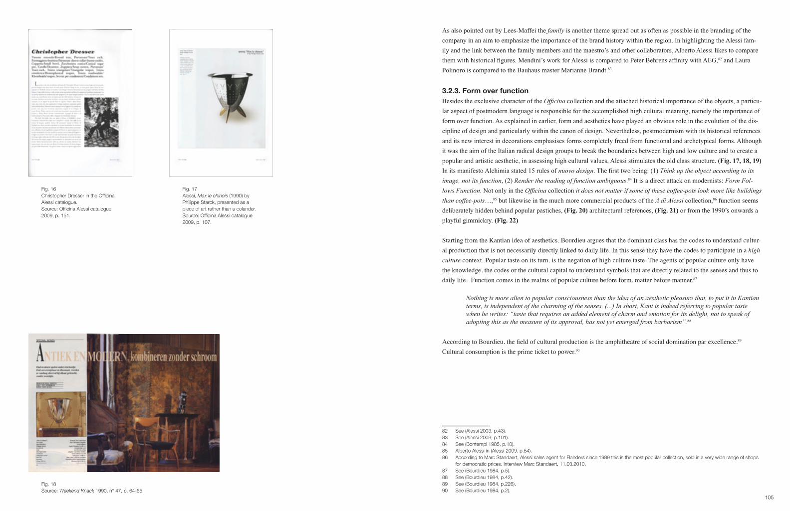
105
As also pointed out by Lees-Maffei the family is another theme spread out as often as possible in the branding of the company in an aim to emphasize the importance of the brand history within the region. In highlighting the Alessi fam-ily and the link between the family members and the maestro’s and other collaborators, Alberto Alessi likes to compare them with historical figures. Mendini’s work for Alessi is compared to Peter Behrens affinity with AEG,82 and Laura Polinoro is compared to the Bauhaus master Marianne Brandt.83
3.2.3. Form over functionBesides the exclusive character of the Officina collection and the attached historical importance of the objects, a particu-lar aspect of postmodern language is responsible for the accomplished high cultural meaning, namely the importance of form over function. As explained in earlier, form and aesthetics have played an obvious role in the evolution of the dis-cipline of design and particularly within the canon of design. Nevertheless, postmodernism with its historical references and its new interest in decorations emphasises forms completely freed from functional and archetypical forms. Although it was the aim of the Italian radical design groups to break the boundaries between high and low culture and to create a popular and artistic aesthetic, in assessing high cultural values, Alessi stimulates the old class structure. (Fig. 17, 18, 19)In its manifesto Alchimia stated 15 rules of nuovo design. The first two being: (1) Think up the object according to its image, not its function, (2) Render the reading of function ambiguous.84 It is a direct attack on modernists: Form Fol-lows Function. Not only in the Officina collection it does not matter if some of these coffee-pots look more like buildings than coffee-pots…,85 but likewise in the much more commercial products of the A di Alessi collection,86 function seems deliberately hidden behind popular pastiches, (Fig. 20) architectural references, (Fig. 21) or from the 1990’s onwards a playful gimmickry. (Fig. 22)
Starting from the Kantian idea of aesthetics, Bourdieu argues that the dominant class has the codes to understand cultur-al production that is not necessarily directly linked to daily life. In this sense they have the codes to participate in a high culture context. Popular taste on its turn, is the negation of high culture taste. The agents of popular culture only have the knowledge, the codes or the cultural capital to understand symbols that are directly related to the senses and thus to daily life. Function comes in the realms of popular culture before form, matter before manner.87
Nothing is more alien to popular consciousness than the idea of an aesthetic pleasure that, to put it in Kantian terms, is independent of the charming of the senses. (...) In short, Kant is indeed referring to popular taste when he writes: “taste that requires an added element of charm and emotion for its delight, not to speak of adopting this as the measure of its approval, has not yet emerged from barbarism”.88
According to Bourdieu, the field of cultural production is the amphitheatre of social domination par excellence.89 Cultural consumption is the prime ticket to power.90
82 See (Alessi 2003, p.43).83 See (Alessi 2003, p.101).84 See (Bontempi 1985, p.10).85 Alberto Alessi in (Alessi 2009, p.54).86 According to Marc Standaert, Alessi sales agent for Flanders since 1989 this is the most popular collection, sold in a very wide range of shops for democratic prices. Interview Marc Standaert, 11.03.2010.87 See (Bourdieu 1984, p.5).88 See (Bourdieu 1984, p.42).89 See (Bourdieu 1984, p.226).90 See (Bourdieu 1984, p.2).
Fig. 16Christopher Dresser in the Officina Alessi catalogue.Source: Officina Alessi catalogue 2009, p. 151.
Fig. 17Alessi, Max le chinois (1990) by Philippe Starck, presented as a piece of art rather than a colander.Source: Officina Alessi catalogue 2009, p. 107.
Fig. 18Source: Weekend Knack 1990, n° 47, p. 64-65.

107
Within the field of cultural production, (...) art obviously offers the greatest scope to the aesthetic disposition, butthereisnoareaofpracticeinwhichtheaimofpurifying,refiningandsublimatingprimaryneedsandim-pulses cannot assert itself, no area in which the stylization of life, that is, the primacy of forms over function, of manner over matter, does not produce the same effects. And nothing is more distinctive, more distinguished, than the capacity to confer aesthetic status objects that are banal or even ‘common’ (because the ‘common’ people make them their own, especially for aesthetic purposes), or the ability to apply the principles of a ‘pure’ aesthetic to the most everyday choices of everyday life, e.g., in cooking, clothing or decoration, completely reversingthepopulardispositionwhichannexesaestheticstoethics.91
With pure aesthetic, Bourdieu refers to the pure gaze, based on the Kantian idea of aesthetics, by which the agent has the natural talent to focus on the form instead of the function. This is characteristic for a cultivated appreciation of a work of art. It is precisely the legitimating of certain goods as naturally superior to others, - because their aesthetics are more pure than others-, that the French sociologist considers as the basis of social domination through cultural capital.In Distinction, Boudieu explains through the difference between Kantian and Anti-Kantian aesthetics, how in the rank-ing of cultural capital and social groups, the lower on the social stratification the more functional goods and the more representational artworks will be. The higher on the ladder, the less functional and the more abstract they will be. In other words, the more unfunctional a product looks, the more easily it is associated with art. (Fig. 23, 24)
Thanks to the basic concept of the postmodern design Alessi branded itself as a natural high-cultural phenomena. From the 1990’s, when they left the strict postmodern language behind, they continued creating objects with multi-layer meanings that attract the consumer foremost for the story and unusual form than the function. The promise of use-value is replaced with the promise of high cultural value. Wolfgang Haug suggests that form, or the body of the commodity is misleading as it is a mere appearance of use-value that promises more, much more than it can ever deliver.92 As for Haug, aesthetics and form are a function in themselves. In this sense design represents a means by which corporations accumulate wealth, without any regard to the true needs of the consumer. Baudrillard emphasizes this danger, through the general paradigm shift of products from a use-value to a sign-value.93 For Baudrillard, the consumer has turned into a dupe of the capitalist marketing system. Sottsass, as a founder of Memphis might be considered from a marketing point of view as a godfather both of the coupling of art and commerce,94 and of low and high culture, but he definitely never approved of the subordination of artistic and in some respect utopian ideas to commerce. Social improvement stayed at the heart of his work. It is therefore no surprise that he distinguished himself from the Alessi practice.
You know, the new trend of Alessi, I must say I don’t very much agree, because as I told you before, I think they are using design as a seducing possibility. No more as the creation of objects, which might help your life or your awareness of life (…) I am old, and I cannot change my previous basic idea about design and architecture (…) In fact, I almost don’t design any more for Alessi.95
The younger generation however, such as Matteo Thun, or one of Alessi’s successful designer duos Stefano Giovannoni and Guido Venturini,96 see themselves as servants to the new capitalist system.97 Giovannoni states in the Dreamfactory:
91 See (Bourdieu 1984, p.5).92 See (Haug 1986, p.50).93 See (Baudrillard 1998).94 See for example (Sparke 2004; Verganti 2009).95 Quoted in (Lees-Maffei 2002, p.50) based on an interview with Ettore Sottsass.96 Marc Standaert claims that the true success for Alessi started with the products designed by Giovannoni, see interview Marc Standaert, 11.03.2010.97 See (Lees-Maffei 2002, p.50).
Fig. 19Source: Weekend Knack 1990, n° 44, p. 60.
Fig. 20Alessi advertisement in ‘Weekend Knack’ as an example of a popular pastiche.Source: Weekend Knack 2006, n° 41, p. 53.
Fig. 21Alessi advertisement, as an example of an architectural reference.Source: View on Alessi magazine 2009 (fall-winter), p. 43.
Fig. 22Alessi cover, as an example of gimmickry.Source: View on Alessi magazine 2009, cover.

109
We’ve had enough of erudite designers like Mendini or Branzi, you need to have a degree in architecture to un-derstand their designs. We would like to design things that are liked by Leo Castelli as well as by the general public.98
This quote, very much reflects the approach Alessi took in their marketing, attracting the cultural elite through the lim-ited series at the same time as the wide spectrum of consumers with the A of Alessi collection.
3.3. Starring Michael Graves’ Kettle 9093, 1985.From the 10 architects who designed a Tea and Coffee Piazza, only Aldo Rossi and Michael Graves were initially asked to think of more commercial products for a larger market.99 Especially Kettle 9093 designed by Michael Graves showed a spectacular success.100 (Fig. 25) By the early 1980’s Graves, being influenced by Robert Venturi, turned towards post-modernism and developed a decorative handwriting.101 According to Graves, the kettle is a mix of influences. Some Vienna Secession, Art Deco, American 1930’s design and a dash of Pop.102 The success of this product and many oth-ers to follow is according to Verganti’s marketing model the result of the earlier explained mediation of the new design language. In the third phase of his model (Address), referring to the moment when commercial products are brought to the market, there is a move from the conceptual phase to the designing of cost-effective and functional market prod-ucts.103 The high artistic products have evened the path. The brand meaning as an investor in high culture is initiated and has become common ground. At this stage Alessi mainly focuses on press attention. About the success of the Graves Kettle 9093 Verganti writes: The members of the design discourse, by continuing to talk and write about the kettle’s role andmeaning,disseminatedknowledgeoftheproducttoawideraudience.Intheend,theyactedasamplifiersofames-sage they had helped to construct.104 As explained above, one can hardly speak of the dissemination of knowledge, but rather of the bestowal of taste. The media, as will be shown in Case 4 does pay a lot of attention to the exhibitions and high cultural initiatives of Alessi and thus amplifies the cultural value. In a second stage they will continuously inform their readers on the new Alessi products. By then the high cultural value is already established. And as Collins explains, this strategy is borrowed from the fashion world. The Tea and Coffee Piazza and other high cultural initiatives can be comparedtoanexpensivegroupofcouturier’sclothesonthecatwalkofPostmoderndesign(…)aswiththeexpensivecouturier’s items, there follows the diffusion range.105 Penny Sparke uses the same metaphor in explaining the mass ac-ceptance of the new language and form introduced by Memphis and interprets the whole success of Alessi as thus.106 According to Sparke this was only possible thanks to the large media coverage of Memphis.107
98 See (Alessi 2003, p.91).99 See (Alessi 2003, p.54).100 It was Alessi’s best selling product between 1985 and 1988, with a sales jump from 30.560 pieces to 78.027 in 1988, see (Bertsch 1997, p.28). By 2009 1.5 million pieces were sold, see (Verganti 2009, p.94).101 See (Bertsch 1997, p.47).102 See (Bertsch 1997, pp.15-16).103 Thus addressing the other two elements of Alessi’s four-dimensional marketing strategy: cost and functionality. 104 See (Verganti 2009, p.6).105 See (Collins 1999, p.14).106 See (Sparke 2004, p.195).107 Case 4 shows that this assumption is correct in Flanders.
Fig. 23The Alessi kettle and coffeemaker have become mantelpieces.Source: Weekend Knack 1987, n° 45, p. 71.
Fig. 24Alessi advertisement in ‘Weekend Knack’, the fruit basket of the brothers Campana is presented as a non-functional object and thus referring to a piece of art.Source: Weekend Knack 2007, n° 49, p. 125.
Fig. 25Alessi Kettle 9093 (1985) by Michael Graves, miniature version (2009).Source: Alessi catalogue 2009, p. 194.

111
However the success of some of the Alessi products, as, for example, Graves’ water kettle, the other objects of the Graves family, (Fig. 26, 27) and the subsequent products from the same period as the Aldo Rossi Cupola, Conica and Cubica cannot solely be reduced to the instigated high-cultural meaning of the brand. Meaning was also enforced through the particular design aspects and the desires of the consumers. Several authors point out the importance of the particular visual elements, the use of material, specific trends at that time, and certain experiences appreciated by the consumer. For some elements, which have played a role in the success of these products it is not always simple to trace back to where the meaning was generated: through the design itself, through the consumer or even by the means of other companies using Alessi objects as props in their advertisements.
During the 1980’s Kettle 9093 was a first rated gift object.108 (Fig. 28, 29) Several reasons for its success should be brought into account. Firstly, according to Peter Dormer table and kitchenware during the 1980’s take over the role of the figurative table or dresser centrepiece. The postmodern language of the Alessi products proved to be ideal. Another factor that has to be considered is the transformation of the kitchen during the 1980’s. From a workspace it moved into a prestigious domestic centre.109 (Fig. 30, 31) The Alessi products no doubt added to the quest for luxury. From a market-ing perspective Verganti sees Alessi and other producers responsible for the changing trend in kitchens:
The products we see and use shape our culture. If we like to spend more time in our kitchens and even con-nect them to other rooms, it is because companies such as Alessi transformed a closed-off area dedicated exclusivelytothefunctionalaspectsofpreparingfoodandwashingdishesintoaspacethatisopen,hospita-ble, and enjoyable.110
Then there are of course the visual aspects of the kettle. The shininess of the chrome attracted the 1980 consumers with a preference for metal materials.111 The playfulness of the design, reflected in the use of colour, the explicit form of the handle and the red whistling bird referring to a child’s toy. And probably as Bertsch emphasises, the associations of the bird with the hood ornaments of luxurious cars.112 Kettle 9093 has all the features of what Deyan Sudjic describes as cult-objects in an era with a quest for material differentiation and luxury, mainly embodied by the growing group of so called yuppies. The success of certain products above others had to do with the fact that …they represent mass produc-tion with a human face, machines that have a personality, an identity and a quality that marks them out from the herd of banal everyday objects. The cult object offers a variety of diversions.113
A last reason for success is what Verganti calls the breakfastexperience. This meaning was mediated by Michael Graves himself, in an interview in BusinessWeek.com, stating that he once received a postcard from a French poet, who wrote, I’m always very grumpy when I get up in the morning. But when I get up now, I put the teakettle on, and when it starts tosingitmakesmesmile-goddamnyou!114 Graves’ kettle no doubt beholds power, status, playfulness and entertainment at the same time; different tokens, which very easily attract a multiple audience.
108 See for example (Dormer 1993, p.165; Lloyd & Snelders 2003, p.243).109 See (Börnsen-Holtmann 1994, p.140).110 See (Verganti 2009, pp.53,107).111 See for example (Julier 2008, p.76) on the symbolic link with silverware.112 See (Bertsch 1997).113 See (Sudjic 1985, p.16).114 See (Verganti 2006, p.2). See also (Norman 2004, p.7).
Fig. 26Graves familySource: Alessi catalogue 2005 (fall-winter ), p. 7.
Fig. 27 Source: Weekend Knack 1988, n° 35, p. 67.
Fig. 28Advertisement for wedding lists.Source: Weekend Knack 1989, n° 37, p. 49.

113
4. Negotiated meaningIt is obvious that Alessi holds a strong power over the positional value of its products. Case 4 will show how the media underlines this message. However Alessi is not free of a trickle down effect,115 nor of an impetus of meaning by the con-sumer. While Case 5 looks into the meaning the consumer of today appoints to Alessi goods, and how the pre-packed meaning of Alessi has influenced his perception of design, this part looks into subtle deviations of meaning instigated from outside the producers marketing machine.
4.1. Alessi props in advertisingAs a vehicle of social communication, the role of advertising is indisputable. Since the 1980’s with the change in em-phasis on the creative, advertising has been playing a substantial role as cultural intermediary, in particular in bridging the cultural with the economic.116 This shift is articulated through more aesthetic, image driven advertising with a main-ly emotional or artistic tone.117 However, Alessi has never really invested in advertisement as brand awareness.118 Dutch marketer and researcher Giep Franzen’s survey on reading behaviour of magazines, shows that 60% of advertisings on a half page or larger are not noticed or given an average of 2 seconds of attention. Between 1965 and 1991 the reading of black and white ads halved, the attention for coloured pages reduced to one third.119 Franzen attributes this relapse to a communication overload, explaining that there is more communication supply than there is consumption. It is thus only logical that producers are looking for more effective means of communication, which are not systematically screened out by the consumers.
However, Alessi products were, during the second half of the1980’s and early 1990’s frequently used as props in adver-tisements of other brands published in the magazine ‘Weekend Knack’. The different types of brands and the different ways of staging the props show subtle changing symbolic codes and meanings given to the Alessi props over the years, and particularly illustrate a trickle down effect.120
115 This term was introduced by Simmel and refers to a consumption pattern by which aspirational classes or social groups buy into positional consumption goods of a higher ranking. This leads to a refusal of the higher ranked to identify any longer with those goods. Through this pro- cess the symbolic value of the goods changes. For more on the strengths and weaknesses of the trickle down theory see (McCracken 1988, pp.93-103). See also part II. Theoretical framework.116 See for example (Mort 1996; Nixon 1996; Nixon 1997; McFall & du Gay 2002; McFall 2002; Lash & Urry 1994; Leiss 1990; Featherstone 2007; Soar 2002; Miller 1997; Slater 1997; Williamson 1978). For a critical approach upon this shift see for example (Baudrillard 1998; Wernick 1991). 117 In general on changes within the advertising world from the viewpoint of an advertiser see for example (Himpe 2006). On the change towards a more emotional approach in Belgian advertising see (De Pelsmacker & Geuens 1997).118 See (Moon e.a. 2004, p.5). It’s possible that consumer advertisement is the best approach to take in a country like the U.S., where the con- sumer mentality is so different than what we find in Europe, explained Alessio Alessi but historically, we haven’t done much mainstream adver- tisement, and it’s unclear what the impact would be on our brand identity.119 See (Franzen 2004).120 In the case of Alessi it is not clear how the company looks upon this practice. Marc Standaert didn’t comment on this question. See interview Marc Standaert, 11.03.2010. In the case of Vitra, some of the most high-end advertisings with Vitra props were published in a Vitra publica- tion (Windlin & Fehlbaum 2008). In an interview CEO Rolf Fehlbaum insinuated that some of the products of Ray and Charles Eames have obtained a luxurious status due to advertising of other companies, using for example La Chaise as a prop, see (Bouchez 2000). See also Case 2.
Fig. 29 Editorial in ‘Weekend Knack’ on ideal products for wedding lists.Source: Weekend Knack 1986, n° 20, p. 40.
Fig. 30 Editorial in ‘Weekend Knack’: Kitchens become again the heart of the home, on the stove Graves’s water kettle.Source: Weekend Knack 1986, n° 9, p. 49.
Fig. 31Source: Weekend Knack 1998, n° 23, p. 52.

115
Fig. 32 Advertising Minute Maid.Source: Weekend Knack 1986, n° 49, p. 17.
Fig. 33Advertisement American Express.Source: Weekend Knack 1986, n°49, p. 20.

117
Fig. 35Advertisement Ligne Roset.Source: Weekend Knack 1988, n°44, p. 185.
Fig. 34 Advertisement De Standaard.Source: Weekend Knack 1987, n° 15, p. 81.

119
Fig. 36Advertisement Barclay Direct.Source: Weekend Knack 1990, n° 38, p. 21.
Fig. 37Advertisement Royco Minute Soup.Source: Weekend Knack 1990, n°20, p. 30..

121
Fig. 38Advertisement Hedem TeamSource: Weekend Knack 1992, n° 40, p. 27
Fig.39Advertisement Hof van Bourgondië.Source: Weekend Knack 1994, n°42, p. 135.

123
In all the ads, the Alessi goods are used as an amplifier of status. In 1986-1987 different brands use Alessi props to transfer a meaning of luxury and quality. In this respect they are aiming at a specific high-end consumer group. Some examples:In the case of the brand Minute Made, the Conica designed by Aldo Rossi takes a prominent space in the advertising; it is given as much attention as the fruit-juice. (Fig. 32) In the advertising of ‘De Standaard’, the newspaper wants to iden-tify itself with quality and makes in the underlying text a direct link with quality cooking and flower arrangements. On the side of the image in the kitchen working area three Alessi products are staged. The newspaper is even hidden behind the flowers. The sign-value of the props around it are more essential in giving meaning. (Fig. 34)For American Express, Alessi is part of the design shopping experience, as explained in the accompanying text. Two identical water kettles by Richard Sapper are placed upon a glass coffee table. Not exactly a place where one keeps a water kettle. The text adjoining the image describes the day of a successful yuppie. (Fig. 33)The advertising for the post order catalogue of Barclay Direct insinuates a similar story, without text. The apartment with view, the position of the man, and the interior props scream economic and worldly success. The silhouette of the Aldo Rossi-set against the skylight of the city connects the personal with the world and plays an essential role in read-ing the image. (Fig. 36)By 1990 a new kind of advertising with Alessi props is introduced. Luxury brands, as the above-mentioned are no long-er identified with the yuppie-lifestyle, nor with the Alessi products. It is now mainstream brands as for example Royco Minute Soup, who link their brand identity with the high design sign-value of Alessi. (Fig. 37) The Alessi goods only appear marginal. Royco combines a country-style look with Richard Sappers Kettle 9091. A water kettle is an obvious item to be shown with the product, however, the brand doesn’t seem to be eager to fully identify with Alessi. Consum-ers who are not acquainted with Alessi might oversee the extravagant design, the ones who are buying into Alessi might be attracted by the prop. A similar position is found in the many adds between 1990 and 1995 of the Belgian company Heden Team. On the table we see the Bombé,121 in the china cabinet a strange collection is on view: a water kettle, a strainer and a coffeepot. ( Fig. 38) The fact that they are by Alessi justifies their setting: as artworks, which are obvi-ously not for use. Here again the objects have their semiotic advantage, but they have clearly moved to the background. The same can be said for the companies Hof Van Bourgondië and Tapiran. (Fig. 39, 40) Philippe Starck’s strainer is more apparent in the Ligne Roset advertising, but again it is presented rather as an art object, than an object of use. (Fig. 41)This shift in companies who are identifying with Alessi and the way the products are presented exemplifies clearly the trickle down effect of the Alessi image, from high-end luxury brand to mainstream middle class producers. From 1996 onwards Alessi props are only rarely used in advertisements.Looking into the use of Alessi props in advertising gives a corrected view of the way consumers read the products, op-posed to the presented static success mediated through the Alessi publications and media.122
4.2. Juicy Salif, 1990 Although most of the Alessi collections are famous for their outstanding forms, rather than their functionality, all of the products can be used. There is however one item than stands out because of its problematic use: the Juicy Salif designed in 1989 by Philippe Starck.123 Probably the most iconic design piece of the last 20 years, being emblematic for its time, as a symbol of sign over use. (Fig. 42, 43, 44)
121 Designed in 1946 by Carlo Alessi.122 See Case 4 in respect to the media coverage of Alessi, and also Case 5 for an insight on how Alessi products are concieved by the consumer anno 2009.123 The Hot Bertaa waterkettle by Starck functions even more badly and has been taken out of the collection, See interview Marc Standaert, 11.03.2010. See also (Sweet 1988, p.36).
Fig. 40Advertisement Tapiran.Source: Weekend Knack 1995, n° 42, p. 141.
Fig. 41Advertisement Ligne Roset.Source : Weekend Knack 1996, n° 46, p. 66.

125
Several authors have looked into reasons why this object has so much success: form (sexual, unusual, sculptural), story (mainly based on the myth created by Starck himself), emotional attraction (novelty, instinct), high cultural status (the name of the designer and the brand) …,124 Certainly, this squeezer is made to start the conversation,125 as Starck claimed himself, be it a conversation within the family, amongst friends, or within the academic world.Philippe Starck is one of the most famous designers from the end of the 20th century, however as Adrian Forty has argued, the omnipotence of the designer cannot be the sole reason for a product to be successful: no design works un-less it embodies ideas that are held in common by the people for whom the object is intended.126 Approximately 50.000 Juicy Salifs are sold per year. This means that the consumer is buying into the ideas that the product is expressing.127 It is more often bought to be displayed in the kitchen, or even on the mantelpiece, than it is applied as a kitchen utensil.128 Within the process of the domestication of a product Silverstone and Haddon firstly recognise a phase of appropriation: which means to take the objects home or into other private cultural spaces, and in making, or not making, them accept-able and familiar.129 Secondly there is the moment of conversion, or the importance of display. It involves the various things consumers do to signal to others their participation in consumption and innovation.130 According to the authors Domestication is anticipated in design and design is completed in domestication, implicating the role not only of the producer but also of the consumer in giving meaning to goods. The success of the Juicy Salif lies precisely in the fact that it looks more like a sculpture than a tool. It radiates high cultural capital, good taste and a high rated position in the fashionable and cultural lifestyles ranking. Although it has no doubt suffered from the previously mentioned trickle down effect, Alessi managed to give it a re-boost. Although Alessi pre-packs its products with high cultural meaning, it never communicates its products as decorative pieces to be put on the mantelpiece rather than to be used in the kitchen. It seems that the consumer has appropriated the meta-narrative, -design as a piece of art-, of the Alessi brand in general and dealt with the non-functionality of the juicer in particular. Moreover, in articulating the communicative role of the object, consumers have eventually participated in the production of a new Alessi product with an enunciated new meaning. In 2000 Alessi put a gold-plated limited edi-tion of the Juicy Salif on the market. Probably the ultimate symbol of a design object that has become a non-functional decoration.In the 2003 edition of the Dreamfactory we read:
To celebrate in 2000 the 10th anniversary of the most famous design of Starck, we have launched a limited edi-tion of the Juicy Salif in gold plated metal. In the instructions of use it is advised not to use this edition, but to give this object a nice place in the bookcase.131
Through the process of first appropriating the Juicy Salif and then converting it to a symbol of high style the consumer has enhanced the non-functionality. The success of this product and thus the consumer has empowered the producer of kitchenware to produce a lemon-squeezer-sculpture to be shown in the decorative bookcase.By doing this, Alessi is addressing itself to the highest end of consumers and in the meantime giving an impetus to the other consumers to keep on buying the artistic aluminium juicer as a decorative piece. In the Interieur Biennale of 2008 Alessi showed in its booth only Juicy Salifs. Hundreds of small ones surrounding a huge one, Marc Standaert comments:
124 See for example (Lloyd & Snelders 2003; Julier 2008, pp.75-76; Norman 2004, pp.111-115; Putnam & Poynor 1992).125 See (Lloyd & Snelders 2003, p.240).126 Quoted in (Lloyd & Snelders 2003, p.237).127 See (Forty 1986; Lloyd & Snelders 2003).128 See for example (Norman 2004, p.115).129 See (Silverstone & Haddon 1996, p.45).130 See (Silverstone & Haddon 1996, p.46).131 Alberto Alessi in (Alessi 2003, p.84). The quote is a free translation from the Dutch publication.
Fig. 42 Alessi, Juicy Salif (1998) by Philippe Starck in ‘Weekend Knack’ editorial.Source : Weekend Knack 1990, n° 18, p. 49.
Fig. 43Alessi’s Juicy Salif in 1991 in the editorial of ‘Weekend Knack’ as a useful object.Source: Weekend Knack 1991, n° 7, p. 178.
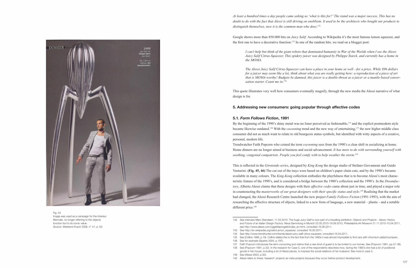
127
At least a hundred times a day people came asking us ‘what is this for?’ The stand was a major success. This has no doubt to do with the fact that Alessi is still driving on snobbism. It used to be the architects who bought our products to distinguish themselves, now it is the common man who does.132
Google shows more than 850.000 hits on Juicy Salif. According to Wikipedia it’s the most famous lemon squeezer, and the first one to have a decorative function.133 In one of the random hits, we read on a blogger post:
I can’t help but think of the giant robots that dominated humanity in War of the Worlds when I see the Alessi Juicy Salif Citrus-Squeezer. This spidery juicer was designed by Philippe Starck, and currently has a home in the MOMA.
TheAlessiJuicySalifCitrus-Squeezercanhaveaplaceinyourhomeaswell—foraprice.While$96dollarsfor a juicer may seem like a lot, think about what you are really getting here: a reproduction of a piece of art thatisMOMA-worthy!Budgetsbedamned,thisjuicerisadouble-threatasajuiceroramantle-basedconver-sation starter. Count me in.134
This quote illustrates very well how consumers eventually magnify, through the new media the Alessi narrative of what design is for.
5. Addressing new consumers: going popular through affective codes
5.1. Form Follows Fiction, 1991By the beginning of the 1990’s shiny metal was no loner perceived as fashionable,135 and the explicit postmodern style became likewise outdated.136 With the cocooning trend and the new way of entertaining,137 the new higher middle class consumer did not as much want to relate to old bourgeois status symbols, but identified with witty aspects of a creative, personal, modern life. Trendwatcher Faith Popcorn who coined the term cocooning sees from the 1990’s a clear shift in socializing at home. Home dinners are no longer aimed at business and social advancement. It has more to do with surrounding yourself with soothing, congenial compatriots. People you feel comfy with to help weather the storm.138
This is reflected in the Girotondo series, designed by King Kong the design studio of Stefano Giovannoni and Guido Venturini. (Fig. 45, 46) The cut out of the trays were based on children’s paper chain cuts, and by the 1990’s became available in many colours. The King-Kong collection embodies the playfulness that is to become Alessi’s most charac-teristic feature of the 1990’s, and is considered a bridge between the 1980’s collection and the 1990’s. In the Dreamfac-tory, Alberto Alessi claims that these designs with their affective codes came about just in time, and played a major role in counteracting the masterworksofourgreatdesignerswiththeirspecificstatusandstyle.139 Realising that the market had changed, the Alessi Research Centre launched the new project Family Follows Fiction (1991-1993), with the aim of researching the affective structure of objects, linked to a new form of language, a new material – plastic - and a notable different price.140
132 See interview Marc Standaert, 11.03.2010. The huge Juicy Salif is now part of a travelling exhibition: Objects and Projects - Alessi: History and Future of an Italian Design Factory. Neue Sammlung in Munich 22.05.2010-19.09.2010, Philadelphia Art Museum 21.11.2010-10.04.2011, see http://www.alessi.com/oggettieprogetti/index_en.html, consulted 16.06.2011.133 See http://en.wikipedia.org/wiki/Lemon_squeezer, consulted 16.05.2011.134 See http://www.trendhunter.com/trends/alessi-juicy-salif-citrus-squeezer, consulted 16.04.2011.135 See (Collins 1999, p.19). Collins relates this to the fact that from the 1990s it was almost impossible to find cars with chromium-plated bumpers.136 See for example (Sparke 2004, p.197).137 Faith Popcorn introduces the term cocooning and claims that a new kind of guest is to be invited to our homes. See (Popcorn 1991, pp.27-38). 138 See (Popcorn 1991, p.32). In the research for Case 5, one of the respondents describes how, during the 1980’s she had a lot of positional goods in her house, including a lot of Alessi pieces, to impress the social relations of her husband. See more in case 5.139 See (Alessi 2003, p.93).140 Alessi refers to these ‘research’ projects as meta-projects because they occur before product development.
Fig. 44Image was used as a campaign for the Interieur Biennale, no longer referring to the objects function but to its iconic value.Source: Weekend Knack 2006, n° 41, p. 62.

129
The name of this project refers to one of Alessi’s Leitmotif, the family, as well as to the Form Follows Function adagio. In the latter meaning, continuing the postmodern reaction on modernism, but emphasising the fictional. Inspired by the seminal writing of D.W. Winnicott, Playing and Reality and the work of Italian neuro-psychiatrist and psychoanalyst Franco Fornari, a new meaning was attached to the products launched during the 1990’s. Paediatrician and psychoana-lyst Donald Winnicott researched the meaning children give to everyday objects. He focussed particularly on transi-tional objects, which are mainly teddy bears, safety blankets and toys representing a safe and happy world, united with the mother. (Fig. 47) These objects fulfil a transitional role for the child, in becoming more psychologically autonomous and independent from the mother. In essence the object becomes indispensible for its symbolic meaning and not at all for its actual function. According to Winnicott adults also make use of transitional objects.141 This is where Alessi saw a role for its new products. Alberto Alessi explains:
Thanks to this epistemological contribution I was more comfortable when at the beginning of the ‘90s I started toworkonourmeta-projectcalled“FamilyFollowsFiction.”ItsaimwaspreciselytoexploreindepththeAffective Structure of objects. (…) There is no difference, at heart, between a coffee pot or a kettle and a teddy bear. (…) We know very well that our activity has not as much the purpose to satisfy a primary need: we know that one can light up a burner, boil water, make a coffee or serve tea, dose salt and pepper, crack nuts and clean toilets also with tools that are more “normal” than those created by us. What we do is to try to answer to a desire of happiness of people.142
The psychological theories coincide very well with the coded semiotic approach of the previously launched collections. The products of the Form Follows Fiction project, and succeeding projects relate to the animated world of children and seem to dissociate from the high cultural references of the 1980’s products. However, these goods continue to accentu-ate form over function. Moreover for many of the products, their function is a complete mystery. See for example the Magic Bunny, Pino or Lilliput all designed by Giovannoni. (Fig. 48-51) Most of the products resulting from these pro-jects were made in plastics, with a much lower retail price, thus attracting a much larger public. Additionally, from the 1990’s Alessi expanded its range from kitchen products to bathroom goods, thus broadening their target group. It is also of importance in understanding the continuing success of Alessi after 1990, that in this time period cartoon figures in general became popular within an adult setting. The popularity of Cobi the mascot designed by Javier Mariscal for the Barcelona Olympics in 1992 can be seen as an example, and of course the growing success of the Simpsons, which first appeared on television on 1987 and premiered in 1989 as a half-hour series.143
In contradiction to the 1980’s products, the designs from the 1990’s became less and less mediatised, not only in the editorial pages but also in advertisements for other companies.144 Nevertheless the success of Alessi did not stagnate. A small questionnaire conducted with first year interior design students,145 shows that most of them are acquainted with the 1980’s products as well as the successes of the 1990’s. Interesting is that the 18 year olds mainly know the objects from shop displays. This results from a reorganisation of the distribution system. According to Marc Standaert, this has been of major importance for the success of Alessi.146
141 See (Winnicott 1971).142 Alberto Alessi, La storia della Alessi dal 1921 al 2005 e il fenomeno delle Fabbriche del design italiano, quoted in (Verganti 2009, p.42).143 See http://en.wikipedia.org/wiki/The_Simpsons, consulted 10.08.2010.144 See research Case 4.145 This was conducted over 96 students, in October 2008, the first day their actual design history lessons started.146 See interview Marc Standaert, 11.03.2010.
Fig. 45Alessi Girotondo series (1991) by King Kong Source: View On Alessi magazine, spring-summer. 2010, p. 4.
Fig. 46 Source: Weekend Knack 1992, n° 11, p. 23.
Fig. 47Alessi, Form Folows Fiction.Source: View On Alessi magazine 2009 (fall-winter), p. 2 .

131
5.2. A new distribution modelAlessio Alessi, the brother of Alberto joined the company in 1980 and became head of distribution. With the growing number of products, and the obvious high-cultural meaning attached to them, Alessio reorganised the distribution model of the company. After presenting the Tea and Coffee piazza in several museums, Alessio began selling directly to 200 high-end, luxury retail shops in Italy, in an attempt to reposition and elevate the brand according to its changed mean-ing. Many of the premium shops opposed the idea because of the extensive distribution network Alessi worked with. Within the traditional network it was very difficult to control display, merchandising and pricing. From 1983 onwards the OfficinaAlessi collection was only made available to premium retailers, thus emphasising the rarity and exclusive-ness of the products.147 From that point on Alessi started worldwide a new network with a single, independent agent per country, and in some cases company owned subsidiaries as exclusive agents for its products, as was the case in Belgium.148 Marc Standaert points out the direct revenues of this method. WecouldnotonlypositiontheOfficinabrandin better shops, the A di Alessi we sold in a large variety of shops, trying to reach different kinds of consumers through different outlets. A second important aspect is that all the Alessi products are displayed together in a way proposed by Alessi.AndthirdlyasIamdirectlylinkedtothecompany,Iaminafirstclasspositiontolearnaboutthestoriesbehindthe products and forward them directly to the salespeople in the shops.149 Standaert also stresses that over the years he has established a very good relationship with the press and that their interest in the brand has been important, as well as the fact that every two years the company has a big booth at Flanders most important design fair: the Interieur Biennale.According to Lees-Maffei, the way the Alessi products are represented in shop displays, refers to the museum approach: only one object of each, with enough open space to admire its design, and no link to the actual use-value. Also, by showing them all together, the high cultural icons halo upon the cheaper products, and the brand name is emphasised. It is interesting to see from the student survey, that only 5 of 96 students knew the name of Philippe Starck as one of the Alessi designers. Of the students who were familiar with the Alessi products, depending on the object, between 38 and 45 % did know the brand name.150 This means that although the company started its success through collaboration with star architects, it is especially the brand name, which is known. Whereas in the whole strategy the names and positions of the architects were of major importance to establish a high design position, 25 years later the general public has as-sociated the brand name with high design, rather than the designers.151
Another strategic element in the distribution is the opening of flagship stores. They function as shopping-museums, where the brand name is visible at its best. Alessi calls them their Wunderkammer, again linked to the world of collec-tors. Based on the flagship store design and principles, Alessi is also creating Alessi spaces in the better design shops all over the world. In 2003, Alessi was present in 103 of these.152 For Alessio, all these distribution challenges were related to the larger issue of how to expand distribution without compromising control of the brand image. He concludes:
As our company has grown, we’ve had to deal with a growing number of products in a growing number of categories.Thismademyjobmoredifficultovertime.However,IbelieveinthedecisionsAlbertohasmadeonbehalf of the company. He’s the ultimate steward of our product strategy. My job is to make sure that our distri-bution strategy is aligned with his vision.153
Although not all brand products are as much related to the high cultural assets of the early OficinaAlessi designs, turnover between 1980 and 2000 doubled after the plastic goods were brought onto the market, while the points of sale diminished by 40% between 1989 and 2000. Once the brand name was established, Alessi saw a continuously growing consumer public.
147 See for example (Moon e.a. 2004).148 See interview Marc Standaert, 11.03.2010.149 See interview Marc Standaert, 11.03.2010.150 All five only recognised the Juicy Salif as a design by Philippe Starck.151 A similar conclusion can be read in Case 5.152 See (Alessi 2003, pp.140-141).153 Alessio Alessi quoted in (Moon e.a. 2004, p.6).
Fig. 48 Interview with Stefano Giovannoni in ‘Weekend Knack’.Source: Weekend Knack 1997, n° 17, p. 25.
Fig. 49Design by Stefano Giovannoni in the shopping pages of ‘Weekend Knack’.Source: Weekend Knack 1998, n° 3, p. 31.

133
Marc Standaert states that for years he has been hearing colleagues and people from the design field saying that Alessi’s success is soon to be over. We don’t just relate to a snobbish public anymore, as we did in the 1980’s and even early 1990’s.Alessitodayisworldwidecommonlyknownandattractsanextremevarietyofconsumers.
6. ConclusionAlthough the postmodern succes that Alessi is still associated with had a limited life as a style and went out of fashion by the early 1990’s, it seems to have had a profound impact on design in particular, and culture and economy in general. From a management perspective Verganti stresses the endless possibilities for businesses if instead of just changing a product’s function, they change a function in order to radically innovate what a product means (…) the ultimate pur-pose of innovation is to innovate meaning (hence ‘function follows meaning’). And the impact on business value is much moresignificant …154 For Penny Sparke postmodernism has generated important characteristics of the everyday life in the neo-liberal society, such as the close link between design and marketing; the dominance of the image over the ob-ject; and that of representation over reality.155 From a design perspective, John Heskett concludes on the impact of the so-called postmodern miracle as following:
This particular approach to design has been avidly adopted by innumerable companies looking to inject added valueintoproductsonwhichprofitmarginsarelow.Asaresult,postmodernistideasindesignhavebeenwidelyappropriatedforcommercialpurposesinordertoconvertefficient,inexpensive,andaccessibleprod-uctsintonewmanifestationsthatareuseless,expensive,andexclusive.Theemphasisonmeaning,moreover,unlocks a vista of unlimited possibilities for the collaboration of ever-new forms requiring little or no relation-shiptopurpose,enablingproductstobedrawnintocyclesoffashionablechangefortheprimarybenefitofmanufacturers.156
Case 2 and 3 will show how other companies, such as Vitra and TECTA have applied techniques derived from this so called postmodern model, in a different visual context. Upgrading a companies cultural capital through various strate-gies, has not only ambiguous consequences within the design discourse, it is also much more complex than marketers as for example Verganti want to make believe.
154 See (Verganti 2009, p.33).155 See (Sparke 2004, p.197). See also Selle who already foresaw this evolution in his seminal article on postmodernism (Selle 1989, p.65).156 See (Heskett 2002, p.59).
Fig. 50Design by Stefano Giovannoni in the shopping pages of ‘Weekend Knack’.Source: Weekend Knack 1996, N°36, p. 226.
Fig. 51Design by Stefano Giovannoni in the shopping pages of ‘Weekend Knack’.Source: Weekend Knack 1998,n° 34, p. 79.

135
CASE 2
VITRA AND ITS PLURALISTIC SYMBOLIC LANGUAGE1
1. IntroductionWhere Verganti uses Alessi to exemplify his design-driven innovation, the research on the Swiss based office furniture company Vitra shows, that during the 1990’s it makes use of a similar strategy of culturally upgrading its products. In this case it is however not possible to explain their success through Verganti’s model, as the most well-known designers of the Vitra collection were active from the 1940’s-1960’s. There was at that time no conscious design methodology in creating a new language, which would lead to new uses, by for example the Eameses, Prouvé or Panton. Where Verganti gives credit to the interpreter/designer who is to account for the creation of a new meaning, this case-study shows that it is especially the marketing strategies in collaboration with the media that create the brands success and eventually result in a meta-narrative of design being synonymous with high cultural icons. In particular, Bourdieu’s Field of Cultural Production will be looked into as a means to understand the dynamics between the producer and the media,2 and Peterson and Kern’s notion of omnivores is given attention in order to understand the impact of Vitra’s marketing on a diverse consumer group.3
2. A subtle adaptation of meaningWhereas Alessi has been considered by historians and economists as an example of a company witnessing great success through adding pre-packed meaning to their designs, Vitra’s marketing strategy has not as much been subject to discus-sion, nor research.4 Vitra in general is not considered as a design company that brings objects with ready-made mean-ings onto the market, mainly because their biggest successes from the 1990’s onwards are re-issues of the Eameses, Panton and Prouvé. Objects that already had a history of meaning imbedded in post-war modern design,5 before Vitra re-hyped them. In this sense Vitra does not create meaning, but layers new meanings upon the old ones, depending on the customer groups they want to address. In contradiction to Alessi, Vitra does not refer to grand theories to bolster their collections. In the overall narrative, Vitra gives the impression that company decisions all evolve naturally as a consequence of changing consumer de-mands, rather than marketing led motivations. Marketing decisions are therefore addressed as problem solving: (...) our activities never were part of a larger concept or big plan.6 However, what Mendini is for Alessi, the Eames legacy is for Vitra. (Fig. 1) The Eameses are the binding that connects different approaches, collections and changing visions. In doing so, Vitra created their own Eames legacy, through copy and paste, adjusted to different situations.
Not a day goes by without reference to the Eameses’ conceptual and philosophical approach in our discus-sions.Inmanydifferentcontexts,whetherrelatedtoproducts,re-editions,exhibitions,anecdotes,recollections,acquisitions to the collections, legal disputes with copyists, research, or important design decisions, one of the questions we most frequently ask ourselves is: “What would Charles say?”7
1 Parts of this case study have been published in conference proceedings. See (Bouchez 2007; Bouchez 2005).2 See (Bourdieu 1993).3 See (Peterson & Kern 1996).4 Jonathan Woodham’s design directory is exemplary in the way Alessi is seen as a company that has (…) produced a number of designs that seek to underline its sophistication and awareness of design heritage, reflecting a cultural promotion strategy (Woodham 2006, p.11), whereas Vitra in the same publication is applauded for its high-quality design and its exciting and world-famous Vitra Design Museum, (Woodham 2006, p.445).5 The work of Eames was incorporated in Edgar Kaufman, Jr.’s 1950 publication as excellent examples of modern design, see (Kaufmann 1950). 6 See (Fehlbaum 1992, p.18,34).7 See (Windlin & Fehlbaum 2008, pp.226–227).
Fig. 1Souce: Kalman 1997, pp. 130-131.

137
2.1. Meeting the Eameses, 1953Vitra starts its history in 1953,8 with Willi Fehlbaum’s trip to the United States where he is introduced to the work of Ray and Charles Eames. (Fig. 2) The instant impact of their designs led to a business move: from a shop-fitting busi-ness, to a company that produces office design.9 In 1957 Vitra obtains the licences from the American producer Herman Miller to manufacture the office furniture of the Eameses and of George Nelson for Europe. In 1977 Rolf Fehlbaum, the son of Willi becomes director of Vitra.10 In 1984 the European rights to the Eames products were transferred to Vitra.11 It took until 1996 before Vitra started with the vast promotion of the work of Ray and Charles Eames,12 which led, to use the words of Gareth Williams to an Eames-mania.13
From the 1960’s onwards Vitra starts manufacturing new products, of which the Panton chair is best known.14 The de-velopment of other office products, mainly chairs, starts in the seventies with designs from Mario Bellini and later on Antonio Citterio.15 From the 1990’s onwards many designers came on board, such as Jasper Morisson, the Bouroullec brothers, Hella Jongerius and Maarten Van Severen.
2.2. Vitra Edition, 1986In 1986 Vitra took a decisive marketing step - in line with the success of other companies who positioned themselves at that time on the market as producers of high design -16 through the launching of the Vitra Edition.17 The basic idea of this project is similar to the Alessi’s Tea and Coffee Piazza. Different designers such as Shiro Kuramata, Alessandro Mendini, Ron Arad, Ettore Sottsass, … were asked to design a chair, free from production restrictions.18 (Fig. 3) In a lecture given in 1991 in Amsterdam,19 Rolf Fehlbaum explains that the designers of the Vitra Edition brought a new language along.20 He explains about this collection:
Although we had now reached a pluralistic view of design, this was not something that we had consciously striven for, backed up by some grand theory. You don’t work with theories in industry. You just get on with itandfindatheoryforitlater.Wehadaccidentallystumbleduponthispluralism–orpost-modernism–byworking with all these different designers.21
It is quite surprising for a collector of design to accidentally stumble upon the postmodern actors of that time, such as Mendini and Sottsass.22 It is more likely that in retrospect, in 1991 when the postmodern hype subsides, Fehlbaum no longer wants to be associated with it and thus emphasises the philanthropic goals of Vitra towards the creative process of design in general.23
8 See (Vitra 1996, p.13) and (Windlin & Fehlbaum 2008, p.226).9 See for example (Woodham 2006, p.445). The company was founded in Basel in 1934. In 1950 Vitra Deutschland in Weil am Rhein is founded. See Vitra press release 1998, p3.10 See Vitra press release 1998.11 See (Albrecht 1997, p.90; Vitra 1996, p.13).12 In 1996 Vitra published a catalogue on the work of Eames, which was widely spread to European lifestyle magazines and free-lance journalists. 13 See (Williams 2006) Which peaked according to Williams about 1998. Research in ‘Weekend Knack’ shows that in Flanders the mania lasted for a couple of years to continue in a general Vitra hype. See Case 4.14 See (Fehlbaum 1992, p.12; Windlin & Fehlbaum 2008, p.229) The official publications of Vitra are rather vague and mention hardly any exact dates of production, except for the last 12 pages of the Project Vitra book, in the glossary. The Panton Chair is produced in 1966/67, See Vitra press release 1998, p.3.15 See (Fehlbaum 1992, pp.13–17). The first collaboration with Mario Bellini dates from 1979, and a first collection from 1984. The collaboration with Antonio Citterio started in 1985. See (Anon 1998, pp.3–6; Windlin & Fehlbaum 2008, p.381).16 See for example (Cacciola 2008).17 See (Fehlbaum 1992, pp.18–21).18 See Vitra press release 1995, p.4.19 The text was delivered as the second Luminance Lecture on September 8 in the Paradiso building, Amsterdam, and titled After the design explosion. See (Fehlbaum 1992).20 Other than the language Bellini and later on Citterio had been doing for Vitra.(Fehlbaum 1992, p.16).21 See (Fehlbaum 1992, p.18).22 Fehlbaum starts from the early 1980’s to collect furniture, which became the backbone of the Vitra Design Museum. See (Windlin & Fehlbaum 2008, p.6).23 In the 1991 lecture, Fehlbaum doesn’t mention Mendini and Sottsass. Vitra does at that time not want to be associated with the postmodern movement.
Fig. 2Charles Eames, Willi Fehlbaum, Erika Fehlbaum and Ray Eames, Venice, California 1963.Souce: Kalman 1997, pp. 134-135.
Fig. 3Vitra, How High The Moon by Shiro Kuramata, Issey Miyake sits in the chair, ‘Personalities’ campaign, photographed by Christian Coigny between 1987-1997.Source: Windlin & Fehlbaum 2008, p. 335.

139
The Vitra Edition was first and foremost regarded by Vitra as an experiment to infuse the main company business: mak-ing office furniture. Fehlbaum states about this project IfeelthatthisexperiencefundamentallychangedVitra’sdesignculture and our company culture as well.24 By working with different designers who designed within different languag-es Vitra felt the urge to widen its horizons and to start cooperating with more contemporary designers. Not as much to just enlarge the Vitra edition collection, but to channel their ideas and concepts into the office furniture business. Vitra did not at that time promote the edition the way Alessi did with the Tea and Coffee Piazza, but nevertheless levelled the ground to use Verganti’s words to position itself among design companies investing in the cultural field.25 An eye catch-ing advertising campaign, named Personalities paved the way to media attention.26 As a solution to the overload of visual information at that time, black and white photography was proposed. All advertisements have the same concept: a high-culture representative portrayed in a Vitra chair. The focus is on the personality, the chair is subordinate. Fehlbaum refers to the people they asked to be portrayed as somepersonwithwhomwehadaffinities–Hockney,PatriciaHigh-smith, Godard, Tinguely, Rauschenberg, Gilbert and George, etc.27 (Fig. 3, 4) The artists were remunerated by a Vitra chair of their choice, which ensured that these artistic leaders actually sat in Vitra chairs at home, in the office, or their studio. This might seem a futile element as marketing tool. Nevertheless a full page photograph is printed in the most recent Vitra publication of Bruce Nauman seated in his studio in an Eames chair. (Fig. 4) The picture is taken by Juer-gen Teller published in the section Vitra in art, and seems to suggest that the chair somehow contributes to the artistic production of Bruce Nauman.Although this is a very different approach to Alessi, it is in essence the same underlying technique of adding high cul-tural meaning to a product, in Vitra’s case not through the museum status, but through the high cultural personality status. 28
2.3. The Eames legacy, 1996The Vitra Edition of 1986 as the start of a new direction, was still mediated through paid advertisements. With the launch of the catalogue Vitra/Eames on the products of the Eameses, a new approach towards the media is taken and advertisement becomes secondary. The new product catalogue is published a year before the opening of the exhibition The work of Charles and Ray Eames. A legacy of invention in September 1997 in the Vitra Design Museum in Weil am Rhein. This exhibition became a great success and continued to travel until 2005, all over the world.29 The accompanying book publication was widely distributed.30 The exhibition played an important role in the popularisation of the American design couple. Nevertheless, the much smaller Vitra product-catalogue of 1996 proved to be very influential towards the media: the amplifiersofthemessage, according to Verganti.31
24 See (Fehlbaum 1992, p.20).25 See (Verganti 2009).26 See Vitra press release 1998.27 See (Fehlbaum 1992, p.24). In the Project Vitra publication there is an insert on how Vitra products are represented in the media, presenting the black and white Personalities advertisements. Issey Miyake, Spike Lee and Louise Bourgeois each receive a full-page picture.28 When a few years later (1989), the Vitra Design Museum opens in Weil am Rhein, the company’s corporate identity shifts clearly from a producer of office chairs into a cultural institution. 29 See http://www.design-museum.de/museum/ausstellungen/eames/index.php, consulted 04.08.2010.30 See (Albrecht 1997).31 See (Verganti 2009, p.6). See also Case 1.
Fig. 4Left: ‘Personalities’ campaign photographed by Christian Coigny between 1987-1997.Right: Bruce Nauman, New Mexico 2010, photographed by Juergen Teller.Source: Windlin & Fehlbaum 2008, p. 338-339.
Fig. 5Source: Vitra 1996, cover.

141
The catalogue reflects how Vitra added a new, high cultural meaning to the Eames products and in essence to the Eames legacy, somehow contradictory to meanings intended by the designers. (Fig. 5) In doing so, Vitra emphasises the iconic value of the objects and presents the designers as genii or authors as Vitra likes to phrase it.32
The catalogue is first and foremost a visual publication, with short texts in three languages. Fourteen pages are dedicat-ed to the way of living and working of the Eameses. The other 98 pages focus on product-information such as materials, sizes, and colours, exemplified by projects. (Fig. 7) In its form we can call this a technical catalogue packed in an artis-tic framework, which in marketing terms can be considered as cultural branding.33
Vitra is depicting the work of Ray and Charles as a form of high culture by adding symbolic codes. The cover depicts the smiling couple, with a picture of the wired chairs underneath, both photographs taken by Charles Eames. The first page of the book is the dancing couple representing the domestic bliss Vitra will promote over the years.34 Most inter-esting is the following double page with an image of Charles holding a picture of Picasso’s face.35 (Fig. 8) This picture suggests somehow that Eames and Picasso can be considered equals, with a similar cultural value. The image adds to the artistic authority of Charles and Ray Eames and their products. This authority is not something the designers them-selves have instigated, on the contrary.
Within a few years Charles and Ray Eames had changed from artists to social engineers-designers who first thought about the place and function of products rather than the form and style of the products themselves. (...) Certainly in design circles, industrial design, with its highly utilitarian notion, served as the guiding principle bywhichmanydesignersworked–andthennolongertoproduceluxuryorimitationalluxurygoods,buttofindpracticalanduser–friendlysolutionsforeverydayproblems.Thelonelyartistwassuspectedofbeinganelitist and anti-socially engaged. It was no small wonder that Eames continually rebelled against his lifelong ‘genius’ label, bestowed on him by so many.36
This portrait of Charles Eames has been published in other books on the work of the Eameses.37 In these publications however, the image comes together with a portrait of Ray, holding an image of a huge cat-head in front of her face. Both pictures were taken in 1971, when the couple was working on a film: Clown Face, commissioned by Bill Ballan-tine who wanted a movie on how to put on clown make-up.38 (Fig. 9) The two portraits of Ray and Charles are funny masks linked to that particular job and in general to be understood as their desiretofacilitatefreeexpressioninchildrenand to encourage it in the activities of adults.39 Throughout their career, the Eameses took several pictures wearing strange masks. By only showing the Picasso-face the whole context in which the pictures were taken, dissolves and a new context, or rather myth is created. The association with Picasso is further again underlined in the catalogue. Where the first picture emphasis the artistic author, the image on page 31 visually links the chair from the Aluminium Group with the artwork, Bull’s Head of Picasso. (Fig. 6)From this first publication onwards, Vitra bestows the label of artists upon the Eameses. Where in the 1991 lecture, Fe-hlbaum points out the dangers of what he calls the design explosion of the 1980’s: One of the prime manifestations of thedesignexplosionisthatahighlydevelopedconsumerismhasevolvedinwhichthedesigner’ssignatureispartofadifferentiation technique.40
32 See for example (Fehlbaum 1992, pp.22–23; Windlin & Fehlbaum 2008, pp.137–238).33 See for example (Holt 2004). For a critical approach on cultural branding see (Wernick 1991).34 Throughout the years, the Eameses have been presented as a creative, happy couple. Buying one of their products seems to bring along their happiness. See further.35 The same photograph is also used in another publication, promoting Vitra. See for example (Kalman 1997, p.124).36 See (de Rijk 2003, p.58).37 See (Kirkham 1995, p.149; J. Neuhart e.a. 1989, p.373).38 See (J. Neuhart e.a. 1989, p.373).39 See (Kirkham 1995, p.148).40 In the Luminance lecture, Fehlbaum gave in 1991, he points out the dangers of what he calls the design explosion of the 1980’s, such as individual authorship. In his critique on the evolution of design Fehlbaum sees that a highly developed consumerism has evolved in which the designer’s signature is part of a differentiation technique, see (Fehlbaum 1992, p.8).
Fig. 6Source: Vitra 1996, pp. 30-31.
Fig. 7Source: Vitra 1996, pp. 70-71.

143
By the mid 1990’s however, Vitra understands that the genius label and iconic value of design means big business. In the prestigious Birkhäuser publication Project Vitra of 2007 the company clearly moved its core business from supplier of semi-anonymous ergonomic office design, towards a highly branded design producer who claims that his design pro-cess, depends on authors:
Vitra works with independent ‘authors’- primarily with designers, but also with architects and graphic artists. What distinguishes the work of these people from that of other designers is the fact that their personal imprint andoutlookisreflectedineveryoneoftheirproducts.41
Thus Vitra positions all meaning of the product within the realm of the author, reducing design to the achievements of a genius individual in a Pevsner tradition.42 Interesting in this respect is Bourdieu’s outline on the role of the producer, rather than the author in adding meaning to goods.
The question can be asked in its most concrete form (which it sometimes assumes in the eyes of the agents): whoisthetrueproducerofthevalueofthework–thepainterorthedealer,thewriterorthepublisher,theplay writer or the theatre manager? The ideology of creation, which makes the author the first and last source of the value of his work, conceals the fact that the cultural businessman (art dealer, publisher, etc.) is at one andthesametimethepersonwhoexploitsthelabourofthe‘creator’bytradinginthe‘sacred’andthepersonwho,byputtingitonthemarket,byexhibiting,publishingorstagingit,consecratesaproductwhichhehas‘discovered’ and which would otherwise remain a mere natural resource; and the more consecrated he per-sonally is, the more strongly he consecrates the work. (...) He is the person who can proclaim the value of the author he defends (cf. the fiction of the catalogue or blurb) and above all ‘invests his prestige’ in the author’s cause, acting as a ‘symbolic banker’ who offers as security all the symbolic capital he has accumulated (which he is liable to forfeit if he backs a ‘loser’).43
It is interesting to see how Fehlbaum has likewise invested in his own prestige, see for example the so-called Vitra Red Book, a publication dated from 1997, designed by the legendary graphic artist Tibor Kalman. (Fig. 10) The beautifully made book is an illustrative exposé on the life of Rolf Fehlbaum, wittily named Chairman, and his love for chairs, design and art.44 (Fig. 11) In 1998 Fehlbaum was Guest of Honour of the Interieur Biennale in Kortrijk. A three dimen-sional version of the book was developed for this exhibition and had a central space in exhibition hall.45 (Fig. 12)
From 1996 onwards, Vitra continuously elevates the Eameses as artists and their products as artistic endeavours. In the 2008 publication Vitra states:
Likenoonebeforeorafter,CharlesandRayEamesexploitedthepossibilitiesofferedbyindustrializationinconnection with new materials and technologies. But they were not merely technicians. Ray was a painter, Charles an architect. They were artists, even though they did not regard themselves as such (…) Yet all of these thingsdonotexplaintheunwaningattractivenessofEamesproducts.Theirsolutionswereultimatelyartisticinnature, and there is an undeniable genius (though Charles rejected this label) behind the almost magical allure of their designs.46
41 See (Windlin & Fehlbaum 2008, p.223).42 Throughout their correspondence from 2004 onwards, Vitra uses the term author and not artist as Alessi does. Both refer to the high artistic autonomy of the designer. On Pevsner, see also part II. Theoretical framework.43 See (Bourdieu 1993, pp.76–77). 44 The publication resulted from a price Fehlbaum received from the German Rat für Formgebung in Design Leadership, see (Kalman 1997).45 See (Interieur Foundation 2010, p.110).46 (Windlin & Fehlbaum 2008, p.227).
Fig. 8Charles Eames with Picasso mask.Source: Vitra 1996, pp. 4-5.
Fig. 9Ray Eames with cat mask, Charles Eames with Picasso mask.Source: Neuhart 1989, p. 373.

145
The danger from a design historian perspective on focussing on the designer genius has been explained earlier.47 For Vitra however it is important to contest the authority of the Eameses in the strategy of augmenting their own authority as producer. As will further be elaborated, the Eames legacy is the backbone of Vitra’s branding. One could question what the Eameses would have thought of this kind of representation.48 In their choice of signing with Herman Miller or Knoll International at the beginning of their career they were distinct. Their grandson Eames Demetrios demonstrates their view:
The Eameses’ choice between Herman Miller and Knoll was an important and difficult one. Charles and Ray certainly respected Hans Knoll and knew and liked Florence from Cranbrook (she was “practically an adopted daughter of the Saarinens.”) But Ray pointed out that “Charles was drawn to the DePrees because he thought they were very straightforward, honest business people, as opposed to the Knoll idea of ‘image’ and ‘international design.” She was not implying anything about the business integrity of Knoll (which is and was impeccable), but she was putting into business terms an Eames concern that “what works good is better than what looks good, because what works good lasts.” In other words, the people who had just designed the most revolutionary chair of the 20th century felt that they were better off with a company that took that approach as a given and put it in the marketplace as simply a good chair. They felt uncomfortable asking people to buy the chair as a landmark of international design or “design style,” they wanted them to buy it because it was com-fortable and worked. This is a key insight to the way Charles and Ray viewed things.49
Moving functional objects, in this case mass produced furniture from the field of practical, daily use towards the field of high arts, and design icons, and thus objects which guarantee a distinction of good taste, was willingly instigated by Vitra. The fact that the producers of office design also have a museum no doubt adds to the creating of the so-called “natural” superiority of the products they produce. The authority of Vitra, is according to Bourdieu itself a credit-basedvalue,whichonlyexistsintherelationshipwiththefieldofproductionasawhole,50 by which he means the role of the artist, in this case designer, the catalogue, the other producers, the media, and the consumers who all give each other credit in their mutual strive to distinguish themselves. Thus, the authority is nothing other than credit with a set of agents who constitute connections whose value is proportionate to the credit they themselves command.51 Bourdieu explains that the field of cultural production should be understood as:
The system of objective relations between these agents or institutions and as the site of the struggle for the monopoly of the power to consecrate, in which the value of works of art and belief in that value are continuously generated.52
The upgraded symbolic meaning of Eames products, initiated by Vitra through the first Eames catalogue of 1996 led to an amplification of the Vitra meaning, thanks to what Bourdieu refers to as credit-based relationships within the field of cultural production. In the same way Alessi did, Vitra distributed the catalogue extensively to its press relations in Europe, which resulted in a growing number of editorials on Eames designs and on Vitra products in general, because of the magazines belief that they could upgrade their content through the inclusion of the Eames products, which have been mediated as a sort of art-work and thus have a high cultural value.53
47 See part II.Theoretical framework.48 By the time of the publication and the beginning of the Eames-mania, both had passed away. Charles Eames died August 21, 1978 , Ray Eames died August 21, 1988. (Demetrios 2001, pp.255, 260)49 See (Demetrios 2001, p.110), however, the Eameses’ heirs don’t seem to be struggling with the high-art label recently attached to the legacy of Ray and Charles Eames. On the contrary, Eames Demetrios is himself accentuating the high artistic values of the Eames designs and the resulting importance of their work within the pantheon of design. In a lecture he gave in 2004, the importance of the Eameses was presented in the creative field with an emphasis on the iconographic forms, rather than the technical renewal attributed to the couple. Lecture at the Interieur Biennale, Kortrijk, October 2004.50 See (Bourdieu 1993, p.78). This credit-based system is what he sees as the essence of the field of cultural production, meaning the dynamics of artistic works within the social conditions of production, mediation, and consumption.51 See (Bourdieu 1993, p.78).52 See (Bourdieu 1993, p.78).53 Bourdieu speaks in this respect of the production of belief, see (Bourdieu 1993, p.106).
Fig. 10Source: Kalman 1997, cover.
Fig 11Rolf Fehlbaum in India 1997.Source: Kalman 1997, pp. 236-237.

147
Fig 12 The red book of a Chairman.Source: Weekend Knack 1998, n° 42, pp. 75-76.

149
Before going further into the tight collaboration of Vitra with the media, through the case study of Weekend Knack,54 (Fig. 13-15) a singular example of the Dutch ‘Elle Wonen’ of June 1997, shows how the Vitra.Eames catalogue had a direct outcome.55 In the book review of the Dutch ‘Elle Wonen’, the editorial recommends the catalogue/book of Vitra.Eames, although it can hardly be considered a regular book. (Fig. 16) Interesting is that in the same issue, products of Vitra are depicted 11 times: on a page on newofficechairs 6 of the 9 chairs are by Vitra and in the styling pages 3 pieces designed by Eames are depicted full page. (Fig. 17) In the previous issues of that year, not once was a Vitra product published. Due to the high-cultural meaning, magazines have more interest in the products, because in focussing on ‘high cultural’ themes, the magazines increase their own credit. As Bourdieu explains:
Choosing according to one’s tastes is a matter of identifying goods that are objectively attuned to one’s position and which ‘go together’ because they are situated in roughly equivalent positions in their respective spaces.56
Bourdieu’s analysis coincides again very well with Verganti’s model of design–driveninnovation, where he sees an important role for the media in promoting the artistic “design” language.57 In the case of Vitra there is no new language but a new symbolic meaning of existing furniture pieces that is readily amplified by the media in the logic of augment-ing their own cultural capital. Case 4 shows how just like Alessi, Vitra hardly advertises, but does get an even larger media coverage in ‘Weekend Knack’ by the end of the 1990’s and especially the first half of the 2000’s. As we shall see, Vitra takes it further with a double-layered communication strategy.
3. The collage-effect: a multi-layered meaningIn 2004 the Vitra Home Collection is launched. In Belgium, one of the oldest and major sales points of Vitra, the target group is 10 million people,58 which equals the total Belgian population. In marketing terms this implies a strategy of up- and downgrading at the same time. From a sociological approach this means that the products operate in the liminal space between high and low culture. The success of this unusual repositioning strategy can firstly be explained through the technique of a double layered communication strategy. Secondly, through the fact that the identifying process of consumers is no longer defined within a monolithic symbolic landscape. Peterson and Kern argue that consumers no longer distinguish themselves through exclusion, but have become increasingly omnivorous in their taste from high to low culture.59
3.1. The Eameses’ multiple eyeIn Domesticity at War Beatriz Colomina presents the Eameses as pioneers and masters of the new media rules, gener-ated by the new consumer culture of the 50’s. After World War II a new kind of domesticity emerged. Meticulously orchestrated images of domestic bliss were propagated in a general campaign to mask cold war threats, through (…) endlessly multiplied images of the absolute control of domestic details and permanent smiles.60 (Fig. 18, 19) The Eames couple fulfilled this demand seamlessly. In her archive research, Colomina found that the Eameses were champions in filing and documenting their everyday life.
Theykepttrackofsuchmundanethingsaswhattheyateattheofficeonaparticularweek(menus,withtwo choices for each course, are typed and are now kept in the archives) or the clothes they were taking on a trip (listsofitemstotakearefirstscribbledonascrapofpaper,thentyped,thenfiledaway);eventhememosof whocalledonwhatday,atwhathour,withwhatmessage,arefiledaway.61
54 See Case 4.55 See (Elle Wonen 1997, n°6). This Dutch publication is also widely distributed in Flanders.56 See (Bourdieu 1984, p.232).57 See (Verganti 2009).58 Interview Remy Schepens, General manager Vitra Belgium, 05.09.2007.59 See (Peterson & Kern 1996).60 See (Colomina 2007, p.19).61 See (Colomina 2007, pp.18–19).
Fig. 13New and instantly classic.Source: Weekend Knack 1996, n° 42, pp.156-160.

151
This obsessive domesticity is reflected in the way they represent their architecture, their furniture and eventually their view on the world throughout their movies and exhibitions. The many images of the Eameses we have now grown fa-miliar with as a result of the extensive media coverage of recent years, presents a blissful and highly creative designer couple, that brought back a feeling of home into the modern house according to their functional decoration concept ex-plained in part I. Theorethical framework. (Fig. 20) The images of domestic bliss are largely used by Vitra in the promo-tion of the furniture of the couple and appear as natural. Nevertheless Colomina’s research shows how constructed and packed with meaning their photographic representations are. The endless photographs of the almost ridiculously happy Eamesesdisplayingtheirlatestinventionsarepartofanextraordinarilypreciseandprofessionaldesignpractice.62 The real legacy of the Eameses is not as much the goods they have designed, but the meaning of domestic bliss and crea-tive geniality they added through the created photographs and movies. Their snapshot-looking eclectic assemblages add according to Pat Kirkham an extraculturalsurprise.63 Colomina describes the early pictures, in which they mostly wear matching outfits, transformative in a sense that the Eameses themselves became a designer object that could be moved around the frame or from picture to picture. It was always the layout that was the statement not the objects.64 Colomina stresses that the images that they created should be understood as meticulously constructed multi-screen performances,65 presenting a sort of multiple eye, which belonged to a different kind of consumer. It was the eye of the postwar acquisi-tive society.66 It is the eye of a television viewer, not the one of the 1950s, but closer to the one of today, looking at mul-tiple screens, some with captions, all simultaneously. It helps to follow more than one story at once.67 The logic of the Eameses’ multiscreens is simply the logic of the mass media.68
Their technique was used not to overtaxtheviewers’brain but precisely to offer a broad menu of options and to create an impulse to make connections.69
Vitra very much continued to work within this framework introduced by the Eameses, by applying what they call the collage technique. From 2004, with the launch of the Vitra home collection, Collage design becomes a leitmotiv and stands for multiple choices and multiple combinations, decided upon by the inhabitants of the homes, not the architects or stylists. (Fig. 21) While every home can be enhanced by products from the Vitra Home Collection, there will never be a typical Vitra home. Of course Vitra doesn’t sell standard furnishing schemes, it’s thus logical that they will promote individual items, such as the collageoffurniture,objects,textile,folkart,picturesandplants in the home of the Eame-ses: It had an improvised feeling about it and yet one could palpably sense the guiding hand that had carefully selected and ordered the elements.70 The idea that each individual should create a personal home very much coincides with a growing plethora of consumer groups who are looking for a creative lifestyle to identify with.71 The collage design and multiple eye presentation collides therefore perfectly with the consumer demands of the first decade of the new century. (Fig. 22)
62 See (Colomina 2007, p.88).63 See (Kirkham 1995, p.143).64 See (Colomina 2007, p.89).65 See (Colomina 2007, p.268). For the first time in the exhibition Glimpses of the USA in 1959, where they projected images on 7 different screens in Buckminster Fuller’s geodesic dome. Fuller commented upon their approach that nobody had done this before and predicted that advertisers and filmmakers soon would follow, see (Colomina 2007, p.103).66 See (Colomina 2007, p.107).67 See (Colomina 2007, p.103).68 See (Colomina 2007, p.267).69 See (Colomina 2007, p.270).70 See (Windlin & Fehlbaum 2008, p.132).71 Case 5 will look further into this based on an ethnographic research.
Fig. 14Advertising for an exhibition on the work of Eames, only a few weeks after the introduction (see Fig. 13).Source: Weekend Knack 1996, n° 47, p. 109.
Fig. 15Invitation of ‘Weekend Knack’ readers to the Eames exhibition (see Fig. 14).Source: Weekend Knack 1996, n° 48, p. 12.
Fig. 16Publication of the Vitra catalogue in ‘Elle Wonen’.Source: Elle Wonen 1997, n° 6, p.24.

153
3.2. Vitra Home Collection, 2004Whereas producers and media are according to Bourdieu, mainly responsible for the production of belief by creating and signifying the authority of certain goods, this authority only holds stand if there is a group of consumers who legiti-mizes the symbolic meanings and thus objectify and internalize the goods as cultural capital.72 In 2004 the Vitra Home Collection is launched, aimed to reach a much larger consumer’s group than the project market of the office design. The home collection mainly exists out of what Vitra refers to as classics by designers as the Eameses, Panton, Nelson, and Prouvé and focuses on the historical value of the Vitra collection.73 (Fig. 23)The contemporary products by designers as Mario Bellini, Antonio Citterio, Jasper Morisson, Ron Arad, Maarten Van Severen, Hella Jongerius, the Bouroullecs,... are less known and receive less media attention.74 Nevertheless, in sales terms, the classics on the Belgian market only represent in 2007, 10% of total sales.75 This results from the fact that the main business of Vitra is still the project market with their office design. The classics are in the first place a tool for cultural branding, and only since 2004 are the products being repositioned towards a large public. In marketing terms, during the nineties Vitra focussed on an upgrading of its brand, while since 2004 they are downgrading in order to raise production numbers.
The Vitra Home Collection brings together well-established icons and reissued works from major twentieth- century designers, as well as designs from the vibrant generation of contemporary authors. It includes furnitureforallbudgets,frominexpensivearticlestoluxuryobjects,inavarietyofmanufacturingtechniques ranging from traditional handicrafts to highly innovative technologies and materials.76
Following Bourdieu, as a means to keep their distinction from other classes, the consumers of high cultural goods strive to keep the symbolic value of those goods as high as possible, through rarity.77 Going popular leads no doubt to a trickle down effect.78
In 2004 Vitra repositions its high-cultural furniture collection through the launching of a Vitra Home Collection with the aim of reaching the largest possible number of consumers, through a 360° marketing strategy.79 By reaching a larger public, according to the logicofthefieldofculturalproduction, Vitra is going to lose its cultural capital as the products become accessible for another, less distinctive social group or class.80 Following Bourdieu, certain groups of consumers will no longer identify themselves with the popular product. This means that the economic success of a certain cultural product stands in opposition to the cultural capital of that product. The more successful a product becomes, the more the dominant class dissociates with the work. This is what Bourdieu calls winner loses logic.81
72 See (Bourdieu 1993, pp.74–111). This concept can be compared to Silverstone and Haddon’s theory of domestication, see (Silverstone & Haddon 1996), see also Case 1.73 Vitra regards as classics the products that are still up to date even though they were created in a previous era. When such a design is created, it is revolutionary but it also signals the birth of a new concept of design. In subsequent decades, the design proves to be resilient in the face of its successors and imitators. It outlives them and becomes a classic. This does not mean that it is now ‘tamed’: its revolutionary origins live on and it seems to remain eternally fresh. A classic appears to be timeless, and only becomes dated when a new era begins. Vitra classics include designs by Ray & Charles Eames, George Nelson, Jean Prouvé and Verner Panton. See (Windlin & Fehlbaum 2008, p.371).74 Maarten Van Severen is the only exception because he is Belgian and received locally a lot of press. Also the fact that he died very young instigated a sort of myth around his products.75 Interview Remy Schepens, general manager Vitra Belgium, 05.09.2007.76 See (Windlin & Fehlbaum 2008, p.134).77 See (Bourdieu 1984, p.228). See also Case 1.78 On Simmels Trickle Down effect see part II. Theoretical framework .79 Through for example the opening of Vitra Points, for the general public in different cities. Advertising campaigns in popular decoration magazines, attaining public fairs, producing catalogues which look like magazines. Before, Vitra exclusively focussed on the office market. Interview Remy Schepens, 05.09.2007.80 See (Bourdieu 1984, p.247).81 See (Bourdieu 1993, p.8).
Fig. 17aStyling page with La Chaise.Source: Elle Wonen 1997, n° 6, p. 88.
Fig. 17bPromotion for office chairs.Source: Elle Wonen 1997, n° 6, p. 102.
Fig. 18Ray and Charles Eames.Source: Kalman 1997, pp. 116-117.
155
According to Bourdieu, the field of cultural production exists out of two oppositional subfields. The field of restricted production and the field of large-scale production. In the first subfield the cultural capital is most important, in the sec-ond subfield the economic capital is dominant. What is interesting is the distinction of the consumers of these subfields. The first market is one between producers (of cultural capital) for producers, the second one between producers for non-producers.82 In this respect the general manager of Vitra Belgium, Remy Schepens distinguishes three groups of possible Vitra con-sumers within the Belgian home market. There is first what he calls the designcollectors, who are mainly architects, designers and other creative people. This group meets the producers for producers group of Bourdieu. The second group are the design-interested; these are especially young people who show a great interest in design in general. The third group is the largest and consists of people with a contemporary lifestyle who buy contemporary furniture, without being acquainted with the brand, nor the designer. These last two groups form Bourdieu’s market producers for non-producers, for which the economic capital is dominant. Since the launch of the Vitra Home Collection it is the aim of the company to produce for both groups at the same time, and to achieve a win-win situation, where the cultural capital as well as the economic capital is achieved. Following Bourdieu’s theory based on the rules of exclusion, the success is dubious.Nevertheless, after almost four years as general manager, Schepens is convinced that the 360° marketing strategy does work. In 2008 La Chaise became the central feature in the daily decor of a popular television station,83 and several pro-grammes on the national TV stations are using Vitra furniture as props.84 At the other hand the Italian magazine ‘Case da Abitare’,85 inserted in its Spring 2006 issue, an editorial of 5 double pages on the Vitra Home Collection. (Fig.24) Representatives of the highbrow as well as the middlebrow culture seem to show interest in the same products of the Vitra brand. How can this be explained?
3.3. Attracting a new consumer groupIn 2004 the American author Richard Florida introduces the Creative Class. This is not a class in which one is born,86 but a class into which individuals move through their job, which is somehow creative. According to Florida, this new class has a large economic impact.87 Since the new economy creativity has become one of the most important assets for leading functions. He argues that the people he interviewed no longer identify themselves through social categories such as education, occupation, family status, but through a tangle of connections to myriad creative activities.88 To the Crea-tive Class belong: computer and mathematical occupations, architecture and engineering occupations, physical, and social science occupations, education, training, and library occupations, arts, design, entertainment, sports, and media occupations. Professions that in Bourdieu’s terms are mainly catalogued within the fieldofculturalproduction, under the producers and thus the consumers of the subfield of restricted production.A main characteristic of the Creative Class, according to Florida is a creative life-style, as a means to create their own identity. The way they dress, the style of their home and work environment becomes very important and must reflect creativity, which distinguishes them from other classes. They are thus ideal seekers of distinguishable cultural capital.
82 See (Bourdieu 1993, p.115).83 Vijf TV.84 See for example VRT ‘Het Journaal’ and ‘De Zevende Dag’.85 ‘Case da Abitare’ is considered a ‘high profiled’ interior magazine and far more avant-garde than f. ex. ‘Elle Decorations’. In the Dutch magazine ‘Hide and Chic’ we find in 2006 similar examples.86 As presented in (Bourdieu 1984).87 See (Florida 2004, p.xiv). The wealth generated by the creative sector is astounding: It accounts for nearly half of all wage and salary income in the United States, $ 1,7 trillion dollars, as much as the manufacturing and service sectors combined (...) The Creative Class is dominant in terms of wealth and income, with its members earning nearly twice as much on average as members of the other two classes. 88 See (Florida 2004, p.13).
Fig. 19Ray and Charles EamesSource: Source: Windlin & Fehlbaum 2008, p. 141.
Fig. 20a Eames house.Source: Vitra Home 2005, p. 90.
Fig. 20bEames house.Source: Vitra Home 2005, p. 92.

157
Where people once found themselves bound together by social institutions and formed their identities in groups, a fundamental characteristic of life today is that we strive to create our own identities. It is this creation and re-creationoftheself,ofteninwaysthatreflectourcreativity,thatisakeyfeatureofthecreativeethos.89
A critique on Florida’s theory is the fact that he is counting non-creative jobs under the Creative Class and thus rep-resents the group’s power (quantitative and qualitative) too highly. Florida catalogues all management functions as creative. This subgroup, called the Creative Professionals,90 have a lot in common with the ‘New Bourgeoisie’ of Bourdieu.91 According to Bourdieu, these newcomers of the dominant class have an oppositional taste to the senior members. Important for him is the fact that they combine luxurious and intellectual properties. In contradiction to the old dominant class, where these properties were clearly divided by two opponents, respectively the bourgeoisie and the intellectuals. For Bourdieu, the intellectuals, the bourgeoisie and the new bourgeoisie all own diverse cultural capital in their strive for power of the dominant class. This means that each group is associating with another set of goods in the logic of the homology between groups and goods.
But the new bourgeoisie is mainly characterized by its opposition to the old business bourgeoisie. Having achieved positions of power at an earlier age, more often being graduates, more often belonging to bigger, moremodernfirms,theprivate–sectorexecutivesaredistinguishedfromtheindustrialandcommercialem-ployers, a traditional bourgeoisie with its spa holidays, its receptions and its ‘society’ obligations, by a more “modernist”,“younger”life-style,certainlyonethatismoreconsistentwiththenewdominantdefinitionof the dynamic manager.92
If Florida is correct and this Creative Class does exists as one group, identifying with the same kind of products, the producers of the desired products will be in good business, since this class counts a much larger group of people, than the rivalling subclasses initiated by Bourdieu.93 Comparable to Florida’s theory is the more popular book by David Brooks: BoBo’s in Paradise. BoBo’s are the mem-bers of a new cultural group, blending bourgeois and bohemian values.94 Whereas Bourdieu categorises his classes through birth and habitus, Florida according to production (meaning, the jobs the Creative Class are doing), Brooks catalogues his social class according to consumption.95 According to Brooks although BoBo’s admire art and intellect, theyfindthemselvesamidstcommerce,oratleastinthatweirdhybridzonewherecreativityandcommerceintersect.96 It is therefore not surprising that from a marketing perspective the term BoBo has been very mediatised and has become a popular name for the class described by Florida, and Bourdieu’s artistic intellectuals of the old bourgeoisie and the new bourgeoisie. It is the ideal target group for design company’s that intertwine commerce and culture and sell products with a high cultural identity token.
Considering Bourdieu, Florida or Brooks, for this new social group it is very important to win recognition of their pow-er. They do so by showing off their life-style or standard of living.
89 See (Florida 2004, p.8). 90 See (Florida 2004, p.328). Who is the creative class: Super-Creative Core: -Computer and mathematical occupations-Architecture and engineering occupations-Life, physical, and social science occupations-Education, training, and library occupations-Arts, design, entertainment, sports, and media occupations Creative Professionals: -Management occupations-Business and financial operations occupations-Legal occupations-Healthcare practitioners and technical occupations-High –end sales and sales management.91 See also (Negus 2002).92 See (Bourdieu 1984, p.305).93 One of the major critiques on Bourdieu’s research and reasoning is that the research is conducted in the 1960’s in France. In that sense his class stratification can only reflect French society in the 1960s. See also part II. Theoretical framework.94 See (Brooks 2001, p.43).95 See (Brooks 2001, p.61).96 See (Brooks 2001, p.41).
Fig. 21Source: Vitra Home 2004, p. 19.
Fig. 22Source: Vitra Home 2004, p. 19.
Fig. 23Source: Vitra Home 2004, p. 21.
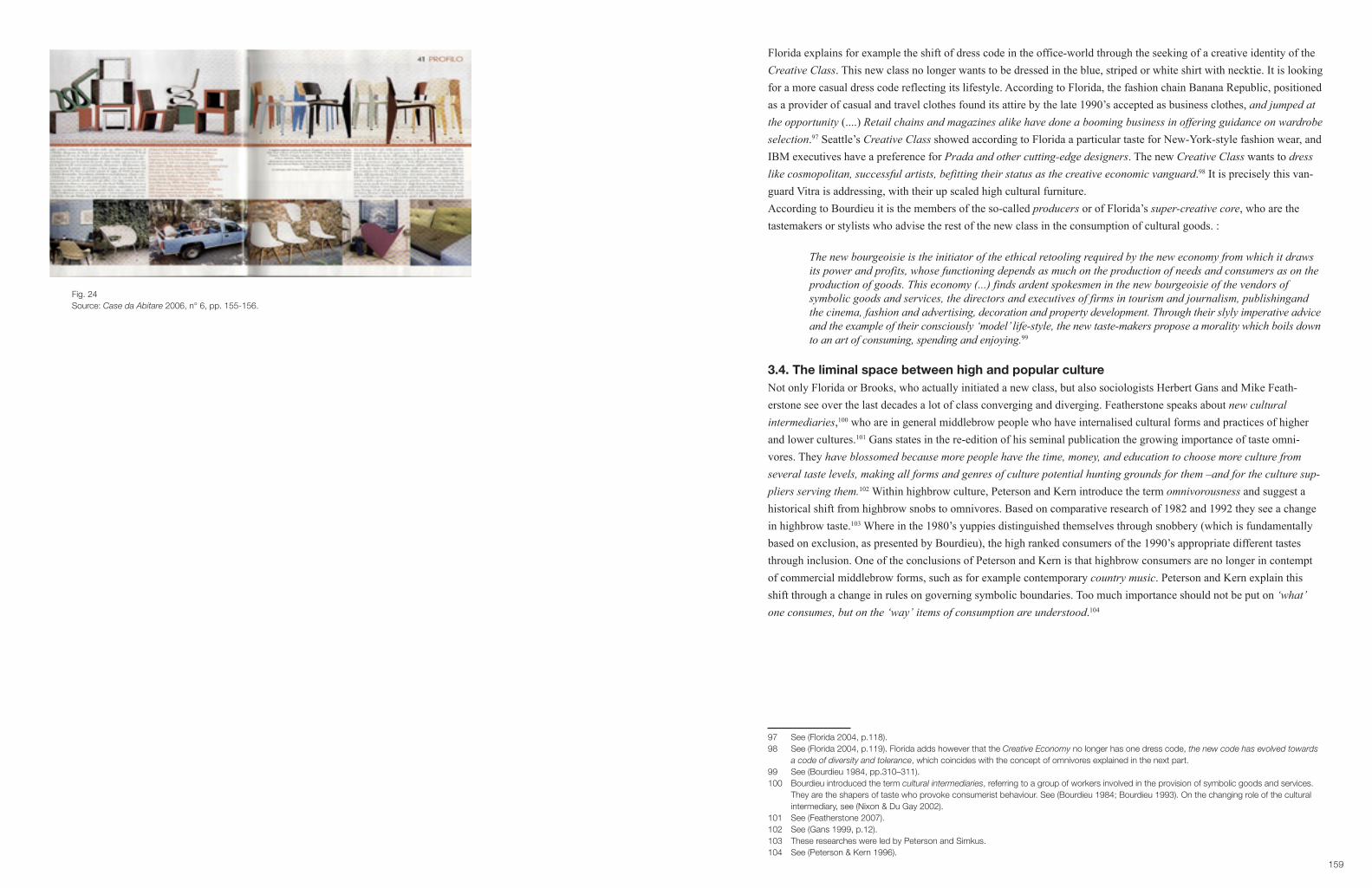
159
Florida explains for example the shift of dress code in the office-world through the seeking of a creative identity of the Creative Class. This new class no longer wants to be dressed in the blue, striped or white shirt with necktie. It is looking for a more casual dress code reflecting its lifestyle. According to Florida, the fashion chain Banana Republic, positioned as a provider of casual and travel clothes found its attire by the late 1990’s accepted as business clothes, and jumped at the opportunity (....) Retail chains and magazines alike have done a booming business in offering guidance on wardrobe selection.97 Seattle’s Creative Class showed according to Florida a particular taste for New-York-style fashion wear, and IBM executives have a preference for Prada and other cutting-edge designers. The new Creative Class wants to dress like cosmopolitan, successful artists, befitting their status as the creative economic vanguard.98 It is precisely this van-guard Vitra is addressing, with their up scaled high cultural furniture.According to Bourdieu it is the members of the so-called producers or of Florida’s super-creative core, who are the tastemakers or stylists who advise the rest of the new class in the consumption of cultural goods. :
The new bourgeoisie is the initiator of the ethical retooling required by the new economy from which it draws its power and profits, whose functioning depends as much on the production of needs and consumers as on the production of goods. This economy (...) finds ardent spokesmen in the new bourgeoisie of the vendors of symbolicgoodsandservices,thedirectorsandexecutivesoffirmsintourismandjournalism,publishingand the cinema, fashion and advertising, decoration and property development. Through their slyly imperative advice andtheexampleoftheirconsciously‘model’life-style,thenewtaste-makersproposeamoralitywhichboilsdown to an art of consuming, spending and enjoying.99
3.4. The liminal space between high and popular cultureNot only Florida or Brooks, who actually initiated a new class, but also sociologists Herbert Gans and Mike Feath-erstone see over the last decades a lot of class converging and diverging. Featherstone speaks about new cultural intermediaries,100 who are in general middlebrow people who have internalised cultural forms and practices of higher and lower cultures.101 Gans states in the re-edition of his seminal publication the growing importance of taste omni-vores. They have blossomed because more people have the time, money, and education to choose more culture from severaltastelevels,makingallformsandgenresofculturepotentialhuntinggroundsforthem–andfortheculturesup-pliers serving them.102 Within highbrow culture, Peterson and Kern introduce the term omnivorousness and suggest a historical shift from highbrow snobs to omnivores. Based on comparative research of 1982 and 1992 they see a change in highbrow taste.103 Where in the 1980’s yuppies distinguished themselves through snobbery (which is fundamentally based on exclusion, as presented by Bourdieu), the high ranked consumers of the 1990’s appropriate different tastes through inclusion. One of the conclusions of Peterson and Kern is that highbrow consumers are no longer in contempt of commercial middlebrow forms, such as for example contemporary country music. Peterson and Kern explain this shift through a change in rules on governing symbolic boundaries. Too much importance should not be put on ‘what’ one consumes, but on the ‘way’ items of consumption are understood.104
97 See (Florida 2004, p.118).98 See (Florida 2004, p.119). Florida adds however that the Creative Economy no longer has one dress code, the new code has evolved towards a code of diversity and tolerance, which coincides with the concept of omnivores explained in the next part.99 See (Bourdieu 1984, pp.310–311).100 Bourdieu introduced the term cultural intermediaries, referring to a group of workers involved in the provision of symbolic goods and services. They are the shapers of taste who provoke consumerist behaviour. See (Bourdieu 1984; Bourdieu 1993). On the changing role of the cultural intermediary, see (Nixon & Du Gay 2002).101 See (Featherstone 2007).102 See (Gans 1999, p.12).103 These researches were led by Peterson and Simkus.104 See (Peterson & Kern 1996).
Fig. 24Source: Case da Abitare 2006, n° 6, pp. 155-156.
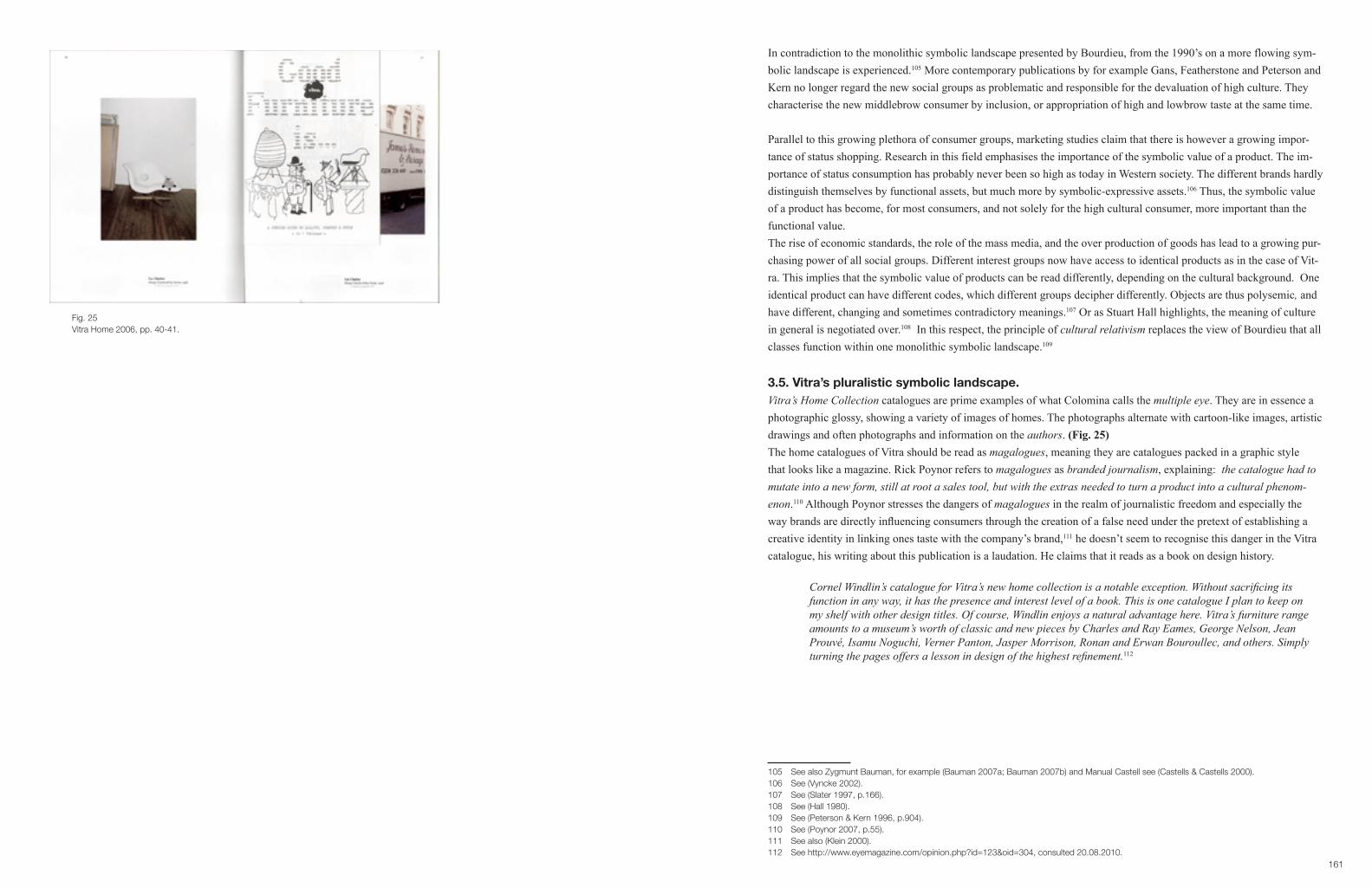
161
In contradiction to the monolithic symbolic landscape presented by Bourdieu, from the 1990’s on a more flowing sym-bolic landscape is experienced.105 More contemporary publications by for example Gans, Featherstone and Peterson and Kern no longer regard the new social groups as problematic and responsible for the devaluation of high culture. They characterise the new middlebrow consumer by inclusion, or appropriation of high and lowbrow taste at the same time.
Parallel to this growing plethora of consumer groups, marketing studies claim that there is however a growing impor-tance of status shopping. Research in this field emphasises the importance of the symbolic value of a product. The im-portance of status consumption has probably never been so high as today in Western society. The different brands hardly distinguish themselves by functional assets, but much more by symbolic-expressive assets.106 Thus, the symbolic value of a product has become, for most consumers, and not solely for the high cultural consumer, more important than the functional value. The rise of economic standards, the role of the mass media, and the over production of goods has lead to a growing pur-chasing power of all social groups. Different interest groups now have access to identical products as in the case of Vit-ra. This implies that the symbolic value of products can be read differently, depending on the cultural background. One identical product can have different codes, which different groups decipher differently. Objects are thus polysemic, and have different, changing and sometimes contradictory meanings.107 Or as Stuart Hall highlights, the meaning of culture in general is negotiated over.108 In this respect, the principle of cultural relativism replaces the view of Bourdieu that all classes function within one monolithic symbolic landscape.109
3.5. Vitra’s pluralistic symbolic landscape.Vitra’s Home Collection catalogues are prime examples of what Colomina calls the multiple eye. They are in essence a photographic glossy, showing a variety of images of homes. The photographs alternate with cartoon-like images, artistic drawings and often photographs and information on the authors. (Fig. 25)The home catalogues of Vitra should be read as magalogues, meaning they are catalogues packed in a graphic style that looks like a magazine. Rick Poynor refers to magalogues as branded journalism, explaining: the catalogue had to mutateintoanewform,stillatrootasalestool,butwiththeextrasneededtoturnaproductintoaculturalphenom-enon.110 Although Poynor stresses the dangers of magalogues in the realm of journalistic freedom and especially the way brands are directly influencing consumers through the creation of a false need under the pretext of establishing a creative identity in linking ones taste with the company’s brand,111 he doesn’t seem to recognise this danger in the Vitra catalogue, his writing about this publication is a laudation. He claims that it reads as a book on design history.
CornelWindlin’scatalogueforVitra’snewhomecollectionisanotableexception.Withoutsacrificingitsfunction in any way, it has the presence and interest level of a book. This is one catalogue I plan to keep on my shelf with other design titles. Of course, Windlin enjoys a natural advantage here. Vitra’s furniture range amounts to a museum’s worth of classic and new pieces by Charles and Ray Eames, George Nelson, Jean Prouvé, Isamu Noguchi, Verner Panton, Jasper Morrison, Ronan and Erwan Bouroullec, and others. Simply turningthepagesoffersalessonindesignofthehighestrefinement.112
105 See also Zygmunt Bauman, for example (Bauman 2007a; Bauman 2007b) and Manual Castell see (Castells & Castells 2000). 106 See (Vyncke 2002).107 See (Slater 1997, p.166).108 See (Hall 1980).109 See (Peterson & Kern 1996, p.904).110 See (Poynor 2007, p.55).111 See also (Klein 2000).112 See http://www.eyemagazine.com/opinion.php?id=123&oid=304, consulted 20.08.2010.
Fig. 25Vitra Home 2006, pp. 40-41.

163
The most surprising aspect of the Vitra catalogues is probably the lack of highly aestheticized, ‘design’ houses, as they have growingly been presented in the media from the 1990’s onwards. The Vitra products are mainly presented in homes, which look like real peoples homes and not like high-end showrooms.113 (Fig. 26, 27) Poynor comments:
Itstillcomesasasurprise,though,tofindthatVitrawantsitsimmaculatepiecestobeperceivedinsucha casual way. There is little sign of anything resembling ordinary life in most furniture catalogues. You see this so often that it is easy to assume there must actually be a caste of design hierophants that lives refusing to permit mess-makers under eighteen through the door.114
An interesting detail on the front and back cover of the Vitra Home Collection catalogue of 2005 is a full-page printed list of the names of the designers, photographers, stylists and graphic designers. (Fig. 28, 29) In doing so, Vitra states that all creative’s, who are working for Vitra have an equal cultural importance. In a small pre-catalogue of the Home Collection, headliners are added to enforce the message of individual creativity, linked to the collage design: The way we create and inhabit our personal environment is fundamental to our identity: our family, culture, education, our passion, dreams and even limitations.115 The whole concept happens to coincide perfectly with one of the major values of Florida’s Creative Class: The value of‘self-expression’,favouringtherightsofindividualstoexpressthemselves,116 and in general the rise of the creative industries117 with their creative knowledge workers who are seeking a highly individuated work- and lifestyle.118 In con-tradiction to Poynor’s statement, this strategy is from a marketing perspective no surprise.
With a strategy to attract the full spectrum of consumers, the catalogues must somehow attract a diverse public. There-fore Vitra is making use of the flow of meaning, or what Slater calls, the polysemic character of goods.119 Through the diverse visuals, different meanings are introduced, and different narratives suggest different readings. (Fig. 30-38)The magazine-like format makes it possible to insert different styles of photography and graphic design. The different styles can be read in different ways, but also the photographs in themselves can be decoded differently. Most of the images depict the Vitra furniture in a non-aesthetic venue, as products blending away in a non-bourgeois environment. Those images contradict the pure gaze representation typical for high cultural communication.120 What most people do not know is that these pictures have been taken by photographers with a high cultural capital. The focus is no longer on the artistic and symbolic value as status symbol or landmark, but rather on the functional object blend-ing into daily life. In some of the other images in the catalogue it takes time to even find the Vitra product. (Fig. 39) The furniture does not make an artistic, nor an iconographic impression. They are commodities of the everyday. Some of the images are photographed by Juergen Teller, and most of them are inspired by his way of working. (Fig.40, 41) His photography is known for an aesthetic that is deceptively casual and emotionally blunt.121
113 See also Case 6.114 See http://www.eyemagazine.com/opinion.php?id=123&oid=304, consulted 20.08.2010.115 See (Vitra 2004).116 See (Florida 2004, p.xxv).117 See (Gimeno Martinez 2006).118 See for example (McRobbie 2002).119 See (Slater 1997). See part II. Theoretical framework.120 See Case 1 and (Bourdieu 1984).121 His avant-garde work dates from the 1980’s, when he photographed the ‘Smells Like Teen Spirit’ album of Nirvana. During the late 1980’s and early 1990’s he worked for controversial magazines as I-D and The Face. Through his photography the grunge look was mediatised. Since the middle of the 1990’s he has photographed major-advertising campaigns from Yves St-Laurent to Calvin Klein. Today his work is represented by several art galleries and on show in several museums, see for example (Teller 2006), see also Case 6.
Fig. 26Source: Vitra Home 2006, pp. 36-37.
Fig. 27Source: Vitra Home 2007, p. 65.

165
Fig. 30Source: Vitra Home 2005, p. 6.
Different visual narratives generated by Vitra in their Home catalogue 2005. The Lounge Chair and Ottoman by Ray and Charles Eames.
Fig. 28Source: Vitra Home 2008, cover.
Fig. 29Source: Vitra Home 2008, back cover.

167
Fig. 31Source: Vitra Home 2005, p. 7.
Fig. 32Source: Vitra Home 2005, p. 20.

169
Fig. 33Source: Vitra Home 2005, p. 60..
Fig. 34Source:Vitra Home 2005, p. 71.

171
Fig. 35Source: Vitra Home 2005, p. 89.
Fig. 36Source: Vitra Home 2005, p. 95.

173
Fig. 37Source: Vitra Home 2005, p. 96..
Fig. 38Source: Vitra Home 2005, p. 97.

175
Fig. 39Vitra Cité Armchair by Jean Prouvé.Source: Vitra Home 2005, p. 72.
Fig. 40 Fotography Juergen Teller.Source: Vitra Home 2005, p. 39.
Fig. 41 Fotography Nick Haymes.Source: Vitra Home 2005, p. 36.

177
By using this kind of photography Vitra links itself up with the creative world of high fashion and art collectors. For those who do not have the ability to decipher this particular code, the photographs depicting the products in an everyday situation, create a direct link to any kind of consumer: from student, to art collector. Next to this kind of photography, a more commercial approach is taken. On the one hand there is a sort of mainstream of photos of simple modern homes, with a mainly white and blending surrounding. (Fig. 42, 43) Here the similarity with an IKEA catalogue is striking, especially the double page pack shots, which appear to be a copycat from the IKEA catalogue. (Fig. 44, 45) The only difference is the absence of a price tag.We can conclude that Vitra introduced a double coding as marketing strategy. The brand in general is represented as high cultural and commercial at the same time. Where most companies up- or downgrade through a new range of prod-ucts, with different marketing and branding strategies,122 Vitra tries to realise an up- & downgrading with one collection and one brand-image. The success of this new strategy can be explained by a growing plethora of consumer groups inherent to the liminal space between high and popular culture, and the resulting pluralistic symbolic landscape through which eachindividual is trying to create his identity.
3.6. A particular example of the flow of meaning: La Chaise, 1991The reason why Vitra chose to work with a new kind of aesthetic can also be explained as an aim to escape the pitfalls of their own success. La Chaise is an excellent example of a product with an unusual biography and contradicting sym-bolic meanings. By the end of the 1990’s it became a high status symbol, especially used by other companies in adver-tising campaigns. A trickle down effect of the Vitra brand was to be expected if no other strategy was adopted.
In 1948 the Eames office entered the ‘International Competition for Low-Cost Furniture Design’ initiated by MoMA, under the direction of Edgar J. Kaufmann, Jr.123 In collaboration with a research team of engineers from UCLA on fibreglass-reinforced plastic chairs, and Zenith Plastics of Gardena who had produced fibreglass-reinforced plastic radar domes during the war, the Eames office developed one of the first plastic chairs in one-piece, with a surface that was not upholstered. The aim of the Eameses was to strive for a chair that was cheap, lightweight, versatile, and suitable for young families.124 Within this context La Chaise was developed as an experiment, mainly designed by Ray as an exam-ple of the possibilities of the new material.125 (Fig. 46) Pat Kirkham states that the Eameses always stressed the fact that La Chaise is a work-in-progress, itdidnotpretendtoclearlyanticipatethevarietyofneedsitistofill…needs…asyetindefinite.126 However, the Eames publication by the Vitra Design museum, in collaboration with the Library of Con-gress does not present La Chaise in this way, on the contrary it is described as an artwork by the hand of Ray. One and a half pages are dedicated to the artistic skills of Ray, finalized with a quote by Mercedes Matter: Charles was not a very originaldesigner.Raywascertainlytheartist–hercontributionswereeverywhere.Shewasthemostextremelytalentedpainter, and he used that talent in whatever they did.127
122 Louis Vuitton for example, under the art direction of Marc Jacobs, who collaborates with artists upgraded a new range of products, see (Coles 2005). Prada on the other hand, launched in 1996 a sports collection as a downgrading strategy, see (Parrider 1999).123 See (J. Neuhart e.a. 1989, p.97).124 See (Albrecht 1997, p.86).125 See (Kirkham 1995, p.234).126 See (Kirkham 1995, p.234).127 See (Albrecht 1997, p.64).
Fig. 42Source: Vitra Home 2005, p. 5.
Fig. 43Source: IKEA catalogue 2004, p. 82.
Fig. 44Source: Vitra Home 2004, p. 16.
Fig. 45Source: IKEA catalogue 2004, p. 89.

179
The same publication stresses the fact that La Chaise is named after a Gaston Lachaise model, without mentioning that only afteritwasmade,itoccurredtotheEamesesthataGastonLachaisefloatingfiguresculpturecouldjustaboutfitin it.128 Both narratives are completely in tune with the artistic status Vitra introduces in its 1996 catalogue, but deviate from Pat Kirkham’s historical research and of Ray Eames’, John and Marilyn Neuhart ‘s testimony as contemporary witnesses.129 (Fig. 47)Even though MoMA bought La Chaise for its collection, the Eames’ office never brought the chair into production, as it was impossible to produce at a moderate price.130 The Eameses strongly believed that the modern industries’ aim ought to be: the most of the best to the greatest number of people for the least,131 and followed in this sense the basic aim of the MoMA competition.In 1991 Vitra brought La Chaise into production.132 By the end of the 1990s La Chaise and many other designs of Charles and Ray Eames were largely exposed in the media as stylistic objects in a museum like setting, rather than com-fortable chairs to sit in. (Fig. 48, 49) La Chaise mostly presented in a minimal white surrounding, very similar to the aestheticized representation of the Modern Ideal in the 1950s Knoll showrooms and publications, became very much en vogue, completely in tune with the minimalism fashion of the mid 1990’s.133 In many lifestyle magazines La Chaise be-came by the end of the 1990s a landmark of post-war modernism, with a very high status value. (Fig. 50) Exactly what the Eameses did not want and why they therefore explicitly decided not to work with Knoll.Although the media bought into the artistic status of the Eames products, in an interview with Rolf Fehlbaum in 2000, Vitra rejects that particular symbolic value.
LaChaiseisanextraordinaryobject.Itwasdesignedin1948withtheaimtobecomea popularseat.How evertheproductionprocessturnedouttobetooexpensivetobringtheproductforareasonablepriceonthe market. But we shouldn’t consider it a design failure; it is a most beautiful piece. The prototype found its way to MoMA, where it became some sort of a myth. That is why, in the 1980’s when Ray was still alive, I proposed to produce La Chaise. It is still a handmade sculpture and a replica of the original on show in the museum in New York. AlthoughLaChaiseisextremelyexpensive,ithasbecomeatruecultobject.Itoftenhappensthatthemost expensivethingsreceivethemostattention.Andinthatsensetheyarepartlyafailure,becausethewholeidea of design is to make affordable good products. Sometimes, though, a product leads a life of its own.134
First of all, Fehlbaum declares that the chair already became a myth the moment it was bought by MoMA, secondly he points out that other factors than Vitra’s marketing strategy led to a symbolic meaning of status and luxury, and under-pins that this is not the aim of Vitra, although he still considers it as a sculpture, rather than a chair. However, by 2004, with the launch of the Vitra Home Collection, La Chaise is more and more depicted as a seat rather than a sculpture.Through an intertwining of dynamics between the producer, the media and producers of other products linking them-selves with the high cultural value of Eames, a flow of meanings resulted. Since 1997 an ongoing exhibition, made by Vitra on the work of Eames, started travelling around the world. The attention on the products of Eames has since in all sorts of popular decoration magazines increased and is still very much present. As explained before, in focussing on high cultural themes, the magazines increase their own credit.135 Of all the Eames products La Chaise is obviously the most sculptural and the most expensive, two decisive elements in status growth.
128 See (J. Neuhart e.a. 1989, p.99).129 See (J. Neuhart e.a. 1989).130 See (Kirkham 1995, p.234).131 James H. Billington quotes Charles and Ray Eames in his foreword, see (Albrecht 1997, p.6).132 See (Albrecht 1997, p.89).133 See also Case 6.134 See (Bouchez 2000).135 See (Bourdieu 1984, p.232).
Fig 46The making of La Chaise.Source: Demetrios,2001, p. 45.
Fig 47Source: Vitra 1996, pp. 44-45.

181
Besides the media attention, La Chaise (and many other Vitra products) was in analogy to some of the Alessi products used in advertising campaigns, which make use of the authority of the Vitra product as a marker of high culture and thus distinguished taste.136 (Fig. 51-53)
In the 2005 Vitra catalogue, La Chaise is depicted in a very controversial way. (Fig. 54) The image looks like snapshots taken by an amateur. The light is not well balanced, and the picture is not horizontal. The explicit free-floating form of the chair dissolves into the white background. The cardboard boxes against the wall refer to a storage room, and finally the toy on La Chaise gives the impression that the picture was taken by someone who doesn’t care much about the value of this piece of furniture and let his kids play in it. La Chaise is clearly depicted in a surrounding that has not been styled. Again, this picture is taken by Juergen Teller and as explained before accounts for a high cultural value for the connoisseurs. For the rest of the world it looks as if this pictures and others after 2005 emphasize the original aim of Ray and Charles Eames: the most of the best to the greatest number of people for the least.137 (Fig. 55) In this sense we could conclude that this historical design experiment became first an icon, to be today presented as a commodity.
4. Vitra Campus
(…) Moved by Fehlbaum’s sense of curiosity about design, a curiosity and enthusiasm that go far beyond the boundaries of his own company’s output, Vitra has created one of the most remarkable collections of twentieth- century design anywhere. Much more than a corporate museum, it offers a perspective about what design can be in the contemporary world,138
writes Deyan Sudjic, director of the London Design Museum in the Birkhauser publication on Vitra. (Fig. 56) In coher-ence with the rest of the book, his text praises Fehlbaum in particular, and Vitra in general as patrons of the arts, who safeguard and celebrate the design heritage. In his writing, Sudjic situates Vitra between the most important design museums in the world, such as the Victoria &Albert Museum, MoMA, the Cooper Hewitt National Design Museum, … (Fig. 57)
In 1989 the first Frank O. Gehry buiding in Europe opened at the Vitra Campus in Weil am Rhein, as the Vitra Design Museum. (Fig. 58) It hosts the private collection of Rolf Fehlbaum,139 and the collection of museum director Alexander von Vegesack140 and has been over the years collecting original pieces, but also parts of archives of designers.141 Besides collecting, the museum has successfully been creating exhibitions, which travel around the world. It needs no explana-tion that these travelling exhibitions, which are extensively covered by the press worldwide, are ideal brand promotions.142 Although many of the exhibitions are not directly related to the Vitra products, the travelling shows established a brand awareness of high culture and promote Vitra as a cultural agent rather than a commercial producer of designgoods.
136 See (Bourdieu 1984, p.577).137 See for example (Kirkham 1995).138 See (Sudjic 2008).139 Who started collecting in the early 1980’s. See (Windlin & Fehlbaum 2008, p.299).140 Von Vegesack started his collection in the 1960’s. See (Windlin & Fehlbaum 2008, p.299).141 In 1989 the collection counted 1000 objects, by 2008 there were about 6000 pieces. The museum holds parts of the Eameses’ estate, the George Nelson office, the Panton estate, patents and correspondence of Anton Lorenz, artefacts and documents collected by Alexander Girard, correspondence and photographs by Harry Bertoia, the Barragan Foundation. See (Windlin & Fehlbaum 2008, pp.305–310).142 See Case 4.
Fig. 48Interior report.Source: Weekend Knack 2001, n° 7, p. 46.
Fig. 49Interior report.Source: Weekend Knack 2002, n° 16, p. 56.
Fig. 50La Chaise amongst other high valueable objects in an article on the homes of a Dutch photographers couple in the luxury magazine ‘Hide & Chic’.Souce: Hide & Chic 2006, pp. 212-213.

183
Nicky Ryan researched the branding strategy of the Guggenheim Foundation, introduced by CEO Thomas Kern as a museum without walls.143 The concept is to liberate the museum from the confines of architecture and place and insti-gate the idea of the museum as a networkofculturaldialogue,culturaldiscourseandculturalexchange. An important strategy in this network of cultural flow is according to Ryan the creation of travelling blockbuster shows, which garner publicity,attractglobalaudiencesandgeneratesignificantrevenuefromticketandmerchandisesales.144 Vitra’s strat-egy can very much be compared to the Guggenheim approach. Through ongoing road shows, Vitra has become much more than a small museum on the border between Germany and Switzerland. It is a major creator of high cultural mean-ing, and probably more well-known than any other design museum. (Fig. 59) It has become a network of cultural infu-sion towards a constant growing public. Herbert Gans points out that since boundaries between subgroups of the middle class are easily crossed, museums put on exhibitions that attract the large lower middle class, through more apprehensible shows.145 Many of the exhibitions are on show outside the classical design-museum circuit, reaching an even larger public.146
Vitra exhibitions are prime examples of easily apprehensible shows. They mainly focus on monographs of start-design-ers. No extensive discourse is needed to grasp the work of designers as Panton, Eames, Breuer,… in contradiction to most art pieces, the chairs of these designers speak for themselves. One does not need to be initiated in art history to be attracted to a functional chair. The shows do not take any critical positions, nor do they look into deeper levels of under-standing design. The exhibitions are mainly historical accounts of the life of a genius. Adding to the Pevsner approach and literately rewriting history for the company’s sake.147 By stressing the designer genius throughout the narrative in-herent to the marketing messages as through the museum approach, Vitra adds to what Jameson refers to as the weaken-ing of historicity.148 Design history is reduced to series of malleable signs,149 independent of the material history and the specific narratives of the period in which they were designed. By staging certain designers within the aura of the high cultural museum, Vitra is creating new positional goods, which are happily mediatised by the lifestyle media.150 The icons become distinctive historically authorised symbols, with a high market value. As Williams claims that Vitra created an Eames mania,151 the travelling exhibition of Verner Panton led to a similar hype. (Fig. 60) The Panton chair has probably become the most iconic hip design piece in the Flemish public space. From trendy bars, hip hair-saloons to the Sunday morning newsroom on national TV. Because the objects on display in the white museum-rooms are often the same as the ones for sale in the museum-shop, the consumer when buying a Vitra product experiences it as buying a museum piece. Next to the re-editions the com-pany created a collection of miniature classics of the most iconic chairs, which are not for sale in their own Vitra collec-tion, thus directly supplying the museum consumer with a symbol of cultural power to take home.152
143 See (Ryan 2008, p.485).144 See (Ryan 2008, p.488).145 See (Gans 1999, p.151). See also (Heskett 2002, p.47). From 2005-2008 the Design museum Gent had more visitors than the city museum for contemporary art (SMAK), see (Timmerman & Van Ingelgom 2009, p.6). 146 For example the exhibtion Hidden Heroes: The Genious of Everyday Things was from 2011 on show in Designhuis, Eindhoven, Netherlands, Gelbes Haus Flims, Switzerland, Science Museum, London, Great Britain, MIT Museum, Cambridge, USA, see http://www.design-museum.de/ museum/ausstellungen/helden/index.php, consulted 31.07.2001.147 As Willams puts it: In many ways Vitra has changed public taste too. See (Williams 2006, p.9).148 Jameson states that postmodern culture is characterised by this weakening of historicity, see (Jameson 1991, p.6). See also Julier, who explicitly refers to Vitra in this problematic approach towards design history, (Julier 2008, p.49). There is a clear parallel with the findings of Alessi and Bourdieu’s concept of cultural allodoxia. See (Bourdieu 1984, p.323) and Case 1.149 This is a term borrowed from Lisa Taylor. In this paper she looks into the role of lifestyle magazines in flattening out the history of garden design. See (Taylor 2005, pp.122–126).150 See Case 4.151 See (Williams 2006).152 By 2011 there are 75 miniatures in the collection, price ranging between 29 euro for the Bouroullec’s Vegetal and 484 euro for Nelson’s Marshmallow. http://www.design-museum.com/Miniatures-Collection, consulted 31.07.2011. On the success of museum shops see also (Brouns 2007).
Fig. 51Advertising in ‘Weekend Knack’.Source: Weekend Knack 2003, n° 41, p. 197.
Fig. 52Advertising in ‘Weekend Knack’.Source: Weekend Knack 2004, n° 6, back cover.
Fig. 53Advertising in ‘Weekend Knack’.Source: Weekend Knack 2004, n° 11, p. 17.
Fig. 54La Chaise photographed by Juergen Teller.Source: Vitra Home 2005, p. 40.

185
Fig. 55Charles & Ray Eames collection.Source: Windlin & Fehlbaum 2008, pp. 66-67.
Fig. 56Source: Windlin & Fehlbaum 2008, cover.
Fig. 57Source: Windlin & Fehlbaum 2008, p. 225.
Fig. 58Vitra museumSource: Windlin & Fehlbaum 2008, p. 37.
Fig. 59This article starts with: The furniture collection of the Vitra Design Museum is considered as one of the most important of the world.Source: Weekend Knack 2001, n° 7, p. 8.
Fig. 60Tessa Vermeiren, editor in chief of ‘Weekend Knack’ poses in a Vitra, Panton chair for her weekly column.Source: Weekend Knack 2003, n° 39, p. 7.

187
(Fig. 61, 62) In this sense, Vitra seems to educate the public at both ends of the production/consumption spectrum, with one single purpose: to develop distinctive goods, to help people recognize these goods and finally to sell every year more of these distinctive icons.Barbara Usherwood looked into the network of funding of the London Design Museum and the role of Sir Terence Con-ran as a one of the major funders of the museum. She rightly questions:
To what degree is the museum being used to legitimate the buying of goods and services from Conran’s commercial venues? References are made to Habitat and its wares throughout the museum: chairs in the study collection,fabricsinthefirsttemporaryexhibition,andaHabitatcarrierbaginoneofthevideos.153
Her paper is critical of the way commerce and culture (which was also the name of the first exhibition of the museum) intertwines, within the realm of design museums in general and the consequent blurring of the distinction between the cultural institution and the commercial world. Especially when today in most cases, the museum shops have become more important than the museum; one can wonder what the real aim of cultural institutions is today.154
On the fact that Vitra has been involved in and has benefitted from this evolution, Fehlbaum answers thus:
Personally, I think that in business you always have to combine your direct interest with general interest. But we also found that it is much better to sponsor yourself, i.e. the Vitra Design Museum, than somebody else. After all, when you sponsor yourself, you at least know where the money is going; also, you have your own expertise,andyou’recommittedtosomethingthatyouunderstandsothatyouunderstandyourselfbetterintheend. Another advantage is that the Vitra Design Museum is located on our own site. When you are confronted with the history of design or with the greatness of design each and every day, and also see all these visitors coming to your museum, you feel a tremendous sense of mission for your own work, and strongly identify with the place that you’re working at and the work that you do.155
The museum is situated on the Vitra Campus, a few kilometres from the company’s headquarters in Bale. (Fig. 63) Part of the Vitra factory located just over the Swiss-German border was majorly damaged after a large fire, in 1981. Nicolas Grimshaw was asked to design a new factory building and to think of a corporate image for other buildings on the site. In 1984 Rolf Fehlbaum commissioned a sculpture from Claes Oldenburg and Coosje van Bruggen for Willi Fehlbaum’s birthday. According to the company history, this triggered the whole concept of a unifying corporate iden-tity architecture and made Fehlbaum decide to ask different star-architects for different buildings. This lead to the fact that the design museum was not only worth a visit for design lovers, but especially the much larger architecture crowd of the early 1990’s was attracted to this ‘architecture park’ with buildings by Frank O. Gehry,156 Tadao Ando,157 Zaha Hadid,158 Alvaro Siza, Buckminster Fuller, Jean Prouvé, Antonio Citterio, Nicolas Grimshaw and since February 2010 the VitraHaus,159 by Herzog & de Meuron.160 (Fig. 64) No wonder, then, that the company grounds have emerged as a Mecca for architecture lovers from all over the world in the past one and a half decades,161 one reads on Vitra’s website, promoting guided architectural tours on the campus.
153 See (Usherwood 1995, p.259).154 See for example (Chung e.a. 2001; Cummings & Lewandowska 2000; Lai 2008). See also on the promotion of museum shops worldwide an article of 10 pages in the Weekend Knack of 2007. Five different lifestyle journalists inform the readers about their favourite museum shop, worldwide (Brouns 2007).155 (Fehlbaum 1992, p.34).156 This was the first European building of Ghery. http://www.design-museum.de/museum/weil/fuehrung/index.php, consulted on 01.08.2011.157 This is Ando’s first building in Europe. http://www.design-museum.de/museum/weil/fuehrung/index.php, consulted on 01.08.2011.158 This was Hadid’s first comission. http://www.design-museum.de/museum/weil/fuehrung/index.php, consulted on 01.08.2011.159 This building is a huge showroom and Vitra flagship store.160 According to Williams, This was the period in which furniture design came out of the shadow of architecture, and began to be treated with the same seriousness as art. See (Williams 2006, p.9).161 http://www.design-museum.de/museum/weil/fuehrung/index.php, consulted on 01.08.2011.
Fig. 61Vitra miniature collection.Source: Weekend Knack 1995, n° 4, p. 97.
Fig. 62Vitra miniature collection.Source: Weekend Knack 2001, n° 42, p. 10.
Fig. 63 Vitra campus.Source: Vitra Home 2007-2008, pp. 186-187.

189
The up- and downgrading strategy is not limited to the way the products are being branded in the catalogues. Since the launch of the Vitra Home Collection, Vitra has continued not only to invest in high culture, but also to almost seam-lessly intertwine culture and commerce. The huge VitraHaus, which is a super-showroom and flagship store on the high-cultural campus is an excellent example. Their recent collaboration with the popular jeans brand G-star is another example: several designs by Jean Prouvé have been re-edited by G-star in collaboration with Vitra.162 (Fig. 65, 66)On the other hand, Vitra is aware of criticism of their way of working. When the Maarten Van Severen Foundation or-ganised an exhibition on the creation of the .03 chair, produced by Vitra, Rolf Fehlbaum collaborated with the family in lending archive pieces, molds and prototypes, but didn’t consider the exhibition suitable for the museum, because the focus of the exhibition was too much on the creation of a Vitra product.163 Vitra is cautious of promoting its own busi-ness too directly. Although it is obvious that the patronage narrative has lead to a gigantic economic success, after 22 years since the opening of the museum the design patronage is still praised as such and Vitra has not yet been associated with the other commercial design companies. Somehow, they seem to continue to be able to surprise the omnivorous, super creative BoBo on the one hand and on the other, to create commodity icons recognized by and affordable for the world’s grow-ing middleclass. As a furniture company they have been successfully working in the liminal space between culture and commerce, and have become one of the largest private creators and patrons of both high and apprehensible culture.164 In this role, they have no doubt influenced the generative meaning of design as will be shown in Case 5.
5. Conclusion Vitra has repositioned itself over the past 30 years from an office furniture company to a patron of high design. In it’s branding strategy Vitra emphasised the high-cultural role of its designers and injected the essentially practical and democratic furniture of Eames and others with an iconic high-status value. Due to what Bourdieu calls a production of belief, the media eagerly published Vitra products, which lead to an Eames-mania. Consequently, through an up- and downgrading Vitra found a means to cater to a large variety of consumers and levelled the ground for design to become more popular and especially to be understood within the realms of high culture. The next case, the German furniture manufacturer TECTA, shows how a seemingly similar marketing approach does not necessarily lead to popularisation of products, because the most essential element in the dynamic between producer and consumer: media-coverage is absent.
162 See Raw magazine, 05/03/2011. This is a commercial magazine, which was added to the weekend newspapers of De Morgen and De Standaard in the weekend of 5-6 of March 2011. 163 De stoel .03 van Maarten Van Severen, De geboorte van een designicoon, Design museum Gent, 20.11.2010 - 27.02.2011. See http://www.maartenvanseveren.be/MVS_tentoonstellingen_NL.html consulted 08.08.2011.164 There are many other examples of brands operating in this liminal space, especially within fashion or luxury products, for example Banana Republic, see (Florida 2004). Or Louis Vuitton see for example (Coles 2005).
Fig. 64VitraHause by Herzog & de Meuron.Source: Windlin & Fehlbaum 2008, p. 221.
Fig. 65Jean Prouvé by G-star RAW for Vitra.Source: RAW Magazine 2011, n° 5, p. 8.
Fig. 66Jean Prouvé by G-star RAW for Vitra,Source: RAW Magazine 2011, n° 5, p. 11.

191
CASE 3
TECTA: DESIGN IS GARBAGE
1. Introduction.In addition to the previous two cases on design manufacturers, this case looks into the German design company TEC-TA. In its methodology, this research is different than the other two and must be read as a participant-observer project.1 It is based on a three-day visit along with a photographer, with the aim to make, as free-lance journalists, a photo report on the company TECTA and the private home of its owner, Axel Bruchhäuser.2 The arrangements for the interview were made with Bruchhäuser’s nephew and assistant. However when we arrived at the factory we were declined by Axel Bruchhäuser, insisting he did not want to talk to any journalists. The fact that his company would make an interesting case for PhD research on the role of producers and media in the commodification of design, made him willing to col-laborate. During the visit we had free access to the archives, the factory grounds and his private home. Copies of press releases and all company publications were given to us.It is not the aim of this case-study to bring a complete account of the company’s history and branding strategy, rather to understand why in contradiction to Alessi and Vitra, TECTA, who uses very similar methods (such as historical re-issues, working with external art-directors and a design museum on the company grounds) did not receive as much me-dia attention in the researched Flemish magazine ‘Weekend Knack’. In contradiction to Alessi and Vitra, TECTA is not at all well-known in the Flemish media.3 The case study on ‘Weekend Knack’ shows that in only three articles TECTA is mentioned along the sides.4 It is therefore an interesting case to see how it differs with Alessi or Vitra in its branding and mediating.
2. Rewriting historyThe furniture company TECTA, located in Lauenförde, was bought in 1972 by Axel Bruchhäuser and his father who, a couple of months earlier had fled from Eastern Germany, where they had been running a furniture company. 5 (Fig. 1) Axel Bruchhäuser had already designed his first chair in 1958 and had a tremendous love for the Bauhaus designs, which led to his search for several of the Bauhaus masters and his quest to produce some of their first designs.To the present day, the company profiles itself as a producer of Bauhaus and other modernist products, which were never industrially made. (Fig. 2) In a company publication we read TECTA is now realising what the Bauhaus masters waitedforinvain.Manyofthefurnituredesignsoftheinternationalavantgardeofthe1920s,forexampleBreuer’sglasscaseandGropius’FagusFactoryarmchair,havebeenproducedbymachineforthefirsttimebyTECTA(…).6 (Fig. 3)In 1983, at the peak of re-editions worldwide,7 TECTA positioned itself next to Cassina in Italy and Knoll in The United States in fulfilling a similar function in Germany: the re-editing of historical pieces.8 Throughout the company books the idealism of Axel Bruchhäuser in wanting to manufacture furniture that had been designed, but no longer existed is obvi-ous. See for example:
1 In particular the anthropologist Irene Cieraad stressed the importance of adding personal experiences as a journalist to this PhD. Conversation 21.11.2008 as a member of the jury of a presented paper at the JDS.2 The Hexenhaus by Alison and Peter Smithson.3 According to TECTA agent for Benelux, Ton J. de Geus the Flemish media is hardly covering the products of TECTA. Telephonic interview, 12.01.2012.4 Over the 10 years that I worked full-time as a design journalist for ‘Standaard Magazine’ and ‘Financieel Economische Tijd’, not one press release of TECTA was sent to me. 5 See (Schmiegelow Powell 2003, pp.3-4).6 See (Wewerka 1983, p.9).7 See for example (Woodham 1997, p.159; Cacciola 2008).8 See for example (Wewerka 1983, p.9).
Fig. 1Source: Schmiegelow Powell 2003, p. 1.
Fig. 2Source: Schmiegelow Powell 2003, p. 7.
Fig. 3TECTA, Bench by Walter Gropius, 1910.Source: Wewerka 1983, p. 16.

193
AtthebuildingexhibitioninBerlinin1931MarcelBreuershowedinthe“70squaremeterapartment”a tubularsteelsofawithlooselyquiltedcushions.Ofthefurnitureattheexhibition,onlythesofahassurvived inaphotograph.WithagraphiccomputerTECTAcalculateditsexactdimensionsandreproducedit.9
FortheexhibitionattheStateBauhausinWeimar,MarcelBreuerdevelopedin1925thisglasscabinetoftwo square cases with a black and white lacquered wooden frame. Since only this picture of the original has survived,theexactdimensionshadtobedeterminedwiththehelpofacomputerreconstructiondrawingbefore the cabinet could be reproduced.10
Throughout the company visit, the interviews and informal talks, Bruchhäuser emphasises his role as a saviour of his-torical pieces, and stresses the fact that his company really invests in the true wishes of the designers. Throughout his career it has been very important for him to have a personal contact with the designers. In the case of Mart Stam for instance, Bruchhäuser searched, according to his own account, for four years to find the designer totally isolated in a Swiss forest. His search for the widow of El Lissitzky, was a similarly hard task. He found her in questionable condi-tions in a housing estate in Siberia. In most company publications, personal letters of the Bauhaus masters addressed to TECTA illustrate Bruchhäuser’s personal quest in realising the one and only true historical masterpiece. (Fig. 4) Of Mies van der Rohe for example TECTA manufactures the first cantilever chairs seen on a picture of the Silk exhibit, Exposition de la Mode, Berlin 1927.11 (Fig. 5) The reconstruction was made through the intermediation of Mies’s assistant Sergius Ruegenberg and dates from 1926, thus from before the Tugendhat chairs of 1930, which are produced by Knoll.12 In Der Kragstuhl catalogue 12 pages are reserved for the designs by Mies. The main narrative is not the mystification of the architect, but the design process with a focus on the influences of historical figures such as Schinkel and the contem-poraries such as Mart Stam or Le Corbusier.13 (Fig. 6)
The company history and the direct and indirect communication read as a struggle against injustices. Bruchhäuser has dedicated his life to fighting against mediagenetic and spectacular design, which is according to him, mainly driven by temporary fashions and trends in a capitalistic framework. For most contemporary design companies design is cosmet-ics TECTA’s director claims.Although Cassina was in a TECTA publication of 1983 quoted as exemplary,14 by 2008 Bruchhäuser considers it a des-picable company which uses re-issues purely as a means to catch the attention of the media; a practice TECTA dissoci-ates itself from totally.Vitra is another company, which is aimed at. Especially the Panton chair, one of Vitra’s major successes, which is for Bruchhäuser one of the biggest lies of design history. For the German producer it is obviously a copy of the Aagaard Andersen design of 1953.15 (Fig. 7) Bruchhäuser has however, other reasons to dislike Vitra. In 2000 The Prouvé family ended their twenty year contract with TECTA and sold the rights to reproduce most of the Prouvé furniture to Vitra.16
9 See (Wewerka 1983, p.34).10 See (Wewerka 1983, p.35).11 See (Bruchhäuser 1998, pp.48-53).12 Knoll has been manufacturing these chairs since 1948, but never with a wicker seating. See for example (Rouland 2005; Schiffer 2006). Tugendhat house was designed in 1928 and built between 1929-1930. See http://www.tugendhat.eu/en/ consulted on 05.01.2012.13 See (Bruchhäuser 1998, pp.48-59).14 See (Wewerka 1983, p.72).15 See (Bruchhäuser 1998, p.16; TECTA 2007).16 In 1981 the first Prouvé pieces were re-issued. See (Sulzer 2008, p.24; Wewerka 1983, pp.102-103). In 2000 Vitra acquired the exclusive rights from the Prouvé family, 16 years after the death of Jean Prouvé. See (Vitra 2002, p.8). Most of Prouvé’s personal archive is still owned by TECTA.
Fig. 4Letter by the widow of El Lissitzky.Source: Wewerka 1983, p. 21.
Fig. 5Silk exhibit, 1927.Source: Bruchhäuser 1998, p. 49.
Fig. 6Mies van der Rohe, wickerwork by Lilly Reich, 1927.Source: Bruchhäuser 1998, p. 51.

195
In his quest to do design history right, in 1982 Bruchhäuser opened the Stuhlmuseum in the nearby village Beverungen, based on his private collection of chairs.17 In 2003 the museum moved to a new building, designed by Peter and Alison Smithson on the company grounds. The collection has some unique pieces, which underline Bruchhäuser’s personal quest, such as for example the Andersen chair. (Fig. 8) He also has some Junker pieces and several archive documents to prove that his version, the D4of the Wassily chair of Marcel Breuer, is the most original.18 There is a large collection of original Prouvé furniture that is no longer in production, to exemplify the gaps in the Vitra collection. Next to those and many more historical design pieces of the nineteenth and mainly twentieth century, the museum has an interesting collection of anonymous chairs.
Throughout the two days of visiting and photographing the factory grounds and Bruchhäuser’s private home, criticism of design companies and the design discourse in general becomes the overtone.On the work of for example Ettore Sottsass, Bruchhaüser is clear: the designs are idiotic and mean nothing in the course of history. Also designers of today, for example. the Bouroullecs,19 of whom he accidentally has an article on his desk, are no good. Only the modernist masters, plus Stefan Wewerka and the Smithsons of whom he has designs in his collec-tion, are of any good.The meaning of the words Design ist Muhe, by which Bruchhäuser had welcomed us, becomes more and more clear.20
3. The art-directorsBy the early 1980’s Bruchhäuser met Stefan Wewerka and decided to produce some of his works. He also started work-ing with Wewerka as an external art-director for the company.21 Through the introduction of Wewerka, TECTA participated in the postmodern debate of that period. (Fig. 9) Wewerka was an ideal figure because he positioned himself between Bauhaus and postmodernism, he translated the language of the Bauhaus into a postwar idiom.22
In 1982 Wewerka designed a glass pavilion on the industrial site for the opening of Documenta 7 in Kassel.23 It was the first of a conglomerate of pavilions and buildings on the company grounds, which Bruchhäusers likes to call an industri-al garden, in reference to Schinkel. (Fig. 10) The parallels with Vitra’s factory grounds in Weil am Rhein is evident.24 A striking difference however is the openness of the area in Lauenförde. No gates, no entry fees, just a seemingly endless green field with a few, mainly glass buildings on it.
Through Wewerka, Bruchhäuser meets the British architects Peter and Alison Smithson, with whom he starts a long-term collaboration; which started with re-issuing the Trundling Turk sofa and the assignment to design his private home, the notorious Hexenhaus, built between 1984-2002. (Fig. 11)From an architectural point of view, Bruchhäuser was an important commissioner of the Smithson’s work and played a substantial role in their oeuvre.
17 See for example in de museum catalogue, Der hinterbeinlose Stuhl als Object der Justiz (Bruchhäuser 1998, pp.116-129).18 On the history of the re-edition of the Gavina/Knoll Wassily chair and the role of TECTA in the production of the D4, see (Cacciola 2003, pp.57-197). 19 The Bouroullecs have designed a complete office range for Vitra.20 Design is garbage. See also an article by David Galloway, Taking “the garbage” out of Design, printed in the Wewerka publication of 1983. In this article the author states that Wewerka begins his art and design classes with these words, see (Wewerka 1983, pp.102-103). 21 Wewerka and the Smithsons were both members of Team X, see for example (van den Heuvel & Risselada 2004; Wewerka 1983, p.57). The position of these designers, is comparable with the role of Alessandro Mendini for Alessi, see Case 1.22 See an article by David Galloway (1982), in (Wewerka 1983, p.103).23 During the meeting, Bruchhäuser stressed a few times that the Documenta grounds in Kassel are very near. He believed that visitors for Documenta would easily make a stop at his museum and company. However Lauenförde is 42 km from Kassel. 24 The Frank O. Gehry building on the Vitra Campus, opened in 1989. Another point of frustration for Bruchhäuser, as he feels that Vitra copied his idea, plus moved its terrain from Switzerland to Germany.
Fig. 7Aagaard Andersen versus Verner Panton.Source: Bruchhäuser 1998, pp.18-19.
Fig. 8 Leaflet Kragstuhlmuseum-recto.Source: TECTA archive.

197
AspecialseriesofinterventionswascommissionedbyAxelBruchhäuser,directorofthefurniturecompany TECTA. From the mid-1980s onward, Alison and Peter Smithson were given the opportunity to continually realisebothlargeandsmallinterventionstoboththefactoryandBruchhäuser’sownhouse.Thelatterranged fromporchesandbaywindowstothe‘Hexenbesenraum’pavilion.AfterAlisonSmithsondiedin1993Peter continuedworkingwithBruchhäuser,furtherelaboratingthisseriesbyaddingmoreinterventionsplustwo pavilions: the Tea Pavilion and the Lantern Pavilion. When Peter Smithson died he was still working on the museumforBruchhäuser’sextensivecollectionoffurniture,mostlychairs.25
The museum opened in 2003 and was the last building to be opened for the public on the factory grounds. The Smith-sons also transformed certain parts of the original factory building. All of their interventions were linked through what they referred to as the lattice idea, which led in the late 1990s to their design of lattice furniture.26 (Fig. 12, 13)
Throughout the 1980s and 1990s TECTA produced several furniture pieces by the Smithson’s. Most of them were de-signed directly for TECTA, others were re-isued as for example the Trundling Turk series.27 (Fig. 14) At the Milan fur-niture fair of 2010, TECTA was present with all the designs by the Smithsons, which emphasises the impact the Smith-sons have on the company, right up to today.
4. Cultural branding It is questionable to use the term ‘branding’ in the case of TECTA as the cultural initiatives taken by the company result more from the owners’ strive to be historically correct than to be commercially successful.
Besides designing the architecture and some furniture pieces for TECTA, the Smithson’s took on an art-direction role within the company. One of their most important actions was the exhibition Flying Furniture in the company’s Stuhl-museum, in 1999, for which they also made a catalogue. (Fig. 15)Bruchhäuser speaks of them as dear friends whose presence he still misses today. Very much in contradiction to Alessi or Vitra TECTA didn’t achieve media attention through their collaboration with these world famous architects. In anal-ogy with the other two companies researched TECTA did use similar marketing strategies, such as the organisation of exhibitions, the publication of books, having their own museum designed by majorly important 20th century architects, and of course mainly producing furniture designed by important, historically proven architects.28
In adding up the company products, publications and cultural activities one would suggest that the media would show a similar interest as in the cultural initiatives of Alessi or Vitra. One of the most obvious reasons why TECTA’s activities are not reported upon has to do with Bruchhäuser’s attitude towards the media. He is an outgoing personality who talks in a flamboyant way about his company and its designers, but within the first 5 minutes of our visit he stated his aversion towards the media. After some persuasion he changed his mind and our visit was quite agreeable. However most journalists wouldn’t want to write about a company with such an aversion towards their work. Bruchhäuser’s anger with the media, results from frustration. He finds journalists idiots and ignorant, not able to grasp the genius of his company.
25 See (van den Heuvel & Risselada 2004, p.233).26 Lattice Chair 1997; Lattice Sofa 1998; Lattice Table 1998, Lattice Cupboard 1998 see (P. Smithson & Unglaub 1999).27 Trundling Turk 1953 and Trundling Turk II 1976, see (P. Smithson & Unglaub 1999, pp.22, 27).28 The only unknown design pieces are the ones Bruchhäuser designed himself.
Fig. 9TECTA invitation to the Furniture Fair, Milan, 1982.Source: Wewerka 1983, p. 93.
Fig. 10Leaflet Kragstuhlmuseum-verso.Source: TECTA archive.
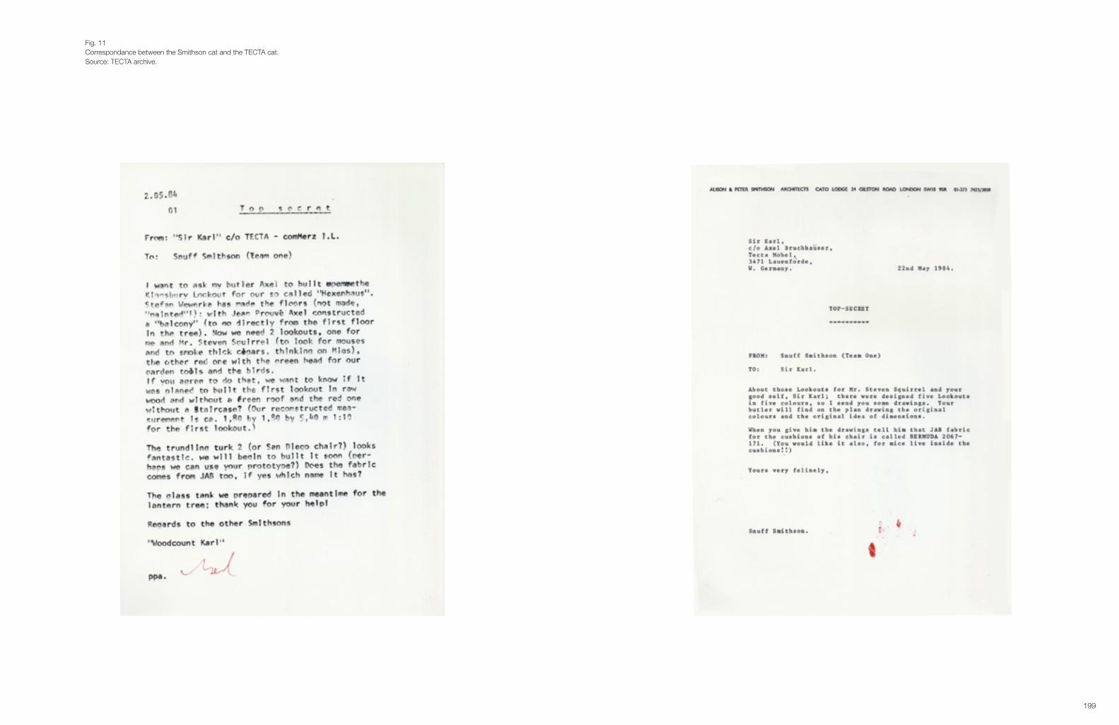
199
Fig. 11Correspondance between the Smithson cat and the TECTA cat.Source: TECTA archive.

201
Every magazine reproduces the lies of Vitra. Vitra gives the idea that they have resurrected Prouvé, but on the contrary, they only produce the most commercial products, the most interesting designs by Prouvé are banned to my company cellars, because I have no more right to produce them. Vitra reduces design history to thehistoryofcommerce,andnotonejournalistwho reportsuponthisshamefulconduct! 29 (Fig. 16)
Not an ideal start for communication! A good personal relationship between a producer and the media is primordial, as explained in the first two cases.Bruchhäuser’s frustration is somehow grounded. In contradiction to the company publications of Vitra and Alessi, TEC-TA publications do not look like magalogues,30 as in the case of Vitra, or simplified historicised accounts of so called design icons.31
They are also compilations mainly of pictures, but the adjoining texts by Wewerka and the Smithsons aren’t easily transferable to a magazine. Nor are the designs by both contemporaries. To understand their work one needs to do some research. TECTA does not provide easy manageable texts to be copied and pasted into the magazine, on the contrary their main aim is to do design history right. (Fig. 17) Nor do they show any interest in lifestyle images or publication trends. (Fig. 18) It is therefore not a surprise that journalists, in the overload of images and information they receive from design companies, do not pay attention to the products of a company like TECTA.See for example TECTA’s stand on the Milan furniture fair of 1991, where they showed The Desert … The study of Saint Jerome, by Alison Smithson and as a press text handed over a paper by Alison Smithson written in a academic language.32 (Fig. 19, 20)Another example is the publication on cantilever tables,33 which opens with the Large Glass by Marcel Duchamps, without further explanation. (Fig. 21) The analogy Vitra made between Picasso and Eames, in the Eames catalogue is a lot easier to understand and has a humorous, light twist to it.34 In the TECTA publication it is often difficult to under-stand the links and underlying codes, most probably because they are not added from a marketing perspective, with the aim of being understood by a specific target group. The book is a compilation of images and is more like an art book than a catalogue. It is quite complex to decipher the codes - mainly created by the Smithsons - if one isn’t acquainted with their oeuvre. (Fig. 22)
5. TECTA in ‘Weekend Knack’In the Flemish magazine ‘Weekend Knack’ only three references were made to Tecta, during the years researched (1982-2008).35
In 1986 in an article on re-issues of historical pieces, TECTA is mentioned alongside Cassina and Knoll, Ecart and Pol-trona Frau and other smaller companies.36 Of the 10 pictures, none are TECTA products and nowhere in the article does the journalist look at the TECTA products in more detail.In 1988 in a special design issue, almost a full-page picture of the Kitchen-tree designed by Stefan Wewerka in 1984 is published.37 (Fig. 23) The image is positioned directly under the title of the article. However, there is no reference made in the article towards the company, nor the product and the designer. It is used as an eyecatcher thanks to its unusual form.38
29 These were the first words he uttered upon our arrival, in order to explain why journalists were not welcome anymore. See interview Axel Bruchhäuser, 2.08.2008.30 As in the case of Vitra.31 As in the case of Alessi.32 The text was based on two lectures given by Alison Smithson in Barcelona (1985) and Stockholm (1986). The full text has been reprinted in the van de Heuvel & Risselada (eds.) publication on the Smithsons and shows its academic importance. See (van den Heuvel & Risselada 2004, pp.225-229). See (A. M. Smithson 1990).33 See (Unglaub 2003).34 See (Vitra 1996).35 About this research see Case 4.36 See article (Bucquoye 1986).37 See article (Bucquoye 1988)38 About different strategies applied by the media, such as the importance of form over content, see Case 4.
Fig. 14TECTA, Trundling Turk II by the Smithsons.Source: Smithson & Unglaub 1999, p. 26.
Fig. 12The lattice idea by the Smithsons.Source: Smithson & Unglaub 1999, pp. 60-61.
Fig. 13TECTA, Lattice furniture by the Smithsons.Source: Smithson & Unglaub 1999, p. 70.
Fig. 15Source: Smithson & Unglaub 1999, cover.

203
The article concerns the growing importance of modern open kitchens and is further illustrated with designs by interna-tional companies such as Bosch and Bulthaup and national manufacturers such as Top-Mouton and De Moor.It is interesting that only 3 weeks before this article, the same journalist published a story on limited editions in the furniture sector.39 The article is illustrated with images of designs by Denis Santachiara, Ettore Sottsas, Gaetano Pesce, Shiro Kuramata, Ron Arad, Frank Gehry, Richard Artschwager and Scott Burton, all produced by Vitra. The author criticizes artistic non-functional design objects, which seem to be elevated as artworks. However Rolf Fehlbaum and Vitra are praised in turning these experiments into functional furniture through the Vitra Edition collection. The article concludes with the announcement that some of the Vitra prototypes will be on display in ‘Documenta 8’ in Kassel, and the phone number of Vitra Belgium is added. Throughout the period of ‘Documenta 7’ and ‘Documenta 8’, nothing was published on TECTA and its cultural programme at that particular time. Because of the proximity to Kassel, the lack of interest towards TECTA’s museum and collections from the Documenta curators and visitors is another disappointment for Bruchhäuser.
A curious detail concerning the author of all previously stated articles - Moniek Bucquoye who was during the 1980’s and 1990’s the main design journalist of ‘Weekend Knack’ - has since 2003 become press agent for Vitra Belgium. It exemplifies the intertwined, and often very subjective relationship between the journalist and the producer. Another detail, which illustrates Bruchhäuser’s attitude towards journalists, is the fact that entire parts of the journalistic article that I wrote after the visit, and sent to Bruchhäuser to be cross-checked before being sent to different magazines, have been published on the company’s website, without permission and without author reference.40 It doesn’t need to be said that practices like this do not encourage journalists to give a company free forum in their magazine.
In 2001, the year that Vitra launches the Jean Prouvé collection, Jesse Brouns writes a small announcement on the Prou-vé furniture. He writes :
Incontradictiontoforexamplethefifties-heritageofCharlesEamesandEeroSaarinen,thatneverwentout of production, the chairs and tables by Prouvé haven’t been produced in an eternity (that is only half the truth, but lets keep a long story short) (…).41
A similar lack of interest in TECTA was felt when the photographers’ agency OWI presented the pictures taken by John Brown to the international architecture and design magazines. Only three international magazines published the story: the Italian ‘Case da Abitare’42, the ‘AD Russia’43 and the Korean ‘Architectural Digest’,44 three magazines, with a more elite and artistic/creative readership. (Fig. 24) Mainstream and lifestyle magazines didn’t show interest.
39 See article (Bucquoye 1988).40 See www.tecta.de/usa/company/background/index.html, www.tecta.de/usa/company/kragstuhlmuseum/index.html, consulted on 10.01.2012.41 See article (Brouns 2001).42 See article (Bouchez 2008).43 See article (Brown 2009a). As a journalist I sometimes work under the name of June Brown.44 See article (Brown 2009a).
Fig. 17Sergius Ruegenberg.Source: TECTA catalogue 2007, pp. 10-11.
Fig. 16Jean Prouvé, chaise longue 1935 and armchair 1924.Source: Wewerka 1983, p. 50.
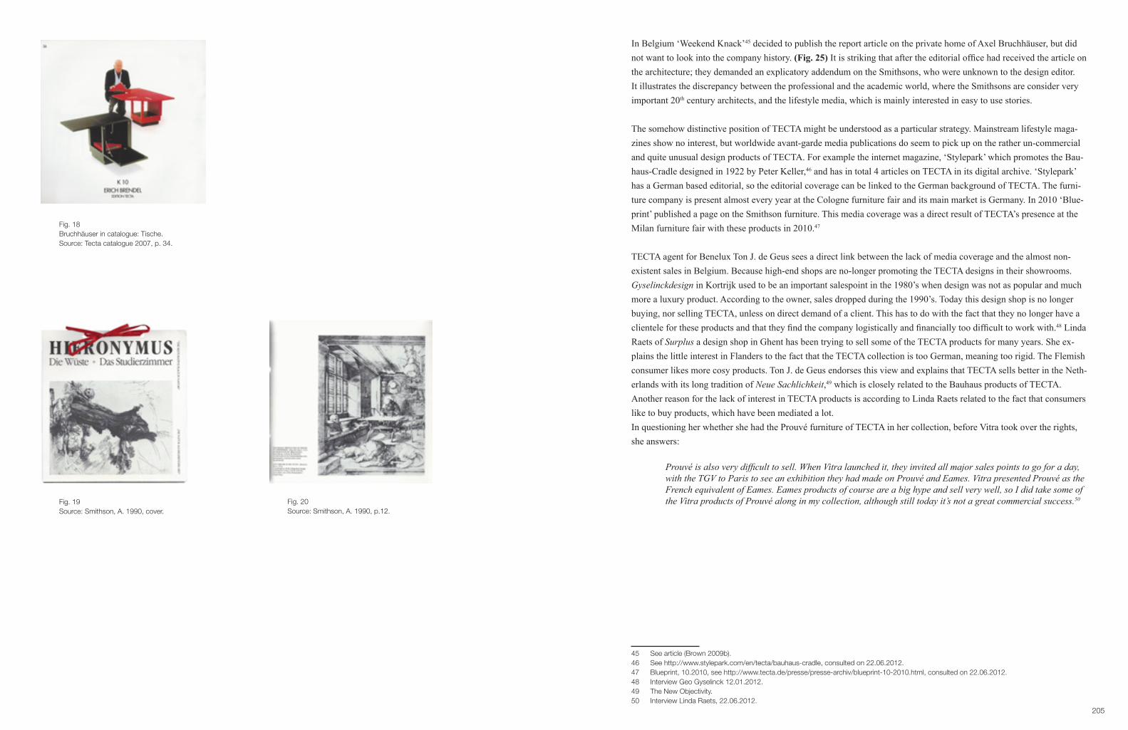
205
In Belgium ‘Weekend Knack’45 decided to publish the report article on the private home of Axel Bruchhäuser, but did not want to look into the company history. (Fig. 25) It is striking that after the editorial office had received the article on the architecture; they demanded an explicatory addendum on the Smithsons, who were unknown to the design editor. It illustrates the discrepancy between the professional and the academic world, where the Smithsons are consider very important 20th century architects, and the lifestyle media, which is mainly interested in easy to use stories.
The somehow distinctive position of TECTA might be understood as a particular strategy. Mainstream lifestyle maga-zines show no interest, but worldwide avant-garde media publications do seem to pick up on the rather un-commercial and quite unusual design products of TECTA. For example the internet magazine, ‘Stylepark’ which promotes the Bau-haus-Cradle designed in 1922 by Peter Keller,46 and has in total 4 articles on TECTA in its digital archive. ‘Stylepark’ has a German based editorial, so the editorial coverage can be linked to the German background of TECTA. The furni-ture company is present almost every year at the Cologne furniture fair and its main market is Germany. In 2010 ‘Blue-print’ published a page on the Smithson furniture. This media coverage was a direct result of TECTA’s presence at the Milan furniture fair with these products in 2010.47
TECTA agent for Benelux Ton J. de Geus sees a direct link between the lack of media coverage and the almost non-existent sales in Belgium. Because high-end shops are no-longer promoting the TECTA designs in their showrooms. Gyselinckdesign in Kortrijk used to be an important salespoint in the 1980’s when design was not as popular and much more a luxury product. According to the owner, sales dropped during the 1990’s. Today this design shop is no longer buying, nor selling TECTA, unless on direct demand of a client. This has to do with the fact that they no longer have a clientele for these products and that they find the company logistically and financially too difficult to work with.48 Linda Raets of Surplus a design shop in Ghent has been trying to sell some of the TECTA products for many years. She ex-plains the little interest in Flanders to the fact that the TECTA collection is too German, meaning too rigid. The Flemish consumer likes more cosy products. Ton J. de Geus endorses this view and explains that TECTA sells better in the Neth-erlands with its long tradition of Neue Sachlichkeit,49 which is closely related to the Bauhaus products of TECTA.Another reason for the lack of interest in TECTA products is according to Linda Raets related to the fact that consumers like to buy products, which have been mediated a lot. In questioning her whether she had the Prouvé furniture of TECTA in her collection, before Vitra took over the rights, she answers:
Prouvéisalsoverydifficulttosell.WhenVitralaunchedit,theyinvitedallmajorsalespointstogoforaday, withtheTGVtoParistoseeanexhibitiontheyhadmadeonProuvéandEames.VitrapresentedProuvéasthe French equivalent of Eames. Eames products of course are a big hype and sell very well, so I did take some of the Vitra products of Prouvé along in my collection, although still today it’s not a great commercial success.50
45 See article (Brown 2009b).46 See http://www.stylepark.com/en/tecta/bauhaus-cradle, consulted on 22.06.2012.47 Blueprint, 10.2010, see http://www.tecta.de/presse/presse-archiv/blueprint-10-2010.html, consulted on 22.06.2012.48 Interview Geo Gyselinck 12.01.2012.49 The New Objectivity.50 Interview Linda Raets, 22.06.2012.
Fig. 18Bruchhäuser in catalogue: Tische.Source: Tecta catalogue 2007, p. 34.
Fig. 20Source: Smithson, A. 1990, p.12.
Fig. 19Source: Smithson, A. 1990, cover.

207
Fig. 22TECTA, Kragtisch M23 by The Smithsons, 2002.Source: Unglaub 2003, pp.51-52.
Fig. 23TECTA, Kitchen-tree by Stefan Wewerka, 1984.Source: Smithson & Unglaub 1999, p. 78.
Fig. 21Marcel Duchamp, The Large Glass Completed, 1965.Source: Unglaub 2003, pp. 6-7.
Of course the company size of TECTA cannot be compared to Vitra, nor Alessi. In 2003 Vitra counted about 850 employees,51 in 2009 Alessi has 500 workers,52 whereas TECTA only has 40 workers in 2008.53 To add TECTA to the case-studies is therefore a decision solely made based on the fact that TECTA does use marketing techniques similar to Vitra and Alessi, however with a totally different outcome.Where the other two cases show how companies position a product in the market by addressing their easy manageable narratives to the consumer, through the media,54 and as explained above, through their sales points, TECTA hasn’t done this. However, there is no immediate proof that this has resulted in the fact that in 2010 not one Flemish design shop is selling the TECTA collection.55
6. ConclusionThis case study shows that to appear in the media, it is not as much important that one produces highly cultural-related products, but that one should establish a good personal bond with the journalists, and provide a manageable narrative, illustrated with a hip and aestheticized photography. Elements, which coincide with Bourdieu’s logic of cultural produc-tion and lead to Bourdieu’s culturalallodoxia,or flattened out historical discourse.56 TECTA’s products are high cul-tural, in most cases in total agreement with the designers’ original design and often based on a lot of profound research, but rarely picked up on by the media. In the case of the Prouvé furniture it is obvious that a company like Vitra was able to bring the Prouvé designs to the media attention, whereas TECTA who signed a contract with Prouvé 16 years earlier didn’t succeed in mediatising the products. The first time Prouvé is mentioned in Weekend Knack is in April 2001 in direct response to a Vitra press release.57
51 See http://www.edmpdm.info/news/news_2004_10/ugs_vitra.htm, consulted on 23.06.2012. 52 See interview with Alberto Alessi http://www.reuters.com/article/2009/11/01/us-italy-recession-design-idUSTRE5A000Z20091101, consulted on 23.06.2012.53 See interview Axel Bruchhäuser, 2.08.2008.54 In reference to Verganti’s third phase in his design-driven-innovations model, to address. See (Verganti 2009; Verganti 2006).55 According to TECTA agent, Ton J. de Geus the designs of TECTA did sell in the 1980’s in Flanders in the most exclusive design shops. Today however, it is only rarely that a shop orders TECTA goods, and none of them have a TECTA collection in their showroom. Telephonic interviews, 12.01.2012.56 See (Bourdieu 1984, p.323; Wernick 1991), see also Case 1.57 See article (Brouns 2001). As free-lance journalist I also received the Vitra press-kit and together with Jesse Brouns of ‘Weekend Knack’ and a few other journalists we were invited to travel at Vitra’s expense to the exhibition Prouvé/Eames in Paris. This resulted in a half page article published in the ‘Financieel Economische Tijd’.

209
Fig. 24Source: Case da Abitare 2008, n° 6, pp. 100-104.

211

213
Interieur: Heksenhuis
Thuis bijde heksenFig. 25
Source: Weekend Knack 2009, n° 29, pp. 38-40.
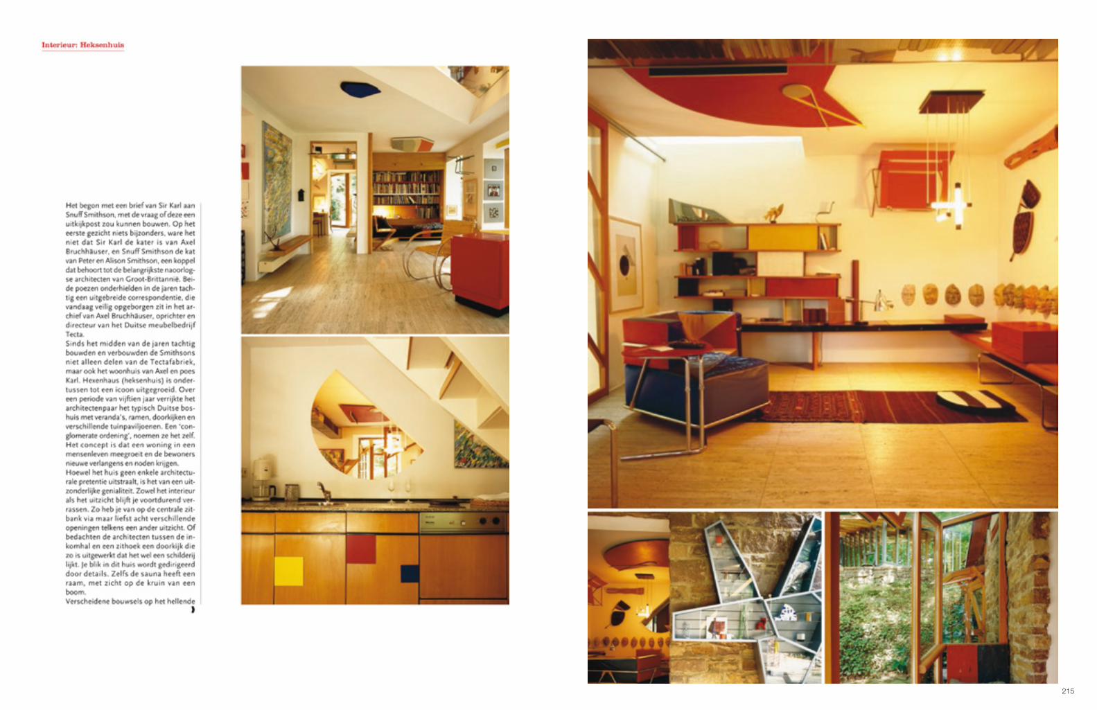
215

217

219
CASE 4
‘WEEKEND KNACK’: A CULTURAL INTERMEDIARY OF AN IDEAL LIFESTYLE1
1. IntroductionPrevious cases showed how producers bestow design objects with high cultural meaning. As Verganti states, media are the magnifiers of this meaning. A quantitative analysis of one of Flanders life-style magazines underlines this dynamic and shows how companies such as Alessi or Vitra hardly advertise and still receive major media attention. Content analysis shows the strategies this cultural intermediary uses to advise its readers to buy into an overall designed life-style, with a focus on particular designed objects as tokens of distinction.
2. The magazine as mythmaker.Since the beginning of the 1980’s the number of lifestyle magazines has seen a substantial growth.2 This can be ex-plained according to Zygmunt Bauman by the growing interest in lifestyle matters in general, due to a shift from a civic to a consumer culture.3 Traditional ways of life in which the family, the community, the church,… were the social reference points, have been replaced by a consumer lifestyle. David Chaney claims that culture has become a symbolic repertoire.4 This repertoire is a set of goods and practices, which consumers symbolically identify with. Lifestyle me-dia offer their readers guidance in the jungle of consumption possibilities. Mike Featherstone explains lifestyle, or this symbolic repertoire as an individual sense and display of a style in the particularity of the assemblage of goods, clothes, practices,experiences,appearanceandbodilydispositions.5 Since the 1980’s many magazines are launched with an emphasis on this mentioned assemblage.6
For Janice Winship, who has researched women’s magazines, the mid 1980’s is a time when the heritage of the boom-ing magazines of the 1950’s was jettisoned and a new kind of magazine, particularly for young women was introduced.7 This should be understood within the changing social identification where young consumers no longer define their identity through the old social system but through shopping, in general.8 Another important reason for Winship is the blurring of the boundaries between feminism and non-feminism, which led to a less rigid demarcation between femi-nist magazines and the more commercial glossies.9 In these new kinds of magazines there is more stress on the style, through the typographic design, the layout and the growing importance of the image, in accordance with a growing aestheticization,10 and a growing interest in design.11
1 Parts of this case study have been published in conference proceedings. See (Bouchez 2010; Bouchez 2008a; Bouchez 2008b; Bouchez 2008c).2 See for example (Bell & Hollows 2005, p.1; Williams 2006, p.13).3 See (Bauman 1987).4 See (Chaney 1996).5 See (Featherstone 2007, p.86). See also part II. Theoretical framework.6 Books as well played an important role in this new lifestyle segment of the market. Especially the German publisher, Benedict Taschen who popularized contemporary interiors through affordable glossy picture books, see for example (Williams 2006, p.147; Julier 2008, p.49). 7 See (Winship 1987).8 See also Andy Bennet who sees the importance of the new lifestyle magazines as an aim to break with the traditions of the domestic magazine, they expressed a new self-confidence and openness to the world, (Bennett 2005, pp.84–87). See also (McRobbie 1997, p.191; McRobbie 1991, p.205). In Flanders An Brouckmans, former editor in chief of the women’s magazine ‘Flair’, explains the success of this magazine launched in 1980 in a similar way. Likewise it describes the evolution from the late 1980’s onwards of popular weeklies to glossy monthly magazines (Brouckmans 2006).9 See (Winship 1987, p.149). The success of ‘Weekend Knack’, with a broader focus on design and interior matters can also be related to the changed position of women. This PhD however does not look into gender matters.10 See on the Aestheticization of the everyday (Featherstone 2007). 11 See for example (Julier 2008).
title launched male readership
female readership
read range
Libelle 1945
Knack 1971
Ik ga bouwen en renoveren 1972
Beter Bouwen en Verbouwen 1978
Flair 1980
Weekend Knack 1985
Feeling 1990
Marie-Claire (Dutch edition) 1990
Aktief Wonen 1995
Feeling Wonen 1998
Nest 2002
Glam*it 2003
Marie-Claire (Flemish edition) 2006
Marie-Claire Wonen 2009
27,4 72,6 1.049.000
52,2 47,8 658.200
61,8 38,2 77.300
52,7 47,3 71.700
29,6 73,1 805.000
47,8 52,2 496.100
21,1 78,9 429.000
14 86 127.000
32 68 96.000
22,1 77,9 179.000
34,4 65,6 554,500
11,5 88,5 135.000
/ / /
/ / /
source: CIM 08-09
Fig. 1Cim-numbers 2008-2009 of different Flemish magazines.Source: http://www.theppress.be/febelmag/nl/Magazines-leden-52/, consulted 16.02.2011.
0% 100% 200% 300% 400% 500% 600% 700% 800% 900%
1985 2005
home editorial home advertisement
Fig. 2‘Weekend Knack’ home editorial versus home advertising.Source: Bouchez 2008.
0 5
10 15 20 25 30 35 40 45 50
1985 2001 2005
interior reportages
Fig. 3‘Weekend Knack’ interior reports between 1985-2005.Source: Bouchez 2008.
advertising
report

221
As Dick Hebdige described in an analysis of ‘The Face’: Thus the impression you gain as you glance through the magazine is that this is less an “organ of opinion” than a wardrobe full of clothes (garments, ideas, values, arbitrary preferences …).12
Coherent with this shift in women’s magazines, a new kind of interior and design magazine was launched during the 1980’s and 1990’s. The focus no longer lay on the interior architecture, but on a complete lifestyle built around the home sphere. In contradiction with the post-war architectural and interior magazines -which were edited primarily as advice literature to educate their target group,13 the new publications mediate a specific inclination towards consump-tion.14 They guide their consumers in a wide array of goods and experiences as part of an ideal identity.15 As Putnam & Newton explain:
With the use of value-oriented ‘life-styles’ in marketing, the universal ‘housewife’ has begun to disappear from the screen, subject to insuperable contradictions. The merchandising of packaged décor has linked the diffusion of design advice, market differentiation and programmatic obsolescence in competition for disposable income.16
Through emulation readers can obtain a new self within a social hierarchy. Although these magazines focus on the do-mestic, the issue of interior architecture has not only become secondary, an impression is given that interiors are not made by architects, but that they are the sum of designer products.17 The interior architecture is reduced to a décor in which the design-goods are on show. Advice on the home is curtailed to a matching colour scheme of goods, through which the editorial pages show similar semiotic systems as advertising.18 Whereas the magazines as intermediaries used to take a role of adviser for the modern home, they have become a mere promotional service-hatch for an aesthetic sta-tus related way of living, where the producer of design goods, rather than the architect plays a major role.19
In Great Britain ‘Elle Decoration’, founded in 1989 by Ilse Crawford, and ‘Wallpaper*’ in 1996 by Tyler Brulé take a leading role in this new kind of magazine with an emphasis on hip interiors and visually focussing on what appear to be candid images.20 ‘Wallpaper*’ especially introduced a new visual representation with a mutual focus on furniture, architecture, clothing and travel. The subtitle is exemplary for this new approach: the stuff that surrounds you. On the cover of the first magazine they address their aspirational readers as urban modernists. Later on they introduce the term urban nomads referring to a hip, rich, young and successful consumer-group, who invest as much in the way they decorate their homes as in the way they are dressed.21 This way of presenting the domestic becomes the paradigm of all lifestyle magazines.
12 Hebdige 1985, p. 46, cited in (Winship 1987, p.152).13 See on research in Flanders (Floré 2006; Floré 2005) and (De Vos 2006; De Vos 2008). For similar findings in Great Britain see also (Keeble 2007; Winship 1987; Edwards 2005).14 See for example (Bell & Hollows 2006, p.4).15 About the shifting categories in magazines in the 1980’s Winship quotes publisher Joan Barrell: The name of the game is to get particular groups with distinctive lifestyles to identify themselves with specific magazines … (they) will need to attract specific age groups, rather than covering everything from changing baby’s nappy to claiming your old age pension (Advertising Age’s Focus, May 1984), see (Winship 1987, p.151).16 See (Putnam & Newton 1990, pp.15–16).17 See for example (Swales 1990, p.104).18 See for example (Poynor 2007, p.139).19 See also (Aynsley & Forde 2007). T. Keeble points out the highlighting of the role of the architect and other specialists in ‘Woman’ magazine in the 1950’s as opposed to contemporary lifestyle magazines (Keeble 2007, p.109). Grace Lees–Maffei however points out that in a historical context, the advice literature is a fictional genre with scant relations to practice, due to the direct dependence of the magazine on advertising revenues. Magazines give advice as part of a mixed diet of articles and advertisements, each occupying some point on the commercial continuum from editorial to advertising. See (Lees-Maffei 2003, pp.5–7).20 See for example (Williams 2006). On the role of ‘Elle’ see (Usherwood 1997) and for more on the role of ‘Wallpaper*’ see (Poynor 2007, pp.42–47).21 See for example Williams on the assemblage of goods in ‘Wallpaper*’: Often it was impossible to tell whether editorial pages were about the clothes worn by the models, the furniture they sat on, or both (Williams 2006, p.136).
Fig. 4Interior report, project by architect Jo Crepain.Source: Weekend Knack 1985, n° 19, pp. 24-26.
Fig. 5Interior report, project by architect Stéphane Beel.Source: Weekend Knack 1994, n° 15, pp. 56-58.

223
Both magazines publish lived-in-interiors, with people in the pictures, giving the impression that they are very real. In the foreword of the first issue of ‘Elle Decoration’ the editor in chief Ilse Crawford writes:
Style-wise, street-wise and pound-wise, Elle Decoration brings the allure of Elle to your home. In each issue we feature the up-to-the minute interiors of the hip and rich, and show you, in wonderful photographs, how to pick up some of their ideas.22
In referring to the allure of Elle, the seminal publication Mythologies of Roland Barthes comes to mind. He describes ‘Elle’ as a real mythological treasure. In the article Ornamental Cookery he argues that the food dishes in ‘Elle’ are presented as objects, as a cuisine of advertisement, and claims that thereadersofElleareentitledonlytofiction.23
In Myth today Barthes continues:
In fact, what allows the reader to consume myth innocently is that he does not see it as a semiological system butasaninductiveone.Wherethereisonlyanequivalence,heseesakindofcausalprocess:thesignifierand thesignifiedhave,inhiseyes,anaturalrelationship.Thisconfusioncanbeexpressedotherwise:anysemio- logicalsystemisasystemofvalues;nowthemyth-consumertakesthesignificationforasystemoffacts:myth is read as a factual system, whereas it is but a semiological system.24
From this point of view, all lifestyle magazines create through carefully framed images a fictional message, which is understood by the consumer as real. Moreover, as argued by Susan Sontag, photography is not experienced as an inter-pretation of reality, but as reality itself. Photographs furnish evidence (…) the picture may distort; but there is always a presumptionthatsomethingexists,ordidexist,whichislikewhat’sinthepicture.25
In featuring the up-to-the minute interiors of the hip and rich and presenting them as taste makers, ‘Elle decoration’ lays the basis for a distinctive lifestyle, linked with status, which can be copied and thus can become democratic or popular. It is the magazine’s aim to show the readers in wonderful photographs how to pick up some of their ideas. This concept has contradicting consequences.First of all, this view implies the didactic function of the magazine. By picking-up some ideas of the rich and hip an upward social mobility is promised. In this sense the magazine is in charge of a never-ending search for hipper, newer and richer examples of contemporary lifestyle, because the possibility of imitating a distinctive lifestyle leads inevitably to the devaluing of certain things and certain ways of living. Lifestyle magazines are, what Featherstone calls cultural intermediaries, which take a lead in a quest to stay ahead of the game and therefore rather stress the extraordinary than reality.26 According to Bourdieu, popular taste is the negation of high cultural taste. ‘Elle’ magazine readers are not elite, they belong to the middle class, who learn and decipher the codes of the rich and hip thanks to these publications. In order to keep their distinction from other classes, the high-end consumers on their side strive to keep the symbolic value of their lifestyle as elevated as possible.27 Their distinction only exists through rarity.28 Therefore many magazines struggle to find exclusive stories. Therefore most of the magazines publish interiors that have been completely constructed by styl-ists along with the real homes. Most readers do not see the difference. The interior is nothing more than a stage set for trendy furniture, and like fashion magazines, interior magazines are reduced to a celebration of elite names and brands.29
22 See (Crawford 1989).23 See (Barthes 2000b, pp.78–80).24 See (Barthes 2000b, p.131).25 See (Sontag 1977, pp.4–5). On the problematic duality between the perceived reality of interior photography and using photographic representations as historical source see for example (Cieraad 2000; Burkom & Gaillard 2000).26 See (Featherstone 2007), see also (Bell & Hollows 2006, p.11).27 See (Bourdieu 1984, p.228).28 See (Bourdieu 1984, p.227; Bourdieu 1993, p.113).29 See (Williams 2006, p.138).
Fig. 6Interior report with a focus on design and art objects rather than architecture.Source: Weekend Knack 1999, n° 2, pp. 36-38.

225
They resemble high cultural catalogues of design labels, which in their turn imitate the photography and graphic design of magazines under the denominator magalogue. Vitra, as explained before, starts working with star photographers such as Wolfgang Tillmans or Juergen Teller. Fritz Hansen brings out a monthly magazine, and the Edra catalogue looks like a fashion magazine. The difference between an interior lifestyle magazine and a branded catalogue becomes very small.30 The promotional language of producers and the authoritative message of the magazine as cultural intermediary has become quasi synonymous, both emphasising the, - as naturally experienced -, meaning of design icons as carriers of distinctive high culture.
3. ‘Weekend Knack’ between 1984-2008To understand the different mechanisms of the lifestyle magazine as intermediary between producers and consumers, a case study of the Flemish magazine ‘Weekend Knack’ was conducted.31 All weekly issues of the magazine between 1984 and 2008 were looked into page by page. The number of editorial inserts concerning design and interior subjects was counted, as well as the number of advertisements.32 Next to this quantitative research, all the articles related to de-sign and home matters were analysed on their content and their illustrations.
The magazine was launched in 1984 as a supplement to the already existing ‘Knack’ (1971) magazine, which mainly focussed on a male readership. ‘Weekend Knack’ is not sold separately and addresses a male and female audience. CIM statistics show for example that in 2008-2009 47,8 men and 52,2 woman read the magazine.33 However at the start of Weekend Knack the magazine addressed mainly female readers through information on what you want to see, hear and wear. The trip you want to make. Your garden, the interior of your house, your health.34
Tessa Vermeiren ran the editorial office until 2008.35 During the first years of publication the editorial staff existed primarily of male journalists who previously wrote for the cultural pages of ‘Knack’. Gradually, new editors, who in-troduced another tone and perspective, took over the job. The history of ‘Weekend Knack’ exemplifies the above-men-tioned change in magazine formats. Although it was never a popular woman’s magazine it moved gradually from a wide cultural and human interest perspective into a lifestyle glossy, with increased attention to the layout, and a shift in focus from words to highly styled coloured images. In a special issue of 2008, celebrating the 25th anniversary of the maga-zine Tessa Vermeiren recalls the start: after the launch in 1983 of the short lived Weekend Magazine (a leisure magazine producedbytheeditorsofKnack,TrendsandSportMagazine)inMay1984WeekendKnackasaKnacksupplementwasborn.CEORikDeNolfofRoulartapublisherssoughtafemaleeditor-in-chieftostartFlandersfirsttruelifestylemagazine.36 Vermeiren states that at that time the editors were influenced by magazines such as ‘Vogue’, ‘Bazaar’ and ‘Mirabelle’, which guided them through this new spectrum of the media,37 and from the start they sought for a higher cultural value than the existing women magazines. Besides, very soon after its launch they decided not solely to address the wives of the ‘Knack’ readers, but also a male readership.38 Today the target group is according to the publishers: people with a higher life standard.39
30 See for example (Poynor 2007, pp.55–60).31 For more on the research of lifestyle magazines within the context of design history see (Bell & Hollows 2006; Aynsley & Grant 2006).32 All pages were counted as full, half, ¼, 1/3, ... They were not exactly measured. The resulting statistics should thus be understood as approximate.33 See CIM 2008-2009 (http://www.theppress.be/febelmag/nl/Magazines-leden-52/, consulted 16.02.2011) CIM, Centrum voor Informatie over de Media is an independent organisation, which collects statistics on the media concerning circulation and readership. It is mainly consulted by advertisers. For more information see (http://www.cim.be/media/Pers).34 See (Verleyen 1984, p.3).35 In May 1985 she became editor-in-chief, see (Vermeiren 2008b, p.27). Since 2008 Trui Moerkerke has been editor-in-chief.36 See (Weekend Knack (Vermeiren 2008a).37 See (Vermeiren 2008b, p.27).38 See (Vermeiren 2008b, p.27).39 See (http://www.roulartamedia.be/nl/magazines/weekendknack/default.asp, consulted 21.08.2008).
Fig. 7Interior report. 9 of the 15 objects added by the stylist are from Alessi.Source: Weekend Knack 1994, n° 34, pp. 67, 69.

227
According to CIM information the majority of readers have attended university or another form of higher education. ‘Weekend Knack’ covers a much smaller group of readers (13,2%) than for example ‘Flair’ (24%) or ‘Libelle’ (23,6%), who address a larger and more socially spread female readership.40 ‘Libelle’ was launched in 1945 and can be consid-ered a popular woman’s magazine.41 ‘Flair’ was launched in 1980 and can be compared to the successful British maga-zine ‘Just Seventeen’ which addressed a completely new group of younger consumers.42 ‘Weekend Knack’ was in this sense the first lifestyle magazine covering several lifestyle matters beyond the traditional women’s focus of ‘Libelle’ or new youngster focus of ‘Flair’. (Fig. 1)‘Weekend Knack’ was also the first lifestyle magazine in Flanders that covered design and interior subjects. Magazines like ‘Aktief Wonen’ and ‘Feeling Wonen’, which focus solely on interior and design matters were launched much later, respectively in 1995 and 1998.43
For the years covered by this research, from 1984-2008, the growing editorial attention to design and interior matters was quantified, likewise for the advertising pages. The PhD zoomed in on the representation of interiors and design sub-jects and took a particular interest in the representation of Vitra and Alessi products and the evolution of its published narratives. This resulted in an extended analysis of the different editorial formats presenting the domestic through vari-ous interiors and goods. The quantitative research shows that in its first full year of publication (1985) 3,19% of the total pages covered editorial home matters, whereas by 2005, 8,8% is assigned to the design of the home. (Fig. 2) Over this period, the number of articles on interior reports of real homes, which included a display of design products, rose from 8 (in 1985) to 47 (in 2001). This went down to 38 in 2007.44 (Fig. 3) Additionally in the advertising pages a comparable trend is detected: the percentage of advertisements that show design objects rises from 2,58% in 1984 to 6,47 % in 2008. (Fig. 2) ‘Weekend Knack’ has thus given its readers over the past 20 years a growing amount of information on design and contemporary domestic lifestyles.
4. Editorial formats: from the real to the ideal
One of the principal shifts in the global cultural order, created by cinema, television, and video technology (and the ways in which they frame and energize other, older media), has to do with the role of the imagina- tion of social life. Until recently, whatever the force of social change, a case could be made that social life waslargelyinertial,thattraditionsprovidedarelativelyfinitesetofpossiblelives,thatfantasyandimagina- tionwereresidualpractices,confinedtospecialpersonsordomains,restrictedtospecialmomentsorplaces. Ingeneral,imaginationandfantasywereantidotestothefinitudeofsocialexperience.Inthepasttwodecades, as the deterritorialization of persons, images, and ideas has taken on new force, this weight has imperceptibly shifted. More persons throughout the world see their lives through the prisms of the possible lives offered by mass media in all their forms. That is, fantasy is now a social practice; it enters, in a host of ways, into the fabrication of social lives for many people in many societies… For the new power of the imagination in the fabrication of social lives is inescapably tied up with images, ideas, and opportunities that come from elsewhere, often moved around by the vehicles of mass media.45
This chapter will look into the different editorial strategies applied by ‘Weekend Knack’ in the fabrication of dreams, pos-sible lives as Appadurai puts it, and the impact this has on the way the general public is informed on contemporary design.
40 CIM numbers from 2006-2007, see (http:www.cim.be/computed/audi/nl/BACJ.png, consulted 21.08.2008).41 See (http://www.theppress.be/febelmag/nl/Magazines-leden-52/Libelle-140/ , consulted16.02.2011).42 For information on ‘Flair’, see (http://www.theppress.be/febelmag/nl/Magazines-leden-52/Flair--219/, consulted 16.02.2011. About the new market position of ‘Just Seventeen’ see for example (Winship 1987, pp.148–162).43 For more information on ‘Aktief Wonen’ see (http://www.theppress.be/febelmag/nl/Magazines-leden-52/Actief-Wonen-78/, consulted 16.02.2011). More on ‘Feeling Wonen’ see (http://www.theppress.be/febelmag/nl/Magazines-leden-52/Feeling-Wonen-130/, consulted 16.02.2011).44 Because of the general malaise in the printed magazine industry, the magazines have fewer pages and subsequently less place for editorial, moreover the price per page for an interior report is much higher than for many other editorials.45 See (Appadurai 1996, pp.53–54).
Fig. 8‘Weekend Knack’ editors photographed in Vitra showroom.Source: Weekend Knack 2008, n° 14, pp. 22-23.

229
Like other magazines ‘Weekend Knack’ makes use of varying editorial strategies to enhance different fantasies linked to different lifestyles. Instead of advising consumers, the glossy helps consumers to imagine an ideal way of life. Through cultural advisory they provide the readers with tools to fill the disparity between the real home and the imagined ideal.According to Bourdieu it is in particular the new cultural intermediaries, which are arbiters of taste and promote a par-ticular type of consumption as a means to acquire cultural capital. These cultural intermediaries are active in the pro-duction and promotion of goods with a strong codified identity and social appearance, through the media, advertising, branding and public relations. Bourdieu criticizes this new group for being responsible for a flattening out of high cul-ture. (…)thesenewintellectualsareinventinganartoflivingwhichprovidesthemwiththegratificationsandprestigeof the intellectual at the least cost.46 The goods of this new lifestyle cipher promises of a high cultural way of life and are (…)stillabletofulfilfunctionsofdistinctionbymakingavailabletoalmosteveryonethedistinctiveposes,thedis-tinctivegamesandotherexternalsignsofinnerrichespreviouslyreservedforintellectuals.47 The aim of cultural inter-mediaries is to strip down previous barriers to elite culture,48 and to bridge the disparity between the real and the ideal. The following parts will look into the strategies ‘Weekend Knack’ applies to fill the gap between the real and the ideal.
4.1. Interior articles : the staged domestic as real homeA vast number of editorial pages show the homes of real people. These so-called interiors articles have been published since the start of ‘Weekend Knack’. In the earliest years the focus lay on the point of view of the architect and most im-ages were shown to represent this perspective. (Fig. 4) By the mid 1990’s the emphasis moves from the architecture to the ambience of the interior, with less text and more pictures. (Fig. 5) The photographs are less informative and become aesthetic still-lives of details with a focus on objects, rather than architectural vistas. (Fig. 6) Additionally there is a shift in the texts towards more descriptive details of how the owners of the house experience their ‘home’ rather than the architect’s point of view. We could say that the centre of interest moves from the house to the home.49 Although these articles seem very realistic, they cannot be considered as real for several reasons. First of all there is the introduction of the stylist. From the late 1980’s, in order to restyle the home towards a coherent image representing the aims of the magazine, a stylist accompanies the photographers. In so doing, many of the household artefacts are moved out of the image and products alien to the owners are brought in. Editors prefer households where the real life has been erased and the right kind of objects -read the objects the magazine wishes to promote as trendy and hip- are focussed upon. The focus on particular objects changes according to the changing fashions in design retail, and in the personal preferences of the magazine relating to which companies they want to work with.50
In 1957 the American architect and designer George Nelson explains in his book Problems of design what an architect who wants to have his projects published in progressive architecture and interior magazines needs: a big car, a subtle choice of furniture and other home objects, a good photographer and a rubber plant which is strong enough to survive all the travelling.51 He concludes this after an analysis of the contemporary magazines. Many of the houses look the same to him, and most of the furniture is identical. What was in the 1950’s meant as an ironical remark has today be-come entirely true.
46 See (Bourdieu 1984, p.370).47 See (Bourdieu 1984, p.371).48 See also (Taylor 2005, p.123).49 For the difference between and historical evolution of the house and the home see for example (Edwards 2005).50 See for example the shifts in attention for Alessi products. 51 Nelson, G., Problems of Design, Whitney Publications, New York, 1957, referred to in (Pruys 1971), see also Part II.
Fig. 9Interior private home by architects Mys & Bomans published in Vitra catalogue.Source: Vitra Home 2006, p. 27.
Fig. 10Interior private home by architects Mys & Bomans published in ‘Weekend Knack’.Source: Weekend Knack 2005, n° 11, p. 52.

231
In an example of a report on a home, published in ‘Weekend Knack’ in 1994, stylist Sonja Mertens added 15 objects of which 9 were from Alessi, to the existing kitchen utensils,52 even though the owners of the home explicitly asked not to add any consumer products. (Fig. 7) The published result can be considered as pure product placement. At that time, the products were not mentioned in the text. In essence they seem to be benign details. However, gradually in the interior reports, more attention is given in the text to the furniture and design objects that appear in the images and as will be discussed further, direct shopping advice was linked. Similarly, Valerie M. Swales claims that:
Visual images can indeed reveal much about the way houses and homes look. However, this ‘look’, as found in the mediated images of the design industry, in advertising, magazines and journals, has a particular inauthen- ticity.Theroomdesignsdonotexistoutsidespecificeconomicconditionsofproduction:theyareroommodels posed to increase sales of furniture, furnishings, paint, wallpaper, objects. Even when the rooms are ‘authen- tic’,insofarastheyaretheresidencesofthewealthyorthosewithdesignflair,theyadheretoBarthes’closed fieldofforces’.53Every‘designed’photographistheoutcomeofaspecificsetofintentionsdependentonthe purposive action of the producers.’54
Keith Negus questions whether cultural intermediaries are as creative as is often thought, and explains through a case study of the music industry that serendipity is more often the leading thread than conscious creativity.55 The choices made by design stylists are likewise, not very often guided by authoritative taste-advice, or sole creativity, but rather directed by the personal connections with companies that easily provide goods for photo shoots. In an interview Marc Standaert, sales manager of Alessi Flanders states that the success of Alessi is in large part linked to the good relation-ship he has with the Flemish press.56 The same can be said of Vitra. In the special edition for ‘Weekend Knack’s’ 25th birthday, a double page portrait is taken of the entire editorial staff in the Vitra showroom as if it is the editorial office of ‘Weekend Knack’. (Fig. 8) This shows the close relationship between the furniture producer and the makers of the magazine. It is a normal procedure for companies to establish a distinguished relationship with stylists and journalists. Trips organised by the producers, exclusive dinner parties with star-designers and other favours are common practice.57 Goodlad et al introduce in this respect the term collaborative editorial.58
When a strong relationship is established with the magazine, and stylists can freely borrow all the goods from a com-pany for several months, it is only logical that these goods will appear more on pictures than those goods the stylist has to go search for in shops.
52 See (Moerkerke 1994, p.67). The reportage was made in my personal home.53 Swales refers to a passage in Camera Lucida on portrait photography in which Barthes explains how the object becomes a subject: …what I see is that I have become Total Image, which is to say, Death in person; others-the Other do not disposes me of myself, they turn me, ferociously, into an object, they put me at their mercy, at their disposal, classified in a file, ready for the subtlest deceptions… (Barthes 2000a, pp.14–15). 54 See (Swales 1990, p.104). See also Lise Taylor who concludes after a research study on garden lifestyle magazines, that the media acts as a commercial guarantor for the values of new positional goods, (Taylor 2005, p.126).55 See (Negus 2002, p.509).56 Interview Marc Standaert 11.03.2010.57 As explained in Case 3, with the example of the Prouvé exhibition in Paris. Between1995-2001 I was invited on several trips around Europe, by design companies. A few examples: For Anker Bedding I was invited for a 5 day trip to Normandy and Bretagne in luxurious hotels, for the promotion of their duvets. For Thonet a select group of journalists was invited to the factory in Germany, during a 3 day visit. I was invited for 5 days to Sweden, to visit several design companies as Kosta Boda and Orrefors.58 See (Goodlad et al. 2002, p.83), on the role of the press-agent of Alessi see also (Lees-Maffei 1997, p.81). See also Bourdieu’s concept of social capital, which is acquired by the move from a contingent relationship towards durable obligations, which are subjectively felt, or institutionally guaranteed through particular rights (Bourdieu 1986, p.246).
Fig. 12Wilkins House, Neutra, before and after furniture removal.Source: Shulman 2002, p. 340.
Fig. 11Craig Ellwood early home, poorly furnished – no appeal to the public.Neutra, Maslon House, Modernism at its best!Source: Shulman 2002, p. 342.

233
Most of the photographers working for ‘Weekend Knack’ are accompanied by a stylist who decides on the created nar-rative. Even though some of the stylists claim that they never bring in attributes, it is the stylist who decides on which particular objects the photographer must focus. As for example the way the magazine ‘World of Interiors’ proceeds: roomsmaybetidied,cornflakepacketsremoved,cleansheetsputonthebeds,achairturnedtofacethecamera.59
An interior can be photographed in a very particular ways, creating a very specific narrative. A Belgian project by archi-tects Mys & Bomans was published as well in ‘Weekend Knack’ (Fig. 10) as in the Vitra Home catalogue. (Fig. 9) The similarity between these images is striking.The positioning of the furniture by Ray and Charles Eames is exemplifying in how functional objects are depicted as artworks, and centre staged in a picture. Vitra promotes these design icons as pieces of art throughout its catalogues and publications, as explained in Case 2.60 The magazines take over this concept and represent it as a real life situation. By positioning an Eames chair, faced towards the camera in front of an artwork, it is as if the cultural capital of the artistic photographs shines upon the chair, which in a very natural way glows with a similar value. In the ‘Weekend Knack’ im-age, the child sitting on the concrete bench behind the chair emphasises even more the non-functional and artistic aspect of the chair.Whether it be for a magazine or a catalogue, there seems to exist a non-specified transnational law on how interiors have to be shot.61 Since 2000 more and more articles are being sold internationally, thanks to digitalisation and inter-net. The Belgian photographic agency, Office for Word and Image, published for example the report of the home of the Boxy’s designed by Maarten Van Severen over 13 times to 9 different countries.62 Here again similar shots were taken from this house, for the Vitra catalogue. As mentioned before, the objects in the homes photographed, seem to be more important than the architecture. Meticu-lously constructed images have to represent the lifestyle of the owner through accumulated goods, rather than to explain the architecture. Julius Shulman, who became world-famous thanks to his constructed views of post-war American modern interiors, explains that the austere and empty interiors presented by the architects, were not all appreciated by the magazines and their readers.63 (Fig. 11, 12) Shulman recalls the response of ‘House Beautiful’s editor Elisabeth Gor-don: Why are these interiors so cold and unattractive? I would never publish such inhospitable scenes.64 Contemporary editors of lifestyle magazines respond similarly when there is not enough lifestyle in the photos. And just as Nelson detects the same kind of furniture in interior reports published in the 1950’s,65 throughout the 25 years of ‘Weekend Knack’ similar waves of promoted objects are exposed. (Fig. 13) Once a particular product, brand, or designer is hot, editors desire images with these particular objects highlighted. In manipulating the picture choice and layout, editors can zoom in or out on goods. They have the freedom to cut into photographs and thus reposition objects.66 Choosing particular images and leaving others out can stage a different kind of house. See for example the opening picture of a summerhouse, with a green Eames chair in front of a window. (Fig. 14) This tells us nothing about the architecture, nor the interior, but represents the lifestyle of the owners.
59 See (Poynor 2007, p.45).60 See (Windlin & Fehlbaum 2008).61 See also (Poynor 2007, pp.42–47).62 OWI, see mail Stefan Jansen, OWI, 17.08.2011, full reportage: http://www.owi.bz/collection/?uid=bbb9372b-7f1c-498d-95ff-65c3e649fcda, consulted 16.07.2012 .63 See for example (Rosa & McCoy 1994; Shulman 2002; Shulman 2007).64 See (Shulman 2002, p.336).65 See part II.66 Poynor exemplifies how the editor of ‘World of Interiors’ works. Photographers are meticulously briefed but even a poor set of images can be transformed on the page, (Poynor 2007, p.45).
Fig. 13Products of Alessi, Vitra and Fritz Hansen in interior reports in ‘Weekend Knack’, between 1984-2008.Source: Bouchez 2008.
jaar Interior reports Vitra Alessi Fritz Hansen19801981198219831984198519861987198819891990199119921993199419951996199719981999200020012002200320042005200620072008
0 0 0 08 0 0 08 1 2 0
11 0 2 06 1 1 03 0 11 07 4 0 05 0 2 07 0 0 0
11 0 2 014 2 2 123 4 2 034 2 23 038 4 20 251 8 6 637 9 7 140 20 6 347 25 2 743 21 1 1144 30 0 841 31 2 1237 31 5 1046 30 1 640 33 1 938 46 0 1
1984
1985
1986
1987
1988
1989
1990
1991
1992
1993
1994
1995
1996
1997
1998
1999
2000
2001
2002
2003
2004
2005
2006
2007
2008
0 15 30 45 60
Chart 2
Interior reports Vitra Alessi Fritz Hansen
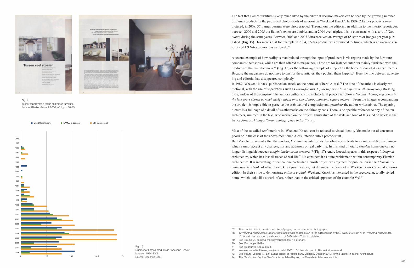
235
The fact that Eames furniture is very much liked by the editorial decision makers can be seen by the growing number of Eames products in the published photo shoots of interiors in ‘Weekend Knack’. In 1994, 2 Eames products were pictured, in 2008, 37 Eames designs were photographed. Throughout the editorial, in addition to the interior reportages, between 2000 and 2005 the Eames’s exposure doubles and in 2004 even triples, this in consensus with a sort of Vitra mania during the same years. Between 2003 and 2005 Vitra received an average of 65 stories or images per year pub-lished. (Fig. 15) This means that for example in 2004, a Vitra product was promoted 99 times, which is an average vis-ibility of 1,9 Vitra promotions per week.67
A second example of how reality is manipulated through the input of producers is via reports made by the furniture companies themselves, which are then offered to magazines. These are for instance interiors mainly furnished with the products of the manufacturers,68 (Fig. 16) or the following example of a report on the home of one of Alessi’s directors. Because the magazines do not have to pay for these articles, they publish them happily.69 Here the line between advertis-ing and editorial has disappeared completely.In 1989 ‘Weekend Knack’ published an article on the home of Alberto Alessi.70 The tone of the article is clearly pro-motional, with the use of superlatives such as world-famous, top-designers, Alessi imperium, Alessi-dynasty stressing the grandeur of the company. The author synthesises the architectural project as follows: No other home-project has in the last years shown as much design talent on a site of three-thousand square meters.71 From the images accompanying the article it is impossible to perceive the architectural complexity and grandeur the author writes about. The opening picture is a full page of a detail of weathercocks on the chimney caps. There is no specific reference to any of the ten architects, summed in the text, who worked on the project. Illustrative of the style and tone of this kind of article is the last caption: A shining Alberto, photographed in his library.
Most of the so-called real interiors in ‘Weekend Knack’ can be reduced to visual identity-kits made out of consumer goods or in the case of the above-mentioned Alessi interior, into a promo-stunt.Bart Verschaffel remarks that the modern, harmonious interior, as described above leads to an immovable, fixed image which cannot accept any changes, nor any additions of real daily life. In this kind of totally restyled home one can no longer distinguish between a night bucket or an artwork.72 (Fig. 17) Andre Loecxk speaks in this respect of designed architecture, which has lost all traces of real life.73 He considers it as quite problematic within contemporary Flemish architecture. It is interesting to see that one particular Flemish project was rejected for publication in the Flemish Ar-chitecture Yearbook, of which Loecxk is a jury member, but did make the cover of a ‘Weekend Knack’ special interiors edition. In their strive to demonstrate cultural capital ‘Weekend Knack’ is interested in the spectacular, totally styled home, which looks like a work of art, rather than in the critical approach of for example VAI.74
67 The counting is not based on number of pages, but on number of photographs.68 In Weekend Knack Jesse Brouns wrote a text with photos given to the editorial staff by B&B Italia. (2002, n°.7). In (Weekend Knack 2004, n°.49) a similar report on the showroom of B&B Italy in Tbilisi is published. 69 See Brouns, J., personal mail correspondence, 14 juli 2008.70 See (Bucquoye 1989a).71 See (Bucquoye 1989a, p.50).72 In reference to Karl Kraus, see (Verschaffel 2006, p.3). See also part II. Theoretical framework.73 See lecture (Loecxk, A., Sint-Lucas school of Architecture, Brussels, October 2010) for the Master in Interior Architecture.74 The Flemish Architecture Yearbook is published by VAI, the Flemish Architecture Institute.
Fig. 14Interior report with a focus on Eames furniture.Source: Weekend Knack 2000, n° 1, pp. 30-33.
EAMES EAMES VITRA
GENenaralINTerior
REPortage
EDIToRIAL EDITORIAL
1984 0 0 0
1985 0 0 0
1986 1 2 3
1987 0 1 5
1988 0 0 3
1989 0 0 0
1990 4 0 0
1991 1 0 0
1992 0 1 1
1993 0 0 2
1994 2 2 6
1995 4 2 6
1996 2 6 9
1997 4 1 4
1998 8 9 18
1999 9 9 19
2000 20 22 33
2001 25 28 36
2002 21 14 37
2003 28 25 64
2004 30 33 66
2005 28 24 66
2006 26 9 37
2007 25 7 28
2008 37 6 28
EAME
S
interio
rs
EAME
S
editori
al
VITR
A
genera
l1984
1985
1986
1987
1988
1989
1990
1991
1992
1993
1994
1995
1996
1997
1998
1999
2000
2001
2002
2003
2004
2005
2006
2007
2008
INTeri
or
REPort
age
EDITo
RIAL
EDITO
RIAL0 0 0
0 0 0
1 2 3
0 1 5
0 0 3
0 0 0
4 0 0
1 0 0
0 1 1
0 0 2
2 2 6
4 2 6
2 6 9
4 1 4
8 9 18
9 9 19
20 22 33
25 28 36
21 14 37
28 25 64
30 33 66
28 24 66
26 9 37
25 7 28
37 6 28
1984
1985
1986
1987
1988
1989
1990
1991
1992
1993
1994
1995
1996
1997
1998
1999
2000
2001
2002
2003
2004
2005
2006
2007
2008
0 17,5 35 52,5 70
Chart 7
EAMES in interiors EAMES in editorial VITRA in general
Fig. 15Number of Eames products in ‘Weekend Knack’ between 1984-2008.Source: Bouchez 2008.

237
4.2. Styling pages: the semiotic messages of the editorIn addition to the so-called real interiors, editorial pages have advisory shopping pages added to them, composed of photographs of products staged in different kind of settings. They are comparable to a fashion shoot and mutually show new trends, colours and combinations. (Fig. 18) Prices and shops where the products can be bought are included. Over the past 25 years these shopping pages have evolved from simple displays (Fig. 19) to complete fake interior settings, which look as though they are real. (Fig. 20) From the mid 2000’s ‘Weekend Knack’ added shopping pages at the end of the interior reports. In these pages stylists give ideas on how to create the same ambience in one’s own home, through the acquisition of one of the presented products.An example of this can be seen in (Fig. 21). This shopping page is added to an article on the home of a Flemish archi-tect. None of the products promoted are owned by the architect.
The magazine plays a double role: as a cultural educator and informant via the architectural story, and also as a pro-motional intermediary, through product placement. The first narrative explicates the ideal, whereas the accompanying page facilitates the real through the possible purchase of one product. Besides their role as producer of ideal domestic images, the magazines see themselves as guides to actual consumption of domestic products. They advise their readers to buy particular objects, which bridge the ideal and the real. According to McCracken, these goods become objective correlatives. The possession of one particular product represents the style of life to which the reader aspires. McCracken specifies:
Themotivationfortheexceptionalpurchaseisusuallyanticipatory.Itarrivesasa“frontrunner.”Thegood is purchased in anticipation of the eventual purchase of a much larger package of goods, attitudes, and cir cumstances of which it is a piece.75
The Juicy Salif designed by Starck for Alessi for instance, published many times because of its spectacular and sculp-tural form, is not only bought as a status symbol, but as a token for an ideal home. By placing the object in an ordinary kitchen, the user idealises his or her domestic situation. Hyped design objects become a sort of wish-stick with magical values to transform the domestic only for the eyes of the beholder.
The didacticism of combining the real and the ideal in one single editorial story is comparable to the encyclopaedic plate, analysed by Roland Barthes. (Fig. 22) With the encyclopaedic plate the information is specifically given through a visual representation, with a minimum of words. Essential, according to Barthes, is the combination of images of objects in a real situation, with people, plus images of objects, which are isolated from any real context. This is compa-rable to the way the editorial pages are constructed. At the end of an interior reportage, in the pictures where the objects are isolated, the plate has the role of declining the object, of manifesting its paradigm. This image is always linked with a real life situation (what Barthes calls the vignette), where the object is enacted in a tableau vivant. For Barthes this structure of information is articulated like real language. In an indirect way, the products presented in the bare represen-tation obtain a naturalness and familiarity through the enacted image.The combination of the two photographs presents itself as a kind of riddle: we must decipher it, locate the informative units. The real life picture has what Barthes calls theriddle’sactualdensity:alltheinformationmustturnupintheex-perienced scene. The scene itself gives little information, but it is the legitimising of the promotion of consumer goods. The real life interior, like the vignette in the encyclopaedia tells us here, once again, that language (and a fortiori, iconic language) is not pure intellectual communication: meaning is completed only when it is somehow naturalized in a complete action of man; (…) there is only message in situation.76
75 See (McCracken 1988, p.111). He’s referring to the Diderot-effect, see part II. 76 See (Barthes 1983, pp.226–227).
Fig. 16Interior report made by B&B Italia and published in ‘Weekend Knack’.Source: Weekend Knack 2002, n° 7, pp. 16-20.
Fig. 17Interior report in ‘Weekend Knack’.Source: Weekend Knack 2002, n° 16, pp. 54-57.

239
Barthes shows us the ambiguous narrative created through the combination of the interior reportage and bold product information. The identification process between product and consumer is established in a very natural way and most probably has a lot more effect than, for instance, advertising.
In their quest for finding newer and hipper interiors and products, editors not only link real interior reportages with con-sumer products, they construct visual representation of an enacted real-life. What started out in the early eighties as so called shopping productions (through a photographic frame a kind of window display was reconstructed with new prod-ucts) has evolved since the nineties into a complete fake construction of a domestic scene. With the same logic as the Encyclopaedic plate consumers are familiarised with the newest designs and consumer goods. The photographic images of what appears to be natural show design products in a home environment and are thereby validating the lifestyle of the rich and hip, although the image is nothing more than a stage set. The magazine ‘Wallpaper*’ made these kinds of set-tings, preferably with models on the sofa, its trademark. But ten years later most magazines with visual publications on domestic architecture use the same strategy in creating new styles and hip interior images.77 Journalist and design critic R. Poynor writes about this kind of editorial:
The effect is uncomfortably close to an advertisement or marketing person’s conception of ‘lifestyle’ as somethingtobepurchasedasanaccessoryratherthaninventedforoneself.Itfurthererodesthefast–closing gap between editorial and advertorial and turns the personal matter of devising an agreeable, individualised, self-expressiveinterior(withorwithoutprofessionalhelp)intoanexerciseinbuying-in,andplayingapart.78
These ‘Wallpaper*’–style photographs are meticulously constructed images. They are comparable to some of the icono-graphic photos Julius Shulman made in the forties and fifties.79 (Fig. 23) By carefully placing a model into the setting, with the right kind of clothing, the right kind of light and the right angle, the image achieves an artistic and aesthetic value, rather than a practical one, or a realistic one. Moreover, Judith Williamson, in her seminal work on advertising,80 explains how well constructed photographs with a correlation between an object and a stylish world, or a model, or a particular colour scheme are inherent to the semiotic structure of advertising. The photographs are the basis for connec-tions and thus underlying messages, which are not stated in the verbal parts of the advertising, portraying an assemblage of goods,81 as a certain lifestyle in an ideal but existing world of matching colours and beautiful people. According to Williamson, advertisers create through this kind of unuttered symbolic language an objective correlation, between the depicted ideal world and the product the advertiser wants to promote. (Fig. 24, 25) This seemingly real coexistence of things and styles gives the consumer the idea that, by purchasing the promoted product, the promised lifestyle of the total image will naturally come along. (Fig. 26)This correlation between the object, the model, and a particular colour scheme typical in advertising, is also applied in the editorial pages.Williamson:
(…) a selection of certain elements, things or people from the ordinary world, and then a rearranging and altering of them in terms of a product’s myth, to create a new world, the world of advertising. This is the essence of all advertising: components of ‘real’ life, our life, are used to speak a new language, the advertise- ment’s. Its language, its terms … are the myth; … they are too full of coincidence, of colour co-ordination, to bereal.Theverymeansofexpression(asshownbycolour,inthiscase)isthemyth.82
77 In the Vitra Home collection catalogue of 2007-2008, 12 pages are inserted of copies of these kind of ‘styled realities’ with products of the company, published in major European home-lifestyle magazines (Vitra 2007, pp.149–171).78 (Poynor 2007, p.47).79 In Shulman’s case, the vistas and architectural surrounding play a major role in the dramatic setting, see for example (Shulman 2007). In the contemporary examples of shopping pictures, the sales objects are the sole focus.80 See (Williamson 1978). Her work is based on semiology and largely influenced by the thinking of Roland Barthes.81 See (Featherstone 2007, p.86).82 See (Williamson 1978, p.23).
Fig. 18Styling pages in ‘Weekend Knack’.Source: Weekend Knack 1996, n° 49, pp. 18-19.
Fig. 19Styling pages in ‘Weekend Knack’.Source: Weekend Knack 1990, n° 42, pp. 160-161.
Fig. 20Styling pages in ‘Weekend Knack’.Source: Weekend Knack 2002, n° 7, pp. 90-91.

241
This advertising technique is not only applied in fashion or design editorials, but a similar approach is seen in the food pages. From the mid 2000’s, the dishes look like artworks. (Fig. 27, 28)In this sense, the general tendency of magazines to put the emphasis on aesthetic images with colour correlations, blurs the boundary between advertising and editorial more and more. Whereas during the eighties and nineties advertisements were still seen as the major intermediary between production and consumption, it is obvious that today the editorial pages have taken over this role. This could explain why highly praised design firms such as Alessi or Vitra have hardly advertised over the past 25 years, (Fig. 29, 30) and have received far more media attention than for example companies like B&B Italia, or Molteni, who advertised on a regular basis.
4.3. Editorial writing: from functional design to designartThe general shift from a function-based approach towards a more artistic approach within design, triggered by postmod-ern designers as Ettore Sottsass and Alessandro Mendini started in the 1970’s and came to a peak in the early 1980’s with the launch of Memphis. Several articles on design in ‘Weekend Knack’ in the 1980’s, show that Memphis and Sott-sass in particular, and postmodernist design in general, played a substantial role in the popularisation of design as form, rather than function. Although ‘Knack’s’ cultural pages already regularly featured articles on fashion and occasionally on design, the major-ity of the cultural editorial was dedicated to art. ‘Weekend Knack’ brings its readers an exponentially growing amount of written articles on design matters, from its be-ginning up to today. Throughout this proliferation of articles, the general narrative distinctly shifts from functional good design to design as a visual, artistic statement. Three incentives can be considered in this change of meaning: firstly, the way the Italian Radical design movement is pictured in opposition to the modernist view, secondly, the intertwining of culture and economy throughout the editorial. This leads to a subtle, but vast publicity for the artistic status of certain consumer goods as a means of distinction. Finally, a new lifestyle language is introduced, with its own logic in the pro-motion of design as trendy and artistic, rather than as a functional product.
4.3.1. From furniture to sculpture, ‘Knack’ 1980
From the 1980’s onwards, completely in tune with the international tendency in the media, already ‘Knack’ magazine shows a growing interest in design. (Fig. 31) The majority of the early articles are written in an art-critical and informative voice, with an emphasis on the sculptural assets of the furniture. Functional objects arepraisedfortheirartisticvalue,evidentlyinfluencedbythepostmoderndiscourse.Althoughapreponder-ance of articles deals with subjects that could easily be part of the crafts discourse, they are rarely addressed assuch.Onfurnitureby,forexample,AlexColp,J.DeRoeywritesTheylookmorelikesculptures,orthreedimensional artworks, than actually useable, manageable furniture.83 (Fig. 32) The work of the Blondeel family,84 Siegfried de Buck,85 Michel Martens,86 Marc Van de Steen,87 Emiel Veranneman88 is presented in the same way. Even though these are all designers whose oeuvre is strictly spoken better placed under crafts, than art or industrial design.
In October 1982, ‘Knack’ inserts 70 pages on a housing-special linked to the Interieur Biennale. It is in this special that design journalist Moniek Bucquoye introduces the polemic between modernism and postmodernism. She claims that the time has come to free design from the false impressions that the modern movement and its functionalism have created within architecture and design. This first article and about 70% of the following articles (mainly from her hand) until 1987 are a eulogy for the non-functional, anti-modernist approach of Alchimia and Memphis.
83 See (De Roey 1981, p.187).84 See (Darge 1983b).85 See (Darge 1983a).86 See (Bucquoye 1982).87 See (Darge 1982).88 See (De Coster 1982).
Fig. 21Interior report in ‘Weekend Knack’ with styling page as example of the real and the ideal.Source: Weekend Knack 2007, n° 11, pp. 51-52, 66.
Fig. 22The encyclopaedic plate.Source: Larouse s.d. (circa 1900), VI, p. 17.

243
Neo–design, postmodernism or memphism are the terms Bucquoye uses to describe the new movement. In 1987 she states that Memphis is dead and that a new generation of designers has risen out of its ashes: Form Follows Function is no longer ruling (…) The home-landscape in 1987 cares for the single furniture piece: the showpiece.89 Nevertheless, after the declared death of Memphis several articles refer to this historically important movement and its influence on contemporary design.90
The modernist/postmodernist debate is replaced by a discussion on non-functional, artistic forms versus practical, use-able items and their resulting commercial successes.
4.3.2. Furnished museum for sale, ‘Weekend Knack’ 1988Already in the early 1980’s, ‘Knack’ dedicates a few articles to design related issues. Some are reviews within an art-critical context, others focus upon the commercial aspect of design. In the Echo’s column, which is only half a page with a few small pictures, readers get to learn more about new consumer products and their prices, such as for example Bulo chairs, Breuer designs, produced by Habitat, (Fig. 33) or a water kettle by Nova,… Many of the companies pub-lished in the Echo’s pages, are also advertising in the magazine.All of the early articles have an informational goal. In an article on furniture and technique for example, journalist Jo-sef De Coster explains to his readers the trickle down effect, and introduces them to the practice of psychogramming in market research.91 Likewise, in the first years of ‘Weekend Knack’, readers are informed on economic trends and fluc-tuations within the market of furniture design. (Fig. 34) Several articles are dedicated to market research and consumer style–types. The role of the Flemish government in the promotion of design is also reported upon. Next to these sorts of articles, several reportages deal with the high cultural aspect of design. At first the journalists divide the more commer-cial approach clearly from the cultural. Economic articles deal with marketing strategies, trends and portraits of compa-nies. Artistic articles bring portraits of the artist/designer and inform on exhibitions of design. By the 1990’s however, the line between these two aspects of design is totally blurred.
In several articles in the 1980’s on the design trade shows Interieur Biennale and Linea, the artistic and the commercial line becomes diffuse. Both shows are commercial trade fairs with a cultural extra, through exhibitions. In the articles on these fairs the polemic between modernism and postmodernism becomes more distinct. While the Interieur Bien-nale and journalist M. Buquoye, who also became director of the Interieur Biennale in 1981,92 defends postmodernism, Linea and its curator Ballegeer, who also writes for ‘Weekend Knack’ at that time, still promotes the old spirit of social reform through modern design. Once Bucquoye’s pro-postmodern position is secured in ‘Weekend Knack’, there are fewer articles on the modernist-functionist discourse, which makes place for a new dualism. As previously mentioned, the new debate is about artistic form and non-functionality, versus the more commercial approach linked with usability.
Both fairs organise cultural events next to the commercial booths of the design companies. The cultural aspects of the fairs are ideal in gathering large media attention. The magazine prefers to focus on the cultural rather than the com-mercial in its aim to keep its own cultural value high.93 It is via the same mechanisms that companies such as Alessi and Vitra achieve major editorial coverage of their products, without the need to advertise. As explained in Case 1 and Case 2 these companies have largely invested in the promotion of the designer-celebrities in a Pevsnerian sense. The presen-tation of a person-centred design history is copied in the ‘Weekend Knack’ editorials.94
89 See (Bucquoye 1987).90 There have been articles published with a reference to postmodern design in 1990, 1992, 1994, 1995, 1996, 1997, 1998.91 See (De Coster 1981).92 See (Interieur Foundation 2010, p.75).93 See (Bourdieu 1993, p.78). See also Case 2.94 See also Jonathan Woodham on the ubiquity of this approach in the media (Woodham 2005, p.263).
Fig. 23‘Wallpaper*’ style in ‘Weekend Knack’.Source: Weekend Knack 1999, n° 16, p. 23.
Fig. 24Photography by Julius Shulman, Case Study House n° 21.Source: http://fairuse-wjy.blogspot.nl/2011/12/interior-case-study-house-21.html, consulted 15.07.2012.

245
Fig. 25Advertising Poggenpohl in ‘Knack’.Source: Knack 1982, n° 15, p. 85..
Fig. 26Styling page ‘Weekend Knack’.Source: Weekend Knack 2000, n° 8, p. 276.

247
(Fig. 35) However, in these more cultural pages there is a clear shift away from the objective, critical approach of the first years of publication towards an undisputable promotional narrative. The design pieces are praised for their aesthetic, spectacular and high cultural values.
In the first publication on Alessi, in 1985, Pierre Darge reviews in a two-page article the Alessi Tea and Coffee Piazza exhibition in Museum Boymans-Van Beuningen in Rotterdam.95 Only four pictures are published, with more text than image. The tone of the article relates to art and architectural writing, with a critical description of the different works of the eleven architects who are considered artists. Although the article is written from an art-historical and critical point of view, the last paragraph gives the name and address of the sales point. This is a shift away from the pure informative approach of ‘Knack’ towards a lifestyle approach in ‘Weekend Knack’. In 1992 M. Bucquoye publishes a second large article on an Alessi exhibition,96 in the Design museum Gent.97 The ar-ticle doesn’t take a critical stance towards the exhibition, but adulates Alberto Alessi who is quoted from the catalogue Rebus Sic….98 The author does not only take over the grandiloquent words of A. Alessi on the role of his company to (…) offer ‘good’ products and to advance the evolution of public taste,99 but also concludes her article with the same message, strengthened by her authority as a recognised Flemish design journalist. ‘Memory Containers’ is a beautiful project that should be applauded and asks for more new initiatives from other sectors (…) they are a stimuli for young people and initiate taste formation to the public. (Fig. 36)Also important is a distinct shift towards less text and more images over the 25 year period researched. In the 1992 article 9 different products are photographed, and more than half of the page layout is used for images. The article opens with a large image going over the double page. This in contrast with the two-page article with four small pictures in 1985.In 1997 Max Borka interviews Stefano Giovannoni,100 at that time the latest successful Alessi designer.101 The empha-sis is on the designer’s way of working, but although the article mentions the fact that the designer works for different companies, all the images are Alessi products.102 The narratives initiated by Alessi are similar to Giovannoni’s ideas, and some of them, such as design as art are underlined by the author. However this article does take a slightly critical stance and does not arbitrarily reproduce the Alessi ideal. Borka raises for example questions concerning sustainability and consumerism. Even if this particular journalist does take a more critical approach, the company still gets major atten-tion. That same year 14 different new Alessi products are promoted in ‘Weekend Knack’. The high cultural initiatives from the producer have a direct influence on the number of representations of Alessi products in the ‘Weekend Knack’. (Fig. 29)Both in 1992 and in 1997, years when large informative articles were published on the Alessi firm and its designers, linked to cultural incentives organized by the producer, the inserts in the editorial ‘shopping-pages’ are significantly more numerous.
95 See (Darge 1985). See also Case1.96 See (Bucquoye 1992) about the Creole Project/Memory Containers Contest, organized by Centro Studi Alessi.97 At that time still called Museum for Decorative Arts (Museum voor Sierkunst). Since 1 Jan 2002 the museum changed its name officially to Design museum Gent. See (Verlinden 2008, pp.6–10).98 See (Polinoro 1991).99 See (Bucquoye 1992, p.136). 100 See (Borka 1997).101 Together with Guido Venturini they became known as the King-Kong designers of the Girotondo tray, first produced in 1989 in steel. See (Collins 1999, p.19). See also Case 1.102 The opening double page features four different designs: the Happy-spices-set, Moly, Mary Biscuit and a Girotondo plate.
Fig. 27Food styling ‘Weekend Knack’.Source: Weekend Knack 2005, n° 46, p. 34.
Fig. 28Food styling ‘Weekend Knack’.Source: Weekend Knack 2005, n° 46, pp. 56-57.

249
In 1988 M. Bucquoye writes a four-page article, with seven enlarged pictures on the Vitra Edition collection. She re-minds her readers that there is more contemporary design being made, than there is being sold. Due to their lack of functionality these objects end up in galleries and museums, instead of in the design shops. Rolf Fehlbaum, chairman of Vitra is lauded in this publication for bringing ten artistic chairs into production. As for the Alessi Tea and Coffee Pi-azza, the designers of the chairs are brought to the foreground. Architects (for example Frank O’ Gehry), designers (Ron Arad, Sottsass) and artists (Richard Artschwager) are given a similar artistic status. The creative authority of artists, architects and designers is treated in the same way. By the end of the eighties the discourse moves from a discussion on functionalism to an acceptance of design as a form of high art, with not only a focus on the forms of the objects, but also on the genius of their makers. The objects and their makers move very subtly into/onto the art scene. When some of the Vitra prototypes are on display in Documenta 8, Bucquoye concludes her article: Of every prototype a small series will be produced to be sold to the devotees (…) in the art circuit.103
A couple of months later the same author publishes an article on a remarkable exhibition in Hasselt entitled: Furnished museum for rent.104 The exhibition shows unique furniture objects, with a twofold aim: firstly to prove that furniture does not become art when positioned in a white museum room, and secondly to stimulate the creation of unique design objects, moving them out of the crafts discourse and into the contemporary production systems. In the article Bucquoye points out that applied arts and crafts have always stood at the margin of the art scene. She concludes that furniture in the white, naked space of a museum room is surprising and questions whether design is not becoming art? When in 1990, the Swiss based company Vitra opens a private museum, the same author doesn’t see anything surprising in the fact that design is shown in a museum. (Fig. 37) The bond between culture and economy is a fact. Design objects are shown on pedestals in white cubes and are described as icons. Large monographs of the designers are published in analogy with the monographs of painters and sculptures. And the phone numbers of the company are found at the end of the article.
As cultural intermediary ‘Weekend Knack’ focuses on high design in their strive to stay ahead of the game.105 Moreover, writing and reading about design icons doesn’t need a profound knowledge of art-history, in comparison to articles on contemporary high art. The majority of the middle class consumers can easily comprehend and relate to the functional and formal aspects of the design objects presented in the ‘Weekend Knack’ articles.106 Exemplary are the design for beginners stories, emphasizing the educational role of the magazine as intermediary. (Fig. 38) These articles mainly focus on the life of the designer and describe his most well-known products. They sometimes conclude with pure prod-uct placement, through pack-shots of the products, with the sales-points and the prices, implying a comparable natural link between the ideal and the real as explained previously. In this sense ‘Weekend Knack’ spotlights the canonisation of designers in a continuation of the Vitra narrative.Alessi and Vitra introduced an ideal marketing technique to bridge the divergence between culture and commerce. Other companies employ a similar technique, using the spectacular forms created by the new generation of designers as a means to produce art rather than consumer products.107 After the debate between modernism and postmodernism, the debate between artistry/culture and functionality/economy has evolved into a commercial trick to move non-functional objects into high art, and thus ideal tokens of distinction. When in 1991 M. Bucquoye reports on the popular hybrid shops, which are something between a gallery and a design shop, she states that the unique design object is being sold to an elite public. (Fig. 39)
103 See (Bucquoye 1988a, p.79).104 See (Bucquoye 1988b).105 See (Bourdieu 1984, p.228).106 See (Bourdieu 1984, p.5).107 Garouste-Bonetti-collection, Cleto Munari collection, Cristal collection of Val Saint Lambert, Martell.
WK Vitra editorial Vitra advertising
1984198519861987198819891990199119921993199419951996199719981999200020012002200320042005
0 00 13 05 03 00 00 00 01 02 06 06 09 44 3
18 419 633 936 637 664 966 1666 6
WK Alessi editorial Alessi advertising
1984198519861987198819891990199119921993199419951996199719981999200020012002200320042005
1 04 08 95 63 164 154 7,5
10 721 27 17 105 10
34 539 220 315 621 015 01 02 3
13 48 1
0
17,5
35
52,5
70
1984 1985 1986 1987 1988 1989 1990 1991 1992 1993 1994 1995 1996 1997 1998 1999 2000 2001 2002 2003 2004 2005
Chart 38
Vitra editorial Vitra advertising
0
10
20
30
40
1984 1985 1986 1987 1988 1989 1990 1991 1992 1993 1994 1995 1996 1997 1998 1999 2000 2001 2002 2003 2004 2005
Chart 39
Alessi editorial Alessi advertising
Fig. 29.Alessi advertising versus editorial in ‘Weekend Knack’ between 1984-2005.Source: Bouchez 2008.
WK Vitra editorial Vitra advertising
1984198519861987198819891990199119921993199419951996199719981999200020012002200320042005
0 00 13 05 03 00 00 00 01 02 06 06 09 44 3
18 419 633 936 637 664 966 1666 6
WK Alessi editorial Alessi advertising
1984198519861987198819891990199119921993199419951996199719981999200020012002200320042005
1 04 08 95 63 164 154 7,5
10 721 2
7 17 105 10
34 539 220 315 621 015 0
1 02 3
13 48 1
0
17,5
35
52,5
70
1984 1985 1986 1987 1988 1989 1990 1991 1992 1993 1994 1995 1996 1997 1998 1999 2000 2001 2002 2003 2004 2005
Chart 38
Vitra editorial Vitra advertising
0
10
20
30
40
1984 1985 1986 1987 1988 1989 1990 1991 1992 1993 1994 1995 1996 1997 1998 1999 2000 2001 2002 2003 2004 2005
Chart 39
Alessi editorial Alessi advertising
Fig. 30Vitra advertising versus editorial in ‘Weekend Knack’ between 1984-2005.Source: Bouchez 2008.

251
Fig. 31Postmodernism in ‘Knack’.Source: Knack 1984, n° 11, pp. 118-119.
Fig. 32Function versus non-function debate in ‘Knack’.Source: Knack 1991, n° 19, p. 187.
Fig. 33Habitat product in Echo’s, ‘Knack’.Source: Knack 1981, n° 28, p. 96.
Fig. 34Habitat advertisement in ‘Knack’.Source: Knack 1981, n° 38, p. 87.
Fig. 35Example of a portrait of designer; Jan Godijns.Source: Weekend Knack 1990, n° 42, pp. 58-59.
253
Fig. 36Alessi in ‘Weekend Knack’.Source: Weekend Knack 1992, n° 6, pp. 134-135.
Fig. 37Vitra-museum in ‘Weekend Knack’.Source: Weekend Knack 1990, n° 7, pp. 216, 218.
Fig. 38Design for beginners: Ray and Charles Eames.Source: Weekend Knack 2005, n° 17, pp. 88-90.
Fig. 39Hybrid shop: between art and design in ‘Weekend Knack’.Source: Weekend Knack 1991, n° 41, pp. 140-142.

255
Fig. 40Design galleries in ‘Weekend Knack’.Source: Weekend Knack 2007, n° 41,pp. 126-127.
Fig. 41Brunati advertisement in ‘Knack’.Source: Knack 1981, n° 26, pp. 26-27.

257
The target group is:
(…) intellectual, trendy and well-read. They know who’s ‘in’, which kind of curve will be ‘hot’ and how the quality should be judged. It’s a progressive public that loves beautiful forms, but also an eccentric one who knows how to manipulate the word ‘art’ very readily.108
From the late 1980’s into the 1990’s most of the articles on design deal with its formal, elitist aspects. In a world drown-ing in images, the mediated overproduction has no alternatives other than amazement and spectacle. (…) Design shops showdesignonapedestal.Thesebeautifulsettingsnevermisstheirfinalgoal:thecashcounter.109 This process contin-ues and is celebrated at the artfair in Miami in 2008, according to the magazine.110 Designart is now widely accepted by the elite art collector and has a cultural and commercial value equivalent to art.111 (Fig. 40)
4.3.3. Black is beautiful, Weekend Knack 1987In the process of intertwining the artistic and the commercial, a new lifestyle language develops. The art-critical tone, with its references to a presumed background knowledge in art history, makes place for informative articles that do not require any specialised knowledge. Robert Boonstra for example, publishes an article on Italian design in 1983, report-ing on the new movement in which functional objects seem to have bizarre forms.112 In his art-critical article he refers to Loos’ Ornament und Verbrechung, he brings in a discussion on kitsch (Selle), and the role of the ritual (Sottsass). In order to fully understand the article, readers need to be familiar with the cultural background and cultural discussion to which Boonstra is referring. Slowly however, this kind of language disappears and is replaced by more easy going descriptions and often more personal accounts. The distant voice of the specialist is no longer present. The lifestyle journalist becomes more of a personal guide in the intriguing world of art, design, cinema, music, fashion and so on. Ar-ticles tend to blend the different cultural and economical aspects of the consumer world into one story. At the beginning of 1986, Patrick Duynslaegher introduces a whole new form of editorial. The text reads like a rollercoaster ride cover-ing extremely different cultural subjects as well as trendy objects. The Ford T, Darth Vader, Yohji Yamamoto, Swatch, Charles Mackintosh, Maurice De Wilde, Francois Truffaut, Yuppies and many more are mentioned in one breath. The author does not position the discourse in a wider cultural context, nor does he explain who all these people and things are and what they mean in a historical perspective. He is thus assuming that the reader knows the codes to understand his exposé. The message of the article is simple: the colour black dictates the contemporary lifestyle, from fashion, to movies. Large photographs, which have been meticulously constructed by a stylist, explain to those who are not familiar with the context, what the article is about.113
In a gradual process, art-critical articles move into easily readable informative articles, with initially a clear distinction in cultural or economic subjects. Progressively the promotional, economic language of fashion and trends is applied to most articles of design.
4.4. The marginal role of advertisingThere is no doubt that the new magazines of the 1980’s, such as ‘Weekend Knack’ came into being because they prom-ised a large advertising income.114 With the change in emphasis in magazines towards the creative, advertising played a substantial role as cultural intermediary, in particular in bridging the cultural with the economic.115
108 See (Bucquoye 1991).109 See (Bucquoye 1989b).110 See (Willot 2008).111 See for example Pierre Bergé auctions of design, where a limited edition of Humberto & Fernando Campana’s Mickey & Minnie sofa is estimated between 28000 and 35000 euro (Bergé 2009, p.96).112 See (Boonstra 1983).113 See (Duynslaeghers 1986).114 See for example (Winship 1987, p.160).115 See for example (Mort 1996; Nixon 1996; Nixon 1997; McFall & du Gay 2002; McFall 2002; Lash & Urry 1994; Leiss 1990; Featherstone 2007; Soar 2002; Miller 1997; Slater 1997; Williamson 1978). For a critical approach upon this shift see for example (Baudrillard 1998; Wernick 1991).
Fig. 42deSede advertisement in ‘Knack’.Source: Knack 1981, n° 39, pp. 46.

259
This is articulated through the preponderance of aesthetic, image driven advertising with a mainly emotional or artistic tone.116
Design companies were already advertising in ‘Knack’. The ads of luxury brands such as Brunati, (Fig. 41) Ligne Ro-set, deSede, (Fig. 42) Bonaci were quite striking and prominent due to the aesthetics of the image, the graphic design and often the fact that they were the only pages in colour. They had a sort of creative and avant-garde radiance. In ‘Weekend Knack’, the number of design adverts was growing every year, and, eventually, other companies with a more mainstream target group and products essentially unrelated to design (washing powder, (Fig. 43) radio programmes, (Fig. 44) political campaigns (fig. 45)) began to refer to the word design,117 or use visual design props in their advertis-ing. These companies did not however express exactly the same distinctive designed way of life as that presented by the luxury brands in the early 1980’s. Even so, by the end of the 1990’s the whole magazine breathes an aestheticized design style and the difference between editorial and advertisement has blurred. Editorial and advertising look the same, by using the same style, props and messages.118 It is inherent to advertising to bridge the realms of production and consumption, however, as already explained, maga-zines influence their readers much more through indirect advertising, via their editorial coverage.119
Al and Laura Ries state in their much acclaimed publication The fall of Advertising and the rise of PR that all the recent marketing successes have been PR successes, not advertising successes. To name a few: Starbucks, The Body Shop, Amazon.com,Yahoo!,eBay,Palm,Google,Linus,Playstation,HarryPotter,Botox,RedBull,Microsoft,Intel,andBlackBerry.120 Vitra and Alessi fit into this enumeration.The most important aspect of communication for a new company is getting the brand name into the minds of the con-sumer. Ries acknowledges that advertising is too weak a link to establish brand awareness.
Advertising has lost its power to put a new brand name into the mind. Advertising has no credibility with consumers, who are increasingly sceptical of its claims and whenever possible are inclined to reject its message121(…)It’stheself-servingvoiceofacompanyanxioustomakeasale.Youcanlaunchnewbrands only with publicity or public relations (PR). PR allows you to tell your story indirectly through third-party outlets, primarily the media.122
As Pierre Martineau already states in 1957 any buying process is an interaction between the personality of the individu-al and the so-called ‘personality’ of the product itself,123 quoted by Baudrillard in his System of Objects, through which he explains that the objects of mass consumption merely form a repertoire.124 And better than advertising, magazines supply and guide the consumers with and through this symbolic repertoire.125 Using different strategies, the editorials associate the products with particular lifestyles or images of a certain social standing, and in this way an emotional at-tachment to the product is achieved.
116 In general on changes within the advertising world from the viewpoint of an advertiser see for example (Himpe 2006). On the change towards a more emotional approach in Belgian advertising see (De Pelsmacker & Geuens 1997).117 In 1984 Moniek Bucquoye as Gerrit Six criticise the fact that the word design is being prostituted, see (Bucquoye 1984, p.27) or has become a fata morgana see (Six 1984, p.11).118 See also (Poynor 2007, p.47).119 See also (Usherwood 1997, p.182) on the case of the British ‘Elle Decoration’.120 See (A. Ries & L. Ries 2002, p.xvi).121 See (A. Ries & L. Ries 2002, p.xvi).122 See (A. Ries & L. Ries 2002, p.xi).123 See Pierre Martineau 1957, p. 73 quoted in (Baudrillard 2001, p.14).124 See (Baudrillard 2001, p.14).125 See also (Chaney 1996).
Fig. 43Coral advertisement in ‘Weekend Knack’.Source: Weekend Knack 1998, n° 7, p. 211.

261
Through the different levels of meaning created in magazines, products achieve a more complex personality than the single meaning created through advertisements and can therefore attract a much more diverse public.Throughout the different aforementioned strategies an emphasis on the relationship between the ideal and the real is es-sential in the establishment of a symbolic repertoire. The magazine as tastemaker of the domestic interior and its goods creates an aesthetic frame, with an emphasis on the spectacular and the ideal. Through the promotion of the actual consumption of one of the spectacular objects they invite the consumer into the real. It is this duality between the ideal and the real that is precisely the strength of the magazine as a mediator of a self-identity.126 This is referred to by McCracken,127 who explains how the acquisition of one particular product becomes an objective correlative that represents a whole lifestyle, which the consumer wants to be identified with. It is nevertheless doubtful that the user will eventually purchase the whole assemblage of goods.128 In this respect, Giddens stresses the fact that the media offers access to settings with which the individual may never personally come into contact,129 and thus enlarges the gap between the real and the ideal.While the ideal of the homes or stories presented in these magazines will probably never be obtained by the largest part of its readers, the consumption of one particular, spectacular, symbolic design gadget is, nevertheless, within reach. In this respect we can say that modern architectural advice on good living has evolved into consumer-advice on iconic design.
Magazines have become powerful suppliers of meaning and have become prime cultural intermediaries in bestowing taste.By the mid 1980’s it becomes evident that it is the commercial producers, through the logic of upgrading cultural capital, who are the real decision makers in what gets promoted and what does not. In the home, a major arena for the representation of the self,130 the modern consumer is guided through a fast growing number of life-style magazines in a choice of products. Through the seemingly natural link between the ideal and the real, the promoted objects become correlatives for the home of their dreams. The strive for the ideal has always been a motor for social organisation and mobility.131 What is new is the explicit role of the lifestyle magazine as consumer guide. Referring to Andrew Wernicks’ Promotional culture,132 the so called cultural intermediaries which are ideally depicted as gatekeepers of information between the producer and the consumer, should today be understood as promotional intermediaries. There is a total absence of objective journalism and grounded information on how we ideally could organize our home. Due to these kinds of life-style magazines, the general public bases its knowledge of the interior on unreal domestic situations. This encourages the conspicuous consumption of design goods and guides consumers towards a visually spectacular archi-tecture. The new generation of architects in the USA is already alluded to as the ‘Wallpaper*’ generation. Ironically, in order to meet the expectations of the public, architects and designers are forced to design real homes, based on the vir-tual. In the 1960’s the Dutch critic Simon Mari Pruys,133 questioned if the empty and cold architecture of post-war mod-ernism was not a result of a misapprehension of the emptied out photographs published at that time. In the same sense, we could argue today that the success of design products and spectacular architecture is based on the falsified informa-tion generated by lifestyle magazines.
126 Giddens explains self-identity in high-modernity as a reflexive organised endeavour. The reflexive project of the self, which consists in the sustaining of coherent, yet continuously revised, biographical narrative, takes place in the context of multiple choice as filtered through abstract systems. See (Giddens 1991, p.5).127 See (McCracken 1988).128 See (Featherstone 2007).129 See (Giddens 1991, p.169).130 See (Giddens 1991).131 See (Winship 1987).132 See (Wernick 1991).133 See (Pruys 1971).
Fig. 44Studio Brussel advertisement in ‘Weekend Knack’.Source: Weekend Knack 2000, n° 13, p. 110.

263
5. ConclusionOver the years researched it seems that the role of the stylist has become primordial in lifestyle magazines. Overall there is a growing tendency to aestheticize or design all aspects of the magazine, from fashion and homes to food. The images have become more important than the texts and within the written content on design matters, there is a clear shift from an art-critical approach in the mid 1980’s towards a lifestyle jargon.Different strategies are applied to present an idealised and aestheticized designed lifestyle, which attracts the reader by its ideal representation and knows how to bridge this ideal with the real through the promotion of specific objects which are presented as tokens of distinction.
We can conclude that:- The real homes used in the magazines have become stages for high design objects. They are often created through the direct collaboration of the stylist with the producers.- The advisory pages contain new products moved into aesthetic images of real-life situations, but are based on the principles of advertising, using a similar, subtle symbolic language.- Written articles on design have gradually evolved into a laudation of iconic high design, where the status of the designer is of more importance than the use-value of the product.- The style of the articles has become easily manageable and promotional, with no background needed to comprehend the content.
These strategies have no doubt added to the design popularisation process and the infusion of the idea that design is distinctive and artistic, rather than functional and related to everyday use.
Fig. 45Advertisement for a political party in ‘Weekend Knack’.Source: Weekend Knack 1989, n° 23, p. 148.

265
CASE 5
KEEPING UP WITH THE JANSSENS1
1. IntroductionDesign history over the past 40 years has become an autonomous field of study, emancipated from the art-historical perspective with its main focus on the analysis of styles, and high cultural productions with a suggestion of the artist as genius.2 However design in the everyday public space seems to be represented mainly as a compilation of icons and its genius designers, be that in popular publications on design, or in the window-displays of most Western cities. The con-tinuous flow of presenting icons of design is striking, from Taschen publications to McDonald’s interiors.3 The same can be said of the focus in lifestyle media on design.4 Editorial mainly brings objects with a strong visual statement into the spotlight. Alice Rawsthorn even speaks in this respect of mediagenetic design,5 and Gareth Williams refers to them as objects that can command a magazine spread or dominate a television studio set.6 Some of these de-signs have become ubiquitous.From the attention high design goods are given in our real and virtual public spaces one could conclude that the con-sumer has appropriated the meaning of design dispersed by producers and highlighted by the media into the private sphere of their home. One could presume that the highly mediated furniture of for example Jacobsen, Eames, Panton… has found its way into the private households, through the acquisition of the highly mediatised products and highly pro-moted design style, if not in recognition and narrative.7
Jeffrey Meikle pointed out in 1998 that although there is a growing attention to design from an academic perspective, there it remains difficult for researchers to analyse the extent of the reception and perception of design by consumers.8
The only way to really know how the mainstream consumer is dealing with design and home improvement in his pri-vate domestic space, is to go out into the streets and question the Janssens. In the line of researches by for example Daniel Miller,9 and Alison Clarke,10 in one particular street or building block, this research looks into appropriation schemes on design products and designing the home in one particular street in Ghent, Belgium.11 It questions how the highly mediated contemporary design narrative has been read into by the consumer, and how this relates to the DIY-trend of open design.
1 Jansen and Janssen are the names of Tintin’s identical police detectives. Their names are probably the most common in Flanders and thus the equivalent for the Joneses. In the English version they are translated to Thomson and Thompson. Large parts of this case will be published upcoming December, (Bouchez 2012).2 See (Meikle 1998).3 See also an advertisement of the Catholic Church in Flanders, in which they use Arne Jacobsen chairs. This picture was a billboard on catholic institutions, all over Flanders in 2006, See Introduction. See for example the highly popular Taschen publications on design by Charlotte and Peter Fiell (C. Fiell & P. Fiell 2000; C. Fiell & P. Fiell 2001; C. Fiell & P. Fiell 2007; C. Fiell & P. Fiell 2005; C. Fiell et al. 1997).4 The PhD research of Donatella Cacciola states that magazines, more than book publications add to the literal iconisation of certain design furniture. Part of the research focuses on the mediation and reception of re-editions of Gavina, Knoll and Cassina from 1960-1990 in Italy and Germany (Cacciola 2003).5 See (Rawsthorn 1999, p.19). Gareth Williams refers to them as objects that can command a magazine spread or dominate a television studio set, (Williams 2006, p.18).6 See (Williams 2006, p.11).7 See also Case 4, on the way interior reports are manipulated.8 See (Meikle 1998). Meikle points out that the discrepancy of the real and the ideal is a problem inherent to design history, since most scholars base their studies on published materials being texts and images, rather than the real thing. Besides is there a tendency to accept the opinions of the designers and the producers about the meaning of their products. (…) we have no way of knowing with certainty how and why consumers at a given historical moment responded to particular products, graphics or environments, (Meikle 1998, p.194).9 See (Miller 1990; Miller 2001b; Miller 2008).10 See (Clarke 2001). For other ethnographic researches on private homes see also (Putnam & Newton 1990; Cieraad 1999; Pink 2004; Woodward 2007; Southerton 2003; Madigan & Munro 1996; Pader n.d.).11 23 different households were researched. On demand of some owners, of only 19 homes photographs are inserted. Because the photographs are not directly related to the information given by the respondents, they will not be referred to in the text. However, when reading a quote of a respondent the photographs can be helpful in contextualising.
Fig. 1Respondent n° 1.Source: Bouchez 2009.
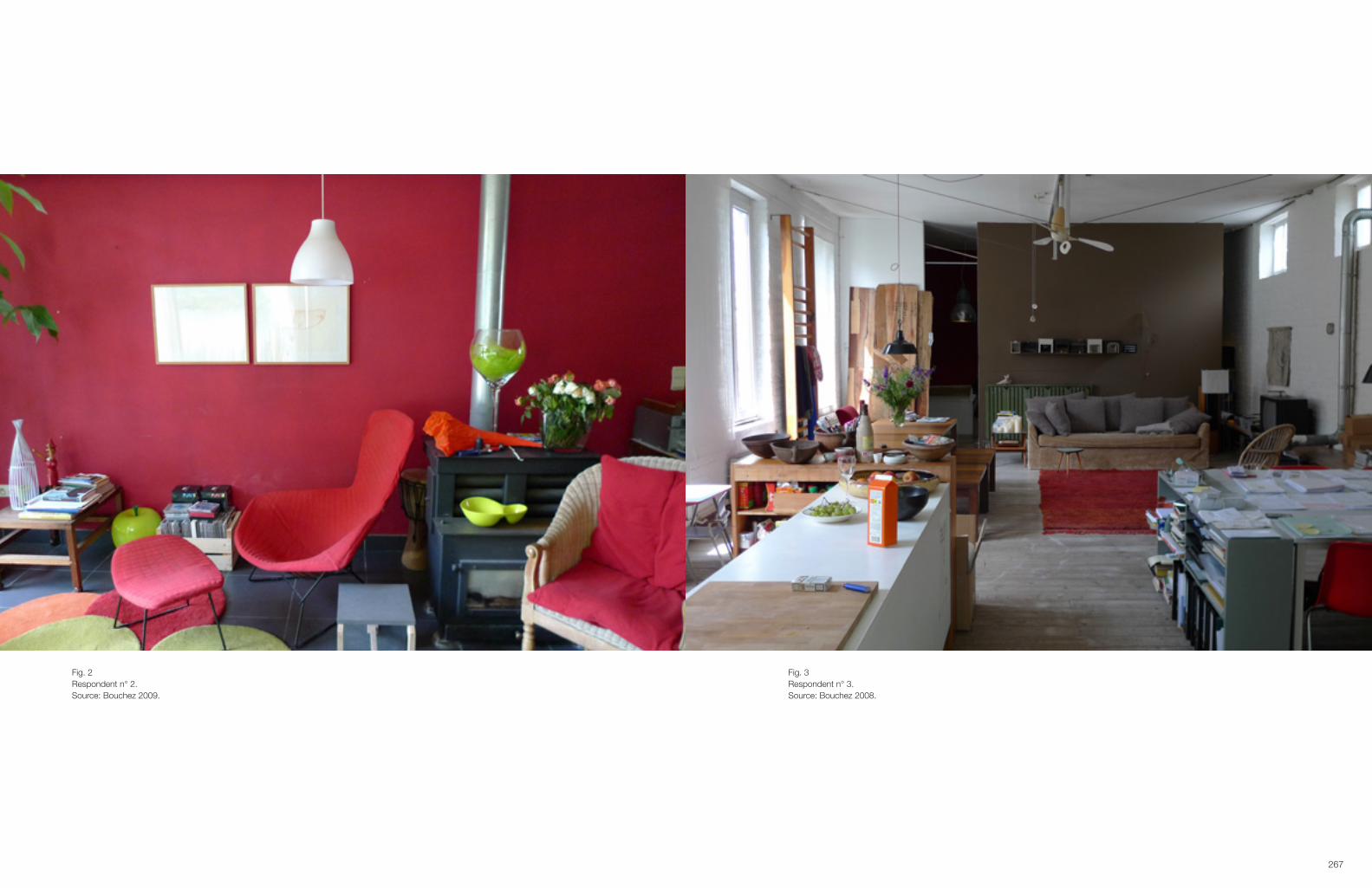
267
Fig. 2Respondent n° 2.Source: Bouchez 2009.
Fig. 3Respondent n° 3.Source: Bouchez 2008.

269
2. Research methodThe street is located just outside the city centre of one of the major cities of Flanders. The area expanded in the second half of the 19th century from a small village to a proto-industrial suburb. It is characterised by small workers’ houses, medium sized traders houses and two industrial complexes, which have been renovated into lofts. Most of the houses are owner-occupied. Some of them are rented and one of the larger houses is a shared by several friends. The street is in full gentrification. In the early 1990’s the internationally known artist Wim Delvoye bought the two old factory buildings and started renovating them as lofts.12 At first, young people and families working within the creative field settled in the lofts. Soon to be followed by young, often creative people who bought into the smaller and larger family houses. In 2000 one of the factory buildings was sold to two young entrepreneurs, and has been renovated into hip, sophisticated lofts. At the time of research (2009-2010) the oldest inhabitant still lives in the house she was origi-nally born in, in 1927. The youngest adult of the street was born in 1984 and shares a medium large house with a couple of friends. The respondents have very diverse occupations: truck driver, factory labourer, architect, designer, entrepre-neur, secretary, professor, fireman… there are several housewives and a few unemployed people. The inhabitants of this street represent a diverse palette of age, education and income. It was not the aim of the research to find class divergenc-es or convergences, but rather to look into a representation of mainstream urban consumers and how they have appro-priated high design goods and the highly mediated narratives on design, as well as a kind of design-style in the course of the so called aestheticization of the everyday,13 promoted so much in this design-conscious era.
It is not because the research was limited to one street that a strong social network between the inhabitants was pre-sumed. On the contrary, as Daniel Miller explains in his 2008 study of thirty households in one random street in Lon-don: People do not live their lives in order to accord either with the cosmology of a religion or with the cosmology of a beliefinsociety.Forthemostpart,thesearetherandomjuxtapositionsofhouseholds,asdeterminedbyforcessuchashouseprices,transportsystemsandproximitytowork,schoolandleisure.14 A comparable situation was found in this street. In most cases people hold social relations with their closest neighbours, but in general there is no sense of social belonging to this particular geographic area. The fact that the interviewer lives in the same street as the interviewees, made it easier to find an introduction into the private lives of these people. On the other hand it could be considered a bias in the research, because there might be an effort to present oneself better, based on emulation of neighbours (keeping up with the Joneses) in the strive to move up the scale of a materialistic lifestyle. Similarly ethnographic researchers have expressed the same concern. Entering peo-ple’s private spaces is inevitably intrusive and the methodology can always be flawed when, for example, the respond-ents only say what the interviewer wants to hear, or when the respondent represents himself in an idealised way.15
Practice showed that most respondents did not take any particular precautions during the interview. Often respondents excused themselves for the clutter in their home when pictures were taken as part of the research, implying that they had not had the time to clean up the house and thus had not tried to make it look better.16
12 About the role of lofts in a gentrification process see for example (Zukin 1989). By the time of the research W. Delvoye had sold both buildings and moved to another factory-loft around the corner.13 Along with this statement Featherstone questions which particular groups, strata, or class fractions are most closely involved in symbolic production and, particular, in producing the images and information celebrating style and lifestyle (Featherstone 2007, p.82). Nor is it our aim to find evidence for the process of cultural declassification, which started in the sixties and has according to DiMaggio (DiMaggio 1987) led to the end of the endemic features of social life, as high and low, elite and popular. 14 See (Miller 2008, p.284).15 See for example (Miller 2001a, p.1; Pink 2004, pp.28–29; Woodward 2007, p.166).16 In the 1990’s the interviewer worked as a freelance journalist and accompanied interior photographers on photo-shoots of private homes. The difference with these homes and the ones in the researched street is striking. For a magazine reportage people clean their home and present an exciting story about themselves. The Janssens on the other hand treated the researcher as a neighbour, and in a sense as one of them, rather than as a specialist, or a journalist with authority. With most of the neighbours the researcher had never spoken before and only a few people were aware of her professional background.
Fig. 4Respondent n° 4.Source: Bouchez 2009
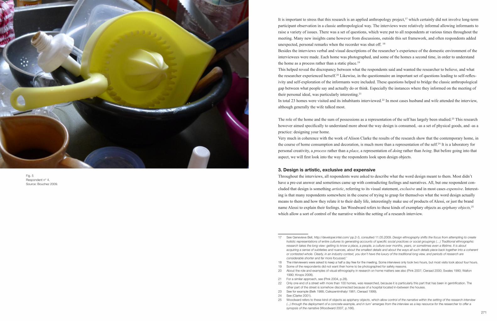
271
It is important to stress that this research is an applied anthropology project,17 which certainly did not involve long-term participant observation in a classic anthropological way. The interviews were relatively informal allowing informants to raise a variety of issues. There was a set of questions, which were put to all respondents at various times throughout the meeting. Many new insights came however from discussions, outside this set framework, and often respondents added unexpected, personal remarks when the recorder was shut off. 18 Besides the interviews verbal and visual descriptions of the researcher’s experience of the domestic environment of the interviewees were made. Each home was photographed, and some of the homes a second time, in order to understand the home as a process rather than a static place.19 This helped reveal the discrepancy between what the respondents said and wanted the researcher to believe, and what the researcher experienced herself.20 Likewise, in the questionnaire an important set of questions leading to self-reflex-ivity and self-exploration of the informants were included. These questions helped to bridge the classic anthropological gap between what people say and actually do or think. Especially the instances where they informed on the meeting of their personal ideal, was particularly interesting.21
In total 23 homes were visited and its inhabitants interviewed.22 In most cases husband and wife attended the interview, although generally the wife talked most.
The role of the home and the sum of possessions as a representation of the self has largely been studied.23 This research however aimed specifically to understand more about the way design is consumed, -as a set of physical goods, and -as a practice: designing your home. Very much in coherence with the work of Alison Clarke the results of the research show that the contemporary home, in the course of home consumption and decoration, is much more than a representation of the self.24 It is a laboratory for personal creativity, a process rather than a place, a representation of doing rather than being. But before going into that aspect, we will first look into the way the respondents look upon design objects.
3. Design is artistic, exclusive and expensiveThroughout the interviews, all respondents were asked to describe what the word design meant to them. Most didn’t have a pre-cut answer and sometimes came up with contradicting feelings and narratives. All, but one respondent con-cluded that design is something artistic, referring to its visual statement, exclusive and in most cases expensive. Interest-ing is that many respondents somewhere in the course of trying to grasp for themselves what the word design actually means to them and how they relate it to their daily life, interestingly make use of products of Alessi, or just the brand name Alessi to explain their feelings. Ian Woodward refers to these kinds of exemplary objects as epiphany objects,25 which allow a sort of control of the narrative within the setting of a research interview.
17 See Genevieve Bell, http://developer.intel.com/ pp.2-3, consulted 11.05.2009. Design ethnography shifts the focus from attempting to create holistic representations of entire cultures to generating accounts of specific social practices or social groupings (…) Traditional ethnographic research takes the long view: getting to know a place, a people, a culture over months, years, or sometimes even a lifetime. It is about acquiring a sense of subtleties and nuances, about the smallest details and about the ways all such details piece back together into a coherent or contested whole. Clearly, in an industry context, you don’t have the luxury of the traditional long view, and periods of research are considerable shorter and far more focussed.’18 The interviewers were asked to keep a half a day free for the meeting. Some interviews only took two hours, but most visits took about four hours.19 Some of the respondents did not want their home to be photographed for safety reasons.20 About the role and examples of visual ethnography in research on home matters see also (Pink 2007; Cieraad 2000; Swales 1990; Walton 1990; Knops 2006).21 For a similar approach, see (Pink 2004, p.28).22 Only one end of a street with more than 100 homes, was researched, because it is particularly this part that has been in gentrification. The other part of the street is somehow disconnected because of a hospital located in-between the houses.23 See for example (Belk 1988; Csikszentmihalyi 1981; Cieraad 1999).24 See (Clarke 2001).25 Woodward refers to these kind of objects as epiphany objects, which allow control of the narrative within the setting of the research interview (...) through the deployment of a concrete example, and in turn’ emerges from the interview as a key resource for the researcher to offer a synopsis of the narrative (Woodward 2007, p.166).
Fig. 5Respondent n° 4.Source: Bouchez 2009.
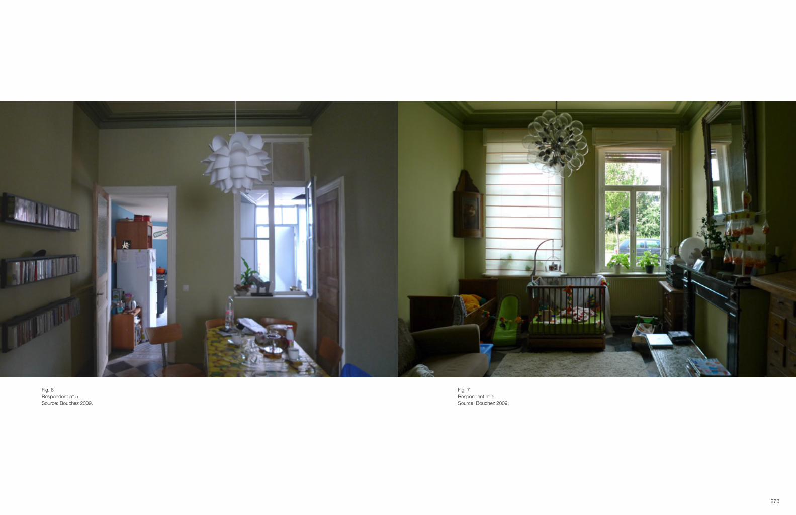
273
Fig. 6Respondent n° 5.Source: Bouchez 2009.
Fig. 7Respondent n° 5.Source: Bouchez 2009.

275
The single respondent who claims that design refers to all useful products and not solely objects with a strong visual statement is trained as an industrial designer and has thus been introduced to the academic view of design. In his reason-ing he adds that his view is not the generic way design is read today and like many respondents indirectly refers to the Juicy Salif of Philippe Starck for Alessi, without actually pinpointing it.
When an Italian producer adds a beautiful form or colour to a juicer then it is considered design. For me any useful fruit juicer is called design.26
Functionality versus artistic form is a theme most respondents bring up. Some find the artistic form of design appealing but too extreme for them to buy into. Most experience a problematic contradiction in the fact that the extreme form ex-presses artistry and status, but leads to products with absolute no use. Respondent n° 4 who has actually used the Juicy Salif in the home of his parents expresses his feelings about the juic-er, which exemplifies design as following:
It’snotajuicer,it’sastatue.Haveyouevertriedit?Ifinditabsolutelyunwieldy.Youhavetograbthetwolegsand then squeeze the lemon.27
Another respondent who actually has the juicer at home brings it up to illustrate the non-functional aspect of design in general and claims that she has the squeezer somewhere packed away in her cupboard, but never uses it anymore.28
These are the only two of the respondents who have actually used the Juicy Salif. This means that hardly any of the respondents conclude from direct experience that design has a problematic, non-functional aspect of design from a real experience. It is thus a narrative they have somewhere picked up and appropriated. On a direct level we can conclude that the high design narrative, which Alessi connected to its products, is adopted by the consumers. Since the launch of the highly artistic Tea & Coffee Piazza project in 1983, the Italian company has hardly stressed the functionality of their products in advertisements, catalogues and other publications. Research has shown that magazines readily take over this narrative.29 Alessi goods have mainly been mediated as works of art.30 On a second level, the fact that Alessi prod-ucts are deployed as an archetypical example of what design means. This implies that the respondents in their informal knowledge on design in general have appropriated the fact that for an object to be labelled design, form comes before function. Thus, design objects are to be categorised within the realm of art. It seems that a meta-narrative on design is appropriated by seeing the goods, mainly as published images within a semantic context. Consumers readily accept the pre-packed meaning of high design and associate the strong visual statement with high art. Silverstone and Haddon specify this part of the appropriation as the objectification, meaning: (…) socially located individuals (distinguished by class, age, gender, ethnicity, and as member of families or households) accept enough of the relevance of the publicly definedmeaningofsomethingtotheirowncircumstances.31
26 Respondent nr.4.27 Respondent n° 4.28 Respondenten n° 3.29 See Case 3.30 See Case 1.31 In the process of consumption they underline three moments: 1. The commodification of a products, which means not only the coming on the market of the good, but also the ideological processes at work within these material and symbolic artefacts, work which defines them as the products and, in varying degrees, the expression of, the dominant values and ideas of the societies that produce them. 2. The appropriation, which consists of the objectification and the incorporation. With the later they refer to activities and social dynamics, which will occur as a result of the function of the consumed good. 3. Conversion : the dimension (…) which reconnects the household into the public world of shared meanings and the claims and counterclaims of status and belonging. See (Silverstone & Haddon 1996).
Fig. 8Respondent n° 5.Source: Bouchez 2009.

277
Of course it is not just Alessi who is to responsible for this narrative, since many design companies use a similar strat-egy in creating a high art status of design through a pre-packed fixed meaning.32 Most lifestyle publications adopt and reinforce the iconic representation of design as art. High design within the realms of art has thus been mass mediated as a master or meta-narrative of what design in general stands for. Although there seems to be a consensus on Alessi products as good examples of the non-functional aspect of design, those respondents who do claim to buy design products and strongly identify themselves with the high cultural value of design realise during the interview that design means two different things to them. On the one snobbish products à la Alessi, on the other hand design classics, such as the furniture of Le Corbusier, Eames, Colombo,… But whether the respondents buy design or not, they all have adopted the meaning that design is synonymous for objects having a particular stylish form. It is generally accepted that design products belong to the high art realms rather than being part of the everyday. For the group of interviewees who claim not to buy into design, this leads to a distorted view of design being by definition non-functional. This is especially apparent in the way they adhere to IKEA products. In the group of consumers who claim to buy design there is a consensus on the fact that the high design objects they own, represent a specific lifestyle. They are recognised as ideal tokens for distinction. The non-functional aspect, as well as the high status-value is a direct derivative of the metanarratives instigated by the producers of design goods.
4. Having and Being.
4.1. Respondents who do not wish to be identified with designThe respondents can be grouped into three different categories according to how they incorporate the meaning of design as being artistic, within their daily life. The largest group claims that they do not buy design, because they are too ex-pensive and the goods are not practical. This group of respondents shows no aspirations to buy into design.
Do you sometimes buy design goods? No.Why not?BecauseIcan’taffordit,itistooexpensive.But do you like design? That depends. Alessi kind of stuff I don’t like.Why? It is kitsch to me.Have you always disliked Alessi? I think so, I like more simple things. Goods where you know what use they have.You mean the fact that the function of these products is not always clear? Yes.33
In their reasoning informants often apply terms as extravagant, extraordinary, special, … feelings that don’t coincide with their particular, rational lifestyle. The fact that they radically denounce the conspicuous consumption of expensive, non-functional furniture or kitchenware stresses their identity as responsible consumers. What is however striking with-in this group is that all claim that IKEA products or other modern design products from cheaper and thus more easily available chains and brands do not fit into their categorisation of design. Respondent n° 15, a young Turkish woman who has lived all her life in Belgium, describes design as something extraor-dinary. When she is asked if that is automatically linked to expensive things she answers. Not necessarily. Even if it is cheap, it is never useful, practical.34
This respondent concludes as a result of how she percieves design, that the lamps and other IKEA things she has in her home are not at all to be considered as design. All of the respondents who claim not to buy into design, do however have objects or pieces of furniture, which can eas-ily be labelled as design, but these are not necessarily original high design. An elderly couple has a copy of a Breuer
32 According to Cacciola are the furniture companies Knoll, Gavina and Cassina key players in the instigation of high design museum status to their re-editions from the 1960’s onward of modernist furniture of Breuer, Mies van de Rohe, Le Corbusier, ... (Cacciola 2003).33 Respondent nr° 7.34 Respondent n° 15.
Fig. 9Respondent n° 6.Source: Bouchez 2009.

279
Cesca chair in their kitchen,35 which they bought in the 1980’s in a cheap chain store.36 When the lady is asked what design means to her, she exemplifies her thoughts with Alessi and explains that her daughter has a lot of design. She likes design but finds herself too old to buy these things now. When she is asked if the chair she’s sitting on could be called design, she replies first hesitantly, probably presuming that the interviewer knows more about design than her, but eventually, decides firmly that it is not design.
Infactitisnot,isit?Ifindtheformofthechairnot...Maybeyouthinkthatthelegsofthechair...ButIfinditverydifficulttoseethisasdesign.
In another household a copy of a Breuer Wassily chair is set in the living room.37 Apparently, it belonged to the daughter of the respondent, who didn’t have the space to store it anymore. This respondent explains that before her divorce, in the late 1980’s and early 1990’s she bought a lot of design.
Rietveld, Starck, and more, but I can’t recall the names right now. Alessi I bought a lot. We had a corkscrew and other things for the kitchen mainly from Alessi. These things were just on the market at that time, and were highly original. You could show off with those things to your friends and visitors. It seemed important then, now I feel it is an empty show. With the environmental crisis, everything changed for me. And of course, start-ing to live on my own. The idea of status has disappeared, you don’t function as a couple anymore, you have to findyourtrueself.38
Her whole house breaths her strive for personality away from status. It is therefore not surprising that she doesn’t even see that this chair is a so-called classic design piece. In the context of her previous home she would have probably im-mediately described it as design, in this context she decides it is a beautiful chair, but the IKEA sofa, next to it, she finds more beautiful because it is more practical.
A similar view is expressed by a young couple with two children. They have just renovated their whole house and firmly dissociate with design. Not because they don’t like it, but because they feel that like art, they can enjoy reading about it, or seeing it in a museum, but it is not something they can afford in their own home. And even in an ideal situa-tion, where they would have all the money to buy their desires, they feel that art will never be something they will buy into. They express that they are not experts enough for that. In their kitchen around an old wooden table stand six chairs of different colours, bought in Weba.39 They are a sort of in between copy’s of the Series7 chair and the Ant chair of Arne Jacobsen,40 often presented in the media and in the Fritz Hansen propaganda in a colourful mix of chairs. It is only when the respondents are asked if they know the original design, that they realise that they have seen those images and that they have bought some sort of copy. Their vindication for buying these is the playfulness of the colours and the fact they these chairs were not at all expensive. Once they realise they have bought some sort of copy-design they don’t feel that they should have bought the real ones, because they express an aversion to cultural snobbery and keep insisting that these chairs are not at all design.
35 Breuer designed this chair originally in 1928 under the name B64 and was produced by Thonet (Droste 2006, p.57; Macel 2003, pp.80–101). In the mid 1960’s the Italian manufacturer Gavina SpA re-issued the chair under the name Cesca. In 1968 Knoll took over Gavina SpA and up till today produces the Cesca (Cacciola 2003, pp.152–165).36 The respondent (n° 10) recalls she bought the chair in the Makro chain. Already from the 1950’s onwards, cheap copies of the chair became popular (Sudjic 1985, p.99).37 Breuer designed the Club chair B3 between 1927-1928. Variations on the first design were produced by Thonet (1930-1932) and by Standard Mobel (1927) (Droste 2006, p.56; Macel 2003, pp.58–65). In 1962 a new edition was developed for Gavina SpA and named Wassily (Cacciola 2003, pp.156–160). It is still today in production by Knoll (http://www.knoll.com/products/product.jsp?prod_id=572, consulted on 01.02.2011). The Cesca as well as the Wassily are according to Deyan Sudjic excellent examples of cult objects. In his eponymous publication of 1985 he writes about these among other cult furniture: A pair of matching chairs, rather than just one, is sometimes needed for an object to come across with full force. Cult objects often need enough space to enable them to be seen from an angle (Sudjic 1985, p.109). It is striking that the chairs are not all positioned this way in the homes of the two respondents and as a consequence do not demand attention, nor imply a high design status. On the role of positioning high design furniture see Chapter 1. See also (Nelson 1948; Verschaffel 2006; Wolfe 1981).38 Respondent n° 6.39 Weba is a fairly cheap and popular mega-furniture store in Gent and Deinze.40 Respectively designed in 1955 and 1952. Still in production by Fritz Hansen (Woodham 2006, pp.156–157).
Fig. 10Respondent n° 6.Source: Bouchez 2008.

281
Respondents seem to have readily adopted the meta narrative of design being synonimous with art, but improvise a specific meaning around it which fits with their particular lifestyle. Since they identify themselves with a down to earth family who does not buy art, all the objects which might be well designed, and functional are not categorised as design. In a publication on how art can help to bring order to experience, Csikszentmihalyi explains how the majority of con-sumers agrees with artistic values created by social consensus, which they attach to visual elements, but alongside of which they create a set of personal references and meanings related to their private experience.41 In this sense Appadurai speaks of imagined vistas of mass mediated master narratives.42 We can conclude in accordance with Appadurai that the consumer does appropriate the master narrative produced by the elite, new intermediaries, in a Bourdieu logic, but that the idea of habitus needs to be understood as an imagined, fluctuating life-world rather than a fixed social class-bound experience and reference.
4.2. Respondents who do recount buying designFor the second group of respondents who do buy design, the artistic feature and thus master narrative is likewise accept-ed and expressed. For this group the high-art status is not necessarily linked to non-functionality and is in many cases the precise reason why they buy into design. For them design has foremost a symbolic power on a first level as an af-firmation of having good taste. On a second level the objects often represent an achieved desired lifestyle. For example a particular piece of furniture brings a sense of emotional harmony, due to the fact that the object represents a goal that has been achieved. This can be exemplified by the way a couple living in a perfectly decorated loft, which they bought a couple of years ago, answers the question whether design adds a feeling of distinction towards their lifestyle.
Man:Ipersonallydon’tthinkso.IfinditapitythatthemajorityoftheBelgiansshownointerestintheirinte-rior. If I look at the homes around me I can only conclude that the average person has very little taste. Even on a very low scale of just adding some taste to their living room or bedroom.
Woman:OfcourseifyouwanttobuyaVanSeverenoraCorbusier,thatisexclusivebecauseofitsprice,butdesign can also be bought in IKEA and that is payable for a large group of people, so there is no reason for not paying attention to good taste.
These respondents don’t consider their own furniture as status laden, but as examples of their good taste. It is only on a second, underlying level that they express the link between their successful lifestyle and the designpieces in their home, since they do have the exclusive Le Corbusier furniture and are saving their money to soon buy Maarten Van Severen chairs.43
Striking is that all respondents who do claim to buy design, also consider IKEA and other cheaper designerbrands as design. Most of these respondents do buy things at IKEA, but many see this as a temporary solution in anticipation of a high design replacement. The reasons why they choose for IKEA is because at the moment they cannot afford their dream furniture or for practical reasons while the kids are small.44 Only one young couple did not want to be associated with IKEA anymore. (Fig. 14) At the time of the interview they were about to move to the loft next door to the apart-ment they temporarily inhabited. They refer to the place they are moving to, as the realisation of their ideal home and therefore decided not to move any of their IKEA furniture into the new loft. They explain:
41 See (Csikszentmihalyi 2009, p.163).42 Appadurai points out that the real importance of the media is not as much a direct source for lifestyle choices which leads to the actual acquisition of the advised goods, but sees the power of the media as “semiotic diacritics” in the reporting of possibilities which are in a constant flux. Going back to Bourdieu, Appadurai stresses the role of improvisation within the context of habitus. For improvisation no longer occurs within a relatively bounded set of thinkable postures but is always skidding and taking off, powered by the imagined vistas of mass-mediated master narratives (…) habitus now has to be painstakingly reinforced in the face of life-worlds that are frequently in flux (Appadurai 1996, pp.56–57).43 Respondent n° 11. They are referring to the .03 chair produced by Vitra.44 Respondent n° 8.
Fig. 11Respondent n° 7.Source: Bouchez 2009.

283
We don’t have anything against IKEA, it’s very good to decorate your house low budget, but now we have de-cided to design our house within a certain status, we feel we have to be coherent.45
What is noticeable in the group of consumers, which buy design is that the inherent contradiction between art and func-tion, emphasised by the first group, leads in the second group to confusion about what is design and what isn’t. A female architect, who temporarily rents a loft, while she is building her own house, exemplifies her rather negative feelings towards design through the Juicy Salif:
It is not functional and moreover, the aluminium leaves a taste. There was a time that I did like these sorts of things,butnotanymore.Idon’tfinditnecessaryanymore,allthatdesign.IhaveafewpiecesofAlessipackedin my cupboard. I never use them.46
She speaks very negatively about design in general and clearly doesn’t want to be associated with it anymore. She refers to design as a form of snobbery. But when she is asked how she would describe the Arne Jacobsen Series7 chair she has in her own home, or the Robin Day chairs around her office table, she realizes that she has an oppositional feeling about what is design, and solves this contradiction by referring to the objects she has at home as design classics. In the way she used the Juicy Salif to exemplify her aversion for design, she uses the work of the Eameses as an example of the design classics she loves. A similar situation occurs in a dialogue between the previously mentioned couple in their renovated loft.47 The man brings up Alessi as an example of bad and non- functional design. The design goods that they have in their own home, they consider highly aesthetic and functional, but do add that when they will have children they will buy a comfortable cosy sofa (as opposed to the sofas by Le Corbusier) and will probably move to a house in the countryside.
A family, who lives in a large, renovated modern house with quite a lot of design, uses a chair by Joe Colombo to ex-emplify what they understand by a good piece of design. They were introduced to the work of Joe Colombo in the Vitra Design Museum. After they had visited the museum they bought a Universale chair in a second hand shop.48 It stands in the living room against the wall, in between the dining area and the sitting area. When they are asked why they don’t use it around the table with the other chairs the lady replies that the chair is not comfortable to sit in, and even adds:
I don’t really like that chair, but I do admire Colombo.Man:WehavediscoveredColombointheVitraMuseuminBazel.TherewasanexhibitionofthatColomboand that was very impressive. And then you feel a sort of sympathy for that guy, also because he died so young.49
When asked if they buy a lot of design in designshops the husband replies negative:
The kind of design you see in those interior magazines? It’s always the same furniture you get to see. It’s like ... wellyouseeiteverywhere...ItistheIKEAfortherich!
The fairly exclusive, and little mediatised design of Colombo symbolises their distinctive lifestyle. They describe their house as eclectic, different and personal. The chair is a token for the cultural capital of being acquainted with a high designer as presented in a museum and distinguishes them from non-creative snobs who buy design as a status.In a first reflex these consumers don’t see any burden with the not so functional design piece in their home. That is, for all, it represents far more a symbolic value than a use value.
45 Respondent n° 9.46 Respondent n° 3.47 Respondent nr° 11.48 Designed in 1964-1965 and produced by Kartell (Woodham 2006, p.89).49 Respondent n° 17.
Fig. 12Respondent n° 8.Source: Bouchez 2009.

285
Fig. 13Respondent n° 8.Source: Bouchez 2009.
Fig. 14Respondent n° 11.Source: Bouchez 2009.

287
A young couple that bought and renovated a small house explains that for their new house, they bought one important design piece: an expensivevintage lamp. Just looking at it and describing it makes them happy. They don’t regret the fact that they paid more than they could afford, neither the fact that they cannot buy more design goods, although they like design a lot. This lamp represents the transitory moment between the real and the ideal, and brings a certain peace of mind, a certain proof of accomplishing the road to their dreams.50
The man (respondent n° 11), living in the highly renovated loft stresses the fact, that since his teens he has on his Bucket list a loft,51 Le Corbusier furniture and the Barcelona chair by Mies van der Rohe. Only the last piece of his wish list he hasn’t bought yet. The two LC2 sofas in the middle of the loft are the symbolic representation of his achievements in life: working hard and being able to buy the objects of his dreams. McCracken introduces the idea of displaced meaning, referring to the fact that certain objects symbolise a whole life-style.52 The acquisition of such an object bridges the real and the ideal. These objects are so to speak tagged with sym-bolic values. Knowing the tag adds to ones cultural capital, owning the object adds to ones expressed lifestyle. In coher-ence, Colin Campbell states that consumption is for a major part a form of imagination.53 Central to consumerism is the fantasy of a specific lifestyle. It is not as much the object in itself that the consumer desires, but rather the obtaining of dreams and the pleasurable dramas, which they have already enjoyed in imagination.54 As Baudrillard pointed out al-ready in 1968 in the The System of Objects,55 in an affluent society we are not consuming physical objects, but the idea of an object. The consumer is then driven by a psychological motivation rather than utility. And although Baudrillard, McCracken and Campbell stress the fact that consumption leads to an endless cycle of disappointments and new desires, most respondents who bought a specific design piece that represents a particular dream, did not give the impression that they had to buy much more to accomplish the dream. One, or a few objects embody the whole dream. Although the interviewed consumers who buy high design, mainly buy into the symbolic meaning, they are not to be seen as mere dupes. The owner of the Le Corbusier sofa’s for example,56 bought copies and claims he would never pay the price Cas-sina asks for a real LC2.57 Another respondent owning a loft in the same building, in explaining what design means for him, states:
There is design and there is design. There is design with crazy and odd forms, from an artist’s mind, which I mostly dislike. And then there is design like our sofa from Weba, of which people think we bought it in the Di-recteurswoning.58 I prefer this second kind of design.59
For these respondents the design they own represents for the owner a successful, personal and tasteful lifestyle, but it does not represent mere show or economic status, linked to a brand logo. It is more a playful, momentary representation of their lifestyle. In general all respondents see the objects they bought and the style of their house as a temporary state. It is part of a continuous process, where the doing seems to be more important than the being or the having.
50 Respondent n° 5.51 The respondent uses this term in reference to the eponymous Hollywood movie (Rob Reiner, 2007) about two elderly men suffering from cancer, realising their list of life goals before they die.52 See part II. Theoretical framework, see also (McCracken 1988, pp.104–117).53 See (Campbell 1987).54 See (Campbell 1987, p.90).55 See (Baudrillard 1996).56 Respondent n° 11.57 Since 1964 in the collection Cassina I Maestri.Originally designed by Le Corbusier in collaboration with Pierre Jeanneret and Charlotte Perriand, Grand Confort, Petite Modele armchair, 1928. See more (Cacciola 2003; McLeod 2003).58 The Directeurswoning an exclusive furniture shop specialised in high-design. 59 Respondent nr° 9.
Fig. 15Respondent n° 12.Source: Bouchez 2009
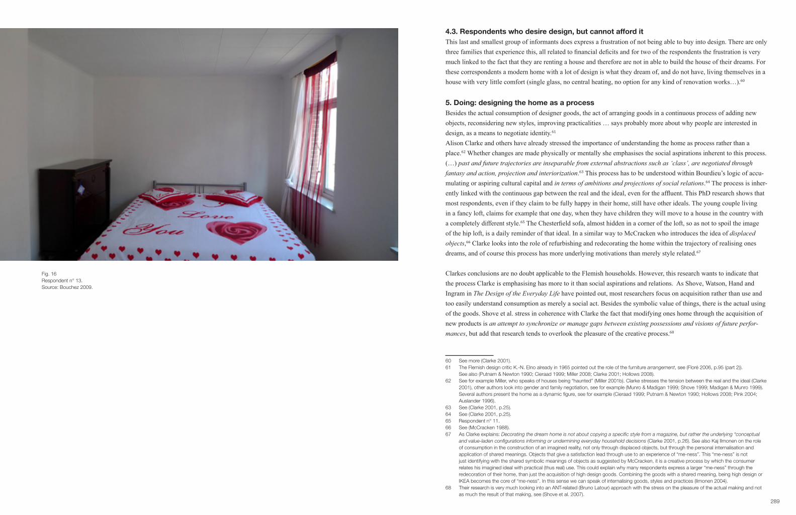
289
4.3. Respondents who desire design, but cannot afford itThis last and smallest group of informants does express a frustration of not being able to buy into design. There are only three families that experience this, all related to financial deficits and for two of the respondents the frustration is very much linked to the fact that they are renting a house and therefore are not in able to build the house of their dreams. For these correspondents a modern home with a lot of design is what they dream of, and do not have, living themselves in a house with very little comfort (single glass, no central heating, no option for any kind of renovation works…).60
5. Doing: designing the home as a processBesides the actual consumption of designer goods, the act of arranging goods in a continuous process of adding new objects, reconsidering new styles, improving practicalities … says probably more about why people are interested in design, as a means to negotiate identity.61
Alison Clarke and others have already stressed the importance of understanding the home as process rather than a place.62 Whether changes are made physically or mentally she emphasises the social aspirations inherent to this process. (…) pastandfuturetrajectoriesareinseparablefromexternalabstractionssuchas‘class’,arenegotiatedthroughfantasy and action, projection and interiorization.63 This process has to be understood within Bourdieu’s logic of accu-mulating or aspiring cultural capital and in terms of ambitions and projections of social relations.64 The process is inher-ently linked with the continuous gap between the real and the ideal, even for the affluent. This PhD research shows that most respondents, even if they claim to be fully happy in their home, still have other ideals. The young couple living in a fancy loft, claims for example that one day, when they have children they will move to a house in the country with a completely different style.65 The Chesterfield sofa, almost hidden in a corner of the loft, so as not to spoil the image of the hip loft, is a daily reminder of that ideal. In a similar way to McCracken who introduces the idea of displaced objects,66 Clarke looks into the role of refurbishing and redecorating the home within the trajectory of realising ones dreams, and of course this process has more underlying motivations than merely style related.67
Clarkes conclusions are no doubt applicable to the Flemish households. However, this research wants to indicate that the process Clarke is emphasising has more to it than social aspirations and relations. As Shove, Watson, Hand and Ingram in The Design of the Everyday Life have pointed out, most researchers focus on acquisition rather than use and too easily understand consumption as merely a social act. Besides the symbolic value of things, there is the actual using of the goods. Shove et al. stress in coherence with Clarke the fact that modifying ones home through the acquisition of new products is anattempttosynchronizeormanagegapsbetweenexistingpossessionsandvisionsoffutureperfor-mances, but add that research tends to overlook the pleasure of the creative process.68
60 See more (Clarke 2001).61 The Flemish design critic K.-N. Elno already in 1965 pointed out the role of the furniture arrangement, see (Floré 2006, p.95 (part 2)). See also (Putnam & Newton 1990; Cieraad 1999; Miller 2008; Clarke 2001; Hollows 2008).62 See for example Miller, who speaks of houses being “haunted” (Miller 2001b). Clarke stresses the tension between the real and the ideal (Clarke 2001), other authors look into gender and family negotiation, see for example (Munro & Madigan 1999; Shove 1999; Madigan & Munro 1999). Several authors present the home as a dynamic figure, see for example (Cieraad 1999; Putnam & Newton 1990; Hollows 2008; Pink 2004; Auslander 1996).63 See (Clarke 2001, p.25).64 See (Clarke 2001, p.25).65 Respondent n° 11.66 See (McCracken 1988).67 As Clarke explains: Decorating the dream home is not about copying a specific style from a magazine, but rather the underlying “conceptual and value-laden configurations informing or undermining everyday household decisions (Clarke 2001, p.26). See also Kaj Ilmonen on the role of consumption in the construction of an imagined reality, not only through displaced objects, but through the personal internalisation and application of shared meanings. Objects that give a satisfaction lead through use to an experience of “me-ness”. This “me-ness” is not just identifying with the shared symbolic meanings of objects as suggested by McCracken, it is a creative process by which the consumer relates his imagined ideal with practical (thus real) use. This could explain why many respondents express a larger “me-ness” through the redecoration of their home, than just the acquisition of high design goods. Combining the goods with a shared meaning, being high design or IKEA becomes the core of “me-ness”. In this sense we can speak of internalising goods, styles and practices (Ilmonen 2004).68 Their research is very much looking into an ANT-related (Bruno Latour) approach with the stress on the pleasure of the actual making and not as much the result of that making, see (Shove et al. 2007).
Fig. 16Respondent n° 13.Source: Bouchez 2009.

291
Fig. 17Respondent n° 14.Source: Bouchez 2009.
Fig. 18Respondent n° 15.Source: Bouchez 2009.

293
Ruth Madigan and Moira Munro researched in 1991 how commercially inspired styles and fashions have entered the private home of middle class families.69 They concluded that amongst their respondents there is not a strong involve-ment with design and style. Most respondents are aware of the changing fashions, but express an anxiety about not being able to buy into the latest trends. Not as much due to financial reasons, but rather because they feel they do not know how to style their house as such. The authors conclude at that time in Glasgow the view of consumption as pleas-urableleisureactivityandameansofself-expressioniseasilyoverdrawn.70
This research conducted in 2009 shows a different finding. Almost all participants claim to enjoy redecorating their home very much. The only two respondents who do not express any positive feelings, are two families who rent a house and who very much experience that they have been let down by the landlord.71 Their frustrations express that they feel that the house is not at all theirs. An overall feeling of alienation dominates this interview. Miller speaks in this respect of a haunted house.72 The other respondents experience a great joy not as much in the ownership of products, but in the creative process of making their house into a home, through designing their private spaces.73 For some that is to move around the furniture they already have, for others it is the complete renovation of the house. Daniel Miller stresses in this respect that householders should be considered as designers and interior designers since they may care just as much about the aesthetics and the order of their display as for the content.74
Since the 1980’s our society has seen a continuous promotion of the creative, through the growing impact of the culture industries and the state emphasis on a creative economy.75 As Featherstone pointed out, in a postmodern society cultural intermediaries76 promote several different lifestyles and consumption possibilities throughout the media. In the last decade, designing ones house, in the meaning of modernizing and styling a home according to the latest design fashion, has been mediated as much as the consumption of design products.77 Leslie and Riemer, who analysed home-design magazines such as ‘Elle Décor’ and ‘Wallpaper*’ explain that contemporary magazines view the home as an extension of fashion, and of the body, implying that it is acceptable for women to have an interest in the more masculine realm of design.78 They also explain that these magazines promote modern aesthetics with an emphasis on urban rather than rural homes. The same can be said of ‘Weekend Knack’ and the majority of home-decoration magazines in Flanders. Suc-cessful DIY television programmes not only spur consumers to change their homes, they also show how easily this can be done. Home decoration as a playful leisure pursuit has by now, in Flanders become commonplace.79
There is no doubt that consumers have since the 1990’s gradually been more and more exposed to modern aesthetics and styles within reach of the majority of consumers,80 but not just through the media. A growing number of design shops on the one hand has to be considered, but especially the booming of out-of-town stores like IKEA who sell life-style concepts and show through realistic displays and mock-up interiors a range of different style possibilities. Both of these types of shops have taken part in the process of stimulating home improvement. No doubt their impact has been
69 They conducted 382 postal questionnaires and twenty extended interviews in Glasgow (Madigan & Munro 1996).70 See (Madigan & Munro 1996, p.53). Another research study dated 2000 the UK by an advertising agency for IKEA concludes similarly that make do is far more prevalent than making over (Sweet 2002). 71 In total 5 respondents are renting a home.72 See (Miller 2001b, pp.113–114), see also (Csikszentmihalyi 1981, p.128; Hollows 2008; Shove 1999).73 About the difference between home and house, from an anthropological point of view see for example (Blunt & Dowling 2006). For a historical discourse see for example (Edwards 2005).74 In his comparison between display and content, he refers in the latter to the fact that all householders are museum curators, collecting stuff that gives meaning to their personal life. It is Miller’s finding in this text published in 2011 that most people try to combine the collecting and the aesthetics of display. See (Miller 2011, pp.95–96).75 Lash and Urry speak of a design-intensive process (Lash & Urry 1994, p.123). See also the success of Richard Florida’s thesis on the Creative Class (Florida 2004).76 By which he means professionals whose jobs entail performing services and the production, marketing and dissemination of symbolic goods, (Featherstone 2007, p.19).77 See for example (Usherwood 1997; Hollows 2008, p.76).78 See (Leslie & Riemer 2003, pp.304–305).79 See also Clarke on the role of DIY TV programmes, (Clarke 2001, p.27).80 See for example (Williams 2006, p.147). Flanders sees a crescendo from 2000 onwards due to television coverage of home decoration programmes.
Fig. 19Respondent n° 16.Source: Bouchez 2009.
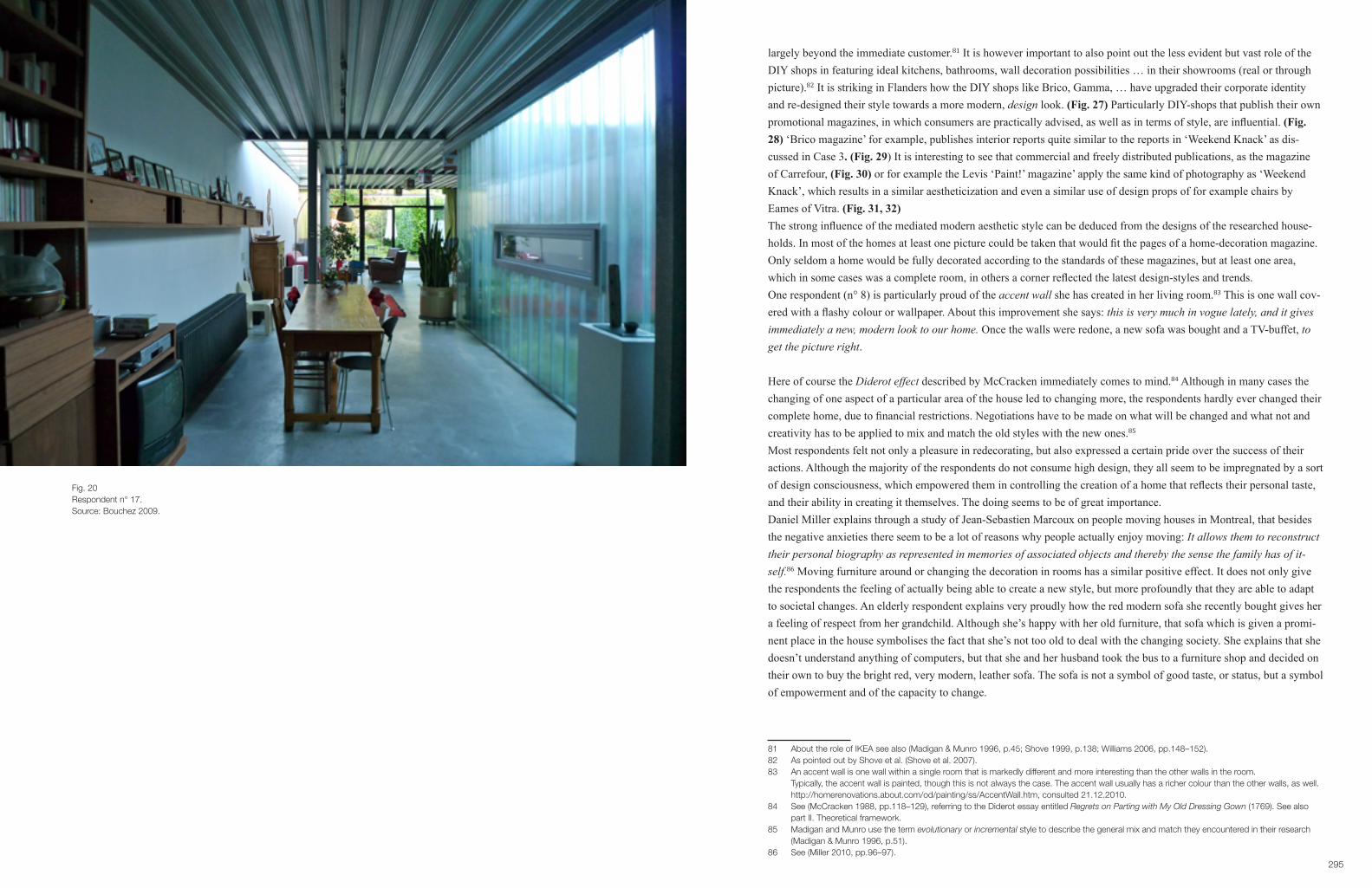
295
largely beyond the immediate customer.81 It is however important to also point out the less evident but vast role of the DIY shops in featuring ideal kitchens, bathrooms, wall decoration possibilities … in their showrooms (real or through picture).82 It is striking in Flanders how the DIY shops like Brico, Gamma, … have upgraded their corporate identity and re-designed their style towards a more modern, design look. (Fig. 27) Particularly DIY-shops that publish their own promotional magazines, in which consumers are practically advised, as well as in terms of style, are influential. (Fig. 28) ‘Brico magazine’ for example, publishes interior reports quite similar to the reports in ‘Weekend Knack’ as dis-cussed in Case 3. (Fig. 29) It is interesting to see that commercial and freely distributed publications, as the magazine of Carrefour, (Fig. 30) or for example the Levis ‘Paint!’ magazine’ apply the same kind of photography as ‘Weekend Knack’, which results in a similar aestheticization and even a similar use of design props of for example chairs by Eames of Vitra. (Fig. 31, 32)The strong influence of the mediated modern aesthetic style can be deduced from the designs of the researched house-holds. In most of the homes at least one picture could be taken that would fit the pages of a home-decoration magazine. Only seldom a home would be fully decorated according to the standards of these magazines, but at least one area, which in some cases was a complete room, in others a corner reflected the latest design-styles and trends. One respondent (n° 8) is particularly proud of the accent wall she has created in her living room.83 This is one wall cov-ered with a flashy colour or wallpaper. About this improvement she says: this is very much in vogue lately, and it gives immediately a new, modern look to our home. Once the walls were redone, a new sofa was bought and a TV-buffet, to get the picture right.
Here of course the Diderot effect described by McCracken immediately comes to mind.84 Although in many cases the changing of one aspect of a particular area of the house led to changing more, the respondents hardly ever changed their complete home, due to financial restrictions. Negotiations have to be made on what will be changed and what not and creativity has to be applied to mix and match the old styles with the new ones.85 Most respondents felt not only a pleasure in redecorating, but also expressed a certain pride over the success of their actions. Although the majority of the respondents do not consume high design, they all seem to be impregnated by a sort of design consciousness, which empowered them in controlling the creation of a home that reflects their personal taste, and their ability in creating it themselves. The doing seems to be of great importance. Daniel Miller explains through a study of Jean-Sebastien Marcoux on people moving houses in Montreal, that besides the negative anxieties there seem to be a lot of reasons why people actually enjoy moving: It allows them to reconstruct their personal biography as represented in memories of associated objects and thereby the sense the family has of it-self.86 Moving furniture around or changing the decoration in rooms has a similar positive effect. It does not only give the respondents the feeling of actually being able to create a new style, but more profoundly that they are able to adapt to societal changes. An elderly respondent explains very proudly how the red modern sofa she recently bought gives her a feeling of respect from her grandchild. Although she’s happy with her old furniture, that sofa which is given a promi-nent place in the house symbolises the fact that she’s not too old to deal with the changing society. She explains that she doesn’t understand anything of computers, but that she and her husband took the bus to a furniture shop and decided on their own to buy the bright red, very modern, leather sofa. The sofa is not a symbol of good taste, or status, but a symbol of empowerment and of the capacity to change.
81 About the role of IKEA see also (Madigan & Munro 1996, p.45; Shove 1999, p.138; Williams 2006, pp.148–152).82 As pointed out by Shove et al. (Shove et al. 2007).83 An accent wall is one wall within a single room that is markedly different and more interesting than the other walls in the room. Typically, the accent wall is painted, though this is not always the case. The accent wall usually has a richer colour than the other walls, as well. http://homerenovations.about.com/od/painting/ss/AccentWall.htm, consulted 21.12.2010.84 See (McCracken 1988, pp.118–129), referring to the Diderot essay entitled Regrets on Parting with My Old Dressing Gown (1769). See also part II. Theoretical framework.85 Madigan and Munro use the term evolutionary or incremental style to describe the general mix and match they encountered in their research (Madigan & Munro 1996, p.51). 86 See (Miller 2010, pp.96–97).
Fig. 20Respondent n° 17.Source: Bouchez 2009.

297
Fig. 21Respondent n° 17.Source: Bouchez 2009.
Fig. 22Respondent n° 18.Source: Bouchez 2009.

299
Every little movement of things, or small changes in the decor gives the respondents the power to refuse to the daily rut. It expresses their agency over things,87 but likewise over the daily stress of being lived quite quintessential of our soci-ety. It is considered as play, as opposed to the daily routine of work, as Rebecca Abrams puts it in The Playful Self:
Playgivescolourtothemonochromeofdailyexistence.Itisthesalttothemeatofoureverydaylives.Aworldof work without play is a recipe for tense, stressed, bored people, who are not only not working to the best of their ability, but not living to the best of their ability. 88 In the researched street, many informants totally rebuilt their house after they bought is. Most of them did the renova-tion themselves, whist they lived in the house. There were no architects or contractors involved. The respondents ex-press proudness in having physically built ones own house. This is very much in tune with Daniel Millers findings in a research on council houses, where the inhabitants make the house their own through the physical engagement. Through ones own labour a feeling of alienation evolves into a sense of belonging.89
Although the result does undeniable have symbolic meanings related to status and social distinction90, it is for most re-spondents the actual accomplishment of creating a nice home for themselves that is important. Many of them state to be inspired in style but also in practicalities by home DIY programmes on television and are particularly proud of the fact that they created a modern ambience without the help of an expert. In talking about renovations but also minor changes, the respondents eagerly shared the process of decisions, mistakes, challenges, annoyances and especially, when the job is finished: total satisfactions.Shove et al. emphasise that very little research looks into the joy of the creative process.91 Theorists tend to be more interested in the underlying social meanings.92 This research however wants to point out that the creative process of the average consumer is allowed as much interest as that of the high-end artist. In our contemporary society the media is loaded with messages on creative empowerment. (Fig. 33) It is therefore not so unusual that the common man shows more interest in being creative.93 When the respondents (n° 17), who bought the Joe Colombo chair were asked if that object could represent their life-style, as people who are always looking for new things to discover. They both firmly refused this idea. It is the lamp-shades; made out of empty tomato tins and other stuff they have made themselves that represents who they are. For them and for most of the young and middle-aged respondents home is experienced as a creative laboratory.For the fireman living a few houses up the street his home is in a constant process. When he is not painting the walls or resetting the furniture, he is thinking about the colours he will apply next time.94 A young girl who shares a house with a couple of friends shows how she painted the quite ugly second hand cupboard in green and matched this with some affordable green IKEA items into an aesthetic ensemble.95
87 See (Miller 2010, p.99), see also chapter 1 concerning the role of having agency over things as an example of objectification.88 In http://www.demos.co.uk/files/proamrevolutionfinal.pdf?1240939425, p. 15, consulted 21.12.2010.89 See (Miller 1997).90 See for example Clarke : Whether physically or mentally transforming or transposing their homes, the process in which they are engaged is socially aspirant, not merely in terms of accumulating and articulating cultural capital (Bourdieu, 1979), but in terms of the ambitions and projections of ideal social relations, (Clarke 2001, p.25).91 (Shove et al. 2007, p.49). Riemer and Leslie point out that there has been little or no research on the creativity of individuals in general. See (Riemer & Leslie 2006).92 See also Warde on the focus of symbolic meaning and the role in forming self-identity. Warde gives an abridged account of theories of practice from a sociological point of view (Warde 2005). See also (Warde 2002).93 As Jeremy Rifkin puts it in The Age of Access: In an era where cultural production is becoming the dominant form of economic activity, securing access to the many cultural resources and experiences which nurture one’s psychological existence becomes just as important as holding onto property http://www.demos.co.uk/files/proamrevolutionfinal.pdf?1240939425, p. 40, consulted 21.12.2010.94 Respondent nr° 7.95 Respondent nr° 19.
Fig. 23Respondent n° 19.Source: Bouchez 2009.

301
Shove et al. highlight that practical competence is the central attraction to home decoration. This PhD would like to add that for the majority of the respondents it is not as much the competence of knowing how to paint or how to rebuild a kitchen cabinet, but the competence of designing the space that matters.96 For one of the female respondents just mov-ing around the furniture and creating a new picture frame-environment is a satisfying act.97 Mihaly Csikszentmihalyi points out in Flow that an optimal experience is not attained by the skills we actually have, but determined by the skills we think we have. Flow, or the feeling of optimal satisfaction or happiness is autotelic, meaning that it is not the expec-tation of the future benefit that counts, but the doing itself that generates this feeling. Being satisfied in doing a DIY job, or a simple restyling of the home by moving around furniture implies that the practitioner somehow has the belief that what he or she is doing is good. As Csikszentmihalyi explains:
Theartistmightnothaveavisualimageofwhatthefinishedpaintingshouldlooklike,butwhenthepicturehas progressed to a certain point, she knows whether this is what she wanted to achieve or not. And a painter who enjoys painting must have internalized criteria for “good” or “bad” so that after each brush stroke she can say:“Yes,thisworks;no,thisdoesn’t.Withoutsuchinternalguidelines,itisimpossibletoexperienceflow.98
The media interest in DIY subjects on home decoration and improvement, and the commercially aimed attention to aes-thetic ensembles in home furnishing stores as well as DIY shops seems to have given the respondents the idea that they are able to design their homes themselves. Paint company Levis publishes on the cover of it’s promotional magazine:99 Painting-party, underlining the fun of DIY. This empowerment leads to the feeling that they have control over situa-tions. Csikszentmihalyi continues:
(…) whatpeopleenjoyisnotthesenseofbeingincontrol,butthesenseofexercisingcontrolindifficultsitua-tions.Itisnotpossibletoexperienceafeelingofcontrolunlessoneiswillingtogiveupthesafetyofprotectiveroutines.Onlywhenadoubtfuloutcomeisatstake,andoneisabletoinfluencethatoutcome,canapersonreally know whether she is in control.100
Several respondents express the doubts they had throughout the process of changing things and the pleasure from the outcome. Others express the fact that they just like to try something out, and if it is no good, no-one’s leg got broken. Satisfaction in acquiring knowledge is a primal draw.101 In the way Shove et al. point out the importance of product evolution to enabling amateur home decorators both technically and practically, and in the same way, this research study wants to add the role of design mediation as a process in empowering the consumer. Working on and improving the home allows the consumer to experience control over the alienating effects of contemporary society.
96 The respondents do not consider themselves as designers, however, as Pauline Garvey points out: Designers are “creative brokers” in compiling, assimilating, and recombining knowledge economies in new ways (Sunny et. al.: 685). A creative broker then synthesizes ideas from disparate fields and transmits them in novel ways. She states that IKEA consumers describe themselves in similar ways. See (Garvey 2011, p.144). Most of the respondents of this research study use a similar terminology in describing how they mix and match their interior.97 Respondent n° 2.98 See (Csikszentmihalyi 1994, p.56).99 The magazine was freely distributed among other weekly commercial publications to all private homes of Flanders.100 See (Csikszentmihalyi 1994, p.61).101 See (Shove et al. 2007, p.55) and http://www.demos.co.uk/files/proamrevolutionfinal.pdf?1240939425, consulted 21.12. 2010.
Fig. 24Respondent n° 19.Source: Bouchez 2009.

303
Fig. 25Respondent n° 21.Source: Bouchez 2009.
Fig. 26Respondent n° 22.Source: Bouchez 2009.

305
Charles Leadbeater and Paul Miller the begetters of the Pro-Am revolution,102 claim that there is a growing number of what they call professional amateurs. The most popular activities of this growing group are gardening and DIY.103
They state that one of the reasons more people get involved in creative work has to do with the fact that through DIY activities people getfarmoreintense,pleasurableandsatisfyingexperiencesfromtheiractivitiesthantheydofromwork,formallearningorpassiveconsumption.Pro-Amsfeelmorethemselvesandmorefulfilledwhentheyengageinthese activities.104 Psychologist Graham Privette, in his study of the satisfaction from leisure comes to a similar conclu-sion. People who are engaged in creative tasks in their leisure time are more likely to feel focus, a sense of power, joy, value, integration and wholeness than those who consume by shopping.105
In conjunction with the findings of this research a reference to Alan Warde is useful, in a quest to understand design consumption rather as a process, rather than a mere acquisition of status laden goods.106 It seems that design practices, rather than the individual desire to buy high design creates wants. Warde explains this through the practice of motor-sports. The same can be said about redecorating the house. The majority of design consumption results from the engaging in the practice of decorating/designing the home, rather than as a direct result of taste or choice dictated by status aims.
This approach leads to a different perspective, as Warde puts it in general on a shifting view of consumption in general:
(…) attending less to individual choices and more to the collective development of modes of appropriate conduct in everyday life. The analytic focus shifts from the insatiable wants of the human animal to the institutedconventionsofcollectiveculture,frompersonalexpressiontosocialcompetence,frommildly constrainedchoicetodisciplinedparticipation.Fromthisangletheconceptof‘theconsumer’,afigure who has bewitched political and social scientists as well as economists, evaporates. Instead the key focal points become the organization of the practice and the moments of consumption enjoined. Persons confront moments of consumption neither as sovereign choosers nor as dupes.
102 A Pro-Am pursues an activity as an amateur, mainly for the love of it, but sets a professional standard, http://www.demos.co.uk/files/ proamrevolutionfinal.pdf?1240939425, p.20, consulted 21.12.2010. It is of course questionable how professional these hobbyists are. Leadbeater and Miller do not state any criteria on which they base their conclusions. For this research study however, it is not as much the professionalism that matters, but the fact that there is a growing number of consumers who are enjoying designing their own home in some way or another.103 According to their research 20 per cent Pro-Ams say they do regular home improvement and home decoration jobs, 74 per cent say they have good skills. The research concluded that 15 per cent of the population see themselves as Pro-Am at do-it-yourself, http://www.demos.co.uk/ files/proamrevolutionfinal.pdf?1240939425, p.32, consulted 21.12.2010.104 See http://www.demos.co.uk/files/proamrevolutionfinal.pdf?1240939425, p.41, consulted 21.12.2010).105 See http://www.demos.co.uk/files/proamrevolutionfinal.pdf?1240939425, p.41, consulted 21.12.2010).106 I understand consumption as a process whereby agents engage in appropriation and appreciation, whether for utilitarian, expressive or contemplative purposes, of goods, services, performances, information or ambience, whether purchased or not, over which the agent has some degree of discretion. In this view, consumption is not itself a practice but is, rather, a moment in almost every practice (Warde 2005, p.135).
Fig. 27Advertisement Brico, DIY shop in ‘Weekend Knack’.Source: Weekend Knack 2005, n° 17, p. 189.
Fig. 28DIY example in ‘Brico Magazine’.Source: Brico Magazine 2011, n° 9, p. 48.
Fig. 29Interior report in ‘Brico Magazine’.Source: Brico Magazine 2011, n° 9, pp. 58-59.
Fig. 30Eames, Vitra chair in ‘Simply You’, free magazine of Carrefour.Source: Simply You 2011, Spring, p. 75.
Fig. 31Cover of free magazine by paint company Levis.Source: Paint! 2011, cover.
Fig. 32DIY tips, with an Eames chair as styling prop.Source: Paint! 2011, p. 39.

307
6. ConclusionWe can conclude, that high design is bought mainly for its sign-value and its symbolic messages, however in this design conscious time only a rather small group of consumers engages in this expressive type of consumption. Although home consumption remains governed by considerations of functionality, the contemporary consumer has readily adapted the dominant meaning of design. Whereas the media has been stressing the consumption of design things, this research shows that the consumer is in fact more inspired by design as a process. There is a growing interest in the DIY practice of designing ones home as a dy-namic negotiation between the real and the ideal. Consumption as a practice can be understood within the logic of social stratification and self-identity, but should likewise be seen as an empowerment of the consumer. Due to the mediation of the multiplicity of practices of home decoration, the consumption of design through the practice of designing ones home leads to a sense of well-being or a degree of happiness through self-deployment.This research therefore wants to stress that the role of the consumption of design is today more about being through do-ing, than being through having, and as the next case will show coincides with open design, a new movement within the design discourse that has numerous links with DIY.
Fig. 33Humo competition: pimp your homeSource: Humo 2011, p. 41.

309
CASE 6
‘YES WE’RE OPEN’. A PARADIGM SHIFT?
1. IntroductionThis chapter looks into the paradigm shift from design generically being considered as status identity objects, as pro-moted by certain design companies, through the lifestyle media and through certain innovation models,1 towards an interest in Do It Yourself (DIY) and open design, with a focus on the making and sharing rather than the having.The previous chapter showed how the Flemish public has been very much influenced by the narratives of lifestyle media and design producers. However in the way they deal with design at home, it becomes clear that the majority of respond-ents do not buy into the much-mediated design objects, nor do they want to be associated with the non-functional status symbol these products often represent. Thus, not only the consumer, but also the designer has recently been looking for another meaning for design. According to Fuad-Luke, the author of the seminal publication Design activism,2 a number of new organizations were established between 1999 en 2008 looking into design from a sustainable point of view. In 2008 more than 300 de-sign researchers gathered at the Changing the change conference and addressed diverse sustainability issues. By now, design-activism is substantial in the academic design discourse, as in design practice. Service design, co-design, people-centered design are new outcomes of the interesting intersection of ecological and societal challenges every consumer has witnessed since the triple crunch. The successful publication of McDonough & Braungart on the concept of cradle to cradle,3 and in 2009 the largely mediated publication by Tim Brown (CEO of IDEO) on design thinking,4 added to a shift in design practice. At the same time, many new technological possibilities have been brought into society as will be seen further on.
For Paul Atkinson the most challenging shift within the professional design discourse is the dismantling of the boundary between the professional and the amateur, or the designer and the user.5 When making seems to be more important than having, consumer behavior seems to coincide with the growing interest in open design, one of the most recent tenden-cies within the design practice. A case study on a project by designer Thomas Lommée for Designregio Kortrijk will look into the possibilities of open design, and how it has been received by the media.6 Secondly, we have seen a shift in interest within the design industry, which is likewise reflected in a changing tone in lifestyle publications. Until 2008, for the high end design manufacturers and the media, the emphasis was laid on the esthetic and thus on form, as presented in the white cube-home. In recent years, there has been a shift, not only towards DIY and promoting the creative on a consumer level, but also towards a re-framing of aesthetics. Everyday clutter seems to have become a high cultural asset. After many years of emphasizing the high cultural aspect of design within a museum-like stage set in the lifestyle media, the artistic elite now distinguishes itself through a renewed interest in the vernacular. Or should we say in a design-led vernacular? This evolution can be linked to a reframing of aesthetics in the fashion world with the work of Juergen Teller and other photographers inspired by the countercultural grunge move-ment, as well as the anti-design aesthetics of Droog Design in its early years. This will be looked into in the second part of this chapter
1 See for Example Verganti’s design-driven innovation, (Verganti 2009; Verganti 2006).2 See (Fuad-Luke 2009).3 See (McDonough & Braungart 2002).4 See (Brown 2009).5 See (Atkinson 2010).6 Lommée has internationally been recognised as one of the forerunners of this movement, as will be explained further on. This made him interesting as a case-study of open design in Flanders.
Fig. 1‘Yes, We’re Open’.Source: Lommée 2010, press release.
Fig. 2‘Yes, We’re Open’.Source: Lommée 2010, press release.
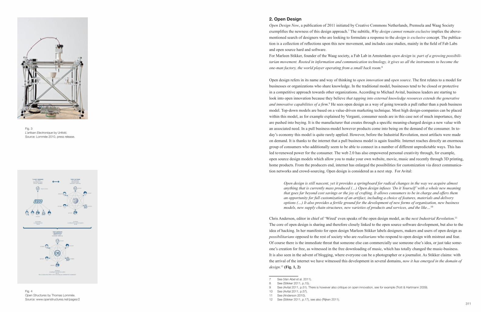
311
2. Open Design Open Design Now, a publication of 2011 initiated by Creative Commons Netherlands, Premsela and Waag Society exemplifies the newness of this design approach.7 The subtitle, Whydesigncannotremainexclusive implies the above-mentioned search of designers who are looking to formulate a response to the designisexclusive concept. The publica-tion is a collection of reflections upon this new movement, and includes case studies, mainly in the field of Fab Labs and open source hard and software.For Marleen Stikker, founder of the Waag society, a Fab Lab in Amsterdam open design is: part of a growing possibili-tarian movement. Rooted in information and communication technology, it gives us all the instruments to become the one-man factory, the world player operating from a small back room.8
Open design refers in its name and way of thinking to open innovation and open source. The first relates to a model for businesses or organizations who share knowledge. In the traditional model, businesses tend to be closed or protective in a competitive approach towards other organizations. According to Michael Avital, business leaders are starting to look into open innovation because they believe thattappingintoexternalknowledgeresourcesextendsthegenerativeandinnovativecapabilitiesofafirm.9 He sees open design as a way of going towards a pull rather than a push business model. Top-down models are based on a value-driven marketing technique. Most high design-companies can be placed within this model, as for example explained by Verganti, consumer needs are in this case not of much importance, they are pushed into buying. It is the manufacturer that creates through a specific meaning-charged design a new value with an associated need. In a pull business-model however products come into being on the demand of the consumer. In to-day’s economy this model is quite rarely applied. However, before the Industrial Revolution, most artifacts were made on demand. It is thanks to the internet that a pull business model is again feasible. Internet reaches directly an enormous group of consumers who additionally seem to be able to connect in a number of different unpredictable ways. This has led to renewed power for the consumer. The web 2.0 has also empowered personal creativity through, for example, open source design models which allow you to make your own website, movie, music and recently through 3D printing, home products. From the producers end, internet has enlarged the possibilities for customization via direct communica-tion networks and crowd-sourcing. Open design is considered as a next step. For Avital:
Open design is still nascent, yet it provides a springboard for radical changes in the way we acquire almost anything that is currently mass produced (…) Open design infuses ‘Do it Yourself’ with a whole new meaning that goes far beyond cost savings or the joy of crafting. It allows consumers to be in charge and offers them an opportunity for full customization of an artifact, including a choice of features, materials and delivery options (…) It also provides a fertile ground for the development of new forms of organization, new business models, new supply chain structures, new varieties of products and services, and the like…10
Chris Anderson, editor in chief of ‘Wired’ even speaks of the open design model, as the nextIndustrialRevolution.11
The core of open design is sharing and therefore closely linked to the open source software development, but also to the idea of hacking. In her manifesto for open design Marleen Stikker labels designers, makers and users of open design as possibilitarians opposed to the rest of society who are realitarians who respond to open design with mistrust and fear. Of course there is the immediate threat that someone else can commercially use someone else’s idea, or just take some-one’s creation for free, as witnessed in the free downloading of music, which has totally changed the music-business. It is also seen in the advent of blogging, where everyone can be a photographer or a journalist. As Stikker claims: with the arrival of the internet we have witnessed this development in several domains, now it has emerged in the domain of design.12 (Fig. 1, 2)
7 See (Van Abel et al. 2011).8 See (Stikker 2011, p.15).9 See (Avital 2011, p.51). There is however also critique on open innovation, see for example (Trott & Hartmann 2009).10 See (Avital 2011, p.57).11 See (Anderson 2010).12 See (Stikker 2011, p.17), see also (Rijken 2011).
Fig. 3L’artisan Electronique by Unfold.Source: Lommée 2010, press release.
Fig. 4Open Structures by Thomas Lommée.Source: www.openstructures.net/pages/2

313
Fig. 5‘Yes, We’re Open’.Source: Lommée 2010, press release.
Fig. 6‘Yes, We’re Open’.Source: Lommée 2010, press release.

315
Fig. 7‘Yes, We’re Open’.Source: Lommée 2010, press release.
Fig. 8‘Yes, We’re Open’.Source: Lommée 2010, press release.

317
Fab Labs, founded in 2002 by Neil Gershenfeld at the MIT (Massachusetts Institute of Technology) Center for Bits and Atoms have been essential in the evolution of open design. The idea has its origins in Gershenfeld’s basic belief that if you giveordinarypeopletherighttools,andtheywilldesignandbuildthemostextraordinarythings. In order to do so according to Gershenfeld, you need a PF or personal fabricator, which is a machine that makes machines. With a PF, instead of shopping for or ordering a product, you could download or develop its description, supplying the fabricator with designs and raw material.13 In 1998 Gershenfeld and his colleagues at MIT started a class called How To Make (almost) Anything with the aim of offering a course for students to learn to work with some of these PF’s. The course was to their surprise a great success and the major motivation of the students wasn’t professional but personal: their own pleasure in making and using their inventions.14 It led to the launch of the Fab Labs, meaning laboratory for fabri-cation, or simply a fabulous laboratory, as a means of equipping ordinary people to actually do what we are studying at MIT instead of just talking about it.15 In essence the Fab Labs invest in the empowering of ordinary people to build and share open source hardware and software in order to design and produce things.A Fab Lab is therefore accessible to every individual and hosts different digital and analog tools for the fabrication of things. Most Fab Labs have laser cutters, CNC machines, rapid prototypers, milling machines, … and should be able to be set up for 20,000 euro. As a down payment for the free-access, every user must share his knowledge with the other users of the physical lab, but also through worldwide communities via the internet. It is a laboratory for learning, shar-ing and making sustainable things for the future.
One of the most successful evolutions of Personal Fabrication is the rapid prototyping technology. (Fig. 3) Because it is printing in 3D, a rapid prototyper is of major importance in the evolution of bringing open design into the private home and is probably comparable to the role of the drill in the DIY movement.16 The first rapid prototyper was devel-oped in the mid 1980’s as a means of making one-off products cost-effectively. The machines were highly expensive and exclusively used in high-end production, for prototyping. Today, these machines are low-cost open-source, avail-able via the internet. The cheapest RepRap costs 350 euro. These DIY machines enable desktop manufacturing of physi-cal objects at home. You can even make your own 3D printer with Lego blocks. They are comparable to a regular printer, but in 3D. Hewlett Packard brought their first 3D printer onto the market in 2010 with a salesprice of 12,550 euro.17 The development of the 3D printer enables the end-user to not only design but also physically make its own, individualized products. Of course for the moment, highly developed CAD modeling skills are required to be able to work with the open-source data and produce ones own product. However more and more companies and designers are developing software programs, which enable consumers to create their own designs. Open Design is in the line of DIY enhancing people’s notion of themselves as agents of design rather than merely a passive consumer.18
13 See (Gershenfeld 2005, pp.3–4).14 See (Gershenfeld 2005, p.6).15 See (Gershenfeld 2005, p.12).16 See (Atkinson 2006; Lichtman 2006; Jackson 2006).17 For an overview of 3D printers, see http://www.3dprinter.nu/3d_printer_prijs.php, consulted 10.04.2012.18 See (Atkinson 2010, p.138). See also (Atkinson 2006).
Fig. 9‘Yes, We’re Open’.Source: Lommée 2010, press release.

319
3. ‘Yes, we’re Open’
3.1. A new design model, by Thomas LomméeIn 2010 Belgian designer Thomas Lommée curated an exhibition in Kortrijk on the new possibilities of open design, within a sustainable context.19 He saw the project as a blueprint for a possible strategy of an interconnected open design lab. Inspired by Fab Labs, open source thinking, open business innovation models and individual creativity found on internet, Lommee designed an ideal some would say utopian model of production-mediation-consumption for the next generation of designers, producers and consumers.After being trained as a graphic designer, Lommée studied at the Eindhoven Design Academy, and in 2003 joined the Institute without Bounderies, initiated by Bruce Mau and run by Luigi Ferrara. As a result of this diverse training, he gained knowledge in how to combine the aesthetics of design, with the storytelling capacities characterizing the Eind-hoven Academy students, with the sustainable and often utopian message of Bruce Mau’s Massive Change students.20
Lommée already had some credentials in the field of open design with his Open Structures. A project started in 2002 in his master year in Eindhoven with a research study on the feasibility of applying digital models to our physical world.21 This idea evolved into an open grid, provided by the designer, where anyone can design objects and assembly pieces, which can then collectively and thus openly be used. In essence Open Structures is a design platform, which aims to modify the traditional linear life-cycle of an object through modularity. Participants of this project have designed for example an open source bicycle, a water boiler, a coffee grinder and, in 2009, final year students from the Sint-Lucas architecture school in Brussels designed a whole village for an African aid programme.22 The different designs from this project were in show in Z33 in 2009.23 (Fig. 4)
For Kortrijk, Lommée created a small exhibition under the name ‘Yes, we’re Open’ that was on show during the Interieur Biennale. It could be read as a DIY-manual for the open designer, within the realms of sustainable innovation.Lommée describes the Project Synthesis as following:
Over the last 20 years we have been witnessing the steady evolution of the World Wide Web and with it the early developments of a networked society. Both producers and consumers now have potential access to a communicationinfrastructurethatisgearedtowardssharingandexchange.Thisshiftisprofoundlychanging our current models of creation, production and consumption. Just as digital cameras democratized photography ten years ago, the internet, CNC production techniques and free, easy-to-use 3D software is opening up the design profession today.
The participating consumer is no longer judging an object for what it is but rather imagines what it can be come. Objects on the other hand are evolving into dynamic puzzles, self-improving product versions rather than rigid monoliths. Both producers and consumers are now enriching the overall product ecosystem by feeding it with new soft- and hardware plug-ins, updates and add-ons.
Theexhibition‘Yes!we’reOpen’unfoldedthefirstmaterializedoutcomesofacollaborativedesignlanguage. By showcasing very diverse products, services and systems, it offered a glimpse into the characteristics and aesthetics of this new design culture.24
19 The name of the exhibition was ‘Yes, we’re Open’ and ran during the Innovation Festival: What If, October 2010.20 Lommée worked during his time in Canada on the making of this exhibition.21 Lommée, A research project between 2D and 3D, Eindhoven 2002, see http://intrastructures.net/Intrastructures/Actions_-_2,5D.html, consulted on 15.06.2012.22 Irene Maldini ’s study on Open Structures shows that the project counts 78 contributors up to today, of which most are designers or design students. All of the participants were invited by Lommée and contribute to the system and not to their own use. For an in depth critique on the open concept of Lommée’s project see (Maldini 2012).23 See http://www.z33.be/projecten/openstructures, consulted on 15.06.2012.24 See ‘Yes, we’re Open’, press release 2010.
Fig. 10Open Structures - coffee grinder by Unfold en Jeroen Maes, 2009.Source: www.openstructures.net/pages/2
Fig. 11‘Yes, We’re Open’.Source: Lommée 2010, press release.

321
In 13 steps Lommée explains to his public how we can all participate in his interconnected model for a better world : - Through open source micro financing one can launch an idea and find individuals who are willing to support the project. (Fig. 5) - Within a restricted material framework (here he refers directly to cradle to cradle)25 the designer develops a product within open standards (as for example Lommée’s Open Structures grid) so that other user/designers can add, reassemble, and thus re-use the design. (Fig. 6) - The design concept is of course open source and thus available worldwide, which means the objects can be fabricated locally on consumer demand. (Fig. 7)- The data is linked to active recycle clusters, which implies that eventually when a product no longer responds to a consumer need, it can be re-used and thus a has a second life, through for example hacking,26 (Fig. 8) and can be up cycled, thanks to the cradle to cradle application. (Fig. 9)The 13 steps as described by Lommée were :
1. Frommacrotomicro:fromventurecapitalismtopeopletopeoplefinancing.
Support an idea!
2. Fromunrestrictedtocertified:fromtotalmaterialfreedomtostrictmaterialframeworks.
Integrate your design!
3. From random to compatible: From closed patented standards towards universal open standards.
Synchronize your design!
4. From object thinking to component thinking: from closed monoliths towards transparent component assemblies
(Re)assemble your design!
5. From marketing to market-driven: from a top-down approach towards a bottom-up approach
Review other design!
6. From shielding to sharing: from copyright to right-to-copy
Copy/Paste other designs!
7. From mass production to mass customization: From centralized mass production to decentralized micro production
Prototype Production!
8. From centralized to distributed production: from massive and vast factories towards small and flexible manufactures
Outsource production!
9. From shops to hubs: from passive shopping centres towards active recycle clusters
Do it yourself!
10. From consumption to personalisation: from static end products towards dynamic product versions
Hack products!
11. From independence to interdependence: from independent entities towards interdependent clusters
Cluster Products!
25 See (McDonough & Braungart 2002). With cradle to cradle they mean that all parts of a product can eventually be re-used. 26 One of the best examples of hacking in design are the IKEA hackers website. See http://www.ikeahackers.net/ consulted 22.07.2012.
Fig. 12‘Yes, We’re Open’.Source: Lommée 2010, press release.

323
12. From revolution to evolution: from revolutionary movements to evolutionary adaptations
Grow products!
13. From waste to resource: from brutal down-cycling towards elegant up-cycling
Transform your waste!27
Lommée presented his line of thinking through infographs and an exhibition a presentation of examples. The exhibition was on display in the Budascoop on Buda Island, Kortrijk’s creative and artistic centre.28 It lasted only 10 days during the fair and attracted very few visitors from the commercially oriented Interieur Biennale. However this rather small project had an unexpectedly important outcome. Not only was it well commented on in the national and international press,29 but it was also exhibited again in Berlin (2011), and partly in Milan during the furniture fair (2011). Additional-ly the exhibition was included in the Open Design Now publication.30 It was very positively commented upon by Paola Antonelli, director of the design department of the MoMa New York,31 and found a consolidation in Kortrijk in the Eu-ropean Interreg program PROUD, aiming at design innovation.
3.2. Designregio Kortrijk (DRK)In 2005, the region of Kortrijk in the northeast of Belgium declared itself a designregion.32 The organisation’s chairman, Stefaan De Clerck believes design to be an excellent leverage for economic growth. Kortrijk has been known since 1968 for the Interieur Biennale, Belgium’s most well known biannual international design-fair. Branding the city and its rich industrial region with a design label is thus not illogical. With the help of local, federal and European subsidies, DRK has over the years invested in several initiatives, events and publications on design within the region, thus promot-ing a strong design culture in industry, in education and in the public sector.
One of the initiatives is DesignX50 (2006 and 2008), a publication on the design products of the region. It shows a se-lection of innovative products, which were brought to the market by companies who still believe that staying ahead is the only strategy to survive in a rapidly evolving society.33 The result is a compilation of 50 objects presented using a large picture, and adjoining short explanatory texts, with an elegant layout. The book’s use is solely promotional. One of the innovative examples is a ready-to-fill puff pastry, photographed on a white background. The adjoining text doesn’t explain what this product has to do with innovative design; nevertheless, the double page looks very stylish and is in a sense showing a high design product, with a stress on style. It is an example of how design mediates a specific message in different ways. In this case, it is the layout of the page and the way the form of the pastry is photographed, which is seen as design even though the product has nothing to do with innovation in itself. The product has thus become design because of its presentation and its form.
Another initiative is the 5x5 (2006, 2008, 2010, 2012) project, in which 5 Belgian designers are assigned to 5 com-panies from the region to develop a new product.34 For 2012 the designers are Roel Vandebeek, Alain Gilles, Stefan Schöning, Eric Dumortier. The pairs work together intensively for one year. DRK shares some of the design costs and supervises the process from prototype to market placement. Although this project wants to be more than a showcase for a star designer, with the creation of a star product for the associated company, the designers are mainly chosen for their success on the high design production market. In the press release, their curriculum vitaes read as an enumeration of internationally known design manufacturers the designers have worked for, and the international magazines they have
27 See ‘Yes, we’re Open’ press release 2010.28 September 2012 the Buda Fabriek is to open on the island, and will be a new major cultural hub.29 See further.30 See (Van Abel et al. 2011).31 See personal mail with Thomas Lommée, 11.12.2011.32 See http://www.designregio-kortrijk.be/over-ons, consulted 12.07.2012.33 See http://www.designregio-kortrijk.be/oproepen/designx50-n°4, consulted 12.07.2012.34 See http://www.designregio-kortrijk.be/projectlijnen/5x5, consulted 12.07.2012.
Fig. 13Article on ‘Yes, we’re Open’ in ‘Weekend Knack’.Source: Weekend Knack 2010, n° 41, pp. 126-127.

325
been published in.35 In both initiatives (5x5 and Designx50) design is applied as a marketing tool, with the stress on form, rather than on true innovation. Thus when in 2010 DRK wanted to organise an event within the European Innovation Festival, What If, Thomas Lom-mée’s project was not the most obvious choice in the conservative and established business region of Kortrijk. The fact that Lommée had already had an exhibition in a cultural institution and that he was teaching at the Design Academy of Eindhoven was a plus. But it was more particularly some photographs of his earlier work for Open Struc-tures that convinced DRK.36 The fact that his work looked artistic and aesthetic, rather than green or alternative encour-aged them to take the step in a new direction. (Fig. 10) Along with the exhibition from Lommée, a second partner was introduced to the What If project: Timelab, Flanders first Fab Lab.37 The fact that Timelab grew out of Time festival, a theatre festival that worked with well-known contemporary artists in its last edition, promised an artistic rather than a bland sustainable approach. Although sustainability was the main issue from the start, the arty visuals and narratives generated by Lommée and Timelab were ultimately the reason why they chose Lommée and Timelab.
Lommée’s main task for the Innovation Festival, during the Interieur Biennale was to make his concept accessible for a very diverse public. With the catchy headline: Don’t judge an object for what it is, imagine what it can become, (Fig. 11) Lommée found a way to point out that the old idea of design, as expressed in the ‘Wallpaper*’ quote: “I don’t care what it’s for, I want it” has merged into a flow of possibilities in which the consumer can actively participate. The old meaning of design as form is challenged and subtly moves into a new and much more interesting story, involving inter-connected consumers and producers. It has to be said that these consumers are still very marginal for the time being and open source companies in a design-production context are even fewer.38 In spite of this the Innovation Festival project was aimed at a large target group of consumers and producers, made up of people generally attracted to design. It was therefore crucial that the project was embedded in a familiar cultural narrative. In Lommée’s aim to change attitudes within the design-consumer group, he needed to talk their language. Responsibility, sustainability, anti-consumption, … are, for the time being, dead-end leads. As explained in Case 4, the attention of the media will only be captured through high design forms and a spectacular, new story, integrated into a high cultural context, thereby generating again an even larger audience.
As a graphic designer, form is eminent in Lommée’s concept : the form of the exhibition, the form of the objects, and the form of the graphic posters as communication tools. In all these examples newness, aestheticization and a link to the artistic remains apparent. The explicit, visual design language enabled the project to capture the attention of the design loving public, who in general still prefer the artistic above the sustainable. Not only did the media cover his work sub-stantially, DRK applied in 2011 for another European project fund ( named PROUD ) to start an innovation hub, with a Fab Lab based on Lommée’s blueprint on the Buda Island. It is to open in September 2012.39 (Fig. 12)
35 See 5X5, press release 2012.36 The author was part of the advisory board and thus witnessed the procedure.37 See http://www.timelab.org/, consulted 12.07.2012.38 Companies such as Artek and Extremis use the open design concept, but as will be explained later, mainly for media attention reasons. The Italian design company Lago addresses the active consumer who can, within a restricted modular setting, design its own cupboards. See http://www.lago.it/ consulted on 23.07.2012. Lago’s appoach is comparable to Lommée’s Open Structures, but not completely open as suggested in the open design discourse. 39 See http://www.designregio-kortrijk.be/projectlijnen/internationaal, consulted 12.07.2012.
Fig. 14Interview with Enzo Mari in ‘Weekend Knack’.Source: Weekend Knack 2010, n° 41, p. 117.

327
3.3. Media At the time of the exhibition, design journalist Leen Creve publishes a six-page article in ‘Weekend Knack’ on open de-sign as it is explained by Thomas Lommée. She comments on his work as a typical example of the You tube-generation Transformer-designers and focuses very much on the idealistic approach of Lommée to design for a better world, or as his mentor Bruce Mau states: It’s not about the world of design, it’s about the design of the world.40 (Fig. 13)The article is not typical of the aestheticized lifestyle language generally used in ‘Weekend Knack’. There is a lot of text, with in-depth explanation of the ideas and possibilities of open design, and no highly styled images. In her editorial foreword Creve explains that the contemporary designer has to question the relevance of his job, in times of too much stuff*.41 She starts the editorial with: Who is the designer of my rocking chair? No idea. And frankly, I don’t care, and continues with the explanation that the chair was a gift from her boyfriend who bought it in a local, anonymous carpen-ter shop.42
Again this statement relates to the shift in meaning and addresses the seemingly outdated ‘Wallpaper*’ quote of 2005: I don’t care what it is for, I want it*. The 2010 introduction of the ‘Weekend Knack’ Interior special by Leen Creve illus-trates a shift from status back to function. A quite logical move in times of crisis.
In the same ‘Weekend Knack’ issue, journalist Jesse Brouns publishes an interview with Enzo Mari.43 (Fig. 14) The article reflects Mari’s frustration with the world in general and with design in particular: Design is dead. The planet has cancer. Life is a cesspool. Interestingly, Mari is admired in the article for a DIY project he launched in 1974: Proposta per un’autoprogettazione. It was a self-manufacturing collection, which was basically not much other than a compila-tion of instructions to build wooden furniture. It is made up of unpretentious rough wooden boards, which have to be nailed together in a very basic way. The whole aim of the project was to have consumers become more critical about design production: to teach anyone to look at present production with a critical eye.44 Mari continues: the end product, although usable, is only important for its educational value.45 The idea was to send Mari a pre-franked envelope, who then sent back the manual with instructions on how to make the furniture yourself, or one could order the DIY kit from Simon International, a factory in Bologna for 40,000 lire per article.46 Anyone, apart from factories and traders, can use the designs to make them by themselves.47
Now 80 years old, Enzo Mari has struggled all his life against injustice and although he did design for major companies, he remained a critical designer. Mari is interviewed in Weekend Knack as, earlier that year at the Milan furniture fair, he presented by far the most radical piece of furniture,48 the Sedia 1, which is one of the original autoprogettazione pieces of 1974. This re-edition by Artek is very similar. 36 years after the original, the consumer can buy the manual of instructions for 15 euros and the entire kit is for sale for 241 euros. Most probably Artek did not re-issue the chair with the ambition of a direct sales outcome, but rather as a statement in times of crisis - and they succeeded. Not only did Belgian journalist Jesse Brouns consider it the hype of the fair, but, in 2010, DIY in general was reported as one of the most important trends of the near future, in the trend watching magazine ‘Viewpoint’, with titles such as: Yeswecan!The DIY revolution and the new creative consumer or Open for business: How open source thinking will transform the world of things.49
40 See (Creve 2010c, p.126).41 Referring to the website thestoryofstuff.org a widely watched environmental-themed set of movies, which explain in a provocative way the consumer-driven culture. See http://www.storyofstuff.org/, consulted on 12.07.2012.42 See (Creve 2010b, p.7).43 See (Brouns 2010).44 See (Mari 2002, p.1).45 See (Mari 2002, p.5).46 See (Mari 2002, p.33).47 See (Mari 2002, p.1).48 See (Brouns 2010, p.118).49 See (Shah 2010). ‘Viewpoint’ is a trend magazine made by The Future Laboratory, an international brand and trend consultancy. It is a below the line magazine and thus explicitly made for producers. It cannot be bought in the newsstand. Companies have to subscribe.
Fig. 15Extremis in ‘Weekend Knack’.Source: Weekend Knack 2010, n° 41, p. 27.
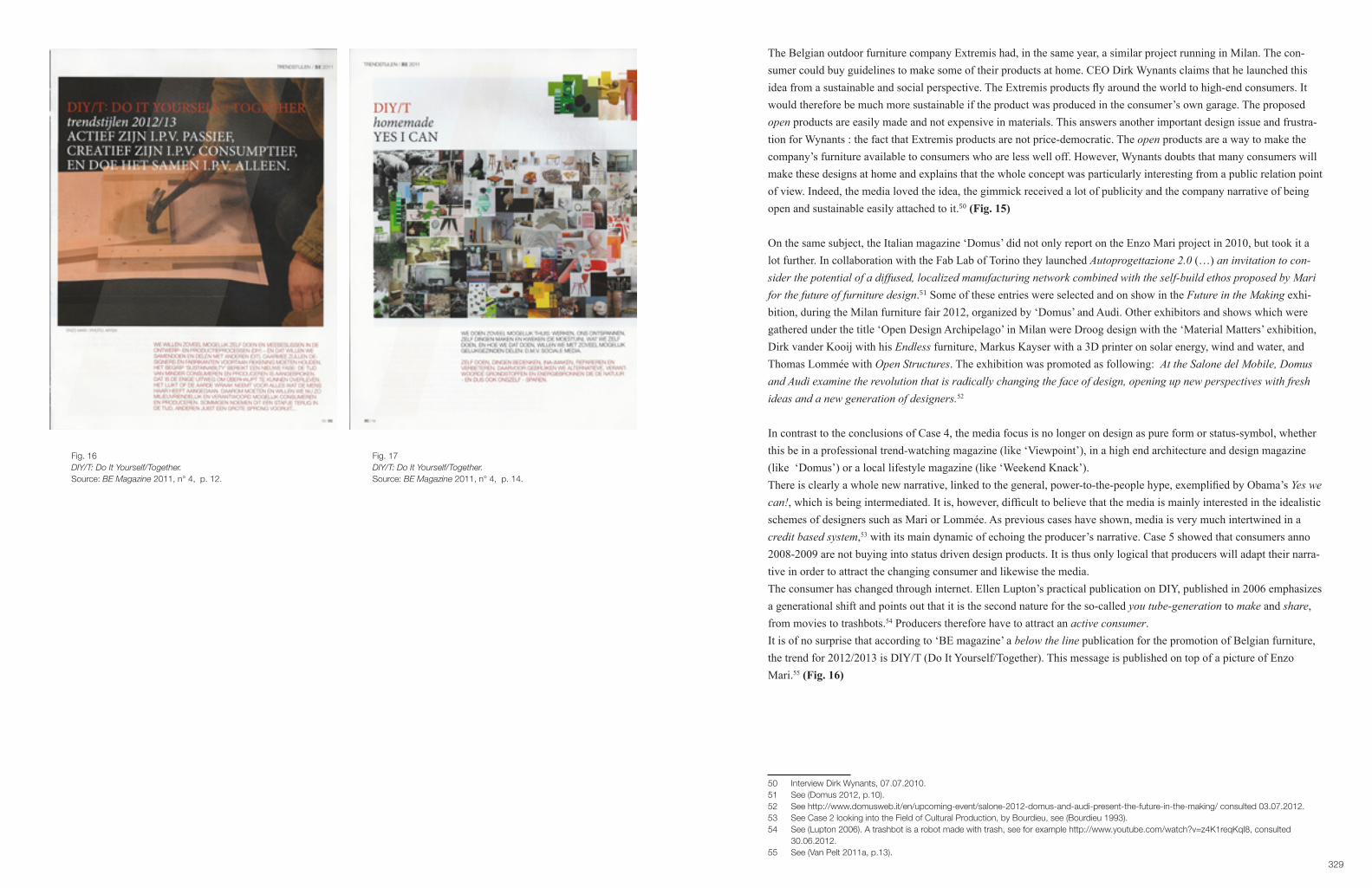
329
The Belgian outdoor furniture company Extremis had, in the same year, a similar project running in Milan. The con-sumer could buy guidelines to make some of their products at home. CEO Dirk Wynants claims that he launched this idea from a sustainable and social perspective. The Extremis products fly around the world to high-end consumers. It would therefore be much more sustainable if the product was produced in the consumer’s own garage. The proposed open products are easily made and not expensive in materials. This answers another important design issue and frustra-tion for Wynants : the fact that Extremis products are not price-democratic. The open products are a way to make the company’s furniture available to consumers who are less well off. However, Wynants doubts that many consumers will make these designs at home and explains that the whole concept was particularly interesting from a public relation point of view. Indeed, the media loved the idea, the gimmick received a lot of publicity and the company narrative of being open and sustainable easily attached to it.50 (Fig. 15)
On the same subject, the Italian magazine ‘Domus’ did not only report on the Enzo Mari project in 2010, but took it a lot further. In collaboration with the Fab Lab of Torino they launched Autoprogettazione 2.0 (…) an invitation to con-sider the potential of a diffused, localized manufacturing network combined with the self-build ethos proposed by Mari for the future of furniture design.51 Some of these entries were selected and on show in the Future in the Making exhi-bition, during the Milan furniture fair 2012, organized by ‘Domus’ and Audi. Other exhibitors and shows which were gathered under the title ‘Open Design Archipelago’ in Milan were Droog design with the ‘Material Matters’ exhibition, Dirk vander Kooij with his Endless furniture, Markus Kayser with a 3D printer on solar energy, wind and water, and Thomas Lommée with Open Structures. The exhibition was promoted as following: At the Salone del Mobile, Domus andAudiexaminetherevolutionthatisradicallychangingthefaceofdesign,openingupnewperspectiveswithfreshideas and a new generation of designers.52
In contrast to the conclusions of Case 4, the media focus is no longer on design as pure form or status-symbol, whether this be in a professional trend-watching magazine (like ‘Viewpoint’), in a high end architecture and design magazine (like ‘Domus’) or a local lifestyle magazine (like ‘Weekend Knack’).There is clearly a whole new narrative, linked to the general, power-to-the-people hype, exemplified by Obama’s Yes we can!, which is being intermediated. It is, however, difficult to believe that the media is mainly interested in the idealistic schemes of designers such as Mari or Lommée. As previous cases have shown, media is very much intertwined in a credit based system,53 with its main dynamic of echoing the producer’s narrative. Case 5 showed that consumers anno 2008-2009 are not buying into status driven design products. It is thus only logical that producers will adapt their narra-tive in order to attract the changing consumer and likewise the media.The consumer has changed through internet. Ellen Lupton’s practical publication on DIY, published in 2006 emphasizes a generational shift and points out that it is the second nature for the so-called you tube-generation to make and share, from movies to trashbots.54 Producers therefore have to attract an active consumer.It is of no surprise that according to ‘BE magazine’ a below the line publication for the promotion of Belgian furniture, the trend for 2012/2013 is DIY/T (Do It Yourself/Together). This message is published on top of a picture of Enzo Mari.55 (Fig. 16)
50 Interview Dirk Wynants, 07.07.2010.51 See (Domus 2012, p.10).52 See http://www.domusweb.it/en/upcoming-event/salone-2012-domus-and-audi-present-the-future-in-the-making/ consulted 03.07.2012.53 See Case 2 looking into the Field of Cultural Production, by Bourdieu, see (Bourdieu 1993).54 See (Lupton 2006). A trashbot is a robot made with trash, see for example http://www.youtube.com/watch?v=z4K1reqKqI8, consulted 30.06.2012.55 See (Van Pelt 2011a, p.13).
Fig. 16DIY/T: Do It Yourself/Together.Source: BE Magazine 2011, n° 4, p. 12.
Fig. 17DIY/T: Do It Yourself/Together.Source: BE Magazine 2011, n° 4, p. 14.

331
The magazine has amongst others, an article on Unfold, the Belgian couple of designers Claire Warnier and Dries Ver-bruggen who received a lot of media attention with L’artisan Electronique, a digital pot-maker based on an open source 3D printer. (Fig. 3) In the article we read L’Artisan Electronique is a museum installation,56 and thus very directly refer-ring to the world of high-arts rather than consumer empowerment. In the trend pages we read Yes I can clearly referring to ‘Viewpoint’s message. (Fig. 17) In that particular ‘Viewpoint’ article, pictures of both Open Structures by Thomas Lommée, as well as examples of L’artisanat Electronique by Unfold were published.David Carlson, an expert in brand strategies who works amongst others for Audi, IKEA and Electrolux writes in the aforementioned ‘Viewpoint’ issue:
After all, it is not so much that consumers are in a hurry to give up shopping. It is more that they feel their shopping needs have a resonance that, for at least the past three decades, has been lacking. A brand could be an enabler of an individual’s personality, rather than a badge that sends certain signals to our friends and colleagues but also somehow diminishes us. (…) Companies that want to come on the journey are going to have to do what many are not good at. They are going to have to listen to what the consumer wants, rather than tell them.57
It is thus not so unusual to read in the Belgian magazines for producers, that now is a time for less consumption and production. In ‘BE magazine’ we read:
The consumers want to do as much as they can themselves and want to have a say in the design-and production process (DIY)- and in doing so they want to collaborate and share with others (DIT). From now on designers and manufacturers will have to keep this in mind. Sustainability has reached a new level: the time of less consuming and less producing has come. This is the only way to survive. It looks as if the earth is taking revenge for everything human kind has done to it. Therefore we must now consume and produce as sustainably and responsibly as possible. Some call it a step back in time others the big leap forward….58
After this introduction, a DIY/T trend dossier of 53 pages is added with / to the promotion of Belgian furniture. Under titles as for example prosuming ( producing and consuming) as strategy for the future, a set of quite ordinary looking sofas is promoted. The promoted company however has a Facebook application where consumers can create their fa-vorite sofa by choosing a model and upholstery. This led, according to the editors, to 200 dreamsofas. The designer of the nicest sofa, wins a trip to Ibiza.59 The open design idea of Lommeé is reduced to a commercial trick to attract those active consumers. Moreover, in the whole catalogue, not one commercial product can be considered DIY/T.Worldwide companies are now looking into this new trend and how to benefit from it.60
56 See (Van Pelt 2011b, p.7).57 See (Carlson 2010, p.73), see also David Report: http://static.davidreport.com/2011/11/Closed-Wallets-Closed-Minds-trend-report-by-David- Report.pdf consulted on 04.07.2012.58 See (Van Pelt 2011a, p.13).59 See (Van Pelt 2011a, p.45).60 From a production point of view DIY and open design are communicated on as a trend. Throughout history, different social phenomena from the emancipatory to the democratising or even simple leisure time have been associated with DIY dynamics, in the 1920-1930’s, the 1950’s and the 1970’s. For historical accounts on DIY movements see (Atkinson 2006; Edwards 2006; Lichtman 2006; Mota 2011; Ventura 2011; Maldini 2012). Fiona Hackney’s research on DIY in the 1920-1930’s shows how it has been mediated and commercialised as a trend in specialized women’s magazines (Hackney 2006).
Fig. 18Ikea hackSource: Bengtsson 2010, p. 6.

333
The Vitra Design Museum, for example, hosted an exhibition of Gerrit Rietveld and ended its review on its website as follows: Andwithaseriesoffurnitureforself-assemblyinthe1930sand’40s,Rietveldanticipatedeventoday’sdo-it-yourself trend and the concept of “open design”.61 IKEA has its own hackers site, where it encourages consumers to hack IKEA products and to share their designs in the IKEA hack community. (Fig. 18) Nike opened their Make Some-thing workshops in California, New York and Boston, where consumers can make their own shoes from the available raw materials. Once people get a taste of being able to select and participate in the making, it’s going to be hard to go back, states John Hoke, vice president of global footware design at Nike.62 The power is reversing back to the indi-vidual,whoisgoingtousebrandstoself-createandself-express.You’regoingtoseemoreofthis;morecustomization,more personalization, with the brand taking a back seat.
It seems that brands are looking for new ways to attract the customer, and where designers as Lommée and Mari present a sort of anti-consumer model, with an empowerment of the consumer as maker or producer of his own things, ‘View-point’ concludes in its trend analysis: Forthetimebeing,atleast,theclearestbenefitoftheDIYmovementisforcon-sumers: somewhat ironically, less in the freedom to make products themselves than in the greater diversity of products to buy that DIY will bring.63 Along with an analysis of the DIY trend, ‘Viewpoint’ gives examples of hip products made within this new movement. Under the title Hack it Better they write: Hack it better, or even hack it beautiful, is the modern day make-do and-mend mantra.64 The result is 7 full-page photographs of up cycled objects which position somewhere between artistic looking ready-mades and crafted designart. Aesthetics and form obviously prevail. Although the objects are mainly made from waste and inherently might have a message of sustainability or anti-consumerism, the way they have been pictured nar-rates most of all extravaganza and exclusiveness.
The ‘Domus’ June issue of 2012 looks back at the Milan furniture fair and concludes: This was the Salone of digital fab-rication, because of the many events related to open design, such as ‘Domus’s’ ‘Open Design Archipelago’, ‘Hacked’ a 5 day program curated by Beatrice Galilee, and many 3D and rapid manufacturing experiments throughout the fair.65 (Fig. 19) Of the 32 pages on the fair, 24 pages focus on open DIY fabrication. Additionally the magazine provides an-other 8 pages on the worldwide makerculture, with the title: The militarization of makers.66 It is clear, only two years after the re-introduction of Mari’s autoprogettazione, the design intermediators have declared open design to be hip. According to the June 2012 publication, the ‘Domus’ design competition Autoprogettazione 2.0 received 257 entries from designers and Fab Labs worldwide. 7 were selected and shown at the exhibition in the ‘Open Design Archipelago’. Each of the selected deigns are full-page presentations in the magazine and can easily sit next to other manufactured products. They seem to speak the same design-language, and in opposition to the examples given by trend magazine ‘Viewpoint’, the products selected by ‘Domus’ have first and foremost a functional value, with aesthetics somewhere between minimalism and Droog. (Fig. 20, 21) Interesting is an image in the magazine of the exhibition lay-out on the tables. The resemblance with the presentation Thomas Lommée did for the Kortrijk What If -festival during the In-terieur Biennale is striking. (Fig. 22, 23)
61 See http://www.design-museum.de/en/exhibitions/detailseiten/gerrit-rietveld.html, consulted on 04.07.2012.62 See (Shah 2010, p.41).63 See (Shah 2010, p.41).64 See (Franklin & Till 2010, p.62).65 See (McGuirk 2012; BCXSY et al. 2012; Galilee 2012; Mascheroni 2012).66 See (Berg 2012).
Fig. 193D print demonstration at ‘Hacked’, Milaan 2012.Source: Domus 2012, n° 959, p. 62.
Fig. 20Open design-Guenda, by Filippo Mambretti for ‘Autoprogettazione 2.0’. Source, Domus 2012, n° 959, p. 82.
Fig. 21Open design-Wedge Side Table, by Andreas Kowalewski for ‘Autoprogettazione 2.0’. Source, Domus 2012, n° 959, p. 78.

335
‘Viewpoint’s’ issue 28 of 2011 has the title Local Heroes,67 and concentrates on another current movement : local economy. This movement is likewise related to the open design idea of Thomas Lommée. Through the internet, local communities get empowered and the more globally we experience the world, the more we seem to seek direct physical connections with a real community around us. The more we spend time in the digital world, the more we look for ana-logue connections. Many of these communities start as DIY gatherings, be it knitting groups, repair shops or Fab Labs. Interestingly, in this Viewpoint issue, one of the presented heroes is none other than Thomas Lommeé with his Open Structures project.68
There is obviously a sort of network of information, where the few key players seem to recurrently show up. Artek’s re-issuing of Mari’s Proposta per un’autoprogettazione attracted a lot of attention, and the work by the Belgians Thomas Lommée and Unfold was also easily picked-up through this network. There are several reasons for this. First of all, the general mentality, or Zeitgeist linked to the credit crunch, the environmental crisis and the positive message of people-empowerment linked to president Obama’s election. From a media perspective, the work of Lommeé and Unfold were not only in coherence with this general quest for sustainability and democratization, but secondly have a strong feeling of newness to them, even though they are packed in the artistic language associated with design since the mid 2000’s. Thirdly by 2011 the media attention for this new story has many links with the newly generated narratives of the pro-ducers. Whereas open design, implying an open business model, is not immediately feasible for big design companies, producers do look into the active consumer. Not as much from a real sustainable or democratizing view, but rather, as already implied by ‘Viewpoint’, as marketing strategy. The artistic looking design aesthetic linked to the open-hacker culture, the everyday and the vernacular has become cool. It has already been explained, in Case 2, how Vitra operates in the liminal space between high and low culture through meticulously constructed visuals in their catalogues. Today, in the same way, other design companies use a design-led vernacular, to attract the elite through a new design as art code and the popular through an emphasis on DIY and everydayness.
Trendwatchers such as ‘Viewpoint’ or mediators such as ‘Domus’, ‘Weekend Knack’ and even ‘Wallpaper*’,69 have translated the message according to their own needs. This message has been circulating in academic design circles, for quite some years now.70 These new design strategies imply social innovation led by the consumer and are taken very se-riously within the academia and in design practice.71 However, the mediatization of this movement shows how, through the dynamics between producers and media, a quite different narrative is added. The next part of this chapter will show how aesthetic and form are again used in the construction of an elite design narrative, linked to the above-mentioned lat-est trends. The social and ecological agenda from the design practice has been transformed into hype, with a narrative, which is once again all about being artistic and exclusive.
67 See (Shah 2011a).68 See (Shah 2011b, p.85).69 See http://www.wallpaper.com/design/the-future-in-the-making-exhibition-milan/5759#62455 consulted on 30.07.2012, on the ‘Domus’ exhibition as one of the highlights of Milan 2012. One of the pictured examples is a bike designed with the Open Structures model of Lommée, .70 See for example: Changing the change conference, Turin, 2008 http://www.changingthechange.org/papers/ctc.pdf, and Sustainability in design: now, Bangelore 2010, http://www.lensconference.polimi.it/, Change Design, Journal of Design Strategies, The New School for Design, Parsons, New York, volume 4, spring 2010, https://webspace.utexas.edu/cherwitz/www/articles/darwin-journal.pdf, Design activism and social change conference, Barcelona, 2011, http://www.historiadeldisseny.org/congres/.71 On co-design and participatory design, see for example (Sanders 2006; Salustri & Eng 2007).
Fig. 22Exhibition layout ‘Open Design Archipelago’.Source: Domus 2012, n° 959, p. 88.
Fig. 23Exhibition overview ‘Yes, we’re Open’. Source: Lommée 2010.

337
4. Re-framing high designSubsequently with the rise of interest in DIY matters and open design, mediated worldwide as a new trend, ‘Weekend Knack’ introduces a new narrative in accordance with a concept of author Douglas Coupland: Ikeasis. This concept re-flects the desire of the consumer to cling to “generically” designed objects. This need for clear, unconfusing forms is a means of simplifying life amid an onslaught of information,72 and is in accordance with the findings of Case 5. This so called simplifying life is embraced in ‘Weekend Knack’ through interior reports of real homes, with traces of real life, rather than emptied-out or totally styled homes as shown in Case 4.At first glance, this new ideal epitomizes DIY and everydayness. However, if one looks more closely at the circuit of production and consumption of this new trend, it is in fact again a constructed meaning, related to the artiness of the grunge counterculture, as well as the early Droog Design narrative related to anti-consumerism. The result is an empha-sis of the same message: that design is exclusive and therefore ideal in the formation of a distinctive lifestyle.
4.1. Droog and its postmodernist heritageThe important role of Droog Design in adding new layers of meaning and new perspectives to the design discourse is without question.73 Designers such as Jurgen Bey, Tejo Remy, Marcel Wanders, Hella Jongerius, Marti Guixé, who have collaborated with Droog, have played a substantial role in the re-framing of design-aesthetics within a high design context. However, up till now, their contribution to the design history discourse has not been reflected in the researched magazine ‘Weekend Knack’. Although the magazine principally mediated on high cultural matters linked to commercial institutions such as Vitra and Alessi, they did also comment on new and often more controversial waves within the de-sign discourse. However these kinds of articles are a minority.
When questioning first year students upon their knowledge of design, most of them are acquainted with names such as Philippe Starck and Alessi and have seen images of the Juicy Salif and other successful Alessi pieces. However, de-sign objects as for example the You Can’t Lay Down Your Memories Chest of Drawers by Tejo Remy (1991) or some products by Marti Guixé have never been seen before. Nevertheless, the work of Tejo Remy for Droog design and the oeuvre of Marti Guixé are, from a design historical perspective, at least as important as some of Starck’s designs.Over the researched years, ‘Weekend Knack’ readers in the early eighties were very well informed about the postmod-ern movement with the not at all commercial products of Mendini and Sottsass, as Case 4 has shown. However, over the years, information within the popular design discourse is increasingly infused with commercial incentives, rather than with innovative changes. Droog Design for example played a comparable role within the history of design as that of Memphis ,74 however, very little of the Droog products and concepts has been popularised in an effort to increase under-standing of contemporary design.
After the short-lived success of postmodern design, from the mid 1980’s onwards most design companies refreshed their designs with modernist geometric forms. It was also during that time that a lot of modernist furniture was re-issued.75 This movement, which became known as minimalism, or neo-modernism to distinguish it from its historical example, is not at all embedded in any sort of social awareness. However, minimalism has been extremely influential and according to Craig Miller attracted the largest numbers of designers working during the period 1985 to the present. Minimalism still stands synonymous for quite expensive and exclusive designs.76
72 See http://www.nytimes.com/2010/09/13/opinion/13coupland.html, consulted 20.01.2011.73 See for example (McDermott 2009, p.39).74 See for example (McDermott 2009, p.39).75 See (Cacciola 2008).76 See (Miller et al. 2009, p.108).
Fig. 24Design Fair in Miami.Source: Weekend Knack 2008, n° 51, p. 36-37.

339
It is especially this style in design and in architecture that has been mediatised throughout the late 1980’s up to today in ‘Weekend Knack’.Droog Design was a direct critique on the over-aestheticised forms of the minimalist movement or style, and the presen-tation of these products in likewise spotless white ambiances, which looked more like a showroom than a true home.77 It was the aim of founders Renny Ramakers and Gijs Bakker to bring products on the market, which resulted from a concept, rather than just being another, new form. It was the You Can’t Lay Down Your Memories Chest of Drawers by Tejo Remy that made them decide to start a totally new collection of design objects. For Ramakers this was a literal break with art history, never before had we seen such a piece of furniture.78 In 1993 they showed the first Droog pieces at the furniture fair in Milan.79
Although most of the designs of these creators do have a functional intention, we cannot say that their functions are more important than their form. In this respect they could be considered as heirs of the postmodernist movement,80 and as in the case of their precursors, most of their products found their way to the museum rather than to the private home.In an interview, Renny Ramakers states that in a sense Droog Design has been foundational for the designart movement of today, totally against Ramakers and Bakkers intention. When launching Droog, it was their aim to invest in a differ-ent kind of design with a totally different language, as a critique to the status-struck design of the 1980’s. The unusual aesthetics lead however to the museum floors and eventually to the commercial rules of the artworld.The success of many of the products by designers selected for Droog, unambiguously lead to a second generation of designers, who targeted the collectors market and for whom concept and visual statement became a direct ticket to eco-nomic success. This group would include the designers Tord Boontje, Studio Job, Haydon and the prestigious design company Established and Sons.81
According to a publication by Craig Miller, Penny Sparke and Catherine McDermott, the European design history from 1985 into the new century82 can be schematised into three styles, which evolved from modernism, being Geometric Minimal design, Biomorphic design and Neo-Pop design, and five styles which should be understood as postmodern: Decorativedesign,Expressivedesign,Conceptualdesign,Neo-Dada/Surrealdesign,Neo-Decorativedesign. For the last three Craig Miller emphasises the role of Droog Design. The whole publication, which is also the catalogue to an eponymous exhibition,83 reads as a compendium of artistic and exclusive designs, very much in line with the mediage-netic design Alice Rawstone commented about.84 Somewhere in the text Craig Miller states that it used to be the role of the museums to set standards for the field and to provide a more scholarly perspective on current events and helping to educate the general public.85 He feels that this role today is totally absent, and this publication shows that he is abso-lutely right. This museum catalogue looks little different to the average lifestyle-design magazine.The catalogue underlines very much the art-design narrative and although the authors underline the conceptual aspects of design with and after Droog, they only highlight forms and styles. This means, that even from a certain academic point of view, design is still reduced to a high art historical discourse.
77 See interview Renny Ramakers, 13.02.10.78 See interview Renny Ramakers, 13.02.10.79 See (Ramakers & Bakker 1998).80 See (Miller et al. 2009, p.58).81 See (McDermott 2009, p.38).82 See (Miller et al. 2009).83 In the Denver Art museum and Indianoplis Museum of Art in 2009, followed by a national tour (Miller et al. 2009, p.7).84 See Case 4, and see (Rawsthorn 1999).85 See (Miller et al. 2009, p.52).
Fig. 25Wild Living.Source: Weekend Knack 2010, n° 41, p. 36-37, 40-41.

341
Although it wasn’t the intention of Droog, they did set aesthetic standards for an artistic and exclusive design, related to obscure forms, deduced from a concept, and very different to the general aestheticization of ‘Weekend Knack’ explained in Case 4. The Droog aesthetic is more related to the grunge or anti-aesthetics of photographer Juergen Teller and oth-ers, as introduced in Case 2, and further elaborated on in the next sections.By December 2008 with the introduction of design at the Miami art fair, it looks as though design’s destiny is to be a full player within the art world, the thin distinctions between art and design having evaporated.86 (Fig. 24) Collec-tors will pay extremely high prices for a design prototype similar to the prices of an artwork by the elite contemporary artists. Deyan Sudjic remarks on the sale of Marc Newson’s Lockheed Lounge in 2006 at Sotheby’s in New York for 968.00 dollars: ItwasapricethatcertainlyconfirmedtheuselessnessoftheLounge.87 The exclusiveness of design is a fact.
However, by 2008 the eye-opening year of the triple crunch, the position of design as being exclusive is even in the popular media showing the first cracks, and ‘Weekend Knack’ for example, gradually starts to look into more sustain-able projects and proposals. In May 2008, Jesse Brouns reports on the Milan furniture fair with the title: Proliferation. About blingblingdesign, the mausoleumtrend and megalomania: during the designweek of Milan we saw that the furniture business stands on the threshold of decadence.
We (…) witness the end of an era. Since the end of the Second World War, furniture producers’ and designers’ aims were to democratise comfort and good taste. Who until recently took the term design in its mouth, was talking about industrially produced, functional products for an as large as possible public. Design was striving for a better world. In 2008 this word means something totally different. For most producers, and almost the entire designers generation, design is nothing more than a status symbol, an instrument owned by the m’as-tu-vu’s of the world. With a most worrying outcome.88
4.2. IkeasisIn the editorial introduction to ‘Weekend Knack’s’ interior special of fall 2010, design expert Leen Creve introduces the term Ikeasis,89 which she picked up from Douglas Coupland’s Dictonary of the Near Future in ‘The New York Times’. Ikeasis means: The desire in daily life and consumer life to cling to “generically” designed objects. This need for clear, unconfusing forms is a means of simplifying life amid an onslaught of information.90
For the editor it is not just objects that have to express a sort of normality or everydayness, but also the homes we live in. In the same issue she publishes 8 pages on what she calls the wild living: the clean, ideal house makes place for lively, spontaneous homes. Photographers and magazines follow this trend.91 (Fig. 25)However most of the other articles in ‘Weekend Knack’ up to today are more in tune with the ongoing aestheticization, than with everyday reality. The spring issue on design and interiors of 2011 has a major dossier on Living as it is. Editor in chief, Trui Moerkerke writes in her editorial introduction:
Howwearedesigningandexperiencingourhouse,asaworkinprogressisthethemeofthisissue.No,itis definitelynotaboutstrictrules.Theperfectminimalistinteriorthataverylongtimewasstrictlyfollowed,has for a while now been threatened by houses and gardens with space for the everyday.92
86 See (Willot 2008).87 See (Sudjic 2009, p.204).88 See (Brouns 2008, p.39).89 See (Creve 2010b, p.7).90 See http://www.nytimes.com/2010/09/13/opinion/13coupland.html, consulted 20.01.2011.91 See (Creve 2010a, p.36).92 See (Moerkerke 2011, p.5).
Fig. 26Cover of the magazine ‘Apartamento’.Source: Apartamento 2011, n° 8, cover.
Fig. 27Article in the magazine ‘Apartamento’.Source: Apartamento 2011, n° 8, p. 12.

343
In this issue there is an interview with psychologist Peter Adriaenssens who is writing a book about homes in which people really live, because we all seem to function better in an interior with less design and more junk, souvenirs and space for children playing.93 If one reads through the articles it seems as if the age of design is over. The amateur-pro-fessional has risen and the success of aestheticized, highly designed houses, furbished with high design is over. How-ever, when browsing through the magazine, the homes photographed do not show much clutter or many playing chil-dren, on the contrary. They are shot in a way similar to the way they have been for the previous 20 years. The style is a lot less sterile than the white minimalistic cubes, but nevertheless, the homes on show are a compilation of high design furniture in highly constructed images of the so-called everyday, and definitely not as unusual or wild as the interiors presented half a year earlier by Leen Creve within the concept of Ikeasis. For Creve, the magazine ‘Apartamento’ is an ideal example of our strive to live in real houses. (Fig. 26, 27, 28) This Spanish interior magazine was launched in April 2008, and made this so call unestheticized, wild, everyday look, its trademark. Twice a year they publish stories of especially famous, but also less famous, people’s real lifestyle. On the website one reads about the magazine:
Apartamento, an everyday life interiors magazine For too many people, being happy at home is pretty much an abstract idea, something they can’t know or imagine, until it appears on some taste maker’s must-have list, or in a magazine, or reposted on Tumblr. A home sweet home is not curated or produced by acquiring a perfect arrangement of chairs, lamps and friends. A real living space is made from living, not decorating. A bored materialist can’t understand that a house has to become a home. It happens, not through perfection but by participation.94
In the ‘Weekend Knack’ article Leen Creve refers to this magazine as exemplifying this latest trend. The owners , Ital-ian Marco Velardi and his Spanish friends Omar Sosa and Nacho Alegre, were 25, 26 and 27 years old at the time they launched the magazine. In an interview, they claim that they started the magazine out of frustration with the magazine market: interior magazines were so incredibly boring and for 90% appealing to only those who can buy into design furniture. We wanted to make something that felt real, for us and our friends. People do cook in their houses and have plants, pets and children.95 The editors realize that their articles are not at all mainstream and might not interest a large public, although they believe that most people live the way they present peoples homes. Therefore they consider them-selves more as an inspiration board, to empower people to live in the real, rather than the ideal.96
Another example is photographer Todd Selby who’s been receiving a lot of attention with this kind of everydayness. In 2008 he started a website with photo shoots of his friends in their homes. He photographed them among their real things, be it clutter. (Fig. 29) He photographs homes, where every object tells the story of the owner and not of the de-sign companies they bought into. It’s all about showing personal creativity mixed with a kind of underground coolness. His website turned out to be very successful and
Requests quickly began coming in daily from viewers all over the world who wanted their homes to be featured onthesite.TheSelby’swebsitebecamesoinfluential—withupto95,000uniquevisitorsdaily—thatwithin months, top companies from around the world began asking to collaborate. These joint projects have included a large ad campaign and web project with Nike 6.0, collaborations with Louis Vuitton and Hennessy, a solo show at colette, an international ad campaign for Habitat, work for the New York Times T Magazine, and frequent contributions to Vogue Paris and Architectural Digest France.97
93 See (Swimberghe 2011).94 See Andy & Elsa Beach, Apartamento issue #07, http://www.apartamentomagazine.com/about.php, consulted 26.01.201095 See (Creve 2010a, p.40).96 On the real and the ideal promoted by magazines, see Case 4.97 See http://www.theselby.com/bio.html, consulted 11.07.2012.
Fig. 28Eames chair in the magazine ‘Apartamento’.Source: Apartamento 2011, n° 8, p. 214.

345
Fig. 29Source: Todd Selby 2010, pp. 18-19.

347
In 2010 his first book was published under the title: The Selby.98 It is a compilation of portraits such as those he had been posting on his website. According to Leen Creve the success of this trend is mainly a result of the new medias such as Facebook, You Tube and of course the digital camera on our phones. Snapshots of everyday life have become normal.
However the so-called everydayness in The Selby or ‘Appartamento’ is still quite different to the photographs of the homes in the researched street of Case 5, and is somehow more related to the anti-aesthetics of Nan Goldin, Juergen Teller and this whole new generation of fashion/ art photographers.99
Although these images claim to represent the everyday, they are just as coded and orchestrated as the perfect pictures of most magazines described in case 4 and in this sense, again represent an ideal way of living. This ideal is characterized by a sort of artistic bohemian nonchalance, typical of the artist’s studio and very oppositional to the commercial show-room, to which a majority of houses in most lifestyle magazines relate. ‘Apartamento’ brings an eccentric,100 and artistic lifestyle, portraying the homes and studios of artists in the widest sense of the word: musicians, designers, stylists, nov-elists, photographers, … With its 22,000 readers worldwide,101 ‘Apartamento’ is a niche magazine appealing to a public, which looks for the newest and most artistic trends. The companies that advertise in the magazine are mainly high-end design companies such as Vitra, Casa Camper, Santa & Cole, Maharam, but also design hotels such as The Standard Hotel, Hotel Americano, …The people photographed in The Selby are not mainstream inhabitants either, as they are in the street researched in case 5, as the introductions show:
Ozzie is a pro surfer who lives in Sydney with his family.102 Erin has been a muse for the downtown hip set for both her fashion sense and bohemian lifestyle.103 Everyone knows that Karl is one of the top fashion designers in the world, but not many people know how much Karl loves book.104 I saw the Neistat brothers’ video while shopping at Colette in Paris. 105
Interesting is that Karl Lagerfeld features amongst other much less well-known creative people and is treated as such. The recurrent theme of this publication is creativity as status.106
As shown in the case of Vitra, the Eameses were the first designers after the rational, modernist architecture to propose homes filled with clutter and life, to generate an extra-culturalsurprise.107 But as shown by Beatriz Colomina their mul-tiple eye approach was just as orchestrated as Julius Shulmans clean-approach.108
4.3. Design-led vernacularIn the 1980’s, Nan Goldin and the post-punk movement, very much instigated a new aesthetic of coincidence and eve-rydayness. Her successor Juergen Teller introduced his anti-aesthetics into the fashion world in the late 1990’s,109 and as seen in Case 2, into the design world via the Vitra catalogue, as early as 2004. Way before ‘Apartamento’ and The Selby. Also noteworthy in this context of everydayness, is the Droog do create exhibition in the summer of 2000 in de 98 See (Selby 2010).99 See (Kismaric 2004).100 They use this term in the editorials to describe some of the interviews. See for example (Marino 2011, p.63).101 Most readers live in Northern Europe, see (Creve 2010a, p.40).102 See (Selby 2010, p.10).103 See (Selby 2010, p.20).104 See (Selby 2010, p.29).105 See (Selby 2010, p.36).106 And thus also doing rather than having.107 See (Kirkham 1995), and see also Part II.108 See Case 2 and see (Colomina 2007) on the multiple eye approach of the Eameses, and see (Shulman 2002) on the constructed view.109 See for example (Kismaric 2004).
Fig. 30Source: Vitra Home 2004, p. 29.

349
Kunsthal Rotterdam. In the images of the exhibition, Droog designers clearly flirt with the banal and the everyday and the participation of the consumer is asked for in the exhibited products. As for example the do add, from Jurgen Bey, which is a chair with one shorter leg, so the consumer can add his personal magazines or books under the chair, in order to sit on it.110
Since the late 1990’s, the artistic elite has been infused with a new everyday aesthetic, dissociated from the minimal-ist aesthetic approach, which by the mid 2000’s will have been rather over-exposed in the lifestyle media. The early adopters, of course, with the new anti-aesthetic trend, wish to distinguish themselves from the minimalist approach, as it becomes over-used and commonplace, via the trickle down effect.It is interesting to see how recently some design manufacturers have jumped upon this trend, with Vitra as explained in Case 2 as prime example. (Fig. 30, 31) Molteni’s catalogue of 2010, was given the name At Home and explains that their predominantly minimalistc furniture is designed for: a more comfortable home, more looking like you, more real. Classic Design Italia even swapped models for local Italian woman, discussing on the tomato braiding using design icons. (Fig. 32, 33) These campaigns however are still a minority.While Case 5 looked at the vernacular from within, this chapter, through the case of Thomas Lommée and the mediation of his design approach, shows how since 2008 the amateur and the vernacular have become two diverging mediated narratives of the popular understanding of design being artistic and exclusive.
From a design history perspective, the way the amateur,111 is being presented and constructed by producers and the media can be compared with the local craftsman praised by architect Edward Prior, founder of the Art Workers Guild and a key figure in the Arts & Crafts movement.112 Within the same perspective, the rural and traditional vernacular was praised by the Arts & Crafts as a space of resistance to homogeneity and industrialization.113 Michelangelo Sabatino explains how these essentially anti-modern elements were utilized by the modernists.114 Moreover in the 1990’s with the trend of minimalism or neo-modernism, the rural simplicity of Shaker vernacular, applauded for its simplicity and di-rectness, and became a kind of ideal, when compared to the empty, white-cube space contemporary man was to live in. It is therefore interesting to see that today’s real vernacular as shown in Case 5 is no longer linked to local traditions and rural handicraft, but rather infused by the generic image of a modern, aestheticized lifestyle. Most of the respondents modernized their homes and applied techniques of, for instance, matching colors, accent-walls, high-design look-alike furniture … promoted in the media.The mediatized vernacular however, is romanticized. For example, the aestheticized vernacular approach of Rudofsky’s book and exhibition Architecture Without Architects,115 which doesn’t take into account the maker and its context. The vernacularisreducedtoaestheticexemplarsoftimelessfunctionalism.116 The everyday is therefore bestowed with a high cultural narrative.Scott, Venturi and Izenour very much criticized this aesthetic, romanticized approach and pointed out the importance of the commercial vernacular as the real vernacular of the people.117
Graphic designers Kalman and Jacobs in turn urged designers to look to the local streets, in opposition to the strip in Las Vegas, proposed by Scott, Venturi and Izenour.118 Case 2 looked into the Chairman publication of Vitra, made by Kalman on the life of Vitra’s CEO, Rolf Fehlbaum.119 With this book, Kalman designed a vernacular portait of chair-man Rolf Fehlbaum, picturing him amongst everyday which fit perfectly with this simple, functional, timeless design,
110 See http://www.kunsthal.nl/22-216-do-Droog-Design-do-create.html, consulted 26. 01.2011.111 Amateur as opposed to the professional. See more on this theme in a special issue of Design History Journal: Ghosts of the Profession: Amateurs, Vernacular and Dilettante Practices and Modern Design in 2008, Volume 21, n°4.112 See (Beegan & Atkinson 2008, p.308).113 See (Beegan & Atkinson 2008, p.311).114 See (Sabatino 2008).115 See (Rudofsky 1987).116 See (Beegan & Atkinson 2008, p.310).117 See (Venturi et al. 1977).118 See (Beegan & Atkinson 2008, p.312).119 See (Kalman 1997), and see Case 4.
Fig. 31Source: Vitra Home 2008, p. 94-95.

351
as promoted by the modernists.120 Throughout history, the vernacular has been a source of inspiration for designers and architects,121 but in most cases this was used to affirm a certain position of the designer/architect, thus becoming a distinction within the mainstream ap-proach of their fellow professionals.
Similarly, photographers Juergen Teller, Todd Selby and many others, construct a contemporary vernacular based on an artistic lifestyle. This means creating a collage of everydayness, using elements of romanticized vernacular, and espe-cially causing a disruption of the modern generic aestheticized style. In these constructed images, there are still many high design objects, but these are blurred with a so-called bohemian everydayness, linked to the high creative class of Richard Florida.122 For example, in The Selby, the photographer asks 30 year old, media celebrity Julia Roitfelt, daugh-ter of Carine Roitfelt editor in chief of ‘Vogue’ Paris,123 what kind of furniture she likes. Her answer: Clean, pure, mini-malist.IamafanofKnoll,butdon’tlikethe“totallook”,somixKnollerawithmore“vintagepieces”.124
Due to the trickle down effect, the rich and famous no longer surround themselves with high design in a white cube set-ting, referred to as the total look. Rather, as we may be lead to believe from the latest Taschen publication,125 the mem-bers of the high-end creative class prefer to live in a shed. (Fig. 34)From 2008 onwards, there is a convergence between the way the general public experiences designing in a DIY context (as shown in case 5), the language of the media and producers (as shown above), and the design practice itself, which shows a shift from designing things to design thinking. The design discourse moves from designing artefacts with a pre-packed meaning which thus implies the creation of a need, towards a discipline that uses the designer’s sensibility and methods to match people’s needs, 126 somewhere in the liminal space between production and consumption. The ‘Changing the Change’ conference on sustainability in 2008 and the largely mediated publication of IDEO’s CEO Tim Brown in 2009 Change by design are focal points in this transition.127
The design practice and the consumers seem to speak a similar language, one in which the creativity of the user and the needs of the user are central. Whereas the producers of high design furniture and the media, on the other hand, have a tendancy to introduce buzzwords such as open, professional, amateur, vernacular, … and then add commercial mean-ing to them.
The vernacular used by the manufacturers and the media can in this sense be considered a design-led vernacular. Mean-ing, meticulously creating a specific style with the stress on a new aesthetic. This kind of vernacular is not much more than a new code, only to be deciphered by the highest in the creative rank, and emphasized by the cultural intermediar-ies. It is the new code of distinction. The way elite consumers, producers and the media are dealing with this shift can be understood as a diversion of the commodity as explained by Appadurai.128 Whereas high design was originally a kingly good, in an enclaved zone, where exchange was confined, it has, over the researched years, been diverted through commoditization, because of the wide media attention it received. Today, however we see a diversion again as a result of crisis. As exemplified with the quote of Julia Roitfeld about her favorite furniture; in essence she still buys into the high design of Knoll, but in arranging the setting differently, in changing the environment in which the Knoll furniture is represented it becomes once again a kingly good. As Appadurai explains, theflowofcommoditiesinanygivensitua-tion is a shifting compromise between socially regulated paths and competitive inspired diversions.129
120 See for example Guiseppe Pagano, in (Beegan & Atkinson 2008, p.309).121 See also (Clarke 2011).122 See also Case 2 (Florida 2004).123 Roitfelt was editor in chief from 2001-2011.124 See http://www.theselby.com/4_29_09_julia_roitfeld/index.html, consulted 11.07.2012. The whole website and book is written in a very laid-back language, spelling doesn’t seem to be an issue. Another example of the anti-establishment narrative The Selby is expressing.125 See the teaser Taschen sent round to promote ‘100 interiors’, see http://www.easyliving.co.uk/homes/furnishings/100-interiors-around-the- world, consulted 08.06.2012.126 See (Kimbell 2009, p.170).127 See (Brown 2009), see also (Julier & Moor 2009) on design thinking.128 See (Appadurai 1986).129 See (Appadurai 1986, p.17).
Fig. 32Advertisement of Classic Design Italia.Source: Metropolitan Eurostar 2011, p. 54.
Fig. 33Advertisement Flexform.Source: Weekend Knack 2010, n° 8, p. 46.

353
To distinguish herself from the masses, Roitfelt and other consumers photographed by Todd Selby use the vernacular as a surrounding framework for their high design consumption, be that a Cartier watch, a Saab, boots by Yves Saint Laurent, a Louis Vuitton bag…. It is only logical that producers of luxuries are investing in this particular narrative, which in essence has nothing to do with the needs, desires, actions and vernacular of the real consumer, but with a new, encoded distinction belonging to the high creative.
In the same way, the results of the creativity of the real, active consumer or amateur are by no means being mediated: neither their interiors, nor their products. Producers and media only look into the creative actions of the early adopters and present it as reality, as what every consumer wants. In doing so, they are re-interpreting the ideals of the designers and the consumers into new narratives, always adapted to a continuous strive for distinction.130 In the introduction to The Selby, Lesly Arfin explains that the biggest thing that unites New York City is not love, but envy. In this city we’re always looking over each others’ shoulders. There is always a hotter person we could be going out with. There’ s a cooler job just around the corner. Of course, someone else’s apartment is always better than our own. (…) We’re a greedy bunch when it comes to our time and our goals. A materialistic bunch, too, but also a deter-mined one. Basically, we all just want cool stuff. And we want it now.131 A message, that altogether does not sound so different from the Wallpaper message. For this consumer group it is still about having rather than doing, or maybe the doing should be understood as participating in the creative process of the photo shoot. As Arfin explains: (…) every time I see Todd I bug him to shoot me again. All participants actively engage in the photo shoots, by putting on their favorite wardrobe, or showing off their weirdest hobbies. However the big shift is the objects by which they identify themselves with. It is no longer the highly aestheticized form, which hides the function that is on the wish list of this consumer. It’s weird and sometimes even ugly things (…).132
5. Conclusion Since 2008 there has been a clear shift in the design discourse. Within the design practice and the academic field in gen-eral there has been a shift in focus since the beginning of the 2000’s, which coincides with the findings of Case 5 and the experience of the consumers regarding the popularised design-time of the mid 2000’s. From 2008 onwards we see a shift in the mediated narrative on design in ‘Weekend Knack’ and other international magazines. Design is presented as a tool for a sustainable economy, with a growing focus on the consumer and thus increased user participation in the design process. One of the newest movements within the discourse - open design - very much exemplifies this shift in meaning. Simultaneously, there is a shift in aesthetics. The mediated open design approach shows similarities to the mediated narratives of Droog design. The aesthetics applied by open design participants correspond to the Droog design aesthetics, which are about the importance of concept above form. However, as explained, Droog has played an impor-tant role in the evolution of design towards designart. It is therefore not unimaginable that the open design discourse will eventually subside into highly commercial designart.Similarly these new aesthetics linked to the everyday and the mediated emancipation of the consumer add to the con-struction of a new narrative. This is that of a design-led vernacular, in an aim to overcome the trickle down effect of the much mediated, aestheticized, high design narrative. Today’s trendy consumer lives in a designed clutter of uncanny looking objects, with a DIY touch and at least one high design piece of furniture. This narrative results from different dynamics instigated by the producers as much as by the consumers, and is somehow linked to the movements within the design practice, and the successful evolution of high design into designart.Where the project of Thomas Lommée illustrated an ideal vision and new possibilities for the design discourse in gen-eral, this case–study shows that the original meaning of consumer/user-empowerment has already been altered by the producers of high design into a commercial narrative, authorised by the lifestyle media and presented as the next big thing.
130 See for example the social agenda of modernists, (Wolfe 1981), or the artist genius of the Eameses (de Rijk 2003).131 See (Selby 2010, p.6).132 See (Selby 2010, p.7).
Fig. 34Teaser for the Taschen publication 100 Interiors 2012.Source: http://www.easyliving.co.uk/homes/furnishings/100-interiors-around-the-world

355
IV. CONCLUSION

357
1. Summary Since 1980 design has at the one hand become increasingly popular and is today omnipresent, at the other hand the de-sign practice has since a couple of years been emphasising the identity crisis of design. This PhD aims at understanding why and how design has become so popular and to what consequences. In order to grasp this quite complex and especially wide research question, the research was narrowed down to 6 case studies, representing the three moments of meaning-giving in the life cycle of a product: production-mediation-consumption, within the geographic scope of Flanders.The most obvious reason why design has become omnipresent, is the hypothesis that the reflexive consumer buys into the goods as a means to construct an identity through consumption. In this respect the status-value of an object is of prime-importance and explains why design has become so desired in neo-liberal society. In the course of its history de-sign has expressed a growing accumulation of cultural capital, with the success of designart as its triumph.However the research show that it is not so much the consumer who has ratified the high cultural meaning of design. The consumer seems to have mainly adopted the narratives and labels bestowed upon it by the producer in positioning the goods onto the market. Through very particular and successful branding strategies, the producer’s message has been confirmed and authorised by the lifestyle media. This implies that design’s success is driven by commercial and eco-nomic imperatives, veiled under the pretext of high culture. Looking into the three major moments of mediation, shows that producers of high design invest in high cultural brand-ing, which doesn’t necessarily have a direct economic outcome, but does generate a brand image of an industrial inves-tor who is rather an altruistic maecenas, than an industrialist creating new desires in the endless cycle of consumption. Alessi for example has invested in the Tea and Coffee Piazza, a collection of silver objects designed by internationally known architect. These designs were only produced in threefold in analogy of the limited editions within the art circuit, and worldwide found a direct entry into the main art museums. Vitra and Tecta opened their own musem under the al-truistic aim of sharing the private collections of their CEO’s with the world. Next to this obvious strategy, it is especially the interplay between the created high cultural narrative of the producers with the lifestyle media that has led to the ac-cumulation of cultural capital of the goods, but also of the producer, the media and the consumer who does buy into the goods. Case 4 of the research shows that the media not only echo, but enforce the narratives of the producer in their own strive to accumulate cultural capital. In doing so, they present life amidst high design objects as an ideal to strive for. This interplay between producers and media has proven producers to invest in cultural branding, rather than advertising. The products of for example, Vitra and Alessi are broadly represented throughout different editorial formats. TECTA at the other hand, which does invest in cultural initiatives as for example a museum and book publications, is not covered in ‘Weekend Knack’, precisely because it is not willing to provide the magazines with flattened-out, easy manageable narratives, which can be directly copied and pasted into the eitorials.
However the economically successful initiatives of companies as for example Alessi and Vitra and the strategies implied by the media in advising the consumer in the obtaining of an ideal lifestyle, through high design consumption, has im-plications on the meaning of design in general and is symptomatic for the crisis in design.The above briefly described strategy of uploading goods with cultural capital, implies meticulously constructed narra-tives, which are layered upon the intrinsic qualities of design goods and can even be contradictory to the intended mean-ing and use of the designers. Thus erasing their mere reason for existing. Secondly, the commodification of high design has lead to the spreading of the high cultural aura to all objects with a related design-style, and thirdly, to the assump-tion that the function of an object is subordinate to its form and expression.The case-study on the acquisition and assimilation of high design by the consumers in 2009 shows the preliminary hy-pothesis: that the success of high design is linked to the drive of the consumer to buy positional goods in the construc-tion of an identity, to be false. Most of the consumers claim not to buy design, precisely for its positional and non-func-tional aura. They do however all buy adapted copies of high design, or products expressing a design-style at cheap chain stores as for example IKEA or Weba. Surprisingly, most consumers do not label these goods as design. This implies that the meaning of high design, as being artistic and exclusive has from the perspective of the consumer, become synony-

359
mous to the meaning of design in general, which of course does give reason to believe that the design is in crisis.The consumer’s refusal to identify with the artistic and exclusive character of design and the critique from the design practice and academia has led to the construction of a new and at first glance deviating narrative by producers and media. Vitra as one of the first producers started photographing its products in everyday situations with a stress on the use-value of the goods and the reflexive capacity of the consumer in creating a personal home, which radiates creativity rather than social position. However this shift in context: from the white-cube, museum kind of settings to a presenta-tion of the products in everyday homes, is not devoid of a high cultural meaning, on the contrary. These new settings and images are complete in tune with art and fashion avant-garde as for example the photography of Juergen Teller. The applied strategy of the producers and media is rather infused by their fear for a trickle down effect, and again contra productive to the real aims of designers, and needs of consumers. For producers of high design goods, there seems to be no direct interest in promoting design as an innovation driven practise with as intrinsic value and desire to improve things.In mapping the narratives and labels of the three major moments in a product’s lifecycle it becomes clear that in order to understand the dynamics underlying the popularisation of design it is not the moment of creation, nor the moment of consumption that should be solely looked at, but the interplay or mediation between those moments, and the generated flow or flux of meaning.

361
2. Conclusion The popularisation of high design could be understood as a demonstration of design’s ability to embody and express the idea of modernity, meaning a way of life that embraces all things modern life has to offer. In this sense, design has been democratising ideals and values, which used to be restricted to an elite group. As Penny Sparke puts it: Design became everyone’s bridge to their own brand of modernity.1 Design is in this sense seen as the bridge between consumption and production.This research study however wants to point out that this reflexive view is one-sighted. It is a view, which seamlessly coincides with the aims of a neo-liberal economy which heralds creative identity. However, it is not the high design object in itself: the material body with a form, a function, expressing innovation, comfort, beauty, … that embodies the ability to form one’s identity within consumer society. It is rather the narrative stuck to it, which might even be contra-dictory to the initial narrative and intention of the designer. Having gone through the biography of high design products and having looked into the three major moments of adding meaning, we can conclude that it is rather the light that shines upon high design objects that is to be accredited for its recent success in mediating modern identity. Design as it is understood today is no longer directly linked to the designer’s creativity and aim to make things better, but has be-come synonymous with the aura bestowed upon it, with the sole aim of selling more. High design has become the token of power and success, the gold medal of consumer culture. In the spreading of its light, the dominant modern design aesthetic, infused with the focus on form rather than function and subsequent status-value, has led to the elaboration of a design-style. This means a type of product which is not infused with the status of a brand or a branded designer, but which has adopted the highly mediated aesthetic or style of high design objects and resides within the category of anon-ymous design. An adapted copy of, for example, an Arne Jacobsen chair, which does not at all have the same inherent design qualities (within its material body), but breaths the same style, holds the same promise of a modern identity for less than half the price. This means that anonymous design as opposed to high design has evolved into a design-style, which is also positional, due to the reflection of the light shed on the highly promoted high design. The contemporary success of design lies not in the creative process of the designer, but in the second skin layered upon it. As Haug explains, the promise of a use-value, which one can never truly have experienced at the cash desk, is estab-lished through the commodity aesthetic, by which Haug means advertising, salesmanship, brand names, design, pack-aging and display.2 This commodity aesthetic has, since the late 1980’s, been dominated by the modernist style code. Cheap chain shops such as for example in Flanders, Weba, who used to be known for their traditional furniture styles,3 and most DIY shops, which were formerly characterised by a technical and practical approach, free from any kind of style, have adapted to this particular commodity aesthetic to which Slater refers as the production of the appearance of use-value.4 Meaning that this dominant modern style, which is invisibly linked to a narrative of high status, good taste and distinction, authorizes a product to be functional within today’s lifestyle codes. Strangely enough the majority of the researched respondents do not label these products as design, precisely because there is still a prominent use-value. This means that the emptying-out of the inherent meaning of high design has, unnoticed, been proliferated to a whole league of everyday products. In an aim to create a personal and creative identity, matching the idealised lifestyle pre-sented by the media, the consumer has bought into design-style and thus benefits from practically the same aura as that of high-design. Case 5 has argued that the doing and thus the creating is more important than identification through having. However the doing is guided by the metanarrative of high design, with a focus on form as a means to sell a promised use-value. The whole dynamic of aestheticization can be understood as the spreading of the light, or should we say shadow, of the producer and the media, with a very simple outcome: the more we abide by a complete aesthetic, the more stuff we have to buy.
1 See (Sparke 2004, p.7).2 See (Haug 1986). 3 See (Schoonjans 1996).4 See (Slater 1997, p.113).
363
If we truly want to understand the impact of design in today’s everyday experience, from a theoretical and research per-spective, we should not focus on production (in the sense of creating an object), nor on consumption (in the sense of the reflexive act of the consumer in creating an identity), neither believe that design in itself is the bridge between both mo-ments. It is the second skin that is the almost invisible bridge in the creation of need, covered by the pretext of providing the tools for an individual lifestyle. This second skin, or light shed upon the high design objects, has over the researched years slightly changed and maybe faded into another colour, but it still comes from above, from those in power. Despite the paradigm shift in the design practice and new focuses for Design Culture Studies in the academic world, the narrative of design as a means to create a better social and sustainable world is not yet accredited by the general con-sumer. Not because the consumer is not interested, quite on the contrary, but because the message does not get through.
The postmodern reflexive consumption model tends to overlook the impact of the narratives and desires generated and mediated by producers and media under the pretext of creating an identity for the consumer. Grace Lees-Maffei pro-posed in 2009 an article in the Journal of Design History,5 that in the study of design there needs to be a shift in focus, with an emphasis on the role of mediation. Lees-Maffei introduces the Production-Consumption-Mediation Paradigm, referring to the fact that design historians have, over the course of this fairly new discipline, moved from a focus on production, to a focus on consumption. She now pleas for a focus on mediation, because it enables recognition of the fact that design is much more than the object;itisacomplexwebofsurroundingpracticesanddiscourses.6
In this mediation stream in design history she sees three currents. One is the obvious mediating role of press, television, and advice literature... The second current is the design applied by the media in the way they brand themselves. Here she refers to for example the graphic design of the magazines, the design of the film-sets, the furniture used in the news-rooms... The third current is the role design objects play as mediating devices in the formation of (social) identity.This PhD attempts to sharpen the focus on the mediating devices of the producers and their almost invisible but direct collaboration with the media.
In an aim to follow Don Slater’s advice to unearth these patterns, this research study wants to conclude with the follow-ing findings in the geographical research area of Flanders:
1. The producer generates narratives, which influence the general meaning of what design stands for. This finding contrasts with the largely accepted postmodern shift of the role of the producer to the role of the consumer in giving meaning to objects. It is thereby not only the emphasis on form, but also the positioning of high design in a particular context, which adds meaning. Thus producers mainly apply a museum-like attitude in coherence with artistic publications. Design as understood by the majority of consumers is therefore linked to a particular styling or aestheticization of form and context. Marcel Breuer’s most famous chairs (the Wassily and the Ces-ca) for example are not read, or recognised as design in an everyday surrounding, because the museum-aura is lacking, as Case 5 exemplifies. Rather than the inherent functional, practical and even aesthetic qualities of the material body of goods, it is their positioning (both physical and mental), which is at the core of the design-driven innovation logic. Roberto Verganti presented this idea, which has proven to be very successful from an economic point of view. However, adding meaning to a product through cultural branding has led to the devaluation of the intrinsic meaning of design in general and has encouraged contemporary designers to create useless objects according to this economically successful principle.
2. The three producers researched all aim to inform the reflexive consumer on high design. Due to the conscious neglect of direct advertising, they don’t seem to strive towards consumption, but present themselves as Maece-nas of high design. However as it is essential for producers to have a consumption outcome, they apply different cultural codes for different target groups with the sole aim of seducing consumers into identity-consumption.
5 See (Lees-Maffei 2009).6 See (Lees-Maffei 2009, p.372).

365
3. Uploading goods with high cultural meaning has led to a strong collaboration between the producers and the lifestyle media whose aim is to promote objects, which abet identity formation. Through this collaboration the magazine can upgrade its own cultural status, according to Bourdieu’s credit-basedfieldofculturalproduc-tion. Advertising as a medium to distribute the producers narrative has shown to be much less successful than the echo of the lifestyle magazine, which is experienced as advice rather than promotion. This has however led to a flattening out of design history and of design’s true assets. It has above all narrowed the meaning of design to a positional style.
4. The continual infusion of high cultural value and the shift in focus on form above function has irrefutably led to the fusion of art and design. The success of designart clearly pronounces the general meaning of design as artistic, exclusive and expensive.
5. Since the lifestyle media has recently been in crisis due to the lack of advertising revenues, media corporations have found new income in the making of free promotional magazines for producers, such as for example, Bri-co, Carrefour, Levis… This way, the promotion of lifestyle consumption reaches an even larger target group, articulated through the highlighting of a design-style and a certain selection of design objects. As explained by McCracken, the high design object sheds its positional light over the whole interior. One Eames chair can illuminate an entire home and expresses a modern, successful way of life. And those who cannot afford it or do not want to be identified with the exclusive character, can find enough look-alikes for one third of the price throughout the mainstream market. Further, for those who do not wish to be identified with the commodified high design, there is the vintage shop, which provides the same chair, for double the price and a distinguishing aura labelled authenticity.
6. Case 5 shows that the consumer is not a mere dupe and does not buy blindly into promoted high design. The question remains, however, as to how far the consumer’s desire for DIY and thus doing rather than having, has not been mainly infused by the mediation of design-style from the high-street shop to the cheap chains and DIY stores. These shops have provided the consumer with tools to create this style on their own, at home. This has no doubt led to empowerment with an emphasis on being creative, but likewise strongly promotes the con-sumption of anonymous products with a design-style.
7. Although the design practice has shifted their focus towards consumer needs, lifestyle media and high design producers find ways to present the new needs within the old paradigm, which results in a status quo. New nar-ratives instigated by the consumer and the new meaning-seeking designer fluctuate and thus struggle and create conflict with the existing metanarrative of exclusive design. These conflicts are however, meticulously levelled out into a flow of trends such as the playful self, the collage technique, open-design, DIY/T, Ikeasis, wild liv-ing… Even though 2008 held the promise of a paradigm shift in the mediation of design towards the larger public, with the introduction of a new meaning, producers have already found ways to gag it.
8. However there is still the hope that socially inspired designers, as exemplified by Thomas Lommée, do find new ways to actively engage the consumer through open source models, Fab Labs and other initiatives. These paths bypass the classic circuit of culture between production and consumption and ignore the unilateral light beam of the producer-lifestyle media tandem.

367
*
Throughout these six years of research I have tried to understand why today everyone likes design, and how, for some reason, this design is not the same design that I was introduced to as a teenager working in my mother’s design shop, even if some of the objects are exactly the same. In the course of this research, one of the first things I read was Bourdieu’s Distinction which helped me to understand that I am most probably a snob, who doesn’t want her distinctive lifestyle to be prostituted to the masses. Secondly, that as a journalist I have participated in the adding of conspicuous meaning to high design. But although this research showed me how determinant the producer and media strategies are,I did however became more and more convinced that a good design object does have an intrinsic value, which in es-sence is free of the added aura. I do not think this intrinsic value embodies and expresses the idea of modernity. It ex-presses something much more fundamental, which for the moment I have not been able to put my finger on. It is therefore important to stress that during this research study, I did not look into the intrinsic qualities of a well-designed object (whatever that may mean). I only mapped the light shed upon it. And although the conclusions of this PhD are not very optimistic, I am hopeful that those very many designers which engage in, and strive for a new, social, sustainable and cultural meaning of design will find ways to get the message through, and that, in maybe 10 years time, research in the same street will show a totally different outcome, closer to the real aims of today’s and history’s designers.
*
We shape clay into a pot, but it is the emptiness inside that holds whatever we want.
-- Lao Tzu

369
V. BIBLIOGRAPHY

371
MagazinesKnack 1980-1984Weekend Knack 1984-2008
Press releasesAlessi 1994-2010Vitra 1994-2010Yes, we’re Open 20105X5 2012
Private archiveTECTA, Lauenförde, Germany.
Interviews23 anonymous respondents, 2009Bruchhäuser, Axel, director TECTA, 2.08.2008Daenens, Lieven, director Design museum Gent, 23.03.2010de Geus, Ton J., agent Benelux TECTA, 12.01.2012Gyselinck, Geo, owner designshop Gyselinck, 12.01.2012Raets, Linda, designshop Surplus, 22.06.2012Ramakers, Renny, founder Droog Design, 13.02.2010Schepens, Remy, director Vitra Belgium, 05.09.2007Standaert, Marc, salesdirector Alessi Flanders, 11.03.2010Wynants, Dirk, director Extremis, 07.07.2010
Personal mailBrouns, Jesse, free-lance journalist, 14.07.2008Lommée, Thomas, designer, 11.12.2011De Loose, Bernadette, deputy-director Design museum Gent, 13.08.2010 De Loose, Bernadette, deputy-director Design museum Gent, 09.05.2011Stefan, Jansen, director Office for Word and Image, 17.08.2011
QuestionnaireConducted over 96 first year students Interieur Vormgeving, Sint-Lucas Architectuur Gent, October 2008

373
Books and articlesVan Abel, B. et al. eds., 2011. Open Design Now. Why design cannot remain exclusive, Amsterdam: BIS Publishers.
Adorno, T., W., 2005. Culture Industry Reconsidered. In Popular Culture, A Reader. London ; Thousand Oaks, New Dehli: SAGE Publications, pp. 103–108.
Albrecht, D. ed., 1997. The Work of Charles and Ray Eames: A Legacy of Invention, New York: Harry N. Abrams in association with the Library of Congress and the Vitra Design Museum.
Alessi, 2009. Officina Alessi, Alessi.
Alessi, A., 1998a. De Droomfabriek: Alessi vanaf 1921, Milaan: Electa/Alessi.
Alessi, A., 2003. De Droomfabriek: Alessi vanaf 1921 2nd ed., Milano: Electa/Alessi.
Alessi, A., 1998b. The Dream Factory, Alessi since 1921, Milano: Electa.
Anderson, C., 2010. Atoms are the new bits. Wired, (10), pp.74–85.
Antonelli, P., 2003. Objects of Design, from the Museum of Modern Art, New York: Museum of Modern Art.
Appadurai, A., 1996. Modernity at Large: Cultural Dimensions of Globalization, Minneapolis, Minn: University of Minnesota Press.
Appadurai, A., 1986. The Social Life of Things: Commodities in Cultural Perspective, Cambridge [Cambridgeshire]: Cambridge University Press.
Atkinson, P., 2010. Boundaries? What Boundaries? The Crisis of Design in a Post-Professional Era. The Design Journal, 13(2), pp.137–155.
Atkinson, P., 2006. Do it yourself, democracy and design. Journal of Design History, 19(1), pp.1–10.
Attfield, J., 2006. Redfining Kitsch, the politics of design. Home Cultures, 3(3), pp.201–212.
Attfield, J., 2008. Towards a political analysis of design aesthetics. Home Cultures, 3(3), pp.202–212.
Attfield, J., 2000. Wild Things: the material culture of things, Oxford: Berg.
Attfield, J. & Kirkham, P., 1989. A View from the Interior: Feminism, Women, and Design, London: Women’s Press.
Auslander, L., 1996. Taste and Power: Furnishing Modern France, Berkeley: University of California Press.
Avital, M., 2011. The generative bedrock of open design. In B. Van Abel et al., eds. Open Design Now. Why design cannot remain exclusive. Amsterdam: BIS Publishers.
Aynsley, J. & Forde, K. eds., 2007. Design and the modern magazine, Manchester and New York: Manchester University Press.
Aynsley, J. & Grant, C. eds., 2006. Imagined Interiors: Representing the Domestic Interior Since the Renaissance, London: V & A Publications.
Bachelard, G., 1994. The poetics of space, Boston: Beacon Press.
Barthes, R., 2000a. Camera Lucida, Berkshire: Vintage.
Barthes, R., 2000b. Mythologies, London: Vintage.
Barthes, R., 1983. Selected Writings S. Sontag, ed., Fontana Press.

375
Baudrillard, J., 2001. Baudrillard, Selected writings, Stanford University Press.
Baudrillard, J., 1981. For a critique of the political economy of the sign, St. Louis, MO: Telos Press.
Baudrillard, J., 1994. Simulacra and simulation, University of Michigan Press.
Baudrillard, J., 1998. The consumer society: myths and structures, SAGE.
Baudrillard, J., 1996. The System of Objects, London: Verso.
Bauman, Z., 2007a. Consuming Life, Cambridge: Polity Press.
Bauman, Z., 1988. Freedom, Minneapolis: University of Minnesota Press.
Bauman, Z., 1987. Legislators and interpreters - On Modernity, Post-Modernity, Intellectuals., Ithaca, NY: Cornell University Press.
Bauman, Z., 2007b. Liquid Times: Living in an Age of Uncertainty, Cambridge: Polity Press.
BCXSY et al., 2012. Et voilà le Salon. Domus, 959, pp.60–71.
Beegan, G. & Atkinson, P., 2008. Professionalism, Amateurism and the Bounderies of Design. Journal of Design History, 21(4), pp.305–313.
Belk, R.W., 2002. Changing consumer: Changing disciplinarity. In S. Miles, A. Anderson, & K. Meetham, eds. The changing consumer, Markets and meanings. London and New York: Routledge, pp. 145–161.
Belk, R.W., 1988. Possessions and the Extended Self. Journal of Consumer Research, 15(2), pp.139–168.
Belk, R.W., Dholakia, N. & Venkatesh, A. eds., 1996. Consumption & Marketing: Macro Dimensions, Cincinnati, Ohio: South-Western College Pub.
Bell, D. & Hollows, J., 2005. Ordinary Lifestyles: Popular Media, Consumption and Taste, Milton Keynes: Open University Press.
Bell, D. & Hollows, J. eds., 2006. Historicizing Lifestyle: Mediating Taste, Consumption and Identity from the 1900s to 1970s, Aldershot, England: Ashgate.
Bellati, N., 1990. New Italian Design, New York: Rizzoli.
Bennett, A., 2005. Culture and Everyday Life, London: SAGE Publications.
Bennett, T., Emmison, M. & Frow, J., 1999. Accounting for Tastes: Australian Everyday Cultures, Cambridge, U.K: Cambridge University Press.
Berg, N., 2012. The militarisation of makers. Domus, 959, pp.94–101.
Bergé, P., 2009. Pierre Bergé & associates, auction catalogue,
Berger, S., 2005. Ready made: how to make (almost) everything: a do-it-yourself primer, New York: Clarkson Potter.
Bertsch, G.-C., 1997. The Water Kettle by Michael Graves, Frankfurt am Main: Verlag form.
Blunt, A. & Dowling, R., 2006. Home, London and New York: Routledge.
Bontempi, P.C., 1985. Alchimia, Milano.
Boonstra, R., 1983. Een stoel als zonsondergang. Knack, (1), pp.85–86.

377
Borka, M., 1997. De vierde dimensie in een eierdop. Weekend Knack, (17), pp.24–28.
Börnsen-Holtmann, N., 1994. Italian Design, Köln: Taschen.
Bouchez, H., 2007. Branding designproducts in the liminal space between high art and popular consumption. A case study of the double layered communication strategy of Vitra. In Conference proceedings book, Design and cc: sos! IADE. Lissabon.
Bouchez, H., 2008a. Could the recent success of design be based on a photographic misapprehension? In Conference Book, Networks of Design Conference. Journal of Design History Conference. Cornwall.
Bouchez, H., 2010. From a lifestyle perspective: did design checkmate art? In Design and craft: a history of convergences and divergences. ICDHS. Brussels.
Bouchez, H., 2005. From design icon to commodity, a case-study on Vitra’s strategy of cultural branding, in: Conference proceeding, Design and Evolution, TU Delft, 2005. In Conference proceeding, Design and Evolution. Journal of Design History Conference. Delft.
Bouchez, H., 2008b. I♥ magazines: Reality versus fiction in visual publications on domestic architecture. In Proceedings Joint Doctoral Seminar, Sint-Lucas Department of Architecture, Interior-Architecture and Interior Design. JDS. Brussels.
Bouchez, H., 2008c. I♥ magazines: Reality versus fiction in visual publications on domestic architecture. In Conference Proceedings, IFW conference. IFW. Milano.
Bouchez, H., 2008d. Movimento Moderno. Case da Abitare, 6, pp.100–104.
Bouchez, H., 2012. Pimp Your Home. Or Why Design Cannot Remain Exclusive – From a Consumer Perspective. The Design Journal, to be published.
Bouchez, H., 2000. Rolf Fehlbaum. De Standaard Magazine, pp.22–25.
Bourdieu, P., 1984. Distinction: A Social Critique of the Judgement of Taste, Cambridge, Mass: Harvard University Press.
Bourdieu, P., 1993. The Field of Cultural Production: Essays on Art and Literature, New York: Columbia University Press.
Bourdieu, P., 1986. The Forms of Capital. In Handbook of Theory and Research in the Sociology of Education. New York: Greenwald Press, pp. 241–258.
Bousteau, F. & Fayolle, C., 2004. Qu’est-ce-que le design ? : (aujourd’hui), Paris: Beaux Arts Editions.
Brooks, D., 2001. Bobos in paradise: The New Upper Class and How They Got There, New York: Simon & Schuster.
Brouckmans, A., 2006. Vriendinnen van papier. Inzichten in de rol, impact en evolutie van vrouwenbladen in Vlaanderen.
Brouns, J., 2008. Einde van een tijdperk. Weekend Knack, 18, pp.39–49.
Brouns, J., 2010. Enzo Mari maakt zich boos. Weekend Knack, 41, pp.117–124.
Brouns, J., 2007. Museum in zakformaat. Weekend Knack, (49), pp.70–80.
Brouns, J., 2001. Prouvé hoezee. Weekend Knack, (16), p.12.
Brown, J., 2009a. Tecta & Hexenhaus. Architectural Digest Korea.

379
Brown, J., 2009b. Thuis bij de heksen. Weekend Knack, (29).
Brown, T., 2009. Change by design, New York: HarperCollinsPublishers.
Brownlee, D.B. & Hiesinger, K.B. eds., 2001. Out of the ordinary: Robert Venturi, Denise Scott Brown and Associates: architecture, urbanism, design, Philadelphia, Pa: Philadelphia Museum of Art in association with Yale University Press.
Bruchhäuser, A. ed., 1998. Der Kragstuhl, Köln: Walther König.
Bucquoye, M., 1988a. Beperkte oplage. Weekend Knack, (5), pp.76–82.
Bucquoye, M., 1986. Bisnummers. Weekend Knack, (23), pp.76–79.
Bucquoye, M., 1984. De toekomst in een glazen doos. Weekend Knack, (40), pp.26–27.
Bucquoye, M., 1989a. De zevende hemel. Weekend Knack, (4), pp.44–50.
Bucquoye, M., 1989b. Design op een piëdestal. Weekend Knack, (42), pp.180–184.
Bucquoye, M., 1987. Een nieuwe generatie. Weekend Knack, (10), pp.50–55.
Bucquoye, M., 1988b. Gemeubeld museum te koop. Weekend Knack, (25), pp.41–45.
Bucquoye, M., 1988c. Leve de leefkeuken. Weekend Knack, (8), pp.88–95.
Bucquoye, M., 1982. Made in Flanders. Knack, (38), pp.165–168.
Bucquoye, M., 1991. Meubeldelikatessen. Weekend Knack, (41), pp.141–142.
Bucquoye, M., 1992. Vrouwen voor Alessi. Weekend Knack, (16), pp.134–138.
Burdek, B.E., 2008. The images of design. Form, The Making of Design, (221), pp.88–91.
Burkom, F. & Gaillard, K., 2000. Gesprek over de waarde van woonadviesboeken als historische bron. In Achter gesloten deuren. Bronnen voor interieurhistorisch onderzoek 1800-1950. Jaarboek Cuypersgenootschap. Rotterdam: Uitgeverij 010, pp. 102–120.
Butler, R., 1999. Jean Baudrillard: The Defence of the Real, London: Sage.
Cacciola, D., 2003. Established Modernism - The furniture of Marcel Breuer in production by Gavina and Knoll International. In Weil am Rhein: Vitra Design Museum, pp. 150–165.
Cacciola, D., 2008. Moderne Klassiker: die wiedergefundene Zeit: Die Reeditionen von Sitzmöbeln in Deutschland und in Italien und ihre Rezeption. PhD Dissertation. Delft: TUDelft.
De Caigny, S., 2007. Bouwen aan een nieuw huis. Ongepubliceerd proefschrift, Doctor in de Ingenieurswetenschap-pen: Architectuur. Leuven: KULeuven.
Campbell, C., 1987. The Romantic Ethic and the Spirit of Modern Consumerism, Oxford, UK: B. Blackwell.
Carlson, D., 2010. Closed wallets, closed minds. Viewpoint, 27, pp.72–73.
Castells, M., 2000. The Rise of the Network Society 2nd ed., Oxford: Blackwell Publishers.
Certeau, M. de, 1984. The practice of everyday life, Berkeley: University of California Press.
Chaney, D., 1996. Lifestyles, London and New York: Routledge.

381
Chung, C.J. et al. eds., 2001. Guide to Shopping, Köln: Taschen.
Cieraad, I., 1999. At Home: An Anthropology of Domestic Space 1st ed., Syracuse: Syracuse University Press.
Cieraad, I., 2000a. De gestoffeerde illusie, De ontwikkeling van het twintigste-eeuwse woninginterieur. In Honderd jaar wonen in Nederland, 1900-2000. Rotterdam: Uitgeverij 010, pp. 47–107.
Cieraad, I., 2000b. Wonen in beeld. De betrouwbaarheid van de interieurfoto. In Achter gesloten deuren. Bronnen voor interieurhistorisch onderzoek 1800-1950. Jaarboek Cuypersgenootschap. Rotterdam: Uitgeverij 010, pp. 37–49.
Clarck, T., 1999. Farewell to an Idea: Episodes from a History of Modernism, New Haven: Yale University Press.
Clarke, A., 2001. The Aesthetics of Social Aspiration. In Home Possessions, Material Culture behind Closed Doors. Oxford, New York: Berg, pp. 23–45.
Clarke, A., 2011. The Anthropological Object in Design: From Victor Papanek to Superstudio. In A. Clarke, ed. Design anthropology, Object culture in the 21st century. Wien, New York: Springer, pp. 74–87.
Clifton, R. & Maughan, E., 2000. The Future of Brands: Twenty-Five Visions, New York: New York University Press.
Coles, A., 2005. DesignArt, London: Tate Publishing.
Collins, M., 1999. Alessi, London: Carlton Books.
Colomina, B., 2007. Domesticity at War, Cambridge, Mass: MIT Press.
Colomina, B., 1997. Eames’ Images. Daidalos, 66, pp.40–53.
Colomina, B., 1994. Privacy and Publicity: Modern Architecture as Mass Media, Cambridge, Mass: MIT Press.
Compagnie, 2006. Vormgeving in cijfers 2005-2006, Brussels: DesignVlaanderen.
De Coster, J., 1981. Meubel en techniek. Knack, (48), pp.235–243.
De Coster, J., 1982. Meubelen om niet te gebruiken. De kunst van Emiel Veranneman. Knack, (37), pp.77–79.
Crawford, I., 1989. Foreword. Elle Decoration, 1(1), p.3.
Creve, L., 2010a. Het wilde wonen. Weekend Knack, 41, pp.36–43.
Creve, L., 2010b. Intro, onze eigen kleine wildernis. Weekend Knack, 41, p.7.
Creve, L., 2010c. Transformeer-designers. Weekend Knack, 41, pp.126–135.
Csikszentmihalyi, M., 2009. Design and order in everyday life. In B. Highmore, ed. The Design Culture Reader. London and New York: Routledge.
Csikszentmihalyi, M., 1994. Flow [the Psychology of Optimal Experience], New York, NY: Simon & Schuster Audio.
Csikszentmihalyi, M., 1981. The Meaning of Things: Domestic Symbols and the Self, Cambridge [Eng.]: Cambridge University Press.
Cummings, N. & Lewandowska, M., 2000. The Value of Things, Basel, Boston, Berlin: Birkhäuser.
Darge, P., 1983a. Darge, P. (1983) Originaliteit als vingeroefening. Knack, 1983, 21 september, pp. 188-190. , (38), pp.188–190.

383
Darge, P., 1985. Koffie uit een kopje. Weekend Knack, (18), pp.87–88.
Darge, P., 1983b. Spelen met licht. Knack, (38), pp.193–194.
Darge, P., 1982. Vindingrijkheid in de achterkeuken. Verbeelding in het interieur. Knack, (38), pp.166–168.
Demetrios, E., 2001. An Eames Primer, New York: Universe Pub.
DiMaggio, P., 1987. Classification in Art. American Sociological review, 52, pp.440–455.
Domus, 2012. Open for Ideas: Autoprogettazione 2.0. Domus, 956, p.10.
Dormer, P., 1993. Design Since 1945, New York, NY: Thames and Hudson.
Douglas, M. & Isherwood, B.C., 1979. The World of Goods, London: Allen Lane.
Droste, M., 2006. Bauhaus, Hongkong, Koln, London, Los Angeles, Madrid, Paris, Tokyo: Taschen.
Duynslaeghers, P., 1986. Black is beautiful. Weekend Knack, (9), pp.28–33.
Edensor, T., 2002. National identity, popular culture and everyday life, Oxford ; New York: Berg Publishers.
Edwards, C., 2006. Home is where the art is. Journal of Design History, 19(1), pp.11–21.
Edwards, C., 2005. Turning Houses into Homes: A History of the Retailing and Consumption of Domestic Furnishings, Aldershot, England: Ashgate.
Featherstone, M., 2007. Consumer Culture and Postmodernism 2nd ed., Los Angeles: SAGE Publications.
Featherstone, M., Lash, S. & Robertson, R. eds., 1995. Global modernities, London ; Thousand Oaks, Calif: Sage Publications.
Fehlbaum, R., 1992. After the design explosion, Haarlem: Lumiance.
Fiell, C. et al., 1997. 1000 Chairs, Köln: Taschen.
Fiell, C. & Fiell, P., 2005. 1000 Lights, Köln: Taschen.
Fiell, C. & Fiell, P., 2007. Design Now!, Hong Kong: Taschen.
Fiell, C. & Fiell, P., 2001. Designing the 21st Century = Design Des 21. Jahrhunderts, Köln: Taschen.
Fiell, C. & Fiell, P., 2000. Industrial Design A-Z, Köln: Taschen.
Fine, B. & Leopold, E., 1993. The world of consumption, London ; New York: Routledge.
Fischer, V., 2005. Ornament und Versprechen, Postmoderne und Memphis Rückblick, Frankfurt: Museum für Angewandte Kunst.
Fiske, J., 1989. Understanding Popular Culture, Boston: Unwin Hyman.
Floré, F., 2006. Goed wonen in de jaren vijftig. De woonopvoeding van de Christelijke Arbeidersbeweging en de Belgische Boerinnenbond. In K. Van Herck & T. Avermate, eds. Wonen in welvaart. Woningbouw en wooncultuur in Vlaanderen, 1948-1973. Rotterdam, Antwerpen: Uitgeverij 010, VAI, pp. 110–127.
Floré, F., 2005. Lessen in Modern Wonen. Een architectuurhistorisch onderzoek naar de communicatie van modellen voor “goed wonen” in Belgie 1945-1958. Onuitgegeven doctoraatsverhandeling. Gent: Universiteit Gent.
385
Florida, R.L., 2004. The Rise of the Creative Class: And How It’s Transforming Work, Leisure, Community and Everyday Life, New York, NY: Basic Books.
Forty, A., 1986. Objects of Desire, London: Thames and Hudson.
Foster, H., 2003. Design and Crime: And Other Diatribes Pbk. ed., London: Verso.
Foster, H., 2009. The ABCS of contemporary design. In The Design Culture Reader. London ; New York: Routledge, pp. 61–67.
Foster, H., 2002. The Anti-Aesthetic: Essays on Postmodern Culture, New York: New Press.
Franklin, K. & Till, C., 2010. Hack it better. Viewpoint, 27, pp.62–68.
Franzen, G., 2004. Wat drijft ons? Denken over motivatie sinds Darwin, Utrecht: Lemma.
Frow, J., 1995. Cultural Studies and Cultural Value, Oxford: Clarendon Press.
Fuad-Luke, A., 2009. Design activism: beautiful strangeness for a sustainable world, London ; Sterling, VA: Earthscan.
Galilee, B., 2012. WikiHouse, Open-source housing. Domus, 595, pp.72–75.
Gans, H., 1999. Popular culture and high culture: an analysis and evaluation of taste Reviewed and updated ed., New York: Basic Books.
Garvey, P., 2011. Consuming IKEA: Inspiration as Material Form. In Design Anthropolgy. Wien, New York: Springer, pp. 142–152.
Du Gay, P., 1997a. Doing Cultural Studies: The Story of the Sony Walkman, London: Sage, in association with The Open University.
Du Gay, P., 1997b. Production of Culture/Cultures of Production, London: Sage in association with the Open University.
Du Gay, P. & Pryke, M., 2002. Cultural Economy: Cultural Analysis and Commercial Life, London: SAGE.
Gershenfeld, N.A., 2005. Fab: the coming revolution on your desktop--from personal computers to personal fabrication, New York: Basic Books.
Getty Research Institute & Scott, F., D., 2007. Lessons from Bernard Rudofsky: life as a voyage, Basel ; Boston: Birkhäuser.
Giddens, A., 1991. Modernity and Self-Identity: Self and Society in the Late Modern Age, Stanford, Calif: Stanford University Press.
Gimeno Martinez, J., 2006. The Role of the Creative Industries in the Construction of Regional/European Identities (1975-2002): Design and Fashion in Belgium and Spain. PhD Dissertation. Leuven: Katholieke Universiteit Leuven.
Gimeno Martinez, J., 2007. Women Only: Design Events Restricted to Female Designers During the 1990s. Design Issues, 23(2).
Goodlad, N., Douglas, K. & Raymond, M., 2002. Advertorial: Creative Solution or Last Report. Cultural Studies, 16(4), pp.501–515.
Hackney, F., 2006. “Use Your Hands for Happiness” Home Craft and Make-do-and-Mend in British Women’s Magazines in the 1920s and 1930s. Journal of Design History, 19(1), pp.23–38.

387
Hall, S., 1980. “Encoding/decoding.” In S. Hall et al., eds. Culture, Media, Language. London: Hutchinton.
Hall, S. & Du Gay, P., 1996. Questions of Cultural Identity, London: Sage.
Hara, K., 2007. Designing Design, Baden: Lars Müller Publishers.
Haug, W.F., 1986. Critique of Commodity Aesthetics: Appearance, Sexuality and Advertising in Capitalist Society, Cambridge: Polity Press.
Hebdige, D., 1988. Hiding in the Light: On Images and Things, London: Routledge.
Hebdige, D., 1991. Subculture: The Meaning of Style, London: Routledge.
Heibrunn, B., 2003. The Granddesigner, Brief Handbook of Starckian Philisophy. In Starck, Words. Paris: Centre Pompidou, pp. 27–44.
Heskett, J., 2002. Toothpicks and Logos: Design in Everyday Life, New York: Oxford University Press.
van den Heuvel, D. van den & Risselada, M. eds., 2004. Alison and Peter Smithson: From the House of the Future to a House of Today, Rotterdam: 010 Pub.
Hiesinger, K.B. et al., 1983. Design since 1945, Philadelphia: Philadelphia Museum of Art.
Himpe, T., 2006. Advertising is dead long live advertising, Amsterdam: BIS Publishers.
Hollows, J., 2008. Domestic Cultures, Maidenhead: Open University Press.
Holt, D.B., 2004. How Brands Become Icons: The Principles of Cultural Branding, Boston, Mass: Harvard Business School Press.
Ilmonen, K., 2004. The Use of and Commitment to Goods. Journal of Consumer Culture, 4(27), pp.27–55.
Interieur Foundation ed., 2010. Interieur Design Biennale since 1986, Kortrijk: Interieur Foundation.
Jackson, A., 2006. Labour as Leisure-The Mirror Dinghy and DIY sailors. Journal of Design History, 19(1), pp.57–67.
Jackson, L., 1994. Contemporary: architecture and interiors of the 1950s, London: Phaidon Press.
Jackson, L., 1991. The new look: design in the fifties, New York: Thames and Hudson.
Jameson, F., 1991. Postmodernism, or, The Cultural Logic of Late Capitalism., Durham: Duke University Press.
Julier, G., 2006. From Visual Culture to Design Culture. Design Issues, 22(1), pp.64–76.
Julier, G., 2008. The Culture of Design 2nd ed., Los Angeles: SAGE Publications.
Julier, G., 2005. Urban Designscapes and the Production of Aesthetic Consent. Urban studies, 42(5/6), pp.869–887.
Julier, G. & Moor, L., 2009. Design and creativity: policy, management and practice English ed., Oxford ; New York: Berg Publishers.
Julier, G. & Narotzky, V., 1998. Guy Julier & Viviana Narotzky, The Redundancy of Design History, 1998. In “Practically Speaking” Conference. Wolverhampton University. Available at: http://www.designculture.info/reviews/ArticleStash/GJVNRedundancy1996.pdf.
Kalman, T., 1997. Chairman: Rolf Fehlbaum, Baden: Lars Müller Publishers.
Kaufmann, E., 1950. What Is Modern Design?, New York.

389
Keeble, T., 2007. Domesticating modernity: Woman magazine and the modern home. In J. Aynsley & K. Forde, eds. Design and the modern magazine. Manchester and New York: Manchester University Press, pp. 95–113.
Kimbell, L., 2009. The Turn to Service Design. In Design and creativity: policy, management and practice. New York: Berg Publishers, pp. 157–174.
Kircherer, S., 1990. Olivetti: A study of the Corporate Management of Design, London: Trefoild.
Kirkham, P., 1995. Charles and Ray Eames: Designers of the Twentieth Century, Cambridge, Mass: MIT Press.
Kismaric, S., 2004. Fashioning fiction in photography since 1990, New York, NY: Museum of Modern Art : distributed by Distributed Art Publishers.
Klein, N., 2000. No Logo: Taking Aim at the Brand Bullies 1st Picador USA ed., New York: Picador.
Knops, J. ed., 2006. Living, Gent: Mens & cultuur uitgevers.
Krippendorff, K., 2006. The semantic turn: a new foundation for design, Boca Raton: CRC/Taylor & Francis.
Lai, C.-I., 2008. From item to icon: why do some chairs matter? In Networks of Design. Cornwall: Universal Publishers, pp. 449–455.
Lane, R., 2000. Jean Baudrillard, London, New York: Routledge.
Langman, L., 1992. Neon Cage, Shopping for Subjectivity. In Lifestyle Shopping, The Subject of Consumption. London ; New York: Routledge, pp. 40–82.
Lash, S., 2010. Intensive culture: social theory, religion and contemporary capitalism, Los Angeles: SAGE.
Lash, S. & Lury, C., 2007. Global Culture Industry: The Mediation of Things, Cambridge: Polity.
Lash, S. & Urry, J., 1994. Economies of Signs and Space, London: Sage.
Lee, H.-K., 2008. The new mode of museum which generates culture. In Networks of Design. Cornwall: Universal Publishers.
Lees-Maffei, G., 1997. Balancing the Object: The Reinvention of Alessi. Things, 6, pp.74–91.
Lees-Maffei, G., 2003. Introduction Studying Advice: Historiography, Methodology, Commentary, Bibliography. Journal of Design History, 16(1), pp.1–14.
Lees-Maffei, G., 2002. Italianita and Internationalism: the design, production and marketing of Alessi s.p.a. Modern Italy, 7(1), pp.37–57.
Lees-Maffei, G., 2009. The Production-Consumption-Mediation Paradigm. Journal of Design History, 22(4), pp.351–376.
Leiss, W., 1990. Social Communication in Advertising: Persons, Products & Images of Well-Being, Scarborough: Nelson Canada.
Leslie, D. & Riemer, S., 2003. Gender, modern design and home consumption. Environment and Planning, Society and Space, 21, pp.293–316.
Lévi-Strauss, C., 1979. Myth and meaning, New York: Schocken Books.
Lévi-Strauss, C., 1969. Totemism, Harmondsworth: Penguin.

391
Lichtman, S., 2006. Do-It-Yourself Security: Safety, Gender, and the Home Fallout Shelter in Cold War America. Journal of Design History, 19(1), pp.39–55.
Lloyd, P. & Snelders, D., 2003. What Was Philippe Starck Thinking of? Design Studies, 24(3), pp.237–253.
Loos, A., 1998. Ornament and crime: selected essays, Riverside, Calif: Ariadne Press.
Lupton, E., 2006. D.I.Y. Design It Yourself, New York: Princeton Architectural Press.
Macel, O., 2003. Marcel Breauer - “Inventor of bent tabular steel furniture.” In V. von Vegesack, ed. Marcel Breuer design and architecture. Weil am Rhein: Vitra Design Museum, pp. 52–147.
Madigan, R. & Munro, M., 1996. “House Beautiful”: style and consumption in the home. Sociology, 30(1), pp.41–57.
Madigan, R. & Munro, M., 1999. “The more we are together”, Domestic space, gender and privacy. In T. Chapman & J. Hockey, eds. Ideal Homes?, Social change and domestic life. London and New York: Routledge, pp. 61–72.
Maldini, I., 2012. From do it yourself to open design: users’ involvement and ideological implications. MA Thesis. Amsterdam: Faculty of Arts, MA Comparative Arts & Media Studies, Specialization in Design Cultures, VU Amsterdam.
Marcus, G.H., 1998. Design in the Fifties: When Everyone Went Modern, Munich: Prestel.
Mari, E., 2002. Autoprogettazione?, Mantova: Corraini.
Marino, M., 2011. Manhattan’s edge. Apartamento, 7, pp.62–71.
Marx, K., 2007. Capital: A Critique of Political Economy - Vol. I-Part I: The Process of Capitalist Production, Cosimo, Inc.
Mascheroni, L., 2012. Autoprogettazione 2.0. Domus, 959, pp.76–83.
McCracken, G.D., 2005. Culture and Consumption II: Markets, Meaning, and Brand Management, Bloomington: Indiana University Press.
McCracken, G.D., 1988. Culture and Consumption: New Approaches to the Symbolic Character of Consumer Goods and Activities, Bloomington: Indiana University Press.
McDermott, C., 2009. The Context of European Design Since 1985. In European Design Since 1985: Shaping the New Century. London: Merrell, pp. 30–49.
McDonough, W. & Braungart, M., 2002. Cradle to cradle: remaking the way we make things 1st ed., New York: North Point Press.
McFall, L., 2002. What about the old cultural intermediary? An historical review of advertising producers. Cultural Studies, 16(4), pp.532–552.
McFall, L. & du Gay, P., 2002. Consuming advertising, Consuming cultural history. In S. Miles, A. Anderson, & K. Meetham, eds. The changing consumer, Markets and meanings. London and New York: Routledge, pp. 74–89.
McGuirk, 2012. A fair for the future. Domus, 959, pp.84–93.
McKellar, S. & Sparke, P., 2004. Interior Design and Identity, Manchester [UK]: Manchester University Press.
McLeod, M. ed., 2003. Charlotte Perriand: An Art of Living, New York: H.N. Abrams, in association with the Architectural League of New York.

393
McRobbie, A., 1997. Back to Reality?: Social Experience and Cultural Studies, Manchester [England]: Manchester University Press.
McRobbie, A., 2002. Clubs to companies: notes on the decline of political culture in speeded up worlds. Cultural Studies, 16(4), pp.516–531.
McRobbie, A., 1991. Feminism and Youth Culture: From Jackie to Just Seventeen, Boston: Unwin Hyman.
Meikle, J., 1998. Material Virtues: on the Ideal and the Real in Design History. Journal of Design History, 11(3), pp.191–199.
Mendini, A., 1972. The Land of Good Design. In Emilio Ambasz (ed.), Italy: The New Domestic Landscape. Achievements and Problems in Italian Design. New York: Museum of Modern Art, pp. 370–379.
Miller, D., 1990. Appropriating the state on the council estate. In Household choices. Bath: Future, pp. 43–55.
Miller, D., 2001a. Behind Closed Doors. In Home Possessions, Material Culture behind Closed Doors. Oxford, New York: Berg, pp. 1–19.
Miller, D., 1997a. Capitalism: An Ethnographic Approach, Oxford, UK: Berg.
Miller, D., 1997b. Consumption and its consequences. In H. Mackay, ed. Consumption and Everyday Life. London: Sage, pp. 13–64.
Miller, D., 2011. Designing Ourselves. In Design Anthropolgy. Wien, New York: Springer, pp. 88–99.
Miller, D., 1987. Material Culture and Mass Consumption, Oxford: Blackwell.
Miller, D., 1998. Material Cultures: Why Some Things Matter, Chicago: University of Chicago Press.
Miller, D., 1994. Modernity, an Ethnographic Approach: Dualism and Mass Consumption in Trinidad, Oxford: Berg.
Miller, D., 2001b. Possessions. In Home Possessions, Material Culture behind Closed Doors. Oxford, New York: Berg, pp. 107–121.
Miller, D., 2010. Stuff, Cambridge: Polity Press.
Miller, D., 2008. The Comfort of Things, Cambridge, UK: Polity.
Miller, R.C., 2009. European Design Since 1985: Art or Industry? In European Design since 1985, Shaping the New Century. London ; New York: Merrell, pp. 111–159.
Miller, R.C., Sparke, P. & McDermott, C. eds., 2009. European Design Since 1985: Shaping the New Century, London: Merrell.
Moerkerke, T., 1994. Het grote ruimtegevoel. Weekend Knack, (34), pp.64–68.
Moerkerke, T., 2011. Intro, Wonen zoals het is. Weekend Knack, 13, p.5.
Molotch, H.L., 2003. Where Stuff Comes from: How Toasters, Toilets, Cars, Computers, and Many Others Things Come to Be as They Are, New York: Routledge.
Moon, Y., Dessain, V. & Sjöman, A., 2004. Alessi: Evolution of an Italian Design Factory. Harvard Business Review, pp.1–13.
Mort, F., 1996. Cultures of Consumption: Masculinities and Social Space in Late Twentieth-Century Britain, London: Routledge.

395
Mota, C., 2011. The rise of personal fabrication. In Proceedings of the 8th ACM conference on creativity and cognition. C&C’11. pp. 279–287.
Munro, M. & Madigan, R., 1999. Negotiating Space in the Family Home. In I. Cieraad, ed. At Home, An Anthropology of Domestic Space. Syracuse: Syracuse University Press.
Narotzky, V., 2006. Dream Homes and DIY: television, new media and the domestic makeover. In Imagined Interiors: Representing the Domestic Interior Since the Renaissance. London: V & A Publications, pp. 258–273.
Narotzky, V., 2002. Stories of Things: History of Design and Material Culture. Available at: http://www.glaadh.ac.uk/documents/narotzky_bibliog.pdf.
Negus, K., 2002. Negus, K., The work of cultural intermediaries and the enduring distance between production and consumption, in: Cultural Studies, 16(4), jul 2002, p. 509. Cultural Studies, 16(4), pp.501–515.
Nelson, G., 1948. Modern Furniture: An Attempt to Explore its Nature, its Sources, and its Probable Future. Interiors, July, pp.108–111.
Nelson, G., 1957. Problems of Design, Whitney Publications.
Nelson, G., 1950. The Contemporary Domestic Interior. Interiors, pp.62–63.
Neuhart, J., Eames, R. & Neuhart, M., 1989. Eames Design: The Work of the Office of Charles and Ray Eames, New York: H.N. Abrams.
Nixon, S., 1997. Circulating culture. In P. du Gay, ed. Production of Cultures/ Cultures of Production. London: Sage.
Nixon, S., 1996. Hard Looks: Masculinities, Spectatorship and Contemporary Consumption, New York: St. Martin’s Press.
Nixon, S. & Du Gay, P., 2002. Who needs cultural intermediaries? Cultural Studies, 16(4), pp.495–500.
Norman, D.A., 2004. Emotional Design: Why We Love (or Hate) Everyday Things, New York: Basic Books.
Pader, E., Spatiality and social change: domestic space use in Mexico and the United States. American Ethnologist, 20(1), pp.114–137.
Parrider, M., 1999. Move On. Things, (11), pp.89–99.
De Pelsmacker, P.D. & Geuens, M., 1997. Emotional Appeals and Information Cues in Belgian Magazine Advertisement. International Journal of Advertisement, 16, pp.123–147.
Van Pelt, 2011a. DIY/T: Do it yourself/together, trendstijlen 2012/2013. BE magazine, 7, pp.13–67.
Van Pelt, 2011b. Unfold/belgische designers: grip op de post-digitale wereld. BE magazine, 7, pp.6–7.
Peterson, R. & Kern, R., 1996. Changing highbrow taste: from snob to omnivore. American sociological review 61, Oct. 96, pp. 900-907, (61), pp.900–907.
Pink, S., 2007. Doing Visual Ethnography: Images, Media, and Representation in Research 2nd ed., London: Sage Publications.
Pink, S., 2004. Home Truths: Gender, Domestic Objects and Everyday Life English ed., Oxford: Berg.
Pinxten, R. & Verstraete, G., 1998. Antwerpen: Hautekiet.
Polinoro, L., 1991. Rebus sic..., Crusinallo: Fratelli Alessi Omegna (F.A.O.).
397
Popcorn, F., 1991. The Popcorn Report: Faith Popcorn on the Future of Your Company, Your World, Your Life 1st ed., New York: Doubleday.
Poynor, R., 2006. Designing Pornotopia: Essays on Visual Culture, New York: Princeton Architectural Press.
Poynor, R., 2007. Obey the Giant: Life in the Image World 2nd ed., Boston, MA: Birkhauser Verlag AG.
Prina, D., 2008. Design as conceptual research and political instrument: role and legacy of the Italian Radical movement. In Networks of Design. Cornwall: Universal Publishers, pp. 100–105.
Pruys, S.M., 1971. De nieuwe onzakelijkheid, Designkritiek, Amsterdam: Meulenhof.
Putman, A. & Poynor, R. eds., 1992. The International Design Yearbook, London: Thames and Hudson.
Putnam, T., 1999. “Postmoden” Home Life. In At Home, An Anthropology of Domestic Space. Syracuse: Syracuse University Press, pp. 144–152.
Putnam, T. & Newton, C., 1990. Household choices, London: Future Publications Limited.
Radice, B., 1984. Memphis: Research, Experiences, Results, Failures, and Successes of New Design, New York, NY: Rizzoli.
Raizman, D.S., 2004. History of modern design, Upper Saddle River, N.J: Prentice Hall.
Ramakers, R. & Bakker, G., 1998. Droog Design: spirit of the nineties, Rotterdam: 010 Publishers.
Rawsthorn, A., 1999. Marc Newson, London: Booth-Clibborn Editions.
Riemer, S. & Leslie, D., 2006. Situating design in the Canadian household furniture industry. The Canadian Geographer, 50(3), pp.319–341.
Ries, A. & Ries, L., 2002. The fall of Advertising and the rise of PR, New York: HarperCollinsPublishers.
de Rijk, T., 2003. Bright Minds, Beautiful Ideas: Parallel Thoughts in Different Times: Bruno Munari, Charles & Ray Eames, Marti Guixe, and Jurgen Bey. In I. Schwartz & E. Annink, eds. Amsterdam: BIS Publishers.
Rijken, D., 2011. Design Literacy: organizing self-organization. In B. Van Abel et al., eds. Open Design Now. Why design cannot remain exclusive. Amsterdam: BIS Publishers, pp. 152–158.
De Roey, J., 1981. Zullen we het maar skulptuur heten? De meubels van Colp. Knack, (20), p.187.
Rosa, J. & McCoy, E., 1994. A constructed view: the architectural photography of Julius Shulman, New York: Rizzoli.
Rouland, S., 2005. Knoll Furniture, 1938-1960 Rev. and updated 2nd ed., Atglen, PA: Schiffer Pub.
Rudofsky, B., 1987. Architecture without architects: a short introduction to non-pedigreed architecture, Albuquerque: University of New Mexico Press.
Ryan, N., 2008. The network museum: culture, commerce and exchange. In Networks of Design. Cornwall: Universal Publishers.
Sabatino, M., 2008. Ghosts an Barbarians: The Vernacular in Italian Modern Architecture and Design. Journal of Design History, 21(4), pp.335–358.
Salustri, F.A. & Eng, N.L., 2007. Design as...: Thinking of what design might be. Journal of Design Principles and Practices, 1(1), pp.19–28.

399
Sanders, E., 2006. Sanders, E. 2006: Design Research in 2006, Design Research Quarterly, 1:1, 2006. Design Research Quarterly, 1(1).
Saussure, F. de, 2006. Writings in general linguistics, Oxford ; New York: Oxford University Press.
Schiffer, N., 2006. Knoll Home & Office Furniture, Atglen, PA: Schiffer Pub.
Schmiegelow Powell, A., 2003. Geschichte einer deutschen Unternehmung, Bremen: Gustrow im Umbruch.
Schoonjans, Y., 1996. Gefragmenteerde bedenkingen over het Vlaamse interieur. Andere Cinema, 133, pp.25–28.
Seabrook, J., 2001. Nobrow: The Culture of Marketing, the Marketing of Culture 1st Vintage Books ed., New York.
Selby, T., 2010. The Selby is in your place, New York: Abrams.
Selle, G., 1989. There Is No Kitsch. In Design Discourse, History, Theory, Criticism. Chicago and London: University of Chicago Press, pp. 55–65.
Shah, D.R., 2011a. Local Heroes. Viewpoint, 28, pp.34–40.
Shah, D.R., 2011b. The vision. Viewpoint, 28, p.85.
Shah, D.R., 2010. Yes we can! Viewpoint, 27, pp.35–41.
Shove, E., 1999. Constructing Home. In I. Cieraad, ed. At Home, An Anthropology of Domestic Space. Syracuse: Syracuse University Press, pp. 130–143.
Shove, E. et al., 2007. The Design of Everyday Life, New York, NY: Berg.
Shulman, J., 2007. Modernism rediscovered, Köln: Taschen.
Shulman, J., 2002. Shulman, J., The Vibrant Diversity of Modernism, in: Back from Utopia, Henket H., & Heynen H. (eds), 010 Publishers, Rotterdam, 2002, pp.336-349. In Back from Utopia. Rotterdam: 010 Publishers, pp. 336–349.
Silverstone, R. & Haddon, L., 1996. Design and the Domestication of Information and Communication Technologies, Technical Change and Everyday Life. In R. Mansell & R. Silverstone, eds. Communication by Design. The Politics of Information and Communication Technologies. Oxford: Oxford University Press, pp. 44–74.
Six, G., 1984. Van Design tot Da Sein. Weekend Knack, (22), pp.11–12.
Slater, D., 1997. Consumer Culture and Modernity, Cambridge, UK: Polity Press.
Smithson, A.M., 1990. Hieronymus, Die Wuste, Das Studierzimmer.
Smithson, P. & Unglaub, K., 1999. Flying Furniture, Köln: Walther König.
Soar, M., 2002. The first things first manifesto and the politics of cultural jamming: towrads a cultural economy of graphic design and advertising. Cultural Studies, 16(4), pp.570–592.
Sontag, S., 1977. On Photography, New York: Farrar, Straus and Giroux.
Southerton, D., 2003. “Squeezing Time”, Allocating practices, coordinating networks and scheduling society. Time & Society, 12(1), pp.5–25.
Sparke, P., 2004. An Introduction to Design and Culture: 1900 to the Present 2nd ed., London: Routledge.
Sparke, P., 1995. As Long as It’s Pink: The Sexual Politics of Taste, London: Pandora.

401
Sparke, P., 2009a. Design in Europe 1945-1985. In European Design since 1985, Shaping the New Century. London ; New York: Merrell.
Sparke, P., 1988. Design in Italy: 1870 to the Present 1st ed., New York: Abbeville Press.
Sparke, P., 2009b. Designing the Modern Interior: From the Victorians to Today, Oxford: Berg.
Sparke, P. & Design Council, 1982. Ettore Sottsass Jnr, London: Design Council.
Standaert, K., 2008. Het interieur van de International Style en de nieuwe naoorlogse bouwprogramma’s van de USA. Master thesis. Gent, Groningen: RUG/Groningen University, Department of Engineering Sciences.
Stikker, M., 2011. Introduction. In B. Van Abel et al., eds. Open Design Now. Why design cannot remain exclusive. Amsterdam: BIS Publishers, pp. 14–19.
Strinati, D., 1995. An introduction of Theories of Popular Culture, Manchester: Manchester University Press.
Sudjic, D., 1985. Cult Objects: The Complete Guide to Having It All, London: Paladin Granada Pub.
Sudjic, D., 2009. The Language of Things: Understanding the World of Desirable Objects 1st American ed., New York: W.W. Norton & Co.
Sudjic, D., 2008. The Vitra Design museum-collection and mission. In C. Windlin & R. Fehlbaum, eds. Project Vitra. Basel, Boston, Berlin: Birkhauser Verlag AG.
Sulzer, P., 2008. Jean Prouve, Oeuvre complete/Complete works, Basel, Boston, Berlin: Birkhäuser.
Swales, V., 1990. Making Yourself at home: a study in discourse. In Household choices. London: Future Publications Limited, pp. 103–118.
Sweet, F., 1988. Art and Poetry, Lewes: The Ivy Press.
Sweet, F., 1999. Philippe Starck: Subverchic Design, London: Thames and Hudson.
Sweet, M., 2002. “Chucked out your chintz?” In Understanding everyday life. Oxford: Blackwell, pp. 170–173.
Swimberghe, P., 2011. Te mooi om waar te zijn. Weekend Knack, 13, pp.74–77.
Taylor, L., 2005. It was beautiful before you changed it all. Class, taste and the transformative esthetics of garden lifestyle media. In Popular Media, Consumption and Taste. Berkshire: Open University Press, pp. 113–127.
TECTA ed., 2007. Sergius Ruegenberg, Lauenförde: TECTA.
Teller, J., 2006. Do You Know What I Mean, London and New York: Thames & Hudson.
Timmerman, R. & Van Ingelgom, A., 2009. Gentse Musea in cijfers.
Trott, P. & Hartmann, D., 2009. Why “open innovation” is old wine in new bottles. International Journal of Innovation Management, 13(4), pp.715–736.
Unglaub, K. ed., 2003. Kragtische, Cantilever Tables, Köln: Walther König.
Usherwood, B., 1995. The Design Musem: Form Follows Function. In Victor Margolin and Richard Buchanan (eds.), The Idea of design: a Design Issues Reader. Cambridge, Massachusetts, London, England: MIT Press, pp. 257–267.
Usherwood, B., 1997. Transnational Publishing, The case of Elle Decoration. In M. Nava et al., eds. Buy This Book. London and New York: Routledge, pp. 178–190.

403
Vanderpoorten, N., 2008. Niké, VANDERPOORTEN, First Class Seat to Modernity: De import van het moderne Amerikaanse interieur in België en Europa (1945-1965). Master thesis. Gent, Groningen: RUG/Groningen University, Department of Engineering Sciences.
Veblen, T., 2006. Conspicuous consumption, New York: Penguin Books.
Ventura, O., 2011. Design and alternative production models: Charles Riart and countercultural movements in the Barcelona of the 1970’s. In Proceedings of the Design History Annual Conference. Design activism ans social change. Barcelona.
Venturi, R., Scott Brown, D. & Izenour, S., 1977. Learning from Las Vegas: the forgotten symbolism of architectural form, Cambridge, Mass: MIT Press.
Verganti, R., 2009. Design-Driven Innovation: Changing the Rules of Competition by Radically Innovating What Things Mean, Boston, Mass: Harvard Business Press.
Verganti, R., 2006. Innovation Through Design. Harvard Business Review, pp.1–9.
Verleyen, F., 1984. Voorwoord. Knack, (20), p.3.
Verlinden, J., 2008. What’s in a name? De paradox van “design” : de aankoop (1985-1995 van een antal postmod-erne Italiaanse objecten door het museum Gent en haar nasleep. Leuven: K.U. Leuven. Faculteit Letteren.
Vermeiren, T., 2008a. Het eerste Vlaamse Lifestyleblad. , (14), p.21.
Vermeiren, T., 2008b. Mijn magische eerste jaar. Weekend Knack, (21), pp.27–30.
Verschaffel, B., 2006. Privaat Kunstbezit, Notities over het kunstwerk als “geschenk” en het probleem van het interieur. De Witte Raaf, 121, pp.1–3.
Vitra, 2007. At home with Jean Prouvé, Charles and Ray Eames, George Nelson, Maarten Van Severen, Isamu Noguchi, Verner Panton, Ronan & Erwan Bouroullec, Jasper Morrison, Sori Yanagi, Hella Jongerius, Greg Lynn, Frank Gehry and many others: The Home Collection, Vitra.
Vitra, 2002. Jean Prouvé/Charles & Ray Eames, Vitra.
Vitra, 2004. Vitra Home Collection, Vitra.
Vitra, 1996. Vitra. Eames, Weil am Rhein: Vitra.
De Vos, E., 2008. Hoe zouden we graag wonen?, Woonvertogen en –praktijken in de jaren 1960-70 in Vlaanderen. Ongepubliceerd proefschrift, Doctor in de Ingenieurswetenschappen: Architectuur. Leuven: KULeuven.
De Vos, E., 2006. Techniek in huis. De bevordering van huishoudelijk comfort door het middenveld in de gouden jaren zestig. In Wonen in welvaart. Woningbouw en wooncultuur in Vlaanderen, 1948-1973. Rotterdam, Antwerpen: Uitgeverij 010, VAI, pp. 217–229.
Vyncke, P., 2002. O’Cass & Frost, Kopen, hebben, zijn, Statusmerken: een onderzoek naar de effecten van niet-productgerelateerde merkassociaties op status en opzichtige consumptie. Tijdschrift voor strategische bedrijfscommunicatie, 8(3), pp.14–33.
Walton, K., 1990. Home lives. In Household choices. London: Future Publications Limited, pp. 66–71.
Warde, A., 2005. Consumption and the Theories of Practice. Journal of Consumer Culture, 5(131), pp.131–153.
Warde, A., 2002. Setting the scene: Changing conceptions of consumption. In S. Miles, A. Anderson, & K. Meetham, eds. The changing consumer, Markets and meanings. London and New York: Routledge, pp. 10–24.

405
Wernick, A., 1991. Promotional Culture: Advertising, Ideology, and Symbolic Expression, London: Sage Publications.
Wewerka, S. ed., 1983. 1972-1982 Bericht einer deutschen Unternehmung, Berlin: Alexander Verlag.
Whiton, A.S. & Abercrombie, S., 2002. Interior design & decoration 5th ed., Upper Saddle River, NJ: Prentice Hall.
Williams, G., 2006. The Furniture Machine: Furniture Since 1990, London: V&A Publications.
Williamson, J., 1978. Decoding Advertisements: Ideology and Meaning in Advertising, London: Boyars : Distributed by Calder and Boyars.
Willot, I., 2008. Kunstdesign duikt in de traditie. Weekend Knack, (51), pp.35–38.
Wilms, M., 1997. The Struggle of Belgian Modernism Between the Wars. In P. Greenhalgh, ed. Modernism in design. London: Reaktion Books, pp. 149–162.
Windlin, C. & Fehlbaum, R. eds., 2008. Project Vitra: Places, Products, Authors, Museum, Collections, Signs 1st ed., Basel, Boston, Berlin: Birkhäuser.
Winnicott, D.., 1971. Playing and reality, New York: Basic Books.
Winship, J., 1987. Inside Women’s Magazines, London: Pandora.
Wolfe, T., 1981. From Bauhaus to Our House, New York: Farrar Straus Giroux.
Woodham, J.M., 2006. A Dictionary of Modern Design, Oxford: Oxford University Press.
Woodham, J.M., 2005. Local, National and Global: Redrawing the Design Historical Map. Journal of Design History, 18(3), pp.257–267.
Woodham, J.M., 1997. Twentieth-Century Design, Oxford: Oxford University Press.
Woodward, I., 2007. Understanding Material Culture, Los Angeles: Sage Publications.
Yin, R.K., 1994. Case Study Research, Design and Methods, Thousand Oaks, London, New Delhi: SAGE Publications.
Zukin, S., 1989. Loft Living: Culture and Capital in Urban Change, New Brunswick, N.J: Rutgers University Press.

407
Websiteshttp://en.wikipedia.org/wiki/Lemon_squeezer, consulted 16.05.2011
http://static.davidreport.com/2011/11/Closed-Wallets-Closed-Minds-trend-report-by-David-Report.pdf, consulted 04.07.2012
http://www.3dprinter.nu/3d_printer_prijs.php, consulted 10.04.2012
http://www.alessi.com/en/3/1405/silver-objects/tea-and-coffee-service, consulted 22.07.10
http://www.alessi.com/en/catalog/thematicpaths/museum, consulted 01.08.2010
http://www.alessi.com/oggettieprogetti/index_en.html, consulted 16.06.2011
http://www.apartamentomagazine.com/about.php, consulted 26.01.2010
http://www.changingthechange.org/papers/ctc.pdf, consulted 16.06.2012
http:www.cim.be/computed/audi/nl/BACJ.png, consulted 21.08.2008
http://www.demos.co.uk/files/proamrevolutionfinal.pdf?1240939425, consulted 21.12.2010
http://www.design-museum.com/Miniatures-Collection, consulted 31.07.2011
http://www.design-museum.de/museum/ausstellungen/eames/index.php, consulted 04.08.2010
http://www.design-museum.de/museum/ausstellungen/helden/index.php, consulted 31.07.2001
http://www.design-museum.de/en/exhibitions/detailseiten/gerrit-rietveld.html, consulted 04.07.2012
http://www.design-museum.de/museum/weil/fuehrung/index.php, consulted 01.08.2011
http://www.designregio-kortrijk.be/oproepen/designx50-n°4, consulted 12.07.2012
http://www.designregio-kortrijk.be/over-ons, consulted 12.07.2012
http://www.designregio-kortrijk.be/projectlijnen/5x5, consulted 12.07.2012
http://www.designregio-kortrijk.be/projectlijnen/internationaal, consulted 12.07.2012
http://www.domusweb.it/en/upcoming-event/salone-2012-domus-and-audi-present-the-future-in-the-making/,consulted 03.07.2012
http://www.edmpdm.info/news/news_2004_10/ugs_vitra.htm, consulted 23.06.2012
http://www.eyemagazine.com/opinion.php?id=123&oid=304, consulted 20.08.2010
http://www.flandersdc.be/en, consulted 22.07.2012
http://www.historiadeldisseny.org/congres/, 16.06.2012
http://homerenovations.about.com/od/painting/ss/AccentWall.htm, consulted 21.12.2010
http://www.ikeahackers.net/,consulted 22.07.2012
http://intrastructures.net/Intrastructures/Actions_-_2,5D.html, consulted 15.06.2012
http://www.knoll.com/products/product.jsp?prod_id=572, consulted 01.02.2011

409
http://www.kunsthal.nl/22-216-do-Droog-Design-do-create.html, consulted 26. 01.2011
http://www.lago.it/, consulted 23.07.2012
http://www.lensconference.polimi.it/, consulted 16.06.2012
http://www.nytimes.com/2010/09/13/opinion/13coupland.html, consulted 20.01.2011
http://www.reuters.com/article/2009/11/01/us-italy-recession-design-idUSTRE5A000Z20091101, consulted 23.06.2012
http://www.roulartamedia.be/nl/magazines/weekendknack/default.asp, consulted 21.08.2008
http://www.storyofstuff.org/, consulted 12.07.2012
http://www.stylepark.com/en/tecta/bauhaus-cradle, consulted 22.06.2012
http://www.tecta.de/presse/presse-archiv/blueprint-10-2010.html, consulted 22.06.2012
www.tecta.de/usa/company/background/index.html, consulted 10.01.2012
www.tecta.de/usa/company/kragstuhlmuseum/index.html, consulted 10.01.2012
http://www.trendhunter.com/trends/alessi-juicy-salif-citrus-squeezer, consulted 16.06.2011
http://www.theppress.be/febelmag/nl/Magazines-leden-52/, consulted 16.02.2011
http://www.theppress.be/febelmag/nl/Magazines-leden-52/Actief-Wonen-78/, consulted 16.02.2011
http://www.theppress.be/febelmag/nl/Magazines-leden-52/Feeling-Wonen-130/, consulted 16.02.2011
http://www.theppress.be/febelmag/nl/Magazines-leden-52/Flair--219/, consulted 16.02.2011
http://www.theppress.be/febelmag/nl/Magazines-leden-52/Libelle-140/ , consulted16.02.2011
http://www.theselby.com/bio.html, consulted 11.07.2012
http://www.theselby.com/4_29_09_julia_roitfeld/index.html, consulted 11.07.2012
http://www.timelab.org/, consulted 12.07.2012
http://www.tugendhat.eu/en/, consulted 05.01.2012.
http://www.wallpaper.com/design/the-future-in-the-making-exhibition-milan/5759#62455, consulted 30.07.2012
https://webspace.utexas.edu/cherwitz/www/articles/darwin-journal.pdf, consulted 16.06.2012
http://www.youtube.com/watch?v=z4K1reqKqI8, consulted 30.06.2012
http://www.z33.be/projecten/openstructures, consulted 15.06.2012