'How has art refocused consumers' attention within a visual ...
106
University of Mississippi University of Mississippi eGrove eGrove Honors Theses Honors College (Sally McDonnell Barksdale Honors College) Spring 5-8-2020 ‘How has art refocused consumers’ attention within a visual world ‘How has art refocused consumers’ attention within a visual world through the exploration of package design?’ through the exploration of package design?’ Frances Hackney Follow this and additional works at: https://egrove.olemiss.edu/hon_thesis Part of the Graphic Design Commons, Marketing Commons, and the Painting Commons Recommended Citation Recommended Citation Hackney, Frances, "‘How has art refocused consumers’ attention within a visual world through the exploration of package design?’" (2020). Honors Theses. 1501. https://egrove.olemiss.edu/hon_thesis/1501 This Undergraduate Thesis is brought to you for free and open access by the Honors College (Sally McDonnell Barksdale Honors College) at eGrove. It has been accepted for inclusion in Honors Theses by an authorized administrator of eGrove. For more information, please contact [email protected].
-
Upload
khangminh22 -
Category
Documents
-
view
2 -
download
0
Transcript of 'How has art refocused consumers' attention within a visual ...

University of Mississippi University of Mississippi
eGrove eGrove
Honors Theses Honors College (Sally McDonnell Barksdale Honors College)
Spring 5-8-2020
‘How has art refocused consumers’ attention within a visual world ‘How has art refocused consumers’ attention within a visual world
through the exploration of package design?’ through the exploration of package design?’
Frances Hackney
Follow this and additional works at: https://egrove.olemiss.edu/hon_thesis
Part of the Graphic Design Commons, Marketing Commons, and the Painting Commons
Recommended Citation Recommended Citation Hackney, Frances, "‘How has art refocused consumers’ attention within a visual world through the exploration of package design?’" (2020). Honors Theses. 1501. https://egrove.olemiss.edu/hon_thesis/1501
This Undergraduate Thesis is brought to you for free and open access by the Honors College (Sally McDonnell Barksdale Honors College) at eGrove. It has been accepted for inclusion in Honors Theses by an authorized administrator of eGrove. For more information, please contact [email protected].

A thesis submitted to the faculty of the University of Mississippi in partial fulfillment of the requirements of the Sally McDonnell Barksdale Honors
College.
‘How has art refocused consumers’ attention within a visual world through the exploration of package design?’
by Frances M. Hackney
OxfordMay 2020
Approved by
____________________________________Advisor: Professor Emily Bowen-Moore
____________________________________Reader: Professor John Baker
____________________________________Reader: Professor Scott Fiene
Hackney 2
© 2020Frances Marshall Hackney
All Rights Reserved

Hackney 3
Dedicated to my family for all of their support in my academic pursuits.Special thank you to Professor Emily-Bowen Moore for her help.
Hackney 4
The art of design has refocused the attention of consumers as they have entered
into a visually demanding world. While this concept is complex and perplexing,
stemming from endless influencing factors, the elements of design can be broken down
into areas of focus to dissect the visual world of marketing. A simple way to communicate
the influence of design on the consumers is to unveil the answers through the study of art.
In this thesis, the study will turn to the world of art to learn more about
consumerism. The goal is to understand how visual images and the ongoing influence of
art function within a consumer culture based on package design. Lengthy investigation
into artists, elements of art and design, and consumerism are used to evaluate products
and brands that have withstood the test of time to reveal how art has refocused
consumers’ attention within the modern visual world.
Findings are based on primary and secondary research. Studies were conducted
through surveys, observations, and interviews to gather data on how consumers are
influenced and associate elements of art and how those elements can change package
design.
It is concluded that package design is the most important factor in selling a
product by influencing a consumer’s symbolic, semantic, and aesthetic associations. The
packaging plays a huge role in modern visual culture, thus the elements that compose it
are the direct source of creating an image in the eyes of consumers. Package design has
evolved to a form of art and art has evolved to reveal secrets to successful package design
in the 21st century visual culture.
ABSTRACTThe study of art in a modern visual world through the exploration of
package design.
Hackney 5
Table of Contents
1. Terms....................................................................................................................6
2. Introduction .........................................................................................................7
3. Consumers ...........................................................................................................16
4. The Image ............................................................................................................18
4.1 The Semitotic Approach to the Image
4.2 The Image as a Representation
4.3 The Image Over Necessity
5. Art in Marketing ...................................................................................................26
5.1 Pop Art and Visual Consumption
6. Package Design ....................................................................................................33
6.1 Packaging Influence
6.2 Package Shape
6.3 Shampoo Study
7. Water Bottle Study ...............................................................................................40
8. La Croix Study .....................................................................................................48
9. Observations: Serial Imagery ...............................................................................55
10. Color in Design ..................................................................................................56
10.1 Color Block Study: Broad Messaging Patterns
10.2 Color Block Study: Personal Color Associations with Price
10.3 Color Block Study: Personal Color Associations
11. Proximity ...........................................................................................................69
12. Logo in Design ..................................................................................................72
12.1 Three Logo Study
12.2 Interpreting a Logo
13. Grayscale Block Study ......................................................................................84
14. Package to Logo Contrast Study .......................................................................87
15. Conclusion .........................................................................................................95
16. Work Cited..........................................................................................................96

Hackney 6
1. TERMSArt of Marketing: an approach to marketing that employs principles of art in order to
reach a specific target market through their senses
Art Infusion Effect: associating art with a brand, package, or product in order to increase its overall perception (Hagtvedt et al.)
Consumer: used to refer to both the individuals involved in purchase decisions and those individuals who are part of the ongoing process of visual consumption
Consumer Behavior: how individuals make decisions to spend their available resources, such as time and money, on consumption-related items
Consumerism: the promotion of the consumer’s interest, preoccupation with and an inclination toward the buying of consumer goods (“Definition of Consumerism”)
Gestalt’s theory: a theory of perception, states that the whole is more than the sum of its parts. It describes the human ability to recognize patterns and make associations; group objects that are closer together into larger units, and relate objects into a group based on similar shapes. (“Gestalt Theory in Art”).
Isomorphic Correspondence: responding to some images very strongly, based on one’s experience in the physical world; for example, an image of thanksgiving turkey may stir up emotions of warm, happy, family dinners ( Luchins)
Pop Art: stylish, colorful, humorous, unsettling; Pop-Art is highly recognizable and visually appealing, any art that depicts images and iconography culture and mass media out of it original context with the goal of holding a mirror up to society which created it (“Art Influences in Design: Pop Art”)
Proximity: Gestalt’s Law of Proximity; spatial or temporal proximity of elements may lead the mind to perceive a collective totality of the objects present
Sensory Marketing: engages consumers' senses and alters their behavior
Serial imagery: object is repeated over and over again, such as how a product would realistically appear on a shelf
Visual culture: the theoretical approach to the interstices of consumption, vision, and culture
Visual consumption: begins with the consumer’s eyes; involves looking, watching, browsing, etc. through a variety of mediums of images digitally or tangibly
Hackney 7
2. INTRODUCTION
The art of design has refocused the attention of consumers as they have entered
into a visually demanding world. While this concept is complex and perplexing,
stemming from endless influencing factors, the elements of design can be broken down
into areas of focus to dissect the visual world of marketing. Elements of design such
as color, shape, size, proportion, and contrast all play a role in appealing to consumers.
However, a simple way to communicate the influence of design on the consumers is to
unveil the answers through the study of art.
A term to summarize this suggestion is the ‘Art of Marketing’. The art of
marketing is an approach to marketing that employs principles of art to reach a specific
target market through their senses. The concept of the art of marketing has redefined what
a consumer is. A consumer is an individual involved in purchase decisions and who is
part of the ongoing process of visual consumption (Schroeder). This is the foundation of
consumer-to-brand relationships.
In this thesis, the study will turn to the world of art to learn more about
consumerism. The goal is to understand how visual images function within a consumer
culture based on package design. I will focus on different artists, elements of art and
design, and consumerism by evaluating products and brands that have withstood the test
of time to reveal how art has refocused consumers’ attention within the modern visual
world.
Package design is the most important factor when it comes down to selling

Hackney 8
a product by influencing a consumer’s purchasing decision. While the basic role of
packaging is to keep the product safe and transport products from producer to consumer,
today packaging is one of the most effective advertising tools to promote sales. 70%
of all brand and purchase decisions are made in-store at the moment of the buying, this
removes all outside influences of advertising and solely sells a product based on the
package design (Behzad). The packaging is directly correlated with the success or failure
of a product in increasingly competitive markets (Mohebbi). The packaging is used as a
promotional tool through its design elements; color, logo, design, materials, and shapes.
While advertising and marketing do a lot for a brand name and brand awareness, the
actual package is the only physical element grabbing consumers’ attention in the store at
the time of purchase.
The packaging plays a huge role in modern visual culture. A package is a
functional object meant to deliver a product from a brand to consumers, but it has
evolved to a form of art.
This overlap between the art of marketing and consumerism is often coined as
‘visual culture’.
Hackney 9
Visual culture refers to the theoretical approach to the interstices of consumption, vision,
and culture. Contemporary visual consumption involves looking, watching, browsing,
etc. through a variety of mediums of images digitally or tangibly. Secondary and primary
research will be used along with quantitative and qualitative studies to gather further
information on the visual world of package design. Surveys, observation, and interviews
will be conducted to gather this primary research to determine how elements of design
have created a visual world within marketing.
Art can be applied as a marketing tool to tap into the senses and send a direct
message to the consumer. For example, when you choose an art piece to hang in a
business, it directly makes a viewer feel a particular way when they walk in that space
and contributes to that particular brand image. With package design, art plays an identical
role. Art has a constant and continuous influence on the visual culture of the modern
world.
Certain elements of design make different brands and products stand out and
communicate the brand image, my goal is to dissect this. To do so, different images,
colors, shapes, logos, and products are introduced to participants and studied to determine
which elements influence the “consumers”. This is an anthropological approach that
focuses on influences of culture and society on the individual consumer’s behavior along
with (Tian) the art of marketing and sensory marketing. The knowledge gained from the
secondary research will be used to gather support on the question being explored, ‘How
has art refocused consumers’ attention within a visual world through the exploration of
package design?’.
The participants in these studies were interviewed at random, based on who was

Hackney 10Hackney 10
willing to sign up. A majority of these participants are between the ages of 19 and 23,
both males and females, and from a variety of regions in the United States. All of these
participants were interviewed in Oxford, Mississippi at the same location. They were
interviewed based on the time they felt they would be able to answer the questions best.
This created an environment for participants to be interviewed without negative stressors
influencing answers.
Art and Science differ in many ways such as motive, means of execution,
production, and intention, however the questions that artists and curators struggle with
overlap and attract those of which market researchers focus on. This area of overlap
includes a focus on a package’s logo, design, color, and shape and the role it plays in
visual consumerism. This paper will focus on the area where these two worlds overlap,
intending to study how art has refocused consumers’ attention within a visual world with
an emphasis on package design.
Traditionally, artists and consumers are two distinct groups of people, yet, when
competing in the modern world, these two groups have overlapped. Pop Art stems
largely from the relationships and remodeling of brands and their associated products
which create symbolism within advertising. It can be argued that Pop Art supports and
reinforces the consumer society. Pop Art builds the bridge between art and consumer
goods, brand names and expression, and advertising and art.
William S. Burroughs II, American writer and visual artist , once said, “I see no
reason why the artistic world can’t absolutely merge with Madison Avenue. Pop art is
a move in that direction. Why can’t we have advertisements with beautiful words and
beautiful images?”, in regards to the merging of art and marketing (qtd. in “Art Influences
Hackney 11
in Design: Pop Art”). Think about the number of advertisements that have become framed
pieces of art in people’s homes. Marketing design is art.
Pop Art divorces an object from its already understood meaning by altering its
size, repetition, and color. The separation in meaning and design elements is what opens
up a question to be answered; ‘How has art refocused consumers’ attention within a
visual world?’.
Art becomes an integrated part of a product, it somehow has the power to influence
consumer perceptions (Hagtvedt et al.).
It is natural to refer back to the analysis of pop art and materialism beginning
with Andy Warhol in order to better understand the role of a package. Andy Warhol,
accompanied by many other artists who will later be discussed, explored the importance
of brand and product communication that is so important within the modern, materialistic
world. Instead of Warhol making art for the intention of producing advertisements, he
made advertisements into art, providing the answers on how art forms a visual culture
within consumerism by analyzing art backward into its original form of advertising.

Hackney 12
Andy Warhol mirrored consumerism within society so that society could see
themselves directly. He did so by refining the object down to its basic elements so that
the focus of consumers was no longer on the mass-produced good, but the science behind
the refined elements of the good. Refining a product down to its single elements of color,
shape, type, and logo then provide answers as to how these elements communicate to
consumers. When an object is taken into focus, it forces consumers to reflect on what it
means to you. This forces one to come to terms with that which is in focus, as replicated
in my studies.
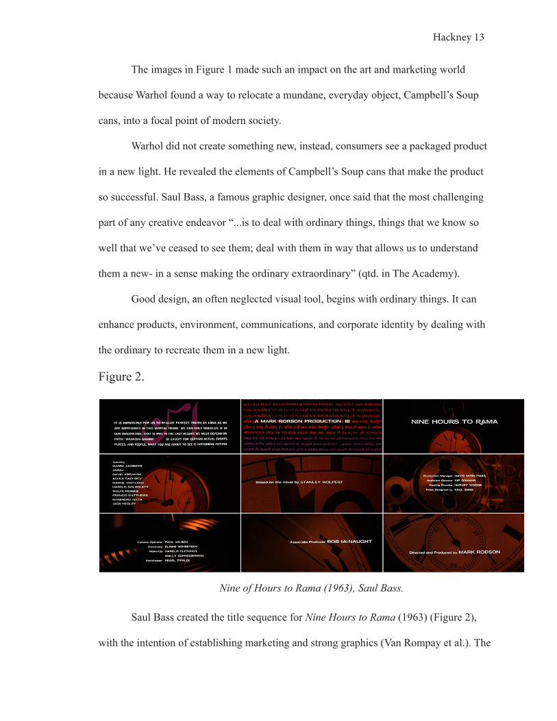
Warhol famously painted a study on the mass production of an everyday product
as it appears on a shelf (Figure 1). A simple can of Campbell’s Soup truly contains so
much truth in the development of product design.
[1.3]
Figure 1. [1.1] [1.2]
Campbell’s Soup Cans (1962), Andy Warhol
Hackney 13
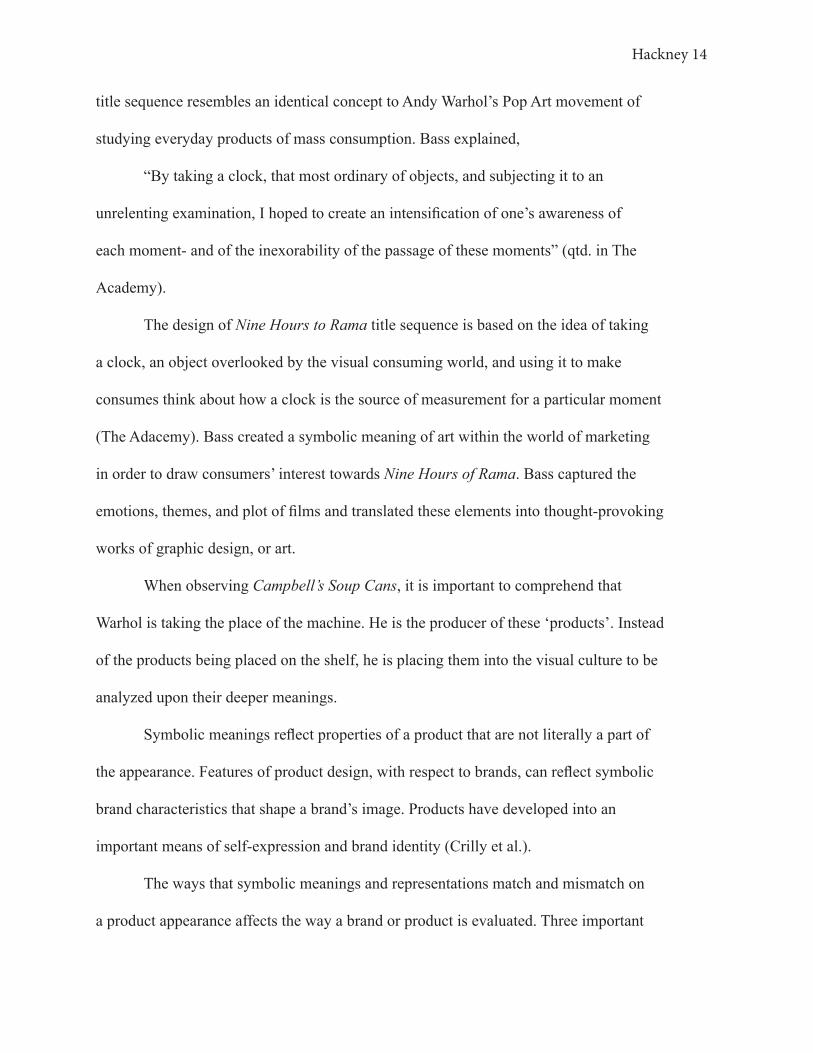
Figure 2.
Nine of Hours to Rama (1963), Saul Bass.
Saul Bass created the title sequence for Nine Hours to Rama (1963) (Figure 2),
with the intention of establishing marketing and strong graphics (Van Rompay et al.). The
The images in Figure 1 made such an impact on the art and marketing world
because Warhol found a way to relocate a mundane, everyday object, Campbell’s Soup
cans, into a focal point of modern society.
Warhol did not create something new, instead, consumers see a packaged product
in a new light. He revealed the elements of Campbell’s Soup cans that make the product
so successful. Saul Bass, a famous graphic designer, once said that the most challenging
part of any creative endeavor “...is to deal with ordinary things, things that we know so
well that we’ve ceased to see them; deal with them in way that allows us to understand
them a new- in a sense making the ordinary extraordinary” (qtd. in The Academy).
Good design, an often neglected visual tool, begins with ordinary things. It can
enhance products, environment, communications, and corporate identity by dealing with
the ordinary to recreate them in a new light.
Hackney 14
title sequence resembles an identical concept to Andy Warhol’s Pop Art movement of
studying everyday products of mass consumption. Bass explained,
“By taking a clock, that most ordinary of objects, and subjecting it to an
unrelenting examination, I hoped to create an intensification of one’s awareness of
each moment- and of the inexorability of the passage of these moments” (qtd. in The
Academy).
The design of Nine Hours to Rama title sequence is based on the idea of taking
a clock, an object overlooked by the visual consuming world, and using it to make
consumes think about how a clock is the source of measurement for a particular moment
(The Adacemy). Bass created a symbolic meaning of art within the world of marketing
in order to draw consumers’ interest towards Nine Hours of Rama. Bass captured the
emotions, themes, and plot of films and translated these elements into thought-provoking
works of graphic design, or art.
When observing Campbell’s Soup Cans, it is important to comprehend that
Warhol is taking the place of the machine. He is the producer of these ‘products’. Instead
of the products being placed on the shelf, he is placing them into the visual culture to be
analyzed upon their deeper meanings.
Symbolic meanings reflect properties of a product that are not literally a part of
the appearance. Features of product design, with respect to brands, can reflect symbolic
brand characteristics that shape a brand’s image. Products have developed into an
important means of self-expression and brand identity (Crilly et al.).
The ways that symbolic meanings and representations match and mismatch on
a product appearance affects the way a brand or product is evaluated. Three important
Hackney 15
factors that impact the flow of symbolic meanings are congruence, processing fluency,
and impression formation (Crilly et al.). Procession fluency states that stimuli easily
processed are perceived in more positive terms (Van Rompay et al.). As a result, fluent
elements of art are experienced as more visually pleasing and memorable than non-fluent
elements (Crilly et al.).
The development of this thesis is built up as concepts and terms are dissected.
Through the process of reviewing existing research, gathering primary research on
specific artistic elements of package design, and answering the thesis question in a
progressive structure of dissection and exploration, the following goals are accomplished:
1. Organizing existing research from different areas of study will provide
the framework for which the significance of art in improving package design can
be constructed
2. Theories will be introduced that can guide readers through the significance of
art in the world of package design that this paper explains
3. Existing research provides a basis and point of reference to build on and
identify missing areas of information
4. Primary research will prove and support my argument
Hackney 16
3. CONSUMERS
Consumers are an emotionally driven group that makes decisions subconsciously,
influenced by feelings and emotions (BBDO, New York City). For reference, consumer
refers to individuals who are a part of the ongoing process of visual consumption (Crilly
et al.). For the remainder of this paper, relate the consumer to the same experience
that a viewer of art has, someone who gazes upon a piece of art and has an emotional
connection in response to it.
Consumers are similar to tourists in a most simplified form of comprehension,
“they are sensation-seekers and collectors of experiences; their relationship to the
world is primarily aesthetic; they perceive the world as a food for sensibility- a matrix
of possible experiences” (Schroeder). Identity drives these consumers, or “sensation-
seekers”, creating patterns and habits that reflect their cultural values. Products are
marketed to a specific audience, identified through market research, in order to relate with
their personal cultural values and consumer patterns.
The visual consumer behavior theory is an important concept to get familiar with
before understanding the image on package design. Representation is a “...central concept
within the humanities but not well researched within consumer behavior” (Tian). The
visual representation of products is a critical determinant to consumer response, and thus
product success (Crilly et al.).
Visual consumption of design is crucial to visual culture,
“Despite our resistance and growing cynicism, we remain to one degree or
Hackney 17
another caught in the light of what we see- what we are shown. Images show us a
world but not the world [...] When we look at images...what we see is the product
of human consciousness, itself part and parcel of culture and history” (Art And
The Committed Eye: The Cultural Functions Of Imagery).
Sensory design engages consumers’ senses and alters their behavior. It is used
to create subconscious triggers for consumers that create abstract notions of a product
without them even understanding that it is happening. Consumers react based on what
they see, and what they see in a product is what they are shown. Consumer judgments,
in regards to a product, based on visual information are made upon perceived elegance,
functionality, and social significance. These judgments relate to the perceived attributes
of products and most often center on the satisfaction of consumer wants and desires, more
so than their needs (Crilly et al.).
These visual triggers are the most effective way to engage consumers into a brand.
Understanding these sensory triggers used on consumers provides an understanding of
perception and how it influences consumer behavior. That is what opens up the research
to the brand image stimuli that attract or detract consumers from package design.
Hackney 18
4. THE IMAGE
A key characteristic of the 21st century is the visual image. The image refers
to symbols a brand uses that connects them and their products with consumers. Brands
are developed and products are advertised based upon the image. In modern marketing
practices, the brand image succeeds in contemporary society, and the product is merely a
variable that represents the brand image.
Visual consumption begins with the eyes. The image observed serves as a
stimulus that drives cognition, interpretation, and preference (Van Rompay et al.)s.
Humans, in general, respond to images very strongly, based on our experience in the
physical world, a concept known as isomorphic correspondence ( Luchins). Basically,
when a consumer comes into contact with a product stimulus, their brain is making
connections based on past associations, memories, or tendencies. Art and design taps into
this network of associations to connect with visual consumers (Bowen). In a world of
mass production, the image distinguishes one brand from another.
In marketing practices, the brand most likely to succeed will be the brand that
employs the image as the primary marketing focus. The actual product is merely a
secondary variable that represents the image. Consequently, people are no longer buying
items based on necessity, they are purchasing a brand image, just as an art viewer
purchases a piece based on how it makes them feel. It is crucial for a brand to be able
to sell a product to the eye so that the viewer can form a relationship with that brand.
(Schroeder).
Communication through design cannot be stressed enough. In general, artists do
not have access or influence on their clients, only their work does. Similarly, in general, a

Hackney 19
Figure 3.
Package Designer ResponseConsumerThe ImagePackage
consumer has no previous influence from a package designer. Therefore, the image is the
source of communication to a consumer.
4. 1 THE SEMIOTIC APPROACH TO THE IMAGE
The semiotic approach to product design views products as the sign that
represents the brand (Crilly et al.). While this is an important approach to marketing and
art, for the purpose of this study, I will explore how the package forms the image, which
then communicates to the consumer, resulting in a consumer’s decision. It is important
to understand that the “image” I am referring to is not a physical entity. The image is the
connection between the package and the consumer.
Figure 3 above represents the significance of the image package design, beginning
with the package designer and ending with the response. The three center steps in the
process are crucial to establishing the emotional connection between designer and
consumer, resulting in response behavior.
To dissect the image, I took apart the artistic elements that construct it by isolating
color, shape, logos, serial imagery, etc. in the studies further discussed later in this paper.
For the sake of understanding the image in the semiotic approach, imagine
a designer who has made a package containing jewelry. The package designer did
not design the jewelry, but the case in which the jewelry is transported and sold to a
consumer. When a consumer comes in contact with this purple, velvet package, they
begin making connections and assumptions about it. These connections and assumptions

Hackney 20
form the “image”. For example, based on the Color Block Study, this consumer may form
an image of luxury based on symbolic color associations of ‘royalty..high class…[and]
expensive…” (Study: Color Block, Participant 8) . This consumer is creating an image
of the jewelry box they feel a connection to, despite that it is their first contact with the
jewelry package, this relays the sensory design concept mentioned earlier.
Visual connections made in-store happen without the consumer opening the
package. That is the importance of the image in package design. After the image is
created, the consumer interprets, and a purchasing decision is made. The purchasing
decision is what will be referred to as the result of consumer behavior. While some
decisions are more habitual, others more interpretive and complex, but at some point,
every consumer endures this process of package semiotics.
4.2 THE IMAGE AS A REPRESENTATION
Universally, a significant portion of our conscious and unconscious understanding
of the self and the world are framed in the image. Advertisements influence consumers to
create new ideas for their sense of self, beliefs, individuality, and social status. Similarly,
art has influenced the world since the beginning of time, altering views and perceptions.
Package design does the same thing (Art and the Committed Eye: The Social Functions
of Imagery).
In the Water Bottle Study, four Water Bottles were presented to participants and
they were asked a series of questions following. The water bottles were presented with
no labels and no product within the bottles, or packages. Participants were asked which
water bottle represented higher status, 100% of them had a definite answer, mostly
between Bottle 1 and Bottle 2 (Figure 4) (Study: Water Bottle).

Hackney 21
Figure 4.
Bottle 1 Bottle 4Bottle 3Bottle 2
Figure 5.
Bottle 240.0%
Bottle 420.0%
Bottle 140.0%

Hackney 22
Just as Pop Artists use their work to alter the perception of consumer goods,
designers are using water bottles to alter the view of personal status by creating an image
that sells. A majority of participants believed that Bottle 1 (40.0% of participants) and
Bottle 2 (40.0% of participants) represent an image of higher status (Figure 5). It can be
concluded that these participants correlate consumers of these packages with a higher
status.
In a museum of art, the Louvre, for example, visitors walk around with a sense
of poise, quietness, and sophistication because the pieces of art are of high status and
prestige. However, a print of a Monet in an individual’s home does not have the same
effect because the print is not regarded with the same degree of authenticity. This is
parallel to the effect the image of status has on participants in the Water Bottle Study.
The image is created with the intent to alter the way people think, act, and feel
(you would be happier with this, this will make you more successful, etc.). It seems to
promise future contentment by being satisfied in the present. Nike uses its famous orange
swoosh on all of its products and advertising that says to consumers, be fast, be athletic,
have what professional athletes have.
Yet, an image cannot fulfill the longevity of future happiness. Instead, it secures
a purchase and allows a consumer to keep coming back to fulfill that same sensation.
Images show consumers a world but not show the world itself (Schroeder), “Images are
not the things shown but are representations thereof: re-representations” (Art and the
Committed Eye: The Social Functions of Imagery). Images represent wishes, desires,
dreams. They are the product of human consciousness; “...they are constructed for the
purpose of performing some function within a given sociocultural matrix” (Art and the

Hackney 23
Committed Eye: The Social Functions of Imagery).
To dissect the brand image of 21st-century visual consumption, questions arise in
efforts to make sense of it all. How do images communicate with a consumer? How does
a consumer understand the image? How does the image circulate in the visual culture?
What is the foundation of consumption in the visual culture? Once again, the answer is
revealed through the study of art.
4.3 The Image Over Necessity
Andy Warhol employed the image semiotic approach in studying Campbell’s
Soup cans. He opened up the early exploration of image dissection. The idea that when
a single consumer walks down an aisle in a grocery store, one product amongst the
countless mass-produced items will grab the consumer’s attention for some reason that
must be discovered.
Americans no longer want to buy for means of necessity, they want to buy an
image. Consumers want to be influenced by something, to become the image itself. In the
Water Bottle Study, this is exactly what occurred, people wanted to buy an image for their
personal aesthetic pleasure.
While this is not a psychological focused paper, I want to introduce readers to
the following viewer responses that are applied to both art and package design. These
responses are important to consider when analyzing the studies, but not crucial to the
purpose of this paper.
The image creates three kinds of potential cognitive responses in consumers. These are
not descriptive words towards a package design, but are descriptive towards the response
to the image. They fall under the response segment in Figure 3.

Hackney 24
The aesthetic response is a response to beauty, attractiveness, and elegance. The
aesthetic response to a package as interested artists and designers for centuries, “As
such, Baxter describes the inherent attractiveness of visual form as that most elusive and
intangible quality” (Van Rompay et al.).
The symbolic association is the perception of what a product says about its
owner or user. This is the personal and/or social significance of a design, whether in art or
package design. It is culturally defined. (Van Rompay et al.)
Semantic Interpretation may be defined as what a package is seen to say about the
function and qualities that it holds (Crilly et al.). This interpretation is made by usefulness
or functionality to the consumer. (Van Rompay et al.)
The affective response is an umbrella term used to establish a product’s emotions,
moods, and feelings, the affect. The affective response is geared towards a consumer’s
“psychological response to the semiotic content of the product” (Van Rompay et al.).
Visual consumption is based on aesthetic impressions, symbolic associations, and
semantic interpretations.
Finally, the psychological responses, listed above, created as a result of the package
design, leading to the image, influence the consumer behavioral response.
Consumer products and visual communications are complex stimuli
compromising multiple visual elements, shape, logo, and color, through which symbolic
meanings are communicated (Van Rompay et al.).
It is important to understand the different elements of art and design used to
reach different groups. Every individual forms their own image of a package and for
themselves, with some similar areas of interest. Therefore, different elements such as
Hackney 25
color, shape, contrast, brightness, and placement communicate different messages, attract
different people, and form particular images.
Hackney 26
5. ART IN MARKETING
The Fine Art movement today has been absorbed into the world of design
aesthetics. Modern designers are making use of this movement in package design. Paul
Rand, one of the most timeless graphic designers once said that,
“Most great art is perceived as something different, existing on a pedestal, not
part of one’s day to day experience. On the other hand, most designs (great or
otherwise) of printed ephemera, logos, advertisements, brochures, posters, and
television commercials are so much a part of everyday experience that eventually
it finds itself not on a pedestal but on a rubbish heap” (Rand).
The reason that the product was even purchased in the first place was because of its visual
integrity. Design in marketing is no longer irrelevant to brand success, it is the brand
success.
A large pool of research exists that studies consumer response. While this is
useful, the world of marketing struggles to always make sense of the information
because of its “... lack of conceptual framework” (Crilly et al.) that can make sense of the
findings. Therefore, this information is difficult to apply to the development of successful,
unique package designs. The study of art in relation to package design, specifically, is
undernourished, yet it is the missing link between visual consumption of consumers and
package design.
Art is an easier way to understand consumer research in a deeper level. I am
not proposing that art is more convincing in marketing, I am arguing that art is more
Hackney 27
relatable to consumers. As later shown in the Color Block Study (10.1 Color Block
Study), Water Bottle Study (7. Water Bottle Study), Logo Study (12.1 Three Logo
Study ), and Shampoo Study (5.3 Shampoo Study), each individual has symbolic
associations to design elements in relation to package design. Marketing encourages
symbolic associations through a variety of design elements; color, shape, logo, repetition,
proximity, negative space, etc. Art influences these symbolic associations, therefore
allowing art to be the connection between marketing and symbolic associations (Crilly et
al).
Marketing ← → Art ← → Symbolic Associations
Marketing associations become highly complicated and hard to produce because
consumer’s past associations and experiences influence image associations. Therefore,
art in marketing can send subtle, yet powerful, messages. These messages tap into the
senses to send a distinct message. Therefore, art plays a powerful role in connecting with
consumers to create a brand identity and teaches designers a lot about consumers. (Van
Rompay et al.).
The design of the Anatomy of a Murder (1959) poster by Saul Bass, which has
influenced designers for 50 years now, is a rather simple design. It is made from cut-
outs of black paper on a colored background to form a human figure. It is a “somewhat
ragged version” of Matisse’s cut-paper figures. In this comparison of works (Figure 6),
it is clearly apparent how the design influence of artists have carried over into creating
successful marketing hits (Kuperminc).

Hackney 28
Saul Bass’s use of a nearly identical abstraction of a figure to the one in The
Fall of Icarus by Matisse introduced the graphic design world to another iconic design.
When art is infused in the marketing world, it is referred to as the art infusion effect, or
associating art with a brand, package, or product in order to increase its overall perception
(Hagtvedt et al.). Learning from the design elements of Matisse, Bass was able to infuse a
successful image into the Anatomy of a Murder poster to create an artistic perception.
When designers apply the art infusion effect to package design, identical results
occur; increase in package perception (Hagtvedt et al.). In a survey given out through a
social media poll, I was able to collect data on the art infusion effect by comparing the
perception of the status of Bottle 1, from the Water Bottle Study, when it is associated
with art and not associated with art (Figure 7).
Figure 6.
Anatomy of a Murder (1959), Saul Bass The Fall of Icarus (1941), Henri Matisse

Hackney 29
Both of these bottles are identical in size, product, and color, only the label was
altered to infuse or not infuse art with the package. The Art Infusion Survey yielded that
out of the 83 participants who voted, 54.2% of voters thought that when Bottle 1 was
infused with art that it inherited a higher status (Figure 7, B). Thus, art increases the
aesthetic appeal of a package as seen in this survey and supported through the research of
Henrik Hagtvedt.
Realistically, not all packaging will appear as a gallery for Monet’s work, but the
idea is that elements of artworks can be translated to package design to yield the same
aesthetic and symbolic results as art.
Figure 7.
Bottle 1 associated with a plain, pink label compared to Bottle 1 associated with Water Lilies (1914-1917) by Claude Monet.
A B

Hackney 30
5.1 POP ART AND VISUAL CONSUMPTION
Pop Art is a fine art movement that celebrates the commercial arts. The All-
American dream of affluence and abundance that came about in the 50s and 60s became
quite appealing to American culture (“Art Influences in Design: Pop Art”). The style takes
consumerism and mass marketing “...out of its original context with the goal of holding a
mirror up to the society which created it” (“Art Influences in Design: Pop Art”).
Figure 8.
Examples of Pop Art in Packaging.The use of Pop Art in package design by Pepsi.
This window of materialism was applied to the marketing world to invite the
consumer in and ask them to participate in their product. The product was no longer just a
product, but a means of visual consumption.
Pop Art is user-friendly in comparison to other images. When it is used to
represent a product on a package that image no longer represents the product but instead
creates an association between art, creativity, materialism, and imagination. The bright
colors, heavy outlines, and bold imagery are extremely eye-catching and relevant to

Hackney 31
popular, present design trends.
Andy Warhol is one of the most famous Pop Artists and Marketing designers, one
that has heavily influenced the findings of package design. Warhol started his career as a
product marketer which heavily influenced his artistic career (Waller). He glamorized and
transformed everyday objects into art.
Figure 9.
Original Volkswagen logo (1938, Germany) Volkswagen 358 (1985), Andy Warhol; rebranding efforts of the Volkswagen brand
image
Warhol’s work is the ideal example of how connecting with consumers represents
a perfect balance of image, text, and simplicity. His work was so great that he revamped
Volkswagen (Volkswagen 358, 1985) (Figure 9) after Hitler adopted it, publically, as his
favorite car (Waller).
Warhol acknowledges the commercial nature of American society and urges
consumers to continue to buy iconic imagery that will continuously provide them
with a new and exciting product. In Warhol’s case, the use of art enhanced products,
Hackney 32
environment, communication, and brand identity represented in visual culture. (Waller).
Today, art is becoming more relevant to marketing practices. Contemporary Pop
Artist Ashley Longshore has become the face of Bloomingdale’s. Why? Because they
have hired her as the in-house artist for their company. While her work is depicting
Bloomingdale’s, and seems rather unrelated, having her work represent Bloomingdale’s
helps resonate with consumers based on personal and cultural associations and implies a
status to the store. Longshore’s work not only represents herself, but it is seen anywhere
as a form of indirect advertising for Bloomingdale’s.
As of 2019, design trends have moved towards vibrant color, hand-drawn
illustrations, pops of hues, strong typography, and eye-catching work, such as
Bloomingdale’s has adopted. Thus, Pop Art is becoming more and more relevant and
common in the world of package design as design trends have changed. (McCready).

Hackney 33
6. PACKAGE DESIGN
In a 1986 New York Times article, “Designer Packages That Sell”, author Richard
Stevenson describes how the Kraft cheese package was redesigned to improve product
identity. Kraft became an equivalent noun for ‘cheese’ at the time. Rising competitors
mimicked Kraft package design, increasing competition and the need for an updated
package. The author of the article mentioned, “These days war on the shelf is more
intense than ever, with products and brand names proliferating at a dizzying pace. That
has put a premium on packaging that is easily visible and communicates the brand’s
identity and a sales pitch as well” (Stevenson). Determining the intrinsic value of package
elements such as a logo, color, shape, material, and overall design are all critical factors
in this redesign (Rand). With an increase in logo size, a change of color scheme, and a
reorganization of the Kraft package, the product regained its title.
Visual perception is intimately a part of taste and design. Today, “packaging is proved to
be one of the significant factors in the success of promoting product sales” (Mohebbi).
Because the basic function of packaging is to keep the product safe and transport
the goods. Today, consumers’ perception of a product runs parallel to Maslow’s hierarchy
of needs,
“[It] is a...theory in psychology...often depicted as hierarchical levels within a
pyramid. Needs lower down in the hierarchy must be satisfied before individuals
can attend to needs higher up. From the bottom of the hierarchy upwards, the
needs are: physiological, safety, love and belonging, esteem, and self-
Hackney 34
actualization” (Mcleod).
This suggests that when utility, safety, and comfort are met, visual attributes of a product
are regarded with higher importance than its tangible properties (Crilly et al.). Today,
packaging is used to promote sales.
6.1 Packaging Influence
Packaging exerts an influence on two key factors; brand equity and consumer
loyalty. Brand equity is the commercial value that derives from consumer perception
of the brand name of a particular product or service, rather than from the particular
product itself (Annadi). Consumer loyalty is the result of consistently positive emotional
experience, physical attributes based on satisfaction, and perceived value of an
experience. (Mohebbi)
Product packaging is important in identity formation (Crilly et al.). A brand
does not get to meet a consumer face to face in order to form a relationship. Instead,
the package is the initial introduction that forms an impression. Consumer products are
“embedded within a context compromising non-visual elements (brand slogans and
evaluations)” (Van Rompay et al.). The meanings of products are often determined by
factors external to the package.
The major functions of packaging are to protect, contain, communicate
information, promote the product, and enhance the relationship between brands and
consumers (Mohebbi).Oone key role of packaging is to foster product sales. Designers
are creating an image that sells, not a package. This thesis focuses on enhancing the
relationship between brands and consumers to foster sales through visual elements of
package design; graphics, color, size, and shape.

Hackney 35
Cohesiveness is key in successful packages-to-consumer communication. Think
of a stop sign that was switched to green, but still displayed the command ‘Stop’ (Figure
10).
Figure 10.
STOP
People probably would not stop as often in response to the green sign. Despite
the text in Figure 10 reading ‘Stop’, visual consumers’ understand the sign as ‘Go’. The
same concept goes for a men’s body soap that was designed with pinks and rounded
shapes (Figure 11). These alterations would cause confusion to a consumer because
the understood societal associations would no longer make symbolic sense because the
intended product message is unclear (Tian). Basically, a package must maintain cohesive
colors, shapes, and visual cues in order to communicate to create positive processing
fluency with consumers.

Hackney 36
Between the male and females interviewed in the study, their color preference
evidently differed in their personal preference of color (Study: Color Block). The males
tend to be more attracted to muted or darker color palettes, such as blues, navy, dark
green, whites, blacks, and grays. Whereas females have more variation. Therefore, Dove
targets their soap products to two different target markets, simply by changing the colors
of their package, as well as other elements, such as typography, gradient, etc. Historically,
males are categorized with a darker color attraction and females are stereotyped with
brighter color schemes.
When a package’s visual elements are used effectively, it positions products, and
their companies, at a vantage point in a highly competitive marketplace by increasing the
likelihood of consumer purchase. Simply put, a consumer’s decision to choose a brand is
Figure 11.
Dove Men+ Care packaging features dark, masculine colors, typography, and package
shape.
Dove Pink/Rosa soap for women that features light, feminine colors of pink and white. The typorgraphy is light in weight and the package shape is long and lean.

Hackney 37
based on package aesthetics. (Mohebbi). By understanding consumers, brands can feed
their products into the hands of consumers.
6.2 Package Shape
A package is the most influencing factor in a purchasing decision when its form
is in congruence with the remainder of its elements (Mazhar et al.). According to Paul
Rand, “Everything possesses the form of some kind, good or bad, pleasing or not...there
is no such thing as formlessness” (Rand). Form, package design shape, and content are an
interactive relationship, mutually dependent on one another. Form manipulates its content
as in a way to intensify, obscure, or even change its meaning. (Rand)
In general, as discussed in Chapter 12.1 Three Logo Study, sharp and angular
is perceived as potent and masculine, whereas rounded and curved forms are perceived
as feminine, due to human figure associations. The same idea is employed in the three-
dimensional perception of packaging. Content can not hide behind the form, instead, the
form has the power, when designed well, to dictate the interpretation of the content.
6. 3 SHAMPOO STUDY
As discussed in 6.2 Package Shape, the form has a strong communicative role in
content, so the Shampoo Study removes the content to dissect the importance of form.
The purpose of the Shampoo Study is to isolate a specific product category in
order to understand the role a package’s shape plays in consumer behavior. This includes
how they associate past shapes, what the shapes symbolize, and how they personally
relate to a package shape. Consumers were asked questions that led them to describe each
bottle based on the package’s physical appearance. These questions revealed symbolic
associations, semantic interpretations, and aesthetic responses as a result of the four

Hackney 38
shampoo bottles shown to them in order to determine what role shape plays in package
design.
Remember, packaging plays three important roles in marketing; communication
of information, promotion, and enhancing consumer to brand interaction. A majority of
participants had never analyzed the impact shape has on shampoo in relation to package
design. Many of them were surprised to discover that they really did have strong opinions
regarding which package they prefer and why they prefer it, expressing isomorphic
correspondence ( Luchins).
The four bottles that were introduced to study participants are shown in Figure 12
as they appeared to the participants.
Figure 12.
Bottle 1 Bottle 4Bottle 3Bottle 2

Hackney 39
All four of the bottle shapes resemble existing bottle packages. Therefore,
participants found these shapes were familiar to them based on the individual
participant’s past relations with the bottle shapes. Nine out of the fifteen participants
in this study had personal associations with the presented bottle packages, such as
associating the shape of the package with a particular brand or a past memory of that
influences their feelings towards the bottle. For example, Participant 6 associated Bottle
2 with “my sister always had it and it always fell and annoyed me” (Study: Shampoo
Packaging, Participant 6).
Bottle 2 stood out as the most appealing to the majority of participants because
of the pump feature. These participants felt that the pump stood out as a unique feature
between all of the bottles, as it was the only one that featured it. This is a semantic
interpretation. Consumers are defining a package by what it is seen to say about the
functional qualities. This interpretation is dictated by usefulness to the consumer.
Therefore, this study proves that people purchase based on associations and
features that stand out as a unique user experience.

Hackney 40
7. WATER BOTTLE STUDY
Form manipulates the content in which displays. Most of a consumer’s purchasing
decision occurs at the shelf. Even if shopping with specific products in mind, package
design exerts such a strong influence on consumer’s decision making, that 70% of all
brand decisions by consumers are made at the moment of purchase in-store (Mohebbi).
The Water Bottle Study evaluates why decision purchases are made the moment
of purchase based on package shape and also how these shapes influence future
interactions with a product. The bottles were chosen based on a variety of different
shapes and aesthetic appeal, not based on variation in price. Figure 4 below shows the
shapes of the bottles used, labels and fluid were removed from the bottles.
Figure 4.
Bottle 1 Bottle 4Bottle 3Bottle 2

Hackney 41
The participants were asked to label each bottle with one adjective beginning
with Bottle 1 through Bottle 4. Participant 8 described these bottles as “sharp”, “elegant”,
“basic”, and “convenient”. Bottle 2 was the most appealing water bottle to Participant 8
and associated with status perception. Participant 8 claimed that all the other bottles are
more functional for everyday activity, but thought Bottle 2 was more visibly appealing.
However, this participant was not willing to pay for the more appealing package shape.
This participant used symbolic association and aesthetic response in establishing this
decision.
When evaluating a product, appearance is the attraction and price is a contributor
to the decision making process. Because Participant 8 consistently chose to find a cheaper
alternative to the bottle he found the most attractive, it is conclusive that he most likely
thought that Bottle 2 was the most attractive and he could see it representing a sense
of higher, “elegant” status, yet he was not willing to pay more to obtain this status for
himself. Consumers evaluate themselves and people based on their product associations.
Bottle 4
Figure [4. 4]

Hackney 42
Participant 8 described Bottle 4 as “convenient”. After completing the Water
Bottle Study, it is conclusive that because this participant is not concerned with paying
for a high-status package, they tend to buy based on functionality within an acceptable,
personal price range. Participant 8 thought Bottle 4 was the most functional for everyday
activity, the best for work or class, the best to carry to the gym, and the best to purchase
an entire case of. This participant associated this bottle as the most functional because of
its convenient, semantic qualities.
A second participant I want to point out is Participant 6. This participant described
each bottle, beginning with Bottle 1 and ending with Bottle 4; “trying too hard”, “subtle,
just grabbing a water for an everyday person”, “person who needs water but doesn’t
like it so gets whatever”, and “reminds me of my mom, we used to get this as our
fun thing”. After describing each bottle, Participant 6 said that Bottle 4 was the most
appealing package. The reason this package is the most appealing shape is because of
this participant’s personal association with it. In addition, Participant 6 would most likely
take Bottle 4 to the gym, an everyday activity, and purchase a whole case of this package.
Of all four of the bottles presented, Bottle 4 was the only one that brought up a personal
association, backing up her description that this “reminds me of my mom, we used to get
this as our fun thing” (Study: Water Bottle, Participant 6).
Based on the results in entirety, when Participant 6 walks into a store, to purchase
a water bottle for the day, this individual is not looking to purchase a bottle that proves
status (Bottle 1 would do that), but knows enough to not purchase a bottle that is at
or below the average Bottle 3, one that targets a “person who needs water but doesn’t
like it so gets whatever”. Participant 6 wants a bottle that can serve a functional role in

Hackney 43
daily activities. Bottle 4 has a vantage point in appealing to Participant 6 because this
participant symbolically associates the shape with a past memory. This attachment and
the desire for functionality is so meaningful that Participant 6 is willing to pay more for
this bottle, even if it were the most expensive bottle on the shelf.
While package shapes are crucial in establishing a relationship with a consumer, it
is also vital in maintaining the consumer relationship through time. Artistic attributes are
vital in maintaining that relationship.
7. 1 WATER BOTTLE STUDY: Symbolic Associations to Status
In the Water Bottle Study, Participant 4 described Bottle 1 as “creative” and
additionally associated it with a higher status. This brings up the art infusion effect again,
as initially introduced in Chapter 5. Art in Marketing (Hagtvedt et al.). This effect states
that packages associated with art, or artistic effects, bring higher status to the product.
Therefore because this participant is identifying this bottle as being more creative, they
are associating it with a higher sense of status.
Figure [4.3]
Bottle 3

Hackney 44
Meanwhile, Participant 4 said that Bottle 3 was “average”, which led the
participant to state that if all the bottles were to contain an identical product of equal
quality, such as if each bottle had the exact same liquid from the same source, that Bottle
3 would be the only package that seemed to be worth less than the value of the water.
Because this bottle seems “average”, it has less artistic appeal and therefore is valued at a
lower cost with less status.
When each participant was asked “Based on the packaging appearance, do you
believe the quality of the packaging resonates the quality of the product within it?,” the
only bottle that was stated to not resonate with the quality of the product was Bottle
3. In translation, if all these bottles were seen as options in a store, Bottle 3 would
communicate to consumers that its water was of a lower quality than its competing
brands.
Bottle 3 was conclusively the least appealing bottle overall. It was described with
adjectives such as “voluminous”, “ugly”, “grippy”, “average”, “odd”, “I don’t like it”,
“basic”, “spunky”, “Dollar Store”, “gremlin”, etc. For the majority, this bottle received
highly negative feedback in regard to its packaging appearance. This created a direct
correlation with the low status and perceived low quality of the bottle.
As seen below, when asked “Which bottle shape is the most appealing to you?”
(Figure 13), only 6.7% of the 15 participants answered that Bottle 3 was the most
appealing bottle. When asked “Which package is associated more with status?”, 0% of
participants answered that Bottle 3 was associated more with status (Figure 14).
Instead, Bottle 2 (40.0%) was highly associated with status, along with Bottle
1 (40.0%), as shown in Figure 14. Yet, only 13.3% of participants found Bottle 2 to be

Hackney 45
the most appealing and 20% of participants found Bottle 1 the most appealing, while
60% said that Bottle 4 was the most appealing. Therefore, it is safe to assume that the
packages that convey status are set for a smaller, niche group of consumers who are
looking for a bottle that conveys status. The remainder of consumers recognizes that this
product associates with status, but want their main priority in a bottle that is sleek or cool
but is more functional for their tasks, such as Bottle 4. This creates another category of
consumers to design for. (Study: Water Bottle)
Figure 13.
Figure 14.

Hackney 46
Bottle 4 was described as “sleek”, “basic” “clean”, “efficient”, “slim” “classic”,
“convenient”, “Starbucks”, and “useful” (Study: Water Bottle). These are examples of
how consumers use this bottle. While it is probably not the most expensive bottle on the
shelf it is similar to Starbucks, described with elements in a minimal modernist style,
and highly functional. Think of the number of consumers who choose to carry around a
Starbucks cup (Figure 15) over a McCafe cup (Figure 16).
The price difference in a small latte between a Starbucks and a McCafe cup
is close to $.60. While this price difference may not seem like a significant amount
Starbucks and McDonald’s are marketing to two different target markets, one who cares
about the experience and status and the other one who just wants a fast, convenient cup of
coffee. The same goes for these water bottles.
Packages are a means of identity and image. When a consumer chooses to
consume Starbucks, they see it as a way to show who they are, what they spend, and
where they spend time. It is not really about the coffee in this scenario, it is about
Figure 16.Figure 15.
Package design of a Starbucks cup served nationally. This package has a significantly more modern design, intended to represent the amount the consumer paid for it.
Package design of McCafe cups served nationally throughout the country. This package feels out of date and less likely to be an object of state, more so an object of convenience.

Hackney 47
the status, the self-expressive, and categorical symbolism (Crilly et al.). Objects
consumed reflect and contribute to identity, which Thomas J. L. van Rompay reinforced,
“Possessions may impose their identities on us...we regard possessions as parts of
ourselves”. Symbolic association is broken down into self-expressive symbolism and
categorical symbolism. Self-expressive symbolism, associated with packages, allows
the expression of unique personality qualities. Categorical symbolism, in relation to
packages, allows the expression of group membership, social position, and status (Crilly
et al.).
As discussed earlier, with the rise of consumerism necessities are no longer the
primary focus. Judgments of packages are made on visual elements such as “...elegance,
functionality, and social significance. These judgments relate to the perceived attributes
of products” and revolve on the satisfaction of consumer wants and desires, not needs.
(Crilly et al.). Water is a necessary element of survival to every consumer, yet through
the development of consumerism, and proved this study, appearances are more important
than tangible properties of a package. Consumers are not just buying a product, they
are buying value “in the form of entertainment, experience, and identity.” (Crilly et al.).
Consumers want to find an image in a necessity.

Hackney 48
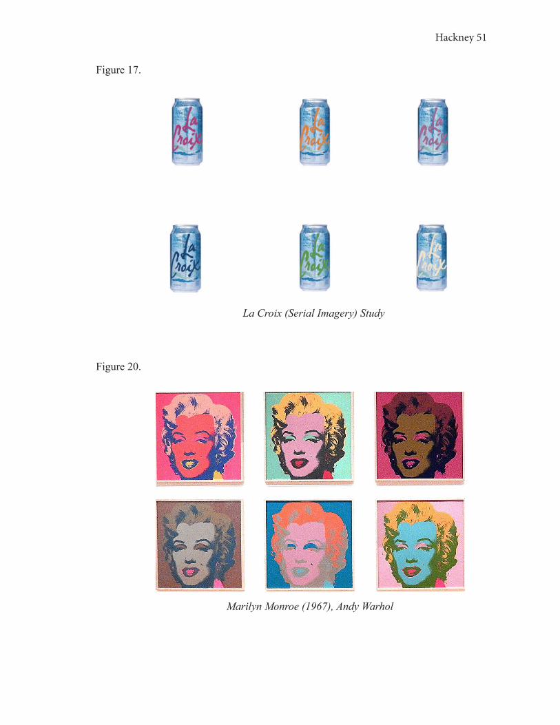
8. LA CROIX STUDY
In the La Croix Study, participants viewed the six La Croix cans under the
impression that it was a mock shelf of a familiar product that is, arguably, a staple to
this decade. The participants were shown Figure 17, but on a larger scale, and asked a
series of questions in response. The purpose of this study is to dissect the impact that
serial imagery has on consumer behavior and what design elements affect participants’
responses in relation to their responses in the other studies and their interaction with
inverse similarity.
Figure 17.
Can 1 Can 2 Can 3
Can 4 Can 5 Can 6
Hackney 49
When LaCroix is analyzed through serial imagery, it is a masterpiece of serial
consumption. The serial imagery creates a piece of art on the shelf that allows it to stand
out to consumers.
La Croix falls under the category of water, more specifically sparkling water, and
more specifically canned sparkling water. While the can separates La Croix from non-
canned sparkling waters by material and shape, the artistic features are what distinguish
La Croix from its closest competitors.
The kaleidoscope design certainly stands out amongst otherwise minimal
sparkling seltzer packages. La Croix rebranded its design in 2002. LaCroix’s parent
company, National Beverage, disliked the splashy, kaleidoscope look, however, consumer
research revealed that consumers loved the neon masterpiece. Now, La Croix is at the
top of the seltzer space, partly because of the unique design (“35 Awesome Packaging
Designs”).
The overall thought of packages repeated over and over again on a shelf is too
often ignored. While the individual package plays a huge role in perception, status,
associations, and loyalty, the initial encounter with that package begins on the shelf, pre-
sale, or pre-revenue to the brand, the ultimate goal of a brand is to sell products.
To understand the importance of serial imagery in visual consumption, I will
unveil it through art. Serial imagery is a concept seen in Andy Warhol’s work and other
pop artists. An object is repeated over and over again, as it would realistically appear
on a shelf. When objects are displayed across a shelf, it is harder for the eye to establish
its own focal point, or package that grabs its attention amongst competing brands, if a
package does not stand out amongst those around it.
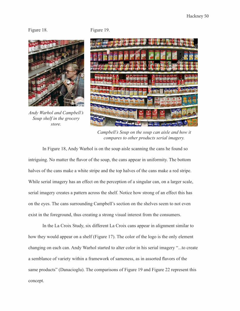
Hackney 50
In Figure 18, Andy Warhol is on the soup aisle scanning the cans he found so
intriguing. No matter the flavor of the soup, the cans appear in uniformity. The bottom
halves of the cans make a white stripe and the top halves of the cans make a red stripe.
While serial imagery has an effect on the perception of a singular can, on a larger scale,
serial imagery creates a pattern across the shelf. Notice how strong of an effect this has
on the eyes. The cans surrounding Campbell’s section on the shelves seem to not even
exist in the foreground, thus creating a strong visual interest from the consumers.
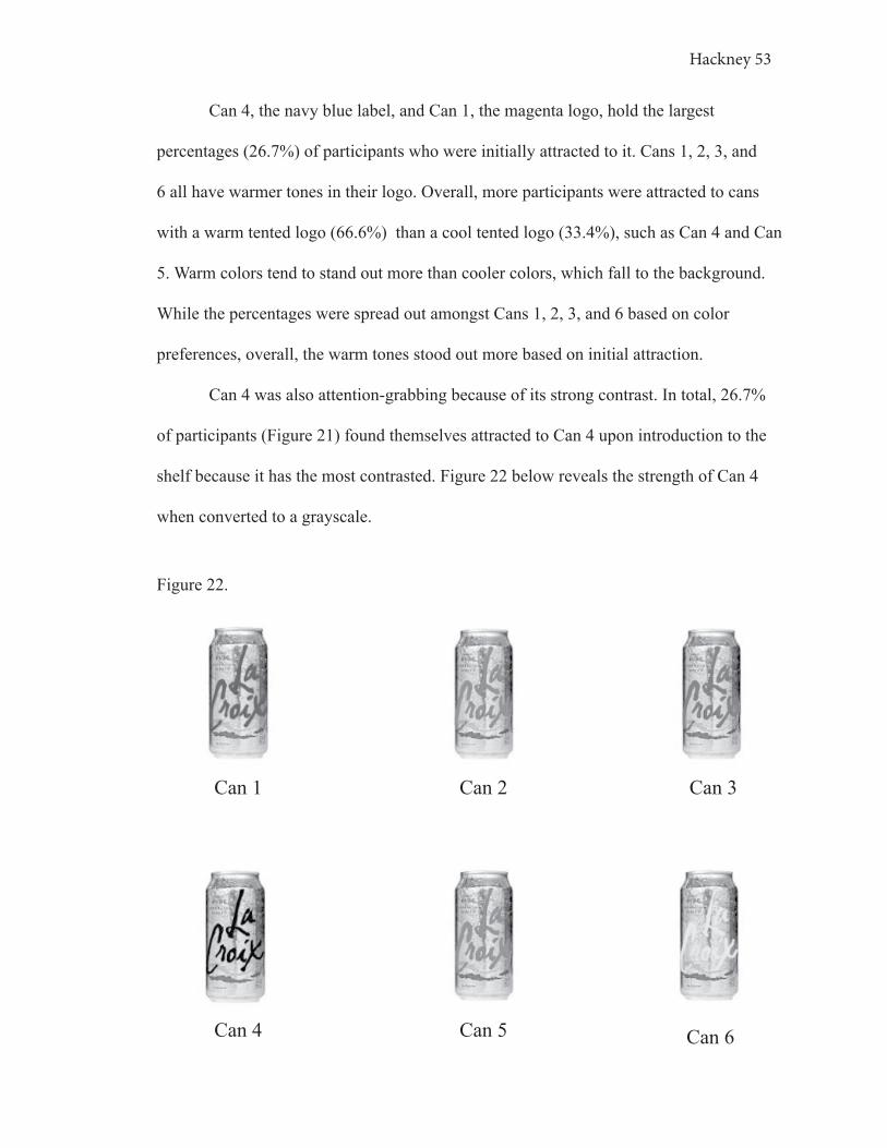
In the La Croix Study, six different La Croix cans appear in alignment similar to
how they would appear on a shelf (Figure 17). The color of the logo is the only element
changing on each can. Andy Warhol started to alter color in his serial imagery “...to create
a semblance of variety within a framework of sameness, as in assorted flavors of the
same products” (Danacioglu). The comparisons of Figure 19 and Figure 22 represent this
concept.
Figure 18.
Andy Warhol and Campbell’s Soup shelf in the grocery
store.
Figure 19.
Campbell’s Soup on the soup can aisle and how it compares to other products serial imagery.
Hackney 51
Figure 17.
La Croix (Serial Imagery) Study
Figure 20.
Marilyn Monroe (1967), Andy Warhol

Hackney 52
Figure 20, Marilyn Monroe, and, Figure 17, La Croix (Serial Imagery) Study,
demonstrate how showing the same figure over and over again with a change in color
creates an inverse similarity effect The idea of inverse similarity in the La Croix Study
explores how there is little room for variation between packages of a specific product,
yet the variation is crucial. The technique of serial imagery used in Figure 20 is more
dramatically used than the inverse similarity scale in Figure 19. Yet, in Figure 17, the
variance in color helps consumers distinguish between the different flavors of the La
Croix sparkling water.
In the interview process of the La Croix Study, participants were asked to express
which can grab their attention first. Figure 21 represents the results of the participant’s
initial attraction to the cans shown.
Figure 21.
Can 426.7%
Can 56.7%
Can 313.3%
Can 213.3%
Can 613.3%
Can 126.7%
Hackney 53
Can 4, the navy blue label, and Can 1, the magenta logo, hold the largest
percentages (26.7%) of participants who were initially attracted to it. Cans 1, 2, 3, and
6 all have warmer tones in their logo. Overall, more participants were attracted to cans
with a warm tented logo (66.6%) than a cool tented logo (33.4%), such as Can 4 and Can
5. Warm colors tend to stand out more than cooler colors, which fall to the background.
While the percentages were spread out amongst Cans 1, 2, 3, and 6 based on color
preferences, overall, the warm tones stood out more based on initial attraction.
Can 4 was also attention-grabbing because of its strong contrast. In total, 26.7%
of participants (Figure 21) found themselves attracted to Can 4 upon introduction to the
shelf because it has the most contrasted. Figure 22 below reveals the strength of Can 4
when converted to a grayscale.
Figure 22.
Can 1 Can 2 Can 3
Can 4 Can 5 Can 6

Hackney 54
Hence, Can 4 was most likely chosen due to its contrast, not color preference.
Participants did not verbally express the contrast of Can 4 originally, instead, they
justified their can selection based on color (aesthetic appeal) or symbolic association
with sparkling water. This response proves that consumers do not always recognize the
motive of attraction to an element of design. In this case, the contrast was unrecognized
by participants in the color version, but effectual in grabbing their attention.
Participant 5 chose Can 6 to be the most attractive to their senses and appetite, “...
because it is the brightest and how the colors contrast...but thinking on other cans [in the
market] there are already a lot of blue and white.” Can 6 is significantly more muted than
its surrounding cans, which would normally cause a can to fade out of consumer vision.
In the Color Block Study, this participant declared white to be a color most drawn to, that
muted palettes are more attractive than vibrant, and their home is predominately muted
colors. This fact reveals Participant 5’s attraction to a fairly neutral and low contrast can
amongst surrounding colorful cans. Personal color coordinations, such as Participant 5’s
with Can 6, make up nearly 93.3% of La Croix package preferences when shown on the
mock shelf.
Lastly, 42.9% of the participants said that Can 4, the navy logo, best represents
the “pure”, non-flavored, version of La Croix. Correspondingly, 46.7% of the participants
felt that blue had a connection with water (Study: Color Block). Conclusively, the
association of blue with water affects consumers’ perception of serial imagery.
Serial imagery is strongly affected by color contrast, symbolic associations of
color, and inverse similarity. It is an important factor in the success of a product sold on
store shelves, dictating what a consumer will choose to purchase.

Hackney 55
9. OBSERVATIONS: Serial Imagery
When a consumer is browsing an aisle’s shelves for a product, they are scanning
items based on packaging. The moment of first encounter between a consumer and a
package is the introduction point. For example, if a consumer is shopping for wine. That
consumer will scan the store to find the kind of wine they want, then move to that section
to browse for the exact package they want. Wine is a good example because it comes in
so many package designs and has so many package variations at different price points.
The consumer hits the introduction point and familiarizes themself with the products and
then moves to the comparison point where they compare packages to purchase. At the
decision point, consumers compare specific features that appeal most strongly to them to
make a purchasing decision.
On the other side of the consumer scale is the habitual consumer, or the consumer
who has a predetermined idea of what they want to purchase, such as a water. A habitual
consumer has an idea of the kind of water they want to consume so that when they walk
into a store they show no attention to the remaining bottle options and therefore do not
make any associations with those bottles. Instead, this consumer is fixated on finding the
one bottle familiar to them, that they trust, and connect with confidence.

Hackney 56
10. COLOR IN DESIGN
Color is a purposeful tool used in art that affects viewers’ sensations, desires, and
symbolic associations. Color evokes a consumer to draw on memories and experiences in
the visual consumption process to create life in a package.
The color of packaging plays a huge factor in package impact and effectiveness
by triggering different moods and signaling different functions (Rand). In fact, 62-90% of
a person’s assessments and evaluations of a visual stimuli are based on color (Mohebbi).
Branco Chocolate packaging (Figure 23) shows striking similarities to La Perruche Et La
Sirene (Figure 24) by Henri Matisse, who mastered the life of color in his cut-paper art.
Figure 23. Figure 24.
La Perruche Et La Sirene (1952), Henri MatisseBranco Chocolate Bar Packaging
The shapes and colors of Figure 23 and Figure 24 are nearly identical. The
similarities in color and color proximity between the two figures evoke similar feelings
of the joyous life of childhood. Color has dramatic effects on thoughts, feelings, and

Hackney 57
behaviors of a consumer. The three main functions of packaging color are voluntary
and involuntary attention, aesthetics, and communication through symbolism (Role of
Graphics and Color).
Color evokes many reactions and emotions not obtained through other elements of
design (Behzad). Georgia O’Keeffe, “the Mother of American Modernism” (Smith), once
said, “I found I could say things with color...that I couldn’t say any other way... things I
had no words for” (qtd. in Smith). In O’Keeffe’s work, she struggled to find meaning in
her forms without color, because, to her, color translated the significance of an object she
was painting to her viewer. Color evolves a designer’s work into a form of symbolism
and life.
Many aspects influence the interpretation of colors. Factors such as cultural
background, age, gender, geographic location, interests, personal experience, and
exposures all play a role in how individuals associate with particular colors. As stated
in the Logo Study (Chapter 12.1 Three Logo Study), the shape comes before color.
Therefore, a color must work with shape in order to properly function in the visual world.
It is difficult to prove that a particular color creates a universal reaction through
the visual world, yet, it can be studied to gather useful insight. In Henri Matisse’s speech
from 1907, he confirmed his inspiration for his spontaneous use of color was based on his
understanding, “My choice of colours does not rest on any scientific theory; it is based
on observation, on sensitivity, on felt experience” (qtd. in Ktos). The research gathered in
the Color Block Study is not based on a complex scientific formula, similar to Matisse’s
expression, instead, it is based on consumer understanding and emotional associations
(Ktos).
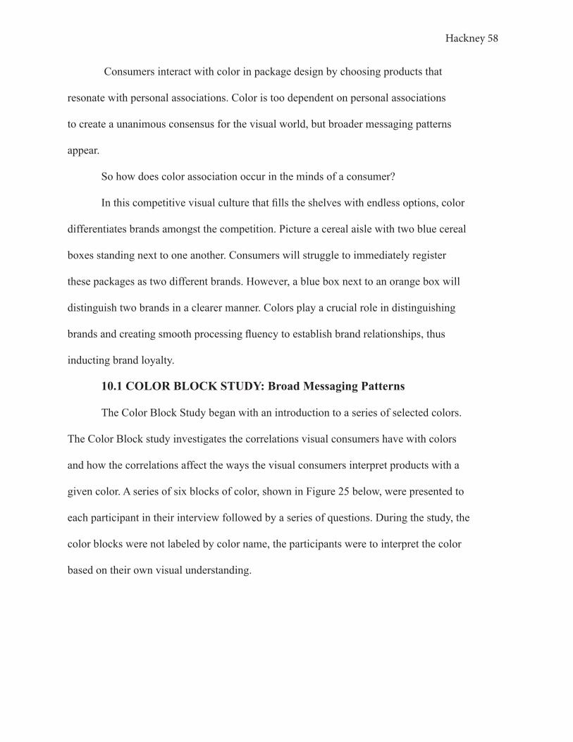
Hackney 58
Consumers interact with color in package design by choosing products that
resonate with personal associations. Color is too dependent on personal associations
to create a unanimous consensus for the visual world, but broader messaging patterns
appear.
So how does color association occur in the minds of a consumer?
In this competitive visual culture that fills the shelves with endless options, color
differentiates brands amongst the competition. Picture a cereal aisle with two blue cereal
boxes standing next to one another. Consumers will struggle to immediately register
these packages as two different brands. However, a blue box next to an orange box will
distinguish two brands in a clearer manner. Colors play a crucial role in distinguishing
brands and creating smooth processing fluency to establish brand relationships, thus
inducting brand loyalty.
10.1 COLOR BLOCK STUDY: Broad Messaging Patterns
The Color Block Study began with an introduction to a series of selected colors.
The Color Block study investigates the correlations visual consumers have with colors
and how the correlations affect the ways the visual consumers interpret products with a
given color. A series of six blocks of color, shown in Figure 25 below, were presented to
each participant in their interview followed by a series of questions. During the study, the
color blocks were not labeled by color name, the participants were to interpret the color
based on their own visual understanding.

Hackney 59
The Color Block Study dissects the association each participant has with the
six particular colors used in the study in relation to their past experiences, internal and
external influences, and personal associations. The findings are important in further
understanding the other studies. The findings lead to a grasp of the importance of color in
the art of marketing in the 21st-century visual culture.
Based on the research findings, trends, and conclusions, consumer reliance on
color becomes apparent. Color is a complex stimulus to study as it dives into the science
of psychology. Yet, this study focuses on proven data from participant interviews, not
psychological data calculated. This method is just as effective in collecting information
on the artistic importance of color.
Color reveals strong insight into the connection of color to consumers.
Participants became increasingly frustrated in trying to connect color with a description
or memory. They did not realize, prior to this study, how often their brain associates color
Figure 25.

Hackney 60
with a description or memory. Participants had similar and varying answers describing
the color blocks presented, and different reasons as to how they made these associations.
For example, when shown the green block, Participant 1 associated it with a
“leaf” and “vegetable products”. Participant 2 associated the green block with “go”
and “carpet”. Participant 8 describes the green block as “alive” and associated it with
a “wholesome product like a protein bar” (Study: Color Block). These associations are
learned connections from interacting with the visual culture. The visual culture teaches
consumers to associate green as a soothing, harmonious, natural color in both the natural
and design world.
The adjectives were recorded for each participant as they were shown the color
blocks, as with the above participants. This data was placed into a Color Chart (Figure
26) to categorize participants’ associations and descriptions of each color block presented
in the interviews. The Color Chart provides an easy visual to recognize similarities in
associations amongst participants.
Reading through the descriptive words in The Color Chart (Figure 26),
categorized by color, it becomes evident how consumers perceive colors as an individual,
but more importantly as a society. For example, looking at the orange block category you
can see words such as “action”, “tense”, “festive”, “sports”, “spirit”, and “sun”. (Study:
Color Block)
To further expand on the participants’ color associations, Figure 27 displays
examples of well-known logos that are predominantly one color. Each logo’s color and
shape are important in communicating its brand identity. This communication is due
to the fact that color changes the way the logo is perceived and understood as a brand
image.

Hackney 61
Figure 26.
leaf
vegetable
gogreen
carpet
eco-friendly
life
medical items
healthy trees
alive
springwholesome
forest
happy
money
food
sun
sunscreen
fruit
Sunkist
cleaner
soda
medical items sunshine
drink
yellow bright
highlighter
light
banana
hygeine
love candles
couch
velvet
purple
clothing
pens
high class
royalty
dress
grapesgown
professional
expensive
Barney
lavish
dark
blood
� re truck
red
warm
health
athletic shoe/out� t
� re
cheetos
medical items
Christmas
mad
stern
energy drink
pillow throw
security company
home goods
fast food
loveclothes
clothing
deep
ocean
restaurant
steadycalm
good quality
blue
snowcleaning supplies
victory
achievement
water
sports
paint
sad
chill vibes
party decor
orange
tense
nail polishfruit
cup
festive
cheeotos
sports apparrel
sunset
spirit
UTlonghorns
sportsaction
sun
oranges
Color Chart
The above chart represents the six different colors of the six blocks used in the Color Block Study. The words and objects used to describe each given block is displayed in the appropriate
section based on the color itself and its relationship or similarity to the color next to it.

Hackney 62
Figure 27.
The above chart represents the six different blocks used in the Color Block Study. The logos are displayed based on the predominant color of the logo/brand. This chart parallels the format of the Color Chart in Figure 25 to compare the descriptive words of the color blocks to the logos.

Hackney 63
In Figure 27, the orange category displays brands such as Nickelodeon, Sunkist,
Reese’s, Gatorade, Tostitos, and Nike. All of these brands have a connection with the
descriptive words for the orange block in Figure 28; action, tense, sun, spirit, and sports.
If these brands were to adopt a new color, the brand image would also change. For
example, if Reese’s logo changed to green instead of orange it would look similar to
Figure 28, and communicate a different message.
Figure 28.
This is a representation of what Reese’s would look like if the package were not orange and yellow, but green. Referring to the graphs below you can analyze the effects the color shift has on
Reese's brand image.
The Reese’s product would no longer be perceived with the qualities associated
with orange; spirited and festive. Instead, it would most likely cause confusion amongst
consumers because, based on the package appearance, they would read Reese’s product
based on green associations; “eco-friendly”, “all-natural”, “healthy”, and “wholesome”
(Study: Color Block). Not many packaged chocolates and candies are represented
by a green packaging for a reason. The green creates a turbulent processing fluency
contradicting a brand image with its visual elements. Color carries an essential purpose in
establishing visual associations in the modern marketing world.

Hackney 64
10.2 COLOR BLOCK STUDY: Broad Messaging Associations with
Price
Colors also have broad messaging associations with the price. Because consumers
have effortless associations of what colors communicate from prior exposure to the visual
world, they also have developed associations with a price. This concept is similar to how
consumers associate elements of design with either a higher or lower sense of status.
Of the six color blocks in the Color Block Study, 60% of the fifteen participants
chose purple as representing a package the most expensive and 26.7% of the participants
chose the red block as representing a packagethe most expensive, shown in Figure 31.
Interestingly, the participants who said that purple represented a product that
was the most expensive described purple as “long gown, something royal, professional”
(Participant 6), “clothing” (Participant 13), “royalty” (Participant 4), “anything lavish”
Figure 29.
Blue6.7%
Red26.7%
Purple60.0%
Yellow6.7%

Hackney 65
(Participant 5), “high class, expensive watch” (Participant 8), “velvet” (Participant
11), to name a few examples. These consumers associated the purple block with these
descriptions prior to labeling the purple as the most expensive (Study: Color Block).
Figure 29 shows the data proving that yellow is most often associated with a
lower price point (Study: Color Block). Looking at Figure 29, you can see that 46.7% of
the fifteen participants indicated that yellow represents a package that would be the least
expensive out of the 6 colors options given.
The yellow block descriptions in Figure 28 consist of light and accessible objects,
such as the “sun”, “food”, “fruit”, “drinks”. You can see how yellow as a color represents
broad messaging associations with “clean”, “bright”, “sun”, “soda”, “drink”, “hygienic”.
This trend is seen in Participant 10’s interview. Participant 10 labeled yellow with “sun”
and “banana”. This participant also thought yellow was the most convenient color and the
least expensive of the six color blocks (Study: Color Block). Correspondingly, Participant
11 also said that the yellow block was the most convenient and the least expensive.
Figure 30.
Orange20.0%
Yellow46.7%
Red6.7%
Blue13.3%
Purple13.3%
Hackney 66
Participant 11 described yellow as “sun” and “drink”.
Three of the seven participants who said yellow represented a package the least
expensive, also said that yellow represented convenience. Whereas, participants who
thought orange represented a product the least expensive (20.0%), did not find it to be the
most convenient (0% of participants deemed orange the most convenient).
Yellow is very energetic, which is emotionally and metabolically stimulating, and
attention-grabbing (The Color Psychology of Yellow). The fast-food industry has adopted
yellow for this reason, they represent a place that is quick and convenient. However, 0%
of participants find yellow to be trustworthy (Study: Color Block).
Think of McDonald’s brand image, what they are known for. Children love it, it
is the home of the “Happy Meal”. Consistency from brand personality, to brand message,
to brand package all play a role in influencing a consumer to buy a particular product for
a particular reason. In this example, yellow influences consumers to find a quick piece
of happiness and brightness in their day at a cheap price point. A yellow package, for
example, may grab attention quicker than a blue package, for example, but it is most
likely the cheaper product on the shelf and has a shorter consumer attention span because
of its visual aggression (The Color Psychology of Yellow).
Consumers’ brains store information associated with a color and use it in visual
decision-making processes. If you refer back to Figure 27, you can associate each color
of the logo categories with both their adjectives in Figure 26 and their price perception in
Figure 29 and Figure 30 (Study: Color Block section).
10.3 COLOR BLOCK STUDY: Personal Color Associations
The Color Block Study not only reveals insight into broader messaging
Hackney 67
associations but how personal associations also govern a consumer’s decision-making
process in regards to a package. While colors can be universally understood, most
interaction with color is based on symbolic, or personal, associations (Color Psychology:
Does It Affect How You Feel?). Personal associations heavily dictate consumer buying
behavior and how one interacts in the presence of a particular color. The Color Block
Study reveals an abundance of correlations between personal connections and interaction
with the six different colors presented.
In the Color Block Study, Participant 6 described the green square as “my mom”
and associated the color green with a “sweater” (Study: Color Block). These responses
indicate that Participant 6 understands green based on personal connections, individually
unique. Participant 6 later answered that she most closely relates to the green square of
all six squares shown, and is most drawn to shades of green. These responses indicate
that Participant 6 has a deep personal association with the color green, therefore this
particpant has a symbolic association with the color causing them to interpret green
differently than another consumer.
When asked which color resonates with a past memory that is meaningful,
Participant 6 said “blue and orange remind me of my home and parents” (Study: Color
Block, Participant 6). This participant also said that she decorates her home with shades
of blue and orange like her mother’s house and that blue is one of the colors she finds
most trustworthy. Clearly, blue is a trustworthy color to Participant 6 because it is
emotionally familiar. Meanwhile, orange reminds Participant 6 her father. Conclusively,
Participant 6’s consumer behavior is heavily influenced by personal association.
Furthermore, 33% of the participants said that the same color that resonated
Hackney 68
with a past memory also is the color they most closely relate to. Therefore, many color
associations are shared amongst a large number of consumers, but for many consumers,
colors are judged based on an endless number of personal experiences (Study: Color
Block).

Hackney 69
11. PROXIMITY
People tend to group things together based on similarity. Relation, association,
link, bond, correlation, interrelation, etc. are all terms sparked through the similarity and
relationships of artistic elements; shape, color, alignment, angle, size, value, and color.
When a group of items has a similar appearance, then the brain focuses on the differences
in these appearances in order to distinguish them (see Figure 31). This is one of Gestalt’s
theories known as proximity. (Bowen)
Figure 31.
In this figure Gestalt’s theory of Proximity is being shown. The squares on the left side of this gray square that are closer together are understood as being related to
one another, whereas the squares on the right right side of the square that are further apart from other squares are seen as individual units.
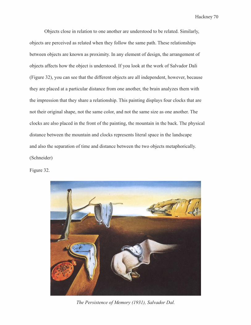
Hackney 70
Objects close in relation to one another are understood to be related. Similarly,
objects are perceived as related when they follow the same path. These relationships
between objects are known as proximity. In any element of design, the arrangement of
objects affects how the object is understood. If you look at the work of Salvador Dali
(Figure 32), you can see that the different objects are all independent, however, because
they are placed at a particular distance from one another, the brain analyzes them with
the impression that they share a relationship. This painting displays four clocks that are
not their original shape, not the same color, and not the same size as one another. The
clocks are also placed in the front of the painting, the mountain in the back. The physical
distance between the mountain and clocks represents literal space in the landscape
and also the separation of time and distance between the two objects metaphorically.
(Schneider)
Figure 32.
The Persistence of Memory (1931), Salvador Dal.
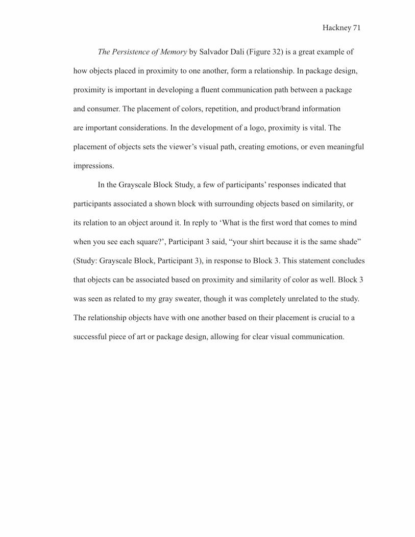
Hackney 71
The Persistence of Memory by Salvador Dali (Figure 32) is a great example of
how objects placed in proximity to one another, form a relationship. In package design,
proximity is important in developing a fluent communication path between a package
and consumer. The placement of colors, repetition, and product/brand information
are important considerations. In the development of a logo, proximity is vital. The
placement of objects sets the viewer’s visual path, creating emotions, or even meaningful
impressions.
In the Grayscale Block Study, a few of participants’ responses indicated that
participants associated a shown block with surrounding objects based on similarity, or
its relation to an object around it. In reply to ‘What is the first word that comes to mind
when you see each square?’, Participant 3 said, “your shirt because it is the same shade”
(Study: Grayscale Block, Participant 3), in response to Block 3. This statement concludes
that objects can be associated based on proximity and similarity of color as well. Block 3
was seen as related to my gray sweater, though it was completely unrelated to the study.
The relationship objects have with one another based on their placement is crucial to a
successful piece of art or package design, allowing for clear visual communication.

Hackney 72
12. LOGO IN DESIGN
The logo is a very effective element in communicating a brand image to a
consumer through a package. To create a credible logo, the design of the message
requires symbolism of the source represented (Haig).
The logo at its core communicates basic business, it is a trademark image that
identifies elements of a brand. When you add artistic elements of design to a logo, then
the logo becomes a messenger to consumers, delivering the brand image through a
symbol. This is done by thinking of the logo as a non-verbal, purely visual expression.
Credible logo design requires a good artist to symbolize the company’s business (Haig).
Visual elements, such as the logo, are perceived in terms of their formal properties but
also in terms of their symbolism (Van Rompay et al.).
12. 1 THREE LOGO STUDY
The Three Logo Study was conducted in order to better understand, from
a consumer’s perspective, how a logo can communicate a brand image and create
symbolism. Three logos that I designed on a grayscale were shown to consumers, similar
to how the Color Block Study was conducted. Each participant was asked a series of
questions in regard to the logos.
The logos were designed without color to isolate the function of the shapes,
symbolism, and overall design. The three logos are shown below in Figure 33. Logo 1
was designed to be more angular, masculine, and dynamic. Logo 2 was designed to be
subtle, harmonious, and feminine. Lastly, Logo 3 was designed as a combination of the

Hackney 73
two extremes of angularity and roundness (Van Rompay).
When shown Logo 1, the most common words used to describe it were “striped”,
“sharp”, and “triangle” (Study: Three Logo). Participants expressed that this logo was
intended to communicate that the brand wanted to show they are “moving forward”,
“cool”, “clean”, and “organized”, along with other similar indications seen in the study
results. Most people associated Logo 1 with “shoes”, “sports”, “athletics”, or “fitness
brands”, in fact, 60% of the participants connected this logo to an item related to
movement (Study: Three Logo).
Figure 33.
Logo 1. Logo 3. Logo 2. Logo 3Logo 2Logo 1
Logo 1 has a unique aspect of design that affects its interpretation by consumers.
A consumer reads the diagonal relationship of the lines from left to right, first, then, the
gradient of lines below the triangular shape. A lot of movement is taking place, thus
communicating dynamic traits. When a consumer views this logo, the eyes register
the movement, then the brain makes past associations with movement and connects
movement to a product of fitness or athletics, as a majority of participants in the Three
Logo Study suggested. Figure 34, below, represents the path the eye takes when Logo 1 is
observed, and how the brain groups the lines and shapes present based on Gestalt’s theory
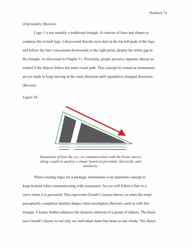
Hackney 74
of proximity (Bowen).
Logo 1 is not actually a traditional triangle. It consists of lines and shapes to
compose the overall logo. I discovered that the eyes start at the top left peak of the logo
and follow the line’s movement downwards to the right point, despite the white gap in
the triangle. As discussed in Chapter 11. Proximity, people perceive separate objects as
related if the objects follow the same visual path. This concept be coined as momentum,
an eye tends to keep moving in the same direction until signaled to changed directions
(Bowen).
Figure 34.
Simulation of how the eye, in communication with the brain, moves along a path to analyze a shape based on proximity, hierarchy, and
similarity.
When creating logos for a package, momentum is an important concept to
keep in mind when communicating with consumers. An eye will follow a line or a
curve when it is presented. This represents Gestalt’s closure theory, or when the mind
perceptually completes familiar shapes when incomplete (Bowen), such as with this
triangle. Closure further enhances the dynamic interests of a group of objects. The brain
uses Gestalt’s theory to not only see individual items but items as one whole. The object

Hackney 75
is communicated as one because the objects presented are following the same paths
(Bowen).
Referring to Figure 35, you can see that a total of 33.33% of participants said the
first word that came to their mind when shown Logo 1 was “triangle”, the shape revealed
through proximity. 13.4% of the fifteen participants were able to connect the shape to an
existing shape, “shoe” and “Adidas”. Additionally, 46.8% of the participants associated
the first word that came to their mind in response to Logo 1 with its unique attributes such
as “sharp”, “pointy”, “stripes”, and “lines”. This reveals that 46.73% of the participants
made an immediate connection to the overall shape, while 46.8% of participants made an
immediate recognition of the attributes of the intended triangular shape.
Figure 35.
Sharp26.7%
Triangle33.3%
Lines6.7%Clean6.7%
Pointy13.3%
Shoe6.7%
Adidas6.7% Stripes
6.%
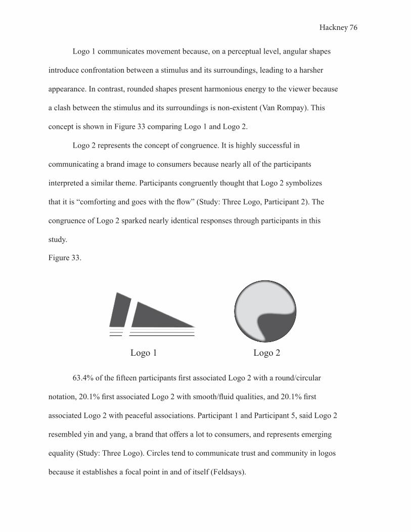
Hackney 76
Logo 1 communicates movement because, on a perceptual level, angular shapes
introduce confrontation between a stimulus and its surroundings, leading to a harsher
appearance. In contrast, rounded shapes present harmonious energy to the viewer because
a clash between the stimulus and its surroundings is non-existent (Van Rompay). This
concept is shown in Figure 33 comparing Logo 1 and Logo 2.
Logo 2 represents the concept of congruence. It is highly successful in
communicating a brand image to consumers because nearly all of the participants
interpreted a similar theme. Participants congruently thought that Logo 2 symbolizes
that it is “comforting and goes with the flow” (Study: Three Logo, Participant 2). The
congruence of Logo 2 sparked nearly identical responses through participants in this
study.
63.4% of the fifteen participants first associated Logo 2 with a round/circular
notation, 20.1% first associated Logo 2 with smooth/fluid qualities, and 20.1% first
associated Logo 2 with peaceful associations. Participant 1 and Participant 5, said Logo 2
resembled yin and yang, a brand that offers a lot to consumers, and represents emerging
equality (Study: Three Logo). Circles tend to communicate trust and community in logos
because it establishes a focal point in and of itself (Feldsays).
Figure 33.
Logo 1. Logo 3. Logo 2.
Logo 1 Logo 2
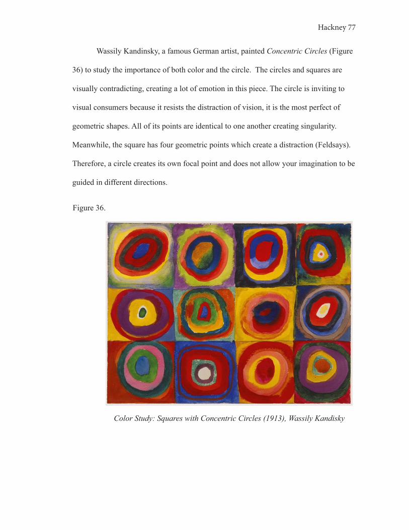
Hackney 77
Wassily Kandinsky, a famous German artist, painted Concentric Circles (Figure
36) to study the importance of both color and the circle. The circles and squares are
visually contradicting, creating a lot of emotion in this piece. The circle is inviting to
visual consumers because it resists the distraction of vision, it is the most perfect of
geometric shapes. All of its points are identical to one another creating singularity.
Meanwhile, the square has four geometric points which create a distraction (Feldsays).
Therefore, a circle creates its own focal point and does not allow your imagination to be
guided in different directions.
Figure 36.
Color Study: Squares with Concentric Circles (1913), Wassily Kandisky
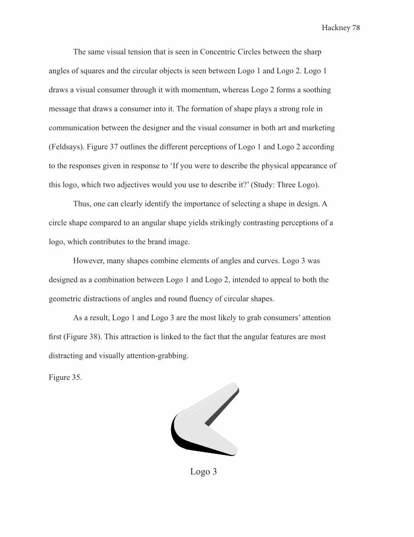
Hackney 78
The same visual tension that is seen in Concentric Circles between the sharp
angles of squares and the circular objects is seen between Logo 1 and Logo 2. Logo 1
draws a visual consumer through it with momentum, whereas Logo 2 forms a soothing
message that draws a consumer into it. The formation of shape plays a strong role in
communication between the designer and the visual consumer in both art and marketing
(Feldsays). Figure 37 outlines the different perceptions of Logo 1 and Logo 2 according
to the responses given in response to ‘If you were to describe the physical appearance of
this logo, which two adjectives would you use to describe it?’ (Study: Three Logo).
Thus, one can clearly identify the importance of selecting a shape in design. A
circle shape compared to an angular shape yields strikingly contrasting perceptions of a
logo, which contributes to the brand image.
However, many shapes combine elements of angles and curves. Logo 3 was
designed as a combination between Logo 1 and Logo 2, intended to appeal to both the
geometric distractions of angles and round fluency of circular shapes.
As a result, Logo 1 and Logo 3 are the most likely to grab consumers’ attention
first (Figure 38). This attraction is linked to the fact that the angular features are most
distracting and visually attention-grabbing.
Figure 35.
Logo 3
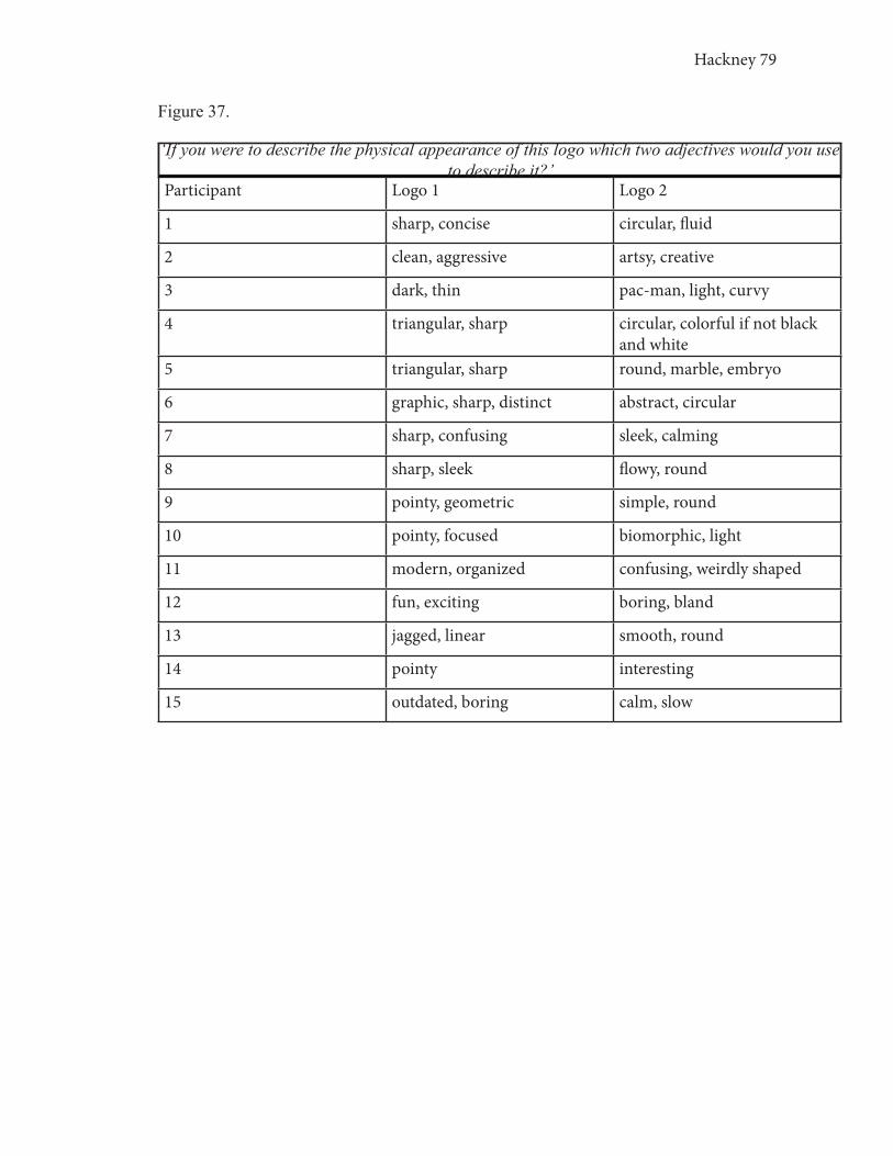
Hackney 79
Figure 37.
Participant Logo 1 Logo 2
1 sharp, concise circular, fluid
2 clean, aggressive artsy, creative
3 dark, thin pac-man, light, curvy
4 triangular, sharp circular, colorful if not black and white
5 triangular, sharp round, marble, embryo
6 graphic, sharp, distinct abstract, circular
7 sharp, confusing sleek, calming
8 sharp, sleek flowy, round
9 pointy, geometric simple, round
10 pointy, focused biomorphic, light
11 modern, organized confusing, weirdly shaped
12 fun, exciting boring, bland
13 jagged, linear smooth, round
14 pointy interesting
15 outdated, boring calm, slow
‘If you were to describe the physical appearance of this logo which two adjectives would you use to describe it?’

Hackney 80
However, the descriptions of Logo 3 show an evident combination of both Logo 1
and Logo 2. When you add Logo 3’s descriptions into the table of Figure 39 the overlap
between the logos can be seen.
Overall, I found consumers to form three distinct brand images for each of the
logos. Participants believe Logo 1 represents a brand that is ‘concise’ and ‘cutting edge’,
Logo 2 represents a brand that is ‘comforting’ and ‘sustainable’, and Logo 3 represents a
brand that is ‘edgy’ and ‘open’ (Study: Three Logo). Evidently, there are many individual
and personal interpretations, but also broad areas of overlapping perspectives.
The shape is a crucial element in logo design as seen through art and the Three
Logo Study.
Figure 38.
Logo 140.0%
Logo 226.7%
Logo 333.3%
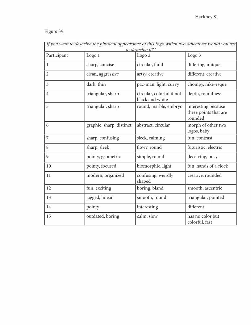
Hackney 81
Figure 39.
Participant Logo 1 Logo 2 Logo 3
1 sharp, concise circular, fluid differing, unique
2 clean, aggressive artsy, creative different, creative
3 dark, thin pac-man, light, curvy chompy, nike-esque
4 triangular, sharp circular, colorful if not black and white
depth, roundness
5 triangular, sharp round, marble, embryo interesting because three points that are rounded
6 graphic, sharp, distinct abstract, circular morph of other two logos, baby
7 sharp, confusing sleek, calming fun, contrast
8 sharp, sleek flowy, round futuristic, electric
9 pointy, geometric simple, round deceiving, busy
10 pointy, focused biomorphic, light fun, hands of a clock
11 modern, organized confusing, weirdly shaped
creative, rounded
12 fun, exciting boring, bland smooth, ascentric
13 jagged, linear smooth, round triangular, pointed
14 pointy interesting different
15 outdated, boring calm, slow has no color but colorful, fast
‘If you were to describe the physical appearance of this logo which two adjectives would you use to describe it?’
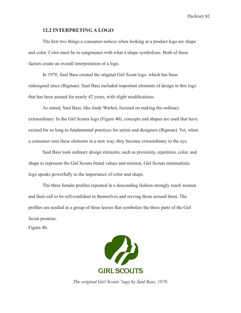
Hackney 82
12.2 INTERPRETING A LOGO
The first two things a consumer notices when looking at a product logo are shape
and color. Color must be in congruence with what a shape symbolizes. Both of these
factors create an overall interpretation of a logo.
In 1978, Saul Bass created the original Girl Scout logo, which has been
redesigned since (Bigman). Saul Bass included important elements of design in this logo
that has been around for nearly 42 years, with slight modifications.
As stated, Saul Bass, like Andy Warhol, focused on making the ordinary
extraordinary. In the Girl Scouts logo (Figure 40), concepts and shapes are used that have
existed for so long as fundamental practices for artists and designers (Bigman). Yet, when
a consumer sees these elements in a new way, they become extraordinary to the eye.
Saul Bass took ordinary design elements, such as proximity, repetition, color, and
shape to represent the Girl Scouts brand values and mission. Girl Scouts minimalistic
logo speaks powerfully to the importance of color and shape.
The three female profiles repeated in a descending fashion strongly reach women
and their call to be self-confident in themselves and serving those around them. The
profiles are nestled in a group of three leaves that symbolize the three parts of the Girl
Scout promise.
Figure 40.
The original Girl Scouts’ logo by Saul Bass, 1978.

Hackney 83
Because the three figures are placed in a certain pattern and proximity, the
hairstyle seen on the first female appears on all three of the females, though it is really
only one shape, because of the way that the eye groups objects seen in relation to one
another. (Van Rompay et al.)
The rounded shapes of the logo communicate a feminine and welcoming feel,
“rounded shapes present no clash between stimulus and surroundings” (Van Rompay et
al.). As stated earlier in the Logo 2 analysis of the Three Logo Study, the circular points
eliminate distraction and invite consumers in.
Furthermore, the green contributes to the symbolic associations. Through the
Color Block Study, green represents emotions such as wholesome, natural, happy,
healthy, nature, life, etc, which once again reflect the brand of Girl Scouts.
The eye and the brain work to associate all of these elements of art and design in
order to make sense of the object present. Associations and impressions are made within
seconds of coming into contact with a visual image. On average, it took participants one
to four seconds to create a response to questions asked in these studies. This process
exists in both art and package design in order to communicate a message to the visual
consumers.
The structural relations between visual-spatial elements and symbolic meanings
create a positively perceived brand identity for Girl Scouts (Van Rompay et al.). This logo
by Saul Bass is an excellent example of how congruence in design can lead to positive
brand evaluation (Van Rompay).

Hackney 84
12. GRAYSCALE BLOCK STUDY
Color plays a pivotal role in consumers’ decision making-process. When color
is removed or converted to grayscale, the color associations are lost in the mind of the
consumers because their brains are not reading the values in the same manner. In the
Grayscale Block Study, the same colors used in The Color Block Study were converted
to a grayscale (Figure 41) and the study was conducted in an identical fashion; the same
wording and the same questions were used.
The shift from color to grayscale created a significant change in the participant’s
answers. While the color associations were somewhat difficult for consumers to form, the
lack of color proved a dramatic decrease in their ability to form associations of any sort.
Figure 41.

Hackney 85
Participant 5 answered the questions in the Color Block Study quite fluidly,
making associations with each block of color presented. However, when this participant
was introduced to the Grayscale Block Study, they no longer could make correlations
with adjectives or products for each block presented. 41.67% of Participant 5’s answers
were ‘No Correlation’ in the Grayscale Block Study. This decrease in correlation suggests
that grayscale packaging is less likely to form personal connections with consumers and
will not create a lasting brand relationship with consumers.
In the Color Block Study Participant 6 was using words such as ‘healthy’, ‘mad’,
‘royalty’, ‘happy’, ‘action’, ‘achievement’ to describe the 6 blocks of color. Shifting
to the Grayscale Block Study Participant 6’s descriptions became a monotype array of
words; ‘low printer ink’, ‘winter time’, ‘cold’, ‘No Correlation’, ‘dusk’, and ‘off white’.
Items that lack color have a narrower scope of descriptive opportunities. It is evident that
a direct relationship exists between a loss of color and a loss of association.
It is important to notice the increase in ‘No Correlation’ as a response to the
questions in the Grayscale Color Block Study. When asked ‘Do any of these squares
resonate with a past memory of yours that is meaningful to you?’, ‘No Correlation’
increased as an answer by 33.3%. ‘No Correlation’ also made up 62 of the 270 responses
in the Grayscale Block Study. In the color Block Study, ‘No Correlation’ only made up
12 of the 270 responses. These results prove that consumers have a significantly more
difficult time relating to a package that lacks color, thus steering them away from that
package, or brand.
One benefit that grayscale offers is the isolation of shape and typography. When
images are shown in grayscale, the color no longer forms the association, the shape and
Hackney 86
pattern do, as seen in the Three Logo Study. In the development of package design, the
shape is always developed first, then color is applied to reinforce the message and make it
clear, concise, and whole.
It is extremely interesting to note participants’ ability to create a color where there
is no color present. In the Three Logo Study, Participant 4 described Logo 2 as “colorful
if it was not black and white”. Similarly, Participant 15 described Logo 3 with “It has no
color but somehow colorful…”. The fact that a consumer can place color in a grayscale
logo proves that the brain processes a shape with relevant color associations in mind.
Correspondingly, in the Waterbottle Study, Participant 4 described Bottle 2, as ‘colorful’,
however, there were not any colors present on the bottle. The color association was made
solely on the visual formation of the bottle. I found that thorough designs communicate
with a consumer so effectively that they can place color without color being present in
reality. Color is associated with an object that lacks color when the consumer associates
emotion derived from other visual elements and feels an emotion that color would have
otherwise evoked.
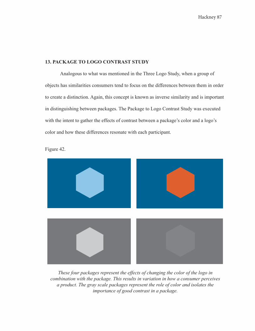
Hackney 87
13. PACKAGE TO LOGO CONTRAST STUDY
Analogous to what was mentioned in the Three Logo Study, when a group of
objects has similarities consumers tend to focus on the differences between them in order
to create a distinction. Again, this concept is known as inverse similarity and is important
in distinguishing between packages. The Package to Logo Contrast Study was executed
with the intent to gather the effects of contrast between a package’s color and a logo’s
color and how these differences resonate with each participant.
Figure 42.
These four packages represent the effects of changing the color of the logo in combination with the package. This results in variation in how a consumer perceives
a product. The gray scale packages represent the role of color and isolates the importance of good contrast in a package.

Hackney 88
Figure 42 shows the visuals used in conducting the Package to Logo Contrast
Study. The Package to Logo Contrast Study evaluated two different packages with
inverse similarities, the logos. At first, participants were shown the navy blue packages
with the orange logo and lighter blue logo, followed by a series of questions. These colors
were chosen because they sit opposite each other on the color wheel and come from two
different color families; warm, the orange, and cool, the blue. Then, participants were
introduced to the same packages but converted to grayscale, followed by a series of
questions.
The orange logo on a navy package displays two colors that share a similar
intensity to each other and less contrast. The lighter blue logo is also on the same navy
package but it has more contrast to the navy blue and comes from the same original hue.
To analyze this study I want to first focus on Participant 6’s interviews. This
participant was most attracted to the blue on blue package, finding it to be the most
attention-grabbing, the highest price point, and the most likely to be purchased based
on appearance over the navy and orange package. When asked to describe what each
package communicates to consumers about its brand, Participant 6 said that the blue on
blue was a “calm, safe option, you know it will work” and the orange on blue was “more
fun and exciting, different” (Study: Package to Logo Contrast).
In Participant 6’s Color Block Study, she stated that orange reminded her of
her dad and the University of Texas Longhorns, and that blue reminds her of the ocean
and water, or something at a restaurant. But what do these answers have to do with one
another?
In the Color Block Study Participant 6 responded to the question, ‘How do

Hackney 89
you believe a product’s packaging color impacts your decision after being exposed to
the grayscale and the contrast?’, by stating, “Color definitely makes it more attractive
because now that it is in gray I can’t read the blue on orange anymore, but the blue is
sharper. It makes you think about the product in different ways.”
Referring to the Color Block Study (Chapter 10. Color), it is clear that blue carries
a calming, convenient, trustworthy meaning to the participant. And while this participant
stated, “blue and orange remind me of my home and my parents”, she still chose the
blue on blue over the orange on blue. Therefore, it is fair to argue that the brain is still
more attracted to the artistic association between this participant and the stimuli than her
personal connection of the two colors that are found within her parent’s home.
The orange may be more exciting, but Participant 6’s eye is drawing upon the
emotion of trust because this participant presumes the blue on blue package is more
reliable. If Participant 6 is going to purchase a more expensive product, naturally, this
participant wants to find trust, calmness, and the knowledge that it is a safe option.
However, not all participants are looking at the packages through the same eye.
Overall, 80% of the participants said that the blue on blue combination of logo and
package grabs their attention first when seeing both packages at the same time. When
asked which package is sold at a higher price point, 55.6% of the participants said the
lighter blue logo package, and 44.4% of the participants said the orange logo package.
Orange is commonly used to convey action and engage consumers in impulse buying.
While orange may increase sales, it also can decrease value. Therefore, price is an
assumption made by each consumer based on personal perceptions.
Color contrast significantly affects consumer behavior in regards to their

Hackney 90
perception of product quality, visual attraction, and, ultimately, purchase (Mohebbi).
However, just because one color grabs your attention first does not necessarily mean
that it sells, although it does win the first impression. These impressions are similar to
interacting with someone with an overbearing personality, while some people enjoy it,
others detract from it. The same goes for products.
Participants tended to see the lighter blue logo on the navy blue package at
first because of the package’s contrast. Many consumers are not aware of the role that
contrasts have in the visual culture, especially on a package. To understand the intensity
of contrast for those not trained to recognize it, it is easier to view the object on a
grayscale. That is the reason the grayscale was applied to the packages in this study.
Converting Andy Warhol’s Campbell Soup Cans to a grayscale displays the
successful balance between the heavy red and light white, as seen in Figure [1.3] and
Figure 43. The balance of contrast is important in properly using color design so that
colors compliment each other harmoniously, and do not compete for visual attention.
Campbell’s Soup was originally wrapped in orange and blue packaging in 1897,
prior to the famous white and red label known today. So, what made the brand change its
color scheme? The company’s treasurer, Herberton L. Williams, went to the 1898 Cornell
versus University of Pennsylvania football game. Cornell’s white and red uniforms made
such an impression on him that he thought Campbell’s Soup needed to adopt it (Neilson).
The color scheme switched from orange, attention-grabbing, indicating action
and spirit, paired with a blue, which evokes feelings of calmness, trust, and stability, to
the red and white. Red generally suggests passion, intimacy, and warmth, and the white
often coordinates with simplicity and lightness. Knowing Campbell’s Soup brand that

Hackney 91
Figure [1.3]
Campbell’s Soup Cans (1962), Andy Warhol
Figure 43.
Campbell’s Soup Cans (1962), Andy Warhol
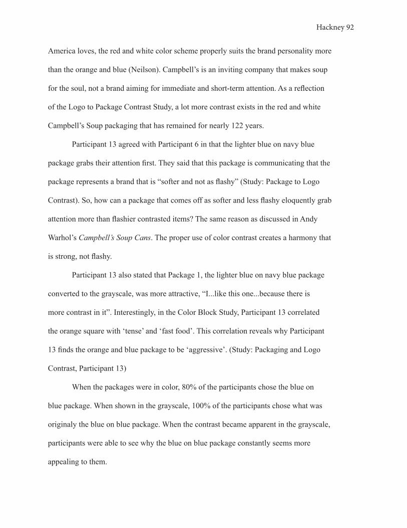
Hackney 92
America loves, the red and white color scheme properly suits the brand personality more
than the orange and blue (Neilson). Campbell’s is an inviting company that makes soup
for the soul, not a brand aiming for immediate and short-term attention. As a reflection
of the Logo to Package Contrast Study, a lot more contrast exists in the red and white
Campbell’s Soup packaging that has remained for nearly 122 years.
Participant 13 agreed with Participant 6 in that the lighter blue on navy blue
package grabs their attention first. They said that this package is communicating that the
package represents a brand that is “softer and not as flashy” (Study: Package to Logo
Contrast). So, how can a package that comes off as softer and less flashy eloquently grab
attention more than flashier contrasted items? The same reason as discussed in Andy
Warhol’s Campbell’s Soup Cans. The proper use of color contrast creates a harmony that
is strong, not flashy.
Participant 13 also stated that Package 1, the lighter blue on navy blue package
converted to the grayscale, was more attractive, “I...like this one...because there is
more contrast in it”. Interestingly, in the Color Block Study, Participant 13 correlated
the orange square with ‘tense’ and ‘fast food’. This correlation reveals why Participant
13 finds the orange and blue package to be ‘aggressive’. (Study: Packaging and Logo
Contrast, Participant 13)
When the packages were in color, 80% of the participants chose the blue on
blue package. When shown in the grayscale, 100% of the participants chose what was
originaly the blue on blue package. When the contrast became apparent in the grayscale,
participants were able to see why the blue on blue package constantly seems more
appealing to them.

Hackney 93
In the Color Block Study, 20%, the second-highest percentage, of the fifteen
participants said orange represents a product that is the least expensive, Participant 13
being a part of that 20%. In the Package to Logo Contrast Study, 60% of the participants
claimed the orange on blue package was the least expensive package, the lighter blue
on navy blue the most expensive. Once again, the relationship of participant responses
between studies proves the consistency in how consumers associate elements of design to
develop a purchasing decision.
The selection of colors on a package is vital to the impact that a product has on a
consumer. The colors used impact color associations and how consumers isolate products
on a shelf, resulting in purchasing decisions.

Hackney 94
13. CONCLUSION
At the base of all of this research, well-designed advertisements, packaging,
products, art, etc. allow a brand to shape its environment, reaching and influencing the
taste of audiences. The elements of art have evolved to become a considerable factor in
the 21st visual culture. In regard to package design, the simplest and most relevant way
to communicate the influence of design on consumers in the visual culture is to dissect
answers through art. By turning to the world of art to better understand consumerism,
studies were developed in order to better understand the significance of the collision of
marketing and art.
Pop Art is a very perceptive form of art that isolates products of mass
consumption that are often forgotten about. Pop Artists, similar to graphic designers,
such as Saul Bass, have allowed consumers to see products in a new light, based on
deeper symbolic meanings and aesthetic understandings. Pop Art is a mock process of
how marketing and package design is created with the intent of making the ordinary
extraordinary.
Conclusively, the elements of color, shape, logo, package formulation, and
contrast all play a significant role in determining the behavior of each individual visual
consumer. These artistic design elements work together to communicate between the
package and the consumer to form an image. The image reflects how the consumer
perceives the package based on aesthetic impressions, symbolic associations, and
semantic interpretations, and how the consumer perceives the brand.

Hackney 95
While artists and consumers have traditionally been two distinct groups in the
visual culture, this thesis has excavated the importance of these two worlds colliding to
strengthen the understanding of package design. There is an abundance to be learned and
applied to the world of marketing from studying art.
If art has the power to impose aesthetic responses, symbolic associations, and
semantic interpretations of visual consumers, there is no reason to not transform the
works of artistic masterpieces into the world of marketing. Elements of art have remained
empowering for centuries, increasing the visual value of objects associated with it.
Applying the same artistic elements used in paintings, from The Fall of Icarus by Henri
Matisse to Campbell’s Soup Cans by Andy Warhol, package design will transform the
visual culture of the 21st century as it unravels and breaks through in developing images
of higher value.
Through the studies conducted, research applied, and data inferred, art has truly
refocused consumers’ attention within a visual world through the exploration of package
design, because at its core “...the most potent force for imaginative marketing and product
strategy is a real partnership between marketing and [art]” (Rand).
Hackney 96
Work Cited
Annadi, Srikanth Reddy, et al. “Apple Computer and the Service-Profit Chain.” Service-
Profit Chain, 23 June 2015, group3rivier.wordpress.com/2015/06/20/hello-world/.
Behzad, Mohebbi. “The Art of Packaging: An Investigation into the Role of Color in
Packaging, Marketing, and Branding.” International Journal of
Organizational Leaderhip, vol. 3, 1 Dec. 2014. Research Gate, www.researchgate.
net/publication/303285136_The_art_of_packaging_An_investigation_into_
the_role_of_color_in_packaging_marketing_and_branding, 10.33844/
ijol.2014.60248. Accessed Mar. 2019.
Bigman, Alex. “Saul Bass: The Man Who Changed Graphic Design.” 99designs,
99designs, 12 June 2012, 99designs.com/blog/famous-design/saul-bass-graphic-
designer-of-a-century/. Accessed Oct. 2019.
Bowen, Emily. “Gestalt Design Theories Lecture.” Feb. 2019.
Crilly, Nathan, et al. “Seeing Things: Consumer Response to the Visual Domain in
Product Design.” Design Studies, vol. 25, no. 6, Nov. 2004, pp. 547–577,
10.1016/j.destud.2004.03.001. Accessed 14 Oct. 2019.
Danacioglu, Gokhan. “G-MAN Creative Blog | POP ART AND DESIGN – A Short
Guide.” Gmancreativeblog.Com, 18 Sept. 2018, gmancreativeblog.com/2018/
pop-art-and-design-a-short-guide/. Accessed 20 Mar. 2020.
“Definition of CONSUMERISM.” Merriam-Webster.Com, 2019, www.merriam-webster.
com/dictionary/consumerism. Accessed Jan. 2020.
Feldsays, Alfons. “Circle and It’s Importance in Visual Arts.” OpenArt, 4 Oct. 2016,
www.openart.in/general-topics/circle-importance-visual-arts/. Accessed 3 Apr.
2020.
Hackney 97
“Gestalt Theory in Art.” Columbia College Chicago, 2010.
Hagtvedt, Henrik, et al. “The Perception and Evaluation of Visual Art.” Empirical
Studies of the Arts, vol.26, no. 2, July 2008, pp. 197–218, www.bauer.uh.edu/
vpatrick/docs/The%20Perception%20and%20Evaluation%20of%20Visual%20
Art.pdf, 10.2190em.26.2.d.
Haig, Bill. “The Saul Bass-Approved Method of Credibility-Based Logo Design.” AIGA |
the Professional Association for Design, www.aiga.org/the-saul-bass-approved-
method-of-credibility-based-logo-design. Accessed Apr. 2019.
Kłos, Anna. “Henri Matisse vs Paul Rand – What the Famous Fauvist Has to Do with
the Author of IBM Logo.” Retroavangarda, 24 Nov. 2016, retroavangarda.com/
henri-matisse-vs-paul-rand-en/. Accessed Feb. 2020.
Kuperminc, Melissa. “Three Lessons in Design from Saul Bass.” Stunning Proof, 26 Aug.
2015, stunningproof.com/2015/08/26/three-lessons-in-design-principles-from-
saul-bass/.Accessed 15 Feb. 2019.
Luchins, Edith H.“Isomorphism in Gestalt Theory : Comparison of Wertheimer.” (2015).
Mazhar, Mahera, et al. “Impact of Product Packaging on Consumers Buying Behavior:
Evidence from Karachi.” Ssrn.Com, 2015, papers.ssrn.com/sol3/papers
cfm?abstract_id=2910712. Accessed 31 Oct. 2019.
McCready, Ryan. “The 8 Biggest Graphic Design Trends That Will Dominate 2019
[Infographic] Venngage.” Venngage, 13 Mar. 2019, venngage.com/blog/graphic-
design-trends/Accessed Oct.2019.
Mcleod, Saul. “Maslow’s Hierarchy of Needs.” Simply Psychology, Simply Psychology,
5 Feb.
Hackney 98
2007, www.simplypsychology.org/maslow.html. Accessed 5 Mar. 2020.
Mohebbi, Behzad. “INTERNATIONAL JOURNAL OF ORGANIZATIONAL
LEADERSHIP The Art of Packaging: An Investigation into the Role of Color in
Packaging, Marketing,and Branding.” International Journal of Organizational
Leadership, vol. 3, 2014, pp. 92–102. AIMI Journals,oaji.net/
articles/2014/1012-1420044857.pdf. Accessed 3 Apr. 2020.
Rand, Paul. Design, Form, and Chaos. 1993. Google Books, New York, New York,
Yale University Press, 2017, books.google.com/books?hl=en&lr=&id=VYw-
DwAAQBAJ&oi=fnd&pg=PP1&dq=paul+rand+design&ots=BYdkf_
OL9a&sig=pYP9hd3HBNSlzZNFUNaVURIZcF4#v=onepage&q=pa
ul%20rand%20design&f=false. Accessed 3 Apr. 2020.
Republic, 10 July 2014, www.foodrepublic.com/2014/07/10/a-condensed-history-of-the-
campbells-tomato-soup-can/. Accessed 3 Apr. 2020.Neilson, Laura. “A
Condensed’ History Of The Campbell’s Tomato Soup Can.” Food
Schneider, Lydia. “Finding Gestalt Principles in Art.” Memories of a College Student,
9 Sept. 2013, lschne11.wordpress.com/2013/09/09/finding-gestalt-principles-in-
art/. Accessed 18 Mar. 2020.
Schroeder, Jonathan. Visual Consumption. 2002. Www.Academia.Edu, vol. 4, Routledge
Interpretive Marketing Experience, www.academia.edu/805861/Visual_
Consumption. Accessed 3 Apr. 2020.
Smith, Kate. “Georgia O’Keeffe Quotes About Color | Sensational Color.” Https://Www.
Sensationalcolor.Com/, www.sensationalcolor.com/okeeffe-quotes/. Accessed 3
Apr. 2020.

Hackney 99
Stevenson, Richard W. “Designer Packages That Sell.” The New York Times, 25 Oct.
1986, p. 33, www.nytimes.com/1986/10/25/business/designer-packages-that-sell.
html. Accessed Dec. 2019.
The Academy. “Saul Bass On His Approach To Designing Movie Title Sequences.”
Medium, ART & SCIENCE, 21 Oct. 2015, medium.com/art-science/saul-bass-on-
his-approach-to-designing-movie-title-sequences-47fd537c457b. Accessed Apr.
2020.
Tian, Robert. “Anthropological Approach to Consumer Science: A
Practical Teaching Case Study.” High Plains Applied Anthropologist,
vol. 21, no. 2, 2001, pp. 157–164. Semantics Scholar, pdfs.semanticscholar.
org/6775/77036bf16756b682e6c7d537c2487c399b33.pdf.
Waller, David. “Adman: Andy Warhol’s Origins as a Commercial Artist and Illustrator.”
Marketing Magazine, Niche Media, 29 Mar. 2017, www.marketingmag.com.au/
hubs-c/ adman-warhol-before-pop/. Accessed 3 Apr. 2020.
Van Rompay, Thomas J. L., et al. “Symbolic Meaning Integration in Design and Its
Influence on Product and Brand Evaluation.” International Journal of Design,
2009, www.ijdesign.org/index.php/IJDesign/article/view/566/257. Accessed 3
Mar. 2020.
“35 Awesome Packaging Designs.” Digital Synopsis, 2014,
digitalsynopsis.com/inspiration/35-creative-product-package-designs/. Accessed 5
Sept. 2019.
Hackney 100
Figure 1:
[1.1], [1.3]
Warhol, Andy. Campbell’s Soup Cans, 1962, www.moma.org/collection/works/79809.
Accessed 2019.
[1.2]
---. Campbell’s Soup Cans, blog.rsvpgallery.com/tag/andy-warhol/. Accessed 2020 Feb.
2AD.
Figure 2:
Bass, Saul. Nine Hours to Rama, 1963, www.artofthetitle.com/title/nine-hours-to-rama/.
Accessed Oct. 2019.
Figure 4:
Bottle 1:
Kroger Co. “Evian Bottled Natural Spring Water,” Smith’s Food and Drug, 2020,
www.smithsfoodanddrug.com/p/-lmtd-qty-evian-bottled-natural-spring-
water/0007929800007. Accessed Sept. 2020.
Bottle 2:
Icelandic Glacial. “Icelandic Glacial Natural Spring Alkaline Water, 500 Ml (24 Count),”
Amazon.Com, Inc., www.amazon.com/Icelandic-Glacial-Natural-Spring-
Milliliter/dp/B0083TTBWS. Accessed Sept. 2019.
Bottle 3:
Gold Peak Tea. “Gold Peak Diet Green Tea,” H-E-B, LP, 2020, www.heb.com/product-
detail/gold-peak-diet-green-tea/2093237. Accessed Sept. 2019.
Hackney 101
Bottle 4:
Life Water. “LIFEWTR, Purified Water, PH Balanced with Electrolytes For Taste,
1 Liter Bottles (6 Count),” Walmart, 2020, www.walmart.com/ip/
LIFEWTR-Purified-Water-pH-Balanced-with-ElectrolytesForTaste-1-
Liter-bottles-6-Count/55464643?athcpid=55464643&athpgid=athenaItemPage&at
hcgid=null&athznid=PWVUB&athieid=v0&athstid=CS004&athguid=bfbcb9cf-
a7d-17154fb892db28&athancid=null&athena=true. Accessed
Sept. 2019.
Figure 4:
Bass, Saul. Anatomy of a Murder Poster, 1959, scene360.com/design/49712/saul-bass-
anatomy-of-a-poster/. Accessed Sept. 2019.
Matisse, Henri. The Fall Os Icarus, 1941, Bass, Saul. Anatomy of a Murder Poster, 1959,
scene360.com/design/49712/saul-bass-anatomy-of-a-poster/. Accessed Sept.
2019. Accessed Sept. 2019.
Figure 5:
Kroger Co. “Evian Bottled Natural Spring Water,” Smith’s Food and Drug, 2020,
www.smithsfoodanddrug.com/p/-lmtd-qty-evian-bottled-natural-spring-
water/0007929800007. Accessed Sept. 2020.
Monet, Claude. Water Lilies, legionofhonor.famsf.org/monets-water-lilies-returns-legion-
honor. Accessed 10 Mar. 2020.
Figure 6:
Warhol, Andy. “Andy Warhol Collage of Work,” Blogspot.Com, 2.bp.blogspot.com/-
33qtrdXOPdg/UpO3n-LnyBI/AAAAAAAAAFY/uz54weokzM0/s00/Montagem-
Pop.jp. Accessed Feb. 2020.

Hackney 102
Pepsi Co. “Be Different (Pop Art Ad),” Pinterest, i.pinimg.com
originals/59/81/3f/59813f72c13bf14eb5cf03744a5f552d.jpg. Accessed Jan. 2020.
Figure 7:
Volkswagen. “The History of the Volkswagen Logo, from 1937 to Today,” Motor 1, 9
Sept. 2019, www.motor1.com/photos/697283/vw-logo-history/. Accessed Feb.
2020.
---. Volkswagen, from Ads, 11 May 2016, www.christies.com/lotfinder/Lot/andy-
warhol-1928-1987-volkswagen-from-ads-5995029-details.aspx. Accessed Feb.
2020.
Figure 9:
Unilever. “Men + Care Extra Fresh Body and Face Bar,” Dove, 2020, www.dove.com/us/
en/men-care/washing-and-bathing.html. Accessed Feb. 2020.
Figure 10:
Dove. “Dove Beauty Bar for Softer Skin Pink More Moisturizing Than Bar Soap,”
Amazon.Com, Inc., 2020, www.amazon.com/Dove-Beauty-Pink-packaging-vary/
dp/B002DUOOXO?th=1. Accessed Feb. 2020.
Figure 12:
Bottle 1:
Kroger Co. “Evian Bottled Natural Spring Water,” Smith’s Food and Drug, 2020,
www.smithsfoodanddrug.com/p/-lmtd-qty-evian-bottled-natural-spring-
water/0007929800007. Accessed Sept. 2020.
Hackney 103
Bottle 2:
Icelandic Glacial. “Icelandic Glacial Natural Spring Alkaline Water, 500 Ml
(24 Count),” Amazon.Com, Inc., www.amazon.com/Icelandic-Glacial-Natural-
Spring-Milliliter/dp/B0083TTBWS. Accessed Sept. 2019.
Bottle 3:
Gold Peak Tea. “Gold Peak Diet Green Tea,” H-E-B, LP, 2020, www.heb.com/product-
detail/gold-peak-diet-green-tea/2093237. Accessed Sept. 2019.
Bottle 4:
Life Water. “LIFEWTR, Purified Water, PH Balanced with Electrolytes For Taste, 1 Liter
Bottles (6 Count),” Walmart, 2020, www.walmart.com/ip/LIFEWTR-
Purified-Water-pH-Balanced-with-Electrolytes-For-Taste-1-Liter-bottles-6-
Count/55464643?athcpid=554646
43&athpgid=athenaItemPage&athcgid=null&athznid=PWVUB&athieid=v0&athstid=
CS004&athguid=bfbcb9cf-a7d-17154fb892db28&athancid=null&athena=true
Accessed Sept. 2019.
Figure 15:
Freedom Bunker. “Starbucks Is the Latest Victim of Pseudoscience (Image),” Freedom
Bunker, 9 May 2018, freedombunker.com/2018/05/09/starbucks-is-the-latest-
victim-of-pseudoscience/. Accessed Mar. 2020.
Figure 16:
McDonald’s. “McDonald’s McCafe Coffee Cup,” McDonald’s Facebook, m.facebook.
com/McDonalds1237SweitzerRdphotos/a.847735561936520/2754110741298983/
?type=3&source=54. Accessed Mar. 2020.
Hackney 104
Figure 17:
La Croix. “LaCroix Sparkling Water, Pure, 12oz Can, 24/Carton,” Amazon.Com, Inc.,
2020, www.amazon.com/LaCroix-Sparkling-Water-Pure-Carton/dp/
B00INALHDS. Accessed Sept. 2020.
Figure 18:
Juxtapoz Magazine. Andy Warhol and Campbell’s Soup in Soup Aisle, 2020, www.
instagram.com/p/B9-aLGVpnWO/?igshid=1qqyynxvotqkq. Accessed 15 Mar.
2020.
Figure 19:
F, Sheila. “Alameda CA - October 10 2017: Grocery Store Isle with Cans of Campbell’s
Brand Soup and Various Brands Boxed Broth. Campbell’s Products Are Sold in
120 Countries around the World.,” Big Stock, 10 Oct. 2017, www.bigstockphoto.
com/image-210762673/stock-photo-alameda-ca-october-10-2017%3A-grocery-
store-isle-with-cans-of-campbell-s-brand-soup-and-various-brands-boxed-broth-
campbell-s-products-are-sold-in-120-countries-around-the-world. Accessed Mar.
2020.
Figure 21:
Warhol, Andy. Marilyn Monroe, 1967, catherinegoerner.com/?page_id=1115. Accessed
Mar. 2020.
Figure 23:
“Tomba Chocolate Brand.” Behance, 15 July 2018, www.behance.net/gallery/67919191/
Branco. Accessed Mar. 2020.

Hackney 105
Figure 24:
Matisse, Henri. La Perruche Et La Sirene, 1952, fgsblog.com/tag/national-gallery/.
Accessed Mar. 2020.
Figure 25:
The Hershey Company. “Reese’s Logo,” The Hershey Company, 2019, www.hersheys.
com/reeses/en_us/home.html. Accessed Feb. 2020.
Figure 32:
Dali, Salvador. The Persistence of Memory, 1931, www.moma.org/collection/
works/79018. Accessed Mar. 2020.
Figure 36:
Kandinsky, Wassily. Color Study: Squares with Concentric Circles, 1913, Color Study:
Squares with Concentric Circles. Accessed Mar. 2020.
Figure 40:
Girl Scouts. “Girl Scout’s Logo,” 99 Designs, 1978, 99designs.com/blog/famous-design/
saul-bass-graphic-designer-of-a-century/. Accessed Feb. 2020.
Figure 43:
Warhol, Andy. Campbell’s Soup Cans, 1962, www.moma.org/collection/works/79809.
Accessed 2019.