Gephi: a network visualisation tool - e-learning unipd
37
-
Upload
khangminh22 -
Category
Documents
-
view
6 -
download
0
Transcript of Gephi: a network visualisation tool - e-learning unipd

Overview
1. What is Gephi?
2. Gephi download and installation
3. Gephi network visualization demo
4. Dataset generation

What is Gephi?
● Gephi is an open-source software for visualization of graphs and networks
● Offers built-in network analysis with few simple clicks
● For more information, examples and tutorials: official website

Gephi instalation
● pretty straightfoward● if you run into issues contact me :)

Gephi nw visualization demo
What we’ll do:● start from a (small) friendship network● import nodes and edges● adjust graph layout● set node color according to degree● set node size according to betweeness
centrality● detect communities● set node color according to community● export graph image

Gephi nw visualization demo
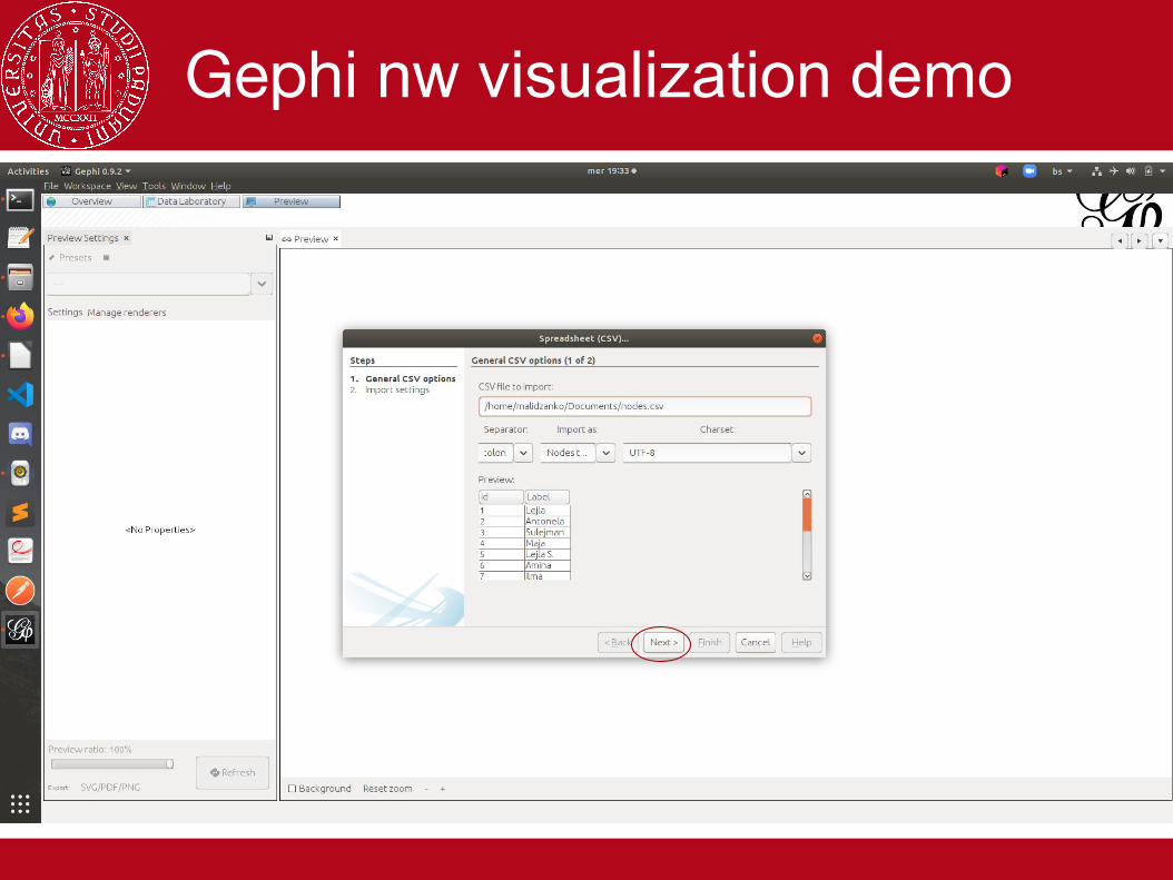
Go to Import spreadsheet...

Gephi nw visualization demo
Select your nodelist Excel spreadsheet.
Gephi nw visualization demo

Gephi nw visualization demo

Gephi nw visualization demo
Pick undirected graph, append to existing workspace, no self-loops

Gephi nw visualization demo
Go to Import spreadsheet...

Gephi nw visualization demo
Go to Import spreadsheet...
Select your edgelist Excel spreadsheet.

Gephi nw visualization demo

Gephi nw visualization demo

Gephi nw visualization demo
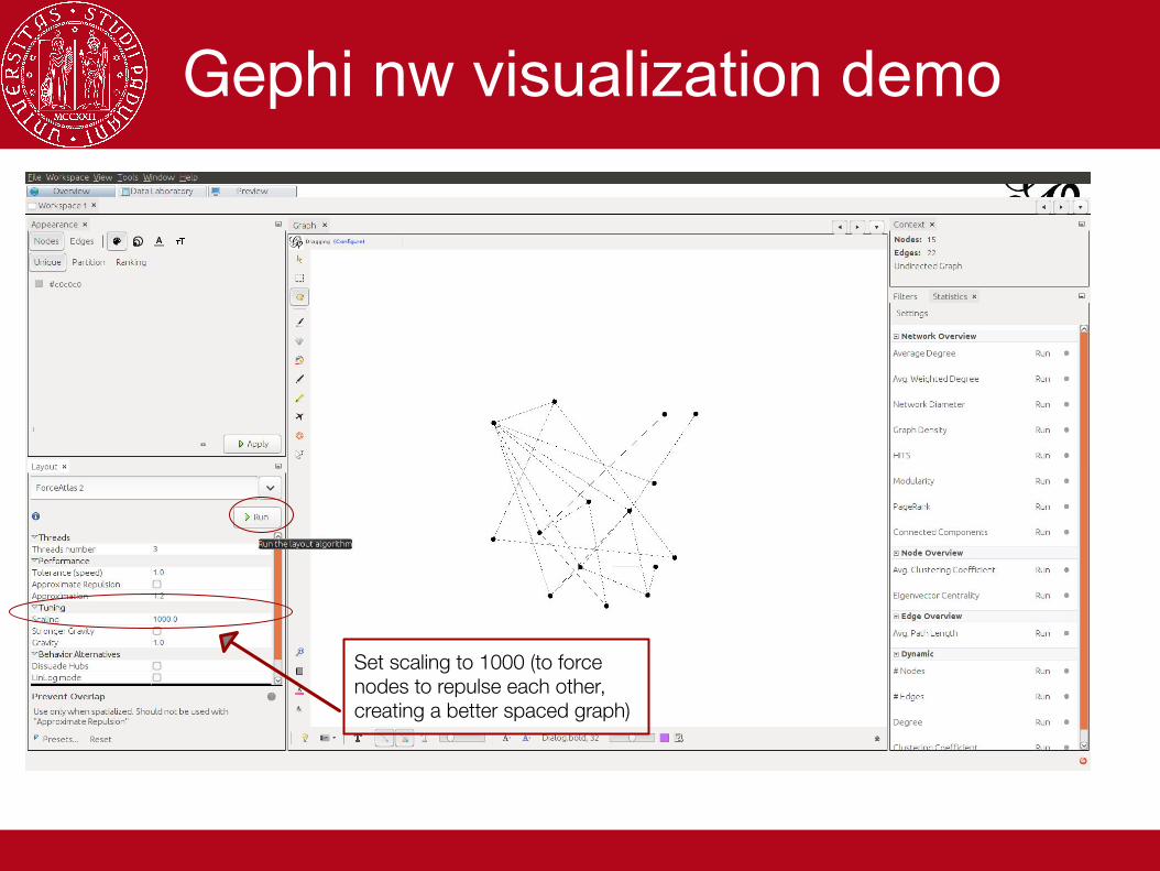
Currently we have a random node layout
Choose ForceAtlas2
Gephi nw visualization demo
Set scaling to 1000 (to force nodes to repulse each other, creating a better spaced graph)
Gephi nw visualization demo
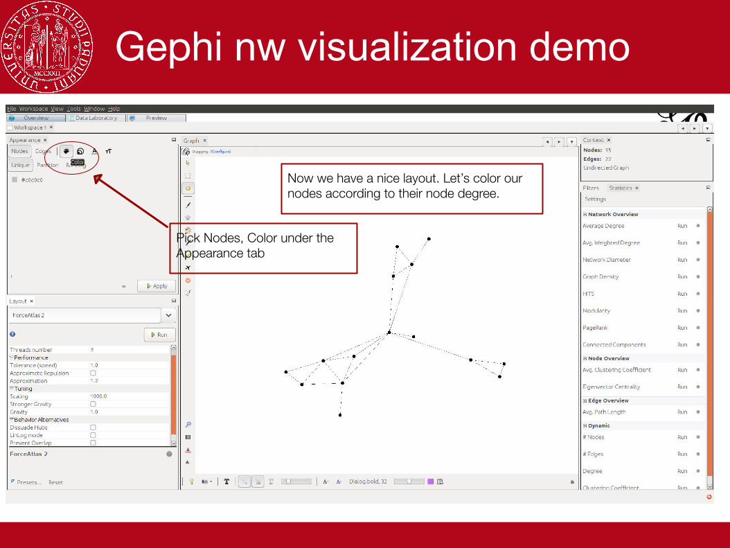
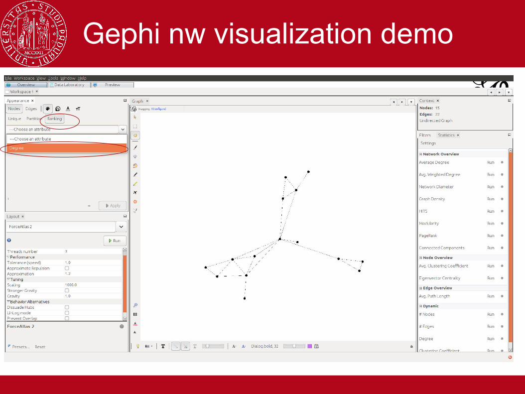
Pick Nodes, Color under the Appearance tab
Now we have a nice layout. Let’s color our nodes according to their node degree.
Gephi nw visualization demo

Gephi nw visualization demo
Pick a Default palette you like or create your own using the Color picker

Gephi nw visualization demo
Nice colors, but we can’t really appreaciate them because our nodes are too small. Let’s adjust their size so it fits their (betweenes) centrality metric!
Under Statistics - Edge Overview run the Avg. PathLength Algorithm.

Gephi nw visualization demo

Gephi nw visualization demo
Pick Nodes - Size - Ranking. From the dropdown menu of attributes choose Betweenes Centrality.

Gephi nw visualization demo
Lets display node labels.

Gephi nw visualization demo
Select Prevent Overlap and run ForceAtlas2 again, in case some of the node labels overlap.

Gephi nw visualization demo
Go to Preview tab. Pick “Default Straight Preset”. Unselect the Edge Labels - Show Labels option and click on refresh. You’ll see your graph and you can export it as an image(File - Export - SVG/PDF/PNG File)

Gephi nw visualization demo
To detect communities, we run the Statistics - Network Overview - Modularity algorithm

Gephi nw visualization demo

Gephi nw visualization demo
We can see the results in the Data Laboratory tab. We can sort them or filter by Modularity Class to inspect which nodes were assigned to which class. We can also export this table (as .csv file).

Gephi nw visualization demo

Gephi nw visualization demo
We can also color the nodes according to their community by choosing Modularity Class as the partition attribute.

Gephi nw visualization demo

Gephi nw visualization demo
Go to Preview tab. Pick “Default Straight Preset”. Unselect the Edge Labels - Show Labels option and click on refresh. You’ll see your graph and you can export it as an image(File - Export - SVG/PDF/PNG File)

Gephi nw visualization demo

Dataset generation
● edge and/or node lists in Excel● for node list, column names: Id, Label● for edge list, column names: Source, Target,
Label (optional)● save as .csv files and choose “;” as delimiter

Dataset generation

Dataset generation

Questions?