Further Development of Warnings for Automotive Lifts - Deep ...
68
UMTRI 91 -43 Further Development of Warnings for Automotive Lifts Marie Williams Paul Green Gretchen Paelke DECEMBER 1991 ,s\T' 0, * Irk + *A - As UMTRl :@I; The University of Michigan % ,,,, 0 Transportation Research Institute
-
Upload
khangminh22 -
Category
Documents
-
view
1 -
download
0
Transcript of Further Development of Warnings for Automotive Lifts - Deep ...

UMTRI 91 -43
Further Development of Warnings for Automotive Lifts
Marie Williams Paul Green
Gretchen Paelke
DECEMBER 1991
,s\T' 0, * I r k + *A - A s
UMTRl :@I; The University of Michigan % ,,,, 0
Transportation Research Institute


Tochnlal Report Documentation Page
I. ~ r n UMTRl 91 - 43
L - L ~ Y Y L ~ I ~ r -s-wk
+ ThmdQ&t&
Further Development of Warnings for Automotive Lifts
7. Almw(a):
Marie Williams, Paul Green, and Gretchen Paelke a - ~ ~ l n i n k n ~ n r r d -
The University of Michigan Transportation Research Institute 2901 Baxter Road, Ann Arbor, Michigan 481 09 - 21 50
12. s p o n u u h g A g m a y ~ m d ~
Automotive Lift Institute, lnc. P. 0. Box 1519 New York, NY 101 01 -1 51 9
15. W N o C .
& R p # c w
December 1 991 r~w(onnhg--
,rkbnaka--Wa
UMTRl 91-43
lo. wolclw~acr(rruw)
11. ConkdamlSA
, ,,-,-- Final
' ~ ~ ~ -
Copyright ownership for all warning labels in this report is hereby given to the Automotive Lift Institute
la m u :
Based on previous UMTRl research on warnings and the human factors literature, warning design guidelines were written for automotive lifts (garage hoists). They included general guidelines (2), legibility rules (6) understandability rules (1 2), and text rules (5). In addition to the rules, information was provided on the literature supporting each rule as well as comments on how the rules should be applied.
Using these guidelines, both graphics and associated text were developed for 56 new warning labels based on draft labels from Safety Management Consultants, Inc. They were for four lift types (Hinged frame-engaging, In-ground, Surface-mounted wheel-engaging, and Movable wheel-engaging). In addition, 16 warnings obtained from previous UMTRl research on two-post surface-mounted lifts were re-examined. Warnings included "Do not operate a damaged lift," "Avoid excessive rocking of vehicle while on lift," "Do not remove oil fill plug before reading manufacturer's manuals," and so forth.
17. k y W#dr
Human factors engineering, hoists, human factors, ergonomics, lifts, safety, signs, symbols, warnings
1h m & b l d a I m
Unlimited
la m a n ~ . ( o r l k l . n p a p
Unclassified -Q.wn.(dW.pg.)
Unclassified n.kdkg.r
60 22 .~1-


ACKNOWLEDGEMENTS
The warning concepts for each lift type were developed by J. Terrence Grisim of Safety Management Consultants, Inc., Elmhurst Illinois, at the request of the Automotive Lift Institute, Inc., the project sponsor.
The assistance of Mr. Grisim and the members of the Automotive Lift Institute in providing technical information and the editing of this report are gratefully acknowledged.


TABLE OF CONTENTS
ABSTRACT .. .... .. .. ...... ........ .. .. ...... .. .. .. .. . . . . . . . . . .. . . . . . . . . . . . . . . . . . . . . . . . . i
ACKNOWLEDGEMENTS ................................................................................. iii
TABLE OF CONTENTS ........................................................................................... v
INTRODUCTION ........................................................................................................... 1
AUTOMOTIVE LIFT WARNING DESIGN GUIDELINES .......................................... 4
DEVELOPMENT OF WARNING LABELS ......................................................... 10
REFERENCES .................................. ..... ...................... . .......... . ..... , ...... . ...... . .............. 43
APPENDIX A - Recommended Warning Labels Grouped by Lift Type ....................... 45 B - Vehicles and Operators Used ............................................................ . . 60

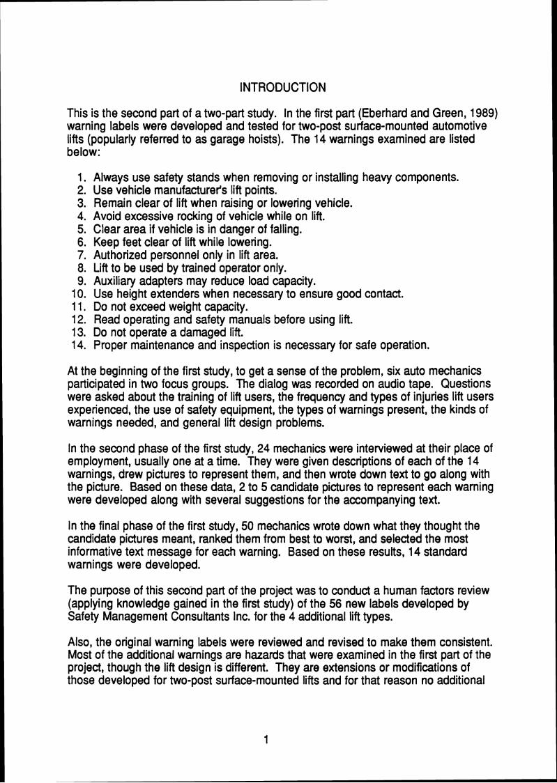
INTRODUCTION
This is the second part of a two-part study. In the first part (Eberhard and Green, 1989) warning labels were developed and tested for two-post surface-mounted automotive lifts (popularly referred to as garage hoists). The 14 warnings examined are listed below:
1. Always use safety stands when removing or installing heavy components. 2. Use vehicle manufacturer's lift points. 3. Remain clear of lift when raising or lowering vehicle. 4. Avoid excessive rocking of vehicle while on lift. 5. Clear area if vehicle is in danger of falling. 6. Keep feet clear of lift while lowering. 7. Authorized personnel only in lift area. 8. Lift to be used by trained operator only. 9. Auxiliary adapters may reduce load capacity.
10. Use height extenders when necessary to ensure good contact. 1 1. Do not exceed weight capacity. 12. Read operating and safety manuals before using lift. 13. Do not operate a damaged lift. 14. Proper maintenance and inspection is necessary for safe operation.
At the beginning of the first study, to get a sense of the problem, six auto mechanics participated in two focus groups. The dialog was recorded on audio tape. Questions were asked about the training of lift users, the frequency and types of injuries lift users experienced, the use of safety equipment, the types of warnings present, the kinds of warnings needed, and general lift design problems.
In the second phase of the first study, 24 mechanics were interviewed at their place of employment, usually one at a time. They were given descriptions of each of the 14 warnings, drew pictures to represent them, and then wrote down text to go along with the picture. Based on these data, 2 to 5 candidate pictures to represent each warning were developed along with several suggestions for the accompanying text.
In the final phase of the first study, 50 mechanics wrote down what they thought the candidate pictures meant, ranked them from best to worst, and selected the most informative text message for each warning. Based on these results, 14 standard warnings were developed.
The purpose of this second part of the project was to conduct a human factors review (applying knowledge gained in the first study) of the 56 new labels developed by Safety Management Consultants Inc. for the 4 additional lift types.
Also, the original warning labels were reviewed and revised to make them consistent. Most of the additional warnings are hazards that were examined in the first part of the project, though the lift design is different. They are extensions or modifications of those developed for two-post surface-mounted lifts and for that reason no additional
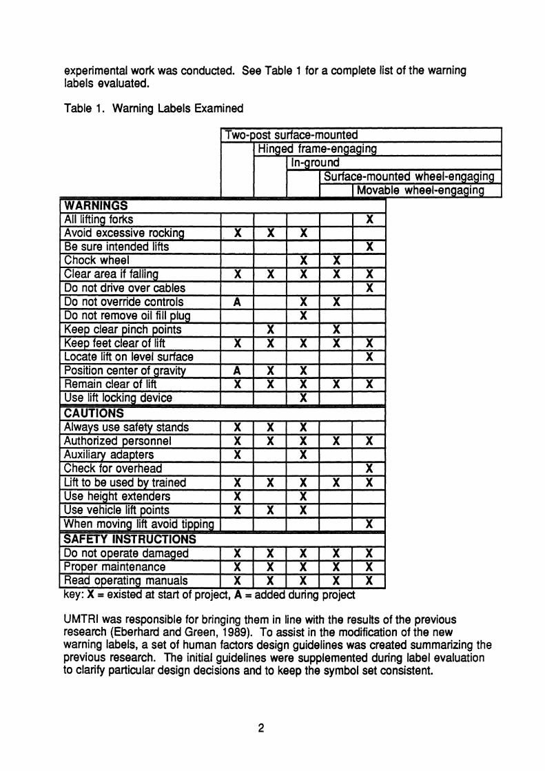
experimental work was conducted. See Table 1 for a complete list of the warning labels evaluated.
Table 1. Warning Labels Examined
I Two-post surface-mounted i Hinged frame-engaging
I In-ground
I I Surface-mounted wheel-engaging I Movable wheel-enaaaina
l WARNINGS I
Avoid excessive rocking X X X I
Be sure intended lifts I 1 x 1 - - - -~ - . - - - - - - I I I I . -
I Chock wheel I I l X l X l
[Position center of gravity I 1
I Y I
key: X = existed at start of project, A = added during project
Remain clear of lift Use lift lockina device
UMTRl was responsible for bringing them in line with the results of the previous research (Eberhard and Green, 1989). To assist in the modification of the new warning labels, a set of human factors design guidelines was created summarizing the previous research. The initial guidelines were supplemented during label evaluation to clarify particular design decisions and to keep the symbol set consistent.
X X X X
X X
The guidelines consist of a global goal, 2 general guidelines, 6 legibility rules, 12 understandability rules, and 5 rules for text. In each case comments identify exceptions, implementation procedures, and examples from the set developed. The FMC manual (FMC, 1985), a commonly cited source for warning labels, was followed as well. The extent to which the FMC manual is supported by research is unknown.
AUTOMOTIVE LIFT WARNING DESIGN GUIDELINES Global Goal:
The intent is to design warnings that can be read by lift users under actual viewing conditions and encourage users to comply with.the warnings. This implies that the warnings should be legible, discriminable, and understandable.
Implementation: Decisions about warnings should be made rationally relying primarily on specific data for lift symbols, secondarily on general human factors data, and, if both are lacking, on expert opinion.
General Guidelines for Warnings
General G u l m e 1 - Leaibilitv: Lgibilitv considerations take pra~edence over undermdabil itv (e.g., coding rules).
Comment: Images must first be perceived before they can be understood.
General Guideline 2 - Consistencv: Be consistent.
Comment: Since symbols are viewed as a language, the same graphic element should be used for all warnings for the same idea. For example, for the "run away" warning, the same human figure should be used, though re-sizing may be required for the image to fit within the space available. The graphic elements used for vehicles (car, van, pick up truck, transit bus) and lift operators are in the appendix.
The text and warning should agree. If the text says "do not," then the warning image should show what not to do, or the negative consequences of doing it.
Consistency also implies that the rules should be applied in the same manner for all warnings of a set.
Legibility Rules
b a b a d be 0.2 inches hiah or largar,
Comment: If lift operators are to follow warning messages, they must be able to read them. There is a vast body of human factors literature concerning recommended character size. The Bond Rule (Smith, 1979) is the most general and covers poor viewing conditions and less than normal (20/20) viewer visual acuity. According to the Bond Rule the height of a character divided by its viewing distance should be greater than or equal to 0.007. If the viewing distance is assumed to be 28 inches, then the height should be about 0.2 inches high (0.007 x 28 = 0.196 inches). While the actual viewing distance changes from task to task, 28 inches is assumed to be the standard panel viewing distance in the human factors literature.
Rule 2 - TuPeface: Use a -e such as to maxlmlze . .
leaibilitv. Comment: The human factors literature (e.g., Cornog and Rose, 1967) shows that within the limits of common variation, altering the typeface has less of an effect than altering size, contrast, or other physical characteristics. Plain typefaces (Helvetica, Geneva, etc.) are more legible than ornate ones (London).
e Widths: All l nes and most w s beween lines should be t 0.03 inches wide,
Comment: What people can discriminate is usually determined by critical details, the smallest features of an object, such as identifying the opening of a Landholt c, or the width of a line (Sanders and McCormick, 1987). For a maximally legible character set the height to stroke width ratio is 6:1 to 8:1. That is, the characters are 6 to 8 times taller than they are thick. For Helvetica the ratio typically is 10:l, depending on the weight of the implementation (light vs. medium vs. bold). Therefore, lines should be 1/10 the height of characters or 0.02 inches wide at a minimum. Objects less than this critical size may be difficult to distinguish from the background. In the case of gaps, images blending may not be critical (for example, the image of the car merging with the lift supporting it).
tv Rule 4 - Plan Views: Avoid-lve illustration& . .
Comment: The Pictorial Catalog in the FMC Manual does not contain any perspective drawings. This is probably because perspectives take up more space than projections in a single view (so details must be smaller to fit the drawing in a fixed size area). Details are thus harder to see. Also, the single bit representation (no grey scale) makes it harder to show depth, which is critical to understanding a perspective image.
. . ne details are cnt~cal to an ~maae. thev should be 4 .
exaaaerated. Comment: It is important to think of the graphics as caricatures rather than pictures and hence key elements should be given emphasis. For example, the pipes on the self-closing controls warning are not identifiable if the pipe flanges are drawn to scale.
~litv Rule 6 - Discriminabiw: Make sure that obiects are discriminable,
Comment: People may not respond to a message as desired if they mistake one object for another. For example, the lift operator is shown wearing a cap so he or she looks different from a customer or other non-operators.

Understandability Rules
ity Rule 1 - Lift Views: Except for the lift point wamina. use side views Q u k
Comment: In Eberhard and Green (1 989), lift users were far more likely to draw side views (elevations) of warning scenarios, and preferred candidates showing side views over front views. The only exception was the pickup point warning where a bottom view was preferred.
Rule 7 - Slashiu Use m m m u n & e "do not."
To keep the text and graphic compatible (a general rule) use slashes as shown below. if only part of the image is wrong, then circle the problem area and put a slash through it. Sometimes deciding if an image communicates a negative idea can be a judgement call. For example, for the rocking message, it is not clear if rocking or excessive rocking (the warning) is being shown. Since some rocking is common and useful, a slash was not used.
Where slashing is concerned, the graphic standing alone is most important. The text should be tailored to match the graphic as indicated in the following three steps:
1. Design the graphic so it can function alone. 2. Look at the graphic, what does it say? 3. Make the wording consistent with the graphic.
Text Says Do not Do , (keep clear, avoid, etc.)
Finally, there is a tendency for antecedents of problems to warrant slashes, but not consequences of problems. If the slash obscures a key part of the image, break the slash, re-size it, or move it as stipulated by General Guideline # I (Legibility over understandability). (See Dewar, 1976.)
When the consequences are shown and they are blatant (hand or foot crush), a slash may not be required. If the graphic shows both a negative antecedent and a consequence, such as for the oil fill plug warning (the impact wrench is the antecedent while the flying oil plug is the consequence) the slashing rules for the antecedent apply. Radiating lines (for collisions) are an indicator of consequences and draw attention to that part of the graphic.
Graphic Shows
Of the rules in the set, this is the most complex and open for interpretation. While the authors have tried to consider all of the exceptions, others may still exist.
What to do no slash no slash
What not to do slash slash

Y n d e ~ ~ i l l h r Rule 3 - Arrows: Use arrows and circles to direct m a o n to kev details.
Comment: In some cases a large area must be presented to provide context so that a detail (often the focus of the warning) can be understood. To avoid overlooking the detail, point to it. There are no data linking the size of a detail to performance (warning compliance, the time to match a graphic with text, etc.) but the authors believe directing attention to details is beneficial.
Unders- Rule 4 - Arrow Proliferation: Where arrows or circles are used t~ 11s. there should be no more than four,
Comment: There is no data to support this, but in exploring variations of the lift point warning, it became clear that adding too many arrows made the drawing more complex and more difficult to understand. It is not clear if the maximum should be three or four.
Unde--on: Use a r r o w w linear or circular motion, nes to show sh
Comment: Information on depicting continuous motion appears in Easterby's research (Easterby, 1966). The convention recommended here is widely followed but difficult to document. In brief, arrows should be thin to emphasize directionality but wide enough so they can be seen. They also tend to be oriented vertically or horizontally. Short curved lines indicate where the corner of an unstable object was and usually appear near points with the greatest velocity.
Understandabllitv Rule 6 - Vehicle Tv~e : Where a ~roblem could occur with multi~le . a . vemes. show the veh~cle for whlch ~t IS m u l v to occur,
Comment: There are no data to support this rule, only opinion. For example, if a problem for a particular lift is mostly with buses, then it makes sense to show a bus, not a generic large vehicle. If shown generically, then the common warning may be missed. A drawback of this rule is that users may not generalize the warning.
U n d e r ~ n d a b ~ ~ u l e 7 - Arrow Dlscriminabilitv: Make arrows for motion nable from those used for hla- a , .
-
Explanation: Arrows to highlight should have shorter and fatter heads and shafts. The authors' opinion is that the motion arrowheads should be as thin as possible and the highlighting arrows as fat as possible and still retain their identity. Based on opinion, relative shaft widths of at least 2:1 have been used in this set to assure discriminability.
Exception: If there is no room for a long arrow, make it short. The general rule is legibility takes precedence over understandability.

Understan-v Rule 8 - Causation: When arrows s h o w i o n . the imam be left to n o and t p ~ to bottom
Comment: This is so that the logical flow matches the reading pattern. The image instructing operators to run away if a car starts to fall was constructed accordingly.
Understandability Rule 9 - Postures: Rodv posues of pe-d e w z e the motions likelv to occur,
Comment: In the oil plug warning, the head position is exaggerated to show the plug impact. In early versions of the unauthorized users warning, the graphic was misinterpreted as "no dancing under lift," because of the arm positions of the unauthorized persons beneath the lift (Eberhard and Green, 1989).
Understandabilitv Rule 10 - Personnel Deoiction: Dlst~nw . . ish the lift ogerator from
other ~ersonnel,
Comment: Some efforts were made by participants in the first experiment of this project (Eberhard and Green, 1989) to distinguish between lift operators and visitors. A hat with an enlarged bill and sometimes a badge is used to identify a person as the lift operator. That image should be consistently applied to all graphics (following General Rule #2, be consistent).
Understandabilitv Rule 11 - Deoth: Show d e ~ t h via front to b& su~emos~tron and . .
Comment: In the illustration that follows, A is in front of B. The superposition issue first arose in the design of the safety stands graphic, in particular depicting that the car was between the vertical members.
Understandabilitv Rule 12 - Impact . . : Show i m m using r a d ~ w lines from the point gr ~o ints of con&&
Comment: There should be at least three lines to avoid confusion with the field of view graphic (two lines). Ways of depicting impact were explored by Eberhard and Green (1 989) for the foot protection warning.

Text Rules
Text Rule 1 - Verbiaae: Use verbiae people prefer,
Example: Eberhard and Green (1989) found people preferred the term safety stands over jack stands.
Text Rule 2 - Messaae Lenatkk-es shPd,
Comment: The more complex the expression, the less likely people are to understand it. While the readability literature (Klare, 1963; Williams and Siegel, 1974) emphasizes multiple sentence passages, this point should also hold for simple statements.
Text Bule 3 - P h r m : Rreak lines of text acrQSSphrase boundaries,
Comment: Splitting lines this way means that readers will not have to regroup them in their head and they will be easier to read (Green and Baker, 1987; Hartley, 1980; Hartley and Trueman, 1981). Grammatically this means keeping adjectives on the same lines as associated nouns, adverbs with verbs, and, where possible, not splitting prepositional phrases.
Example:
Keep clear of pinch Should be: Keep clear points when lift is of pinch points moving. when lift is moving.
Text Rule 4 - C-d Fm~hasis): Cadtalize words. and then onlv _a )<ev word or word#& if the messaae represents an extremellr hazardous situation.
Comment: Text in upper case is more difficult to read than mixed case text and excessive use of upper case will make it less likely, rather than more likely that the message will be communicated.
5 - CapjfaULBfion !Verbositvl: C - a . . word or words if t b
comment: For long messages it is easy for a key word to be lost. For example, in the case of the oil fill plug message shown below, the key words "Do not," could be forgotten when the end of message is read. This case is worsened by space constraints not allowing proper line breaking. Also since the message is long, it may not be read as carefully, and the basic idea needs to be communicated.
Example: DO NOT remove oil fill plug before reading manufacturer's manuals.

DEVELOPMENT OF WARNING LABELS
This section describes, in alphabetical order, the recommended warning labels. Associated with each warning are the original graphic and text (from the previous UMTRl study or suggested by Safety Management Consultants, lnc.) and the recommended version. Along with each pair of labels, or set of pairs, is a paragraph describing the changes made, and the reasons and guidelines supporting the changes. The associated lift type (two-post surface-mounted, in-ground, hinged frame-engaging, surface-mounted wheel-engaging, and moveable wheel-engaging) is shown above the label pairs.
Global changes made to all labels include: (1) lines and pertinent gaps were made a minimum of 0.027 inches wide, (2) car, truck, van, and bus graphics were replaced with consistent graphics (shown in the Appendix), (3) hats were put on all operators. The labels produced in the previous study are included in this section and have been updated to be consistent with the new design guidelines.
The warning labels include:
All lifting forks must properly engage vehicle tires or supports. Always use safety stands when removing or installing heavy components. Authorized personnel only in lift area. Auxiliary adapters may reduce load capacity. Avoid excessive rocking of vehicle while on lift. Be sure intended lifts are moving together evenly. Check for overhead obstructions before raising vehicle. Chock wheel to prevent vehicle movement. Clear area if vehicle is in danger of falling. Do not drive over or pinch electrical cables. Do not operate a damaged lift. Do not override self-closing lift controls. Do not remove oil fill plug before reading manufacturer's manuals.
* Keep clear of pinch points when lift is moving. Keep feet clear of lift while lowering. Lift to be used by trained operator only. Locate lift on firm, level surface, preferably concrete. Position vehicle center of gravity over lift. Position vehicle with center of gravity midway between adapters. Proper maintenance and inspection is necessaty for safe operation. Read operating and safety manuals before using lift. Remain clear of lift when raising or lowering vehicle. Use height extenders when necessary to ensure good contact.
* Use lift locking device or 4 stands to support vehicle. Use vehicle manufacturer's lift points. When moving lift, be careful to avoid tipping.
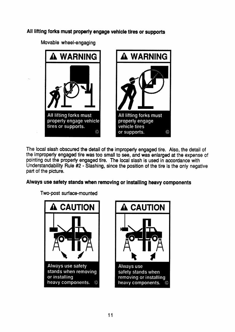
All lifting forks must properly engage vehicle tires or supports
Movable wheel-engaging
I A WARNING I
The local slash obscured the detail of the improperly engaged tire. Also, the detail of the improperly engaged tire was too small to see, and was enlarged at the expense of pointing out the properly engaged tire. The local slash is used in accordance with Understandability Rule #2 - Slashing, since the position of the tire is the only negative part of the picture.
Always use safety stands when removing or installing heavy components
Two-post surface-mounted
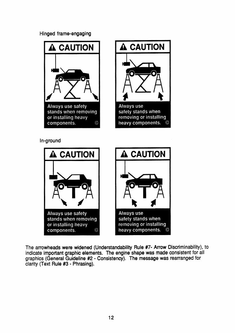
Hinged frame-engaging
The arrowheads were widened (Understandability Rule #7- Arrow Discriminability), to indicate important graphic elements. The engine shape was made consistent for all graphics (General Guideline #2 - Consistency). The message was rearranged for clarity (Text Rule #3 - Phrasing).
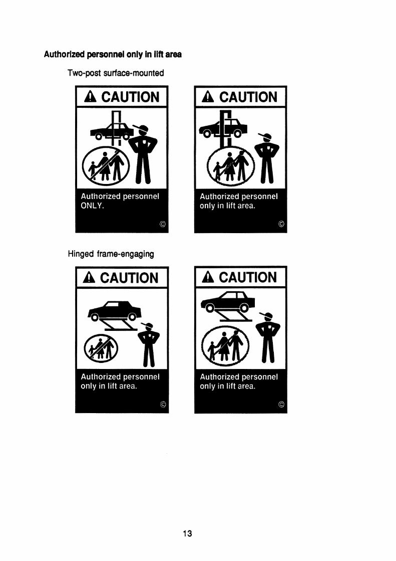
Authorized personnel only in lift area
Two-post surface-mounted
Hinged frame-engaging
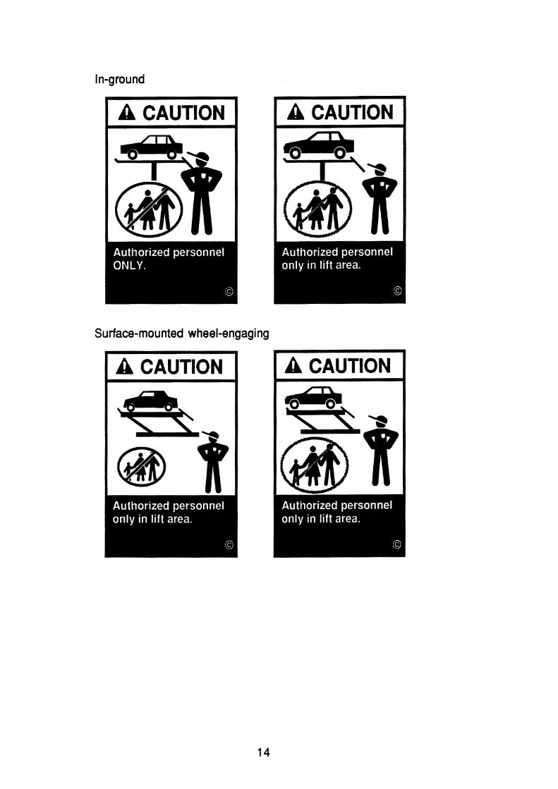
Surface-mounted wheel-engaging

Movable wheel-engaging
The graphic of the slashed family was made large enough to distinguish. The graphic space available was filled more in accordance with FMC Cropping Instruction #l.
Auxiliary adapters may reduce load capacity
Two-post surf ace-mounted

The arrows highlighting the adapter are now wide (Understandability Rule #7 - Arrow Discriminability). The auxiliary adapters now have ramps and chocks. The lifts are more obviously deforming, indicating consequences. No slash is needed since the picture indicates consequences (Understandability Rule #2 - Slashing). The text line breaks were rearranged for clality (Text Rule #3 - Phrasing).
Avoid excessive rocking of vehicle while on lift
Two-post surface-mounted
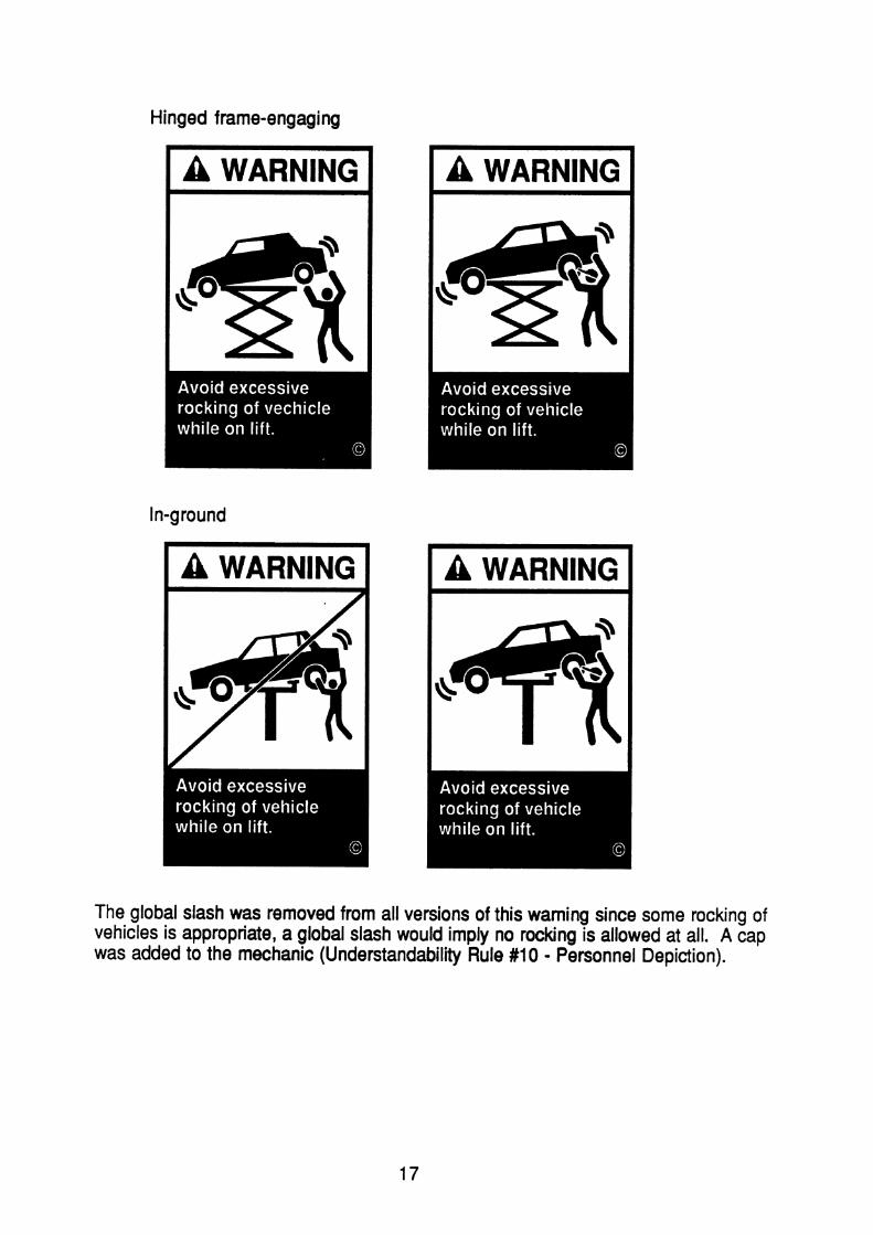
Hinged frame-engaging
I A WARNING I
The global slash was removed from all versions of this warning since some rocking of vehicles is appropriate, a global slash would imply no rocking is allowed at all. A cap was added to the mechanic (Understandability Rule #I 0 - Personnel Depiction).
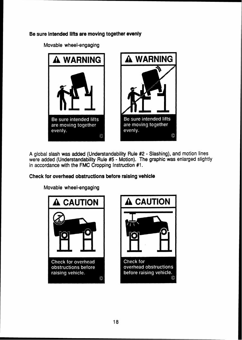
Be sure intended lifts are moving together evenly
Movable wheel-engaging
A global slash was added (Understandability Rule #2 - Slashing), and motion lines were added (Understandability Rule #5 - Motion). The graphic was enlarged slightly in accordance with the FMC Cropping Instruction #I.
Check for overhead obstructions before raising vehicle
Movable wheel-engaging

This graphic matches the one on the "Keep feet clear of lift while lowering" label. The graphic depicts consequences and does not warrant a slash (Understandability Rule #2 - Slashing). The ceiling was added for clarity of the " I " beam.
Chock wheel to prevent vehicle movement
In-ground Surface-mounted wheel-engaging
The arrows were widened (Understandability Rule #7 - Arrow Discriminability), and the ramp and truck roof were thickened (Legibility Rule #3 - tine Widths). The text line breaks were changed for clarity (Text Rule #3 - Phrasing).
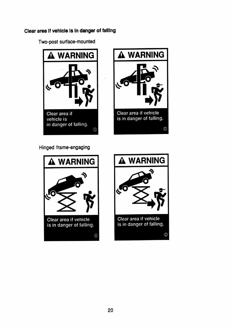
Clear area if vehicle is in danger of falling
Two-post surface-mounted
Hinged frame-engaging
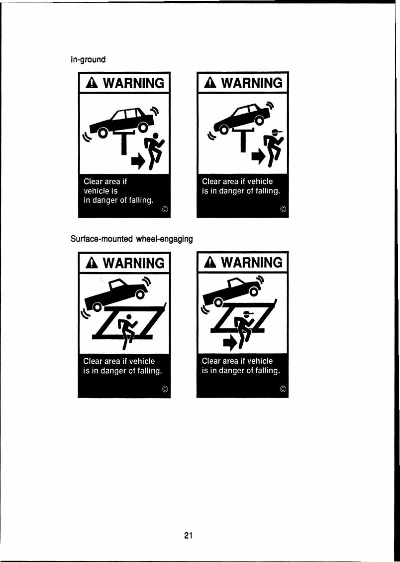
Surface-mounted wheel-engaging
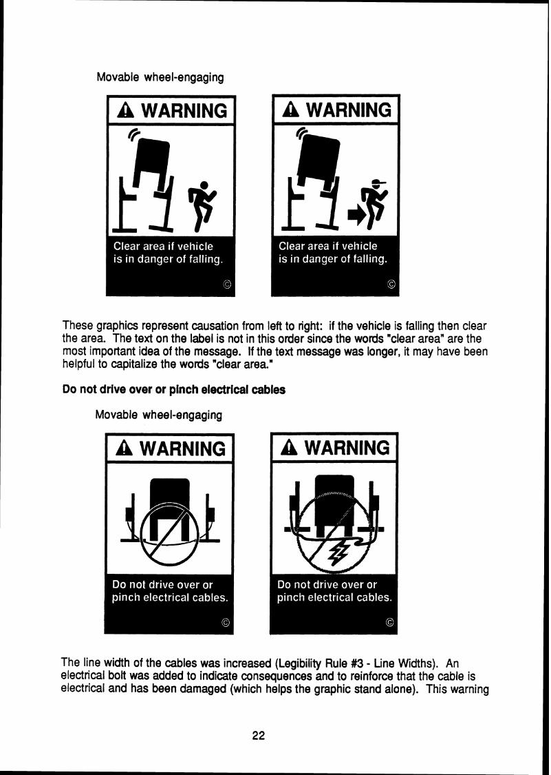
Movable wheel-engaging
These graphics represent causation from left to right: if the vehicle is falling then clear the area. The text on the label is not in this order since the words "clear area" are the most important idea of the message. If the text message was longer, it may have been helpful to capitalize the words "clear area."
Do not drive over or pinch electrical cables
Movable wheel-engaging
The line width of the cables was increased (Legibility Rule #3 - Line Widths). An electrical bolt was added to indicate consequences and to reinforce that the cable is electrical and has been damaged (which helps the graphic stand alone). This warning
is similar to "Do not remove oil fill plug before reading manufacturer's manuals" in that it depicts consequences and antecedents. The antecedent in this case is the vehicle driving over the cable.
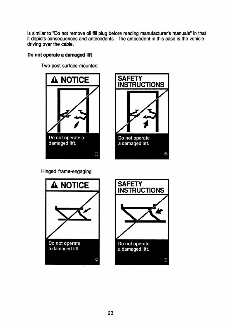
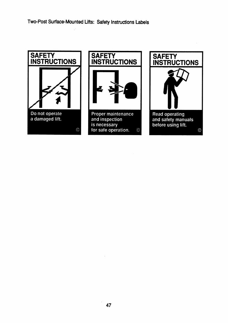
Do not operate a damaged lift
Two-post surface-mounted
I A NOTICE I I SAFETY 1 INSTRUCTIONS
Hinged frame-engaging
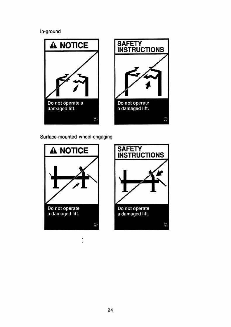
Surface-mounted wheel-engaging
I A NOTICE I

Movable wheel-engaging
The label type was changed to "Safety Instructions" for consistency with FMC label types. The lifts in this set were enlarged for clarity and the arrows were widened (Understandability Rule #7 - Arrow Discriminability). The damage on the movable wheel-engaging was altered to make it more likely. The label type was changed for consistency with FMC label types.
Do not override self-closing lift controls
Two-post surface-mounted

Surface-mounted wheel-engaging
On the in-ground lift warning, only half of the car and lift are shown to decrease the complexity of the image without losing the context. The local slash was enlarged to keep the slash from obscuring the details of the controls and to make it consistent with the surface-mounted wheel-engaging warning.
The wrenches in all graphics were enlarged to increase their legibility.

Do not remove oil fill plug before reading manufacturer's manuals
I A WARNING I
The fill plug was made non-perspective, (Legibility Rule #4 - Plan View), was given more.motion, and was made to do damage. The perspective of the floor detail was shifted to a less complex flat view. The slash is localized on the impact wrench since that is part of the causation, while the rest of the graphic depicts consequences (Understandability Rule #2 - Slashing). The leg detail was modified to clarify the body position (Understandability Rule #11 - Depth). "Do not" was changed to all caps to emphasize compliance with the warning (Text Rules #4 and #5).

Keep clear of pinch points when lift is moving
Hinged frame-engaging Surface-mounted wheel-engaging
I A WARNING I
The graphic was enlarged to show the detail of the pinching action, along with impact lines (Understandability Rule #12 - Impact), which makes this warning consistent with the "Keep feet clear of lift while lowering" warning. The text line breaks were changed for clarity (Text Rule #3 - Phrasing).

Keep feet clear of lift while lowering
Two-post surface-mounted Hinged frame-engaging In-ground Surface-mounted wheel-engaging Movable wheel-engaging
The label was changed from caution to warning since it represents severe injury and for consistency with the "Keep clear of pinch points when lift is moving" label. The lowering lift was made generic for use with all lift types.
Lift to be used by trained operator only
Two-post surface-mounted

Hinged frame-engaging

Surface-mounted wheel-engaging
Movable wheel-engaging
The confused operator was slashed to match the text message, (Understandability Rule #2 - Slashing). The word "only" was made lower case to eliminate undue emphasis (Text Rules #4 and #5 - Capitalization).

Locate lift on firm, level surface, preferably concrete
Movable wheel-engaging
The lift base was enlarged to better show the detail of the uneven ground causing the tipping, and to help keep the slash from obscuring the detail.
Position vehicle center of gravity over lift
Two-post surface-mounted

Hinged frame-engaging
The van was tilted toward the engine to represent the more likely center of gravity point of an unloaded van. The center of gravity symbol was enlarged to improve legibility. The text on the two-post surface-mount and the hinged frame-engaging was modified for clarity in consultation with J. Terrence Grisim of Safety Management Consultants, Inc.

Proper maintenance and inspection is necessary for safe operation
Two-post surface-mounted
Hinged frame-engaging
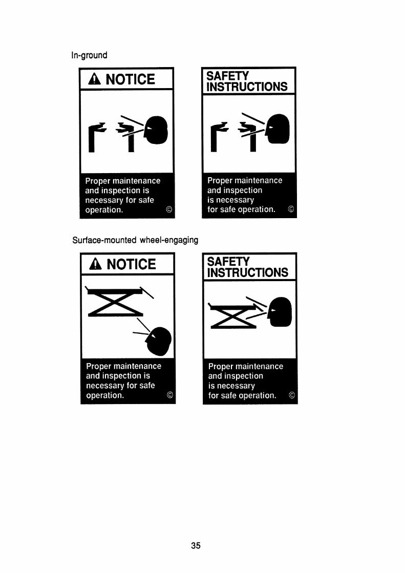
Surface-mounted wheel-engaging

Movable wheel-engaging
The label type was changed for consistency with FMC label types. The head was modified to match the FMC profile head. The text line breaks were changed to enhance readability (Text Rule #3 - Phrasing).
Read operating and safety manuals before using lift
Two-post surface-mounted Hinged frame-engaging In-ground Surface-mounted wheel-engaging Movable wheel-engaging
The label type was changed for consistency with FMC label types.
36

Remain clear of lift when raising or lowering vehicle
Two-post surface-mounted
Hinged frame-engaging
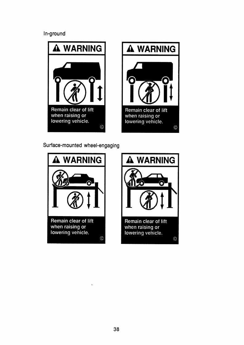
Surface-mounted wheel-engaging

Movable wheel-engaging
Hats were put on all operators for consistency with the label set (Understandability Rule #I 0 - Personnel Depiction). The slashed operator was made straight-legged and the position under the lift made consistent for all labels.
Use height extenders when necessary to ensure good contact
Two-post surface-mounted
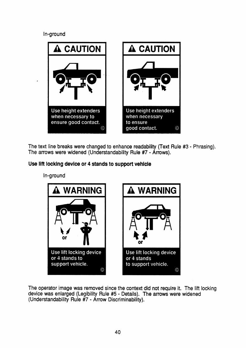
The text line breaks were changed to enhance readability (Text Rule #3 - Phrasing). The arrows were widened (Understandability Rule #7 - Arrows).
Use lift locking device or 4 stands to support vehicle
In-ground
The operator image was removed since the context did not require it. The lift locking device was enlarged (Legibility Rule #5 - Details). The arrows were widened (Understandability Rule #7 - Arrow Discriminability).
40

Use vehicle manufacturer's lift points
Two-post surface-mounted Hinged frame-engaging In-ground
One label is now used for all applicable lift types. Changes made were made by ALI graphic artist to be consistent with the forthcoming SAE Recommended Practice J2184 for lift points.
When moving lift, be careful to avoid tipping
Movable wheel-engaging
The radiating lines were replaced with teetering motion lines (Understandability Rule #5 - Motion and General Guideline #2 - Consistency). The bump was changed to a hole, a more likely hazard, and was moved to the front wheels which depicts the initial shaking of the lift. A localized slash was added to indicate which part of the picture is incorrect (Understandability Rule #2 - Slashing). This makes this label consistent with the warning for "Locate lift on firm, level surface, preferably concrete." Slashing the whole picture would imply that pulling the lift around was incorrect.

REFERENCES
Cornog, D.Y. and Rose, F.C. (1967). W r l l t v of Alphanumeric C h m e r s and Other . .. Svmbols I I. A Reference Hadbook (Miscellaneous Publication 262-2). Washington, D.C.: National Bureau of Standards.
Dewar, R.E. (1 976). The Slash Obscures the Symbol on Prohibitive Traffic Signs, Human Factors, June, u ( 3 ) , 253-258.
Easterby, R.S. (1 966). An F v a m of the m r s h m d a r d Symbols for Machine Tool . .
or Plates (Research Report lo), Hurdsfield, Macclesfield, Cheshire, UK: Machine Tool Industry Research Association.
Eberhard, J. and Green, P. (1989). The Development and Testina of Warninas for Automotive biftS (Technical Report 89-26), Ann Arbor, MI: University of Michigan Transportation Research Institute, October.
FMC Corporation (1 985). Product Safetv Sian and I abel Svsteq, Santa Clara, CA: FMC Corporation.
Green, P. and Baker, D. (1987). Page Format and User Understanding of Command Language Computer Manuals. In Mark, L.S., Warm, J.S., and Huston, R.L. (eds.),
and Human Factors, New York: Springer-Verlag, 259-265.
Hartley, J. (1 980). Spatial Cues in Text, Visible Lanauaga, u ( 1 ) , 62-79.
Hartley, J. and Trueman, M. (1981). The Effects of Changes in Layout and Changes in Wording on Preferences for Instructional Text, m l e 1 a m , . .
x ( 1 ), 1 3-31 .
Klare, G.R. (1963). The Measurement of Readability, Ames, IA: Iowa State University Press.
Sanders, M.S and McCormick,. E.J. (1987). 9 aesian (6th ed.), New York: McGraw-Hill.
Smith, S.L. (1 979). Letter Size and Legibility, Human Fact-, December, a ( 6 ) , 57-64.
Williams, A.R., Jr. and Siegel, A.I. (1 974). Peadabilitv of Textual Material - A Survev of L i t e w (Technical report AFHRL-TR-74-29), Brooks Air Force Base, TX: U.S. Air
Force Systems Command, Air Force Human Resources Laboratory.


Appendix A - Two-Post Surface-Mounted Lifts: Warning Labels
I A WARNING I

Two-Post Surface-Mounted Lifts: Caution Labels
1 A CAUTION I
Two-Post Surface-Mounted Lifts: Safety Instructions Labels
1 SAFETY I SAFETY I I INSTRUCTIONS I

Hinged Frame-Engaging Lifts: Warning Labels
I A WARNING I
I A WARNING I
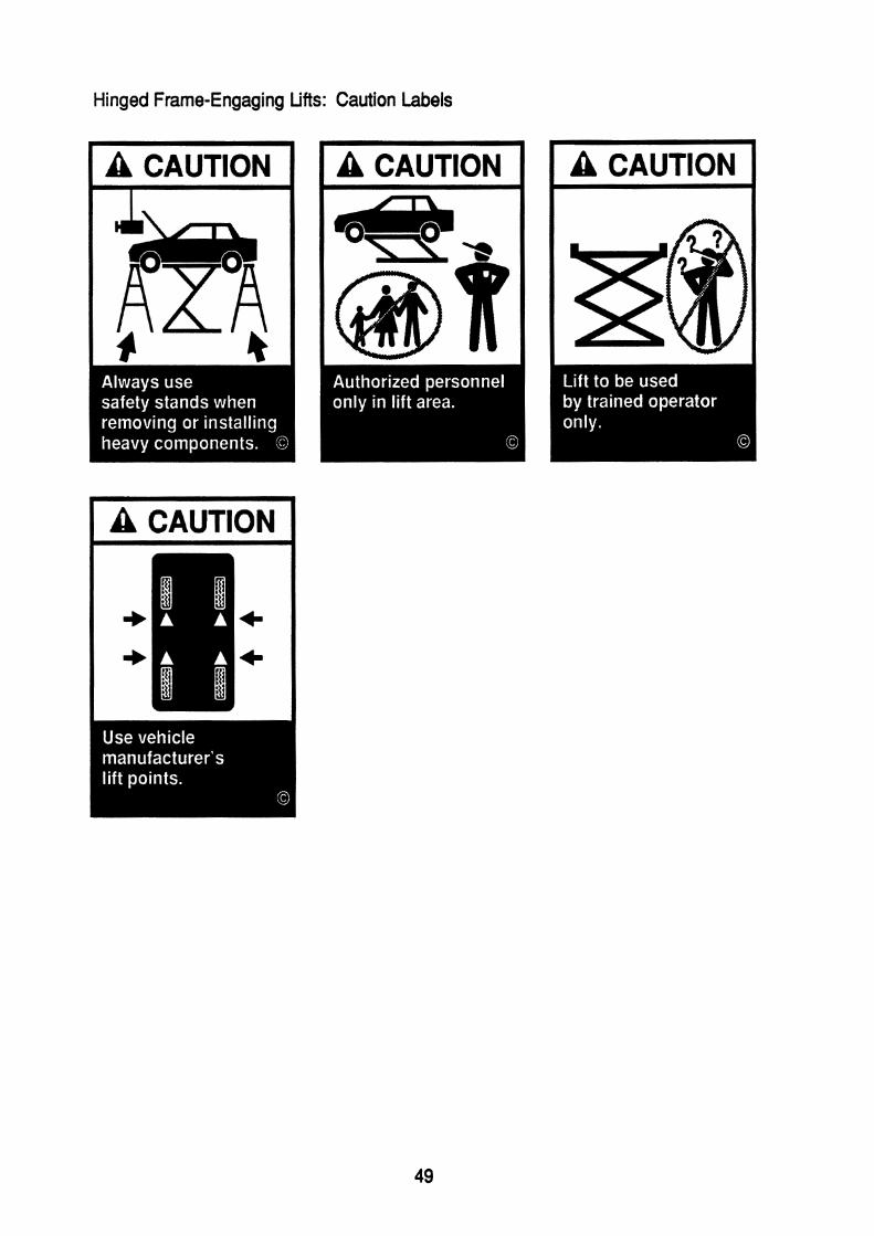
Hinged Frame-Engaging Lifts: Caution Labels

Hinged Frame-Engaging Lifts: Safety Instructions Labels
SAFETY

In-Ground Lifts: Warning Labels
I A WARNING I
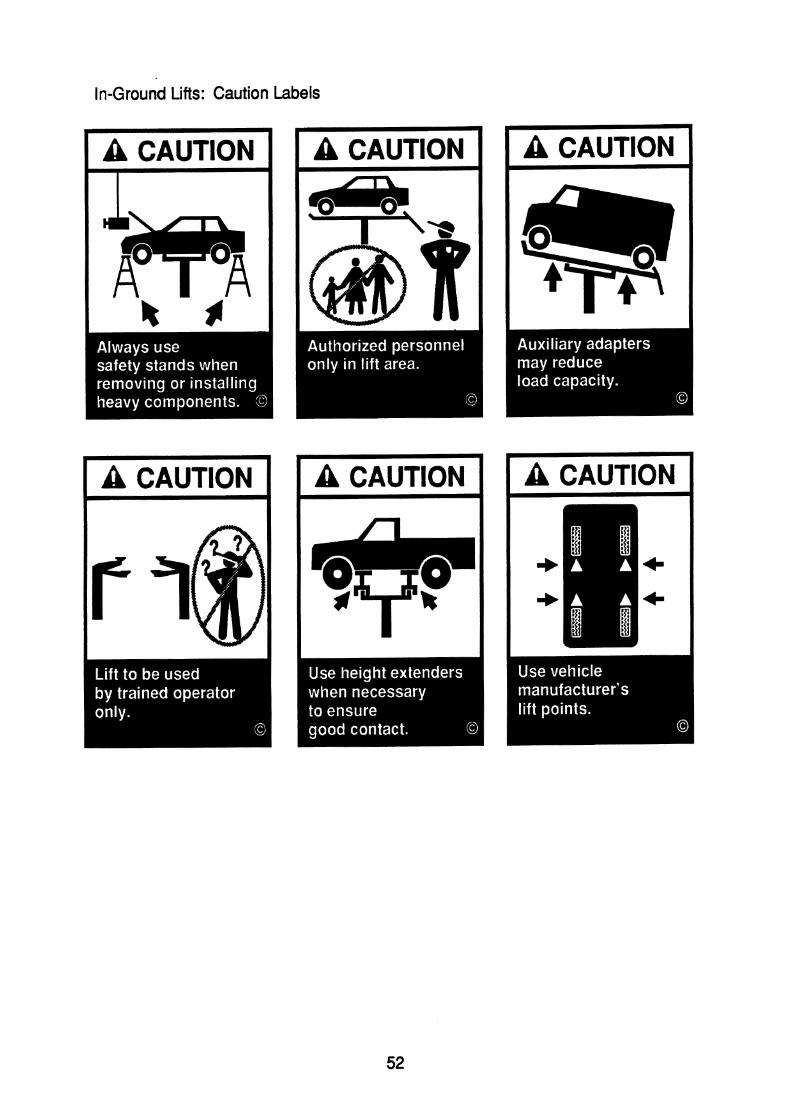
In-Ground Lifts: Caution Labels
I A CAUTION I
I A CAUTION 1

In-Ground Lifts: Safety Instructions Labels
I SAFEN 1 I SAFEN I I INSTRUCTIONS 1

Surface-Mounted Wheel-Engaging Lifts: Warning Labels
A WARNING I I A WARNING I I A WARNING I

Surface-Mounted Wheel-Engaging Lifts: Caution Labels
1 A CAUTION 1

Surface-Mounted Wheel-Engaging Lifts: Safety Instructions Labels
SAFETY INSTRUCTIONS
SAFETY INSTRUCTIONS

Movable Wheel-Engaging Lifts: Warning Labels

Movable Wheel-Engaging Lifts: Caution Labels

Movable Wheel-Engaging Lifts: Safety Instructions Labels
INSTRUCTIONS I SAFETY INSTRUCTIONS

Appendix B - Vehicles and Operators Used