Heuristic Evaluation Checklist for Domain-specific Languages
1
From Web 1.0 to Web 2.0 and beyond: Reviewing usability heuristic criteria taking music
sites as case studies
Ganesh Viswanathan Punit Dutt Mathur Pradeep Yammiyavar Indian Institute of Technology Guwahati Indian Institute of Technology Guwahati Indian Institute of Technology Guwahati
Guwahati-781039 Guwahati-781039 Guwahati-781039 [email protected] [email protected] [email protected]
Abstract. The simple sites of the past web environment (termed as web 1.0) have given way to complex sites with confusing content in today’s Web 2.0 environment. Usability issues surrounding Web 2.0 emphasize simplifying content on the GUIs, which need to be presented as infotainment – a combination of information and entertainment. Web 3.0 is already emerging on the horizon. The massive amount of user-generated content on Web 3.0 needs to be continuously and dynamically organized. Designers are still using heuristics of Web 1.0 to cope with the requirements of complex Web 3.0 environments. Questions arise as to whether Nielsen’s original set of heuristics continue to be valid for Web 2.0 environments. Web 2.0 category sites like YouTube are found to obey only two of the ten Nielsen heuristics but yet continue to be one of the most popular websites in the world today [1]. What possibly can explain this is the starting point of this paper’s posit. This paper makes an attempt to examine the relevance of Web 1.0 heuristics in the Web 2.0 environment, in the context of Indian users of music sharing sites. The bottom of the pyramid paradigm can be used to explain the user behavior of the large mass of Indian users [9]. This paper also attempts to project what kind of heuristics are likely to evolve for Web 3.0 environment based on the analysis of qualitative user behavior data collected on a music website.
Keywords: heuristic evaluation, web 2.0, cultural context, usability testing, music sites
1. INTRODUCTION
The first websites of the World Wide Web (labelled today as Web 1.0 environment) were a platform where the privilege of creating content rested with a chosen set of people related to the website creation. Hence, the structure of the websites in Web 1.0 was unilateral and inflexible with homogenous information. The information framework of Web 1.0 sites was simple and user‟s involvement in terms of interaction was highly restricted [16]. Web 1 and Web 2 are labels indicating different generations of sites depending upon the evolution of the technologies used. However, in the current scenario of what is termed as Web 2.0, the information is no longer homogenous in terms of whose point of view (users or producers) has been represented. Users have been empowered with the right to create content and publish it on the web, all by themselves. Therefore the framework of web 2.0 has extended the user‟s role as a creator and editor of content besides being a consumer of the content. Websites made in the Web 2.0 environment turned out to be quite complex with additional features, compared to those made in Web 1.0 resulting in usability
problems. These features fulfilled user needs such as collective intelligence, collaborated work, learning and community behaviour as well as social interactions. In addition to these features, the set of people who could generate and publish content is no longer fixed. This set is dynamic and is heterogeneous in space (parsing through different cultures) and time (moving through technological advances and new user needs). Social networking sites which are a significant part of web 2.0 encourage social interaction by emphasizing connections through shared interests or causes such as music which is a widely accessed product among users worldwide. YouTube [10] that allows users to store and share personal videos, subsequently, linked, searched and/or rated by other users. YouTube is quite popular among users worldwide and it is consistently high in popular website rankings by country [6]. Other examples of Web 2.0 sites interspersed with music include MySpace [11] and Muziboo [12]. MySpace is a social networking site with an emphasis on popular culture and music and Muziboo which is a platform for up-and-coming musicians who could publish the music
Viswanathan • Dutt Mathur • Yammiyavar
2
that they compose and receive feedback from other users. When creating web sites, as with any software product, it is important to ensure that a high level of usability is attained. If sites are not usable, users will leave and find others which better cater to their needs [5]. As a result, effective evaluation criteria are required to determine the usability of web sites. One of the most used techniques is termed as „heuristic evaluations based on criteria developed by Jakob Nielsen [4]. Despite many sets of heuristics used by designers all over the world, Nielsen‟s heuristics are discussed most often, so for the purpose of this paper, only Nielsen‟s heuristics are considered. [14] Heuristic Evaluation is a popular usability technique which is used to inspect websites through focus on user needs, user trends and how websites could be better tailored to meet these needs. Despite, the nature of user data being second-hand in Heuristic Evaluation, the method is effective in highlighting key issues which have obvious remedies [15]. The empirical study of user data in this paper revolves around young music listeners in India who constitute a great number of users of websites like YouTube, MySpace and Muziboo. It is important to know that in our study we have focused on the evaluation and design of a similar website of an existing company, ABC (name altered to protect commercial interests). Towards the end, we have speculated possible usability evaluation heuristics based on user interaction patterns which could help web design in the future web 3 environments. We consider this paper to be the beginning of an understanding of trend variation from Web 1.0, to 2.0 and beyond and that concerning web usability evaluation and inspection methods over this variation.
2. WEB 1.0 AND WEB 2.0
2.1 Definitions: a) Web 1.0: Web 1.0 environment or the initial World Wide Web environment was where the web was an information portal and content was owned by a few people. The whole of the World Wide Web was divided into linked directories. Web 1.0 was all about read only content and static HTML sites. This period was dominated by the likes of Geocities (one of the oldest web-hosting service) and Hotmail (one of the first web-based email services). [3] b) Web 2.0: The change in the framework of the Web 1.0 environment brought in what is called as the Web 2.0 environment which was about user-generated content and the read-write web. Web 2.0 also followed a loose form of user-generated classification in the form of “tags”. Web 2.0 not only involved the user, but also had the intelligence to adapt and adjust to the
user‟s needs, requirements and depth of involvement. It had built-in features that fulfilled deeper needs such as collective intelligence, collaborated work, learning and community behaviour as well as social interactions. The difference can be understood from table 1 which is adapted from [3] 2.2 Features of Web 1.0: Typical web design elements of that initial phase of Web 1.0 can be listed as follows:
Static pages instead of dynamic user content
The use of framesets (feature of web 1.0 where content can be organised in frames)
Proprietary HTML extensions such as the <blink> and <marquee> tags introduced during the first browser war in 1995 between Netscape Navigator and Microsoft Internet Explorer [7].
Online guest books (feature of web 1.0 where a logging system allows visitors of a website to leave a public comment.)
GIF buttons, typically 88x31 pixels in size [7] promoting web browsers and other products.
HTML forms sent via email. A user would fill in a form, and upon clicking submit their email client would attempt to send an email containing the form‟s details.
Being static pages in which users have no control over the content of the website, unless they are the authors of the website themselves, Web 1.0 trends included worries over privacy concerns resulting in a one-way flow of information.
Table 1: Comparing Web 1.0 and Web 2.0[3]
Web 1.0 Web 2.0
“the mostly read-only web”
“read and write web”
focused on companies focused on communities
homepages/purchased websites
Blogs
owning content sharing content
HTML, portals XML, RSS
Netscape Google
Web forms Web applications
Directories (defined taxonomy)
Tagging (user-generated folksonomy)
Web was an information portal
Web is a platform for users to create
2.3 Features of Web 2.0: The leap from Web 1.0 to Web 2.0 is not only characterised by redefining the users‟ role on the World Wide Web, but also involved a technological improvement. These technological refinements included such adaptations as “broadband, improved browsers, and AJAX, to the rise of Flash
From Web 1.0 to Web 2.0 and beyond: Reviewing usability heuristic criteria taking music sites as case studies
3
application platforms and the mass development of widgetization, such as Flickr and YouTube badges”. Use of technological features like AJAX and Flash players has given rise to popular websites like Google Maps and YouTube [17]. Flash is capable of doing many things which are not currently possible in HTML, the language used to construct web pages. It could be argued that the term Web 2.0 does not represent a major change from Web 1.0, but it is true that there is a visible change in use of web applications, their technology and the user involvement. With the enhancement of the web technology, users are presented with an altogether different web experience like total immersion, anonymity etc which resulted in a new set of user behaviours and user expectations. The change in the role of users in the World Wide Web can also be responsible for the change in their behaviour and expectations. Based on the discussions so far we can state that among other features, the change from Web 1.0 to Web 2.0 involved the following significant aspects:
change in user role from passive recipients to active contributors and producers of information
change in user behaviour, user demands and needs
technological advances which the new framework allowed (like AJAX, Flash platforms, widgets etc.)
2.3 Emergence of Web 3.0: After the start of Web 2.0, not much time has passed since we have seen the emergence of the term “Web 3.0”. Web 1.0 focused on the web being a pool of information, Web 2.0 focused on the web being a platform for the community to create and validate information, so what could Web 3.0 mean? Semantic web is poised to become the face of “Web 3.0”. Semantic Web is a feature of the World Wide Web where the meaning of information and of services is defined, allowing the web to match and satisfy the requests of people and machines while they are dynamically interactive [8]. In simpler terms, the effect of Semantic Web on a search engine for example, would be that the search engine would understand who you are, what you‟ve been doing and what you are going to do next all by itself in an intelligent way and also remember it next time you use the web. However, elements of Semantic Web are either only in the form of formal specifications or expressed as a possibility in the future, but are yet to be implemented. It is uncertain that Semantic Web is Web 3.0. Web 3.0 is in some contexts, considered where the web can be accessed from anywhere, bringing mobile web to the forefront. It is certain though that these attempts at
recognising Web 3.0, would bring us closer to a newer framework of World Wide Web, newer technological features possible in a browser and of course, newer patterns of user behaviour and needs [3]. For the sake of convenience, we conceptualise Web 3.0 as a new platform which would include the following features:
Portability (infotainment anywhere, anytime)
Personal (focused on the individual, as opposed to community)
Dynamic and Contextual content (handling the aspect of Semantic Web)
Due to the high competition between various websites for users, it is very important for a website to be usable. If websites are not usable, then users would find another website which fulfils their needs better. With changing user needs and new technological demands, how do we evaluate Web 3.0? What are the methods currently available to us? Is it sufficient to keep track of changing user needs?
Table 2: Current set of heuristics [4]
Heuristic/Usability Principle
Description
Visibility of system status
The system should always
keep users informed about
what is going on, through
appropriate feedback within
reasonable time.
Match between system
and the real world
The system should speak the
users‟ language, with words,
phrases and concepts
familiar to the user, rather
than system-oriented terms.
User control and freedom
Users should be free to
choose the sequence of
functions they would want to
follow and also should be
provided with marked
“emergency exits”, undo and
redo.
Consistency and
standards
Users should not have to
wonder whether different
words, situations, or actions
mean the same thing.
Error prevention
Even better than good error
messages is a careful design
which prevents a problem
from occurring in the first
place.
Viswanathan • Dutt Mathur • Yammiyavar
4
Recognition rather than
recall
The user should not have to
remember information from
one part of the dialogue to
another. Instructions for use
of the system should be
visible or easily retrievable
whenever appropriate.
Flexibility and efficiency
of use
The system should cater to
both inexperienced and
experienced users. Allow
users to tailor frequent
actions.
Aesthetic and minimalist
design
Dialogues should not contain
information which is
irrelevant or rarely needed.
Help users recognize,
diagnose, and recover
from errors
Error messages should be
expressed in plain language
(no codes), precisely indicate
the problem, and
constructively suggest a
solution.
Help and documentation
Any such help information
should be easy to search,
focused on the user‟s task,
list concrete steps to be
carried out, and not be too
large.
Table 2 (continued)
2.4 Evaluation techniques and Nielsen’s heuristics: According to Nielsen, the changes in the web experience brought about by “Web x.o” are only secondary issues which may compromise the central usability issues. One of the evaluation techniques for inspecting a site for usability issues is Heuristic Evaluation where the interface is examined by a small set of evaluators who judge the compliance of a site with recognised usability principles. The advantage is that it is cheap, quick and easy to conduct and the usability problems identified can be both major and minor, which is why heuristic evaluation is also supplemented by a severity rating of every problem. Current heuristics which are popularly in use (shown in table 2), are a set of 10 recognised usability principles recommended by Nielsen J [4]. 2.5 User background: The large user group of Indian music listeners have a particular set of expectations and behaviours and this trend is seen throughout the user pyramid and not just in any specific section. In simpler words, terms like “bottom-of-the-pyramid” do
not hold true for such a user group in context of the experience [9]. To design for such a large user group, it is important to take into account, their behaviours and their needs and most importantly, the cultural context, while designing the web experience and evaluating usability issues of a music sharing interface. 2.6 Existing Gaps: In our literature study, we found that some user requirements in context of Web 2.0 sites are not concurrent with the heuristics laid down by Nielsen for Web 1.0. A study conducted in [1] also has questioned the use of traditional usability evaluation techniques for Web 2.0 websites like YouTube which have been designed for a ludic web experience. YouTube, when examined through conventional heuristics was found to obey only two of ten criteria while being one of the most popular websites according to Alexa‟s List [6]. This was also found in the case of Facebook,[13] a social networking site, wherein the heuristic techniques undermined the web experience [1]. So the experience is apparently more important than the “usability in the conventional sense” and this is more or less similar throughout the pyramid. In this paper, we report on an empirical study through web analytics, in an attempt to understand the gaps that conventional heuristic evaluation faces when inspecting Web 2.0 sites. We hope that the analysis of these findings would lead to a set of heuristics concurrent with increasing user needs.
Fig 1: Facebook Interface
From Web 1.0 to Web 2.0 and beyond: Reviewing usability heuristic criteria taking music sites as case studies
5
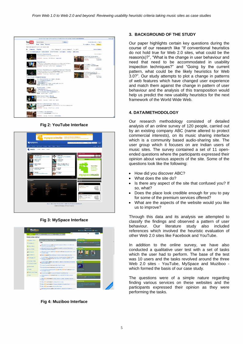
Fig 2: YouTube Interface
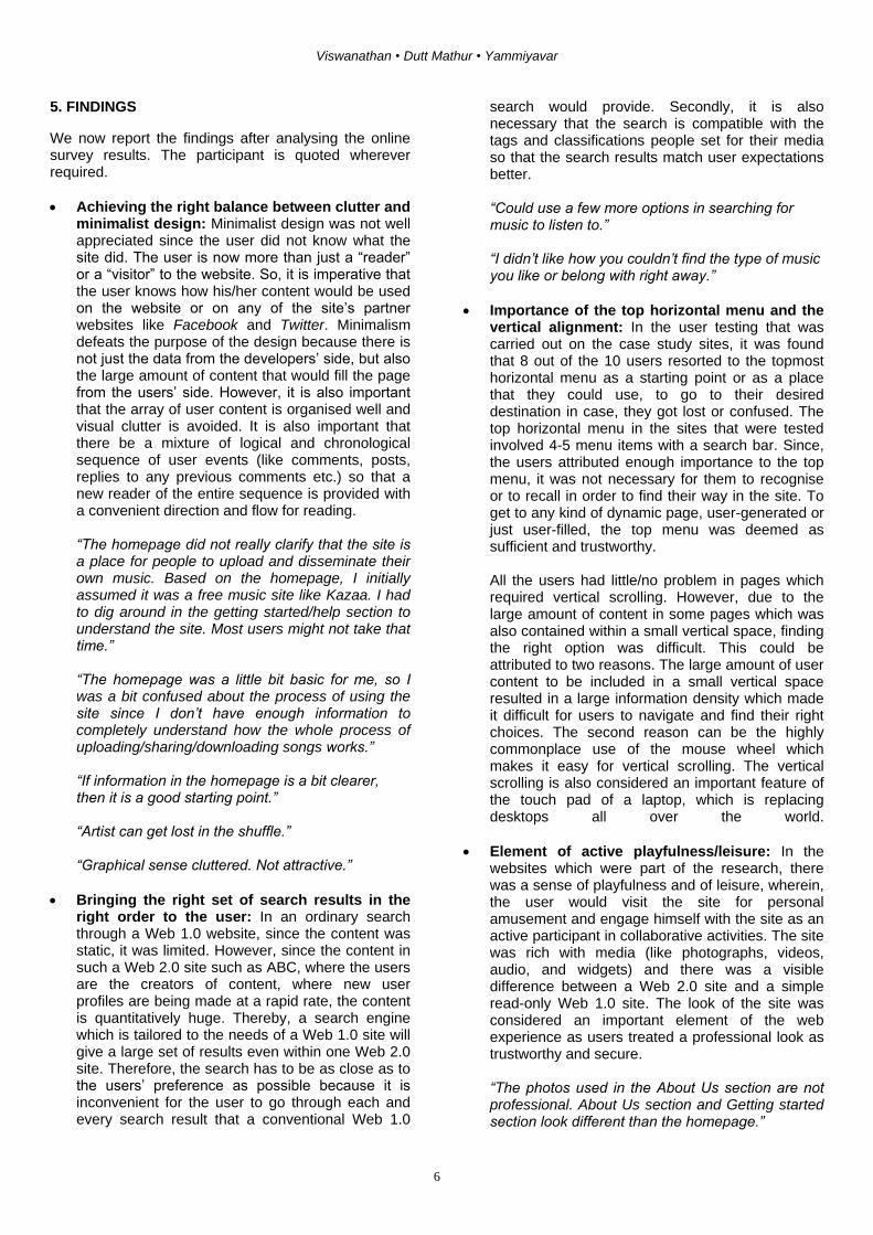
Fig 3: MySpace Interface
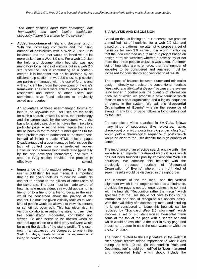
Fig 4: Muziboo Interface
3. BACKGROUND OF THE STUDY
Our paper highlights certain key questions during the course of our research like “If conventional heuristics do not hold true for Web 2.0 sites, what could be the reason(s)?”, “What is the change in user behaviour and need that need to be accommodated in usability inspection techniques?” and “Going by the current pattern, what could be the likely heuristics for Web 3.0?”. Our study attempts to plot a change in patterns of web features which have changed user experience and match them against the change in pattern of user behaviour and the analysis of this transposition would help us predict the new usability heuristics for the next framework of the World Wide Web.
4. DATA/METHODOLOGY
Our research methodology consisted of detailed analysis of an online survey of 120 people, carried out by an existing company ABC (name altered to protect commercial interests), on its music sharing interface which is a community based audio-sharing site. The user group which it focuses on are Indian users of music sites. The survey contained a set of 11 open-ended questions where the participants expressed their opinion about various aspects of the site. Some of the questions look like the following:
How did you discover ABC?
What does the site do?
Is there any aspect of the site that confused you? If so, what?
Does the place look credible enough for you to pay for some of the premium services offered?
What are the aspects of the website would you like us to improve?
Through this data and its analysis we attempted to classify the findings and observed a pattern of user behaviour. Our literature study also included references which involved the heuristic evaluation of other Web 2.0 sites like Facebook and YouTube. In addition to the online survey, we have also conducted a qualitative user test with a set of tasks which the user had to perform. The base of the test was 10 users and the tasks revolved around the three Web 2.0 sites - YouTube, MySpace and Muziboo - which formed the basis of our case study. The questions were of a simple nature regarding finding various services on these websites and the participants expressed their opinion as they were performing the tasks.
Viswanathan • Dutt Mathur • Yammiyavar
6
5. FINDINGS
We now report the findings after analysing the online survey results. The participant is quoted wherever required.
Achieving the right balance between clutter and minimalist design: Minimalist design was not well appreciated since the user did not know what the site did. The user is now more than just a “reader” or a “visitor” to the website. So, it is imperative that the user knows how his/her content would be used on the website or on any of the site‟s partner websites like Facebook and Twitter. Minimalism defeats the purpose of the design because there is not just the data from the developers‟ side, but also the large amount of content that would fill the page from the users‟ side. However, it is also important that the array of user content is organised well and visual clutter is avoided. It is also important that there be a mixture of logical and chronological sequence of user events (like comments, posts, replies to any previous comments etc.) so that a new reader of the entire sequence is provided with a convenient direction and flow for reading. “The homepage did not really clarify that the site is a place for people to upload and disseminate their own music. Based on the homepage, I initially assumed it was a free music site like Kazaa. I had to dig around in the getting started/help section to understand the site. Most users might not take that time.” “The homepage was a little bit basic for me, so I was a bit confused about the process of using the site since I don‟t have enough information to completely understand how the whole process of uploading/sharing/downloading songs works.” “If information in the homepage is a bit clearer, then it is a good starting point.” “Artist can get lost in the shuffle.” “Graphical sense cluttered. Not attractive.”
Bringing the right set of search results in the right order to the user: In an ordinary search through a Web 1.0 website, since the content was static, it was limited. However, since the content in such a Web 2.0 site such as ABC, where the users are the creators of content, where new user profiles are being made at a rapid rate, the content is quantitatively huge. Thereby, a search engine which is tailored to the needs of a Web 1.0 site will give a large set of results even within one Web 2.0 site. Therefore, the search has to be as close as to the users‟ preference as possible because it is inconvenient for the user to go through each and every search result that a conventional Web 1.0
search would provide. Secondly, it is also necessary that the search is compatible with the tags and classifications people set for their media so that the search results match user expectations better. “Could use a few more options in searching for music to listen to.” “I didn‟t like how you couldn‟t find the type of music you like or belong with right away.”
Importance of the top horizontal menu and the vertical alignment: In the user testing that was carried out on the case study sites, it was found that 8 out of the 10 users resorted to the topmost horizontal menu as a starting point or as a place that they could use, to go to their desired destination in case, they got lost or confused. The top horizontal menu in the sites that were tested involved 4-5 menu items with a search bar. Since, the users attributed enough importance to the top menu, it was not necessary for them to recognise or to recall in order to find their way in the site. To get to any kind of dynamic page, user-generated or just user-filled, the top menu was deemed as sufficient and trustworthy. All the users had little/no problem in pages which required vertical scrolling. However, due to the large amount of content in some pages which was also contained within a small vertical space, finding the right option was difficult. This could be attributed to two reasons. The large amount of user content to be included in a small vertical space resulted in a large information density which made it difficult for users to navigate and find their right choices. The second reason can be the highly commonplace use of the mouse wheel which makes it easy for vertical scrolling. The vertical scrolling is also considered an important feature of the touch pad of a laptop, which is replacing desktops all over the world.
Element of active playfulness/leisure: In the websites which were part of the research, there was a sense of playfulness and of leisure, wherein, the user would visit the site for personal amusement and engage himself with the site as an active participant in collaborative activities. The site was rich with media (like photographs, videos, audio, and widgets) and there was a visible difference between a Web 2.0 site and a simple read-only Web 1.0 site. The look of the site was considered an important element of the web experience as users treated a professional look as trustworthy and secure. “The photos used in the About Us section are not professional. About Us section and Getting started section look different than the homepage.”
From Web 1.0 to Web 2.0 and beyond: Reviewing usability heuristic criteria taking music sites as case studies
7
“The other sections apart from homepage look „homemade‟, and don‟t inspire confidence, especially if there is a charge for the service.”
Added importance of help and documentation: With the increasing complexity and the rising number of possibilities with a Web 2.0 site, it is inevitable that the user would be faced with a lot more tasks than a Web 1.0 site. For a web 1.0 site, the help and documentation heuristic was not mandatory for all kinds of website but in a web 2.0 site, since the user is contributing as a content-creator, it is important that he be assisted by an efficient help section. In web 2.0 sites, help section are part-user-managed with the use of forums and with sufficient help from the developers of the site‟s framework. The users were able to identify with the responses and needs of other users and sometimes have found solutions to previously asked user-queries. An advantage of these user-managed forums for help is the keywords that user uses are the basis for such a search. In web 1.0 sites, the terminology and the jargon used by the developers were the basis for a static search which gives them links to a particular page. A second advantage is that since the helpdesk is forum-based, further queries to the same problem can be addressed at the same post, instead of facing a static HTML solution page. Disadvantages of a user-managed help include the lack of control over some irrelevant replies. However, some forums being moderated (generally by the site developer themselves) and with a separate FAQ section provided, the problem is effectively solved.
Importance of Information privacy: Since the user is publishing his own media, it is important that he be given tools as to how he wants his content to appear to the billions of other users of the same site. The user must be made aware of how his new music video, say would appear to his friend, or to a friend of a friend, because the user would be concerned about the privacy of his content. He must be given visibility tools as to what kind of people would be allowed to view his content or sometimes even edit. This has given rise, in various collaborative authoring sites, to user roles like administrator, moderator, contributor and viewer. He also needs to be notified when an external application or a third party software would be using the details of the user‟s profile. The user, now in an advanced role compared to one in the Web 1.0 days, needs to have the experience of being „in control‟ of his content.
6. ANALYSIS AND DISCUSSION
Based on the six findings of our research, we propose a modified list of heuristics for a web 2.0 site and based on the patterns, we attempt to propose a set of heuristics for web 3.0 as well. It is worth mentioning that the idea emerged as a result of a project based on design of music websites wherein a case study of not more than three popular websites was taken. If a firmer set of heuristics are to emerge, then the number of websites to be considered and analysed must be increased for consistency and verification of results. The aspect of balance between clutter and minimalist design indirectly contradicts the conventional heuristic “Aesthetic and Minimalist Design” because the system is no longer in control over the quantity of information because of which we propose a new heuristic which focuses on a neat organisation and a logical sequence of events in the system. We call this “Sequential Organisation of Events” wherein the sequence of events in any kind of page follows a logic understood by the user. For example: a video searched in YouTube, follows many kinds of sequences (like relevance, rating, chronology) or a list of posts in a blog under a tag “xyz” would yield a chronological sequence of posts which would be clear to the user despite the high quantity of content. The importance of an effective search engine within the website is an important feature of web 2.0 sites which has not been touched upon by conventional Web 1.0 heuristics. We combine this heuristic with the previously proposed heuristic of “Sequential Organisation of Events” wherein the right kind of search results would be displayed in the right order. The elements of the top menu and the vertical alignment (which is no longer considered a hindrance, provided the page is not too long), comes into contrast with the heuristic “Recognition rather than recall” which specifies that the user should not have to look for his information and should recognise his options easily. With the availability of a concise top menu and scrolling no longer considered an issue, this heuristic can be replaced by “Standard Web 2.0 alignment” which involves a set of 3-5 standardised horizontal menu items at the top of the page with a search bar and which would be available to the user in every page and it acts as a detour in case the user wants to withdraw the current task. The finding related to the Help feature in the web 2.0 sites should receive added importance to what it was during the web 1.0 era. So the heuristic “Help and Documentation” should be modified to “User-managed and moderated Help” which should include the
Viswanathan • Dutt Mathur • Yammiyavar
8
intervention of other users and of the developers in an interactive way to help the users. Importance of information privacy can be combined with “Visibility of system status” since both relate to informing the users about the status of the system. However, since the user also needs to be informed and be given controlling tools simultaneously - to alter the privacy of his content and media, “Visibility of user status” needs to be included. The aspect of playfulness and engagement form a very important aspect of the web experiences of the web 2.0 sites which were part of the research. For example, the user must be provided with options which are related to the media he is viewing or which are published by the same author to keep the user engaged in the experience. The aspect of a professional look can be included in the proposed heuristic “Standard Web 2.0 alignment” but the overall look and feel of the website should invoke playfulness and a ludic experience. We call this heuristic “Engaging user activity” which is a holistic and not an elemental aspect of the site. This heuristic would inspect how actively the user stays and interacts on the website. We summarise our new and proposed set of heuristics for web 2.0 sites in table 3 as shown. We could observe a pattern going from web 1.0 to 2.0 and extrapolate it to web 3.0 to propose new heuristics for the future web framework. In table 4, we have extrapolated the aspects related to technology and user needs from web 1.0 and web 2.0 to web 3.0; while in table 5, we propose a newer set of heuristics based on the outcome of table 4.
Table 3: Proposed list of heuristics
Original heuristic
New heuristic Description
Visibility of System Status
Visibility of User status
Informing the users about the status of the system and about their media and content
Match between
system and real
world
Match between
system and real
world
The system
should speak the
users‟ language,
with words,
phrases and
concepts familiar
to the user, rather
than system-
oriented terms.
User control and
freedom
User control and
freedom
The user should
be provided with
options regarding
his content and
also be allowed to
change his
decision using
“undo” and “redo”
Consistency and
standards
Consistency and
standards
Users should not
have to wonder
whether different
words, situations,
or actions mean
the same thing.
Error prevention
Error prevention
Even better than
good error
messages is a
careful design
which prevents a
problem from
occurring in the
first place.
Recognition
rather than recall
Standard Web
2.0 alignment
A vertically
scrollable
alignment is
acceptable
Flexibility and
efficiency of use
Flexibility and
efficiency of use
The system
should cater to
both
inexperienced
and experienced
users. Allow
users to tailor
frequent actions.
Aesthetic and
minimalist design
Sequential
Organisation of
events
The information
must be
organised neatly
in a logical
sequence which
can be
understood or set
by the user.
Help users
recognize,
diagnose, and
recover from
errors
Help users
recognize,
diagnose, and
recover from
errors
Error messages
should be
expressed in
plain language
(no codes),
precisely indicate
the problem, and
constructively
From Web 1.0 to Web 2.0 and beyond: Reviewing usability heuristic criteria taking music sites as case studies
9
suggest a
solution.
Help and
documentation
User-managed
and moderated
help
Interactive help
interface which
involves a forum
consisting of
other users and
the developers.
Provide an FAQ if
needed.
NA
Engaging user
activity
The system
should provide
options which are
related to the
media which the
user is using in
order to provide
an engaging
experience.
.
Table 3 (continued)
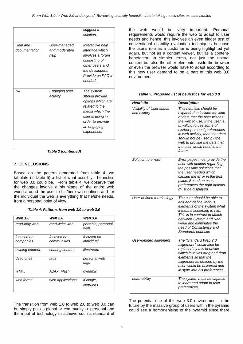
7. CONCLUSIONS
Based on the pattern generated from table 4, we tabulate (in table 5) a list of what possibly - heuristics for web 3.0 could be. From table 4, we observe that the changes involve a shrinkage of the entire web world around the user to his/her own confines and for the individual the web is everything that he/she needs, from a personal point of view.
Table 4: Patterns from web 1.0 to web 3.0
Web 1.0 Web 2.0 Web 3.0
read-only web
read-write web
portable, personal web
focused on companies
focused on communities
focused on individual
owning content
sharing content
lifestream
directories
tags
personal web tags
HTML
AJAX, Flash
dynamic
web forms
web applications
iGoogle,
NetVibes
The transition from web 1.0 to web 2.0 to web 3.0 can be simply put as global -> community -> personal and the input of technology to achieve such a standard of
the web would be very important. Personal requirements would require the web to adapt to user needs and hence, this involves an even bigger test of conventional usability evaluation techniques because the user‟s role as a customer is being highlighted yet again, but not as a content viewer, but as a content-benefactor. In simpler terms, not just the textual content but also the other elements inside the browser or even the browser would have to adapt according to this new user demand to be a part of this web 3.0 environment.
Table 5: Proposed list of heuristics for web 3.0
Heuristic Description
Visibility of User status and history
This heuristic should be expanded to include the kind of data that the user wishes the web to use. If the user is unwilling to use some of his/her personal preferences in web activity, then that data should not be used by the web to provide the data that the user would need in the future.
Solution to errors
Error pages must provide the user with options regarding the possible solutions that the user needed which caused the error in the first place. Based on user, preferences the right options must be displayed.
User-defined terminology
The user should be able to edit and define various elements of the system what it means according to him. This is in contrast to Match between System and Real world and eliminates the need of Consistency and Standards heuristic
User-defined alignment
The “Standard Web 2.0 alignment” would also be replaced by this heuristic which involves drag and drop elements so that the alignment as defined by the user would be universal and in sync with his preferences.
Learnability
The system must be capable to learn and adapt to user preferences.
The potential use of this web 3.0 environment in the future by the massive group of users within the pyramid could see a homogenising of the pyramid since there
Viswanathan • Dutt Mathur • Yammiyavar
10
would be no such terms such as bottom of the pyramid. To any kind of user, the web would have to adapt meaning divisions within the pyramid would vanish in Web 3.0. Evaluation techniques would therefore have to tend to an even bigger user group, because every user by him/her self becomes a new and unique user group. Hence, evaluation techniques and heuristics should be aimed at making the system very universal adaptable and sustainable.
8. REFERENCES
1. Silva, P.A & Dix, A. (2007). Usability – Not as we know it! HCI07 Conference on People and Computers XXI (p. 26) ACM. 2. Nielsen, J. (1999) Designing Web Usability: The Practice of Simplicity. New Riders, Indianapolis, Indiana. 3. Strickland M. (Presentation: Nov.1, 2007). What is Web 3.0? http://www.slideshare.net/mstrickland/the-evolution-of-web-30 . Organic Inc. 4. Nielsen, J. (2005) 10 Heuristics for User Interface Design. http://www.useit.com/papers/heuristic/heuristic_list.html (retrieved December 14th, 2009). 5. Thompson, AJ & Kemp, EA (2009) Web 2.0: extending the framework for heuristic evaluation, CHINZ'09, Auckland, New Zealand, 6-7 July 2009, (pg. 29), ACM. 6. Alexa Internet Inc. Alexa Top 500 Global Sites. http://www.alexa.com/topsites (retrieved December 14
th, 2009)
7. O'Reilly, Tim. (2005). "What is Web 2.0: Design Patterns and Business Models for the Next Generation of Software". http://www.oreillynet.com/pub/a/oreilly/tim/news/2005/09/30/what-is-web-20.html (retrieved 3 September, 2008) 8. Berners-Lee, Tim; James Hendler and Ora Lassila (May 17, 2001). "The Semantic Web". Scientific American Magazine. http://www.sciam.com/article.cfm?id=the-semantic-web&print=true. (retrieved March 26, 2008.) 9. Prahlad C. K. & Hart S. L. (2004). The Fortune at the Bottom of the Pyramid. Content – Strategy and Competition. 10. www.youtube.com 11. www.myspace.com 12. www.muziboo.com 13. www.facebook.com 14. Molich R. & Nielsen J. (2009) Heuristic Evaluation: Use and Abuse. UPA 2009: Bringing Usability to Life, Oregon, USA, 8-12 June 2009. 15. Nielsen J. “How to conduct a Heuristic Evaluation”. http://www.useit.com/papers/heuristic/heuristic_evaluation.html (retrieved Feb 14th, 2010) 16. Isaías P., Miranda P. & Pífano S.(2009) Critical Success Factors for Web 2.0 – A Reference
Framework. Online Communities and Social Computing. Volume 5621/2009, page numbers 354-363. 17. Madden N. (2008) Portals in a Web 2.0 world. http://www.technewsworld.com/story/61820.html (retrieved February 14th, 2010)
Copyright © 2022 FDOKUMEN