Developing Heuristic Evaluation Methods for Large Screen ...
235
Developing Heuristic Evaluation Methods for Large Screen Information Exhibits Based on Critical Parameters Jacob Somervell Dissertation submitted to the Faculty of the Virginia Polytechnic Institute and State University in partial fulfillment of the degree requirements for Doctor of Philosophy in Computer Science and Applications at Virginia Polytechnic Institute and State University June 22, 2004 Dr. D. Scott McCrickard, Chair Dr. Doug A. Bowman Dr. John M. Carroll Dr. David Hicks Dr. Christopher L. North Keywords: heuristics, evaluation, notification systems, critical parameters c Copyright 2004, Jacob Somervell
-
Upload
khangminh22 -
Category
Documents
-
view
2 -
download
0
Transcript of Developing Heuristic Evaluation Methods for Large Screen ...

Developing Heuristic Evaluation Methods forLarge Screen Information Exhibits
Based on Critical Parameters
Jacob Somervell
Dissertation submitted to the Faculty of theVirginia Polytechnic Institute and State Universityin partial fulfillment of the degree requirements for
Doctor of Philosophy in Computer Science and Applicationsat
Virginia Polytechnic Institute and State University
June 22, 2004
Dr. D. Scott McCrickard, ChairDr. Doug A. BowmanDr. John M. Carroll
Dr. David HicksDr. Christopher L. North
Keywords: heuristics, evaluation, notification systems, critical parameters
c©Copyright 2004, Jacob Somervell

Developing Heuristic Evaluation Methods forLarge Screen Information Exhibits
Based on Critical Parameters
Jacob Somervell
ABSTRACT
Evaluation is the key to effective interface design. It becomes even more important when theinterfaces are for cutting edge technology, in application areas that are new and with little priordesign knowledge. Knowing how to evaluate new interfaces can decrease development effort andincrease the returns on resources spent on formative evaluation. The problem is that there are few,if any, readily available evaluation tools for these new interfaces.
This work focuses on the creation and testing of a new set of heuristics that are tailored to thelarge screen information exhibit (LSIE) system class. This new set is created through a structuredprocess that relies upon critical parameters associated with the notification systems design space.By inspecting example systems, performing claims analysis, categorizing claims, extracting designknowledge, and finally synthesizing heuristics; we have created a usable set of heuristics that isbetter equipped for supporting formative evaluation.
Contributions of this work include: a structured heuristic creation process based on criticalparameters, a new set of heuristics tailored to the LSIE system class, reusable design knowledge inthe form of claims and high level design issues, and a new usability evaluation method comparisontest. These contributions result from the creation of the heuristics and two studies that illustrate theusability and utility of the new heuristics.

Acknowledgements
This thesis is the result of three years of continued thought and effort. This work would not havebeen possible without the support of a system of friends and family.
First I would like to thank D. Scott McCrickard, my advisor. He has been a source of energy,a sound board for ideas, a golfing buddy, and certainly not least, an excellent advisor. He wasalways ready to talk about anything, and he was always available to me, either electronically or inperson. I never felt that I could not ask him about anything, from the academic to the insane. Hisdedication to his students still amazes me.
I would also like to thank Christa Chewar. She has been my colleague since the fall of 2001,and I am honored to have met and worked with her. Her dedication and work ethic are nothingshort of super-human. It is her constant drive and desire to produce valuable scientific findings thathas motivated me on those occasions when it seemed hopeless.
I also want to thank Ali Ndiwalana for his continued support. He is always in good spiritsand is easy to talk to about anything. We spent quite a bit of time together in the lab, and hehas become a good friend. He has taught me to appreciate Linux, and I learned quite a bit aboutcomputer hardware from him.
I have to thank my family, which is quite large. I have four brothers and one sister, all of whomencourage me and share feelings of pride that I have accomplished so much. My parents were alsosupportive and provided a loving retreat when things got overwhelming.
My younger brother Logan was always supportive of me and we often talked about the goodol’ days: playing video games, fishing, swimming – even working with our father. John, my nextolder brother, has probably been the closest to me during my time at Virginia Tech. He alwaysseemed to have some project going on in which I was needed. These little jobs often provided anice alternative to setting in front of a computer all day. Jason, Jim, and Lillian are the next eldest.I really didn’t get to see them very much but they were always supportive and always welcomedme to their homes when I needed a vacation.
My mother and father have a direct impact on the fact that I was able to complete this thesis.They raised me to strive for my personal best and to never give up. These fundamental attitudestowards life can help anyone accomplish the goals he/she sets out to tackle. They are the bestparents anyone could ever ask for, and they have always given me what I need.
Of course, I have to thank my wife, Cynthia, for being understanding throughout this process.She has sacrificed so much for me; I don’t know how to express my gratitude. I only hope that Ican make her as happy as she makes me.
There are numerous other people who have influenced me and the completion of this work.My committee members – John M. Carroll, Doug Bowman, Chris North, and David Hicks – eachgave thoughtful and useful feedback on my work. There are too many graduate students in theComputer Science department at Virginia Tech to mention by name, but they are always friendlyand approachable.
Jacob SomervellJune 22, 2004
iii

To Cynthia
iv

Contents
1 Introduction 11.1 Problem Description . . . . . . . . . . . . . . . . . . . . . . . . . . . . . . . . . 11.2 Terminology . . . . . . . . . . . . . . . . . . . . . . . . . . . . . . . . . . . . . . 21.3 Research Goals . . . . . . . . . . . . . . . . . . . . . . . . . . . . . . . . . . . . 31.4 Summary . . . . . . . . . . . . . . . . . . . . . . . . . . . . . . . . . . . . . . . 5
2 Literature Review 72.1 Notification Systems . . . . . . . . . . . . . . . . . . . . . . . . . . . . . . . . . 7
2.1.1 Examples of Notification Systems in Literature . . . . . . . . . . . . . . . 82.1.2 Framework for Understanding Notification Systems . . . . . . . . . . . . . 92.1.3 Applicability To This Work . . . . . . . . . . . . . . . . . . . . . . . . . 15
2.2 Evaluation of Large Screen Information Exhibits . . . . . . . . . . . . . . . . . . 162.2.1 Analytical Methods . . . . . . . . . . . . . . . . . . . . . . . . . . . . . . 162.2.2 Heuristic Evaluation . . . . . . . . . . . . . . . . . . . . . . . . . . . . . 172.2.3 Comparing UEMs . . . . . . . . . . . . . . . . . . . . . . . . . . . . . . 172.2.4 Comparing Heuristics . . . . . . . . . . . . . . . . . . . . . . . . . . . . 18
2.3 Large Screen Displays . . . . . . . . . . . . . . . . . . . . . . . . . . . . . . . . 192.3.1 Early Forms . . . . . . . . . . . . . . . . . . . . . . . . . . . . . . . . . . 192.3.2 Early Uses of Large Screen Displays . . . . . . . . . . . . . . . . . . . . . 202.3.3 Shift Toward Notifications . . . . . . . . . . . . . . . . . . . . . . . . . . 21
2.4 Summary . . . . . . . . . . . . . . . . . . . . . . . . . . . . . . . . . . . . . . . 21
3 Background and Motivation 233.1 Introduction . . . . . . . . . . . . . . . . . . . . . . . . . . . . . . . . . . . . . . 233.2 Assessing Evaluation Methods . . . . . . . . . . . . . . . . . . . . . . . . . . . . 243.3 Motivation from Prior Work . . . . . . . . . . . . . . . . . . . . . . . . . . . . . 243.4 Experiment Description . . . . . . . . . . . . . . . . . . . . . . . . . . . . . . . . 25
3.4.1 System Descriptions . . . . . . . . . . . . . . . . . . . . . . . . . . . . . 253.4.2 Methodology . . . . . . . . . . . . . . . . . . . . . . . . . . . . . . . . . 26
3.5 Discussion . . . . . . . . . . . . . . . . . . . . . . . . . . . . . . . . . . . . . . . 283.5.1 Drawbacks to Surveys . . . . . . . . . . . . . . . . . . . . . . . . . . . . 293.5.2 Strength of Claims Analysis . . . . . . . . . . . . . . . . . . . . . . . . . 30
3.6 Summary . . . . . . . . . . . . . . . . . . . . . . . . . . . . . . . . . . . . . . . 30
v

4 Heuristic Creation 324.1 Introduction . . . . . . . . . . . . . . . . . . . . . . . . . . . . . . . . . . . . . . 324.2 Motivation . . . . . . . . . . . . . . . . . . . . . . . . . . . . . . . . . . . . . . . 344.3 Processes Involved . . . . . . . . . . . . . . . . . . . . . . . . . . . . . . . . . . 344.4 Selecting Systems . . . . . . . . . . . . . . . . . . . . . . . . . . . . . . . . . . . 36
4.4.1 Are these LSIEs? . . . . . . . . . . . . . . . . . . . . . . . . . . . . . . . 364.4.2 Systems . . . . . . . . . . . . . . . . . . . . . . . . . . . . . . . . . . . . 37
4.5 Analyzing Systems . . . . . . . . . . . . . . . . . . . . . . . . . . . . . . . . . . 414.5.1 Claims Analysis . . . . . . . . . . . . . . . . . . . . . . . . . . . . . . . 414.5.2 System Claims . . . . . . . . . . . . . . . . . . . . . . . . . . . . . . . . 424.5.3 Validating Claims . . . . . . . . . . . . . . . . . . . . . . . . . . . . . . . 42
4.6 Categorizing Claims . . . . . . . . . . . . . . . . . . . . . . . . . . . . . . . . . 434.6.1 Classifying Claims Using the IRC Framework . . . . . . . . . . . . . . . . 434.6.2 Assessing Goal Impact . . . . . . . . . . . . . . . . . . . . . . . . . . . . 444.6.3 Categorization Through Scenario Based Design . . . . . . . . . . . . . . . 45
4.7 Synthesis Into Heuristics . . . . . . . . . . . . . . . . . . . . . . . . . . . . . . . 494.7.1 Visualizing the Problem Tree . . . . . . . . . . . . . . . . . . . . . . . . . 494.7.2 Identifying Issues . . . . . . . . . . . . . . . . . . . . . . . . . . . . . . . 504.7.3 Issues to Heuristics . . . . . . . . . . . . . . . . . . . . . . . . . . . . . . 534.7.4 Heuristics . . . . . . . . . . . . . . . . . . . . . . . . . . . . . . . . . . . 54
4.8 Discussion . . . . . . . . . . . . . . . . . . . . . . . . . . . . . . . . . . . . . . . 554.9 Summary . . . . . . . . . . . . . . . . . . . . . . . . . . . . . . . . . . . . . . . 56
5 Heuristic Comparison Experiment 585.1 Introduction . . . . . . . . . . . . . . . . . . . . . . . . . . . . . . . . . . . . . . 585.2 Approach . . . . . . . . . . . . . . . . . . . . . . . . . . . . . . . . . . . . . . . 58
5.2.1 Heuristic Sets . . . . . . . . . . . . . . . . . . . . . . . . . . . . . . . . . 595.2.2 Comparison Technique . . . . . . . . . . . . . . . . . . . . . . . . . . . . 615.2.3 Systems . . . . . . . . . . . . . . . . . . . . . . . . . . . . . . . . . . . . 625.2.4 Hypotheses . . . . . . . . . . . . . . . . . . . . . . . . . . . . . . . . . . 665.2.5 Identifying Problem Sets . . . . . . . . . . . . . . . . . . . . . . . . . . . 66
5.3 Testing Methodology . . . . . . . . . . . . . . . . . . . . . . . . . . . . . . . . . 685.3.1 Participants . . . . . . . . . . . . . . . . . . . . . . . . . . . . . . . . . . 685.3.2 Materials . . . . . . . . . . . . . . . . . . . . . . . . . . . . . . . . . . . 695.3.3 Questionnaire . . . . . . . . . . . . . . . . . . . . . . . . . . . . . . . . . 695.3.4 Measurements Recorded . . . . . . . . . . . . . . . . . . . . . . . . . . . 70
5.4 Results . . . . . . . . . . . . . . . . . . . . . . . . . . . . . . . . . . . . . . . . . 705.4.1 Participant Experience . . . . . . . . . . . . . . . . . . . . . . . . . . . . 705.4.2 Applicability Scores . . . . . . . . . . . . . . . . . . . . . . . . . . . . . 725.4.3 Thoroughness . . . . . . . . . . . . . . . . . . . . . . . . . . . . . . . . . 745.4.4 Validity . . . . . . . . . . . . . . . . . . . . . . . . . . . . . . . . . . . . 765.4.5 Effectiveness . . . . . . . . . . . . . . . . . . . . . . . . . . . . . . . . . 775.4.6 Reliability – Differences . . . . . . . . . . . . . . . . . . . . . . . . . . . 785.4.7 Reliability – Agreement . . . . . . . . . . . . . . . . . . . . . . . . . . . 815.4.8 Time Spent . . . . . . . . . . . . . . . . . . . . . . . . . . . . . . . . . . 83
vi

5.5 Discussion . . . . . . . . . . . . . . . . . . . . . . . . . . . . . . . . . . . . . . . 835.5.1 Hypotheses Revisited . . . . . . . . . . . . . . . . . . . . . . . . . . . . . 835.5.2 Other Discussion and Implications . . . . . . . . . . . . . . . . . . . . . . 86
5.6 Summary . . . . . . . . . . . . . . . . . . . . . . . . . . . . . . . . . . . . . . . 87
6 Heuristic Application 886.1 Introduction . . . . . . . . . . . . . . . . . . . . . . . . . . . . . . . . . . . . . . 886.2 Novice HCI Students . . . . . . . . . . . . . . . . . . . . . . . . . . . . . . . . . 88
6.2.1 Method . . . . . . . . . . . . . . . . . . . . . . . . . . . . . . . . . . . . 896.2.2 Results . . . . . . . . . . . . . . . . . . . . . . . . . . . . . . . . . . . . 896.2.3 Discussion . . . . . . . . . . . . . . . . . . . . . . . . . . . . . . . . . . 906.2.4 Post-Analysis of Problems . . . . . . . . . . . . . . . . . . . . . . . . . . 926.2.5 Evaluator Ability . . . . . . . . . . . . . . . . . . . . . . . . . . . . . . . 92
6.3 Education Domain Experts . . . . . . . . . . . . . . . . . . . . . . . . . . . . . . 936.3.1 Method . . . . . . . . . . . . . . . . . . . . . . . . . . . . . . . . . . . . 946.3.2 Results . . . . . . . . . . . . . . . . . . . . . . . . . . . . . . . . . . . . 946.3.3 Discussion . . . . . . . . . . . . . . . . . . . . . . . . . . . . . . . . . . 956.3.4 Post-Analysis . . . . . . . . . . . . . . . . . . . . . . . . . . . . . . . . . 956.3.5 GAWK Re-Design . . . . . . . . . . . . . . . . . . . . . . . . . . . . . . 96
6.4 HCI Expert Opinions . . . . . . . . . . . . . . . . . . . . . . . . . . . . . . . . . 976.4.1 Method . . . . . . . . . . . . . . . . . . . . . . . . . . . . . . . . . . . . 976.4.2 Results . . . . . . . . . . . . . . . . . . . . . . . . . . . . . . . . . . . . 986.4.3 Discussion . . . . . . . . . . . . . . . . . . . . . . . . . . . . . . . . . . 98
6.5 Overall Discussion . . . . . . . . . . . . . . . . . . . . . . . . . . . . . . . . . . 986.6 Summary . . . . . . . . . . . . . . . . . . . . . . . . . . . . . . . . . . . . . . . 98
7 Discussion 1007.1 Supporting UEM Creation Through Critical Parameters . . . . . . . . . . . . . . . 1007.2 Supporting Interface Evaluation . . . . . . . . . . . . . . . . . . . . . . . . . . . 1027.3 Comparing Evaluation Methods . . . . . . . . . . . . . . . . . . . . . . . . . . . 1027.4 Exploring Generality vs Specificity . . . . . . . . . . . . . . . . . . . . . . . . . . 1037.5 Lessons Learned Through Use . . . . . . . . . . . . . . . . . . . . . . . . . . . . 104
7.5.1 Reporting Problems to Developers . . . . . . . . . . . . . . . . . . . . . . 1047.5.2 Mapping Problems to Critical Parameters . . . . . . . . . . . . . . . . . . 1057.5.3 Specificity in Heuristics . . . . . . . . . . . . . . . . . . . . . . . . . . . 1057.5.4 Development Costs and Benefits . . . . . . . . . . . . . . . . . . . . . . . 1067.5.5 Critical Parameters vs. Usability Metrics . . . . . . . . . . . . . . . . . . 107
7.6 Discussion Summary . . . . . . . . . . . . . . . . . . . . . . . . . . . . . . . . . 108
8 Conclusion 1098.1 Summary of the Work . . . . . . . . . . . . . . . . . . . . . . . . . . . . . . . . . 1098.2 Contributions . . . . . . . . . . . . . . . . . . . . . . . . . . . . . . . . . . . . . 110
8.2.1 Critical Parameter Based Creation of System Class Heuristics . . . . . . . 1108.2.2 Heuristics Tailored to the LSIE System Class . . . . . . . . . . . . . . . . 1118.2.3 LSIE System Design Guidance . . . . . . . . . . . . . . . . . . . . . . . . 111
vii

8.2.4 UEM Comparison Tool . . . . . . . . . . . . . . . . . . . . . . . . . . . . 1128.2.5 Generic vs. Specific UEM Tradeoffs . . . . . . . . . . . . . . . . . . . . . 1128.2.6 Contribution Summary . . . . . . . . . . . . . . . . . . . . . . . . . . . . 112
8.3 Future Work . . . . . . . . . . . . . . . . . . . . . . . . . . . . . . . . . . . . . . 1138.3.1 Extend Method to Other System Classes . . . . . . . . . . . . . . . . . . . 1138.3.2 Automate Comparison Platform . . . . . . . . . . . . . . . . . . . . . . . 1138.3.3 Critical Parameters . . . . . . . . . . . . . . . . . . . . . . . . . . . . . . 1148.3.4 Design Knowledge Reuse . . . . . . . . . . . . . . . . . . . . . . . . . . 115
BIBLIOGRAPHY 116
APPENDICES 124
A Surveys Used in Preliminary Study 124A.1 Generic Survey (used for both systems) . . . . . . . . . . . . . . . . . . . . . . . 124A.2 GAWK Specific Survey . . . . . . . . . . . . . . . . . . . . . . . . . . . . . . . . 124A.3 Photo News Board Specific Survey . . . . . . . . . . . . . . . . . . . . . . . . . . 125
B Scenarios for Systems 126B.1 GAWK . . . . . . . . . . . . . . . . . . . . . . . . . . . . . . . . . . . . . . . . 126
B.1.1 Ms. Lang Surveys Student Groups . . . . . . . . . . . . . . . . . . . . . . 126B.1.2 Karen Checks For Due Dates . . . . . . . . . . . . . . . . . . . . . . . . . 126B.1.3 Mr. Bosk Assesses Progress . . . . . . . . . . . . . . . . . . . . . . . . . 126
B.2 Photo News Board . . . . . . . . . . . . . . . . . . . . . . . . . . . . . . . . . . 127B.2.1 Jill Learns About Sports . . . . . . . . . . . . . . . . . . . . . . . . . . . 127B.2.2 Ted Learns About Jill . . . . . . . . . . . . . . . . . . . . . . . . . . . . . 127B.2.3 Joe Breaks the Ice . . . . . . . . . . . . . . . . . . . . . . . . . . . . . . 127
B.3 Notification Collage . . . . . . . . . . . . . . . . . . . . . . . . . . . . . . . . . . 127B.3.1 Bob Checks on Alice . . . . . . . . . . . . . . . . . . . . . . . . . . . . . 127B.3.2 Bob Keeps Tabs . . . . . . . . . . . . . . . . . . . . . . . . . . . . . . . 128B.3.3 Dock Shares His Work . . . . . . . . . . . . . . . . . . . . . . . . . . . . 128
B.4 What’s Happening? . . . . . . . . . . . . . . . . . . . . . . . . . . . . . . . . . . 128B.4.1 Dill Checks on Traffic . . . . . . . . . . . . . . . . . . . . . . . . . . . . 128B.4.2 Alice Learns about Research . . . . . . . . . . . . . . . . . . . . . . . . . 128B.4.3 Trudy Checks the Weather . . . . . . . . . . . . . . . . . . . . . . . . . . 129
B.5 Blue Board . . . . . . . . . . . . . . . . . . . . . . . . . . . . . . . . . . . . . . 129B.5.1 Trudy Posts a Presentation . . . . . . . . . . . . . . . . . . . . . . . . . . 129B.5.2 Alice Stays Informed . . . . . . . . . . . . . . . . . . . . . . . . . . . . . 129B.5.3 Alice Checks Her Schedule . . . . . . . . . . . . . . . . . . . . . . . . . 129
B.6 Plasma Poster . . . . . . . . . . . . . . . . . . . . . . . . . . . . . . . . . . . . . 130B.6.1 Elizabeth Schedules a Presentation . . . . . . . . . . . . . . . . . . . . . . 130B.6.2 Alex and Kathy Make Plans . . . . . . . . . . . . . . . . . . . . . . . . . 130B.6.3 Jeff Enjoys Daily Humor . . . . . . . . . . . . . . . . . . . . . . . . . . . 130
B.7 Source Viewer . . . . . . . . . . . . . . . . . . . . . . . . . . . . . . . . . . . . . 130B.7.1 John Switches Source Content . . . . . . . . . . . . . . . . . . . . . . . . 130
viii

B.7.2 Bill Keeps Accurate Records . . . . . . . . . . . . . . . . . . . . . . . . . 130B.7.3 Sarah Catches a Problem . . . . . . . . . . . . . . . . . . . . . . . . . . . 131
C System Claims 132C.1 GAWK Upsides and Downsides . . . . . . . . . . . . . . . . . . . . . . . . . . . 132C.2 Photo News Board Upsides and Downsides . . . . . . . . . . . . . . . . . . . . . 134C.3 Notification Collage Upsides and Downsides . . . . . . . . . . . . . . . . . . . . 137C.4 What’s Happening? Upsides and Downsides . . . . . . . . . . . . . . . . . . . . . 139C.5 Blue Board Upsides and Downsides . . . . . . . . . . . . . . . . . . . . . . . . . 141
D Electronic Problem Tree 143D.1 Activity Design . . . . . . . . . . . . . . . . . . . . . . . . . . . . . . . . . . . . 143
D.1.1 Metaphors . . . . . . . . . . . . . . . . . . . . . . . . . . . . . . . . . . 143D.1.2 Supported/Unsupported Activities . . . . . . . . . . . . . . . . . . . . . . 145
D.2 Information Design . . . . . . . . . . . . . . . . . . . . . . . . . . . . . . . . . . 149D.2.1 Screen Space . . . . . . . . . . . . . . . . . . . . . . . . . . . . . . . . . 149D.2.2 Object and Background Colors . . . . . . . . . . . . . . . . . . . . . . . . 150D.2.3 Use of Fonts . . . . . . . . . . . . . . . . . . . . . . . . . . . . . . . . . 152D.2.4 Use of Audio . . . . . . . . . . . . . . . . . . . . . . . . . . . . . . . . . 153D.2.5 Use of Animation . . . . . . . . . . . . . . . . . . . . . . . . . . . . . . . 154D.2.6 Grouping of Information Items . . . . . . . . . . . . . . . . . . . . . . . . 156
D.3 Interaction Design . . . . . . . . . . . . . . . . . . . . . . . . . . . . . . . . . . . 158D.3.1 Recognition of Affordances . . . . . . . . . . . . . . . . . . . . . . . . . 158D.3.2 Behavior of Interface Control . . . . . . . . . . . . . . . . . . . . . . . . 159D.3.3 Expected Transition of State . . . . . . . . . . . . . . . . . . . . . . . . . 160D.3.4 Support for Undo/Error Recovery . . . . . . . . . . . . . . . . . . . . . . 161D.3.5 Feedback about Progress on Task Goals . . . . . . . . . . . . . . . . . . . 162D.3.6 Configurability Level for Usage Experience . . . . . . . . . . . . . . . . . 163
E High Level Issues 165
F Process Walkthrough 167F.1 Classifying Claims . . . . . . . . . . . . . . . . . . . . . . . . . . . . . . . . . . 167F.2 Categorizing Claims . . . . . . . . . . . . . . . . . . . . . . . . . . . . . . . . . 186F.3 From Claims to Issues . . . . . . . . . . . . . . . . . . . . . . . . . . . . . . . . 205F.4 Issues to Heuristics . . . . . . . . . . . . . . . . . . . . . . . . . . . . . . . . . . 215
G Questionnaire 217
H Use Guide 219
VITA 222
ix

List of Figures
2.1 Notification system classes according to design objectives for each of interruption(I), reaction (R), and comprehension (C), simplified as high (1) or low (0). . . . . . 11
2.2 The LSIE system class within the notification systems design space. . . . . . . . . 16
3.1 Example claims and survey questions, with upside (+) and downside (-) tradeoffsthat correspond to sample questions from the system-class (G9) and single-system(A3, B4) surveys. . . . . . . . . . . . . . . . . . . . . . . . . . . . . . . . . . . . 28
4.1 Blue Board. Attract loop shows users information about the current environment.c©2003 - IBM. Printed here with permission. . . . . . . . . . . . . . . . . . . . . 40
4.2 Problem tree . . . . . . . . . . . . . . . . . . . . . . . . . . . . . . . . . . . . . . 514.3 Creation process used to extract heuristics from system inspection. . . . . . . . . . 57
5.1 Nielsen’s heuristics. General heuristics that apply to most interfaces. Found in [70]. 595.2 Berry’s heuristics. Tailored more towards Notification Systems in general. Found
in [9]. . . . . . . . . . . . . . . . . . . . . . . . . . . . . . . . . . . . . . . . . . 605.3 Layout of the Source Viewer large screen display at WDBJ 7 in Roanoke, VA. . . . 645.4 Summary of evaluator experience with usability evaluation, heuristic, evaluation,
and large screen information exhibits. . . . . . . . . . . . . . . . . . . . . . . . . 725.5 Applicability scores for each heuristic set by system. . . . . . . . . . . . . . . . . 745.6 Thoroughness scores for each method and system. . . . . . . . . . . . . . . . . . . 765.7 Validity scores for the three heuristics sets for each system. . . . . . . . . . . . . . 785.8 Effectiveness scores for each system. Somervell’s heuristics had consistently high
effectiveness. . . . . . . . . . . . . . . . . . . . . . . . . . . . . . . . . . . . . . 795.9 Overall average evaluator differences for each heuristic set, with standard deviation
error bars. Somervell’s heuristics had the lowest average difference, which meansthat set had better reliability when considering all of the claims across the threesystems. . . . . . . . . . . . . . . . . . . . . . . . . . . . . . . . . . . . . . . . . 80
5.10 Average difference scores for each method by system. Lower differences indicatehigher reliability. . . . . . . . . . . . . . . . . . . . . . . . . . . . . . . . . . . . 81
5.11 Overall average evaluator agreement for the three heuristic sets. Error bars repre-sent one standard deviation from the means. Somervell’s set had the best evaluatoragreement, whereas Nielsen’s set had the least. . . . . . . . . . . . . . . . . . . . 82
5.12 Evaluator agreements for the three heuristic sets, shown by system. Note thatSomervell’s heuristics had consistently high evaluator agreement across all threesystems. . . . . . . . . . . . . . . . . . . . . . . . . . . . . . . . . . . . . . . . . 83
x

5.13 Average time to complete evaluations with each heuristic set. . . . . . . . . . . . . 84
6.1 Total number of problems uncovered with the heuristics, shown by team. . . . . . . 906.2 Percentage of students who agreed that the heuristic was applicable to large screen
information exhibits. . . . . . . . . . . . . . . . . . . . . . . . . . . . . . . . . . 91
xi

List of Tables
3.1 Survey result impact on claims analysis: numbers of claims are shown for claimanalysis categories. Single-system surveys addressed slightly more claims (a), butthe system-class survey supported/refuted similar percentages of claims (b). . . . . 29
4.1 Target systems and user goals. Multiple entries come from different scenario pa-rameter values. . . . . . . . . . . . . . . . . . . . . . . . . . . . . . . . . . . . . 37
4.2 Numbers of claims found through inspection of five systems. Claim numbers arelisted for each system . . . . . . . . . . . . . . . . . . . . . . . . . . . . . . . . . 42
4.3 Example classification of claims with keywords in italics. The resulting classifica-tion is provided in the right column. The italicized keywords suggest the correctclassification (high, medium, or low). . . . . . . . . . . . . . . . . . . . . . . . . 44
4.4 Example categorization of claims tradeoffs. Particular key words (in italics) sug-gest the correct classification area within the categories (category: sub-category). . 48
4.5 Breakdown of unclassified claims and where they were found. Most of theseclaims came from the interaction design branch of the framework. . . . . . . . . . 49
4.6 Example of transforming specific claims tradeoffs into high level issues. Here wehave five tradeoffs from the “metaphor” sub-branch within the “activity” branch.The issues serve as potential heuristics and capture high level design guidelines forLSIE systems. The italicized words indicate the metaphor used or the consequenceof the metaphor. These keywords suggest possible underlying issues and lead tothe creation of the wording of the issue. . . . . . . . . . . . . . . . . . . . . . . . 52
4.7 Example of how to extract heuristics from the design issues. Here we have severaldesign issues on the left and the resulting heuristic on the right. Italics show thekeywords that led to the formulation of the heuristic. . . . . . . . . . . . . . . . . 53
5.1 Latin Square balanced ordering for the test setup used in the comparison study. Pstands for Plasma Poster, S stands for Source Viewer, and N stands for NotificationCollage. . . . . . . . . . . . . . . . . . . . . . . . . . . . . . . . . . . . . . . . . 68
5.2 Evaluator experience with usability evaluation. Amateur means they had knowl-edge of usability evaluation and had performed at least one such evaluation. Novicemeans that the evaluator was only familiar with the concept of usability evaluation.Expert means the evaluator had performed two or more evaluations. . . . . . . . . 71
5.3 Summary of ANOVA for overall applicability. This includes all 33 claims fromthe three systems. . . . . . . . . . . . . . . . . . . . . . . . . . . . . . . . . . . . 73
6.1 Summary of problems found through student application of heuristics. . . . . . . . 92
xii

6.2 Number of problems identified by teachers that relate to critical parameters, shownby breakdown for each parameter. Some problems were related to multiple param-eters, hence the total is greater than the number of problems found in the evaluation(23). . . . . . . . . . . . . . . . . . . . . . . . . . . . . . . . . . . . . . . . . . . 96
xiii

Chapter 1
Introduction
1.1 Problem Description
Suppose you were asked to design and evaluate a new electronic poster that is to display importantnews, information, and upcoming activities within your local workplace. How would you go aboutstarting your design, and furthermore, how would you assess how well it performs? Traditionalapproaches involve talking with potential end users to determine requirements, developing initialprototypes, performing formative evaluation of the prototypes, redesigning and developing a fullsystem, performing summative evaluation of the system, and finally, deploying the product.
This process usually works well with multiple iterations in the earlier phases. However, giventhe constraints of this particular system, evaluation is a difficult problem. Setting up a prototypeand having users work with the system is difficult due to the nature of the display. It is designed toallow the users to determine when they want to see the information, while simultaneously providingimportant information and updates. One would need to set up an environment that modeled theuser’s typical work style, present the user with the system, then try to assess how well he/shecompletes both the primary tasks as well as the tasks associated with the new system. Set-up andexecution of this type of test is often too costly. Other methods of evaluation could rely uponexpert analysis of the system, but existing evaluation tools do not readily apply to this type ofsystem. Extensive effort would be necessary to modify pre-existing tools before they could beapplied to this new situation. What we need is an evaluation tool that is applicable to the type ofsystem that we are creating.
But, how would be go about creating an evaluation tool that applies to this type of system?Would we want to create a tool dedicated to this single system or would a more generic, system-class level tool be a better investment of our time? Evidence from preliminary work suggests thatsystem-class level evaluation tools hold the most promise for long-term performance benchmark-ing and system comparison, over more generic tools or even tools tailored for an individual system[85, 56, 5]. A system class level tool is situated more towards the specific side of the general-ity/specificity scale; yet, it is still generic enough to apply to many different systems within a class.So, again, how would we go about creating a new tool for this type of system? The key to success-ful evaluation tool creation is focusing on the user goals associated with the target system class.This requires an understanding of the system class, in terms of these critical user goals. Basically,if given a set of attributes that accurately capture the user goals associated with a system class, one
1

Jacob Somervell Chapter 1. Introduction 2
could more readily create new evaluation tools for that class of system, based on those attributes.This work investigates the creation and testing of new analytic evaluation tools based on the notionof critical parameters.
1.2 Terminology
To understand the purpose and need for this work, we must understand some terminology. Thiswork is focused onusability evaluation methods(UEMs), and more specifically,heuristic evalu-ation methods. UEMs are tools or techniques used by usability engineers to discover problemsin the design of software systems, typically measuring performance against some usability metric(ease of use, learnability, etc). Heuristic evaluation is a specific type of UEM in which expert us-ability professionals inspect a system according to a set of guidelines. This method is analytic innature because the experts review a system (through prototypes or screen-shots) and try to discoverusability issues from inspection and reflection upon the guidelines. Other UEMs can be empiricalin nature, i. e. they rely upon involving real users in situated testing for feedback on usability ofa system. However, testing systems like our example require significant modification to existingUEMs. We need a specific tool, like heuristics, that can support formative evaluation of thesedisplays.
Heuristics have been used throughout the HCI community for quick, efficient usability evalu-ation [66, 70, 69, 48, 40, 32, 56, 21]. They involve the use of guidelines, and target systems areevaluated by experts in a walk-through type process. Actual system use is not required, only sim-ulation or mock ups of the target system are needed to assess the usability of the system. Althoughthey are high-level and generic, when tailored to support the design model associated with a noti-fication system, heuristics could provide more detailed insight into the information and interactiondesign aspects of these systems. However, generic heuristics are ill-suited for new applications,creating a gap in evaluation tool support.A method for creating heuristics that focus on the keyuser goals of a system class would provide developers much needed evaluation support, andallow us to create a set of heuristics tailored to a system class.
Usability metrics allow designers and evaluators to create a system that meets the needs of theusers by focusing evaluation effort on important system functionality. These metrics are typicallydescribed at evaluation time and exist mainly as means for measuring system performance. In thiswork, we specifically build on the notion ofcritical parameters, a set of values or attributes thatdefines whether a system serves its purpose [68]. Besides being useful for guiding standard systemevaluation, like typical usability metrics, critical parameters also provide higher level utility insystem classification and categorization [62] that transcends single systems to focus more on theunderlying principles that define a system class. By focusing on the most important issues in asystem from the onset, these parameters can guide development and evaluation throughout thedesign process. In our work, we use critical parameters to guide the creation of a new evaluationtool designed to facilitate formative evaluation of specific system classes.It is this more robustuse of critical parameters that allows us to create new heuristics targeted to the key usergoals associated with a particular system.
The example system described earlier can be classified as a large screen information exhibit.Software applications that run on the large screens to provide interesting or useful information,during times when the large screen is not being used for presentations or meetings, are examples

Jacob Somervell Chapter 1. Introduction 3
of large screen information exhibits. It is this usage of these systems that is interesting to thisresearch. We are interested in large screen interfaces because institutions are purchasing displaysfor the purpose of providing easily updatable information, yet software systems to support thisneed are lacking.Providing evaluation support can help developers create effective systems.These systems will be referred to aslarge screen information exhibitsor LSIEsfor the remainderof this work (see Section 2.3 for more on LSIEs).
Large screen information exhibits fall into a category of interfaces known asnotification sys-tems. Notification systems are interfaces which provide interesting or important information tousers who are busy with other tasks [61, 62]. Familiar examples of notification systems includestock tickers, email biffs, system load monitors, and clocks. Other examples, perhaps not labeledby their creators as notification systems, include vehicle dashboard instruments, handhelds or cellphones with alerting mechanisms, and sometimes even fans and lamps [67].Notification systemsare seeing rapid acceptance and as more and more people are willing to sacrifice attentionfor secondary information display, evaluation methods that ensure good design become in-creasingly important. More on notification systems can be found in Section 2.1.
The defining characteristic of notification systems is that they are used in so calleddual tasksituations. Dual task situations are those in which a user is engaged in two or more tasks simulta-neously. Consider the college professor who watches for new email while writing a proposal as anexample. A small icon appears in the system tray whenever she receives a new email. She can thendecide whether or not to open her email client or continue working on the proposal. The main workthis professor is trying to accomplish is the writing of a proposal. We call this aprimary task. Thesecondary taskin this example is watching for new email. The dual-task paradigm is importantwhen discussing notification systems because without a dual-task situation, we no longer considernotification system goals.It is this dual-task nature of notification systems that necessitatesdevelopment of new testing techniques.
Use of notification systems is increasing, and as people are more willing to attempt to multi-task and use these systems, effective and efficient design will become increasingly important. But,tools to support the design and evaluation are lacking. Determining the most effective and effi-cient evaluation methods for specific interfaces has been pursued for years. Now, as informationbecomes available through newly developed interfaces for devices off the desktop, the need for de-sign and evaluation becomes paramount in ensuring adoption and use. Missing UEMs for specificsystem classes puts extra burden on developers and usability professionals because they are forcedto adapt and/or create methods tailored to their needs.
This research seeks to address this need by studying a specific type of notification system andthe most effective usability evaluation methods for analyzing systems in this class. By focusingon LSIEs, we start filling the holes in the evaluation aspect of the emerging field of notificationsystems, while simultaneously supporting the development of cutting-edge software systems [79].Leveraging critical parameters in the creation of new evaluation tools should provide necessarystructure and focus to development effort.
1.3 Research Goals
This research deals with evaluating information design and interface usability for LSIE systems.LSIEs show great promise when users decide to pause their current work to look at the display.

Jacob Somervell Chapter 1. Introduction 4
By focusing on a single type of notification system (i.e. LSIEs), exemplification of the techniquesutilized in this work is clearer. The following statement motivates and summarizes the nature ofthis work.
Although new applications are being introduced as large screen display infor-mation exhibits, there is a lack of clear methods for recognizing when a systemsupports its intended goals. Critical parameters allow us to create tailoredheuristics to facilitate earlier system testing, ensure quality designs, and im-prove design knowledge capture and reuse.
To deal with the lack of dedicated UEM materials for notification systems, this work describesa structured, repeatable heuristic creation method that is based on the critical parameters associatedwith LSIE systems. Critical parameters provide a classification scheme for different systems froma certain class. This classification allows one to systematically analyze multiple interfaces andextract the the underlying design tradeoffs. The following section details three phases of researchgeared towards the creation of heuristics based on critical parameters.
Research Plan
To develop and test new heuristics that are tailored to LSIE systems, based on critical parameters,three separate efforts were required. We will briefly discuss these phases here; detailed descriptionsof the work come in later chapters.
Phase 1 – Creation
This phase involves the development of heuristics for large screen information exhibits. This de-pends on examination of five large screen systems based on the critical parameters for notificationsystems (Section 2.1.2). The general process involves methods from scenario based design [77, 13]and claims analysis [15]. Using scenarios for each system, claims are extracted and classified withrespect to the critical parameters. With claims from each of the five systems classified in the no-tification system framework, heuristics for supporting the user goals can be developed based onthe claims analysis. A detailed description of the processes utilized in the creation of large screeninformation exhibit heuristics is provided in Chapter 4.
Phase 2 – Comparison
This phase serves two purposes. The first purpose is to provide support for the heuristic set as aviable evaluation method. The second purpose is to show that the newly created heuristic set is atleast as good as other methods for evaluating large screen information exhibits. This is necessaryfor showing that the creation method produces comparably good heuristics. To do this, we per-formed an experiment that pitted the heuristics against each other in an evaluation of three examplelarge screen information exhibits. The set of heuristics developed in phase 1 (found in [88] andChapter 4), along with Nielsen’s heuristics [70], and a set for general notification systems [9] arethe heuristics that we tested. These methods were compared using a subset of a UEM comparisontechnique recently introduced by Hartson, Andre, and Williges [40]. This comparison technique

Jacob Somervell Chapter 1. Introduction 5
involves calculation of each UEMs’ thoroughness, validity, effectiveness, and reliability. The datanecessary for each calculation was obtained during the evaluations. Full descriptions of the setupand execution of this experiment are provided in Chapter 5.
Phase 3 – Application
This phase involves concentrated effort to show the utility of the newly created heuristics and pilottest their use in real-world evaluation of large screen information exhibits. This consists of twoexperiments involving the use of the heuristics in guiding evaluation, as well as expert feedbackfrom the international Human-Computer Interaction community. This work is necessary to showthat the creation method actually produces usable and useful heuristics. The descriptions of theseefforts are provided in Chapter 6.
1.4 Summary
This research seeks to develop a set of heuristics tailored to the LSIE system class, to support earlyevaluation and ensure quality in designs. In developing this new UEM, we leverage the criticalparameters of the notification system design space, as well as SBD and claims analysis. The resultis a structured heuristic creation method that can be repeated for other system classes. In addition,an experiment to investigate three LSIE systems with each of the three heuristic sets, comparingthem with a recent comparison technique provides evidence of the utility of the newly createdheuristics.
Contributions of this work include:
• Critical parameter based creation of system class heuristicsWe develop and use a newheuristic creation process that leverages critical parameters from the target system class.Researchers can now focus UEM development effort on a structured process that yieldsusable heuristics.
• Heuristics tailored to the LSIE system classLSIE researchers and developers now have anew tool in their arsenal of evaluation methods. These heuristics focus on the unique usergoals associated with the LSIE system class.
• LSIE system design guidanceIn addition to the heuristics, we produced significant num-bers of design tradeoffs from system inspection. These claims are useful to other systemdevelopers because the claims can be reused in disparate projects.
• UEM comparison tool Through our efforts to compare the new heuristics to other existingalternatives, we developed a new comparison technique that relies upon expert inspection toprovide a simplified method for calculating UEM comparison metrics.
• Deeper understanding of the generality vs. specificity tradeoffFinally, we also providemore insight into the question of the level of specificity a UEM should have for a givensystem. We also find support for system-class specific UEMs, as other work has indicated.

Jacob Somervell Chapter 1. Introduction 6
Up to this point, a general description of the problem area, notification systems, large screeninformation exhibits, and the research approach to the problem has been introduced. This introduc-tion serves as an overview of the proposed work, to both situate the work and provide motivation.More detailed descriptions follow in subsequent sections of this document.
The remainder of this document is organized as follows:
• Chapter 2 discusses appropriate literature and related work, situating our critical parameterbased approach and providing motivation;
• Chapter 3 provides details on early studies that illustrate the need for an effective UEMcreation method, it also illustrates the utility of claims analysis for uncovering problem sets;
• Chapter 4 describes the UEM creation process, including descriptions of the five LSIE sys-tems (phase 1);
• Chapter 5 describes the comparison experiment, including discussion (phase 2);
• Chapter 6 describes three efforts to show the heuristic set produced in Chapter 4 is indeeduseful and usable (phase 3);
• Chapter 7 provides a discussion of the implications of this work;
• and Chapter 8 provides detailed descriptions of the contributions and information on futurework directions.

Chapter 2
Literature Review
We are interested in developing new heuristics for the LSIE system class, based on critical pa-rameters. This chapter outlines and reviews prior work which investigates evaluation techniques,notification systems, critical parameters, and large screen displays and associated technologies.These areas are important to the research goals, in terms of reviewing what has already been doneand what needs to be addressed, thereby situating this work and illustrating the logical place it willhold in the road to betterment. Each above mentioned area has its own subsection that discussesrelevant work in that field.
2.1 Notification Systems
Before we discuss prior work that pertains to the creation of a new UEM for the LSIE system class,information on notification systems is necessary to ensure understanding of the types of systemswith which we are concerned. The following paragraphs provide information on notification sys-tems and the associated critical parameters that define the different types of notification systemclasses. Understanding the nature of notification systems and the underlying critical parametersprovides motivation for the creation process.
Notification systems are information presentation systems which seek to provide important oruseful information, without being overly distracting to other primary tasks [62, 61]. The types ofsystems existing in this classification were previously labeled “peripheral” or “secondary” displays[55, 87, 60]. This new moniker is used to stress the user goals and functionality associated withthese systems. They really exist to provide “notifications” of changes to some information source.Users tend to run these applications to achieve a greater understanding and awareness of variousinformation sources, while busy performing other tasks. Sometimes these notification systems areused to support current work activity, and other times they are used for completely separate tasks.In all cases, notification systems are part of some dual- or multi-task situation.
Familiar examples of notification systems include instant message buddy lists, email biffs, andsystem load monitors. They are used to keep track of friends, family, and coworkers-workers; orto monitor information sources (machine load, network traffic, status of large downloads). Otherless familiar examples include displays and monitors for nuclear power plant safety inspectors andair traffic controllers. Various windows and audible sounds could inform these users of changes incritical information. These windows and sounds are examples of notification systems.
7

Jacob Somervell Chapter 2. Literature Review 8
2.1.1 Examples of Notification Systems in Literature
Here we provide some discussion of examples of early notification systems. Most early notifica-tion systems were designed to reside on computer desktops. They existed as windows or iconsresiding around the periphery of the computer screen. Several of these desktop systems attemptedto integrate multiple information sources into a single application.
Desktop
Irwin [57], Information Resource Watching In a Nutshell, as the name implies, was developed toprovide a common location for monitoring information sources such as local news, sports, stocks,weather, and email. The application was intended to be used while one was busy with other tasks(writing, reading, surfing the web). Sideshow [12] was a similar system that resided on the rightmargin of the screen, somewhat like the toolbar at the bottom of Windows operating systems. LikeIrwin, it provided an integrated approach to information monitoring. Users could decide whatinformation they wanted on the side bar; anything from email to local traffic reports. It leveragedfreely available information from web sources.
A more recent desktop notification system is the Scope [92]. This system sought to integratedifferent types of notifications (from your inbox, calendar, to-do lists) into a single area, where thestatus of various notifications could be assessed through quick glances. It resided in the lower rightcorner of the desktop and provided cues about status and additions to important items.
These desktop systems are only a small portion of the applications that have been developedfor supporting various types of information sharing and awareness. Other systems involve theuse of video or video ‘snippets’ [27]. In fact, several media spaces rely on video channels tosupport distance communication [83]. In addition to video, other systems leverage different typesof information to enable awareness. The Peepholes system [33] leveragedruserinformation (fromUnix servers) to provide lightweight awareness of colleagues. It was implemented as a desktopsystem that ran in a small portion of the desktop.
These examples illustrate the dual-task nature of notification systems and provide some insightinto the challenges that arise during evaluation. Modeling these situations for empirical evaluationis difficult, so we turn to analytic techniques. But, there is still a lack of support for analyticevaluation.Again we see the need for dedicated evaluation tools but lack the requisite supportfor effective UEM creation. This problem is exacerbated when considering notification systemsthat are not on a typical desktop.
Off-Desktop
Other notification systems can appear in off-desktop applications. Weiser’s dangling string rep-resentation of network traffic [93], in-vehicle information systems [74, 39, 51], ambient media[47, 56], and multi-monitor displays are examples [37, 42]. These types of off-desktop notificationsystems leverage the physical space in which people work and exist to provide information whilepeople are busy with other tasks.
An interesting example of a truly off-desktop notification system is “Phidget Eyes” [34]. Thissystem leverages physical objects in the environment to reflect specific information states. A pairof fabricated eyes can open, close, and ‘look around’ to indicate various information states. An

Jacob Somervell Chapter 2. Literature Review 9
example usage could be to monitor when colleagues are available in a distributed office; the eyescould open when a colleague came into his office.
Others are looking into real world interfaces (RWI) as notification systems [67, 63]. Thesenotification systems are everyday lights, fans, and other electrical equipment that is attached toa computer control. Information can be represented with these devices, serving as notificationsystems, without taking up precious desktop real estate. Consider as an example a light that reflectswhen a meeting is scheduled. As the meeting time draws near, the light turns on and gets brighter.When the meeting time is reached, the light could flash on and off to let the user know it is timefor the meeting.
Along with this myriad of platforms for hosting notification systems, large screen displays canbe used to show information to users. They provide rich display capabilities and leverage the spacein which they are located. Information shown on these displays would be visible from multiplelocations within the space. See Section 2.3 for more discussion on large screens and how they tiein with notification systems.
These examples provide an idea of the variability in notification system design and implemen-tation. It should be clear that notification systems can take on many forms and appear on manytypes of platforms. This variability can lead to disjoint evaluation efforts from researchers, and re-sults may not be readily usable by others.It is clear that a structured, repeatable UEM creationtechnique is necessary to provide the analytic methods for supporting formative evaluation.The next section presents some background on a framework created to support evaluation of no-tification systems, to promote comparison and reuse. This framework uses critical parameters toallow for definition of various types of interfaces (or system classes) within the notification systemdesign space. In fact, these critical parameters define the notification system design space [62].
2.1.2 Framework for Understanding Notification Systems
Discussing notification systems in a cohesive framework, defined by critical parameters, allowsfor effective evaluation and comparison. This ability stems from the fact that critical parameterscapture the overarching goals of a system class, not just those for a single system. Instead offocusing evaluation on metrics derived from developer expectation, critical parameters providegrounded, reusable, and comparable metrics where evaluation is focused on determining if newsystems provide advancements. Indeed, critical parameters provide the criteria for establishinglong term performance measures so that we can assess whether new systems are “better” or “justdifferent” [68]. We now describe a framework for describing notification systems based on thenotion of critical parameters. The thrust of this work supports our goal of producing a structured,repeatable heuristic creation process by providing established parameters with which we can assessspecific systems within a class.
Critical Parameters
William Newman put forth the idea of critical parameters for guiding design and strengtheningevaluation in [68] as a solution to the growing disparity between interactive system design andseparate evaluation. For example, consider airport terminals, where the critical parameter would beflight capacity per hour per day [68]. All airport terminals can be assessed in terms of this capacity,and improving that capacity would invariably mean we have a better airport. Newman argues that

Jacob Somervell Chapter 2. Literature Review 10
by establishing parameters for application classes, researchers can begin establishing evaluationcriteria, thereby providing continuity in evaluation that allows us “to tell whether progress is beingmade” [68].
In addition, Newman argues that critical parameters can actually provide support for devel-oping design methodologies, based on the most important aspects of a design space. This abilityseparates critical parameters from traditional usability metrics. Most usability metrics, like “learn-ability” or “ease of use” only probe the interaction of the user with some interface, focusing noton the intended purpose of the system but on what the user can do with the system. Critical pa-rameters focus on supporting the underlying system functions that allow one to determine whetherthe system performs its intended tasks. Indeed, the connection between critical parameters andtraditional usability metrics can be desribed as input and output of a “usability” function. Criticalparameters are used to derive the appropriate usability metrics for a given system, and these met-rics are related to the underlying system goals through the critical parameters. Thus, as we test andevaluate systems, we can determine if we are making progress in system design.
Critical Paramters for Notification Systems
In [62], we embraced Newman’s view of critical parameters and established three parameters thatdefine the notification systems design space. Interruption, reaction, and comprehension are threeattributes of all notification systems that allow one to assess whether the system serves its intendeduse. Furthermore, these parameters allow us to assess the user models and system designs asso-ciated with notification systems in terms of how well a system supports these three parameters.High andlow values of each parameter capture the intent of the system, and allow one to measurewhether the system supports these intents.
Representing the high and low values for each parameter as 1’s and 0’s provides unique de-scriptions of eight classes of notification systems. As shown in [62], these eight classes cover allcombinations of the levels of the three parameters. Furthermore, each class is unique, implyingfundamental differences in the nature of each of the system classes. Figure 2.1 provides a graphi-cal depiction of these classes, with labels capturing the nature of each. The framework describedabove [62] will be adopted in this research. It will be referred to as the “IRC”. These three criti-cal parameters are used to categorize all notification systems and correspond to varying levels inuser goals for the notification (secondary task): interruption, reaction, and comprehension. Theseclasses represent ideal instantiations of systems for each blend of the critical parameters. There canbe many types of systems that hold varying levels for each of the critical parameters that still fallwithin a system class. The binary representation of 0 or 1 is only a simplification of a continuousspectrum from which many systems can be classified.
Interruption
Interruptionoccurs when attention is allocated from a primary task to the notification [62]. It ismost easily seen when a user switches their current task to address the notification. This parameterdeals with whether or not a user has the goal of being interrupted to receive information from thenotification system. In the case where interruption is desired, we would have a high level (1),otherwise we would have a low level (0). In some instances, being interrupted from current worktasks could have serious negative consequences (like driving a car, or performing brain surgery).

Jacob Somervell Chapter 2. Literature Review 11
Figure 2.1: Notification system classes according to design objectives for each of interruption (I),reaction (R), and comprehension (C), simplified as high (1) or low (0).
But, in other cases, interruption could be desired or even necessary (think about a nuclear reactorabout to blow). In fact, recent work suggests that interruptions become important for managerialtasks [43].
Examples in Literature Researchers have been interested in the effects interruption may haveon ongoing tasks for years. Recently, focus has been on the negative aspects of interruption andmethods for avoiding or reducing these impacts. Bailey et al. [4] looked at how annoying interrup-tions were as well as how it contributed to anxiety levels. Not surprisingly, unwanted interruptionswere considered annoying and increased anxiety in users.
Other researchers have investigated negative aspects of interruption as well. Cutrell et al. lookedat the effects interruptions have on memory and performance [23]. Participants were asked to findbook titles in a listing, using a scrolling display. The titles were located down in the list and re-quired some scrolling to find. Interruptions were initiated by the investigators at specific times andmeasures of how long it took the participant to find the title after being interrupted were used toanalyze the effects of the interruptions. Interruptions in this context carried a negative impact onremembering the current task (specific book title), and on how long it took to find the title.

Jacob Somervell Chapter 2. Literature Review 12
Similar work looked at the relationship of the interruption to the primary task [25]. Relatedinterruptions (those that dealt with something similar to the ongoing task) were found to be moredisruptive in terms of resuming the interrupted task than unrelated interruptions. Others haveinvestigated how interruptions impact different task types. Czerwinski et al. investigated instantmessage interruptions on editing tasks, playing Tetris, and search tasks [24]. They found that theimpacts of interruption indeed differed for the different task types. It was suggested that the morecognitively demanding tasks suffered higher levels of disruption.
Some researches looked to how to eliminate or reduce the negative aspects of interruption.McFarlane came up with a taxonomy for classifying types and styles of interruptions [65, 64].He studied four types of interruptions to determine relative effects on ongoing tasks. He foundthat negotiated interruptions were better for reducing the disruptive effects associated with theinterruptions. A similar finding by Trafton et al. suggests that having time to rehearse before taskswitching facilitates task resumption [91].
Self-defined Interruption These findings lead one to think about interruption as a necessary partof life but that we can reduce or alleviate some of the negative aspects if we can design systemsto leverage our abilities to rehearse and negotiate our time. The ideas posed by McFarlane andTrafton led me to think about a particularly interesting type of interruption; that which is definedby the user. Thisself-definedinterruption occurs without real thought and effort.
For example, consider the secretary busy writing a memo for his boss. The secretary is roughlyhalf way through the memo and decides to stop and check the news headlines on his news ticker.The ticker has been visible on the screen the whole time while he was typing in his word pro-cessor but he explicitly decided to look at the ticker to get a sense of the current news items.The ticker perhaps only mildly distracted him, shifting some attention away from the typing task;but, the secretary defined his own interruption and looked at the ticker. Nothing really caused orprompted the interruption, but subtle cues in the moving ticker helped the secretary notice changes,prompting the secretary to look at that particular time. Since the interruption was self-defined, thesecretary could easily rehearse the position of the current task to facilitate task resumption. Thisidea helps define the notion of large screen information exhibits, as this is one of the fundamentalcharacteristics of typical LSIE use.
However, we need to expand the IRC framework to include this idea of self- defined interrup-tion. The original framework only addressed distinct levels of each parameter, designated as highand low (or 1 and 0) [62] in an effort to simplify the presentation of the framework. But, the levelsof each parameter can move along a range from 0 to 1. This implies other levels between high andlow. For example, consider the idea of self-defined interruption, which is neither a high interrup-tion goal nor a low interruption goal but something in between, or something that can cover a rangefrom high to low. We do not desire high interruption because we need to stay focused on currentwork tasks, but we are more tolerable to distractions. We also do not want low interruption be-cause we need to shift our attention to the notification system in order to assess the display. Hence,we need to include various levels and ranges for interruption, and similarly for each parameter,as potential user goals. Including amediumlevel for each parameter (represented as .5) can giveus more flexibility when dealing with the idea of self-defined interruption, while simultaneouslyleveraging the utilility of the critical parameters for system design. Including continuous ranges(from medium to high, or low to medium, or even low to high) can also provide some flexibility

Jacob Somervell Chapter 2. Literature Review 13
in system classification. We claim that self-defined interruption can be thought of as requiring amedium or medium-to-high level of interruption.
Attribute Leveraging A different look at interruption deals with specific design elements in asystem and how they cause or reduce disruptive effects of interruption. Different uses of color,shape, and motion as information encoding mechanisms bring different levels of interruption.Healey and Enns looked at choosing effective colors in information design, to facilitate quick com-prehension of information to avoid disruption [41]. Shape has been investigated in other studies aswell. Chewar et al. actually compared color, shape, and position as encoding mechanisms to assesswhich would be better for supporting interruption [18]. They found that position was best overallbut interestingly, as more interruption to the primary task was allowed, color and shape switchedin which was better. Bartram also compared shape to motion with respect to grabbing attention[8, 7, 6]. Her findings suggest that motion is best for grabbing attention, especially as the targetgets farther and farther from the center of focus. Other work has investigated how increasing thenumbers of notifications can increase interruptiveness. Somervell et al. found that increasing thenumber of secondary tasks caused performance degradation in the primary task [87]. Interestingly,they found that when extra secondary tasks were added, users seemed to ignore them in favor ofcompleting the primary tasks.
Some studies of interruption also illustrate methods for measuring interruption in relation to aprimary task, illustrating the difference between a critical parameter and a test metric. A commonstrategy is to measure performance degradation (a test metric) on a primary task to assess thedisruptive effects (critical parameter of interruption) of a notification system. McCrickard [60] andSomervell [86, 87] illustrate an effective testing methodology in which a dual-task experimentalsetup is used to assess various aspects of notification systems. These studies provide measures ofinterruption, as well as reaction and comprehension. The point being that the critical parametersuggests which metrics to use in the evaluation phases of system design.
Reaction
Reactionis the rapid and accurate response to important information provided by the notification[62]. An example of a reaction to a notification would be sending an instant message in responseto a notification of a friend becoming available online. Often, the ability to quickly perform someaction is the most important goal for a notification. This parameter refers to the goal of performinga specific action in response to a notification.
Sometimes users may not have the goal of responding to information in a notification. Forexample, a person using a stock ticker may simply want to know what the market is doing; buyingor selling a particular stock may not be part of his/her intended usage. However, a different usercould use the same notification system for the explicit goal of being able to know when to buy/sellstocks. These two different user goals illustrate the differences associated with notification systemsand how they support intended user goals.
Examples Most of the systems that were mentioned earlier also deal with reaction to some ex-tent. Scope, Irwin, and Elvin all support reaction to changes in the information. Appropriatereactions in Scope might include clicking on an urgent item to get more details, or leaving to go

Jacob Somervell Chapter 2. Literature Review 14
to a meeting in response to a reminder [92]. Similarly, Irwin supported reaction by allowing auser to respond to emails or news events in a timely fashion [58]. The Elvin notification serversends notifications when specific events occur. Correct reactions to these notices include checkingemails, opening web browsers, or placing a phone call [30].
There are some empirical evaluations of notification systems that deal with reaction to someextent [60, 84]. These studies used a dual-task setting to separate measures on primary and sec-ondary task performance. Measures on reaction included timings for indicating certain states inthe information had occurred. This method provides an effective technique for measuring the reac-tion support for a given notification system. Again we see how the evaluation metrics are directlyrelated to the critical parameter.
Others also measured reaction in their studies of other aspects of notification systems. Czer-winski measured reaction times for responding to instant messages [25]. McFarlane investigatedtimings as well as correct responses in his investigations of interruptions [65, 64]. Empirical mea-sures of timings seem to be an effective method of measuring the reaction levels associated with anotification.
For the LSIE system class we define the notion ofappropriate reactionto capture the range ofpossible goals with respect to reaction. Sometimes a user may need to immediately perform someaction as a result of the information in the LISE (high reaction). At other times, users may notneed to do anything with the information (low reaction). For LSIEs then, the appropriate reactiondepends on the use context and can vary from low to high. So, like interruption, the reactionparameter requires some flexibility.
Comprehension
Comprehensionrefers to the goal that the information in the notification be remembered and re-tained in long term memory [62]. Being able to recall and use information over extended periodsof time are associated with the goal of high comprehension. For example, a user may want to knowwhat the headlines are for a particular day. This knowledge could be used later to start a conversa-tion. But, as with interruption and reaction, users may not always want to gain high comprehensionfrom the notification. An example is with a fire alarm. People probably don’t want to know whatthe cause of the fire is, or even the location, they only want to know that there is a fire and theyneed to evacuate the premises. So user goals vary with respect to how much comprehension of theinformation they want to attain.
Examples Some of the systems introduced in the earlier sections also deal with comprehension.Sideshow [12] provides information from multiple sources and this access to information helpswith comprehension. Likewise, Irwin [58] provided information which aided comprehension.
There are few empirical works that investigate how to measure comprehension when dealingwith notification systems. McCrickard et al. used correctness scores in [59]. Questions askedabout general and specific information shown in notifications were used to measure comprehen-sion. Similar techniques were used in [86], [84], and [87]. These measures provided useful insightinto various information encoding techniques for comprehension support.
Other types of notification systems leverage comprehension as their main purpose or objective.Examples include work by Ishii [47] that deals with ambient media. Information displays such aswater ripples projected on a ceiling and moving lights convey information about certain sources,

Jacob Somervell Chapter 2. Literature Review 15
but the goal is to obtain some amount of comprehension of the information, not to be able to reactto it, and definitely not to be interrupted by it. Another example of a system that provides highcomprehension is Informative Art [76], with its depiction of weather as abstract artwork. Highcomprehension of the weather forecast is the main objective of this display.
For LSIEs, comprehension goals suggest ahigh rating is most accurate. Understanding andmaking sense of the information provided by the LSIE system is important for the users of thesystem. While this requirement can be less stringent in some instances, the typical comprehensionrequirements of LSIE systems is high.
It should be clear that notification systems are complex systems and need to be evaluated withrespect to interruption, reaction, and comprehension. Researchers have touched on these ideas inexisting studies but they have only recently been considered together [62] as critical parametersthat define the notification system design space.
2.1.3 Applicability To This Work
Now that we have the IRC framework, we can begin systematic development of UEMs tai-lored to the user goals for specific system classes.This framework provides a common discussionand classification scheme for notification systems. Using this framework, we can identify systemsthat on the surface seem completely different, but with respect to user goals are actually quite sim-ilar. Identifying the design models (user goals) associated with these systems allows researchers tofocus evaluation and probe issues that are important to the users of those systems [17]. Since ourwork seeks to understand evaluation methods for large screen information exhibits, this frameworkwill provide a starting point for identifying heuristics for these systems, by classifying the targetsystems in terms of the critical parameters (see Chapter 4). To clarify, LSIE systems typicallyrequire high comprehension, self-defined interruption, and varying levels of reaction (dependingon usage context), which would fit into the design space as a range across the right face of the cube(as opposed to just a corner). Figure 2.2 provides this depiction.
It is prudent at this point to describe how a system class can range across a face on the Noti-fication Systems design space. The key to establishing a system class within the IRC frameworkis by restricting the parameters. For example, if a system tries to support high comprehensionwhile simultaneously providing rapid reaction, but not eliciting user attention, that system wouldbe classified as a “secondary display”. In this instance we restrict comprehension, reaction, andinterruption. For the LSIE system class we restrict both comprehension and interruption. At leasttwo of the three parameters need to be restricted to establish a system class, otherwise the resultingdesign space would be addressing four or more combinations of user goals simultaneously, whichwould suggest creating a system that would be too complicated to function well for any of thetasks.
This also brings to light the notion of further categorizing the notification system classes intosmaller chunks. Indeed, one wonders if there are different kinds of LSIE systems. As discussedin Chapter 6, there is an indication that the level of coupling between the primary and secondarytasks may differentiate some underlying difference in LSIE systems, but this notion is not furtherexplored here. Future work could consider whether there may be refined critical parameters foreach of the system classes in the notification systems design space (see Chapter 8).

Jacob Somervell Chapter 2. Literature Review 16
Figure 2.2: The LSIE system class within the notification systems design space.
2.2 Evaluation of Large Screen Information Exhibits
There has been little evidence of evaluations of large screen notification systems. Granted, someinvestigators have done limited user observations (as in [36] and [75]), but real empirical evalua-tions of whether the displays support their intended use are lacking. This is often due to difficultiesin modeling the dual-task situation. Furthermore, these disjoint evaluations are difficult to leveragein design of other systems. The methodology and results are tailored explicitly for the individualsystems tested, minimizing the chances for generalizing results for sharing and reuse.
One way to achieve generalizability is by effective evaluation of these systems based on de-sired user goals, or critical parameters. Developing generic evaluation methods based on criticalparameters could promote reuse and generalizability of results [17]. A question then arises aboutwhich methods could be generalized for notification systems, specifically large screen informationexhibits, based on the critical parameters for that system class. There are many evaluation methodsthat could be used, both analytical and empirical. We focus on analytic techniques in our work.
2.2.1 Analytical Methods
Analytical methods show great promise for ensuring formative evaluation is completed, and notjust acknowledged in the software life cycle. These methods provide efficient and effective usabil-ity results [70]. The alternative usually involves costly user studies, which are difficult to perform,and increase the design phases for most interface development projects. It is for these reasons thatwe focus on analytical methods, specifically heuristics.

Jacob Somervell Chapter 2. Literature Review 17
Heuristic methods are chosen in this research for two reasons. One, these methods are consid-ered “discount” methods because they require minimal resources for the usability problems theyuncover [70]. Two, these methods only require system mock-ups or screen shots for evaluation,which makes them desirable for formative evaluation. These are strong arguments for developingthis method for application in multiple areas.
2.2.2 Heuristic Evaluation
A popular evaluation method, both in academia and industry is heuristic evaluation. Heuristics aresimple, fast approaches to assessing usability [70]. Expert evaluators visually inspect an interfaceto determine problems related to a set of guidelines (heuristics). These experts identify problemsbased on whether or not the interface fails to adhere to a given heuristic. When there is a failure,there is typically a usability problem. Studies of heuristics have shown them to be effective (interms of numbers of problems found) and efficient (in terms of cost to perform) [48, 50].
Some researchers have illustrated difficulties with heuristic evaluation. Cockton & Woolrychsuggest that heuristics should be used less in evaluation, in favor of empirical evaluations involvingusers [21]. Their arguments revolve around discrepancies among different evaluators and the lownumber of major problems that are found through the technique. Gray & Salzman also point outthis weakness in [32].
Despite these objections, heuristic evaluation methods, particularly Nielsen’s, are still popularfor their “discount” [70] approach to usability evaluation. Several recent works deal with adapt-ing heuristic approaches to specified areas. Baker et al. report on adapting heuristic evaluation togroupware systems [5]. They show that applying heuristic evaluation methods to groupware sys-tems is effective and efficient for formative usability evaluation. Mankoff et al. actually comparean adapted set of heuristics to Nielsen’s original set [56]. They studied ambient displays (whichare similar to the systems that would be classified as ambient displays in the IRC framework) withboth sets of heuristics and determined that their adapted set is better suited to ambient displays.
This renewed interest in heuristic approaches is part of the motivation for this work, beyondthe general need for evaluation methods for large screen information exhibits. As such, the heuris-tic usability evaluation method will be investigated in this research, but with different forms ofheuristics, some adapted specifically to large screen information exhibits, others geared towardsmore general interface types (like generic notification systems or simply interfaces).The focus ofour work is to create a new set of heuristics by reliance on critical parameters. One that istailored to the LSIE system class.
2.2.3 Comparing UEMs
There is obvious interest in determining which, when, and how usability evaluation methods shouldbe applied to certain types of systems [48, 50, 52, 11]. These types of evaluations of UEMs havesparked further discussion and debate [32]. Issues with current UEM comparison studies mainlyrevolve around lack of validity in the comparison [32]. Others have made counter arguments,suggesting that some comparison is better than none at all. Regardless of the back and fortharguments for various studies of UEMs, the HCI community recognizes the need for comparisonand evaluation of UEMs in all areas. The lesson to take away from this discussion is to be carefuland methodical in future UEM comparisons, striving for the highest validity in comparison studies.

Jacob Somervell Chapter 2. Literature Review 18
Recent examples of work that strives to compare heuristic approaches to other UEMs (likelab-based user testing) include work shown at the 46th Annual Meeting of the Human Factors andErgonomics Society. Chattratichart and Brodie report on a comparison study of heuristic methods[16]. They extended heuristic evaluation (based on Nielsen’s) with a small set of content areas.These content areas served to focus the evaluation, thus producing more reliable results. It shouldalso be noted that subjective opinions about the new method favored the original approach over thenew approach. The added complexity of grouping problems into the content areas is the speculatedcause of this finding [16].
Tan and Bishu compared heuristic evaluation to user testing [90]. They focused their work onweb page evaluation and found that heuristic evaluation found more problems, but that the twotechniques found different classes of problems. This means that these two methods are difficult tocompare since the resulting problem lists are so different (like comparing apples to oranges). Thisdifficulty in comparing analytical to empirical methods has been debated (seeHuman ComputerInteraction13(4) for a great summary of this debate) before and this particular work brings it tolight in a more current example.
2.2.4 Comparing Heuristics
The approach in this work is to compare different types of heuristics, to illustrate the utility ofa new set of heuristics targeted towards large screen information exhibits as compared to moregeneral alternatives. By focusing on heuristics, any comparisons will be on similar output from themethods.
There has been some work on the best ways to compare UEMs. These studies are often limitedto a specific area within HCI. For example, Lavery et al. compared heuristics and task analysis inthe domain of software visualization [52]. Their work resulted in development of problem reportsthat facilitate comparison of problems found with different methods. Their comparisons relied oneffectiveness, efficiency, and validity measures for each method.
Others have also pointed out that effectiveness, efficiency, and validity are desirable measuresfor comparing UEMs (beyond simple numbers of usability problems obtained through the method)[40, 21]. Hartson et al. further put forth thoroughness, validity, reliability, and downstream utilityas measures for comparing usability evaluation methods [40].
These criteria (suggested by Hartson et al.) for comparison will serve useful in this research andwill be adopted for several reasons. One, this work is recent, done in the last few years, meaning itis at or near the top of the list of current, accepted methods. Two, the comparison technique relieson multiple measures for each UEM, providing a more robust indication of the overall “goodness”of the UEM. And finally, the technique stresses the utilization of a usability problem set as the basisfor comparing the methods. This makes the comparison rest on the real problems inherent in thesystems used in the comparison study, thereby increasing the validity of the comparison [40].Wedeveloped a new UEM comparison approach that simplifies the calculation of these metrics.Chapter 5 provides more detail on the comparison experiment done in this work.
The next section talks in some detail about large screen displays, some uses and evaluations ofthese displays, and how they may be used as notification systems. This discussion provides someinsight into LSIE systems and motivates why we focus on them in this research.

Jacob Somervell Chapter 2. Literature Review 19
2.3 Large Screen Displays
Large screen displays are much larger than typical computer desktops. They are most easily rec-ognized as large flat panels attached to a computer, usually in a self-contained box unit. Thisdiscussion doesn’t limit itself to only this type of large screen; in fact, any large surface that couldbe used as a display would fall into this category for discussion. There are some displays that areextremely large and would not be directly available for study (most sporting events arenas use verylarge screens to show interesting highlights). As such, the research proposed in this document dealsexclusively with large screens designed for use inside buildings, but the results should generalizeto these larger, outdoor displays.
Part of the motivation for focusing on large screen technologies comes from the fact that moreand more institutions are purchasing large screens for use in workplaces. However, more oftenthan not, institutions that own or possess large screen displays only use them sporadically, if atall. When they are used, it is typically for presentations or informal meeting support. These usageperiods represent a small fraction of the time these displays could be used for notification tasks.Developing design recommendations and guidelines for using large screens as notification systemscan help designers create systems that could utilize these displays during periods of typical non-use.
2.3.1 Early Forms
Early large screens came from the Xerox corporation in the early nineties. The Liveboard provideda large display surface along with some interesting software that allowed one to draw and annotatethe programs being used on the display [29]. This new interaction technique would spark interestin the product and ultimately lead to its inclusion in numerous research institutions and businesses.These early large screens could be thought of as a desktop computer with a very large monitor.
Other early instances of large screen usage are reported in [44]. The Clearboard system wasan instance of a large screen display that allowed users to share the space and work together whilealso maintaining eye contact. It used a mirroring technique to show the image of the other personcorrectly. Basically the display surface had a “see-through” layer that allowed the people workingon the display to see each other and their gestures. Evaluations of Clearboard indicate that thistechnology supported awareness of other peoples’ actions and activities with the display [45, 46].
Currently, SMART is a leader in large screen technology for large monitors. With integratedtouch screen control these displays provide effective interaction without the use of pens or otherdevices. As such, interaction capabilities are increased and more and more universities and institu-tions are purchasing these boards [22]. However, with decreasing prices and development of newertechnologies, other companies are beginning to develop their own systems.
Other Technologies
Other large screen display technologies include wrap around displays and projected surfaces. Wraparound displays could involve multiple monitor setups to provide extra display surface. MaryCzerwinski at Large Display User Experience group at Microsoft is investigating these types ofdisplay surfaces [26]. Projectors can also be used to project information on large surfaces such aswalls or curtains. Bowden et al. illustrate this technique in their projection of “Jeremiah”, a large

Jacob Somervell Chapter 2. Literature Review 20
human-like face that reflects the status of its surroundings by facial expressions [10]. These typesof displays are similar to the ones that will be focused on in this research, the large, box unitsdescribed above, in that they provide extra display space away from the desktop.
Development of new and exciting display technologies has implications for large screen in-formation exhibit use and development. Plasma screens are highly desirable for extended lifeand clarity in picture. Of course, cost makes these displays almost unattainable. Cheaper al-ternatives include LCD and OLED display technologies. LCD (liquid crystal display) screens aresignificantly cheaper to produce but they suffer from degraded picture quality and shorter life span.OLED (organic, light emitting diode) technology is still in its infancy and has not been successfullymarketed as a viable large screen platform. However, businesses, institutions, and even individu-als are intensely interested in purchasing larger and larger screens for use in communication andentertainment tasks.
Regardless of the possibilities for large screen platforms, this research is focused on the largescreen software systems that run on these platforms. These software programs often allow infor-mation sharing and communication and do not necessarily rely on the underlying technology. Assuch, we are not concerned with the actual presentation medium in this research. Nonetheless,it is desirable to include information on this technology when discussing these types of systems.Limiting this research to these screens should not limit the results to this type of display. Any sug-gestions for evaluating information exhibits on “standard” large screens (i.e. those found runningon dedicated large screen technologies) should readily apply to these other technologies.
2.3.2 Early Uses of Large Screen Displays
Predominantly these large screen displays have been used for meeting support. These displays pro-vide rich capabilities for showing vivid images and color without the use of projecting equipment.They provide unique drawing surfaces for use during presentations and meetings. They are alsoused for informal meetings as extra desktop space. The Tivoli system [75] was one example of thistype of system. It provided necessary interaction support for informal collaborative work meetings.The i-Land system also supported team work and collaboration [89]. It provided large screens forinformation sharing surfaces, as well as multiple input support for creativity and innovation.
Another example is the BlueBoard [78, 79]. This large screen system was mainly used forcollaboration support for distributed colleagues. It was stationary and “knew” its place, so that itcould provide relevant information to the occupants of a particular space. Interestingly, when theBlueBoard was not being actively used, it cyclically displayed web pages of information relevantto the location. This use actually makes the BlueBoard a notification system. The next sectionfurther investigates how large screen displays have been used as notification systems.
Not surprisingly, large screen displays are making their way into classrooms as well as meetingrooms. One early instance of a large screen in a classroom comes from Dufrense’s implementationand usage of the Classtalk system [28]. A large screen was used to present the results of the studentresponses for the entire class to view and discuss. Another classroom system incorporated a largescreen. The e-Class system had a large screen with a software program to allow the instructorto scribble notes on a scroll-able whiteboard [2, 3]. The large screen served as a note-takingspace and specific notes on student comments were explicitly added during the lecture to providecomprehensive coverage of the course material.
Another example of large screens in the classroom is with the ClassroomBridge system [31].

Jacob Somervell Chapter 2. Literature Review 21
This system provided both teachers and students with information regarding progress towardssemester-long research projects. An LSIE display showed icons representing different types ofwork, as well as upcoming project deadlines. The idea was that the teachers and students, whilebusy completing projects and working with one another, could look at the display to assess andcompare progress.
2.3.3 Shift Toward Notifications
In addition to typical dedicated uses, these large screen display systems are being used for tasks thatare becoming more and more related to notification systems. Goals are shifting from presentinginformation as a primary task to a secondary task. One example is the WebAware system developedby Skog and Holmquist [82]. This system presented web page hits in a galaxy-like visualizationon a wall in a common space. People could easily see what web sites were receiving the mosttraffic. This display existed only to provide the information to those who wanted it. The displaywas not the primary focus of any specific task, instead it existed to provide useful or interestinginformation in a secondary nature to other ongoing tasks.
Another example of a large screen display being used for information presentation is the No-tification Collage by Saul Greenberg and Michael Rounding [36]. This system allowed users in acommon area to post tidbits of information to the large screen. Others could then come by and seethe postings and make new postings in response. Here again the display was not used as a primaryactivity but existed as a message information center, used only for secondary communication tasks.
Informative Art is yet another example of a large screen being used to present interesting in-formation in a secondary fashion [76]. Large wall mounted displays provided information aboutweather in an aesthetically pleasing form. Users could look at the display during times of reflec-tion and thought. Systems like WebAware, Notification Collage, and Informative Art illustrate thepossibilities of using large screens as notification systems.
Each of the above systems can be classified using the IRC framework and the three criticalparameters. If we examine the intended use of these systems, we see that they each strive toprovide information to users. Users decide when to look at the displays (self-defined interruption)in hopes of gaining some useful understanding of the information (high comprehension), to perhapsperform some response (reaction).
2.4 Summary
Thus far background information on relevant related work has been presented. Discussion of eval-uation methods and UEM comparison has illustrated the necessity for system-class level specificheuristics. This requires development of new heuristics tailored to the user goals associated with asystem class.Furthermore, critical parameters and the notification system design space helpfocus our work and provide underlying structure to our heuristic creation method (as shownin Chapter 4).
In addition, we must take care in the comparison of our new heuristics with existing alter-natives. Focusing on specific metrics, as proposed by Hartson et al. can provide much neededvalidity to our UEM comparison. We also are motivated to avoid the previous problems UEMresearchers have encountered when conducting UEM comparisons.To reduce ambiguity and

Jacob Somervell Chapter 2. Literature Review 22
increase validity, we have devised a new comparison technique that puts each of the targetUEMs on equal ground, thus ensuring a fair comparison(see Chapter 5).
General discussion of notification systems and critical parameters, as well as information onLSIE systems, provides motivation for this work. Notification systems are rapidly gaining atten-tion in all aspects of the HCI field. Large screen display technologies are rapidly approachingubiquity in universities, industries, schools, offices, and in the home.Providing developers andresearchers with much needed evaluation tools can support the creation of effective, usefulsystems.
The following chapter describes some early work that further motivates the need for a system-class level UEM for the LSIE system class. In addition, this background work illustrates the utilityof Scenario Based Design [77] and claims analysis [15], which are used in the heuristic creationprocess.

Chapter 3
Background and Motivation
This chapter contains information on preliminary and background work done to identify require-ments and needs for heuristics for large screen information exhibits, and to illustrate the utilityof claims analysis in system inspection.1 We will provide evidence of the potential that tailoredheuristics provide as a usability evaluation method for large screen information exhibits, illustratethe utility of claims analysis for extracting design tradeoffs, and motivate the idea of structuredheuristic creation.
3.1 Introduction
Recognizing the need for efficient evaluation of large screen information exhibits, a concentratedeffort has been made to understand the best approach to address this need. The following sec-tions provide information on a preliminary assessment of the utility in creating evaluation methodswhich are specific to a single system class, such as large screen information exhibits, yet are alsogeneric enough to be applied across different systems in the same class. This background workprovides a look at some LSIE systems, presents discussion of alternative heuristic creation ap-proaches, and illustrates the need for a structured heuristic creation process.
As information presentation shifts from the desktop to ubiquitous displays (like a large screen),usability evaluation methods need to be tailored or newly developed to address pivotal user con-cerns and ensure quality software development. Ubiquitous systems, like LSIEs, bring new chal-lenges to usability [1], mostly due to the nature of their multi-tasking use, in which attention isshared between ongoing tasks. Hence, keeping those challenges in mind can further evaluationmethod development efforts for large screen information exhibits.
However, there are many different types of usability evaluation methods one could employ totest design, and it is unclear which ones would serve as the best for this system class (large screeninformation exhibits). One important variation in methods is whether to use an interface-specifictool or a generic tool that applies to a broad class of systems. This preliminary study investigatestradeoffs of these two approaches (generic or specific) for evaluating LSIEs, by applying two typesof evaluation to example LSIE systems. This work provides the motivation and direction for thecreation, testing, and use of a new set of heuristics tailored to the LSIE system class.
1Parts of this chapter are published in [85].
23

Jacob Somervell Chapter 3. Background and Motivation 24
3.2 Assessing Evaluation Methods
Specific evaluation tools are developed for a single application, and apply solely to the systembeing tested (we refer to this as a per-study basis). Many researchers use this approach, creatingevaluation metrics, heuristics, or questionnaires tailored to the system in question (for example see[5, 56]). These tools seem advantageous because they provide fine grained insight into the targetsystem, yielding detailed redesign solutions. However, filling immediate needs is costly—for eachsystem to be tested a new evaluation method needs to be designed (by designers or evaluators),implemented, and used in the evaluation phase of software development.
In contrast, system-class evaluation tools are not tailored to a specific system and tend to fo-cus on higher level, critical problem areas that might occur in systems within a common class.These methods are created once (by usability experts) and used many times in separate evalua-tions. They are desirable for allowing ready application, promoting comparison between differentsystems, benchmarking system performance measures, and recognizing long-term, multi-projectdevelopment progress. However, using a system-class tool often means evaluators sacrifice focuson important interface details, since not all of the system aspects may be addressed by a generictool. The appeal of system- class methods is apparent over a long-term period, namely throughlow cost and high benefit.
We conducted an experiment to determine the benefits of each approach in supporting a claimsanalysis, a key process within the scenario-based design approach [15, 77]. In aclaims analysis,an evaluator makes claims about how important interface features will impact users. Claims canbe expressed as tradeoffs, conveying upsides or downsides of interface aspects like supported orunsupported activities, use of metaphors, information design choices (use of color, audio, icons,etc.), or interaction design techniques (affordances, feedback, configuration options, etc.). Theseclaims capture the psychological impacts specific design decisions may have on users.
3.3 Motivation from Prior Work
UEM research efforts have developed high level, generic evaluation procedures, a notable examplebeing Nielsen’s heuristics [70]. Heuristic evaluation has been embraced by practitioners becauseof its discount approach to assessing usability. With this approach (which involves identificationof usability problems that fall into nine general and “most common problem areas”), 3-5 expertevaluators can uncover 70% of an interface’s usability problems.
However, the drawbacks to this approach (and most generic approaches) are evident in theneed to develop more specific versions of heuristics for particular classes of systems. For example,Mankoff et al. created a modified set of heuristics for ambient displays [56]. These displays differfrom regular interfaces in that they often reside off the desktop, incorporating parts of the physicalspace in their design, hence necessitating a more specific approach to evaluation. They cameup with the new set of heuristics by eliminating some from Nielsen’s original set, modifying theremaining heuristics to reflect ambient wording, and then added five new heuristics [56].However,they do not report the criteria used in eliminating the original heuristics, the reasons forusing the new wordings, or how they came up with the five new heuristics.They proceeded tocompare this new set of heuristics to Nielsen’s original set and found the more specific heuristicsprovided better usability results.

Jacob Somervell Chapter 3. Background and Motivation 25
Similar UEM work dealt with creating modified heuristics for groupware systems [5]. In thiswork, Baker et al. modified Nielsen’s original set to more closely match the user goals and needsassociated with groupware systems. They based their modification on prior groupware systemmodels to provide guidance in modifying Nielsen’s heuristics. The Locales Framework [35] andthe mechanics of collaboration [38] helped Baker et al. in formulating their new heuristics.How-ever, they do not describe how these models helped them in their creation, nor how theywere used.From the comparison, they found the more application class-specific set of heuristicsproduced better results compared to the general set (Nielsen’s).
Both of these studies suggest that system-class specific heuristics are more desirable for for-mative evaluation. However, the creation processes used in both are not adequately described. Itseems that to obtain the new set of heuristics, all the researchers did was modify Nielsen’s heuris-tics. Unfortunately, it is not clear how this modification occurred. Did the researchers base thechanges on important user goals for the system, as determined through critical parameters for thesystem class? Or was the modification based on guesswork or simple “this seems important forthis type of system” style logic? Based on what is provided in [56] we can assume that the latterwas the case, as no mention of detailed inspection or analysis was provided. Baker et al. do pro-vide some justification of their method. They modified pre-existing guidelines to form heuristicstailored for groupware applications. Unfortunately, specifics on how this transformation was doneare lacking [5].
Based on these efforts, it is clear that a structured, repeatable heuristic creation method is nec-essary for development of system-class specific heuristics. However, there are specific processesrequired to ensure that the method can be repeated. To illustrate the utility of these processes, weperformed an experiment that highlights both the analytic techniques for system inspection, as wellas the need for a system-class level UEM tailored to the LSIE system class.
3.4 Experiment Description
These successes in creating evaluation tools that are specific to an application class represent newhope for human-computer interaction research — perhaps we can have the long-term comparisonand benchmarking advantages with valuable, immediate feedback about interface usability prob-lems. Therefore, as the field pursues UEM adaptation for large screen information exhibits, it isnecessary to clarify the techniques that lead to effective UEM creation.
Our early work focused on evaluating LSIE systems through questionnaires [85], and comparedsingle-system questionnaires to system-class questionnaires. Findings suggested that system-classquestionnaires were the more desirable evaluation methods for the LSIE class. However, an impor-tant impact from this work involved the use of claims analysis [15] for assessing usability concerns.The following sections provide descriptions of the methods used in our earlier work, and supportour decision to use claims analysis in our heuristic creation method (Chapter 4).
3.4.1 System Descriptions
We selected two interfaces within the large screen information exhibit application class for com-parison in our earlier study [85]. Large screen information exhibits are software interfaces createdfor use on large display surfaces, providing interesting or useful everyday information to groups

Jacob Somervell Chapter 3. Background and Motivation 26
or individuals in multi-use areas, such as meeting rooms, break rooms, and labs. These “off thedesktop” interfaces provide context-aware access to deeper information about ongoing activities(high comprehension) in a format that allows users to decide when they want to look at the display(self-defined interruption) and supports necessary response to the information (reaction).
GAWK
The GAWK (Group Awareness, Work Knowledge) display was designed as part of the VirtualSchool [31] software suite to show student group work progress as icons within a timeline metaphor.As project groups complete work on documents and charts, icons appear in group rows. The sys-tems cycles through newer icons, highlighting each and displaying a summary in the banner. Thisrepresentation provides a history and current summary of the work done in each group, allowingteachers (and students) to better understand how they should help.
Photo News Board
The Photo News Board shows photos of recent news stories arranged by news type, allowingpeople who use common areas such as break rooms, labs, and meeting rooms with large screendisplays to gain awareness of the day’s news events [54]. Highlighted stories (photos) correspondwith the text descriptions at the bottom. The system polls and retrieves photos and news clipsfrom Internet sources, introducing newer stories in the center and constantly shifting older storiestoward the edge. Highlighting patterns reflect the news category the occupants of the room aremost interested in.
3.4.2 Methodology
We conducted an analysis of usability evaluation results on both systems to evaluate how wellsystem-class or single-system surveys could support claims associated with these systems, leadto redesign conclusions, and impact long-term design processes. The overall methodology ofthis analysis consists of three phases: conducting the usability evaluations, assessing the claimsanalysis according to each result set from the usability evaluations, and recognizing potential long-term benefits.
Usability evaluations
We built several assumptions into our analytical approach that we believe to be typical of a usabilitystudy in the formative stages of system development. For instance, since participant time is quitecostly, our evaluation sessions were designed to be completed within one-half hour. This madea controlled, lab-based test appealing, since we also wanted the feedback to be based on actualexperience with the system rather than impressions from screenshots or storyboards. Therefore,we used scripted, rapid prototypes displayed on a 52” screen to illustrate how each system wouldsupport a real situation.
To conduct our testing, we used a 2 (system) x 2 (survey type) between-subjects experimentaldesign. Twenty computer science undergraduate students participated in this experiment volun-tarily. Participants were tested individually and asked to take on the role of a typical user for the
Jacob Somervell Chapter 3. Background and Motivation 27
system they were evaluating. To do this, they performed other tasks (such as reading a newspa-per or recording quiz grades) that would be part of the usage context (a classroom for the GAWKsystem and a break room for the Photo News Board). While the participant was engaged in thesetasks, the interfaces presented scripted scenarios to familiarize the participants with the informa-tion presentation as it would actually be used in the intended situation. After experiencing eachof several scenarios, the participant was asked simple, free-response questions about the infor-mation displayed by the interface, reinforcing their awareness of system features. However, theonly recorded feedback was answers to a nine-question survey provided to the participant once allscenarios were completed.
The between-subjects design allowed both displays to be evaluated using two separate evalu-ation tools—a specific survey derived for each system that focused on important system featuresand a system-class survey based on the typical user goals for applications within the large screeninformation exhibit system class. System-class survey questions were loosely based on a frame-work for understanding user goals of notification systems [61] . The same system-class survey wasused for both systems. See Appendix A for the survey questions.
To maintain consistency and usability study brevity, all three survey versions were developedwithin our research group and had nine questions. The surveys used Likert-style rating scales forvarious aspects of the systems. Participants read a statement and indicated their level of agreementwith the statement, ranging from strongly disagree to strongly agree.
After aggregating responses for each survey, questions with ratings that clearly showed agree-ment or disagreement (average responses within one-standard error of the “neutral” response) werethen applied to the claims analysis to determine the impact of participant responses on our claims.
Claims analysis assessment
To determine the impact of survey responses to understanding usability problems, we had to per-form a claims analysis [15, 77] on each interface. Within the scenarios of use developed for eachsystem, claims were made about the various design choices. These claims indicate how the de-sign choices were thought to positively or negatively impact users. Claims analyses produced 58design tradeoffs for GAWK and 56 for Photo News Board — each addressing system-specificclaims based on activity design (e.g. supported or unsupported activities), information design (e.g.font/icon usage), and interaction design considerations. Examples of two categories of claims foreach system are shown in Figure 3.1. Numbers of upside and downside tradeoffs by category canbe seen in Table 3.1’s left-most column for each system.
Next, survey questions from both the system-class and single-system surveys were mappedto each system’s claims, although some claims were not addressed by questions on a given sur-vey. This mapping was then used to determine whether or not claims were supported or refutedaccording to participant opinion. After capturing these numbers for the two types of evaluationtools, we compared how thoroughly the surveys addressed the claims analysis, gauging the impactof both survey tools on targeting immediate, per-study usability concerns and suggesting redesignconclusions.

Jacob Somervell Chapter 3. Background and Motivation 28
Figure 3.1: Example claims and survey questions, with upside (+) and downside (-) tradeoffs thatcorrespond to sample questions from the system-class (G9) and single-system (A3, B4) surveys.
Recognizing long-term benefits
We compared system-class survey responses for both systems. We started by identifying questionsthat exhibit low response variance, since these could be candidate questions for benchmark estab-lishment. Then, we looked for cases where the two systems demonstrated similar results (averageresponse value and amount of response variance) on questions that map to similar design tradeoffs,allowing recognition of potential general guidelines that would be useful in designing new sys-tems. We also looked for questions that had wide response variation, since the associated claimsmight allow detection of design artifacts that are responsible for the usability concern. Finally, wethought about how the two systems compared to each other. This allowed appraisal of the system-class survey’s impact on long-term design processes — by suggesting guidelines, benchmarkingresponse values, and allowing overall system comparison [85].
3.5 Discussion
This experiment investigated the tradeoffs associated with using single-system and system-classevaluation tools for large screen information exhibit systems — in terms of immediate, per-studycontributions to the usability engineering process and impact to long-term design processes. These

Jacob Somervell Chapter 3. Background and Motivation 29
Table 3.1: Survey result impact on claims analysis: numbers of claims are shown for claim analysiscategories. Single-system surveys addressed slightly more claims (a), but the system-class surveysupported/refuted similar percentages of claims (b).
tradeoffs highlight the need for system-class level UEMs. Furthermore, this experiment has illus-trated two important considerations for the creation of heuristics based on critical parameters.
3.5.1 Drawbacks to Surveys
The comparison of redesign conclusions made available through each survey type did not showany advantage for either system-class or single-system evaluation tools, largely because the strongmapping between questions and claims provides a rich basis for analyzing design artifact usabilityperformance. These findings provide no clear support for either type, suggesting no differencebetween the two tools for per-study usability evaluations. This means that the apparent advantagesof the single- system method – addressing finer details of a design, as a result of tighter couplingwith a claims analysis, to reveal better redesign options – did not manifest in this study. Reasonscould be as simple as insufficient experimental conditions or could be as complex as individualinterpretation of question wordings.The important point is that we must provide support forsystem-class level UEMs.

Jacob Somervell Chapter 3. Background and Motivation 30
3.5.2 Strength of Claims Analysis
We note that the claim analysis process showed to be an extremely useful approach for support-ing depth and breadth in usability problem identification, despite the relatively small amount ofdata, few users, rapid prototype systems, and brief session durations. This approach to usabilityevaluation provides direct feedback on design artifacts. By associating user responses to specificclaims through the question-to-claims mappings, we were able to determine directed redesign con-clusions from both surveys. It is this mapping that provides the redesign capability and insight intothe usability of an interface, broadening the analytical scope afforded by each question. Using theclaims analysis approach and assessing the coverage a UEM provides to a set of claims seems tocomplement newer UEM comparison methods (e.g. [40]).
From this study, we see that a system-class approach to large screen information exhibit us-ability evaluation seems like a logical choice. Hence, the long term benefits of these system-classmethods (as opposed to a method created explicitly for a single system) suggest taking the initialcost to produce them, so that they may be reused in subsequent evaluations of new versions or othersystems within the application class. As refinement of usability evaluation material for these typesof systems proceeds, there is an impetus for carefully considering system-class tools that can becreated by experts and leveraged by development teams for low-cost reuse and design knowledgecollection. However, as pointed out in Section 3.3, we need a structured UEM creation processthat produces usable and useful evaluation guidance.
3.6 Summary
The findings of our early study, which compared tailored, application-specific usability surveys tosystem-class surveys, can be summarized as follows:
• There is insufficient evidence that system-specific evaluation tools have an advantage oversystem-class tools in facilitating better identification of usability concerns or redesign strate-gies.
• We observed the potential long-term benefits of guideline and benchmark development, aswell as system comparison in system-class evaluation tools.
• Claims analysis proved to be an extremely useful approach for producing problem sets in aconsistent manner, which is necessary for validly evaluating UEMs [40].
• System-class evaluation tools for large screen information exhibits interfaces should be re-searched and developed by experts to provide development teams the benefits of low-costreuse and design knowledge collection.
These findings suggest many directions for future work: improving upon the actual evaluationtools, extending our UEM comparison process with complementary, metric-centered techniques,investigating other evaluation methods, and drawing out the long-term benefits that are embeddedin system-class specific approaches. Certainly, our evaluation tools can be improved upon. Ourinitial work can be extended with Hartson’s equations [40], comparatively assessing UEM thor-oughness, reliability, and downstream utility. In addition, this analytical process (claims analysis)

Jacob Somervell Chapter 3. Background and Motivation 31
can be applied to other evaluation methods, such as heuristics, cognitive walkthroughs, and criticalincident reports. As other systems are evaluated with system-class specific tools, it will be espe-cially important to collect results in a cohesive manner that empowers formulation of benchmarks,guidelines, and other reusable design knowledge.
This background work suggests that system class level methods are most promising becausethey are at a desired level of specificity and generality, without being too much of either. Theimplications of this finding suggest that we create an evaluation method tailored to the large screeninformation exhibit system class, then compare it with other, accepted alternatives to illustratemethod effectiveness. As noted in Section 2.2, heuristics are an excellent candidate for develop-ment as a formative evaluation tool for LSIE systems. The next chapter describes the creationmethod used to develop a set of heuristics tailored to the LSIE system class.

Chapter 4
Heuristic Creation
This chapter describes the creation process used for developing a set of usability heuristics forlarge screen information exhibits. The basic approach involves:
• inspecting example systems from the target system class, performing claims analysis fromscenarios of use;
• classifying and categorizing these claims into manageable groups based on similarities;
• inspecting the wordings of the claims to extract design issues;
• and finally synthesizing heuristics from the issues
After providing some motivation and review, the following sections fully describe the processesused to arrive at the set of heuristics1, and provide details on the final set.
4.1 Introduction
Ensuring usability is an ongoing challenge for software developers. Myriad testing techniquesexist, leading to a trade-off between implementation cost and results effectiveness. Some methodsare easier to administer, others perhaps are less costly. Finding and using the right method for aspecific application is part of the usability process, but determining the most effective methods fora given application class is not clear.
Usability testing techniques are broken down into analytical and empirical types. Analyticalmethods involve inspection of the system, typically experts in the application field, who iden-tify problems in a walkthrough process. Empirical methods leverage people who could be realusers of the application in controlled tests of specific aspects of the system, often to determineefficiency in performing tasks with the system. Using either type has advantages and disadvan-tages, but practitioners typically have limited budgets for usability testing. Thus, they need touse techniques that give useful results while not requiring significant funds. Analytic methods fitthis requirement more readily for formative evaluation stages. With the advent of new technologiesand non-traditional interfaces, analytic techniques like heuristics hold the key to early and effectiveinterface evaluation.
1A terse description of the process and the full listing of heuristics has been published in [88]
32

Jacob Somervell Chapter 4. Heuristic Creation 33
There are problems with using analytical methods (like heuristics) that can decrease the valid-ity of results [21]. These problems come from applying a small set of guidelines to a wide range ofsystems, necessitating interpretation of evaluation results. This illustrates how generic guidelinesare not readily applicable to all systems [40], and more specific heuristics are necessary. As werealize the potential in analytical evaluation techniques (namely cost effectiveness and early adop-tion and use), we have developed a set of heuristics tailored for evaluating large screen informationexhibits. Our goal was to create a more specific set, tailored to this system class, yet still have aset that can be generic enough to apply to all systems in this class. This idea follows from what welearned in previous work on system-class evaluation methods (see Chapter 3).
Large screen information exhibits (LSIEs) are information presentation applications built to runon large screen displays. These displays can range from projections on walls to large electronicLED displays (like at sporting arenas), but are perhaps most easily recognized on situated largescreens like the SMART board or Liveboard. These applications are part of a larger class ofsystems known as notification systems [62, 61]. Typically used to support secondary tasks, thesenotification systems are characterized through some common user goals revolving around dual-and multi-task situations.
LSIEs focus on very specific user goals based on the critical parameters of interruption, re-action, and comprehension. Differing levels of each parameter (high, medium, or low) definedifferent system classes [62]. We focus on LSIEs which require medium interruption, low to highreaction, and high comprehension.
First, users want to gain a better understanding of the information presented on the display.This high-level comprehensioninvolves making sense of the information and storing it in longterm memory. All LSIE systems support the understanding of some information source throughcombinations of design artifacts like colors, layout, and groupings. The mapping of informa-tion meaning to design artifact provides the ability for increased understanding of the informationsource. By designating ahigh level for this parameter, we are requiring LSIE systems to sup-port increased comprehension of the secondary information source, through storage in long termmemory or relation to existing knowledge.
A second goal associated with LSIEs deals with minimizing the distraction caused by the dis-play, while simultaneously allowing the user to decide when he/she wants to look at the infor-mation. Thisself-defined interruption, along with being shown on large screen displays, is whatclearly separates these applications from other typical information interfaces. The self-defined as-pect is important because users often need to stay focused on the primary task; only checking theLSIE when it is convenient. Self-defined interruption maps to amediumto medium-highlevel forthe interruption parameter because a significant shift in attention is required. However, the userdefines when this shift occurs. In other words, we do not want alow level of interruption, becausewe must shift our attention to the display. Also, we do not want ahigh level of interruption becausewe need to focus on our primary tasks, but we can more readily tolerate required shifts in attention.This suggests a medium to medium-high range.
A third goal, although somewhat more flexible than the other two, is to be able to react to theinformation. Thisappropriate reactiondepends on usage context and personal goals, as some usersmay need to be able to make important decisions based on the information shown on the display in aquick and efficient manner (high reaction), while others may not need to do anything (low reaction).Users are busy with other tasks, such as editing documents, or searching through databases, andrely on these displays to facilitate awareness and understanding of the secondary information. As

Jacob Somervell Chapter 4. Heuristic Creation 34
such, the appropriate level for reaction can be different for various types of displays, ranging fromlow to mediumto high.
Creating effective, useful applications for large screen displays is an important goal for devel-opers. Effective evaluation methods, which can be readily implemented, are needed to ensure usergoals are met early in the design life-cycle. Heuristics are a logical choice as an evaluation methodfor this system class because they can provide early design feedback with lower cost than empir-ical methods, but no heuristics specific to this class are available. This work seeks to create a setof heuristics, specifically targeting LSIEs, with the eventual goal of being able to allow efficient,accurate testing of formative designs. In so doing, we expected to learn how critical parameters cansupport heuristic creation, how to effectively compare different sets of heuristics, and how designknowledge can be reused in future LSIE development efforts.
4.2 Motivation
Tremendous effort has been devoted to the study of usability evaluation, specifically in comparinganalytic to empirical methods. Nielsen’s heuristics are probably the most notable set of analyticaltechniques, developed to facilitate formative usability testing [71, 70]. They have come under firefor their claims that heuristic evaluations are comparable to user testing, yet require fewer testsubjects. Comparisons of user testing to heuristic evaluation are numerous [48, 50, 90], yet noneseem to address the apparent lack of creation description. In other words, researchers seem focusedon using, testing, and comparing heuristics, but few seem interested in how they are developed.
Some have worked to develop targeted heuristics for specific application types. Baker et al. re-port on adapting heuristic evaluation to groupware systems [5]. They show that applying heuristicevaluation methods to groupware systems is effective and efficient for formative usability evalu-ation. Mankoff et al. compare an adapted set of heuristics to Nielsen’s original set [56]. Theystudied ambient displays with both sets of heuristics and determined that their adapted set is bettersuited to ambient displays.
However, as discussed in Chapter 3, these studies fail to provide readily applicable heuristiccreation processes. Neither of these studies adequately describes the process used to arrive at thenew heuristic sets. In the case of [5], they relied upon some previous theoretical underpinnings,but do not detail how to move from theory to heuristics. In the case of [56], they simply rely onexpert experience to suggest plausible new heuristics. In both cases the new sets are based heavilyon Nielsen’s original set [71] and the processes are not clear to someone who may try to use themin their own efforts.
These previous works illustrate the interest and need for effective heuristics; furthermore, itillustrates the desire to create evaluation methods that are effective for specific types of interfaces.However, these works do not specify exactly how one can create heuristics for an application class(as discussed in Section 3.3). The following section describes how we approached this problem.
4.3 Processes Involved
How does one create a set of heuristics anyway? We could follow the steps of previous researchersand just use pre-existing heuristics, then reason about the target system class, hopefully coming up

Jacob Somervell Chapter 4. Heuristic Creation 35
with a list of new heuristics that prove useful. There is little structure to this approach, and it ishighly dependent upon the individuals involved in the analysis. In fact, in the original publishedwork that describes the heuristics, Nielsen and Molich explicitly state that the heuristics come fromyears of experience and reflection. Not surprising as the heuristics emerged some 30 years aftergraphical interfaces became mainstream. In the case of Nielsen and Mack, they at least validatedtheir method through using it in the analysis of several systems, after they had created their set. Butthis approach is not feasible for most system classes, mainly because the systems are new and havereceived little evaluation attention, and the time required to amass necessary experience would beunacceptable for current and near term development efforts. Because these systems are so new,targeted evaluation methods become even more desirable and necessary to ensure early formativefeedback.
Other types of heuristics have not seen this level of use and validation but still show promisefor usability. However, one issue with these other sets is the approach behind their creation [56, 5].In particular, these two studies fail to provide repeatable, structured creation methods that can bereadily applied in other areas. Indeed, the two mentioned studies relied upon vague descriptions oftheoretical underpinnings [5] or simple tweaking of existing heuristics [56]. Researchers struggleto come up with methods to obtain usable heuristics in their particular domains, and the approachesdescribed in [5] and [56] do not provide a clear, structured approach to heuristic creation.
Our approach to this lack of structure in creating heuristics is to take a logical look at howone might uncover or discover heuristics for a particular type of system. Basically, to gain insightabout a certain type of system, one could analyze several example applications in that system classbased on the critical parameters for that system class, and then use the results of that analysis tocategorize and group the issues discovered into re-usable design guidelines or heuristics.
This sounds simple but in reality takes a concentrated effort in several stages. These stagesinvolve:
• selection of target systems.
• inspection of these systems.An approach like claims analysis [15] provides necessarystructure to knowledge extraction and provides a consistent representation.
• classifying design implications. Leveraging the underlying critical parameters can helporganize the claims found in terms of impacts to those parameters.
• categorizing design implications.Scenario Based Design [77] provides a mechanism forcategorizing design knowledge into manageable parts.
• extracting high level design guidance.Based on the groupings developed in the previousstep, high level design guidelines can be formulated in terms of design issues.
• synthesizing potential heuristics.By matching and relating similar issues, heuristics canbe synthesized.
The following sections describe in detail the process used in this work to create a set of heuristicstailored to the LSIE notification system subclass.
Jacob Somervell Chapter 4. Heuristic Creation 36
4.4 Selecting Systems
The first step in the creation process requires careful selection of example systems to inspect andanalyze for uncovering existing problems in the systems. The idea is to uncover typical issuesinherent in that specific type of system. These issues are the keys to design guidance and informa-tion re-use in that knowing about them and mitigating them can help future designers create bettersystems.
Our goal was to use a representative set of systems from the LSIE class. Because these typesof systems are relatively new, our selection space is limited. We wanted systems that had beenin use for a while, with reports on usage or studies on usability to help validate the analysis wewould perform on the systems. Given these constraints, we chose the following five LSIE systems,including some from our own work and some from other well-documented design efforts, to furtherinvestigate in the creation process.
• GAWK [31] This system provides teachers and students an overview and history of currentproject work by group and time, on a public display in the classroom.
• Photo News Board [85] This system provides photos of news stories in four categories,shown on a large display in a break room or lab.
• Notification Collage [36] This system provides users with communication information andvarious data from others in the shared space on a large screen.
• What’s Happening? [94, 95] This system shows relevant information (news, traffic, weather)to members of a local group on a large, wall display.
• BlueBoard [78] This system allows members in a local setting to view information pagesabout what is occurring in their location (research projects, meetings, events).
These five systems were chosen as a representative set of large screen information exhibits. TheGAWK and Photo News Board were created in local labs and thus we have access to the developersand potential user classes. The other three are some of the more famous and familiar ones foundin recent literature. These five systems also clearly illustrate the unique user goals associated withthe LSIE system class. The following sections provide some more details on these systems anddiscussion of the user goals associated with them.
4.4.1 Are these LSIEs?
Each of the systems we chose to include in our heuristic creation process are considered LSIEs.The following sections provide some details on the systems and why they are classified as LSIEsystems. To summarize the following descriptions of the target systems, we have provided Table4.1, listing the systems and the user goals associated with them according to the LSIE system class.Recall that we have defined LSIEs to be notification systems that support the user goals of self-defined interruption (medium to medium-high interruption), high comprehension, and appropriatereaction (low to medium to high reaction). Determining the goals of each system is accomplishedthrough assessment of typical usage and system intent, as stated by the system developers. Indescribing these systems, we provide justification for classification in the LSIE system class.

Jacob Somervell Chapter 4. Heuristic Creation 37
System Interruption Comprehension ReactionGAWK medium-high high high
Photo News Board medium high low
Notification Collage medium high low to high
What’s Happening? medium-high high high
Blue Board medium high low to high
Table 4.1: Target systems and user goals. Multiple entries come from different scenario parametervalues.
4.4.2 Systems
GAWK
The GAWK system was designed as part of the ClassroomBridge [31] software suit to providemiddle school science teachers with extra awareness information about the student groups in theirclasses. Specifically, the GAWK is the name of the large screen awareness application used in theclassrooms. Students in separate classrooms work together to complete long term projects in whichthey must collaborate on and share the work. Teachers need to stay on top of how the groups areperforming, and the GAWK display provides this information in real time, in the classroom. Iconsrepresenting various documents are displayed on the large screen, arranged by group and week.This provides the teachers (and students) with an overall view of on what the groups worked andwhen.
As project groups complete work on documents and charts, icons appear in group rows, rep-resenting their work activity. These rows are further broken down into 6th and 8th grade work byshowing specific icons on the top or bottom of the row. The system cycles through recent work,highlighting the icon and previous versions of the work, and displaying a summary in the ban-ner. This representation provides a history and current summary of the work done in each group,allowing teachers (and students) to better understand how groups have worked over time.
Facilities for collaborative editing, real time chat, and document sharing are included amongthe many tools in the desktop software. The GAWK was designed to support awareness of eachgroups’ work in the science projects the students complete as part of class work. Work artifacts(documents, charts, pictures) are represented as icons, distributed over time. This allows bothteacher and students to assess how well groups compare in progress towards specific project goals.
User Goals The intended use of this system was to support activity awareness [14] by providinga work history on the large screen in the classroom. Users (both students and teachers) would beable to look over at the display and assess how well groups are making progress towards goals.Understanding the current state of the project, as well as the history of the work is part of thisawareness. Presence and absence of work icons reflects when work was completed. This informa-tion supports thehigh comprehensiongoal associated with this display.

Jacob Somervell Chapter 4. Heuristic Creation 38
The display was designed to support gaining high comprehension without requiring significantuser attention (medium interruption). To this end, users should be able to decide when to look atthe display, as opposed to the display aggressively grabbing their attention (not high interruption),in order to maximize efficiency with their primary tasks and still maintain an understanding ofgroup work status. This falls in line with the notion ofself-defined interruptionmentioned earlier.
This particular display supports various types of reactions to the information; from a teacherdeciding to intervene with a group, to students deciding to increase work effort to accomplish goals(perhaps they recognized they may be behind other groups). These are some of theappropriatereactionsfor this display in this particular context. Scenarios describing typical usage can be foundin Appendix B.1.
Photo News Board
The Photo News Board is a news dissemination system shown on a large screen display in breakrooms or labs. Community members associated with these places can quickly and easily view thenews stories from the day, and engage in conversations with other community members about thecontent on the display. News items from World News, Top Stories, Sports, and Entertainment areshown in a radial grid pattern. These items are represented with cropped photos, arranged by time.Recent additions to the display are added at the center, and older photos are shifted towards theouter edges. This time metaphor is reinforced by size as well — larger photos are closer to thecenter of the display, and older photos are smaller, nearer the edges.
A highlighting technique is used to provide textual information about a photo in a banner atthe bottom of the screen. When a story is highlighted, the corresponding text blurb appears in thebanner. The highlighting reflects the news category the occupants of the room are most interestedin. It moves from photo to photo within a category or across categories if two or more categoriesreceive similar interest rankings. This highlighting can provide meta-information about the usersof the system, in addition to the current news happenings.
User Goals Typical users of the Photo News Board seek comprehension of the recent newsevents in world news, sports, entertainment, and the top stories. This directly translates to ahighcomprehensionneed. Since these users are busy with other tasks (editing documents, etc), thisdisplay is only glanced at when the user wants to see any new stories or if they happen to lookup from their work and an image catches their attention (medium interruption). This correspondswith a self-defined interruptionrequirement. Usually, the users will not need to react to seeing aspecific news story, hence there is alow reactionrequirement, but they may sometimes strike upconversations with others based on the content. Scenarios describing typical usage can be found inAppendix B.2.
Notification Collage
The Notification Collage is an information sharing system to allow lab members to post various in-teresting content to a large public display. Here others can view the information, post new items, orcomment about the current content. This particular system has an associated desktop component,or private view. Data can be made public or private in a conscious choice by the user.
Jacob Somervell Chapter 4. Heuristic Creation 39
Users can share almost anything, from simple text to screenshots. The data files are sent tothe Notification Collage and are randomly placed on the screen. Newer items can partially orcompletely cover other items. This random, haphazard layout is intentionally designed to stressthe collage metaphor. Users can post comments in Post-It style notes to give some feedback onspecific items.
The whole purpose of the Notification Collage is to increase the awareness of the people in alocal lab setting. The idea is based on the theory that if people know what is going on with othersin a small setting, those people would be more likely to talk about their activities with each other.This display attempts to achieve this goal through static, omnipresent work artifacts shown on alarge public display.
User Goals As mentioned, typical users seek information about their colleagues and currentwork activities in the lab or organization. The display provides this information without aggres-sively seeking attention (not high interruption). Users can survey the screen, assessing what isgoing on in their environment, without their attention being drawn explicitly to the display, how-ever they must shift their attention to the display to gain understanding (medium interruption). Thisfalls in line with the idea ofself-defined interruption. The display also provides the users with theinformation they are seeking, hence it helps them gainhigher comprehensionof the current workefforts in the group. Finally, the display shows the information to the users so that they can de-cide what actions are necessary, whether it is to immediately perform an action (high reaction) ordo nothing (low reaction), thus supporting the goal ofappropriate reaction. Scenarios describingtypical usage of the Notification Collage can be found in Appendix B.3.
What’s Happening?
What’s Happening? provides interesting, useful information to users by showing relevant picturesand text on a large display in a busy hallway or common area. Information about traffic, weather,news, and local events is displayed for users to quickly and easily see, and hopefully assimilate theimportant aspects. The display automatically cycles through the information pages and users canlook at the display when they feel the need or desire to do so.
User Goals This display provides its users with useful, desired information on the screen inlarge images (medium interruption) without being overly intrusive (not high interruption), thussatisfying the need forself-defined interruption. Also, the display supportshigh comprehensionby providing users with the information they need and want. Finally, the display allows usersto perform any required actions at opportune times (high reaction), supporting theappropriatereactionrequirement. Typical usage scenarios can be found in Appendix B.4.
Blue Board
Blue Board is similar to What’s Happening? in that it provides information to users in a commonarea, but the information is more specifically tailored to the location in which the board is situated.Specifically, users can view information pages related to the area in which the board is located.Typical information includes special events, pertinent announcements, local traffic reports, localweather, and other information. See Figure 4.1 for a screenshot. In addition to its large screen

Jacob Somervell Chapter 4. Heuristic Creation 40
Figure 4.1: Blue Board. Attract loop shows users information about the current environment.c©2003 - IBM. Printed here with permission.
information exhibit characteristics, it can also present information about individual users withinthe organization. This information is accessed by users and allows them to exchange and shareinformation through the large screen display. However, this particular usage would not be classifiedas an information exhibit, it would be more like a typical application in that case.
User Goals The Blue Board provides users in a local setting interesting and useful informationabout the local environment. Traffic reports, local happenings, weather information, and otherinformation types are shown in a cyclic manner (medium interruption) on the large screen in anopen area of the organization, providinghigh comprehension. Passers-by and others can gain anunderstanding of these events by glancing at the display. Additionally, users do not need to spendsignificant time (not high interruption) viewing the display as they are busy writing, attendingmeetings, and doing other tasks, supporting the notion ofself-defined interruption. Some contentmay elicit specific responses (high reaction) but in general users do not need to respond (lowreaction) to the items they see on the Blue Board, thus it supportsappropriate reaction. Scenariosfor the Blue Board can be found in Appendix B.5.

Jacob Somervell Chapter 4. Heuristic Creation 41
4.5 Analyzing Systems
Now that we have selected our target systems, we must now determine the typical usability issuesand problems inherent in these systems. Performing usability analysis or testing of these systemsfinds the issues and problems each system holds. To find usability problems we can do analytic orempirical investigations, recording the issues we find.
We chose to use an analytic evaluation approach to the five aforementioned LSIEs, based onarguments from Section 3.3. We wanted to uncover as many usability concerns as possible, sowe chose claims analysis [15, 77] as the analytic vehicle with which we investigated our systems.This depends on multiple scenarios describing each system. This method proved useful in earlyinvestigations into the generality vs. specificity question (see Chapter 3), so we are using it here aswell.
4.5.1 Claims Analysis
Claims analysis is a method for determining the impacts design decisions have on user goals fora specific piece of software [15, 77].Claimsare statements about a design element reflecting apositive or negative effect resulting from using the design element in a system [15]. For example,if an interface used a form of blinking text, a possible claim could be:
Using blinking text can:+ direct users’ attention to important informationBUT might also distract users from other tasks
Claims analysisinvolves inspection and reflection on thewordingsof specific claims to de-termine the psychologicalimpactsa design artifact may have on a user [15]. The wordings arethe actual words used to describe positive and negative effects of the claims. The impacts are theoverall psychological effect on the user. From the wordings and impacts, one can determine howa particular claim might effect the user goals associated with large screen information exhibits.For example, if we inspect the example claim from above, we can see that there is an impacton interruption, reaction, and comprehension. Why? By directing a users attention to importantinformation, we are improving the user’s ability to react to the information, possibly increasingcomprehension as well. However, we also see that it could cause interruption to other tasks, whichmay or may not be desired.
Using claims, we can analyze design choices in terms of user goal impact through criticalparameters; revealing groups or classes of problems that share similar characteristics. These prob-lem classes form the basis for formulating higher level heuristics, which encompass several detaildriven problems. By synthesizing many problems into fewer, high-level heuristics, practitionersand researchers are better able to apply the knowledge learned in our inspection of these five sys-tems in their own design projects.
This analysis technique can uncover underlying problems with an entire system class, likeinformation exhibits. This technique also allows for knowledge building and re-use based onlooking at several example systems and performing claims analysis on them. Identifying poordesign elements as well as good design elements can further the development cycle for large screeninformation exhibits.

Jacob Somervell Chapter 4. Heuristic Creation 42
System # ClaimsGAWK 58Photo News Board 56Notification Collage 48What’s Happening? 41Blue Board 50Total 253Average 51
Table 4.2: Numbers of claims found through inspection of five systems. Claim numbers are listedfor each system
4.5.2 System Claims
Claims were made for each of the five systems that were inspected. These claims focused on designartifacts and overall goals of the systems. These claims are based on typical usage, as exemplifiedby the scenarios shown for each system. On average, there were over 50 claims made per system.Table 4.2 shows the breakdown of the numbers of claims found for each system. Each claimdealt with some design element in the interface, showing upsides or downsides resulting from aparticular design choice. These claims can be thought of asproblem indicators, unveiling potentialproblems with the system being able to support the user goals. These problem indicators includepositive aspects of design choices as well. By including the good with the bad, we gain fullerunderstanding of the underlying design issues. Claim wordings indicate immediate classificationinto whether the issue holds a positive or negative impact on the user goal. See Appendix C forcomplete listing of all claims found for each system. Understanding these problem indicatorsand assessing their impact on interruption, reaction, and comprehension is a key to developingheuristics for large screen information exhibits. By leveraging real issues from real world systems,we can determine the immediate problems that surround current implementations of large screeninformation exhibits.
4.5.3 Validating Claims
How do we know that the claims we found through our analysis represent the “real” design chal-lenges in the systems? This is a fair question and one that must be addressed. We need to verifythat the claims we are using to extract design guidance for LSIE systems are actually representativeof real user problems encountered during use of those systems. We tackled this problem throughseveral different techniques. For the GAWK and Photo News Board, we relied upon existing em-pirical studies [85] to validate the claims we found for those systems. The earlier studies actuallycontributed to the claims analysis and served as validation of those claims for these two systems,so we feel confident in the claims used from those systems.
For the Notification Collage we relied upon discussion and feedback from the system develop-ers. We sent the list of claims and scenarios to Saul Greenberg and Michael Rounding and askedthem to verify that the claims we made for the Notification Collage were typical of what theyobserved users actually doing with the system. Michael Rounding provided a thorough responsethat indicated most of the claims were indeed correct and experienced by real users of the system.

Jacob Somervell Chapter 4. Heuristic Creation 43
There was one claim that he said was not observed in real users:
- lack of organization frustrates users when trying to look for an artifact [response] Idon’t know if I’ve ever observed this. More often than not, people will ask a questionlike “did you see x website that y posted to the NC? You should check it out!” Thishappens almost daily. [personal communication, 8/27/2003]
However, he did not specify that the claim was not correct, so we kept it in our analysis.A similar effort was attempted with both the What’s Happening? and Blue Board systems.
The developers of these systems were contacted but no specific feedback was provided on ourclaims. However, John Stasko, co-developer of the What’s Happening? system, provided interviewfeedback on the system and provided a nice publication [95] that served as validation material forthe claims. This report provides details on user experiments done with the What’s Happening?system. Using this report, we were able to verify that most of the claims we made for the systemwere experienced in those experiments. We decided to keep the claims that were not refuted in thatreport in our analysis, since the extra information would not reduce potential design guidance.
Unfortunately, none of the developers of the Blue Board system responded to our request. Wewere able to use existing literature on the system to verify some of the claims but the reports onuser behavior in [78] did not provide enough material to validate all of the claims we found for thatsystem.
Thus, we have empirical evidence coupled with developer feedback to validate the claims foundin our system inspection. This validation is important because we want to extract design guidancefrom the “real” issues with LSIE systems. While these efforts did not validate every single claim inour analysis, we have support for the overwhelming majority of them, and those without validationcould contain important design knowledge. Thus we elected to keep all of the claims that were notrefuted through our validation efforts in completing the remainder of the creation effort.
4.6 Categorizing Claims
Now that we have analyzed several systems in the LSIE class, and we have over 250 claims aboutdesign decisions for those systems, how do we make sense of it all and glean reusable designguidance in the form of heuristics? To make sense of the claims we have, we need to groupand categorize similar claims. This will allow us to more fully understand the underlying issuesthat appear across the five systems we have been studying. This requires a framework to ensureconsistent classification and facilitate final heuristic synthesis from the classification. This is wherethe idea of critical parameters plays an important role, and how focusing on scenarios of use cansupport categorizing the claims.
4.6.1 Classifying Claims Using the IRC Framework
Recall that notification systems can be classified by their level of impact on interruption, reaction,and comprehension [62]. This classification scheme can be simplified to reflect ahigh, medium, orlow impact to each of interruption, reaction, and comprehension. Furthermore, this classificationcan be applied to the claims we have from our earlier inspections of these systems.

Jacob Somervell Chapter 4. Heuristic Creation 44
Claim IRC classification+ fading bannerminimizes low interruptiondistraction
+ showing movement of pictures high reactionwhen new items arrivefacilitatesrecognitionof new items
- flashing with highlighting low comprehensionmay beconfusing
Table 4.3: Example classification of claims with keywords in italics. The resulting classificationis provided in the right column. The italicized keywords suggest the correct classification (high,medium, or low).
In other words, we can take a single claim and classify it according to the impact it wouldhave on the user goals associated with the system. For example, we have a claim about the collagemetaphor from the Notification Collage system that suggests that the lack of organization canhinder efforts to find information. This claim would be classified as “high” interruption becauseit increases the time required to find a piece of information. It could also be classified as “low”comprehension because it reduces a person’s ability to understand the information quickly andaccurately. It is perfectly acceptable to have the claim fit into both classifications. Note how thisclaim fits in with the definition of the LSIE system goals. The following describes the mechanismused to perform this classification.
4.6.2 Assessing Goal Impact
Determining the impact a claim has on the user goals was done through inspection and reflectiontechniques. Each claim was read and approached from the scenarios for the system, trying toidentify if the claim had an impact on the user goals. A claim impacted a user goal if it wasdetermined through the wording of the claim that one of interruption, reaction, or comprehensionwas modified by the design element. Since each claim has the potential to impact interruption,reaction, and comprehension, care must be taken in determining what those impacts are. Theinspection process used here does this through discussion and reference back to the scenarios forthe target system when there is disagreement among evaluators.
The wordings of the claims often contain catch phrases or key words that indicate the appropri-ate user goal that is impacted by the claim. Example keywords include: distraction, understanding,decision, notice, know, and awareness. It is not difficult to determine to which of the three usergoals these keywords pertain (distraction maps to interruption, understanding maps to comprehen-sion, notice maps to reaction). Example catch phrases include: “focuses attention”, “increasesunderstanding”, “recognize photos”, etc. Again, matching the phrases to user goals is not difficult(focuses attention maps to high interruption, increases understanding maps to high comprehen-sion). Table 4.3 provides example claims and the keywords contained in them.
To assign user goal impacts to the claims, a team of experts should assess each claim. These

Jacob Somervell Chapter 4. Heuristic Creation 45
experts should have extensive knowledge of the system class, and the critical parameters that definethat class. Knowledge of claims analysis techniques and/or usability evaluation are highly recom-mended. We used a two- person team of experts. These experts have extensive knowledge of theIRC framework [62] and of claims analysis techniques. We had each of the two experts providedhis/her classification for each claim separately. Differences occurred when these classificationswere not compatible. Agreement was measured as the number of claims with the same classifica-tion divided by the total number of claims. We found that initial agreement on the claims was near94% and after discussion was 100% for all claims. This calculation comes from the fact that outof 253 individual claims, 237 were classified by the inspectors as impacting the user goals in thesame way, i.e. all of the experts agreed on the same classification. Differences in the remaining16 claims consisted mainly of an inspector having chosen one factor out of multiple factors as thedominant classification. For example, the claim “banner suggests late breaking topics and adds ex-citement” was rated as both “high” interruption and “high” reaction. In cases like this, discussionabout reasons for choosing one classification over another led to total agreement among the inspec-tors on the final classification. It is important that all evaluators agree on the final classificationsfor all claims, so that in later stages, these earlier disagreements do not cause problems.
Table 4.3 provides some example claims and their resulting classification. In reality, the clas-sification differences were even smaller because it was deemed acceptable for a claim to havemultiple goal impacts. In cases where there was disagreement, discussion was necessary to ensurethat the inspectors all understood the reasoning behind the classification. The full classification ofall claims can be found in Appendix F.1.
4.6.3 Categorization Through Scenario Based Design
Categorization is needed to separate the claims into manageable groups. By focusing on relatedclaims, similar design tradeoffs can be considered together. An interface design methodology isuseful because these approaches often provide a built-in structure that facilitates claims categoriza-tion. Possible design methodologies include Scenario Based Design [77], User Centered Design[73], and Norman’s Stages of Action [72].
Scenario based design (SBD)[77] is an interface design methodology that relies on scenariosabout typical usage of a target system. This system can be a conceptual design or, as in this case, apre-existing system. The scenarios capture typical usage context and illustrate user goals. This isuseful in analyzing and understanding the typical user interactions with a system, and how specificfactors can impact the utility of the system for the user. For system analysis, this is importantfor determining possible functionality needs, as well as identifying specific usage settings andrestrictions resulting from those settings.
We chose SBD to use in this work for several reasons. First, it is a simple framework consistingof activity, information, and interaction design. This framework is a simplification of Norman’sseven stages of action [72]. So instead of focusing on seven different categories, we can focuson three. Secondly, the framework provides nice sub-categories for each of activity, information,and interaction design; further supporting the structured creation effort. Finally, we chose SBDbecause it is tightly coupled to claims analysis [15], which we found in earlier work ([85] andChapter 3) to be excellent for assessing system usability.
Scenariosdescribing users and their interaction with a system are at the heart of SBD [77]. Byfocusing on believable stories, insight into the target system is achieved. While intended to guide

Jacob Somervell Chapter 4. Heuristic Creation 46
design for new systems, SBD captures typical interface usage within a simple framework that canbe applied to analysis of existing systems. For example, to better understand how large screeninformation exhibits are used, scenarios were created for them, to illustrate a typical user and theirinteraction with the system. Literature on the five systems and discussions with developers helpedin the creation of the scenarios. These scenarios were then analyzed to identify claims relating toactivity, information, and interaction design choices. Appendix B contains three scenarios for eachof the systems used in this creation process.
We used the scenarios of the systems to feed our analysis in uncovering claims about the designdecisions for the five LSIEs. Identifying the effects on goals is an important part of how we usedSBD for guiding the creation of heuristics for large screen information exhibits. To more fullyunderstand how this was accomplished, one must understand the framework suggested by SBD.This framework includes activity, information, and interaction design.
Activity Design
Activity design involves what users can and cannot accomplish with the system, at a high level[77]. These are the tasks that the interface supports, ones that the users would otherwise not beable to accomplish. Scenarios are excellent methods for identifying activities for a given interfacebecause they illustrate what users can do with a system. Understanding what activities are possiblewith an existing system can help identify problems with how the system was designed.
Activity design encompasses metaphors and supported/unsupported activities [77]. Under-standing and identifying the presence and strength of metaphors is one half of activity design.Metaphors can help users comprehend an interface and identify the ways in which it may or maynot be used. Realizing and understanding exactly what tasks can be completed with an interface isthe other half of activity design. This also involves identifying those tasks that are not supportedby the interface.
Metaphors and supported/unsupported activities can directly impact user goals related to largescreen information exhibits. A suitable metaphor can increase comprehension and reduce theamount of unwanted interruption, thereby creating a more effective system. Whereas a poorlychosen metaphor can increase the time it takes to learn the interface, decreasing comprehension,and increasing unwanted interruption.
Information Design
Information design deals with how information is shown and how the interface looks [77]. De-sign decisions for information presentation directly impact comprehension, as well as interruption.Identifying the impacts of information design decisions on user goals can lead to effective designguidelines. Furthermore, effective information design can allow users to react appropriately whennecessary.
Information design is an enormous area with many different facets. This category must bebroken down into smaller, more identifiable parts. We chose to use the following sub-categoriesfor refining the information design category: use of screen space, foreground and backgroundcolors, use of fonts, use of audio, use of animation, and layout. These sub-categories were chosenbecause they cover almost all of the design issues relevant to information design [77].

Jacob Somervell Chapter 4. Heuristic Creation 47
Interaction Design
Interaction design focuses on how a user would interact with a system (clicking, typing, etc) [77].This includes recognizing affordances, understanding the behavior of interface controls, knowingthe expected transitions of states in the interface, support for error recovery and undo operations,feedback about task goals, and configurability options for different user classes [77]. Interestingly,interaction with large screen information exhibits is minimal, thus the impacts to user goals wouldbe minimal for most aspects of interaction design. This is discussed in more detail in a Section4.7.1.
Categorization
Armed with the above categories, we are now able to group individual claims into an organizedstructure, thereby facilitating further analysis and reuse. So how do we know in which area aparticular claim should go? This again is done through group analysis and discussion regardingthe wording of the claim. The claim wordings typically indicate which category of SBD applies,and any disagreements can be handled through discussion and mitigation.
Similar to the classification effort, this categorization process relied upon the claim wordingsfor correct placement within the SBD categories. The sub- categories for each of activity, infor-mation, and interaction provide 14 areas in which claims may be placed. Typical keywords thatplaced a claim within the activity design category revolve around descriptions of metaphors anduser tasks. Other claim wordings suggested other placements, within either activity, information,or interaction design categories. Table 4.4 provides some example claims and their resulting cat-egorization. Keywords in the claim suggest the categorization choice. As an example, considerthe claim about the banner adding excitement, we can see that it would fall in the activity designcategory, particularly within the “metaphors” sub-category. Why? Because the banner is an in-stance of a type of information sharing mechanism that people are familiar with from other areas(television, billboards, etc.) Here the designers are trying to leverage that metaphor (of a banner)to help users understand the interface, and thus which activities are supported by the interface.
It took two inspectors six hours over a 6 week period to completely categorize all 3332 claimscategorizations found in the claims analysis phase. This time calculation only includes joint effortrequired to justify a particular claim categorization, as well as instances of disagreement and re-sulting mitigation. Additional time was required by each expert to individually categorize the 333claims instances. Accurate time records were not kept by each expert, but estimates suggest 3-4hours per week over the six week period for individual claims categorization, before meeting at thedesignated time for discussion and mitigation. The full categorization of all claims can be foundin Appendix F.2.
Unclassified Claims It is necessary to discuss what we are callingunclassifiedclaims. Some ofthe claims were deemed to be unclassified, since the claim did not impact interruption, reaction,or comprehension. While it is possible to situate these claims within the SBD categories, if theclaim does not impact one of the three user goals, it was said to be unclassified. These unclassified
2There are 333 total claims classifications (see Section 4.6.1) because some of the individual claims have multipleclassifications according to their impact on interruption, reaction, and comprehension. Hence, we have more than theoriginal 253 claims to work with.

Jacob Somervell Chapter 4. Heuristic Creation 48
Upsides and downsides SBD categorization+ using pictures as asingle form of information activity: supported activitiesdeliveryreduces clutter
+ small amount ofwhite space separates information: screen spaceindividual photos
- heavy use ofred colordraws focus away information: colorfrom history and current screen areas
- use of fancierfontdecreases clarity information: fonts
- transitionof the slideshow can distract users information: animation
Table 4.4: Example categorization of claims tradeoffs. Particular key words (in italics) suggest thecorrect classification area within the categories (category: sub-category).
claims were revisited twice to make sure the classification assessment was correct. Typical claimsfrom this classification are exemplified by referring to aspects that do not fit within the notificationsystem realm, i.e. they involved aspects of primary task work instead of the secondary task.
Just because a claim did not have an impact on any of the user goals for the system, does notmean that the claim can not be categorized into the framework according to activity, information,or interaction design. It is still possible to discern where a claim fits in the framework and all ofthe claims, regardless of classification, were categorized. Table 4.5 shows the breakdown of theunclassified claims, according to where they belong in the framework.
Looking at these unclassified claims gives us more evidence about the nature of the large screeninformation exhibit as a notification system. Recall that notification systems are dual-task systemsand provide information to users while they are busy with other tasks. This table reinforces thatconcept because it shows that functionality concerning interaction with the interface has little orno impact on the user goals associated with the system. This is directly a result of the notificationsystem aspect of these systems. In other words, once a user starts interacting with the system(clicking buttons, looking for information, etc.) then the system is no longer functioning as anotification system; and hence, the original notification system user goals are no longer beingpursued.
Overall, the claim categorization process had more instances of disagreement among the in-spectors than the classification of the claims using the IRC framework. Often an inspector wanteda particular claim to be in an interaction design category and another would want it in an infor-mation design category. These instances were resolved through discussion, with each inspectordefending his/her categorization. After discussion, both inspectors were in agreement on the finalcategorization.

Jacob Somervell Chapter 4. Heuristic Creation 49
Branch Sub-Branch # Unclassified Total %Activity Presence/strength of metaphors 1 24 4.2
Supported/Unsupported activities 10 54 18.5
Information Screen space 3 24 12.5Object/Background colors 3 28 10.7Fonts 2 24 8.3Audio 2 11 18.2Animation 0 25 0Grouping/Layout 2 32 6.25
Interaction Recognizing Affordances 19 34 55.9Behavior of interface controls 8 8 100Transition of states 4 23 17.4Error recovery/undo 3 3 100Feedback on task progress 4 13 30.8Configurability 5 30 16.7
Table 4.5: Breakdown of unclassified claims and where they were found. Most of these claimscame from the interaction design branch of the framework.
4.7 Synthesis Into Heuristics
After classifying the problems within the framework, we then needed to extract usable designrecommendations from those problems. This required re-inspection of the claim groupings todetermine the underlying causes to these issues. Since the problems come from different systems,we get a broad look at potential design flaws. Identifying and recognizing these flaws in theserepresentative systems can help other designers avoid making those same mistakes in their work.To facilitate this process, we created a visualization of the claims, to allow easy identification ofsimilar claims, and thus more readily extract underlying design issues.
4.7.1 Visualizing the Problem Tree
To better understand how claims impacted the user goals of each of the systems, a problem tree wascreated to aid in the visualization of the dispersion of the claims within different areas of the SBDcategories. Aproblem treeis a collection of claims for a system class, organized by categories,sub-categories, and critical parameter. It serves as a representation of the design knowledge thatis collected from the claims analysis process. Anodein the problem tree refers to a collection ofclaims that fits within a single category (from SBD) with a single classification (from the criticalparameters). Aleaf in the tree refers to a single claim, and is attached to some node in the tree.
Recall that SBD encompasses activity, information, and interaction design phases. Within eachof these phases, there are more specific areas in which to classify design work. These areas werementioned earlier in the SBD introduction and serve as sub-categories for our claims analysis.A tree structure was created based on these categories, and it was modified to include the usergoals from the notification systems critical parameters [62], specifically high and low levels of

Jacob Somervell Chapter 4. Heuristic Creation 50
interruption, reaction, and comprehension, as based on the classification effort (Section 4.6.1).The problems identified through the claims analysis were then placed in this tree structure basedon the impact to the user goals of the system and the SBD classification.
This problem tree was created specifically for aiding in the creation of heuristics. The naturalcategorization provided by SBD, augmented with the IRC framework allowed us to effectivelydetermine where specific claims from each system should go in the problem tree. Classifying theproblems in this way allows us to determine which areas have the most impact, and also facilitatescreating higher level heuristics for other designers and evaluators to use.
Figure 4.2 shows the problem tree that was created for the five target systems. The three mainbranches correspond to the activity, information, and interaction design phases from SBD [77].The sub-branches for each of these are taken from generic topics that fall into these categories.For example, when dealing with activity design, designers usually focus on metaphors or whichactivities to support with the software system. Likewise, information design often deals with color,layout, font types and styles, animation, audio, and grouping. Interaction design focuses on affor-dances, expected state transitions, feedback, and error control and handling functionality. Thesesub-categories provide ample coverage of the design phases (activity, information, interaction)while also providing a manageable set.
It is interesting, however not surprising, that the interaction branch has fewer claims associatedwith it. As mentioned earlier, this results from the fact that interaction with an LSIE typicallymeans that the interface has become the primary task of the user, and thus, is no longer functioningas a notification system. Hence any problems that arise from these areas would have little to noimpact on the user goals associated with the large screen information exhibit. To clarify, once auser has started interacting with the display, he/she is no longer interested in the dual-task supportthat the system primarily provides.
The major strength of using the problem tree comes into play when trying to synthesize theproblems into reusable chunks (like heuristics). By using the problem tree, the classificationscheme is available in one physical place and you can see which areas have the most impact (moredense nodes) by looking at the number of claims attached to each node. It also provides a sum-mary of the classification and categorization work done through this creation process, both withrespect to the SBD categories and the IRC framework. Without this problem tree, one is forcedto look at an electronic version through web pages and a complete picture is not possible withoutextensive effort. The full electronic problem tree, with all of the classifications and categorizationsis provided in Appendix D.
4.7.2 Identifying Issues
To glean reusable design guidance from the individual claims, team discussion was used. A teamof experts who are familiar with the claims analysis process and the problem tree considers eachnode in the tree with the aim of identifying one or moreissuesthat capture the claims within saidnode. Issues are design statements, more general than individual claims, that capture underlyingdesign ideas inherent in multiple, related claims. In this case, our experts were the same ones whoperformed the classification/categorization work. The research team looked at each leaf node inthe problem tree and through discussion, formulated one or more underlying issues that seemedto explain the claims in that node. This effort produced 22 issues that covered the 333 claims.It should be remembered that in the classification effort, some of the claims were deemed to be

Jacob Somervell Chapter 4. Heuristic Creation 51
Figure 4.2: Problem tree based on claims from the five large screen information exhibits. La-beled are the activity, information, and interaction branches, a sub-category within the informationbranch, a leaf node within a sub-category, and a claim attached to a leaf node. Note the sparsity ofthe interaction branch due to the small number of claims.
unclassified, due to the fact that they mostly referred to interaction with the displays, and thus thoseclaims did not contribute to the issues.
This process relies on the wording of the claims in conjunction with the specific claims inthe categorization. Here the wording refers to the actual words used to describe the claim. Eachleaf node has a unique type of claim associated with it from the categorization, and because eachclaim in this node has a similar impact on the user goals, we can determine underlying causes forthese impacts. In other words, the problem tree we have, when taken as a whole, allows one tosystematically extract design guidance from system analysis by visiting one leaf node at a time.Re-inspection involves taking the leaf nodes of the problem tree and determining what, if any,underlying causes produced the problems in that specific node. For example, under the activitydesign branch, in the metaphors sub-branch, we find five problems that increase the level of inter-ruption a user would experience. Analyzing these problems reveals that inappropriate metaphorscan increase the time it takes a user to understand a display, thereby increasing the amount of in-terruption he/she would experience with the display. This finding is recorded in a list of high levelissues that serve as candidate heuristics.
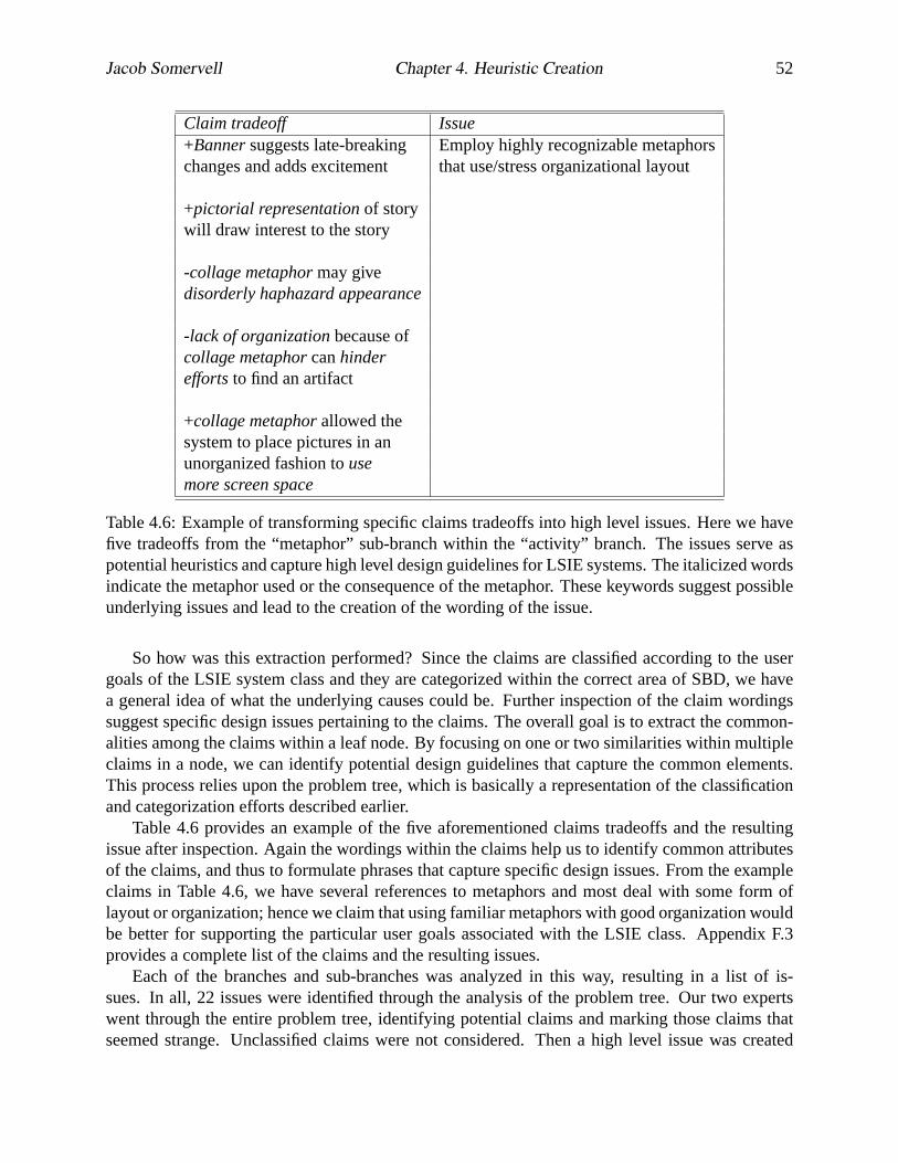
Jacob Somervell Chapter 4. Heuristic Creation 52
Claim tradeoff Issue+Bannersuggests late-breaking Employ highly recognizable metaphorschanges and adds excitement that use/stress organizational layout
+pictorial representationof storywill draw interest to the story
-collage metaphormay givedisorderly haphazard appearance
-lack of organizationbecause ofcollage metaphorcanhindereffortsto find an artifact
+collage metaphorallowed thesystem to place pictures in anunorganized fashion tousemore screen space
Table 4.6: Example of transforming specific claims tradeoffs into high level issues. Here we havefive tradeoffs from the “metaphor” sub-branch within the “activity” branch. The issues serve aspotential heuristics and capture high level design guidelines for LSIE systems. The italicized wordsindicate the metaphor used or the consequence of the metaphor. These keywords suggest possibleunderlying issues and lead to the creation of the wording of the issue.
So how was this extraction performed? Since the claims are classified according to the usergoals of the LSIE system class and they are categorized within the correct area of SBD, we havea general idea of what the underlying causes could be. Further inspection of the claim wordingssuggest specific design issues pertaining to the claims. The overall goal is to extract the common-alities among the claims within a leaf node. By focusing on one or two similarities within multipleclaims in a node, we can identify potential design guidelines that capture the common elements.This process relies upon the problem tree, which is basically a representation of the classificationand categorization efforts described earlier.
Table 4.6 provides an example of the five aforementioned claims tradeoffs and the resultingissue after inspection. Again the wordings within the claims help us to identify common attributesof the claims, and thus to formulate phrases that capture specific design issues. From the exampleclaims in Table 4.6, we have several references to metaphors and most deal with some form oflayout or organization; hence we claim that using familiar metaphors with good organization wouldbe better for supporting the particular user goals associated with the LSIE class. Appendix F.3provides a complete list of the claims and the resulting issues.
Each of the branches and sub-branches was analyzed in this way, resulting in a list of is-sues. In all, 22 issues were identified through the analysis of the problem tree. Our two expertswent through the entire problem tree, identifying potential claims and marking those claims thatseemed strange. Unclassified claims were not considered. Then a high level issue was created

Jacob Somervell Chapter 4. Heuristic Creation 53
Issues Resulting HeuristicUsecool colors(blues, greens) for Appropriate color schemes can be used forborders and backgrounds supporting information understanding.
Usewarm colors(reds, yellows) forimportant information itemsand highlighting
Avoid heavy useof bright colors.
Table 4.7: Example of how to extract heuristics from the design issues. Here we have severaldesign issues on the left and the resulting heuristic on the right. Italics show the keywords that ledto the formulation of the heuristic.
that attempted to capture the majority of the claims within a leaf node of the problem tree. Thesewordings are somewhat arbitrary but they do provide useful design guidance. These 22 issues(found in Appendix E) represent high level design guidance extracted from the claims in the prob-lem tree. They do not quite serve as heuristics because some are related by other, even higherlevel causes. These issues were then categorized and synthesized into general heuristics througha similar discussion and mitigation technique, relying upon commonalities within the issues. Thefinal synthesis resulted in a list of eight potential heuristics, based on the type and frequency of theproblem occurring in the five systems.
4.7.3 Issues to Heuristics
Armed with the 22 high level issues, we now needed to extract a subset of high level designheuristics from these issues. Twenty-two is unmanageable for formative heuristic evaluation [66]and in many cases the issues were similar or related, suggesting opportunities for concatenation andgrouping. This similarity allowed us to create higher level, more generic heuristics to capture theissues. This process involved inspecting the issues for underlying similarities and then creating anew wording that captured the issues. This new wording serves as the heuristic in the final set. Thewordings of some of the original issues are also provided with the heuristics as details describingthe new heuristics, providing better understanding of the applicability and scope of an individualheuristic. These issues also provide some clarification for how the final heuristic could be appliedin an evaluation. We created eight final heuristics, capturing the 22 issues discovered in the earlierprocess. Table 4.7 provides an example of how we moved from the issues to the heuristics. Inmost instances, two or three issues could be combined into a single heuristic. However some ofthe issues were already at a high level and were taken directly into the heuristic list. The techniquein this synthesis process relies upon team discussion to come up with the individual wordings thatcaptured the issues. Appendix F.4 provides a complete listing of the issues and resulting heuristicsfrom the synthesis process. The following section provides the final heuristics with explanatorytext taken directly from the issue list (Appendix E).

Jacob Somervell Chapter 4. Heuristic Creation 54
4.7.4 Heuristics
Here is the list of heuristics that can be used to guide evaluation of large screen information ex-hibits. Explanatory text follows each heuristic, to clarify and illustrate how the heuristics couldimpact evaluation. Each is general enough to be applied to many systems in this application class,yet they all address the unique user goals of large screen information exhibits.
• Appropriate color schemes should be used for supporting information understanding.Try using cool colors such as blue or green for background or borders. Use warm colors likered and yellow for highlighting or emphasis.
• Layout should reflect the information according to its intended use.Time based informa-tion should use a sequential layout; topical information should use categorical, hierarchical,or grid layouts. Screen space should be delegated according to information importance.
• Judicious use of animation is necessary for effective design.Multiple, separate anima-tions should be avoided. Indicate current and target locations if items are to be automaticallymoved around the display. Introduce new items with slower, smooth transitions. Highlight-ing related information is an effective technique for showing relationships among data.
• Use text banners only when necessary.Reading text on a large screen takes time and effort.Try to keep it at the top or bottom of the screen if necessary. Use sans serif fonts to facilitatereading, and make sure the font sizes are big enough.
• Show the presence of information, but not the details.Use icons to represent larger infor-mation structures, or to provide an overview of the information space, but not the detailedinformation; viewing information details is better suited to desktop interfaces. The mag-nitude or density of the information dictates representation mechanism (text vs icons forexample).
• Using cyclic displays can be useful, but care must be taken in implementation.Indicate“where” the display is in the cycle (i.e. 1 of 5 items, or progress bar). Timings (both forsingle item presence and total cycle time) on cycles should be appropriate and allow users tounderstand content without being distracted.
• Avoid the use of audio.Audio is distracting, and on a large public display, could be detri-mental to others in the setting. Furthermore, lack of audio can reinforce the idea of relyingon the visual system for information exchange.
• Eliminate or hide configurability controls. Large public displays should be configured onetime by an administrator. Allowing multiple users to change settings can increase confusionand distraction caused by the display. Changing the interface too often prevents users fromlearning the interface.

Jacob Somervell Chapter 4. Heuristic Creation 55
4.8 Discussion
Initially one may have questions about the applicability of this method for other system classes.Would different inspectors come up with the same heuristics, if they followed the method as de-scribed? Perhaps, perhaps not. Individual differences can manifest in all stages of this method,from system selection, to claims analysis, to classification, and so on. Of course different peoplewould uncover different heuristics through this process. However, the point of the method is toprovide a structured process to producing such heuristics, not ensure that the set of heuristics pro-duced is the best set for the system class. Proving that requires testing and comparing the new setof heuristics with other alternatives, to assess system problem coverage and applicability.
To better illustrate this point, consider claims analysis by itself [15]. Given a scenario forsome system, two different inspectors will come up with different sets of claims for the scenario.Does this suggest that the claims analysis method is weak or faulty? No, it simply illustrates thecomplexity of design, and how individuals insert their knowledge upon the process. In fact, it is thiscomplexity and reliance upon individual knowledge that strengthens the claims analysis technique.More people can identify more claims for a given scenario, thus broadening the understanding ofthe system. An analogous argument can be made for the method used in this work. The set ofheuristics found in this particular effort may not capture every last detail for every LSIE, but itdoes not have to do that. Furthermore, if other evaluators went through our creation method andcame up with a different set of heuristics, it is likely that the set would provide similar designguidance as the one produced in this work because the would be based on the same underlyingdesign problems in the target systems, as identified through impacts on the critical parameters andhow they fall within the SBD categorization.
The strength of this method is evident in the clearly defined steps for producing heuristicsfrom system inspection. Instead of blindly guessing about correct design guidelines for a systemclass, one can follow this process to systematically derive heuristics from example systems. Thisstructure is necessary for gaining design guidance in new areas of system development, like notifi-cation systems, or ubiquitous computing, or real world interfaces. These areas are relatively new,and they do not have established usability techniques specifically tailored to the unique user goalsassociated with them.
Process Analysis When reflecting upon this creation process, it is important to contrast it withother heuristic development approaches. Consider the creation of Nielsen’s 10 heuristics. Theseheuristics were originally described in a 1990 Communications of the ACM article [66] and werebased on observations of system use by those authors and several years of experience. Of courseNielsen was/is an experienced consultant, so his and Molich’s experience is indeed valuable. Laterworks by Nielsen do not describe the genesis of these heuristics [71, 69, 70], and it seems thatthe creation of that original set is still a mystery. Perhaps more important, they do not describeany structure for creating one’s own heuristics. They seemed more concerned with generating andperfecting generic heuristics. In contrast, our creation process is based on six distinct steps, with aclear structure that can be followed from start to finish.
As hinted earlier, neither Mankoff et al. nor Baker et al. provide a detailed description oftheir respective heuristic creation processes. It appears that Mankoff et al. relied upon Nielsen’soriginal set of heuristics as a basis, then went through some modification process to derive a settailored to ambient displays [56]. This modification is not entirely clear from their description

Jacob Somervell Chapter 4. Heuristic Creation 56
but they did show that tailored heuristics are more desirable over more generic sets. Baker etal. performed similar heuristic creation effort, producing heuristics tailored to groupware systems[5]. While their creation method was not entirely replicable, at least their process is grounded intheoretical underpinnings surrounding their target system class. Like Mankoff, Baker also showedthat specific heuristics are better for evaluation over more generic heuristics [5]. It is important tonote that both of these efforts reported creation methods that relied upon what the authors felt werethe most important elements for the respective system classes. This provides some inspiration forour effort, because we embrace the notion of critical parameters and it is encouraging to see othersattempting similar efforts.
It seems that the most important steps in our creation process are the scenario extraction, claimsanalysis, classification, and categorization. These steps provide the background and support for thesynthesis of heuristics. It is in these steps that the critical parameters support the creation processby focusing creation effort on identifying claims that impact the parameters. This leads to heuristicsthat allows evaluators to describe problems that are related to the important user goals for a system.This further illustrates the utility of critical parameters and how, when identified for a system class,they can guide both design and evaluation cycles.
We feel good about this creation process, and our successful creation of heuristic tailored tothe LSIE system class provides some indication of how the technique can be applied. However,there are some drawbacks related to the specific steps in the process. Specifically this process ishighly dependent upon the individuals involved in the process due to the analytic requirementsin extracting design issues and synthesizing heuristics. If there were mechanisms to guide theanalysis required in these phases, we could reduce variability among different creators using themethod, reducing overall creation time.
Finally, consider the time it took for Molich and Nielsen to publish their heuristics. The accu-mulated knowledge reported in their heuristics was aggregated roughly 30 years after computingbecame mainstream. However, new research areas (like notification systems) need evaluation toolsin the short term as developers and designers can not wait 30 years to test their systems. Hence,the method described here would allow usability professionals to develop heuristics in a system-atic and structured way, with turn around time on the order of a few weeks as opposed to years.Granted, there is significant effort involved, but the process at least produces some form of usableheuristic guidance (see Chapters 6 and 5 for validation of this claim).
4.9 Summary
We have described the process of creating usability heuristics for LSIEs. By using scenario baseddesign, which focuses on user goals and tasks, we have inspected five different systems from theinformation exhibit class, and identified several high level heuristics. Several important steps makeup this creation process. Claims analysis allows us to extract potential design tradeoffs from thesystems. Classifying these claims according to impact on user goals provides initial indicators ofsimilar claims, but there are too many claims within a single classification (like high interruption).Further categorization is required to more fully separate the different types of claims from oneanother. The SBD categories provide a simple and manageable breakdown of claim types. By usinga physical model of the resulting problem tree, one is able to consider a small group of claims ata time to process and extract higher level design issues. After the design issues are extracted from

Jacob Somervell Chapter 4. Heuristic Creation 57
Figure 4.3: Creation process used to extract heuristics from system inspection.
the problem tree, one is able to synthesize heuristics from similar issues, resulting in a smaller,more manageable set. Figure 4.3 provides a graphical depiction of the creation process.
By grounding these heuristics in real systems that have been developed and used, we haveestablished a set that is based on real system problems. Other researchers do not adequately de-scribe how their heuristics were developed [5, 56], which allows critics to question their originsand doubt their validity; whereas we have shown the explicit steps taken in the creation process,which provides the background and foundation for this heuristic set.
We envision these heuristics as guiding and grounding analytical evaluation of LSIEs. How-ever, we do not expect practitioners to simply pick these up and use them without knowingwhether or not they work, especially when they have alternatives that have been extensively studied(Nielsen’s for example). Therefore, the next step in this creation process is to perform empiricaltests on our heuristics. We will compare them to the more established heuristics (like Nielsen’s),using accepted UEM comparison metrics [40], thereby determining whether or not our heuristicswill be useful in formative usability evaluation for the LSIE class. The next chapter reports an ex-periment in which this comparison study was executed. Chapter 6 describes an effort to show theutility of the heuristics described here through actual use in evaluation. It includes two applicationexamples, and some feedback from international experts.

Chapter 5
Heuristic Comparison Experiment
5.1 Introduction
This chapter reports on an experiment in which the heuristics that were developed in Chapter 4 aretested to see if they indeed provide a useful and sound evaluation approach to the usability analysisof large screen information exhibits. If these new heuristics perform as well as or better thanexisting alternatives (other heuristic sets), then that is evidence that the heuristic creation methodproduces usable evaluation tools, further strengthening the notion of critical parameters as a soundUEM creation approach.
Now that there is a set of heuristics tailored for the large screen information exhibit systemclass, a comparison of this set to more established types of heuristics can be done. The purpose ofthis comparison would be to show the utility of this new heuristic set. This comparison needs tobe fair, so that determining the effectiveness of the new method will be accurate.
To assess whether the new set of heuristics provides better usability results over existing alter-native sets, we conducted a comparison experiment in which each of three sets of heuristics wereused to evaluate three separate large screen information exhibits. We then compared the resultsof each set through several metrics to determine the better evaluation methods for large screeninformation exhibits.
This comparison is necessary for several reasons. Because we have a new UEM, we needto show that it performs as well as or better than alternative methods. If this method does notproduce similar results, then an alternative UEM creation approach is necessary. In addition, thisexperiment serves as initial validation of the heuristic set by showing it can be used to discoverusability issues with large screen information exhibits.
5.2 Approach
The following sections provide descriptions of the heuristics used, the comparison method, and thesystems used in this experiment.
58

Jacob Somervell Chapter 5. Heuristic Comparison Experiment 59
Visibility of system statusMatch between system and real worldUser control and freedomConsistency and standardsError preventionRecognition rather than recallFlexibility and efficiency of useAesthetic and minimalist designHelp users recognize, diagnose, and
recover from errorsHelp and documentation
Figure 5.1: Nielsen’s heuristics. General heuristics that apply to most interfaces. Found in [70].
5.2.1 Heuristic Sets
We used three different sets of usability heuristics, each at a different level of specificity for ap-plication to large screen information exhibits, ranging from a set completely designed for thisparticular system class, to a generic set applicable to a wide range of interactive systems. Thefollowing sections provide more information on each set, as well as a listing of the heuristics.
Nielsen
The least specific set of heuristics was taken from Nielsen and Mack [70]. This set is intendedfor use on any interactive system, mostly targeted towards desktop applications. Furthermore, thisset has been in use since around 1990. It has been tested and criticized for years, but still remainspopular with usability practitioners. Again, this set is not tailored for large screen informationexhibits in any way and has no relation to the critical parameters for notification systems. SeeFigure 5.1 for a listing of this set of heuristics.
Content Comparison It is worthwhile to consider at a conceptual level what is contained inthe actual heuristics that are provided to the evaluators. As seen in Chapter 4, the new heuristicsconsist of a general statement and several sentences describing in more detail the idea containedin the general statement. These sentences are theissuesthat were identified through the creationprocess (Section 4.7.2). This bundle of information (statement plus issues) provides considerabledesign knowledge to the evaluator as he/she performs the heuristic evaluation.
In contrast, Nielsen’s heuristics are more generic in the information provided, requiring theevaluator to perform a mental interpretation of the heuristic meaning when applied in an evaluation.Figure 5.1 illustrates the vague nature of the general statements provided in [70]. Nielsen alsoprovides some sentences to clarify the general statements, but the information contained in thesestatements is also less specific than the content of the issues provided with the new set of heuristics.
The implication of having more design-related content in the heuristic descriptions is that eval-uators may be able to word problems that are found in terms of offending artifacts in the design,possibly suggesting immediate fixes or at least suggesting which areas to search for ideas in similarartifacts, like in a claims library [17]. Without this close tie to the underlying goals of the system,

Jacob Somervell Chapter 5. Heuristic Comparison Experiment 60
Notifications should be timelyNotifications should be reliableNotification displays should be consistent
(within priority levels)Information should be clearly understandable
by the userAllow for shortcuts to more informationIndicate status of notification systemFlexibility and efficiency of useProvide context of notificationsAllow adjustment of notification parameters
to fit user goals
Figure 5.2: Berry’s heuristics. Tailored more towards Notification Systems in general. Found in[9].
evaluators are forced to write out problems in generic terms, which must then be interpreted by thedesigner during re-design phases, potentially increasing the overall development time and costs.
Berry
The second heuristic set used in this comparison test was created for general notification systemsby Berry [9]. This set is based on the critical parameters associated with notification systems [62],but only at cursory levels. This set is more closely tied to large screen information exhibits thanNielsen’s method in that large screen information exhibits are a subset of notification systems, butthis set is still generic in nature with regards to the specifics surrounding the LSIE system class.See Figure 5.2 for a listing of this heuristic set.
Content Comparison Although Berry’s heuristics are at least attuned to the critical parametersassociated with Notification Systems, they are still generic in relation to the LSIE system class.In assessing the content of these heuristics, they attempt to illustrate the overarching goals ofgeneral notification systems by focusing evaluator attention on conceptual issues surrounding theapplication and use of the system. This is similar to Nielsen’s heuristics, but these are more focusedon a specific type of system (NS) as opposed to any generic interface.
Like Nielsen’s, these heuristics also have some explanatory text associated with the heuristicwith which evaluators can more accurately assess an interface. But, an evaluator will still need toperform some form of mental interpretation when applying these heuristics to LSIE systems. InBerry’s case, the explanatory text describes examples of possible notification systems and why theheuristic would be important to consider in an evaluation. This information is more specific thanNielsen’s, and helps evaluators understand how the heuristic is intended to be used.
In comparison to Somervell’s heuristics, the content in Berry’s heuristics is much more generalin nature. While they do address notification system concerns, they do not address the more specificlevels of each parameter that define the LSIE system class (namely self-defined interruption, highcomprehension, and appropriate reaction). This difference could impact design guidance duringthe redesign portion of system development cycles. Because evaluators must be more creative in

Jacob Somervell Chapter 5. Heuristic Comparison Experiment 61
their application of Berry’s heuristics, he/she may not be able to describe the problem in terms thatsuggest immediate re-design fixes.
Somervell
The final heuristic set is the one created in this work, as reported in Chapter 4. This set is tailoredspecifically to large screen information exhibits, and thus would be the most specific method ofthe three when targeting this type of system. It is based on specific levels of the critical parametersassociated with the LSIE system class.
In contrast to the other two sets, these heuristics are tuned to the unique challenges surround-ing the development and use of LSIE systems. Application is straightforward, with less mentalinterpretation from the evaluator. Describing problems should also be facilitated by focusing thewordings on the artifacts in the design that cause or contribute to the problem. Evidence fromexample application of these heuristics is provided in Chapter 6
Thus, we have a small spectrum of specificity with these three heuristic sets, ranging from thegeneric to the specific. In line with previous research [56, 5], we hypothesize that the more specificmethods will produce “better” evaluation results. The following section describes the comparisontechnique used and what we will use as a definition for “better”.
5.2.2 Comparison Technique
To determine which of the three sets is better suited for formative evaluation of large screen infor-mation exhibits, we use a current set of comparison metrics that rely upon several measures of amethod’s ability to uncover usability problems through an evaluation. This technique is describedfully in [40]. A terse description of this method follows.
The comparison method we are using typically relies on five separate measures to assess theutility of a given UEM for one’s particular needs, but we will only use a subset in this particularcomparison study. Hartson et al. report that thoroughness, validity, effectiveness, reliability, anddownstream utility are appropriate measures for comparing evaluation methods [40]. A subset ofthese measures was used for this work due to data collection methods and relative worth of themetric. Specifically, our comparison method capitalizes on thoroughness, validity, effectiveness,and reliability, abandoning the downstream utility measure. This choice is used here because long-term studies are required to illustrate downstream utility. Besides, application examples in Chapter6 further illustrate the utility of the new method for providing re-design guidance and act as areplacement.
Thoroughness
The first measure we will use isthoroughness. This measure gives an indication of a method’sability to uncover a significant percentage of the problems in a given system. Thoroughness con-sists of a simple calculation of the number of problems uncovered by a single UEM divided by thetotal number of problems found by all three methods.
thoroughness =# of problems found by target UEM
# of problems found by all methods

Jacob Somervell Chapter 5. Heuristic Comparison Experiment 62
Validity
Another measure, which relies on the same data, isvalidity. Validity refers to the ability of amethod to uncover the types of problems that real users would experience in day to day use ofthe system, as opposed to simple or minor problems. Validity is measured as the number of realproblems found divided by the total number of real problems identified in the system.
validity =# of problems found by target UEM
# of problems in the system
The number of real problems in the system refers to the problem set identified through somestandard method that is separate from the method being tested. Section 5.2.5 provides a descriptionof the problem sets used in this test.
Effectiveness
Effectivenesscombines the previous two metrics into a single assessment of the method. Thismeasure is calculated by multiplying the thoroughness score by the validity score.
effectiveness = thoroughness ∗ validity
Reliability
Reliability is a measure of the consistency of the results of several evaluators using the method.This is also sometimes referred to as inter-rater reliability. This measure is taken more as agree-ment between the usability problem sets produced by different people using a given method. Thismeasure is calculated from thedifferencesamong all of the evaluators for a specific system as wellas by the total number ofagreementsamong the evaluators, thus two measures are used to providea more robust measurement of the reliability of the heuristic sets:
reliabilityd = difference among evaluators for a specific method
reliabilitya = average agreement among evaluators for a specific method
For calculating reliability, Hartson et al. recommend using a method from Sears [81] that de-pends on the ratio of the standard deviation of the numbers of problems found by the averagenumber found [40]. This measure of reliability is overly complicated for current needs, thus amore traditional measure that relies upon actual rater differences is used instead.
These measures are only part of what Hartson et al. provide in [40]. These and not othermeasures from their work (e.g. downstream utility) are used because these measures are the mostprevalent among other UEM comparison studies [40, 21].
5.2.3 Systems
Three systems were used in the comparison study providing a range of applications for which eachheuristic would be used in an analytic evaluation. The intent was to provide enough variability inthe test systems to tease out differences in the methods. The following sections describe the threesystems used in this study.

Jacob Somervell Chapter 5. Heuristic Comparison Experiment 63
Source Viewer
One of these large screen systems is a local television station’s master control room. This roomprovides quality control to the broadcasts before they leave the station and go to the transmissionantennas. The controller sits at a work station, surrounded by controls, video screens, and oscillo-scopes. Mounted on the wall directly in front of this work station is a large screen display, uponwhich there are 13 different video feeds, plus a clock. This large screen display, which we will callthe Source Viewer, helps the controller keep track of the programming for the day. The controller’smain focus is upon the myriad video monitors and control devices at his work station, and he reliesupon the large screen for source switching.
The Source Viewer exists to provide surveillance-like information to the controller as he/shemakes sure the broadcast is correct and on schedule with the programming guidelines. To accom-plish this task effectively, the controller must be able to quickly and easily see the informationfrom several different sources, and press buttons on the control panel to initiate changes on what istransmitted through the broadcast antennas. See Figure 5.3 for a screenshot of the Source Viewerand its layout.
The following scenario illustrates the setup and typical usage of the Source Viewer:
John, the control manager, must ensure that the appropriate breaks occur in the broad-cast at specific times. This job is one of the most important in the station because hecontrols what is broadcast over the antennas, and ultimately, what the end consumersees on his/her television set. The main aspect of this work involves switching amongsources to broadcast the required signal at the right times. Timed switches are trig-gered mostly through audio cues, with some visual cues to add redundancy. Howeverit is paramount to understand exactly what will be broadcast from a particular source,especially if that source is the one to be broadcast on the button press.
Hence, there is a large screen display to help John keep track of what is being broadcastand what options he has for switching the signal. This screen shows the current signaland up to 13 other sources that can be queued for switching at the touch of a button.In addition, there is a digital clock to assist with timings. Each source has a label box,positioned at bottom center. This label is opaque and thus obscures what is behind it.The label can be removed but not moved within the source box.
This simple display provides invaluable information to John as he performs his duties.He does not look at the display the whole time, but rather relies on audio and certainvisual cues to perform the source switching required in completing his tasks. He looksat the display briefly before switching sources to ensure that the correct video feed isbroadcast at the correct times.
Why Source Viewer? The Source Viewer was chosen as a target system for this study becausewe wanted an example of a real system that has been in regular use for an extended period. Weimmediately thought of command and control situations. Potential candidates included local tele-vision stations, local air traffic control towers, electrical power companies, and telephone exchangestations. We finally settled on local television command and control after limited responses fromthe other candidates.

Jacob Somervell Chapter 5. Heuristic Comparison Experiment 64
Figure 5.3: Layout of the Source Viewer large screen display at WDBJ 7 in Roanoke, VA.
We finally chose WDBJ 7 in Roanoke, VA as the target location because they were interestedin new technology and had a large screen system installed at their Roanoke broadcast station.Furthermore, the president of the station was interested in public relations and wanted to be ofassistance to this research effort.
By using a local system, we are giving back to the community through improved usability ina local television broadcast station, thereby increasing the quality in the broadcasts to the public.We have the opportunity to show real impact in this work through improved system design for areal world command and control situation.
Plasma Poster
The Plasma Poster [20] is a large screen program that runs on a situated plasma screen in differentlocations within an organization. Typical installation locations include kitchen areas, hallways,alcoves, atriums, and similar areas with high traffic. Information is posted to the Plasma Poster bymembers of the organization. This information can include any type of content but is typically an-nouncements of upcoming events or web page snippets of information that people find interestingor amusing.
The intent of the display is to encourage information sharing and thus casual, unplanned inter-actions among the organization members [20]. These types of interactions would typically occurduring break times but could occur at anytime. Users are often busy reading, editing, or workingand rely on the Plasma Poster for local updates.
Content is sent to the display in two ways; either through a web interface or through email. Theweb interface is a standard submission style interface where a user types in relevant information

Jacob Somervell Chapter 5. Heuristic Comparison Experiment 65
and hits a submit button. The email interface is unusual in that the Plasma Poster has an emailaddress and you can send messages to it like it is a real person. Content is not posted from theactual Plasma Poster itself, so a person cannot walk up to the display and add content.
People who post content have limited information (name, work location, etc.) about them alsoposted at the bottom of the display. In addition, there is a cyclic list of upcoming posts. Theseupcoming posts are the ones that will be displayed after the current wait cycle has expired. Thus,the display automatically changes its content after a short time (about 30 seconds). At the verybottom of the screen are controls for browsing through content, gaining details, and sending a postto yourself via email.
The following scenarios describe the Plasma Poster and how it is typically used:
1. Elizabeth goes to the kitchen to get some coffee. She glances at the Plasma Posterand sees a new announcement for an upcoming presentation by her friend on his recentresearch effort. She goes over to the display and reads the date, time, and location ofthe presentation and makes a mental note to write it down in her schedule.
2. Alex is walking down the hall to his office when he sees Kathy looking at the PlasmaPoster. He stops by and sees that she is viewing a posting from a mutual friend in thebuilding about an informal get together later in the week. He stops, asks her if she isgoing, and they make plans to car-pool. He then remembers they have a meeting andsuggests they go over some information beforehand.
Why Plasma Poster? We wanted to include the Plasma Poster because it is one of very fewLSIE systems that has seen some success in terms of long term usage and acceptance. It has seenover a year of deployment in a large research laboratory, with reports on usage and user feedbackreported in [20].
This lengthy deployment and data collection period provides ample evidence for typical us-ability problems. We can use the published reports as support for our problem sets. Coupled withdeveloper feedback, we can effectively validate the problem set for this system.
Notification Collage
The Notification Collage [36] (NC) shows a variety of information on a large screen that looks likea large wall. A full description can be found in Section 4.4.2.
Why Notification Collage? We chose the Notification Collage as the third system for severalreasons. First, we wanted to increase the validity of any results we find. By using more systems,we get a better picture of the “goodness” of the heuristic sets, especially if we get consistent resultsacross all three systems. Secondly, we wanted to explicitly show that the heuristic set we created inthis work actually uncovered the issues that went into that creation process. In other words, sincethe Notification Collage was one of the systems that led to this heuristic set, using that set on theNotification Collage should uncover most of the issues with that system. Finally, we wanted to usethe Notification Collage out of the original five because we had the most developer feedback onthat system, and like the Plasma Poster, it has seen reasonable deployment and use.

Jacob Somervell Chapter 5. Heuristic Comparison Experiment 66
5.2.4 Hypotheses
At this point we need to specify exactly what we are looking to find in this experiment. We neededto know about the systems we were testing, and the measurements we were using before we couldexplicitly state any of our hypotheses. We have three main hypotheses to test in this experiment:
1. Somervell’s set of heuristics has a higher validity score for the Notification Collage.We believed this was true because the Notification Collage was used in the creation ofSomervell’s heuristics, thus those heuristics should identify most or all of the issues in theNotification Collage.
2. More specific heuristics have higher thoroughness, validity, and reliability measures.We felt this was true because more specific methods are more closely related to the systemsin this study. Indeed, from Chapter 3, we discussed how previous work suggests system-classlevel heuristics would be best. This experiment illustrates this case for heuristic evaluationof large screen information exhibits.
3. Generic methods require more time for evaluators to complete the study.This seemslogical because a more generic heuristic set would require more interpretation and thought,hence we felt that those evaluators who use Nielsen’s set would take longer to complete thesystem evaluations, providing further impetus for developing system-class UEMs.
5.2.5 Identifying Problem Sets
One problem identified in other UEM comparison studies involves the calculation of specific met-rics that rely upon something referred to as the “real” problem set (see [40]). In most cases, thisproblem set is the union of the problems found by each of the methods in the comparison study.In other words, each UEM is applied in a standard usability evaluation of a system, and the “real”problem set is simply the union of the problems found by each of the methods. There are issueswith this approach because there is no guarantee that the problems found by the UEMs are theproblems that would be experienced by real users in normal day to day activity with the system inquestion.
This comparison study also faced the same challenge. Instead of relying on evaluators toproduce sets of problems from each method, then using the union of those problem sets as the“real” problem set, analysis and testing was performed on the target systemsbeforehandand theproblem reports from those efforts were used to come up with a standard set of problems for eachsystem. Coupled with a new testing approach, this eliminated much of the variability inherentin most UEM comparison studies that arises from having to read through problem reports anddeduce (perhaps erroneously) the intention of the evaluator. The following sections describe howthe problem sets were derived for use in this test. Descriptions of the actual testing methodologystart in Section 5.3.
Source Viewer Problem Set
To determine the problem sets experienced by the users of this system, a field study was conducted.Two interviews with the users of the large screen system, as well as observation were conducted.

Jacob Somervell Chapter 5. Heuristic Comparison Experiment 67
This abbreviated field study produced some interesting insight into the usage and nature of thelarge screen and how it impacted daily job activities.
The interviews were conducted over a two day period with the control manager at the newsstation. They were informal in nature, and probed current usage of the large screen in supportingdaily work activity. These interviews were recorded, using both written note taking and digitalaudio recordings. The digital recordings were then transcribed to allow for complete analysis, andidentification of usability problems.
Observations occurred during a 4 hour time period, split over 2 days. The observer stayed outof the way, usually off to the side, and watched the people in the control room as they went abouttheir daily work. Notes on work context, situational context, and interactions with the large screenwere recorded. These observations served to provide evidence of the current usability issues thatthe users encountered with the large screen display.
Field Study Results Concurrently with the field study, a claims analysis [15] was performedon the Source Viewer. This analysis was based on typical usage context for the system, and wasintended to capture the typical usability issues with it. We used this format with all three systemsto ensure a common, easy to understand representation of the problem sets.
The claims analysis identified 11 claims, altogether covering about 30 tradeoffs with the SourceViewer. These claims were then verified with the field study results. Each of the claims capturesa typical usability tradeoff in the design of the source viewer as reported from interviews with thesystem users. This verification ensures that the problems we have in the claims analysis are indeeda subset of the real problems that are experienced by the users of this system.
Plasma Poster Problem Set
Analytic evaluation augmented with developer feedback and literature review served as the methodfor determining the real problem set for the Plasma Poster. We employed the same claims analysistechnique that we used in the creation process to identify typical usability tradeoffs for the PlasmaPoster. After identifying the usability issues, we asked the developers of the system to verify thetradeoffs.
In all there were 14 tradeoffs for the Plasma Poster and most were validated by the lead de-veloper of the system. In addition, we used the literature available on the Plasma Poster to verifycertain claims that represented behavior the developers could not recall or had not observed. Thus,we used all 14 claims in the experiment.
Notification Collage Problem Set
To validate the problem set for the Notification Collage, we contacted the developers of the systemand asked them to check each tradeoff as it pertained to the behavior of real users. The developerswere given a list of the tradeoffs found in our claims analysis (from Chapter 4) and asked to verifyeach tradeoff according to their observations of real user behavior. This problem set validationinsured that the problems we would be using in the test were at least a subset of the real problemsthat users experienced in their daily use of the system.

Jacob Somervell Chapter 5. Heuristic Comparison Experiment 68
Method OrderingNielsen PSN PNS SNP
SPN NPS NSP
Berry PSN PNS SNPSPN NPS NSP
Somervell PSN PNS SNPSPN NPS NSP
Table 5.1: Latin Square balanced ordering for the test setup used in the comparison study. P standsfor Plasma Poster, S stands for Source Viewer, and N stands for Notification Collage.
5.3 Testing Methodology
This experiment involves a 3x3 mixed factors design. We have three levels of heuristics (Nielsen,Berry, and Somervell) and three systems (Source Viewer, Plasma Poster, and Notification Collage).The heuristics variable is a between-subjects variable because each evaluator sees only one set ofheuristics. The system variable is within-subjects because each participant sees all three systems.For example, evaluator 1 saw only Nielsen’s heuristics, but used those to evaluate all three systems.
We used a balanced Latin Square to ensure learning effects from system presentation orderwould be minimized. Thus, we needed a minimum of 18 participants (6 per heuristic set) toensure coverage of the systems in the Latin Square balancing. Table 5.1 shows the presentationorder resulting from the balanced Latin Square. The first entry in the first column indicates whichsystem the participant would see first, second, and third; or in this case, Plasma Poster (P), SourceViewer (S), then Notification Collage (N). We did not expect the system presentation order toimpact the study, but using the Latin Square ordering effectively eliminates any possible effectsfrom presentation order.
5.3.1 Participants
As shown in Table 5.1, we needed a minimum of 18 evaluators for this study. Twenty-one computerscience graduate students who had completed a course on Usability Engineering volunteered forparticipation as inspectors. Six participants were assigned to each heuristic set, to cover each ofthe order assignments. Three additional students volunteered and they were randomly assigned apresentation order.
These participants all had knowledge of usability evaluation, as well as analytic and empiricalmethods. Furthermore, each was familiar with heuristic evaluation. Some of the participants werenot familiar with the claim structure used in this study, but they were able to understand the tradeoffconcept immediately.
Unfortunately, one of the participants failed to complete the experiment. This individual ap-parently decided the effort required to complete the test was too much, and thus filled out thequestionnaire using a set pattern. For example, this participant answered the questions exactly the

Jacob Somervell Chapter 5. Heuristic Comparison Experiment 69
same for every claim, for all three systems. It is obvious that they did not look at or think aboutthe issue and the heuristic applicability, but chose to simply mark the circles as they saw fit. It wasonly obvious after about 10 claims that the participant was simply marking the answers exactly thesame as on the previous sheet. As a result, we were forced to disregard this person’s answers anddata. This makes the final number of participants 20, with seven for Nielsen’s heuristics, seven forBerry’s heuristics, and six for Somervell’s heuristics.
5.3.2 Materials
Each target system was described in one to three short scenarios, and screen shots were provided tothe evaluators. The goal was to provide the evaluators with a sense of the display and its intendedusage. This material is sufficient for the heuristic inspection technique according to Nielsen andMack [70]. This setup ensured that each of the heuristic sets would be used with the same material,thereby reducing the number of random variables in the execution of this experiment.
A description of the heuristic set to be used was also provided to the evaluators. This descrip-tion included a listing of the heuristics and accompanying text clarification. This clarification helpsa person understand the intent and meaning of a specific heuristic, hopefully aiding in assessment.These descriptions were taken from [70] and [9] for Nielsen and Berry respectively.
Armed with the materials for the experiment, the evaluator then proceeded to rate each of theheuristics using a 7-point Likert scale, based on whether or not they felt that the heuristic applied toa claim describing a design tradeoff in the interface. Thus they are judging whether or not a specificheuristic applies to the claim, and how much so. Marks of four or higher indicate agreement that theheuristic applies to the claim, otherwise the evaluator is indicating disagreement that the heuristicapplies.
To fully understand this setup, one needs to understand the presentation used to provide theevaluator with the necessary comprehension of a potential usability problem in the target system.Instead of listing a specific problem in the interface, we used a claims analysis technique of show-ing a design decision, along with its associated upside and downside tradeoffs. This presentationformat gets the evaluator to think about the claim (design decision) in terms of the rationale behindit, as well as the potential negative results of using that design decision. This format allows theevaluator to make their own judgment as to whether a particular heuristic would apply to the issuedescribed in the claim. Another way to think of this would be that the evaluator speculates as towhether a heuristic would lead to the discovery of the issue in the claim (if the claim had not beenpresented to the evaluator). He or she then indicates how much they think a heuristic applies to theclaim by marking the corresponding point on the Likert scale.
5.3.3 Questionnaire
As mentioned earlier, the evaluators in this experiment provided their feedback through a Likertscale, with agreement ratings for each of the heuristics in the set. In addition to this feedback, eachevaluator also rated the claim in terms of how much they felt it actually applied to the interfacein question. By indicating their agreement level with the claim to the interface, we get feedbackon whether usability experts actually think the claim is appropriate for the interface in question.This feedback helps us in identifying the issues that truly seem to apply to the interface, according

Jacob Somervell Chapter 5. Heuristic Comparison Experiment 70
to multiple experts. They provided this claim applicability feedback before rating the heuristics.Appendix G provides a copy of the questionnaire.
After rating each of the heuristics for the claims, we also asked each evaluator to rank theseverity that the claim would hold, if the claim were indeed a usability problem in the interface.This question asked the evaluators to rely on their expertise in usability evaluation in order to rankthe claim as a usability problem. Rankings ranged from “no problem” to “most severe”, withthe latter indicating the problem must be fixed and the former indicating that the claim does notrepresent a usability issue in the interface.
5.3.4 Measurements Recorded
The data collected in this experiment consists of each evaluator’s rating of the claim applicability,each heuristic rating for an individual claim, and the evaluator’s assessment of the severity of theusability problem. This data was collected for each of the thirty claims across the three systems.
In addition to the above measures, we also collected data on the evaluator’s experience withusability evaluation, heuristics, and large screen information exhibits. This evaluator informationwas collected through survey questions before the evaluation was started.
After the evaluators completed the test, they recorded the amount of time they spent on thetask. This was a self reported value as each evaluator worked at his/her own pace and in their ownlocation.
Data collection was done through pen and paper. Each claim was presented on a single sheetof paper, along with the questions about the applicability of the claim to the interface and theseverity of the problem. In addition, each of the heuristics was listed on the same sheet, adjacentto the claim. This setup allowed the evaluator to consider the claim for each of the heuristics andsubsequently rate how much they felt the heuristic applied to the claim. As mentioned earlier, eachheuristic was rated on a 7-point Likert scale, indicating the evaluators level of agreement that theheuristic applied to the claim. Agree ratings meant that the heuristic somehow related to the issuein the claim, through the associated upside or downside tradeoffs. Disagree ratings meant that theheuristic did not really relate to the claim.
5.4 Results
Twenty-one evaluators provided feedback on 33 different claims across three systems. Each eval-uator ended up providing either 10 or 12 question responses per claim, depending on the heuristicset used (Nielsen’s set has 10 in it, whereas the others only have 8). This means we have either 330or 396 answers to consider, per evaluator. Fortunately, this data was separable into manageablechunks, dealing with applicability, severity, and heuristic ratings; as well as evaluator experiencelevels and time to complete for each method.
5.4.1 Participant Experience
As for individual evaluator abilities, the average experience level with usability evaluation, acrossall three systems, was “amateur”. This means that overall, for each heuristic set, we had com-parable experience for the evaluators assigned to that set. This feedback was determined from a

Jacob Somervell Chapter 5. Heuristic Comparison Experiment 71
Participant Set Usability Heuristic LSIE1 Nielsen expert amateur novice2 Nielsen expert amateur amateur3 Nielsen expert expert novice4 Nielsen amateur amateur novice5 Nielsen amateur amateur novice6 Nielsen amateur novice novice7 Nielsen expert amateur novice
8 Berry amateur novice novice9 Berry expert amateur novice10 Berry expert amateur novice11 Berry amateur expert novice12 Berry amateur amateur novice13 Berry expert amateur expert14 Berry expert amateur amateur
15 Somervell expert amateur amateur16 Somervell amateur amateur novice17 Somervell amateur amateur novice18 Somervell amateur amateur novice19 Somervell amateur amateur novice20 Somervell amateur amateur novice
Table 5.2: Evaluator experience with usability evaluation. Amateur means they had knowledgeof usability evaluation and had performed at least one such evaluation. Novice means that theevaluator was only familiar with the concept of usability evaluation. Expert means the evaluatorhad performed two or more evaluations.
question asking the evaluator to rate his/her experience with usability evaluation. They answeredthe question with either novice, amateur, or expert. This answer was then coded with a 1, 2, or 3 sothat averages and standard deviations could be taken. Table 5.2 lists the self-reported experiencelevel for each evaluator, with their assignments to the systems. Thus, we are confident that theoverall usability evaluation experience levels of the evaluators was equal or near equal across thethree heuristic sets.
What about experience with heuristic evaluation or experience with large screen informationexhibits? Feedback on these questions was given as responses to similar questions as the usabil-ity evaluation experience. Again, evaluators gave their self-assessment rating of their experiencelevel with heuristic evaluation and with large screen information exhibits. Table 5.2 gives theratings of each evaluator. Heuristic experience was equal or near equal across all three heuristicsets. Experience with large screen information exhibits was likewise equal or near equal. Figure5.4 provides a summary of the evaluators’ experience levels with respect to usability evaluation,heuristic evaluation, and large screen information exhibits by system.

Jacob Somervell Chapter 5. Heuristic Comparison Experiment 72
Figure 5.4: Summary of evaluator experience with usability evaluation, heuristic, evaluation, andlarge screen information exhibits.
5.4.2 Applicability Scores
To indicate whether or not a heuristic set applied to a given claim (or problem), evaluators markedtheir agreement with the statement “the heuristic applies to the claim”. This agreement ratingindicates that a specific heuristic applied to the claim. Each of the heuristics was marked on a 7-point Likert scale by the evaluators, indicating his/her level of agreement with the statement.
Using this applicability measure, the responses were averaged for a single claim across all ofthe evaluators. Averaging across evaluators allows assessment of the overall “applicability” of theheuristic to the claim. This applicability score is used to determine whether any of the heuristicsapplied to the issue described in the claim. If a heuristic received an “agree” rating, average greaterthan or equal to five, then that heuristic was thought to have applied to the issue in the claim.
Overall Applicability
Considering all 33 claims together (found in all three systems), one-way analysis of variance(ANOVA) indicates significant differences among the three heuristic sets for applicability (F (2, 855) =3.0, MSE = 49.7, p < 0.05). Further pair-wise t-tests reveal that Somervell’s set of heuristics hadsignificantly higher applicability ratings over both Berry’s (df = 526, t = 3.32, p < 0.05) andNielsen’s sets (df = 592, t = 11.56, p < 0.05). In addition, Berry’s heuristics had significantlyhigher applicability scores over Nielsen’s set (df = 592, t = 5.94, p < 0.05). Table 5.3 provides

Jacob Somervell Chapter 5. Heuristic Comparison Experiment 73
Table 5.3: Summary of ANOVA for overall applicability. This includes all 33 claims from thethree systems.
the ANOVA summary.
Plasma Poster
Somervell’s heuristics had the highest applicability scores of the three sets. One-way analysisof variance (ANOVA) indicates a significant difference in scores for the three heuristic sets foreach of the systems (F (2, 361) = 3.02, MSE = 34.16, p < 0.05 for Plasma Poster). Pairwiset-tests indicate that Somervell’s heuristics have significantly higher applicability scores over bothNielsen’s (df = 250, t = 10.33, p < 0.05) and Berry’s sets (df = 222, t = 3.30, p < 0.05).Similarly, Berry’s set was rated significantly higher than Nielsen’s set (df = 250, t = 4.75, p <0.05). Thus, Somervell’s heuristics have the highest applicability for the Plasma Poster. Figure 5.5shows the applicability scores for the three heuristic sets for the Plasma Poster.
Notification Collage
Similar analysis for the Notification Collage yields slightly different results. One-way ANOVAindicates significant differences across the three heuristic sets (F (2, 205) = 13.93, MSE =12.77, p < 0.05). Pairwise t-tests show that both Somervell’s and Berry’s heuristics have sig-nificantly higher applicability scores over Nielsen’s set (df = 142, t = 5.14, p < 0.05 anddf = 142, t = 3.80, p < 0.05 respectively). However, there was no significant difference be-tween the applicability scores for Somervell’s and Berry’s (df = 126, t = 0.76, p = 0.44). Figure5.5 shows this graphically.

Jacob Somervell Chapter 5. Heuristic Comparison Experiment 74
Figure 5.5: Applicability scores for each heuristic set by system.
Source Viewer
Source Viewer analysis is similar to the other two systems. One-way ANOVA indicates significantdifference in applicability scores for the three heuristic sets (F (2, 283) = 6.96), MSE = 7.0, p <0.05). However, we only find significant differences from t-tests for Somervell’s compared toNielsen’s, with Somervell’s significantly higher (df = 196, t = 4.42, p < 0.05). T-tests do notindicate significance between Somervell and Berry (df = 174, t = 1.4, p = 0.16) nor betweenBerry and Nielsen (df = 196, t = 1.94, p = 0.05). Figure 5.5 summarizes these results.
5.4.3 Thoroughness
Recall that thoroughness is measured as the number of problems found by a single method, dividedby the number uncovered by all of the methods. This requires a breakdown of the total numberof claims into the numbers for each system. Plasma Poster has 14 claims, Notification Collagehas eight claims, and the Source Viewer has 11 claims. We look at thoroughness measures foreach system. To calculate the thoroughness measures for the data we have collected, we count thenumber of claims “covered” by the target heuristic set. Here we are defining covered to mean thatat least one of the heuristics in the set had an average agreement rating of at least five. Why five?On the Likert scale, five indicates somewhat agree. If we require that the average score across allof the evaluators to be greater than or equal to five for a single heuristic, we are only capturingthose heuristics that truly apply to the claim in question.
Overall Thoroughness
Across all three heuristic sets, 28 of 33 claims had applicability scores higher than five. Somervell’sheuristics had the highest thoroughness rating of the three heuristic sets with 96% (27 of 28 claims).Berry’s heuristics came next with a thoroughness score of 86% (24 of 28) and Nielsen’s heuristics

Jacob Somervell Chapter 5. Heuristic Comparison Experiment 75
had a score of 61 (17 of 28)Test of proportions1 reveals significant differences between Somervell’s heuristics and Nielsen’s
heuristics (z = 3.26, p = 0.001). Berry’s heuristics also showed significance when comparedto Nielsen’s heuristics (z = 2.11, p = 0.04). No significant difference was found betweenSomervell’s heuristics and Berry’s heuristics (z = 1.41, p = 0.16)
The following subsections detail the thoroughness scores as broken down for each of the threesystems.
Plasma Poster
With 14 claims, the Plasma Poster had the highest number of issues of the three systems. Across allthree heuristic sets, 11 of 14 issues were covered. In other words, if we take the number of issuescovered (average ratings higher than 5 for at least one heuristic) by all three heuristic sets, wecome up with a total of 11. Somervell’s heuristics applied to the most problems, with 11, Berry’sheuristics were next with eight, and Nielsen’s heuristics applied to three. So for thoroughness,this means that Somervell’s heuristics had a thoroughness rating of 100%, Berry’s heuristics hada rating of 73%. and Nielsen’s heuristics had a thoroughness rating of 27%. Figure 5.6 shows thethoroughness scores for all three heuristic sets.
Test of proportions reveals significant differences between Somervell’s heuristics and Nielsen’sheuristics (z = 3.55, p < 0.05). Berry’s heuristics also showed significantly higher thorough-ness over Nielsen’s set (z = 2.13, p = 0.03). No significant differences were found betweenSomervell’s heuristics and Berry’s heuristics (z = 1.86, p = 0.06).
Notification Collage
The Notification Collage had the least number of claims of the three systems with eight. Acrossall three heuristic sets, seven of these claims were covered. Nielsen’s heuristics applied to sixof the eight claims, yielding a thoroughness score of 86%. Berry’s heuristics also applied to sixof the eight claims, with an 86% thoroughness score. Somervell’s heuristics applied to sevenclaims, hence it received a thoroughness score of 100%. Figure 5.6 shows these scores. Test ofproportions reveals no significant differences in thoroughness scores among the three heuristic setsfor the Notification Collage.
Source Viewer
The Source Viewer had 11 claims associated with it. Of these, 10 were determined to have applica-bility from across the three heuristic sets. Somervell’s heuristics applied to nine of those 10 issues,for a thoroughness rating of 90%. Nielsen’s heuristics applied to eight, for a thoroughness score of80%. Berry’s heuristics applied to 10 of the 10 claims, for a thoroughness score of 100%. Again,these scores are shown in Figure 5.6. Test of proportions indicates no significant differences inthoroughness scores for the Source Viewer.
1Test of proportions is an accepted statistical test for determining significant differences between proportions [49].
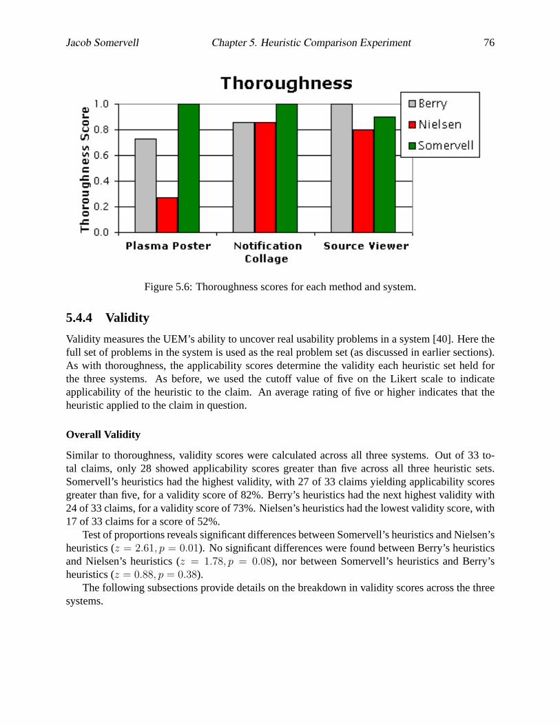
Jacob Somervell Chapter 5. Heuristic Comparison Experiment 76
Figure 5.6: Thoroughness scores for each method and system.
5.4.4 Validity
Validity measures the UEM’s ability to uncover real usability problems in a system [40]. Here thefull set of problems in the system is used as the real problem set (as discussed in earlier sections).As with thoroughness, the applicability scores determine the validity each heuristic set held forthe three systems. As before, we used the cutoff value of five on the Likert scale to indicateapplicability of the heuristic to the claim. An average rating of five or higher indicates that theheuristic applied to the claim in question.
Overall Validity
Similar to thoroughness, validity scores were calculated across all three systems. Out of 33 to-tal claims, only 28 showed applicability scores greater than five across all three heuristic sets.Somervell’s heuristics had the highest validity, with 27 of 33 claims yielding applicability scoresgreater than five, for a validity score of 82%. Berry’s heuristics had the next highest validity with24 of 33 claims, for a validity score of 73%. Nielsen’s heuristics had the lowest validity score, with17 of 33 claims for a score of 52%.
Test of proportions reveals significant differences between Somervell’s heuristics and Nielsen’sheuristics (z = 2.61, p = 0.01). No significant differences were found between Berry’s heuristicsand Nielsen’s heuristics (z = 1.78, p = 0.08), nor between Somervell’s heuristics and Berry’sheuristics (z = 0.88, p = 0.38).
The following subsections provide details on the breakdown in validity scores across the threesystems.

Jacob Somervell Chapter 5. Heuristic Comparison Experiment 77
Plasma Poster
Recall that Plasma Poster had 14 claims in the real problem set. Nielsen’s heuristics applied tothree of the 14 issues in the Plasma Poster, thus yielding a validity score of 21%. Berry’s heuristicsapplied to eight of the 14, for a validity score of 57%. Somervell’s heuristics applied to 11 ofthe 14, for a validity score of 79%. These scores are in alignment with what was found in thethoroughness measures. Figure 5.7 provides a graphical view of these scores.
Test of proportions reveals significant differences in validity between Somervell’s heuristicsand Nielsen’s heuristics (z = 3.02, p < 0.05). However, no significant differences were foundbetween Somervell’s heuristics and Berry’s heuristics (z = 1.21, p = 0.22) nor between Berry’sheuristics and Nielsen’s heuristics (z = 1.93, p = 0.05).
Notification Collage
The general trend reported in the Plasma Poster was also found in the Notification Collage. Nielsen’sheuristics applied to six of the eight issues with the system, giving it a validity score of 75%.Berry’s heuristics also applied to six of the eight issues, with a validity score of 75%. Somervell’sheuristics performed best, applying to seven of the eight issues, yielding a validity score of 88%.See Figure 5.7 for a graphical comparison of these scores. Test of proportions does not indicatesignificant differences in these validity scores.
Source Viewer
As with the thoroughness measure, validity did not follow the pattern observed so far. Nielsen’sset of heuristics applied to eight of the 11 claims, producing a validity score of 73%. Berry’s setapplied to 10 of the 11 issues, giving that set a validity score of 91%. Somervell’s only applied tonine of the 11 issues, with a validity score of 82%. Figure 5.7 gives a graphical depiction of thesescores. Test of proportions indicates no significant differences in these scores.
5.4.5 Effectiveness
Effectiveness is calculated by multiplying thoroughness by validity. UEMs that have high thor-oughness and high validity will have high effectiveness scores. A low score on either of thesemeasures will reduce the effectiveness score.
Overall Effectiveness
Considering the effectiveness scores across all three systems reveals that Somervell’s heuristicshad the highest effectiveness with a score of0.79. Berry’s heuristics came next with a score of0.62. Nielsen’s heuristics had the lowest overall effectiveness with a score of0.31.
Plasma Poster
For the Plasma Poster, Somervell’s heuristics had the highest effectiveness scores (0.79). Berry’shad the next highest effectiveness score (0.42), and Nielsen’s heuristics had the lowest effectivenessscore (0.06). Figure 5.8 provides a graphical depiction.

Jacob Somervell Chapter 5. Heuristic Comparison Experiment 78
Figure 5.7: Validity scores for the three heuristics sets for each system.
Notification Collage
As expected, Somervell’s heuristics had the highest effectiveness scores for the Notification Col-lage (0.88). Berry’s heuristics and Nielsen’s heuristics had the same effectiveness score (0.64) [seeFigure 5.8].
Source Viewer
As observed in the thoroughness and validity measures, Berry’s heuristics also had the highesteffectiveness score for the Source Viewer (0.91). Somervell’s heuristics had the next highest ef-fectiveness score (0.74). Nielsen’s heuristics had the lowest effectiveness score (0.58). Figure 5.8shows the effectiveness scores for the Source Viewer.
5.4.6 Reliability – Differences
Recall that the reliability of each heuristic set is measured in two ways: one relying upon theactual differences among the evaluators, the other upon the average number of agreements amongthe evaluators. Here we focus on the former. For example, Berry’s set has eight heuristics, soconsider calculating the differences in the ratings for the first heuristic for the first claim in thePlasma Poster. This difference is found by subtracting the ratings of each evaluator from everyother evaluator and summing up each of the differences, then dividing by the number of differences(or the average difference). Suppose that an evaluator rated the first heuristic with a 6 (agree) andanother rated it as a 4 (neutral) and a third rated it as a 5 (somewhat agree). The difference in this

Jacob Somervell Chapter 5. Heuristic Comparison Experiment 79
Figure 5.8: Effectiveness scores for each system. Somervell’s heuristics had consistently higheffectiveness.
particular instance would be:
(6− 4) + (6− 5) + (5− 4)
3= 1.33
We then averaged the differences for every heuristic on a given claim to get an overall differencescore for that claim, with a lower score indicating higher reliability (zero difference indicates com-plete reliability). These average differences provide a measure for the reliability of the heuristicset.
Overall Reliability Differences
Considering all 33 claims across the three systems gives an overall indication of the averagedifferences for the heuristic sets. One-way ANOVA suggests significant differences among thethree heuristic sets (F (2, 23) = 23.02, MSE = 0.84, p < 0.05). Pair-wise t-tests show thatSomervell’s heuristics had significantly lower average differences than both Berry’s heuristics(df = 14, t = 4.3, p < 0.05) and Nielsen’s heuristics (df = 16, t = 6.8, p < 0.05). No sig-nificant differences were found between Berry’s heuristics and Nielsen’s heuristics (df = 16, t =1.43, p = 0.17), but Berry’s set had a slightly lower average difference (MB = 2.02, SDB = 0.21;MN = 2.14, SDN = 0.13). Figure 5.9 shows the overall average evaluator differences for thethree heuristic sets.
Plasma Poster
Focusing on the Plasma Poster, one-way analysis of variance (ANOVA) suggests significant differ-ences in the reliability of the three heuristic sets (F (2, 23) = 21.7, MSE = 0.83, p < 0.05). Fur-ther pairwise t-tests show that Somervell’s set had the lowest average difference (M = 1.58, SD =0.23), with significance at theα = 0.05 level over the other two methods [df = 16, t = 6.5, p <

Jacob Somervell Chapter 5. Heuristic Comparison Experiment 80
Figure 5.9: Overall average evaluator differences for each heuristic set, with standard deviationerror bars. Somervell’s heuristics had the lowest average difference, which means that set hadbetter reliability when considering all of the claims across the three systems.
0.05 for Nielsen’s set (M = 2.18, SD = 0.16) anddf = 16, t = 1.85, p = 0.08 for Berry’s(M = 2.02, SD = 0.20)]. Berry’s set also showed significance over Nielsen’s set (withdf =26, t = 15.24, p < 0.05). So for the Plasma Poster, Somervell’s heuristics had the lowest averagedifference. See Figure 5.10 for a graphical representation.
Notification Collage
One-way ANOVA on the average differences of the three heuristic sets for the Notification Collageindicates significant differences (F (2, 23) = 7.03, MSE = 0.44, p < 0.05). Using pairwise t-tests, Somervell’s set holds significantly higher reliability (M = 1.65, SD = 0.29) over bothNielsen’s (M = 2.062, SD = 0.26) and Berry’s (M = 2.058, SD = 0.18) with df = 16, t =3.06, p = 0.01 for Nielsen anddf = 14, t = 3.29, p = 0.01 for Berry. Berry’s heuristics andNielsen’s heuristics had very similar reliability ratings and there is no significant difference inreliability between these two heuristic sets (df = 16, t = 0.04, p = 0.97). See Figure 5.10 for agraphical representation.
Source Viewer
One-way ANOVA suggests significant differences in reliability of the three heuristic sets for theSource Viewer (F (2, 23) = 17.78, MSE = 1.22, p < 0.05). Further analysis using pairwise t-testsreveals that Somervell’s heuristics had significantly lower average differences (M = 1.42, SD =0.08) than both Nielsen’s (M = 2.14, SD = 0.03) and Berry’s (M = 2.0, SD = 0.10) sets(with df = 16, t = 6.48, p < 0.05 for the former anddf = 14, t = 3.78, p < 0.05 for thelatter). T-tests do not show significant differences between Nielsen’s and Berry’s heuristic sets(df = 16, t = 1.16, p = 0.26). Figure 5.10 provides a graphical summary of the reliability scores.

Jacob Somervell Chapter 5. Heuristic Comparison Experiment 81
Figure 5.10: Average difference scores for each method by system. Lower differences indicatehigher reliability.
5.4.7 Reliability – Agreement
In addition to the average differences, a further measure of reliability was calculated by countingthe number of agreements among the evaluators, then dividing by the total number of possibleagreements. This calculation provides a measure of the agreement rating for each heuristic. Forexample, consider the previous three evaluators and their ratings (6, 5, and 4). The agreementrating in this case would be:
agreement =0
3= 0
because none of the evaluators agreed on the rating, but there were potentially three agreements (ifthey had all given the same rating). Averages across all of the claims for a given system were thentaken. This provides an assessment of the average agreement for each heuristic as it pertains to agiven system.
Overall Agreement
Taking all 33 claims into consideration, one-way ANOVA indicates significant differences amongthe three heuristic sets for evaluator agreement (F (2, 23) = 6.31, MSE = 0.01, p = 0.01). Pair-wise t-tests show that both Somervell’s heuristics and Berry’s heuristics had significantly higheragreement than Nielsen’s set (df = 16, t = 2.99, p = 0.01 anddf = 16, t = 3.7, p < 0.05respectively). No significant differences were found between Somervell’s and Berry’s heuristics(df = 14, t = 0.46, p = 0.65). Figure 5.11 shows the average evaluator agreement for eachheuristic set across all three systems.

Jacob Somervell Chapter 5. Heuristic Comparison Experiment 82
Figure 5.11: Overall average evaluator agreement for the three heuristic sets. Error bars representone standard deviation from the means. Somervell’s set had the best evaluator agreement, whereasNielsen’s set had the least.
Plasma Poster
One-way ANOVA for agreement on the Plasma Poster suggests significant difference among thethree heuristic sets (F (2, 23) = 4.58, MSE = 0.01, p = 0.02). Pair-wise t-tests show thatSomervell’s heuristics (M = 0.22, SD = 0.07) had significantly higher agreement ratings thanNielsen’s heuristics (M = 0.17, SD = 0.03) with df = 16, t = 2.17, p < 0.05. Berry’s heuristicsalso held higher agreement ratings (M = 0.23, SD = 0.03) with df = 16, t = 4.23, p < 0.05.No significant differences were found between Somervell’s heuristics and Berry’s heuristics. SeeFigure 5.12 for graphical depiction.
Notification Collage
One-way ANOVA for agreement on the Notification Collage does not reveal significant differenceamong the three heuristic sets (F (2, 23) = 2.82, MSE = 0.01, p = 0.08). However, Somervell’sheuristics had a slightly higher average agreement rate (M = 0.21, SD = 0.06) over Nielsen’s(M = 0.16, SD = 0.04) and Berry’s (M = 0.21, SD = 0.03). Figure 5.12 shows a graphicalrepresentation.
Source Viewer
One-way ANOVA for agreement on the Source Viewer suggests significant difference among thethree heuristic sets (F (2, 23) = 6.81, MSE = 0.021, p < 0.05). Pair-wise t-tests show thatSomervell’s heuristics (M = 0.26, SD = 0.0.07) had significantly higher agreement ratings thanNielsen’s heuristics (M = 0.16, SD = 0.04) with df = 16, t = 3.56, p < 0.05. Berry’s heuristicsalso held significantly higher agreement ratings (M = 0.23, SD = 0.03) over Nielsen’s set, with

Jacob Somervell Chapter 5. Heuristic Comparison Experiment 83
Figure 5.12: Evaluator agreements for the three heuristic sets, shown by system. Note thatSomervell’s heuristics had consistently high evaluator agreement across all three systems.
df = 16, t = 2.62, p = 0.02. No significant differences were found between Somervell’s heuristicsand Berry’s heuristics. Figure 5.12 shows these findings.
5.4.8 Time Spent
Recall that we also asked the evaluators to report the amount of time (in minutes) they spentcompleting this evaluation. This measure is valuable in assessing the cost of the methods in termsof effort required. It was anticipated that the time required for each method would be similar acrossthe methods.
Averaging reported times across evaluators for each method suggests that Somervell’s set re-quired the least amount of time (M = 103.17, SD = 27.07), but one-way ANOVA reveals nosignificant differences (F (2, 17) = 0.26, p = 0.77). Berry’s set required the most time (M =119.14, SD = 60.69) while Nielsen’s set (M = 104.29, SD = 38.56) required slightly more thanSomervell’s. Figure 5.13 provides a graphical representation of these times.
5.5 Discussion
So what does all this statistical analysis mean? What do we know about the three heuristic sets?How have we supported or refuted our hypotheses through this analysis? We address these ques-tions in the following sections.
5.5.1 Hypotheses Revisited
Recall that we had three hypotheses for this experiment:

Jacob Somervell Chapter 5. Heuristic Comparison Experiment 84
Figure 5.13: Average time to complete evaluations with each heuristic set.
1. Somervell’s set of heuristics will have a higher validity score for the Notification Col-lage.
2. More specific heuristics will have higher thoroughness, validity, and reliability mea-sures.
3. Generic methods will require more time for evaluators to complete the study.
We discuss the statistical analysis in terms of these three hypotheses in the following sections.
Hypothesis 1
For hypothesis one, we discovered that Somervell’s heuristics indeed held the highest validityscore for the Notification Collage (see Figure 5.7). However, this validity score was not 100%,as was expected. What does this mean? It simply illustrates the difference in the evaluators whoparticipated in this study. They did not think that any of the heuristics applied to one of the claimsfrom the Notification Collage. Although, it can be noted that the applicability scores for thatparticular claims were very close to the cutoff level we chose for agreement (that being 5 or greateron a 7-point scale). Still, evidence suggests that hypothesis 1 holds.
Implications Since Somervell’s set had the highest validity of the three heuristic sets for theNotification Collage, we have further validation of that set. Why? In the creation process (Chapter4) we used the Notification Collage as input. It seems logical that the heuristic set developed inthat effort should find most or all of the problems with one of the systems used in that creationprocess. We found evidence of this case in this study. Had Somervell’s method not produced the

Jacob Somervell Chapter 5. Heuristic Comparison Experiment 85
highest validity score for the Notification Collage, one could raise questions about the soundnessof Somervell’s set of heuristics. As it stands, we have verified that Somervell’s method works onat least a subset of the systems from which it came: a kind of validation of the method and theheuristics.
Hypothesis 2
We find evidence to support this hypothesis based on the scores on each of the three measures:thoroughness, validity, and reliability. In each case, more specific methods had the better ratingsover Nielsen’s heuristics for each measure. Overall one could argue that Somervell’s set of heuris-tics is most suitable for evaluating large screen information exhibits, but must concede that Berry’sheuristics could also be used with some effectiveness.
Specifically, the Source Viewer results suggest that there was a slight turn around in the other-wise consistent trend observed in the methods. For this system, we found that Berry’s heuristicsactually applied to more of the claims than both Somervell’s and Nielsen’s heuristics. Although wecannot be entirely sure why this anomaly was observed, it does not weaken the hypothesis muchbecause the statistical differences were not significant. Possible reasons why this anomaly occurredcould be due to evaluator differences, the actual problems for that particular system, or even thenature of problem collection. Since the differences were not significant, post-facto analysis canonly suggest a possible cause, and it does not impact the overall findings of this work.
It should be noted that even though Somervell’s heuristics came behind Berry’s set for theSource Viewer in terms of thoroughness, validity, and effectiveness; Somervell’s heuristics hadbetter reliability, both in terms of evaluator differences, and evaluator agreement. So, even thoughBerry’s heuristics had higher thoroughness and validity for the Source Viewer, Somervell’s heuris-tics were very close and had higher reliability for that system. This allows us to claim thatSomervell’s heuristics are best suited for the LSIE system class.
Implications This result is by far the most compelling. We have shown through rigorous test-ing that Somervell’s method is the best heuristic choice for evaluating large screen informationexhibits. Coupled with the validation results from Chapter 6, we show that this method is botheasy to use in analytic evaluations of these systems, as well as effective (in terms of thoroughness,reliability, and validity) at finding usability problems.
In other words, for a given system class, it is worthwhile and useful to create an evaluationmethod that is tailored to the goals of that system class, yet is still generic enough to apply to manysystems within that class. This finding does not contradict efforts from Mankoff et al. [56] andBaker et al. [5] in which they have shown that similar evaluation tools, corresponding to system-class specificity, actually perform better than generic sets.
Hypothesis 3
We did not find evidence to support this hypothesis. As reported, there were no significant differ-ences in the times required to complete the evaluations for the three methods. However, Somervell’sand Nielsen’s sets took about 15 fewer minutes, on average, to complete. This does not indicatethat the more generic method (Nielsen’s) required more time. So what would cause the evalua-tors to take more time with Berry’s method? Initial speculation would suggest that this set uses

Jacob Somervell Chapter 5. Heuristic Comparison Experiment 86
terminology associated with Notification Systems [62] (see Figure 5.2 for listing of heuristics), in-cluding reference to the critical parameters of interruption, reaction, and comprehension, and thuscould have increased the interpretation time required to understand each of the heuristics.
Implications Since we did not find any statistical differences in the amount of time required tocomplete the evaluation with each of the three heuristic sets, we cannot claim that one method ismore cost effective over the other methods (with respect to time spent). This is unfortunate, as itwould have been compelling to have Somervell’s method also the one to require the least amountof time. While on average, Somervell’s method did have the lowest time, Nielsen’s method onaverage only required about 1 minute longer. This difference is negligible.
It is encouraging however, that both Berry’s and Somervell’s methods required similar amountsof time to that of Nielsen’s. As mentioned before, Nielsen’s method has been around for almost20 years and has seen extensive use and analysis. Therefore it is promising that the more specificmethods do not require significantly more time when used in an analytic evaluation; suggestingthat these more specific methods could reach acceptance levels comparable to Nielsen’s.
5.5.2 Other Discussion and Implications
In addition to the insight provided through analysis of the hypotheses, we can also discuss some ofthe caveats and limitations of this experiment and its findings, in terms of how it can impact andsupport various groups, including usability professionals and UEM researchers.
Implications for Usability Specialists
This study has shown that system-class specific UEMs are desirable for formative usability evalua-tion. What this implies for evaluators, especially for those who are evaluating notification systems,is that some up-front effort should be expended for developing a set of tools that can be reused inmultiple evaluations of similar systems.
Somervell’s heuristics are an example of this level of specificity. They are tailored to the usergoals associated with the LSIE system class, yet are applicable across multiple systems within thatclass. The other areas of the notification systems design space are other potential system classesthat could benefit from tailored UEM development.
For example, consider the secondary display system class. These interfaces try to support rapidreaction to and high comprehension of information, while simultaneously being non-interruptive.A major news agency like CNN or Fox News would be highly interested in providing the mosteffective designs for their tickers and faders. If they had tailored heuristics to help evaluate theirdesigns, they could maximize utility while minimizing cost. Each of the other system classes de-scribed by the notification design space could have a tailored UEM, thus improving the evaluationphases of notification system design.
Implication for UEM Researchers
This work has illustrated a new approach to UEM comparison. Instead of relying upon evaluatorsto produce disjoint problem reports which UEM researchers must then interpret, we have suggested

Jacob Somervell Chapter 5. Heuristic Comparison Experiment 87
an alternative approach that strengthens consistency and eliminates some of the ambiguity inherentin UEM comparison studies.
This is achieved through a setup that requires the UEM researcher to provide a real problemset up front, to each of the evaluators, instead of trying to derive the set from the comparison testresults. There are several advantages to this approach. Obviously, we can eliminate the ambiguitythat arises from the inspector trying to interpret the problem reports from the system evaluators.Secondly, by using the same set of problems for each evaluator, we have tighter control of the ex-perimental conditions. Lastly, by having the evaluators concentrate on the system and the targetedUEM instead of writing out problem descriptions, they can provide more robust analysis and givemore reliable answers.
Furthermore, this particular setup allows for easy calculation of the desired metrics (thorough-ness, validity, etc.). By using the structured presentation and data collection methods employedhere, UEM researchers can quickly and easily calculate all of the metrics included in the Hartsonet al. technique. A spreadsheet program or database application can easily perform the necessarycalculations.
One other advantage to this setup is that it can be somewhat automated by connecting to adatabase of design knowledge. UEM researchers would be able to import design problems orclaims from a database, as well as heuristics (if comparing heuristics). This would allow for rapidcreation of multiple tests across different systems and UEMs. Efforts to support this are ongoing,as reported in [17].
This could be especially important for large companies that produce or focus on one type ofsystem. Leveraging a new evaluation mechanism, like heuristics, could prove time consuming if anew evaluation has to be created for every system to be tested. Having an automated platform canfacilitate multiple, rapid evaluation setup, execution, and data collection.
5.6 Summary
We have described an experiment to compare three sets of heuristics, representing different levelsof generality/specificity, in their ability to evaluate three different LSIE systems. Information onthe systems used, test setup, and data collection and analysis has been provided. This test wasperformed to illustrate the utility that system-class specific methods provide by showing how theyare better suited to evaluation of interfaces from that class. In addition, this work has providedimportant validation of the creation method used in developing these new heuristics.
We have shown that a system-class specific set of heuristics provides better thoroughness,validity, and reliability than more generic sets (like Nielsen’s). The implication being that withoutgreat effort to tailor these generic evaluation tools, they do not provide as effective usability dataas a more specific tool.
While this experiment makes a compelling case for system-class specific UEMs, further vali-dation of the actual heuristics is required to ensure faith in the creation method. Efforts to achievethis validation are described in the next chapter.

Chapter 6
Heuristic Application
This chapter reports on efforts to illustrate the utility and usefulness of the heuristic sets createdthrough the development process reported in Chapter 4. While they were created from inspectionof five example large screen information exhibits, and experimentally shown to be as good as orbetter than other heuristics, these heuristics need to be validated in the sense that the method isusable in evaluation efforts.
By using these heuristics in real system development efforts, we gain insight into the effec-tiveness and utility of this UEM. We are pushing the envelope on heuristic use by focusing onnon-traditional users: novice HCI students and domain experts. These two groups often rely onanalytic techniques, and using the new heuristics with these groups can illustrate the utility of thenew set while providing support for the heuristic creation process. In addition, we seek expertopinion, providing feedback and commentary on the heuristics.
6.1 Introduction
Before we can expect practitioners to use the set of heuristics developed in Chapter 4, it is necessaryto provide support for their existence. In other words, we need to show that these heuristics areindeed a “good” set and uncover a substantial portion of the usability problems associated withlarge screen information exhibits. Three approaches were taken to assess the utility of the heuristicsfor evaluating large screen information exhibits; one involves neophyte HCI students, one involvesdomain experts, and a final approach relies on international HCI expert opinion. Each of theseefforts will be discussed in turn.
6.2 Novice HCI Students
An initial look at these heuristics was done by neophyte HCI students. These students come froman introductory undergraduate HCI class that I taught during the summer of 2003. This coursewas beneficial to this research effort in that it provided a test bed for the new heuristic set. Aspart of the course requirements, the students were required to develop LSIE systems, providing anopportunity for applying the new heuristics in the development process. Student experience withheuristic evaluation was limited, but they had experience with usability engineering concepts from
88

Jacob Somervell Chapter 6. Heuristic Application 89
the course content. The analytical evaluation stage occurred towards the end of the course, afterempirical evaluation had been covered.
These students performed heuristic evaluation of several large screen information exhibits us-ing the heuristics described in chapter 4. The goals of the evaluation were to help the studentswith the design of their systems, and to gather feedback on the utility of the heuristic method forproducing redesign guidance. In addition to the evaluations, each student provided a critique inwhich they could give their opinions on the utility and usefulness of the heuristics for guiding anevaluation of large screen information exhibits.
6.2.1 Method
This test was conducted as part of course requirements for the Introduction to HCI class in whichthe students were enrolled. Sixteen students participated in this study in the form of 5 group projectteams. These groups were tasked with creating new LSIE systems which displayed news contentfrom CNN 1. Each display was required to provide some subset of the daily news, presented on alarge screen that would be situated in a lab or common area. There were no restrictions on how thedisplay could look, as long as a user could gain an understanding of the daily news by looking atthe display.
Development occurred over a six week period, with summative evaluation occurring in thefifth week. None of the students were familiar with the systems used in the creation processreported in Chapter 4. Furthermore, they were not familiar with the new heuristics before theevaluation assignment. They were familiar with analytic evaluation and had performed a simplesuch evaluation in a class activity that used Nielsen’s set (as found in [70]).
These LSIEs were then used by the students in analytic evaluations involving the new heuris-tics. Each team was randomly assigned to a different team’s interface. Each team member thenindividually performed an analytic evaluation on the interface using the heuristics. Once this partwas completed, the teams reassembled as agroup and produced a common problem list for theinterface. This common list was a union of the individual problem sets found by each individualteam member. These group-level problem sets were then returned to the development team andsubsequently used to guide redesign efforts.
6.2.2 Results
Several measures were taken from the problem reports and critiques of the method. These measureshelp to assess the utility of the heuristic set for supporting formative usability evaluation.Numberof problems foundby each team is an early indicator that the method was successful in uncoveringat least some of the issues with the various designs. Each team uncovered at least 10 problems, butonly 19 at most, with an average of 16 problems found per team. Figure 6.1 shows the distributionof the problems found by team.
Subjective opinionwas gathered from the critiques provided by these novice HCI students. Thetone and nature of the critiques was easily discernible through the language and wordings used intheir reports. These critiques provide unbiased feedback on the heuristics when used in traditionalheuristic evaluations.
1http://www.cnn.com

Jacob Somervell Chapter 6. Heuristic Application 90
Figure 6.1: Total number of problems uncovered with the heuristics, shown by team.
The majority of the students felt the heuristics were “useful” and provided “much needed guid-ance for evaluation effort.” Granted, this in itself would be expected, because as composed tono heuristics, having something to guide evaluation effort is indeed useful. In addition, studentsindicated that the heuristics were “easy to understand”, and application was “straightforward”.
Most of the students agreed that the majority of the heuristics were applicable to the designsthey evaluated. As part of the critique, the student gave theiragreementwith the heuristic accordingto if they felt the heuristic applied to large screen information exhibits. Figure 6.2 shows thepercentage of students who agreed with each heuristic.
Also, 12 of 16 students explicitly stated that they would have liked to have had these heuristicsavailable during the design phases of their projects. This information was voluntarily provided,as they were not prompted explicitly about this topic. These students indicated they would haveused the information in the heuristics as design guidance and felt they would have produced betterdesigns before doing any evaluation had they known about the issues contained in the heuristics.
6.2.3 Discussion
Clearly, these heuristics provided necessary guidance for the analytic evaluations performed by thenovice HCI students. Considering the nature and intent of these particular large screen informationexhibits, identifying 16 usability issues is quite good. In fact, each of the solutions given by

Jacob Somervell Chapter 6. Heuristic Application 91
Figure 6.2: Percentage of students who agreed that the heuristic was applicable to large screeninformation exhibits.
the student groups consisted entirely of one screen, which typically employed some animationtechnique to show changes to information sources. Thus, 16 real problems identified in thesesystems allows for substantial improvements to the design.
We accept that the participants in this study were NOT expert HCI professionals, as is typicallyused in heuristic evaluation [70]. Yet, given the nature and number of the problems found persystem, we feel these heuristics provided essential evaluation guidance for the students. As such,the success of this study suggests that the heuristics were indeed sufficient for evaluating a typicallarge screen information exhibit. The systems used in the evaluation were new and did not haveany common design with the ones used in the creation method. This is an important distinction aswe have shown that these heuristics are applicable across at least five different LSIEs. Hence, webelieve that the creation method we developed indeed produces usable heuristics that can be usedin analytical evaluation.
Another interesting use for heuristics comes from the potential for design guidance providedfrom the heuristic sets. As seen in this study, most of the students felt these heuristics could serve asdesign guidelines to aid in the development and creation of the interfaces in the early design stages.This observation is powerful in that these heuristics have a second function beyond simply guidingevaluation effort—they can be used to guide design from the start of a project by identifying andillustrating potential trouble spots in the design of large screen information exhibits—thus they cantruly be considered as heuristics. This apparent usefulness also strengthens the overall desirabilityof these heuristics for use in design and evaluation of large screen information exhibits.

Jacob Somervell Chapter 6. Heuristic Application 92
Total Problems Overall IRC interruption reaction comprehension# 183 88 20 9 59
% of total — 48 11 5 32
Table 6.1: Summary of problems found through student application of heuristics.
6.2.4 Post-Analysis of Problems
Because this summative-style evaluation occurred towards the end of the project development cy-cle, no significant changes were made to the students’ designs. However, analysis of the prob-lem reports can reveal how well the heuristics supported reporting of problems that are related tothe critical parameters for the LSIE system class. These students had no knowledge of the IRCframework. All they knew about LSIEs was that they involved software running on large displaysurfaces. Hence, it is interesting to see if the problems they find with the heuristics can be tracedback to the underlying critical parameters for the system class.
The majority of the problems reported by the students related to some design artifact withinthe particular system that was evaluated. To assess whether a problem related to interruption, re-action, or comprehension, the wordings of each problem were considered in relation to the artifactdescribed therein. For example, the following problem refers to specific artifacts in a design:
The current temperature does not stand out well against the blue background.
Clearly this problem describes a specific piece of information (the current temperature), as wellas the problem with that artifact (does not stand out well). However, inspection of this problemsuggests a connection to the critical parameter of comprehension. Why? Assessment of the prob-lem description implies that it will be difficult for a user to read the current temperature, hence,he/ she would experience decreased understanding of that information, or a lower comprehension.Alternatively (or in addition) a user may experience an increase in interruption because it takesmore time to look at the temperature and decode what it says.
Most of the problems reported by the students relate to one or more of the critical parameters.The 16 students reported a total of 183 problems across the five systems. This total includesmultiple instances of the same problems because they were identified by separate evaluators. Ofthis 183 problems, 88 were related to the IRC parameters. This is about 48% of the problems. Ofthe problems that correspond to critical parameters (88) there were 59 related to comprehension,20 related to interruption, and nine related to reaction. This breakdown reflects the emphasis onthe comprehension based tasks for which the systems are created to support. Table 6.1 provides asummary of this analysis.
6.2.5 Evaluator Ability
It is prudent to consider the ability of these students in regards to completing heuristic evaluation.While these students had little experience with evaluation and could be considered novices, theydid understand the purpose of usability evaluation and understood the goals of the system that theyevaluated. Given this understanding of their ability level, it is interesting to conceptually comparethe results of a “good” evaluator and a “poor” evaluator from this pool.

Jacob Somervell Chapter 6. Heuristic Application 93
As expected, the majority of the problems reported by the students dealt with specific designdecisions and related impacts to the user goals of the display. There were only three students whoprovided robust problem reports that could be useful during redesign. The nature of the problemdescriptions for these “good” evaluators consistently revolved around specific interface artifactsand the consequences of those decisions. One outstanding example even described the problemsin terms of claims, listing both upsides and downsides of the design element as psychologicaltradeoffs for the user.
Nine of the students provided what we call “average” reports, consisting of a short descriptionof a problem they thought would occur. The problem with these reports was that there was little re-design guidance provided in the wording of the problem to aid designers when fixing the problem.
Four of the students gave “poor” problem reports, merely consisting of simple statements de-scribing how the system followed the heuristics (or not). These reports described very few prob-lems with the target systems, and held no re-design value. In most cases, the so called problemsthat these students reported were in actuality a description of the system, not an analysis of thesystem.
Speculation suggests that the students in the “poor” category did not spend adequate timeon the assignment, perhaps only attempting the exercise the night before they were due in theclass. In contrast, the “good” examples likely involved several hours playing with the interfacein question, assessing it in terms of typical tasks, and writing useful problem descriptions. Wemust also concede that the heuristics themselves could have posed a problem for the students inthe “poor” category. Perhaps the students did not understand how to apply the heuristics due to thewording. Perhaps these students did not fully understand the idea encapsulated in each heuristic.
However, our evidence suggests that these HCI students were able to effectively apply theheuristics in evaluation of LSIE systems. Coupled with the positive feedback from these students,we feel confident that the heuristics provide structure and guidance for analytic evaluation efforts.However, this example did not illustrate how the problems could be used in system re-design. Thefollowing section describes a separate effort in which the heuristics were used and the problemsfed into a re-design.
6.3 Education Domain Experts
A separate application of these heuristics consisted of having domain experts use the heuristics inan analytical evaluation of the GAWK system. Specifically, the teachers involved in the ClassroomBridge effort [31] used these heuristics to evaluate an updated version of the GAWK software.
One could ask why we wanted to use non-HCI people in a heuristic evaluation, especiallysince usability experts are required for effective results. We wanted to use domain experts be-cause they have the unique ability to fully grasp the nature of the system and provide insight otherevaluators may not have, and heuristics have been used successfully with domain experts in otherinvestigations [70]. Furthermore, these people can provide feedback on the format and wordingsof the heuristics, illustrating that the heuristics are understandable and usable by a wide range ofindividuals.
One other question about this effort involves the use of the GAWK system. Recall that theGAWK was one of the five systems in the heuristic creation process. If we use the heuristicsfrom that process to evaluate the GAWK system, what would we really be finding? There are two

Jacob Somervell Chapter 6. Heuristic Application 94
answers to this. One is that the GAWK system underwent significant design changes from theversion that was reported in Chapter 3 and used in the creation process in Chapter 4. In reality, thenew GAWK looks different from the original version and thus learning whether the set of heuristicscan uncover the original problems would validate the set to a certain degree. Second, because thesystem performs the same functionality and only underwent cosmetic changes, any problems foundin this effort should match up with the issues we identified in the earlier study (Chapter 4).
6.3.1 Method
Since these evaluators are not expert usability people, additional materials were provided to themfor the evaluation. Specifically, scenarios were provided to illustrate the use of the display andto allow the teachers to get a feel for the display and how it worked. We felt this additionalinformation was necessary for the teachers to understand the display, as they had not used it forabout 5 months prior to this evaluation, and to put them in the mind set for assessing the displayfor usability problems.
Additionally, we used structured problem reports [52] to help the teachers capture a descriptionof the problems they experienced or discovered through their inspection of the system. This choicewas made because these evaluators were novice usability people, and thus had no clue about usabil-ity problems or how to report them. We felt these structured reports would help these evaluatorscodify and communicate the issues they found more effectively.
Using the scenarios as guides, each teacher performed the tasks outlined in the scenarios on thelarge screen. These tasks were done to ensure familiarity with the system so they could understandthe interface and the information available in the interface components. After completing thescenarios with the software, they used the heuristics to determine problems they had executingthose tasks, filling out problem reports for each problem encountered.
This method is slightly different from the suggested implementation of a heuristic evaluation asreported in [70] but we felt it was necessary given the novice experience level of our evaluators. Intraditional heuristic evaluation, the evaluator does not typically use the system or try to completetasks with it. Instead, they attempt to derive potential problems from a purely analytic analysisof the system and its intended usage. Here we have our evaluators actually using the systemin specific, scripted scenarios. We felt that the structure provided through this approach wouldfacilitate the problem identification and help with the reporting effort.
There were two forms of data collected in this study: the problem reports and interview feed-back on the heuristics. Each evaluator provided their own problem reports, detailing the problemthe found, the applicable heuristic that led to the reporting of said problem, and the severity of theproblem. After completing the evaluation, the two evaluators were interviewed jointly. Specificinterview topics included how well the heuristics applied to the issues they found and their overallimpressions of the heuristics. Interview data was informally captured through note taking.
6.3.2 Results
These non-HCI professionals, who had never heard of heuristic evaluation before, were able totake these heuristics, and identify several usability problems with the display. These two evaluatorsfound a total of 23 problems with the system. While this number may seem low, considering theirlack of experience with analytical evaluation techniques, it is a good number.

Jacob Somervell Chapter 6. Heuristic Application 95
Furthermore, these evaluators ranked all problems as being moderate to high in terms of sever-ity or need to fix. This rating holds more weight with these particular evaluators, as these are theend users and thus would have a better understanding of the potential impact a problem may haveon the actual usage situation. This means that the problems they identified were indeed the mostimportant problems to the actual users of the system.
In terms of using the heuristics, both evaluators stated that they could “easily understand”the heuristics. They also said they understood how the heuristics applied to the problems theyidentified with the systems. Neither of the evaluators suggested that the heuristics were difficultto read or understand, and they were able to relate all of the problems they came across to theheuristics in the set.
The heuristics even helped the teachers understand the purpose of the evaluation:
“I don’t think I would have understood what you wanted me to do if you didn’t provideme that list.” [referring to the set of heuristics]
They also indicated that the heuristics applied to the system so well that they suggested problemsthat the teachers had not considered:
“This list helps me identify what is wrong with the system. I didn’t think about theuse of colors and what they mean till I read the list that talked about color.”
6.3.3 Discussion
Simple analysis of the problems found in this effort shows that these two non-HCI people wereable to identify about 40% (23 of 58) of the issues with the GAWK system. This statistic comesfrom comparing the problem reports in this study to the claims analysis performed on the originalGAWK system as reported in Chapter 4. Furthermore, if we examine empirical findings on heuris-tic evaluation [69], we see that this number is right in line with the expected performance for aheuristic evaluation tool, using two evaluators.
It is interesting to see non-HCI people perform a heuristic evaluation of an interface. Theystart out not knowing what to do and seem frustrated by the sheer overwhelming nature of thetask with which they are faced. It only takes a few moments for them to recognize a problemwith the interface, and identify the heuristic(s) that applies. Then they start identifying problemsmore easily and with more enthusiasm. This lends credit to the validity of this set of heuristics asgenuine evaluation support for finding usability problems with large screen information exhibits.
6.3.4 Post-Analysis
Deeper analysis of the problems reported by the teachers can reveal more information about theheuristics and how they support evaluation efforts. Specifically, it is worthwhile to consider howthe heuristics may suggest re-design guidance for systems, and whether this guidance is directlytied to the critical parameters. This situation with the domain experts provides a unique opportunityto investigate how the heuristics support re-design because the system tested, GAWK, requiredcontinuing development. Hence, the results of the evaluation were applied in another developmentphase.

Jacob Somervell Chapter 6. Heuristic Application 96
Interruption Reaction Comprehension6 7 17
Table 6.2: Number of problems identified by teachers that relate to critical parameters, shown bybreakdown for each parameter. Some problems were related to multiple parameters, hence thetotal is greater than the number of problems found in the evaluation (23).
Inspection of the problem list generated by the teachers through the evaluation suggests thatthe heuristics support identifying problems that are pertinent to the underlying user goals of thesystem. This is evident in the nature of the problem, as well as the language used by the teacherswhen reporting the problems. For example, one teacher identified a problem with the icons usedin the system and how it was “difficult to track group work over time”. Obviously this problemdirectly relates to the long-term understanding of the information in the display, clearly illustratingthe connection tocomprehension. Another example problem describes a “lack of separation inwork icons,” suggesting lack of understanding of the icons and different bodies of work representedtherein.
Assessing each of the 23 problems provides an indication as to how many were directly re-lated to the critical parameters. Inspection of the wordings suggests which of the parameters areapplicable, as in the previous examples. Nineteen of the 23 problems can be traced to one or moreof the critical parameters associated with the GAWK display. Table 6.2 provides the numbers foreach parameter. We believe that this high correlation between the problems and the parameters isa direct result of the heuristic creation process that is based on the critical parameters. The im-plication is that the new heuristics address problems that pertain to the critical parameters for thesystem class, thereby providing important re-design considerations.
6.3.5 GAWK Re-Design
Because the programmers involved with the ClassroomBridge effort did not have knowledge ofthe IRC framework, it was necessary to shield them from describing the problems in terms ofinterruption, reaction, and comprehension. Instead, the problems were described and discussedthrough language that referred to “supporting understanding” or “preventing too much distraction”or “allowing quick decisions”. These terms were understood by the programmers, and the pivotalconcerns surrounding the GAWK display were addressed without reliance upon the IRC terminol-ogy.
It is further necessary, in supporting the programmers, to group problems into categories thatcorrespond to artifacts within the interface. In the case of the GAWK system, there are distinct“parts” of the display in which the problems occur. For example, there is a banner area near thetop of the display. This banner area is created in a specific part of the code and any changes willhave to be made in that part of the code. Grouping related problems into these parts can helpthe programmers as they address the problems and make changes. By providing the problems tothe programmers in terms of interface artifacts, rather than in terms of interruption, reaction, andcomprehension goals, the programmers are better able to make effective changes.
Comparing this new design to the earlier instance of the GAWK display, we see some im-portant changes. Overall the structure is cleaner and the color scheme supports reading from a

Jacob Somervell Chapter 6. Heuristic Application 97
distance. As an example, consider the changes made to the banner design, including multi-line an-nouncements, a new color scheme, separating announcements from artifact information, and morespace. These changes resulted from specific problems reported by the teachers, that impacted thecomprehension and interruption parameters. However, these problems were reported to the pro-grammers grouped in relation to the banner artifact, with wordings that required improvements for“user understanding” or “decreasing distraction”.
It is important that identified problems are given to the programmers in terms that they under-stand. In this case, the programmers did not have knowledge of the IRC framework and the criticalparameters associated with the LSIE system class. However, these programmers did understandthe underlying user goals associated with the display, in terms of supporting typical user tasks. It isencouraging that the problems identified by the teachers through the evaluation were mappable tothe underlying parameters associated with the LSIE class. This apparent connection between theproblems and the underlying user goals could suggests that more robust techniques are possible,with which evaluators and designers could couple the results of heuristic evaluation to direct val-ues for each parameter, facilitating the assessment of whether an LSIE system supports its intendedpurpose. More discussion of this notion can be found in Section 8.3.2.
6.4 HCI Expert Opinions
Another effort to validate this set of heuristics was through international usability experts. Specif-ically, a terse description of the creation work and the heuristic list was submitted and accepted atthe Ninth IFIP TC13 Conference on Human-Computer Interaction in Zurich, Switzerland. This pa-per was peer reviewed by an international community. Hence, acceptance suggests these heuristicsare indeed useful for interface design and evaluation.
In addition to acceptance within the international community, interviews with several usabilityexperts were also conducted. These interviews were informal in nature and were conducted at theabove mentioned conference. The interviewees were attendees at the conference, and were in someway connected to large screen display design and/or evaluation; either through dedicated researchor through usage contexts.
6.4.1 Method
The interview structure consisted of a few questions about the usage of large screen display tech-nologies within the interviewee’s current work setting, usually an industrial or academic researchsetting (like a lab). The majority of the interviewees were interested in designing and developinglarge screen display interfaces.
In all, ten Human-Computer Interaction experts were interviewed about large screen displaytechnologies and their usage. Notes were taken on the comments given and were subsequentlyused to determine opinions on and about large screen information exhibits. The interviews wereinformal in nature and mostly revolved around their individual opinions on the heuristics created inthis development effort. Other comments focused on LSIEs and the shifting computing paradigm(from desktop to more ubiquitous devices).

Jacob Somervell Chapter 6. Heuristic Application 98
6.4.2 Results
There was a broad range in opinions about the heuristics from the interviews. Five of the 10 expertsstated they “liked” them and would use them in their development efforts. The others were moreskeptical and wanted to see evidence of the heuristics in use, or in comparison to other sets ofheuristics. None of the experts felt that the heuristics were unnecessary, and all agreed that thiswas an interesting and useful approach to a difficult usability evaluation problem.
Four of the ten experts gave specific feedback on the individual heuristics. Of these four ex-perts, they generally felt that the heuristics were simple enough and covered a significant portionof the potential trouble areas in LSIE systems. However, two of these four experts pointed out thatthree or four of the heuristics had more of a “guideline” feel to them, rather than a “heuristic” one.When prompted to explain this separation, they stated that the wordings of the heuristics soundedmore like commandments rather than general rules. For example, the heuristic “Avoid the use ofaudio” struck them as too strict for wide applicability.
6.4.3 Discussion
Overall, the experts who reviewed and provided feedback on the heuristics had a positive outlooktowards them. The overwhelming point from this effort was that the heuristics were “untried” andneeded to be used in real evaluations and compared to other types of heuristics; both to show thatthey can uncover usability problems, and to show that they are better suited to the LSIE systemclass than other heuristics.
At the time of the interviews, none of the interviewees were aware of the validation effortsinvolving use of the heuristics (as described in Sections 6.2 and 6.3). They were informed of intentto compare this set to other types of heuristics and applauded that goal. All were curious to see theresults of such a comparison study.
6.5 Overall Discussion
These three efforts provided feedback on the usability and effectiveness of the heuristics. Wehave evidence that the heuristics can be used in real evaluations, both from the neophyte HCIstudents and the domain experts. These heuristics uncover real usability problems and providedesign feedback in formative evaluation efforts. In addition, expert usability people had a positivefeel towards the heuristics, suggesting they are a step in the right direction.
The successes in these efforts indicate that the heuristics hold great potential for supportingformative usability evaluation. Coupled with the experimental findings from Chapter 5, we nowhave confidence in the heuristic creation method based on critical parameters.
6.6 Summary
In the process of creating a new set of heuristics for the large screen information exhibit systemclass, we had to show that the heuristics we came up with can be used in real evaluations and ac-tually produce results. By having neophyte HCI students employ these heuristics in evaluations ofnew LSIE systems, we gain the confidence that the heuristics are effective for uncovering usability

Jacob Somervell Chapter 6. Heuristic Application 99
problems. By having domain experts use these heuristics, we gain the confidence that the heuris-tics are usable; they are easy to understand and apply in heuristic evaluation. Usability experts alsoprovided positive feedback about this set and felt the set was promising and should be comparedto other types to illustrate the improvements from using this UEM method over other methods.
This evidence lends strength that these heuristics are suited for large screen information ex-hibits by supporting usability evaluation. This also gives credence to the creation method wereported in Chapter 4–that process produces usable and reliable heuristics.
Chapter 7 summarizes the work and provides some discussion of the implications of this work.Chapter 8 details the contributions of this work and possible areas of future work.

Chapter 7
Discussion
To fully appreciate the impacts of our work and the subsequent application of the results, weneed to discuss potential areas where these efforts have important ramifications. After discussingimportant facets of the tool development work described in previous chapters based on criticalparameters, we discuss interface evaluation, testing usability evaluation methods, and UEM gener-ality vs. specificity. These topics directly relate to the contributions of this work (Section 8.2, andhave important impacts for future work (Section 8.3).
7.1 Supporting UEM Creation Through Critical Parameters
As developers build knowledge on different system classes, focused on critical parameters, thetechniques described in this work can allow systematic creation of heuristics for formative evalu-ation. Because system class specific evaluation methods hold great potential for guiding evalua-tion as well as allowing benchmark development and system comparison, the research communityshould focus tool development effort on system class specific methods.
The method described in this work (see Chapter 4) provides the necessary steps for creatingand testing a new evaluation tool tailored to the critical parameters for a system class. To furtheraid those who may wish to implement this technique, Appendix H provides a guide, in which theprocess is extracted to high level steps and illustrated with an example.
By relying on the method described in this work, UEM developers can focus their effort onspecific steps that lead to the creation of an analytic tool for formative evaluation. They no longerhave to spend considerable time aimlessly evaluating and analyzing systems with no clear structureor process, in hopes that massive, disjoint effort will unveil “gems” of design knowledge that couldlead to an evaluation tool. Instead, effort is structured and guided with specific goals and tasks,ensuring that tool creation effort results in a usable evaluation tool.
Our work has provided valuable insight into the development and testing of a new set of heuris-tics, tailored to the unique user goals associated with the large screen information exhibit systemclass. Through two empirical studies (see Chapters 3 and 6), we now have evidence to supporta new UEM creation technique, as well as evidence to suggest that the resulting tools are indeeduseful.
Traditionally, usability specialists and developers spend significant time and effort creatingusability evaluation tools for a single system. Our efforts have shown that more generic methods
100

Jacob Somervell Chapter 7. Discussion 101
hold promise for designer because they reduce the amount of time required in formative evaluation.Focusing evaluation tool design on the user goals of a system class produces desirable results aswell as allowing for re-use of the evaluation tools. Initial investment of tool development effortcan yield better usability results in the long term.
A major problem with this approach arises from lack of clear methods for creating a new eval-uation tool. By focusing on critical parameters, evaluation tool creation is proceduralized andsimplified. Based on the notion of critical parameters, focused analysis and knowledge extrac-tion produces detailed design guidance. This design guidance provides a foundation for creatinghigh-level, generalized design concepts that can guide formative evaluation efforts in the form ofheuristics.
An important aspect of the critical parameter approach to heuristic development is that theheuristics will be targeted to the most important user concerns with the system. In our case theheuristics indicate how to support the appropriate levels of interruption, reaction, and comprehen-sion. Problems identified by these heuristics are readily approached because the heuristics indicatepossible ways to improve the design, or at least suggest alternatives that may alleviate the symp-toms of the problem.
The approach described in Chapter 4 details how one can develop heuristics based on criticalparameters. Applying this approach to other system classes will provide the research communitywith valuable evaluation tools and reusable design knowledge. However, this process includesthe assumption that the critical parameters are already defined for the target system class. Herethe critical parameters of interruption, reaction, and comprehension were previously identified andaccepted within the community. Other system types, like ubiquitous interfaces, may not have pre-defined critical parameters; hence, the method described in this work may not be immediatelyapplicable.
However, there could be other ways to define a system class. Perhaps focusing on the typesof tasks that the systems support could lead to a clearly defined system class. In this case thetechnique described herein would be applicable. Other system class definitions could result frominvestigating user goals. Again, once a set of design parameters are known, our method can beused to guide heuristic creation for that system class.
Whether one focuses on user tasks, user goals, or well-defined critical parameters, there is stillthe question of how to determine when a set of each actually defines a system class. This questionis beyond the scope of this work but this work has illustrated the need for a structured process foridentifying reliable critical parameters.
Another aspect of the creation method reported in this work involves the effort required to ac-tually derive the heuristics through the process. Identifying systems, creating scenarios, extractingclaims, and creating the problem tree took six weeks of dedicated effort. Extracting heuristics re-quired an additional four weeks. However, when one considers that the process was being refinedand evaluated during the same time frame, the actual effort to produce heuristics from the processwould be about1
2to 3
4of this time (say 3 to 5 weeks). While significant, this effort is worthwhile,
as illustrated and discussed in previous sections. The question arises then about how much timeother methods would require. If we consider an alternative set of heuristics, like Nielsen’s, onecan ask how much effort went into the creation of that set. It has not been clearly documented asto how and where the original heuristics actually came from, but it can be assumed that it tooklonger than 6 weeks to come up with that set of heuristics (and likely involved years of thought andexperience). Because researchers need and want more specific heuristics, our proposed creation
Jacob Somervell Chapter 7. Discussion 102
method provides the necessary tools to facilitate this UEM creation effort, even if it may requiresix weeks of effort.
7.2 Supporting Interface Evaluation
This work has illustrated a gaping hole within the development space for interfaces. That hole isa lack of evaluation methods and tools for achieving effective formative evaluation results. Westarted to fill this hole by focusing in on LSIE systems but there are numerous other types ofinterfaces within the notification systems design space, and within other interface types, that couldbenefit from targeted evaluation tools.
This work supports this endeavor in several ways. First, evaluating notification systems, espe-cially formative evaluation, often necessitates reliance upon analytic techniques. Supporting thecreation of new analytic tools enhances notification systems researchers’ abilities to produce effec-tive designs. The method we have provided can ensure rapid development of re-usable heuristicsfor many types of systems.
Secondly, by promoting the use of critical parameters and the associated terminology, the re-search community is strengthened and solidified in advancement efforts. A community of re-searchers, discussing and talking about the same types of ideas, can more readily breach the re-search gaps within emerging fields.
Finally, this new set of heuristics provides immediately available tools for LSIE system design-ers and developers. Existing designs can be readily evaluated and emerging systems can benefitfrom early evaluation and design guidance.
7.3 Comparing Evaluation Methods
For researchers interested in comparing evaluation methods, our work provides a unique setup thatsupports these types of endeavors. Usability evaluation is one of the most important and costlysteps in developing human-computer interfaces. The goal is to identify and fix problems in theinterface, so as to improve the user experience with the interface.
What this means is that researchers are tasked with developing effective evaluation tools formany different system classes. A key part of this development work involves testing the new meth-ods and comparing them to existing alternatives. Traditionally UEM comparison has been difficultand wrought with problems that lead to debate over validity and utility of previous comparisonstudies [32]. A large part of the problem with these comparison studies involves validity in prob-lem sets and results. Hartson et al. suggest a set of metrics to use in UEM comparison studies thatare designed to help with accurately comparing different methods [40]. However, calculating thesemeasures relies upon knowledge of the real problem sets for the target system. This can be prob-lematic for traditional comparison tests because it is not clear what constitutes the real problem set[40].
Our work addresses this problem in a novel way. Instead of having evaluators uncover usabilityproblems in a traditional evaluation; we provide a list of problems for the target system and askthe evaluators to rate the applicability of specific heuristics to that problem. In other words, weask the usability professionals to assess the heuristics in terms of how much the heuristic would

Jacob Somervell Chapter 7. Discussion 103
help in identifying the issue in a traditional evaluation. This relies on the evaluators’ experiencewith usability problems and their ability to reason about the heuristics in an abstract manner. Thestrength of this approach comes from the fact that we have a specific set of problems to serve asthe real problem set and we can easily calculate the Hartson et al. measures from this setup.
By providing a set of problems to the evaluators, we can more accurately determine the applica-bility of a set of heuristics to that problem set. This allows us to quickly calculate several measuresof the method and compare different methods on the same basis. Other comparison studies usu-ally must deal with validity issues that arise from evaluator differences, investigation of lengthy,wordy problem reports, and then mapping multiple descriptions of problems to an accepted set ofproblems.
These comparison studies are often also plagued with having questionable or weak “real” prob-lem sets. For example, a common technique is to use the union of problems found by all the meth-ods in a comparison study as the real problem set. One problem with this approach arises from thefact that this set of problems may not be the ones that real users would experience during typicalsystem use. In our approach, we use actual problems encountered by the users of the systems, asfound through system inspection and feedback with developers, or through direct user studies.
Our implementation of this new comparison technique suggests a better approach to UEMassessment. Instead of relying on highly variable problem sets from traditional evaluation ap-proaches, we have a common base set to use in the calculation of comparison metrics. We reducethe variability in the calculations, ensuring that the comparison is fair and balanced.
Furthermore, this approach can be somewhat automated. By relying upon existing designknowledge, one can create a new testing setup by importing usability problems and heuristic setsto dynamically create new tests, either for evaluating the problems or for comparison tests. Infact, this particular effort is underway as part of the LINK-UP system for evaluating notificationsystems [17]. The testing platform used in this work can be automated to retrieve specific claimsfrom a database, which can then be used in analytic evaluations.
7.4 Exploring Generality vs Specificity
Exploration of the generality/specificity question within usability evaluation method applicabilityoccurred through two experiments. Covering the spectrum of specificity from system specific,through system class, then interface type, and finally to generic interfaces, allowed for deeper un-derstanding of how the specificity level impacts usability problem coverage. Usability evaluationmethods that are targeted for a specific system class provide the most promise for continued devel-opment and study. They seem to apply to the systems and produce more reliable results than moregeneric methods. In addition, evaluation tools targeted to system classes also provide enough gen-erality that they can be applied to multiple systems within the class as well as help in identifyingbenchmark performance. What does this mean for other usability experts? How can they leveragethis finding in their development and testing efforts?
By providing the HCI community with analytic evaluation tools, we are supporting the futuredevelopment of notification systems. Because there are better alternatives for effective notificationsystem analytic evaluation, formative evaluation design phases can be completed with higher ef-ficiency and better results. Furthermore, the creation method reported in this work allows UEMresearchers to create these system-class specific UEMs through a structured process, eliminating

Jacob Somervell Chapter 7. Discussion 104
ambiguity and uncertainty.The tools need to be targeted to the specific user goals associated with the system class, yet
need to be general enough to allow for reuse across multiple systems within the class. Our work hassuggested that the best place to focus tool development effort is at the system-class level, which isdefined by specific levels of critical parameters. Using our creation process, researchers can focuson the critical parameters that define a design space, thereby building new evaluation tools withfocus and ease. By doing so, new design knowledge can be captured and reused in future efforts.
A long term effect of this type of work includes the strengthening of the notification systemsresearch community; both through promotion of reusable tools and design knowledge, as well asthrough continued evaluation and system refinement. This effect can occur due to the reduction intime required for developing effective, reusable evaluation tools.
A possible tradeoff of using more specific tools rather than highly generic tools (like Nielsen’sheuristics) could be loss of creativity. In other words, if a UEM deals with specific terms andconcepts indigenous to the target system, it is possible that the evaluator would be less likely torely upon his/her mind to assess the interface in ways that may not be obvious. By using focusedterminology and concepts, imagination could easily be constrained.
While we concede that this is possible, we must point out that the experiment described inChapter 5 does not support this suggestion. Here we almost totally relied upon the evaluators’ability to think about the claim and assess whether or not a heuristic had some applicability to thatclaim. If the above assertion were true, we would have expected Nielsen’s heuristics to have thehighest applicability of the three methods. This expectation arises from the structure of the test;evaluators would have been able to think at a high level whether the heuristics had any applicabilityto the claim. Without restrictions on their thinking and consideration, one might expect that themore generic heuristics would be rated with higher applicability. This was not the case in ourexperiment. The evaluators indicated that Somervell’s heuristics had the highest applicability.
7.5 Lessons Learned Through Use
Both examples of using the heuristics in system evaluation provided valuable insight into how theheuristics support these types of efforts. There are several areas related to the development anduse of these heuristics from which important ramifications arise: reporting problems to program-mers, mapping problems to critical parameters, specificity in heuristics, work/benefit tradeoffs, anddifferences between critical parameters and usability metrics.
7.5.1 Reporting Problems to Developers
One of the most important aspects of usability evaluation is reporting the results to the program-mers/developers in a format that is understandable. This implies a need for concisely wordedstatements that reflect specific changes to be made in the system. This can be difficult when eval-uation is not focused on critical parameters, especially for analytic methods that rely upon expertswho may not be familiar with the parameters for a specific system class. This problem reportingcan be further blurred because the programmers and/or developers often do not know the specificterminology associated with the critical parameters for a system class. But, when a developer de-cides to build an LSIE system, without fully understanding the critical parameter concept, their

Jacob Somervell Chapter 7. Discussion 105
design/evaluation cycle is guided by the parameters that they indirectly selected—the parametersassociated with LSIE systems. Restricted knowledge of these critical parameters necessitates care-ful problem wording if effective design changes are to be achieved.
Fortunately, effective heuristics can remedy this situation. As seen in the case of the domainexperts, problems are often closely tied to one or more of the underlying critical parameters for asystem. It is natural and straightforward to describe problems in terms of user goals and the associ-ated interface artifacts that hinder those goals, without explicit references to the critical parameters.Based on our comparison experiment and usage examples, our heuristics can guide developers to-ward a design that is more in line with the critical parameters, at least for LSIE systems.
Several researchers point out that, in general, heuristics are poor at providing problem descrip-tions that capture the underlying user goals [80, 21]. Our heuristics are a step in the right direction,because they are closely related to the critical parameters of the LSIE system class. Indeed, thisconnection to the critical parameters can be strengthened through further research (see Section8.3.2).
7.5.2 Mapping Problems to Critical Parameters
Though it is desirable for programmers to separate the problem reports from critical parameterterminology, system developers and researchers often need to know how well a system is per-forming its intended function, for comparing systems or benchmarking; thus they need to knowwhich parameters are addressed by a system. This seems to suggest a conflict — on the one handprogrammers want problem descriptions to revolve around interface artifacts and user impacts, onthe other hand researchers want to know how well certain critical parameters are addressed by asystem.
This conflict may not actually exist. Inspection of the problem reports from the domain expertsreveals that most of the problems are inherently tied to the critical parameters, even if they donot explicitly use the terms interruption, reaction, and comprehension. In addition, these problemreports typically suggested the interface artifact that, when changed, could alleviate the problem.We seem to be getting the best of both worlds. Granted, a small amount of analysis is requiredto ascertain to which parameters a particular problem pertains, but this effort is minimal in mostcases.
How are we achieving this robust problem reporting? It seems that the heuristics that camefrom the critical parameter based creation process allow problem reporting that bridges the afore-mentioned conflict. Because the heuristics are tightly coupled to the critical parameters (throughthe claims analysis process), problem reports seem to revolve around the underlying user goals as-sociated with each parameter. Furthermore, the heuristics suggest specific interface artifacts (likeuse of animation) that programmers could immediately identify for change. Hence, the heuristicsprovide the robust analysis that supports both the programmer and the researcher.
7.5.3 Specificity in Heuristics
It is worthwhile to discuss the heuristics at a conceptual level, especially with respect to how spe-cific they are. The students from our second application effort and the expert reviewers suggestedthat some of the heuristics were “too strict” and needed to be more generic in nature. This raises thequestion of what constitutes a heuristic. Are heuristics just “vague checklists” as argued by Sauro

Jacob Somervell Chapter 7. Discussion 106
[80]? How vague is vague? What are guidelines then? Are guidelines not checklists, perhapsonly slightly less vague than heuristics? Understanding the difference between what is considereda heuristic and what is considered a guideline is non-trivial. Individual opinions will vary, but ingeneral a guideline is thought to be more “specific” than a heuristic. In other words, a guidelinesuggests how to design while a heuristic raises questions about a design. However, clearly defin-ing the separation point is the difficult task, and because so many different opinions surround thisnotion, no clear answer is available.
Still, we are faced with the question of what “specific” means for a heuristic. It is obviousthat the new set of heuristics created in this work are more specific than both Nielsen’s and Berry’ssets, with respect to the LSIE system class. However, are the new heuristics still considered heuris-tics, or are they just guidelines? Does this question even matter? Our comparison experiment hasshown that the more specific heuristics had better thoroughness, validity, effectiveness, and relia-bility. Would that not suggest that even if they are “guidelines”, they are better suited for analyticevaluation? In addition, our application examples both illustrated that these heuristics find usabilityproblems in typical analytic evaluations. This provides strong evidence that the creation processproduces sound evaluation tools. What this implies is that we need to further investigate analyticevaluation through differing levels of tool specificity.
7.5.4 Development Costs and Benefits
In considering the new heuristics and the critical parameter based creation process, one must con-front the issue of development costs and long term benefits. It took two researchers six weeks ofeffort to come up with the final set of eight heuristics tailored to the LSIE system class. This effortconsisted of both individual and group work and analysis. Typical work schedules involved 5- 10hours per week by each individual in inspecting systems, creating scenarios, performing claimsanalysis, classifying claims according to critical parameter impacts, and categorizing claims intoscenario based design categories. This was followed by a separate 1-3 hour weekly meeting be-tween the researchers, to assess each other’s work and to reach consensus at every step. However,when one considers that the process was being refined and evaluated during the same time frame,the actual effort to produce heuristics from the process would be about1
2to 3
4of this time (say 3 to
5 weeks).All this work amounts to significant investment. So why is it worthwhile? There are three
major reasons. First, the targeted heuristics had higher thoroughness and validity scores in thecomparison test. This suggests that the more specific heuristics can find more of the real problemswith an interface in the first evaluation phase. This invariably reduces downstream developmentcosts because problems are easier to fix earlier in the software development cycle. This benefitbecomes even more valuable for entities who specialize in similar types of systems and performmany evaluations across multiple interfaces. A group that specializes in a user interface area witha well-defined IRC level could benefit from tailored heuristics. Long term reductions in evaluationcosts can mean more projects because evaluation time is shortened.
Secondly, because these heuristics had the highest reliability scores, this suggests that we canfeel confident in our results with fewer evaluators. This is important for problematic domains likein-vehicle information systems, emergency response systems, and mission-critical systems wheredomain experts are rare or non-analytic evaluation techniques are costly. The higher reliabilityallows us to feel confident in our re-design guidance when faced with limited evaluation resources.

Jacob Somervell Chapter 7. Discussion 107
Thirdly, these heuristics are tightly coupled with the critical parameters of the system class.This is important because design decisions and changes are made to address these pivotal con-cerns. Perfecting a system according to the appropriate levels of the critical parameters insuresthat the system performs its intended function. Without a focus on the critical parameters, systemdevelopers are faced with the challenge of making design changes based on more simple usabilitymetrics, which may or may not be adequate for improving design. We expand on this in the nextsection.
7.5.5 Critical Parameters vs. Usability Metrics
It is interesting and worthwhile to discuss how critical parameters and usability metrics are related.Because critical parameters are universally accepted indicators of whether at system serves itsintended purpose, they are often confused with typical usability metrics. There is a distinctionhowever. Usability metrics are typically describedafterdesign and before testing, whereas criticalparameters are described “at the outset of design” [68]. Also, usability metrics focus solely onwhether or not a system will be “usable” by the consumer. While this goal is desirable, it doesnot entirely focus evaluation on whether a system actually performs its function correctly, whichcritical parameters provide [68]. Usability metrics are not “utility metrics”. For example, considerthe GAWK system as described earlier. Its purpose is to allow teachers and students to understandinformation about lengthy class projects. A typical usability test may show that the interface iseasy to use and easy to learn. What these usability metrics do not show is that the program issupporting the long term understanding of the information.
This example shows the difference in critical parameters and usability metrics. A critical pa-rameter is an attribute that captures an important functional aspect of a system [68]. In contrast,a usability metric is how a person could measure a critical parameter through testing. Take theexample of our critical parameters for notification systems. Each of interruption, reaction, andcomprehension can be measured through separate metrics. Interruption is measured by primarytask degradation. Reaction is measured in response time or hit rate. Comprehension can be mea-sured by questions about the information source, with percent correct being the metric.
In addition, describing interfaces in terms of concrete parameters supports testing and longterm benchmarking. Because critical parameters are closely tied to the typical user tasks associatedwith a system, benchmark performances can be determined and described through the parameters.If a newly created system performs poorly in one or more of the parameters, then the designerknows where to focus re-design effort. For example, say a newly created LSIE system has weakperformance on a benchmark comprehension test, then the designer can focus re-design effort onhelping the user understand the information (maybe a different layout, maybe textual formatting,maybe including a legend). The same utility is not found in standard usability metrics. If aninterface performs poorly on “ease of use”, what does that tell the designer? There would be toomany possible areas where a re-design could occur. The critical parameters suggest to designerswhere improvements can be made, focusing design effort on fixes that result in better systems.

Jacob Somervell Chapter 7. Discussion 108
7.6 Discussion Summary
We have illustrated the utility of our new heuristic creation process through experimental com-parison and application. Researchers now have the techniques to help close the evaluation gappresent in all human interfaces. By focusing on critical parameters, structured UEM creation canproceed. Coupled with our process, usable heuristics result, pushing notification systems evalua-tion forward. The following chapter provides a summary of the work, describes some of the majorcontributions, and then concludes with potential extensions and future work.

Chapter 8
Conclusion
Here we provide a summary of the work completed, as well as descriptions of the contributions ofthe work and discussion of potential future work to extend and build off of the efforts described inprevious chapters.
8.1 Summary of the Work
Supporting the creation of heuristics for system classes is accomplished through a process thatinvolves system inspection, claims analysis, classification, categorization, and design knowledgeextraction. The impetus for this work comes from the desire and need for tailored UEMs, providingtargeted evaluation and reliable results.
Early work (Chapter 3) involved the comparison of generic to specific UEMs in evaluatingLSIE systems. That work provided the background and motivation for pursuing a structuredheuristic creation process, based on critical parameters. Results of the early work suggested thatsystem-class specific methods are probably best, which coincided with findings from earlier re-search. Furthermore, this background work illustrated the utility in formative analytic evaluationfor notification systems.
Chapter 4 describes the heuristic creation process. The method relies upon critical parameters,which define a design space, for effectively deriving usable heuristics for a target system class.Claims analysis and Scenario Based Design are tools used to facilitate the process. After iden-tifying 333 claims, 22 design issues were extracted, then eight heuristics were synthesized. Theappropriate levels of the critical parameters–interruption, reaction, and comprehension–allowed usto derive the final heuristics.
After creating a set of heuristics tailored to the LSIE system class, we performed an experimentto compare the new heuristics to existing, more generic alternatives (Chapter 5). This comparisonstudy illustrated the effectiveness of system-class specific heuristics and validated the heuristic cre-ation method. In addition, a new UEM comparison technique was developed and implemented tofacilitate the calculation of comparison metrics. This new testing platform allows UEM researchersto compare multiple methods, quickly and easily; reducing ambiguity and increasing validity in theprocess.
In addition to the comparison study, we also illustrated the effectiveness of the new heuristicsthrough two real-world applications of the method (Chapter 6. In one instance we had undergrad-
109

Jacob Somervell Chapter 8. Conclusion 110
uate HCI students perform analytic evaluations on newly created LSIE systems by incorporatingthe new heuristics. Findings from this application suggest that the new heuristics were easy to use,reliable, and produced important design problems that were fixed in subsequent implementationsof the systems. The second application involved domain-expert evaluators using the heuristics toevaluate an LSIE system. Again we found that the heuristics were highly applicable to the systemand facilitated these domain-experts in uncovering usability problems with the interface. Thesevalidation efforts illustrate the utility of the new heuristics, as well as provide support for the cre-ation method.
8.2 Contributions
This work impacts several important research areas within the Human Computer Interaction branchof the Computer Sciences, including: usability evaluation method creation and testing, usabilityevaluation method applicability, notification systems evaluation, notification systems design anddevelopment, large screen information exhibit design and use, and knowledge re-use. Specifically,the contributions of this work include:
• Critical parameter based creation of system class heuristics
• Heuristics tailored to the LSIE system class
• LSIE system design guidance
• UEM comparison tool
• Deeper understanding of the generality vs. specificity tradeoff
8.2.1 Critical Parameter Based Creation of System Class Heuristics
The main contribution of this work comes from the creation method leading to the set of heuris-tics for large screen information exhibits. This method is based on solid methods of analysis ofexisting systems (scenario based design and claims analysis) and leverages the notification sys-tems framework (critical parameters) in the classification and categorization of claims into usableheuristics. This method has a specific structure and can be repeated for other system classes. Oneexample is the notification systems design space (as described in [62]). In that model, differentlevels of the three critical parameters–interruption, reaction, and comprehension–define subsets ofthe design space for notification systems. Large screen information exhibits are one such subsetof the entire notification system space, but other types of systems (like alerts, secondary displays,ambient displays, etc.) can benefit from this creation process. We simply focus the analysis on theparticular user goals for the target system class. For example, instead of focusing on self-definedinterruption and high comprehension (as for LSIEs), we could look for low interruption and lowcomprehension and focus onindicators[62]. We could then identify three to five example systemsfrom this class, perform claims analysis on them to identify current design tradeoffs, then use themethod described herein to systematically extract high level design issues and potential heuristicsfor the indicator system class.

Jacob Somervell Chapter 8. Conclusion 111
This work illustrates the strength and utility that critical parameters hold for guiding usabilityevaluation method creation. As alluded to in Section 7.1, determining the critical parameters for asystem type may not be obvious. Speculation on methods for guiding this process are discussed inSection 8.3.3.
8.2.2 Heuristics Tailored to the LSIE System Class
Another important contribution of this work is the set of heuristics. LSIE designers and evaluatorsnow have an effective formative evaluation tool. Evaluation resources can now be devoted torunning analytic tests and analyzing results, as opposed to developing tools for every system to betested.
In addition, other notification systems researchers can potentially leverage these heuristics inevaluation of related system classes. For example, some of these heuristics would facilitate theevaluation of secondary displays, as well as ambient displays. By having more tools in theirusability toolkit, evaluators can more readily find important usability problems in their designs.
The new set of heuristics developed in this effort provides enough detail to uncover importantusability issues with a target system, yet it is generic enough to be applicable across many differentLSIE systems. Armed with this new tool, system developers and usability engineers will be ableto include formative evaluation of their systemsearlier in the process. Why earlier? Becausethey will not have to spend time creating a new evaluation tool, tailored to the system they arestudying. Instead they can focus time and effort on performing the evaluations and analyzingfeedback. Furthermore, these heuristics can be used early in design (before testing) to suggestpossible design elements or to provide evidence for omitting certain technologies.
The real strength of this contribution becomes apparent when one considers alternatives toevaluating these types of systems. Often one would have to rely on existing tools and try to manip-ulate or change them to suit the current need. Now, evaluators and designers can use the methoddeveloped in this work to derive heuristics targeted for their particular needs.
8.2.3 LSIE System Design Guidance
A third contribution comes from the extensive analysis we performed in the creation process usedto develop the new set of heuristics. We have on average 50 claims for the five systems used inthe creation method that can be used by designers as evidence of good and bad design choices.These claims can serve as idea material for generating designs or as support for specific designdecisions. In addition to the 253 total claims, we have identified 22 high level issues that capturethe underlying design problems associated with the claims. These issues are not exactly worded tobe used as heuristics, but they certainly provide design advice for large screen information exhibits.
In addition, these claims can feed into ongoing efforts within the local research community onunderstanding design re-use. The LINK-UP system [17] attempts to incorporate design knowledgegleaned from various system development efforts into the design of new systems. Part of thissystem requires analytic evaluation techniques within a system of exploring and testing variousclaims for use in new design efforts [17]. The analytic evaluation provides users a method forcreating a set of claims that he/she is interested in for re-using in his/her development projectbut needs to get feedback on those claims [17]. The user can select a subset of the claims in adatabase or library and then have experts evaluate those claims according to some analytic method

Jacob Somervell Chapter 8. Conclusion 112
(like heuristics) in an automated interface. The claims produced through our inspection of the fivesystems can feed directly into the growing claims database used in the LINK-UP system.
8.2.4 UEM Comparison Tool
Another important contribution comes from the testing methodology we used in the comparisonstudy (see Chapter 5). For this test, we created a new way to calculate the UEM comparisonmetrics required for comparing evaluation methods. Instead of relying on problem sets from theevaluators (as recommended in [40]), we identify potential problem setsbeforethe evaluation andhave the test participants assess the applicability of the UEM to the problem. This new approachto UEM comparison eliminates variability in problem set identification, and provides control overmetric calculation.
8.2.5 Generic vs. Specific UEM Tradeoffs
Finally, we have probed the issue of whether to use generic or specific heuristic evaluation methodsfor large screen information exhibits. We reached the conclusion that system level specific evalua-tion tools hold the most promise for providing effective evaluation of systems within a well definedclass of systems. This was accomplished through an extensive comparison of three LSIE systemsusing three different types of heuristics, each representing a different level on the generic/specificscale; coupled with a study comparing system specific surveys to system class surveys. These twostudies provide new insight into the generality/specificity tradeoff in usability evaluation methodapplicability.
The findings impact overall UEM research endeavors by allowing other researchers to refinetheir focus in creating new evaluation tools; increasing the potential effectiveness of their methodswhile reducing the amount of time spent exploring alternatives. This is achieved through applyingthe heuristic creation method we used in this work. Our specific technique could be modified tocreate questionnaires or surveys for particular system classes, but one needs an understanding ofthe key task goals for the system class for easy application.
8.2.6 Contribution Summary
These contributions are important to the emerging field of Notification Systems by aiding futuredesign and evaluation of these displays and for facilitating comparison among systems that dealwith similar problems. Systems that share design models, even those that are not designed forlarge screens, could benefit from the design guidelines and heuristics. Each area of the notifica-tion systems design space could be explored in this manner, identifying specific user goals andhow systems support those goals, leading to the development of consistent and re-usable designrecommendations for all notification systems.
The more general field of Human Computer Interaction will benefit from the sound method-ology employed in investigating this area. Future researchers can take this approach and evaluateother types of methods for different classes of systems. Sound methodology and empirical prac-tices illustrate strong science upon which others can build and refine, advancing the field.

Jacob Somervell Chapter 8. Conclusion 113
8.3 Future Work
Even though this work has provided methods and techniques for improving notification systemdesign and evaluation, there are several areas that can be identified where future work will yieldimportant contributions, both within the notification systems design community and in the largerHuman-Computer Interaction community.
8.3.1 Extend Method to Other System Classes
One obvious extension would be to use this method on each of the system classes defined by theIRC framework [62]. By applying the heuristic creation process described in this work to the otherareas, two major advances result:
1. Further validation and refinement of the creation process and
2. Extensive coverage of the notification system design space.
There are basically seven areas of the notification design space that have not received extensivestudy, like that of this thesis work. Doing that work will flesh out the body of design knowledgesurrounding notification systems and support future system development efforts. This knowledgecan and should be stored in the emerging LINK-UP system [17] so that the effort to create evalua-tion tools is not lost to the design community.
Completing the system classes in the notification design space also provides a pre-existing testbed for refining the creation process. This is possible because the design space has been laid outand clearly defined system classes exist. Each class could benefit from targeted evaluation tools,hence application of our creation method seems the logical next step.
As researchers develop evaluation tools for each of these system classes, the process can be-come streamlined and even benefit from reuse of artifacts from the creation process itself. For ex-ample, scenarios created in the early phases of system inspection could be recycled and re-tooledto apply to different systems from different system classes. This reuse can even extend beyondthe boundaries of notification systems and reach into the ubiquitous computing, CSCW (computersupported collaborative work), distance communication, and educational realms.
8.3.2 Automate Comparison Platform
Another logical extension of the work would be in automating the UEM comparison tool. Insteadof relying upon pen and paper for data collection, the tool structure could be automated as simpleweb pages or as a survey through online survey tools1. A more robust implementation could di-rectly tie in with design knowledge databases, allowing the UEM researcher to define problem setsand heuristics for specific tests, with quick and efficient data collection and analysis. Furthermore,existing evaluations can be saved and reused multiple times, with feedback instantly available tothe entire design community involved with the knowledge repository.
In addition, important strides can be made in developing direct mappings from the heuristics tothe critical parameters. The LINK-UP system [17, 19] allows designers to assess the design model
1www.survey.vt.edu is an example

Jacob Somervell Chapter 8. Conclusion 114
in terms of specific levels of the critical parameters. The design model is a notion put forth byNorman in [72] that captures the designers understanding of how a system will work. In contrast,the users model represents how the user understands the system and how it works [72]. A goal fordesigners is to get the designers’ and users’ models to be as close as possible (ideally they wouldbe the same). The LINK-UP system helps designers formulate and quantify the design models interms of critical parameters [17]. What we also need is a method for quantifying the user modelsso that comparisons can be made to the design model representations. Lee et al. describe an earlyattempt at quantifying the user model through analytic evaluation [53]. However, they do notdescribe how they quantify the analytic results to the user model. Mapping our heuristics to thecritical parameters is one possibility for providing this quantification. This mapping would allowsus to track levels of the parameters and feed into redesign, which in turn could further map to newuser interface components and claims, providing a clear development history that could facilitatefuture reuse efforts.
A possible way to accomplish this mapping would be to reverse-engineer the creation processwe used and trace back to the claims classifications. Because the heuristics are derived from claimswith IRC classifications, it would be possible to trace back and find which ratings correspond tothe heuristics. As an example, the “avoid the use of audio” heuristic could be mapped to theinterruption parameter. Indeed, these mappings could then be verified through application of theheuristics, like in Chapter 6.
Another possible way to map the heuristics to the critical parameters involves quantifying eachof the heuristics in terms of interruption, reaction, and comprehension. Doing so would allow aresearcher to more readily assess how to correct problems found through the heuristics by focusingdesign effort on the most important aspects surrounding the critical parameters. It is not clear howthis quantification should proceed. One suggestion could be to rate the heuristics for a givensystem and different ratings indicate on which areas to focus re-design effort. For example, ifheuristics 2, 5, and 7 received high ratings, then that could mean the designer needs to focus moreon supporting comprehension. Identifying these mappings is non-trivial but could provide benefitsto address some of the downsides to traditional heuristic evaluation discussed by Sauro and others[80, 21].
8.3.3 Critical Parameters
This work has also illustrated an important constraint on the application of the creation method toother system types. To be effective and useful, clearly defined system classes are a must. To definea system class, one needs to know the critical parameters for the design space, so that he/she canfocus on the correct levels of each parameter. Identifying the critical parameters for a system typeis not necessarily straightforward.
Future work needs to examine the process of identifying critical parameters for system types.One technique would involve extensive literature survey to determine initial taxonomies that de-scribe the target systems. From this taxonomy, one could then determine the underlying importantaspects that the systems hold for the end users. This user-focused approach is likely the best wayto determine the critical parameters that hold the most importance in system design.
Another possible approach is to use the method described herein for deriving heuristics andtweak it to derive critical parameters. Much of the effort in the early stages (system inspec-tion, claims analysis) can assist researchers in organizing disjoint systems based on commonalities

Jacob Somervell Bibliography 115
among them. A user-centered method like Scenario Based Design can provide some structure tothe categorization of various claims, thereby focusing researchers’ effort towards determining crit-ical parameters. The entire method would not be applicable in this case but the analytic approachwould at least give guidance for assessing claims and perhaps lead to identification of underlyingparameters for the system class.
This realization could manifest due to the wording of claims. For example, if several claimsdeal with aspects of design causing distraction to a user, perhaps an important aspect of thesesystems is managing interruption. While this example is based on the critical parameters for noti-fication systems, the underlying principle could work for other system types.
Another direction with critical parameters would be to investigate the “level” of the parameter.Indeed, as shown in this work, perhaps there are sub-classes of systems within a corner of the NScube. Perhaps the physical instantiation of the software system (i.e. the platform) has importantramifications for design that impact the user goals associated with interruption, reaction, and com-prehension. This would imply an extension of the current critical parameters to include “platform”or “medium” to capture this idea.
8.3.4 Design Knowledge Reuse
Creating heuristics by using the method described in this work produces significant amounts ofdesign knowledge on multiple systems. Scenarios, claims, design issues, and the final heuristicsare all reusable packets of design knowledge. Capturing this design knowledge and storing it forfuture use would be an important contribution to the notification systems research community.
Efforts exist in which this goal is being pursued. Specifically, significant effort is being putinto the development of the LINK-UP system [17]. This system will provide notification systemsresearchers with claims, scenarios, and artifacts to guide design and testing. However, a clearconnection to this system is critical for the method developed in this work. Tool support forthe creation of scenarios and claims, as well as classifying and categorizing claims would allowbroader application of our creation method. Some of the tools in the LINK-UP system could beused to support these tasks, but some changes would be necessary.
One example is apparent in the analytic module [17] of the LINK-UP system. This moduleguides the designer in creating and executing analytic formative evaluations. This involves testingclaims and can be done through heuristic evaluation (as illustrated in Chapter 5). Supporting testcreation and execution can easily be accomplished through software implementations of the testingprocedure used in our experiment. However, tool support would need to be created for importingheuristics for inclusion in testing, as well as setting up the analytic test. A simple program couldprovide the researcher with access to existing sets of heuristics and he/she could then pick andchoose which heuristics to include in the assessment of the chosen claims.
Future work efforts can target the inclusion of the creation method described herein as part ofthe analytic module of the LINK-UP system. One important aspect of this inclusion process will betying the heuristics to the critical parameters associated with the system class. While the creationprocess relied upon the critical parameters for establishing the correct classifications for variousclaims, the resulting heuristics are more generic and do not immediately reflect the underlyingcritical parameters. Developing the relationship that each heuristic has with the critical parametersfor the system class would be a valuable addition to the analytic module.

Bibliography
[1] Gregory Abowd and Elizabeth Mynatt. Charting past, present, and future research in ubiqui-tous computing.ACM Transactions on Computer-Human Interaction (TOCHI), 7(1):29–58,2000.
[2] Gregory D. Abowd, Christopher G. Atkeson, Jason Brotherton, Tommy Enqvist, Paul Gulley,and Johan LeMon. Investigating the capture, integration, and access problem of ubiquitouscomputing in an educational setting. InProceedings of the ACM Conference on HumanFactors in Computing Systems (CHI’98), pages 440–447, April 1998.
[3] Gregory D. Abowd, Maria da Graca Pimentel, Bolot Kerimbaev, Yoshihide Ishiguro, andMark Guzdial. Anchoring discussions in lecture: An approach to collaboratively extendingclassroom digital media. InProceedings of the Computer Support for Collaborative Learning(CSCL)1999 Conference, pages 11–19, December 1999.
[4] Brian P. Bailey, Joseph A. Konstan, and John V. Carlis. The effects of interruptions on taskperformance, annoyance, and anxiety in the user interface. InProceedings of the 8th IFIPTC.13 International Conference on Human-Computer Interaction (INTERACT 2001), pages593–601, Tokyo, Japan, July 2001.
[5] Kevin Baker, Saul Greenberg, and Carl Gutwin. Empirical development of a heuristic eval-uation methodology for shared workspace groupware. InACM Conference on ComputerSupported Cooperative work (CSCW’02), pages 96–105, New Orleans, LA, November 2002.
[6] Linda Ruth Bartram.Enhancing Information Visualization with Motion. PhD thesis, SimonFraser University, Canada, 2001.
[7] Lyn Bartram. Enhancing visualizations with motion. InProceedings of the IEEE Symposiumon Information Visualization (InfoVis ’98), pages 13–16, Raleigh, NC, 1998.
[8] Lyn Bartram, Colin Ware, and Tom Calvert. Moving icons: Detection and distraction. InProceedings of the 8th IFIP TC.13 International Conference on Human-Computer Interac-tion (INTERACT 2001), pages 157–165, Tokyo, Japan, July 2001.
[9] Brandon Berry. Adapting heuristics for notification systems. InProceedings of 41st AnnualACM Southeast Conference (ACMSE’03), pages 144–149, Savannah, GA, March 2003.
[10] Richard Bowden, Pakorn Kaewtrakulpong, and Martin Lewin. Jeremiah: the face of computervision. In Proceedings of the 2nd international symposium on Smart graphics, pages 124–128. ACM Press, 2002.
116

Jacob Somervell Bibliography 117
[11] Doug Bowman, J. Gabbard, and Deborah Hix. A survey of usability evaluation in virtual en-vironments: Classification and comparison of methods.Presence: Teleoperators and VirtualEnvironments, 11(4):404–424, 2002.
[12] JJ Cadiz, Gina Danielle Venolia, Gavin Jancke, and Anoop Gupta. Sideshow: Providing pe-ripheral awareness of important information. Technical Report MSR-TR-2001-83, MicrosoftResearch, Collaboration, and Multimedia Group, September 2001.
[13] John M. Carroll. Making Use: Scenario-Based Design of Human-Computer Interactions.The MIT Press, Cambridge, MA, 2000.
[14] John M. Carroll, Dennis Neale, Philip Isenhour, Mary B. Rosson, and D. Scott McCrickard.Notification and awareness: Synchronizing task-oriented collaborative activity.InternationalJournal of Human-Computer Studies, Special Edition on Design and Evaluation of Notifica-tion User Interfaces, 58:605–632, 2003.
[15] John M. Carroll and Mary Beth Rosson. Getting around the task-artifact cycle: how tomake claims and design by scenario.ACM Transactions on Information Systems (TOIS),10(2):181–212, April 1992.
[16] Jarinee Chattratichart and Jacqueline Brodie. Extending the heuristic evaluation methodthrough contextualisation. InProceedings of the Human Factors and Ergonomics Society46th Annual Meeting, pages 641–645, 2002.
[17] C. M. Chewar, Edwin Bachetti, D. Scott McCrickard, and John Booker. Automating a designreuse facility with critical parameters: Lessons learned in developing the link-up system.In Proceedings of the 2004 International Conference on Computer-Aided Design of UserInterfaces (CADUI ’04), Island of Madeira, Portugal, January 2004.
[18] C. M. Chewar, D. Scott McCrickard, Ali Ndiwalana, Chris North, Jon Pryor, and DavidTessendorf. Secondary task display attributes: Optimizing visualizations for cognitive tasksuitability and interference avoidance. InProceedings of the Symposium on Data Visualiza-tion (VisSym ’02), pages 165–171, Barcelona, Spain, 2002. Eurographics Association.
[19] C. M. Chewar, D. Scott McCrickard, and Alistair G. Sutcliffe. Unpacking critical parametersfor interface design: Evaluating notification systems with the irc framework. InProceedingsof the 2004 Conference on Designing Interactive Systems (DIS ’04), to appear, August 2004.
[20] Elizabeth F. Churchill, Les Nelson, Laurent Denoue, and Andreas Girgensohn. The plasmaposter network: Posting multimedia content in public places. InNinth IFIP TC13 Interna-tional Conference on Human-Computer Interaction (INTERACT03), pages 599–606, Zurich,Switzerland, September 2003.
[21] Gilbert Cockton and Alan Woolrych. Sale must end: Should discount methods be cleared offhci’s shelves?interactions, september + october:13–18, 2002.
[22] SMART company site. The history of smart technologies. [ONLINE]http://www.smarttech.com/company/aboutus/history.asp.

Jacob Somervell Bibliography 118
[23] Edward Cutrell, Mary Czerwinski, and Eric Horvitz. Notification, disruption, and memory:Effects of messaging interruptions on memory and performance. InProceedings of the 8thIFIP TC.13 International Conference on Human-Computer Interaction (INTERACT 2001),pages 263–269, Tokyo, Japan, July 2001.
[24] Mary Czerwinski, Edward Cutrell, and Eric Horvitz. Instant messaging and interruption:Influence of task type on performance. InProceedings of OzCHI 2000, pages 356–361,Sydney, Australia, December 2000.
[25] Mary Czerwinski, Edward Cutrell, and Eric Horvitz. Instant messaging: Effects of relevanceand timing. InProceedings of HCI 2000, September 2000.
[26] Mary Czerwinski, Desney S. Tan, and George G. Robertson. Women take a wider view.In Proceedings of the SIGCHI conference on Human factors in computing systems, pages195–202. ACM Press, 2002.
[27] Paul Dourish and Sara Bly. Portholes: Supporting awareness in a distributed work group.In Proceedings of the ACM Conference on Human Factors in Computing Systems (CHI ’92),pages 541–547, May 1992.
[28] Robert J. Dufresne, William J. Gerace, William J. Leonard, Jose P. Mestre, and Laura Wenk.Classtalk: A classroom communication system for active learning.Journal of Computing inHigher Education, 7(3–47), March 1996.
[29] Scott Elrod, Richard Bruce, Rich Gold, David Goldberg, Frank Halasz, William Janssen,David Lee, Kim McCall, Elin Pedersen, Ken Pier, John Tang, and Brent Welch. Liveboard: alarge interactive display supporting group meetings, presentations, and remote collaboration.In Proceedings of the ACM Conference on Human Factors in Computing Systems (CHI’92),pages 599–607. ACM Press, 1992.
[30] Geraldine Fitzpatrick, Tim Mansfield, Simon Kaplan, David Arnold, Ted Phelps, and BillSegall. Augmenting the workaday world with elvin. InProceedings of European Confer-ence on Computer Supported Cooperative Work(ECSCW’99), pages 431–451, Copenhagen,Denmark, September 1999. Kluwer Academic Publishers.
[31] Craig Ganoe, Jacob Somervell, Dennis Neale, Philip Isenhour, John M. Carroll, Mary BethRosson, and D. Scott McCrickard. Classroom bridge: Using collaborative public and desktoptimelines to support activity awareness. InProceedings of the ACM Conference on UserInterface Software and Technology (UIST ’03), pages 21–30, November 2003.
[32] Wayne Gray and Marilyn Salzman. Damaged merchandise? a review of experiments thatcompare usability evaluation methods.Human-Computer Interaction, 13(4):203–261, 1998.
[33] Saul Greenberg. Peepholes: Low cost awareness of one’s community. InConference Com-panion for the ACM Conference on Human Factors in Computing Systems (CHI ’96), pages206–207, Vancouver, BC, April 1996.

Jacob Somervell Bibliography 119
[34] Saul Greenberg and Chester Fitchett. Phidgets: easy development of physical interfacesthrough physical widgets. InProceedings of the 14th annual ACM symposium on User Inter-face Software and Technology (UIST’01), pages 209–218. ACM Press, 2001.
[35] Saul Greenberg, Geraldine Fitzpatrick, Carl Gutwin, and Steve Kaplan. Adapting the localesframework for heuristic evaluation of groupware. InProceedings of OZCHI, pages 28–30,1999.
[36] Saul Greenberg and Michael Rounding. The notification collage: Posting information topublic and personal displays. InProceedings of the ACM Conference on Human Factors inComputing Systems (CHI ’01), pages 515–521, Seattle, WA, April 2001.
[37] Jonathan Grudin. Partitioning digital worlds: Focal and peripheral awareness in multiplemonitor use. InProceedings of the ACM Conference on Human Factors in Computing Sys-tems (CHI’01), pages 458–465, Seattle, WA, April 2001.
[38] Carl Gutwin and Saul Greenberg. The mechanics of collaboration: Developing low costusability evaluation methods for shared workspaces. InIEEE 9th International Workshopon Enabling Technologies: Infrastructure for Collaborative Enterprises (WET-ICE’00), June2000.
[39] Richard Hanowski and Barry Kantowitz. Driver memory retention of in-vehicle informationsystem messages. [ONLINE] http:citeseer.nj.nec.com/274172.html, 2000.
[40] H. Rex Hartson, Terence S. Andre, and Robert C. Williges. Criteria for evaluating usabilityevaluation methods.International Journal of Human-Computer Interaction, 13(4):373–410,2001.
[41] Christopher G. Healey and James T. Enns. Large datasets at a glance: Combining texturesand colors in scientific visualization.IEEE Transactions on Visualization and ComputerGraphics, 5(2):145–167, 1999.
[42] D.A. Henderson and S. Card. Rooms: The use of multiple virtual workspaces to reducespace contention in a window-based graphical user interface.ACM Transactions on Graphics,5(3):211–243, 1986.
[43] James M. Hudson, Jim Christensen, Wendy A. Kellogg, and Thomas Erickson. “I’d beoverwhelmed, but it’s just one more thing to do”: Availability and interruption in researchmanagement. InProceedings of the SIGCHI Conference on Human Factors in ComputingSystems, pages 97–104. ACM Press, 2002.
[44] Hiroshi Ishii and Minoru Kobayashi. Clearboard: a seamless medium for shared drawing andconversation with eye contact. InProceedings of the SIGCHI conference on Human factorsin computing systems, pages 525–532. ACM Press, 1992.
[45] Hiroshi Ishii, Minoru Kobayashi, and Jonathan Grudin. Integration of inter-personal spaceand shared workspace: Clearboard design and experiments. InProceedings of the 1992 ACMconference on Computer-supported cooperative work, pages 33–42. ACM Press, 1992.

Jacob Somervell Bibliography 120
[46] Hiroshi Ishii, Minoru Kobayashi, and Jonathan Grudin. Integration of interpersonal space andshared workspace: Clearboard design and experiments.ACM Transactions on InformationSystems (TOIS), 11(4):349–375, 1993.
[47] Hiroshi Ishii and Brygg Ulmer. Tangible bits: Towards seamless interfaces between people,bits, and atoms. InProceedings of the ACM Conference on Human Factors in ComputingSystems (CHI ’97), pages 234–241, Atlanta, GA, March 1997.
[48] Robin Jeffries, James R. Miller, Cathleen Wharton, and Kathy Uyeda. User interface eval-uation in the real world: a comparison of four techniques. InProceedings of the SIGCHIconference on Human factors in computing systems, pages 119–124. ACM Press, 1991.
[49] Robert Johnson and Patricia Kuby.Elementary Statistics. Duxbury, 2000.
[50] Claire-Marie Karat, Robert Campbell, and Tarra Fiegel. Comparison of empirical testing andwalkthrough methods in user interface evaluation. InProceedings of the SIGCHI conferenceon Human factors in computing systems, pages 397–404. ACM Press, 1992.
[51] Kara A. Latorella. Investigating interruptions: Implications for flightdeck performance. InProceedings of the Human Factors and Ergonomics Society 40th Annual Meeting, pages249–253, Santa Monica, CA, 1996.
[52] Darryn Lavery, Gilbert Cockton, and Malcolm Atkinson. Comparison of evaluation meth-ods using structured usability problem reports.Behaviour and Information Technology,16(4/5):246–266, 1997.
[53] Jason Chong Lee, Sirong Lin, C. M. Chewar, and D. Scott McCrickard. From chaos to coop-eration: Teaching analytic evaluation with link-up. InProceedings of the World Conferenceon E-Learning in Corporate, Government, Healthcare, and Higher Education (E-Learn ’04),to appear, November 2004.
[54] William Luebke, Michael Richmond, Jacob Somervell, and D. Scott McCrickard. An ex-tensible framework for information visualization and collection. InProceedings of the 41stAnnual ACM Southeast Conference (ACMSE’03), pages 365–370, March 2003.
[55] Paul P. Maglio and Christopher S. Campbell. Tradeoffs in displaying peripheral information.In Proceedings of the SIGCHI conference on Human factors in computing systems, pages241–248. ACM Press, 2000.
[56] Jennifer Mankoff, Anind K. Dey, Gary Hsieh, Julie Kientz, Scott Lederer, and Morgan Ames.Heuristic evaluation of ambient displays. InProceedings of the conference on Human factorsin computing systems, pages 169–176. ACM Press, 2003.
[57] D. Scott McCrickard. Maintaining information awareness with Irwin. InProceedings of theWorld Conference on Educational Multimedia/Hypermedia and Educational Telecommuni-cations (ED-MEDIA ’99), pages 552–557, Seattle, WA, June 1999.

Jacob Somervell Bibliography 121
[58] D. Scott McCrickard.Maintaining Information Awareness in a Dynamic Environment: As-sessing Animation as a Communication Mechanism. PhD thesis, Georgia Institute of Tech-nology, Atlanta GA, 2000.
[59] D. Scott McCrickard, Richard Catrambone, C. M. Chewar, and John T. Stasko. Establishingtradeoffs that leverage attention for utility: Empirically evaluating information display innotification systems.International Journal of Human-Computer Studies, Special Edition onDesign and Evaluation of Notification User Interfaces, 58:547–582, 2003.
[60] D. Scott McCrickard, Richard Catrambone, and John T. Stasko. Evaluating animation inthe periphery as a mechanism for maintaining awareness. InProceedings of the IFIP TC.13International Conference on Human-Computer Interaction (INTERACT 2001), pages 148–156, Tokyo, Japan, July 2001.
[61] D. Scott McCrickard and C. M. Chewar. Attuning notification design to user goals andattention costs.Communications of the ACM, 46(3):67–72, March 2003.
[62] D. Scott McCrickard, C. M. Chewar, Jacob P. Somervell, and Ali Ndiwalana. A model fornotification systems evaluation: assessing user goals for multitasking activity.ACM Trans-actions on Computer-Human Interaction (TOCHI), 10(4):312–338, 2003.
[63] D. Scott McCrickard, David Wrighton, and Dillon Bussert. Supporting the construction ofreal world interfaces (tech note). InProceedings of the 2002 IEEE Symposia on HumanCentric Computing Languages and Environments (HCC’02), pages 54–56, Arlington VA,September 2002.
[64] Daniel C. McFarlane.Interruption of People in Human-Computer Interaction. PhD thesis,George Washington University, Washington DC, 1998.
[65] Daniel C. McFarlane. Comparision of four primary methods for coordinating the interruptionof people in human-computer interaction.Human Computer Interaction, 17(3):63–139, 2002.
[66] Rolph Molich and Jakob Nielsen. Improving a human-computer dialogue: What designersknow about traditional interface design.Communications of the ACM, 33(3):338–348, 1990.
[67] Ali Ndiwalana, C. M. Chewar, Dillon Bussert, Jacob Somervell, and D. Scott McCrickard.Ubiquitous computing: By the people, for the people. InProceedings of the 41st AnnualACM Southeast Conference, pages 24–29, Savannah, GA, March 2003.
[68] William M. Newman. Better or just different? on the benefits of designing interactive systemsin terms of critical parameters. InProceedings of Designing Interactive Systems (DIS’97),pages 239–245, 1997.
[69] Jakob Nielsen and Thomas K. Landauer. A mathematical model of the finding of usabilityproblems. InProceedings of the SIGCHI conference on Human factors in computing systems,pages 206–213. ACM Press, 1993.
[70] Jakob Nielsen and R. L. Mack.Usability Inspection Methods. John Wiley and Sons, NewYork, NY, 1994.

Jacob Somervell Bibliography 122
[71] Jakob Nielsen and Rolph Molich. Heuristic evaluation of user interfaces. InProceedings ofthe ACM Conference on Human Factors and Computing Systems (CHI’90), pages 249–256,Seattle, WA, April 1990.
[72] Donald A. Norman.The Design of Everyday Things. MIT Press, 1998.
[73] Donald A. Norman and Stephen W. Draper, editors.User Centered System Design: New Per-spectives on Human-Computer Interaction. Lawrence Erlbaum Associates, Hillsdale, NewJersey, 1986.
[74] Graham Pang and Hugh Liu. Led location beacon system based on processing of digitalimages.IEEE Transactions on Intelligent Transportation Systems, 2(3):135–150, 2001.
[75] Elin Rønby Pedersen, Kim McCall, Thomas P. Moran, and Frank G. Halasz. Tivoli: anelectronic whiteboard for informal workgroup meetings. InProceedings of the SIGCHI con-ference on Human factors in computing systems, pages 391–398. ACM Press, 1993.
[76] Johan Redstrom, Tobias Skog, and Lars Hallnas. Informative art: Using amplified artworksas information displays. InProceedings of DARE 2000 conference on Designing AugmentedReality Environments, pages 103–114. ACM Press, 2000.
[77] Mary Beth Rosson and John M. Carroll.Usability Engineering: Scenario-Based Develop-ment of Human-Computer Interaction. Morgan Kaufman, New York, NY, 2002.
[78] Daniel M. Russell, Clemens Drews, and Alison Sue. Social aspects of using large publicinteractive displays for collaboration. InUbiquitous Computing (UbiComp 2002), pages229–236, Goteburg, Sweden, September 2002.
[79] Daniel M. Russell, Jay Trimble, and Roxana Wales. Two paths from the sameplace: Task driven and human-centered evolution of a group information surface.http://www.almaden.ibm.com/software/user/BlueBoard/index.shtml.
[80] Jeff Sauro. Premium usability: getting the discount without paying the price.interactions,11(4):30–37, 2004.
[81] A. Sears. Heuristic walkthroughs: Finding the problems without the noise.InternationalJournal of Human Computer Interaction, 9(3):213–234, 1997.
[82] Tobias Skog and Lars Erik Holmquist. Webaware: Continuous visualization of web siteactivity in a public space. InProceedings of the ACM Conference on Human Factors inComputing Systems (CHI’00) Extended Abstracts, pages 351–352, The Hague, Netherlands,April 2000.
[83] Markus Sohlenkamp and Greg Chwelos. Integrating communication, cooperation, and aware-ness: the diva virtual office environment. InProceedings of the Conference on ComputerSupported Cooperative Work (CSCW’94), pages 331–343. ACM Press, 1994.
[84] Jacob Somervell, C. M. Chewar, and D. Scott McCrickard. Evaluating graphical vs. tex-tual displays in dual-task environments. InProceedings of the 40th Annual ACM SoutheastConference (ACMSE’02), pages 153–160, Raleigh, NC, April 2002.

Jacob Somervell Bibliography 123
[85] Jacob Somervell, C. M. Chewar, D. Scott McCrickard, and Ali Ndiwalana. Enlarging usabil-ity for ubiquitous displays. InProceedings of the 41st Annual ACM Southeast Conference(ACMSE’03), pages 24–29, March 2003.
[86] Jacob Somervell, D. Scott McCrickard, Chris North, and Maulik Shukla. An evaluationof information visualization in attention-limited environments. InJoint Eurographics/IEEETCVG Symposium on Visualization (VisSym’02), pages 211–216, May 2002.
[87] Jacob Somervell, Ragavan Srinivasan, Omar Vasnaik, and Kim Woods. Measuring distractionand awareness caused by graphical and textual displays in the periphery. InProceedings ofthe 39th Annual ACM Southeast Conference (ACMSE’01), Athens, GA, March 2001.
[88] Jacob Somervell, Shahtab Wahid, and D. Scott McCrickard. Usability heuristics for largescreen information exhibits. InProceedings of the Ninth IFIP TC13 International Confer-ence on Human Computer Interaction (INTERACT’03), pages 904–907, Zurich, Switzerland,September 2003.
[89] Norbert A. Streitz, Jorg Geiβler, Torsten Holmer, Shin’ichi Konomi, Christian Muller-Tomfelde, Wolfgang Reischl, Petra Rexroth, Peter Seitz, and Ralf Steinmetz. i-land: aninteractive landscape for creativity and innovation. InProceedings of the SIGCHI conferenceon Human factors in computing systems, pages 120–127. ACM Press, 1999.
[90] Wei-Song Tan and R. R. Bishu. Which is a better method of web evaluation? a comparison ofuser testing and heuristic evaluation. InProceedings of the Human Factors and ErgonomicsSociety 46th Annual Meeting, pages 1256–1260, 2002.
[91] J. Gregory Trafton, Erik Altmann, Derek Brock, and Farilee Mintz. Preparing to resume aninterrupted task: effects of prospective goal encoding and retrospective rehearsal.Interna-tional Journal of Human-Computer Studies, Special Edition on Design and Evaluation ofNotification User Interfaces, 58:583–603, 2003.
[92] Maarten van Dantzich, Daniel Robbins, Eric Horvitz, and Mary Czerwinski. Scope: Provid-ing awareness of multiple notifications at a glance. InProceedings of the 6th InternationalWorking Conference on Advanced Visual Interfaces (AVI ’02). ACM Press, 2002.
[93] Mark Weiser and John Seely Brown. Designing calm technology.PowerGrid Journal, 1.01,July 1996.
[94] Q. Alex Zhao and John T. Stasko. What’s Happening? the community awareness application.In Conference Companion of the ACM Conference on Human Factors in Computing Systems(CHI’00), pages 253–254, The Hague, the Netherlands, April 2000.
[95] Q. Alex Zhao and John T. Stasko. What’s Happening?: Promoting community awarenessthrough opportunistic, peripheral interfaces. InProceedings of the Working Conference onAdvanced Visual Interfaces (AVI’02), pages 69–74, Trento, Italy, May 2002.

Appendix A
Surveys Used in Preliminary Study
This appendix contains the statements used in the study of generic and specific evaluation methods.Each statement was rated by the participant using a 7-point Likert scale, ranging from stronglydisagree to strongly agree.
We used this rating to assess how much the statement applied to the interface in question.
A.1 Generic Survey (used for both systems)
1. I could find natural break points in my task to look at the display so I wouldn’t miss importantinformation.
2. The interface did not distract my attention from my current task.
3. I was able to notice when new information appeared on the display without stopping mycurrent work.
4. The interface provides an overall sense of the information.
5. The interface provides an ability to detect and understand clusters in the information.
6. The interface supports easy understanding of how information changes over time.
7. The interface supports easy understanding of links between different types of information.
8. The interface supports rapid reaction to the information.
9. Appropriate reactions to the information are obvious and intuitive.
A.2 GAWK Specific Survey
1. The interface provides an overall sense of the status of all groups.
2. I could tell how each group was doing in the project.
3. I could tell if the group work seemed one-sided.
124

Jacob Somervell Appendix A. Surveys 125
4. I could tell which groups needed help.
5. I got a general sense of what the groups had been doing before today.
6. I could tell how the groups had worked over time.
7. I was quickly able to tell when useful information was available that I could look at morecarefully when I had time.
8. If I were busy with something, changes in the display would NOT distract me.
9. If I were a part of the class, the information would be useful to me.
A.3 Photo News Board Specific Survey
1. The four quadrants were easily discernible and indicated the separate news areas.
2. I gained an overall sense of what events where happening in each area.
3. I could easily tell which news stories were recent and which stories were older.
4. The movement of the pictures allowed me to know when new stories appeared.
5. The movement of the pictures did not distract me from my other tasks.
6. I could tell what category was most interesting to the users in the room.
7. I like the access to current news stories provided by the interface.
8. When someone came into the room, I could tell what they were interested in from the high-lighting.
9. Seeing a news story for a different person’s interest would cause me to start a conversationwith that person about the story.

Appendix B
Scenarios for Systems
This appendix includes the scenarios that were created in the analysis of each of the systems usedin the creation process. We have also included scenarios for the two other systems we used in thecomparison study.
B.1 GAWK
B.1.1 Ms. Lang Surveys Student Groups
Ms. Lang, the sixth grade teacher, just finishes helping group one with posting their experimentresults to the Virtual School project notebook. She needs to determine which group needs helpnext. Several students have hands in the air and two are lined up waiting to talk to her. She quicklylooks at the GAWK and surveys the status of her groups. She sees that group five has not been asactive as the others and decides to see if she can help them after taking care of the current line.
B.1.2 Karen Checks For Due Dates
Karen, an eighth grader, is busy working on typing out the processes her team used in their scienceexperiment. She has several things to do and needs to prioritize by when things are due. As shefinishes typing a sentence, she glances at the GAWK and notes that the introduction materials aredue the next day. She decides to save work on the process description, and begins editing theintroduction, hoping she can finish it before class is over so she won’t have to do homework.
B.1.3 Mr. Bosk Assesses Progress
Mr. Bosk, the eighth grade teacher, is curious about how far along the sixth graders are in theirparts of the projects. As he is giving a quiz, reading the questions to the class, he surveys theGAWK and notes that most of the sixth-grade groups are not as far along as he would hope, inregards to the upcoming deadline. He decides to contact Ms. Lang to discuss the situation afterclass.
126
Jacob Somervell Appendix B. Scenarios 127
B.2 Photo News Board
B.2.1 Jill Learns About Sports
Jill goes to the break room to relax for a few minutes. It is early in the day and she is the onlyone in the break room. She gets her cup of coffee and sets at the table to read her newspaper.While reading a few headlines she notices movement on the Photo News Board. She looks at thelarge screen display and watches as photos of interesting news stories get added to the display.She finds it interesting to see the display highlight different types of stories, from world news toentertainment to sports. She also notes that the display highlights more stories about sports thanthe other categories. She then recalls that she filled out a form when she came here that stated whatshe was most interested in (sports) and realizes that the large screen is simply highlighting storiesthat pertain to her interests.
B.2.2 Ted Learns About Jill
Ted goes into the break room to get a cup of coffee and pauses to watch the large screen display.Since he is the only one in the room, the display focuses on the entertainment section (that is whathe is most interested in). After a few seconds, Jill a new coworker enters the break room. Thedisplay starts highlighting stories from the sports section (since Jill likes sports most). Ted noticesthe change in highlighting during a glance up from his paper, and starts some light conversationabout the possible baseball strike. Jill is surprised to learn that Ted knew she liked sports just fromthe screen. They continue their conversation as they leave the break room.
B.2.3 Joe Breaks the Ice
Joe, the company boss, makes his way to the break room. He wants to get to know his coworkers alittle better, so they do not always get quiet when he is around. He wants his employees to be ableto come to him with problems if the need arises. Upon entering the break room, he notices Teddrinking some coffee and reading his newspaper. Joe proceeds to get a cup of coffee, and suddenlynotices highlighting changes on the large screen. He notices a recent story on the new winner ofthe “American Idol” competition so he asks Ted what he thinks about the show. Surprised at first,Ted responds tersely then warms up and starts a more rich conversation with his boss. After theshort conversation, Ted feels like he knows his boss a little better than he did before. Joe thinks thesame about Ted.
B.3 Notification Collage
B.3.1 Bob Checks on Alice
Bob is working with Alice on some paperwork in their lab. Bob must frequently go over to Alice’sworkstation to get her to look at the paperwork and sign documents that are needed. Alice, how-ever, is often not at her workstation. Bob can uses the Notification Collage so he asks Alice to posta video feed of her workstation area. Bob will be able to continue doing his work, but stay aware

Jacob Somervell Appendix B. Scenarios 128
of Alice’s presence by glancing at the Notification Collage. By glancing at the system when hetakes a break or has a need to talk to Alice, Bob will be able to quickly realize if Alice is presentat her workstation. He will no longer waste time walking across the lab to find Alice.
B.3.2 Bob Keeps Tabs
Bob is leading a project and is currently working at a different location for the rest of the month. Allthe members of the project team would like to keep Bob updated on what is completed. The teamuses the Notification Collage to post notes about their work. Bob uses the Notification Collage tomonitor notes that are posted by the members so that he can stay on top of what is going on. Bobcan now continue to work with new workers at his new location and when he has time, he can lookat the display and see if any notes are posted.
B.3.3 Dock Shares His Work
Dock, a professor running a lab, is proposing changes to the layout of the lab in order to accountfor new people using the lab constantly. Dock has drawn out a few layouts that could work well forthe lab. He wants the others in the lab to give him opinions on the layouts. Knowing the lab usersall use the NC, he posts his layouts as a slideshow on the Notification Collage for others to see.As users come by to the lab to work, they see the Notification Collage on their personal displaysand the common large screen display. The Notification Collage initiates casual interaction amongusers who are around the large screen display and leads them to posting notes about the layouts.Users working at workstations glance at the slideshow and post their opinions. While Dock isbusy writing a proposal, he notices the feedback about the lab layout, considers the opinions, andupdates his proposal budget to include more equipment.
B.4 What’s Happening?
B.4.1 Dill Checks on Traffic
Dill is working in his office, but must leave for home in time to make it to an invitation. Unfortu-nately, the time he plans to leave is the usual time for high traffic in nearby areas. To be able to planhis journey home, he can use the What’s Happening? system running on the large screen displayin the office. Every few minutes, Dill can glance at the display to see if the traffic information isbeing displayed as he continues to do his work. Once it is displayed, Dill can quickly determinethe best route for him to take without much effort and will be able to make it home in time.
B.4.2 Alice Learns about Research
Alice is an active researcher in her department. Along with her work, she wishes to be able tohave an idea about other research that other colleagues are working on. She knows that the What’sHappening? goes through research pages that many of the researchers have. When Alice is in herlab, she can use the What’s Happening? on the large screen display. While working, the displayupdates periodically with new content; she can glance at the pictures that are displayed and see

Jacob Somervell Appendix B. Scenarios 129
screenshots of interfaces that are posted at the researchers’ sites. The system allows her to continuedoing her work and at the same time facilitate her research interest by showing the ideas from otherresearchers’ work.
B.4.3 Trudy Checks the Weather
Trudy works in a lab that is located in the center of her building. She usually works in this loca-tion, but some of her work involves doing to another building. During the winter’s harsh weatherconditions, Trudy would like to be informed of current weather conditions outside. The What’sHappening? system can inform her of such information. Trudy can now continue to do her work,and a quick glance at the display will indicate the weather. When she must leave to go to anotherbuilding, she can briefly glance at the What’s Happening? display and quickly interpret the weatherinformation. Now she can prepare herself for the weather outside.
B.5 Blue Board
B.5.1 Trudy Posts a Presentation
Trudy works for many people and must often make presentations to groups of people. Often, sheneeds to stay aware of scheduling changes in the available meeting rooms. As Trudy prepares apresentation, she notices a change in room assignments on the BlueBoard. She finishes her currentpowerpoint slide, then looks at the display to see if her room has been changed. Fortunatly, shestill has the large conference room with the digital projector.
B.5.2 Alice Stays Informed
Alice works in a lab at her workstation. As she works throughout the day, she wishes to gain anunderstanding of announcements and news about the lab and company she works for. Alice knowsthat when the BlueBoard is not used, the system goes through the attract loop to show webpageswith such announcements. As she works at her workstation, Alice can glance at the display at herown will and see which webpage is being displayed. If she sees a page that may be interesting, shecan walk up and use the BlueBoard to browse through the page. The system allows her to continuedoing her work and at the same time be informed of the current news.
B.5.3 Alice Checks Her Schedule
Alice is walking down the hallway, arms full of papers and books, when she suddenly realizesthat she must check her schedule to make sure of the time her next meeting is. Alice is far fromher workstation knows that it would be a waste of time to walk back. Fortunately, she noticesthe BlueBoard. She goes to the BlueBoard and it automatically badges-in and gives access to herposted information. She quickly sees her schedule and confirms the time of her next meeting. Inthis case, the BlueBoard provides an answer to a spontaneous need for information. She leaves,automatically badging-out and continues going on with her work.

Jacob Somervell Appendix B. Scenarios 130
B.6 Plasma Poster
B.6.1 Elizabeth Schedules a Presentation
Elizabeth goes to the kitchen to get some coffee. She glances at the Plasma Poster while pouring acup and sees a new announcement for an upcoming presentation by her friend on his recent researcheffort. She goes over to the display and reads the date, time, and location of the presentation andmakes a mental note to write it down in her schedule.
B.6.2 Alex and Kathy Make Plans
Alex is walking down the hall to his office, reading a memo, when he sees Kathy looking at thePlasma Poster. He stops by and sees that she is viewing a posting from a mutual friend in thebuilding about an informal get together later in the week. He stops, asks her if she is going, andthey make plans to car-pool. He then remembers they have a meeting and suggests they go oversome information beforehand.
B.6.3 Jeff Enjoys Daily Humor
Jeff need a cup of coffee. He heads to kitchen to get a cup. He notices the empty pot and brewssome more. While he fills up the pot with water, his attention falls on the Plasma Poster. He hasseen it before and he looks at the bottom to see what the upcoming content may be. He turns backto his coffee-making task, sets the coffee-maker, then looks back at the Plasma Poster just in timeto see the news article he noted from the preview list. He reads the article and chuckles to himselfabout it as he pours himself a cup of coffee.
B.7 Source Viewer
B.7.1 John Switches Source Content
John is busy with the noon newscast, listening for information from the producer and communi-cating timing information back. He is focused on his control board which is situated in front ofhim. He also must pay close attention to two oscilloscopes representing the volume levels on thecommercial feed and the in-house news cast. A scheduled commercial break is coming up and heneeds to make sure the station logo is played first. He glances at the large screen and sees that thelogo is cued up on DSK1. He selects this source for the PRESET then waits for the cue from theon-screen talent. At the cue he switches the content. He then loads the next source in the PRESETwindow.
B.7.2 Bill Keeps Accurate Records
Bill is busy tracing the station breaks and marking them in his ledger. He gets a call from thestation manager and he continues making the station breaks by glancing at the Source Viewer. Hehas just found out that there is an emergency break-in from CBS, posting the results of the New

Jacob Somervell Appendix B. Scenarios 131
Hampshire primaries. He easily switches the content but he must keep track of the planned stationbreaks. He periodically glances at the clock and the DSK and PRESET sources while viewingthe highly interesting broadcast; so he can keep accurate records of when scheduled breaks wereto occur. This information is vital for the station as they will have to settle accounts with variouscustomers who had purchased air time that was pre-empted. The Source Viewer allows Bill to keeptrack of the commercials and the times at which they normally would have been broadcast.
B.7.3 Sarah Catches a Problem
Sarah is interning at WDBJ 7 in Roanoke. She wants to go into producing but must start out inthe control room. Today she gets to do the source switching. She has watched John do it for a fewdays and she knows how to use the control panel but she is still nervous. As the noon newscastapproaches, she must ensure that the sound levels are correct, that commercial breaks are switchedcorrectly, and the live newscast gets broadcast. The Source Viewer provides all of the commercialand local news information and all she has to do is select the correct source and make the switch.After a few minutes into the newscast, she forgets to switch sources from the live newscast to anon-location agent. She missed the sound cue from the on-screen talent, and didn’t hit the button ontime. As a result, the switch was delayed about 10 seconds and the on-screen talent had to coverand move on. It wasn’t a big deal because Sarah was able to make the switch, and cue up the nextstory. The Source Viewer allowed her to catch the problem very quickly and fix it.

Appendix C
System Claims
The following sections contain design tradeoffs in the form of upsides and downsides. These arethe psychological impacts of specific design features. We abbreviate the typical claim format toinclude the feature in line with the tradeoff.
C.1 GAWK Upsides and Downsides
• +comparing groups/relative effort helps a teacher decide who needs help
• +showing deadlines helps students form goals
• +showing deadlines helps teachers focus students on tasks
• +showing work history shows group reputation for success
• +showing types of work completed gives a sense of what contributions are still necessary
• -public comparison of efforts may be embarrassing for students or grade groups
• +use of timeline to convey history, present status, upcoming requirements is a strong metaphor
• +3D rep of “today” in front helps people understand what’s closest
• +Banner suggests late-breaking changes and adds excitement
• -Timeline constrains lateral description space
• -3d Metaphor may be missed since it looks like a clickable object
• -banner info is often old, not exciting
• +stacking groups and separating with bold line allows easy comparison
• +“today” day is referred to most and should be in center and largest
• +showing work effort according to group and grade is most meaningful
132

Jacob Somervell Appendix C. System Claims 133
• +banner on top allows people to notice changed items first
• +days are distinct as a thin vertical line
• -one-line banner is difficult to parse
• -space constrained for past items
• -entire 6th/8th grade performance difficult to realize
• -wasted space for future days
• +Red deadlines stand out and imply importance
• +green highlight stands out as item being described in banner
• +green highlight is not overly obtrusive
• +lack of other color reduces visual clutter and avoids confusion (unintended meaning)
• +blue highlight for new item flashing retains low obtrusiveness
• +dashed green highlight associates item versions
• -heavy use of red draws focus away from past and current screen areas
• -green highlight may not be visible on white background
• +San serif font and large size for easy reading from far away
• +icons show what work was a document, chat, or photo without requiring much space
• +chat icons show direction of chat and allow teachers to infer who’s leading efforts
• -size constrains message length to 70-80 characters
• -small icons difficult to distinguish (from a distance)
• +lack of audio prevents distraction/annoying noises
• -rely on visual features totally to convey presence of new info, alerts, etc.
• +fading banner minimizes distraction
• +animated banner allows a lot of info to be cycled
• +transition of icon highlight corresponds with banner update to suggest association
• +new item flashing allows quick recognition of changes
• -flashing duration may be too short and go unnoticed
• -flashing with highlighting changes may be confusing

Jacob Somervell Appendix C. System Claims 134
• -must watch whole cycle before getting text (banner) info for new item, causing frustra-tion/confusion/interruption
• +Icons appear clickable and allow access to work item details
• -3d day presentation may appear clickable, when it is not
• -clickability of deadlines not conveyed
• +single screen is good for quickly recognizing changes or noticing changes over time
• +single screen is easy to learn
• +major screen changes occur at the very beginning of a session/day and aren’t interruptive
• +new icons appear as work is completed, showing dynamic snapshot of progress
• -icons may be unexplained until banner cycle updates
• -difficult to anticipate highlighting sequence
• +icon selection is validated by banner updating and highlight movement
• +new icon flashing and presence provides acknowledgement of item submission
• +accommodates addition of groups and days to allow increase in project awareness
• +add deadlines or banner messages to promote new activities, actions, plans
• -too many groups/days makes interface too cluttered
• -messages added to banner may not be noticed quickly
C.2 Photo News Board Upsides and Downsides
• +seeing news summaries allows people to know the current status of news areas
• +seeing photos triggers curiosity about topics
• +new items arriving indicates when news is happening
• +showing history of photos allows tracking over time
• +showing interests of room occupants triggers conversation among them
• +quadrants allow awareness of news categories that people are interested in
• -showing interests publicly may be embarrassing or controversial
• -people may not recognize photos but are still interested in the topic (missed information)
• +lack of metaphor use allows for less prerequisite knowledge

Jacob Somervell Appendix C. System Claims 135
• +pictorial representation of story will draw interest to the story
• +collage metaphor suggests loose connection between stories
• -may not associate photos with stories
• -collage metaphor may give disorderly haphazard appearance
• +categorizing stories and arranging them in quadrants allows for comparison of relativeamount of news coverage for a topic
• +showing new items as larger and near center facilitates recognition
• +keeping older photos on edges gives sense of relative age of stories
• +showing older photos with new allows for tracking stories over time
• +banner design optimizes screen space for photos
• +small amount of white space separates individual photos
• -may not be obvious which quadrants are associated with which news topics
• -may not be clear that larger, center items are new; could be construed as importance
• -may not notice banner information immediately
• +color photos are appealing to look at
• +blue boundaries on quadrants is pleasing color, produces a calming effect
• +gray background on banner separates it from photo area
• +low contrast in all but one item focuses attention to the item (transparency)
• +using sans serif font facilitates reading
• +different sized pictures indicates relative age of pictures
• -font may be too small to read from long distances
• -smallest pictures may not be recognizable (on outer edges)
• +lack of audio prevents distraction/annoyance
• -relies on visual system for information changes
• +showing movement of pictures when new items arrives facilitates recognition of new items
• +highlighting disappears/reappears to allow quick recognition of change
• +text changes with highlighting aids association of the banner info to the pictures

Jacob Somervell Appendix C. System Claims 136
• -multiple movements (transitioning photos and changed highlighting) can be confusing
• -abrupt changes in highlighting can cause distraction
• -movement of pictures prevents tracking of favorite stories (see where it goes)
• +showing options menu with arrow symbol implies you can click it to get the options
• -the fact that you can click on a picture is not immediately clear
• +single screen facilitates recognition of changes to information over time (easy to notice adifference)
• +single interface promotes learnability
• +options appear near option menu
• +movement pattern has pleasing effect and is not interruptive
• +clicking a picture brings it to center with story for easy reading/viewing
• -once a quadrant is full of pictures, older ones are moved off and lost
• -highlighting pattern is random which introduces uncertainty
• -a selected photo hides the photos behind it
• +photo selection is shown by making the photo appear in full color in center of screen withnews story directly below it
• +options appear when options button is clicked
• -no immediate indication for when set of preferences changes (person leaves or enters room)
• -lack of association of preferences to a person may inhibit spontaneous communication (noway to tell who causes preference highlighting)
• +selecting speed, animation, and fonts promotes use
• +allows people to find most/least distracting settings
• -multiple users may not agree on settings
• -high speed setting slows processing (animation)

Jacob Somervell Appendix C. System Claims 137
C.3 Notification Collage Upsides and Downsides
• + collage metaphor allows users to informally post information without any regards to orga-nization
• + background supports the idea of graffiti. ie: put anything you want for everyone to see
• - lack of organization because of collage metaphor can hinder efforts to find an artifact
• + posting of live video, sticky notes, slide shows, etc. afford a wide variety of media forms
• + live video allows a quick and easy way of showing presence
• - lack of option limiting number of artifacts does not allow client to control clutter
• + filter options to hide artifacts can reduce some clutter
• - live video broadcast reduces privacy for users
• - full screen forces the user to use a secondary display
• + adjustable vertical bar lets user take control of the space
• + right side allows user to identify important artifacts
• - users define screen space
• + scattered arrangement of artifacts across screen accurately reflects the collage metaphor
• + background affords graffiti-like use
• - the background of the area on the right of the vertical bar does not convey the absence ofartifact competition
• + font size is readable at large screen display
• - font size is too big for a personal display. a smaller size could save screen space
• - use of a fancier font decreases clarity
• + lack of audio decreases interruption and information overload, avoiding sensory overload
• - transition of the slideshow can distract users
• + customizing the rate at which the video feed updates allows user to control interruption
• - rapid animated updates to artifacts cause the artifact to move to the front at a constant rate
• - lack of organization frustrates users when trying to look for an artifact
• + lack of organization creates an informal virtual environment for users
• + artifacts placed on the right side of the vertical bar allows users to do their own organization

Jacob Somervell Appendix C. System Claims 138
• + vertical bar clearly defines where artifacts must be arranged in order to preserve them
• + the system affords an environment in which users can be aware of each other
• + slideshow artifact allows multiple images to be shown in limited space
• - photo artifact uses a lot of space
• - chatting by using the post-it notes creates a distraction for others not chatting
• - system does not stop users from posting what may not be appropriate
• + vertical bar allows user to control what artifacts must remain in clear view
• - users hiding certain artifacts may miss important information
• - the design of the vertical bar is not intuitive. users may not know they can drag it
• - raising of context menu to initiate direct communication is not intuitive
• - left clicking on a webpage artifact does not take user directly to the page
• - left clicking on a picture does not open then picture in a picture editor
• + right clicking on an artifact raises the context menu to be able to contact the user thatposted the artifact
• - competition between artifacts result in artifacts suddenly appearing on top, creating a dis-traction
• - slideshow artifact does not have smooth transitions
• - the system does not support receiving a receipt once an artifact is viewed by intended users
• + the video feed allows a user to constantly be aware of people working in the lab
• + the system allows users to filter out artifacts that aren’t needed
• - the system does not allow a user to limit the number of artifacts viewable at any point intime
• - users do not have the ability to control the refresh rate of a video feed another person isposting
• - users can not configure transition of slideshow
• - users can not resize artifacts to tailor their use of space

Jacob Somervell Appendix C. System Claims 139
C.4 What’s Happening? Upsides and Downsides
• + collage metaphor allowed the system to place pictures in an unorganized fashion to usemore screen space
• - system does not allow users to post information at their will
• - the system does not allow users to access the page from which the pictures were taken from
• - users do not have a way of going back to check what was on the system
• + since the system is designed to be opportunistic, users are not forced to regularly check thepictures on the system
• - the system did not allow users to filter certain types of images
• + using pictures as a single form of information delivery reduces the information clutter
• - full screen use in a screen saver does not allow the user to use their personal computer andmonitor the system at the same time on a personal display
• + scattered arrangement of pictures across screen accurately reflects the collage metaphor
• + not using text descriptions allows more pictures to be shown
• - pictures uses a lot of space
• - bits of text displayed do not use as much space as they could for users to be able to readfrom greater distances
• - the black background of the system does not convey the collage metaphor
• - the background is a single color that may blend with pictures that may use the same colorat the edges
• - font size is too small for a large screen display
• + smaller font size accurately conveys the system’s concentration on pictures instead of text
• - use of a fancier font (italic) decreases clarity
• + lack of audio conveys the system’s concentration on visual information
• - system does not use audio to alert users when new information is posted
• + lack of animated pictures or video decreases interruption produced by the system
• - lack of organization frustrates users if pictures are covered by others
• + lack of organization expresses the variations in types of pictures the system can display

Jacob Somervell Appendix C. System Claims 140
• - users do not have a way of moving pictures around to be able to see pictures that may bepartially covered
• - the system does not group pictures in the regions according to their source or type ofinformation
• - pictures that are covered do not resurface to the front
• + the system affords an environment in which users can be aware of each other and theircommunity
• - using an 18 month threshold for webpages allows the system to show information that maybe up to 18 months old and irrelevant
• - the validity of the information displayed on the system depends on the validity of thewebsites used
• - the system does not afford posting information
• + the system affords glancing at the display to retrieve information opportunistically
• - lack of filters do not allow users to stop certain pieces of information
• - the system doesn’t not allow any direct interaction since any type of input exits the screen-saver
• - trying to click on a picture or text does not take the user to the page it was found at
• - pictures appearing/disappearing suddenly may distract users since there is no apparent useof a fade in/out feature
• - the system does not provide any feedback on progress towards personal goals
• - there is no support for error recovery since the information displayed is driven by the system
• - irrelevant or old information can not be changed or removed
• - users can not change the amount of time a picture is displayed
• - users can not request a specific picture again
• - the system does not allow a user to limit the number of pictures viewable at any point intime
• - users can not configure the rate at which pictures from a source appear

Jacob Somervell Appendix C. System Claims 141
C.5 Blue Board Upsides and Downsides
• + the finger-painting metaphor is accurately conveyed in the whiteboard
• + system allows rapid exchange of information by dragging and dropping
• + not using a keyboard or mouse simplifies all activities
• - lack of keyboard does not allow users to log into site they may want to see
• + system allows users to display calendars to quickly schedule activities
• + whiteboard provides a quick space in which users can write and/or draw
• + badging-in allows users to access their own posted information
• - system browser does not support all standard browsing features (ie. ctrl-f)
• + system displays web pages tailored to the location in the attract loop
• + dock clearly displays users that are badged-in on the right side of the screen
• + main screen area provides enough space for browsing and whiteboard use
• + background of the dock clearly separates the dock from the rest of the space
• + lack of a background in the main screen area affords using all the screen space at all times.
• - readability of fonts used will depend on information that is posted by users
• - lack of keyboard may lead to writing on the whiteboard that is illegible
• + lack of audio conveys the system’s concentration on visual information
• - system does not use audio when an updated site is displayed in the attract loop to notifypeople of the update
• + use of alpha-blend to transition between webpage in the attract loop decreases interruption
• + badged-in users are clearly arranged on the right side
• - the system does not arrange information based on their type. they are all shown in the samescreen area
• + the system afford quick exchange of information
• + users can be notified of webpages tailored to their interests based on their location
• + the back button afford quick retrieval of previously displayed pages in the attract loop
• + badge-in process allow quick access to personal information space
• + whiteboard affords quick and informal sketches

Jacob Somervell Appendix C. System Claims 142
• - whiteboard affords illegible writing since there isn’t a pen
• - system does not force a user to badge-out, leaving their account logged in so that othersmay pass information to fill their inbox
• + use of fingers makes the system interface more intuitive
• - the system does not allow a user to see another users page unless the other user is actuallybadged-in
• - the system does not allow a user to pass information they find on the BB to a user who isnot badged-in
• + touching screen while using the whiteboard draws a line
• + touching a link on a page allows you to go to where the link points
• + touching and moving an object to the dock is an intuitive way of sending the informationto a user
• + system uses alpha-blend to transition between webpages
• + emails that are sent about information exchanged act as progress receipts
• + social interaction around the display can result in feedback on information displayed
• - the system does not allow you to stop a transfer of information done to to another user bymistake
• - users can not configure the interface to accommodate their own needs
• + lack of configuration options allows all users to know exactly how the system will behaveat all times since everyone will use the same interface
• - users can not change the amount of time a webpage is displayed in the attract loop

Appendix D
Electronic Problem Tree
This appendix contains the electronic problem tree containing all of the claims for the five systems(GAWK, Photo News Board, Notification Collage, What’s Happening?, and Blue Board) as theywere categorized and classified in the heuristics creation process.
KeyGAWK = GAWK
PNB = Photo News Board
WH = What’s Happening?
NC = Notification Collage
BB = Blue Board
D.1 Activity Design
Activity design encompasses the capabilities of the system, the tasks that users can accomplishthrough the interface. Sub-categories include use of metaphors and supported/unsupported activi-ties.
D.1.1 Metaphors
Metaphors in interface design refer to leveraging existing knowledge about other real world objectsin the design to strengthen the user’s understanding of the system. An example is the “desktop”metaphor found in most single-user computer systems.
High Interruption
• +Banner suggests late-breaking changes and adds excitement (GAWK)
• +pictorial representation of story will draw interest to the story (PNB)
143

Jacob Somervell Appendix D. Electronic Problem Tree 144
• -collage metaphor may give disorderly haphazard appearance (PNB)
• -lack of organization because of collage metaphor can hinder efforts to find an artifact (NC)
• +collage metaphor allowed the system to place pictures in an unorganized fashion to usemore screen space (WH)
Low Interruption
None
High Reaction
• +Banner suggests late-breaking changes and adds excitement (GAWK)
• +3D rep of “today” in front helps people understand what’s closest (GAWK)
• +use of timeline to convey history, present status, upcoming requirements is a strong metaphor(GAWK)
• +pictorial representation of story will draw interest to the story (PNB)
Low Reaction
• -banner info is often old, not exciting (GAWK)
High Comprehension
• +background supports the idea of graffiti. ie: put anything you want for everyone to see(NC)
• +collage metaphor suggests loose connection between stories (PNB)
• +lack of metaphor use allows for less prerequisite knowledge (PNB)
• +3D rep of “today” in front helps people understand what’s closest (GAWK)
• +use of timeline to convey history, present status, upcoming requirements is a strong metaphor(GAWK)
Low Comprehension
• -3d Metaphor may be missed since it looks like a clickable object (GAWK)
• -Timeline constrains lateral description space (GAWK)
• -banner info is often old, not exciting (GAWK)
• -may not associate photos with stories (PNB)

Jacob Somervell Appendix D. Electronic Problem Tree 145
• -collage metaphor may give disorderly haphazard appearance (PNB)
• -lack of organization because of collage metaphor can hinder efforts to find an artifact (NC)
• +collage metaphor allowed the system to place pictures in an unorganized fashion to usemore screen space (WH)
Unclassified
• +collage metaphor allows users to informally post information without any regards to orga-nization (NC)
• +the finger painting metaphor is accurately conveyed in the whiteboard (BB)
D.1.2 Supported/Unsupported Activities
High Interruption
• +seeing photos triggers curiosity about topics (PNB)
• +new items arriving indicates when news is happening (PNB)
• -people may not recognize photos but are still interested in the topic (missed information)(PNB)
• +live video allows a quick and easy way of showing presence (NC)
• +posting of live video, sticky notes, slide shows, etc. allows information sharing (NC)
• -chatting by using the post-it notes creates a distraction for others not chatting (NC)
Low Interruption
• +using pictures as a single form of information delivery reduces the information clutter (WH)
• +since the system is designed to be opportunistic, users are not forced to regularly check thepictures on the system (WH)
• +filter options to hide artifacts can reduce some clutter (NC)
• -lack of filters do not allow users to stop certain pieces of information (WH)
• +the system affords glancing at the display to retrieve information opportunistically (WH)
• +vertical bar allows users to control what artifacts must remain in clear view (NC)
• -users hiding certain artifacts may miss important information (NC)
• +the video feed allows a user to constantly be aware of people working in the lab (NC)

Jacob Somervell Appendix D. Electronic Problem Tree 146
High Reaction
• +showing deadlines helps students form goals (GAWK)
• +showing deadlines helps teachers focus students on tasks (GAWK)
• +showing types of work completed gives a sense of what contributions are still necessary(GAWK)
• +comparing groups/relative effort helps a teacher decide who needs help (GAWK)
• +showing interests of room occupants triggers conversation among them (PNB)
• +quadrants allow awareness of news categories that people are interested in (PNB)
• +seeing photos triggers curiosity about topics (PNB)
• +seeing news summaries allows people to know the current status of news areas (PNB)
• +filter options to hide artifacts can reduce some clutter (NC)
• +live video allows a quick and easy way of showing presence (NC)
• +posting of live video, sticky notes, slide shows, etc. allows information sharing (NC)
• +system allows rapid exchange of information by dragging and dropping (BB)
• +users can be notified of webpages tailored to their interests based on their location (BB)
• +the video feed allows a user to constantly be aware of people working in the lab (NC)
Low Reaction
• -people may not recognize photos but are still interested in the topic (missed information)(PNB)
• +since the system is designed to be opportunistic, users are not forced to regularly check thepictures on the system (WH)
• +filter options to hide artifacts can reduce some clutter (NC)
• +the system affords glancing at the display to retrieve information opportunistically (WH)
High Comprehension
• +comparing groups/relative effort helps a teacher decide who needs help (GAWK)
• +showing deadlines helps students form goals (GAWK)
• +showing deadlines helps teachers focus students on tasks (GAWK)
• +showing work history shows group reputation for success (GAWK)

Jacob Somervell Appendix D. Electronic Problem Tree 147
• +showing types of work completed gives a sense of what contributions are still necessary(GAWK)
• -public comparison of efforts may be embarrassing for students or grade groups (GAWK)
• +showing history of photos allows tracking over time (PNB)
• +new items arriving indicates when news is happening (PNB)
• +showing interests of room occupants triggers conversation among them (PNB)
• +quadrants allow awareness of news categories that people are interested in (PNB)
• -showing interests publicly may be embarrassing or controversial (PNB)
• +seeing news summaries allows people to know the current status of news areas (PNB)
• +using pictures as a single form of information delivery reduces the information clutter (WH)
• +filter options to hide artifacts can reduce some clutter (NC)
• +live video allows a quick and easy way of showing presence (NC)
• +posting of live video, sticky notes, slide shows, etc. allows information sharing (NC)
• +system allows rapid exchange of information by dragging and dropping (BB)
• +system displays web pages tailored to the location in the attract loop (BB)
• -system does not force a user to badge-out, leaving their account logged in so that othersmay pass information to fill their inbox (BB)
• +users can be notified of webpages tailored to their interests based on their location (BB)
• +the system affords an environment in which users can be aware of each other (NC)
• +slideshow artifact allows multiple images to be shown in limited space (NC)
• +system affords an environment in which users can be aware of each other and their com-munity (WH)
• +the video feed allows a user to constantly be aware of people working in the lab (NC)

Jacob Somervell Appendix D. Electronic Problem Tree 148
Low Comprehension
• -people may not recognize photos but are still interested in the topic (missed information)(PNB)
• -the system did not allow users to filter certain types of images (WH)
• +filter options to hide artifacts can reduce some clutter (NC)
• -lack of filters do not allow users to stop certain pieces of information (WH)
• -using an 18 month threshold for webpages allows the system to show information that maybe up to 18 months old and irrelevant (WH)
• - users hiding certain artifacts may miss important information (NC)
• -the system does not support receiving a receipt once an artifact is viewed by intended users(NC)
• -lack of association of preferences to a person may inhibit spontaneous communication (noway to tell who causes preferences highlighting) (PNB)
• -no immediate indication for when set of preferences changes (person leaves or enters room)(PNB)
• -the system does not provide any feedback on progress towards personal goals (WH)
Unclassified
• -the system does not allow users to access the page from which the pictures were taken from(WH)
• -system does not allow users to post information at their will (WH)
• -users do not have a way of going back to check what was on the system (WH)
• -live video broadcast reduces privacy for users (NC)
• -lack of option limiting number of artifacts does not allow client to control clutter (NC)
• +system allows users to display calendars to quickly schedule activities (BB)
• +whiteboard provides a quick space in which users can write and/or draw (BB)
• +badging-in allows users to access their own posted information (BB)
• -lack of keyboard does not allow users to log into site they may want to see (BB)
• -system browser does not support all standard browsing features (BB)

Jacob Somervell Appendix D. Electronic Problem Tree 149
D.2 Information Design
D.2.1 Screen Space
High Interruption
• -one-line banner is difficult to parse (GAWK)
• +scattered arrangement of artifacts across screen accurately reflects the collage metaphor(NC)
• +scattered arrangement of pictures across screen accurately reflects the collage metaphor(WH)
• -photo artifact uses a lot of space (NC)
• -pictures uses a lot of space (WH)
• +adjustable vertical bar lets user take control of the space (NC)
• -users define screen space (NC)
Low Interruption
• +right side allows user to identify important artifacts (NC)
• +small amount of white space separates individual photos (PNB)
• +adjustable vertical bar lets user take control of the space (NC)
• -users define screen space (NC)
High Reaction
• +“today” day is referred to most and should be in center and largest (GAWK)
Low Reaction
none
High Comprehension
• +“today” day is referred to most and should be in center and largest (GAWK)
• +showing work effort according to group and grade is most meaningful (GAWK)
• +right side allows user to identify important artifacts (NC)
• +dock clearly displays users that are badged-in on the right side of the screen (BB)
• +small amount of white space separates individual photos (PNB)
• +banner design optimizes screen space for photos (PNB)

Jacob Somervell Appendix D. Electronic Problem Tree 150
Low Comprehension
• -space constrained for past items (GAWK)
• -wasted space for future days (GAWK)
• +scattered arrangement of artifacts across screen accurately reflects the collage metaphor(NC)
• +scattered arrangement of pictures across screen accurately reflects the collage metaphor(WH)
• -bits of text displayed do not use as much space as they could for users to be able to readfrom greater distances (WH)
Unclassified
• -full screen forces the user to use a secondary display (NC)
• +main screen area provides enough space for browsing and whiteboard use (BB)
• -full screen use in a screen saver does not allow the user to use their personal computer andmonitor the system at the same time on a personal display (WH)
D.2.2 Object and Background Colors
High Interruption
• -the background is a single color that may blend with pictures that may use the same colorat the edges (WH)
• +low contrast in all but one item focuses attention to the item (transparency) (PNB)
• +color photos are appealing to look at (PNB)
• +green highlight stands out as item being described in banner (GAWK)
• +Red deadlines stand out and imply importance (GAWK)
• -heavy use of red draws focus away from past and current screen areas (GAWK)
Low Interruption
• +background of the dock clearly separates the dock from the rest of the space (BB)
• +blue boundaries on quadrants is pleasing color, produces a calming effect (PNB)
• +gray background on banner separates it from photo area (PNB)
• +green highlight is not overly obtrusive (GAWK)

Jacob Somervell Appendix D. Electronic Problem Tree 151
• +blue highlight for new item flashing retains low obtrusiveness (GAWK)
• -green highlight may not be visible on white background (GAWK)
• +lack of other color reduces visual clutter and avoids confusion (unintended meaning) (GAWK)
High Reaction
• +low contrast in all but one item focuses attention to the item (transparency) (PNB)
• +color photos are appealing to look at (PNB)
• +green highlight stands out as item being described in banner (GAWK)
Low Reaction
• -green highlight may not be visible on white background (GAWK)
High Comprehension
• +low contrast in all but one item focuses attention to the item (transparency) (PNB)
• +gray background on banner separates it from photo area (PNB)
• +lack of other color reduces visual clutter and avoids confusion (unintended meaning) (GAWK)
• +Red deadlines stand out and imply importance (GAWK)
• +dashed green highlight associates item versions (GAWK)
Low Comprehension
• -the background is a single color that may blend with pictures that may use the same colorat the edges (WH)
• -the background of the area on the right of the vertical bar does not convey the absence ofartifact competition (NC)
• -heavy use of red draws focus away from past and current screen areas (GAWK)
Unclassified
• -the black background of the system does not convey the collage metaphor (WH)
• +lack of a background in the main screen area affords using all the screen space at all times(BB)
• +background affords graffiti-like use (NC)

Jacob Somervell Appendix D. Electronic Problem Tree 152
D.2.3 Use of Fonts
High Interruption
• -use of a fancier font decreases clarity (NC)
• -readability of fonts used will depend on information that is posted by users (BB)
• -font size is too small for a large screen display (WH)
• -use of a fancier font decreases clarity (WH)
• -font may be too small to read from long distances (PNB)
• +icons show what work was a document, chat, or photo without requiring much space(GAWK)
• -small icons difficult to distinguish (from a distance) (GAWK)
• -smaller font size is harder to read on the large screen display (WH)
Low Interruption
• +font size is readable at large screen display (NC)
• -readability of fonts used will depend on information that is posted by users (BB)
• +using sans serif font facilitates reading (PNB)
• +San serif font and large size for easy reading from far away (GAWK)
High Reaction
none
Low Reaction
none
High Comprehension
• +using sans serif font facilitates reading (PNB)
• +different sized pictures indicates relative age of pictures (PNB)
• +San serif font and large size for easy reading from far away (GAWK)
• +icons show what work was a document, chat, or photo without requiring much space(GAWK)
• +chat icons show direction of chat and allow teachers to infer who’s leading efforts (GAWK)

Jacob Somervell Appendix D. Electronic Problem Tree 153
Low Comprehension
• -font size is too small for a large screen display (WH)
• -font may be too small to read from long distances (PNB)
• -smallest pictures may not be recognizable (on outer edges) (PNB)
• -small icons difficult to distinguish (from a distance) (GAWK)
• -smaller font size is harder to read on the large screen display (WH)
• -size constrains message length to 76 characters (GAWK)
Unclassified
• -font size is too big for a personal display. a smaller size could save screen space (NC)
• -lack of keyboard may lead to writing on the whiteboard that is illegible (BB)
D.2.4 Use of Audio
High Interruption
• -rely on visual features totally to convey presence of new info, alerts, etc. (GAWK)
• -relies on visual system for information changes (PNB)
Low Interruption
• +lack of audio prevents distraction/annoying noises (GAWK)
• +lack of audio prevents distraction/annoyance (PNB)
• +lack of audio decreases interruption and information overload, avoiding sensory overload(NC)
• -system does not use audio to alert users when new information is posted (WH)
• -system does not use audio when an updated site is displayed in the attract loop to notifypeople of the update (BB)
High Reaction
none

Jacob Somervell Appendix D. Electronic Problem Tree 154
Low Reaction
• -system does not use audio to alert users when new information is posted (WH)
• -system does not use audio when an updated site is displayed in the attract loop to notifypeople of the update (BB)
High Comprehension
• none
Low Comprehension
none
Unclassified
• +lack of audio conveys the system’s concentration on visual information (BB)
• +lack of audio conveys the system’s concentration on visual information (WH)
D.2.5 Use of Animation
High Interruption
• -rapid animated updates to artifacts cause the artifact to move to the front at a constant rate(NC)
• -transition of the slideshow can distract users (NC)
• +showing movement of pictures when new items arrives facilitates recognition of new items(PNB)
• +highlighting disappears/reappears to allow quick recognition of change (PNB)
• +text changes with highlighting aids association of the banner info to the pictures (PNB)
• -multiple movements (transitioning photos and changed highlighting) can be confusing (PNB)
• -abrupt changes in highlighting can cause distraction (PNB)
• +new item flashing allows quick recognition of changes (GAWK)
• -must watch whole cycle before getting text (banner) info for new item, causing frustra-tion/confusion/interruption (GAWK)
• -flashing with highlighting changes may be confusing (GAWK)
• -highlighting pattern is random which introduces uncertainty (PNB)

Jacob Somervell Appendix D. Electronic Problem Tree 155
• -competition between artifacts result in artifacts suddenly appearing on top, creating a dis-traction (NC)
• -pictures appearing/disappearing suddenly may distract users since there is no apparent useof a fade in/out feature (WH)
• -slideshow artifact does not have smooth transitions (NC)
• -difficult to anticipate highlighting sequence (GAWK)
Low Interruption
• +use of alpha-blend to transition between webpage in the attract loop decreases interruption(BB)
• +lack of animated pictures or video decreases interruption produced by the system (WH)
• +fading banner minimizes distraction (GAWK)
• -flashing duration may be too short and go unnoticed (GAWK)
• +major screen changes occur at the very beginning of a session/day and aren’t interruptive(GAWK)
• +movement pattern has pleasing effect and is not interruptive (PNB)
• +system uses alpha-blend to transition between webpages (BB)
High Reaction
• +showing movement of pictures when new items arrives facilitates recognition of new items(PNB)
• +highlighting disappears/reappears to allow quick recognition of change (PNB)
• +new item flashing allows quick recognition of changes (GAWK)
Low Reaction
• -flashing duration may be too short and go unnoticed (GAWK)
High Comprehension
• +showing movement of pictures when new items arrives facilitates recognition of new items(PNB)
• +text changes with highlighting aids association of the banner info to the pictures (PNB)
• +animated banner allows a lot of info to be cycled (GAWK)
• +transition of icon highlight corresponds with banner update to suggest association (GAWK)

Jacob Somervell Appendix D. Electronic Problem Tree 156
Low Comprehension
• -multiple movements (transitioning photos and changed highlighting) can be confusing (PNB)
• -movement of pictures prevents tracking of favorite stories (see where it goes) (PNB)
• -flashing with highlighting changes may be confusing (GAWK)
• -highlighting pattern is random which introduces uncertainty (PNB)
• -difficult to anticipate highlighting sequence (GAWK)
• -icons may be unexplained until banner cycle updates (GAWK)
• -once a quadrant is full of pictures, older ones are moved off and lost (PNB)
Unclassified
none
D.2.6 Grouping of Information Items
High Interruption
• -lack of organization frustrates users if pictures are covered by others (WH)
• -lack of organization frustrates users when trying to look for an artifact (NC)
• +showing new items as larger and near center facilitates recognition (PNB)
• -may not be obvious which quadrants are associated with which news topics (PNB)
• -may not be clear that larger, center items are new; could be construed as importance (PNB)
• +cyclic banner on top allows people to notice changed items first (GAWK)
Low Interruption
• +artifacts placed on the right side of the vertical bar allows users to do their own organization(NC)
• +vertical bar clearly defines where artifacts must be arranged in order to preserve them (NC)
• +categorizing stories and arranging them in quadrants allows for comparison of relativeamount of news coverage for a topic (PNB)
• -may not notice banner information immediately (PNB)
• +stacking groups and separating with bold line allows easy comparison (GAWK)

Jacob Somervell Appendix D. Electronic Problem Tree 157
High Reaction
• +showing new items as larger and near center facilitates recognition (PNB)
• +stacking groups and separating with bold line allows easy comparison (GAWK)
• +cyclic banner on top allows people to notice changed items first (GAWK)
Low Reaction
• none
High Comprehension
• +lack of organization expresses the variations in types of pictures the system can display(WH)
• +badged-in users are clearly arranged on the right side (BB)
• +artifacts placed on the right side of the vertical bar allows users to do their own organization(NC)
• +vertical bar clearly defines where artifacts must be arranged in order to preserve them (NC)
• +categorizing stories and arranging them in quadrants allows for comparison of relativeamount of news coverage for a topic (PNB)
• +keeping older photos on edges gives sense of relative age of stories (PNB)
• +showing older photos with new allows for tracking stories over time (PNB)
• +stacking groups and separating with bold line allows easy comparison (GAWK)
• +weeks are distinct as a thin vertical line (GAWK)
Low Comprehension
• -the system does not group pictures in the regions according to their source or type of infor-mation (WH)
• -pictures that are covered do not resurface to the front (WH)
• -the system does not arrange information based on their type. they are all shown in the samescreen area (BB)
• -lack of organization frustrates users when trying to look for an artifact (NC)
• -may not be clear that larger, center items are new; could be construed as importance (PNB)
• -may not notice banner information immediately (PNB)
• -entire 6th/8th grade performance difficult to realize (GAWK)

Jacob Somervell Appendix D. Electronic Problem Tree 158
Unclassified
• -users do not have a way of moving pictures around to be able to see pictures that may bepartially covered (WH)
• +lack of organization creates an informal virtual environment for users (NC)
D.3 Interaction Design
D.3.1 Recognition of Affordances
High Interruption
none
Low Interruption
none
High Reaction
none
Low Reaction
none
High Comprehension
none
Low Comprehension
none
Unclassified
• +use of fingers makes the systems interface more intuitive (BB)
• -whiteboard causes illegible writing since there isn’t any pen (BB)
• +badge-in process allows quick access to personal information spaces (BB)
• -the system does not allows a user to pass information they find on the BB to a user who isnot badged-in (BB)
• +the system affords quick exchange of information (BB)
• +whiteboard affords quick and informal sketches (BB)

Jacob Somervell Appendix D. Electronic Problem Tree 159
• +the back button affords quick retrieval of previously displayed pages in the attract loop(BB)
• +icons appear clickable and allow access to work item details (GAWK)
• -clickability of deadlines not conveyed (GAWK)
• -they system does not allow a user to see another users page unless the other user is actuallybadged-in (BB)
• -the system does not afford posting information (WH)
• -the fact that you can click on a picture is not immediately clear (PNB)
• +showing options menu with arrow symbol implies you can click it to get the options (PNB)
• -raising of context menu to initiate direct communication is not intuitive (NC)
• -system does not stop from posting what may not be appropriate (NC)
• -the design of the vertical bar is not intuitive. users may not know they can drag it (NC)
• -the validity of the information displayed on the system depends on the validity of the web-sites used (WH)
• -3D day presentation may appear clickable, when it is not (GAWK)
• -users hiding certain artifacts may miss important information (filtering) (NC)
D.3.2 Behavior of Interface Control
High Interruption
none
Low Interruption
none
High Reaction
none
Low Reaction
none
High Comprehension
none

Jacob Somervell Appendix D. Electronic Problem Tree 160
Low Comprehension
none
Unclassified
• +touching screen while using the whiteboard draws a line (BB)
• +touching and moving an object to the dock is an intuitive way of sending the informationto a user (BB)
• +right clicking on an artifact raises the context menu to be able to contact the user that postedthe artifact (NC)
• -the system does not allow any direct interaction since any type of input exists the screensaver(WH)
• -trying to click on a picture or text does not take the user to the page it was found at (WH)
• -left clicking on a picture does not open the picture in a picture editor (NC)
• -left clicking on a webpage artifact does not take the user directly to the page (NC)
• +not using a keyboard or mouse simplifies all activities (BB)
D.3.3 Expected Transition of State
High Interruption
none
Low Interruption
• +single screen is good for quickly recognizing changes or noticing changes over time (GAWK)
High Reaction
• +single screen facilitates recognition of changes to information over time (easy to notice adifference) (PNB)
• +new icons appear as work is completed, showing dynamic snapshot of progress (GAWK)
Low Reaction
none

Jacob Somervell Appendix D. Electronic Problem Tree 161
High Comprehension
• +single screen facilitates recognition of changes to information over time (easy to notice adifference) (PNB)
• +single screen is good for quickly recognizing changes or noticing changes over time (GAWK)
• +new icons appear as work is completed, showing dynamic snapshot of progress (GAWK)
Low Comprehension
• -a selected photo hides the photos behind it (PNB)
Unclassified
• +clicking a picture brings it to the center with the story for easy reading/viewing (PNB)
• +options appear near option menu (PNB)
• +single screen is easy to learn (GAWK)
• +single interface promotes learnability (PNB)
D.3.4 Support for Undo/Error Recovery
High Interruption
none
Low Interruption
none
High Reaction
none
Low Reaction
none
High Comprehension
none
Low Comprehension
none
Jacob Somervell Appendix D. Electronic Problem Tree 162
Unclassified
• -irrelevant or old information can not be changed or removed (WH)
• -the system does not allow you to top a transfer of information done to another user bymistake (BB)
• -there is no support for error recovery since the information displayed is driven by the system(WH)
D.3.5 Feedback about Progress on Task Goals
High Interruption
none
Low Interruption
none
High Reaction
none
Low Reaction
none
High Comprehension
• +icon selection is validated by banner updating and highlight movement (GAWK)
• +new icon flashing and presence provides acknowledgement of item submission (GAWK)
Low Comprehension
none
Unclassified
• +photo selection is shown by making the photo appear in full color in the center of the screenwith news story directly below it (PNB)
• +options appear when options button is clicked (PNB)
• +e-mails that are sent about information exchanged act as progress receipts (BB)
• +social interaction around the display can result in feedback on information (BB)
Jacob Somervell Appendix D. Electronic Problem Tree 163
D.3.6 Configurability Level for Usage Experience
High Interruption
• +the system allows users to filter out artifacts that aren’t needed (NC)
• -the system does not allow a user to limit the number of pictures viewable at any point intime (WH)
• -users can not change the amount of time a picture is displayed (WH)
• -users can not configure the rate at which pictures from a source appear (WH)
• -users can not configure transition of slideshow (NC)
• -the system does not allow a user to limit the number of artifacts viewable at any point intime (NC)
• -users do not have the ability to control the refresh rate of a video feed another person isposting (NC)
• +allows people to find the most distracting settings (PNB)
• -too many groups/days makes interface too cluttered (GAWK)
• +customizing the rate at which the video feed updates allows user to control interruption(NC)
• -high speed settings slows processing (animation) (PNB)
Low Interruption
• -users can not change the amount of time a webpage is displayed in the attract loop (BB)
• +allows people to find the least distracting settings (PNB)
• -messages added to banner may not be noticed quickly (GAWK)
• +customizing the rate at which the video feed updates allows user to control interruption(NC)
High Reaction
none
Low Reaction
• -messages added to banner may not be noticed quickly (GAWK)
• -high speed settings slows processing (animation) (PNB)

Jacob Somervell Appendix D. Electronic Problem Tree 164
High Comprehension
• -users can not change the amount of time a webpage is displayed in the attract loop (BB)
• +lack of configuration options allows users to know exactly how the system will behave atall times since everyone will use the same interface (BB)
• +accommodates addition of groups and days to allow increase in project awareness (GAWK)
Low Comprehension
• +the system allows users to filter out artifacts that aren’t needed (NC)
• -the system does not allow a user to limit the number of pictures viewable at any point intime (WH)
• -users can not change the amount of time a picture is displayed (WH)
• -users can not resize artifacts to tailor their use of space (NC)
• -the system does not allow a user to limit the number of artifacts viewable at any point intime (NC)
• -too many groups/days makes interface too cluttered (GAWK)
• -high speed settings slows processing (animation) (PNB)
Unclassified
• -users can not configure the interface to accommodate their own needs (BB)
• -users can not request a specific picture again (BB)
• -multiple users may not agree on settings (PNB)
• -high speed settings slows processing (animation) (PNB)
• +selecting speed, animation, and fonts promotes use (PNB)
• +add deadlines or banner messages to promote new activities, actions, plans (GAWK)

Appendix E
High Level Issues
This appendix contains the high level issues identified from the problem tree. These issues capturesome of the underlying causes in the nodes of the tree but are not general enough to be heuristics.They can serve as design guidelines and are available here for that purpose.
• Employ highly recognizable metaphors that use/stress organizational layout.
• Avoid metaphors that suggest haphazard or random layouts.
• Show the presence of information, but not the details of the information source.
• The magnitude or density of the information dictates visual representation.
• Avoid the use of audio.
• Introduce changes (new items) with slower, smooth transitions.
• Highlighting is an effective technique for showing relationships among data.
• Use cyclic displays with caution. If used, indicate “where” the display is in the cycle.
• Multiple, separate animations should be avoided.
• Indicate current and target locations if items move around the display.
• Text-based banner information should be located on the top or bottom, depending on focusand use of the information.
• Information grouped by time should be sequential.
• Information grouped by type can use random layouts within sub-groupings.
• Appropriate screen space should be delegated according to information importance.
• Important areas should be clearly recognizable.
• Use cool colors (blues, greens) for borders and backgrounds.
• Use warm colors (reds, yellows, oranges) for important information pieces and highlighting.
165

Jacob Somervell Appendix E. High Level Issues 166
• Avoid heavy use of bright colors.
• Use sans serif fonts, in large size to facilitate reading.
• Use meaningful icons to show information, avoid text descriptions or delegate them to edgesof the display.
• Avoid using multiple, small fonts.
• Eliminate or hide configurability controls.

Appendix F
Process Walkthrough
This appendix has a complete walkthrough of transforming the claims into heuristics, includingthe classification (Section 4.6.1) and categorization (Section 4.6.3) processes to form the problemtree. We also describe the extraction of high level issues from the problem tree (Section 4.7.2) aswell as the final synthesis into heuristics (Section 4.7.3).
F.1 Classifying Claims
Extraction of claims from scenarios for each system was done through standard claims analy-sis techniques as described in [15] and [77]. Once these claims were identified, we needed todetermine the impacts each claim had on the user goals of self-defined interruption, high compre-hension, and appropriate reaction. This process is described in Section 4.6.1. Here we provide theresults of that classification for all of the claims. The claim is listed on the left, with its associatedclassification on the right. I, R, and C refer to interruption, reaction, and comprehension respec-tively. “↑” and “↓” show how the particular parameter is effected by the claim. For example,↑ Iwould indicate that the claim increased or otherwise caused higher allocation of attention from theuser’s primary task to the notification, whereas,↓ C would suggest the claim caused or contributedto a lower understanding of the information. Italicized words indicate the reason for the classifica-tion. Multiple classifications arise from separate scenarios, and sometimes the classifications arein direct competition (↑ I and↓ I).
KeyGAWK = GAWK
PNB = Photo News Board
WH = What’s Happening?
NC = Notification Collage
BB = Blue Board
Claim IRC classification
167

Jacob Somervell Appendix F. Process Walkthrough 168
+Banner suggestslate-breaking changes ↑ I, ↑ Randadds excitement(GAWK)
+pictorial representationof story will ↑ I, ↑ Rdraw interestto the story (PNB)
-collage metaphor may givedisorderly ↑ I, ↓ Chaphazard appearance(PNB)
-lack of organization because of collage ↑ I, ↓ Cmetaphor canhinder effortsto find anartifact (NC)
+collage metaphor allowed the system to ↑ I, ↓ Cplace pictures in anunorganized fashionto use more screen space (WH)
+3D rep of “today” in fronthelps ↑ R, ↑ Cpeople understandwhat’s closest (GAWK)
+use of timeline toconvey history, ↑ Rpresent status, upcoming requirements isa strong metaphor (GAWK)
-bannerinfo is often old, not ↓ R, ↑ Cexciting(GAWK)
+background supports the idea of ↑ Cgraffiti. ie: put anything you want foreveryone to see(NC)
+collage metaphor suggestsloose ↑ Cconnection between stories(PNB)
+lack of metaphor use allows forless ↑ Cprerequisite knowledge(PNB)
-3d metaphormay be missedsince it ↓ Clooks like a clickable object (GAWK)
-timelineconstrains lateral description ↓ Cspace (GAWK)
-people may notassociate photoswith ↓ Cstories (PNB)

Jacob Somervell Appendix F. Process Walkthrough 169
+collage metaphor allows users toinformally post information without anyregards to organization (NC)
+the finger painting metaphor isaccurately conveyed in the whiteboard(BB)
+seeing photostriggers curiosityabout ↑ I, ↑ Rtopics (PNB)
+new itemsarriving indicateswhen ↑ I, ↑ Cnews is happening(PNB)
-people may notrecognize photosbut ↑ I, ↓ R, ↓ Care still interested in the topic(missed information) (PNB)
+live videoallows a quick and easy way ↑ I, ↑ Rof showing presence(NC)
+posting of live video, sticky notes, ↑ I, ↑ R, ↑ Cslide shows, etc. allowsinformationsharing(NC)
-chatting by using the post-it notes ↑ Icreates a distractionfor others notchatting (NC)
+using pictures as a single form of ↓ I, ↑ Cinformation deliveryreduces theinformation clutter(WH)
+since the system is designed to be ↓ I, ↓ Ropportunistic, users are not forcedto regularly checkthe pictures onthe system (WH)
+filter options tohide artifacts ↓ I, ↑ R, ↓ R, ↑ C, ↓ Ccanreduce some clutter(NC)
-lack of filters do not allow users ↓ I, ↓ Cto stop certain pieces of information(WH)
+the system affords glancing at the ↓ I, ↓ R

Jacob Somervell Appendix F. Process Walkthrough 170
display toretrieve informationopportunistically(WH)
+vertical bar allowsusers to control ↓ Iwhat artifacts must remain inclear view(NC)
-users hiding certain artifacts ↓ I, ↓ Cmaymiss important information(NC)
+thevideo feedallows a user to ↓ I, ↑ R, ↑ Cconstantly beaware of peopleworking in the lab (NC)
+showing deadlineshelps students ↑ R, ↑ Cform goals (GAWK)
+showing deadlineshelps teachers ↑ R, ↑ Cfocus students on tasks (GAWK)
+showing types of work completed ↑ R, ↑ Cgives asense ofwhat contributions arestill necessary (GAWK)
+comparing groups/relative effort ↑ R, ↑ Chelps a teacher decidewho needshelp (GAWK)
+showinginterests of room occupants ↑ R, ↑ Ctriggersconversation among them (PNB)
+quadrants allowawareness of news ↑ R, ↑ Ccategories that people are interestedin (PNB)
+seeingnews summariesallows people ↑ R, ↑ Cto know the current statusof newsareas (PNB)
+live video allows a quick and ↑ R, ↑ Ceasy way ofshowing presence(NC)
+system allowsrapid exchange of ↑ R, ↑ Cinformationby dragging and dropping (BB)
+users can benotified of webpages ↑ R, ↑ C

Jacob Somervell Appendix F. Process Walkthrough 171
tailored to their interestsbased ontheir location (BB)
+showing work historyshows group ↑ Creputation for success(GAWK)
-publiccomparison of effortsmay ↑ Cbe embarrassing for students orgrade groups (GAWK)
+showing history of photos allows ↑ Ctracking over time(PNB)
-showing interestspublicly may ↑ Cbe embarrassing or controversial (PNB)
+system displays web pagestailored ↑ Cto the locationin the attractloop (BB)
-system does not force a user to ↑ Cbadge-out, leaving their accountlogged in so that others maypassinformationto fill their inbox (BB)
+the system affords an environment ↑ Cin which users can beaware ofeach other(NC)
+slideshow artifact allows multiple ↑ Cimages to be shownin limited space (NC)
+system affords an environment ↑ Cin which users can beaware ofeach otherand their community (WH)
-the system did not allow users ↓ Cto filter certain types of images(WH)
-using an 18 month threshold for ↓ Cwebpages allows the system to showinformation that may be up to18 months old and irrelevant(WH)
-the system does not supportreceiving ↓ C

Jacob Somervell Appendix F. Process Walkthrough 172
a receiptonce an artifact is viewedby intended users (NC)
-lack ofassociation of preferences ↓ Cto a person may inhibit spontaneouscommunication (no way totell whocauses preferences highlighting) (PNB)
-no immediate indication for when ↓ Cset ofpreferences changes(personleaves or enters room) (PNB)
-the system does not provide any ↓ Cfeedback on progresstowardspersonal goals (WH)
-usershiding certain artifactsmay ↓ Cmiss important information(filtering) (NC)
-the system does not allow users toaccess the page from which the pictureswere taken from (WH)
-system does not allow users to postinformation at their will (WH)
-users do not have a way of goingback to check what was on thesystem (WH)
-live video broadcast reduces privacyfor users (NC)
-lack of option limiting number ofartifacts does not allow client tocontrol clutter (NC)
+system allows users to displaycalendars to quickly schedule activities(BB)
+whiteboard provides a quick space inwhich users can write and/or draw (BB)

Jacob Somervell Appendix F. Process Walkthrough 173
+badging-in allows users to access theirown posted information (BB)
-lack of keyboard does not allow usersto log into site they may want to see(BB)
-system browser does not support allstandard browsing features (BB)
-the system does not allow a user topass information they find on the BBto a user who is not badged-in (BB)
+the system allows quick exchange ofinformation (BB)
+the back button allows quick retrievalof previously displayed pages in theattract loop (BB)
-they system does not allow a user tosee another users page unless theother user is actually badged-in(BB)
-the system does not allow postinginformation (WH)
-system does not stop from postingwhat may not be appropriate (NC)
-the validity of the informationdisplayed on the system depends onthe validity of the websites used (WH)
-one-line banner isdifficult to parse ↑ I(GAWK)
+scattered arrangementof artifacts ↑ I, ↓ Cacross screen accurately reflects thecollage metaphor (NC)
+scattered arrangementof pictures ↑ I, ↓ Cacross screen accurately reflects thecollage metaphor (WH)

Jacob Somervell Appendix F. Process Walkthrough 174
-photo artifactuses a lot of space(NC) ↑ I
-picturesuses a lot of space(WH) ↑ I
+adjustable vertical bar letsuser ↑ I, ↓ Itake control of the space(NC)
-users define screen space(NC) ↑ I, ↓ I
+right side allows user toidentify ↓ I, ↑ Cimportant artifacts(NC)
+small amount of white spaceseparates ↓ I, ↑ Cindividual photos(PNB)
+“today” day is referred to most ↑ R, ↑ Cand should be in center and largest(GAWK)
+showing work effort according to ↑ Cgroup and grade is most meaningful(GAWK)
+dockclearly displays usersthat ↑ Care badged-in on the right sideof the screen (BB)
+bannerdesign optimizes screen ↑ Cspace for photos (PNB)
-space constrained for past items(GAWK) ↓ C
-wasted space for future days(GAWK) ↓ C
-bits of text displayed do not ↓ Cuse as much space as they couldfor users to be able to readfromgreater distances (WH)
-full screen forces the user touse a secondary display (NC)
+main screen area provides enoughspace for browsing and whiteboard use(BB)

Jacob Somervell Appendix F. Process Walkthrough 175
-full screen use in a screen saverdoes not allow the user to use theirpersonal computer and monitor thesystem at the same time on apersonal display (WH)
-the background is a single color that ↑ I, ↓ Cmay blend with picturesthat may usethe same color at the edges (WH)
+low contrast in all but one itemfocuses ↑ I, ↑ R, ↑ Cattentionto the item (transparency)(PNB)
+color photos areappealing to look at ↑ I, ↑ R(PNB)
+green highlightstands outas item ↑ I, ↑ Rbeing described in banner (GAWK)
+Red deadlinesstand outandimply ↑ I, ↑ Cimportance(GAWK)
-heavy use of reddraws focus away ↑ I, ↓ Cfrom past and current screen areas(GAWK)
+background of the dock clearly ↓ Iseparates the dock from the restof thespace (BB)
+blue boundaries on quadrants is ↓ Ipleasing color, produces a calmingeffect(PNB)
+gray background on bannerseparates ↓ I, ↑ Cit from photo area(PNB)
+green highlight isnot overly ↓ Iobtrusive(GAWK)
+blue highlight fornew item flashing ↓ Iretains low obtrusiveness(GAWK)
-green highlightmay not be visible ↓ I, ↓ Ron white background (GAWK)

Jacob Somervell Appendix F. Process Walkthrough 176
+lack of other colorreduces visual ↓ I, ↑ Cclutter and avoids confusion(unintended meaning) (GAWK)
+dashed green highlightassociates ↑ Citem versions(GAWK)
-the background of the area on the right ↓ Cof the vertical bar does notconvey theabsenceof artifact competition (NC)
-the black background of the systemdoes not convey the collage metaphor(WH)
+lack of a background in the main screenarea affords using all the screen spaceat all times (BB)
+background affords graffiti-like use(NC)
-use of a fancier fontdecreases ↑ Iclarity (NC)
-readabilityof fonts used will depend ↑ Ion information that is posted byusers (BB)
-font size istoo smallfor a large ↑ I, ↓ Cscreen display (WH)
-use of a fancier fontdecreases clarity ↑ I(WH)
-font may betoo small to readfrom ↑ I, ↓ Clong distances (PNB)
+iconsshow what work wasa document, ↑ I, ↓ Ichat, or photo without requiring muchspace (GAWK)
-small iconsdifficult to distinguish ↑ I, ↓ C(from a distance) (GAWK)
-smaller font size isharder to read ↑ I, ↓ Con the large screen display (WH)

Jacob Somervell Appendix F. Process Walkthrough 177
+font size isreadableat large screen ↓ Idisplay (NC)
-readabilityof fonts used will depend ↓ Ion information that is posted by users(BB)
+using sans serif fontfacilitates ↓ I, ↑ Creading(PNB)
+San serif font and large size for ↓ I, ↑ Ceasy readingfrom far away (GAWK)
+different sized picturesindicates ↑ Crelative ageof pictures (PNB)
+chat iconsshow direction of chat ↑ Cand allow teachers toinfer who’sleading efforts(GAWK)
-smallest pictures may not be ↓ Crecognizable(on outer edges) (PNB)
-sizeconstrains message lengthto 76 ↓ Ccharacters (GAWK)
-font size is too big for a personaldisplay. a smaller size could savescreen space (NC)
-lack of keyboard may lead to writingon the whiteboard that is illegible (BB)
-rely on visual features totally to ↑ Iconvey presence of new info, alerts,etc. (GAWK)
-relies on visual system for ↑ Iinformation changes(PNB)
+lack of audioprevents ↓ Idistraction/annoying noises(GAWK)
+lack of audioprevents ↓ Idistraction/annoyance(PNB)

Jacob Somervell Appendix F. Process Walkthrough 178
+lack of audiodecreases interruption ↓ Iand information overload, avoidingsensory overload (NC)
-system does not use audio toalert ↓ I, ↓ Ruserswhen new information isposted (WH)
-system does not use audio when an ↓ I, ↓ Rupdated site is displayed in theattract loop tonotify peopleof theupdate (BB)
+lack of audio conveys the system’sconcentration on visual information (BB)
+lack of audio conveys the system’sconcentration on visual information (WH)
-rapid animated updates to artifacts ↑ Icause the artifact tomove to the frontat constant rate (NC)
-transition of the slideshow can ↑ Idistract users(NC)
+showing movement of pictures when new ↑ I, ↑ R, ↑ Citems arrivesfacilitates recognitionof new items (PNB)
+highlighting disappears/reappears to ↑ I, ↑ Rallow quick recognition of change(PNB)
+text changes with highlightingaids ↑ I, ↑ Cassociationof the banner info to thepictures (PNB)
-multiple movements (transitioning ↑ I, ↓ Cphotos and changed highlighting)can beconfusing(PNB)
-abrupt changes in highlightingcan ↑ Icause distraction(PNB)

Jacob Somervell Appendix F. Process Walkthrough 179
+new item flashing allowsquick ↑ I, ↑ Rrecognitionof changes (GAWK)
-must watch whole cycle before getting ↑ Itext (banner) info for new item,causingfrustration/confusion/interruption(GAWK)
-flashing with highlighting changesmay ↑ I, ↓ Cbe confusing(GAWK)
-highlighting pattern is random which ↑ I, ↓ Cintroduces uncertainty(PNB)
-competition between artifacts result in ↑ Iartifactssuddenly appearing on top,creating a distraction(NC)
-pictures appearing/disappearing suddenly ↑ Imaydistract userssince there is noapparent use of a fade in/out feature (WH)
-slideshow artifact does not havesmooth ↑ Itransitions(NC)
-difficult to anticipatehighlighting ↑ I, ↓ Csequence (GAWK)
+use of alpha-blend to transition between ↓ Iwebpage in the attract loopdecreasesinterruption(BB)
+lack of animated pictures or video ↓ Idecreases interruptionproduced bythe system (WH)
+fading bannerminimizes distraction ↓ I(GAWK)
-flashing duration may be too short ↓ I, ↓ Randgo unnoticed(GAWK)
+major screen changes occur at the very ↓ Ibeginning of a session/day andaren’tinterruptive(GAWK)

Jacob Somervell Appendix F. Process Walkthrough 180
+movement pattern haspleasing effect ↓ Iand isnot interruptive(PNB)
+system usesalpha-blend to transition ↓ Ibetween webpages (BB)
+animated banner allowsa lot of info ↑ Cto be cycled (GAWK)
+transition of icon highlight ↑ Ccorresponds with banner update tosuggest association(GAWK)
-movement of picturesprevents tracking ↓ Cof favorite stories (see whereit goes) (PNB)
-iconsmay be unexplaineduntil ↓ Cbanner cycle updates (GAWK)
-once a quadrant is full of pictures, ↓ Colder ones aremoved off and lost(PNB)
-lack of organizationfrustrates users ↑ Iif pictures are covered by others (WH)
-lack of organizationfrustrates users ↑ I, ↓ Cwhen trying to look for an artifact (NC)
+showing new items as larger and near ↑ I, ↑ Rcenterfacilitates recognition(PNB)
-may not be obviouswhich quadrants are ↑ Iassociated with which news topics (PNB)
-may not be clearthat larger, center ↑ I, ↓ Citems are new; could beconstrued asimportance(PNB)
+cyclic banner on top allows people to ↑ I, ↑ Rnotice changed items first(GAWK)
+artifacts placed on the right side ↓ I, ↑ Cof the vertical bar allowsuserstodo their own organization(NC)

Jacob Somervell Appendix F. Process Walkthrough 181
+vertical barclearly defines where ↓ I, ↑ Cartifacts must be arranged in orderto preserve them (NC)
+categorizing stories and arranging ↓ I, ↑ Cthem in quadrants allows forcomparisonof relative amount of news coveragefor a topic (PNB)
-may not noticebanner information ↓ I, ↓ Cimmediately (PNB)
+stacking groups and separating with ↓ I, ↑ R, ↑ Cbold line allowseasy comparison(GAWK)
+lack of organizationexpresses the ↑ Cvariationsin types of pictures thesystem can display (WH)
+badged-in users areclearly arranged ↑ Con the right side (BB)
+keeping older photos on edges gives ↑ Csense of relative ageof stories (PNB)
+showing older photos with new allows ↑ Cfor tracking stories over time(PNB)
+weeks are distinctas a thin vertical ↑ Cline (GAWK)
-the system does notgroup pictures ↓ Cin the regions according to theirsource ortype of information(WH)
-pictures that are covereddo not ↓ Cresurface to the front (WH)
-the system does notarrange information ↓ Cbased on their type. they are allshown in the same screen area (BB)
-entire 6th/8th grade performance ↓ Cdifficult to realize(GAWK)

Jacob Somervell Appendix F. Process Walkthrough 182
-users do not have a way of movingpictures around to be able to seepictures that may be partially covered(WH)
+lack of organization creates aninformal virtual environment forusers (NC)
+use of fingers makes the system’sinterface more intuitive (BB)
-whiteboard causes illegible writingsince there isn’t any pen (BB)
+icons appear clickable and allowaccess to work item details (GAWK)
-clickability of deadlines notconveyed (GAWK)
-the fact that you can click on apicture is not immediately clear (PNB)
+showing options menu with arrowsymbol implies you can click it toget the options (PNB)
-raising of context menu to initiatedirect communication is not intuitive(NC)
-the design of the vertical bar isnot intuitive. users may not know theycan drag it (NC)
-the validity of the informationdisplayed on the system depends onthe validity of the websites used (WH)
-3D day presentation may appearclickable, when it is not (GAWK)
+touching screen while using the

Jacob Somervell Appendix F. Process Walkthrough 183
whiteboard draws a line (BB)
+touching and moving an object tothe dock is an intuitive way ofsending the information to a user(BB)
+right clicking on an artifact raisesthe context menu to be able tocontact the user that posted theartifact (NC)
-the system does not allow any directinteraction since any type of inputexits the screensaver (WH)
-trying to click on a picture or textdoes not take the user to the pageit was found at (WH)
-left clicking on a picture does notopen the picture in a picture editor(NC)
-left clicking on a webpage artifactdoes not take the user directly tothe page (NC)
+not using a keyboard or mousesimplifies all activities (BB)
+single screen is good forquickly ↓ I, ↑ Crecognizingchanges ornoticingchanges over time (GAWK)
+single screenfacilitates recognition ↑ R, ↑ Cof changes to informationover time(easy tonotice a difference) (PNB)
+new iconsappear as work is completed, ↑ R, ↑ Cshowing dynamicsnapshot of progress(GAWK)
-a selected photohides the photos ↓ Cbehind it (PNB)

Jacob Somervell Appendix F. Process Walkthrough 184
+clicking a picture brings it to thecenter with the story for easyreading/viewing (PNB)
+options appear near option menu (PNB)
+single screen is easy to learn (GAWK)
+single interface promotes learnability (PNB)
-irrelevant or old information cannot be changed or removed (WH)
-the system does not allow you tostop a transfer of information doneto another user by mistake (BB)
-there is no support for errorrecovery since the informationdisplayed is driven by the system (WH)
+icon selection isvalidatedby ↑ Cbanner updating and highlightmovement (GAWK)
+new icon flashing and presence ↑ Cprovides acknowledgementof itemsubmission (GAWK)
+photo selection is shown by makingthe photo appear in full color inthe center of the screen with newsstory directly below it (PNB)
+options appear when options buttonis clicked (PNB)
+e-mails that are sent aboutinformation exchanged act asprogress receipts (BB)
+social interaction around thedisplay can result in feedbackon information (BB)

Jacob Somervell Appendix F. Process Walkthrough 185
+the system allows users tofilter ↑ I, ↓ Coutartifacts that aren’t needed (NC)
-the system does not allow a user ↑ I, ↓ Cto limit the number of picturesviewable at any point in time (WH)
-users can not change theamount of ↑ I, ↓ Ctimea picture is displayed (WH)
-users can not configure therate ↑ Iat which pictures from a sourceappear(WH)
-users can not configuretransition ↑ Iof slideshow (NC)
-the system does not allow a user ↑ I, ↓ Cto limit the number of artifactsviewableat any point in time (NC)
-users do not have the ability to ↑ Icontrol therefresh rate of a videofeed another person is posting (NC)
+allows people to find themost ↑ Idistracting settings(PNB)
-too many groups/days makes ↑ I, ↓ Cinterface too cluttered(GAWK)
+customizing the rate at which the ↑ I, ↓ Ivideo feed updates allows user tocontrol interruption(NC)
-high speed settingsslows ↑ I, ↓ R, ↓ Cprocessing(animation) (PNB)
-users can not change theamount ↓ I, ↑ Cof timea webpage is displayedin the attract loop (BB)
+allows people to find theleast ↓ Idistracting settings(PNB)

Jacob Somervell Appendix F. Process Walkthrough 186
-messages added to bannermay not ↓ I, ↓ Rbe noticed quickly(GAWK)
+lack of configuration options allows ↑ Cusers toknow exactlyhow the systemwill behave at all times since everyonewill use the same interface (BB)
+accommodates addition of groups and ↑ Cdays to allowincrease in projectawareness(GAWK)
-users can not resize artifacts to ↓ Ctailor their useof space (NC)
-users can not configure the interfaceto accommodate their own needs (BB)
-users can not request a specificpicture again (BB)
-multiple users may not agree onsettings (PNB)
+selecting speed, animation, andfonts promotes use (PNB)
+add deadlines or banner messagesto promote new activities, actions,plans (GAWK)
Some of these claims have no classification. This occurs because it is not clear from the wordinghow the claim would impact any of the three parameters. The unclassified claims are discussed inSection 4.6.3.
F.2 Categorizing Claims
Here we provide the full categorization of the claims into their respective categories. These cate-gories are taken from [77]. Activity is broken down into claims that deal with the ”presence andstrength of metaphors” and “supported/unsupported activities” [77]. Information is broken downinto “use of screen space”, “object and background color”, “use of fonts”, “use of audio”, “useof animation”, and “grouping of information items” [77]. Interaction is broken into “recognition

Jacob Somervell Appendix F. Process Walkthrough 187
of affordances”, “behavior of interface controls”, “expected state transitions”, “error recovery”,“feedback on task progress”, and “configurability levels and controls” [77].
The following provides the claims and the categories. Italicized words suggest the correctcategory. IRC ratings are included from the previous description of the classification of claims.Non-italicized claims are to be taken as a whole.
Claims IRC SBD Category+Bannersuggests late-breaking changes ↑ I, ↑ R activity: metaphorsand adds excitement (GAWK)
+pictorial representationof story will ↑ I, ↑ R activity: metaphorsdraw interest to the story (PNB)
-collage metaphormay give disorderly ↑ I, ↓ C activity: metaphorshaphazard appearance (PNB)
-lack of organization because ofcollage ↑ I, ↓ C activity: metaphorsmetaphorcan hinder efforts to find anartifact (NC)
+collage metaphorallowed the system to ↑ I, ↓ C activity: metaphorsplace pictures in an unorganized fashionto use more screen space (WH)
+3D rep of “today” in front helps ↑ R, ↑ C activity: metaphorspeople understand what’s closest (GAWK)
+use oftimelineto convey history, ↑ R activity: metaphorspresent status, upcoming requirements isa strong metaphor (GAWK)
-bannerinfo is often old, not ↓ R, ↑ C activity: metaphorsexciting (GAWK)
+background supports the idea of ↑ C activity: metaphorsgraffiti. ie: put anything you want foreveryone to see (NC)
+collage metaphorsuggests loose ↑ C activity: metaphorsconnection between stories (PNB)
+lack ofmetaphoruse allows for less ↑ C activity: metaphorsprerequisite knowledge (PNB)
-3d Metaphormay be missed since it ↓ C activity: metaphors

Jacob Somervell Appendix F. Process Walkthrough 188
looks like a clickable object (GAWK)
-Timelineconstrains lateral description ↓ C activity: metaphorsspace (GAWK)
-people may not associatephotoswith ↓ C activity: metaphorsstories (PNB)
+collage metaphorallows users to activity: metaphorsinformally post information without anyregards to organization (NC)+thefinger painting metaphoris activity: metaphorsaccurately conveyed in the whiteboard(BB)
+seeing photostriggers curiosityabout ↑ I, ↑ R activity: activitiestopics (PNB)
+new items arriving indicates when ↑ I, ↑ C activity: activitiesnews is happening(PNB)
-people may notrecognize photosbut ↑ I, ↓ R, ↓ C activity: activitiesare still interested in the topic(missed information) (PNB)
+live video allows a quick and easy way ↑ I, ↑ R activity: activitiesof showing presence(NC)
+posting of live video, sticky notes, ↑ I, ↑ R, ↑ C activity: activitiesslide shows, etc. allowsinformationsharing(NC)
-chatting by using the post-it notes ↑ I activity: activitiescreates a distraction for others notchatting (NC)
+usingpictures asa single form of ↓ I, ↑ C activity: activitiesinformation deliveryreduces theinformation clutter (WH)
+since the system is designed to be ↓ I, ↓ R activity: activitiesopportunistic, users are not forcedto regularlycheck the picturesonthe system (WH)
+filter options tohide artifacts ↓ I, ↑ R, ↑ C activity: activities

Jacob Somervell Appendix F. Process Walkthrough 189
can reduce some clutter (NC)
-lack of filters do not allow users ↓ I, ↓ C activity: activitiesto stop certain pieces of information(WH)
+the system affords glancing at the ↓ I, ↓ R activity: activitiesdisplay toretrieve informationopportunistically (WH)
+vertical bar allows users tocontrol ↓ I activity: activitieswhat artifacts must remain in clear view(NC)
-usershiding certain artifacts ↓ I, ↓ C activity: activitiesmay miss important information (NC)
+the video feed allows a user to ↓ I, ↑ R, ↑ C activity: activitiesconstantly beaware of peopleworking in the lab (NC)
+showing deadlines helps students ↑ R, ↑ C activity: activitiesform goals(GAWK)
+showing deadlines helps teachers ↑ R, ↑ C activity: activitiesfocus students on tasks(GAWK)
+showing types of work completed ↑ R, ↑ C activity: activitiesgives a sense ofwhat contributions arestill necessary(GAWK)
+comparing groups/relative effort ↑ R, ↑ C activity: activitieshelps a teacherdecide who needshelp(GAWK)
+showing interestsof room occupants ↑ R, ↑ C activity: activitiestriggers conversation among them (PNB)
+quadrants allowawareness of news ↑ R, ↑ C activity: activitiescategories that people are interestedin (PNB)
+seeing news summaries allows people ↑ R, ↑ C activity: activitiesto know the current status of newsareas (PNB)
+live video allows a quick and ↑ R, ↑ C activity: activities

Jacob Somervell Appendix F. Process Walkthrough 190
easy way ofshowing presence(NC)
+system allowsrapid exchange of ↑ R, ↑ C activity: activitiesinformationby dragging and dropping (BB)
+users can benotified of webpages ↑ R, ↑ C activity: activitiestailored to their interests based ontheir location (BB)
+showing work historyshows group ↑ C activity: activitiesreputation for success (GAWK)
-public comparison of effortsmay ↑ C activity: activitiesbe embarrassing for students orgrade groups (GAWK)
+showing history of photos allows ↑ C activity: activitiestracking over time(PNB)
-showing interests publiclymay ↑ C activity: activitiesbe embarrassing or controversial (PNB)
+systemdisplays web pagestailored ↑ C activity: activitiesto the location in the attractloop (BB)
-system does not force a user to ↑ C activity: activitiesbadge-out, leaving their accountlogged in so that others maypassinformationto fill their inbox (BB)
+the system affords an environment ↑ C activity: activitiesin which users can beaware ofeach other(NC)
+slideshow artifact allows multiple ↑ C activity: activitiesimages to be shownin limited space (NC)
+system affords an environment ↑ C activity: activitiesin which users can beaware ofeach otherand their community (WH)
-the system did not allow users ↓ C activity: activitiesto filter certain types of images(WH)

Jacob Somervell Appendix F. Process Walkthrough 191
-using an 18 month threshold for ↓ C activity: activitieswebpages allows the system toshowinformationthat may be up to18 months old and irrelevant (WH)
-the system does not supportreceiving ↓ C activity: activitiesa receiptonce an artifact is viewedby intended users (NC)
-lack of association of preferences ↓ C activity: activitiesto a person may inhibitspontaneouscommunication(no way to tell whocauses preferences highlighting) (PNB)
-no immediate indication for when ↓ C activity: activitiesset ofpreferences changes(personleaves or enters room) (PNB)
-the system does not provide any ↓ C activity: activitiesfeedback onprogress towardspersonal goals(WH)
-usershiding certain artifactsmay ↓ C activity: activitiesmiss important information(filtering) (NC)
-the system does not allow users to activity: activitiesaccess the pagefrom which the pictureswere taken from (WH)
-system does not allow users topost activity: activitiesinformationat their will (WH)
-users do not have a way of going activity: activitiesback tocheck what was on thesystem(WH)
-live video broadcastreduces privacy activity: activitiesfor users (NC)
-lack of option limiting number of activity: activitiesartifacts does not allow client tocontrol clutter(NC)
+system allows users todisplay activity: activities

Jacob Somervell Appendix F. Process Walkthrough 192
calendarsto quickly schedule activities(BB)
+whiteboard provides a quick space in activity: activitieswhich users canwrite and/or draw(BB)
+badging-in allows users toaccess their activity: activitiesown posted information(BB)
-lack of keyboard does not allow users activity: activitiesto log into sitethey may want to see(BB)
-system browser does notsupport all activity: activitiesstandard browsing features(BB)
-the system does not allow a user to activity: activitiespass informationthey find on the BBto a user who is not badged-in (BB)
+the system allows quickexchange of activity: activitiesinformation(BB)
+the back button allows quickretrieval activity: activitiesof previously displayed pagesin theattract loop (BB)
-they system does not allow a user to activity: activitiessee another user’s pageunless theother user is actually badged-in(BB)
-the system does not allowposting activity: activitiesinformation(WH)
-system does not stop fromposting activity: activitieswhat may not be appropriate(NC)
-thevalidity of the information activity: activitiesdisplayed on the system depends onthe validity of the websites used (WH)
-one-line banneris difficult to parse ↑ I information: screen space(GAWK)
+scattered arrangement of artifacts ↑ I, ↓ C information: screen space

Jacob Somervell Appendix F. Process Walkthrough 193
across screenaccurately reflects thecollage metaphor (NC)
+scattered arrangement of pictures ↑ I, ↓ C information: screen spaceacross screenaccurately reflects thecollage metaphor (WH)
-photo artifact uses alot of space(NC) ↑ I information: screen space
-pictures use alot of space(WH) ↑ I information: screen space
+adjustable vertical bar lets user ↑ I, ↓ I information: screen spacetakecontrol of the space(NC)
-users definescreen space(NC) ↑ I, ↓ I information: screen space
+right sideallows user to identify ↓ I, ↑ C information: screen spaceimportant artifacts (NC)
+small amount ofwhite spaceseparates ↓ I, ↑ C information: screen spaceindividual photos (PNB)
+“today” day is referred to most ↑ R, ↑ C information: screen spaceand should be incenter and largest(GAWK)
+showing work effort according to ↑ C information: screen spacegroup and gradeis most meaningful (GAWK)
+dock clearly displays users that ↑ C information: screen spaceare badged-in on theright sideof the screen (BB)
+banner design optimizesscreen ↑ C information: screen spacespacefor photos (PNB)
-spaceconstrained for past items (GAWK)↓ C information: screen space
-wastedspacefor future days (GAWK) ↓ C information: screen space
-bits of text displayed do not ↓ C information: screen spaceuse asmuch spaceas they couldfor users to be able to read fromgreater distances (WH)

Jacob Somervell Appendix F. Process Walkthrough 194
-full screenforces the user to information: screen spaceuse a secondary display (NC)
+main screen areaprovides enough information: screen spacespacefor browsing and whiteboard use(BB)
-full screenuse in a screen saver information: screen spacedoes not allow the user to use theirpersonal computer and monitor thesystem at the same time on apersonal display (WH)
-the background is asingle colorthat ↑ I, ↓ C information: colormay blend with pictures that may usethesame colorat the edges (WH)
+low contrastin all but one item focuses ↑ I, ↑ R, ↑ C information: colorattention to the item (transparency)(PNB)
+color photosare appealing to look at ↑ I, ↑ R information: color(PNB)
+green highlightstands out as item ↑ I, ↑ R information: colorbeing described in banner (GAWK)
+red deadlinesstand out and imply ↑ I, ↑ C information: colorimportance (GAWK)
-heavy use of reddraws focus away ↑ I, ↓ C information: colorfrom past and current screen areas(GAWK)
+backgroundof the dock clearly ↓ I information: colorseparates the dock from the rest of thespace (BB)
+blue boundarieson quadrants is ↓ I information: colorpleasing color, produces a calmingeffect (PNB)
+gray backgroundon banner separates ↓ I, ↑ C information: colorit from photo area (PNB)
+green highlightis not overly ↓ I information: colorobtrusive (GAWK)

Jacob Somervell Appendix F. Process Walkthrough 195
+blue highlightfor new item flashing ↓ I information: colorretains low obtrusiveness (GAWK)
-green highlightmay not be visible ↓ I, ↓ R information: coloronwhite background(GAWK)
+lack of othercolor reduces visual ↓ I, ↑ C information: colorclutter and avoids confusion(unintended meaning) (GAWK)
+dashed green highlightassociates ↑ C information: coloritem versions (GAWK)
-thebackgroundof the area on the right ↓ C information: colorof the vertical bar does not convey theabsence of artifact competition (NC)
-theblack backgroundof the system information: colordoes not convey the collage metaphor(WH)
+lack of abackgroundin the main screen information: colorarea affords using all the screen spaceat all times (BB)
+backgroundaffords graffiti-like use(NC) information: color
-use of afancier fontdecreases ↑ I information: fonts, iconsclarity (NC)
-readability of fontsused will depend ↑ I, ↓ I information: fonts, iconson information that is posted byusers (BB)
-font sizeis too small for a large ↑ I, ↓ C information: fonts, iconsscreen display (WH)
-use of afancier fontdecreases clarity ↑ I information: fonts, icons(WH)
-font may be too smallto read from ↑ I, ↓ C information: fonts, iconslong distances (PNB)
+iconsshow what work was a document, ↑ I, ↓ I information: fonts, iconschat, or photo without requiring muchspace (GAWK)

Jacob Somervell Appendix F. Process Walkthrough 196
-small iconsdifficult to distinguish ↑ I, ↓ C information: fonts, icons(from a distance) (GAWK)
-smaller font sizeis harder to read ↑ I, ↓ C information: fonts, iconson the large screen display (WH)
+font sizeis readable at large screen ↓ I information: fonts, iconsdisplay (NC)
+usingsans serif fontfacilitates ↓ I, ↑ C information: fonts, iconsreading (PNB)
+sans serif fontand large size for ↓ I, ↑ C information: fonts, iconseasy reading from far away (GAWK)
+different sized picturesindicates ↑ C information: fonts, iconsrelative age of pictures (PNB)
+chat iconsshow direction of chat ↑ C information: fonts, iconsand allow teachers to infer who’sleading efforts (GAWK)
-smallestpicturesmay not be ↓ C information: fonts, iconsrecognizable (on outer edges) (PNB)
-sizeconstrains message length to 76 ↓ C information: fonts, iconscharacters(GAWK)
-font sizeis too big for a personal information: fonts, iconsdisplay. a smaller size could savescreen space (NC)
-lack of keyboard may lead towriting information: fonts, iconson the whiteboard that isillegible (BB)
-rely on visual features totallyto ↑ I information: audioconvey presence of new info, alerts,etc. (GAWK)
-relies on visual systemfor ↑ I information: audioinformation changes (PNB)
+lack of audioprevents ↓ I information: audiodistraction/annoying noises (GAWK)

Jacob Somervell Appendix F. Process Walkthrough 197
+lack of audioprevents ↓ I information: audiodistraction/annoyance (PNB)
+lack of audiodecreases interruption ↓ I information: audioand information overload, avoidingsensory overload (NC)
-systemdoes not use audioto alert ↓ I, ↓ R information: audiousers when new information isposted (WH)
-systemdoes not use audiowhen an ↓ I, ↓ R information: audioupdated site is displayed in theattract loop to notify people of theupdate (BB)
+lack of audioconveys the system’s information: audioconcentration on visual information (BB)
+lack of audioconveys the system’s information: audioconcentration on visual information (WH)
-rapidanimated updatesto artifacts ↑ I information: animationcause the artifact to move to the frontat constant rate (NC)
-transition of the slideshowcan ↑ I information: animationdistract users (NC)
+showingmovement of pictureswhen new ↑ I, ↑ R, ↑ C information: animationitems arrives facilitates recognitionof new items (PNB)
+highlighting disappears/reappearsto ↑ I, ↑ R information: animationallow quick recognition of change (PNB)
+text changes with highlightingaids ↑ I, ↑ C information: animationassociation of the banner info to thepictures (PNB)
-multiple movements(transitioning ↑ I, ↓ C information: animationphotos and changed highlighting) can beconfusing (PNB)

Jacob Somervell Appendix F. Process Walkthrough 198
-abruptchanges in highlightingcan ↑ I information: animationcause distraction (PNB)
+newitem flashingallows quick ↑ I, ↑ R information: animationrecognition of changes (GAWK)
-must watchwhole cyclebefore getting ↑ I information: animationtext (banner) info for new item, causingfrustration/confusion(GAWK)
-flashing with highlighting changesmay ↑ I, ↓ C information: animationbe confusing (GAWK)
-highlighting patternis random which ↑ I, ↓ C information: animationintroduces uncertainty (PNB)
-competition between artifacts result in ↑ I information: animationartifactssuddenly appearing on top,creating a distraction (NC)
-pictures appearing/disappearingsuddenly ↑ I information: animationmay distract users since there is noapparent use of a fade in/out feature (WH)
-slideshow artifact does not havesmooth ↑ I information: animationtransitions(NC)
-difficult to anticipatehighlighting ↑ I, ↓ C information: animationsequence(GAWK)
+use ofalpha-blendto transition between ↓ I information: animationwebpage in the attract loop decreasesinterruption (BB)
+lack ofanimated pictures or video ↓ I information: animationdecreases interruption produced bythe system (WH)
+fading bannerminimizes distraction ↓ I information: animation(GAWK)
-flashing durationmay be too short ↓ I, ↓ R information: animationand go unnoticed (GAWK)
+majorscreen changesoccur at the very ↓ I information: animation

Jacob Somervell Appendix F. Process Walkthrough 199
beginning of a session/day and aren’tinterruptive (GAWK)
+movement patternhas pleasing effect ↓ I information: animationand is not interruptive (PNB)
+animated bannerallows a lot of info ↑ C information: animationto be cycled (GAWK)
+transition of icon highlight ↑ C information: animationcorresponds with banner update tosuggest association (GAWK)
-movement of picturesprevents tracking ↓ C information: animationof favorite stories (see whereit goes) (PNB)
-icons may be unexplained until ↓ C information: animationbanner cycle updates(GAWK)
-once a quadrant is full of pictures, ↓ C information: animationolder ones aremoved offand lost (PNB)
-lack of organizationfrustrates users ↑ I information: grouping, layoutif pictures are covered by others (WH)
-lack of organizationfrustrates users ↑ I, ↓ C information: grouping, layoutwhen trying to look for an artifact (NC)
+showing new items aslarger and near ↑ I, ↑ R information: grouping, layoutcenterfacilitates recognition (PNB)
-may not be obvious whichquadrantsare ↑ I information: grouping, layoutassociated with which news topics (PNB)
-may not be clear thatlarger, center ↑ I, ↓ C information: grouping, layoutitems are new; could be construed asimportance (PNB)
+cyclic banner on topallows people to ↑ I, ↑ R information: grouping, layoutnotice changed items first (GAWK)
+artifacts placed on theright side ↓ I, ↑ C information: grouping, layoutof the vertical bar allows users todo their own organization (NC)

Jacob Somervell Appendix F. Process Walkthrough 200
+vertical barclearlydefines where ↓ I, ↑ C information: grouping, layoutartifacts must be arranged in orderto preserve them (NC)
+categorizing stories andarranging ↓ I, ↑ C information: grouping, layoutthem in quadrantsallows for comparisonof relative amount of news coveragefor a topic (PNB)
-may not noticebanner information ↓ I, ↓ C information: grouping, layoutimmediately (PNB)
+stacking groupsandseparating with ↓ I, ↑ R, ↑ C information: grouping, layoutbold lineallows easy comparison (GAWK)
+lack of organizationexpresses the ↑ C information: grouping, layoutvariations in types of pictures thesystem can display (WH)
+badged-in users are clearly arranged ↑ C information: grouping, layouton theright side(BB)
+keeping older photos onedgesgives ↑ C information: grouping, layoutsense of relative age of stories (PNB)
+showingolder photos with newallows ↑ C information: grouping, layoutfor tracking stories over time (PNB)
+weeks are distinct as athin vertical ↑ C information: grouping, layoutline (GAWK)
-the system does notgroup pictures ↓ C information: grouping, layoutin the regions according to theirsource or type of information (WH)
-pictures that are covereddo not ↓ C information: grouping, layoutresurface to the front (WH)
-the system does notarrange information ↓ C information: grouping, layoutbased on their type. they are allshown in thesame screen area(BB)
-entire 6th/8th grade performance ↓ C information: grouping, layoutdifficult to realize (GAWK)

Jacob Somervell Appendix F. Process Walkthrough 201
-users do not have a way ofmoving information: grouping, layoutpictures aroundto be able to seepictures that may bepartially covered(WH)
+lack of organizationcreates an information: grouping, layoutinformal virtual environment forusers (NC)
+use of fingers makes the system’s interaction: affordancesinterface more intuitive(BB)
-whiteboardcauses illegible writing interaction: affordancessince there isn’t any pen (BB)
+iconsappear clickableand allow interaction: affordancesaccess to work item details (GAWK)
-clickability of deadlinesnot interaction: affordancesconveyed (GAWK)
-the fact that youcan clickon a interaction: affordancespicture isnot immediately clear(PNB)
+showing options menu with arrow interaction: affordancessymbolimplies you can click ittoget the options (PNB)
-raising of context menu to initiate interaction: affordancesdirect communication isnot intuitive(NC)
-the design of the vertical bar is interaction: affordancesnot intuitive. users may not know theycan drag it(NC)
-3D day presentation mayappear interaction: affordancesclickable, when it is not (GAWK)
+touching screenwhile using the interaction: behavior of controlswhiteboard draws a line (BB)
+touching and moving an objectto interaction: behavior of controlsthe dock is an intuitive way of

Jacob Somervell Appendix F. Process Walkthrough 202
sending the information to a user(BB)
+right clicking on an artifactraises interaction: behavior of controlsthe context menu to be able tocontact the user that posted theartifact (NC)
-the system does not allow anydirect interaction: behavior of controlsinteractionsince any type of inputexits the screensaver (WH)
-trying toclick on a picture or text interaction: behavior of controlsdoes not take the user to the pageit was found at (WH)
-left clicking on a picturedoes not interaction: behavior of controlsopen the picture in a picture editor(NC)
-left clicking on a webpageartifact interaction: behavior of controlsdoes not take the user directly tothe page (NC)
+not using a keyboard or mouse interaction: behavior of controlssimplifies all activities (BB)
+single screenis good for quickly ↓ I, ↑ C interaction: state transitionrecognizing changes or noticingchanges over time (GAWK)
+single screenfacilitates recognition ↑ R, ↑ C interaction: state transitionof changes to information over time(easy to notice a difference) (PNB)
+newicons appear as work is completed, ↑ R, ↑ C interaction: state transitionshowing dynamic snapshot of progress(GAWK)
-aselected photo hides the photos ↓ C interaction: state transitionbehind it(PNB)
+clicking a picture brings it to the interaction: state transitioncenterwith the story for easyreading/viewing (PNB)

Jacob Somervell Appendix F. Process Walkthrough 203
+options appear near option menu(PNB) interaction: state transition
+single screenis easy to learn (GAWK) interaction: state transition
+single interfacepromotes learnability (PNB) interaction: state transition
-irrelevant or old information can interaction: error/undonot bechanged or removed(WH)
-the system does not allow you to interaction: error/undostop a transferof information doneto another userby mistake(BB)
-there is no support forerror interaction: error/undorecoverysince the informationdisplayed is driven by the system (WH)
+iconselection is validatedby ↑ C interaction: feedbackbanner updating and highlightmovement (GAWK)
+new icon flashing and presence ↑ C interaction: feedbackprovidesacknowledgement of itemsubmission (GAWK)
+photoselection is shownby making interaction: feedbackthe photo appear in full color inthe center of the screen with newsstory directly below it (PNB)
+optionsappear whenoptions button interaction: feedbackis clicked(PNB)
+e-mails that are sent about interaction: feedbackinformation exchanged act asprogress receipts(BB)
+social interaction around the interaction: feedbackdisplay can result infeedbackon information(BB)
+the systemallows users to filter ↑ I, ↓ C interaction: configurabilityout artifacts that aren’t needed (NC)

Jacob Somervell Appendix F. Process Walkthrough 204
-the system does notallow a user ↑ I, ↓ C interaction: configurabilityto limit the number of picturesviewable at any point in time (WH)
-users can not changethe amount of ↑ I, ↓ C interaction: configurabilitytime a picture is displayed (WH)
-users can not configurethe rate ↑ I interaction: configurabilityat which pictures from a sourceappear (WH)
-users can not configuretransition ↑ I interaction: configurabilityof slideshow (NC)
-the systemdoes not allow a user ↑ I, ↓ C interaction: configurabilityto limit the number of artifactsviewable at any point in time (NC)
-users do not have the ability to ↑ I interaction: configurabilitycontrol the refresh rate of a videofeed another person is posting (NC)
+allows people to findthe most ↑ I interaction: configurabilitydistracting settings (PNB)
-too many groups/daysmakes ↑ I, ↓ C interaction: configurabilityinterface too cluttered (GAWK)
+customizing the rateat which the ↑ I, ↓ I interaction: configurabilityvideo feed updates allows user tocontrol interruption (NC)
-high speed settingsslows ↑ I, ↓ R, ↓ C interaction: configurabilityprocessing (animation) (PNB)
-users can not changethe amount ↓ I, ↑ C interaction: configurabilityof time a webpage is displayedin the attract loop (BB)
+allows people to findthe least ↓ I interaction: configurabilitydistracting settings (PNB)
-messages added to bannermay not ↓ I, ↓ R interaction: configurabilitybe noticed quickly (GAWK)

Jacob Somervell Appendix F. Process Walkthrough 205
+lack of configuration optionsallows ↑ C interaction: configurabilityusers to know exactly how the systemwill behave at all times since everyonewill use the same interface (BB)
+accommodatesaddition of groupsand ↑ C interaction: configurabilitydays to allow increase in projectawareness (GAWK)
-users can not resizeartifacts to ↓ C interaction: configurabilitytailor their use of space (NC)
-users can not configurethe interface interaction: configurabilityto accommodate their own needs (BB)
-users can not requesta specific interaction: configurabilitypicture again (BB)
-multipleusers may not agreeon interaction: configurabilitysettings (PNB)
+selectingspeed, animation, and interaction: configurabilityfonts promotes use (PNB)
+add deadlines or banner messages interaction: configurabilityto promote new activities, actions,plans (GAWK)
F.3 From Claims to Issues
We now provide the detailed analysis of the claims that produced the 22 design issues. Thesedesign issues can provide designers with input in early design phases as well as suggest possibledesign flaws if used in heuristic evaluation (see Section 4.7.2). Some claims did not directly impactthe issue formation, others had high impacts on the wordings. Unclassified claims are not includedhere.
After classification and categorization, we had manageable chunks of claims that could then beprobed for underlying design issues. The issues found in this effort are described below. We reliedupon the wordings of the claims and in many instances, several claims from different systems hadsimilar wordings or addressed similar issues. Furthermore, some claims seemed obscure or strangeand did not necessarily contribute to the formulation of the issues.
Claims Resulting Issue+Bannersuggests late-breaking changes Employ highly recognizable

Jacob Somervell Appendix F. Process Walkthrough 206
and adds excitement(GAWK) metaphors that use/stressorganizational layout.
+ pictorial representationof story willdraw interest to the story (PNB) Avoid metaphors that suggest
haphazard or random layouts.-collage metaphormay givedisorderlyhaphazard appearance(PNB)
-lack of organizationbecause ofcollagemetaphorcanhinder effortsto find anartifact (NC)
+collage metaphorallowed the system toplace pictures in anunorganized fashionto use more screen space(WH)
+3D rep of “today” in front helpspeopleunderstand what’s closest(GAWK)
+use of timelineto convey history,present status, upcoming requirements isa strong metaphor (GAWK)
-banner info is often old, notexciting (GAWK)
+background supports the idea ofgraffiti. ie: put anything you want foreveryone to see (NC)
+collage metaphorsuggests looseconnection between stories (PNB)
+lack of metaphor use allows for lessprerequisite knowledge (PNB)
-3d metaphor may be missedsince itlooks like a clickable object (GAWK)
-timelineconstrains lateral descriptionspace (GAWK)
-people may not associate photos withstories (PNB)—————————————————————————————–
Jacob Somervell Appendix F. Process Walkthrough 207
+seeing photos triggers curiosityabout Show the presence of informationtopics (PNB) but not the details of the
information source.
-peoplemay not recognize photosbut The magnitude or density of theare still interested in the topic information dictates visual
(missed information) (PNB) representation.
+ live videoallows a quick and easy wayof showing presence (NC)
+ posting of live video, sticky notes,slide shows, etc. allows informationsharing (NC)
-chatting by using the post-it notescreates a distractionfor others notchatting (NC)
+using picturesas a single form ofinformation delivery reduces theinformation clutter (WH)
+the system affords glancing at thedisplay toretrieve informationopportunistically(WH)
+vertical bar allowsusers to controlwhat artifacts must remain in clear view (NC)
+thevideo feedallows a user toconstantly be aware of peopleworking in the lab (NC)
+ showing deadlineshelps studentsform goals (GAWK)
+ showing deadlineshelps teachersfocus students on tasks (GAWK)
+ showing types of work completedgives a sense of what contributions arestill necessary (GAWK)

Jacob Somervell Appendix F. Process Walkthrough 208
+showing interestsof room occupantstriggers conversationamong them (PNB)
+quadrants allow awarenessof newscategories that people are interestedin (PNB)
+seeingnews summariesallows peopleto know the current statusof newsareas (PNB)
+showingwork historyshows groupreputation for success (GAWK)
+showinghistory of photosallowstracking over time (PNB)
+system displays web pagestailoredto the location in the attractloop (BB)
+slideshow artifact allows multipleimages to beshown in limited space(NC)
+system affords an environmentin which users can beaware ofeach otherand their community (WH)
-the system did not allow usersto filter certain types of images(WH)
-the system does not support receivinga receipt once an artifact is viewedby intended users (NC)
-lack of association of preferencesto a person may inhibit spontaneouscommunication (no way to tell whocauses preferences highlighting) (PNB)
-no immediate indication for whenset of preferences changes (personleaves or enters room) (PNB)
-the system does not provide any

Jacob Somervell Appendix F. Process Walkthrough 209
feedback on progress towardspersonal goals (WH)
-users hiding certain artifacts maymiss important information(filtering) (NC)—————————————————————————————–+ scattered arrangement of artifacts Appropriate screen space shouldacross screen accurately reflects the be delegated according tocollage metaphor (NC) information importance.
+ scattered arrangement of pictures Important areas should beacross screen accurately reflects the clearly recognizable.collage metaphor (WH)
Information grouped by time-photo artifact uses a lot of space (NC) should be sequential.
-pictures uses a lot of space (WH) Information grouped by typecan use random layouts within
+adjustable vertical bar lets user subgroups.take control of the space (NC)
- users define screen space (NC)
+showing work effort according togroup and grade is most meaningful (GAWK)
+banner design optimizes screenspace for photos (PNB)
- space constrained for past items (GAWK)
- wasted space for future days (GAWK)
-bits of text displayed do notuse as much space as they couldfor users to be able to read fromgreater distances (WH)—————————————————————————————–+low contrastin all but one item focuses Use cool colors (blues, greens)attention to the item (transparency)(PNB) for borders and backgrounds.
+color photosare appealing to look at Use warm colors (reds, yellows,(PNB) oranges) for important information
pieces and highlighting.

Jacob Somervell Appendix F. Process Walkthrough 210
+green highlightstands out as itembeing described in banner (GAWK) Avoid heavy use of bright colors.
+red deadlinesstand out and implyimportance (GAWK)
-heavy use of reddraws focus awayfrom past and current screen areas(GAWK)
+blue boundarieson quadrants ispleasing color, produces acalmingeffect(PNB)
+gray backgroundon banner separatesit from photo area (PNB)
+green highlightis not overlyobtrusive(GAWK)
+blue highlightfor new item flashingretains low obtrusiveness(GAWK)
—————————————————————————————–-use of afancier font decreases Use sans serif fonts, in largeclarity (NC) size to facilitate reading.
-font size is too smallfor a large Avoid using multiple, small fonts.screen display (WH)
Use meaningful icons to show-use of afancier font decreases clarity information, avoid text(WH) descriptions or delegate them
to edges of the display.-font may be too small to readfromlong distances (PNB) Text-based banner information
should be located on the top+icons showwhat work was a document, or bottom, depending on focuschat, or photowithout requiring much and use of the information.space(GAWK)
-small icons difficult to distinguish(from a distance) (GAWK)
-smaller font size is harder to readon the large screen display (WH)

Jacob Somervell Appendix F. Process Walkthrough 211
+font size is readable at large screendisplay (NC)
+usingsans serif font facilitatesreading (PNB)
+san serif font and large sizeforeasy readingfrom far away (GAWK)
+chat iconsshow direction of chatand allow teachers to infer who’sleading efforts (GAWK)
-size constrains message length to 76characters (GAWK)
-font size is too big for a personaldisplay, a smaller size could savescreen space (NC)—————————————————————————————–-rely on visual features totallyto Avoid the use of audio.convey presence of new info, alerts,etc. (GAWK)
-relies on visual systemforinformation changes (PNB)
+lack of audio preventsdistraction/annoying noises (GAWK)
+lack of audio preventsdistraction/annoyance (PNB)
+lack of audio decreases interruptionand information overload, avoidingsensory overload (NC)
-systemdoes not use audioto alertusers when new information isposted (WH)
-systemdoes not use audiowhen anupdated site is displayed in theattract loop to notify people of theupdate (BB)

Jacob Somervell Appendix F. Process Walkthrough 212
—————————————————————————————–-rapid animated updatesto artifacts Introduce changes (new items)cause the artifact tomove to the front with slower, smooth transitions.at constant rate (NC)
Highlighting is an effective- transition of the slideshow can technique for showing relationshipsdistract users (NC) among data.
+showing movement of pictureswhen new Use cyclic displays with care, indicateitems arrivesfacilitates recognition where the display is in the cycle.of new items (PNB)
Multiple, separate animations should+highlightingdisappears/reappears to be avoided.allow quick recognitionof change (PNB)
Indicate current and target locations+text changes with highlighting aids if items move around the display.association of the banner info to thepictures (PNB)
-multiple movements (transitioningphotos and changed highlighting) can beconfusing (PNB)
-abrupt changes in highlighting cancause distraction (PNB)
+new item flashing allows quickrecognition of changes (GAWK)
-must watch whole cyclebefore gettingtext (banner) info for new item,causingfrustration/confusion/interruption(GAWK)
-flashing with highlighting changes maybe confusing (GAWK)
-highlighting pattern israndomwhichintroduces uncertainty(PNB)
-competition between artifacts result inartifactssuddenly appearing on top,creating a distraction(NC)
-pictures appearing/disappearing suddenlymay distract users since there is no

Jacob Somervell Appendix F. Process Walkthrough 213
apparent use of a fade in/out feature (WH)
-slideshow artifact does not have smoothtransitions (NC)
-difficult to anticipate highlightingsequence (GAWK)
+use of alpha-blend to transition betweenwebpage in the attract loopdecreasesinterruption(BB)
+lack of animated pictures or videodecreases interruption produced bythe system (WH)
+fading banner minimizes distraction(GAWK)
-flashing duration may be too shortand go unnoticed (GAWK)
+major screen changes occur at the verybeginning of a session/day and aren’tinterruptive (GAWK)
+movement pattern has pleasing effectand is not interruptive (PNB)
+system uses alpha-blend to transitionbetween webpages (BB)
+animated banner allows a lot of infoto be cycled (GAWK)
+transition of icon highlightcorresponds with banner update tosuggest association (GAWK)
-movement of pictures prevents trackingof favorite stories (see whereit goes) (PNB)
-icons may be unexplained untilbanner cycle updates (GAWK)

Jacob Somervell Appendix F. Process Walkthrough 214
-once a quadrant is full of pictures,older ones are moved off and lost (PNB)—————————————————————————————–+users can not changethe amount of Eliminate or hide configurabilitytime a picture is displayed (WH) controls.
+users can not configurethe rateat which pictures from a sourceappear (WH)
+users can not configuretransitionof slideshow (NC)
-allows people to find the mostdistracting settings (PNB)
-too many groups/days makesinterface too cluttered(GAWK)
+customizing the rateat which thevideo feed updates allows user tocontrol interruption(NC)
-users can not changethe amountof time a webpage is displayedin the attract loop (BB)
+allows people to find theleastdistracting settings(PNB)
+lack of configurationoptions allowsusers to know exactly how the systemwill behave at all times since everyonewill use the same interface (BB)
-users can not resize artifactstotailor their use of space (NC)

Jacob Somervell Appendix F. Process Walkthrough 215
F.4 Issues to Heuristics
To reduce the number of issues, we went through one more level of discussion and mitigation inan attempt to reduce the amount of knowledge into a more manageable set. Again we looked atthe wordings of the issues to see if we could extract even higher level design guidance from them.The goal was to find eight to ten heuristics that captured the overall design issues.
We provide the complete listing of the issues and the resulting heuristics from this process. Theprocess is described in Section 4.7.3 and the results are given below.
Issues HeuristicUse cyclic displays with caution. If used, Use cyclic displays with cautionindicate ”where” the display is in the cycle. if used indicate where the
display is in the cycle.—————————————————————————————–Show the presence of information, but Show the presence of informationnot the details of the information but not the details.source.
The magnitude or density of the informationdictates visual representation.
Use meaningful icons to show information, avoidtext descriptions or delegate them to edgesof the display.—————————————————————————————–Avoid the use of audio. Avoid the use of audio.—————————————————————————————–Introduce changes (new items) with slower, Judicious use of animation issmooth transitions. necessary for effective design.
Highlighting is an effective technique forshowing relationships among data.
Multiple, separate animations should beavoided.
Indicate current and target locations ifitems move around the display.
—————————————————————————————–Information grouped by time should be Layout should reflect thesequential. information according to its
intended use.Information grouped by type can use randomlayouts within sub-groupings.

Jacob Somervell Appendix F. Process Walkthrough 216
Appropriate screen space should be delegatedaccording to information importance.
Important areas should be clearly recognizable.
Employ highly recognizable metaphorsthat use/stress organizational layout
Avoid metaphors that suggest haphazardor random layouts.—————————————————————————————–Use cool colors (blues, greens) for borders Appropriate color schemes shouldand backgrounds. be used for information understanding.
Use warm colors (reds, yellows, oranges) forimportant information pieces and highlighting.
Avoid heavy use of bright colors.—————————————————————————————–Use sans serif fonts, in large size to Use text banners only when necessary.facilitate reading.
Text-based banner information should belocated on the top or bottom, depending onfocus and use of the information.
Avoid using multiple, small fonts.—————————————————————————————–Eliminate or hide configurability controls. Eliminate or hide configurability controls.

Appendix G
Questionnaire
Here we have a snapshot of the questionnaire provided to the evaluators in the heuristic comparisonstudy (Chapter 5).
217

Jacob Somervell Appendix G. Questionnaire 218

Appendix H
Use Guide
Here we provide a guide for designers, developers, or researchers who are interested in creatingheuristics for some system class. Our method supports heuristic creation and the following guideprovides a simple explanation with examples at each step to illustrate the process.
Introduction
To understand the creation process described in Chapter 4, we provide a walkthrough of the processusing an example system class based on the “secondary display” class of notification systems.
A secondary display focuses on supporting high levels of comprehension of information, sup-porting high levels of reaction, but also not requiring much attention. A classic example wouldbe a stock ticker. The ticker exists on the screen in a small area, provides information of interestand use, yet does not take anything away from the primary task. The following sections describe apossible approach to creating a set of heuristics targeted to this system class.
Step 1 – Identify Target Systems
The first step in this process requires identification of example systems from the target class. Thesesystems should be typcial of the system class in that they exhibit the desired levels of the criticalparameters. Current literature, successful applications, and highly visible interfaces are good can-didates for finding example systems.
Good examples of secondary displays would include the aforementioned stock ticker, emailbiffs, network monitors, and a plethora of others. Choosing three to five example systems shouldprovide adequate coverage of the system class.
Step 2 – Create Scenarios and Claims
After picking the example target system, proceed to write scenarios and perform claims analysison each system. This process is described in [77]. We have found that anywhere from three to sixscenarios are adequate for capturing the typcial usage situations and tasks associated with a given
219

Jacob Somervell Appendix H. Use Guide 220
system. If a system is more robust, more scenarios are needed to cover the typical tasks supportedby that system.
Extracting claims from the scenarios should be straigtforward, based on the techniques de-scribed in [77]. It is helpful when extracting the claims to keep in mind the user goals associatedwith the system, and how design choices (colors, animation, etc.) actually impact the user. Thisties directly in with the next step.
Step 3 – Categorize and Classify the Claims
As mentioned in step 2, categorization and classifiation of claims is at the heart of this method. Asclaims are extracted from the scenarios, one needs to keep in mind the underlying psychologicalimpact the design artifact has on the user goals associated with a system. For example, if a claiminvolves the use of animated text (like in a ticker), then a possible impact could be increasedinterruption. Another example from the same claim would be possible decreased comprehension(due to missed information, or only catching a snippet as it moved off screen). Indicating how theclaim impacts the associated critical parameters allows the researcher to group related claims.
Another technique that supports grouping of claims depends on the category in which the claimlies. In other words, different claims may deal with the same type of design element (like coloror animation) or task (user feedback or system state information). By identifying the underlyingdesign element, the researcher can group the related claims.
A useful technique to aid in this process is to create a problem tree that captures the claims andtheir associated impacts on the critical parameters. What this means is to create a physical depictionof the claims, along with their organization into the categories. This allows the researcher to focuson one group at a time during the next phase, thereby guiding and structuring the work effort.
Step 4 – Extract High Level Design Issues
After grouping the claims by category and assigning appropriate impacts on the critical parameters,the researcher can begin to extract design knowlegde from the problem tree. This process entailsinspection of the wordings of the claims to identify the category and classification that led to itsinclusion in that particular node of the tree. This wording, coupled with the wordings of the otherclaims in that node, can lead to one or more statements about the underlying design challengescaptured in those claims. These statements about design are consideredhigh leveldesign issuesand can be useful in their own right as design knowledge.
Determining the wording of these issues is somewhat open to the researchers invovled in theprocess. It is often useful to describe the type of design artifact and resulting impacts on criticalparameters. There should be some amount of specificity to these issues as they are taken from ahandful of individual claims. Deriving more generic heuristics occurs in the next step.
Step 5 – Synthesize Heuristics
Synthesizing a set of usable heuristics from the larger set of design issues requires investigationand analysis of the wordings and relationships among the various issues. Identifying similar or

Jacob Somervell Appendix H. Use Guide 221
common issues, as well as issues that deal with similar critical parameters suggests grouping andgeneralizing them into higher level heuristics. Reference to existing heuristics can help with un-derstanding the level of generality needed in the wording, but care must be taken so that the newheuristics do not copy the model. The new heuristics should apply to the targeted system class.

Vita
Jacob Somervell
Jacob was born on April 29, 1977 in Hopewell, Va to a chemical plant supervisor and his house-wife. He had 3 older brothers and an older sister. Two years later his younger brother was born(six total). He moved from Hopewell, VA to Rich Valley, VA in the spring of 1983.
Jacob completed his undergraduate work at Clinch Valley College of the University of Virginia.He graduated Summa Cum Laude (3.9 or higher GPA) with a Bachelor of Science holding a doublemajor in Mathematics and Computer Science on May 16, 1999. He started Graduate School atVirginia Tech on August 16, 1999. He received his Master’s degree in Computer Science andApplications on May 16, 2001. He received his Doctorate in Summer of 2004. He has accepted atenure-track faculty position with the University of Virginia’s College at Wise, in Wise, VA.
222