Expressive Generation - DiVA portal
38
E xpressive G eneration Educational Guerilla Marketing Camila Garay & Emilia Millner Physical & Virtual Design K3, Malmö University
-
Upload
khangminh22 -
Category
Documents
-
view
4 -
download
0
Transcript of Expressive Generation - DiVA portal

Expressive Generation
Educational Guerilla Marketing
Camila Garay & Emilia Millner
Physical & Virtual Design K3, Malmö University

“The possibility ofexpressing oneself in art
is like giving a language to the speechless. A first step
towards freedom. Without language we
are powerless.”
Peder Gowenius
1
00. Contents
01. Introduction 31.1 Abstract 3 1.2 Preface 31.3 Design Project 41.4 Division of work 5
02. Research 5
2.1 Project brief 6 The FJAC’s present graphic profile 6
Target group 6 Budget 6
2.2 Parties involved 7 The Frank Joubert Art Centre & - The Ibhabhathane Project 7 Western Cape Education Department 7 Schools in the Western Cape/Focus Schools 8 Artscape 8
2.3 Social Research 9 South Africa – The people, history and culture 9 Social Campaigns in South Africa 11
2.4 Practical inspiration 13 Workshop at the Frank Joubert Art Centre 13 The Design Discovery Tour 2008 - Lecture and workshop in Khayelitsha 13 The Design Indaba 15 InDesign Course 15
2.5 Design Research 16 Exhibition Marketing in Cape Town 16 Graphic Design in Cape Town 16 Inspirational Ways to Advertise 17
2.6 Summary 182.7 Analysis 192.8 Conclusion of Research 19
03. Design Concept 20 3.1 Expressive Generation – Educational guerrilla marketing 20
Poster – The thought-provoking 20 Sticker – The streetwise 21 Folder – The stretchy 22 Invite – The VIP 23 Exhibition merchandise – The bling 24 Window graphics – The crystal clear 24
3.2 Graphic elements 25 Colours 25 Shapes and objects 25 Type 26 Photography 26
04. Creative Process 26 4.1 Work methods 264.2 Scamps and concept development 27 Early colour schemes and headlines 28 Format and decorative elements 28 Folder 29 Invite 29 Name 294.3 Proposals – the ones that didn’t make the cut 304.4 Meetings & guidance - Educational Guerrilla Marketing is born 314.5 Turning points 31
05. Concluding reflections 32
06. Acknowledgments 34 07. References 35
08. Appendix 36
2

1.1 Abstract
“A creative city requires creative solutions” was one of the many insights we got when conduc-tion our examination project together with a Minor Field Study, in Cape Town/South Africa. This report is a window into our South African design adventure and explores the question; how can we create an expressive and dynamic campaign that will succeed in a vibrant city like Cape Town? Under the wing of our assigners at The Frank Joubert Art Centre we created an edgy and interactive campaign for The Expressive Generation Exhibition, that plays with both its environ-ment and its viewer. Our extensive research gave birth to a new design concept; Educational Guerrilla Marketing, with the context of involving the young artists and designers in their own exhibition advertisement.
So, how did we manage to combine a design examination project with a social-focused SIDA-report and at the same time get a life changing experience? The following pages will paint you the picture.
1.2 Preface
When we participated as exchange students in Cape Town, during the period of January-July 2007, we felt that we wanted to make use of the experiences and thoughts we gathered during this stay. One of the strongest impressions of the country was the presence of ethnic segrega-tion that still to this day is an existing issue. As students we soon discovered that the design programs at CPUT (Cape Peninsula University of Technology) where we did our exchange, were dominated by white males, mostly from wealthy families. It was at this point a seed of interest in Social Design and integration issues was planted.
We were happy to be granted a full Minor Field Study grant from SIDA to conduct a project in South Africa. We made the most of this opportunity by combining it with our graphic design examination project for Malmö University.
When conducting the research we came in contact with Jill Joubert, the principal of the Frank Joubert Art Centre. Due to the fact that we share the common vision with the FJAC; the key to a more sustainable and equal society is integration, understanding and education, we are very exited about collaborating with them through advertising their Expressive Generation Exhibition.
01.
Introduction
3

1.3 Design project
Title: Expressive Generation 2008 – Educational Guerrilla Marketing
Design Project Planning and creating an advertisement campaign for the Expressive Generation Exhibition which is a collabo-ration between The Frank Joubert Art Centre (FJAC), The Ibhabhathane Project, High Schools in the Western Cape and the Artscape Theatre.The campaign will consist of: posters, stickers, folders, invites and alternative media such as: T-shirts, key chains, pins.
The Expressive Generation Exhibition 2008 is a modern forum where young South Africans from all social classes can manifest their views on society through art and design using struggle-posters of the apartheid era as an inspiration. Besides being an examination project for Malmö University, this is also a part of a Minor Field Study which will result in a report for SIDA. In connection to this, a workshop by the name The Design Discovery Tour is held, with the purpose to encourage young learners to pursue studies at university level and broaden their perspective on design professions.
Question of ResearchThe Expressive Generation Exhibition has a broad target group wanting to reach out to everyone, from young people to politicians thanks to its social context and importance. How can we create an expressive and dy-namic campaign that will succeed in a vibrant city like Cape Town?
Goals• CreateinterestingandedgygraphicmaterialthatbyawakeningcuriositywillbringvisitorstotheEx pressive Generation Exhibition 2008.• Createinformativematerialwithaclearmessageabouttheexhibitionandproject.• EncourageandempowercreativeyoungpeopletopursuestudieswithinArtsandDesignforthemto eventually become a part of an integrated design industry.• BringtheexhibitiontoSweden.ExamplesofvenuescouldbeculturaleventssuchasStockholm’s Cultural Festival and galleries.
External Contact Jill Joubert is the principal of the FJAC. Together with Colin Stevens, she organises the exhibition as well as introduced us to the brief. Jill Joubert is an energetic inspirational person with a strong ideology. When discussing one idea with her, it will grow into ten new ones.
Work Process • Research• Briefandplanning• Brainstormingandscamping• Creategraphicprofile• Applicationofgraphicprofiletomaterial• Follow-upandpossibleprojectcontinuation
Time Plan 29 Jan - 9 March •ExtensiveresearchasitisalsopartofourMFS-reportforSIDA.
10 – 23 March•ConductadesignlectureatfocusschoolChrisHani-Khayelitsha•Researchfortheadvertisingcampaign•Brainstormingandscampingdesignconcepts
24 March -30 April•Workshop“DesignDiscoveryTour”withsixlearnersfromChrisHaniFocusSchool.•FinalisingthegraphicmaterialfortheExpressiveGenerationExhibition2008.
1 May – 30 May•PlanningandconstructingourexhibitionatFormandDesignCentre•Writingthereport-•Preparingforthepresentation.
01.
Introduction4

Risks
Main risks in this project could be: • Artworksfromtheschoolsbeingdelayed• Mainsponsorswithdrawing• NosucceedinawakeningSwedishinterestfortheexhibition
Together with Jill Joubert we are boosting the teachers and explaining the importance of the exhibition. The main sponsors are Artscape Theatre, providing the exhibition with a venue and the Western Cape Education Department, supporting the Frank Joubert Art Centre financially. These are reliable partners who are in good contact with Jill Joubert and Colin Stevens. Bringing the exhibition to Sweden would be the icing on the cake, but we will do everything we can to create an interest at suitable Swedish culture institutions.
1.4 Division of work
We work simultaneously side by side during the majority of the time throughout the project, attend all meetings and interviews together which gives us a similar view and overlook of the research and materi-als. The aesthetic look of the graphic campaign has been created on a mutual level. Divisions of workload have been made by the following:
Millner-Research:Socialdesign&Environment Design: Typography & form Garay-Research:Historicalbackground&Targetgroup Design: Colour & form
02.
Research
We divided our extensive research in different areas and took a closer look at: Project Brief, Involved
parties, Social research, Practical research and Design research. This broad study was necessary as it
togetherwiththe
MinorFieldStudyR
eportforSIDAga
veustheinsighta
ndplatformrequired
tocon-
duct our thesis for Malmö University. The fact that the project is made in Cape Town, under the wing of
a South African assigner, raised the task to another level as we first had to get a good understanding of
the country, culture and its design scene.
5

2.1 PROJECT BRIEF
The project brief was created through conversations and interviews with our assigners Jill Joubert and Collin Steven from The Frank Joubert Art Centre. The assigners had in the early stages of the project divided opinions about target markets and graphic messages but later agreed on the following:
Exhibition AdvertisementExhibition Title: Working progress – Assigner open for name suggestionsSponsors: The Ibhabhathane Project, Artscape Theatre and Western Cape Education Department, Cape Town FestivalType of advertisement: Poster, sticker, folder, invite Language of text: EnglishTarget group: The public with focus on young peopleExhibitions message: Young expression through art & designPlacement of adverts: Everywhere. City centre, schools, galleries etcOther: Assigners open for alternative media like t-shirts, key chains etc
Also see appendix: Interview with Collin Stevens
02.
Research
6
The FJAC’s present graphic profileThe FJAC is a busy organisation with many exhibitions under their name. During the years the art centre has run their graphic profile themselves consisting of, among others, their yearly magazine Frankly Speaking as well as advertising print media for exhibitions.When coming in contact with the art centre and its materials
we got the impression that the present graphic profile wasn’t making justice to the vision and the good intentions of the organization. As men-tioned, FJAC produces their own materials, a reason for these being low print costs and time. Visual aspects in FJAC’s visual approach we feel needs revising are:
•Aconsistentgraphicprofile•Layout–placementofimageandtext•Type–toomanyandtoobiginsize•Information–bigdistractingquantitiesof text on the same space•Paperquality
Target group – A public matter At first, the FJAC wanted a sole focus on youth and concentrate the advertisements around schools. The motivation was “by young people, for young people” as they previously haven’t been successful in attracting a young audience. We agreed to this motivation but questioned the narrow target group as the exhibition carries an important social message that involves the soci-ety. It is also important to not forget the power of media attention and influential people like politi-cians when wanting to make a change. We there-fore agreed on a wide public target group with a strong youthful approach.
BudgetUnder the sponsoring of The Cape Town Fes-tival we got fairly free hands in what graphic materials would be suitable for advertising the exhibition. Due to this we could work without heavy creative restrains. We never received a set budget from our assigners, but an approximate number of posters, invites and folders wanted.
1000 posters100 invites200 folders

curriculum. Others having art and design classes at the centre are local primary schools, Focus Schools, SEN learners (Learners with Special Education Needs) and teachers.
The FJAC has through its human perspective and social commitment to the educational sector of Arts and Design earned a great reputation and keeps on performing excellent results through the learners and teachers connected to the centre.
The Ibhabhathane Project The Ibhabhathane Project is FJAC’s non-govern-mental branch targeting both learners and teach-ers from less privileged areas that due to social injustices generally wouldn’t have the possibility to access these. Jill Joubert, the principal, believes that “Anyone can be good, all one needs is a proper education” (Jill Joubert interview, 2008).
Participating schools work under a two year period at the FJAC. At the end of this cycle teachers are given the sufficient quality art training to apply at their own schools (frankjoubertartcentre, 2007). Learners and teachers are weekly being bussed to the centre for participation in art and design workshops.
Western Cape Education Department The Western Cape Education Department, WCED, is equivalent to the Swedish “Skolverket”. It is a governmental committee responsible for the education at all levels from early Childhood Devel-opment to Adult Basic Education and Training, in the Western Cape. The WCED seeks to ensure that their 900 000 learners obtains the knowledge and ideals required for them to have fulfilling lives and to contribute to the community. (Cape Gate-way, 2008) Frank Joubert Art Centre falls under the WCED which supports the centre financially by paying salaries to four full time and nine part time art teachers. (FJAC, 2008)
2.2 Parties Involved
The Frank Joubert Art CentreWe got the great opportunity to come in contact with the FJAC and the principal Jill Joubert through a lecturer at Cape Peninsula University of Tech-nology (CPUT). When expressing our interest in social design/design for development as well as our practical project in graphic design, Jill Joubert, through a meeting at the art centre, suggested a collaboration. We soon gladly discovered that we share the common vision with the FJAC; the key to a more sustainable and equal society is integration, understanding and education.
The FJAC works firmly and full-time within the educational sector as they believe education equals awareness, encouragement and empowerment and is a critical core-element to create a stable society,
We were thrilled and excited about the collabora-tion with the FJAC as it would give us the oppor-tunity to instantaneously start working on a project that would not only benefit us as design students and the FJAC but also indirect fulfil one of our project-goals: To encourage, support and empower creative young people to continue their work within Arts and Design.
The institution of FJAC centre was established back in 1943 and today holds classes throughout the weeks offering a broad variety of subjects such as drawing, ceramics/sculpture, communication design, general design, painting photography and history of art.
The old beautiful building of FJAC is an impres-sive sight with its mixture’s of sounds, materials, creative people and surrounding nature. It is also a constantly busy venue as the art centre offers around 300 high school students from over 50 schools afternoon classes as a subject in their
7

Schools Participating
Focus Schools of the Arts Alexander Sinton HSChris Hani HSWynberg HSSouth Peninsula HSCedar HSBelhar HSArt CentresFrank Joubert ACHugo Naude AC Jack Meyer AC Battswood ACTygerberg ACRegular High SchoolsLivingstone HSMuizenberg HSLanga HSOaklands HSGrassdale HSWindsor HSRhodesHSPrivate SchoolsBishopsConstantia WaldorfSt Joseph’s College
Chris Hani High School, situated in the township Khayelit-sha, is one of 10 focus school of the arts. We decided to do a research of the exhibitors and target group at Chris Hani. Due to this we felt it was essential to learn more about the concept of a Focus School.
Focus Schools of the ArtsWhen the new educational system was initiated, the WCED recognized the need for art and culture as a school subject. In the Western Cape’s previously disadvantaged areas, 10 high schools were converted into so called Art and Culture Focus Schools offering studies in Dance, Design, Dramatic Arts, Music and Visual Arts. (WCED, 2007).The aim of the Focus Schools is to promote cre-ative thinking and give a lifelong learning which can lead to further education and work, making arts and culture into a productive resource. (SA Government, 2007)
The WCED and the Focus Schools have been criticised by culture workers. Jill Joubert, from FJAC, says that the Focus Schools were only created as a political move. The education of the teachers was forgotten and without the knowledge of how to unpack the curriculum and translate it to actual classes, the main goals can’t be reached. This is one of the reasons to why design educations at university level have a low number of students from the less privi-leged areas applying and being accepted. (Jill Joubert, 2008)
ArtscapeArtscape is a venue for culture happenings such as theatre, opera, concerts and exhibitions. They strive to constantly promote all the arts genres by continuously improve and increase their agenda to attract a wider audience. Education programmes have been developed to complement the educational system of the country, offering the experience of learning through the arts.
For 2008 projects like the Mini Drama Festival, Youth Jazz Festival and School Arts Festival amongotherswilltakeplaceatArtscape.EducationalprojectsaretheRuralCommunityDevel-opment Programme, where art is taken from the building to the people, and the Visual Arts Mural Project where local artist and musicians are transforming a long tunnel in the city centre with dance, music, mythology and colours.
Artscape has the support of the Western Cape Education Department, which considers Artscape to be vital to “bridge-the-gap” between Government and civil society. (Artscape 2008).
8

2.3 Social Research
South Africa – the people, history and cultureSouth Africa, situated at the tip of the African continent has with its reputation of fantastic nature, multicultural society and its political history of apartheid, today become a popular tour-ist destination. From being one of the most brutal and racist regimes in history South Africa has emerged into a multiracial young democracy, as well as the economical centre of the conti-nent (Falola, T. 2004: 245).
The people of the Rainbow Nation - When dealing with social design in South Africa it is important to explain and acknowledge the social-historical background of the citizens of the country. Due to South Africa’s harsh racial history during apartheid the matters of class and race have become significant factors as well as social walls dividing the population in different economi-cal and cultural groups.
South Africa is known for being the “rainbow nation” with its 11 official languages and a variety of cultural and ethnic population as a result of colonial concurs throughout history. This mixture of people is officially statistically divided in ethnic groups such as African, Coloured, Asian and European.
Political History-RacialdivisionswithinSouthAfricanscanbe tracked back in history until the end of the 1400th century. The 1950s was the dark decade when the concept of Apartheid (apart) was officially and systematically put in to the South Afri-can system. This was the kick start of over 45 years of discrimi-nation, humiliation and violation of human rights.
TheNationalPartyingovernmentinstalledtheRegistrationActin 1950 to divide all citizens into “appropriate” racial groups and made it an illegal act to have sexual relationships as well as marriage between races. The Group Area act, systemised the very same year, split up different regions and allowed people from only a certain race group the allowance of land and prop-erty ownership, This had enormous consequences as many of “wrong” racial groups where forced to move to the outskirts of the cities creating massive townships. Eventually, passes were introduced indicating what colour you were, where you lived, who you worked for and ultimately limited your movement in certain areas after hours (Gostelow, M. 2006: 20).
The surrounding world started focusing attention on the difficult and unjust political situation of South Africa. Violent protest from the people and organisations against the apartheid put the country under even higher pressure. After a number of horrific killings during protest the political situation reached its peak. One violent case was the Soweto riot on the 16th of June 1978. Outside of Johannesburg hundreds of students took the streets and demonstrated against the obligatory education of the Dutch-descend language Afrikaans planned to be installed in all schools. Many young people lost their lives and the boiling an-ger of citizens spread across the country and eventually caused the loss of around 600 lives. (landguiden, 2007: 12).
9

The 16th of June is today a South African public holiday under the name of Youth Day, it’s a day to honour the ones who lost their lives in the riot. Youth Day is also the inauguration day of the Expressive Generation Exhibition.
South Africa is today a democratic country that still has a long way to go before the biggest social issues as HIV, poverty and high crime are not longer on the governments to-do lists. Despite the remaining issues South Africa has a people-elected constitution that allows everyone an education, work and free movement. Many people around the world are visiting the fantastic country of South Africa (hosting the world Soccer Cup in 2010), that with a bright future, continues to develope in a post-apartheid era.
Culture – Arts and DesignSouth Africa’s political history has made its impact through-out all social levels and cultural aspects of the country. Many cultural artists returned to South Africa in the beginning of the 90s after many years of forced/self exile. Although many intel-lectuals and artist, as a result of the apartheid, chose to leave the country and live a life without restrictions of creativity, many also stayed and fought the battle against suppression within the borders.
A number of recreation and art centres were established through the initiatives of liberal organisations were people could go and express creativity through arts, drama and music. Many of South Africa’s greatest artists were trained and encouraged at these art centres. These platforms have been of great signifi-cance in preserving as well as nurturing the African art scene.
CAP – The Community Arts Project -A silkscreen/media proj-ect was initiated in 1983 under the CAP centre. Students, trade unions, religious groups and all kind of cultural activist were in-vited to produce media such as posters, t-shirts and banners as opposition to the apartheid government. The material produced at CAP was placed all over Cape Town as well as in the town-ships to unite and inform people about events and opinions. (Joubert, J. 2008: 38).
The silkscreen/media project is of great relevance to our project as it carries a historical message of graphic artefacts produced in a social context, distributed in a large and effective way. In a society where a person of “wrong” colour normally wouldn’t have voice of opinion, the posters produced at CAP were voices of expression.The struggle posters are today part of South African cultural art history, even though the materials weren’t seen as art but rather communicative media. The posters are perfect examples of how graphic design can be used in a social context and in an effec-tive way to reach whole communities in need of change.
The posters are today used by the Frank Joubert Art Centre as educational material in art and design history. These posters and their message function as inspirational material for the learners exhibiting their works at the Expressive Generation Exhibition.
10

Social Campaigns in South Africa
We have taken a closer look at South Afri-can social campaigns aimed to the public in large. We found the most prominent ones being HIV/AIDS campaigns.
With more than 5 million people living with HIV in South Africa, research has shown that 50 % of HIV-infections occur before the age of 20. With 40 % of the population being under the age of 15 (loveLife, 2008) many of the campaigns are targeted at a young audience.
The following posters are from four differ-ent campaigns. We have divided them into three subgroups, Informative, Traditional and Trendy, thereafter analysing and com-paring their visual language.
Khomanani is a campaign run by the government with the aim to prevent HIV and inform the public about the rights to treatment and care by developing simple, innovative and effective messages. Khoma-nani’s messages can be heard on the radio, seen on television and at their events. The printed material consists of posters, folders and booklets which are distributed at public places, for example schools and health centres. (Health Insite, 2008).
loveLife spreads the messages of healthy living, respect, love and dignity by having youth centres around South Africa, adver-tisement on the radio, a website, booklets and giving out their own magazine, UNCUT (loveLife, 2008).
Designing Hope created the campaign “I Love you Positive or Negative” with the help of designers and celebrities. The campaign material consists of posters,
condom display boxes, condom packs, stickers, postcards etc. They believe that the diversity of the visuals and messages makes them reach out to a broad target group.
The poster from I’m a Partner, we collected at the Health Centre at CPUT where it is used. The webpage mentioned on the poster doesn’t exist any more, but what you can see on the poster is that it was a campaign financed by several organisations and governmental aid from other countries like SIDA/Sweden. It is interesting to see that the poster is in use even though the actual campaign doesn’t exist any more. But of course the message is still the same as in many other campaigns.
Informative Posters -These posters are both from the Khomanani-campaign. The first one addresses the problem of stigma and discrimination that follows HIV/AIDS and encourages people to help children of families affected by HIV. The second one communicates the importance to know one’s HIV-status and what to do if it is posi-tive. The posters have the very informative language, the step by step instructions and the use of smiling people of different colours, in common. This is typical for the Khomanani posters we have seen. The informative language is probably due to their aim of having clear and simple messages. The use of people of all colours is to make us understand that this concerns us all. Khomanani is a Tsonga word meaning “car-ing together”.
They do differ in their visual language. The one poster has smiling kids which goes well together with the bright colours red, blue
and yellow, as well as with the circles. The information is not only given in
11

text but is also illustrated to make the under-standing faster and easier. The other poster is very basic with soft colours and has a simple layout. The photos are in black and white, which gives the poster a serious and formal approach.
Traditional Posters - The word traditional must here be seen in its context, HIV/AIDS campaigns in South Africa only go back to the 90’s. When holding a design lecture at the Chris Hani high school (more on that further down) we mentioned that HIV-campaigns are a great example of social graphic design. We asked learners how they think a typical poster looks and got the answer: “It’s a boy and a girl and it says protect yourself”. This is the most common way to inform people about HIV/AIDS, especially the young target group.
The billboard from loveLife is simplistic; a black and white photo and a clear and a catchy slogan, “Prove your love, protect me”. When asking around, it is also the most recognized. The other campaign catches the eye with its orange colour, but the message is not as straight, instead it has a personal approach by having the couple looking straight at you and also using a font that reminds one of handwrit-ing.
Trendy Posters - A lot of the HIV/AIDS material is so similar to one another that they have lost their abilities to get their messages across. People walk by them without reacting. This is where the trendy campaigns come in. These are often designed by young creative people that are looking for an alternative graphic language that will catch attention.
These are posters that address stigma related issues and all have their own style in choice of illustration or photo but with a typography and layout that binds them together, creating one campaign. The choice of a white colour and the curvy font for the capital letter gives the posters simplicity. The condom box belonging to the same campaign is in strong contrast to the poster due to colour choice, the boxes must be visible from a distance. The pictures from the posters are also found on the con-dom packages together with a message from a celebrity supporting the cause. A lot of people think it is embarrassing collecting free condoms, by making the packages original and having celebrates being role models, this fear can be reduced.
12

2.4 Practical Inspiration
Workshop at the Frank Joubert Art CentreAs previously mentioned, the FJAC not only trains learners in Arts and Design, but also teachers through the Ibhabhathane INSET (In Service Teacher Training). We took the opportunity of participating on two occasions in the teachers’ workshop. By using the workshop as a part of our research we wanted to:
• Getanunderstandingofwhattrainingtheteachersreceive,theoryandpractical• Findoutmoreaboutthestruggle-posterassignment(ourgraphicproject)• Createcontactwithafocusschoolinalessprivilegedareatoholdadesignlectureandworkshop.• BuildusanimageoftheschoolscontributingtotheExpressiveGenerationExhibition.
Conclusion of workshop - We found participating in the workshop being ideal and helpful. Together with the teachers we worked in classes conducted by Jill Joubert (Theory) and Liesl Hartman (Practical arts). The first part of the workshop was an introduction to the theoretical materials handed out by Jill Joubert; among the supplies was a book from the Cap Media Project; From Weapon to Ornament. The book contains the Cap Media Art Centre poster-movement and discusses both history and tributes activists working there during the 1980s.
During a meeting with all the participating teachers we got the chance to present our part and contribution to the exhibition. We explained the advertisement campaign and the aim to get as many people as possible to attend the exhibition and see their learners’ works. Thanks to this short presentation we managed to boost the enthusiasm and interest about the project even a bit more among the teachers, which hopefully will show in the outcome of the learners’ art and design works on the exhibition day.
In addition to this, we also managed to create a contact with teacher Madoda Magazi from the focus school Chris Hani. We also got invited to conduct our design lecture and Design Discovery Tour with the school.
The Design Discovery Tour 2008 - Lecture and workshop in KhayelitshaAs the intention of the Expressive Generation Exhibi-tion is to channel young people voices and opinions, it is important to us to know who these young people are.To get to know them we went to their school and held a lecture in what design is and the importance of having good designers in a society. The class we met consisted of around 35 xhosa speaking learners be-tween the ages 15-18, all coming from less privileged backgrounds.
Khayelitsha is South Africa’s third largest township with a number of 500 000 – 1 million residents situ-ated in the outskirts of Cape Town. The majority of the populations (90%) are black Xhosa speaking and the remaining 10% are coloured. Although there has been changes made since the 1994, for example the build-
ing of new brick houses, crime statistics are high and the infrastructures of the township are very deteriorated (Wikipedia, 2007).
Although Chris Hani is a focus school of the arts and the students are privileged to have art and design classes as a part of their education, the quality of information and techniques used are not as good as it could be. A reason for this is the lack of teacher training and economical resourc-es.The concept of design that we presented to the learners was a brief introduction and explanation of the different design fields such as industrial, fashion, surface, graphic and social design. We also left the students with an assignment to fol-low up. The learners had to (in junction with their design class) think about a problem in their sur-
13

rounding environment and illustrate this in any artistic way. For example; Mlindo feels his neighbourhood is flooded with garbage, and chooses to illustrate this in a drawing.
From the drawings, we were able to see who had a passion and interest, that little extra for design. Together with Madoda Magazi we chose six learners from the class to participate in the Design Discovery Tour. Learners: Nosiviwe Shiyani, Nolitha Mabali,
The TourWe planned and conducted a four day long creative workshop consisting in visits to companies, gal¬leries and educational facilities around Cape Town. This became a much rewarding experience as the participants in an exclusive way got to meet professionals within the design field at their work places.
The majority of the participants of the Design Discovery Tour, although they live in Cape Town, had never before visited the central parts of the city, nerveless encountered with the different design facilities available to the public. Places we visited were:
Monday- Iziko History Museum- Creative Session with university students. Illustration, Architecture, Photography, Industrial Design
Tuesday- Cape Peninsula University of Technology. Design Department-...XYZ. Industrial design company
WednesdayThe Fab Lab. Design and Fabrication studioPlutonic. Graphic design studio
ThursdayAssociated Magazines. Photography StudioFire&Ice.Restaurant
Conclusion - The Design Discovery tour was a much rewarding sequence of our research as it not only broad-ened our perspectives as designers, but also our hearts. Our relationship to the learners and their lecture grew for each day up to the point of tears when saying goodbye on the last day of the tour. The learners had with their passion and enthusiasm for design developed an understanding as well as a growing interest within the different design fields. Contacts were made between learners and the different facilities we visited. This enhances the possibility of the learners future education-plan as they all expressed the wish to apply for a design education at CPUT. A further extract of the Design Discovery Tour can be found in our MFS-report Design as a Tool for Social Development.
Mlindo Nkomiyahlaba, Hazel Mdkazi, Nkosi Dayimani and Nosabelo Dilla.
The group size of six learners, one teacher, and us the conductors was an ideal size as we had to have transport and individual time with the learners in mind. The rest of the class at Chris Hani were welcomed to participate at CPUT’s Open Day/Design day were they will get introduced to the design fields in bigger groups.
14
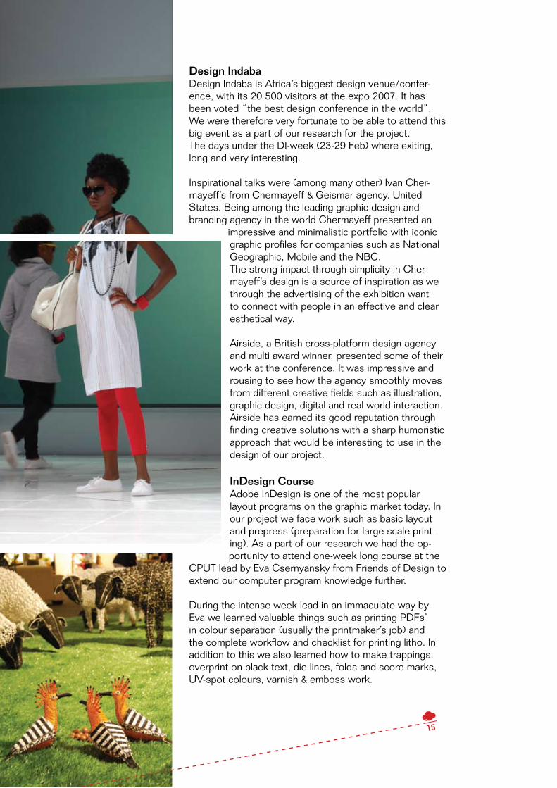
Design Indaba Design Indaba is Africa’s biggest design venue/confer-ence, with its 20 500 visitors at the expo 2007. It has been voted “the best design conference in the world”. We were therefore very fortunate to be able to attend this big event as a part of our research for the project. The days under the DI-week (23-29 Feb) where exiting, long and very interesting.
Inspirational talks were (among many other) Ivan Cher-mayeff’s from Chermayeff & Geismar agency, United States. Being among the leading graphic design and branding agency in the world Chermayeff presented an
impressive and minimalistic portfolio with iconic graphic profiles for companies such as National Geographic, Mobile and the NBC.The strong impact through simplicity in Cher-mayeff’s design is a source of inspiration as we through the advertising of the exhibition want to connect with people in an effective and clear esthetical way.
Airside, a British cross-platform design agency and multi award winner, presented some of their work at the conference. It was impressive and rousing to see how the agency smoothly moves from different creative fields such as illustration, graphic design, digital and real world interaction. Airside has earned its good reputation through finding creative solutions with a sharp humoristic approach that would be interesting to use in the design of our project.
InDesign CourseAdobe InDesign is one of the most popular layout programs on the graphic market today. In our project we face work such as basic layout and prepress (preparation for large scale print-ing). As a part of our research we had the op-portunity to attend one-week long course at the
CPUT lead by Eva Csernyansky from Friends of Design to extend our computer program knowledge further.
During the intense week lead in an immaculate way by Eva we learned valuable things such as printing PDFs’ in colour separation (usually the printmaker’s job) and the complete workflow and checklist for printing litho. In addition to this we also learned how to make trappings, overprint on black text, die lines, folds and score marks, UV-spot colours, varnish & emboss work.
15

2.5 Design Research
Exhibition Marketing in Cape TownTo find out more about how exhibitions normally are mar-keted, we went to the gallery focus contemporary, situat-ed in the heart of Cape Town. This gallery has showings of photography and fine young art. It is, as galleries often are, an open light space with big windows. When walking in, you are welcomed by Gernot Achleitner who is the co-director of the gallery. One can tell his passion for the job as he eagerly answers questions and gives informa-tion about the art and the artists. Each artist and his/hers work are also presented in a folder, these folders follow the same sober style as the interior of the gallery.
As we haven’t seen a lot of advertising for exhibitions in form of posters or flyers, we figured this not to be the common way to go about it, which was confirmed by Achleitner. The gallery markets their exhibition on websites for culture events and in the Arts and Crafts map. A good review in a magazine also attracts visitors. The gallery also has a website where all exhibitions and artists are presented. As you visit the gallery you are encouraged to leave your name and e-mail address to receive their newsletter and get invites openings of new exhibitions. In this way focus contemporary has created a reliable audience.
Since we can’t rely on regular visitors at the Expressive Generation Exhibition, other ways of marketing are nec-essary. It would be a great possibility if we could con-vince galleries and museums to mention the exhibition and its importance in their newsletters.
Gallery focus contemporary has big windows that allow people walking by getting a glimpse of the art exhibited. This awakens curiosity and perhaps a spontaneous visit. We should also have the spontaneous visitor in mind and see if we can take advantage of Artscape’s windows.
Graphic Design in Cape TownIn many ways one is surrounded by graphic design in Cape Town and it comes in various shapes. Sober and minimalist design can be found in South Africa as else-where, especially when targeting people with a more lavish lifestyle.
More interesting, is the young, trendy and colourful de-sign often seen on flyers for clubs and concerts. Trendy shops and galleries have graphic art covering the win-dows. The style has a humoristic and naivistic approach which seams to have found inspiration in the world of comics, Manga and illustrations in children’s books.
16

Street art in form of murals and smaller paintings on walls are very popular and you can see graphic design and street art influencing one and other. Painted facades are also common for other reasons; shops often have their logotype painted in strong colours making it visible from a distance. The many car shops / mechanics often follow the norm of American gas stations from the 50’s in the interior and graphics. In Sweden this would be a well thought trough retro style, in Cape Town it just is what is.
To get a good view of what the professional design scene has to offer, we read the inspiring one small seed which is a South African magazine covering design, archi-tecture, photography and art. The founder and creative director,GiuseppeRusso,startedthemagazinein2005with the aim to educate and sow seeds of inspiration, confidence and pride. The magazine showcases both international and South African talent and introducing the reader to the artistic genius that surrounds us (one small seed, issue 2: 2006).
Cape Town has contrasts and diversity, this can of course also be seen in the field of graphic design. It can be high-class, expensive and stylish. It can be young, fresh and trendy or perhaps colourful rough and arty. The variety is what is inspiring.
Inspirational Ways to AdvertiseWe plan to create an edgy marketing campaign which stands out in Cape Town, so we took a closer look at what inspirational materials out in the graphic scene.
This series of three white posters placed in a street envi-ronment plays with our minds creating illusions. The first poster is placed in front of a metal fence, illustrating six metal bars where the two middle ones are bent. On the second poster a stem and roots are place in front of a tree, giving the perception that the tree is pulled up from the ground. The last poster shows a metal pole tied in a knot, which is placed in front of a traffic sign. The illustra-tions together with the placement, gives life to the poster and creates an interesting 3D-effect.
These two posters were designed for the Stockholm Jazz Festival. The use of bright and strong colours and the simplistic illustrations of instruments gives a joyful straight message. The placement of the posters adds an extra dimension to them as they interact with the sur-rounding objects, such as an electric box.
What would be the best way to advertise an auto clinic? By placing plasters on your scratched vehicle of course! These plasters are printed with the phone number of the auto clinic. This is a playful and direct marketing strategy, which would put a smile on your face instead of the an-noyment of yet another flyer stuck to your car.
17

18
2.6 Summary
The Frank Joubert Art Centre, our project assigners, together with the Ibhab-hathane Project works within the educational sector. They believe education equals awareness, encouragement and empowerment and is a critical core-element to create a stable society. They educate learners and teachers from all over the Western Cape and we considered ourselves privileged to collabo-rate with them under our project.
The Western Cape Education Department, WCED, is equivalent to the Swedish “Skolverket” and is the main financial support of the FJAC. High Schools in the Western Cape participate and exhibits. Artscape, the venue for the event is a big culture house that hosts everything from operas and theatres to exhibitions.
South Africa, also called The Rainbow Nation, has with its reputation of fan-tastic nature, multicultural society and its political history of apartheid today become one of the main tourist attractions in the world.
A number of recreation and art centres where established through the initia-tives of liberal organisations during Apartheid. Many South African artists flourished from these centres and has influenced both African art history and contemporary scene. The antiapartheid struggle-posters are used as educa-tional and inspirational material for the learners exhibiting at the Expressive Generation Exhibition.
The common message in South African HIV-campaigns is the one of “love, caring & togetherness”. The traditional material sent out by the governmental organisations is very instructional with step by step instructions. As a reac-tion to the public’s low interest for traditional campaigns, young designers create with a new and trendy approach.
By attending the INSET-teacher workshop at FJAC we got a further insight into the educational structure of our assigners. We also conducted a design lecture & Design Discovery Tour around Cape Town with a group of learners from the school of Chris Hani. With this knowledge we got a picture of how and who the exhibitors at the Expressive Generation Exhibition are.
Design-Inspirational elements of our research were among others the visit at the awarded design conference Design Indaba. Through CPUT we also took a layout course in Adobe InDesign to broaden our computer program knowl-edge for this project.
Exhibitions and Galleries in Cape Town are often marketed discreetly. They have their information in the Arts and Crafts’ map and on websites for culture events. A good review attracts many visitors. Information is spread by using emailing-lists.
Graphic Design in can be found everywhere in Cape Town. Trendy shops and galleries have graphic art covering the windows. Street art is very popu-lar and comes in form of murals, stencils and stickers. For the latest South African design, one small seed is an inspiring magazine.
A Poster can interact with the city environment and encourage the spectator to use his/her imagination. By creating material that surprises, it can put a smile on your face instead of being annoying.

2.7 Analysis
A creative city requires creative solutions. Cape Town is vibrant and filled of contrast and happenings; it’s a city of youth and energy. This gives us the possibility be playful and take advantage of the inspiring surround-ing and people. As Colin Stevens from FJAC explained, this exhibition is made by young people; the advertise-ment must therefore communicate this.
South African government has since the abolishment of Apartheid made a big effort into social restoration and equality among citizens. It has become important to forgive the racial inequalities of the past, but never to for-get and relapse. The South African atmosphere and lifestyle is constantly reminded of human rights, equality and empowerment. This has created a very equal and politically correct approach from commercial media such as magazines, TV and internet. An example of cultural difference between Sweden and South Africa is the ap-proach to humour. In Sweden we often use irony when advertising while in South Africa it’s a non provocative sweet humour.
Thanks to our practical research together with South African teachers and learners we realized the importance of creative interaction towards the Expressive Generation Exhibition, by the parties involved. The Frank Jou-bert Art Centre’s approach to the exhibition was one of pride and sense-of-belonging of the young and their opinions.
In order to find an interesting way to market this exhibition we need to go several steps forward in Cape Town and find alternative solutions. We are finding inspirations in for example street art, with its amazing illustrations and colours. We also found interesting examples of advertisement where the city environment actually be-comes apart of the posters creating illusions and 3D-effects.Posters might not be the most economical ways to advertise, therefore we must think of complementary ways to go about it. Stickers and pins could be additional ways to spread the message. The challenge is to make them different and awake a sense of curiosity.
2.8 Conclusion of Research
Social South Africa – A Country of historical reminders. South Africa – Neutral, equal, politically correct media and cultural approach. Interaction of parties creates interest, pride and belonging.
Graphic South Africa – A use of strong colours and illustrations South Africa – Straight and clear messages Cape Town - A creative city requires creative solutions
19

03.
Design Concept
3.1 Expressive Generation – Educational guerrilla marketingYoung, thought-provoking, pedagogical, bling, expressive, interactive, witty and crystal clear. These are all adjectives describing the versatile and broad range of marketing material for the Expressive Generation Ex-hibition 2008. The campaign experiments with the expressive messages of the exhibition and the vibrant city structure, allowing an interaction between the spectators and the printed material. It also combines guerrilla marketing with educational material allowing the exhibitors themselves to take part and express their creativ-ity through the advertisement material. Expressive stands for freedom of speech and creative opinions while Generation represents the young exhibitors and their future South African society. With inspired minds and a full load of research, we created the following range:
Poster – the thought-provokingThe poster is the core of our campaign, being the classic of advertisement.The Expressive Generation poster transforms the street to a medium for expression by having the die cut speech and thought bubble framing an “opinion” or a “statement”. This reveals the structure underneath the paper and plays with the different scratches, patterns and graffiti of the streets.
Thanks to the interaction with its environment and the play on words, the posters are displayed both in a traditional way such as walls but also unconventionally on pavements and over edges. The viewer is encour-aged to become aware of his/her environment, and might also question visual message. Working in a 3D way with a 2D object creates attention and interest with its eye catching approach.
20

Sticker – The streetwiseThe slogan Educational Guerrilla Marketing is represented in this sticker. The appearance and the purpose of the sticker is the same as the poster’s. The twist lays in the fact that the exhibitors themselves are part of the advertisement. By receiving the stickers from their schools, 500 learners will spread the advertisement in their own neighbourhoods in a guerrilla marketing manner. When highlighting spots to create messages the learners are encouraged to think about their views, thus the placement of the sticker becomes a school project. For the “streetwise” the sticker can also function as a stencil. The expressions of the stickers will be documented by themselves and presented in class.
An empty statement - Is placed on
empty walls or surfaces. Clean walls
are often found in up-market areas of
the city, reaching an influential target
group.
A statement – Is placed on spots where someone has made a mark.This could be everything from a crack in the wall to a graffiti tag.
A flexible opinion – Is placed on 3Dsurfaces such as pillars, tables, corners and fabrics.
A dangerous opinion – Is placed on “dangerous” city spots like busy roads and electric fences. It can also frame any object or writing considered to be negative.
21
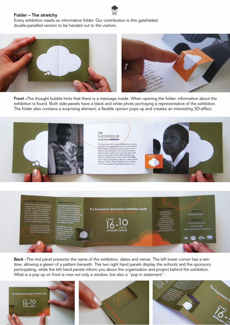
Folder – The stretchyEvery exhibition needs an informative folder. Our contribution is this gatefolded double-panelled version to be handed out to the visitors.
Front –The thought bubble hints that there is a message inside. When opening the folder, information about the exhibition is found. Both side-panels have a black and white photo portraying a representative of the exhibition. The folder also contains a surprising element; a flexible opinion pops up and creates an interesting 3D-effect.
Back –The mid panel presents the name of the exhibition, dates and venue. The left lower corner has a win-dow, allowing a gleam of a pattern beneath. The two right hand panels display the schools and the sponsors participating, while the left hand panels inform you about the organisation and project behind the exhibition. What is a pop up on front is now not only a window, but also a “pop in statement”.
22
A statement – Is placed on spots where someone has made a mark.This could be everything from a crack in the wall to a graffiti tag.

Invite – The VIPTo attract influential people to the exhibition, a spe-cial type of invite was created. The idea behind the invite is to give the guest a scene of exclusivity by not only receiving a customary invite but also a gift in an interesting package.
There are two versions of the invite, one for him and one for her, as it in a more personal way connects to the guest. The invites consists of two pieces; an envelope-box and a card with a gift. The invite plays with the guest’s curiosity by in three steps revealing the inside information. The following is the invite for her:
1. First open the speech bubbled seal flap of the box and encounter the top view of the inside.
2. A die cut square under the text An opinion re-veals a shiny object with a thought bubble and the text Expressive Generation.
3. A discreet finger grip entices to pull up the inside card and exposes the copy and a now visible single earring in Perspex. The copy continues from the previous phrase An opinion to; Get your other one at the Expressive Generation Exhibition. The version for him, contains a single cufflink.
Giving the visitor only one piece of the gift, entices him/her to go to the exhibition and receive the other one.
23

Exhibition Merchandise – The blingTo further satisfy the visitor, we created a souvenir range in Perspex to be sold at the exhibition. The souvenirs are an important addition to the advertisement as they can be used over and over and by this prolong the life of the exhibition.
T-shirt – The stylishThe T-shirt comes in black with a white thought bubble and can be found in a male and female version. This will be worn by the staff working on the ex-hibition, as well as for sale in at the souvenir stall.
Having an exhibition t-shirt falls natu-rally seeing as the t-shirt together with the banderol, was the forerunners to the struggle-poster of the antiapart-heid movement.
Window graphics – The crystal clearA graphic message displayed on windows, is an effective and eye-catching method to ad-vertise. The bubbles are ideal to use in this manner as they can be both solid and outlined. What is framed within the outlined bubbles constantly changes depending on movement and activities on the inside and outside of the building.
The graphics will be decorating shops, popular among young people, and the windows of
Artscape to attract spontaneous visitors walking by.
Alternative Media
24
Keychain: A handy everyday product
Pin: Neutral, stylish and unisex
Earrings (drop & stud edition):For the jewellery lover
Cellphone accessory:Contemporary and easy to spotin the bottom of your bag.

3.2 Graphic Elements
ColoursThe campaign colours where created and inspired by the streets of Cape Town. Thanks to the versatility of city colours, a strong scheme is vital to contrast the spots of placement. The Expressive Generation colour scheme is also used throughout all campaign materials shifting in combinations depending on the artefact and purpose.
Poster & Sticker- Thefourcampaigncolours:RichBlack,PurpurRed,SunnyOrangeandImpactWhitearecustomised for the different purposes and messages of the posters and stickers. Forest Green blends nicely into the city structure with its neutral and earthy qualities.
PurpurRed–onAstatementcontrastswellonpalebackgrounds such as grey or white.
Impact White – on An empty statement is well exposed on colourful backgrounds like painted walls or red tiles.
RichBlack–onAflexibleopinionalsofunctionswellonpale surfaces.
Sunny Orange – on A dangerous opinion is strongly visible on darker ground surfaces, much like the one of busy roads.
To create maximum visibility of text we used Impact White for the majority of the head and sublines. Forest Green was applied on the text of the already white An empty statement.
Folder and Invite – The colour combination of the folder and invite differs slightly as a third colour is introduced to the artefact. This allows the material to be dynamic and more detailed as they don’t need to catch the viewer’s attention in the same manner as the poster. The dominant colour of both artefacts is Forest Green with its calm approach. Segments of Sunny Orange, RichBlackandImpactWhitecanbefoundthroughoutthe layout.
Exhibition merchandise – The Perspex chosen for the souvenirs also go in the colour range of black and white/transparent for an elegant look. Only the cellphone jewellery has a “sunny orange”-colour with its glowing appearance.
Shapes and objectsThe visual language of
the Expressive Gen-eration is simple and
straight forward. The main visuals are the ones of the speech and though-bubble represented
in different ways throughout the materials. The design of the objects is strong but yet uncom-plicated, not to take away the street message
it’s aimed to highlight. All campaign materials are intended to either have a three-dimensional aspect or be used
that way in the city.
The die cut with its window-like approach can be found in the poster, sticker, earring and
window graphic. Another creative solution is the speech bubble-shaped flap that closes the
envelope-box on the invite. Throughout the design phase we used the shapes to their full
capacity and experimented with size and crop-ping for a versatile feel.
As the folder and invite are slightly more de-tailed, decorative lines have been introduced
to the design. This enhances the look and feel of the artefacts in an elegant manner as their
environment will be more intimate in the exhibi-tion guest’s hands.
PurpurRedC0 M100 Y40 K50
Impact WhiteC0 M0 Y0 K0
Sunny OrangeC0 M33 Y100 K0
RichBlackC60 M40 Y40 K100
Forest GreenC48 M36 Y100 K13
25

Type
Briem Academi StdFor the poster headlines the choice of type fell on the strong and angular Briem Academi Std, which com-municates the power of a statement and opinion. It also stands in an interesting contrast to the curvy bubbles catching just enough attention. Briem Academi Std is also used for headlines in the folder and invite, and goes well together with the simplistic Folio Std.
Folio StdThe chosen body type Folio Std, is used in all printed material. It’s a clean sans serif which is easy to read but yet stylish. It’s a fresh alternative to frequently used fonts like Helvetica and Arial.
Century GothicThis classic font has characteristic numbers which we chose to use for the exhibition dates. The numbers 16 and 10, together with the Months, June and July written in Folio Std, creates a harmonic assembly.
PhotographyTo give the exhibitors a face, the folder portrays two learners from the School Chris Hani. The in b/w photos contrasts an compliments the colours of the folder. The photo on the left hand side portrays a girl dressed in a shirt she decorated with her own design. She looks straight at viewer with a discreet smile, her eyes commu-nicates both pride and shyness. The second photo portrays an attentive learner during class very focused on what is being said. More photos can be seen in our MFS-report Design as a tool for Development.
04. Creative Process
4.1 Work methods
A lot of research – By doing an extensive research of South Africa and its creative aspects we were able to build a platform of confidence and enter the design phase. Important aspects of our research were the meetings with interesting people that all contributed to our experience in different ways. The research also gave us needed knowledge of the South African design scene and the different visual languages of the country.
Keywords – By working under the keywords; expressive, young and interactive, we were able to build a foundation for
the campaign concept. These keywords were a stable work support as they helped us to stay on the right path when creating and making decisions.
Trial and error – Due to the many different materi-als and customised formats, it was important to try them out in real life, therefore we made prototypes for all campaign material. This was an exciting pe-riod; throughout days and nights we cut, folded and glued pieces of paper and cardboard.At this point, the graphic profile of the campaign was planted which
allowed us to work and ex-periment both separately and together.
26

4.2 Scamps and concept developmentThe idea behind the Expressive Generation’s visual language was born one sunny afternoon at a Cape Town café. After taken a closer look into the local advertisement scene we felt that there was a broad variety of posters out there, but yet none that challenged the viewer creatively. These raw scamps were created on the spot while trying to figure out an effective and innovative way of display. The early scamps show the thought process and development of the concept step by step. Page 1 is an exploration of the expressive symbols and die cuts. Page 2 is a further development as the early concept is applied and plays three-dimensionally with the different street elements. Although this concept was further developed and refined, the core idea has remained intact.
27

Early colour schemes and headlinesThe posters were originally made in a range of six, all with different colours and headlines. The thought behind this was the big variety of clever headlines and colour combinations. The campaign was at this point very broad and no specific number of posters was set. At this point, the headlines were a bit lon-ger with “This is a…” in beginning of the sentence and a following question “what is yours?”.
After meetings with graphic designer/lecturer Bruce Snaddon from CPUT as well as our assigners at the FJAC, we agreed that some of the posters could be “merged together” and the headlines simpli-fied somewhat. We therefore decided to take away “This is a…” and only stick with the essence of the headline, in this case: A statement. The “This is an over the edge statement” and “This is a flexible opinion”-posters got transformed into the present A flexible opinion. “This is a flat state-ment” was intended to be placed on the ground but came very close to the concept of “This is a danger-ous opinion” with the same intention. We therefore removed it from the range. The question “what is yours?” was also removed as it didn’t leave the im-portant gap for the viewer to fill in himself.
expressivegeneration.com
youngvoiuces.co.za
This is a dangerous opinion
What is Yours?The Expressive Generation Exhibition 16th June
Artscape Theatre - Free Entranceexpressivegeneration.com
... What is Yours?The Expressive Generation Exhibition
16th June Artscape Theatre - Free Entrance
This is a statement
What is Yours?The Expressive Generation Exhibition 16th June
young opinons through art and design
Artscape Theatre - Free Entrance
expressivegeneration.com
This is an empty opinion
What is Yours?The Expressive Generation Exhibition 16th June
Artscape Theatre - Free Entranceexpressivegeneration.com
This is someone else’s statement
What is Yours?The Young Voices Exhibition 20th June
Artscape Theatre - Free Entranceyoungvoiuces.co.za
What is Yours?The Young Voices Exhibition 20th June
Artscape Theatre - Free Entranceyoungvoiuces.co.za
This is an over the edge statement
What is Yours?The Expressive Generation Exhibition 16th June
Artscape Theatre - Free Entranceexpressivegeneration.com
Format and decorative elementsEven though the visual language of the campaign was somewhat grounded from the start we still experimented with the format of the poster and decorative elements. Using a portrait format allowed more text-space and gave the speech bubble a different visual approach. After some trials we agreed that a landscape format was
the most interesting as it’s in minority to the present posters on the streets and therefore more attractive.
We also experimented with the visual elements of the poster by adding decorative lines in different shapes and directions. This was an interesting move as we felt that the lines created a nice addition and change to the layout. We decided to have these decorations in mind for the other material when, we at the end, chose to stay with the more uncomplicated/clean language of
the original posters. A statement
A R T S C A P E
ARTSCAPE THEATRE 2oo8 Free entrence
The Expressive Generation Exhibition
Young opinions through Art and Design
expressivegeneration.com
16 1oJ U N E
J U L Y
A statement
What is Yours? 16 June 2oo8 Young opinons through art and design Artscape Theatre expressivegeneration.com
A R T S C A P E
FRANK JOUBERT The Expressive Generation Exhibition
28

FolderWhen sketching folder ideas, we went in two directions. One where the speech and thought bubble was the inspiration for shape and die cuts and another where the actual folding was the main focus. We wanted an inviting folder that would make one curios and also contain that little extra. This resulted in a wide range of folders, in which three got presented to the assigners at FJAC.
Together with our assigner we decided to go for a self created version with a double panelled gatefold. This folder has a handy size and fits in a pocket or a purse, containing all necessary information. With its elegant folding we could see potentials in creating further graphics and effects. By fitting three folders on an A3 and no die cutting, this was an economical advantage. The campaign’s 3D approach was also integrated in the folder; this is what would become the “flexible-opinion-popup”. The popup turned out to be an appreciated effect and as a bonus, very easy to create without added expenses. InviteIt was decided early on that the invite would contain a gift, a teaser. As the invite in most cases would be sent by mail, we scamped on various version of envelope-boxes. The envelope-box went from a traditional rectangular shape, to a square one to follow the shape of the gift. By folding dummies and then trying out how they best displayed the gift, we found the die cut to be ideal for the revealing effect we were after. When having the dummy in our hands, we saw how easily the envelope could be sealed by slipping the flap into a cut.
NameSince the exhibition name wasn’t set we were welcomed to come up with suggestions. FJAC’s work-ing name; “The Other Side of the Street”, was an expression used in the struggle movement. The name was inspiring but wouldn’t communicate anything about the exhibition to someone walking by the poster. It also gave the feeling of “us and them” in spite the fact that the exhibition rather is about unifying than alienating. FJAC had a second suggestion; “Speak for Your Self”. We felt this name was too focused on the individual and more of a command then an uplifting encouragement.
Our name suggestions were: “Young voices”, “Young perspectives” and “Expressive generation” (see Proposals). These names would in a positive way communicate that it’s an exhibition made by young people. All three names came with a campaign proposal and together with our assigners we chose the one belonging to “Young Voices”. However, the name was changed to The Expressive Generation Exhibi-tion, which states youth and action.
youngvoiuces.co.za
A R T S C A P E
ARTSCAPE THEATRE June 2008 Free entrence
The Expressive Generation ExhibitionYoung opinions through Art and Designexpressivegeneration.com 16 1oJ U N E
J U L Y
ARTSCAPE THEATREYoung opinions through Art and Design expressivegeneration.com
The Expressive Generation Exhibition 2oo8A R T S C A P E 16 1oJ U N E
J U L Y
youngvoiuces.co.za
What is Yours?The Expressive Generation Exhibition 16th June
Artscape Theatre - Free Entranceexpressivegeneration.com
TypeThe layout and look of the type was played around with at several points to create the ultimate balance, dis-creet but visible. At an early stage we wanted the informational text to be as subtle as possible to emphasize the speech bubble and headline. As more and more required text was added to the poster we had to come up with a good layout solution. Once all the required text was placed we layouted it neatly in a block beneath the speech bubble. However, this created empty spaces on the sides. The solution was to break up the text block to create a more harmonic balance which we did by blowing up the exhibition dates.
1, 2 3
29

Speak for Yourself!
Speak for Yourself!
Expr
essive Generation Exhibition
express!
Expressive Generation Exhibition 20th June Artscape Theatre - Free Entrance
youngvoiuces.co.za
- It is post-suppression local standpoints in a contemporary creative context- Hetic dude!
- It is Post-suppression local standpoints in a contemporary creative context- Lekker man!
- It is post-suppression local standpoints in a contemporary creative context- Awesome bro!
Expressive Generation Exhibition 20th June Artscape Theatre - Free Entrance
youngvoiuces.co.za
Expressive Generation Exhibition 20th June Artscape Theatre - Free Entrance
youngvoiuces.co.za
Campaign Concepts 17-04-08Name: ConversationsType: Neutral colours
DescriptionArt exhibitions can sometimes be perceived as to boring and grown-up from a young person’s perspective. By using young peoples own vocabulary with local expressions responding a pompous arty statement this ad shows that anybody can come and take a part of the exhibition.
Bene�ts- Copy describes exactly what the exhibition is about- Speaks to everybody, young and old, using di�erent vocabularies.- Poster has a humoristic and local approach- Function well on it’s own as well as in a series- Normal production costs
“Conversations” Art exhibitions can sometimes, from a young person’s perspective, be perceived as too boring and grown-up. By using a young vocabulary with local expressions responding a pompous arty statement, this ad shows that anybody can come and take a part of the exhibition.
expressive generation exhibit ion at Artscape
20th of June08 Free Entrance
expressive generation exhibit ion at Artscape
20th of June08 Free Entrance
Expressive Generation. To be able to see the possibilities of how society can be influenced by speaking your mind and expressing yourself is a powerful knowledge. In the first poster a girl is shouting out her message, the red thread grows wanting to reach out. As seen in the example of how the poster can be put up, the red thread continues out from the paper and finds its own way creating a pattern on the
fence. This could be an untraditional way to add an exiting flavour to the poster, making it more eye strik-ing. In the second poster we have a big explanation marc containing of speech bubbles, this to show the strength of many individual voices working together as the exhibition will be filled with voices and opinions.
“Expressive Generation part 1/Red thread”The poster illustrates a girl shouting out her message. Her voice, symbolised by the red thread, grows and continues outside the paper creating a pattern on its surrounding. This is an untraditional way to add an exiting flavour to the poster. The second poster has a big explanation mark containing speech bubbles to show the strength of many indi-vidual voices working together.
4.3 Proposals – the ones that didn’t make the cut
Here comes three other concept proposal created for the campaign. They were good but the present one was just better!
30
Exhibition at Artscape20 th of June
Free Entrance
young p ersp ec tives
08
young p ersp ec tives
Exhibition at Artscape20 th of June
Free Entrance08
young p ersp ec tives
Exhibition at Artscape20 th of June
Free Entrance08
These posters communicate how the exhibition will be a great possibility for everyone to see society from the perspective
of youth. The grey and white areas symbolises the world seen from the eyes of an adult, use to the everyday problems
while as the colours shows how youth with fresh eyes easier can see possibilities and ways for change.
“Young Perspectives”These posters communi-cate how the exhibition will be a great possibility for ev-eryone to see society from a youthful perspective. The grey and white areas symb-olises the world seen from the eyes of an adult, blind to the everyday problems. The colours illustrate how youth with fresh eyes easi-er can see possibilities for change.

4.4 Meetings & guidance - Educational guerrilla marketing is born
We are very grateful to have had so many external fellow advisers and their professional input throughout the design process. As our graphic mentor Anders Ljungmark was situated in Sweden, we felt that a local input would be necessary. We therefore scheduled a meeting with graphic de-signer and lecturer Bruce Snaddon from CPUT and embraced his input (see Early colour schemes and headlines).
The good spirited and pedagogical mindset of our assigners at the FJAC rubbed of on us and our design thinking. At one of our many conversations, the interesting idea of sharing the interactive campaign material with the young exhibitors came up. As the FJAC previously hadn’t succeed at-tracting a younger target group (nerveless their own exhibitors) we found this idea to be perfectly suitable and relevant. This was the birth of the slogan Educational guerrilla marketing (see Sticker- The streetwise).
4.5 Turning points
Our South African experience has at all times been a filled by new impression and changes. Thanks to this, we can gladly state that even though some changes in the project at first seemed trouble-some, it often resulted in creative solutions and compromises.
Shift in research focus – At first, before receiving the project brief from FJAC, our research circu-lated around social issues and was somewhat SIDA/MFS focused. With the new brief we could nar-row down our field of research and concentrate on a graphic alignment and the South African design scene.
Meetings & Election of concept – Every new meeting resulted in new insight and changes. One of the more vital ones was our first meeting with Jill Joubert, intended to be only an interview in social design and education. As mentioned, Jill is a woman of many ideas and a bubbly character, when discussing the centre’s many events and the upcoming exhibition, the idea of a collaboration sparked up.
Once the different concept proposals were presented to our fellow advisers; A.Ljungmark and B.Snaddon, we noticed mutual opinions regarding combining the different strengths in the concepts “YoungVoices”and“ExpressiveGeneration1/Redthread”.Therewasastronglikinginthewaythe posters interacted with its environments as well as the name proposals. This was also expressed by our enthusiastic assigners. We got the suggestions to merge the qualities of the two concepts into one. The common theme in both proposals was the interactive aspect with the streets, however, they had very different approaches to this being strong on their own. We felt the die cut and the red thread-theme would compete with each other and rather deprive then enhance the poster. The mat-ter was settled based on the pedagogical and interactive qualities of the speech bubble-concept. However, one element of the “red-thread” concept was kept and used; the name Expressive Gen-eration. By having a set name and concept we could fully concentrate on fine-tuning the campaign material.
Finances – A long way into the design project we worked under the believe that the Cape Town Fes-tival, the exhibition’s main sponsor, would provide the financial means for print. It was a disappoint-ment when it became clear that they withdrew their collaboration with the FJAC by cancelling two set meetings without a notice. All of a sudden we stood empty handed and in the dark without a main sponsor. This required economic compromises and creative solutions! The possibilities of looking for other sponsors arise, one being the WCED by printing the stickers as educational material.
Creative solutions• Resizingthefoldertofit3onanA3paper• Producingtheinvite-giftofPerspexoffcutsandfreelasercutthrough student-friendly organisation The Fab Lab. • WindowgraphicvinylalsosponsoredandproducedattheFabLab.• Postersandstickersdiecutbyhandatschoolsandartcentres.• FoldersandinvitesfoldedandcutbyhandatFJAC.
31

We arrived in South Africa with big expectations and with a few butterflies inside. During our first stay in Cape Town we were exchange students at the CPUT, living a structured life of set schedules and deadlines. This time, we were respon-sible for our own planning and the execution of the biggest project within our education. We had also committed to a second project, the Minor Field Study which required atten-tion of its self.
Design for Social ChangeBeing design students, we were well aware of design as medium and its roll in our western society. The seed of social change and integration had been planted in us during our first stay in South Africa. Equipped with an opened mind and a strong will to make a thesis beyond the traditional standards, we returned to Cape Town. By first focus the research on design for social change and the educational system, we naturally came in contact with creative people within these fields. One of them was our assigner Jill Jou-bert.
Creativity is in the AirThe exhibition project and our Minor Field Study developed and grew together, hand in hand, due to their common social context. Our extensive research gave us a deeper understanding of South African society and the presence of historical reminders; this came to be an important knowl-edge as the exhibition itself is inspired by the powerful struggle-posters. When creating the advertisement cam-paign, these where aspects we had in mind along with the contemporary design surrounding us. We regularly went to CPUT to interact with lecturers and students. In a university environment fresh ideas are encouraged and the creativ-ity is in the air. Design Indaba has the similar open minded approach, only at this point innovations are taken a step further into reality with a business perspective.
Innovation in the NationThe South African design market is flourishing; the many cultures are finding each other merging into a spectrum of colourful expressions. Cultural meetings have worked as a guiding-star throughout the project and have boosted our creativity as designers. Our contribution resulted in an edgy campaign with the following innovative qualities:
• Interactiveposters–Playswithitsenvironmentand also its viewer• EducationalGuerrillaMarketing–Advertisement with a second purpose • Exhibitioninvites–Attractsvisitorsbyteasingwith only “half a gift”.
05.
ConcludinReflec
tion
32

33
1
• MFS+MalmöUniversity–Provethatitspossibletobothcombinea design project with a SIDA research and do the examination project outside of Sweden. • TheDesignDiscoveryTour–conductaprojectresearchthatnotonly takes but also gives back
A True ExperienceThe most memorable part of this project is definitely The Design Discovery Tour. It was inspirational getting to know the six teenagers coming from a very different background than ours, meeting through love for design. Our workshop group grew strong in only a few days and it was a true experi-ence to see how each personality blossomed. We realized the importance of involving all participants of a project, which was implemented in the ad-vertisement campaign. The learners will hopefully feel pride and a sense of belonging when they together spread the message about the exhibition they created.
Future perspectivesWe wish to continue the collaboration with marketing FJAC’s events and we are all hoping for a continuation making The Expressive Generation Exhibi-tion into a yearly event. The Design Discovery Tour has great potential as the Department of Education showed interest in developing design orientated field-trips for learners in Focus Schools, after listening to our experiences. As previously mentioned our ambition is to bring the exhibition to Sweden and through this tie some further knots between FJAC and Sweden. The Stock-holm Culture Festival has been contacted and we are awaiting their response with great anticipation.
Africa is about PeopleWorking side by side as a duo taught us the importance of a continuous and clear dialog. The guidance and practical help we received from our MFS-mentorMugendiM’Rithaa,madetheDesignDiscoveryTourpossible.Ourgood friend and graphic designer Nelson Velayo shared his knowledge about the new environment we entered when visiting Chris Hani. Staying in contact with the people who patricipated in this project is important to us.
MugendiM’Rithaaoftensays;“Africaisaboutpeople,havethatinmind”,this has shown to be true over and over again. This project has a lot of warmth and joy thanks to the fact that it’s built on relationships between people with a common goal.

34
06. Acknowledgments
We will forever be grateful to everyone that took part of our project, for helping us not only to reach our goals but also contrib-uting to a memory for life. With-out your good hearts and door opening qualities, this could never have been possible.
Camila and Emilia2008

Written sourcesFalola, T. 2004. Teen life in Africa. Westport, Connecticut, London: Greenwood Press
Frank Joubert Art Centre. N.d.PDF Curriculum Vitae, the Frank Joubert Art Centre and The Ibhabhathane Project.1998 to the present. Cape Town: FJAC
Gostelow,M.2006.ReseguidenSydafrika(TravelGuideSouth Africa). Värnamo: Fälth & Hässler
Joubert, J. 2008.The other side of the street – Three alternative centres of the arts in South Africa. Cape Town: Western Cape Education Department
Naidoo,R.2008.DesignIndabaExpo,Visitor’sGuide.Cape Town: Interactive Africa
Mass.M,LeRoux.M.2008Audience Development & Education Diary 2008.Artscape, Cape Town
Papanek,V.1972.DesignfortheRealWorld.London:Thames & Hudson Ltd
Russo.G2006.onesmallseed.Cape Town
Internet
Amref [Online]. Available:http://www.amref.org/index.asp?PageID=51&PiaID=2&CountryID=4[6 march 2008]
Cape Gateway [Online]. Available:http://www.capegateway.gov.za/eng/yourgovernment/gsc/4186[25 Feb 2008]
Design Indaba [Online]. Available:http://www.designindaba.com/conf/conf2008 [4 March 2008]
Designing Hope [Online]. Available:http://www.dessinelespoir.org/web/affich_E.php?Fiche_ID=64&Langue=Ehttp://www.dessinelespoir.org/web/affich_E.php?Fiche_ID=61[6 March 2008]
Frank Joubert Art Centre [Online]. Available:http://www.frankjoubertartcentre.co.za/[24 June 2007, Viewed 2nd march 2008]
07.
References
Health Insite [On-line]. Available:http://www.healthinsite.net/health/HealthProfile.dll/eCareCentreDetail?fh=1420[6 March 2008]
Landguiden [Online]. Available:http://www.landguiden.se[14 December 2007]
loveLife [Online]. Available:http://www.lovelife.org.za/corporate/index.html[8 March 2008]
SA Government [Online]. Available:http://curriculum.pgwc.gov.za/site/23/page/view/[28 Feb 2008]
SABS Design Institute [Online]. Available:https://www.sabs.co.za/Business_Units/Design_Institute/Initia-tives/africa/DFD_Conference/ [5 November 2007] South Africa Info [Online]. Available:http://www.southafrica.info/ess_info/sa_glance/health/aids.htm[6 March 2008]
WCED [Online]. Available:http://wced.wcape.gov.za/comms/press/2007/21_arts&cul.html[28 Feb 2008]
Wikipedia [Online]. Available:http://en.wikipedia.org/wiki/Khayelitsha[31 March 2008]
Oral sources
Colin StevensFrank Joubert Art [email protected]: 01-04-2008, Cape Town
Gernot Achleitnerfocus contemporary +27214198888www.focuscontemporary.co.za
Jill JoubertFrank Joubert Art Centre [email protected]@ibhabhathane.comInterview: 21-02-2008, Cape Town
35

Interview with Colin Stevens - 1/4-2008
What will the name of the exhibition be?- We haven’t got one yet, but we will have a meeting to come up with a catchy name. One name we are playing about is “The Other Side of the Street”, that is actually the name of the books we have given to the teachers. The work (anti-apartheid posters etc.) was actually made by people from the streets and it’s addressing issues that are on the streets. So “The other Side of the Street” is quite a nice title. But what I would like to do is to get it translated into Xhosa; often you get a catchier name in Xhosa. We would love for you to come with something!
Who is sponsoring the exhibition?- The Ibhabhathane Project, Artscape Theatre and Western Cape Education Department.
Which logos must be shown on the poster? - The logos that would go on to a poster are those of FJAC, Ibhabhathane, Artscape Theatre and Western Cape Education Department.
What language will the copy going to be in?- I don’t think three versions would work, it would be nice to have at least some acknowledgement to each language (English, Afrikaans and Xhosa) but you are the designers. At the venue I think everything obviously will be in English.
What are the most important messages for the exhibition?- I think first of all we are looking at opportunities for young people to express there thoughts and ideas through art. Also to emphasise the importance of arts in the curriculum, in the living, in communication, the importance of art and design as subjects in school.
Who is the exhibition targeting?- The young - they are the main target group. Some people thought the target should be very wide. We are showing it of to the rest of the world but we are not aiming it at the older, we are aiming at the young – come and see what your people have done. At Artscape, at the same time the exhibition is on, there
are a number of activities for young people; there is the Youth Jazz Festival, there is a Youth Drama Festival, all on that time, so that’s who we’re aiming at.
What visual style keywords would you want the exhibition/advertisement to express?- For me, there has to be something about young people’s art, it’s a poster made by young profes-sionals for young artists. When you look at the poster – it’s a young person’s poster. It’s got to be for them, it’s got to attract the young. It’s got to use their language as well.
Where is the ad-material planned to be distributed?- It would be nice to put it at the galleries, I don’t know how supportive they’ll be, but I think they probably would. It also would be nice to put them up at schools, which is the ideal. We definitely want to put something up at Artscape itself and at the Art Centres. Although we’re looking at major money for posters and I don’t know what it’s going to cost, we have limited capacity. On the other hand the posters are the only cost we’re looking; putting up the exhibition won’t cost a thing thanks to the sponsors.
Is there an interest in using alternative media?- It’s going to cost producing those things, but if we had a sponsor for it… I would personally love to hear other ideas. Things like radio and inter-views will be done because we have those sorts of contacts. But first of all we’re talking about posters. I do like it, particularly the T-shirt story, because it carries us back to the original work, it was at first T-shirts and big banners.
How do you feel about having products for sale?- I’m not an artist; I’m an art administrator and an art friend. I know there is the problem of “we can’t sell children’s art”, but we got to look at the situation, you have to find ways to fund your ideals, you have to sell your self. So I don’t think that couldn’t be done, it makes a lot of sense. I’d actually like to see a stall at Artscape.
Interview made 1/4-2008,
08.
Appendix
36
07.
References
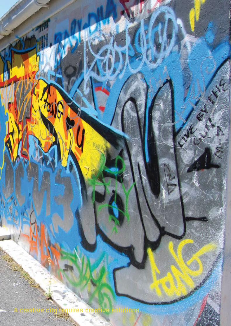
A creative city requires creative solutions...