Editors' Perspective on the Use of Visual Displays in ...
21
The Qualitative Report The Qualitative Report Volume 22 Number 7 Article 13 7-24-2017 Editors’ Perspective on the Use of Visual Displays in Qualitative Editors’ Perspective on the Use of Visual Displays in Qualitative Studies Studies Norma I. Scagnoli University of Illinois Urbana-Champaign, [email protected] Susana Verdinelli Walden University, [email protected] Follow this and additional works at: https://nsuworks.nova.edu/tqr Part of the Quantitative, Qualitative, Comparative, and Historical Methodologies Commons, and the Social Statistics Commons Recommended APA Citation Recommended APA Citation Scagnoli, N. I., & Verdinelli, S. (2017). Editors’ Perspective on the Use of Visual Displays in Qualitative Studies. The Qualitative Report, 22(7), 1945-1963. https://doi.org/10.46743/2160-3715/2017.2202 This Article is brought to you for free and open access by the The Qualitative Report at NSUWorks. It has been accepted for inclusion in The Qualitative Report by an authorized administrator of NSUWorks. For more information, please contact [email protected].
-
Upload
khangminh22 -
Category
Documents
-
view
1 -
download
0
Transcript of Editors' Perspective on the Use of Visual Displays in ...
The Qualitative Report The Qualitative Report
Volume 22 Number 7 Article 13
7-24-2017
Editors’ Perspective on the Use of Visual Displays in Qualitative Editors’ Perspective on the Use of Visual Displays in Qualitative
Studies Studies
Norma I. Scagnoli University of Illinois Urbana-Champaign, [email protected]
Susana Verdinelli Walden University, [email protected]
Follow this and additional works at: https://nsuworks.nova.edu/tqr
Part of the Quantitative, Qualitative, Comparative, and Historical Methodologies Commons, and the
Social Statistics Commons
Recommended APA Citation Recommended APA Citation Scagnoli, N. I., & Verdinelli, S. (2017). Editors’ Perspective on the Use of Visual Displays in Qualitative Studies. The Qualitative Report, 22(7), 1945-1963. https://doi.org/10.46743/2160-3715/2017.2202
This Article is brought to you for free and open access by the The Qualitative Report at NSUWorks. It has been accepted for inclusion in The Qualitative Report by an authorized administrator of NSUWorks. For more information, please contact [email protected].
Editors’ Perspective on the Use of Visual Displays in Qualitative Studies Editors’ Perspective on the Use of Visual Displays in Qualitative Studies
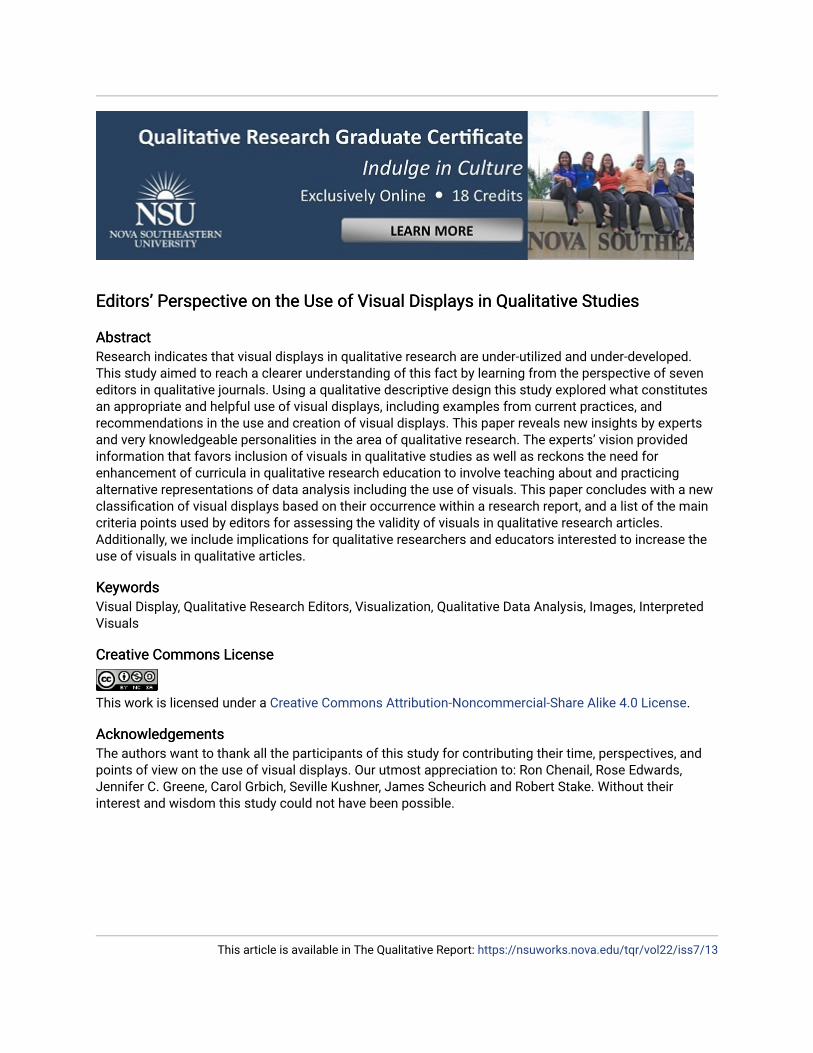
Abstract Abstract Research indicates that visual displays in qualitative research are under-utilized and under-developed. This study aimed to reach a clearer understanding of this fact by learning from the perspective of seven editors in qualitative journals. Using a qualitative descriptive design this study explored what constitutes an appropriate and helpful use of visual displays, including examples from current practices, and recommendations in the use and creation of visual displays. This paper reveals new insights by experts and very knowledgeable personalities in the area of qualitative research. The experts’ vision provided information that favors inclusion of visuals in qualitative studies as well as reckons the need for enhancement of curricula in qualitative research education to involve teaching about and practicing alternative representations of data analysis including the use of visuals. This paper concludes with a new classification of visual displays based on their occurrence within a research report, and a list of the main criteria points used by editors for assessing the validity of visuals in qualitative research articles. Additionally, we include implications for qualitative researchers and educators interested to increase the use of visuals in qualitative articles.
Keywords Keywords Visual Display, Qualitative Research Editors, Visualization, Qualitative Data Analysis, Images, Interpreted Visuals
Creative Commons License Creative Commons License
This work is licensed under a Creative Commons Attribution-Noncommercial-Share Alike 4.0 License.
Acknowledgements Acknowledgements The authors want to thank all the participants of this study for contributing their time, perspectives, and points of view on the use of visual displays. Our utmost appreciation to: Ron Chenail, Rose Edwards, Jennifer C. Greene, Carol Grbich, Seville Kushner, James Scheurich and Robert Stake. Without their interest and wisdom this study could not have been possible.
This article is available in The Qualitative Report: https://nsuworks.nova.edu/tqr/vol22/iss7/13
The Qualitative Report 2017 Volume 22, Number 7, Article 10, 1945-1963
Editors’ Perspective on the Use of Visual Displays in Qualitative
Studies
Norma I. Scagnoli University of Illinois at Urbana-Champaign, USA
Susana Verdinelli Walden University, Minneapolis, Minnesota USA
Research indicates that visual displays in qualitative research are under-
utilized and under-developed. This study aimed to reach a clearer
understanding of this fact by learning from the perspective of seven editors in
qualitative journals. Using a qualitative descriptive design this study explored
what constitutes an appropriate and helpful use of visual displays, including
examples from current practices, and recommendations in the use and creation
of visual displays. This paper reveals new insights by experts and very
knowledgeable personalities in the area of qualitative research. The experts’
vision provided information that favors inclusion of visuals in qualitative
studies as well as reckons the need for enhancement of curricula in qualitative
research education to involve teaching about and practicing alternative
representations of data analysis including the use of visuals. This paper
concludes with a new classification of visual displays based on their occurrence
within a research report, and a list of the main criteria points used by editors
for assessing the validity of visuals in qualitative research articles. Additionally,
we include implications for qualitative researchers and educators interested to
increase the use of visuals in qualitative articles. Keywords: Visual Display,
Qualitative Research Editors, Visualization, Qualitative Data Analysis, Images,
Interpreted Visuals
“Data visualization offers us the ability to view data in different ways and gives us a
better chance of detecting obscured patterns and connections” (Azzam & Evergreen, 2013, p.
3). Data visualization has been broadly used to represent quantitative data results, different
from what happens in qualitative data representation, where visuals are under-utilized and
under-developed. Previous research on data display in qualitative analysis (Verdinelli &
Scagnoli, 2013) shows the scant use of visual displays in qualitative journals, even when the
utilization of Computer Assisted Qualitative Data Analysis Software (CAQDAS) has been
largely promoted among qualitative researchers. Although some authors highly recommended
using different displays during data analysis (Bazeley, 2009; Miles, Huberman, & Saldaña,
2014), research kept showing little use of data displays in published academic articles (Scagnoli
& Verdinelli, 2015). Interested in learning if the lack of visuals was due to qualitative journals
limitations or editors’ preferences, this research study sought editors’ perspectives on the issue.
The inquiry furthered into editors’ views on what constitutes an appropriate and helpful use of
visual displays with the aim of being able to provide information to researchers regarding the
criteria used to judge visual displays in qualitative articles.
Considering that new generation of researchers and learners are part of the so called
“You tube generation” (Duffy, 2008) we predict that more users will demand or include visuals
in qualitative research studies. To reach that state we believe that more education on the
creation and use of visuals for qualitative studies is needed as well as more explicit criterion
and standards for their inclusion in publications. We hope that this study will contribute with

1946 The Qualitative Report 2017
the information needed to guide and encourage researchers to enhance their qualitative studies
with visuals that illustrate authors’ interpretation and analysis.
Researchers
Norma I. Scagnoli has been exploring the affordances of technology applications in
education, communication and information venues since 1998. She has been interested in the
human interaction with visuals in different formats and its exponential growth given the
increased access and affordability of technology gadgets. As a qualitative researcher, she has
developed research studies on the use of multimedia and video lectures in education, and
teaches about the production and educational uses of multimedia. Knowing that the production
of good quality visuals is no longer in the realm of people with professional training, and
convinced that anyone with a digital camera or low cost cell phone can produce visuals that
will enhance any information or communication piece. Dr. Scagnoli teaches her students to be
producers of information using a balanced mix of text and media to inform and educate. She
believes that the world of publishing still has to catch up with the affordances of technology
and is interested in learning what the barriers that prevent a faster adoption are. Her interests
have led her to investigate the use of visuals to communicate information in areas where visuals
are not easily conceived, like in qualitative analysis, but can make a difference when produced
and added to a narrative. She thinks that bringing more awareness of the possibilities of use of
visuals in providing and simplifying access to information, and representing knowledge, will
benefit qualitative research and welcome innovations brought by new generations to the field.
Susana Verdinelli has been teaching qualitative research methods for the last decade.
She became interested in the use of visuals early on but found lack of direction on how to create
useful visual displays to represent qualitative research findings. Early experiences in
submitting interpreted visuals for publication as part of her qualitative studies ended in deleting
the visual display due to editors’ recommendations. Although a little discouraged by the lack
of interest journals demonstrated on the use of visuals, she began exploring the topic and
teaching herself how to create meaningful visuals. She believes that we are living in a visual
world and younger generations use visuals as part of their interpretation of the world. The field
of qualitative methods needs to find ways to incorporate guidelines that will encourage and
regulate the use of visuals. Dr. Verdinelli and Dr. Scagnoli’s research aims to provide
information so that visuals are more widely adopted.
Methods
Design
This study used a qualitative descriptive design (Caelli, Ray, & Mill, 2003;
Sandelowski, 2000). This design is used when descriptions of specific phenomena are desired.
This design seemed the most appropriate considering that our goal was to bring to the forefront
the experiences and perceptions of experts challenging their standard assumptions regarding
norms and criteria for including visuals in qualitative reports. In depth interviews, follow up
conversations and discussions on documents that show visuals served as data sources for this
paper.
Participants
Seven experienced qualitative journal editors in the field were invited to participate in
this study via email. The participants were selected based on experience as qualitative

Norma Scagnoli and Susana Verdinelli 1947
researchers, and current or previous role as journal editor. Current and previous editors of
qualitative research journals were invited to participate. Seven accepted the invitation.
Professional email addresses were obtained from journal’s contact information or school
information. The names of the participants remained anonymous for confidentiality purposes.
Data Collection
The study obtained IRB approval from the authors’ professional affiliations. Both
researchers conducted data collection. Data collection methodology included one initial
interview and follow up communication regarding visuals or participant’s review of the
interview transcripts by email. Two interviews were conducted in person with the editors who
lived in the same location as one of the researchers. Two interviews were conducted by phone,
two interviews were conducted using Skype video and audio, and one interview was conducted
by email. The editors’ preference was followed in establishing the interview modality.
The semi-structured interview consisted of the following five questions:
1.) What is your view on the use of visual displays in qualitative studies?
2.) Which would be a case when it would be useful to have a visual display?
3.) Which would be key characteristics or features of a good visual display?
4.) How do you assess the usefulness or value of a visual display when you
receive a manuscript? And
5.) Please give us examples of visual displays already published in your journal
that you consider a good fit for the article. Please justify your selection.
The process for data collection started with initial contact with the editors, inviting them
to participate in the study. Next, the researcher would agree with the editor on date and time
for initial interview and mode: in person, by phone, via web conference (Skype), or by email.
During the initial interview, editors were encouraged to think further about the use of visuals,
and if they remembered or came across any visual that was not mentioned in the interview,
they should save it. We promised to follow up, and request a copy or reference for sample/s of
visual/s that they would like to suggest. Table 1 shows the timeline for data collection and
analysis. Data constituted the content of the interviews as well as subsequent communication
with subjects via email and the resources that interviewees provided in the meetings, such as
references to articles or samples of visuals that were mentioned during the interview.
Table 1: Timeline for data collection and analysis.
Steps 1 2 3 4 5
Data
Collection
Schedule
interview
Interview Follow up
conversation by
Participant review
of text / transcript
Data
Analysis
Transcription and
analysis of
interviews
Additions to
transcript
Review or
confirmation of
interviews
Thematic
analysis,
coding, final
analysis
Data Analysis
A general inductive approach to data analysis was conducted to report the participants’
opinions on visual displays, the process of inductive analysis followed Creswell (2002) and is
detailed in Table 2. An inductive approach helped to condense raw data into summary format
1948 The Qualitative Report 2017
and establish links between research and findings (Thomas, 2003). Significant interview
passages were assigned descriptive codes; a pattern coding was developed resulting from the
clustering of the descriptive coding (Table 1). Main themes capturing the participants’ opinions
on visual displays emerged (Miles & Huberman, 1994).
Table 2: The coding process in inductive analysis (adapted from Creswell, 2002. Figure 9.4, p. 266, in Thomas,
2003)
Stage 1 Stage 2 Stage 3 Stage 4 Stage 5
Initial reading/
listening
interviews
Identify specific
information
Label the segments of
information to create
categories
Reduce overlap and
redundancy in
categories
Create a model
incorporating top
categories
Script / Logs from
interviews to 7
journal editors
Words, phrases full
sentences on the
topic of visuals in
qualitative research
20 + categories 14 categories 4 categories in
Classification of
Visual Displays;
4 categories in Key
Features of Visual
Displays
6 Barriers to use of
Visual Displays
Themes emerged from categories. Reducing overlap and redundancy helped identify
top categories and main themes emerged from that process. After the categories and themes
have been identified, we conducted a next round of reading and listening for confirmation of
information and to identify possible missed topics. The whole process –identification, labeling,
reducing overlap, creating themes and validating– was iterative (Braun & Clarke, 2006).
As an illustration of this process, this is an example of how we approached categories
and themes. In Stage 2, when we were to identify specific information, we realized that more
than one of the subjects in the interviews referred to “visuals” only as the information a
researcher collects in the field: pictures, brochures, drawings, etc. We had to inquire then about
the visuals that are displayed in a paper representing the analysis process. Our subjects agreed
and provided rich details and ended in prolific interviews. The fact that in some cases the word
“visuals” was not immediately associated with the researcher authorship through analysis, but
with sources from the field, was revealing to us. Then we came to the conclusion that visuals
might come from two sources, thence our choice of “source” as a theme in the classification of
visuals (See Figure 1). As a result of the analysis, the results and findings are organized and
presented as themes. We include details of what each theme represents and how we arrived to
those in our analysis.
Verification of Quality
In order to ensure quality of the research process, results were thoroughly discussed
between the two authors. We use negative case analysis by analyzing negative or disconfirming
evidence; rich and thick descriptions by using verbatim quotes that strengthened credibility,
and clarification of researcher biases by exploring stereotypes, our previous knowledge on the
topic, and past experiences that could have shaped our analysis or interpretation (Creswell,
2007).
Results
Results are presented as themes that derived from the categories that we arrived at our
analysis. The results of this analysis are presented in three segments under a theme: first our
Norma Scagnoli and Susana Verdinelli 1949
classification of visual displays according to source and target audience (Figure 1); next, the
key features of visual displays according to editors’ views; and finally, under the theme of
barriers to the use of displays, we classified and grouped the elements that can be considered
obstacles to the use of visual displays in qualitative studies, always according to the data
collected from interviews.
Source and Target of Images
The first presentation of results refers to the classification of displays based on their
origin and the audience they are intended for. The analysis of the interviews revealed that the
participants referred to visuals in qualitative articles as the elements (drawing, maps, brochures,
etc.) that were collected in field research, and later turned to the tables and other images that
resulted from deeper analysis. Based on the participants’ descriptions we interpreted that there
is a clear distinction between the types of visuals used in qualitative reports, so we classified
them according to the source of the visual and the target audience of the report or research
article. The “source of the visual” refers to the origin and reason of the visual, the author of it,
and the time when it was produced. For example, it may come from the field or as part of the
data collection process, such as the case of pictures, kids’ drawings, handouts; or it may have
originated in the process of analysis of data, at the time when the researcher is making sense
of the information collected. Such would be the case of graphics, tables, Venn diagrams, and
other visuals that the researcher produces to explain or illustrate interpretation of the data. As
participant 1 indicated:
There are all sorts of ways that people might use visuals images in and out
themselves, like they might look at videos or look at advertisements, but they
might also use them as part of interviews, and images might be brought by the
researcher to the interview beforehand, or the interviewee has themselves; or
the researcher asks the interviewee to create a visual as part of the research
process… there are also visuals that conceptualize an analysis.
Seemingly, participant 7 indicated that a visual display can “provide a visual
perspective on textual data or as a data set in its own right.” Regarding the target
audience of the visual, we determined that some visuals used in qualitative articles or
reports are meant to reach a very informed and academic-only audience, such as the
reach of the academic journal; some other visuals are created to reach a larger and more
diverse audience, such as visuals that are used in infographics or magazine reports. As
participant 5 indicated:
Let me differentiate between academic research and commercial research. In
commercial research which we don’t see published in academic journals, I think
there’s a lot more visualization because you are presenting the results to your
client; and I think, there, you see much more use of pictograms, more posters,
and more visual presentations where you see cartoons and other images... you
don’t see this in the academic side.
Considering the source of the image, and based on what we learned from the words of
the editors of qualitative journals we have classified them as field images and interpretations.
Considering the target audience of the visuals, we have classified them as academic and visuals
for a diverse audience. A more detailed description of these classifications follows Figure 1.

1950 The Qualitative Report 2017
Figure 1: Classification of Visual Displays according to source and target audience.
Field Images
Derived from the theme of sources of visuals, we categorized them as field images, or
those visuals that are an intrinsic part of the research study, such as an artifact or evidence
gathered in the data collection stage. Those that illustrate or show an example and/or authentic
information related to the case or study being reported. For example, (a) a photograph of a
place, of a community, of a situation; (b) a map or a building blueprint to show location,
distribution, distance, relationship between things or spaces; (c) a kid’s drawing to provide an
example of the case being studied; or (d) elicited graphic productions. These types of visuals
have been received with articles for a long time, and editors determine if they are valid or
necessary to the story or the report, and they are usually concerned about the number of images
that can go with a paper. If they add information or serve as a clear pictorial representation of
the case, then they agree on the relevance of some images that go with the study. For example,
(see Fig. 2) one of the editors used the article “Using Photography to Understand Change and
Continuity in the History of Residential Care for Older People” (Rolph, Johnson, & Smith,
2009), to highlight the importance of the photos in that a study, “…they [the photos] gave the
readers a sense of the history, of the time that the study was reporting…” (Participant 1).
The same participant indicated that “the addition of photographs or kids’ drawings is
attached to emotions and feelings that the author has captured in a study and it is common to
see too many images for one case.” Then editors may recommend reducing the amount or
selecting the best quality pictures if there is replication or redundancy among them.
Photographs are usually well received by editors in qualitative journals, most of them referred
to photographs as a (sometimes) necessary element to illustrate an article. Drawings, another
common visual in qualitative studies, are sometimes part of the data collection of a study.
Therefore, they are used in the final report of the study as evidence of what was studied.
Another editor mentioned maps or demarcation within a geographical space, “it is logical and
an image will present it more authentic and accurate than just words, the image is almost
necessary” (Participant 3). Therefore, field images serve to illustrate or convey (a) what the
researcher saw in, or during the study, (b) the participants’ work and/or productions, (c) the
subjects or context of the study, its location or its characteristics.
Classification
Visual Displays
SOURCE
Field Images
Interpretations
TARGET AUDIENCE
Academic
Diverse
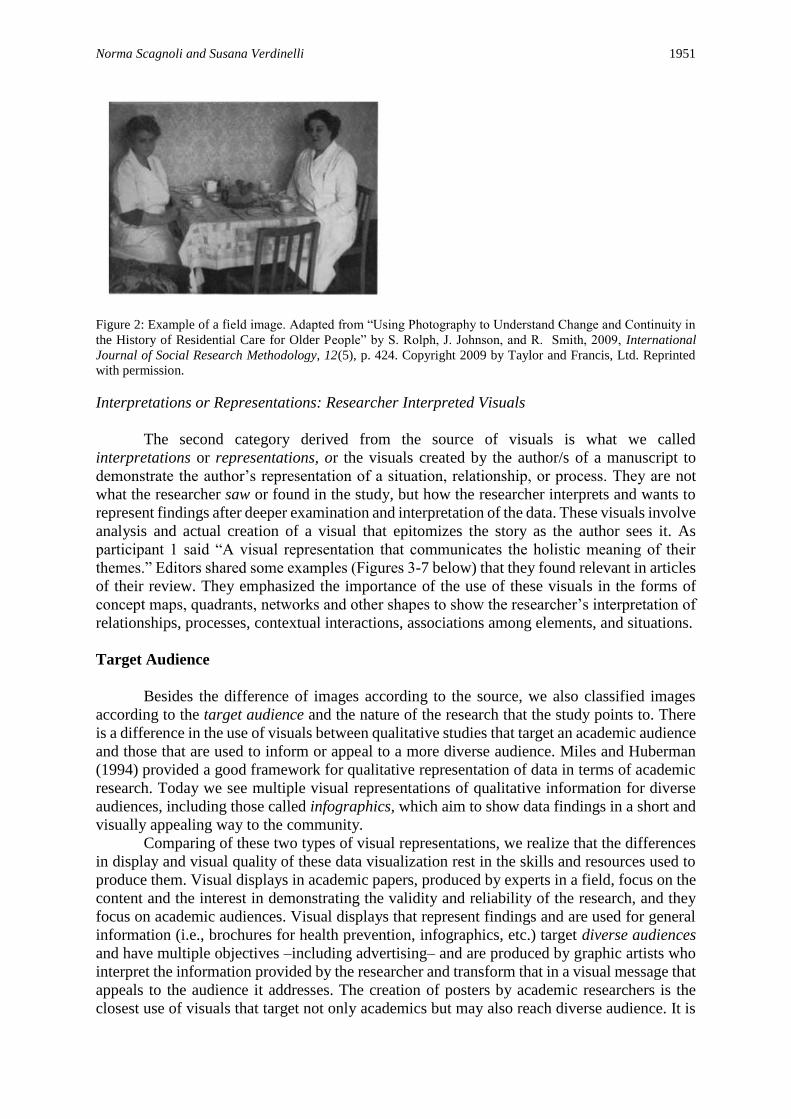
Norma Scagnoli and Susana Verdinelli 1951
Figure 2: Example of a field image. Adapted from “Using Photography to Understand Change and Continuity in
the History of Residential Care for Older People” by S. Rolph, J. Johnson, and R. Smith, 2009, International
Journal of Social Research Methodology, 12(5), p. 424. Copyright 2009 by Taylor and Francis, Ltd. Reprinted
with permission.
Interpretations or Representations: Researcher Interpreted Visuals
The second category derived from the source of visuals is what we called
interpretations or representations, or the visuals created by the author/s of a manuscript to
demonstrate the author’s representation of a situation, relationship, or process. They are not
what the researcher saw or found in the study, but how the researcher interprets and wants to
represent findings after deeper examination and interpretation of the data. These visuals involve
analysis and actual creation of a visual that epitomizes the story as the author sees it. As
participant 1 said “A visual representation that communicates the holistic meaning of their
themes.” Editors shared some examples (Figures 3-7 below) that they found relevant in articles
of their review. They emphasized the importance of the use of these visuals in the forms of
concept maps, quadrants, networks and other shapes to show the researcher’s interpretation of
relationships, processes, contextual interactions, associations among elements, and situations.
Target Audience
Besides the difference of images according to the source, we also classified images
according to the target audience and the nature of the research that the study points to. There
is a difference in the use of visuals between qualitative studies that target an academic audience
and those that are used to inform or appeal to a more diverse audience. Miles and Huberman
(1994) provided a good framework for qualitative representation of data in terms of academic
research. Today we see multiple visual representations of qualitative information for diverse
audiences, including those called infographics, which aim to show data findings in a short and
visually appealing way to the community.
Comparing of these two types of visual representations, we realize that the differences
in display and visual quality of these data visualization rest in the skills and resources used to
produce them. Visual displays in academic papers, produced by experts in a field, focus on the
content and the interest in demonstrating the validity and reliability of the research, and they
focus on academic audiences. Visual displays that represent findings and are used for general
information (i.e., brochures for health prevention, infographics, etc.) target diverse audiences
and have multiple objectives –including advertising– and are produced by graphic artists who
interpret the information provided by the researcher and transform that in a visual message that
appeals to the audience it addresses. The creation of posters by academic researchers is the
closest use of visuals that target not only academics but may also reach diverse audience. It is
1952 The Qualitative Report 2017
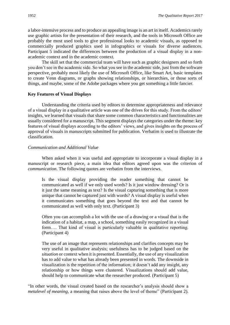
a labor-intensive process and to produce an appealing image is an art in itself. Academics rarely
use graphic artists for the presentation of their research, and the tools in Microsoft Office are
probably the most used tools to give professional looks to academic visuals, as opposed to
commercially produced graphics used in infographics or visuals for diverse audiences.
Participant 5 indicated the differences between the production of a visual display in a non-
academic context and in the academic context.
The skill set that the commercial team will have such as graphic designers and so forth
you don’t see in the academic side. So what you see in the academic side, just from the software
perspective, probably most likely the use of Microsoft Office, like Smart Art, basic templates
to create Venn diagrams, or graphs showing relationships, or hierarchies, or those sorts of
things, and maybe, some of the Adobe packages where you get something a little fancier.
Key Features of Visual Displays
Understanding the criteria used by editors to determine appropriateness and relevance
of a visual display in a qualitative article was one of the drives for this study. From the editors’
insights, we learned that visuals that share some common characteristics and functionalities are
usually considered for a manuscript. This segment displays the categories under the theme: key
features of visual displays according to the editors’ views, and gives insights on the process of
approval of visuals in manuscripts submitted for publication. Verbatim is used to illustrate the
classification.
Communication and Additional Value
When asked when it was useful and appropriate to incorporate a visual display in a
manuscript or research piece, a main idea that editors agreed upon was the criterion of
communication. The following quotes are verbatim from the interviews.
Is the visual display providing the reader something that cannot be
communicated as well if we only used words? Is it just window dressing? Or is
it just the same meaning as text? Is the visual capturing something that is more
unique that cannot be captured just with words? A visual display is useful when
it communicates something that goes beyond the text and that cannot be
communicated as well with only text. (Participant 3)
Often you can accomplish a lot with the use of a drawing or a visual that is the
indication of a habitat, a map, a school, something easily recognized in a visual
form…. That kind of visual is particularly valuable in qualitative reporting.
(Participant 4)
The use of an image that represents relationships and clarifies concepts may be
very useful in qualitative analysis; usefulness has to be judged based on the
situation or context when it is presented. Essentially, the use of any visualization
has to add value to what has already been presented in words. The downside in
visualization is the repetition of the information; it doesn’t add any insight, any
relationship or how things were clustered. Visualizations should add value,
should help to communicate what the researcher produced. (Participant 5)
“In other words, the visual created based on the researcher’s analysis should show a
metalevel of meaning, a meaning that raises above the level of theme” (Participant 2).

Norma Scagnoli and Susana Verdinelli 1953
When we think about this criterion of communication applied to the use of visual
displays –something that cannot be communicated as well if we only used words–our
analysis shows that this clearly applies to field images. The use of photos or drawings
is relevant to put the reader in the context of the subject studied and/or the situation
where and when the data was collected. For example, kids’ drawings collected in the
classroom may illustrate a study about children in grade school; or images of a hospital
floor plan would exemplify findings in a study about location of nurses and quality of
care. Figure 3, for example, shows field images gathered by the researchers when
collecting data for their study on people’s selections of avatars. Their field images were
also used in the data analysis to classify their subjects: False persona, enhanced persona,
and true persona; and the images illustrated the classification they created. These visual
displays allowed readers to portray the researchers’ classification more easily than if
they had only been presented in words.
Figure 3: Example of relevant use of field images. Adapted from “Real Projects, Virtual Worlds: Coworkers, their
Avatars and the Trust Conundrum” by M. F. Lohle and S. R. Terrell, 2014, The Qualitative Report, 19(15), p. 12.
Retrieved from http://nsuworks.nova.edu/tqr/vol19/iss8/1 Copyright 2014 by The Qualitative Report and authors
of the article. Reprinted with permission.
A much more complex task is to decide whether a researcher interpreted visual display
meets any, some or all of the following purposes: (a) attain a level of communication that
complements what is said in text, (b) add value, (c) reach a meta-level of meaning, and/or (d)
illustrate the topic without repeating the information provided in the text. One of the editors
acknowledged the difficulty in attaining the communication level. Interpretations or
representations are “the ones that referees tend to challenge because they conceptualize an
analysis, ... and interpretation of these representations may not be so straightforward”
(Participant 1). Referees have to agree that the researcher’s representation is true and necessary
to what the researcher is explaining in the paper.
Logical and Coherent Structure
The study participants also agreed that another key feature that makes visual displays
relevant has to do with its structure. “An image communicates something… Or a concept map;

1954 The Qualitative Report 2017
there is a structure on a concept map you get to see where the circles are; and the circles have
a logic,” Participant 1 said. And added that the challenge for the researcher was to use a visual
to “represent key concepts and creating relationships between them, or else we get lists.”
Editors agreed that visuals need a structure that is logical and will make it easier for
readers to interpret and understand the writer’s message as they interact with the content of a
study. One of the participants gave an example as “if it is a circle, it should be clear what the
different parts of that circle represent and if there is movement, it should follow a logical
sequence” (i.e., clockwise, counterclockwise, does is have words, arrows for direction, etc.).
She also referred to a matrix, or a quadrant, and how easy it would be to understand the words
and the blanks in it for the informed or not so informed reader. To illustrate her example of a
logical and solid structure, the participants selected Figure 4 in which the authors were able to
include the voices of the students and the staff in relation to four elements of program theory.
The participant added “it is interesting how the diagram represents both perspectives helping
the reader make comparisons between two populations’ opinions: the students and the staff. In
the inner circle, they represented the staff, and the outer area, the students’ opinions”.
Figure 4: Example of logical and organized structure in a visual display. Adapted from Johnson, J., Hall, J.,
Greene, J. C., & Ahn, J. (2013). Exploring alternative approaches for presenting evaluation results. American
Journal of Evaluation, 34, 489-503. doi:10.1177/1098214013492995. Copyright 2013 by Sage Publications.
Reprinted with permission.
Figure 4 portrays a level of comparison and input from study participants in a unique
diagram that combines logic sequence and organization. This visual could be classified as a
modified matrix, according to Lofland, Snow, Anderson, and Lofland’s (2006) definition of
matrices. This modified matrix is less static and seems more dynamic than the regular matrix.
Norma Scagnoli and Susana Verdinelli 1955
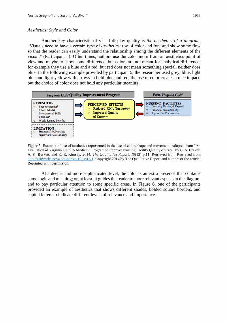
Aesthetics: Style and Color
Another key characteristic of visual display quality is the aesthetics of a diagram.
“Visuals need to have a certain type of aesthetics: use of color and font and show some flow
so that the reader can easily understand the relationship among the different elements of the
visual,” (Participant 5). Often times, authors use the color more from an aesthetics point of
view and maybe to show some difference, but colors are not meant for analytical difference,
for example they use a blue and a red, but red does not mean something special, neither does
blue. In the following example provided by participant 5, the researcher used grey, blue, light
blue and light yellow with arrows in bold blue and red, the use of color creates a nice impact,
but the choice of color does not hold any particular meaning.
Figure 5: Example of use of aesthetics represented in the use of color, shape and movement. Adapted from “An
Evaluation of Virginia Gold: A Medicaid Program to Improve Nursing Facility Quality of Care” by G. A. Craver,
A. K. Burkett, and K. E. Kimsey, 2014, The Qualitative Report, 19(13) p.11. Retrieved from Retrieved from
http://nsuworks.nova.edu/tqr/vol19/iss13/1. Copyright 2014 by The Qualitative Report and authors of the article.
Reprinted with permission.
At a deeper and more sophisticated level, the color is an extra presence that contains
some logic and meaning; or, at least, it guides the reader to more relevant aspects in the diagram
and to pay particular attention to some specific areas. In Figure 6, one of the participants
provided an example of aesthetics that shows different shades, bolded square borders, and
capital letters to indicate different levels of relevance and importance.

1956 The Qualitative Report 2017
Figure 6: Example of aesthetics by use of bold, shape and shades of grey. Adapted from “Assessing the Quality
of a University, Particularly its Teaching” by R. E. Stake, G. Contreras, and I. Arbesú, 2011, in C. Secolsky and
D. B. Denison (Eds.) Handbook on Measurement, Assessment, and Evaluation in Higher Education p. 8.
Copyright 2011 by Taylor and Francis, Ltd. Reprinted with permission.
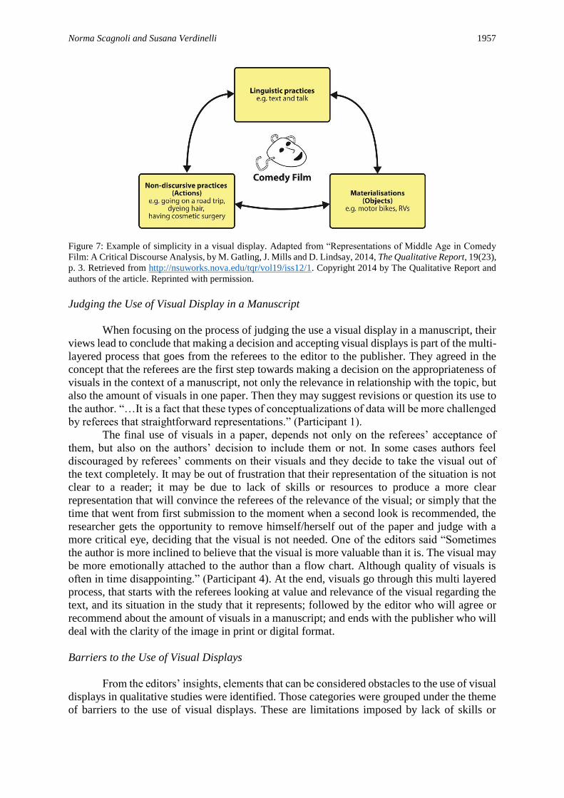
Simplicity
Participants identified simplicity as a recommended feature in visual displays. The
simplicity is the “capacity to transmit easily and quickly the information the researcher wants
to share with readers” (Participant 7). Visuals can be used to show progression to complexity,
for example, in terms of someone’s experiences; or to show significant qualitative differences,
as Participant 5 said, “visualizations work well when the author is showing synthesis or
showing how the components of the results function with one another.”
As an example of simplicity, Participant 7 shared a figure to exemplify his views (see
Figure 7). In his view, Figure 7 is an image that illustrates the concept of simplicity that he was
referring to.
Norma Scagnoli and Susana Verdinelli 1957
Figure 7: Example of simplicity in a visual display. Adapted from “Representations of Middle Age in Comedy
Film: A Critical Discourse Analysis, by M. Gatling, J. Mills and D. Lindsay, 2014, The Qualitative Report, 19(23),
p. 3. Retrieved from http://nsuworks.nova.edu/tqr/vol19/iss12/1. Copyright 2014 by The Qualitative Report and
authors of the article. Reprinted with permission.
Judging the Use of Visual Display in a Manuscript
When focusing on the process of judging the use a visual display in a manuscript, their
views lead to conclude that making a decision and accepting visual displays is part of the multi-
layered process that goes from the referees to the editor to the publisher. They agreed in the
concept that the referees are the first step towards making a decision on the appropriateness of
visuals in the context of a manuscript, not only the relevance in relationship with the topic, but
also the amount of visuals in one paper. Then they may suggest revisions or question its use to
the author. “…It is a fact that these types of conceptualizations of data will be more challenged
by referees that straightforward representations.” (Participant 1).
The final use of visuals in a paper, depends not only on the referees’ acceptance of
them, but also on the authors’ decision to include them or not. In some cases authors feel
discouraged by referees’ comments on their visuals and they decide to take the visual out of
the text completely. It may be out of frustration that their representation of the situation is not
clear to a reader; it may be due to lack of skills or resources to produce a more clear
representation that will convince the referees of the relevance of the visual; or simply that the
time that went from first submission to the moment when a second look is recommended, the
researcher gets the opportunity to remove himself/herself out of the paper and judge with a
more critical eye, deciding that the visual is not needed. One of the editors said “Sometimes
the author is more inclined to believe that the visual is more valuable than it is. The visual may
be more emotionally attached to the author than a flow chart. Although quality of visuals is
often in time disappointing.” (Participant 4). At the end, visuals go through this multi layered
process, that starts with the referees looking at value and relevance of the visual regarding the
text, and its situation in the study that it represents; followed by the editor who will agree or
recommend about the amount of visuals in a manuscript; and ends with the publisher who will
deal with the clarity of the image in print or digital format.
Barriers to the Use of Visual Displays
From the editors’ insights, elements that can be considered obstacles to the use of visual
displays in qualitative studies were identified. Those categories were grouped under the theme
of barriers to the use of visual displays. These are limitations imposed by lack of skills or

1958 The Qualitative Report 2017
training, shortage of examples, or the type of analysis conducted by the researcher. These are
the categories used to represent those barriers or limitations.
Skills and Training
Editors identified the lack of skills, resources, or training as potential reasons why
researchers do not use more visuals or do not create more clear representations. Our participants
indicated that there is little guidance on how to construct a visual display both in formal courses
on qualitative analysis, or through regular training. As one of the editors mentioned “[I] point
him or her (the author) to some references. Because we need help; for most of us this is not
intuitive… Not everyone feels an artist, not everyone feels they can speak in that visual
language” (Participant 3). The lack of training can be related to the lack of knowledge on
“graphic design” that seems to deflect researchers’ intentions of creating visual displays. Little
emphasis is placed in graduate courses in this topic, “We get training on how to design a study,
not necessarily on how to design the final report” (Participant 5). There is also a lack of
knowledge or training in graduate school on the value or importance of displaying results
graphically “… because qualitative research doesn’t use it very often, it doesn’t get the
attention it deserves. If we look at the most common textbooks used to teach qualitative
research we’ll see that they don’t emphasize the use of visual displays.” (Participant 2). In sum,
most of the editors agreed that visual displays are underutilized in qualitative research and that
lack of skills and training may be one of the reasons for that.
Shortage of Examples, Incentives or Models
There is a paucity of visual displays in qualitative studies to use as a model and there
are no interventions or suggestions from editors to guide in the use of visuals in qualitative
research. When asked whether the editors invited authors to create visual displays of their
work, they mentioned that the display should come out of the researchers’ intentions and own
analytical process. Imposing the use of visuals would potentially alter the researchers’
purposes. “We respect that there is their papers that they are turning in, and now the
visualizations are going to change their results, we wish they have been doing some drawing…”
(Participant 5)
The Type of Analysis Conducted
Participants identified that the use of diagrams and visuals to represent results is linked
to the type of analysis and data interpretation conducted. When the results of a study are limited
to content analysis or the creation of lists of themes, there is not much room for a re-
presentation or meta-meaning. Participants provided a constructive criticism to qualitative
research that limits its scope to listing themes in isolation without providing a meta-level of
interpretation and depth and without linking in a more holistic way the themes or results.
Many qualitative studies include basic content analysis in which the end result is to create
categories and themes. The editor-participants in this study said about this in their own words:
Participant 5: Other research based on qualitative traditions such as grounded theory,
ethnography or phenomenology can be more literary and the end result can be to produce a
model, a theory, or more integrated results that can lend to creating more visualizations. The
visualization should be built into the analysis process; then, the use of the display comes more
natural. The visualization is not just a reporting technique; it is how the researcher saw the
results and how the researcher organized the results.
Norma Scagnoli and Susana Verdinelli 1959
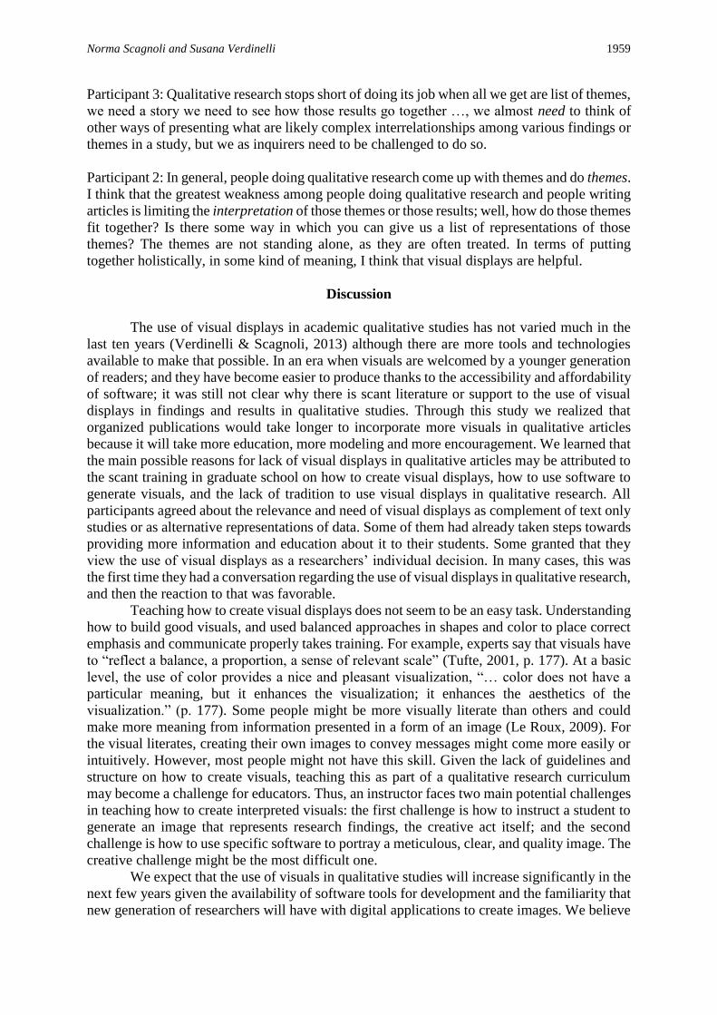
Participant 3: Qualitative research stops short of doing its job when all we get are list of themes,
we need a story we need to see how those results go together …, we almost need to think of
other ways of presenting what are likely complex interrelationships among various findings or
themes in a study, but we as inquirers need to be challenged to do so.
Participant 2: In general, people doing qualitative research come up with themes and do themes.
I think that the greatest weakness among people doing qualitative research and people writing
articles is limiting the interpretation of those themes or those results; well, how do those themes
fit together? Is there some way in which you can give us a list of representations of those
themes? The themes are not standing alone, as they are often treated. In terms of putting
together holistically, in some kind of meaning, I think that visual displays are helpful.
Discussion
The use of visual displays in academic qualitative studies has not varied much in the
last ten years (Verdinelli & Scagnoli, 2013) although there are more tools and technologies
available to make that possible. In an era when visuals are welcomed by a younger generation
of readers; and they have become easier to produce thanks to the accessibility and affordability
of software; it was still not clear why there is scant literature or support to the use of visual
displays in findings and results in qualitative studies. Through this study we realized that
organized publications would take longer to incorporate more visuals in qualitative articles
because it will take more education, more modeling and more encouragement. We learned that
the main possible reasons for lack of visual displays in qualitative articles may be attributed to
the scant training in graduate school on how to create visual displays, how to use software to
generate visuals, and the lack of tradition to use visual displays in qualitative research. All
participants agreed about the relevance and need of visual displays as complement of text only
studies or as alternative representations of data. Some of them had already taken steps towards
providing more information and education about it to their students. Some granted that they
view the use of visual displays as a researchers’ individual decision. In many cases, this was
the first time they had a conversation regarding the use of visual displays in qualitative research,
and then the reaction to that was favorable.
Teaching how to create visual displays does not seem to be an easy task. Understanding
how to build good visuals, and used balanced approaches in shapes and color to place correct
emphasis and communicate properly takes training. For example, experts say that visuals have
to “reflect a balance, a proportion, a sense of relevant scale” (Tufte, 2001, p. 177). At a basic
level, the use of color provides a nice and pleasant visualization, “… color does not have a
particular meaning, but it enhances the visualization; it enhances the aesthetics of the
visualization.” (p. 177). Some people might be more visually literate than others and could
make more meaning from information presented in a form of an image (Le Roux, 2009). For
the visual literates, creating their own images to convey messages might come more easily or
intuitively. However, most people might not have this skill. Given the lack of guidelines and
structure on how to create visuals, teaching this as part of a qualitative research curriculum
may become a challenge for educators. Thus, an instructor faces two main potential challenges
in teaching how to create interpreted visuals: the first challenge is how to instruct a student to
generate an image that represents research findings, the creative act itself; and the second
challenge is how to use specific software to portray a meticulous, clear, and quality image. The
creative challenge might be the most difficult one.
We expect that the use of visuals in qualitative studies will increase significantly in the
next few years given the availability of software tools for development and the familiarity that
new generation of researchers will have with digital applications to create images. We believe

1960 The Qualitative Report 2017
that future curriculum will have to include research courses that include training in higher order
thinking skills to help students or researchers interpret data and to create visuals out of results
or findings; as well as courses that encourage collaborative work among students from different
disciplines. There is a real need to encourage academic programs to update the focus of skills
and competencies that students acquire in qualitative research courses in favor of adding topics
that include focus on digital literacies, use of qualitative data analysis tools, and interpretation
of data through art.
Learning about key features in visual displays from the editors’ insights is critical to
better understand the criteria that may be used to judge their relevance and appropriateness for
inclusion in a manuscript. A visual display should not be overloaded with information or small
unreadable font; it should add only what cannot be shown in text. Visuals are part of a larger
work and they need to complement the rest adding value (and not confusion) to help the reader
see how all the pieces fit together. While working on this study, we became more aware that,
not different from text, visuals also undergo scrutiny by referees who may differ in the criteria
for interpreting their value to complement an article.
Limitations
The number of participants was adequate for the purposes of our study; however, a
larger sample size could have enriched our results. A higher number of participants were
invited to our study, but only those who participated in this project consented to share their
views. This might reveal that those who participated had an interest or awareness on this topic.
Some editors might not consider this a significant topic and further research will be needed to
understand this. The concept of visual display is a broad concept and participants interpreted
this concept differently. For example, one participant came to the interview prepared to discuss
the use of photography as one of the most relevant visual displays used in the field, but did not
extensively elaborate on the use of interpreted visual displays. A varied array of perspectives
on what constituted a visual display was recorded, which enhanced our findings. Further
explorations could concentrate more thoroughly on each type of visual displays used in
qualitative research.
Future Directions
Our conversations with journal editors and study of the recent literature on the topic of
the use of data visualization led us to the conclusion that there are several new things to look
for in a near future:
(a) Support and openness to the use of visuals by journals. Interest towards the use of visual
displays that conceptualize the discovery in the data analysis could be encouraged, given that
data visualization has become more abundant in publications and the tools to produce them are
more ubiquitous. Either specific software for producing the images or hardware such as
scanners, cameras in your cellphone, or even touch displays in tablets or phones that allow to
draw as if drawing on a piece of paper.
(b) Replication of what is happening in the field of mixed methods where there is
acknowledgement to the use of alternative representations to capture results or analysis of
mixed methods analysis (Onwuegbuzie & Dickinson, 2008). Now, due to the fact that in mixed
methods there is an active intention to “show relationships between the quality and the quantity
of data collected and there is data triangulation, it is more common to see visuals as a way of
linking the two forms of data.” (Participant 5).
Norma Scagnoli and Susana Verdinelli 1961
(c) A technically skilled and equipped generation of researchers born as digital natives, who
are more familiar and skilled to create images in different media and use in digital and print
presentations.
(d) Interest in taking advantage of new tools and strategies to be creative. Qualitative
researchers are starting to feel challenged to produce something more visual in an environment
when almost everything is visual. “Qualitative research stops short of doing its job when all
we get are list of themes, we need a story we need to see how those results go together …, we
almost need to think of other ways of presenting what are likely complex interrelationships
among various findings or themes in a study, but we as inquirers need to be challenged to do
so…” (Participant 3)
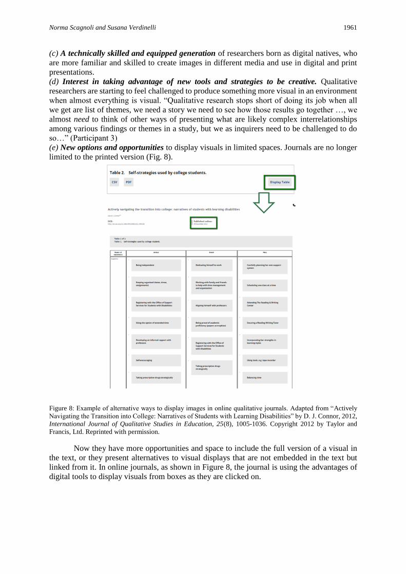
(e) New options and opportunities to display visuals in limited spaces. Journals are no longer
limited to the printed version (Fig. 8).
Figure 8: Example of alternative ways to display images in online qualitative journals. Adapted from “Actively
Navigating the Transition into College: Narratives of Students with Learning Disabilities” by D. J. Connor, 2012,
International Journal of Qualitative Studies in Education, 25(8), 1005-1036. Copyright 2012 by Taylor and
Francis, Ltd. Reprinted with permission.
Now they have more opportunities and space to include the full version of a visual in
the text, or they present alternatives to visual displays that are not embedded in the text but
linked from it. In online journals, as shown in Figure 8, the journal is using the advantages of
digital tools to display visuals from boxes as they are clicked on.

1962 The Qualitative Report 2017
Note: The authors want to thank all the participants of this study for contributing their time,
perspectives, and points of view on the use of visual displays. Without their interest and
wisdom this study could not have been possible.
References
Azzam, T., & Evergreen, S. (2013). Editors’ note. New Directions for Evaluation, 139, 1-6.
Bazeley, P. (2009). Analysing qualitative data: More than “identifying themes”. Malaysian
Journal of Qualitative Research, 2, 6–22.
Braun, V., & Clarke, V. (2006). Using thematic analysis in psychology. Qualitative Research
in Psychology, 3(2), 77–101. doi: 10.1191/1478088706qp063oa.
Caelli, K., Ray, L., & Mill, J. (2003). “Clear as mud”: Toward greater clarity in generic
qualitative research. International Journal of Qualitative Methods, 2(2), 1. Retrieved
from http://journals.sagepub.com/doi/full/10.1177/160940690300200201
Creswell, J. W. (2002). Educational research: Planning, conducting, and evaluating
quantitative and qualitative research. Upper Saddle River, N.J: Merrill.
Creswell, J. W. (2007). Qualitative inquiry and research design: Choosing among five
approaches (2nd ed.). Thousand Oakes, CA: Sage.
Connor, D. J. (2012). Actively navigating the transition into college: Narratives of students
with learning disabilities. International Journal of Qualitative Studies in Education,
25(8), 1005–1036.
Craver, G. A., Burkett, A. K., & Kimsey, K. E. (2014). An evaluation of Virginia Gold: A
Medicaid program to improve nursing facility quality of care. The Qualitative Report,
19(13), 1–26. Retrieved from http://nsuworks.nova.edu/tqr/vol19/iss13/1
Duffy, P. (2008). Engaging the YouTube google-eyed generation: Strategies for using web 2.0
in teaching and learning. The Electronic Journal of e-Learning, 6(2), 119–130.
Gatling, M., Mills, J., & Lindsay, D. (2014). Representations of middle age in comedy film: A
critical discourse analysis. The Qualitative Report, 19(23), 1–15. Retrieved from
http://nsuworks.nova.edu/tqr/vol19/iss12/
Johnson, J., Hall, J., Greene, J. C., & Ahn, J. (2013). Exploring alternative approaches for
presenting evaluation results. American Journal of Evaluation, 34, 489–503.
doi:10.1177/1098214013492995
Le Roux, C. S. (2009). Enhancing learning and comprehension through strengthening visual
literacy. Per Linguam, 25(2), 46–60.
Lofland, J., Snow, D., Anderson, L., & Lofland, L. (2006). Analyzing social settings. A guide
to qualitative observation and analysis. Belmont, CA: Wadsworth/Thomson Learning.
Lohle, M. F., & Terrell, S. R. (2014). Real projects, virtual worlds: Coworkers, their avatars
and the trust conundrum. The Qualitative Report, 19(15), 1–35. Retrieved from
http://nsuworks.nova.edu/tqr/vol19/iss8/1
Miles, M. B., & Huberman, A. M. (1994). Qualitative data analysis. Thousand Oaks, CA: Sage
Publications.
Miles, M. B., Huberman, A. M., & Saldaña, J. (2014). Qualitative data analysis. A methods
sourcebook (3rd ed.). Thousand Oaks, CA: Sage Publications.
Onwuegbuzie, A. J., & Dickinson, W. B. (2008). Mixed methods analysis and information
visualization: Graphical display for effective communication of research results. The
Qualitative Report, 13(2), 204–225. Retrieved from
http://nsuworks.nova.edu/tqr/vol13/iss2/5
Rolph, S., Johnson, J., & Smith, R. (2009). Using photography to understand change and
continuity in the history of residential care for older people. International Journal of
Social Research Methodology, 12(5), 421–439.
Norma Scagnoli and Susana Verdinelli 1963
Sandelowski, M. (2000). Focus on research methods: Whatever happened to qualitative
description? Research in Nursing and Health, 23, 334–340.
Scagnoli, N. I., & Verdinelli, S. (2015, May). Towards a classification of interpretative visual
displays in qualitative research. Poster presented at The Eleventh International
Congress of Qualitative Inquiry, Urbana-Champaign, IL.
Stake, R., Contreras, G., & Arbesu, I. (2012). Assessing the quality of a university, particularly
its teaching. In C. Secolsky & D. B. Denison (Eds.), Handbook of assessment,
measurement and evaluation of higher education (pp. 3–14). New York, NY:
Routledge.
Thomas, D. R. (2003). A general inductive approach for qualitative data analysis. Retrieved
from
http://citeseerx.ist.psu.edu/viewdoc/download?doi=10.1.1.462.5445&rep=rep1&type=
Tufte, E. R. (1983/2001). The visual display of quantitative information. Cheshire, CT: Graphic
Press.
Verdinelli, S., & Scagnoli, N. I. (2013). Data display in qualitative research. International
Journal of Qualitative Methods, 12, 359–381.
Author Note
Norma I. Scagnoli, Ph.D., is the Sr. Director of eLearning in the College of Business
and Research Assistant Professor in the College of Education at the University of Illinois at
Urbana-Champaign. She has a Ph.D. in Human Resource Development, a Master’s in
Education with specialization in Instructional Technologies from the University of Illinois, and
a Bachelor’s degree in English as a Foreign Language. Correspondence regarding this article
can be addressed directly to: Norma I. Scagnoli, College of Business, 1206 S. Sixth St, 430
Wohlers Hall, Champaign, IL 61820. Phone: 217-333-2652, e-mail: [email protected].
Susana Verdinelli, Psy.D., is a core faculty in the doctoral program in counseling
psychology at the College of Social and Behavioral Sciences at Walden University. Susana has
a Doctor in Psychology from Our Lady of the Lake University, a Master’s degree in School
Psychology, a Master’s degree in Educational Psychology from the State University of New
York, Buffalo, and a Bachelor’s degree in Psychology. Correspondence regarding this article
can also be addressed directly to: to Susana Verdinelli, School of Psychology, College of Social
and Behavioral Sciences, Walden University, 100 Washington Avenue South, Suite 900,
Minneapolis, MN 55401. Phone: 1-469-277-2320, e-mail: [email protected].
The authors want to thank all the participants of this study for contributing their time,
perspectives, and points of view on the use of visual displays. Our utmost appreciation to: Ron
Chenail, Rose Edwards, Jennifer C. Greene, Carol Grbich, Seville Kushner, James Scheurich
and Robert Stake. Without their interest and wisdom this study could not have been possible.
Copyright 2017: Norma I. Scagnoli, Susana Verdinelli, and Nova Southeastern
University.
Article Citation
Scagnoli, N. I., & Verdinelli, S. (2017). Editors’ perspective on the use of visual displays in
qualitative studies. The Qualitative Report, 22(7), 1945-1963. Retrieved from
http://nsuworks.nova.edu/tqr/vol22/iss7/13