Diploma in Mul media and Anima on (DMA)
478
DMA-102 Digital Imaging Diploma in Mulmedia and Animaon (DMA)
-
Upload
khangminh22 -
Category
Documents
-
view
2 -
download
0
Transcript of Diploma in Mul media and Anima on (DMA)

DMA-102Digital Imaging
Diploma in Mul�media and Anima�on (DMA)

Digital Imaging
2020
Dr. Babasaheb Ambedkar Open University

1
Digital Imaging Editor Dr. Himanshu Patel
Assistant Professor, School of Computer Science
Dr. Babasaheb Ambedkar Open University, Ahmedabad
ISBN-978-81-945801-1-9 Acknowledgement: The content in this book is modifications based on the work created and
shared by the Odisha State Open University (OSOU), Sambalpur for the subject Digital
Imaging and used according to terms described in Creative Commons Attribution-ShareAlike
4.0 International (CC BY-SA 4.0) License: https://creativecommons.org/licenses/by-
sa/4.0/legalcode
Printed and published by: Dr. Babasaheb Ambedkar Open University, Ahmedabad

2
Dr. Babasaheb Ambedkar Open University
DMA-102
Digital Imaging
Block-1: Introduction to Digital Imaging
Unit-1 Introduction to Graphics Design 001
Unit-2 Understanding Digital Images 023
Unit-3 Understanding Colour 043
Unit-4 Visual concepts and Graphics preparation 064
Block-2: Digital Imaging: Aesthetics & Artistry
Unit-1 Introduction to Digital Composition 081
Unit-2 Use of Digital Elements in DigitalLayouts 100
Unit-3 Basics of Image Editing 114
Unit-4 Raster,Vector Graphics & Typography 135
Block-3: Image Development on different Graphic S/W
Unit-1 Introduction to Krita 151
Unit-2 Familiarization to Inkscape 198
Unit-3 Illustration and Vector Design using Inkscape 239
Unit-4 Professional Projects 277
Block-4: Preparation of Digital Images using Media
technologies
Unit-1 Working with Digital Images 303
Unit-2 Managing file formats for Images 314
Unit-3 Image Editing with GIMP 322
Unit-4 Techniques behind VFX 361

3
Unit-1 Introduction to Graphics Design
Introduction
Today due to technological advancement and improved tools in computer software
programs almost every computer and Smartphone is equipped with capability to perform some
effects of graphics. Now even common people can perform some creative tasks easily on their
devices, in many cases so good that they look to have been done by professionals.
Creating meaningful and effective graphic visuals for television requires very simple but
specific design that communicates the message to the audience / viewer straight as the diverse
audience has different understanding levels. Sometime, what you are viewing neatly and easily
readable on your computer or laptop, may look clumsy and difficult to be read on television
screen. So one has to careful, while producing any graphics that will be viewed properly on a
TV screen too besides a Smartphone. In short, graphics shall be prepared in such a manner so
they can be easily readable and understood by TV viewing audiences within short time. People
are easily discouraged by reading rapid graphics. Hence we can say that the key for all
appealing visuals lies in their simplicity and boldness.
Outcomes
Upon completion of this unit you will be able to:
Describe Evolution of Computer Graphics;
Use Digital technology in Graphics;
State the Principles of Graphic Design;
Explain the Fundamentals of Computer Graphics and
Prepare Print Graphics and TV Graphics
Terminology
Broadcast: Program transmitted from Radio or Television
Computer Graphics: Designs, Art or Illustrations created through computer
Chroma Key: A technique used in removing a particular colour (blue or green) from video
image and replaced by another image or colour.
Clipart: Readymade simple icons, pictures, logos etc. available for use in computer
designs

4
CGI: Computer Generated Imagery
Graphics
What does the term “Graphics” stands for? A graphics is an image or visual representation of any object. It can be a Map, Sketch or
Picture that was produced using various techniques of paintings, i.e. etchings, engravings and
lithographs. Later on as the technology developed, drawing and painting techniques gradually
transformed into new avatars and this fusion came to be known as „Computer Graphics‟ later.
It is the stage when imagery based graphics are created without pigment colours and paper. It is
not only an interesting method but also a more convenient way to create art works. Even on this
media one can work like a traditional artist and with much more precision and possibility of
corrections.
It would have been interesting to see whether the old great masters in the history of world
art, like Salvador Dali or Van Gogh were alive today, would they still paint canvas using
pigment colours and use charcoal or pencil to draw on a sketchpad or sit on their PC holding a
mouse or a Graphics Tablet instead to draw their masterpieces on screen on a virtual canvas
using virtual colours.
Digital Painting is now growing popular among next-gen who creatively uses modern
tools for making digital art or digital imagery in the computer. Computer software that help in
creating virtual canvas and virtual colours and many tools that have replaced traditional painting
mediums and woven canvas-cloth / paper now seem to be the first choice of digital artists. Here
more accurate drawings of any form of geometrical designs, symmetry, repetition of motifs can
be created very easily those are less possible in traditional painting. The option of undo without
leaving trace adds more finishing and freshness to any digital graphics. Thus use of technology
in creating graphics proves to be more accurate than that by human hands and traditional
methods. It is now possible to generate more complex shapes and figures using computer
programs by an artist for their visuals. Taking an example of ‗Fractal Art‘ (Fig. 01) which was
rarely drawn or painted by hand can now easily be created on computer, which is capable in
creating any type of complex nature of patterns just by its calculations resulting to a
mesmerizing fractal in form of still images or animated sequences.

5
Fig 01: Computer Generated Fractal Art (Created by Author)
Overview of Evolution of Computer Graphics
If you look back into the history of computer and technology you‘ll find a guy from mid
twentieth century a scientist named Ben Laposky (1950) who invented first ever Graphic
Images, he was a mathematician and artist in Cherokee, Lowa, he used electronic machine
(which was an analog vector devise) named Oscilloscope. By utilizing it as a medium for
creating abstract images he produced most of the images. It was achieved by manipulating the
electronic beams on the device and later on recording those on photographic films. He named
these images as ―Oscillons‖. Laposky created electronic vibrations on the screen of his
Oscilloscope which produced a number of abstract images which were named as “electronic
compositions” by the artist and by using photographic stills he captured those images, which he
displayed too in an exhibition at Sanford Museum in Cherokee.
Later on, as technology advanced many inventions happened in this field. Invention of
light pen (1955) as input device is one of them. By using this device (Light pen) earlier graphics
designers were able to create basic shapes on computer screen by using Ivan Sutherland‟s
software “Sketchpad” for sketching. Light pen has small photoelectric cell on its tip. When
placed near a screen, with the help of cursor, one can easily draw any shape and fill desired
colours to it. Sutherland‘s software has lots of self-programmed features like basic primitive
shapes, which can help in easy drawing, hence one can choose from them and the shape is
automatically created; only operator has to modify or reposition it in his composition.
In 1965 Jack Bresenham invented ―Line drawing algorithm‖. By the early 70‘s Raster
displays were introduced so the magnification of images became more clear and crisp. In 1977
Apple II design was presented to this world of computing which became the first ever Personal
Graphic Computer. In the 80‘s various technologies were invented for creating and producing
digital images on computer. Star Wars like programs used optimum graphic effects by using
‗chroma key‘ (blue screening). We find the same revolutionary techniques of imagery
introduced in printing technology too where the use of Computer Aided designs starts replacing
conventional techniques. Many tools were developed to visualize data. In later stage this was
bifurcated into 2D and 3D computer graphics. Over the past few decades we saw the growth in
visualization, be it informative or scientific visualization.
Further advances in computing technology led to greater advancements in Post Script
Page descriptions when “John Warnock” and pioneers founded Adobe Systems and made
revolutionary entry into Photo editing and Movie editing software‘s “Adobe® Photoshop®”
and “Adobe® After Effects®” respectively. By this time in early 1980s we see
commercialization and modernization of computer graphics at steady rate. Computer was now

6
adopted by many sectors of society. Software Developers are increasing now significantly.
Artists and animators have started using computers as a design tool on which they can design
more accurately and saves lots of time. Macintosh computers are highly popular among artists
and design studios.
During the 1990s‘ use of 3D modeling grows on mass. As the CGI quality improved,
more users are now able to use their home or personal computers for 3D modeling and
rendering. Earlier it was limited to heavy ‗Silicon Graphic workstations‘ only. Growing demand
of cost effective machines leads to popularity of Microsoft Windows and Apple Macintosh
which are now capable of running 3D studio and Autodesk products. 3D graphics became far
more popular among multimedia artists and animators.
Later in 2000s‘ video games and CGI cinema‘s accelerated pace leads digital revolution to
new highs. Increase in digital processing and 3D rendering capabilities improved the efficiency
of computer in texturing, shading, bump mapping allowing the simulation of details in imagery.
Computer graphic imagery that was used in film and animation gradually increased the realism
due to these advance GPUs. Animated 3D films like ‗Ice Age‘, ‗Finding Nemo‘ and
‗Madagascar‘ are some examples where one can witness the close to reality and their
photorealistic CGI characters that can be possible only with motion capture technique.
Use of Digital Technology in Graphics
As technology progressed we saw more advancement in 3D computer graphic use. It
emerged as a new tool for generating virtual images, complex 3D models having vast number of
polygon which were used in almost all major streams, like Architecture, Films, Medical science,
Astrophysics, Advertising and promotional videos. Now graphics are nearly scientifically
photorealistic, having texture mapping in matured stage we see that designers/modelers can
create more complex objects, shapes and anatomy figures quite easily and that too with realistic
ambience.
Here are some common terms that are used as technological tools in graphic context.
Desktop Publishing : Vast number of software are developed for integrating graphics and texts
in layout so that it may be arranged in desired order for production of various images, magazine,
catalogs, newspaper and other media in printed form. This form of technology allows users to
create and print their data in magazine, book or paper formats. It is also used for Digital
Typography where large number of fonts, symbols and icons can be used for composition.
There are two types of pages that can be created on Desktop Publishing -
1. Electronic pages: These pages are published only in electronic form. e.g.,

7
Web newspaper, magazines etc.
2. Virtual pages: These pages are digitally designed page layouts to be printed on physical
paper of varied size. e.g., News Paper, Books, catalogs etc.
Graphics Programs: Any software that is used for generating, modifying, or editing the digital
images. Scribus, Krita, Inkscape, Microsoft Word, Adobe Indesign, Adobe Photoshop,
CorelDraw, Blender, Maya etc. are some examples of Graphic programs.
Internet and Web: It is a worldwide network of computers interconnected with each other by
internet protocol suite (TCP/IP) sharing extensive data of information resources and services
among group of computers through graphical interface. Internet service providers made the
connectivity available to the users who then share or obtain the information on network. This is
a vital tool that was helpful for artist for gathering or sharing graphic data. Graphic artist can
access various and enormous information from web uses it in their composition or can share his
creative output to the outer world also.
You can find in later units of this course how effectively digital technology can be used as
designing tool and helps artist in creating its artwork more easily and accurately.
Historical Background of Broadcast Graphics
In television technology ‗Broadcast Graphics‘ were adapted as like they are used in films.
Since the invention of Television in 1936, there were constant experiments were done for the
enhancement of its potential visual communication by creating attractive graphics. During this
period all graphics were created by hand on celluloid, paper and card board. Some studios use
embossing machines to give the feel of 3D. Usually Program Title, Maps, Illustrative charts,
Credits and weather report featuring temperature were common graphics prepared by artists.
Whole process was extremely time consuming and due to limited resources and technical
limitations in resolution of only 405 lines restrict the professional painters in achieving desired
results. Most of the areas around borders and corners of screen was not fully utilized as it
remains out of focus as the resolution of cameras was very low.
Letters and text that was written on black paper sheets are bold and larger in size. For
credit rolls lettering was done on paper roll and then manually or with the help of electric motor
it was physically rolled. All illustrative work would also be created with bold outlines.
Sometime limited animation gimmick were done by designers. They make cut holes a window
like shape on black paper sheet then write lengthier text matter on little bigger size of black
paper strip which was placed behind that cut window opening. (Fig 02)Then a path was made

8
by sticking little thick paper so when this text written strip was dragged or pulled from one side
only some part of text appears on screen and gives crawl like effect.
Fig02: Manual Process of scrolling by making cutout mask on paper
It was the time during 1920‘s when Graphic designer, Saul Bass made Graphics for Films
and Television. He was the earlier artist before computer generated graphics invaded the
industry. He had designed many opening titles for number of films. The Man with the
Golden Arm (1955), Vertigo (1958), and Psycho (1960) etc. are few famous films for which
he made title sequences. He was a creative and talented designer, and a pioneer of motion
graphics. Comparing from today‘s standards, Bass‘ designs seem very simple and amateur, but
they were effective and considered state-of-the-art visuals at the time when all graphics were
created by hand, without the aid of any computer.
Later Rostrum camera was invented and frequently used in Graphic designing. By the
help of this vertically mounted Rostrum camera Graphics and cell animation sequences become
automated to some extent. This camera has the function to move up and down and any artwork
which was placed in front of it was exposed on film and later on after processing like any other
film these exposed negatives were edited manually and pasted so as to give the motion effect to
that artwork. With the help of Rostrum camera ‗Still images‘ like Photographs, Paintings or
hand drawn artwork was exposed on film. This also helps in shooting lots of cell frames for 2D
animations. Later on as the technology advances further these Rostrum cameras were attached
with motorized units which helps in taking more variety of camera moves such as „Slit-scan‟
and „Streak-timing‟.

9
The 1980‘s more development happened in Graphic technology, resulted to the evolution
digital paint systems like ‗Quantel Paintbox‟. This gadget strengthens the creativity of Graphic
designers and enabling them to assemble collages and montages as well as to adapt more
images into their compositions. Graphic Designers are now able to type on Quantel Paintbox by
choosing varied Fonts, though limited, but this text typing saves a lot of time and also the
finishing in artwork was improved. Earlier these compositional Lettering or typography were
drawn either by hand or by using stencils, later on Letterset transfer sheets and character
generators came to help designers in formatting, composing text matter with vide range of
fonts, borders and corners readymade designs. By the help of Quantel machines text captions
could now be composed in few seconds. The computer systems are become so functional, that it
was used in varied form of designing with numerous ranges of fonts and symbols.
After computers were introduced to graphic industries, companies in association with
BBC develop Character Generator, an initial device for creating onscreen graphics named
„Aston‟ and „Chyron‟. These hefty and bulky machines are very popular in that era as the
graphic generated on these machines are quite crispy and fast as compared to the traditional
manual graphic making process. It consumes less time, paper & pigment colours were replaced
by electronic generated imagery.
In 1990s 3D Character Generators were introduced to electronic media, they are improved
versions of their ancestor CG machines, Quantel Paintbox was one of them which were very
costly and bulky also. It was generally used for generating backgrounds and small animated
sequences. It takes frame by frame rendering process which was very tedious and time
consuming. Later Silicon Graphic computers invaded the industry, though they also had
memory like issues but become the first choice of designers and 3D animators as they can
operate various dedicated programs on it. This era of Silicon Graphic® and Qantel Paintbox®
was not as lengthy because Windows based Computer machines stepped into the market and
programs like Adobe® Photoshop®, Adobe® After Effects®, Adobe® Premier®, Digital
Fusion®, were equipped with lots of Tools and Effects. Windows- driven software is easy to
operate and was programmed by keeping in mind the artistic sense of Visual art.
Principles of Design
Before starting any artwork or painting or any digital layout it is good to follow some
rules and principles that will enhance the composition‘s aesthetic value and appears more
effective, balanced and meaningful. Some aesthetic principles are drawn which guides for a

10
good and balanced composition. These principles are – Unity, Harmony, Contrast, Repetition,
Variety, Emphasis, Balance and Proportion (Fig 03). According to the author of ‘The Elements
of Graphic Design’, Alex White: “To achieve visual unity is the key concept and main aim of
any graphic design. If all elements are in linear arrangement, a graphics design is treated as
unified”.
The expert designers sometime break these rules of designing. They usually compensate
this by some unusual composition for viewer‘s attraction or achieving something different. But
it is always recommended that unless you are not sure or be certain of doing something
miraculous, it is better to abide by these principles.
Fig. 03: Design
Created by Author
Unity: It refers to a sense that all elements in your composition or in a piece of work
will be in proper order i.e. having some sort of relation in between them. If proper unity
is achieved it will bind all forms into a single piece of work that is an ‗artwork‘ in proper
sense. Unity can be achieved by proper use of balance in composition, repetition of
graphic forms.
Fig. 04: Unity, Created by Author
Harmony: Always remember that Harmony is a very important element in composition
and it is created by the balance of unity and variety. It can also be achieved by Colours,
using complementary colours. It appears visually pleasing and makes any composition
more lively and balanced.

11
Fig. 05: Harmony, [Created by Author]
Contrast: Separating and making the subject prominent is the main use of contrast. It
can be achieved by choosing variation of great difference in colour, value, size, etc. It
creates significance in layout and attracts the viewer‘s attention close to the important
area in the subject.
Fig. 06: Contract [Created by Author]
Repetition: Repeating some elements within a composition, be it in the forms of
colours, lines, shapes, values, etc. with some variations to generate interest in design.
Fig. 07: Repetition [Created by Author]
Variety: The use of various elements in composition, which creates interest in the mind
of viewer with variation of forms and colours in order to make design more dynamic and
not have monotony, is called variety, another important principle in design.
Fig. 08: variety [Created by Author]

12
Emphasis: It specifies the prominent area of interest where the designer wants to pull
more attention of the spectator. It is the main point of interest in any composition. It also
gives direction and specific pattern to a design. Emphasis or ascendancy of an object can
also be achieved by increasing the object size, by placing it in the prominent area or
foreground, and making it visually emerge more compared to other objects in a painting
or artwork.
Fig. 09, Emphasis [Created by Author]
Balance: There are two types of Balance, symmetrical or asymmetrical. It
depends on artist‘s visual sense how to use it. Sometimes this balance can be gained by
arranging its objects according to their figure or sizes and sometimes it can be according
to its colour also. Symmetrical colour scheme can also help in making the composition
more Balanced.
Fig. 10:Balance [Created by Author]
Proportion: It involves directly with the relationship of size of different objects.
Sometime Proportion is also relative to size of areas of different colours. Proportion also
depends on purpose of used object in composition.
Fig. 11: proportion [Created by Author]

13
Design Elements E. Graves (1902-1978) in his book ‘The Art of Colour Design’ mentions that any
composition can be created by using these elements of design. (Fig 03).These design elements
are Line, Shape, Size, Space, Colour, Texture and Value. Hence these are the components
which are used in creating any painting or digital layout.
Line: Line is treated in two ways. The linear marks made by any writing/painting tool or
the boundary created when two shapes meet. While making any composition be careful
in adding Line shape horizontally, It should be more than 4 points thick otherwise it
flickers like crazy on screen due to interlacing.
Shape: A shape is a geometric form, drawn to create objects, figures and visual
components in any layout. A shape may be round, square, triangular or oval etc. Try
using similar shape throughout your Compositions.
Size: It is an important element as it makes your artwork attractive and organized.
Choosing the right size for selective layout is very important. If you are creating
Graphics for Television your layout must be in horizontal shape and usually be either a
4:3 or 16:9 displays. Hence it is better to know what your target output size is. In
television broadcast system there are various display sizes. Some of them are listed as
below:
Display Size –4:3 format
a) VGA:640 x 480
b) PAL: 768 x 576
c) SVGA:800 x 600
d) XGA: 1024 x 768
e) 1280: 960
f) SXGA+:1400 x 1050
g) UXGA :1600 x 1200
Display Size –16 : 9 format
a) WVGA : 854 x 480
b) HD 720 : 1280 x 720
c) 1366 x 768
d) HD 1080 : 1920 x 1080

14
Fig. 12 – Display size for 4:3 & 16: Video frame [Created by Author]
Some other Display Sizes are as below :
a) Cineon Half : 1828 x 1332
b) Cineon full : 3656 x 2664
c) Film 2K : 2048 x 1556
d) Film 4K : 4096 x 3112
Space: It is the area that contains any visual image or shape in the given picture. It is
referred in design element as an aesthetical element also as it gives some meaning and
aesthetic value to any composition. There are two types of space in any composition
‗Positive‘ and ‗Negative‘ space. Positive space is referred as the ‗Brimming‘ space or
you may say it is any form, object or element that is occupying space in any design
layout. While Negative space is the empty space leftover in design.
Colour: In technical terms colour is referred to as „Hue‟. It is the most important
element of composition hence its use is very crucial. In any composition choosing right
colour is very important as artist should know the properties and their combinations of
colour schemes for effective and meaningful output or composition. Colour schemes or
colour harmonies are made to help artists choose the colour that suit their composition or
layout. For the help of designers and artists in choosing proper colour; having certain
properties and meaning, colour wheel was invented. This colour wheel is a visual
representation of all Basic colours specifically known as Primary, Secondary and
Tertiary colours.
Texture: Texture is like material coated on the surface. It reflects the quality of a shape
–means viewer can assume the surface after looking the drawing, that gives the feel of
smooth, soft, hard, rough, glossy etc. Texture can be created by two methods, Physical

15
(tactile) or Visual. Physical Texture is that texture which you can actually feel by your
hand. Visual Texture is only an illusion. It just gives the feel of physical texture to the
viewer. Use of Digital Paint in artwork gives the effect of texture to it.
Value or Tone: Value is referred here as the lightness or darkness of a colour. It is also
termed as Tone sometime. Difference between the light and dark areas in a graphic
composition is known as Tonal contrast.
Fundamentals of Computer Graphics
In the field of Information& Technology Computer Graphics is an emerging trend.
Almost any venture now days make some use of Computer Graphics. Some major areas are -
creating Cartoon Films, Animations, Architecture, Fashion Designing, Photography, Special
effects for films and Ads, and for visualising Print publicity for which we use Computer as a
tool.
In addition computer graphics are massively used in the Film and Video industry,
exclusively to develop special effects in movies and animations. Video games are now very
much popular among all generation groups. In the field of Animation there are graphic artists,
who efficiently blend different techniques by using or exploring different media effects to
enhance the creative aspect.
Now the question arise how we perceive any information in a computer? Answer to it is
obviously by seeing Images, Texts and Through Videos, while sound support us in
understanding the visuals. These visual are created by the computer using various input devices.
These are:
Keyboard and Mouse
Fig. 13- Keyboard and Mouse [Created by Author]
Wacom Tablet
Fig. 14-Wacom Tablet[Created by Author]

16
Scanners
Fig. 15-Scanners [Created by Author]
Digital Camera
Fig. 16-Digital Camera [Created by Author]
We have output devises on computer through which we can obtain the information are:
Monitor
Fig. 17: Monitor [Created by Author]
Screen
Fig. 18-Screen [Created by Author]

17
Printers
Fig. 19-Printers [Created by Author]
Speakers
Fig. 20- Speakers [Created by Author]
In computer we have CD/DVD ROMs, Hard drives and Tapes as storage devices. These
all devices are connected with various cables, wires and fibre optics through which the
information was carried to different devices and transmitted to different places for e.g.
transmission using computer networks and through different broadcasting mediums.
Multimedia production for presentation, films requires Graphics, some moving images,
such as animation and sound. It also requires effective approach of utilising the data consisting
of text, voice, audio components, video components and image animation. Here in integrated
multimedia applications user can modify this data by cutting partial sections of all or any of
these components and pasting them in their project for making their presentation.
While working on computer graphics we use some media elements for creating our
projects, these are as follows
Images : These can be imported from digital cameras or scanned through scanners using
a hand scanner, sheet fed scanner, flatbed & drum scanner. After scanning these
photographs or other various images save them in any desired format (JPEG, TIFF, GIF
etc.). You can use any other program to generate your own graphics/image like Paint®,
Inkscape®, Krita® etc. If one has good hand in drawing and painting then they can
create sketches, painting on paper and then after scanning that artwork you can use them
as digital images.
Text: Using variety of fonts and symbols.
Video: This can be recorded by camcorder or digital camera, now even smart phones

18
comes with high quality recording facilities in it and animated sequence.
Audio: Adding music to compositions is very important; it can be created or recorded
from any source.
Note, however, if you won‘t able to create drawings/sketches through pen and paper or
in any computer program, need not to worry, you can pick up existing images for a wide range
of purposes. Collections of clip art are available on web and in many commercial and shareware
software packages.
Term Clip art is used for image files (sometimes for other media files like animations or
sound tracks) that you get readymade and not created by you but which are made available to
you for use in your graphic compositions. Clip art libraries can be found on Web, it comes
along with some software packages, and on CD-ROM/DVD disk from different vendors like
―Getty Images‖ or any local software store. These Clip art as a rule are offered copyright-free,
and you can use them any way you like. Some Clip art collections are copyright protected for
some uses; be sure to read any copyright notice accompanying any clip art before using them
into your artwork.
Downloading Clipart from web
1. Using Internet browser, go to web page of Clip art/Image site.
Fig. 21 Screenshot
2. Browse your desired picture and select it.
Fig. 22 Screenshot
3. Right click you mouse button and choose Save Picture As from the pop-up menu.
Fig. 23 Screenshot
19
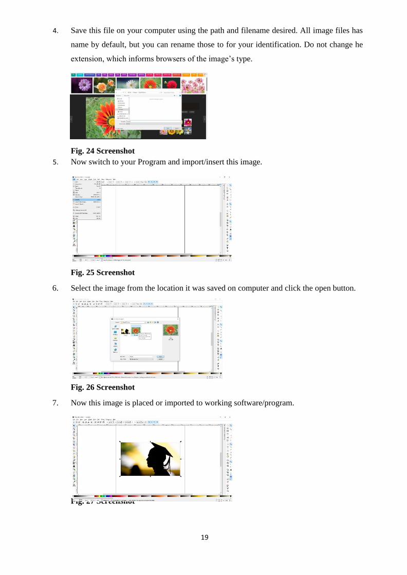
4. Save this file on your computer using the path and filename desired. All image files has
name by default, but you can rename those to for your identification. Do not change he
extension, which informs browsers of the image‘s type.
Fig. 24 Screenshot
5. Now switch to your Program and import/insert this image.
Fig. 25 Screenshot
6. Select the image from the location it was saved on computer and click the open button.
Fig. 26 Screenshot
7. Now this image is placed or imported to working software/program.
Fig. 27 Screenshot

20
Using Images from CD-ROM/DVD
1. You can insert/import a picture directly from your disk (CD/DVD) into your program or
2. You can copy Clip art/ Images from CD-ROM or DVD to your project folder on your
Local drive by creating a new folder and renaming it ‗Clip art‘ or whatever you like.
3. Use ‗My computer‘ to navigate to the CD/DVD drive where it is stored, locate the exact
image (can preview by increasing the Icon size) you need.
Important Stuff about using Images
Before inserting any image into your composition check the quality and resolution of
chosen image. Resolution of image may differ from medium to medium, for Print medium,
image should be not less than ‗300 Pixels per inch‘ but in video it will be of ‗72 Pixel per inch‘.
Images used for printing purpose require more colour depth in image and higher resolution.
Higher resolution means bigger file size.
Print Graphics and TV Graphics
Computer screen has relatively low-resolution as compared to printed surface.
Computer screen has 72 dots per inch resolution display while most four colour printing of
magazines is done on 300 dpi at least. It means the resolution of printing is higher hence more
fine details were produced on paper as compared to television screen.
Four colour print reproduction is separated into four colours also known as „Subtractive
Colours‟ These colours also known as CMYK colour scheme where ‗C‘ is ‗CYAN‘, ‗M‘ is
‗MAGENTA‘, ‗Y‘ is ‗YELLOW‘ and ‗K‘ is referred to ‗BLACK‘. (Fig 28)After mixing these
combinations with different tonal values we get the image printed on paper. These four colours
give the illusion of full range of colour on any printed surface but only 4 primary colours are
printed through separate plates of each colour.
Fig. 28-Color Modes [Created by Author]

21
Trans illuminated Images on Television or Computer monitors are generated by three
colours RED, BLUE and GREEN commonly known as RGB colour where each initial represent
each colour. This scheme is also known as ‗Additive Colours‘ also. These illuminated images
have greater range of contrast and colour intensity as compared to subtractive colours printed on
paper. One reason may be that what is printed on surface was received by human eye as a
reflected light, but RGB colours system appears to be much broader and subtler range of colour.
Fig. 29 Additive color [Created by Author]
Unit summary
In this unit you learned the Basic of Graphic Design and Use of Digital technology;
‗Historical Background‘ of Graphics since the beginning of Television and stages of
development of Television. You were able to understand about the ‗Elements of Designs‘ and
‗Principles of Design‘. How to add aesthetics to any composition? Why these elements are
important for any layout.
We also addressed about ‗Fundamental of Computer Graphics‘ and able to distinguish
Additive and subtractive colours. How their properties are different from each other? While
working on TV graphics or Print Graphics you may be able to select the appropriate colour
mode. You also learn the difference of pixel size between Screen Graphic and Print Graphic
along with CMYK and RGB colour.
We also discussed importing and cropping the clipart, images from internet or CD-
ROM/DVD.
Assignments
1. Name the person who invented Computer Graphics?
2. List the elements of design? Briefly explain their use in multimedia designing.
3. Describe the term ‗Fractal Art‖
4. Describe the use of Computer Graphics.
5. Explain the need to use Principles of Design.
6. What is Chroma key and how it is beneficial in making videos.
7. Describe the use of Desktop Publishing.

22
8. Write the role of Scanners and Cameras.
9. Differentiate between additive and subtractive colour mode.
10. Identify the primary colours for Print medium and Colour Monitor? How do they
differ in properties?
11. Write the difference between 4:3 and 16:9 display size of video frame?
Resources
1. Lidwell, William; Kritina Holden; Jill Butler (2010) Universal Principles of Design
(2nd
edition). Beverly, Massachusetts: Rockport Publishers. ISBN 978-1-59253-587-3.
2. Charlotte Jirousek. Art, Design, and Visual Thinking. An online, interactive textbook.
Cornell. edu, 1995.
3. Graves, Maitland. The art of colour and design. (2nd
edition). New York, N.Y.:
McGraw-Hill, 1951.
4. Alex White. The Elements of Graphic Design. New York, NY: Allworth Press. pp. 81–
105. ISBN 978-1-58115-762-8.

23
Unit 2 Understanding Digital Images
Introduction
Pixel and resolution are the primary source of the video which displays any image on the
screen or monitor. Clarity of any image depends upon its resolution which is calculated by the
amount of pixels having in it under standard and universal measurement unit i.e. ―Per Square
Inch.‖ It means that the more the pixel per inch present in an image, more colour information
and details is present in it. Increasing the quality of image is possible by increasing the PPI.
Secondly, every digital image must be saved in desired format or which will suit to your
requirement. As now there are lot of common formats like ―JPEG‖, ―TIFF‖, ―PNG‖, ―GIF‖, and
―TARGA‖, ―BMP‖ etc.
Outcomes
Upon completion of this unit you will be able to: Describe Pixel, Resolution and Bitmaps;
Differentiate Square and non-square pixel and Pixel dimension;
Recognize different file formats;
Practice optimizing Digital Images;
Modify colour by reduction algorithm;
Terminology
Alpha Channel: It represents the degree of transparency present in any colour.
Algorithm: A procedure to solve any complex problem.
Bitmap: It is a type of memory organization that stores the image format
Mega Pixel: Unit used for One Million Pixel.
Optimization: Process of reducing the Image file size without any change in quality,
sharpness or tonal value for faster download from web.
Pixel: Single rectangular shape dot that contains blend of RGB colour
information.
Resolution: Amount of Pixels presents in Display monitor on ‗x‘ and ‗y‘ co-ordinates.
A Brief History of Designing
Since the inception of civilisation humans were fond of making images. During those

24
ages humans communicated through signals, symbols and sounds. Sometimes they used to
create images of their daily life on cave wall where they dwelled. They were very much
intrigued by the majestic nature and hence they used to draw to express their thoughts and
reverence towards the unknown power. That was the only way of communication in prehistoric
era as the knowledge of languages had not come to humans till then. Mostly hunting, animals,
motifs, and images related to nature were common subjects whom they engraved by rough tools
generally stones, charcoal and chalk. Initially colours were not used, only outline of figures
were engraved without any details. These images were drawn either for their memories or to
show the strengths of their habitation.
As the times passed, prehistoric humans started inventing more means of
communication. By the ancient time around 1000–500 BC humans had developed the alphabets;
their drawings were now little more advance and had greater details like paintings of later
period. Use of pigment colours was introduced to wall paintings. Later after the invention of
paper and inks these groups started making paintings on paper. Engraving techniques like
Lithography and Etching were developed. Artists were now well equipped with different tools,
brushes and colours which they used in creating their artworks.
During 400 & 1000 AD books were the storage medium of information. Decorated
illustrations were given place as visual communication; the contents of books were hand written
initially. Much later, after invention of printing press Typographic fonts, blocks and screens
were used for printing on paper surface. This period is known as Renaissance era of human
civilisation; the period approximately from 1300 to 1800 AD. A lot of inventions were made
during this period in all fields. Various Printing techniques were developed; Books, newspapers
and magazines now became the main storage medium of information.
In the modern world when film and magnetic tapes were invented, they brought a
revolution in the field of information and communication. Now it was very easy to document
anything by photograph with a new invention, „camera‟, now everybody‘s most popular
machine. The photographs taken from a camera produce images that are more realistic, more
authentic and accurate than those produced by paintings or illustrations or any other traditional
method of creating images. Films and magnetic tapes are the storage devices that store all these
artworks and information. After it came the electronic era (1950 – 1980) what we call
Telecommunications. Television and Computers were invented as tools of information and now
all information is stored on these electronic tools like Electronic memory cassette, L.P. records
etc.
After the invention of digital techniques there were drastic changes in information and
communication mediums. It also helps other varied sectors in their functioning, for example in

25
Medical science, Astrology, Space missions, Banking and Insurance sector. These are just a few
examples that have been benefited and are now using newer techniques in their functioning.
CD-ROMS, DVD, Blu-ray Hard disks became the storing devices for any information.
Digital cameras and computers had given a new meaning to the digital art. Higher details in
photography are now possible through advance cameras. They have processor to generate
stunning results. Digital images produced by these cameras are very much clear, sharp, and
instant. Variety of mesmerising effects of virtual world can be generated by these tools. Film
and television industry, Printing and Gaming industry are main gainers of this digital revolution.
Pictures are now displayed through “Pixel”.
Pixel and Bitmaps
A Pixel is a tiny dot which contains RGB information of any picture. Computer monitor
reflects colours through this information. Millions of pixels are connected in lines and columns
and attached together to form an image on display monitor. Each pixel has RGB (Red, Green
and Blue) information which was calculated in bits. It is binary and only has two possible
values, 0 or 1.Colours or shades of gray present in any displayed image are determined by bits
which are used to represent each pixel. If we take an example of 8-bit colour mode, it means
that our colour monitor is using 8 bits for each pixel, hence the monitor is capable of displaying
28= (256) of different shades of gray.
Here you may note that aspect of any display monitor depends on its resolution. VGA
system displays 640 x 480 resolutions; it means about 3, 00,000 pixels. While SVGA monitors
can display 800 x 600, or 4, 80, 000 pixels. 24 bits per pixel were used by True colour system
monitors that are capable of displaying 16 million different colours. One more important point
you may note that Pixels of any image don‘t have a definite / fixed size. They are relative to the
screen‘s resolution.
Every pixel stores its own value or colour
information, or intensity. If all the pixels in any image have
the same value or colour information, then it is a uniform
colour image. Intensity in a Black and white image is from
100% white to 100% black. While on the other hand,
intensity of each Red, Green and Blue value in all colour
images are from their brightest to darkest value.
Fig 01-Pixel [Created by Author]
By mixing these primary or basic colours, in varying proportions, another colour is

26
produced that is called ‗secondary colour‘. Image generated in such way will contain varied
range of tonal values. Since one more thing is added, all RGB images consist of 3 x 8-bit
intensities; that‘s why, they are also called as 24-bit colour images. It is important to mention
here that in theory, an 8- bit range stores values from ―0‖ to ―1‖ using1/256
th increments, while in
real term, 8-bit images appear only in whole number; that is from 0 to 255
All digital images consists Pixels that stores 24-bit colour information. These digital
images are also called as Raster images. Bitmap is a file that indicates a colour of each pixel
along its horizontal and vertical axis i.e. ―x co-ordinates‖ and ―y co- ordinates‖ respectively. A
‗JPEG‘, ‗BMP‘ or ‗TIFF‘ for example contains a bitmap of an image. In some images
transparency value is also stored. Those images having transparency channel also are of 32-bit.
Image files like - Targa, PNG and GIF are capable of storing this transparency value.
Resolution and Pixel Dimension
Any image appears on screen can be displayed high and low quality due to screen
resolution. This screen image is expressed as “dpi” (Dots per inch), here Dot is represented as
pixel or “ppi”(pixel per inch). This resolution is determined by both physical screen display
size or by resolution settings. Pixel Dimension is the horizontal and vertical measurements of a
digital image. Dimensions of any image can be calculated by multiplying the width and the
height by the dpi. All digital cameras work on this pixel based technique; dimensions of their
output images are calculated as the number of pixels in horizontal and vertical co- ordinates
which also specify its resolution.
Image size exactly specifies the number of “Pixels” within a digital image, while
“Resolution” is the pixels occupying the image or can say groups of pixel carrying colour
information. For resolution we use following terms “ppi” as pixels per inch and “dpi” is dots
per inch. “ppi” refers to ‗pixel arrays‘, while “dpi” refers to ‗Printer resolution‘. There is one
more resolution term that you may encounter is “Lpi”, which is known as „lines per inch‟. It is
generally used in printing technology. By default resolution of images captured by camera or
video is 72 ppi. Depending on each monitor specification, its screen can display maximum
amount of pixels, but their resolution can be increased or decreased by adjusting the settings of
any display monitor screen. By reducing the number of pixels of display monitor we can
increase the size of image and therefore increase or expand the image size. See below two
examples of screens.

27
(Fig 02) (Fig 03) [Created by Author]
This can be understood by above illustration more easily. There are two images one has
16 x 12 pixels (Fig 2) and8 x 6 (Fig 3). Let‘s assume each square as 1 pixel and the whole area
as screen. Observe that when resolution was lowered to half (Fig 3) the image appears double in
size, but if image was scale down as shown in smaller images of both figure we observe that
their resolution is twice and have more pixel per square inch of monitor.
Hence, we can say that the higher is the pixel resolution, the higher is the quality of the
image. Higher pixel may also increase the file size of image also.
Aspect ratio
It is an important concept with the pixel resolution of output device of computer. Every
monitor or screen is quite different from one another. We can easily understand size of any
screen without physically seeing it or can assume it. Aspect ratio is helpful in making digital
images where the exact size is not known, only ratio is known. Just by ratio one can easily able
to design his composition which can be scaled up or down later to fit in desired size. Aspect
ratio is the ratio between ―X‖ and ―Y‖ co-ordinates of an image. It can be differ in separate
image sizes and in separate screens.
The common aspect ratios of video screen resolutions are - 3 : 4 and 16 : 9 in video
format. There are some other few ratios also like 5 : 3, 16 : 10 (WXGA), 5 : 4 (SXGA).
While creating any graphics these ratios must be kept in mind and follows as a thumbs
rule otherwise crated image may get distorted or become non-impressive.
Square and Non-square Pixel
Fig 04-types of pixel [Created by Author]

28
It is very important to learn the properties of “Square” and “Non-Square” pixel as both
have certain differences. If we design any composition of graphic in Square Pixel (as most of
graphic software generate image in this format) on computer display or computer based
software like Adobe®Photoshop®, Flash etc. it will be fine but if we display the same image on
conventional Standard-definition Television (PAL or NTSC) that uses rectangular pixels our
image will get horizontally distorted and unnaturally stretched.
Digital camera images, web videos is always ‗Square Pixel‘ based but videos shot on
PAL D1/DV or NTSC D1 video, a digital electrical video signal (SDI)are rectangular or non-
square pixels. So if you are using this format into your project do changes to get even output.
Similarly, consider it also before making any graphics on these formats. A Circular shape will
appear horizontally stretched while in PAL video it is squeezed. Following illustration will
make it clearer. Here are three monitors, ‗A‘ is ‗Square Pixel‘ based computer screen on which
circular object is perfect round.
But if it is not corrected it will appear distorted in ‗B‘ (PAL) and ‗C‘ (NTSC) non-
square monitors.
Fig 05- image distortion [Created by Author]
While doing editing on Standard Definition software Pixel Aspect Ratio must be taken
into consideration. Graphics or video footages generated on Square Pixel ratios must be used
very with cautiously. Adobe®Photoshop® software had reduced this size related puzzle with its
default file sizes for various frame size. Hence need not to worry distortion of image the only
care one has to take is just choose the right size for output. Adobe After effect software will also
be helpful in handling or making correction to this type of complexity. See below when creating
new file in Adobe® Photoshop® following options are suggested by software when we choose
our preset size as ‗Film & Video‘.

29
Fig 06: Size templates for different video formats in Adobe® Photoshop®[screenshot]
When your project is ready for outputting, Adobe Media Encoder is software that can
take care of your size with properly scaling it for any format.
Pixel Dimensions
As we know that an ―inch‖ is a standard unit of measurement, which cannot be change
and remains same and equal. But Pixels may vary in different photographs; say one picture of
10 inches x 8 inches may be of 300 PPI and can be of 72 PPI. Size doesn‘t matter but the
resolution of image that is holding more pixels in one inch appears to be more sharp and clear.
Here size of a pixel in one inch is much smaller as compared to the 72 PPI‘s pixel size, for
example, you can accommodate more tennis balls as compared to footballs in the same area.
Fig 07-Pixel dimensions [Created by Author]
You need not to worry about it as Image editing software including
―Adobe®Photoshop®‖ do resizing of pixels for us. Here I just want to brief ―image resolution‖
has two things – size of a pixel and number of pixel per inch (PPI) that will be printed on
surface. Hence you have to be very conscious of using correct ―PPI‖.
Here‘s one photograph which is clicked by 10 MP camera, having resolution of 3648 x
2736 to illustrate how re-sizing of images works.

30
Fig 08-Photograph [Taken by author]
This picture obviously appears smaller as to fit in the screen window of ―Adobe®
Photoshop® Software‖ to see the actual size of image you have to open ―Image menu‖ and
scroll to ―Image size‖.
Fig 09 screenshot
After clicking on ―image size‖ a dialogue box will appear on the screen, which provides
the information about the size, resolution and pixel dimensions of this picture. On top you can
see “Pixel Dimension: 28.6M” which is the file size of this Image on disc. Here you saw two
types of Sizes, ―Pixel Dimensions‖ and ―Document Size‖. Adobe®Photoshop® is giving
measurement of this image in ―Pixels‖ as well as in Centimeter or Inches, as per Width and
Height of above image which is 3648 and 2736 respectively. It means that 3648 pixels are in
―x‖ co-ordinate and 2736 in ―y‖ co-ordinate. If we multiply ‗x‘ co-ordinate times ‗y‘ co-
ordinates we get total number of pixels in image. If we
calculate for this picture, 3648 x 2736 we get total 9,980,928
pixels.
Fig 10-screenshot
If you remember, it is mentioned above that this picture was taken by 10 Mega Pixel

31
Camera. Here Mega stands for ―Million‖ hence ―10 MP‖ means 10 Million Pixels. Our total
pixels (9,980,928) come near to it. Similarly if 16MP or 24MP camera, we get 16 Million or 24
Million pixel images from it.
Document Size
Now, let‘s discuss the ―Document size‖ which is 12.16inches in width and 9.12 inches
in height with 300 Resolution. It means above image having 3648 pixel x 2736 pixel on 300
resolution when get printed on paper will cover area of
―x 9.12‖.Let‘s do some maths here if we divide pixel width by resolution, we gets the
printable width.
3648 ÷ 300 = 12.16 (width)
2736 ÷ 300 = 9.12 (height)
Fig 11-screenshot
Now, if we reduce the resolution from 300 to say 72 pixels/inch, our width and height‘s
size increased to 50.667‖ and 38‖ respectively. It means this document is oversize for A4 size
print.
Fig 12-screenshot
One important thing you may notice here that even after reducing the resolution 300
pixel/inch to 72 pixels/inch width and height of pixels remains same and even it size also i.e.

32
28.6M
You can also use GIMP (GNU Image Manipulation Program) as it is open source
(free) editing software very much similar to Adobe® Photoshop® for changing the size and
resolution of image. Krita® is also a similar image editing program where you can
manipulate the digital images.
Re-sizing of image
We know any picture can be used in different means of communication, like –
Newspaper, books, magazines, HD videos and on Web pages. Each format has its own
limitation and pixel requirements. Magazine and Newspaper require higher resolution, say
more than 300 DPI.
Re-sizing of image for webpages save lot of bandwidth and page loading time.
Determining the right size for web image is only its ―Pixel‖ size not resolution. Let‘s say if the
web page is 960 pixels wide, your image cannot be more than 960 pixels.
You can find the size of an image on the web.
1. First right-click the image in Firefox viewer.
Fig 13 Screen shot
2. Select ―view image info‖
3. In the dialogue box you will see the file name, size, Dimensions of the image and all
web page information.
Fig 14 Screenshot

33
Understanding image File Formats
In this digital era, when you take a photograph or acquire any image from scanners what
is essentially happens is the data was generated in form of Digital Image. This data requires to
be saved for further use. Now there are several file formats into which this data was saved and
retrieved, edited and transferred using several image editing software available today. Be it open
source (free) or commercial ones. Digital artist / photographers generally use JPG, GIF, TIFF,
PNG, DNG, BMP, PSD & RAW formats commonly for creating or capturing digital images.
Fig 15- image formate illustration [Created by Author]
Some Digital Image files can be quite bigger in file size, which means they consume
more disk space and slower to transfer or download. To reduce this, Compression technique is
used to scale down the size of any file. Compression can sometimes reduce the image details
leading to a hazy picture.
BMP (Bitmap Graphics): This is a Microsoft‘s® uncompressed proprietary format. It
is now universal format that saves each pixel data of image without any compression; which
results to heavy file size and qualitative image resolution simultaneously. BMP images are
assumed good and suitable for use in printing but due to bulky size these are not ideal for Web.
Advantages: These images have higher quality of pixels.
Disadvantages: Bigger size of image needs more storage space.
TIFF (Tagged Image File Format)
it is in principle most commonly and frequently used industry standard file format, it is
preferred in printing industry due to its uncompressed and lossless feature. Due to this feature
images saved under this format are bulky and much bigger in size. These files also take more
memory and disk space. Sometime you may find ‗LZW‘ term in software while converting to
TIFF format. It‘s Lossless compression algorithm‘, This ―LZW‖ is not universally supported by

34
some software. Most digital cameras now days have TIFF as the highest image quality level.
Advantages: It has ability to manipulate images extensively in editing software. Printing
larger size and highest quality without any loss is also strength of Tiff.
Disadvantages : More loading/transfer time is required due to fat size of image that
again leads to more storage or disc space requirement.
JPEG (Joint Photographic Experts Group)
This format is especially optimized for digital photographs and other identical rich tone
digital images that contain wide range of colours. These files have ability to store compressed
information in much smaller size. Most of the cameras stores digital images in JPEG format. A
JPEG file can store pixel colour information as 24 bit colour. Its compression levels is so much
balanced that photographs saved in this format are next to uncompressed quality, it is very
difficult for the human eye to find any difference in quality. Sometimes even at large
enlargements these files produced spectacular results without any blur or haziness. JPEG files
help users to upload their pictures on web portals easily, as smaller size gets quickly uploaded
on web. JPEG are not good for Line drawings or fine illustrations as these images, after
compression, look jagged or broken.
Advantages: Smaller file size results in quick upload/download and more storage in
small size discs.
Disadvantages: Loss in quality due to compression leads to limited image manipulation
in any photo editing software.
PSD (Photoshop)
This file format is a proprietary formats used by Adobe®Photoshop® programs. It is by
default saving format of Adobe®Photoshop® and allows user to save his document in layers.
This feature makes it unique and easy to manipulate each layer separately without affecting
other layer data. Layers are used for making complex images while editing and saving them as
it is, while in other non-proprietary programs this feature is not available.
Advantages: Separate layers and accurate colour information are main USP‘s of this
format.
Disadvantages: Due to more information the file size grows larger and larger by
addition of Layers.

35
PNG (Portable Network Graphics)
It is also a lossless storage format. However, in comparison to TIFF format (indexed or
RGB, 1 to 48-bits), it reviews the arrangement of pixels in the image that it can use to shrink
file size. Transparency is also retained in these types of 24 bit RGB images. Normally PNG files
are much smaller than LZW compressed TIFF or GIF format. In this format the compression is
volatile; hence the image is recovered exactly. PNGs are much slower to read and write but
these are good option for lossless quality with transparency work for saving photographs, PNG
is considered as not so good format as compared to JPEG, the reason is it creates larger size.
Advantages: Lossless compression feature is its strength. It means during and after
editing quality of image is not changed and its transparency feature remains as it is.
Disadvantages: PNG images are not good for high quality printing.
GIF (Graphics Interchange Formats)
This format is able to create up to 256 colours from available bandwidth of 16 million
colours. If there are less than 256 colours in the image, GIF can render the image exactly. It was
designed by „Compuserve‟ in the starting days of computing era when computers functions on
8-bit video. This format is fine for computer and video screen images. GIF is not recommended
for printing related designing due to less colours storing capacity. GIF format is "lossless" only
for images with 256 colours or lesser and good for transparency in animated images.
Advantages: Animation and small file size is its uniqueness, it is ideal for web graphics.
Disadvantages: Due to limited colour use it is not good choice for photographs. It also
not supports partial transparency.
RAW
These file formats are generally used on DSLR cameras while taking high quality
images. Mostly RAW files are compressed using a process which stores all of information
which was originally captured, like white balance, exposure, contrast, saturation, etc. The major
drawback of RAW is that all manufacturers coded their RAW individually and according to
their standards, which means you may have to use their indigenous software to view these
images. Photographing in this format is very expensive in the manner of storage. This format
requires lot of processing time and user must be capable of handling graphic editing software as
after finishing some editing one has to share these images perfectly on internet or export them
into various file formats.

36
Advantages: Images captured in this format are best in quality, Extensive options of
editing and post production remains open due to best quality and details in pictures.
Disadvantages: Bigger file size and conversion from RAW to another format after
editing is very longer process and time consuming activity.
Optimising Digital Images
It is the process of adjusting the display quality and lowering the file size of any digital
image you are preparing for the webpage use or on other online media. You can also term it as
‗Conversion of Digital image file to a type that can be affectively displayed on web page‘. It is a
process to reduce the file size of an image so it can be quickly sent or received electronically
across the World Wide Web. There are several programs available now in which you can
optimize your images. Among those ―Adobe® Photoshop®‖ and ―Adobe ImageReady®‖ gives
you more effective and wide range of controls for compressing the file size.
Now the question arise, why it is necessary to reduce the file size? Answer is, as you
know that all web pages are downloaded into web browser window, it is good for user
experience that all information on visiting page immediately opens up and all images on that
HTML page appears without any wait. For this optimization of images is required. Without
sufficient optimization, digital images file can increase the file size of web page which will slow
down the download process. This leads to the increase in waiting time for users, sometime their
patience lost and user become irritated and frustrated due to wastage of his time.
How the files are optimized?
It is very simple, if we reduce the visual information, i.e. colour or tones of an image we
can reduce its size, but this also reduces the quality of an image. When displaying image
resolution is lowered it is not taken as big issue, since the image is only for viewing purpose and
not for printing. As you know the computer monitor‘s display resolution is lower than that
resolution required for printing.
There are two approaches for optimizing digital images:
Basic image optimization can be done in Adobe®Photoshop® software by using ―Save
As‖ command. This lets you save any image as a GIF, JPEG, PNG, or WBMP file. Here
as per your requirement, you can define quality, select transparency or matting, choose
the colour display, and also determine the downloading method.
For actual optimization, you have to use the given features of optimization in software
like ―Adobe®Photoshop®‖ or ―Adobe ImageReady®‖.There only you can preview
optimized images in different formats and attributes. In this software you can see

37
different views of your image results after assigning required parameters you may get
the desired result. Out of these best required image can be chosen. In these software you
can also add and specify transparency, dithering can also be adjusted, and can resize the
image to the required size.
Types of Image that can be optimized for web:
JPEG
PNG-8
PNG-24
GIF
WBMP
Below here is step by step optimization process for PNG-8 and GIF format is described-
Solid colour areas are compressed in PNG-8 format along with retaining the sharper
details.GIF is also a good format for compressing images. This format also retains flat colour
and crisp details. Here also by reducing the number of colours you can decrease the size of your
GIF images. PNG-8 is very similar to the GIF format in terms of file settings. Below is the
image of Optimization Panel (Fig 16) which controls the conversion of optimization in
Adobe®Photoshop®.
Fig 16 composition [Created by Author]
Colour Reduction Algorithm and Colours
For optimizing a JPEG image to GIF in Adobe ImageReady® first choose algorithm for
generating a colour table from the Colour Reduction Algorithm menu. There you find some
options like – Perpetual, Selective, Adaptive, Web, and Custom, Black and White, Grey Scale,
Mac OS and Windows options. After choosing desired option, say ‗Perpetual‘ or ‗Selective‘

38
then choose the maximum number of colours from the Colour text box, For Perpetual,
Selective, and Adaptive selection from colour reduction algorithm menu, you can choose 2 to
256 colours, while for others like - Web, Custom, Black and White, Grey Scale, Mac OS and
Windows options you have option either to select ‗Auto‘ or any number of given colours.
Dithering
Dithering is technique of simulating colours that are not available in your computer
colour system. Solid colour images are good without dithering but those having continuous
gradation type tone of colour must need this process (Dithering) because if it is not processed
or dithered it may shows colour banding in image.
Fig 17 [Screenshot]
If ‗No Dither‘ is selected from the menu box then it won‘t be applied to
the image.
Diffusion control can only be applied to the random pattern which is very
much less noticeable.
Pattern option only applies like a halftone pattern.
Noise option gives a grainy random like pattern which is very much
similar to the Diffusion dither option.
Apart from above Dithering and Colour control algorithm there are some more controls,
like ‗Transparency‘, ‗Matte‘, ‗Interlaced‘ and ‗Web snap‘ which you can try yourself and enjoy
the results. You can use transparent image also by checking the Transparency box and then
choose from drop menu; ‗Diffusion Transparency Dither‘, ‗Pattern Transparency Dither‘ and
‗Noise Transparency Dither‘. Try and use Matte option also for more dramatic results.
Let‘s optimize given below JPEG picture (Dimensions: Width 3648 Pixels x Height
2736 Pixels) and see how it appears after optimization in GIF and PNG-8 formats.

39
Fig 18 Screenshot
Go to ‗File‘ menu bar, select Save for Web
Fig 19 Screenshot
Then another window open up. In this window there are several options for adjustments.
Choose 4-Up in top left corner. It gives you 4 displays of same image. You can assign different
values to 3 displays, I suggest you to leave first one (Top Left) as original one for comparison.
Fig 20 [Screenshot]
Here in different windows (Except first one) notice that some information was given, i.e.
file format, image size and Data transfer speed and time was displayed at bottom left of the
window. In the right side Colour reduction algorithm menu, Dither algorithm menu and total
number of colours presents in file are displayed.

40
Fig 21 Screenshot
Change the settings in colour reduction algorithm menu to ‗Perceptual‘ and Dither
algorithm to ‗‘No Dither‘ with 256 Colours. See the result of New Size i.e. 2.44M and transfer
rate 101 sec @ 256 kbps. It means this image is now reduced to 2.44Mega Pixel and will take
101 seconds @ the speed of 256kbps.
Now let‘s try more options.
Fig 22 Screenshot
This time I Choose GIF File format and ‗Web‘ in colour reduction algorithm menu and
choosing ‗Diffusion‘ with Dither as ‗0%‘. Now image again reduced to 754.5K having transfer
rate 35 sec @ 256kbps. See the colours chosen are web palette having only 55 colours in the
image. Now I wish it to convert image in WBMP. Let‘s see the result below.
Fig 23 Screenshot
Wow, here I get nice stippling B/w result of my image. See its transfer rate is 50 sec @
256kbps and the file size is 1.19M

41
Fig 24 Screenshot
Output results shown in the above example of optimisation of JPEG image may vary
from picture to picture due to their resolution, document size, colours and pixel dimensions.
Illustrative example is only for demonstration purpose. You may get different results with
different images.
Unit Summary
In this unit you learned about Pixel and Bitmaps. Based on prior learning you can
practice importing the images and changing it size and resolution for different usages. You also
learn the names of different image file types and their properties, Importing and exporting those
files into different formats. You are able to reproduce the images by using various outputting
techniques. In this unit you were able to recognise Square and non-square Pixels. Here you
learn about x and y co-ordinates of pixel. We have also learnt step by step optimisation process
of images for web usable images.
Assessment
1. What is a Pixel?
2. Differentiate between square and non-square pixels.
3. Describe the common aspect ratios used in video.
4. What is Resolution and Pixel Dimensions?
5. Write different types of file formats, and how do you choose these formats?
6. Write the advantages of JPEG file format. What makes this format more popular?
7. What is dithering?
8. Why Optimisation of image for web is needed?
9. Write the full forms of following :
(a) BMP
(b) PNG
(c) TIFF
(d) JPEG
42
(e) GIF
Resources
1. A History of Modern Design: Graphics and Products Since the Industrial Revolution, by
David Raizman, Laurence King Publishing (February 9, 2004), ISBN 978-1-85669-348-
6
2. Foley, J. D.; Van Dam, A. (1982). Fundamentals of Interactive Computer Graphics.
Reading, MA: Addison- Wesley. ISBN 0201144689.
3. John Naughton, A Brief History of the Future: The Origins of the Internet, Phoenix;
2nd Revised edition (5 October 2000), ISBN 978-0-7538-1093-4
4. Jakob Nielsen, Designing Web Usability: The Practice of Simplicity, Peachpit Press
(January 2000), ISBN 978-1-56205- 810-4
5. The Art of 3-D: Computer Animation and Imaging, 2nd Edition, by Isaac Victor Kerlow,
John Wiley & Sons; 2 Sub edition (May 11, 2000), ISBN 978-0-471-36004-9
6. Derek Doeffinger (2005). The Magic of Digital Printing. Lark Books. p. 24. ISBN 1-
57990-689-3.
7. Poynton, Charles (2002). Digital Video and HDTV: Algorithms and Interfaces. San
Francisco: Morgan Kaufmann Publishers. ISBN 1-55860-792-7.
8. Harald Johnson (2002). Mastering Digital Printing. Thomson Course Technology. p. 40.
ISBN 1-929685-65-3.

43
Unit 3 Understanding Colour
Introduction
Colour is the basic element for any Art. It spreads the essence of composition to the
viewer‘s eyes and brain or makes the viewer to feel the given composition. It helps in
translating the image grasped by humans through their eyes. Since the civilisation of humans,
colours have attracted the human beings. They had the passion for them. Later it transformed
every part of their lives. Artist plays with colours to form different artistic form and
compositions, which were accepted to eyes of patron like the poetry to ears. Putting right
colours to any composition is highly skilled job and has some aesthetics behind them. In this
unit we will learn the development process of colours since start and nature of colours, their use
in compositions and making variety of colour harmonies from the hues and shade.
Outcomes
Upon completion of this unit you will be able to:
Describe Color;
Differentiate between primary, secondary and tertiary colors;
Explain Hue, Value and Chroma;
Practice using the proper color harmony;
Explain Additive and Subtractive color modes;
Practice optimizing Digital images;
Practice converting images color modes;
Use the Hexadecimal representation code for web colors
Terminology
Color Wheel : It is a circular shape consisting basic Hues with their values around a circle for
creating different color schemes.
Electromagnetic Waves : Waves used in transmitting Long / Short / FM wavelength TV /
Telephone / Wireless signals.
Infrared : Thermal in nature these rays extends from the edge of visible spectrum at 700
nanometers (nm).
Ultraviolet : These are also an electromagnetic ray shorter than visible spectrum.
Wavelength : Distance measured between the two high and low points in a wave.

44
Introduction to Color
What is Color? How do we see them? How colors affect our composition? These are
some questions which come to our mind as a digital imaging learner. We will be going to
address all such queries in this unit which will not only broaden the learner‘s knowledge about
color but also make him better understand color schemes and their use in their digital
compositions / animation scenes.
Color is not only very important element of composition but it also helps us in many
ways in our day to day life. Our eyes see visible subject in the presence of light, which was
processed by brain and then we recognize it. Hence we can say that Color is only a perception.
We see what our eyes and brain tells us. When light was reflected from any object it was in
different combinations of wavelengths. Our brain processed this wavelength combination and
tells us about the image we are viewing or in other words we were able to identify the colors in
that image.
Digital Images has vast numbers of colors in them. The least number in any image is
only two colors, Black or White; only 1 bit for each pixel is needed for these types of images. It
is also known as bitmapped 1-bit image, as it has a bit depth of 1. During the early stage PC‘s
video cards support only 16 colors. Later on these were developed to display 256 colors and
gradually, 16 million colors can be shown up in monitors. Now new display cards are capable of
displaying 24 bits to each pixel, therefore more than 16 million colors can be displayed now.
In this unit we will learn the different color models, their usages, color mixing and
visual effects of color combination, Color wheel, Hue, shade, tint and tone. We will also study
history of color theory and color harmony schemes.
Color Theory
A Brief History
Humans have always had a passion for colors. Since early ages people had been using
color as a mode of expression. Many civilizations, from early era to modern days attached
symbolic meaning to color. They used to paint and decorate their bodies, masks, totems,
dwellings, clothing and items used in everyday life as well as in the ritualistic life with their
favorite colors. In many cases the colors represented their society, culture, identity etc. and were
used in specific manner choosing specific colours only. Many archeological excavations
discovered colored Pottery shreds, funerary remains; rock art which gives visual testimony that
the colors, dyes and pigments were integral part of ancient human lifestyle. We see this trend all

45
over the world. Ancient and prehistoric multi-colored rock art that early humans had created
using pigment colors for aesthetic pleasure and to convey their beliefs symbolically.
Over the centuries, artists and scientists have studied this affection for color by humans.
There are numerous volumes of findings and research on color was done by scientists and
artistic color theorists during the last three centuries. We can now enjoy the benefits of those
findings as now we are using more scientifically developed tools like digital mediums for
creating artistic compositions in which we can implement those golden principles for
aesthetically sound designs.
Why do some people respond to some color schemes more favorably than others? Why
some designs attracts us while some not appeals us and looks dull and unimpressive? It can be a
subject to personal choice. After years of studies of color properties artists and scientists came
to a conclusion and developed an organized way of displaying colors more scientifically which
lead to the creation of ―Color Wheel‖. Several theories evolved during these decades to explain
the relations and significance of color patterns, Hues and contrasts. Scientist like Newton,
Holze, Wilhelm von Bezold, Johann Wolfgang Goethe and Albers derived their color theories
on their experiments and measurable color attributes called ‗colorimetry‘ in technical language.
‗Colorimetry‟ or „colourimetry‟ as it is called is a technique "used to determine the
concentration of colored compounds in solution."
Title- Fig 01: Newton's asymmetric color wheel relates colors with musical notes
and planetary symbols from 1704
Attribution- Isaak Newton - Opticks. 1704, from Book I, Part II, Proposition VI, Problem 2.
Source- Wikipedia
Link- https://en.wikipedia.org/wiki/Color_wheel#/media/File:Newton%27s_colour_circle.png

46
Title- Fig 02 : Goethe's symmetric color wheel with 'reciprocally evoked colours'
Attribution- Luestling at German Wikipedia, Transferred from de.wikipedia to Commons by
Andrei Stroe usingCommonsHelper.
Source- Wikipedia
Link- https://en.wikipedia.org/wiki/Color_wheel#/media/File:Newton%27s_colour_circle.png
Title- Fig 03: Boutet's 7-color and 12-color color circles from 1708
Attribution- Luestling at German Wikipedia, Transferred from de.wikipedia to Commons by
Andrei Stroe usingCommonsHelper.
Source- Wikipedia
Link- https://en.wikipedia.org/wiki/Color_wheel#/media/File:Newton%27s_colour_circle.png
Fig 04: Wilhelm von Bezold's 1874 Farbentafel
Title- Wilhelm von Bezold's 1874 Farbentafel
Attribution Wilhelm von Bezhold
Source- Die Farbenlehre im Hinblick auf Kunst und Kunstgewerbe
Link- https://commons.wikimedia.org/wiki/File:Bezold_Farbentafel_1874.jpg

47
Basic of any theory is to distinguish color and give them precise name. For example if
you choose Yellow, it can be bright sunshine yellow or a deep mustard yellow.
Albert Henry Munsell, (1898) an American painter and art professor in Boston,
Massachusetts Normal Art school, developed a color-modeling system which is more scientific
for literally naming the colors. In his study, Munsell attained a meaningful documentation of
colors which is more organized and specific. He separated Saturation into ‗Value‘ and
‗Chroma‘. Munsell interpreted Chroma as difference between a pure ‗Hue‘ and a ‗pure grey.‘
Munsell identified following three independent components of color –
Title- Fig 05: Munsell Color System Attribution- Jacob Rus
Source- wikimedia
Link- https://commons.wikimedia.org/wiki/File:Munsell-system.svg
1. Hue—It is the quality through which we distinguish one color from another. He
mentioned that wavelength of light differs according to different Hues.
2. Value—Munsell described value as ―The quality by which we distinguish a dark color
from a light one.‖ Value is a range between brightness and darkness of a color. Any
color at full brightness appears ―White‖ and when it is full dark it looks Black.
3. Chroma—Affluence of hue can be termed as color saturation. For example it
differentiates between Deep Yellow and Pale
Yellow. If you add white color to Yellow, this will reduce its saturation or chroma,
leading to the paler yellow.
Chroma specifies the difference between pure hue and pure grey. Here it is important to
note that the ultimate chroma of any color is represented by the hue of color. Let‘s take an
example; color with hue of yellow has lower chroma values as compare to color with purple
hue.
How do we see colors?
When the light was reflected or emitted from any object to our eyes it contains color

48
element. To see the color you have to have light. This reflected light consist color information
that our brain reads and process for identifying the objects or images. When light shines on any
surface it bounce off some colors and other colors were absorbed. Our eye only sees those
reflected or bounced off colors.
Sir Isaac Newton (1642-1726) was the first scientist who introduced the rainbow
spectrum from the ray of light (Fig 06). He placed a prism near his window and saw 7 colors
were projected out in form of ‗Violet, Indigo, Blue, Green, Yellow, Orange and Red‘, also
termed as ―VIBGYOR‖. Newton also proved that Light alone was responsible for color.
Title- Fig 06: Newton‘s Prism Experiment
Attribution- Source- wikimedia Link-
As we know that sun is a primary source of light which contains all colors, this rainbow
when mixed all together forms pure white light. When this light falls on a white surface none of
the colors are absorbed or in other words we can say when all colors are reflected back we see
the surface as white. Similarly when this light falls on black surface it absorbs all colors and
none of the colors is reflected back, then the surface appears as black.
When an artist paints something black, they use black pigment as a color but in light
spectrum black is not a color. It is only absence of light or of all colors.
Light is a form of electromagnetic energy emitted from any source in the form of
varying degree of waves (wavelengths). Every color has a certain wavelengths (Fig 07). Human
eye can perceive only a small portion of these wavelengths that is known is „Visible
Spectrum‟; the range of wavelength that is visible to naked human eye without the help of
any special device. This range of ‗Visible Spectrum‘ is from 380nm to 780 nm (referred to as
400nm to 700 nm approx in most references) where ‗nm‘ stands for ‗nanometre‘ {a unit of
length in the metric system, equal to one billionth of a metre (0.000000001 m)}.
At the each extreme ends of the ‗Visible Spectrum‘ are violet and red color wavelengths
and only up to this length humans can see. Red has the longest wavelength while Violet colour

49
has the shortest wavelength that is visible to human eye. There is another ―Ultraviolet‖ color
which is also a shorter wavelength but it is not visible to us. Only some birds and insects can see
ultraviolet light. Likewise ―Infrared‖ has a longer wavelength than that of Red color but human
eyes cannot see this light too. This can be easily understood by this given below Figure (Fig
07).
Title- Fig 07: Visible Light Spectrum with wavelength
Attribution- NetKismet Source- wikimedia
Link- https://commons.wikimedia.org/wiki/File:Visible_Light_Spectrum.jpg
Color Wheel
The color wheel is a representative circle for all color Hues. It contains combination of
colors of different values in purest form. It is designed in such a way that when any color is
virtually chosen from it, it has interrelationship all together in a circular pattern. First color
wheel was created by famous scientist, Sir Isaac Newton in 1666. Since then over the years,
traditional color wheel has been changed several times with different shapes. Most of the color
wheels express only primary and secondary color hues, and then show a vibrant relationship
between analogous colors.
Traditionally there
are 12 colors in a color
wheel based on RYB
(Subtractive Theory) color
model (Fig 08). These
colors are considered as
pleasing colors and have
harmony between them.
Title- Fig 08: Color Wheel
[created by author]
Besides RYB (Subtractive) theory there is another theory RGB (Additive). ‘Subtractive

50
Colour Theory’ is applied for pigment colours (the colours we normally paint with) whereas
‘Additive Colour Theory’ is applied for light.
Numerous computer based programs are now available that function on the color wheel
with interactive colour wheel and is available for desktop applications and Internet as well.
Fig 09: Some Different Types of Interactive Color wheel used in different programs. [Created by author]
Color Harmony
Color harmony is a type of balance or unity of colors schemes in any art composition or
photograph. Color that is used in any composition must be soothing and pleasing to our eye.
Our brain can easily distinguish the visual interest in composition and the sense of order that
was created by the harmony of forms and color. Just keep in your mind that what you learned
above in ‗color wheel‘ that those color combination that are aesthetically appealing and pleasant
can create more harmonious art composition. Once you are clear about color harmony you‘ll be
able to choose good color from thousands of colors for a balanced harmonious composition.
Creating Color Harmony
Successful color schemes can be obtained when you have good knowledge of Hue,
Value and Chroma.
1. Monochromatic : This type of harmony use variety of tonal values (tints, tones and
shades) within the same color family.(Fig 10)
Fig 10: Monochromatic Color Harmony [Created by author]
2. Analogous: These harmony use colors that are neighbors on color wheel (Fig 11) or can
say next to each other. These schemes are serene and pleasing to eye and harmonious. In
this color scheme three or more colors that sit side by side are used.

51
Fig 11: Analogs Color Harmony [Created by author]
3. Complementary: Directly opposite to each other colors on color wheel (Fig 12) are
known as complementary colors.
Fig 12: Complementary Color Harmony [Created by author]
4. Split Complementary: Three colors out of which two on either side direct
complementary from another single color arrangement results in this scheme.(Fig
13)This scheme has the same visual appearance in terms of color contrast as
complimentary scheme has. This is good choice for artists as the colors used in this
scheme are difficult to mess up.
Fig 13: Split Complementary Color Harmony [Created by author]
1. Double Complementary: Under this harmony two neighbor colors those are directly
opposite to each other on color wheel (Fig 14).
Fig 14: Double Complementary Color Harmony [Created by author]
2. Tetrad: Four hues or four colors having equal distance from each other is known as
Tetrad harmony scheme. (Fig 15)Under this square or rectangle shape is formed

52
virtually.
Fig 15: Tetrad Color Harmony [Created by author]
3. Diad : When two colors that sit two steps apart one other under this adjacent color is
skipped are selected then formation of this color scheme is known as Diad. (Fig 16)
Fig 16: Diad Color Harmony [Created by author]
1. Triad : On color wheel when chosen colors are equally far away and form equilateral
triangle. (Fig 17) To use triad harmony efficiently the colors you choose should be balanced.
Fig 17: Triad Color Harmony [Created by author]
Selecting right color harmony in art composition creates more appealing message and
impressive artistic look.
Color Contrast
Adding contrast in any art composition enhances the visualappeal. As it is clear itself by
word contrast, that there should be some color difference between your visual subject and its
background or surrounding area. The more you add color contrast between subject and
background the more it appears visible and focused.
Contrast of color can be added to any composition in two basic variations, „Value
contrast‟ (light vs. dark color) and „Hue contrast‟ (deference in color hue).
On color wheel complementary colors are just opposite to each other like Red and

53
Green, Orange and Blue. This color combination when used together in design creates good
contrast in design composition. However you must be very careful by using complimentary
colors Red and Green directly, these colors influence and pulsate when used next to each other
in design. It is not advisable to use both colors directly in layouts, especially when you are using
both color in text composition directly as Red in foreground and green as background or vice a
versa (Fig 18).If we print it on a black and white printer tonal variation will be very low, which
means that our text is not clearly readable. Using high contrast, complementary colors are good
in producing more contrast and readable look on screen as well as on paper (Fig 19). Lack of
contrast between text and background can irritates the user, he may get confused which color to
focus, this leads to the strain on the eyes of a viewer.
SAMPLE TEXT
(Fig 18) [Created by author]
Important point after seeing above figure we observe that it is not necessary that
complimentary color give desired contrast value. It is because this combination has maximum
―Hue‖ contrast. For getting better results from this type of complimentary color scheme we
need to adjust the value.
SAMPLE TEXT
(Fig 19) [Created by author]
Itten‟s Theory on color contrast
Title- Fig 20: Farbkreis by Johannes Itten (1961)
Attribution- Zeichner: Malte Ahrens
Source- de.wikipedia
Link- https://commons.wikimedia.org/wiki/File:Farbkreis_Itten_1961.png
Johannes Itten, Swiss painter and theorist was one of the early people who had defined
and identify approach for good and effective combinations of color by his vast and deep
subjective research. Itten had defined seven types of contrast plans.

54
Fig 21: Itten‟s contrast color schemes [Created by author]
1. Contrast of Saturation: This contrast is between pure intensive color and neutral or
grayed color. Dull color appears duller when they are placed near pure intense color.
2. Contrast of Hue: When contrast creates difference between Hues or by juxtaposition of
Hues is known as contrast of hue. Wider distance between hues on color wheel creates
more contrast.
3. Contrast of extension: when we need different amount of one color to balance other or
the contrast of extension is used to indicate contrast between the proportions of color
area of any shape.
4. Light Dark contrast: This is contrast between light values and dark values. Like Night
and Day. This type of contrast is effective in monochromatic compositions.
5. Complementary contrast: Complimentary contrast refers to opposite (complimentary)
colors on placed on color wheel which creates maximum contrast. For example, Yellow,
violet, blue, orange, red and green.
6. Simultaneous contrast: Two or more colors which were not exactly opposite to each
other from this type of contrast. Or in other words contrast between a color which is
located on right or left of its compliment.
7. Cool and warm contrast: It refers to the contrast between cool and warm colors. For
example, Blue, green and brown (Cool) contrast with Red, orange, Yellow (Warm).
Cool and Warm Colors
Warm colors are bright and fiery like sunlight, whereas cool colors are pleasant and
soothing like water and moonlight. When we develop our designs it is a golden rule to first
choose your background and foreground colors according the aesthetic sense. Firstly think
about the color requirement of your subject. Choose color scheme from cool or warm colors.
For example suppose, if we are designing a layout for ‗Soft drink‘ it would be better to choose

55
‗Cool‘ color scheme (Fig 22). As water, ice and chilled environment will give the freshness feel
of the product i.e. chilled soft drink. This hidden message was communicated to the viewer
more effectively. In this way viewer can assume or feel the chillness of the product. If we
replace the composition‘s background color to Yellow which is considered as warm color (Fig
23), it completely changes the mood and appearance of the product as well as design.
Feel the difference of both color schemes in the given below samples.(Fig 22) and (Fig
23) are showing Cool and Warm color schemes respectively.
(Fig 22) (Fig 23)
Cool color scheme Warm color scheme
[Created by author]
Here another important point may be noted, in visual creativity ―Thumb rules‖ can be
changed, if they appeals more effectively.
Additive And Subtractive Colors Modes
These are two types of color modes which differentiate the mode or usage, be it for
printing or viewing. We see colors in light waves, means mixing light in different combinations
to form a certain color. This is also known as “Additive Color model” (Fig 24) as these RGB
colors combines to create white. If you add all these colors together white color is created, as all
visible wavelengths are reflected to our eye.
Fig 24: Additive Primary Colors
In this color model we see ―RED‖, ―GREEN‖ and ―BLUE‖ are the primary colors. This
is also known as ―RGB‖ color model. By mixing these light sources in various values or

56
intensities we get other secondary colors. Here it is to be notice that if more light we add, the
brighter mix colors we get. When all these three colors lights i.e. RED, GREEN and BLUE we
get ―White‖ light. Our TV monitor screens and projectors use ‗Additive Color Model‘ for
producing colors. This RGB model produces intensity value from ―0‖ to ―255‖ to its each pixel
for each channel. Here ―0‖ is pure Black & ―255‖ is pure White.
For example, if R=255, G=120, B=0 we see Orange color is formed (Fig 25) where red
is maximum, green is medium, and color blue is absent.
(Fig 25) [Created by author]
Following table (Fig 26) shows how we can get RGB colors by assigning these values
for creating some important colors.
(Fig 26) [Created by author]
Second color model is known as “Subtractive Color model”. This is primarily used for
printing technology; where colors inks are processed, mixed and printed on physical surface
Color Red Channel Green Channel Blue Channel
Red 255 0 0
Purple 255 0 255
Yellow 255 255 0
Deep yellow 255 200 0
White 255 255 255
Black 0 0 0
Green 0 255 0
Blue 0 0 255

57
i.e. Paper, Board etc. In this color model ―CYAN‖ (C), ―MAGENTA‖ (M), ―YELLOW‖
(Y) and ―BLACK‖ (K) are the primary colors (Fig 27) for this model (“K” is used for Black
instead of „B‟ just to avoid the confusion with Blue) It is also known as “CMYK”color
model.
Fig 27: Subtractive Primary Colors [Created by author]
It is called ―Subtractive‖ because it subtracts the light being reflected from the paper.
Earlier RED, YELLOW and BLUE were the traditional primary colors for paintings that artists
use as primary colors. Later, due to development in printing press technology, Cyan
subsequently replaced Blue and Red was replaced by Magenta (Fig 28). Here it is important to
note that this CMYK model is universal and more scientific to generate wider variety of colors
by mixing this basic Colors (CMYK) on paper.
The additive (RGB) and subtractive (CMY) colors are complementary colors. Each pair
of additive colors makes a subtractive color, and vice versa.
(Fig 28) [Created by author]
Printing CMYK image on paper through subtractive color mixing method produce more
accurate results. If you have RGB image for printing, it is better to convert it to CMYK in any

58
image editing software before sending it for print.
Color And Graphics
Graphic display whether it is of any type first attracts attention of the viewer and then
holds the viewer to read the details. Here color plays an important role for communicating
message to the viewer in short and quick time. In certain mediums of publicity, visual
engagement in advertisement must be very rapid, and we have to communicate the viewer
within the fraction of a second. Say, in Television ads, Highway side hoardings, Packaging of
products, Display on multimedia kiosks and web site banner pages are some mediums where we
have time limitations. We have to communicate and register the message on the viewer‘s
memory within given time. Here ‗bright colors‘ clamor for attention, as they are loud. ‗Subject‘
on darker background attracts the viewer as it looks like neon signs of with lighting effect.
Artists can achieve this type of effect by using direct hues on a black background.
Fig 29: Sample Web page layout [Created by author]
Here one has to take care about the usage of bright colors as these colors should not
remain for long. However, because it loses its effect quickly, one of the main reason is our eye
briskly becomes lethargic to this harmony. Hence it would be better to use more balanced color
scheme. Colors themselves have certain emotional qualities, which derive from natural
situations and traditional usage. Artists should use color psychology in extensive manner so as
to achieve the desired results by choosing suitable color schemes in their compositions. Your
design will achieve success when the viewer should retain something memorable. Human
memory usually stores colors as brighter as and purer than they actually are.
Colors have psychological and emotional power which can be effectively used by
choosing appropriate color schemes. For example, if you want to say some mellow or soothing
information through your design, use ‗cool colors‘ but when communicating some hot and fiery
energetic visual it is better to use ‗warm colors‘.
If there is any doubt in selection of right color scheme, the best method is usually to
choose a light color for the background, and a dark color for the foreground or text matter.

59
When you want to draw attention of viewer to a specific portion of your composition, make its
surrounding area different then the text try to keep it simple and legible.
Using color effectively in graphic layout is not very complicated subject if visualizer has
taken care of certain rules. Though there is no guaranteed formula to work in all cases, but still
try the following influencing factors.
1. First confirm the color need of your layout.
2. Try color harmony as per requirement of subject.
3. Be consistent in using color throughout your composition or layout.
4. Use color considering visual variable.
5. Never use those colors that are not required, use them sparingly.
6. Use color to improve object recognition and establishing identity.
7. Colors have some symbolic communication also. Hence, use them
according to cultural and psychological feelings.
Colors For The Web
Designs created for web pages have some color restrictions. If you desire that your web
pages appear on all monitors with the same quality result, you must choose among the 216
colors. Much software like Adobe® Photoshop® etc. now have the option to convert colors to
web safe palette, or use browser safe palette as your default, like Dreamweaver® software
where HTML picker is also available.
Fig 30 : Photoshop® color picker when only web color is selected [screenshot]
Colors for web are coded either by names or by ―Hexadecimal representation code‖(Fig
31) of RGBs color component. 16 colors that are recognized by all browsers are as below.
16 basic
color
Colo
r
Name
#RGB
Triplet
Hexadecima
l Code Color

60
Fig 31: Hexadecimal code chart [Created by author]
The differences in color vision of the viewer's and monitor settings and operating system
are some factors that can destroy any possibility of color accuracy. It is possible that color or
tone of your photograph used in your design may not appear as it is. Another factor is ―Gamma‖
that is responsible for the lightness and darkness of any image. Since different systems have
separate Gamma standards, many doesn‘t have sufficient gamma correction feature.
This short coming of image format was addressed in ―PNG‖ image format which is
capable of holding extra detail of color information. Most of the browsers now support PNG
format. However this format cannot compensate for flawed gamma correction and other
computer display limitations.
Red 255, 0, 0 #FF0000
Lime 0, 255, 0 #00FF00
Blue 0, 0, 255 #0000FF
White 255, 255, 255 #FFFFF
F
Black 0, 0, 0 #000000
Aqua 0, 255, 255 #00FFFF
Fuschia 255, 0, 255 #FF00FF
Yellow 255, 255, 0 #FFFF00
Grey 128, 128, 128 #808080
Green 0, 128, 0 #008000
Maroon 128, 0, 0 #800000
Navy 0, 0, 128 #000080
Purple 128, 0, 128 #800080
Olive 128, 128, 0 #808000
Teal 0, 128, 128 #008080
Silver 192, 192, 192 #C0C0C
0

61
Converting Image Between Color Modes
Sometime we need to convert our image mode considering their output result, especially
when we go for offset printing. As we have already studied in detail about ‗Subtractive‘ and
‗Additive‘ color modes. You are aware that images are captured by digital cameras in RGB or
additive mode. These images need conversion to CMYK or subtractive mode for printing. This
conversion can be done through any image editing software like Inkscape®, Krita®, Adobe®
Photoshop®, Coreldraw® etc. Although on computer display you may not be able to notice the
difference between CMYK and RGB image, but they are quite different. Their output result
appears after printing. Visual spectrum of RGB color mode is wider than the CMYK mode.
While image having same dimensions, a CMYK image has a larger file size as compared to
RGB image. This is due to different channels that are necessary for printing technology
standard for inks.
When color mode is changed it also results change in its value simultaneously. For
example, if you want to convert an RGB image to CMYK mode some values of RGB that are
outward to CMYK color gamut are adjusted according to CMYK gamut. Here some color
information is lost as CMYK has different gamut than RGB. Hence it is good that you may do
all adjustments or editing in image‘s original mode before conversion. Always save a backup
copy of original image, including all layers.
(Fig 32) [Created by author]
Each time when image is converted, it may lose some color information. Therefore do
all necessary editing and flatten the file before converting it so the necessary details may not
vanished. Interaction of color between each layer will also change along with conversion of
mode. Image conversion can be done in other modes like RGB to Grayscale, Index color,
Labcolor, Duotone, and CMYK etc. and vice-versa (Fig 32).
It is Important to note that if an RGB image is converted to Grey scale or Monochrome
Bitmap and was saved it is not possible to revert it. So it would be better to make another copy
of it and do whatever changes you want.

62
Unit Summary
In this unit we learnt history of color, color theories of different scientists and painters
like Albert Henry Munsell and Swiss painter and theorist, Johannes Itten‘s theory on color
contrast. We also learn the color harmony and discussed eight different color schemes. After it
we discussed warm and cool color combination scheme and their correct usage and selection for
our color compositions.
We also discussed Additive and subtractive modes of colors, their properties and areas
of usage. Under color for graphics you learn how to choose relevant color for different means of
communications i.e. for Hoarding, TV commercials and web page. We also discussed web
colors, how they appear on screen when used properly or suitable color scheme. We learnt the
prominent 16 color names their RGB tonal values and hexadecimal code that were mainly used
in web graphics or web pages. Contrast in tonal value, as well as Hues have important role in
any design. We also cover the conversion between RGB and CMYK color modes.
Trusting your intuition, as well as theoretic knowledge is major important aspect in your
design. Giving some meaning to you design through color also we had covered in this unit. By
adopting these certain rules you can assign the mood, give cultural and aesthetical meaning to
you designs and connect psychologically with your viewers.
Final words, try to use various image editing tools, such as: Inkscape®, Krita®, Adobe®
Photoshop® for creating different compositions. Study pattern of websites, their color scheme
and take note of the color combinations used. This will give you confidence and aesthetically
you‘ll be able to communicate the message of your artwork more effectively.
Assessment
1. Describe a color wheel and explain its purpose?
2. Define primary colors?
3. List secondary colors? How are they created?
4. Differentiate between complementary and analogous colors? Where do you found
these one on the color wheel?
5. Colors that are next to each other on color wheel are known as .
6. If you add some black to a color, that is called
7. If you add white to a color that is called .
8. What are color contrasts and why are they important?
9. Describe color dominance in graphic design.

63
10. What is color contrast and how would you use it in Web design?
11. Differentiate between warm and cool colors? Site examples of each.
12. What is saturation of color? How can it be achieved in a tool such as Adobe®
Photoshop®?
13. Describe color models? What is the difference between print and computer screen
color models?
14. Explain the use of Hexadecimal code in making web layouts.
15. Describe the Itten‘s Theory on color contrast. How it is useful in designing.
Resources
1. https://en.wikipedia.org/wiki/Color_wheel
2. Itten, Johannes, and Birren, Faber (1970). The Elements of Color: A Treatise on the
Color System of Johannes Itten Based on His Book The Art of Color. New York: Van
Nostrand Reinhold. ISBN 0-442-24038-4
3. Itten, Johannes (1973). The Art of Color: the subjective experience and objective
rationale of color. New York: Van Nostrand Reinhold. ISBN 0-442-24037-6.
4. Martha Gill (2000). Color Harmony Pastels: A Guidebook for Creating Great Color
Combinations. Rockport Publishers. ISBN 1-56496-720-4.
5. Simon Jennings (2003). Artist's Color Manual: The Complete Guide to Working With
Color. Chronicle Books. ISBN 0-8118-4143-X.

64
Unit 4 Visual concepts and Graphics preparation
Introduction
In this unit we will describe the development and use of computer graphics in the
multimedia production. As the visual information is most important content of any production;
graphic plays the key role in making any video program more interesting and informative. Since
major development happens in technology by the invention of computer; graphics too had also
developed with the same pace. In this unit we will discuss the components that were used in
making computer graphics, like fonts, images, Illustrations etc. Making and composing graphics
in tune to the display resolution, content related and easily understood by the viewer are some
points that we will learn in this unit. What cares and measures can be taken for creating a good
visual that would be informative, attractive and simple.
Outcomes
Upon completion of this unit you will be able to:
Define Graphic Designing;
Design TV Graphics in Standard and High Definition Formats;
Practice the use of Illustrations in Graphics;
Practice making all types of Graphics like Titles, Tickers, Credits etc.;
Explain Title safe and Action safe Margins;
Differentiate Vector and Raster Graphics;
Generate Graphics for Virtual World;
Prepare VFX (Visual Effects)
Illustrate Info graphics and use them as Visuals in Multimedia Production
Terminology
2D & 3D: 2D images have only 2 axis ‗X‘ and ‗Y‘. Which means the image is flat like any
drawing on paper. However in 3D space search image has a third dimension i.e. ‗Z‘ which
means the sense of depth.
Adjustment layers: This is a type of layer that's used to apply effects to multiple layers at once.
Whenever any effect is applied to a layer it affects only that particular layer to which it was
applied. With an adjustment layer the effect created on the adjustment layer can exist
independently of the other layers.
Alpha Channel: Alpha channel is reserved for transparency data, and are mostly represented as
a black and white image. If there are gray areas this
will show a semi- transparent area.

65
Anti-aliasing: It is a process of smoothening broken edges on graphics. Shaded pixels were
created in between the areas of high contrast when this
option is selected.
Composition: A composition is the basic building block of the video. A typical composition
will contain multiple layers of information like video,
images and audio.
Frames: Frames are the individual images; when played at a certain speed make up a moving
sequence.
HSB : It is used for color settings. Hue, Saturation and Brightness are its form.
Kerning: It is the space between individual letters. For example if you‘d want to kern a small
case letter ―o‖ to fit underneath the capital letter ―T‖.
Leading: Leading is known as the spacing between the lines.
Tracking: Tracking is used for adjusting the space between letters used in captions.
Typography: Typography is the technique for arranging type. Sometimes typography is well
done and easy to read which the success in terms of good composition is.
Origin Of Broadcast Graphics
It is well known that the origin of broadcast graphics, in television technologies, came
from film. Since all the graphics from Opening Title to end Credit rolls were designed as like
for Films. Saul Bass (1920-1996) was the very first motion graphic designer during the initial
days of invention of Television, who had an expertise in generating Graphics for Film as well as
Television. Prior to the invention of computer generated graphics technology he designed
various opening title sequences for popular films such as: The Man with the Golden Arm
(1955), Vertigo (1958) and Psycho (1960). Bass, who was also known as pioneer of motion
graphics was an extremely talented and productive designer. If we judge his work by today‘s
standards, Bass‘ contemporary graphics designs seem comparatively very simple and
uninterested, but they were much attractive, effective and considered as best state-of-the-art at
that time. At that time all television or film graphics were created manually by hand on paper or
directly on film without the assistance of any technical equipment, like computers, Character
Generator etc. Designing Handmade illustrative Graphics were extremely time consuming and
expensive affair at that time.
Later on by using some initial devices like Rostrum camera, Graphic design starts to
become little bit automated. This camera can produce several types of shots, hence lots of
effects were achieved by early art directors and designer who starts experimenting and using
different techniques of making graphics. It leads to invention of cell animation process. This is a

66
vertically mounted camera and have fixed path for the upward and downward movement. Any
artwork was placed in front of its bench which is also pressed by glass to so that cut outs may
not fold. This bench has markers and scales also called ‗Pegs‘. When any artwork is placed
above this bench several effects and movements can be achieved which were shot or exposed on
16mm film. This Rostrum camera is used for filming 2D animated captions, animated scenes for
cartoon films etc. frame by frame. Once these films are exposing by taking series of shot, next
step is to develop and process these films. After processing, editing was carried out by cutting
and pasting the exposed shots in linear way so it will match with audio track also. After this
long process and wait animation or graphic was ready for use . Later on computers comes to the
help of designers in by automated control of rostrum camera. This adds to capture some more
complicated moves and motions of Rostrum camera, such as ‗slit-scan‘ and ‗streak-timing‘.
Graphics preparations for Television are very costly and time consuming affair. It was
generally used in film and high budget television productions. After the arrival of computers in
1960s render able computer graphics came into existence when Charles Csuri and John Whitney
become the early users of computer aided animations. Later from 1980-90 several graphic
systems like, Quantel workstations, ‗Paintbox‘ become the standard graphic machine. Several
other brands like Ampex, ADO, Abekas and K-scope were also used for creating motion
graphics. Those computers have many limitations and since their processing was too slow it is
very much time consuming to transfer the output on Tape media. But any how these old beasts
rule the world of graphics.
When desktop based Adobe®Photoshop® entered the market in 1990s it drastically
reduced the price of producing Graphics. As it is a cheaper solution for computer designers, and
also easily operated due to user friendly software programming. It also has lots of filters and
controls on digital image editing. Afterwards some other programs like Adobe®After effects®,
Discreet Combustion®, Apple Motion® comes as a tool for computer designers. Later on Aston
Broadcast system and Chyron Corporation‘s invented character generators which were more
suitable to incorporate motion graphics.
Autodesk‘s Maya® and 3D Studio Max then steps in, as they are pure 3D modeling and
rendering programs which are very useful in creating virtual environment and models. There are
some other open source programs widely used for creating 3D animations like ‗Blender®‘ and
for 2D image editing ‗Inkscape®‘ and ‗Krita®‘. Blender® integrates several 3D functions like
their counterparts Maya® and 3D Max®.
Future of Computer Graphics
Looking the rapid pace of day by day improvement in computer graphics, it can be seen

67
that confluence of television, computers and mobile devices when connected on internet helps
in creating more interactive forms of television graphics. Here the Internet will almost certainly
play an important role in telecast of new media where graphics are utilized for the enhancement
of viewer‘s grasping and accepting the complex information power. Edsall (2008) states that
combination of television and computer creates ―tele-puter‖ which can enable viewers to
interact more effectively with their devises. There are some devises already exists that helps the
viewer to interact with streaming of programs across on web and can watch their favorite shows
when they want them on even multiple devices. Logically now interactive graphics are
becoming more realistic and becoming the integral parts of our life which is allowing the users
to connect with new media techniques and technology.
Graphic Designing
Graphic design is a pictorial language composed of different signs, symbols, logos,
pictures and Texts. It is a designer‘s role to arrange the visual elements in best effective manner
so as it appears artistic and communicable. Composition is one of the most essential features of
graphic design especially when designers use diverse elements and materials in their
compositions. For creating any graphic visual designer creates and combines symbols, images,
texts in given size (page layout or screen size) as per the subject and requirement. Graphics are
commonly used in Television graphics, Magazines, Newspaper, Webpage, Product packaging
and several other outdoor/indoor publicity. For example for any consumer product publicity it
all starts from Logo of that product. This logo helps in registering the brand image of product in
consumers mind. Then other layout like Label, advertisement layouts, danglers, broachers,
hoardings, TV commercials and web advertisements all are created in harmonious way by using
organized text and pure design elements which we have learnt in ―Unit 1 – Introduction to
Digital Imaging‖ under the aesthetics and principles of designing.
Along with the role in visual designing, graphic designers today lend their visual skill
expertise in various disciplines like branding and broadcast design, design consultancy, signage
and other modern ways of outdoor publicity as the designers have aesthetically visualizing
power in drawing, photography, composition and typography.
Earlier graphic designers have limited fields in which they work. Some are expertise in
coloring, some loves to sketch and some has passion for photography. Now after the
introduction of various digital tools and techniques graphic designers has a bigger territory now.
Desktop graphic design, web designing, animation, special effects are some new arenas where
creative visual engineers can prove their capabilities.
Designing multimedia graphics is one of the very specialized field where creative

68
designers can do most of the effective use of digital technology. When designing multimedia
graphics, one should take care of the size and ratio of the output display size which we had
already discussed in unit-1.
Usually our display size of Television will be either 4:3 or 16:9. After selecting the size
select square pixels or non-square pixel format as some editing systems cannot support square
pixel dimension.
For creating graphics in 4:3 (standard definition) television
Select the size of your document in Krita® software. Go to File New, Here you may
find some pre-defined templates with aspect ratio under ‗Design Template‘ menu. (Fig 01) You
had already learnt about different sizes of video and film in Unit 01 of Block 01. Krita®
similarly helps us in choosing appropriate size from4:3, 16:9 & Web Design for making
standard TV or web graphics.
(Fig 01) : For creating new document in Krita® Screenshot
Choose ‗Design screen 4:3‘select ‗Use this template button.‘ New Canvas was created
in Krita® afterwards Import pictures; create backgrounds using gradient tool or do what was the
demand of subject. Use contrast color for fonts. If needed give some shadow or outline to
separate it from background. Below is a sample TV graphic (Fig 02).
(Fig 02): Standard Definition (4:3) caption Standard Definition (4:3) Caption [Created by author]
For creating graphics in16:9 (High definition) televisions
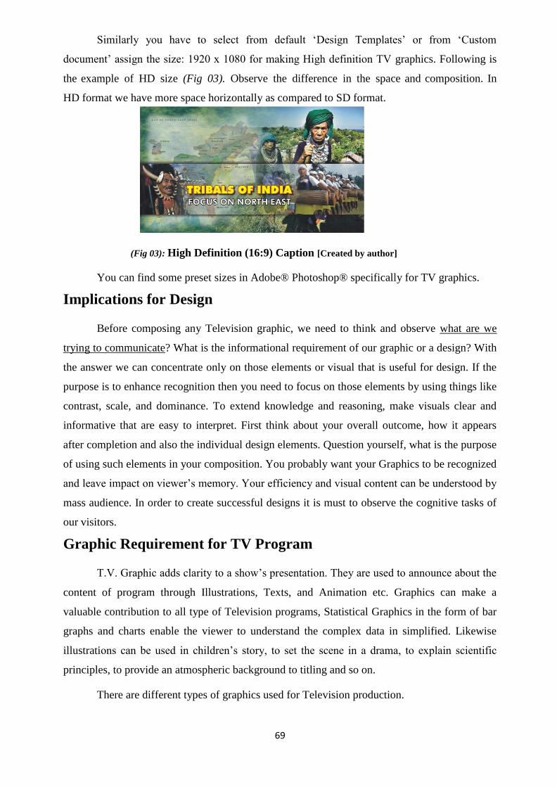
69
Similarly you have to select from default ‗Design Templates‘ or from ‗Custom
document‘ assign the size: 1920 x 1080 for making High definition TV graphics. Following is
the example of HD size (Fig 03). Observe the difference in the space and composition. In
HD format we have more space horizontally as compared to SD format.
(Fig 03): High Definition (16:9) Caption [Created by author]
You can find some preset sizes in Adobe® Photoshop® specifically for TV graphics.
Implications for Design
Before composing any Television graphic, we need to think and observe what are we
trying to communicate? What is the informational requirement of our graphic or a design? With
the answer we can concentrate only on those elements or visual that is useful for design. If the
purpose is to enhance recognition then you need to focus on those elements by using things like
contrast, scale, and dominance. To extend knowledge and reasoning, make visuals clear and
informative that are easy to interpret. First think about your overall outcome, how it appears
after completion and also the individual design elements. Question yourself, what is the purpose
of using such elements in your composition. You probably want your Graphics to be recognized
and leave impact on viewer‘s memory. Your efficiency and visual content can be understood by
mass audience. In order to create successful designs it is must to observe the cognitive tasks of
our visitors.
Graphic Requirement for TV Program
T.V. Graphic adds clarity to a show‘s presentation. They are used to announce about the
content of program through Illustrations, Texts, and Animation etc. Graphics can make a
valuable contribution to all type of Television programs, Statistical Graphics in the form of bar
graphs and charts enable the viewer to understand the complex data in simplified. Likewise
illustrations can be used in children‘s story, to set the scene in a drama, to explain scientific
principles, to provide an atmospheric background to titling and so on.
There are different types of graphics used for Television production.

70
(Fig 04): Opening Title Caption (16:9) Screenshot
Opening titles announce and introduces the Show.
Subtitles identify people and places.
Illustration, Maps, Animated info graphics are some visual inputs that
can be used in lieu of live visuals or to communicate the complex nature
of information in simplified form of graphics.
Tickers are Crawling text matter that continuously runs down bottom of
the screen with various info and advertisements also.
Credits names will be given to those who were the part of any
production.
Preparing TV Graphics
It is the golden rule that first understand, and then be understood. It is very clear if you
understand the concept of program for which graphics are to be prepared, you can create more
effective. For example, if the script is about natural disaster, using subject related visuals in
your composition and try to even give create or choose your fonts that give the feel of disaster.
It is simply by adding cracks/fire/distortion in your text. This will give the impression and feel
of subject and supports your visual in communicating to the viewer more effectively.
Think clearly about the purpose of your graphic. Choose what information is useful for
putting on screen in graphic. It is very important that information on screen has some message
and visually understandable to the viewer. It is more important how clearly the viewer would
understand what you are trying to show and what viewer will learn from this graphic?
Generally solid colors are the better options for Graphs, Pie and Charts. Using two color
gradients can also enhance the backgrounds. Texture can also be over layered on this gradient
background.
(Fig 05): Font Anatomy [Created by author]

71
Coming to the text/font part; chose proper fonts size that is readable. There are two types
of fonts used in typography. ―Serif fonts‖ and ―Sans-serif fonts‖ it is advisable to use sans-serif
fonts like ‗Aerial‘, ‗Helvetica‘, ‗Futura‘ etc. type of fonts as they have uniform thickness. Finer
line and Serifs are not present so their appearance on screen is loud and visible even for less
duration these fonts are readable. While ‗Times Roman‘, ‗New Century‘ and ‗Zapf Chancery‘
type fancy fonts have serifs and their body and shoulder have fine lines which can become
unreadable at less than 72 point in size. Script type fonts can be used for Headings if required. It
is advisable to avoid these fonts for body text.
While making info based text captions or slides, where there is lot of information given
in textual form, try to give only 6 to 8 lines per slide or caption. Break up the text and use
bullets in formatting to highlight important points. Caption on screen will remain for 10
seconds, so try to accommodate only that much text which was readable in given duration. Long
duration caption on screen make viewer uncomfortable and uneasy. Try to split the information
in two or more captions by giving some transition effects such as dissolves, wipes etc.
Here you must think in terms of brightness and contrast. Right color scheme having
good contrast which separates the foreground and background elements. Use either light letters
on a dark background or vice versa. This harmony we have already learnt in Unit-3 ―Color‖ of
Digital Imaging.
(Fig 06) : Example of Separate and Overlapped compositions [Created by author]
Delicate text or foreground elements need not to be used until very much required.
Complicated backgrounds whether still or animated need bold foreground elements especially
‗Text‘. Try to add depth into your artwork if possible. Overlapping Pictures, creating shadows,
are some techniques to show depth (Fig 06).
Title Safe And Action Safe Margin
The title/action safe area is that area which is left around on each side of the frame as a
safety of our visuals and Text matter. It is easily visualized by gridlines demarcating areas of a
screen. Earlier on certain types of televisions some areas may be cut off so to make sure that the

72
text and graphics information remains intact it is advisable to keep your objects/elements within
the safe region. Readable parts need to be inside of the ―Title Safe Area‖, while the ―Action
Safe area‖ is a larger area which acts as more of a margin for the television. Here within this
area objects or models in picture / videos should be composed.
Since now we are generally using two types of video formats for multimedia or TV
productions i.e. Standard Definition (SD) and High Definition (HD). Sizes of both formats are
quite different; where SD format or generally termed as PAL D1/DV has 720 pixels x 576
pixels on width and height co-ordinates respectively (Fig 06). While HD format has display size
of 1920 pixels x 1080 pixels on its width and height co-ordinates respectively (Fig 07).
10% Area is left for Action / Video safe zone and another 20% is left as Title safe zone
for SD video display. Hence it is recommended to just compose the titles or written graphics
within this portion and not exceeding any lengthier line of text more than 576 pixels in width.
Illustration or any picture having some important information or details on its corner will be
places in a way so that it will fits within the video safe area zone.
(Fig 07) Action Safe and Title Safe Margins in Standard Definition (4:3) Display [Created by author]
Whereas, for HD videos safer area for Titles or text matter is 5% of the display size i.e.
1728 pixels in width. Similarly the Action safe margin in HD video display is recommended
3.5% of the display size. It means that important content of photos, illustrations, maps or
drawing etc. will be placed in this area so the information of video will remain in safer zone
which is calculated about 1786 pixels in width
(Fig 08) Action Safe and Title Safe Margins in High Definition (16:9) Display [Created by author]

73
Vector Graphics
A vector graphic is the most common type of graphic that is used in making compositions. It
is based on paths or stokes which lead to different control points which make up the graphic. Each
one of these points has handle arms for adjustments and definitive position on the work plane.
Vector graphics can be scale up or down to any size it never loses quality.
(Fig 09) [Created by author]
Raster Graphics
Pixel-based raster graphics will typically come from a bitmap image. These graphics are
made up of individual colored squares (pixels) which are all assigned a specific location and
color value. We have discussed Bitmap images in Unit-2 ‗Understanding Digital Images‘. The
amount of pixels that make up a graphic is determined by the resolution of image. It means if a
bitmap graphic is scaled up or down it can lose quality.
(Fig 10) [Created by author]
Visual Effects (VFX) Design
Television industry has travelled over years. There are lots of experiments taken place
since then. Now in this era when computer imagery is standing next to reality where virtual
world has its own fantasy, lots of imaginary works, scientific atomic experiments, astronomical
missions, space wonders, kids fairy tales and super human imagery is now can be generated in
few hours. It does all can happen on your PC or workstation. During 80s when Star wars
program mesmerizes us with its special effects and chroma scenes, now those effects looks

74
dwarf sized if we measure them with contemporary technology. We are standing on the verge of
virtual world where any idea/dream can be transformed into digital imagery even it can even be
printed in 3D also. Visual effect artist has the tools which can dramatically create any
environment and live image of camera can be composite so perfectly that it is beyond the
human eye to find the difference between virtual and real image.
Virtual World
(Fig 11): A Virtual Scene created in 3D Maya® (High Definition, 16:9) [Created by author]
Virtual world has illusionist environment, where the user can merged with 3D animated
characters, or interplay with other users by using 3D characters. In sport coverage‘s
Broadcasters are using this technology, where one can see that anchor or commentator is
standing in field and taking interview of sportsman‘s. While in reality that anchors is standing in
studio against Blue or Green Screen and performing live actions which appears that he is
standing close to the player in ground.
(Fig 12-vertual Studio) [Created by author]
(Fig 13) (Fig 14)
Studio (Physical) Virtual Computer generated Set
[Created by author]

75
It is now very common to use graphics, animation, and special effects in television
programs. Now a day‘s computer artist have tools to composite many informative sports score
details, data charts, with live video signals. You may have seen these effects in cricket coverage,
or any other sports coverage where lots of 3D information was composite with video feed for
creating the visuals more dramatic and creative. Likewise in weather reports on several news
channels you can observe this virtual world environment where anchor is standing against the
blue/green screen and after compositing with 3D animated imagery it appears like he is standing
on physical earth or somewhere in assigned unnatural space. Weather broadcasts are now more
illustrative and real-time updated. Images of earth received from satellites, helps TV
broadcasters to show the accurate weather conditions and estimate precipitation or any
thunderous storm-forecast with its tracking visuals.
Here is a list of some digital compositing software which was used by television
industry. These packages can generate images or video sequence with alpha channel, which
stores the transparency information of image.
Adobe After Effects®
Adobe Flash®
Apple Motion®
Autodesk Combustion®
Eyeon Fusion®
Max/MSP®
Natron®
Nuke®
3D softwares that are used in creating 3D graphics are:
Autodesk 3d studio max®
Autodesk Maya®
e-on Vue Infinite®
Maxon Cinema 4D®
NewTek Lightwave®
The Blender Foundation Blender software®
Illustrations and theirUse In Graphic
Designing
An Illustration is an artist‘s visual language for
explanation of a text, process or idea. Illustrations were
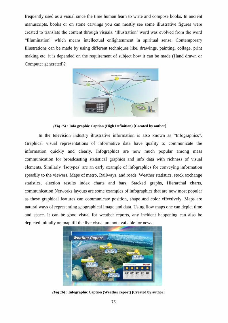
76
frequently used as a visual since the time human learn to write and compose books. In ancient
manuscripts, books or on stone carvings you can mostly see some illustrative figures were
created to translate the content through visuals. ‗Illustration‘ word was evolved from the word
―Illumination‖ which means intellectual enlightenment in spiritual sense. Contemporary
Illustrations can be made by using different techniques like, drawings, painting, collage, print
making etc. it is depended on the requirement of subject how it can be made (Hand drawn or
Computer generated)?
(Fig 15) : Info graphic Caption (High Definition) [Created by author]
In the television industry illustrative information is also known as ―Infographics‖.
Graphical visual representations of informative data have quality to communicate the
information quickly and clearly. Infographics are now much popular among mass
communication for broadcasting statistical graphics and info data with richness of visual
elements. Similarly ‗Isotypes‘ are an early example of infographics for conveying information
speedily to the viewers. Maps of metro, Railways, and roads, Weather statistics, stock exchange
statistics, election results index charts and bars, Stacked graphs, Hierarchal charts,
communication Networks layouts are some examples of infographics that are now most popular
as these graphical features can communicate position, shape and color effectively. Maps are
natural ways of representing geographical image and data. Using flow maps one can depict time
and space. It can be good visual for weather reports, any incident happening can also be
depicted initially on map till the live visual are not available for news.
(Fig 16) : Infographic Caption (Weather report) [Created by author]

77
Technical and scientific illustration communicates scientific nature information.
Instructional Images made for scientific components, Instructional diagrams generates more
effectively and convey the information via visually generated channel to your viewers. These
are generally designed to explain subjects to mass audience that is not familiar to it. Or you can
say non-technical viewer can easily understood the information of scientific nature. The
contemporary 2D and 3D software can be used to create these illustrations in accurate form.
Similarly a Medical illustration also helps the audience to learn medical anatomical and related
information. Medical illustrators can visualize medical anatomy through illustrations for bio-
communication by using the same tools of designing.
(Fig 17) : Infographic Caption (Scientific Component Diagram) [Created by author]
Narrative visual art is another important pictorial graphic form to tell the story through
graphic visual. Here sequences of images or illustration are prepared for conveying the
information to audience. Comic stories and comic strips are the example of this sequential
narrative graphic literature. Here series of illustrations with expressions and gestures are drawn
or created in 3D models and dialogue text was written in speech balloons. Story board can also
be put in this category for pre-production of 2D or 3D animation films. Here artists and
directors makes some pre- visualizing images with a series of illustrations or pictures which are
helpful in communicating the shot division, sequence, costume, location and camera angles.
This whole exercise bridges any communication gap.
Unit summary
In this Unit we have discussed Origin of Broadcast Graphics that issued in television
production. We discussed use of Designing Elements and principles of designs for balanced
composition for TV graphics. We learnt how to prepare graphics for Television and dos and
don‘ts regarding composing TV graphics in Title safe area and Video in Action safe margin
which we left while producing computer graphics. Further we described Raster and Vector form
of graphics along with compositing graphics in virtual world with the help of different
compositing software.

78
To sum up it can be said that Graphic and Animation add interest and beauty in TV
production; hence there is a need to be creative and innovative. An effective graphic has the
capacity to draws the attention of viewer and generates his interest in program in other words
viewer was bound to watch the program if it has interesting Materials in form of Graphics and
Animated Clip. Use of latest digital tools effectively can create wonders as the graphic software
is more powerful and easy to operate. The more creative you are the amazing results can come
out with these tools.
Assignment
1. Create opening Title for Hindi Play ‗Godaan‘ written by
Munshi Premchand with suitable Illustration.
2. Create weather report background of 4 Indian metro cities, with minimum and
maximum temperature column.
3. Compose a ticker giving 4 headlines as breaking news.
Assessment
1. What are Television Graphics?
2. Differentiate between Serif and Sans-Serif fonts.
3. Write the difference between Raster and Vector graphic image.
4. Explain the term virtual studio.
5. How VFX helps in creating virtual background?
6. Explain meaning of info graphics. How they are helpful in communication?
7. What is onion skinning?
8. Describe the usage of typography in TV production.
9. Write the frame rate for PAL video.
10. Explain the term rendering.
11. What is the use of layers in creating graphics?
Resources
1. Horak, Jan-Christopher (2014). Saul Bass: Anatomy of Film Design. The University of
Kentucky Press. ISBN 0813147190.
2. Bass, Saul (1960). "Film Titles – a New Field for the Graphic Designer". Graphis. 16
(89).
3. Jennifer Bass and Pat Kirkham, Saul Bass: A Life in Film & Design, Laurence King
Publishing, 2011, pg.263
4. Hansen, Charles D.; Johnson, Christopher R., eds. (2005). The Visualization Handbook.
Elsevier. ISBN 978-0-12-387582-2.

79
Suggested video links
(1) https://www.youtube.com/watch?v=cNCEFZLRY0k
(2) https://www.youtube.com/watch?v=xIyUEAsI3NY

80
DMA-02
Digital Imaging
Block – II: Digital Imaging: Aesthetics & Artistry

81
Unit-1 Introduction to Digital Composition
is intended for people who want to become a Graphic
Introduction
Composition means a mixture of multiple elements together to form a meaningful output.
In the Digital world, composition is done out of images, videos, graphics, sounds etc. Digital
Composition creates the output in a very informative way.
We can take an example of an image where we can see an image of a showroom. In the
bottom, we have a graphic rectangle with a text over it briefing about the location of the scene.
In the top we have the logo of the company that has published the image. Again in the corner
we have the name of the photographer or the Agency. Thus, a composition makes the output
attractive as well as informative.
Source: Composition with elements, Created by Author
Digital Composition is not only about the technical process of merging two subjects. The
composition has to be in process with the norms of the society. It should be ethical and should
bring no harm to the content holders. The user must be aware of the copyright issues while
creating a composition out of various materials from various sources. Even if a compositor
mixes from various sources, he/she should acknowledge the original source.
Digital Composition of image requires the basic knowledge of Photography. For making original
content, the compositor has to use all the original sources by himself/herself. The basis of an image is the
Camera and the photography technique used to capture the image.
There are certain rules and principles of design which has to be adopted while designing a
composition. We have to be familiar about theoretical aspect as well as some practical techniques of

82
making a Digital Composition. And in the final, it is about the output whether it conveys the intended
resource is an efficient and effective manner.
Outcomes
Upon completion of this unit you will be able to:
Describe about the Basics of Digital Imaging.
Explain the Basics of Photography and the type of photography required for Digital
Composition.
Compare the practical techniques of Image composition
Evaluate the principles and elements of Design during composition.
Identify the computer software‘s used for Digital Composition.
Terminology
Photography: It is the process of capturing a real time image on a camera.
Digital: It is the process of storing an information in a numerical format.
Composition: It is the mixing of two or more content together to form a single element.
Camera: It is a device used to do Photography i.e. capture an image, from real time on a
negative film or on digital sensor with the help of light.
Opensource software: It is a software which is free and can be openly used and distributed by
anyone.
Commercial software: It is a paid software. License of Commercial software has to be
purchased and is not freely distributable.
Technical Process of Digital Composition
An image is made up of pixels which consist of position and colour information. When
two images blend together, it can be termed as ―alpha blending‖. In this case, the pixel of two
images merge with each other with an opacity value called ―Alpha‖. The composition of colours
of both the images mixes to create a new colour with the combined values.
IMAGE 1 + IMAGE 2 = IMAGE 3
Existing
Image or
file is called
Background
The image
which is
brought in
is called
Alpha
blending of
the pixel
information
Formation
of New
composited
image

83
Image 1 which is existing can be termed as Background Image or Background layer. The
image which is brought in can be termed as Foreground Image or Foreground layer. Then the
opacity value or value of foreground image is reduced so that it does merge with the
background and create a composed output. The percentage of alpha reducing is based on the
visual effect choice of the creator.
Opacity value or Alpha Value = 0 [For an opaque pixel]
Opacity value or Alpha Value = 100 [For a fully transparent pixel]
Opacity Value or Alpha Value = 50 [Both the images are displayed as semi-transparent
image corresponding to each other.
These calculations are in-built in the software‘s like Krita, Photoshop etc. It is
automatically done in the process. We don‘t have to manually calculate anything. We have to
concentrate only on the creative aspect of the image.
There are two technical methods of compositing:-
Node Based Composition
Node based Compositing is the mixing of images from two different sources. In this
process, it is very effective for still frame composition. But while handing key-frame and time
of real time editing it is very poor. The data‘s are not perfectly merged in a moving video. Some
example of software‘s which use node based compositing are Blender, Nuke, and Fusion etc.
Layer Based Composition
In a Layer Based Compositing the image and effects are stored in individual layers. The
layers are stacked one over the other as per the editing requirement and each layer has its own
key-frame track. Each and every layer can be given motion individually. This is a very effective
type of composition done by most of the professionals in the Industry. Some of the software‘s
which use layer based composition are Adobe After Effects, Adobe Premiere etc.
Rule of Thirds
The ―Rule of thirds‖ refers to one of the many rules that help a person in making a
composition more attractive and more pleasing. Any composition looks better in a certain
arrangement if the rules are understood well and followed properly and may not look as
attractive as it ought to, if these rules are not followed.
layer Foreground layer of both the
images

84
The ‗Rule of Thirds‘ is just a guide line to help make better compositions, not a hard and
fast rule that cannot be broken. But good understanding of the same and following it is more
likely to help one in making a composition better. The rule describes where the creator (artist)
of the work should place / arrange his objects and where he should avoid placing his objects of
importance.
The creator of rule of third was ―John Thomas Smith‖ in 1797. A transcript of his rule of
third in a book is shown here:
Title- Rule of Thirds
Attribution- John Thomas Smith
Source- Wikipedia
Link-https://en.wikipedia.org/wiki/Rule_of_thirds
In this rule a given area or block (we will call canvas), which is mostly rectangular, is
divided into three equal parts both horizontally and vertically. Dividing the canvas this way
produces nine blocks. The lines that are drawn to divide the canvas will intersect other lines at
Some places. Where these intersecting lines join each other they will form points that are
called ‗Intersecting Points‘. These points are the key points to denote the location where the
most important part (main subject) of the composition is to be placed which is called ‗Centre of
Interest‘. Placing your centre of interest near these intersecting points helps in making a
composition better and more rhythmic.
An example of a ―Rule of Thirds‖ image is shown below:
Title- Bangalore Airport [The lines drawn as per Rule of Third by the author]

85
Attribution- Sarangib (user name as per pixabay) Source-
pixabay.com
Link-https://pixabay.com/en/airport-bangalore-india-control-190940/
The above rule was devised keeping in mind the field of ‗Photography‘ but the same rule
can also be successfully applied to any design so that it would look better and more pleasing to
the eyes.
Generation of Images through Photography and Computer
Graphics
Composition is done from the Photographs and Images which are generated from
photography and Computer Generated Graphics which may be a slide of data/graphs etc. or a
2D or 3D generated graphics. Hand drawn and hand painted subjects can also be inputted for
Compositing.
Photography is done with cameras and the quality of the image depends upon the
photographer, the quality of camera and the lighting of the scene. The photographer should
understand the needs of the subject he/she is capturing to get the picture needed for creating
final output. He/she should also understand the theme of the photograph i.e. whether it is a
personal portfolio photography or a photo for an advertisement, hoarding or a banner. The
photographer chooses the camera and camera settings as per the size of the output required for
final composition.
The source of images for digital composition with example is as follows:
Images acquired through the medium of Photography
Text Styles from Computer Graphics software
Designs from vector based Computer Graphics software
Scanning from documents using scanner.
Elements of a Digital Composition
Lighting
When we plan composite images, the source of the images has to be shot in with the same
lighting pattern. There are occasions when the first photo is shot in the morning and the second
photo which is required to be taken is shot in the afternoon. If we merge these two images
directly then the output will not look natural. It is very frustrating situation for compositor who
has to first match the light settings manually using Computer graphics software. It is a trial and
error method where variety of combination of options has to be tried by the compositor.

86
Here, we have two images that need to be merged but the lighting of both the shots are
different.
Title- Lighting
Source-Pixabay Link-
https://pixabay.com/get/eb36b40e29f2043ed1534705fb0938c9bd22ffd41cb0154992f8c37 ca6/sunny-morning-
2351165_1920.jpg
Title- Lighting Source-
Pixabay Link-
https://pixabay.com/get/eb35b10d2ef0023ed1534705fb0938c9bd22ffd41cb0154 99df0c57fa0/kot-
2002643_1920.jpg
Hence, a pre-production work has to be check listed before planning for a compositing work in terms of
lighting.
Final Output
Image: Combination of the two base images matching the light settings Created by Author
Lighting is very crucial when we are doing blue screen shots or green screen shots. The

87
source shot lighting should match with the destination shots. There are lots of properties of light
settings like – intensity of the light, colour of the light and distance of the light. The positioning
of light has to be perfectly done.
Lighting is in total a completely individual art work. It is handled by professionals in the
Industry. It is very difficult for a new comer to set lights with only theoretical knowledge. If not
done properly, it will show blue or green spills during the compositing which will make the
output nasty. There are various methods of reducing the spills. One of them is to focus some
yellow light on the subject to decompress the blue colour. Various colours of lights have to be
used according to the requirement of final scene.
Camera Technicality Match
This is a very important phenomenon of composition. The two merging images will look
perfect only when the camera angles of both the images match perfectly. If you have taken a
photo of scenery from top angle and you want to merge your image into another picture, you
should take your shot for the second image too from the top angle only to match the
composition.
There are options in Computer graphic software to change the scale of the shot but a
different camera angle of two shots is very difficult to merge.
Now-a-days, there are techniques where a camera motion is controlled by computers.
Shots which are used for double role are shot using computer controllers which help in perfect
merging. We can see the perfect composition in the movies where we find actors doing double
roles.
Identical source of acquiring Images
It is better to take the photograph of two scenes to be combined using the same source i.e.
camera, or scanner etc. The same source is important for a perfect composition because the
same settings in different brand of cameras generate different results. Technically the settings
may be same, but the hardware quality varies from company to company. In case of films,
people tend to use single type of camera for shooting the entire film to maintain perfect
compositing.
Information Assessment
This can well be called a Pre-production job. When we go for shooting images for
composition purpose we have to make good notes and prepare a check list of all the
requirements for the shoot.

88
An example of elements in a check list is as follows:
Lights of different varieties
Camera lens
Camera battery [Additional battery for backup]
Tapes for measurement of distance from camera position and model
position.
Colour combination of background, dress of the model, colour of the props
in the scene etc.
All these information beforehand will enable in functioning of smooth shooting of raw
materials for composition in later stage.
Fixing or Manipulation
There are occasions when after all the shooting and acquiring the raw image the shoots are
done in digital format, we come to know that there are some settings which are wrongly done
for which the shots of some area are not perfect and it has to be shot again. Now it is no more
possible to shoot again due to various reasons.
In such cases there is no alternate except to fix the issues using Digital Computer Graphics
software. This is called fixing or manipulating the original material to match the required
output. In some cases, it is easily done and in some others, it is extremely time taking and
difficult. It takes not only the technical knowledge but also the creative idea of the compositor
to fix the issue.
Rotoscoping
Rotoscoping is the process of removing the unwanted areas of a frame for compositing. It
is done by professionals where they remove unwanted areas which cannot be easily removed by
green screen or blue screen areas. In one second we have twenty five frames; that means that if
a rotoscope artist has 30 seconds of a shot he/she has to clean (30 x 25) 750 frames which is a
very time consuming job.
Here is an example where we use rotoscoping to separate the character from the
background.

89
Title- Compositing
Source- Pixabay Link https://pixabay.com/en/windmill-river-scenary-water-sky-916637/
https://pixabay.com/en/people-man-model-glasses-516372/
Here the artist has to work very minutely over the edge areas because it is the place where
it merges with the background area.
Merged Image
Created by Author
In the above, the character has been selected individually using the Roto process and then
pasted in the background.
Wire Removal
The extreme Action sequences and dance sequences are done using wires ties to the
actor/actress. Here the frame is imported into computer and the CG artist removes the wire
frame by frame. This job is of similar category of Rotoscoping job. This also takes lots of time
and artist has to merge the background too along with the removal of the wire.

90
Title-Wire removal
Source-Own Photography with original source.
This practice is very common in visual effects in films where lots of mechanical devices
are used to create an effect and thereafter removed using Computer Graphics. The person doing
the wire removal has to be very skilful and work of every frame has to be done perfectly else
there will be flickering and jerk in the output. There are some cases in which wire frames are
easily removed but in some cases the wire areas have to be manually painted through software
brushes.
Hand Painting
Hand painting is used to create exotic background effects which cannot be shot through a
camera. Fancy elements like starburst, extensive glow effects etc. are doing using computer
graphic software‘s like Krita, Photoshop etc. Hand Painting doesn‘t mean only the hand drawn
paintings, it is the digital painting done using Computer Software‘s.
Clone Stamp
Clone stamp is the method to remove unwanted spots or elements in a frame. There are
occasions where we get elements in a shot we don‘t require. For example, in a shot we have two
crows sitting on a rock in the background. We want to remove one crow only from the shot.
This is done using Clone stamp tools which is available in all the computer graphic software‘s.
Title-Clone Stamp
Source-pixabay.com
Link-https://pixabay.com/en/birds-crow-black-433965/

91
Output after cleaning using Clone Stamp
Title: Image after applying Clone stamp
Spots on the face of actor/actress can also be removed using Clone stamp. This has given
the director the freedom to add or remove elements even at a later stage. This was not available
in olden days where things were not done digitally. In olden days, things were done using
optical techniques where a portion of a frame was very difficult to be edited.
Filters
Filters are the effects which are added after composting to make the image more effective.
Some of the commonly used filters are Blur, Noise reduction etc. Blur is used in background
areas where we need to focus on the foreground image only. We have seen in movies where the
background is automatically blurred and the character is focussed using camera techniques.
In some cases of night shots, we get grains on the shot which distracts the image. It can be
reduced or removed using filters like Noise reduction. There are many other filters also which
effectively work towards a best composition.
Artificial Lighting
Artificial lighting is also an in-built feature of Digital Composing software‘s like Krita,
Photoshop etc. Unique type of lighting can be used on specific areas of composition to make the
scene more realistic. They are termed as lens flare, Omni light, spotlight, and illumination lights
etc. in technical software terms.
Shadows
When merging two elements, shadows are not always merged. The compositor has to
manually add shadows of the subject to add depth to the image. Shadow is a very important
element and it has to be created professionally taking into view all the properties of a shadow
according to the lighting.
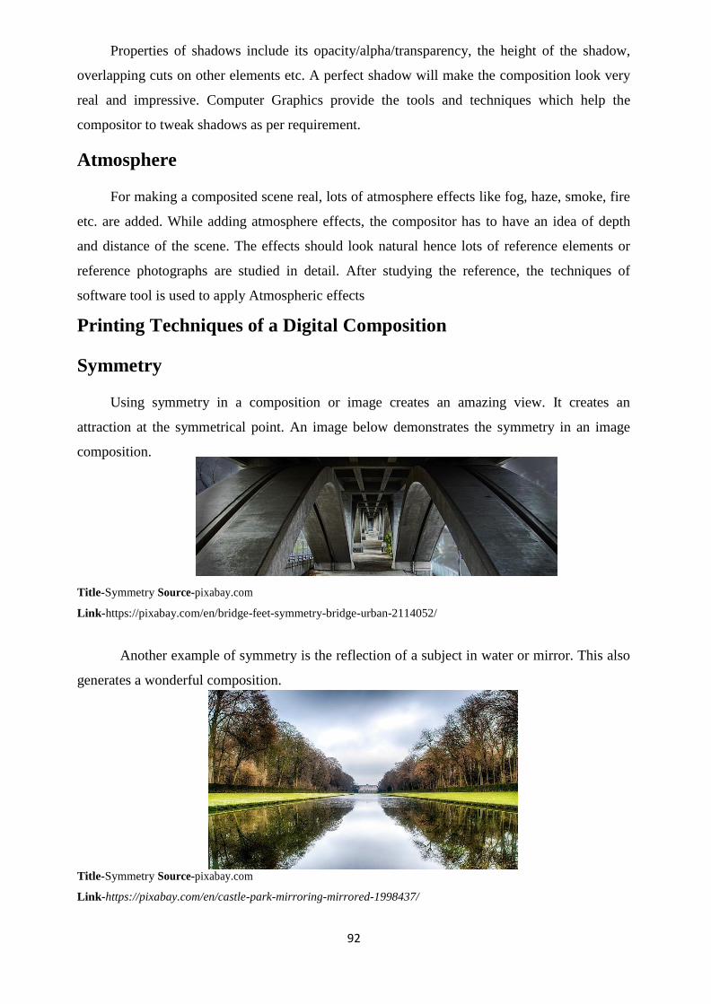
92
Properties of shadows include its opacity/alpha/transparency, the height of the shadow,
overlapping cuts on other elements etc. A perfect shadow will make the composition look very
real and impressive. Computer Graphics provide the tools and techniques which help the
compositor to tweak shadows as per requirement.
Atmosphere
For making a composited scene real, lots of atmosphere effects like fog, haze, smoke, fire
etc. are added. While adding atmosphere effects, the compositor has to have an idea of depth
and distance of the scene. The effects should look natural hence lots of reference elements or
reference photographs are studied in detail. After studying the reference, the techniques of
software tool is used to apply Atmospheric effects
Printing Techniques of a Digital Composition
Symmetry
Using symmetry in a composition or image creates an amazing view. It creates an
attraction at the symmetrical point. An image below demonstrates the symmetry in an image
composition.
Title-Symmetry Source-pixabay.com
Link-https://pixabay.com/en/bridge-feet-symmetry-bridge-urban-2114052/
Another example of symmetry is the reflection of a subject in water or mirror. This also
generates a wonderful composition.
Title-Symmetry Source-pixabay.com
Link-https://pixabay.com/en/castle-park-mirroring-mirrored-1998437/

93
In symmetrical compositions, it is better to add the highlighted subject in the centre of
the frame.
Frame within a Frame
There are compositions in which a scene is seen through a door or a window which
consists like a frame. This will give a more focus to the subject of the composition. The image
below shows a sea view through the window. This creates a focus on the output area.
Title-Frame within frame
Source-pixabay.com
Link-https://pixabay.com/en/view-window-sea-view-tenerife-2417156/
Leading Lines
Image Composition of pathways leading to a destination catch the eye balls of the
audience. The lines need not be straight always. A curved pathway also does the same leading
work. There are examples of flowing waters, moving cars on a road etc. which leads the photo
to a destination.
Title-Frame within frame Attribution-
Thomas Alter Source-pixabay.com
Link-https://pixabay.com/en/road-town-paved-old-town-949832/
Diagonal Representation of Images
The representation of images can be divided into shapes. Some shapes automatically

94
appear during a perspective shot of building, a bird‘s eye view of a mountain etc. So always try
to make composition in triangles forming diagonal lines.
Title-Diagonal representation of Image
Source-pixabay.com
Link-https://pixabay.com/en/ely-cathedral-colossal-church-414090/
Patterned Images & Use of Textures
Patterned flooring and walls are done to create attraction. It gives depth as well as a
message for remembering a spot due to its resemblance of continuous pattern. Differentiated
patterns make the scene memorable as well as beautiful.
Title-Patterned Image
Source-pixabay.com
Link-https://pixabay.com/en/tile-pavement-road-city-831527/
Textures also come in large variety like wooden textures, granite flooring textures,
marble flooring textures, colourful square textures, parking textures etc. These textures add
depth and artificial realism to a place. For example, a wooden texture would give the feeling of
a tree or scenery in an interior.

95
Rules of Odds and Evens
In composition, odd number of elements creates more attraction than even numbers. For
example, five birds sitting on a branch will be more effective two.
Image: Nine Birds sitting on an electric wire
Title-Rules of odds and evens
Source-pixabay.com
Link-https://pixabay.com/en/birds-swallows-lines-sit-427909/
This rule is followed by professionals but not considered by all. There are occasion
where even number of elements are required compulsorily. For example, two people are talking,
in this case a third character can become a distraction. Hence, it depends upon situation where
we need the odds and where the evens.
Filling the Frame
In a composition, the main element has to be focussed and fit in the frame. In case of a
face of an animal photo we have cropped it till its face even eliminating the outer border. This
helps in focussing on the face of the animal.
Title-Filling the frame
Source-pixabay.com
Link-https://pixabay.com/en/africa-african-animal-cat-close-up-17335/

96
In this building, a little space has to be left to show the surrounding of the building but
to some extent only. So the compositor has to decide according to the subject on how to fill and
fit the frame with the content.
Title-Filling the frame
Source-pixabay.com
Link-https://pixabay.com/en/scania-sweden-lighthouse-sea-ocean-123782/
Leaving Negative Space
In some cases, there are lots of negative spaces or blank spaces that have to be left to
focus on the character or subject. We can see in full page advertisements where around 50 to 60
percent of space is used in negative and only 40 percent is used for the content. This creates a
pin point view to the audience who concentrate only on the main subject for the whole time they
look into the image. This will not put pressure on them at a glance to view at all the materials in
the space.
Title-Leaving Negative space
Source-pixabay.com
Link-https://pixabay.com/en/curriculum-vitae-cover-letter-1756264/
Simplicity by isolating the subject
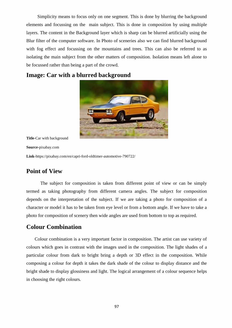
97
Simplicity means to focus only on one segment. This is done by blurring the background
elements and focussing on the main subject. This is done in composition by using multiple
layers. The content in the Background layer which is sharp can be blurred artificially using the
Blur filter of the computer software. In Photo of sceneries also we can find blurred background
with fog effect and focussing on the mountains and trees. This can also be referred to as
isolating the main subject from the other matters of composition. Isolation means left alone to
be focussed rather than being a part of the crowd.
Image: Car with a blurred background
Title-Car with background
Source-pixabay.com
Link-https://pixabay.com/en/capri-ford-oldtimer-automotive-790722/
Point of View
The subject for composition is taken from different point of view or can be simply
termed as taking photography from different camera angles. The subject for composition
depends on the interpretation of the subject. If we are taking a photo for composition of a
character or model it has to be taken from eye level or from a bottom angle. If we have to take a
photo for composition of scenery then wide angles are used from bottom to top as required.
Colour Combination
Colour combination is a very important factor in composition. The artist can use variety of
colours which goes in contrast with the images used in the composition. The light shades of a
particular colour from dark to bright bring a depth or 3D effect in the composition. While
composing a colour for depth it takes the dark shade of the colour to display distance and the
bright shade to display glossiness and light. The logical arrangement of a colour sequence helps
in choosing the right colours.

98
Title-Color combination
Source-pixabay.com
Link-https://pixabay.com/en/color-district-colorful-pattern-455365/
Rule of left to right
We always read text from left to right; hence we have the same pattern in images also to
look at it from a left to right perspective. So the flow of information or movement in any
composition has to be displayed from left to right. For example, if you want to show a
photograph in which a person is walking to destination, then it has to be shown as the person is
walking from left to right towards his destination.
Title-Rule of Left to Right
Source-pixabay.com
Link-https://pixabay.com/en/walking-girl-female-young-people-591202/
Although in Arabic countries, text are read from right to left. So there is possibility that
images may be in those countries may be composed with the opposite rule.
Balancing Elements in a Composition
Balancing elements means the arrangement of focused parts of composition. For
example, in an advertisement one wants to focus on 50% discount first, then the focus on the
product, then on the features of the product, then on the contact information.

99
This balance is created by the sizing of the elements in some places and by colour
specifications in another. The composition of dark background with a bright text brings the
subject in focus, whereas a semi dark background with a semi bright text solves the purpose of
giving information but it is not highlighted as equal to the main subject. A successful
compositor is one who masters the art of balancing the elements in Digital composition in
computer software.
Unit summary
In this unit you learned about the Digital Composition elements which make the
composition a successful output. You have also learnt about the role of Computer Graphic
software in each and every element of Digital Composition. In today‘s graphic world all the
composition has to be done using Computer Graphics only.
Assessments
Name two software‘s used for Digital Composition.
Name five elements used in Digital Composition.
Name the person who established the Rule of Third.
In the year , the Rule of third was established.
Name the two technical methods of compositing.
Resources
Digital Composition
https://en.wikipedia.org/wiki/Digital_compositing Digital Composition and Digital
Literacy http://guides.library.stonybrook.edu/digital-storytelling Digital
Composition and Performance
https://www.eca.ed.ac.uk/study/postgraduate/digital-composition-and-performance-msc
100
Unit 2 Use of Digital Elements in DigitalLayouts
Introduction
A good design always comes with some common elements. It is because of the use of
these elements in perfect way; an output of a design is appreciated and fulfils the motive of the
designer to convey the information. Conveying information to the user is the most essential part
of creating a design using visual elements.
There are around twenty numbers of elements of design. The number of elements is not
fixed. It depends upon the choice of the designer to use the combination of elements. It is not
required that you use all the elements of design in a single project. The fundamentals of Design
elements are taught in the school of art as the basic foundation. It is upon this foundation that
the style of the work of artist depends. If the foundation is good and clear, then the artist can go
on to become a good asset as a Visual Communication candidate to any organisation. The
process of learning Design elements is possible only though visual demonstration of each and
every element.
Outcomes
Upon completion of this unit you will be able to:
Describe the Design Elements of Digital Layouts.
Interpret the use of major Design Elements.
Examine the combination of best components for design.
Apply the Design Elements in Practical works.
Draw the elements through graphical representation of each element.
Terminology
Design: A representation of a subject in a stylized manner.
Visual: Any subject which can be seen using eyes.
Elements: The components out of which a subject is made up of.
Texture: An image which is applied on a subject to
show its originality and create the feel. For example, a brick texture on a flat box.
A Brief History of Designing
Design Elements

101
The elements of design are used according to the requirement of subject. The most
commonly used Elements of Design are as follows:
Now, we will study each and every element in detail.
Line
Fig. 1: Different styles which can be applied to Lines [Created by the Author]
Line is the first and foremost element of Design. Everything we look upon is made of line.
It may be the numbers, alphabets, drawing etc. everything is made up of Lines in one form or
the other. Line always does not necessarily mean a straight one. The curved forms of a drawing
are also considered as a line. If we need to show something to the point of the subject only, then
a straight line is used. When we want to show something which gives movement to the
information, then curvy lines are used. If we need to show something new and innovative with
suspense then patterned lines are used.
Line gives direction to our eyes to generate emphasis on the subject according to the
arrangement of the design.
When we give an artist a pencil to learn art then what does he do. He just draws lines and
composes them to create a final version of the drawing. In the same way in design, Line tool
and Pen Tool in graphic software play a big role in creating a good Computerised Graphic
design. It is easy to draw straight and curve lines using software‘s with accuracy. Even if we
make mistakes, there are options to rectify it with ease.
Scale
Fig. 2: A comparison of a wrong and correct form of scaling [Created by the Author]
1. Line
2. Scale
3. Colour
4. Shape
5. Negative Space
6. Symmetry
7. Transparency
8. Texture
9. Balance
10. Hierarchy
11. Contrast
12. Framing
13. Grid
14. Randomness
15. Repetition
16. Rules
17. Movement
18. Depth
19. Typography
20. Composition

102
Scale classifies the importance of the subject according to its requirement. It means that
the headings are a bit bigger in size and bold than the normal text. This distinguishes between
the important points of the design and the ordinary information of the design.
When we look at an advertisement, we always see the information which is larger in the
size and then move our eyes towards the smaller size information. For example in a product
advertisement ―50% Discount‖ is sometimes highlighted in big and then the product
information follows. So Scale is a very important element in design because in today‘s busy
life, people have less time. People looks at things in glance and only when there is a thing of
appeal in larger size, it attracts the person. It is only after the attraction that they get into the
detail if they are interested.
Scale is not always used as per subjects appear in real. Lots of variations are used to
create attraction. We have seen cartoon characters with a big face and a small body which is not
real but looks attractive. So use of artificial scale is done according to the requirement of the
subject. A viewer has to comfortably establish the important subject in the design according to
the scale.
Colour
Fig. 3: A graph consisting of all colours on Computer Graphic Software
[Composition by the Author]
Colour is an essential part of design today. It plays a very vital role in design to catch the
attraction of the audience. The above figures indicate the colours which can be used in
Computer Graphics. Each colour has been given its own resemblance and is used according to
the feel of watching a colour. Some of the commonly used colour implications are as follows:
Colour Implication
Red Red colour is used to show Passion and Excitement which fill our mind with
energy and confidence.

103
Orange Orange is a fresh colour which is used as a symbol of adventure. If you are
willing to try something new in a business, the use of Orange will create strong
enthusiasm.
Yellow Yellow colour is cheerful and light colour. It is a symbol of the colour of the
sun when it shines. But due to its extra glossiness it may look cheap if not used
with the perfect combination. So try to avoid yellow as a single colour medium.
Green Green colour is the symbol of tree which gives a natural feeling. Depending
upon the product category, green is used which connects us with the outer
greenery.
Blue Blue colour symbolises sky, ocean etc. It is a vast colour which is used for
communication. It easily connects with the harmony of the viewer. It is used as
a cool colour in design.
Purple Purple is a royal colour and is mostly used in luxurious brands.
Brown Brown is a bold colour which adds strength to the design just like a branch to
the tree. It is mostly used in organic products.
Pink Pink symbolises romantic and sentimental feelings.
Black Black is used for communication purpose and sometimes as the background
highlighter over a light colour like white, yellow etc.
White White colour symbolises space and in any design fifty to sixty percent is left as
blank space as an element of design.
Shape
Fig. 4: Varieties of Shapes [Created by the Author]
Shapes play a big role in forming of design. Triangle, Rectangle, square, oval, circle,
start, polygons etc. are used in designs to create the output. There a two kinds of shapes. One is
mechanical shape and the other is organic shape.
Mechanical shapes are those which are formed of measurement like Rectangle with its
length and width, Circle with its radius, Polygon with specific number of sides with radius.

104
Organic shapes are free hand drawing shapes which are done using Pen tool, Bezier tool etc. It
is formed in a specified space according to the rough estimated proportion. It depends upon the
artistic ability of the designer to make the shape attractive.
Negative Space
Fig. 5: Image displaying the unused space as negative space to form a design [Created by the Author]
Negative space is the space left over after creating our designs. But this space can also
be used in an effective way to create a symbol. In Fig. 5, we can see the white space as the
negative space. But if we subtract black from it we get a design from the outline of the white
shape. This has not been created intentionally by the user by it automatically happened.
Negative spaces are used in patterns and tiles also. The left over shape is automatically formed.
It looks like a loop where every part can be considered as the starting point of the subject.
It is also created in small shape designs like logo where we need to represent more using
less design.
Symmetry
Fig. 6: A symmetrical figure where the left side is the mirror of the right side. [Created by the Author]
A human shape is made up of symmetry. Symmetry means the left side and ride side are
similar to each other facing the opposite direction. Images which form symmetry attract the
most. From an advertising point of view, we can see designs and background photographs
which are drawn or photographed from symmetry point of view.
Symmetry is basically used in symbols and logo forms. Although each designer has his
own choice of representation, symmetry acts as an asset for the designer. Symmetry is used in
cases of mirrored images, reflections on water etc.
It is not necessary to create the whole image in symmetry. A part of a scene can be also

105
shown in symmetry which adds an essence to the viewer.
Transparency
Fig. 7: The intersected area displaying transparency of overlaying objects with alpha/opacity applied on it.
[Created by the Author]
In the language of Computer Graphics, Transparency is termed as Opacity and in some
cases as Alpha. In case of Raster Graphics software, a shape or an image is placed in layers and
the opacity of the layer is reduced to see the transparent parts of the lower layer. In case of
Vector Graphics Software, the shape itself is considered as a layer and the opacity is reduced as
property of the individual shape.
Opacity is used mostly in Compositing of images where we would like to merge one
image over the other and be able to see both the images with reduced transparency of both.
Transparent medium of design is being experimented on glass paintings also. This
element is not only limited to computer graphics. In hard copy of design also transparency is
tried to be implemented in form of glass, transparent sheets etc.
Texture
Fig. 8: Varieties of Textures inserted inside the shapes [Created by the Author]
Textures are used for creating a 3D feel of a photograph when we look at it. For example
when we look at the texture of branch of a tree, we feel the depth of touching the tree. In the
same way there are lots of textures like brick texture, stone texture, marble texture, fabric
texture for clothing etc.
When we create something artificially using Computer graphics, it is formed in outlines
or flat and gradient colours. With the help of textures we can apply it in shapes to make it look
real. It creates an illusion of depth in the minds of the viewer.

106
It is not merely used a design, but it is used with intention to create the feel of the
subject of the design. It is a source of tactility to the design to create incredible effects on the
screen. It creates the vintage feel to the viewer while watching the dark and light strokes which
is created by the designer. Watching as a source of information and feeling it as natural
connects the mind of the viewer with the potential source of information.
Balance
Fig. 9: Equal balance of subjects in both the directions [Created by the Author]
Balance is the placement of the elements of your design in an even way that it looks
informative from all the angles. For example, we have created a design and put most of the
elements in the left side then there will be a problem for the viewer standing in the opposite
direction to watch it.
Hence we have to see that both of sides of the design contain equal elements of
importance even if it is negative space. It is like the weight of elements placed on either side of
a measuring bar. Both the sides need not be fully symmetrical with identical contents but the
information of value should be equal in both directions.
Hierarchy
Fig. 10: Positioning of elements according to importance under a hierarchy chain
[Created by the Author]
Our world runs on Hierarchy, both from top to bottom as well as in parallel. It may be
family or business, authority runs on hierarchy. Hence while designing something we have to
create the hierarchy. We should be clear that which information has to be highlighted first and
then the next. It is not only in scale that hierarchy can be shown. Hierarchy is also shown using
colours.
With the help of scale and colours the designer has to create the hierarchy of
information. A perfect hierarchy give significant importance to the elements of the design.

107
Contrast
Fig. 11: A contrast variation among the colours from dark to light [Created by the Author]
Contrast is used for highlighting a subject or to make an object look like popping out of
the screen. It is basically done where we place a white text over a completely black colour. It
looks like the white colour comes forward of the black creating a depth or a 3d kind of look.
Contrast is used to create artificial depth to an object. Although the object is not in 3D but it
creates an illusion of front and back in space.
Technically contrast is created in different ways like using Bright Colour against Dark
Colour together, Thick shapes against Thin Shape together, large shapes against small shapes
together. When we place two opposite things in front of each other or besides each other it
creates a 3D kind of effect which indicates depth to the design.
Framing
Fig. 12: Framing of subjects to create importance [Created by the Author]
Framing in a design is created to draw attention towards a particular subject. The frame
may be in form of an outline in any shape such as rectangle, oval etc. It gives emphasis to the
subject which is placed inside the frame.
It creates an aesthetical composition of the subject and the frame. There are occasions
when the highlighted subject is just information but not an attractive design. In this case the
subject is intentionally highlighted through a frame.
The frame also removes the unwanted part of a subject or an image which is done using
Cropping. It is also termed as Masking in Computer Graphic language. In Masking, a shape is
created in any form and an image or another shape is placed inside the mask. Frames need not
be a specific shape; it can be designed from simple to exotic floral designs.
Grid

108
Fig. 13: A Graph composition of Grid [Created by the Author]
Grid takes us back to our olden days of Graph Paper in the subject of Mathematics in
school. It is used to prepare Graphs, Charts etc. using perfect measurement. In Computer
Graphics Grids are used to create elements with perfect alignment. The placement of elements
of a design is very important. It has to appear in a perfect way. For example, we use scale to
draw a straight line on a paper. In the same way Grid is used to place things in proper place and
proportion.
A single grid is used in different ways. Sometimes it is used to generate objects by
perfect measurement. It is used to create alignments of objects according to their measure for
i.e. left, centre, right, top, vertical centre, and bottom, justify etc.
Grids are used as a helpful tool in a design which appears only on the screen. Grids do
not appear in printout. It is like an on and off option in a software. When required it is turned on
and when the use the over it is turned off. The spacing of grid can be specified by the user
according to his need.
It makes the design neat and clean, look good and impressive to the viewer.
Randomness
Fig. 14: Rough Positioning of subject creating Randomness [Created by the Author]
Randomness is used in Design for Abstract form of artwork. There are occasions of
designs where non uniform works attract. It is a composition of subject which are placed and
aligned in an abstract manner. It deviates all the elements of design still looks impressive. These
are used in designs which are used to convey information that are not of high commercial value.
These are used in Art works.
Randomness is termed as Design Randomness when used in design works. Even though
things are placed in rough order, design randomness still creates a message out of it. It helps in a
smooth eye flow on the hidden elements in a random design. It is like searching for a valuable
among the scraps. Everyone might have done this in their life at least for once. We get a chance

109
to get into a store room locked for months. We would try to find something useful from the
useless things and feel proud when we find a one of our relevant importance.
In the same way Randomness in design is also a genre of work in which a category of
people are interested. It may be for film, art, design etc. People visualise abstract form like
making an imaginative picture out of the formation of clouds in the sky.
Repetition
Fig. 15: Repetition of a single element like logo in all the correspondence document of a company
[Created by the Author]
Repetition is a useful element to build the brand of an organisation. People quickly
remember symbols and logos rather than the name of the company. So we can see logos of
various companies like Tata, Coca Cola, and MDH etc. They have a unique symbol which is
repeated on all its products from packaging to letter heads, visiting cards etc. A consistent view
of the logos creates the brand of the organisation in a large scale. Logos and Trademarks are
done by professionals looking into all the aspects of the company because this is the symbol
which will represent its identity for all the future days to come.
Repetition is also used to create emphasis on a design. It is also being termed as Tiling
or Patterns. In this case a single design is repeated all through a shape to create a textured effect.
The design which has to be repeated should be in continuous flow then only a tile effect is
created. If the design is broken or creates a patch while repetition then it is a wrong pattern.
Hence, while drawing a pattern one has to be very cautious in the corners because the pattern
connectsthem from the four corners i.e. top, bottom, left and right.
Rules
Fig. 16: A rule sheet of right and wrong in Design [Created by the Author]
Even though there are some logics of design, a designer denies following certain rules.
In some cases, a designer does not even want to have an eye on any of rules while designing a
piece of work. Rules exist in design which creates a checklist of what is right and what is
wrong.

110
Following the rules create a design of perfect nature. It tells us what should be done and
what should not be done. It is not described by aliens. It is done by the people who have
contributed their years of experience in the field of design. These are the basic common rules
which are correct to the maximum extent. There are rules like using a particular font, not using
pixelated images, cutting an image sharply from the edges without leaving any cut marks or
background colours etc.
So there are designers who follow the rules as well as the designers who feel pride in
breaking the rules and arguing with the justification of their deeds. This has been going on and
will go on till designers exist.
Movement
Fig. 17: Movement of a subject in a pace [Created by the Author]
When we hear of movement in a design or still graphic, we might imagine that how can
we give a movement to a static image. But still movement is an important element of design.
Movement is the flow of information which you want to convey in the design. For example,
when we see a design, we see the focussed part of the design then move onwards to the other
parts of information.
Movement can be shown on the still graphic by symbols, arrow marks, transparency
flow of an object, scale hierarchy of an object etc. It creates a sense of happening in the image.
Movement is also achieved through filter effects like Blur. It is also illustrated through motion
lines like smoke effect in the backside of a vehicle, circular lines around the legs of a person etc.
Depth
Fig. 18: Adding depth to a shape and a text [Created by the Author]
Anything which has depth captures the attention rather than a flat image of the same
subject. It is the artwork which generates a 3D visualisation on the flat surface itself. It is done
using various techniques:

111
Adding Shadows – The oldest and easiest technique of creating a solid feel of an object
is to add shadow to it. It makes the object lively in the scene even if it is seen from a two
dimensional view. The shadow is given a treatment like black faded colour with
transparency. It is tweaked using shape manipulating techniques like Distort, Free
Transform, and Skew etc.
Light and Deep shade of a colour – A depth to an object is formed by creating a gradient
shade from the light colour to its dark shade. It is the efficient method of creating 3D
using gradients in all the raster and vector based two dimensional software‘s like Krita,
Inkscape, Photoshop, CorelDRAW etc.
Perspective – Depth is generated from the Perspective drawing. Drawing in perspective
is an art which has to be learnt in Art subjects. Drawing roads, buildings etc. are a part
of perspective drawing study. Drawing in perfect proportion in perspective will make
the scene lively by adding depth in form of distance.
3D effect like Extrude, Revolve etc. – There is readymade effects like Extrude, Revolve
etc. in software which automatically creates depth to the subject in various forms and
colour.
Typography
Fig. 19: Different styles of writing a text [Created by the Author]
The style of writing an alphabet is called Typography. There are thousands of
typographical designs available as readymade in the industry. Typography according to
Computer Terms is referred to as Fonts. There are lots of in-built fonts which come with the
Software operating system. A user need not be a good artist in writing or may have a bad
handwriting. But when he uses a computer to write something, he can choose the best font
available and make the writing good excellent.
It is the choice of the font which a designer chooses according to his creativity which
makes him outstanding in the text design. This is really a boon for the designer as in the old
days without computer; an artist has to manually write the text with lots of technical equipment
of art like scale, rounder, eraser, ink, paint etc.
So Typography is only a choice for the designer without worrying about the process of
writing a text. Even though there are some designers who create their own style of text using the
shape tools of the software‘s.
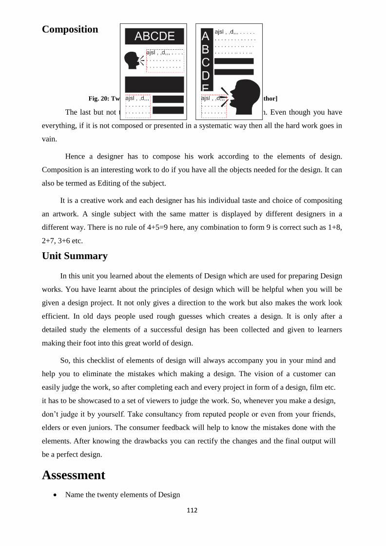
112
Composition
Fig. 20: Two different types of Composition [Created by the Author]
The last but not the least component of design is Composition. Even though you have
everything, if it is not composed or presented in a systematic way then all the hard work goes in
vain.
Hence a designer has to compose his work according to the elements of design.
Composition is an interesting work to do if you have all the objects needed for the design. It can
also be termed as Editing of the subject.
It is a creative work and each designer has his individual taste and choice of compositing
an artwork. A single subject with the same matter is displayed by different designers in a
different way. There is no rule of 4+5=9 here, any combination to form 9 is correct such as 1+8,
2+7, 3+6 etc.
Unit Summary
In this unit you learned about the elements of Design which are used for preparing Design
works. You have learnt about the principles of design which will be helpful when you will be
given a design project. It not only gives a direction to the work but also makes the work look
efficient. In old days people used rough guesses which creates a design. It is only after a
detailed study the elements of a successful design has been collected and given to learners
making their foot into this great world of design.
So, this checklist of elements of design will always accompany you in your mind and
help you to eliminate the mistakes which making a design. The vision of a customer can
easily judge the work, so after completing each and every project in form of a design, film etc.
it has to be showcased to a set of viewers to judge the work. So, whenever you make a design,
don‘t judge it by yourself. Take consultancy from reputed people or even from your friends,
elders or even juniors. The consumer feedback will help to know the mistakes done with the
elements. After knowing the drawbacks you can rectify the changes and the final output will
be a perfect design.
Assessment
Name the twenty elements of Design

113
Create an own graphical representation of the twenty elements of design in a pen and
paper.
Name the elements which you find more interesting and why?
Resources
Elements of Design : https://en.wikipedia.org/wiki/Visual_design_elements_and_principles
Ten Basic Elements of Design https://creativemarket.com/blog/10-basic-elements-of-design Design
Elements and Principles https://designschool.canva.com/design-elements-principles/ Introduction to
Elements of Design http://char.txa.cornell.edu/language/element/element.htm
114
Unit 3 Basics of Image Editing
Introduction
Digital Industry is progressing very fast. The varieties of input into digital platform are
increasing in form of Scanners, Digital Camera‘s, Mobile Cameras etc. Text has most probably
been replaced by Images and Photographs. With the advancement of 3G and 4G network, now
it is possible to easily transmit images, audio and video on digital exchange platforms. Hence,
each and every person should be acquainted with the digital devices and the operating platform
on the devices.
The application of digital content or soft copies is applicable in most of the areas. The
process of admission into colleges, entrance examinations, form fill up for jobs, interviews,
government projects etc. all involve activities done in digital format to reduce the time taken for
the work and convenience to the people. So it is very important for every common man to be
knowledgeable about the common digital techniques, social networking, internet access
procedure etc. Handling mass works is becoming a tough task today which is being slowly
replaced by computers.
The population of the world is increasing day by day and the mass repeatable activities
which were done by human beings are replaced by analytical robots. The process of finger
sensors, face sensors, voice sensor recognition techniques are used to reduce manual
verifications for quick processing of work.
Analytical robotics, today not even does repetitive jobs but also analyses information to
produce results as equal to a human being. It is preferable to each and every person to have an
idea of Digital Platform.
Outcomes
Upon completion of this unit you will be able to:
Describe the process of scanning i.e., transferring of paper content into a Digital
Image content using Scanners.
Identify the aspects of Camera.
Use the software‘s used in Image Editing.
Practice the process of image editing.
Apply the process of colour correction in an image using software.
Explainthe process of masking in a design.

115
Terminology
Scanning: The Process of transferring documentation on a paper to a digital format. It can be
said that the conversion of a hard copy format into a soft copy format is called Scanning.
Image Editing: Manipulation of a Photo or an image to make it better in terms of clarity is
called Image Editing.
Masking: Making a graphics to appear in a particular shape is called Masking. For example, a
rectangle shaped photo is masked into a Circle. The photo can be viewed only up to the border
of the circle and not beyond it.
Capturing Images: Taking Photographs using camera is called Capturing Images or scenes.
The quality of capturing images depends upon the quality of the Camera used.
Scanning and Capturing Images
Scanning is the process of transferring content in a piece of paper into digital format.
The content in the paper can be text, hand written matter, drawing, painting, photograph etc.
The device which is used to do scanning is called Scanner. It is a device in which we place the
paper on the glass and it captures the data in RGB format of the computer.
History of Scanning
Telephotography and fax were the input devices which were used in the early days for
transmitting messages from one place to another in paper format. These sources inspired the
idea of modern scanners of today.
In the year 1860s, the historical form of facsimile machine which used to transmit
images on a telegraph line was introduced by Giovanni Casselli. It was named Pantelegraph,
which started to be used commercially for practical purposes. It used Electromagnets which
matches the movements and creates an exact replica of the image at source. The size of the
paper used to transfer was around 150 x 100 mm.
After few years, photocells were used for scanning and the data generated was
transferred using Phone lines. This process was adopted by AT&T for their wire photo service.
This type of technique was also experimented in Europe and named Belino. The media agencies
of newspaper, T.V., Radio etc. used this system in the 90s era for their business purpose.

116
Types of Scanners
Drum Scanners PMT Tubes i.e., Photomultiplier Tubes were used to transfer the
information using Drum Scanners. Three colours are used to capture
images i.e., Red, Green and Blue. The content is divided into these three
channels and transferred into Digital System.
Flatbed
Scanners:
These are the scanners which are used now- a-days for scanning paper
contents. A thin light beam passes over the content which transfers the
content line wise into a Digital Image format.
CCD Scanner CCD (Charged couple device) scanners are made up of three arrays or
rows. They contain sensors of Red, Green and Blue colours which are
called Primary Colours.
CIS Scanner CIS (Contact Image Sensor) also used Red, Green and Blue LEDs for
illumination purpose. For the purpose of light collection the LEDs are
connected to a monochromatic photodiode which is placed under a Rod.
Apart from these, there are also other scanners like Film, Roller Scanner, 3D Scanner,
Planetary scanner etc. Due to the rise in technology, the types of scanners are developing in the
quality and providing excellent results.
Process of Scanning
―Power On‖ the Scanner
Insert the image in the glass bed of the scanner upside down as done in
case of a Xerox Machine.
1. Choose the Photo 2. Open the Scanner and place the
photo upside down
[Screenshot]
[Screenshot]
3. Place the photo upside down 4. Close the scanner

117
[Screenshot]
[Screenshot]
Open the software for Scanning
File – New Scan
[Screenshot]
Click on ―Preview‖
[Screenshot]
Choose the Resolution as 300 DPI [Minimum standard for good print quality]

118
[Screenshot]
Click on ―Scan‖
The Process of scanning will take around a minute.
[Screenshot]
After the scanning is complete, it will save the image in the computer in the default
folder of scanned images.
Capturing Images
The medium of capturing images from the live scene is called Camera. It is optical
equipment which is used for clicking images and storing photographs. Today, we have Digital
Camera‘s which has the capability to display the positive of the image immediately after
clicking it on its display. In today‘s life almost everyone has a camera in-built in his/her mobile.
Canon FT camera ,135mm 1:3.5 lens of the
90‟s
Title-Camera Attribution-
Alvesgaspar Source-Wikipedia
Link-
https://en.wikipedia.org/wiki/Camera
The cameras in the beginning used Negative as
the source to store the image which is clicked.
Then the image is taken to Photo Lab where the
image is developed is a dark room. After that the
positive is derived out of it. This process takes
around 2 or 3 days for the customer to get the
positive of the image taken.
The quality of the image depends upon the lens
of the camera. To achieve better results of a far
distance scene, high range lenses are mounted on
the camera.
Photos and Photography has always remained a
passion for each and every human being. They
feel happy watching at the glimpses of

119
photographs of self and others in various moods
and places.
The excessive interest in Photography has
been the motivation to develop high end
cameras with quick functionality.
This gave birth to Digital Cameras which
was a revolution in the world of
Photography.
The immediate output is one of the feature
which has delighted everyone. Digital
camera is available in most of the
households as a part of home accessory. It
is no more a luxury, it is a part of a daily
entertainment to capture moments and
make it memories.
Digital images are stored in digital format
hence it is very easy to transfer and share
images. Websites like Facebook, whatsapp
etc. have grown to a huge extent due to its
photo sharing capability.
Image stored in digital format are very
durable and do not get distorted or
damaged. It remains in the same quality in
which it has been taken. It can be stored
for all the generations to come with
perfect quality.
Title-Camera front & Back
Attribution-Antoine.01
Source-gemaakt met digitalecamera Olympus X-720
Link- https://commons.wikimedia.org/ wiki/File:Olympus-
digitale- camera-FE-130.JPG
Resolution of Capturing Images on a Camera
The resolution of Capturing an Image depends upon the Optical Zoom of the Camera.
We have also heard of 8 megapixels, 12 megapixel and 15 megapixels also. This is the pixel
size at which a shot is made. The more is the megapixels, the more is the size of the pixel of the
image. This will help in printing the image at a bigger size with perfect quality. This table
illustrates an example of megapixels with pixel size and image size.

120
The latest Digital Cameras have all the capabilities to capture an image with high quality
output. It depends upon the knowledge of the user to choose and capture images as per his
requirement.
Image Editing
Images are stored in computer in a pixel format which comprises of grids. This process
of storing a Digital image is termed as Raster Graphics. It contains the information of the
position and colour of each and every pixel which combines into an Image when displayed on
computer software or any digital platform.
The images which are captured can be stored as well as edited with the help of
software‘s. The images are edited to make them look better. There are automatic settings fitted
in cameras which rectifies the image and produces a bright and clear image in dim lighted areas
also. Even though the photo is dim, there are computer software‘s with options which
automatically corrects the colour of the image.
The few features of images which can be edited in computer software are described with
the process.
Selection and adjusting a particular part of an image.
In a Particular image, we can select an area using the selection tool of software and
make modifications to the selected area or delete as per our requirement.
Open Krita
File – Open [Open an Image]
Maximum Print
Size
Minimum
Megapixels
Pixel
Resolution
8‖ x 10‖ 5 Megapixels 2560 x 1920
11‖ x 14‖ 6 Megapixels 2816 x 2112
16‖ x 20‖ 8 Megapixels 3264 x 2468
16‖ x 24‖ 12 Megapixels 4200x 2800

121
Title- River - Landscape
Attribution- Quangpraha (User name as per pixabay)
Source- Pixabay
Link-https://pixabay.com/en/rivers-river-the-landscape-wheel-3059562/
Rectangle Selection Tool
Select an Area
[Screenshot]
Press Delete
Select Menu - Deselect
It will delete the selected area.
Merging two or more images via Layers
Two different images can be merged into a single image using Layers. This helps to
move the layers or remove it at any time.
Open Krita
File – Open [Open an Image]

122
Rectangle Selection Tool
Select an area
[Screenshot]
Edit Menu –Copy
File – Open [Open Another Photo]
Title- Red Rocks
Attribution- esudroff (User name as per pixabay)
Source- Pixabay
Link-https://pixabay.com/en/hiking-red-rocks-valley-of-fire-3057280/
Edit Menu – Paste
It will paste the selected portion of the first image in this file. This will create a new
layer in the layers panel.

123
[Screenshot]
We are resize the image using Transform Tool
[Screenshot]
Changing the Image Size according to requirement
An image can be opened using the software and the size of the image can be changed
according to the need of the Project. However, if the size of the image is increased the pixels of
the image will get distorted. But, if the size of the image is reduced, there will be no effect in
the quality of the picture.
Open Krita
File – Open [Open an Image]
Image Menu – Scale Image to New Size

124
[Screenshot]
[Screenshot]
Change the width and height as required and press OK.
Cropping of an image
There are situation when we take a photograph or scan an image, we get some portions
which seems to be not required at the edges. We can select the portion only which we want and
remove the remaining areas using the Crop Tool.
Open Krita
File – Open [Open an Image]
Rectangle Selection Tool
Select an area

125
Image Menu – Trim to Selection [In some software, Crop is termed as Trim]
[Screenshot]
The output will be as follows:
[Screenshot]
Changing the Image Orientation
The angle of the Image can be rotated by any angle as required. We can even Mirror the
image horizontally or vertically as per our need.
Open Krita
File – Open [Open an Image]
Image Menu – Rotate
[Screenshot]
Image Menu – Mirror Image Horizontally
Image Menu – Mirror Image Vertically
Transforming, Perspective and Warping Images.
The image can be applied transformations, adjust the Perspective and Warp Images.
When we take a photograph, it may or may not fit the area in which we want, hence, we need to
manipulate the transformations i.e. Move, Rotate and Scale the image to fit our requirement.

126
Open Krita
File – Open [Open an Image]
Choose the Transform tool
Tool Options –
We have the options required for editing.
[Screenshot]
- Free
- Perspective
- Warp
- Cage
- Liquify
Choose each tool and click and drag on the specific area of the image to
view the result.
Cleaning a damaged area using Clone stamp
There are situation when we take a photograph or scan an image, we get some portions
which seems to be not required at the edges. We can select the portion only which we want and
remove the remaining areas using the Crop Tool.
Open Krita
File – Open [Open an Image with some stain marks]

127
[Image Composition by the Author]
Our motive is to clean the stained areas of the Image
Choose Brush Tool
Brush Settings – Clone Tool
You will be able to see a green marker
Hold Control and Click on a nice area
Leave the Control and Click on the Affected area
[Screenshot]
Repeat the process as many times as required to clean the affected area.
The output will be as follows.
[Screenshot]

128
Blurring the Images and Reducing Noise
There are occasions where we get noise in a photograph due to inadequate lighting. In
that case we have options in computer software to reduce the Noise using the Blur technique
Open Krita
File – Open [Open an Image with some stain marks]
Filter Menu – Blur
[Screenshot]
Or Filter Menu – Enhance – Gaussian Noise Reduction
[Screenshot]
Any of the above two can be applied for Noise reduction.
Creating Artificial Lighting
When we take a photograph, it comes with the natural lighting of the scene. There are some
in-built capabilities in Camera like Flash etc. which can correct the light of the image to a
certain extent. But there are cases where the default settings of the camera output do not suit our
requirement. So, we want to increase the brightness of a particular area using the artificial
lighting which can be added using software‘s. In software‘s like Photoshop we have the option
in the Filter Menu – Render – Lighting Effects and Lens flare. We can manually draw using the
brush tool and create the effect of an artificial light.
Application of Filters
Photographs and images are edited and enhanced using the application of Filters in
software‘s like Krita, Photoshop etc.
Open Krita
File – Open [Open an Image]
Filter Menu – Apply and Practice and all options one by one to view the changes in the
image.

129
The options in Filter Menu are experimental and developed by the coding experts in a
random manner to create abstract form of images. Some output from the options can be
explained in particular whereas other are creative forms which do not have exact
meanings.
Colour Adjustments
Colour Adjustment or Colour Correction is an important part of Image Editing. When we
take a photograph it comes with the default settings. But we can enhance and change the colour
settings using software‘s. We can take a photograph in day time and convert it to a theme where
it would look like it has been taken in night or a cloudy atmosphere.
Open Krita
File – Open [Open an Image]
Filter Menu – Adjust – [Options]
All the options under the Filter Menu – Adjust will change the colour settings of the
image. The user has to apply the effects one by one and decide which suits his
requirement.
[Screenshot]
Auto Contrast – It automatically sets the contrast of the image as per the default
settings of the Software for an image.
Brightness / Contrast Curve – It will change the brightness and contrast of the image
as done in case of a Television or a Computer Monitor.

130
[Screenshot]
The line has to be adjusted by moving up or down for the effect.
Burn – It will Burn the image or create a dark shade of an image.
[Screenshot]
Shadows indicate the dark shades of an image, Midtones indicates the mid shades of an
image and Highlights indicate the bright shades of an image.
We have to select them one by one and change the Exposure. The preview icon will
display the output before pressing the OK Button. After getting satisfied with the output one can
click OK.
Colour Balance – It will change the colour balance by changing the options.
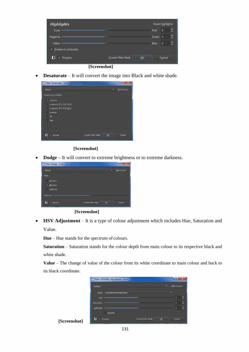
131
[Screenshot]
Desaturate – It will convert the image into Black and white shade.
[Screenshot]
Dodge – It will convert to extreme brightness or to extreme darkness.
[Screenshot]
HSV Adjustment – It is a type of colour adjustment which includes Hue, Saturation and
Value.
Hue – Hue stands for the spectrum of colours.
Saturation – Saturation stands for the colour depth from main colour to its respective black and
white shade.
Value – The change of value of the colour from its white coordinate to main colour and back to
its black coordinate.
[Screenshot]

132
Invert – It will reverse the colour channels of the image hence turning the image into a
negative kind of effect.
Levels – It is used to change the lighting theme of the image.
[Screenshot]
There are three markers for adjustment-
1. Shadows
2. Midtones
3. Highlights
Colour Adjustment Curves– The colours can be adjusted by choosing the Channels
and the curve in the panel.
[Screenshot]
Threshold – It will convert the colour into a Single colour mode where we will have
only black as the key colour with white background. This is done for creating an outline
sketch of an image.
[Screenshot]

133
Masking
Masking is the effect of placing a photo inside a particular shape. It is done using the
help of software‘s like Krita, Photoshop etc. This kind of effects is basically used in
commercially done designs. In this case we see an image wrapped inside a Circle, Rectangle, a
Love shape, Text etc. This adds to the creative design aspect of the designer. This kind of effect
appeals to the consumer or viewer.
Open any Image Editing Software.
Select the Image which you want to warp inside a mask.
Create a mask i.e. Shape, Text, Hand drawn design etc.
[Composition by Author]
- Photo inside a Circle
[Composition by Author]
- Photo inside a Text
There are enormous examples of this kind of masking effects in Leaflets, brochures,
catalogues etc. Any image with a different structure creates a visual appeal in the minds of the
people. They are extraordinary than a rectangle shaped image. It conveys the message of two
things at a same time. One is the Image and the other the shape or text in which the image is
display. Again these masked images are supported by outlines, shadows etc. to create a more
depth effect. It is a composition of effects which makes an image attractive.
Unit Summary
In this Unit you have learnt about the process of converting paper content into a digital
content via scanning. You learnt some of the options related to Camera and resolution. We
came to know about the theory of Image Editing as well as the Practical of some of the image
editing using open source software Krita.
You can also do colour corrections, colour adjustments and masking of an image. These
tips and techniques will help you to use the software effectively. The motive of learning an
image editing software has to be clear before entering into practical. This will help in knowing

134
the applicability of the functions of the software in projects or commercial works.
Assignment
Scan a newspaper advertisement to Computer.
Make your signature in a paper and scan it to Computer.
Take 10 photographs using Digital Camera or Mobile Camera and transfer it to
computer.
Open an Image in Krita and use the Image Editing options. Save each section in a new
file.
Write all the above Assignments in DVD using Nero with the
video output, raw source files of the software used and submit it to the University.
Resources
Digital Image Scanning and Editing Basics
http://scantips.com/
Image Masking http://www.xinapse.com/Manual/masking.html Image
Colour Corrections for Cinemascope view
https://fstoppers.com/education/how-apply-cinematic-color-grading-your-still-images-56538

135
Unit 4 Raster,Vector Graphics & Typography
is intended for people who want to become a Graphic
Introduction
Graphics is being used in each and every segment of work in almost all the industries. It
is not restricted to Design segment only or Computers only. Graphics today are mostly
generated out of Smartphone camera. Smartphone phone cameras come with the resolution of
8x, 12x which is equivalent to a quality of Digital Camera few year ago.
Graphics are categorized into two segments, Raster Graphics and Vector Graphics.
Whenever we see an image or photograph it consists of photographs, shapes, effects etc. All of
the photograph contents are Raster Graphics which are captured using Cameras. The shape
content may be Raster or Vector depending upon the software used for creating of the content.
Typography has grown leaps and bounds in the digital age. Typography is referred to the
style of writing or handwriting of a particular person. People were appreciated for their good,
neat and clean handwriting, but now-a-days handwriting is no more seen as a barrier for people.
All the handwritten matters are replaced by Computer Fonts. There was a time where letter
styling was the property of a manual artist who uses his skill and knowledge of pencil art to
create a design of a text. In digital age, it is called Fonts. Fonts are designed and created by
artist once and it can be used in all the software‘s. Any computer user can create content using
beautiful typographical effect irrespective of his/her handwriting.
Outcomes
Upon completion of this unit you will be able to:
Differentiate between Raster and Vector Graphics.
Describe the use of resolution in a Printing Unit.
Create Vector design using software‘s.
State process of applying Typography via Computer Fonts in creating Designs.
Use software‘s used in creating Raster and Vector Graphics.
Terminology
DPI: Dots per Inch. This is the resolution measuring unit of a Design. The resolution is required
in Scanning an image, Capturing an image from camera, Printing use etc.
Raster Graphics or Bitmap Graphics: An image which is composed of grid and pixels.

136
Vector Graphics: A shape which is created from mathematical calculations.
Typography: The style of representing a text in various design forms.
Font: The word used in Computer for Typography for representing Text.
Raster Graphics
A Raster Graphics is an image made up of rectangular grids which are called pixels in
computer language. Whenever we see an image or any photograph on a digital format it is a
combination of pixels. It is called a Bitmap Image or Bitmap Graphics.
The word Raster is originated from Latin word ―rostrum‖ which means a rake. A
monitor of CRT (Cathode Ray Tube) presents an image each line magnetically which is steered
by an electron beam which is focused.
The pixel contains the position information and the colour information. When all the
information is combined together in a Digital Platform, it generates the image. It is stored in the
format of a Dot Matrix.
The files of Raster graphics format are stored in various formats. Some of the mostly
popularly used formats are BMP, JPG, TGA, TIFF, PNG etc.
A Pictorial example of a Raster Graphics technically can be represented as follows:
[Created by the Author]
Size of the Image:
The measuring unit of a computer screen is pixel. Suppose we taken an image of 400
pixels in width and 300 pixels in height. The total number of pixels used in the file would be
400 x 300 = 12,000 pixels.
Each pixel is identified by its x axis and y axis position. Suppose we take an example of
a point (100,200). It will be identified by its position.
Colour of the Image

137
The colours used in digital format come in two modes. One is RGB Mode - Red, Green
and Blue. The other mode is CMYK – Cyan, Magenta, Yellow and Black.
The RGB mode is used for on-screen presentation formats like Monitor, Television, and
Mobile etc. The CMYK mode is used for printing formats on paper, flex etc. Every colour has
its own RGB and CMYK coordinates. The following image demonstrates a colour coordinate.
[Screenshot]
When we choose a colour blue, we have its RGB coordinates as well as its
corresponding CMYK coordinates.
Resolution
Resolution is a very important factor which determines the quality of the Image. The
Digital cameras and the scanner plays a big role in bring a photograph into digital shape. The
quality of cameras and scanner define the clarity of an image. The resolution of a computer
screen starts from 640 x 480 pixels, 1024 x 768 pixels etc. Likewise all the images require to be
presented in particular pixel format. Some of the examples of pixel sizes used in different
industry formats are as follows:
For Monitor Display 640 x 480 pixels, 800 x 600 pixels, 1024 x
768 pixels etc.
The size of the pixels varies according to the size of the monitor.
For Television
Display
NTSC Format – National Television Standard Committee – 720 x 480
pixels in the display ratio of 16:9.
PAL Format – Phase Alternate Line – 720 x 576 pixels in the display
ratio of 4:3.
HD Format – High Definition -1920 x 1080 Pixels in the display ratio
of 16:9.

138
For Print formats The Resolution plays a vital role in print formats where the pixel size
has to be related with the measuring unit of print (cm, mm, inches) etc.
Resolution for Print for matters which required to be read from near
the eyes like magazine, brochures etc. is 300 pixels/inch.
If we need to print an image matter of 5 inch x 4 inch, then the pixel
size should be (5 x 300 = 1500 pixels) x (4 x 300 = 1200 pixels). The
size of the image captured depends upon camera like 8x, 12 x etc.
Resolution for print of matters which required to be read from a
distance like hoardings, banners etc. is 72 to 100 pixels/inch. If we
need to print an image of 10’ x 6’, then the pixel size should be (10’ x
12 inches x 72 = 8640 pixels) x (6’ x 12 inches x 72 = 5184 pixels).
The resolution for big size printing is less due to the following reasons:
The matters required for a big size print are basically larger in size and are to be viewed
from a distance. The square pixel dots will exist but will not be affecting the person‘s
view because he watches the subject from a distance. But in case of magazines, product
catalogues etc. the person views from nearby the eyes so the less pixel resolution images
get distorted and is clearly displayed as a poor quality image. This does not happen in
case of a hoarding or big banner.
The capacity of a computer system is a hurdle for big pixel sized image. A 10‘ image
with a 300 pixel/inch resolution will result in a size which may hand the computer
system or be very slow in operation. It is practically impossible to do mass work with
300 pixel/inch resolution for huge size prints.
The process of transmitting data from the computer to printer will take more time
according to the size of the file. The time taken for transmitting a 300 pixel/inch file will
be relatively much more than a 72 to 100 pixel/inch file. Even though a designer has
designed a hoarding in a 300 pixel/inch resolution, the flex operator will reduce it to 72
to 100 pixel/inch and process the printing.
The ink consumed in printing for a big resolution file will be also relatively more. So,
for this purpose also the printer reduces the resolution for higher size prints.
Scaling capability as a demerit of Raster Graphics
The only one demerit of Raster Graphics is its inability to scale maintaining the quality
of an Image. Whenever we scale an image beyond its 100% capacity it will get distorted.
However, we have software‘s today which use blur technology to reduce the rectangular patch

139
output which used to occur in older Raster Graphic Editors.
Scalability is an issue when we use images by choice from varieties of images from
internet. Because, in internet we may find an image with the content we like, but the resolution
of the image may not be equal to the size in which we want to fit. In that case, we scale up the
image using software tools which result in distortion up to the extent in which it is scaled.
But, when we know the content we want, then we choose our camera accordingly and
hunt for the images in various places. In that case, we won‘t require scaling because we have
prepared our hardware (camera) according to the content of the software. For example, we need
an image for advertisement in a newspaper of 5 cm x 5 cm. We can capture the image with an
8x camera. But if we want an image to be used in a hoarding of 20‘ x 10‘ then we have to use a
high end camera with a high optical zoom capacity and around 12 to 20 megapixels resolution.
So, scaling is a demerit for only those who use readymade images with low resolution.
Some images may be up to the mark and some may not. But when a designer hires a
professional photographer and conveys his requirement in form of size and quality, then the
image need not be scaled beyond 100%, hence achieving the best content.
Vector Graphics
Vector Graphics is derived out of mathematical calculations. It stores the information in
form of x axis and y axis of the end points or nodes of the shape. Basically, the shape related
contents and text related contents are done using vector software‘s. The end points are termed as
node, point, vertex etc. in different vector software‘s. The end point is supported by handles or
tangents for smoothness purpose.
The following example demonstrates a vector shape:
Line
[Created by the Author]
In vector software, in case of line, it is defined by its starting point and ending point
coordinates. When we create a file in vector software, make and line and save it, it will save the
coordinates of two points. It does not matter about the length of the line. It is automatically
generated when we open the file in the vector software again. This also helps in reducing the
size of the file without reducing the content. This is also called compression of data in terms of
computer language.

140
Rectangle, Polyline
[Created by the Author]
In the same way as of a line, the above shapes are stored in form of its end points. Along
with the end points of a shape, the vector design also stores the properties of the shape such as
stroke colour, fill colour, stroke outline thickness etc.
Smooth lines
[Created by the Author]
The above design in a vector shape is called handles or tangents. It creates the
smoothness of a vector shape without increasing the number of points. In old process, if we
needed a smooth shape then we have to create more nodes or points.
[Created by the Author]
However, when we scale the shape the outline will be displayed as straight lines.
Properties of Vector Graphics
Scalability
The design produced in vector graphics is scalable up to infinite extents without any
distortion. This happens because the end points or curves are stored in the memory. For
instance, if we take a triangle of 5 cm in width and 5 cm in height, it has got 3 end points. If we

141
take a triangle of 20 cm in width and 20 cm in height also, it has also got 3 end points. So size is
not a matter of vector graphics because the in-between gap of end point is instantly generated by
the software as soon as you open the file. Hence, scalability is a very big advantage for
designers. A designer creates a logo in vector graphics because a logo needs to be printed on a
small envelope as well as on a big hoarding. A vector design solves both the purposes.
Minimal Space Consumption
Vector Data is hugely used in Web design world where the memory of the file plays a
big role in fast downloading and uploading of the data. Most of the website today is powered by
Flash content which use Vector graphics for its content. The most important thing is that
quality is not compromised for space reduction. The quality of vector graphics is very much
crystal clear in any size which it is produced.
High Processing Speed
The speed of producing or processing the data is very higher. It happens so due to its
less space consumption. The modifications done to a vector graphic design is property wise i.e.
Move, Rotate, Scale, Stroke Width, Fill colour, Scale colour etc. All these properties are placed
in vector based software in a systematic way which can be changed even at a click at any time
required.
Apart from all its advantages, Vector Graphics cannot be used in Photograph in high
detail. Vector Graphics are only for shape related and text related contents. Images can be
applied in vector graphic software along with vector shapes, but when we zoom into the subject,
the images will get distorted, but the shape is not. So, one has to be clear in vector graphic
software that whatever shapes you create in Vector Graphic software is scalable but the image
pasted into a vector graphic software is not scalable without distortion if it extend beyond its
100% pixel size.
Properties of Vector Design
Outline Shape Outline colour /
Stroke Colour
Stroke Style
Fill Colour Stroke Thickness

142
[Created by the Author]
Software used in Vector Graphics
Vector Graphics in various Industries
Game Industry
Vector Graphics are used for creating Game designs. There are thousands of games done
using Flash Animation and Graphics which use Vector Shapes. Early day Arcade games were
done using Vector Graphics.
Web Design Industry
Animated Flash banners are extensively used in web pages to make the webpage more
lively and attractive. It helps to deliver with less memory and high quality output.
Advertisements on web use flash because it is animated with excellent quality and a moving
information using images give more and effective information than a still text.
Cartoon Industry
Open Source Software Commercial Software
Inkscape – for
Design Vectr – for
Design
CorelDRAW – for
Design Illustrator – for
Design
Synfig Studio – for Animation Adobe Flash – for Animation
Blender – for 3D Autodesk 3ds Max – for 3D

143
All the cartoon animations, cartoon films and cartoon serials are done using vector
graphics. In olden days, each and every frame was hand drawn and painted by the artists, but
today all the work is done using Vector graphic animation software‘s.
3D Industry
All the 3D software‘s are vector graphics. Software‘s like Blender, 3dsMax, Maya etc.
used for creating 3D contents for all purposes are vector based. It combines the vector capability
with 3D space. Art oriented design is now being armed with scientific coding and the artists are
able to create new and attractive heights in design.
Difference between Raster Graphics and Vector Graphics
Raster Graphics Vector Graphics
It is a combination of
rectangular grids or pixels.
It is generated through
mathematical calculation.
Each pixel consists of position
information and colour information.
It consists of node/vertex/point information,
shape properties like stroke colour, fill
colour, stroke width, stroke style etc.
Any photo related subject is a Raster
Graphics
Any shape related subject created using
Vector Graphic Software is Vector Graphics.
Pixels get distorted on enlargement of the
image beyond 100%.
Pixels do not get distorted on enlargement up
to infinity.
The bigger is the size of the image, higher
is the memory.
The memory depends on the curves, not on
the size of the shape.
Typography
Typography is the art of displaying text in a most appealing and attractive manner. It is a
subject of art where different styles of text are developed and used. It includes all the properties
of a text like its size, word spacing, word stretching or squeezing, line spacing, paragraph
spacing etc. Typography is used differently for different purposes like official letters have a
normal look, letters of weddings written on walls are colourful and stylish, letters of
advertisements are presented in a different way. So for every occasion the style of writing is
different.
With the advancement of computer and graphics, fonts were developed which created a
great revolution in the text design category. Thousands of fonts were developed and now a user

144
has to only choose from the varieties available. A normal person need not hire an artist to create
a stylish text. It is available in computer and can be used in almost all the software‘s used.
Typography is derived from Greek work ―typos‖ which means an impression and
―graphia‖ which means writing. The glimpses of varieties of typographical outcomes can be
seen in the following outputs:
Advertisements
Headlines of Magazines
Hoardings
Newspaper articles
Leaflets
Product catalogues
Book Covers
Logo Designs
Grafitti
Motion Pictures
Architectural designs
Old Age Cave
A great typographical design depends upon the choice of layout, pattern of grid, the
combination of colours etc. A creative design can become a good, great or bad design according
to the composition of all the properties of typography
Properties of Typography
Size
The font size is a very important section in typography. The size of a text is given
considering its usage. For example, heading of a book, heading of a chapter, normal body of the
text, text required for poster/hoardings of huge size etc. Point is the basic measuring system
used in all software‘s to measure the size of the font. One point is equal to 1/72 of an inch. Size
is related to the readability of a subject either from a nearby or far distance.
Leading
The distance between two lines is called leading. The distance between lines make the
text look more readable and resemble a neat outlook. In the old days when text was done using
metal typesetting, lead strips were used for separate one line from the other. Hence, it is termed

145
This is a TEXT BOX. I can
place it anywhere.
Th
as leading. As per standards, the distance between two lines should be somewhere between 1.25
to 1.50 times of the size of the text.
Tracking and Kerning
Kerning is the use of space between two alphabets. There are certain alphabets like ―A‖
and ―V‖. When these two alphabets are placed one after another (AV) in any word then the
adjacent lines should remain parallel for a smooth flow of the writing. In these types of cases,
kerning is used. Tracking is used at a place where the spacing between two characters is exactly
same whatever may be shape of the alphabet.
Text Box
Text Boxes are used for perfect placement of the letters according to our required place.
In software‘s like MS Word, the letters or words are typed one after another. This text box helps
to insert text in between a blank space at our convenience. The text used in the box may be of
same font as other or may vary also as per our requirement.
Hierarchy and Scale
When we prepare a document, there are cases where we have a heading and lots of sub
headings under each category. This is distinguished by a hierarchy of scale where the top title
resembles a higher size and the sub titles go on decreasing in size till the body of the text. This
gives a decent view to the reader to distinguish the main points from each other.
ASIA
INDIA
ODISHA
BHUBANESWAR
Dropcap
is type of typographical setting is used in Newspaper articles. In this case, the first or
two alphabets or a word in the beginning resembles a big giant size which is followed by the
normal text. These are the designs used as a signature style for different type of textual works.

146
B – Bold, I- Italic, U-Underline
These three form the basics of computer fonts in all the software‘s ranging from an
ordinary WordPad to the latest version of Microsoft Office. A particular set of words can be
selected individually and can be assigned Bold, Italic or Underline or any of the combination
together. They are like button switches, which activates on one click on it and again deactivates
on the other click as desired by the user.
Glyphs
Glyphs are the symbolic representation of a font. Now-a-days font is not limited to
alphabets, numbers and symbols. Fonts are used to demonstrate shape, designs, symbols and
vector shapes as well. There are font categories of webding, winding 1, winding 2 etc. where we
see designs in place of text. Glyphs represent the building block of text. Even an alphabet is a
shape if it is not viewed as an alphabet. So if a shape can represent an alphabet then it can
represent any type of vector shape or symbol also. So letters, shapes and symbols used in a font
are uniquely termed as Glyphs.
Alignment
Alignment is the basic of a document. The Alignment comprises of Horizontal Category
of Left, Center, The example of alignment in a document is as follows:
Alignment Left Alignment Center Alignment Right
This is for your kind
information we are
studying the unit of
Odisha State Open
University. This head
office of the
University is located
in Sambalpur.
This is for your kind
information we are
studying the unit of
Odisha State Open
University. This head
office of the
University is located
in Sambalpur.
This is for your
kind information we
are studying the unit
of Odisha State
Open University.
This head
office of the
University is located
in
Sambalpur.
Alignment Justify
This is for your kind information we are studying the unit of
Odisha State Open University. This head office of the University
is located in Sambalpur.

147
The Vertical Alignment comprises of Top, Vertical Center and Bottom.
Vertical Top Vertical Center Vertical Bottom
I AM IN THE TOP
I AM IN THE
CENTER
I AM IN THE
BOTTOM
Margins
Whenever we create a document we have the decency to leave margins from top,
bottom, left and right. The blank spacing has to be determined and judged by the user depending
upon the subject he/she is writing upon.
Apart from the above, there are lots of min aspects about typography which keeps
adding on and making fonts more and more attractive. The features of typography are an art
combined with science. And the combination of art and science has always created wonderful
results.
Steps of Creating Typography
Creating a Rough Imagination
[Created by the Author]
The first step is the creativity. One has to roughly think of a writing style on a piece of
paper. Lots of brainstorming has to be made to look the design attractive.
Technical drawing of Typography
After the first imaginary step, the next level is to create margins or guidelines to prepare
the text. It can be of any form. When we were kids, we had a handwriting copy with margins.
This helped us to learn handwriting and write with correct proportions. In the same way a new
typography or font requires guidelines to draw.

148
[Created by the Author]
In the above image, the extension of ―g‖ required an extra support in the bottom. This
happens in case of ―y‖, ―p‖, ―q‖, etc. Hence a detailed plan has to be made to bring the imagined
typography into perfect and accurate reality.
Vectorisation in Vector Software
The handmade design is scanned and taken into vector software and the outlines are
traced to form a final neat and clean output.
[Created by the Author]
Unit summary
In this Unit we have learnt about the differentiation between Raster Graphics and
Vector Graphics. We came to know the place where we have to use Raster Graphics and where
we have to use Vector. We also learnt about the available software‘s in the market to learn
Raster and Vector Graphics. We learnt about the features of Typography and the process
to create a new typography style.
Assignment
Create your own font with your name as the design style in the steps as mentioned
manually. For e.g. Rajesh, Rajesh etc.
Write all the above Assignments in DVD using Nero with the
video output, raw source files of the software used and submit it to the University.
Assessment
Name the three Raster Graphic software‘s.
List three Vector Graphic Software‘s.
Differentiate between Raster and Vector Graphics in a multiple table format.
Write down 3 formats to store a Bitmap graphics.
Resources
Raster Graphics
https://en.wikipedia.org/wiki/Raster_graphics

149
https://www.techopedia.com/definition/9098/raster-graphics
Vector Graphics
https://en.wikipedia.org/wiki/Vector_graphics
http://searchwindevelopment.techtarget.com/definition/vector- graphics
Typography
https://en.wikipedia.org/wiki/Typography
http://www.creativebloq.com/typography/what-is-typography- 123652

150
DMA-02
Digital Imaging Block – III: Image Development on different Graphic software
.
151
Unit-1 Introduction to Krita
is intended for people who want to get their hands on
Introduction
Open source software‘s mean the software‘s which are developed by a group of software
developers and provide for free on the internet. Anyone can download the software from the
internet and use it without paying. It has got all the capabilities and options of professional
software which makes it very much useful to the user. In today‘s life designing and image
editing has become a requirement for each and every person. Everyone wants to make their own
design whether it is a book cover design, a profile design for their social networking sites, a
greeting card design and so on. People want to create their own custom oriented designs.
Krita is open source software which is used for Image Editing. It is very easy software
for learners to download and learn. In this unit you will learn about this open source software,
which is Image Editing software.
Outcomes
Upon completion of this unit you will be able to:
Use the tools and techniques of Krita software.
Identify the Menu Bar options of Krita.
Create designs using Krita.
Terminology
Krita: Open source software for Image Editing.
Interface: The look or design of software in which the tools and features are arranged in a
systematic manner.
Menu bar: Top most panel of any software where we have File, Edit, etc.
Shortcut Keys: The keys used to execute commands.
Use of Krita
Krita can be used for creating almost all types of designs. It is the choice of the user to
design in Krita or in any other software. It is the user friendly interface and ease in using the
tools which attracts the person towards the software. Krita can be used for the following
purposes categorically:
Image Processing

152
Mixing Photographs
Retouching & Cleaning Old and Damaged Photographs
Converting Black & White Photo to Colour
Design
Digital Painting
Cover Design
Banners
Logo Design
Leaflets and Brochures
Stickers
Card Design
Visiting Card
Identity Card
There are unlimited types of designs which can be made using Krita. It is the creativity
and idea of the user on how to use the software.
Job Prospects after learning Krita
There are lots of Job Prospects after learning designing in Krita. These are the following
categories and Places where different types of designing are done:
Advertising Agencies
Textile DesigningAgencies
Illustration / Book / Magazine PublishingIndustries
Designing for Webpage Interfaces
Designing for Software Interfaces
Practice the Practical tools point wise as mentioned.
Tools of Krita
Freehand Brush Tool [Shortcut – B]
File – New

153
Screenshot
Image Size – Predefined – A4 Size (300 ppi (pixels per inch))
Choose the Freehand Brush Tool
Left Click and Drag on the Screen roughly
Change the colour.
Change the Upper Colour for drawing with that colour on the screen.
Left Click and Drag on the Screen
Change the Brush Shape and Size
Click on Edit Brush Setting
Screenshot
Select from the pre-defined Brush as above.
Edit Brush Settings

154
[Screenshot]
Change the options one by one and create a trial on the white screen which is on the
right hand side.
After choosing the right kind of brush and being satisfied that it is the brush you want
for a particular type of effect, click outside and starting drawing on your main board.
Brush Engines
Select this in default settings of brushes.
Choose the Brush
Left Click and drag on the screen.
Choose the Brush
Left Click and Drag on the screen
Choose the Brush

155
Left Click and Drag on the screen
Choose the Brush
Left Click and Drag on the screen
Choose the Brush
Left Click and Drag on the screen
Choose the Brush
Left Click and Drag on the screen

156
Choose the Brush
Left Click and Drag on the screen
Choose the Brush
Left Click and Drag on the screen
Choose the Brush
Left Click and Drag on the screen
Choose the Brush
Left Click and Drag on the screen

157
Choose the Brush
Left Click and Drag on the screen
Choose the Brush
Left Click and Drag on the screen
Clone Stamp is used to clean damaged portions of a photograph, cleaning of patches on
the faces etc.
Open a Photo with patches on face.
[Screenshot]
Hold Ctrl and Click on a Good Place
Click and Drag on the affected area.
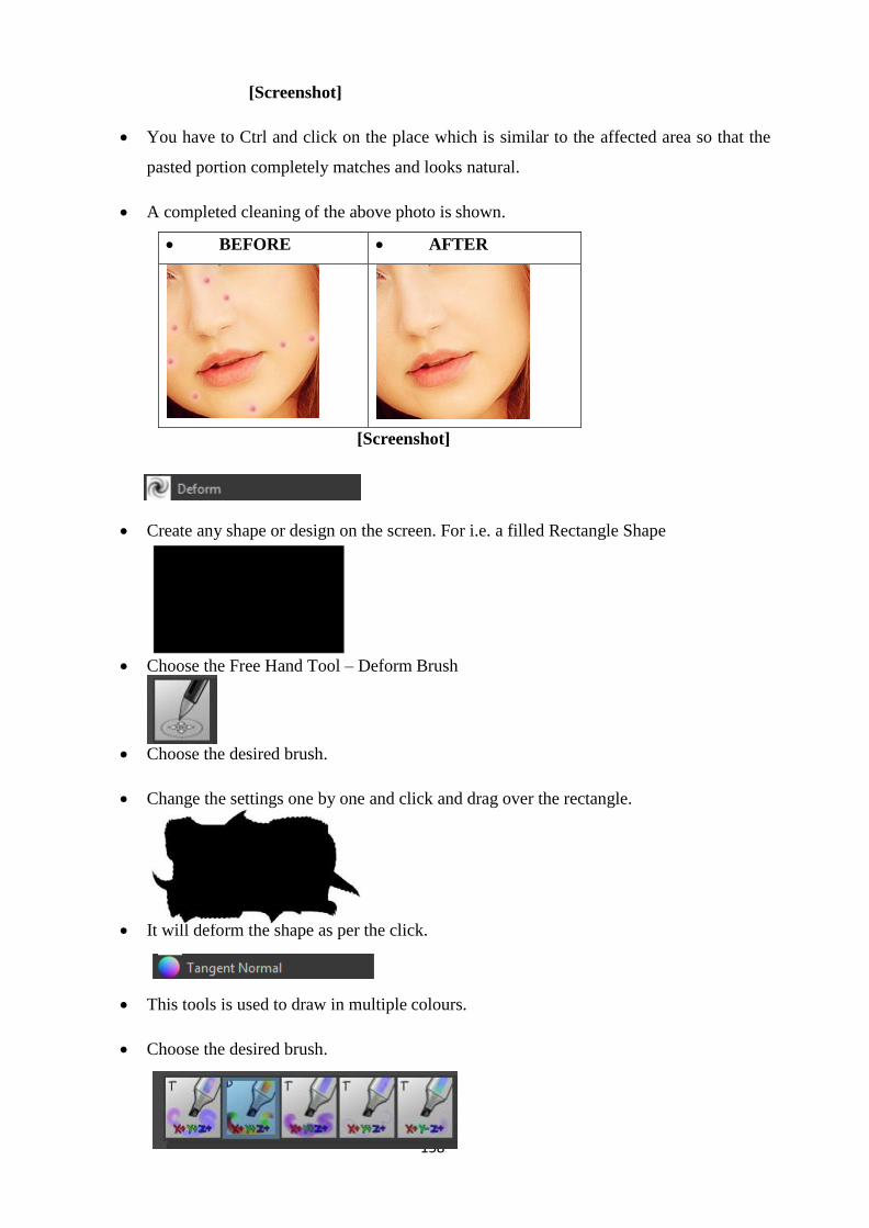
158
[Screenshot]
You have to Ctrl and click on the place which is similar to the affected area so that the
pasted portion completely matches and looks natural.
A completed cleaning of the above photo is shown.
BEFORE AFTER
[Screenshot]
Create any shape or design on the screen. For i.e. a filled Rectangle Shape
Choose the Free Hand Tool – Deform Brush
Choose the desired brush.
Change the settings one by one and click and drag over the rectangle.
It will deform the shape as per the click.
This tools is used to draw in multiple colours.
Choose the desired brush.
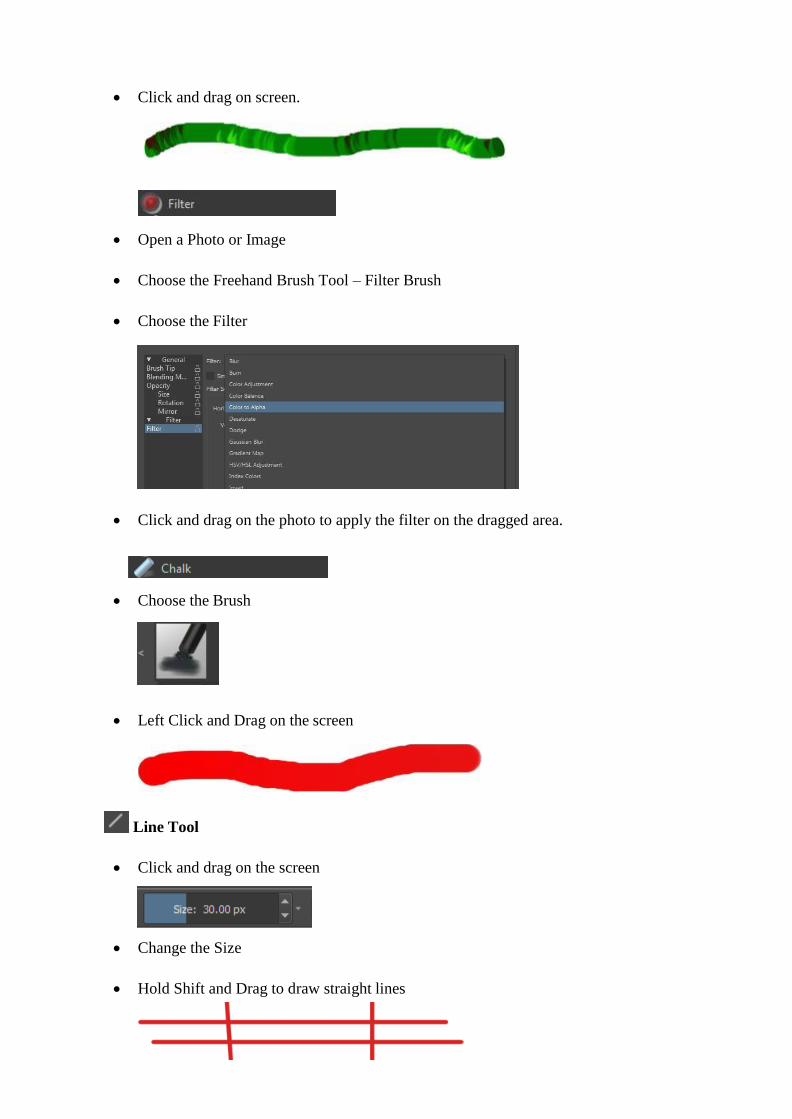
159
Click and drag on screen.
Open a Photo or Image
Choose the Freehand Brush Tool – Filter Brush
Choose the Filter
Click and drag on the photo to apply the filter on the dragged area.
Choose the Brush
Left Click and Drag on the screen
Line Tool
Click and drag on the screen
Change the Size
Hold Shift and Drag to draw straight lines

160
Rectangle Tool
Click and drag on the screen
Click and drag on the screen + Hold Shift to draw perfect squares.
Choose from the Tool Options to define Fill and Outline properties.
Ellipse Tool
Click and drag on the screen
Click and drag on the screen + Hold Shift to draw perfect circle.
Polygon Tool
Left click on the screen on the required end points of the polygon.
Hold Shift + Click to end the polygon
Polyline Tool
Left click on the screen on the required end points of the polyline.
Double click to end the Polyline

161
Bezier Curve Tool
Left click on the screen on the required end points of the Bezier Curve.
Left click and drag to create a smooth edge
Double click to end the Bezier Curve
Freehand Path Tool
Left click and drag on the screen as a freehand paint tool.
Dynamic Brush Tool
Tool Options – Increase the Mass to 0.10
Click and Drag on the screen
Multi Brush Tool
Choose from the Tool options
[Screenshot]
Click and Drag on screen

162
If you draw once, it will create 4 symmetrical copies
Transform a Layer Tool
File – Open – Open a Photo
Rectangular Selection Tool
Title: Globe
Attribution: qimono (User name as per pixabay)
Source: Pixabay
Link: https://pixabay.com/en/globe-world-earth-planet-1339833/
Select a portion of the photo
File – New – A4 Size
Edit – Paste
Transform a Layer Tool
Tool Options
Click and Drag from the corners to adjust the image
Change the Tool Options as required.

163
Position Settings
Rotation Settings
Scale Settings Shear Settings
Mirror Vertical, Mirror,
Horizontal, Rotate 90 degree
CW, Rotate 90 degree CCW
Move Tool
File – Open – Open a Photo
Rectangular Selection Tool

164
Select a portion of the photo
File – New – A4 Size
Edit – Paste
Move Tool
Move and Place at the required place.
Copy and 4 different images from different files in a single file.
Tool Options
Move Current Layer – It will move the layer which is selected in the layer list.
Move layer with content – It will automatically select the layer when the image on the
layer is clicked on the drawing screen. We can select any image and move without going
to the layer box to select the layer.
Move the whole group – It will select the total group of the layer selected if any.
Crop Tool
File – Open
Title: Building
Attribution: Mabelamber (User name as per pixabay) Source: Pixabay
Link: https://pixabay.com/en/canal-building-boat-city-amsterdam- 3047927/

165
Crop Tool
Click and drag on the area you want to keep.
Press Enter
It will crop the selected area and delete the remaining part of the image.
Gradient Tool
File – New – A4 Size
Gradient Tool
Choose the Gradient Style –
Click on ―Edit‖-
[Screenshot]
Click on the Marker, Change the Colour

166
Click in between to Add Marker
Right click on the marker to delete.
Change the opacity as required.
Tool Options
[Screenshot]
Change the Shape
Colour Selector Tool
File – Open
Choose the Colour Selector Tool
Click on any colour on the screen.
The colour will get selected.
Fill Tool
File – New – A4 Size
Rectangular Selection Tool
Select an area
Fill Tool
Choose the colour
Click on the selected area
The selected area will fill with the selected colour.
Assistant Tool
It is used as an Assistant while drawing to know the straight line, perspective, guidelines

167
etc.
Tool Options
Choose the type of assistant needed.
[Screenshot]
Click and drag on screen
The displayed design will not appear in the printout. It is for reference purpose only.
Measure Tool
It is used to Measure the distance and angle.
Click and drag on the screen
[Screenshot]
The output will be displayed in the Tool options.

168
[Screenshot]
Selection Tools
Selection Tools are used to select a particular area for the purpose of copying, deleting,
filling with colour and moving.
Rectangular Selection Tool
File – New – A4 Size
Select an Area
Shift + Backspace – Fill with Foreground colour
Elliptical Selection Tool
File – New – A4 Size
Select an Area
Shift + Backspace – Fill with Foreground colour
Polygon Selection Tool

169
File – New – A4 Size
Select an Area
Shift + Backspace – Fill with Foreground colour
Outline Selection Tool
File – New – A4 Size
Select an Area
Shift + Backspace – Fill with Foreground colour
Contiguous Selection Tool
File – Open an Image with a flat colour in the
background.
Title: Parrot
Attribution: christels (User name as per pixabay)
Source: Pixabay, Link:https://pixabay.com/en/parrot-blue-macaw-fly-bird-wing-2796766/

170
Contiguous Selection Tool
Click on the Blue Colour
It will select the Blue colours all over
Select Menu – Invert Selection
Edit – Copy
File – New – A4 Size
Edit - Paste
Similar Colour Selection Tool
It will select the similar colours on the screen
Bezier Curve Selection Tool
File – New – A4 Size
Select an Area
Shift + Backspace – Fill with Foreground colour
Selection Tool Options
Addition

171
File – New – A4 Size
Rectangular Selection Tool
Click and drag on screen
Elliptical Selection Tool
Tool Options – Addition
Click and Drag on screen
Subtraction
File – New – A4 Size
Rectangular Selection Tool
Click and drag on screen
Elliptical Selection Tool
Tool Options – Subtraction
Click and Drag on screen
Intersection
File – New – A4 Size
Rectangular Selection Tool
Click and drag on screen
Elliptical Selection Tool
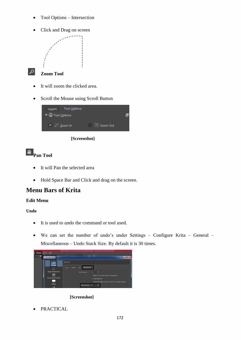
172
Tool Options – Intersection
Click and Drag on screen
Zoom Tool
It will zoom the clicked area.
Scroll the Mouse using Scroll Button
[Screenshot]
Pan Tool
It will Pan the selected area
Hold Space Bar and Click and drag on the screen.
Menu Bars of Krita
Edit Menu
Undo
It is used to undo the command or tool used.
We can set the number of undo‘s under Settings – Configure Krita – General –
Miscellaneous – Undo Stack Size. By default it is 30 times.
[Screenshot]
PRACTICAL

173
File – New – A4 Size
Choose a Brush tool
Click and Drag on the screen 30 times.
Edit – Undo (Ctrl + Z is the shortcut of Undo)
Redo
Once the Edit – Undo is done, you can use the Redo immediately to cancel the Undo. It
has to be used immediately after doing the Undo. If you do some other work after Undo,
then the Redo won‘t work.
PRACTICAL
File – New – A4 Size
Choose the Brush Tool
Click and Drag on the Screen One time.
Edit – Undo [The subject drawn will get erased]
Edit – Redo [It will bring back the erased subject]
It will work on most of the tools and commands.
Cut Command – Paste Command
File – Open a Photo
Choose any Selection Tool. For i.e. Rectangular Selection Tool
Select an area.
Edit – Cut [ It will delete the selected area ]
File – Open Another File
Edit – Paste [ It will paste the cut area here ]
File – New – A4 size
Edit – Paste [ We can paste the cut subject anywhere and as many times as we want ]

174
Copy Command – Paste Command
File – Open a Photo
Choose any Selection Tool. For i.e. Rectangular Selection Tool
Select an area.
Edit – Copy [ It will copy the selected area ]
File – Open Another File
Edit – Paste [ It will paste the cut area here ]
File – New – A4 size
Edit – Paste [ We can paste the cut subject anywhere and as many times as we want ]
Cut (Sharp) – The Process is same as Cut, but the edges will be sharp.
Copy (Sharp) – The Process is same as Copy, but the edges will be sharp.
Copy Merged Command – Paste Command
File – New – A4 Size
Create a Filled Rectangle.
New Layer
Create another Filled Rectangle.
New Layer
Create a Filled Circle.
New Layer
Create another Filled Circle.
Rectangular Selection Tool
Select an area covering all the shapes.

175
Edit – Copy Merged
File – New – A4 size
Edit – Paste
It will paste all the shapes in a single layer.
This process is applicable for photos in different layers also.
Paste into New Image
File – Open a Photo
Rectangular Selection Tool
Select an area
Edit – Copy
Edit – Paste into New Image
It will paste the copied section into a New file.
Clear
File – Open a Photo
Rectangular Selection Tool
Select an Area
Edit – Clear
It will delete the selected area.
Fill with foreground colour
File – New – A4 Size
Choose the Foreground Colour

176
Rectangular Selection Tool
Select an Area
Edit - Fill with Foreground colour [Shift + Backspace]
Fill with background colour
File – New – A4 Size
Choose the Foreground Colour
Rectangular Selection Tool
Select an Area
Edit - Fill with Background colour [Backspace]
Fill with Pattern
File – New – A4 Size
Choose the Pattern
[Screenshot]

177
Rectangular Selection Tool
Select an Area
Edit - Fill with Pattern
Stroke Selected Shapes
File – New – A4 size
New Layer - Vector Layer
Create a Rectangle Shape.
Click and Drag on screen
Choose the Path Editing Tool
Click on the Rectangle
Edit – Stroke Selected Shapes
It will create a new layer with the border of the shape.
Stroke Selection
File – New – A4 Size
Rectangular Selection Tool

178
Select an Area
- Shape Manipulation Tool
Tool Options – Choose the type of stroke wanted.
[Screenshot]
Edit – Stroke Selection
[Screenshot]
View Menu
Show Canvas Only [Tab]
It will show the Canvas only in Full View
Full Screen Mode
It will show the Canvas in Full Screen view without any options
Wrap Around Mode
It will continue the subject area like a Tile all around the screen
Instant Preview Mode
It will decrease the memory of high resolution images for the smooth functioning of the
software.
Soft Proofing

179
It is the software setting for soft display of the output.
Out of Gamut Warning
It is the software settings to display warning about the colour contents of the image.
Canvas
Mirror View- It will Mirror the Canvas.
Reset Zoom- It will reset the Zoom to 100%.
Rotate Canvas Right- It will Rotate Canvas to Right by a few degrees.
Rotate Canvas Left- It will Rotate Canvas to Left by a few degrees.
Reset Canvas Rotation- It will Rest the Canvas to its default angle i.e. straight canvas.
Zoom In-It will Zoom in the Canvas.
Zoom Out-It will Zoom out the Canvas.
Show Rulers- It will Show the Rulers on the Screen
Show Guide-
It will Show the Guides drawn on the Screen.
File – New – A4 size.
View Menu – Show Rulers On.
Click and drag from inside the Ruler to draw a Guide.
Lock Guide
It will lock the guide which is created.
Show Status Bar
Status Bar is the Bar which is shown at the bottom which highlights some tips about the
tool or option selected.
Show Grid-It will show grid on the screen.
Snap to-While using the Tools and Option it will automatically get snapped or attracted towards the
following if selected.
Guides, Grid, Orthogonal, Node, Extension, Intersection, Bounding Box, Image Bounds, Image Center
Show Painting Assistants

180
It will show Painting Assistants while drawing which was set using the Assistant Tool
Show Assistant Previews
It will display the Assistant Preview on the screen when created.
Image Menu
Properties
It will display the properties of the opened and selected file.
[Screenshot]
Image Background colour and Transparency
The image background colour and the Transparency (Alpha) can be set
[Screenshot]
Convert Image Colour Space
The colour settings of the current file can be changed.

181
[Screenshot]
Trim to Image Size
It will Trim all the layers to the Image Size.
It will delete all the image areas of the layer outside the Image Size.
It will help in reduction of the file size.
Trim to Current Layer
It will Trim the Image to the Size of the contents of the current layer.
Trim to selection
File – Open – Open an Image
Rectangular Selection Tool
Select an area
Image – Trim to Selection
It will crop the image to the selected area.
Rotate
File – Open – Open an Image.
Image – Rotate – [Try the four options as mentioned]

182
[Screenshot]
Rotate Image
Rotate 90 degree to the Right
Input - Output -
Title: Building
Attribution: bogitw (User name as per pixabay)
Source: Pixabay
Link:https://pixabay.com/en/architecture-city-panorama-old- 3052486/
Rotate 90 degree to the Left
Input – Output -
Rotate Image 180 degrees

183
Input- Output -
Output - Shear Image
File – Open an Image
Image – Shear Image
[Screenshot]
Mirror Image Horizontally
It will create a Mirror of the image Horizontally.
Input -
Output –
Mirror Image Vertically
It will create a Mirror of the image Vertically.
Input –

184
Output –
Scale Image to New Size
File – Open an Image
Image – Scale Image to New Size
It will resize the Image according to the dimensions specified by the user.
[Screenshot]
Offset Image
File – Open an Image
Image – Offset Image
[Screenshot]
It will offset the image by the numbers specified by the user.
Resize Canvas

185
File – Open an Image
Image – Resize Canvas
[Screenshot]
It will resize the canvas according to the dimension specified by the user.
Layer Menu
Cut Layer – Paste Layer
File – Open an Image
Layer – Cut Layer
File – New – A4 size
Layer – Paste Layer
Copy Layer – Paste Layer
File – Open an Image
Layer – Copy Layer
File – New – A4 Size
Layer – Paste Layer
New
Paint Layer
File – Open an Image
Layer – New – Paint Layer
It will create a new Paint layer
New Layer From Visible
File – Open an Image.

186
Layer – New – New Layer From Visible.
It will create a new layer from the visible layer.
Duplicate Layer or Mask
File – Open an Image.
Layer – New – Duplicate Layer or Mask.
It will create a duplicate layer of the selected layer.
Cut Selection to New Layer
File – Open an Image
Rectangular Selection Tool
Select an area
Layer – New – Cut Selection to New Layer
It will cut the selection from current layer to New layer
Copy Selection to New Layer
File – Open an Image
Rectangular Selection Tool
Select an area

187
Layer – New – Copy Selection to New Layer
It will copy the selection from current layer to New layer
Select
All Layers-It will select all the layers in the file.
Visible Layers -It will select all the Visible Layers in the file. Invisible
Layers-It will select all the Invisible Layers in the file. Locked Layers -It
will select all the Locked Layers in the file. Unlocked Layers-It will select
all the unlocked layers in the file.
Group-
Quick Group
File – New – A4 Size
Create a filled rectangle
New Layer
Create a filled rectangle again
New Layer
Create a filled Ellipse again
New Layer
Create another filled Ellipse
[Screenshot]
Select all the Layers. Click on Layer 6
Hold Shift and Click on Layer 2.
It will select all the layers.
Layer – Group – Quick Group
Quick Clipping Group

188
File – New File – A4 Size
New Layer
Create a filled Ellipse [It is the mask which is created first]
Layer – Group – Quick Clipping Mask
[Screenshot]
Create the Shapes. It will be drawn inside the shape mask only.
[Screenshot]
Quick Ungroup
It will ungroup the selected Group.
Transform
Mirror Layer Horizontally
Mirror Layer Vertically
Scale Layer to new Size
Rotate
Rotate Layer
Rotate 90 degree to the Right
Rotate 90 degree to the Left
Rotate Image 180degrees
Shear Layer
Offset Layer
File – New – A4 Size
New Layer
Create a filled rectangle or any
shape or an Image
Layer – Transform [Use the
options in the left hand side one by
one]

189
Split
Split Layer
File – Open an Image with flat vector colours from Internet.
Title: Bee Fun
Attribution: jambulboy (User name as per pixabay)
Source: Pixabay
Link: https://pixabay.com/en/bee-fun-funny-cute-smile-2519766/
Layer – Split – Split Layer
[Screenshot]
The layer is split according to the colours automatically according to the settings.
Screenshot

190
Clones Array
File – New – A4 Size
New Layer
Create a Filled Rectangle
Layer – Split – Clones Array
[Screenshot]
Apply
Merge with Layer Below
File – New – A4 Size
New Layer
Create a Filled Rectangle
New Layer
Create a Filled Ellipse
Select both the layers
Layer – Merge with Layer Below
Flatten Layer
File – New – A4 Size
New Vector Layer
Create a design with Bezier Tool
Select the layer
Layer – Flatten layer

191
Rasterize Layer
File – New – A4 Size
New Vector Layer
Create a design with Bezier Tool
Select the layer
Layer – Rasterize Layer
Flatten Image
File – New – A4 Size
New Layer
Create a Filled Rectangle
New Layer
Create a Filled Ellipse
Layer – Flatten Image
It will merge all the layers into one layer.
Layer Style
File – New – A4 size
Create a New Layer
Create a filled rectangle
Layer – Layer Style
[Screenshot]
Practice the options one by one-
o Drop Shadow
o Inner Shadow

192
o Outer Glow
o Inner Glow
o Bevel and Emboss
o Contour
o Texture
o Satin
o Colour Overlay
o Gradient Overlay
o Pattern Overlay
o Stroke
Select Menu
Select All- It will select the whole image.
Deselect- It will deselect the selected image.
Reselect- It will again reselect the deselected image.
Invert Selection- It will select the opposite selection of the selected image.
Convert to Shape
File – New – A4 Size
Rectangle Selection Tool
Select an area
Selection – Convert to Shape
Display Selection- It will display the Selection
Show Global Selection Mask- It will display the Global Selection mask if any.
Scale
File – New – A4 Size
Rectangle Selection Tool
Select an area
Selection – Scale

193
[Screenshot]
Select from Colour Range
File – Open an Image
Select – Select from Colour Range
It will select all the colours in the file of similar range.
Feather Selection
File – New – A4 Size
Rectangle Selection Tool
Select an area
Select – Feather Selection. [It will feather and fade the edges]
[Screenshot]
Edit – Fill with Foreground colour.
Grow Selection
File – New – A4 Size
Rectangle Selection Tool
Select an area
Selection – Grow Selection

194
[Screenshot]
Shrink Selection
File – New – A4 Size
Rectangle Selection Tool
Select an area
Selection – Shrink Selection
[Screenshot]
Border Selection
File – New – A4 Size
Rectangle Selection Tool
Select an area
Selection – Border Selection
Smooth
File – New – A4 Size

195
Rectangle Selection Tool
Select an area
Select – Smooth
Filter Menu
File – Open an Image
[Screenshot]
Filter Menu – Try all the filters one by one as specified in the software.
[Screenshot]
Summary
In this Unit we have described about the tools and features of Krita. After using the
tools and menu bar options you can create designs according to requirement. In the
practical world of design, only a few percent of the options of software is used extensively
and a major portion of tools and options are used occasionally on requirement only.
Assignments
Practice all the tools taught in the Unit and save each and every file.
Write (Process of copying the softcopy into CD/DVD) all the above Assignments in
DVD using Nero software with the video output, raw source files of the software used

196
and submit it to the University.
Assessment
Krita is an source software used for .
Write down any three categories of Image Processing.
Write down any five categories of Design works.
Write down any five job prospects after learning Krita.
Which tool is used for cleaning spots on a face?
What is transparency called in Krita?
Resources
Krita Learning Tutorials
https://docs.krita.org/Category:Getting_Started
https://dev.krita.org/en/learn/tutorials/
http://white-heron.deviantart.com/art/Krita-tutorial-Basics- 325962811
http://www.davidrevoy.com/article185/tutorial-getting-started- with-krita-1-3-bw-portrait

197
Unit 2 Familiarization to Inkscape
Introduction
Learning to create a design goes through the process of Digital Technology and the
software‘s related with it. If you want to be a good designer you have to effectively use the tools
and techniques provided by the software. Now-a-days software‘s have lots of in-built
capabilities which make the manual work easier and perfect. Options like Alignment, Colour
settings, Geometrical shapes etc. are already there in the software which we can use at a single
click. These works used to take lots of time and gives stress to the designer for bringing
perfection when done manually. It was an Art when the design was done manually, but when it
comes to the digital, the same thing becomes a Science.
Inkscape is an open source Vector based software used for designing. It has got almost
all the capabilities of commercial software available in the market. With the knowledge of
Inkscape one can create visiting cards, posters, hoardings, advertisement materials, books cover
designs etc.
After learning the Inkscape, digital software, the designer has a variety of choices he can
use to immediately create outputs and choose the best out of them. Human being has to just
have the knowledge of using software‘s to create Designs.
Outcomes
Upon completion of this unit you will be able to:
Use the tools of Inkscape.
Create designs using the tools and menus.
Select the import and export options of the software.
Terminology
Vector: Vector designs are created using software‘s which has the capability to expand without
any pixel distortion.
Import: If we want to bring some design made in different software‘s together in single
software, we need to Import the file if the format of the file is supported.
Export: If we want that the file which we are currently working to be used in some other
software, then we have to Export the file in the format

198
supported by other software‘s.
A Brief History of Designing
Tools of Inkscape
Select and Transform Objects
Create a Rectangle
Choose the tool
Click on the corners named ―A‖ for uniform scaling from all sides.
Click on the corners named ―B‖ for non-uniform scaling from all sides.
Click on the Rectangle again. The corner adjustment symbols will change as follows.
Click on the corners named ―C‖ for Rotation of the subject
Click on the corners named ―D‖ for skewing the subject.
Moving the Object – Click from the middle of the shape and move the object.

199
Edit Path by Nodes
Choose the tool ‖Draw Bezier curves & Straight lines‖
Create a curve drawing with 5 to 6 nodes (or clicks)
Choose the tool -
Click on the square points to move the nodes
Click on the tangent to adjust the smoothness of the curve
Insert new nodes into selected segments
Select two or three nodes in between by click and drag over the nodes.
Click on
Output will be as follows
Delete Selected Nodes
Select the nodes you want to delete
Click on
Join Selected Nodes
Select two or three nodes in between
Click on

200
The selected nodes will join together in their selected center
Break path at selected Nodes
Select a single node in between
Click on
Click outside
Click on the node and move
You will find two nodes one over the other which are broken
Move and place as required
Join Selected end nodes with a new segment
Select two open end point nodes.
Click on
Output will be as follows
Delete segment between two non-end point nodes
Select two non end point nodes

201
Click on
Output will be as follows
Make selected nodes corner
Select nodes with smooth corner
Click on
Make selected nodes smooth
Select nodes with pointed corners
Click on
Make selected nodes symmetric
Select some smooth nodes
Click on
The selected handles or tangents of the nodes will get symmetric.
Make Selected Nodes Auto smooth
Select node or nodes in between

202
Click on
The selected nodes will become smooth as per the default settings of the PC
Make Selected Segments Lines
Select node or nodes in between
Click on
The Selected segments in between the nodes will become straight lines
Make Selected Segments Curves
Select node or nodes in between
Click on
The Selected segments in between the nodes will become curves
Convert Selected object to path
Create a Rectangle using Rectangle tool
Click on
Move the nodes as required
You can use Circle Tool, Polygon tool etc. in this option to move their individual nodes
as per your requirement.
Convert Selected object stroke to path
Create a rectangle with stroke thickness of 20
Click on

203
You will get nodes all over the rectangle as a fill identity instead of stroke identity.
Select node or nodes.
Change the position coordinates of x and y in the box.
The nodes will move as per the coordinates.
Tweak Objects by sculpting or painting
Create any shape using any tool
Choose
Change the settings of the tool one by one and click and drag on the screen over the
shape
It is the width of the tool which will affect the brush area only.
It is the force of the brush which will drag the shape to the pixels as
described in the force.
Use the pressure of the input device to alter the force of tweak action.
Mode:
Move Objects in any direction.
Move Objects towards cursor, with shift from cursor
Move objects in random directions
Shrink objects, with shift enlarge
Rotate objects, with shift counter clock wise

204
Duplicate objects, with shift delete
Push parts of paths in any direction
Shrink (inset) parts of path, with shift grow (outset)
Attract parts of paths towards cursor, with shift from cursor
Roughen parts of the paths
Paints the tools colour upon selected object
Jitter the colours of selected objects
Blur selected objects more, with Shift, blur less
Fidelity is the level of blur.
It is the colour channels
Zoom In or Zoom Out
Create a New File
Draw shapes all over the screen
[Screenshot]
Practice the zoom options one by one. The name of the zoom options itself describes the
output. The shortcut of the tool is mentioned in square brackets.

205
Zoom in [ + ]
Zoom out [ - ]
Zoom to 1:1 [ 1 ]
Zoom to 1:2 [ 2 ]
Zoom to 2:1
Zoom to fit selection in window [ 3 ]
Zoom to fit drawings in window [ 4 ]
Zoom to fit page in window [ 5 ]
Zoom to fit page width in window [ 6 ]
Preview Zoom (from the history of zooms) [ ` ]
Next Zoom (from the history of zooms) [ Shift + ` ]
Measurement Tool
Click and drag on the screen
It is used to measure distance while drawing
This is a temporary scale and is for information only
The design and text shown will vanish after the tool is deselected
It will not appear in printout
For visibility purpose the font size may be increased or decreased as per self-
convenience.
If the measurement line passes over object will also show the measure of its segments.
[Screenshot]

206
Create Rectangle and Squares
Click and drag on the screen
Setting fill colour – Click on the colour as required from the colour screen
Setting stroke colour – Right click on the colour and click on ―Set stroke‖
Remove fill colour – Click on [cross symbol] in the colour palette
Remove stroke colour – Right click on [cross symbol] in the colour palette and
click on ―Set stroke‖
Change the width and height of the rectangle
Change the roundness of the rectangle
Make corners sharp
Create 3D Boxes
Click and drag on the screen
Change the above settings as required for modification
Choose the Tool

207
[Screenshot]
You can move the node points and adjust the 3D shape
Create Circle, Ellipse and Arcs
Click and drag on screen
Switch to segment (closed shape with two radii)
Switch to Arc (unclosed shape)
Make the shape a whole ellipse, not arc or segment
Create Stars and Polygons
Click and Drag on the screen for Polygon

208
Click and drag on the screen for star
Change the options to view the changes
Reset shape parameter to default – This will set all the options as it was in the beginning.
Create Spirals
Click and drag on the screen
You can increase or decrease the number of turns.
The proportion of the gap in between the turns will be unequal.

209
We can specify the amount of spiral as required from its
corners.
Reset shape parameters to default.
Draw Freehand lines
Click and drag on the screen to create freehand lines with the settings as required
Reset shape parameters to default
[Screenshot]
The settings of the shapes can be defined from the shape option.
Choose Ellipse and draw

210
Choose the Tool
Move and adjust the nodes as required.
Draw Bezier curves & Straight lines
Click and drag on screen to draw with the defined settings.
[Screenshot]
Choose the Tool
Move and adjust the nodes as required.
Draw Calligraphic or brush strokes
Click and drag on the screen with defined settings.

211
Create and Edit Text Objects
Click on the screen to type text
Change the font (style of text or typography) as required
Change the font size as required
Choose Normal, Italic, Bold or Bold Italic
Type a paragraph with 4 or 5 lines. Practice the Alignment options.
Alignment Left

212
Alignment Center
Alignment Right
Alignment Justify
Superscript
Click on the Text Tool
Type a2 + b2
Select 2 only
Click on
Output a2 + b2
Subscript
Click on the Text Tool
Type H2O
Select 2 only
Click on
Output H2O
Spacing between lines
Spacing between letters
Spacing between words
Horizontal kerning
Vertical Shift
Character Rotation
Horizontal Text-The text will be displayed in Horizontal form.

213
Vertical Text-The text will be displayed in Vertical form.
Spray objects by sculpting or painting
Create a Star
Keep the Star in selection
Choose the Spray Tool
Click and drag on screen with the defined settings.
Change the settings as required and click and drag on the screen as many times as
desired.
Erase existing paths
Create a rectangle or any shape
Choose the

214
Click and drag over the rectangle on the areas which you want to erase.
Delete objects touched by eraser
Cut-out from objects
Fill bounded Areas
Create Rectangle, Circle, Polygon and other shapes with no fill and black outline.
The shapes need to overlapping as shown
Click on the Tool
Click on the intersecting areas.
A new shape will be generated
Fill it with colour.

215
Create and Edit Gradients
Create a Rectangle or any shape.
Click on Tool
Click and drag inside the rectangle
Change the options one by one view the changes.
Create Linear Gradient
Create Radial Gradient
Link gradients to change all related gradients.
Reverse the direction of the gradient.
Insert New Stop – It will add a new colour marker.
Click on the color marker
Click on the color as required in that place of the marker.

216
File Menu
New
Click on File Menu – New.
It will create a new file for making the design.
New from Template
Click on File Menu – New From Template
[Screenshot]
Choose the setting as required from the template
Open
Click on File Menu – Open
Choose the file to open from the saved list of folders.
[Screenshot]
Open Recent
Go to File Menu – Open Recent
Choose the recently done file from the list of files
Revert
Go to File Menu – New
Create Some designs
217
[Screenshot]
Go to File Menu – Save – [Give a name for i.e. trial1]
Now do some modification in design or add a few more design.
[Screenshot]
Go to File Menu – Revert
It will bring back to the position of the file when it was saved earlier.
It will revert back the changes to the last saved file and save the time of continous undo
in a single click.
Save
Go to File Menu – click on New
Create some designs
Go to File Menu – Save
Choose a folder and a file name to save the created design.
Save as
Go to File Menu – click on New
Create some designs
Go to File Menu – Save
Choose a folder and a file name (a1) to save the created design.
Do some modification or create some extra design.
Go to File Menu – Save As
Choose another file name (a2) to save.

218
Now, there will be two version of the file. One which was saved in one name (a1) and
the other which was saved in another name (a2).
The current open file is a1.
Save a Copy
Go to File Menu – click on New
Create some designs
Go to File Menu – Save
Choose a folder and a file name (b1) to save the created design.
Do some modification or create some extra design.
Go to File Menu – Save A Copy
Choose another file name (b2) to save.
Now, there will be two version of the file. One which was saved in one name (b1) and
the other which was saved in another name (b2).
But, the file which is currently open will be ―b1‖ WHICH DIFFERENTIATES it from
―Save As‖
Import
Go to File – Import
[Screenshot]

219
We can import files from the works done on other software‘s similar to Inkscape like
Coreldraw, AutoCAD, and Illustrator etc.
Export PNG Image
PNG Image is a file which can maintain the transparency in the edges so that it can be
easily pasted over another image with transparency.
Go to File – New
Create a Design
Select all the design
Go to File – Export PNG Image –
[Screenshot]
Set the Settings as required. In this case choose ―Selection‖
Choose the folder and file name to save –
Click Export.
Import Clip Art
Go to File – Import Clip Art
Click on Search
If there are any clip arts loaded in the system, then it will appear.

220
[Screenshot]
Go to File – New from Template
Choose A4 Size document
Create a design
Go to File – Print
Set the settings as per your printer
[Screenshot]
Clean-up Document
When we create a design, we use lots of options, undo‘s etc. which are stored in the
temporary memory which becomes a part of the file size.
Hence, after completion of the total design, it is suggested to click on File – Clean-up
Document
After that click on File – Save
It will save the cleaned file without unnecessary and unused definitions.
Document properties
Go to File – Document Properties

221
[Screenshot]
It will display all the properties of the document which we can change according to our
requirement like Page Size, Guides, Grids, Snap, Colour etc.
Close
Go to File – New
Create a Design
File – Save [Give a name to save]
Go to File – Close
It will close the opened file, but not the software.
Quit
Go to File – Quit
It will close the software. Before closing if there are any unsaved open files, it will ask
the option to Close without Saving or Close with Saving.
Edit Menu
Undo
Create 4 to 5 shapes or use any options.
Go to Edit – Undo
The shortcut of Edit – Undo is (Ctrl + Z)
Redo
In case you have done undo wrongly, then you can immediately click ―Edit – Redo‖ to
get back.

222
This has to be done immediately else it will not work. It will work for the immediate
previously used options only.
Undo History
In case you want to undo more than 1 time, then you can choose undo history.
It will appear on the right hand side screen of the software.
[Screenshot]
Cut Command+ Paste Command
File – New
Create a Rectangle or any shape
Select the shapes using Tool
Edit – Cut
It will cut the selected shape into the memory of the computer. The selected shape will
get deleted.
File – New
Edit – Paste
The cut subject will get pasted here.
File – New
Edit – paste
Digital Imaging 97
The cut subject can be pasted as many times as wanted.
Move the subject
Edit – Paste
The subject can be pasted as many times in the same file also.

223
Copy Command + Paste Command
File – New
Create a Rectangle or any shape
Select the shapes using Tool
Edit – Copy
It will copy the selected shape into the memory of the computer. The selected shape will
not get deleted.
File – New
Edit – Paste
The cut subject will get pasted here.
File – New
Edit – paste
The cut subject can be pasted as many times as wanted.
Move the subject
Edit – Paste
The subject can be pasted as many times in the same file also.
Copy Command + Paste in Place Command
File – New
Create a Rectangle or any shape
Select the shapes using Tool
Edit – Copy
It will copy the selected shape into the memory of the computer. The selected shape will
not get deleted.
File – New
Edit – Paste in Paste
The copied shape will get pasted in the same place from where it was copied in the
previous file.

224
Copy Command + Paste Style Command Unit 2 Familiarization to
Inkscape 98
File – New
Create a Rectangle [any shape]
Set a Fill Colour
Set a Stroke Colour
Set the Stroke width to 3
Select the Rectangle
Edit – Copy
Create a Circle [any shape]
Now, the purpose is to copy all the properties of Rectangle to Circle i.e. Fill colour,
stroke colour, stroke width etc.
Select Circle
Edit – Paste Style
It will paste the properties of the Rectangle onto Circle. We don‘t have to set the
properties of new shapes again.
Copy Command + Paste Size Command
Create a Rectangle
Note the width and height.
Select the Rectangle
Edit – Copy
New File
Create another Rectangle

225
Edit – Paste Size – Paste Size
The selected rectangle will get the properties of the size of the copied rectangle in the
previous file.
Create a Circle
Select the Circle
Edit – Paste Size – Paste Size
The width and height of the circle will also become the same as of the copied rectangle.
This is essential for designing purpose where the properties of one drawing need to be
same as another drawing. It will be time taking to note the properties one by one and
paste onto another. Hence, this option is very useful.
Note: If 2 or more shapes are selected together and we use Paste Size, then the size of all
shapes will combine together to match the size of the copied shape.
Paste Width
It will paste only the width of the copied shape.
Paste Height
It will paste only the height of the copied shape.
Paste Size separately
Create a rectangle
Select the rectangle
Edit - Copy
Create 4 rectangles
Select all the 4 rectangles
Edit – Paste Size – Paste Size Separately
In this case, the width and height will be individually pasted onto the rectangles.
Paste Width separately
Create a rectangle
Select the rectangle
Edit - Copy

226
Create 4 rectangles
Select all the 4 rectangles
Edit – Paste Size – Paste Size Separately
In this case, the width will be individually pasted onto the rectangles.
Paste Height separately
Create a rectangle
Select the rectangle
Edit - Copy
Create 4 rectangles
Select all the 4 rectangles
Edit – Paste Size – Paste Size Separately
In this case, the height will be individually pasted onto the rectangles.
Find/Replace
Choose the Tool
Type ―College‖
Choose the Select Tool
Edit – Duplicate. Shortcut is Ctrl+D [Step A]
Move the Text here and there [Step B]
Repeat the Step A and Step B around 9 times
Now repeat the same process for the text ―School‖

227
Go to Edit – Find/Replace
[Screenshot]
Type – College in the Find Section and click on Find
It will display the College text one by one
Now Type – University in the Replace Section
Now click – Replace All
You will see that all the text containing College will be replaced by University.
In the Same process we can replace all the School text by Institute
Duplicate
Create a Rectangle
Select the Rectangle
Edit – Duplicate
Selection Tool
Move
You will find a duplicate copy.
The shortcut of Duplicate is Ctrl + D
Clone
Create Clone
Create a Rectangle

228
Select the Rectangle
Edit – Clone – Create Clone
Move the Rectangle
Select the original Rectangle
Change the Width, Height, Colour etc.
You will see that the changes are getting effected in the Cloned copies also.
Create tiled clone
Create a Circle
Select the Circle
Edit – Clone – Create tiled clone
[Screenshot]
Choose from the option and click on Create Tiled Clones
There are lots of options associated with it. It has to be practiced one by one.
Unlink clone
The clones will be unlinked and will become individual or standalone identities.

229
Relink to copied
The clones will be relinked to the object which was copied in the clipboard.
Select original
The original object from which the clone is created is selected automatically.
Clone original path
The original shape of the object is cloned as original path.
Delete
Create some shapes on the screen
Selection tool
Select all the shape
Edit – Delete [Shortcut is Delete button on the keyboard]
Select All
Create some shapes on the screen
Edit – Select All
It will select all shapes on the screen automatically without taking the mouse over it.
Select All in All layers
It will select all the shapes in all the layers
Select same
Fill & Stroke
Create a Rectangle
Give a fill colour and a stroke colour
Edit – Duplicate 6 nos.
Move here and there
Click outside
Create a circle or any shapes
Give the same fill colour and stroke colour as given to the Rectangle.
230
Select any one rectangle
Edit – Select same – Fill and stroke
It will automatically select all the objects with the same fill and stroke properties.
Fill colour
Create a Rectangle
Give a fill colour.
Edit – Duplicate 6 nos.
Move here and there
Click outside
Create a circle or any shapes
Give the same fill colour as given to the Rectangle.
Select any one rectangle
Edit – Select same – Fill
It will automatically select all the objects with the same fill colour
Stroke colour Stroke Style Object type
The same process is applied to Stroke colour, Stroke Style and Object type also. This
option will select similar properties. It helps in reducing the time and effort for manually
choosing a type of object.
Invert selection
Create 4 to 5 shapes on the screen
Select any one shape
Edit – Invert Selection
It will automatically select all the shapes which were not selected.
Deselect
Create 4 to 5 shapes on the screen
Select any shape
Edit – Deselect

231
It will Deselect the shape.
This can be done by clicking outside also.
But in some cases there are background filled objects which makes difficult to click
outside in the vacant space. In that case, we can use Deselect.
Resize Page to Selection
File – New
Create 4 to 5 shapes
Select all the shapes
Edit – Resize Page to selection.
The width and height of the page will change to the border extent of the selection.
[Screenshot]
Create Guides around the page
File – New
Edit – Create Guides around the page
[Screenshot]
It will create guides around the page for reference purpose. The guides will not come in

232
the printout.
Lock All Guides
File – New
Create Guides from dragging them from the Ruler.
[Screenshot]
Edit – Lock all Guides
It will lock all guides and they will not move even if it is clicked.
Delete All Guides
If you want to delete all the guides together, go to Edit Menu – Delete all Guides.
XML Editor
It will show the XML editor or the programming tree of the file. It is theoretical
information.
Input Devices
Professional Artists use Wacom tables and Pens which are pressure sensitive and draws
just like a normal brush.
Edit – Input Devices is used to configure such
instruments if being used.
[Screenshot]

233
Preferences
These are the by default software settings. It is recommended not to alter any options in
it. It may result in software corruption.
View Menu
Zoom
Zoom In -It will help in Zoom into the details of the work area. Zoom
Out-It will help in Zooming out.
Zoom 1:1
Zoom 1:2
Zoom 2:1
Selection-
It will zoom the selection objects to the screen.
Drawing-
It will zoom in such a way that all the drawings will be fitted in one space.
Page-
It will zoom till the page fits the screen.
Page Width-
It will zoom till the page width fits the width of the screen area.
Previous Zoom-
It will display the previous zoom area. It is like undo button for Zoom.
Next Zoom-
It will display the next zoom area. It is like the redo button for Zoom.
Display Mode Toggle-
It will switch the display between Normal and Outline.
Normal-
It will display in Normal quality.
No filters-
It will display without Filters although the Filters are applied. It is used to save memory

234
while working.
Outline-
It will display the objects in outline only. It will now show the fill or gradient. It is used
to save memory while working.
Colour display Mode Toggle-
It will switch the display between Normal (colour) and Greyscale.
Normal-
It will show the display in full colour.
Greyscale-
It will show the display in Black and White & Grey Shades.
Page Grid-
It will display the Page Grid.
[Screenshot]
Guides-
It will display the Guides if they are created by clicking and dragging from the rulers.
Colour Managed View-
It will switch between the original colour and the colour managed view.
Show/Hide-
The following can be shown or hidden by this option as per the convenience of the user.
Commands Bar Snap Control Bar
Tool Control Bar Toolbox
Rulers Scrollbars Palette Status
Bar
Show/Hide Dialogs
Dialog Box is the box with settings of tool and options shown in the right hand side of the

235
software. We can Show or Hide it as per our requirement.
[Screenshot]
Swatches-
Swatches are pre-defined colour setting which are packed in a dialog box. We can choose
our colour shades as required.
[Screenshot]
Messages-
We can view or hide the messages in a dialog box.
Previous Window-
If there are 4 or 5 files opened at a time. Then we can switch between the files.
Next Window-
If there are more than one files opened at a time. We can switch between files.
Icon Preview-
The file created can be viewed as icon in small and big size.

236
[Screenshot]
Duplicate Window-
A duplicate window of the selected file will open. We can do changes and compare it with
the original one.
Fullscreen-
The work area turns into Fullscreen covering the total area of the PC or laptop.
Default-
Settings of the area to work in default.
Custom-
Settings of the area to work as per our custom settings.
Wide-
Settings of the area to work in wide screen.
Unit Summary
In this Unit we have described the uses of each and every tool of Inkscape. The
description of the tool is supported by the step by step instructions for practical use of the tool
and creating the output out of the tool. After learning this unit, you can do designs, save them;
export them in any format as required.
Assessment
Describe the adjustment point of a line drawn using Pen tool called in Inkscape?
Which format should be used for export so that the background transparency is
maintained?
Write the two commands which should be used for copying an object and pasting in the

237
same place?
Assignment
Practice all the tools and save them in Inkscape file format and export them in JPG
format.
Write all the files of your practice in DVD using Nero with the video output, raw
source files of the software used and submit it to the University.
Resources
Here are some referral links to video tutorials which will give you some information
about Inkscape.
Inkscape tutorials: https://inkscape.org/en/learn/tutorials/
https://www.unixmen.com/31-best-tutorials-of-inkscape/ http://goinkscape.com/

238
Unit 3 Illustration and Vector Design using
Inkscape
Introduction
Digital Illustration tools and techniques in vector based software are very important
foundation for creating a Project work. Illustrations are done using various combinations of
tools and techniques in software. A single type of work can be done in various ways. It is the
user who has to choose the best and convenient process of doing the work. Most of the
illustrations are done using Vector based software‘s. Hence we have chosen Inkscape as a
medium to demonstrate the vector capabilities of creating an output. Software‘s have come a
long way in designing which has made the manual artist to get converted into Digital Artist in a
much easier way.
Inkscape has menu bars which have lots of advanced options with the help of which you
can create lots of readymade designs.
Outcomes
Upon completion of this unit you will be able to:
Use the entire menu bar options of Inkscape.
Create a project work using menu bar options.
Compose a vector based output using Inkscape.
Terminology
Inkscape: It is an open source vector based designing software.
Nodes: Nodes are the Vertex point which is used to create a polygon or a shape.
Project: The purpose of learning software is to create a Project out of it. The Project is
the output purpose of learning which can be an Advertisement, Banner, Poster, Visiting
Card etc.
Menu Bars of Inkscape
Layer Menu
Go to Layer Menu – Layers [last option]
It will display the docker in the right hand side of the software.

239
[Screenshot]
File - New
Add layer
Click on the symbol on the Docker OR Layer Menu – Add Layer

240
[Screenshot]
It will add a new layer on the file.
―Layer 2‖ is added above ―Layer 1‖
[Screenshot]
Rename layer
Suppose we want to rename the ―Layer 1‖ as ―Background‖ and ―Layer 2‖ as
―Character‖
Select the ―Layer 1‖ by clicking on it.
Layer Menu – Rename OR Double click on ―Layer 1‖ in the Docker
Change the name.
[Screenshot]
Show/hide current layer
We can hide the layer and then unhide whenever required by pressing the Eye Symbol in
the Docker of the Layer OR from Layer Menu – Show/Hide current layer. It is like an
ON and OFF button. One click will hide and another click on the same will unhide.
Select the ―Background‖ Layer
Draw a Rectangle
Select the ―Character‖ Layer

241
Draw an Ellipse
Select the Layer ―Background‖
Click on the Icon
It will hide the contents in this particular layer
Click on the Icon again
It will unhide the contents in this particular layer
Lock/Unlock current layer
We can lock the layer and then unlock whenever required by pressing the Lock Symbol
in the Docker of the Layer OR from Layer Menu – Lock/Unlock current layer. It is like
an ON and OFF button. One click will Lock and another click on the same will Unlock.
If we Lock a Layer then we can see the contents of the layer but we cannot do any
changes or modification to the subjects of that particular Layer.
Select the ―Background‖ Layer
Click on the Icon
It will Lock the contents in this particular layer
Click on the Icon again
It will unlock the contents in this particular layer
Switch to layer above
It is used to select the layer above the current layer.
Select the ―Background‖ Layer in the docker.
Layer Menu – Switch to layer above.
It will automatically select the ―Character layer‖ in the docker.
Switch to layer below
It is used to select the layer below the current layer.
Select the ―Character‖ Layer in the docker.
Layer Menu – Switch to layer below.
It will automatically select the ―Background layer‖ in the docker.

242
Move selection to layer above
Create a New File
Draw a Rectangle
Layer Menu – Add Layer
Draw an Ellipse
Layer Menu – Add Layer
Draw a Polygon
Rectangle is in Layer 1
Ellipse is in Layer 2
Polygon is in Layer 3
[Screenshot]
Select the Rectangle
Layer Menu – Move selection to layer above.
The Rectangle will be transferred to Layer 2
Check by Hiding the Layer 2.
Unhide Again.
Move selection to layer below
Continue this from the previous option ―Move selection to layer above‖
Now select the Ellipse which is in Layer 2
Layer Menu – Move selection to layer below
The Ellipse will move to the layer below which is Layer 1

243
Check by Hiding the Layer 1
Unhide Again.
Move selection to layer
Continue this from the previous option ―Move selection to layer below‖
Select the Polygon which is in Layer 3
Layer Menu – Move Selection to Layer –
[Screenshot]
Choose the Layer in which you want to move the selection into.
Click on Layer 1
Hide the layer to check.
Unhide the layer again.
Raise layer
This option is used to move the position of the selected layer above by one position.
Lower layer
This option is used to move the position of the selected layer below by one position.
Layer to top
This option is used to move the selected layer to the top of all layers.
Layer to bottom
This option is used to move the selected layer to the bottom of all layers.
Duplicate current layer
This option will create a duplicate layer of the selected current layer.
Delete current layer
This option will delete the current layer.

244
Layers
This option will bring the Layer docker on the right hand side of the software.
Object Menu
Objects
New File
Objects Menu – Objects
A docker of the Objects will open in the right hand side of the software.
[Screenshot]
Create 4 to 5 shapes
[Screenshot]
The docker will look as following with the
objects.
[Screenshot]
- We can add a Layer by clicking on this ―+‖ button.

245
- We can delete the selected object by pressing this button.
- We can collapse i.e. expand the layer to display all the objects in it.
- Select an object. Click on this button to move it to the top of all objects.
- Select an object. Click on this button to move it above by one object.
- Select an object. Click on this button to move it below by one object.
- Select an object. Click on this button to move it to the bottom of all objects.
- We can change the blend mode of the
object using this options.
-We can blur the selected object using this
option.
- - We can increase or decrease the opacity
i.e. transparency of the selected object using this option.
Selection sets – This will Act as an Open Group but not be a group. In this open group,
one can add a single object to many groups or Selection sets.
New File
Create a Rectangle suppose ―A‖
Create a Circle suppose ―B‖
Create a Polygon suppose ―C‖
[Screenshot]
Select ―A‖ and ―B‖
[Screenshot]
Object Menu – Selection Sets
A docker will open in the right hand side of the software.

246
[Screenshot]
Click on the ―+‖ symbol [ New Selection set ]
Expand the set
[Screenshot]
Select ―B‖+ ―C‖
Click on the ―+‖ symbol
[Screenshot]
Now we have two sets where ―path4517‖ or ―B‖ shape is common in both the sets.
Select ―A‖ + ―C‖ [Select ―A‖, Hold Shift and Click on ―C‖]
Click on the ―+‖ symbol
Now we have three sets.
[Screenshot]
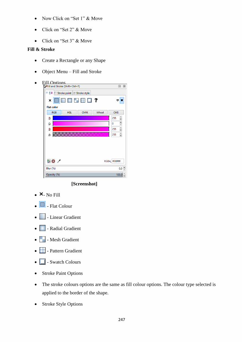
247
Now Click on ―Set 1‖ & Move
Click on ―Set 2‖ & Move
Click on ―Set 3‖ & Move
Fill & Stroke
Create a Rectangle or any Shape
Object Menu – Fill and Stroke
Fill Options
[Screenshot]
- No Fill
- Flat Colour
- Linear Gradient
- Radial Gradient
- Mesh Gradient
- Pattern Gradient
- Swatch Colours
Stroke Paint Options
The stroke colours options are the same as fill colour options. The colour type selected is
applied to the border of the shape.
Stroke Style Options

248
[Screenshot]
Create a Rectangle
Object Menu – Fill and Stroke
Stroke Style
Width – Assign the width of the stroke
Dashes – The style of the stroke
Markers – Assign as required
Join – The corners of the shape can be round, straight or corner
Cap – The segment corner can be straight, round or extendedly straight.
Order – The position of the style.
Object Properties
Create a Rectangle or any shape.
Object Menu – Object Properties.
[Screenshot]
ID: The name of the shape as per the software.
Label: The identity of the shape as per the software.
Title: We can manually add the title to the shape as per our subject.

249
Image Rendering: The type of quality of output.
[Screenshot]
Description: The details of the shape can be given if required.
Symbols
Object Menu – Symbols
A Docker of Symbols will open in the right hand side of the software.
It contains lots of in-built designs which can be used as per our requirement.
[Screenshot]
Click on any design and drag it to the screen.
There are different types of symbol categories also.
[Screenshot]
Group
Create 4 to 5 shapes
Select all the shapes together

250
Object Menu – Group. [Ctrl + G is the shortcut]
It will group the object as single object.
Now Move the object, it will move in group.
Ungroup
A group is created as above.
If you do not want that group and break them into individual shapes again.
Go to Object Menu - Ungroup
Put selected objects out of group
Create 4 to 5 rectangles
Select all the shapes together
Object Menu – Group
Double click on the Group
Select any one shape
Object Menu – Put selected objects out of group
Now click outside
Move the group
You can see that the object which was put out of group is no more part of the group.
Clip
Set
File – Import – (select an image)
Create a rectangle or any shape over it
[Screenshot]

251
Select the image and shape together
Object – Clip – Set
The image will get clipped inside the shape
[Screenshot]
Release
After the Clip is Set, if you want to Release it Click on Object – Clip – Release
It will separate both the image and shape as it was in the beginning.
Mask –
The Process of Clipping and Masking is same. In the Clip, the image gets inside the
shape with 100% transparency. In the Mask, the image gets inside the shape and the
properties of transparency or gradient can be set manually by the user. Use Mask with
Black, Gray and White colour separately, the difference can be seen.
Set
File – Import – (select an image)
Create a rectangle or any shape over it
[Screenshot]
Select the image and shape together
Object – Mask – Set
The image will get clipped inside the shape
[Screenshot]

252
Release
After the Mask is Set, if you want to Release it Click on Object – Mask – Release
It will separate both the image and shape as it was in the beginning.
Pattern
Objects to Pattern
Create a Pattern design using Shapes
Select all the shapes used in the pattern design
Object – Pattern – Object to Pattern
Create a Big Circle
Go to Object – Fill and Stroke
Under the Fill – Choose Pattern fill
[Screenshot]
The created pattern design is used as Pattern automatically. We can choose our own
pattern from a group of patterns created.
Pattern to Objects
Create a big Circle
Go to Object – Fill and Stroke
Under the Fill – Choose Pattern fill
Choose a different pattern which you have not created.

253
[Screenshot]
Object – Pattern – Pattern to Objects
It will derive the pattern design.
We can do some changes and modify the design and again create a pattern out of it.
Objects to Marker
Create a Marker design using shapes.
Select the design
Object – Objects to Marker
Create a path
[Screenshot]
Select the Path
Object – Fill and Stroke
Go to Stroke Style –
[Screenshot]
Sometimes the Shapes of the marker will be displayed as a Box. Click on it. It will show

254
the created design.
The output will be as follows:
[Screenshot]
Objects to Guides
Create a Rectangle
Select the Rectangle
Object – Objects to Guides
[Screenshot]
Raise
Create 4 to 5 filled shapes one over the other with different colours.
[Screenshot]
Select a shape in between.
Click on Object – Raise
It will raise the object to one object above.
Lower
Create 4 to 5 filled shapes one over the other with different colours.

255
Select a shape in between.
Click on Object – Lower
It will lower the object to one object below.
Raise to Top
Create 4 to 5 filled shapes one over the other with different colours.
Select a shape in between.
Click on Object – Raise to Top
It will raise the object above all objects.
Lower to Bottom
Create 4 to 5 filled shapes one over the other with different colours.
Select a shape in between.
Click on Object – Raise to Bottom
It will lower the object below all objects.
Rotate 900 CW
Create a shape or a group of shapes
Select -
Object – Rotate 900 CW
The selected objects will rotate 90 degree clock wise.
Rotate 900 CCW
Create a shape or a group of shapes
Select

256
Object – Rotate 900 CW
The selected objects will rotate 90 degree counter clock wise.
Flip Horizontal
Create a shape which needed to be flipped or mirrored horizontally
- Object Menu – Flip Horizontal -
Flip Vertical
Create a shape which needed to be flipped or mirrored vertically
Object Menu – Flip Vertical –
Unhide All
Create 4 to 5 shapes
Object – Objects
Hide all the shapes in the docker
[Screenshot]
Object – Unhide All

257
It will unhide all the objects in one go. You need not unhide by clicking on shapes eye
symbol on docker one by one.
Unlock All
Create 4 to 5 shapes
Object – Objects
Lock all the shapes in the docker
[Screenshot]
Object – Unlock All
It will unlock all the objects in one go. You need not unlock by clicking on lock symbol
on docker one by one.
Transform
This option is used to Move, Rotate, Scale and Skew the Objects as per numerical data
which will allow perfect measurement output.
Create a Rectangle or any Shape
Object Menu – Transform
Move -
Scale -

258
Rotate -
Skew -
[Screenshot]
Align and Distribute
Align is used to keep the objects in a perfect lining. Distribute is used to maintain equal
spacing between the shapes.
Create Shapes as shown
[Screenshot]
Select the following shapes
[Screenshot]

259
Object Menu – Align and Distribute
[Screenshot]
Use the boxed options for this kind of selection.
Alignment Left, Center and Right
Select the following shapes
[Screenshot]
Object – Align and Distribute
[Screenshot]
Use the boxed option for this type of selection
Alignment Top, Center and Bottom
Select the following shapes
[Screenshot]

260
Use the Distribute options which is boxed
[Screenshot]
Select the following shapes
[Screenshot]
Use the Distribute options which is boxed
[Screenshot]
Aligning a Shape in the Top Left corner of a Page
Create a Rectangle
Select the Rectangle
Object Menu – Align and Distribute
Choose – Relative to – Page
Choose Alignment – Left
Choose Alignment – Top
[Screenshot]
Aligning a Shape to the Center of the Page
Create a Rectangle
Select the Rectangle
Object Menu – Align and Distribute

261
Choose – Relative to – Page
Choose Alignment –Horizontal Center
Choose Alignment – Vertical Center
[Screenshot]
Rearrange
Create 4 to 5 shapes one over the other with different colours.
[Screenshot]
Select all the shapes together. Click on the Rearrange options one by one to view the
results.
- Nicely Arrange selected connector network.
- Exchange position of selected objects – selection order
-Exchange position of selected objects – stacking order
-Exchange position of selected objects – counter clockwise
-Randomize centers in both directions
- Unclamp Objects – Try to equalize end to end distance
Remove Overlaps
It is used to remove overlaps of objects.

262
Arrange
Create 3 or 4 Rectangles or any shapes
Select the shapes together
Object Menu – Arrange
[Screenshot]
Choose the options and click arrange
Arranging shapes along a circle
Create few shapes and a big circle
[Screenshot]
Select all the shapes together
Object Menu – Arrange

263
Polar Coordinates
[Screenshot]
Choose the options one by one click to Arrange to experiment the outputs.
Path Menu
Object to Path
Create a Rectangle
Choose the Tool
Try to move the corner nodes
It will not move the nodes individually, it will scale the object.
Select the Rectangle
Path Menu – Object to Path
Now choose the Tool
Move the nodes, it will move individually.
This option is applicable to readymade shapes available in the software like Rectangle,
Ellipse, and Polygon etc.

264
Stroke to Path
Create a Rectangle
Object Menu – Fill and Stroke
Fill – None
Stroke Style
Width – 6 mm [Thick edges]
Path Menu – Stroke to Path
Now the outline stroke will get converted into a Fill Shape.
Choose the Tool
Move the edge points to check
[Screenshot]
Trace Bitmap
Go to Internet search engine like goggle and search for Vector Art, Black colour
silhouette art etc.
Save an individual file.
File – Import – [choose an image downloaded]
This is a Raster image of a Vector Art
Path Menu – Trace Bitmap

265
[Screenshot]
Choose the Settings.
Live Preview and Update
After choosing from the preview – OK
Move the Shape which is created.
You can see two shapes, one is the vector shape which is created and other is the old
shape.
Delete the old shape.
Choose the Tool
You can move the node points to edit.
Trace Pixel Art
It is basically used in small Pixel files in case of Icons, Video games etc. The files are of
mostly in PNG format.
File – Import – Choose an Icon file

266
Title- Pixel art
Attribution-
Source- inkscape.org
Link- https://inkscape.org/en/doc/tutorials/tracing-pixelart/tutorial- tracing-pixelart.en.html
Path Menu – Trace Pixel Art
Experiment with the settings above and Click OK.
Union
Create two or more
intersecting shapes.
Select both the shapes Path Menu – Union
Difference
Create two or more intersecting
shapes.
Select both the shapes Path Menu – Difference

267
Intersection
Create two or more
intersecting shapes.
Select both the shapes Path Menu – Intersection
Exclusion
Create two or more intersecting
shapes.
Select both the shapes
Path Menu – Exclusion
Division
Create two or more
intersecting shapes.
Select both the shapes Path Menu – Division
Select the 2nd
shape and move
Cut Path
Create two or more
intersecting shapes.
Select both the shapes Path Menu – Cut Path
Move the 2nd
shape
Combine
Create two or more intersecting shapes.
Select both the shapes
Path Menu – Combine
Both the shape will be combined and form a single object.

268
Break Apart
Create two or more intersecting shapes.
Select both the shapes
Path Menu – Combine
If you want to break the two shapes apart then click on Path Menu – Break Apart.
The shapes will become individual again. Move to Check.
Inset
Create a Rectangle or any shape
Path Menu – Inset
It will decrease the size of the
total shape.
Try this option typing text, then
select the text, Path Menu –
Object to Path, Then Use Path
Menu – Inset
Outset
Create a Rectangle or any shape
Path Menu –Outset
It will increase the size of the total shape.
Try this option typing text, then select the
text, Path Menu – Object to Path, Then
Use Path Menu - Outset
Dynamic Offset
Create a Rectangle or (type a
text, then select the text, Path
Menu – Object to Path)
Select the Rectangle or Text
Path Menu – Dynamic
Offset
Click on the border area and drag
to define the offset space.
Linked Offset
Create a Rectangle or (type a text, then
select the text, Path Menu – Object to
Path)
Select the Rectangle or Text
Path Menu – Linked Offset
Click on the border area and drag to define
the offset space.

269
Simplify
Choose the Tool
Click and drag on the screen to draw design.
Select the design
Path Menu – Simplify
It will reduce the nodes and make the shape smoother.
Reverse
It will reverse the starting point and ending point of the shape. The output will not be
visible. This option is used while writing a Text on a path.
Path Effects
Create any shape
Path Menu – Path Effects –
Click on the ―+‖ symbol and choose the Path Effect
[Screenshot]
We can add more than one path effect also.
Paste Path Effect
Create any shape

270
Path Menu – Path Effects –
Click on the ―+‖ symbol and choose the Path Effect
[Screenshot]
We can add more than one path effect also.
Select the Shape
Edit – Copy
Create another shape
Path Menu – Paste Path Effects
It will paste the path effect of the copies shape.
Remove Path Effect
Create any shape
Path Menu – Path Effects –
Click on the ―+‖ symbol and choose the Path Effect

271
[Screenshot]
We can add more than one path effect also.
If we do not want any Path Effect, click on Path Menu – Remove Path Effect.
Text Menu
Text and Font
Type a Text
Text Menu – Text and Font
Choose the font, size etc. as required
[Screenshot]
SVG Font Editor
This is used to create Own Fonts
[Screenshot]
This is a section for development purpose and not for learning design.
Glyphs

272
These are the readymade symbols as compared to a Character Map of Default Windows.
The symbols are not visible in the original form in some computers.
[Screenshot]
Put on Path
Create a Text
Create a Circle
Select the Circle
Path – Object to Path
Select both the text and circle
Text Menu – Put on Path
Select the circle and rotate
Select the Circle
Remove the stroke

273
Remove from Path
Select the Text which has put on the path.
Text Menu – Remove from path.
It will be back into the original form.
Flow into Frame
Create a Circle
Select the Circle
Path – Object to Path
Create a Paragraph Text
Select both the circle and the text
Text Menu – Flow into frame
Unflow
Click on Unflow if you want to delink the text from the shape.
Check Spelling
Type some text with wrong spellings.
Check the spellings of the wrong words and correct them.

274
[Screenshot]
Filters Menu
Filters are experimental effects.
Create a Rectangle or any shape
Select the shape
Filter Menu – Apply all the filters one by one and practice.
Extension Menu
Create a Rectangle or any shape
Select the shape
Extension – Apply all the extension one by one and practice.
Unit Summary
In this Unit you have learnt about the Inkscape options and certain examples of creating
practical work using Inkscape. The Knowledge of all the option of the software will help in
accomplishing any project successfully with ease. An example of the projects done in this unit
will help you explore the technical aspects of a project which will be needed at the time of
publishing or printing the work.
Assignment
Practice the examples of each and every option shown in this unit.
Create a list of shortcuts of the tools and options which you feel important and
frequently used.
Save the files which have been practiced and submit it in a DVD to the University.
Assessment
Which option should be used for repeating a same design or tiling a design?
Which option should be used to keep the object in perfect line either to the left, right
or center?
Which option is used to maintain equal spacing between shapes?

275
Which option is used to convert Raster image into Vector image?
Resources
Web Reading Reference
Inkscape tutorials:
https://inkscape.org/en/learn/tutorials/ https://www.unixmen.com/31-best-
tutorials-of-inkscape/ http://goinkscape.com/
Flower Design using Inkscape step by step
https://design.tutsplus.com/tutorials/quick-tip-fun-tricks-with- inkscapes-polygon-
tool--vector-14959
Working with Inkscape Nodes
https://design.tutsplus.com/tutorials/tips-and-tricks-for-working-with- inkscapes-nodes--
vector-19804
50 Tutorials using Inkscape
https://creativenerds.co.uk/tutorials/inkscape-tutorials/
https://design.tutsplus.com/tutorials/quick-tip-fun-tricks-with-inkscapes-polygon-tool--vector-14959
https://design.tutsplus.com/tutorials/quick-tip-fun-tricks-with-inkscapes-polygon-tool--vector-14959
https://design.tutsplus.com/tutorials/quick-tip-fun-tricks-with-inkscapes-polygon-tool--vector-14959
https://design.tutsplus.com/tutorials/tips-and-tricks-for-working-with-inkscapes-nodes--vector-19804
https://design.tutsplus.com/tutorials/tips-and-tricks-for-working-with-inkscapes-nodes--vector-19804

276
Unit 4 Professional Projects
Introduction is intended for people who want to get their hands on The process of learning and the
process of implementation of the knowledge learned are two different things. While learning the
tools and techniques of software, you get acquainted with the use of the tools. When you are
working on a project, you have to judge the combination of tools and options required to get a
specified result. Sometimes, people learn perfectly, but when it comes to a Project work; we are
not able to accomplish them perfectly. The reason is due to lack of practice of a work. While
learning a tool, you learn it once. But, when you have to do a Project you have to apply the tools
multiple number of times which requires persistence and hard work; only knowledge will not
work. In case of project work, all the tools and techniques of software are not applied
everywhere. There are projects which are done using only a few options of the software. It is
about specialization of a particular type of work you practice which will make you a
professional. When we come to software‘s, there are many software‘s available to create a
single type of output. It is about your judgment based on your practice which will complete
your project work perfectly and on time. In this unit you will learn about how professional
projects are designed.
Outcomes
Upon completion of this unit you will be able to:
Design professional Project works.
Describe the process of doing a project work in particular software.
Examine the format of Graphic design output.
Employ the combination of software‘s used to complete a certain work.
Terminology
Professional : Creating a work or a project which has a value in a systematic way and in
stipulated time.
Output Format: Output format is format used to create an output in a Digital File. Every
software has its own format for saving a file.
Creating a 3D ball using Krita
File – New – Image Size - Predefined – A4
(300 PPI)

277
[Screenshot]
Click on Create
Choose Elliptical Selection Tool
Click and Drag on screen holding Shift
Note it!
Choose Elliptical Selection Tool
First Click and drag on the screen, then Hold the Shift.
DONOT HOLD THE SHIFT FIRST.
Gradient Tool
Tool Options –
Shape – Radial
[Screenshot]
Click on the Gradients – Click on Edit
[Screenshot]

278
Click on the First Colour – Change it to White colour.
Create a Second colour maker – Change it to Red colour
Click on the end Marker – Change the colour to the dark shade of second colour.
[Screenshot]
Now click and drag on the selection from a corner where you need the highlighter.
Output
Create a 3D Ball out of the following colours using the same process as shown above.
o Green Colour
o Blue Colour
Create a 3D button using Krita
File – New – Image Size - Predefined – A4 (300 PPI)
[Screenshot]
Click on Create
Choose Elliptical Selection Tool
Click and Drag on screen holding Shift
Gradient Tool
Tool Options –

279
Shape – Linear
[Screenshot]
Click on the Gradients – Click on Edit
[Screenshot]
Click on the First Colour – Any colour [Red Colour]
Click on the end Marker – Change the colour to the dark shade of first colour.
[Screenshot]
Click and drag in the selection from top to bottom
Select Menu – Shrink Selection by 60 pixels

280
[Screenshot]
Gradient Tool
Click and Drag from bottom to top [opposite direction of the previous]
Select – Deselect
The output will look like a button
Activity 2
Create a 3D Button out of the following colours using the same process as shown
above.
o Green Colour
o Blue Colour
Create a Pen design using Krita
File – New – Image Size - Predefined – A4 (300 PPI)
[Screenshot]
Click on Create
Choose Rectangular Selection Tool
Click and Drag on screen

281
Gradient Tool
Tool Options –
Shape – Linear
[Screenshot]
Click on the Gradients – Click on Edit
Create a gradient as shown –
[Screenshot]
Click and drag on the screen from left to right.
Create a New Layer
Select as shown
Gradient Tool – Click and drag from left to right.
Select – Deselect
New Layer
Create a selection as shown

282
Gradient Tool –
Choose a shade
of Red colour
(any colour) –
Click and drag
from left to
right.
[Screenshot]
Select the second layer containing the second design done by us. Right click on the
layer – Duplicate Layer.
Move Tool and Move as shown
[Screenshot]
New Layer.
Rectangular Selection Tool
Transform a Layer or Selection Tool
Select the Red
colour Body
Layer. Right
click – Duplicate
Layer - Move
and Place as
shown.
Gradient
Tool.
Choose the
Gradient shade as of
the first design.
Click and
drag on the screen
from left to right as
shown.

283
Tool Options - -
Perspective
Adjust as shown –
New Layer
Create a selection for the lead of the pen.
Gradient Tool – Choose Grey shaded gradient.
Transform a Layer or Selection Tool
Tool Options - -
Perspective
Adjust as shown –
Create
handles as per your
creativity.
Create each
shape in a new layer.

284
Activity 3
Create a 3D Pen out of the following colours using the same process as shown above.
o Green Colour
o Blue Colour
Create a Jewellery Design using Krita
File – New – Image Size - Predefined – A4 (300 PPI)
[Screenshot]
Click on Create
Create a 3D Ball using a colour in a new layer
Create a 3D Button using a colour in a new layer
Create duplicate copies out of the shape and arrange like Jewellery as shown.
Activity 4
Create a Jewellery Design using your own Creative idea.
Create a Digital Painting using Krita
File – New – Image Size - Predefined – A4 (300 PPI)
[Screenshot]

285
Click on Create
Image – Rotate – Rotate Image 900 to the Right
This will convert the canvas to Landscape.
We have to first create a plan of contents for the design –
Planning of Layers:-
Background – sky
Background – Bushes
Background – Ground
Grass
Clouds
Sun
Birds flying – silhouette
Stones
Background sky -
Brush tool – choose type of brush
Choose colour
LC & drag on screen
[Screenshot]
Ground
New layer
Brush tool – choose type of brush
Choose colour
LC & drag on screen
[Screenshot]
Bushes
New layer

286
Brush tool – choose type of brush
Choose colour
LC & drag on screen
[Screenshot]
Grass
New layer
Brush tool – choose type of brush
Choose colour
LC & drag on screen
[Screenshot]
Clouds
New layer
Brush tool – choose type of brush
Choose colour
LC & drag on screen
[Screenshot]
Sun
New layer
Brush tool – choose type of brush

287
Choose colour
LC & drag on screen
[Screenshot]
We can interchange the position of the layers as required.
Activity 5
Create a Digital Painting of your own as per your creativity. You can take a reference
of scenery or any subject.
Create a Greeting Card Design using Krita
There has to be complete pre-production process before creating any design in software.
The pre-production includes the following:
Theme of the Design
The current theme of our design is HAPPY NEW YEAR. We are going to design a card
with the contents related to this theme.
Size of the Design
After deciding the theme, it is the time to decide the canvas size upon which the design
is to be made. It has to be decided whether it would be a single sided design, a double sided
design, a multiple folded design etc.
The size of the design is decided to be 10 cm x 10 cm which would be single folded.
That means the size of the design will be 20 cm x 10 cm. After designing and taking the
printout, the print will be folded from the center. A look at the manual layout will help in
understanding the size better.

288
Manual Layout of the Design
After deciding the Size of the Design, the designer creates a manual layout or a sketch
drawing of the proposed output.
[Created by the Author]
The draft of the greeting card will divided into following contents: A – Upper Border of
Right hand side
B – Upper Border of Left hand side
C – Bottom Border of Right hand side
D – Bottom Border of Left hand side
E – HAPPY NEW YEAR F – 2018
G – Photo in Center
H – Logo of Gallery I – JSR Gallery
J – Ellipse Tool
K – Copy of Ellipse Tool
PRACTICAL
File –New
Set the Settings as follows:
[Screenshot]
Width – 20, Centimetres
Height – 10, Centimetres
Resolution – 300 ppi (pixels per inch)
Colour Model – CMYK
View Menu – Show Rulers
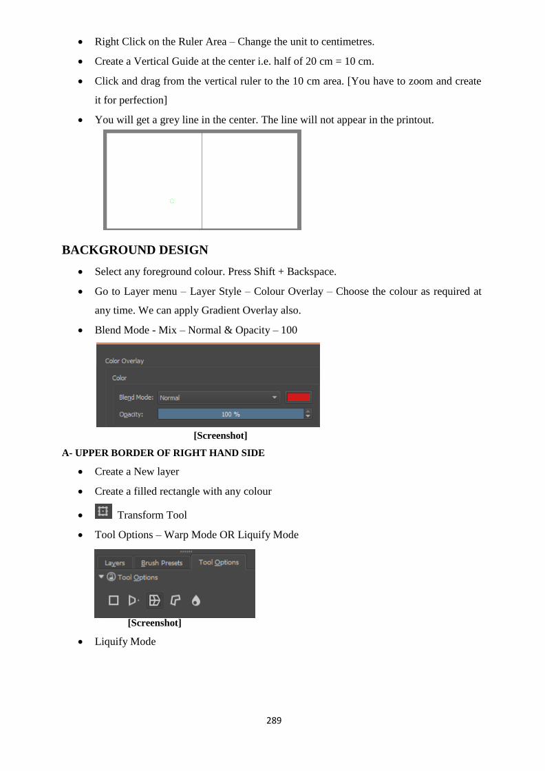
289
Right Click on the Ruler Area – Change the unit to centimetres.
Create a Vertical Guide at the center i.e. half of 20 cm = 10 cm.
Click and drag from the vertical ruler to the 10 cm area. [You have to zoom and create
it for perfection]
You will get a grey line in the center. The line will not appear in the printout.
BACKGROUND DESIGN
Select any foreground colour. Press Shift + Backspace.
Go to Layer menu – Layer Style – Colour Overlay – Choose the colour as required at
any time. We can apply Gradient Overlay also.
Blend Mode - Mix – Normal & Opacity – 100
[Screenshot]
A- UPPER BORDER OF RIGHT HAND SIDE
Create a New layer
Create a filled rectangle with any colour
Transform Tool
Tool Options – Warp Mode OR Liquify Mode
[Screenshot]
Liquify Mode

290
[Screenshot]
Click on the screen over the Rectangle to do the adjustments.
The output design will be as follows:
[Screenshot]
B- UPPER BORDER OF LEFT HAND SIDE
We will create a copy of the right hand side design and create a mirror in the left hand
side.
Select the upper border of left hand side layer.
Right Click on the Layer –Duplicate Layer
Move Tool
Move it to the Left hand Side
Transform Tool
Tool Options
Flip Vertical
[Screenshot]
[Screenshot]

291
C- BOTTOM BORDER OF RIGHT HAND SIDE
We will create a copy of the Upper right hand side design and create a mirror in the
bottom right hand side.
Select the upper border of left hand side layer.
Right Click on the Layer –Duplicate Layer
Move Tool
Move it to the bottom of right hand side.
Transform Tool
Tool Options
[Screenshot]
Flip Horizontal
[Screenshot]
D- BOTTOM BORDER OF LEFT HAND SIDE
We will create a copy of the Upper Left hand side design and create a mirror in the bottom left
hand side.
Select the upper border of left hand side layer.
Right Click on the Layer –Duplicate Layer
Move Tool
Move it to the bottom of left hand side.
Transform Tool
Tool Options

292
Flip Horizontal
[Screenshot]
E – HAPPY NEW YEAR
Choose the Text Tool
Click and Drag on Screen
Type the Text ―HAPPY NEW YEAR‖
Choose the Shape Manipulation Tool
Tool Options
Change the colour of the Text
Move and Place wherever required using Move Tool
[Screenshot]
F – 2018
Choose the Text Tool
Click and Drag on Screen

293
Type the Text ―2018‖
Choose the Shape Manipulation Tool
Tool Options
Change the colour of the Text
Move and Place wherever required using Move Tool
[Screenshot]
G – Photo in Center
[Download a vector design from internet in PNG format]
File- Open
Title: Vector Design Attribution:
Source: Freepngimg
Link: http://www.freepngimg.com/png/18676-vector-high-quality- png
Select the Photo using Selection Tool
Edit – Copy
Go to the Greeting Card File
Edit – Paste
Adjust the size using the Transform Tool
[Screenshot]

294
H – Logo of Gallery
File – Open [Open any Logo Design]
Select
Edit – Copy
Go to the Greeting Card File
Edit – Paste
Resize using the Transform tool
[Screenshot]
I– Text of Gallery
Choose the Text Tool
Click and Drag on Screen
Type the Text ―University Gallery‖
Choose the Shape Manipulation Tool
Tool Options
Change the colour of the Text
Move and Place wherever required using Move Tool
[Screenshot]
J – Ellipse Tool
Create a New Layer
Choose the Ellipse Tool
Create an Ellipse
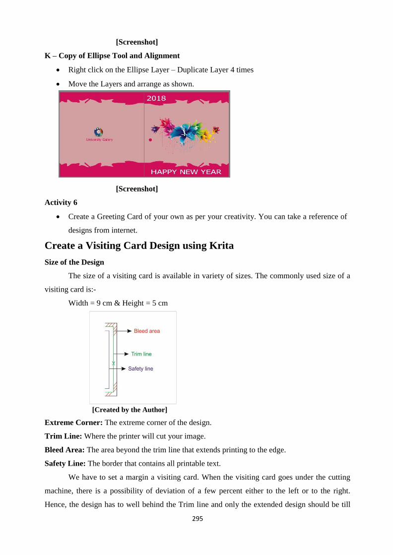
295
[Screenshot]
K – Copy of Ellipse Tool and Alignment
Right click on the Ellipse Layer – Duplicate Layer 4 times
Move the Layers and arrange as shown.
[Screenshot]
Activity 6
Create a Greeting Card of your own as per your creativity. You can take a reference of
designs from internet.
Create a Visiting Card Design using Krita
Size of the Design
The size of a visiting card is available in variety of sizes. The commonly used size of a
visiting card is:-
Width = 9 cm & Height = 5 cm
[Created by the Author]
Extreme Corner: The extreme corner of the design.
Trim Line: Where the printer will cut your image.
Bleed Area: The area beyond the trim line that extends printing to the edge.
Safety Line: The border that contains all printable text.
We have to set a margin a visiting card. When the visiting card goes under the cutting
machine, there is a possibility of deviation of a few percent either to the left or to the right.
Hence, the design has to well behind the Trim line and only the extended design should be till

296
the Bleed line.
Contents of a Visiting Card
The most common elements used in a Visiting Card are as follows:
Background design
Name of the Company
Logo of the Company
Address of the Company
Quotation or Punch line of the Company
Name of the Person
Designation
Mobile Number
E-mail Id
Website address
Dealing in ……
Images [if required]
Sample Output:
[Screenshot]
PRACTICAL
File –New
Set the Settings as follows:
[Screenshot]

297
Width – 9, Centimetres
Height – 5, Centimetres
Resolution – 300 ppi (pixels per inch)
Colour Model – CMYK
View Menu – Show Rulers
Right Click on the Ruler Area – Change the unit to centimetres.
Background design
Select any foreground colour. Press Shift + Backspace.
Go to Layer menu – Layer Style – Gradient Overlay – Choose the colour as required at
any time. We can apply Gradient Overlay also.
Blend Mode - Mix – Normal & Opacity – 100
[Screenshot]
Name of the Company
Choose the Text Tool
Click and Drag on Screen
Type the Text ―YYYYY Publications‖
Choose the Shape Manipulation Tool
Tool Options
Change the colour of the Text
Move and Place wherever required using Move Tool
Logo of the Company
File- Open [Open the logo file]
Select the Logo using Selection Tool
Edit – Copy
Go to the Visiting Card File
Edit – Paste

298
Adjust the size using the Transform Tool
Address of the Company
Choose the Text Tool
Click and Drag on Screen
Type the Text ―Address‖
Choose the Shape Manipulation Tool
Tool Options
Change the colour of the Text
Move and Place wherever required using Move Tool
Quotation or Punch line of the Company
Choose the Text Tool
Click and Drag on Screen
Type the Text ―Quotation‖
Choose the Shape Manipulation Tool
Tool Options
Change the colour of the Text
Move and Place wherever required using Move Tool
Name of the Person
Choose the Text Tool
Click and Drag on Screen
Type the Text ―Name of the person‖
Choose the Shape Manipulation Tool
Tool Options
Change the colour of the Text
Move and Place wherever required using Move Tool
Same Process for Designation, Mobile Number, E-mail Id, Website address, Dealing in etc.
Choose the Text Tool
Click and Drag on Screen
Type the Text ―Designation‖
Choose the Shape Manipulation Tool
Tool Options
Change the colour of the Text
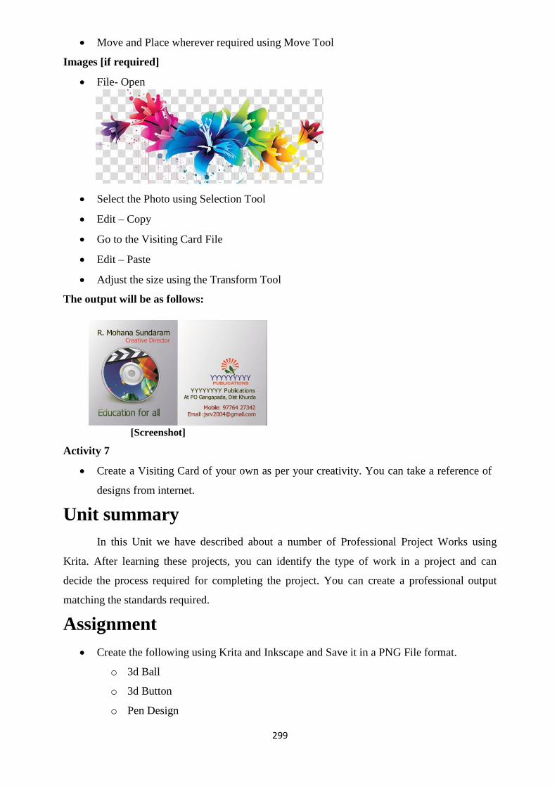
299
Move and Place wherever required using Move Tool
Images [if required]
File- Open
Select the Photo using Selection Tool
Edit – Copy
Go to the Visiting Card File
Edit – Paste
Adjust the size using the Transform Tool
The output will be as follows:
[Screenshot]
Activity 7
Create a Visiting Card of your own as per your creativity. You can take a reference of
designs from internet.
Unit summary
In this Unit we have described about a number of Professional Project Works using
Krita. After learning these projects, you can identify the type of work in a project and can
decide the process required for completing the project. You can create a professional output
matching the standards required.
Assignment
Create the following using Krita and Inkscape and Save it in a PNG File format. o 3d Ball
o 3d Button
o Pen Design

300
o Jewellery Design
o Greeting Card Design
o Visiting Card Design
Assessment
Name the Projects done in this unit.
Name the software used for creating the projects in this unit. Write (Process of converting soft copy into CD/DVD) all the above Assignments in
DVD using Nero with the video output, raw source
files of the software used and submit it to the University.
Resources
Web Reading Reference
Go through the following website for details of Krita Projects and
Tutorials:
http://www.davidrevoy.com/categorie5/tutorials

301
DMA-02
Digital Imaging Block – IV: Preparation of Digital Images using Media technologies

302
Unit-1 Working with Digital Images involve the integration of live- action footage and
Introduction
Digital images have a ―structure‖—that is, they are built up from basic elements that are
assembled in particular ways to make up a digital image. The basic unit of a digital image is the
pixel, and these pixels are arranged into arrays and those arrays are arranged into one or more
layers. In this unit, we will take a tour of the pixels, arrays, and layers to see how they make up
a digital image. Outcomes
Upon completion of this unit you will be able to:
Understand Digital image, its aspects and functions
Understand the structure of digital images, pixel, greyscale and colour images
Understand the importance of image resolution
Understand the texture of images
Terminology
Digital image: A digital image is a numeric representation, normally binary, of a two-
dimensional image. Depending on whether the image resolution is fixed, it may be of vector or
raster type.
Pixel: Pixels are the Digital images that are bifurcated in to small tiles of separate colours.
Greyscale: Grey as the name suggests are theimages with Black and White texture, single
channel images, and one colour(monochrome) images.
Colour images: These are the form of digital images that are used to deploy colour to the
human eyes.
RGB: The RGB color model is an additive color model in which red, green and blue light are
added together in various ways to reproduce a broad array of colors.
CMYK: The CMYK color model (process color, four colors) is a subtractive color model, used
in color printing
Resolution: The quality of being determined or resolute
Textures: The projection of two-dimensional digital images in a three-dimensional object.
Aspect Ratio: Any images aspect ratio can be referred as the proportional ratio of its height and
width.
Structure of digital images
Digital images maintains a "structure"— that is, they are developed from fundamental

303
components that are gathered in specific ways to create a digital image. Pixel is the essential
unit of a digital image, and these pixels are organized into arrays and further the arrays are
organized into one or multiple layers. In the accompanying, we take a voyage through those
pixels, clusters, and layers to perceive how they together form a digital image.
The Pixel
Pixels are type of the Digital images that are further breached down in tosmall ―tiles‖ of
single colour. * It‘s essential for the computer to have the capacity to get to every one
independently keeping in mind the end goal to control it. Every pixel is likewise loaded with at
least single strong shading or colour. At the point when the pixels are sufficiently little they mix
together to frame a smooth picture to the eye, for example, the case of Marcie, Kodak's well
known film young lady found in Figure 1-1. Notwithstanding, on the off chance that you draw
nearer than the ordinary survey remove, you may begin to see her pixels, as in Figure 1-2. On
the off chance that you get truly close, you can clearly see her pixels as shown in Figure 1-3.
Fig 1.1 close up Fig 1.2 Big Close up Fig 1.3 Extreme close up
Title-Pixel Attribution-
Source- Pexels.com
Link- https://www.pexels.com/photo/close-up-photography-of-woman- wearing-red-lipsticks-
765193/
Basically Pixels have two important traits fundamental to the computer.
First To begin with, they are composed in flawless little rows and columns like a
checkerboard, and in the land of computer this is known as array. After the pixels get organized
into an array kin this manner itsmandatory for the computer to have the capacity to find them.
There are two positions
a) The classic horizontal direction: The horizontal position of a pixel in an
array is referred to as its position in ―X‖.
b) The classic vertical direction:its vertical position is referred to as ―Y‖.
By this way each pixel is provided with aspecific location, or ―address,‖ in X and Y. or
instance, in the event that you had a picture that was 100 pixels wide and 100 pixels tall, you
could distinguish the correct area of a particular pixel by saying it was 50 columns more than
(50 in X) and 10 rows down (10 in Y). In short it could be said its XY location is 50, 10. This
pixel will be different from its neighbour that is present, one column to the right at 51, 10, or in

304
the row below at 50, 11. Indeed, every pixel will have a specific XY location in the image and
can be denoted by the computer, in the same manner, which it is.
The next important trait is that a pixel is having its single colour. As defined a pixel is
all one solitary colour. In a pixel variation of colour or textures are not permitted. Every pixels
colour is represented by a number. Truth be told, pixels are basically sets of defined numbers
representingcolours that are organized in clear rows and columns. They are turned in to picture
only when the numbers are converted into colours by a display device like TV set or computer
monitor.
*The word Pixel is gotten from "pix" a slang truncation for "pictures", and "el"
originates from "component", so the pixel signifies "picture component".
Greyscale Images
Black and white images, one channel images, and monochrome (one color) images are
the other names of Greyscale Images. The assortment of names is because of the way that few
diverse technical disciplines have built up their own terms to depict a similar thing.Historically
it emerges from many discipline so thisoccurs frequently in computer graphics. Herewe shall
call them asgreyscale images for better clarification and brevity. Due to their simple attribute
Greyscale images are used commonly in computer graphics, they are a perfectmethod to
effortlessly approach the subject of digital images. They exhibit just a single channel, or layer,
whereascolor images have three channels or more, which we shall come across shortly.
Digitization of a black and white picture can be one case of a greyscale image is, and the
next more pertaining caseare the majority of the mattes on the planetMattes may be utilized to
compose one picture above the other.The latter cases are outlined in Figure 1-4. These pictures
don‘t have any colour as they are greyscale images. Even though differences in appearance of
the two images the common is that both of them are one-channel images. Here one channel,
orlayer, implies that the imagescomprised of only one array of pixels with the values of
brightness ranges from black to white and shades of grey.
Greyscale image Close up pixels Matte Close up pixels
Fig 1.4 Examples of greyscale images and their pixels
Fig 1.5 An array of pixels

305
When we see this one channel array of pixel it can be interpreted as close and personal,
Figure 1-5 zooms in to a tiny little region of pixels in the greyscale image of Figure 1-4. The
numbers in Figure 1-5 are the code values of each pixel. These can be refered as code values on
the grounds that encoding or measuring the numerical values, the splendor of every pixel. The
dim chip that each numerical values encode, or quantify, the brightness of each pixel. The grey
chip that each code value sits on speaks to how brilliant that pixel will show up when shown on
a screen.Internally the computer utilizes the code values that are arranged in to an arrayfor
representation of the picture. The important thing here to focus is thatjust one array of code
values exists, which is known as a channel, and the code values are concerned only with
brightness, and not colour.
Color Images
In the actual world our eyes can see the entire spectrum or range of colour however in
reality our eyes, aresensitizefor three colorsof light that is red, green, and blue. Since our brain
"blends" segments of these three hues we could see other colours like yellow, magenta, and
cyan. Take an example, red and green are blended to get yellow. A similar trap is utilized as a
part of the majority of our picture are displayed in devices such as television, led panel displays,
digital projectors, and feature film. Actually all these gadgets projects only red, green and blue
colours that is coordinated in our brain and integrated as each and every colour shades of the
rainbow. To make a colour display device for humans, all you need is red, green, and blue,
which is abbreviated RGB.
RGB Image Red Channel Green Channel Blue Channel
Fig 1.6 A RBG image is made of up 3 channels
Until and unless the digital images have RGB data on them the human eyes could not
see the colours of digital images displayed over the screen. In the past segment, we came across
about the working of the greyscale images, the way it uses its solitary single channel and since

306
it‘s been made from the arrangement of numbers in single array that inturn represents the
brightness values of the pixel from black to white.
By and large now we will be using three channels and now we can assign one of these
colours to each channel, say one to red, other to green and last to blue. Now we can put distinct
code values in these three channels of each pixel which in turn is going to enable us to allocate a
specific RGB code value to every pixel. This scheme will allow us to assign a unique RGB code
value to each pixel in our colour image by putting different code values in the red, green, and
blue channels of each colour pixel. We now have a colour image composed of three channels,
which is referred to as an RGB image, as illustrated in Figure 1-6. Note how the yellow paint
cans in the RGB image appear bright in the red channel, medium in the green channel, and dark
in the blue channel. Having these different values in each channel is what gives the image its
colours.
Even though in the RGB image every channels data represents different values of red,
green or blue colour pixel per pixel but if we see the data the data is in different hues of grey.
This is because of the reason that the different shades of grey depicts the amount of brightness
of that particular channel of every pixel.You could observe this in the Figure 1-7:
Fig 1.7 Grey RGB data becomes colour
If we see the extreme left you could see the red pixel, containing the red chip coded as
―R‖ appears to be very bright whereas the Green and Blue pixel consisting of green and blue
chips, coded as
Suppose there is plenty of red and minute amount of green and blue that indicates the
colour is red. next to the red we have yellow pixel that has bright R and G values above it, but a
low (dark) B value, which is the quintessential definition of yellow. The skin tone chip shows a
more typical RGB combination to make a common skin tone color. Lastly the grey pixel
demonstrates a unique case. In the event that every one of the three of the RGB esteems are the
same, than grey color is produced. Indeed, this defines grey that every one of the three channels
having parallel estimations of brightness. At the point when the RGB estimations of a pixel
happens to be unique in relation to each other, this forms hues or colour.

307
Fig 1.8 Grey RGB data gets it colour from the display device
In an event that the RGB information is entirely grey or in black and white, than from
where the the colours are visible in a coloured image? The answer is the generation of the
colour is originated from display like digital projector, TV, LED screen, etc. As shown in
Figure 1-8. For instance in a digital projector for the red channel the grey data is feeded to the
red lamp of a digital projector as a result of which the whole screen is filled with adequate
amount of red light at every pixel. Same way The green and blue data go to their respective
lamps. after this all the images of red ,blue and green superimpose on each other that makes the
eyes to see the colour. Important aspect here is to be noted basically a colour image is a three
channel image where in each channel it consists of distinct RGB data in every channel The key
point to note from this is a shading picture is a three-channel picture that contains isolate RGB
information into each channel, but the data in these channels is, indeed grey.
Adobe Photoshop will conveniently outline now. To visualise the effect upload a color
photographic kind picture into Photoshop (not a convenient graphic). Select the Channels
palette (it should be notedin the Photoshop software also they are called as channels), at that
point close up the visibility (the eyeball icon) for every channel with the exception of the Red
channel. You ought to be watching a gray image. Currently click on the inexperienced channel
and view the other, however completely different, grey image. Attempt the Blue channel.
It‘s completely different another time. It‘s vital to consider RGB pictures as 3
channels of grey data just since that's however the PC thinks of them. To master digital
compositing, you would like to understand however the PC assumes therefore you'll
think over it.
Four-Channel Images
A three-channel RGB image will be made as a four-channel image if a matte is enclosed
within it that's placed in an exceedingly fourth channel.This newly formed four-channel image
is named as alpha channel that is denoted by letter ―A, ―and then onward this four- channel
image is named as a RGBA image.
A three-channel RGB image can have a matte included with it that is placed in a fourth
channel, making it a four-channel image. This fourth channel is called the alpha channel, which
is represented by the letter ―A,‖ so a four-channel image is referred to as a RGBA image. CGI is

308
a case of an RGBA image ,it is displayed in Figure 1-9. Likewise its totally conceivable to have
pictures with more than four channels, yet you will plausible experience them later in your
profession..
Fig 1.9 A four channel RGBA image
Attributes of digital images
Now that we have already discussed about the digital images models or structures,
additionally we couldinvestigate the different characteristics of digital images. Not only they
appear in different shapes and sizes but also,in the internal representation of the image and
data variations exists.So this segment will basically begin with digitizing an image in order to
know about it.After that we shall know in length about the distinction between display aspect
ratio image aspect ratio, and pixel aspect ratio—3 extremely confusing ideas. This will
elaborate all the essential points and clarify all doubts.
Digitizing Images
Despite the fact that they play out a tremendous assortment of capacities, by the day's
end, whatever they can do is control numbers (in addition to a little Boolean logic en route).
Thus, they take a shot at must be changed over to numbers or whatever we load or feed in is
lessened to numbers.Even if to create a text file such as an text message, email, a book or a
word processor document each letter of the alphabet is assigned with a defined number. The
audio files after conversion to numbers to create MP3 files only could be played or listened over
DVDs, iPods, , and other MP3-enabled devices. In addition, the photos must be changed over to
numbers before the PC can work with them. On the off chance that it isn't first changed over to
numbers, the PC basically can't manage it.
When a picture or an audio say a sound track is converted in to numbers or digits the
phenomenon known as digitizing. After completion of the digitization of the image, aPC after
having the digitized image, any work becomes possible. The two important concept that should
be clear on digitizing images are:
The first is how the entire process is done.
The second are what issues occurred during the process and how to

309
resolve them.
Following example will explain both points on analysis of the digitized image.
Fig 1.10 Original Picture Fig 1.11 Sampling points Fig 1.12 Digitized picture
Image Resolution
Dot per pixel or DPI is thought as resolution. Image resolution refers to how
{many|whatpercentage|what number} pixels wide and the way many pixels tall image is. Let‘s
say, if a picture were three hundred pixels wide and three hundred pixels tall, the image
resolution would be 300 by 300, or written as 300 × 300. The PAL video image features a
resolution of 720 × 576 component. A regular academy aperture feature frame has a picture
resolution of 1828 × 1332. The pictures from a photographic camera might need a picture
resolution of 3072 × 2048 or additional.
Notice that nothing was mentioned about the ―size‖ of the image. This is on account of
the real display size of a picture changes relying upon the display device it is seen on. The
display size can vary, but the NTSC and PAL image resolution remains the same i.e. 720 × 486
& 720 × 576 respectively. Say the projection of a small movie or a feature film,can be done on a
small screen in a small theatre, or on a huge screen in a large auditorium. Here again the
difference is in display size, but in case of a 35 mm film image resolution remains intact and
same. We do need to be cautious here in light of the fact that the termresolutionhas an
altogether different meaning in other disciplines. The typical significance for the word outside
of digital compositing isn't what number of pixels are there in the whole picture, yet what
number of pixels are there in per unit of display—that is, what number of pixels per inch or dots
per centimetre.
Image Aspect Ratio
The aspect ratio of an image is defined by the aspect ratio of a picture is really a
portrayal not of its size or its resolution, but rather of its shape. It depicts whether the picture is
tall, thin, or low and wide. Each picture on your PC will have a built up aspect proportion, and
image resolution, and all your work must comply with it. The aspect ratio is essentially the
proportion of the picture's width to its tallness, so it is computed by partitioning the picture's
width by its height. For example, if the image resolution is 400 × 300, divide 400 by 300 the

310
aspect ratio thus obtained will be 1.33, the classic video resolution. It should be noted that the
image aspect ratio can be applied on image file, but by this it could not be predicted that how
it‘s going to look on the final display. There are instances that thethe image aspect ratio and its
display aspect ratio may differ. We will discuss this in coming topics.
Pixel Aspect Ratio
As we know that the digital images contains pixel.as in images the pixels have a defined
shape which is again denoted by its image- aspect ratio. You should make a point that all pixels
are not equal. Like in a square pixel, same as a square image, shall have a pixel aspect ratio of
1.0, however there are lot of display systems that don‘t have square pixels. Figure 1-13 shows
the non-square pixel aspect ratios you may commonly come across in production.
Fig 1-13 Common pixel aspect ratios
Explanation of the above figure:
The left example shows an NTSC (American television) video pixel that has a pixel
aspect ratio of 0.9, making it tall and thin.
The middle image describes a PAL (European television) video pixel that has a pixel
aspect ratio of 1.1, that makes it short and wide.
Generally square pixels are found in many feature film format,but the Cinema Scope
(Cscope) format is a specific widescreen format that has a pixel aspect ratio of 2.0, making its
pixels too wide. Luckily, video formats of all HDTV (High Definition Television) consists of
square pixels.
Display Aspect Ratio
So by this time it‘s been clear that the image aspect ratio depicts the images shape and
the pixel aspect ratio depicts the pixels shape. And these two factors integrate and referred as
the display aspect ratio i.e. the images shape after being projected through a display device. The
significance of the Display aspect ratio is that, there may be variance in the aspect ratio of the
image and the display device on which the image is displayed. This variation is caused because
of the pixel aspect ratio. If the pixels are square, then the image aspect ratio and the display
aspect ratio are identical.
Texture
When two-dimensional color pictures are projected in three- dimensional object it is
known as texture. A 3D model of the scene can be constructed from a single image, without

311
knowing the layout of common surfaces of the scene, as done in previous works. The
understanding of texture of objects improves object detection.
Scene interpretation is a long-standing, basic problem in computer vision. Recent work
demonstrates that a synergistic treatment of diverse image-understanding tasks, including object
recognition, image segmentation, and 3D-scene reconstruction, may overcome many errors
induced by addressing them in isolation. These approaches typically fuse object detections with
supervised priors of spatial layouts of common scene surfaces (e.g., the sky is on the top, and
the ground is planar and horizontal).
While holistic scene interpretation shows great promise, the treatment of the 3D scene
layout in existing work has certain shortcomings. First, they make the restrictive assumption
that surfaces in the scene are planar, and discredited surface orientations into a pre-specified
number of classes (e.g., buildings may face only left, right, or front). Second, they typically
estimate surface orientation classes too locally (e.g., per each super pixel), without accounting
for the long-rage spatial relations among image parts. This may easily lead to implausible 3D
layouts.
One visual cue that has been overlooked, and that could address the aforementioned
shortcomings of prior work, is texture arising from a spatial repetition of objects in the scene. In
general, textures of recurring objects are ubiquitous. For example, windows on a building
facade jointly give the percept of window texture, and a sequence of cars parked along a street
gives rise to car texture, as illustrated in Fig 1. In a cafeteria scene, tables and chairs, and people
standing in a line comprise many distinct textures. Also, in natural scenes, one can easily find
textures corresponding to flocks of birds, herds of animals, or tree lines.
Summary
This unit gave an introduction to the basics of digital images. It elaborated the
structure of digital images and other key elements like pixels, greyscale images, colored images,
RGB and four scale images. It also discussed the various attributes of the digital images like,
digitizing images, image resolution, image aspect ratio display aspect ratio and the basics of
image texture.
Assessments
1. What are pixels?
2. RGB is made of how many channels? Mention them.
3. What is image aspect ratio?
4. What is picture aspect ratio?
5. What is display aspect ratio?

312
Resources
1. Wright, Steve. Compositing visual effects: Essentials for the aspiring artist. Taylor &
Francis, 2011.
2. Payet, Nadia, and SinisaTodorovic. "Scene shape from texture of objects." Computer
Vision and Pattern Recognition (CVPR), 2011 IEEE Conference on. IEEE, 2011.

313
Unit 2 Managing file formats for Images
Introduction
We come across lot of images and each image is either shared or received by usor
deliver to a client or colleague. These image sare present in the form of a file, and files are
available in a massive form of completely different formats. It‘s a true facility in front of you,
where you have to apply your wisdom while choosing the file formats. We should be cautious
about the selection because of the following reasons:
Firstly because if you send a file or receive a file from someone in a specific format that
the software or programme could not read, you will be lost and end your start there itself.
Secondly if you choose the file formats via which your image file get compressed than
the image quality may be compromised or degraded. Sometimes your selection may work and
sometimes it may not work.
Thirdly, if you pick a wrong file format the file size may increase, more than your
requirement. Many peopledon‘t want to unnecessary waste their disk space, download time,
network bandwidth, and production time.
Outcomes
Upon completion of this unit you will be able to:
Understand the basics of image file formats
Understand the basics of file compression
Realize the importance of Dots per inch in digital images
Know the basics of EXR
Terminology
File: A computer file is a computer resource for recording data discretely in a computer storage
device. Just as words can be written to paper, so can information be written to a computer file?
File Format: A file format is a standard way that information is encoded forstorage in
a computer file.
Graphics: Graphics are simple images created or drawn with designing software‘s.
Photographic images: These are real scenes captured by some kind of camera, either digital or
film.
JPEG: It is a floating-point image file format developed by Industrial Light & Magic (ILM).
JPEG or Joint Photographic Experts Group is an older lossy compression file format
specifically designed for photographic images.
Compression: It reduces the size of the file so that it can be shared conveniently.
DPI: DPI is used to describe the resolution number of dots per inch in a digital print

314
Image file formats
Before taking a gander at the file formats, there are a couple of key ideas to think about
certain picture writes and pressure plans. In this segment, we will investigate the contrasts
between photographic pictures and designs on the grounds that the kind of picture you have
powerfully influences the decision of the pressure plot. The EXR file formats gets its own
particular extraordinary say due to its rising significance in the visual impacts industry.
Photographic Images vs. Graphics
There are extremely two noteworthy kinds of images: Photographic images and graphic
images. Photographic images are genuine scenes caught by some sort of camera, either digital
or film. Their key element is that their pixel esteems fluctuate significantly everywhere
throughout the picture, in this way making them "complex." Graphics, then again, are
straightforward images made or drawn with designing programming's, for example, Adobe
Photoshop, Adobe Illustrator, Coral Draw, indesign, and so forth. The key component is that
their pixel esteems don't fluctuate more over the image.
Fig 2.1 Pictures and graphics have very different pixels variations
Figure 2.1 shows this significant distinction between the two kinds of pictures at the
pixel level. In the nearby of photo, no two pixels are of a similar shading(colour). In the graphic
close-up there are substantial regions of indistinguishable pixel esteems. These distinctions are
utilized while choosing a compression scheme. A lossless sort of compression would be utilized
on the realistic in light of the fact that the document size could be packed by exploiting every
one of the pixels of a similar esteem. Such a plan would be futile on the photo and result in for
all intents and purposes no document size lessening. A lossy pressure plan would detectably
harm the graphic, yet can go unnoticed in the photo if not squeezed too far. Indexed Color
Images (CLUT)
Fig 2.2 an indexed color image
The document size of any RGB image can be extensively diminished by changing over

315
it to an ordered shading image. The PC initially completes a factual examination of all the RGB
hues in the image and afterward delivers a Look-Up Table (LUT) of just 256 hues, which speak
to the nearest 256 midpoints of the considerable number of hues in the RGB image. It at that
point makes a one-channel 8-bit "index" image where every pixel is extremely a pointer or
index to one of the hues in the shading(colour) table. To show the image in colour the PC takes
a gander at every pixel in the index image, takes after that file to its shading chip in the LUT,
understands that RGB esteem, and shows it on the screen as the red arrows appear in Figure 2.2
Despite the fact that the scope of hues is genuinely lessened (256 hues rather than 16
million), the subsequent colours image looks shockingly great (in the event that you don't look
too carefully). The Marcie colours image in Figure 2-2 is a genuine index colours image. this is
because the look is so great is that the 256 hues in the LUT are full 24-bit RGB esteems. Since
there are just 256 of them, they don't expand the file size extensively. A typical shortening for
index colours images is CLUT, that represents Color Look up Table.
CLUT images work exceptionally well for graphics, particularly if the graphics has
under 256 hues in it. The CLUT form would then be a lossless pressure. Photographic images
can be changed over to a CLUT, obviously, yet they get severely pounded all the while during
the process. it might be OK for a website, however not for printing a 8 × 10 portrait.
Compression
All file formats offer some sort of data compression feature. A few sorts of data
compression are lossless, implying that as soon as the compressed file is opened, the image is a
correct imitation of the first. Be that as it may, some compression schemes are lossy, implying
that the compressed image has endured a few misfortunes, or corruption.
Two transcendent lossless compression plans are RLE and LZW. Run Length Encoding
(RLE), which is quite often utilized for rendering CGI pictures; and, Lempel-Ziv-Welch
(LZW), that is essential since it is accessible in a considerable number image file formats. Since
these are lossless compression plans, they lessen file measure with no debasement of the image;
moreover, they can likewise be utilized together. Utilize them unreservedly on CGI and
graphics realizing that they won't hurt your photos. Photographic pictures can utilize LZW,
however there will be negligible compression.
Two transcendent lossy compression plans are JPEG and MPEG-2. The JPEG
compression is proposed for still photographic pictures and fundamentally evacuates fine detail
in the picture to lessen its file size. It debases the picture quality, and if set too high can corrupt
it genuinely. The MPEG-2 compression is particularly intended for moving pictures, for
example, video. It begins by playing out a JPEG-type compression on chosen key frames, and
after that it shrinks the middle frames by developing a rundown of distinctions between the key

316
frames.
EXR
Open EXR, or EXR, is a drifting point image file format created by Industrial Light and
Magic (ILM) that is quick turning into an industry standard. It‘s likely that you may experience
it right off the bat in your digital compositing vocation and more probable after some time, so
how about we investigate it intently. The following area discusses the different essential image
file formats, however EXR is both remarkable and sufficiently vital to get its own spot in the
sun, particularly in light of the fact that it was particularly created in viewing the compositors.
Here is an outline of its primary highlights:
High powerful range: - Designed particularly to oblige high unique range image data, for
example, film checks and photorealistic CGI components. The dynamic range (darkest
to brightest) of a normal screen may be around 150 to one and projected film maybe
2000 to one, whereas EXR's dynamic range is over a billion to one!
Many channels: - when the basic CGI render is a four-channel image, EXR is
expandable to any number of channels. The reason for existing is to abstain from
rendering the many obstacles or passes of a CGI subject into multiple separate files.
They would all be able to be in their own channels inside one EXR file.
Lossless compression: - Designed for including feature film work, film outlines are
extensive photographic images that take up a considerable disk space and network or
system exchange time. A special lossless compression plot is bolstered that slices file
sizes down the middle with no corruption to the image and it is quick to compress and
uncompress. Short float: - A floating point format, however rather than the standard 32-bit drift,
actualizes a novel 16-bit "short buoy." This understands the speed punishment as a rule
related with floating point, while keeping up all that could possibly be needed exactness
notwithstanding for include film work. At the end of the day, it gives a speed of number
with the exactness of float.
Open EXR was discharged by ILM to the world as an open standard for nothing in 2003
keeping in mind the end goal to quickly spread it into the visual impacts industry. It has worked.
Many 3D animation and compositing programs now bolster EXR. It has even entered to the
omnipresent programming resembles Adobe After Effects and Adobe Photoshop.
We can't talk about each file format in the entire library as that would be a whole epic
book. Rather this topic comprise of a leniently concise portrayal of a few of the most widely
recognized and imperative file formats we go over regularly being a compositor.

317
File Formats
As we are well aware that in order to recognize an image we need to add extension to
the file name to know what is the format that the file belongs to. In the event that the file is in
TIFF format, for instance, the file name will appear as "filename.tif," a JPEG picture would be
named "filename.jpg," et cetera. In view of this, the file formats are recorded beneath in
sequential order arrange in view of their filename expansions.
.bmp: An adaptable Microsoft Windows image file format that backs the two photos and
graphics. These images are saved as 8 or 16 bits, BW, RGB, RGBA, and CLUT. No
compression.
.cin: Cineon is a more seasoned, extremely particular file format particularly for 10-bit
log film scans. No compression, no choices, and nothing specific. It underpins BW,
RGB, and RGBA pictures.
.dpx: Digital Picture Exchange, a newly introduced file format for 10-bit log film scans
that is supplanting the Cineon format. Assists numerous channels, linear and log data,
and multiple bit depths. sometimes HDTV video frames are saved in the .dpx format.
.exr: Short form of Open EXR, Industrial Light and Magic's (ILM) broadened extensive
range file format basically designed to work for images of feature film. It highlights
floating point information and the colossal vibrant scope of hue and bright required for
top- quality element film work.
.gif: Most generally observed as a 8-bit CLUT file format basically used for graphics
that is broadly utilized for the web. Incorporates assist for animation in a single file and
doles out one CLUT hue for hard-edged transparency. It additionally assists 8-and 16-bit
images, BW, RGB with lossless compression, yet no one appears to mind.
.jpg: JPEG, or Joint Photographic Experts Group, is a more established lossy
compression file format particularly intended for photographic images. The fundamental
component is the capacity to dial in the measure of compression to influence the file to
estimate smaller, which likewise influences how much image data is lost. Unreasonable
compression causes genuine loss of image quality and presents antiquities or artifacts.
.jp2: JPEG 2000, a more up to date lossy compression file format, which is additionally
particularly intended for photographic images. In view of a totally unexpected
innovation in comparison to JPEG, it compresses image files to a littler size while
presenting less rarities or artifacts.
.mov: Apple's pervasive QuickTime motion image file format is utilized to store moving
images. The QuickTime file format is really a "wrapper" that assists a not insignificant

318
rundown of conceivable compression plans called codecs (Coder/Decoder). While
numerous projects can read QuickTime films, inconvenience comes when the motion
picture (movie) is packed with a codec that the program endeavoring to peruse or read
the file doesn't have.
.png: The Microsoft Windows variant of a .gif file that assists genuine transparency.
.psd: Adobe Photoshop file format that assists isolate layers for the different components
of a image. Expected for Photoshop image altering, it isn't assisted by numerous
different projects.
.tga: Targa, a Microsoft Windows-based file format that assists CLUT, BW, RGB,
RGBA, 8 bits for each channel, and lossless compression.
.tiff: - TIFF, the most vital image file format in light of the fact that it is assisted by for
all intents and purposes each digital imaging program in the whole world. It is a to a
great degree adaptable and completely attributed file format that assists various
channels, 8-and 16-bit images, and lossless compression. Perfect for CLUT, BW, RGB,
RGBA, illustrations, photos, CGI, and practically every other image write aside from a
compacted photo (utilize JPEG or JPEG 2000).
.yuv:- A file format particularly for video frames. Numerous projects can read .yuv files
and change over them to RGB for show on the screen, and the resulted outcome will be
a .yuv file.
Dots per inch (dpi)
The idea of dpi is utilized as a part of print media for books and magazines and so forth.
It is vital to talk about dpi, or "dabs per inch," while examining computerized images is
basically on thegrounds that it is a consistent wellspring of perplexity and confusion in visual
impacts. Dpi is likewise appeared in Adobe Photoshop in the Image Size dialogue box as
―Resolution.‖ with regards to printing, resolution implies what number of pixels are printed per
inch of paper. With regards to advanced compositing, determination implies the width and
tallness of a image in pixels.
In the event that you have a image that is 100 pixels wide and it will be imprinted in a
magazine as a 1-inch wide image, you would clearly have 100 pixels spread crosswise over one
inch of paper. In this way, the photo would have a print determination of 100 pixels for each
inch. For respecting print custom, it would really be alluded to as 100 dpi (dabs per inch).
Presently assume you have a 500-pixel image and its print will be a five inch image. The
resolution would even now be 100 dpi in light of the fact that in one inch of image despite
everything you have 100 pixels. Don't bother the way that the photo is five inches wide. In any
case, assume your 500-pixel image was printed as a one inch image. You would now have a 500

319
dpi image since 500 pixels are spread more than one inch. For a given image width in pixels,
the littler it is printed, the more pixels per inch, the more prominent the dpi. For a settled image
measure, the higher the dpi the more honed the image will be. (see Figure 2-3)
30dpi
75dpi
300dpi
Fig 2.3 Increasing the dpi makes the picture sharper
One can really watch this in real life in Photoshop. Upload a image, and after that go to
the "Image Size" dialogue box. To start with, uncheck "Resample Image" present in the bottom
side. Now its going to advice Photoshop to not to change the image "Pixel Dimensions: Width
or Height" (what we computerized typesetters call image resolution). Presently go to the
"Resolution" window and there you enter or change a number and note that the values change
the ―Document Size: Width and Height‖. Next change the values of "Width or Height" and
observe the change in the "Resolution ―value. What exactly the phenomenon is that the image
width and height were locked with the goal that the real pixel counts will not get altered while
adjusting the dpi to perceive how the subsequent image will be printed bigger or littler on
paper.
This story has two focuses. The primary point is that if an image is made in Photoshop
for a visual impact shot, the question may arise that what the dpi should be. The appropriate

320
response should be dpi is unessential. By this it clarifies that the Width and Height of the image
in pixels that are imperative to us. This will jumble some Photoshop specialists whose
orientation is more towards printing. Secondary point is that when images are produced from a
visual results shot to Photoshop or to print, (for example, PR photographs), this may likewise
bring up the issue of the dpi. A casing of film or video from a visual impacts shot has no natural
dpi. Which consists of just Width and Height in pixels. But at the time of printing it should be
allotted a dpi to set how lengthy the image will be printed. The dpi value and image printing is
complementary to each other. The higher the dpi is set the littler the image will print. For
instance, if a 600 × 300 image was relegated a dpi of 300 the printout will be 2 inches wide. Be
that as it may, on the off chance that it is set at 600 dpi the print will be in one inch of paper.
Unit Summary
This unit gave detailed knowledge regarding the Managing File formats for images,
import and export techniques. It elaborated the basics of file formats and dots per inch
importance in digital images. Also discussed about the photographic images vs Graphics,
indexed colour images, EXR; the industry standard and the basics of EXR. It also explained the
importance of compression in digital images.
Assessment
1. What are indexed colour images?
2. What is the importance of EXR?
3. What are the various digital image file formats?
4. What is DOT and discuss its importance in digital image?
5. What is DPI?
6. True or False
a. Increasing the DPI makes the image less sharp
b. GIF is a video format
7. What is full form of the commonly used JPEG format?
Resources
1. Wright, Steve. Compositing visual effects: Essentials for the aspiring artist.
Taylor & Francis, 2011.
2. https://en.wikipedia.org/wiki/Image_file_formats

321
Unit 3 Image Editing with GIMP Introduction
Gimp is an acronym for GNU Image Manipulation Program. Gimp is a freely distributed
piece of software suitable for such tasks as photo retouching, image composition and image
authoring. It is an extremely capable piece of software with many capabilities. It can be used as
a simple paint program, an expert quality photo retouching program, an online batch processing
system, a mass production image renderer, an image format converter and more. Gimp is
expandable and extensible. It is designed to be augmented with plug-ins and extensions to do
just about anything. The advanced scripting interface allows everything to be easily scripted,
from the simplest task to the most complex image manipulation procedures.
This unit will elaborate the various applications of Gimp and demonstrate the step by
step process of editing photographs utilizing it.
Outcomes
Upon completion of this unit you will be able to:
Edit photographs using the advance techniques layer like blend and the exposure tools of
the Gimp.
Blend two different exposures of the same scene combined to get the best parts of both
images.
Terminology
GIMP: GIMP ( /ɡɪmp/ GHIMP) (GNU Image Manipulation Program) is a free and open-
source raster graphics editor used for image retouching and editing, free- form drawing,
converting between different image formats, and more specialized tasks.
Masking: Layer masks are a fundamental tool in image manipulations. They allow you to
selectively modify the opacity (transparency) of the layer they belong to. This differs from the
use of the layer Opacity slider as a mask has the ability to selectively modify the opacity of
different areas across a single layer.
Quick Mask: The Quick Mask allows you to paint a selection instead of just tracing its outline.
Layers: A GIMP image is as a stack of transparencies: in GIMP terminology, each individual
transparency is called a layer.
What is GIMP?
Gimp is an acronym for GNU Image Manipulation Program. Gimp is a freely distributed
piece of software suitable for such tasks as photo retouching, image composition and image
authoring. It is an extremely capable piece of software with many capabilities. It can be used as
a simple paint program, an expert quality photo retouching program, an online batch processing

322
system, a mass production image renderer, an image format converter and more. Gimp is
expandable and extensible. It is designed to be augmented with plug-ins and extensions to do
just about anything. The advanced scripting interface allows everything to be easily scripted,
from the simplest task to the most complex image manipulation procedures.
Features and capabilities
A brief list of Gimp features:
Full suite of painting tools including brushes, a pencil, an airbrush, cloning, etc.
Tile-based memory management so image size is limited only by available disk space.
Sub-pixel sampling for all paint tools for high-quality anti- aliasing.
Full Alpha channel support.
Layers and channels.
A procedural database for calling internal Gimp functions from external programs, such
as Script-Fu.
Advanced scripting capabilities.
Multiple undo/redo (limited only by disk space).
Transformation tools including rotate, scale, shear and flip.
File formats supported include GIF, JPEG, PNG, XPM, TIFF, TGA, MPEG, PS, PDF,
PCX, BMP and many others.
Load, display, convert and save to many file formats.
Selection tools including rectangle, ellipse, free, fuzzy, bezier and intelligent.
Plug-ins that allow for the easy addition of new file formats and new effect filters
Basic GIMP Concepts
This section is intended to give you a brief introduction to the basic concepts and
terminology you will need to understand in order to use Gimp.
Working with Images
Image types It is tempting to think of an image as something that corresponds with a
single display window, or to a single file such as a JPEG file, but really a Gimp image is a
rather complicated structure, containing a stack of layers plus several other types of objects: a
selection mask, a set of channels, a set of paths, an "undo" history, etc. The most basic property
of an image is its mode. There are three possible modes: RGB, greyscale, and indexed.
Quick Mask
Screenshot

323
The selection tools sometimes show their limits when they have to be used for creating a
complex selection. In these cases, using the Quick Mask can make things much easier. Simply
put, the Quick Mask allows you to paint a selection instead of just tracing its outline.
Layers
A good way to visualize a GIMP image is as a stack of transparencies: in GIMP
terminology, each individual transparency is called a layer. There is no limit, in principle, to the
number of layers an image can have: only the amount of memory available on the system. It is
not uncommon for advanced users to work with images containing dozens of layers. The
organization of layers in an image is shown by the Layers dialog, which is the second most
important type of dialog window in GIMP, after the Main Toolbox. The appearance of the
Layers dialog is shown in the adjoining illustration. How it works is described in detail in the
Layers Dialog section, but we will touch on some aspects of it here, in relation to the layer
properties that they display.
Each open image has at any time a single active drawable. A "drawable" is a GIMP
concept that includes layers, but also several other types of things, such as channels, layer
masks, and the selection mask. (Basically, a "drawable" is anything that can be drawn on with
painting tools.) If a layer is currently active, it is shown highlighted in the Layers dialog, and its
name is shown in the status area of the image window. If not, you can activate it by clicking on
it. If none of the layers are highlighted, it means the active drawable is something other than a
layer. In the menu bar above an image window, you can find a menu called Layer, containing a
number of commands that affect the active layer of the image. The same menu can be accessed
by right-clicking in the Layers dialog.
Undoing
Almost anything you do to an image in GIMP can be undone. You can undo the most
recent action by choosing Edit Undo from the image menu, but this is done so frequently that
you really should memorize the keyboard shortcut, Ctrl Z.
Undoing can itself be undone. After having undone an action, you can redo it by
choosing Edit Redo from the image menu, or use the keyboard shortcut, Ctrl Y. It is often
helpful to judge the effect of an action by repeatedly undoing and redoing it. This is usually
very quick, and does not consume any extra resources or alter the undo history, so there is never
any harm in it.
If you undo one or more actions and then operate on the image in any way except by
using Undo or Redo, it will no longer be possible to redo those actions: they are lost forever.
The solution to this, if it creates a problem for you, is to duplicate the image and then operate on
the copy. (Not the original, because the undo/redo history is not copied when you duplicate an

324
image.)
Grids and Guides
You will probably have it happen many times that you need to place something in an
image very precisely, and find that it is not easy to do using a mouse. Often you can get better
results by using the arrow keys on the keyboard (which move the affected object one pixel at a
time, or 25 pixels if you hold down the Shift key), but GIMP also provides you with two other
aids to make positioning easier: grids and guides.
Image Grid
Screens hot
Each image has a grid. It is always present, but by default it is not visible until you
activate it by toggling View Show Grid in the image menu. If you want grids to be present more
often than not, you can change the default behaviour by checking "Show grid" in the Image
Window Appearance page of the Preferences dialog. (Note that there are separate settings for
Normal Mode and Fullscreen Mode.)
Guides
Screenshot
In addition to the image grid, GIMP also gives you a more flexible type of positioning
aid: guides. These are horizontal or vertical lines that you create by clicking on one of the rulers
and dragging into the image. You can create as many guides as you like, positioned whereever
you like. To move a guide after you have created it, activate the Move tool in the Toolbox (or

325
press the M key), you can then click and drag a guide.
To delete a guide, simply drag it outside the image. Holding down the Shift key, you can
move everything but a guide, using the guides as an effective alignment aid. As with the grid,
you can cause the pointer to snap to nearby guides, by toggling View Snap to Guides in the
image menu. If you have a number of guides and they are making it difficult for you to judge
the image properly, you can hide them by toggling View Show Guides. It is suggested that you
only do this momentarily; otherwise you may get confused the next time you try to create a
guide and don't see anything happening.
Paths
A path is a one-dimensional curve.
Screenshot
Paths are used for two main purposes:
A closed path can be converted into a selection.
An open or closed path can be stroked, that is, painted on the image, in a variety of
ways.
Paths can be created and manipulated using the Path tool. Paths, like layers and
channels, are components of an image. When an image is saved in GIMP's native XCF file
format, any paths it has are saved along with it. The list of paths in an image can be viewed and
operated on using the Paths dialog. If you want to move a path from one image to another, you
can do so by copying and pasting using the popup menu in the Paths dialog, or by dragging an
icon from the Paths dialog into the destination image's window.

326
Brushes
Screenshot
A brush is a pixmap or set of pixmaps used for painting.
GIMP includes a set of 10 "paint tools", which not only perform operations that you
would think of as painting, but also operations such as erasing, copying, smudging, lightening
or darkening, etc. All of the paint tools, except the ink tool, use the same set of brushes. The
brush pixmaps represent the marks that are made by single "touches" of the brush to the image.
A brush stroke, usually made by moving the pointer across the image with the mouse
button held down, produces a series of marks spaced along the trajectory, in a way specified by
the characteristics of the brush and the paint tool being used. Brushes can be selected by
clicking on an icon in the Brushes dialog. GIMP's current brush is shown in the
Brush/Pattern/Gradient area of the Toolbox. Clicking on the brush symbol there is one way of
activating the Brushes dialog.
Gradient
A gradient is a set of colors arranged in a linear order. The most basic use of gradients is
by the Blend tool, sometimes known as the "gradient tool" or "gradient fill tool": it works by
filling the selection with colors from a gradient. You have many options to choose from for
controlling the way the gradient colors are arranged within the selection. There are also other
important ways to use gradients.
Screenshot
When you install GIMP, it comes presupplied with a large number of interesting
gradients, and you can add new ones that you create or download from other sources. You can
access the full set of available gradients using the Gradients dialog, a dockable dialog that you

327
can either activate when you need it, or keep around as a tab in a dock. The "current gradient",
used in most gradient- related operations, is shown in the Brush/Pattern/Gradient area of the
Toolbox. Clicking on the gradient symbol in the Toolbox is an alternative way of bringing up
the Gradients dialog.
Patterns
A pattern is an image, usually small, used for filling regions by tiling, that is, by placing
copies of the pattern side by side like ceramic tiles. A pattern is said to be tileable if copies of it
can be adjoined left-edge-to-right-edge and top-edge-to-bottom-edge without creating obvious
seams. Not all useful patterns are tileable, but tileable patterns are nicest for many purposes. (A
texture, by the way, is the same thing as a pattern.)
Screenshot
In GIMP there are three main uses for patterns:
With the Bucket Fill tool, you can choose to fill a region with a pattern
instead of a solid color.
With the Clone tool, you can paint using a pattern, with a wide variety of
paintbrush shapes.
When you stroke a path or selection, you can do it with a pattern instead
of a solid color. You can also use the Clone tool as your choice if you
stroke the selection using a painting tool.
Palettes
Screenshot
A palette is a set of discrete colors. In GIMP, palettes are used mainly for two purposes:
They allow you to paint with a selected set of colors, in the same way an
oil painter works with colors from a limited number of tubes.

328
They form the color maps of indexed images. An indexed image can use
a maximum of 256 different colors, but these can be any colors. The color
map of an indexed image is called an "indexed palette" in GIMP.
Actually neither of these functions falls very much into the mainstream of GIMP usage:
it is possible to do rather sophisticated things in GIMP without ever dealing with palettes. Still,
they are something that an advanced user should understand, and even a less advanced user may
need to think about them in some situations, as for example when working with GIF files.
Colormap
GIMP makes use of two types of palettes. The more noticeable are the type shown in the
Palettes dialog: palettes that exist independently of any image. The second type, indexed
palettes, forms the color maps of indexed images. Each indexed image has its own private
indexed palette, defining the set of colors available in the image: the maximum number of
colors allowed in an indexed palette is 256. These palettes are called "indexed" because each
color is associated with an index number. (Actually, the colors in ordinary palettes are
numbered as well, but the numbers have no functional significance.)
Screenshot
Text and Fonts
One of the greatest improvements of GIMP 2.0 over GIMP 1.2 is in the handling of text.
In GIMP 2.0 and 2.2, each text item goes in a separate Text layer, and you can come back later
to the layer and edit the text in it. You can also move the text around in the image, or change the
font, or the font size. You can use any font available on your system. You can control
justification, indentation, and line spacing.
Actually, you can operate on a text layer in the same ways as any other layer, but doing
so often means giving up the ability to edit the text without losing the results of your work.
Screenshot

329
Files
The GIMP is capable of reading and writing a large variety of graphics file formats.
With the exception of GIMP's native XCF file type, file handling is done by plug-ins. Thus, it is
relatively easy to extend GIMP to new file types when the need arises. Not all file types are
equally good for all purposes. This part of the documentation should help you understand the
advantages and disadvantages of each type.
Creating new Files
You can create new files in GIMP by using the following menu item: File New. This
opens the Create a new image dialog, where you can modify the initial width and height of the
file or using the standard values. More information about this dialog can be found in.
Opening Files
There are several ways of opening an existing image in GIMP:
Open File The most obvious is to open it using a menu, by choosing File Open from
either the Toolbox menu or an image menu. This brings up a File Chooser dialog,
allowing you to navigate to the file and click on its name. This method works well if
you know the name of the file you want to open, and where it is located. It is not so
convenient if you want to find the file on the basis of a thumbnail.
Screenshot
Saving Files
There are several commands for saving images. A list, and information on how to use
them, can be found in the section covering the File menu. GIMP allows you to save the images
you create in a wide variety of formats.
Screenshot
It is important to realize that the only format capable of saving all of the information in
an image, including layers, transparency, etc., is GIMP's native XCF format. Every other format
preserves some image properties and loses others. When you save an image, GIMP tries to let
you know about this, but basically it is up to you to understand the capabilities of the format

330
you choose.
Using the Quic kmask
Open an image or begin a new document;
Activate the Quick mask using the left-bottom button in the image window. If a selection
is present the mask is initialized with the content of the selection;
Choose any drawing tool. Paint on the Quick Mask using black color to remove selected
areas and white color to add selected areas.
You can use grey colors to get partially selected areas. You can also use selection tools
and fill these selections with the Bucket Fill tool. This does not destroy the Qmask selections!
Toggle off the Quick mask using the left-bottom button in the image window: the
selection will be displayed with its marching ants.
Creating New Layers
There are several ways to create new layers in an image. Here are the most important
ones:
Selecting Layer New Layer in the image menu. This brings up a dialog that allows you
to set the basic properties of the new layer; see the New Layer dialog section for help with it.
Selecting Layer Duplicate Layer is in the image menu. This creates a new layer that is a
perfect copy of the currently active layer, just above the active layer.
When you "cut" or "copy" something, and then paste it using Ctrl- V or Edit Paste, the
result is a "floating selection", which is a sort of temporary layer. Before you can do anything
else, you either have to anchor the floating selection to an existing layer, or convert it into a
normal layer. If you do the latter, the new layer will be sized just large enough to contain the
pasted material.
Working with Digital Camera Photos
The Procedure
The basic technique is to create a layer above the image that contains the other exposure
of the same scene. Finally, apply a layer mask to the thin layer which makes parts of the image
transparent to shown in image below.

331
Step 1
Screenshot
Step 2
Here are the two exposures, loaded into GIMP. Sandwich these on different layers and
then combine them with a layer mask.
Screenshot

332
Screenshot
Screenshot
The first decision is which one goes on top. In this case the decision is to put the lighter
image on top and the darker one on the bottom. The reason is because is that these are hand-
held shots, and are far from aligned. Move the bottom image until the arch is aligned as best.
Go the image that is going to be on the bottom. Open the Layers dialog (Ctrl+L) and
click on the new layer button ( ) to create a new layer.
Step 3
Screenshot
Go to the image that is going to be on top. Select all and copy (Ctrl+Athen Ctrl+C).
In the Layers dialog, make sure the new layer is selected, then go to the bottom image

333
window and paste (Ctrl+V). In the Layers dialog, click on the anchor button ( ) to
anchor the floating image.
Step 4
Screenshot
Crank down the opacity of the upper layer so that you can see both images.
If, they are perfectly aligned you can skip the next step. Unless you used a digital
capture on a tripod, the images probably need to be aligned. (Even if you had a film camera on a
tripod, it is difficult to get two successive scans to feed through in perfect alignment.)
Step 5
Screenshot
Screenshot
In the Layers dialog, select the layer you need to move or rotate. In this case it is the
lower layer. Using the arrow keys, nudge the image into alignment. You may need to rotate the
image slightly too. When you get close to alignment, zoom in to get a good close-up view and

334
get the best possible fit.
Step 6
Screenshot
In the Layers dialog, right-click on the upper layer and select Add Layer Mask. In the
Add Mask Options dialog, select White (Full Opacity) and click OK.
Screenshot
Step 7
Screenshot
Now, to paint black (transparency) onto the layer mask wherever we want the lower
image to show through.
To minimize painting time, use the hand-select (―lasso‖) tool to select a large, hand-
drawn region just inside all the borders of the area you want to paint, as shown at right. Then
using the fill tool fill the selection with black.
Step 8

335
Screenshot
Screenshot
Next, select a large opaque brush from the Brushes dialog (Dialogs/Brushes), select the
Paint tool and begin painting into the mask close to the boundaries of the blend.
Notice that we still have the opacity cranked down on the upper layer so that I can see
both layers.
Step 9
Screenshot
Screenshot
For the very edges, switch to a small, feathered brush and very carefully paint the edges.

336
While painting, zoom in and out frequently (―=‖ key to zoom in, ―-‖ key to zoom out) to
inspect the work. Don‘t worry too much about the borders, since we‘ll probably have to touch
those up anyway.
Step 10
Screenshot
Now the most painstaking part: blending the seams. This is a little tricky due to the
different tonalities of the two exposures.
For blending work, the Clone ( ), Smudge ( ), Airbrush ( ) and Blur ( ) are my tools of
choice.
Since not sure if these tools have the ability to work across layers (as they do in
Photoshop), duplicate the image (Ctrl+D) and flatten the duplicate (Layers -> Flatten Image)
and work on it. This has the additional benefit that if ever mess up the blending job too badly
can always easily start over at this step.
Note: see this tutorial on correcting blown out highlights for another example of using these
tools for blending and some useful tips on their use.
Here we have used primarily clone and a touch of smudge to blend the seams of the two
exposures.
Note: notice the chromatic aberration of the lens in the form of purple fringing at the edge of
the arch. These tools are great for dealing with that even if I were not blending two exposures.
Final Step
Screenshot

337
Finished
The image still has some problems with blown out highlights in the sunlight of the rock
face. It is also a little too dark in the foreground shadow.
Creating a Contrast Mask
Introduction
This tutorial will show you how to do create a contrast mask for your image in GIMP.
Screenshot
A contrast mask allows you to reduce overall contrast, simultaneously bringing out more
detail in highlights and shadows. This may be necessary to obtain a decent print, because prints
on paper do not have as much dynamic range as a monitor; if you don‘t control the contrast,
detail in the highlights may blow out and detail in the shadows can block up and become muddy
or even black. You can of course modify your image directly in GIMP to decrease contrast, but
the advantage of the contrast mask technique is that it allows you much more precise control,
and gives better results.
The basic technique is to create a layer above the image that contains a B&W negative
of the image. The images are combined in overlay mode: dark parts with light, light parts with
dark. All the while your original image remains blissfully unchanged on its layer.
Giving credit where credit is due: I did not come up with this method. I adapted it for
GIMP from a Photoshop tutorial on The Luminous Landscape web site (great photography web
site BTW; I recommend it).
The contrast mask technique does some similar things for the exposure as the digital
split ND filter and the blended exposures techniques. If you feel your image have exposure
problems you might want to consider those techniques as well. Each one has different strengths.
Occasionally this technique gives unacceptable color shifts in certain images. Sometimes it is
just the ticket.
The Procedure

338
Here is the original example image, loaded into GIMP. The red leaves are a little too
dark to make out the detail; if printed, the result would be pretty dark and muddy. At the same
time, the yellow flowers have a couple of specular highlights that would probably blow out the
detail if printed.
We want to brighten the dark areas a little and darken the light areas a little. In other
words, reduce contrast.
Step 1
Screenshot
Step 2
Open the Layers dialog. Right-click on the Background layer and select Duplicate (there
is also a button for this in the bottom button bar of the Layers dialog.
Screenshot
Now double-click on the duplicate layer and rename the new layer ―Contrast Mask‖.
(This step is not strictly necessary, but it is helpful to prevent confusion about what is on each
layer, especially if you add some additional layers for other editing purposes).
Step 3
Screenshot

339
Select the Contrast Mask layer. Go to the image window and right- click, selecting:
Image → Colors → Desaturate
Screenshot
Right-click and select
Image → Colors → Invert
You now have a B&W negative image of your original. We‘re going to combine this
with the original (light with dark, dark with light) to reduce the overall contrast.
Step 5

340
Screenshot
Go back to the Layers dialog and in the ―Mode‖ drop-down box, select ―Overlay‖. The
result may look better in terms of contrast, but degraded in terms of overall sharpness.
Don‘t worry, we‘re not done yet.
Step 6
Screenshot
Screenshot
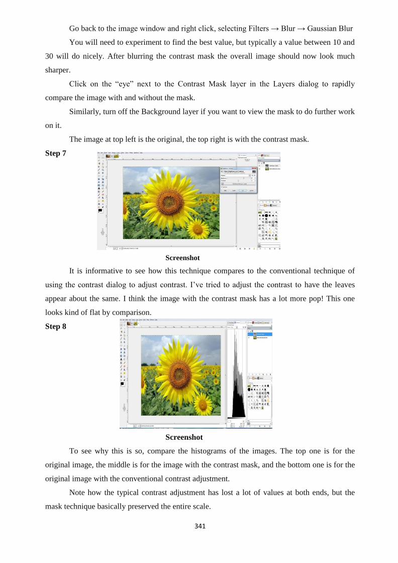
341
Go back to the image window and right click, selecting Filters → Blur → Gaussian Blur
You will need to experiment to find the best value, but typically a value between 10 and
30 will do nicely. After blurring the contrast mask the overall image should now look much
sharper.
Click on the ―eye‖ next to the Contrast Mask layer in the Layers dialog to rapidly
compare the image with and without the mask.
Similarly, turn off the Background layer if you want to view the mask to do further work
on it.
The image at top left is the original, the top right is with the contrast mask.
Step 7
Screenshot
It is informative to see how this technique compares to the conventional technique of
using the contrast dialog to adjust contrast. I‘ve tried to adjust the contrast to have the leaves
appear about the same. I think the image with the contrast mask has a lot more pop! This one
looks kind of flat by comparison.
Step 8
Screenshot
To see why this is so, compare the histograms of the images. The top one is for the
original image, the middle is for the image with the contrast mask, and the bottom one is for the
original image with the conventional contrast adjustment.
Note how the typical contrast adjustment has lost a lot of values at both ends, but the
mask technique basically preserved the entire scale.

342
Step 9
You‘ll have to flatten the image if you are saving it to a typical image format like TIFF
or JPEG (but not if you are saving to GIMP‘s native XCFformat). To do that, right-click on the
image and select
Layers → Flatten Image
Fine Tuning
Now that your contrast mask is created, it‘s time to fine tune it. Here are some things
you can do:
Use the ―Opacity‖ slider in the Layers
dialog to decrease the effect of the contrast mask
overall.
Apply Levels or Curves to the contrast
mask to open up the shadows or reduce the
highlights further.
Apply the dodge and burn tools to the
contrast mask.
Apply a layer mask to the contrast mask and use it to select only parts of the contrast
mask; e.g. if you only want the contrast mask to apply to certain areas of the image
(see my example of this below).
Tips
See this article for some informative tests on the effects of the Gaussian Blur step on the
contrast mask.
Other Examples
Screenshot

343
Screenshot
With a contrast mask as described above. Notice how the sky has recovered some blue,
and the detail visible under the tree!
Screenshot
Screenshot
Here‘s an example of how this technique overlaps with the digital split ND filter
approach. Which do you prefer?
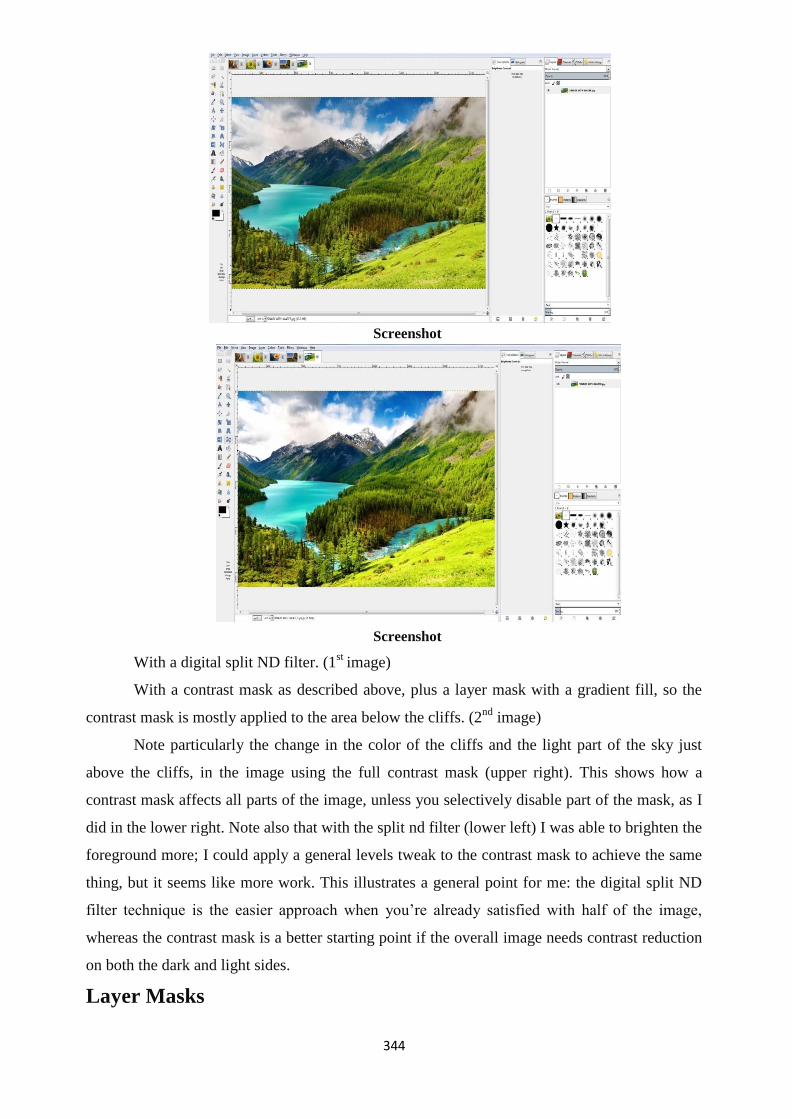
344
Screenshot
Screenshot
With a digital split ND filter. (1st image)
With a contrast mask as described above, plus a layer mask with a gradient fill, so the
contrast mask is mostly applied to the area below the cliffs. (2nd
image)
Note particularly the change in the color of the cliffs and the light part of the sky just
above the cliffs, in the image using the full contrast mask (upper right). This shows how a
contrast mask affects all parts of the image, unless you selectively disable part of the mask, as I
did in the lower right. Note also that with the split nd filter (lower left) I was able to brighten the
foreground more; I could apply a general levels tweak to the contrast mask to achieve the same
thing, but it seems like more work. This illustrates a general point for me: the digital split ND
filter technique is the easier approach when you‘re already satisfied with half of the image,
whereas the contrast mask is a better starting point if the overall image needs contrast reduction
on both the dark and light sides.
Layer Masks

345
Layer masks are a fundamental tool in image manipulations. They allow you to
selectively modify the opacity (transparency) of the layer they belong to. This differs from the
use of the layer Opacity slider as a mask has the ability to selectively modify the opacity of
different areas across a single layer.
This modification of a layer‘s transparency through a mask is non- destructive to the
layer itself.
This flexibility to define the opacity of different areas of a layer is the basis for more
interesting image manipulation techniques such as selective coloring and luminosity masking.
Adding a Mask to a Layer
Layer masks need to be added to a layer before they can be used. The process for adding
them is simple.
Title-Colorization Attribution- Pat David Source- GIMP.org
Link- https://www.gimp.org/tutorials/Layer_Masks/
Layers dialog for the image.
For this example a simple image is used with only two layers, as shown above. There is
a base image at the bottom of the stack and a single layer of teal over it. The teal layer is the
active layer (look for the white border), and the one which we will add a layer mask to.
Right-Click on the layer you want to add a mask to (the ―Teal‖ layer in my example),
and the Context menu will show an option to Add Layer Mask…:
Add Layer Mask in the context menu. You can also add a layer mask through the
menus:
Title-Colorization Attribution- Pat David Source- GIMP.org
Link- https://www.gimp.org/tutorials/Layer_Masks/
Layer → Mask → Add Layer Mask…
This will then bring up the ―Add a Mask to the Layer‖ dialog with some options:
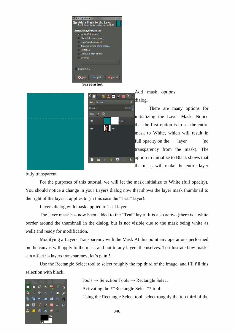
346
Screenshot
Add mask options
dialog.
There are many options for
initializing the Layer Mask. Notice
that the first option is to set the entire
mask to White, which will result in
full opacity on the layer (no
transparency from the mask). The
option to initialize to Black shows that
the mask will make the entire layer
fully transparent.
For the purposes of this tutorial, we will let the mask initialize to White (full opacity).
You should notice a change in your Layers dialog now that shows the layer mask thumbnail to
the right of the layer it applies to (in this case the ―Teal‖ layer):
Layers dialog with mask applied to Teal layer.
The layer mask has now been added to the ―Teal‖ layer. It is also active (there is a white
border around the thumbnail in the dialog, but is not visible due to the mask being white as
well) and ready for modification.
Modifying a Layers Transparency with the Mask At this point any operations performed
on the canvas will apply to the mask and not to any layers themselves. To illustrate how masks
can affect its layers transparency, let‘s paint!
Use the Rectangle Select tool to select roughly the top third of the image, and I‘ll fill this
selection with black.
Tools → Selection Tools → Rectangle Select
Activating the **Rectangle Select** tool.
Using the Rectangle Select tool, select roughly the top third of the

347
image:
Top third of the image selected.
If you want to fill this selection with black, but before you do you need to make sure that
the foreground color is black. Click on the foreground color in the Color area to bring up the
―Change Foreground Color‖ dialog:
Click the foreground color to change.
The ―Change Foreground Color‖ dialog allows you to set the foreground color. For this
example set the color to black, RGB(0, 0, 0):
Change the color to black.
With the foreground color set, you can now
use the Bucket Fill Tool to fill in the selection.
Tools → Paint Tools → Bucket Fill
Title-Colorization Attribution- Pat
David Source- GIMP.org
Link- https://www.gimp.org/tutorials/Layer_Masks/
Activating the **Bucket Fill** tool.
You can now click inside the selection to fill it with the foreground color (black). As
soon as you do, you‘ll be presented with a new view of your image on the canvas:
Title-Colorization Attribution- Pat
David Source- GIMP.org
Link- https://www.gimp.org/tutorials/Layer_Masks/
As you can see, filling the selected portion of the layer mask with black resulted in that

348
area having 100% transparency, showing the layer below it.
If you Rectangle select a different area of the mask, you can fill it in with a different
shade of gray to produce a variable opacity. For example, I will select a few different regions of
the mask, and fill it with different levels of gray:
Title-Colorization Attribution- Pat
David Source- GIMP.org
Link- https://www.gimp.org/tutorials/Layer_Masks/
If you examine the layer mask, you‘ll see that there are different levels of gray being
applied (black to white, from top to bottom), and their value is what determines the opacity of
the layer.
Selective Colorization Example
A good example of the application of layer masks is doing selective colorization of an
image (selectively allowing color to show through a mostly black and white image). Walk
through how to easily do this with an image from Mardi Gras 2013:
Title-Colorization
Attribution- Pat David
Source- GIMP.org
Link- https://www.gimp.org/tutorials/Layer_Masks/
Start the process by duplicating the base image (Shift+Ctrl+D, or Right-Click layer →
Duplicate Layer). From the menu:

349
Layer → Duplicate Layer
Then desaturate the upper layer using:
Colors → Desaturate
Following the steps above, add a layer mask to the desaturated layer and initialize it to
White (full opacity). At this point, the Layers dialog should look like this:
Screenshot
As before, set your foreground color to black. This time, rather than filling selections,
we are going to use the Paintbrush Tool to paint areas of the image we want the color to show
through from the layer below.
I decided to paint the boy on the fence. Using the Paintbrush Tool I painted over his shirt
and head. This allowed those colors to show through from the layer below. Here are the results
after painting:
Title-Colorization Attribution- Pat
David Source- GIMP.org
Link- https://www.gimp.org/tutorials/Layer_Masks/
Simple Selective Colorization Example To illustrate what was done,
here is the layer mask I painted to achieve the above result: Mask isolated to

350
illustrate Of course, you could have chosen a different color than black to create the mask. If
you wanted a slightly more muted color I could have painted with a more middle gray vs. black:
Simple Selective Colorization
Example (painted with gray vs. black).
Basic Color Curves
Color has this amazing ability to evoke emotional responses from us. From the warm
glow of a sunny summer afternoon to a cool refreshing early evening in fall, we associate colors
with certain moods, places, feelings, and memories (consciously or not).
Instead, we are going to take a look at the use of the Curves tool in GIMP. Even though
GIMP is used to demonstrate these ideas, the principles are generic to just about any RGB curve
adjustments.
You‟re Pixels and You
First there‘s something you need to consider if you haven‘t before, and that‘s what goes
into representing a colored pixel on your screen.
Title-Basic Color Curves Attribution-
Pat David Source- GIMP.org
Link- https://www.gimp.org/tutorials/Basic_Color_Curves/
Open up an image in GIMP.Now zoom in.
Nope - don‘t be shy now,zoom in more! And there‘s Nope - don‘t be shy now, zoom in
more! And there‘s your pixel. So let‘s investigate what goes into making your pixel.

351
Remember, each pixel is represented by a combination of 3 colors: Red, Green, and
Blue. In GIMP (currently at 8-bit), that means that each RGB color can have a value from 0 -
255, and combining these three colors with varying levels in each channel will result in all the
colors you can see in your image.
If all three channels have a value of 255 - then the resulting color will be pure white. If
all three channels have a value of 0 - then the resulting color will be pure black.
If all three channels have the same value, then you will get a shade of gray (128,128,128
would be a middle graycolor for instance).
So now let‘s see what goes into making up your pixel: The RGB components that mix
into your final blue pixel.
As you can see, there is more blue than anything
else (it is a bluish pixel after all), followed by green,
then a dash of red. If we were to change the values of
each channel, but kept ratio the same between Red,
Green, and Blue, then we would keep the same color
and just lighten or darken the pixel by some amount.
Curves: Value
So let‘s leave your pixel alone for the time being, and actually have a look at the Curves
dialog. I‘ll be using this wonderful image by Eric from Flickr.
Title-Curves Value Attribution-
Qsimple Source- flickr.com
Link- https://www.gimp.org/tutorials/Basic_Color_Curves/

352
Opening up my Curves dialog shows me the following: Colors → Curves…
We can see that I start off with the curve for the Value of
the pixels. I could also use the drop down for ―Channel‖ to change
to red, green or blue curves if I wanted to. For now let‘s look at
Value, though.
In the main area of the dialog I am presented with a linear
curve, behind which I will see a histogram of the value data for the
entire image (showing the amount of each value across my image).
Notice a spike in the high values on the right, and a small gap at
the brightest values.
What we can do right now is to adjust the values of each
pixel in the image using this curve. The best way to visualize it is to remember that the bottom
range from black to white represents the current value of the pixels, and the left range is the
value to be mapped to.
So to show an example of how this curve will affect
your image, suppose I wanted to remap all the values in the
image that were in the midtones, and to make them all lighter.
I can do this by clicking on the curve near the midtones, and
dragging the curve higher in the Y direction:
Screenshot
Screenshot

353
What this curve does is takes the values around the midtones, and pushes their values to
be much lighter than they were. In this case, values around 128 were re-mapped to now be
closer to 192.
Because the curve is set Smooth, there will be a gradual transition for all the tones
surrounding my point to be pulled in the same direction (this makes for a smoother fall-off as
opposed to an abrupt change at one value). Because there is only a single point in the curve
right now, this means that all values will be pulled higher.
Screenshot
The results of pushing the midtones of the value curve higher (compare to original).
Care should be taken when fiddling with these curves to not blow things out or destroy
detail, of course. We only push the curves here to illustrate what they do.
A very common curve adjustment you may hear about is to apply a slight ―S‖ curve to
your values. The effect of this curve would be to darken the dark tones, and to lighten the light
tones - in effect increasing global contrast on your image. For instance, if I click on another
point in the curves, and adjust the points to form a shape like so:
Screenshot

354
A slight ―S‖ curve
This will now cause dark values to become even darker, while the light values get a
small boost. The curve still passes through the midpoint, so middle tones will stay closer to
what they were.
Screenshot
Slight ―S‖ curve increases global contrast (click for original).
In general, it easiest to visualize in terms of which regions in the curve will affect
different tones in your image. Here is a quick way to visualize it (that is true for value as well as
RGB curves):
If there is one thing you take away from reading this, let it
be the image above.
Curves: Colors So how does this apply to other channels?
Let‘s have a look.
The exact same theory applies in the RGB channels as it
did with values. The relative positions of the darks, midtones, and
lights are still the same in the curve dialog. The primary
difference now is that you can control the contribution of color in
specific tonal regions of your image.
Value, Red, Green, Blue channel picker.
You choose which channel you want to adjust from the ―Channel‖ drop-down.
To begin demonstrating what happens here it helps to have an idea of generally what
effect you would like to apply to your image. This is often the hardest part of adjusting the color
tones if you don‘t have a clear idea to start with.

355
For example, perhaps we wanted to ―cool‖ down the
shadows of our image. ―Cool‖ shadows are commonly seen
during the day in shadows out of direct sunlight. The light that
does fall in shadows is mostly reflected light from a bluish
sky, so the shadows will trend slightly more blue.
To try this, let‘s adjust the Blue channel to be a little
more prominent in the darker tones of our image, but to get
back to normal around the midtones and lighter.
Screenshot
Boosting blues in darker tones
Screenshot

356
Now, here‘s a question: If you wanted to ―cool‖ the darker tones with more blue, what if
you wanted to ―warm‖ the lighter tones by adding a little yellow?
Well, there‘s no ―Yellow‖ curve to modify, so how to approach that? Have a look at this
HSV color wheel below:
Screenshot
The thing to look out for here is that opposite your blue tones on this wheel, you‘ll find
yellow. In fact, for each of the Red, Green, and Blue channels, the opposite colors on the color
wheel will show you what an absence of that color will do to your image. So remember:
Red → Cyan
Green → Magenta
Blue → Yellow
What this means to you while manipulating curves is that if you drag a curve for blue
up, you will boost the blue in that region of your image. If instead you drag the curve for blue
down, you will be removing blues (or boosting the Yellows in
that region of your image).
So to boost the blues in the dark tones, but increase the
yellow in the lighter tones, you could create a sort of ―reverse‖
S-curve in the blue channel:
Screenshot
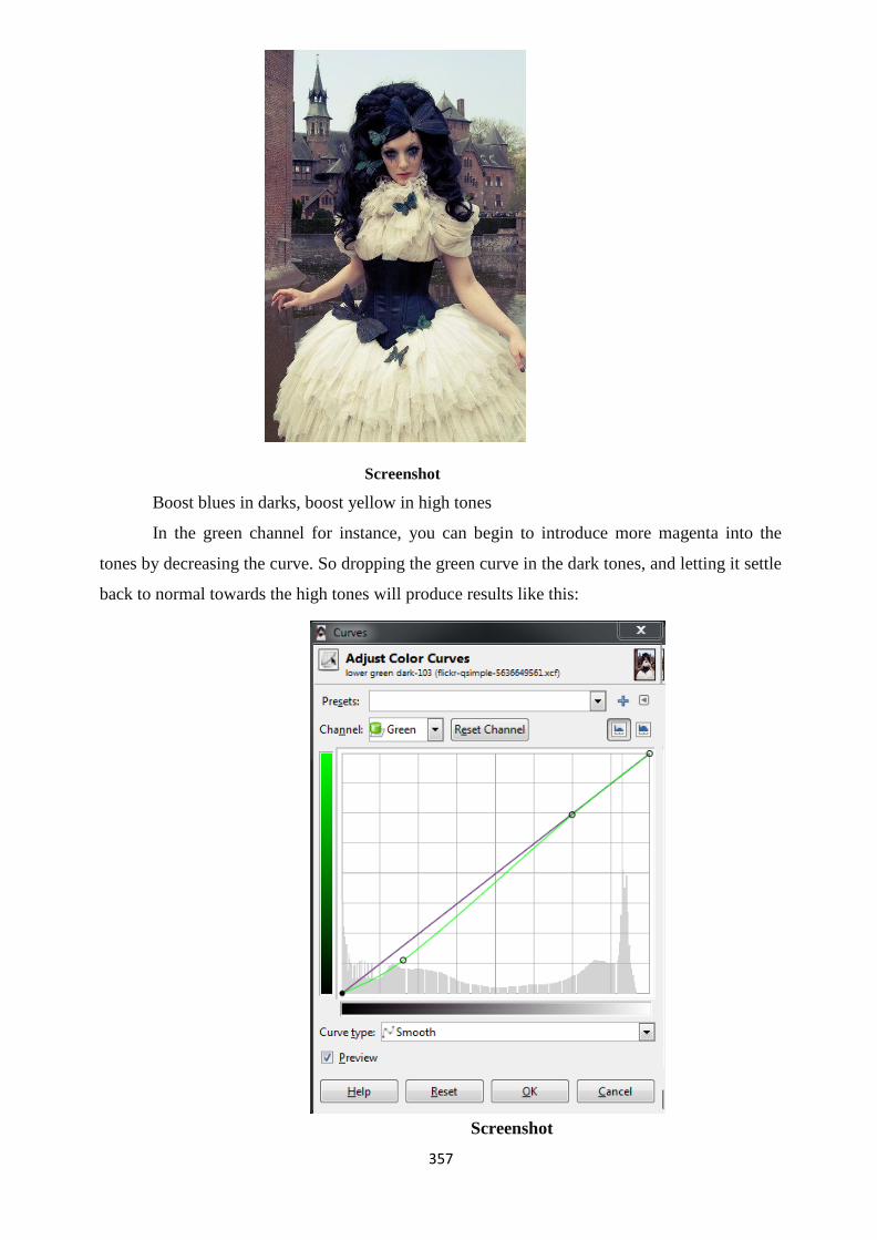
357
Screenshot
Boost blues in darks, boost yellow in high tones
In the green channel for instance, you can begin to introduce more magenta into the
tones by decreasing the curve. So dropping the green curve in the dark tones, and letting it settle
back to normal towards the high tones will produce results like this:
Screenshot

358
Screenshot
Suppressing the green channel in darks/mids adds a bit of magenta
(click for original).
In isolation, these curves are fun to play with, but think that perhaps walking through
some actual examples of color toning/grading would help to illustrate what we are talking about
here. Choose a couple of common toning examples to show what happens when you begin
mixing all three channels up.
Unit Summary
This unit introduced the Gimp and its various applications. We learnt the use of GIMP
tool to edit images professionally. It discussed in details about GIMP Express which is used for
minor editing and GIMP Editor which is used as a professional image editing tool. It elaborated
the use of GIMP to edit image using its various tools like Editing Masking, Colour
adjustments, layer masking, etc through tutorials.
Assessment
1. What is GIMP?
2. What are Layers?
3. What are the features & capabilities of GIMP?
4. What are the three different types of color channel?
5. What is Layer masks In GIMP? Give example.
6. What is the use of Bucket Fill Tool?
7. Select a photograph and adjust the colour toning & gradient of that photograph using
359
GIMP.
Resources
1. https://docs.gimp.org/odftest/en.pdf
2. www.gimp.org
3. http://wwwcdf.pd.infn.it/localdoc/gum.pdf
4. All images saved from screenshot which are done manually using the above editors.
5. Some materials referenced from Google. This website states, it is not copyrighted, thus a
free material.

360
Unit 4 Techniques behind VFX Introduction
involve the integration of live-action footage and Visual effects are processes by
which imagery is createdor manipulated outside the context of a live action shot. Visual effects
involve the integration of live-action footage and generated imagery to create environments
which look realistic, but would be dangerous, expensive, impractical, or impossible to capture
on film. Visual effects using computer-generated imagery have recently become accessible to
the independent filmmaker with the introduction of affordable and easy-to- use animation
and compositing software. Visual effects are processes used to manipulate imagery world which
is manipulated in postproduction house. Visual effects have taken over the kinds of imagery
effect or processes which were once dominated called specialeffects. Special effects are effects
either created on the camera or by CGI. Both of these processes are employed to take advantage
of technology to make imagery that is impossible to find in the real world or far too difficult or
may be dangerous. Some shots may be expensive to achieve without the use of visual or special
effects
Outcomes
Upon completion of this unit you will be able to:
Understand the techniques of VFX
Understand what is digital composting
Learn about Computer generated Imagery CGI
Learn importance of visual effects shots
Terminology
VFX: Visual effects are processes by which imagery is created or manipulated outside the
context of a live action shot.
Digital compositing: Digital compositing is the process of digitally assembling multiple images
to make a final image, typically for print, motion pictures or screen display. It is the digital
analogue of optical film compositing.
CGI: It is the computer generated imaginary.
Chroma: Chroma key compositing or chroma keying, is a visual effects / post-production
technique for compositing (layering) two images or video streams together based on color
hues (chroma range).
Keying: The portions of the video which match the preselected color are replaced by the
alternate background video. This process is commonly known as "keying", "keying out"
or simply a "key".

361
Visual Effects
there were two major special effects categories, in the year 1990called as Opticaleffects
or techniques such as multiple exposures, glass shots, or mattes. Also in this category the effects
were also achieved through the optical printer, where footage could be photographed. Even
today the optical printing effects are the basis for the software-based effects. The second
category is mechanicaleffects, which are effects created on set, in front of the camera, such as
with models, props, and make-up.
In the late 1980s, digital compositing developed. Compositing is the demonstration of
consolidating two diverse symbolism sources; a procedure that was once done on an optical
printer is currently upgraded with the more noteworthy control permitted by PCs, at a
significantly decreased cost. The mid 1990s saw the start of wide utilization of what is regularly
alluded to as CGI or CG. CGI or PC produced symbolism consolidates the procedure of activity
with the utilization of photorealistic surfaces to make characters, view, and whatever else the
psyche can envision to make what can't be shot.
In the present visual impacts world, two noteworthy arrangements of systems are
utilized to unravel generally issues. Will the shot an executive needs be accomplished by
producing designs, joining distinctive wellsprings of film, or utilizing the two procedures?
Digital Compositing
The utilization of advanced compositing has turned out to be so ordinary in present day
diversion that it will frequently go totally under the watcher's radar. A case of ordinary
compositing is your TV meteorologist. Your meteorologist is remaining before a green screen
(or blue screen), which is expelled and supplanted with PC created maps.
Green screens and blue screens are utilized as a part of a procedure called chroma
keying or shading keying. The utilization of entering started in the 1930s when a meticulous
concoction process, beside a troublesome match up shooting process, was utilized at an
awesome cost of time and cash. Be that as it may, with the utilization of video and advanced
compositing, the procedure has turned out to be speedy and cheap.
Basically, an on-screen character, or subject, is shot before a screen that is either blue or
green. The shading does not need to be blue or green, but rather blue and green are utilized
frequently on the grounds that they are in the scope of hues most inverse to human skin. Blue,
the inverse of yellow, was the customary decision, which changed over to green when advanced
compositing turned into the standard on the grounds that computerized cameras react better to
the higher luminance estimations of green. At the point when a film or non-computerized
camcorder is being used, blue is regularly favored. Green is regularly utilized when a shoot

362
happens outside due to the sky.
The shading screen background would then be able to be evacuated. At the point when
film is shot digitally, data is put away in discrete shading channels. These will be red, green,
and blue. Moreover, there is a fourth channel, the alpha channel. The alpha channel controls the
clarity of the shading channels, and in a composite shot the compositor can determine the
shading range that will get either a decreased straightforwardness or evacuation. At that point a
different bit of film can be put behind the shading keyed shot and the joined shot is done.
Keying isn't the main technique for utilizing the utilization of alpha channels. The
utilization of garbage mattes is frequently important to help where shading keys are excessively
troublesome. Garbage mattes more often than not allude to the procedure of hand drawing the
zone that will have a decreased transparency. The modifier "garbage" alludes to the way that it
is typically brief or utilized as a feature of another procedure.
At the point when this isn't utilized as an impermanent or assisted measure, the
compositor is said to masking. The motivation behind why this procedure isn't utilized more
frequently than shading (colour) keying is because of the way that it more often than not
requires alteration frame by frame. Considering film (footage) with a hand-drawn process frame
by frame is referred as rotoscoping. .Rotoscoping is the way toward reshaping a matte, however
it can likewise be utilized to portray a shot that incorporates a hand-drawn or balanced system
that requires consideration for every individual edge. In this way, some speedy math, a motion
picture has 24 frames for each second (fps) while a TV show or business has around 30 fps.
Indeed, on a 30-second commercial that would be 900 different images that a rotoscoper must
take care of, which isn't generally alluring in the snappy pivot entertainment surrounding we
live in. The digital or computerized compositing world comes furnished with little partners to
lessen the requirement for rotoscoping. Motion tracking is one of the example within this. A
territory of a picture can be recorded or tracked by the PC with the goal that some different
procedure can be utilized to that region. For instance, in the Digital Dismemberment, we can
paint out and supplant half of a performing artist's arm. To abstain from rotoscoping, we can put
a dark spot with a marker on our on-screen character's arm so that the PC can track and
afterward something could be joined to that point in its place.
Computer-Generated Imagery
Frequently joined with compositing, the other classification of strategies used to take
care of most visual impacts issues is the production of CGI or CG. What this will involve is
either assembling a few 2D or 3D dimensional digtal (computerized) models that, dissimilar to
live performers or actual real locations or scenes can be changed and moved effectively around
to accomplish the coveted scene.

363
While the utilization of CGI scenes started in the late 1970s, what denoted the entry of
what has turned out to be exceptionally regular in the present visual impacts is the 1993 super
hit film Jurassic Park where CGI dinosaurs were convincingly incorporated into scenes with
live performing artists. Presently, that isn't the special case, it's the standard.
Frequently, not simply Pixar characters but rather even sets, helicopters, structures like
buildings, and blasts are ordinarily made using PC produced graphics that are composited into
scenes. This unit will talk about the procedures for making 2D and 3D designs in After Effects
and also Apple's Motion and Autodesk's Combustion, however these projects can just begin to
expose what's underneath of the 3D illustrations world, as there are many devoted projects to
create and animating 3D characters and universes.
Three-dimensional character movement has to a great extent supplanted the
conventional hand-drawn animated characters. In dream type films, for example, the current
Star Wars prequel set of three, 300, Sin City, and the Lord of the Rings set of three, performing
artists were for the most part shot in blue or green rooms to have 2D-and 3D-rendered sets
supplanting the screen foundations. The simplicity of control and the scope of conceivable
outcomes have made 3D-rendered sets a perfect decision over the antiquated arrangement of
utilizing scale models. Notwithstanding when scale models are picked by the generation groups,
3D graphics are utilized to improve the models.
Particle systems are utilized to reproduce regular marvels, for example, smoke, fire, rain,
snow, and tidy. Basically, similar to a streaming wellspring of pixels, these particles can be
controlled to react to true material science at the tact of the VFX craftsman.
The under realized Power of Available Software
A standout amongst the most generally utilized instruments by VFX craftsmen is
something you likely have on your PC as of now, Adobe Photoshop. Initially composed by
Thomas Knoll while he was a doctoral scholar, the thought got the consideration of his sibling
John Knoll, he has worked in Industrial Light and Magic. John Knoll has turned into a academy
award winner and foundation grant champ for his VFX job away at the current Pirates of the
Caribbean films and is perceived for his work on numerous different movies that depend on
VFX.
Be that as it may, notwithstanding Photoshop's heredity as having an association with
the universe of visual impacts, it has viable use as an instrument for VFX specialists. Thought to
be the establishment programming for altering any picture on a PC, it's frequently utilized as a
part of conjunction with Adobe After Effects. Eventual outcomes reads the different layers of a
Photoshop archive and enables the client to apply keyframe style animation of liveliness to
them. For painting style impacts, clients will alter pictures from After Effects in Photoshop to
have an advantage of Photoshop's unequaled quality with painting instruments and after that

364
arrival the picture to After Effects. The first vision of programming creators of After Effects
was to take what Photoshop does and put it on a course of events.
Beside Adobe, Apple has filled their PCs with an awesome number of stunning,
proficient programming packages. Apple's Final Cut Pro Studio began as an elective editing
framework that overwhelmed the postproduction world. Numerous VFX shots that once would
have required an excursion apart from an editing package can be executed in Final Cut Pro,
which utilizes a comparable key framing engine to After Effects. Sparing time and cash
numerous VFX issues would now be able to be settled in a similar program that the editing may
happen in.
Apple presented Motion in 2004, which later turned out to be a piece of the Final Cut
Studio. Created at first to encourage ease the need to leave the Final Cut condition, Motion has
developed into a proficient contender to After Effects. It has a few impediments, so it's not
exactly a genuine trade for AE till now; be that as it may, it has the solid preferred standpoint of
tight combination with Final Cut. These projects are ordinary among an assortment of clients,
however frequently their actual potential goes unnoticed in light of the fact that the client
doesn't know the procedures to take genuine preferred advantage and support of these projects.
Preparing for your visual effects shot
Here we will examine tips and strategies for setting up a VFX shot. The measure of time
spent in preproduction can spare significant hours on the creation and days in postproduction.
An awesome case is like this something. Suppose you're taking a shot at a shoot that
requires a bright day, however in preproduction the climate reports were not checked and it's
cloudy. So they waited over the set, for the mists to spread, however the mists don't, so they
shoot at any cost. Presently regardless of numerous endeavours to cut around the cloudy film,
the editor needs the shot. A compositor is brought in to supplant the mists and light up the
recording to influence it to look right. Contingent upon the shot, it may take lot of times
altogether however in the event that there's loads of movement, it may take much more time.
Presently, had the climate been checked, the issue could have been worked around.
Presently every issue can't be expected, and plans must be worked out. In any case, what
ought to be maintained a strategic distance from are things that can be dealt with effortlessly on
the preproduction and production levels. You must have heard the joke "we'll settle it in post?"
Well, it's not a joke for all, and keeping in mind that numerous issues can be settled in
postproduction, for what reason do that when it can be settled by simply changing the framing
or, even better, simply going into production with a superior thoroughly considered
arrangement.
Tips for VFX Artists in Preproduction
365
Let‘s see a couple of tips on the best way to help your VFX shot keep running as easily
as could be expected.
Storyboard the Effect
Film scholars with storyboards don‘t go together and they are like oil-and-water
association. It's terrible on the grounds that arranging is entirely critical, and in the event that
you can envision it, early issues can be expected. We will see exhibit utilizing Photoshop to
make storyboards. There are some particular favourable circumstances to storyboarding an
impact carefully; utilizing Photoshop you can think of something considerably nearer to the last
shot than stick figures.
Get Your Camera and Do a Test Shoot
It's really amazing that how could some postproduction people don‘t go from their
workplace. On the off chance that you realize that you have an impact shot coming up, for what
reason not give it a shot? Get the camera and make a test shot. You ought to have some thought
of what you would get and provide yourself the chance to expect issues. It‘s imperative that the
shot be hand-held or bolted off? Is lighting may be an issue? Will you require track focuses?
The test film(footage) can be conveyed to VFX specialists, can be tested,tried and utilized for
something.
Show up on Set
A few directors, if the shot will depend on an impact, will demand a VFX individual
being available amid the shoot. Enormous spending Hollywood motion pictures do this, and
there's no purpose behind an independent to be any extraordinary. Particularly if the VFX
craftsman has done tests as of now, now he/she can exhort or advise on how everything is being
finished. Knowing where the issues will shoot, you can yell to the director that maybe a retake
is all together, given obviously that the entire team of production compliant to it as instances are
there some may or may not comply.
Research the Technique
At the point when given a visual impacts venture you ought to have some thought
regarding how to work on it. In spite of the fact that, why stick to one process up to your basic
knowledge, when you have a universe of information readily available?
Browse the Google and complete a little snappy research. How do individuals take care
of this issue? On the off chance that you take after a long-established system for making a
specific impact or effect, has the procedure changed?
Generally, character animation in After Effects was finished by bringing the character
into Photoshop, cutting every one of the parts up into layers, and afterward bringing in each one
of those layers into After Effects, changing all the Anchor Points, and utilizing a complex
Parenting plan. Seem like a considerable measure of work? It may be.

366
At the point when After Effects CS3 turned out, it appeared like a minor update, off-
base! One new impact has totally changed the procedure of character animation, the Puppet
Tool. Presently you can have full control over a character on a solitary layer. Beside the
likelihood that you might not have the best procedure for making an impact, the best methods
frequently change.
Text effects
In 1994 when Seven was released, people were not just blown away by the film itself,
but also by the excellent titlesequence designed by Kyle Cooper. Title sequences got a huge
boost from the enthusiasm for the one seen in Seven. It created a sense of anticipation for the
film that would follow; just by the title sequence the audience became unnerved — like, okay
what you are about to see is like nothing you‘ve seen before. In this section you will see some
tutorials on how you can give your film that exciting boost that only the right title sequence can
give.
Title Sequence Workflow
Even the most utilitarian, functional purpose-only title sequence can have a little style
and flair and bring up the level of your production. However, there are ways of
overcomplicating a title sequence without some careful considerations for the workflow.
Ingredients:-
The background images for the title sequence.
Text file with credits listed (in most situations, producers will give the designer a text
file with the credits listed).
Text Background Integration
(Created by Author)

367
(Created by Author)
This technique has also been used on Heroes, but we‘ve seen it a lot in TV commercials.
Basically we take generated text layers and make them a part of the scene by taking advantage
of 3D space. Typically, actors will walk in front, or on top of our type to make it feel more
three-dimensional.
Ingredients:-
Footage of actors walking in a fairly large space
Three-Dimensional Text
To get that big, triumphant look, nothing does
better than 3D text.
Fig 4.1 3-Dimensional text
The new glass shot
A glass shot is a strategy that is to a great degree low tech yet exceptionally viable.
Basically, when a movie makerwants to include landscape components and its cost is too high
to create set pieces, movie producers would paint the required additional view on a sheet of
glass and shoot the performing artists with the glass specifically before the camera. Sounds
enchanting and curious, isn't that so? Surprisingly, This procedure was very basic at present.
In any case, now, on account of computerized digital compositing programming, shots that used
to utilize these glass strategies can be balanced carefully with more accuracy and more
prominent capacity.
The visual impacts methods talked about here are not intended to hit the watchers
beyond understanding; apart these systems not upset the scene. In the wake of taking in these
strategies, it's really amazing that how frequently these are utilized and regularly goes
unnoticed. On the off chance that the impact is perfectly done, the viewers never loses that
suspension of doubt, and these are presumably a portion of the most straightforward to pull off
without demonstrating the hand of the VFX artists excessively.

368
Modifying a Building
Fig 4.2 Modifying building(Created by Author)
Amid creation on a movie, movie makers are regularly in the circumstance of requiring
an outside shot that is not existing. Suppose we need to make a world with large messages to
our hero so how about we add a bulletin or hoarding to the highest point of a working in
Photoshop.
Requirements:-
A master shot of the building that ought to be adjusted.
Another shot with the components to be added to the building.
Adding Reflections to a Shot

369
Regularly hard to shoot, shots containing a reflection can include a little punch and
significance to a specific scene. The objects that are reflective will frequently require the hand
of the visual impacts specialists to make the shot land precisely as it should.
Requirements:-
A master shot of the scene consisting of the reflective surface
A second shot utilized on the surface that is reflective to demonstrate the reflection we need (this
is discretionary as there will probably be circumstances where the shot as of now contains what
we have to reflect)
Sign Replacement

370

371
Fig. 4.3 Sign Replacement
(Created by Author)
Signs can be hazardous or a lifeline with regards to building up an location. Signs can be
utilized to set a state of mind and recognize an area for a group of people. On the off chance that
a sign is inadequately found or wrong for a film, frequently it should be supplanted. Presently
VFX craftsmen make the suitable sign for a scene to catch the mind-set splendidly..
Requirements:-
A master shot of the sign that will be changed.
A graphic of a new sign (which will be created in Photoshop).
Removing Objects from the Frame
(Created by Author)

372
Fig. 4.4 Removing objects from frame.
Regardless of how thorough the moviemaker, the photography director, the area scout,
and the entire crew are there will without a doubt be shots that have subjects in the frame that
ought not to be there and can be evacuated.
Requirements:-
Footage with aitem that necessities evacuating
Changing the Weather
Numerous creations just advances or proceeds at the impulse of the climate. By and

373
large, in the event that we have a movie maker who's justified regardless of his or her salt they
will plan the shoot so it happens in the suitable area with pleasing climate. On the other hand,
the climate can change on a dime. Fortunately the VFX craftsman can, much of the time,
change the climate. Be that as it may, it's only one out of every odd case.
Requirements:-
Footage of the shot that needs its weather changed.
Replacement footage for the sky. (if needed)
Fig. 4.5 Turning an Overcast Day into a Sunny Day
(Created by Author)
Fig. 4.6 Turning a Sunny Day into a Rainy Day
Removing an Actor from the Frame
Fig. 4.7 Removing an Actor from frame
It is a typical understanding among editors, like that of magicians, to demonstrate the
group of viewers something required to converge their attention regarding one place with the

374
goal that they will be diverted by something unique. Sometimes we may have a great shotthat
will be the best regardless of differences in the position of things. Here's is a suggestion of
managing that, concealing the confusion.
Requirements:-
Footage of the shot that requires a new or innovative focal point.
Footage or still photo that may be utilized to mask or hide something.
Horror effects
Some folks love to view movies of horror. There are few who are habituated to go for
sleep after watching a horror movie. There are numerous reasons why they adore ghastliness.
The reasons varyin various individuals. There are however the impacts of watching
frightfulness. A few people discover horror or frightfulness fascinating and enjoyable to view.
Others would not set out watch films or even short clippings of this kind.
One reason why individuals appreciate watching ghastliness is the story. As the story
line of many horror movie is fascinating. The thrills and suspense in the horror movies influence
the viewers to watch more movies like the same. These horror movies needs great standards of
direction. The horror movies director are mindful so as to pick the best strategies utilized by the
on-screen characters in making the frightful or horror films more appealing. The role or acting
done in the film is additionally appreciated by most of the audience. The fearlessness delineated
by a few characters in these stories inspire the majority of the audience. Other individuals
appreciate watching horror movies in light of the thrilling component in the motion pictures and
movies. The music that is incorporated into the movies and horror films flicks additionally
persuades a few audience to continue viewing the films. So all these features of horror movies
make such movies or motion pictures intriguing for the individuals who cherish viewing the
subject horror
Evil Eyes
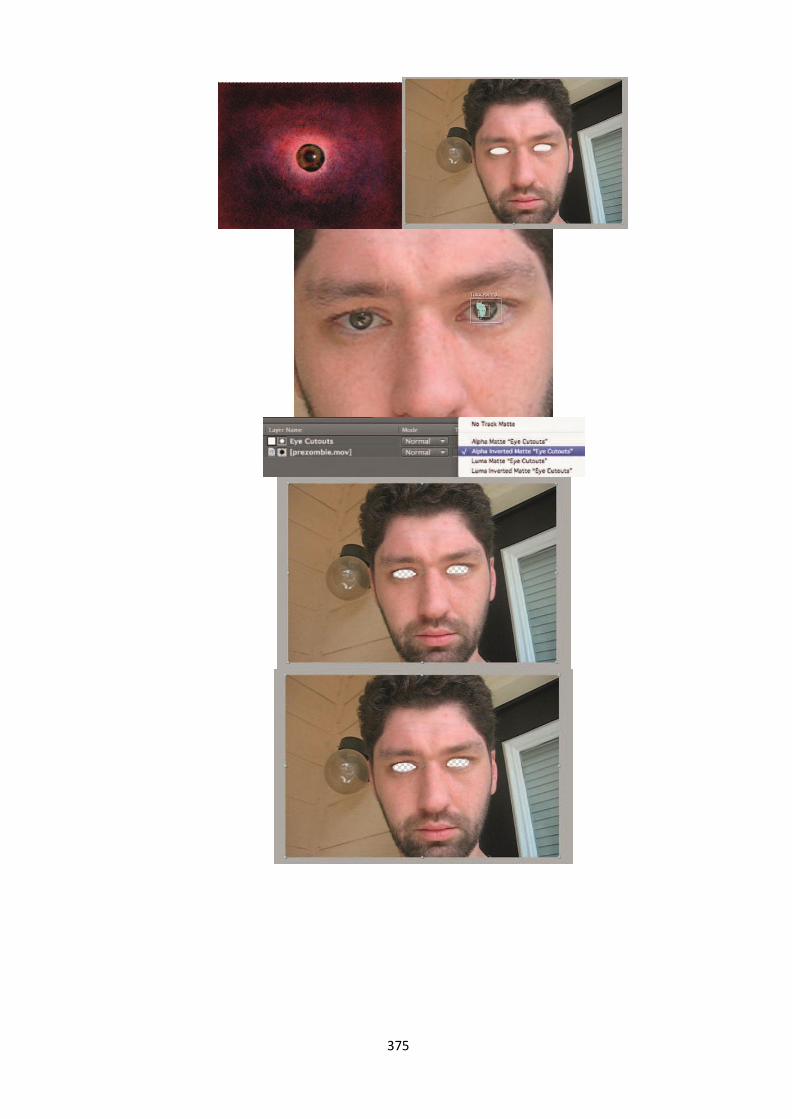
375

376
Fig. 4.11 Creation of evil eyes

377
Fig. 4.12 Distorting facial features to create horror
A convention of the horror movie is Twisting the recognizable soothing face into a
beast. Here we will take a performer and give him a quite irritating change. The eyes of a
human is a standout amongst the most particular highlights of a person has and a little change in
this marks a distinction and we could say that they have been changed into a beast.
Requirements:-
Footage of a performing artist whose eyes we will supplant..
Large resolution still photograph of one of the performing artist's eyes,
ideally a digital macro lens close-up
Zombie Faces

378
Fig. 4.13 Creating Zombie faces
Till now you have gone through the tutorials to make someone beautiful or look
attractive using a Photoshop. Now let‘s see how to make a face look absolutely frightening or
terrific.
Requirements:-
A shot of the performing artist whose face will get our beast make-up.
Digital Dismemberment
At some point or another, in most great slasher flicks, somebody lost an appendage.
Here's an approach to subtract an arm, finger, or leg with a little cautious arranging and some
VFX enchantment.
Fig. 4.14 creating digital dismemberment

379
Action effects
As per the historical background, activity motion images have inferred two things:
extensive blasts and more noteworthy spending designs. These motion pictures are frequently
called as "idealist" or "popcorn" yet the activity type is furthermore very well picturized and
shown in the world of cinema. In the present action film, the VFX skilled worker is routinely
required to finish two critical things: save money on expensive objects, hard to-get shots and
extra stand-ins from the distinctive dangers of on-set failures.
In the 1930s, most movement films were expected for period pieces, with a similar
number of sword fights as the present action films rely upon gun duels. By the 1970s, the tide
had swung to the cruel and tumble, not bewildered of bowing the law cop flick. In any case, the
1980s gave us the Stallone/Schwarzenegger/Willis- style of over-the-principle one man against
widespread trap of mental oppressor's style that helped impact the action to film the common
style in Hollywood today. By the mid-1990s, another move twisted up evidently self-evident,
the effect of the Hong Kong style of action film, which joined the class with awesome "kung-
fu" sort. To the dissident fresh motion picture maker, it has been a serious class in view of its
prerequisite for swollen spending designs.
The best in class official normally can't stand to detonate automobiles, squash windows,
affect Uzis, and have swarms of winged animals (affirm, that one we can hold just for John
Woo). Since the mid-1990s, it has ended up being progressively standard for movement films to
VFX over certified impacts and traps to shield movies from going course finished spending
design. Look at it thusly; there aren't over and over again that you can detonate a set, should
something turn out seriously. Low-spending action films, for instance, Robert Rodriguez's El
Mariachi, show that with great keenness, and the instrument set, it's positively attainable.
Moreover, with some VFX charm, spending designs can be saved and structures can regardless
be detonated. We should encounter various typical action film shots and how, with some
extremely low-fi VFX frameworks, a film can at introduce come in under spending design.
Vehicle Explosions
Creating vehicle explosions
(Created by Author)

380
There is a little piece of every one of us that gets some sort of fulfilment about observing
something detonate. Exploding something, while at the same time adding much energy to a
film, can likewise kill a financial plan. Frequently a visual impact of a blast can be a bit of
frustrating, so here are a few hints on the most proficient method to influence it to feel to some
degree persuading. Here's one strategy to make an extraordinary looking blast.
Ingredients:-
Footage of the vehicle you would like to blow up (shot with the camera
on a tripod).
Footage of the background or location where the vehicle will blow up
without the vehicle there.
Stock footage of Square Flames from www.detonationFilms.com
Building Fire
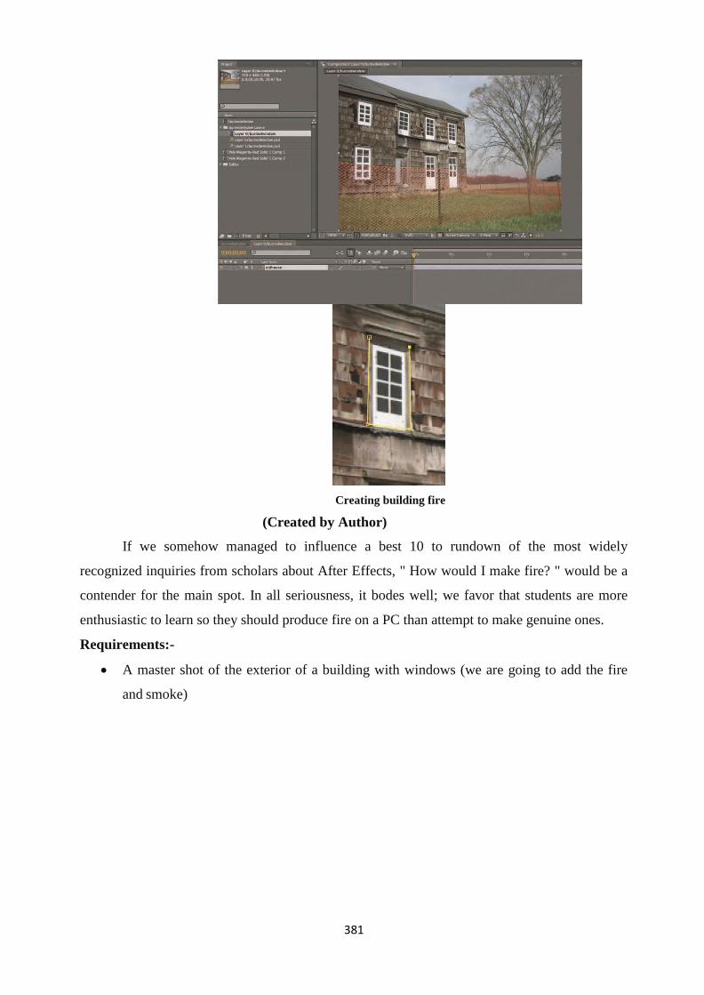
381
Creating building fire
(Created by Author)
If we somehow managed to influence a best 10 to rundown of the most widely
recognized inquiries from scholars about After Effects, " How would I make fire? " would be a
contender for the main spot. In all seriousness, it bodes well; we favor that students are more
enthusiastic to learn so they should produce fire on a PC than attempt to make genuine ones.
Requirements:-
A master shot of the exterior of a building with windows (we are going to add the fire
and smoke)

382
Creating Realistic Gunplay
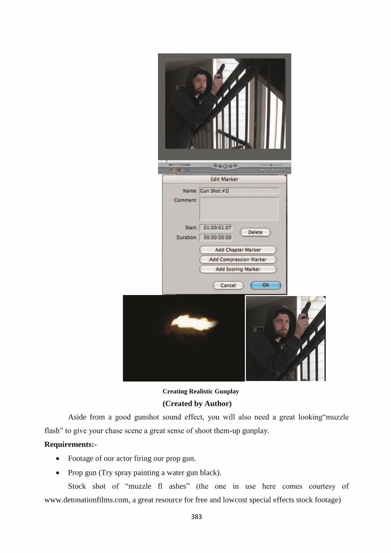
383
Creating Realistic Gunplay
(Created by Author)
Aside from a good gunshot sound effect, you will also need a great looking―muzzle
flash‖ to give your chase scene a great sense of shoot them-up gunplay.
Requirements:-
Footage of our actor firing our prop gun.
Prop gun (Try spray painting a water gun black).
Stock shot of ―muzzle fl ashes‖ (the one in use here comes courtesy of
www.detonationfilms.com, a great resource for free and lowcost special effects stock footage)

384
Unit summary
This unit gave a brief introduction to VFX and its relevance intoday‘s world. It
discussed about digital composting and computer generated imagery CGI. It also introduced the
software‘s used to create VFX and elaborated various tools associated with VFX. It explained
the process to create different effects like an action shot, a horror shot, changing weather,
creating explosion, etc.
Assignment
1. What is digital composting?
2. What are computer generated imagery?
3. What are blue screen and green screen, why are they used in VFX?
4. What is story boarding?
5. What are the advantages of using VFX?
6. Why is VFX used instead of video shooting?
Resources
1. https://en.wikipedia.org/wiki/Visual_effects
2. Byrne, Bill. The visual effects arsenal: VFX solutions for the independent filmmaker. CRC
Press, 2012.

385
DMA-02
Digital Imaging
Block – V: Finishing and Digital Media Outputting

386
Unit-1 Practical- Graphics for TV Production
is intended for people who aim to create designs for print medium on canvas, T-shirt etc.
Introduction
Vibrant Graphics and Animation are very common in Television Programs to create
attraction for the viewers. Television programmes are full of advanced graphics and visual
effects. This Graphic design industry has emerged as a parallel part of the Video Production.
The work of pioneering graphic designers in the Design Industry has set the standards
that still influence what you see on Television today.
In this unit you will learn about how to design the graphics for television. Further, we
will be covering the practical portion of creating some of the Graphics for Television.
Outcomes
Upon completion of this unit you will be able to:
Create and place still and animated logo for Television program.
Develop the still and animated header and footer designs of a Television Program.
Construct an Animated Globe using Synfig Studio.
Design a 3D Animated Globe for a Television program using Blender.
Create a Negative Rolling Animation using Synfig Studio.
Terminology
Blender: Open source software for 3D. It is widely used by professionals and learners. It has
options which are almost matching to the professional software‘s.
Synfig Studio: An Open source 2D Animation Software. Apart from just drawing frame by
frame, 2D Animation software has the capability of optics animation which generates frames on
their own after specifying the starting point and the ending point.
PNG: Portable Network Graphics has the capability to use Transparent Background. In case of
Titling and Logo placement, transparency is required in the edges, hence PNG format is capable
to do so.
FPS: Frames Per Second is the speed which is specified in an animation or movement. In a real
time vide the FPS used is 25 fps in PAL format and 30 FPS in NTSC format.
Birth of Graphic Design in Television Industry
In 1936, the Television Industry was born which was considered as a revolution in that
era. Graphic design was an Industry which was totally considered for print media only. Any
graphics which were required for the Television shot was first hand painted, then it was
photographed or video graphed and brought into the video format for television. There were lots

387
of techniques which were required to be used for bringing the drawn shots to video so only still
format of text and drawings were only used.
BBC television appointed their first graphic designer as full time employee after 20
years of its existence in the year 1954. The employee was John Sewell. A new profession
emerged as the newer competitive players in the industry started adopting new strategies of their
competitors so that they amy move at the same pace with others without being left behind. Still,
the use of Graphic design was under the control of lots of similar designs as a standard format
of a letter. Artistic designs were not used at that phase. Only rectangular and circular shape with
light background and dark text or vice versa were used during that period. The time taken for
creating artistic content could not be afforded or utilized and the normal process itself took a
long time to operate and complete. History of Desktop Publishing
The year 1983 saw a new dawnfor the Desktop Publishing when James Davise, for the
first time, developed a code in Philadelphia. It was for a community newspaper. In olden days,
software were called Programs which were written in codes. The program was Type Processor
One. It ran of computers which had a Graphics card on WYSIWYG display. In 1984, the
software was released in open market commercially by Best Info.
The major breakthrough of Desktop Publishing was in the year 1985 when Apple Laser
Writer Printer was introduced in the market in the month of January. In the same year, in the
month of July, Pagemaker software was launched into the market by Aldus. Pagemaker has
been designed in such a way that documentation of hundreds of pages can be done with
convenience.
―Desktop Publishing‖ term is a contribution to the founder of Aldus Corporation, Mr.
Paul Brainerd. In the world of expensive software and equipment‘s related to colour printing
techniques, Pagemaker was like an affordable solution to the artists and designers who sought
computer as the future tools and technique of advanced designing.
Apart from the introduction of Desktop Publishing in those days, people faced lots of
problems like small screen size, monochrome monitors, inability to use letter spacing, line
spacing etc. The computer display out did not accurately match the print output. The developers
have strived a lot to create graphic designing software‘s which are compatible with hardware‘s,
operating systems and output devices like printers. There has been lots of developments step by
step which has given scope to the Desktop Publishing Industry to flourish.
Now in the 21st century, Advanced and High speed Computer systems have emerged,
Advanced and High End Offset printers have come into existence. Due to all this, there is lots of
scope in Printing Industry. Anything can be designed and printed and printing can be done
anywhere. We can print on paper, we can print on canvas, print on glass as well as we can print
on wood, iron and steel also. Desktop Publishing is already on an advanced mode and is

388
marching ahead to set new avenues for high standard design and printing.
Role of Graphic Designer in the Television Industry
Graphic design in TV industry is growing in a much higher pace. There has been
advanced in the hardware segment which has given wings to the graphic designer to spread and
develop the kinds of output like King Kong and Narnia which was once beyond the
imagination.
As there are lots of options, hence the role of Graphic designer has expanded many
contexts as follows:
Creating the Titles at the beginning of a program and also the End credits of a Program
Creating the identity of the Television channel through Logo Design and specific colour
schemes.
Creating the Graphic Props required for a program
i.e. Backdrop of news channels with vibrant graphics and animation.
Continuous Animated Contents like scrolling of text, animated text etc. for News
channels and music channels.
Changing the formats and sequences monthly or quarterly as desired by the channel.
Now-a-days in channels, same format is not accepted for long, so a graphic designer is
always required to generate new content every time.
Print related Graphic required like Poster of a T.V. program, Hoarding of Channel
advertisement etc.
Use of Computer and Software‟s for design in the Television
Industry
The film rostrum camera was the source of creating designs for Television in the olden
time. It is basically used for creating vertical scrolling contents of text in the titling of a serial or
a program. Rostrum camera is a vertically mounted camera. It has the capability to move up and
down on the area where the artwork is kept. This helps in producing the movement which we
call Animation.
Emergence of Computer and Computer Graphic software totally changed the scenario of
the Television Graphics Industry. Now with minimum effort lots of excellent and eye catching
designs are produced with the help of advanced graphic software‘s. It has reduced the work of
excess dependence of camera for graphics. They are created from the scratch in computers
either in 2D or 3D. Readymade templates are also available in the market which makes the
work easier for designers as they don‘t have to build everything on their own. They are
choosing readymade designs which are called templates and just change the text, logo, graphics
etc. to produce an original content.

389
Output Formats for the Television Industry
NTSC and PAL are the standard format which is used in all the places. Now with the
emergence of HD Televisions, HD [High Definition] formats are also used. The output video
remains the same, but there are some changes in its size specification and frame rate (fps).
NTSC means National Television Standard Committee. Its frame size is 720 x 480
pixels and the frame rate is 30 frames per second. It is mostly used in western countries where
the monitor size or Television size is in the ratio of 16:9.
PAL means Phase Alternate Line. Its frame size is 720 x 576 pixels and the frame rate is
25 frames per second. It is mostly used in Asian countries where the monitor size of Television
size is in the ratio of 4:3.
HD means High Definition. HD comes in various sizes i.e. 1920 x 1080, 1280 x 720,
etc. The final size depends upon the requirement of a place or the output media.
Apart from Television, now-a-days lots of different platforms have come into existence
like Mobile, YouTube Videos etc. Hence a same video output is resized to fit various platforms
and used across all for the convenience of the viewers.
Still Logo Design – Setting the logo design in Krita
A.
Go to google.co.in.
Go to Google Images
Search for a 3d globe. Type ―3d globe png‖
PNG format is a pre transparent background which makes it easier to place an image.
The transparent background is represented through a grey and white grid.
Title: World Globe
Attribution: qimono [User name as per Pixabay]
Source: Pixabay
Link: https://pixabay.com/en/world-globe-earth-planet-blue-1303628/
From the displayed image, choose an image of your choice. Be sure that the background
is in Grey and white shade (the grey and white shade represents transparency in computer
screen).
Save the file in a folder in your PC.
Open Krita
Let us pre assume that we are creating a file for HD format.
Note
HD format – 1920 x 1080 pixels PAL

390
format – 720 x 576 pixels
B.
Create a New file in Krita.
File – New -
Width - 1920 pixels & Height - 1080 pixels.
Color Mode – RGB
File – Open – Choose the saved 3D Globe photo.
Select Menu – Click on Select All.
Edit Menu – Click on Copy.
C.
Go to the new HD file which you have created earlier.
Edit Menu - Paste
Transform Tool -
Scale and place it in a corner as a logo is placed.
Remove the Background layers. Right Click on the Layer – Remove
Layer (Shift + Del is the shortcut)
Save the output file in the PNG format so that it can be used in the editing
track with transparency.
The saved file can be used a logo layer file in the editing software.
The individual Png file can also be placed directly in the editing track without Krita edit
also.
Note
Creating a completely transparent file with only a logo will be helpful in future in
placement of logo.
Activity
Reference Collection
Make a collection of most of the logos of TV Channels and save it in your reference
Click on Create

391
folder in PNG format.
2D Animated Globe Logo – Synfig Studio
A. COLLECTING THE MAP FILE
Go to google.co.in
Go to google images.
Search for globe texture. Type ―globe texture‖ in the search box.
Choose the texture which you feel suitable.
Title: World Globe Map Texture
Attribution:
Source: Pixabay
Link: https://pixabay.com/en/nasa-map-day-ocean-earth-
ice- 140636/
Save the texture file in a folder in your PC
B(1). CREATING A NEW FILE IN KRITA
Open Krita
File – New –
Width – 1300 Pixels
Height – 400 Pixels
Color Mode – RGB
Click on Create
B(2). RESIZING THE MAP FILE IN KRITA
Open the Globe texture file saved in your PC.
Select Menu – Click on Select All

392
Edit Menu – Click on Copy
Go to the new file created earlier of 1300 x 400 pixels.
Edit Paste.
Transform tool -
Resize the globe as required.
Right click on the globe layer – Click on Duplicate Layer.
Right click on the globe layer – Click on Duplicate layer again.
Move and place the layers as shown below.
Select the middle globe – Transform Tool – Tool Options - Flip
Horizontal
[Screenshot]
[Screenshot]
Select the globe area only.
Image Menu – Trim to Selection
Now save the file in jpg form named globeani.jpg

393
C. CREATING THE ANIMATION IN SYNFIG STUDIO
Open Synfig Studio
[Screenshot]
File – Import – Choose the globeani.jpg file
Select the file.
Select the Move tool -
Move the image and place the starting point near the starting area of the
file.
[Screenshot]
Create two guideline. One at the starting point of the image. Second at the
ending point of the single image [not at the ending point of the whole
image]
[Screenshot]
Now we are in the first frame.

394
]
. 0f indicates first frame
Now Turn on the Animation Editing Mode.
After turning on the Animation mode the symbol changes to .
Select the image.
Move tool.
Move the image slightly to create a Keyframe in the beginning.
Now go to the 120th frame. [Type 120f in the frame area -
] or Move the Timeline
marker [
Move the image till it reaches the end point of the whole image matching
the end point guide which we have created.
[Screenshot]
Play the animation.
D. CREATING THE CIRCULAR MASK
Turn Off the Animate Button. . The symbol changes to
Go to the first frame – 0f.
Choose the Circle Tool – Create the circle as shown.
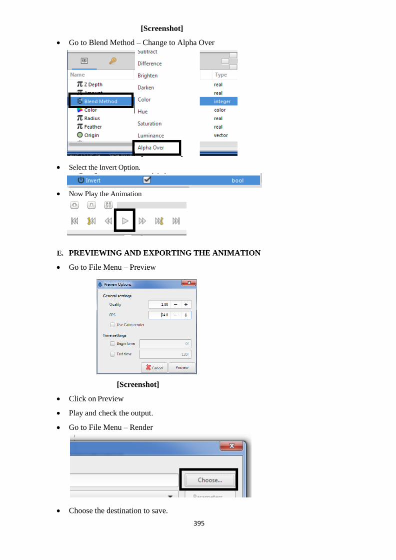
395
[Screenshot]
Go to Blend Method – Change to Alpha Over
[Screenshot]
Select the Invert Option.
Now Play the Animation
E. PREVIEWING AND EXPORTING THE ANIMATION
Go to File Menu – Preview
[Screenshot]
Click on Preview
Play and check the output.
Go to File Menu – Render
Choose the destination to save.

396
Type the file name as – globeanimation.avi
Target – ffmpeg format.
Quality – 9, Anti-Aliasing - 5
Image size – Let it be as default.
[Screenshot]
(The above settings may vary from system to system)
Click - Render
Wait for the rendering to complete.
Now go the destination folder and Play the animation.
This animation can be used in the Editing Track for creating Television Graphics.
3D Animated Logo - Blender
Open Google Chrome
Go to google.co.in
Go to google images.
Search for globe texture. Type ―globe texture‖ in the search box.
Choose the texture which you feel suitable.
Save the texture file in a folder in your PC.
Open Blender

397
Go to Create – UV Sphere
Object Mode – Texture
Material Tab
Left Click on New Material
Texture Tab
Left Click on New
Type – Image or Movie
Left Click on Open
[Screenshot]
Choose UV Editing Mode

398
[Screenshot]
Choose the Map
Object Mode – Rendered
Edit Mode – Solid
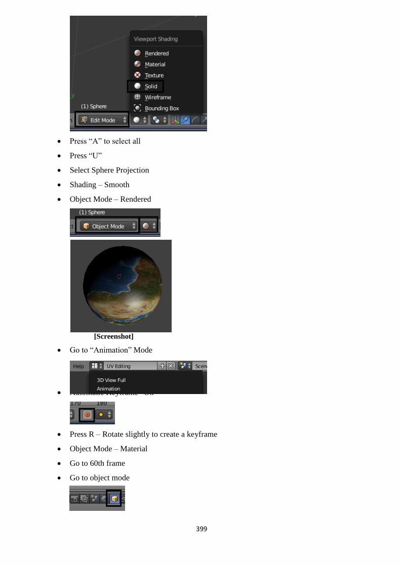
399
Press ―A‖ to select all
Press ―U‖
Select Sphere Projection
Shading – Smooth
Object Mode – Rendered
[Screenshot]
Go to ―Animation‖ Mode
Automatic Keyframe ―On‖
Press R – Rotate slightly to create a keyframe
Object Mode – Material
Go to 60th frame
Go to object mode

400
Change the Rotation Axis
Z Axis to 360
Press the Play Button
Rendering - Animation
Render Presets – HDTV 1080p End Frame – 60
Output – Select the folder
File type – Avi RAW format
Left click on Animation
The Render file can be used in any Video Editing software as 3d Globe Graphics.
Video Reference
Video Tutorial Link of the above Chapter: https://youtu.be/NqSAgoR2UJ4
Still Header and Footer Design - Krita
1. Open Krita.
2. File –New
3.
[Screenshot]

401
4. Width – 1920 Pixels, Height – 1080 Pixels, Model - RGB
5. OK
Bottom Design
Rectangle Shape Tool
Tool Options –
Fill – Foreground Colour
Outline – No Outline
Screenshot
Create the rectangle shape
Transform Tool
Tool Options – Perspective
Screenshot
Tool Options – Wrap
Screenshot

402
Change the above options as required and do the adjustments
Select the layer – Right click – Duplicate Layer (Ctrl+ J)
Move to the bottom
Filter Menu – Adjustment – HSV Adjustment – [Increase the lightness]
[Screenshot]
Transform tool – Rotate the design
[Screenshot]
Left Design
Rectangle Shape Tool
Tool Options –
Fill – Foreground Colour
Outline – No Outline
Screenshot

403
Create the rectangle shape
[Screenshot]
Transform Tool
Tool Options – Liquify
Screenshot
Click and drag on the shape for adjustments
Select the layer – Right click – Duplicate Layer (Ctrl+ J)
Move to the left
Filter Menu – Adjustment – HSV Adjustment – [Increase the lightness]
[Screenshot]

404
[Screenshot]
Save the file in PNG format.
Import the file in Video Editing software for using the design.
Text Animation using Blender
In this section we will cover the following:
Writing Text in Blender.
Writing a word Alphabet wise.
Animating the word Alphabet wise.
Rendering the Scene.
Practical Process:
Open Blender
Press Delete Button keyboard – Click Delete button on screen. . It will
delete the existing object.
Go to Create Menu -
Click on Others – Text -
Go the Top Right hand side
corner. Search for
Text by scrolling down. Click
‗+‖ by the left side of Text. The
panel will be expanded and you
will find another text below.
or Go to Edit Mode -
Backspace and Change the
Text to ―N‖
Change to Object
Mode -

405
Click on the Text
On the screen in the middle you
will find a cursor to the right.
Backspace and delete the existing
text.
Type your required text. Suppose
I type ―U‖.
In the right hand side corner - Click on ―‖ – Data – Object Data.
Go to the Geometry Section
Screenshot
Increase the Extrude value.
Increase the Bevel De:
The output will look as follows:
Use the Scroll Mouse to Rotate the View
Use the Shift + Scroll Mouse to Pan the View
[Screenshot]
Now we will type the word ―UNIVERSITY‖ i.e. ―U‖, ―N‖, ―I‖, ―V‖, ―E‖, ―R‖, ―S‖, ―I‖,
―T‖, ―Y‖ separately.
Press ―Shift + D‖ [Shortcut of Duplicate]
Move it to the right side of first ―U‖
Go to Edit Mode -
Backspace and Change the Text to ―N‖
Change to Object Mode -

406
Press ―Shift + D
Move it to the right side of ―N‖
Go to Edit Mode -
Backspace and Change the Text to ―I‖
Change to Object Mode -
Press ―Shift + D
Move it to the right side of ―I‖
Go to Edit Mode -
Backspace and Change the Text to ―V‖
Change to Object Mode -
Press ―Shift + D
Move it to the right side of ―V‖
Go to Edit Mode -
Backspace and Change the Text to ―E‖
Change to Object Mode –
Press ―Shift + D
Move it to the right side of ―E‖
Go to Edit Mode -
Backspace and Change the Text to ―R‖
Change to Object Mode –
Press ―Shift + D
Move it to the right side of ―R‖
Go to Edit Mode -
Backspace and Change the Text to ―S‖
Change to Object Mode –
Press ―Shift + D
Move it to the right side of ―S‖
Go to Edit Mode -
Backspace and Change the Text to ―I‖
Change to Object Mode –

407
Press ―Shift + D
Move it to the right side of ―I‖
Go to Edit Mode -
Backspace and Change the Text to ―T‖
Change to Object Mode –
Press ―Shift + D
Move it to the right side of ―T‖
Go to Edit Mode -
Backspace and Change the Text to ―Y‖
Change to Object Mode -
Final View looks like this –
[Screenshot]
Now Activate the Animate Keyframe - .
Suppose we need to make an animation @ 25 frames per second for 6 seconds i.e. 25 x 6
= 150 frames.
Hold - Ctrl + Click and drag to select all the alphabets like a lasso selection.
Click on 150th frame.
Create the keyframe – Click on
Click on Keyframe – Yellow Marker -
Screenshot
Choose Location –

408
Click on Key -
Go to 0 Frame
Deselect all the shapes – Ctrl + Shift + Click and drag around alphabets like a lasso
selection.
Go to 0 frame
Select only ―U‖ – Right Click on ―U‖
Choose Translate and Move it beyond the view.
Press ―A‖ to Deselect
Select only ―N‖ – Right Click on ―N‖
Choose Translate and Move it beyond the view.
Press ―A‖ to Deselect
Select only ―I‖ – Right Click on ―I‖
Choose Translate and Move it beyond the view.
Press ―A‖ to Deselect
Select only ―V‖ – Right Click on ―V‖
Choose Translate and Move it beyond the view.
Press ―A‖ to Deselect
Select only ―E‖ – Right Click on ―E‖
Choose Translate and Move it beyond the view.
Press ―A‖ to Deselect
Select only ―R‖ – Right Click on ―R‖
Choose Translate and Move it beyond the view.
Press ―A‖ to Deselect
Select only ―S‖ – Right Click on ―S‖
Choose Translate and Move it beyond the view.
Press ―A‖ to Deselect
Select only ―I‖ – Right Click on ―I‖
Choose Translate and Move it beyond the view.
Press ―A‖ to Deselect
Select only ―T‖ – Right Click on ―T‖
Choose Translate and Move it beyond the view.
Press ―A‖ to Deselect
Select only ―Y‖ – Right Click on ―Y‖
Choose Translate and Move it beyond the view.

409
The final 0 frame view should look like this.
Now go to 150th
frame – The frame should look like this.
[Screenshot]
Now go to 0 frame and Play -
Now Zoom near to the text ―University‖
Now Render for the final output.
Rendering - Animation
[Screenshot]
[Screenshot]
Render Presets – HDTV 1080p
End Frame – 60

410
Output – Select the folder
File type – Avi RAW format
Left click on Animation
The final rendered file can be used in Titling Effects in documentaries, serials, films etc.
Activity
Study Graphic Animations in YouTube and try to identify the software‘s in which they
would have been made. Try to utilize your skills and learning to develop that kind of
Graphics.
Summary
In this unit you learnt about designing television graphics. There are several tools and
software‘s for designing graphics. You can search more on the web and learn which are
important to you.
Assignments
Create a Logo with a 3D Globe image in the Krita.
Create an animated 3D Globe using Synfig Studio.
Create an animated 3D Globe using Blender and Render it in an ―avi‖ file.
Create a Header and Footer design in Krita for a Television Program.
Create a Text Animation using Blender.
Write all the above Assignments in DVD using Nero with the video output, raw source
files of the software used and submit it to the University.
Assessment
is the open source 3D software used for creating Television graphics in this unit.
_______ is the open source 2D software used for creating Television graphics in this
unit.
_______ is the graphic design software used for creating Television graphics in this
unit.
________ is the full form of FPS.
_______ is the frame rate of PAL format. is the frame rate of NTSC format.

411
Unit 2 Practical- Create colourful Vector
character art in Krita
Introduction
Character Designing is a full-fledged job of an artist in a film or a comic book or a story,
or an advertisement etc. Whenever you plan to go to a movie, you first try to know about the
name of the hero, heroine, side actors, villains etc. After knowing that you have a rough idea of
the movie based on your previous experience. In the same way, the looks of the character plays
a big role in the output of the presentation. It attracts the audience to view the product or film.
In this unit you will learn how to create vector character design in Krita and Inkscape
which are one of the software‘s for designing different types of characters.
Outcomes
Upon completion of this unit you will be able to:
Sketch a character.
Usethe software Krita.
Use the software – Inkscape for Vectoring the Art.
Createa complete character design using Krita and Inkscape.
Evaluate the different formats of output of a design.
Terminology
Vector: The shape used by software‘s which are not distorted while enlargement as well as
consumes only less space.
Raster or Bitmap: Photographs or images made up of pixels or dots which represent the
information of position as well as the colour of the pixel. It consumes more space as compared
to Vector based shapes.
Character design: Visualising and creating the Design of a person, animal, a cartoon etc. using
the characteristics of the above.
PNG format: Portable Network Graphics (PNG) is a raster graphics file format that supports
lossless data compression.
TGA format: True vision TGA, often referred to as TARGA, is a raster graphics file format.
TIFF format: Tagged Image File Format, abbreviated TIFF or TIF, is a computer file format
for storing raster graphics images, popular among graphic artists, the publishing industry, and
photographers.
Steps for Character Design

412
First, the script of the project is written and all the characters are established in writing.
Next, a Character Designer is hired and the described character is given to him. The
character designer and the director discuss about the details of the character like the
height, the mood, the dress, the posture etc.
After getting the brief the character designer starts his sketching.
The sketching goes in various rounds with inputs and corrections from the director.
Once the sketch of the character is finalized, it is scanned and taken to the digital
department.
In the digital department, it is created using vector graphic software‘s. Vector graphics is
preferred because it does not get distorted on enlargement. A small design can be enlarged to
huge size also.
After the lining, it is coloured by the artist through the software‘s and the final output is
created.
In this unit, we have prepared an outline sketch and will learn to create the digital output
with colours.
There are few things which you should know and for which you should be prepared.
Tip
An Artist and a Digital Artist. Both the designations seem same, but are different from
one another. An artist learns art from pencil and it is movement of his hands which
creates the art. The Digital Artists uses the tools and technique of the software‘s to
create a better output of the hand drawn art with the help of vector shapes and colours.
A multimedia learner is not compulsorily to be a great artist to create a great output.
You will be surprised to know that in the Graphic Design Industry, 70% and above
people belong to categories other than professional passed Artists from Art related
courses.
Art comprises not only of drawings, but there are lots of departments in Art. For e.g.
Drawing Department, Digital Drawing Department, Colour department using
software‘s, Layout Department, Composition Department etc. All these together create
a great art. It is not a One Man Show. So learn the process and try to be expert in your
own Area.
Krita – Open Source Software for Designing
There are lots of open source software‘s which are available in the market for image
processing and designing works. One of the popular and widely used software is Krita. It has
got all the capabilities of creating a successful design required for commercial works.
The word ―Krita‖ is a Swedish word. It means ―to draw‖ or ―chalk‖. The name was

413
assigned after the name ―KImageShop‖ and ―Krayon‖. These former names were not going well
with the software hence ―Krita‖ is finalized.
Open source software‘s means any person can access the software code and add or
modify options. Any person can write code and benefit to the company or community by their
efforts and earn recognition for them. These open source software‘s have created a good
platform for users who cannot afford or purchase costly commercial software‘s.
Note It
You have already studied the software Krita in Block 3 – Image
Development on different Graphic Software, Unit 1- Krita – Familiarization with
interface - Tools and Features.
Hence, we will only focus on the tools required for the character design.
Practical – Technique 1 – Drawing and Tracing in Krita
Draw a rough sketch of your own choice.
Take the photograph of the sketch in digital format.
Open Krita
Create a new file of A4 Size
Screenshot
Copy and Paste your sketch drawing file.
Create a New Layer
Trace the outline with your desired brushes.
Bezier tool is an excellent tool for tracing in Krita.
Brush Options Screenshot
Brush Engine – Choose ―Pixel‖.

414
Screenshot
Choose the following type of brush.
Screenshot
Now start the tracing.
Hide the other layers expect the drawn layer
File – Export – PNG format.
Note It
Do it patiently. It will take about 20 to 30 minutes to bring perfection in drawing.
Inkscape – Open Source Software for Designing
Inkscape is a vector based open source software used by people in the industry. Designs
which are related to shape are mostly done using Inkscape.
It has lots of ready-made tools and options required to create advertisements, shape
related designs such as logo, visiting card etc. It has the ability to create lots of textures and
manually created shade of designs.
It is inherited with the capability of creating lots of variety of output formats. The export
capability into various formats of a design makes it usable in most of the platforms available in
the computer operating system.
Note It
You have already studied the software Inkscape in Block 3 –
Image Development on different Graphic Software, Unit 2 - Familiarization with
interface of Inkscape.
Hence, we will only focus on the tools required for the character design.
Practical – Technique 2 - Vectoring
Open Inkscape
File – Import – [Choose the eyes file drawn in Krita]

415
Path Menu – Trace Bitmap
Screenshot
Now your shape is in Vector format.
Choose the fill tool and colour as required.
OUTPUT FILE -
Total Structure of a Character Drawing
First of all, before entering into the software interface, we have to prepare a complete
sketch of the character drawing manually on a piece of paper. We will now study all the
elements of a character design one by one.
Character Anatomy
The designer first creates the character anatomy with the features which are assigned to
him. An overview anatomy and drawing of the character is shown in Fig A, B & C, and a
technique of digitization is described.
Practical – Technique 2 – Outline Vector Drawing
Take a Photograph of Figure A as shown below using any Smartphone.
Transfer the Photograph to your computer.
Open Krita
Open the Photo of Figure A
Select Menu – Select All
Edit Menu – Copy

416
Fig. A
[Drawn by the Author]
File - New [Choose any size]
Edit – Paste
Transform the Photo and resize according to the screen.
New Vector layer
Screenshot
Choose Brush Tool - Brush Settings - - Choose a Round Brush
Choose Bezier Curve Tool -
Click and draw the outline shape – Press Enter
Fig. B
Fig. C

417
Continue the above process till completion.
Work in Progress –
[Screenshot]
We can adjust the points after drawing the lines also.
Choose the shape manipulation tool.
Left click and drag over a shape.
It will get selected as shown.
[Screenshot]
The bottom tool under this Shape manipulation tool will change to Path Editing
tool
Choose the Path Editing tool
Click and move to adjust the points.
[Screenshot]
Go to Tool Options – We have got extra options like Add points, Remove points etc.
to modify the shape further.

418
After the complete drawing, save the file in Krita [ File – Save ]
Save the file in JPG format also [ File – Save ]- Under the ―Save as type‖ option
choose JPG.
Activity 1
Download a reference image similar to the Above File from ―Google‖ through Internet
OR use the three files Fig. A, B & C by taking a photo in your Smartphone and
transfer it to your PC.
Import the file in Krita and Trace using the technique as shown above.
Save the file in Krita format and PNG format.
Face
Face is the area where we look for the most amounts of details to recognize a person.
While drawing a character the artist draws the profile of the character in front view, left view or
right view and a one third perspective view.
A sample of a face profile is shown in Figure D, E & F.
Fig. D - Front Profile Fig. E - Right Profile Fig. F - One third
Profile
[Drawn by the
Author]
Practical – Technique 3 – Stroke Path using Brush
Take a Photograph of Figure D, E & F as shown using any Smartphone.
Transfer the photos to your PC

419
Open Krita
Open the Photo of Figure A
Select Menu – Select All
Edit Menu – Copy
File - New [Choose any size]
Edit – Paste
Transform the Photo and resize according to the screen.
New Vector layer
Choose Brush Tool - Brush Settings - - Choose a Round Brush
Choose Bezier Curve Tool -
Click and draw the outline shape – Press Enter
Continue the above process till completion.
Choose Brush Tool - Brush Settings - - Choose a Designed Hazy Brush.
Set the Brush Size as required.
Select the vector layer.
Edit Menu – Stroke Selected Shapes

420
[Screenshot]
The output will look as above. We can create sketch type of drawing using this
process.
Activity 2
Download a reference image similar to the Above File from ―Google‖ through Internet
Import the file in Krita and Trace.
Save the file in Krita and PNG format.
Eyes
Eyes are one of our important parts to portray our expressions. Hence drawing eyes is a
vital part of character design. In the given figure below are illustrated some of the eyes with
their properties.
Fig. J- Round
Eyes
Fig. K - Sleepy
Eyes
Fig. L - Down
turned Eyes
[Drawn by the Author]
Activity 3
Download a reference image similar to the Above File from ―Google‖ through Internet
Import the file in Krita and Trace.
Save the file in Krita and PNG format.
Eye Colour
When it comes to the digital world, eves come in all colours as compared to our natural
eyes. The natural colour of an eye is black, blue or brown. There are rarely some shades of
green. The side portions of eye ball come in white colour shades with stains of brow, yellow
and red.
Fig. G -Almond
Shaped Eyes
Fig. H
Hooded Eyes
Fig. I –
Deep-Set Eyes

421
Fig M: Eyes of Different Colors [Created by the Author]
Practical – Technique 5 – Readymade vector shapes with filled
colours.
Take a Photograph of Figure M as shown using any Smartphone.
Transfer the photos to your PC
Open Krita
Open the Photo of Figure A
Select Menu – Select All
Edit Menu – Copy
File - New [Choose any size]
Edit – Paste
Transform the Photo and resize according to the screen.
Now we will create the design according to a plan as shown below.
[Screenshot]
Go to Settings Menu – Docker – Add Shape
Select the circle shape – Click and drag onto screen
Go to Tool Options – Choose the fill and change the colour as required.
Set the line style and outline width as required.
In the above process create the other two circles and place it as shown in the reference
image.
The output should be as follows:

422
[Screenshot]
We can change the colours as required anytime by selecting the shaping and going to
the Tool Options as shown above.
Activity 4
Download a reference image similar to the Above File from ―Google‖ through Internet
Import the file in Krita and Trace.
Save the file in Krita format and PNG format.
Nose
A Nose defines the look of a person. Whenever we draw an imaginary character, the
look of the nose is important and forms an eye catching element in the face. People of various
countries have different types of noses and while drawing a character, the artist has to experiment with
different types of noses which suit the character.
Some examples of different types of noses are given below with figures.
HOOKED NOSE DROOPY NOSE AQUILINE NOSE
ROMAN GRECIAN

423
BUTTON NOSE CHILD
VERSION
UPTURNED
NOSE
Figure N: Different Drawings of Nose [Drawn by the Author]
Activity 5
Download a reference image similar to the Above File from ―Google‖ through Internet
Import the file in Krita and Trace.
Save the file in Krita format and PNG format.
Lips
Lips come in various shapes and sizes. But an overall look will display that all the lips
are mostly same. But there is a difference when it comes to drawing lips of a character. The
expression of a face is portrayed by the change in shape of the lips like smiling, laughing, sad
etc.
Even lips vary from children, young person and old person. The lip of a same person
SNUB NOSE FUNNEL NOSE
FRONT VIEW AND UNDER NOSE DRAWINGS

424
changes in texture as the age goes by. Hence, the designer or character artist should have
knowledge of lips to draw a successful and appealing character.
Here are some examples of the lips with its title characteristics.
Natural Pointy
Natural
Thin Cupid‟s Bow
Uni-lip Beestung Smear Glamour
Figure O: Different Drawings of Lips [Drawn by the Author]
Activity 6
Download a reference image similar to the Above File from ―Google‖ through Internet
Import the file in Krita and Trace.
Save the file in Krita format and PNG format.
Ear
Ears are still identities in human beings. They come in few categories. As a designer, it
is used to attach some decorative elements like ear rings to generate appeal.
Here are some of the examples of ears with their characteristics.
Round Ear Free Lobe Square Ear Pointed Ear Narrow Ear

425
F
igure P: Different types of Ears [Drawn by the Author]
Activity 7
Download a reference image similar to the Above File from ―Google‖ through Internet
Import the file in Krita and Trace.
Save the file in Krita format and PNG format.
Eyebrows
Eyebrows vary from male to female. The eyebrows of male are rough and natural. The
eyebrows of female are polished and thinner. There are two factors which established the shape
of eyebrows- one is the overall basic shape and the other is the height of the arch.
Some of the examples of male and female eyebrows are as follows:
Female
Sticking Out Attached Lobe Broad Lobe
Flat Shape
Blun
t
Tail
Full
Male Eyebro
ws
Arched Shape
Tapered Tail
Thin
Female Eyebrows

426
Basic
Shape
Arch Curved Angled Soft
Angle
d
Rounded Flat
Low
High
Male
Basic
Shape
Arch Angled Rounded Flat
Low
Figure Q: Different types of Eyebrows [Drawn by the Author]
Activity 8
Download a reference image similar to the Above File from ―Google‖ through Internet
Import the file in Krita and Trace.
Save the file in Krita format and PNG format.
Hairline
Hairline is the overall outline of a face. It varies from children, male and female and it
varies as per age also. Some hairlines are round; some are square and are in different
proportions also.
Some of examples of male and female hairlines are given below.
Female Hairline

427
Straight Rounded Widow‟s Peak
Male Hairline
Regular Receding Receding
Figure R: Different types of Head Shapes [Drawn by the Author]
Activity 9
Download a reference image similar to the Above File from ―Google‖ through Internet
Import the file in Krita and Trace.
Save the file in Krita format and PNG format.
Hands
Hands consist of three joints and five fingers. The fingers again have their own joint
bones. Hence, drawing a hand in different angles perfectly is very difficult. An artist has to do
lots of practice to draw the poses of the hand.
Hand specifies the work which a human being does. By looking at the drawing of hands
people can visualize what a person is doing. Maintaining proportions and perspective is a
challenge while drawing a hand. It has to sync with the other body part pose also.
Drawing hands digitally has to go through lots of gridlines, guides and references.
Hence, the base drawing is drawn on paper first with lots of shade lines and corrections. After
getting the final pose of hand, it is scanned into computer and the perfect fine lines are digitized
using software tools to create the neat and clean output.
Some of the poses of hands are illustrated below.

428
Figure S: Different types of Hand pose [Drawn by the Author]
Activity 10
Download a reference image similar to the Above File from ―Google‖ through Internet
Import the file in Krita and Trace.
Save the file in Krita format and PNG format.
Reading
Go through the following website for details of hand design:
https://design.tutsplus.com/tutorials/human-anatomy- fundamentals-how-to-draw-hands-
-cms-21440
Legs
Legs are the base on which a body stands. Like hands, legs also have three joints and
five toes. As the toes of the legs are small it is quite easy to draw legs as compared to hands.
The motion drawings of legs indicate whether is the person is still, walking, jogging or
running. In 2D, drawings have to be done in each and every pose as required. If we want to
show a man running from top view and then in a perspective view, we have to totally redraw the
two drawings.
There are lots of poses related to legs, which has to be first drawn manually and then
transferred to computer to create the digital output.
Some of the poses of legs are demonstrated below:

429
Figure T: Different types of Leg pose [Drawn by the Author]
Activity 11
Download a reference image similar to the Above File from ―Google‖ through Internet
Import the file in Krita and Trace.
Save the file in Krita format and PNG format.
Complete Character Design
After learning the individual parts of character design, now we are in a position to create
a complete character and create the vector colourful output.
First, a conceptual art work is done by the artist, which consists of lots of pencil shades.
The artwork is seen by the client and finalized. Once the manual work is finalized, it goes to the
Digital department.
The artwork is scanned in high resolution and set as background in digital image
processing software. The digital artist redraws the fine lines from the sketch. Then he colours it
and the final output is reviewed for colour changes and shape modifications if an. After the final
changes the output is generated.
Some examples of character designs are as follows:
Conceptual Art

430
Conceptual Art Design [Drawn by the Author]
Activity 12
Download a reference image similar to the Above File from ―Google‖ through Internet
Import the file in Krita and Trace.
Save the file in Krita format and PNG format.
Different formats of output
KRITA FORMAT
*.KRA – It is the format of output of the files created using Krita Software. This format
consists of all the layers details of the work and can be opened in KRITA
software only.
INKSCAPE FORMAT
*.SVG- Inkscape SVG if the format of the files created using Inkscape software. This
format consists of all the vector shapes of the work and can be opened in
INKSCAPE software only.
PNG FORMAT
PNG stands for Portable Network Graphics. This format is popularly used due to its
transparency maintenance in the edges of an image. Basically, in Logos and individual drawings
or photographs the base file is required to be transparent around in edges so that it can easily
merge with the background. In most of the other formats, the shape in four corners is white. The
artist has to manually remove the border edges and then use the image. Hence, PNG format
being transparent on its own while saving the file eases the work of the designer.
Conceptual Art

431
PNG Format
JPG Format
Title: Vector Design Attribution: Source: Freepngimg
Link: http://www.freepngimg.com/png/18676-vector-high-quality- png
Here is an example of same image with JPG format and PNG format. In JPG format, we
can notice white colour patch in the edges. When we copy and paste it anywhere, it will be
accompanied by the white edges.
But in PNG format the edges are transparent. It is displayed as Grey and White grid.
When we copy and paste it into other image, it will automatically merge without any corner or
white patch.
TGA FORMAT
TGA stands for ―Truevision Graphics Adapter‖. It can contain images up to 32 bits per
pixel. TGA format is mostly used for still video editing sources. The edges are also transparent
in TGA format.
In comparison to PNG, TGA format does not give thumbnail previews, but PNG format
gives thumbnail previews. For this reason, people now-a-days use mostly PNG format as
compared to TGA format.
TIFF FORMAT
TIFF stands for Tagged Image File Format. It has got the capability to store the files in
form of layers. This helps the artist to edit the files in future if required. The file size of TIFF
is a bit higher than other formats. But still people prefer TIFF when it comes to quality or re-
editing of the design.
TIFF stores both raster and vector graphics data which helps the designer in saving the

432
file for making changes in the future.
JPG FORMAT
JPG is the final compressed file which for display purpose. The Pixel data is squeezed
and saved as per the necessity. The use varies from usage of image in webpage, usage of the
image for print purpose etc.
The designer has to fix the pixel size before saving in this format. Once the file is saved
in a fixed size, it will get distorted if expanded beyond its 100% capacity. However, the
memory and file size consumed by this format is very less as compared to other formats.
JPG files can be opened by most of image editing software‘s, from Microsoft Paint to
Adobe Photoshop.
Unit Summary
In this Unit you have studied about Character Design. You have learnt the process of
creating a vector output from raster drawings of various parts of our body. This Unit also
described about various techniques using open source software‘s like Krita and Inkscape for
creating the Digital version of the character which was drawn by us by our hands.
Assessment
Describe the adjustment point of a line drawn using Pen tool called in Inkscape?
Which format should be used for export so that the background transparency is
maintained?
Write the two commands which should be used for copying an object and pasting in the
same place?
Assignment
Create a hand drawing of a complete character.
Scan or Take the photograph of the character.
Create a Raster black outline work of the character in Krita.
Create a Vector colourful output of the character in Inkscape.
Save the output of all files created in this unit in PNG format and submit all the
supporting files i.e., Krita file, Inkscape file, rough character photo and output files in a
CD/DVD to the University.
Resources
Illustrating a Character in Krita:
https://www.youtube.com/watch?v=edJJTemV4pY
2D Character Design in Krita:

433
https://www.youtube.com/watch?v=ZYwICk_XbMg
2D Character in Colour
https://www.youtube.com/watch?v=3xsyoTqcwRA
Colouring in Krita
https://www.youtube.com/watch?v=low1odYyuWo

434
Unit 3 Practical- Create Texture tricks with
Inkscape Introduction
Texture is the about creating the surface quality or feel of an object. The way your skin
surpasses against the rough fabric of your woollen blanket, the warm sensation of the soapy
bubbles over your skin in the bath or the gentle touch of your hair falling down your shoulders
— these are all sensations and experiences created solely by the qualities of texture. In the olden
days, textures were only photographed and utilized in the designs. But with the help of latest
software‘s like Inkscape, Photoshop, Coreldraw etc. You have the freedom to create the texture
of your own settings. Artificial textures, or abstract textures, comprise a wide array of imagery
with surrealistic patterns and human- fabricated objects. Artificial texture graphics include a
broad spectrum of elements and colours created by three-dimensional design and a blend of
computer graphic software‘s. By using the power of modern 3D and Graphic Design software,
designers can add a broad range of artificial textures to their designs, and the results are limited
only by imagination.
Outcomes
Upon completion of this unit you will be able to:
Develop an idea of creating Textures.
Practice the software – Inkscape for creating Textures.
Use the created textures for creating design works.
Prepare a practical study of all the texture options available in Inkscape.
Create some examples of combined texture effects.
Terminology
Texture: A realistic effect of an object or colour with adds depth to the visual.
Vector: The shapes used by software‘s which are not distorted while enlargement as well as
consumes only less space.
Blog: Photographs or images made up of pixels or dots which represent the information of
position as well as the colour of the pixel. It consumes more space as compared to Vector based
shapes.
Typography: The style of writing an alphabet written manually.
Font: The style of using the digital alphabets using Computers or any digital platform.
Tips and Notes
Before starting of the practical, there are few things which you should know and for
which you should be prepared.

435
You should know about the meaning of various types of textures. For doing so you
have to go to Internet and search various texture photographs.
You should keep a collection of textures for reference purpose so that you can use them
wherever required.
Group Activity
Go to ―google.co.in‖.
Click on the ―Images‖
Search for texture design i.e., wood texture, tiles, grass texture, marble texture, fabric
texture etc.
Create a Folder named ―texture‖ in your PC or your pen drive.
Save as many variety of textures you feel as of good quality.
Now copy all the textures downloaded from internet by all the students in this
particular batch.
You will notice that you have collected a huge collection which will be useful for all
in creating future designs.
Apply this method for other purposeful searches also. This will create a variety of
output and will be multi beneficial to everyone.
Texture Design – Requirement of Industry standard
The designs which we create today needs to be filled by Textured Graphics and abstract
backgrounds which gives truly immersive feel of the design. For getting the depth and detail in
our work we have to create textures using the tools and techniques available in the digital
industry. Softwares give us options like opacity, blending modes like add, overlay, multiply etc.
which enables us to create a look of three dimension in the two dimension layout. Typography
is an important element in texture which adds meaning to the background to transfer
communicative messages. Different styles of typography which are called fonts in the computer
terminology comes in thousands. Modern designers use all sorts of fonts which range from
calligraphically styled icons to simple and modern typed text. By utilising the mixture of style,
shape and texture, a written font creates a statement of power without the input of complex
composition of designs.
The technical world has gone beyond expectations and limitation to creating a stunning
visual outputs in our designs.
Texture became applicable in design decades ago when people use to draw line
drawings on walls which we can see in ancient places. There were no particular medium like
pen, paper, canvas or digital screens at that time. People use to communicate on leafs, rocks and

436
wherever they could using their knowledge and creativity. Hence forth, texture has become a
compulsory part of the design. The use of texture is found in each and every medium of today,
whether it may be a flyer or a hoarding on the road. The background is given an effect of a
texture of any resource which creates depth to the presentation.
Texture does not only mean rough surface, there are varieties of tiles surfaces which
form of a geometric design. A different type of textures generates different kinds of feeling in
us. So textures are used according to the place and requirement. For example, if we are making
a design of a bathroom, then the floor are made up of glazing tiles. The half of the walls is
covered up of glazing tiles. These tiles do not soak water; hence these tiles are used in this
place.
Textures are basically random in nature. No two textures can resemble accurately the
same. As we can say that no finger prints of different individuals can ever match although it
seems equal from a distance. The wood texture of two different people will never match
although it may look same. We will now have a look into the types of textures used in
designing.
Types of Textures
There are two kinds of textures. One is Tactile Texture and the second is Visual Texture.
Tactile Texture
Tactile means the feeling of a touch. In Tactile texture, materials are used such as sand,
thick colours etc. to emboss the effect and have the feeling of a raised element. For creating
tactile kinds of texture, we have got 3D printing technology. 3D printing technology has
enabled us to create designs and effects which can be printed on raised platforms like thermocol
design printing, printing on wooden pens etc. We can print a complete science project using a
3D printer showing various parts of the area in three dimensions.
Visual Texture
Where as in Visual Texture, it is representation of colours used which create a 3d raised
effect on a flat surface. It is the illusion created by the artist by his colour combination
techniques that makes a two dimensional work to look three dimensional. Texture is a subtle
element in design. It makes the design more attractive. Although they are not real, it depends
upon the talent of the artist to represent a visual texture with a raised feeling.
Inkscape – Open Source Software for Design and Texturing
Inkscape is one of the free professional quality vector graphics software which runs on
Windows, Mac OS X and GNU/Linux. It is used by design professionals and hobbyists
worldwide, for creating a wide variety of graphics such as illustrations, icons, logos, diagrams,
maps and web graphics. The W3C open standard i.e. SVG (Scalable Vector Graphics) is used

437
by Inkscape. This format is the native format of Inkscape which is vector based and can be
exported and compatible with other vector based software‘s.
Inkscape has got tools and techniques that can create outputs which are comparative to
Adobe Illustrator, CorelDRAW and Xara Xtreme. Several other formats can also be exported
and imported using Inkscape, which includes SVG, AI, EPS, PDF, PS and PNG. Inkscape has a
comprehensive set of features, with a simplified interface, multi-lingual support and is
extensible in design; users can extend the functionality of Inkscape functionality with add-ons
which can be provided by any open source software developer.
The availability of this kind of open source software‘s have enabled artists to come
forward and display their creations to the open world. The world is expanding day by day. The
concept of getting quality product only by a paid program has faded away. Products like
Facebook, Whatsapp, G-mail are totally free to use. No one can even question about the quality
of the product or service. They are world class but still they are free. The generation of open
source software has opened doors for best talents all over the world. It is the work which is
appreciated, not the source of making the work. No one bothers about the bat of Sachin
Tendulkar, it is the runs scored which matters. Hence, before using free open source software,
the artist should not think himself of inferior to paid software‘s. It is the difference of comfort of
use only, rather than the quality. If we travel in a General compartment, or a Sleeper
Compartment, or an AC compartment of a train, all the three reach the same destination.
Open source software‘s have some limitation in advanced tools and techniques, the time
taken to create a master piece using open source software will take a little more time for
the artist, but the destination i.e. quality of the output will be at par with paid software‘s if the
artist is talented. So it is your talent which will help you in creating a fine quality output.
Note It
You have already studied the software Inkscape in Block 3 –
Image Development on different Graphic Software, Unit 2 - Familiarization with
interface of Inkscape.
Hence, we will only focus on the tools required for texture designing.
Study Skills
Texture designing has become a trend for the designers by using the filter capabilities of
software. Lots of textures from realistic to abstract can be done using software‘s. In the olden
days texture creation was limited to professional learning hand drawn artists and painters only.
But henceforth for creating texture, you do not require a hand drawn skill only. It is
about the blend of your creativity and knowledge of software operations which will create a
colourful and attractive texture.

438
Create Base Texture using in-built Inkscape Options
Textures are categorically arranged in Inkscape. The filters which creates the effect of a
texture are actually codes or programs written by a programmer studying the details of a texture.
Each colour has got its depth coordinates which begin from brighter part to the darker part i.e.
White to Black. In- between white to black, there are grey shade available. These shades are
applied as base coordinates to the colour or image on the screen to create the texture kind of
effect. Before creating a meaningful texture, we will go through the process of creating a
texture. First of all, we will have a study of all the inbuilt texture options of Inkscape software.
There are around hundreds of ready-made texture filters in Inkscape. We will go through it one
by one as mentioned in the table below.
Practical:
Open Inkscape Software
Create a rectangle
Apply any colour
Select the Rectangle
Create around 10 copies of the Rectangle in the same page.
Select One Rectangle
[Screenshot]
Note It
Please do not neglect this activity as simple.
Practice each and every filter from beginning to end one by one without missing
any of it.
This kind of practice is very important for becoming an expert in any subject.
Texture output will vary from colour to colour and image to image. For i.e. a
texture applied to a dark shade of colour will be more appropriate than applying
the texture to a light shade and vice versa.
Select Filters –
Bevel – Bloom
Select Filters – Bevel –
Bright Metal
Select Filters –
Bevel – Button

439
Select Filters – Bevel – Diffuse Light
Choose Live Preview
Select Filters – Bevel – Electronic
Microscopy
Select Filters – Bevel –
Flat Oil
Select Filters – Bevel
– Glowing Metal
Select Filters – Bevel –
Jigsaw Piece
Select Filters
– Bevel – Matte Bevel
Select Filters – Bevel –
Matte Jelly
Select Filters –
Bevel – Melted Jelly
Select Filters – Bevel –
Melted Jelly Matte
Select Filters – Bevel
– Metal Casting
Select Filters – Bevel
– Molted Metal
Select Filters –
Bevel – Neon
Select Filters – Bevel –
Pressed Steel
Select Filters – Bevel –
Raised Border
Select Filters – Bevel –
Combined Lighting
Select Filters – Bevel –
Dark Glass
Select Filters – Bevel –
Deep Color Plastic

440
Select Filters – Bevel –
Ridged Border
Select Filters – Bevel –
Smart Jelly
Select Filters – Bevel
– Specular Light
Select Filters – Bevel – Stained Glass
Select Filters – Bevel – Translucent
Below Mentioned are the list of all the Filter effects. Practice the effects one by one and
put a tick mark after visualising the effect in the rectangle on the computer screen. Save the
final jpg file of all the effects for future reference.
Select Filters – Blurs-
Apparition
Blur Double
Blur
Clean Edges
Cross Blur
Select Filters –
Bumps
Basic Diffuse
Bump
Basic
Canvas Bumps Alpha
Canvas Bumps Matte
Convoluted Bump
Dark Emboss
Evanescent
Feather
Out of Focus
Specular Bump
Basic Two Light
Bumps
Bubbly Bumps
Bubbly Bumps
Alpha
Bubbly Bumps
Matte
Bump Engraving
Bump
Canvas Bumps
Embossed
Leather
HSL Bumps
Alpha
Jelly Bum
Linen Canvas
Paper Bump

441
Select Filters – Bumps-
Plaster
Plaster Color
Plasticine
Plastify
Relief Print
Rough Canvas Painting
Thick Acrylic
Thick Paint
Tinfoil
Velvet Bumps
Wax Bump
Wrinkled Varnish
Select Filters – Color-
Black Light
Blend Opposites
Brilliance
Channel Painting
Color Shift
Colorize
Component Transfer
Duochrome
Extract Channel
Fade to Black or White
Fluroscence
Greyscale
Hue to White
Invert
Lighting
Lightness- Contrast
Nudge CMY
Nudge RGB
Paint Channels
Quadritone fantasy
Simulate CMY
Soft Colors
Solarize
Trichrome
Tritone
Select Filters – Distort
Chalk and Sponge
Felt Feather
Lapping
Pixel Smear
Ripple
Rough and Dilate
Roughen Inside
Roughen
Swril
Torn Edges
Select Filters – Fill and
Transparency -
Blend
Channel
Transparency
Fill Background
Flatten
Transparency
Light Eraser
Monochrome
Transparency
Opacity
Posterized Light
Eraser
Saturation Map
Silhouette

442
Select Filters – Image
Effects -
Age
Edge Detect
Film Grain
Sharpen
Sharpen More
Soft Focus Lens
Select Filters –
Image Paint and Draw -
Cross Noise Poster B
Drawing
Old Postcard
Pencil
Point Engraving
Alpha Draw Liquid
Alpha Engraving
Alpha Engraving B
Blueprint
Chromolitho
Alternate
Chromolitho
Cross Engraving
Cross Noise Poster
Electrize
Image Drawing Basic
Light Contour
Liquid Drawing
Litho
Marbled Ink
Neon Draw
Oil Painting
Poster ColorFun
Poster Draw
Poster Paint
Poster Rough
Posterize Basic
Select Filters –
Materials -
3D Marble
3D Mother of Pearl
3D Wood
Cracked Lava
Enamel Jewellery
Eroded Metal
Flex Metal
Gold Paste
Gold Splatter
Iridescent
Beeswax
Leopard Fur
Lizard Skin
Metallized Paint
Peel Off
Select Filters –
Morphology -
Black Hole
Contouring discrete
Contouring table
Cool outside
Cross Smooth
Outline
Posterized Blur
Warm Inside

443
Select Filters – Non
Realistic 3D Shaders -
Aluminium
Aluminium Emboss
Brush Draw
Brushed Metal
Chrome
Chrome Emboss
Comics
Comics Cream
Comics Draft
Comics Fading
Contour Emboss
Deep Chrome
Deep Metal
Emboss Shader
Frosted Glass
Opaline
Refractive Glass
Sharp Deco
Sharp Metal
Select Filters –
Overlays -
Alpha Monochrome
Cracked
Alpha Turbulent
Barbed Wire
Canvas
Transparency
Carnaval
Clouds
Colorize Turbulent
Cross Noise Cross
Noise B
Dots Transparency
Duotone Turbulent
Frost
Garden of Delights
Growing Cells
Light Eraser Cracked
Liquid
Noise Fill Oil
Slick People
Poster Turbulent
Rough
Transparency Rubber
Stamp Scotland
Shaken Liquid
Silhouette Marbled
Select Filters – Pixel
Tools -
Pixellize
Select Filters –
Protrusions-
Chewing Gum
Dripping
Fire
Ink Bleed
Snow Crest
Select Filters –
Ridges -
Dragee
Glowing Bubble
Matte Ridge
Metallized Ridge
Refractive Gel A
Refractive Gel B
Thin Membrane

444
Select Filters –
Scatter -
Air Spray
Cubes
Leaves
Pointillism
Select Filters – Shadows
and Glows -
Cutout
Glow
Dark and Glow
Drop Shadow
Emergence
In and Out
Inset
Select Filters – Textures
-
Bark
Blotting Paper
Burst
Cracked Glass
Crumpled Plastic
Felt
Gouache
Ink Blot
Ink Paint
Jam Spread
Melted Rainbow
Organic
Riddled
Rough and Glossy
Rough Paper
Silk Carpet
Stone Wall
Tinted Rainbow
Warped Rainbow
Water Colour
Wax Print
Creating Textures using Combined Options of Inkscape
Apart from the base effects available in Inkscape we can create new types of effects with
the combination of several vector tools and filters.
Textured Text with Background
Open Inkscape
Create a Rectangle
Create a coloured Gradient in the Rectangle [Object Menu – Fill and Stroke]

445
Gradient Tool
Double Click on the subject
Change the Angle of the Gradient
Select the Above Rectangle
Filter Menu – Filter Editor
[Screenshot]
Left Click on New
Select the Effect from the list in the right hand side of Add Effect
Left Click on Add Effect
Change the Settings as Required

446
Type a Text : OSOU
Text Tool
Select the Text
Filter Menu – Materials – 3D Wood
Filter Menu – Shadows and Glows – Drop Shadow
Final Output
[Screenshot]
File – Save – Inkscape format
File – Export – JPG format.
Activity 1
Create a Textured Text with a Textured Background as shown in the process.
Save the File in Inkscape Format as well as JPG format
Create a Patterned Texture in Inkscape

447
Open Inkscape
Create a Pattern Design
Select both the shapes
Path Menu – Combine
Both the shapes will change to single colour.
Select Black Colour
Choose Stroke as None
Object Menu – Pattern – Object to Pattern
Create a Big Rectangle
Object – Fill and Stroke
Apply the Pattern in the Fill
[Screenshot]
Activity 2
Create around three Patterns as shown in the process.
Save the File in Inkscape Format as well as JPG format
Converting a Bitmap into Tiled Clones
Open Inkscape
File – Import – Import an Image [ Use the Images with white background and a
colourful image]
[Screenshot]
Create a Small Circle as compared to the size of the bat [5% of the size of the bat]. Hold

448
Control to draw a perfect circle.
Set the fill colour to BLACK
Select the Small Circle
Edit Clones – Create Tiled Clones
Go to the Trace Tab and set the settings as shown.
[Screenshot]

449
Delete the unwanted shapes
Final Output
[Screenshot]
Activity 3
Create a tiled clone of a tiger silhouette.
Save the File in Inkscape Format as well as JPG format
Create a 3D style of texture
Creating a 3D style of effect in a 2d layout software has added a new arrow in the
armour of a designer. Creating 3D drawing required a good knowledge of perspective drawings.
A graphic designer with only a knowledge of computer graphics cannot draw as perfectly as
compared to a trained artist. So the 3D tool in software is an excellent option for use.
Open Inkscape
Select the 3D box tool -
Left click and drag on screen
[Screenshot]
Adjust the white points or nodes to create different camera angles.
Create 4 to 5 different 3D boxes with different colours and create a composition.
Select a 3D Box. Right click on the 3D Box – Left click on Enter Group.

450
Select the parts of the box individually and change the colour
[Screenshot]
Activity 4
Create around ten 3D boxes as shown in the process.
Save the File in Inkscape Format as well as JPG format
Create a texture using combination of shapes
Various geometrical shapes can be created using the inbuilt options of Inkscape. Hand
drawn designs take time and the accuracy depends on the art hand of the artist. Whereas using
tools and techniques a common designer can create perfectly shaped designs.
Open Inkscape
OPTION – A – PATH MENU - UNION
Create shapes as shown below and colour them differently:
[Screenshot]
Select the above shapes together
Path Menu – Union
[Screenshot]
In the final output the shapes will be combined together to form a single shape.
OPTION – B – PATH MENU - DIFFERENCE
Create Shapes as shown below and colour them differently

451
Select the above shapes together
Path Menu – Difference
In the final output the shape which is on the front gets subtracted from the shape which
is below.
OPTION –C– PATH MENU - INTERSECTION
Create shapes as shown below and colour them differently:
Select the above shapes together
Path Menu – Intersection
In the final output the intersected part of the shapes will be combined together to form a
single shape removing the non- intersected areas.
OPTION – D – PATH MENU - EXCLUSION
Create Shapes as shown below and colour them differently
Select the above shapes together
Path Menu – Exclusion
In the final output the shape which is above seems to be filled with white colour. But
actually it is not filled with white colour, the above shape is being cut from the shape below. If
we move the shape to a different image, out of the hole we can see the image behind.
OPTION –E– PATH MENU - DIVISION
Create shapes as shown below and colour them differently:
Select the above shapes together

452
Path Menu – Division
Move the objects separately
In the final output the shape above is subtracted from the shape below and vice versa.
And both the subtracted shapes remain on the screen.
OPTION – F – PATH MENU – CUT PATH
Create Shapes as shown below and colour them differently
Select the above shapes together
Path Menu – Cut Path
Move the path
In the final output the outline shape of the path is divided along the above shape.
Activity 5
Create three examples of Union, Difference, Intersection, Exclusion, and Division & Cut
path each as shown in the process.
Save the File in Inkscape Format as well as JPG format
Create textures with various tools
Open Inkscape
Calligraphic Brush tool
Choose the tool
Left click and drag on screen
Change the Tools options of the tool and draw on the screen.

453
Spray tool
Draw any shape
Choose the Spray tool
Left click and drag over the shape
[Screenshot]
Create a digital painting texture
In this part, we will prepare a digital painting. The tools used for digital painting
comprise of options required for creating various kinds of textures. The individual tools act as a
combination for creating an output. Learning the tools will limit the knowledge up to options
itself. Applying it in a project will enhance the capabilities of the user to know where to use
them in required segments.
Open Inkscape
Create a new file in Inkscape.
File – Document Properties
Document size – 1200 pixels by 1800 pixels.

454
Create a rectangle which covers the whole canvas.
Apply a light blue colour of a sky.
Layers Docker – Shift + Ctrl + L
Rename the layer as Background
Layer – Add Layer – (Shift + Ctrl + N)
Rename the layer to Hills
Choose the Pen tool.
Draw Hills as per your imagination.
To create a natural hill look, the lines should looks scattered for which we have to add
lots of nodes in the shapes.
Select the Nodes tool -
Select the top nodes
Nodes Tool Bar – Add Nodes -
Left click 3 times of the Add Nodes

455
Go to Extension Menu – Modify Path – Jitter Nodes
Maximum displacement in X – 2.0 and Maximum Displacement in Y – 6.0.
Live Preview – On – Apply
The above shows a very detailed description of the hill shape. Now we will colour the
shape.
Press Ctrl + Shift + F to open Fill and Stroke dialog box
Apply a light fill colour and remove the stroke paint.
We will create a Gradient out of the fill colour. A gradient colour effect will add depth
to the design. We have to choose and experiment with various colours to get the desired

456
effect. The colour combination varies from artist to artist. Hence, it is not required to use
the same colours or shapes as shown above.
Choose Gradient Icon from the Fill -
Left click on Edit Gradient Icon -
Change the direction of the gradient from top to bottom as shown above.
Create 4 to 5 more hills in the same process as described above.
[Screenshot]
Create a hill with black colour in the bottom
Create a rectangle in the bottom to extend the hill area if required
You can copy the shapes which we have created above multiple number of times and
arrange them one over the other to create the feel of a filled range.
[Screenshot]
Create shapes similar to building silhouette using Bezier tool or combination of tools.

457
Select the shape and create a duplicate copy of the shape – Ctrl + D
Move
Mirror the shape using – Object – Flip Horizontal
We are using varieties of shapes to create these kind of texture effects.
Creating mist and smoke kind of effects
Draw thick lines using line tool and change the colour to White
Stroke Style – 7 px
Select the Line
Blur – 27 , Opacity – 52.3%
Create a few more mists as above.
FINAL OUTPUT

458
[Screenshot]
Activity 6
Download an image similar to above from internet for reference and follow the steps as
mention above to create the design.
Save the File in Inkscape Format as well as JPG format
Unit Summary
In this Unit we have studied about Texture Design. You have learnt the process of
creating a texture which is inbuilt in Inkscape. We have described about process of using open
source software‘s Inkscape for creating the Textures with help of combination of its options and
Filter Effects. The study indicates that there is not limitation to the texture and applying a
texture is an art. Varieties of combination of filters will create unlimited designs. The user
has to create, judge and choose the best combination.
Assignment
Create 20 rectangles in a file and apply the best effects as practiced by you.
Create 5 types of Textured Text Effects
Create 5 types of Pattern Effects.
Create 5 types of Tiled Effects.
Save the file in Inkscape format as well JPG format.
Write the files in a DVD and submit it to the University.
Assessment
Which option should be used for repeating a same design or tiling a design?
Which option should be used to keep the object in perfect line either to the left, right
or center?
Which option is used to maintain equal spacing between shapes?
Which option is used to convert Raster image into Vector image?

459
Resources
Go through the following website for details of Inkscape tutorials:
https://inkscapetutorials.org/tutorial-list-2/

460
Unit 4 Practical- Create T-shirt design with
vector art of Tiger
Introduction
is intended for people who aim to create designs for print medium on canvas, T-shirt etc.
T-shirt is the trend of all kinds of people in this generation. People from small kids to
old people are fascinated towards T- shirt. T-shirt comes in all type of shapes & sizes with
variety of colours and design. The interest towards T-shirt has created a great demand for T-
Shirt designs.
The designs created by the designers using digital software‘s are excellent and vibrant in
colour. There are lots of motivational texts used in the T-shirt which make them more attractive
and appealing to the customer. The textile industry of today has a maximum share of T-Shirts
rather than normal shirts.
Designing a T-shirt is a very interesting activity for a designer which includes lots of
creativity as well as fun. The printing technology has also become economical and even single
design can be printed on a single T-shirt at a nominal cost.
Outcomes
Upon completion of this unit you will be able to:
Describe the meaning of vector design.
Create a T-shirt design.
Prepare various vector designs in Krita.
Create a T-shirt design using Krita with Tiger Picture in Vector Art
Use the T-shirt printing techniques
Terminology
Professional : Creating a work or a project which has a value in a systematic way and in
stipulated time.
Output Format: Output format is format used to create an output in a Digital File. Every
software has its own format for saving a file.
Vector Art
Vector Graphics is a very excellent and qualitative method of representation of shapes
and text. It is created out of mathematical calculation which involves x and y coordinates of the
end points or curve points of the shape or the text. Geometrical representation of shapes helps in
low memory consumption and creates high quality expandable designs.
Each end point or curve is called nodes which are accompanied by tangent lines for
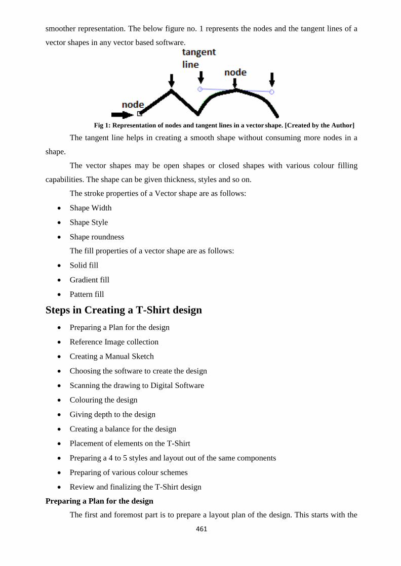
461
smoother representation. The below figure no. 1 represents the nodes and the tangent lines of a
vector shapes in any vector based software.
Fig 1: Representation of nodes and tangent lines in a vector shape. [Created by the Author]
The tangent line helps in creating a smooth shape without consuming more nodes in a
shape.
The vector shapes may be open shapes or closed shapes with various colour filling
capabilities. The shape can be given thickness, styles and so on.
The stroke properties of a Vector shape are as follows:
Shape Width
Shape Style
Shape roundness
The fill properties of a vector shape are as follows:
Solid fill
Gradient fill
Pattern fill
Steps in Creating a T-Shirt design
Preparing a Plan for the design
Reference Image collection
Creating a Manual Sketch
Choosing the software to create the design
Scanning the drawing to Digital Software
Colouring the design
Giving depth to the design
Creating a balance for the design
Placement of elements on the T-Shirt
Preparing a 4 to 5 styles and layout out of the same components
Preparing of various colour schemes
Review and finalizing the T-Shirt design
Preparing a Plan for the design
The first and foremost part is to prepare a layout plan of the design. This starts with the

462
concept requirement like who is the target customer i.e. child, youth, professional etc. After
identifying the segment for use the elements required for the design is planned.
Reference Image collection
Before starting the actual work, lots of reference study has to be done through internet,
visiting various T-shirt showrooms etc. A reference study will make clear about the common
elements used in the T-shirt design which attracts the targeted segment.
Creating a manual sketch
A manual sketch of the T-shirt design is made by artists. There are hundreds of drawings
which are roughly drawn first. After finalizing the shape of the drawing a clean-up drawing is
drawn out of the rough drawings. The clean-up shape means the only outline shape of the
drawing representing the main character.
Choosing the software to create the design
After the manual sketch, comes the digital process. Here the artist has to choose the
software to digitize the drawing. The drawing may be raster or vector. However, in today‘s
market, most of the work is done using Vector process. This helps the designer in future
adjustments as well as scalability of the shape. Again choosing the software may be choice of
an artist or the choice of the company where the artist works. An artist may be efficient in Krita,
but if the company policy is to work on Inkscape, then the artist has to work or Inkscape.
Hence, an artist should know the process of transferring the work done in Krita into Inkscape
and vice versa.
Scanning the drawing to Digital Software
Once the manual drawing is finalized and the software is chosen, now is the process of
bringing the manual drawing into Computer screen using Scanners. This can be done using
digital camera also. Now-a-days the camera‘s come of very high resolution hence scanners are
used in limited purposes.
Colouring the design
After drawing the shape in Vector software, the process of colouring begins. There are
three types of colouring:
i. Sold Colouring – Single colour
ii. Gradient Colour – Shade of colours
iii. Patching colouring – Single colours are used in three tones, one is normal colour,
second is the dark shape of the normal colour and the third colour is usually
white or the light shade of the normal colour.
Giving depth to the design
After the base colouring is done the next step is to give depth to the design. This effect

463
can be achieved by combining some elements of design in quite a similar manner as it is done
while creating a drawing with pencil; shading, colour toning, using hatched textures etc. This
helps in producing 3D effect in digital art work (design) too.
Creating a balance for the design
Before going to the printout, a balance of the design is done with the base colour of the
T-shirt. It is very important for the colour of the T-shirt and the colours of the design used to
print. Sometimes a single design needs to be printed in various colours of T-shirt. Hence a
colour balance check has to be done and a unique colour has to be chosen which fits all the
variety colours of the T-shirt.
Placement of elements on the T-Shirt
After the colour combination, it is the placement of the design on the T-shirt. It may be
in the middle, left, right, hand portion, neck portion etc.
Preparing a 4 to 5 styles and layout out of the same components
Various types of layouts are made out of the same components and texts used in the
design and the final is chosen by the supervisors or owners.
Review and finalizing the T-Shirt design
Finally, a sample T-shirt is printed out of all varieties and queued for review. After
finalizing, it goes to the printing phase.
Creating T-Shirt Design using Tiger Picture in Vector Art using
Krita
Plan and Concept of the design
Download photographs of reference T-shirt containing vector Illustration
Downloading reference photograph of Tiger Vector Art from internet
Pen Tool Tracing in Krita
Raster to Vector in Inkscape
Finalizing the work
Fitting the design into T-shirt for finalization.
Plan and Concept of the design
The motto of creating our T-shirt design is using a Tiger Illustration in the T-shirt. We
have to create a Tiger illustration in digital software and make it ready for printing in a T-shirt.
Download Photographs of reference T-Shirt containing Vector Art
First, we have collected the reference of some T-shirts from the Internet sources. The
images of T-shirt which we will use as reference are as follows:

464
Fig 2. Downloaded T-Shirt Design
Title: T-Shirt Design
Attribution: ahmadkosasih110 [User name as per pixabay] Source:
Pixabay
Link: https://pixabay.com/en/design-tshirt-coffee-lovers-print-1772284/
Fig. 3. Downloaded T-Shirt design
Title: T-Shirt Design
Attribution: ahmadkosasih110 [User
name as per pixabay] Source: Pixabay
Link: https://pixabay.com/en/bad-story-design-tshirt-lettering-
1772283/
Downloading reference Photograph of Tiger Vector Art from internet
Open Google Chrome
Go to Images
Search for ―Tiger Vector Art‖
Choose the files which you want as reference to create your own vector art.
Save the files in a folder

465
Pen Tool Tracing in Krita
We will follow a Figure of Tiger as the base image for preparation of Vector design in
Krita.
Take a Photograph of a drawing a Tiger using any Smartphone or a Digital Camera.
Transfer the Photograph to your computer.
Open Krita
Open the Photo of the reference of the Tiger
Select Menu – Select All
Edit Menu – Copy
Open Krita
File – New – Choose the size as the printable area of the T- shirt [Measure using scale]
Edit - Paste
Choose the Transform tool and Transform the Photo and resize according to the
screen.
This image is a symmetrical image [Right side is the opposite of Left Side]. So, we can
trace one side and copy the opposite side.
New Vector layer
Fig 4: Outline Art
Title: Tiger
Vector
Attribution:
Source: pixabay
Link:
https://pixabay.com/en/tiger- cat-
big-black-white-stripes-309914/
Fig 5. Colourful Output
Title: Colorful Tiger Head
Vector Attribution:
Source: pixabay
Link:
https://pixabay.com/en/tiger-
head-logo-isolated-sports-309218/

466
Choose Brush Tool - Brush Settings - - Choose a Round Brush
Choose Bezier Curve Tool -
Click and draw the outline shape – Press Enter
Continue the above process till completion.
Work in Progress –
[Snapshot]
We can adjust the points after drawing the lines also.
Choose the shape manipulation tool.
Left click and drag over a shape.
The bottom tool under this Shape manipulation tool will change to Path Editing
tool
Choose the Path Editing tool
Click and move to adjust the points.

467
[Snapshot]
Go to Tool Options – We have got extra options like Add points, Remove points etc. to
modify the shape further.
We will trace each and every shape categorically to complete the drawing. We will trace
half of the shape and copy and create the symmetry.
Outline shape of face
Tools Options – Fill with Black colour
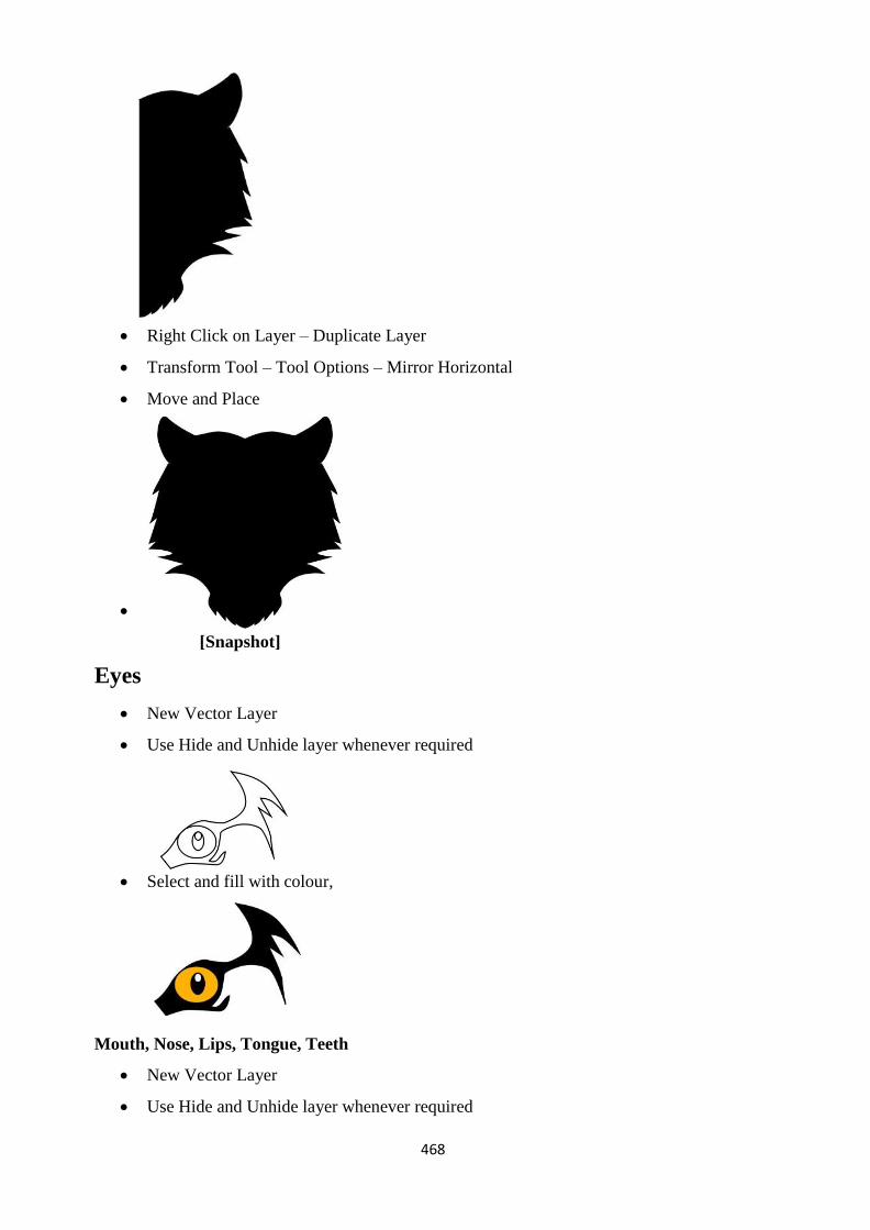
468
Right Click on Layer – Duplicate Layer Transform Tool – Tool Options – Mirror Horizontal
Move and Place
[Snapshot]
Eyes
New Vector Layer
Use Hide and Unhide layer whenever required
Select and fill with colour,
Mouth, Nose, Lips, Tongue, Teeth
New Vector Layer
Use Hide and Unhide layer whenever required

469
Select and fill with colour,
[Snapshot]
Ears
Select and fill with colour,
Inner Shapes

470
Select and fill with colour,
Finalise the output by duplicating the layer and creating the mirror.
[Snapshot]
The output file and the original file may vary according your creativity.
Note It
You can use various categories of brushes experimentally and complete the Tiger Vector
Art. It requires:
Technical software knowledge
Creativity
Not Hard Work But Work with Patience
Extensive research of internet video tutorials to create a vector art.
There are various ways to do a certain works; you have to choose your process which is
convenient and easy for you.
Fitting the design into T-Shirt for finalization
Open Krita
Open the Tiger Traced File

471
File – Open the T-shirt image
[Snapshot]
Select All – Edit – Copy
New File – Set the size according to the T-shirt size [Measure it with scale or tape]
Edit – Paste the T-shirt
Drag the T-shirt layer behind the Tiger character layers.
Output File
[Snapshot]
Printing Techniques of a T-Shirt
There are varieties of printing techniques available in the market. Some are for bulk
printing and some are used for single printing purposes. The designer has to decide the printing
technique which best befits the design and economy.
Screen Printing

472
This is the oldest method of printing which is still prevailing today. It is the method
which is mostly used for printing on T- Shirts.
Screen printing for different colours are done on different phases as per the colour. If we
have three colours in our design then there has to be three different screens and three passes has
to be done on the T-Shirt. It is considered as a high quality print.
The process can be done manually as well as through machine. The one time setup cost
is high but is economical in case of bulk printing.
The one disadvantage in this type of printing is that it cannot be printed on dark colour
base with light colours.
Direct to Garment Printing (DTG)
This is the new technology available in the market in which the multi-colour design can
be directly printed on a T-Shirt. The cost of the printer is very high but the quality of the print is
excellent. It has left behind the traditional method of T-Shirt printing and marching ahead by
getting more and more attraction. It is almost equal to a colour print on a paper. It has the
capacity to print millions of multiple variable colours at a single go. The time consumed for
printing is longer than usual printing techniques.
Heat Press Transfer Printing
This technology is used to print on T-shirts. In this case, first a colour printout is taken
on a piece of paper. Then the paper is placed upside down on the T-shirt and it is heat pressed
for some time. It is heated at 180 degrees for 20 to 30 seconds. After the prescribed time, the
heat press is removed and the colours on the paper get transferred to the T-Shirt. It is very faster
and easy to use.
Heat Transfer Vinyl Printing
This is the technology used to print Hoardings on Flex. This is a perfect option for T-
Shirt printing also. First, the design is printed on a vinyl sheet instead of a plain paper. Then the
vinyl sheet is heat pressed on the T-Shirt. This technique is mostly used for simple printing
purpose. It is not used for bulk printing. The quality of the print will be felt only when it is
instantly used by the user. If it is printed in bulk for sale purpose, then the quality reduces on
stock transfer from one place to another and if the sales take a longer period then also the
quality reduces.
Dye Sublimation Printing
In this technology, the heat is transferred onto garments of polyester and its coated
products such as mugs, plates etc. This technique is used for printing key chains, photos on
mugs, mouse pads etc. It requires a special paper to be digitally printing and then it is heat
pressed on the polyester surface. This is mostly done for gift giving purposes of the consumer.

473
Professional guidance for T-Shirt design
There are lots of professional aspects which have to be taken care while designing a T-
Shirt. Some of the aspects are as follows:
Workout hard on the concept
Creating a design is like writing a book or poetry. It is an Art. It is not a straight forward
mathematics. You have to go through lots of brainstorming for creating a design. You have to
fill your mind with lots of crazy ideas to genuine ideas. And at last, after exploring most of the
possibilities, filter out the best and start working on it. There is a saying that more time has to be
given on the plan so that if the plan is perfect then the execution will be faster and smoother.
Pre-visualise the output
It is said that you must have a dream first before achieving something. Hence, you
should have a clear visualization of the output before starting any work. Once you have the
visualization and start the technical process, then there are lots of ways to accomplish the
design.
Simple design with clarity
The design has to be simple with required details and be clear in quality. Most of the
best T-shirt designs of branded companies are plain with attractive typographies. More details in
a T-shirt are not visible and get distorted quickly after a few washes. Hence smaller details have
to be avoided in T-shirts. Only bigger and bold designs have to be used.
Market study
A market study of the consumer is very essential while making a product else all the
hard work will go in vain. The consumer has to be categorized like child, youth, male, female,
old etc. A similar style used by them has to be studied like what colour they like, what type of
text they like and so on. After that the design has to be done keeping in mind the common
elements of design.
Creating humour using Cartoons, shapes and text.
Today we see T-shirt with motivational text and humorous Text arranged with a good
typographical design. Abstract Shapes are used in the background with cartoons or photographs
of birds, sceneries etc. Humour attracts people and makes them look important. Hence, a T-shirt
should be made attractive with the elements of humour as per the age category of the person.
Colour combination
Colour combination is very important in all kinds of design. In a T-Shirt there is a base
colour which comes with the T- Shirt and other colours are used by the designer while
designing. There should be a balance in both the colours. If the base colour is dark, then the
design colours have to be light and bright. And if the base colour is light, then the design colour

474
has to be deep and dark.
Drawing with perfect proportions
Drawing on T-Shirt is like designing a cover of a Book. The drawing has to be in
perfection proportions without mistakes to get attraction. People generally identify the
proportional mistakes as the output with wrong proportion misrepresents the image or drawing.
Utilising the best printing technology
There are lots of printing options available in the market. T-Shirts can be printed
individually as well as in bulk. The best printing ensures that the T-Shirt design will be more
durable and does not get faded in few washes. Sample print designs can be made before
ordering bulk quantities for print. This is a safe option used by most of the branded companies.
Learn the latest software techniques
Software‘s get updated every six months and new options are added for the convenience
of the designer. Getting frequently updated with the software will help the designer to create
newer designs and work in a faster way. The more we learn about technology we will have lots
of variety of designs. And today the consumer wants variety out of which he has the option to
choose. The concept of big bazaar is successful because people have the option to choose out of
hundreds of brands.
Always be creative and innovative
Consumer today wants to be new and different from the others. He wants to gather
attention wherever he goes. Hence, he chooses the best design available in the market and the
normal designs remain unsold for years which are further sold on discount to clear stocks. It is
you to decide whether you want to be creative and remain forward or get unnoticed for a
distress sale in the future. Hence, be creative and innovative and create eye catching attractive
designs applying most of the techniques of a successful T- Shirt design.
Unit summary
In this Unit we have learnt some of the Krita tools and techniques.
We have created a Vector Art of Tiger and placed in a T-Shirt. T- Shirt design is the
new trend which has emerged since the printing on T-shirt has become easier. Apart from T-
shirt vector design, you can use Krita for all kind of vector designing and printing purpose.
You can create Book Cover Designs, Leaflets, Flyers, Banner design etc. also using
Krita.
Assignment
Create a Vector Design of Tiger in Krita.
Identify the place near your area where T-shirt printing is done.
475
Print the Vector Design of Tiger on a T-shirt with you name printed on it as a
Designer.
Write the class work‘s done in Krita in a DVD and submit it to the University.
Assessment
Write down five professional tips for a T-Shirt design.
Write down the names of any four types of T-Shirt printing techniques.
Resources
http://www.wikihow.com/Design-Your-Own-T-Shirt
http://www.creativebloq.com/design/guide-t-shirt-printing- designers-912867
https://helpx.adobe.com/illustrator/how-to/design-a-tshirt.html
https://wegraphics.net/blog/articles/a-comprehensive-guide-to- desiging-and-printing-your-first-
tee-shirt/