Designing Truth: Visual Stories of Genocide and the Museum's Role
38
Visual Stories of Genocide and the Museum’s Role TRUTH
Transcript of Designing Truth: Visual Stories of Genocide and the Museum's Role
Visual Stories of Genocide and the Museum’s Role
TRUTH

Today, I’d like to discuss The Rescuers project from the perspective of a designer as well as a practice-led design researcher. This will, I hope, provide you with some insights to use within the workshop section of our time here today as well.
But before I begin talking about some of these processes behind the design of The Rescuers, I want to explain two important terms that will, I hope, help to explain why this field of exhibiting has its own challenges for professionals who work on them.
Introduction

» Deferred action;
» Transference; and
» Symbolisation.
PITT & BRITZMAN
USE THESE PSYCHOANALYTIC TERMS
{
‘Difficult Knowledge’“The Rescuers” belongs to a category of exhibitions that contain ‘difficult knowledge’. Pitt and Britzman (2003) define difficult knowledge as being that which signifies both representations of social traumas in curriculum and the individuals’ encounter with them in pedagogy.

Bonnell and Simon (2007) place the concept of difficult knowledge within the museum context, as it acts as a reflection of society’s changing views of itself, from the triumphant, heroic narratives that dominated much of past exhibiting culture, to include the darker, more troubling moments of history both ancient and living. Simon (2011) further argues that viewing these exhibits is not enough: they must be displayed in a way that encourages thought and affect to come together, while Trofanenko (2011) argues for the value of emotional responses within the learning processes involved in viewing difficult exhibitions.
These approaches to understanding difficult knowledge are useful for the practice of designing projects such as The Rescuers, because they provide valuable insight into how different types of knowledge can be received by visitors. The Rescuers project is an interesting one to research as a designer,
because it is exhibited in public spaces, universities, at conferences and within schools, as well as within more traditional museum spaces. We need to look a little more broadly at who will be ‘visiting’ the exhibit, and what we hope for them to gain from it, even if they walk by it on their way to work. We also need to maintain an awareness that this is a specific type of knowledge we’re exhibiting. Further to this, The Rescuers is quite a unique exhibition in that it provides a local context when travelling in regions like the Balkans and in Cambodia, but it talks about genocide as a global phenomenon as well. From an interpretive perspective, this provides a more complex arrangement for designers, as it’s not one culture or conflict that’s being discussed, but genocides around the world from the perspective of individuals who chose not to participate.

(Simon 2011)

in the museum context‘Difficult Knowledge’ within the museum (and also broader exhibiting) context acts as a reflection of society’s changing views of itself, from the triumphant, heroic narratives that dominated much of past exhibiting culture, to include the darker, more troubling moments of history both ancient and living.
(Bonnell & Simon 2007)

It’s arguably a good thing that difficult knowledge exhibiting is on the rise. We need to ask important and challenging questions of ourselves and our histories. But these are not only questions for those deeply embedded in their fields of interest: we need to find engaging and dynamic ways to also present this knowledge to exhibition visitors. Further, we also need to uphold the dignity and truth of the stories that have been entrusted to us: it is this particular question that drives my practice-led research. Without getting into the philosophical debates around notions of truth here with you today, I’d like to explain another term that is perhaps more useful for practice-led design research, as well as a possible vehicle for communication between designers and other exhibit stakeholders.

“The Recuers” on display in Mostar, 2013 (PHOTO: ERNST J)

“The Recuers” on display in Sarajevo, 2011 (PHOTO: PROOF)

“The Recuers” on display at Yale, 2009 (PHOTO: PROOF)
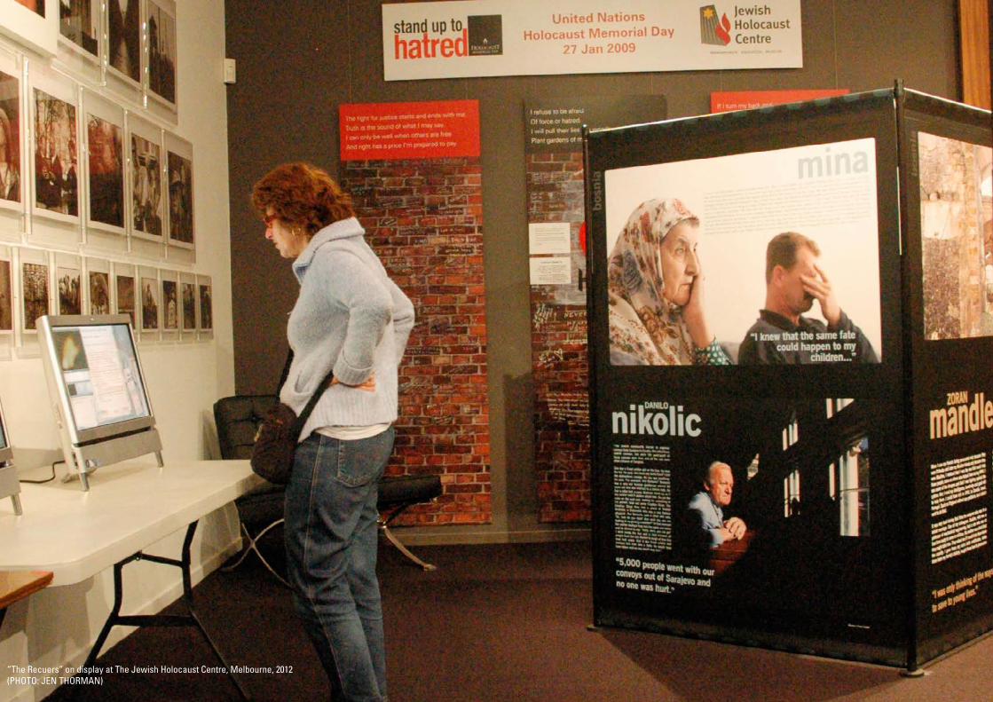
“The Recuers” on display at The Jewish Holocaust Centre, Melbourne, 2012 (PHOTO: JEN THORMAN)

“The Recuers” travelling in regional Cambodia, 2012 (PHOTO: Youth For Peace)

The Rescuers exhibition is quite a unique project, in that it provides visitors with both a local and global context when learning about genocide and rescuer behaviour.
In post-conflict regions, such as Bosnia and Herzegovina and Cambodia, this can help expand the dialogue about genocide, and highlights rescuer behaviour as a universal trait found across the globe.
Within the design process, however, this can complicate the interpretive process, because we are effectively representing multiple cultural contexts of conflict.
Context


van Leeuwen (2005: 160)
a “social semiotic approach to the question of truth”
van Leeuwen (2005) defines ‘modality’ as a “social semiotic approach to the question of truth” (p. 160). What he means by this is, if we view all of the semiotic resources we use to make meaning – typefaces, photographs, film, colour, music, verbal and written language, gesture, etc ¬ – they have a significant role in creating authority. Picture a corporate memo as a child’s crayon drawing and you can see how certain modes of communication have a higher authority than others. This authority, or modality, must be carefully monitored within difficult exhibitions if we want their message to be accepted by exhibition visitors.

This idea of modality can be best explained by honing in on the typographic representations of rescuer testimony, and examine the ways in which typography, as a visual semiotic resource, can in fact raise or lower notions of truth. What is important to recognise is that, within design practice, we are creating the visual representations of the exhibition’s contents, and perhaps most significantly of all, we’re making decisions related to typographic design that house people’s words. It’s commonly known as the ‘dress of text’.

MEMORAMNDUMTO: All Staff 9 JULY 2015
This year’s Annual General Meeting (AGM) will be held in the Park Hyatt, Regent Square, on the 11 December 2015.
All staff, heads of department and management are required to attend.
More detailed information will be sent to you next month.
Sincerely,
Catherine TattersallDirectorHuman Resources
MEMO:
TO: All Staff
This year's Annual General
Meeting (AGM) will be held in the
Park Hyatt, Regent Square, on
the 11 December 2015.
All staff, heads of department
and management are required to
attend.
More detailed information will be
sent to you next month.
LOVE,
Cathie in HR.

It was in 2009 that PROOF’s Executive Director, Leora Kahn, and I first collaborated on The Rescuers exhibition. When I look back on this project, there is one key process that has been at the heart of how I’ve changed as a collaborator on difficult exhibitions, and as a designer and interpreter of difficult knowledge, and that is, the typographic representations of rescuer testimonies.

Example 1: The Rescuers Mark I
Here are a few photos of the original design of the Rescuers exhibition, designed in 2009, when I was a recent graphic design graduate. For better or worse, I was of the opinion that text within an exhibition should be set in a typeface that should be as neutral as possible. There turned out to be a few issues with this idea – the first, is that no typeface is ever truly neutral, or devoid of visual meaning, and secondly, that I had put no thought into who each of these individuals were: who was telling their story?
I’d taken the more traditional exhibitioner’s line that text was label, and the photograph was the exhibited object. The text shouldn’t interfere with the object. Through my years with PROOF, and my contact with the stories of the rescuers, I began to see how flawed this approach was. The problem with this idea was that testimony is not, and never can be, merely a label, and it certainly isn’t ‘neutral’. I began to understand that there was very little benefit in designing
this way – on the one hand, it didn’t visually express anything about the rescuers themselves, and secondly, was a long way off from the dynamic engagement with visitors that I now recognised was needed for difficult exhibitions. So, what could possibly be the benefit of housing these testimonies in a neutral way?
Instead, I began approaching the photographs and testimony as two parts of a whole: they work together to make meaning for visitors, and each without the other is not as powerful as when they are together. Of course, this opened up another can of worms, and that was, if I am to take a more dynamic approach to the typesetting of rescuer testimony, how do I ensure, within my interpretive practice, that I have as much information as possible to support that interpretation, so that the aim of creating a high modality and dynamic exhibition can be realised?
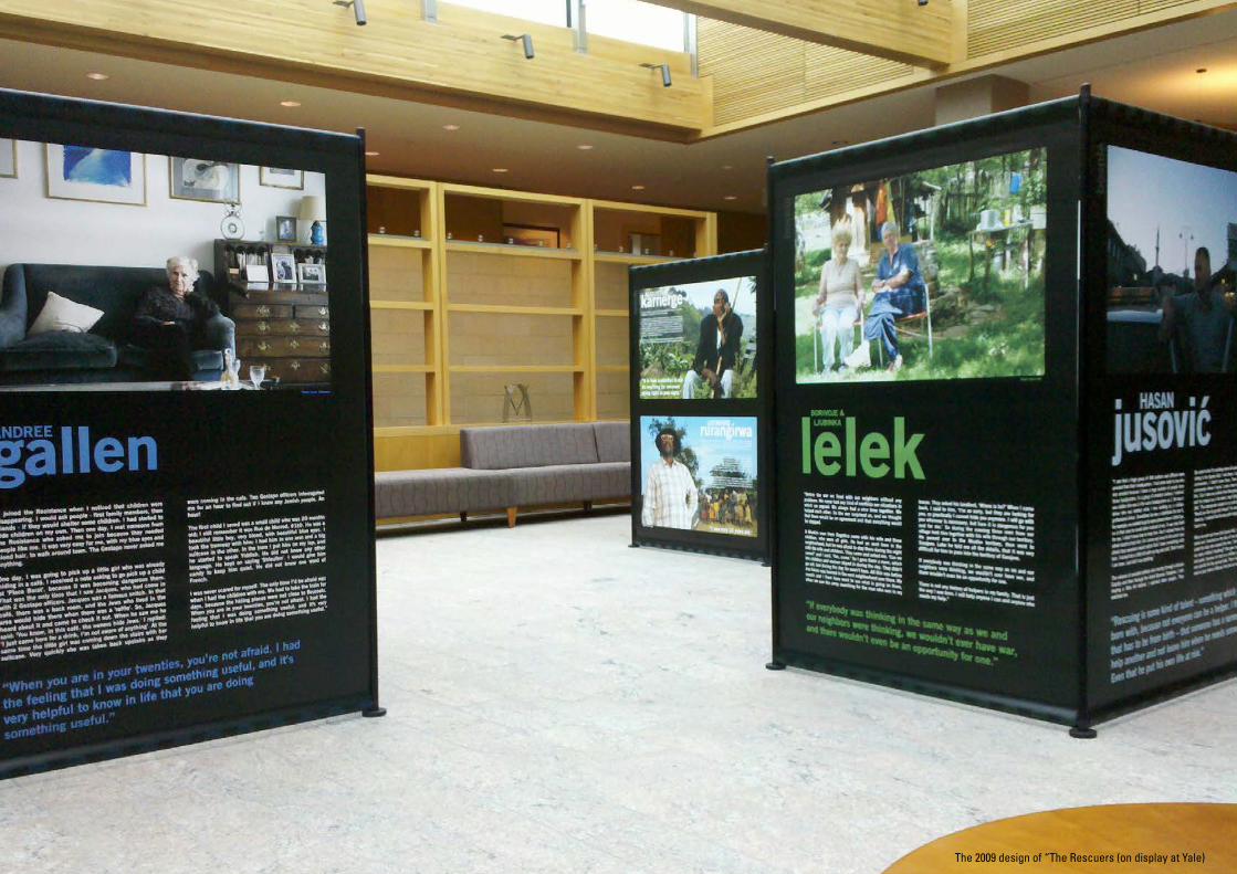
The 2009 design of “The Rescuers (on display at Yale)

“I could not understand why [the Germans] would go after children. I was living in a boarding school, a very well regarded and expensive boarding school, here in Brussels. The principal of the school had accepted to harbor 12 Jewish children, they all lived with us, among the other children. One night, because they were tipped off to our doings, the Gestapo came and took those children, who never came back. I was talking to the German, since I could speak the language very well, I was translating the situation to the principal. At one point I was so mad, I told the Gestapo soldiers: ‘Aren’t you ashamed to be at war against children? They were the adults afterall!’ He answered back: ‘If you did not want to be taken over by roaches when they reach adulthood, you need to crush them while they are still small’. I’ll never forget that.
We were divided in 3 groups: one group’s job was to find boarding places, another group, that I was part of, went to visit the families, and then there was an office that kept the records. Why? Because when we got the children, we had to save the real family name, give them a fake ID, know the
“The most astonishing thing from what I remember was that the children never cried. The parents cried when I came to get the children, the mothers, cried. I picked up 2 weeks old babies, and the mothers cried, but the children never cried.”
gallen ANDREE
parents’ or grand-parents’ addresses. Everything had to be recorded in notebooks.
The most astonishing thing from what I remember was that the children never cried. The parents cried when I came to get the children, the mothers, cried. I picked up 2 weeks old babies, and the mothers cried, but the children never cried. I would tell them we were going on vacation, we’re going to the countryside, you’ll eat omelets with bacon, and that would make the parents happy. A good omelet, with kosher bacon.
I was never scared for myself. The only time I’d be afraid was when I had the children with me. Throughout the whole trip, when we had to take the train, because the hiding places where not close to Brussels, so we’d take the train for days, I would be afraid for the children, not for myself. When you are in your twenties, you’re not afraid; I was 21 and I was not afraid.
the
holo
caus
t
Photo: Sonia Folkmann
Holocaust_andree.pdf 1 10/10/10 4:06 PM
“Rescuing is some kind of talent – something which you are born with, because not everyone can be a helper. I think that has to be from birth – that someone has a sense to help another and not leave him when he needs someone. Even that he put his own life at risk.”
“I saw that a huge group of JNA soldiers and officers were arrested from their headquarters. I had some wish to see who was arrested because I knew a huge number of people from those headquarters. In a group of arrested soldiers I noticed one soldier who was in the same headquarters as I. He was a driver who was drafted while I was working as a civilian professional driver. Sometimes he was a substitute for me if, for example, we needed to go to some places where I didn’t go, so in that case he would drive instead of me. It was very hard for me. I didn’t know how to help him. And I wished from my whole heart to help him. So I came very close to him and I was afraid that someone would notice that I have something with him. I kicked him a little bit with my leg and said, ‘Don’t worry I am here. Just don’t say anything.’
The column [of arrested soldiers] was moving through Latinska Cuprija and then through the street Branioci Sarajevo. I was staying a little bit behind. I watched other people. They watched me.
We came to the Fis building where all arrested soldiers were sitting in the Sports Hall. I was there. I saw some Bosniak commanders. I didn’t know them. Then I saw the main commander whom I knew. I came close to him and asked him, ‘Can I take one soldier from this group? Can he go with me? He helped me a lot when I was trying to escape from JNA.’ The commander looked at me and asked the soldier, ‘Would you like to go with Hasan?’ He answered, ‘Yes.’ He stood up. I realized that he was quite happy. He had a huge trust in me.
When we went out from that Sports Hall, I went across the street and I knocked on the door of one private building. I asked the lady who opened the door, ‘Can you please give me some clothes? Anything?’ [She gave us] some tee-shirts and pants, because he had on a military uniform that was very specific for the special units. Then I said to him, ‘From now on your name is Mirsad. And you are my cousin.’”
HASANJusovi Photo: Paul Lowe
bosn
ia
Bosnia_Hasan.pdf 1 9/10/10 4:27 PM
The 2009 design of “The Rescuers” panel examples.

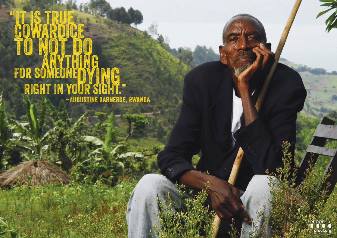
AUGUSTINE
“It is true cowardice to not do anything for someone dying right in your sight.”
“I saw a bunch of people fleeing and looking for refuge in my house. Afterwards I helped them to flee to the Congo. A woman came to my home and asked to be let in. I asked her where she had been since the beginning of the assaults and she said she was hiding in a Hutu neighbo r’s house. I asked her why she left and she said to me, ‘After my brother, my Mum and I were wounded by machete cuts, a woman helped us and sheltered us in her house. When we were healed she asked me to work in her sweet potato field. Then one day while I was working, I noticed that my brother was taken to the Kivu Lake to be drowned. I felt scared and ran away.’
I hid her and others in small forest of bee trees that killers wouldn’t dare enter. So they would hide in the forest and spend the night among bees.”
LEONARDrurangirwa“I took the Inkotanyi’s side by my own decision. Neither Inkotanyi nor someone else chose for me what to do. At the beginning, Tutsi hiding in the forest took refuge at my home but were afraid because they thought that I was a killer too. But when they reached my home and found other Tutsis there, they felt secure and decided stay with me.
Then there ended up being a big crowd at my home. It was difficult to protect them. Partly because there was an Interahamwe called Emmy, who assaulted people several times. So we decide to dispatch the group of Tutsi to different groups and give each group to a family. We did our best to ensure that they got food at home. We talked to them only in the night time because during the day we were waiting for assaults from different parts of the region. When killers came, we organized ourselves to hide. Then they came in big numbers and killed seven of our people.
To help the refugees I used to move them from one place to another, hiding them in abandoned houses and banana trees. It was a big problem to find enough food to feed them because there were so many. They ate once in the night. A group of seven ate at home, another three at my mom’s house and so on. Some people had shops so they sometimes gave us rice.”
“I was only 18 years old.”
rwan
da
Photos: Riccardo Gangale
Rwanda_Augustine.pdf 1 9/10/10 2:17 PM
The 2009 design of “The Rescuers” panel examples.

Example 2: Bosnia and Herzegovina
The Rescuers that we redesigned for Bosnia and Herzegovina threw up a whole new challenge: it was bilingual. It was not only bilingual, but the Bosnian language also has a restrictive number of typefaces that offer full family support for glyphs. This became apparent when I began designing: the original typeface couldn’t be used for people’s names because symbol like this…or this…were missing from the font set. This meant that, for branding consistency, I chose to keep the typeface for the heading names only, creating the glyphs myself manually. This was impossible for the larger bodies of text. What was an interesting part of this journey was also discovering that, even though some typefaces have Bosnian language support, when you put them together with English, they can look quite radically different.
I had also started looking into the issue of visual modality, and decided I would minimise the ‘neutral’ sans serif of the original design, and go for something that had a more bookish quality, while at the same time offering up some interesting physical features. I ended up with Adobe Caslon Pro, because it has a beautiful italic set for break out quotes that looked the same in both languages, while also having a more formal serif appearance.
There are other instances of The Rescuers that have taken these formal qualities one step further, omitting the sans serif all together: one was a series of posters designed for Bosnian high schools, and the second was a flexi glass series for a more flexible display in the US. You might also notice that black was taken out of these designs entirely, and colour used to create more dynamic backgrounds for the type, instead of the type holding the colour. I use colour quite a bit in design to link rescuer testimony to their images, by sampling colours from the images themselves.
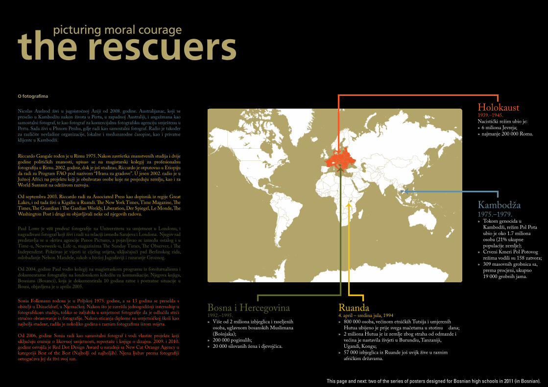
Ruanda4. april – sredina jula, 1994 » 800 000 osoba, većinom etničkih Tutsija i umjerenih Hutua ubijeno je prije svega mačetama u stotinu dana;» 2 miliona Hutua je iz zemlje zbog straha od odmazde i većina je nastavila živjeti u Burundiu, Tanzaniji, Ugandi, Kongu;» 57 000 izbjeglica iz Ruande još uvijk žive u raznim afričkim državama.
Bosna i Hercegovina1992.–1995.» Više od 2 miliona izbjeglica i raseljenih osoba, uglavnom bosanskih Muslimana (Bošnjaka);» 200 000 poginulih;» 20 000 silovanih žena i djevojčica.
Holokaust1939.–1945.Nacistički režim ubio je:» 6 miliona Jevreja;» najmanje 200 000 Roma.
Kambodža1975.–1979.» Tokom genocida u Kambodži, režim Pol Pota ubio je oko 1.7 miliona osoba (21% ukupne populacije zemlje);» Crveni Kmeri Pol Potovog režima vodili su 158 zatvora;» 309 masovnih grobnica sa, prema procjeni, ukupno 19 000 grobnih jama.
rescuerspicturing moral courage
the
Paul Lowe je viši predvač fotogra�je na Univerzitetu za umjetnost u Londonu, i nagrađivani fotograf koji živi i radi na relaciji između Sarajeva i Londona. Njegov rad predstavlja se u okviru agencije Panos Pictures, a pojavljivao se između ostalog i u Time-u, Newsweek-u, Life-u, magazinima �e Sunday Times, �e Observer, i �e Independent. Pokrivao je vijesti iz cijelog svijeta, uključujući pad Berlinskog zida, oslobađanje Nelson Mandele, sukob u bivšoj Jugoslaviji i razaranje Groznog.
Od 2004. godine Paul vodio kolegij na magistraskom programu iz fotožurnalizma i dokumentarne fotogra�je na londonskom koledžu za komunikacije. Njegova knjiga, Bosnians (Bosanci), koja je dokumentirala 10 godina ratne i postratne situacije u Bosni, objavljena je u aprilu 2005.
O fotogra�ma
Sonia Folkmann rođena je u Poljskoj 1975. godine, a sa 13 godina se preselila s obitelji u Düsseldorf, u Njemačkoj. Nakon što je završila jednogodišnji internship u fotografskom studiju, toliko se zaljubila u umjetnost fotogra�je da je odlučila steći stručno obrazovanje iz fotogra�je. Nakon sticanja diplome na umjetničkoj školi kao najbolji student, radila je nekoliko godina s raznim fotogra�ma širom svijeta.
Od 2006. godine Sonia radi kao samostalni fotograf i vodi vlastite projekte koji uključuju emisije o likovnoj umjetnosti, reportaže i knjige o dizajnu. 2009. i 2010. godine osvojila je Red Dot Design Award u suradnji sa New Cat Orange Agency u kategoriji Best of the Best (Najbolji od najboljih). Njena ljubav prema fotogra�ji omogućava joj da živi svoj san.
Riccardo Gangale rođen je u Rimu 1975. Nakon završetka znanstvenih studija i dvije godine političkih znanosti, upisao se na magistarski kolegij za profesionalnu fotogra�ju u Rimu. 2002. godine, dok je još studirao, Riccardo je otputovao u Etiopiju da radi za Program FAO pod nazivom “Hrana za gradove”. U jesen 2002. radio je u Južnoj Africi na projektu koji je obuhvatao osobe koje ne posjeduju zemlju, kao i za World Summit na održivom razvoju.
Od septembra 2003. Riccardo radi za Associated Press kao dopisnik iz regije Great Lakes, i od tada živi u Kigaliu u Ruandi. �e New York Times, Time Magazine, �e Times, �e Guardian i �e Gardian Weekly, Liberation, Der Spiegel, Le Monde, �e Washington Post i drugi su objavljivali neke od njegovih radova.
Nicolas Axelrod živi u jugoistočnoj Aziji od 2008. godine. Australijanac, koji se preselio u Kambodžu nakon života u Pertu, u zapadnoj Australiji, i angažmana kao samostalni fotograf, te kao fotograf za komercijalnu fotografsku agenciju smještenu u Pertu. Sada živi u Phnom Penhu, gdje radi kao samostalni fotograf. Radio je također za različite nevladine organizacije, lokalne i međunarodne časopise, kao i privatne klijente u Kambodži.
This page and next: two of the series of posters designed for Bosnian high schools in 2011 (in Bosnian).

Foto: Sonia Folkmann
holokaust Andree Gellan
“Priključila sam se Pokretu otpora kada sam primijetila da nestaju djeca. Pitala sam ljude, prvo članove porodica, a onda prijatelje da li su dali utočište nekoj djeci. Počela sam sama da sakrivam djecu. A onda sam jednog dana upoznala nekog iz Otpora ko me pitao da se pridružim jer su im trebali ljudi popout mene. Meni je bilo veoma lako
kretati se po gradu, s mojim plavim očima i plavom kosom. Gestapo me nikad ništa nije pitao. Jednog dana, išla sam pokupiti djevojčicu koja se već krila u kafeu. Primila sam poruku u kojoj se tražilo da pokupim dijete u Place Barat, jer je tamo postajalo sve opasnije. To je bio jedini put da sam vidjela Jacquesa koji je došao s dva Gestapo
o�cira. Jacques je bio poznati potkazivač. U tom kafeu bila je stražnja soba i Jevreji koji su živjeli u tom području krili su se tu kada se dešavala ‘lutrija’. Jacques je čuo za to i došao je da to provjeri. Kada me ugledao, rekao je: ‘Znaš, u ovom kafeu, vlasnik krije Jevreje.’ Odgovorila sam: ‘Dolša sam na piće. Nemam pojma ni o čemu,’ a u isto to vrijeme
djevojčica je silazila niz stepenice sa svojim koferom. Brzo su je vratili gore dok su oni ulazili u kafe. Dva Gestapo o�cira ispitivala su me cijeli sat kako bi saznali da li znam neke Jevreje. Ispitivali su me sat vremena! Djevojčica se bezbijedno izvukla.”

The Rescuers Poster Project
I’m now working on a new rescuer exhibition, which will be displayed as posters in Sydney next year. As you can see, an entirely different approach is being taken to the typographic design.
What I want to explore is what each of these rescuer’s testimonies might look like visually. This approach requires a much deeper understanding of the exhibitor’s aims, the rescuer’s stories, the background of the conflicts, and the space in which it will be displayed.
I’ve worked very closely on this project with Leora for the last 6 years, and this puts me in quite a unique position as a designer: I have had time to reflect upon each of the stories, upon my own preconceptions, and use my experience and knowledge within the interpretive process. I have also had the benefit of working alongside Leora and our other
partners – their expertise in their fields has hugely important to the interpretive processes of each of The Rescuers exhibition designs.
I’ve run as far as I can from the prescriptive approach I began with, and even further from the manuals of label design set out by many exhibiting institutions. I’m not saying that these aren’t created for a reason, and that there aren’t instances where they offer the most appropriate design response, but in working with testimony within difficult exhibitions in particular, designers need to take on the interpretive challenge of creating the visual representations of testimony that visitors use to make meaning, to eventually ‘symbolise’ the difficult knowledge they’re coming into contact with. To do this, they need to work closely with curators, historians, experts in law and anyone else that has a role to play within the exhibit, and to do this designers need to ask the right questions.


Whether an exhibition ends up with a different typeface for each person or not, the process always draws on these experiences: to understand that we have a social responsibility as designers to treat difficult knowledge with the respect it deserves. To understand that audiences will find it difficult, but that to encourage them to engage with the knowledge is key. And that we are part of a collaborative team, learning all the time about why projects MUST be made visual in order for them to make a difference.
with designersWhy would you want to (or need to) collaborate with a designer?
In our fields of research, we become immersed in complex information. If any of you have had to take the 3-minute elevator challenge (which you’ll be doing a little later), then you’ll know how difficult it can be to explain all of that knowledge you have with people who are outside of your field. But the knowledge you are gaining within your research is incredibly valuable, but at the same time, raises complex issues for the general public, educators, museums, and others.
Practice-led design research might seem a bit of a world away from genocide studies, but actually, designers can be quite a good partner for you to have.
There are any number of ways that you can utilise design to disseminate your information: posters, websites, exhibitions, postcard campaigns, infographs, apps, the list goes on. Our job, as designers, is to work closely with you to ensure that the aims of your project are realised, particularly in terms of successful audience engagement.

with designersThe Design Brief
THE DESIGN BRIEF IS THE KICK OFF POINT OF ANY PROJECT.
FOR DIFFICULT EXHIBITIONS, THE DESIGN BRIEF CAN BE A DETAILED AND COMPLEX DOCUMENT THAT A DESIGNER CAN USE TO GATHER IMPORTANT INFORMATION ABOUT THE PROJECT.
One of the most important documents that starts any project off is the design brief. Within difficult exhibition projects, these documents can be quite complex. What I like to know is not only what the exhibition will be about, but why it is being created – why now? What are its aims? Who is it for?
This design brief is an example of one we are working on at present for our Unearthed project, about rape in India. The design brief not only asks who is involved and how to contact them, but also provides valuable statistical information on rape in India, what the project hopes to achieve, where it will be exhibited, who the local partners are, etc. One area of this brief that I’m working on is this binary system: this is aimed at drawing out tacit knowledge from all team members, including the curator, local partners and the designer. It’s important that the designer also completes the form, so that they can use it as a tool for reflexive practice as well.

know what to tellThere are different levels of information you need to provide a designer when working with them on a project, and these should be included within a design brief.
A design brief can come from you or the designer can work with you to produce one. For difficult exhibitions, it works much better if the curator and designer work together on the brief, so that as much information as possible can be gathered BEFORE the interpretive stage of design begins.

A designer might start by asking basic questions:
What is the budget?
What materials will it be printed on?
Who is printing it?
Who are the main contacts?
More complex information could include:
What is the purpose of the exhibit?
Is there historical background information?
Why it is being produced now?
Who are the stakeholders?
Who is being represented?
What will the content include?
A curator might start by explaining:
Ideas they have for visualising their information;
What their institution is all about;
Who is being represented (and why);
Cultural considerations about the project.
More basic information could include:
The project’s budget, including production costs;
Time line of content creation, design, editing and production/delivery/set up;
People who the designer will be working closely with and reporting to.
This presentation is based on a paper that will be part of a special edition of The Design Journal on Visual Communication in the Balkans, to be published in December 2015. Please feel free to contact me if you would like more information about this, or have any questions about today’s presentation and workshop.
So let’s get stuck into the workshop. We hope that, with a few tools to get you started, it can help you to condense your knowledge in a way that will make it easier to communicate with professionals outside of your field, and get you thinking about how you might like to visually present it to the public.
For information on how this workshop was run , please contact Willhemina: [email protected]
ResourcesBonnell, Jennifer, and Roger I. Simon. 2007. “‘Difficult’ Exhibitions and Intimate Encounters.” Museum and Society 5 (2): 65–85.
Pitt, Alice, and Deborah Britzman. 2003. “Speculations on Qualities of Difficult Knowledge in Teaching and Learning: An Experiment in Psychoanalytic Research.” International Journal of Qualitative Studies in Education 16 (6): 755–76. doi:10.1080/095183903100016 32135.
Simon, Roger I. 2011. “A Shock to Thought: Curatorial Judgment and the Public Exhibition of ‘Difficult Knowledge.’” Memory Studies 4 (4): 432–49. doi:10.1177/1750698011398170.
Trofanenko, Brenda M. 2011. “On Difficult History Displayed: The Pedagogical Challenges of Interminable Learning.” Museum Management and Curatorship 26 (5): 481–95. doi:10.10 80/09647775.2011.621733.
Van Leeuwen, Theo. 2005. Introducing Social Semiotics. Oxon, U.K and New York: Routledge.