Descriptive statistics - Ex Libris
49
CHAPTER 3 Descriptive statistics 41 CHAPTER OVERVIEW In Chapter 1 we outlined some important factors in research design. In this chapter we will be explaining the basic ways of handling and analysing data collected through quantitative research. These are descriptive statistics. An important step for anyone trying to understand statistical analyses is to gain a good grounding in the basics. Therefore, we will explain to you a number of basic statistical concepts which will help you to understand the more complex analyses presented later in the book. By the end of this chapter, you should have a good understanding of the following: ■ samples and populations ■ measures of central tendency (e.g. the mean) ■ graphical techniques for describing your data (e.g. the histogram) ■ the normal distribution ■ measures of variability in data (e.g. the standard deviation). These are all important concepts, which will pop up in various guises throughout the book, and so it is important to try to understand them. Look at these as the initial building blocks for a conceptual understanding of statistics. Descriptive statistics 3 3.1 Samples and populations In Chapter 1 we explained that statistics are essentially ways of describing, comparing and relating variables. When producing such statistics, we have to be aware of an important distinction between samples and populations. When psychologists talk about populations, they do not necessarily mean the population of a country or town; they are generally referring to distinct groups of people: for example, all individuals with autism or all men who are left-footed. In statistical terms, a population can even refer to inanimate objects: for example, the population of Ford cars. Definition A population consists of all possible people or items who/which have a particular characteristic. A sample refers to a selection of individual people or items from a population.
-
Upload
khangminh22 -
Category
Documents
-
view
0 -
download
0
Transcript of Descriptive statistics - Ex Libris

CHAPTER 3 Descriptive statistics 41
CHAPTER OVERVIEW
In Chapter 1 we outlined some important factors in research design. In this chapter we will be explaining the basic ways of handling and analysing data collected through quantitative research. These are descriptive statistics. An important step for anyone trying to understand statistical analyses is to gain a good grounding in the basics. Therefore, we will explain to you a number of basic statistical concepts which will help you to understand the more complex analyses presented later in the book. By the end of this chapter, you should have a good understanding of the following:
■ samples and populations
■ measures of central tendency (e.g. the mean)
■ graphical techniques for describing your data (e.g. the histogram)
■ the normal distribution
■ measures of variability in data (e.g. the standard deviation).
These are all important concepts, which will pop up in various guises throughout the book, and so it is important to try to understand them. Look at these as the initial building blocks for a conceptual understanding of statistics.
Descriptive statistics 3
3.1 Samples and populations
In Chapter 1 we explained that statistics are essentially ways of describing, comparing and relating variables. When producing such statistics, we have to be aware of an important distinction between samples and populations. When psychologists talk about populations, they do not necessarily mean the population of a country or town; they are generally referring to distinct groups of people: for example, all individuals with autism or all men who are left-footed. In statistical terms, a population can even refer to inanimate objects: for example, the population of Ford cars.
Definition
A population consists of all possible people or items who/which have a particular characteristic.
A sample refers to a selection of individual people or items from a population.

Statistics without maths for psychology42
A sample is simply a selection of individuals from the population (see Figure 3.1). Researchers use samples for a number of reasons, chiefly that samples are cheaper, quicker and more convenient to examine than the whole population. Imagine that we wanted to see if statistics anxiety was related to procrastination, as Walsh and Ugumba-Agwunobi (2002) have done. We could simply measure everyone’s levels of statistics anxiety and procrastination and observe how strongly they were related to each other. This would, however, be prohibitively expensive. A more convenient way is to select a number of individuals randomly from the population and find the relationship between their statistics anxiety and procrastination levels. We could then generalise the findings from this sample to the population. We use statistics, more specifically inferential statistics, to help us generalise from the sample to the whole population.
When conducting research, we have to ensure that we know which population is relevant and choose our sample from that population. It is of no use conducting a study using a sample of males if the target population includes both sexes, and it is pointless conducting a study using a sample of tarantulas if the target population is zebras.
The ability to generalise findings from a sample to the population is vitally important in research. We therefore have to ensure that any samples used are truly representative of the target population. A simple example will illustrate some of the problems. Imagine that some researchers want to find out if walking a dog leads to more social encounters than walking without a dog. They decide to go to their nearest park and follow a number of dog owners and non-owners to count the number of social interactions they have. They find that non-owners tend to have more social encounters than dog owners do. They conclude that having a dog is bad for your social life.
Is this correct? We do not really know the answer to this from the research that these researchers have conducted. It might be correct, but they may not have used an appropriate sample upon which to base their conclusions: that is, they may have a sampling problem. The problem with this is that the dog owners they followed may, for example, have all been very shy, and it is this rather than having a dog that explains the difference in social encounters. There are many ways in which the researchers could have failed to obtain representative samples. There could be experimenter bias, where the experimenters unconsciously follow people who help support their hypothesis. There could be issues to do with the time of day at which people walk their dogs: for example, people walking dogs early in the morning may be in a hurry in order to get to work and thus may be less sociable. Certain dogs may lead to
Figure 3.1 Illustration of several samples of five faces taken from a population of faces

CHAPTER 3 Descriptive statistics 43
fewer social interactions (e.g. walking with a pit bull terrier). As researchers we have to be aware of all these possibilities when designing our research in order to ensure such problems do not arise. We want to be able to generalise from our sample to the wider populations and therefore we want to avoid problems with the design that reduce our ability to do this. Many of the finer points of research design are attempts to ensure that we are able to generalise. The researchers in the above example could, of course, have gone to many different parks and followed many people on many occasions. In this way they would ensure that their samples are much more representative of the population.
The previous example illustrates a very important point, which is that our ability to generalise from samples to populations is dependent upon selecting samples that are truly representative of the target population.
We have now introduced you to the distinction between samples and populations. You will find when you read textbooks on statistics that statisticians have different ways of describing samples and populations. Strictly speaking, statistics describe samples. So if you calculate an average or mean for a sample, it is a statistic. If you calculate the mean for a population, however, you should call it a parameter. While statistics describe samples, parameters describe populations. Thus a population mean is a parameter and a sample mean is a statistic. This is a technical distinction and one that need not worry you unduly, as long as you realise that there are differences between the statistical techniques that describe samples and those that describe populations. Typically, we use sample statistics to estimate population parameters. More speci-fically, however, we tend to use descriptive statistics to describe our samples and inferentialstatistics to generalise from our samples to the wider populations.
Definitions
Parameters are descriptions of populations whereas statistics are descriptions of samples. We often use sample statistics as estimations of population parameters. For example, we often try to estimate the population mean (a parameter) from the sample mean (a statistic).
Activity 3.1
If you wanted to find out which group, football fans or rugby fans, were least intel-ligent, which of the following samples would be most suitable?
• A group of people who are both football and rugby fans• A random sample of people from the general population• One group of football fans and one group of rugby fans• One group of males and one group of females• A group of psychology students• A group of chimpanzees
3.2 Measures of central tendency
The first and perhaps most common form of descriptive statistics that you will come across are measures of central tendency. A measure of central tendency of a set of data gives us an indication of the typical score in that dataset. There are three different measures of central tendency that are typically used to describe our data. We will begin with the most popular of these, the mean, which may be known to many of you as the average.

Statistics without maths for psychology44
3.2.1 Mean
The mean is easily calculated by summing all the scores in the sample and then dividing by the number of scores in the sample. The mean of the sample of scores 5, 6, 9, 2 will be:
5 + 6 + 9 + 2
4 = 5.5
As another example, if we obtained the following dataset, 2, 20, 20, 12, 12, 19, 19, 25, 20, we would calculate the mean as follows:
We would add the scores to get 149. We would then divide this by 9 (which is the number of scores we have in the sample) to
get a mean of 16.56.
2 + 20 + 20 + 12 + 12 + 19 + 19 + 25 + 20
9 = 16.56
This gives us an indication of the typical score in our sample. It is quite difficult simply to use the mean of a sample as an estimate of the population mean. The reason for this is that we are never certain how near to the population mean is our sample mean, although there are techniques we can use to help us in this regard (e.g. confidence intervals; see p. 109).
Definition
Measures of central tendency give us an indication of the typical score in our sample. It is effectively an estimate of the middle point of our distribution of scores.
Definition
The mean is the sum of all the scores in a sample divided by the number of scores in that sample.
3.2.2 Median
A second measure of central tendency is the median, which is officially defined as the value that lies in the middle of the sample: that is, it has the same number of scores above as below it. The median is calculated by ranking all the scores and taking the one in the middle. For the data used above to illustrate the calculation of the mean (2, 20, 20, 12, 12, 19, 19, 25, 20), we rank the data by putting them in ascending order, from lowest to highest score thus:

CHAPTER 3 Descriptive statistics 45
You can see that we have arranged the scores in ascending order (top row) and assigned each score a rank (bottom row). Thus, the lowest score gets a rank of 1, the next lowest a rank of 2, and so on.
Strictly speaking, however, when we have two or more scores the same (as in the above example), the ranks we assign to the equal scores should be the same. Therefore, ranks given to the data presented above should actually be as follows:
You can see here that all the scores that are equal have the same rank as each other. We work out the ranking in such cases by taking the mean of the ranking positions that these scores occupy, as illustrated above.
In order to find the median, we need to locate the score that is in the middle of this ranked list. We have nine scores, therefore the middle score here is the fifth one. The median is thus 19, which is the fifth score in the list.
In the above example, it was easy to work out the median as we had an odd number of scores. When you have an odd number of scores there is always one score that is the middle one. This is not the case, however, when we have an even number of scores. If we add the score of 26 to the above list, we now have an even number of scores.
In such a situation the median will be between the two middle scores: that is, between the fifth and sixth scores. Our median is, in this case, the average of the two scores in the fifth and sixth positions: (19 + 20) ÷ 2 = 19.5.
Definition
The median is the middle score/value once all scores in the sample have been put in rank order.

Statistics without maths for psychology46
3.2.3 Mode
A third measure of central tendency is the mode, which is simply the most frequently occurring score. In the set of scores given above to illustrate the mean and median, the mode would be 20, which is the most frequently occurring score.
Definition
The mode is the most frequently occurring score in a sample.
3.2.4 Which measure of central tendency should you use?
We have described to you three different measures of central tendency: that is, three measures of the typical score in a sample. The question remains, however, which of these should you use when describing your data? The answer to this question is that it depends upon your data.
The important point to keep in mind when choosing a measure of central tendency is that it should give you a good indication of the typical score in your sample. If you have reason to suspect that the measure of central tendency you have used does not give a good indication of the typical score, then you have probably chosen the wrong one.
The mean is the most frequently used measure of central tendency and it is the one you should use once you are satisfied that it gives a good indication of the typical score in your sample. It is the measure of choice because it is calculated from the actual scores themselves, not from the ranks, as is the case with the median, and not from frequency of occurrence, as is the case with the mode.
There is a problem with the mean, however. Because the mean uses all the actual scores in its calculation, it is sensitive to extreme scores. Take a look at the following set of scores:
1 2 3 4 5 6 7 8 9 10
The mean from this set of data is 5.5 (as is the median). If we now change one of the scores and make it slightly more extreme, we get the following:
1 2 3 4 5 6 7 8 9 20
Activity 3.2
For practice work out the mean, median and mode for the following sets of scores:
(a) 12, 23, 9, 6, 14, 14, 12, 25, 9, 12(b) 1, 4, 5, 6, 19, 1, 5, 3, 16, 12, 5, 4(c) 32, 56, 91, 16, 32, 5, 14, 62, 19, 12

CHAPTER 3 Descriptive statistics 47
The mean from this set of data is now 6.5, while the median has remained as 5.5. If we make the final score even more extreme, we get the following:
1 2 3 4 5 6 7 8 9 100
We now get a mean of 14.5, which is obviously not a good indication of the typical score in this set of data. As we have the same number of scores in each of these sets of data and we have changed only the highest score, the median has remained as 5.5. The median is thus a better measure of central tendency in the latter two cases. This example illustrates the need for you to check your data for extreme scores (we will be introducing one way of doing this later in this chapter) before deciding upon which measure of central tendency to use. In the majority of cases you will probably find that it is acceptable to use the mean as your measure of central tendency.
If you find that you have extreme scores and you are unable to use the mean, then you should use the median. The median is not sensitive to extreme scores, as the above example illustrated. The reason for this is that it is simply the score that is in the middle of the other scores when they are put in ascending order. The procedure for locating the median score does not depend upon the actual scores themselves beyond putting them in ascending order. So the top score in our example could be 10, 20, 100 or 100 million and the median still would not change. It is this insensitivity to extreme scores that makes the median useful when we cannot use the mean.
As the mode is simply the most frequently occurring score, it does not involve any calcula-tion or ordering of the data. It thus can be used with any type of data. One of the problems with the median and mean is that there are certain types of data for which they cannot be used. When we have categories such as occupation as a variable, it does not make sense to rank these in order of magnitude. We therefore cannot use the mean or the median. If you have this sort of data, you have no choice but to use the mode. When using the mode, however, you need to make sure that it really is giving you a good indication of the typical score. Take a look at the following sets of data:
1 2 2 2 2 2 2 2 3 4 5 6 7 81 2 2 3 4 5 6 7 8 9 10 11 12
You should note that the first set of data contains many more 2s than any other score. The mode in this case would be a suitable measure of the central tendency, as it is a reasonable indication of the typical score. In the second set of data, 2 would again be the mode because it is the most frequently occurring score. In this case, however, it is not such a good indicator of the typical score because its frequency of occurrence is only just greater than all the other scores. So in this case we should probably not choose the mode as our measure of central tendency. Sometimes you may find that none of the measures of central tendency is appropriate. In such situations you will just have to accept that there are no typical scores in your samples.
Activity 3.3
Which measure of central tendency would be most suitable for each of the following sets of data?
(a) 1 23 25 26 27 23 29 30(b) 1 1 1 1 1 1 1 1 1 1 1 2 2 2 2 2 3 3 4 50(c) 1 1 2 3 4 1 2 6 5 8 3 4 5 6 7(d) 1 101 104 106 111 108 109 200

Statistics without maths for psychology48
3.2.5 The population mean
The measures of central tendency we have just described are useful for giving an indication of the typical score in a sample. Suppose we wanted to get an indication of the typical score in a population. We could in theory calculate the population mean (a parameter) in a similar way to the calculation of a sample mean: obtain scores from everyone in the population, sum them and divide by the number in the population. In practice, however, this is generally not possible. Can you imagine trying to measure the levels of procrastination and statistics anxiety of everyone in the world? We therefore have to estimate the population parameters from the sample statistics.
One way of estimating the population mean is to calculate the means for a number of samples and then calculate the mean of these sample means. Statisticians have found that this gives a close approximation of the population mean.
Why does the mean of the sample means approximate the population mean? Imagine randomly selecting a sample of people and measuring their IQ. It has been found that gener-ally the population mean for IQ is 100. It could be that, by chance, you have selected mainly geniuses and that the mean IQ of the sample is 150. This is clearly way above the population mean of 100. We might select another sample that happens to have a mean IQ of 75, again not near the population mean. It is evident from these examples that the sample mean need not be a close approximation of the population mean. However, if we calculate the mean of these two sample means, we get a much closer approximation to the population mean:
75 + 150
2 = 112.5
The mean of the sample means (112.5) is a better approximation of the population mean (100) than either of the individual sample means (75 and 150). When we take several samples of the same size from a population, some will have a mean higher than the population mean and some will have a lower mean. If we calculated the mean of all these sample means, it would be very close to 100, which is the population mean. This tendency of the mean of sample means to closely approximate the population mean is extremely important for your under-standing of statistical techniques that we cover later in this book, so you should ensure that you understand it well at this stage. You should also bear this in mind when we discuss the Central Limits Theorem in Chapter 4. Knowing that the mean of the sample means gives a good approximation of the population mean is important, as it helps us generalise from our samples to our population.
3.3 Sampling error
Before reading this section you should complete Activity 3.4.

CHAPTER 3 Descriptive statistics 49
Activity 3.4
Above is a diagram containing pictures of many giant pandas. Each giant panda has a number that indicates its IQ score. To illustrate the problems associated with sampling error, you should complete the following steps and then read the sampling error section. Imagine that this picture represents the population of giant pandas. The mean IQ score of this population is 100. We want you to randomly select ten samples from this population. Each sample should contain only two pandas. In order to do this, we advise you to get a pencil and wave it over the picture with your eyes closed. With your free hand, move the book around. When ready let the tip of the pencil hit the page of the book. See which panda the pencil has selected (if you hit a blank space between pandas, select the panda nearest to where your pencil falls). Make a note of the IQ of the panda that you have selected and do this twice for each sample. You should repeat this process ten times so that you have ten samples of two pandas drawn from the population of pandas. We realise that this doesn’t actually represent random selection from the population, but it will do for now to illustrate a point we wish to make.
We would now like you to repeat this whole process, but this time selecting samples of ten pandas each time. Once you have done this, calculate the mean for each of the samples that you have selected (all the two-panda samples and all the ten-panda samples).
You may now continue to read the section relating to sampling error.
Statistics without maths for psychology50
One of the problems with sampling from populations is that systematic errors may affect our research and, as a result, make it difficult to interpret. For this reason, statistical error due to sampling is perhaps the biggest problem that we face when estimating population parameters from sample statistics. Whenever we select a sample from a population, there will be some degree of uncertainty about how representative the sample actually is of the population. Thus, if we calculate a sample statistic, we can never be certain of the comparability of it to the equivalent population parameter. The degree to which such sample statistics differ from the equivalent population parameter is the degree of sampling error. Why should there be such an error, and how can we minimise it?
Sampling error occurs simply because we are not using all the members of a target popula-tion. Once you start to use samples, you will get some degree of sampling error. For example, supposing we wanted to measure the IQs of giant pandas. If we went out and tested all the pandas in the world, we would calculate the mean population IQ directly. We have tested the entire population and therefore the mean that we calculate will be the population mean.
Now suppose we tested only 90% of the population. We have effectively selected a sample. The mean we calculate from this sample will be a good estimate of the population mean, but it will not necessarily be exactly the same. Because we have not tested all the pandas, we are likely either to overestimate or to underestimate the population mean.
The fact that we have selected so many pandas means that, by chance, we are likely to select pandas from both extremes of the distribution. That is, we are likely to select both clever and not so clever pandas in the same sample. You should have seen from completing Activity 3.4 that when you selected samples containing ten pandas, all the samples contained pandas whose IQs were above and below the mean. Thus with relatively large sample sizes, our samples are highly likely to contain clever and not so clever pandas. The sample mean is therefore likely to be a fairly good estimate of the population mean. Consequently, if we take lots of such samples, the degree of sampling error for each sample is likely to be quite small.
Let us now assume that we are researchers with very little money and as a result we can only afford to take sample sizes consisting of two pandas. What effect will this reduction in sample size have on the degree of sampling error? Again referring to Activity 3.4, you will probably have noticed that in some of the samples you selected, both of the pandas were more clever than the population mean. This will mean that your sample mean is an overestimation of the population mean. You will also have found that in some of your samples both of your pandas were less clever than the population mean. Your sample mean in these cases will be an underestimate of the population mean. With such small sample sizes it is thus much more likely that the entire sample will be either more clever or less clever than the population mean. In such cases the sample mean will be a poor estimate of the population mean. We therefore have a much greater degree of sampling error with these small sample sizes.
As you increase your sample size, you increase the probability that you will choose pandas that fall both above and below the population mean. You also decrease the likelihood that all the selected pandas are from the extremes of the distribution. You therefore decrease the degree of sampling error. You should have noticed from Activity 3.4 that the means calculated from the two-panda samples varied quite a lot, with some being a lot different from the population mean, whereas for the ten-panda samples the sample means were probably pretty good estimates of the population mean. Thus, in general, the larger the samples, the closer the sample mean will be to the population mean.

CHAPTER 3 Descriptive statistics 51
A further example may make this point clearer. Suppose that everybody in the population was classified as tall, medium height or short. Suppose that you randomly select two people from the population. You should be able to see that there are a number of combinations possible for the height of the people selected and these are:
Person 1: Short Short Short Medium Medium Medium Tall Tall TallPerson 2: Short Medium Tall Short Medium Tall Short Medium Tall
You should be able to see that the probability of randomly selecting two short people from the population is 1 in 9 and the probability of selecting two people the same height is 1 in 3. Thus is it quite likely with a sample size of two that both will be classified as the same height. Now let us randomly select a sample of three people from the population. Here are the possible combinations this time:
Person 1 Person 2 Person 3 Person 1 Person 2 Person 3 Person 1 Person 2 Person 3
Short Short Short Medium Short Short Tall Short Short
Short Short Medium Medium Short Medium Tall Short Medium
Short Short Tall Medium Short Tall Tall Short Tall
Short Medium Short Medium Medium Short Tall Medium Short
Short Medium Medium Medium Medium Medium Tall Medium Medium
Short Medium Tall Medium Medium Tall Tall Medium Tall
Short Tall Short Medium Tall Short Tall Tall Short
Short Tall Medium Medium Tall Medium Tall Tall Medium
Short Tall Tall Medium Tall Tall Tall Tall Tall
Now you can see that there are 27 different possible combinations of heights for a sample of three people. In only one out of the 27 combinations are all the participants short and in only three out of 27 (1 in 9) are all the participants the same size. You should, therefore, be able to see that when you increase the sample size, the likelihood of all participants being above the mean or all being below the mean is reduced and as a result so is the degree of sampling error.
Definition
When we select a sample from a population and then try to estimate the population parameter from the sample, we will not be entirely accurate. The difference between the population parameter and the sample statistic is the sampling error.

Statistics without maths for psychology52
SPSS: obtaining measures of central tendency
To obtain measures of central tendency from SPSS, you need to input your data as described in Chapter 2 (see section 2.7) and then click on the Analyze menu (see screenshot below).
When you have displayed the Analyze menu, click on the Descriptive Statistics option and then select the Explore . . . option of the final menu. You will then get the following dialogue box:

CHAPTER 3 Descriptive statistics 53
There are other options for displaying descriptive statistics, but the Explore option is more flexible. The Explore option allows you to access a wider range of descriptive statistical techniques and so is a useful option to get familiar with. You will notice that there are a number of features in this dialogue box, including:
• variables list• box for dependent variables (Dependent List)• box for grouping variables (Factor List)• Display options (at the bottom left)• various option buttons (Statistics, Plots, Options).
Note: If you are using earlier versions of SPSS, you will find that the dialogue boxes are essentially the same in the features that they have but they differ in terms of their layouts. For example, whereas the Explore dialog box for version 18 has the ‘Statistics’, ‘Plots’ and ‘Option’ button running down the right-hand side of the box, for earlier versions these buttons run along the bottom of the dialogue box. Please don’t ask why SPSS felt the need to make such cosmetic changes!
To obtain measures of central tendency, move the non-grouping variables to the Dependent List box by highlighting the relevant variables and then clicking on the arrow by the Dependent List box. You will see the variables move over to this box. See below:
To obtain the relevant descriptive statistics, you should select the Statistics option (the middle one of the set of Display options) and then click on the OK button to obtain the measures of central tendency. When you do so, you will get the following output from SPSS:

Statistics without maths for psychology54
EXPLORE
You will notice from the SPSS printout that you are presented with a lot of information. Do not worry too much if you do not understand most of it at this stage; we will explain it later in the book. For now, you should notice that for the two variables you can see the mean and median displayed. If you want the mode, you should try using the Frequencies . . . option from the Analyze . . . Descriptives menus rather than the Explore . . . option. Once you get the Frequencies dialogue box open, click on the Statistics button and select the mode from the next dialogue box – see the screenshot below:

CHAPTER 3 Descriptive statistics 55
3.4 Graphically describing data
Once you have finished a piece of research, it is important that you get to know your data. One of the best ways of doing this is through exploratory data analysis (EDA). EDA essentially consists of exploring your data through graphical techniques. It is used to get a greater under-standing of how participants in your study have behaved. The importance of such graphical techniques was highlighted by Tukey in 1977 in a classic text called Exploratory Data Analysis. Graphically illustrating your data should, therefore, be one of the first things you do with it once you have collected it. In this section we will introduce you to the main techniques for exploring your data, starting with the frequency histogram. We will then go on to explain stem and leaf plots and box plots.
Definition
Exploratory data analyses are where we explore the data that we have collected in order to describe it in more detail. These techniques simply describe our data and do not try to draw conclusions about any underlying populations.
3.4.1 Frequency histogram
The frequency histogram is a useful way of graphically illustrating your data. Often researchers are interested in the frequency of occurrence of values in their sample data. For example, if

Statistics without maths for psychology56
you collected information about individuals’ occupations, you might be interested in finding out how many people were in each category of employment. To illustrate the histogram, con-sider a frequency histogram for the set of data collected in a study by Armitage and Reidy (unpublished). In this study investigating the fear of blood, the researchers asked participants to indicate from a list of seven colours which was their favourite. The histogram representing the data is shown in Figure 3.2. You should be able to see from Figure 3.2 that people rated blue as being their favourite colour most often and white as their favourite least often.
The frequency histogram is a good way for us to inspect our data visually. Often we wish to know if there are any scores that might look a bit out of place. The histogram in Figure 3.3 represents hypothetical scores on a depression questionnaire. You can see from the histogram that the final score is much greater than the other scores. Given that the maximum score on this particular depression scale is only 63, we can see from the histogram that we must have made an error when inputting our data. Such problems are easier to spot when you have graphed your data. You should, however, be aware that the interpretation of your histogram is dependent upon the particular intervals that the bars represent. The histogram in Figure 3.3 has bars representing intervals of 1. Figure 3.4 shows how the depression score data would look with bars representing intervals of 5.
Definition
The frequency histogram is a graphical means of representing the frequency of occurrence of each score on a variable in our sample. The x-axis contains details of each score on our variable and the y-axis represents the frequency of occurrence of those scores.
Figure 3.2 Frequency histogram showing frequency with which people rated colours as being their favourites (Armitage and Reidy, unpublished)

CHAPTER 3 Descriptive statistics 57
The frequency histogram is also useful for discovering other important characteristics of your data. For example, you can easily see what the mode is by looking for the tallest bar in your chart. In addition, your histogram gives you some useful information about how the scores are spread out: that is, how they are distributed. The way that data are distributed is important, as you will see when we come to discuss the normal distribution later in this chapter. The distribution of data is also an important consideration in the use of the inferentialstatistics discussed later in the book. We can see from the histogram of the depression questionnaire data that there is a concentration of scores in the 5 to 7 region and then the scores tail off above and below these points.
Figure 3.3 Histogram of the depression questionnaire data
Figure 3.4 Histogram of the depression data grouped in intervals of 5

Statistics without maths for psychology58
The best way of generating a histogram by hand is to rank the data first, as described earlier in the chapter for working out the median. You then simply count up the number of times each score occurs in the data; this is the frequency of occurrence of each score. This frequency is then plotted on a chart as above.
Activity 3.5
Given the following histogram, try to answer these questions:
(a) What is the mode?(b) What is the least frequent score?(c) How many people had a score of 5?(d) How many people had a score of 2?
3.4.2 Stem and leaf plots
Stem and leaf plots are similar to frequency histograms in that they allow you to see how the scores are distributed. However, they also retain the values of the individual observations. Developed by Tukey (1977), they tend to be a lot easier to draw by hand than the histogram. The stem and leaf plot for the data we used to illustrate the calculation of the mean, median and mode (2, 12, 12, 19, 19, 20, 20, 20, 25) is presented in Figure 3.5.
Definition
Stem and leaf plots are similar to histograms but the frequency of occurrence of a particular score is represented by repeatedly writing the particular score itself rather than drawing a bar on a chart.

CHAPTER 3 Descriptive statistics 59
You can see the similarities between histograms and stem and leaf plots if you turn the stem and leaf plot on its side. When you do this, you are able to get a good representation of the distribution of your data.
You can see that, in the example of Figure 3.5, the scores have been grouped in tens: the first line contains the scores from 0 to 9, the next line from 10 to 19 and the last line 20 to 29. Therefore, in this case the stem indicates the tens (this is called the stem width) and the leafthe units. You can see that a score of 2 is represented as 0 in the tens column (the stem) and 2 in the units column (the leaf ), whilst 25 is represented as a stem of 2 and a leaf of 5.
The stem and leaf plot in Figure 3.6 comes from these scores: 1, 1, 2, 2, 2, 5, 5, 5, 12, 12, 12, 12, 14, 14, 14, 14, 15, 15, 15, 18, 18, 24, 24, 24, 24, 24, 24, 25, 25, 25, 25, 25, 25, 25, 28, 28, 28, 28, 28, 28, 28, 32, 32, 33, 33, 33, 33, 34, 34, 34, 34, 34, 34, 35, 35, 35, 35, 35, 42, 42, 42, 43, 43, 44. You can see from Figure 3.6 that the stem and leaf plot provides us with a concise way of presenting lots of data. Sometimes, however, the above system of blocking the tens is not very informative. Take a look at Figure 3.7, which shows the stem and leaf plot for the depression data that we presented in histogram form (Figure 3.3) earlier.
Figure 3.7 does not give us much information about the distribution of scores, apart from the fact that they are mostly lower than 20. An alternative system of blocking the scores is to
Figure 3.5 Example of a stem and leaf plot
Figure 3.6 Stem and leaf plot for a larger set of data
Figure 3.7 Stem and leaf plot for depression data grouped in blocks of ten

Statistics without maths for psychology60
do so in groups of five (e.g. 0 – 4, 5 – 9, 10 –14, 15 –19, etc.). The stem and leaf plot for the depression data grouped this way is presented in Figure 3.8. This gives a much better indica-tion of the distribution of scores. You can see that we use a full stop (.) following the stem to signify the first half of each block of ten scores (e.g. 0 – 4) and an asterisk (*) to signify the second half of each block of ten scores (e.g. 5 – 9).
3.4.3 Box plots
Even though we can see that there is an extreme score in the depression example, it is often the case that the extreme scores are not so obvious. Tukey (1977), however, developed a graphical technique called the box plot or box and whisker plot, which gives us a clear indica-tion of extreme scores and, like the stem and leaf plots and histogram, tells us how the scores are distributed.
Definition
Box plots enable us to easily identify extreme scores as well as seeing how the scores in a sample are distributed.
Although you can get the computer to produce box and whisker plots, we will describe to you how to produce a box and whisker plot for the following data so that you know how to interpret them (the box plot for these data is presented in Figure 3.9):
2 20 20 12 12 19 19 25 20
First, find the median score as described above. This was position 5 (the actual median score was 19, but once the data had been ranked, the score was in position 5).
Figure 3.8 Stem and leaf plot for the depression data grouped in blocks of five

CHAPTER 3 Descriptive statistics 61
Then calculate the hinges. These are the scores that cut off the top and bottom 25% of the data (which are called the upper and lower quartiles): thus 50% of the scores fall within the hinges. The hinges form the outer boundaries of the box (see Figure 3.9). We work out the position of the hinges by adding 1 to the median position and then dividing by 2 (remember that our median is in position 5) thus:
5 + 1
2 = 3
The upper and lower hinges are, therefore, the third score from the top and the third score from the bottom of the ranked list, which in the above example are 20 and 12 respectively.
From these hinge scores we can work out the h-spread, which is the range of the scores between the two hinges. The score on the upper hinge is 20 and the score on the lower hinge is 12, therefore the h-spread is 8 (20 minus 12).
We define extreme scores as those that fall one-and-a-half times the h-spread outside the upper and lower hinges. The points one-and-half times the h-spread outside the upper and lower hinges are called inner fences. One-and-a-half times the h-spread in this case is 12: that is, 1.5 × 8. Therefore any score that falls below 0 (lower hinge, 12, minus 12) or above 32 (upper hinge, 20, plus 12) is classed as an extreme score.
The scores that fall between the hinges and the inner fences and that are closest to the inner fence are called adjacent scores. In our example, these scores are 2 and 25, as 2 is the clos-est score to 0 (the lower inner fence) and 25 is closest to 32 (the upper inner fence). These are illustrated by the cross-bars on each of the whiskers.
Any extreme scores (those that fall outside the upper and lower inner fences) are shown on the box plot.
You can see from Figure 3.9 that the h-spread is indicated by the box width (from 12 to 20) and that there are no extreme scores. The lines coming out from the edge of the box are called whiskers, and these represent the range of scores that fall outside the hinges but are within the limits defined by the inner fences. Any scores that fall outside the inner fences are classed as extreme scores (also called outliers). You can also see from Figure 3.9 that we have no scores outside the inner fences, which are 0 and 32. The inner fences are not necessarily shown on the plot. The lowest and highest scores that fall within the inner fences (adjacent scores 2 and 25) are indicated on the plots by the cross-lines on each of the whiskers.
If we now add a score of 33 to the dataset illustrated in Figure 3.9, the box plot will resemble that shown in Figure 3.10. You should notice that there is a score that is marked ‘10’. This is telling us that the tenth score in our dataset (which has a value of 33) is an extreme score. That is, it falls outside the inner fence of 32. We might want to look at this score to see why it is so extreme; it could be that we have made an error in our data entry.

Statistics without maths for psychology62
The box plot illustrated in Figure 3.11 represents the data from the hypothetical depression scores presented earlier in the chapter. You can see from this that the obvious extreme score (the score of 64) is represented as such; however, there are less obvious scores that are extreme, the scores of 18 and 23. This clearly indicates that it is not always possible to spot which scores are extreme, and thus the box plot is an extremely useful technique for exploring your data. You will notice that the box plot has a whisker coming from the top of the box. This
Figure 3.10 Box plot illustrating an extreme score
Definition
Outliers or extreme scores are those scores in our sample that are a considerable distance either higher or lower than the majority of the other scores in the sample.
Figure 3.9 Example of a box plot

CHAPTER 3 Descriptive statistics 63
means that there are scores that fall outside the upper hinge but inside the inner fence (the scores of 13).
Why is it important to identify outlying scores? You need to bear in mind that many of the statistical techniques that we discuss in this book involve the calculation of means. You should recall that earlier (see page 46) we discussed how the mean is sensitive to extreme scores. We thus need to be aware of whether or not our data contain such extreme scores if we are to draw the appropriate conclusions from the statistical analyses that we conduct.
Strictly speaking, we should not use most of the inferential statistical techniques in this book if we have extreme scores in our data. There are, however, ways of dealing with extreme scores. If you find that you have extreme scores, you should take the following steps:
Check that you have entered the data correctly. Check that there is nothing unusual about the outlying (extreme) score. For example, do
you recall from testing the person whether they looked as though they understood the instructions properly. Did they complete your questionnaire properly? Is there any reason to think that they didn’t complete the task(s) properly?
– If you have a good reason then you can remove the participant (case) from the analysis. However, when you report your data analyses you should report the fact that you have removed data and the reason why you have removed the data.
If there is nothing unusual about the participant that you can identify apart from their extreme score, you should probably keep them in the analyses. It is legitimate, however, to adjust their score so that it is not so extreme and thus doesn’t unduly influence the mean. Why is this so?
– Remember, if you are using the mean then you must be interested in the typical score in a group. Clearly, an extreme score is not a typical score and so it is legitimate to adjust it to bring it more in line with the rest of the group.
– To do this we adjust the extreme score so that it is one unit above the next highest score in the sample which is not an extreme score. In this way the participant is still recognised as having the highest score in the sample, but their score is now having less of an impact upon the mean and thus less impact on our inferential statistical analyses.
– As an example, refer to the depression scores we presented earlier (see Figure 3.11). Let us suppose that we had only one extreme score in this sample (the score of 64) and that this is a valid score (for the sake of illustration we will ignore the other two outliers in this sample). To adjust the extreme score we would find the highest score that is not
Figure 3.11 Box plot for the questionnaire data illustrating several extreme scores

Statistics without maths for psychology64
Example from the literature
Work stress in primary care settings
It is rare for researchers to refer to box plots in their published articles, although we would presume that they do examine them before using many of the statistical techniques covered in this book. It is even rarer for researchers to actually present box plots in published articles. An exception to this is a recent paper published by Siegrist et al. (2010). In this paper the authors report a study where they compared the work-related stress of doctors in primary care settings across three countries (the UK, Germany and the USA). The authors found that there were reliable differences across the countries in terms of work-related stress, with the German doctors reporting the greatest amount of stress and the UK doctors reporting the least amount of stress. The authors present box plots to illustrate the difference between countries on a number of summaries of work-related stress.
Activity 3.6
Given the following box plot:
(a) What is the median?(b) How many extreme scores are there?
extreme. In this case that is a score of 13. We would therefore adjust the extreme score so that it is one greater than 13. Our extreme score is therefore adjusted to 14.
Of course, if you make such adjustments to the scores, you need to report exactly what you have done when you come to write up the research, so that your readers know that your analyses are based upon some adjusted scores.
We are not able to give a full discussion of this here but you can find a good account of it in Tabachnick and Fidell (2007).

CHAPTER 3 Descriptive statistics 65SPSS: generating graphical descriptives
To obtain histograms, stem and leaf plots and box plots using SPSS, you can use the Explore dialogue box. You should proceed as described earlier for obtaining measures of central tendency. If you wish to obtain measures of central tendency and the graphical descriptive, you should select the Both option at the bottom left of the dialogue box (Display options). If, however, you only want to obtain graphical descriptives, you should select the Plots option (see below):
You should then click on the Plots button to specify which plots you want displayed. When you click on Plots, you will be presented with the following dialogue box:
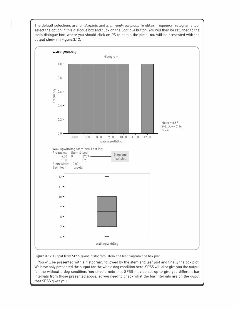
Statistics without maths for psychology66The default selections are for Boxplots and Stem-and-leaf plots. To obtain frequency histograms too, select the option in this dialogue box and click on the Continue button. You will then be returned to the main dialogue box, where you should click on OK to obtain the plots. You will be presented with the output shown in Figure 3.12.
Figure 3.12 Output from SPSS giving histogram, stem and leaf diagram and box plot
You will be presented with a histogram, followed by the stem and leaf plot and finally the box plot. We have only presented the output for the with a dog condition here. SPSS will also give you the output for the without a dog condition. You should note that SPSS may be set up to give you different bar intervals from those presented above, so you need to check what the bar intervals are on the ouput that SPSS gives you.

CHAPTER 3 Descriptive statistics 67
3.5 Scattergrams
A useful technique for examining the relationship between two variables is to obtain a scatter-gram. An example of a scattergram can be seen in Figure 3.13 for the statistics anxiety and procrastination data presented in Chapter 2 (see page 30). These data are presented again below:
Statistics anxiety score: 50 59 48 60 62 55Procrastination score: 96 132 94 110 140 125
A scattergram plots the scores of one variable on the x-axis and the other variable on the y-axis. Figure 3.13 gives scores for procrastination on the x-axis and statistics anxiety on the y-axis.It gives a good illustration of how the two variables may be related. We can see from the scatter-gram that, generally, as statistics anxiety increases so does procrastination. Thus there seems to be a relationship between the two variables. The scores seem to fall quite close to an imaginary line running from the bottom-left corner to the top-right corner. We call this a positive relationship.
Definition
A scattergram gives a graphical representation of the relationship between two variables. The scores on one variable are plotted on the x-axis and the scores on another variable are plotted on the y-axis.
Suppose that when you conducted your statistics anxiety study you found that, as statistics anxiety increased, procrastination decreased. What do you think the resulting scattergram would look like? You might find that it resembled the one presented in Figure 3.14.
You can now see from the scattergram in Figure 3.14 that, as procrastination increases, statistics anxiety decreases. The scores appear to cluster around an imaginary line running from the top-left corner to the bottom-right corner. We would call this a negative relationship. What would the scattergram look like if there were no discernible relationship between statistics
Figure 3.13 Scattergram for the statistics anxiety and procrastination data presented in Chapter 2

Statistics without maths for psychology68
Activity 3.7
Given the following scattergram, what would be the most sensible conclusion about the relationship between the price of petrol and driver satisfaction?
anxiety and procrastination? The scattergram presented in Figure 3.15 gives an indication of what this might look like.
You can see that the arrangement of points in the scattergram illustrated in Figure 3.15 appears to be fairly random. Scattergrams are thus a very useful tool for examining relationships between variables, and will be discussed in more detail in Chapter 6.
Figure 3.14 Scattergram indicating that, as statistics anxiety decreases, procrastination increases

CHAPTER 3 Descriptive statistics 69
SPSS: generating scattergrams
To obtain a scattergram using SPSS, you should click on the Graphs menu and then select the Scatter . . . option. You will be presented with the following option box:
Figure 3.15 Scattergram indicating no relationship between statistics anxiety and procrastination

Statistics without maths for psychology70
You should select the Simple option (which is the default selection) and click on the Define button. You will then be presented with a dialogue box where you can select various options for your scattergram.
Move one variable to the Y Axis box and one other variable to the X Axis box using the buttons and then click on OK to obtain the scattergram. The graph should be similar to the one presented earlier (see Figure 3.13).
3.6 Sampling error and relationships between variables
You should recall that earlier in the chapter (see page 50) we explained the problems associated with sampling error. There we indicated that because of sampling error our sample mean need not necessarily be a good indicator of the population mean. You should note that sampling error is not restricted to circumstances where we wish to estimate the population mean. It is also an important concern when investigating relationships between variables. Suppose we conduct a study relating statistics anxiety to procrastination, and suppose that (unknown to us) there is actually no relationship between these two variables in the population. For the sake of illustration, let us assume that there are only 50 people in the population. The scattergram in Figure 3.16, therefore, represents the pattern of scores in the population. If we took two different samples from this population, one containing only three people and one containing 20 people, we might get scattergrams that look like Figure 3.17(a) and (b). In these scattergrams we can see that there does not appear to be a relationship between the two variables. As procrastination increases, there is no consistent pattern of change in statistics anxiety. In this case, our samples are good representations of the underlying population.
If we now select two more samples (one containing three people and one containing 20 people), we might obtain the scattergrams shown in Figure 3.18(a) and (b). In this case, in the three-person sample we might conclude that there is a negative relationship between the two

CHAPTER 3 Descriptive statistics 71
variables. As statistics anxiety decreases, procrastination increases. In the 20-person sample, however, the suggestion is again that there is no real relationship between the two variables. You can see that here the smaller sample does not accurately reflect the pattern of the underlying population, whereas the larger sample does.
Finally, if we select two more samples we might get the pattern illustrated in Figure 3.19. Here you should be able to see that there does not appear to be a relationship between statistics anxiety and procrastination in the three-person sample but there does appear to be a relationship in the 20-person sample. If you look at Figure 3.19, you should see that there appears to be a pattern for the 20-person sample that suggests as procrastination increases so does statistics anxiety. In this case the larger sample does not accurately represent the underlying population, whereas the smaller sample does.
Figure 3.16 Scattergram of the population of procrastination and statistics anxiety scores
Figure 3.17 Scattergrams illustrating no relationship between statistics anxiety and procrastination suggested by the three- and 20-person samples

Statistics without maths for psychology72
You should note that you are much less likely to get the patterns indicated in Figure 3.19 than those in Figures 3.17 and 3.18. As we indicated earlier in the chapter, when you have larger sample sizes the samples are much more likely to be accurate representations of the underlying population. Although the scenario illustrated by Figure 3.19 is quite unlikely, it can occur and therefore we have to be careful when trying to generalise from samples to populations.
The main point of the above illustration is that the conclusions we draw from sample data are subject to sampling error. We can rarely be certain that what is happening in the sample reflects what happens in the population. Indeed, as the above scattergrams illustrate, our sample data can deceive us. They can show a pattern of scores that is completely different from the pattern in the underlying population. The larger the sample we take from the population, however, the more likely it is that it will reflect that population accurately.
Figure 3.18 Scattergrams illustrating a negative relationship between statistics anxiety and procrastination suggested by the three-person sample but not the 20-person sample
Figure 3.19 Scattergrams illustrating a relationship between statistics anxiety and procrastination suggested by the 20-person sample but not the three-person sample

CHAPTER 3 Descriptive statistics 73
3.7 The normal distribution
We have now presented you with four useful techniques for graphically illustrating your data. Why is it so important to do this? It is certainly not so that software giants can sell you fancy computer software. It is because the way that our data are distributed is important. Many of the statistical tests you will be presented with in this book make assumptions about how your data are distributed. That is, the tests are valid only if your data are distributed in a certain way. One of the most important distributions that you will come across is the normal distribution.
The curves illustrated in Figure 3.20 are all normal distributions. In everyday life, many variables such as height, weight, shoe size, anxiety levels and exam marks all tend to be normally distributed: that is, they all tend to look like the curves in Figure 3.20. In our research we can use this information to make assumptions about the way that populations are distributed. It is for this reason that many of the most powerful statistical tools we use assume that the populations from which our samples are drawn are normally distributed.
For a distribution to be classed as normal it should have the following characteristics:
It should be symmetrical about the mean. The tails should meet the x-axis at infinity. It should be bell-shaped.
All the distributions in Figure 3.20 are normal; even though they are not exactly the same, they have the characteristics described above. You can see that they differ in terms of how spread out the scores are and how peaked they are in the middle. You will also notice that, when you
Figure 3.20 Normal distributions

Statistics without maths for psychology74
have a normal distribution, the mean, median and mode are exactly the same. Another impor-tant characteristic of the normal distribution is that it is a function of its mean and standard deviation (we explain standard deviations later in this chapter). What this means is that, once we have the mean and standard deviation, we can plot the normal distribution by putting these values into a formula. We will not present the formula here; you just need to remember that the normal distribution can be plotted by reference to its mean and standard deviation.
Definition
A normal distribution is a distribution of scores that is peaked in the middle and tails off symmetrically on either side of the peak. The distribution is often said to be ‘bell-shaped’. For a perfectly normal distribution, the mean, median and mode will be represented by the peak of the curve.
As we pointed out earlier, when many naturally occurring variables are plotted, they are found to be normally distributed. It is also generally found that the more scores from such variables you plot, the more like the normal distribution they become. A simple example may serve to illustrate this. If you randomly selected ten men and measured their heights in inches, the frequency histogram might look something like Figure 3.21(a). It is clear that this does not much resemble the normal distributions illustrated in Figure 3.20. If we select an additional ten men and plot all 20 heights, the resulting distribution might look like Figure 3.21(b), again not too much like a normal distribution. You can see, however, that as we select more and more men and plot the heights, the histogram becomes a closer approximation to the normal distribution (Figures 3.21(c) to (e)). By the time we have selected 100 men, you can see that we have a perfectly normal distribution. Obviously we have made these data up to illustrate a point, but in general this is what happens with many variables that you will come across.
We have given you an indication of what the normal distribution looks like; however, you need to be aware that there is not just one single normal distribution. As indicated in Figure 3.20, normal distributions represent a family of distributions. These distributions all have the characteristics of normal distributions (bell-shaped, symmetrical about the mean, etc.), but they differ from one another in terms of how spread out they are and how peaked or flat they are.
3.8 Variation or spread of distributions
We have introduced you to measures of central tendency, which give us an indication of the typical score in a sample. Another important aspect of a sample or population of scores is how spread out they are. Or, to put it another way, how much variation there is in your sample or population.
Definition
Variance or variation of scores indicates the degree to which the scores on a variable are different from one another.

CHAPTER 3 Descriptive statistics 75
3.8.1 The range
One simple way of getting an indication of the spread of scores is to compare the minimum score with the maximum score in the sample or population. This is known as the range. The range is simply the difference between the minimum and maximum scores. For example, the range for the depression scores in Figure 3.3 is 64: that is, 64 minus 0. In that example the lowest score is 0 and the highest score is 64, so the range is 64.
Although the range tells us about the overall range of scores, it does not give us any indication of what is happening in between these scores. For example, take a look at the two
Figure 3.21 Histograms showing the progression to a normal distribution as more people are sampled

Statistics without maths for psychology76
distributions in Figure 3.22. These histograms were generated from two sets of data which have the same mean (16) and the same minimum and maximum scores (5 and 27). They both therefore have the same range, which is 22 (27 minus 5). They are, however, totally different distributions; the scores in distribution B are packed tightly around the mean whereas the scores in distribution A are generally more spread out. Ideally, we need to have an indication of the overall shape of the distribution and how much the scores vary from the mean. Therefore, although the range gives a crude indication of the spread of the scores, it does not really tell us much about the overall shape of the distribution of the sample of scores.
Definition
The range is the highest score in a sample minus the lowest score.
3.8.2 Standard deviation
A more informative measure of the variation in data is the standard deviation (SD). One of the problems with the range is that it does not tell us what is happening with the scores between the minimum and maximum scores. The SD, however, does give us an indication of what is happening between the two extremes. The reason why the SD is able to do this is that it tells us how much all the scores in a dataset vary around the mean. The SD is a very important concept, so it is worth the effort spent now getting to understand it. It is important because it forms the basis of many of the statistical techniques we use to analyse our data.
The SD is a measure of how much the scores in your sample vary around the mean. Each score in a sample will deviate from the mean by some amount. If we subtract the mean from each score, we get an indication of how far each score in the sample is from the mean. As with any group of scores, we could then find the mean of the deviations from the mean. This mean,
Figure 3.22 Distributions with the same mean and minimum and maximum scores but which have very different dis-tributions around the mean

CHAPTER 3 Descriptive statistics 77
called the mean deviation, gives us an indication of how much the group as a whole differs from the sample mean. To calculate the mean deviation, we have to sum the individual deviations and divide by the number of scores we have. There is a problem with such a procedure, however. The problem relates to the fact that the mean is a measure of central tendency (middle or typical score). As a result, approximately half of the deviations from the mean will be negative deviations (the scores will be less than the mean) and half will be positive deviations (the scores will be greater than the mean). If we sum these deviations, we will get zero. This is illustrated below:
This is not a very informative indication of how the whole group is deviating from the mean, as for every sample we will get zero. A way out of this dilemma is to square each of the devia-tions from the mean; this eliminates all negative values (a negative number squared gives a positive value, e.g. −52 = 25). We can then calculate the mean of these squared deviations to give an indication of the spread of the whole group of scores. The resultant statistic is known as the variance. The problem with the variance is that it is based upon the squares of the deviations and thus it is not expressed in the same units as the actual scores themselves. It is expressed in the square of the unit of measurement. For example, if we had a set of scores expressed in seconds, the variance would be expressed in seconds2. To achieve a measure of deviation from the mean in the original units of measurement, we have to take the square root of the variance, which gives us the standard deviation.
Definition
The standard deviation is the degree to which the scores in a dataset deviate around the mean. It is an estimate of the average deviation of the scores from the mean.
A simple example will illustrate this. Suppose that we have the following group of scores collected from a study into the number of chocolate bars eaten by people each week: 1, 4, 5, 6, 9, 11. To work out the standard deviation, we proceed as follows:
First, calculate the mean, which is 6. The deviation of each score from the mean is: −5, −2, −1, 0, 3, 5 (if we add these up, you
see that we get zero). We therefore need to square these deviations to get rid of the negative values, which gives
us these scores: 25, 4, 1, 0, 9, 25. Next, we calculate the mean of these scores, which is 10.67, i.e. 64 ÷ 6, which gives us our
variance. Finally, we work out the standard deviation by taking the square root of the variance, which
gives us 3.27.

Statistics without maths for psychology78
The standard deviation figure of 3.27 is useful as it gives us an indication of how closely the scores are clustered around the mean. Generally, you will find that nearly 70% of all scores fall within 1 standard deviation of the mean. In the above example the standard deviation is 3.27: this tells us that the majority of the scores in this sample are within 3.27 units above or below the mean. That is, nearly 70% of scores would fall between 2.73 (6 minus 3.27) and 9.27 (6 plus 3.27). The standard deviation is useful when you want to compare samples using the same scale. Suppose we took a second sample of scores and now had a standard deviation of 6.14. If we compare this with the SD of 3.27 from the initial example, it suggests that the initial sample of scores tends to be more closely clustered around the mean than the second sample.
If you calculate the standard deviation in the way just shown, you will obtain a standard deviation that is specific to your sample. This is called a sample standard deviation. Usually, however, we are interested in a measure of variation which is an estimate of the underlying population. The problem with the sample standard deviation is that it tends to be an under-estimate of the population standard deviation. We therefore usually report a slightly modified version of the sample standard deviation when we are trying to generalise from our sample to the underlying population. The only difference between this modified standard deviation and the sample standard deviation is that, instead of dividing the sum of the squared deviations from the mean by the number of observations, we divide by the number of observations minus 1. Thus, in the above example, instead of dividing 64 by 6, we would divide it by 6 − 1 (or 5). This would give us a standard deviation of 3.58. You will find when you use SPSS that the standard deviation reported in the output is the modified version rather than the sample standard deviation. Therefore, if you typed the data used in the above example into SPSS and ran some descriptive statistics, you would find that the standard deviation is given as 3.58 rather than 3.27.
Activity 3.8
Below is an extract from a table presented in a paper by Zhao et al. (2010). Take a look at the table and for each variable identify which condition has the greatest amount of variation around the mean.
Variable
Nap seated Nap in a bed No nap
Mean SD Mean SD Mean SD
Sleepiness 47.50 14.19 50.00 16.67 57.50 12.08
Fatigue 57.40 14.34 59.50 12.75 49.60 10.54
Mood 42.71 3.52 40.71 6.74 42.73 5.00

CHAPTER 3 Descriptive statistics 79
SPSS: obtaining measures of variation
To obtain measures of variation using SPSS, you should follow the instructions presented earlier for generating measures of central tendency. If you use the Explore dialogue box as previously described, you will generate a printout similar to that presented below:
EXPLORE
You can see that the printout contains the range, variance and standard deviation.

Statistics without maths for psychology80
3.9 Other characteristics of distributions
We have now covered ways to measure the spread of distributions. The other way in which distributions can differ from one another is in terms of how peaked or flat they are. The degree of peakedness or flatness is the kurtosis of the distribution. If a distribution is highly peaked, it is said to be leptokurtic; if the distribution is flat it is said to platykurtic. A distribution that is between the more extremes of peakedness and flatness is said to be mesokurtic (see Figure 3.23).
Definition
The kurtosis of a distribution is a measure of how peaked the distribution is. A flat distribution is called platykurtic, a very peaked distribution is called leptokurtic, and a distribution between these extremes is called mesokurtic.
You need not worry unduly about kurtosis at this stage of your statistical careers. We introduce it here for two reasons. First, for completeness: we want you to have a fairly comprehensive knowledge of the normal distributions and how they can differ from one another. Second, when you get SPSS to run descriptive statistics, you will see a measure of kurtosis on the output. When you come across this, you will now know what it refers to: positive values of kurtosis on the output suggest that the distribution is leptokurtic, whereas negative values suggest that it is platykurtic. A zero value tells you that you have a mesokurtic distribution.
3.10 Non-normal distributions
Although many variables, when plotted, roughly approximate the normal distribution, you will often find that variables deviate from this shape of distribution. Often such deviations from normal are the result of sampling error. It is important to check the shape of your distributions,
Figure 3.23 Normal distributions varying in terms of their peakedness and flatness

CHAPTER 3 Descriptive statistics 81
as most of the statistical techniques described in this book make the assumption that the data you are analysing are normally distributed. You can check the shape of the distributions by generating histograms. If you find that your data deviate markedly from the normal distribution, you should consider using one of the statistical techniques that do not make the assumption of normally distributed data. These are called distribution-free or non-parametric tests and are covered in Chapter 16. The following descriptions illustrate some of the more common ways in which a distribution you may come across will deviate from the normal distribution.
3.10.1 Skewed distributions
The most often observed deviations from normality are the result of skewness. The distributions presented below are skewed distributions (Figure 3.24). You can see that in comparison with the normal distribution they are not symmetrical. The distribution that has an extended tail to the right is known as a positively skewed distribution (Figure 3.24(a)). The distribution that has an extended tail to the left is known as a negatively skewed distribution (Figure 3.24(b)).
Definition
Skewed distributions are those where the peak is shifted away from the centre of the distribution and there is an extended tail on one of the sides of the peak. A negatively skewed distribution is one where the peak has been shifted to the right towards the high numbers on the scale and the tail is pointing to the low number (or even pointing to the negative numbers). A positively skewed distribution has the peak shifted left, towards the low numbers, and has the tailed extended towards the high numbers.
Figure 3.24 Positively and negatively skewed distributions

Statistics without maths for psychology82
If you come across badly skewed distributions, you should be cautious about using the mean as your measure of central tendency, as the scores in the extended tail will be distorting your mean. In such cases you are advised to use the median or mode, as these will be more representative of the typical score in your sample.
As with kurtosis, the output you get from SPSS for descriptive statistics also gives a measure of skewness. Here a positive value suggests a positively skewed distribution, whereas a negative value suggests a negatively skewed distribution. A value of zero tells you that your distribution is not skewed in either direction. If you look back at the output shown on page 79, you can see that we have a skewness value of 0.46 for the ‘WithDog’ condition, indicating a small positive skew. We also have a value of −0.94 for the ‘WithoutDog’ condition, indicating quite a large negative skew for these data. Values of skewness around about 1 (or −1) suggest devia-tions from normality which are too extreme for us to use many of the statistical techniques covered in this book.
3.10.2 Bimodal distributions
Occasionally you may come across a distribution like the one represented in Figure 3.25. This is known as a bimodal distribution. Essentially it has two modes, although in most cases the two humps of the distribution will not be equal in height. This is clearly a non-normal distribu-tion. If you come across such a distribution you should look closely at your sample, as there may be some factor that is causing your scores to cluster around the two modal positions. It might be the case that you have to treat these as two separate populations. If all seems in order, you should report that the distribution is bimodal and report the two modes.
Definition
A bimodal distribution is one that has two pronounced peaks. It is suggestive of there being two distinct populations underlying the data.
A good example of bimodally distributed data is presented by Morris et al. (1981). In this study they looked at the relationship between memory for football scores and knowledge of football. Knowledge of football was measured using a football quiz. When the researchers examined the distribution of knowledge scores, they found that it was bimodal. The explanation was that they had two distinct populations of people in the study: football enthusiasts and non-enthusiasts. The football enthusiasts’ scores clustered near the maximum possible score and the non-enthusiasts clustered near the minimum possible scores, thus forming a bimodal distribution.
We have now shown you what the normal distribution looks like and illustrated some of the ways in which actual distributions can deviate from normality. Because the normal distribu-tion is so important in statistics, one of the main aims of illustrating your data graphically is to see whether they are normally distributed. Perhaps the best graphical techniques for estab-lishing whether or not your data are normally distributed are histograms and stem and leaf plots. If you take another look at Figure 3.21(e), you will see an example of a histogram showing a normal distribution. On the other hand, Figure 3.3 is an example of a distribution that is slightly positively skewed. Compare it with Figure 3.24(a) and you will see that they are similar in shape.
One of the limitations of box plots is that it is often more difficult to tell when a distribution deviates from normality, but as a guide Figures 3.26(a) to (c) give examples of box plots illustrating normally and non-normally distributed data.

CHAPTER 3 Descriptive statistics 83
Figure 3.26(a) was generated from normally distributed data (1, 2, 2, 3, 3, 3, 4, 4, 4, 4, 5, 5, 5, 6, 6, 7) and shows that the median is in the centre of the box and we have whiskers of equal length coming from each side of the box. Also there are no outliers.
Figure 3.26(b) was generated from negatively skewed data (1, 2, 3, 3, 3, 4, 4, 4, 5, 5, 5, 5, 5, 5, 5, 5, 5) and shows that the median is shifted upwards in the box and is right near the top edge. Also there is no whisker coming out of the top of the box. This is an extreme example but whenever the median is shifted towards one edge of the box and you have a shortened or no whisker coming from that edge, you should suspect that you have skewed data.
Finally, Figure 3.26(c) was generated from bimodally distributed data (1, 2, 2, 3, 3, 3, 3, 3, 4, 4, 5, 5, 5, 5, 5, 6, 6, 7). Surprisingly, it looks exactly like Figure 3.26(a) and is a good illus-tration of the caution you should exercise when trying to interpret whether you have normally distributed data from box plots. This is why the histogram and, to a certain extent, stem and leaf plots are better for assessing whether you have normally distributed data. Thankfully, bimodally distributed data are not too common in research, so box plots can give a reasonable indication of the way your data are distributed.
Figure 3.25 Bimodal distribution

Statistics without maths for psychology84
Figure 3.26 Box plots illustrating (a) normally distributed, (b) negatively skewed and (c) bimodally distributed data

CHAPTER 3 Descriptive statistics 85
Activity 3.9
Which of the following distributions are normal and which are not?
Example from the literature
Pain for hot and cold noxious stimuli
Even though we would expect that all researchers using the statistical techniques covered in this book would examine histograms, it is quite rare to find researchers referring to histograms in published reports. A nice exception to this is a recent article published by Thompson et al. (2008). In this study the researchers report a study investigating the pain thresholds and tolerances of males

Statistics without maths for psychology86
and females for heat and cold. They asked participants to endure pain which was induced using either hot or cold stimuli, but to ensure that the study was ethically robust the researchers stopped each trial after 120 seconds. The authors report that they referred to histograms in their analyses of participants’ times to withdraw their hands from the painful stimuli. Interestingly, the authors report finding data that was bimodally distributed. They found that there was a second peak in the distribu-tion at 120 seconds. The authors report that this pattern of findings is quite common in such pain research and occurs because a number of participants do not find the stimuli very painful and so are able to endure the pain for the 120 seconds maximum for the trial.
It is rare for researchers to refer to histograms and even rarer for them actually to present them as part of a research paper published in a journal. Sadly, in this example, the authors did not present their histograms. In their defence, journals do not like to publish too many tables and figures in published research as it is quite costly, and as a result researchers have to use tables and figures sparingly. It is good that these researchers refer to their histograms and indeed present a very detailed explanation of how they dealt with their bimodal data in readiness for further analyses. It is clear that they have undertaken appropriate descriptive statistical analyses of their data before moving on to the more complex inferential statistical techniques.
SPSS: displaying the normal curve on histograms
It is quite useful to get SPSS to display a normal distribution on your histograms to help you decide whether your data are normally distributed. Unfortunately, it is not possible to do this using the Explore dialogue box. In order to do this, you should generate histograms using the Graphs menu instead of the Analyze menu. When you click on the Graphs menu, you should notice that there are options for all the graphical descriptive techniques that we have shown you:

CHAPTER 3 Descriptive statistics 87
Select the Histogram . . . option and you will be presented with the following dialogue box. To generate a histogram with a normal curve on it, you should move the relevant variable to the Variable box. You should then select the option that states Display normal curve. When you have made the correct selection, click on OK to generate the histogram. The resulting histogram will contain the normal curve, as indicated in Figure 3.27.

Statistics without maths for psychology88
Figure 3.27 PASW histogram showing the normal distribution curve
You can see from the histogram that the set of data that we have used corresponds quite closely to the normal curve.
3.11 Writing up your descriptive statistics
Although it is good practice to examine the distribution of your data, you will find that most researchers do not routinely report the findings of such examinations. Typically, if your distributions deviate from normality, it is a good idea to report this fact. If the distributions are approximately normal in shape, it is up to you whether you report this. Whether or not you report the shape of your distribution, you should always examine this, as the shape of your distribu-tion has a bearing on the sorts of statistical technique you can use to analyse your data.
If you wish to mention the way that your data are distributed, the following is perhaps how you should report your descriptive statistics. In a study conducted by Reidy and Keogh (1997), anxious and non-anxious individuals were compared on their interpretation of ambiguous information. There was also an examination of gender differences in such interpretations. We might present the descriptive statistics as follows:
There were 98 students in the study. The mean numbers of positive and negative interpreta-tions were 10.06 and 7.95 respectively. The number of positive and negative interpretations given by males and females was compared. Table 3.1 shows the means and standard deviations for these two groups. The table shows that the males offered more negative interpretations than the females and about the same number of positive interpretations. Both genders gave

CHAPTER 3 Descriptive statistics 89
Discover the brand new website at www.pearsoned.co.uk/dancey where you can test your knowledge with multiple choice questions and activities, discover more about topics using the links to relevant websites, and explore the interactive flowchart designed to help you find the right method of analysis.
more positive interpretations than they did negative interpretations. The standard deviations show that the two groups had similar levels of variability in terms of positive and negative interpretations. Examination of box and whisker plots revealed that the distributions were approximately normally distributed and that there were no extreme scores.
Table 3.1 Mean number of positive and negative interpretations shown by males and females (standard deviations in parentheses)
Females Males
Positive interpretations 10.20 (2.32) 9.91 (3.01)
Negative interpretations 7.27 (2.99) 8.62 (3.55)
In this chapter we have introduced you to ways of exploring and describing your data. We have highlighted the fact that it is important to become familiar with your data by using a number of descriptive statistical techniques, and we explained how to use and interpret such techniques. Thus, you have learnt:
• How to calculate means, medians and modes in order to get an indication of the typical score in a sample (these are measures of central tendency).
• Sampling errors occur when we take samples from populations, and the larger the sample we take, the lower will be the degree of sampling error.
• That there are a number of graphical techniques that help us to become more familiar with how our data are distributed, including:
– frequency histograms
– stem and leaf plots
– box plots
– scattergrams.
• What the normal distribution looks like and why it is important in statistics.
• That there are a number of ways in which data that you gather can deviate from the normal distribution, including:
– negatively skewed distributions
– positively skewed distributions
– bimodal distributions.
• That an important feature of any distribution is the degree to which the scores are spread out and that the most important measure of this is called the standard deviation.
• That the standard deviation is the degree to which the scores in a distribution deviate from the mean.
Summary