Creating Educational Video
160
Creating Educational Video eory and Practice for Visual Communication Designers TIMOTHY ALAN JACOBY
-
Upload
khangminh22 -
Category
Documents
-
view
0 -
download
0
Transcript of Creating Educational Video

Creating Educational VideoTheory and Practice for Visual Communication Designers
TIMOTHY ALAN JACOBY


Creating Educational VideoTheory and Practice for Visual Communication Designers
Timothy Alan JacobyThe Ohio State University, Department of Design.Columbus, Ohio. Autumn Quarter, 2008. Presented in Partial Fulfillment of the Requirements for the Degree Master of Fine Arts in the Graduate School of the Ohio State University.
The Author would like to thank The Wexner Center for the Arts for full funding of graduate studies and other assistance.
E-mail: [email protected]. Telephone: 773-301-9042.
All rights reserved. No portion of this book may be reproduced or transmitted in any form or by any means, electronic or mechanical, without written permission of the author.
Printed in The United States of America, Lulu Inc., ID 5043199.3rd printing, January, 2009.


Creating Educational VideoTheory and Practice for Visual Communication Designers
TIMOTHY ALAN JACOBYThe Ohio State University, 2008
Presented in Partial Fulfillment of the Requirements for the Degree Master of Fine Arts in the Graduate School of the Ohio State University
Committee membersPeter Kwok Chan, PhD: Associate ProfessorJeffrey Haase: Associate ProfessorPaul Nini: Professor and Committee Chair


Abstract 1 Introduction 3
Part I: Theory, Criticism and Observations Introduction 7 1. Motion in Pictures and Motion Pictures 11 2. Architecture in Photography 33 3. Architecture and Environment in Film and Video 45 4. Film and Video as Information Design 61
Part II: Creating the Video Introduction 75 5. Pre Production 77 6. Production 83 7. Post Production 89
8. The Final Video 99
Part III: Dénouement Introduction 111 9. The Current Distribution of Video Over the Internet 115 10. Criticism 127
Bibliography 143 About the Author 147
Contents

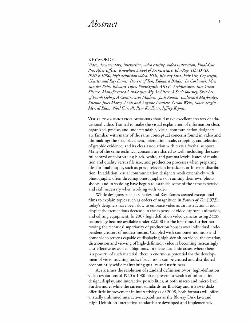
KEYWORDSVideo, documentary, interactive, video editing, video instruction, Final-Cut Pro, After Effects, Knowlton School of Architecture, Blu-Ray, HD DVD, 1920 × 1080, high definition video, HDi, Blu-ray Java, Fair Use, Copyright, Charles and Ray Eames, Powers of Ten, Édouard Baldus, Le Corbusier, Mies van der Rohe, Edward Tufte, PhotoSynth, ARTE, Architectures, Into Great Silence, Manufactured Landscapes, My Architect: A Son’s Journey, Sketches of Frank Gehry, A Constructive Madness, Jack Koumi, Eadweard Muybridge, Etienne-Jules Marey, Louis and Auguste Lumière, Orson Wells, Mack Scogin Merrill Elam, Noël Carroll, Rem Koolhaas, Jeffrey Kipnis. Visual CommuniCation designers should make excellent creators of edu-cational video. Trained to make the visual explanation of information clear, organized, precise, and understandable, visual communication designers are familiar with many of the same conceptual concerns found in video and filmmaking: the size, placement, orientation, scale, cropping, and selection of graphic evidence, and its clear association with textual/verbal support. Many of the same technical concerns are shared as well, including the care-ful control of color values; black, white, and gamma levels; issues of resolu-tion and quality versus file size; and production processes when preparing files for final output, such as press, television broadcast, or Internet distribu-tion. In addition, visual communication designers work extensively with photographs, often directing photographers or running their own photo shoots, and in so doing have begun to establish some of the same expertise and skill necessary when working with video. While designers such as Charles and Ray Eames created exceptional films to explain topics such as orders of magnitude in Powers of Ten (1973), today’s designers have been slow to embrace video as an instructional tool, despite the tremendous decrease in the expense of video capture, animation, and editing equipment. In 2007 high definition video cameras using 3CCd technology became available under $2,000 for the first time, further nar-rowing the technical superiority of production houses over individual, inde-pendent creators of modest means. Coupled with computer monitors and home video screens capable of displaying high-definition video, the creation, distribution and viewing of high-definition video is becoming increasingly cost-effective as well as ubiquitous. In niche academic areas, where there is a poverty of such material, there is enormous potential for the develop-ment of video teaching tools, if such tools can be created and distributed economically while maintaining quality and usefulness. At six times the resolution of standard definition dVds, high-definition video resolutions of 1920 × 1080 pixels presents a wealth of information design, display, and interactive possibilities, at both macro and micro level. Furthermore, while the current standards for Blu-Ray and Hd dVd disks offer little improvement in interactivity as of 2008, both formats will offer virtually unlimited interactive capabilities as the Blu-ray Disk Java and High Definition Interactive standards are developed and implemented,
1Abstract

including Web-based integration with Html, Xml, Css, and other media formats and technologies; developers such as Apple will likely begin to incorporate these features into products such as dVd Studio Pro. While the Internet distribution of high definition video is often problematic in terms of current consumer bandwidth limits, typical home computer power, and common screen resolutions, it is currently possible to play high-quality Hd video in real-time over commercial and university Internet connections, broadening the reach for high-definition video beyond broadcast and cable audiences. Video-on-demand capabilities currently offer cable television users real-time playback control of pre-recorded television programs, and cable television technology is moving towards more robust interactivity. The final outcome of this thesis—a high-definition documentary video—will establish the feasibility of producing low-cost, high-definition educational tools of high quality, while exploring various methods of distribution. This paper will examine the creation of a high-definition documentary video of recently completed Knowlton Hall, which houses the departments of Architecture, Landscape Architecture, and City and Regional Planning at The Ohio Statue University in Columbus, Ohio. Knowlton Hall, which was opened in September of 2004, became a choice topic for the development of this video due to its conceptual complexity, the possibility to shoot visu-ally and aesthetically arresting video, as well as its nearly 24 × 7 accessibility to the author. Additionally, the building presented a range of challenges including various materials with different reflective and specular attributes; working with natural and artificial lighting conditions, often in the same shot; radically different scales, from models and drawings to enormous open spaces and entire facades; and the need to consider the interior of the build-ing in 360,° literally from floor to ceiling and wall to wall. Finally, there was the unpredictably of location shooting due to weather and human activity, as well as the difficulties of moving equipment from place to place within Knowlton Hall, a constant struggle providing valuable real-world experience. The lessons learned during the creation of this video should provide use-ful information in the development of similar video design and production, regardless of subject. This paper will discuss the entire process, from the development of an idea to the creation of a proposal, a thorough description of the research phase, the development and revisions of scripts, production challenges, and editing, animation, and other post-production work, in-cluding legal concerns. While an in-depth technical overview of equipment is beyond the scope of this paper, I will also address the equipment used, from video camera and location tools to computers and software programs, followed by an overview of the distribution of the material, including inter-active possibilities.
2 Creating eduCational Video

grapHiC design, increasingly referred to as visual communication design to indicate the broadening of its scope to include interactive design and motion graphics, is the process of communicating information visually across a variety of media, including television, the Internet, film, and all variety of publications. Graphic design combines images, including dia-grams, photographs, illustration, and animation with text, and it is typi-cally its association with text that clarity occurs. While formal invention, aesthetics, conventions and styles will continue to evolve and change, the central concern of graphic design—to communicate information clearly to a receiver—will remain. Two trends have influenced graphic design enormously in the last 15 years: the computer, and the increasingly multi-disciplinary nature of design as a profession. While computers have changed the nature of work in many fields, arguably in no other design discipline have computers had as great an impact.1 Compared to the careers of graphic designers of 15 years ago, today’s designers have combined the design and production skills that were previously spread across a group, including typographers, type setters, paste-up artists, layout artists, and photographers. While graphic design has historically been collaborative, often including copy-writers, art-directors, illustrators and photographers, designers today often work alongside animators, programers, musicians, sound editors, and videographers in the development of Web sites, video games, kiosks and interactive dVds, and are often expected to have expertise in these areas as well. Graphic designers have increasingly worked in broadcast and motion-pictures, from the look-and-feel of credits and other time-based motion graphics, particularly in advertising, to the creation of maps, diagrams, and other explanatory graph-ics on network news or science programs. This collaboration has resulted in a new graphic language and new expressions, reflecting the new tools and new processes. However, while the breadth of the graphic design profession has increased, the creation and capture of live film or video, as opposed to animation, remains a highly segregated endeavor, as production houses and studios are often employed to script, shoot, and edit video, with designers often serving minor post-production roles, such as preparing video for use on the Web, or in the design of dVd interfaces. Graphic designers, having unique skills in organizing and presenting visual information, have developed many of the same sensibilities needed to produce live-action instructional video. Charles and Ray Eames worked in many fields of design, including graphic design, furniture design, industrial design, and architecture. The Eames also produced a series of more than 100 educational films with small crews and limited productions covering topics including orders of magnitude in Powers of Ten, as well industrial design (Fiberglass Chairs), architecture (Expanding Airport, Aquarium) and toys (Toccada for Toy Trains, Parade, Tops). Unlike today’s designers, live-action film was the primary product of their labor. Yet their studios were small, the equipment rudimentary, and the pre-digital, optical visual effects modest, even for their times. Unfortunately, with few exceptions, graphic
3Introduction
1Charlotte & Peter Fiell, Design for the 21st Century, (Koln, 2005), p. 6.
The Films of Charles & Ray Eames,Box set, (Image Entertainment, 2005).

designers have not exploited the decreasing costs of video-related equipment, particularly video cameras, computers, and editing and animation software. The purpose of documentary film and video, according to filmmaker John Grierson, is “not to tell a story with actors but to deal with aspects of the real world that had some drama and perhaps importance—that we might do something about a particular situation or at least should be aware of it.”2 This definition does not include the topics of nature, science, indus-trial, corporate, mathematics, mechanics, or other types of non-fiction. The selection of The Ohio State University’s Knowlton Hall as a subject, while in many ways concerning “nuts and bolts” concepts of contemporary archi-tecture, could also be read as a reflection and critique of the use of building materials and construction methods (why notions of ‘green’ design were absent during all phases of planning and construction), contemporary plan-ning practices (was this a fair and efficient use of limited state-owned space), the state of architectural education (is this an appropriate teaching environ-ment), as well as a reflection of the additional economic, cultural and social influences that brought such a project to fruition. However, as discussed in this paper, I will consider the Knowlton Hall video as an instructional documentary, rather than as social documentary as defined above, because both this paper and the video itself are concerned with the power of video as a tool for visual explanation, rather than its ability to shape or influence public opinion on social issues. The Knowlton Hall Video was shot primarily from March through June 2007 over the course of approximately ten weeks. The creation of a virtual Knowlton Hall walkthrough via 360° panoramic photography was photo-graphed and then programmed using dVd Studio Pro from June through August of the same year, while various animated segments were completed in September, October, and November. The first draft of the final narra-tion script and initial editing began in January of 2008. Editing, research, additional location shooting, and script revisions continued through July, at which point the first cut was completed and presented to interested parties, including my graduate advisors, graduate school colleagues, friends, and family members. The first cut, which in my opinion requires additional development, never-the-less serves to document the feasibility of creating high-quality educational video by a small team—in this case, a team of one. “Part I: Theory, Criticism and Observations” examines the beginning studies that helped shape the project, as I was still struggling with overall direction. At that time I was particularly interested in building justification for the greater cost and complexity of video in comparison to books or other media, such as Web sites, or at least trying to better understand their similarities and differences. I was also tying to establish an overview of similar projects, all created by a small team of professionals for theatrical release or television broadcast. In “Part II: Creating the Video,” I discuss the actual realization of the Knowlton Hall Video, from pre-production planning and research to on-site production videography to the development of the final narration script, as well as the difficulty of editing all the often disparate parts into a coherent whole. In the final section, “Part III: Dénouement,” I reflect on the outcome of nearly one-and-a half years of my time in an attempt to qualify both the successes and failures of the effort.
2Jack C. Ellis and Betsy A. McLane, A New History of Documentary Film, (New York, 2005), p. ix.
4 Creating eduCational Video

While I have exerted constant effort to maintain my objectivity as the author or this book, I readily admit that at times I have felt completely consumed by the enormity and difficulties of this project. While person-ally engaged in this type of work, distance is difficult—perhaps impossi-ble—to maintain. Having admitted that, I still believe that in many ways this project points to a way forward for those intending to follow similar pursuits. To be clear up front, I believe the marshalling of discipline, orga-nization, and creativity required in a project of this nature would pave the way not only to success when working with video—which was the origi-nal intent of this project—but with any project with such a high number of complexities, dependencies, and uncertainties. Perhaps this is why Charles and Ray Eames exhibited such enthusiasm for the development of films: As a tool for problem solving, film and video offer unlimited potential. While video had proven far more difficult than I expected, it is also far more rewarding. Unlike the types of tasks that become repetitive for designers over the years, working in video places one in constant state of flux, and therefore offers constant challenge. If the creation of film and video can become part of a designers repertoire, the opportunity exists for both our personal development in the field and the expansion of the pro-fession. I believe that this expansion will also reflect back on and influence tasks that visual communication designers have been performing for years. The possibilities exist, and the challenge is open—not in five years, but right now. I leave to the reader to decide if answering the demands of film and video merits their serious attention; at the very least, it merits their serious consideration.
Columbus, OhioDecember 2008
Eames Demetrios, director. 901: After 45 Years of Work,1990. Produced and distributed by the Eames Office.
Demetrios, the grandson of Charles and Ray Eames, is a writer, artist, design consultant, and filmmaker. 901: After 45 Years of Work was his first film, documenting the Eames office at 901 Washington Boulevard in Venice, California, where the Eames worked until the death of Ray in 1988. A hodgepodge of studio space and archive of nearly a half century of their work, the office also housed an area devoted to developing and editing motion-picture film. The Eames used these relatively primitive facilities to produce over 100 films in 16mm and 35mm. Today’s designers have the opportunity to create videos with far more affordable, versatile, and powerful equipment.
Images © Eames Demetrios and the Eames Office, 1990.
introduCtion 5

Part I: Theory, Criticism and Observations
Frank Gerhy,Sketch for Diller Building, New York City. Presskit, Sketches of Frank Gerhy.

in part i, considerations are made of the relative merits of photography, film, and video as tools first of visual explanation in general and then in the case of architecture specifically. This section begins with an attempt to differentiate photography from cinema in order to acknowledge certain phe-nomenological implications and thus suggest a basis for the selection of one over the other in certain pedagogical instances. The next chapter discusses the history of architectural photography, a logical next step, since photog-raphy both predates and heavily influenced concepts of film and video. In addition, the history of modern architecture and the history of architectural photography are so tightly interconnected in their evolution and develop-ment that the study of one almost necessarily becomes the study of the other. Their relatedness—extensively documented by numerous sources—became the foundation of my early research for this paper, as I found that a better understanding of architectural photography led to a better under-standing of architecture as depicted in film and video. Photographic cita-tions are noted to illustrate the development of a compositional, thematic, and graphic vocabulary for the display of architectural information, up to and including collaborative Web-based interactivity. This leads into the examination of contemporary video documentaries devoted to—or periph-erally concerning—architecture. (Unlike architectural photography, there is an unfortunate dearth of literature devoted to architectural film and video). The intent is to establish precedence of approach, technique, and context in the development of architectural photography and architectural film/video. In the chapter “Production” in “Part II” I will show how I adapted technique from these precedents to my own work. In an attempt to examine the role of time-based graphic presenta-tion of quantifiable, multivariate data, “Part I” also addresses Powers of Ten by Charles and Ray Eames, as well as recent video by Edward Tufte, Professor Emeritus of information design and statistic at Yale University and author of several classics on information design, including Visual Explanations and Envisioning Information. While I had originally planned to correlate some type of statistical graphics with what was being displayed in the video, such as the superimposition of dimensions or directional cues over the space being shown, this was eventually ruled out due to time limitations. However, it would have been remiss to omit any refer-ence to the work of the Eames and Tufte, as they have heavily influenced the work of graphic designers across a variety of media, including film and video. A relatively late-adopter to video, Tufte’s work, still highly experimental, is particularly informative regarding the potential power of high-definition, high-bandwidth video to finally escape the confines of flatland, once and for all. The type of thinking involved in many of the videos created by both Tufte and the Eames seem tailor made as points of departure for any graphic designer wishing to experiment with the use of animation and video as tools to establish visual evidence. In all cases, the films and videos discussed in “Part I” were created by very small teams. For the documentary series Architectures, produced by
Introduction 7

arte France for broadcast on European television networks, the produc-tion team was typically six people, often including the director, who in addition typically served as the writer and often as the editor as well. The film Into Great Silence was written, produced, shot, directed, and edited by Philip Gröning. In the film Manufactured Landscapes, director Jennifer Baichwal and cinematographer Peter Mettler document photographer Edward Burtynsky’s journey through China, and in so doing create a textbook example on the differences between photography and film/video. Tufte’s Waveform, a short clip shot on readily available high-definition video cameras, was created by Tufte in collaboration with Andrei Severny. These illustrations are instructive beyond their craft: they are useful examples of high-quality outcome possible even when created under considerable time, scope, and cost constraints. If a graphic designer or animator had access to digital video and afford-able digital tools such as Adobe After Effects, the optical compositing and animation seen in 1977’s Powers of Ten could be accomplished far more quickly, with higher-quality results, while reducing both the cost and the number of people involved. Eleven colleagues from the Eames office worked on Powers of Ten. Although collaboration with experts would still be required to develop and script the film today, I don’t doubt that a single designer could at least edit and animate the entire eight-minute sequence while cloistered away on computer, without the need to invest in the time or expense of developing film or trying to build the computer-controlled camera systems that the Eames built by scratch in 1977. Similarly, the use of digital video, rather than film, would have greatly reduced production expense in the creation of My Architect: A Son’s Journey, if we are willing to accept that a switch to video would not detract from the film’s aesthetic. We should recognize that video has an its own aesthetic that is in many ways far different from that of film, even as video today remains in some ways infe-rior to film as a recording medium. One need only examine the directions that digital photography has taken in recent years as it has all but eclipsed film, at least in commercial photography. The power and resolution of video will shortly equal and then surpass film as used in motion pictures as well, and when this happens, expect an even more rapid evolution of the video aesthetic. All the videos reviewed in “Part I” served as models of quality, realistic scope, and modest expense while I was developing the Knowlton Hall documentary. Much can be learned through the careful study of their craft, as well as their choice of content and conceptual approaches. While my original interest in both photography and the videos centered primarily on their visual representation of ideas—that is, as expressed through their com-positions, lens selection, camera movement, control and choice of lighting, and other concerns common in cinematography and videography—as I was trying to create my own video I began to appreciate the intricacies of their scripts, structure, and editing. As a graphic designer, striving for the ‘great shot’ seemed like a natural and engaging way to begin; however, working to organize and edit those shots to a meaningful narration script proved to be far more difficult. In retrospect, I question if the working practice typical to graphic design may have actually complicated the process of developing structure. Graphic
8 Creating eduCational Video

designers almost always inherit work—text, photographs, drawings—that suggest at least some degree of organization already; the designers job is to find and express this organization. While creating the Knowlton Hall video, I operated under an a priori assumption that an implicit structure would become apparent in much the same way that text and photographs guide the design of books and magazines. After weeks of shooting, I had most of the video that I needed. What was missing at that point was any intent that had been thoroughly defined beforehand. I had originally believed that merely reviewing and organizing hours and hours of video would begin to make a fundamental structure apparent. To quote the cliché, I believed that the film would be made in the editing room, each piece falling into place logically, as if part of a jigsaw puzzle. As you review the selections of film, video, and photography over the next several chapters, keep in mind that the authors try to communicate with a clarity of purpose. In many cases their ambitions evolved over time or perhaps changed completely from the initial concepts, but in the end, each video and photograph express a set of ideas. This is obvious of course, but when I began viewing the following photographs and videos (as well as many others), I was often bogged down by my obsessions with the visual problem solving, compositional, and technical skills on display, making the mistake of examining the trees while remaining unaware of the forest. Attention to detail is important in any field, and designers take naturally to experimentation. Unfortunately for those working in relative isolation over such a compressed time span, one must always strive to adapt the means available to the rapidly approaching end. In the case of creating the Knowlton Hall documentary, this included not only developing the visual components, which seemed straightforwardly related to the tasks that graphic designers deal with daily, but also extensive organization, planning, writing, research, and editing, which did not. Graphic design is a highly intuitive profession. Creating video with a “team” of one is far less so. Keep in mind the collaborative nature of the following work, as well as what responsibilities may be required of you, and plan accordingly. Do not get caught, as I did, in the minutia of your research. There are far more skills involved than you are likely to master while pursuing your degree. Let your research inform your pursuits, but choose an appropriate level of depth and detail.
tHeory, CritiCism, and obserVations 9

10 Creating eduCational Video
Etienne-Jules Marey, Linear Graph of Running Man in Black with White Stripes, c. 1882. The Image Gallery, University of California, San Diego.
Sergei M. Eisenstein, Battleship Potemkin,(Mosfilm, Moscow, 1925).

Ontology of Photography and Cinema
The skeptics presupposed that, by definition, art required the creative, expressive, and/or interpretive input of an artist. But, they contended, photography is a mechanism. It affords no space for creative, expressive, and/or interpretive invention. Therefore, it fails to meet the criteria requisite for art status; it cannot be art. And since film is essentially photography, films cannot be art either. —Noël Carroll1
WHy sHould a designer concern themselves with the philosophy of pho-tography and cinema? My interest began as an attempt to better elucidate the conceptual and practical frameworks that I would be immersed in for nearly two years of my academic career —that is, I wished to better define what I was working with, and hoped to establish some rationale when trying to compare the cost and benefits of choosing one type of representa-tion over another. The course of my professional career and academic stud-ies involved engagement with a variety of media, including video, drawing, three-dimensional models, interactive Web sites, and two-and-four color print, and through them, with different forms of associated representation including photography, typography, animation, and illustration—and yet, grasping their ontological idiosyncrasies proves elusive. What I had hoped to establish through this thesis was a justification for the use of video over photography, illustration, or graphic design, despite video’s greater costs and complexities. Certainly video and cinema are qualitatively different than other forms of representation, but I could only vaguely articulate these dif-ferences. Perhaps with a better understanding of their nature, I could assert the primacy of one over the other in specific situations. According to arguments put forth by Noël Carroll, Roger Scruton, and Dominic McIver Lopes, art requires the creative, interpretive, and emotional input of the artist to the medium of their craft; that is, directly into the artifacts they produce. Art, then, is the expression of thought by way of an artistic medium. Therefore, one assumes that a better understanding of the art of photography and cinema—a greater perception of their nature and essence—leads to greater expression of thought as expressed though them. Early motion-picture philosophers and critics asserted that identifying and exploiting the fundamental nature of film would not only serve to “differen-tiate it from its ostensible neighbors, like theater and painting,” but would also allow a more sound “framework from which to build criticism.”2 Caroll refers to the “fundamental essence” of film as the cinematic; thus, the more cinematic a film—according to this belief—the greater its artistic merit. Critics such as Rudolph Arnheim and Roman Jokobson, as well as the filmmaker Sergei Eisenstein, argued that montage—that is, meaning cre-ated through the process of editing—was essential to elevating film to art. Competing theories proffered by Andre Bazin and Sigfried Kracauer placed films photographic element as its “cinematic identity,” enabling an “art of the real.” Carroll notes that as partisan as the supporters of the theories of montage versus photographic realism were, the canon of theoretically and
1Noël Carroll and Jinhee Choi,Philosophy of Film and Motion Pictures, (Blackwell Publishing, Malden, MA, 2006), p. 1.
1. Motion in Pictures and Motion Pictures
11
2Ibid., p. 52.

critically exalted films are populated through the work of creators who were adherents of both styles. Carrol also notes that both styles are incompatible, in that they cannot “both be maximally exploited in the same film at the same time.”3 Because of the irreconcilable and mutually-exclusive nature of the theories, neither can claim to define the cinematic, and so the dialectical pursuit continued. Carrol in 2006:
Recent exploration into the ontology of film generally no longer assume that dis-covering the distinguishing features of the medium will grant insight into the most (cinematically) excellent way of making film. Ontologists do not presently believe that we can know a priori what will work or not work in film just by knowing what makes a performance of Paul Scofield’s King Lear a work of theater and a performance of Roman Polanski’s King Lear a work of cinema.4
If the century-long ontological discourse on cinema has thus far been unable to establish a precise dialectical, critical and conceptual framework because of unresolved paradoxes and contradictions, what practical value does the study of the metaphysics of cinema offer? Perhaps because an inability to resolve cinema’s intangibles and antinomies does not preclude us from a deeper understanding of its constituencies. If arguments that the cinematic essence of film is due to editing or because of its photographic nature are no longer supportable—indeed, if the existence of the cinematic is no longer supportable—that does not counter their conceptual impor-tance. The study of the philosophy of cinema, the analysis of its concepts and classifications, offers lessens that a more heuristic approach likely would not. If the ontology of cinema has failed to provide a primary method for success, it has expounded on the possibilities. Awareness of these possibili-ties is of practical importance precisely because they increase the sophistica-tion and scope of our responses to a variety of problems—both conceptual and technical—we are likely to encounter. We are also likely to increase our critical comprehension of methods used by others, whose work in turn may influence and expand our own line of reasoning and approach.
Photography
While the acceptance of photography as art may seem uncontroversial to many, philosophers have argued about the nature of photography since shortly after its inception. In Photography and Representation (1983), Roger Scruton asserts that photography is a mere causal event, constrained by real-ity—that is, limited to capturing and displaying what is by way of a chain of physical and chemical events—and thus not open to the level of invention, interpretation, and creativity as expressed in, for instance, painting. Thus, photography is not art. According to Scruton, painting—requiring the full commitment of human agency—is art; photography, however, is a mere mechanical process, slavishly capturing whatever is placed in front of the camera, and thus, is not art. Regarding subject: “…if a photograph is a photograph of a subject, it follows that the subject exists, and if x is a pho-tograph of a man, there is a particular man of whom x is the photograph.”5 The factual existence of a subject in photography is contrary to painting, where the subject need not exist; for instance, angels or unicorns. Thus in painting, all subjects are the result of the intentionality of the painter—that
5Roger Scruton, “Photography and Presentation,” Philosophy of Film and Motion Pictures, (Blackwell Publish-ing, Malden, MA, 2006), p. 22.
3Noël Carroll, “Introduction to Part II,” Philosophy of Film and Mo-tion Pictures, (Blackwell Publishing, Malden, MA, 2006), p. 52.
4Ibid., p. 53.
12 Creating eduCational Video

Gordon Matta-Clark, 1945–Conical Intersect: Etant d’art pour lo-cataire, Quel Con, Quel Can, and Cal Can: view from street, 1975. © 2007 Estate of Gordon Matta-Clark / Art-ists Rights Society (ARS), New York.
The Contextual View: Choosing to Suspend a Moment in TimeMatta-Clark’s photograph documents the destruction of the old Beaubourg area of Paris to make way for the new. Centre Georges Pompidou rises in the background, providing a juxtaposition of materials, technology, and the authority of the state versus private owner-ship and personal histories.
motion in piCtures and motion piCtures 13

14 Creating eduCational Video
Gordon Matta-Clark, 1945–Conical Intersect: Etant d’art pour lo-cataire, Quel Con, Quel Can, and Cal Can: view from interior, 1975. © 2007 Estate of Gordon Matta-Clark / Artists Rights Society (ARS), New York.
Intentionality and the Privileged View From the interior, looking back towards the location from which the previous photo was taken. Matta-Clark has allowed us to view his collage of materials, space, and construc-tion methods from the preferred location—inaccessible to nearly all when shot; inacces-sible to all today.

is, they require the thought, intent, and execution of their author to exist at all, whereas a photograph may capture things never noticed or intended by the photographer in addition to that which the photographer has no con-trol. Scruton argues that photographs are representationally transparent—it is the subject within the photograph that captures our interest, not the photograph itself, which is simply a surrogate or reflection, as if seen in a mirror or telescope. Scruton also dismisses aesthetic concerns of photogra-phy qua photographs: there are no beautiful photographs; rather, there are photographs of beautiful things. Scruton refers to art as representational; that is, as creative fictions that represent their author’s ideas directly in the creation of the physical artifacts themselves. In this definition, the Mona Lisa is representational, in that the painting is representational of the thoughts of Leonardo da Vinci; a post-card or print of the same is not. Similarly in the case of photography:
Of course I may take a photograph of a draped nude and call it Venus, but insofar as this can be understood as an exercise in fiction, it should not be thought of as a photographic representation of Venus but rather as the photograph of a representation of Venus. In other words, the process of fictional representation occurs not in the photograph but in the subject: it is the subject which represents Venus; the photograph does no more than disseminate its visual character to other eyes…But the representa-tional act, the act which embodies the representational thought, is completed before the photograph is ever taken.6
In the introduction to Philosophy of Film and Motion Pictures, editor Noël Carroll puts forth objections to Scruton’s arguments that photography, because of it’s causal nature, is not art. If the photographer chooses her lens, film speed, exposure level, framing, position of the camera and distance to the subject, Carroll asks, have they not exercised intentionality, i.e., have they not escaped the “mere causality” of Scruton’s photography? Carroll further stresses that such control exercised by the photographer “decontex-tualizes” the photograph in such a way that they are not simply “reflections” of the subject, that seeing an object in real life is not the same as viewing it in a photograph, where it may reveal much that is occluded in reality for a number of reasons. Photographers choose to suspend a particular moment in time, can present subjects at scales radically different from reality, offer unexpected juxtapositions, or allow us to see something from views that may be novel, impractical, impossible, or dangerous in real life. The choice of film, lighting, emulsions, and digital manipulation likewise allow the author considerable subjective control over their work, in the documents themselves. Photographers can also select the desired depth-of-field, focal length, aperture settings, lens selection and other physico-mechanical controls of the camera to impart a subtle or substantial sense of style that departs dramatically from a simple “mirroring” of what is there. Carroll references Dominic McIver Lopes’ argument that the styles of photog-raphers such as Diane Arbus, Nan Goldin, Sherrie Levine, and Robert Mapplethorpe, among others, are immediately identifiable to those familiar with their work, allowing the cognoscenti to place completely unfamiliar photographs within their proper oeuvre, often regardless of content or sub-ject matter.7 The two nudes at the top of the following page, Joana’s back in the
7Dominic McIver Lopes, “The Aes-thetics of Photographic Transparency,” Philosophy of Film and Motion Pictures, (Blackwell Publishing, Malden, MA, 2006), p. 42.
motion in piCtures and motion piCtures 15
6Roger Scruton, “Photography and Presentation,” Philosophy of Film and Motion Pictures, (Blackwell Publish-ing, Malden, MA, 2006), p. 22.

doorway, Chateauneuf de Gadagne, Avignon by Nan Goldin and Robert Mapplethorpe’s Ajitto are illustrative of their idiosyncratic styles. Levine’s choice of color film, soft focus, soft lighting and longer exposures result in a more subjective, more personal feel, perhaps even suggesting narrative or autobiography, in contrast to Mapplethorpe’s high-contrast, sharp focus, short focal length, black and white print, which seems more concerned with the crisp, objective capture of the visual aesthetics of edge, contour, shape, and form. The existence of distinct, discernible styles, according to Lopes, establishes the artistic intention of the photographers qua photographs: “…if style concepts are aesthetic concepts, the perception of photographic style satisfies an aesthetic interest…It is fair to conclude, modestly, that photo-graphs engage genuine aesthetic interest when seen as photographs.”8 By establishing photography as art—that is, capable of expressing the creative intent of the photographer—we have begun to establish the aesthetic legiti-macy of cinema, which, according to both skeptic Scruton and proponents Carrol and Lopes, is based on photography.
Moving Images According to Carroll: Five Necessary Conditions
A modernist work of art must try, in principle, to avoid dependence upon any order of experience not given in the most essentially construed nature of its medium. This means, among other things, renouncing illusion and explicitness. The arts are to achieve con-creteness, “purity,” by acting solely in terms of their separateness and irreducible selves. Modernist painting meets our desire for the literal and positive by renouncing the illusion of the third dimension—Clement Greenberg9
Medium specificity—a term popularized by Clement Greenberg to express the idea that each art form has its own preordained teleological direction, as though set within its “genes”—has influenced the direction of art theory and criticism since the 18th century, through the Modernist criticism of Greenberg and continuing through the work of more contemporary writers such as Roland Barthes.10 Carroll elucidates the concept by referencing the work of Gotthold Lessing (Laocoön, 1969) and his description of poetry—as words that are arranged sequentially, as temporal art “specializing and the representation of events and process”—compared to painting, “whose signs,
16 Creating eduCational Video
8Dominic McIver Lopes, “The Aes-thetics of Photographic Transparency,” Philosophy of Film and Motion Pictures, (Blackwell Publishing, Malden, MA, 2006).
9Clement Greenburg, “The New Sculpture,” in his Art and Culture, (Boston: Beacon, 1961), p.22.
10Noël Carroll, Theorizing the Moving Image, (Cambridge University Press, New York, New York, 1996), p.25.
Diane Arbus, Child with a Toy Hand Grenade in Central Park, NYC, 1962. The Image Gallery.
Nan Goldin, Joana’s back in the door-way, Chateauneuf de Gadagne, Avi-gnon, 2000. The Image Gallery.
Robert Mapplethorpe, Ajitto, 1981. The Image Gallery.

daubs of paint, are encountered as only spatially contiguous,” and should thus represent moments in time.11 Greenberg, as seen through his praise of American Abstract Expressionists such as Jackson Pollock and Willem de Kooning, supported their break from the historical preoccupation with the depiction of illusory three-dimensional space in painting. Since painting occurs on a flat surface, Greenberg argued, “truth” in painting was por-trayed be reflecting it’s inherent two-dimensional nature, just as sculpture should celebrate its three-dimensionality. The attraction of media specifici-ty—the ability to not only define art forms, but also prescribe methods that fully activate the ‘essential’ nature of a medium—continues to hold sway in contemporary arts, although as previously noted, is met with increasing skepticism. This is particularly true in the case of cinema. If Carroll denies the existence of media specificity—particularly the denial of the cinematic in terms of motion pictures—he nevertheless asserts that we can craft a definition of cinema that withstands scrutiny while also respecting the limits inherent in such definitions. Carroll’s first necessary condition of cinema is the (metaphorical) projection of images from displays spatially detached from the locations shown. Photographic realists have stressed the ontological congruencies between photography and telescopes, both presenting (their preferred term, in contrast to representing as earlier defined) a view into the past through the transparency of their mediums. However, Carroll notes that position and directionality is implicit when viewing images through a telescope, but not in photography, film, or painting; that is, in most cases we are unable to orient ourselves spatially. We may see the Casbah in Casablanca, but we have no way of being certain if we are on location in Morocco or on a Hollywood backlot, nor can we determine the cameras cardinal orientation.12 We know from experience that paintings, drawings, and photographs are snapshots frozen in time, even if the amount of time captured varies from fractions of a second to days. Referring to “still” paintings or photo-graphs is redundant. However, we do, with few exceptions, expect cinema
motion in piCtures and motion piCtures 17
11Noël Carroll, Theorizing the Moving Image, (Cambridge University Press, New York, New York, 1996), p. 26.
Jackson Pollock, Number 10, 1949. Museum of Fine Arts, Boston.The Image Gallery.
Willem De Kooning, Women Sing-ing I, 1966, © 2007. The Willem de Kooning Foundation. The Image Gallery.
12Noël Carroll, “Defining the Moving Image,” Philosophy of Film and Mo-tion Pictures, (Blackwell Publishing, Malden, MA, 2006), p. 125.

to contain motion. While experimental films such as Chris Marker’s La Jétte may consist entirely of photographs, Carroll points out that movement is at least possible at any moment, unlike the same photographs displayed through a slide show. We often see freeze-frames used in mainstream film, and as in La Jétte we recognize this as one stylistic approach; acknowledg-ing the same stylistic effect in painting would be a non sequitur. Carroll also objects to the term motion pictures, because “picture” connotes the intentional capture of an identifiable person, place, or thing, contrary to the abstract, hermetic, non-narrative films and video by artists such as Viking Eggeling (1880–1925) and Stan Brakhage (1933–2003). Carroll’s preferred motion images thus defines the second necessary condition of cinema, while including non-objective experimental work. We have now effectively separated film from photography and painting. However, we have not yet distinguished motion images from theater, which also exists on a detached display and can display motion, including the motion of abstract objects (or remain perfectly still, as in Douglas Dunns’s 10121). Citing a performance of A Streetcar Named Desire, Carroll points out that we can’t orient ourselves to the locations portrayed in New Orleans based on our view of the stage any better than we can pinpoint Rick Blaine (Humphrey Bogart) within Morocco from our view of the screen. While theatrical performances and film share the traits of detached views and the expectation of motion, Carroll makes crucial distinctions. A theatrical performance can be evaluated in its own light; even established plays with a history of public performance are subject to reinvention through different stage direction, art direction, lighting, sound, the per-formances of the actors, and even interaction with the audience. Samuel Beckett’s Waiting for Godot became one of the 20th Century’s most cel-ebrated plays, as well as one of its most interpreted. The New York Times has reviewed the play no fewer than fifteen times since Brooks Atkinson’s covered Herbert Berghof ’s 1956 production. Other runs include a 1996 version at the Gate Theater of Dublin as part of a Becket Festival; a German-language version at the Brooklyn Academy of Music in 1977; and Paul Chan’s 2007 production, set in the flood damaged Gentilly neighbor-hood of New Orleans, suggesting that the Godot they wait for in vain is not God, perhaps, but the Federal Emergency Management Agency. Each performance is an artwork in its own right, and each instance at a different time and/or place can be subject to criticism. We may prefer the version performed by the Classical Theater of Harlem in 2006 to the Actor’s Studio production of 2005, or we may note that the Actor’s Studio performance became more cohesive as the season progressed. We may simply feel that Thursday’s performance captured something that was missing on Wednesday, or that the understudy—in their only appearance—was a better Estragon than the lead. Carroll notes that in theater, criticism involves the evaluation of three components: the script itself; the interpretation of the play by its producers; and the performance of the cast. Each component is subject to individual evaluation, and the relative importance of those components are subject to change. As Waiting for Godot has become canonized as essential theater, we are increasingly more interested in its interpretation and cast. A recent search on YouTube reveals 290 results, from amateur to professional and scholastic performances, all of widely varying quality and direction.
18 Creating eduCational Video
Chris Marker, La Jetée, (Argos Films, 1962).
Waiting for Godot theatrical poster, Tricklock Company production from 2003, starring Joe Pesce.
Paul Chan’s 2007 production of Wait-ing for Godot, photo Lee Celano for The New York Times.

When watching films, we may prefer attending at different times due to the crowds we expect or variable admission price, and we may prefer one theater over another, but we would not expect the actual film itself to change from showing to showing. The playing of films in a theater is not a creative, interpretive event; we expect only that the film remain in focus, the sound clear, and hope that the projectionist attends to the changing of the reels in a way that we don’t notice. Carroll mentions that we would never “applaud projectionist as we do violinists;” we simply hope for their competence. All things being equal, the print of a recent release as seen in Orlando is the same as the one shown in Chicago, and if the theaters are well maintained and of similar size, our perceptions will be equal as well. Thus the “performance” of film—the showing of it in the theater—is not subject to criticism in any aesthetically meaningful way. In this case the film seen is merely a “template”—a standard model—that does not vary from one screening to another, or from place to place. It exists in stasis. Carroll’s template, as used here, also indicates that the film must not be an artwork in it’s own right; that is, it must be played at the specified speed and not otherwise modified or influenced by other factors, such as improvised soundtracks, superimposition with film from other projectors, or the use of gels or other devices to alter the projected image. Carroll’s final condition for motion images is that they must be two-dimensional. Assuming that most readers will wonder why the two-dimensionality of motion images was not introduced earlier to separate film from theater, he mentions that there are examples of two-dimensional theater, including the “shadow-puppet plays of Bali (the Wayang Kulit), and of China.” The conditions explicated above include any mass-produced flip-book of animation, which seems contrary to our ideas of motion picture. Why not include the physical projection of images in the requirements? Because, as Carroll notes, this would exclude the early Edison kinescopes. Furthermore, moving images are increasingly being adapted to a wide variety of media, and Carroll believes that a more rigid definition may omit certain instances in the same way requiring projection disallows inclu-sion of the kinescopes. Carroll hopes the more inclusive definition above allows more precision when discussing the ontology of motion images without holding to any essentialist notion of what film and video should or shouldn’t be.
The section “Moving Images According to Carroll: Five Necessary Conditions” was adapted from Noël Carrol’s essay “Defining the Moving Image,” from Philosophy of Film and Motion Pictures, (Blackwell Publishing, Malden, MA, 2006), pp. 113–133.
motion in piCtures and motion piCtures 19
Two-dimensional Theater
Photographer: Dr. Meierhofer,Chinese Shadow Puppet (Beijing Style), The Demon Hunter, Zhong Kui Qing Dynasty Museum für Osta-siatische Kunst, Berlin (2006).
Photographer: Nevit Dilmen, Kara-goz theatre, backstage, (2006).
Shadow Puppet, The John C. and Susan L. Huntington Archive of Buddhist and Related Art, The Ohio State University.

20 Creating eduCational Video
The Sequential Capture of Change Prior to Cinema[Vision is a] process that produces from images of the external world a description that is useful to the viewer and not cluttered with irrelevant information —David Marr13
Making a preCise distinCtion between motion pictures and photography is more involved than one might assume. Making A-to-B comparisons of temporal data contained in photographs versus cinema or video is not quan-titatively sufficient to make a distinction. A photograph, such as the one taken from Nicéphore Niépce’s shop as seen in chapter one, may require literally hours of exposure, while a video clip may be mere fractions of a second long (while perhaps compressing years worth of data into those fractions of a second). Both may record changes in the position of their sub-jects or the orientation of the cameras. If both photography and video are capable of capturing information over indeterminate lengths of time, what is their difference? In a conventional photograph, even dynamic information—such as the movement of the carousel ride (sidebar, bottom)—has been reduced to one single, static display. While graphically displaying the velocity of the passen-ger cars, the photograph itself does not change over time. Furthermore, the more changes that play in front of the camera during its exposure, the more data that is captured; however, this typically results in a lowering of the clar-ity of that information. For instance, the photograph of the carousel had an exposure time of 2/5 of a second. Thus, we are able to roughly determine the period of rotation of the ride by estimating how far the cars move in that time period. However, as exposure time is increased, the legibility of the same type of photograph decreases, making it increasingly difficult to make
Gphoto, photographer, A fair ride taken with a long shutter speed, 2006. http://en.wikipedia.org/wiki/Image: Long_exposure_at_the_fair.jpg#metadata.
Eadweard Muybridge (1830–1904)Man Performing Handstands, 1887.Electro-Shutters, before, during & after exposure, c. 1878.The Image Gallery, University of California, San Diego.
13David Marr, Vision, (1982, San Francisco).

motion in piCtures and motion piCtures 21
reliable empirical determinations based on the multi-variable visual evidence it contains. Had the same photograph been captured over five minutes, one can imagine the greater clutter of information that would be hidden in the increasing blur. Eadweard Muybridge (1830–1904) attempted to overcome the time-capturing limitations of photography by taking numerous photographs of the same subject sequentially from a system using 12 to 24 cameras, each camera often containing multiple lenses.14 This enabled the synchronized and chronological capture of images from both front and side views (photo composite opposite page, top) as well as from cameras placed serially along a path (above). Muybridge photographed his subjects at precise intervals using a sophisticated electronic timing device, typically placing the subject in front of a grid to allow more accurate physical measurements. What these photographs allow us to do is to make comparisons in the position, align-ment, and placement of the entire body over time in a single eye span at a resolution impossible by simply capturing one photograph with an extended exposure. Edward Tufte refers to this type of image grouping —a block of
“uninterrupted visual reasoning” —as the small multiple:
At the heart of quantitative reasoning is a single question: compared to what? Small multiple designs, multivariate and data bountiful, answer directly by visually enforcing comparisons of changes, of the differences among objects, of the scope of alternatives. For a wide range of problems in data presentation, small multiples are the best design solution.15
Careful examination of Man Performing Handstands (opposite, top) is infor-mative in its record of the angle of orientation of the various joints of the
14National Museum of American History, Freeze Frame: Eadweard Muybridge’s Photography of Motion.http://americanhistory.si.edu/muybridge/htm/htm_sec3/sec3.htm.
Eadweard Muybridge (1830–1904)Horse in Motion, 1878.Girl Running, date unknown.The Image Gallery, University of California, San Diego.
15Edward Tufte, Envisioning Information, (Graphics Press, Cheshire, Connecticut, 1990), p. 67.

22 Creating eduCational Video
body, from the wrists to the shoulders and hips, as well as the curvature of the spine and the placement of the head, that is required to achieve a state of balance as the subject begins his handstand from a nearly prone position on the floor. Shooting simultaneously from the side and behind the subject allow us to better understand the abduction and adduction of the limbs three dimensionally as well as the mass of the limbs compared to the torso and the changing location of the body’s center of gravity during execution of the handstand. As noted by Tufte, such spatial adjacency allows quick cross-comparison of the images both temporally and perspectively, while the inclusion of the grid allows the transcription of accurate measurements. While taking multiple photographs and changing the length of exposure are two ways to control the amount of time captured on film, another method is the use of multiple exposures as seen in the photo-graphs of Etienne-Jules Marey (1830–1904), a Physiologist and contem-porary of Eadweard Muybridge. Although Marey’s interest were similar to Muybridge—the use of film to capture and transcribe precise, scien-tific measurements of the body in motion through space and time—his approach was different. Rather than using a number of cameras at inter-vals of several inches to several feet apart, as Muybridge had done, Marey captured multiple images from a single device that operated similarly to the motion-picture camera (the world’s first film, Roundhay Garden Scene by Louis Le Prince was filmed in West Yorkshire, England on October 14, 1888, several years after the initial work of both Marey and Muybridge).16 The images captured were superimposed onto a single photographic plate, often emphasizing certain information (particularly a change in the speed of movement as well as the distance those movements cover) that is arguably displayed more graphically than the same type of information as depicted in the Muybridge photos. In Bouncing Ball: Study of Trajectory (1886) (side-bar, top), we are able to understand the Newtonian physics of the titular ball as it bounces, its velocity clearly increasing due to the acceleration of gravity as it drops to the ground, as well as its loss of energy with each suc-cessive bounce as illustrated in the decreasing height of each subsequent
16Uncredited author, The First Film: Roundhay Garden Scene, film.learn-hub.com/lesson/page/1110-the-first-film-roundhay-garden-scene.
Etienne-Jules Marey
Bouncing Ball: Study Of Trajectory, 1886.
Hammer’s blow, 1895.
Marey Wheel Photos of George Reynolds, 1884.
Chronophotographic Plate Show-ing Phases in the Movement of a Flexible Cane, 1884.
Study of lateral walk-ing and running, 1886.
The Image Gallery, University of California, San Diego.

motion in piCtures and motion piCtures 23
“When a painting is reproduced by a film camera it inevitably becomes ma-terial for the film-maker’s argument. A film which reproduces images of a painting leads the spectator, through the painting, to the film-makers own conclusions. The painting lends authority to the film-maker. This is because a film unfolds in time and a painting does not. In a film the way one image follows another, their succession, constructs an argument which becomes irreversible. In a painting all its elements are there to be seen simultaneously. The spectator may need time to examine each ele-ment of the painting but whenever he reaches a conclusion, the simultane-ity of the whole painting is there to reverse or qualify his conclusion. The painting maintains its own authority.” —John Berger, Ways of Seeing,(London, 1972), p. 26.
Henri met de Bles, The Road To Cal-vary, The Image of the Black in West-ern Art Research Project and Photo Archive, W.E.B. Du Bois Institute for African and African American Research, Harvard University.
Arrangement after a design from Ways of Seeing, John Berger, (London, 1972), p. 26.
17Richard Flood, “Voodoo Autere-urism: Film Stills and Photography,” Veronica’s Revenge, Elizabeth Janus, Editor. (Gőttingen, 1998), p. 207.
rebound. The nine exposures in Marey Wheel Photos of George Reynolds (1884, sidebar, opposite) shows not only the position and movement of pole vaulter Reynolds, but also his body’s reaction to the landing, visible in the compression of Reynold’s legs and torso due to the sudden and dramatic change in velocity when his decent is abruptly halted by collision with the ground, precisely at the moment in which he has achieved his greatest speed. In the Marey photos, less cognitive effort is needed by the viewer to resolve the multiple exposures into one continuous temporal occurrence compared to the photos of Muybridge. In fact Marey’s depiction of motion was later adapted by artists such as Jack Kirby and Gene Colan to the world of super-hero comics, securing the technique in popular culture.
Cinematography
The film still is an element of a completed act whereas the photograph brings with it no such assurance…A movie is always in the can whereas life is endlessly mutable and idle intervention has been known to kill. —Richard Flood17
WHile two-dimensional art such as painting, photography, and comics are capable of representing change over time, either singularly or as part of a series, they themselves remain fixed and unchanging, available to the viewer all at once in their entirety. It is the choice of the viewer when and where to focus their attention. However, cinema and video are dynamic and fluid in nature, and a viewer has access to only a portion of their content at any one time, presented in the order intended by the filmmaker. As John Berger notes in Ways of Seeing, this selection and ordering of information imposed through editing can impose the director’s point of view on a painting that may be contrary to the conclusions reached when viewing the original art work without such editorial influence (sidebar and top). The photographs of Muybridge and Marey, while covering the move-ment of bodies or other subjects over several seconds, have broken this movement into discrete fragments. Cinema and video (technically frag-mented into 24 or 30 frames per second respectively) offer far greater tem-poral continuity with lower cognitive overhead required of the viewer; they are thus typically less abstract and more experiential. While we may better

24 Creating eduCational Video
18Ann Marie Seward Barry,Visual Intelligence: Perception, Image, and Manipulation in Visual Com-munication, (1997, Albany, NY), pp. 191–192.
Announcement of the arrival of the French Lumiere Cinematographe at Wonderland, from the Rochester Post Express, November 2, 1896. The Im-age Gallery.
understand and quantify the mechanics of movement through the multiple photos of Muybridge and the multiple exposures of Marley, it is difficult to mentally fuse them into one unbroken, continuous motion. To put this notion to the test, examine Marey’s Study of Lateral Walking and Running and try to recreate both the subjects walk and run with your mind’s eye. Is the walker using his hands to counterbalance his legs, or is he keeping them rigid? Is the runner in a full sprint or a slower run? In my own participation in this informal thought experiment, I’ve had particular trouble not only imagining the bodies’ orientation and position during their movements—the specifics of gait—but also the speed of their subjects as well. The ability of motion pictures to fool the eye has been experienced by anyone who’s ever lost themselves while viewing movies in the theater (and perhaps to a lesser extent, at home). There is an immediacy in motion pictures that can thrill, excite, or frighten us that is qualitatively different than that of other media and arguably more powerful. Even the most banal horror films can at times elicit shock and promote a fight-or-flight response while the written script of the same would not. According to Ann Marie Barry, author of Visual Intelligence, it is through film’s “mimicking [of ] perception itself ” that we are able to thoroughly suspend our disbelief and involve ourselves so intimately:
The art of film ultimately drives from the process of perception: from our ability to see a refection of real experience in a single, two dimensional image, and from our percep-tual bias for detecting movement. Whatever understanding can be brought to the still image—such as the meaning of close ups, camera angles, lighting, and context—is also applicable to film, but this is added to the magic of motion…the movement we see in film is indistinguishable in perception from real movement in real time. Images flow past us in a steady stream in the same way that in real life there is an optical flow of information in the perceptual process...this information not only allows for a totally dif-ferent experience from the still image, but also compounds film’s potential influence…film has not only the capacity to imitate life, but to direct thought as well.18
Objective and Subjective Movement in Cinema
If there is an aesthetics of the cinema…it can be summarized in one word: ‘movement.’ —Rene Clair19
In the early work of the Lumière brothers, Auguste Marie Louis Nicolas (1862–1954) and Louis Jean (1864–1948), we are presented with short films of everyday life in one single, unedited shot. In La Sortie de l’Usine Lumière à Lyon (Workers Leaving the Lumière Factory, 1895) the Lumières place a single camera in front of the Lumière and Sons factory to docu-ment the workers as they depart for lunch. At 46 seconds the people within the frame are free to move about, while the camera itself remains almost stationary, shaking slightly ostensibly due to its hand-crank operation. Other films, such as Le Débarquement du Congrès de Photographie à Lyon (The Photographical Congress Arrives in Lyon) similarly use a single, fixed camera to capture the arrival of the Congress of Photographic Societies to Neuville-sur-Saône, Rhône, France, as they advance to shore across the boardwalk of a steamer, one passenger filmed stopping to photograph the Lumières themselves as they work their camera. Other films include the
19Siegfried Kracauer, “A Realist Theory of Film,” (New York, 1960). The Philos-ophy of the Visual Arts, Philip Alperson, Editor. (New York, 1992), p. 309.

motion in piCtures and motion piCtures 25
20Stephen Bottomore, “The Panick-ing Audience?: early cinema and the `train effect’,” Historical Journal of Film, Radio and Television, Vol. 19, No. 2, 1999, p. 179.
22Siegfried Kracauer, “A Realist Theory of Film,” (New York, 1960). The Philosophy of the Visual Arts, Philip Alperson, Editor. (New York, 1992), p. 309.
Lumière, Louis and Auguste, L’arrivée d’un train à la Ciotat, 1895.The Image Gallery, University of Cali-fornia, San Diego.
feeding of a baby (Le Repas (de bébé)), the activity of two blacksmiths as they labor in their shop (Les Forgerons), and the urban life on the streets of Lyon (La Place des Cordeliers à Lyon), as pedestrians and horse-drawn streetcars parade past. Thus the history of cinema began by documenting both exotic travel destinations many would never reach as well as the type of mundane events we experience throughout our lives, in the process elevating the com-monplace to the extraordinary. By 1896 the Lumières chose to film a more novel event—the arrival of a massive steam locomotive at a passenger station. The reaction of viewers to L’arrivée d’un train à la Ciotat has long been a topic of urban myths vari-ously stating that viewers of the film fled from theater in panic, believing that the behemoth rushing towards them on the screen would crush them. While this seems unlikely—Stephen Bottomore points out that their were no reported injuries in either police records or the press during the showing of the film as one would expect given the size of the theater and the number of people per show20—there is no doubt from a survey of critical reaction that L’arrivée d’un train à la Ciotat aroused profound reaction in those who’d seen it:
…there on a white screen of no great size I saw a railway-train draw up at theplatform of a small country station. A few passengers left, and others entered the compartments, and the train went on. It was a thrilling experience, something entirely unprecedented, and the few who saw it found it miraculous.21
The Lumière’s films powerfully capture the unpredictable nature of life through movement as crowds enter and exit buildings, trains, and boats, revealing the ebb and flow of transient urban rhythms through the objec-tive, clinical detachment of the stationary camera. Like a spectator in the theater, we are confined to a single point from which we view the action. In A Realist Theory of Film, Siegfried Kracauer points out that it would have been natural for film makers in the “primitive” era of early cinema—forced to use stationary cameras—to “concentrate on moving material phenomena”22 such as the crowds that fascinated the Lumières, and we still
“Our eyes are not a mechanism func-tioning independently of the rest of the body. They work in constant co-operation with the other sense organs. Hence surprising phenomena result if the eyes are asked to convey ideas unaided by the other senses. Thus, for example, it is well known that a feeling of giddiness is produced by watching a film that has been taken with the camera travelling very rap-idly. This giddiness is caused by the eyes participating in a different world from that indicated by the kinesthetic reactions of the body, which is at rest. The eyes act as if the body as a whole were moving; whereas the other senses, including that of equilibrium, report that it is at rest.” —Rudolf Arnheim, Film as Art, (1957, Berkeley: University of Cali-fornia Press), p. 34.
21W. Riley, Sunset Reflections, (London, 1957), p. 81.

26 Creating eduCational Video
Godfrey Reggio, director, Koyaanisqatsi: Life Out of Balance, (1983). © Institute for Regional Edu-cation, 2000. All rights reserved.
see the use of still cameras to capture objective movement today, particu-larly in establishing shots. In collaboration with cinematographer Ron Fricke, director Godfrey Reggio’s first two releases in a trilogy of experimental documentaries, Koyaanisqatsi (1983), and Powaqqatsi (1988) both rely heavily on the use of stationary cameras, with far fewer of the pans, tilts, and movement of the camera itself that one usually associates with contemporary cinema. (The third film, Naqoyqatsi: Life as War, released in 2002, was composed primar-ily of archival footage and stock images that had been digitally altered or mixed with computer-generated animation). In Koyaanisqatsi: Life out of Balance, Reggio and Fricke use film as a medium to meditate on technol-ogy and its role within our personal lives, landscapes, and societies, from work within a factory to our urban infrastructure, including train stations, our highways, and our high-rises. While using techniques including time-lapse and slow-motion, the role of the (usually stationary) camera is not to interact with their subjects, but to record them, as though for some massive catalog of human life and activity. The detached nature of Koyaanisqatsi’s observations—presented through long, uninterrupted shots and economical, non-narrative editing—present an opportunity for the viewer to reflect on the film with less directorial influence that one would typically expect in a documentary, allowing the viewer to reach their own conclusions. The audi-ence is thus free to examine the onscreen action in an unmediated manner similar to the viewing of a photograph, painting, or drawing. While camera placement, framing, and distance from subject are all under the control of the operator when filming from a stationary camera, the use of movements including pans (from “panorama”), tilts (up-and-down rotations on the vertical axis) and tracking (movement along a track or on a dolly) makes the hand of the cinematographer or camera operator more prominent, increasing the subjectivity of the shot. Camera move-ment may subtly or completely allow a change of composition over time, can serve as an alternative to editing, suggest the feelings of a character, or advance the plot. The use of a moving camera also introduces—or at least greatly expands—sensations of visual motion parallax, which, along with binocular vision, are primary cognitive tools tools used to establish depth perception when navigating three-dimensional space. While three-dimensional binocular vision in motion pictures remains a novelty due to expense, complexity, and less-than-satisfactory results, motion parallax has played a role in helping users understand depth since the beginning of film. Merriam Webster’s online dictionary defines paral-lax as “the apparent displacement or the difference in apparent direction of an object as seen from two different points not on a straight line with the object.” Motion parallax in cinema can be defined as the different on-screen velocity of stationary foreground and background elements as introduced by camera movement (or, accepting that motion is relative, as seen in the movement of a subject itself from a fixed camera). For an example of motion parallax as depicted in film, consider the shot of the boots of the Tsarist soldiers marching down the Odessa Steps in Eisenstein’s Battleship Potemkin (left). We see clearly, in their automaton-like precision, that the soldiers are descending in almost perfect synchronicity, and thus at the same velocity. However, the boots closer to us clearly move faster across the
Sergei M. Eisenstein, director,Battleship Potemkin,(Mosfilm, Moscow, 1925).

motion in piCtures and motion piCtures 27
23Michael Endaatje, The Conversations: Walter Murch and the Art of Editing Film, (New York, 2002), p. 184.
25Michael Endaatje, The Conversations: Walter Murch and the Art of Editing Film, (New York, 2002), p. 188.
24Fred Camper, “Out of the Shadows,” The Chicago Reader, September, 1998.
screen (and our retinas), giving us important perceptual clues that aid in our comprehension of depth. Now imagine the soldiers standing at atten-tion—that is, frozen in space—and the camera itself in motion, tracking to the left, for an equivalent effect. This is something we experience repeatedly in film, and one of the fundamental ways in which we differentiate film from other planar forms of representation.
Orson Welles’ Touch of Evil Visual Perceptual Phenomena in the Opening Shot
Wells had been permitted only one screening of the film, after the studio has worked for months making many changes…They were supposed to explain the situation more clearly and make the film more accessible to the audience…by the morning he had typed up fifty-eight pages of comments—astute, insightful, restrained, boiling with pas-sion under the surface…the memo is inspiring also for its raison d’être—which was to lay out the things Welles felt were wrong with the studio version of the film, and what he felt could be done to correct it, within it’s own terms. —Walter Murch, editor, Touch of Evil re-release, 1998.23
The original 1958 studio release of Touch of Evil containing changes and revisions imposed by Universal Pictures executives had been made without Welles’ knowledge or consent. Watching the studio’s final cut for the first time, Welles began taking notes, outlining his objections right there in the screening room. While the studio proceeded to release the movie without heeding Welles advice—explicitly put forth over fifty-eight typed pages—his memo survived. In the 1990s, spurred by critic Jonathan Rosenbaum’s Film Quarterly excerpts of Welles’ memo, the studio re-released the film, this time edited by Academy-Award-winner Walter Murch. According to fellow Chicago Reader critic Fred Camper, by adhering to the instructions left by Welles as closely as possible, Murch’s edit—
…makes it even clearer that Touch of Evil is a flat-out all-cylinders-running, eye-popping masterpiece, one of a few monumental 1950s swan songs marking the end of the great epoch of traditional studio filmmaking.24
Touch of Evil begins with one of the most famous opening shots in cinema history: an unedited, three-minute-thirty second crane shot that tracks over four blocks of night-time action on location in Venice Beach, California (serving as a stand-in for the fictional border town of Los Robles). In the original release, film credits were superimposed directly on top of the opening shot, obscuring not only much of the activity, but the texture and tone of the film to follow. Murch, following Welles direction, completely removed them. Murch:
And what’s nice about the new version of the film is that opening shot now acts as a prelude to the events that follow. It settles you into your chair and presents you, in miniature, with all the themes and ideas that the following piece of cinema is about to investigate.25
The shot begins with a time bomb being set to exactly three minutes and thirty seconds. While watching the approach of neighborhood crime boss


Orson Welles, Director,Touch of Evil, (1958, Universal Pic-tures). In 1998, the opening three-minute-twenty-second tracking shot (left) had been restored to Welles original intent by removing the superimposed credits that had filled much of the frame in the original 1958 release. According to re-release editor Walter Murch, “We were able to remove the titles, since we luckily discovered a “text-less” background in one of the cans of negative. This was then digitally rewoven into the fabric of the film, so you can’t tell when the transition takes place.” —Michael Endaatje, The Conversations: Walter Murch and the Art of Editing Film, (New York, 2002), p. 186.
Rudy Linnekar, the bomber activates the device and plants it, unseen, in the trunk of Linnekar’s car. Seconds later we watch Linnekar and his strip-per girlfriend climb into the car while the camera simultaneously cranes to a height of twenty five or thirty feet, revealing the location of the scene: the Mexican side of a seedy border town. The camera, maintaining a height of several stories, reveals more about Los Robles as the car briefly drives off screen—its small size but compact, rectilinear density, neon signs beckon-ing tourists to strip clubs and liquor stores as they wind along streets and through porticos. As the camera tracks left over the rooftops and begins its decent back to eye level, the crime boss’s car reappears at just the time the movies protagonist, Mexican government official Mike Vargas (Charlton Heston) and his bride Susie (Janet Leigh) make their on-screen appearance. Welles and cinematographer Russell Metty continue their choreography between Linnekar’s doomed car and the Vargases, and in doing firmly estab-lish the spatial and cultural milieu of the location that we know will soon become the scene of a crime, setting the tone for the rest of the film. Before the car explodes at precisely three-minutes-thirty seconds, we are also aware of Vargas’s position as a Mexican representative to the U.N., that he has just married, and that he is conscientious, hardworking, uptight, and meticu-lous. The shot ends at the exact moment that the bomb detonates, at which point Wells switches to a hand-held camera, reinforcing the sense of chaos the explosion introduces. The opening shot amply illustrates cinema’s ability to at least partially escape from its two-dimensional confines. First we note the same cognitive representational cues that add depth and realism to photography. Welles and Metty have carefully captured gradients of artificial light and shadow as they play out across surfaces (such as columns) and at the intersections of planes, allowing us to more easily understand the geometry of the buildings, their facades and punched-out porticos, their relationship to the streets, and the perspectives they cumulatively describe—the buildings in this town follow some type of plan, rather than developing organically. We compare the rela-tive size of common objects—such as cars and people—to estimate distance, size, and depth. We view the texture gradients in the dirt or patina on walls as they fade over distance. Objects farther away are partially occluded by closer objects; sometimes those closer bleed off two or more sides of the screen. Foreshortening occurs, helping sustain the illusion of projection toward us through space. By adding motion to the phenomena above, cinema escapes two-dimensional flatland more fully than photography. As the camera now moves through space, the relative size of objects changes due to our posi-tion; conversely, objects in motion relative to us also change in size, rein-forcing our sense of kinetic depth perception. For instance, while watching the movement of Linnekars car, we use the changing size (and inferred speed) of the car to help establish the size of the town and scale and place-ment of its buildings. Objects now occlude other objects serially, helping the viewer establish a change in position over time. Motion parallax occurs continuously throughout the shot, as perceived not only in the movement of the camera through x, y, and z axes, but in the concomitant movement of people, automobiles, and livestock. The playing of a fluid “ambient” soundtrack (restored in the re-release) of songs played in cantinas and car
motion in piCtures and motion piCtures 29
“The effect of film is neither abso-lutely two-dimensional nor absolutely three-dimensional, but something between.”—Rudolph Arnheim, Film As Art, (1957, University of California Press), p. 12.

30 Creating eduCational Video
radios mixed with street sounds give further spatial/dimensional indicators to help convince us that we are not merely staring at a flat screen, but peer-ing into reality. Welles and Metty chose to shoot using a large depth-of-field, bringing foreground, middleground, and background into focus simultaneously, thus increasing the impact of these perceptual cues. The perception of depth in particular is stunning, and it is to their credit that so much visual informa-tion—stretching from foreground to background across the entire extended depth-of-field—is not reduced to a high-contrast muddle of confusing imagery, effectively flattening the image. The visual density is moderated through the careful placement and control of camera movement, cropping, and framing; the choreography of actors, automobiles, and extras; dynamic control of lighting; and the careful selection and contrasting values of cos-tumes and accoutrements, paint, signage, etc. The fact that the elements on film remain visually comprehensible and narratively coherent without the use of color is more remarkable. The craft and talents of Welles and Metty are on full display in the opening shot more than perhaps any other in their oeuvre, and the end result is worthy of careful study, both in uninterrupted viewing of the original scene and through still photos. In October of 2008, Universal is releasing a dVd of three cuts of the film —the original 1958 version; the pre-view version, not seen outside the studio until 1972; and the restored 1998 version produced by Rick Schmidlin and edited by Walter Murch. Also included are four commentary tracks; one documentary on the making of the original film and another on the 1998 re-release; and Welles fifty-eight-page document printed on both sides of sheaths of paper, as the originals were. This package illustrates the potential instructional power of interactive video, providing a wealth of information from numerous perspectives, nota-bly those of Welles himself. Designers wishing to expand the scope of their profession would do well to pay attention.


Nicéphore Niépce’s earliest surviving photograph, c. 1826.
32 Creating eduCational Video

Architecture at the Beginning of Photography
PerHaps beCause of tHe time required to capture images using early photographic techniques, the subject of architecture played prominently in the early development and evolution of photography, arguably more so than landscapes, still lives, and portraits. Certainly the dramatic break from his-toric precedent apparent in modern architecture became an exciting topic for photographers, as they strove to establish photography as distinct from painting and the graphic arts. In architecture we have a topic that gives form to Modernist concerns, from technology and production to issues of economics and planning, as well as reflecting the era’s changing aesthetics. As Modernism was becoming the driving cultural force of Western life by the middle of the nineteenth century, photography became both its chroni-cler and herald. In 1826, Joseph Nice’phore Nie’pce captured buildings and landscapes from his workshop window in Le Gras, France. The exposure, called a heliograph, required eight hours to complete, typical of the time required for proper exposure.1 In Architecture Transformed: A History of the Photography of Buildings from 1839 to the Present by Cervin Robinson and Joel Herschman, the authors discuss the original limitations of emulsifiers and the long expo-sures required between 1839 and 1851, and the changes in photography thereafter with the development of more light-sensitive emulsifiers. The result of far faster “film speed” allowed the photography of pedestrians without blurring (despite the smaller apertures typically used) as well as the photography of indoor spaces in relatively low-light conditions.2 Hershman argues that 1851 was the year that architectural photography came of age, due to technical advances and processes such as the develop-ment of the Deguerrotype and it’s ability to create crisp, high resolutions images across wider lighting conditions. The London Exhibition of 1851, and in particular the controversial Crystal Palace, gave photographers both appropriate subject and high-visibility event, resulting in a massive catalogue of architectural photographs received by an interested public. The French publisher Blanquart-Evrad used mass-production in the creation of photographic prints in his publication Album Photographique.3 The Société Héliographique—five photographers chosen by the Commision des Monuments Historiques (Édouard Baldus, Hippolyte Bayard, Gustave Le Gray, Henri Le Secq, and Auguste Mestral)—were employed to photograph the country’s endangered architecture, including Gothic Cathedrals in Reims, Romanesque churches, and towns in Brittany and Normandy, before returning to Paris to display their work. Little seen during their day, today the negatives are archived at the Musée d’Orsay, with critic Francis Wey lamenting at the time that the Commission des Monuments Historiques
…congratulated them, received their negatives and locked them in a drawer, neither authorizing nor even tolerating their publication. The public is thus deprived of these prints… the photographers are denied the publicity they hoped for, and our country fails to do justice to the most beautiful work yet produced.4
1Mitchell Schwarzer, Zoomscape: Architecture in Motion and Media, (New York, 2004), p. 165.
2Cervin Robinson and Joel Herschman, Architecture Transformed: A History of the Photography of Buildings from 1839 to the Present, (Cambridge, 1987), pp. 2–3.
3Ibid., pp. 2–3.
4Department of Photographs, The Metropolitan Museum of Art,
“Mission Héliographique, 1851,” Timeline of Art History, (New York, 2004), www.metmuseum.org/toah/hd/heli/hd_heli.htm.
2. Architecture in Photography 33
Joseph Paxton, architect, Crystal Palace, London, 1850–1. The Image Gallery, University of California, San Diego.

Le Corbusier, architect, Le Couvent de la Tourette. Eveux-sur-Arbresle, near Lyon, France, 1960.
Le Corbusier et sot atleier rue de Sèvres 35: Œuvre complète 1957–1965, (Zurich, 1965, 1977).Scan from p. 36.
34 Creating eduCational Video

Today these prints are instructive for both their historical content, as well as their place in the history of architectural photography, revealing their relationship to the capture of place and the aesthetics of the time. Many of the earliest photographic depictions of buildings were front-on shots, taken from enough distance to minimize perspective, and thus appear more like elevation drawings, idealizing the building. Édouard-Denis Baldus’s photograph of the Notre-Dame, ca. 1857, is typical of the front-on, nearly perspective-less exterior shot, exhibiting the interest in capturing sur-face articulation typical of the time. The photo of the new Louvre, also by Baldus, ca. 1855–1857, has almost no perspective and appears even more elevation like, with an even richer articulation of surface details in the subtle but precise tonal control of whites, grays, and blacks.5 The use of perspective, such as John Plumbe’s photograph of the White House, ca. 1846, is less about architecturally exact representations of facade relationships than about placing a building in its context, in this case the White House Lawn, free from the encumbering presence of other buildings, on a you-are there Daguerreotype.6 The photography of urban fabric itself, such as Charles Marville’s photos of alleys, arcades, and galleries, places the viewer at eye level, using perspective to again reinforcing a you-are-there, more experiential perception. Henry Dixon’s photograph of a building he attributes to architect Christopher Wren taken in London in 1883. In this depiction of urban life we begin to understand more than the consider-ations of architectural form; unusual in the cannon of architectural photog-raphy of the time, we see evidence of the actual use of this and neighboring buildings, such as storefront windows jammed with goods, and all manner of signs indicating building names, addresses, vacancies, and descriptions of the wares, products, and services available within.
in tHe monograpH Le Corbusier et sot atleier rue de Sèvres 35: Œuvre com-plète 1957–1965 (Le Corbusier and studio at 35 Sèvres Steet: Complete work, 1957–1965), there is less interest on capturing static, front-on facade shots or experiential exterior perspectives; more emphasis is placed on capturing the play of light on surfaces, for instance reveling the deep recesses of the dorm windows in the Convent of la Tourette, or the natural lighting in the refectory and the interpenetration and transparency of interior and exterior space. In Modernist architecture we are aware of the diagrammatic legibility of plan, section, and facade on paper; the photographs in the monograph mirror this desire to express formal, volumetric, spatial, and programmatic relationships clearly. The photographs illustrate relationships such as the volume and organization of the lecture hall to the exhibition space, or the sectional differences between the exterior circulation ramp and classrooms in a way that would have been far less legible (or impossible) if photograph-ing pre-Modern buildings. The fact that Le Corbusier himself edited the book is an indication that photographs were selected and arranged based on their explanatory power.
arCHiteCture in pHotograpHy 35
Édouard Baldus, (French, born Prussia, 1813–1889), Notre-Dame (façade), ca. 1860s. The Metropolitan Museum of Art.
Édouard Baldus, (French, born Prus-sia, 1813–1889), Pavillion Devon, Louvre, Paris, ca. 1857. The Min-neapolis Institute of Arts.
5Cervin Robinson and Joel Herschman, Architecture Transformed: A History of the Photography of Buildings from 1839 to the Present, (Cambridge, 1987), p. 12.
6Ibid., p. 17.

36 Creating eduCational Video
Architecture as Motion
Le Corbusier represents tHe Villa saVoy in a series of photographs including one subtitled “promenade architecturale.” The sequence begins with an approach to the house, contrasting the severe, modernist form with the open field and country setting in which it sits. As we get closer to the facade, we notice the system of pilotis that support the building, and the contrast in the recessed volume of the plan on the lower level (plan du res-dechaussee) with the perfectly square perimeter of the second floor, housing the living space (l’etage d’habitation) and third floor garden (Etage du solarium). Once inside the structure the series of photographs continues, taken from the ramp or in adjacent areas, with the entrance vestibule. Then,
…the promenade continues. We climb up the ramp from the garden to the topmost level reaching the roof of the house, where the solarium is located. Arabic architecture has taught us an invaluable lesson. It favors walking; it is on foot that we can best see the unfolding of architectural arrangements…in this house, there is a veritable prom-enade architectural.7
By moving the viewer through the Villa Savoy, the series of photographs provide important visual evidence of theories advanced in Le Corbusier’s Five Points of Architecture in real-world use—elevation on pilotis, a free facade, open floor plan, and rooftop garden. We can also reconcile the spaces photographed in careful consultation with plans, sections, and facade drawings. What we are unable to do is experience the building as Le Corbusier intends; that is, on foot, proceeding up the ramp, experiencing the complexities of the building without the interruptions in continuity and fragmentation caused by the limitations of photographs, as well as the dif-ficulty of reorienting ourselves spatially from photograph to photograph.
7Ibid.
Le Corbusier, Carpenter Center for the Visual Arts, Cambridge, Massachusetts. Le Corbusier, Pierre Jeanneret, Willy Boesiger, Oscar Stonorov, and Max Bill, Le Corbusier et sot atleier rue de Sèvres 35: Œuvre complète 1957–1965, (Zurich, 1965, 1977), p. 61.
Le Corbusier, Villa Savoye, Poissy, France. Le Corbusier, Pierre Jeanneret, Willy Boesiger, Oscar Stonorov, and Max Bill, “Promenade Arcitecturale,” Le Corbusier et sot atleier rue de Sèvres 35: Œuvre complète 1929–1934, (Zurich, 1965, 1977).

Architecture as Object
WHen tHe knowledge to render accurate, realistic perspective developed in Florence during the Renaissance, the depiction of perspective became a primary means to communicate architectural form. Contrary to the common use of perspective drawing and painting after 1600 to give the viewer a more realistic, experiential understanding of architecture, much of the drawings favored by Modernists to explain their buildings were abstract, allowing viewers to “see” buildings from impossible angles or imaginary positions. By ignoring the foreshortening effects inherent in photography or perspective projection, plans, sections, and in particular axonometric drawings represent structure and space with a Platonic idealism and clarity, appropriate for the rational expressions of Modernism’s formal, spatial, and structural practices. The “God’s-eye” axonometric rendering in particular depicts with a more precise geometric precision than the perspective, reveal-ing more diagrammatic information while stepping away from the realistic depiction of space. We find this interest of a less experiential, more purely formal articulation in the graphic representation of Modernist architecture to heavily influence the use of photography as well, with their clarity of purpose, for instance, in the illustration of sectional differences and spatial transparencies seen in Le Corbusier et sot atleier rue de Sèvres 35. Mitchell Schwarzer notes that in most artistic and commercial photog-raphy of architecture, the buildings are shown as “new and pristine, before occupation and use,” and as “frozen, static snapshots in time.”8 This is apparent in the monographs of modernists such a Frank-Lloyd-Wright, Le Corbusier, and Mies van Der Rohe, and the aesthetic interest in surface, volume, spatial and structural relationships, and lighting conditions is typi-cally coupled with a complete lack of users not only in the photographs, but in the drawings as well. Interestingly, when figures are present in perspective drawings, such as a rendering of the massive interior of Crown Hall, they appear (unsurprisingly) as tightly integrated into both the compositional structure and stripped-down, high-contrast graphic vocabulary in a way that the same perspective shot on film with real people would not.9 Figures are included in the drawing to establish the size and scale of the interior, but
arCHiteCture in pHotograpHy 37
8Mitchell Schwarzer, Zoomscape: Architecture in Motion and Media (New York, 2004), p. 171.
Frank Lloyd Wright, 1869–1959,American System-Built Houses for The Richards Company, project, Milwaukee, Wisconsin Isometric plan of model J400.© 2007 Frank Lloyd Wright Foundation / Artists Rights Society (ARS), New York.
Walter Gropius, 1883–1969, Bauhaus, Weimar, 1923. Isometric drawing. © 2007 Artists Rights Society (ARS), New York / VGBK, Bonn, University of California, San Diego.
Peter Eisenman, 1932– ,Hardwick: House II, Hardwick VT, 1969–70. Axonometric drawing,University of California, San Diego.
9Werner Blasser, Mies Van Der Rohe: Crown Hall, (Basel, Switzerland, 2001), p. 6.

they are not allowed to intrude on either the diagrammatic clarity of the drawing or the severity of the pen-and-ink realizations of Van der Rohe’s austere, Modernist aesthetics. Thus, “people” are portrayed almost as move-able, modular components, abstractions designed to illustrate concepts of space and scale while minimizing concepts of real-life use, with all of its inherent anti-Modernist unpredictability and messy entropy. Iain Borden discusses the history of “subjective” architectural pho-tography, in which 19th century photographers such as Harry Lemere and the Bisson Brothers used soft focus to create a more ‘picturesque’ image, complete with people apparently enjoying an idyllic respite from the West’s encroaching urbanism and industrialization, a common thread particularly in Victorian England. Mentioning Julius Shulman’s argument from 1962 that “one should beware of the photography that calls too much attention to it’s own art, thereby detracting from the art of its subject matter,”10 Borden discusses what we have lost in the retreat from “subjec-tive” architectural photography: cultural contextuality. Citing the image of the Zeppelinfeld in Nurenberg from Barbara Miller Lane’s Architecture and Politics in Germany, 1918–1945, Borden notes that one of the great spaces of the National Socialists, home to Nazi party congresses and crowds of upwards of 100,000 of their supporters, is shown “almost entirely as a piece of form, largely empty of historical events and human activity.”11 An overview of recent architectural publications confirms the continu-ing preference of architectural photographers to depict architectural space without its intended inhabitants. At over 300 pages, the 2007 issue of the Spainish-language AV: Monographs devotes the entire release to projects completed in Spain and around the world during the year. As with Mies van Der Rohe’s inclusion of figures within his architectural drawings, people in photographs (usually one or two) are captured at just the moment they move into compositionally desirable locations, typically (one assumes) to better establish a sense of scale. Judging from the sunlight, external photos are usually taken just after dawn, for lighting conditions certainly, but also before traffic and pedestrian activity become larger concerns. In the majority of photos there are no people, and we see the same concerns photographers might have when shooting sculpture, namely in the capture of light, surface, texture, color, and the geometries of volume, structure and space. Even for buildings with interesting programmatic concerns—such as the Station Amsterdam/Bijmer Arena, by Arcadis Grimshaw Architects as seen in Architecture in the Netherlands, 2006/2007—the photographer has taken photographs of the station mostly without users. A view of the station during rush-hour, while in many ways problematic for the photographer, may have been more instructional regarding the success of programmatic fulfillment, such as the provision for adequate circulation space, sighting conditions, safety, and accessibility problems. ArtStor.org is a repository of nearly one million images for academic use, covering the topics of the visual arts, architecture, and design, as well as disciplines outside the arts, including literary studies, music history, and anthropology. The collection itself includes photographs from within other collections, including the Carnegie Arts of the United States, The Museum of Modern Art’s Architecture and Design Collection, The Andrew Dickson White Collection of Architectural Photographs from Cornell University
38 Creating eduCational Video
10Iain Borden, “Imaging Architecture: The Uses of Photography in the Practice of Architectural History,” The Journal of Architecture, Volume 12, Number 1, p. 59.
11Ibid., p. 60.
Albert Speer, 1905–1981 Zeppelin Field, Nuremberg. Uncredited photos. University of California, San Diego.
In the bottom two photos, the Zeppelin Field occupied by the Nazi Party Congress.
Werner Blasser, Mies Van Der Rohe: Crown Hall, (Basel, Switzerland, 2001), p. 6.

Library, and other prominent contributors. The photographs themselves are both high resolution and of high quality, and while it’s difficult to deter-mine by the credits, most appear to be shot be professional photographers, some (perhaps) by knowledgeable and experienced professionals working within various foundations. The collection holds extensive photographs of Rem Kookhaas’ Seattle Public Library as well as his McCorkmick Tribune Campus Center at the Illinois Institute of Technology on Chicago’s South Side, both of which were photographed while occupied by visitors. However, the preferred photographic solution typically does not include people, or if people are included in the photographs, they are usually at its periphery, nearly out of sight. The usual paraphernalia found in public buildings—menu stanchions, yellow caution tape, strollers(!) could easily have been moved but were not; sometimes trucks, cars, or other vehicles intrude into the shot, and there is a not-quite-finished draft quality to the photos. However, as we have seen in the contemporaneous photographs of modernist buildings, their ability to express architectural ideas and relationships through the careful consider-ation of framing, composition, and the position of the camera remains. Rob Wilkinson, the President of ART on File in Seattle, Washington, is a professional photographer that has supplied numerous photographs to ARTStor.org, including the above mentioned photos of Rem Koolhaas’ work. Along with his partner Colleen Chartier, Wilkinson has created a digital library of images taken around the world of notable works of archi-tecture, many available for purchase on the companies Website, ArtOnFile.com. I spoke to him recently about the reality of working as a photographer in the field of architecture, and how the prevalence of Web-based collections has influenced his work—a topic for a future essay.
Meta-data: Architecture as Taxonomy
A surVey of arCHiteCtural History books shows the consistent group-ing of buildings within taxonomies, typically including Classical, Gothic, Renaissance, Baroque, Neoclassical, and Modern, as well as areas within these taxonomies, for instance Modernism in Europe. In A World History of Architecture, by Michael Fazio, Marian Moffett, and Lawrence Wodehouse (2003), taxonomies by chapter include The Greek World, The Architecture of Ancient India, Traditional Architecture of China and Japan, The Roman World, Islamic Architecture, and The Twentieth Century and Modernism. College-level history of architecture courses present lectures in ways that reinforce these taxonomies as well. Typical slide presentations consist of photographs selected to illustrate structural, spatial, or surface ideas specific to a certain time, architect, or architectural movement, and are often selected for their diagrammatic value, for instance, in vis-à-vis comparisons of structural systems between epochs or architects. The ability to sort, arrange, group and compare photographs reinforces the tendency to taxonomize our presenta-tion of information in architectural education. Thus much of the traditional approach to the teaching of the history of architecture to undergraduate students is tremendously broad, but often at the expense of the in-depth study of individual buildings.
arCHiteCture in pHotograpHy 39
Rem Koolhaas, Seattle Public Library, 1000 Fourth Avenue, Seattle, WA. Completed 2004.
West side of the building.
10th floor reading room.
Image and original data provided by ART on FILE, www.artonfile.com.© 2007 Artists Rights Society (ARS), New York / BEELDRECHT, Hoofddorp, NL.

The Austin E. Knowlton School of Architecture’s Digital Library holds literally hundreds of thousands of images of buildings, most contributed by students and faculty. Taxonomies on the Website include country, period, architect name, spatial organizations, and materials and methods, and the site is also searchable through meta tags entered by the submitter or site curator, such as title, course number, description or other information. As we see often in the history of architectural photography, we view photo-graphs without people, framed in such a way as to appear diagrammatic,—focusing on surface, transparency, elevation, circulation, spatial or structural concerns. Here too one is keenly aware of the static nature of photography, of the concentration on particular ideas that the photographer wishes to illustrate, usually in isolation from the larger context. Search results for Daniel Burnham return pictures titled exterior view of entry, interior detail of elevator doors, view of staircase, court mosaic detail, and exterior view of entrance. The taxonomy of building type (Modern, industrial, reinforced concrete) is also reflected by a taxonomy of photographic type in the title (interior/exterior, staircase/elevator, east facade/west courtyard). Browsing the results of a search for Frank Lloyd Wright’s Fallingwater produces 19 images (surprisingly few), but of relatively good quality and informative. These images, most taken by faculty member Aimee Moore, are tagged with meta-data including title (such as Fallingwater: Exterior), date of work (1934, 1938, 1748), type of structure (residential), materials (concrete, masonry, stone), systems (cantilever construction), location (United States / Pennsylvania / Fayette County / Ohiopyle), coordinates (39.8667 degrees N Lat, 79.4833 degrees W Long), climate zone (severe mid latitude), type of image (35 mm slide), and other information, yet when we compare the images, there is a complete discontinuity from one to the next, and no inherent structure in the grouping beyond common meta tagging . For instance, we cannot easily locate the photograph of the stonework of a wall and patio within an imagined model of the building solely through visual clues, and the captions and other meta data offer little help. Most of the other shots are difficult or impossible to reconcile spatially as well, and there is no inherent narrative in the display of constituent photographs. In this case, the sum is less than the parts.
Inherent Semantic Structure in Web-Based Photographs
A Current weakness in web-based pHotograpHiC ColleCtions—the technological inability to exploit inherent semantic structure within the photos themselves—is currently being challenged by MicroSoft in col-laboration with the University of Washington. The organization of current photographic collections on the Internet relies primarily on user-entered meta-data as we have seen above in the Knowlton Virtual Library. What MicroSoft and the University of Washington hope to develop is a system capable of identifying semantic information in Web-based collections of photographs and then arranging them into visually coherent, intuitively navigable hypertextual organizations. In March of 2007, Microsoft Live Labs architect and developer Blaise Aguera y Arcas demo’d a product called PhotoSynth in Monterrey,
40 Creating eduCational Video
Frank Lloyd Wright, Fallingwater, Ohiopyle, Pennsylvania. 1934–1948.Photo by Nina Thomson. From the collection of the Knowlton School of Architecture Digital Library.

California. When fully operational, the PhotoSynth software will take advantage of social networking sites such as Photobucket to assemble col-lections of photos which may have been shot by different photographers, from different angles, different locations, under different shooting condi-tions, and at different resolutions. Unlike the Knowlton Digital Library, the software does not require user entered meta-data to compile the col-lections; rather, the software is driven by visual algorithms that recognize patterns in photographs, search for matches in other photographs, and then links them accordingly. Arcas presented a collection of photos of Notre Dame Cathedral com-posed of images found on Flickr. Using the pattern recognition algorithms, the software was able to assemble the photos into a three dimensional virtual space using semantic data purely from the photographs themselves, for instance, matching the portal of the Virgin Mary in one photo with the portal of the Virgin Mary in another, regardless of differences in the framing, lighting, focal length, or resolution. The result is the mapping of these images into a virtual 3-D environment that the software was able to determine and recreate from the photos themselves, ostensibly without direct human intervention.
What PhotoSynth does is link images together. Whenever images are taken in a common environment, it’s as if you form a hyperlink between them. So now if you think about the emergent network of hyperlinks between images that could be built by a crawler, going out and searching the whole Web, it’s a very powerful idea.12
What Arcas implies is that, once operational, the PhotoSynth project would build ever more expansive and higher resolution models of architec-turally significant sites around the world as more and more data becomes available and compiled—gathering and assembling more pieces of the puzzle, at ever higher resolutions. A user would be able to virtually navi-gate not only hundreds of historical cathedrals but also their surroundings, perhaps even entire cities, with a point of view unencumbered by gravity or other physical constraints. Another advantage would be the ability to zoom from the level of macro information—for instance, an overview of an
PhotoSynth Interface© 2006 Microsoft CorporationPiazza San Marco photos by Jonathan Dughi.
arCHiteCture in pHotograpHy 41
12Microsoft Architect Glaise Aguera y Arcas© 2006 Microsoft Corporationhttp://labs.live.com/photosynth/videodemo.html
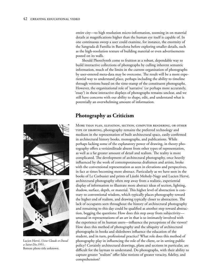
entire city—to high resolution micro-information, zooming in on material details at magnifications higher than the human eye itself is capable of. In one continuous sweep a user could examine, for instance, the enormity of the Sangrada di Familia in Barcelona before exploring smaller details, such as the high-resolution texture of building material or even advertisements posted on its walls. Should PhotoSynth come to fruition as a robust, dependable way to build interactive collections of photographs by culling inherent semantic information, much of the limits in the current organization of photographs by user-entered meta-data may be overcome. The result will be a more expe-riential way to understand place, perhaps including the ability to timeline through versions based on the time-stamp of the constituent photographs. However, the organizational role of ‘narrative’ (or perhaps more accurately, ‘essay’) in these interactive displays of photographs remains unclear, and we still have concerns with our ability to shape, edit, and understand what is potentially an overwhelming amount of information.
Photography as Criticism
More tHan plan, eleVation, seCtion, Computer rendering, or otHer type of drawing, photography remains the preferred technology and medium in the representation of built architectural space, easily confirmed in architectural history books, monographs, and publications. While perhaps lacking some of the explanatory power of drawing, in theory pho-tography offers a verisimilitude absent from other types of representation, as well as a far greater amount of detail and realism. The reality is more complicated. The development of architectural photography, once heavily influenced by the work of contemporaneous draftsmen and artists, broke with the conventional representation as seen in elevations and perspectives, in fact at times becoming more abstract. Particularly as we have seen in the books of Le Corbusier and prints of László Moholy-Nagy and Lucien Hervé, architectural photography often step away from a realistic, experiential display of information to illustrate more abstract ideas of section, lighting, shadow, surface, depth, or material. This higher level of abstraction is con-trary to conventional wisdom, which typically places photography toward the higher end of realism, and drawing typically closer to abstraction. The lack of occupants seen throughout the history of architectural photography and remaining to this day could be qualified as another step toward abstrac-tion, begging the questions: How does this step away from subjectivity—unusual in representations of an art in that is so intimately involved with the experience of its human users—influence the perceptions of the viewer? How does this method of photography and the ubiquity of architectural photographs in books and slideshows influence the education of the student, and in turn, professional practice? What role does this method of photography play in influencing the role of the client, or in setting public policy? Certainly architectural drawings, plans and sections in particular, are difficult for the layman to understand. Do photographs, with their ability to capture greater “realism” offer false notions of greater veracity, fidelity, and comprehension?
42 Creating eduCational Video
Lucien Hervé, Usine Claude et Duval a Saint-Die,1951. Bottom photo title unknown.
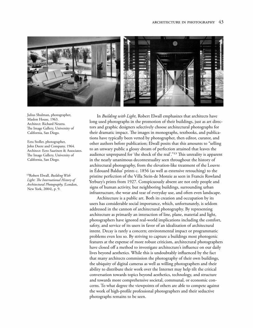
In Building with Light, Robert Elwall emphasizes that architects have long used photographs in the promotion of their buildings, just as art direc-tors and graphic designers selectively choose architectural photographs for their dramatic impact. The images in monographs, textbooks, and publica-tions have typically been vetted by photographer, then editor, curator, and other authors before publication; Elwall posits that this amounts to “selling to an unwary public a glossy dream of perfection attained that leaves the audience unprepared for ‘the shock of the real’.”13 This unreality is apparent in the nearly unanimous decontextuality seen throughout the history of architectural photography, from the elevation-like treatment of the Louvre in Édouard Baldus’ prints c. 1856 (as well as extensive retouching) to the pristine perfection of the Villa Stein-de Monzie as seen in Francis Rowland Yerbury’s prints from 1927. Conspicuously absent are not only people and signs of human activity, but neighboring buildings, surrounding urban infrastructure, the wear and tear of everyday use, and often even landscape. Architecture is a public art. Both its creation and occupation by its users has considerable social importance, which, unfortunately, is seldom addressed in the cannon of architectural photography. By representing architecture as primarily an interaction of line, plane, material and light, photographers have ignored real-world implications including the comfort, safety, and service of its users in favor of an idealization of architectural intent. Decay is rarely a concern; environmental impact or programmatic problems even less so. By striving to capture a buildings most photogenic features at the expense of more robust criticism, architectural photographers have closed off a method to investigate architecture’s influence on our daily lives beyond aesthetics. While this is undoubtably influenced by the fact that many architects commission the photography of their own buildings, the ubiquity of digital cameras as well as willing photographers and their ability to distribute their work over the Internet may help tilt the critical conversation towards topics beyond aesthetics, technology, and structure and towards more comprehensive societal, communal, or economic con-cerns. To what degree the viewpoints of others are able to compete against the work of high-profile professional photographers and their seductive photographs remains to be seen.
arCHiteCture in pHotograpHy 43
13Robert Elwall, Building With Light: The International History of Architectural Photography, (London, New York, 2004), p. 9.
Julius Shulman, photographer,Maslon House, 1963. Architect: Richard Neutra.The Image Gallery, University of California, San Diego.
Ezra Stoller, photographer,John Deere and Company, 1964.Architect: Eero Saarinen & Associates.The Image Gallery, University of California, San Diego.

Into Great Silence,© Philip Gröning / VC Build Kunst / Zeitgeist Films Ltd.
44 Creating eduCational Video

In oCtober of 2006, Turner Classic Movies ran a series regarding archi-tecture’s role in film called Architecture in Film, each night with a different theme. The Urban Landscape series consisted of movies either shot on loca-tion in New York City, or recreated on Hollywood backlots, including The Naked City (1948) and Skyscraper Souls (1932); Architects on Screen included The Fountainhead (1949), The Towering Inferno (1974), and a documentary on Antonio Gaudi (Antonio Gaudi, 1986), all portraying architects as larger-than-life mavericks struggling against complacency and mediocrity; and Restructuring History, a series described as “costume dramas…a genre involv-ing extravagant sets, lavish costumes, inflated budgets, and casts of thou-sands” including The Alamo (1960), The Fall of the Roman Empire (1964) and Marie Antoinette (1938). The series is interesting not necessarily because of what it reveals about the role of architecture in society, but because of what it reveals about the role of architecture in movies and how our cultural perceptions of architecture are subtly reflected through film. Through care-fully composed mise-en-scene, cities become either escapist locales to fulfill desire or dangerous, Noir-ish underbellies of society to be avoided; architect as genius; the myth of place; architecture as spectacle—while essentially avoiding deeper criticism of the practice (The Fountainhead notwithstand-ing) or furthering our understanding of the buildings themselves. While architecture has played a significant supporting role through-out film history, (one easily thinks of more relevant film moments than those from the Turner series, including the steps of Odessa in Eisenstein’s Battleship Potemkin, New York of the 70s in Allen’s Manhattan, and the distopia of Scott’s futuristic Los Angeles in Blade Runner) there remains a dearth of films and videos exclusively devoted to the discipline of architec-ture as the primary topic. Fortunately, what has been created is valuable as a resource to establish an overview of content, tone, and technique, particularly as a study in the visual grammar and syntax used by skilled and experienced videographers and editors, few more skilled than the producers of Architectures, produced by arte France.
ARTE and Architectures
Arte (assoCiation relatiVe à la téléVision européenne), founded on April 30, 1991, is a public service broadcaster, distributing high-quality cultural programming in France and Germany, and increasingly throughout the European Union and Canada, over the air, on cable, in print, and via the Internet. Programming in the past has covered topics from science and social developments to the development of feature films, including The Life of Others, an Oscar Award™ winner for Best Foreign Language Film in 2007. arte’s mission, according to Article 2 of the contract establishing arte g.e.i.e. defines its role:
The purpose of this grouping is to conceive and produce television programmes
3. Architecture and Environment in Film and Video
45
Sergei M. Eisenstein, director,Battleship Potemkin,(Mosfilm, Moscow, 1925).
Woody Allen, director,Manhattan, (United Artists, 1979).
Ridley Scott, director, Blade Runner, (Burbank, Califor-nia, 1982). Warner Home Video, © 2007.

which, in a broad sense, are cultural and international in character and condu-cive to promoting understanding and rapprochement among Europe’s nations and to broadcast these programmes or to authorise their broadcasting.
arte has its headquarters in Strasbourg, but arte France in Paris and arte Deutschland TV GmbH in Baden-Baden are primarily responsible for the production of programming and it’s delivery. arte France produced a series of television documentaries about painting (Palettes) and photography (Contacts), and, from 2001–2007, architecture. The Architectures series consists of over 29 half-hour (26 minute) episodes covering mostly build-ings of the 19th and 20th centuries, including Renzo Piano’s Pompidou Center, Paris (constructed 1971–1977), Frank Lloyd Wright’s Johnson Wax Headquarters in Racine (constructed 1936–1939), and Philip Johnson’s Glass House in New Canaan (constructed 1949). The intent of each episode is to explore the structural, spatial, formal, and material properties of the buildings; their theoretical underpinnings; and economic, social, historical and contextual conditions at the time of their construction. The series came as the result of the collaboration primarily between Stan Neumann and Richard Copans, two filmmakers with an extensive background in documentary; Copans as a producer, cinematographer, direc-tor, and writer; Neumann as a director, writer, and editor. On all episodes the directors (usually serving as the writer as well) lead a surprising small production and post-production crew, including a single editor (sometimes with the director as a second editor), two camera operators, one or two sound editors, a model maker, a production director, a stagehand, voice actor(s), and perhaps photographers, for a typical total of eleven or twelve credits, of which only a fraction are required from begging to end. If the recent biography/autobiography about architect Louis Kahn by his son Nathaniel—My Architect: A Son’s Journey—places architecture within a larger narrative of a relationship between father and son, Architectures is pure essay, and explains architectural ideas with supporting visual evidence more thoroughly than any other documentary on architecture that I am aware of. Even more remarkable is the the economy of the productions and the nearly thirty episodes released over six seasons. The directors takes special care to create establishing shots that clearly position the building in their contexts, showing the structure from various angles and at a variety of sizes to clearly establish position and scale. In the episode titled “Phæno, Le Bâtiment Paysage,” regarding architect Zaha Hadid’s Phæno Science Center in Wolfsburg, German, writer and director Copans begins with a backward tracking shot from underneath the building, among the ten pylons—referred to as cones by Hadid—that serve both as structural elements, hold-ing the science center above, and as inhabitable spaces. Beginning with a backwards tracking shot among the structural cones that define the ground-level parking area under the center, the camera rises from eye level, exits the underside of the building at a height of approximately twenty feet (now even with the main floor), and then begins to slowly track forward towards the facade, showing the geometries at play in the facade while both track-ing and panning left. This stunning opening provides, in one continuous shot, information about the buildings unusual formal geometries, structural system, building materials, facade, and sectional complexities, while clearly
46 Creating eduCational Video
Stills from “Phæno, Le Bâtiment Paysage,” Architectures, © arte, (France, 2006).

placing it within it’s urban context. (See sidebar, opposite page). Rather than relying on computer graphics, the Architectures series employs the use of a single model maker (David Toppani) to create fairly abstract models with minimum complexity (often with fewer edges and surfaces than a toddlers plastic toy or puzzle) but maximum diagrammatic value to explain, for instance, how Hadid has used the ten cones that sup-port the Science Center as both structural elements and as containers of programmatic elements, housing the buildings reception, restaurant, bar, workshops, shopping, and circulation. The use of real, rather than virtual models may have been an aesthetic decision but was also likely far cheaper, allowing the same models—typically modular in appearance—to be moved, rearranged, reassembled, and reshot quickly and easily, depending on the information to be conveyed. Of particular interest is the use of a moving camera to record visitors after beginning their circulation from outside the building, up the stairs inside one of the cones, and out and into the main exhibition area, all in one shot. (See sidebar, left). While the interior is spatially complex, the plan is basically open, and visitors are expected to wonder from exhibit to exhibit as they see fit, with only the placement of the extruded cones to provide reference. Through a break from modernist ideology and embrace of com-plexity, the experience of the building, according to Hadid, can be
equally calming or equally thrilling. I would call it a landscape, although the idea is not to copy landscape literally. It is a process where you begin with a new organization of the plan. Then you move towards a more fluid kind of morphology and flexibility. What you achieve is the creation of a landscape. The landscape is the plan.
Copan argues that landscape is associated with walks and preferred points of view, path, and progression, and allows us to experience Hadid’s internal
“landscape” as the camera operators literally walk the small, mobile Jimmy Jib rig through the building. The Jimmy Jib is a camera mount that allows both the tracking and elevation of a film or video camera, while allowing remote control over a cameras panning and tilt through a series of cables. The two person camera and Jimmy Jib operators were able to move smooth-ly from one location to another while also increasing in height from eye level to nearly forty feet, or cantilevering over balconies in a way not pos-sible by a human being. The resulting continuity of the video shots captures the spatial complexity, transparencies, and sectional differences in a process more informational than even a series of photographs or drawings, while the presence of narration and viewpoint imposed by the camera confine our attention to the topic of interest, leaving the viewer free from distractions inherent in an interactive virtual model.
arCHiteCture in film and Video 47
Stills from “Phæno, Le Bâtiment Paysage,” Architectures, © arte, (France, 2006).

Into Great Silence,© Philip Gröning / VC Build Kunst / Zeitgeist Films Ltd.
Into Great Silence
PHillip gröning (b 1959), a former student at the Munich Film School, began his career in film as an actor, sound assistant, propmaster, and assistant director, as well as screenwriter. His early films included Summer (1986), and The Terrorists! (1992) as well as documentaries The Last Picture Taken (1983) and Victims. Witnesses. (1993). In 1984, he wrote to the Carthusian Order to express an interest in making a documentary film about their lives within the 312 year-old hermitage, nestled in the moun-tains near Grenoble, France. Sixteen years later, they agreed. Into Great Silence is a case study of both extreme economy of means and perseverance: “I did everything on my own: operated the camera, recorded the sound, carried 20 kilograms of equipment. I often felt that I wouldn’t

make it—until I discovered another image that fascinated me.”1 The director, unencumbered by a crew and with minimal equipment, was able to establish an intimacy with his subject that would have otherwise been impossible. While filming the daily rituals of the monks that live within Grande Chartreuse monastery, the director spent six months living and working among them to directly experience their daily rhythms, from thrice daily mass to chores and hours of solitary prayer. As the strictest order within the Catholic Church, the monks live lives of abject poverty, solitude, and extreme asceticism, and as the film’s title suggests, exist in almost complete silence. Except for weekly communal walks, when the monks are encour-aged to socialize, the Carthusians speak as little as possible, spending most of their days alone in their cells in study and contemplation, or silently performing chores. Because of his participation in both mass and duties assigned by the prior, Gröning was able to work on his film for only two-to-three hours per day. Shooting primarily on a high-definition video camera (and occasionally Super 8), Gröning recorded over 120 hours of footage, or about 49 minutes (one digital cassette) per day; only natural lighting was used. While mostly shot on tripod, there is also occasional hand-held camera work. The film contains shots of the monks during prayer and study in the isolation of their cells, while performing mass, and doing chores; they are brilliantly descrip-tive of the milieu they capture, from the manner of the participants to the austerity of their surroundings. Time-lapse photography captures the exte-rior of the Grand Chartreuse over the course of two entire days and nights, the sun, stars and clouds whirling overhead. Only a single light, flickering briefly from inside one of the many cells, gives any indication of human presence. We watch the seasons change, aware that their passing hold more significance here in their mountain cloister, the heavy winter snow a literal enforcer of their separation from society below. The director’s unobtrusive visual style, concentrating mostly on long, static shots with a minimum of camera movement, together with the lack of narration, low-volume sound, and simple, straightforward editing, result in a meditative documentation of life within the order. The structure and aesthetic of the film—in both cinematography, composition, selection of subject, length of shots, and use of montage (Gröning also served as the editor)—reflect both the beauty of the surroundings and the severity of the Carthusian ascetic, and we find reflections in the rhythm of the film in the rhythms of the pursuit of spiritual life within the hermitage. Although left knowing little about the specifics of the order, the background of the monks, or even their names, we contemplate the role of silence, isolation, ritual and place, as well as the nature of time, in their spiritual quest. The length of the film, at 162 minutes, would seem to make watching a documentary of this sort difficult, but the pace of the film allows us the time to more fully con-sider, to more fully allow what we see to resonate. Because its non-narrative structure remains so different from what we typically encounter, New York Times critic A.O. Scott, hesitating to call it one of the years best (primarily because of it’s early release date), refers to it as “an antidote to all others.”2
arCHiteCture in film and Video 49
2A. O. Scott, “Lives Lived at a Monk’s Pace, Allowing Time for the Spirit to Flourish,” The New York Times, (New York, February 28, 2007).
Into Great Silence,Images © Philip Gröning / VC Build Kunst / Zeitgeist Films Ltd.
1Into Great Silence. A Film by Philip Gröning, press kit. Zeitgeist Films Release.

Manufactured Landscapes
Canadian edward burtynsky’s curriculum vitae includes over ten solo exhibitions of his photograph, including Material World (2008), Queen’s University, Kingston, Ontario; New Quarries (2007), Robert Koch Gallery, San Francisco, California; and China Works (2008), Koldo Mitxelena Kulturunea, San Sebastián, Spain. Burtynsky’s publications include Quarries (2007), China (2006), and Manufactured Landscapes (2003),3 which togeth-er with his exhibitions and lectures, deliver a cautionary tale on the effects of industrialization on the environment and society. Photographic subjects include strip mining, quarrying, recycling, refineries, and manufacturing, and the photographs are both aesthetically arresting and damning.
The concept of the landscape [dramatically altered by industry] as architecture has become, for me, an act of imagination. I remember looking at buildings made of stone, and thinking, there has to be an interesting landscape somewhere out there, because these stones had to have been taken out of the quarry one block at a time. I had never seen a dimensional quarry, but I envisioned an inverted cubed architecture on the side of a hill. I went in search of it, and when I had it on my ground glass I knew that I had arrived.4
In 2006, Manufactured Landscapes was released as a film in collaboration with director Jennifer Baichwal and Cinematographer Peter Mettler. The film documented Burtnsky’s trips to China and Bangladesh to photograph the dramatic environmental changes happening in China accompanying its explosive industrial and economic growth. The photography of Burtynsky and cinematography of Mettler are tightly and inseparably integrated into the narrative. Spoken words are used economically. The movie begins with one of the longest opening shots on film, an eight-minute crab to our left through a gigantic factory at the rate of a slow walk. In front of us passes row after row after row of factory workers dressed in yellow T-shirts, concentrating on work that we can only imagine on the tables and desks in front of them. A few look at the camera briefly before returning to their work, while most don’t appear to notice. None talk. The
Manufactured Landscapes
Directed and Produced by Jennifer BaichwalOriginal Music Dan Driscoll
Cinematography Peter Mettler
Film Editing Roland Schlimme
Production Companies: Foundry Films, National Film Board of Canada (NFB)
Distributors
Cinemien (2007) Netherlands, theatrical
E.D. Distribution (2007) France, theatrical
Gaia Films (2006) Spain, all media
Homescreen (2007) Netherlands, dVd
Sundance Channel (2008) USA, TV
Zeitgeist Films (2007) USA, theatrical
50 Creating eduCational Video
top
Photos: Edward Burtynsky.
3edwardburtynsky.com/Sections/Statement_CV/CV.html
4www.edwardburtynsky.com

space is brightly lit, fairly orderly, and quiet, and the work seems efficient, but there is no mistaking the monotony of life in this factory. (sidebar, left) After the eight-minute crawl, the next image we see is composed of two of Burtynsky’s photographs of the same space taken from a height of twenty feet (bottom). Each photograph covers roughly one-half of the factories interior; they must be placed side-by-side, panoramic-style, in order to see the entire space. The enclosed area of the warehouse is so large that the wall at the other end of the space has almost collapsed to a single point from foreshortening, and the repetition of the supporting structure of the building starts to appear as if we are starring at the reflection between two mirrors—a series of recursions to infinity. The effect of the montage is startling, as we experience contrasting micro and macro views of the same area, each revealing a different perception of the space. As the video moves from one end of the factory to the other, we become aware of the drudgery of the workers condition among the accouterments of their manufacturing environment. In the video, as we roll past the repetition of rows of workers at tables separated by aisles, we begin to wonder at the enormity of the space, but we have difficulty visualizing the container in which they fit. In the photography we are more clearly able to grasp both the size and charac-ter of the space we’re in, through the repetition of the people, the structure, the lighting, and through the incredible depth of the perspective, but in this case Burtynsky reduces the role of human beings to mere compositional objects—diminutive representations of scale or pointillist dots of color—a refection of the aesthetic interests of the photographer but without reflect-ing the social reality of the workers as seen in the video. These two shots differentiate photography’s static nature from the fluidity of film and video better than any single comparison I’ve studied. While film or video could approximate the panoramic, longitudinal photography, no photograph or series of photographs could portray what is essentially a time-based, internal elevation captured on the cinematographers 16 mm film, factory life play-ing out before our eyes.
arCHiteCture in film and Video 51
Jennifer Baichwal, director,Manufactured Landscapes,© 2006, Zeitgeist Films.Stills of opening sequence, an eight minute crab left through factory.
Photos of above factory by Edward Burtynsky.

My Architect: A Son’s Journey
In My Architect: A Son’s Journey, director Nathaniel Kahn—the illegitimate son of mythical 20th Century architect Louis Kahn—attempts to reconcile his relationship to his distant father, who died over 25 years ago when the director was 11 years old. The film traces the architect’s life from his child-hood as an immigrant, including the accident that would permanently scar his face; his long struggle to distinguish himself professionally before con-ceptual breakthroughs very late in his career; his marriage, mistresses, and birth of four children, two of which were illegitimate; and his anonymous death at age 72 of a heart attack in Penn Station, considered by many at the time the greatest living architect, even as few knew him publicly and his firm approached bankruptcy. Nathaniel Kahn visits various buildings built by his father beginning in and around their hometown of Philadelphia, including the Richards Medical Research Laboratories, moving on to the Yale University Art Galleries in New Haven, The Salk Institute for Biological Studies in La Jolla, California, and the Kimball Art Museum in Fort Worth, Texas, interviewing
52 Creating eduCational Video
My Architect: A Son’s Journey
Director and ProducerNathaniel Kahn
Producer and Executive ProducerSusan Rose Behr.
EditorSabine Krayenbühl
Director of Photography Bob Richman
MusicJoseph Vitarelli
Written and narrated by Nathaniel Kahn
Film sponsored by the New York Foundation for the Arts.
A New Yorker Films release.Presented in association withHBO/Cinemax Documentary Films.

other architects along the way, including I.M. Pei, Robert Stern, Frank Gehry, and Vincent Skully. The son’s architectural odyssey culminates at the National Assembly Building in Dhaka, Bangladesh, perhaps Kahn’s greatest building, unfinished until several years after his father’s death.
Through getting to know his buildings, I got to know him. And that’s something that really surprised me. I think it shows me something about architecture, about the power of architecture. I always thought, starting out, that architecture was a distant art. It’s a little cold; it doesn’t speak the way painting does, or sculpture. It doesn’t seem that emotional. But in going on this journey I found that architecture was in fact incredibly emotional. And I felt so many things about him from those buildings. I felt the loss, sometimes, that I think he felt, the romanticism that he felt, the loneliness that he felt, the joy that he felt—all those things were in the buildings. And I think that in finding ways to film them, it’s was almost like I was relating to him, because he put himself in those buildings. And I think he really felt, I mean I really felt that—at [the National Assembly Building in] Dhaka.
—From “Q and A with Director,” My Architect: A Son’s Journey, dVd Version, New Yorker Films, 2005.
The director interviews the two surviving mothers of Louis’ children (including the director’s own mother) as well as his half-sisters. Each of Kahn’s “families” was aware of the other; none communicated, even at his funeral, and only one could claim legitimacy. His own mother, who worked with Louis, was not allowed to attend professional or social affairs in fear that the wife would show up, and typically worked locked in an office for the same reason. Nathaniel himself only saw his father once a week. Neither of Kahn’s mistresses ever married after the affair, and Nathaniel asks his mother, who clings to the belief that the architect may have been on his way to live with her and Nathaniel when he died, if she’s angry, implying that her present life may have been better had they never met. The younger Kahn states that this movie is about his search for his father, and in many ways the story is more auto-biographical than bio-graphical. But the story is also about Kahn’s architecture, and while there are many beautiful shots of the buildings, there seems to be a Cinéma vérité approach in the compositions, the hand-held camerawork, and the lack of narrative or explanatory power in the shots of the actual buildings. People wonder in and out of the frame, and camera movement seems completely unrehearsed. While there is a team credited with cinematography, it often appears that there are only two cameras, one of which is typically handheld by the director, the other seen on a small tripod; both waiting to capture something interesting in their surrounds. There doesn’t seem to be the use of a crane or even the simplest jib, and one can imagine the camera operator in a wheeled office chair, being pushed by a crew member to shoot tracking or crabbing shots. While this lack of direction and stripped-down production prevents us from understanding Kahn’s architecture in a way that more thoughtful cin-ematography and camera movement might have, it is very much in keeping with the themes of the movie. The mystery and complexity of Nathaniel’s relationship with his father, never resolved, is reflected in the mystery and complexity of Kahn’s buildings, and the director allows us to wonder at them both. The film is richer for it. We experience a very visceral under-standing of Kahn’s buildings, their massiveness, the powerful expression of
arCHiteCture in film and Video 53
My Architect: A Son’s Journey
Nathaniel and Louis and Kahn, c. 1974.
Director and Producer Nathaniel Kahn.
Kahn’s Phillips Exeter Academy Library, Exeter, New Hampshire, 1965–1971.
Film stills courtesy New Yorker Films. ©2003 The Louis Kahn Project, Inc.

their geometries, the play of light, and the raw eloquence of their materials, but, as with their architect, we are kept at a distance. More familiarity is something we are not allowed, and in the end, like the director, we are left with questions.
Sketches of Frank Gehry
One of tHe otHer widely-seen recent documentaries on architecture was Sidney Pollack’s Sketches of Frank Gehry (2005). Pollack, an actor and Academy Award ® winning director (Out of Africa, 1985), captures Gehry’s self-effacing, seemingly everyman persona in a series of intimate discussions between two old friends. We learn of Gehry’s long struggles with self-doubt and feelings of bankruptcy as an architect struggling in professional ano-nymity before the creation of his first buildings of true daring rather late in his career, his own residence in 1978, followed by the campus for the Loyola Law School (also in 1978), reaching perhaps the zenith of his career at age 68 with the Guggenheim Museum in Bilboa, Spain in 1997. During an interview with his therapist of 35 years, Milton Wexler, we learn of Gehy’s divorce and difficulties in school, his fear of antisemitism (changing his name from Goldberg in the 1960s), and his fear of mediocrity. Pollack takes us inside Gehry’s design studio to watch him explain his creative process, from the playful assembly of models to the importance and role of sketches:
“I prefer the sketch quality, the tentativeness, the messiness, the appearance of in-progress rather than the assumption of total resolution and finality…” On collaboration Gehry says:
I can’t do it alone anymore—I used to. I respond to them, they respond to me. And they’re different personalities. So those personalities express when you look at a building I did with Edwin [Chan] or a building I did with Graig [Webb]. They’re different. I respond to them, they respond to me. There’s a different Chemistry. That’s interesting.
While Sketches of Frank Gehry provides beautiful shots of some of his more prominent projects, including The Guggenheim Museum in Bilbao and the Walt Disney Concert Hall in Los Angeles, the film celebrates Frank Gehry the man perhaps more than Gehry’s architecture; it is almost unargu-ably more biographical in it’s approach than an attempt to provide visual evidence of Gehry’s architectural ideas. Pollack presents himself early in the film as (conveniently and truthfully or not) an inexperienced architectural layman, while Gehry responds that Pollack’s lack of expertise in the field would make him the ideal choice to direct an honest appraisal of his career, un-muddied by obscure academic theories or professional jargon. The resulting shots, often beautifully conceived and filmed, are neither struc-tured or narrated in such a way as to provide an “architects” explanation of the ideas behind the architecture; they are simply presented straightfor-wardly, offering a more experiential understanding of his buildings without becoming abstruse or esoteric.
Sketches of Frank Gehry,© 2006 Sony Pictures Classics.
54 Creating eduCational Video

A Constructive Madness
Opening a documentary about Frank Gehry with concert footage of Jimi Hendrix performing a feedback-soaked Purple Haze might seem a bit of a stretch, regardless of Gehry’s involvement as the architect of Seattle area Experience Center, dedicated to their Seattle guitarist. According to writer Jeff Kipnis, however, they both arose through an “unlikely confluence of the improbable”—unique personal histories, great talent, mastery of their crafts, and the larger influence of the times, technologies, and cultural forces that shaped them. In A Constructive Madness, Kipnis uses the metaphors of music, painting, sculpture, literature, and philosophy when explicating the work of one of the greatest living architects. In 1984, Frank Gerhy met Paul Lewis, then Ceo of Progressive Insurance, during a lecture in Cleveland. Impressed with Gehry, Lewis approached him afterwards with an offer to design and build his house. The work would last ten years, with numerous stops and starts, until Lewis, with increasing wealth and influence in the art world, renewed his commitment to the project in 1992. At that point, Lewis encouraged the architect to design beyond previous limits. With a video crew commissioned to docu-ment their meetings for the entire project, Lewis proclaims to Gerhy and collaborator/mentor Philip Johnson: “if there’s anything that’s ever been done before we have to scratch it.” Development on the Lewis House progressed through 14 iterations, and as the design became more refined, the materials, structure, and methods of construction became more elaborate. Lewis balked when the cost reached $82 million, and the project stopped permanently. In the process, however, Gehry had developed ideas that would come to fruition in his masterpiece, the Guggenheim Museum in Bilbao, Spain, that would set him apart from both his contemporaries and the entire history of architecture to that point. The creators of the film, under the auspices of the Knowlton School of Architecture, did not have the opportunity of filming real buildings, as the project never broke ground. When the Lewis House is shown, it is as a series of models and drawings, sometimes shot on video, other times through photography. The Lewis house never appears as an animated 3-D model. Although the film lacks the stunning visuals and camera work seen in the Architectures series, the thoughtful explication of architectural ideas, particularly through metaphor, is a credit to the script by Jeff Kipnis. Kipnis (who Herbet Muschamp of the New York Times calls “surely the most adventurous architecture curator we have in this country”)5 and the directors use a variety of archival footage from a variety of sources to make certain comparisons. In one, we examine the similarities between Bach’s Goldberg Variations, in the continuing repetition of its lower notes, to tie the thirty variations occurring higher on the clefts together. They liken this to the similarities of each plan drawing of the 15 variations of the Lewis House, with the varieties in material, structure, and form happening above. The film makes further comparison between Gehry’s pre-Lewis House work to the painting and collage of Robert Rauschenberg, and later to the gestural work of William de Kooning and Jackson Pollack, all of which Gehry admits as influences. Again, in an act of economy, the directors support
arCHiteCture in film and Video 55
A Constructive Madness
Written by Jeffrey KipnisDirected by Thomas Ball, Brian NeffArchitectural Research: Rebeca CoteraProducer: Jennifer FrutchyExecutive Producer: Knowlton School of Architecture, The Ohio State UniversityResearch: Rujuta ModyStills Coordinator: Meagan CananaughAdditional Assistance: Jill Davis, Steve Hunt, Joby Pottmeyer, Vi Schaaf, Beverly Stephens
For Telos ProductionsProduction Research: Laura WongProduction Assistants: Moria Crawford, Sam Meister, Mathew Neff, Mike Scaletta, Alain Sy. Crane Operator: Gerry CumminsOffice Manager: Cristy Zdnenek
Footage Provided by: ABC News Video, BBC Worldwide Americas, Inc., Experience Music Project, Granada Visual, Grey Lynn Form, Howard Hall Productions, The Image Bank, Michael Blackwood Productions, Solomon R. Guggenheim Museum, American Masters, Winstar Home Entertainment, Karen Thomas, The National Broadcasting Corporation, Angel Films/Tyrone Productions, Ellieot Caplan, Columbia TriStar Motion Picture Group, Dreamworks SKG and Universal Pictures, Experience Hendrix, L.L.C., Hans Lamuth, LTD. & The Museum of Modern Art, Masters and Masters Production, Inc., Parimount Pictures, Tonylyn Productions and Fariveiw Productions
Photos Courtesy of Gehry Partners, Susan Desko, Joan Quinn, Thomas Ball, Wendy and Billy Al Bangston.
5Herbert Muschamp, “Critic’s Notebook: After The Decay Of Decay, A New Modernity,” The New York Times, (New York, February 7, 2004).

the arguments using archival footage, in this case from Winstar Home Entertainment (Robert Raushenberg Inventive Genius); Masters and Masters Productions (Willem deKooning: Artist); and Lamuth Ltd & The Museum of Modern Art (Jackson Pollack). Other sources of clips include the Musee du Louvre, the National Gallery Picture Library, the Estate of Pablo Picasso, the University of Stuttgart. In another example, the authors make comparisons between archi-tecture, the Macy’s Thanksgiving Day Parade, and the English Millitary parade, courtesy of abC news Video Source and the bbC Worldwide Americas, Inc.
Architecture is often called the art of order. And historically, architects have drawn inspiration from geometry. The transcendent refection of divine order, to organize and give coherence to everyday life. The English military parade typifies much of traditional architecture. Hierarchical, symmetrical, rational, coherent, uniform, harmonious. Gehry’s organizations, on the other hand, seem thoughtless and haphazard. Trash sheets, some critics call them. The apparent chaotic temperament of Gehry’s architectural organization is on closer inspection, something quite different. It is a manifestation of one of twentieth century art’s most powerful organizational innovations: collage. The technique of discovering endless possibilities of surprise and delight from strange juxtapositions, ad-hoc arrangements, incongruencies, and incoherence. Collage is less a matter of celebrating disorder than discovering new affiliations and other kinds of order within unlikely ensembles. The collage counterpart to an English military parade is Macy’s Thanksgiving Day Parade, with its ecstatic confusion of sizes and shapes, colors and sounds. Yet, the Macy’s parade is full of order. A prime example of the emergence of a new, democratic sense of order—fast, furious, shifting, tolerant and fun. Frank Gehry’s Peter Lewis House distills the very same freedom, the exhilaration and unexpected order of the Macy’s Day Parade into architecture.
Legal Issues and Fair Use
Knowing that Paul Lewis was responsible for shooting most, if not all, if the interviews between himself and Gehry, as well as a review of the clip credits, it’s apparent that little video was actually shot specifically for this film (one probable exception: the performance of Bach’s Goldberg Variations by Lisa Crawford, at Oberline Conservatory of Music). Therefore, the legal use of all externally created clips, photographs, and artwork depended on either securing permission from their copyright holders, or through fair use provisions. In many cases, the use of copyrighted material requires a signed permission, called a license, typically accompanied by a fee. According to The Filmmaker’s Handbook by Steven Asher and Edward Pinkus, this can be both an expensive and lengthy process, both in terms of the payment of the licensing fee, and the legal and administrative work that accompanies it.6 Most of the clips included in A Constructive Madness probably qualify under fair use. To qualify, copyrighted material can be used without secur-ing a license, if the excerpts are “relatively” short, and used for the purpose of scholarship or critical review. The courts, if involved, will determine if the use is “for commercial nature, or non-profit educational purposes,”7 as well type and subject of the work, but the authors of The Filmmakers Handbook
6Steven Asher and Edward Pinkus, The Filmmakers Handbook, A Comprehensive Guide for the Digital Age. Copyright © Steven Asher 2007. A Plume Book. p. 738.
7Ibid., p. 744.
56 Creating eduCational Video
A Constructive Madness, Copyright © 2003,Telos Video Communications.

warn that the law is often murky, without clear guidelines, and suggest that any and all content used be subject to lawyer approval. According to Fair Use and Best Practices: Surprising Success, by Pat Aufderheide and Peter Jaszi, fair usage exemptions fall under the rubric of First Amendment protections; indeed, without such exceptions, copy-right laws would effectively block free speech and would therefore not be constitutionally protected.8 At American Universities Center for Social Media website (www.centerforsocialmedia.org), there is a list of clear-cut cases of fair use for documentary films and videos in cases of media criti-cism, historical or biographical sequences, cultural criticism, or when captured incidentally. As an example, the site references the use of Martin Luther King Jr.’s “I Have a Dream” speech for wgbH’s biography on King, with copyrights belonging to King’s estate. The estate refused permission. However, fair use of the clip was successfully argued due to the historical importance of the document. In an attempt to codify fair use practices, in November of 2005 The Center for Social Media at American University published Documentary Filmmakers Statement of Best Practices in Use.9 Written by a legal advisory board and funded by the Rockefeller Foundation, The John D. and Catherine T. MacArthur Foundation, and Grantmakers in Film and Electronic Media, the document has been endorsed by Arts Engine Bay Area Video Coalition, Independent Television Service, p.o.V./American Documentary, and the University Film and Video Association. The paper lists four classes of situations that documentarians are likely to encounter that have been successfully established as legally permissible instances of fair use. They are:
•One: Employing Copyrighted Material As The Object Of Social, Political, Or Cultural Critique
The authors note that the above situation is similar to the use of illustrations from a book in a newspaper book review; the fact that a negative book review may do economic damage to the copyright owner is irrelevant. In addition, the use may be as extensive as necessary to complete an argument; limiting the percentage of the use to under 10% of the original—a widely held belief—is not a widely accepted limit. However, “the critical use should not become a market substitute for the work (or other works like it).” In A Constructive Madness, the inclusion of the Jimi Hendrix clip could be broadly construed as a historical, political, and cultural critique. In the film, Kipnis explains the Hendrix phenomenon as being grounded in not only in the turbulence of the Vietnam war and upheaval of the sixties, but in the convergences of African-American music and historical experience with Pop music, the history of the electric guitar and amplification, and Hendrix’s own outsider influences married to his mastery of craft and tech-nique. It was though these factors that Hendrix’s music “found resonance with a vast audience that had in a sense been waiting for it to come.” Kipnis uses this brief biographical critique of Hendrix to establish an the argument that all artists are partially products of their time, as well as establishing commonalities between the art of Hendrix and Gehry.
arCHiteCture in film and Video 57
8Pat Aufderheide and Peter Jaszi, “Fair Use and Best Practices: Surprising Success,” Intellectual Property Today, October, 2007.
9Association of Independent Video and Filmmakers, Independent Feature Project, International Documentary Association, National Alliance for Media Arts and Culture, Women in Film and Video (Washington, D.C., Chapter), Documentary Filmmakers Statement of Best Practices in Use, Nov. 18, 2005.www.centerforsocialmedia.org/files/pdf/fair_use_final.pdf.

•Two: Quoting Copyrighted Works Of Popular Culture To Illustrate An Argument Or Point
In this instance, the work quoted is not itself being criticized, but refer-enced because it illustrates an argument or point, such as using clips from video games when discussing violence. The work is thus used metaphori-cally, in this case, unless the intent is to critique the video game itself as a cause of violence (see class number one). There are several limitations for this type of use, including the need for credits; drawing material from a variety of locations; and limiting the length to the time it takes to make the intended point. There is a scene from Gladiator, quoted in A Constructive Madness, in which the gladiators themselves first view the Roman Colosseum. “I didn’t know man could build such things,” one of them says. The use of this clip could constitute fair use in this case as a popular depiction of the human fascination with great buildings. In another quotation of popular film the authors include excerpts from the trailer for the The Blob (1958) to argue the other-worldliness of the 21st century architecture of Daniel Libiskind, Peter Eisenman, and Zaha Hadid, as well as Frank Gehry, although in this case, this may be the slipperiest example of those discussed.
•Three: Capturing Copyrighted Media Content In The Process Of Filming Something Else
This situation is fairly straightforward: copyrighted material may be filmed incidentally while recording everyday activities. However, the material must be integral to the film, and, if music is captured, it may not serve as sound-track, nor be synched to the editing (for instance cutting on the beat). As the Ceo of Progressive Insurance, Paul Lewis began purchasing art for his office, eventually building a collection of over 5000 works. Included in this collection are the silkscreens of Chairman Mao produced by Andy Warhol in 1973, filmed (ironically) in a meeting room in which Lewis addresses his employees. Even if we assume that Lewis is not the copyright owner and thus is unable to grant permission, the inclusion of this copy-righted work of art could be included because of its central importance in establishing Lewis as an art collector and his office as home to his massive collection.
•Four: Using Copyrighted Material In A Historical Sequence
As in the example of Martin Luther King Jr.’s “I Have a Dream” speech, at times the most effective portrayal of an event or historical thread is the actual use of the event itself, or clips linked to the event by era or subject. There are numerous quotes within A Constructive Madness that could arguably fall into this category, in the use of video excerpts to establish a timeline of artists and architects that influenced Gehry, including archival footage of painters Robert Raushenberg, William de Kooning, and Jackson Pollack, although the comparison to Gehry’s working methods are so broad and interpretive that they may fit under the first class as well. According to Intellectual Property Today’s release of October, 2007, the
58 Creating eduCational Video

release of the Documentary Filmmakers’ Statement of Best Practices in Fair Use on November 18, 2005, “has already changed industry practice to the point that all major insurers of documentary film now routinely accept fair use claims that a lawyer asserts are backed by the Statement.”10 In particular, the statement has been adopted or endorsed by a variety of media organizations, including Hbo, Independent Film Channel, Public Broadcasting Service, The Discovery Times, Sundance Channel, Independent Television Service, and wgbH tV. The legal community has also begun to publicly recognize the document, and the four insurance companies most used by documen-tary filmmakers have adopted the statement, establishing it as a precedent when negotiating insurance coverage for the use of copy written material.
Copyright
According to the United States Copyright Office, “copyright is a form of protection provided by the laws of the United States (title 17, u.s. Code) to the authors of “original works of authorship,” including literary, dramatic, musical, artistic, and certain other intellectual works. This protection is available to both “published and unpublished works,” although to be covered, the work must be fixed in tangible form, which would include any digital or analogue recording or transcription as well as physical artifact, such as sculpture (architectural drawings are covered; buildings are not). Thus, works that cannot be completely substantiated, such as unrecorded and unwritten improvised performances, do not qualify for copyright pro-tection, nor do “ideas, procedures, methods, systems, processes, concepts, principles, discoveries, or devices…”11 When a video or film is copyrighted, this includes all music, dialogue, sound, photography, and any artwork contained within, while titles, con-cepts, and ideas and plot contained within are not. Copyright is granted automatically at the moment text is committed to paper (or other storage media), as is film and video the moment it is shot, regardless of wether the creator has registered their work. However, to establish the authenticity on your work and defend against plagiarism, Ascher and Pincus recommend applying for copyright with the u.s. government, as well as with the Writers Guild of America, and including copyright notice on any scripts or other material given to others. Registration for copyright protection in the u.s. can be done at www.copyright.gov and is handled by the Library of Congress. The online appli-cation form will include the title of the work, year of creation, contact infor-mation, and signatures. The signed form should be returned, along with copies of the work and fee payment to the Library of Congress. All work created on or after January 1, 1978, will be covered by copyright from the date of its creation to the end of creator’s life plus 70 years; this provision covers dual-authorship. If the work was created by an author or authors “for hire” (that is, in employment of another party), the work retains its copy-right for “95 years from publication or 120 years from creation, whichever is shorter.”12
arCHiteCture in film and Video 59
10Pat Aufderheide and Peter Jaszi, “Fair Use and Best Practices: Surprising Success,” Intellectual Property Today, October, 2007, p. a.www.centerforsocialmedia.org/files/pdf/IPTodaySuccess.pdf.
11excepts taken from Copyright Office Basics, U.S. Copyright Office, Washington, DC.www.copyright.gov/circs/circ1.html#wci.
12Ibid.

Stills from Powers of Ten. From a picnic in Chicago to 100 million light years from Earth in just over four minutes. Each rectangle is ten times the width of the one before, and each rectangle theoretically contains all the rectangles that came before. The Office of Charles and Ray Eames, 1977.
60 Creating eduCational Video
1 meter
1 m
eter
100,
000
met
ers
10,0
00 m
illio
n m
eter
s1,
000
mill
ion
mill
ion
met
ers
10,0
00 li
ght y
ears
100,
000
light
yea
rs
1 m
illio
n lig
ht y
ears
10 m
illio
n lig
ht y
ears
100
mill
ion
light
yea
rs
1 lig
ht y
ear
10 li
ght y
ears
100
light
yea
rs
1,00
0 lig
ht y
ears
100,
000
mill
ion
met
ers
1 m
illio
n m
illio
n m
eter
s
10 m
illio
n m
illio
n m
eter
s
100
mill
ion
mill
ion
met
ers
1 m
illio
n m
eter
s
10 m
illio
n m
eter
s
100
mill
ion
met
ers
1,00
0 m
illio
n m
eter
s
10 m
eter
s
100
met
ers
1000
met
ers
10,0
00 m
eter
s
101 meters 102 meters 103 meters 104 meters
105 meters 106 meters 107 meters 108 meters 109 meters
1010 meters 1011 meters 1012 meters 1013 meters 1014 meters
1015 meters 1016 meters 1017 meters 1018 meters 1019 meters
1020 meters 1021 meters 1022 meters 1023 meters 1024 meters

Powers of TenA Film Dealing with the Relative Size of Things in the Universe and the Effect of Adding Another Zero
Although the work involved with this thesis resulted in the creation of a documentary video regarding the Knowlton School of Architecture, the broader goal is the adaptation of video as an information design medium applicable to any topic. Of particular interest are the films of Charles and Ray Eames, who created series of movies to explain concepts of mathematics, architecture, industrial design, culture, and science. According to Edward Tufte, among the many outstanding films of Charles and Ray Eames, Powers of Ten in particular is “one of the finest video works in analytical design.”1 Powers of Ten (1977), subtitled A film dealing with the relative size of things in the universe and the effect of adding another zero, was created to explain the relative scale of the universe through orders of magnitude. Beginning at a lake shore picnic in Chicago, the film establishes a scale of one square meter viewed from exactly one meter away, increasing the rela-tive size on screen, as well as the distance, by one order of magnitude every ten seconds, so that at ten seconds we view the picnic from ten meters, at twenty seconds we view the scene from 100 meters, one kilometer at thirty seconds, an so on. In 240 seconds (1024) we have traveled beyond the limits of the known universe, more than 1 billion light years, before beginning the trip back to Chicago, and then, arriving at where we departed, into the microverse within our own bodies. In less than ten minutes we have moved, in one continuous sweep, through 42 orders of magnitude, “presenting a visual model of our current knowledge of the universe.”2 While the optical effects are rather modest, even for their time, the film succeeds in explaining the concepts behind orders of magnitude and the size of the universe splendidly. The synchronization of pictorial and graphic ele-ments, such as the square-within-square perimeter markers of the previous step and the use of both scientific and standard notation, allow quantifiable comparisons between size, distance, content, and unit of measurement (in both meters and as factors of speed-of-light) to be made easily. It is this superimposition of important quantitative and qualitative information, and the economy and clarity of their display, that differentiates Powers of Ten from lesser motion-based analytics. Philip Morrison, who collaborated with Charles and Ray Eames on Powers of Ten and also served as its narrator, was a professor of physics at the Massachusetts Institute of Technology, a reviewer of books for Scientific American, and, from 1973 to 1976, the Chairman of the Federation of American Scientists. After Charles death, Phillip Morison, along with his wife, science and art teacher Phylis Morrison, and Ray Eames, collaborated on a print version of Powers of Ten, expounding on the film with an enor-mous amount of detail. According to Tufte,
Powers of Ten
Made by the Office of Charles and Ray Eames for IBM© Charles and Ray Eames, 1977Music Composed and Performed by Elmer BernsteinNarrated by Philip Morrison
For the Eames OfficeAlex FunkeMichael WienerRon RozzelleDennis CarmichaelWendy VanguardCy DidjurgisDon AmundsonMichael RussellSam Passacqua
ConsultationJohn FesslerOwen GingerichKenneth JohnsonJean Paul RevelandPhilip Morrison
4. Film and Video as Information Design
61
2Phillip and Phyllis Morrison and The Office of Charles and Ray Eames, Powers of Ten: A book about the relative size of things in the universe and the effect of adding another zero. Copyright © Scientific American Library, 1982.
1Edward Tufte, http://www.edwardtufte.com/bboard/q-and-a-fetch-msg?msg_id=0000xH.

62 Creating eduCational Video
…one of the finest books in analytical design is Powers of Ten… Both the video and the book were texts in my courses on analytical design at Yale. It would be helpful to com-pare carefully movie and book, side-by-side. Such a comparison would hold constant the nature of the content and, as well, the quality. I’ve been meaning to do this for years (and failed to induce a student project along these lines).3
In fact, the book version of Powers of Ten makes such a comparison to film practical. The right hand of each spread contains a frame from the movie, complete with the narration (although expanded from the film), as well as measurement and distance notation. Unlike the film, we begin not in Chicago but deep space: at 1025 meters, encompassing a view of ~one bil-lion light years. On the left of the spread, the authors expound further on the narration from the film, explaining that one more step by an additional power of ten would take us both spatially and temporally beyond the realm of the known and into conjecture. We learn that the current frame illus-trates the universe depicted within over a billion years ago, but that nothing in its representation would have differed had it reflected “real time.” On the other end of the scale, at a resolution of 10-14 meters or 10 fermis, we see a frame of the carbon-12 molecule, the neutrons and pro-tons bound together but moving in a state of quantum unpredictability. Opposite the frame, the authors discuss the photos of a star spinning at thirty rotations a second, emitting light with a brightness of 1,000 suns with an equal amount of mass, but no larger than a small city. The star is made of 1056 nuclear particles, joined by gravity. At each step between the two extremes of scale the book is filled with information either synchronous with the current scale depicted in the film, or presented, as above, in mean-ingful contrast. There are pages devoted to the methodology and rules of the journey through the universe by powers of ten, including the fact that each and every picture, no matter the distance, points directly towards the carbon atom under the man’s skin in Chicago, and that each picture theoretically contains all the pictures at lesser powers under it. A history of optical tele-scopes is presented, as is a chronology of important scientific discoveries rel-evant to various scales, from the discover of quasars in 1963 (ten25 meters) to the first electron microscope transmission in 1931 (10-5 meters). We also see a Tuftian spread containing all the snapshots from the film in order, and these “small multiples” allow us to easily compare and contrast them. The book closes with a list of other resources, both film and print, on topics such as chemistry and atomic physics, the metric system, and astronomy, along with descriptions. At the end of the book is an index, with hundreds of entries—unusual long for a book so short. The presence of so much information, impossible in a ten-minute—or ten-hour—film expands our knowledge immensely, and invites carefully study and cross-comparison from page-to-page, section-to-section, as well as to the film. While nearly half of the pages follow the narrative structure of the film, the book is distinctly non linear: it exists as a hyper-textual com-pendium, every entry clearly linked to another, each page structurally cross-referenced to another section. The contents within the carefully arranged architecture of the book interact similarly to an online information destina-tion such as Wikipedia: extensive interconnectivity but with a far higher degree of architectural coherence and organization.
3Edward Tufte, http://www.edwardtufte.com/bboard/q-and-a-fetch-msg?msg_id=0000xH].

While the procession of frames in the book represent the animation at every crucial step of the journey, the overall presentation is fragmented in comparison to the film. Continuity along the journey is lost, particularly the film’s fluid visual explanation of orders of magnitude. While the book can be though of as a brilliant addendum to the film or even a necessary companion piece, highly rewarding in every way, it does not stand alone. To fully understand the capabilities and limits of their respective medium, the film and book must be studied together.
Edward Tufte
In Tufte’s Visual Explanations: Images and Quantities, Evidence and Narrative, the author examines the dequantification typical in scientific and techni-cal imaging, noting that in one scholarly compilation of supercomputer scientific animations, “65% of the 134 color images published had no scales or labeled dimensions at all and 22% had partial labels or scales. Only 13% had complete labels and scales.”4 Siting the videotape “Study of a Numerically Modeled Severe Storm” by the National Center for Supercomputing Applications, Tufte re-imagines the computer animation of the growth of a cumulus cloud as it becomes a major storm. In the original, only a time stamp provides quantitative information. Tufte asks the follow-ing questions: How big is that cloud? What direction is it moving? At what rate? What are the dimensions of the grid that it sits on? At what moment are we in the animation? Using high-quality maps and statistical graphics as a guide, Tufte’s redesign ads the missing quantitative information, including three-dimensional orientation (North, South, East, West, and height) and scale indicators. Tufte also builds a visible timeline to indicate the playback position; something now common in video playback applications. Perhaps the most interesting addition to the animation is the placement of “snap-shots” from the video across the bottom of the screen. These “small mul-tiples,” as Tufte calls them, allow us to compare and contrast the formation of the storm in six small thumbnails, each captured in roughly twenty five minute increments. In 2007, Tufte began posting a series of his videos to YouTube.com, as well as his own Website. In his short Wavefields, Tufte, in collaboration with Andrei Severny, examines the use of Hd video to record the information-rich wave interactions on rippling bodies of water as well as wheat fields blowing in the wind. While there are several shots of the waves recorded at different scales, the camera itself does not move, and there is only minimal editing. The simple camerawork is combined with suggestions of the superimposi-tion of other quantitative graphics existing on a separate layer above the live-action video. This video is simply a sketch, but suggests the power of high-definition video to explain in ways vastly different from still graphics, or for that matter, lower resolution video.
Wavefields are data graphics that draw on and completely fill, the entire display surface, using every pixel on the data plane to show high-resolution, complex, multivariate, animated statistical data flows...Wavefields extend my work on sparklines. These high-definition videos of waves—that is, very rich 3-D time series projected onto screen
4Edward Tufte, Visual Explanations: Images and Quantities, Evidence and Narrative, Copyright © 1977 by Edward Rolf Tufte. Published by Graphic Press Cheshire, Connecticut, p. 21.
Edward Tufte and Colleen B. Bushell, animation based on “Study of Numerically Modeled Severe Storm,” National Center for Supercomputing Applications, University of Illinois at Urbana-Champlaign. Visual Explanations: Images and Quantities, Evidence and Narrative, Copyright © 1977 by Edward Rolf Tufte. Pulbished by Graphic Press Cheshire, Connecticut, p. 21.
film and Video as information design 63
Edward Tufte, Andrei Severny Wavefields. http://www.youtube.com/watch?v=12Ib25LzCRk

64 Creating eduCational Video
flatland—sketch out some possibilities for bringing color, layers, cross-flows, overlaps, and animation, all to help reason about statistical information…The big ideas here are to blur and to reduce distinctions between movies and statistical graphics; to get some visual depth to data graphics; and to bring all the capacity of Hd movie making to data graphics making… The metaphor for sparklines is typography, while the metaphor for Wavefields is the Hd video, which, remarkably, records approximately 1 gig per minute—a data throughput that might finally make our statistical graphics worthy of the power of the human eye-brain system.5
While live-action was used for the video, possibilities suggest computer ren-dering of information from any field where large amounts of multivariate data exist, and particularly when this information interacts, such as in medi-cine, economics, mathematics, biology, and, as shown, physics. The use of such high-resolution graphics allows both macro analysis of larger trends as well as micro analysis of smaller interference patterns or the examination of specific data points exclusively. By adding the ability to scale both quantita-tive and temporal axes independently, patterns existing in the data could be identified and visualized more easily. In the case of high definition video, Tufte’s chapter “Micro/Macro Readings” from Envisioning Information provides useful observations. Referencing Constantine Anderson’s highly detailed axonometric map of Midtown Manhattan, Tufte notes that readings allow one to recognize not only famous buildings and intersections of major boulevards, but bus shel-ters, telephone booths, trees, and sidewalk planters, resulting in “personal micro-readings, individual stories about the data: shops visited, hotels stayed at, walks taken, office windows at a floor worked on—all in the extended context of an entire building, street, and neighborhood.” Tufte then sums up Constantine’s “unconventional” design strategy: “to clarify, add detail.”6 High resolution aerial and satellite photography available on sites such as GoogleMaps.com surpass the information density of Andersons’ map. At the highest zoom, cities such as Paris are resolved down to a resolution of several feet, while cities like Cambridge, Massachusetts appear to resolve to around six inches. As in Anderson’s maps, the GoogleMaps aerial views allow macro readings, where viewers can determine major structures, high-way systems, neighborhood zoning, central business districts, farmland, major bodies of water, etc., while also identifying our own homes, offices, or favorite restaurants.
5Edward Tufte, Andrei Severny Wavefields. www.youtube.com/watch?v=12Ib25LzCRk].
6Edward Tufte, Envisioning Information, (Graphics Press, Cheshire, Connecticut, 1990), p. 37.
Paris from above, with Louvre at center. GoogleMaps © 2008.

While working on the collaboration between Ohio State University’s depart-ments of Dance and the Advanced Computing Center for Art and Design with The William Forsythe Foundation, I began performing conversions of high definition video (1920 × 1080 pixels) to standard definition (720 × 480 pixels) and vice-versa, in an attempt to better understand the tradeoffs in terms of quality versus bandwidth, playback performance, and filesize. The video was footage of One Flat Thing, reproduced, Forsythe’s eighteen minute dance performed by 17 dancers around a grid of twenty rectangu-lar tables. Professionally shot by fellow choreographer and documentary filmmaker Thierry De Mey, many of the shots were included in De Mey’s documentary of the dance, released theatrically in 2006. The interest in us-ing high-definition video was the nature of the filming: the entire dance had been shot from stationary cameras, capturing all 17 dancers at all times for the entire performance: one shot from overhead, one at eye level, and one from just above the floor. Because the activity of the dancers resulted in a great visual density of activity at any one moment, there was concern that too much information would be lost if reduced to standard definition, ren-dering the video less legible. In addition, graphic elements, typography, and animation would be placed on a transparent layer over the video, further increasing the visual density. In a quick study, arial photography of Paris was captured from GoogleMaps in High Definition format (1920 × 1080 pixels), complete with a graphic map overlay containing street outlines and names, in an attempt to simulate typographic overlays we would develop during the Forsythe project. When down converted to standard definition video resolution (720 × 480 pixels), a great amount of detail in the aerial photography of Paris either became unreadable or disappeared completely, particularly the typography or very thin, single or double-pixel lines. The data density between sd and Hd video is simply incomparable.
Thierry De Mey, (MK2, Paris) in collaboration with William Forsythe, (Forsythe Foundation, New York), One Flat Thing, reproduced, 2006. Animation overlay by Tim Jacoby, The Advanced Computing Center for the Arts and Design, The Ohio State University, Columbus, Ohio, in collaboration with the Foresyth Foundation. 2006.
film and Video as information design 65

66 Creating eduCational Video
Advantages of Video in Education
As an instructional tool, video, being a time-based medium, offers numer-ous advantages over other methods. Jack Koumi has been engaged in the process of educational video for a number of years, first as a senior producer of educational video at the Open University in the uk, and later as the instructor for the Educational tV courses there. In the table below, Koumi outlines 27 categories of “value added video techniques” that help differen-tiate video from other methods of instruction. While the claim that these categories offer distinct advantages to video over competing methods has not been empirically supported, Koumi list was derived from the opinion of other experts. In particular, the list was partially drawn from the Open University’s “distinctive value video list” written to help ensure that the creation of video was effective both pedagogically and in terms of cost. That original list of 17 items has been expanded by Koumi to it’s current 27, but he warns that the debate over the strengths, roles, and costs associated with video remains unresolved.
…the different capabilities of each medium, still poorly understood, will result in powerful new education methods (designs). In other words, the more that is learned about a medium’s distinctive capabilities (and limitations), new meth-ods will suggest themselves to take better advantage of that medium’s potential. Conversely, the more that is learned about a medium’s limitations, the fewer will be the attempts to use if for inappropriate teaching functions.7
The table opposite is quoted directly from Koumi’s Designing Video and Multimedia for Flexible Learning. Following the table, I place my own exam-ples from the Knowlton Hall video within Koumi’s framework.
7Jack Koumi, Designing video and multimedia for open and flexible learning, (London; New York: Routledge, 2006), p. 6.

ADDED VALUE VIDEO TECHNIQUES AND TEACHING FUNCTIONS
(1) DISTINCTIVE WAYS TO ASSIST LEARNING AND SKILLS DEVELOPMENT
1. composite pictures, e.g. slit screen, S/I 2. animated diagrams exploring processes 3. visual metaphor/symbolism/analogy 4. modeling a process by simplification 5. illustrating concepts with real examples 6. condensing time by editing real life 7. juxtaposition of contrasting situations 8. narrative strength of TV’s rich symbol system 9. demonstration of skills by an expert (e.g. craft, physical, reasoning, social, verbal)
(2) PROVIDING (VICARIOUS) EXPERIENCES BY SHOWING OTHERWISE INACCESSIBLE
1. dynamic pictorial change of movement 2. places e.g. dangerous/remote locations 3. viewpoints e.g. aerial, big close up 4. technical process or equipment 5. 3D objects, using movement or juxtaposition 6. slow/fast motion 7. people/animals interacting 8. one-off or rare events (include archive film) 9. chronological sequence and duration 10. resource-material for viewers to analyze 11. staged events, e.g. complex experiments, dramatized enactments
(3) NURTURING (MOTIVATIONS, FEELINGS)
1. stimulate appetite to learn, e.g. by revealing the fascination of the subject 2. galvanize/spur into action, provoke viewers to get up and do things 3. motivate use of a strategy by showing its success, e.g. exam techniques 4. alleviate isolation of the distant learning by showing the teacher of fellow students 5. change attitudes, appreciations, engender empathy for people 6. reassure, encourage, self confidence 7. authenticate academic abstractions by showing their use in solving real-life problems
Jack Koumi, Designing video and multimedia for open and flexible learning, (London; New York: Routledge, 2006), table components taken from “Part I,” pp. 3–53.
film and Video as information design 67

68 Creating eduCational Video
APPLYING KOUMI’S FRAMEWORK TO THE KNOWLTON HALL VIDEO
(1) DISTINCTIVE WAYS TO ASSIST LEARNING AND SKILLS DEVELOPMENT
1. Composite-picture techniques:There are numerous examples of the compositing of pictures used in the Knowlton Hall Video. Among them are:
•The use of highlights within the high-resolution aerial photography to demonstrate the Ohio State University campus within the city of Columbus, as well as the highlighting of important landmarks and buildings within the campus itself, including Knowlton Hall.
•Slowly dissolving between axonometric drawings of the exterior to floors one, two, three, and four, to show a progression of floor plans and circulation areas.
2. Animated diagrams: Architectural drawings are themselves diagrams, typically explaining spatial configurations, sectional relationships, and structural systems. In the Knowlton Hall video, diagrams built on the existing drawings in several ways, including:
•The superimposition of red structural columns over the existing black columns in the plans was synched to the voice narration to call attention to the rectilinear geometry of the underlying system in Mies Van der Rohe’s Lake Shore Drive Apartments, in compari-son to the more unpredictable placement of structural columns in Knowlton Hall.
4. Modeling a process with a contrived, simplified version. An animation is used to explain the repetition of the both the floor plans and structural system in the Lake Shore Drive Apartment Buildings, in a method that approximates construction. The resulting axonometric animation starts with the ground floor plans, adding columns before capping them with the floor above; this continues floor-by-floor until we reach the height of the building. Only simpli-fied structural columns and striped-down floor plans are shown; other parts of the building, including internal walls, occupants, glazing (and glazing systems) and so on are not shown, nor are the surround-ing buildings, lest they interfere with the main intent of the clip.
5. Illustrating abstract concepts with real-world examples. As a student of architecture, one of the more difficult concepts for me to grasp was the effect of the juxtaposition of horizontal elements referred to as section, particularly in sectional drawings. Knowlton Hall is particularly rich in this regard, and sectional differences can be easily seen and understood from within the building. However,

the sectional differences are so complicated and occur differently in different areas, even when viewing from a single location. Because of the need to rotate one’s view it is extremely difficult to capture in photographs and utterly impossible to explain in sectional drawings. The use of video allows continuity of 360 degrees vertically and hori-zontally in one shot if needed, as seen above.
6. Condensing Time by Editing Out Non-Salient EventsWhile filming the assent on the ramp at Knowlton Hall, I had origi-nally hoped to use a Steadicam shot to record the entire procession from the exterior garden past the Main Space, third-floor studios, and fourth floor library before entering the fourth floor garden. A continuous shot was unusable for two reasons. First, I was unable to control the Steadicam for more than several seconds at a time, resulting in video that wandered from what I had intended to cap-ture. Second, even when the camera was correctly positioned, what it captured was not always informative or interesting. The solution was to edit the walk from what in reality takes over five minutes to complete to under one minute, adding in photography and video shot along the path at a later time to illustrate important architec-tural effects.
(2) VIDEO THAT ADDS EXPERIENTIAL VALUE
1. Dynamic Change or MovementAs noted in Le Corbusier’s acknowledgement of the role of proces-sion in architecture in general and at the Villa Savoye in particular, movement through space affords the greatest experiential value to understanding place. Particularly in a place such as Knowlton Hall, where so many architectural effects are apparent, one must move from one space to the next to build a better inventory of both the spaces and, perhaps more importantly, their transitions. Film and video capture the juxtapositions of these effects and the gradients of the transitions with less fragmentation than photography or draw-ing. In a lecture at the university, the architects state that their intent was to create an “encyclopedic” example of spatial conditions, and the result is a building that is almost purely experiential—study of the plans, elevations, and sectional drawings reveal nether the rich-ness of the building, not it’s architectural effects in a way apparent in the drawings of Mies Van der Rohe. This is a building we must walk within to understand. The environment within Knowlton Hall is urban in nature, in that it exits in a constant state of flux. Desks are moved, partitions are rearranged, entire areas are congested with students and materials one day and then cleared the next. Projects and drawings both large and small are created, placed on display, and then moved elsewhere amidst a jumble of activity. Experiencing these small-scale collections of events is integral to understanding the role of programming, and movement through these spaces is the best way to allow an under-standing the specifics of the interventions made by the students,
film and Video as information design 69

70 Creating eduCational Video
while close up, as well as surveying more global conditions. Clearly, Knowlton Hall is a building that students make use of, filling the areas around their desks, on the walls and floors, between structural compo-nents, and inside circulation corridors with their work—architecture within architecture. Moving the space of several feet reveals an enormous amount of data, both in the nature of the students work, and in the formal, lighting, and sectional changes we encounter.
5. Showing three-dimensional objectsAlthough photography and film/video can only represent 3-D informa-tion two dimensionally, film and video offer certain advantages. When moving (or panning and tilting from a stationary point), a cameras ability to capture parallax changes in the foreground and background information aids in the depiction and understanding of space. Similarly, when objects rotate or move within the frame, the nearer parts will move faster than the farther parts, another perceptual cue to judge size, dis-tance, and shape.8 The movement of people within space will also aid to establish the scale of that space in four ways. First, as in photography, we are able to directly compare the height of an individual to the size of their surroundings. Second, we may estimate the speed, direction, and duration of their movement (if walking, running, bicycling, etc) to better establish relative size and scale. Third, the estimation of the change in scale of a person, for instance their increase in size as they move towards the camera, allows another method of estimating relative scale and depth. Fourth, we know that closer objects occlude those farther away when overlapping, such as a person disappearing from view for any number of reasons.
7. People interacting in real-lifeAs a building with an open program, the behavior of individuals inhabit-ing those open-program areas is of particular interest. Contrary to the omission of human figures previously noted in the history of architec-tural photography and drawing, the intent of the Knowlton Hall video is to present the building in use, not only to show the movement and interaction of its users, but to indicate how those users have responded to the architecture as well. The capture of students rearranging their studio spaces or creating site-specific installations, including the accompanying noise, conversation, collaboration, and movement, would be very dif-ficult to communicate without using video. Similarly, the subtle body language between students and faculty during juried critiques capture anthropological data that would be also be difficult to capture without using video.
8Jack Koumi, Designing video and multimedia for open and flexible learning, (London; New York: Routledge, 2006), p. 38.

Overleaf: Knowlton Hall. Photo copyright © Tim Jacoby, 2005.


Part II: Creating the Video
The JVC Everio gZHd7 3CCd 60gb Hard Disk Drive High Definition Camcorder was used to film the Knowlton Hall video. Promotional image copyright © JVC, 2007.

THis seCtion does not provide detailed technical or theoretical exposition on cinematography, narrative, editing, montage, or film and video his-tory. Similarly, this section does not evaluate or compare different cameras, computer systems, editing and animation programs, lighting equipment, rigging, or any other type of tools used to create film and video. Far more experienced and knowledgeable sources exist for these purposes, several of whom are referenced in the bibliography. What this section attempts to do is emphasize the importance of thorough planning when creating video, hopefully convincing the novice film or video maker that careful delibera-tion at the start will help prevent problems later in terms of time, difficulty, and expense. Weeks of daily shooting produced hundreds of video clips, and while this process was often intoxicating, making sense of what had been shot months later while editing to a final narration script was far more costly in terms of effort and complexity than it need have been. Working as writer, editor, cinematographer, director, narrator and producer for even a modest production such as this required enormous amounts of energy and dedication, and as the entire production stretched over the course of more than a year, reconciling all the components into a reasonable coherent whole was challenging enough. Struggling with insufficient planning, prepa-ration, and organization often threatened to derail the whole project. There’s an old cliché about filmmaking: Pictures are made in the cutting room. “That’s nonsense,” according to Sidney Lummet, director of 12 Angry Men and Serpico. “However, there are reasons why this cliché arose. In the thirties and forties, directors rarely cut their own movies. The studio system was totally compartmentalized.”1 This compartmentalization also included camera operators, sound technicians, art directors, writers, and other spe-cialists behind the camera, as well as film developers and color specialists responsible for the film itself. I mention this because no matter what one’s skill level in the various disciplines involved in the creation of film and video, in a small production when wearing so many hats (or in this case, all the hats), the difficulties formerly shared by a team of professionals are chal-lenge enough even when one has planned responsibly. By the time one starts in the editing room, any lack of preparation and planning will become pain-fully apparent. One of the first video projects I completed was a three minute docu-mentary on the Knowlton School of Architecture, created several years before beginning this version. I spent several days on site, exploring dif-ferent camera angles and movement in an attempt to create compelling video. I wrote the script afterwords, and then began editing —I distinctly remember being driven by the idea that pictures were indeed made in the cutting room, especially of the documentary variety. Since the outcome was respectable, I approached the new version with the same spirit and intent. Do not make this mistake. Stay flexible, of course, but create a plan and treat even the simplest departures as opening the door to contingencies that may influence your work elsewhere.
Introduction 75
1Sidney Lumet, Making Movies, (New York, 1995), p. 148.


after studying law at oXford, British-born Alan Rosenthal went on to make over 60 documentary films, most recently Stalin’s Last Purge, and Out of Ashes, winner of a Christopher Award and Peabody Award for journalism. In addition to teaching at Stanford and the Hebrew University in Jerusalem, Rosenthal has also authored a series of books on filmmaking, including New Challenges for Documentary, and Jerusalem, Take One: Memoirs of a Jewish Filmmaker. In Writing, Directing, and Producing Documentary Films and Videos, in its fourth edition as of 2007, Rosenthal explains his process of documentary filmmaking, from the pitching of an idea to the creation of a script, location production, editing, narration, and completing a film. The following section details the process of creating the Knowlton Hall video, as outlined in Writing, Directing, and Producing Documentary Films and Videos.1 The sections covers the creation of the following: the proposal, which provides a high-level overview of the project; the first draft script, which outlines the narrative and visual direction of the production; and the narration script, which serves as the final guide to the integration of audio, video, animation, and all other components.
The Proposal and Its Purpose
The proposal is a high-level summary, usually several pages in length, outlin-ing the content, tone, and approach of the film. The purpose of a proposal is typically to secure financial and/or editorial support from backers, but also provides the writer, producer, or director the opportunity to create a blueprint for research, scripting, and production, as well as beginning communication between collaborators. For the purpose of this thesis, the audience for the proposal went beyond the professors on the committee and their stake to ensure viability as a thesis project; the proposal was instrumen-tal in my own organization and direction, particularly in establishing scope achievable in the typical duration of graduate studies. The proposal below was written several weeks prior to the first day of shooting.
The Proposal for the Knowlton Hall Documentary Video
The development of this documentary would serve as a case study on the feasibility of creating high-quality, information-rich educational video at modest expense. While a video of this nature would typically involve a small team, including writers, editors, and camera and sound operators, the pro-duction in this case would be limited to one person, responsible for research, writing, videography, animation, and editing. Because of the limits of a single person production, a subject was selected on the basis that it prove both conceptually and aesthetically engaging as well as easily accessible throughout the year. I believe that Knowlton Hall, the University’s contro-versial new home for the Knowlton School of Architecture, would prove an
Panoramic photography of Knowlton Hall, The Ohio State University, Columbus, Ohio. Copyright © Timothy Jacoby, 2007.
5. Pre-Production 77
1Alan Rosenthal, Writing, Producing and Directing Documentary Films and Videos, Fourth Edition. (1990, 1996, 2002, 2007, Carbondale, IL)

78 Creating eduCational Video
ideal topic for a video of this nature. With the opening of Knowlton Hall in 2004, the Ohio State University became the home to another cutting-edge building. Along with the Wexner Center for the Arts, designed by architect Peter Eisenman and completed in 1988, the university would serve as a laboratory in which architectural ideas—cultural, theoretical and technical—would be explored. Like the Wexner Center, the building attempts to push architectural boundaries, with the hope that the building engages both the academic community and those outside the institution on the nature of architecture and its role in society. The placement of the building on a heavily traveled road close to the University’s iconic football stadium, as well as its enormous size and unusual appearance, ensure high visibility and attention—possibly more so than any other building built on the main campus in fifty years. Because of the spatial, structural, and material complexity of the build-ing, I believe that video offers a possibility to both explain and experience the building in ways far richer than is possible in print, including the cap-ture of the building in use. The ability of video to record information over time allows continuity far beyond photography, and the ability to move or reorient the camera without breaking that continuity would be pushed per-haps further when examining architecture than perhaps any other subject. Documenting the building would provide opportunities to explore ideas of composition and framing, camera movement, and lighting, as well as expe-rience working with the public in an unscripted “live” situation. I believe lessons learned on site would be applicable to a broad range of situations when using video to document “real-world” events and environments. The intended audience of this video is college students, specifically students of design, the arts, and architecture, as well as the interested lay person, and will address them at their level of education. The video will explain topics such as the integration of plan and section, structural sys-tems, circulation, lighting, and spatial transparency as well as the influence of programming on building design and use. In addition, comparisons will be made to other important works of architecture, such as those by Mies Van der Rohe, Le Corbusier, and Philip Johnson, as well as contem-porary architecture. High-definition video will be shot throughout the building and its exte-rior, and will include students and faculty in class, lecture, and at work in the studios to establish a more experiential feel. Video shot around the site will show traffic and pedestrian congestion as well as the surrounding urban context. Animation and still photography will be included as needed. Voice narration will be provided by the author. The analytical style of the film will focus on the architectural ideas expressed in the building, with an emphasis on expressive, aesthetically interesting cinematography. Editing will be slow and deliberate, in contrast to rapid-cut mtV style editing. The documentary will feature “live action” shots of the students and faculty using the building, as well as student proj-ects and site-specific installations. However, the video will not be about the architecture students specifically or serve as a criticism of the program.

Research
Before begging the first draft of the script, I spent several weeks reading essays about Knowlton Hall, including Mack Scogin Merrill Elam Architects/ Knowlton Hall ,2 part of the architecture school’s Source Books series on architecture published by Princeton Architectural Press in 2005. Written and compiled by Ohio State University lecturer Todd Gannon, at over 160 pages the monograph is the definitive source on the building. Gannon relies primarily on extensive interviews with the architects regarding development, structural concerns, contextual sensitivity, and theoretical considerations to explain the thoughts behind the building; the book also includes plans, sections, elevations, detail drawings, and photographs, from construction to the building’s completion and occupation. Many of the drawings and photography of various design schemes were used in the video, and the perceptions of the architects as recorded in the book were enormously useful in building a coherent narrative framework. Several other sources were helpful in placing the building within larger historical and theoretical contexts, in particular Ashley Schafer’s discussion of the the role of program in shaping design, Programming aspiration—Mack Scogin, Merrill Elam: Knowlton Hall ,3 and Penelope Dean’s Program is as program does.4 In addition to the study of published academic opinion, several weeks were spent contemporaneously photographing both interior and exterior of Knowlton Hall, in order to establish a direct understanding of the building’s complexities (these photos would later serve as storyboards). This time spent
“on site” proved helpful in bridging the often recondite conceptual reasoning of the academic writing with a first-person knowledge of the building. This back-and-forth approach between text and experience not only strength-ened my conceptual understanding of the building but influenced the development of the initial script as well.
The Creation of an Initial Script
The writing of the initial script was heavily based on the information from the sources sited above, combined with the most basic types of information that would be of interest to students of architecture, including conditions of the site, the history of the school, and basic concepts of structure and space. There were also theoretical concerns raised by Schafer and Dean that I had hoped to develop, but in a rush to start shooting, I delayed. What I present below is the pre-shooting, high-level script that I used, based on the research I had done. Of course this version of the script will have the benefit of hindsight, and it’s shortcomings will become apparent when compared to the final narration script in “Chapter 8.”
Establishing ShotAudio: Place Knowlton Hall within the context of the city of Columbus, Ohio. Provide the population of the city, the size of the campus, and
pre produCtion 79
3Ashley Schafer, “Programming Aspiration—Mack Scogin, Merrill Elam: Knowlton Hall,” Praxis: Journal of Writing + Building, 2006, n.8, pp. 36–47.
4Penelope Dean, “Program is as Program Does,” Praxis: journal of writing + building, 2006, n.8, pp. 48–51.
2Todd Gannon, Mack Scogin, Merrill Elam/Knowlton Hall, (New York, Princeton Architectural Press, 2005).

80 Creating eduCational Video
student enrollment. Explain any important geographical or architectural features.
Visual: Assemble GoogleEarth images. Create a zoom from the level of North America to the city of Columbus, Ohio, and continue zoom to the Ohio State University, and finally, Knowlton Hall. Pause zoom at various locations to allow extended visual and verbal explication.
SiteAudio: place within its campus context, including relationship to Ohio Stadium, business school, parking garage. Compare square footage with surrounding structures. Discuss traffic patters, buses, pedestrian activity. Explain how the building’s site places students in the middle of the type of urban conditions they will confront as professionals. Visual: several exterior shots of the school, including the Business school across the street, as well as Ohio Stadium. Show street traffic, pedestrians.
HistoryAudio: Brief history of the School of Architecture. Biography of Dutch Knowlton, contributor of $10 million donation and osu Architecture graduate. Biography of the Architects, including past projects. Discuss ini-tial design schemes, revisions. Cover construction history.Video: This section will consist entirely of scans and still photos, although some b-roll footage may be inserted as needed.
Lines Of InfluenceAudio: Explanation of how the architects created “lines of influence” from surrounding structures, roadways, paths, etc., as well as how “lines” influ-enced the facade, spaces, and structural elements. Visual: Scans of architect’s drawings with “lines of influence.” Shots of inte-rior and exterior columns.
StructureAudio: Compare the layout of structural elements to the grids used in most Modern and contemporary buildings. Video: Scans of structural plans from other campus buildings vs. scans of column diagrams at Knowlton Hall. Possibly shoot live video of interior of other campus buildings to show columns.
RampAudio: Explain the elevation of circulation in the program. Compare ramp to Le Corbusier’s Villa Savoye.Video: Steadicam shot taken from ground floor to rooftop garden. Scans of Villa Savoye.
Open Program/Open SpaceAudio: Discuss implication of an open plan and how students use unpro-grammed space. Compare to Modernist programming, probably Le Corbusier’s Le Couvent de la Tourette.Video: Shots of students working in studio, including Steadicam. “Main

Space” shown in it’s various uses, from meeting place to hang-out to review and performance space. Show animated scans of Le Couvent de la Tourette.
Additional Spaces
Video, Interior: All main spaces, including the Library, “Main Space,” cafe, “Second Space,” studios, and rooftop garden, as well as shots in and along the ramp.
Video, Exterior: All entrances, exterior courtyards, and facades, as well as locations around the building, including the Fisher College of Business, Ohio Stadium, and along Woodruff Road (one of the University’s main roads, and the Northern border of the site). Document movement from one space to another using Steadicam.
in reality, when shooting in and around Knowlton Hall, I relied much more heavily on my desire to document each space rather than sticking to any notion of narrative as outlined above. The development of the initial script, while consistent in length and detail recommended by Kempe, was not complete enough to guide my shooting effectively. Because I was docu-menting something essentially static with its own essentially static narrative, a more substantial initial script would have resulted in greater economy in both on-site production and editing. In part this was caused by a rush to shoot with a newly-purchased camera. In my enthusiasm, I took time away from the more careful consideration required to extend the script and tighten overall direction and began spending more time experimenting with compositions, camera placement, and point of view, as well as testing the camera’s various modes of exposure, aperture settings, and focal lengths. The shortcomings of this approach would become apparent months later, when trying to reconcile literally hours of shooting with a coherent, complete nar-ration script.
pre produCtion 81

82 Creating eduCational Video

Cinéma Vérité (aka lack of planning)
Some filmmakers plunge into their films with the least clue of what they will be about. They’re just following a hunch. If you film long enough, something interesting will happen. I guess the same rationale supports the argument that if you leave monkey’s long enough with a typewriter, they will write Hamlet. It seems obvious that one must have a clear concept before embarking on a film, yet many cinéma vérité filmmakers ignore that at their own peril. You must know what your film is about. It may change direction or emphasis midway, but without that initial clarity you are going to finish up in some very deep waters. —Barry Kempe1
wHen tHe Cinéma Vérité method of filmmaking developed in in the 1960s, documentaries made a radical departure from those of the past, as well as from mainstream narrative films. For the first time, small film crews using light-weight shoulder-mounted cameras and mobile sound equipment were able to immerse themselves into the environment they wished to document, capturing unexpected, unscripted “slice of life” moments. Free from the confines of the soundstage, this greater intimacy allowed the recording of a
“story” as it happened, ostensibly with no influence from the director or crew. There were seldom interviews between the filmmaker and their subjects, nor was commentary typically used. The idea was to capture the “truth” behind the events filmed, often requiring shooting ratios of 40 or 50-to-one. The
“story” was then crafted in the editing room. According to Alan Rosenthal, the cinéma vérité style of filmmaking exerts a heavy sway with young filmmakers because of the belief that its method leads to greater honesty and truth. A student told him “It is less manipulative, more human. It gets to the heart of things, and it’s more real and direct.” Rosenthal’s response: “I am not convinced.”2 Rosenthal feels that one of the greatest attractions of inexperienced filmmakers to the cinéma vérité method is not so much the promise of its ideology but rather their own laziness. Promising less research, preparation, and writing, the director can choose a topic and, relying on hunches and gut instinct, begin shooting immediately. Even if those hunches have paid off and a story can be found on the cutting table, the 40 or 50-to-one ratio of shooting increases editing time and expense considerably, as well as the cost of developing so much film. Citing A Married Couple, filmed over a period of eight weeks in 1969, Rosenthal notes that its estimated budget of $130,000 was exceeded by nearly $75,000—almost 60%.3 Kempe also warns of the dangers inherent in a lack of groundwork:
There is a recurring error of believing that recording an event as it happens does away with any need to plan the shoot in advance. Quite the opposite is true. Serendipity plays a part in documentary just because you are working with actuality. And every now and then, someone chances to turn on a camera just as something interesting happens in front of the lens. But the good stuff—including “unplanned” good stuff—is most often the result of a shooting plan that puts camera and crew in situations where some-thing interesting is likely to happen. Indeed, the less you know about what will happen, the more essential it is to plan for what might happen.4
1Barry Kempe, Making Documentary Films and Videos, Second Addition, (New York, 1997, 2007), p. 277.
6. Production 83
2Alan Rosenthal, Writing, Producing and Directing Documentary Films and Videos, Fourth Edition, (1990, 1996, 2002, 2007, Carbondale, IL), p. 276.
3Ibid., p. 277.
4Ibid., pp. 125–126.
Video stills of Knowlton Hall, The Ohio State University, Columbus, Ohio. Copyright © Timothy Jacoby, 2007.

84 Creating eduCational Video
I naively approached this project in the spirit of cinéma vérité. The resulting lack of thorough planning prior to location shooting for the Knowlton Hall video complicated the production. I had extensively studied the building through walkthroughs and photography before shooting video, and had identified a number of spaces and architectural effects that I had hoped to capture. Confident in my direction, I began shooting video within these spaces, placing the camera in various locations and shooting a combination of static shots with pans and tilts, as well as walkthroughs with a Steadicam. True to the vérité approach, I did not even create thorough storyboards for what I had hoped to capture, did not create lists of the type of shots that I had hoped to record—in fact, on most days of shooting I did not follow any plan or method beyond the notion that I wanted to capture this space or that space, making decisions often times while on site. When working without a crew, I don’t believe this caused any major problems. In retrospect however, I realize that creating better plans and documents would be neces-sary not only when directing a crew and explaining progress to sponsors, but would have benefitted me in terms of keeping an expanding scope of the project from threatening deadlines. As an inexperienced camera operator, I realized the importance of view-ing every shot taken during the same day on a computer monitor, noting areas of success as well as failure. While framing and composition were often acceptable, I noticed particular difficulty generating smooth camera movement, typically performing pans and tilts too quickly or having prob-lems with fluid ease-ins and ease-outs—the camera often wandered a frac-tion of a degree on release. The use of a Steadicam was far more problematic. Although allowing me to shoot video while in motion without the need for a prohibitively expensive crane and dolly or tracking device, I was never able to develop acceptable technique. Even after four weeks of nearly daily practice, I still did not have enough control to shoot for more than five to ten seconds (on a good shot) before the camera wobbled away from the intended target, followed by a jarring over-correction on my part. Steadicam operation, even when using one matched to cameras under five pounds, causes extreme fatigue in the shoulders and forearms, and this limits the length of shots to, at most, several minutes at a time—again, with the camera in control for only portions of that time. The lack of control may be somewhat mitigated by using a wearable supporting armature, which would also further reduce unwanted up-and-down motion introduced by walking (although require additional training). However, the $2,000 price for an arm/vest gimbal assembly was prohibitively expensive. Particularly when shooting architectural space, even professional Steadicam operators would need extensive rehearsal. In particular, when using the Steadicam Merlin, operators must exert just enough pressure to move an essentially ‘weightless’ camera that is perfectly balanced on a gimbal. The pressure exerted to aim the camera is exceedingly light, only fractions of an ounce, and inexperienced operators (such as the author) tend to over correct. Adding the need to move, turn corners, etc., complicates the process. Walking tends to introduce yaw, pitch, and roll, which must also be corrected. In fact, Steadicam operation is often referred to as flying, as the control of these forces is similar to those experienced by pilots. Tiffen,
The Steadicam Merlin ($849.00) camera mount system was developed to allow video professionals and enthusiasts a less expensive alternative to larger and more elaborate Steadicam mounts, as well as offering far greater mobility and lower weight. The Steadicam Merlin was used to create the Knowlton Hall video.
Image ©The Tiffen Company LLC. All rights reserved. See Steadicam.com for more information.

5Tiffen, theSteadicamworkshops.com/index.shtml.
the manufacturer of the Steadicam, offers a five-day workshops and training for operators throughout the U.S. and across the world for $3,000, grant-ing a certificate of completion. Tiffen claims that 99% of the professional Steadicam operators have formal training.5 As seen in the Architectures series in “Part I,” the use of a Jimmy Jib or other combination of crane/dolly would have produced better results in many cases, although the Steadicam allowed me to shoot while walking up and down stairs as well as unobtrusively move past and through groups of students, requiring little more space than the size of my body to slip by. However, a Jimmy Jib-type rig could easily be used in some of the larger spaces, allowing dramatic changes in height as well as eliminating yaw, pitch and roll. While costing tens of thousands of dollars, they are available for rent around the county. The open plan, spatial transparencies, and glass curtain walls allow natural lighting to be seen from almost anywhere in the building. The result is a huge contrast in lighting intensities even within the space of several feet, making it difficult or impossible to capture white, black, and gray values acceptably on the video camera in use. Particularly when shooting in bright sunshine, levels in the upper quartile tended to blow out completely. When moving the camera, areas in shade would often be followed by framing in direct sunlight, requiring the use of an auto-exposure setting. Perhaps a more expensive camera married to more experienced operator may have captured better video, despite the lighting conditions. I had two solutions to the lighting problems. In general, I tried to shoot interiors on cloudy or overcast days, when internal lighting was more even. The other solution was to move the camera as slowly as possible, adding more time for the camera’s auto-functions to compensate by changing exposure and f-stop settings. I visited Knowlton Hall four or five days a week in the spring of 2007, typically spending two or three hours at a time, hauling my own equipment. What I was left with, before even beginning the script, was nearly 800 shots on over twelve hours of video. In total, these shots provided good docu-mentation of the building and the life within, and many were aesthetically interesting in themselves. Most were not, due to framing and composition or technical problems. Sometimes students accidentally interfered with the shots, or reacted to my presence in such a way as to make the shot less successful. Dead batteries, lighting conditions, and maintaining the balance and integrity of the tripod (i.e. not kicking it while shooting) were daily problems as well. Typically, for each minute of video captured, there were ten minutes of set-up time, including moving from location to location and changing and securing camera mounts. For each minute of video used in the final edit, there was roughly twenty minutes of video shot. In Making Documentary Films and Videos, Barry Hempe notes that most documentary videos will require shooting ratios of at least 10:1; others as much as 20:1 or 50:1, depending on the subject, and notes that crews using video may have higher ratios than film.6 In Writing, Directing, and Producing Documentary Films and Videos, Alan Rosenthal estimates that a typical television docu-mentary will require a shooting ratio of 12 or 14:1, and as high 40 or 50:1 when using a verité approach.7 According to The Filmmaker’s Handbook, fiction films typically have much lower ratios, as low as 5:1, and as high as 15:1, but the authors estimate documentary ratios at 40:1.8
produCtion 85
7Alan Rosenthal, Writing, Producing and Directing Documentary Films and Videos, Fourth Edition, (1990, 1996, 2002, 2007, Carbondale, IL), p. 133
6Barry Kempe, Making Documentary Films and Videos, Second Addition, (New York, 1997, 2007), p. 43.
8Steven Ascher, Edward Pincus, The Filmmaker’s Handbook, (Performing Arts, USA, 2007), p. 320.

86 Creating eduCational Video
Since the architects intended Knowlton Hall to present an “encyclo-pedic” approach to structure and space, I approached the project with an intent to capture as many of these spaces and effects as possible. The vast majority of this video was not featured in the final edit. Had I first written a draft of the final narration script, including shooting guidelines, I believe that I could have lessened the time spent on location by 30% or more, greatly reducing the need for re-shoots during post-production as well. In particular, my interest in explaining the ramp system became a central importance in the documentary, but was difficult to capture on video. Had I used more location time engaged with this problem, the final outcome may have been improved.
Dailies: The Importance of Viewing and Logging Clips
Viewing the framing and composition of shots on a small digital screen is a difficult way to judge their quality. Particularly when panning and tilting, knowing what speed to apply involves guesswork, and in my experience the movement was often too fast, causing textures to blur. On the technical side, exposure settings, color balance, and focus that look perfect on a two-inch camera screen may in fact be unusable when viewed at full definition. For this reason, I tried to view all video shot during the day later in the evening. Unfortunately, the conversion process involved in viewing and archiving the video in a usable video codex was time consuming and complex, with incorrect and incomplete information provided by the manufacturer. I had ordered the camera that was used for this project, the JVC Everio gZHd7, on the day it became available, and after encountering compatibility problems with my editing program (Final Cut Pro for the Macintosh), spent several days tracking postings in various video equipment user forums before find-ing an acceptable solution. This involved using two freeware programs, the first application needed to convert the codex to one compatible with the second, which then made a conversion to a codex compatible with Final Cut Pro. The entire process, even when using automatic batch processing, took roughly fifteen times the length of the video being converted. Thus, 15 minutes of video took nearly four hours to convert. Be aware that problems of this nature are common, especially for new products, and schedule time to research and test solutions. Final Cut Pro offers various methods to label, group, and sort files, including frame size (for instance, 1920 × 1080), audio rate, video rate, and duration. There are also blank fields for log notes, scene number, and reel, as well as descriptions and comments. The fields can be output as Xml or Excel files as needed. Other organizational methods include the creation of folders by name and topic, into which clips can be sorted. Before the final video was edited, I had taken nearly 900 shots. Unfortunately, I was not diligent about adding labels, notes, and comments, and I was well into editing before I went back through every single clip, adding numbers for overall quality of composition (from 1–5); type of shot (pan, tilt, still, Steadicam); finally organizing the best shots by location into their respective folders. While taking nearly a week of full-time work, the resulting organization allowed much quicker cross-referencing of the final narration script to video appropriate to illustrate certain concepts. Again, to

that point my shooting strategy was based on documenting as many spaces as possible, experimenting with as many different types of shots as I could, from tilts and pans to stationary, tracking, and crabbing shots. After viewing the days shooting, I would often mull over the effects of the shots, and real-ize different ways to better express the type of information I sought. Finding these shots when editing proved to be very problematic, which one quickly understands after searching through hundreds of clips shot over several weeks before finding the desired clip.
Lessons learned: create a detailed schedule prior to shooting. Make thorough shot notations daily. Create, adhere to, and refine organizational strategies at all times. The time invested early on will pay dividends later.
Sound Recording
Detailed technical descriptions are beyond the scope of this thesis, and numerous examples are sited in the appendix. However, sound recording methods used to produce the Knowlton Hall video merits mention because of the limitations inherent when shooting on location, capturing sound via the built-in capture devices on the camera. In most cases, the use of built-in microphones is not acceptable. This is due to an inability to capture sound directionally, as well as difficulties inherent when recording sound (such as people talking) in noisy locations, or when the camera is separated from the subject by enough distance to make the source sound too faint unless mic’ed from a position closer than the camera. Additionally, a separate operator is needed to set recording levels, monitor devices, and operate microphones. In the case of boom recordings in particular, an operator cannot control a camera and microphone simultaneously. Even in the stripped-down productions noted in “Part I,” in nearly all cases there are separate videographers and sound engineers present on location. While it may have been possible to operate external mikes and camera simultane-ously, as done in the film Into Great Silence, experimenting with external microphone equipment was prohibitively expensive. At any rate, the col-laboration with a separate crew member for sound would have been nearly impossible to arrange.
produCtion 87
Final Cut Pro includes the ability to rank and sort files by size, resolution, date, length, reel number, etc., as well as the ability to add extensive notes. The list is exportable to Excel. The total number of shots taken during production for the Knowlton Hall video was nearly 1,000; portions from over 150 were included in the final video. The importance of accurate notations cannot be overstated. Final Cut Pro Copyright © 2001–2007 Apple Inc.

88 Creating eduCational Video
All video stills Timothy Jacoby, © Copyright 2007.

Editing and the Creation of the Final Narration Script
The finer the cutter’s technique, the less noticeable is his contribution. And this oversight persists. No nonprofessional viewer will remember the cutting, even in post viewing analysis, since most cuts are specifically contrived to pass unnoticed. If the film is well shot and well cut, the viewer will perceive it as a motion picture which seems to flow in continuous, unbroken movement on a single strip of film.1
After I felt as though I had captured enough video to document the entire interior and exterior of Knowlton Hall, I began work on the final narra-tive script. Although I believe that spending so much time shooting video within the building allowed me to write the final script with sharper intent and greater clarity, had I reversed the process, the time spent shooting and editing would have been sharply reduced. Instead, the process involved searching through a large archive of footage for an appropriate correspon-dence to the narrative. Realizing the difficulty of searching though so much unorganized material, I began reviewing every single shot, using Final Cut Pro to document location, type of shot (tracking, panning, tilting, station-ary) and overall quality, including composition, focus, and exposure, on a five-point scale. When focusing on the students, notations were added for close-up, medium, or long shots. If architectural ideas were strongly expressed, such as section, lighting, or circulation, this was noted as well. By entering the above information into matrixes, I was able to search, group, and organize using a wide variety of criteria. The fact that this should have been done daily, as I transferred the video to computer, unfortunately escaped me. Although I typically reviewed the shots on the computer each evening, had I documented the “dailies” more carefully at the time they were recorded, the time spent organizing the video would have been sub-stantially reduced. The next step involved using the written version of the narration script to build a rough-edit, sequencing the video shots and animation in the proper order. Once the rough cut of video had been assembled, the narra-tion was mic’d and recorded before being edited into the rough cut. The rough cut is far from a finished project, but areas that will require extensive revision to script or video (or both) soon become apparent. Since complex-ity tends to increase with the length of video, it is typically easier to break the video into scenes, sections, or chapters, and continue to work within those sections individually rather than trying to assembly one continuous edit. Tools like Final Cut Pro allowing the joining of the individual scenes into one final composite while still maintaining local control of those scenes. Theoretically, careful planning during the creation of a documentary video would result in movement through distinct phases, from research to the development of a script, then on to production shooting, and finally, editing all the components to produce the final release. In reality, the process is far less linear and more iterative, as work done on one phase may cause revisions or rethinking of work done in earlier phases, which in
1Edward Dmytryk, On Film Editing, An Introduction to the Art of Film Construction, (Focal Press, Boston, London, 1984), pp. 11–12.
7. Post-Production 89

90 Creating eduCational Video
turn may cascade into further revisions elsewhere. As Barry Hempe notes in Making Documentary Films and Videos, each phase is interactive. Scripts might not synch with the flow of visual evidence and will need to be rewrit-ten, sometimes extensively, both during and after production. Certain scenes may be unworkable as you shot them, and you may be forced to search through b-roll footage for suitable replacement video. Often the content of the script is correct, but the rhythm between video and narration is difficult to reconcile, necessitating changes in shot selection, writing, and editing. Sometimes getting behind the camera leads to epiphanies, which may tweak the direction of the script of even argue for changes in the whole production. After viewing the dailies, I often had ideas on how to improve the visual explanation of what I was hoping to communicate, which was often radically different than what I had initially envisioned. Sometimes I felt close to having what I required, but felt a need to reshoot in hope for better quality footage. Often times I decided that I wanted to communicate something different altogether. The difficulty comes down to using time judiciously while striving for the highest quality outcome, a balance difficult to achieve. After assembling the first rough edit, I realized that certain ideas could not be adequately expressed with the existing script, necessitating extensive revisions. In particular, I had intended to compare the unusual structural system in Knowlton Hall with other campus buildings. In the end I decided to make comparisons to Mies Van der Rohe’s Lake Shore Drive Apartment Buildings in Chicago. Several factors influenced the selection of the Lake Short Drive Apartments, including its straightforward and easily visible structural solution as well its acceptance in the cannon of Modern architecture. This would be a building that most students of architecture would already be familiar with, I reasoned, and there were numerous academic articles and photographs to choose from. Besides being a more appropriate and topical comparison, the use of existing materials to make a point reduced the need to schedule additional shooting, which would have been far more expensive in terms of transportation, time, and materi-als. In the end the time taken to find and scan images of the Lake Shore Drive Apartment Buildings was less than forty hours, including extensive Photoshop touch-ups and color-correction. Had I used a three man video crew to shoot additional buildings on campus, even two full-days on loca-tion would have resulted in a total of nearly ninety hours, as well as materi-als, meals, transportation, and lodging costs. Of course there would also be additional research and rendering time. The narration script was rewritten numerous times, sometimes to improve the word choice and sentence flow, sometimes to improve the clarity or make the script leaner and more succinct. The written word takes on a different feel when spoken, and sometimes I found that an ostensibly well-written sentence that feels right on paper sounds wrong when heard. While it may have helped to hire a professional voice actor to recite a script, this was beyond the scope (and budget) of this project. What I had done on other video projects, with some success, was to improvise a “lecture” from notes, rather than read directly from a script. This introduced a more realis-tic conversational tone to the narration, with the type of pauses, inflections, meter, accents, and even occasional grammatical mistakes typical of a dialog

between people. The inspiration for this technique was This American Life, a radio program produced by Chicago Public Radio. On the show, guests deliver first-person narratives, apparently elicited by the host and the shows writers and editors, which appear to be explained without the use of a script. The stories are typically edited into two-to-five acts, with the creator, producer, and host Ira Glass providing additional observations and narra-tion. Having witnessed a live production of the show and watched Glass at work behind his desk, I’m still unable to determine when Glass reads from a prepared script and when he improvises on his notes. The result is a natural rhythm of both host and guests that one hears during the performance of a master storyteller or while enraptured in dialog. What’s absent is the stiff-ness that often accompanies scripts when read aloud by amateurs (and often by professionals). Unfortunately, the length of the Knowlton Hall video, at over 36 minutes, was too long, too complicated, and too precise in its requirements to make this approach practical. Never-the-less, it is a useful technique that merits consideration, and one that I would have preferred to use, or at least attempt, had time permitted.
The Importance of Real-Time Editing
The advantage of non-linear editing, of course, is that an editor can “cut” video without actually destroying or deleting it, making edits not only tech-nically easy to make, but also easy to modify or undo as well. Until a project is snatched away by deadlines, the director or editor can make numerous tweaks or radically re-edit as they see fit. The ability to modify without the fear of damage or degradation to the source material, as happened when editing film, can allow enormous freedom to experiment and refine as the edits are improved. This has certainly helped contribute to an increase in quality at the higher end of network television and cable programs, as pro-ductions become more cinematic in scope. However, to truly take advan-tage of the power and flexibility of non-linear editing on the computer, it is critical to optimize your system, including the source video files, to allow an editor to work in real-time —that is, to make edits and immediately review the results. I can not over stress the importance of real-time editing. Without an optimized system and file formatting structures in place, previewing your edits on even a two minute segment of high-definition video can require minutes or literally hours to render, depending on the number and com-plexity of the edits as well as the number of clips involved. Even a single modification to an otherwise fully-rendered clip may require minutes to render in order to see results. Of course, being forced to wait that long does not allow the editor to quickly make the many small improvements that can ad up to a high-quality cut, and productivity is seriously impaired. Without being able to clearly see and hear what you are working on, you are forced to make guesses. Unfortunately, an edit that is off by even a half or quarter second is readily apparent only after the files have been rendered—especially disconcerting if you had to wait overnight for the computer to do its job. One of the factors that influence your ability to edit in real-time is the power of the computer in use. If you are planning to work with Hd video,
post produCtion 91

92 Creating eduCational Video
plan on spending a substantial amount of time researching your needs before purchasing your system. Unfortunately, I’ve found the typical sales-person to lack the knowledge needed to provide useful advice; you may be better off searching for guidance from professionals, if you can find one, or in Internet user forums. If you ask for advice online, be as specific as pos-sible, in terms of what type of work you intend to do, your current equip-ment, and your budget. In most cases you will be forced to compromise, due to cost, but be certain that you have budgeted appropriately for equip-ment that will help you get the job done, and be sure to factor in time and productivity versus expense. A thousand dollars spent up front that saves dozens of hours should be considered as carefully as a ten-thousand-dollar investment that may save hundreds. When using an application such as Final Cut Pro, to edit in real time it is currently necessary to insure that your source files are the same resolution, file type, and recording format as the Final Cut segment they will be edited in. In other words, if you files were shot in the HdV format at 1920 × 1080, you will need to edit them in a sequence with those same settings. In this case, you should be able to edit in real time—theoretically. Unfortunately, there may still be compatibility problems, and there will almost certainly be performance issues. Even updating from an older version of your editing software to a newer one can introduce trouble, as I found when updat-ing from Final Cut Pro 5 to 6. Segments in which I was able to perform real-time edits suddenly required hours of render times, and the number of formatting options in the segment settings was actually fewer in the new version, likely due to an incomplete install. In addition, patches and fixes are created regularly, and if you are not the administrator on your machine, they may be installed without your knowledge, causing problems elsewhere. I’d also found that the metadata included within some of the video, as displayed in Final Cut Pro 6, was not accurate. In some cases, the resolution of video shot at 1920 × 1080 was listed as 1440 × 1080, although it played within Final Cut at the proper resolution. Unfortunately, with so many-manufacturers, types of equipment, and standards, these complications will likely be with us for some time. The best way to prevent or at least mitigate these problems is to spend some time converting your source files to a variety of formats that match your output needs, and then test these formats by creating and editing seg-ments within your editing program. Once you find the best solution, batch process all your source files to this format, and be certain to create all new segments with identical settings. This whole process may take days, and you may need to rely on others for solutions. Keep in mind that even when you have resolved problems with real-time editing, numerous file formats will still be needed for a variety of output devices, such as dVd, Blu-ray, televi-sion, iPhones, or the Internet, and that running conversions to one format that takes hours may take days when converting to another.

Animation
When done well, 3-D computer graphic animation reveals information in ways impractical or literally impossible compared to other tools, through camera movements, materials, viewpoints, scales, speeds, transparencies, cut-a ways, juxtapositions, and exploded views not possible when dealing with real-world physics. Hand-drawn animation also suffers real-world limi-tations, particularly in the time needed to achieve photo-realistic rendering or when dealing with a high degree of complexity. While 3-D computer graphics can offer undeniable benefits in many cases, they also suffer unde-niable drawbacks: time and expense. My intent was to create animation that provided a high-quality visual explanation in ways that I could not with camera, assuming that the animation could be completed quickly and economically, without resorting to typical 3-D computer graphic animation programs and the labor they require. Although I was willing to sacrifice photo realism in favor of diagramatic clarity, I still wanted to create animation that represented spatial informa-tion—that is, length, width, and height—as well as representing changes over time. I decided to create a simplified animation of the floor-by-floor construction process of Mies Van der Rohe’s Lake Shore Drive Apartment Buildings in Chicago, in order to explain the concept of “stacked plates,” or how the stacking of one floor on top of another typical in most buildings influences space. The concept was relatively simple—the creation of an isometric drawing that would place the buildings within their site, and then add floors one-at-a-time to each building until they reached the top. The basic requirements for the animation were to show the basic floor plans, the placement of structural columns, and the stacking of the floors, without extraneous details. The resulting animation, around twenty seconds long, took less than forty hours to build. In total, five graphics were used. A site plan, lobby plan, and first floor plan were scanned directly from a book, touched up, rotated 45°, and elevated on “floors” drawn in Photoshop. I had also drawn the top of each building in Photoshop, based on photographs and section drawings, as well as one single column that would be used multiple times. Each of the five graphics were placed on a transparent Photoshop layer and imported into After Effects, where they were composited into sections: lobby plan and columns, typical floor plan and columns, and roof plan. Once the animation showing the “construction” of one typical floor was complete, it became a self-contained “object” that could be rear-ranged, stacked, and repeated until the animation reached the top floor, where it would be capped with a roof. This modular approach to anima-tion allowed the bulk of the work to be completed economically in terms of time and materials. The animation was moderately successful, but could have been dramati-cally improved by carefully redrawing each floor plan, possibly including walls and furniture, in a vector program such as Adobe Illustrator. Adding this additional information to drawings, as well as more careful control of line weights to help emphasize depth, would have created a more impressive experience; furthermore, the actual compositing of the improved drawings
post produCtion 93
All video stills Timothy Jacoby,© Copyright 2007.

94 Creating eduCational Video
and creating the animation in After Effects would not have taken any longer than when using the fairly crude graphics prepared in Photoshop. Unfortunately, I estimated the time needed to create just the drawings at approximately sixty hours—time I could not afford. Nevertheless, this type of animation merits more consideration, as the benefits are consider-able when judging quality versus time when compared to more elaborate 3-D animation. Assuming a designer has reasonably good skills in Adobe Illustrator or other vector drawing program, producing a high-quality ani-mation of this kind in After Effects would probably require no more than 40–80 hours of serious training, far less than the months of training needed to produce an acceptable animation in a 3-D program such as Autodesk’s Maya.
The Education of an Editor
I’ve been told by Dan Shellenbarger, the Executive Director of the Ohio Channel and former writer and editor of public television programs, to allow forty hours in order to edit two minutes of video to broadcast standards. This includes color correction, level adjustment, and some fine tuning of the sound levels, assuming that both the video and sound provided are of acceptable quality to begin with. This also includes editing to precise length, queuing for commercial or station breaks, and following any standards for decibel level and broadcast safe colors. What this estimate of time does not take into account is the actual skill, acuity, and sensibility required to edit at a professional level. While editing video might seem straightforward at first to anyone that has ever worked to edit copy (and there is no doubt those skills are helpful), editing film and video is a disci-pline of its own, and increasing your basic understanding of film and video editing is helpful before beginning your first major project. For a quick summary of technical and conceptual concerns, I’ve found Roy Thompson’s Grammar of the Edit (2003) extremely useful as a beginning resource. Thompson’s book covers general and working practices, the types of shots, types of edits, and an explanation of various terms. For in-depth discussion on the philosophies, aesthetics, and discipline of film editing as explained by one of its most prominent practitioners, I recommend Michael Ondaatje’s The Conversations: Walter Murch and the Art of Editing Film. The author of novels including The English Patient, Anil’s Ghost, and Coming Through Slaughter, Ondaatje’s book collects a series of five conversations he had with Walter Murch, the editor of Apocalypse Now, The Godfather (parts II and III), Crumb, and The Conversation, among others. There are also pages written by his Zoetrope cohorts Francis Ford Coppola and George Lucas. No stranger to editing himself, Ondaatje makes an interesting statement in the introduction on the nature of editing in the act of creation:
As a writer I have found that the last two years of any book I work on are given over to its editing. I may have spent four or five years writing in the dark, but now I have to dis-cover the shape of the object I have been struggling to make, its true organic shape, that figure in the carpet. I have made two documentary films, and my fictional works tends
Garret Brown created the first stabilizing mount for hand-held motion picture cameras in the early 1970s. His Steadicam was used to allow a camera operator to follow Sylvester Stallone as he ran up the steps of the Philadelphia Art Museum in the famous shot from Rocky (1976).
The Steadicam Merlin camera mount system was used during filming of the Knowlton Hall documentary video. $849.00
The Steadicam Merlin Arm and Vest (not used in production) $1,895.00
Image ©The Tiffen Company LLC. All rights reserved.

to follow this structural process: shooting or writing everything for a number of months or years, then shaping the content into a new form, until it is almost a newly discovered story. I move things around until they become sharp and clear, until they are in the right location. And it is at this stage that I discover the work’s true voice and structure. When I edited my first documentary I knew that this was where the art came from.2
While short on the technical specifics of film editing, the conversations between Murch (who Copploa refers to as “kind of like the film world’s one intellectual”) and Ondaatje cover a wide range of topics including collaboration between writers, directors and editors; how the development and refinement of notation advanced concepts of polyphony and other advancements in music (insisting that film makers have not yet developed a similar tool); as well as discussions of the French school of realism as reflected through the earlier writings of Flaubert and Balzac (implicit, of course, is their influence on Apocalypse Now). What’s interesting about these conversations is that while Murch insists that much of editing is performed intuitively, he is capable of grounding his decisions (if on occasion only in retrospect) with justification that is both wide ranging and intellectually rigorous. Murch is particularly open in his discussion of risk taking and the difference between following a path of careful planning and when to improvise—a conundrum I struggled with throughout the project. Of course there is no clear answer, but realizing that Murch struggles with the same issues relieved me of an enormous burden that I’d born from day one. Regardless of approach, Murch emphasizes the importance of working even when the answers have not been found, meditating on the unresolved (or backing away completely) in the hopes that a solution will present itself, perhaps days later. Digital technology in particular has allowed far greater risk taking and experimentation, as Murch explains through metaphor:
… I’ve always tried to listen closely to that little voice in my head which says: Why not go down this other path? It’s just a question of the time you have to take those different paths. With digital, you can do more exploration in less time. But the question is: Are you the kind of person that likes to explore? It’s not unlike the distinction between fresco and oil painting. With fresco, once the pigment hit the plaster walls and ceilings, that was it, you couldn’t paint over it, you couldn’t change directions. The fresco was painted in its final location. Everything had to be very carefully planned, in advance… [on the other hand] oil painting on canvas…gave the painter the ability to edit: to paint over, to change an apple into a melon. I think this oil-versus-fresco distinction is true of all creative processes: some writ-ers plan extensively and their first drafts are their final drafts…3
Murch and Endaatje also discuss the distinction between the way that Hitchcock made films—that is, the idea the the creator simply brings to reality what has been fully realized in their mind, versus the Coppola method, where a filmmaker collaborates, improvises, and reflects or cor-rects on steps taken previously in a more fluid process. Both systems have risks. Since films rely on a large team of writers, actors, art directors, camera operators, and editors, the Hitchcockian method may stifle their creative input, while the Coppola method may submerge a team in chaos. While discussions of this nature my seem like a distraction from the more prosaic problems of making a film or video, these types of dilemmas are certain
post produCtion 95
2Michael Endaatje, The Conversations: Walter Murch and the Art of Editing Film, (New York, 2002), p. xviii.
3Ibid., p. xviii.

96 Creating eduCational Video
to dog you throughout your production. Being familiar with—or better, conversational with these issues may help you navigate problems that are certain to arise at some point, particularly in your collaboration with others.
Approaching The Final Cut
For the purpose of this project, the “final” cut was simply a stopping point at which I felt the video was sufficiently demonstrative of my overall intent. While more than a rough cut, first cut might be a more apt description. While most of the sound was acceptable and the video had been color corrected, I consider it far from broadcast ready, and estimate that another 160–300 hours of editing would be needed to reach sufficient quality to broadcast. This time would be needed both to correct technical problems, such as inconsistent sound levels, frame drop-outs, camera trouble (includ-ing any bumps to the camera you may not have noticed), and other errors, as well as improving the overall coherence, continuity, flow, rhythm, and timing of the final video. I had also hoped to ad another short sequence to bring the video to an acceptable close, which would have required addi-tional writing time as well. Sidney Lumet used to assemble a “brain trust” when screening his movies for the very first time: close friends of his that knew him well and understood the business of making movies. After the movie, Lumet would takes his friends to dinner, and solicit their opinions over good food and wine, although he claims he had a feel for their reac-tion as soon as they made eye contact after the viewing.4 At the very least, be certain to have someone whose ability you respect review your edits periodically to catch flaws you may miss, and if you can put together an entire “brain trust” to review an entire cut, so much the better. As I write this, I have previewed the video to a handful of colleagues to positive review, although a former editor of television news pointed out that the cuts were still rather rough and appeared unfinished. At my stopping point, the “final” cut of the video was 35:12:17—short enough to show in a 48 minute class, but too long for a half-hour broadcast (which in reality is roughly 26 minutes, allowing for commercials). I had hoped to create both classroom and broadcast edits, thinking that it should be relatively easy to edit down from the longer to the shorter, but I have my doubts now. Keep in mind your intended release length when creating the first or rough cut of your video, rather than planning on making major changes in the length later. A radical trimming may force you to proceed in ways contrary to your original intent. According to Lumet, when editing for a two-hour film,
A first cut that runs over three hours can really damage a picture. In the desperation to get rid of time, the actor’s pauses go, tracking shots are cut in half, everything that isn’t bare bones plot goes flying out the window. Overlength is one of the things that most often results in the destruction of the movie in the cutting room.5
The final Knowlton Hall video contained roughly 335 edits. There were 59 photographs (most animated in After Effects); 34 stationary shots; 13 panning shots; 11 tilting shots; 26 shots with both panning and tilting; 26 animations (each containing numerous edits); 7 text screens; and 49 shots
5Ibid., p. 167.
4Sidney Lumet, Making Movies, (New York, 1995), pp. 167–168.

with a moving Seadicam, many of which also contained multiple edits. The total ratio of shots taken to shots used was approximately 133:900; roughly 1:7 —an exceptionally high ratio of useful shots for a documentary video. (While the number of useful shots was high, only a portion of the useful shots were actually included; the ration of video shot to video actu-ally appearing in the final cut was in the 1:20 range). In part this was due to the fact that I was not dealing strictly with human subjects that were expected to do anything in particular to drive the narrative, other than make an appearance and hopefully do something that demonstrated life within the building, such as working on a project, walking, talking to colleagues, or even sitting quietly. Another reason for such a high ratio of good shots was likely due to the drama inherent in simply being within the building, due to its assemblage of architectural effects and the interest-ing nature of those effects when viewed on screen. Of course, my own knowledge of the building and it’s place within the architectural cannon of the last fifty years helped, as did my background in photography and graphic design. The study of the history of architectural photography and more recent architectural video established both precedent and point of departure, and helped guide my approach. Another influence to consider includes the fact that as writer, editor, and producer, I had a clear idea of what was desired without the need to translate these ideas to another person, in which case at least some of my intent likely would have been lost in translation. Finally, the deadline imposed by the constraints of being a working professional in addition to developing the video placed con-siderable limits on time, and in some cases I used shots that I would have preferred to reshoot, had time permitted. I was particularly surprised at how useful the Steadicam shots proved to be. Based on their number in the final edit, they were the most numerous of any type of shot used by far—regardless of the fact that I was never fully satisfied with their technical quality, I believe they proved to be the most informative and experiential video captured. Furthermore, it would be interesting to create experiments to capture empirical data comparing differ-ent types of video shots (pan, tilt. Steadicam, etc.), in terms of the viewer’s ability to accurately model the space represented on the video in terms of height, width, and depth, as well as spatial and sectional contours. While there may be published papers in the neurosciences that examine these issues in highly abstract ways, I am not aware of any published work that reference these ideas specifically in the realm of architecture.
post produCtion 97

98 Creating eduCational Video
All video stills Timothy Jacoby, © Copyright 2007.

Knowlton Hall:Form/Space/Programlength: 35:12:17 | resolution: 1920 ×1080i | aspect ratio 16 × 9sound: 46 GHz Stereo | size: 24.6 GB (H.264 @ 100% quality)
The seven chapters in the final narration script as presented below went through numerous iterations during development; rewrites were often required to better accommodate changes in editing or shooting difficulties. These chapters were created to serve as self-contained segments that could, at least to some degree, stand in isolation from the chapters before or after. I believe that the final video covers the intended topics satisfactorily; however, I had hoped to write and edit an appropriate ending, probably of no more that three minutes in length. Due to time constraints—I estimate that 120 additional hours would be needed—this was not possible. As a case study, the video demonstrates the feasibility of creating educa-tional video for a niche audience—in this case, Junior-level undergraduates pursing degrees in architecture and associated disciplines, as well as the in-terested lay person. While there are numerous shortcomings, there is a high degree of successes as well. I will discuss the outcome in the next section. Screen stills are presented in chronological order, uncropped, in their original aspect ratio. The script is presented as it appears in the video—that is, I have not rewritten or edited any section post-hoc to make factual or grammatical corrections, nor have I made any improvements. Paragraph breaks coincide with scene changes.
1: Student Projects
Narration: None. Video is an overview of Knowlton Hall during finals week, June 2007. Activity includes students at work and projects on display for review.
2: Site
Columbus Ohio. Largest city in the state with a population of over 700,000 residents. The population of the metro area is over 1.7 million.
The Ohio State University is the largest in the nation, with over 50,000 students on more than 15,000 acres. The campus includes areas devoted to agriculture, recreation, parking, athletics, support services, administrative facilities, a large research hospital, and student housing.
The main campus houses the majority of the universities classrooms, lecture
8. The Final Video 99
All video stills Timothy Jacoby, © Copyright 2007.

100 Creating eduCational Video
halls, laboratories, libraries, studios, research facilities and dorms. In 1893, the University master plan called for the creation of a central open space around which the campus would be organized. Later known as the Oval, the 11 acre site is one of the universities greatest landmarks.
The recently expanded Ohio Stadium, better know as the Horseshoe, holds over 100,000 people. Saint John’s Arena has seating for over 15,000.
In the late 90s, the Fisher College of Business opened to over 5,000 business students.
Directly to the South of The Fisher College of Business is the Knowlton School of Architecture, home to the universities undergraduate and graduate programs in architecture, landscape architecture, and city and regional planning.
Onscreen Text:The project for the Knowlton School of Architecture began in 1994 with the gift of $10 million from Ohio State graduate Austin E. “Dutch” Knowlton.
In 1998, Mack Scogin Merrill Elam Architects of Atlanta were selected as Design Architects, with Wandell and Schnell Architects of Columbus selected as Associate Architects.
Groundbreaking for the school took place in April of 2002. Construction was completed in June 2004.
3: Context
One of the first things you notice about the building is its enormous size: over 3,000,000 cubic feet on nearly 2 acres: a large building on the countries largest college campus.
The building itself occupies the corner of a bustling intersection with heavy automobile and pedestrian traffic on what is one of the main entrances to the campus.
As the university and architects were formalizing their strategies for the project, certain aspirations emerged. The first was to realize that the building has an opportunity to inform the broader academic community and those outside the university on the nature of architecture and its role in shaping the built environment. Another was to create an immersive environment that brings an encyclopedic approach to space, spatial relationships, light, materials and means of construction. Another goal: to make a place of possibility that is open-ended: a provocation rather than an answer.
To quote the architects themselves, the goal was to make a place of
All video stills Timothy Jacoby, © Copyright 2007.

tHe Video 101
All video stills Timothy Jacoby,© Copyright 2007.
White Marble in a Sea of BrickThe project for the Knowlton School of Architecture began in 1994 with the gift of $10 million from Ohio State graduate Austin E. “Dutch” Knowlton. Knowlton’s donation stipulated that the facade must be covered in white marble, a condition that both the school and the architects initially resisted due to its expense, structural limitations, and weathering problems.

102 Creating eduCational Video
All video stills Timothy Jacoby,© Copyright 2007.

possibility that is open-ended: a provocation rather than an answer.1
In the begging of the design, architects began to analyze the activity through and around the existing site, which contained Ives Hall, the previous studio space for the students. They started documenting the flow of people along sidewalks, paths, and through open spaces on and around the site of the building. They began to look at the flow of automobile traffic on the site, where people crossed the street, and views from different buildings and courtyards. The began to examine the way streets and buildings influenced the site.
So the architects stated drawing what they call “lines of influence” directly onto plans of the site. What’s interesting about these lines of influence is that they allowed the architects to begin to see possibilities for creating space, ways of bringing in outside space, ways of moving into and through the building, and early on in the project began to build models directly on top of sketches with these lines of influence penciled in underneath.
The lines of influence continued to impact the building through several iterations of different schemes and could still be seen visibly guiding final design drawings, including the placement of structural elements. In fact, one of the most highly visible outcomes during this phase was the fact that the structural elements appear to be placed almost randomly and unexpectedly.
4: Structure
In most buildings, structural elements—that is posts, beams, columns, etc.—are placed in a gridded system. But at Knowlton Hall, Scogin and Merill began to think of less traditional ways of creating a structural system.
To understand structural systems, let’s take a look at the Lake Shore Drive Apartment buildings built by Mies Van der Rohe in Chicago.
The Lake Shore Drive apartment buildings were completed in 1951, and become among the most influential modern buildings of the 20th century. What strikes you about the buildings is their creation of austere but elegant spaces using materials and constructions methods that were particular to their time, including structural steel and plate glass, and nearly 60 years later we still find these building’s influence to be enormous.
One way to think about the structural system is as a series of stacked plates. We start with the ground floor, which serves as the entrance lobby of the buildings, and add columns. On top of the columns we add the first floor of residential units. Here we basically stack one floor, or one plate, on top of the one below it, repeating the basic floor plan for 25 floors, until we reach the full height of the building.
tHe Video 103
1Todd Gannon, Mack Scogin, Merrill Elam/Knowlton Hall, (New York, Princeton Architectural Press, 2005).
All video stills Timothy Jacoby, © Copyright 2007.

This is a very efficient and economical way to build a building. But one of the drawbacks of this “stacked plates” approach is that you effectively isolate and remove the activity from one floor to another.
Philip Johnson’s Science and Engineering Library at The Ohio State University, which is only a few blocks from Knowlton Hall, is fairly typical of campus buildings in terms of the stacking of one floor on top of the other. We enter the building and find an entrance area, circulation desks, and study tables. If we take an elevator to the second floor, we find the stacks, and on the third floor, offices and a computer lab. So we have a complete break between floors. Each floor is sealed from the other and has its own function.
The question that Merrill and Elam ask is: how can we tie the spaces of a school of architecture together, that is, how can we avoid the discontinuity between floors that we have in buildings like the Lake Short Drive apartments or the Science and Engineering Library?
4: Program
When architects talk about what a building is supposed to do, they call that the building’s program. For instance, the Lake Shore Drive apartments were created to serve as people’s homes.
The program included the lobbies, offices, room for mechanical equipment, and the housing units themselves, including bathrooms, kitchens, living areas, and the like. Another programmatic requirement is a means to move people between the floors—elevators, and fire stairs.
What is in the program for a school of architecture? Certainly classrooms, faculty offices, administration space, and studio space for the students. At Knowlton Hall, there was also a desire for meeting spaces, a café, a library, outdoor spaces, and an auditorium.
But here, rather than confining movement to elevators or stairs, Merrill and Elam asked: what would happen if the actual movement through the building became elevated in importance? What if the movement through the building became prioritized in the program? What if movement through the building became one of the most important aspects?
Let’s return to our previous example: the Lake Shore Drive Apartment Building. As we noted, each floor is completely cut off from another. This is probably just fine if you’re a resident, as it affords some degree of privacy. But if the goal of the school is to create a more open, collaborative environment, to invite exploration and encourage encounters between students, maybe this is the wrong way to do it.
So now we want people to actually move through the building, to walk from space to space with eyes wide open. We could even compare their movement to choreography. Why would we want to do this?
104 Creating eduCational Video
All video stills Timothy Jacoby, © Copyright 2007.

As we move through the building, we begin to get a sense of many different ways that the architects have made space. We begin to notice how light influences space. We can see how people use different types of space. We start to understand how stacking of the different floors creates what architects call sectional differences—differences vertically. The way the floors are stacked here in Knowlton Hall allows space to flow transparently from one section to another. So by moving through space, with our views up, down, and through one area to another, we can notice differences and make comparisons very easily.
5: Ramps
Merril and Elam chose to create a series of ramps running down the center of the building to connect the floors.
Unlike an elevator, which seals one floor from another, the ramps used in Knowlton Hall offer a nearly unbroken continuity from one area to another. The ramp affords views up, over, down and along the interior space, as do the stairways, bridges, and balconies.
If we start our trip outside the main entrance of the building and continue to the rooftop garden, we’ve moved through a wide variety of spaces, lighting conditions, sectional differences, materials, and structural components.
To better understand how movement along the ramps influence our perception and experience of the building, let’s begin our journey by entering from the building’s eastern facade, continuing to the rooftop garden.
6: Plan and Section
Lets look again at the Lake Shore Drive Apartments. Remember that when architects are talking about section, they are referring to the vertical relationships and alignments of horizontal elements, usually floors. The floors are simply stacked vertically, so we have a repetition in section, or a stacking of plates.
But the Knowlton School is different, because we don’t have the same repetition of identical floors. Here each floor seems to be organized according to its individual needs.
On the first floor we have offices and classrooms that nearly fill the interior of the building. But the second floor, which houses the faculty offices, is smaller than the first floor, with the large rectangular areas here (references animated overlay) open to the space below.
The third floor is almost entirely covered by the studio spaces for over 600 students, but the forth floor above, which contains the library, rooftop garden, classrooms and offices, is much smaller, with these areas (references
tHe Video 105
All video stills Timothy Jacoby, © Copyright 2007.

106 Creating eduCational Video
animated overlay) open to the spaces below.
Because the floors are different sizes, the height to the ceiling above us changes as we move through the building, and some spaces may be two or more stories tall. So unlike the Lake Shore Drive Apartment Buildings, where you can’t see between floors, at Knowlton hall open space flows between the floors, and we can see activity on different floors simultaneously.
Another interesting aspect in the buildings organization is that much of the space is open, which encourages unplanned activity. Architects, particularly Modernist architects such as Meis van der Rohe, exert a fairly tight control over how inhabitants use the building—cooking here, circulation there.
But Knowlton Hall has space for activity not controlled or shaped by the architect, such as the creation of student projects, or chance encounters between students while gathering to collaborate or relax. This open plan, as well as the open views, often creates a spectacle, sort of a game of see and be seen. And because people can come and go freely, work wherever they want, the building starts to feel very urban in its nature.
The architects and university set out to create a non-hierarchical spatial condition to promote exchange between departments and between sections, as well as between the individuals within those sections.
If we stop and think for a moment about urban environments, we realize a couple of things. The first is that in most urban areas, there is a balance of planning as well as unplanned activity. That is, we have architects, planners, engineers, and other experts exerting some type of control over how cities look and work. But cities also grow and operate organically—that is, we have buildings built at different times in different styles, with different techniques and different purposes.
Businesses come and go, buildings, roads, bridges and parks are created, subtracted, and replaced over time. Even in fairly stable urban environments people come and go constantly. So for this very reason, urban spaces offer some degree of surprise, and this has always captured our interest and attention—it captivates us. And we see something similar in Knowlton Hall: we are constantly surrounded by differing levels of activity, and projects are constantly displayed, moved, updated and discarded. And this activity, the intervention of the students, happens not just in the studios but through out the building—even outside.
7: Unprogrammed Space
I mentioned earlier that movement through the building—on the ramps, through the meeting spaces, through the studios—had been elevated in its programmatic importance. We also see that the creation of space for unplanned uses has been elevated as well. The fact that students can use the space in whatever ways they imagine has resulted in students intervening

in the interior spaces of the building with their projects, and we see literally dozens of projects, many of which are actually site specific—that is, they were designed for a particular space within the building. So even if we think we already know the building, if we come back three months —or three days later—we’re surrounded by new models, new drawings, and new installations.
Let’s take a look at the work and theories of Le Corbusier, on of the great Modernist architects. Corbusier compared architecture to “machines for living.” Now, like most Modernist architects, Corbusier believed in designing spaces as rationally as possible. Structural elements should be arranged this way, circulation should work like this, floors should be stacked like this, and so on, and to some degree, people were expected to live and work within his early buildings in highly prescribed ways. So the belief was that through the creation of rationally constructed buildings, architecture could better serve its users.
But this is not necessarily the case at Knowlton Hall. Although we see some of the same structural and spatial ideas of Modernists like Le Corbusier, Knowlton Hall departs dramatically from the notion of Modernist, rational space for rational use. The idea is to allow for greater messiness, a more chaotic use of space, and again this encourages students to use the building in unexpected ways.
8: The Library
The architects refer to the fourth floor library as the “crown” of the building, and here we find an almost Modernist expression of structure and space. While the majority of the structural components in Knowlton Hall seem to be placed almost randomly, the library’s structural system returns to the strict use of grid for the placement of columns.
In contrast to the buildings main facade, which undulates, the library is rectilinear. The use of floor-to-ceiling plate glass, as well as the structural simplicity and programmatic clarity seems to be a recognition of the influence of Meis Van der Rohe.
One is reminded of Van der Rohe’s Crown Hall and Farnesworth House, where separation between inside and outside space is softened by the transparency of the glass. However, in the Knowlton Hall library, the glass walls look out not only on nature, as in the Farnesworth House, but allow us to gaze into the studio space.
9: Conclusion (to be determined)
The development of Knowlton Hall: Form/Space/Program was halted at this point to complete Creating Educational Video: Theory and Practice for Visual Communication Designers, as well as to prepare for the verbal defense of this project during Autumn Quarter, 2008, at the Ohio State University.
tHe Video 107
Overleaf: Knowlton Hall. Photo copyright © Tim Jacoby, 2005.
All video stills Timothy Jacoby, © Copyright 2007.


Part III: Dénouement
Knowlton Hall, Columbus, Ohio, (Sketch © Mack Scogin Merrill Elam Architects, c. 2003).

The Video Revolution
THe intent of tHis tHesis is to establish the feasibility of producing edu-cational video by a small team. In this case the team was composed simply of the author. My educational and professional background is not in video, but design. I have worked as a graphic designer through both print material and the Web, as well as managing a team of interactive designers and infor-mation architects, and it is through my experience with interactive media that my interest in video began. During the early days of the World Wide Web, video over the Internet remained something of a novelty—very heav-ily but inefficiently compressed due to the algorithms then in use, with the concomitant artifacting and often severe degradation of detail. Playback was buggy, dropping frames already half that of television, often appear-ing closer to a slide show than moving images—that is, assuming you had equipment powerful enough to play video at all. Even over high-speed uni-versity or corporate connections (where they existed), download times were excruciatingly slow—forget dial-up access. Video resolutions of 320 × 200 pixels (considered rather large for the time) were still less than a fifth of the Standard Definition television resolution of 720 × 480. In short, Web video, as well as video delivered on Cd, was of lower quality than that of analogue television, as well as far smaller, and the variety of software installations and upgrades often required to play video files invariable created problems with other applications. Even interactive controls—scanning, rewind, fast forward, pause—were subject to large latencies when activated, often times bringing entire systems to a crash. My first experience editing video was in 1995, when I created a two-minute montage of rare Jimi Hendrix photographs that were recently released for publication by a private collector. The resulting video was se-quenced to a two-channel stereo track of “Freedom” from Hendrix’s post-humous 1971 album The Cry of Love. Using Adobe Premiere 2.0 on a Ma-cintosh LC II, rendering that two minutes took several hours. Although Adobe’s specifications indicated that Premiere was capable of real-time edit-ing (that is, allowing you to preview your edits on screen before committing to the significant down-time required to render), this was something the performance of my system would not allow. At best I could estimate how my edits would look, but the control and visual feedback were not sufficient to time cuts to music or otherwise exercise edits with the desired precision or subtlety. Refinements took literally hours to make, render, and review, and changes in one location almost always caused problems in another that I hadn’t anticipated. Despite the difficulties and rather crude outcome, how-ever, I was captivated by the possibility of storytelling through editing, while working on a desktop computer in the privacy of my home. In the last thirteen years, the cost of equipment, including cameras, editing and animation programs, monitors, computers and associated hardware has been steadily decreasing while their power, scope, and perfor-mance improves. Computers, including laptops, are increasing capable of
111Introduction

112 Creating eduCational Video
displaying full-resolution high-definition video. On February 17, 2009, the National Television Standards Committee (ntsC) analog protocols, devel-oped in 1953, will be replaced by the Advanced Television Systems Com-mittee (atsC) digital protocols in the u.s. Expect almost universal adoption of the new high-definition standards on computer monitors by then and on laptops shortly thereafter. At 1920 × 1080 pixels—more than six times the area of standard-definition television—we move into a resolution over thirty times that which was commonly available to bleeding-edge Web users in 1995, but with far more stability, quality, and interactivity, as well as a loga-rithmic increase in content. While the display dimensions of sites such as CNN and The New York Times have increased over the years to currently fit within a 1024 × 768 monitor, as Hd resolutions become universally adopted the width of Websites will continue to grow to nearly twice their current size, requiring the continuing input and ingenuity of designers. It is also possible that the trend of video display devices to rapidly increase in resolu-tion will slow somewhat once the Hd market has been saturated. Regard-less of the speed at which higher resolution monitors continue to become available, the need to view Hd video has undoubtably played a large role in speeding the recent leap in commercial monitor resolutions. The New York Times “Multimedia” section online was created to match high-quality photography taken on assignment with copy provided by an editor or journalist, covering a wide variety of topics including politics, the arts, science, technology, and local, national, and international news. “Mul-timedia” may have been something of a misnomer at the time it was cre-ated, as the slideshows contained only photography and text, with interac-tive control limited to forward and backward buttons. However, the site pioneered the graphic presentation and pairing of this kind of information on the Web, and soon introduced more advanced interactive capabilities, including synchronized sound, animation, auto-play, and the ability to scroll or zoom over interactive maps. Op-ed columnists Nicholas Kristof provided the first example I’d seen where a journalist also provided his own
The New York Times, “Multimedia,”(© 2008 The New York Times Company).

denouement 113
photography and voice narration, covering his knowledge of the sex slave in-dustry in Cambodia, where he literally bought two teenage prostitutes and spirited them to freedom. The idea that a single person could be the sole provider of content has resonated with me since Kristof ’s slideshows went online in January of 2004, informing the spirit of this thesis. While video has been available on the Times Website prior to that date, in the last five years the amount of video content has increased dramatically, both in “Multimedia” as well as inspiring its own section, “Video.” While the number of collaborators vary, some segments have been written, shot, and narrated by a single journalist, as Kristof had done. What this estab-lishes is the possibility of creating high-quality professional content with small teams, stripped to essential contributors that are capable of perform-ing multiple responsibilities, as well as the ability to distribute the videos to an audience that is both disperse and increasingly select. This section will examine the work of numerous producers and/or hosts of professional and educational video available over the Internet, including The New York Times, The Open University, and Blogginheads.tv, as well as YouTube, the largest provider of small-scale video productions. Collaboration is discussed in an attempt to establish and compare team sizes and responsibilities, not only for videos created for Internet distribution but also for the National Film Board of Canada’s Manufactured Landscapes and the series Architectures by arte France. The purpose of these comparisons is to suggest how a variation in team size influences the quality and richness of the outcome, as well as the complexity of their tasks, particularly in the demands called for by the different types of cinematography and videography used. The final chapter, “Criticism,” examines the current version of the Knowlton Hall video, noting its successes and failures, including an admit-tedly subjective comparison between the video and the book Mack Scogin Merrill Elam Knowlton Hall by Todd Gannon. In addition, there is a discus-sion on the inclusion of video depicting the real-world use and occupancy of the building by its users—a condition that has historically been of little interest to professional architectural photographers, the authors of mono-graphs, or the publishers of expensive magazines such as Architectural Record or Architecture Today. The chapter also contemplates an entire re-creation of the Knowlton Hall documentary—from scratch—for public television broadcast to a regional or national audience. This includes a discussion on the need for additional research, interviews and collaboration with subject-matter experts, the purchase of additional equipment, a necessary increase in the size of the crew, and a twenty four-week schedule, including pre-production research, production shooting, and post-production editing and sound mixing.

The New York Times, “Online Video,” (© 2008 The New York Times Company).
114 Creating eduCational Video

As consumers subscribe to faster and faster broadband connections at home and sites like YouTube and Hulu come online offering all kinds of video choices, more people are watching video on the Web. According to ComScore Video Metrix, Americans are currently watching upward of 10 billion videos online a month. By the end of 2007, online viewers averaged more than one video a day…ABI research forecasts the number of viewers who access video via the Web will nearly quadruple in the next few years, reaching at least 1 billion in 2013. —Marguerite Reardon, CNET News1
As of oCtober 14, 2008, apples itunes service has 5,545 movies available for download, from studios including 20th Century Fox, Lion’s Gate, War-ner Brothers, Universal, and Miramax; limits to the growth rate of titles will be bureaucratic and legal rather than technical. Home broadband connec-tions make the download of these movies in standard and high definition practical and convenient, typically taking a fraction of the time needed for a trip to the local video store. As with music, the increasing preference for downloadable files will likely begin to impact physical sales of dVd and Blu-Ray media. What iTunes and other services providing high-quality digital video over the Internet ensure is the growth of machines capable of playing Hd video—which is fully underway—as well as improvements in world-wide high-speed infrastructure, namely the ability to play fully Hd video in realtime. This is already an option on university and corporate Internet con-nections, with many home broadband services rapidly closing the gap. Independent film creators may not compete with Hollywood studios in terms of the scale and expense of their productions, and certainly can’t apply the same marketing muscle, but the ability to distribute their films online potentially brings their work before larger audiences. The Indepen-dent Film Channel distributes programming created by smaller production houses both through cable, and to a lesser degree, on their Website. How-ever, the moniker “independent” is something of a misnomer. While the schedule typically eschews the most mainstream productions, interviews with directors such as Darren Aronofsky, films including Raging Bull and Jersey Girl, and musical features on Lars Ulrich hardly seem representative of the “independent” ethos. The Website of the National Film Board of Canada (nfbC), on the other hand, stays closer to its “indie” roots, even as a public sector producer. Showcasing dozens of documentary, drama, and animated films of the more than twelve thousand produced or co-produced by them (including Jennifer Baichwal’s previously discussed Manufactured Landscapes), the site also includes reviews, news, and clips, as well as select films in their entirety. The nfbC has also posted instructions for those in-terested in collaboration, including the submission of a two-to-four page proposal, product demo, a c.v. detailing production experience, and a dVd of previous work or portfolio. The New York Times Website has 1,135 “video reports” as of October 2008, covering subjects from the change of command in Iraq from General David H. Petraeus to General Ray Odierno; a review of neighborhood im-pact after hurricane Ike; and local and international political and cultural
9. The Current Distribution of Video Over the Internet
iTunes 7, iTunes Store/Movies,© 2008 Apple Inc. All rights reserved.
Independent Film Channel Website,©2008 The Independent Film Channel LLC.
National Film Board of Canada Website, National Film Board of Canada Production © All Rights Reserved, 2008.
1Marguerite Reardon, “ISPs prepare for video revolution,” CNET News,July 7, 2008.
115

116 Creating eduCational Video
coverage. In “Conversations on Broadway,” op-ed journalist Charles Blow begins a journey up the Great White Way to discuss the upcoming presiden-tial election with undecided citizens. At 5:15, the video was shot (and pre-sumably edited) by David Frank, with additional video by Jigar Mehta, and unspecified responsibilities of a single production assistant. The small crew of four is typical of the productions on the site, although at times credits are simply listed as the author in collaboration with CnbC. Perhaps because we expect the writing in The New York Times to be of high quality, we accept the relatively high quality of the video without reflection. But managing a newspaper, even as prestigious as the Times, would have been considered a domain separate from television media historically. What the Internet and desktop video have enabled is a merger between two mediums—print and television—without the need for lavish studios, expensive equipment, or large crews. In “Kayaking in Venice,” author, narrator, and videographer David Kocieniewski offers a 2:43 video exposition on his 1,250 word article
“On Venice’s Grand Canal in a Kayak,” as well as a lesson in economy: the only other collaborator in the segment is Vijai Singh, who one assumes ed-ited the video. The ubiquity of homemade digital video is most apparent on YouTube, the video sharing Website founded in February 2005. Besides videos pro-vided by partners Cbs, bbC, Sony Music Group, Warner Music Group, and The Sundance Channel,2 users upload self-shot video of every type, includ-ing guitar lessons, comedy routines, political diatribes, satires, and dramas, often recorded in bed rooms, living rooms, high-school auditoriums and the like. The number of users, requesting from millions of available videos, is staggering:
YouTube is the King Kong of online videos, and what it lacks in marketable clips it makes up for with its massive and engaged audience. In January, nearly 79 mil-lion viewers, or a third of all online viewers in the U.S., watched more than three billion user-posted videos on YouTube, according to comScore’s latest report. —Fortune3
Fortune’s Yen also claims that 80%–90% of the videos on YouTube were user-created;4 a staggering amount of original content. What this has ef-fectively done is strengthen the shift in influence away from mainstream providers of entertainment, opinion, and news, and towards individuals. We could refer to this as the democratization of video, just as the Internet dissemination of the written word has become the domain of independent bloggers. This marks a profound shift in media culture, with ramifications still being determined. Certainly the appearance of Reverend Jeremiah Wright’s controversial sermons impacted the Obama campaign, as have vid-eos of Thomas Muthee “blessing” Sara Palin to ward off witches. One may wonder if either video would have appeared on network news prior to the creation of YouTube, but it is undeniable that YouTube allowed millions to view the videos, as well as post opinions—often times by editing those opin-ions directly into the videos themselves.
If youtube oCCasionally eleVates tHe user-Contributor to the level of auteur, it should be mentioned that the vast majority of non-professional
3Yi-Wyn Yen, “YouTube looks for the money clip,” Fortune, March 25, 2008. http://techland.blogs.fortune.cnn.com/2008/03/25/youtube-looks-for-the-money-clip/
4Ibid.
2YouTube, “Company History,”www.youtube.com/t/about. © 2008 YouTube, LLC.

Video oVer tHe internet 117
videos posted online—even those containing compelling images or ex-ceptional performances—typically suffer from a shortage of craft in their realization. This applies to the camera work, sound recording, and editing, as well as writing (if relevant) or the thoughtful resolution of conceptual concerns. Just as mastering Microsoft Word does not make one a competent writer, shooting video does not make one a competent presenter of informa-tion via motion images. On the other hand, the level of technical expertise and resources involved in creating mainstream films is prohibitive to small production teams. I’ve noted the exceptional quality of the videos posted on the New York Times Website, but in general these productions are of the type we’ve come to expect from network news, typically featuring interviews mixed with on-site video shot to establish scene. They are not examples of visual explanation per se. My interest is the use of video as a tool to establish information-rich visual evidence in support of a thesis, with an emphasis on minimizing costs. The Open University in the United Kingdom has made progress in the production and distribution of pedagogical video in a man-ner that coincides with my interests. The Open University (ou) is an online learning destination for approxi-mately 150,000 undergraduate and 30,000 postgraduate students, as well as 11,000 people studying for Higher Degrees.5 OU is the uk’s largest universi-ty, with 580 courses in 12 disciplines including Arts and Humanities, Busi-ness and Management, Education, Law, Mathematics and Statistics, and Science. As an “open” university, The ou admits any applicant over the age of 18, offers special help for those with disabilities, and admits academically gifted students under the age of majority through their Young Applicants in Schools and Colleges Scheme. Material for the courses include books, Cds, and dVds, but much of the content is moving online, including pdfs, Html, real-time forums, and audio podcasts. The Open University’s channel on YouTube, created in January of 2008, hosts over 600 videos at the typically tiny 320 × 240 resolution, but iTunes holds over 150 in standard definition (720 × 480), varying in length from 22 seconds to 29 minutes, formatted
The Open University on iTunes. © The Open University.
5The Open University, “About the Open University,” www.open.ac.uk/about/ou/index.shtml

for iPod or computer. The Open University started on the bbC with the first television broad-cast on January 3, 1971. OU continued to co-produce and air their pro-grams through the bbC until December 16 of 2006.6 After that time, videos were produced either in-house or contracted through outside agencies, which, according to ou Electrical Engineering professor John Sparks, al-lowed the academics producing the videos more control. Sparks reflected on the days during collaboration with the bbC:
The disagreement could usually be boiled down to the desire of the [bbC] producers to mix teaching with entertainment, while the academics were keen to explain difficult concepts in as illuminating a way as possible.7
For the course Culture, identity and power in the Roman empire, there are three required texts, as well as a video for the class (conveniently named Culture, identity and power in the Roman empire), broken into six tracks. While the production values of the video are fairly modest, the quality is roughly comparable to what would expect from the more unassuming documentaries seen on pbs, the bbC, or the Discovery Channel, although in this case the content was created specifically to accompany the cur-riculum, rather than broadcast. The video was shot un-staged, mostly on location in Rome using natural light, with sound presumedly captured by camera-mounted microphones. Camera movement is usually limited to pans and tilts, unlike the more complicated tracking and crane shots seen in Architectures. Video of areas outside of Rome, such as the Wailing Wall in Judea, have the appearance of archival film. Both the simple videography and use of stock and archival footage suggesting a concerted effort to limit costs. While I have been unable to find credits for the production, I suspect that the videographers were amateur—the ou Website claims that students and faculty members are often involved in the creation of videos. It is pos-sible that a single person—sans crew—completed all necessary camera work. While the videography is straightforward, the videographer at the very least
Culture, identity and power in the Roman empire, © The Open University.The ColosseumArch of Septimius SeverusTrajans ColumnThe Pantheon
118 Creating eduCational Video
6Huw Richards, “Goodbye to kipper ties and sideburns,” Times Higher Education, (© 2007 TSL Education Ltd, December 15, 2006). www.timeshighereducation.co.uk/story.asp?storyCode=207205§ioncode=26.
7Ibid.

was knowledgeable about their subjects, and capturing them with some de-gree of aesthetic rigor and architectural and conceptual acuity. I spent three weeks in Rome in the winter of 2005, shooting thousands of photographs and hours of standard-definition video in preparation for a planned documentary (later abandoned in favor of the high-definition documentary of Knowlton Hall). My shooting locations included many of those seen in Culture, identity and power in the Roman empire, including the Pantheon, the Colosseum, Trajans Column, and the Arch of Constantine. While many of my videos had problems with color and white balance, expo-sure, contrast, etc., they were often compositionally interesting as well as in-formationally rich—in fact, I find many of the videos I recorded to capture the relationship between buildings, architectural details, and spaces to be more carefully conceived than those in the ou video. At the time of shoot-ing, I was almost a complete novice in terms of the camera’s capabilities and controls; the camera itself—a consumer model—was five years old and already outdated. Yet in terms of my visual thinking and the logic behind my approach, I was able to establish a significant portion of useful video simply with camera and tripod—the same set-up used in Culture, identity and power in the Roman empire. Had I better equipment and more technical knowledge, I believe that the same video, shot from the same angles, would have been usable in professional documentaries. But video alone does not a documentary make.
Collaboration Since the creation of the first digital nonlinear editing program in 1985, we have seen not only a decrease in the cost of video equipment, but the ability to disseminate content world-wide while targeting increasingly specialized niche audiences. This has led to the creation of documentaries, newscasts, and educational video produced at a fraction of the cost of mainstream pro-
Video stills by the author, © Tim Jacoby, 2005.Piazza del CampidoglioSanti Luca e MartinaMaderno’s facade/Saint Peter’s BasilicaThe Fountain of the Four Rivers
Video oVer tHe internet 119

120 Creating eduCational Video
gramming, while maintaining professional production values. A large part of the equation matching audience to content economically involves the use of a stripped-down crew, often performing multiple roles. We have discussed numerous examples of high-quality films and videos throughout this paper, each produced by small teams—as many as 17 in Powers of Ten and 21 in A Constructive Madness to as few as 2 in “Kayaking in Venice.” Phillip Gröning’s Into Great Silence is arguably the provenance of one. While working on Form/Space/Program: Knowlton Hall, like Grön-ing I labored in complete isolation, writing and rewriting scripts, operating cameras, creating animation, providing voice narration, and then editing the entire video into the final 35 minute version. While my intent was not to establish the feasibility of the solitary creator, I believe certain lessons can be gleaned from this ‘jack-of-all-trades’ approach, particularly in the distri-bution of responsibilities throughout a team. Through the creation of my own video as well as the examination of those created by others, I’ve made a rough assessment of the skill sets needed, as well as suggesting small teams targeted to different productions with varying scopes. I will list the type of productions, starting with those requiring the fewest collaborators and low-est estimated cost.
WEBCASTS
Team members: 1–6Required roles: writer/interviewer, camera operator, video editorAdditional responsibilities: 2nd camera operator/sound engineer(s), boom operator, production assistant
Production difficulties: RRRRRCost: RRRRRVisual aesthetics/videography: ranges from RRRRR to RRRRRSound quality: RRRRRWriting/conceptual complexity: RRRRREditing complexity: RRRRRTurn around time: RRRRR
Bloggingheads
Bloggingheads is in some ways a classic expression of the Internet: the ever-dropping cost of information-processing allows people to interact in new ways, and a whole new tribe—the Bloggingheads tribe—is formed.8
bloggingheads.tv
editor in chief: Robert Wrightmanaging editor: Brenda Talbot
Editorial
senior editors: Sian Gibby Sang Ngo
associate editors: Aryeh Cohen-Wade David Killoren
assistant editors: Conor Friedersdorf Philip Korsnes Quinn Nameche Tyler Ortman Marc Tracy
Production technology director: Greg Dingle
production manager: Brian Degenhart
webmaster: Milton Lawson
production editors: Colby Hartburg William Ngo Cristian Rossel
videographers: Cesar Arredondo Ballard Boyd Rachel Boyman Sarah Carson Jason Durand Pedro Padilla
Co-founders Robert Wright Mickey Kaus Greg Dingle
8Blogginheads.tv, “bloggingheads.tv/about/. ”

Video oVer tHe internet 121
Author Robert Wright (The Moral Animal, Nonzero: The Logic of Human Destiny) is a co-creator of bloggingheads.tv, where he and founding mem-bers Mickey Kaus and Greg Dingle “had long been attracted to the idea of pontificating on TV, but so far few if any TV producers had seen merit in this aspiration.”9 Although the Webcasts are not particularly visual interest-ing (they had hoped that the Internet “could turn two not-very-telegenic people into video pundits”),10 the creators of Bloggingheads have hosted split-screen streaming video dialogs between themselves and remote guests, including Slate’s Michael Kinsley, essayist Christopher Hitchins (God Is Not Great, Why Orwell Matters), neuroscientist Stephen Pinker (The Blank Slate, The Language Instinct), and other notables from the sciences, philosophy, law, technology, politics, and religion. What the site misses in visual punch it makes up for in the intellectual rigor of its discussions, while also hosting an extensive selection of comments and discussions from its diverse viewer-ship. While the list of contributing “bloggingheads” includes Jonathan Alter, Senior editor of Newsweek; Ryan Avent of The Economist; Stephen Marglin, Professor of Economics, Harvard; and Al Jazeera Arabic in New York cor-respondent Khaled Dawoud along with dozens of others, the blogginheads production and editorial is handled by 23 people. According to the list of those involved (sidebar, opposite), in addition to the bloggingheads on screen, the crew exists of a videographer and technical editor. While I have been unable to find a description of their responsibilities, one could assume that they are in charge of securing and maintaining connections during the discussions, rather than any active engagement with the camera, which re-mains frozen on a tripod. I suspect that long-time blogginghead participants may require no assistance at all on their end, allowing them to participate from home, office, or while travelling.
The New York Times Website: Video Section
As we’ve seen in the video section of the New York Times Website, produc-tions have been created with as few as 2—the journalist/camera opera-tor, and an editor—or slightly larger crews, including journalist, camera operator(s), editor, and production assistant. In most cases the camerawork is of minimal complexity, probably from a shoulder mount and/or tripod. Complex film-style videography—tracking, crane, Steadicam—would not be required or expected in this type of production. The sound work may be done by a sound engineer, or captured from a camera-mounted microphone; lack of high-quality sound would not be unusual, especially for outdoor locations. This type of production could be handled by a single skilled writer whose responsibilities would include videography and editing; having a separate camera operator would be useful or necessary in certain cases, particularly when shooting on urban locations and/or those with a high level of activity. Segment lengths range from seconds to several minutes, while location shooting is likely limited from several minutes to several hours; editing would be minimal. Soundtrack music may be pres-ent occasionally, more than likely from stock sources.
Brent McDonald, Eric Olsen, Patrick McGeehan, Ken Belson,
“Small Business and the Economic Crisis,” Copyright 2008, The New York Times Company.
9Blogginheads.tv, “bloggingheads.tv/about/. ”
10Ibid.

122 Creating eduCational Video
OPEN UNIVERSITY EDUCATIONAL VIDEOS
Team members: 2–6 (estimated)Required roles: director, writer(s), camera operator(s), sound technician(s)/engineer(s), video editorAdditional responsibilities: research assistant
Production difficulties: RRRRRCost: RRRRRVisual aesthetics/videography and cinematography: RRRRRSound quality: RRRRRWriting/conceptual quality: RRRRREditing: RRRRRTurn around time: RRRRR
Entrainment, (uncredited, © Open University, 2008)
In this 1:59 clip, OU enthnomusicologist Martin Clayton introduces the concept of entrainment, “the process by which two independent rhythmic systems interact with each other and synchronize biological foundations of culture and social life.” Entrainment serves as an introduction to two of Clayton’s papers, Observing entrainment in music performance: Video-based observational analysis of Indian musicians’ tanpura playing and beat mark-ing (2007) and In Time with the Music: The Concept of Entrainment and its Significance for Ethnomusicology (2007), both linked from iTunes. The video consists of a short interview with Clayton, sometimes appearing on cam-era, other times over a video montage edited to illustrate his concepts. The inserted segments include musical ensembles from around the world; the illustrations of periodic processes through the action of metronomes and the movement of clocks; and natural rhythms, including tides and the sleep cycle of humans. While some video was unquestionably created specifically for Entrain-ment, including the interviews with Clayton, it is possible that most of all other clips are from outside sources. Several segments are obviously scans or video capture of film clips, due to visible dust and scratches. It is logical to believe that the effort and expense needed to record Indian musicians’ tanpura playing on location or visits to other remote cultural settings would not be justifiable for a two minute video, although perhaps Clayton pro-vided video personally recorded during his research. More likely it came from ou or bbC archives; was used under the uk equivalent of fair use; was donated; or purchased from providers of stock footage. Unless referenced by Clayton as part of his studies, search for this type of material would likely require a research assistant, possibly a student. The editing as seen in the video follows the “say dog, see dog” approach, synchronizing found video with the words of narrator Clayton to illustrate concepts, rather than seek-ing to establish explanation through the rigorous (and expensive) control of camera movement. The economy of means thus minimize the need for a larger, more expensive crew, travel costs, or extended time on location.
Open University, Entrainment,© Open University, 2008.

Video oVer tHe internet 123
PUBLIC TELEVISION DOCUMENTARIES
Team members: 4–12Required roles: director, writer(s), camera operator(s), sound technician(s)/engineer(s), video editorAdditional responsibilities: boom/jib operator(s), animator(s), music, unit coordinator(s) production assistant(s), voice actor(s)
Production difficulties: RRRRRCost: RRRRRVisual aesthetics/videography and cinematography: RRRRRSound quality: RRRRRWriting/conceptual quality: RRRRREditing: RRRRRTurn around time: RRRRR
Manufactured Landscapes, (Jennifer Baichwal, National Film Board of Canada, 2006)
While Manufactured Landscapes contains stunning video, one may be sur-prised that the location crew consisted only of director Jennifer Baichwal and cinematographer Peter Mettler, who followed renowned Canadian photographer Edward Burtynsky as he shot large-scale color photographs capturing China’s rapid industrialization and the resulting environmental degradation. While Mettler and Burtynsky can be seen using a crane (above), it appears as though it was designed for manufacturing environments, not motion-pictures, and could have easily been borrowed from one of the fac-tories filmed. Outside of a few scenes—which could have been shot from an available pallet cart, pushed by hand—Mettler typically keeps his camera stationary. His approach to cinematography, severely restricted by the lack of crew, remains objective in nature: separate and removed, concentrating on the external motion and activity captured in the frame while the camera
Cinematographer Peter Mettler (top) and photographer Edward Burtynsky, on location. Manufactured Landscapes, (Jennifer Baichwal, 2006).

124 Creating eduCational Video
remains still. While the stripped-down approach to shooting may have been forced by budgetary concerns, it may have also been an aesthetic decision. One could imagine that Mettler wanted the same hands-on control of the cinematography that Burtynsky possessed as a photographer; simply direct-ing others may not have sufficed. It is also possible that a larger crew would have been a distraction not only to the work of Burtynsky, whose work the director sought to engage, and Mettler, struggling to establish his own aes-thetic, but also those filmed and photographed while working in factories, mining, recycling, or ship breaking.
Architectures, (arte France, 1995–2007)
The goals of the producers of Architectures are substantially different than those of Manufactured Landscapes’ director and cinematographer. The vid-eographers of Architectures show less concern than Mettler with the capture of aesthetically arresting motion images from a stationary camera; rather, they choreographed complex camera movements to better explain spatial and structural relationships. The Jimmy Jib used on location—a wheeled, extendible crane offering fluid camera positioning—would have required at least one and possibly two controllers, in addition to the camera opera-tor. Two sound engineers were present, as was the director and a production assistant, for a total of six. While three times larger than the production crew of Landscapes, the fact is that producers/directors Stan Neumann and Richard Copans were able to complete 54 episodes over twelve years, despite establishing a level of sophisticated camera movement and control unseen in any other documentary discussed. The six-person crew may have proved ideal in terms of the advanced videography required versus cost and efficiency. Certainly Neumann and Copans became experts at working with this system; however, as we have seen in nearly all the other films and videos reviewed, they shared a number of responsibilities, including writing and editing in addition to producing, photography, and directing, ensuring a lean, nimble, and adaptable team. The opposite page shows partial credits for six episodes, as well as the producers and partners.
“Understanding our landscapes, our territory, the buildings that surround us, and those in which we lead our lives, along with their layout, hidden corners and corridors, is an infinitely rich way to relate History, the choices of authorities, social choices, and the conflicts, dreams and utopias of every one of us. Every wall tells an infinite number of stories, whether greator tiny, individual or collective, gay or tragic, banal or utopian. This is no metaphor. It’s a line of enquiry, a way both to cherish and to analyze human adventures.” —Richard Copans, Filmer l’Architecture, arte France Développement, (2007), p. 6.

“The Villa Dall’Ava,” 1995
director/author: Richard Copansimages: Richard Copanssound: Henri Maïkoffediting: Stan Neumannproducers: Les Films d’Ici, La Sept Arte, Centre Georges Pompidoupartners: La Sept Arte, Centre Georges Pompidouarchitect: Rem Koolhaaasduration: 26 mins.distributors: Europe Images International, Arte Vidéo
“The Georges Pompidou Center,” 1997
director/author: Richard Copansimages: Richard Copanssound: Olivier Schwobediting: Christine Benoitproducers: Les Films d’Icipartners: La Sept, Centre Georges Pompidou, Usinorarchitect: Richard Rogers Renzo Pianoduration: 26 mins.distributors: Europe Images International, Arte Vidéo
“Johnson Wax Building,” 2000
director/author: Frédéric Compain original music: Frédéric Compainsound: Doug Maraediting: Alberto Yacceliniproducers: Les Films d’Icipartners: ARTE France, Centre Georges Pompidouarchitect: Frank Lloyd Wright duration: 26 mins.distributors: Europe Images International, Arte Vidéo
“Guggenheim Museum in Bilbao,” 2004
director/author: Stan Neumannimages: Jean-Pierre Schaffnersound: Olivier Schwobediting: Muriel Bretonproducers: Les Films d’Ici Richard Copanspartners: Centre Georges
Pompidou with the participation of the Ministry of Culture and Communication, and the National Center of Films with the support of the Japanese/French Foundation of Sasakawa
architect: Frank Gehryduration: 26 mins.distributors: Europe Images International, Arte Vidéo
“Jean Prouve’s House,” 2004
director/author: Stan Neumann images: Katell Djianediting: Stan Neumann Juliette Garciasproducers: Les Films d’Ici, Richard Copanspartners: The Films of Here /
Richard Copans Partners, Centre Georges Pompidou, with the participation of the Ministry of Culture and Communication, National Center of Film
architect: Jean Prouveduration: 26 mins.distributors: Europe Images International, Arte Vidéo
“The Yoyogi Olympic Gymnasium,” 2006
director/author: Stan Neumann Richard Copansimages: Richard Copansediting: Juliette Garciasproducers: Les Films d’Icipartners: Le Centre Georges
Pompidou with the participation of the Ministry of Culture and Communication, and the National Center of Film with the support of the Japanese/French Foundation of Sasakawa
architect: Kenzo Tangeduration: 26 mins.distributors: Europe Images International, Arte Vidéo
All video stills arte France, © Copyright 1995–2007.
Architectures, arte France, 1995-2007 125

SOFTWARE
ADOBE CREATIVE SUITE 4 MASTER COLLECTION
Adobe InDesign® CS4 Photoshop® CS4 ExtendedIllustrator® CS4Acrobat® 9 ProFlash® CS4 Professional Dreamweaver® CS4Fireworks® CS4Contribute® CS4 After Effects® CS4 Adobe Premiere® Pro CS4Soundbooth® CS4Adobe OnLocation™ CS4Encore® CS4 $2499.00
FINAL CUT STUDIO 2
Final Cut Pro 6Motion 3Soundtrack Pro 2ColorCompressor 3DVD Studio Pro 4$1,299.00
CAMERA EQUIPMENT
CAMCORDER JVC Everio GZHD7 3CCD with 60GB video storage $1,699.99
CAMERASony MVCCD500 CD Mavica$599.00
TRIPOD Bogen Manfrotto 190XDB 3 Section Aluminum Tripod$110.00
VIDEO HEAD Bogen / Manfrotto 701RC2 Mini Fluid Video Head w/Sliding RC2 Rapid Connect Plate $127.00
STEADICAM Tiffen Steadicam Merlin$799.00
MICROPHONESamson Q1U $69.97
CARRYING CASE Everio Camera/CamcorderCarrying Case $19.95
COMPUTER: MAC PRO
PROCESSOR Two 2.8GHz Quad-Core Intel Xeon
MEMORY 2GB (2x1GB)
HARD DRIVE – BAY 1 1TB 7200-rpm Serial ATA 3Gb/s
HARD DRIVE – BAY 2 1TB 7200-rpm Serial ATA 3Gb/s
GRAPHICS ATI Radeon HD 2600 XT 256MB
DISPLAYS Apple Cinema HD Display (23” flat panel)
MOUSE Apple Mighty Mouse
DVD DRIVE One 16× SuperDrive
MOUSE Apple Mighty Mouse
KEYBORARD Apple Keyboard
$4,948.00
SCANNEREpson Expression 10000xl Graphic$2,342.87
$3,798.00 $3,423.92 $7,290.87
total cost of equipment: $14,511.92
The software bundles below contain all the programs used to create the documentary Form/Space/Program: Mack Scogin Merrill Elam Knowlton Hall. Although the bundles contain programs that were not needed, bundle pricing proved cost-effective.
All camera equipment listed was purchased and used by the author.
The suggested Mac Pro computer set up is an updated and therefore more powerful system than the 2004 Dual 2 GHz PowerPC G5 used to edit and animate the original video. The Epson Expression 10000xl Graphic scanner was used to convert photos in books to digital images which appear throughout the video.
Equipment Expense
126 Creating eduCational Video

Form/Space/Program: Knowlton Hall On public viewing
form/spaCe/program was ostensibly developed as a case study for the pur-pose of fulfilling requirements for a Master of Fine Arts degree, but I had hoped to develop the video to a half hour length (26 minutes, allowing for station breaks), then submit for regional or national broadcast on pbs. Due to time constraints, work on the project was halted while I prepared to defend my mfa candidacy, including the creation of this document. Should I later continue work on the video, I have identified areas of strength as well as areas that require improvements. This includes an evaluation of the cur-rent script and suggestions for comparing Knowlton Hall with more recent works of architecture; rough evaluations of equipment used; the quality of the editing; needs for additional research; and refinements in overall approach. Also discussed is the necessity of collaboration, and the require-ments for expanding the team to achieve professional results.
The Script, Additional Collaboration, Research, and New Directions
As I have previously noted, more careful attention to the development of the script would have enabled not only a more sophisticated final narration, but also shape additional research and conceptual direction. As the project came to a halt, I realized that the script was perhaps the most important component, guiding and influencing almost every other decision. While I have a ba in architecture, I never worked in the field, nor have I kept cur-rent on evolving architectural theories and practice with any discipline. To contemporize my thinking, I began discussing Knowlton Hall with profes-sors in the program, who helped me ground the building in terms of more recent developments rather than my own suppositions. I read all available literature on Knowlton Hall, including the words of the architects, tran-scribed by Todd Gannon in his book Mack Scogin Merrill Elam Knowlton Hall, as well as articles written by Ashley Schafer (Programming aspiration —Mack Scogin, Merrill Elam: Knowlton Hall), and Penelope Dean (Program is as program does). In addition, I was pointed in the direction of several recent articles written by Jeff Kipnis, a tenured professor in the Knowlton School of Architecture as well as Founder and Director of the Graduate Design Program at the Architectural Association of London, which influ-enced my perceptions of event-structure1 as explained through his criticism of Rem Koolhaas. It is in the area of contemporary criticism that Form/Space/Program is weakest; Kipnis’ writing suggests a way to a more topical video, including a description of current philosophical schisms within the field:
For four hundred years, architectural values have arisen from the same humanist well-spring. Today, these must change because of the fundamental new insights achieved by philosophy. —Peter Eisenman
10. Criticism 127
1“The term event-structure is used to indicate all of the social activities and chance events, desirable or not, that an architectural setting stages and conditions. These include, but are not limited to the expressed activities of the program. An event structure is congruent with the program when no significant events in a setting are encouraged by the architecture other than those pre-written into the pro-gram, though, of course, absolute congruencies can never be achieved. An Architect may reasonably strive for a congruent structure in a prison or a hospital, but such extreme con-gruence would be intolerable in a house. The event-structure of a side-walk on a busy city street far exceeds its program—sometimes dangerously. An unexpectedly high level of event-structure incongruity occurred in ear-ly shopping malls, particularly in the U.S. and Japan. Though the program of the mall was confined to circula-tion and shopping, the event struc-ture in these buildings so burgeoned that they became the public spaces of choice, particularly for adolescents and young adults.” —Jeffrey Kipnis, “Recent Koolhaas,” El Croquis 79, (Madrid, Spain, 1996), p. 30.
“How often, after weeks of editing,during which we have mulled over the most complex and subtle ques-tions, has a first-time viewer said to us ‘that’s all very interesting, but I don’t really understand how you get in.’”—Stan Neumann, Richard Co-pans, Filmer l’Architecture, arte France Développement, (Paris, 2007), p. 16.

128 Creating eduCational Video
Today, these are fundamentally changed because of the elevator. —Rem Koolhaas2 In “Recent Koolhas” (El Croquis 79, 1996), Kipnis contrasts the trend in contemporary architecture as practiced by Peter Eisenman, Zaha Hadid, Daniel Libeskind, and Bernard Tschumi, who rely on contemporary phi-losophy and cultural criticism outside the realm of architecture to guide them, as compared to the work of Dutch architect Rem Koolhaas, who searches for meaning and finds direction through thoughtful “meditation” on the practice and history of architecture itself. And yet, at the time the article was written, critics of architecture (including Kipnis in previous attempts) had been unable to pinpoint why “Koolhaas’ architecture has today become the most debated and influential in the world,” despite the use contemporary analytical tools including such “vogue sophistications as the economic theory of flexible accumulation, complexity theory, and the new biology” alongside more traditional criticism.3 In “Recent Koolhaas,” Kipnis suggests a critical framework to better understand the work of an architect that had so far eluded such diagnostic and disquisitional coherence. What is particularly useful about Kipnis’ assertions is that Scogin and Elam, like Koolhaas, eschew the use of the abstruse dialectics common in the work of Eisenman, Hadid, et al.; rather they choose to focus on architectural cause and effect. In this regard, the work of Koolhaas is associated with that of Scogin and Elam. Kipnis notes that Koolhaas’ work often follows a process of “radical reduction” of the brief or written expectations of program; that is, “excising the residues…of unwarranted authority, unnecessary governance and tired convention” allowing the design to become “an instrument of freedom,”4 and we see a similar interest in freedom at Knowlton Hall. Scogin and Elam chose to downplay the hierarchy of administrator/faculty/staff/student as seen in the amount of size devoted to each, their placement within the building, and the spatial transparencies linking them. In Knowlton Hall this weaving together of interior, exterior, primary, secondary, and tertiary spaces, together with circulation, is reflected in Koolhaas’ designs for the Miami Music Complex and Cardiff Opera House, both predating Knowlton Hall by several years. But it is terms of a radical re-thinking of event-structure in particular that both Koolhaas and the architects of Knowlton Hall make their break from both Modernism and their contemporaries. Event-structure is a term Kipnis uses to describe the sum total of user activities and social interactions that take place within the built environ-ment. This includes activities that are intentionally accommodated, such as lectures within lecture halls, as well as uses not anticipated or specified by the architects or program, including the creation of interactive site-specific installations on the ramps in Knowlton hall, which were of questionable safety and code-compliance. Much of the activity of the students, including the construction of projects for end-of-year finals in 2007 and 2008, was recorded for the video; this is in stark contrast to the nearly complete absence of people or their presence as seen in the photos from architectural history books, magazines, and monographs. It is the inclusion of this type of activity—so central to a the mission of a school of architecture and particu-larly one that celebrates its open program—that separates the video from other forms of representation so effectively. We are able to judge the mission
3Ibid., p. 26.
4Ibid., p. 26.
2Jeffrey Kipnis, “Recent Koolhaas,” El Croquis 79, (Madrid, Spain, 1996), p. 26.

CritiCism 129
of the building—the creation of an immersive learning environment that exposes students to numerous architectural causes and effects, as well as enabling them to collaborate, engage, and experiment—against its realiza-tion in glass, concrete, and steel. We have at our disposal many of video’s advantages mentioned on pages 72–74, including the illustration of abstract concepts with real-world exam-ples—showing dynamic change or movement, using motion-parallax to aid in understanding 3-D space and objects—all aided by video’s continuity, which is far greater than photography or drawing. Taking into account vid-eo’s advantages together with the recording of video of the building actually in use produces a document qualitatively divergent from Todd Gannon’s Mack Scogin Merrill Elam Knowlton Hall, which the video was very loosely based on. The word count in the book is far greater than that of the video script, and there are many areas in the book, particularly in the evolution of design strategies, the development of structural systems, and drawings of construction details, that are barely addressed in the video, if at all. There are also literally hundreds of drawings and photographs, including views of the building during construction. The scope of the book would be impos-sible to approach in a half-hour video, and yet the book, published shortly after Knowlton Hall opened, does not adequately capture the life within, not only in terms of the presence of people, but in the number and com-plexity of artifacts they create. What occurs is a forceful re-imagining of the interior on a daily basis, culminating in the mad rush to complete projects for end-of-term reviews. The typical lack of subjectivity in the history of architectural photography is directly confronted in the video. While strip-ping the building of students, as seen in the majority of photos in Gannon’s book, does not remove the building completely from the political context in which it was created (see Albert Speer’s Zeppelin Field in Nuremberg, cre-ated for Nazi occupation, p. 38), we nevertheless lose sight of Scogin and Elam’s radical denaturing of the program. And unlike the tendency in archi-tectural photography to present buildings as idealized, abstract objects, in the video we recognize it as the often chaotic organic environment it has become. Surrounding buildings in the video are no longer seen as poché, but as vibrant collaborators, participating in a dialogue on the built environ-ment and the meaning of context. The design of Knowlton Hall, compared to many Modern buildings as well as the more contemporary architecture of Peter Eisenman and Bernard Tschumi, was motivated far less by abstract theoretical reasoning. While vis-iting Mies Van der Rohe’s Barcelona Pavilion certainly differs from viewing the building in plan and section on paper, the two experiences do not offer the same extreme experiential divergence between visiting Knowlton Hall and viewing it in drawings. While the use of plans and sections help us understand Knowlton Hall at a certain level, they do not allow us to uncover or track deeper theoretical underpinnings. It is not that kind of building. However, due to its sectional complexity, spatial transparencies, focus on movement, and the creation of space to accommodate unplanned activity, Knowlton Hall calls for the use of video to help us understand the often overwhelming excitement when visiting the building; representing this type of spatial complexity, animation, and the importance of movement through the building is simply not possible in books. Kipnis’ comments on
“It is often said that architecture has a mysterious affinity with film, a kind of attraction that pre-destines the oneart-form to the other. Yet in prac-tice, filming architecture, far from being easy, is more like a difficult obstacle-course. First of all there is the question of scale. A building is large, while the camera is small. How are we to fit one inside the other ? How are we to reconcile the Pharaonic pleasure, the monumental effect of architecture with the love for detail and the subtle effects of film? Then there is movement. At the end of the day, architecture needs to be static and balanced, whereas film actually feeds off disequilibrium and constant movement. And no tracking technique, however brilliantly execut-ed, can alone solve this incoherency. As for space, even the simplest of places, whose layout can be instantly apprehended as one walks through them, become diabolically compli-cated and labyrinthine when one tries to portray them on the flat screen. Lastly there is the question of sense. Architecture is functional, while film is fictional. And yet it is always very tempting to believe that a building’s Visitor Guide can serve as a scenario for a film, and that such a guided tour can provide a good thematic framework. But cinema is allergic to predictable journeys, and a film, in order to exist, must invent its own course through the building. In short, to film architecture is to engage in a permanent struggle to break up distances, to get away from weighty monumentality, to restore movement to the stones, and thus to rediscover, by the means of film, the real dramaturgy of the architec-tural project.” —Stan Neumann, Filmer l’Architecture, arte France Développement, (Paris, 2007), p. 6.

130 Creating eduCational Video
Koolhaas’ entry into the Miami Music Complex and Cardiff Opera House design competition seems equally relevant to the experience offered in Knowlton Hall:
In political terms, intensifying the event-structure amounts to unaligned activism, to a profligate operation that does not selectively enfranchise so much as it diminishes restriction. When achieved, it muffles a badgering program and distracts the visitor with frissons of danger and excitement as it magnifies the possibility of the unexpected. It should, in principle, state a richer range of all events—including none.5
With Knowlton Hall’s similarly intensified event-structure, being able to see, hear, and move through the building among the commotion allows a com-pletely different avenue of understanding. I had hoped to capture hours of activity in the main space, taken from a single camera position, and then use editing or time-lapse videography to show the unfolding of events, including the creation of elaborate models and installations, the creation of review areas, the reviews themselves, and the teardown of these areas after-words. This would have been the best (and one of the simplest) way to explain the event-structure over time in one of the most important areas of the building; unfortunately, I could not commit the number of hours needed in a single day to accomplish this. However, the video that was included in the final cut does illustrate the complexity of the event-structure throughout the building—from the set up of site-specific projects through-out the building, the flow of pedestrians along the ramps, the activity in the studios and during reviews—reasonably well. The inclusion of so much stu-dent activity also suggests student interviews; none were included because the need to ask for and receive signed releases was time prohibitive. Allowing students to express their opinions of the building is worthy of con-sideration should I choose to continue the project. Additional elaboration on event-structure or other theoretical concerns could be made through comparisons with the work of Rem Koolhaas and others; this would help contemporized the video and the building itself. In an attempt to control costs, photographs could be acquired through agen-cies or organizations such as ArtStore.com, which allows the use of thou-sands of images for academic research and teaching. Nearly all photographs have contact information should rights need to be negotiated, including 147 shots of buildings by Koolhaas; the number of photographs is rapidly increasing as other collections are added to the site. The Knowlton School of Architecture is another source of photographs that may be available, par-ticularly if this project were completed with their collaboration. The Knowlton School of Architecture Digital Library currently holds 391 pho-tographs of Koolhaas buildings, 160 by Zaha Hadid, 76 by Daniel Libeskind, and 108 of Peter Eisenman’s buildings, providing a relatively inexpensive source of photographs. Examples of contemporary buildings by the previously mentioned architects, as well as Frank Gehry and Modernists Frank Lloyd Wright and Mies Van der Rohe, are within a six hour drive or less, many within two hours. Eisenman’s Wexner Center for the Arts, Phillip Johnson’s Mathematics Tower and the Science and Engineering Library, and Hugh Stubbins’ Moritz College of Law are on campus. There are additional video sources, including those from the Architectures series, that could per-haps be used under certain circumstances, although the acquisition of this
5Jeffrey Kipnis, “Recent Koolhaas,” El Croquis 79, (Madrid, Spain, 1996), p. 31.

CritiCism 131
type of material would add considerable expense, particularly in terms of licensing and the legal vetting of material used under fair-use provisions. While additional research would solidify the narration in terms of con-temporary theories, it’s doubtful that I could convey the expertise necessary without the input of an expert, or perhaps several, possibly including the authors discussed previously. While prohibitive initially in terms of time, including videotaped interviews with Kipnis, Schafer, Dean, or even Scogin and Elam themselves would add credibility and gravitas to the production. If performed early enough, discussions of this type may even suggest com-plete departures from the current approach. Additional Shooting, Camera Equipment, Sound Recording
While the JVC Everio gZHd7 camcorder provided acceptable video under certain conditions, it is not a professional camera. Color balance was often out of alignment, and the high end was often completely blown out. Because of the Everio’s inability to capture a broad spectrum of whites, grays, and blacks, the best external shots were captured on overcast days, which I strove to take full advantage of. Internal lighting conditions were also dependent on the weather, but this was not as easy to correlate: depending on the location within the building, weather and the sun’s position could alter the interior lighting substantially, or barely at all. Knowlton Hall has a number of spaces next to huge glass curtain walls, flooded with light; these may be adjacent to areas in total shade, or lit by a combination of fluores-cent and incandescent lamps of various intensities, again exceeding the cam-era’s ability to capture such expansive brightness gradients. In addition, while JVC claims that the Everio is a high-definition camera, this is only par-tially true: the Everio is capable of playing Hd, but it cannot truly capture it. The camera uses software interpolation to literally stretch a lower dimension image to Hd.6 A higher-quality camera would be needed to shoot broadcast-ready video, but I am making an assumption that I would be capable of learning how to operate it at a professional level. The use of a Steadicam, while demonstrating the superiority of more subjective control of a camera in terms of filming space, was also problem-atic, due to my own difficulties maintaining control. A professional Steadicam operator would likely be out of the question, as would purchas-ing a professional version and learning how to operate it myself. The use of a Jimy Jib crane, as used in Architectures, would also require training or col-laboration with professionals, again increasing costs considerably. A low-tech solution—being pushed on a wheeled cart while holding the Steadicam—improved performance considerably, and while it is not the ideal solution, it allows more sophisticated and higher quality videography without dramatically increasing cost. In terms of sound recording, using a camera mounted microphone is generally not sufficient, in either quality or directionality. While the capture of ambient sound within the building was acceptable, using the camera microphones for interviews does not allow the control that a boom micro-phone would, and a directional microphone would be needed to capture the conversations of people thirty feet away in noisy environments. I would need to invest in higher quality gear for taped interviews, and may need to
6“We gauge video resolution by shooting a dsC Labs video resolution chart and viewing the image on an Hd monitor. As we found in the video performance, the Hd7 seems to be the middle ground between aVCHd and HdV. The horizontal resolution measured approximately 525 line widths per picture height (lw/ph) and vertical resolution measured 500 lw/ph.” —John Neely,
“JVC gZ-Hd7 Camcorder Review,” camcorderinfo.com, Apr 26, 2007.
www.camcorderinfo.com/content/JVC-GZ-HD7-Camcorder-Review/Performance.htm

132 Creating eduCational Video
collaborate with someone more experienced as a sound engineer; at the very least, an assistant would be useful to position and operate sound gear.
Editing and Animation
While I have never worked as a professional editor, I believe that skills needed to edit effectively are more conceptual than technical, sharing many of the same concerns common to writing—or graphic design. More in-depth study of the discipline, through the essays of filmmakers such as Sergei Eisenstein and critics Siegfried Kracauer, Andre Bazin, and Rudolf Arnheim, would build a more sound philosophical foundation, as would the careful study of the work of prominent editors available on dVd. I would certainly value input from experienced editors, but their collaboration would not be necessary. The feedback of others—friends, faculty, students—would ensure that I was at least communicating my message clearly, and would be greatly valued. The animation included in Form/Space/Program was relatively time-con-suming, but not particularly effective; it may be better to simply remove it. While I believe that I could greatly improve the design in several weeks, I question wether time would not be better spent concentrating on writing or editing. Animation is its own discipline, and dabbling in it does not pro-duce the desired outcome. Furthermore, the time and expense required to contract for the work would almost certainly prove prohibitive. However, the use of relatively straightforward 21/2-D animation of the kind created for the original video merits some attention. A highly-skilled user of a vector drawing program such as Adobe Illustrator could create the artwork needed in a number of days; creating a number of relatively simple animations in Adobe AfterEffects could be completed far more quickly and easily than similar animations created with 3-D programs such as Autodesk’s Maya. In addition, experience of this type would be useful practice for the creation of titles or other motion graphics. The use of the physical models built during design, if they still exist, may allow the explanation of certain concepts visually in ways superior to video shot on location, as well as less expensively than computer animation. Another option would be the creation of simplified physical models by stu-dents, faculty, or others, similar to those seen in Architectures.
Knowlton Hall, Columbus, Ohio, (Model and photo © Mack Scogin Merrill Elam Architects, c. 2003).

CritiCism 133
The Reshoot: by the Numbers
After refleCting on tHe making of Form/Space/Program, I realized that I would need to recreate the video from scratch to match the high quality of the script and visuals seen in Architectures. Although much of the video shot during 2007 and 2008 is interesting and informational, the quality of the video is not acceptable for technical reasons, as previously mentioned. Shooting professional quality Hd video would require the assembly of a small team, including two or three experienced camera and sound operators, assuming that the author could assist with some of their responsibilities.
FORM/SPACE/PROGRAMKNOWLTON HALL (Recreation)
Team members: 3–4The author: writer, director, editor, camera operatorSound: contracted professionalVideo: contracted professional
Production difficulties: RRRRRCost: RRRRRVisual aesthetics and videography: RRRRRSound quality: RRRRRWriting/conceptual quality: RRRRREditing: RRRRRTurn around time: RRRRR
I estimate that a total recreation of the documentary, including the writing of a new script and all new video, edited to 26 minutes, could be completed in 24 weeks, as outlined in the steps below. As in the development of the original version of Form/Space/Program, these stages would be interactive, and would likely require modifica-tion moving forward; however, I believe that 24 weeks would prove sufficient. The creation of the new video assumes funding.
Research, initial script, and planning: weeks 1–6Team (1): author/director/producer While six weeks of full-immersion into architectural history, theory, and criticism would not be nearly enough time to create a desired level of com-petence in the field, this would prepare me for more active engagement with experts in architecture, whose presence through interviews would establish a higher level of credibility. Much of the reading would be self-selected, but I would also solicit suggestions from faculty within the Knowlton School of Architecture and from established reading assignments from various classes. Initial searches suggest Architecture Theory since 1968 (edited by Michael Hays, 2006), Theorizing a New Agenda for Architecture: An Anthology of Architectural Theory 1965 –1995 (edited by Kate Nesbitt, 1996), and Rethinking Architecture: A Reader in Cultural Theory (edited by Niel Leach, 1997). As in the case study video, Knowlton Hall would also be compared to the work of Modern architects; Conversations with Mies van der Rohe by

134 Creating eduCational Video
Moisés Puente and Toward an Architecture by Le Corbusier may be refer-enced to help establish the building’s Modern progenitors while substantiat-ing the building’s locus firmly in the Post-Modern category. Search for archival video to help explain concepts of Modernism and Post-Modernism would begin, including the work of those outside of architecture, including artists, historians, economists, writers, and philosophers. The research would proceed concurrently with the creation of the initial script, which would follow points developed during the previous case study but would also include comparisons with more contemporary architecture. Photo research would begin at this time as well, including a Web-based search of images and high-quality scanning from books or other sources. A search for legal representation would begin, as would the creation of con-tracts and releases. Interviews with production houses or independent sound and video professionals would begin.
Faculty interviews: week 7Team (1): author/sound engineer/camera operatorIf set up to proceed location work, on-camera interviews with experts could suggest new approaches to location work, scripts, and conceptual direction. Contrasting views would be elicited (Jack Naser, a professor of City and Regional Planning has been a vocal critic of the building). While interviews would likely take only a fraction of the week allotted, script revisions and research would continue, including research on relevant topics uncovered during discussions with faculty and other critics.
Location shooting: week 8–10Team (3): author/director, camera operator, sound engineerTiming should coincide with end-of-quarter reviews to illustrate the range of activity within the building, including students at work in their studios as well as the creation of site-specific installations throughout the building. Jimmy Jib crane work would allow the careful control of camera movement through the building as well as camera placement not possible through the use of tripod or shoulder mount. Time-lapse video would be used to estab-lish the reconfiguring of the main space during finals week as well as interior and exterior lighting changes due to the movement of the sun. Steadicam operation would allow camera movement in tight spaces not suitable for track and crane operation, such as in the rooftop garden, thought crowded studio spaces, and along stairways and narrow passages. If funded, addi-tional location work would commence in order to allow video comparisons to other buildings; however, photographs rather than video may be used both to control costs as well as for stylistic purposes; this could include pho-tographs of relevant buildings within a six-hour drive, shot by the author.
Editing and final narration script: weeks 11–24Team (2): author/editor, voice actorThe largest amount of time would be devoted to writing and recording the narration script, as well as editing the final document to a 26 minute length. This would include all color correction and sound mixing, as well as techni-cal optimization for television broadcast. Music would not be included. A voice actor or actors would provide the narration; other voices would

CritiCism 135
include the faculty members and possibly the author. Simple animation may be superimposed on top of drawings or photographs; more ambitious ani-mation would only be used if provided by the university, although physical models may be created and videotaped, depending on the costs.
BUDGET ESTIMATE, WITH PROFESSIONAL CREW
Prior to production, the estimated budget plays a key role in getting the project financed under way. Not only is the total cost important, but the way the budget is drawn up has an impact too. For professionals, the details of the budget make it clear to funders where the money is going to be spent. For novices, a well-drawn budget helps reassure funders that you understand the production process. That said, when preparing a budget for fund-raising purposes, a certain amount of summarizing is called for. An investor or granting agency may be interested in the line item for equipment, but probably doesn’t want to know which camera accessories you plan to rent. —Steven Archer, Edward Pincus, The Filmmaker’s Handbook7
Archer and Pincus suggest one method where budgets are divided into above-the-line costs, which are incurred before production begins, and below-the-line costs, which cover production expenses. The following is a break-down of expenses for the recreation of Form/Space/Program, as outlined in The Filmmakers Handbook, including suggestions from Alan Resenthal’s Writing, Directing and Producing Documentary Films and Videos.
•Above-the-line Costs (Pre-production, 6 weeks)
Tasks: research, script preparation, budget preparation, crew hiring, home-office set-up, legal preparation, location scouting/permission clearance.
Team salary (1): author/director/producer/research 6 weeks @ $1,000/week: $6,000
Hardware, software, and general expenses: books, photocopies, library fees: $200 office: home insurance: unknown computer equipment: $7,291 (depreciation: $810)* software: $3,798 (depreciation: $422)* contingencies: $1,000 Internet, fax, phone: $225 ($150/month) total: $12,314 (w/full equipment costs) total: $2,657 (using depreciation costs)
•Below-the-line Costs (Production, 4 weeks)
Tasks: crew transportation; meals; lodging (out-of-town crew only); loca-tion video and sound recording, including interviews; collect releases.
Team: writer-producer-director-camera (1) 4 weeks @ $1,000/week: $4,000
Team: location crew (camera operator, assistant operator; sound engi-neer, assistant sound operator) + equipment rental (camera package;
7Steven Asher and Edward Pinkus, The Filmmakers Handbook, A Comprehensive Guide for the Digital Age, Copyright © Steven Asher 2007. A Plume Book. p. 727.
*Depreciation costs assume complete replacement after three years; the expected amount of time the equip-ment will be used on this project is four months. New computer and software costs taken from p. 122.

136 Creating eduCational Video
sound package; lighting package; Jimmy-Jib dolly/Steadicam rental; special camera equipment, such as wide-angle lenses and time-lapse capable cameras) 3 weeks @ 10,000/week: $30,0008
Travel and location expenses: if a local crew is available in Columbus, parking only (assumes equipment is transportable in four-door sedan). 6 passes @ $50/week × 3 weeks: $900
Administration and general operating/office expenses: office: home insurance: unknown contingencies: $2,000 Internet, fax, phone: $150
•Below-the-line Costs (Post-production, 14 weeks)
Tasks: editing; video codec conversion; titles and graphics; standards/format conversions; sound mastering; final narration and recording; transcripts; color correction, level correction; stock footage/stills; scan-ning; additional research.
Team: writer-producer-director-designer (1) 14 weeks @ $1,000/week: $14,000
Team: voice narrator (1) 3 days @ $500/day (estimate): $1,500
Administration and general operating/office expenses: office: home insurance: unknown contingencies: $2,000 Internet, fax, phone: $525 ($150/mo @ 3.5 mo) errors and omissions insurance: $5,0009
Distribution and marketing expenses: Screeners (dVds); telephone, post-age, shipping; Website, posters, press kits, stills, flyers, ad sicks, post-cards, trailer; Advertising and promotion; press screenings, publicist; mailing list, festival fees, travel. total of above fees: unknown
Total Cost , Professional Crew
using computer/software depreciation estimates: $62,732
start-up costs, includes equipment: $78,589
BUDGET ESTIMATE, NON-PROFESSIONAL CREW
The single largest expense—$30,00 for a professional production team and equipment rental—consumes nearly 50% of the entire expense in the previ-ous estimate. In order to reduce cost considerably, this second estimate
9“Errors and omissions insurance basi-cally insures the filmmaker against being sued for breach of copyright or for libel or slander of someone in the film. It provides payment for a legal defense against a court action. However, it is very expensive and can cost between $5,000 and $8.000 to purchase for a one-hour film.” —Alan Rosenthal, Writing, Produc-ing and Directing Documentary Films and Videos, Fourth Edition, (1990, 1996, 2002, 2007, Carbondale, IL), p. 136.
8Assumes $2,000/day for crew and camera rental. See Alan Rosenthal, Writing, Producing and Directing Documentary Films and Videos, Fourth Edition, (1990, 1996, 2002, 2007, Carbondale, IL), p.134.

CritiCism 137
assumes that the author is capable of operating video and audio recording equipment primarily unassisted, or with occasional help of a small amateur or student team, under the direction of the author. This approach would require the rental of equipment, or a combination of equipment rental and the purchase of necessary equipment. As noted, the expense of digital video authoring and editing equipment continues to drop while increasing in power, an ongoing trend for over a decade. In 2009, the purchase of a pro-fessional, high-quality digital video camera for under $3,000 may radically reconfigure the production industry far more than any other single develop-ment in the digital age. Certainly considering the option to purchase equip-ment, rather than rent, merits attention. Jim Jannard, founder of sunglass manufacturer Oakely, sold the com-pany last year to concentrate on the design and manufacture of digital video cameras that would speed the switch from film to video in motion picture production, while offering a far larger drop in price than previously seen. Several years ago his company, Red, began production on a 4K video camera capable of capturing a full 4,096 × 2,048 pixel resolution, equalling the resolution of 35mm film. This is in comparison to other movies shot digitally, such as Sin City and the Star Wars prequels, which topped out at 1920 × 1080—the same resolution of high-definition television. Lord of the Rings director Peter Jackson used three prototype versions of the Red One to create his 12 minute featurette Crossing the Line, which debuted at the 2007 National Association of Broadcasters (nab) show as well as playing at the Directors Guild in LA. The reaction was so positive that Steven Soderburg called Jannard and told him “Jim, I’m all in. I have to shoot with this.” Soderburg used the Red One to film his Che Guevara-based double-feature The Argentine and Guerrilla. In the last year, the camera has been used to shoot Ron Howard’s Angels and Demons and Alex Proyas’ Knowing.10 The price of the Red One—$17,500 for the body, with additional com-ponents as needed—is a fraction of the cost of renting a Panavision Millennium Xl-2 35 mm camera, at $25,000 a month. The comparable dig-ital camera—the $150,000 Sony F23—at nearly ten-times the price, shoots at roughly 1/4 the resolution. But perhaps the most exciting development for independent producers is that Jannard’s company plans to release a cam-era—Red Scarlet —capable of capturing a full 3K image (probably in the neighborhood of 3000 × 1688) for under $3,000 in 2009. If the Red Scarlet can deliver video at the price and resolution promised, as well as delivering raw files (allowing for far greater control of levels, exposure, and color bal-ance), consumers and professionals will be able to shoot high-quality video for a fraction of today’s price. Particularly in the case of educational video or other projects that may have limited funding and/or expect limited return, the increase in quality and decrease in cost may open a range of possibilities not currently available. While the company has been vague on what exactly Red Scarlet’s $3,000 price includes, it is reasonable to expect to spend an additional $1,000 or more on accessories, such as LCD screens, camera mounts, flash drives, and battery packs, and perhaps another $2,000 for additional hard-ware, such as tripods, microphones, stands, handles, and cables. Still, a simple $6,000 set-up should theoretically produce video of far higher qual-ity than that produced in the original Form/Space/Program. Using a small
Michael Behar, “Analog Meets Its Match in Red Digital Cinema’s Ultra-high-Res Camera,” Wired Magazine, CondéNet, Inc. 08.18.08. Unless otherwise noted, the information on Red Digital’s cameras was taken from this article.
10Red Digital Cinema, “Shot On Red,” http://www.red.com/shot_on_red/, Copyright © 1999-2008, RED Digi-tal Cinema.
The 3K Red Scarlet, to debut in 2009. The price is expected to be un-der $3,000. Copyright ©2008 RED Digital Cinema.
The Red Epic configurable ultra-high-definition camera. The Epic offers the capability to swap parts, including lenses, LED monitors, powerpacks, flash storage unites, mounts and handles. Upgrades to more powerful cards can be accomplished without buying entirely new cameras. Copy-right ©2008 RED Digital Cinema.

138 Creating eduCational Video
team to operate a Jimmy-Jib or even simple Steadicam/pushcart combina-tion over several days would allow the inclusion of the type of subjective camera motion that was used so effectively in the case study, ostensibly of better caliber but without dramatically increasing costs, particularly assum-ing that the use of a Jimmy-Jib or pushcart would require far fewer takes (only a small fraction of the original Steadicam takes were usable due to lack of control).
Total Cost , Non-Professional Crew
using computer equipment depreciation estimates: $32,732 part-time amateur crew: $2,000 purchase of camera equipment: $6,000 total: $40,732
OTHER CONSIDERATIONS
The two estimates above make several assumptions. First, there is no expense listed for office rental; this would obviously change based on location and office type required. In my case, all pre-production and post-production work was done at the Advanced Computing Center for Art and Design (aCCad) at the Ohio State University in Columbus, Ohio. At any rate, the use of a home office may be necessary when starting as an unestablished documentary or educational video maker; this would certainly apply to the author. Second, the fee assigned to the producer-director-writer (the author) of $1,000/weekly is rather modest; it would be hoped that an established professional with several successful productions and/or broadcasts under their name would be able to justify a far higher fee. Third, the expense of the computing equipment and software could be considerably lower if working within a university. In the case of The Ohio State University, all needed software is available to most students of Design and other depart-ments within the College of the Arts. While aCCad leads the way in terms of high-performance systems, the rest of the university is not far behind—in fact, the majority of the video was edited on a recently replaced machine no more powerful than many of those throughout the university. Similarly, fac-ulty members and students could collaborate on video like Form/Space/Program as faculty and students collaborate on videos produced by the Open University, drastically reducing the costs. Finally, the budget estimates are rough drafts that could be refined or altered substantially as needed, or even discarded altogether should the scope or goals of the project change. It is said that there are two ways to work with a budget: one either esti-mates the budget required to accommodate the planning and script, or one creates the planning and script based on the budget available. In this case, budgets were estimated to create videos similar in quality to those seen in the Architectures series, using the original version of Form/Space/Program as a framework. Other approaches are obviously possible, including the creation of a much shorter or much longer documentary, or even establishing a series of productions. Regardless of the approach taken, the numbers above serve as realistic starting points, given the target scope and project brief.

Overleaf: Knowlton Hall. Photo copyright © Tim Jacoby, 2005.


Bibliography 143
Aguera y Arcas, Glaise. 2006. PhotoSynth demonstration. labs.live.com/photosynth/videodemo.html. (accessed June 10, 2008)
Arnheim, Rudolf. 2003. Film as art. Berkeley: University of California Press.
Ascher, Steven, and Edward Pincus. 1999. The filmmaker’s handbook: a comprehensive guide for the digital age. New York, N.Y.: Plume.
Association of Independent Video and Filmmakers, Independent Feature Project, International Documentary Association, National Alliance for Media Arts and Culture, Women in Film and Video (Washington, D.C., Chapter). 2005. Documentary filmmakers statement of best practices in use. www.centerforsocialmedia.org/files/pdf/fair_use_final.pdf. (accessed June 1, 2008).
Aufderheide, Pat and Peter Jaszi. 2007 “Fair Use and Best Practices: Surprising Success.” Intellectual property today. www.centerforsocialmedia.org/files/pdf/IPTodaySuccess.pdf.
Baichwal, Jennifer, Nick De Pencier, Daniel Iron, and Edward Burtynsky. 2007. Manufactured landscapes. [New York, N.Y.]: Zeitgeist Films.
Barry, Ann Marie. 1997. Visual intelligence: perception, image, and manipulation in visual communication. Albany: State University of New York Press.
Blogginheads.tv. Undated. “About Us.” bloggingheads.tv/about/. (accessed September 18, 2008) Behar, Michael. 2008. “Analog Meets Its Match in Red Digital Cinema’s Ultrahigh-Res Camera.” Wired Magazine. CondéNet, Inc. www.wired.com/entertainment/hollywood/magazine/16-09/ff_redcamera?currentPage=all. (accessed November 16, 2008)
Berger, John. 1988. Ways of seeing. London: British Broadcasting Corporation and Penguin Books.
Blaser, Werner. 2001. Mies van der Rohe: Crown Hall : Illinois Institute of Technology, Chicago, the Department of Architecture. Basel: Birkhäuser.
Borden, Iain. 2007. “Imaging architecture: the uses of photography in the practice of architectural history.” The Journal of Architecture, 12 (1). 57–77.
Bottomore, Stephen. 1999. “The Panicking Audience?: early cin-ema and the `train effect’.”Historical Journal of Film, Radio and Television, Vol. 19, No. 2. 177–216.
Carroll, Noël. 1996. Theorizing the moving image. Cambridge studies in film. Cambridge: Cambridge University Press.
Carroll, Noël, and Jinhee Choi. 2006. Philosophy of film and motion pictures: an anthology. Blackwell philosophy anthologies. Malden, MA: Blackwell Pub.Ellis, Jack C., and Betsy A. McLane. 2005.
Dean, Penelope. 2006.“Program is as Program Does.” Praxis: journal of writing + building, n.8. 48–51.
Department of Photographs, The Metropolitan Museum of Art. 2004. “Mission Héliographique, 1851.” Timeline of Art History. www.metmuseum.org/toah/hd/heli/hd_heli.htm. (accessed May 7, 2008).
Dmytryk, Edward. 1984. On film editing: an introduction to the art of film construction. Boston: Focal Press.
Eames, Charles, Ray Eames, Eames Demetrios, Shelley Mills, Lucia Eames Demetrios, and Gregory Peck. 2005. “Powers of Ten.” The films of Charles & Ray Eames. Chatsworth, CA: Image Entertainment.
Elwall, Robert. 2004. Building with light: the international history of architectural photography. London: Merrell.
Flood, Richard. 1998. “Voodoo Auteurism: Film Stills and Photography.” Veronica’s Revenge. Elizabeth Janus, Editor. 207. Gőttingen, Switzerland: LAC.
Fiell, Charlotte, and Peter Fiell. 2003. Design for the 21st century. Icons. Köln: Taschen.
Gehry, Frank O., Sydney Pollack, and Ultan Guilfoyle. 2006. Sketches of Frank Gehry. Culver City, CA: Sony Pictures Classics.
Greenberg, Clement. 1961. “The New Sculpture,” from his Art and culture; critical essays. Boston: Beacon Press.
Gröning, Philip, Michael Weber, Andres Pfaffli, Elda Guidinetti, and Frank Evers. 2007. Into great silence. [New York, N.Y.]: Zeitgeist Films.
Hampe, Barry. 2007. Making documentary films and reality videos: a practical guide to planning, filming, and editing documentaries of real events. New York: Henry Holt and Company.
Kahn, Nathaniel, Susan Rose Behr, Yael Melamede, and Joseph Vitarelli. 2004. My architect. [New York, N.Y.]: New Yorker Video.
Kipnis, Jeffrey. 1996. “Recent Koolhaas.” El Croquis, No. 79. 27–37.
Koumi, Jack. 2006. Designing video and multimedia for open and flexible learning. Open & flexible learning series. London: Routledge.

Learnhub. Undated. “The First Film: Roundhay Garden Scene.” http://film.learnhub.com/lesson/page/1110-the-first-film-round-hay-garden-scene. (accessed July 10, 2008).
Le Corbusier, Willy Boesiger, and Pierre Jeanneret. 1974. Oeuvre complète de 1929–1934. Zurich: Les Éditions d’Architecture.
Lewis, Peter B., Frank O. Gehry, Jeffrey Kipnis, Brian Neff, and Thomas Ball. 2003. A Constructive madness wherein Frank Gehry & Peter Lewis spend a fortune and a decade, end up with nothing and change the world. Cleveland, OH: Telos Video Communications.
Libera, Adalberto, Andrea Palladio, Kenzō Tange, Zaha Hadid, Frédéric Compain, Richard Copans, and Stan Neumann. 2007. “Phæno, Le Bâtiment Paysage.” Architectures 5. [Paris]: Arte Vidéo.
Lopes, Dominic McIver. 2003. “The Aestheitics of Photographic Transparency.” In Philosophy of Film and Motion Pictures. Edited by Carroll, Noël, and Jinhee Choi, 433–448. Cambridge: Cam-bridge University Press. Lumet, Sidney. 1995. Making movies. New York: A.A. Knopf.
Mack Scogin Merrill Elam Architects, Mack Scogin, Merrill Elam, Todd Gannon, Margaret Fletcher, and Teresa Ball. 2005. Mack Scogin Merrill Elam—Knowlton Hall / Todd Gannon, Margaret Fletcher, Teresa Ball, volume editors.
Morrison, Philip, and Phylis Morrison. 2000. Powers of ten: a book about the relative size of things in the universe and the effect of adding another zero. New York: Scientific American Library.
National Museum of American History. Undated. Freeze Frame: Eadweard Muybridge’s Photography of Motion. americanhistory.si.edu/muybridge/htm/htm_sec3/sec3.htm. (accessed May 2008).
Neely, John. 2007. “JVC GZ-HD7 Camcorder Review.” Camcorderinfo.com. www.camcorderinfo.com/content/JVC-GZ-HD7-Camcorder-Review/Performance.htm. (accessed May 2008).
Neumann, Stan, and Richard Copans. 2007. Filmer l’architecture. Paris: ARTE France Développement.
The Open University. Undated. “About the Open University.” www.open.ac.uk/about/ou/index.shtml. (accessed September 15, 2008)
Riley, W. 1957. Sunset reflections. London: H. Jenkins.
Schwarzer, Mitchell. 2004. Zoomscape: architecture in motion and media. New York: Princeton Architectural Press.
Scruton, Roger. “Photography and Presentation.” In Philosophy of Film and Motion Pictures. Edited by Carroll, Noël, and Jinhee, Choi. 19–34. Cambridge: Cambridge University Press.
Ondaatje, Michael, and Walter Murch. 2002. The conversations: Walter Murch and the art of editing film. Toronto: Vintage Canada.
Reardon, Marguerite. 2008. “ISPs prepare for video revolution,” CNET News CBS Interactive Inc., a CBS Corporation Company. http://news.cnet.com/8301-10784_3-9983861-7.html. (accessed September 17, 2008).
Richards, Huw. 2007. “Goodbye to kipper ties and sideburns,” Times Higher Education. Education Ltd. http://www.timeshighereducation.co.uk/story.asp?storyCode=207205§ioncode=26. (accessed October 18, 2008).
Robinson, Cervin, and Joel Herschman. 1987. Architecture transformed: a history of the photography of buildings from 1839 to the present. New York, N.Y.: Architectural League of New York.
Rosenthal, Alan. 2007. Writing, directing, and producing documentary films and videos. Carbondale: Southern Illinois University Press.
Schafer, Ashley. 2006. “Programming Aspiration—Mack Scogin, Merrill Elam: Knowlton Hall” Praxis: Journal of Writing + Building, n.8. 36–47.
The Tiffen Company. 2008. “The Steadicam Workshop Solution.” thesteadicamworkshops.com/index.shtml. (accessed July 12, 2008).
Tufte, Edward R. 1990. Envisioning information. Cheshire, Conn. (P.O. Box 430, Cheshire 06410): Graphics Press
Tufte, Edward R. 1997. Visual explanations: images and quantities, evidence and narrative. Cheshire, Conn: Graphics Press.
Tufte, Edward R. 2003. Untitled Message. www.edwardtufte.com/bboard/q-and-a-fetch-msg?msg_id=0000xH. (accessed May 28, 2008).
Tufte, Edward R. and Andrei Severny. 2007. Wavefields. www.youtube.com/watch?v=12Ib25LzCRk. (accessed May 28, 2008).
U.S. Copyright Office. 2006. Copyright Office Basics. Washington, DC. www.copyright.gov/circs/circ1.html#wci(accessed November 17, 2008).
Yen,Yi-Wyn. March 25, 2008. “YouTube looks for the money clip,” Fortune. http://techland.blogs.fortune.cnn.com/2008/03/25/youtube-looks-for-the-money-clip/. (accessed October 15, 2008).
YouTube. 2008. “Company History.” www.youtube.com/t/about. YouTube, LLC. (accessed October 17, 2008).
Zugsmith, Albert, Orson Welles, Charlton Heston, Janet Leigh, Marlene Dietrich, Akim Tamiroff, Joseph Calleia, et al. 2000. Touch of evil. Universal City, Calif: Universal Studios.
144 bibliograpHy


About the Author
TimotHy JaCoby has over ten years experience as a visual and interactive designer, including the creation of Websites, dVd interfaces, and two and four-color print. Besides a host of corporate clients including Sanford Fine Writing, Nationwide Financial Services, and CompuServe Interactive, he has designed extensively for the arts, including the first Website and virtual tours of historic theaters for The Greater Columbus Arts Council, and ani-mation, research, and interactive design for choreographer William Forsythe and The Forsythe Company, Frankfurt. For three years while pursuing his mfa, he worked as a Graduate Associate in the award-winning design department of The Wexner Center for the Arts, where he designed the online store, monthly film and video calendars, brochures, posters, direct mail promotions, advertising, installation graphics and signage, as well shooting panoramic photography of galleries and installations. Before beginning his graduate degree Mr. Jacoby had nearly two years of manage-ment experience as the Art Director for a Chicago-based e-business consul-tancy, where his responsibilities included developing new business as well as managing a team of designers and information architects.
Creating Educational Video: Theory and Practice for Visual Communication Designers and its 36-minute interactive video companion Form/Space/Program: Knowlton Hall were created in fulfillment of his graduate thesis. Mr. Jacoby was awarded a Master of Fine Arts degree in 2008 from The Ohio State University, where he previously received a ba in Architecture.
He may be reached at [email protected].
Timothy Jacoby, designer, Innova-tive Design for the Home. Copyright © 2007, The Wexner Center for the Arts.
Timothy Jacoby, designer, The Wex-ner Center Online Store. Copyright © 2007, The Wexner Center for the Arts. store.wexnercenterstore.com
Timothy Jacoby 147
Opposite: Performing Arts posters by Timothy Jacoby. Copyright © 2006–2007, The Wexner Center for the Arts.