Color formulation algorithms improvement through expert ...
249
HAL Id: tel-03125685 https://tel.archives-ouvertes.fr/tel-03125685 Submitted on 29 Jan 2021 HAL is a multi-disciplinary open access archive for the deposit and dissemination of sci- entific research documents, whether they are pub- lished or not. The documents may come from teaching and research institutions in France or abroad, or from public or private research centers. L’archive ouverte pluridisciplinaire HAL, est destinée au dépôt et à la diffusion de documents scientifiques de niveau recherche, publiés ou non, émanant des établissements d’enseignement et de recherche français ou étrangers, des laboratoires publics ou privés. Color formulation algorithms improvement through expert knowledge integration for automotive effect paints Amélie Périssé To cite this version: Amélie Périssé. Color formulation algorithms improvement through expert knowledge integration for automotive effect paints. Chemical engineering. Université de Pau et des Pays de l’Adour, 2020. English. NNT : 2020PAUU3025. tel-03125685
-
Upload
khangminh22 -
Category
Documents
-
view
0 -
download
0
Transcript of Color formulation algorithms improvement through expert ...

HAL Id: tel-03125685https://tel.archives-ouvertes.fr/tel-03125685
Submitted on 29 Jan 2021
HAL is a multi-disciplinary open accessarchive for the deposit and dissemination of sci-entific research documents, whether they are pub-lished or not. The documents may come fromteaching and research institutions in France orabroad, or from public or private research centers.
L’archive ouverte pluridisciplinaire HAL, estdestinée au dépôt et à la diffusion de documentsscientifiques de niveau recherche, publiés ou non,émanant des établissements d’enseignement et derecherche français ou étrangers, des laboratoirespublics ou privés.
Color formulation algorithms improvement throughexpert knowledge integration for automotive effect
paintsAmélie Périssé
To cite this version:Amélie Périssé. Color formulation algorithms improvement through expert knowledge integration forautomotive effect paints. Chemical engineering. Université de Pau et des Pays de l’Adour, 2020.English. �NNT : 2020PAUU3025�. �tel-03125685�

THÈSE DE DOCTORAT
Université de Pau et Pays de l’Adour École doctorale Sciences Exactes et leurs Applications 211
Spécialité : Chimie
Par Amélie PÉRISSÉ
COLOR FORMULATION ALGORITHMS IMPROVEMENT
THROUGH EXPERT KNOWLEDGE INTEGRATION FOR AUTOMOTIVE EFFECT PAINTS
Amélioration des algorithmes de contretypage de teintes via l’intégration de connaissances expertes pour les
peintures automobiles à effets
Thèse CIFRE avec BASF France division Coatings
Directrice de thèse Dominique LAFON-PHAM (IMT Mines Alès)
Encadrant de thèse Belkacem OTAZAGHINE (IMT Mines Alès)
Tuteur industriel Marion L’AOT
Version : 29 Novembre 2019
PERISSAM
Confidentiel

PhD THESIS
Université de Pau et Pays de l’Adour Doctoral school of exact sciences and their applications 211
Specialization: Chemistry
By Amelie PERISSE
COLOR FORMULATION ALGORITHMS IMPROVEMENT
THROUGH EXPERT KNOWLEDGE INTEGRATION FOR AUTOMOTIVE EFFECT PAINTS
Amélioration des algorithmes de contretypage de teintes via l’intégration de connaissances expertes pour les
peintures automobiles à effets
CIFRE PhD thesis with BASF France division Coatings
Thesis director Dominique LAFON-PHAM (IMT Mines Alès)
PhD supervisor Belkacem OTAZAGHINE (IMT Mines Alès)
Industrial supervisor Marion L’AOT
Version: November 29, 2019
PERISSAM
Confidentiel


I
Contents
CHAPTER 1. INTRODUCTION ........................................................................................................ 1
1.1. CONTEXT ........................................................................................................................ 1
1.2. THESIS ORGANIZATION ..................................................................................................... 3
CHAPTER 2. FROM LIGHT TO COLOR ............................................................................................ 7
2.1. LIGHT SOURCE ................................................................................................................. 8
2.1.1. Visible spectrum ..................................................................................................... 8
2.1.2. Light sources .......................................................................................................... 9
2.1.3. Light: wave-particle duality ................................................................................... 11 2.1.3.1. Quantum approach ...................................................................................................... 11 2.1.3.2. Wave approach ........................................................................................................... 12
2.2. LIGHT-MATTER INTERACTIONS ........................................................................................ 12
2.2.1. Light processes .................................................................................................... 13 2.2.1.1. Reflection and reflectance ........................................................................................... 13 2.2.1.2. Refraction .................................................................................................................... 14 2.2.1.3. Absorption and absorbance ........................................................................................ 14 2.2.1.4. Interference of light ...................................................................................................... 14
2.2.2. Scattering and diffraction ...................................................................................... 15 2.2.2.1. Light scattering by a particle ........................................................................................ 15
2.2.2.1.1. Mie theory ............................................................................................................ 16 2.2.2.1.2. Rayleigh theory .................................................................................................... 16
2.2.2.2. Light scattering by a group of particles ........................................................................ 17 2.2.2.3. The Kubelka-Munk theory ........................................................................................... 18
2.3. HUMAN COLOR VISION .................................................................................................... 23
2.3.1. Anatomy of the eye............................................................................................... 23 2.3.1.1. The cornea .................................................................................................................. 24 2.3.1.2. The iris and the pupil ................................................................................................... 24 2.3.1.3. The lens ...................................................................................................................... 24 2.3.1.4. The retina .................................................................................................................... 24 2.3.1.5. The optic nerve............................................................................................................ 25
2.3.2. Structure of the retina ........................................................................................... 25 2.3.2.1. Pigmented cells ........................................................................................................... 26 2.3.2.2. Rods and cones .......................................................................................................... 26 2.3.2.3. Bipolar cells ................................................................................................................. 27 2.3.2.4. Horizontal cells ............................................................................................................ 27 2.3.2.5. Ganglion cells .............................................................................................................. 28
2.3.3. Visual phototransduction ...................................................................................... 28
2.3.4. The visual pathway ............................................................................................... 30 2.3.4.1. The optic chiasma ....................................................................................................... 31 2.3.4.2. The lateral geniculate nucleus (LGN) .......................................................................... 31 2.3.4.3. From the LGN to color perception ............................................................................... 32
2.3.5. Visual adaptation to the environment ................................................................... 33
2.3.6. Human visual acuity ............................................................................................. 35
2.4. CONCLUSION ................................................................................................................. 37

Contents
II
CHAPTER 3. COLOR MEASUREMENT .......................................................................................... 39
3.1. STANDARDIZATION OF LIGHT SOURCES ............................................................................ 40
3.1.1. Photometry ........................................................................................................... 40
3.1.2. CIE illuminants ...................................................................................................... 41 3.1.2.1. CIE standard illuminants .............................................................................................. 41 3.1.2.2. CIE illuminants ............................................................................................................. 42
3.2. BASIC COLORIMETRY ...................................................................................................... 43
3.2.1. The CIE 1931 2° Standard Colorimetric Observer ............................................... 43 3.2.1.1. RGB system ................................................................................................................ 43 3.2.1.2. XYZ system ................................................................................................................. 44
3.2.2. The CIE 1964 Standard Colorimetric Observer .................................................... 46
3.3. ADVANCED COLORIMETRY .............................................................................................. 48
3.3.1. Noticeable color differences ................................................................................. 48 3.3.1.1. Luminance differences ................................................................................................ 48 3.3.1.2. Wavelength differences ............................................................................................... 49 3.3.1.3. Chromaticity differences .............................................................................................. 50
3.3.2. Uniform color spaces ............................................................................................ 50 3.3.2.1. CIELab color space ..................................................................................................... 50
3.3.2.1.1. Definition of CIELab coordinates .......................................................................... 51 3.3.2.1.2. Limitations of the CIELab color space .................................................................. 53
3.3.2.2. CIECAM02 based color space..................................................................................... 56 3.3.3. Color differences ................................................................................................... 60
3.3.3.1. CIE 1976 color difference formulas ............................................................................. 60 3.3.3.2. CMC (l:c) ..................................................................................................................... 61 3.3.3.3. AUDI95 ........................................................................................................................ 62 3.3.3.4. AUDI2000 or DIN6175 ................................................................................................. 62
3.4. CONCLUSION ................................................................................................................. 63
CHAPTER 4. AUTOMOTIVE COATINGS ......................................................................................... 65
4.1. REFINISH COATINGS ....................................................................................................... 66
4.1.1. Composition of the basecoat ................................................................................ 67 4.1.1.1. Formulation of the basecoat ........................................................................................ 67 4.1.1.2. Tinting bases ............................................................................................................... 68
4.1.1.2.1. Solid tinting bases ................................................................................................ 68 4.1.1.2.2. Effect tinting bases ............................................................................................... 70
4.1.1.2.2.1. Metallic pigments .......................................................................................... 71 4.1.1.2.2.2. Special effect pigments ................................................................................. 72
4.1.1.2.3. Flop modifier ......................................................................................................... 75 4.1.2. Sample preparation .............................................................................................. 75
4.2. COLOR AND TEXTURE EVALUATIONS ................................................................................ 76
4.2.1. Color evaluation .................................................................................................... 77 4.2.1.1. Instruments measuring color ....................................................................................... 77
4.2.1.1.1. Spectroradiometers .............................................................................................. 77 4.2.1.1.2. Spectrophotometers ............................................................................................. 78 4.2.1.1.3. Tristimulus-filter colorimeters ................................................................................ 78
4.2.1.2. Measurement geometries ............................................................................................ 78 4.2.2. Texture evaluation ................................................................................................ 80
4.2.3. Visual evaluation ................................................................................................... 82
4.2.4. Color and texture evaluation ................................................................................. 83
4.3. CONTEXT AND PROBLEMATIC .......................................................................................... 86

Contents
III
CHAPTER 5. DEFINITION OF NEW TEXTURE DESCRIPTORS ........................................................... 89
5.1. IDENTIFICATION OF COMPONENTS WITH A VISIBLE INFLUENCE ON BASECOAT PERCEPTION .. 90
5.1.1. Tinting bases used and their associated effects .................................................. 90
5.1.2. Creation of ranges ................................................................................................ 92
5.1.3. Analysis of the influence of four categories of tinting bases on visual appearance
............................................................................................................................................. 93
5.1.4. Assessment of the different ranges .................................................................... 100
5.2. CATEGORIZATION TEST IN ORDER TO DETERMINE NEW TEXTURE DESCRIPTORS ............... 101
5.2.1. Presentation of the different sorting methods .................................................... 101
5.2.2. Procedures for the free sorting task ................................................................... 102
5.2.3. Results on the free sorting task .......................................................................... 105
5.3. STANDARDIZATION OF THE WORDING USED BY BRAINSTORMING METAPLAN® .................. 106
5.4. PRELIMINARY TESTS ON NEW TEXTURE DESCRIPTORS BY THREE EXPERT OBSERVERS ..... 110
5.5. TEXTURE SCALE CREATION ........................................................................................... 115
5.6. ASSESSMENT ON THE DEFINITION OF NEW TEXTURE DESCRIPTORS ................................. 126
CHAPTER 6. ELABORATION OF SENSORIAL PROFILES ............................................................... 129
6.1. PROTOCOL OF EVALUATION .......................................................................................... 129
6.2. ELABORATION OF SENSORIAL PROFILES ........................................................................ 131
6.2.1. Ratings on the descriptor Color .......................................................................... 132
6.2.2. Assessments of the descriptor Contrast............................................................. 133
6.2.3. Evaluation of the descriptor Size ........................................................................ 136
6.2.4. Elaboration of sensorial profile for the descriptor Intensity ................................ 140
6.2.5. Estimation of the descriptor Quantity ................................................................. 144
6.3. STATISTICAL ANALYSIS PERFORMED ON VISUAL ASSESSMENT DATA FOR THE DEFINITION OF
THE MEAN OBSERVER ............................................................................................................... 147
6.3.1. Outlier labelling ................................................................................................... 148
6.3.2. Definition of the mean observer ......................................................................... 149
6.4. ASSESSMENT ON THE ELABORATION OF SENSORIAL PROFILES ........................................ 155
CHAPTER 7. DEFINITION OF PHYSICAL TEXTURE DESCRIPTORS ................................................. 157
7.1. PICTURE ACQUISITION .................................................................................................. 158
7.1.1. System of acquisition.......................................................................................... 158
7.1.2. Calibration of the picture acquisition system ...................................................... 160
7.1.3. Presentation of the assembly and lighting systems used for picture acquisition 162
7.1.4. Picture acquisition .............................................................................................. 165
7.2. BASICS OF PICTURE ANALYSIS ...................................................................................... 167
7.2.1. Filtering operations ............................................................................................. 167
7.2.2. Segmentation ..................................................................................................... 168
7.2.3. Dilation, erosion, opening and closing................................................................ 169
7.2.4. Histogram analysis and statistical measurement ............................................... 171
7.3. PICTURE ANALYSIS FOR THE DETERMINATION OF PHYSICAL TEXTURE DESCRIPTORS ........ 175
7.3.1. Selection and pretreatment of the region of interest .......................................... 175
7.3.2. Definition of Contrast by histogram analysis ...................................................... 178
7.3.3. Determination of Size based on opening operations ......................................... 186
7.3.4. Definition of Quantity by histogram analysis ...................................................... 192
7.3.5. Determination of Intensity based on histogram analysis .................................... 194
7.4. DETERMINATION OF PANEL SIMILARITIES ....................................................................... 197
7.5. ASSESSMENT ON THE DEFINITION OF PHYSICAL TEXTURE DESCRIPTORS ......................... 204

Contents
IV
CHAPTER 8. CONCLUSION AND OUTLOOK ................................................................................ 207
APPENDIX A. ADDITIONAL DATA ON THE ELABORATION OF SENSORIAL PROFILES ..................... 211
A.1. RATINGS OBTAINED ON THE DESCRIPTOR CONTRAST BY 12 OBSERVERS ........................ 211
A.2. RATINGS OBTAINED ON THE DESCRIPTOR SIZE BY 12 OBSERVERS .................................. 212
A.3. RATINGS OBTAINED ON THE DESCRIPTOR INTENSITY BY 12 OBSERVERS.......................... 213
A.4. RATINGS OBTAINED ON THE DESCRIPTOR QUANTITY BY 10 OBSERVERS .......................... 214
APPENDIX B. ADDITIONAL DATA ON PICTURE ANALYSIS ............................................................ 215
B.1. STATISTICAL MEASUREMENTS FOR THE DETERMINATION OF THE DESCRIPTOR CONTRAST 215
B.2. RESULTS OF OPENING OPERATIONS FOR THE DETERMINATION OF THE DESCRIPTOR SIZE . 217
B.3. STATISTICAL MEASUREMENTS FOR THE DETERMINATION OF THE DESCRIPTOR QUANTITY . 219
B.4. STATISTICAL MEASUREMENTS FOR THE DETERMINATION OF THE DESCRIPTOR INTENSITY . 220
REFERENCES ......................................................................................................................... 221

V
List of figures
Figure 1-1: Launch colors of the Peugeot 208 (Yellow Faro), the Renault Clio (Orange Valencia),
the Citroen C4 Cactus (Emerald Crystal) or the Audi RS Q3 Sportback (Green Kyalami) from
(Turbo, 2019) ......................................................................................................................... 1
Figure 1-2: Noticeable color differences between the aisle, the hood and the bumper after repair
(Carrosserie-Geneve.Ch, 2015) ............................................................................................. 2
Figure 2-1: Color perception inspired from (Chrisment et al., 1994) ............................................. 8
Figure 2-2: Electromagnetic spectrum and visible spectrum from (ChemistryLibreTexts, 2018) . 9
Figure 2-3: Colored sensations according to lighting conditions from (X-Rite, 2018c) ............... 10
Figure 2-4: Electric and magnetic fields from (Tang, 2015) ........................................................ 11
Figure 2-5: Comparison of two colored cars (one blue car - in blue - and one red car - in red)
inspired from (Chrisment et al., 1994) .................................................................................. 13
Figure 2-6: Light reflection adapted from (Klein, 2010) ............................................................... 13
Figure 2-7: Light refraction adapted from (Klein, 2010) .............................................................. 14
Figure 2-8: Interference of light at a layer of different refractive indices from (Klein, 2010a) ..... 15
Figure 2-9: Light scattering from (Bohren and Huffman, 2007) .................................................. 15
Figure 2-10: Loss of scattering due to particle scattering volumes overlapping ......................... 17
Figure 2-11 : Schematic diagram of light traveling in a colorant layer inspired from (Geniet, 2013)
............................................................................................................................................. 18
Figure 2-12: Anatomy of the eye from (Iristech, 2018) ............................................................... 23
Figure 2-13: Structure of the retina, picture adapted from (Salesse, 2017) ................................ 25
Figure 2-14: Spectral sensitivity of the S, M and L cones from (Fairchild, 2013c)...................... 26
Figure 2-15: Density of photoreceptors (blue for cones and black for rods) in the retina from
(Fairchild, 2013c) ................................................................................................................. 27
Figure 2-16: Rod (left) and cone (right) structures from (Powell, 2016) ..................................... 28
Figure 2-17: Schematic of the visual phototransduction from (Leskov et al., 2000) ................... 29
Figure 2-18: Conversion of all-trans-retinal to 11-cis-retinal from (Kono et al., 2008) ............... 30
Figure 2-19: Visual pathway from the retina to the primary visual cortex from (Elster, 2018) .... 31
Figure 2-20: Schematic diagram of the left LGN from (Tovée, 2008) ......................................... 32
Figure 2-21: Simplified color vision model diagram adapted from (Boynton, 1986) ................... 33
Figure 2-22: Dark adaptation curve from (Fairchild, 2013c) where the rods take the advantage
over the cones after 10 minutes before reaching their maximum of efficiency after 30 minutes
............................................................................................................................................. 34
Figure 2-23: Simulation of the Purkinje shift from photopic conditions (left side) to mesopic
conditions (middle) and then scotopic conditions (right side) adapted from (Wikipedia, 2019b)
............................................................................................................................................. 35
Figure 2-24: Snellen eye chart for visual acuity measurement from (Lindfield and Das-Bhaumik,
2009) .................................................................................................................................... 35

List of figures
VI
Figure 2-25: Contrast sensitivity function with the invisible part in orange and the visible part in
green adapted from (Zanlonghi, 1991) ................................................................................. 36
Figure 2-26: Adaptation of the trigonometric relations to determine the size of a detail in a scene
.............................................................................................................................................. 37
Figure 2-27: Example of simultaneous contrast from (Carbon, 2014) ........................................ 37
Figure 2-28: Differences in color perception: A, normal trichromatic vision, B protanopia vision, C
deuteranopia vision and D tritanopia vision from (Wikipedia, 2019a) .................................. 38
Figure 3-1: Spectral luminous efficiency functions, V(λ) and V’(λ), defining the standard
photometric observers for photopic and scotopic vision (Fotios and Goodman, 2012) ....... 40
Figure 3-2: Relative spectral power distribution of the CIE standard illuminants A (in blue) and D65
(in orange) standardized to 100 at a wavelength of 560nm adapted from (Fairchild, 2013b)
.............................................................................................................................................. 42
Figure 3-3: Color matching functions for the CIE 1931 RGB system using monochromatic
primaries at 700.0, 546.1 and 435.8 nm adapted from (Fairchild, 2013b) ........................... 44
Figure 3-4: Standard color matching functions for the CIE 1931 XYZ system adapted from
(Fairchild, 2013b) ................................................................................................................. 45
Figure 3-5: The CIE xy chromaticity diagram from (Perz, 2010) ................................................. 46
Figure 3-6: Color matching functions for the CIE 1931 XYZ system using monochromatic
primaries at 700.0, 546.1 and 435.8 nm (solid lines) and for the CIE 1964 𝑋10𝑌10𝑍10 system
using monochromatic primaries 645.2, 526.3 and 444.4nm at (dotted lines) adapted from
(Schanda, 2007) ................................................................................................................... 47
Figure 3-7: Brightness, saturation and hue definitions adapted from (Perz, 2010)..................... 48
Figure 3-8: Left: Weber experiment on luminance differences; Right: Luminance sensitivity or
Weber curve as observed for “white” stimuli adapted from (Wyszecki and Stiles, 1982e) .. 49
Figure 3-9: Wright and Pitt experiments on wavelength differences adapted from (Wyszecki and
Stiles, 1982e) ....................................................................................................................... 49
Figure 3-10: MacAdam ellipses plotted in the CIE 1931 xy chromaticity diagram from (Perz, 2010)
.............................................................................................................................................. 50
Figure 3-11: Extension of the CIE recommendation for negative lightness values made by Pauli
.............................................................................................................................................. 51
Figure 3-12: CIELab color space ................................................................................................. 53
Figure 3-13: Munsell color tree representation with the branches representing each hue category
from (Munsell.COLOR, 2019, Larboulette, 2007) ................................................................ 54
Figure 3-14: Munsell colors of chroma and hue at value 5 plotted in the CIELab a*b* plane from
(Fairchild, 2013a) ................................................................................................................. 55
Figure 3-15: Modeling of the conditions of observations and the different components of the
viewing field adapted from (Mornet, 2011, Luo and Li, 2007) .............................................. 56
Figure 3-16: Schematic diagram of the CIECAM02 model adapted from (Luo and Li, 2007) .... 57
Figure 3-17: Representation of the cartesian coordinate differences between a reference (R) and
a sample (S) adapted from (Chrisment et al., 1994) ............................................................ 60
Figure 3-18: Representation of the polar coordinate differences between a reference (R) and a
sample (S) adapted from (Chrisment et al., 1994) ............................................................... 61

List of figures
VII
Figure 4-1: Arrangement of the different layers in automotive coatings (BASF.Coatings.GmbH,
2012) .................................................................................................................................... 65
Figure 4-2: Arrangement of the different layers in refinish coatings ........................................... 66
Figure 4-3: Proportions of the different components in the basecoat formula ............................ 67
Figure 4-4: Color wheel from (Hoelscher, 2018) ......................................................................... 69
Figure 4-5: Relative light scattering power of rutile TiO2 for blue, red and green light as function
of TiO2 particle size from (DuPontTM, 2007) ......................................................................... 70
Figure 4-6: Light microscopy images of two letdowns, scale indicating 50 µm. Left: cornflake
aluminum tinting base mixed with black tinting base. Right: silver dollar aluminum tinting base
mixed with black tinting base ............................................................................................... 71
Figure 4-7: SEM picture of a cross-section through a mica-based particle with a single layer of
titanium dioxide from (Pfaff, 2009) ....................................................................................... 73
Figure 4-8: SEM picture of a cross-section through a silica-based particle coated with α-Fe2O3
(Eivazi, 2010) ....................................................................................................................... 74
Figure 4-9: Left: SEM picture of a diffractive pigment (Pfaff, 2009); Right: SpectraFlair® multi-
rainbow effects ..................................................................................................................... 74
Figure 4-10 : Orientation behavior of effect pigments in a solventborne car refinish basecoat with
(top) and without (bottom) flop modifier, the scale indicates 20µm from (Maile et al., 2005)
............................................................................................................................................. 75
Figure 4-11: Schematic principle of a color measuring device from (Klein, 2010b) ................... 77
Figure 4-12: Directional measuring geometries: a) 45:0 and b) 0:45 from (Klein, 2010b) .......... 79
Figure 4-13: Diffuse geometry d:0 adapted from (Klein, 2010b) ................................................. 79
Figure 4-14: Principle of a multi-angle spectrophotometer from (Klein, 2010b) ......................... 79
Figure 4-15: Picture of Peugeot Metallic Grey (left) and Honda Vogue Silver (right) ................. 81
Figure 4-16: Light microscopy observations of two commercial colors, scale indicating 50µm. Left
(A): Peugeot Metallic Grey. Right (B): Honda Vogue Silver ................................................ 81
Figure 4-17: Panel orientation under different viewing angles .................................................... 82
Figure 4-18: Color measurement geometries for the BYK Mac (-15° is not drawn) from
(BYK.Gardner.GMBH, 2009) ............................................................................................... 83
Figure 4-19: Texture measurement geometries for the BYK Mac from (BYK.Gardner.GMBH,
2009) .................................................................................................................................... 84
Figure 4-20: Images from BYK Mac under directional conditions (A – low sparkle & B – high
sparkle) and diffuse (C – low graininess & D – high graininess) conditions from
(BYK.Gardner.GMBH, 2009) ............................................................................................... 84
Figure 4-21: Color measurement geometries for the MA-T6 (in orange), directional texture
measurement geometries (in blue) and diffuse texture measurement geometry (in red)
adapted from (Ehbets et al., 2012) ...................................................................................... 85
Figure 4-22: Images from MA-T6 under directional (left) and diffuse (right) conditions from (X-
Rite, 2018b) .......................................................................................................................... 86

List of figures
VIII
Figure 5-1: Associated effects of the five categories of tinting bases ......................................... 91
Figure 5-2: Letdowns of M99/00 with A926, from 100% to 0% of aluminum tinting base content
.............................................................................................................................................. 94
Figure 5-3: Sorting of letdowns with 100% of aluminum tinting base from Range 1 according to
the strength of the effect by 5 observers .............................................................................. 94
Figure 5-4: Sorting of letdowns with 10% of aluminum tinting base from Range 1 according to the
strength of the effect by 5 observers .................................................................................... 95
Figure 5-5: Reflectance curves of the panels from Range 2 with 0% of M99/00 (in blue), 5% of
M99/00 (in green), 50% of M99/00 (in yellow), 90% of M99/00 (in orange), 95% of M99/00
(in red) and 100% of M99/00 (in purple) .............................................................................. 96
Figure 5-6: Panels from Range 2 with different percentages of aluminum tinting base, M99/00, in
green tinting base ................................................................................................................. 96
Figure 5-7: Panels from Range 2 with different percentages of aluminum tinting base, M99/21, in
green tinting base ................................................................................................................. 97
Figure 5-8: Light microscopy images of two letdowns: 70% M99/04 + 30% A035 (A) and 70%
M99/04 + 30% A097 (B), scale indicating 50 µm ................................................................. 97
Figure 5-9: Pictures of two letdowns 70% M99/04 + 30% A035 (A) and 70% M99/04 + 30% A097
(B) ......................................................................................................................................... 98
Figure 5-10: Light microscopy images of four letdowns: 70% M99/21 + 30% A115 (A), 70%
M99/21 + 25% A115 + 5% A035 (B), 70% M99/21 + 20% A115 + 10% A035 (C) and 70%
M99/21 + 5% A115 + 25% A035 (D), scale indicating 50µm ............................................... 99
Figure 5-11: Photographs of four letdowns: 70% M99/21 + 30% A115 (A), 70% M99/21 + 25%
A115 + 5% A035 (B), 70% M99/21 + 20% A115 + 10% A035 (C) and 70% M99/21 + 5%
A115 + 25% A035 (D) ........................................................................................................ 100
Figure 5-12: Example of letdowns randomly selected for the free sorting task ........................ 103
Figure 5-13: Number of groups created by observers during the free sorting task, in blue for a
sorting based on texture, in yellow based on color and in green based on texture + color. The
expert observers are indicated by an asterisk. ................................................................... 105
Figure 5-14: Structure of the brainstorming sessions in five phases ........................................ 107
Figure 5-15: Word cloud of the ideas obtained during all brainstorming sessions .................... 108
Figure 5-16: Reduced word cloud of the ideas obtained during all the brainstorming sessions after
gathering............................................................................................................................. 108
Figure 5-17: Sorting of 17 terms defined during brainstorming sessions into six categories of
descriptors .......................................................................................................................... 110
Figure 5-18: Image of the thirteen panels from Range A, 60% Alu + 40% A926 ...................... 111
Figure 5-19: Analysis of the number of groups created (min, max and mean) during the stage of
assessment by three experts on texture descriptors ......................................................... 112
Figure 5-20: Comparison of the ratings of the twins from Range G on each visual descriptor by
three observers (OBS1, OBS2 & OBS3), T1 and T2 indicated respectively Twin1 or Twin2
............................................................................................................................................ 114
Figure 5-21: Pictures of the four references created for the descriptor Size ............................ 116
Figure 5-22: Light microscopy image of white pearl tinting base mixed with black tinting base,
scale indicating 50µm ......................................................................................................... 117
List of figures
IX
Figure 5-23: Pictures of the eight references created for the descriptor Color ......................... 118
Figure 5-24: Pictures of the six references for the descriptor Contrast .................................... 119
Figure 5-25: Pictures of the four references used for the range Intensity ................................. 120
Figure 5-26: Pictures of the twelve references created for the range Quantity ........................ 122
Figure 5-27: Analysis of the popularity of the twelve propositions of references developed for the
descriptor Quantity according to the selection done by the observers .............................. 123
Figure 5-28: Light microscopy observations of the ChromaFlair® Red/Gold 000 (left side, picture
A) and Silver/Green 060 (right side, picture B), scale indicated 50 µm ............................. 123
Figure 5-29: Pictures of the six references proposed for the descriptor Face-Flop .................. 124
Figure 5-30: Example of a panel holder for the visual evaluation of contrast with standards #1 and
#2 also called Contrast_Inexistent (K_1) and Contrast_Very Low (K_2) .......................... 125
Figure 5-31: Panel holder used for Color evaluation with the eight standards (where #1 = C_1 -
Color_Gold, #2 = C_2 – Color_Orange , #3 = C_3 – Color_Red, #4 = C_4 – Color_White, #5
= C_5 – Color_Green, #6 = C_6 – Color_Blue, #7 = C_7 – Color_Violet and #8 = C_8 –
Color_Aluminum) ............................................................................................................... 126
Figure 6-1: Answer sheet of one observer for the evaluation of the descriptor Size ................ 131
Figure 6-2: Organization of the elements in the light booth for the evaluation of the size where
three panel holders are installed, one of which being placed on the rotating system ....... 132
Figure 6-3: Evaluation made by 12 observers under diffuse lighting conditions on the descriptor
Contrast for 34 panels, where panels K_1 to K_6 are the standards of the range Contrast
........................................................................................................................................... 134
Figure 6-4: Evaluation made by 12 observers under diffuse lighting conditions on the descriptor
Contrast for the panels of the range Contrast .................................................................... 135
Figure 6-5: Evaluation made by 12 observers under diffuse lighting conditions on the descriptor
Contrast for the panels of the range Quantity .................................................................... 135
Figure 6-6: Evaluation made by 12 observers under diffuse lighting conditions on the descriptor
Contrast for the panels of the range Color ......................................................................... 136
Figure 6-7: Evaluation made by 12 observers under diffuse lighting conditions on the descriptor
Size for 34 panels, where panels S_1 to S_4 are the standards of the range Size .......... 137
Figure 6-8: Evaluation made by 12 observers under diffuse lighting conditions on the descriptor
Size for the panels of the range Size ................................................................................. 138
Figure 6-9: Evaluation made by 12 observers under diffuse lighting conditions on the descriptor
Size for the panels of the range Intensity........................................................................... 138
Figure 6-10: Evaluation made by 12 observers under diffuse lighting conditions on the descriptor
Size for the panels of the range Quantity........................................................................... 139
Figure 6-11: Evaluation made by 12 observers under diffuse lighting conditions on the descriptor
Size for the panels of the range Color ............................................................................... 139
Figure 6-12: Evaluation made by 12 observers under diffuse lighting conditions on the descriptor
Size for the panels of the range Contrast .......................................................................... 140
Figure 6-13: Evaluation made by 12 observers under directional lighting conditions on the
descriptor Intensity for 34 panels where panels I_1 to I_4 are the standards of the range
Intensity .............................................................................................................................. 141

List of figures
X
Figure 6-14: Evaluation made by 12 observers under directional lighting conditions on the
descriptor Intensity for the panels of the range Intensity ................................................... 142
Figure 6-15: Evaluation made by 12 observers under directional lighting conditions on the
descriptor Intensity for the panels of the range Size .......................................................... 142
Figure 6-16: Evaluation made by 12 observers under directional lighting conditions on the
descriptor Intensity for the panels of the range Contrast ................................................... 143
Figure 6-17: Evaluation made by 12 observers under directional lighting conditions on the
descriptor Intensity for the panels of the range Color ........................................................ 143
Figure 6-18: Evaluation made by 12 observers under directional lighting conditions on the
descriptor Intensity for the panels of the range Quantity ................................................... 144
Figure 6-19: Evaluation made by 10 observers under diffuse lighting conditions on the descriptor
Quantity for 34 panels where panels from Q_1 to Q_12 are the propositions of the range
Quantity and the references are indicated with asterisk .................................................... 145
Figure 6-20: Evaluation made by 10 observers under diffuse lighting conditions on the descriptor
Quantity for the panels of the range Quantity .................................................................... 146
Figure 6-21: Evaluation made by 10 observers under diffuse lighting conditions on the descriptor
Quantity for the panels of the range Color ......................................................................... 146
Figure 6-22: Evaluation made by 10 observers under diffuse lighting conditions on the descriptor
Quantity for the panels of the range Contrast .................................................................... 147
Figure 6-23: Probability plot obtained after normality test in Minitab for the ratings of panel K_2
............................................................................................................................................ 150
Figure 6-24: Box plot obtained after the use of the Kruskal Wallis test for the evaluation of the
descriptor Contrast where the red cross indicates the mean and the blue cross or point the
outliers ................................................................................................................................ 152
Figure 6-25: Number of outliers per descriptor and per observer ............................................. 153
Figure 7-1: Impact of the ISO value on the brightness of the picture from (Mansurov, 2010a) 159
Figure 7-2: Impact of the lens aperture on the brightness and the blurry background of the picture
adapted from (Mansurov, 2010c) ....................................................................................... 159
Figure 7-3: How image brightness changes with the exposure time from (Mansurov, 2010b) . 160
Figure 7-4: X-Rite ColorChecker® Classic from (X-Rite, 2018a) ............................................... 162
Figure 7-5: Spectral power distribution of one Solux incandescent lamp (36°, 12V, 50W, 4 700K)
measured with a Konica-Minolta CS-2000 spectroradiometer with a 1-degree angle ....... 163
Figure 7-6: Schematic arrangement of the system used to create diffuse lighting conditions .. 164
Figure 7-7: Schematic arrangement of the system used for direct lighting conditions ............. 165
Figure 7-8: Evolution of the exposure time in dependence of the lightness value L*(45°) for the 34
standard panels created for the texture scale .................................................................... 166
Figure 7-9: Example of a two-class segmentation based on pixel intensity: (a) original picture; (b)
binary picture with a threshold value of 150 from (Dupas, 2009) ....................................... 168
Figure 7-10: Example of vicinity pixels with the 4-connected and 8-connected pixels ............. 169
Figure 7-11: (a) Original image where the foreground is in white and the background in black; (b)
dilated image where the grey pixels are the result of the dilation with a 3x3-square structuring

List of figures
XI
element; (c) eroded image where the grey pixels are the result of the erosion with a 3x3-
square structuring element from (Couka, 2015) ................................................................ 170
Figure 7-12: (a) Original image where the foreground is in white and the background in black; (b)
opened image where the grey pixels are the result of the opening with a 3x3-square
structuring element; (c) closed image where the grey pixels are the result of the closing with
a 3x3-square structuring element from (Couka, 2015) ...................................................... 170
Figure 7-13: Procedure for the size determination by successive openings from (Maintz, 2005)
........................................................................................................................................... 171
Figure 7-14: Flight display panel (left) and its associated histogram (right) from (Marques, 2011)
........................................................................................................................................... 171
Figure 7-15: Example of the probability distribution according to the skewness value based on the
mean, the median et the mode values from (Jain, 2018) .................................................. 173
Figure 7-16: Example of the shape of the histogram according to the kurtosis value from (Jain,
2018) .................................................................................................................................. 174
Figure 7-17: Histogram based pictures coming from MA-T6 measurements for three references
from the range Contrast: K_2, K_4 and K_6 ...................................................................... 174
Figure 7-18: Non-uniformity of the lighting conditions explained by a photography of the panel
K_5 taken with the Nikon D800, ISO 800, f/6.3 and an exposure time of 1/2s for directional
lighting. The green arrow indicates the crinkle and the red cross the center of the lighted
circle. .................................................................................................................................. 176
Figure 7-19: (a) initial ROI of K_5 under directional lighting (b) resulting ROI after alternate
opening-closing filtering operations with a square of size 3 (c) resulting ROI after lighting
correction ........................................................................................................................... 177
Figure 7-20: Determination of the contrast sensitivity of the visible effect particles in a panel
photographed at a distance of 70 cm for an estimated optical behavior of one particle of 6
pixels or 20 in spatial frequency, picture adapted from (Yssaad-Fesselier, 2001) ............ 178
Figure 7-21: Number of pixels greater than 1.5 times the minimum value against the mean
observer for Contrast where the 6 standards of this range are identified by a bigger circle
........................................................................................................................................... 179
Figure 7-22: Histograms of the Y pictures under diffuse lighting conditions for the six references
of the range Contrast ......................................................................................................... 180
Figure 7-23: Number of pixels greater than 1.29 times the mode value against the mean observer
for Contrast where the 6 standards of this range are identified by a bigger circle ............ 181
Figure 7-24: Contrast coefficient, C, against the mean observer for Contrast where the 6
standards of this range are identified by a bigger circle .................................................... 182
Figure 7-25: Contrast coefficient, C, against the mean observer for Contrast where the 6
standards of this range are identified by a bigger circle and with the withdrawal of C_3, C_4,
C_5, C_7 and I_4 due to undersaturation .......................................................................... 183
Figure 7-26: Evolution of the contrast coefficient, C, on a simple and theoretical case ........... 184
Figure 7-27: Evolution of the new contrast coefficient, C', on a simple and theoretical case ... 185
Figure 7-28: New contrast coefficient, C’, against the mean observer for Contrast where the 6
standards of this range are identified by a bigger circle and with the exclusion of C_3, C_4,
C_5, C_7, K_2, and I_4 due to incorrect exposure time and the two solid colors K_1 and Q_1
........................................................................................................................................... 186

List of figures
XII
Figure 7-29: (a) Initial ROI of K_5 under diffuse lighting (b) Mask obtained after thresholding at
0.61 (1.29MODE) (c) Resulting masked image after removing the groups of pixels at the
boundaries of the ROI ........................................................................................................ 187
Figure 7-30: (a) Resulting mask after an opening of size 2 on K_5 (b) Resulting mask after an
opening of size 3 on K_5 (c) Resulting mask after an opening of size 4 on K_5 ............... 188
Figure 7-31: Granulometric curves obtained by successive opening filtering operations with a
squared structuring element from size 2 to 10 ................................................................... 189
Figure 7-32: Slope of the granulometric curves obtained for a size 2 squared opening against the
mean observer for the descriptor Size where the 4 standards of this range are identified by a
bigger circle ........................................................................................................................ 190
Figure 7-33: Size coefficient, S, against the mean observer for the descriptor Size where the 4
standards of this range are identified by a bigger circle ..................................................... 191
Figure 7-34: Size coefficient, S, against the mean observer for Size where the 4 standards of this
range are identified by a bigger circle and with the withdrawal of 2 panels due to
undersaturation C_7 and I_4 .............................................................................................. 191
Figure 7-35: Number of pixels greater than 1.29 times the mode value against the mean observer
for Quantity where the 12 panels created for this range are identified by a bigger circle .. 192
Figure 7-36: Quantity coefficient, Q, against the mean observer for the descriptor Quantity where
the 12 standards of this range are identified by a bigger circle .......................................... 193
Figure 7-37: Histograms of the Y pictures under direct illumination conditions for the four
references of the range Intensity ........................................................................................ 194
Figure 7-38: Intensity coefficient, I, against the mean observer for the descriptor Intensity where
the 4 standards of this range are identified by a bigger circle ............................................ 196
Figure 7-39: Intensity coefficient, I, against the mean observer for the descriptor Intensity where
the 4 standards of this range are identified by a bigger circle and with the withdrawal of 5
panels due to undersaturation C_3, C_4, C_5, C_6 and I_4 ............................................. 197
Figure 7-40: Illustrated geometric steps realized by PCA where the two axis of the initial plot (a)
are changed for principal components (b) and then rotated (c) to better illustrate a link
between the number of letters of the word and the number of lines of the definition from (Abdi
and Williams, 2010) ............................................................................................................ 198
Figure 7-41: Plot of the eigenvalues for the PCA performed on the mean observer values ..... 199
Figure 7-42: Biplot of individuals and variables obtained by PCA performed on the mean observer
values ................................................................................................................................. 199
Figure 7-43: Cluster dendrogram obtained by HCPC defined by PCA on the mean observer values
............................................................................................................................................ 200
Figure 7-44: Cluster plot in five groups obtained by HCPC defined by PCA on mean observer
values ................................................................................................................................. 201
Figure 7-45: Radar charts of each cluster determined by PCA and HCPC based on the normalized
values of the texture coefficients obtained by picture analysis .......................................... 203

XIII
List of tables
Table 2-1: Several types of light sources adapted from (Klein, 2010a) ........................................ 9
Table 3-1: Tristimulus values for some illuminants (XN, YN and ZN) for 1931 CIE 2° standard
colorimetric observer or CIE 1964 10° standard colorimetric observer ............................... 51
Table 3-2: Parameters of viewing state of CIECAM02 from (Luo and Li, 2007) ......................... 57
Table 3-3: Calculation of the color appearance attributes for CIECAM02 .................................. 59
Table 4-1: Spectral range of absorption, light color and complementary color .......................... 69
Table 4-2: Comparison of optical properties between cornflake and silver dollar aluminums, from
(Klein, 2010a) ....................................................................................................................... 72
Table 4-3: Color formula of aluminum grey from PSA ................................................................ 76
Table 4-4: Lightness and FI values for Peugeot Metallic Grey and Honda Vogue Silver ........... 81
Table 5-1: Characteristics of the aluminum tinting bases of Line 90 .......................................... 90
Table 5-2: Characteristics of the three white tinting bases of Line 90 ........................................ 91
Table 5-3: Summary of the different formulations sprayed for Range 3 ..................................... 93
Table 5-4: List of the 49 letdowns randomly selected for the free sorting task ......................... 104
Table 5-5: List of features used to gather the forty-nine panels during the free sorting task ... 106
Table 5-6: Global lexicon with parameter, scale and definition obtained after the brainstorming
sessions with overall 70 participants .................................................................................. 109
Table 5-7: Formulas prepared for the preliminary tests on new texture descriptors ................ 111
Table 5-8: Results of the assessment of the three experts on texture descriptors ................... 113
Table 5-9: Standardization of the conditions of observation (light source and angle) for visual
assessment ........................................................................................................................ 115
Table 5-10: Description of the four references developed for the descriptor Size .................... 116
Table 5-11: Description of the eight references developed for the descriptor Color ................ 117
Table 5-12: Description of the six references developed for the descriptor Contrast ............... 119
Table 5-13: Description of the four references developed for the descriptor Intensity ............. 120
Table 5-14: Description of the twelve propositions of references for the descriptor Quantity .. 121
Table 5-15: Description of the six references developed for the descriptor Face-Flop ............ 124
Table 6-1: Evaluations made by the 6 observers from the French color lab on the descriptor Color
for 13 panels under directional lighting conditions ............................................................. 132
Table 6-2: Critical value for the Grubbs test with a significance level of 0.05% or 0.10% ........ 148
Table 6-3: Statistical measurements for panel K_2 obtained for the descriptor Quantity ......... 150
Table 6-4: Comparison of different methods for outlier detection in the ratings obtained for panel
K_2 for the descriptor Quantity based on the observations of 10 participants .................. 151

List of tables
XIV
Table 6-5: Values of the mean observer for the four descriptors, determined after exclusion of
outliers ................................................................................................................................ 154
Table 7-1: Setting of the camera Nikon D800 for picture acquisition ........................................ 160
Table 7-2: Summary of the exposure time for picture acquisition with Nikon D800, ISO 800 and
f/6.3 for diffuse lighting conditions ...................................................................................... 166
Table 7-3: Sign of the skewness value according to the mean, median and mode values ...... 173
Table 7-4: Exposure time selected for diffuse and directional lighting conditions for the 34
standards from texture scale .............................................................................................. 175
Table 7-5: Statistical characteristics inherent to the Y pictures of the panels of the range Intensity
acquired under direct conditions ........................................................................................ 195
Table 7-6: Quality of projections of the descriptors on the two axes ........................................ 199
Table 7-7: Characteristics of each cluster according to the projection of the four descriptors based
on mean observer values ................................................................................................... 201
Table 7-8: Values of the four coefficients (C, S, Q and I) obtained by picture analysis ............ 202

XV
List of abbreviations
CAM Color appearance model
CCT Correlated color temperature
CIE Commission internationale de l'éclairage (International commission on
illumination
CPD Cycle per degree
CT Color temperature
DOI Distinctiveness of image
FI Flop index
HCPC Hierarchical clustering on principal components
IQR Interquartile range
IR Infrared
LED Light emitting diode
LGN Lateral geniculate nucleus
MAD Median absolute deviation
OEM Original equipment manufacturer
PCA Principal component analysis
RI Refractive index
SEM Scanning electron microscopy
UV Ultraviolet

XVI
Glossary
Basecoat – Colored layer used to provide the aesthetic aspect of a vehicle. Can be solid or effect
Blending – Repair technique used to smoothen color differences between two adjacent elements
Bracketing – Technique used in photography to take several pictures of the same scene by using different camera settings
Clearcoat – Uncolored layer used to protect paint from environmental and chemical stresses. Can be glossy, satiny, matte or textured
Color travel – Color change according to the angle of observation
Colormatching – Process of reproducing original OEM colors
Cornflake aluminum – Aluminum particles with irregular surfaces and rough edges
Edge to edge – Repair technique used when there is no difference in color between two adjacent elements
Effect color – Basecoat formulation with effect particles
Effect particles – Particles used in effect tinting bases to provide texture. Can be aluminum, interference or pearlescent.
Face view – Viewing angle of 45° compared to the normal angle
Flip view – Viewing angle of 15° to 25° compared to the normal angle
Flip-flop effect – Lightness change according to the angle of observation
Flop modifier – Silica microspheres which cause a disorientation of the effect particles in the coating film
Flop view – Viewing angle of 75° to 110° compared to the normal angle
Frost effect – Yellowish-gold impression at face view and bluish color impression at flop view
Glass flakes – Transparent effect particles acting like little mirrors and offering an intense sparkling
Graininess – Uniformity of light-dark areas in an effect color linked to the use of effect particles
Hiding power – Ability to hide the surface of an object

Glossary
XVII
Hue extinction – When mixed with colored pigments, ability for aluminum particles to entirely hide the chroma.
ISO – Settings of the camera used to brighten or darken a picture
Lens aperture – Settings of the camera used to sharpen or blur a picture
Letdown – Mix of tinting bases at different percentages
Midcoat – Optional layer added between the basecoat and the clearcoat to obtain deep and vibrant colors
Mode value – Intensity value with the most occurrences in a picture histogram
Shutter time – Settings of the camera used to control the global brightness of a picture
Silver dollar aluminum – Aluminum particles with plane surfaces and round edges
Solid color – Basecoat formulation without effect particles
Sparkling – Distinction of flakes by the human eye due to a highly intense light reflection
Specular angle – Angle of observation where the maximum of reflection is obtained
Spot repair – Repair technique used to paint a small durst without being able to distinguish a color difference
Texture – Heterogeneity of the optical film behavior linked to the use of effect particles creating local optical effects
Tinting base – Suspension of a single pigment in a matrix used in the basecoat formulation. Can be solid or effect


1
Chapter 1. Introduction
Contents
1.1. CONTEXT ........................................................................................................................ 1
1.2. THESIS ORGANIZATION ..................................................................................................... 3
In various artistic or industrial sectors such as cosmetics, transports or luxury, the visual
aspect of materials holds a special place. It has become a criterion of evaluation and
appreciation in purchase decisions. Indeed, when buying a vehicle, the consumer selects
first the brand and model of his future vehicle, then its color before selecting the technical
and ergonomic characteristics. Color is a major quality factor and manufacturers need to be
imaginative and original in the conception of new color trends for automobiles. This market
is then governed by appearance and effects. Customers want to distinguish themselves with
a good balance between color and gloss. The coatings revolution has started to fit to the
customer’s needs: deep and vibrant colors with effects. The color has become so important
that even the bumper is now painted. The manufacturers have been able to adapt quickly by
offering bright colors from the launch of new vehicles such as the Peugeot 208 (Yellow Faro),
the Renault Clio (Orange Valencia), the Citroen C4 Cactus (Emerald Crystal) or the Audi RS
Q3 Sportback (Green Kyalami) presented in Figure 1-1.
Figure 1-1: Launch colors of the Peugeot 208 (Yellow Faro), the Renault Clio (Orange Valencia), the
Citroen C4 Cactus (Emerald Crystal) or the Audi RS Q3 Sportback (Green Kyalami) from (Turbo, 2019)
1.1. Context
This thesis is conducted in the context of automotive paints with a special focus on
refinish automotive coatings. Whatever the reason, accident or resale, a vehicle might need
a repair which will involve a repainting of a specific element. In the automotive refinish area,
a perfect car repair must be undetectable and invisible for the customer. According to the

Chapter 1. Introduction
2
quality of the color formula, different repair techniques exist. The first one is the spot repair
when the quality of the color formula is close to perfection, so the initial color and the matched
one look exactly the same. This quality of formula can be used to fix for example a burst of
paint on the body linked to a violent door knock. With this quality, the body shop is able to
repair only the burst – any difference to the rest of the element is invisible. If the area to be
repaired is bigger, the element needs to be changed before being painted. If the quality of
the color formula provided is acceptable, the element, for example the aisle, is dismantled,
changed, painted and then reinstalled. In the final result, the observer will not be able to
distinguish any difference between the aisle, the door and the hood. This type of repair is
called edge to edge. Finally, when one can notice a color difference between the original
color and the proposed formula without being able to improve the quality, the body shop fixes
the element before reinstalling and painting it. To smoothen the color differences, the paint
is sprayed also on the adjacent elements. This last technique is called “blending”; it helps to
reduce color differences like those presented in Figure 1-2 where the bumper is not properly
matched in color with the aisle and the hood.
Figure 1-2: Noticeable color differences between the aisle, the hood and the bumper after repair
(Carrosserie-Geneve.Ch, 2015)
Customers might think that it is easy to reproduce the color of a car but in fact it requires
a lot of experiments. Many years of training are required to learn how to color match. That is
why, beyond the paint itself, paint manufacturers such as BASF supply to their customers
color formulations which allow to reproduce each color shade of the automotive fleet namely
several hundreds of thousands of colors. For each color, the formula consists of a mixture of
different ingredients which, mixed together, provide a paint with a correct or at least a best
possible color match. Two automotive paint categories exist: solid and effect colors. Solid
colors are based on the mix of several primary colors. For effect colors, metallic or
pearlescent, on top of the primary colors mix, effect particles are added to provide certain
optical properties. Depending on the angle of view, the interactions between light and matter
produce different effects. The particles added in the paint film produce local optical effects
depending on the angle of view. These effects could modify the lightness and/or the hue of
the color itself. They are responsible for the heterogeneity of the optical film behavior and
therefore the effect (texturing).

1.2. Thesis organization
3
Color formulas are developed in the lab by using proprietary matching software which
integrates statistical and physical optical models. These models are used to estimate the
resulting color starting from a formula or reflectance curves coming from spectrophotometer
measurements. They are combined into algorithms which minimize the theoretical color
difference between a standard and the resulting formula. However, the prediction models
have their own limitations – this applies in particular to the color descriptors currently used.
The colorimetric description does not allow a complete representation of the visual color
perception. The color descriptors commonly used, CIELab coordinates, are quite efficient for
solid colors but not efficient enough for effect colors. Indeed, visual texture descriptors are
not available today to correctly characterize these effect colors and the global appearance is
hence not perfectly described. The result obtained during the formulation process is not
precise enough to obtain a good match after the first trial. It must be repeated several times
by an experienced colorist who manually adjusts the formula to lead to a satisfying formula.
Based on his own experience, the colorist is able to reproduce a color. It is also important to
note that the issues of efficiency and repeatability depend on the human factor. The
improvement of descriptors by the addition of texture descriptors to color descriptors would
allow the enhancement of the color matching process.
The main objective of the present thesis is to qualify and to quantify the visually
perceived attributes such as the sparkling effect or the size of the effect particles in the
formula. In effect coatings, the sparkling effect is linked to optical manifestations at the
microscopic and macroscopic levels. Effect particles are micrometric flakes which provide
light interaction. In the case of aluminum particles, when they are lighted, the specular light
intensity is much stronger than the incident light. These particles act like tiny mirrors and are
responsible for the sparkling effect. Therefore, due to the light spreading triggered by light
reflection, the sparkles could appear larger than the physical size of the particles. Besides, it
is also important to consider the complexity of what is perceived by a human observer – the
visual impression is based on a complex combination of color, effect particles and also the
concentration of the different elements in the formula.
1.2. Thesis organization
This thesis results from a collaboration between the Center of Materials Research
(C2MA) of the IMT Mines Alès and BASF France division Coatings within the framework of
the CIFRE convention (Conventions Industrielles de Formation par la REcherche). The
objectives of this PhD thesis are multiple. In a first step, it is necessary to define new
descriptors considering the texturing of the optical signal before correlating them to the visual
acceptance of a color formulation by experienced colorists. One field of investigation is based
on the integration of the human color evaluation through sensorial analysis. The second axis
is to adapt the perceived descriptors into physical descriptors extracted from optical data
acquisitions.
At first, through the second chapter, the mechanism allowing the transformation of light
into color will be presented. Color vision rests on the triplet light-object-observer and the three
pillars will be discussed in detail. First, the light radiation as a combination of waves will be
explained as well as different light sources. Then, the interaction of light and matter will be
analyzed by considering different processes such as reflection, absorption or scattering.

Chapter 1. Introduction
4
Finally, it will be necessary to understand the color vision mechanism of the human visual
system by considering the eye and especially the retina which plays a crucial role in color
vision with its two kind of photoreceptors: cones and rods. The visual path will then be
analyzed to understand the interactions between the eye and the brain. The adaptation of
the human visual system to its environment and in particular to contrast and visual acuity will
be explained.
The third chapter will be devoted to color measurement. To this end, first,
standardization of light sources with the establishment of illuminants and the photometric
methods used will be presented. Then, in order to measure color, the functioning of the
human visual system was standardized by quantifying the spectral responses of its
photoreceptors. This standardization led to the introduction of the two CIE standard
colorimetric observers in 1931 and 1964, respectively. Colorimetry is the science of color
measurement. Through the establishment of uniform color spaces such as CIELab or
CIECAM02, it is then possible to define color differences to better understand the different
types of color shifts. Numerous computational models have been developed to better
represent the color differences distinguishable by the human visual system. A non-
exhaustive list will be presented such as CIE1976, CMC (l:c), AUDI95 and AUDI2000.
The fourth chapter will focus on refinish automotive coatings. After understanding the
behavior of light and matter in Chapter 2, we will herein discuss different types of pigments
involved in the formulation of automotive paints such as aluminum, specific effect pigments
or traditional pigments. A quick presentation of sample preparation and spraying will be
made. In a second part, the state of the art considering various types of evaluations of the
color is presented, instrumental as well as visual. Measuring devices such as
spectroradiometers and spectrophotometers as well as the importance of the measurement
angles will be detailed. For a decade, new portable devices have been introduced into the
market. They allow color measurement as well as image acquisition. From the images
captured by those devices, texture parameters have been derived: sparkling and graininess.
However, neither of them corresponds exactly to visual appearance and perception.
After having defined the constraints and limits of the systems of measurement and the
representation of color perception generated by effect colors, the fifth chapter focuses on the
definition of new texture parameters. To this end, different constituents involved in the
formulation of effect colors will be analyzed to better understand their impact on visual
appearance. One of the objectives of the PhD thesis is to make use of expert knowledge in
terms of visual expertise. The aim here is to bring these fields of expertise together and to
more clearly define their respective content to better understand them and to base the new
texture descriptors on what the human eye can discern and not the other way around. The
different steps leading to their determination will be detailed.
The identification of texture descriptors was the first step of the expert knowledge
mobilization. The aim of this sixth part is to set up sensory analysis sessions in which
experienced observers will have to evaluate the different descriptors previously defined. The
evaluation protocol will be detailed because it is the key to guarantee consistent ratings

1.2. Thesis organization
5
between the different judges. Indeed, by standardizing the observation conditions including
inclination angles and type of lighting, it is thus possible to ensure homogeneous conditions
from one observer to another. Finally, in order to define the mean observer on each
descriptor, different statistical data analysis methods will be presented to choose the best
fitting one compared to the results obtained.
Last, but not least, the adaptation of texture descriptors into physical texture descriptors
is described. For this, different samples are photographed with a high-resolution camera. At
first, it is necessary to select the appropriate settings. As a matter of fact, the sensors of the
device are not able to measure a large dynamic range in luminance. It is hence necessary to
be able to simplify the settings during the acquisition in order to better reproduce the
perception by the human visual system. Indeed, the objective is not just to measure but to
measure in the way that would best fit the perception of the human eye. By setting up all the
parameters except the exposure time, it will then be possible to establish a link between the
luminance of the samples and the exposure time for the picture acquisition. In addition, the
challenge of this part is also to reproduce the observation conditions during sensory analysis
tests to be able to define a correlation between the visible and the measurable. Finally, once
the lighting conditions and the settings are defined, the physical texture descriptors will be
determined from the images. Statements given by expert observers will be at the origin of
their definition. This should allow a better correlation between measurable and perceptible
factors. Indeed, all the core of present thesis rests on the definition of texture descriptors
corresponding as much as possible to the evaluations made by experts.
Finally, the results obtained during this thesis are discussed and an outlook for a
potential future work in this field is given.


7
Chapter 2. From light to color
Contents
2.1. LIGHT SOURCE ................................................................................................................. 8
2.1.1. Visible spectrum ..................................................................................................... 8
2.1.2. Light sources .......................................................................................................... 9
2.1.3. Light: wave-particle duality ................................................................................... 11 2.1.3.1. Quantum approach ...................................................................................................... 11 2.1.3.2. Wave approach ........................................................................................................... 12
2.2. LIGHT-MATTER INTERACTIONS ........................................................................................ 12
2.2.1. Light processes .................................................................................................... 13 2.2.1.1. Reflection and reflectance ........................................................................................... 13 2.2.1.2. Refraction .................................................................................................................... 14 2.2.1.3. Absorption and absorbance ........................................................................................ 14 2.2.1.4. Interference of light ...................................................................................................... 14
2.2.2. Scattering and diffraction ...................................................................................... 15 2.2.2.1. Light scattering by a particle ........................................................................................ 15
2.2.2.1.1. Mie theory ............................................................................................................ 16 2.2.2.1.2. Rayleigh theory .................................................................................................... 16
2.2.2.2. Light scattering by a group of particles ........................................................................ 17 2.2.2.3. The Kubelka-Munk theory ........................................................................................... 18
2.3. HUMAN COLOR VISION .................................................................................................... 23
2.3.1. Anatomy of the eye............................................................................................... 23 2.3.1.1. The cornea .................................................................................................................. 24 2.3.1.2. The iris and the pupil ................................................................................................... 24 2.3.1.3. The lens ...................................................................................................................... 24 2.3.1.4. The retina .................................................................................................................... 24 2.3.1.5. The optic nerve............................................................................................................ 25
2.3.2. Structure of the retina ........................................................................................... 25 2.3.2.1. Pigmented cells ........................................................................................................... 26 2.3.2.2. Rods and cones .......................................................................................................... 26 2.3.2.3. Bipolar cells ................................................................................................................. 27 2.3.2.4. Horizontal cells ............................................................................................................ 27 2.3.2.5. Ganglion cells .............................................................................................................. 28
2.3.3. Visual phototransduction ...................................................................................... 28
2.3.4. The visual pathway ............................................................................................... 30 2.3.4.1. The optic chiasma ....................................................................................................... 31 2.3.4.2. The lateral geniculate nucleus (LGN) .......................................................................... 31 2.3.4.3. From the LGN to color perception ............................................................................... 32
2.3.5. Visual adaptation to the environment ................................................................... 33
2.3.6. Human visual acuity ............................................................................................. 35
2.4. CONCLUSION ................................................................................................................. 37
We live in a world full of light and colors. In our environment (plants, objects …),
everything seems to be colored but it is important to really understand what the nature of
color is. Indeed, the perception of color is a very specific field which mixes physical laws and
very specific physiological and psychological conditions. This chapter will be focused on the
understanding of color and its creation.

Chapter 2. From light to color
8
Human beings tried to understand this complex process for ages, but it is only at the end
of the 17th century that they started to solve it. In 1666, Newton discovered the decomposition
of sunlight when crossing a prism (Newton, 1671). For different angles, the prism refracts
diverse colors, from violet to red with all shades of blue, green, yellow and orange. By this
experiment, Newton showed that color is intrinsic to light.
Color perception involves several factors. First, color cannot exist without light. The light
source is the first step in color sensation of the observed object. The material which
constitutes the observed object reflects or transmits all or a part of the light rays (also called
colored stimulus) emitted by the light source. The eyes, altogether, then capture those light
rays and convert the multiple received stimulus signals into a color signal which can be
transmitted to the brain. The brain will then identify and name the color of the observed object.
Color perception is then highly dependent on the light source, the observed object, the eyes
and the brain. The first three elements form the triplet “light-object-eye”.
Figure 2-1: Color perception inspired from (Chrisment et al., 1994)
2.1. Light source
2.1.1. Visible spectrum
Light is one of the mandatory elements for color perception. Without light, the human
visual system is unable to function and consequently see colors. Light can be defined as a
physical phenomenon which transports energy from one place to another in the form of
electromagnetic radiation. This can also be described as a stream of photons. Photons are
massless particles with a velocity equivalent to speed of light in vacuum, 299 792 458 m/s.
An electromagnetic radiation is defined by its wavelength, λ in m. Even if the electromagnetic
spectrum covers a wide range of wavelengths, from 10-16 m to 106 m, the visible range for
the human eye is between 380 nm and 780 nm (see Figure 2-2).
The visible spectrum is continuous with no boundaries or gaps from one color to another
one. Six named color ranges can be defined from this spectrum: violet (380 nm – 450 nm),
blue (450 nm – 495 nm), green (495 nm – 570 nm), yellow (570 nm – 590 nm), orange (590
nm – 620 nm) and red (620 nm – 780 nm). At the boundaries of a color range, for example

2.1. Light source
9
at 495 nm, the color defined can be considered as a green or a blue according to the
observer. By moving a little around the boundary, a greenish blue or a bluish green is then
obtained, the famous turquoise.
Figure 2-2: Electromagnetic spectrum and visible spectrum from (ChemistryLibreTexts, 2018)
The visible spectrum can also be obtained when a beam of sunlight is crossing a glass
prism. Newton discovered this phenomenon in 1666 and reported it in his “New Theory about
Light and Colours” to the Royal Society (Newton, 1671). The conclusion drawn is that “light
itself is a heterogeneous mixture of differently refrangible rays” or in other words, color is an
intrinsic property of white light.
2.1.2. Light sources
Sunlight is obviously not the only existing light source. Light can be naturally or artificially
produced by for example the sun, stars, fire, incandescent or fluorescent lamps or light
emitting diodes (LEDs). Two types of light sources exist: temperature and luminescence
radiators. They can be classified into two categories according to the way the light is
obtained, naturally or artificially (Klein, 2010a). The visual reference is the sun.
Table 2-1: Several types of light sources adapted from (Klein, 2010a)
Temperature radiators Luminescence radiators
Natural Artificial Artificial
Sunlight Stars
Blackbody radiator Incandescent lamp
Fluorescent lamp LED
There is no equienergetic light, meaning there is no light having a continuous and flat
spectrum, hence the interest of using blackbody radiators as references. To characterize the
light sources, their spectral power distributions are compared with the spectral energy
distribution of a blackbody radiator. At room temperature, a blackbody appears black. During
its heating, a blackbody becomes red, yellow, white and then blue according to the
temperature. The Planck law of radiation (2-1) gives the spectral power distribution of a
blackbody radiator.

Chapter 2. From light to color
10
𝑆(𝜆, 𝑇)𝑑𝜆 =2𝜋ℎ𝑐2
(exp [ℎ𝑐𝑘𝜆𝑇
] − 1)𝜆5𝑑𝜆
(2-1)
With S(λ, T), spectral power distribution (unit: W/m3) λ, wavelength (unit: m) T, temperature (unit: K) c, speed of light in vacuum (c=299 792 458 m/s) h, Planck constant (h=6.626 077 x 10-34 J.s) k, Boltzmann constant (k=1.380 648 x 10-26 J/K)
The color of the spectrum emitted by a blackbody changes with temperature; Kelvin
defined a method to characterize temperature radiators: the correlated color temperature (or
CCT) (Wyszecki and Stiles, 1982d). The light emitted by a radiator is compared to the
temperature of the blackbody radiator which emits the maximum of light at the same color.
According to the CIE1 (Commission Internationale de l’Éclairage), “the correlated color
temperature is the temperature of the Planckian radiator whose perceived color most closely
resembles that of a given stimulus at the same brightness and under specified viewing
conditions” (CIE, 1987).
The main natural light source is the sunlight, which is obviously not constant. The
spectrum of sunlight can be associated to a black-body around 5 500 K. Known as artificial
light source, lamps are electric lights and depend on the light bulb used. An incandescent
light bulb is made from a tungsten wire filament which is heated by an electric current and
then glows. Its CCT is around 2 800 K. This system can be compared to a black-body as its
emission spectrum is only dependent on its temperature. For a halogen lamp, the filament is
surrounded by a small amount of halogen gas (iodine or bromine). This combination
improves the lifespan of the source and raises the color temperature to 3 100 K (Klein,
2010a). All light sources are subject to variations for several reasons. For sunlight, latitude,
season, air pollution or weather conditions have a considerable impact while lifespan or
materials have one for lamps. Besides, a colored sample can produce different colored
sensations merely based on lighting conditions (see Figure 2-3).
Figure 2-3: Colored sensations according to lighting conditions from (X-Rite, 2018c)
1 CIE : Commission Internationale de l’Éclairage which oversees normalization and standardization for
color quantification or colorimetry

2.1. Light source
11
2.1.3. Light: wave-particle duality
Light is an electromagnetic wave, meaning a combination of an electric wave and a
magnetic wave. The electromagnetic wave is described by two vectors: �⃗� for the electric field
and �⃗� for the magnetic field (see Figure 2-4).
Figure 2-4: Electric and magnetic fields from (Tang, 2015)
2.1.3.1. Quantum approach
Light is both, a wave and a stream of particles (photons, which are massless particles).
Their energy E can be described by the Planck-Einstein relation (2-2).
𝐸 =ℎ𝑐
(2-2)
With E, photon energy (unit: eV1) λ, wavelength (unit: m) c, speed of light in vacuum (c=299 792 458 m/s) h, Planck constant (h=6.626 077 x 10-34 J.s)
Absorption is a loss of energy explainable by either the wave properties of light or the
quantum aspects of photons (Crowell, 2019).
Light absorption of matter (molecule, atom, ion …) occurs when the energy E is equal
to the atomic energy difference between two energy levels. In other words, quantum changes
in matter lead to photon absorption., Energy is created by electronic, vibrational and
rotational transitions in matter and this energy is described by the Born-Oppenheimer
approximation (2-3).
𝐸𝑚𝑜𝑙𝑒𝑐𝑢𝑙𝑒 = 𝐸𝑒𝑙𝑒𝑐𝑡𝑟𝑜𝑛𝑖𝑐 + 𝐸𝑣𝑖𝑏𝑟𝑎𝑡𝑖𝑜𝑛𝑎𝑙 + 𝐸𝑟𝑜𝑡𝑎𝑡𝑖𝑜𝑛𝑎𝑙
(2-3)
In the equation (2-3), the electronic transition is defined in the UV or visible area, the
vibrational transition in the IR area and the rotational transition in the far IR area. So only the
electronic transition is responsible for the color of matter. The electronic transitions are linked
to the motion of one valency layer electron from a defined quantum state to another defined
quantum state.
1 1eV=1.60218 x 10⁻¹⁹ J

Chapter 2. From light to color
12
2.1.3.2. Wave approach
Each electromagnetic radiation in media is governed by Maxwell’s equations (2-4), (2-5),
(2-6) and (2-7), (Griffiths, 1999).
∇⃗⃗ ∙ �⃗� = 0 (2-4)
∇⃗⃗ ∙ �⃗� =𝜌
휀0 (2-5)
∇⃗⃗ × �⃗� = −𝜕�⃗�
𝜕𝑡 (2-6)
∇⃗⃗ × �⃗� = µ0𝑗 + µ0휀0𝜕�⃗�
𝜕𝑡 (2-7)
With E⃗⃗ , electric field (unit: V/m²)
B⃗⃗ , magnetic field (unit: A/m)
, electric charge density (unit: C/m3)
J , electric current density (unit: A/m²)
0, permittivity in vacuum (unit: F/m) µ0, permeability of medium in vacuum (unit: N/A²)
∇⃗⃗ ∙ divergence, mathematical operator
∇⃗⃗ × curl, mathematical operator
The first equation, (2-4), is known as Maxwell-Thomson equation. The magnetic field
divergence is equal to 0 because the magnetic transfer moves from one site to another one.
The second equation, (2-5), is known as Maxwell-Gauss equation. The electric field
divergence is proportional to the charge distribution. The third equation, (2-6), is known as
the Maxwell-Faraday equation. The curl of the electric field is inversely proportional to the
magnetic field variation overtime. This variation triggers the electric field as it is used for
example in the dynamo lamps. Then, for the last one, the Maxwell-Ampère equation, (2-7),
the magnetic field triggers a change in electric field overtime. Those last two equations show
how these two fields are linked and how a change in the magnetic field triggers a proportional
change in the electric field and vice versa.
2.2. Light-matter interactions
After describing the characteristics of a light source, the interaction between the object
and the light rays can now be considered. First, two classes of objects can be distinguished:
the self-luminous objects which can create light (e.g. sun, fire, fireworks, lightning) and the
non-self-luminous objects which are seen because of the light reflected off them (e.g. car,
house, moon).
Color perception of non-self-luminous objects is linked to various phenomena of light:
reflection, refraction, absorption, scattering, interference or diffraction. Objects and materials
are perceived by the eye depending on how they affect the light that lights them. In other
words, the light that illuminates an object will be changed by its interactions with matter. For
example, if two cars, one blue and one red, are considered, the blue car reflects in the blue
area (which means that the rest of the light spectrum is absorbed by the object) while the red
one reflects in the red area, see Figure 2-5.

2.2. Light-matter interactions
13
Figure 2-5: Comparison of two colored cars (one blue car - in blue - and one red car - in red) inspired from
(Chrisment et al., 1994)
When a light source illuminates an object, it absorbs certain monochromatic
wavelengths and reemits others. By considering a red car, all the monochromatic
wavelengths will be absorbed except for the red ones, which will be reemitted. The human
eye receives reflected light rays which are closely linked to the interaction between light and
material.
2.2.1. Light processes
When light strikes an object, its path is changed in many ways according to its optical
properties. Various terms are involved to describe the interaction of light with matter.
2.2.1.1. Reflection and reflectance
Reflection occurs when light illuminates an object.
According to the reflection law, the angle at which light
strikes the matter is equal to the angle at which light leaves
the surface with respect to the normal of the reflecting
surface, see Figure 2-6. Besides, in this physical process,
there is no change in wavelengths. If the surface of the
object is matte or textured, the ray will be reflected
diffusely according to the roughness of the surface. It is
noticeable that, for visual observation of a glossy surface,
it is mandatory to avoid observation in the direction of the
specular angle (Klein, 2010a).
Figure 2-6: Light reflection adapted from (Klein, 2010)
The ratio between the incident light, I, and the reflected light, J, is called the reflectance,
R. The reflectance spectrum is the plot of the reflectance as a function of wavelength. The
reflectance is dependent on the measurement angle. The reflectance factor is calculated
according to the equation (2-8).
𝑅𝜆 =𝐽𝑥𝐼𝑥
(2-8)
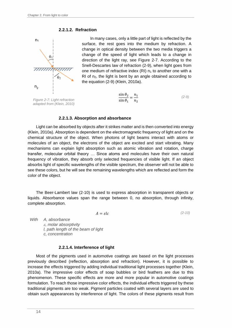
Chapter 2. From light to color
14
2.2.1.2. Refraction
Figure 2-7: Light refraction adapted from (Klein, 2010)
In many cases, only a little part of light is reflected by the
surface, the rest goes into the medium by refraction. A
change in optical density between the two media triggers a
change of the speed of light which leads to a change in
direction of the light ray, see Figure 2-7. According to the
Snell-Descartes law of refraction (2-9), when light goes from
one medium of refractive index (RI) n1 to another one with a
RI of n2, the light is bent by an angle obtained according to
the equation (2-9) (Klein, 2010a).
sin 𝜃2sin 𝜃1
=𝑛1𝑛2
(2-9)
2.2.1.3. Absorption and absorbance
Light can be absorbed by objects after it strikes matter and is then converted into energy
(Klein, 2010a). Absorption is dependent on the electromagnetic frequency of light and on the
chemical structure of the object. When photons of light beams interact with atoms or
molecules of an object, the electrons of the object are excited and start vibrating. Many
mechanisms can explain light absorption such as atomic vibration and rotation, charge
transfer, molecular orbital theory … Since atoms and molecules have their own natural
frequency of vibration, they absorb only selected frequencies of visible light. If an object
absorbs light of specific wavelengths of the visible spectrum, the observer will not be able to
see these colors, but he will see the remaining wavelengths which are reflected and form the
color of the object.
The Beer-Lambert law (2-10) is used to express absorption in transparent objects or
liquids. Absorbance values span the range between 0, no absorption, through infinity,
complete absorption.
𝐴 = 휀𝑙𝑐 (2-10)
With A, absorbance
, molar absorptivity l, path length of the beam of light c, concentration
2.2.1.4. Interference of light
Most of the pigments used in automotive coatings are based on the light processes
previously described (reflection, absorption and refraction). However, it is possible to
increase the effects triggered by adding individual traditional light processes together (Klein,
2010a). The impressive color effects of soap bubbles or bird feathers are due to this
phenomenon. These specific effects are more and more popular in automotive coatings
formulation. To reach those impressive color effects, the individual effects triggered by these
traditional pigments are too weak. Pigment particles coated with several layers are used to
obtain such appearances by interference of light. The colors of these pigments result from

2.2. Light-matter interactions
15
the superposition of wavelengths. Figure 2-8 shows this phenomenon. The incident wave R1
is refracted in the layer before being reflected by the opaque background. This wave is then
reflected at the outer boundary of the layer, R’1. R’2 is the reflected wave of the incident
wave R2. On top of the layer, the waves R’1 and R’2 superimpose.
Figure 2-8: Interference of light at a layer of different refractive indices from (Klein, 2010a)
As either the thickness of the film, X, the angle of observation or the wavelength
changes, the color produced by constructive interference changes.
2.2.2. Scattering and diffraction
2.2.2.1. Light scattering by a particle
When a particle of one RI is surrounded by a medium of another RI, reflection, refraction
and diffraction can occur. The impact of these three phenomena is dependent on the particle
size and the wavelength of light (Jarrige, 2013). For macroscopic objects, the interaction
between light and object is governed by the equations developed by Newton and is known
as lenses. When the particle size is similar or slightly larger (up to ten times) than the
wavelength of light, light interacts by using Mie scattering. For smaller particles, light scatters
according to a mechanism expressed by Rayleigh.
Particles behave as multipoles which reemit
the incident wave. Part of the incident wave is then
distributed in the medium according to its own
angular law. This phenomenon is called scattering.
It is important to consider that the scattering
size of a particle can be larger than the physical
size. Moreover, even if incident light rays do not
strike the particle but brush past it, they can be
scattered.
Figure 2-9: Light scattering from (Bohren
and Huffman, 2007)

Chapter 2. From light to color
16
2.2.2.1.1. Mie theory
Based on Maxwell’s equations resolution and published in 1908, Mie theory describes
the light scattering by a single and spherical particle of one RI embedded by a medium of
another RI (Mie, 1908). The strength of the scattering is dependent on four factors: the RI of
the particle, the RI of the medium, the diameter of the particle and the wavelength of incident
light. The relationship between those four parameters and the scattering strength is explained
by Mie theory, which consists of three parameters: the size parameter, (2-11), the relative
refractive index, m, (2-12), and the cross section of scattering, CSCA, (2-13). The cross section
of scattering, CSCA, is given in units of an area, typically square microns and stands for the
area of the particle which interacts with light by scattering.
= 𝑘𝑛𝑚𝑒𝑑𝑖𝑢𝑚 =2𝜋𝑟
𝑛𝑚𝑒𝑑𝑖𝑢𝑚 (2-11)
𝐶𝑆𝐶𝐴 =2𝜋
𝑘2∑(2𝑛 + 1)(|𝑎𝑖|
2 + |𝑏𝑖|2)
∞
𝑖=1
(2-12)
𝑚 =𝑛𝑝𝑎𝑟𝑡𝑖𝑐𝑙𝑒
𝑛𝑚𝑒𝑑𝑖𝑢𝑚 (2-13)
With CSCA, cross section of scattering ai and bi, expansion coefficients of a scattering electromagnetic field k, molar attenuation coefficient κ, size parameter r, radius of the scattering particle λ, wavelength of light m, relative refractive index nparticle, RI of particle nmedium, RI of medium
From these three parameters, the scattering efficiency, QSCA, (2-14), and the amount of
scattering per unit of volume, SMIE, (2-15), are calculated according to the following equations.
𝑄𝑆𝐶𝐴 =𝐶𝑆𝐶𝐴𝜋𝑟2
(2-14)
𝑆𝑀𝐼𝐸 =𝐶𝑆𝐶𝐴43𝜋𝑟
3=3𝑄𝑆𝐶𝐴4𝑟
(2-15)
However, Mie theory has certain limits. The first limitation is linked to the particle shape.
Pigment particles are not perfectly spherical and can be aggregated or cylindrical in some
cases. Besides, the particle must be isolated from other particles. In paint films for example,
scattering is not created by single particles but by multiple particles which trigger multiple
scattering. Besides, the distribution in size and the form of particles make the phenomena
more complex.
2.2.2.1.2. Rayleigh theory
When the particle size is below one tenth of the wavelength of light, Rayleigh theory is
used to describe the scattering. Due to the very small particle size, it is assumed that the
shape of the particle has no influence on light diffraction.

2.2. Light-matter interactions
17
The efficiency parameter, QSCA, evaluates the scattering of a particle. It is calculated
according to equation (2-16).
𝑄𝑆𝐶𝐴 =8
3(2𝜋𝑟
)4
(𝑛𝑝𝑎𝑟𝑡𝑖𝑐𝑙𝑒2 − 1
𝑛𝑝𝑎𝑟𝑡𝑖𝑐𝑙𝑒2 + 2
)
2
(2-16)
With QSCA, scattering efficiency parameter r, radius of the scattering particle λ, wavelength of light nparticle, RI of particle
Rayleigh theory is especially used to explain the blue color of the sky (Strutt, 2009). The
intensity of the light scattered varies due to the inverse of the fourth power of the wavelength.
In other words, shorter wavelengths (blue) are scattered more strongly than longer
wavelengths (red).
2.2.2.2. Light scattering by a group of particles
In coating films, the distance between particles tends to become smaller and smaller
due to the high pigment concentration in formulas. In this case, multiple scattering occurs. In
coating industry, TiO2 particles of approximatively 0.25 µm in size are used to obtain the
biggest light-scattering (DuPontTM, 2007). Mie theory is very useful to understand light
scattering, but it presents some limitations especially for the particle shape. The particles are
not perfectly spherical and moreover, are often joined in conglomerates. Besides, when light
is scattered by a group of particles, two phenomena not explained by Mie theory occur. The
first one is the multiple scattering which creates the opacity of the coating films and the
second one is the loss of scattering when two particles scattered are close.
As explained before, even if incident light rays do not strike the particle but brush past
it, they can be scattered. The loss of scattering can be easily explained by considering two
particles and their light scattering volume. When the gap between two particles is big enough,
their light scattering volumes do not overlap (Figure 2-10.a.) but, when it starts to become
smaller and smaller, the volumes start to overlap (Figure 2-10.b.) and loss of scattering
occurs.
Figure 2-10: Loss of scattering due to particle scattering volumes overlapping
To formulate paints, formulators use solvent, pigments and dispersant polymers among
other things. As pigment particles are very diluted in the solvent, they are far enough from
each other and can create their own scattering volume without overlapping. When the coating
film starts to dry, the solvent molecules are evaporated while pigment particles tend to get
closer together until, eventually, their scattering volumes overlap.

Chapter 2. From light to color
18
Light scattering is close to light absorption. An equation like the Beer-Lambert law
describes the amount of scattering (2-17).
𝐴𝑚𝑜𝑢𝑛𝑡 𝑜𝑓 𝑠𝑐𝑎𝑡𝑡𝑒𝑟𝑖𝑛𝑔 = 𝑆𝑋 (2-17)
With S, amount of light scattered
X, thickness of the sample
2.2.2.3. The Kubelka-Munk theory
So far, only the scattering phenomenon itself has been considered by either a single
particle or a group of particles. In a coating film, billions of particles are involved. In 1931,
Kubelka and Munk developed a theory based on the simultaneous absorption and scattering
of light from colorant layers (Geniet, 2013). The different layers form a homogeneous material
and not a composite of discrete particles in a resin. This consideration frees from limitations
of Mie’s theory. The Kubelka-Munk theory of reflectance simplifies the light path by assuming
its perpendicularity to the surface air-object. It also gives a quantitative description of light-
scattering colorant layers as reflectance, transmittance or hiding power.
According to this theory, the coating layer can be divided into several elementary layers
with boundaries parallel to those of the complete thickness which have the same properties.
The elementary layer is at a distance x of the illuminated surface. Its thickness is defined as
dx, whereas X is the total thickness of the colorant layer. The elementary layer is very thin
compared to the global layer (dx << X) but it is very wide compared to the pigment particle
size. The object is illuminated with incident light of intensity I0 and after absorption, scattering
or transmission, the reemerging light has intensity I. For the elementary layer, two diffuse
light fluxes can be distinguished: one going ahead downward through the layer, i, and the
other, simultaneous, upward through the layer, j, (Wyszecki and Stiles, 1982a).
Figure 2-11 : Schematic diagram of light traveling in a colorant layer inspired from (Geniet, 2013)
K is the absorption coefficient which is described as the fraction of absorption of light
energy in the elementary layer. S is the scattering coefficient which is described as the
fraction lost by having its direction reversed.

2.2. Light-matter interactions
19
During its passage through the elementary layer, the upward-proceeding, j, is reduced
by absorption by the amount j(K+S)dx, and increased by scattering in exactly the same way
as is the downward-proceeding flux, iSdx (2-18). On the other hand, the downward-
proceeding flux, i, is reduced by the amount i(K+S)dx by absorption and increased by
scattering by the amount jSdx (2-19). By integrations and mathematical calculations, explicit
expressions for reflectance R can be obtained.
−𝑑𝑖 = −(𝑆 + 𝐾)𝑖𝑑𝑥 + 𝑗𝑆𝑑𝑥 (2-18)
𝑑𝑗 = (𝑆 + 𝐾)𝑗𝑑𝑥 + 𝑖𝑆𝑑𝑥 (2-19)
Divide (2-18) by i and (2-19) by j and add together those equations:
𝑑𝑗
𝑗−𝑑𝑖
𝑖= 𝑑 𝑙𝑛
𝑗
𝑖= −2(𝐾 + 𝑆)𝑑𝑥 + 𝑆 (
𝑖
𝑗+𝑗
𝑖) 𝑑𝑥
𝑑 𝑙𝑛𝑗𝑖⁄
𝑑𝑥= −2(𝐾 + 𝑆) + 𝑆 (
𝑖
𝑗+𝑗
𝑖) (2-20)
Define 𝑅 = 𝐼 𝐼0⁄ and 𝑟 =
𝑗𝑖⁄ and replace in (2-20)
d ln r
dx= −2(K + S) + S (
1
r+ r)
d ln r
dx=
drrdx
= S [−2 (K
S+ 1) + (
1
r+ r)]
dr
r [−2(KS + 1) + (
1r+ r)]
= Sdx
∫dr
r [−2(KS + 1) + (
1r+ r)]
= S∫ dxX
0
R
R′
∫𝑑𝑟
1 + 𝑟2 − 2𝑟 (𝐾𝑆 + 1)
= 𝑆∫ 𝑑𝑥𝑋
0
𝑅
𝑅′
(2-21)
Define a =K
S+ 1 =
S+K
S and replace in (2-21)
∫𝑑𝑟
1 + 𝑟2 − 2𝑎𝑟= 𝑆∫ 𝑑𝑥
𝑋
0
𝑅
𝑅′
(2-22)
To solve this integral (2-22), it is necessary to define the solutions of the
polynomial

Chapter 2. From light to color
20
∆= 4𝑎2 − 4
𝑟 =2𝑎 ± √4𝑎2 + 4
2= 𝑎 ± √𝑎2 − 1
𝑟2 + 1 − 2𝑎𝑟 = (𝑟 − 𝑎 −√𝑎2 − 1)(𝑟 − 𝑎 + √𝑎2 − 1)
1
𝑟2 + 1 − 2𝑎𝑟=
𝐴
𝑟 − 𝑎 − √𝑎2 − 1+
𝐵
𝑟 − 𝑎 + √𝑎2 − 1
1
𝑟2 + 1 − 2𝑎𝑟=𝐴(𝑟 − 𝑎 + √𝑎2 − 1) + 𝐵(𝑟 − 𝑎 − √𝑎2 − 1)
(𝑟 − 𝑎 − √𝑎2 − 1)(𝑟 − 𝑎 + √𝑎2 − 1)
By comparing coefficients for r and for constants,
{𝐴 (𝑟 − 𝑎 + √𝑎2 − 1) + 𝐵 (𝑟 − 𝑎 − √𝑎2 − 1) = 1
𝐴 + 𝐵 = 0
{
𝐴 =1
2√𝑎2 − 1
𝐵 =−1
2√𝑎2 − 1
Replace in (2-22)
∫(
1
2√𝑎2 − 1
(𝑟 − 𝑎 − √𝑎2 − 1)+
−1
2√𝑎2 − 1
(𝑟 − 𝑎 + √𝑎2 − 1))𝑑𝑟 = 𝑆∫ 𝑑𝑥
𝑋
0
𝑅
𝑅′
∫(1
(𝑟 − 𝑎 − √𝑎2 − 1)−
1
(𝑟 − 𝑎 + √𝑎2 − 1))𝑑𝑟 = 2𝑆√𝑎2 − 1 ∙ ∫ 𝑑𝑥
𝑋
0
𝑅
𝑅′
[𝑙𝑛𝑟 − 𝑎 − √𝑎2 − 1
𝑟 − 𝑎 + √𝑎2 − 1]𝑅′
𝑅
= 2𝑆√𝑎2 − 1𝑋
lnR − a − √a2 − 1
R − a + √a2 − 1− ln
R′ − a − √a2 − 1
R′ − a + √a2 − 1= 2S√a2 − 1 ∙ X
By defining 𝑏 = √𝑎2 − 1,
𝑙𝑛𝑅 − 𝑎 − 𝑏
𝑅 − 𝑎 + 𝑏− 𝑙𝑛
𝑅′ − 𝑎 − 𝑏
𝑅′ − 𝑎 + 𝑏= 2𝑆𝑏𝑋
𝑙𝑛(𝑅 − 𝑎 − 𝑏) ∙ (𝑅′ − 𝑎 + 𝑏)
(𝑅 − 𝑎 + 𝑏) ∙ (𝑅′ − 𝑎 − 𝑏)= 2𝑆𝑏𝑋 (2-23)
Consider the limiting conditions where the global layer is infinite, then R=R∞ and the
backing reflectance can take any value since the light cannot reach it. To simplify the
equation, the backing reflectance R’ is set to 0, R’=0
𝑅∞ = a − b = a − √a2 − 1 = 1 +K
S−√(
K
S)2
+ 2K
S

2.2. Light-matter interactions
21
a =R∞
2 + 1
2R∞
𝐾
𝑆=(𝑅∞ − 1)
2
2𝑅∞ (2-24)
𝑏 =1 − 𝑅∞
2
2𝑅∞
Replace a and b in equation (2-23) to get the expression of R
𝑅 =
1𝑅∞
(𝑅′ − 𝑅∞) − 𝑅∞ (𝑅′ −
1𝑅∞) 𝑒𝑥𝑝 ((
1𝑅∞
− 𝑅∞) 𝑆𝑋)
(𝑅′ − 𝑅∞) − (𝑅′ −
1𝑅∞) 𝑒𝑥𝑝 ((
1𝑅∞
− 𝑅∞) 𝑆𝑋)
Equation (2-24) is known as the Kubelka-Munk function. The reflectance R∞ can only be
lower than 1 if the absorption coefficient, K, is non-null.
For many years, in various industries (paint, ink, plastic …), it is needed to create specific
colors for customers. The customer provides a standard to be color-matched. The “right”
color can be matched either by a knowledge-based trial and error approach or by
computational color recipe calculation. For the first approach, colorists mix various pigments
to obtain the perfect match. For computed color formulation, colorists use a
spectrophotometer, a device measuring the reflectance of the reference and the samples.
The matching process is helped by an algorithm which selects and adjusts the different
proportions of the pigments. This algorithm is based on the Kubelka-Munk theory.
As a start, it is mandatory to characterize each pigment by creating several letdowns
(also called primary binary blends), such as the respective pigment in white or the pure
pigment for example. These letdowns (at least 2) are measured with a spectrophotometer
and the calculation can be made according to the Kubelka-Munk function, (2-24).
(𝐾
𝑆)𝑝=(1 − 𝑅𝑝)
2
2𝑅𝑝=𝐶𝑝𝐾𝑝
𝐶𝑝𝑆𝑝 (2-25)
(𝐾
𝑆)𝑚𝑖𝑥
=(1 − 𝑅𝑚𝑖𝑥)
2
2𝑅𝑚𝑖𝑥=𝐶𝑝𝐾𝑝 + 𝐶𝑤ℎ𝑖𝑡𝑒𝐾𝑤ℎ𝑖𝑡𝑒
𝐶𝑝𝑆𝑝 + 𝐶𝑤ℎ𝑖𝑡𝑒𝑆𝑤ℎ𝑖𝑡𝑒 (2-26)
With (K/S)p, ratio for pigment,
Rp, reflectance of the letdown “pigment”
Cp, concentration of pigment
Rmix, reflectance of the letdown “pigment+white”
Cwhite, concentration of white
Kwhite, absorbance coefficient of white
Swhite, scattering coefficient of white

Chapter 2. From light to color
22
The absorbance and scattering coefficients of the pigment, Kp and Sp, can then be
derived from the two previous equations, (2-25) and (2-26).
Once all the pigments from a given set to be used have been characterized, the
computed color formulation process can be used. To predict color and according to the
Kubelka-Munk theory, the absorption and scattering coefficients, K and S, of a colored
mixture can be deducted from the individual coefficients of each pigment. This theory is
based on a law of additivity, the law of Duncan. The coefficients of the mixture are calculated
by summation of the weighted coefficients of each pigment composing the final color.
𝐾 = 𝐾0 + 𝑐1𝑘1 + 𝑐2𝑘2 +⋯+ 𝑐𝑁𝑘𝑁 = 𝐾0 +∑𝑐𝑖𝑘𝑖
𝑁
𝑖=1
(2-27)
𝑆 = 𝑆0 + 𝑐1𝑠1 + 𝑐2𝑠2 +⋯+ 𝑐𝑁𝑠𝑁 = 𝑆0 +∑𝑐𝑖𝑠𝑖
𝑁
𝑖=1
(2-28)
With K and S, absorption and scattering coefficients of the mixture
K0 and S0, absorption and scattering coefficients of the substrate
ci, concentration of individual pigment
ki, unit absorptivity of individual pigment
si, unit scattering of individual pigment
Divide (2-27) by (2-28)
𝐾
𝑆=𝐾0 + 𝑐1𝑘1 + 𝑐2𝑘2 +⋯+ 𝑐𝑁𝑘𝑁𝑆0 + 𝑐1𝑠1 + 𝑐2𝑠2 +⋯+ 𝑐𝑁𝑠𝑁
=(1 − 𝑅∞)
2
2𝑅∞ (2-29)
Equation (2-29) is known as the two-constant Kubelka-Munk theory. In many color-
matching problems such as in paint industry, the scattering is mostly provided by the white
pigment added in the formulation or by the substrate itself. When the scattering coefficient
S0 is large in comparison to the scattering provided by the pigments, the equation (2-28) can
be simplified to S≈S0. By simplification of the equation (2-29), equation (2-30) is obtained; it
is known as the single-constant Kubelka-Munk theory.
𝐾
𝑆=𝐾0 + 𝑐1𝑘1 + 𝑐2𝑘2 +⋯+ 𝑐𝑁𝑘𝑁
𝑆0=𝐾0𝑆0+ 𝑐1
𝑘1𝑆0+ 𝑐2
𝑘2𝑆0+⋯+ 𝑐𝑁
𝑘𝑁𝑆0
𝐾
𝑆=(1 − 𝑅∞)
2
2𝑅∞
(2-30)
The algorithm, based on linear least-squares techniques, will adjust the different pigment
quantities to minimize the spectral difference between the standard to color-match and the
theoretical reflectance curve of the mixture of scattering pigments. The Kubelka-Munk theory
is mainly suitable for simple mixtures such as solid colors. However, when the mixtures start
to become more complex, this theory is not applicable anymore.

2.3. Human color vision
23
2.3. Human color vision
After describing the characteristics of a light source and the interactions between the
object and the light rays, human color vision can now be considered. Since Newton
discovered the multichromatic composition of light, color vision has been investigated to
understand how the human visual system works. Color vision is the ability to distinguish
differences in light composition. The field of vision science is very sophisticated, only an
overview of the most important topics will be given in this paragraph.
To have the ability to see, an organism must have on one hand a receiving organ to
focus the electromagnetic wave on a sensitive surface and on the other hand a processing
organ to group and analyze the different signals. For the human visual system, the eye and
the brain respectively assume these two functions.
2.3.1. Anatomy of the eye
Both eyes are spherical globes with an average diameter of 25 mm. The distance
between those two eyes is about 6 cm. Each eye is in one eyeball and then linked to the
brain thanks to the optic nerve. Eyes are composed of several elements which lead to vision.
A vertical cross-section through the eye is presented in Figure 2-12.
Figure 2-12: Anatomy of the eye from (Iristech, 2018)
For better understanding, the eye can be compared at first sight to a camera
(National.Keratoconus.Foundation). In a camera, the front camera lens focuses light on the
film and when light hits the film, the picture is taken. The eye functioning is very close. First,
the lens allows light to pass through before being focused by the cornea on the retina. When
light hits the retina, cells collect the signal to convert it into electric signals which are
transmitted to the brain. The color sensation is then created. The following elements are
presented according to their position in the light path through the eye.

Chapter 2. From light to color
24
2.3.1.1. The cornea
The first element crossed by light rays is the cornea (Wyszecki and Stiles, 1982b). The
cornea is the transparent front part of the eye through which light rays enter. Its thickness is
about 0.5 mm while its RI is around 1.377. According to Snell’s law of reflection (see (2-9)),
a change of media with two different RIs leads to a change in the light rays’ direction. Its main
function is then to refract light based on its curved shape. Most of the light entering in the eye
is focused by the cornea which handles two-thirds of the eye’s total optical power. The cornea
must stay perfectly clean and transparent. Regular closing of the eyelids and tear secretion
keep the surface of the cornea free of any impurity. The cornea tends to repair minor
abrasions by itself but deeper abrasions create scars and the transparency of the cornea is
lost.
2.3.1.2. The iris and the pupil
After being refracted, light rays cross the iris and the pupil (Wyszecki and Stiles, 1982b).
The iris is a flat and circular structure in the eye with an adjustable opening in the center, the
pupil. The iris sphincter muscle contracts or extends the pupil to modulate the amount of light
that reaches the retina. If there is too much light the pupil is contracted and if not, extended.
This modification linked to the ambient light is involuntary and is also called the pupillary
reflex. The color of the iris is related to the genetic code of each individual and is linked to
the concentration of melanin. In some cases, the lack of melanin leads to a red color of this
structure for people with albinism. As the pupil absorbs most of the light touching the eyes, it
appears as a black sphere in the center of our eyes.
2.3.1.3. The lens
After their focusing, the light rays pass through the lens (Wyszecki and Stiles, 1982b).
The lens is a transparent and flexible structure pinpointed just behind the iris, which helps to
refract light before being focused on the retina. By changing its shape and its focal distance,
it focuses the crossing light rays to create clear images of objects at various distances which
can be easily seen by accommodation. If one looks at a close object, the lens becomes
thicker. On the contrary, for a distant object, it becomes flatter. This change in thickness
leads to an increase or a decrease of the optical power, respectively, and eventually our
vision of the object is sharpened. With age, the lens tends to become harder so it loses its
flexibility and observers cannot focus on close objects anymore – this is called presbyopia.
The lens looks like an ellipsoid and a lack of curvature of the lens can lead to vision
abnormalities such as myopia (high bending) where far objects seem fuzzy or hyperopia (low
bending) where nearby objects seem fuzzy. Other abnormalities come from lens
degenerations which can be related to age as e.g. cataract due to opacification of the lens
cells.
2.3.1.4. The retina
After all this travel through the eye, light rays finish by reaching the retina, found at the
back of the eye and covering 75% of the human eye (Wyszecki and Stiles, 1982b). This thin
layer is composed of 150 million of photosensitive cells which are present everywhere in the
retina except for the center part, the so-called blind spot (the connection between the eye
and the optic nerve). They start the conversion of optical signals to neural signals which are

2.3. Human color vision
25
then transmitted to the brain. Color vision relies on the retinal processing which will be
explained in the next parts: 2.3.2. Structure of the retina (page 25) and 2.3.4. The visual
pathway (page 30).
2.3.1.5. The optic nerve
The optic nerve is the last structure of the eye before the transmission of the visual
information to the brain. It is made of the axons of the ganglion cells (Wyszecki and Stiles,
1982b). The optic nerve is made of one million of fibers while each retina counts around 150
million of photosensitive cells. There is a high compression of the optical signal with loss of
information before its transfer to the brain. Since the optic nerve is connected to the retina,
there is a small area which would have been covered by photoreceptors where no visual
stimulation can occur, the blind spot.
2.3.2. Structure of the retina
The retina is the very first neural structure involved in color vision (Rigaudière, 2013). It
has photosensitive cells and cells which send chemical and electrical signals to the brain.
150 million of nervous cells are complexly organized in different layers of the retina to
discriminate colors and detect contrast and motion. The light rays entering in the eye hit first
the ganglion cells and the other layers before stimulating the photoreceptors and being
absorbed by the pigmented cells, the pigment epithelium. Diverse types of nervous cells are
in the retina such as horizontal cells or bipolar cells which coordinate the transmission of
signals to the brain. These cells are schematically organized in a double structure with a
radial structure to preserve the image and a transverse one to detect contrast effects by
modulating the direct signal according to the adjacent signals as exemplified in Figure 2-13.
Figure 2-13: Structure of the retina, picture adapted from (Salesse, 2017)
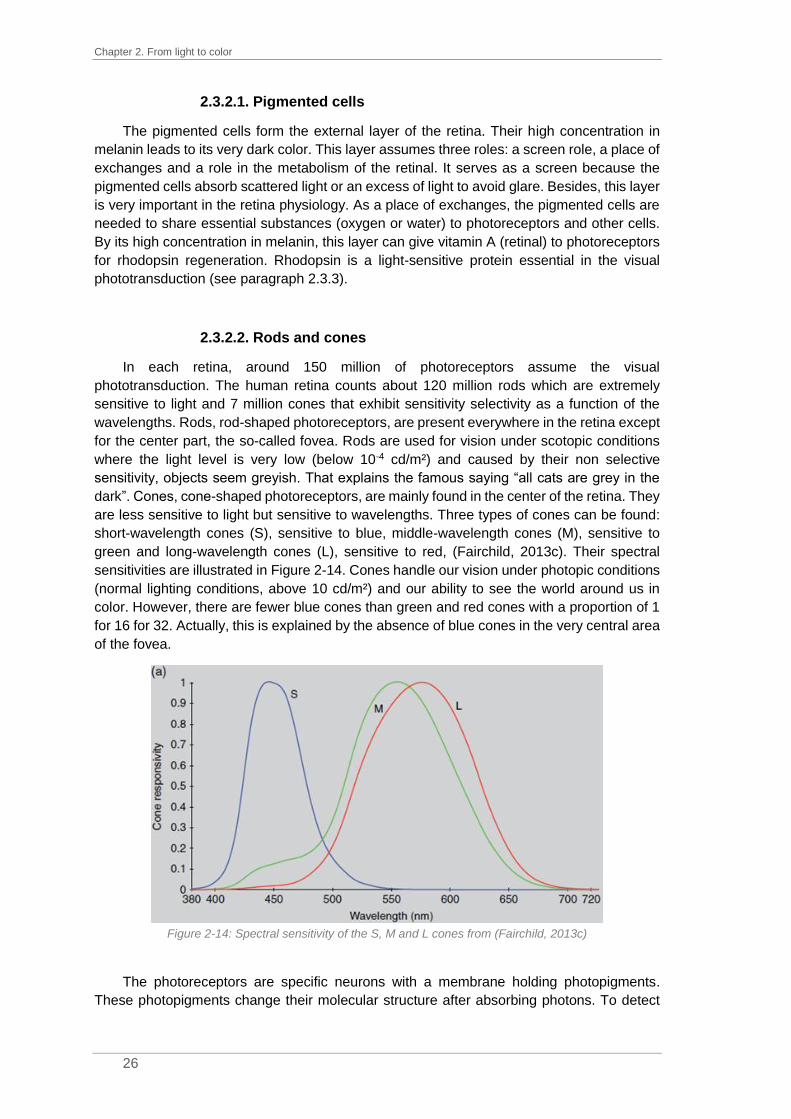
Chapter 2. From light to color
26
2.3.2.1. Pigmented cells
The pigmented cells form the external layer of the retina. Their high concentration in
melanin leads to its very dark color. This layer assumes three roles: a screen role, a place of
exchanges and a role in the metabolism of the retinal. It serves as a screen because the
pigmented cells absorb scattered light or an excess of light to avoid glare. Besides, this layer
is very important in the retina physiology. As a place of exchanges, the pigmented cells are
needed to share essential substances (oxygen or water) to photoreceptors and other cells.
By its high concentration in melanin, this layer can give vitamin A (retinal) to photoreceptors
for rhodopsin regeneration. Rhodopsin is a light-sensitive protein essential in the visual
phototransduction (see paragraph 2.3.3).
2.3.2.2. Rods and cones
In each retina, around 150 million of photoreceptors assume the visual
phototransduction. The human retina counts about 120 million rods which are extremely
sensitive to light and 7 million cones that exhibit sensitivity selectivity as a function of the
wavelengths. Rods, rod-shaped photoreceptors, are present everywhere in the retina except
for the center part, the so-called fovea. Rods are used for vision under scotopic conditions
where the light level is very low (below 10-4 cd/m²) and caused by their non selective
sensitivity, objects seem greyish. That explains the famous saying “all cats are grey in the
dark”. Cones, cone-shaped photoreceptors, are mainly found in the center of the retina. They
are less sensitive to light but sensitive to wavelengths. Three types of cones can be found:
short-wavelength cones (S), sensitive to blue, middle-wavelength cones (M), sensitive to
green and long-wavelength cones (L), sensitive to red, (Fairchild, 2013c). Their spectral
sensitivities are illustrated in Figure 2-14. Cones handle our vision under photopic conditions
(normal lighting conditions, above 10 cd/m²) and our ability to see the world around us in
color. However, there are fewer blue cones than green and red cones with a proportion of 1
for 16 for 32. Actually, this is explained by the absence of blue cones in the very central area
of the fovea.
Figure 2-14: Spectral sensitivity of the S, M and L cones from (Fairchild, 2013c)
The photoreceptors are specific neurons with a membrane holding photopigments.
These photopigments change their molecular structure after absorbing photons. To detect

2.3. Human color vision
27
light, the photoreceptors rely on the light sensitivity of the rhodopsin for rods and the iodopsin
for cones. Three types of iodopsin exist and are present in the cones according to their
wavelength sensitivity: the cyanolabe, sensitive to short wavelengths, the chlorolabe, to
medium wavelengths, and the erythrolabe, to long wavelengths, (Beaudot, 1994). The two
visual pigments, rhodopsin and iodopsin, are similar and consist of the union of retinal and
opsin. The only difference noticeable is on the opsin. For rods and S cones, the opsin is
made of 348 amino acids while 364 are needed for M and L cones. For example, cone M
and cone L have only 4% of difference in their structure while cone S and cone M differ by
40%. Differences in protein structure lead to differences in wavelength sensitivity. The
sensitivity of the retinal is conditioned by the structure of the protein around it.
The fovea is found right at
the center of the retina. In this
area with a width of 2 degrees,
the concentration of cones is
around 140 000 cones/mm². This
small area equivalent to the size
of our thumbnail held at arm’s
length handles color and spatial
vision at a very high accuracy.
Rods are few in the region near
the fovea but increase in number
in peripherical regions.
Figure 2-15: Density of photoreceptors (blue for cones and
black for rods) in the retina from (Fairchild, 2013c)
A blind spot can also be noticed at 15° degree from the fovea. In this area, the optic
nerve is formed and there is no room for photoreceptors (Fairchild, 2013c).
2.3.2.3. Bipolar cells
The bipolar cells are connected to the photoreceptors on one side and to the ganglion
cells on the other side and sometimes even to the horizontal cells. The signals transmitted
to the ganglion cells are in form of graduated potentials (depolarization or hyperpolarization)
depending on the ON or OFF type of the bipolar cells. Two types of pathways exist: direct,
one photoreceptor is linked to one bipolar cell, or indirect, several photoreceptors are
connected to one horizontal cell which is linked to one bipolar cell. The direct pathway is
mainly found in the fovea. The diffusion of the sensorial signal is quicker with this type of
connection. It explains the reason why the visual acuity is better in this area. In the
peripherical retina, thousands of photoreceptors are linked to one horizontal cell.
2.3.2.4. Horizontal cells
The horizontal cells are sideways connected to several photoreceptors on one side and
bipolar cells on the other side. They inhibit the activity of the neighboring cells to increase
the acuity of the sensorial signals. When light rays hit the retina, some of the photoreceptors
are strongly lighted while others are weakly illuminated. By reducing or cutting off the
sensorial signal of the weakly illuminated photoreceptors, only the signal emitted by the
strongly illuminated photoreceptors is transmitted to the ganglion cells. The horizontal cells
improve the contrast perception.

Chapter 2. From light to color
28
2.3.2.5. Ganglion cells
The ganglion cells are connected on one side to the amacrine cells and to the bipolar
cells and on the other side form the optic nerve. One million of these cells are counted in the
retina and their density is low around the fovea (one cone for one ganglion cell) but increase
in the peripherical areas due to its high number of connections to photoreceptors. These cells
handle the signal transmission from the retina to the brain (Rodieck, 1998). They estimate
three types of contrast: luminance, spectral and temporal. The luminance contrast conveys
the difference in light spatial distribution over the entire retina. The spectral contrast enables
to compare activities resulting from the cones. Finally, the temporal contrast serves to
distinguish the speed with which lightening varies in the center and the periphery of the retina
(Imbert, 2006).
The ganglion cells are classified into three groups but more than 15 categories exist
according to (Wassle, 2004). The parvocellular ganglion cells, P-cells, are small and found
in the fovea. They stand for 80% of the ganglion cells. The P-cells are useful for luminance,
temporal and spectral contrasts with object discrimination, detail perception and chromatic
vision. Some of them offer a high chromatic resolution between green and red. The
magnocellular ganglion cells, M-cells, are wide and found in retina peripherical area. They
are connected to thousands of photoreceptors thanks to amacrine and bipolar cells. The M
cells, 5% of the ganglion cells, help in temporal contrast with motion and form detection. The
koniocellular ganglion cells, K-cells, are not very known and the latest studies suppose a role
in luminescence coding and motion detection in only one direction.
2.3.3. Visual phototransduction
The processing of visual information starts in the retina thanks to the light detection of
photoreceptors. Rods and cones handle light absorption and transduction of the signal. The
signal is then transmitted to bipolar, amacrine and ganglion cells before being transmitted to
the brain. The conversion of electromagnetic energy of light into a change in electrical
potential and then neural activity is a complex process called the visual phototransduction.
Figure 2-16: Rod (left) and cone (right) structures from (Powell, 2016)

2.3. Human color vision
29
Rods and cones structure are globally similar (see Figure 2-16). They are made of an
outer segment, an inner segment, a nucleus and a synaptic termination. The only
difference consists in the form of their outer segment, the light sensitive part. A folding of
the plasma membrane is seen for cones while rods consists of a stacking of disks
surrounded by a plasma membrane. The rod outer segment has a piling of 500 to 2,000
disks and each side of a disk contains in average 26,000 molecules of rhodopsin
(Buzhynskyy et al., 2011).
A schematic view of the phototransduction process is presented in Figure 2-17. The
phototransduction starts when light strikes the retina (Salesse, 2017). A rhodopsin molecule
contained in a photoreceptor captures a photon. This results in a photo-isomerization of the
11-cis-retinal contained in rhodopsin (or iodopsin) into all-trans-retinal. Before its
isomerization, the 11-cis retina is bound to the opsin that surrounded it. Once isomerized,
the all-trans retinal does not have the proper complementary form anymore. The retinal is
dissociated from the opsin. The opsin no longer connected to its chromophore is bleached,
the retinal photobleaching. A conformational change from rhodopsin (or iodopsin) to
metarhodopsin II (MII) allows the activation of transducin, a G protein. This is the first stage
of phototransduction amplification. MII activates 1300 molecules of transducin per second.
Transducin (G) in turn activates phosphodiesterase (PDE) in the plasma membrane that
hydrolyzes cyclic guanosine monophosphate (cGMP). This hydrolysis is the second
amplification step since a PDE molecule hydrolyzes 6,000 to 8,000 cGMP per second. The
cGMP molecules accumulate and cause the closing of the cationic channels with an incoming
current. This closure causes a membrane hyperpolarization of the photoreceptors and a stop
of glutamate release. The hyperpolarization of photoreceptors results in a cascade
depolarization of bipolar cells and then ganglion cells before the transmission of the message
to the brain.
Figure 2-17: Schematic of the visual phototransduction from (Leskov et al., 2000)

Chapter 2. From light to color
30
The photoisomerization of 11-
cis-retinal to all-trans-retinal in
photoreceptors is the first step of
vision (Kono et al., 2008). As vision is
an on-going process, the
reconversion of bleached all-trans-
retinal to 11-cis-retinal is needed.
After a photon being captured by
rhodopsin, the 11-cis-retinal
isomerized in all-trans-retinal is
released in the outer segment of the
photoreceptor. In this segment, the
all-trans-retinal is reduced to the all-
trans-retinol. Interphotoreceptor
retinoid-binding proteins (IRPB)
present in the photoreceptors help in
the transport of all-trans-retinol to the
pigmented cells contained in the
retinal pigment epithelium (RPE).
Figure 2-18: Conversion of all-trans-retinal to 11-cis-
retinal from (Kono et al., 2008)
In the RPE, three enzymes handle the conversion of all-trans-retinol to 11-cis-retinal:
the lecithin retinol acyl transferase (LRAT), the isomerohydrolase (RPE65) and the cellular
retinaldehyde binding protein (CRALPB) (Pepperberg and Crouch, 2001). The all-trans-
retinol is transformed to all-trans-retinyl ester with LRAT. Catalyzed by RPE65, these
esters are isomerized and hydrolyzed in 11-cis-retinol which is then oxidized into 11-cis-
retinal. To complete the visual cycle, newly generated 11-cis retinal is transported back to
the photoreceptors to regenerate rhodopsin. In some cases of high and sudden glare, it
might be difficult to see; this is due to the depletion of 11-cis retinal in rods.
2.3.4. The visual pathway
The visual information is projected in mirror-inverted effect on the retina. After being
converted by the retina, the visual information is then transferred to the brain by the optic
nerve. This transmission process includes a crossing of axons at the optic chiasma, a
continuation in the optic tract before arriving to the lateral geniculate nucleus (LGN). From
the LGN, the optic radiations travel to the primary visual cortex. Figure 2-19 describes the
visual pathway.
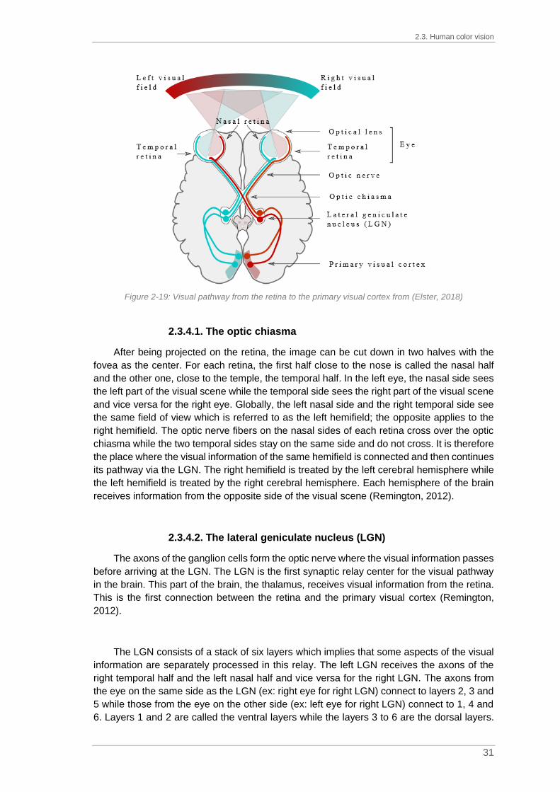
2.3. Human color vision
31
Figure 2-19: Visual pathway from the retina to the primary visual cortex from (Elster, 2018)
2.3.4.1. The optic chiasma
After being projected on the retina, the image can be cut down in two halves with the
fovea as the center. For each retina, the first half close to the nose is called the nasal half
and the other one, close to the temple, the temporal half. In the left eye, the nasal side sees
the left part of the visual scene while the temporal side sees the right part of the visual scene
and vice versa for the right eye. Globally, the left nasal side and the right temporal side see
the same field of view which is referred to as the left hemifield; the opposite applies to the
right hemifield. The optic nerve fibers on the nasal sides of each retina cross over the optic
chiasma while the two temporal sides stay on the same side and do not cross. It is therefore
the place where the visual information of the same hemifield is connected and then continues
its pathway via the LGN. The right hemifield is treated by the left cerebral hemisphere while
the left hemifield is treated by the right cerebral hemisphere. Each hemisphere of the brain
receives information from the opposite side of the visual scene (Remington, 2012).
2.3.4.2. The lateral geniculate nucleus (LGN)
The axons of the ganglion cells form the optic nerve where the visual information passes
before arriving at the LGN. The LGN is the first synaptic relay center for the visual pathway
in the brain. This part of the brain, the thalamus, receives visual information from the retina.
This is the first connection between the retina and the primary visual cortex (Remington,
2012).
The LGN consists of a stack of six layers which implies that some aspects of the visual
information are separately processed in this relay. The left LGN receives the axons of the
right temporal half and the left nasal half and vice versa for the right LGN. The axons from
the eye on the same side as the LGN (ex: right eye for right LGN) connect to layers 2, 3 and
5 while those from the eye on the other side (ex: left eye for right LGN) connect to 1, 4 and
6. Layers 1 and 2 are called the ventral layers while the layers 3 to 6 are the dorsal layers.

Chapter 2. From light to color
32
The ventral layers hold larger neurons than the dorsal layers. As for ganglion cells, the terms
magnocellular and parvocellular are used to qualify the connections made in the different
layers (Tovée, 2008).
Figure 2-20: Schematic diagram of the left LGN from (Tovée, 2008)
Thus, the magnocellular ganglion cells (M) will connect in the ventral magnocellular
layers 1 and 2 while the parvocellular ganglion cells (P) connect in the dorsal layers 3 to 6.
The koniocellular ganglion cells (K) are found between each layer. This confirms a parallel
processing of distinct information channels.
2.3.4.3. From the LGN to color perception
After the LGN, the transformed signals reach the back of the brain where the center of
our visual perception is located, the visual cortex. The color perception is then produced, 100
to 150 ms after photon absorption in the retina. In the theory of human color perception, two
theories confront: Young-Helmholtz theory and the Hering theory.
In the 19th century, Young (1802) and Helmholtz (1850) studied color perception. The
Young-Helmholtz theory assumes a trichromatic color vision where three types of receptors
located on the retina and sensitive to a specific range of wavelengths exist (Fairchild, 2013c).
These photoreceptors could be classified into three categories: sensitive to short
wavelengths (blue), to medium ones (green) and to long wavelengths (red). This theory
assumes then that the color perception relies on a mix of all three photoreceptors, the additive
properties of color mixtures. Nowadays, since 1983 and the experiment of Dartnall,
Bowmaker and Mollon, these three photoreceptors are known as the cone cells.
Conversely, in 1878, Hering assumed that color perception works as a system based on
color opponency in the opponent colors theory (Fairchild, 2013c). He noticed some color
combinations are impossible to see such as greenish-red or yellowish-blue even if it should
be possible to perceive them according to the Young-Helmholtz theory. Hering suggested a
color perception based on the activity of three opponent systems (or receptor pairs): white-
black, red-green and yellow-blue. In that theory, yellow-blue receptors cannot send
messages about both colors at the same time.

2.3. Human color vision
33
Even if the two theories seem to be contradictory, in the middle of the 20th century,
various researches lead to the combination of the trichromatic and the opponent-colors
theories such as (Svaetichin and Macnichol, 1959), (De Valois et al., 1958) or (Wiesel and
Hubel, 1966). It is now well established that both theories complement one another. The
trichromatic theory gives an adequate description of light processing at retinal level while the
opponent colors theory explains the transformation of the nerve impulses into an achromatic
signal and two opponent chromatic signals (yellow-blue and green-red). Those two are
gathered under the naming stage theory where the color perception starts by the trichromatic
vision with the photoreceptors and then the color opponency occurs partly in the retina and
partly in the visual pathway. (Boynton, 1986) proposed a simplified color vision model
diagram as detailed in Figure 2-21.
Figure 2-21: Simplified color vision model diagram adapted from (Boynton, 1986)
This color vision model represents the output of the color-opponent process which is
converted into three channels: A for Luminance, T for Red-Green and D for Yellow-Blue. As
explained in the diagram in Figure 2-21, each new channel is a combination of the input
signals from the cones, represented by triangles S, M or L according to their sensitivity to
wavelengths. The addition of signals from M and L cones leads to the luminance channel, A.
The yellow-blue channel, D, is linked to the sum of the signals from M and L cones minus
the input of the S cones. Finally, the red-green channel, T, is obtained by subtracting L signal
minus twice the value of the M signal.
2.3.5. Visual adaptation to the environment
The human visual system is not a static one as it must adapt itself to changes such as
in lightness or chroma. In order to optimize its response to viewing conditions, the retina
adjusts its sensitivity according to lighting conditions thanks to the two types of
photoreceptors, the cones for high levels of light (photopic conditions) and the rods for low
levels of light (scotopic vision). Various types of mechanisms of adaptation exist such as the
luminance adaptation and the chromatic adaptation. The sensitivity of the eye is then

Chapter 2. From light to color
34
measured by determining the minimum luminance needed to see and thus produce the visual
sensation, the intensity threshold.
The luminance adaptation can be divided into two categories: light and dark adaptations.
The human visual system can work at different levels of illumination from 0.0003 lx to 100,000
lx according to two mechanisms: a change in the pupil size and an alternative or cumulative
function of the photoreceptors.
The dark adaptation occurs when going into a dark area, coming from a very light area.
The visual system responds to the lack of light by increasing its sensitivity. The dark
adaptation is detailed in Figure 2-22.
Figure 2-22: Dark adaptation curve from (Fairchild, 2013c) where the rods take the advantage over the
cones after 10 minutes before reaching their maximum of efficiency after 30 minutes
At first, the surroundings seem completely dark but after a few minutes, objects can be
distinguished. As seen in Chapter 2, paragraph 2.3.2.2, the cones are used under high
intensity while rods dominate under low lighting conditions. When going into the dark area,
the cones cannot work anymore but the rods are bleached due to the high light intensity. In
the dark, the rhodopsin contained in the rods starts to regenerate but this process takes a
certain time, around 10 minutes. After 30 minutes, the rods’ sensitivity is at its maximum of
efficiency. To help this adaptation, a change in pupil’ size is noticed.
During dark adaptation and the transition from photopic to scotopic conditions, rods and
cones work together until rods take over completely from cones. This stage is known as the
mesopic condition. Under photopic conditions, the maximum of sensitivity of cones is around
555 nm (green-yellow) but it decreases at 500 nm (blue-green) under scotopic conditions.
The Purkinje shift illustrates this change in sensitivity. Purkinje noticed a change in color
appearance of flowers which appeared bright red on a sunny afternoon while at dawn they
looked very dark. Conversely, by considering the leaves, they seemed very dark during
daylight and brighter at low intensity light conditions. The Purkinje shift is simulated in Figure
2-23. Under photopic conditions, the flower is brighter than the background while, under
scotopic conditions, it is darker (Tovee, 2008).

2.3. Human color vision
35
Figure 2-23: Simulation of the Purkinje shift from photopic conditions (left side) to mesopic conditions
(middle) and then scotopic conditions (right side) adapted from (Wikipedia, 2019b)
Light adaptation is the reverse process of dark adaptation. It occurs when going into a
very light area from a dark area. Compared to dark adaptation, the process is faster, around
1 minute, as only one photon can initiate the reactivation of rhodopsin.
The chromatic adaptation is the ability of the human visual system to adapt itself to
changes in illumination conditions while preserving the color appearance of objects. This
adaptation is important to ensure the color constancy. A banana will always appear yellow
under a sunny sky, a cloudy sky, a fluorescent lamp or when lighted by candles. It is based
on a scaling of the cones’ sensitivity according to the light.
2.3.6. Human visual acuity
Visual acuity corresponds to the ability of the human visual system to discern details in
images. The separating power of the eye is then measured as the ability to visually separate
two distinct objects. Logically, the visual acuity is inversely proportional to the distance of
observation. In order to check it, the Snellen eye chart is typically used. Developed in 1862
by Hermen Snellen, a Dutch ophthalmologist, this chart consists of different rows of letters
of different sizes (see Figure 2-24). The observer should observe the chart at a distance of
6 meters. This test is useful to determine how well letters and shapes can be distinguished.
Figure 2-24: Snellen eye chart for visual acuity measurement from (Lindfield and Das-Bhaumik, 2009)

Chapter 2. From light to color
36
Luminance adaptation and chromatic adaptation are mainly retinal adaptation while
contrast adaptation is cortical (Webster and Wilson, 2000). According to (Pelli and Bex,
2013), contrast is the relative difference between a target and the background in terms of
luminance. Contrast may be defined as the Weber contrast (2-31) or the Michelson contrast
(2-32).
Weber constrast 𝑊 =𝐿𝑚𝑎𝑥 − 𝐿𝑚𝑖𝑛𝐿𝑏𝑎𝑐𝑘𝑔𝑟𝑜𝑢𝑛𝑑
(2-31)
Michelson contrast 𝑀 =𝐿𝑚𝑎𝑥 − 𝐿𝑚𝑖𝑛𝐿𝑚𝑎𝑥 + 𝐿𝑚𝑖𝑛
(2-32)
With Lmax, luminance maximum
Lmin, luminance minimum
Lbackground, luminance of the background
The human visual system is sensitive to contrast due to the answer of the ganglion cells.
In equations (2-31) and (2-32), by considering the denominators, Weber refers to a
background while Michelson does not.
This sensitivity is measured by using the contrast sensitivity function (CSF). This
function represents the contrast sensitivity of one individual as a function of the spatial
frequency of a stimulus. Figure 2-25 can be used to distinguish the visible contrast from the
invisible contrast, where the abscissa represents the spatial frequency, in ordinate, on the
left the sensitivity to contrast in scales log or in decibel1 and on the right the contrast in
percentage.
Figure 2-25: Contrast sensitivity function with the invisible part in orange and the visible part in green
adapted from (Zanlonghi, 1991)
1 1 decibel = 10 log(1/contrast)

2.4. Conclusion
37
In vision science, in a scene, the size of a detail depends on the viewing distance.
Traditionally, these sizes are given in values of angle, degree or minutes of arc, with 1’=1/60°.
By considering trigonometric relations, an object of size, d, seen at a viewing distance of D
is observed under an angle, α, such that tan α = d/D (see Figure 2-26).
Figure 2-26: Adaptation of the trigonometric relations to determine the size of a detail in a scene
Many optical illusions are based on contrast sensitivity and simultaneous contrast1. For
example, in Figure 2-27, the internal bar is filled with the same grey level but the background
color changes from darker to lighter values. Visually, the inner bar does not appear plain but
shaded. Its shading looks inverted compared to the shading of the background.
Figure 2-27: Example of simultaneous contrast from (Carbon, 2014)
The visual perception depends not only on the characteristics of the observed object
itself, but also on those of the environment. That is why, during sample observation it is
absolutely necessary to control the environment and the conditions of observation in order
to not distort the results.
2.4. Conclusion
The ability of the human visual system to see color is based on the triplet: light source,
object, observer. Without any one of the three elements, color cannot exist. An important
characteristic of the human visual system is its binocularity due to the existence of two eyes,
which leads to a better relief perception, the stereopsis. As seen in Chapter 2, paragraph
2.3.1, the average distance between the two eyes of a human is about 6 cm. Each eye
observes the same object but from a different angle. The images are then transmitted to the
brain with a horizontal offset. By considering effect coatings, the effect particles in the coating
formula create a micro texture in the film. In this case, the left and the right eyes do not see
the particle in the same orientation. The information sent to the left and the right LGNs are
then not identical. We suppose the binocularity coupled with the offset sent to the LGNs
would be at the origin of the phenomenon of the perceived flicker or sparkling which is
considered in the next chapters.
1 Simultaneous contrast is a phenomenon where two different colors affect each other
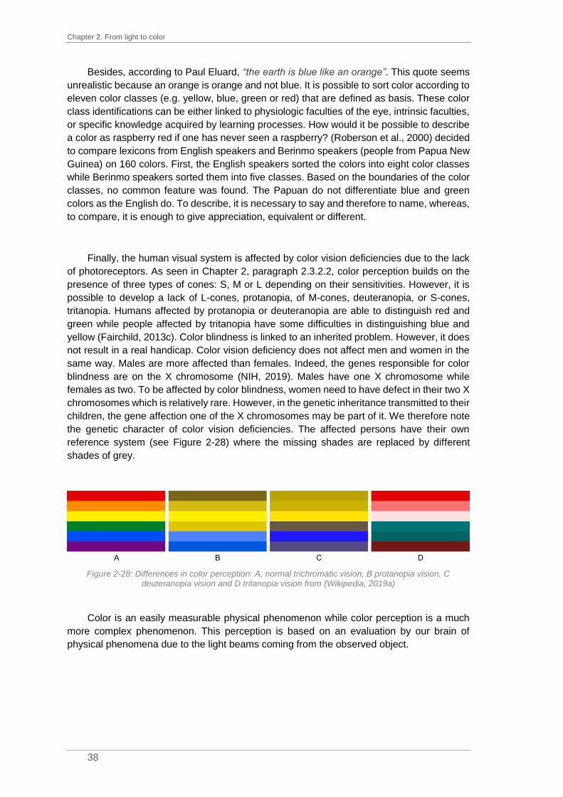
Chapter 2. From light to color
38
Besides, according to Paul Eluard, “the earth is blue like an orange”. This quote seems
unrealistic because an orange is orange and not blue. It is possible to sort color according to
eleven color classes (e.g. yellow, blue, green or red) that are defined as basis. These color
class identifications can be either linked to physiologic faculties of the eye, intrinsic faculties,
or specific knowledge acquired by learning processes. How would it be possible to describe
a color as raspberry red if one has never seen a raspberry? (Roberson et al., 2000) decided
to compare lexicons from English speakers and Berinmo speakers (people from Papua New
Guinea) on 160 colors. First, the English speakers sorted the colors into eight color classes
while Berinmo speakers sorted them into five classes. Based on the boundaries of the color
classes, no common feature was found. The Papuan do not differentiate blue and green
colors as the English do. To describe, it is necessary to say and therefore to name, whereas,
to compare, it is enough to give appreciation, equivalent or different.
Finally, the human visual system is affected by color vision deficiencies due to the lack
of photoreceptors. As seen in Chapter 2, paragraph 2.3.2.2, color perception builds on the
presence of three types of cones: S, M or L depending on their sensitivities. However, it is
possible to develop a lack of L-cones, protanopia, of M-cones, deuteranopia, or S-cones,
tritanopia. Humans affected by protanopia or deuteranopia are able to distinguish red and
green while people affected by tritanopia have some difficulties in distinguishing blue and
yellow (Fairchild, 2013c). Color blindness is linked to an inherited problem. However, it does
not result in a real handicap. Color vision deficiency does not affect men and women in the
same way. Males are more affected than females. Indeed, the genes responsible for color
blindness are on the X chromosome (NIH, 2019). Males have one X chromosome while
females as two. To be affected by color blindness, women need to have defect in their two X
chromosomes which is relatively rare. However, in the genetic inheritance transmitted to their
children, the gene affection one of the X chromosomes may be part of it. We therefore note
the genetic character of color vision deficiencies. The affected persons have their own
reference system (see Figure 2-28) where the missing shades are replaced by different
shades of grey.
Figure 2-28: Differences in color perception: A, normal trichromatic vision, B protanopia vision, C
deuteranopia vision and D tritanopia vision from (Wikipedia, 2019a)
Color is an easily measurable physical phenomenon while color perception is a much
more complex phenomenon. This perception is based on an evaluation by our brain of
physical phenomena due to the light beams coming from the observed object.

39
Chapter 3. Color measurement
Contents
3.1. STANDARDIZATION OF LIGHT SOURCES ............................................................................ 40
3.1.1. Photometry ........................................................................................................... 40
3.1.2. CIE illuminants ...................................................................................................... 41 3.1.2.1. CIE standard illuminants ............................................................................................. 41 3.1.2.2. CIE illuminants ............................................................................................................ 42
3.2. BASIC COLORIMETRY...................................................................................................... 43
3.2.1. The CIE 1931 2° Standard Colorimetric Observer ............................................... 43 3.2.1.1. RGB system ................................................................................................................ 43 2.1.1.1. XYZ system ............................................................................................................... 44
3.2.2. The CIE 1964 Standard Colorimetric Observer ................................................... 46
3.3. ADVANCED COLORIMETRY .............................................................................................. 48
3.3.1. Noticeable color differences ................................................................................. 48 3.3.1.1. Luminance differences ................................................................................................ 48 3.3.1.2. Wavelength differences ............................................................................................... 49 3.3.1.3. Chromaticity differences .............................................................................................. 50
3.3.2. Uniform color spaces ............................................................................................ 50 3.3.2.1. CIELab color space ..................................................................................................... 50
3.3.2.1.1. Definition of CIELab coordinates .......................................................................... 51 3.3.2.1.2. Limitations of the CIELab color space .................................................................. 53
3.3.2.2. CIECAM02 based color space .................................................................................... 56 3.3.3. Color differences .................................................................................................. 60
3.3.3.1. CIE 1976 color difference formulas ............................................................................. 60 3.3.3.2. CMC (l:c) ..................................................................................................................... 61 3.3.3.3. AUDI95 ........................................................................................................................ 62 3.3.3.4. AUDI2000 or DIN6175 ................................................................................................ 62
3.4. CONCLUSION ................................................................................................................. 63
In the previous chapter, the nature of color was explained by answering the question
“Why is color?”. The interaction of light sources, object and the human visual system allows
color to exist. Color is then an attribute of visual sensation. Colorimetry is the branch of color
science dedicated to the physical description of color. According to (Schanda, 1997),
colorimetry is “the science and technology used to quantify and describe physically the
human color perception”. Colorimetry can be divided into two categories: basic
(measurement of color), and advanced (color difference measurement). (Wyszecki, 1973)
gave a definition of those two categories. Basic colorimetry is “a tool used to make a
prediction on whether two lights (visual stimuli) of different spectral power distributions will
match in color for certain given conditions of observation” while advanced colorimetry
represents the “methods of assessing the appearance of color stimuli presented to the
observer in complicated surroundings as they may occur in everyday life”.
The first requirement to perceive color is a light source to start the vision process which
is modulated according to the properties of the object once it is caught by the human visual
system. Each element of the triplet “light-object-observer” must be either quantified or

Chapter 3. Color measurement
40
standardized, depending on what you want to measure (properties or appearance of a
surface, characteristics of lighting systems …). Light sources are quantified by the
measurement of their spectral power distributions by photometry: this relates to
measurement of radiometric quantities at individual wavelengths.
This chapter will describe first the standardization of the light sources with photometric
methods and the CIE illuminants, followed by basic colorimetry with the definition of a
standard observer. Eventually, some methods used in advanced colorimetry are described.
3.1. Standardization of light sources
In industry, color perception is crucial, especially for customers. Would you cook pasta
if half of the content of the box was browner than the other? Would you buy a greenish tomato
sauce? To compare colors, it is necessary to define lighting conditions well and to guarantee
same references in terms of spectral power distribution. The main problem in optical
measurement is then the quantification of light sources and lighting conditions. As the human
eye is not equally sensitive to all wavelengths of visible light, photometry was introduced to
weigh the spectral power distribution at each wavelength with a factor representing the eye’s
sensitivity to light.
3.1.1. Photometry
Photometry is the science of measurement of light in terms of its perceived brightness
by the human eye. Photometry is hence the basis to evaluate light sources. The
standardization of photometric systems pursued by the CIE led to two standard photometric
observers for photopic and scotopic vision and the associated luminous efficiency function,
respectively V(λ) and V’(λ) (Wyszecki and Stiles, 1982c). Each function is normalized and
set to 1 at λm=555 nm for photopic vision and at λ’m=507 nm for scotopic vision, see Figure
3-1.
Figure 3-1: Spectral luminous efficiency functions, V(λ) and V’(λ), defining the standard photometric
observers for photopic and scotopic vision (Fotios and Goodman, 2012)

3.1. Standardization of light sources
41
The luminance of light, Lv, can be defined as a photopic photometric quantity, (3-1).
𝐿𝑣 = 𝐾𝑚∫ 𝐿𝑒,λ𝑉(λ)dλ𝜆
(3-1)
With Lv, luminance (unit: lm/m²/sr)
Km, maximum photopic luminous efficacy (Km = 683 lm/W)
Le, λ, radiance (unit: W/m²/sr)
V(λ), photopic spectral luminous efficiency function
Photopic photometric quantity can be measured according to three methods: broad-
band photometry, spectroradiometric photometry or visual photometry. Only the second
method is explained here, the other methods are detailed in (Wyszecki and Stiles, 1982c). In
the spectroradiometric photometric method, the photopic photometric quantity is determined
by measuring the radiance of light, Le, λ, and then by calculating the luminance, Lv, (3-1).
However, it is important to note that for the following, only relative spectral distribution will be
used. For that, a spectral radiance standard is needed such as e.g. tungsten filament lamps.
3.1.2. CIE illuminants
To reproduce light sources with a constant spectral power distribution, technical light
sources have been created. They allow a high reproducibility of several spectrums such as
cloudy daylight or tungsten filament lamp. It has been decided to standardize several light
sources often used, the illuminants. These technical light sources (light source or illuminant)
are known with their color temperature but it is not always easy to either model their spectral
power distribution or prove their color temperature. The CCT has been introduced to estimate
the temperature at which it would be necessary to heat a black body to obtain the visual
impression given by a light source.
3.1.2.1. CIE standard illuminants
To reproduce the spectrum of a temperature radiator, the technical light sources are
made of a filament in metal which is heated with an electric energy and surrounded by a gas.
The thickness of the filament, the applied voltage and the surrounding gas will lead to a
specific color temperature. A tungsten filament lamp will be reproduced with a tungsten
filament surrounded by bromine or iodine. The tungsten-filament lamp with a color
temperature of 2 856 K is named the standard illuminant A by the CIE in 1931. The spectral
power distribution of the illuminant A can be calculated by equation (3-2), derived from the
Planck law of radiation. For an illuminant, the shape of the spectrum is important and without
any notion of intensity due to the normalization. The wavelength dependence is shown in
Figure 3-2.
𝑆𝐴(𝜆) = 100 ∙ (560
𝜆)5
∙exp [
1.435 ∙ 107
2848 ∙ 560]− 1
exp [1.435 ∙ 107
2848 𝜆 ] − 1 (3-2)

Chapter 3. Color measurement
42
For our visual system, our main light source is daylight. In 1963, the CIE decided to
create new illuminants. The spectral power distribution must consider the different variations
of daylight, from early morning to late evening or from a blue sky to a cloudy sky. The CIE
standard illuminant D65 has a correlated color temperature at 6 504K. It corresponds to an
average daylight at midday on cloudless north sky and its spectral power distribution is
defined by a table published by the CIE (CVRL, 2019). The CIE standard illuminant D65
corresponds to a UV-filtered, high-pressure xenon lamp.
The two CIE standard illuminants, A and D65, are characterized by their relative spectral
power distribution S(). It corresponds to the standardization of their spectral power
distribution to 100 for a wavelength of 560 nm (see Figure 3-2).
Figure 3-2: Relative spectral power distribution of the CIE standard illuminants A (in blue) and D65 (in
orange) standardized to 100 at a wavelength of 560nm adapted from (Fairchild, 2013b)
3.1.2.2. CIE illuminants
Only two illuminants are standardized by the CIE, illuminant A and illuminant D65, but
many other illuminants exist.
Established in 1931, illuminant B stands for direct noon sunlight with a color temperature
(CT) around 4 870K while illuminant C represents average daylight with a CT around 6 770K.
Besides D65, three daylight illuminants have been defined: D50 with a CT around 5 000K,
D55 with a CT around 5 500K and D75 with a CT around 7 500K. Illuminants D have been
created to better represent natural daylight with the “horizon” light, D50, as example.
Illuminant E is an equal-energy radiator with a constant spectral power distribution. This
illuminant is only used for theoretical approaches. Then, the set of illuminants F stands for
several types of fluorescent light sources. Twelve illuminants have been created, from F1 to
F12 but only F2 (cold white, line spectra, CT~4 230K), F7 (bluish white, broadband, CT~6
500K) and F11, also called TL84, (white daylight, triband source, CT~4 000K) are used in
colorimetry.

3.2. Basic colorimetry
43
3.2. Basic colorimetry
As described in the previous chapter, the visual human system is sophisticated. Visual
phototransduction starts in the retina with both two types of photoreceptors: rods and cones.
Basic colorimetry focuses on the first level of vision: the absorption of energy by
photoreceptors. Photoreceptors are either sensitive to light or to wavelength according to
their shape. To quantify human visual response, spectral responsivities of the three types of
cones are defined. The foundations of colorimetry are based on the fundamental empirical
laws of additive color mixing developed by Grassmann in 1853. He assumed that any color
can be matched by a linear combination of three primaries: R, G and B. This law is the
foundation of colorimetry (see (3-3)). A color (C) can be matched by a certain amount of red
(r), a certain amount of green (g) and a certain amount of blue (b).
𝐶 = 𝒓𝑅 + 𝒈𝐺 + 𝒃𝐵 (3-3)
With C, color to match
r, g and b, amount of primaries
R, G and B, set of primaries
It was then mandatory to establish the set of primaries, R, G and B, also called tristimulus
values. This system was introduced in 1931 by the CIE.
3.2.1. The CIE 1931 2° Standard Colorimetric Observer
Wright (1928) and Guild (1931) worked on color matching stimuli by using trichromatic
color theory and Grassmann’s laws. The aims of their experiments were to recreate white
light from RGB primaries. The experiments were conducted with 17 observers by using a 2°
circular split screen. At a viewing distance of 50cm, a 2° field of view is equivalent to a 1.7cm
circle (Fairchild, 2013b).
3.2.1.1. RGB system
In 1931, based on two independent experiments performed by Wright and Guild, the CIE
adopted a standardized system: the CIE 1931 Standard Colorimetric Observer or 2°
Standard Observer. The observation standardization system was needed to be able to repeat
additive color matches. The spectral composition and the luminance of each primary had
been specified. The spectral composition was based on the use of a single wavelength value:
700 nm for red, 546.1 nm for green and 435.8 nm for blue. For the luminance, it had been
decided that for a luminance of 1 cd/m² for red, 4.5907 cd/m² of green and 0.0601 cd/m² of
blue were needed. This standardization led to the 𝑟 (𝜆), 𝑔 (𝜆) and 𝑏 (𝜆) color matching
functions as seen in Figure 3-3. These color matching functions correspond to the chromatic
response of the average human viewing.

Chapter 3. Color measurement
44
Figure 3-3: Color matching functions for the CIE 1931 RGB system using monochromatic primaries at
700.0, 546.1 and 435.8 nm adapted from (Fairchild, 2013b)
The color matching functions show the amount of RGB primaries needed. The
tristimulus values of a stimulus can be obtained by generalized equations, (3-4).
𝑅 = ∫ 𝑃(𝜆)�̅�
𝜆
(𝜆)𝑑𝜆 𝐺 = ∫ 𝑃(𝜆)�̅�
𝜆
(𝜆)𝑑𝜆 𝐵 = ∫ 𝑃(𝜆)�̅�
𝜆
(𝜆)𝑑𝜆 (3-4)
With 𝑟 (𝜆), 𝑔 (𝜆) and 𝑏 (𝜆), color matching functions
𝑃(𝜆), spectral power distribution of the stimulus
R, G and B, tristimulus values
3.2.1.2. XYZ system
However, for a wavelength value included between 435.8 nm and 546.1 nm, this implies
a negative amount of light needed to desaturate the stimuli. Adding a negative amount of
light is impossible. Therefore, in 1931, the CIE decided to transform the RGB system into the
XYZ system. For that, the RGB primaries were replaced by imaginary primaries which were
more saturated than the monochromatic lights. Transformation between the CIE1991 RGB
and the CIE1931 XYZ tristimulus values is given by the following matrix transformation, (3-5).
|𝑋𝑌𝑍| = |
2.768 892 1.751 748 1.130 1601.000 000 4.590 700 0.060 100
0 0.056 508 5.594 292| × |
𝑅𝐺𝐵| (3-5)
𝑟 (𝜆), 𝑔 (𝜆) and 𝑏 (𝜆), the color matching functions, can be converted into 𝑥 (𝜆), 𝑦 (𝜆)
and 𝑧 (𝜆), the standard color matching functions according to the same matrix transformation.
After the conversion, the amounts of XYZ light needed to match the stimuli are either positive
or null.

3.2. Basic colorimetry
45
Figure 3-4: Standard color matching functions for the CIE 1931 XYZ system adapted from (Fairchild,
2013b)
In colorimetry, there is a distinction between direct light and transmitted or reflected light:
self-luminous or non-self-luminous objects. In the first case, light is directly produced by the
source such as the sun, light bulbs or fluorescent materials. In the second case, the material
is only able to reflect or transmit a part of the received light. It leads to a change in the spectral
distribution of the light because only one part of the light reaches the eye of the observer. To
consider this modification, a relative color stimulus function, 𝜙(𝜆), is added into the tristimulus
value calculations, (3-6).
𝜙(𝜆) = 𝑅(𝜆) × 𝑆(𝜆) (3-6)
With 𝜙(𝜆), relative color stimulus function
R (𝜆), spectral reflectance factor
𝑆(𝜆), relative spectral power distribution of the light
The tristimulus values can be obtained by the generalized equations, (3-7).
𝑋 = 𝑘∫ 𝜙(𝜆)�̅�
𝜆
(𝜆)𝑑𝜆 𝑌 = 𝑘∫ 𝜙(𝜆)�̅�
𝜆
(𝜆)𝑑𝜆
(3-7)
𝑍 = 𝑘∫ 𝜙(𝜆)𝑧̅
𝜆
(𝜆)𝑑𝜆 𝑘 =
100
∫ 𝑆(𝜆)�̅�𝜆
(𝜆)𝑑𝜆
With 𝑥 (𝜆), 𝑦 (𝜆) and 𝑧̅ (𝜆), standard color matching functions
𝜙(𝜆), relative color stimulus function
X, Y and Z, the standard tristimulus values
k, constant
𝑆(𝜆), relative spectral power distribution of the illuminant
The constant k represents normalized white light used to light the surface to be
measured. In the case of characterization of light sources, this coefficient is equal to 683
(Viénot and Le Rohellec, 2013).

Chapter 3. Color measurement
46
To make understanding easier, the tristimulus values are converted into chromaticity
coordinates: x, y, and z, (3-8). It has been decided that in the CIE XYZ color space, Y is the
measure of luminance. Chromaticity is then linked to the two chromaticity coordinates: x and
y.
𝑥 = 𝑋
𝑋 + 𝑌 + 𝑍 𝑦 =
𝑌
𝑋 + 𝑌 + 𝑍 𝑧 =
𝑍
𝑋 + 𝑌 + 𝑍= 1 − 𝑥 − 𝑦 (3-8)
Since the human eye is composed of three types of cones, a full plot of all colors would
be a 3D diagram but it is easier to represent colors in a 2D diagram than in a 3D diagram.
The CIE XYZ color space is transformed into the xyY color space, in which the luminance
component, Y, has been removed and the x and y components have been plotted into a 2D
diagram: the chromaticity diagram (Figure 3-5). The straight line between λ=380nm and
λ=780nm is called the purple straight. The colors located on this line are fully saturated and
cannot be represented by spectral colors. The outer curve represents the place of all
monochromatic colors.
Figure 3-5: The CIE xy chromaticity diagram from (Perz, 2010)
3.2.2. The CIE 1964 Standard Colorimetric Observer
In 1931, the CIE standardized a 2° Colorimetric Observer. As the color sensitivity of the
eye changes according to the angle of view, a second standard observer has been
introduced in 1964. The CIE defined an additional standard observer based upon a 10° field
of view and defined it as the CIE 1964 Observer or the 10° Supplementary Standard
Observer. At a viewing distance of 50 cm, a 10° field of view is equivalent to an 8.8 cm circle.
An observation angle of 2° is not adequate for a correct color assessment. This configuration
only considers the functioning of the cones. However, the stimulus falls on a larger distance
and the functioning of the rods must be taken into account.
The 1964 Standard Colorimetric Observer was standardized after Stiles and Burch and
Speranskaya experiments (1959). This modification triggered a change in the

3.2. Basic colorimetry
47
monochromatic primaries wavelengths. For an observation angle of 10°, the chosen RGB
primaries have the respective wavelengths 645.2 nm, 526.3 nm and 444.4 nm.
The 2° Standard Observer should be used for 1° to 4° viewing angles and the 10°
Supplementary Standard Observer for viewing angles larger than 4°. The transformation
between the R10G10B10 and the X10Y10Z10 tristimulus values is given by the following matrix
transformation (3-9).
|
𝑋10𝑌10𝑍10
| = |0.341 080 0.189 145 0.387 5290.139 058 0.837 460 0.073 160
0 0.039 553 1.026 200| × |
𝑅10𝐺10𝐵10
| (3-9)
𝑟10 (𝜆), 𝑔10 (𝜆) and 𝑏10 (𝜆), the R10G10B10 color matching functions can be converted into
𝑥10 (𝜆), 𝑦10 (𝜆) and 𝑧10̅̅ ̅̅ (𝜆), the X10Y10Z10 color matching functions according to the same
matrix transformation (Schanda, 2007).
Figure 3-6: Color matching functions for the CIE 1931 XYZ system using monochromatic primaries at 700.0, 546.1 and 435.8 nm (solid lines) and for the CIE 1964 𝑋10𝑌10𝑍10 system using monochromatic
primaries 645.2, 526.3 and 444.4nm at (dotted lines) adapted from (Schanda, 2007)
The tristimulus values can be obtained by the generalized equations below, (3-10).
𝑋10 = 𝑘10∫ 𝜙(𝜆)𝑥10̅̅ ̅̅
𝜆
(𝜆)𝑑𝜆 𝑌10 = 𝑘10∫ 𝜙(𝜆)𝑦10̅̅ ̅̅
𝜆
(𝜆)𝑑𝜆
(3-10)
𝑍10 = 𝑘10∫ 𝜙(𝜆)𝑧10̅̅ ̅̅
𝜆
(𝜆)𝑑𝜆 𝑘10 =
100
∫ 𝑆(𝜆)𝑦10̅̅ ̅̅𝜆(𝜆)𝑑𝜆
With 𝑥10 (𝜆), 𝑦10 (𝜆) and 𝑧10̅̅ ̅̅ (𝜆), color matching functions
𝜙(𝜆), relative color stimulus function
𝑋10, 𝑌10 and 𝑍10, tristimulus values
𝑘10, constant
𝑆(𝜆), relative spectral power distribution of the illuminant

Chapter 3. Color measurement
48
The chromaticity coordinates for the 10° observer can also be defined (3-11). The x10y10
chromaticity diagram looks like the xy chromaticity diagram.
𝑥10 = 𝑋10
𝑋10 + 𝑌10 + 𝑍10 𝑦10 =
𝑌10𝑋10 + 𝑌10 + 𝑍10
(3-11)
𝑧10 = 𝑍10
𝑋10 + 𝑌10 + 𝑍10= 1 − 𝑥10 − 𝑦10
3.3. Advanced colorimetry
The CIE 1931 chromaticity diagram is the basis of modern colorimetry but it also stands
for the comparison of two colors. The perceived color difference is not proportional to the
physical stimulations of the visual system.
To characterize a color stimulus according to
the visual assessment, three parameters are
used: brightness, saturation and hue (see Figure
3-7). The shade, also called hue, is a visual
sensation which leads to color names such as
blue, green or red; it is linked to the dominant
wavelength. The terms chroma or saturation are
linked to the color intensity. Some objects are pure
red and others less pure red turning to grey. The
brightness or lightness is linked to light
reflectance. Some objects are bright red and
others are dark red.
Figure 3-7: Brightness, saturation and hue
definitions adapted from (Perz, 2010)
Psychophysical experiments were carried out to measure color differences and to find
threshold color difference data. This threshold is the ability for an observer to notice a color
difference between two stimuli and it is based on the “just noticeable difference”.
3.3.1. Noticeable color differences
When the observation conditions change, the human visual system can adapt itself to
keep a consistency in the appearance of the object. Three noticeable differentiations take
place: the luminance differences, the wavelength differences and the chromaticity
differences.
3.3.1.1. Luminance differences
The human visual system can adapt itself to the surrounding luminance. It can work from
0.0003 lx to about 100 000 lx thanks to the retina responsivity. This is due to pupil dilatation
and photoreceptor sensitivity. To quantify the luminance-differential threshold, Weber
developed an experiment based on luminance discrimination (Wyszecki and Stiles, 1982e).
If an observer was not able to notice a difference in luminance between a test light (L) and a
variable light (L’), the variable light luminance (ΔL) was increased (Figure 3-8, left). This
experiment was useful to determine the luminance sensitivity or Weber curve (Figure 3-8,
right). The discontinuity between 10-3 and 10-2 cd/m² is due to the passing from rods to cones.

3.3. Advanced colorimetry
49
From 10-1 to 104 cd/m², the relative threshold is constant but increases drastically after 104
to show the beginning of dazzling.
Figure 3-8: Left: Weber experiment on luminance differences; Right: Luminance sensitivity or Weber curve
as observed for “white” stimuli adapted from (Wyszecki and Stiles, 1982e)
3.3.1.2. Wavelength differences
To measure human ability to discriminate two colors with adjacent wavelengths, Wright
and Pitt studied color-differential thresholds. For these experiments, the luminance was set
and the color variation was analyzed for each monochromatic light. The observer was placed
in front of two luminous areas: one with a fixed wavelength (λ) and the other one with a
variable wavelength. The wavelength was moved until a difference (Δλ) was perceived. The
results of the experiment are shown in Figure 3-9.
Figure 3-9: Wright and Pitt experiments on wavelength differences adapted from (Wyszecki and Stiles,
1982e)
Between 475 and 625 nm, the variation in wavelength is lower than 2 nm. At 490 nm
(greenish-blue) and at 590 nm (yellowish-orange), two minimums are reached. The eye
sensitivity is important because a variation of 1 nm in wavelength is detected. Before 450 nm
and after 625 nm, variation in wavelength increases a lot. It is more and more difficult to
identify a difference between the two luminous areas. After 700 nm, the observer is no longer
able to determine this difference.

Chapter 3. Color measurement
50
3.3.1.3. Chromaticity differences
MacAdam based his tests on
the experiments carried out by
Wright and Pitts. He adopted the
same procedure with an observer
looking at one fixed color and one
color which can be adjusted by the
observer. For this experiment, the
lightness was fixed to 50. In this
case, the observer adjusted the
color until the test color was color
matched. Twenty-five test colors
were selected. MacAdam found
that all the matches, once plotted
into the CIE 1931 chromaticity
diagram, fell into an ellipse, Figure
3-10. The size and orientation of
the ellipses are mainly linked to
the test color. The center dot of
each ellipse represents the test
color.
Figure 3-10: MacAdam ellipses plotted in the CIE 1931 xy
chromaticity diagram from (Perz, 2010)
The ellipses are very small in the blue area, small in the red area and tend to become
bigger in the green area. In other words, the representation space chosen does not allow to
quantify the just noticeable differences. This representation is distorted from the perceptual
point of view. This observation is not in harmony with the eye sensitivity. The human eye can
perceive changes in green based components and the visual system reinforces the
degradation effect for blue colors. The CIE 1931 Chromaticity Diagram is not perfect to match
the human color perception because it does not consider the lightness value.
3.3.2. Uniform color spaces
According to the CIE 1931 xy chromaticity diagram, the Wright and Pitt experiment and
the MacAdam ellipses, two colors close to each other may sometimes be distinguished by
the observer and sometimes not. This distinction or absence thereof is highly dependent on
their position in the chromaticity diagram. To overcome this disadvantage, lots of experiments
were carried out to set up a perceptually uniform color space for which any color deviation
would be reduced to a metric distance.
3.3.2.1. CIELab color space
Color stimuli are three dimensional, therefore, the use of the CIE 1931 xy chromaticity
diagram is not adequate due to the low impact of luminance. To evaluate color differences
between two stimuli, a uniform color space is needed. The CIE worked on the development
of a homogenized color space which can correlate the visual appearance. In 1976, the CIE
standardized two uniform color spaces: CIELuv and CIELab. The CIELab system is

3.3. Advanced colorimetry
51
recommended for non-self-luminous colors and the description herein will be restricted to this
system.
3.3.2.1.1. Definition of CIELab coordinates
The CIELab color space is based on three attributes: L* (black to white contribution), a*
(red to green contribution) and b* (yellow to blue contribution). These attributes correspond
to the Hering theory (see Chapter 2, paragraph 2.3.4.3). First, the X, Y and Z tristimulus
values for the color stimuli are converted into “value” functions X*, Y* and Z*, (3-12).
𝑋∗ = √𝑋 𝑋𝑁⁄3
𝑌 = √Y 𝑌𝑁⁄3
𝑍∗ = √Z 𝑍𝑁⁄3
(3-12)
With XN, YN and ZN, tristimulus values for the illuminant
X, Y and Z, tristimulus values for the color stimuli
The tristimulus values for some illuminants are given in Table 3-1.
Table 3-1: Tristimulus values for some illuminants (XN, YN and ZN) for 1931 CIE 2° standard colorimetric observer or CIE 1964 10° standard colorimetric observer
1931 CIE standard colorimetric
observer (2°)
1964 CIE standard colorimetric
observer (10°)
XN YN ZN XN YN ZN
D65 95.04 100.00 108.88 94.81 100.00 107.32
A 109.85 100.00 35.58 111.14 100.00 35.20
To calculate the CIELab Cartesian coordinates, the following equations are used, (3-13).
𝐿∗ = 116𝑌∗ − 16 𝑎∗ = 500(𝑋∗ − 𝑌∗) 𝑏∗ = 200(𝑌∗ − 𝑍∗) (3-13)
It becomes obvious that for Y/YN <
(16/116)3 (≈0.002624) the lightness
value, L*, will be negative and this is not
possible. The first recommendation
made by the CIE was to restrict the
scope of use of the equations to Y/YN >
0.01.
It became necessary to extend the
CIE recommendation down to Y/YN = 0.
Following a linear extrapolation made
by Pauli (Pauli, 1976), the formulas can
be written as followed.
Figure 3-11: Extension of the CIE recommendation for
negative lightness values made by Pauli

Chapter 3. Color measurement
52
𝐿∗ = 116𝑓(𝑌 𝑌𝑁)⁄
𝑎∗ = 500{𝑓(𝑋 𝑋𝑁) − 𝑓(𝑌 𝑌𝑁)⁄⁄ }
𝑏∗ = 200{𝑓(𝑌 𝑌𝑁) − 𝑓(𝑍 𝑍𝑁)⁄⁄ }
The three functions f(X/XN), f(Y/YN) and f(Z/ZN) are given by:
𝑓(𝑞) = {𝑞13 − 16 116⁄
𝛼𝑞 𝑓𝑜𝑟 𝑞 > 𝛾
𝑓𝑜𝑟 𝑞 ≤ 𝛾
Both functions f(q) and their respective derivatives must be continuous over the whole
range.
For 𝑞 > 𝛾,
{
𝐿∗ = 116𝑞1 3⁄ − 16
𝑑𝐿∗
𝑑𝑞=116
3𝑞−2/3
For 𝑞 ≤ 𝛾
{
𝐿∗ = 𝛼𝑞
𝑑𝐿∗
𝑑𝑞=∝
At the point of tangency, PT,
{
𝐿∗ = 116𝑞1 3⁄ − 16 =∝ 𝑞
𝑑𝐿∗
𝑑𝑞=116
3𝑞−2 3⁄ = 𝛼
⇔ {𝑞 = (6 29⁄ )3 = (24/116)3 = 0.008856
𝛼 = 116(292
108⁄ ) = 903.3
The coordinates of the point of tangency, PT, with the curve are
{𝑞𝑇 = 0.008856
𝐿𝑇∗ = 116(𝑞𝑇
1 3⁄ − 16) = 8
The tangency is described by its slope, α.
𝛼 =𝑦𝑇 − 𝑦0𝑥𝑇 − 𝑥0
=𝐿𝑇∗
𝑞𝑇= 903.3
Then, the equation of the tangency can be written
𝐿∗ =𝐿𝑇∗
𝑞𝑇∙ 𝑞
Yet,
𝐿∗ = 116𝑌∗ − 16⇔ 𝑌∗ =𝐿∗ + 16
116 ⇔ 𝑌∗ =
𝐿𝑇∗
𝑞𝑇𝑞 + 16
116 ⇔ 𝑌∗ =
841
108𝑞 +
4
29
After generalization to the whole range, the CIELab coordinates can be written as the
equations (3-14).

3.3. Advanced colorimetry
53
𝐿∗ = 116𝑓(𝑌 𝑌𝑁)⁄
(3-14)
𝑎∗ = 500{𝑓(𝑋 𝑋𝑁) − 𝑓(𝑌 𝑌𝑁)⁄⁄ }
𝑏∗ = 200{𝑓(𝑌 𝑌𝑁) − 𝑓(𝑍 𝑍𝑁)⁄⁄ }
𝑓(𝑞) =
{
𝑞13 − 16/116
(841 108⁄ )𝑞 + 4/29
𝑓𝑜𝑟 𝑞 > (24/116)3
𝑓𝑜𝑟 𝑞 ≤ (24/116)3
From the CIELab cartesian coordinates, it is possible to calculate the polar coordinates,
C* and h*, (3-15). C* is the chroma also called the radius vector and h* is the hue angle or
polar angle which should be converted to be in the range between 0° and 360°, ℎ𝑎𝑏, (3-16).
𝐶𝑎𝑏∗ = √𝑎∗
2+ 𝑏∗
2 ℎ𝑎𝑏 =
180°
𝜋𝑎𝑟𝑐𝑡𝑎𝑛(𝑏∗ 𝑎∗⁄ ) (3-15)
The CIELab color space can be divided into 4 quadrants (see Figure 3-12) to facilitate
h* conversion.
Figure 3-12: CIELab color space
Quadrant I (a*>0 and b*>0)
ℎ𝑎𝑏 = |180°
𝜋arctan(𝑏∗ 𝑎∗⁄ )|
Quadrant II (a*<0 and b*>0)
ℎ𝑎𝑏 = 180 − |180°
𝜋arctan(𝑏∗ 𝑎∗⁄ )|
(3-16) Quadrant III (a*<0 and b*<0)
ℎ𝑎𝑏 = 180 + |180°
𝜋arctan(𝑏∗ 𝑎∗⁄ )|
Quadrant III (a*>0 and b*<0)
ℎ𝑎𝑏 = 360 − |180°
𝜋arctan(𝑏∗ 𝑎∗⁄ )|
3.3.2.1.2. Limitations of the CIELab color space
As seen previously, from tristimulus values, XYZ, and white reference, XNYNZN, it is then
possible to define the CIELab coordinates, L*, a*, b*, C* and h*. In order to define the
perceptual uniformity of this system, the Munsell Book of Color was used as colors of
reference.

Chapter 3. Color measurement
54
The Munsell Book of Color was developed in 1909 by Albert Henry Munsell. It is a
perceptual scale where the distances between hues are supposed to be perceptively equal
based on visual assessment. The aim of this system was to classify colors according to three
parameters: hue, value and chroma. All the colors can be represented in a three-dimensional
solid with the value measured at the core (vertical axis) of the solid from 0 (black) to 10
(white), the chroma corresponding to the distance the value axis and the hue corresponding
to the direction in the horizontal axis. Even if the description is quite close to the chromatic
circle, it is however possible that the purer yellow and the purer blue are not located at the
same level due to differences in value. Besides, the variable hue is classified into five
principal categories (Red, Yellow, Green, Blue and Purple) along with five intermediate
categories (Yellow-Red, Green-Yellow, Green-Blue, Blue-Purple and Purple-Red) (Landa
and Fairchild, 2005). A representation of this classification is shown in the Munsell color tree
in Figure 3-13. Each branch represents one of the ten hue categories.
Figure 3-13: Munsell color tree representation with the branches representing each hue category from
(Munsell.COLOR, 2019, Larboulette, 2007)
From the Munsell color space and in order to estimate the uniformity of the CIELab color
space, the colors of chroma and hue at value 5 were plotted according to the CIELab
coordinates, a* and b* (see Figure 3-14).

3.3. Advanced colorimetry
55
Figure 3-14: Munsell colors of chroma and hue at value 5 plotted in the CIELab a*b* plane from (Fairchild,
2013a)
The Munsell system was designed to be perceptually uniform in chroma and hue. Once
plotted according to the CIELab a*b* plane, a network of concentric circles and radiating lines
should be obtained. As presented in Figure 3-14, the organization of the Munsell colors
according to the associated CIELab coordinates, a* and b*, shows an acceptable regularity.
However, by comparing yellow and blue colors (see axis B and Y on Figure 3-14), a
dissymmetry can be noticed. Thus, for a change of the same perceptible intensity between
two colors belonging to a same axis, the changes in the CIELab coordinates will not be
identical from one branch to another. Hence, a change in the yellow area will lead to a higher
change in the CIELab coordinates than in the blue area.
Another limitation of the CIELab color space is linked to a chromatic adaptation produced
by the normalization of the XYZ tristimulus values to those of the light source, XNYNZN. This
chromatic adaptation is called the Von Kries transformation but in the CIELab color space
only a simple one is used. It does not correspond to the behavior of the human visual system,
in which the cones’ responses are first linearized before being normalized. The adaptation
can create some discrepancies between visual color evaluation and measured color
evaluation. This false Von Kries transformation in the CIELab color space was studied by
(Liu et al., 1995). In their study, they compared the perceived hue shift in color of the
gemstone tanzanite to the hue change calculated from CIELab coordinates under two
illuminants, D65 and A. The calculated hue change, from blue to blue-green, is contrary to
the perceived hue change, from blue to purple. However, by adapting a correct Von Kries
transformation based on the cones’ responses, the correct hue change is predicted.
Finally, it is also important to note that the CIELab color space was developed in order
to compare colored objects of same size and shape that are observed in white and light grey
surroundings. Besides, CIELab cannot be easily adapted to different viewing environments.

Chapter 3. Color measurement
56
3.3.2.2. CIECAM02 based color space
Although certain limitations exist with the CIELab color space as discussed previously,
it is quite useful for most situations. However, in order to overcome the limitations mentioned
above, new Color Appearance Models (CAM) were created: CIECAM97 and CIECAM02.
CAMs are used to extend traditional colorimetry with XYZ tristimulus values and the CIELab
color space by predicting color stimuli under a wide range of conditions. As an input, the
tristimulus values of the stimuli, the illuminant, the level of luminance and also the conditions
of observations were necessary. CAMs are then able to provide perceptual attributes such
as chroma, saturation or hue. All CAMs are characterized by three points: the chromatic
adaptation transformation, a uniform representation space and appearance attributes (Luo
and Li, 2007). As explained previously, the CIELab color space does not allow the prediction
of luminance effects and the changes of perception depending on the background and the
surroundings. The main objectives of these two CAMs were to match the color appearance
on a display or a hard copy where traditional colorimetry was not efficient enough to this end.
Many researches were carried out by the CIE TC1-34 working group to define first the
CIECAM97. The CIECAM02 model developed and standardized later by the CIE (TC8-01)
improves the considerations of the different luminance levels and the chromatic adaptation
(Luo and Li, 2007). Models CIECAM97 and CIECAM02 are only developed for a single input
color and a certain illumination environment. They break down the illumination environment
and the color stimulus into three components: the stimulus, the background and the
surroundings as in Figure 3-15.
Figure 3-15: Modeling of the conditions of observations and the different components of the viewing field
adapted from (Mornet, 2011, Luo and Li, 2007)
The color stimulus corresponds to the observed color. It is defined to cover a uniform
patch of about 2° of visual angle. The background is the area surrounding the stimulus
extended from the edges of the stimulus to around 100° of visual angle in all directions. Then,
the surroundings extend to the limits of the viewing field.
A schematic diagram of the CIECAM02 model is given in Figure 3-16. It illustrates the
input data, the parameters and the output data.

3.3. Advanced colorimetry
57
Figure 3-16: Schematic diagram of the CIECAM02 model adapted from (Luo and Li, 2007)
The input data of this model are the tristimulus values of the stimulus, XYZ, the
tristimulus values of the white of reference, XNYNZN, the luminance of the adaptive field
(cd/m²), LA, and the luminance factor of the background, YB. On top of these data, parameters
of viewing state are added: the impact of the surroundings, c, the chromatic induction factor,
NC, and the incomplete adaptation factor, F. These three parameters are selected from Table
3-2 according to the viewing conditions.
Table 3-2: Parameters of viewing state of CIECAM02 from (Luo and Li, 2007)
Viewing conditions c NC F
Average 0.69 1.0 1.0
Dim 0.59 0.9 0.9
Dark 0.535 0.8 0.8
Then, many output data are coming from the model: the lightness, J, the brightness, Q,
the redness-greenness, a, the yellowness-blueness, b, the colorfulness, M, the chroma, C,
the saturation, s, the hue composition, H, and the hue angle, h.
In order to determine the output data, intermediate factors must be calculated.
Dependent on viewing conditions and surroundings, they include a luminance level
adaptation factor, FL, a background induction factor, n, a brightness-chromatic induction
factor, NCB, a brightness-background induction factor, NBB, and an exponential non-linearity
factor, z. These factors are calculated according to the following equations (3-17).
𝑘 =1
5𝐿𝐴 + 1 𝐹𝐿 = 0.2𝑘
4(5𝐿𝐴) + 0.1(1 − 𝑘4)2(5𝐿𝐴)
1/3
(3-17)
𝑛 =𝑌𝐵𝑌𝑁
𝑁𝐵𝐵 = 𝑁𝐶𝐵 = 0.725(1/𝑛)0.2 𝑧 = 1.48 + √𝑛
The degree of adaptation D is then calculated as a function of the environment. In theory,
it can take values from 0, for non-adaptation, to 1, for complete adaptation. In practice, the

Chapter 3. Color measurement
58
minimum value is 0.65 for dark viewing conditions and converges exponentially towards 1
for average viewing conditions. It is calculated according to equation (3-18).
𝐷 = 𝐹 (1 −1
3.6𝑒𝑥𝑝 (
−𝐿𝐴 − 42
92)) (3-18)
With all these factors, the chromatic adaptation transformation is determined, (3-19).
[𝑅𝐺𝐵] = 𝑀𝐶𝐴𝑇02 × [
𝑋𝑌𝑍] 𝑀𝐶𝐴𝑇02 = [
0.7328 0.4296 −0.1624−0.7036 1.6975 0.00610.0030 0.0136 0.9834
] (3-19)
The coordinates RCGCBC representing the colors corresponding to an illuminant of same
energy are calculated based on equations (3-20).
𝑅𝐶 = (𝑌𝑁𝑅𝑁
𝐷 + (1 − 𝐷))𝑅
𝐺𝐶 = (𝑌𝑁𝐺𝑁𝐷 + (1 − 𝐷))𝐺
𝐵𝐶 = (𝑌𝑁𝐵𝑁
𝐷 + (1 − 𝐷))𝐵
(3-20)
The post-adaptation signals of the sample RCGCBC are then transformed using the
cones’ response formula of Hunt-Poirier-Estevez, MH, (3-21).
[𝑅′𝐺′𝐵′
] = 𝑀𝐻𝑀𝐶𝐴𝑇02−1 × [
𝑅𝐶𝐺𝐶𝐵𝐶
]
𝑀𝐻 = [0.38971 0.68898 −0.07868−0.22981 1.18340 0.046410.00000 0.0000 1.0000
]
(3-21)
The final coordinates for CIECAM02 are then calculated before the calculation of the
appearance attributes, shown in Figure 3-16, according to equations (3-22).
𝑅𝑎 =400 (
𝐹𝐿𝑅′
100)0.42
(𝐹𝐿𝑅′
100)0.42
+ 27.13
+ 0.1
𝐺𝑎 =400 (
𝐹𝐿𝐺′
100)0.42
(𝐹𝐿𝐺′
100)0.42
+ 27.13
+ 0.1
𝐵𝑎 =400(
𝐹𝐿𝐵′
100)0.42
(𝐹𝐿𝐵′
100)0.42
+ 27.13
+ 0.1
(3-22)

3.3. Advanced colorimetry
59
The succession of the different equations detailed above are used either for the sample
or the white reference.
The yellowness-blueness and redness-greenness dimensions are first calculated (3-23).
𝑎 = 𝑅𝑎 −12
11𝐺𝑎 +
1
11𝐵𝑎 𝑏 =
1
9(𝑅𝑎 + 𝐺𝑎 − 2𝐵𝑎) (3-23)
The achromatic answer for the sample, A, is also computed (3-24). The achromatic
answer for the white, AN, is obtained from the same equation.
𝐴 = (2𝑅𝑎 + 𝐺𝑎 +1
20𝐵𝑎 − 0.305) ∙ 𝑁𝐵𝐵 (3-24)
It is now possible to define all remaining color appearance attributes for CIECAM02. The
different equations are gathered in Table 3-3.
Table 3-3: Calculation of the color appearance attributes for CIECAM02
Hue angle, h ℎ = arctan (𝑏
𝑎)
Lightness, J 𝐽 = 100(𝐴
𝐴𝑁)𝑐∙𝑧
Brightness, Q 𝑄 =4𝐽
100𝑐(𝐴𝑁 + 4)𝐹𝐿
0.25
Chromaticity, C
𝐶 = 𝑡0.9√𝐽
100(1.64 − 0.29𝑛)0.73
With
𝑡 =
500013 𝑁𝐶𝑁𝐶𝐵𝑒𝑡√𝑎2 + 𝑏2
𝑅𝑎 + 𝐺𝑎 +2120𝐵𝑎
𝑒𝑡 =1
4(cos (
𝜋ℎ
180+ 2) + 3.8)
Colorfulness, M 𝑀 = 𝐶𝐹𝐿0.25
Saturation, s 𝑠 = 100√𝑀
𝑄
The advantage of CIECAM02 is based on the consideration of surroundings and viewing
conditions. This system is able to predict color appearance accurately under a wide range of
conditions. This model is also reversible. However, by considering the cones’ response
formula of Hunt-Poirier-Estevez in the calculation, this model is not suitable for highly
illuminated scenes where the cones could be saturated or mesopic or scotopic conditions,
under which rods strongly contribute in the vision mechanism. Besides, this model is quite
complex.

Chapter 3. Color measurement
60
3.3.3. Color differences
In color industries, the distance between two perceived colors is the metric of interest to
evaluate the color matching quality. This metric is needed to convert differences which can
only be described with adjectives such as “darker” or “redder” into distances. The distance
between two colors is given as ΔE*. This metric is helpful to describe how far a sample is
away in terms of color from the reference to be color-matched. Different studies have
triggered different ΔE* calculations with the intention to get closer to representing the human
perception of color differences. It is important to note that the concept of difference is justified
only for colors relatively similar. It becomes very complex to compare colors that are too far
apart.
3.3.3.1. CIE 1976 color difference formulas
The aim of color differences is to describe differences between colors that are really
perceptible to the human eye. To calculate the color metric, it is first needed to calculate the
difference coordinates between a color of reference (R) and a sample (S) (Figure 3-17). Once
calculated, they can be converted into coloristic terms, (3-25).
Figure 3-17: Representation of the cartesian coordinate differences between a reference (R) and a
sample (S) adapted from (Chrisment et al., 1994)
∆𝐿∗ = 𝐿𝑆
∗ − 𝐿𝑅∗ ∆𝑎∗ = 𝑎𝑆
∗ − 𝑎𝑅∗ ∆𝑏∗ = 𝑏𝑆
∗ − 𝑏𝑅∗
(3-25) ∆𝐿∗ {
< 0: 𝑑𝑎𝑟𝑘𝑒𝑟> 0: 𝑙𝑖𝑔ℎ𝑡𝑒𝑟
∆𝑎∗ {< 0: 𝑔𝑟𝑒𝑒𝑛𝑒𝑟> 0: 𝑟𝑒𝑑𝑑𝑒𝑟
∆𝑏∗ {< 0: 𝑏𝑙𝑢𝑒𝑟 > 0: 𝑦𝑒𝑙𝑙𝑜𝑤𝑒𝑟
Based on the three-dimensional Pythagorean theorem, the color difference ∆𝐸𝑎𝑏∗ is
defined, (3-26).
∆𝐸𝑎𝑏∗ = √∆𝐿∗2 + ∆𝑎∗2 + ∆𝑏∗2 (3-26)
The CIELab coordinates can be broken down into brightness, chroma and hue as seen
before. The color difference ∆𝐸𝑎𝑏∗ can also be described by the lightness difference ∆𝐿∗, the
chroma difference ∆𝐶𝑎𝑏∗ and the hue difference ∆𝐻𝑎𝑏
∗ (see Figure 3-18 and equations (3-27)).
For the hue contribution, it is needed to convert the hue angle deviation (∆ℎ𝑎𝑏) into a hue
metric difference ∆𝐻𝑎𝑏∗ .

3.3. Advanced colorimetry
61
Figure 3-18: Representation of the polar coordinate differences between a reference (R) and a sample
(S) adapted from (Chrisment et al., 1994)
∆𝐶𝑎𝑏
∗ = 𝐶𝑎𝑏,𝑆∗ − 𝐶𝑎𝑏,𝑅
∗ ∆ℎ𝑎𝑏 = ℎ𝑎𝑏,𝑆 − ℎ𝑎𝑏,𝑅
(3-27) ∆𝐻𝑎𝑏
∗ = 2√𝐶𝑎𝑏,𝑆∗ 𝐶𝑎𝑏,𝑅
∗ ∙ sin (∆ℎ𝑎𝑏 2)⁄
From these differences, the color difference ∆𝐸𝑎𝑏∗ can also be defined, (3-28).
∆𝐸𝑎𝑏∗ = √(∆𝐿∗)2 + (∆𝐶𝑎𝑏
∗ )2 + (∆𝐻𝑎𝑏∗ )2 (3-28)
3.3.3.2. CMC (l:c)
The CIELab formulas showed some inconsistencies especially for use in the textile
industry. In 1984, the Color Measurement Committee normalized a new color difference
formula, CMC (l:c). CIE 1976 color difference formulas are based on tolerances which can
be assimilated to spheres of equal size, but the British textile industry showed that the
tolerance limits are represented by ellipsoids of different size. The two weighting factors, l
and c, are linear parametric factors which are needed to control the sensitivities to lightness
and chroma. In the textile industry, these factors are set to 2:1. The CMC (l:c) formula brings
into play several weighting factors which can be calculated as explained in equation (3-29).
∆𝐸𝐶𝑀𝐶(𝑙:𝑐) = √(∆𝐿∗
𝑙𝑆𝐿)2
+ (∆𝐶𝑎𝑏
∗
𝑐𝑆𝐶)2
+ (∆𝐻𝑎𝑏
∗
𝑆𝐻)2
(3-29)
𝑆𝐿 =0.040975 𝐶𝑎𝑏,𝑆
∗
(1 + 0.01765 𝐿𝑆∗ )
Unless 𝐿𝑆∗ < 16, then 𝑆𝐿 = 0.511
𝑆𝐶 =0.0638 𝐶𝑎𝑏,𝑆
∗
1 + 0.0131 𝐶𝑎𝑏,𝑆∗ + 0.638
𝑆𝐻 = 𝑆𝐶(𝑓𝑇 + 1 − 𝑓) 𝑓 = √(𝐶𝑎𝑏,𝑆
∗ )4
(𝐶𝑎𝑏,𝑆∗ )
4+ 1900
or 𝑇=0.56+|0.2 cos(168°+ℎ𝑎𝑏,𝑆)| 𝑖𝑓 164≤ℎ𝑎𝑏,𝑆≤345
𝑇=0.38+|0.4 cos(35°+ℎ𝑎𝑏,𝑆)| 𝑖𝑓 ℎ𝑎𝑏,𝑆<164 𝑜𝑟 ℎ𝑎𝑏,𝑆>345

Chapter 3. Color measurement
62
3.3.3.3. AUDI95
Audi developed a new tolerance model called AUDI95, which is better adapted to the
field of automotive paint (Dauser, 2012). This formula is particularly suitable for effect paints
with strong flop effects. With AUDI95, there is a distinction between chromatic and
achromatic colors based on CIELab coordinates. In the following equations, 𝛾𝑖 indicates the
angle of measurement1 (see Chapter 4, Figure 4-14).
For achromatic colors, i.e. C*≤10 or C*≤18 and L*≥27, the CIELab cartesian coordinates
(L*a*b*) are used with several weighting factors, (3-30).
∆𝐸′ = √(∆𝐿∗
𝑆𝑑𝐿)2
+ (∆𝑎∗
𝑆𝑑𝑎)2
+ (∆𝑏∗
𝑆𝑑𝑏)2
(3-30) 𝑆𝑑𝑎𝛾𝑖= 0.50 𝑆𝑑𝑏𝛾𝑖
= 0.50
𝑆𝑑𝐿𝛾𝑖= 0.11√𝐿𝛾𝑖
∗ +22.5
|𝛾𝑖| 𝐿𝛾𝑖
∗ = √𝐿𝑟𝑒𝑓𝑒𝑟𝑒𝑛𝑐𝑒∗ 𝐿𝑆𝑎𝑚𝑝𝑙𝑒
∗
For chromatic colors, i.e. C*>10 except C*≤18 and L*≥27, the CIELab polar coordinates
(L*C*h*) are used with several weighting factors, (3-31).
∆𝐸′ = √(∆𝐿∗
𝑆𝑑𝐿)2
+ (∆𝐶𝑎𝑏
∗
𝑆𝑑𝐶)
2
+ (∆𝐻𝑎𝑏𝑆𝑑ℎ
)2
(3-31)
𝑆𝑑𝐿𝛾𝑖= 0.11√𝐿𝛾𝑖
∗ +22.5
|𝛾𝑖| 𝐿𝛾𝑖
∗ = √𝐿𝑟𝑒𝑓𝑒𝑟𝑒𝑛𝑐𝑒∗ 𝐿𝑆𝑎𝑚𝑝𝑙𝑒
∗
𝑆𝑑𝐶𝛾𝑖= 0.34√𝐶𝛾𝑖
∗ − 0.25√𝐿𝛾𝑖∗ +
30.0
|𝛾𝑖| 𝐶𝛾𝑖
∗ = √𝐶𝑟𝑒𝑓𝑒𝑟𝑒𝑛𝑐𝑒∗ 𝐶𝑠𝑎𝑚𝑝𝑙𝑒
∗
𝑆𝑑ℎ𝛾𝑖= 0.10√𝐶𝛾𝑖
∗ − 0.14√𝐿𝛾𝑖∗ +
15.0
|𝛾𝑖|+ 0.50
3.3.3.4. AUDI2000 or DIN6175
Around the year 2000, car manufacturers started to propose to their customers effect
colors containing very small mica pigments. With this kind of pigment, there is almost no
dependency of the viewing angle and it is difficult to differentiate effect colors from solid
colors. Audi improved its AUDI95 tolerance model to AUDI2000 by changing the weighting
factors, (3-32).
1 for 𝛾 = {𝛾1, … , 𝛾𝑁} with 𝛾𝑖 𝜖 {15°,… ,110°} and 𝑖 = {1,… , 𝑁 − 1}
3.4. Conclusion
63
𝑆𝑑𝑎𝛾𝑖= 1 𝑆𝑑𝐿𝛾𝑖
= (|𝐿𝛾𝑖∗ − 𝐿𝛾𝑖+1
∗ |
𝛾𝑖+1 − 𝛾𝑖)
2/3
+ 0.002𝐶45∗ + 0.33
(3-32) 𝑆𝑑𝑏𝛾𝑖= 1 𝑆𝑑𝐶𝛾𝑖
= 1.478(|𝐶𝛾𝑖∗ − 𝐶𝛾𝑖+1
∗ |
𝛾𝑖+1 − 𝛾𝑖) + 0.014𝐶45
∗ + 0.27
𝑆𝑑ℎ𝛾𝑖= 0.800(
|𝐶𝛾𝑖∗ − 𝐶𝛾𝑖+1
∗ |
𝛾𝑖+1 − 𝛾𝑖) + 0.004𝐶45
∗ + 0.30
For the minima angle, -15°, the weighting factors are calculated according to equations
(3-33).
𝑆𝑑𝐿−15 = 1.2(|𝐿15°∗ − 𝐿25°
∗ |
25 − 15)
2/3
+ 0.002 𝐶45∗ + 0.33
𝑆𝑑𝐶−15 = 1.2 ∙ 1.478(|𝐶15°∗ − 𝐶25°
∗ |
25 − 15) + 0.014 𝐶45
∗ + 0.27
𝑆𝑑ℎ−15 = 1.2 ∙ 0.800(|𝐶15°∗ − 𝐶25°
∗ |
25 − 15) + 0.004 𝐶45
∗ + 0.30
(3-33)
For the maxima angle, 110°, the weighting factors are calculated according to equations
(3-34).
𝑆𝑑𝐿110 = 0.5(|𝐿75°∗ − 𝐿110°
∗ |
110 − 75)
2/3
+ 0.002 𝐶45∗ + 0.33
𝑆𝑑𝐶110 = 0.5 ∙ 1.478(|𝐶75°∗ − 𝐶110°
∗ |
110 − 75) + 0.014 𝐶45
∗ + 0.27
𝑆𝑑ℎ110 = 0.5 ∙ 0.800(|𝐶75°∗ − 𝐶110°
∗ |
110 − 75) + 0.004 𝐶45
∗ + 0.30
(3-34)
3.4. Conclusion
Standardization of the lighting conditions allows for color comparison under a specific
illuminant such as D65 with a known spectral power distribution. Wherever and whenever
the measurement is made, the lighting conditions are repeatable. Moreover, the CIE also
worked on the standardization of two observers to better correlate what we see to what we
measure. Based on CIELab coordinates, color differences were developed following the rule
to always be as sensitive as the human visual system.

Chapter 3. Color measurement
64
The established color differences (CIELab, CMC, AUDI) allow for a better correlation of
perceptible color differences. A trained observer is thus able to compare two colors and to
attribute the perceived differences to existing measurable descriptors (light/dark, yellow/blue
or green/red). The physical descriptors are based on the trichromatic vision of human beings
(see Chapter 2). In the field of automotive coatings, however, Audi has developed its own
color differences: Audi95 or Audi2000. Both of them are weighted according to the color class
of the measured color: chromatic or achromatic. Besides of these weighting factors, for
Audi2000, new weighting factors have been added according to the measurement angles
used in control processes.
Nevertheless, even if an observer is able to compare colors, the color differences are
only efficient for plain colors (called solid colors in automotive coatings). Onlooking at the
cars in a parking lot, one can notice a high percentage of effect colors. To qualify these
specific colors is not easy because no apparent texture descriptors exist. Hence, it is
necessary to create and introduce texture descriptors for automotive coatings to be able to
qualify texture differences such as the color or quantity of the perceived effect, following
similar logics as for existing color descriptors. Besides, texture evaluation works based on
contrast and not based on a point by point evaluation. In the case of automotive effect
coatings, we do not look at a solid paint in an environment but at a texture with existing
contrasts in luminance and chromaticity.

65
Chapter 4. Automotive coatings
Contents
4.1. REFINISH COATINGS ....................................................................................................... 66
4.1.1. Composition of the basecoat ................................................................................ 67 4.1.1.1. Formulation of the basecoat ........................................................................................ 67 4.1.1.2. Tinting bases ............................................................................................................... 68
4.1.1.2.1. Solid tinting bases ................................................................................................ 68 4.1.1.2.2. Effect tinting bases ............................................................................................... 70
4.1.1.2.2.1. Metallic pigments .......................................................................................... 71 4.1.1.2.2.2. Special effect pigments ................................................................................. 72
4.1.1.2.3. Flop modifier ........................................................................................................ 75
4.1.2. Sample preparation .............................................................................................. 75
4.2. COLOR AND TEXTURE EVALUATIONS ................................................................................ 76
4.2.1. Color evaluation .................................................................................................... 77 4.2.1.1. Instruments measuring color ....................................................................................... 77
4.2.1.1.1. Spectroradiometers .............................................................................................. 77 4.2.1.1.2. Spectrophotometers ............................................................................................. 78 4.2.1.1.3. Tristimulus-filter colorimeters ............................................................................... 78
4.2.1.2. Measurement geometries ............................................................................................ 78 4.2.2. Texture evaluation ................................................................................................ 80
4.2.3. Visual evaluation .................................................................................................. 82
4.2.4. Color and texture evaluation ................................................................................ 83
4.3. CONTEXT AND PROBLEMATIC .......................................................................................... 86
Coatings for the automotive industry meet many requirements. The aesthetic aspect is
one of the main requirements for customers but coatings must also fulfill specifications in
terms of functionality. These requirements are important for customers. Vehicles will be
exposed to rain and UV radiation, gravel from the road, corrosion and scratches inherent to
brushes used in the car wash process. To ensure the durability of the paint over years,
different layers are successively sprayed to combine strength and aesthetics
(BASF.Coatings.GmbH, 2012). All the layers together are just a tenth of a millimeter thick
(see Figure 4-1).
Figure 4-1: Arrangement of the different layers in automotive coatings (BASF.Coatings.GmbH, 2012)

Chapter 4. Automotive coatings
66
The car body in galvanized steel is washed and then degreased before being
successively sprayed by a series of layers that give anti-corrosion protection, color and gloss
to the paint. Each layer fulfills a specific function. First, the body is dipped in a chemical
phosphating bath. This process will improve the roughness of the surface and then promote
the adhesion of the following layer. As second layer, E-coat or cataphoresis is applied as first
full coat. Cataphoretic treatment is an organic coating method using an electrolytic deposition
process. It protects the car body from atmospheric agents and then prevent it from corrosion
of the body that cannot be achieved easily by spraying. Besides, as the body is fully dipped
into the electrolytic coating bath, all cavities are coated which would not have been the case
if a spray-painting technique would have been used. The third coat is the primer, which
consists of organic polymeric material and brings a protective function. It protects the
underlying structure against stone-chipping. The dry primer layer can be easily sanded to
offer a smooth surface before application of the basecoat. The basecoat, the fourth coat, is
the colored one; it offers unique characteristics to the car while serving current trends.
Basecoat color can be either solid or effect. Then, the last layer is the clearcoat - this layer
is also thicker and is used to protect paint from environmental and chemical stresses such
as UV radiation, scratches, or weather conditions. The clearcoat layer can be glossy, satiny,
matte or textured.
This arrangement in 5 layers is only valid for automotive OEM1 coatings, thus referring
to brand-new cars produced in the car plants of all car manufacturers such as Renault-
Nissan, PSA or Volkswagen group. The present thesis work was carried out in the automotive
refinish coatings division of BASF Coatings France. In the car refinish process, whether you
need to fix the entire bumper or a tiny scratch, usually three coats (primer, basecoat and
clearcoat) are sprayed at the car body shop, see Figure 4-2.
Figure 4-2: Arrangement of the different layers in refinish coatings
4.1. Refinish coatings
In the field of refinish coatings, two types of repair exist: the edge-to-edge method and
the blending method. The type of technique used depends on the quality of the proposed
color formula. An edge-to-edge repair process will be preferred when the quality of the color
formula is considered as very good. The element in question (a car door for example) is
dismantled from the entire car, fixed and repainted. Once reassembled, one is not able to
distinguish a color difference between the element repaired and the rest of the car. For a
color formula of good quality but having a slight deviation with the initial shade, the blending
method is used. The element is fixed and then repainted by blending the color into the
adjacent elements. This approach helps to lessen the differences between the element fixed
and the rest of the car. However, an experienced sprayer can even do an edge-to-edge repair
with an only reasonable mixing formula just by adapting the application technique. A
satisfactory repair must be invisible to the customer. That is why, beyond the paint itself,
1 OEM: original equipment manufacturer

4.1. Refinish coatings
67
paint manufacturers provide their customers with a database containing color formulas. This
database allows them to reproduce all the colors of a car fleet, i.e. hundreds of thousands of
references. The process of reproducing the original OEM color in the chosen refinish coating
technology is also called colormatching.
The color formulas correspond to a mixture of different pigmented bases (see Chapter
4, paragraph 4.1.1.2) and binders or thinners. Color formulas are developed in the lab by
using a proprietary matching software which integrates statistical and physical optical
models. These predictive models are combined with algorithms to minimize the theoretical
difference between a target color (a car for example) and the color of a calculated formula.
4.1.1. Composition of the basecoat
For this PhD thesis, the focus was put on the basecoat formulation and the influence of
the different components on the global and visible aspects of the effect particles. The
basecoat is a mixture of different components suspended in a polymer matrix. For refinish
coatings, pigmented bases are supplied to body shops: the tinting bases. Each tinting base
consists of ideally a single pigment, solid or effect, in a suspended system made of binder,
fillers, additives and solvents. To colormatch the original shade, the body shop technician
prepares a mixture of several tinting bases in a binder according to the mixing formula, then
dilutes the formulation thus obtained before application.
4.1.1.1. Formulation of the basecoat
The basecoat hence consists of different constituents: the binder, the pigments, the
fillers, the additives, the solvents and the thinner. A typical proportional distribution of the
components is specified in Figure 4-3.
Figure 4-3: Proportions of the different components in the basecoat formula
The binder is the main constituent of the basecoat. It guarantees the physicochemical
characteristics of the paint and allows the correct wetting of the pigments. Two types of binder
are used in the basecoat: one in the tinting base for the pigment wetting and one in the mixing
component to allow a crosslink of the paint film during drying and its adhesion to the substrate

Chapter 4. Automotive coatings
68
(Stoye and Freitag, 1998). Pigments are insoluble suspended particles. They bring hue and
opacity to the basecoat according to their size, their microstructural arrangement and their
chemical composition. The pigments can be organic (examples: phthalocyanines or
quinacridones) or inorganic (examples: carbon black or iron oxides) (Klein, 2010a). The fillers
are white powders such as carbonates or silicates which are used to improve the hiding
power of the basecoat while giving specific characteristics such as resistance to abrasion or
to climatic conditions. The additives, present in small quantities, reinforce the basic properties
of the painting by avoiding the appearance of bubbles during the application or by improving
the tension of the film. Drying or coalescing agents are also used. Solvents reduce the
viscosity of the paint to improve its application. Solvents used in formulation are light
solvents, they evaporate quickly and have no impact on pigment and filler placement. The
thinner is also a solvent which is heavier than the other ones and which allows to reduce the
viscosity while keeping an adequate evaporation rate for optimal placement of the particles
after evaporation of the light solvents. Thinner is added just before application.
In order to reduce the emissions of volatile organic compounds (VOC) due to solvents
use and thus the environmental impact, the main solvent used in the thinner and in the mixing
binder is water. However, a heavy solvent is needed in the formulation to play the role of
coalescing agent and to allow the film formation after water evaporation. According to
Directive 2004/42 / EC of 21 April 2004, the VOC content of the basecoat and the clearcoat
must be less than 420 g/L for waterborne paints.
4.1.1.2. Tinting bases
A tinting base is a mixture of ideally a single type of pigment, a binder, fillers, additives
and solvents. Depending on the type of pigment used, the tinting base may be a so-called
solid, metallic or pearlescent base. The solid basecoat (basecoat without effect) is obtained
by a mixture of several shades of solid tinting bases. It should be noted that solid colors do
not show a color change depending on the viewing angle (flip-flop effect). On the other hand,
by mixing effect tinting bases with solid tinting bases, an effect color (color with effects) will
be obtained. Unlike solid colors, effect colors have a flip-flop effect, a change in lightness
and/or hue, depending on the viewing angle.
4.1.1.2.1. Solid tinting bases
Each solid tinting base represents a basic color: white, black, yellow, red, purple, blue
or green. It consists of ideally a single pigment such as red iron oxide or blue phthalocyanine
suspended in a resin. Solvents and additives are also added to ensure equivalent viscosity
for all solid tinting bases, dispersibility and wettability of pigment particles and stability of the
pigment suspension. From one solid tinting base to the other, only the type of pigment and
the pigment load change. The pigment load is calculated to assure satisfactory hiding power
and an optimum pigment to binder ratio. The solid tinting bases are divided into three types
according to the type of pigment used: colored, white and black pigments.
The perceived color is the result of energetic interactions of electromagnetic waves with
the pigment particles based on light absorption and scattering processes. Light scattering

4.1. Refinish coatings
69
occurs if particle size and the wavelengths of the light used for irradiation are in the same
range and if the chemical composition of the pigments leads to multipoles – separated
electric charge distributions. Those wavelengths of the visible light that are not absorbed by
pigment particles lead to the complementary color, the perceived color, see Table 4-1.
Figure 4-4: Color wheel from (Hoelscher, 2018)
Table 4-1: Spectral range of absorption, light color and complementary color
Spectral range of absorption (nm) Light color Complementary color
380-440 Violet Yellow
440-490 Blue Orange
490-570 Green Red
570-595 Yellow Violet
595-605 Orange Blue
605-750 Red Green
Colored pigments are typically based on selective wavelength absorption. There are two
classes of pigments: organic and inorganic pigments. Inorganic pigments, such as red or
yellow iron oxides, provide dull colors with a high hiding power while organic ones, such as
blue or green phtalocyanines are colorful with a high color strength (Klein, 2010a). The use
of those pigments is essential to match commercial colors. They bring about a change in
color (chromaticity, lightness or hue).
White pigments assume a special role in coatings industry due to their excellent light
scattering. Titanium dioxide, TiO2, in its rutile or anatase crystal structure, is preferred due to
its high opacity and brightness. Due to better scattering properties, stability and durability,
the rutile structure is preferred. Optimal sizing of TiO2 particles is needed to reach those
properties. The particle size should be slightly less half the wavelength of light. If we consider
an average wavelength of 550 nm, the maximum of scattering is reached when particle size
is around 0.2-0.3 µm in diameter as shown in Figure 4-5. For a particle size of 0.2 µm, the
maximum of light scattering is reached.

Chapter 4. Automotive coatings
70
Figure 4-5: Relative light scattering power of rutile TiO2 for blue, red and green light as function of TiO2
particle size from (DuPontTM, 2007)
For titanium dioxide particles of 0.15 µm in diameter, light scattering in the red and green
zones is significantly lower than light scattering in the blue zone. A TiO2 pigment of 0.15 µm
in diameter is then bluer than the one of 0.2 µm; this phenomenon is called undertone. When
considering a translucent film, pigment particle size will affect either, reflected and
transmitted colors. When colored pigments are used in combination with aluminum particles,
a color flop is seen: the frost effect (Klein, 2010a). Such letdowns1 or colors have a yellowish-
gold impression at face view2 and a bluish color impression at flop view3. A sizable part of
the blue light is reflected while more yellow light, yellow being the complementary color to
blue, is transmitted.
The main feature of black pigments is their dominant light absorption. They are used for
black colors or for darkening other types of colors. Black pigments may have a yellowish or
bluish undertone. They can also be very dark and very intense (referred to as “deep”).
4.1.1.2.2. Effect tinting bases
Automotive manufacturers offer more and more effect colors to their customers. Those
specific colors show a change in lightness and/or chroma according to the observation angle.
The angle dependency is linked to single or multiple reflection, interference or diffraction of
light by metallic, pearlescent or interference pigments (see Chapter 2, paragraph 2.2). These
types of visual effects cannot be reached with traditional absorbing pigments. Moreover, the
visual sensation triggered by those pigments on color vision is not simple because our human
visual system is made to perceive only absorbed colors. Two families of effect tinting bases
can be distinguished: metallic tinting bases and special tinting bases according to the type of
1 Letdowns: mix of tinting bases at different percentages 2 Face view: it corresponds to a viewing angle of 45° (more details on pages 81-82) 3 Flop view: it corresponds to a viewing angle of 75° to 110° (more details on pages 81-82)

4.1. Refinish coatings
71
pigment used. It is important to note that effect pigments cannot be thicker than 500 nm. This
limit in size is essential to guarantee a correct particle organization in the coating film, a
smooth surface once varnished and also to avoid particles shattering during the spraying
process.
4.1.1.2.2.1. Metallic pigments
Metallic pigments are made from metal flakes which act like small mirrors and give
metallic reflection (Klein, 2010a). The incident light is mostly reflected and the remaining part
is absorbed by the surface. Light reflection and absorption modulate the typical metallic
brilliance and its greyish color. The metallic behavior is influenced by the particle size, the
chemical nature of the pigment, the aspect of the particle edges and surface, the thickness
and the particle orientation in the basecoat film. The particle orientation in the coating film is
itself influenced by the spraying process. The maximum of reflection, visible near specular
angle, is achieved by metallic flakes that are perfectly parallel to the substrate – the so-called
mirror effect.
A new type of metallic pigments starts to become popular in the market: colored metallic
flakes. These colored flakes are metallic pigments which are coated by a colored component
such as copper or red iron oxide or cobalt (Klein, 2010a).
Classic metallic pigments are divided into two categories according to their morphology:
cornflakes and silver dollars. Cornflake particles display irregular surfaces and rough edges
due to the fracture from other flakes in the manufacturing process. Silver dollar particles, on
the contrary, are produced by elaborate grinding techniques with polishing paste to ensure
plane surfaces and round edges. Those two types of aluminum particles are presented in
Figure 4-6.
Figure 4-6: Light microscopy images of two letdowns, scale indicating 50 µm. Left: cornflake aluminum
tinting base mixed with black tinting base. Right: silver dollar aluminum tinting base mixed with black tinting base
The structural specificities of the two types of aluminum lead to different optical
behaviors or characteristics. The main parameters are summarized in Table 4-2 from (Klein,
2010a).
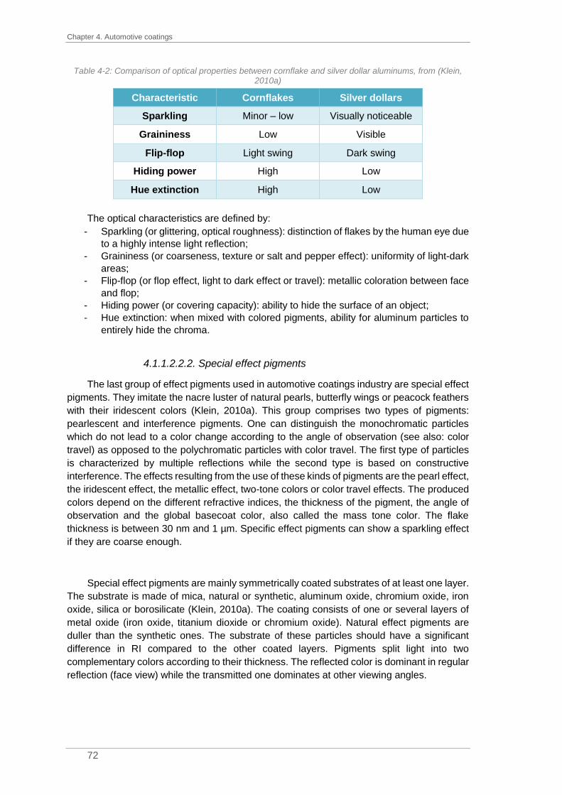
Chapter 4. Automotive coatings
72
Table 4-2: Comparison of optical properties between cornflake and silver dollar aluminums, from (Klein, 2010a)
Characteristic Cornflakes Silver dollars
Sparkling Minor – low Visually noticeable
Graininess Low Visible
Flip-flop Light swing Dark swing
Hiding power High Low
Hue extinction High Low
The optical characteristics are defined by:
- Sparkling (or glittering, optical roughness): distinction of flakes by the human eye due
to a highly intense light reflection;
- Graininess (or coarseness, texture or salt and pepper effect): uniformity of light-dark
areas;
- Flip-flop (or flop effect, light to dark effect or travel): metallic coloration between face
and flop;
- Hiding power (or covering capacity): ability to hide the surface of an object;
- Hue extinction: when mixed with colored pigments, ability for aluminum particles to
entirely hide the chroma.
4.1.1.2.2.2. Special effect pigments
The last group of effect pigments used in automotive coatings industry are special effect
pigments. They imitate the nacre luster of natural pearls, butterfly wings or peacock feathers
with their iridescent colors (Klein, 2010a). This group comprises two types of pigments:
pearlescent and interference pigments. One can distinguish the monochromatic particles
which do not lead to a color change according to the angle of observation (see also: color
travel) as opposed to the polychromatic particles with color travel. The first type of particles
is characterized by multiple reflections while the second type is based on constructive
interference. The effects resulting from the use of these kinds of pigments are the pearl effect,
the iridescent effect, the metallic effect, two-tone colors or color travel effects. The produced
colors depend on the different refractive indices, the thickness of the pigment, the angle of
observation and the global basecoat color, also called the mass tone color. The flake
thickness is between 30 nm and 1 µm. Specific effect pigments can show a sparkling effect
if they are coarse enough.
Special effect pigments are mainly symmetrically coated substrates of at least one layer.
The substrate is made of mica, natural or synthetic, aluminum oxide, chromium oxide, iron
oxide, silica or borosilicate (Klein, 2010a). The coating consists of one or several layers of
metal oxide (iron oxide, titanium dioxide or chromium oxide). Natural effect pigments are
duller than the synthetic ones. The substrate of these particles should have a significant
difference in RI compared to the other coated layers. Pigments split light into two
complementary colors according to their thickness. The reflected color is dominant in regular
reflection (face view) while the transmitted one dominates at other viewing angles.

4.1. Refinish coatings
73
Mica-based effect pigments can be coated by either a single layer of titanium dioxide, a
combination of titanium dioxide – metal oxide or a single layer of iron-III-oxide. With a single
layer of titanium dioxide, the resulting colors can be silver, yellow, red, blue or green,
depending on the thickness of the layer (Klein, 2010a). The cross-section in Figure 4-7 shows
the mica substrate in the middle surrounded by a single layer of titanium dioxide.
Figure 4-7: SEM1 picture of a cross-section through a mica-based particle with a single layer of titanium
dioxide from (Pfaff, 2009)
By superimposing a layer of iron-III-oxide on top of the titanium dioxide layer, the color
obtained is gold, for titanium iron oxide, silver, iron blue, blue and for chromium-III-oxide,
green. The pigments obtained show a color travel. Another possibility is to directly coat a
layer of iron-III-oxide on the mica substrate to obtain either bronze, copper or red effects
depending on the thickness of the layer.
It is also possible to use a silica substrate. Silica-based pigments offer several
advantages compared to pigments based on mica substrates. The substrate preparation
guarantees a uniform thickness of the flakes as illustrated in Figure 4-8. The resulting
interference color is more chromatic than for mica-based pigments because the thickness
irregularities of the substrate reduce light travel. Besides, silica has a lower RI, 1.46,
compared to mica, 1.58. By controlling the thickness of the substrate, the RI can be reduced
by making very thin flakes, around 50 nm, which are then transparent. This provides strong
interference effects with new color travel behavior and a strong chromatic strength.
1 SEM: scanning electron microscopy

Chapter 4. Automotive coatings
74
Figure 4-8: SEM picture of a cross-section through a silica-based particle coated with α-Fe2O3 (Eivazi,
2010)
Sparkling properties can be improved by using borosilicate as substrate (Klein, 2010a).
These pigments are totally transparent and have a smooth and plane surface – they are
called glass flakes and their sparkling properties are very intense.
A new type of special effect pigment starts to be introduced in the automotive coatings
market, the so-called diffractive pigments (Klein, 2010a). The effect of these pigments is
based on light diffraction. The specific surface of the substrate with grooves allows the
reflection and the transmission of light rays. SpectraFlair®, developed by Viavi Solutions Inc,
is a perfect example of these pigments; it is a three-dimensional aluminum substrate coated
with magnesium fluoride. In direct light, SpectraFlair® shows a multi-rainbow effect.
Figure 4-9: Left: SEM picture of a diffractive pigment (Pfaff, 2009); Right: SpectraFlair® multi-rainbow
effects

4.1. Refinish coatings
75
4.1.1.2.3. Flop modifier
The microstructural organization of the effect particles in the coating film is very
important. A perfect application leads to particles that are aligned with the metallic panel. So-
called flop modifiers, that are also available for color matching, are made of silica
microspheres suspended in a polymer matrix. These spheres cause a disorientation of the
effect particles in the coating film. This disorientation is confirmed by the SEM pictures in
Figure 4-10 from (Maile et al., 2005).
Figure 4-10 : Orientation behavior of effect pigments in a solventborne car refinish basecoat with (top) and
without (bottom) flop modifier, the scale indicates 20µm from (Maile et al., 2005)
Regarding those two SEM cross-sections, a change in the orientation of effect pigments
is clearly noticeable. Solvent evaporation during the drying of the basecoat tends to orient
the particles more parallel to the substrate. When flop modifier is added to the basecoat
formula, the orientation of the flakes is less organized and more random. By changing the
orientation angle of the effect particles, they will appear more sparkling and larger. In some
cases, the flop modifier produces a change in lightness by reversing the flop effect from light
to dark to dark to light. It is important to note that this special tinting base can only be used
for effect colors.
4.1.2. Sample preparation
Once the paint formula is selected, several tinting bases, solid and/or effect, are mixed
together with the mixing binder to obtain the desired shade.
Let’s consider the example of a famous color from PSA group, aluminum grey. The color
formula is given in Table 4-3. To colormatch this shade, it is needed to mix together the
mixing binder, two aluminums (M99/01 and M99/02), a white (A032), a black (A926), a blue
(A503), a red (A359) tinting bases and the flop modifier. They are stirred before being diluted
with the thinner.
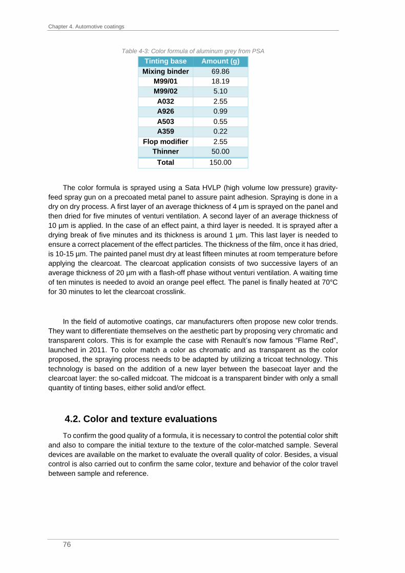
Chapter 4. Automotive coatings
76
Table 4-3: Color formula of aluminum grey from PSA
Tinting base Amount (g)
Mixing binder 69.86
M99/01 18.19
M99/02 5.10
A032 2.55
A926 0.99
A503 0.55
A359 0.22
Flop modifier 2.55
Thinner 50.00
Total 150.00
The color formula is sprayed using a Sata HVLP (high volume low pressure) gravity-
feed spray gun on a precoated metal panel to assure paint adhesion. Spraying is done in a
dry on dry process. A first layer of an average thickness of 4 µm is sprayed on the panel and
then dried for five minutes of venturi ventilation. A second layer of an average thickness of
10 µm is applied. In the case of an effect paint, a third layer is needed. It is sprayed after a
drying break of five minutes and its thickness is around 1 µm. This last layer is needed to
ensure a correct placement of the effect particles. The thickness of the film, once it has dried,
is 10-15 µm. The painted panel must dry at least fifteen minutes at room temperature before
applying the clearcoat. The clearcoat application consists of two successive layers of an
average thickness of 20 µm with a flash-off phase without venturi ventilation. A waiting time
of ten minutes is needed to avoid an orange peel effect. The panel is finally heated at 70°C
for 30 minutes to let the clearcoat crosslink.
In the field of automotive coatings, car manufacturers often propose new color trends.
They want to differentiate themselves on the aesthetic part by proposing very chromatic and
transparent colors. This is for example the case with Renault’s now famous “Flame Red”,
launched in 2011. To color match a color as chromatic and as transparent as the color
proposed, the spraying process needs to be adapted by utilizing a tricoat technology. This
technology is based on the addition of a new layer between the basecoat layer and the
clearcoat layer: the so-called midcoat. The midcoat is a transparent binder with only a small
quantity of tinting bases, either solid and/or effect.
4.2. Color and texture evaluations
To confirm the good quality of a formula, it is necessary to control the potential color shift
and also to compare the initial texture to the texture of the color-matched sample. Several
devices are available on the market to evaluate the overall quality of color. Besides, a visual
control is also carried out to confirm the same color, texture and behavior of the color travel
between sample and reference.

4.2. Color and texture evaluations
77
4.2.1. Color evaluation
As explained in Chapter 2, color perception is based on the triplet “light-object-observer”.
Since the 1960’s, color measuring instruments have been available on the market. These
devices are suitable for numerical quantifications of color impressions. Even if measurements
in principle should correlate to visual impressions, a combination of color measurement and
visual evaluation can be quite valuable. The observer is then replaced by a device measuring
color and a computer connected to it, see Figure 4-11.
Figure 4-11: Schematic principle of a color measuring device from (Klein, 2010b)
4.2.1.1. Instruments measuring color
The instrument measuring color is made from optical components and photodiodes,
which can convert the trichromatic stimulus into a computer signal. Three types of devices
are available to provide the tristimulus values without using the human eye:
spectroradiometers, spectrophotometers and tristimulus-filter colorimeters (Wyszecki and
Stiles, 1982a).
4.2.1.1.1. Spectroradiometers
Spectroradiometers are the most comprehensive devices to quantify color impressions.
They measure the spectral power distribution of the radiance emitted by a surface or in other
words, the radiometric quantities as a function of the wavelength. According to (Grant, 2011),
the radiance is “an elemental quantity of radiometry, expressing the power per unit area and
per unit projected solid angle from a source” (units: W/m².sr). The test source measured may
be either an active emitter, or a passive reflector. The measurement of colorimetric quantities
involves the comparison of the test source with a known spectral radiant power distribution.
The radiation emitted by the test source enters through the device to the monochromator
which disperses the incoming power and transmits it in narrow wavelength bands to the
computer. The outputs of spectroradiometers are, for example, the spectral power
distribution, the correlated color temperature, the tristimulus and chromaticity values
according to the CIE1931 or the CIE1964 system.

Chapter 4. Automotive coatings
78
For radiant power measurements, during the present PhD thesis, a Konika-Minolta non-
contact spectroradiometer that measures contrasts of 100 000:1 and low luminance levels,
down to 0.003 cd/m² was used.
4.2.1.1.2. Spectrophotometers
Spectrophotometers are used to measure the spectral transmittance or reflectance
factors of objects. They can also be configured to measure under different illuminations or
viewing conditions. Inversely to a spectroradiometer, a spectrophotometer works on a
comparison of the radiant power of the reflected light with the radiant power of the incident
light. To quantify the radiant power of the incident light, a standard of reflectance factor is
used. The CIE recommendation is to use a perfect reflecting diffuser, an ideal uniform diffuser
with a reflectance equal to unity. That kind of material is not physically possible, no material
offers this property. However, it is possible to use a white standard as an ideal uniform
diffuser which can be made of MgO or BaSO4 (Wyszecki and Stiles, 1982a). Another white
standard is spectralon, a fluoropolymer, developed by Labsphere.
Spectrophotometers are made of an integrated lighting system and various components
such as monochromator or optical couplers. The reflected light is caught by a detector and
transmitted to measuring equipment. Modern spectrophotometers have 31 filters to measure
the full color spectrum (Mouw, 2017).
Spectrophotometers of different shapes and sizes such as small handheld devices for
labs or in-line devices for manufacturing lines are commercially available. Since they can
evaluate color under different light sources, spectrophotometers are helpful for metamerism
identification. Two objects which have the same spectral power distribution and seem
identical under one type of light source, can have a different spectrum under another source.
In color industry, metamerism is checked under two illuminants, D65 and TL84 (or F11).
Sometimes, illuminant A is used.
4.2.1.1.3. Tristimulus-filter colorimeters
Tristimulus-filter colorimeters work almost the same way as spectrophotometer. The
only difference comes from the filters. Tristimulus-filter colorimeters only have 3 filters: red,
green and blue. The three filters should match the human visual system with the three color
matching functions.
4.2.1.2. Measurement geometries
Spectrophotometers have fundamentally changed color evaluation. They are essential
for physical color characterization of absorption pigments. The first recommendation of the
CIE concerned the measurement of solid material only (CIE, 1998). Two types of geometries
are presented: directional (45:0 or 0:45) and spherical geometries (d:0 or 0:d). It is important
to note that the inverse geometries have no impact on the results.

4.2. Color and texture evaluations
79
With a 0:45 geometry (respectively 45:0), the sample is illuminated at an angle of 0°
(respectively 45°) while the reflected light is detected at 45° (respectively 0°), see Figure 4-12
(Klein, 2010b).
Figure 4-12: Directional measuring geometries: a) 45:0 and b) 0:45 from (Klein, 2010b)
Figure 4-13: Diffuse geometry d:0 adapted from (Klein, 2010b)
The sphere geometry d:0 means diffuse
illumination and a detector at 0° (Klein, 2010b).
Diffuse illumination is obtained by using a suitable
material, Teflon (polytetrafluoroethylene) or barium
sulfate, BaSO4, to coat the interior of the sphere. This
setup is also called the Ulbricht sphere.
However, in automotive industry, effect colors are more and more popular. These
specific colors provide a change in lightness and/or color according to the observation angle.
A large number of geometries is needed to better quantify global color travel (KonicaMinolta,
2019). To measure these angle-dependent colors, gonio spectrophotometers with variable
directional geometries are used. Gonio spectrophotometers propose either a fixed
illumination system and detectors at variable angles or a fixed detector and variable
illumination systems. Nowadays, multi-angle spectrophotometers are available on the
market. Usually, the detector (or illumination system) is fixed at 45° to the normal and, as
recommended by (DIN, 2001), four measurement angles with illumination systems (or
detectors) at 25°, 45°, 75° and 110° are available, see Figure 4-14. Two other standardized
angles were also implemented in such devices: -15° and 15°.
Figure 4-14: Principle of a multi-angle spectrophotometer from (Klein, 2010b)

Chapter 4. Automotive coatings
80
The angles -15° and 15° are also known as near specular angles, 45° as mid specular
angle and 75° and 110° as far specular angles.
4.2.2. Texture evaluation
Multi-angle spectrophotometers are useful to characterize the global color travel of effect
colors. However, the effect pigments in coatings formulation need a different physical
characterization for optical properties. Some optical characteristics have been developed to
quantify the texture: the metallic value, the flop index and the distinctiveness of image (DOI).
These three parameters are based on reflectance, R, or lightness, L*, values.
The metallic value was developed to measure the metallic brilliance of a sample or, in
other words, the degree of light reflection caused by metallic particles. It is then a comparison
of mid specular angle with near specular angle, (4-1). High metallic values stand for high
metallic effects (MV up to 5,000) while low metallic values represent low metallic effects (MV
~ 150) according to (Klein, 2010c).
𝑀𝑉 =𝑅7°𝑅45°
∙ 100 (4-1)
The DOI, distinctiveness of image, is used to estimate the uniformity of the metallic
effect. It is calculated by either one of the two equations (4-2). As the DOI is linked to the
hiding power of metallic particles and then to the low contrast, a high DOI is obtained for fine
particles and a low one for coarse ones (Klein, 2010c).
𝑎) 𝐷𝑂𝐼 = [1 −𝑅14.7°𝑅15°
] ∙ 100
𝑏) 𝐷𝑂𝐼 = [1 −𝑅15.3°𝑅15°
] ∙ 100
(4-2)
The flop index is used to describe the lightness travel or flop effect by comparing the
near specular and the far specular angles, (4-3). An effect color with a low lightness travel,
with fine cornflake aluminum particles, has a low flop index value (FI ~ 20) while a high flop
index (FI ~ 60) stands for metallic colors with dark flop, when coarse silver dollar particles
are used (Klein, 2010c).
𝐹𝐼 = 2.69(𝐿15°∗ − 𝐿110°
∗ )1.11
(𝐿45°∗ )0.85
(4-3)
The flop index is a good indication for lightness travel. Let’s compare two colors: one is
Metallic Grey from Peugeot and the other is Vogue Silver from Honda, see Figure 4-15.
These two commercially available colors are two silver greys. Their lightness values at 15°,
45° and 110° are summarized in Table 4-4 with the FI values.

4.2. Color and texture evaluations
81
Figure 4-15: Picture of Peugeot Metallic Grey (left) and Honda Vogue Silver (right)
Table 4-4: Lightness and FI values for Peugeot Metallic Grey and Honda Vogue Silver
Peugeot _ Metallic Grey Honda _ Vogue Silver
L*(15°) 142.13 133.66
L*(45°) 60.47 62.74
L*(110°) 32.55 31.15
FI 15.12 13.61
The FI values for these two colors are close to each other with a pretty low value but
when looking at the pictures, a high difference in texture can be noticed. The aluminum
particles in Peugeot Metallic Grey are coarser than the ones in Honda Vogue Silver. Besides,
the color from Peugeot seems sparkler than the one from Honda. As a result of light
microscopy investigations of these two colors (see Figure 4-16), the metallic effect in Peugeot
Metallic Grey (in Figure 4-16, A) can be attributed to cornflake aluminums, while for Honda
Vogue Silver (in Figure 4-16, B), the effect is linked to a mixture of cornflake and silver dollar
aluminums.
Figure 4-16: Light microscopy observations of two commercial colors, scale indicating 50µm. Left (A):
Peugeot Metallic Grey. Right (B): Honda Vogue Silver
As previously explained in Table 4-2, each category of aluminum leads to specific optical
properties in terms of sparkling or graininess. Hence, even if the flop index values of the two

Chapter 4. Automotive coatings
82
colors are close, the formula and especially the aluminum tinting bases used have an
important impact on texture evaluation when compared to visual evaluation.
The three parameters are useful to characterize the metallic effect. However, multi-angle
spectrophotometers available on the market do not offer directional geometries at 7°, 14.7°
and 15.3°. In industries, hence, it is not possible to determine neither the metallic value nor
the DOI.
4.2.3. Visual evaluation
For visual assessment, a standardized lighting system must be used. The comparison
is then performed in a light booth equipped with the standard illuminant D65. Besides, to
avoid metamerism between the formula and the standard, the illuminant TL84 (also called
F11) is also used. Visual evaluation is carried out by trained colorists. Indeed, at BASF, every
colorist must succeed at the Farnsworth-Munsell 100 test1 every three years to validate their
visual ability to detect small chromatic differences.
The visual evaluation consists of a comparison of the color to be matched (the standard)
with the test panel, the sample sprayed in the lab. The two references are observed in the
same plane with a spacing of one millimeter between them. Solid colors are mainly observed
at 45°. For effect colors, the references are checked at different angles to evaluate the color
travel between face and flop. Indeed, as previously explained, effect particles are mainly
parallel to the substrate, except when flop modifier is used to disturb the organization (see
Chapter 4 paragraph 4.1.1.2.3). As the physical properties are angle-dependent, it is
important to tilt the panel to better evaluate the color and the effects at different viewing
angles. The main angles are presented in Figure 4-17.
Figure 4-17: Panel orientation under different viewing angles
In the following, the terms “flip view”, “face view”, “flop view”, “flop”, “flip-flop effect” are
frequently used. It is important here to explain this wording. Flip view corresponds to a
1 The Farnsworth-Munsell 100 test is a color vision test made of one hundred color disks which need to be
sorted in the correct order.

4.2. Color and texture evaluations
83
viewing angle of 15° to 25°, face view of 45° and flop view of 75° to 110°. The lightness flop
characterizes a decrease in lightness triggered by metallic coatings when viewed at extreme
angles: from 15° to 110°. In the same way, the use of pearlescent materials leads to a change
in color according to the viewing angles, the color flop. Normally, lightness flop should be use
for metallic coatings and color flop for pearlescent coatings. However, due to the high
complexity of automotive coatings with different types of effect pigments in the formula and
also due to misuse of language, flop and flip-flop effects are used to express either color and
lightness flops.
With visual evaluation, the two references are compared in terms of lightness (brighter
or darker), chromaticity (purer or dirtier) or hue (bluer, yellower, greener or redder). For effect
colors, each of these criteria is observed at all viewing angles. The color travel of the standard
should be replicated in the best way possible. Besides, effect particles are also observed
under a directional spot to estimate the sparkling, their size, their quantities and their colors.
4.2.4. Color and texture evaluation
The three texture parameters previously explained in Chapter 4 paragraph 4.2.2 are not
efficient for texture evaluation. First, they only consider reflectance values at angles
unmeasurable by commercially available multi-angle spectrophotometers. Then, even if the
flop index can rate the level of the lightness travel, some limits exist as shown in Table 4-4.
Besides, these parameters were developed for metallic effects but interference and
pearlescent materials are trendy in automotive coatings formulations.
Beginning of the 21st century, BYK-Gardner, AkzoNobel and Merck associated their
knowledge and competencies in the project TARBAM to improve texture evaluation. They
came out with a multi-angle spectrophotometer equipped with a camera, the Byk Mac
(BYK.Gardner.GMBH, 2009). For the BYK Mac color geometries, an illumination system is
located at 45° compared to the normal and 6 detectors are set at -15°, 15°, 25°, 45°, 75° and
110°, see Figure 4-18.
Figure 4-18: Color measurement geometries for the BYK Mac (-15° is not drawn) from
(BYK.Gardner.GMBH, 2009)
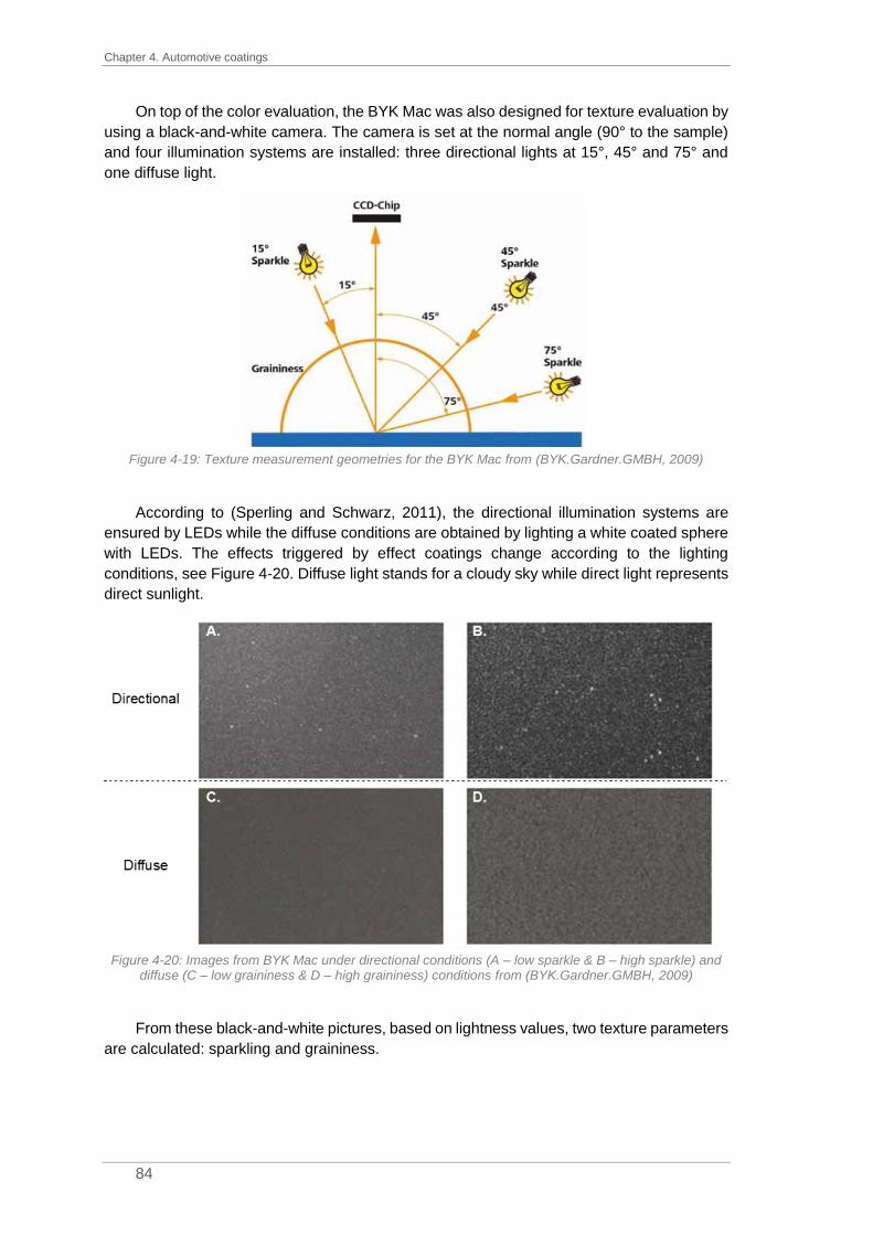
Chapter 4. Automotive coatings
84
On top of the color evaluation, the BYK Mac was also designed for texture evaluation by
using a black-and-white camera. The camera is set at the normal angle (90° to the sample)
and four illumination systems are installed: three directional lights at 15°, 45° and 75° and
one diffuse light.
Figure 4-19: Texture measurement geometries for the BYK Mac from (BYK.Gardner.GMBH, 2009)
According to (Sperling and Schwarz, 2011), the directional illumination systems are
ensured by LEDs while the diffuse conditions are obtained by lighting a white coated sphere
with LEDs. The effects triggered by effect coatings change according to the lighting
conditions, see Figure 4-20. Diffuse light stands for a cloudy sky while direct light represents
direct sunlight.
Figure 4-20: Images from BYK Mac under directional conditions (A – low sparkle & B – high sparkle) and
diffuse (C – low graininess & D – high graininess) conditions from (BYK.Gardner.GMBH, 2009)
From these black-and-white pictures, based on lightness values, two texture parameters
are calculated: sparkling and graininess.

4.2. Color and texture evaluations
85
For the sparkling evaluation, direct pictures (15°, 45° and 75°) are used to determine
two quantities: sparkling area, SA, and sparkling intensity, SI. The sparkling area represents
the total sparkly area and the sparkling intensity, the global intensity of all the “sparkle”
particles. The “sparkle” particles on pictures are the ones that are lighter than the average
lightness level of the picture, (Klein, 2010c). From these two quantities, the sparkle grade,
SG, is calculated according to equation (4-4). As the effect particles are supposed to be
parallel to the surface, except in case of flop modifier use, higher values are obtained for the
15° geometry.
𝑆𝐺 = √𝑆𝐴 × 𝑆𝐼 (4-4)
With SG, sparkle grade
SA, sparkle area
SI, sparkle intensity
For the graininess, G, the diffuse picture is used. Also called the “salt and pepper effect”
or diffuse coarseness, it stands for the non-uniformity of the effect evaluated on the light and
dark fields of the picture. The more uniform the picture is, the smaller the value of graininess
and vice versa.
The BYK Mac developed by BYK-Gardner GmbH is the reference for texture evaluation.
However, X-Rite commercialized its own multi-angle spectrophotometers with camera since
2018, the MA-T6 and MA-T12 as a response to the BYK Mac. The MA-T6 is made of a
detector at 45° compared to the normal and 6 illumination systems at -15°, 15°, 25°, 45°, 75°
and 110°. The MA-T12 offers an additional detector. The lighting system is based on several
polychromatic white LEDs with blue enhancement (Ehbets et al., 2012). The blue
enhancement is needed to compensate for the weakness of the traditional white LEDs in the
blue area. The configuration of the MA-T6 is presented in Figure 4-21 in orange.
Figure 4-21: Color measurement geometries for the MA-T6 (in orange), directional texture measurement
geometries (in blue) and diffuse texture measurement geometry (in red) adapted from (Ehbets et al., 2012)
In addition to the color detector, X-Rite also added a camera for texture evaluation.
Contrary to the black-and-white camera in the BYK-Mac, X-Rite uses an RGB camera. The

Chapter 4. Automotive coatings
86
camera is set at 15° for the MA-T6. The illumination systems used for color measurement
are the same that are also used for texture measurement. Six directional geometries are
available: -15°, 15°, -30°, -45°, 45° and 80°, see Figure 4-21 in blue. The lighting system
used for 25° color measurement (r45as25° in Figure 4-21) cannot be used for texture
measurement as the camera is located in the specular. On top of the directional geometries,
a diffuse one (r15d) is also set, see Figure 4-21 in red. The diffuse geometry is ensured by 2
sets of 3 white LEDs behind an inclined diffusor film.
Directional Diffuse
r15as15 r15as45 r15as80 r15d
Figure 4-22: Images from MA-T6 under directional (left) and diffuse (right) conditions from (X-Rite, 2018b)
From the colored pictures, see Figure 4-22, the sparkle grade, SG, the coarseness,
equivalent to graininess, G, and the color variation are extracted. According to (Gottenbos,
2018), the sparkle grade and the coarseness values have been improved compared to BYK
Mac values to better match visual assessment. Due to the RGB camera, it is now possible
to determine particle colors and better identify effect particles in color formulas.
Color particle identification has been studied by (Beymore and Krawciw, 2014). A multi-
angle spectrophotometer with an RGB camera, such as the X-Rite MA-T6, was used in order
to help effect particle determination in coating formulations. Based on several pictures at
different viewing angles, the sparkle color distribution is calculated for each directional
geometry. The distributions obtained are then an additional input in the database to look for
effect pigments which provide the same effect and/or at each angle. By this method, the
colormatching should be easier with an automatic selection of effect pigments. However,
using an RGB camera does not mean color measurement and clarifications are required
regarding the calculation of the sparkle color distribution.
Nowadays, even if device manufacturers such as BYK-Gardner GmbH or X-Rite
developed multi-angle spectrophotometers with camera, none of the texture values
developed really match the visual appearance. A visual evaluation is needed to validate the
formula proposed to colormatch a standard.
4.3. Context and problematic
Based on BASF data extractions for the last three years on new color formulations
developed by OEMs, 95% are effect colors and only 5% solid colors. Colormatching of effect
coatings is more complex than the one for solid colors. Indeed, the fillers offering optical
properties such as aluminum or pearl particles (see Chapter 4 paragraph 4.1.1.2.2) produce
an appearance heterogeneity for the coating film. According to the observation angle, the
modalities light/matter create various effects: changes in lightness or chroma. In fact, the

4.3. Context and problematic
87
effect pigments added in the coating microstructure lead to optical and local gonio-dependent
effects. These effects cause the texture effect which is perceived.
The prediction models used in the colormatching process have their own limitations, in
particular the color descriptors currently used. They are based on reflectance curves and
CIELab coordinates coming from spectrophotometer measurements. The colorimetric
theoretical description does not allow a complete representation of the colored sensation.
The color descriptors are sufficient for solid colors but only partially for effect coatings. Even
if some texture descriptors have been introduced in the new multi-angle spectrophotometers
(see Chapter 4 paragraph 4.2.2), they do not correlate to the visual appearance. It is needed
to define visual texture descriptors which better or perfectly characterize effect coatings. The
objective is to qualify and quantify the perceived attributes such as the apparent particle size
or the sparkling effect. Another limitation comes from the fact that several color formulas
could lead to the same minimization of the theoretical color distance. However, the type of
effect pigments used in the formulation could lead to huge differences in visual appearance.
The effect colormatching process provides a result that is generally not precise enough
to achieve the right formula on the first trial. It must be repeated several times and an
experienced colorist must manually adjust the formulas by selecting the right effect tinting
bases to get a satisfactory formula. This means that only expert colorists can actually
produce effect color formulas based on their experience. The improvement of color
descriptors as well as the integration into the algorithm of their know-how would thus make
it possible to develop an effective system of color formulation for labs.
The objectives of this PhD thesis were to work on color formulation algorithm
improvement by defining new texture descriptors considering the textured optical signals and
by correlating them to visual appearance. So, one of the most important aspects of this
project is the elucidation and integration of human color evaluation through sensorial
analysis.
In present PhD thesis, only effect coatings with a glossy clearcoat have been
considered. Changes of the system concerned only the basecoat. Different basecoat
formulations have been produced by mixing effect and solid tinting bases.
By analyzing effect coatings, the impacts of aluminum or pearl particles are available at
different scales. At the macroscopic scale, the overall effect of the particles is visible. The
flakes are easily discernible and are causing the sparkling effect and the global change in
lightness or hue. At the microscopic scale, the sparkling effect is due to the interaction
between the incident light and the effect particles which act like tiny mirrors. At nanoscale,
the surface finishes of the particles in the film can be analyzed. For the PhD thesis, the
macroscopic scale has been mainly studied to correlate the measurements to visual
appearance. A colorist will always try to relate the appearance to a given formula or effect
components. Insofar, as the appearance results from interaction in a complex system, the
colorist sometimes cannot identify them easily.


89
Chapter 5. Definition of new texture descriptors
Contents
5.1. IDENTIFICATION OF COMPONENTS WITH A VISIBLE INFLUENCE ON BASECOAT PERCEPTION .. 90
5.1.1. Tinting bases used and their associated effects .................................................. 90
5.1.2. Creation of ranges ................................................................................................ 92
5.1.3. Analysis of the influence of four categories of tinting bases on visual appearance
............................................................................................................................................. 93
5.1.4. Assessment of the different ranges .................................................................... 100
5.2. CATEGORIZATION TEST IN ORDER TO DETERMINE NEW TEXTURE DESCRIPTORS ............... 101
5.2.1. Presentation of the different sorting methods .................................................... 101
5.2.2. Procedures for the free sorting task ................................................................... 102
5.2.3. Results on the free sorting task .......................................................................... 105
5.3. STANDARDIZATION OF THE WORDING USED BY BRAINSTORMING METAPLAN® .................. 106
5.4. PRELIMINARY TESTS ON NEW TEXTURE DESCRIPTORS BY THREE EXPERT OBSERVERS ..... 110
5.5. TEXTURE SCALE CREATION ........................................................................................... 115
5.6. ASSESSMENT ON THE DEFINITION OF NEW TEXTURE DESCRIPTORS ................................. 126
As explained in the previous chapters, a colorimetric approach based on reflectance
curves and then CIELab coordinates is not enough to comprehensively describe the
complete visual perception of an effect color by the observer. A new approach based on the
combination of colorimetric and texture values has evolved about ten years ago with the
launch of a new multi-angle spectrophotometer, the BYK-Mac. Two texture parameters,
sparkling and graininess, were developed by BYK-Gardner, Merck and AkzoNobel to better
define the optical behavior of effect colors. However, they do not really match the visual
impression of texture and hence, the two mentioned parameters may not be enough to
describe the human visual perception.
In present PhD thesis, the objective was to find new texture descriptors based on visual
appearance of effect colors. To that end, it was necessary to first identify the visible impact
of coating components such as aluminum or white tinting bases on the overall visual
perception. After the mentioned determination, the objective was to then develop new visual
texture descriptors. The determination of these descriptors was based on the input of several
experienced observers in order to gather their expert knowledge for the definition of those
new texture descriptors. The new texture descriptors should be based on explainable
perceptible characteristics; hence, human perception needed to be the unique input for their
definition. The different stages which led to the development of the new texture descriptors
are explained in the following. The aim of the new descriptors is to avoid false diagnoses
based on preconceptions such as a supposed formula.
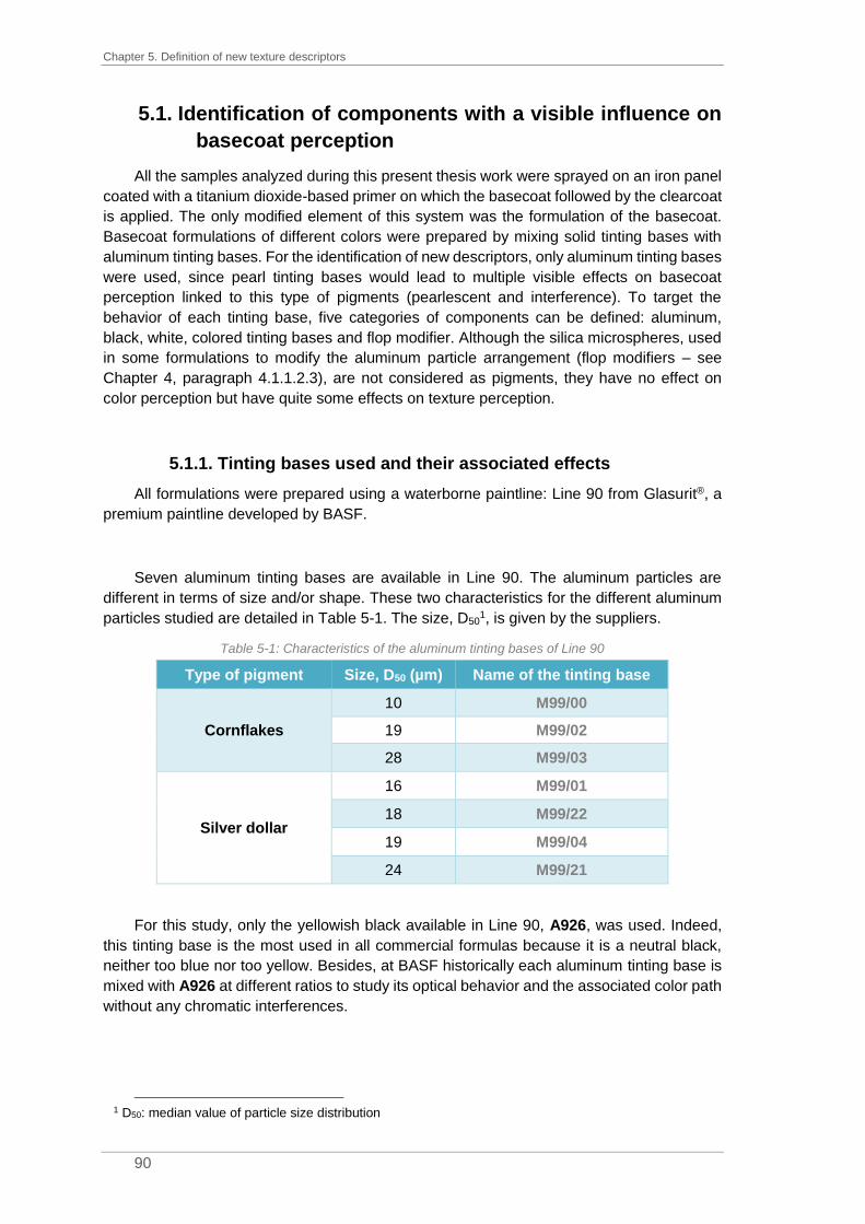
Chapter 5. Definition of new texture descriptors
90
5.1. Identification of components with a visible influence on
basecoat perception
All the samples analyzed during this present thesis work were sprayed on an iron panel
coated with a titanium dioxide-based primer on which the basecoat followed by the clearcoat
is applied. The only modified element of this system was the formulation of the basecoat.
Basecoat formulations of different colors were prepared by mixing solid tinting bases with
aluminum tinting bases. For the identification of new descriptors, only aluminum tinting bases
were used, since pearl tinting bases would lead to multiple visible effects on basecoat
perception linked to this type of pigments (pearlescent and interference). To target the
behavior of each tinting base, five categories of components can be defined: aluminum,
black, white, colored tinting bases and flop modifier. Although the silica microspheres, used
in some formulations to modify the aluminum particle arrangement (flop modifiers – see
Chapter 4, paragraph 4.1.1.2.3), are not considered as pigments, they have no effect on
color perception but have quite some effects on texture perception.
5.1.1. Tinting bases used and their associated effects
All formulations were prepared using a waterborne paintline: Line 90 from Glasurit®, a
premium paintline developed by BASF.
Seven aluminum tinting bases are available in Line 90. The aluminum particles are
different in terms of size and/or shape. These two characteristics for the different aluminum
particles studied are detailed in Table 5-1. The size, D501, is given by the suppliers.
Table 5-1: Characteristics of the aluminum tinting bases of Line 90
Type of pigment Size, D50 (µm) Name of the tinting base
Cornflakes
10 M99/00
19 M99/02
28 M99/03
Silver dollar
16 M99/01
18 M99/22
19 M99/04
24 M99/21
For this study, only the yellowish black available in Line 90, A926, was used. Indeed,
this tinting base is the most used in all commercial formulas because it is a neutral black,
neither too blue nor too yellow. Besides, at BASF historically each aluminum tinting base is
mixed with A926 at different ratios to study its optical behavior and the associated color path
without any chromatic interferences.
1 D50: median value of particle size distribution

5.1. Identification of components with a visible influence on basecoat perception
91
Three white tinting bases are available in Line 90: A032, A035 and A097. As explained
before, the white tinting bases contain titanium dioxide. The grinding process of the pigments
leads to different properties. A035 is used as a standard white tinting base with an average
particle size D50 for titanium dioxide particles of 180 nm. The tinting base A032 is the diluted
version of A035 (addition of binder). It is used to improve the accuracy of the paint formulation
in the case of very dark colors when only a small quantity of A035 is necessary. Use of the
diluted version makes it possible to use a larger quantity of tinting base and thus to improve
the precision of the weighing of the formula (and consequently the repeatability) in car body
shops. A097 has an average particle size around 80 nm. Its use leads to the frost effect
defined previously with the yellowish-gold impression at face view and a bluish color
impression at flop view. The characteristics of the three white tinting bases are compared in
Table 5-2.
Table 5-2: Characteristics of the three white tinting bases of Line 90
Name of the tinting base
Type of grinding
Size D50 (nm)
Concentration of TiO2 (%)
Visible effect
A035 Classical 180 50% Masking effect
A032 Classical 180 10% Masking effect
A097 Micro 80 30% Frost effect
Colored tinting bases are essential to colormatch OEM colors. Around fifty colored tinting
bases exist in Line 90 but only nine of them were used for the creation of the samples during
this PhD thesis: two yellows (A115 & A136), three reds (A306, A329 & A372), one violet
(A430), one blue (A563) and two greens (A640 & A695).
The associated behaviors of all tinting bases used are summarized in Figure 5-1.
Figure 5-1: Associated effects of the five categories of tinting bases
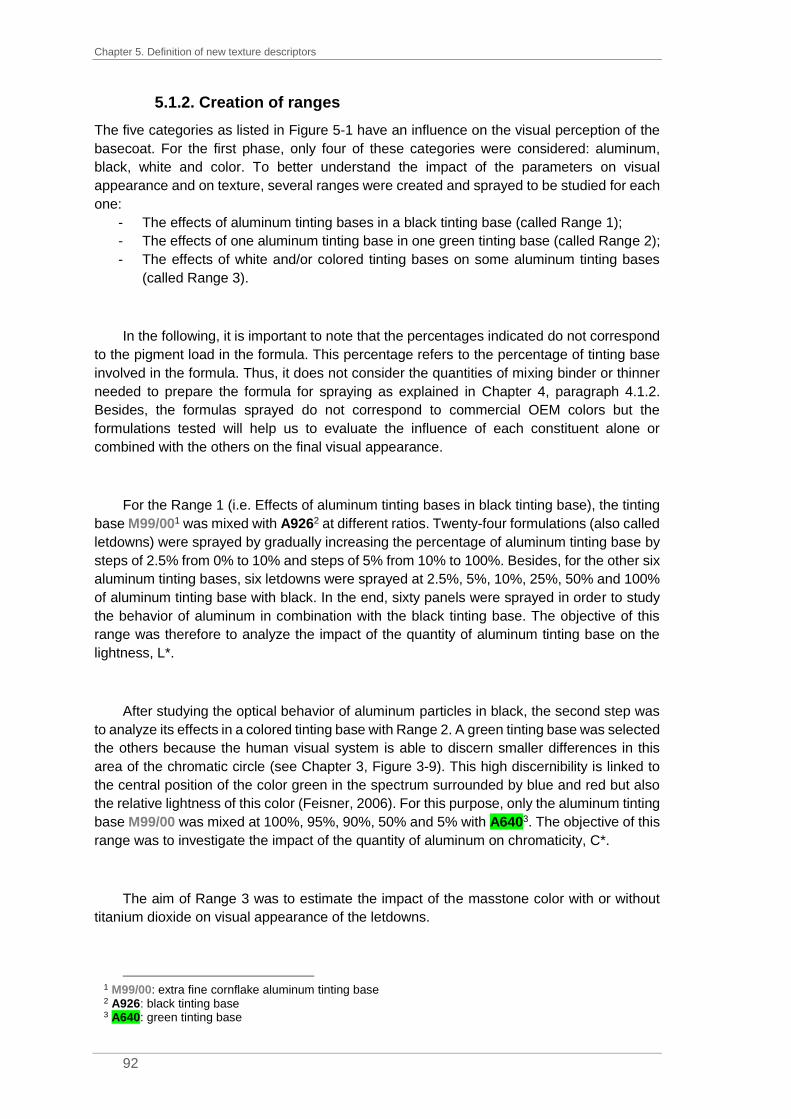
Chapter 5. Definition of new texture descriptors
92
5.1.2. Creation of ranges
The five categories as listed in Figure 5-1 have an influence on the visual perception of the
basecoat. For the first phase, only four of these categories were considered: aluminum,
black, white and color. To better understand the impact of the parameters on visual
appearance and on texture, several ranges were created and sprayed to be studied for each
one:
- The effects of aluminum tinting bases in a black tinting base (called Range 1);
- The effects of one aluminum tinting base in one green tinting base (called Range 2);
- The effects of white and/or colored tinting bases on some aluminum tinting bases
(called Range 3).
In the following, it is important to note that the percentages indicated do not correspond
to the pigment load in the formula. This percentage refers to the percentage of tinting base
involved in the formula. Thus, it does not consider the quantities of mixing binder or thinner
needed to prepare the formula for spraying as explained in Chapter 4, paragraph 4.1.2.
Besides, the formulas sprayed do not correspond to commercial OEM colors but the
formulations tested will help us to evaluate the influence of each constituent alone or
combined with the others on the final visual appearance.
For the Range 1 (i.e. Effects of aluminum tinting bases in black tinting base), the tinting
base M99/001 was mixed with A9262 at different ratios. Twenty-four formulations (also called
letdowns) were sprayed by gradually increasing the percentage of aluminum tinting base by
steps of 2.5% from 0% to 10% and steps of 5% from 10% to 100%. Besides, for the other six
aluminum tinting bases, six letdowns were sprayed at 2.5%, 5%, 10%, 25%, 50% and 100%
of aluminum tinting base with black. In the end, sixty panels were sprayed in order to study
the behavior of aluminum in combination with the black tinting base. The objective of this
range was therefore to analyze the impact of the quantity of aluminum tinting base on the
lightness, L*.
After studying the optical behavior of aluminum particles in black, the second step was
to analyze its effects in a colored tinting base with Range 2. A green tinting base was selected
the others because the human visual system is able to discern smaller differences in this
area of the chromatic circle (see Chapter 3, Figure 3-9). This high discernibility is linked to
the central position of the color green in the spectrum surrounded by blue and red but also
the relative lightness of this color (Feisner, 2006). For this purpose, only the aluminum tinting
base M99/00 was mixed at 100%, 95%, 90%, 50% and 5% with A6403. The objective of this
range was to investigate the impact of the quantity of aluminum on chromaticity, C*.
The aim of Range 3 was to estimate the impact of the masstone color with or without
titanium dioxide on visual appearance of the letdowns.
1 M99/00: extra fine cornflake aluminum tinting base 2 A926: black tinting base 3 A640: green tinting base

5.1. Identification of components with a visible influence on basecoat perception
93
Four aluminum tinting bases were selected for their respective aluminum particles: two
cornflakes (M99/001 & M99/032) and two silver dollar morphologies (M99/043 & M99/214).
This choice made it possible to compare the associated effects of size and type (surface
state) for each type of aluminum particle and especially those used in M99/03 and M99/21
which are the coarsest aluminums available in Line 90 with a respective D50 of 28µm and
24µm. To study the impact of titanium dioxide on texture, two white tinting bases, A0355 and
A0976, were used. In addition, to observe only the impact of the masstone color on visual
appearance, eight solid tinting bases (A115, A136, A306, A329, A372, A430, A563 & A695)
were selected. Finally, to test the impact of titanium dioxide and masstone color on visual
perception, A035 and A0327 were used. Indeed, the use of A097 would have brought the
frost effect in addition to the changes generated by the masstone color, aluminum or titanium
dioxide. This is why this tinting base was not used in this experiment.
The different letdowns sprayed for Range 3 are summarized in Table 5-3, where Ai is
the concentration used for the aluminum tinting base and Ci is the concentration for solid
tinting bases.
Table 5-3: Summary of the different formulations sprayed for Range 3
Ai Ci A097 A035 A032
#1 70% - 30% - -
#2 70% - - 30% -
#3 70% 30% - - -
#4 70% 25% - 5% -
#5 70% 20% - 10% -
#6 70% 5% - 25% -
#7 70% 30% - - 10%
During this phase, 234 letdowns were sprayed to study variations related to type, size
and percentage of aluminum tinting bases in the formula (i.e. Range 1), the hue extinction
(i.e. Range 2) and the impact of masstone color and/or titanium dioxide on visual appearance
(i.e. Range 3).
5.1.3. Analysis of the influence of four categories of tinting bases
on visual appearance
As previously discussed, a large number of samples were sprayed to evaluate the
influence of the different paint constituents. Different analyses were performed on all the
panels such as spectral measurements, visual analysis or light microscopy investigations.
1 M99/00: extra fine cornflake aluminum tinting base 2 M99/03: coarse cornflake aluminum tinting base 3 M99/04: medium silver dollar aluminum tinting base 4 M99/21: coarse silver dollar aluminum tinting base 5 A035: classical white tinting base 6 A097: micro milled white tinting base 7 A032: classical white tinting base (diluted version)

Chapter 5. Definition of new texture descriptors
94
All samples were visually checked in a light booth under the illuminant D65 and with a
spotlight for direct light. The objective of this analysis was to be able to detect if a threshold
effect in texture was visually noticeable and what was the impact of the amount of aluminum
on lightness. Panels with M99/001 (i.e. Range 1) were visually controlled. Between 10% and
100% of aluminum, few changes are visually detectable for the human eye. However,
between 0% and 10%, significantly more changes are noticeable. Moreover, to construct a
logical sequence of these panels according to the percentage of M99/00 is relatively obvious
due to the strong change in lightness, see Figure 5-2.
Figure 5-2: Letdowns of M99/00 with A926, from 100% to 0% of aluminum tinting base content
For the second part of Range 1, it was to be checked if, by visual assessment, several
observers would classify the letdowns in the same order and regardless of the percentage of
aluminum used. Five observers reclassified two series of seven letdowns according to the
strength of the effect: the first series comprises the letdowns with 100% of aluminum tinting
base (see Figure 5-3) and the second one the letdowns with 10% (see Figure 5-4). For the
ease of reading, only the mean observer is shown in the two following charts.
Figure 5-3: Sorting of letdowns with 100% of aluminum tinting base from Range 1 according to the
strength of the effect by 5 observers
1 M99/00: extra fine cornflake aluminum tinting base

5.1. Identification of components with a visible influence on basecoat perception
95
Figure 5-4: Sorting of letdowns with 10% of aluminum tinting base from Range 1 according to the strength
of the effect by 5 observers
The type, the size and the amount of aluminum tinting base have a strong influence on
the lightness values, L*, but also on visual appearance. The sorting of the two series of
letdowns (100% and 10%) by visual assessment by experts was more obvious for 100% of
aluminum content than for 10%. Below a certain amount of aluminum, the human eye is no
longer able to differentiate the aluminum tinting bases despite large variations in particle size
(see Figure 5-4). From the charts (Figure 5-3 and Figure 5-4), it is easily recognizable that,
for the same particle size (Silver _ Medium and Cornflakes _ Fine), silver dollar aluminum
particles provide more effect than cornflake aluminum particles.
To analyze the samples, spectral measurements were performed using a
spectroradiometer (Konica Minolta CS-2000). This device measures the energetic luminance
in W/sr/m2. The lighting system is provided by several Solux lamps (50W, 36°, 4 700 K) that
reproduce the full spectrum of daylight while maintaining a color rendering index of 99%. The
energetic luminance measurements are converted into reflectance values. Range 2 was
analyzed by spectral measurements to confirm the visible hue extinction. The reflectance
curves thus obtained are presented in Figure 5-5. It is important to note that the colors of the
curves in Figure 5-5 do not correspond to the perceived colors of the letdowns.

Chapter 5. Definition of new texture descriptors
96
Figure 5-5: Reflectance curves of the panels from Range 2 with 0% of M99/00 (in blue), 5% of M99/00 (in
green), 50% of M99/00 (in yellow), 90% of M99/00 (in orange), 95% of M99/00 (in red) and 100% of M99/00 (in purple)
At 0%, 5% and 50% of M99/001, a peak in the green area (480 – 540 nm) can be
observed. However, a flattening in the signal can be noticed between 90% and 95% of
M99/00 in the formulation. Visually, this observation corresponds to a loss in chromaticity
also called hue extinction, see Figure 5-6.
Figure 5-6: Panels from Range 2 with different percentages of aluminum tinting base, M99/00, in green
tinting base
This effect results from the low concentration of green tinting base but also from the high
density of aluminum particles in the sample. Regardless of the colored tinting base used, in
presence of a high percentage of M99/00 (around 95%), the sample will appear achromatic.
However, it is important to note here that M99/00 is an extra fine cornflakes aluminum. Its
hiding power is dominant due to its shape and its size. The flakes tend to cover the entire
surface and to overlap with each other, leading to hue extinction.
1 M99/00: extra fine cornflake aluminum tinting base

5.1. Identification of components with a visible influence on basecoat perception
97
When considering a coarse silver dollar aluminum such as M99/211, its hiding power is
critical. The coarse particles interfere and cannot be positioned perfectly in parallel to the
panel surface. For M99/21, more than 95% of aluminum tinting base is needed to reach hue
extinction as illustrated in Figure 5-7. Indeed, at 95% of aluminum tinting base, the green
shade is still noticeable.
Figure 5-7: Panels from Range 2 with different percentages of aluminum tinting base, M99/21, in green
tinting base
The concept behind Range 3 was to consider the impact of masstone color and/or
titanium dioxide on visual appearance. The use of titanium dioxide has an impact on the
perceptibility of the aluminum particles. Particles are buried or hidden in the coating film. In
order to check if this kind of effects can be easily characterized, the samples were also
analyzed using a binocular microscope equipped with a camera. The objective was then to
confirm the aforementioned hypothesis and its potential link to the concentration of titanium
dioxide in the formula but also to compare the two types of titanium dioxide, classic and micro
milled.
First, the effects of the two white tinting bases, A0352 (D50=180 nm) and A0973 (D50=80
nm), were analyzed. The pictures obtained by microscope analysis with a magnification x20
are shown in Figure 5-8.
Figure 5-8: Light microscopy images of two letdowns: 70% M99/04 + 30% A035 (A) and 70% M99/04 +
30% A097 (B), scale indicating 50 µm
1 M99/21: coarse silver dollar aluminum tinting base 2 A035: classical white tinting base 3 A097: micro milled white tinting base
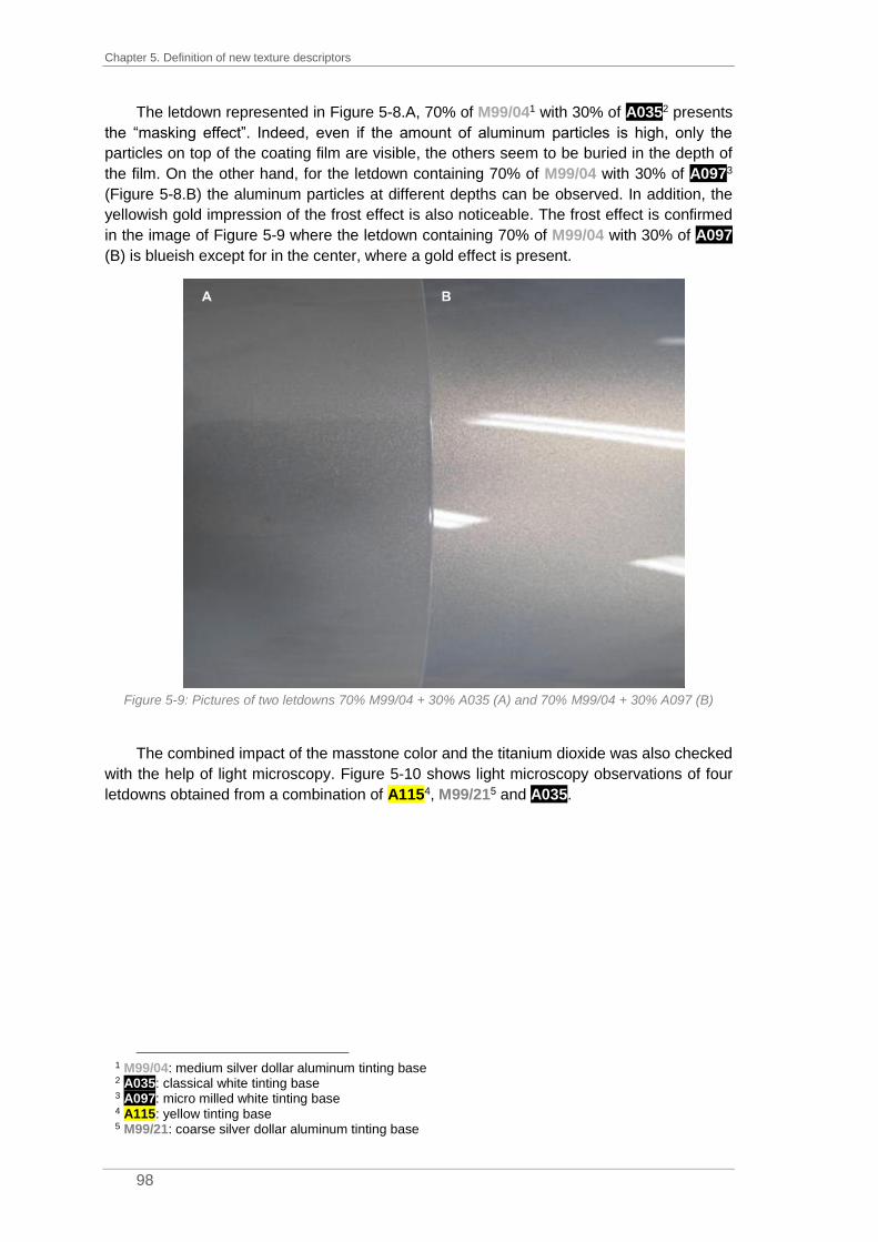
Chapter 5. Definition of new texture descriptors
98
The letdown represented in Figure 5-8.A, 70% of M99/041 with 30% of A0352 presents
the “masking effect”. Indeed, even if the amount of aluminum particles is high, only the
particles on top of the coating film are visible, the others seem to be buried in the depth of
the film. On the other hand, for the letdown containing 70% of M99/04 with 30% of A0973
(Figure 5-8.B) the aluminum particles at different depths can be observed. In addition, the
yellowish gold impression of the frost effect is also noticeable. The frost effect is confirmed
in the image of Figure 5-9 where the letdown containing 70% of M99/04 with 30% of A097
(B) is blueish except for in the center, where a gold effect is present.
Figure 5-9: Pictures of two letdowns 70% M99/04 + 30% A035 (A) and 70% M99/04 + 30% A097 (B)
The combined impact of the masstone color and the titanium dioxide was also checked
with the help of light microscopy. Figure 5-10 shows light microscopy observations of four
letdowns obtained from a combination of A1154, M99/215 and A035.
1 M99/04: medium silver dollar aluminum tinting base 2 A035: classical white tinting base 3 A097: micro milled white tinting base 4 A115: yellow tinting base 5 M99/21: coarse silver dollar aluminum tinting base
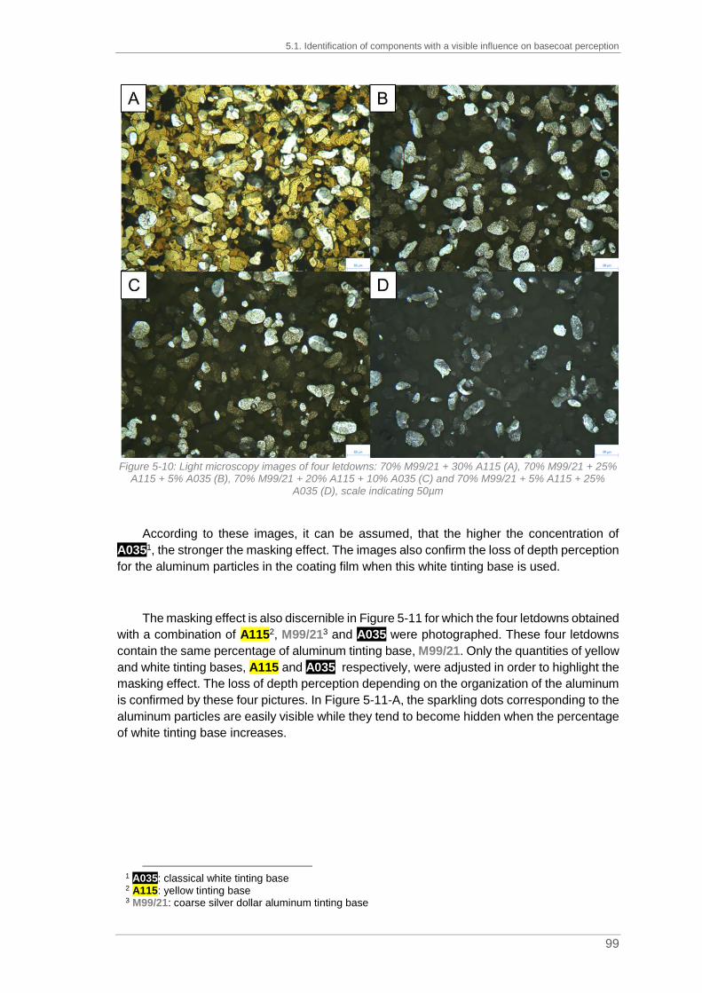
5.1. Identification of components with a visible influence on basecoat perception
99
Figure 5-10: Light microscopy images of four letdowns: 70% M99/21 + 30% A115 (A), 70% M99/21 + 25%
A115 + 5% A035 (B), 70% M99/21 + 20% A115 + 10% A035 (C) and 70% M99/21 + 5% A115 + 25% A035 (D), scale indicating 50µm
According to these images, it can be assumed, that the higher the concentration of
A0351, the stronger the masking effect. The images also confirm the loss of depth perception
for the aluminum particles in the coating film when this white tinting base is used.
The masking effect is also discernible in Figure 5-11 for which the four letdowns obtained
with a combination of A1152, M99/213 and A035 were photographed. These four letdowns
contain the same percentage of aluminum tinting base, M99/21. Only the quantities of yellow
and white tinting bases, A115 and A035, respectively, were adjusted in order to highlight the
masking effect. The loss of depth perception depending on the organization of the aluminum
is confirmed by these four pictures. In Figure 5-11-A, the sparkling dots corresponding to the
aluminum particles are easily visible while they tend to become hidden when the percentage
of white tinting base increases.
1 A035: classical white tinting base 2 A115: yellow tinting base 3 M99/21: coarse silver dollar aluminum tinting base

Chapter 5. Definition of new texture descriptors
100
Figure 5-11: Photographs of four letdowns: 70% M99/21 + 30% A115 (A), 70% M99/21 + 25% A115 + 5% A035 (B), 70% M99/21 + 20% A115 + 10% A035 (C) and 70% M99/21 + 5% A115 + 25% A035 (D)
5.1.4. Assessment of the different ranges
By spraying different samples to constitute three ranges, it was possible to study the
impacts of different components: aluminum, black, white and colored tinting bases.
The first range highlighted the impact of aluminum on visual perception. The samples
were created by mixing an aluminum tinting base with a black tinting base. The visual sorting
of the samples according to the perceptible amount of aluminum particles by experts is
facilitated by the change in lightness L*. However, by considering letdowns of the same ratio
with only a change in the aluminum tinting base, it was more difficult to sort them according
to the global effect of aluminum particles and especially at low concentration of aluminum.
The second range was created to estimate the impact of the aluminum tinting base
concentration on the chromaticity of the samples. With a very high concentration of aluminum
tinting base, the colored appearance is completely hidden in favor of the greyish appearance
due to the aluminum particles. This phenomenon corresponds to hue extinction.
Finally, for the third range, the objective was to compare the impact of titanium dioxide
on the visual appearance. Depending on the size of the TiO2 particles, either the masking
5.2. Categorization test in order to determine new texture descriptors
101
effect for A0351 or the frost effect for A0972 can be noticed. As a consequence of the masking
effect, the sparkling effect of letdowns with a high amount of A035 is destroyed.
5.2. Categorization test in order to determine new texture
descriptors
The associated effects of the different categories of tinting bases were studied by the
creation of different ranges. It is now known that some specific effects are inherent to the
type of pigments used in the formula. However, even if the effects are for example called
sparkling, frost effect or hue extinction by several authors (see Chapter 4, paragraph
4.1.1.2.2), it is not obvious that observers, even experienced ones, are able to classify visual
appearance of texture according to the same criteria. To simplify the evaluation step, a
categorization test was organized. Indeed, the purpose of this test was to highlight common
characteristics to certain samples in order to define the associated texture descriptors. For
the range creation phase, almost 250 letdowns were sprayed. Looking at all samples would
be redundant and would have led to significant visual fatigue for the observers. 49 letdowns
were randomly selected for this test without any selection criteria.
The conditions of these visualization tests have been standardized in order to ensure
the consistency of the results obtained between the different industrial sites where the tests
were carried out (IMT Mines Alès, BASF Clermont and BASF Münster). The lighting
conditions were controlled to ensure optimal lighting. First, the free sorting method was
favored at the expense of other sorting methods (hierarchical sorting, directed sorting or
Napping® method).
5.2.1. Presentation of the different sorting methods
The sorting task is a simple method used for collecting similarity data which is
established on categorization, a cognitive process routine (Chollet et al., 2014). The main
objective is to obtain information about sensory differences among objects. This task can be
either performed by novice or trained panelists. Assessors are asked to group together
stimuli based on the similarities they perceive. Two objects sorted together are close and two
objects rarely grouped together are far apart. The sorting task is a non-descriptive method,
but the assessors can also be asked to describe the criteria applied. This procedure is called
labeled sorting by (Becue-Bertaut and Lê, 2011).
The sorting task can be free, hierarchical or directed. For the free sorting task, the
number of groups and objects per group is determined by the assessor himself or herself.
However, he/she can neither group all objects together nor isolate each object in a group of
its own. For the directed sorting task, the number of groups and objects per group is
determined by the experimenter. The hierarchical sorting task can be either ascendant or
descendant. In the first case, the assessor must perform a free sorting task and then
successively merge the two groups with the most similarities up to get a single group. In the
1 A035: classical white tinting base 2 A097: micro milled white tinting base

Chapter 5. Definition of new texture descriptors
102
second case, the assessor starts with a free sorting task and then he/she must subdivide
each group further to isolate all objects.
Developed by Daniel Katz and Wilbur Hulin in 1933, the sorting task was initially created
for a psychological study on facial expressions. The objective of this study was to associate
an emotional expression to a picture (Hulin and Katz, 1935). After many years of use in
psychology, Lawless adapted this method to the field of sensory evaluation in 1989. The first
sensory assessment was based on the sense of smell of several assessors divided into two
groups. The assessors had to sort several fragrance materials made from wood, citrus or a
mix between wood and citrus. For one group, a free sorting task was proposed and for the
second group, it was a directed sorting task of two groups (Lawless, 1989). Due to promising
results after its first use in sensory evaluation, the sorting task was used several times in food
industries with studies on cheese (Lawless et al., 1995), jam (Blancher et al., 2008) or beer
(Chollet and Valentin, 2001), in cosmetic industries with studies on fragrances (Cadoret,
2010) and also in other industries such as the automotive industry with the evaluation of
tactile perception of leathers (Faye et al., 2006).
The sorting results of trained and untrained panelists were studied several times to
evaluate the consistency of product sensory mapping. A comparison between expert and
non-expert panelists was made on visual description of plastic pieces (Faye et al., 2004). A
free sorting task followed by a descriptive task was proposed to untrained assessors while
experts set up a sensory profile. The results of these two methods were quite similar; the
visual characteristics given by experts and non-experts were equivalent. These two methods
were also adapted to leather samples (Faye et al., 2006). As seen previously, the conclusions
reached on visual and tactile characteristics are similar for untrained and trained assessors.
However, these studies involved non-food products and the authors suggested their products
were easily differentiable. In food industry, the comparison between novice and expert
panelists was for example carried out on breakfast cereals (Cartier et al., 2006). After a
descriptive free sorting task on 14 commercially available breakfast cereals, the groups
created by untrained and trained assessors were quite similar. For some studies, untrained
and trained assessors generated similar product maps (Chollet et al., 2011); other studies
also reported differences between those two groups of assessors. According to a study on
wine categorization (Ballester et al., 2008), untrained assessors seemed to cluster the
products on basic sensory features when trained assessors were more precise and could
sort by grape variety.
In order to define texture descriptors, a free sorting method was used on automotive
paint samples. As the sorting method is a non-descriptive one, it was decided to add a
description phase at the end of the test to describe the groups created by the assessors
according to the criteria used.
5.2.2. Procedures for the free sorting task
To be able to notice any texturing of the optical signal, it is important to standardize the
lighting conditions. Daylight seems appropriate since vehicles are mainly observed under
daylight. For quality control, artificial lighting is used. To analyze the overall visual effect, the
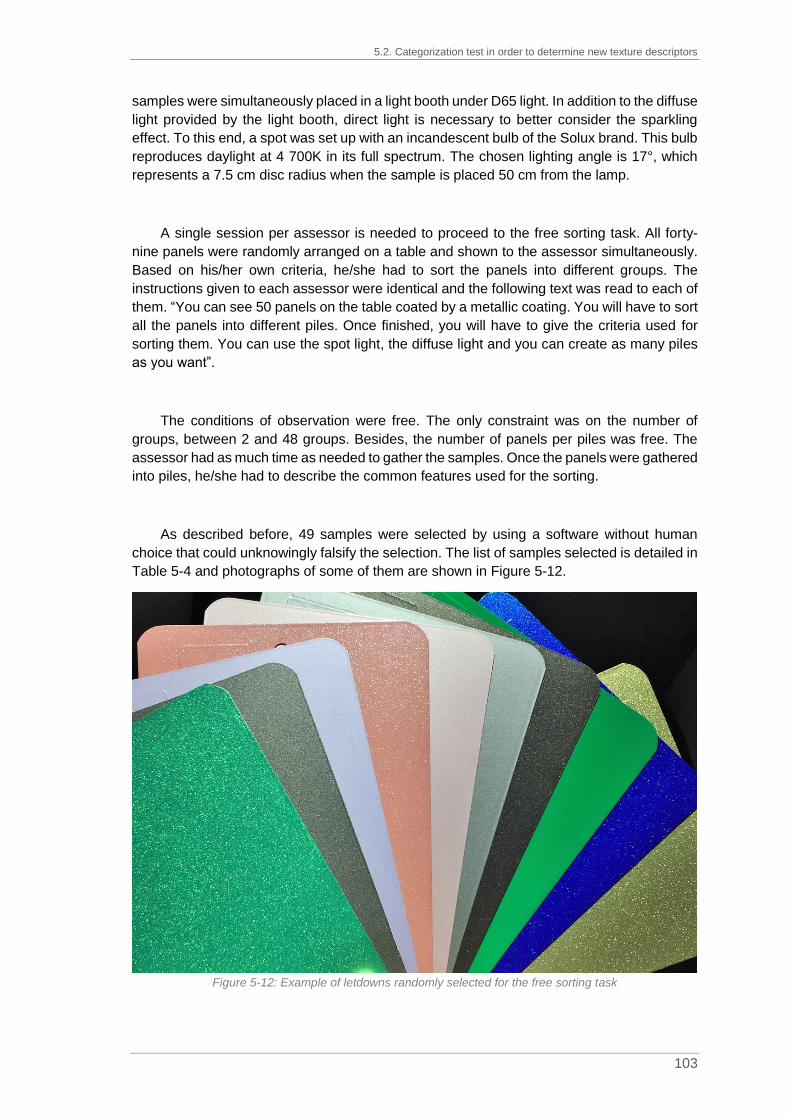
5.2. Categorization test in order to determine new texture descriptors
103
samples were simultaneously placed in a light booth under D65 light. In addition to the diffuse
light provided by the light booth, direct light is necessary to better consider the sparkling
effect. To this end, a spot was set up with an incandescent bulb of the Solux brand. This bulb
reproduces daylight at 4 700K in its full spectrum. The chosen lighting angle is 17°, which
represents a 7.5 cm disc radius when the sample is placed 50 cm from the lamp.
A single session per assessor is needed to proceed to the free sorting task. All forty-
nine panels were randomly arranged on a table and shown to the assessor simultaneously.
Based on his/her own criteria, he/she had to sort the panels into different groups. The
instructions given to each assessor were identical and the following text was read to each of
them. “You can see 50 panels on the table coated by a metallic coating. You will have to sort
all the panels into different piles. Once finished, you will have to give the criteria used for
sorting them. You can use the spot light, the diffuse light and you can create as many piles
as you want”.
The conditions of observation were free. The only constraint was on the number of
groups, between 2 and 48 groups. Besides, the number of panels per piles was free. The
assessor had as much time as needed to gather the samples. Once the panels were gathered
into piles, he/she had to describe the common features used for the sorting.
As described before, 49 samples were selected by using a software without human
choice that could unknowingly falsify the selection. The list of samples selected is detailed in
Table 5-4 and photographs of some of them are shown in Figure 5-12.
Figure 5-12: Example of letdowns randomly selected for the free sorting task

Chapter 5. Definition of new texture descriptors
104
Table 5-4: List of the 49 letdowns randomly selected for the free sorting task
Formulas Formulas
30% A1151 + 70% M99/04 30% A136 + 70% M99/00
25% A115 + 70% M99/04 + 5% A035 25% A136 + 70% M99/03 + 5% A035
5% A115 + 70% M99/00 + 25% A035 20% A136 + 70% M99/04 + 10% A035
5% A115 + 70% M99/22 + 25% A035 20% A136 + 70% M99/04 + 10% A032
20% A306 + 70% M99/04 + 10% A032 5% A136 + 70% M99/00 + 25% A035
5% A306 + 70% M99/04 + 25% A035 25% A329 + 70% M99/22 + 5% A035
30% A035 + 70% M99/04 20% A329 + 70% M99/00 + 10% A032
30% A097 + 70% M99/04 5% A329 + 70% M99/03 + 25% A035
25% A372 + 70% M99/03 + 5% A035 5% A329 + 70% M99/04 + 25% A035
20% A372 + 70% M99/04 + 10% A035 30% A430 + 70% M99/00
20% A372 + 70% M99/22 + 10% A032 30% A430 + 70% M99/03
5% A372 + 70% M99/04 + 25% A035 25% A430 + 70% M99/00 + 5% A035
5% A372 + 70% M99/22 + 25% A035 25% A430 + 70% M99/04 + 5% A035
25% A563 + 70% M99/03 + 5% A035 20% A430 + 70% M99/22 + 10% A035
25% A563 + 70% M99/04 + 5% A035 5% A430 + 70% M99/04 + 25% A035
25% A563 + 70% M99/22 + 5% A035 95% A926 + 5% M99/00
20% A563 + 70% M99/00 + 10% A035 95% A926 + 5% M99/04
20% A563 + 70% M99/03 + 10% A035 95% A926 + 5% M99/21
20% A563 + 70% M99/03 + 10% A032 95% A926 + 5% M99/22
5% A563 + 70% M99/22 + 25% A035 90% A926 + 10% M99/04
69,5% A695 + 30,5% M99/22 80% A926 + 20% M99/00
59,5% A695 + 30,5% M99/22 + 10% A035 70% A926 + 30% M99/00
30% A695 + 70% M99/03 45% A926 + 55% M99/00
25% A695 + 70% M99/04 + 5% A035 100% M99/02
20% A695 + 70% M99/00 + 10% A035
A115 & A136: yellow tinting bases A306, A329 & A372: red tinting bases A430: violet tinting base A563: blue tinting base A695: green tinting base A926: black tinting base A035: classical white tinting base A032: classical white tinting base (diluted) A097: micro milled white tinting base M99/00: extra fine cornflake aluminum M99/02: medium cornflake aluminum M99/03: coarse cornflake aluminum M99/04: medium silver dollar aluminum M99/21: coarse silver dollar aluminum

5.2. Categorization test in order to determine new texture descriptors
105
5.2.3. Results on the free sorting task
The test was carried out by seventeen assessors: 8 novices (4 from IMT Mines Alès and
4 from BASF Clermont site) and 9 experts (7 from BASF Clermont site and 2 from BASF
Münster site).
After data analysis of the results from the 17 observers, 7 persons sorted by texture or
effect (see histograms in blue in Figure 5-13), 8 by color and the associated color changes
(see histograms in yellow in Figure 5-13) and 2 observers by texture + color (see histograms
in green in Figure 5-13). This classification into three categories was defined after analysis
of the criteria used (see examples on Table 5-5). The number of groups created by the
assessors is compared in Figure 5-13.
Figure 5-13: Number of groups created by observers during the free sorting task, in blue for a sorting
based on texture, in yellow based on color and in green based on texture + color. The expert observers are indicated by an asterisk.
On average, 8.06 groups were created to sort the 49 panels during this free sorting test.
However, observers who sorted by texture created less groups (average: 4.42 groups) than
those who favored a sorting by color (average: 8.50 groups).
From Figure 5-13, it is deducible that the novice observers preferred a sorting by texture
to a sorting by color (4 observers for 1 observer). On the other hand, experienced assessors
preferred a sorting by color to a sorting by texture (7 assessors for 3 observers).
After the free sorting task, the observers were asked to name the common features used
for the gathering. These definitions were analyzed and are listed in Table 5-5. It is important
to note that the lists of features, especially for the sorting based on texture + color, are
incomplete.

Chapter 5. Definition of new texture descriptors
106
Table 5-5: List of features used to gather the forty-nine panels during the free sorting task
All the observers who decided to sort by texture grouped the samples on a scale of
intensity. For example, the criteria used by Observer 3 and Observer 4 is sparkling. For the
first observer, six levels were needed (very low, low, low to medium, medium, medium to
strong, strong) while, for the second one, four levels were enough (low, low to moderate,
moderate to intense, intense). Then, when a deeper analysis was carried out on the word
“sparkling”, for Observer 3, it described the quantity of bright spot under direct light while for
Observer 4, it defined the amount of light coming from the glitters. The definitions of the
wording used for texture classification vary from observer to observer. The word "matte" can
describe a very small amount of effect particles in the sample and therefore the lack of very
bright spots related to the specular reflection of the particles but also the use of a matting
agent in the clearcoat.
The descriptive phase after the categorization step is a crucial step to define new texture
descriptors. Observers who described the texture explicitly mentioned only one parameter
when sorting. It seemed that a single parameter was not efficient enough to describe the
phenomenon of texture signals, since the words size and sparkling do not seem, at first sight,
to be linked. In addition, the confrontation of the neophyte and expert vocabulary showed
inconsistencies in the wording used.
5.3. Standardization of the wording used by brainstorming
Metaplan®
To overcome these linguistic differences, the decision was taken to organize
brainstorming sessions on texture to obtain a lexicon approved by experts and neophytes.
Those sessions were carried out with the American, the French and the German BASF
teams. These three teams are decision makers for any changes in processes or practices
within the refinish color organization in BASF Coatings. The objective was to get a list of
words describing the apparent texture and also their definition. The lexicons thus obtained
were compiled and translated into German, English and French.
Criteria used for sorting
Based on Color
Blue / Green / Violet / Yellow
Orange / Pink / Red / Rust
Gold / Silver / Champain
Chromatic / Achromatic
Dull / Intense
Based on Texture + Color
Black metallic with coarse aluminum
Dark achromatic with fine aluminum
Visible particles at flop (110°)
Grey side at flop
Colored travel (flip-flop)
Based on Texture
Matte / Glossy
Sparkling
Glittering
Graininess
Quantity / Density

5.3. Standardization of the wording used by brainstorming Metaplan®
107
These brainstorming sessions are inspired by brainstorming techniques which consist
in the search for original ideas by all participants (Delengaigne et al., 2016). The decision
was to opt for the Metaplan® technique or Post-It® meeting. This technique, inspired by
brainstorming, allows to quickly and easily get all the ideas of a group in a short time, about
15 minutes. Each participant's ideas are written on Post-It®. The sessions were scheduled
for 90 minutes; between six and eight persons participated. The overall 70 participants were
either neophytes or experts. The two classes of participants were mixed to confront the two
types of wording detected during the descriptive phase at the end of the free sorting task.
Each session was structured in five phases as given in Figure 5-14.
Figure 5-14: Structure of the brainstorming sessions in five phases
The first step was an introduction to the topic and especially to the visual appearance of
effect coatings. The question to answer was “Which words can we use to define or
characterize effects or texture on effect coatings?”. Then, for the second step, each
participant had to think on his/her own and write down all of his/her ideas on Post-It® notes.
To help the participants with their reflection, sixteen samples were sprayed. Those samples
were selected from a range of OEM colors based on their specificities and sprayed. The
selection of samples was based on the effect particles used in the formulation (aluminum,
pearl or a mixture), the amount of flop modifier, the use of micro-milled titanium dioxide for
the frost effect or a high concentration in titanium dioxide for the masking effect. Indeed,
these elements were identified (see Chapter 5, paragraph 5.1.1) as tinting bases having a
proven impact on visual appearance of the colors. The third step was needed to gather all
the ideas into piles sharing the same idea as for example size, medium, fine and coarse. The
fourth stage was the crucial one. The objectives were to find a definition for all groups of
ideas by consensus and to then determine a gradation scale. The last step was just a
conclusion on the session by showing the participants the wording list they created.
The “word cloud” representation in Figure 5-15 shows the different words obtained
during step 2. 633 words were mentioned by the participants. The font size is linked to the
number of repetitions. To clarify the word cloud, only the words given at least three times are
kept for its conception.
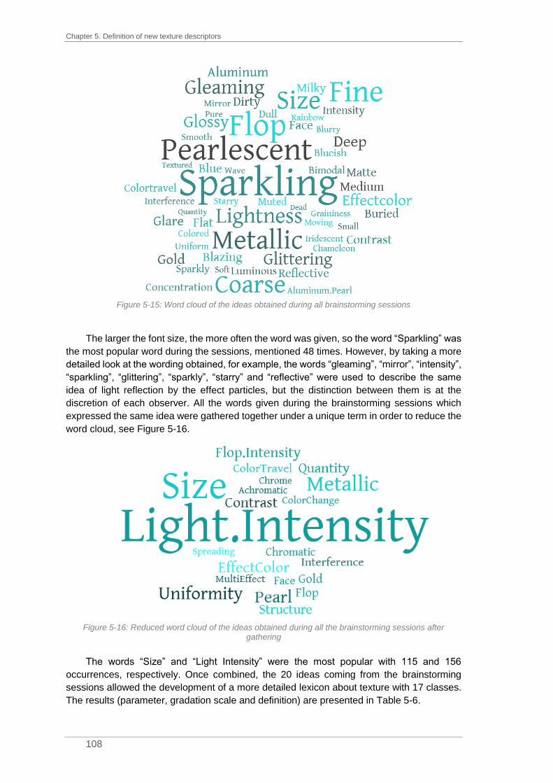
Chapter 5. Definition of new texture descriptors
108
Figure 5-15: Word cloud of the ideas obtained during all brainstorming sessions
The larger the font size, the more often the word was given, so the word “Sparkling” was
the most popular word during the sessions, mentioned 48 times. However, by taking a more
detailed look at the wording obtained, for example, the words “gleaming”, “mirror”, “intensity”,
“sparkling”, “glittering”, “sparkly”, “starry” and “reflective” were used to describe the same
idea of light reflection by the effect particles, but the distinction between them is at the
discretion of each observer. All the words given during the brainstorming sessions which
expressed the same idea were gathered together under a unique term in order to reduce the
word cloud, see Figure 5-16.
Figure 5-16: Reduced word cloud of the ideas obtained during all the brainstorming sessions after
gathering
The words “Size” and “Light Intensity” were the most popular with 115 and 156
occurrences, respectively. Once combined, the 20 ideas coming from the brainstorming
sessions allowed the development of a more detailed lexicon about texture with 17 classes.
The results (parameter, gradation scale and definition) are presented in Table 5-6.

5.3. Standardization of the wording used by brainstorming Metaplan®
109
Table 5-6: Global lexicon with parameter, scale and definition obtained after the brainstorming sessions with overall 70 participants
Parameters Gradation Definition
Particle size Fine / Medium / Coarse Apparent particle size
Light spots intensity
(Sparkling, reflection,
glittering, gleaming, starry)
Weak / Medium / Strong Quantity of light reflected by
particles
Spread of particles
(Modality)
Homogeneous
Heterogeneous
Mixture (or not) of different
particle sizes
Quantity of bright spots
(Density, particle spacing) Few / Medium / A lot
Number of particles on a specific
area
Effect color e.g. Grey, Blue, Yellow Color of the particles
Effect type Metallic / Pearl Type of effect particles used in
formulation
Multi effect Metallic + Pearl Combination of pearls and
aluminum in formulation
Metallic effect -
Greyish appearance, achromatic
effect particles and lightness
change between face and flop
Pearl effect -
Visible colored effect particles
and color change between face
and flop
Interferential effect e.g. Green to Red
Gold to Violet
Strong color change between
face and flop
Flop intensity - Strong difference in lightness
between face and flop
Iridescent effect
Under the same angle, different
colors are emitted by the particles
(mainly used for white pearls)
Chrome effect -
Extra fine aluminum, mirror effect,
high intensity of the reflected light,
high flop index, very bright at face
and very dark at flop
Gold effect Gold at face
Bluish at flop
Specific effect linked to the use of
micro-milled titanium dioxide with
a gold effect at face and a bluish
side at flop
Intensity face-flop to be determined Lightness and /or chroma
difference between face and flop
Contrast Weak / Medium / Strong Difference between particles and
masstone color
Particle structure Flat/Buried/Masking effect
Deep Particle structure in the bulk film

Chapter 5. Definition of new texture descriptors
110
Brainstorming sessions allowed the development of a more detailed vocabulary on
texture. However, some definitions are very close such as “flop intensity” and “intensity face-
flop”. In order to reduce the list of texture parameters, it is also possible to gather ideas under
one descriptor. One descriptor can be used to define either the particle size or the spread of
particles. In the same way, another descriptor can define either the contrast or the particle
structure.
At the end of the brainstorming sessions, six visual texture descriptors were established:
size, intensity, quantity, color, contrast and face-flop. From those six descriptors, the
seventeen terms of the global lexicon can be extracted as detailed in Figure 5-17. Some
parameters are then associated with several descriptors.
Figure 5-17: Sorting of 17 terms defined during brainstorming sessions into six categories of descriptors
5.4. Preliminary tests on new texture descriptors by three
expert observers
As a result of the brainstorming sessions, six visual texture descriptors were defined.
However, it was necessary to carry out preliminary studies on them. Three expert observers
tested the new descriptors, with several objective to the tests. First, it was necessary to
ensure the correct understanding of these parameters by the assessors. Then, the conditions
of observation, meaning angle and type of light sources, needed to be standardized and the
behavior of the three experts was a good starting point for that standardization. Finally, the
overall performances were analyzed by checking the notation of the experts with a
reproducibility and repeatability study. The repeatability was tested with the addition of a
duplicate sample in the ranges observed and the reproducibility by comparing the notes of
the three experts. The three experts had participated in one of the brainstorming sessions
held previously.
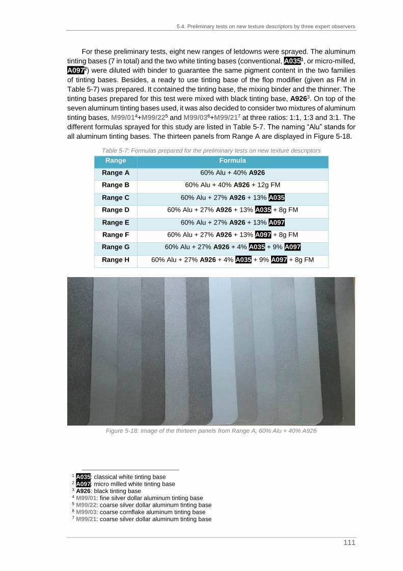
5.4. Preliminary tests on new texture descriptors by three expert observers
111
For these preliminary tests, eight new ranges of letdowns were sprayed. The aluminum
tinting bases (7 in total) and the two white tinting bases (conventional, A0351, or micro-milled,
A0972) were diluted with binder to guarantee the same pigment content in the two families
of tinting bases. Besides, a ready to use tinting base of the flop modifier (given as FM in
Table 5-7) was prepared. It contained the tinting base, the mixing binder and the thinner. The
tinting bases prepared for this test were mixed with black tinting base, A9263. On top of the
seven aluminum tinting bases used, it was also decided to consider two mixtures of aluminum
tinting bases, M99/014+M99/225 and M99/036+M99/217 at three ratios: 1:1, 1:3 and 3:1. The
different formulas sprayed for this study are listed in Table 5-7. The naming “Alu” stands for
all aluminum tinting bases. The thirteen panels from Range A are displayed in Figure 5-18.
Table 5-7: Formulas prepared for the preliminary tests on new texture descriptors
Range Formula
Range A 60% Alu + 40% A926
Range B 60% Alu + 40% A926 + 12g FM
Range C 60% Alu + 27% A926 + 13% A035
Range D 60% Alu + 27% A926 + 13% A035 + 8g FM
Range E 60% Alu + 27% A926 + 13% A097
Range F 60% Alu + 27% A926 + 13% A097 + 8g FM
Range G 60% Alu + 27% A926 + 4% A035 + 9% A097
Range H 60% Alu + 27% A926 + 4% A035 + 9% A097 + 8g FM
Figure 5-18: Image of the thirteen panels from Range A, 60% Alu + 40% A926
1 A035: classical white tinting base 2 A097: micro milled white tinting base 3 A926: black tinting base 4 M99/01: fine silver dollar aluminum tinting base 5 M99/22: coarse silver dollar aluminum tinting base 6 M99/03: coarse cornflake aluminum tinting base 7 M99/21: coarse silver dollar aluminum tinting base

Chapter 5. Definition of new texture descriptors
112
Assessors had to evaluate the eight ranges with two types of lighting: diffuse and direct
light. The diffuse light was provided by natural sunlight and direct light by a halogen spot
corrected in blue (Solux, 4 700K, 17°, 50W). Each evaluator was asked to categorize the
letdowns of each range into different groups according to the six visual texture descriptors.
To limit visual fatigue, three sessions per observer were organized.
For each range, except for Range E, a duplicate of one of the panels was added. The
evaluators identified this panel on all the criteria without knowing the trap. This approach
made it possible to evaluate the repeatability of the ratings on the different criteria. For all the
ranges, all the criteria and all the observers, the twins were gathered in the same group in
97% of the cases (123/126). Three mistakes were made on two criteria, two for face-flop and
one for contrast.
In order to evaluate the reproducibility of the notation, the number of groups formed by
criteria are summarized in Table 5-8. The results are then detailed, descriptor by descriptor,
and plotted in Figure 5-19. Even if the number of groups created varies from one observer to
the other, it is important to note that the arrangement of the samples is equivalent for all
observers, only the categorization differs.
Figure 5-19: Analysis of the number of groups created (min, max and mean) during the stage of
assessment by three experts on texture descriptors

5.4. Preliminary tests on new texture descriptors by three expert observers
113
Table 5-8: Results of the assessment of the three experts on texture descriptors
Size Quantity Color Intensity Contrast Face-flop
Minimum number of
groups created 3 2 1 3 2 3
Maximum number of
groups created 4 5 3 7 7 7
Average number of
groups created 3.5 3.5 2 3.9 3.5 4.2
Variance 0.3 0.7 0.5 1 1.9 1
For the texture descriptor “Size”, expert observers split the panels in 3 or 4 groups with
a mean of 3.5. The categories identified are fine, medium, large and an extra-fine class is
added when four groups were created. The variance, or dispersion of the values compared
to the mean value, is low at 0.3. Hence, this descriptor seems to be understood by assessors.
For the descriptor “Quantity”, 2 to 5 groups were formed with an average of 3.5 groups.
When two groups were set up, the classes according to which the sorting occurred were “not
many” or “many” while the formation of five groups allowed to qualify the categories: not
many, low, medium, intermediate, a lot. The large differences in the ratings related to the
number of groups created a limit for the reproducibility of this descriptor. Besides, sometimes
it got mixed up with the descriptors “Contrast” or “Intensity”.
For the descriptor “Color”, assessors qualified their scoring by forming 1 to 3 groups,
with 2 groups on average. In some cases, the observers assumed an achromatic color
particle while, in other cases, they found a strong difference on the same range with 3
categories: achromatic, slightly gold, gold. However, the letdowns studied were only made
of aluminum tinting bases, hence achromatic particles. The gold effect is linked either to the
interaction between the yellowish black tinting base; A9261, and the aluminum particles or to
the use of micro-milled titanium dioxide, A0972, responsible for the frost effect. The large
differences in the ratings related to the number of groups created limit the reproducibility of
this descriptor even if the variance is at 0.5. Besides, the visual assessment of this descriptor
required a high luminous intensity.
For the descriptor “Intensity”, expert observers gathered the panels in 3 or 7 groups with
a mean at 3.9. The segmentation into 3 categories was limited to weak, medium and strong
while the one in 7 included the classes: non-existent, very weak, weak, low, medium, strong
and very strong. Although this descriptor seems to be pretty well understood by the
assessors, again, the large differences in the rating lead to low reproducibility and a variance
at 1.
1 A926: black tinting base 2 A097: micro milled white tinting base
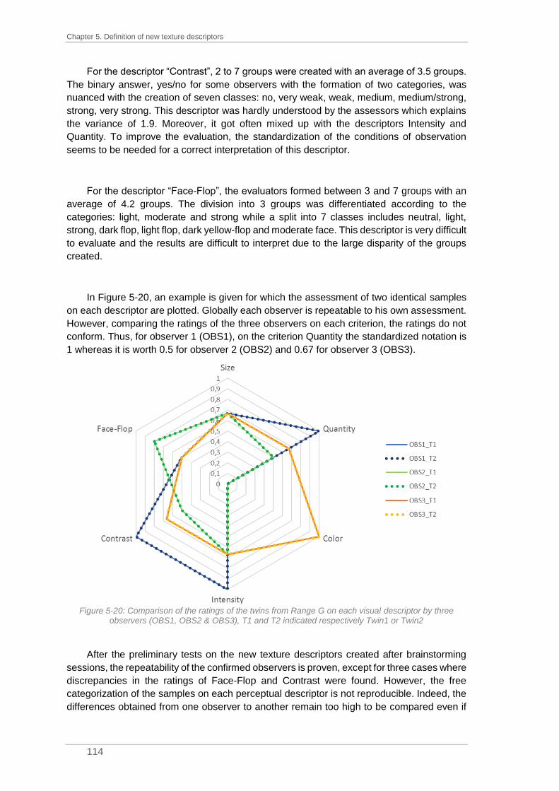
Chapter 5. Definition of new texture descriptors
114
For the descriptor “Contrast”, 2 to 7 groups were created with an average of 3.5 groups.
The binary answer, yes/no for some observers with the formation of two categories, was
nuanced with the creation of seven classes: no, very weak, weak, medium, medium/strong,
strong, very strong. This descriptor was hardly understood by the assessors which explains
the variance of 1.9. Moreover, it got often mixed up with the descriptors Intensity and
Quantity. To improve the evaluation, the standardization of the conditions of observation
seems to be needed for a correct interpretation of this descriptor.
For the descriptor “Face-Flop”, the evaluators formed between 3 and 7 groups with an
average of 4.2 groups. The division into 3 groups was differentiated according to the
categories: light, moderate and strong while a split into 7 classes includes neutral, light,
strong, dark flop, light flop, dark yellow-flop and moderate face. This descriptor is very difficult
to evaluate and the results are difficult to interpret due to the large disparity of the groups
created.
In Figure 5-20, an example is given for which the assessment of two identical samples
on each descriptor are plotted. Globally each observer is repeatable to his own assessment.
However, comparing the ratings of the three observers on each criterion, the ratings do not
conform. Thus, for observer 1 (OBS1), on the criterion Quantity the standardized notation is
1 whereas it is worth 0.5 for observer 2 (OBS2) and 0.67 for observer 3 (OBS3).
Figure 5-20: Comparison of the ratings of the twins from Range G on each visual descriptor by three
observers (OBS1, OBS2 & OBS3), T1 and T2 indicated respectively Twin1 or Twin2
After the preliminary tests on the new texture descriptors created after brainstorming
sessions, the repeatability of the confirmed observers is proven, except for three cases where
discrepancies in the ratings of Face-Flop and Contrast were found. However, the free
categorization of the samples on each perceptual descriptor is not reproducible. Indeed, the
differences obtained from one observer to another remain too high to be compared even if

5.5. Texture scale creation
115
the order established for the range remains the same. In addition, some perceptual
descriptors, mainly Contrast and Face-Flop, were difficult to understand for the experienced
assessors.
These tests also made it possible to standardize the conditions of observation for each
visual descriptor according to the behavior of the three assessors. They are summarized in
Table 5-9.
Table 5-9: Standardization of the conditions of observation (light source and angle) for visual assessment
Texture descriptor Light source Angle of observation
Size Diffuse light ~ 45°
Quantity Diffuse light ~ 45°
Color Direct light Close to specular angle, ~15°
Intensity Direct light Close to specular angle, ~15°
Contrast Diffuse light ~ 45°
Face-Flop Diffuse & direct light Moving observation from 0° to 100°
To allow for a better understanding of each perceptual descriptor as well as a
homogenized scale of ratings, a reference range for each of them was created inspired by
the Sensotact® reference scale developed by Renault1. Indeed, this referential for tactile
perception makes it possible to evaluate and quantify tactile sensations like the hardness or
the stickiness of a surface based on a pre-established metric.
5.5. Texture scale creation
During the first phase of preliminary tests on the new texture descriptors, some
parameters such as Contrast or Face-Flop were misinterpreted by experienced assessors.
In order to limit these problems of misunderstanding, the decision was taken to create a
rating scale. Thus, like the Sensotact®, each descriptor is explained by a reference range to
better enable its evaluation.
The results of the preliminary tests on the new texture descriptors (see Table 5-8) were
the basis to establish the number of references for each range. For each reference, a
formulation was created based on expert knowledge for the effect tinting bases. The
quantities of effect pigments were visually adjusted to get a sufficient amount to be
perceptible without being predominant. At the end of the creation of all the standards, they
were submitted to expert assessors for approval. Only the formulations of the final standards
are explained below. For all the standards, the masstone is black to avoid all combined
effects with colored tinting bases. However, the black tinting base of reference, A9262, used
1 The Sensotact® is a reference frame used to assess haptic quality perception with 10 descriptors. The
descriptors summarize the complete human touch sensation. They are divided into three clusters: orthogonal (hardness, nervousness, memory of shape, stickiness), tangential (fibrous, depth, roughness, braking, slippery) and thermal. For each descriptor, five to six references compose the range. The samples to evaluate are compared to the ranges according to the intensity.
2 A926: black tinting base

Chapter 5. Definition of new texture descriptors
116
for the creation of the ranges (see Chapter 5, paragraph 5.1.2) was not used. A deep black,
A9241, was preferred to avoid the yellowish undertone of the A9262.
For the texture descriptor Size, between three and four groups were needed according
to the assessors. It was decided to create four standards to match the levels: extra-fine, fine,
medium and coarse. Letdowns with aluminum and black were sprayed in order to create
those four references. The formulas are gathered in Table 5-10.
Table 5-10: Description of the four references developed for the descriptor Size
Descriptor Naming Level Formula
Size
S_1 Extra-fine 92.5% A924 + 7.5% M99/003
S_2 Fine 92.5% A924 + 7.5% M99/014
S_3 Medium 90% A924 + 10% M99/035
S_4 Coarse 90% A924 + 10% M99/216
Pictures of the different standards were taken with the spectrophotometer MA-T6 (see
Chapter 4, paragraph 4.2.4). The four pictures obtained under diffuse geometry (see r15d in
red in Chapter 4 Figure 4-21) are gathered in Figure 5-21.
Figure 5-21: Pictures of the four references created for the descriptor Size
1 A924: deep black tinting base 2 A926: black tinting base 3 M99/00: extra fine cornflake aluminum tinting base 4 M99/01: fine silver dollar aluminum tinting base 5 M99/03: coarse cornflakes aluminum tinting base 6 M99/21: coarse silver dollar aluminum tinting base

5.5. Texture scale creation
117
For the range Color, the objective was to formulate standards which could be either used
for aluminum or pearl colors. Pearls or colored aluminum were then added in the formulation
in order to define the main families for color particle evaluation. Eight effect tinting bases
were selected to guarantee a correct representation of the color space. The quantities of
effect tinting bases were visually adjusted to maintain the same visual amount in all the
formulations. The sparkling effect of white pearl is typically due to the simultaneous blue, red
and green sparkling, see Figure 5-22.
Figure 5-22: Light microscopy image of white pearl tinting base mixed with black tinting base, scale
indicating 50µm
The formulas sprayed for the eight references of the range are summarized in Table
5-11.
Table 5-11: Description of the eight references developed for the descriptor Color
Descriptor Naming Level Formula
Color
C_1 Gold 90% A9241 + 10% E9202
C_2 Orange 90% A924 + 10% E2803
C_3 Red 90% A924 + 10% LAB35054
C_4 White 90% A924 + 10% M9195
C_5 Green 90% A924 + 10% E6306
C_6 Blue 85% A924 + 15% LE5557
C_7 Violet 80% A924 + 20% LE4058
C_8 Aluminum 95% A924 + 5% M99/019
1 A924: deep black tinting base 2 E920: gold aluminum tinting base 3 E280: orange aluminum tinting base 4 LAB3505: red aluminum tinting base 5 M919: white pearl tinting base 6 E630: green pearl tinting base 7 LE555: blue pearl tinting base 8 LE405: violet pearl tinting base 9 M99/01: fine silver dollar aluminum tinting base
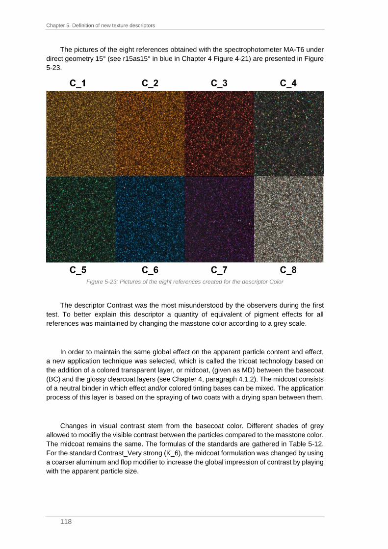
Chapter 5. Definition of new texture descriptors
118
The pictures of the eight references obtained with the spectrophotometer MA-T6 under
direct geometry 15° (see r15as15° in blue in Chapter 4 Figure 4-21) are presented in Figure
5-23.
Figure 5-23: Pictures of the eight references created for the descriptor Color
The descriptor Contrast was the most misunderstood by the observers during the first
test. To better explain this descriptor a quantity of equivalent of pigment effects for all
references was maintained by changing the masstone color according to a grey scale.
In order to maintain the same global effect on the apparent particle content and effect,
a new application technique was selected, which is called the tricoat technology based on
the addition of a colored transparent layer, or midcoat, (given as MD) between the basecoat
(BC) and the glossy clearcoat layers (see Chapter 4, paragraph 4.1.2). The midcoat consists
of a neutral binder in which effect and/or colored tinting bases can be mixed. The application
process of this layer is based on the spraying of two coats with a drying span between them.
Changes in visual contrast stem from the basecoat color. Different shades of grey
allowed to modifiy the visible contrast between the particles compared to the masstone color.
The midcoat remains the same. The formulas of the standards are gathered in Table 5-12.
For the standard Contrast_Very strong (K_6), the midcoat formulation was changed by using
a coarser aluminum and flop modifier to increase the global impression of contrast by playing
with the apparent particle size.
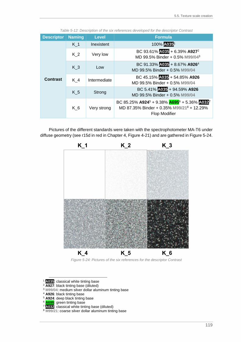
5.5. Texture scale creation
119
Table 5-12: Description of the six references developed for the descriptor Contrast
Descriptor Naming Level Formula
Contrast
K_1 Inexistent 100% A0351
K_2 Very low BC 93.61% A035 + 6.39% A9272
MD 99.5% Binder + 0.5% M99/043
K_3 Low BC 91.33% A035 + 8.67% A9264
MD 99.5% Binder + 0.5% M99/04
K_4 Intermediate BC 45.15% A035 + 54.85% A926
MD 99.5% Binder + 0.5% M99/04
K_5 Strong BC 5.41% A035 + 94.59% A926
MD 99.5% Binder + 0.5% M99/04
K_6 Very strong
BC 85.25% A9245 + 9.38% A6956 + 5.36% A0327
MD 87.35% Binder + 0.35% M99/218 + 12.29%
Flop Modifier
Pictures of the different standards were taken with the spectrophotometer MA-T6 under
diffuse geometry (see r15d in red in Chapter 4, Figure 4-21) and are gathered in Figure 5-24.
Figure 5-24: Pictures of the six references for the descriptor Contrast
1 A035: classical white tinting base 2 A927: black tinting base (diluted) 3 M99/04: medium silver dollar aluminum tinting base 4 A926: black tinting base 5 A924: deep black tinting base 6 A695: green tinting base 7 A032: classical white tinting base (diluted) 8 M99/21: coarse silver dollar aluminum tinting base

Chapter 5. Definition of new texture descriptors
120
For the descriptor Intensity, the assessors sorted the ranges into four categories on
average. This clustering was kept for the intensity scale with the levels: low, moderate,
intense and very intense. In order to obtain a high intensity in light reflection, glass flakes
were selected from the effect tinting bases available. Indeed, these particles act like little
mirrors in coating formulation. To enhance their effect, they were added in the midcoat to
leave the particles on top of the coating film and then improve their influence on lighting. The
formulations are listed in Table 5-13.
Table 5-13: Description of the four references developed for the descriptor Intensity
Descriptor Naming Level Formula
Intensity
I_1 Low 95% A9241 + 5% M99/002
I_2 Moderate 95% A924 + 5% M99/043
I_3 Intense 90% A924 + 10% M99/214
I_4 Very
intense
BC 100% A924
MD 99.7% Binder + 0.3% E025 (glass flakes)
The pictures of the four references obtained with the spectrophotometer MA-T6 under
direct geometry 15° (see r15as15° in blue in Chapter 4, Figure 4-21) for the descriptor
Intensity are presented in Figure 5-25.
Figure 5-25: Pictures of the four references used for the range Intensity
1 A924: deep black tinting base 2 M99/00: extra fine cornflake aluminum tinting base 3 M99/04: medium silver dollar aluminum tinting base 4 M99/21: coarse silver dollar aluminum tinting base

5.5. Texture scale creation
121
For the range Quantity, two to five groups were created during the first phase. However,
the panels rated during this test contained a maximum of 40% of aluminum tinting bases. In
order to assess all types of colors, meaning even silver colors with a high amount of
aluminum pigments in formulas, a wide scale was created, while the number of standards
was reduced with six expert observers. Changes in quantity of effect pigments were made
via the concentration of effect pigments in the midcoat while the basecoat remains black. The
formulas of the twelve different standards are gathered in Table 5-14 and the corresponding
pictures are displayed in Figure 5-26, using diffuse geometry.
Table 5-14: Description of the twelve propositions of references for the descriptor Quantity
Descriptor Naming Level Formula
Quantity
Q_1 0% BC 100% A9241
Q_2 0.025% BC 100% A924
MD 99.975% Binder + 0.025% M99/042
Q_3 0.05% BC 100% A924
MD 99.95% Binder + 0.05% M99/04
Q_4 0.1% BC 100% A924
MD 99.9% Binder + 0.1% M99/04
Q_5 0.5% BC 100% A924
MD 99.5% Binder + 0.5% M99/04
Q_6 1% BC 100% A924
MD 99% Binder + 1% M99/04
Q_7 2% BC 100% A924
MD 98% Binder + 2% M99/04
Q_8 4% BC 100% A924
MD 96% Binder + 4% M99/04
Q_9 6% BC 100% A924
MD 94% Binder + 6% M99/04
Q_10 8% BC 100% A924
MD 92% Binder + 8% M99/04
Q_11 10% BC 100% A924
MD 90% Binder + 10% M99/04
Q_12 100% BC 100% M99/04
1 A924: deep black tinting base 2 M99/04: medium silver dollar aluminum tinting base

Chapter 5. Definition of new texture descriptors
122
Figure 5-26: Pictures of the twelve references created for the range Quantity
The twelve samples were proposed to six expert observers to reduce their number. They
had to select the references needed for the evaluation of the quantity according to their
expertise. Four observers decided to reduce the number of standards to 6, one to 5 and one
to 4. The popularity of each standard was analyzed and is plotted in Figure 5-27.

5.5. Texture scale creation
123
Figure 5-27: Analysis of the popularity of the twelve propositions of references developed for the descriptor
Quantity according to the selection done by the observers
First, the decision was taken to keep the extremum panels so Quantity_0% (Q_1) and
Quantity_100% (Q_12). Then, according to the number of selections, the panels with
0.025%, 0.1%, 0.5% and 6% of aluminum tinting base (respectively Q_2, Q_4, Q_5 and Q_9)
were kept. However, due to an important jump in the perceptive texture, it was decided to
add another new standard, Quantity_2% (Q_7). The final scale for quantity evaluation is thus
made of seven standards.
The last range to create was the Face-Flop range. During the brainstorming sessions,
the difference between face and flop was denoted as flop intensity, interferential effect and
intensity face-flop. To estimate the color travel between front view and side view, specific
pearls offering strong interference effects were used: ChromaFlair® pigments produced by
Viavi. Two of them were selected: the ChromaFlair® Red/Gold 000 and ChromaFlair®
Silver/Green 060. The first one offers shifts from red through orange and yellow into green
while the second shows a travel from silver through green to purplish blue. Light microscopy
images of these two pigments are presented in Figure 5-28.
Figure 5-28: Light microscopy observations of the ChromaFlair® Red/Gold 000 (left side, picture A) and
Silver/Green 060 (right side, picture B), scale indicated 50 µm

Chapter 5. Definition of new texture descriptors
124
For the lightness change between face and flop, it was necessary to establish a
gradation scale. In addition to the traditional aluminum tinting bases, it was decided to use a
special aluminum tinting base, 90-905. The special feature is the extra-fine thickness of the
aluminum particles obtained by physical vapor deposition. The particles reflect light like tiny
mirrors and are used to reproduce chrome effect like e.g. in aluminum rims.
The formulas of the six references created for the descriptor Face-Flop are gathered in
Table 5-15 and the associated pictures, obtained using direct geometry -15° (see r15as-15°
in blue in Chapter 4, Figure 4-21), are given in Figure 5-29.
Table 5-15: Description of the six references developed for the descriptor Face-Flop
Descriptor Naming Level Formula
Face-Flop
F_1 Very low 30% A9241 + 60% M99/002 + 10% A0353
F_2 Low 33% A924 + 67% M99/00
F_3 Moderate 30% A924 + 70% M99/044
F_4 High 70% A924 + 30% 90-905
F_5 Chromatic 30% A924 + 70% ChromaFlair® Red/Gold
F_6 Chromatic 30% A924 + 70% ChromaFlair® Silver/Green
Figure 5-29: Pictures of the six references proposed for the descriptor Face-Flop
1 A924: deep black tinting base 2 M99/00: extra fine cornflakes aluminum tinting base 3 A035: classical white tinting base 4 M99/04: medium silver dollar aluminum tinting base

5.5. Texture scale creation
125
The descriptor Face-Flop is quite difficult to assess due to the definition itself. The travel
between face view and flop view can be either fully chromatic, fully achromatic but also a mix
between chromatic and achromatic. Besides, the particles can be visible or not at flop angle
(≈ 100°). All of these criteria make the evaluation even more complex. It was decided to not
consider this descriptor for the next steps.
Once all the scales were created and sprayed, a special panel holder was designed.
The objectives were first to protect the references from damages or scratches due to the
frequent contact with metal panels, then to simplify the visual assessment of the six
descriptors for the observers and finally to guarantee the alignment of the sample and the
references in the same plane of observation and thus same angle.
The panel holder is made of an aluminum sheet which is coated with a matte dark grey
color to avoid all interferences, such as light reflection from the panel holder, which could
then disturb the observer during the visual assessment. In Figure 5-30, a panel holder is
depicted.
Figure 5-30: Example of a panel holder for the visual evaluation of contrast with standards #1 and #2 also
called Contrast_Inexistent (K_1) and Contrast_Very Low (K_2)
To better understand the functioning of the visual assessment using a procedure based
on reference samples, let’s consider an example. A sample has to be evaluated in terms of
Contrast (written down “Panel to evaluate” in Figure 5-30). The question to answer is “Am I
able to discern the particles from the masstone color?” or “Is the difference between the
masstone color and the particle color big enough to perfectly see them or is it quite difficult
to identify particles in the panel to evaluate?”. The observer takes the panel to evaluate and
has to compare it with the different standards. In a first step he takes the panel holder number
1 made of the standards #1 (K_1 – Contrast_Inexistent) and #2 (K_2 – Contrast_Very Low)
and places the panel to be evaluated in the middle of the two. If no visual match is found, he
takes the next panel holder made of the standards #2 (K_2 – Contrast_Very Low) and #3
(K_3 – Contrast_Low), places his sample in the middle and compares it to the standards.
This process is repeated until a correct visual match with the standards is found.

Chapter 5. Definition of new texture descriptors
126
For the descriptors Size, Contrast, Intensity and Quantity, the number of panel holders
is linked to the number of standards. For the descriptor Contrast, five panel holders are
available: K_1-K_2, K_2-K_3, K_3-K_4, K_4-K_5 and K_5-K_6. For the descriptor Size,
there are 3 panel holders (S_1-S_2, S_2-S_3 and S_3-S_4), same as for the descriptor
Intensity (I_1-I_2, I_2-I_3 and I_3-I_4). For the descriptor Quantity, six panels holders are
proposed: Q_1-Q_2, Q_2-Q_4, Q_4-Q_5, Q_5-Q_7, Q_7-Q_9 and Q_9-Q_12. However, for
the descriptor Color, only one panel holder is available, made of the eight standards, see
Figure 5-31. Indeed, as one sample to test can be a mix of several effect pigments of different
colors, it was necessary to have the standards on the same panel holder.
Figure 5-31: Panel holder used for Color evaluation with the eight standards (where #1 = C_1 -
Color_Gold, #2 = C_2 – Color_Orange , #3 = C_3 – Color_Red, #4 = C_4 – Color_White, #5 = C_5 – Color_Green, #6 = C_6 – Color_Blue, #7 = C_7 – Color_Violet and #8 = C_8 – Color_Aluminum)
Finally, to guarantee the same conditions of evaluation for all observers (see Table 5-9),
a rotating system was used with predefined angles (15°, 25°, 45°, 75° and 110°). The
evaluations can be either conducted under a diffuse light source (light booth with illuminant
D65) or direct light source (spot light).
5.6. Assessment on the definition of new texture descriptors
The definition of new texture descriptors was an important step in present PhD thesis.
The principal objective was to focus on visual appearance. This has been possible by setting
up a new approach to move away from the two parameters initially developed by BYK
Gardner, sparkling and graininess, and ensure a definition of texture appearance based on
six perceptive descriptors.
The identification of the components having a visible influence on visual appearance
allowed a clustering into five groups: aluminum, black, white, colored tinting bases and flop
modifier. Initially, the pearl tinting bases were set aside to avoid multiple interferences on
visual appearance. The huge number of panels sprayed (338) was then used in the free
sorting tests. This was the first-time neophyte and expert observers were involved in the

5.6. Assessment on the definition of new texture descriptors
127
same test session. Besides, when the sorting was made according to texture, it was mainly
on one criterion such as sparkling or quantity. Even if the results obtained were not the ones
wished-for, they highlighted inconsistencies between the two types of wording. Participants
at the free sorting test did not use the same words to describe the same things. It was then
necessary to set up a specific wording. Thanks to brainstorming sessions in three BASF
Coatings sites (US, France and Germany) with overall seventy participants, experts or
neophytes, a wording list was obtained. This is a more detailed list with a definition and also
a gradation scale of the lexicon. The number of parameters found during those sessions was
quite important; in the following, it was then possible to reduce the list to six descriptors: Size,
Color, Contrast, Intensity, Quantity and Face-Flop.
The six texture descriptors coming from the brainstorming sessions were then tested
with three expert observers to evaluate first correct understanding but also the repeatability
and reproducibility of the ratings done on a free scale. Even if the observers were repeatable
to themselves, the reproducibility was not ensured due to the high heterogeneity in the
number of groups per descriptor. Moreover, the tests shed light on the misunderstanding of
two descriptors, Contrast or Face-flop. In addition to the descriptors found and the associated
wording list, it was then necessary to find a method to train the observers to evaluate the
descriptors. The solution for this training was the creation of a texture scale in order to better
define the characteristics to assess by observation. A graduated texture scale was defined
for each descriptor based on really perceptive recommendations. With the standards, it is
now easier to rate a panel to evaluate. Besides, the panel holders also created the possibility
to guarantee the right angle of observation for both standards and the panel to rate.
The visual texture descriptors are now defined. The objective for the next step was to
evaluate the performances of the texture scales in the elaboration of sensorial profiles of test
samples.


129
Chapter 6. Elaboration of sensorial profiles
Contents
6.1. PROTOCOL OF EVALUATION .......................................................................................... 129
6.2. ELABORATION OF SENSORIAL PROFILES ........................................................................ 131
6.2.1. Ratings on the descriptor Color .......................................................................... 132
6.2.2. Assessments of the descriptor Contrast............................................................. 133
6.2.3. Evaluation of the descriptor Size ........................................................................ 136
6.2.4. Elaboration of sensorial profile for the descriptor Intensity ................................ 140
6.2.5. Estimation of the descriptor Quantity ................................................................. 144
6.3. STATISTICAL ANALYSIS PERFORMED ON VISUAL ASSESSMENT DATA FOR THE DEFINITION OF
THE MEAN OBSERVER ............................................................................................................... 147
6.3.1. Outlier labelling ................................................................................................... 148
6.3.2. Definition of the mean observer ......................................................................... 149
6.4. ASSESSMENT ON THE ELABORATION OF SENSORIAL PROFILES ........................................ 155
Characterizing sensorial perceptions is a matter more complicated than it may seem.
The tasks involve a number of parameters that cannot be comprehensively considered and
correlated to physical measurements. The definition of new texture parameters explained in
the previous chapter coupled to the creation of texture scales is supposed to ensure
consistency of the visual assessments. Indeed, the observers share the same wording and
also a pre-established metric to simplify the evaluation with the texture scales. Moreover, a
sensation always combines two very different notions: a subjective evaluation and an
objective evaluation. The implementation of scales makes it possible to master the
subjectivity of the assessor and to reduce the variability of his/her results.
Sensorial profiles are obtained by the evaluation of a complex system based only on
visual appearance. The resulting descriptions of panels are consequently obtained by the
quantification of the descriptors with only the human eye. The sensorial profiles are based
on only five descriptors. As explained before, the Face-Flop evaluation is not the simplest
one, hence the decision was taken to not consider this descriptor for the next steps.
In a first part, the evaluation protocol will be presented describing the selection of the
observers, the samples observed and the conditions of observation. Then, after a brief
discussion of statistical methods used for the average observer determination, the results
obtained on the five descriptors will be reviewed.
6.1. Protocol of evaluation
The purpose of the characterization of sensorial perceptions is to provide a real sensory
identification map, the sensorial profile. In order to obtain coherent results, it is important to
respect the protocol of evaluation for all visual assessment sessions and for all participants.
A set of conditions must be met for the perception to operate normally and to allow a good
evaluation.

Chapter 6. Elaboration of sensorial profiles
130
All participants of the visual assessment sessions were involved in one session of
brainstorming for the creation of a wording list (Thomas, 2016), see Chapter 5, paragraph
5.3. The assessors are considered as experts in their field. The observers were selected
from the color labs either in France or in Germany or from the color development team. Six
observers are from the French color lab, four from the German lab and two from the color
development team. Each participant of the lab is used to evaluate color differences. The
visual acuity of the participants is controlled every three years with the Farnsworth test in the
light booth.
To avoid visual fatigue of the observers, one session per descriptor with a limited
duration of 30 minutes was organized. The first descriptor assessed was Color, then
Contrast, Size, Intensity, followed by Quantity. If possible, the sessions were scheduled in
the morning and there were no consecutive sessions. A briefing was held at the beginning of
each session to really in depth explain its objectives and to present the standards. As
determined in Chapter 5, Table 5-9, each descriptor has to be evaluated according to one
type of illumination system and one specific geometry. Although the participants are used to
making a dynamic evaluation in their daily routine by changing the angle of observation, they
were forced here to observe only at one specific fixed angle to be able then to convert the
observation conditions to future picture acquisition.
To avoid a bias in assessment from observer to observer, sample presentation followed
a specific procedure. The composition of each sample is anonymized. The observers did not
know the type of effect pigments in the formulas hence they could only make assumptions
based on their know-how. Furthermore, a coding was randomly assigned to each sample.
The painted panels were then arranged in ascending order and presented one after the other
to the participant. If needed, a cloth was at their disposal to remove dust or finger prints from
the panels. 34 panels were selected for this test. They represent all standards created for
the different texture scales with the exception of the six standards of the scale for the
descriptor Face-Flop.
For the evaluation, an intensity measurement scale was created. For the size, the texture
scale consists of four standards. The intensity measurement scale available for the rating is
shown in Figure 6-1. The number of the panel to evaluate was written at the beginning of the
scale and each standard was represented by a digit which was also indicated on the panel
holders. There is a multitude of possibilities in the notation which makes it possible to qualify
the perceived intensities compared to the standards (Abbas, 2014). The observer just had to
make a cross at the corresponding area. If it was located on one standard (see rating for
panel #20 in Figure 6-1), the intensity of the panel to assess was equivalent to one of the
standards. The marks were easily converted into numerical values which were used later in
the statistical analysis.

6.2. Elaboration of sensorial profiles
131
Figure 6-1: Answer sheet of one observer for the evaluation of the descriptor Size
The visual assessment was performed either in a dark room or at least isolated from any
light disturbance by a blackout curtain. The tests were performed in a light booth under the
illuminant D65 for diffuse illumination or under a spotlight for directional illumination. The
spotlights used are LED spots for light intensity evaluation or a Solux incandescent light bulb
(36°, 12V, 50W and 4 700K) for color evaluation. The LED spot was preferred to the Solux
lamp because it delivers a more powerful light and it is then easier to estimate the intensity
of light coming from the particles (Descriptor Intensity). On the other side, the Solux bulb
simulates the solar daylight without any weakness in the blue area that would be present for
LEDs so it was chosen for the evaluation of the descriptor Color.
For all evaluations, the angle selected was close to the specular angle. At this geometry,
the panel receives an incident light ray and returns a refracted light ray. The observer is
placed in the trajectory of the refracted light ray. He is therefore blinded by the surface of the
panel. This blinding angle allows to define the angle where the maximum of light is reemerged
by the panel. The assessor has to be close to the specular without being blinded.
6.2. Elaboration of sensorial profiles
For the elaboration of sensorial profiles, the different observers had to evaluate the thirty-
four standards created for the texture scales and for each descriptor, respectively. All the
evaluations started with a quick briefing and explanations of the descriptor to assess.
Besides, the observers had to select the right angle of observation close to the specular
angle but not in the dazzling. The different panel holders were shown to the observers. Figure
6-2 is an illustration of the organization of the elements in the light booth at the beginning of

Chapter 6. Elaboration of sensorial profiles
132
the test. In that case, the descriptor studied is Size with four standards and three panel
holders. The evaluation sheet is placed close to the light booth.
Figure 6-2: Organization of the elements in the light booth for the evaluation of the size where three panel
holders are installed, one of which being placed on the rotating system
6.2.1. Ratings on the descriptor Color
The first session was only performed in the French color lab. The descriptor studied was
Color. The evaluation was performed under directional lighting created by a Solux lamp close
to the maximum of reflection. For this first assessment, only thirteen panels were studied.
Eight panels constituted the texture scale Color (from C_1 to C_8) and five other panels were
chosen from the other ranges. Only a restricted set of panels was considered, as the
standards are mainly formulated with aluminum particles. The results obtained for the six
observers are gathered in Table 6-1 where 0 indicates a solid color.
Table 6-1: Evaluations made by the 6 observers from the French color lab on the descriptor Color for 13 panels under directional lighting conditions
Coding Panel name OBS1 OBS2 OBS3 OBS4 OBS5 OBS6
C_1 Color_Gold 1 + 2 1 1 1 1 1
C_2 Color_Orange 2 2 2 2 2 2
C_3 Color_Red 3 3 3 3 3 3
C_4 Color_White 4 4 4 4 4 4
C_5 Color_Green 5 5 5 5 5 5
C_6 Color_Blue 6 6 6 6 6 6
C_7 Color_Violet 7 7 7 7 7 7
C_8 Color_Aluminum 8 8 8 8 8 8
K_2 Contrast_Very low 8 8 4 8 8 8
S_4 Size_Coarse 8 8 8 4 8 8
K_6 Contrast_Very strong 8 8 4 + 8 8 8 8
I_4 Intensity_Very intense 8 8 4 8 8 8
Q_1 Quantity_0% 0 0 0 6 0 0
All the assessors evaluated the same panels. In 54% of the case (7 panels), all assigned
the same rating. For 4 panels (31%), one observer did not assign the same score as the rest

6.2. Elaboration of sensorial profiles
133
of the group, twice for OBS3 and for OBS4. For 2 panels (15%), one observer assumed a
mix of effect particles in the formula.
For the evaluation of the panels K_2 (Contrast_Very low), I_4 (Intensity_Very intense)
and S_4 (Size_Coarse), the experts’ assumption based on their know-how seemed to be
misleading. Their erroneous assumptions did thus favour precedence over perception. For
the example of panel K_2, colorists based on their expertise could assume at first sight a
white tricoat due to the important lightness level of the panel. These colors are usually
formulated by using a white pearl and the tricoat technology but in that specific case, even if
the lightness level is important, the panel K_2 was formulated with aluminum tinting base
only (see Chapter 4, Table 4-12). Panel Q_1 (Quantity_0%) is a solid color and thus does
not contain any effect particles (see Chapter 5, Table 5-14). The blue effect particles found
by the OBS4 in this panel are due to the scratches on the clearcoat.
However, a problem could be identified following this assessment. For two observers,
OBS1 and OBS3, a mix of colored effect pigments in the formulation was assumed. In that
specific case, however, such a mixture was not used because the formulations selected for
the texture range creation are the simplest ones, containing only one type of effect pigment.
OEM effect colors available on the market, however, are made by mixing several effect
pigments of different colors. The evaluation today is not adapted for the mix of effect
pigments. After this ascertainment, the test was not proposed to the German team and will
not be considered for the definition of physical texture descriptor in the next chapter.
6.2.2. Assessments of the descriptor Contrast
The second evaluation was focused on the Contrast evaluation. The assessment was
done under diffuse lighting with five panel holders, meaning six standards (K_1 to K_6). The
thirty-four standards were rated by twelve observers from the two sites. The contrast can be
explained as the difference in lightness between the background and the particles. The
observers had to rate the panels according to their ability to see or distinguish easily or not
the effect particles from 1 (equal to K_1, Contrast_Inexistent) for solid colors to 6 (equivalent
to K_6, Contrast_Very Strong) for a maximum of contrast. The results of the different
observers are plotted in Figure 6-3 and are summarized in appendix A.1

134
Figure 6-3: Evaluation made by 12 observers under diffuse lighting conditions on the descriptor Contrast for 34 panels, where panels K_1 to K_6 are the standards of the range
Contrast

6.2. Elaboration of sensorial profiles
135
For the descriptor Contrast, the evaluations of the observers follow the same trend, see
Figure 6-4. The panels K_1 to K_6 were rated according to their corresponding standards of
the range.
Figure 6-4: Evaluation made by 12 observers under diffuse lighting conditions on the descriptor Contrast
for the panels of the range Contrast
By considering the panels Q_1 to Q_12 corresponding to the range Quantity, the
observers easily assigned the same rating for the panels with low quantity of effect pigments
(Q_2 to Q_6). However, based on Figure 6-5, the evaluation of panels Q_7 to Q_12 was
more difficult and the results obtained show a high variation. For example, on the twelve
ratings of Q_12 – Quantity_100%, the variance is equal to 0.7 with ratings from 1 to 4. Due
to the high concentration of aluminum particles in the coating, the metallic particles cannot
be distinguished easily from the background. In fact, isolating these aluminum particles from
the background is quite difficult as they overlap.
Figure 6-5: Evaluation made by 12 observers under diffuse lighting conditions on the descriptor Contrast
for the panels of the range Quantity

Chapter 6. Elaboration of sensorial profiles
136
However, for panels C_1 to C_8, standards of the range Color, the opinions were rather
mixed, see Figure 6-6. One of the reasons is probably linked to the apparent particle size.
As explained in Chapter 5, Table 5-11, pearlescent materials are used in the formulas of
these standards. These effect particles are finer than the aluminum particles. Moreover, as
they are colored, the contrast between the dark background and the effect particles could be
difficult to estimate.
Figure 6-6: Evaluation made by 12 observers under diffuse lighting conditions on the descriptor Contrast
for the panels of the range Color
Only the contrast in luminance has been evaluated but in the case of colored references,
the chromaticity changes. Possibly, the unassessed chromaticity contrast interferes with the
visual evaluations. Also, the human visual system is based on receptor fields of different
sizes that collect contrast in luminance. The human eye is not sensitive to contrasts in the
same way, but may differ, depending on the size of the object being observed. Nevertheless,
with some exceptions, the global tendency in the evaluation is apparent.
6.2.3. Evaluation of the descriptor Size
The third session of visual assessment was dedicated to the evaluation of Size. It was
performed by all observers in the light booth. The descriptor Size is linked to the apparent
size of the optical effect of one particle. This range is made of four standards (S_1 to S_4)
and the ratings are made on the intensity measurement scale and can reach 0 for a solid
color or be greater than 4 if the participant thought the size of the size standard #4 (S_4,
Size_Coarse) was smaller than the panel to rate. The results are presented in Figure 6-7 and
are gathered in appendix A.2.

137
Figure 6-7: Evaluation made by 12 observers under diffuse lighting conditions on the descriptor Size for 34 panels, where panels S_1 to S_4 are the standards of the range
Size

Chapter 6. Elaboration of sensorial profiles
138
For the descriptor Size, the ratings assigned by the observers are in the same range.
The observers were able to rate the panels S_1 to S_4 at the same level as the standards of
the range with however a little more varied results for the panel S_4, Size_Coarse, see Figure
6-8.
Figure 6-8: Evaluation made by 12 observers under diffuse lighting conditions on the descriptor Size for
the panels of the range Size
For the panels from the range Intensity (I_1 to I_4), the assessors agreed on the ratings
awarded, with the exception of panel I_4, Very intense, see Figure 6-9. This deviation can
be linked to the low amount of effect particles in the formulation (see Chapter 5, Table 5-13).
Figure 6-9: Evaluation made by 12 observers under diffuse lighting conditions on the descriptor Size for
the panels of the range Intensity
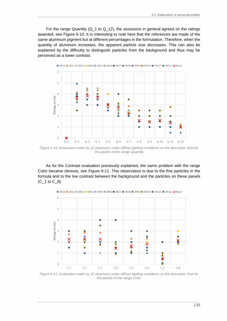
6.2. Elaboration of sensorial profiles
139
For the range Quantity (Q_1 to Q_12), the assessors in general agreed on the ratings
awarded, see Figure 6-10. It is interesting to note here that the references are made of the
same aluminum pigment but at different percentages in the formulation. Therefore, when the
quantity of aluminum increases, the apparent particle size decreases. This can also be
explained by the difficulty to distinguish particles from the background and thus may be
perceived as a lower contrast.
Figure 6-10: Evaluation made by 12 observers under diffuse lighting conditions on the descriptor Size for
the panels of the range Quantity
As for the Contrast evaluation previously explained, the same problem with the range
Color became obvious, see Figure 6-11. This observation is due to the fine particles in the
formula and to the low contrast between the background and the particles on these panels
(C_1 to C_8).
Figure 6-11: Evaluation made by 12 observers under diffuse lighting conditions on the descriptor Size for
the panels of the range Color

Chapter 6. Elaboration of sensorial profiles
140
For the panels K_2 and K_3 (Contrast_Very Low and Contrast_Low respectively) from
the range Contrast, the color of the background is quite similar to the one of the particles. To
isolate particles can be tricky so the size evaluation is not easy, hence the diverse
assessments, see Figure 6-12.
Figure 6-12: Evaluation made by 12 observers under diffuse lighting conditions on the descriptor Size for
the panels of the range Contrast
6.2.4. Elaboration of sensorial profile for the descriptor Intensity
The penultimate evaluation concerned the descriptor Intensity. The respective
assessment was performed under direct lighting conditions to maximize the reflected light
coming from the particles. The objective of this evaluation was to estimate the amount of light
reflected by the effect particles. This range is made of four standards: I_1 to I_4. All twelve
observers participated in this assessment. As for the size, the rating can be equal to 0 for a
solid color or be greater than 4 if the participant estimated the intensity of the panel greater
than the one of the intensity standard #4 (I_4, Intensity_Very Intense). The results are plotted
in Figure 6-13 and detailed in appendix A.3. The ratings of the thirty-four panels for the
descriptor Intensity follow mainly the same trend.

141
Figure 6-13: Evaluation made by 12 observers under directional lighting conditions on the descriptor Intensity for 34 panels where panels I_1 to I_4 are the standards of the
range Intensity

Chapter 6. Elaboration of sensorial profiles
142
The assessors rated the panels I_1 to I_4 according to the corresponding standards,
see Figure 6-14.
Figure 6-14: Evaluation made by 12 observers under directional lighting conditions on the descriptor
Intensity for the panels of the range Intensity
The panels from the range Size (S_1 to S_4) show cohesion in the ratings, see Figure
6-15.
Figure 6-15: Evaluation made by 12 observers under directional lighting conditions on the descriptor
Intensity for the panels of the range Size

6.2. Elaboration of sensorial profiles
143
Larger differences in the evaluation of the panels K_2 and K_3 from the range Contrast
(Contrast_Very Low and Contrast_Low respectively) become obvious, supposedly linked to
the weak contrast, see Figure 6-16.
Figure 6-16: Evaluation made by 12 observers under directional lighting conditions on the descriptor
Intensity for the panels of the range Contrast
As for the evaluation of the previous descriptors, the panels C_1 to C_8 from the range
Color were difficult to rate due to the low contrast and the size of the particles used (Figure
6-17).
Figure 6-17: Evaluation made by 12 observers under directional lighting conditions on the descriptor
Intensity for the panels of the range Color

Chapter 6. Elaboration of sensorial profiles
144
Then, for the panels of the range Quantity (Q_1 to Q_12), the evaluation globally follows
the same trend nevertheless it shows some disparities (Figure 6-18). It is interesting to note
here that these eleven panels are made of the same aluminum pigment but at different
percentages in the formula. And so, when the quantity of aluminum increases, the relative
intensity coming from the particles and perceived by the human visual system decreases.
This can be explained anew by the difficulty to distinguish particles from the background and
also by a local adaptation in a situation of low contrast (see Figure 6-3 and Figure 6-5).
Figure 6-18: Evaluation made by 12 observers under directional lighting conditions on the descriptor
Intensity for the panels of the range Quantity
6.2.5. Estimation of the descriptor Quantity
The last evaluation under diffuse lighting conditions was the one for the descriptor
Quantity. For the first trial after the conception phase, the range comprised twelve standards.
Finding differences between these standards, mainly at high percentage of aluminum
particles was quite difficult. Thanks to the comments from the observers, some of the panels
were eliminated and the final number of standards kept for the same range is equal to seven
(Q_1, Q_2, Q_4, Q_5, Q_7, Q_9 and Q_12). For this assessment, only ten observers
participated and their evaluations are gathered in Figure 6-19 and in appendix A.4.
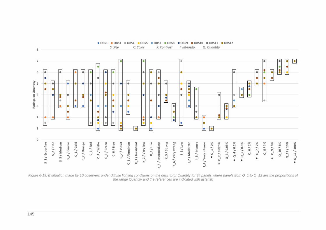
145
Figure 6-19: Evaluation made by 10 observers under diffuse lighting conditions on the descriptor Quantity for 34 panels where panels from Q_1 to Q_12 are the propositions of
the range Quantity and the references are indicated with asterisk

Chapter 6. Elaboration of sensorial profiles
146
This range was maybe the most difficult to assess for the observers. Firstly, it contains
many standards compared to the other ranges. Secondly, it is also a kind of circular range
as the difference between the quantity standard #1 (Q_1, solid color) and the quantity
standard #7 (Q_12, aluminum color) is reduced. In this specific case, the contrast of the panel
Q_12 is low. Indeed, under diffuse lighting conditions it can be considered as a solid color as
particles are not easily isolated from the background. Based on their knowledge, participants
understood at first sight the formula corresponding to Q_12. Globally, the observers rated
the panels of the range Quantity according to their corresponding standards, see Figure 6-20.
Figure 6-20: Evaluation made by 10 observers under diffuse lighting conditions on the descriptor Quantity
for the panels of the range Quantity
However, huge differences in ratings can be noticed for the panels of the range Color
(C_1 to C_8), see Figure 6-21. Indeed, the effect particles in formulas are so fine that
estimating their quantity is complicated.
Figure 6-21: Evaluation made by 10 observers under diffuse lighting conditions on the descriptor Quantity
for the panels of the range Color

6.3. Statistical analysis performed on visual assessment data for the definition of the mean observer
147
For the panels of the range Contrast and mainly K_2 to K_5, the quantity of effect
pigments in the formula is equivalent and only the background color changes with the tricoat
technology (see Chapter 50, Table 5-12). For the majority of observers, the perceived
quantity of particles decreases along with the global lightness value, see Figure 6-22.
Figure 6-22: Evaluation made by 10 observers under diffuse lighting conditions on the descriptor Quantity
for the panels of the range Contrast
The results obtained on the elaboration of sensorial profiles show that, depending on
the formula, the defined texture descriptors are more or less important. This means that at
the level of the physical signal, the prominent elements can be of several types and can
compete with one another.
6.3. Statistical analysis performed on visual assessment
data for the definition of the mean observer
After the establishment of sensorial profiles by twelve experienced observers, the
objective was then to define a mean observer based on their ratings. The use of a texture
scale should have ensured the consistency of the evaluations. However, even if the ratings
follow a trend as presented in paragraph 6.2, some observations deviate too much from the
others, and are considered as outliers. The deviations are observed mainly for the panels of
the range Color (C_1 to C_8) for all the descriptors or the rating obtained for the descriptor
Quantity. According to Hawkins, “an outlier is an observation which deviates so much from
the other observations as to arouse suspicions that it was generated by a different
mechanism” (Hawkins, 1980). The detection of outliers is of major importance for the
determination of the mean observer. Indeed, for each descriptor, a mean observer should be
calculated from the evaluations of all observers. The presence of deviant values could
jeopardize the accuracy and the reliability of the mean observer thus obtained. Different
methods exist for the evaluation of values of a given system and determination of outliers;
these are presented in the following before defining the mean observer.

Chapter 6. Elaboration of sensorial profiles
148
6.3.1. Outlier labelling
This paragraph is dedicated to a brief description of the techniques which are used for
outlier labelling. For a better understanding, some methods cited in literature are presented
in the following. The detection of outliers is important because they have an influence on the
statistical values such as the mean or the variance.
The Grubbs’ outlier test, (Grubbs, 1969), is used to detect outliers for normally
distributed data for a set containing a minimum of six values. It detects one outlier at a time
and iterates up to the absence of outliers. This test is based on two hypotheses, H0 and H1,
where H0 assumes the absence of outliers and H1 the presence of one outlier. The Grubbs
test checks the values which deviate the most from the mean according to equation (6-1).
𝐺 =max (𝑋𝑖 − �̅�)
𝜎 (6-1)
With �̅�, mean of the sample
𝜎, standard deviation
To detect the outliers, the G value obtained should be compared to the critical value,
Gcrit, defined for a significance level α=0.05% or 0.10% and for a number of elements in a
set, see Table 6-2. The critical value must be adapted when an outlier is removed from the
list.
Table 6-2: Critical value for the Grubbs test with a significance level of 0.05% or 0.10%
n Gcrit
(α=0.05%)
Gcrit
(α=0.10%) n
Gcrit
(α=0.05%)
Gcrit
(α=0.10%)
3 1.1531 1.1547 8 2.1266 2.2744
4 1.4812 1.4962 9 2.2150 2.3868
5 1.7150 1.7637 10 2.2900 2.4821
6 1.8871 1.9728 11 2.3547 2.5641
7 2.0200 2.1391 12 2.4116 2.6357
The standard deviation method or SD method is a simple approach which uses the mean
and the standard deviation. Two adaptations exist: the 2 SD or the 3 SD as detailed in
equation (6-2).
2𝑆𝐷 𝑀𝑒𝑡ℎ𝑜𝑑 = �̅� ± 2𝜎𝑜𝑟
3𝑆𝐷 𝑀𝑒𝑡ℎ𝑜𝑑 = �̅� ± 3𝜎 (6-2)
With �̅�, mean of the sample
𝜎, standard deviation
However, it is important to note that the mean and the standard deviation used in the
SD method are mainly impacted by outliers (Olewuezi, 2011). The MADe method was then
developed to avoid this strong impact of outliers on statistical measurements (Hampel, 1971).
This method is based on the definition of an estimator, MAD for median absolute deviation,
which corresponds to the median value of the difference between a value and its median,

6.3. Statistical analysis performed on visual assessment data for the definition of the mean observer
149
see equation (6-3). The median or the second quartile (Q2) represents the value under which
50% of the other values lie below.
2𝑀𝐴𝐷𝑒 𝑀𝑒𝑡ℎ𝑜𝑑 = 𝑀𝑒𝑑𝑖𝑎𝑛 ± 2𝑀𝐴𝐷𝑒𝑜𝑟
3𝑀𝐴𝐷𝑒 𝑀𝑒𝑡ℎ𝑜𝑑 = 𝑀𝑒𝑑𝑖𝑎𝑛 ± 3𝑀𝐴𝐷𝑒𝑤𝑖𝑡ℎ
𝑀𝐴𝐷𝑒 = 1.483𝑀𝐴𝐷𝑀𝐴𝐷 = 𝑀𝑒𝑑𝑖𝑎𝑛(|𝑋𝑖 −𝑀𝑒𝑑𝑖𝑎𝑛(𝑥)|)
(6-3)
Small sets of samples can be adapted as proposed in equation (6-4) by (Iglewicz and
Hoaglin, 1991). The authors’ recommendation on the outlier detection is based on a threshold
value of 3.5. To be considered as an outlier, the Mi value must be below 3.5.
𝑀𝑖 =0.6745(𝑋𝑖 − �̅�)
𝑀𝐴𝐷 (6-4)
The Tukey fences or IQR (interquartile range) method (Tukey, 1977) identifies two
boundaries for outlier detection based on the interquartile range, see equation (6-5). The first
and the third quartiles, Q1 and Q3, represent 25% of the ratings or 75% which lie below this
value, respectively. A value which does not bellow to the outer fences is considered as an
outlier, and a value between the inner and outer fences is a potential outlier.
𝐼𝑄𝑅 = 𝑄3−𝑄1𝐼𝑛𝑛𝑒𝑟 𝑓𝑒𝑛𝑐𝑒𝑠 ∶ [𝑄1 − 1.5 𝐼𝑄𝑅; 𝑄3 + 1.5 𝐼𝑄𝑅]
𝑂𝑢𝑡𝑒𝑟 𝑓𝑒𝑛𝑐𝑒𝑠 ∶ [𝑄1 − 3 𝐼𝑄𝑅;𝑄3 + 3 𝐼𝑄𝑅] (6-5)
With IQR, interquartile range
Q1, first quartile
Q3, third quartile
Also based on interquartile range, the median rule is the last method presented here.
The values must be in the range presented in equation (6-6) to not be considered as outlier.
[𝐾1; 𝐾2] = 𝑄2 ± 2.3 × 𝐼𝑄𝑅 (6-6)
With IQR, interquartile range
Q2, second quartile or median value
After detailing different methods to identify outliers, it is necessary to determine which
one is the most suitable for the definition of the mean observer. The identification methods
are tested on the ratings in the next paragraph.
6.3.2. Definition of the mean observer
For the definition of the mean observer, the selection of the appropriate outlier detection
method is mandatory. The statistical measurements for the ratings obtained from the ten
observers for the panel K_2 for the descriptor Quantity [respectively for OBS1 to OBS10: 1.5;
2; 1.5; 1.5; 6; 7; 4; 1.8; 6; 5]. are gathered in Table 6-3.

Chapter 6. Elaboration of sensorial profiles
150
Table 6-3: Statistical measurements for panel K_2 obtained for the descriptor Quantity
Mean Standard Deviation Median Q1 Q3 IQR
3.63 2.21 3 1.575 5.75 4.175
As explained in Chapter 6 paragraph 6.3.1, the Grubbs outlier test is used for normally
distributed data. First, it is necessary to check if the ratings obtained for panel K_2 for the
descriptor Quantity follow this prerequisite.
The normality test available in the software Minitab was used (Minitab, 2019). This
normality test is based on two hypotheses: H0, data follow a normal distribution and H1, data
do not follow a normal distribution. If the p-value1 obtained by this test is less than or equal
to the significance level (α=0.05), the hypothesis H0 is rejected and the data do not follow a
normal distribution.
The probability plot obtained after the normality test is presented in Figure 6-23. It
represents the estimated cumulative distribution function by plotting the value of each rating
against the estimated cumulative probability. In that case, the p-value is equal to 0.042 which
is less than the significance level of 0.052. Hence, the data do not follow a normal distribution
and the Grubbs outlier test cannot be used.
Figure 6-23: Probability plot obtained after normality test in Minitab for the ratings of panel K_2
1 The p-value or probability value represents the statistical significance in a hypothesis test.

6.3. Statistical analysis performed on visual assessment data for the definition of the mean observer
151
The different methods presented in Chapter 6, paragraph 6.3.1, were applied to the data
set of K_2, the results are gathered in Table 6-4.
Table 6-4: Comparison of different methods for outlier detection in the ratings obtained for panel K_2 for the descriptor Quantity based on the observations of 10 participants
Method Range Outliers?
Grubbs Not adapted Not adapted
2-SD [-0.80;8.06] None
3-SD [-3.02;10.28] None
2-MADe [0;3] 5
3-MADe [0;3] 5
MAD Not adapted, MAD=0 None
Tukey fences Inner: [-4.69;12.01]
Outer: [-10.95;18.28] None
Median rule [-6.60;12.60] None
Based on the results of the different methods for outlier detection, the Grubbs test, the
SD method, the MAD method for small sets of samples, the Tukey fences and the median
rule are not applied. Potentially, the 2-MADe and the 3-MADe method seem to be applicable
for this case, but they removed 5 outliers so 42% of the set considered. Moreover, the MAD
value is equal to 0 so these two tests are maybe not that efficient on the data obtained.
To label the outliers, the decision was taken to use the Kruskal Wallis test in XLStats.
This test is non-parametric; it does not assume a normal distribution of the data. It determines
if the medians of two or more groups differ and also if all the elements belong to the same
group or if one element of the group does not belong to it, the potential outlier. Box plots were
then used to highlight the potential outliers. An example of the box plot obtained for the
evaluation of the descriptor Contrast is presented in Figure 6-24. The box plots of the panels
Q_1 to Q_12 are not shown in Figure 6-24 for the ease of reading.

152
Figure 6-24: Box plot obtained after the use of the Kruskal Wallis test for the evaluation of the descriptor Contrast where the red cross indicates the mean and the blue cross or
point the outliers
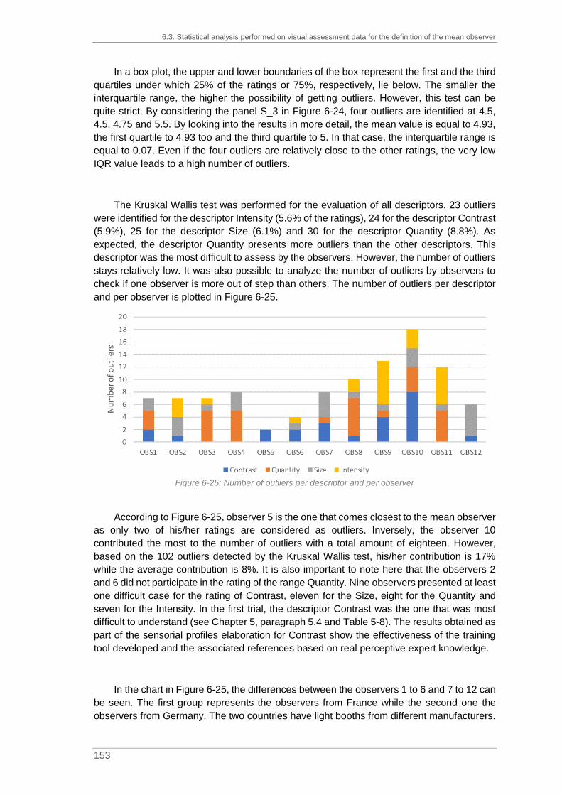
6.3. Statistical analysis performed on visual assessment data for the definition of the mean observer
153
In a box plot, the upper and lower boundaries of the box represent the first and the third
quartiles under which 25% of the ratings or 75%, respectively, lie below. The smaller the
interquartile range, the higher the possibility of getting outliers. However, this test can be
quite strict. By considering the panel S_3 in Figure 6-24, four outliers are identified at 4.5,
4.5, 4.75 and 5.5. By looking into the results in more detail, the mean value is equal to 4.93,
the first quartile to 4.93 too and the third quartile to 5. In that case, the interquartile range is
equal to 0.07. Even if the four outliers are relatively close to the other ratings, the very low
IQR value leads to a high number of outliers.
The Kruskal Wallis test was performed for the evaluation of all descriptors. 23 outliers
were identified for the descriptor Intensity (5.6% of the ratings), 24 for the descriptor Contrast
(5.9%), 25 for the descriptor Size (6.1%) and 30 for the descriptor Quantity (8.8%). As
expected, the descriptor Quantity presents more outliers than the other descriptors. This
descriptor was the most difficult to assess by the observers. However, the number of outliers
stays relatively low. It was also possible to analyze the number of outliers by observers to
check if one observer is more out of step than others. The number of outliers per descriptor
and per observer is plotted in Figure 6-25.
Figure 6-25: Number of outliers per descriptor and per observer
According to Figure 6-25, observer 5 is the one that comes closest to the mean observer
as only two of his/her ratings are considered as outliers. Inversely, the observer 10
contributed the most to the number of outliers with a total amount of eighteen. However,
based on the 102 outliers detected by the Kruskal Wallis test, his/her contribution is 17%
while the average contribution is 8%. It is also important to note here that the observers 2
and 6 did not participate in the rating of the range Quantity. Nine observers presented at least
one difficult case for the rating of Contrast, eleven for the Size, eight for the Quantity and
seven for the Intensity. In the first trial, the descriptor Contrast was the one that was most
difficult to understand (see Chapter 5, paragraph 5.4 and Table 5-8). The results obtained as
part of the sensorial profiles elaboration for Contrast show the effectiveness of the training
tool developed and the associated references based on real perceptive expert knowledge.
In the chart in Figure 6-25, the differences between the observers 1 to 6 and 7 to 12 can
be seen. The first group represents the observers from France while the second one the
observers from Germany. The two countries have light booths from different manufacturers.

Chapter 6. Elaboration of sensorial profiles
154
This difference in equipment presumably leads to slight shifts in the ratings. Indeed, in the
German light booth, it is easier to perceive the very fine particles as the pearlescent materials
used for the range Color, than in the French one. However, it is important to put these
differences into perspective. As previously mentioned, the outliers identified by the Kruskal
Wallis test are mainly dependent on the IQR. Indeed, the height of the boxes in Figure 6-24
is connected to the strong or weak consensus between the observers. The outliers labelled
by the Kruskal Wallis test for weak IQR are not necessarily so far from non-outlier values.
After the exclusion of outliers, the new values of the mean are then calculated to define
the mean observer for each descriptor. The four mean observers are gathered in Table 6-5.
Table 6-5: Values of the mean observer for the four descriptors, determined after exclusion of outliers
Panel ID Contrast Size Intensity Quantity
S_1 3 1 1 4.8
S_2 4.04 2 1.72 4.78
S_3 5 3 2.79 3.91
S_4 5.44 3.75 3.14 3.3
C_8 4.36 2.09 2 3.95
C_7 1.25 0.37 1.11 2.48
C_6 3.63 1.69 2.58 3.3
C_5 3.38 1.66 2.25 3.57
C_1 4.17 2.27 1.46 5
C_2 4.33 2.26 1.43 4.58
C_3 4.23 1.94 2.64 4.25
C_4 3.69 1.2 2.8 2.73
K_1 1 0 0 1
K_2 2 1.08 2.3 3.63
K_3 3 1.78 2.54 3.45
K_4 4 2.27 2.7 4.25
K_5 5 3.32 2.85 3.91
K_6 6 4.49 4.19 2.68
I_1 2.93 1 1 5.44
I_2 4.39 2.27 2 4.2
I_3 5.21 3.62 3 2.55
I_4 4.79 2.89 4 1.5
Q_1 1 0 0 1
Q_2 5.42 3.67 3.32 2.03
Q_3 5.5 3.82 3.17 2.56
Q_4 5.22 3.72 2.88 3.28
Q_5 5 3 2.66 4
Q_6 4.54 2.73 2.27 4.83
Q_7 4.02 2.07 2.11 5.25
Q_8 3.29 1.58 1.93 6.02
Q_9 2.85 1.46 1.77 6
Q_10 3.04 1.63 1.7 6.37
Q_11 2.7 1.23 1.56 6.6
Q_12 2.25 1 1.23 7
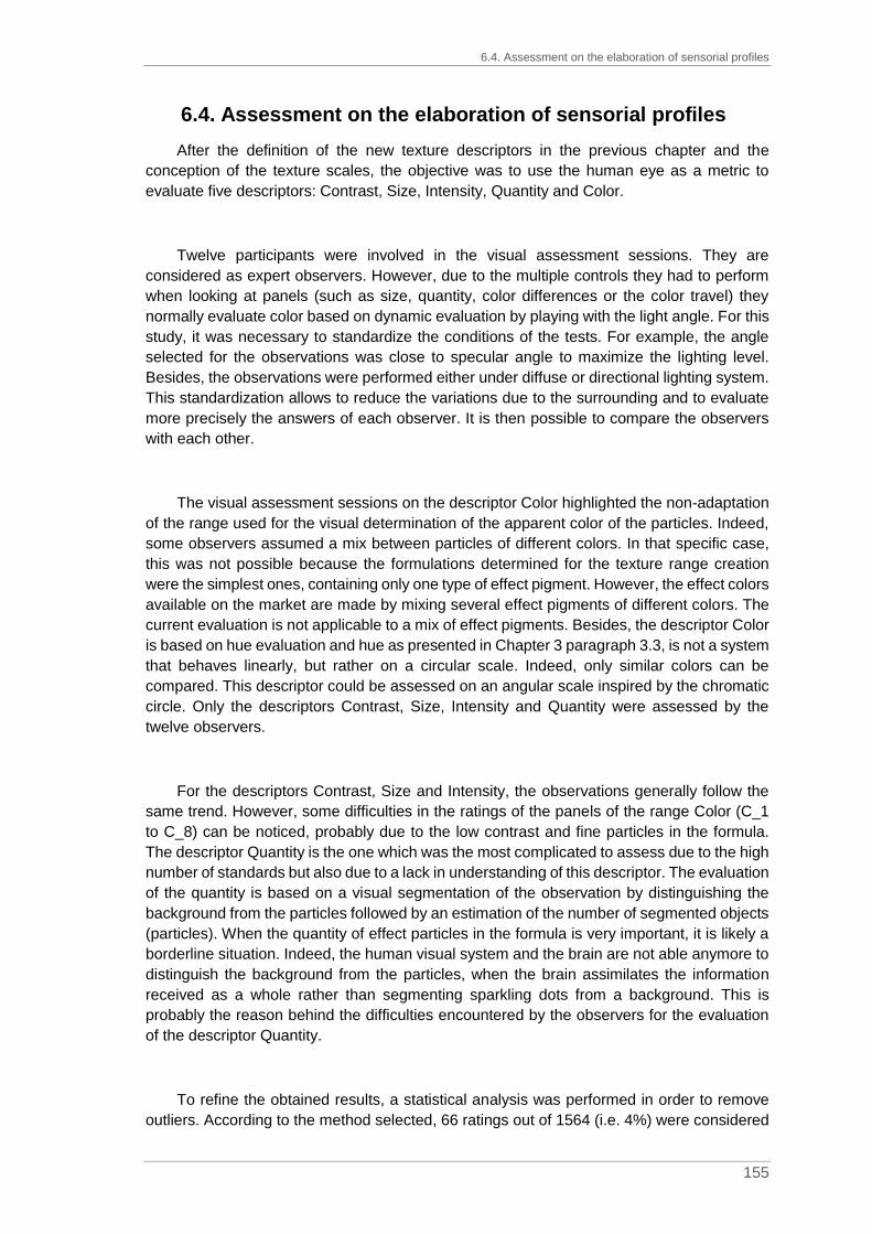
6.4. Assessment on the elaboration of sensorial profiles
155
6.4. Assessment on the elaboration of sensorial profiles
After the definition of the new texture descriptors in the previous chapter and the
conception of the texture scales, the objective was to use the human eye as a metric to
evaluate five descriptors: Contrast, Size, Intensity, Quantity and Color.
Twelve participants were involved in the visual assessment sessions. They are
considered as expert observers. However, due to the multiple controls they had to perform
when looking at panels (such as size, quantity, color differences or the color travel) they
normally evaluate color based on dynamic evaluation by playing with the light angle. For this
study, it was necessary to standardize the conditions of the tests. For example, the angle
selected for the observations was close to specular angle to maximize the lighting level.
Besides, the observations were performed either under diffuse or directional lighting system.
This standardization allows to reduce the variations due to the surrounding and to evaluate
more precisely the answers of each observer. It is then possible to compare the observers
with each other.
The visual assessment sessions on the descriptor Color highlighted the non-adaptation
of the range used for the visual determination of the apparent color of the particles. Indeed,
some observers assumed a mix between particles of different colors. In that specific case,
this was not possible because the formulations determined for the texture range creation
were the simplest ones, containing only one type of effect pigment. However, the effect colors
available on the market are made by mixing several effect pigments of different colors. The
current evaluation is not applicable to a mix of effect pigments. Besides, the descriptor Color
is based on hue evaluation and hue as presented in Chapter 3 paragraph 3.3, is not a system
that behaves linearly, but rather on a circular scale. Indeed, only similar colors can be
compared. This descriptor could be assessed on an angular scale inspired by the chromatic
circle. Only the descriptors Contrast, Size, Intensity and Quantity were assessed by the
twelve observers.
For the descriptors Contrast, Size and Intensity, the observations generally follow the
same trend. However, some difficulties in the ratings of the panels of the range Color (C_1
to C_8) can be noticed, probably due to the low contrast and fine particles in the formula.
The descriptor Quantity is the one which was the most complicated to assess due to the high
number of standards but also due to a lack in understanding of this descriptor. The evaluation
of the quantity is based on a visual segmentation of the observation by distinguishing the
background from the particles followed by an estimation of the number of segmented objects
(particles). When the quantity of effect particles in the formula is very important, it is likely a
borderline situation. Indeed, the human visual system and the brain are not able anymore to
distinguish the background from the particles, when the brain assimilates the information
received as a whole rather than segmenting sparkling dots from a background. This is
probably the reason behind the difficulties encountered by the observers for the evaluation
of the descriptor Quantity.
To refine the obtained results, a statistical analysis was performed in order to remove
outliers. According to the method selected, 66 ratings out of 1564 (i.e. 4%) were considered

Chapter 6. Elaboration of sensorial profiles
156
as “absurd”. After removal of these values, the “corrected” mean values for each panel on
each standard were calculated to determine the mean observer. This mean observer will be
used in the next chapter to define the physical texture descriptors based on ground truth
data.

157
Chapter 7. Definition of physical texture
descriptors
Contents
7.1. PICTURE ACQUISITION .................................................................................................. 158
7.1.1. System of acquisition.......................................................................................... 158
7.1.2. Calibration of the picture acquisition system ...................................................... 160
7.1.3. Presentation of the assembly and lighting systems used for picture acquisition 162
7.1.4. Picture acquisition .............................................................................................. 165
7.2. BASICS OF PICTURE ANALYSIS ...................................................................................... 167
7.2.1. Filtering operations ............................................................................................. 167
7.2.2. Segmentation ..................................................................................................... 168
7.2.3. Dilation, erosion, opening and closing................................................................ 169
7.2.4. Histogram analysis and statistical measurement ............................................... 171
7.3. PICTURE ANALYSIS FOR THE DETERMINATION OF PHYSICAL TEXTURE DESCRIPTORS ........ 175
7.3.1. Selection and pretreatment of the region of interest .......................................... 175
7.3.2. Definition of Contrast by histogram analysis ...................................................... 178
7.3.3. Determination of Size based on opening operations ......................................... 186
7.3.4. Definition of Quantity by histogram analysis ...................................................... 192
7.3.5. Determination of Intensity based on histogram analysis .................................... 194
7.4. DETERMINATION OF PANEL SIMILARITIES ....................................................................... 197
7.5. ASSESSMENT ON THE DEFINITION OF PHYSICAL TEXTURE DESCRIPTORS ......................... 204
Now, established ground truth data describing automotive coatings via real perceived
criteria and without any consideration of the formulation is available, enabling the evaluation
of the effectiveness and relevance of any measurement made from color or grey scale
images.
The visual aspect of an effect coating is linked to its composition and the optical and
physical properties inherent to the type of pigments in the formula but also to the viewing
conditions such as the type of light or the angle of observation. Chapter 4 was devoted to the
presentation of different effect pigments used in automotive coatings. The properties of each
family of pigments were discussed in detail considering, for example, the impact of the type
of aluminum particles (corn flakes or silver dollar) on the sparkling effect. Chapter 5 is based
on the definition of new texture descriptors. Six of them were identified: Size, Color, Contrast,
Intensity, Quantity and Face-Flop. However, since the descriptor Face-Flop revealed high
complexity during visual assessment, this descriptor was not considered (Chapter 5). The
five remaining descriptors and their associated texture scales were used in Chapter 6 to
elaborate sensorial profiles on test panels. However, after the visual assessment performed
on the descriptor Color, this descriptor was not considered anymore in the following visual
evaluation due to the difficulties in the interpretation of the obtained results.

Chapter 7. Definition of physical texture descriptors
158
The definition of physical texture descriptors was based on experience and knowledge
of experts. These ground truth data will in the following be used to better define physical
texture descriptors which must represent the texture descriptors previously highlighted and
defined. The physical texture descriptors should be as close as possible to the texture
descriptors obtained by expert definition to better match the results from visual assessments.
However, before defining the physical descriptors by picture analysis, the acquisition
conditions had to be adapted to the observations conditions.
7.1. Picture acquisition
An image acquisition device captures light information before converting it into an analog
electrical signal: the video signal. This video signal is sampled, quantized and stored in a
digital image (Trémeau et al., 2004). To analyze and process a digital image without any
problems, it is extremely important to master the acquisition phase. Indeed, this phase
conditions and sets the limits of the use of digital images.
7.1.1. System of acquisition
Certain similarities exist between the human visual system and a digital single-lens
reflex camera. Similarly to the human visual system (see Chapter 2, paragraph 2.3), the
camera is composed of a lens which focuses light before it passes through a diaphragm, the
shutter, which would correspond to the pupil in the human eye. The resulting virtual image is
inverted and projected onto a sensor, which is equivalent to the human retina. Each optical
system responds differently to light. It is therefore necessary to fully characterize the camera
selected before using it.
For the picture acquisition, a digital single-lens reflex camera was used, the Nikon D800.
It offers a high resolution (7,360 x 4,912 pixels), high sensitivity and a wide dynamic range.
The camera is paired with a Nikon AF-S FX NIKKOR 50mm f/1.4G lens with auto focus. This
lens is considered sufficiently effective to get enough details at a distance of about 70 cm
from the undeformed panel. The lens aperture varies between f/1.4 and f/16. The samples
photographed contain effect pigments with a considerable amount of small and sparkly
particles. The sharpness of the picture is an important parameter to be able to consider the
entire sparkle phenomenon. In addition, the brightness of the picture is also an important
parameter. As detailed later, the pictures are taken in a black room, so a dark environment.
The setting selected must be in accordance with the illumination of the scene. The acquisition
of images is based on three pillars: ISO, lens aperture and the shutter time. The distance
between the camera and the scene can also have an influence on the results but to simplify
the acquisition system, it will be fixed at 70cm (see explanations in Chapter 7 paragraph
7.1.3).
ISO sensitivity is a setting which brightens or darkens a picture. By increasing the ISO
value, the pictures tend to become lighter (see Figure 7-1). ISO sensitivity is based on a more
or less strong amplification of the input signal. The stronger the amplification, the more noise
the picture shows. Native ISO, meaning without amplification, is set at 160 for the Nikon
D800.

7.1. Picture acquisition
159
Figure 7-1: Impact of the ISO value on the brightness of the picture from (Mansurov, 2010a)
The lens aperture allows the control of the amount of light entering into the camera.
Depending on the opening size, a blurry background results from a large aperture whereas
a sharp picture is the result of a small aperture in addition to the global brightness of the
picture, see Figure 7-2. When the diaphragm is closed (small aperture), little light enters into
the camera, leading to a deep depth of field in the resulting picture. Conversely, when the
diaphragm is opened (large aperture), a large amount of light enters into the camera and the
pictures present a shallow depth of field.
Figure 7-2: Impact of the lens aperture on the brightness and the blurry background of the picture adapted
from (Mansurov, 2010c)
The shutter time is partly responsible for the global brightness of the picture. When the
acquisition starts, the shutter opens to allow a full exposure of the sensor to the light passing
through the lens for a predefined time. By setting up a long exposure time, the sensor
accumulates a high quantity of light and the picture is bright. On the other hand, for a short
exposure time, it is exposed to a low quantity of light and the picture is darker. This
phenomenon is explained on Figure 7-3.
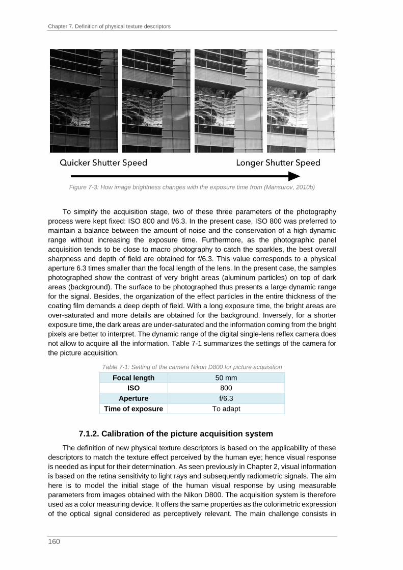
Chapter 7. Definition of physical texture descriptors
160
Figure 7-3: How image brightness changes with the exposure time from (Mansurov, 2010b)
To simplify the acquisition stage, two of these three parameters of the photography
process were kept fixed: ISO 800 and f/6.3. In the present case, ISO 800 was preferred to
maintain a balance between the amount of noise and the conservation of a high dynamic
range without increasing the exposure time. Furthermore, as the photographic panel
acquisition tends to be close to macro photography to catch the sparkles, the best overall
sharpness and depth of field are obtained for f/6.3. This value corresponds to a physical
aperture 6.3 times smaller than the focal length of the lens. In the present case, the samples
photographed show the contrast of very bright areas (aluminum particles) on top of dark
areas (background). The surface to be photographed thus presents a large dynamic range
for the signal. Besides, the organization of the effect particles in the entire thickness of the
coating film demands a deep depth of field. With a long exposure time, the bright areas are
over-saturated and more details are obtained for the background. Inversely, for a shorter
exposure time, the dark areas are under-saturated and the information coming from the bright
pixels are better to interpret. The dynamic range of the digital single-lens reflex camera does
not allow to acquire all the information. Table 7-1 summarizes the settings of the camera for
the picture acquisition.
Table 7-1: Setting of the camera Nikon D800 for picture acquisition
Focal length 50 mm
ISO 800
Aperture f/6.3
Time of exposure To adapt
7.1.2. Calibration of the picture acquisition system
The definition of new physical texture descriptors is based on the applicability of these
descriptors to match the texture effect perceived by the human eye; hence visual response
is needed as input for their determination. As seen previously in Chapter 2, visual information
is based on the retina sensitivity to light rays and subsequently radiometric signals. The aim
here is to model the initial stage of the human visual response by using measurable
parameters from images obtained with the Nikon D800. The acquisition system is therefore
used as a color measuring device. It offers the same properties as the colorimetric expression
of the optical signal considered as perceptively relevant. The main challenge consists in

7.1. Picture acquisition
161
giving the right weighting factor to each channel composing the image (Red, Green and
Blue), so that the resulting picture contains colorimetric information that is representative to
what is detected by the human eye. Color calibration is based on the matching of measured
values (RGB) with the associated device-independent values (XYZ). By using a calibrated
camera, it is furthermore possible to determine a map of the radiometric signals received by
the sensor and to predict them with respect to the human visual system and its
photoreceptors (Medina, 2016).
The RGB signals from the camera must be converted into XYZ representation. This
transformation is known as camera characterization. It is important to recall here that RGB
signals are generated for a specific camera with specific settings (ISO, aperture and time of
exposure). The camera characterization must be performed for all sets of parameters used.
The camera characterization is not a linear transformation of RGB values into XYZ
values and different methods exist such as the spectral characterization of camera sensors
(Cheung et al., 2005, Laflaquiere et al., 1998) or the polynomial modeling (Hong et al., 2001).
The polynomial modeling for the characterization of the Nikon D800 was chosen, which is
expressed in equation (7-1).
(𝑋𝑌𝑍) = (
𝑎11 𝑎12 𝑎13𝑎21 𝑎22 𝑎23𝑎31 𝑎32 𝑎33
) × (𝑅𝐺𝐵) + (
𝑣1𝑣2𝑣3) ⇔ (
𝑋𝑌𝑍) = (
𝑎11 𝑎12 𝑎13 𝑣1𝑎21 𝑎22 𝑎23 𝑣2𝑎31 𝑎32 𝑎33 𝑣3
) × (
𝑅𝐺𝐵1
)
(𝑋𝑌𝑍) = 𝐶 × (
𝑅𝐺𝐵1
)
(7-1)
With XYZ, colorimetric representation
RGB, signals recorded by the camera
aij, coefficients of the color calibration matrix
𝑣i, contribution of the lighting conditions
C, coefficient of the color calibration matrix
As explained by (Medina, 2016), the camera characterization is based on the
determination of a linear relationship between RGB and XYZ values for a set of N colors. By
considering H, a “N x 3” matrix corresponding to the XYZ values ηi of a color sample, and R,
a “N x 3” matrix corresponding to the associated RGB values ρi, the equation (7-1) can be
adapted as in (7-2).
(
𝑋1𝑋2𝑋3…𝑋𝑁
𝑌1𝑌2𝑌3…𝑌𝑁
𝑍1𝑍2𝑍3…𝑍𝑁)
=
(
𝑅1𝑅2𝑅3…𝑅𝑁
𝐺1𝐺2𝐺3…𝐺𝑁
𝐵1𝐵2𝐵3…𝐵𝑁
111…1)
× (
𝑎11 𝑎12 𝑎13 𝑣1𝑎21 𝑎22 𝑎23 𝑣2𝑎31 𝑎32 𝑎33 𝑣3
)
𝑇
𝐻 = 𝑅𝐶𝑇
(7-2)
With C coefficient of the color calibration matrix

Chapter 7. Definition of physical texture descriptors
162
The coefficient of the color calibration matrix, C, should be defined to minimize the color
differences. As explained by (Hong et al., 2001), the XYZ space is not a uniform color space
as the CIElab can be. The non-linearity of this color space can however be overcome by
using the least-square fitting approach to define the color calibration matrix, C, see equation
(7-3).
𝐶 = (𝑅𝑇 × 𝑅)−1 × 𝑅𝑇 × 𝐻 (7-3)
With RT, transpose matrix of R
R-1, inverse matrix of R
In order to simplify the camera characterization stage, an X-Rite ColorChecker® Classic
was used. As can be seen in Figure 7-4, it is made of a 4 x 6 array of patches with the third
row reserved for the additive and subtractive primaries and the fourth row dedicated to the
grey scale. According to (McCamy et al., 1976), each patch is described by its colorimetric
measurements CIE1931 xyY and its Munsell notation. One of the main features is that the
patches are matte and thus display a Lambertian behavior.
Figure 7-4: X-Rite ColorChecker® Classic from (X-Rite, 2018a)
The characterization process consists of two steps, colorimetric and radiometric, which
are both performed with the same lighting system. For the colorimetric step, a raw picture of
the X-Rite ColorChecker® is taken with the camera for a defined set of parameters (ISO
sensitivity, aperture and exposure time). Once this step is done, the camera is replaced by a
spectroradiometer (Konica-Minolta CS-2000) to measure the radiance received by the CCD
sensor for each patch. By this process, a correspondence between RGB and XYZ values is
established and the coefficients of the color calibration matrix are determined. The camera
was characterized for ISO 800, f/6.3 and ten exposure times from 1/10s to 5s. ISO sensitivity,
aperture and exposure time influence the amount of light transmitted to the sensor each time
we shoot.
7.1.3. Presentation of the assembly and lighting systems used for
picture acquisition
After the camera characterization had been performed for different settings, the picture
acquisition phase was planned to get as close as possible to the conditions of the visual
assessments. Indeed, as presented in Chapter 4, the lighting system is a critical point. For

7.1. Picture acquisition
163
example, by considering the descriptor Intensity, if the amount of light is not adequate, the
relative intensity coming from the effect particles will not be sufficient and this can lead to a
wrong characterization of the perceived effect. On the other hand, by using a high intensity
for the lighting system, the evaluation of other descriptors such as size, will not be satisfactory
due to the interferences linked to the reflective intensity coming from the particles.
To define physical texture descriptors, the considerations are based on ground truth data
coming from visual assessments of texture by experts. To that end, the lighting conditions
during visual assessments needed to be reproduced as accurately as possible for the taking
of the images. As explained previously, a diffuse system and a directional lighting system
needed to be used depending on the descriptor assessed.
For both geometries, the light system was provided by two direct Solux halogen bulbs.
These lights are used to simulate solar daylight with incandescent lamps at 4 700K with a
cone of illumination of 36 degrees. The spectral power distribution of the Solux bulbs is shown
in Figure 7-5 and was measured with a Konica-Minolta CS-2000 spectroradiometer with a 1-
degree angle.
Figure 7-5: Spectral power distribution of one Solux incandescent lamp (36°, 12V, 50W, 4 700K) measured
with a Konica-Minolta CS-2000 spectroradiometer with a 1-degree angle
The distance panel-camera was set at 70 cm. Indeed, the Nikon AF-S FX NIKKOR
50mm f/1.4G lens used is considered as sufficiently effective to get enough details without
distorting the panel photographed. The panels on which all the formulations were sprayed
measured 10 cm by 14.8 cm (width x height). The picture size is 7,360 x 4,912 pixels and
the panel photographed is imaged with a total size of 2,400 x 1,600 pixels. With this
equivalence cm-pixel, the size of one pixel is deduced to be 60 µm. In addition, at a distance
of 70 cm, the angular resolution of an average human eye is approximately equal to 1 minute
of angle so 1/60°. By using trigonometric relations detailed in Chapter 2 Figure 2-26, the
minimum size of one element to be discernible at a distance of 70 cm is 200 µm, which is

Chapter 7. Definition of physical texture descriptors
164
roughly equivalent to three pixels. In this configuration, the elements smaller than 3 pixels in
size cannot be seen by the human eye.
The diffuse lighting condition was ensured by two reflective umbrellas with Solux lamp
oriented towards it. The purpose was to expand the light source and to reflect the incident
light in different directions. As the power of the Solux bulbs is limited and to improve the
global luminance of the scene and thereby to reduce the time of exposure during the
acquisition phase, two umbrellas were set up. Many trials were needed to find the right
inclination, orientation, height and distance of the umbrellas to the panels to obtain a
homogeneous lighting and simultaneously avoiding the shadow of the camera. The final
arrangement is shown in Figure 7-6. The camera is slightly shifted compared to the normal
angle to avoid the shadow of the camera or its reflection in the glossy clearcoat of the painted
panel. The two reflective umbrellas are located at -20° and 20°, respectively.
Figure 7-6: Schematic arrangement of the system used to create diffuse lighting conditions
Obtaining the ideal directional lighting conditions turned out to be more complicated than
for the diffuse mode. The use of reflective umbrellas led to a loss of lighting intensity and the
reflective intensity coming from the effect particles was almost inexistent. Besides, the
panels, once photographed, showed oversaturated or undersaturated areas. To avoid this
lack of information, a collimator was used to narrow the beam of waves and to convert the
light rays coming from the bulb into parallel ones. The collimator was created by using a 1-
meter black matte tube to ensure an almost perfectly collimated beam at its end. Besides, to
facilitate this alignment, a honey-comb louver was fixed on the bulb to reduce stray light. The
final set-up is shown in Figure 7-7. The Solux bulb and the collimator are placed in front of
the panel to be photographed at 0° compared to the normal angle while the camera is located
at 15° and at a distance of 70cm. The camera was slightly shifted from the normal angle to
avoid the shadow of the camera on the panel.
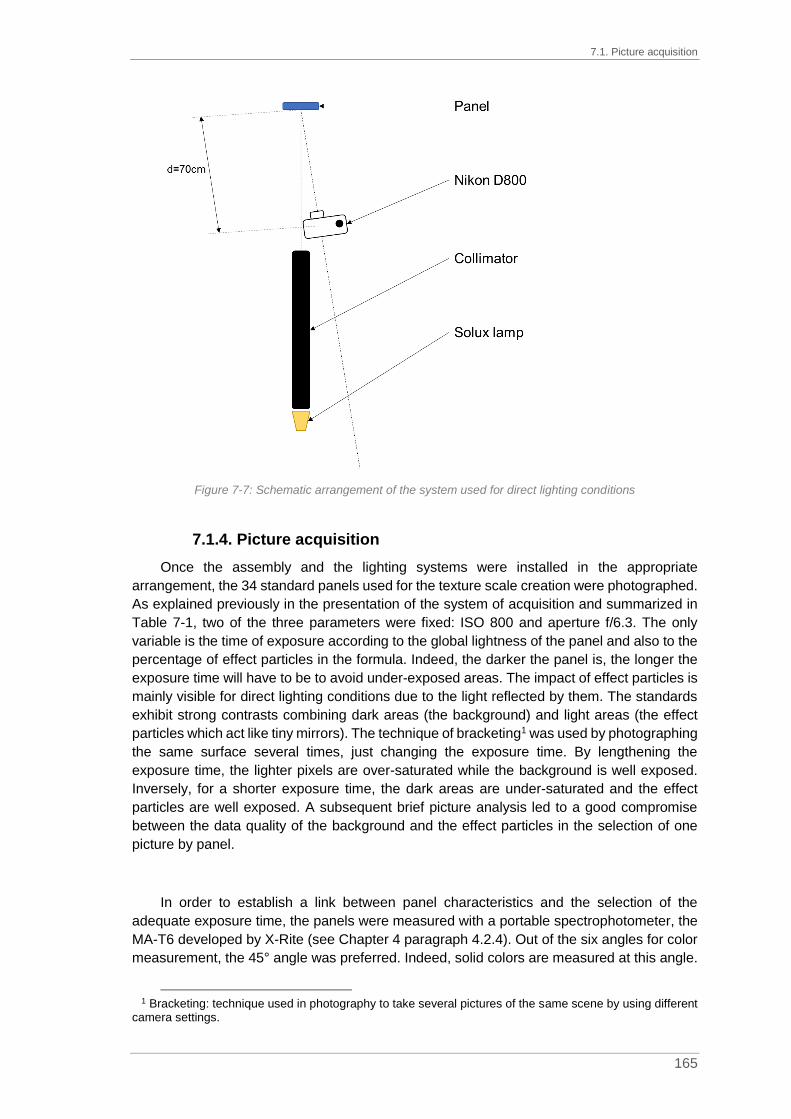
7.1. Picture acquisition
165
Figure 7-7: Schematic arrangement of the system used for direct lighting conditions
7.1.4. Picture acquisition
Once the assembly and the lighting systems were installed in the appropriate
arrangement, the 34 standard panels used for the texture scale creation were photographed.
As explained previously in the presentation of the system of acquisition and summarized in
Table 7-1, two of the three parameters were fixed: ISO 800 and aperture f/6.3. The only
variable is the time of exposure according to the global lightness of the panel and also to the
percentage of effect particles in the formula. Indeed, the darker the panel is, the longer the
exposure time will have to be to avoid under-exposed areas. The impact of effect particles is
mainly visible for direct lighting conditions due to the light reflected by them. The standards
exhibit strong contrasts combining dark areas (the background) and light areas (the effect
particles which act like tiny mirrors). The technique of bracketing1 was used by photographing
the same surface several times, just changing the exposure time. By lengthening the
exposure time, the lighter pixels are over-saturated while the background is well exposed.
Inversely, for a shorter exposure time, the dark areas are under-saturated and the effect
particles are well exposed. A subsequent brief picture analysis led to a good compromise
between the data quality of the background and the effect particles in the selection of one
picture by panel.
In order to establish a link between panel characteristics and the selection of the
adequate exposure time, the panels were measured with a portable spectrophotometer, the
MA-T6 developed by X-Rite (see Chapter 4 paragraph 4.2.4). Out of the six angles for color
measurement, the 45° angle was preferred. Indeed, solid colors are measured at this angle.
1 Bracketing: technique used in photography to take several pictures of the same scene by using different
camera settings.
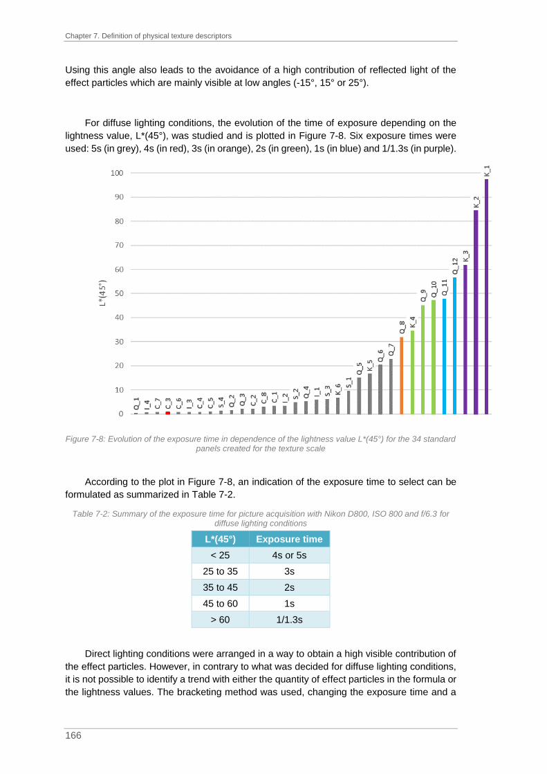
Chapter 7. Definition of physical texture descriptors
166
Using this angle also leads to the avoidance of a high contribution of reflected light of the
effect particles which are mainly visible at low angles (-15°, 15° or 25°).
For diffuse lighting conditions, the evolution of the time of exposure depending on the
lightness value, L*(45°), was studied and is plotted in Figure 7-8. Six exposure times were
used: 5s (in grey), 4s (in red), 3s (in orange), 2s (in green), 1s (in blue) and 1/1.3s (in purple).
Figure 7-8: Evolution of the exposure time in dependence of the lightness value L*(45°) for the 34 standard panels created for the texture scale
According to the plot in Figure 7-8, an indication of the exposure time to select can be
formulated as summarized in Table 7-2.
Table 7-2: Summary of the exposure time for picture acquisition with Nikon D800, ISO 800 and f/6.3 for diffuse lighting conditions
L*(45°) Exposure time
< 25 4s or 5s
25 to 35 3s
35 to 45 2s
45 to 60 1s
> 60 1/1.3s
Direct lighting conditions were arranged in a way to obtain a high visible contribution of
the effect particles. However, in contrary to what was decided for diffuse lighting conditions,
it is not possible to identify a trend with either the quantity of effect particles in the formula or
the lightness values. The bracketing method was used, changing the exposure time and a

7.2. Basics of picture analysis
167
brief subsequent picture analysis allowed for selection of the right exposure time and hence
the right picture.
Once all panels had been photographed, the RGB images were converted into XYZ by
using the calibration of the camera presented in Chapter 7 paragraph 7.1.2, for the
corresponding exposure time. The XYZ cartographies are the ones used for picture analysis.
7.2. Basics of picture analysis
This paragraph is dedicated to a brief description of the image analysis concepts which
are used for the determination of physical texture descriptors. The reader is referred to the
cited sources for a better understanding of the filters and algorithms presented in the
following.
A picture is a two-dimensional representation of a three-dimensional scene. From a
mathematical point of view, it is a representation of the two-dimensional signal in a matrix
NxM where N represents the width of the picture measured in numbers of pixels and M
represents the height. Each pixel can have an intensity value between 0 (black) and 65 535
(white); the work is performed on 3x16 bit images with real values (X, Y and Z are real positive
numbers). The first step carried out before starting the construction of the X, Y, Z
cartographies is the thresholding of irrelevant values on the R, G and B channels. Indeed, to
limit the impact of outliers, values below 2 000 and those above 60 000 were considered as
irrelevant and only pixels of intensities between 2 000 and 60 000 were considered. Indeed,
this range could be considered as the linear part of the digital single-lens reflex camera
transfer function without noise (below 2 000) and over-saturated pixels (over 60,000). The
resulting R, G and B images were then converted into X, Y and Z images according to the
corresponding calibration. Finally, to avoid any falsely negative value generated by the
calibration, a second thresholding is performed on the X, Y and Z images by applying a mask
to return negative values to 0.
7.2.1. Filtering operations
Once the thresholding was performed, it was necessary to highlight the “useful”
information contained in the picture and to reduce or eliminate the “useless” information. The
“useless” information represents for example problems of inhomogeneity in the lighting
conditions or noise during the acquisition. Before extracting objects from images, a
preliminary step consists of performing a filtering operation on the picture. A large number of
possible filters exists; they can be classified according to three categories: linear,
morphological or adaptative (Coster and Chermant, 1989). Only low-pass and high-pass
filtering are briefly explained in the following.
The low-pass filter is a linear system which does not modify the frequencies below a
selected cutoff frequency. However, it attenuates or excludes the frequencies greater than
the cutoff frequency, DO. Abrupt changes in signal intensities linked to noise, dust or effect
particles are attenuated or eliminated. However, this filtering operation leads to a picture

Chapter 7. Definition of physical texture descriptors
168
blurring, making it more difficult to extract the objects accordingly. The high-pass filter is the
exact opposite of the low-pass filter; it attenuates low frequencies and enhances high
frequencies. In a non-uniform picture with small dots of high frequencies, a pixel brighter than
its neighbors is enhanced. However, high-pass filtering amplifies the noise.
7.2.2. Segmentation
Image segmentation is one of the most important operations in picture analysis. Image
segmentation divides the image into “homogeneous” regions. Thus, the segmentation of an
image makes it possible to find forms and areas sharing same properties (Dupas, 2009). The
challenge is to define the so-called homogeneity criteria to achieve the targeted
segmentation.
Many segmentation algorithms exist and they are subdivided into two categories:
manual and automatic segmentation algorithms. For the manual method, the algorithm needs
to have the number of classes to create as an input before performing the segmentation by
determining the most appropriate threshold values. This determination can be based on for
example the maximization of the interclass variance (Otsu, 1979). Automatic methods
determine the number of classes and the associated threshold values (Jourlin et al., 2013).
A segmentation into two classes results in a binary image. To binarize a grey-scale
image is equivalent to converting it to a black and white image. This two-class segmentation
is performed with only one threshold value where all pixels of lower intensity than a
determined threshold value are set to 0 while the others are set to 1. The two classes are
called “background” for the pixels lower than the threshold value and the “foreground” for
pixels greater than the threshold value. The difficulty of the segmentation lies in the
determination of the threshold value to isolate the background on one side and the
foreground on the other side. An example of two-class segmentation is presented in Figure
7-9.
Figure 7-9: Example of a two-class segmentation based on pixel intensity: (a) original picture; (b) binary
picture with a threshold value of 150 from (Dupas, 2009)

7.2. Basics of picture analysis
169
In the case of color images, the thresholding leads to an issue if for example the blue
sky in Figure 7-9 has to be isolated. First, the color criteria must be described, meaning the
color subspace to be extracted, hoping that it corresponds to an identifiable subset in the
representation mode used (ex. RGB).
7.2.3. Dilation, erosion, opening and closing
Mathematical morphology is the study of objects according to their shape, their size, the
relations to their vicinity, their color or their level of greyscale. The transformations proposed
are undertaken at different stages of image processing (filtering, segmentation,
measurements or texture analysis) and thus provide tools for pattern recognition.
First, it is necessary to define, whether two pixels are part of the same object.
Connectivity rules are used corresponding to the 4 or the 8-connectivity as shown in Figure
7-10. The 4-connected pixels rule considers the four nearest pixels while the 8-connected
pixels rule includes also the four-corner-neighboring pixels. According to the connectivity rule
selected, a different number of objects on a picture is defined.
Figure 7-10: Example of vicinity pixels with the 4-connected and 8-connected pixels
The dilation δ(X) and the erosion ε(X) of a binary image X by a structuring element S
are defined in equation (7-4).
𝛿(𝑋) = {𝑥 + 𝑠|𝑥 ∈ 𝑋 ∧ 𝑠 ∈ 𝑆} = 𝑋⊕ 𝑆
휀(𝑋) = {𝑥|∀𝑠 ∈ 𝑆, 𝑥 + 𝑠 ∈ 𝑋} = 𝑋⊝ 𝑆 (7-4)
With 𝛿(𝑋), dilation
휀(𝑋), erosion
X, binary image
S, structuring element
Dilation and erosion are based on a hit-or-miss approach (Maintz, 2005). For a dilation,
any point of the image for which the structuring element intersects, the object is included in
the foreground of the resulting image. For an erosion, only the points of the image for which
the structuring element is totally included in the object are preserved in the foreground of the
image. These two morphological operations are explained in Figure 7-11. The image (a) is
the original binary picture where a 3x3-square structuring element is used for the dilation (b)
and the erosion (c). The grey pixels correspond to the dilated or the eroded part. By dilation,
the area of the foreground increases (white + grey) while it decreases by erosion (only white).

Chapter 7. Definition of physical texture descriptors
170
Figure 7-11: (a) Original image where the foreground is in white and the background in black; (b) dilated
image where the grey pixels are the result of the dilation with a 3x3-square structuring element; (c) eroded image where the grey pixels are the result of the erosion with a 3x3-square structuring element from
(Couka, 2015)
Applied on greyscale images, the erosion will consist in assigning the lowest values of
its neighbors to a pixel while the dilation will consist in assigning the highest values of its
neighbors to a pixel. The dilation widens the peaks while the erosion planes them.
After a dilation or an erosion, it is possible to perform morphological filtering operations,
the opening, γ, and the closing, Φ. The opening corresponds to an erosion followed by a
dilation while the closing is the exact opposite of the opening, so a dilation followed by an
erosion, as detailed in equation (7-5).
𝛾(𝑋) = 𝛿(𝑋) ∘ 휀(𝑋)𝜙(𝑋) = 휀(𝑋) ∘ 𝛿(𝑋)
(7-5)
With 𝛿(𝑋), dilation
휀(𝑋), erosion
𝛾(𝑋), opening
𝜙(𝑋), closing
These two morphological filtering operations are explained in Figure 7-12. The image
(a) is the original binary picture, same as in Figure 7-11, where a 3x3-squared structuring
element is used for the opening (d) and the closing (e). The grey pixels correspond to the
opened or the closed part. By opening, the area of the foreground decreases (only white)
while it increases by closing (white + grey).
Figure 7-12: (a) Original image where the foreground is in white and the background in black; (b) opened
image where the grey pixels are the result of the opening with a 3x3-square structuring element; (c) closed image where the grey pixels are the result of the closing with a 3x3-square structuring element from
(Couka, 2015)

7.2. Basics of picture analysis
171
As the opening filtering operation tends to remove objects which are smaller in size than
the structuring element, this operation could be considered for the size determination of
segmented objects in an image. The procedure, known as granulometric analysis, is
presented by (Maintz, 2005) and detailed in Figure 7-13.
Figure 7-13: Procedure for the size determination by successive openings from (Maintz, 2005)
7.2.4. Histogram analysis and statistical measurement
An image can be described using the statistical distribution of lightness. The number of
pixels at each intensity level is then plotted as shown in Figure 7-14.
Figure 7-14: Flight display panel (left) and its associated histogram (right) from (Marques, 2011)
The histogram gives information on the lightness level of the image with the dominance
of bright (close to 255) or dark (close to 0) pixels, hence the minimum or the maximum
intensity values. For example, in Figure 7-14, the picture is mainly dark, the histogram is then
shifted on the left side, so in the dark area. Moreover, the shape of the histogram holds
information as to the existence of different classes of intensities by examining the local
maxima.
In addition to the histogram, it is also possible to determine statistical parameters from
the frequency of occurrence of each intensity value, the moments. There are four moments:
mean, variance (and/or standard-deviation), skewness and kurtosis. Apart from these
moments, the minimum and the maximum intensities are also determined as well as the
quartiles or the mode values. The mode is the intensity value which presents the most
occurrence. Median, or second quartile Q2, can also be deducted. It corresponds to the
intensity of the middle intensity value. Half of the pixel intensities are less than the median

Chapter 7. Definition of physical texture descriptors
172
intensity value and the other half greater. The first and the third quartiles, Q1 and Q3,
represent respectively one fourth or three fourth of the pixels.
Mean is known as the first moment. It is one of the basics in statistics which represents
the value that each pixel would have if the distribution was equitable. Mean is calculated
according to equation (7-6).
𝜇 =∑𝑛𝑖 𝑋𝑖∑𝑛𝑖
(7-6)
With µ, mean value
ni, number of pixels for i
Xi, intensity values for i
The second moment is the variance. It measures the distribution around the mean of the
pixels. From the variance value, the standard deviation can be deducted as its positive
square root. A low standard deviation indicates a tendency for the pixels to approach the
mean intensity value. A high standard deviation indicates a strong disparity of the pixel
intensity values (Kumar and Gupta, 2012). The variance is calculated according to equation
(7-7).
𝜎2 =∑(𝑛𝑖 𝑋𝑖 − 𝜇)
2
∑𝑛𝑖 (7-7)
With σ², variance value
µ, mean value
ni, number of pixels for i
Xi, intensity values for i
The skewness is known as the third moment. It measures the asymmetry of the
probability distribution of the pixels and can be positive, negative or null. Its calculation is
given in equation (7-8).
𝛾 =∑(𝑛𝑖 𝑋𝑖 − 𝜇)
3
∑𝑛𝑖 (7-8)
With γ, skewness value
µ, mean value
ni, number of pixels for i
Xi, intensity values for i
In a graphic representation, for a negative skewness value, the tail on the left side of the
curve is longer than the one on the right side and the peak lies shifted to the right. Inversely,
for a positive value, the tail on the right side of the curve is longer and the peak is shifted to
the left side. If the skewness value tends to zero, the values are equally distributed on both
sides of the maximum of the curve. All three cases are presented in Figure 7-15. It is also
possible to estimate the sign of the skewness value according to the mean, median and
mode values as detailed in Figure 7-15 and summarized in Table 7-3.

7.2. Basics of picture analysis
173
Figure 7-15: Example of the probability distribution according to the skewness value based on the mean,
the median et the mode values from (Jain, 2018)
Table 7-3: Sign of the skewness value according to the mean, median and mode values
Mean = Median = Mode γ = 0
Mean < Median < Mode γ < 0
Mode > Median > Mean γ > 0
The Karl Pearson’s (KP) and the Bowley’s (B) coefficients of skewness are also used to
determine the skewness value with either mean, mode and standard deviation or quartiles
values (Nagla, 2014). The formulas are given in equation (7-9).
𝐾𝑃 =𝑀𝑒𝑎𝑛 −𝑀𝑜𝑑𝑒
𝑆𝑡𝑎𝑛𝑑𝑎𝑟𝑑 𝐷𝑒𝑣𝑖𝑎𝑡𝑖𝑜𝑛
𝐵 =𝑄3 + 𝑄1 − 2 𝑄2
𝑄3 −𝑄1
(7-9)
The fourth moment is the kurtosis. It is used to estimate the flat or peaked shape of the
histogram but also the outliers present in the distribution. The calculation is given in equation
(7-10).
𝜅 =∑(𝑛𝑖 × 𝑋𝑖 − 𝜇)
4
∑𝑛𝑖 (7-10)
With κ, skewness value
µ, mean value
ni, number of pixels for i
Xi, intensity values for i
For a kurtosis value close to 3, the histogram follows a normal distribution (called
mesokurtic). For a kurtosis value less than 3, the histogram displays a sharp peak with short
tails (called platykurtic). For a kurtosis value greater than 3, the histogram presents a flatter
top and wider tails with a high probability to encounter outliers (called leptokurtic). The three
curve shapes are detailed in Figure 7-16.

Chapter 7. Definition of physical texture descriptors
174
Figure 7-16: Example of the shape of the histogram according to the kurtosis value from (Jain, 2018)
In the following, three histograms corresponding to the associated pictures of three
references of the descriptor Contrast (see Chapter 5, Table 5-12), K_2 / Very Low, K_4 /
Intermediate and K_6 / Very Strong are considered, see Figure 7-17.
Figure 7-17: Histogram based pictures coming from MA-T6 measurements for three references from the
range Contrast: K_2, K_4 and K_6
The histograms are based on pictures taken with the spectrophotometer MA-T6 under
directional geometry. From these three histograms, we can assume a monomodal
transformation. The quantity of sparkle points is negligible compared to the background and
this population is not visible on the histogram. We can assume a positive skewness linked to
the right tail of the curve.

7.3. Picture analysis for the determination of physical texture descriptors
175
7.3. Picture analysis for the determination of physical texture
descriptors
The determination of physical texture descriptors is based on picture analysis. The
objective is to match the results obtained by the elaboration of sensorial profiles on the visual
descriptors to some physical texture descriptors. The results from the visual assessments
are the basis of this determination.
As for the visual assessment, the determination of the physical texture descriptors is
based on the 34 standards used to define the texture scale. All of them were photographed
with the Nikon D800, ISO 800, f/6.3 at different exposure times. The best picture, meaning
not too over or under-saturated, was then selected. The respective selected exposure times
for each standard are gathered in Table 7-4 for both diffuse and directional lighting
conditions.
Table 7-4: Exposure time selected for diffuse and directional lighting conditions for the 34 standards from texture scale
Panel Name Diffuse Direct Panel Name Diffuse Direct
S_1 5s 1s K_6 5s 1s
S_2 5s 1s I_1 5s 1s
S_3 5s 1s I_2 5s 1s
S_4 5s 1s I_3 5s 1s
C_1 5s 2s I_4 5s 4s
C_2 5s 2s Q_1 5s 1s
C_3 4s 5s Q_2 5s 1s
C_4 5s 5s Q_3 5s 1s
C_5 5s 5s Q_4 5s 1s
C_6 5s 5s Q_5 5s 1/2s
C_7 5s 5s Q_6 5s 1/4s
C_8 5s 1s Q_7 5s 1/4s
K_1 1/1.3s 1/8s Q_8 3s 1/6s
K_2 1/1.3s 1/4s Q_9 2s 1/8s
K_3 1/1.3s 1/2s Q_10 2s 1/8s
K_4 2s 1/2s Q_11 1s 1/8s
K_5 5s 1/2s Q_12 1s 1/10s
After the first trials on the visual descriptors, the viewing and lighting conditions were
standardized (see Chapter 5, Table 5-9). In order to be as representative as possible of the
visual assessment, the five physical texture descriptors were then determined with the same
observation settings. Like this, the descriptors for Contrast, Size and Quantity should be
defined from diffuse pictures while those for Intensity and Color come from directional
pictures. However, Color was not studied due the non-evaluation during the visual
assessment part.
7.3.1. Selection and pretreatment of the region of interest
The lighting systems used for picture acquisition were set up to represent the conditions
used for the observations made by the experts. However, the lighting of the panels is not
uniform. First, to reduce the total weight of the texture scales, the standards were sprayed

Chapter 7. Definition of physical texture descriptors
176
on cardboard sheets. With the humidity of the paint during the application process, they
slightly crinkled in some places. Apart from that, as the position of the camera was slightly
shifted to avoid its reflection or shadow in the glossy clearcoat of the panel, a non-uniformity
at the acquisition stage is noticeable. For directional lighting, the size of the lighted circle on
the panel is limited and does not cover the entire panel due to the collimator diameter. In
Figure 7-18, an example of a raw picture in which a crinkle is visible on the left side of the
panel (see green arrow) and the center of the lighted circle is located on the right side (see
red cross) is shown. Also, the shadow of the camera is visible on the panel holder on the
extreme right side of the picture (in white).
Figure 7-18: Non-uniformity of the lighting conditions explained by a photography of the panel K_5 taken with the Nikon D800, ISO 800, f/6.3 and an exposure time of 1/2s for directional lighting. The green arrow
indicates the crinkle and the red cross the center of the lighted circle.
A panel holder was designed to guarantee the same position and the same angle for all
panels photographed. From the raw picture, a region of interest (ROI) was extracted at the
exact same place for all panels to obtain a picture large enough to be as representative as
possible of the panel and to ensure a relative homogeneity and reproducibility in the lighting
conditions. The ROI selected represents an area of 701 pixels in width and 301 pixels in
height, accordingly 211 001 pixels in total.
Despite this careful approach, it was necessary to correct the lighting of the panel.
Successive opening and closing filtering operations were applied to the ROI. The resulting
image is a kind of luminance cartography at as small a scale as the sparkling effect. It is then
subtracted from the original image, pixel by pixel. An example of this pretreatment stage is
explained in Figure 7-19 with the ROI of panel K_5 under directional lighting. In Figure 7-19
(a), the brighter pixels represent the effect particles. One can distinguish a better illumination
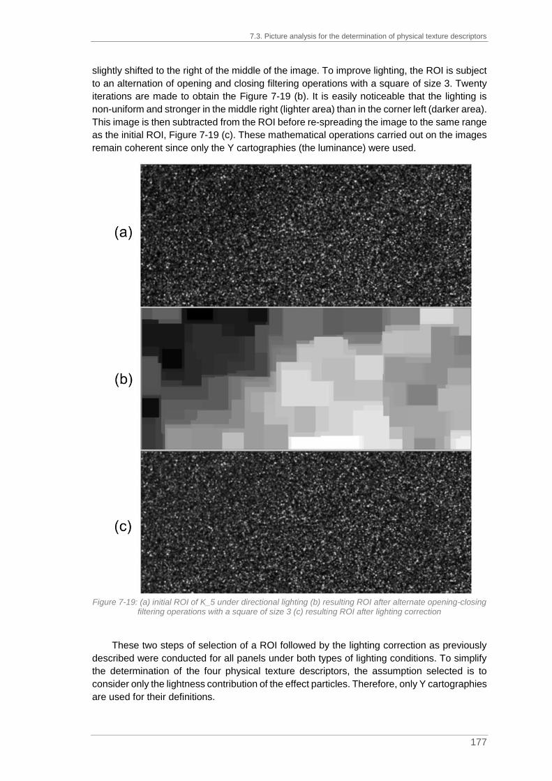
7.3. Picture analysis for the determination of physical texture descriptors
177
slightly shifted to the right of the middle of the image. To improve lighting, the ROI is subject
to an alternation of opening and closing filtering operations with a square of size 3. Twenty
iterations are made to obtain the Figure 7-19 (b). It is easily noticeable that the lighting is
non-uniform and stronger in the middle right (lighter area) than in the corner left (darker area).
This image is then subtracted from the ROI before re-spreading the image to the same range
as the initial ROI, Figure 7-19 (c). These mathematical operations carried out on the images
remain coherent since only the Y cartographies (the luminance) were used.
Figure 7-19: (a) initial ROI of K_5 under directional lighting (b) resulting ROI after alternate opening-closing
filtering operations with a square of size 3 (c) resulting ROI after lighting correction
These two steps of selection of a ROI followed by the lighting correction as previously
described were conducted for all panels under both types of lighting conditions. To simplify
the determination of the four physical texture descriptors, the assumption selected is to
consider only the lightness contribution of the effect particles. Therefore, only Y cartographies
are used for their definitions.

Chapter 7. Definition of physical texture descriptors
178
7.3.2. Definition of Contrast by histogram analysis
The visual assessment of the descriptor Contrast was done under diffuse light
conditions. For its determination by picture analysis, the picture obtained under diffuse light
conditions was selected. Contrast can be explained as the difference in luminance between
two objects which makes them discernible from one another. It is necessary to identify what
is visible and what is not. In the coating film, the effect particles are located throughout the
entire layer but when located at the bottom of the film are not visible due to the interactions
of light with other particles.
As explained in Chapter 7 paragraph 7.1.3., elements smaller than 3 pixels in size
cannot be seen by the human eye. On average and based on picture analysis, it is assumed
that a single effect particle has at least an optical effect covering an area of 6 pixels, meaning
360 µm. By using trigonometric relations, an angle of 0.029° or 2’ at a distance of 70 cm can
be determined. Based on the contrast sensitivity function explained in Chapter 2 paragraph
2.3.6, visible contrast can be differentiated from the invisible contrast.
In this present case, the equivalent of the determined value in arc minutes is 2’ so
roughly 20 cpd1. By graphical resolution (see Figure 7-20), the contrast sensitivity is roughly
equal to 20; this means that for a contrast value less than 0.2, the distinction of elements is
not possible while it is possible for a contrast value greater than 0.2.
Figure 7-20: Determination of the contrast sensitivity of the visible effect particles in a panel photographed
at a distance of 70 cm for an estimated optical behavior of one particle of 6 pixels or 20 in spatial frequency, picture adapted from (Yssaad-Fesselier, 2001)
1 Cpd (cycle per degree): value in degrees of the visual angle that underlies both the retinal image and the
object viewed

7.3. Picture analysis for the determination of physical texture descriptors
179
By considering the equation of the contrast of Michelson as previously explained in
Chapter 2 paragraph 2.3.6, a relation between the maximum and minimum luminances can
be determined as detailed in equation (7-11).
𝑀 =𝐿𝑚𝑎𝑥−𝐿𝑚𝑖𝑛
𝐿𝑚𝑎𝑥+𝐿𝑚𝑖𝑛> 0.2 𝐿𝑚𝑎𝑥 − 𝐿𝑚𝑖𝑛 > 0.2(𝐿𝑚𝑎𝑥 + 𝐿𝑚𝑖𝑛)
(7-11) 0.8 × 𝐿𝑚𝑎𝑥 > 1.2𝐿𝑚𝑖𝑛 ↕
𝐿𝑚𝑎𝑥 > 1.5𝐿𝑚𝑖𝑛
After the pretreatment of the ROIs to smoothen the inhomogeneity of the panel lighting,
the histogram of each panel was plotted. In order to have an estimation of the visible contrast,
the number of pixels higher than 1.5 times the minimum value was calculated and plotted
against the mean observer determined by visual assessment. The results are presented in
Figure 7-21.
Figure 7-21: Number of pixels greater than 1.5 times the minimum value against the mean observer for Contrast where the 6 standards of this range are identified by a bigger circle
From this chart, it is easily noticeable that even if the observers were able to estimate a
contrast for C_7, K_2, Q_12, K_3, C_5, C_4, K_4, C_3 and I_4 (positioned between 0 and
20,000 on the Y axis in Figure 7-21), the number of pixels greater than 1.5 times the minimum
value is very low.
For panels C_7, C_5, C_4, C_3 and I_4, the observation can be explained by the
inadequate selection of the exposure time. Indeed, these panels are very dark panels. The
exposure time selected for them is equal to 5s except for C_3 for which it is 4s. This exposure
time was probably too short to ensure a correct exposition of the effect particles with the
selected lighting conditions. Besides, for panels K_2 and K_3, the exposure time selected is
equal to 1/1.3s. These panels are lighter than the others but the exposure time was too long,

Chapter 7. Definition of physical texture descriptors
180
and the pictures are over-saturated. For the rest of the determinations, attention must be paid
to these specific panels to avoid probable outliers which could hinder the identification of
possible correlations.
There is no correlation to visual assessment observable. It seems that the minimum
value selected with the contrast of Michelson equation is maybe too restrictive. Thus, instead
of using the minimum value, the mode value is preferred. Indeed, by considering the mode
value the average behavior of the background as it is entailed in the human visual system is
selected. As explained in Chapter 7 paragraph 7.2.4, it represents the intensity value with
the most occurrence.
Considering an example with the six references used for the range Contrast, where K_1
has no contrast and K_6 shows the highest contrast of the range, the histograms of the Y
pictures acquired under diffuse conditions are plotted in Figure 7-22.
Figure 7-22: Histograms of the Y pictures under diffuse lighting conditions for the six references of the
range Contrast
From the six histograms obtained, an interesting fact is noticeable. The organization of
the peaks is inversely equivalent to the ranking obtained by visual assessment. The panel
K_6 / Contrast _ Very Intense is the one having the highest contrast based on visual
assessment but also the lowest mode value. Inversely, the panel K_1 / Contrast _ Inexistent
has the highest mode value. By considering the mode value instead of the minimum value in
the determination of the contrast coefficient, the thresholding background/foreground is
simplified as the very dark pixels are not considered anymore.
Moreover, the coefficient of 1.5 was roughly determined by graphic readout. This value
must be adapted and the best match is obtained for a factor of 1.29. For the ease of reading
of the chart, the panel numbers are not added in Figure 7-23.

7.3. Picture analysis for the determination of physical texture descriptors
181
Figure 7-23: Number of pixels greater than 1.29 times the mode value against the mean observer for
Contrast where the 6 standards of this range are identified by a bigger circle
Contrast can also be understood as the relative ratio in luminance between the
background and the foreground. From the histogram distribution of each panel, other
parameters were calculated:
- The weighted average of the background, meaning the global average of all
pixels of intensity included between the minimum value and 1.29 times the mode
value (note MeanBack);
- The weighted average of the foreground, meaning the global average of all
pixels of intensity included between 1.29 times the mode value and the
maximum value (note MeanFore);
- The weighted sum of the headcount background (note WSBack);
- The weighted sum of the headcount foreground (note WSFore).
The weighted sums are obtained by multiplying each intensity value with the number of
pixels having that intensity value and adding up the terms. Besides, the minimum (Min) and
the maximum (Max) intensity values are also determined.
The best correlation to visual assessment is obtained by calculating for each panel the
contrast coefficient, C, according to equation (7-12) as confirmed by the chart in Figure 7-24.

Chapter 7. Definition of physical texture descriptors
182
𝐶 =
𝑙𝑜𝑔(
𝑀𝑒𝑎𝑛𝐹𝑜𝑟𝑒𝑀𝑒𝑎𝑛𝐵𝑎𝑐𝑘
|log (𝑊𝑆𝐹𝑜𝑟𝑒𝑊𝑆𝐵𝑎𝑐𝑘
)|)
√𝑀𝑎𝑥 −𝑀𝑖𝑛
(7-12)
With MeanFore, average of pixel intensity in the range [1.29MODE;MAX]
MeanBack, average of pixel intensity in the range [MIN;1.29MODE[
WSFore, weighted sum of the foreground
WSBack, weighted sum of the background
Max, maximum intensity value
Min, minimum intensity value
Figure 7-24: Contrast coefficient, C, against the mean observer for Contrast where the 6 standards of this
range are identified by a bigger circle
The contrast coefficient, C, allows a good correlation to visual assessment with a
coefficient of determination equal to 0.7606. Nevertheless, the correlation and the R-squared
value can be improved by not considering the panels with incorrect exposure time leading to
under-saturation (C_3, C_4, C_5, C_7 and I_4), see Figure 7-25. In that specific case, the
coefficient of determination reaches a value of 0.8736.

7.3. Picture analysis for the determination of physical texture descriptors
183
Figure 7-25: Contrast coefficient, C, against the mean observer for Contrast where the 6 standards of this
range are identified by a bigger circle and with the withdrawal of C_3, C_4, C_5, C_7 and I_4 due to undersaturation
As presented before, the contrast is needed to distinguish the background from the
foreground. The contrast coefficient determined here is quite efficient for this distinction and
can be used for the other physical texture descriptors to focus only on the foreground where
the visible effect particles are located.
However, the contrast coefficient in equation (7-12) is difficult to modulate according to
the different perception parameters. Indeed, this formula does not have an immediate link to
the human perception. This formula was tested on a simple and theoretical case where a
picture is made of 100 pixels. The intensity of these pixels can either be equal to 50 or to 200
and located in the background or in the foreground, respectively. The number of pixels in the
foreground is gradually increased from 0 to 100 to check the changing outcome of the
contrast coefficient, see Figure 7-26.

Chapter 7. Definition of physical texture descriptors
184
Figure 7-26: Evolution of the contrast coefficient, C, on a simple and theoretical case
The behavior of the curve is interesting. The contrast value increases in parallel to the
number of pixels in the foreground until reaching a limit value at 20. After reaching this value,
the contrast decreases. The contrast coefficient found seems to be applicable to the visual
answer to contrast. When all is foreground, it is logical to have no contrast. However, this
limit value leads to an abrupt change on the slope of the curve and the link to a similar change
in visual assessment is clearly not proven.
In order to improve the coefficient and hence obtain a better correlation to visual
assessment, its theoretical behavior was adapted to a gaussian-shaped function. The
underlying hypothesis was to consider that at a content of 50 pixels in the foreground, the
contrast decreases. This new coefficient is based on a modulation of the contrast linked to
the number of pixels in each phase and not the associated weighted sum. This modulation
is calculated according to the Michelson contrast (see equation (7-11)). The formula is given
in equation (7-13).
𝐶′ = 𝑒𝑥𝑝(0.5(𝑁𝐹𝑜𝑟𝑒 −𝑁𝐵𝑎𝑐𝑘𝑁𝐹𝑜𝑟𝑒 +𝑁𝐵𝑎𝑐𝑘
)2
𝑀𝑒𝑎𝑛𝐵𝑎𝑐𝑘 −𝑀𝑒𝑎𝑛𝐹𝑜𝑟𝑒𝑀𝑒𝑎𝑛𝐵𝑎𝑐𝑘 +𝑀𝑒𝑎𝑛𝐹𝑜𝑟𝑒
) (7-13)
With NFore, number of pixels in the foreground
NBack, number of pixels in the background
MeanFore, average of pixel intensity in the range [1.29MODE;MAX]
MeanBack, average of pixel intensity in the range [MIN;1.29MODE[
As previously undertaken for the contrast coefficient, C, this new version has been tested
on the same simple and theoretical case where the pixel intensity is either equal to 50 or 200.
The result of this new contrast coefficient, C’, is plotted in Figure 7-27.

7.3. Picture analysis for the determination of physical texture descriptors
185
Figure 7-27: Evolution of the new contrast coefficient, C', on a simple and theoretical case
This new coefficient results in a smooth slope change at 50 pixels in the foreground.
Furthermore, its determination is built on known visual parameters with the use of the
Michelson contrast in the calculation of the numerator (based on the number of pixels in each
phase) and of the denominator (based on the mean intensity of each phase). This coefficient
uses the average contrast and the average quantity which both are linked to the visual
appearance. This behavior of the theoretical data seems to correspond to the visual
assessment since it does not lead to an abrupt change in the resulting curve.
However, the formula of the new contrast coefficient, C’, needs to be adapted by the
insertion of constants or adaptation coefficients. Indeed, at 0 pixel in the foreground or in the
background, this formula should be equal to zero.
The new coefficient was then tested on a real data set by removing the panels with
incorrect exposure time (C_3, C_4, C_5, C_7, K_2 and I_4) and the solid colors (K_1 and
Q_1), see Figure 7-28 .

Chapter 7. Definition of physical texture descriptors
186
Figure 7-28: New contrast coefficient, C’, against the mean observer for Contrast where the 6 standards of this range are identified by a bigger circle and with the exclusion of C_3, C_4, C_5, C_7, K_2, and I_4 due
to incorrect exposure time and the two solid colors K_1 and Q_1
With this new contrast coefficient, a good correlation is obtained with a R-squared value
of 0.8201. However, the assumption made here for its determination is based on a visible
change in contrast when 50% of the pixels are in the foreground. There is no evidence that
the 50% threshold is visually justified. This hypothesis should be adapted to a better
correlation to the visual appearance.
7.3.3. Determination of Size based on opening operations
The visual assessment of the descriptor Size was performed under diffuse lighting
conditions so for the determination of the physical descriptors, diffuse pictures were used.
This descriptor can be explained as the apparent size depending on the optical behavior of
a single effect particle under diffuse lighting.
For the determination of the size, only the foreground needs to be considered because
it gathers the part visible and thus the particles visible to the human visual system. Only the
pixels with a Y value greater than 1.29 times the mode value are kept, and the analysis is
performed on the masked image. An example is given using panel K_5 under diffuse lighting
(see Figure 7-29(a)) where a threshold value for Y of 0.61 is applied (1.29MODE). The
masked image (see Figure 7-29(b)) represents in black the pixels lower than the threshold
value and in red the pixels above the threshold value, hence, the background in black and
the foreground in red. Also, in order to avoid inconsistencies, the groups of pixels at the
boundaries of the ROI are removed from the masked image (see Figure 7-29 (c)). Indeed, it
cannot be known if the grouping continues after the ROI or not.

7.3. Picture analysis for the determination of physical texture descriptors
187
Figure 7-29: (a) Initial ROI of K_5 under diffuse lighting (b) Mask obtained after thresholding at 0.61
(1.29MODE) (c) Resulting masked image after removing the groups of pixels at the boundaries of the ROI
For size determination and as explained in Chapter 7 paragraph 7.2.3, the opening
operations tend to remove objects which are smaller in size than the structuring elements.
The opening operations act as a sieving method. The procedure for the size determination
by successive openings detailed in Figure 7-13 was adapted to this case. The structuring
element selected is a square to simplify the calculation. Indeed, choosing a circled structuring
element does not make sense in this case because of the use of a square mesh to represent
small size elements. The successive openings were performed by using a structuring
element of size 2 to 10 in steps of 1 in size. After each opening operation, the remaining area
of the red part was defined to calculate the relative loss in pixels compared to the initial
masked image.

Chapter 7. Definition of physical texture descriptors
188
An example of the successive openings is given in Figure 7-30 where the resulting mask
of the panel K_5 (see Figure 7-29 (c)) undergoes the different opening operations. For this
example, only opening filtering operations with a squared structuring element from size 2 to
4 are presented in Figure 7-30.
Figure 7-30: (a) Resulting mask after an opening of size 2 on K_5 (b) Resulting mask after an opening of
size 3 on K_5 (c) Resulting mask after an opening of size 4 on K_5
The successive opening operations act like sieves after the application of which, only
bigger groups of pixels are kept. It was not tried to separate convex objects from each other
since it was not the intention to look for the size of the effect particles but for the size of the
optical manifestations generated by effect particles. From the relative loss in pixels calculated
for the remaining area after the opening filtering operations, it is possible to plot the
granulometric curves for each panel (see Figure 7-31).

7.3. Picture analysis for the determination of physical texture descriptors
189
Figure 7-31: Granulometric curves obtained by successive opening filtering operations with a squared
structuring element from size 2 to 10
From Figure 7-31, it can be easily seen, that there is no pixels left after thresholding with
a relative loss in pixels equal to 100% before even starting the successive opening filtering
operations. This is obviously the case for K_1 and Q_1 (solid colors without effect particles)
for both the ranges of Contrast and of Quantity. These two panels are used to test the limits
of the procedure. There is no effect on the algorithm developed and therefore no false
detection results. Besides, for the panels with incorrect exposure time leading to
oversaturation, K_2 and K_3, the number of pixels remaining after thresholding although
containg effect pigment in the formulation, respectively 0 and 43 pixels, is absurd. Panels
K_2 and K_3 cannot be considered for the determination of the size descriptor. There is a
unclarity between background and foreground linked to wrong histogram shapes.
Based on the granulometric curves, the impact of the size of the squared structuring
element on the relative loss in pixels is mainly noticeable for opening filtering operations of
size 2 and 3. The slope of the curves is quite significant. In order to estimate which
granulometric parameter could better represent the apparent size of particles in the panels,
the slopes of each segment of the granulometric curves were defined according to equation
(7-14).
𝑆𝑙𝑜𝑝𝑒𝑖 =%𝐷𝑖𝑠𝑖 −%𝐷𝑖𝑠𝑖−1
𝑆𝑖 − 𝑆𝑖−1
%𝐷𝑖𝑠𝑖 = 1 −𝑁𝑢𝑚𝑏𝑒𝑟 𝑜𝑓 𝑝𝑖𝑥𝑒𝑙𝑠 𝑟𝑒𝑚𝑎𝑖𝑛𝑖𝑛𝑔 𝑎𝑓𝑡𝑒𝑟 𝑜𝑝𝑒𝑛𝑖𝑛𝑔 𝑜𝑓 𝑠𝑖𝑧𝑒 𝑖
𝑁𝑢𝑚𝑏𝑒𝑟 𝑜𝑓 𝑝𝑖𝑥𝑒𝑙𝑠 𝑎𝑓𝑡𝑒𝑟 𝑡ℎ𝑟𝑒𝑠ℎ𝑜𝑙𝑑 + 𝑏𝑜𝑟𝑑𝑒𝑟 𝑘𝑖𝑙𝑙
(7-14)
With Slopei, slope value for an opening of size i
%Disi, percentage of disappearance with an opening of size i
%Disi-1, percentage of disappearance with an opening of size i-1
Si, size of the structuring element for opening i
Si-1, size of the structuring element for opening i-1

Chapter 7. Definition of physical texture descriptors
190
The slope value is plotted against the mean observer defined by visual assessment. The
size of the structuring element being the most correlated to the mean observer is size 2. This
plot is presented in Figure 7-32.
Figure 7-32: Slope of the granulometric curves obtained for a size 2 squared opening against the mean
observer for the descriptor Size where the 4 standards of this range are identified by a bigger circle
This plot results in a trend, because, excepted for the two panels K_1 and Q_1
representing solid colors, all other panels follow more or less the same curve (in blue in
Figure 7-32). Nevertheless, panel C_7 is shifted in its position, as was already the case for
the Contrast determination.
From the trend resulting from Figure 7-32, the size coefficient, S, is defined as in
equation (7-15) by considering the slope for an opening of size 2 and its correlation to visual
assessment is confirmed in Figure 7-33.
𝑆 = 𝑙𝑛 (1
𝑆𝑙𝑜𝑝𝑒2) (7-15)
With Slope2, slope value for an opening of size 2

7.3. Picture analysis for the determination of physical texture descriptors
191
Figure 7-33: Size coefficient, S, against the mean observer for the descriptor Size where the 4 standards
of this range are identified by a bigger circle
The size coefficient, S, allows for a sufficiently good correlation to visual assessment
with a coefficient of determination equal to 0.7595. Nevertheless, the R-squared value can
be improved by not considering the panels with incorrect exposure time and especially the
panels C_7 and I_4 as presented in Figure 7-34.
Figure 7-34: Size coefficient, S, against the mean observer for Size where the 4 standards of this range are identified by a bigger circle and with the withdrawal of 2 panels due to undersaturation C_7 and I_4
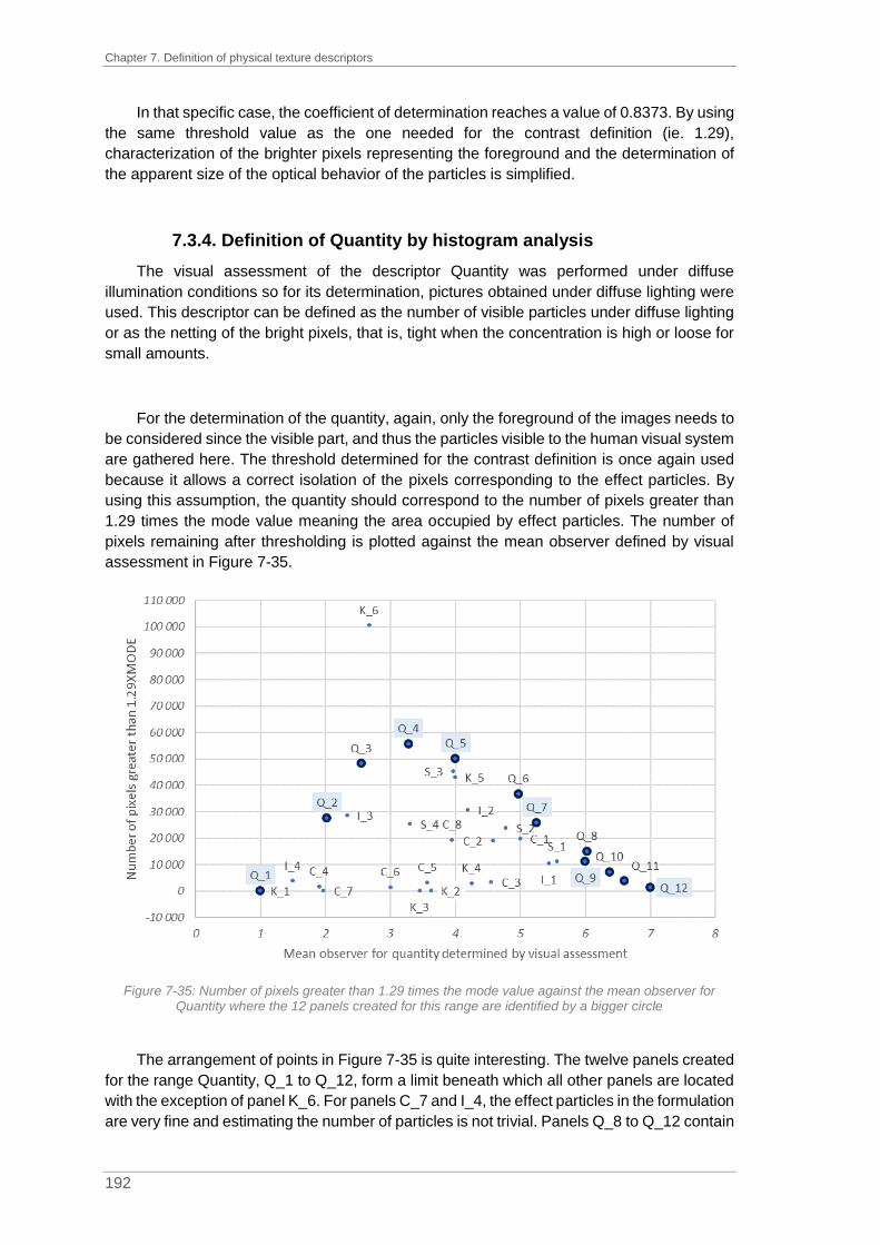
Chapter 7. Definition of physical texture descriptors
192
In that specific case, the coefficient of determination reaches a value of 0.8373. By using
the same threshold value as the one needed for the contrast definition (ie. 1.29),
characterization of the brighter pixels representing the foreground and the determination of
the apparent size of the optical behavior of the particles is simplified.
7.3.4. Definition of Quantity by histogram analysis
The visual assessment of the descriptor Quantity was performed under diffuse
illumination conditions so for its determination, pictures obtained under diffuse lighting were
used. This descriptor can be defined as the number of visible particles under diffuse lighting
or as the netting of the bright pixels, that is, tight when the concentration is high or loose for
small amounts.
For the determination of the quantity, again, only the foreground of the images needs to
be considered since the visible part, and thus the particles visible to the human visual system
are gathered here. The threshold determined for the contrast definition is once again used
because it allows a correct isolation of the pixels corresponding to the effect particles. By
using this assumption, the quantity should correspond to the number of pixels greater than
1.29 times the mode value meaning the area occupied by effect particles. The number of
pixels remaining after thresholding is plotted against the mean observer defined by visual
assessment in Figure 7-35.
Figure 7-35: Number of pixels greater than 1.29 times the mode value against the mean observer for
Quantity where the 12 panels created for this range are identified by a bigger circle
The arrangement of points in Figure 7-35 is quite interesting. The twelve panels created
for the range Quantity, Q_1 to Q_12, form a limit beneath which all other panels are located
with the exception of panel K_6. For panels C_7 and I_4, the effect particles in the formulation
are very fine and estimating the number of particles is not trivial. Panels Q_8 to Q_12 contain

7.3. Picture analysis for the determination of physical texture descriptors
193
the same effect particles but in different concentrations. As the concentration of effect
pigments in these panels is very high, everything appears to be particle to the human eye or
everything is considered as background since there is almost no contrast for these panels.
To estimate an apparent particle size is quite difficult and the values given by the observers
are low, too. On the other hand, K_6 is the panel which shows most contrast and also
contains the biggest particles. The panel in question is located far away from the other panels
in Figure 7-35. The assumption made here is that the perceived apparent size of effect
particles has a non-negligible effect on the visible quantity of effect particles – presumably
considering a simple surface ratio is not sufficient for interpretation here, but the concept
object/background need to be taken into account.
In addition, the mode value used for contrast and size determinations is maybe too strict
and a change in the threshold of discernibility to contrast needs to be considered. As a result
of several trials, the quantity coefficient, Q, is determined according to equation (7-16) by
using the mean value instead of the mode, the square root of the threshold value and the
size coefficient (see (7-15)).
𝑄 =𝑁𝑢𝑚𝑏𝑒𝑟 𝑜𝑓 𝑝𝑖𝑥𝑒𝑙𝑠 𝑔𝑟𝑒𝑎𝑡𝑒𝑟 𝑡ℎ𝑎𝑛 {√1.29 ×𝑀𝑒𝑎𝑛}
𝑆 (7-16)
With S, size coefficient
As the size coefficient is used in the determination of the quantity coefficient, the panels
K_2 and K_3 cannot be considered. Indeed, the number of pixels remaining after
thresholding was absurd. The correlation of the quantity coefficient, Q, to visual assessment
is confirmed in Figure 7-36.
Figure 7-36: Quantity coefficient, Q, against the mean observer for the descriptor Quantity where the 12
standards of this range are identified by a bigger circle

Chapter 7. Definition of physical texture descriptors
194
The quantity coefficient determined herein allows for a good correlation to the mean
observer. The coefficient of determination reaches a value of 0.8098.
7.3.5. Determination of Intensity based on histogram analysis
The last descriptor to be defined is Intensity. During visual assessment, this descriptor
was assessed under directional lighting to maximize light reflected by the particles. The
determination of this descriptor was performed on pictures obtained under directional
illumination.
On pictures obtained under directional lighting, identification of the foreground was
necessary to adapt the analysis only to the brighter pixels. Even if pictures obtained under
directional illumination were preferred to find the intensity coefficient, the threshold
determined on pictures obtained under diffuse illumination for the contrast definition and used
for the size and quantity determinations was kept. As for the quantity determination, the mode
value used is not adequate, so the mean value was preferred for the thresholding calculation.
An example of this assumption is given with the four references of the range Intensity. The
histograms of the Y pictures acquired under direct illumination conditions are plotted in Figure
7-37.
Figure 7-37: Histograms of the Y pictures under direct illumination conditions for the four references of the
range Intensity
From the histograms, statistical characteristics inherent to each panel have been
determined and are gathered in Table 7-5.

7.3. Picture analysis for the determination of physical texture descriptors
195
Table 7-5: Statistical characteristics inherent to the Y pictures of the panels of the range Intensity acquired under direct conditions
I_1 I_2 I_3 I_4
Min value 0.21 0 0 0
Max value 7.44 8.53 8.82 2.01
Mode value 0.79 1.11 0.40 0.04
√𝟏.𝟐𝟗 MODE 0.89 1.27 0.45 0.05
Mean value 0.95 1.68 0.93 0.07
√𝟏.𝟐𝟗 MEAN 1.01 1.79 0.99 0.08
Number of Pixels
[√𝟏.𝟐𝟗 MODE;Max]
100 419 48%
124 345 59%
147 450 70%
71 743 34%
Number of Pixels
[√𝟏.𝟐𝟗 MODE;Max]
62 963 30%
69 755 33%
51 957 25%
30 228 14%
By changing the threshold value from the mode value to the mean value, the percentage
of pixels in the foreground decreases. This change leads to a better determination of the
visible effect particles and thus the determination of the intensity coefficient is improved by
considering only the sparkle dots and not their surroundings.
Only the pixels greater than square root of the threshold value times the mean
(√1.29 MEAN) are considered as the foreground. On the foreground, statistical
measurements are performed to define the mean value, MeanFore. Besides, for the entire Y
picture, the minimum, Min, the maximum, Max and the mean values, Mean, are calculated.
However, as for the quantity determination, the relative perceived intensity seems to be
linked to the apparent size of the particles. Even if the light reflection coming from the
particles is very important, if they are small in size, the surface for reflection is limited. Indeed,
the amount of light reflected reaching the human eye is less important than for coarser
particles. The assumption made here is to consider the size coefficient, S, (equation (7-15)),
in the calculation of the intensity coefficient. Also, as the size coefficient is considered in the
intensity coefficient, panels K_2 and K_3 are not taken into account. The intensity coefficient,
I, is then calculated according to equation (7-17) and plotted against the mean observer
determined by visual assessment in Figure 7-38.
𝐼 = √√𝑀𝑎𝑥 −𝑀𝑖𝑛
𝑀𝑒𝑎𝑛𝑀𝑒𝑎𝑛𝐹𝑜𝑟𝑒𝑆1.29
(7-17)
With Max, maximum intensity value of the entire Y picture
Min, minimum intensity value of the entire Y picture
Mean, mean intensity value of the entire Y picture
MeanFore, average of pixels intensity in the range [√1.29MEAN;MAX]
S, size coefficient

Chapter 7. Definition of physical texture descriptors
196
Figure 7-38: Intensity coefficient, I, against the mean observer for the descriptor Intensity where the 4
standards of this range are identified by a bigger circle
From the chart in Figure 7-38, a trend can be observed but it is also noticeable that even
if the observers were able to estimate a moderate intensity for the panels C_3, C_4, C_5,
C_6 and I_4, the results obtained by picture analysis are not in accordance with visual
assessment. By analysis of the settings used for acquisition of these specific panels (see
Table 7-4), the exposure time selected for directional lighting conditions is equal to 5s except
for I_4 for which it is equal to 4s. As for the diffuse lighting conditions which were already
detailed in Chapter 7 paragraph 7.3.2, they can be explained by the inadequate selection of
the exposure time. Indeed, these panels are very dark panels. The exposure time selected
was probably too short to ensure a correct exposition of the effect particles with the selected
lighting conditions. By not considering these panels, the correlation is improved as detailed
in Figure 7-39.

7.4. Determination of panel similarities
197
Figure 7-39: Intensity coefficient, I, against the mean observer for the descriptor Intensity where the 4
standards of this range are identified by a bigger circle and with the withdrawal of 5 panels due to undersaturation C_3, C_4, C_5, C_6 and I_4
In that specific case, the coefficient of determination reaches a value of 0.8683. By using
the same threshold value as needed for the contrast definition (ie. 1.29), the characterization
of the brighter pixels representing the foreground and the determination of the relative
intensity coming from the effect particles is simplified.
7.4. Determination of panel similarities
According to the four correlations detailed previously in Chapter 7 paragraph 7.3, the
results from picture analysis are in line with the mean observer determined by visual
assessment in Chapter 6. However, it is interesting to determine panel similarities and
potential clusters of panels sharing the same properties.
The Principal Component Analysis (PCA) can be used to improve the visualization of a
data set containing individuals described by multiple quantitative variables, which are
intercorrelated. In our case we have 4 variables (Contrast, Size, Intensity and Quantity) and
34 individuals (the 34 panels observed). The aim of this analysis is to find similarities in the
data set. To clarify the interpretation in a plot, PCA transforms the data set into a new system
in which it is better projected as PCA acts in a way of finding the best coordinates to spread
the data out. The theoretical approach of PCA is not explained in detail here, we refer to
(Abdi and Williams, 2010).
This non-parametric technique is mainly based on the determination of the first principal
component which presents the largest inertia (or variance). The other components are

Chapter 7. Definition of physical texture descriptors
198
defined to be orthogonal to the first axis. PCA relies on matrix computation as detailed by
(Abdi and Williams, 2010). The changes in graphic representation are illustrated in Figure
7-40.
Figure 7-40: Illustrated geometric steps realized by PCA where the two axis of the initial plot (a) are
changed for principal components (b) and then rotated (c) to better illustrate a link between the number of letters of the word and the number of lines of the definition from (Abdi and Williams, 2010)
In the example presented in Figure 7-40, a correlation between the number of letters of
the word and the number of lines of the definition is looked for. Image (a) represents the initial
plot without any transformation. In plot (b), the first two principal components are drawn. The
first axis represents the maximum of variance while the second axis is orthogonal to the first
one. The final representation (c) is obtained by simple rotation.
The data table to be analyzed is Table 6-5 (see Chapter 6, page 154) which gathers the
mean observer values of the thirty-four panels for the four descriptors. The PCA was
performed using R Studio and the library FactoMineR.
In a first step, it is important to determine how many components need to be considered.
The eigenvalues are analyzed as they represent the proportion of information retained by
each component. In Figure 7-41, the plot of the eigenvalues asserts that two dimensions are
sufficient for an adequate spread out of the data set. With the first two components, 94% of
the total variance is explained.

7.4. Determination of panel similarities
199
Figure 7-41: Plot of the eigenvalues for the PCA performed on the mean observer values
The biplot gathering the individuals and the variables factor maps is presented in Figure
7-42. The two dimensions selected correspond to the two axes of projection. One can notice
the opposition between the descriptors Contrast, Size and Intensity described by dimension
1 (Dim1) and the descriptor Quantity describes by dimension 2 (Dim2). Their respective
quality of projection on the two axes is summarized in Table 7-6. The squared cosines are
important to interpret the observations according to the components. Based on the results in
Table 7-6 and confirmed by the biplot in Figure 7-42, the descriptors Contrast, Size and
Intensity are mainly described by the first component while the descriptor Quantity is
described by the second component.
Table 7-6: Quality of projections of the descriptors on the two axes
Cos²(dim1) Cos²(dim2)
Contrast 0.919 0.029
Size 0.944 0.009
Intensity 0.860 0.000
Quantity 0.059 0.937
Figure 7-42: Biplot of individuals and variables obtained by PCA performed on the mean observer values

Chapter 7. Definition of physical texture descriptors
200
In the upper left corner, panels having a high quantity of effect pigments of low intensity,
that are rather fine in size and with a low contrast are plotted. In the lower left corner, panels
with small quantities of fine effect pigments with low or inexistent intensity and low contrast
are gathered. On the right side, mainly panels with high contrast, high reflected intensity and
coarse particles are displayed. In the upper part panels with a relatively high quantity of effect
pigments are grouped and in the lower part, panels with a low quantity of effect pigments can
be found.
After principal component analysis (PCA), a hierarchical clustering on principal
components (HCPC) was performed to identify groups having similarities in the data set. The
cluster dendrogram is shown in Figure 7-43. The thirty-four panels are subdivided into five
groups.
Figure 7-43: Cluster dendrogram obtained by HCPC defined by PCA on the mean observer values

7.4. Determination of panel similarities
201
These clusters are plotted into the chart of individuals in Figure 7-44.
Figure 7-44: Cluster plot in five groups obtained by HCPC defined by PCA on mean observer values
From the chart in Figure 7-44, the similarities between individuals can be extrapolated.
In each cluster, panels share the same characteristics. However, sample C7 seems to be on
the verge of being isolated. According to the projection of the descriptors on the dimensions
1 and 2 (see Figure 7-42), the characteristics of each cluster are given in Table 7-7.
Table 7-7: Characteristics of each cluster according to the projection of the four descriptors after PCA based on mean observer values
Cluster Panels Quantity Contrast Size Intensity
#1 C_7, K_1, Q_1 Low to
inexistent Low to
inexistent Fine to
inexistent Low to
inexistent
#2 S_1, I_1, Q_8,
Q_9, Q_10, Q_11, Q_12
Large Low to
moderate Fine to medium
Low to moderate
#3 C_4, C_5, C_6,
K_2, K_3 Low to
moderate Low to
moderate Fine to medium
Low to moderate
#4 C_1, C_2, C_3, C_8, I_2, K_4, S_2, Q_6, Q_7
Moderate Moderate Medium Moderate
#5
S_3, S_4, K_5, K_6, I_3, I_4,
Q_2, Q_3, Q_4, Q_5
Low to moderate
Moderate to high
Medium to coarse
Moderate to high

Chapter 7. Definition of physical texture descriptors
202
This clustering has thus been proven to be efficient for visual assessment. However, it
is of interest to confirm the similarities in the results obtained by picture analysis with the
determination of the four coefficients. They are gathered in Table 7-8.
Table 7-8: Values of the four coefficients (C, S, Q and I) obtained by picture analysis
Panel Contrast
coefficient C
Size coefficient
S
Quantity coefficient
Q
Intensity coefficient
I
Cluster after HCPC and PCA
S_1 0.10 0.84 28 731.85 1.90 2
S_2 0.29 1.23 25 706.13 2.38 4
S_3 0.53 1.87 21 069.63 3.37 5
S_4 0.27 1.37 18 459.92 3.01 5
C_8 0.26 1.13 27 064.41 2.44 4
C_7 -0.30 1.09 477.18 1.65 1
C_6 -0.23 0.67 8 613.80 1.30 3
C_5 -0.19 0.62 17 665.01 1.23 3
C_1 0.29 1.11 30 686.87 2.02 4
C_2 0.29 1.31 21 790.90 2.26 4
C_3 -0.15 0.89 13 524.23 1.56 4
C_4 -0.17 0.74 7 416.91 1.32 3
K_1 -0.90 0.00 0.00 0.00 1
K_2 -0.54 N/A N/A N/A 3
K_3 -0.22 N/A N/A N/A 3
K_4 -0.08 0.59 16 200.52 2.02 4
K_5 0.49 1.71 25 223.19 3.77 5
K_6 0.69 2.91 15 293.80 5.26 5
I_1 0.11 0.98 24 593.54 2.07 2
I_2 0.43 1.56 24 824.24 2.93 4
I_3 0.31 1.64 17 473.94 3.62 5
I_4 0.01 1.00 6 390.88 2.46 5
Q_1 -0.97 0.00 0.00 0.00 1
Q_2 0.39 1.88 14 653.77 4.30 5
Q_3 0.61 1.96 16 118.86 4.01 5
Q_4 0.70 2.14 19 387.22 3.59 5
Q_5 0.58 1.75 26 808.36 3.69 5
Q_6 0.39 1.50 28 389.23 3.65 4
Q_7 0.26 1.19 33 196.68 3.17 4
Q_8 0.11 0.82 38 694.81 2.82 2
Q_9 0.04 0.60 44 131.73 2.34 2
Q_10 0.00 0.59 34 745.76 2.36 2
Q_11 -0.05 0.51 28 514.42 2.07 2
Q_12 -0.11 0.26 42 061.27 1.51 2
The values presented in Table 7-8 are normalized to improve the scale for the
comparison. As explained before, panels K_2 and K_3 cannot be interpreted due to a
maladjusted exposure time leading to overexposure. Panels of each cluster are plotted
together in radar charts presented in Figure 7-45.

203
Figure 7-45: Radar charts of each cluster determined by PCA and HCPC based on the normalized values of the texture coefficients obtained by picture analysis

Chapter 7. Definition of physical texture descriptors
204
The clustering defined from visual assessment is in line with the texture coefficient
values. The panels sharing similarities according to the human eye also share similarities
based on picture analysis. The assumptions made from the biplot of individuals and variables
in Figure 7-42 and from the cluster plot after HCPC in Figure 7-44 and gathered in Table 7-7
are consistent with the radar charts in Figure 7-45. However, it is important to note that the
values obtained for the intensity coefficient, I, vary widely. By normalization, the values in the
middle of the range, mainly for cluster #4, are attenuated by the higher ones (cluster #5).
Cluster #3 brings together the panels with mid-range values for the four descriptors. Cluster
#2 represents the panels with a high amount of effect particles in the formula while cluster
#5 gathers the panels with the highest contrast, highest intensity and the coarsest pigments.
Cluster #1 groups the solid colors or panels with very low contrast and particles, that are not
easily discernible.
7.5. Assessment on the definition of physical texture
descriptors
After the definition of the new texture descriptors presented in Chapter 5 and the
determination of an average observer developed in Chapter 6, the last step was the
adaptation of the ground truth data coming from expertise to the physical determination of
the texture descriptors.
The different image acquisition methods have been presented with different parameters
in terms of lighting conditions, angle of acquisition and settings of the camera. The camera
used, a Nikon D800, was calibrated for each setting (ISO, aperture and exposure time). The
standards created for the texture scale (see Chapter 5 paragraph 5.5) were all photographed
under diffuse and directional lighting conditions. The RGB pictures thus obtained were
converted into XYZ cartographies to establish the determination only on Y cartography. The
objective of the determination of the physical texture descriptors was to make them as similar
as possible to the sensorial profiles established by visual assessment.
The determination of the texture descriptors was based on the observations made during
visual assessment. Based on the lighting conditions used, the descriptors Contrast, Size and
Quantity were defined based on pictures taken under diffuse illumination conditions while the
descriptor Intensity was derived from pictures obtained under directional lighting. The main
difficulty arose from the delimitation of the effect particles from the background. An automatic
thresholding would not have been efficient because histograms are rather different from one
panel to another. The thresholding was based on the power of discernibility of the human
eye and on its sensitivity to contrast to really isolate the brighter pixels (i.e. the particles) from
the background. By adapting the threshold value to the human visual system, the correlation
found for the four descriptors are in line with the response of the mean observer defined from
12 experienced observers.
It is also important to note the difference in lighting for the panels between the visual
assessment and the picture acquisition. The average intensity level was much higher for the
visual evaluation than it was for the acquisition of the images by camera. The use of

7.5 Assessment on the definition of physical texture descriptors
205
incandescent light bulbs, Solux, was favored over the use of LEDs because of the
discontinuity of the light signal in the blue area for the latter - this would have been
problematic for the definition of the particle color. The low lightness level leads to a loss of
information because the effects of the optical phenomenon are no longer perceptible in the
acquisition. The choice of the threshold value in contrast is then an approximation. The
exposure times selected are at the limits of perceptibility of the camera. In the future, to
improve the acquisition, the acquisition conditions should be adapted to identify when the
phenomenon appears or the global lighting level during the acquisition phase should be
increased.
However, the determination of physical texture descriptors was only performed on
achromatic standards. By considering a panel with, for example, a red background color and
red effect particles, the thresholding applied could lead to irrelevant information. As the
background and the foreground are on the same chromaticity level, isolation of the particles
would potentially lead to inconsistencies where some particles are visible for the human eye
but not for the camera.

207
Chapter 8. Conclusion and Outlook
The experimental work for the present thesis was carried out in the field of automotive
paints with a special focus on the refinish sector. In this sector, a repair must be invisible to
be perfect, whatever the reason, why a car would need to be repaired. To reproduce an
existing color is not always simple. Color formulations are a mix of different primary colors.
In the case of effect coatings, effect particles such as metallic particles or pearlescent
materials are added in the formulas to provide specific optical properties. As state of the art
in actual color matching lab work, colorists need several trials to obtain a satisfying color,
which is obtained based on his/her own experience; he/she is able to manually adjust the
proposals for color correction given by an internal color matching software. The software
used is developed based on statistical and physical optical models to minimize the theoretical
color difference between a standard and the resulting formula. However, the software has
some limitations due to the color descriptors currently used, meaning the reflectance curves
and their associated CIELab coordinates. With increasing popularity of effect colors in the
automotive market, it is essential to consider visual texture descriptors to better describe the
color sensation produced in the eye of a human observer. The objective of present thesis
was to qualify the perceived attributes and to associate some quantifiable parameters to them
such as the apparent size of the particles or the sparkling effect. One of the main objectives
was to correlate the visible to the measurable through the creation of new physical texture
descriptors correlated with the perception of sparkling. These descriptors should correspond
to the visual sensation of the phenomenon of optical signal texturing generated by effect
particles in the specific case of automotive effect coatings.
First, expert knowledge and neophyte perception on the phenomena of optical signal
texturing were utilized. The implementation of an unsupervised categorization test completed
by a descriptive phase should have allowed for the generation of many criteria, specific to
each observer. Conversely, this first test showed inconsistencies between the expert and the
neophyte wordings. For example, the neophytes qualified colors with little sparkling as matte,
while for the experts, this word means the use of a matte clearcoat instead of a glossy
clearcoat layer. In addition, with the free sorting test, the number of potential descriptors was
reduced as the observers established their categorization on a single criterion by nuancing
its intensity.
Following the hypothesis that a single criterion was not sufficient to describe the entire
optical behavior generated by effect particles, brainstorming sessions were organized to
confront both types of wording and to generate many visible texture parameters. The use of
common terms through the consensual explanation of their definitions by various
brainstorming sessions allowed for the creation of a detailed lexicon. The vocabulary shared
by all participants gives a valuable common reference that made possible the definition of
six texture descriptors related to the optical manifestation of the present sparkling particles:
Size, Quantity, Intensity, Contrast, Color and Face-Flop. These descriptors, based on visual
appearance, are needed to better define the sparkling sensation on top of the existing color
descriptors. The descriptor Size refers to the apparent particle size of the effect pigments

Chapter 8. Conclusion and Outlook
208
involved in the formulation (size of the bright spots). The descriptor Quantity is used to
estimate the quantity or density of bright spots in the coating. The descriptor Intensity
describes the quantity of light reflected by the particles or the sparkling. Contrast is needed
to define the difference between particles and the masstone color or, in other words, to
express the visibility of the effect particles in the film. Effect particles are colored, so the
descriptor Color qualifies them (color of the bright spots). Last but not least, the descriptor
Face-Flop is used to define the color travel at different viewing angles.
These new texture descriptors based on visually noticeable criteria were previously
tested by three experienced observers to verify their understanding but also to standardize
the conditions of observation, the type of lighting and the angle of inclination of the sample
used. Standardization of the conditions of observation was mandatory to allow a better
reproducibility of the tests between the observers and also the different locations. These tests
made it possible to detect problems of understanding for some descriptors and especially
the lack of references to assign ratings. Due to notable difficulties for its evaluation, the study
of the descriptor Face-Flop was stopped after this first trial. As a matter of fact, to rate it,
many parameters need to be considered. Finally, from the observations of the experienced
observers, the descriptors Color and Intensity must be rated under directional lighting
conditions to maximize the amount of light reaching the panel. On the other hand, to avoid
being disturbed by the sparkling intensity of the effect particles, observers preferred diffuse
lighting conditions to estimate the descriptors Size, Quantity and Contrast. Actually, if one
observer assesses the apparent particle size under diffuse or direct light, the results will not
be the same. In the latter case, his/her evaluation can be disturbed by the light intensity being
reflected by the particles. In other cases, estimating the color particles without an intense
light such as a spotlight does not make sense if the observer is not able to distinguish the
particles from the masstone color. With a spotlight, the light intensity coming from the
particles is more intense and may be more spread out.
The implementation of texture scales made it possible to describe each descriptor from
references formulated according to perceived expert knowledge in order to explain the
different levels expressed during the brainstorming sessions. The conception of these
samples was made from purely perceptual specifications without seeking to emphasize any
particular component in the mixture. Indeed, the standards were conceived according to
really perceptible effects and not to effect particles. These different ranges of references
allow the training of the observers to evaluate the criteria but also to gain a better
understanding of the descriptors. These ranges have enabled the development of sensorial
profiles for each descriptor. However, despite the introduction of references, the results are
in some cases disparate, especially when evaluating panels with pearlescent materials in the
formula due to the particle size (very fine). Thus, the definition of the mean observer required
the use of statistical tests to label outliers. The mean observer was then used as ground truth
data for the definition of the physical texture descriptors.
Before starting the image analysis, in a first step, the conditions of image acquisition
were defined. To this end, the lighting as well as the camera settings were essential because
the observation conditions had to be reproduced in order to be able to correlate the visual to
the measurable. The whole challenge of this stage was based in particular on the
visualization of three-dimensional phenomena such as sparkling, on two-dimensional

Chapter 8. Conclusion and Outlook
209
images. The diffuse and directional lighting were reproduced while ensuring the respect of
the homogeneity of the lighting on the entire photographed panel. The possible problems of
lighting (non-uniformity of the lighting system, shadow of the camera in the glossy clearcoat
…) were corrected by morphological filtering (successive opening and closing operations) as
pretreatment. In addition, in order to simplify the acquisition conditions, it was decided to vary
only the exposure time depending on the luminance of the panel. Once the panels had been
photographed, they were converted into colorimetric cartographies in the XYZ space (CIE
1931, 2° observer) by camera calibration, similar to what had been done with values obtained
from the visual response before. Because the studied phenomena seem to be manifested
mainly by luminance changes, all determinations of physical texture descriptors were based
on the cartography Y which is close to the luminance.
The physical texture descriptors had to correspond to the texture descriptors and thus
to the assessments of the experts. The definition of the edges of the optical impact of the
particles allowed for the extraction of more precise information. Indeed, by distinguishing the
specular spots from the background, it is more accurate to evaluate the occupied surface or
the intensity. The objective was therefore to define the threshold from which the optical
impact of the particle was discernible. For this task, all considerations were based on the
functioning of the eye and especially its sensitivity to contrast and its power of discernibility
in order to determine the threshold value for distinguishing the background from the
foreground, which contains the effect particles. In other words, this choice was made possible
by the use of unstandardized image data and effectively corresponded to the physical values
specific to the luminous stimulus reemitted by the panels. From the definition of the critical
threshold above which the particles are visible, it was thus possible to derive the four physical
texture descriptors in accordance with the different observations.
The original aspect of present thesis is based on the use of sensory analysis in the field
of the visible. With vision being a so-called subjective domain, the definition of sensory
profiles enables the determination of physical texture descriptors from the collection of
perceptible ground truth data. Even if the results obtained are promising, they only partially
answer the initial problematic.
Indeed, the panels observed are only achromatic and simple formulas since only one
type of effect particles is involved in the formulation. In a next step, the correlations found on
simple chromatic colors could be confirmed using other panels where the black background
would be replaced by colored backgrounds. The detection threshold of contrasts by the
human eye does dependent on the chromatic component of the signals. This approach would
make it possible to define whether the background color has an impact on the evaluation of
the descriptors by the experts and also whether the correlations determined also work on
colored image cartographies. Furthermore, it would also be necessary to consider more
complex formulations including the mixing of different types of effect particles. In this specific
case, in addition to the use of the previously defined threshold values, it would be probably
necessary to define different phases of the foreground depending, for example, on the size
of the optical manifestations or on the particles color to distinguish aluminum particles from
pearls.

Chapter 8. Conclusion and Outlook
210
As discussed in Chapter 7, the lighting conditions of the panels during picture acquisition
are not adapted and this has caused certain issues in the definition of physical texture
descriptors. First of all, the overall lighting level of the visual observations made in light booths
was much higher than the one available during the camera acquisition of images. The use of
incandescent bulbs that guarantee a continuity of the lighting spectrum was favored at the
expense of more powerful lighting provided by LEDs. LED lighting provides a discontinuous
spectrum with a known weakness in the blue area. In order to characterize the color of the
particles, incandescent bulbs have been preferred but the light intensity was too low, hence
the sparkling was not strong enough to be perceptively realistic. Indeed, the level of
illumination is relatively low and for particularly dark colors, the effects of optical phenomena
are no longer perceptible during image acquisition by camera. Even though exposure times
have been increased up to 5 seconds, the conditions chosen are at the limit of the
perceptibility of the camera. To improve the overall illumination during the phase of picture
acquisition, it would be necessary to use more incandescent bulbs in order to increase the
level of lighting or to change the type of lighting altogether (a precise characterization of the
light spectrum would be needed). Another aspect to be improved could be the definition of
the level of illumination after which the phenomenon appears.
After defining the perceptual and physical texture descriptors, it should also be possible
to correlate them to the formulation. For example, according to expert knowledge, it is known
that the addition of white in formulas has an impact on the visibility of particles by limiting
their reflectivity. At high concentration of white, they seem to be buried in the coating film and
only the particles located on top of it are visible. Thus, the higher the concentration of white,
the more the perceived contrast should decrease. This could especially be confirmed with
scales at different concentrations of white. However, the perceived contrast is also closely
related to particle size and the quantity of effect particles in the formula.
Finally, two perceptual texture descriptors have not been studied: Color and Face-Flop.
For the first descriptor, XYZ cartographies should be considered to define the contributions
of the particles on each cartography in order to draw a conclusion about their perceived color
or to continue the transformation of the RGB images on the chromaticity diagram (xy) or
CIELab color space. Again, in the case of mixing, one would have to be able to distinguish
different types of particles to estimate their color. Moreover, in the case of interferential effect
particles, picture acquisition at different angles would make it possible to distinguish these
specific particles according to all observation angles. The descriptor Face-Flop should be
based on the reflectance curves but also on the images. From the reflectance curves, the
definition of a chroma index, like the already existing flop index, could allow for a better
definition of the color travel. For example, considering the micro-milled white tinting base
responsible for the frost effect, the yellowish-gold to bluish color travel peculiar to this type of
pigment could be forecasted to the formulation expert. In addition to the reflectance curves,
the use of images at different angles would make it possible to state, whether particles are
still visible in flop view and therefore potentially to affirm the use of flop modifier in the formula.

211
Appendix A. Additional data on the elaboration
of sensorial profiles
Contents
A.1. RATINGS OBTAINED ON THE DESCRIPTOR CONTRAST BY 12 OBSERVERS ........................ 211
A.2. RATINGS OBTAINED ON THE DESCRIPTOR SIZE BY 12 OBSERVERS .................................. 212
A.3. RATINGS OBTAINED ON THE DESCRIPTOR INTENSITY BY 12 OBSERVERS ......................... 213
A.4. RATINGS OBTAINED ON THE DESCRIPTOR QUANTITY BY 10 OBSERVERS ......................... 214
A.1. Ratings obtained on the descriptor Contrast by 12 observers
Obs 1
Obs 2
Obs 3
Obs 4
Obs 5
Obs 6
Obs 7
Obs 8
Obs 9
Obs 10
Obs 11
Obs 12
S_1 4 3 3 3 4 3.75 3 3 2 1.8 3 3
S_2 5 3.5 4 4 5 4.5 4 4 2.75 3.2 5 3.5
S_3 5.5 4.5 5 5 5 5 5 5 4.75 4.5 5 5
S_4 5 4.5 5 6 6 4.75 6 5.5 5.5 5.5 6 5.5
C_1 4 4 5 4 5 5 5 4 4.5 2.5 3 4
C_2 4.5 4 5 5 5 5 4 4 3 3.5 5 4
C_3 5 4 4 4 5 4.75 5 4 3.5 2.5 4 5
C_4 3 2.5 3 2 2 3.75 5 3 5.5 5.5 6 3
C_5 2 3 4 3 4 4 5 3 3 2.5 3 4
C_6 2 3.5 3 3 3 3.5 5 5 3 2.5 6 4
C_7 1 1 1 1 1 1.5 3.5 2 2 1.2 1 1
C_8 4 4 5 5 5 4.5 4 4.5 4 2.5 4 4
K_1 1 1 1 1 1 1 1 1 1 1 1 1
K_2 2 2 2 2 2 2 2.5 2 2 2 2 2
K_3 3 3 3 3 3 3 3 3 3 2.5 3 3
K_4 4 4 4 4 4 4 4 3 4 3.8 4 3.8
K_5 5 5 5 5 5 5 5 5 5 4.5 5 5
K_6 6 6 6 6 6 6 6 6 6 6 6 6
I_1 3 3 3 3 4 4 4 2.5 2 1.5 3 3
I_2 5 4 5 4 5 5 5 4 3.5 4.2 3 5
I_3 5 4 5 5 6 4.5 6 4.5 5.5 5.5 6 5.5
I_4 6 3 3 3 6 4 6 3 6 5.5 6 6
Q_1 1 1 1 1 1 1 1 1 1 1 1 1
Q_2 6 5 5 6 6 4.5 5.5 5 5 5.5 6 5.5
Q_3 5.5 5 5 6 6 5.5 5.5 5 5.5 5.5 6 5.5
Q_4 5 5.3 5 5 6 5.5 5 5.5 5 4.8 5 5.5
Q_5 5 5 5 5 5 5 5 5 4.5 4.8 5 5
Q_6 4.5 5 5 5 5 4.5 4 4.5 4 4.5 4 4.5
Q_7 4 4 5 5 5 4.5 3 3.5 2.75 3.5 4 4
Q_8 4 3 4 4 4 3.5 2.5 4 1.5 2.5 3 3.5
Q_9 3 3 4 4 4 3.5 2 3.5 1.25 1.9 1 3
Q_10 4 3 4 4 4 3.5 2 3.5 1.5 2.5 1.5 3
Q_11 3.5 3 4 4 3 3.5 1.5 2.5 1.5 1.9 1 3
Q_12 2.5 2.5 3 4 2 3 1.5 2.5 1.5 1.5 1 2

Appendix A. Additional data on the elaboration of sensorial profiles
212
A.2. Ratings obtained on the descriptor Size by 12 observers
Obs 1
Obs 2
Obs 3
Obs 4
Obs 5
Obs 6
Obs 7
Obs 8
Obs 9
Obs 10
Obs 11
Obs 12
S_1 1 1 1 1 1 1 1 1 1 1 1 1
S_2 2 2 2 2 2 2 2 2 2 2 2 2
S_3 3 3 3 3 3 3 3 3 3 3 3 3
S_4 4 4 4 4 4 3.5 4 3 3.75 3.2 3.5 4
C_1 3 2.7 2 3 2 2 3 2 1.5 1.5 1.5 3
C_2 2.5 2.83 2 3 2 3 2 2 2.25 1.5 1 3
C_3 2 2.85 1 2 2 2 4 2 1.75 1.8 2 3.5
C_4 1 0.9 1 1 1 1 4 1.5 1 1.8 1 2
C_5 2 2.31 1 2 1.5 1.5 2 1.5 1 1.15 1 3
C_6 1 2.31 2 2 1.5 1.5 2.5 1.5 1.25 1.5 1.5 3
C_7 0.08 0.4 0 0 0.47 0 2 1 0.8 0.75 0.5 0.1
C_8 2.5 2.11 2 3 2 2 2 2 2 1.85 2 2.5
K_1 0 0 0 0 0 0 0 0 0 0 0 0
K_2 1 1 0.51 3 1 0.75 2.5 1.5 1.5 1.5 1.5 0.5
K_3 1 2 1 3 1 1 2.5 1.5 1.5 1.8 2 3
K_4 2 2.5 2 3 2 2 2 2 3 2.5 2 4
K_5 4 3.83 4 3 3 3 3 3 3 3.5 2.5 4
K_6 5 4.62 5 4.16 4.56 4.29 4 4.5 4.5 4.25 4.5 4.5
I_1 1 1 1 1 1 1 1 1 1 1.1 1 1
I_2 2.5 2 3 3 2 2 2 2 2.25 2 2 2.5
I_3 4 2.93 3 4 4 3 4 4 3.75 3.8 3 4
I_4 2.5 2.81 2 2.5 3 1 4 3 1.5 3.5 3 4
Q_1 0 0 0 0 0 0 0 0 0 0 0 0
Q_2 4.93 4.13 4 4 4 2.5 3.8 3.5 3.25 3.5 4 2.5
Q_3 4.48 4.31 4.51 4 4 3 4 3 3.5 4 3.5 3.5
Q_4 3.5 4.32 4.52 4 4 3 3 3.5 3.75 3.5 3.5 4
Q_5 3 3.1 3 4 3 3 3 2.5 2.75 3 2.5 3
Q_6 3 2.87 3 4 2 2.5 2 2 2.25 3.15 2 4
Q_7 2 2.89 2 2 2 2.5 2 2 2 2.2 2 3.5
Q_8 2 1 1 2 1 2 2 1 1 2.5 1.5 2
Q_9 1.5 1 1 1.5 1 2 1 2 1.5 1.5 1 2.5
Q_10 1 1.5 2 1 2 2.5 1 1.5 1.5 2.5 1 2
Q_11 0.49 1.5 1 1 1 1.5 1 1.5 1.5 2.8 1 2
Q_12 0.48 1 1 1 1 1 1 1 1 1.2 1 1

Appendix A. Additional data on the elaboration of sensorial profiles
213
A.3. Ratings obtained on the descriptor Intensity by 12 observers
Obs
1 Obs
2 Obs
3 Obs
4 Obs
5 Obs
6 Obs
7 Obs
8 Obs
9 Obs 10
Obs 11
Obs 12
S_1 1 1 1 1 1 0.63 1 1 1 1.15 1 1
S_2 2 1.72 2 2 2 1.5 1 2 1.25 2.15 1 2
S_3 2.5 2.76 2 3 2.5 2.5 3.69 3 3 2.8 3 2.75
S_4 3.25 3.98 3 3 3 3 3.5 3 3.25 3.5 3 3
C_1 1 1 2 2 1 1.25 2 3 1 1.5 0.75 1
C_2 1 2 3 2 1 0.79 0 2 1 2.75 0.6 1
C_3 2.5 2.17 3 3 2 2 2.5 3 2.79 3.2 2.5 3
C_4 3 3 3 2.5 3 2 2.94 2.5 3.5 2.5 4.35 2.9
C_5 2.5 2.5 1 2 2.5 2.25 2 3 2 2.5 1.5 2
C_6 3 3 3 1.5 3 2.5 2.5 2 3 2.5 3.5 1.5
C_7 0.18 1.33 0.48 1 0.55 1.25 2 2 0.75 1.8 1 1
C_8 2 2 2 2 2 2 2 2 1.77 1.5 1.75 2
K_1 0 0 0 0 0 0 0 0 0 0 0 0
K_2 1.5 3 2 3 3 1.5 1.5 1 4.58 1.5 3 2
K_3 2 2 2 2 3 2 3 2 3.5 2.5 4 2.5
K_4 3 2.21 2 3 3 2.9 2.25 2 4 2.5 2.5 3
K_5 3 3.5 2 3 3 2.5 3 2.5 3.5 3.15 2 3
K_6 5 4.7 5 4.46 3.5 3.73 4 3.5 5 3.5 4.4 3.5
I_1 1 1 1 1 1 1 1 1 0.78 1.2 1 1
I_2 2 2 2 2 2 2 2 2 2.5 2 1.5 2
I_3 3 3.5 3 3 3 3 3 3 3 3 4.35 3
I_4 4 4 4 4 4 4 4 4 4.55 4 4.5 4
Q_1 0 0 0 0 0 0 0 0 0 0 0 0
Q_2 3.5 4.19 3 3.17 3 2.25 3 3 4.53 2.8 4.4 3
Q_3 3.5 4 3 3 3 2.75 2.94 3 5 3.2 3.5 3
Q_4 2.5 3.23 3 2.5 3 2.83 2.94 2 4.56 2.8 3 3
Q_5 2.17 3.23 2 2 3 2 3 2 3.73 2.8 3 3
Q_6 2.17 3.05 2 2.5 3 1.5 2 1.5 3 1.8 2.5 2.25
Q_7 2.17 3 2 2.5 3 2.09 2 1 3 1.5 1 2
Q_8 2 2 2 1.5 2 2 2 1 3.25 1.85 0.55 2
Q_9 2 2.11 2 1.5 2 1.09 2.5 2 2.25 1.5 0.75 1.5
Q_10 1.5 3 2 1.5 2 1 2 2 1.88 1.85 1 2
Q_11 1.15 2.5 2 1.25 2.5 1.04 2 2 1.25 1.5 0.5 1
Q_12 1 2 1 1 1 0.76 2 1 1.5 1.5 1 1

Appendix A. Additional data on the elaboration of sensorial profiles
214
A.4. Ratings obtained on the descriptor Quantity by 10 observers
Obs
1 Obs
2 Obs
3 Obs
4 Obs
5 Obs
6 Obs
7 Obs
8 Obs
9 Obs 10
S_1 5.5 2 1.5 6 6 6 5.5 4.5 6 5
S_2 5 2 5 5 5 5 4 4.5 5 4.5
S_3 4 3 3.5 4 4 4 4 3.8 6 4
S_4 5 2 3 3 4 2.5 4 2.5 4 3
C_1 3 6 5 5 5 5 5 3.5 5 5
C_2 3 5 5 4 4 6 5 3.8 6 4
C_3 5 5 1.5 4 4 6 5 3.5 5 3.5
C_4 1 2 1.5 1.5 3 6.5 1.75 2.5 5.5 2
C_5 2 2 1.5 5 3 6 6 4.2 2 4
C_6 1.5 3 1.5 4 3 6 2.5 3.5 5 3
C_7 1 3 1 1.5 3 7 5 1.25 1 1
C_8 2.5 4 5 3 5 4 3.5 3.5 5 4
K_1 1 1 1 1 1 1 1 1 1 1
K_2 1.5 2 1.5 1.5 6 7 4 1.8 6 5
K_3 1 2 1.5 1.5 6 6 2 3.5 5 6
K_4 2 2 6 5 5 5 3 5.5 4 5
K_5 4 4 5 4 4 4 3.75 3.5 5 4
K_6 3 3 3 3 3 2 1.75 2.5 3 2.5
I_1 1.5 6 7 5 6 6 4.5 4.5 4 6
I_2 3 4 4 4 3.5 5 4.75 4.2 5 4.5
I_3 2 3 3 2 2 4.5 2 2.5 2.5 2
I_4 1 2 1.5 1.5 1.5 1.5 1.5 1.5 1.5 1.5
Q_1 1 1 1 1 1 1 1 1 1 1
Q_2 2 2 2 2 2 4 2 2.2 4 2
Q_3 2 2 2 2 3 3 2.75 2.8 3 3
Q_4 4 3 4 3 3.5 3 3 3 6 3
Q_5 4 4 4 4 4.5 4 4 4 4 4
Q_6 5 5 5 5 5 4 4.75 4.5 5 5
Q_7 5 5 5 5 5 5 6 5.5 6 5
Q_8 5.5 5 3.5 6 6 6 7 6.2 7 5.5
Q_9 6 6 6 6 6 6 6 5.5 6 6
Q_10 6 6 6 6 7 6.5 7 6.2 7 6
Q_11 6 6 7 6 7 7 6.5 6.5 7 7
Q_12 7 7 7 7 7 7 7 7 7 7

215
Appendix B. Additional data on picture analysis
Contents
B.1. STATISTICAL MEASUREMENTS FOR THE DETERMINATION OF THE DESCRIPTOR CONTRAST 215
B.2. RESULTS OF OPENING OPERATIONS FOR THE DETERMINATION OF THE DESCRIPTOR SIZE 217
B.3. STATISTICAL MEASUREMENTS FOR THE DETERMINATION OF THE DESCRIPTOR QUANTITY . 219
B.4. STATISTICAL MEASUREMENTS FOR THE DETERMINATION OF THE DESCRIPTOR INTENSITY. 220
B.1. Statistical measurements for the determination of the
descriptor Contrast
MIN MAX MEAN MODE 1.29MODE
S_1 0.1951 0.7963 0.2887 0.2737 0.3530
S_2 0.1334 0.9354 0.2233 0.2059 0.2656
S_3 0.1195 1.4089 0.2179 0.1908 0.2461
S_4 0.0813 1.1984 0.1385 0.1262 0.1628
C_1 0.1023 0.6455 0.1583 0.1487 0.1919
C_2 0.0981 0.5492 0.1458 0.1366 0.1762
C_3 0.0723 0.3741 0.0934 0.0905 0.1168
C_4 0.0927 0.7194 0.1170 0.1148 0.1480
C_5 0.0854 0.3296 0.1068 0.1026 0.1323
C_6 0.0744 0.4488 0.1058 0.1045 0.1348
C_7 0.0883 0.6931 0.1041 0.1035 0.1335
C_8 0.1127 0.7895 0.1741 0.1637 0.2112
K_1 8.5227 9.1474 8.8624 8.8649 11.4357
K_2 7.0770 8.7971 8.4253 8.5033 10.9692
K_3 3.6679 7.3837 4.1367 4.1160 5.3096
K_4 1.1740 2.9748 1.3758 1.3278 1.7129
K_5 0.2713 1.6693 0.5358 0.4750 0.6128
K_6 0.0300 1.6677 0.2322 0.1535 0.1980
I_1 0.1494 0.6037 0.2139 0.2042 0.2634
I_2 0.1120 0.8214 0.1908 0.1762 0.2272
I_3 0.0854 1.1176 0.1131 0.1010 0.1303
I_4 0.0738 1.1161 0.0978 0.0947 0.1222
Q_1 0.0786 0.1863 0.0943 0.0943 0.1216
Q_2 0.0507 1.0820 0.1197 0.1077 0.1390
Q_3 0.0679 1.3101 0.1300 0.1116 0.1440
Q_4 0.0898 1.4563 0.1882 0.1585 0.2044
Q_5 0.1995 1.6502 0.4841 0.4255 0.5488
Q_6 0.3466 1.6825 0.7655 0.6957 0.8974
Q_7 0.4421 1.6514 0.9403 0.8736 1.1269
Q_8 0.7682 2.2435 1.3759 1.3020 1.6795
Q_9 1.6597 3.8237 2.5910 2.4535 3.1650
Q_10 1.1763 3.6156 1.6706 1.5931 2.0550
Q_11 2.3541 6.1263 3.3011 3.1692 4.0883
Q_12 3.5268 6.6846 4.5315 4.3996 5.6754

Appendix B. Additional data on picture analysis
216
Panel N Back1 N Fore2 WS Back3 WS Fore4 Mean Back5
Mean Fore6
S_1 199 951 11 050 56 699.3419 4 208.2452 0.2836 0.3808
S_2 187 134 23 867 40 090.3920 7 024.4888 0.2142 0.2943
S_3 165 751 45 250 32 491.1966 13 488.7303 0.1960 0.2981
S_4 185 711 25 290 24 543.4215 4 675.1152 0.1322 0.1849
C_1 191 343 19 658 29 247.2828 4 155.1367 0.1529 0.2114
C_2 191 995 19 006 27 120.2175 3 639.9471 0.1413 0.1915
C_3 207 569 3 432 19 272.3914 435.5764 0.0928 0.1269
C_4 209 484 1 517 24 434.3653 254.9795 0.1166 0.1681
C_5 207 855 3 146 22 072.9459 451.9688 0.1062 0.1437
C_6 209 645 1 356 22 115.8688 208.1949 0.1055 0.1535
C_7 210 829 172 21 926.8913 30.0918 0.1040 0.1750
C_8 191 799 19 202 32 248.4576 4 496.5798 0.1681 0.2342
K_1 211 000 1 1 869 970.7086 9.1474 8.8624 9.1474
K_2 211 000 1 1 777 730.9418 8.7971 8.4253 8.7971
K_3 210 959 42 872 603.1616 235.1259 4.1364 5.5982
K_4 208 154 2 847 285 010.8300 5 292.1087 1.3692 1.8588
K_5 167 910 43 091 81 110.3373 31 950.1899 0.4831 0.7415
K_6 110 511 100 490 17 350.2156 31 647.5804 0.1570 0.3149
I_1 200 692 10 309 42 177.0536 2 955.4864 0.2102 0.2867
I_2 180 412 30 589 32 442.3596 7 826.1185 0.1798 0.2558
I_3 182 393 28 608 19 653.9004 4 214.9064 0.1078 0.1473
I_4 207 264 3 737 20 057.5632 571.7026 0.0968 0.1530
Q_1 210 830 171 19 877.4203 22.7582 0.0943 0.1331
Q_2 183 450 27 551 20 475.9632 4 785.4917 0.1116 0.1737
Q_3 162 823 48 178 18 718.3771 8 719.6532 0.1150 0.1810
Q_4 155 385 55 616 25 214.9058 14 484.9338 0.1623 0.2604
Q_5 160 831 50 170 68 793.8379 33 345.1279 0.4277 0.6646
Q_6 174 236 36 765 123 586.9307 37 926.9702 0.7093 1.0316
Q_7 185 113 25 888 166 411.0655 31 984.4299 0.8990 1.2355
Q_8 195 932 15 069 263 291.2408 27 028.1244 1.3438 1.7936
Q_9 199 911 11 090 509 683.6696 37 009.6667 2.5496 3.3372
Q_10 203 861 7 140 336 826.0723 15 671.4436 1.6522 2.1949
Q_11 207 186 3 815 680 078.7661 16 446.7613 3.2825 4.3111
Q_12 209 677 1 324 948 342.3860 7 812.4879 4.5229 5.9007
1 NBack: number of pixels in the background 2 NFore: number of pixels in the foreground 3 WS Back: weighted sum of the background 4 WS Fore: weighted sum of the foreground 5 Mean Back: weighted average of the background 6 Mean Fore: weighted average of the foreground

Appendix B. Additional data on picture analysis
217
B.2. Results of opening operations for the determination of the
descriptor Size
Init BorderKill 2x2 3x3 4x4
S_1 11 644 11 448 6 486 1 384 170
S_2 29 091 28 160 19 900 7 250 946
S_3 54 530 51 954 43 972 25 961 8 549
S_4 32 920 31 766 23 694 10 136 2 207
C_1 21 776 21 197 14 241 4 804 915
C_2 25 394 24 632 17 976 7 081 1 425
C_3 7 644 7 431 4 375 1 152 206
C_4 3 610 3 535 1 856 400 40
C_5 3 886 3 772 1 741 387 36
C_6 1 966 1 933 942 171 -
C_7 228 228 151 91 32
C_8 19 959 19 414 13 145 4 207 485
K_1 - - - - -
K_2 - - - - -
K_3 43 43 - - -
K_4 2 942 2 889 1 289 99 -
K_5 44 543 43 073 35 270 18 835 5 653
K_6 105 484 81 030 76 617 65 817 47 508
I_1 11 761 11 567 7 217 1 715 112
I_2 36 682 35 355 27 949 13 489 3 247
I_3 32 108 31 029 24 993 12 287 2 936
I_4 3 975 3 889 2 457 1 301 339
Q_1 199 196 124 24 -
Q_2 40 902 39 490 33 465 20 325 7 152
Q_3 52 526 49 754 42 734 27 327 11 330
Q_4 63 417 59 325 52 360 35 499 16 280
Q_5 53 710 50 273 41 576 23 488 7 559
Q_6 37 906 36 424 28 256 12 853 3 136
Q_7 27 039 26 193 18 225 5 910 759
Q_8 15 676 15 196 8 530 1 747 152
Q_9 10 762 10 527 4 749 606 32
Q_10 7 390 7 285 3 238 296 -
Q_11 3 666 3 596 1 444 106 16
Q_12 1 262 1 249 283 - -

Appendix B. Additional data on picture analysis
218
5x5 6x6 7x7 8x8 9x9 10x10
S_1 39 - - - - -
S_2 67 42 - - - -
S_3 1 941 126 - - - -
S_4 185 - - - - -
C_1 86 36 - - - -
C_2 252 53 - - - -
C_3 - - - - - -
C_4 - - - - - -
C_5 - - - - - -
C_6 - - - - - -
C_7 - - - - - -
C_8 25 - - - - -
K_1 - - - - - -
K_2 - - - - - -
K_3 - - - - - -
K_4 - - - - - -
K_5 1 318 209 84 - - -
K_6 28 097 13 130 5 386 1 557 261 -
I_1 - - - - - -
I_2 467 - - - - -
I_3 330 - - - - -
I_4 25 - - - - -
Q_1 - - - - - -
Q_2 1 729 252 96 - - -
Q_3 3 095 602 56 - - -
Q_4 5 239 1 341 126 - - -
Q_5 1 439 120 - - - -
Q_6 471 78 - - - -
Q_7 60 - - - - -
Q_8 - - - - - -
Q_9 - - - - - -
Q_10 - - - - - -
Q_11 - - - - - -
Q_12 - - - - - -

Appendix B. Additional data on picture analysis
219
B.3. Statistical measurements for the determination of the
descriptor Quantity
Panel MEAN SQRT(1.29)xMEAN Number of pixels
[SQRT(1.29)xMEAN;MAX]
S_1 0.2887 0.3279 26 768
S_2 0.2233 0.2536 36 268
S_3 0.2179 0.2475 45 250
S_4 0.1385 0.1573 33 763
C_1 0.1583 0.1798 39 052
C_2 0.1458 0.1656 32 531
C_3 0.0934 0.1061 15 167
C_4 0.1170 0.1329 8 650
C_5 0.1068 0.1212 13 044
C_6 0.1058 0.1202 7 615
C_7 0.1041 0.1182 927
C_8 0.1741 0.1978 35 585
K_1 8.8624 10.0658 1
K_2 8.4253 9.5693 1
K_3 4.1367 4.6983 718
K_4 1.3758 1.5627 10 429
K_5 0.5358 0.6086 45 730
K_6 0.2322 0.2637 47 973
I_1 0.2139 0.2429 26 775
I_2 0.1908 0.2168 43 594
I_3 0.1131 0.1285 39 491
I_4 0.0978 0.1110 12 431
Q_1 0.0943 0.1071 1 020
Q_2 0.1197 0.1360 34 892
Q_3 0.1300 0.1477 38 942
Q_4 0.1882 0.2137 47 974
Q_5 0.4841 0.5498 50 170
Q_6 0.7655 0.8694 44 572
Q_7 0.9403 1.0679 41 269
Q_8 1.3759 1.5627 33 427
Q_9 2.5910 2.9428 27 649
Q_10 1.6706 1.8974 22 304
Q_11 3.3011 3.7493 15 876
Q_12 4.5315 5.1468 11 514

Appendix B. Additional data on picture analysis
220
B.4. Statistical measurements for the determination of the
descriptor Intensity
MIN MAX MEAN MEAN FORE
S_1 0.3078 7.9878 1.4097 2.2395
S_2 0.3490 8.2921 2.2738 3.6272
S_3 0 8.7869 1.4048 2.6384
S_4 0 8.9077 1.4881 3.1545
C_1 0.0948 4.4224 0.5122 0.8909
C_2 0.0613 4.5437 0.4792 0.8530
C_3 0 1.8768 0.3008 0.6101
C_4 0.0040 2.0096 0.5501 0.9519
C_5 0 1.8333 0.2777 0.5336
C_6 0 1.6889 0.2413 0.4957
C_7 0 1.6103 0.1110 0.2158
C_8 0.0262 8.6990 1.4124 2.4849
K_1 8.4671 13.3257 9.5680 11.9629
K_2 6.5606 32.5835 10.8513 15.5218
K_3 4.2554 23.1806 9.7215 13.7802
K_4 0.9920 23.3224 7.0673 11.0807
K_5 0.6724 21.9680 4.9122 8.2170
K_6 0 8.5508 0.7851 2.2065
I_1 0.2056 7.4359 0.9473 1.5455
I_2 0 8.5292 1.6747 2.9567
I_3 0 8.8173 0.9315 2.3503
I_4 0 2.0148 0.0732 0.3117
Q_1 0 1.1951 0.0333 0.1209
Q_2 0 8.3753 0.2579 0.8052
Q_3 0 8.3201 0.5024 1.3079
Q_4 0 8.5751 1.6613 3.0847
Q_5 1.0243 23.3600 7.7003 11.6931
Q_6 1.7746 32.7684 9.1826 13.9527
Q_7 2.9510 35.3545 13.2918 19.2586
Q_8 5.6571 54.2663 19.4683 27.7544
Q_9 14.4771 67.6191 33.2787 44.7871
Q_10 13.2068 73.7994 42.3370 55.2887
Q_11 19.0502 67.9591 38.4733 50.2643
Q_12 19.4972 84.2114 41.6079 55.4923

221
References
ABBAS, W. 2014. Contribution à l'étude et l'évaluation de la qualité et du confort au porter de produits confectionnés : Cas de la chemise homme. Université de Haute Alsace - Mulhouse.
ABDI, H. & WILLIAMS, L. J. 2010. Principal component analysis. In: WILEY (ed.). BALLESTER, J., PATRIS, B., SYMONEAUX, R. & VALENTIN, D. 2008. Conceptual vs.
perceptual wine spaces: Does expertise matter? Food quality and preference, 19, 267-276.
BASF.COATINGS.GMBH. 2012. Automotive OEM Coatings [Online]. Available: http://www.basf-coatings.com/global/ecweb/en/content/products_industries/automotive-oem-coatings/index [Accessed November 21st 2018].
BEAUDOT, W. 1994. Le traitement neuronal de l'information dans la rétine des vertébrés : un creuset d'idées pour la vision artificielle. Institut polytechnique de Grenoble.
BECUE-BERTAUT, M. & LÊ, S. 2011. Analysis of multilingual labeled sorting tasks: application to a cross-cultural study in wine industry. Journal of Sensory Studies, 26, 299-310.
BEYMORE, P. M. & KRAWCIW, A. L. M. 2014. Pigment identification of complex coating mixtures with sparkle color
BLANCHER, G., LÊ, S., SIEFFERMANN, J.-M. & CHOLLET, S. 2008. Comparison of visual appearance and texture profiles of jellies in France and Vietnam and validation of attribute transfer between the two countries. Food quality and preference, 19, 185-196.
BOHREN, C. F. & HUFFMAN, D. R. 2007. Absorption and Scattering by an Arbitrary Particle. Absorption and Scattering of Light by Small Particles.
BOYNTON, R. M. 1986. A system of photometry and colorimetry based on cone excitations. Color Research & Application, 11, 244-252.
BUZHYNSKYY, N., SALESSE, C. & SCHEURING, S. 2011. Rhodopsin is spatially heterogenenously distributed in rod outer segment disk membranes. Journal of molecular recognition, 24, 483-489.
BYK.GARDNER.GMBH 2009. Complete color and effect measurement of metallics multi-angle color and sparkle graininess control.
CADORET, M. 2010. Analyse factorielle de données de catégorisation - Application aux données sensorielles. Université Européenne de Bretagne.
CARBON, C. C. 2014. Understanding human perception by human-made illusions. Front Hum Neurosci, 8, 566.
CARROSSERIE-GENEVE.CH. 2015. Peinture avec différence de couleur en carrosserie [Online]. Available: https://carrosserie-geneve.ch/blog/difference-couleur-peinture/ [Accessed September, 30th 2019].
CARTIER, R., RYTZ, A., LECOMTE, A., POBLETE, F., KRYSTLIK, J., BELIN, E. & MARTIN, N. 2006. Sorting procedure as an alternative to quantitative descriptive analysis to obtain a product sensory map. Food quality and preference, 17, 562-571.
CHEMISTRYLIBRETEXTS. 2018. 9.3: The Electromagnetic Spectrum [Online]. Available: https://chem.libretexts.org/Bookshelves/Introductory_Chemistry/Map%3A_Introductory_Chemistry_(Tro)/09%3A_Electrons_in_Atoms_and_the_Periodic_Table/9.3%3A_The_Electromagnetic_Spectrum [Accessed February 8th 2019].
CHEUNG, V., LI, C., HARDEBERG, J., CONNAH, D. & WESTLAND, S. 2005. Characterization of trichromatic color cameras by using a new multispectral imaging technique. Journal of the Optical Society of America A, 22.
CHOLLET, S., LELIÈVRE, M., ABDI, H. & VALENTIN, D. 2011. Sort and beer: Everything you wanted to know about the sorting task but did not dare to ask. Food quality and preference, 22, 507-520.
CHOLLET, S. & VALENTIN, D. 2001. Impact of training on beer flavor perception and description: are trained and untrained subjects really different? Journal of Sensory Studies, 16, 601-618.
CHOLLET, S., VALENTIN, D. & ABDI, H. 2014. Free Sorting Task. In: PRESS, C. (ed.) Novel Techniques in Sensory Characterization and Consumer Profiling.
CHRISMENT, A., DURCHON, P., LANTHONY, P. & TAVERNIER, I. 1994. Mesurer les couleurs, la colorimétrie. In: 3CCONSEIL (ed.) Communiquer par la couleur.
CIE 1987. The 4th Edition of the International Lighting Vocabulary.
References
222
CIE 1998. Practical methods for the measurement of reflectance and transmittance. COSTER, M. & CHERMANT, J.-L. 1989. Traitement des images en niveaux de gris. In: CNRS
(ed.) Précis d'analyse d'images. COUKA, E. 2015. Modelisation des propriétés optiques de peintures par microstructures
aléatoires et calculs numériques FFT. Ecole Nationale Supérieure des Mines de Paris. CROWELL, B. 2019. Light as a particle. Light and Matter. CVRL. 2019. Colour & Vision Research Laboratory [Online]. Available: http://www.cvrl.org/
[Accessed]. DAUSER, T. 2012. Color Management at Audi [Online]. Available: https://detroitcc.org/wp-
content/uploads/2018/07/Color-Management-at-AUDI-DCC-March-2012.pdf [Accessed November 20th 2019].
DE VALOIS, R. L., SMITH, C. J., KITAI, S. T. & KAROLY, A. J. 1958. Response of single cells in monkey lateral geniculate nucleus to monochromatic light. Science, 127, 238-9.
DELENGAIGNE, X., NEVEU, P. & VINCENZONI, C. 2016. De l'idée à l'action. In: DUNOD (ed.) Managez avec le Mind Mapping.
DIN 2001. Tolerances for automotive paints. Goniochromatic paints. DUPAS, A. 2009. Opérations et Algorithmes pour la Segmentation Topologique d'Images 3D.
Université de Poitiers. DUPONTTM 2007. Polymers, light and the science of TiO2. EHBETS, P., FRICK, B., WEGMULLER, M., HUNKEMEIER, J. & NIEDERER, G. 2012. Handheld
measuring device for recording the visual appearance of an object to be measured. EIVAZI, S. 2010. How to get changing patterns on a textile surface by using pearl luster and color
travel pigments. Master, University College of Boras. ELSTER, A. D. 2018. fMRI of visual system [Online]. Available:
http://mriquestions.com/visual.html [Accessed February 11th 2019]. FAIRCHILD, M. D. 2013a. Color appearance models. Color appearance models. 3rd ed.: John
Wiley & Sons. FAIRCHILD, M. D. 2013b. Colorimetry. Color appearance models. 3rd ed.: John Wiley & Sons. FAIRCHILD, M. D. 2013c. Human color vision. Color appearance models. 3rd ed.: John Wiley &
Sons. FAYE, P., BREMAUD, D., DAUBIN, M. D., COURCOUX, P., GIBOREAU, A. & NICOD, H. 2004.
Perceptive free sorting and verbalization tasks with naive subjects: an alternative to descriptive mappings. Food quality and preference, 15, 781-791.
FAYE, P., BRÉMAUD, D., TEILLET, E., COURCOUX, P., GIBOREAU, A. & NICOD, H. 2006. An alternative to external preference mapping based on consumer perceptive mapping. Food quality and preference, 17, 604-614.
FEISNER, E. A. 2006. What is color? Colour. 2 ed. FOTIOS, S. & GOODMAN, T. 2012. Proposed UK guidance for lighting in residential roads.
Lighting Research & Technology, 44, 69-83. GENIET, F. 2013. Introduction au transfert radiatif. DEA. GOTTENBOS, R. 2018. Review: X-Rite MA-T Multi-Angle Spectrophotometers. GRANT, B. 2011. Field Guide to Radiometry, SPIE. GRIFFITHS, D. J. 1999. Electrodynamics. In: PEARSON (ed.) Introduction to electrodynamics. GRUBBS, F. E. 1969. Procedures for Detecting Outlying Observations in Samples.
Technometrics, 11, 1-21. HAMPEL, F. R. 1971. A general qualitative definition of robustness. The Annals of Mathematical
Statistics, 42, 1887-1896. HAWKINS, D. M. 1980. Identification of Outliers, Springer. HOELSCHER, C. 2018. Basic Color Theory - Why it's not that simple with paint [Online].
Available: https://choelscherart.com/basic-color-theory-why-its-not-that-simple-with-paint/ [Accessed February 12th 2019].
HONG, G., LUO, M. R. & RHODES, P. A. 2001. A study of digital camera colorimetric characterization based on polynomial modeling. Color Research & Application, 26, 76-84.
HULIN, W. S. & KATZ, D. 1935. The Frois-Wittmann pictures of facial expression. Journal of experimental psychology, 18, 482-498.
IGLEWICZ, B. & HOAGLIN, D. 1991. How to detect and handle outliers. IMBERT, M. 2006. Traité du cerveau. IRISTECH. 2018. Pain around the eye [Online]. Available: https://iristech.co/pain-around-eye/
[Accessed February 8th 2019].

References
223
JAIN, D. 2018. Skew and Kurtosis: 2 Important Statistics terms you need to know in Data Science [Online]. Available: https://codeburst.io/2-important-statistics-terms-you-need-to-know-in-data-science-skewness-and-kurtosis-388fef94eeaa [Accessed September 25th 2019].
JARRIGE, R. 2013. Détermination des propriétés optiques de matériaux granulaires. Université Pierre et Marie Curie - Paris VI.
JOURLIN, M., BREUGNOT, J., ABDALLAH, B., CORVO, J., COUKA, E. & CARRÉ, M. 2013. Image Segmentation in the Field of the Logarithmic Image Processing Model.
KLEIN, G. 2010a. Light Sources, Types of Colorants, Observer. In: SPRINGER (ed.) Industrial Color Physics.
KLEIN, G. 2010b. Measuring Colors. Industrial Color Physics. KLEIN, G. 2010c. Systems of Standardized Tristimulus Values, Color Qualities, Chroma of Effect
Pigments. In: SPRINGER (ed.) Industrial Color Physics. KONICAMINOLTA. 2019. Multiangle spectrophotometer technology [Online]. Available:
https://www.konicaminolta.com/about/research/instruments/instrument_001.html [Accessed November 19th 2019].
KONO, M., GOLETZ, P. W. & CROUCH, R. K. 2008. 11-cis- and all-trans-retinols can activate rod opsin: rational design of the visual cycle. Biochemistry, 47, 7567-7571.
KUMAR, V. & GUPTA, P. 2012. Importance of statistical measures in digital image processing. International Journal of Emerging Technology and Advanced Engineering, 2, 56-62.
LAFLAQUIERE, P., LAFON, D., ETERRADOSSI, O. & SLANGEN, P. R. 1998. Characterization of color texture: CIEL*a*b* calibration of CCD device. Electronic Imaging: Processing, Printing, and Publishing in Color. Zurich (Switzerland).
LANDA, E. & FAIRCHILD, M. 2005. Charting Color from the Eye of the Beholder. American Scientist, 93.
LARBOULETTE, C. 2007. Celtic Knots Colorization based on Color Harmony Principles. Computational Aesthetics. Banff, Alberta, Canada.
LAWLESS, H. T. 1989. Exploration of fragrances categories and ambiguous odors using multidimensional scaling and cluster analysis. Chemical Senses, 14.
LAWLESS, H. T., SHENG, N. & KNOOPS, S. S. C. P. 1995. Multidimensional scaling of sorting data applied to cheese perception. Food quality and preference, 6.
LESKOV, I. B., KLENCHIN, V. A., HANDY, J. W., WHITLOCK, G. G., GOVARDOVSKII, V. I., BOWNDS, M. D., LAMB, T. D., PUGH, E. N. & ARSHAVSKY, V. Y. 2000. The Gain of Rod Phototransduction. Neuron, 27, 525-537.
LINDFIELD, D. & DAS-BHAUMIK, R. 2009. Emergency department management of penetrating eye injuries. Int Emerg Nurs, 17, 155-60.
LIU, Y., SHIGLEY, J., FRITSCH, E. & HEMPHILL, S. 1995. Abnormal Hue-Angle change of the gemstone tanzanite between CIE illuminants D65 and A in CIELab color space. Color Research & Application, 20, 245-250.
LUO, M. R. & LI, C. 2007. CIE Color Appearance Models and Associated Color Spaces. Colorimetry - Understanding the CIE system.
MAILE, F. J., PFAFF, G. & REYNDERS, P. 2005. Effect pigments—past, present and future. Progress in Organic Coatings, 54, 150-163.
MAINTZ, T. 2005. Mathematical morphology. Digital and Medical Image Processing. MANSUROV, N. 2010a. Complete Guide to ISO for Beginner Photographers [Online]. Available:
https://photographylife.com/what-is-iso-in-photography [Accessed August, 12th 2019]. MANSUROV, N. 2010b. Introduction to Shutter Speed in Photography [Online]. Available:
https://photographylife.com/what-is-shutter-speed-in-photography [Accessed August, 12th 2019].
MANSUROV, N. 2010c. Understanding Aperture in Photography [Online]. Available: https://photographylife.com/what-is-aperture-in-photography [Accessed August, 12th 2019].
MARQUES, O. 2011. Histogram Processing. Practical Image and Video Processing Using MATLAB®.
MCCAMY, C. S., MARCUS, H. & DAVIDSON, J. G. 1976. A color-rendition chart. Journal of Applied Photographic Engineering, 2, 95-99.
MEDINA, V. 2016. Visuo-perceptual validation methods for physically-based image synthesis. MINES ParisTech.
MELGOSA, M., MARTINEZ-GARCIA, J., GOMEZ-ROBLEDO, L., PERALES, E., MARTINEZ-VERDU, F. M. & DAUSER, T. 2014. Measuring color differences in automotive samples

References
224
with lightness flop: a test of the AUDI2000 color-difference formula. Optics Express, 22, 3458-67.
MIE, G. 1908. Beiträge zur Optik trüber Medien, speziell kolloidaler Metallösungen. Annalen der Physik, 330, 377-445.
MINITAB. 2019. Overview for Normality Test [Online]. Available: https://support.minitab.com/en-us/minitab/18/help-and-how-to/statistics/basic-statistics/how-to/normality-test/before-you-start/overview/ [Accessed September 25th 2019].
MORNET, C. 2011. Reconstruction couleur sous faible éclairement pour des capteurs d'images en technologie CMOS. Université de Grenoble.
MOUW, T. 2017. Colorimeter vs. Spectrophotometer [Online]. X-Rite. Available: https://www.xrite.com/blog/colorimeter-vs-spectrophotometer [Accessed February 18th 2019].
MUNSELL.COLOR. 2019. The Munsell Color Tree [Online]. Available: https://munsell.com/color-blog/color-tree/ [Accessed June 3rd 2019].
NAGLA, J. R. 2014. Skewness and Kurtosis. Statistics for Textile Engineers. NATIONAL.KERATOCONUS.FOUNDATION. How the Human Eye Works [Online]. Available:
https://www.nkcf.org/about-keratoconus/how-the-human-eye-works/ [Accessed May 24th 2018].
NEWTON, I. 1671. A new theory about light and colors. Philosophical Transactions of the Royal Society of London, 6, 3075-3087.
NIH. 2019. Color Blindness | National Eye Institute [Online]. Available: https://www.nei.nih.gov/learn-about-eye-health/eye-conditions-and-diseases/color-blindness [Accessed November 19th 2019].
OLEWUEZI, N. P. 2011. Note on the comparison of some outlier labeling techniques. Journal of Mathematics and Statistics, 7, 353-355.
OTSU, N. 1979. A Threshold Selection Method from Gray-Level Histograms. IEEE Transactions on Systems, Man, and Cybernetics, 9, 62-66.
PAULI, H. 1976. Proposed extension of the CIE recommendation on "Uniform color spaces, color difference equations, and metric color terms. Optical Society of America, 66.
PELLI, D. G. & BEX, P. 2013. Measuring contrast sensitivity. Vision Res, 90, 10-4. PEPPERBERG, D. R. & CROUCH, R. K. 2001. An illuminating new step in visual-pigment
regeneration. The Lancet, 358, 2098-2099. PERZ, M. 2010. Flicker perception in the periphery. Master, University of Eindhoven. PFAFF, G. 2009. Special effect pigments. In: WILEY (ed.) High Performance Pigments. POWELL, S. 2016. The Eye. REMINGTON, L. A. 2012. Visual pathway. Clinical anatomy and physiology of the visual system.
Elsevier. RIGAUDIÈRE, F. 2013. III-1 : LA RETINE : ORGANISATION SCHEMATIQUE. Oeil et physiologie
de la vision [Online]. Available: http://lodel.irevues.inist.fr/oeiletphysiologiedelavision/index.php?id=212.
ROBERSON, D., DAVIES, I. & DAVIDOFF, J. 2000. Color categories are not universal: replications and new evidence from a stone-age culture. Journal of experimental psychology, 129, 369-398.
RODIECK, R. W. 1998. The First Steps in Seeing, Sinauer. SALESSE, C. 2017. Physiologie du signal visuel rétinien : de la phototransduction jusqu'au cycle
visuel. Journal français d'ophtalmologie, 40, 239-250. SCHANDA, J. 1997. Colorimetry. In: DECUSATIS, C. (ed.) Handbook of Applied Photometry. SCHANDA, J. 2007. Colorimetry - Understanding the CIE system, Wiley-Interscience. SPERLING, U. & SCHWARZ, P. 2011. Apparatus and method of investigating coatings with effect
pigments. STOYE, D. & FREITAG, W. 1998. Composition of paints. In: WILEY (ed.) Paints, Coatings and
Solvents. STRUTT, J. W. 2009. XXXVI. On the light from the sky, its polarization and colour. The London,
Edinburgh, and Dublin Philosophical Magazine and Journal of Science, 41, 274-279. SVAETICHIN, G. & MACNICHOL, E. F., JR. 1959. Retinal mechanisms for chromatic and
achromatic vision. Ann N Y Acad Sci, 74, 385-404. TANG, J. 2015. Unlocking Potentials of Microwaves for Food Safety and Quality. Journal of Food
Science, 80, E1776-93. THOMAS, A. 2016. Analyse sensorielle temporelle descriptive et hédonique. Université de
Bourgogne.
References
225
TOVEE, M. J. 2008. The eye and forming the image. An Introduction to the Visual System. TOVÉE, M. J. 2008. The organisation of the visual system. An introduction to the visual system.
Cambridge University Press. TRÉMEAU, A., FERNANDEZ-MALOIGNE, C. & BONTON, P. 2004. Les dispositifs d'acquisition
d'images couleur et de gestion des couleurs. In: DUNOD (ed.) Image numérique couleur : de l'acquisition au traitement.
TUKEY, J. W. 1977. Exploratory Data Analysis. TURBO. 2019. M6 Turbo : Actualité et essais auto, dossiers et émission TV [Online]. Available:
https://www.turbo.fr/ [Accessed October 17 2019]. VIÉNOT, F. & LE ROHELLEC, J. 2013. Colorimetry and Physiology - The LMS Specification.
Digital Color. WALOWIT, E. 1985. Spectrophotometric color formulation based on two-constant Kubelka-Munk
theory. Rochester Institute of Technology. WASSLE, H. 2004. Parallel processing in the mammalian retina. Nature reviews, 5. WEBSTER, M. A. & WILSON, J. A. 2000. Interactions between chromatic adaptation and contrast
adaptation in color appearance. Vision Research, 40, 3801-3816. WIESEL, T. N. & HUBEL, D. H. 1966. Spatial and chromatic interactions in the lateral geniculate
body of the rhesus monkey. J Neurophysiol, 29, 1115-56. WIKIPEDIA. 2019a. Daltonisme [Online]. Available: https://fr.wikipedia.org/wiki/Daltonisme
[Accessed March 22nd 2019]. WIKIPEDIA. 2019b. Purkinje effect [Online]. Available:
https://en.wikipedia.org/wiki/Purkinje_effect [Accessed July 9th 2019]. WYSZECKI, G. 1973. Current developments in colorimetry. AIC Color, 73, 21-51. WYSZECKI, G. & STILES, W. S. 1982a. Colorimetry. Color science : Concepts and methods,
Quantitative Data and Formulae. WYSZECKI, G. & STILES, W. S. 1982b. The Eye. Color science : Concepts and methods,
Quantitative Data and Formulae. WYSZECKI, G. & STILES, W. S. 1982c. Photometry. Color science : Concepts and methods,
Quantitative Data and Formulae. WYSZECKI, G. & STILES, W. S. 1982d. Physical data. Color science : Concepts and methods,
Quantitative Data and Formulae. WYSZECKI, G. & STILES, W. S. 1982e. Visual threshold. Color science : Concepts and methods,
Quantitative Data and Formulae. X-RITE. 2018a. ColorChecker Classic Product Support [Online]. Available:
https://www.xrite.com/service-support/product-support/calibration-solutions/colorchecker-classic [Accessed August 13th 2019].
X-RITE 2018b. MA-T _ The new way to characterize effect finishes. X-RITE. 2018c. Tolerancing Part 2 : The Role of Light [Online]. Available:
https://www.xrite.com/blog/tolerancing-part-2-the-role-of-light [Accessed August 13th 2019].
YSSAAD-FESSELIER, R. 2001. Analyse psychophysique du champ visuel : détection, identification, effet de groupement et apprentissage perceptif Lyon 2.
ZANLONGHI, X. 1991. Sensibilité au contraste. Coup d'Oeil, 7, 70-72.
Résumé
Aujourd’hui, le marché de la peinture automobile est
gouverné par une demande pour des couleurs profondes
et vives avec effets. Dans ce domaine, l’exigence est très
haute car la couleur est associée à un signe de qualité.
Dans une collision classique, différentes parties du
véhicule peuvent être endommagées. La partie
endommagée doit être réparée, poncée et préparée
avant d’être repeinte. Pour réduire les coûts, le
carrossier doit ensuite préparer une peinture avec un
bon contretypage de teinte, et ce aussi vite que possible.
La formulation de la peinture de réparation consiste
donc à reproduire les effets, aussi bien colorés que
texturés, à partir de pigments absorbants ou à effets
(particules d’aluminium, de nacre …) à partir d’une
caractérisation de la peinture du véhicule concerné. Il est
relativement simple de qualifier les effets colorés à partir
des courbes de réflectance puis des coordonnées
CIELab. Cependant, la description de la texturation
engendrée par la distribution des particules à effets à
l’échelle de la microstructure est assez complexe.
L’approche métrologique des propriétés perceptives
dont elle est la cause n’en est encore qu’à ses prémices.
Les paramètres utilisés ne correspondent pas
directement aux phénomènes réellement perçus par
l’œil humain.
Dans le cadre de ce travail de thèse, la mobilisation de
connaissances expertes à travers différentes sessions
de tri libre et de brainstorming sur échantillons peints a
permis la mise en évidence de descripteurs de texture
réellement perceptifs. Ces descripteurs ont fait l’objet
d’un travail d’évaluation “objective” par des évaluateurs
expérimentés. Ces derniers ont ainsi permis d’associer
à chaque descripteur une échelle d’évaluation
quantitative. Cette étape du travail a permis d’établir une
vérité terrain utilisable, matérialisée par un ensemble de
gammes d’échantillons de référence représentant
chacune différents états ordonnés d’un descripteur.
Ces vérités terrain ont ensuite été utilisées pour
concevoir un ensemble de descripteurs physiques de
texture mesurables et directement corrélés à des
échelles perceptives construites dans l’étape
précédente. Dans la procédure développée, l’œil humain
a été remplacé par un appareil photo numérique agissant
en qualité d’intégrateur tristimulaire d’informations
radiométriques. La phase d’acquisition d’images a été
une étape déterminante dans le processus : il a en effet
fallu reproduire les conditions d’évaluation des
propriétés perçues, reconnues et retenues lors des
différentes étapes faisant appel aux observateurs
humains experts. Il a été ensuite possible de caractériser
les phénomènes de texture par analyse d’image et de les
corréler aux valeurs de l’observateur moyen
préalablement défini.
Mots clés
Peinture automobile, peintures à effet, texturation (ou
texture), analyse sensorielle, perception visuelle
humaine, descripteurs visuels, analyse d’image,
observateur moyen
Abstract
Nowadays, the automotive coating market is governed
by a demand for deep and vibrant colors with effects. In
this field, the requirement is very high because the color
is associated with a sign of quality. In a typical collision,
different parts of the vehicle may be damaged. The
damaged part must be repaired, sanded and prepared
before being painted. To reduce costs, the body shop
must then prepare a paint with a good color matching,
and thus as fast as possible.
It is therefore necessary for the formulation of the repair
coating to reproduce the effects, both colored and
textured, from absorbent or effect pigments (aluminum
particles, pearlescent materials …) from a
characterization of the concerned vehicle coating. It is
relatively simple to qualify the colored effects from the
reflectance curves and then the CIELab coordinates.
However, the description of the texturing effect
generated by the distribution of effect particles at the
microstructure scale is quite complex. The metrological
approach of the perceptive properties is still at its
beginnings. The parameters used do not necessarily
correspond directly to the phenomena actually perceived
by the human eye.
As part of this thesis work, the mobilization of expert
knowledge through various sessions of free sorting and
brainstorming on coated samples made it possible to
highlight really perceptive texture descriptors. These
descriptors have been the subject of "objective"
evaluations by experienced observers. They thus made
it possible to associate a quantitative evaluation scale
with each descriptor. This stage of the present thesis
work allowed the establishment of ground truth data
materialized by a set of reference samples representing
different ordered levels of a descriptor.
These ground truth data were then used to design a set
of measurable physical texture descriptors that were
directly correlated to perceptual scales constructed in the
previous step. In the procedure developed, the human
eye has been replaced by a digital camera acting as a
tristimulus integrator of radiometric information. The
image acquisition phase was a decisive step in the
process: it was necessary to reproduce the conditions of
evaluation of the properties perceived, recognized and
retained during the various stages using expert human
observers. It was then possible to characterize the
texture phenomena by image analysis and to correlate
them with the values of the previously defined mean
observer.
Key words
Automotive coating, effect colors, texturing (or texture),
sensory analysis, human visual perception, visual
descriptors, image analysis, mean observer