Chapter 5: Exploratory Data Analysis - Mark Andrews
26
Chapter 5: Exploratory Data Analysis Mark Andrews Contents Introduction 1 Univariate data 2 Types of univariate data .......................................... 2 Characterizing univariate distributions .................................. 3 Measures of central tendency 4 Arithmetic Mean .............................................. 4 Median ................................................... 5 Mode .................................................... 6 Robust measures of central tendency ................................... 7 Measures of dispersion 8 Variance and standard deviation ..................................... 8 Trimmed and winsorized estimates of variance and standard deviation ................ 10 Median absolute deviation ......................................... 10 Range estimates of dispersion ....................................... 11 Measure of skewness 12 Measures of kurtosis 14 Graphical exploration of univariate distributions 18 Stem and leaf plots ............................................. 18 Histograms ................................................. 19 Boxplots ................................................... 20 Empirical cumulative distribution functions ............................... 20 Q-Q and P-P plots ............................................. 21 References 25 Introduction In his famous 1977 book Exploratory Data Analysis, John Tukey describes exploratory data analysis as detective work. He likens the data analyst to police investigators who look for and meticulously collect vital evidence from a crime scene. By contrast, he describes the task undertaken within the courts system of making a prosecution case and evaluating evidence for or against the case as analogous to confirmatory data analysis. In confirmatory data analysis, we propose models of the data and the evaluate these models. This is almost always the ultimate goal of data analysis, but just as good detective work is necessary for the successful operation of the judicial system, exploratory data analysis is a vital first step prior to confirmatory data analysis and data modelling generally. As Tukey puts it “It is important to understand what you can do before you learn to measure how well you seem to have done it.” (Tukey (1977); Page v). Similar perspectives 1
-
Upload
khangminh22 -
Category
Documents
-
view
1 -
download
0
Transcript of Chapter 5: Exploratory Data Analysis - Mark Andrews

Chapter 5: Exploratory Data Analysis
Mark Andrews
ContentsIntroduction 1
Univariate data 2Types of univariate data . . . . . . . . . . . . . . . . . . . . . . . . . . . . . . . . . . . . . . . . . . 2Characterizing univariate distributions . . . . . . . . . . . . . . . . . . . . . . . . . . . . . . . . . . 3
Measures of central tendency 4Arithmetic Mean . . . . . . . . . . . . . . . . . . . . . . . . . . . . . . . . . . . . . . . . . . . . . . 4Median . . . . . . . . . . . . . . . . . . . . . . . . . . . . . . . . . . . . . . . . . . . . . . . . . . . 5Mode . . . . . . . . . . . . . . . . . . . . . . . . . . . . . . . . . . . . . . . . . . . . . . . . . . . . 6Robust measures of central tendency . . . . . . . . . . . . . . . . . . . . . . . . . . . . . . . . . . . 7
Measures of dispersion 8Variance and standard deviation . . . . . . . . . . . . . . . . . . . . . . . . . . . . . . . . . . . . . 8Trimmed and winsorized estimates of variance and standard deviation . . . . . . . . . . . . . . . . 10Median absolute deviation . . . . . . . . . . . . . . . . . . . . . . . . . . . . . . . . . . . . . . . . . 10Range estimates of dispersion . . . . . . . . . . . . . . . . . . . . . . . . . . . . . . . . . . . . . . . 11
Measure of skewness 12
Measures of kurtosis 14
Graphical exploration of univariate distributions 18Stem and leaf plots . . . . . . . . . . . . . . . . . . . . . . . . . . . . . . . . . . . . . . . . . . . . . 18Histograms . . . . . . . . . . . . . . . . . . . . . . . . . . . . . . . . . . . . . . . . . . . . . . . . . 19Boxplots . . . . . . . . . . . . . . . . . . . . . . . . . . . . . . . . . . . . . . . . . . . . . . . . . . . 20Empirical cumulative distribution functions . . . . . . . . . . . . . . . . . . . . . . . . . . . . . . . 20Q-Q and P-P plots . . . . . . . . . . . . . . . . . . . . . . . . . . . . . . . . . . . . . . . . . . . . . 21
References 25
IntroductionIn his famous 1977 book Exploratory Data Analysis, John Tukey describes exploratory data analysis asdetective work. He likens the data analyst to police investigators who look for and meticulously collect vitalevidence from a crime scene. By contrast, he describes the task undertaken within the courts system ofmaking a prosecution case and evaluating evidence for or against the case as analogous to confirmatory dataanalysis. In confirmatory data analysis, we propose models of the data and the evaluate these models. Thisis almost always the ultimate goal of data analysis, but just as good detective work is necessary for thesuccessful operation of the judicial system, exploratory data analysis is a vital first step prior to confirmatorydata analysis and data modelling generally. As Tukey puts it “It is important to understand what you can dobefore you learn to measure how well you seem to have done it.” (Tukey (1977); Page v). Similar perspectives
1

are to be found in Hartwig and Dearing (1979) who argue that the more we understand our data, the “moreeffectively data can be used to develop, test, and refine theory.” (Hartwig and Dearing (1979); Page 9).
In this book, we are wholly committed to the idea that probabilistic modelling is the ultimate goal and eventhe raison d’être of data analysis. Part II of this book is devoted to covering this topic in depth. However,and in line with the advice of Tukey (1977), Hartwig and Dearing (1979), and others, this probabilisticmodelling can only be done thoroughly and well if we understand our data. In particular, understanding thedata allows us to select suitable and customized models for the data, rather than naively choosing familiaroff-the-shelf models that may be either limited or inappropriate.
Univariate dataIn this chapter, we describe quantitative and graphical methods for exploratory data analysis by focusing onunivariate data. Univariate data is data concerning a single variable. For example, if we record the estimatedmarket value of each house in a sample of houses and record nothing other than this value, then our datasetwould be a univariate one. Put like this, it is rare indeed for real world data sets to be truly univariate. Inany data set, however small, we almost always have values concerning more than one variable. Nonetheless,understanding univariate data has a fundamental role in data analysis. First of all, even when we do havedata concerning dozens or even hundreds of variables, we often need to understand individual variables inisolation. In other words, we often first explore or analyse our many variables individually before examiningthe possible relationships between them. More importantly, however, is that often our ultimate goal whenanalysing data is to perform conditionally univariate analyses. In other words, we are often interested inunderstanding how the distribution of one variable changes given, or conditioned upon, the values of oneor many other variables. For example, to use our house price example, we may be ultimately interested inunderstanding house prices, and all the other variables that we collect — such as when the house was firstbuilt, how many bedrooms it has, where it is located, whether it is detached or semi-detached or terraced,and so on — are all used to understand how the distribution of prices vary as a function of the age of thehouse, the number of bedrooms, the neighbourhood, and so on. Conditionally univariate analysis of thiskind is, in fact, what is being done in all regression analyses that considers a single outcome variable at atime. This encompass virtually all the well known type of regression analyses, whether based on linear, orgeneralized linear, or multilevel models. Almost all of the many examples of regression analyses that weconsider in Part II of this book are examples of this kind. Conditionally univariate analysis is also a majorpart of exploratory data analysis: we are often interested in exploring, whether by visualizations or usingsummary statistics, how one variable is distributed when other variables are held constant. In fact, manycases of what we might term bivariate or multivariate exploratory analysis may be more accurately describedas conditionally univariate exploratory analyses.
Types of univariate dataIn a famous paper, Stevens (1946) defined four (univariate) data types that are characterized by whether theirso-called levels of measurement is either nominal, ordinal, interval, and ratio. Roughly speaking, according tothis account, nominal data consist of values that are names or labels. Ordinal data consist of values that hassome natural ordering or rank. The interval and ratio data types are types of continuous variables. Ratio aredistinguished from interval scales by whether they have a non-arbitrary, or true, zero or not, respectively.Although this typology is still seen as a definitive in psychology and some other social science fields, it is notone that we will use here because is not widely endorsed, or even widely known, in statistics and data analysisgenerally. In fact, almost from its inception, it has been criticized as overly strict, limited, and likely to leadto poor data analyses practice (see, for example, Velleman and Wilkinson 1993, and references therein). Ingeneral in statistics or data science, there is no one definitive taxonomy of data types. Different, though oftenrelated, categorization abound, with each one having finer or coarser data types distinctions. Nonetheless, itis worthwhile to make these typological distinctions because different types of data are often best described,visualized, and eventually statistically modelled using different approaches and techniques. For example,when and why to use the different types of regression analyses described in Part II of this book is often basedsolely on what type of data we are trying to model. The following data types are based on distinctions that
2

are very widely or almost universally held. In each case, however, their definitions are rather informal, andwhether any given data is best classified as one type or another is not always clear or uncontroversial.
Continuous data Continuous data represents the values or observations of variable that can take any valuein a continuous metric space such as the real line or some interval thereof. Informally speaking, we’ll saya variable is continuous if its values can be ordered and between any two values, there exists anothervalue and hence an infinite number of other values. A person’s height, weight, or even age are usuallytaken to be continuous variables, as are variables like speed, time, distance. All these examples take ononly positive values, but others like a bank account’s balance, or temperature (on Celsius or Fahrenheitscale, for example) can also take on negative values. Another important subtype of the continuousvariables are proportions, percentages, or probabilities. These exist strictly on the interval of the realline between 0 and 1. In their data typology, Mosteller and Tukey (1977) consider these as part of aspecial data type in itself, but here, we’ll just treat them as a subtype of the continuous data variables.
Categorical data Categorical data is where each value takes on one of a (usually, but not necessarily)finite number of values that are categorically distinct and so are not ordered, nor do they exist aspoints on some interval or metric space. Examples include a person’s nationality, country of residence,occupation. Likewise, subjects or participants in an experiments or study are assigned categoricallydistinct identifiers, and could be assigned to categorically distinct experimental conditions, such a controlgroup versus treatment group, etc. Values of categorical variables can not naturally or uncontroversiallybe placed in a order, nor is there is any natural or uncontroversial sense of distance between them. Thevalues of a categorical variable are usually names or labels, and hence nominal data is another widelyused term for categorical data. A categorical variable that can only take one of two possible values— control versus treatment, correct versus incorrect, etc — is usually referred to simply as binary ordichotomous variables. Categorical variables taking on more than two variables are sometimes calledpolychotomous.
Ordinal data Ordinal data represent values of a variable that can be ordered but have no natural oruncontroversial sense of distance between them. First, second, third, and so on, are values with anatural order, but there is no general sense of distance between them. For example, knowing that threestudents scored in first, second, and third place, respectively, on an exam tells us nothing about howfar apart their scores were. All we generally know is that the student who came first had a higher scorethan the student who scored second, who had a higher score the student who came third. Ordinalvariable may be represented by numbers, for example, first, second, and third place could be representedby the numbers 1, 2, and 3. These numbers have their natural order, i.e. 1 < 2 < 3, but they do notexist a metric space.
Count data Count data are tallies of the number of times something has happened or some value of avariable has occurred. The number of cars stopped at a traffic light, the number of people in a building,the number of questions answered correctly on an exam, and so on, are all counts. In each case, thevalues take on non negative integer values. In general, they have a lower bound of zero, but do notnecessarily have an upper bound. In some cases, like the number of questions answered correctly on anexam with 100 questions, there is also an upper bound. In other cases, like the number of shark attacksat Bondi beach in any given year, does not have a defined upper value. The values of a count variableare obviously ordered, but also have a true sense of distance. For example, a score of 87 correct answerson an exam is as far from a score of 90 as a score of 97 is from 100, and so on.
Characterizing univariate distributionsWe can describe any univariate distribution in terms of three major features: location, spread, and shape. Wewill explore each of these in detail below through examples, but they can be defined roughly as follows.
Location The location or central tendency of a distribution describes, in general, where the mass of thedistribution is located on an interval or along a range of possible values. More specifically, it describesthe typical or central values that characterize the distribution. Adding a constant to all values of adistribution will change the location of the distribution, by essentially shifting the distribution rigidlyto left or to the right.
3

Dispersion The dispersion, scale, or spread of a distribution of a distribution tells us how dispersed orspread out the distribution is. It tells us roughly how much variation there is in the distribution’svalues, or how far apart are the values from one another on average.
Shape The shape of a distribution is roughly anything that is described by neither the location or spread.Two of the most important shape characteristics are skewness and kurtosis. Skewness tells us how muchasymmetry there is in the distribution. A left or negative skew means that the tail on the left (thatwhich points in the negative direction is) is longer than that on the right, and this entails that thecenter of mass is more to the right and in the positive direction. Right or positive skew is defined by along tail to the right, or in the positive direction, and hence the distribution is more massed to the left.Kurtosis is a measure of how much mass is in the center versus the tails of the distribution.
Measures of central tendencyLet us assume that we have a sample of n univariate values denoted by x1, x2 . . . xi . . . xn. Three commonlyused measures of central tendency, at least in introductory approaches to statistics, are the arithmetic mean,the median, and the mode. Let us examine each in turn.
Arithmetic MeanThe arithmetic mean, or usually known as simply the mean, is defined as follows:
x = 1n
n∑i=1
xi.
It can be seen as the centre of gravity of the set of values in the sample. This is not simply a metaphorto guide our intuition. For example, if we had n point masses, each of equal mass, positioned at pointsω1, ω2 . . . ωn along some linear continuum, then Ω = 1
n
∑ni=1 ωi is their centre of gravity.
The arithmetic mean is also the finite sample counterpart of the mathematical expectation or expected valueof a random variable. If X is a continuous random variable with probability distribution P(X), then theexpected value of X is defined as
〈X〉 =∫ ∞−∞
xP(X = x)dx.
On the other hand, if X takes on K discrete values, then its expected value is
〈X〉 =K∑
k=1xkP(X = xk).
A finite sample of points x1, x2 . . . xi . . . xn can be represented as a discrete probability distribution of arandom variable X with a finite number of values such that P(X = xi) = 1
n . Therefore,
〈X〉 =n∑
i=1xiP(X = xi) = 1
n
n∑i=1
xi = x.
As we will discuss in more detail below, the mean is highly sensitive to outliers, which we will define for nowas simply highly atypical values. As an example, consider the following human reaction time (in milliseconds)data.
rt_data <- c(567, 1823, 517, 583, 317, 367, 250, 503,317, 567, 583, 517, 650, 567, 450, 350)
The mean of this data is
mean(rt_data)#> [1] 558
4

This value is depicted by the red dot in Figure 1. However, here there is an undue influence of the relativelyhigh second value. If we remove this value, the mean becomes much lower.
rt_data[-2] %>% mean()#> [1] 473.6667
This new mean is shown by the blue dot in Figure 1.
500 1000 1500Reaction time
Figure 1: The red dot shows the mean value of the set of points in black. In this case, there is an undueinfluence of the one relatively large value. The blue dot displays the mean of the sample after that one largevalue is removed.
MedianThe median of a finite sample is defined as the middle point in the sorted list of its values. If there is an oddnumber of values, there is exactly one point in the middle of the sorted list of values. If there is an evennumber of values, there there are two points in the middle of the of the sorted list. In this case, the median isthe arithmetic mean of these two points. In the rt_data data set, the median is as follows.
median(rt_data)#> [1] 517
The sample median just defined is the finite sample counterpart of the median of a random variable. Again,if X is a random variable with probability distribution P(X), then its median is defined as the value m thatsatisfies ∫ m
−∞P(X = x)dx = 1
2 .
500 1000 1500Reaction time
Figure 2: The red dot shows the median value of the set of points in black. In this case, unlike with themean, there is no undue influence of the one relatively large value.
Unlike the mean, the median is robust to outliers. In Figure 2, we see how the median is not unduly influencedby the presence of the one extreme value. In fact, if this point were removed, the median would be unaffected.
5

ModeThe sample mode is the value with the highest frequency. When dealing with random variables, the mode isclearly defined as the value that has the highest probability mass or density. For example, if X is a continuousvariable, then the mode is given as follows:
mode = argmaxx
P(X = x),
which is the value of x for which the density P(X = x) is at its maximum. For a discrete variable, the modeis as similarly defined.
mode = argmaxxk
P(X = xk)dx,
While the mode is clearly defined for random variables, for finite samples, it is in fact not a simply matter.For example, using our rt_data data above, we can calculate the frequency of occurrence of all values asfollows.
table(rt_data)#> rt_data#> 250 317 350 367 450 503 517 567 583 650 1823#> 1 2 1 1 1 1 2 3 2 1 1
Clearly, in this case, most values occur exactly once. We can identify the value that occurs most often asfollow.
which.max(table(rt_data)) %>% names()#> [1] "567"
In practice, it often occurs that all values in the data set occur exactly once. This is especially the case whenvalues can be anything in a wide range of values. In these cases, there is essentially no mode, or the modecan be said to be undefined. One strategy to deal with these situations is to bin the data first. To illustratethis, let us sample 10000 values from a normal distribution with a mean of 100 and standard deviation of 50.
N <- 10000x <- rnorm(N, mean = 100, sd = 50)
We know that the mode of this normal distribution is 100. However, because the values generated by rnormare specified with many decimal digits, we are astronomically unlikely to get any more than 1 occurrence pereach unique value. We can confirm this easily.
length(unique(x)) == N#> [1] TRUE
One possibility in this case would be to bin these values into, say, 50 equal sized bins, and then find the midvalue of the bin with the highest frequency. We may do this using the hist function. This is usually used forplotting, but also can return counts of values that are binned, and we can suppress the plot with plot = F.
H <- hist(x, 50, plot=F)
We can use which.max applied to the counts property of the object that hist returns. This will give us theindex of the bin with the highest frequency, and then we can use the mids property to get the mid point ofthat bin. We can put this is a function as follows.
sample_mode <- function(x, n_bins=10)h <- hist(x, breaks = n_bins, plot = F)h$mids[which.max(h$counts)]
sample_mode(x)#> [1] 75
6
sample_mode(x, n_bins = 50)#> [1] 95sample_mode(x, n_bins = 100)#> [1] 97.5
Robust measures of central tendencyWe’ve seen that the mean is unduly influenced by outliers. More technically, the mean has a low breakdownpoint. The breakdown point of a statistic is the proportion of values in a sample that be arbitrarily largebefore the statistic becomes arbitrarily large. The mean has a breakdown point of zero. By making justone value arbitrarily large, the mean becomes arbitrarily large. By contrast, the median has a very highbreakdown point. In fact up to 50% of the values of sample can be arbitrarily large before the medianbecomes arbitrarily large. The median, therefore, is said to be a very robust statistic, and the mean is aparticularly unrobust statistic.
There are versions of the standard arithmetic mean that are specifically designed to be robust. The trimmedmean removes a certain percentage of values from each extreme of the distribution before calculating themean as normal. The following code, for example, removes 10% of values from the high and low extremes ofrt_data.
mean(rt_data, trim = 0.10)#> [1] 489.6429
The trimmed mean can be calculated using the following function.
trimmed_mean <- function(x, trim = 0.1)
n <- length(x)lo <- floor(n * trim) + 1hi <- n + 1 - losort(x)[lo:hi] %>%
mean()
Thus, we see that in the case of rt_data, where n = 16, that the trimmed mean is based on elements 2 to 15of rt_data when it is sorted.
A particular type of trimmed mean is the interquartile mean. This is where the bottom and top quartiles arediscarded, and the mean is based on the remaining elements.
iqr_mean <- function(x)q1 <- quantile(x, probs = 0.25)q3 <- quantile(x, probs = 0.75)x[x > q1 & x < q3] %>%
mean()
iqr_mean(rt_data)#> [1] 506.875
An alternative to the trimmed mean, which discards elements, is the winsorized mean which replaces valuesat the extremes of the distributions with values at the thresholds of these extremes. For example, we couldreplace elements below the 10th percentile by the value of the 10th percentile, and likewise replace elementsabove the 90th percentile by the value of the 90th percentile. The following code implements a winsorizedmean function.
winsorized_mean <- function(x, trim = 0.1)low <- quantile(x, probs = trim) #
7

high <- quantile(x, probs = 1 - trim)
x[x < low] <- lowx[x > high] <- high
mean(x)
winsorized_mean(rt_data, trim = 0.1)#> [1] 484.6875
Another robust measure of central tendency is the midhinge, which is the centre point between the first andthird quartiles. This is equivalent to the arithmetic mean of these two values.
midhinge <- function(x)quantile(x, probs = c(0.25, 0.75)) %>%
mean()
midhinge(rt_data)#> [1] 466.875
The midhinge is a more robust measure of the central tendency than the midrange, which is the centre of thefull range of the distribution and so equivalent to the the arithmetic mean of its minimum and the maximumvalues.
midrange <- function(x)range(x) %>% mean()
midrange(rt_data)#> [1] 1036.5
A related robust measure is the trimean, which is defined as the average of the median and the midhinge.Given that the midhinge is
midhinge = Q1 +Q3
2 ,
where Q1 and Q3 are the first and third quartiles, the trimean is defined as
trimean =Q2 + Q1+Q3
22 = Q1 + 2Q2 +Q3
4 .
As such, we can see the trimean as weighted average of the first, second, and third quartiles.
trimean <- function(x)c(midhinge(x), median(x)) %>%
mean()
trimean(rt_data)#> [1] 491.9375
Measures of dispersionVariance and standard deviationJust as the mean is usually default choice, for good or ill, as a measure of central tendency, the standardmeasure of the dispersion of distribution is the variance or standard deviation. These two measures should be
8

seen as essentially one measure given that the standard deviation is simply the square root of the variance.
For a continuous random variable X, the variance is defined as
variance =∫
(x− x)2P(X = x)dx.
While for a discrete random variable X, it is defined as
variance =K∑
k=1(xk − x)2P(X = xk).
From this, we can see that the variance of a random variable is defined as the expected value of the squareddifference of values from the mean. In other words, we could state the variance as follows.
variance = 〈d2〉, where d = x− x.
As we saw with the case of the mean, a finite sample of values x1, x2 . . . xn can be seen as a discrete probabilitydistribution defined at points x1, x2 . . . xn and each with probability 1
n . From this, for a finite sample, thevariance is defined as
variance =n∑
i=1(xi − x)2P(X = xi) =
n∑i=1
(xi − x)2 1n
= 1n
n∑i=1
(xi − x)2.
This is exactly the mean of the squared differences from the mean. Though R has a built in function for thesample variance, as we will soon see, the sample variance as we have just defined it can be calculated withthe following function.
variance <- function(x)mean((x - mean(x))^2)
One issue with the sample variance as just defined is that it is a biased estimator of the variance of theprobability distribution of which x1, x2 . . . xn are assumed to be a sample. An unbiased estimator of thepopulation’s variance is defined as follows.
variance = 1n− 1
n∑i=1
(xi − x)2.
This is what is calculated by R’s built in variance function var. Applied to our rt_data data, the variance isas follows.
var(rt_data)#> [1] 127933.6
The standard deviation is the square root of this number, which is calculated by R’s sd function, as we see inthe following code.
var(rt_data) %>% sqrt()#> [1] 357.6781sd(rt_data)#> [1] 357.6781
Given that the variance is exactly, or close to exactly, the average of the squared distances of the values fromthe mean, to intuitively understand the value of a variance, we must think in terms of squared distances fromthe mean. Because the standard deviation is the square root of the variance, its value will be approximatelythe average distance of all points from the mean. For this reason, the standard deviation may be easier tointuitively understand than the variance. In addition, the standard deviation affords some valuable rulesof thumb to understand the distribution of the values of a variable. For example, for any approximately
9

normally distributed values, approximately 70% of values are within 1 standard deviation from the mean,approximately 95% of values are within 2 standard deviation from the mean, and approximately 99% ofvalues are within 2.5 standard deviations from the mean. For other kinds distributions, these rules of thumbmay be over or underestimates of the distribution of values. However, Chebyshev’s inequality ensures that nomore than 1
k2 of the distribution’s values will be more than k standard deviations from the mean. And so,even in the most extreme cases, 75% of values will always be within 2 standard deviations from the mean,and approximately 90% of cases will be within 3 standard deviations from the mean.
Trimmed and winsorized estimates of variance and standard deviationThe variance and standard deviation are doubly or triply susceptible to outliers. They are based on the valueof the mean, which is itself prone to the influence outliers. They are based on squared differences from themean, which will increase the influence of large differences. They are based on a further arithmetic meanoperation, which again is unduly influenced by large values.
Just as with the mean, however, we may trim or winsorize the values before calculating the variance orstandard deviation The following code creates a function that will trim values from the extremes of a sample,as described previously, before applying a descriptive statistic function. By default, it uses mean, but we canreplace this with any function.
trimmed_descriptive <- function(x, trim = 0.1, descriptive = mean)
n <- length(x)lo <- floor(n * trim) + 1hi <- n + 1 - losort(x)[lo:hi] %>%
descriptive()
trimmed_descriptive(rt_data, descriptive = var)#> [1] 12192.09trimmed_descriptive(rt_data, descriptive = sd)#> [1] 110.4178
We can also define a winsorizing function that can be used with any descriptive statistic.
winsorized_descriptive <- function(x, trim = 0.1, descriptive = mean)low <- quantile(x, probs = trim) #high <- quantile(x, probs = 1 - trim)
x[x < low] <- lowx[x > high] <- high
descriptive(x)
winsorized_descriptive(rt_data, trim = 0.1, var)#> [1] 12958.73winsorized_descriptive(rt_data, trim = 0.1, sd)#> [1] 113.8364
Median absolute deviationA much more robust alternative to the variance and standard deviation is the median absolute deviation fromthe median (mad). As the name implies, it is the median of the absolute differences of all values from the
10

median, and so is defined as follows.mad = median(|xi −m|)
We can code this in R as follows.
sample_mad <- function(x)median(abs(x - median(x)))
sample_mad(rt_data)#> [1] 66.5
The mad is very straightforward to understand. For example, we know immediately that exactly half of allvalues are less than the value of the mad from the median.
In the case of the normal distribution, mad ≈ σ/1.48, where σ is the distribution’s standard deviation.Given this, the mad is often scaled by approximately 1.48 so as to act as a robust estimator of the standarddeviation. In R, the function the built-in command, part of the stats package, for calculating the mad ismad and this is by default calculated as follows.
mad = 1.4826×median(|xi −m|)
We can verify this in the following code.
1.4826 * sample_mad(rt_data)#> [1] 98.5929mad(rt_data)#> [1] 98.5929
Note how much lower the mad is compared to the sample standard deviation, which is ≈ 357.68
Range estimates of dispersionBy far the simplest measure of the dispersion of a set of values is the range, which the difference between themaximum and minimum values. In R, the command range returns the minimum and the maximum valuesper se, rather than their difference, but we can calculate the range easily as in the following example.
max(rt_data) - min(rt_data)#> [1] 1573
Although the range is informative, it is also obviously extremely prone to undue influence of outliers giventhat is defined in terms of the extremities of the set of values. More robust alternative estimates of thedispersion are based on quantiles. The following functions returns the difference between some specifiedupper and lower quantile value.
quantile_range <- function(x, lower, upper)quantile(x, probs = c(lower, upper)) %>%
unname() %>%diff()
Given that the minimum and maximum values of a set of numbers are the 0th and the 100th percentiles,respectively, this function can be used to return the standard defined range, as in the following example.
quantile_range(rt_data, lower = 0.0, upper = 1.0)#> [1] 1573
This is obviously the 100% inner range of the values. The 90% inner range of rt_data is as follows.
quantile_range(rt_data, lower = 0.05, upper = 0.95)#> [1] 643
11
The range from the 10th to the 90th percentile, which gives the 80% inner range, is as follows.
quantile_range(rt_data, lower = 0.1, upper = 0.9)#> [1] 299.5
This range is known as the interdecile range. On the other hand, the range from the 25th to the 75thpercentile, which gives the 50% inner range, is as follows.
quantile_range(rt_data, lower = 0.25, upper = 0.75)#> [1] 208.25
This range is known as the interquartile range (iqr), which can also be calculated using the built-in IQRcommand in R.
IQR(rt_data)#> [1] 208.25
Just as with mad, in normal distributions, there is a constant relationship between the iqr and the standarddeviation. Specifically, iqr ≈ 1.349× σ, and so iqr/1.349 is a robust estimator of the standard deviation.
IQR(rt_data) / 1.349#> [1] 154.3736
Measure of skewnessSkewness is a measure of the asymmetry of a distribution of numbers. For a random variable X, the skewnessis the third standardized moment defined as follows.
skew =⟨(X − µ)3⟩
〈(X − µ)2〉3/2 =⟨(X − µ)3⟩
σ3
The numerator is the expected value of the third central moment, which is the expected value of the cube ofthe difference of the variable from the mean, i.e.,⟨
(X − µ)3⟩ =∫
(x− µ)3 P(X = x)dx.
The denominator is the cube of the standard deviation given that the standard deviation σ is the square rootof second central moment
⟨(X − µ)2⟩.
Whenever there is a longer tail to the right of the distribution, the skewness takes a positive value. Thus,right skewed or right tailed distributions have positive skew. By contrast, whenever there is a longer tail tothe left of the distribution, the skewness takes a positive value, and so left skewed or left tailed distributionshave negative skew.
In a finite sample of n values, the skewness is calculated as follows:
skew =1n
∑ni=1(xi − x)3
s3 ,
where x and s are the sample mean and sample standard deviation, respectively. In R, we can implementthis function as follows.
skewness <- function(x, dof=1)xbar <- mean(x)s <- sd(x)mean((x - xbar)^3)/s^3
skewness(rt_data)#> [1] 2.66389
12

There is no built-in function for skewness in R. However, the function just defined is also available as skew inthe psych package.
psych::skew(rt_data)#> [1] 2.66389
A slight variant is also available as skewness in the package moments.
moments::skewness(rt_data)#> [1] 2.934671
In this version, the standard deviation is calculated based on a denominator of n rather than n− 1.
Trimmed and winsorized skewness
The measure of sample skewness just given is highly sensitive to outliers. This is so because it is based onsample means and standard deviations, and also because it involves cubic functions. We can, however, applythis function to trimmed or winsorized samples. We may use the above defined trimmed_descriptive andwinsorized_descriptive with the skewness function as in the following example.
trimmed_descriptive(rt_data, descriptive = skewness)#> [1] -0.4105984winsorized_descriptive(rt_data, descriptive = skewness)#> [1] -0.4250863
Notice how these measures are now both negative and with much lower absolute values.
Quantile skewness
In a symmetric distribution, the median would be in the exact centre of any quantile range. For example, ina symmetric distribution, the median would lie in the centre of the interval between the lower and upperquartiles, and likewise in the centre of the interdecile range and so on. We can use this fact to get a measureof asymmetry. If the median is closer to the lower quantile than the corresponding upper quantile, thedistribution is right tailed and so there is a positive skew. Conversely, if it closer to the upper quantile thanthe corresponding lower one, the distribution is left tailed and there is a negative skew. This leads to thefollowing definition of quantile skewness.
skewQ = (Qu −m)− (m−Ql)Qu −Ql
,
where Qu and Ql are the upper and lower quantiles, respectively, and m is the median. We can implementthis as follows.
qskewness <- function(x, p=0.25)Q <- quantile(x, probs = c(p, 0.5, 1 - p)) %>%
unname()Q_l <- Q[1]; m <- Q[2]; Q_u <- Q[3]((Q_u - m) - (m - Q_l)) / (Q_u - Q_l)
qskewness(rt_data) # quart_dataile skew#> [1] -0.4813926qskewness(rt_data, p = 1/8) # octile skew#> [1] -0.4578588qskewness(rt_data, p = 1/10) # decile skew#> [1] -0.3355593
Notice how these values are in line with those the trimmed and winsorized skewness measures.
13

Nonparametric skewness
The following function is known as the nonparametric skewness measure.
skew = x−ms
,
where x and s are the sample mean and sample standard deviation as before, and m is the same median. Itwill always be positive if the mean to the right of the median, and negative if the mean is to the left of themedian, and zero if the mean and median are identical. It is also bounded between −1 and 1, given that themedian is always less than 1 standard deviation from the mean. It should be noted, however, that its valuesdo not correspond to those of skewness functions defined above. It is easily implemented as follows.
npskew <- function(x)(mean(x) - median(x))/sd(x)
npskew(rt_data)#> [1] 0.1146282
Pearson’s second skewness coefficient is defined as 3 times the nonparametric skewness measure.
skew = 3(x−ms
),
This can be easily implemented as follows.
pearson_skew2 <- function(x)3 * npskew(x)
pearson_skew2(rt_data)#> [1] 0.3438847
Like the nonparametric skewness measure, it will be positive if the mean is greater than the median, negativeif the mean is less than the median, zero if they are identical. It will also be bounded between −3 and 3.
Measures of kurtosisKurtosis is often described as measuring how peaky a distribution is. However, this is a misconception andkurtosis is better understood as relating to the heaviness of a distribution’s tails. Westfall (2014) arguesthat this misconception of kurtosis as pertaining to nature of a distribution’s peak is due to Karl Pearson’ssuggestions that estimates of kurtosis could be based on whether a distribution is more, or less, or equallyflat-topped compared to a normal distribution. By contrast, Westfall (2014) shows that it is the mass in thetails of the distribution that primarily defines the kurtosis of a distribution.
In a random variable X, kurtosis is defined as the fourth standardized moment:
kurtosis =⟨(X − µ)4⟩〈(X − µ)2〉2
=⟨(X − µ)4⟩
σ4 .
The sample kurtosis is defined analogously as follows.
kurtosis =1n
∑4i=1(xi − x)4
s4 ,
where x and s are the mean and standard deviation. This simplifies to the following.
kurtosis = 1n
n∑i=1
z4,
where zi = (xi − x)/s. This function can be implemented easily in R as follows.
14

kurtosis <- function(x)z <- (x - mean(x))/sd(x)mean(z^4)
kurtosis(rt_data)#> [1] 9.851725
This function is also available from moments::kurtosis, though in that case, the standard deviation iscalculated with a denominator of n rather than n− 1.
In a normal distribution, the kurtosis, as defined above has a value of 3.0. For this reason, it is conventional tosubtract 3.0 from the kurtosis function, both the population and sample kurtosis functions. This is properlyknown as excess kurtosis, but in some implementations, it is not always clearly stated that the excess kurtosisrather than kurtosis per se is being calculated. Here, we will explicitly distinguish between these two functions,and so the sample excess kurtosis is defined as follows.
excess_kurtosis <- function(x)kurtosis(x) - 3
excess_kurtosis(rt_data)#> [1] 6.851725
Let us look at the excess kurtosis of a number of familiar probability distributions.
N <- 1e4distributions <- list(normal = rnorm(N),
t_10 = rt(N, df = 10),t_7 = rt(N, df = 7),t_5 = rt(N, df = 5),uniform = runif(N)
)map_dbl(distributions, excess_kurtosis) %>%
round(digits = 2)#> normal t_10 t_7 t_5 uniform#> -0.07 0.90 1.80 2.59 -1.21
The function rnorm samples from a normal distribution. As we can see, the sample excess kurtosis of thenormal samples are close to zero as expected. The function rt samples from a Student t-distribution. Thelower the degrees of freedom, the heavier the tails. Heavy tailed distribution have additional mass in theirtails and less in their centres compared to a normal distribution. As we can see, as the tails get heavier, thecorresponding sample kurtosis increases. The runif function samples from a uniform distribution. Uniformdistributions have essentially no tails; all the mass in the centre. As we can see, the excess kurtosis of thisdistribution is negative. Distributions with zero or close to zero excess kurtosis are known as mesokurtic.Distributions with positive excess kurtosis are known as leptokurtic. Distribution with negative excess kurtosisare known as platykurtic.
Given that kurtosis is primarily a measure of the amount of mass in the tails of the distribution relative tothe mass in its centre, it is highly sensitive to the values in the extreme of a distribution. Were we to trimor winsorize the tails, as we have done above for the calculation of other descriptive statistics, we wouldnecessarily remove values from the extremes of the sample. This could drastically distort the estimate of thekurtosis. To see this, consider the values of excess kurtosis for the 5 samples in the distributions data setabove after we have trimmed and winsorized 10% of values from both extremes of each sample. Note thathere we are using the map_dbl function from purrr, which is part of the tidyverse. This will apply thetrimmed or winsorized functions to each element of distributions. We will explore map_dbl in Chapter 6.
map_dbl(distributions,
15

~trimmed_descriptive(., descriptive = excess_kurtosis)) %>%round(digits = 2)
#> normal t_10 t_7 t_5 uniform#> -0.96 -0.93 -0.90 -0.88 -1.20map_dbl(distributions,
~winsorized_descriptive(., descriptive = excess_kurtosis)) %>%round(digits = 2)
#> normal t_10 t_7 t_5 uniform#> -1.15 -1.12 -1.09 -1.08 -1.35
With the exception of the platykurtic uniform distribution, the estimates of the excess kurtosis of the otherdistributions have been distorted to such an extent that the mesokurtic and leptokurtic distributions nowappear to platykurtic.
This raises the question of what exactly is an outlier. Rules of thumb such as that outliers are any valuesbeyond 1.5 times the interquartile range above the third quartile or below the first quartile will necessarilydistort leptokurtic distributions if the values meeting this definition were removed. The presence of valuesbeyond these limits may not indicate anomalous results per se but simply typical characteristic values ofheavy tailed distributions. What defines an outlier then can only be determined after some assumptions aboutthe true underlying distribution have been made. For example, if we assume the distribution is mesokurticand roughly symmetrical, then values beyond the interquartile defined limits just mentioned can be classifiedas anomalous. In general then, classifying values as outliers is a challenging problem involving assumptionsabout the distributions then the probabilistic modelling of the data based on this assumptions. Short oftaking these steps, we must be very cautious in how we define classifiers, especially when calculating quantitiessuch as kurtosis.
In the following code, we create a functions to remove and winsorize outliers. The outliers are defined as anyvalues beyond k, defaulting to k = 1.5, times the interquartile range above or below, respectively, the 3rdand 1st quartiles.
trim_outliers <- function(x, k = 1.5)iqr <- IQR(x)limits <- quantile(x, probs = c(1, 3)/4) + c(-1, 1) * k * iqrx[(x > limits[1]) & (x < limits[2])]
winsorize_outliers <- function(x, k = 1.5)iqr <- IQR(x)limits <- quantile(x, probs = c(1, 3)/4) + c(-1, 1) * k * iqroutlier_index <- (x < limits[1]) | (x > limits[2])x[outlier_index] <- median(x)x
If we set k to a value greater than 1.5, we will be more stringent in our definition of outliers, and so there isconsiderably less distortion to the estimates of excess kurtosis.
map_dbl(distributions,~excess_kurtosis(trim_outliers(., k = 3.0))
)#> normal t_10 t_7 t_5 uniform#> -0.06891096 0.61538989 0.87930380 1.26800749 -1.20566605map_dbl(distributions,
~excess_kurtosis(winsorize_outliers(., k = 3.0)))#> normal t_10 t_7 t_5 uniform#> -0.06891096 0.61683724 0.88825156 1.28386529 -1.20566605
16
Our rt_data has an extraordinarily high excess kurtosis value of 6.852. However, the value of 1823 is 6.01times the interquartile range above the 3rd quartile. When we remove this value, or replace it with themedian value, the kurtosis changes dramatically.
excess_kurtosis(rt_data[-2])#> [1] -1.385237rt_replace <- rt_datart_replace[2] <- median(rt_data)excess_kurtosis(rt_replace)#> [1] -1.249404
Quantile based measures of kurtosis
As with other descriptive statistics, we can use quantiles to allow us to calculate robust estimates of kurtosis.One simple procedure us to calculate the ratio of the 95%, or 99% etc, inner quantile interval to the interquartile range. We can denote this as follows.
qkurtosisp = Q1−p −Qp
Q3 −Q1,
where Q1 and Q3 are the first and third quartiles, respectively, and Q1−p and Qp are the quantiles at 1− pand p, respectively, where 0 ≤ p ≤ 1. Clearly, when p = 0.025, qkurtosisp is the ratio of the 95% innerquantile interval to the interquartile range.
In a normal distribution, for example, that value of qkurtosisp=0.025 is approximately 2.91, and the value ofqkurtosisp=0.005 is approximately 3.82. In leptokurtic distributions, these values are higher. For example, inthe t-distribution with ν = 5 degrees of freedom, the values of qkurtosisp=0.025 and qkurtosisp=0.005 are 3.54and 5.55, respectively. On the other hand, in platykurtic distributions, these values are lower. For example,in a uniform distribution they are 1.9 and 1.98, respectively.
It should be noted, and we see below, that the values of qkurtosisp and of the standard kurtosis function willnot be identical or even linearly related, but there will be a clear monotonic correspondence between them inmost cases. Also, if we subtract 3 from the value of qkurtosisp, we will get a quantile based counterpart ofexcess kurtosis.
We can also extend this quantile estimate of kurtosis as follows.
qkurtosisu,p = Q1−p −Qp
Q1−u −Qu,
where 0 ≤ p ≤ u ≤ 1. If u = 0.25, then qkurtosisu,p is identical to qkurtosisp defined above.
We can implement these functions in R as follows.
qkurtosis <- function(x, u=0.25, p=0.025)Q <- quantile(x, probs = c(p, u, 1-u, 1-p))diff(Q[c(1, 4)])/diff(Q[c(2, 3)])
Applying this function to the distributions data sets, we can investigate the effect of using different valuesof u and p.
map_dbl(distributions, qkurtosis) - 3#> normal t_10 t_7 t_5 uniform#> -0.1247618 0.1445630 0.3278772 0.5310460 -1.1139567map_dbl(distributions,
~qkurtosis(., p = 0.01/2)) - 3#> normal t_10 t_7 t_5 uniform#> 0.6609811 1.5074351 1.7742026 2.6498583 -1.0438196
17

map_dbl(distributions,~qkurtosis(., u=0.2, p = 0.01/2)
) - 3#> normal t_10 t_7 t_5 uniform#> -0.04845219 0.63221277 0.80167185 1.51656142 -1.36393460
Clearly, none of these exactly estimates match the kurtosis estimates using the standard kurtosis function.However, in all cases, there is clear correspondence between the two.
The qkurtosisu,p is very straightforward to explain or understand. It gives the ratio of the width of portionof the distribution containing most of the probability mass to the width of its centre. If most of the massis near the centre, as is the case with platykurtic distributions, this ratio will be relatively low. If the tailscontain a lot of mass, as is the case with leptokurtic distributions, this ratio will be relatively high.
Graphical exploration of univariate distributionsThus far, we have used different methods for measuring characteristics of samples from univariate distributionssuch as their location, scale, and shape. Each of these methods provides us with valuable perspectives on thesample and consequently also provide insights into the nature of the distribution from which we assume thissample has been drawn. These are essential preliminary steps before we embark on more formal modellingof these distributions. In addition to these methods, there are valuable graphical methods for exploringunivariate distributions. These ought to be seen as complementary to the quantitative methods describedabove. We have already seen a number of relevant methods, such as histograms and boxplots, in Chapter 4.Here, we will primarily focus on methods not covered in Chapter 4.
Stem and leaf plotsOne of the simplest possible graphical methods for exploring a sample of univariate values is the stem andleaf plot, first proposed by Tukey (1977). In the built-in graphics package in R, the function stem producesstem and leaf plots. In the following code, we apply stem to a set of 6 example values.
c(12, 13, 13, 16, 21, 57) %>%stem()
The decimal point is 1 digit(s) to the right of the |
1 | 23362 | 13 |4 |5 | 7
To the left of the | are the stems. These are the leading digits of the set of values. To the right of | are theleaves. These are the remaining digits of the values. For example, 1 | 2336 indicates that we have 4 valueswhose first digit is 1 and whose remaining digits are 2, 3, 3, and 6. In a stem and leaf plot, we can oftendisplay all the values in the sample, and thus there is not data loss or obscuring of the data, and yet we canstill appreciate major features of the distribution such as the location, scale, and shape.
The command stem.leaf from the aplpack package provides a classic Tukey style version of the stem andleaf plot. In the following code, we apply the stem.leaf command to the rt_data.
library(aplpack)stem.leaf(rt_data, trim.outliers = FALSE, unit=10)
1 | 2: represents 120leaf unit: 10
18

n: 161 2 | 55 3 | 11566 4 | 5
(8) 5 | 011666882 6 | 5
7 |8 |9 |
10 |11 |12 |13 |14 |15 |16 |17 |
1 18 | 2
Here, we have specified that outliers should not be trimmed and also that the order of magnitude of theleaves should be 10. As the legend indicates, rows such as 2 | 5 indicate a value on the order of 250, while3 | 1156 indicates two values on the order of 310 (in this case, these are both the 317), one value on theorder of 350 (in this case, this is 350), and one on the order of 360 (this is 367). The first column of numbersindicate the number of values at or more extreme than the values represented by the corresponding stemand leaf. For example, the 5 on the second row indicates that there are 5 values that as or more extreme,relative to the median value, than the values represented by 3 | 1156. In this column, the number in roundbrackets, i.e., (8) indicates that the median value is in the set of values represented by 5 | 01166688.
HistogramsStem and leaf plots are only useful for relatively small data sets. When the number of values becomesrelatively large, the number of digits in the leaves and hence their lengths can become excessive. If wedecrease the units of the plot, and thus decrease its granularity, we may end up excessive numbers of rows;too many to display even on a single page. In this situation, it is preferable to use a histograms. We havealready described how to make histograms using ggplot2 in Chapter 4. Here, we provide just a brief recapexample.
For this, we will use the example of the per capita gross domestic product (GDP) in a set of different countries.
gdp_df <- read_csv('data/nominal_gdp_per_capita.csv')
As a first step, we will visualize this data with a histogram using the following code, which is shown in Figure3.
gdp_df %>%ggplot(aes(x = gdp)) +geom_histogram(col='white', binwidth = 2500) +xlab('Per capita GDP in USD equivalents')
As with any histogram, we must choose a bin width or the number of bins into which we will divide all thevalues. Although ggplot will default to usually 30 bins in its histograms, it will raise a warning to explicitlypick a better number value. In this case, we will choose a binwidth of 2500.
Even with this simple visualization, we have learned a lot. We see that most countries have per capitaGDP lower than $30,000, and in fact most of these countries have incomes lower than around $15,000. Thedistribution is spread out from close to zero to close to $100,000, and it is is highly asymmetric, with a longtail to the right.
19

0
10
20
30
40
0 30000 60000 90000Per capita GDP in USD equivalents
coun
t
Figure 3: The distribution of the per capita gross domestic product in a set of different countries.
BoxplotsAnother useful and complementary visualization method is the Tukey boxplot. Again, we have described howto make boxplots with ggplot2 in detail in Chapter 4, and so only provide a recap here.
A horizontal Tukey boxplot with all points shown as jittered points, and with a rug plot along the horizontalaxis, can be created with the following code, which is shown in Figure 4.
ggplot(gdp_df,aes(x = '', y = gdp)
) + geom_boxplot(outlier.shape = NA) +geom_jitter(width = 0.25, size = 0.5, alpha = 0.5) +geom_rug(sides = 'l') +coord_flip() +theme(aspect.ratio = 1/5) +xlab('')
As we have seen in Chapter 4, the box itself in the boxplot gives us the 25th, 50th, and 75th percentilesof the data. From this, we see more clearly that 50% of the countries have per capita incomes lower thanaround $6000 and 75% of countries have incomes lower than around $17,000. The top 25% of the countriesare spread from around $17,000 to above $100,000.
Empirical cumulative distribution functionsThe cumulative distribution function, or just simply the distribution function, of a random variable X isdefined as follows.
F (t) = P(X < t) =∫ t
∞P(X = x)dx.
In other words, F (t) is the probability that the random variable takes on a value of less than t. For a sampleof values x1, x2 . . . xn, we define the empirical cumulative distribution function (ecdf).
F (t) = 1n
n∑i=1
Ixi≤t,
20

0 25000 50000 75000 100000gdp
Figure 4: A Tukey boxplot of the distribution of per capita GDP across a set of countries.
where IA takes the value of 1 if its argument A is true and takes the value of zero otherwise. We can plot theecdf of a sample with ggplot as follows.
gdp_df %>%ggplot(aes(x = gdp)) +stat_ecdf()
From the ecdf, by using the percentiles on the y-axis and find the values of gdp on the x-axis that theycorrespond to, we can see that most of the probability mass is concentrated as low values of gdp, and thatthere is a long tail to the right.
Q-Q and P-P plotsDistribution functions, both theoretical and empirical, are used to make so-called Q-Q and P-P plots. BothQ-Q and P-P plots are graphical techniques that are used to essentially compare distribution functions. Whileboth of these techniques are widely used, especially to compare a sample to a theoretical distribution, themeaning of neither technique is particularly self-evident to the untrained eye. It is necessary, therefore, tounderstand the technicalities of both techniques before they can used in practice.
To understand both Q-Q and P-P plots, let us start with two random variables X and Y that have densityfunctions f(x) and g(y), respectively, and cumulative distribution functions F (x) and G(y), respectively.In principle, for any given quantile value p ∈ (0, 1), we can calculate x = F−1(p) and y = G−1(p), whereF−1 and G−1 are the inverses of the cumulative distribution functions, assuming that F−1 and G−1 exist.Therefore, the pair (x, y) are values of the random variables X and Y , respectively, that correspond to thesame quantile value. If, for a range of quantile values 0 < p1 < p2 . . . < pi < . . . pn, we calculate xi = F−1(pi)
21

0.00
0.25
0.50
0.75
1.00
0 25000 50000 75000 100000gdp
y
Figure 5: The ecdf of the per capita GDP across a set of countries.
and yi = G−1(pi) and then plot each pair (xi, yi), we produce a Q-Q plot. If the density functions f(x) andg(y) are identical, the the points in the Q-Q plot will fall on the identity line, i.e. the line through the originwith a slope of 1. If f(x) and g(x) differ in their location only, i.e. one is a shifted version of the other, thenthe (xi, yi) will still fall on a straight line with slope equal to 1 whose intercept is no longer zero and representhow much the mean of Y is offset relative to that of X. If f(x) and g(x) have the same location but differ intheir scale, then the (xi, yi) will again fall on a straight line, but the slope will not equal 1 but the interceptwill be zero.The slope represents the ratio of standard deviation of Y to that of X. If f(x) and g(x) differ in both locationand their scale, then the (xi, yi) will yet again fall on a straight line, but the slope will not equal 1 and theintercept will not be zero.These four scenarios are illustrated with normal distributions in Figure 6.
Whenever distributions differ only in terms of their location and scale, then their Q-Q plots will fall ona straight line and it will be possible to see how their locations and scales differ from one another. Twodistributions that differ in their shape will correspond to Q-Q plots where the points do not fall on straightlines. To illustrate this, in Figure 7, we compare standard normal distributions to t-distributions (Figure7a-b), a χ2 distribution (Figure 7c), and an exponential distribution (Figure 7d). In the case of the twot-distributions, we can see that both the left and right tail are more spread out than the correspondingtails in the normal distribution, while the centres are more similar. In the case of the χ2 and exponentialdistributions, we see the left tails are far more concentrated than the left tail of normal distribution, whilethe right tails are for more spread out.
We may now use Q-Q plots to compare the ecdf of a sample against the distribution function of a knownprobability distribution. As an example, let us again consider the rt_data data. The quantiles that thesevalues correspond to can be found using R’s ecdf function. This function returns a function that can be usedto calculate the ecdf’s value for any given value.
F <- ecdf(rt_data)(p <- F(rt_data))#> [1] 0.7500 1.0000 0.5625 0.8750 0.1875 0.3125 0.0625 0.4375 0.1875 0.7500#> [11] 0.8750 0.5625 0.9375 0.7500 0.3750 0.2500
22

−2
−1
0
1
2
−2 −1 0 1 2x
y
a
−1
0
1
2
3
−2 −1 0 1 2x
y
b
−5.0
−2.5
0.0
2.5
5.0
−2 −1 0 1 2x
y
c
−4
−2
0
2
4
6
−2 −1 0 1 2x
y
d
Figure 6: Q-Q plots corresponding to (a) two identical normal distributions, (b) two normal distributionsthat differ in their mean only, (c) two normal distributions that differ in the standard deviation only, and (d)two normal distributions that differ in the means and their standard deviations.
−2
0
2
−2 −1 0 1 2x
y
a
−2.5
0.0
2.5
−2 −1 0 1 2x
y
b
0
2
4
6
−2 −1 0 1 2x
y
c
0
1
2
3
4
−2 −1 0 1 2x
y
d
Figure 7: Q-Q plots comparing a normal distribution represented by the x-axis to four alternative distributions.In a) the normal distribution is compared to a t-distribution with u = 5 degrees of freedom. In (b), wecompare the normal distribution to a t-distribution with u = 3. In (c), the normal distribution is comparedto a χ2 distribution with u = 1. In (d), the normal distribution is compared to an exponential distributionwith rate parameter λ = 1. In all cases, the red line depicts the identity line.
23
Before, we proceed, we see here that we have a quantile value of 1 in the p vector. This will correspond to ∞in any normal distribution. We can avoid this by first clipping the vector of quantiles so that its minimum isε > 0 and its maximum is 1− ε.
clip_vector <- function(p, epsilon=1e-3)pmax(pmin(p, 1-epsilon), epsilon)
p <- clip_vector(p)
We now find the values of a theoretical probability distribution that correspond to these quantiles. In this case,rather than comparing to a standard normal, we will use a normal distribution with a mean and standarddeviation equal to a robust measure of the location and scale of rt_data. For this, we will use its medianand mad, respectively. We may find these by using the inverse of the cumulative distribution function of thatprobability, assuming it exists. For example, the values of standard normal distribution that correspond tothese quantiles can be calculated using the qnorm function.
qnorm(p, mean = median(rt_data), sd = mad(rt_data))#> [1] 583.4999 821.6750 532.5097 630.4163 429.5336 468.8101 365.7466 501.4903#> [9] 429.5336 583.4999 630.4163 532.5097 668.2534 583.4999 485.5844 450.5001
Now we can plot rt_data against qnorm(p) to produce our Q-Q plot. The code for this is below and theplot is shown in Figure 8.
tibble(y = rt_data,x = qnorm(p, mean = median(rt_data), sd = mad(rt_data))
) %>% ggplot(aes(x = x, y = y)) + geom_point() +geom_abline(intercept = 0, slope = 1, col='red')
500
1000
1500
400 500 600 700 800x
y
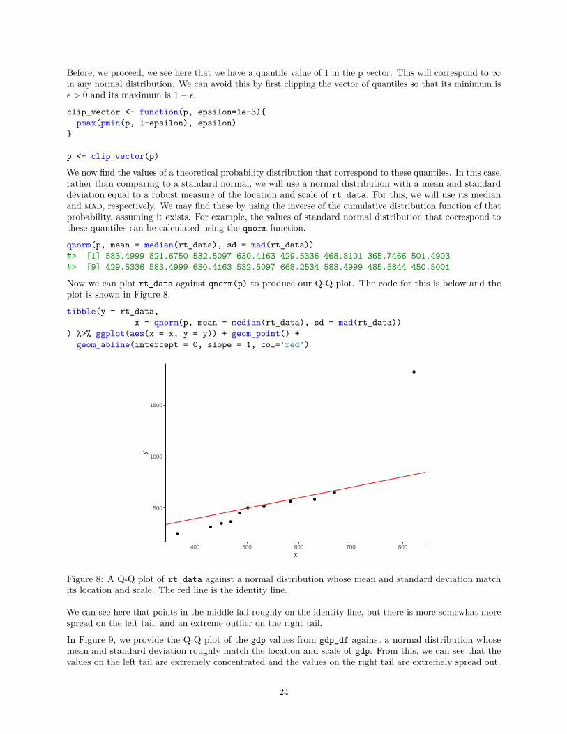
Figure 8: A Q-Q plot of rt_data against a normal distribution whose mean and standard deviation matchits location and scale. The red line is the identity line.
We can see here that points in the middle fall roughly on the identity line, but there is more somewhat morespread on the left tail, and an extreme outlier on the right tail.
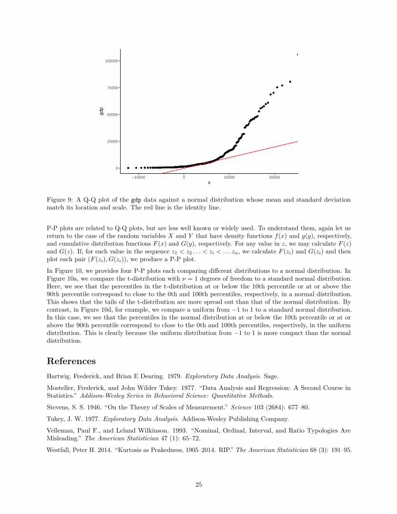
In Figure 9, we provide the Q-Q plot of the gdp values from gdp_df against a normal distribution whosemean and standard deviation roughly match the location and scale of gdp. From this, we can see that thevalues on the left tail are extremely concentrated and the values on the right tail are extremely spread out.
24
0
25000
50000
75000
100000
−10000 0 10000 20000x
gdp
Figure 9: A Q-Q plot of the gdp data against a normal distribution whose mean and standard deviationmatch its location and scale. The red line is the identity line.
P-P plots are related to Q-Q plots, but are less well known or widely used. To understand them, again let usreturn to the case of the random variables X and Y that have density functions f(x) and g(y), respectively,and cumulative distribution functions F (x) and G(y), respectively. For any value in z, we may calculate F (z)and G(z). If, for each value in the sequence z1 < z2 . . . < zi < . . . zn, we calculate F (zi) and G(zi) and thenplot each pair (F (zi), G(zi)), we produce a P-P plot.
In Figure 10, we provides four P-P plots each comparing different distributions to a normal distribution. InFigure 10a, we compare the t-distribution with ν = 1 degrees of freedom to a standard normal distribution.Here, we see that the percentiles in the t-distribution at or below the 10th percentile or at or above the90th percentile correspond to close to the 0th and 100th percentiles, respectively, in a normal distribution.This shows that the tails of the t-distribution are more spread out than that of the normal distribution. Bycontrast, in Figure 10d, for example, we compare a uniform from −1 to 1 to a standard normal distribution.In this case, we see that the percentiles in the normal distribution at or below the 10th percentile or at orabove the 90th percentile correspond to close to the 0th and 100th percentiles, respectively, in the uniformdistribution. This is clearly because the uniform distribution from −1 to 1 is more compact than the normaldistribution.
ReferencesHartwig, Frederick, and Brian E Dearing. 1979. Exploratory Data Analysis. Sage.
Mosteller, Frederick, and John Wilder Tukey. 1977. “Data Analysis and Regression: A Second Course inStatistics.” Addison-Wesley Series in Behavioral Science: Quantitative Methods.
Stevens, S. S. 1946. “On the Theory of Scales of Measurement.” Science 103 (2684): 677–80.
Tukey, J. W. 1977. Exploratory Data Analysis. Addison-Wesley Publishing Company.
Velleman, Paul F., and Leland Wilkinson. 1993. “Nominal, Ordinal, Interval, and Ratio Typologies AreMisleading.” The American Statistician 47 (1): 65–72.
Westfall, Peter H. 2014. “Kurtosis as Peakedness, 1905–2014. RIP.” The American Statistician 68 (3): 191–95.
25

0.25
0.50
0.75
0.00 0.25 0.50 0.75 1.00x
y
a
0.0
0.2
0.4
0.6
0.8
0.00 0.25 0.50 0.75 1.00x
y
b
0.00
0.25
0.50
0.75
1.00
0.00 0.25 0.50 0.75 1.00x
y
c
0.00
0.25
0.50
0.75
1.00
0.00 0.25 0.50 0.75 1.00x
y
d
Figure 10: P-P plots comparing a standard normal distribution represented by the x-axis to four alternativedistributions. In a) the normal distribution is compared to a t-distribution with u = 1 degrees of freedom. In(b), we compare the normal distribution to χ2 distribution with u = 3 degrees of freedom. In (c), the normaldistribution is compared to a uniform distribution from −5 to 5. In (d), the normal distribution is comparedto a unifrom distribution from −1 to 1. In all cases, the red line depicts the identity line.
26