Chapter 15 Design and evaluation in the real world
30
Chapter 15 Design and evaluation in the real world: communicators and advisory systems 15.1 Introduction 15.2 Key issues 15.3 Designing mobile communicators 15.3.1 Background 15.3.2 Nokia’s approach to developing a communicator 15.3.3 Philips’ approach to designing a communicator for children 15.4 Redesigning part of a large interactive phone-based response system 15.4.1 Background 15.4.2 The redesign 15.1 Introduction Textbooks about design and usability testing often make the processes sound straightforward and able to be followed in a step-by-step manner. However, in the real world bringing together all the different aspects of a design is far from straightforward. It is only when you become involved in an actual design project that the challenges and multitude of difficult decisions to be made become appar- ent. Iterative design often involves carrying out different parts of a project in par- allel and under tremendous pressure. The need to deal with different sets of demands and trade-offs (e.g., the need for rigorous testing versus the very limited availability of time and resources) is a major influence on the way a design project is carried out. The aim of this final chapter is to convey what interaction design is like in the real world by describing how others have dealt with the challenges of an actual de- sign project. As you will have noticed, we have written primarily about design in Chapters 6–9 and evaluation in Chapters 10–14. This was to enable us to explain the different techniques and processes involved during a design project. It is impor- tant to realize that in the real world these two central aspects are closely integrated. You do not do one without the other. In particular, the main reason for doing an 461
-
Upload
khangminh22 -
Category
Documents
-
view
0 -
download
0
Transcript of Chapter 15 Design and evaluation in the real world
Chapter 15
Design and evaluation in the real world: communicators and advisory systems15.1 Introduction15.2 Key issues15.3 Designing mobile communicators
15.3.1 Background15.3.2 Nokia’s approach to developing a communicator15.3.3 Philips’ approach to designing a communicator for children
15.4 Redesigning part of a large interactive phone-based response system15.4.1 Background15.4.2 The redesign
15.1 Introduction
Textbooks about design and usability testing often make the processes soundstraightforward and able to be followed in a step-by-step manner. However, inthe real world bringing together all the different aspects of a design is far fromstraightforward. It is only when you become involved in an actual design projectthat the challenges and multitude of difficult decisions to be made become appar-ent. Iterative design often involves carrying out different parts of a project in par-allel and under tremendous pressure. The need to deal with different sets ofdemands and trade-offs (e.g., the need for rigorous testing versus the very limitedavailability of time and resources) is a major influence on the way a design projectis carried out.
The aim of this final chapter is to convey what interaction design is like in thereal world by describing how others have dealt with the challenges of an actual de-sign project. As you will have noticed, we have written primarily about design inChapters 6–9 and evaluation in Chapters 10–14. This was to enable us to explainthe different techniques and processes involved during a design project. It is impor-tant to realize that in the real world these two central aspects are closely integrated.You do not do one without the other. In particular, the main reason for doing an
461
6470D CH15 UG 12/3/01 2:50 PM Page 461
evaluation is to make progress on a design. Conversely, whenever you develop adesign you need to evaluate it. Whether you are designing a small handheld deviceor a large air-traffic control system, a design that takes months to produce or onethat spans years of effort, the two processes must be carried out together.
The chapter provides glimpses into the design and evaluation process for quitedifferent types of interactive systems. The first two case studies discuss the designof mobile communicators for different groups of users, showing how the design is-sues differ for each group. The third case study examines the redesign of a large in-teractive voice response system. In the original design, the focus was on developinga system where the programmers used themselves as models of the users. Further-more, the programmers were more concerned with developing elegant programsthan with users’ needs for easy interaction. As you will see, this caused a mismatchbetween their design and how users tried to find information. This is a commonpredicament and interaction designers are often brought in to fix already badly de-signed systems.
The main aims of this chapter are to:
• Show how design and evaluation are brought together in the development ofinteractive products.
• Show how different combinations of design and evaluation methods are usedin practice.
• Describe the various design trade-offs and decisions made in the real world.
15.2 Key issues
As we have stressed throughout, user-centered approaches to interaction designinvolve iterative cycles of design-evaluate-redesign as development progressesfrom initial ideas through various prototypes to the final product. How many cy-cles need to take place depends on the constraints of the project (e.g., how manypeople are working on it, how much time is available, how secure the system hasto be). To be good at working through these cycles requires a mix of skills involv-ing multitasking, decision-making, team work and firefighting. Many practical is-sues and unexpected events also need to be dealt with (e.g., users not turning upat testing sessions, prototypes not working, budgets being cut, time to completionbeing reduced, designers leaving at crucial stages). A design team, therefore, mustbe creative, well organized, and knowledgeable about the range of techniquesthat can be brought into play when needed. Part of the challenge and excitementof interaction design is finding ways to cope with the diverse set of problems con-fronting a project.
A multitude of questions, concerns and decisions come up throughout a de-sign project. No two projects are ever the same; each will face a different set ofconstraints, demands, and crises. Throughout the book we have raised what weconsider to be general issues that are important in any project. These includehow to involve users and take their needs into account, how to understand aproblem space, how to design a conceptual model, and how to go about designingand evaluating interfaces. In the following case studies, we focus on some of the
462 Chapter 15 Design and evaluation in the real world: communicators and advisory systems
6470D CH15 UG 12/3/01 2:50 PM Page 462
more practical problems and dilemmas that can arise when working on an actualproject.
We present the case studies through a set of questions that draw out a numberof key issues for each project. For example, mapping a large number of functionsonto a much smaller number of buttons is key for mobile devices; understanding achild’s world is key when designing for children; evaluating the current system iskey when redesigning any large system.
15.3 Designing mobile communicators
The first two case studies are about the design of mobile communicators. Theyfocus on some of the design decisions and trade-offs that need to be made. We de-scribe example design practices at two companies, Nokia and Philips, highlightingthe differences in requirements and design methods for what is seemingly a similardevice.
15.3.1 Background
Mobile communicators often combine the functionality of a mobile telephone, aPDA, and a desktop computer. They allow the user to send and receive email andfaxes, to make and receive telephone calls, and to keep contact details, diary en-tries, and other notes. They are an example of new devices that try to push techno-logical boundaries while at the same time being accessible to a wide range of users.A key design challenge, therefore, is how to make such everyday devices usableand affordable to a heterogeneous set of users. Related to this set of usability goalsis the decision about which design approach to use. As you are aware, there aremany different approaches to choose from, ranging from ethnographic to more an-alytic methods. Here, we examine the different approaches of the two companies.To put you in a “design” frame of mind, we begin by asking you to consider the re-quirements for this kind of device.
ACTIVITY 15.1 In Chapter 7, we introduced a number of different kinds of requirements: functional, data,environmental, user, and usability requirements. Which of these is particularly relevant tothe design of a communicator?
Comment All these are relevant in the design of mobile communicators, but one that needs particularattention is environmental requirements. Because the device is aimed at users “on themove” in all kinds of places, the environment in which it should work or its “context of use”is very variable.
Core environmental issues include how to make the device small and lightenough to be carried around in a pocket or small handbag. This means the devicemust be made of light materials and should be physically small, and also the softwaremust be designed to work with a small screen and limited memory. The system must
15.3 Designing mobile communicators 463
6470D CH15 UG 12/3/01 2:50 PM Page 463

allow for a whole range of situations: noisy or quiet, well lit or poorly lit, hot or cold,wet or dry, vibrating or still, and so on. These constraints have implications for theuse of audio, for the levels of display lighting, and for the physical robustness of thedevice, among other things.
Another consideration in the design of this kind of communication device iswhat the users are doing when using it. A typical user is likely to be doing some-thing else at the same time as using the communicator. This may be walkingaround, avoiding obstacles, looking for traffic, etc., or it may be listening for a trainannouncement or a call from children. So users are trying to combine at least threethings: communicating with the device (talking, typing, or whatever), performingthe “external” activity (walking, listening, etc.), and operating the device. This cre-ates quite a high cognitive load, so operating the device should occupy as little at-tention as possible.
Tasks are very likely to be interrupted by external events, so users need toknow where in an interaction sequence they are at any time, and be able to restartthe sequence after an interruption. For a mobile communicator designed to accessthe Internet, this raises an interesting design trade-off: how long should a commu-nicator remain connected to the Internet after activity has apparently ceased? Abalance is needed between disconnecting so as to minimize connection costs, andremaining connected in a stable state to allow the resumption of an interruptedtask. The best option may be to let users set their own time-out period, but thisadds to the complexity of operation.
Another implication of the fact that users are likely to be doing other things inparallel with operating the device is that the communicator may need to be oper-ated with one hand, or indeed in a hands-free mode. For example, someone who iswalking down the street carrying a bag when the phone rings needs to be able to re-spond without stopping and putting the bag down, i.e., the operation needs to beone-handed.
For mobile devices in particular, tasks tend to be time-critical, ad hoc, trig-gered by other people or events, relatively brief, low in terms of attention to be ap-plied to the task, and very personal. Because of these characteristics, the flowamong tasks must be smooth. It seems that easy transition between contact data-base, telephone, and calendar is particularly important for mobile devices. The na-ture of these tasks and the environmental requirements for mobile devices haveimplications for evaluation, as we discuss in section 15.3.2.
Because this device will be mobile it must be simple to use and not involvemuch training. It also needs to be robust and reliable, as the user is most likely tobe away from any significant technical support.
15.3.2 Nokia’s approach to developing a communicator
So how does Nokia deal with these kinds of requirements? And which design andevaluation methods do they use? Here, we look at an example approach ofNokia’s, and some of the key decisions in mobile communicator design. A designexample of an existing Nokia communicator is illustrated in Figure 15.1. This com-municator weighs 244 g, is 158 � 56 � 27 mm, and has a full-color screen. As well
464 Chapter 15 Design and evaluation in the real world: communicators and advisory systems
6470D CH15 UG 12/3/01 2:50 PM Page 464
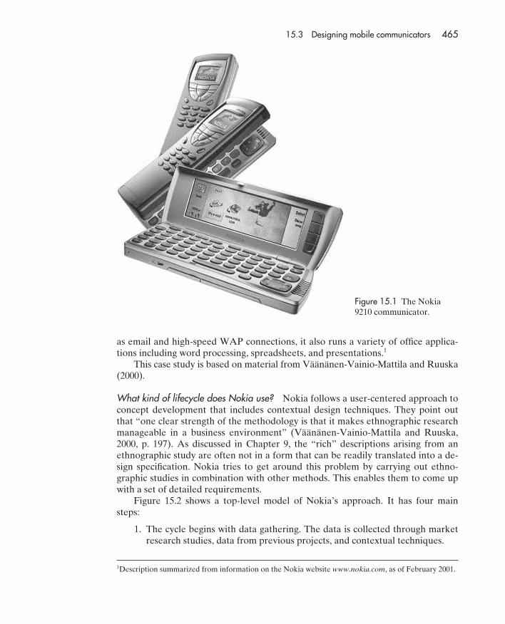
as email and high-speed WAP connections, it also runs a variety of office applica-tions including word processing, spreadsheets, and presentations.1
This case study is based on material from Väänänen-Vainio-Mattila and Ruuska(2000).
What kind of lifecycle does Nokia use? Nokia follows a user-centered approach toconcept development that includes contextual design techniques. They point outthat “one clear strength of the methodology is that it makes ethnographic researchmanageable in a business environment” (Väänänen-Vainio-Mattila and Ruuska,2000, p. 197). As discussed in Chapter 9, the “rich” descriptions arising from anethnographic study are often not in a form that can be readily translated into a de-sign specification. Nokia tries to get around this problem by carrying out ethno-graphic studies in combination with other methods. This enables them to come upwith a set of detailed requirements.
Figure 15.2 shows a top-level model of Nokia’s approach. It has four mainsteps:
1. The cycle begins with data gathering. The data is collected through marketresearch studies, data from previous projects, and contextual techniques.
15.3 Designing mobile communicators 465
Figure 15.1 The Nokia9210 communicator.
1Description summarized from information on the Nokia website www.nokia.com, as of February 2001.
6470D CH15 UG 12/3/01 2:50 PM Page 465
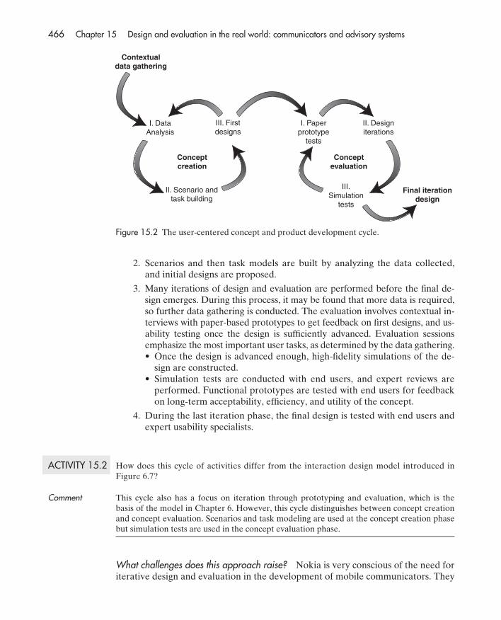
2. Scenarios and then task models are built by analyzing the data collected,and initial designs are proposed.
3. Many iterations of design and evaluation are performed before the final de-sign emerges. During this process, it may be found that more data is required,so further data gathering is conducted. The evaluation involves contextual in-terviews with paper-based prototypes to get feedback on first designs, and us-ability testing once the design is sufficiently advanced. Evaluation sessionsemphasize the most important user tasks, as determined by the data gathering.• Once the design is advanced enough, high-fidelity simulations of the de-
sign are constructed.• Simulation tests are conducted with end users, and expert reviews are
performed. Functional prototypes are tested with end users for feedbackon long-term acceptability, efficiency, and utility of the concept.
4. During the last iteration phase, the final design is tested with end users andexpert usability specialists.
ACTIVITY 15.2 How does this cycle of activities differ from the interaction design model introduced inFigure 6.7?
Comment This cycle also has a focus on iteration through prototyping and evaluation, which is thebasis of the model in Chapter 6. However, this cycle distinguishes between concept creationand concept evaluation. Scenarios and task modeling are used at the concept creation phasebut simulation tests are used in the concept evaluation phase.
What challenges does this approach raise? Nokia is very conscious of the need foriterative design and evaluation in the development of mobile communicators. They
466 Chapter 15 Design and evaluation in the real world: communicators and advisory systems
Contextualdata gathering
Conceptcreation
Conceptevaluation
Final iterationdesign
I. DataAnalysis
II. Scenario andtask building
III. Firstdesigns
I. Paperprototype
tests
II. Designiterations
III.Simulation
tests
Figure 15.2 The user-centered concept and product development cycle.
6470D CH15 UG 12/3/01 2:50 PM Page 466
also use participatory design to a degree, but they point out that users will not nec-essarily have the vision of future possibilities that would allow innovative design inthe same way as they might if asked to help design a familiar application like a webbrowser. Nokia is also well aware of the challenges of evaluating an innovativeproduct like a communicator. These include:
• The difficulty of testing in all possible scenarios.
• The difficulty of testing human communication practices, especially whendeveloping innovative products that will encourage novel behavior.
• The difficulty of testing services that cannot all be known beforehand.
What happens when the product is new and there are no users to test? At Nokia,quick and effortless access to critical tasks is a key design driver, and usability testsare used to evaluate the flow of tasks that have been found critical for mobile devices.
In a competitive and innovative market, other evaluation challenges may alsoarise. For example, consider the original Nokia communicator (the N9000). Thiswas the first of its kind on the market. This had implications for how it could beevaluated because the device could not be shown to people outside the develop-ment team for fear of losing the “first-in-the-market” advantage. Thus the first ver-sion on the market did not have the benefit of testing with real users. Althoughextensive paper-based prototyping and simulations were produced, the evaluationswere limited to a small group of people.
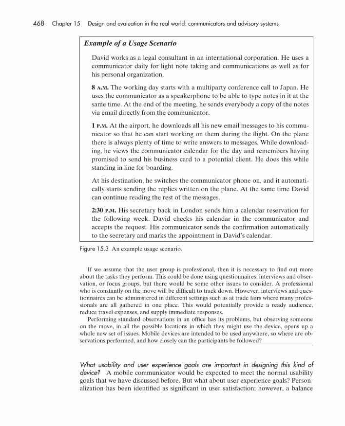
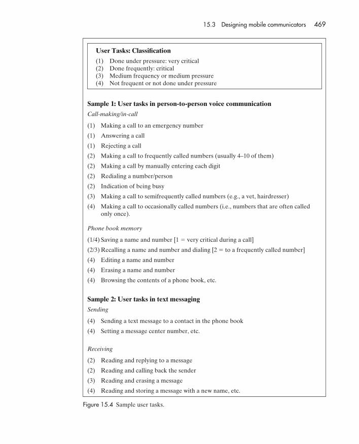
What methods does Nokia use? Nokia uses a number of methods in its develop-ment cycle, in particular “usage scenarios.” Usage scenarios are high-level descrip-tions of uses of the device, based on data collected from representativestakeholders. They differ from the generic scenarios described in Chapter 7 in thatthey focus specifically on concept creation and high-level design considerations. Anexample of a usage scenario developed by Nokia is given in Figure 15.3.
What do design teams do next once they have created a set of scenarios? AtNokia, the design teams use the usage scenarios they have developed to identifycritical user tasks and their structure. These task descriptions, which are moredetailed than the original descriptions provided in the usage scenarios, are thenused to consider lower-level design issues. A sample critical user task is shown inFigure 15.4.
ACTIVITY 15.3 To create scenarios, appropriate tasks and stakeholders will need to be identified. Whowould the stakeholders be, and what techniques might be used to investigate their needs?
Comment First, the tasks to be performed and the stakeholders who might be asked about require-ments would have to be identified. Stakeholders for a mobile device include users, develop-ers, telephone companies, computer hardware and software vendors, and their shareholders.At least in theory, a user may be almost any member of the population, but in practice, onlycertain sections of the population are likely to be users. Given the wide functionality of thecommunicator, the most likely users are professionals.
15.3 Designing mobile communicators 467
6470D CH15 UG 12/3/01 2:50 PM Page 467
If we assume that the user group is professional, then it is necessary to find out moreabout the tasks they perform. This could be done using questionnaires, interviews and obser-vation, or focus groups, but there would be some other issues to consider. A professionalwho is constantly on the move will be difficult to track down. However, interviews and ques-tionnaires can be administered in different settings such as at trade fairs where many profes-sionals are all gathered in one place. This would potentially provide a ready audience,reduce travel expenses, and supply immediate responses.
Performing standard observations in an office has its problems, but observing someoneon the move, in all the possible locations in which they might use the device, opens up awhole new set of issues. Mobile devices are intended to be used anywhere, so where are ob-servations performed, and how closely can the participants be followed?
What usability and user experience goals are important in designing this kind of device? A mobile communicator would be expected to meet the normal usabilitygoals that we have discussed before. But what about user experience goals? Person-alization has been identified as significant in user satisfaction; however, a balance
468 Chapter 15 Design and evaluation in the real world: communicators and advisory systems
Example of a Usage Scenario
David works as a legal consultant in an international corporation. He uses acommunicator daily for light note taking and communications as well as forhis personal organization.
8 A.M. The working day starts with a multiparty conference call to Japan. Heuses the communicator as a speakerphone to be able to type notes in it at thesame time. At the end of the meeting, he sends everybody a copy of the notesvia email directly from the communicator.
1 P.M. At the airport, he downloads all his new email messages to his commu-nicator so that he can start working on them during the flight. On the planethere is always plenty of time to write answers to messages. While download-ing, he views the communicator calendar for the day and remembers havingpromised to send his business card to a potential client. He does this whilestanding in line for boarding.
At his destination, he switches the communicator phone on, and it automati-cally starts sending the replies written on the plane. At the same time Davidcan continue reading the rest of the messages.
2:30 P.M. His secretary back in London sends him a calendar reservation forthe following week. David checks his calendar in the communicator and accepts the request. His communicator sends the confirmation automaticallyto the secretary and marks the appointment in David’s calendar.
Figure 15.3 An example usage scenario.
6470D CH15 UG 12/3/01 2:50 PM Page 468
15.3 Designing mobile communicators 469
Sample 1: User tasks in person-to-person voice communication
Call-making/in-call
(1) Making a call to an emergency number
(1) Answering a call
(1) Rejecting a call
(2) Making a call to frequently called numbers (usually 4–10 of them)
(2) Making a call by manually entering each digit
(2) Redialing a number/person
(2) Indication of being busy
(3) Making a call to semifrequently called numbers (e.g., a vet, hairdresser)
(4) Making a call to occasionally called numbers (i.e., numbers that are often called only once).
Phone book memory
(1/4) Saving a name and number [1 � very critical during a call]
(2/3) Recalling a name and number and dialing [2 � to a frequently called number]
(4) Editing a name and number
(4) Erasing a name and number
(4) Browsing the contents of a phone book, etc.
Sample 2: User tasks in text messaging
Sending
(4) Sending a text message to a contact in the phone book
(4) Setting a message center number, etc.
Receiving
(2) Reading and replying to a message
(2) Reading and calling back the sender
(3) Reading and erasing a message
(4) Reading and storing a message with a new name, etc.
User Tasks: Classification
(1) Done under pressure: very critical(2) Done frequently: critical(3) Medium frequency or medium pressure(4) Not frequent or not done under pressure
Figure 15.4 Sample user tasks.
6470D CH15 UG 12/3/01 2:50 PM Page 469
must be struck between allowing flexibility and providing sensible default values sothat users don’t have to customize settings unless they want to.
Mobile communicators are intended to support users wherever they are, sothey must be compatible with the users’ lifestyles. Designers must therefore under-stand the design characteristics that make the communicator attractive to differentuser groups, and those characteristics that will vary from group to group. If we con-sider the users as business people, then the important user experience goals arelikely to include being helpful, motivating, aesthetically pleasing, and rewarding. Ifwe consider children, then entertainment and fun are likely to be more important,while for teenagers its physical appearance might be more significant.
How does Nokia design a communicator’s physical aspects? Deciding how manykeys to have and how to map them onto a much larger set of functions is a difficultdesign challenge in any mobile device (see Box 15.1). For example, in the Nokia 7110mobile phone, the problem of limited keys and limited space was dealt with by pro-viding softkeys with context-sensitive functions that change depending on where theuser is in the interaction sequence. This allows the keys to perform different functionsdepending on the other contextual issues. The softkeys allow the user to do a varietyof things, such as make selections, enter, edit, or delete text. The current label foreach softkey is displayed at the bottom of the screen, near the relevant key. There is,
470 Chapter 15 Design and evaluation in the real world: communicators and advisory systems
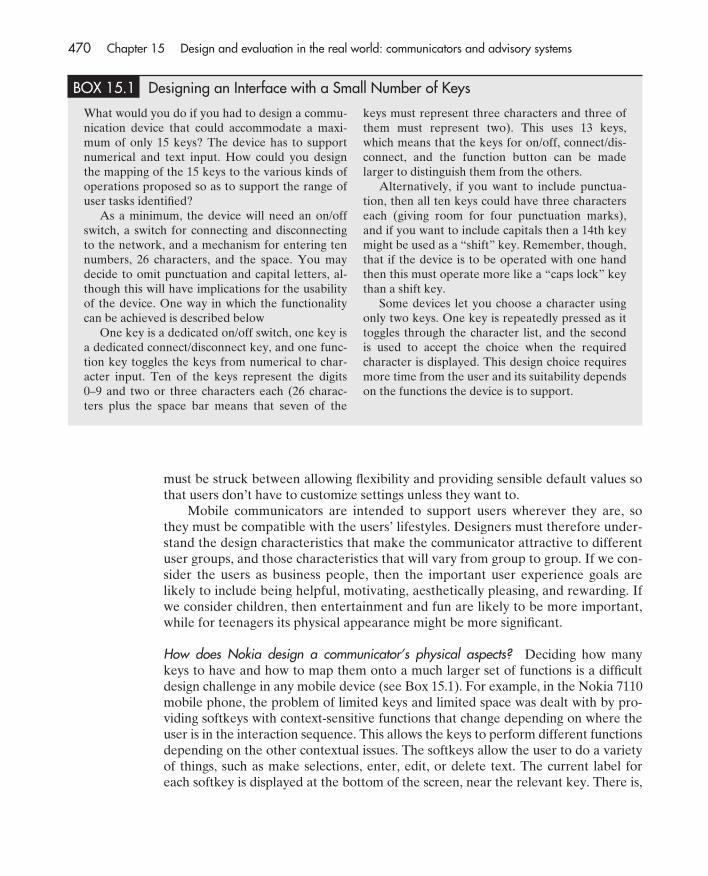
BOX 15.1 Designing an Interface with a Small Number of Keys
What would you do if you had to design a commu-nication device that could accommodate a maxi-mum of only 15 keys? The device has to supportnumerical and text input. How could you designthe mapping of the 15 keys to the various kinds ofoperations proposed so as to support the range ofuser tasks identified?
As a minimum, the device will need an on/offswitch, a switch for connecting and disconnectingto the network, and a mechanism for entering tennumbers, 26 characters, and the space. You maydecide to omit punctuation and capital letters, al-though this will have implications for the usabilityof the device. One way in which the functionalitycan be achieved is described below
One key is a dedicated on/off switch, one key isa dedicated connect/disconnect key, and one func-tion key toggles the keys from numerical to char-acter input. Ten of the keys represent the digits0–9 and two or three characters each (26 charac-ters plus the space bar means that seven of the
keys must represent three characters and three ofthem must represent two). This uses 13 keys,which means that the keys for on/off, connect/dis-connect, and the function button can be madelarger to distinguish them from the others.
Alternatively, if you want to include punctua-tion, then all ten keys could have three characterseach (giving room for four punctuation marks),and if you want to include capitals then a 14th keymight be used as a “shift” key. Remember, though,that if the device is to be operated with one handthen this must operate more like a “caps lock” keythan a shift key.
Some devices let you choose a character usingonly two keys. One key is repeatedly pressed as ittoggles through the character list, and the secondis used to accept the choice when the requiredcharacter is displayed. This design choice requiresmore time from the user and its suitability dependson the functions the device is to support.
6470D CH15 UG 12/3/01 2:50 PM Page 470

of course, a balance to be struck between having too many softkeys, each with limitedfunctionality, and having only a few keys that can be overloaded with too many func-tions. In the end, the Nokia 7110 (Figure 15.5) was designed with just two softkeysthat performed multiple functions. (Väänänen-Vainio-Mattila and Ruuska, 2000).
Textual input becomes a major problem when the number of input keys is re-stricted by the design. Having only a small number means the users must con-stantly “peck” at a few keys, typically using their thumbs. Trying to place too manykeys in a heavily constrained space means that the user is likely to press the wrongkey or two keys at once. How was this problem handled by Nokia? They opted fora small number of keys but in combination with a way of speeding up the typing ofwords, through having the communicator guess what the user is writing. In particu-lar, the Nokia 7110 introduced the T9 predictive text method that allows speedyinput of words based on a dictionary. The phone proposes a likely word once theuser has typed a few characters. The user then either selects the proposed wordand moves on to the next word, or rejects it and continues to enter the currentword.
Communicators have also been designed to include a function button to let theuser customize the interface to a limited degree, for example by allowing a favoriteapplication to be associated with one of the hard keys.
15.3 Designing mobile communicators 471
Figure 15.5 The Nokia7110 mobile phone.
6470D CH15 UG 12/3/01 2:50 PM Page 471

Is it possible to design consistent interfaces, given the physical constraints of a commu-nicator? A particular problem when developing software for a small display withlimited input controls is how to make the interface consistent.
The design dilemma of consistency was addressed in Chapter 1. Consistencyis often extolled as a virtue, yet it is sometimes appropriate to be inconsistent. Inthe design of communicators, the problems of consistency arise again. The deviceneeds to have external consistency, i.e., consistency with users’ expectations fromtheir use of other similar tools, and also internal consistency, i.e., consistency withother items of software that the device supports. Sometimes these two designgoals are in conflict, and it is appropriate to design a new solution for a particularsituation.
The N9000 web browser was developed for the Nokia N9000 communicator.Many design decisions had to be dealt with, especially the problem of consistency(Ketola et al., 2000). Nokia has an internal style guide that all its products must fol-low in order to maintain internal consistency. External consistency with PC-basedproducts is difficult to achieve because of physical constraints, and because the op-erating system for the N9000 is not commonly used with a PC. Other constraints onthe design were:
1. The N9000 does not have a pointing device. Pointing is therefore done byselection using the scrolling bars. Scrolling down causes selection to jumpfrom one hyperlink to the next; scrolling up causes it to jump to the previ-ous link.
2. In cellular devices, connection rate is limited to 9600 bps, which is slowerthan the fixed-line rate. Connection can also take up to 30 seconds, consid-erably slower than the fixed-line equivalent. Web users may be accus-tomed to slow downloading times, but a long connection time is a new
472 Chapter 15 Design and evaluation in the real world: communicators and advisory systems
BOX 15.2 Designing Telephones for the Elderly and Disabled
The British Royal National Institute for the Blind(RNIB), together with the British Department ofTrade and Industry and British Telecommunica-tions, have compiled a brochure to explain the dif-ferent impairments affecting many telephone usergroups, together with a set of suggested telephonefeatures that could greatly enhance the accessibilityof devices for such user groups. They identify 15impairments and 44 features that could be added totelephones to make their use more pleasant. Theimpairments include cognitive impairment, weakgrip, limited dexterity, speech impairment, hearingimpairment, and hand tremor (Gill and Shipley,1999). Features that could make a difference tothese user groups include:
• Guarded or recessed keys to help preventpressing the wrong key by mistake.
• Sidetone reduction, which reduces theamount of noise picked up from the environ-ment and mixed with incoming speech at theearpiece.
• Allowing the user to adjust the amount ofpressure needed to select a key. Apart fromthe more obvious consequences of too muchor too little pressure, unsuitable key pres-sure may produce muscle spasms in someusers.
• Audio and tactile key feedback to indicatewhen a key has been pressed.
6470D CH15 UG 12/3/01 2:50 PM Page 472
phenomenon. A progress indicator was included in the design so that userswould not become frustrated and start pressing other buttons. This leads toa further external consistency issue: should web pages be made to look thesame as on faster desktop machines, or should they be designed for fasterdownloading?
Specific design decisions and solutions taken under these constraints were asfollows:
1. The default page for a desktop web browser is a home page, but because ofthe connection time and the speed of downloading, the N9000 browser de-faults to a list of favorite pages (called the Hotlist) instead. Thus, the defaultstate is offline. This violates external consistency, but proved to be accept-able to users.
2. The functionality of the N9000 browser had to be carefully examined. Be-cause of the Nokia style guide, only three buttons were available for navi-gating through the function hierarchy, so navigation became a major issue.To cope with the limited availability of command buttons, the N9000 em-ploys the idea of views, within which only certain functions are possible. Forthe web browser, three views were provided: Hotlist view, Document view,and Navigation view. Users can select a document in the Hotlist view andenter the Document view. From here they are able to save, read, disconnectfrom the network, and close the document. However, they cannot navigatethrough the document. For this they need to go to the Navigation view. Thisconceptual shift was difficult for users to come to terms with.
3. The style guide dictated that the fourth command button be used to moveupwards in the view hierarchy. It is also a part of the style guide that thisbutton should be called “Back.” In other applications this may not be aproblem, but in the context of a web browser, a button labeled “Back” is in-terpreted differently. Internal consistency had to be obeyed here, and so thecommand that moved back to the previous page in the history list was called“Previous.” This caused considerable confusion for users.
4. Optimizing web pages for display on mobile communicators involves thefollowing three issues: content, because it’s important to optimize downloadtimes; page layout, because of the small size of the screen; and navigation,because it’s important to minimize the number of file downloads. User trialsshowed that, in the mobile context, users are more interested in getting thetext information quickly than in downloading the graphics. Downloadingunwanted pages also proved to be considered a key aspect of usability.Good link naming and clear, predictable behavior were important becauseof the long downloading times; locating the wrong page expends much timeand cost.
ACTIVITY 15.4 If you are sitting near a desktop computer, study the interface of the piece of software that isrunning. If you are not near one, then think of the application you run most regularly on a
15.3 Designing mobile communicators 473
6470D CH15 UG 12/3/01 2:50 PM Page 473
desktop machine. Imagine what this interface would look like if you were to reduce thescreen size to a mere 158 mm � 56 mm (the size of the Nokia 9210 communicator). Whatdifficulties can you see? What implications do you think this has for software design, andalso for the user who is swapping between desktop systems and mobile systems on a regularbasis?
Comment If the same screen design is carried over to the mobile device then either everything willhave to be miniaturized, so that the tool bars, icons and menus will become unreadable, orleft at the same size, so that they will take up too much space on the screen. The interfacetherefore must be designed differently. This has implications for consistency for users whomight be using the same application in a desktop environment and on the mobile device.
What kind of user testing does Nokia use? As mentioned earlier, there were confi-dentiality problems in testing the first generation of communicators on the in-tended user population. Hence, user testing could be done only after the productwas released on the market. One kind of summative testing Nokia did was to findout what questions people have when first using the communicator. Users weregiven the device to use for some weeks and were then asked to report on positiveand negative features. The results from this study confirmed the developers’ con-cerns about the effects of consistency with other similar applications designed torun on desktop machines. Another study involved sending questionnaires to morecritical communicator users whose experience ranged from 0 to 12 months, to findout if their reactions were similar.
As can be seen from this case study, Nokia uses a number of methods to de-velop their communicators for the general public. Furthermore, many design deci-sions and problems have to be dealt with, ranging from the lack of real users fortesting, to how to let users send text messages with only a few keys and a very con-fined space.
15.3.3 Philips’ approach to designing a communicator for children
We now consider how another company went about designing a mobile communi-cator aimed at a specific user group, children (mostly girls) aged between 7 and 12.Developing a tool for this user group is quite different from developing a tool foruse by the general public, where there is likely to be a huge range of different users.An advantage of designing a device for a smaller set of users is that they are likelyto have similar needs and preferences, meaning that the device can be customizedmuch more to their requirements. This case study draws on material reported inOosterholt et al. (1996).
Which approach did Philips use? The Philips process of development for thisparticular communicator made extensive use of prototyping techniques and par-ticipatory design. Children were involved from the initial concepts stage rightthrough to final product testing. Each time a prototype was produced, it wasshown to children for comment and feedback. A central part of the design processinvolved developing interface metaphors. Again, when ideas for metaphors were
474 Chapter 15 Design and evaluation in the real world: communicators and advisory systems
6470D CH15 UG 12/3/01 2:50 PM Page 474
proposed, the designers turned to the girls in a spirit of participatory design inorder to elicit their responses.
What usability and user experience goals were considered important? In the Nokiacommunicator example we saw the importance of usability goals focusing on effec-tiveness and efficiency, especially the need to move smoothly among critical tasks. Incontrast, Philips focused more on the user experience goals of being enjoyable, en-tertaining, and fun. Other goals were that it should encourage creativity and providepersonal and magical applications. The girls had expressed a specific desire for these.
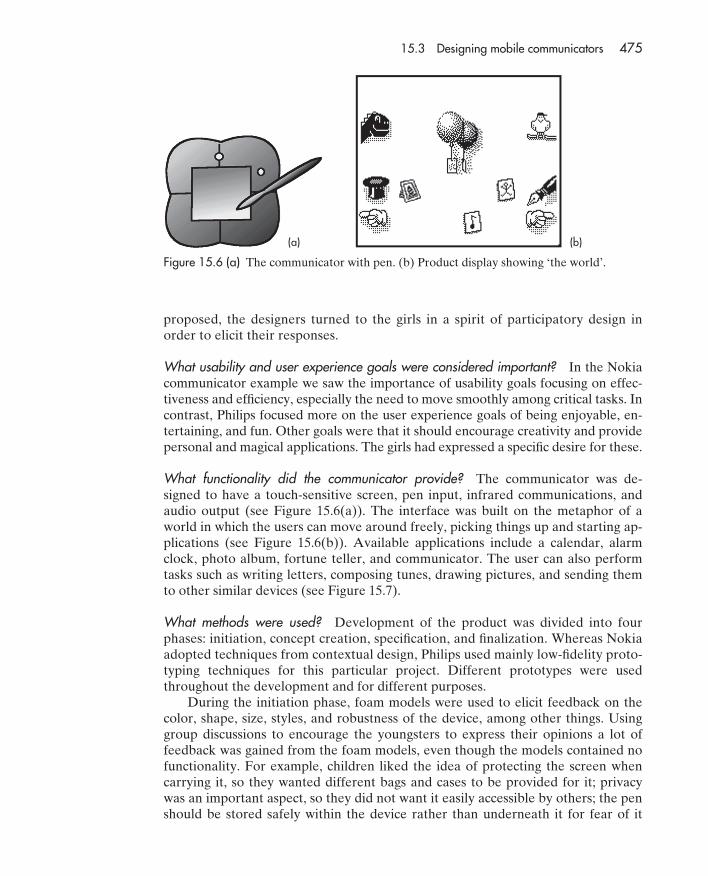
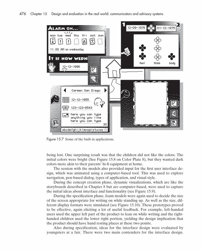
What functionality did the communicator provide? The communicator was de-signed to have a touch-sensitive screen, pen input, infrared communications, andaudio output (see Figure 15.6(a)). The interface was built on the metaphor of aworld in which the users can move around freely, picking things up and starting ap-plications (see Figure 15.6(b)). Available applications include a calendar, alarmclock, photo album, fortune teller, and communicator. The user can also performtasks such as writing letters, composing tunes, drawing pictures, and sending themto other similar devices (see Figure 15.7).
What methods were used? Development of the product was divided into fourphases: initiation, concept creation, specification, and finalization. Whereas Nokiaadopted techniques from contextual design, Philips used mainly low-fidelity proto-typing techniques for this particular project. Different prototypes were usedthroughout the development and for different purposes.
During the initiation phase, foam models were used to elicit feedback on thecolor, shape, size, styles, and robustness of the device, among other things. Usinggroup discussions to encourage the youngsters to express their opinions a lot offeedback was gained from the foam models, even though the models contained nofunctionality. For example, children liked the idea of protecting the screen whencarrying it, so they wanted different bags and cases to be provided for it; privacywas an important aspect, so they did not want it easily accessible by others; the penshould be stored safely within the device rather than underneath it for fear of it
15.3 Designing mobile communicators 475
Figure 15.6 (a) The communicator with pen. (b) Product display showing ‘the world’.
(a) (b)
6470D CH15 UG 12/3/01 2:50 PM Page 475
being lost. One surprising result was that the children did not like the colors. Theinitial colors were bright (See Figure 15.8 on Color Plate 8), but they wanted darkcolors more akin to their parents’ hi-fi equipment at home.
The session with the models also provided input for the first user interface de-sign, which was animated using a computer-based tool. This was used to explorenavigation, pen-based dialog, types of application, and visual style.
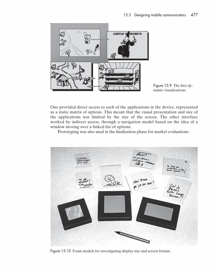
During the concept creation phase, dynamic visualizations, which are like thestoryboards described in Chapter 8 but are computer-based, were used to capturethe initial ideas about interface and functionality (see Figure 15.9).
During the specification phase, foam models were again used to decide the sizeof the screen appropriate for writing on while standing up. As well as the size, dif-ferent display formats were simulated (see Figure 15.10). These prototypes provedto be effective, again eliciting a lot of useful feedback. For example, left-handedusers used the upper left part of the product to lean on while writing and the right-handed children used the lower right portion, yielding the design implication thatthe product should have hand resting places at these two points.
Also during specification, ideas for the interface design were evaluated byyoungsters at a fair. There were two main contenders for the interface design.
476 Chapter 15 Design and evaluation in the real world: communicators and advisory systems
Figure 15.7 Some of the built-in applications.
6470D CH15 UG 12/3/01 2:51 PM Page 476
One provided direct access to each of the applications in the device, representedas a static matrix of options. This meant that the visual presentation and size ofthe applications was limited by the size of the screen. The other interfaceworked by indirect access, through a navigation model based on the idea of awindow moving over a linked list of options.
Prototyping was also used in the finalization phase for market evaluations.
15.3 Designing mobile communicators 477
Figure 15.9 The first dy-namic visualizations.
Figure 15.10 Foam models for investigating display size and screen format.
6470D CH15 UG 12/3/01 2:51 PM Page 477
ACTIVITY 15.5 Prototypes are often used to answer specific questions. In this development, what questionswere answered by producing and evaluating the foam models?
Comment Foam models were used at two specific points in the development to answer clear ques-tions. The first set was used to consider the physical design such as size and color. Theyalso elicited comments about storing the pen, covering the display, and having a carryingbag. The second set was used to design the display size and format. This also had the sideeffect of finding out useful information about where children would rest their hands onthe device.
How much did the children participate in the design? One of the problems withparticipatory design is knowing how much to involve the users. Trying to involvechildren too much can be counterproductive, boring them and sometimes makingthem feel out of their depth. Asking children to participate too little can end upmaking them feel as if their views and ideas are not being sufficiently taken intoaccount.
The Philips design team involved the children in design and evaluation fromthe very beginning. The first participatory design session was held during the ini-tiation phase at a local international primary school. The session investigatedthe social and personal lives of 7 to 12 year-olds. Groups of 8 to 10 children wereengaged in discussions and were asked to draw sketches of their ideal prod-uct. They were also asked to write stories about the use of the product, so thatdesigners could get some contextual information about how it might be used.From this first session, it was clear that the concept was well received by thechildren. They particularly liked the communication, the pen-based interface,and its multifunctionality.
There were clear differences between boys, who wanted a broader range of func-tionality, and girls, who focused on communication. The ability to personalize wasimportant to both groups. For example, one girl wanted the device to cough when amessage arrived so that the teacher wouldn’t know she was using it during class.
The whole design team was present at participatory design sessions. Spendingtime to get the children’s opinions and to enter their world to understand how theyperceive things was important for the success of the product.
One lesson that the designers drew from this exercise echoes a comment byGillian Crampton Smith in the interview at the end of Chapter 6: users are not de-signers. In this instance, the children were limited in what they could design bywhat they knew and what they were used to. Another stakeholder group, parents,expected keyboard input, as they believed this to be more sophisticated than peninput, which was seen as old fashioned.
On the other hand, children are often more imaginative than adults, so involv-ing the children was useful when discussing innovative ideas, or when only partialideas were available. Working with children like this rather than adults requires adifferent approach, yet both adults and children need to appreciate each others’strengths and weaknesses. Box 15.3 describes the intergenerational design teamsthat Druin works with in projects at the University of Maryland.
478 Chapter 15 Design and evaluation in the real world: communicators and advisory systems
6470D CH15 UG 12/3/01 2:51 PM Page 478
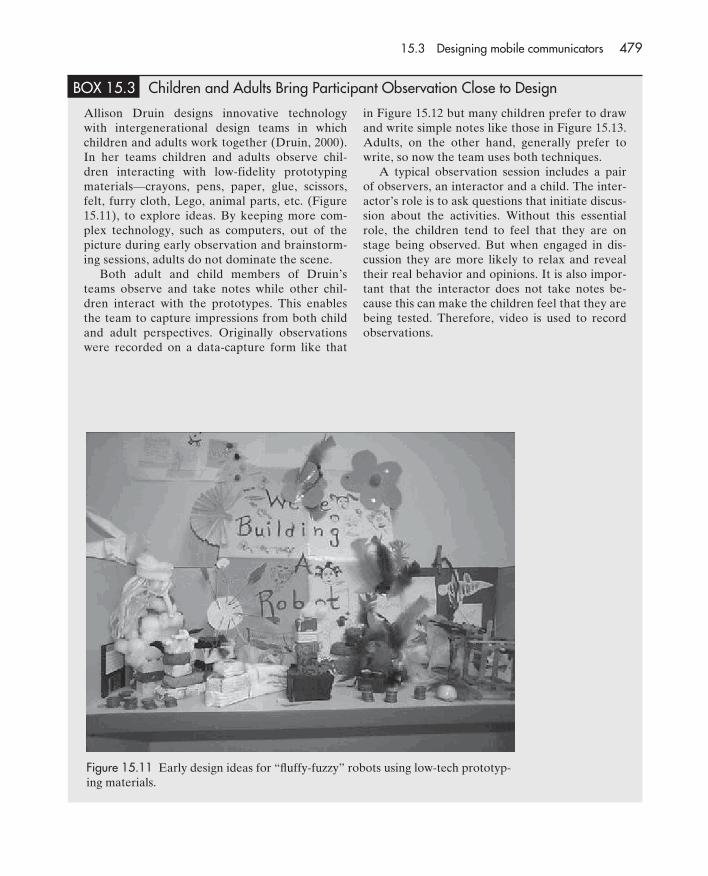
BOX 15.3 Children and Adults Bring Participant Observation Close to Design
Allison Druin designs innovative technologywith intergenerational design teams in whichchildren and adults work together (Druin, 2000).In her teams children and adults observe chil-dren interacting with low-fidelity prototypingmaterials—crayons, pens, paper, glue, scissors,felt, furry cloth, Lego, animal parts, etc. (Figure15.11), to explore ideas. By keeping more com-plex technology, such as computers, out of thepicture during early observation and brainstorm-ing sessions, adults do not dominate the scene.
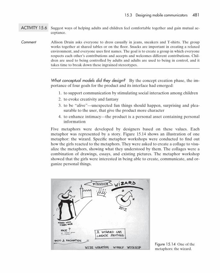
Both adult and child members of Druin’steams observe and take notes while other chil-dren interact with the prototypes. This enablesthe team to capture impressions from both childand adult perspectives. Originally observationswere recorded on a data-capture form like that
in Figure 15.12 but many children prefer to drawand write simple notes like those in Figure 15.13.Adults, on the other hand, generally prefer towrite, so now the team uses both techniques.
A typical observation session includes a pairof observers, an interactor and a child. The inter-actor’s role is to ask questions that initiate discus-sion about the activities. Without this essentialrole, the children tend to feel that they are onstage being observed. But when engaged in dis-cussion they are more likely to relax and revealtheir real behavior and opinions. It is also impor-tant that the interactor does not take notes be-cause this can make the children feel that they arebeing tested. Therefore, video is used to recordobservations.
Figure 15.11 Early design ideas for “fluffy-fuzzy” robots using low-tech prototyp-ing materials.
15.3 Designing mobile communicators 479
6470D CH15 UG 12/3/01 2:51 PM Page 479
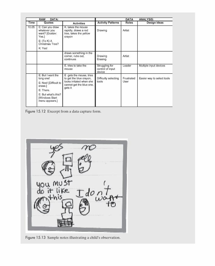
Figure 15.12 Excerpt from a data capture form.
Figure 15.13 Sample notes illustrating a child’s observation.
6470D CH15 UG 12/3/01 2:51 PM Page 480
ACTIVITY 15.6 Suggest ways of helping adults and children feel comfortable together and gain mutual ac-ceptance.
Comment Allison Druin asks everyone to dress casually in jeans, sneakers and T-shirts. The groupworks together at shared tables or on the floor. Snacks are important in creating a relaxedenvironment, and everyone uses first names. The goal is to create a group in which everyonerespects each other’s contributions and accepts and welcomes different contributions. Chil-dren are used to being controlled by adults and adults are used to being in control, and ittakes time to break down these ingrained stereotypes.
What conceptual models did they design? By the concept creation phase, the im-portance of four goals for the product and its interface had emerged:
1. to support communication by stimulating social interaction among children
2. to evoke creativity and fantasy
3. to be “alive”—unexpected fun things should happen, surprising and plea-surable to the user, that give the product more character
4. to enhance intimacy—the product is a personal asset containing personalinformation
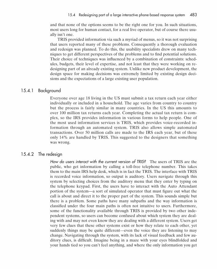
Five metaphors were developed by designers based on these values. Eachmetaphor was represented by a story. Figure 15.14 shows an illustration of onemetaphor: the wizard. Specific metaphor workshops were conducted to find outhow the girls reacted to the metaphors. They were asked to create a collage to visu-alize the metaphors, showing what they understood by them. The collages were acombination of drawings, essays, and existing pictures. The metaphor workshopshowed that the girls were interested in being able to create, communicate, and or-ganize personal things.
15.3 Designing mobile communicators 481
Figure 15.14 One of themetaphors: the wizard.
6470D CH15 UG 12/3/01 2:51 PM Page 481

How did they evaluate the conceptual model? During the finalization stage, usabil-ity evaluations with children were performed to investigate the user interface itselfand also to answer specific questions concerned with ideas for games, and writingperformance. In most sessions, users were asked to play with the device for a cer-tain period of time before giving feedback.
What lessons were learned from this case study? Many lessons were learned fromdeveloping an innovative product using a combination of participatory design anduser testing. Some practical advice offered by Oosterholt and colleagues that canbe generalized to the design of other interactive products is:
Specify Your User Requirements And Define Milestones The rationale behindspecifying user requirements is not just to develop them, but to make sure that the teamagrees on the assumptions and realizes how and when they have been and can bechanged.
A Product Is Not Designed in a Vacuum Start thinking about additional and follow-up products at an early stage, so one does not have to change suddenly or add extrafunctionality in a later phase.
Users Are Not Designers Not all answers can be generated by user or market tests.Users will generally relate any new product concept to existing products.
Act Quick And Dirty If Necessary Often, the purpose of user testing is not to decidewhether one interface concept is more usable than an alternative concept, but todiscover issues that are important to the children. Small qualitative sessions of userinvolvement are therefore often appropriate. Furthermore, such sessions provide anopportunity for designers to “enter” the children’s world.
15.4 Redesigning part of a large interactive phone-based response system
In this case study, we focus on quite a different kind of system, one being re-designed for a specific application intended to provide the general public with ad-vice about filling out a tax return—and those of you who have to do this know onlytoo well how complex it is. The original product was developed not as a commer-cial product but as an advisory system to be interacted with via the phone. We re-port here on the work carried out by usability consultant Bill Killam and hiscolleagues, who worked with the US Internal Revenue Services (IRS) to evaluateand redesigned the telephone response information system (TRIS).
Although this case study is situated in the US, such phone-based informationsystems are widespread across the world. Typically, they are very frustrating to use.Have you been annoyed by the long menus of options such systems provide whenyou are trying to buy a train ticket or when making an appointment for a techni-cian to fix your phone line? What happens is that you work your way through sev-eral different menu systems, selecting an option from the first list of, say, sevenchoices, only to find that now you must choose from another list of five alterna-tives. Then, having spent several minutes doing this, you discover that you madethe wrong choice back in the first menu, so you have to start again. Does this soundfamiliar? Other problems are that often there are too many options to remember,
482 Chapter 15 Design and evaluation in the real world: communicators and advisory systems
6470D CH15 UG 12/3/01 2:51 PM Page 482
and that none of the options seems to be the right one for you. In such situations,most users long for human contact, for a real live operator, but of course there usu-ally isn’t one.
TRIS provided information via such a myriad of menus, so it was not surprisingthat users reported many of these problems. Consequently a thorough evaluationand redesign was planned. To do this, the usability specialists drew on many tech-niques to get different perspectives of the problems and to find potential solutions.Their choice of techniques was influenced by a combination of constraints: sched-ules, budgets, their level of expertise, and not least that they were working on re-designing part of an already existing system. Unlike new product development, thedesign space for making decisions was extremely limited by existing design deci-sions and the expectations of a large existing user population.
15.4.1 Background
Everyone over age 18 living in the US must submit a tax return each year eitherindividually or included in a household. The age varies from country to countrybut the process is fairly similar in many countries. In the US this amounts toover 100 million tax returns each year. Completing the actual tax return is com-plex, so the IRS provides information in various forms to help people. One ofthe most used information services is TRIS, which provides voice-recorded in-formation through an automated system. TRIS also allows simple automatedtransactions. Over 50 million calls are made to the IRS each year, but of theseonly 14% are handled by TRIS. This suggested to the designers that somethingwas wrong.
15.4.2 The redesign
How do users interact with the current version of TRIS? The users of TRIS are thepublic, who get information by calling a toll-free telephone number. This takesthem to the main IRS help desk, which is in fact the TRIS. The interface with TRISis recorded voice information, so output is auditory. Users navigate through thissystem by selecting choices from the auditory menu that they enter by typing onthe telephone keypad. First, the users have to interact with the Auto Attendantportion of the system—a sort of simulated operator that must figure out what thecall is about and direct it to the proper part of the system. This sounds simple butthere is a problem. Some paths have many subpaths and the way information isclassified under the four main paths is often not intuitive to users. Furthermore,some of the functionality available through TRIS is provided by two other inde-pendent systems, so users can become confused about which system they are deal-ing with and may not even know they are dealing with a different system. Users getvery few clues that these other systems exist or how they relate to each other, yetsuddenly things may be quite different—even the voice they are listening to maychange. Navigating through the system, with its lack of visual feedback and few au-ditory clues, is difficult. Imagine being in a maze with your eyes blindfolded andyour hands tied so you can’t feel anything, and where the only information you get
15.4 Redesigning part of a large interactive phone-based response system 483
6470D CH15 UG 12/3/01 2:51 PM Page 483
is auditory. How can you possibly remember all the instructions and construct anaccurate mental model in your head to help you?
Once in TRIS, users can take various paths that:
• Provide answers to questions about tax law (provided by one of the twoother computer systems accessible through TRIS).
• Allow people to order all the forms and other materials they need to com-plete their tax return (provided by the two other systems accessible throughTRIS).
• Perform simple transactions, such as changing a mailing address, ordering acopy of a tax return, or obtaining answers to specific questions about a per-son’s taxation.
• Reach a live operator if none of the above options are applicable or the usercannot figure out how to use the system.
ACTIVITY 15.7 Why is developing an accurate mental model of TRIS difficult for users?
Comment Much of TRIS is hidden to the users. Their interaction with it is indirect, through listening toresponses from the system and pressing various keys (whose meaning is always context de-pendent). There is no visual interface and users have only speech output to support theirmental model development. Because speech is transient, unlike visual feedback, users mustwork out the conceptual model without visual cues. The user interface to this system is a se-ries of menus in a tree structure and, since human short-term memory is limited, the struc-ture of the system must also be limited to only a few branches at each point in the tree.Another problem is that TRIS accepts input only from the telephone number keypad, so it’snot possible to associate unique or meaningful options with user choices.
What are the main problems identified with the existing version of TRIS? Becauseone of the main problems users have when using TRIS is developing a mentalmodel of the system it is hard for users to find the information they need. In addi-tion, TRIS was not designed to reveal the mapping of the underlying systems andoften did things that made sense from a processing point of view but not from theuser’s. This is probably because the programmers took a data-oriented view of thesystem rather than a user-oriented one. For example, TRIS used the same softwareroutine to gather both a social security number and an employee identificationnumber for certain interactions. This may be efficient from a code-developmentstandpoint, since only one code module needs to be designed and tested, but fromthe user’s perspective it presented several problems. The system always had to askthe user which type of number was expected, even though only one of these num-bers made sense for many questions being asked. Consequently, many users unfa-miliar with employee identification numbers were not sure what to answer, thosewho knew the difference wondered why the system was even asking, and all usershad yet another chance to make an entry error.
484 Chapter 15 Design and evaluation in the real world: communicators and advisory systems
6470D CH15 UG 12/3/01 2:51 PM Page 484

What methods did the usability experts use to identify the problems with the currentversion of TRIS? To begin with the usability specialists did a general review of theliterature and industry standards and identified the latest design guidelines and cur-rent industry best practices for interactive voice response (IVR) systems. Theseguidelines formed the basis for a heuristic evaluation of the existing TRIS user in-terface and helped identify specific areas that needed improvement. They also usedthe GOMS keystroke-level modeling technique to predict how well the interfacesupported users’ tasks. Menu selection from a hierarchy of options is quite wellsuited to a GOMS evaluation, although certain modifications were necessary to es-timate values for average performance times.
What did they do with the findings of the evaluation? Once the analysis of the ex-isting interface and user tasks was complete, the team then followed a set of designguidelines and standards, to develop three alternative interfaces for the Auto At-tendant part of TRIS. An expert peer panel then reviewed the three alternativesand jointly selected the one that they considered to have the highest usability. Theusability specialists also performed a further GOMS analysis for comparison withthe existing system. The analysis predicted that it would only take 216.2 seconds tomake a call with the new system, compared with 278.7 seconds with the originalsystem. While this kind of prediction can highlight possible savings, it says littleabout which aspects of the redesign are more effective and why. The usability spe-cialists, therefore, needed to carry out other kinds of user testing.
ACTIVITY 15.8 Why is it that the results from a GOMS analysis do not necessarily predict the best design?
Comment The keystroke-level analysis predicts performance time for experts doing a task from begin-ning to end. Not all of the users of TRIS will be experts, so performance time is not the onlypredictor of good usability.
The usability specialists did three iterations of user testing in which they simulatedhow the new system would work. When they were confident the new Auto Atten-dant interface had sufficient usability, they redesigned a subset of the underlyingfunctionality. A new simulation of the entire Auto Attendant portion of TRIS wasthen developed. It was designed to support two typical tasks that had been identi-fied earlier as problematic, to:
• find out the status of a tax refund
• order a transcript of a tax return for a particular year
These tasks also provide examples of nearly all of the user–system interactions withTRIS (e.g., caller identification, numeric data entry, database lookup, data play-back, verbal instructions, etc.). A separate simulation of the existing system was alsodeveloped so that the new and existing designs could be compared. The user inter-action was automatically logged to make data collection easier and unobtrusive.
15.4 Redesigning part of a large interactive phone-based response system 485
6470D CH15 UG 12/3/01 2:51 PM Page 485
What conflicts can arise when suggesting changes for improvement? When carry-ing out an evaluation of an existing product, often “jewels in the mud” stick out—glaring usability problems with a system that, if changed, could result in significantimprovements. However, conflicts can arise when suggesting such changes, espe-cially if they may decrease the efficient running of the system. The usability special-ists quickly became aware that the TRIS system was making too many cognitivedemands on users. In particular, the system expected users to select from too manymenu choices too quickly. They also realized that immediate usability improve-ments could be gained by just a few minor changes: breaking menu choices intogroups of 3–5 items; making the choices easier to understand; and separating gen-eral navigation commands (e.g., repeat the menu or return to the top menu) fromother choices with pauses. However, to make these changes would require addingadditional menus and building in pauses in the software. This conflicts with the wayengineers write their code: they are extremely reluctant to purposely add addi-tional levels to a menu structure and resist purposely slowing down a system withpauses.
ACTIVITY 15.9 The gap between programmers’ goals and usability goals is often seen in large systems likeTRIS that have existed for some time. How might such problems be avoided when designingnew systems?
Comment It can be hard to get changes made when a system has been in operation for some time,but it is important for interaction designers to be persistent and convince the programmersof the benefits of doing so. Involving users early in design and frequent cycles of ‘design-test-redesign’ helps to avoid such problems in the design of new systems.
How were the usability tests devised and carried out? In order to do usability tests,the usability specialists had to identify goals for testing, plan tasks that would sat-isfy those goals, recruit participants, schedule the tests, collect and analyze data,and report their findings. Their main goals were to:
• evaluate the navigation system of the redesigned TRIS Auto Attendant
• compare the usability of the redesign with the original TRIS for sample tasks
Twenty-eight participants were recruited from a database of individuals whohad expressed interest in participating in a usability test. There was an attempt torecruit an equal number of males and females and people from a mixture of educa-tion and income levels. The participants were screened by a telephone interviewand were paid for their participation. The tests were conducted in a usability labthat provided access to the two simulated TRIS systems (the original design andthe redesign). The lab had all the usual features (e.g., video cameras) and a tele-phone. Timestamps were included in the videotape and the participants’ commentswere recorded.
The order of the tasks and the order in which the systems were used wascounter-balanced. This was done so that participants’ experience on one system or
486 Chapter 15 Design and evaluation in the real world: communicators and advisory systems
6470D CH15 UG 12/3/01 2:51 PM Page 486

task would not distort the results. So, half the participants first experienced theoriginal TRIS design and the other half first experienced the redesigned TRIS sys-tem. That way, if a user learned something from one or other system the effectswould be balanced. Similarly, the usability specialists wanted to avoid ordering ef-fects from all the participants doing the same task first. Half the participants weretherefore randomly allocated to do task A first and the other half to do task B.Taking both these ordering effects into account produced a 4 � 4 experimental de-sign with eight participants for each condition.
Compare the description of this testing procedure with that for HutchWorld in Chapter 10.What differences do you notice and how can they be explained?
Comment The testing for HutchWorld is more typical. There were fewer participants and only one ver-sion of the system was tested at any time. In the TRIS test a larger number of participantswere involved and the tests were more like an experiment. TRIS is complex, particularly themapping between TRIS and the underlying functionality, although the system’s purpose isclearly defined. By the time the usability specialists started the tests, they believed that theyhad fixed the major usability problems because they had responded first to the expert re-viewers’ feedback and then to the GOMS analysis. They were therefore confident that thenew design would be better than the original one, but they had to demonstrate this to theIRS. This style of testing was also possible because there were thousands of potential usersand the cost savings over 50 million calls justified the cost of this elaborate testing procedure.
How did they ensure that the participants tested were a representative set of users?In order to get demographic information to make sure the participants were repre-sentative, a questionnaire was given to all of them. It revealed a broad range of eth-nicity, educational accomplishment, and income among the 18 women and 14 menwho took part in the tests. Most had submitted tax returns during the last five yearsand most were experienced with interactive voice response systems. Eight partici-pants indicated strong negative feelings about IVR systems, saying they were frus-trating, time-consuming, and user-unfriendly.
What data was collected during the user testing? A total of 185 subnavigation stepsmade up the two tasks for the current TRIS. Participants successfully completed 91steps on their first attempt (49% of the total). This was compared with a similarnumber of steps for the redesigned system: 187 subnavigation steps made up thesame tasks for the redesigned TRIS. Participants were able to complete 117 of thesteps on the first attempt (62% of the total), indicating an improvement of over 10%.
The average time to perform tasks was also analyzed. The summary data forthe two tasks is shown in Table 15.1. As you can see, performance time on the re-designed system was much better for both tasks.
How was the user’s satisfaction with the system assessed? At the end of each task,participants were asked to evaluate how well they thought the system enabled
15.4 Redesigning part of a large interactive phone-based response system 487
ACTIVITY 15.10
6470D CH15 UG 12/3/01 2:51 PM Page 487

them to accomplish their tasks by completing a user satisfaction questionnaire.The responses again indicated that participants thought the redesign was easierto use and they preferred it. Regardless of the order in which participants usedthe two systems, the scores on the redesigned system were consistently much bet-ter than for the original system. The questionnaire provided statements that theparticipants had to rate on a 7-point scale. The difference between the two sys-tems was highly significant, averaging over 3 rating-scale points higher on eachstatement.
User satisfaction questionnaires like the ones just described enable usability specialists toget answers to questions they regard as important. How can you make sure you collect opin-ions on all the topics that are most important to users?
Comment Asking users’ opinions informally after pilot testing the questionnaire helps to make surethat you cover everything, but it is not foolproof. Furthermore, you may not want to increasethe length of the questionnaire. Two other approaches that could be used separately are toask users to think aloud and to use open-ended interviews. However, the think aloudmethod can distort the performance measures, so that is not such a good idea. Open-endedinterviews are better, and this was done by the usability specialists in this case.
Participants were also invited to make any additional comments they wanted aboutthe two systems. These were then categorized in terms of how easy the new systemwas considered to navigate, whether it was less confusing, faster, etc. Specific com-plaints included that some wording was still unclear and that not being able to re-turn to previous menus easily was annoying. No matter how much usability testingand redesign you do, there is always room for improvement.
Would it have been better to redesign the entire system? It would have been far tooexpensive and time-consuming to redesign and test the whole system. A skill thatusability specialists need when dealing with this much complexity is how to limitthe scope of what they do and still produce useful results.
What other design features could be considered besides improving efficiency?Given that the system is aimed at a diverse set of users, many whose native lan-guage is not English, a system that uses different languages would be useful (theOlympic Messaging System used in the Los Angeles games did this very success-
488 Chapter 15 Design and evaluation in the real world: communicators and advisory systems
Table 15.1 Average total task completion time by systems in seconds (s)
Task Original system (s) Redesigned system (s)
A 264.3 186.9B 348.7 218.1
ACTIVITY 15.10
6470D CH15 UG 12/3/01 2:51 PM Page 488

fully). A range of voices could also be tested to compare the acceptability of differ-ent kinds of voices.
This case study has illustrated how to use different techniques in the evaluationand redesign of a system. Expert critiques and GOMS analyses are both useful toolsfor analyzing current systems and for predicting improvements with a proposed newdesign. But until the systems are actually tested with users, there is no way of knowingwhether the predictions are accurate. What if users can theoretically carry out theirtasks faster but in practice the interface is so poor that they cannot use it? In manycases, testing with real users is needed to ensure that the new design really does offeran improvement in usability. In this case study, results from usability testing were ableto indicate that not only was the new design faster but users also liked it much better.
Summary
The three case studies illustrate how different combinations of design and evaluation tech-niques can be used effectively together to arrive at a design for a new product or redesign ofan existing system. Quite different demands are placed on the design team when redesigningan existing product compared with designing a new product. Many practical problems andconstraints will be encountered in both situations and experience of designing different sys-tems will help you learn how to deal with them.
Key points• Design involves trade-offs that can limit choices but can also result in exciting design
challenges.
• Prototypes can be used for a variety of purposes throughout development, including formarketing presentations and evaluations.
• The design space for making changes when upgrading a product is limited by previousdecisions.
• The design space is much greater when building new products.
• Rapid prototyping and evaluation cycles help designers to choose among alternatives ina very short time.
• Simulations are useful for evaluating large systems intended for millions of users when itis not feasible to work on the system directly.
• Piecing together evidence from data from different sources can provide a rich picture ofusability problems, why they occur, and possible ways of fixing them.
Further Reading
Further reading 489
BREWSTER, S., AND DUNLOP, M. (2000) (eds.) Personal Tech-nologies. Special issue on Human Computer Interaction andMobile Devices, 4, 2&3. This collection of articles discussesmany issues in the design of mobile devices and would be agood starting point for anyone interested in pursuing this area.
BERGMAN, ERIC. (2000) (ed.) Information Appliances and Be-yond. San Francisco, CA: Morgan Kaufmann. This book con-
tains an excellent collection of practical articles describing howdifferent information appliances have been developed, frominteractive toys and games to a vehicle navigation system.
KILLAM, H. W. AND AUTRY, M. (2000) IVR interface designstandards: A practical analysis. In Proceedings ofHFES/IEA 44th Annual Meeting. This paper describes as-pects of the TRIS study in more detail.
6470D CH15 UG 12/3/01 2:51 PM Page 489

6470D CH15 UG 12/3/01 2:51 PM Page 490