
Capstone Project MA English
52
Cindy L. Taylor Capstone Project: Master of Arts Northern Arizona University, Department of English March 19, 2006 Visual Rhetoric and the Prospect of Pearls: An Exploration of the Interplay of Text and Images in Creating Effective Domestic Violence Messages A domestic violence shelter in rural Arizona has, for several years, employed a dramatic image on the cover of its informational brochure: A young woman, her face severely bruised, her eyes half shut, and her lip split and swollen, stares off to the side (see fig. 1). I assert that this image, while certainly affecting an emotional response, is not the only (or perhaps the most effective) way to communicate persuasive messages about domestic violence. I maintain that, while it is easy enough to sympathize with the woman depicted, it is not as easy for many viewers to identify with her. Many viewers who might benefit from domestic violence messages are likely to say, “I would never let that happen to me”, “thank God he only yells at me” or even, “it’s never been that bad”.
Transcript of Capstone Project MA English

Cindy L. TaylorCapstone Project: Master of ArtsNorthern Arizona University, Department of EnglishMarch 19, 2006
Visual Rhetoric and the Prospect of Pearls:
An Exploration of the Interplay of Text and Images in Creating Effective Domestic
Violence Messages
A domestic violence shelter in rural Arizona has, for
several years, employed a dramatic image on the cover of its
informational brochure: A young woman, her face severely bruised,
her eyes half shut, and her lip split and swollen, stares off to
the side (see fig. 1). I assert that this image, while certainly
affecting an emotional response, is not the only (or perhaps the
most effective) way to communicate persuasive messages about
domestic violence. I maintain that, while it is easy enough to
sympathize with the woman depicted, it is not as easy for many
viewers to identify with her. Many viewers who might benefit from
domestic violence messages are likely to say, “I would never let
that happen to me”, “thank God he only yells at me” or even, “it’s
never been that bad”.

Fig. 1. Colorado River Regional Crisis Shelter Brochure.
Taylor 2
Each year, an estimated three million
women in the United States are abused
by an intimate partner1 and over 25% of
women will be abused in their
lifetimes2. These are statistics that
many of us have heard, repeatedly, and
they certainly reveal a shocking reality. Yet, when statistics
are presented without strong visuals, many of us find is easy to
become inured to these numbers and percentages; they are dry and
cold, lacking the visceral power that contemporary audiences have
come to expect in this age of advertising, media, and the
proliferation of images. The problem of representation lies
somewhere between that shocking picture of the abused woman whom
it is so easy to label as “not me, not my problem”, and the
lifeless statistics she represents.
The questions that emerged as I considered this problem
include:
How might we use text and images (visual rhetoric) to reach an
audience that may not know they need to be reached with
1 http://www.endabuse.org/resources/facts/2 http://www.ncadv.org/resources/Statistics_170.html
Taylor 3
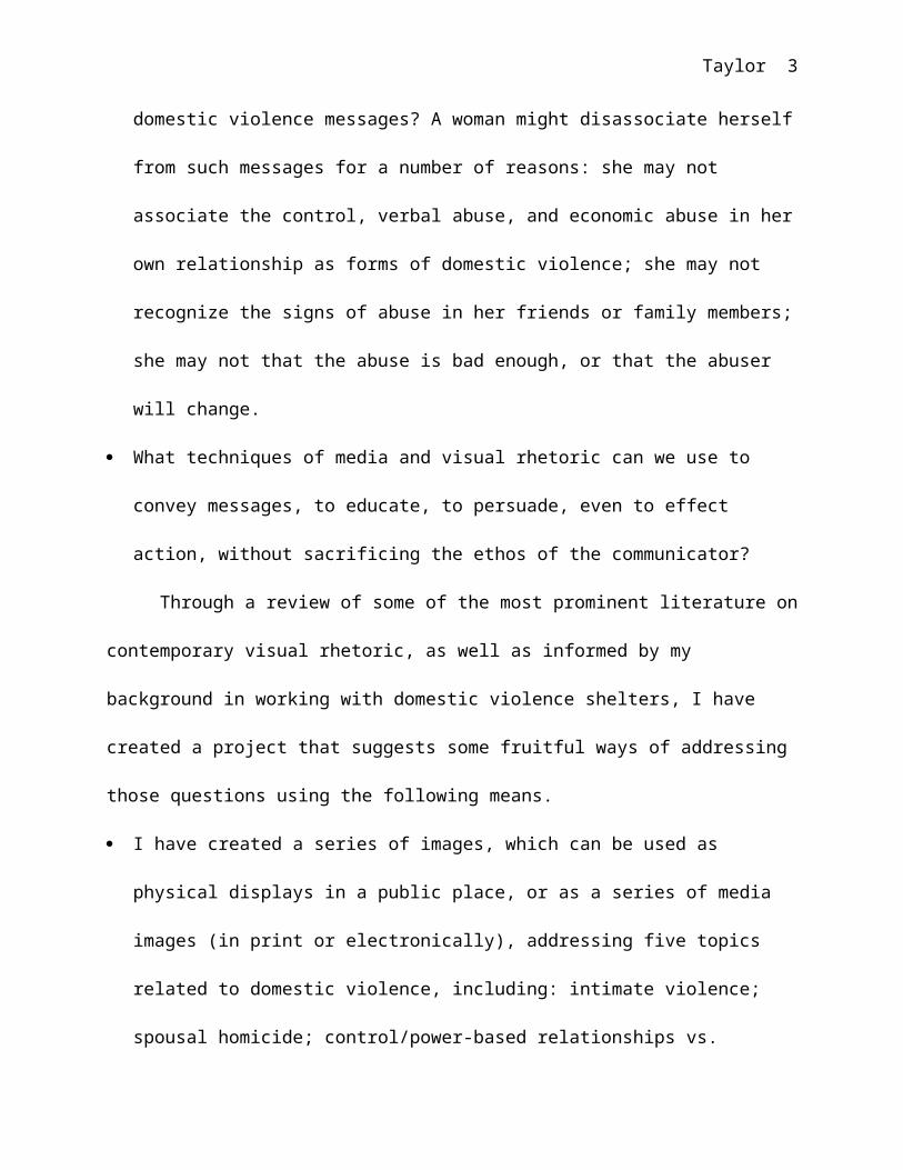
domestic violence messages? A woman might disassociate herself
from such messages for a number of reasons: she may not
associate the control, verbal abuse, and economic abuse in her
own relationship as forms of domestic violence; she may not
recognize the signs of abuse in her friends or family members;
she may not that the abuse is bad enough, or that the abuser
will change.
What techniques of media and visual rhetoric can we use to
convey messages, to educate, to persuade, even to effect
action, without sacrificing the ethos of the communicator?
Through a review of some of the most prominent literature on
contemporary visual rhetoric, as well as informed by my
background in working with domestic violence shelters, I have
created a project that suggests some fruitful ways of addressing
those questions using the following means.
I have created a series of images, which can be used as
physical displays in a public place, or as a series of media
images (in print or electronically), addressing five topics
related to domestic violence, including: intimate violence;
spousal homicide; control/power-based relationships vs.

Taylor 4
egalitarian relationships; teen dating violence; and child
abuse. My goal has been to address a range of topics, some of
which may or may not be thought of as “domestic violence” by
all audience members. The National Coalition Against Domestic
Violence defines domestic violence, or battery, as “a pattern
of behavior used to establish power and control over another
person with whom an intimate relationship is or has been
shared through fear and intimidation, often including the
threat or use of violence.”3
I have attempted to use those images to attract the attention
of, and impart messages to, women and girls who might not
otherwise feel compelled to access domestic violence
materials, due to beliefs that they are not at risk, are not
experiencing a form of domestic violence, or that individuals
they know are not likely to be affected by those issues.
Following a review of the selected literature, and extensive
experimentation with images, I chose to explore the use of
multiple image and text layers to produce final images that are
multivalent, and reveal their full meanings only upon closer
3 http://www.ncadv.org/learn/TheProblem_100.html

Taylor 5
examination. The intent is to draw the viewer into the pieces
using visuals that appear, at first, to be standard media images
(culled from advertising, magazines, and even sources such as
wedding invitations) reflecting on themes generally framed as
those of women’s interest: romantic relationships, weddings,
dating, etc. My aim was to interpellate the viewer, to call to her
by an appellation she recognizes and readily accepts (bride-to-
be, girlfriend, mother). Louis Althusser’s theory of
interpellation is defined by Sturken and Cartwright as the
process of being “constructed by the ideologies that speak to us
every day through language and images” (52). Once the viewer has
answered that call, has accepted that appellation, and is
involved in the image, it is my hope that she will then stay with
the piece even as further examination of the images and text
therein begin to reveal contradictory messages to those she was
expecting. I have concluded that there are many fruitful
possibilities in exploring the methods I outline here—using
Visual Rhetoric techniques to reach audiences that may be
reluctant to accept messages that appear overtly persuasive. I
further conclude that this type of message may be necessary to

Taylor 6
reach audiences that are familiar to the point of saturation with
the sophisticated manipulations of contemporary advertising
(Sturken and Cartwright, 204). In sum, this project reveals some
ways in which a theoretical basis in visual rhetoric can inform
the use of graphic design principles—the selection of images,
text, fonts, colors, and graphic arrangements—to effectively
reach audiences with social messages.
Literature Review
I will begin with a review of some of the key visual
rhetoric literature that has informed this project. Among the
many aspects of recent study in this dynamic and relatively young
field, I have chosen to focus upon the definition and defense of
Visual Rhetoric, the possibility of visual argumentation, and the
relationship and functions of text in the image artifact.
Sturken and Cartwright have provided a helpful, if
simplified, overview of visual theory and influential aspects of
language, aesthetics, and cultural theory in Practices of
Looking: An Introduction to Visual Culture. Their explications of
the theoretical concepts of interpellation and the “other” have
been most useful to me in developing this project. Particularly

Taylor 7
influential was the authors’ discussion of the concept of
interpellation in relation to contemporary advertising.
“Interpellation is the process by which we come to recognize
ourselves in the subject position offered in a particular
representation or product” (203). The authors also discuss the
concept of the “other”, especially in regards to photography:
“photographs thus often function to establish difference, through
which that which is defined as other is posited as that which is
not the norm or the primary subject” (95). This text was useful
as an overview of visual rhetoric, and a source for definitions
of key theories, such as interpellation and appellation.
If images can be used to affect rhetorical intentions, as
Sturken and Cartwright suggest, then what are the rhetorical
principles at work? Kevin LaGrandeur’s detailed discussion of the
image (especially the digital image) in terms of Classical
Rhetoric helps to answer this question. I found especially
helpful his discussion of Aristotelian principles of rhetoric as
applied to visuals. LaGrandeur posits ways in which the
principles codified by Aristotle are still relevant in the age of
digital media and advertising: “Fluency with images and their use

Taylor 8
has become crucial to controlling credibility and creating
emotional appeal, and even, to some extent, logical appeal”
(119). Interestingly, Aristotle’s definition of rhetoric is broad
enough to comfortably (almost necessarily) include visuals: He
defines rhetoric as the art of finding “in any given case the
available means of persuasion” (qtd. in LaGrandeur 119-120).
LaGrandeur also discusses the application of another of
Aristotle’s ideas that are key to rhetorical studies, the three
artistic forms of proof; logos, ethos, and pathos. He concludes that,
while images are most powerful in their ability to appeal to the
emotions (pathos), they are also capable of creating (or
enhancing) ethos (especially when supporting text) and logos
(especially to demonstrate the logical appeal made in text).
Another useful explanation of the ways in which visuals can
accomplish rhetorical aims is provided by Craig Stroupe’s theory,
which he calls “the rhetoric of
irritation”, or inappropriateness
as a visual/literate practice. The
author suggests that the “yoking
together” of the words “visual” and
Fig. 2. “Oswald in a Jam,” George E. Mahlberg (1996); rpt. in Defining Visual Rhetorics (New Jersey: Lawrence Erlbaum Assoc., 2004) 251.

Taylor 9
“rhetoric”, rather than christening a new discipline, merely
constitutes a trope—but a useful one (244). He states that the
dilemmas inherent in creating such a seemingly contradictory
trope may be just the irritant that is needed in rhetorical
study, the “grain of sand that ideally instigates a pearl” (244).
Just such irritants can be used in rhetorical compositions
(including visual ones) to create an uncomfortable tension with
which the viewer is forced to come to terms. Stroupe illustrates
this by analyzing the PhotoShop work of George E. Mahlberg,
especially the image entitled “Oswald in a Jam” (see fig. 2)
(251-252). The author claims that the power in this piece emerges
from the inherent cultural tensions in the images, and generates
an intense discomfort in the audience due to the jarring
rearrangement of visual codes with which we are so familiar. This
text provided the theory of “rhetoric of irritation”, which gave
a theoretical framework for the juxtaposition of disparate visual
codes in my images.
“Recent work in rhetoric has taken a pictorial turn”,
observes Sonja K. Foss, and she goes on to posit that the study
of visuals is important because it can offer a rhetorical theory

Taylor 10
that is “more comprehensive and inclusive” than is the solely
verbal (303). She also provides a helpful dual definition of
visual rhetoric: It is both a product created when communicators
utilize visual symbols and a scholarly perspective that can be
applied to the symbolic process of communication that occurs with
visuals (304). If visual rhetoric refers to the “artifact”
itself, Foss gives us several areas of focus for the study of the
artifact: the nature (distinguishing characteristics) of the
artifact; the function (what effects are intended or achieved in
the audience) of the artifact; and evaluation (e.g.,
accomplishment of the intended function) of the artifact (307-
310). Foss’ work was useful in defining visual rhetoric, and
providing a framework for the examination of the visual artifact.
Roland Barthes explores the nature of the image as symbol in
order to discuss its rhetorical possibilities. “There are those
who think that the image is an extremely rudimentary system in
comparison with language and those who think that signification
cannot exhaust the image’s ineffable richness” (152). Barthes
discusses how the signifiers in the image may include not only
pictures or drawings of objects, but also colors, text,

Fig. 3. “Don’t you get hooked!” U.S. Department of Health, Education, and Welfare (1976); rpt. in Visual Rhetoric in a Digital World: A Critical
Taylor 11
arrangements, and more (153-155). Another notable feature of the
system of symbols used in visual imagery is that it is subject to
multiple interpretations, and that the readings of the image sets
varies from one viewer to the next (160). Barthes’ discussion of
the signifier and the signified in images provided a useful
paradigm for thinking about the function of images, and text.
Anthony J. Blair also addresses the relationships among
rhetoric, argument, and the visual. He points out that
argumentation has traditionally been thought of as necessarily
verbal, due to the traditions of classical rhetoric (41). The
author then pauses to illuminate the word “persuasion” as it is
used in rhetorical studies, asserting that it cannot mean any act
or manner of influencing a person, but is rather limited to those
forms of persuasion which result in the audience freely consenting
to change its mind (42-43). Blair then asks if visual arguments
are possible. First, to define argument in its simplest form:
“someone asserts that some
proposition, B, is true (1)
because some other
proposition, A, is true and

Taylor 12
(2) because B follows from or is supported by A” (44). Blair
asserts that visuals can clearly persuade, but adds that
allowing for this fact does not at all prove that visuals can
also be arguments (45). He then reviews two key objections made
by scholars against the reality of “visual arguments”: the visual
is too ambiguous, and the visual alone cannot make a
propositional statement. The author refutes the charge that
visuals cannot make propositional claims, due to the lack of
truth values inherent in the medium, by pointing out that
propositions can be made that challenge beliefs, and that visuals
are capable of doing so (47-48). Blair’s discussion of visual
arguments is useful for
its definition of argumentation, and his application of that
definition to visual cases.
Blair is not the only author to discuss the potential of
visuals to make arguments. In “Toward a Theory of Visual
Argument”, Birdsell and Groarke state that argumentation
theorists do not often take the visual aspects of persuasion into
account (309). The difficulty in overcoming this shortcoming is
the tendency to place argumentation within a verbal paradigm.

Taylor 13
They refute the prevalent notion that images are intrinsically
ambiguous, stating, “we think that this prejudice is a dogma that
has outlived its usefulness” (310). The authors use examples to
point out how images can, in fact, give meaning to text that
would otherwise be “vague and ambiguous”, as illustrated by this
anti-smoking poster (see fig. 3) (310-311). The authors refute
David Fleming’s claim that a picture cannot make a “claim which
can be contested, doubted, or otherwise improved upon by others”
(due to the refutability of any assumed meaning assigned to the
image) by pointing out that the failure of a viewer/reader to
understand a message can occur in either verbal or visual media
(311-312). This failure occurs due to a breakdown in
coding/decoding between the rhetor and the audience, not due to
the innate ambiguity of the visual. This text is valuable for its
discussion of whether or not visuals can function as arguments,
the authors’ references to prominent theories on the subject, and
for their analysis of examples in which visuals work together
with texts to make arguments that neither could make without the
other.

Taylor 14
Birdsell and Groarke’s discussion of the relationship
between text and visuals led me to explore Matthew G.
Kirshenbaum’s work on text as a visual medium. “The word is an
image after all,” Kirschenbaum quotes Stuart Moulthroup in “The
Word as Image in an Age of Digital Reproduction” (137). The
author looks at the emergence of text as a form of image, and
analyzes that development over the past century. Especially since
the rise of desktop publishing in the mid 1980’s, the visual
aspects of text (font, arrangement, color, etc.) have taken on
increasing significance. Kirschenbaum points out that emerging
technologies that have allowed for such rapid change in visual
representation of text have also contributed to the emergence of
visual rhetoric and visual culture as important academic fields
of study in and of themselves (138).
Barthes also discusses the relationship of the text to the
picture, inverting the typical question (i.e., “is the image
redundant to the text?”) when he asks whether or not the text is
redundant to the image (155). The author concludes that the
relation of the linguistic message to the image is twofold:
anchorage (in which text directs the reader in how to view and
Taylor 15
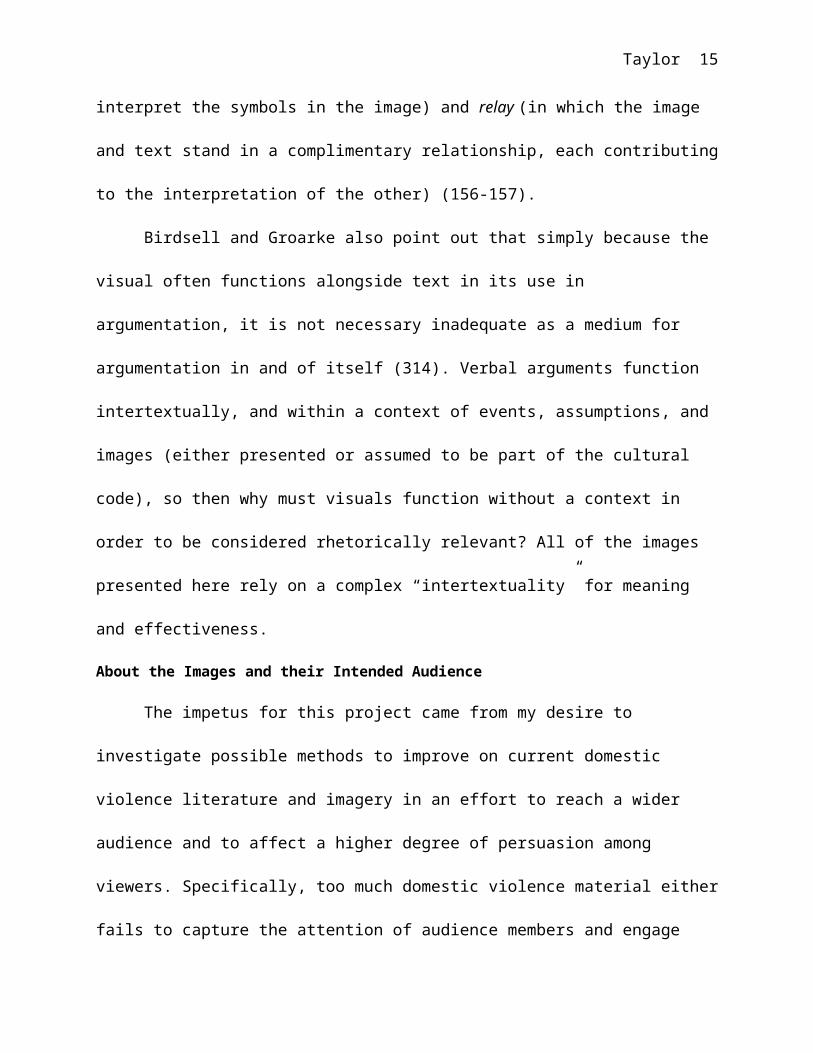
interpret the symbols in the image) and relay (in which the image
and text stand in a complimentary relationship, each contributing
to the interpretation of the other) (156-157).
Birdsell and Groarke also point out that simply because the
visual often functions alongside text in its use in
argumentation, it is not necessary inadequate as a medium for
argumentation in and of itself (314). Verbal arguments function
intertextually, and within a context of events, assumptions, and
images (either presented or assumed to be part of the cultural
code), so then why must visuals function without a context in
order to be considered rhetorically relevant? All of the images
presented here rely on a complex “intertextuality” for meaning
and effectiveness.
About the Images and their Intended Audience
The impetus for this project came from my desire to
investigate possible methods to improve on current domestic
violence literature and imagery in an effort to reach a wider
audience and to affect a higher degree of persuasion among
viewers. Specifically, too much domestic violence material either
fails to capture the attention of audience members and engage

Taylor 16
them in our media-rich environment, or fails to interpellate them
by referencing codes that cause the audience to disassociate from
the subjects of the images.
I would here like to briefly discuss the intended audience
for these images. First, I will define the demographic group
addressed. Since these images were designed primarily to be
displayed in large-format printing (i.e., as posters) in a public
setting, I believe it is important to define a very specific,
local audience, as attitudes, cultural demographics, and other
unique qualities of each community must be addressed specifically
in order to best convey messages involving social issues and
concerns. The focus audience includes Flagstaff, Arizona,
residents and visitors, very predominantly women, and
predominantly young women. Due to the nature of the images I have
used (based on icons of traditional romance, weddings, and
dating, etc.), I expect to draw the attention of a young
demographic ranging from teens to college-aged women and other
young women. It is my intent that these images will not be
limiting in attracting the attention of any specific socio-
economic group, or excluding others. The racial and ethnic

Taylor 17
demographics of the target audience are expected to reflect the
demographics of Flagstaff and Northern Arizona, including
Northern Arizona University (where the images may be displayed).
Hispanic, non-Hispanic Caucasian, Native American, African
American, and Asian individuals were all considered as audience
members, with the intent that the visuals are inclusive, and do
not contain features that are significantly limiting to any of
these groups. That being said, it would certainly be appropriate
to develop versions of these materials in other languages.
Here it is important to address some of the concerns
associated with the chosen methods of interpellating the
audience, especially from a feminist viewpoint. Certainly, these
images are focused on a specific demographic. They are not meant
to encompass all women and girls, but rather to serve as a
demonstration of ways in which mainstream cultural cues,
especially those focused on traditional codes of femininity, can
be used (or, if you will, exploited) to reach a relatively wide
mainstream audience. This choice is not made to intentionally
exclude those people experiencing domestic violence who are not
effectively interpellated by traditional images of femininity,
Taylor 18
but rather to focus on a specific audience in the hope that this
paper provides a blueprint for ways in which social messages can
be constructed rhetorically to reach a wide variety of other
audiences as well. It is no accident that I chose to focus upon
the interpellation of heterosexual females within mainstream U.S.
culture: I am a heterosexual female who was brought up steeped
in the codes of traditional femininity within U.S. culture. The
fact that gay men and lesbians, for example, also experience
domestic violence is certainly acknowledged (although these
victims are often under-served), but I also acknowledge a lack of
understanding of the codes that may effectively interpellate
those audiences. However, it is my hope that this paper provides
some helpful ideas which can be used by those who possess the
proper ethos (i.e., are fluent in the appropriate cultural codes)
to speak to other audiences about these and other social topics.
Given the selected audience for these demonstration images,
what are some of the relevant cultural codes I have accessed? And
why is it possible (perhaps even necessary) to speak about these
subjects, in this way?

Taylor 19
In order to better understand the origin and effects of many
of the societal codes accessed in my project, I turned to Susan
Brownmiller’s absorbing cultural and historical discussion of
femininity. Brownmiller evokes the experience of growing up, as
so many girls do, steeped in expectations of tradition: “Lessons
in the art of being feminine lay all around me and I absorbed
them all: the fairy tales that were read to me at night, the
brightly colored advertisements I pored over in magazines…” (14).
And the stakes are high for learning these lessons, for as
Brownmiller points out, the woman who does not live up to
femininity’s demands, or rejects those demands, is often seen as
somehow “failing” in her social role, despite success in any
other field or endeavor (16). Further, despite the gains of the
Women’s Movement, we cannot assume these codes and expectations
to be those of a by-gone era:
So it is not surprising that we are currently
witnessing a renewed interest in femininity and an
unabashed indulgence in feminine pursuits. Femininity
serves to reassure men that women need them and care
about them enormously. By incorporating the decorative

Taylor 20
and the frivolous into its definition of style,
femininity functions as an effective antidote to the
unrelieved seriousness, the pressure of making one’s
way in a harsh, difficult world.” (Brownmiller 17)
I will reference some of Brownmiller’s discussion of specific
codes of femininity later in this paper.
Why do these codes of femininity obtain? What is their
origin and why do they matter so much in society? I will here
reference some of Judith Butler’s illuminating work on the
construction of gender in an effort to clarify these queries.
Butler writes of the distinction between sex and gender, a
distinction often missed by mainstream society due to the
“naturalization” of gender constructs. As Butler states, “the
political construction of the subject proceeds with certain
legitimating and exclusionary aims, and these political
operations are effectively concealed and naturalized by a
political analysis that takes juridical structures as their
foundation” (5). Naturalizing the constructs of gender has the
effect of inverting the process: It appears that the power
structures, codes, and rules associated with gender have

Taylor 21
developed in response to a “natural law” inspired by the sexes
themselves. In reality, the sexes have been defined according
those social constructs, which then take on an appearance of
inevitability. On the other hand, Butler does acknowledge that
the concept of gender construction does not negate the reality or
authenticity of gender, but rather places gender into a context
in which it can be understood in terms of its functions within
social and political discourses (43).
Butler points out that the origins of many of the constructs
of gender can be traced to concerns of heterosexuality. Since my
project focuses on power relations between the partners in
heterosexual couples, I would like to discuss some of these
theories as especially relevant in this context. First, Butler
states that if sexuality is culturally constructed within
existing power structures, there can be no normative sexuality
beyond or outside of those structures (40). As I see it, this
means that those who choose to conform to the sexual norms of
their society must do so within the structures (including the
gender codes) established by that society. Butler later invokes
Lacan to discuss the binary of “being” and “having” in gender

Taylor 22
dynamics. In this theory, women become the “site” upon which male
ideals of power are reflected (56-57). As the reflector, the woman
is expected to conform to that which is opposite of the ideal
male energy (thus magnifying it be contrast). This is explained
in terms of either “having” the phallus, or in the case of women,
“being” the phallus (by reflecting social roles determined by the
male to enhance, or reflect, the power of the phallus) (57). The
author further discusses this idea in terms of Lacan’s notion
that this process for the woman is a masquerade: a term that both
denotes female gender as a performance, and also implies the
existence of a “real” female identity beneath the imposed mask
(60). According to Irigaray, “this masquerade…is what women do…in
order to participate in man’s desire, but at the cost of giving
up her own” (qtd. in Butler: 60). Are the cues I have chosen to
speak to a given audience of women ones that appeal to this
desire to please? Certainly. Are they designed to lead those
women towards a closer look at the “reality” of gender dynamics
behind that mask? Definitely.
Taylor 23
Techniques and Rhetorical Choices Used in Creating the Images
In regards to the format used in creating these images, I
chose the software PhotoShop as an ideal means to produce the
multi-layered and graphics-intensive effects desired. PhotoShop
allows the artist to work in layers and to achieve fades,
transparencies, textures, color changes, and other effects which
enhance the varied visual effects desired. In addition, PhotoShop
allows for the manipulation of text effects and the use of a
large variety of fonts. The results of my efforts comprise five
images, each of which is described below in terms of the choices
I made in an effort to achieve the desired rhetorical effect.
“Cordially Invited”
The image entitled “Cordially Invited” (see fig. 4)
exemplifies my previously mentioned intent to interpellate the
viewer, in this case it has called to her as a bride, a potential
bride, or as someone personally close to such a woman. To fulfill
this function, the format of a wedding invitation is used. As
noted earlier, the signifiers in the image, as Barthes discusses
them, may include not only pictures, but also colors and text
arrangements. In this case, the classic format of the wedding

Taylor 24
invitation includes such elements as the size and shape of the
image; the use of an elegant, traditional script font (Vivaldi)
arranged in short, centered lines; the spelling out of dates and
numbers; the use of colors and images appropriate to a wedding
(pink rose petals, hearts); and the use of implied translucency
and texture (the background imitates vellum and the semi-
transparent central portion imitates a tissue overlay). All
elements are selected to invoke the image of the popular
contemporary wedding invitation. The intent here is to apply
Birdsell and Groarke’s theory of intertextuality, in which both
verbal and visual arguments function within a context of all the
images, events, and assumptions made by the viewer/reader within
a cultural context (316).

Taylor 25
Fig. 4. “Cordially Invited”
Once the viewer has responded to the apparent visual codes
of the image as seen from a slight distance, or at a glance, it
is then my intent that she should be drawn in to take a closer

Taylor 26
look at the image, and to read the text. At this point, I would
like to return to Stroupe’s theory of the “rhetoric of
irritation” (244). In this case, the tension is created not only
between two jarring oppositional visual codes (the apparently
traditional invitation format vs. the images contained in the two
hearts), but also between the visual codes and the content of the
text. The viewer has been interpellated, as she is accustomed to
be in our society of omnipresent advertising, but in this case,
under “false pretenses”. Unlike her experience with ads for
makeup or clothing, she does not find just what she expects upon
further investigation. She has been called as a bride and is now
experiencing messages warning of danger and violence. The text
itself reflects the theory of what Judith Williamson calls
appellation, as described by Sturken and Cartwright: “Ads speak to
us through particular modes of address, and ask us to see
ourselves within them. Often this is done with written text that
specifically speaks to the viewer as ‘you’” (203). Thus, the
first line of the text not only imitates the text of a
traditional wedding invitation, but assigns the viewer a role in
the process: “You are Cordially Invited”. Once interpellated,
Taylor 27
the viewer/reader is already invested in the message, and it is
my belief that she will therefore be less likely to reject the
content as belonging to another intended viewer/reader, and more
likely to internalize it.
The intent of this piece is dual, in that it is meant to be
informative and persuasive. The text reveals some key domestic
violence statistics, then offers a concrete action that can be
taken by the audience (visiting a national domestic violence
website). It is not the intent of the piece to give detailed
information, but rather to illicit a response based on the pathos
created through juxtaposition of the images and text, and to
provide a brief but effective basis of logos by using concrete
statistics (gleaned from the quoted website). Juxtaposition is
achieved not only through the unexpected content of the text, but
also through the small, translucent images within the hearts near
the top of the image, the disturbing content of which (a bruised
woman and a pair of handcuffed fists) is not apparent until the
viewer looks very closely. The use of these images addresses
Blair’s assessment that the image is more efficient than text
(53-54). In this case, the image fulfills Barthes’ function of

Taylor 28
“relay”—the image and text stand in a complimentary relationship,
each contributing to the interpretation of the other (156-157).
If this piece is successful in interpellating its intended
audience of women, why is this the case? Brownmiller discusses
how the cultural construct of femininity dictates “acceptable”
responses to such concerns of relationships as expressed in this,
and the other images: “the territory of the heart is admittedly a
province that is open to all, but women alone are expected to
make an obsessional career of its exploration, to find whatever
adventure, power, fulfillment or tragedy that life has to offer
within its bounds” (215).
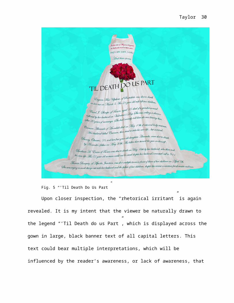
‘Til Death Do Us Part
In this image (see fig. 5), the viewer is again
interpellated in relation to conventional images assumed to be of
interest to young women—in this case, a stylish bridal gown is
displayed against a blue background (in a color reminiscent of
both a popular wedding gown advertisement background, and the
famous Tiffany & Company signature box). The use of an attractive
and vibrant red rose bouquet also draws the viewer’s attention
from a distance, while its color is also evocative when viewed in

Taylor 29
light of the sinister content revealed in the copy. The format is
reminiscent of bridal magazines, and could be interpreted from a
distance as an ad for a bridal fair, a bridal gown shop, a dress
manufacturer, or a similar enterprise. The copy, in a flowing
font (Edwardian Script) selected to enhance the elegant tone of
the image, and arranged gracefully on the wedding gown, might be
presumed to provide further information on products or services
to potential brides.
Taylor 30
Fig. 5 “’Til Death Do Us Part”
Upon closer inspection, the “rhetorical irritant” is again
revealed. It is my intent that the viewer be naturally drawn to
the legend “’Til Death do us Part”, which is displayed across the
gown in large, black banner text of all capital letters. This
text could bear multiple interpretations, which will be
influenced by the reader’s awareness, or lack of awareness, that

Taylor 31
the blue pattern repeated in the background is, in fact, made up
of layers of crossed “six-shooters”. The viewer is then likely to
read the top text, arranged across the bodice of the dress, her
eye
being drawn to the red font color, and will then see that this is
a memorial piece. Unlike the previous image, this piece is
designed to function primarily as a memorial and a consciousness-
raising effort, and does not offer any imperative statements, or
create an appellation for the viewer. Rather, the text itself
creates a strong emotional statement as it not only enumerates
but names, and describes the deaths of, six wives killed in
domestic violence incidents in Arizona last year. In this case
pathos, which LaGrandeur names as the element of Aristotelean
rhetoric most effectively accomplished by visuals, is achieved
through the interplay between text and image (119-120). Ethos is
also established through the statistical references and factual
stories as reprinted from the Arizona State Domestic Violence
Fatality Report. This image is again a demonstration of Barthes’
category of relay, in which meaning is dependant on the
reciprocal relationship of visuals and text. In addition, Blair’s

Taylor 32
comment that the visual has the power to inspire deep emotional
reactions in the viewer, which must then be refuted consciously
if they are to be overcome, is illustrated as the viewer
struggles to reconcile the ideal image of marriage with the
realities presented by the memorial text (53-54).
The viewer of this entire series of images may note that
actual representation of individual people is limited and
relegated to subtle background imagery, or else is completely
absent (as in the present example). I have made these choices
primarily to avoid the tendency of the viewer to place the
subject who may appear “different” from herself in the position
of the “other”, thereby problematizing or nullifying the
appellation of the viewer (Sturken and Cartwright, 100-104). For
the viewer who sees the figures in the image as “other”, it is
easy to dissociate herself, her life, her problems, and those of
her close relatives and friends from the messages portrayed.
Other women might believe that the messages and assistance
offered are not intended for them (not available to them or not
appropriate for them), if the women in the images look very
different from themselves.

Taylor 33
I believe that the imagery of the wedding gown is one of the
most effective I have used in any of these images. One of the
last bastions of ultra-traditional femininity in U.S. society
today, the wedding costume reflects codes with which most girls
have been inculcated in the acceptable form of femininity since
their earliest days. As Brownmiller comments: “Who said that
clothes make a statement? What an understatement. Clothes never
shut up” (81). The author also points out that a pattern of
looking back in history continues to characterize contemporary
clothing design (87), and I would add that is no more true than
in the design of wedding dresses. But why do these cultural
gender codes especially dominate wedding attire? As Brownmiller
states, “it is impossible to separate longstanding concepts of
sexual morality from longstanding concepts of esthetics and
fashion” (83), and this is certainly true in the context of the
wedding ceremony, in which the symbolism of the white gown and
veil speak to the sexual expectations placed upon the bride by
society (or, at least, the expectations of a convincing
masquerade for the occasion) (97).
He Loves Me, He Loves Me Not
Taylor 34
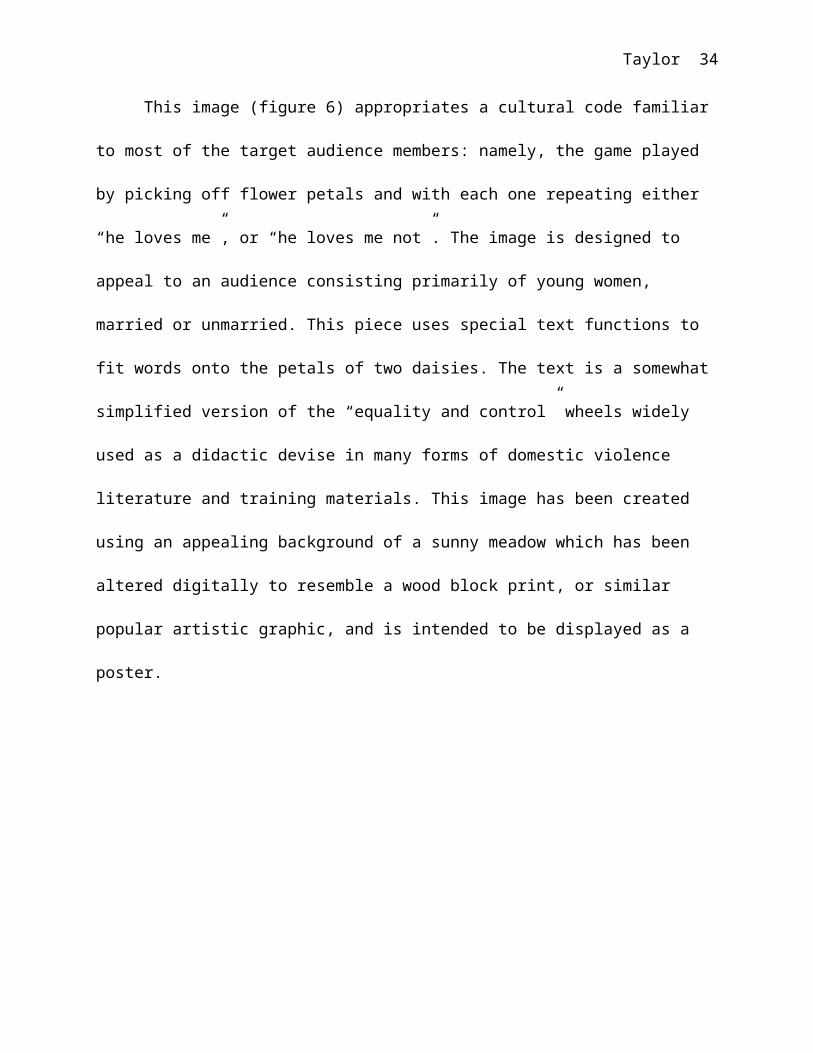
This image (figure 6) appropriates a cultural code familiar
to most of the target audience members: namely, the game played
by picking off flower petals and with each one repeating either
“he loves me”, or “he loves me not”. The image is designed to
appeal to an audience consisting primarily of young women,
married or unmarried. This piece uses special text functions to
fit words onto the petals of two daisies. The text is a somewhat
simplified version of the “equality and control” wheels widely
used as a didactic devise in many forms of domestic violence
literature and training materials. This image has been created
using an appealing background of a sunny meadow which has been
altered digitally to resemble a wood block print, or similar
popular artistic graphic, and is intended to be displayed as a
poster.

Taylor 35
Fig. 6. “He Loves Me…He Loves Me Not”.

Taylor 36
The large, superimposed daisies have received the same treatment,
in order to add visual interest and graphic contrast, therefore
attracting the viewer from a distance. “He Loves Me, He Loves Me
Not” is intended to be accompanied by extensive text in the form
of a brochure or other “take-away” material, tied to the image
visually with repeated colors and fonts. These materials would
explain the “wheels” in more detail, offer further education, and
provide specific options for action (hotline numbers, etc.). The
image, however, should stand by itself in the sense that it
encourages the viewer (including girls and young women) to
consider their relationships not only in terms of their partners’
feelings (he loves me, he loves me not), but also in terms of the
balance of power, and their own feelings within the
relationship. The “Equality” wheel is placed in the privileged
position (the upper left, since readers of English begin reading
a page of text from this position) in order to interpellate the
viewer as a partner or potential partner in the ideal
relationship. The hope is that if she feels any sense of discord
between the ideals in the “Equality” wheel and her own
relationship, she will then read further to see what is involved

Taylor 37
in the “Power & Control” wheel. At that point, she would have the
option of taking home the literature that is provided.
The familiarity of the “daisy game” and the conventional
appeal to positive emotions evoked by a flowery meadow both draw
upon cultural intertexuality. In this case, nothing is present in
the image itself to jar the viewer’s pre-existing cultural
expectations, but the “intense discomfort” of the audience
described by Stroupe is nonetheless achieved when the viewer
reads the copy superimposed on the lower wheel (251-252). In
Barthes’ terms, the relationship between the text and the image
in this case can most properly be seen as that of “anchorage”, in
which text directs the reader in how to view/interpret the
symbols in the image (156-157). In a manner reminiscent of
Birdsell and Groarke’s example of the anti-smoking poster, here
the image alone cannot make the rhetorical point clear (310-311).
The text could be said to stand alone, but its significance and
effectiveness are greatly enhanced by the image. Of course, the
arrangement of the text in this piece is especially significant.
As Kirshenbaum observes, “when the ‘word’ is put into a photo-
shop image as part of a pixelated tapestry so that it loses all

Taylor 38
relation to keystrokes or letters and function just like another
element in the image—subject to the same ‘stretch’, ‘twist’ and
other visual command, then the status of the word as such becomes
a moot point” (142). The text here can scarcely be thought of as
distinct from the visual as whole.
As Brownmiller points out, it is the expected province of
females to become the caretakers of relationships. The evocation
of this traditional game references the expectations which are
placed upon a girl from a very early age to “place much of her
hopes, her dreams, her feminine identity and her social
importance in the private sphere of personal relations”. (218)
The pervasiveness of this expectation (which has been naturalized
to a great extent), cannot be challenged unless it is
acknowledged.
Take the Quiz!
The image which I call “Take the Quiz!” (see fig. 7) is
inspired by magazines marketed to teen girls. Relationship advice
and quizzes are two perennial staples of these popular
publications. After studying several examples of popular teen
magazines, I selected a format, color scheme, fonts, and graphic

Taylor 39
style in imitation of the codes prevalent in those periodicals.
The proportions and layout of the image reflect those of a
magazine page, while the bright colors and casual, fresh graphics
are inspired by those I observed. The legend “Take the Quiz!”
attracts immediate attention with its bold black oval background
and whimsical pink copy (Curlz MT font), while the common
magazine convention of “call out” text (large, bold text isolated
in a separate box) is highlighted by using a bold, san-serif font
and bright colors to entice the reader to further explore the
text. The simple sans-serif body style of the quiz itself is
chosen both to enhance readability and to imitate the look of
teen magazine copy.

Taylor 40
Fig. 7. “Take the Quiz!”
If the reader allows herself to be interpellated by the
imperative “Take the Quiz!”, she will soon begin to see that the

Taylor 41
content is not the lighthearted fun she is expecting. Borrowing
cues from the style of actual teen magazine articles, I began the
quiz on a light note: “Does your Boyfriend listen to you when you
talk, or does he totally tune you out?”. I then move on to
increasingly uncomfortable questions, culminating in the final
query, “Has your Boyfriend ever punched, slapped, bit, or kicked
you?” Placing the questions on a continuum from describing
behavior that is ambiguously inappropriate to that which is
clearly abusive is designed to
influence the reader in accepting the statements below regarding
the escalating nature of relationship violence. This piece is
designed to function informatively, as well as persuasively, and
culminates by directing the reader to actions she may take.
Independent of the text, the images themselves also provide
that “intense discomfort” described by Stroupe by juxtaposing the
youthful, bright visual cues of the teen magazine with the subtle
image enmeshed in the red “doodlings” of the upper-left corner—a
semi-transparent image of a girl, her head bent in despair and
apparently crying, has been introduced into the swirling pink
background. This piece has the potential to be persuasive to the
Taylor 42
extent that it generates adequate tension between the happy
discussion of teen relationships expected and the incipient cues
revealed by examining the piece further. It is my aim to create
an image/text combination that is jarring enough to effect
change, yet employs enough logos to effect true persuasion.
Here again is an image-text relationship that exemplifies
Barthes’ concept of relay. The images support the text in making an
effective statement, yet the images certainly cannot stand alone
(156-157). As Kirschenbaum notes, in the digital age it is
difficult to separate the text from the image, or the influence
and importance of one from the other (140-141). The effect of
this fluidity of boundaries is to blur the viewer/reader’s
response to the text into a hybrid image/content response. This
response is especially strong when the familiarity of the viewer
with encoded visual forms and specific images creates an almost
subconscious intertextuality that informs the use of imagery in
rhetoric (Birdsell and Groarke, 316).
In terms of the interpellating power of this image, I would
note that femininity dictates a distinct mindset to the
adolescent girl, as does her developing biology as a woman.

Taylor 43
Brownmiller points out that “if a young girl thinks of marriage
while a boy thinks of getting laid, her emotional commitment is
rooted not only in her different upbringing but in her
reproductive biology as well” (216). The combination of societal
conditioning and biological drives can lead to thoughtless
behavior, and acceptance of otherwise unacceptable behavior
(216). I believe that this image is jarring enough to make teen
girls stop for a moment to think about the distance potentially
separating their romantic ideals from reality.
Safety, Security, Peace of Mind
The image called “Safety, Security, and Peace of Mind” (see
fig. 8) was created to address the issue of child abuse.
Appropriating the look of advertisements that rely heavily on
establishing a sense of ethos (such as those for insurance
companies, banks, etc.), I have created an image designed to both
inform and persuade. The proportions and layout of this piece are
that of a two-page magazine spread. The background, colors, and
fonts have all been chosen to contribute to the visual sense of
ethos that reinforces the message of the bold text headings:
“SAFETY…SECURITY…PEACE OF MIND”. The background imitates stone with

Taylor 44
a sculpted border, reminiscent of the architecture of venerable
and trusted institutions such as banks, schools, and libraries.
The color scheme relies heavily on a grey/sepia mix, again
imparting a sense of the rhetor as serious, venerable, and
trustworthy. A deep, subdued rust red provides the only other
color, and is used to highlight copy intended to draw the reader
further into the piece after reading the bold, black headings.
The font selections were kept to only two: the all-caps
Copperplate (a historic choice for business, bank and stock
engraving) is used for the headings, while the classic and
readable Times New Roman and Times New Roman Italic are used for
the smaller body copy. The photo insert is rendered in black and
white with a sepia overlay to enhance the sense of timelessness
carried out throughout the image.

Taylor 45
Fig. 8. “Safety, Security, Peace of Mind”
The purpose of this piece is to inform and persuade. The
viewer is interpellated as a concerned mother or other family
member, by the headings listing qualities that are ideally the
concern of most parents, and by the image of the child’s hand
sheltered by the hands of a woman and a man. Borrowing from both
the writing style and arrangement of the types of advertisements
discussed above, I have added red text below the headlines, which
carries on the theme. The appellation of the reader is expressed
in these red lines, e.g., “Have you ever thought about what you

Taylor 46
can do to protect your child’s future?”, which leave the reader
still wondering, is this an ad for insurance? Recognizing the
readers’ tendency to give his or her first attention to the
larger, bolder, or colored text on a page, I have written all the
headings and red copy to remain ambiguous. However, if the
reader’s curiosity leads her to venture into the small,
italicized body copy, she will find child abuse statistics. As in
the case of “Take the Quiz!”, the statistics are arranged from
the least to most shocking, at first interpellating the reader as
someone who might witness or suspect child abuse, and culminating
as follows: “Each day in the United States, 4 children die as a
result of child abuse”. At this point, the photo used in the
image may be perceived in a different light: Are the hands of the
parents really protective? The piece culminates by asking readers
to call the Childhelp USA hotline or visit their website for
further information.
In this image, the visuals could be seen as very much
subordinate to the copy, or at best, as decorative
embellishments. However, as LaGrandeur argues, images play a more
important role in today’s media than the merely decorative; they

Taylor 47
are often an integral part of the data, and of the rhetoric
itself (138-139). This idea recalls Barthes’ deconstruction of
specific images to illustrate how the layering of signs functions
both as denotation and connotation, within a given cultural
context (153-155). Here, all the ethos evoked by many generations
of institutions endeavoring to inspire trust in the viewer is
connoted by the visual choices; while the denotations function to
anchor the image in the specific (the actual photo of the
family’s hands, the real statistics). This image is another
example of how Barthes’ “signifiers” may include not only
pictures or drawings of objects, but also colors, text, and
arrangements. Finally, Barthes’ concept of the linguistic message
in relation to the image is best described here in terms of the
anchorage function, as the text in this case directs the reader
in how to interpret the images (156-157).
The question here must be asked: Why are so many women
easily interpellated as mothers? Aside from the fact that many
women do become mothers, or hope to, why are their concerns
assumed to focus upon this aspect of their identity? I note here
that one rarely sees advertisements aimed at interpellating men

Taylor 48
as fathers (although this practice is growing in very recent
times). I must admit to my manipulation of the tendency in our
society to exploit maternal guilt, as Brownmiller puts it, “the
endemic feeling that whatever a mother does, her loving care my
be inadequate or wrong” (214), but I would also point out that I
have taken that cue from advertising, as is part of the
inspiration and purpose of this project: “Advertising copywriters
successfully manipulate this feminine fear when they pitch their
clients’ products” (Brownmiller 214).
Conclusion
I hope that this project has demonstrated some ways in which
images and text may be used together to achieve rhetorical
effects that could not be accomplished as effectively using
either medium alone. The difficulty I have attempted to address
here is that of successfully interpellating the viewer who may
not realize or acknowledge her need to receive domestic violence
messages. I have used the techniques of a “rhetoric of
irritation” and the theory of interpellation (especially in
regards to its use in advertising) to convey messages, to
educate, and (it is hoped) to persuade. I have also referenced

Taylor 49
the codes of mainstream traditional femininity in order to
interpellate a specific audience of women and girls most
effectively. These works are not meant to generate specific and
concrete actions among viewers, for even if this were possible,
each woman must decide her own course of action. Rather, these
images were designed to create a memorable discomfort, one which
the viewer may seek to resolve through further information,
interaction, or consideration in her own mind. In short, I hope
that I have shown how images such as these may provide, to borrow
Stroupe’s phrase, the “grain of sand that ideally instigates a
pearl.”

Taylor 50
Works Cited
Barthes, Roland. “Rhetoric of the Image”. Visual Rhetoric in a
Digital World: A Critical Sourcebook. Carolyn Handa, Ed.
Boston; New York: Bedford/St. Martin’s, 2004.
Birdsell, David S. and Leo Groarke. “Toward a Theory of Visual
Argument”. Visual Rhetoric in a Digital World: A Critical
Sourcebook. Carolyn Handa, Ed. Boston; New York: Bedford/St.
Martin’s, 2004.

Taylor 51
Blair, J. Anthony. “The Rhetoric of Visual Arguments”. Defining
Visual Rhetorics. Hill, Charles A. and Marguerite Helmers,
Eds. Mahwah, New Jersey; London: Lawrence Erlbaum Associates,
2004.
Brownmiller, Susan. Femininity. New York: Linden Press/Simon &
Schuster,1984.
Butler, Judith. Gender Trouble: Feminism and the Subversion of
Identity. New York; London: Routledge, 1999.
Child Help USA. http://www.childhelpusa.org/
Family Violence Prevention Fund.
http://www.endabuse.org/resources/facts/
Foss, Sonja K. “Framing the Study of Visual Rhetoric: Toward a
Transformation of Rhetorical Theory”. Defining Visual
Rhetorics. Hill, Charles A. and Marguerite Helmers, Eds.
Mahwah, New Jersey; London: Lawrence Erlbaum Associates, 2004.
Kirschenbaum, Matthew G. “The Word as Image in an Age of Digital
Reproduction”. Eloquent Images: Word and Image in the Age of
New Media. Mary E. Hocks and Michelle R. Kendrick, Eds.
Cambridge, Mass.; London: The MIT Press, 2003.

Taylor 52
LaGrandeur, Kevin. “Digital Images and Classical Persuasion”.
Eloquent Images: Word and Image in the Age of New Media. Mary
E. Hocks and Michelle R. Kendrick, Eds. Cambridge, Mass.;
London: The MIT Press, 2003.
National Coalition Against Domestic Violence.
http://www.ncadv.org/
Stroupe, Craig. “The Rhetoric of Irritation: Inappropriateness as
Visual/Literate Practice”. Defining Visual Rhetorics. Hill,
Charles A. and Marguerite Helmers, Eds. Mahwah, New Jersey;
London: Lawrence Erlbaum Associates, 2004.
Sturken, Marita and Lisa Cartwright. Practices of Looking: An
Introduction to Visual Culture. Oxford; New York: Oxford
University Press, 2005.