
Can be used in noncommercial online and TV broadcasts of ...
393
ID #1369 - Can be used in noncommercial online and TV broadcasts of your presentation, but not modified. ID #1 - Can be used in noncommercial online and TV broadcasts of your presentation. ... DESCRIPTION: Blank slide
-
Upload
khangminh22 -
Category
Documents
-
view
0 -
download
0
Transcript of Can be used in noncommercial online and TV broadcasts of ...
ID #1369 - Can be used in noncommercial online and TV broadcasts of your presentation, but not modified.
ID #1 - Can be used in noncommercial online and TV broadcasts of your presentation.
...
DESCRIPTION: Blank slide

ID #2 - Can be used in noncommercial online and TV broadcasts of your presentation.
This famous picture, called Earthrise, was taken on December 24th, 1968 by the first Apollo spacecraft to go around the moon. Within two years of this photo being taken, the first Earth Day was organized, major environmental laws were passed and the modern environmental movement began. This image changed the way people thought about our relationship with our planet.
DESCRIPTION: Photo of Earth taken from the moon by Apollo 8, December 22, 1968
ADDITIONAL TALKING POINTS: This photo, called Earth Rise, was taken by astronaut Bill Anders.* The photo was the first to show Earth from this perspective, and demonstrates the fragility and finite nature of Earth.**
REFERENCES:* NPR, “On Anniversary of Apollo 8, How the ‘EarthRise’ Photo Was Made,” December 23, 2013. http://www.npr.org/blogs/thetwo-way/2013/12/23/256605845/on-anniversary-of-apollo-8-how-the-earthrise-photo-was-made ** NASA, “Earthrise at Christmas,” last accessed April 2014. http://www.nasa.gov/multimedia/imagegallery/image_feature_102.html

ID #3 - Can be used in noncommercial online and TV broadcasts of your presentation.
This was a photograph taken of Earth from the last lunar mission. December 7th, 1972.
DESCRIPTION: Photo from Apollo 17, taken as the crew was traveling toward the moon
ADDITIONAL TALKING POINTS: This picture is called the “Blue Marble” image of the earth, and was taken in 1972, during the last Apollo mission. It is unique because the entire circle of the earth is revealed; the photo helps us think about our planet in its entirety.*
It was the first time the Apollo mission made it possible to capture almost the entire southern polar ice cap.**
REFERENCES:* LIFE Magazine, “Home, Sweet Home: In Praise of ‘Blue Marble,’ last accessed April 2014. http://life.time.com/history/blue-marble-the-iconic-apollo-17-photo-of-earth-from-space/#1 ** NASA, Visible Earth, “The Blue Marble from Apollo 17,” December 7, 1972. http://visibleearth.nasa.gov/view.php?id=55418
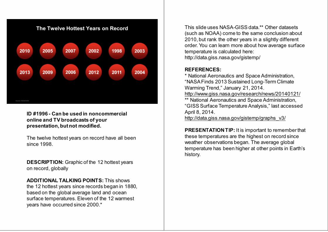
ID #4 - Can be used in noncommercial online and TV broadcasts of your presentation.
This is the first home movie of the Earth, taken by a robotic spacecraft sent to explore the Earth.
DESCRIPTION: Video of Earth spinning
ADDITIONAL TALKING POINTS: This video was taken from the Galileo orbiter as it left Earth’s gravity on December 11, 1990. It shows one complete day.*
REFERENCES:* NASA, Goddard Space Flight Center, “Earth
Rotation from Galileo Imagery: 100 x Real Time,” last accessed April 2014. http://svs.gsfc.nasa.gov/vis/a000000/a001300/a001373/

ID #1929 - Can be used in noncommercial online and TV broadcasts of your presentation, but not modified.
This is a time-lapse representation of global warming from the late Industrial Revolution when they first started measuring temperature with instruments. The more yellow and orange, the warmer the temperature compared to the midcentury average.
DESCRIPTION: World map of yearly deviation from the long-term global average surface temperature (1951-1980 base period), 1884-2011
ADDITIONAL TALKING POINTS: The average global temperature (ocean and land combined) in 2013 was 1.12 degrees Fahrenheit (0.62 degrees Celsius) warmer than the mid-20th century baseline.*
Scientists expect a continuation of the warming trend over decades**
REFERENCES: * National Oceanic and Atmospheric Administration, National Climatic Data Center, “Global Analysis -Annual 2013,” last accessed April 9, 2014. http://www.ncdc.noaa.gov/sotc/global/2013/13** National Aeronautics and Space Administration, “NASA Finds 2011 Ninth Warmest Year on Record,” January 19, 2012. http://www.nasa.gov/topics/earth/features/2011-temps.html
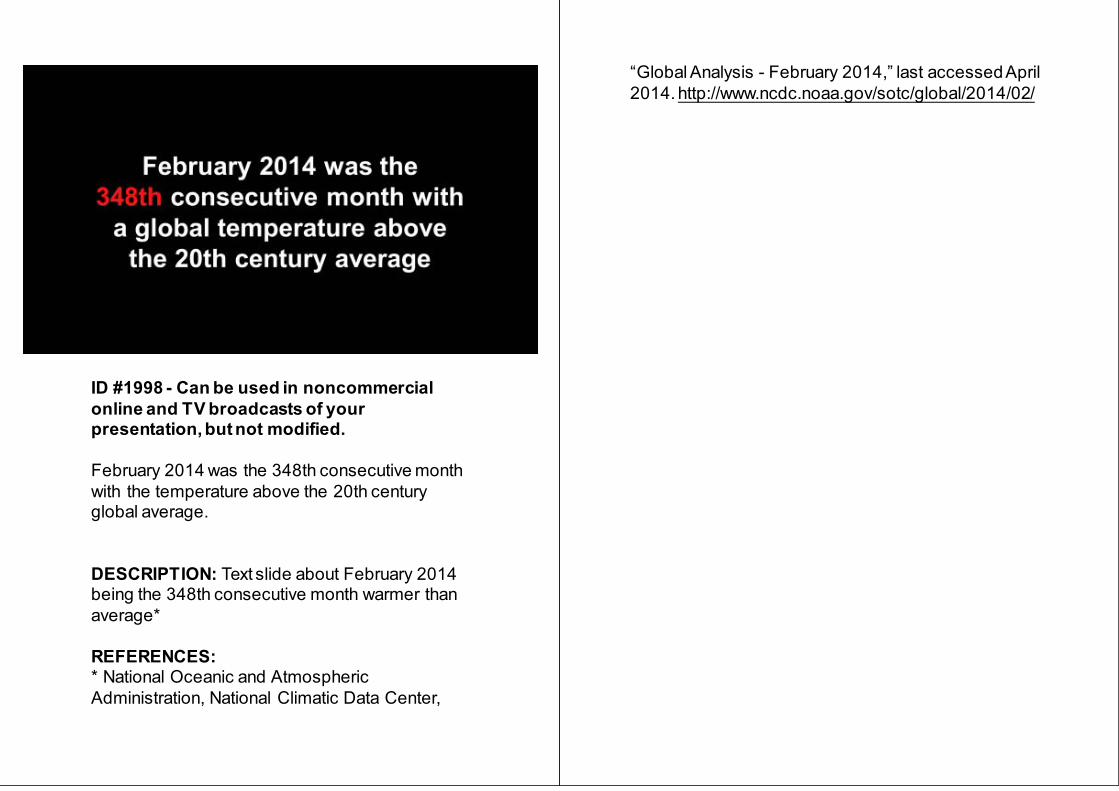
ID #1996 - Can be used in noncommercial online and TV broadcasts of your presentation, but not modified.
The twelve hottest years on record have all been since 1998.
DESCRIPTION: Graphic of the 12 hottest years on record, globally
ADDITIONAL TALKING POINTS: This shows the 12 hottest years since records began in 1880, based on the global average land and ocean surface temperatures. Eleven of the 12 warmest years have occurred since 2000.*
This slide uses NASA-GISS data.** Other datasets (such as NOAA) come to the same conclusion about 2010, but rank the other years in a slightly different order. You can learn more about how average surface temperature is calculated here: http://data.giss.nasa.gov/gistemp/
REFERENCES:* National Aeronautics and Space Administration, “NASA Finds 2013 Sustained Long-Term Climate Warming Trend,” January 21, 2014. http://www.giss.nasa.gov/research/news/20140121/** National Aeronautics and Space Administration, “GISS Surface Temperature Analysis,” last accessed April 8, 2014. http://data.giss.nasa.gov/gistemp/graphs_v3/
PRESENTATION TIP: It is important to remember that these temperatures are the highest on record since weather observations began. The average global temperature has been higher at other points in Earth’s history.

ID #1997 - Can be used in noncommercial online and TV broadcasts of your presentation, but not modified.
2013 was the 37th year in a row with a temperature above the 20th century average.
DESCRIPTION: Text slide about 2013 being warmer than average
ADDITIONAL TALKING POINTS: Every year since 1976 has been warmer than the 1951-1980 average.* Since 1880, the average global temperature has increased 1.4 degrees Fahrenheit (0.8 degrees Celsius).
Two-thirds of the warming since 1880 has occurred since 1975.**
REFERENCES:* National Aeronautics and Space Administration, “NASA Finds 2012 Sustained Long-Term Climate Warming Trend,” January 15, 2013. http://www.nasa.gov/topics/earth/features/2012-temps.html** National Aeronautics and Space Administration, “Global Temperatures,” last accessed June 2013. http://earthobservatory.nasa.gov/Features/WorldOfChange/decadaltemp.php
ID #1998 - Can be used in noncommercial online and TV broadcasts of your presentation, but not modified.
February 2014 was the 348th consecutive month with the temperature above the 20th century global average.
DESCRIPTION: Text slide about February 2014 being the 348th consecutive month warmer than average*
REFERENCES:* National Oceanic and Atmospheric Administration, National Climatic Data Center,
“Global Analysis - February 2014,” last accessed April 2014. http://www.ncdc.noaa.gov/sotc/global/2014/02/
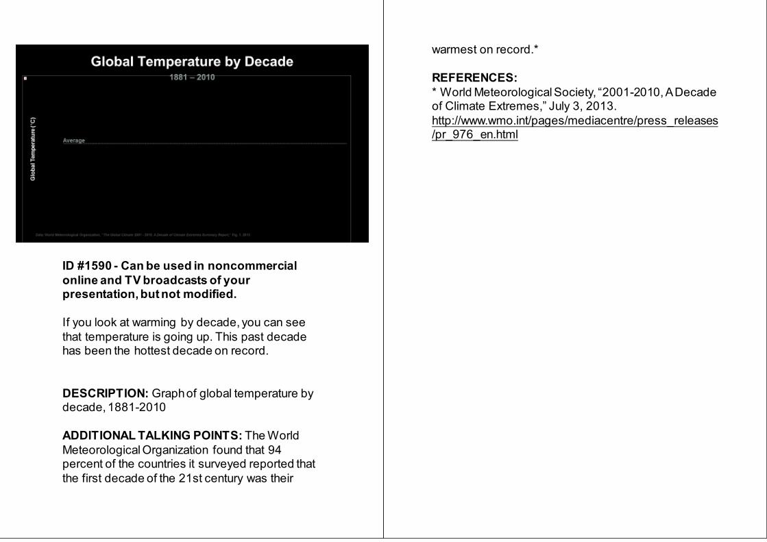
ID #1590 - Can be used in noncommercial online and TV broadcasts of your presentation, but not modified.
If you look at warming by decade, you can see that temperature is going up. This past decade has been the hottest decade on record.
DESCRIPTION: Graph of global temperature by decade, 1881-2010
ADDITIONAL TALKING POINTS: The World Meteorological Organization found that 94 percent of the countries it surveyed reported that the first decade of the 21st century was their
warmest on record.*
REFERENCES:* World Meteorological Society, “2001-2010, A Decade of Climate Extremes,” July 3, 2013. http://www.wmo.int/pages/mediacentre/press_releases/pr_976_en.html
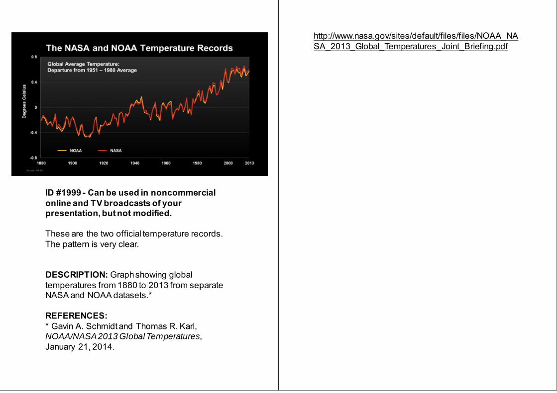
ID #1999 - Can be used in noncommercial online and TV broadcasts of your presentation, but not modified.
These are the two official temperature records. The pattern is very clear.
DESCRIPTION: Graph showing global temperatures from 1880 to 2013 from separate NASA and NOAA datasets.*
REFERENCES: * Gavin A. Schmidt and Thomas R. Karl, NOAA/NASA 2013 Global Temperatures, January 21, 2014.
http://www.nasa.gov/sites/default/files/files/NOAA_NASA_2013_Global_Temperatures_Joint_Briefing.pdf

ID #1078 - Can be used in noncommercial online and TV broadcasts of your presentation, but not modified.
As the average goes up, the extremes go up and there are record breaking temperatures in many parts of the world…
DESCRIPTION: Text about a temperature record in Aydingkol Lake, China, July 2011
ADDITIONAL TALKING POINTS: China has warmed by about 1.8 degrees Fahrenheit (1 degree Celsius) since 1960, and could warm another 1.8 to 9 degrees Fahrenheit (1 to 5
degrees Celsius) by the end of the century.*
REFERENCES:* S. Piao, P. Ciais, Y. Huang et al., “The impacts of climate change on water resources and agriculture in China,” Nature 467, no. 2 (September 2010): 43-51. http://www.nature.com/nature/journal/v467/n7311/full/nature09364.html

ID #1070 - Can be used in noncommercial online and TV broadcasts of your presentation, but not modified.
As the average goes up, the extremes go up and there are record breaking temperatures in many parts of the world…
DESCRIPTION: Text about a temperature record in Aydingkol Lake, China, July 2011
ADDITIONAL TALKING POINTS: China has warmed by about 1.8 degrees Fahrenheit (1 degree Celsius) since 1960, and could warm another 1.8 to 9 degrees Fahrenheit (1 to 5
degrees Celsius) by the end of the century.*
REFERENCES:* S. Piao, P. Ciais, Y. Huang et al., “The impacts of climate change on water resources and agriculture in China,” Nature 467, no. 2 (September 2010): 43-51. http://www.nature.com/nature/journal/v467/n7311/full/nature09364.html
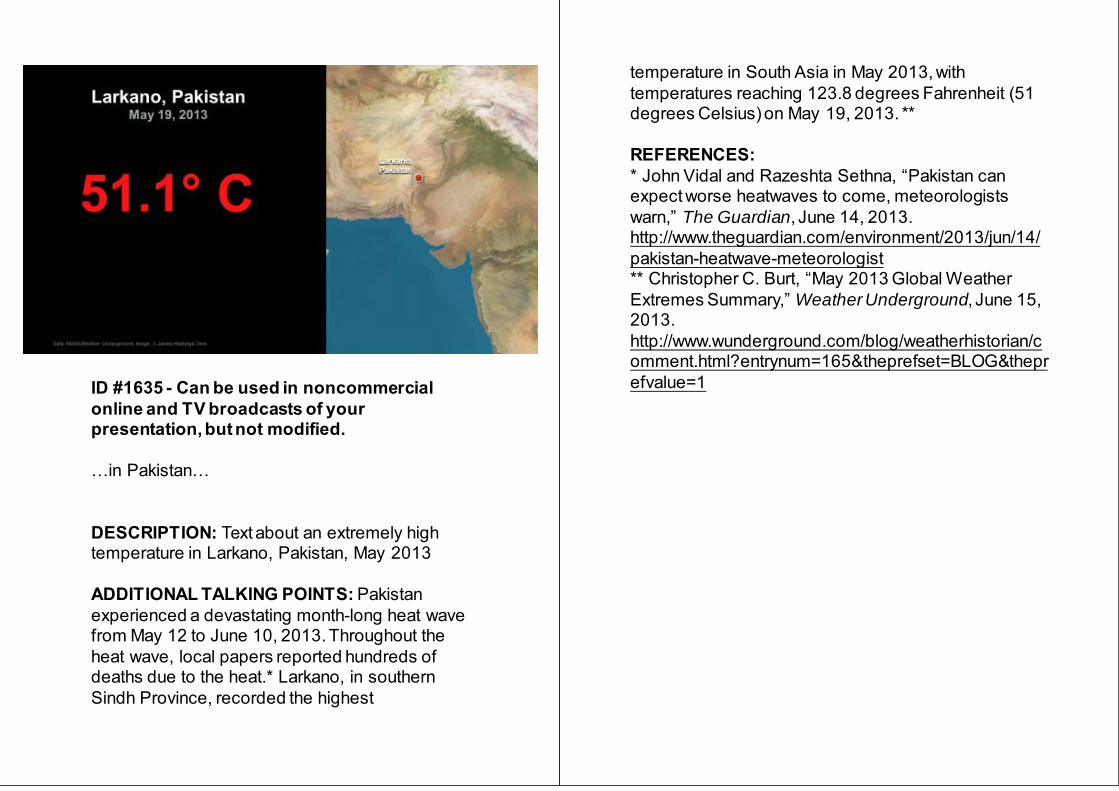
ID #1635 - Can be used in noncommercial online and TV broadcasts of your presentation, but not modified.
…in Pakistan…
DESCRIPTION: Text about an extremely high temperature in Larkano, Pakistan, May 2013
ADDITIONAL TALKING POINTS: Pakistan experienced a devastating month-long heat wave from May 12 to June 10, 2013. Throughout the heat wave, local papers reported hundreds of deaths due to the heat.* Larkano, in southern Sindh Province, recorded the highest
temperature in South Asia in May 2013, with temperatures reaching 123.8 degrees Fahrenheit (51 degrees Celsius) on May 19, 2013. **
REFERENCES:* John Vidal and Razeshta Sethna, “Pakistan can expect worse heatwaves to come, meteorologists warn,” The Guardian, June 14, 2013. http://www.theguardian.com/environment/2013/jun/14/pakistan-heatwave-meteorologist** Christopher C. Burt, “May 2013 Global Weather Extremes Summary,” Weather Underground, June 15, 2013. http://www.wunderground.com/blog/weatherhistorian/comment.html?entrynum=165&theprefset=BLOG&theprefvalue=1
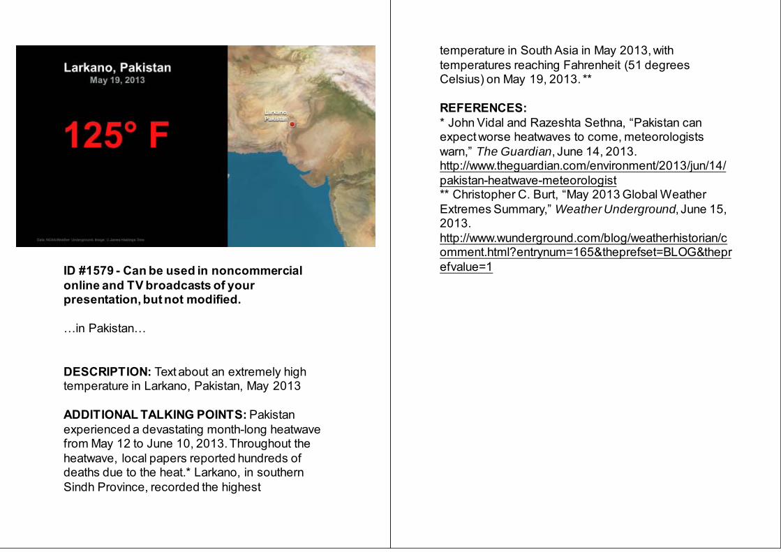
ID #1579 - Can be used in noncommercial online and TV broadcasts of your presentation, but not modified.
…in Pakistan…
DESCRIPTION: Text about an extremely high temperature in Larkano, Pakistan, May 2013
ADDITIONAL TALKING POINTS: Pakistan experienced a devastating month-long heatwave from May 12 to June 10, 2013. Throughout the heatwave, local papers reported hundreds of deaths due to the heat.* Larkano, in southern Sindh Province, recorded the highest
temperature in South Asia in May 2013, with temperatures reaching Fahrenheit (51 degrees Celsius) on May 19, 2013. **
REFERENCES:* John Vidal and Razeshta Sethna, “Pakistan can expect worse heatwaves to come, meteorologists warn,” The Guardian, June 14, 2013. http://www.theguardian.com/environment/2013/jun/14/pakistan-heatwave-meteorologist** Christopher C. Burt, “May 2013 Global Weather Extremes Summary,” Weather Underground, June 15, 2013. http://www.wunderground.com/blog/weatherhistorian/comment.html?entrynum=165&theprefset=BLOG&theprefvalue=1

ID #1281 - Can be used in noncommercial online and TV broadcasts of your presentation, but not modified.
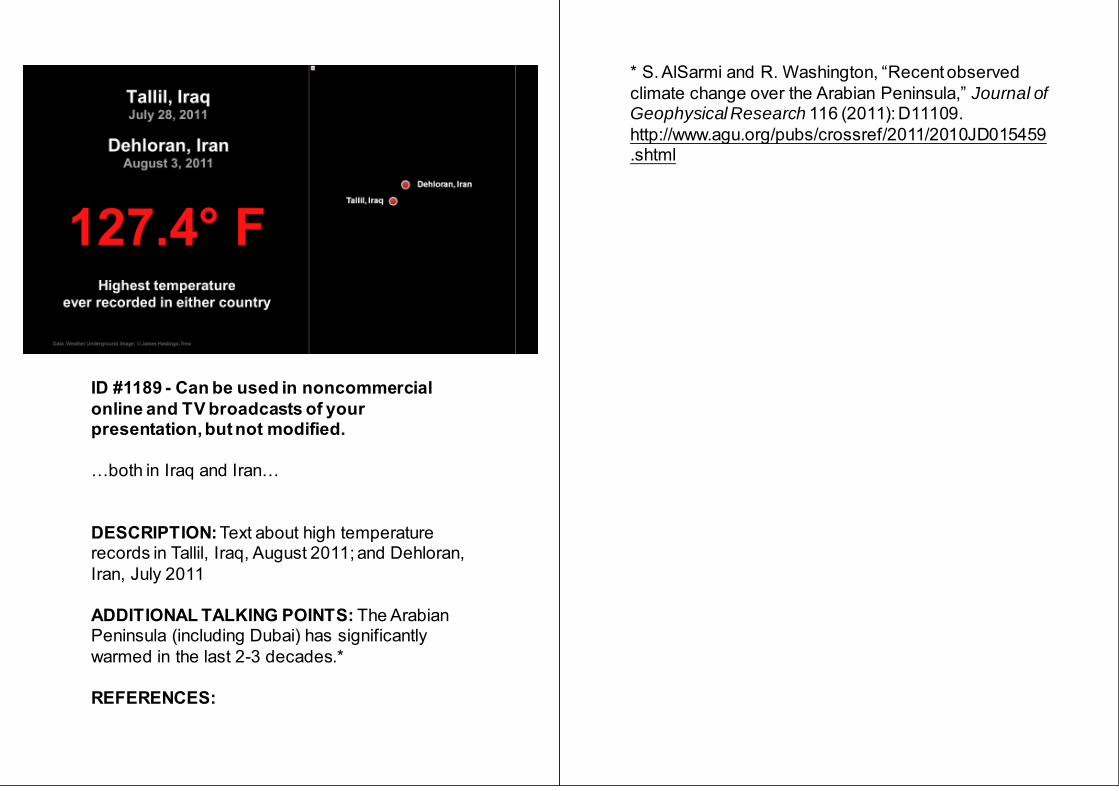
…both in Iraq and Iran…
DESCRIPTION: Text about high temperature records in Tallil, Iraq, August 2011; and Dehloran, Iran, July 2011
ADDITIONAL TALKING POINTS: The Arabian Peninsula (including Dubai) has significantly warmed in the last 2-3 decades.*
REFERENCES:
* S. AlSarmi and R. Washington, “Recent observed climate change over the Arabian Peninsula,” Journal of Geophysical Research 116 (2011): D11109. http://www.agu.org/pubs/crossref/2011/2010JD015459.shtml
ID #1189 - Can be used in noncommercial online and TV broadcasts of your presentation, but not modified.
…both in Iraq and Iran…
DESCRIPTION: Text about high temperature records in Tallil, Iraq, August 2011; and Dehloran, Iran, July 2011
ADDITIONAL TALKING POINTS: The Arabian Peninsula (including Dubai) has significantly warmed in the last 2-3 decades.*
REFERENCES:
* S. AlSarmi and R. Washington, “Recent observed climate change over the Arabian Peninsula,” Journal of Geophysical Research 116 (2011): D11109. http://www.agu.org/pubs/crossref/2011/2010JD015459.shtml
ID #1080 - Can be used in noncommercial online and TV broadcasts of your presentation, but not modified.
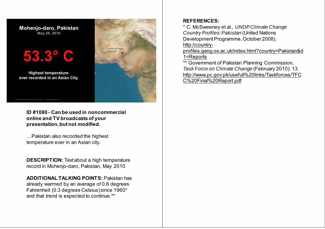
…Pakistan also recorded the highest temperature ever in an Asian city.
DESCRIPTION: Text about a high temperature record in Mohenjo-daro, Pakistan, May 2010
ADDITIONAL TALKING POINTS: Pakistan has already warmed by an average of 0.6 degrees Fahrenheit (0.3 degrees Celsius) since 1960* and that trend is expected to continue.**
REFERENCES: * C. McSweeney et al., UNDP Climate Change Country Profiles: Pakistan (United Nations Development Programme, October 2008). http://country-profiles.geog.ox.ac.uk/index.html?country=Pakistan&d1=Reports ** Government of Pakistan Planning Commission, Task Force on Climate Change (February 2010): 13. http://www.pc.gov.pk/usefull%20links/Taskforces/TFCC%20Final%20Report.pdf

ID #918 - Can be used in noncommercial online and TV broadcasts of your presentation, but not modified.
…Pakistan also recorded the highest temperature ever in an Asian city.
DESCRIPTION: Text about a high temperature record in Mohenjo-daro, Pakistan, May 2010
ADDITIONAL TALKING POINTS: Pakistan has already warmed by an average of 0.6 degrees Fahrenheit (0.3 degrees Celsius) since 1960* and that trend is expected to continue.**
REFERENCES: * C. McSweeney et al., UNDP Climate Change Country Profiles: Pakistan (United Nations Development Programme, October 2008). http://country-profiles.geog.ox.ac.uk/index.html?country=Pakistan&d1=Reports ** Government of Pakistan Planning Commission, Task Force on Climate Change (February 2010): 13. http://www.pc.gov.pk/usefull%20links/Taskforces/TFCC%20Final%20Report.pdf

ID #1197 - May not be modified or used in presentations that are recorded, streamed, or broadcast.
This is Reagan National Airport in Washington, DC. The passengers all boarded the plane and were then told they had to get off. Why? Because the runway had melted.
DESCRIPTION: Photo of airplane stuck in heat-softened tarmac at Reagan National Airport, Washington DC, July 2012
ADDITIONAL TALKING POINTS: In early July, a U.S. Airways flight headed from Washington,
D.C. to Charleston, South Carolina got stuck on the runway when the tarmac softened in extreme heat.*
Roads buckled due to the heat in Wisconsin, Illinois and Pennsylvania.**
REFERENCES: * Martin Weil, “US Airways Plane Gets Stuck in ‘Soft Spot’ on Pavement at Reagan National,” Washington Post, July 8, 2012. http://www.washingtonpost.com/local/crime/plane-gets-stuck-at-reagan-national/2012/07/08/gJQAZgG9UW_story.html ** “Heat Wave Expands, as Do Signs of the Times: Buckled Roads,” MSNBC, July 5, 2012. http://usnews.nbcnews.com/_news/2012/07/05/12575489-heat-wave-expands-as-do-signs-of-the-times-buckled-roads?lite

ID #1165 - May not be modified or used in presentations that are recorded, streamed, or broadcast.
Infrastructure damage could be in the trillions of dollars
DESCRIPTION: Photo of thermometer during a heat wave, Fuzhou City, China, July 2012
ADDITIONAL TALKING POINTS: In the last two decades, much of China has seen an increase in the number of hot days and nights and a decrease in the number of cold days and nights.*
REFERENCES: * X. Xu, Y. Du, J. Tang and Y. Wang, “Variations of temperature and precipitation extremes in recent two decades over China,” Atmospheric Research101, no. 1-2 (July 2011): 143-154. http://www.sciencedirect.com/science/article/pii/S0169809511000408
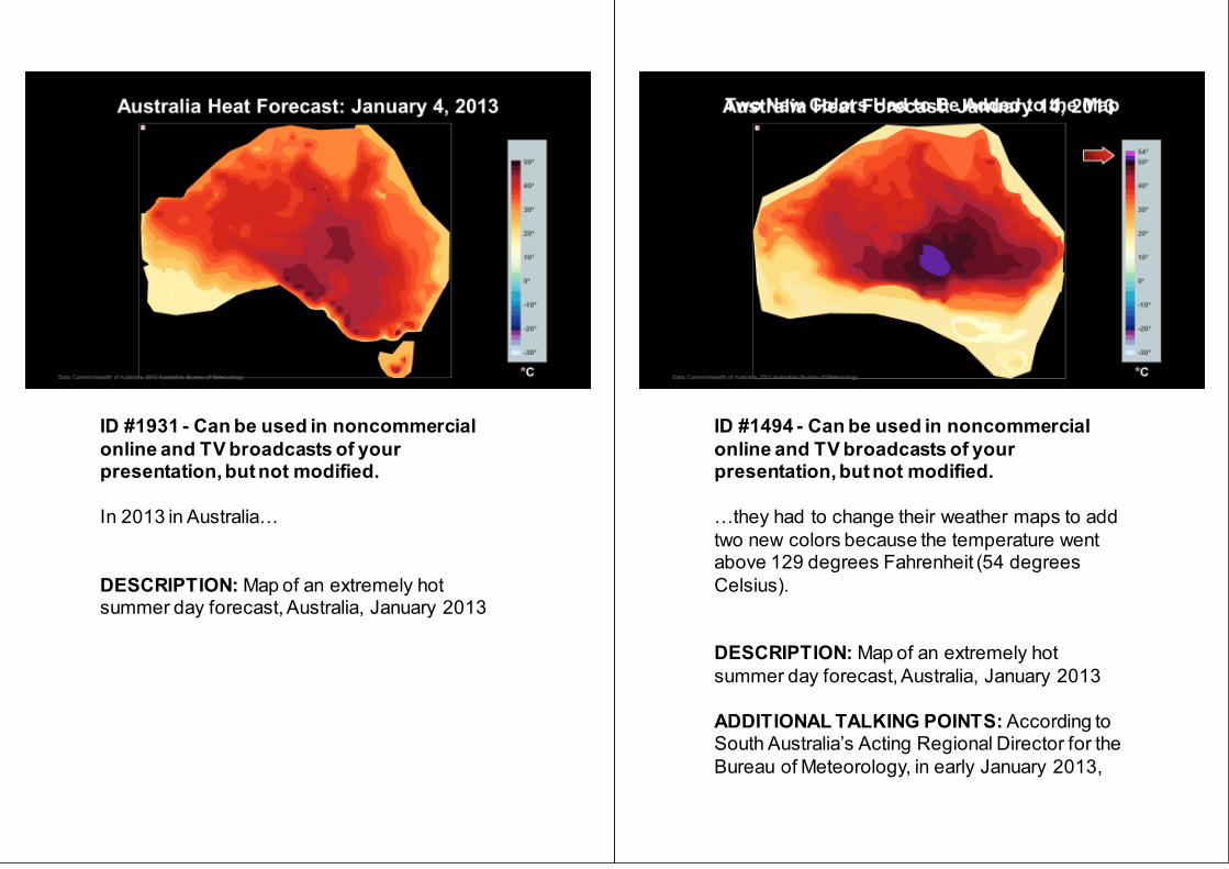
ID #1931 - Can be used in noncommercial online and TV broadcasts of your presentation, but not modified.
In 2013 in Australia…
DESCRIPTION: Map of an extremely hot summer day forecast, Australia, January 2013
ID #1494 - Can be used in noncommercial online and TV broadcasts of your presentation, but not modified.
…they had to change their weather maps to add two new colors because the temperature went above 129 degrees Fahrenheit (54 degrees Celsius).
DESCRIPTION: Map of an extremely hot summer day forecast, Australia, January 2013
ADDITIONAL TALKING POINTS: According to South Australia’s Acting Regional Director for the Bureau of Meteorology, in early January 2013,
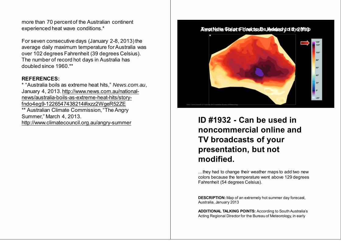
more than 70 percent of the Australian continent experienced heat wave conditions.*
For seven consecutive days (January 2-8, 2013) the average daily maximum temperature for Australia was over 102 degrees Fahrenheit (39 degrees Celsius). The number of record hot days in Australia has doubled since 1960.**
REFERENCES:* “Australia boils as extreme heat hits,” News.com.au, January 4, 2013. http://www.news.com.au/national-news/australia-boils-as-extreme-heat-hits/story-fndo4eg9-1226547438214#ixzz2WgeR52ZE** Australian Climate Commission, “The Angry Summer,” March 4, 2013. http://www.climatecouncil.org.au/angry-summer ID #1932 - Can be used in
noncommercial online and TV broadcasts of your presentation, but not modified.
…they had to change their weather maps to add two new colors because the temperature went above 129 degrees Fahrenheit (54 degrees Celsius).
DESCRIPTION: Map of an extremely hot summer day forecast, Australia, January 2013
ADDITIONAL TALKING POINTS: According to South Australia’s Acting Regional Director for the Bureau of Meteorology, in early
January 2013, more than 70 percent of the Australian continent experienced heat wave conditions.*
For seven consecutive days (January 2-8, 2013) the average daily maximum temperature for Australia was over 39 °C. The number of record hot days in Australia has doubled since 1960.**
REFERENCES:* “Australia boils as extreme heat hits,” News.com.au, January 4, 2013. http://www.news.com.au/national-news/australia-boils-as-extreme-heat-hits/story-fndo4eg9-1226547438214#ixzz2WgeR52ZE** Australian Climate Commission, “The Angry Summer,” March 4, 2013. http://climatecommission.gov.au/wp-content/uploads/Key-Facts-The-Angry-Summer-web.pdf
ID #2000 - Can be used in noncommercial online and TV broadcasts of your presentation, but not modified.
2013 was the hottest year since records began in Australia
DESCRIPTION: Text slide talking about Australia’s hottest year on record
ADDITIONAL TALKING POINTS: Australia’s average temperature for 2013 was 1.20 degrees Celsius (2.16 degrees Fahrenheit) above the long-term average. In addition to the year being the warmest on record, the summer and springs

of that year were also the warmest for each of those seasons on record.*
REFERENCES:* Australian Government, Bureau of Meteorology, “Annual Climate Statement 2013,” January 3, 2014. http://www.bom.gov.au/climate/current/annual/aus/2013/
ID #1592 - Can be used in noncommercial online and TV broadcasts of your presentation, but not modified.
Heat waves are now five times more likely in Australia because of climate change.
DESCRIPTION: Text slide about increasing likelihood of heat waves in Australia
ADDITIONAL TALKING POINTS: With more frequent heat waves, Australians will be subject to more record-breaking summers. One study suggests that at least half of the extreme temperatures that are likely to occur in Australia
in the future will be tied to human activities.*
Since 1910, the average temperature in Australia has increased 0.9 degrees Celsius (1.6 degrees Fahrenheit), and is expected to increase another 2 to 3 degrees Celsius (3.6 to 5.4 degrees Fahrenheit) in the next 50 years.**
REFERENCES:* Tim Radford, “Australian heatwaves ‘five times more likely due to global warming’,” The Guardian, July 8, 2012. http://www.theguardian.com/environment/2013/jul/08/australian-heatwaves-likely-global-warming ** Simon Lauder, “Heatwave exacerbated by climate change: Climate Commission,” ABC News, January 12, 2013. http://www.abc.net.au/news/2013-01-12/climate-commission-predicts-more-heatwaves-bushfires/4461960
ID #2001 - May not be modified or used in presentations that are recorded, streamed, or broadcast.
ID #2002 - May not be modified or used in presentations that are recorded, streamed, or broadcast.
ID #2003 - May not be modified or used in presentations that are recorded, streamed, or broadcast.
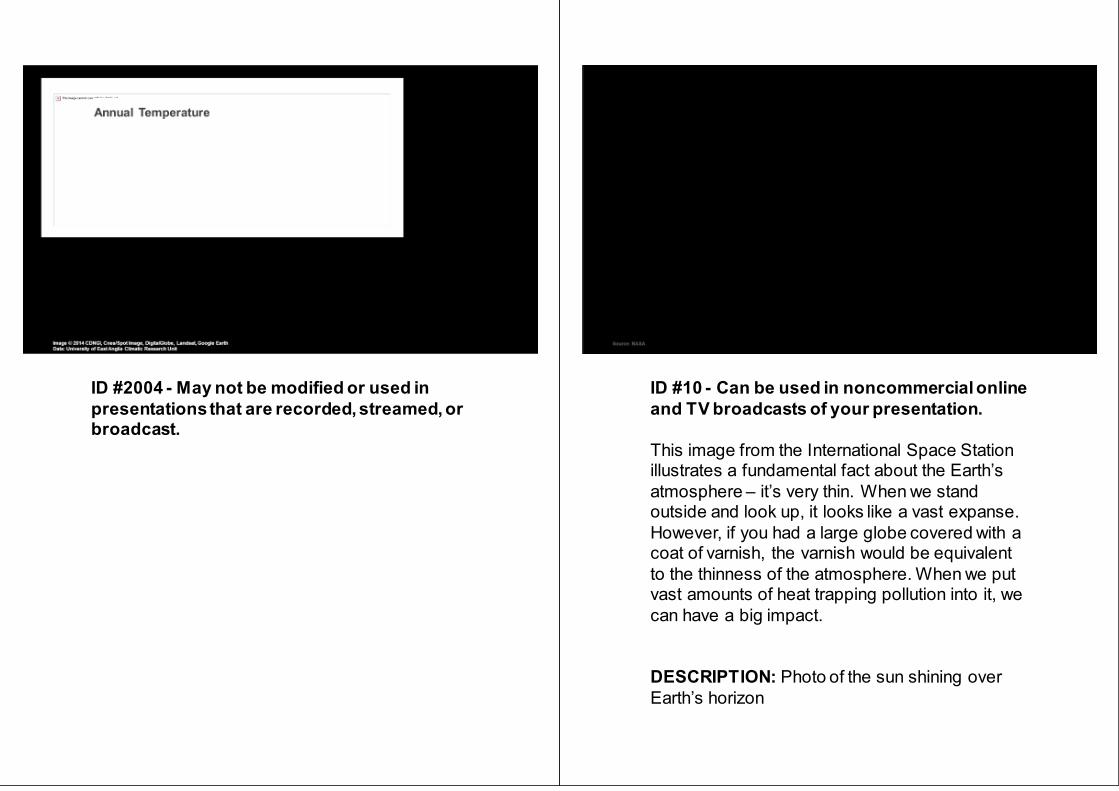
ID #2004 - May not be modified or used in presentations that are recorded, streamed, or broadcast.
ID #10 - Can be used in noncommercial online and TV broadcasts of your presentation.
This image from the International Space Station illustrates a fundamental fact about the Earth’s atmosphere – it’s very thin. When we stand outside and look up, it looks like a vast expanse. However, if you had a large globe covered with a coat of varnish, the varnish would be equivalent to the thinness of the atmosphere. When we put vast amounts of heat trapping pollution into it, we can have a big impact.
DESCRIPTION: Photo of the sun shining over Earth’s horizon

ADDITIONAL TALKING POINTS: If you look up on a nice day, the sky looks vast and limitless. From the angle in this photo, however, you can see that the lower layers of the atmosphere are actually quite thin. Carl Sagan (1934-1996), a renowned teacher and astronomer, said about the troposphere that if you had a globe covered with a coat of varnish, the thickness of that varnish would be about the same as the thickness of the Earth’s atmosphere compared to the Earth itself.* This view makes it easier to understand that the atmosphere is vulnerable to the vast amounts of pollution we emit.
ADDITIONAL BACKGROUND: This image shows the troposphere and the stratosphere, the two lowermost layers of the atmosphere.
REFERENCES: * Carl Sagan, Thoughts on Life and Death at the Brink of the Millennium (New York, Ballantine Books, 1997): 39. https://www.andrew.cmu.edu/user/jksadegh/A%20Good%20Atheist%20Secularist%20Skeptical%20Book%20Collection/carl%20sagan%20-%20billions%20and%20billions.pdf
ID #11 - Can be used in noncommercial online and TV broadcasts of your presentation, but not modified.
The energy from the Sun comes into the atmosphere in the form of light radiation…
DESCRIPTION: Diagram of the sun and the earth. The yellow lines represent energy from the sun.
ADDITIONAL TALKING POINTS: Light waves travel from the sun to the Earth’s atmosphere.*
REFERENCES:
* NASA, “Global Climate Change: Causes,” last accessed April 2014. http://climate.nasa.gov/causes/
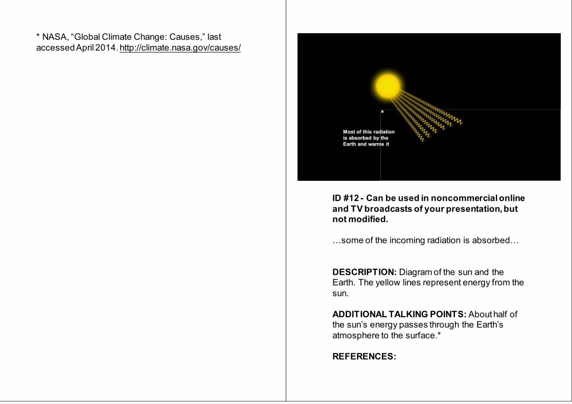
ID #12 - Can be used in noncommercial online and TV broadcasts of your presentation, but not modified.
…some of the incoming radiation is absorbed…
DESCRIPTION: Diagram of the sun and the Earth. The yellow lines represent energy from the sun.
ADDITIONAL TALKING POINTS: About half of the sun’s energy passes through the Earth’s atmosphere to the surface.*
REFERENCES:
* NASA, “Global Climate Change: Causes,” last accessed April 2014. http://climate.nasa.gov/causes/
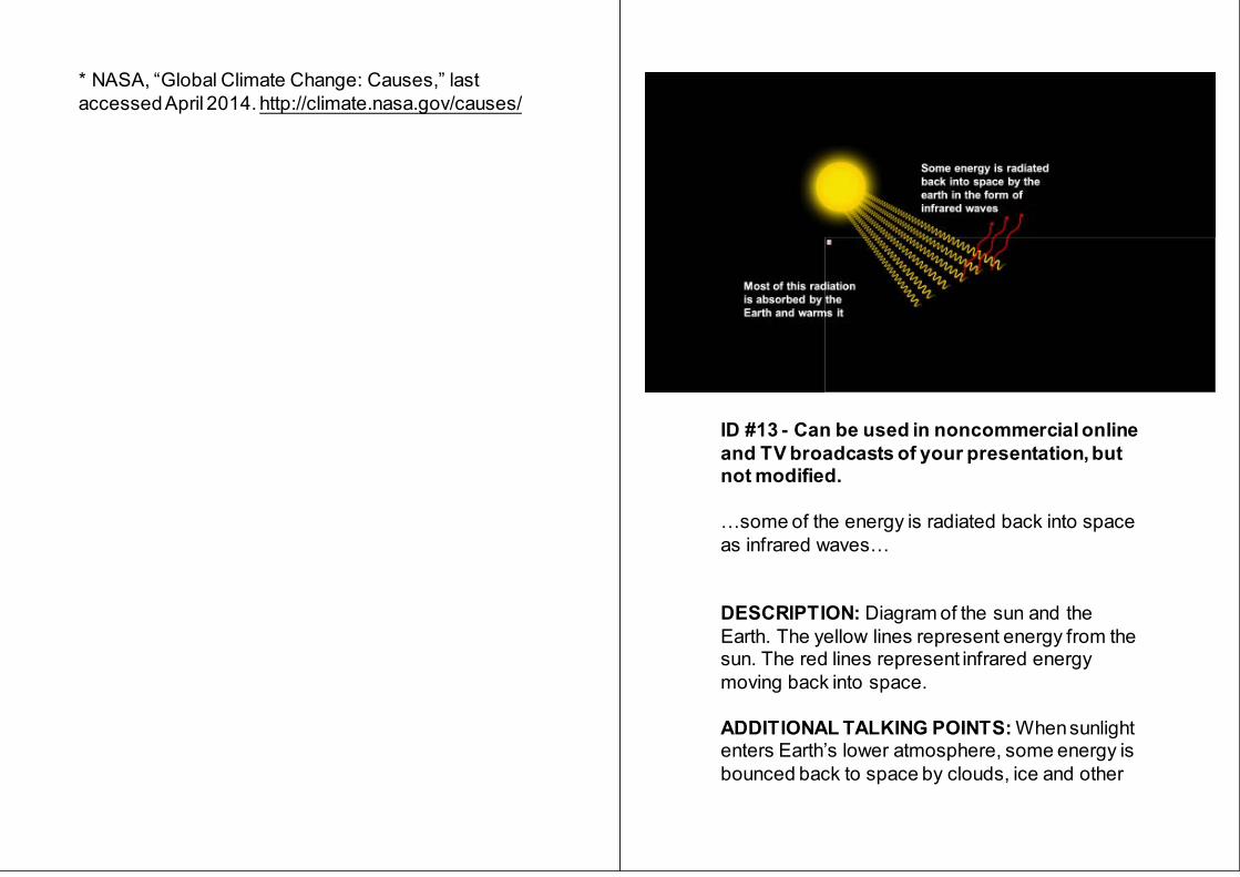
ID #13 - Can be used in noncommercial online and TV broadcasts of your presentation, but not modified.
…some of the energy is radiated back into space as infrared waves…
DESCRIPTION: Diagram of the sun and the Earth. The yellow lines represent energy from the sun. The red lines represent infrared energy moving back into space.
ADDITIONAL TALKING POINTS: When sunlight enters Earth’s lower atmosphere, some energy is bounced back to space by clouds, ice and other
reflective surfaces, and some energy warms the earth itself.*
REFERENCES: * NASA, “Global Climate Change: Causes,” last accessed April 2014. http://climate.nasa.gov/causes/
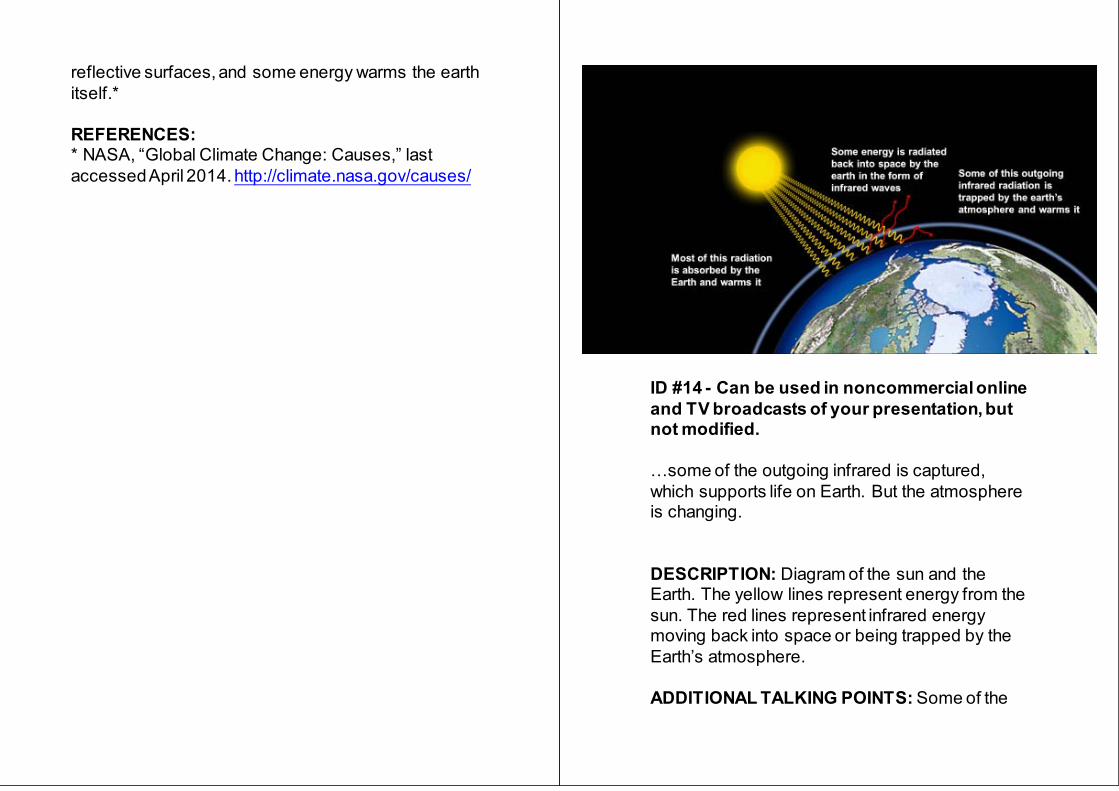
ID #14 - Can be used in noncommercial online and TV broadcasts of your presentation, but not modified.
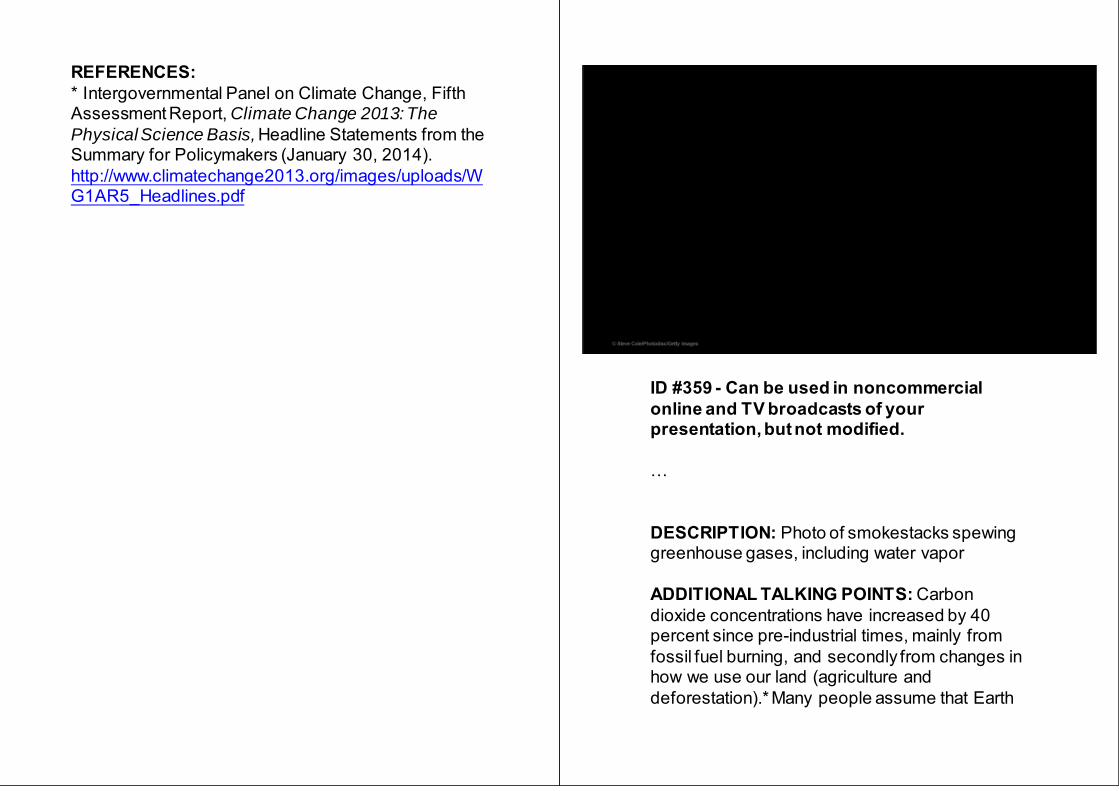
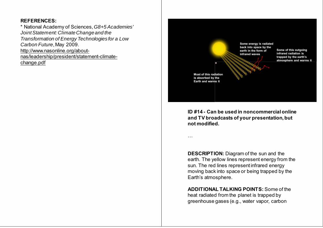
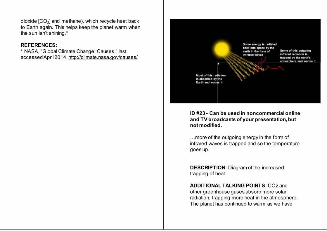
…some of the outgoing infrared is captured, which supports life on Earth. But the atmosphere is changing.
DESCRIPTION: Diagram of the sun and the Earth. The yellow lines represent energy from the sun. The red lines represent infrared energy moving back into space or being trapped by the Earth’s atmosphere.
ADDITIONAL TALKING POINTS: Some of the
heat radiated from the planet is trapped by greenhouse gases (e.g., water vapor, carbon dioxide [CO2] and methane), which recycle heat back to Earth again. This helps keep the planet warm when the sun isn’t shining.*
REFERENCES: * NASA, “Global Climate Change: Causes,” last accessed April 2014. http://climate.nasa.gov/causes/
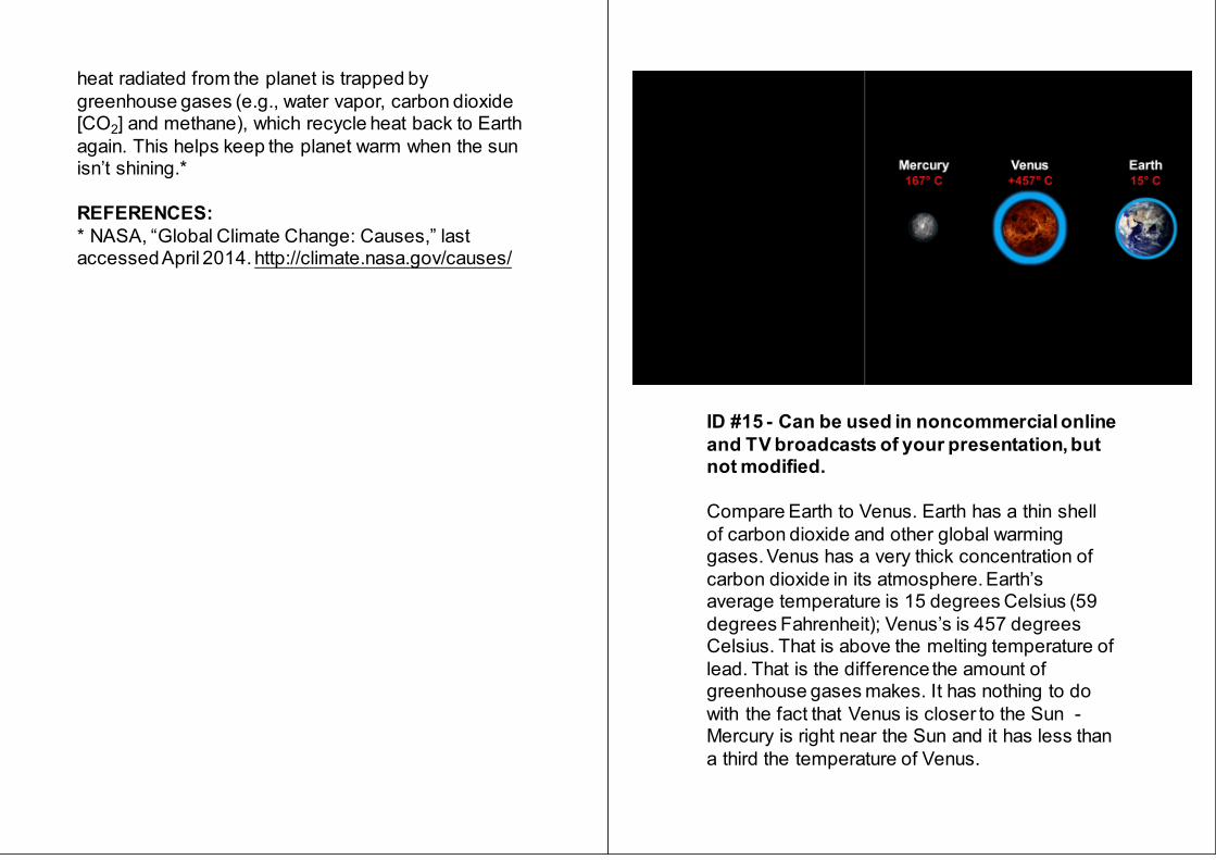
ID #15 - Can be used in noncommercial online and TV broadcasts of your presentation, but not modified.
Compare Earth to Venus. Earth has a thin shell of carbon dioxide and other global warming gases. Venus has a very thick concentration of carbon dioxide in its atmosphere. Earth’s average temperature is 15 degrees Celsius (59 degrees Fahrenheit); Venus’s is 457 degrees Celsius. That is above the melting temperature of lead. That is the difference the amount of greenhouse gases makes. It has nothing to do with the fact that Venus is closer to the Sun -Mercury is right near the Sun and it has less than a third the temperature of Venus.
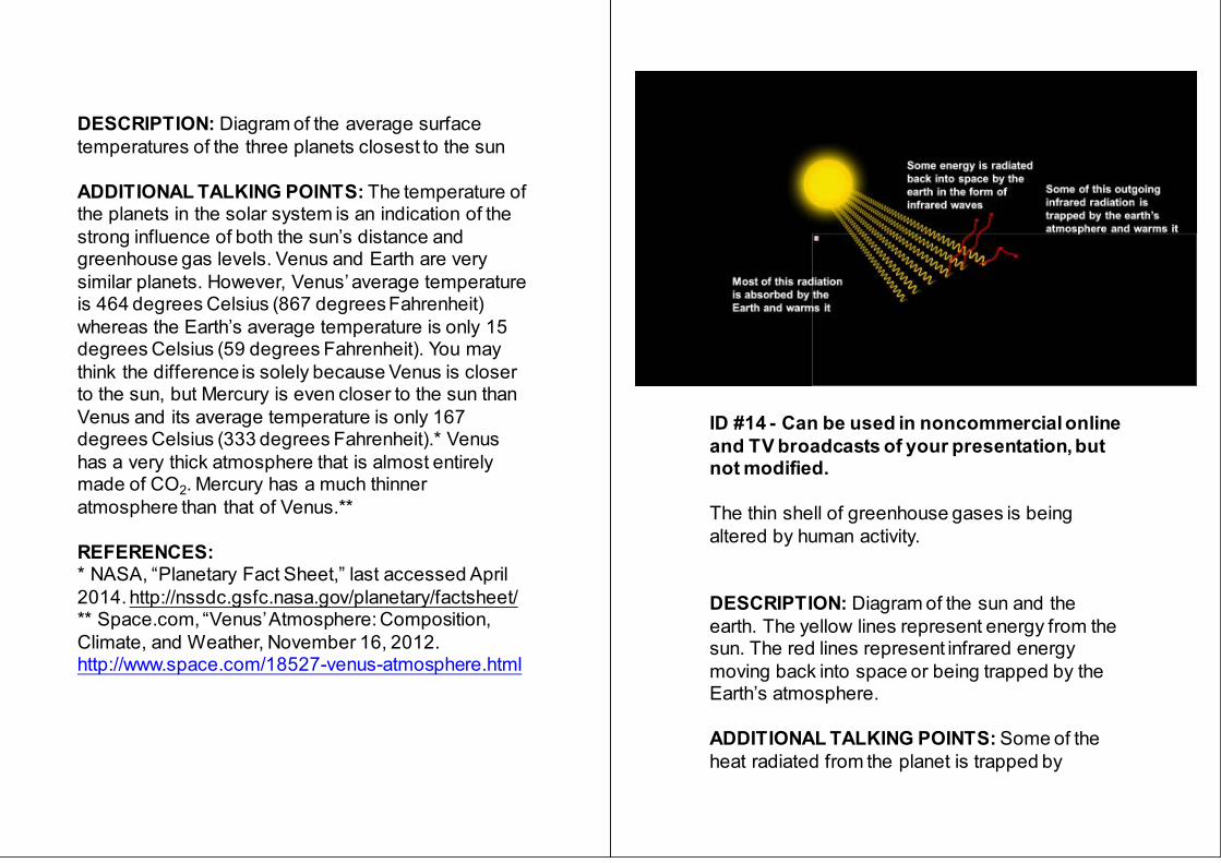
DESCRIPTION: Diagram of the average surface temperatures of the three planets closest to the sun
ADDITIONAL TALKING POINTS: The temperature of the planets in the solar system is an indication of the strong influence of both the sun’s distance and greenhouse gas levels. Venus and Earth are very similar planets. However, Venus’ average temperature is 464 degrees Celsius (867 degrees Fahrenheit) whereas the Earth’s average temperature is only 15 degrees Celsius (59 degrees Fahrenheit). You may think the difference is solely because Venus is closer to the sun, but Mercury is even closer to the sun than Venus and its average temperature is only 167 degrees Celsius (333 degrees Fahrenheit).* Venus has a very thick atmosphere that is almost entirely made of CO2. Mercury has a much thinner atmosphere than that of Venus.**
REFERENCES:* NASA, “Planetary Fact Sheet,” last accessed April 2014. http://nssdc.gsfc.nasa.gov/planetary/factsheet/** Space.com, “Venus’ Atmosphere: Composition, Climate, and Weather, November 16, 2012. http://www.space.com/18527-venus-atmosphere.html
ID #14 - Can be used in noncommercial online and TV broadcasts of your presentation, but not modified.
The thin shell of greenhouse gases is being altered by human activity.
DESCRIPTION: Diagram of the sun and the earth. The yellow lines represent energy from the sun. The red lines represent infrared energy moving back into space or being trapped by the Earth’s atmosphere.
ADDITIONAL TALKING POINTS: Some of the heat radiated from the planet is trapped by

greenhouse gases (e.g., water vapor, carbon dioxide [CO2] and methane), which recycle heat back to Earth again. This helps keep the planet warm when the sun isn’t shining.*
REFERENCES: * NASA, “Global Climate Change: Causes,” last accessed April 2014. http://climate.nasa.gov/causes/
ID #358 - May not be modified or used in presentations that are recorded, streamed, or broadcast.
We’re putting enormous amounts of greenhouse gases into the atmosphere…
DESCRIPTION: Photo of skyscrapers in a haze of smog (i.e., air pollution)
ADDITIONAL TALKING POINTS: The IPCC says that the human influence on the climate is evident from increasing greenhouse gas concentrations in the atompshere.*
REFERENCES:* Intergovernmental Panel on Climate Change, Fifth Assessment Report, Climate Change 2013: The Physical Science Basis, Headline Statements from the Summary for Policymakers (January 30, 2014). http://www.climatechange2013.org/images/uploads/WG1AR5_Headlines.pdf
ID #359 - Can be used in noncommercial online and TV broadcasts of your presentation, but not modified.
…
DESCRIPTION: Photo of smokestacks spewing greenhouse gases, including water vapor
ADDITIONAL TALKING POINTS: Carbon dioxide concentrations have increased by 40 percent since pre-industrial times, mainly from fossil fuel burning, and secondly from changes in how we use our land (agriculture and deforestation).*Many people assume that Earth
is too vast to be harmed through human activity, or that the planet can recover quickly from environmental damage. But the science is clear: when we burn dirty fuels like oil and coal, we are polluting our air and warming our planet.
REFERENCES: * Intergovernmental Panel on Climate Change, Fifth Assessment Report, Climate Change 2013: The Physical Science Basis, Headline Statements from the Summary for Policymakers (January 30, 2014). http://www.climatechange2013.org/images/uploads/WG1AR5_Headlines.pdf
ID #20 - May not be modified or used in presentations that are recorded, streamed, or broadcast.
…
DESCRIPTION: Photo of smoke billowing up from factories in the industrial port area Chiba Prefecture, Japan
ADDITIONAL TALKING POINTS: Most of the major scientific organizations around the world have concluded that the climate is changing and that humans are largely to blame.*
REFERENCES:* National Academy of Sciences, G8+5 Academies’ Joint Statement: Climate Change and the Transformation of Energy Technologies for a Low Carbon Future, May 2009. http://www.nasonline.org/about-nas/leadership/president/statement-climate-change.pdf
ID #14 - Can be used in noncommercial online and TV broadcasts of your presentation, but not modified.
…
DESCRIPTION: Diagram of the sun and the earth. The yellow lines represent energy from the sun. The red lines represent infrared energy moving back into space or being trapped by the Earth’s atmosphere.
ADDITIONAL TALKING POINTS: Some of the heat radiated from the planet is trapped by greenhouse gases (e.g., water vapor, carbon
dioxide [CO2] and methane), which recycle heat back to Earth again. This helps keep the planet warm when the sun isn’t shining.*
REFERENCES: * NASA, “Global Climate Change: Causes,” last accessed April 2014. http://climate.nasa.gov/causes/
ID #23 - Can be used in noncommercial online and TV broadcasts of your presentation, but not modified.
…more of the outgoing energy in the form of infrared waves is trapped and so the temperature goes up.
DESCRIPTION: Diagram of the increased trapping of heat
ADDITIONAL TALKING POINTS: CO2 and other greenhouse gases absorb more solar radiation, trapping more heat in the atmosphere. The planet has continued to warm as we have
add more and more CO2 and other pollution from dirty energy sources to the atmosphere.*
REFERENCES: * NASA, “Global Climate Change: Causes,” last accessed April 2014. http://climate.nasa.gov/causes/
ID #1354 - Can be used in noncommercial online and TV broadcasts of your presentation, but not modified.
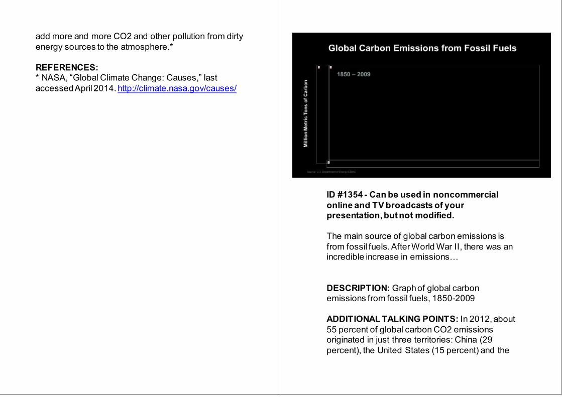
The main source of global carbon emissions is from fossil fuels. After World War II, there was an incredible increase in emissions…
DESCRIPTION: Graph of global carbon emissions from fossil fuels, 1850-2009
ADDITIONAL TALKING POINTS: In 2012, about 55 percent of global carbon CO2 emissions originated in just three territories: China (29 percent), the United States (15 percent) and the
European Union (11 percent).
REFERENCES: * PBL Netherlands Environmental Assessment Agency, Trends in Global CO2 Emissions: 2013 Report (October 2013): 8. http://www.pbl.nl/sites/default/files/cms/publicaties/pbl-2013-trends-in-global-co2-emissions-2013-report-1148.pdf
ID #19 - Can be used in noncommercial online and TV broadcasts of your presentation, but not modified.
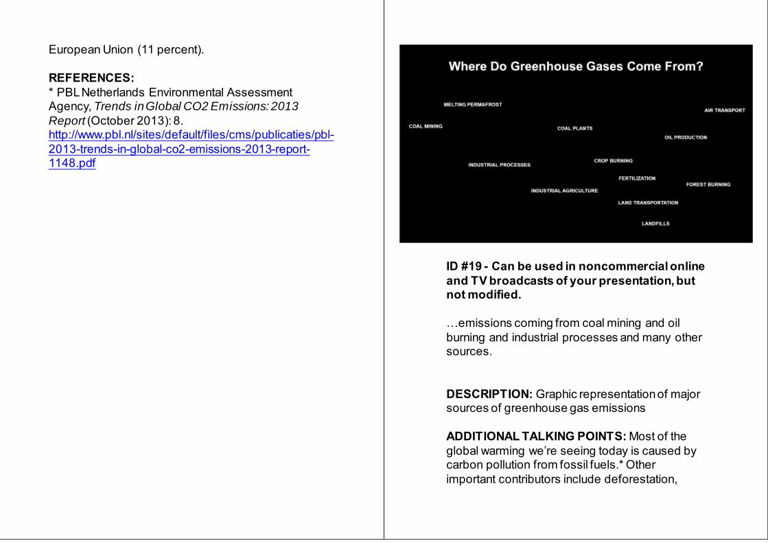
…emissions coming from coal mining and oil burning and industrial processes and many other sources.
DESCRIPTION: Graphic representation of major sources of greenhouse gas emissions
ADDITIONAL TALKING POINTS: Most of the global warming we’re seeing today is caused by carbon pollution from fossil fuels.* Other important contributors include deforestation,
agriculture (crops and livestock) and industrial processes.**
REFERENCES:* Union of Concerned Scientists, “Why Does CO2 Get Most of the Attention When There are So Many Other Heat-Trapping Gases (Greenhouse Gases)?” last updated May 1, 2009. http://www.ucsusa.org/global_warming/science_and_impacts/science/CO2-and-global-warming-faq.html** U.S. Environmental Protection Agency, “Global Greenhouse Gas Emissions Data,” last updated September 9, 2013. http://www.epa.gov/climatechange/ghgemissions/global.html
ID #1506 - Can be used in noncommercial online and TV broadcasts of your presentation, but not modified.
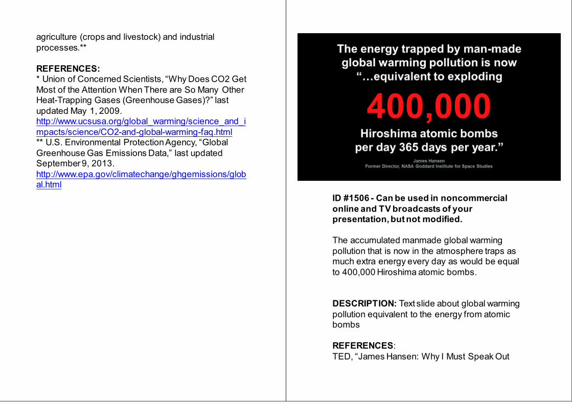
The accumulated manmade global warming pollution that is now in the atmosphere traps as much extra energy every day as would be equal to 400,000 Hiroshima atomic bombs.
DESCRIPTION: Text slide about global warming pollution equivalent to the energy from atomic bombs
REFERENCES: TED, “James Hansen: Why I Must Speak Out
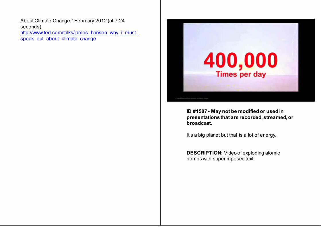
About Climate Change,” February 2012 (at 7:24 seconds). http://www.ted.com/talks/james_hansen_why_i_must_speak_out_about_climate_change
ID #1507 - May not be modified or used in presentations that are recorded, streamed, or broadcast.
It’s a big planet but that is a lot of energy.
DESCRIPTION: Video of exploding atomic bombs with superimposed text
ID #1193 - Can be used in noncommercial online and TV broadcasts of your presentation, but not modified.
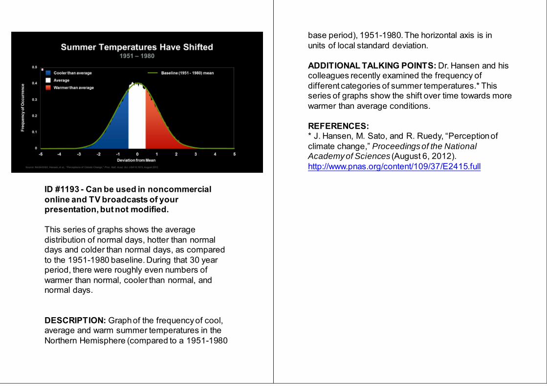
This series of graphs shows the average distribution of normal days, hotter than normal days and colder than normal days, as compared to the 1951-1980 baseline. During that 30 year period, there were roughly even numbers of warmer than normal, cooler than normal, and normal days.
DESCRIPTION: Graph of the frequency of cool, average and warm summer temperatures in the Northern Hemisphere (compared to a 1951-1980
base period), 1951-1980. The horizontal axis is in units of local standard deviation.
ADDITIONAL TALKING POINTS: Dr. Hansen and his colleagues recently examined the frequency of different categories of summer temperatures.* This series of graphs show the shift over time towards more warmer than average conditions.
REFERENCES:* J. Hansen, M. Sato, and R. Ruedy, “Perception of climate change,” Proceedings of the National Academy of Sciences (August 6, 2012). http://www.pnas.org/content/109/37/E2415.full
ID #1194 - Can be used in noncommercial online and TV broadcasts of your presentation, but not modified.
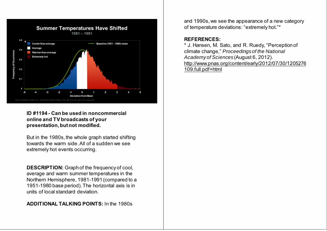
But in the 1980s, the whole graph started shifting towards the warm side. All of a sudden we see extremely hot events occurring.
DESCRIPTION: Graph of the frequency of cool, average and warm summer temperatures in the Northern Hemisphere, 1981-1991 (compared to a 1951-1980 base period). The horizontal axis is in units of local standard deviation.
ADDITIONAL TALKING POINTS: In the 1980s
and 1990s, we see the appearance of a new category of temperature deviations: “extremely hot.”*
REFERENCES:* J. Hansen, M. Sato, and R. Ruedy, “Perception of climate change,” Proceedings of the National Academy of Sciences (August 6, 2012). http://www.pnas.org/content/early/2012/07/30/1205276109.full.pdf+html
ID #1195 - Can be used in noncommercial online and TV broadcasts of your presentation, but not modified.
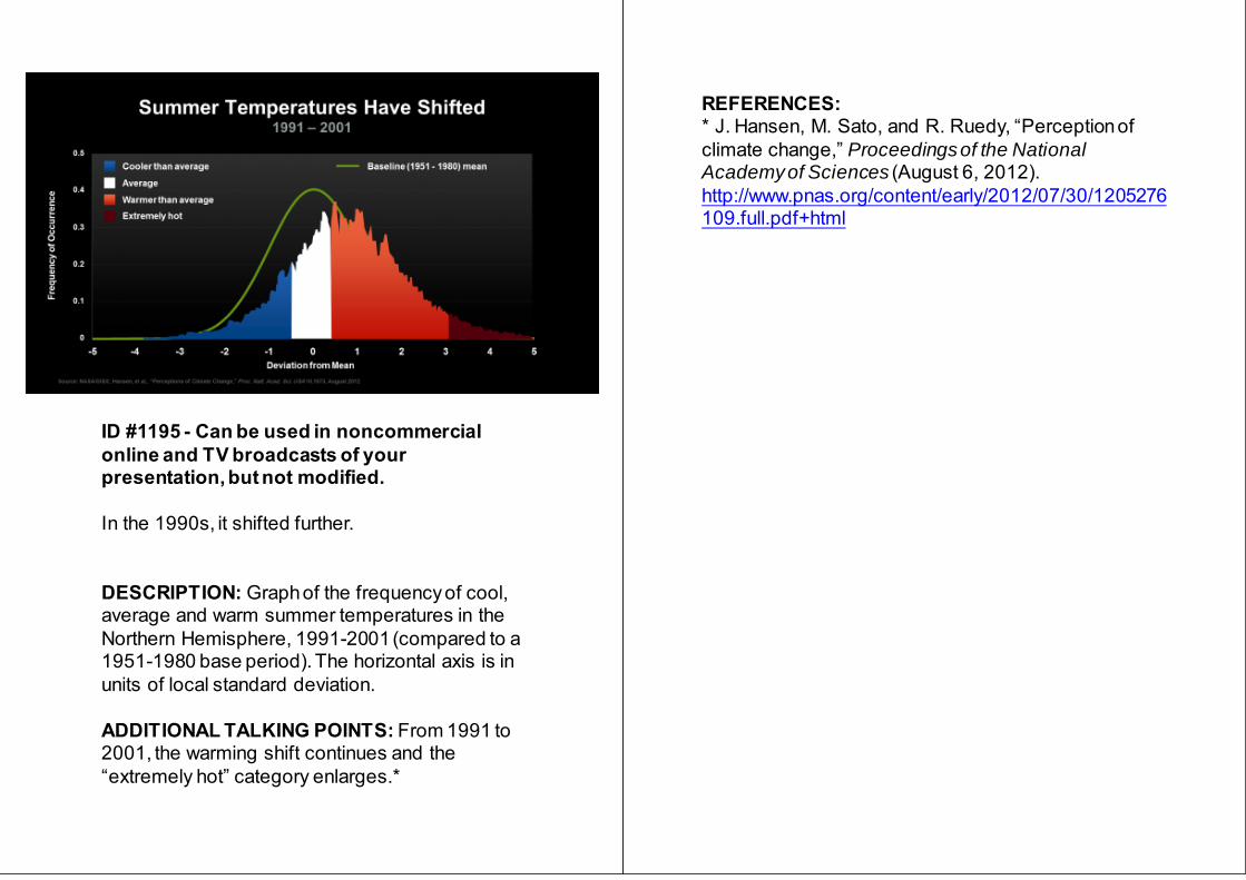
In the 1990s, it shifted further.
DESCRIPTION: Graph of the frequency of cool, average and warm summer temperatures in the Northern Hemisphere, 1991-2001 (compared to a 1951-1980 base period). The horizontal axis is in units of local standard deviation.
ADDITIONAL TALKING POINTS: From 1991 to 2001, the warming shift continues and the “extremely hot” category enlarges.*
REFERENCES:* J. Hansen, M. Sato, and R. Ruedy, “Perception of climate change,” Proceedings of the National Academy of Sciences (August 6, 2012). http://www.pnas.org/content/early/2012/07/30/1205276109.full.pdf+html
ID #1196 - Can be used in noncommercial online and TV broadcasts of your presentation, but not modified.
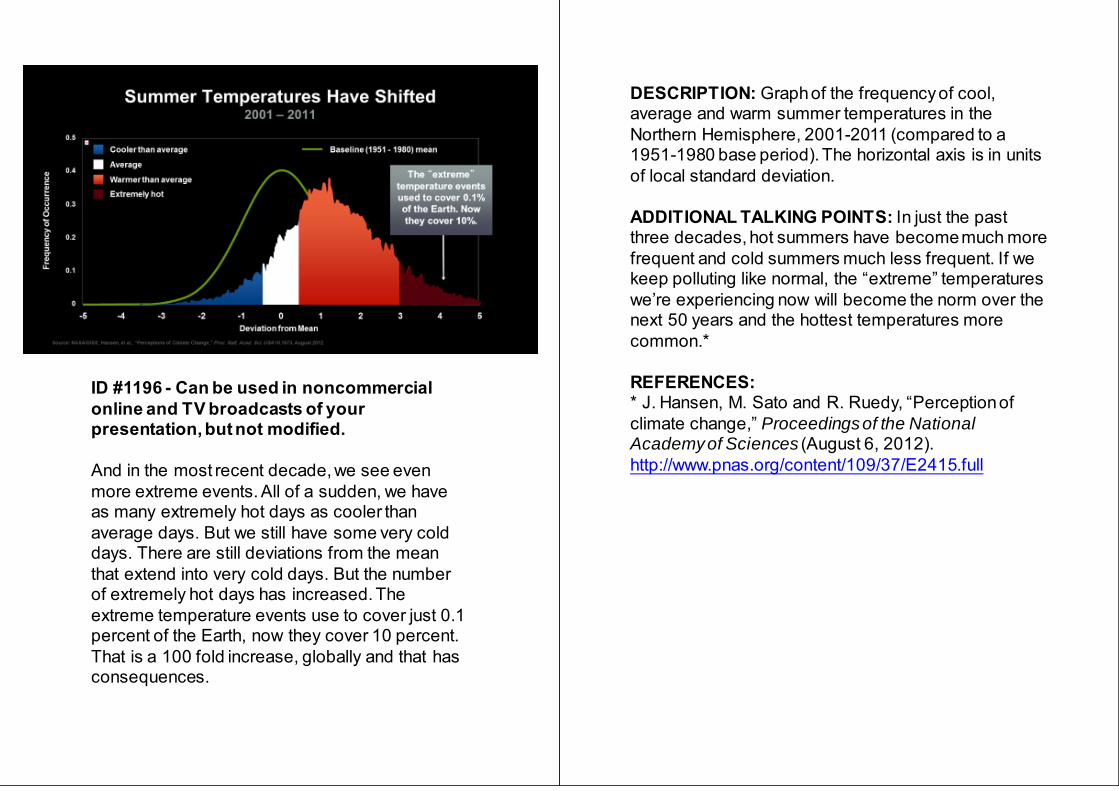
And in the most recent decade, we see even more extreme events. All of a sudden, we have as many extremely hot days as cooler than average days. But we still have some very cold days. There are still deviations from the mean that extend into very cold days. But the number of extremely hot days has increased. The extreme temperature events use to cover just 0.1 percent of the Earth, now they cover 10 percent. That is a 100 fold increase, globally and that has consequences.
DESCRIPTION: Graph of the frequency of cool, average and warm summer temperatures in the Northern Hemisphere, 2001-2011 (compared to a 1951-1980 base period). The horizontal axis is in units of local standard deviation.
ADDITIONAL TALKING POINTS: In just the past three decades, hot summers have become much more frequent and cold summers much less frequent. If we keep polluting like normal, the “extreme” temperatures we’re experiencing now will become the norm over the next 50 years and the hottest temperatures more common.*
REFERENCES: * J. Hansen, M. Sato and R. Ruedy, “Perception of climate change,” Proceedings of the National Academy of Sciences (August 6, 2012). http://www.pnas.org/content/109/37/E2415.full
ID #1136 - Can be used in noncommercial online and TV broadcasts of your presentation, but not modified.
…
DESCRIPTION: Quote from James Hansen, Director of the NASA Goddard Institute for Space Studies, August 2012
ID #1125 - Can be used in noncommercial online and TV broadcasts of your presentation, but not modified.
The two largest reinsurance companies have no doubt. Munich Re says climate change is the only plausible explanation.
DESCRIPTION: Quote slide from Munich Re, one of the largest reinsurance companies in the world, September 2010
ID #1594 - Can be used in noncommercial online and TV broadcasts of your presentation, but not modified.
The CEO of the other says climate change keeps him up at night.
DESCRIPTION: Quote slide about the impact climate change is having and will continue to have on society, July 2013
ADDITIONAL TALKING POINTS: The year 2011 ranked 16th for human lives lost by natural and man-made disasters since 1970. When densely populated cities are hit by natural disasters,
some of which are linked to climate change, the effects are even more devastating because of increased number of casualties and destruction.*
Additionally, flooding “hot spot” zones are becoming increasingly more difficult to insure because of higher potential for flooding in these regions. In the last 40 years, losses due to flooding have increased from $1-2 billion to $15 billion.**
REFERENCES:* Swiss Re, “Managing climate and natural disaster risk,” last accessed August 13, 2013. http://www.swissre.com/rethinking/climate_and_natural_disaster_risk/** Swiss Re, “Insuring floods: a challenge and an opportunity,” September 6, 2012. http://www.swissre.com/rethinking/climate_and_natural_disaster_risk/Insuring_floods_a_challenge_and_an_opportunity.html
ID #953 - Can be used in noncommercial online and TV broadcasts of your presentation, but not modified.
Scientists used to say that you couldn’t blame any one single event to climate change. The odds of these events occurring have been increasing but now scientists are saying that all extreme weather events are influenced by global warming.
DESCRIPTION: Quote slide from climate scientist Kevin Trenberth, senior scientist at the US National Center for Atmospheric Research’s Climate Analysis Section, July 2011
ID #1933 - Can be used in noncommercial online and TV broadcasts of your presentation, but not modified.
The IPCC says that Africa is one of the most vulnerable continents in the world to climate change.
DESCRIPTION: Quote slide from the IPCC’s Fourth Assessment Report about the vulnerability of Africa to climate change and variability
ID #1061 - Can be used in noncommercial online and TV broadcasts of your presentation, but not modified.
Here’s the linkage between the climate crisis and extreme weather events.
DESCRIPTION: Text slide about the link between climate change and extreme weather
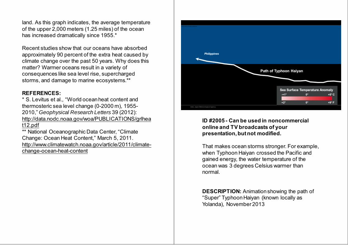
ID #1054 - Can be used in noncommercial online and TV broadcasts of your presentation, but not modified.
As carbon dioxide goes up, so does average temperature…
DESCRIPTION: Graph of carbon dioxide concentrations and temperature over the last 2,000 years
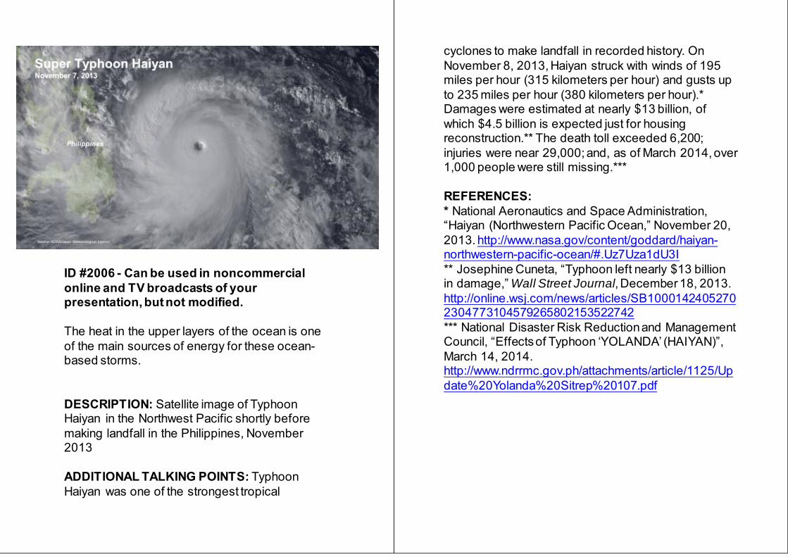
ID #1441 - Can be used in noncommercial online and TV broadcasts of your presentation, but not modified.
…and the temperature of the ocean. Over the last half of the 20th century, there has been a dramatic rise in global ocean heat content. 90 percent of heat energy is absorbed in the oceans.
DESCRIPTION: Graph of global ocean heat content, 1955-2010
ADDITIONAL TALKING POINTS: Temperature rise can be measured in the oceans as well as on
land. As this graph indicates, the average temperature of the upper 2,000 meters (1.25 miles) of the ocean has increased dramatically since 1955.*
Recent studies show that our oceans have absorbed approximately 90 percent of the extra heat caused by climate change over the past 50 years. Why does this matter? Warmer oceans result in a variety of consequences like sea level rise, supercharged storms, and damage to marine ecosystems.**
REFERENCES:* S. Levitus et al., “World ocean heat content and thermosteric sea level change (0-2000 m), 1955-2010,” Geophysical Research Letters 39 (2012):http://data.nodc.noaa.gov/woa/PUBLICATIONS/grlheat12.pdf** National Oceanographic Data Center, “Climate Change: Ocean Heat Content,” March 5, 2011. http://www.climatewatch.noaa.gov/article/2011/climate-change-ocean-heat-content
ID #2005 - Can be used in noncommercial online and TV broadcasts of your presentation, but not modified.
That makes ocean storms stronger. For example, when Typhoon Haiyan crossed the Pacific and gained energy, the water temperature of the ocean was 3 degrees Celsius warmer than normal.
DESCRIPTION: Animation showing the path of “Super” Typhoon Haiyan (known locally as Yolanda), November 2013
ID #2006 - Can be used in noncommercial online and TV broadcasts of your presentation, but not modified.
The heat in the upper layers of the ocean is one of the main sources of energy for these ocean-based storms.
DESCRIPTION: Satellite image of Typhoon Haiyan in the Northwest Pacific shortly before making landfall in the Philippines, November 2013
ADDITIONAL TALKING POINTS: Typhoon Haiyan was one of the strongest tropical
cyclones to make landfall in recorded history. On November 8, 2013, Haiyan struck with winds of 195 miles per hour (315 kilometers per hour) and gusts up to 235 miles per hour (380 kilometers per hour).* Damages were estimated at nearly $13 billion, of which $4.5 billion is expected just for housing reconstruction.** The death toll exceeded 6,200; injuries were near 29,000; and, as of March 2014, over 1,000 people were still missing.***
REFERENCES:* National Aeronautics and Space Administration, “Haiyan (Northwestern Pacific Ocean,” November 20, 2013. http://www.nasa.gov/content/goddard/haiyan-northwestern-pacific-ocean/#.Uz7Uza1dU3I** Josephine Cuneta, “Typhoon left nearly $13 billion in damage,” Wall Street Journal, December 18, 2013. http://online.wsj.com/news/articles/SB10001424052702304773104579265802153522742*** National Disaster Risk Reduction and Management Council, “Effects of Typhoon ‘YOLANDA’ (HAIYAN)”, March 14, 2014. http://www.ndrrmc.gov.ph/attachments/article/1125/Update%20Yolanda%20Sitrep%20107.pdf
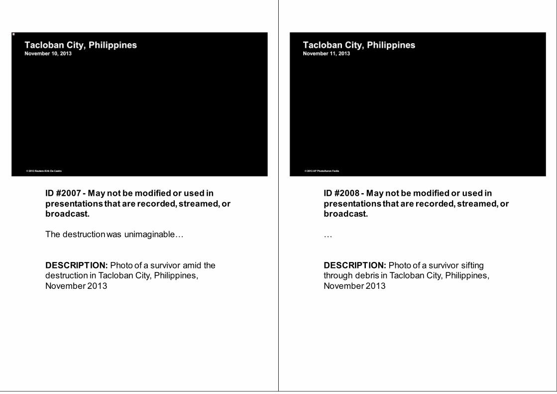
ID #2007 - May not be modified or used in presentations that are recorded, streamed, or broadcast.
The destruction was unimaginable…
DESCRIPTION: Photo of a survivor amid the destruction in Tacloban City, Philippines, November 2013
ID #2008 - May not be modified or used in presentations that are recorded, streamed, or broadcast.
…
DESCRIPTION: Photo of a survivor sifting through debris in Tacloban City, Philippines, November 2013
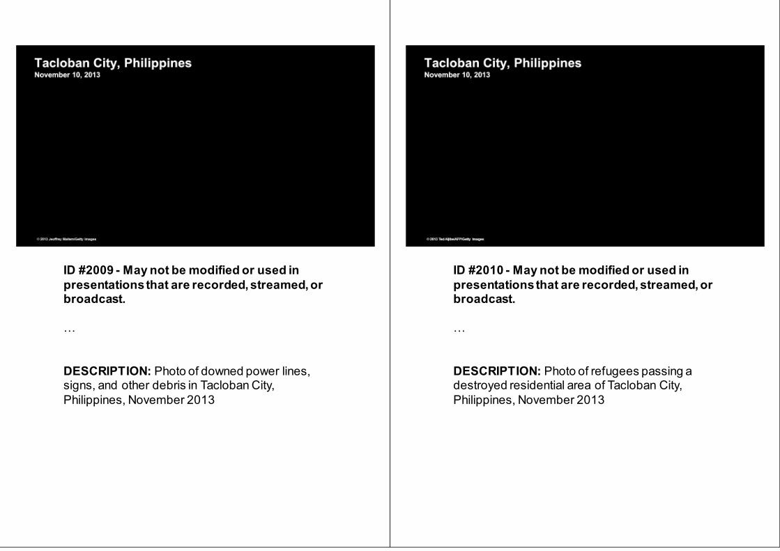
ID #2009 - May not be modified or used in presentations that are recorded, streamed, or broadcast.
…
DESCRIPTION: Photo of downed power lines, signs, and other debris in Tacloban City, Philippines, November 2013
ID #2010 - May not be modified or used in presentations that are recorded, streamed, or broadcast.
…
DESCRIPTION: Photo of refugees passing a destroyed residential area of Tacloban City, Philippines, November 2013
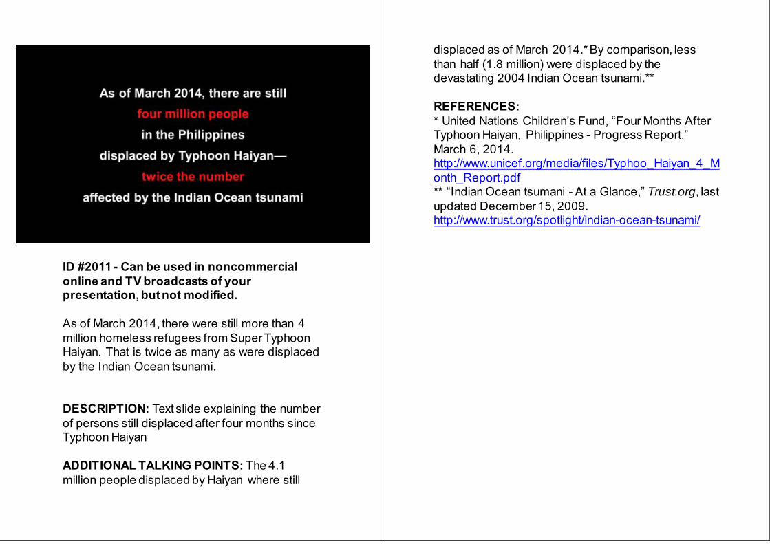
ID #2011 - Can be used in noncommercial online and TV broadcasts of your presentation, but not modified.
As of March 2014, there were still more than 4 million homeless refugees from Super Typhoon Haiyan. That is twice as many as were displaced by the Indian Ocean tsunami.
DESCRIPTION: Text slide explaining the number of persons still displaced after four months since Typhoon Haiyan
ADDITIONAL TALKING POINTS: The 4.1 million people displaced by Haiyan where still
displaced as of March 2014.* By comparison, less than half (1.8 million) were displaced by the devastating 2004 Indian Ocean tsunami.**
REFERENCES:* United Nations Children’s Fund, “Four Months After Typhoon Haiyan, Philippines - Progress Report,” March 6, 2014. http://www.unicef.org/media/files/Typhoo_Haiyan_4_Month_Report.pdf** “Indian Ocean tsumani - At a Glance,” Trust.org, last updated December 15, 2009. http://www.trust.org/spotlight/indian-ocean-tsunami/
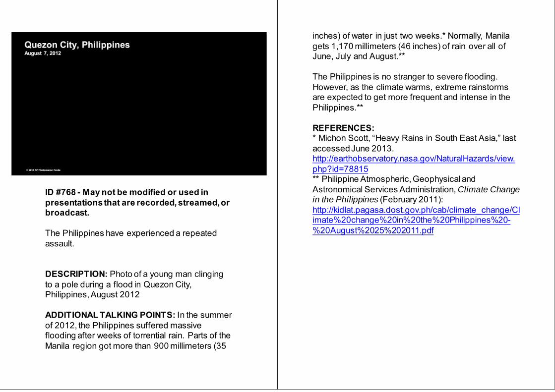
ID #768 - May not be modified or used in presentations that are recorded, streamed, or broadcast.
The Philippines have experienced a repeated assault.
DESCRIPTION: Photo of a young man clinging to a pole during a flood in Quezon City, Philippines, August 2012
ADDITIONAL TALKING POINTS: In the summer of 2012, the Philippines suffered massive flooding after weeks of torrential rain. Parts of the Manila region got more than 900 millimeters (35
inches) of water in just two weeks.* Normally, Manila gets 1,170 millimeters (46 inches) of rain over all of June, July and August.**
The Philippines is no stranger to severe flooding. However, as the climate warms, extreme rainstorms are expected to get more frequent and intense in the Philippines.**
REFERENCES:* Michon Scott, “Heavy Rains in South East Asia,” last accessed June 2013. http://earthobservatory.nasa.gov/NaturalHazards/view.php?id=78815** Philippine Atmospheric, Geophysical and Astronomical Services Administration, Climate Change in the Philippines (February 2011): http://kidlat.pagasa.dost.gov.ph/cab/climate_change/Climate%20change%20in%20the%20Philippines%20-%20August%2025%202011.pdf
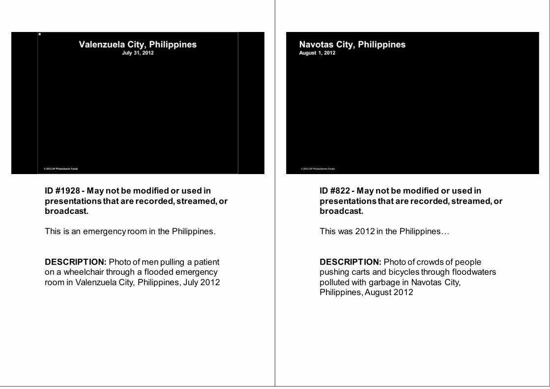
ID #1928 - May not be modified or used in presentations that are recorded, streamed, or broadcast.
This is an emergency room in the Philippines.
DESCRIPTION: Photo of men pulling a patient on a wheelchair through a flooded emergency room in Valenzuela City, Philippines, July 2012
ID #822 - May not be modified or used in presentations that are recorded, streamed, or broadcast.
This was 2012 in the Philippines…
DESCRIPTION: Photo of crowds of people pushing carts and bicycles through floodwaters polluted with garbage in Navotas City, Philippines, August 2012
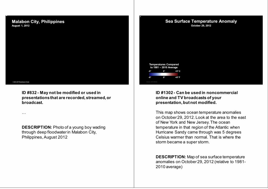
ID #832 - May not be modified or used in presentations that are recorded, streamed, or broadcast.
…
DESCRIPTION: Photo of a young boy wading through deep floodwater in Malabon City, Philippines, August 2012
ID #1302 - Can be used in noncommercial online and TV broadcasts of your presentation, but not modified.
This map shows ocean temperature anomalies on October 29, 2012. Look at the area to the east of New York and New Jersey. The ocean temperature in that region of the Atlantic when Hurricane Sandy came through was 5 degrees Celsius warmer than normal. That is where the storm became a super storm.
DESCRIPTION: Map of sea surface temperature anomalies on October 29, 2012 (relative to 1981-2010 average)
ADDITIONAL TALKING POINTS: In October 2012, the global ocean surface temperatures were just over 0.5 degrees Celsius (0.9 degrees Fahrenheit) warmer than average, tying the 4th warmest October on record. Ocean temperatures in the northwestern Atlantic were especially high.* Exceptionally warm temperatures in the Atlantic and the Gulf Stream helped make Hurricane Sandy stronger.**
REFERENCES:* National Climatic Data Center, “State of the Climate: Global Analysis - October 2012,” last updated November 26, 2012. http://www.ncdc.noaa.gov/sotc/global/2012/10**Skeptical Science, “Hurricane Sandy and the Climate Connection,” November 1, 2012. http://www.skepticalscience.com/hurricane-sandy-climate-connection.html
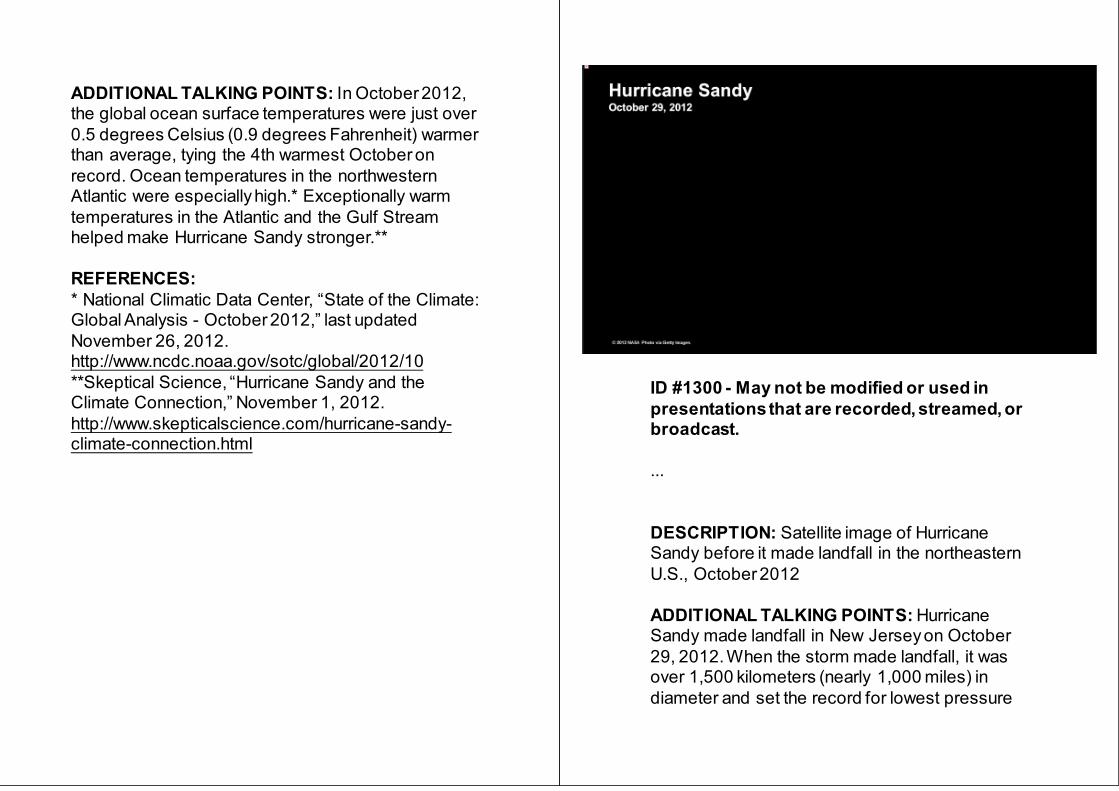
ID #1300 - May not be modified or used in presentations that are recorded, streamed, or broadcast.
...
DESCRIPTION: Satellite image of Hurricane Sandy before it made landfall in the northeastern U.S., October 2012
ADDITIONAL TALKING POINTS: Hurricane Sandy made landfall in New Jersey on October 29, 2012. When the storm made landfall, it was over 1,500 kilometers (nearly 1,000 miles) in diameter and set the record for lowest pressure
recorded north of North Carolina.*
REFERENCES: * Jeff Masters, “Sandy by the numbers: trying to comprehend a stunning disaster,” WunderBlog (blog), November 1, 2012. http://www.wunderground.com/blog/JeffMasters/comment.html?entrynum=2284
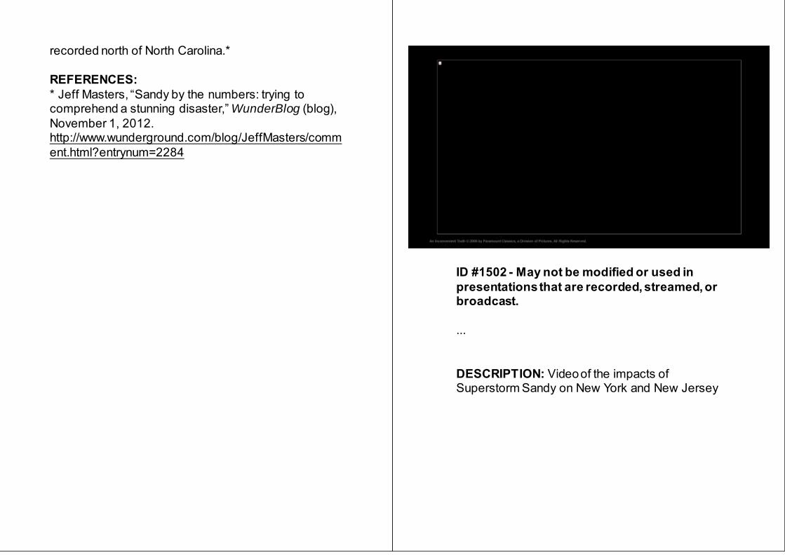
ID #1502 - May not be modified or used in presentations that are recorded, streamed, or broadcast.
...
DESCRIPTION: Video of the impacts of Superstorm Sandy on New York and New Jersey
ID #960 - Can be used in noncommercial online and TV broadcasts of your presentation, but not modified.
The warmer oceans not only feed more energy into ocean-based storms, they also cause the evaporation of more water vapor into the sky. This is not rain, this is water vapor.
DESCRIPTION: Visualization of the distribution of water vapor around the world during an average December and January
ADDITIONAL TALKING POINTS: As the world’s average temperature increases, the rate of
evaporation over oceans and evapotranspiration (loss of water from soil and plants) over land also increases.*
This animation is a representation of typical water vapor patterns seen in December and January. It is based on high-resolution satellite data. The pulsing pattern over some of the land surfaces is the movement of water vapor into the atmosphere and then back on to the land in the form of rain.**
REFERENCES:* Intergovernmental Panel on Climate Change, “Precipitation and Surface Water,” Contribution of Working Group I to the Fourth Assessment Report of the Intergovernmental Panel on Climate Change, 2007 (Cambridge: Cambridge University Press, 2007). http://www.ipcc.ch/publications_and_data/ar4/wg1/en/ch10s10-3-2-3.html ** Email from James Hack, Director, National Center for Computational Sciences, Oak Ridge National Laboratory, November 5, 2010.
ID #962 - Can be used in noncommercial online and TV broadcasts of your presentation, but not modified.
Warmer air holds a lot more moisture. If you take a hot shower the mirror will steam up but if you take a cold shower it will not. The reason is that warmer air holds more water vapor. With each additional one degree Celsius increase, the holding capacity of the atmosphere increases by 7 percent. In the last 30 years, the global atmosphere has 4 percent more water vapor.
DESCRIPTION: Text slide about the capacity of warm air to hold more water vapor
ADDITIONAL TALKING POINTS: Warm air can hold more water vapor than cold air.* If you have lived through more than a day or two of freezing weather, you have also experienced the effects of low humidity — chapped hands and lips, and lots of static electricity.**
As an approximate rule of thumb, the water-holding capacity of the atmosphere increases about 7 percent for every 1 degree Celsius (1.8 degree Fahrenheit) increase in temperature. (Note that these increases are somewhat lower over land, where water is less available.)*
Climate change has already increased the amount of water vapor in the atmosphere. Three sets of data show that on average, the global surface humidity has increased since 1970.***
REFERENCES:* K.E. Trenberth, “Changes in precipitation with climate change,” Climate Research 47 (March 31, 2011): 122-138. http://www.int-res.com/articles/cr_oa/c047p123.pdf ** Discovery Place, “Static Electricity in Winter,” January 8, 2010. http://www.discoveryplace.org/blog/post/32/Static-electricity-in-winter *** National Oceanic and Atmospheric Administration, “Climate Indicators,” last updated August 21, 2012.
http://www.ncdc.noaa.gov/bams-state-of-the-climate/2009-time-series/humidity
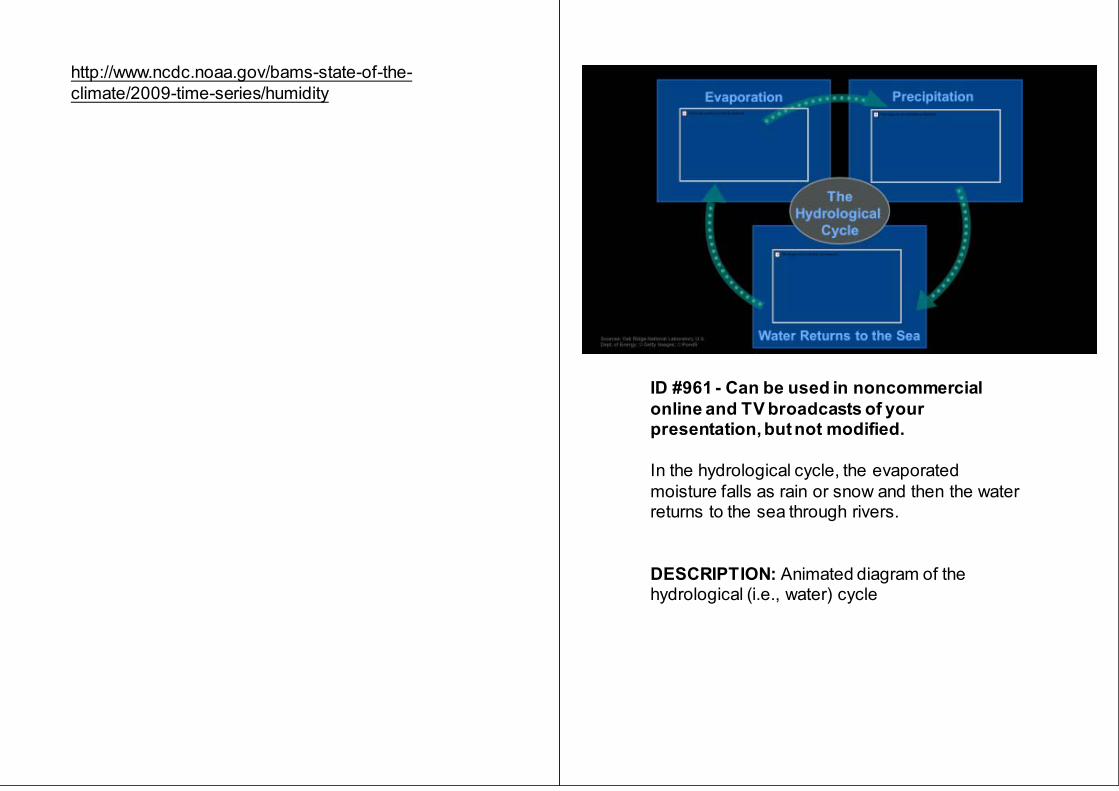
ID #961 - Can be used in noncommercial online and TV broadcasts of your presentation, but not modified.
In the hydrological cycle, the evaporated moisture falls as rain or snow and then the water returns to the sea through rivers.
DESCRIPTION: Animated diagram of the hydrological (i.e., water) cycle
ID #1144 - May not be modified or used in presentations that are recorded, streamed, or broadcast.
Dr. Hayhoe is a conservative, evangelical Republican from Texas.
DESCRIPTION: Video of scientist Dr. Katherine Hayhoe describing the influence of increased heat and humidity on storms
ID #341 - Can be used in noncommercial online and TV broadcasts of your presentation, but not modified.
These are the changes in global annual temperatures…
DESCRIPTION: Graph of change in annual global temperature, 1880-2009
ID #398 - Can be used in noncommercial online and TV broadcasts of your presentation, but not modified.
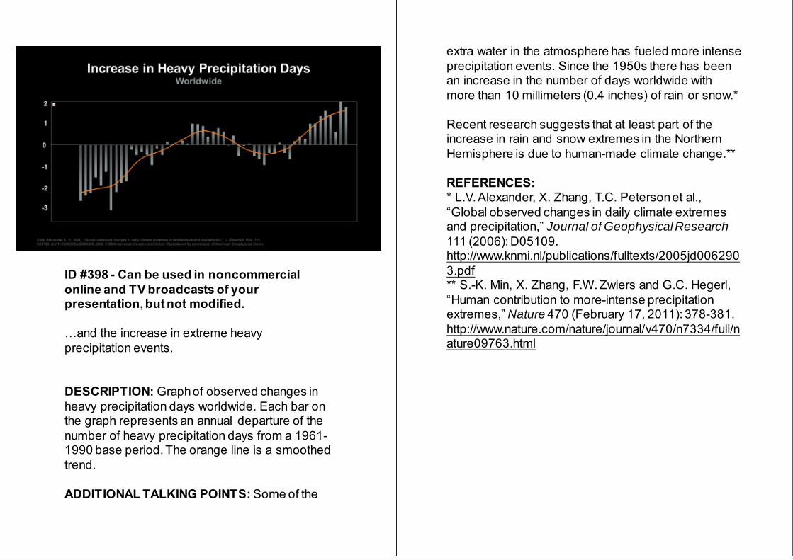
…and the increase in extreme heavy precipitation events.
DESCRIPTION: Graph of observed changes in heavy precipitation days worldwide. Each bar on the graph represents an annual departure of the number of heavy precipitation days from a 1961-1990 base period. The orange line is a smoothed trend.
ADDITIONAL TALKING POINTS: Some of the
extra water in the atmosphere has fueled more intense precipitation events. Since the 1950s there has been an increase in the number of days worldwide with more than 10 millimeters (0.4 inches) of rain or snow.*
Recent research suggests that at least part of the increase in rain and snow extremes in the Northern Hemisphere is due to human-made climate change.**
REFERENCES:* L.V. Alexander, X. Zhang, T.C. Peterson et al., “Global observed changes in daily climate extremes and precipitation,” Journal of Geophysical Research111 (2006): D05109. http://www.knmi.nl/publications/fulltexts/2005jd0062903.pdf ** S.-K. Min, X. Zhang, F.W. Zwiers and G.C. Hegerl, “Human contribution to more-intense precipitation extremes,” Nature 470 (February 17, 2011): 378-381. http://www.nature.com/nature/journal/v470/n7334/full/nature09763.html
ID #2012 - Can be used in noncommercial online and TV broadcasts of your presentation, but not modified.
So the rainstorms…
DESCRIPTION: Text slide introducing a series about heavy rainstorms
ID #1364 - May not be modified or used in presentations that are recorded, streamed, or broadcast.
This picture from Montana illustrates that water falling out of the sky does not just originate directly above where it falls. It is important to realize that when a storm releases a downpour, the raindrops that hit the ground do not originate from the part of the sky directly above where they fall. The storms reach out, often 1,300 miles (2,092 kilometers) and funnel the moisture towards where it falls. Think about a drain on a bathtub, versus a drain on a swimming pool. The more water you have piled up behind the drain, the more intense the storm can be.

DESCRIPTION: Photo of a supercell with a column of rain at its center, near Glasgow, Montana, July 2010
ADDITIONAL TALKING POINTS: Supercell thunderstorms can produce damaging wind, hail and, sometimes, tornadoes.* This supercell looked impressive, but thankfully caused only minor damage.**
There are not enough data to assess whether thunderstorms and tornadoes have gotten stronger or more frequent in recent decades in the U.S.*** Because these types of storms can be so damaging, however, scientists are intensely interested in learning more about how thunderstorms and tornadoes might change in a warming climate.****
REFERENCES:* National Weather Service, “Structure and Dynamics of Supercell Thunderstorms,” last updated August 31, 2012. http://www.crh.noaa.gov/lmk/soo/docu/supercell.php ** “Eye of the Storm: The Jaw-Dropping Image of an Enormous ‘Supercell’ Cloud,” Daily Mail, December 5, 2010. http://www.dailymail.co.uk/sciencetech/article-1334672/Jaw-dropping-image-enormous-supercell-cloud-Glasgow-Montana.html#ixzz177N0KRiT*** Jason Samenow, “Mostly Cloudy: Linking Climate Change to Severe Storms in the U.S.,” The
Washington Post, August 13, 2012. http://www.washingtonpost.com/blogs/capital-weather-gang/post/mostly-cloudy-linking-climate-change-to-severe-storms-in-the-us/2012/08/13/731c46e0-e558-11e1-936a-b801f1abab19_blog.html **** T. Karl et al., eds., Weather and Climate Extremes in a Changing Climate. Regions of Focus: North America, Hawaii, Caribbean, and U.S. Pacific Islands(U.S. Climate Change Science Program and the Subcommittee on Global Change Research, June 2008). http://downloads.climatescience.gov/sap/sap3-3/sap3-3-final-all.pdf
ID #1653 - May not be modified or used in presentations that are recorded, streamed, or broadcast.
You may have noticed that street became a river.
DESCRIPTION: Video showing sheets of rain as torrential downpours and gusty winds producing near zero visibility envelop the neighborhood
ID #2013 - Can be used in noncommercial online and TV broadcasts of your presentation, but not modified.
These giant downpours are causing bigger extreme weather events.
DESCRIPTION: Text slide about the increasing severity of downpours and floods
ID #1924 - May not be modified or used in presentations that are recorded, streamed, or broadcast.
One event in Pakistan…
DESCRIPTION: Photo of floodwaters in northwest Pakistan, August 2010
ADDITIONAL TALKING POINTS: In the summer of 2010, Pakistan suffered the worst flooding in its history due to heavy rain over just a few days in July and August.*
REFERENCES:
* J. Blunden, D.S. Arndt and M.O. Baringer, eds., “State of the climate in 2010,” Bulletin of the American Meteorological Society 92, no. 6 (June 2011): 218. http://www1.ncdc.noaa.gov/pub/data/cmb/bams-sotc/climate-assessment-2010-lo-rez.pdf
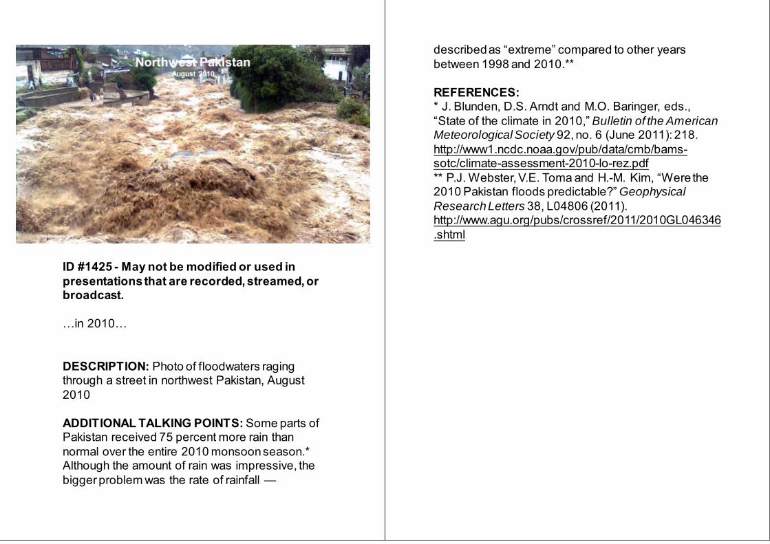
ID #1425 - May not be modified or used in presentations that are recorded, streamed, or broadcast.
…in 2010…
DESCRIPTION: Photo of floodwaters raging through a street in northwest Pakistan, August 2010
ADDITIONAL TALKING POINTS: Some parts of Pakistan received 75 percent more rain than normal over the entire 2010 monsoon season.* Although the amount of rain was impressive, the bigger problem was the rate of rainfall —
described as “extreme” compared to other years between 1998 and 2010.**
REFERENCES:* J. Blunden, D.S. Arndt and M.O. Baringer, eds., “State of the climate in 2010,” Bulletin of the American Meteorological Society 92, no. 6 (June 2011): 218. http://www1.ncdc.noaa.gov/pub/data/cmb/bams-sotc/climate-assessment-2010-lo-rez.pdf** P.J. Webster, V.E. Toma and H.-M. Kim, “Were the 2010 Pakistan floods predictable?” Geophysical Research Letters 38, L04806 (2011). http://www.agu.org/pubs/crossref/2011/2010GL046346.shtml
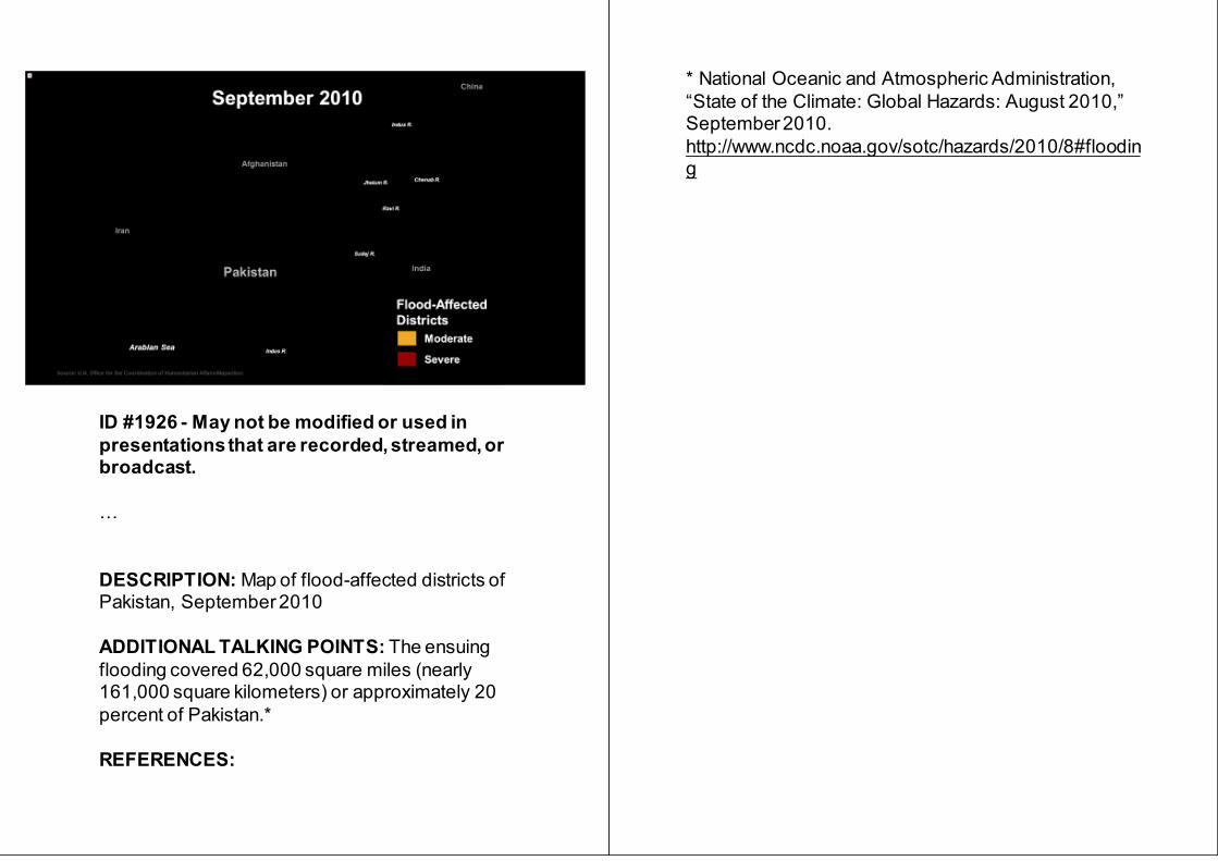
ID #1926 - May not be modified or used in presentations that are recorded, streamed, or broadcast.
…
DESCRIPTION: Map of flood-affected districts of Pakistan, September 2010
ADDITIONAL TALKING POINTS: The ensuing flooding covered 62,000 square miles (nearly 161,000 square kilometers) or approximately 20 percent of Pakistan.*
REFERENCES:
* National Oceanic and Atmospheric Administration, “State of the Climate: Global Hazards: August 2010,” September 2010. http://www.ncdc.noaa.gov/sotc/hazards/2010/8#flooding
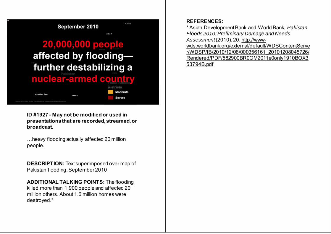
ID #1927 - May not be modified or used in presentations that are recorded, streamed, or broadcast.
…heavy flooding actually affected 20 million people.
DESCRIPTION: Text superimposed over map of Pakistan flooding, September 2010
ADDITIONAL TALKING POINTS: The flooding killed more than 1,900 people and affected 20 million others. About 1.6 million homes were destroyed.*
REFERENCES:* Asian Development Bank and World Bank, Pakistan Floods 2010: Preliminary Damage and Needs Assessment (2010): 20. http://www-wds.worldbank.org/external/default/WDSContentServer/WDSP/IB/2010/12/08/000356161_20101208045726/Rendered/PDF/582900BR0OM2011e0only1910BOX353794B.pdf

ID #423 - May not be modified or used in presentations that are recorded, streamed, or broadcast.
The human tragedy can be seen in the faces of those affected.
DESCRIPTION: Photo of flood victims evacuating their homes in Sukkur, Pakistan, August 2010
ADDITIONAL TALKING POINTS: The 2010 floods in Pakistan threatened an already limited supply of fresh drinking water. Following the floods, tens of thousands of Pakistanis were
treated for diseases such as malaria and dysentery.*
REFERENCES:* National Oceanic and Atmospheric Administration, “State of the Climate: Global Hazards: August 2010,” September 7, 2010. http://www.ncdc.noaa.gov/sotc/hazards/2010/8#flooding
ID #426 - May not be modified or used in presentations that are recorded, streamed, or broadcast.
…
DESCRIPTION: Photo of flood victims in Sukkur, Pakistan, evacuating their houses due to flooding, August 2010
ADDITIONAL TALKING POINTS: Much of Pakistan has seen an increase in both the total amount and intensity of rain over the last half century, and that trend is expected to continue as the world warms.*
REFERENCES:* Government of Pakistan Planning Commission, Final Report of the Task Force on Climate Change(February 2010): 10. http://www.pc.gov.pk/usefull%20links/Taskforces/TFCC%20Final%20Report.pdf
ID #424 - May not be modified or used in presentations that are recorded, streamed, or broadcast.
…
DESCRIPTION: Photo of a Pakistani villager leading his cattle through high floodwaters, August 2010
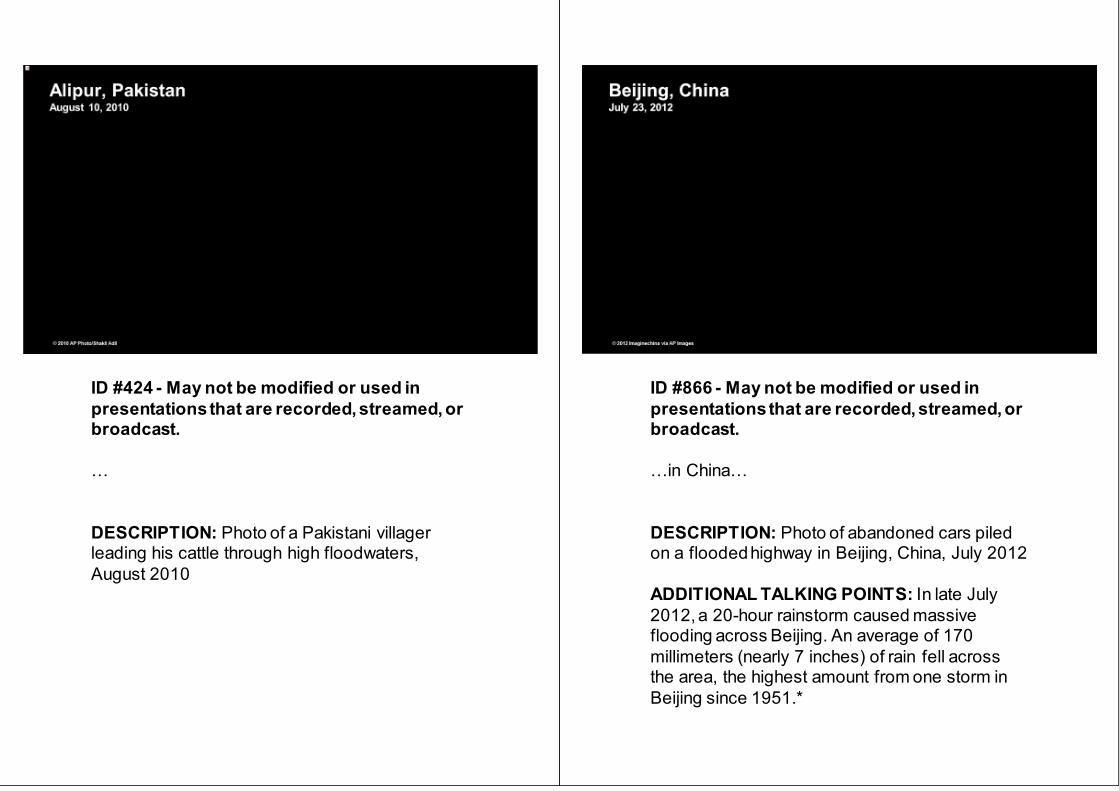
ID #866 - May not be modified or used in presentations that are recorded, streamed, or broadcast.
…in China…
DESCRIPTION: Photo of abandoned cars piled on a flooded highway in Beijing, China, July 2012
ADDITIONAL TALKING POINTS: In late July 2012, a 20-hour rainstorm caused massive flooding across Beijing. An average of 170 millimeters (nearly 7 inches) of rain fell across the area, the highest amount from one storm in Beijing since 1951.*
REFERENCES:* Hu Yongqi and Cui Jia, “Capital Flood Death Toll Hits 37,” China Daily, July 23, 2012. http://www.chinadaily.com.cn/cndy/2012-07/23/content_15606918.htm
ID #881 - May not be modified or used in presentations that are recorded, streamed, or broadcast.
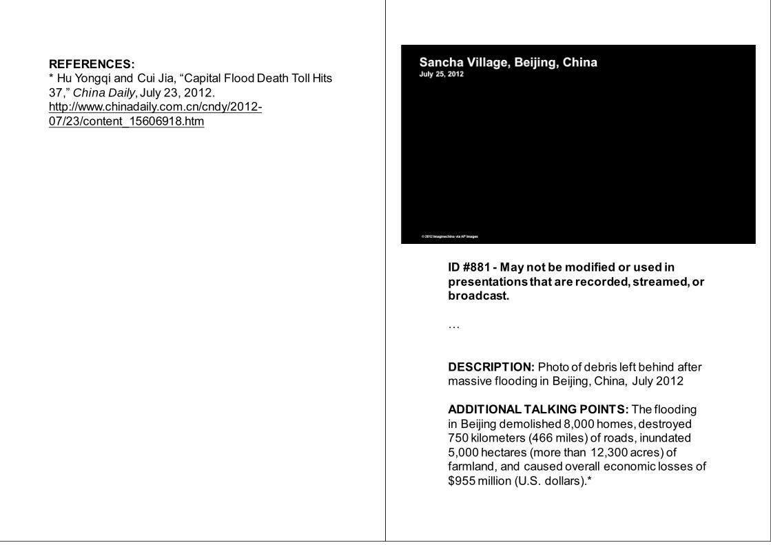
…
DESCRIPTION: Photo of debris left behind after massive flooding in Beijing, China, July 2012
ADDITIONAL TALKING POINTS: The flooding in Beijing demolished 8,000 homes, destroyed 750 kilometers (466 miles) of roads, inundated 5,000 hectares (more than 12,300 acres) of farmland, and caused overall economic losses of $955 million (U.S. dollars).*

REFERENCES:* Hilary Whiteman, “China Doubles Beijing Flood Death Toll,” CNN, July 26, 2012. http://articles.cnn.com/2012-07-26/asia/world_asia_china-beijing-flood_1_death-toll-flood-control-flood-risk
ID #878 - May not be modified or used in presentations that are recorded, streamed, or broadcast.
…
DESCRIPTION: Photo of an elderly lady being escorted through floodwaters, Chongqing, China, July 2012
ADDITIONAL TALKING POINTS: Torrential July rains in China caused the Yangtze River to overflow the Three Gorges Dam and inundate the city of Chongqing. Nearly 1.2 million people were forced to relocate.*

REFERENCES:* Angela Wang, “Yangtze River Floods Chongqing City,” Epoch Times, July 27, 2012. http://www.theepochtimes.com/n2/china-news/yangtze-river-floods-chongqing-city-270585.html
ID #1595 - May not be modified or used in presentations that are recorded, streamed, or broadcast.
…in China in 2013…
DESCRIPTION: Photo of a rescue effort during flooding in Chengdu, China, July 9, 2013
ADDITIONAL TALKING POINTS: In July 2013, floods throughout Western China swept away homes, bridges, and everything else in their path, leaving nearly 200 people dead or missing.*
The people of Chengdu were still recovering from

a 7.0 magnitude earthquake that had occurred a few months earlier, exacerbating the effects of the July floods. Flooding destroyed 3 bridges, stranded around 4,000 passengers at the airport, and in total affected over 16,000 people.**
REFERENCES:* “China Floods Kill At Least 31 People, 166 Missing In Sichuan Province, 220,000 Forced To Evacuate,” Huffington Post, July 2013. http://www.huffingtonpost.com/2013/07/11/china-floods-kill-31-sichuan_n_3579442.html** “Rainstorm triggers floods in China’s Sichuan Providence,“ UPI, July 2013. http://www.upi.com/Top_News/World-News/2013/07/09/Rainstorms-trigger-flooding-in-Chinas-Sichuan-Province/UPI-52091373380837/
ID #1596 - May not be modified or used in presentations that are recorded, streamed, or broadcast.
...
DESCRIPTION: Photo of floodwaters in Sichuan Province destroying a multistory building, July 9, 2013
ADDITIONAL TALKING POINTS: At the time, the July 2013 floods in Sichuan Province were the worst in 50 years, causing more than 220,000 people to evacuate. These floods also led to landslides, making conditions extremely

dangerous throughout the province.*
REFERENCES:* “China Floods Kill At Least 31 People, 166 Missing In Sichuan Province, 220,000 Forced To Evacuate,” Huffington Post, July 2013. http://www.huffingtonpost.com/2013/07/11/china-floods-kill-31-sichuan_n_3579442.html
ID #1597 - May not be modified or used in presentations that are recorded, streamed, or broadcast.
...
DESCRIPTION: Photo of a building being swept away by a landslide in Sichuan Province, July 11, 2013

ID #1598 - May not be modified or used in presentations that are recorded, streamed, or broadcast.
...
DESCRIPTION: Photo of residents in Meishan, Sichuan Province attempting to escape the floodwaters, July 10, 2013
ID #1599 - May not be modified or used in presentations that are recorded, streamed, or broadcast.
…this was 2013, in Sichuan. These rescues continued throughout the night…
DESCRIPTION: Video of a rescue operation in Sichuan Province, July 8, 2013

ID #1540 - May not be modified or used in presentations that are recorded, streamed, or broadcast.
…
DESCRIPTION: Photo of a woman being transported to safety, Uttarakhand State, India, June 2013
ADDITIONAL TALKING POINTS: Over 100,000 people were rescued after being stranded when floodwaters and landslides washed out bridges and roads across the state of Uttarakhand.*
REFERENCES:* Associated Press, “5,700 Presumed Dead in June Floods in India,” CBC News, July 16, 2013. http://www.cbc.ca/news/world/story/2013/07/16/india-flood-death-toll.html
ID #950 - May not be modified or used in presentations that are recorded, streamed, or broadcast.
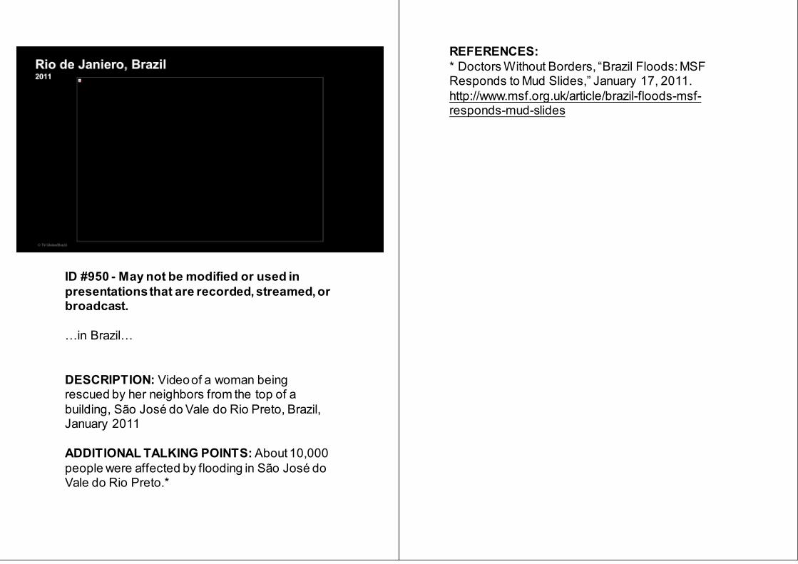
…in Brazil…
DESCRIPTION: Video of a woman being rescued by her neighbors from the top of a building, São José do Vale do Rio Preto, Brazil, January 2011
ADDITIONAL TALKING POINTS: About 10,000 people were affected by flooding in São José do Vale do Rio Preto.*
REFERENCES: * Doctors Without Borders, “Brazil Floods: MSF Responds to Mud Slides,” January 17, 2011. http://www.msf.org.uk/article/brazil-floods-msf-responds-mud-slides

ID #2030 - May not be modified or used in presentations that are recorded, streamed, or broadcast.
…
DESCRIPTION: Photo of people wading through floodwaters in Rio de Janeiro
ADDITIONAL TALKING POINTS: At least 32 were killed and thousands were displaced from their homes in what was described as the worst flooding in nearly 90 years in the state of Rio de Janeiro.*
REFERENCES: * “Floods leave 50,000 Brazilians homeless,” Aljazeera, December 26, 2013. http://www.aljazeera.com/news/americas/2013/12/floods-leave-50000-brazilians-homeless-20131225231242259425.html
ID #2114 - May not be modified or used in presentations that are recorded, streamed, or broadcast.
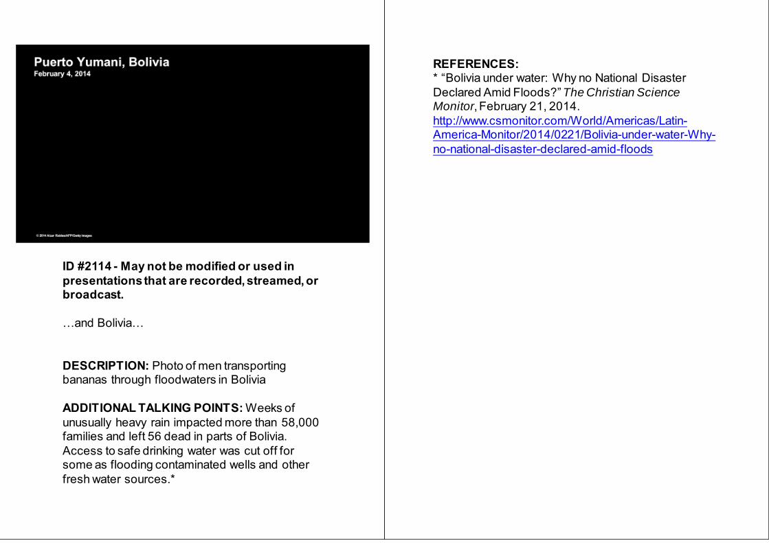
…and Bolivia…
DESCRIPTION: Photo of men transporting bananas through floodwaters in Bolivia
ADDITIONAL TALKING POINTS: Weeks of unusually heavy rain impacted more than 58,000 families and left 56 dead in parts of Bolivia. Access to safe drinking water was cut off for some as flooding contaminated wells and other fresh water sources.*
REFERENCES: * “Bolivia under water: Why no National Disaster Declared Amid Floods?” The Christian Science Monitor, February 21, 2014. http://www.csmonitor.com/World/Americas/Latin-America-Monitor/2014/0221/Bolivia-under-water-Why-no-national-disaster-declared-amid-floods
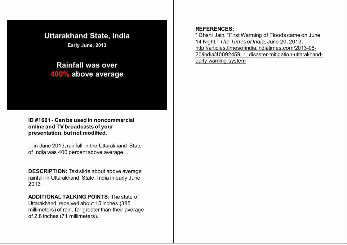
ID #1601 - Can be used in noncommercial online and TV broadcasts of your presentation, but not modified.
…in June 2013, rainfall in the Uttarakhand State of India was 400 percent above average…
DESCRIPTION: Text slide about above average rainfall in Uttarakhand State, India in early June 2013
ADDITIONAL TALKING POINTS: The state of Uttarakhand received about 15 inches (385 millimeters) of rain, far greater than their average of 2.8 inches (71 millimeters).
REFERENCES: * Bharti Jain, “First Warming of Floods came on June 14 Night,” The Times of India, June 20, 2013. http://articles.timesofindia.indiatimes.com/2013-06-20/india/40092459_1_disaster-mitigation-uttarakhand-early-warning-system
ID #1541 - May not be modified or used in presentations that are recorded, streamed, or broadcast.
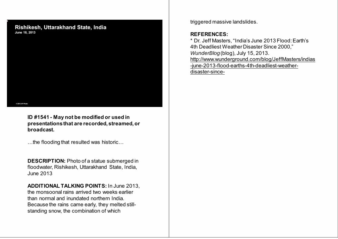
…the flooding that resulted was historic…
DESCRIPTION: Photo of a statue submerged in floodwater, Rishikesh, Uttarakhand State, India, June 2013
ADDITIONAL TALKING POINTS: In June 2013, the monsoonal rains arrived two weeks earlier than normal and inundated northern India. Because the rains came early, they melted still-standing snow, the combination of which
triggered massive landslides.
REFERENCES:* Dr. Jeff Masters, “India’s June 2013 Flood: Earth’s 4th Deadliest Weather Disaster Since 2000,” WunderBlog (blog), July 15, 2013. http://www.wunderground.com/blog/JeffMasters/indias-june-2013-flood-earths-4th-deadliest-weather-disaster-since-
ID #1536 - May not be modified or used in presentations that are recorded, streamed, or broadcast.
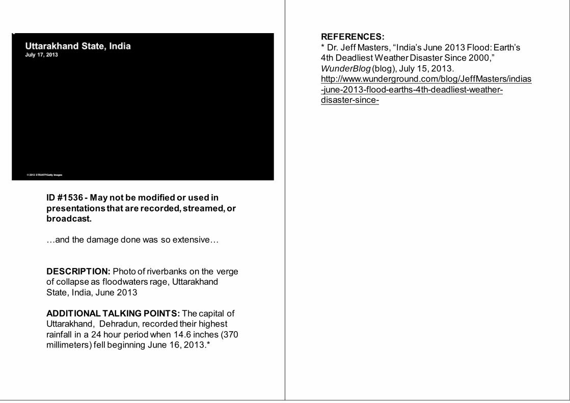
…and the damage done was so extensive…
DESCRIPTION: Photo of riverbanks on the verge of collapse as floodwaters rage, Uttarakhand State, India, June 2013
ADDITIONAL TALKING POINTS: The capital of Uttarakhand, Dehradun, recorded their highest rainfall in a 24 hour period when 14.6 inches (370 millimeters) fell beginning June 16, 2013.*
REFERENCES:* Dr. Jeff Masters, “India’s June 2013 Flood: Earth’s 4th Deadliest Weather Disaster Since 2000,” WunderBlog (blog), July 15, 2013. http://www.wunderground.com/blog/JeffMasters/indias-june-2013-flood-earths-4th-deadliest-weather-disaster-since-

ID #1632 - May not be modified or used in presentations that are recorded, streamed, or broadcast.
…
DESCRIPTION: Photo of the flood-ravaged town of Kedarnath, northern India, June 2013
ADDITIONAL TALKING POINTS: The Kedarnath Temple is a sacred site and the destination for one of the most significant Hindu pilgrimages which takes place every June.* Tourists and pilgrims accounted for a large number of the casualties in this hard-hit area.**
REFERENCES:* Dr. Jeff Masters, “India’s June 2013 Flood: Earth’s 4th Deadliest Weather Disaster Since 2000,” WunderBlog (blog), July 15, 2013. http://www.wunderground.com/blog/JeffMasters/indias-june-2013-flood-earths-4th-deadliest-weather-disaster-since-** “India Floods: Bad Weather Delays Rescue and Mass Cremations,” BBC News India, June 25, 2013. http://www.bbc.co.uk/news/world-asia-india-23042438

ID #1633 - May not be modified or used in presentations that are recorded, streamed, or broadcast.
…
DESCRIPTION: Photo of housing buildings submerged in floodwaters, Uttarakhand State, India, June 2013
ID #1544 - May not be modified or used in presentations that are recorded, streamed, or broadcast.
…
DESCRIPTION: Photo of buildings damaged from floods and landslides, Uttarakhand State, India, June 2013

ID #1542 - May not be modified or used in presentations that are recorded, streamed, or broadcast.
…in New Delhi…
DESCRIPTION: Photo of the flooded Yamuna River, New Delhi, India, June 2013
ADDITIONAL TALKING POINTS: The Yamuna River set a new record level of 680 feet (207.2 meters) on June 19th, 2013, just barely crossing the previous record. The river overflowed its banks and flooded low-lying parts of New Delhi.*
REFERENCES:* “Delhi: Yamuna Water Level Rises over 207 meters, Breaks 2010 Record,” CNN-IBN, June 20, 2013. http://ibnlive.in.com/news/delhi-yamuna-water-level-rises-over-207-meters-breaks-2010-record/400178-3-244.html
ID #1543 - May not be modified or used in presentations that are recorded, streamed, or broadcast.
…
DESCRIPTION: Photo of residents boating down an alleyway, New Delhi, India, June 2013
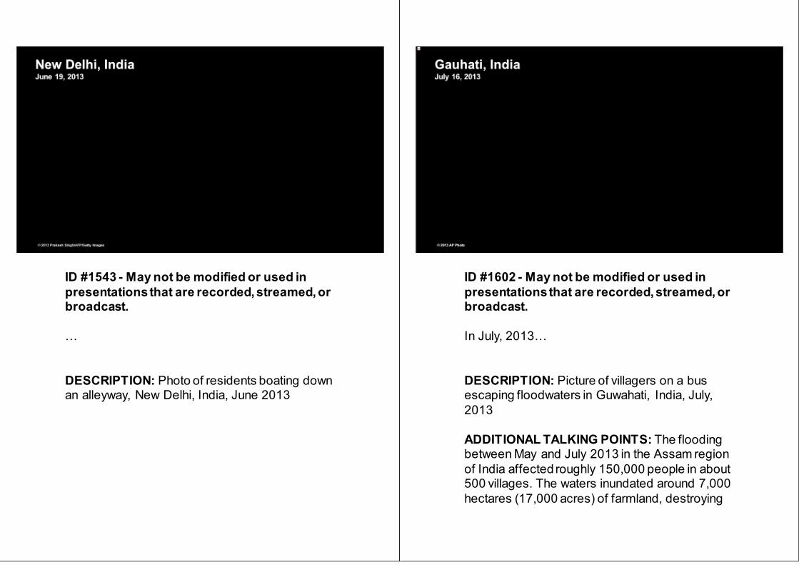
ID #1602 - May not be modified or used in presentations that are recorded, streamed, or broadcast.
In July, 2013…
DESCRIPTION: Picture of villagers on a bus escaping floodwaters in Guwahati, India, July, 2013
ADDITIONAL TALKING POINTS: The flooding between May and July 2013 in the Assam region of India affected roughly 150,000 people in about 500 villages. The waters inundated around 7,000 hectares (17,000 acres) of farmland, destroying
standing crops like rice.*
REFERENCES:* “Assam Flood Situation Improves, 59 Villages Still Under Water,” The Times of India, July 15, 2013. http://timesofindia.indiatimes.com/india/Assam-flood-situation-improves-59-villages-still-under-water/articleshow/21087867.cms
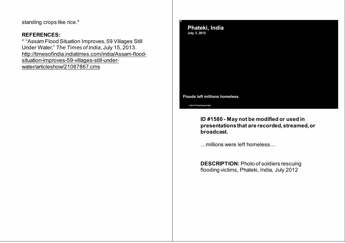
ID #1580 - May not be modified or used in presentations that are recorded, streamed, or broadcast.
…millions were left homeless…
DESCRIPTION: Photo of soldiers rescuing flooding victims, Phateki, India, July 2012
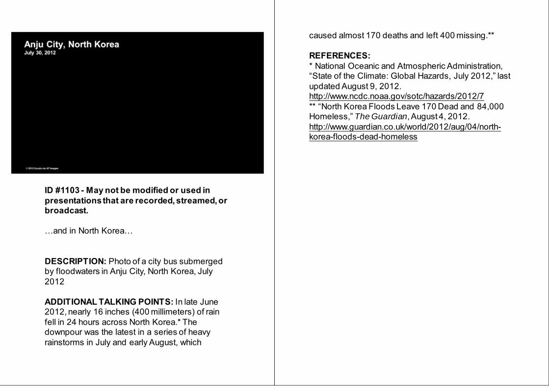
ID #1103 - May not be modified or used in presentations that are recorded, streamed, or broadcast.
…and in North Korea…
DESCRIPTION: Photo of a city bus submerged by floodwaters in Anju City, North Korea, July 2012
ADDITIONAL TALKING POINTS: In late June 2012, nearly 16 inches (400 millimeters) of rain fell in 24 hours across North Korea.* The downpour was the latest in a series of heavy rainstorms in July and early August, which
caused almost 170 deaths and left 400 missing.**
REFERENCES: * National Oceanic and Atmospheric Administration, “State of the Climate: Global Hazards, July 2012,” last updated August 9, 2012. http://www.ncdc.noaa.gov/sotc/hazards/2012/7 ** “North Korea Floods Leave 170 Dead and 84,000 Homeless,” The Guardian, August 4, 2012. http://www.guardian.co.uk/world/2012/aug/04/north-korea-floods-dead-homeless
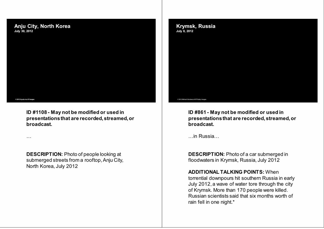
ID #1108 - May not be modified or used in presentations that are recorded, streamed, or broadcast.
…
DESCRIPTION: Photo of people looking at submerged streets from a rooftop, Anju City, North Korea, July 2012
ID #861 - May not be modified or used in presentations that are recorded, streamed, or broadcast.
…in Russia…
DESCRIPTION: Photo of a car submerged in floodwaters in Krymsk, Russia, July 2012
ADDITIONAL TALKING POINTS: When torrential downpours hit southern Russia in early July 2012, a wave of water tore through the city of Krymsk. More than 170 people were killed. Russian scientists said that six months worth of rain fell in one night.*
REFERENCES:* Ellen Barry, “After Russian Floods, Grief, Rage and Deep Mistrust,” New York Times, July 10, 2012. http://www.nytimes.com/2012/07/11/world/europe/after-russian-floods-grief-rage-and-deep-mistrust.html?_r=1&pagewanted=all
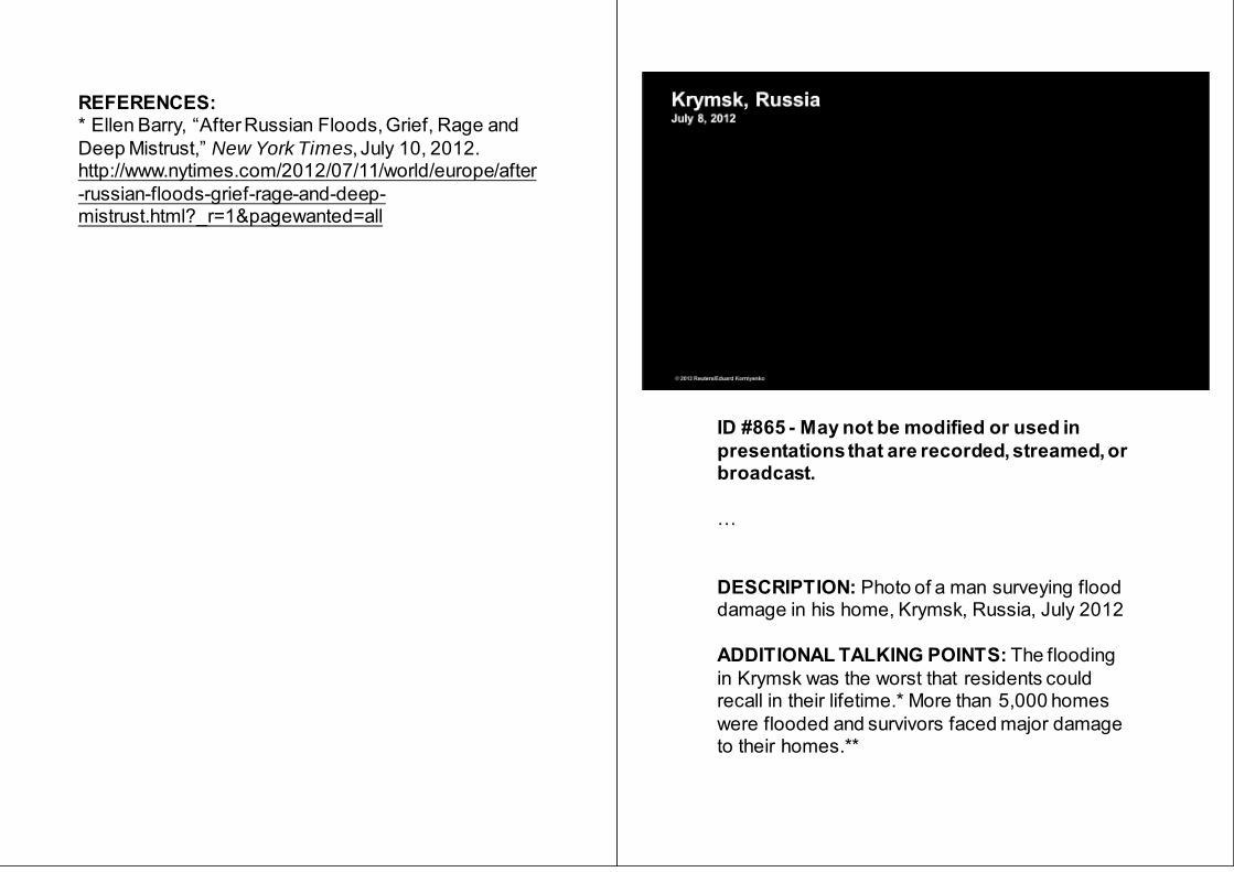
ID #865 - May not be modified or used in presentations that are recorded, streamed, or broadcast.
…
DESCRIPTION: Photo of a man surveying flood damage in his home, Krymsk, Russia, July 2012
ADDITIONAL TALKING POINTS: The flooding in Krymsk was the worst that residents could recall in their lifetime.* More than 5,000 homes were flooded and survivors faced major damage to their homes.**
REFERENCES:* Miriam Elder, “Russian Floods Kill 150 and Leave Thousands Homeless,” The Guardian, July 8, 2012. http://www.guardian.co.uk/world/2012/jul/08/russia-floods-deaths ** “Mourning, Search for Answers as Russian Flooding Death Toll Climbs to 171,” CNN, July 9, 2012. http://www.cnn.com/2012/07/08/world/europe/russia-floods/index.html
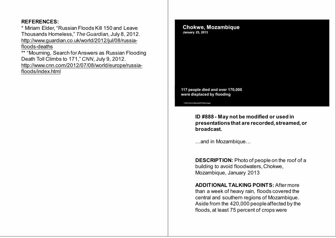
ID #888 - May not be modified or used in presentations that are recorded, streamed, or broadcast.
…and in Mozambique…
DESCRIPTION: Photo of people on the roof of a building to avoid floodwaters, Chokwe, Mozambique, January 2013
ADDITIONAL TALKING POINTS: After more than a week of heavy rain, floods covered the central and southern regions of Mozambique. Aside from the 420,000 people affected by the floods, at least 75 percent of crops were
destroyed and threat of diseases such as cholera and malaria increased.*
REFERENCES:* United Nations Humanitarian Country Team, Mozambique Floods 2013, Consolidated Early Recovery Strategy (April 2013). http://reliefweb.int/sites/reliefweb.int/files/resources/MOZ-Consolidated%20Early%20Recovery%20Strategy-Final-20130404.pdf
ID #1937 - May not be modified or used in presentations that are recorded, streamed, or broadcast.
…Sudan…
DESCRIPTION: Aerial photo showing the extent of flood waters in Khartoum, Sudan, August 2013
ADDITIONAL TALKING POINTS: Flooding impacted over half a million people and led to the damage or destruction of nearly 75,000 homes in parts of Sudan. Khartoum was hardest hit with nearly a quarter million people impacted in some way.* Initial estimates are that at least 48 died in
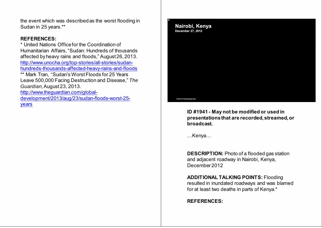
the event which was described as the worst flooding in Sudan in 25 years.**
REFERENCES:* United Nations Office for the Coordination of Humanitarian Affairs, “Sudan: Hundreds of thousands affected by heavy rains and floods,” August 26, 2013. http://www.unocha.org/top-stories/all-stories/sudan-hundreds-thousands-affected-heavy-rains-and-floods** Mark Tran, “Sudan’s Worst Floods for 25 Years Leave 500,000 Facing Destruction and Disease,” The Guardian, August 23, 2013. http://www.theguardian.com/global-development/2013/aug/23/sudan-floods-worst-25-years
ID #1941 - May not be modified or used in presentations that are recorded, streamed, or broadcast.
…Kenya…
DESCRIPTION: Photo of a flooded gas station and adjacent roadway in Nairobi, Kenya, December 2012
ADDITIONAL TALKING POINTS: Flooding resulted in inundated roadways and was blamed for at least two deaths in parts of Kenya.*
REFERENCES:

* “Nairobi flood kills 2,” Sabahi, December 27, 2012. http://sabahionline.com/en_GB/articles/hoa/articles/newsbriefs/2012/12/27/newsbrief-09
ID #1942 - May not be modified or used in presentations that are recorded, streamed, or broadcast.
…
DESCRIPTION: Photo showing flooded roadways in Nairobi, Kenya, April 2012
ADDITIONAL TALKING POINTS: Heavy rainfall in Kenya produced flash flooding. Seven were killed when their church group was struck by flooding in Hells Gate National Park in Naivasha, outside of Nairobi.*
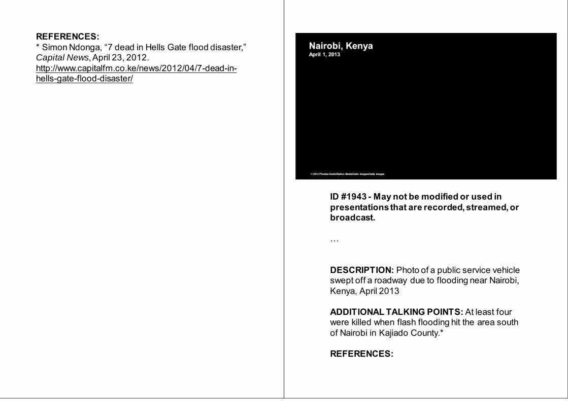
REFERENCES: * Simon Ndonga, “7 dead in Hells Gate flood disaster,” Capital News, April 23, 2012. http://www.capitalfm.co.ke/news/2012/04/7-dead-in-hells-gate-flood-disaster/
ID #1943 - May not be modified or used in presentations that are recorded, streamed, or broadcast.
…
DESCRIPTION: Photo of a public service vehicle swept off a roadway due to flooding near Nairobi, Kenya, April 2013
ADDITIONAL TALKING POINTS: At least four were killed when flash flooding hit the area south of Nairobi in Kajiado County.*
REFERENCES:
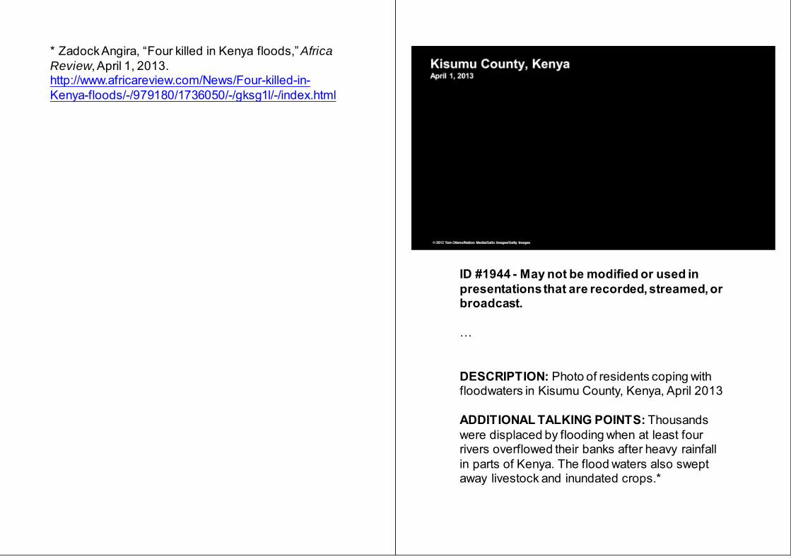
* Zadock Angira, “Four killed in Kenya floods,” Africa Review, April 1, 2013. http://www.africareview.com/News/Four-killed-in-Kenya-floods/-/979180/1736050/-/gksg1l/-/index.html
ID #1944 - May not be modified or used in presentations that are recorded, streamed, or broadcast.
…
DESCRIPTION: Photo of residents coping with floodwaters in Kisumu County, Kenya, April 2013
ADDITIONAL TALKING POINTS: Thousands were displaced by flooding when at least four rivers overflowed their banks after heavy rainfall in parts of Kenya. The flood waters also swept away livestock and inundated crops.*
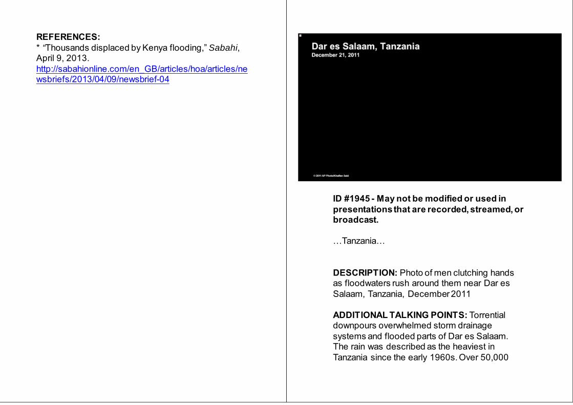
REFERENCES: * “Thousands displaced by Kenya flooding,” Sabahi, April 9, 2013. http://sabahionline.com/en_GB/articles/hoa/articles/newsbriefs/2013/04/09/newsbrief-04
ID #1945 - May not be modified or used in presentations that are recorded, streamed, or broadcast.
…Tanzania…
DESCRIPTION: Photo of men clutching hands as floodwaters rush around them near Dar es Salaam, Tanzania, December 2011
ADDITIONAL TALKING POINTS: Torrential downpours overwhelmed storm drainage systems and flooded parts of Dar es Salaam. The rain was described as the heaviest in Tanzania since the early 1960s. Over 50,000

people were impacted by the flooding. At least 200 were injured and 40 were killed.*
REFERENCES: * Relief Web, “Tanzania: Floods and Landslides - Dec 2011,” last accessed April 8, 2014. http://reliefweb.int/disaster/fl-2011-000183-tza
ID #1946 - May not be modified or used in presentations that are recorded, streamed, or broadcast.
…Mali…
DESCRIPTION: Photo of rushing floodwaters sweeping away anything in their path including vehicles near Bamako, Mali, August 2013
ADDITIONAL TALKING POINTS: Flooding washed away homes in several neighborhoods in Bamako. At least 24 people died as a result of the floods.*
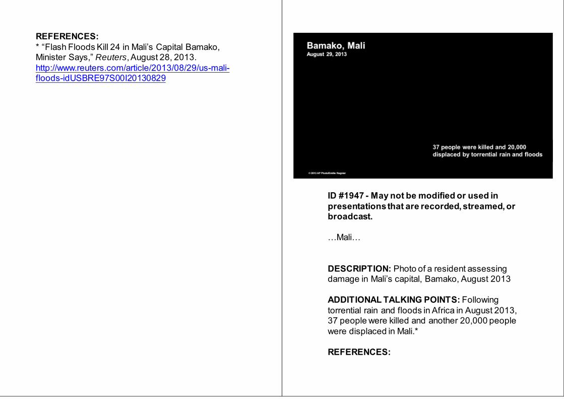
REFERENCES: * “Flash Floods Kill 24 in Mali’s Capital Bamako, Minister Says,” Reuters, August 28, 2013. http://www.reuters.com/article/2013/08/29/us-mali-floods-idUSBRE97S00I20130829
ID #1947 - May not be modified or used in presentations that are recorded, streamed, or broadcast.
…Mali…
DESCRIPTION: Photo of a resident assessing damage in Mali’s capital, Bamako, August 2013
ADDITIONAL TALKING POINTS: Following torrential rain and floods in Africa in August 2013, 37 people were killed and another 20,000 people were displaced in Mali.*
REFERENCES:
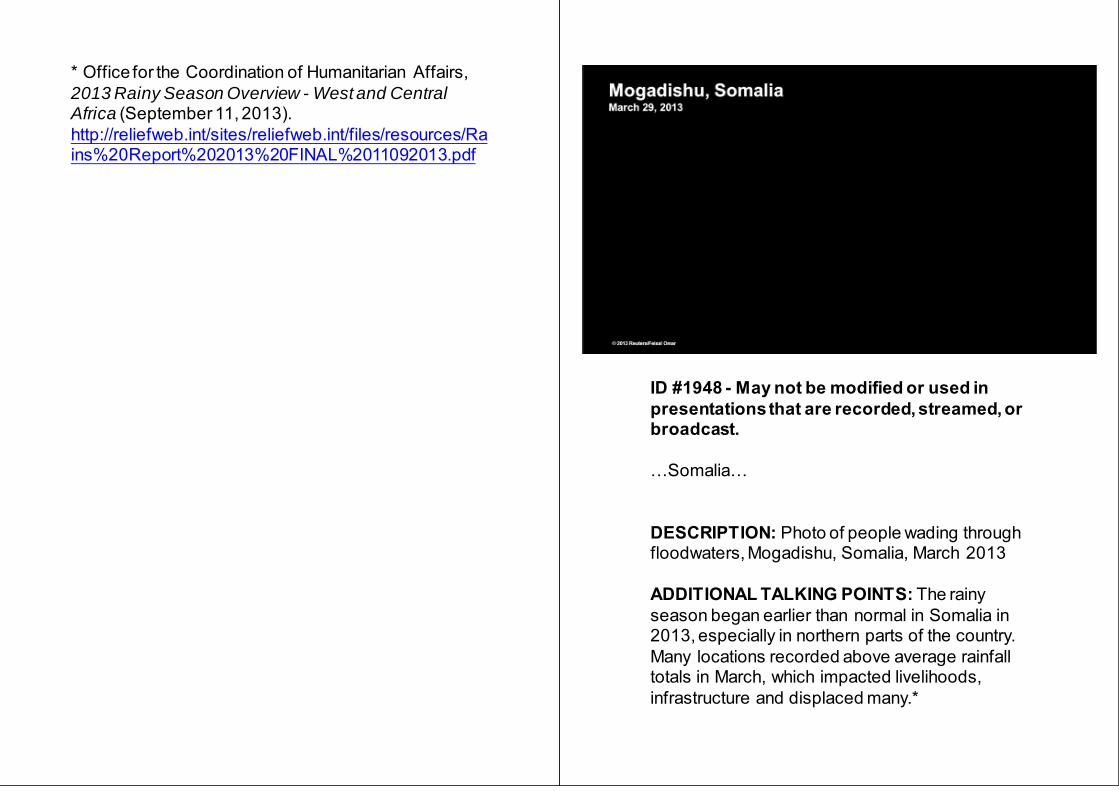
* Office for the Coordination of Humanitarian Affairs, 2013 Rainy Season Overview - West and Central Africa (September 11, 2013). http://reliefweb.int/sites/reliefweb.int/files/resources/Rains%20Report%202013%20FINAL%2011092013.pdf
ID #1948 - May not be modified or used in presentations that are recorded, streamed, or broadcast.
…Somalia…
DESCRIPTION: Photo of people wading through floodwaters, Mogadishu, Somalia, March 2013
ADDITIONAL TALKING POINTS: The rainy season began earlier than normal in Somalia in 2013, especially in northern parts of the country. Many locations recorded above average rainfall totals in March, which impacted livelihoods, infrastructure and displaced many.*
REFERENCES: * ReliefWeb, Climate Update: March (April 2013). http://reliefweb.int/sites/reliefweb.int/files/resources/Climate-Update-March-2013.pdf
ID #1951 - May not be modified or used in presentations that are recorded, streamed, or broadcast.
…Niger…
DESCRIPTION: Photo of residents evacuating after floods with their belongings, Niamey, Niger, August 2012
ADDITIONAL TALKING POINTS: 65 people died and 125,000 were left homeless as a result of flooding in Niger.
REFERENCES:
* BBC News, “Niger Floods Cause Widespread Devastation,” August 26, 2012. http://www.bbc.com/news/world-africa-19384377
ID #1952 - May not be modified or used in presentations that are recorded, streamed, or broadcast.
…Nigeria…
DESCRIPTION: Photo of a car being washed away by floodwaters, Patani, Nigeria, October 2012
ADDITIONAL TALKING POINTS: Heavy rain between July and November 2012 led to the worst flooding in Nigeria in 50 years.
REFERENCES:

* BBC, “Nigeria Floods Displace Two Million, Kill 363,” November 6, 2012. http://www.bbc.com/news/world-africa-20221451
ID #1953 - May not be modified or used in presentations that are recorded, streamed, or broadcast.
…
DESCRIPTION: Photo of residents wading through a flooded street in Amassoma, Nigeria, October 2012
ID #1658 - May not be modified or used in presentations that are recorded, streamed, or broadcast.
…Mexico…
DESCRIPTION: Photo of a man wading through floodwaters, Acapulco, Mexico, September 2013
ADDITIONAL TALKING POINTS: Two tropical storms converged in Mexico in 2013, leading to the worst flooding in decades and killing at least 55 people.
In Acapulco, roads were buried under 13
landslides, 23,000 homes lost power and 40,000 tourists were stranded by closed airports.*
REFERENCES: * “Mexico Floods Leave Thousands Trapped in Acapulco,” The Guardian, September 18, 2013. http://www.theguardian.com/world/2013/sep/18/mexico-floods-tourists-acapulco-trapped
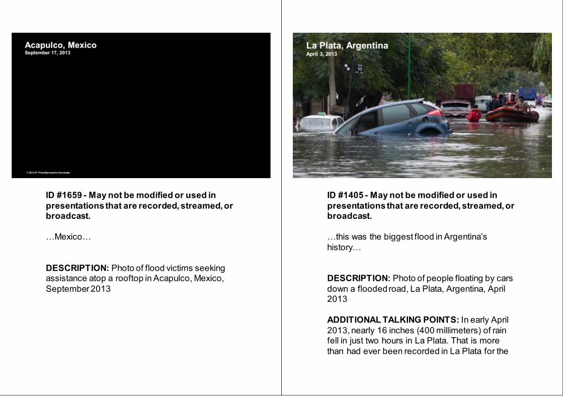
ID #1659 - May not be modified or used in presentations that are recorded, streamed, or broadcast.
…Mexico…
DESCRIPTION: Photo of flood victims seeking assistance atop a rooftop in Acapulco, Mexico, September 2013
ID #1405 - May not be modified or used in presentations that are recorded, streamed, or broadcast.
…this was the biggest flood in Argentina’s history…
DESCRIPTION: Photo of people floating by cars down a flooded road, La Plata, Argentina, April 2013
ADDITIONAL TALKING POINTS: In early April 2013, nearly 16 inches (400 millimeters) of rain fell in just two hours in La Plata. That is more than had ever been recorded in La Plata for the

entire month of April.*
REFERENCES: * Jeff Masters, “April 2013: Earth’s 13th warmest April; 92E a threat to Mexico and Guatemala,” WunderBlog(blog), May 27, 2013. http://www.wunderground.com/blog/JeffMasters/article.html?entrynum=2417
ID #1447 - May not be modified or used in presentations that are recorded, streamed, or broadcast.
…Athens...
DESCRIPTION: Photo of a woman trying to escape floodwaters, Athens, Greece, February 2013
ADDITIONAL TALKING POINTS: In Athens, almost 2.3 inches (60 millimeters) of rain fell in just a few hours, more than the average for the entire month of February.* Meteorologists called this the heaviest rainfall in 50 to 60 years.**
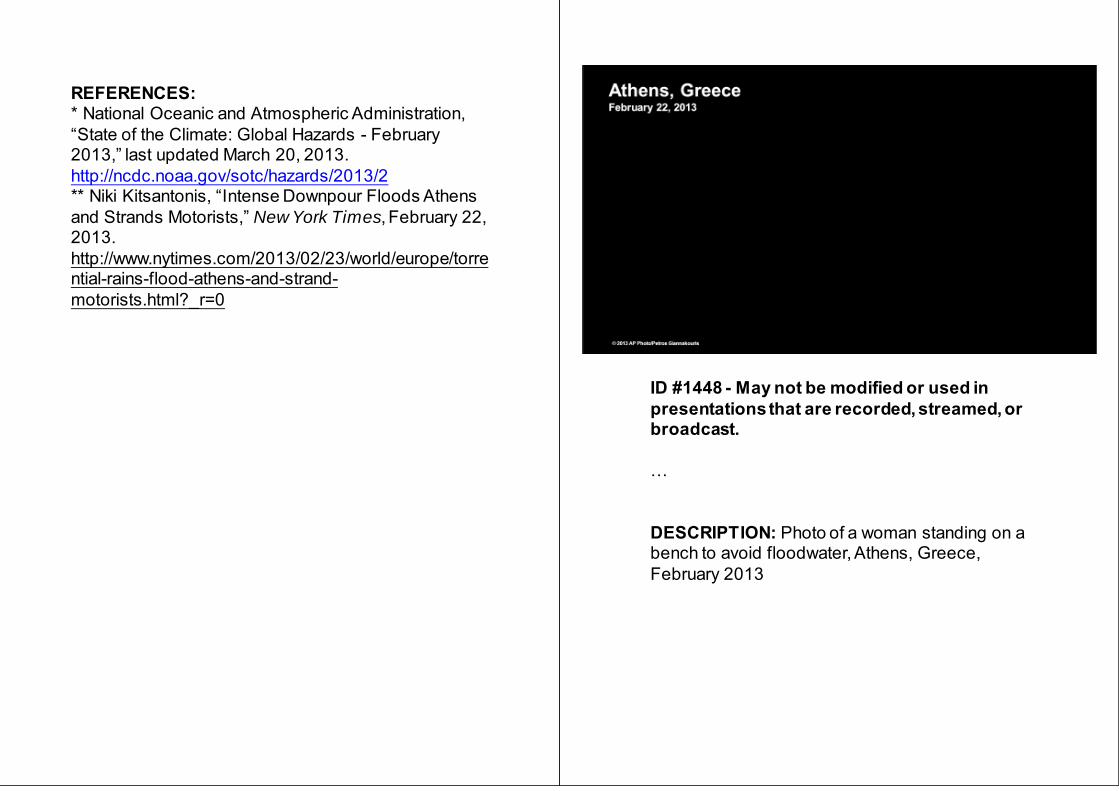
REFERENCES:* National Oceanic and Atmospheric Administration, “State of the Climate: Global Hazards - February 2013,” last updated March 20, 2013. http://ncdc.noaa.gov/sotc/hazards/2013/2** Niki Kitsantonis, “Intense Downpour Floods Athens and Strands Motorists,” New York Times, February 22, 2013. http://www.nytimes.com/2013/02/23/world/europe/torrential-rains-flood-athens-and-strand-motorists.html?_r=0
ID #1448 - May not be modified or used in presentations that are recorded, streamed, or broadcast.
…
DESCRIPTION: Photo of a woman standing on a bench to avoid floodwater, Athens, Greece, February 2013
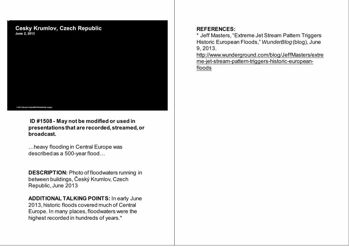
ID #1508 - May not be modified or used in presentations that are recorded, streamed, or broadcast.
…heavy flooding in Central Europe was described as a 500-year flood…
DESCRIPTION: Photo of floodwaters running in between buildings, Český Krumlov, Czech Republic, June 2013
ADDITIONAL TALKING POINTS: In early June 2013, historic floods covered much of Central Europe. In many places, floodwaters were the highest recorded in hundreds of years.*
REFERENCES: * Jeff Masters, “Extreme Jet Stream Pattern Triggers Historic European Floods,” WunderBlog (blog), June 9, 2013. http://www.wunderground.com/blog/JeffMasters/extreme-jet-stream-pattern-triggers-historic-european-floods
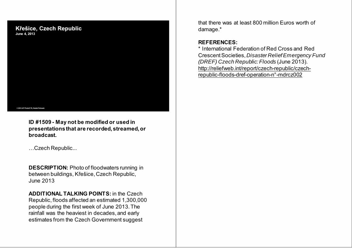
ID #1509 - May not be modified or used in presentations that are recorded, streamed, or broadcast.
…Czech Republic...
DESCRIPTION: Photo of floodwaters running in between buildings, Křešice, Czech Republic, June 2013
ADDITIONAL TALKING POINTS: in the Czech Republic, floods affected an estimated 1,300,000 people during the first week of June 2013. The rainfall was the heaviest in decades, and early estimates from the Czech Government suggest
that there was at least 800 million Euros worth of damage.*
REFERENCES: * International Federation of Red Cross and Red Crescent Societies, Disaster Relief Emergency Fund (DREF) Czech Republic: Floods (June 2013). http://reliefweb.int/report/czech-republic/czech-republic-floods-dref-operation-n°-mdrcz002

ID #1510 - May not be modified or used in presentations that are recorded, streamed, or broadcast.
…Germany...
DESCRIPTION: Photo of people kayaking through the doorway of a flooded building, Wehlen, Germany, June 2013
ADDITIONAL TALKING POINTS: On June 6, 2013, the Elbe River – which flows right by Wehlen – reached a height of nearly 29 feet (8.8 meters), much higher than the normal 6.5 feet (2 meters).*
REFERENCES: * NASA Earth Observatory, “Flooding in Eastern Germany,” last accessed April 2014. http://earthobservatory.nasa.gov/NaturalHazards/view.php?id=81287
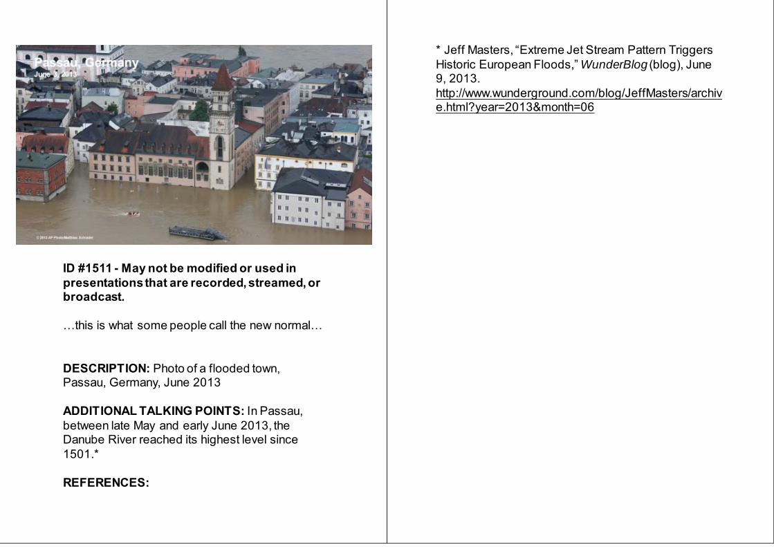
ID #1511 - May not be modified or used in presentations that are recorded, streamed, or broadcast.
…this is what some people call the new normal…
DESCRIPTION: Photo of a flooded town, Passau, Germany, June 2013
ADDITIONAL TALKING POINTS: In Passau, between late May and early June 2013, the Danube River reached its highest level since 1501.*
REFERENCES:
* Jeff Masters, “Extreme Jet Stream Pattern Triggers Historic European Floods,” WunderBlog (blog), June 9, 2013. http://www.wunderground.com/blog/JeffMasters/archive.html?year=2013&month=06
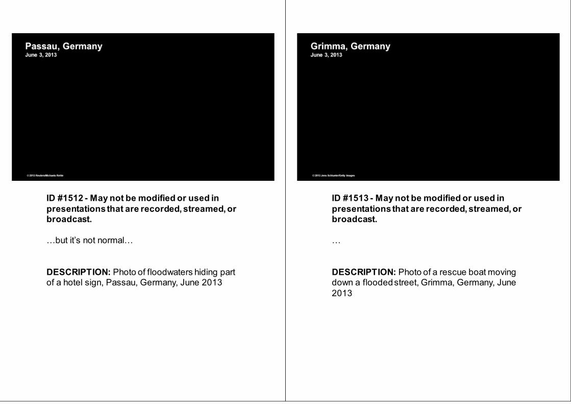
ID #1512 - May not be modified or used in presentations that are recorded, streamed, or broadcast.
…but it’s not normal…
DESCRIPTION: Photo of floodwaters hiding part of a hotel sign, Passau, Germany, June 2013
ID #1513 - May not be modified or used in presentations that are recorded, streamed, or broadcast.
…
DESCRIPTION: Photo of a rescue boat moving down a flooded street, Grimma, Germany, June 2013

ID #1514 - May not be modified or used in presentations that are recorded, streamed, or broadcast.
…
DESCRIPTION: Photo of rooftops of flooded buildings from above, Deggendorf, Germany, June 2013
ADDITIONAL TALKING POINTS: In Deggendorf, helicopters had to carry people from rooftops to safety.*
REFERENCES:
* “Rescuers Winch Families to Safety in German Flood Town,” BBC News, June 5, 2013. http://www.bbc.co.uk/news/world-europe-22779749

ID #1516 - May not be modified or used in presentations that are recorded, streamed, or broadcast.
…
DESCRIPTION: Photo of rescue workers dragging a boat through debris and floodwater, Deggendorf, Germany, June 2013
ID #1517 - May not be modified or used in presentations that are recorded, streamed, or broadcast.
…
DESCRIPTION: Photo of a flooded town and the surrounding fields, Deggendorf Germany, June 2013
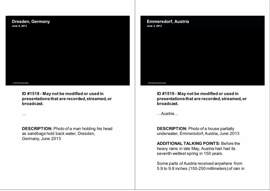
ID #1518 - May not be modified or used in presentations that are recorded, streamed, or broadcast.
…
DESCRIPTION: Photo of a man holding his head as sandbags hold back water, Dresden, Germany, June 2013
ID #1519 - May not be modified or used in presentations that are recorded, streamed, or broadcast.
…Austria…
DESCRIPTION: Photo of a house partially underwater, Emmersdorf, Austria, June 2013
ADDITIONAL TALKING POINTS: Before the heavy rains in late May, Austria had had its seventh wettest spring in 150 years.
Some parts of Austria received anywhere from 5.9 to 9.8 inches (150-250 millimeters) of rain in
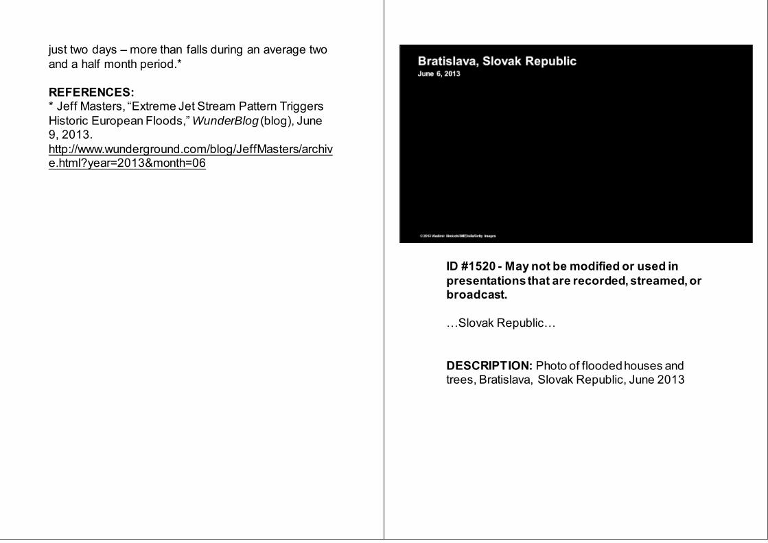
just two days – more than falls during an average two and a half month period.*
REFERENCES: * Jeff Masters, “Extreme Jet Stream Pattern Triggers Historic European Floods,” WunderBlog (blog), June 9, 2013. http://www.wunderground.com/blog/JeffMasters/archive.html?year=2013&month=06
ID #1520 - May not be modified or used in presentations that are recorded, streamed, or broadcast.
…Slovak Republic…
DESCRIPTION: Photo of flooded houses and trees, Bratislava, Slovak Republic, June 2013
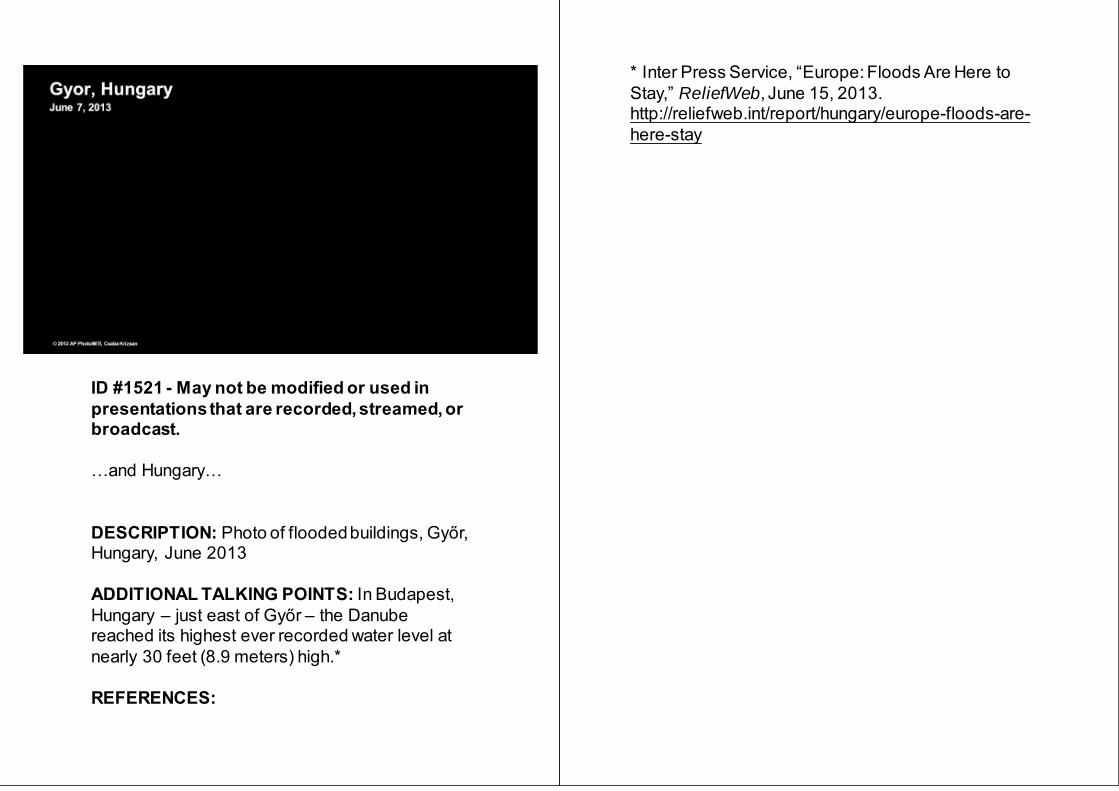
ID #1521 - May not be modified or used in presentations that are recorded, streamed, or broadcast.
…and Hungary…
DESCRIPTION: Photo of flooded buildings, Győr, Hungary, June 2013
ADDITIONAL TALKING POINTS: In Budapest, Hungary – just east of Győr – the Danube reached its highest ever recorded water level at nearly 30 feet (8.9 meters) high.*
REFERENCES:
* Inter Press Service, “Europe: Floods Are Here to Stay,” ReliefWeb, June 15, 2013. http://reliefweb.int/report/hungary/europe-floods-are-here-stay
ID #2014 - May not be modified or used in presentations that are recorded, streamed, or broadcast.
…Missouri….
DESCRIPTION: Video of a crane falling after the soil underneath was washed away, Powell, Missouri, August 2013
ID #1548 - May not be modified or used in presentations that are recorded, streamed, or broadcast.
…in downtown Calgary, in Alberta, Canada…
DESCRIPTION: Photo of floodwaters in downtown Calgary, Alberta, June 2013
ADDITIONAL TALKING POINTS: The flooding killed 4 people and displaced more than 100,000 Alberta residents.* Several areas declared states of local emergency.**
REFERENCES:
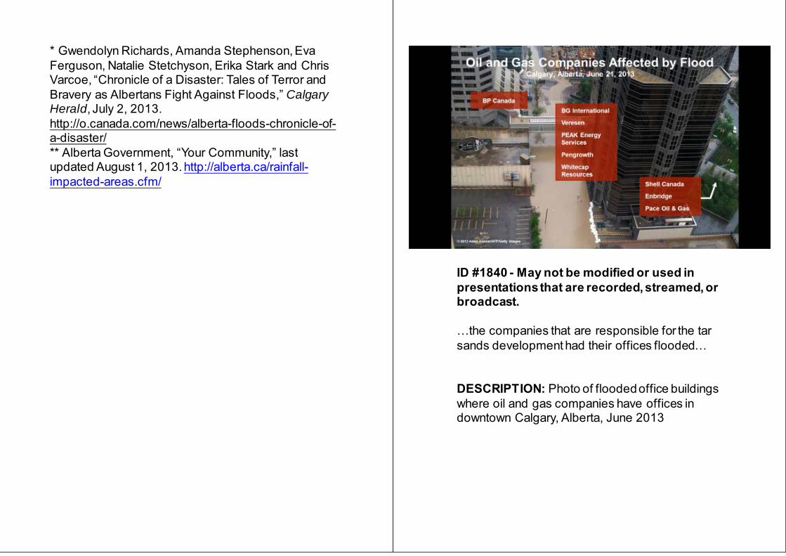
* Gwendolyn Richards, Amanda Stephenson, Eva Ferguson, Natalie Stetchyson, Erika Stark and Chris Varcoe, “Chronicle of a Disaster: Tales of Terror and Bravery as Albertans Fight Against Floods,” Calgary Herald, July 2, 2013. http://o.canada.com/news/alberta-floods-chronicle-of-a-disaster/** Alberta Government, “Your Community,” last updated August 1, 2013. http://alberta.ca/rainfall-impacted-areas.cfm/
ID #1840 - May not be modified or used in presentations that are recorded, streamed, or broadcast.
…the companies that are responsible for the tar sands development had their offices flooded…
DESCRIPTION: Photo of flooded office buildings where oil and gas companies have offices in downtown Calgary, Alberta, June 2013
ID #2015 - May not be modified or used in presentations that are recorded, streamed, or broadcast.
…and in Malaysia…
DESCRIPTION: Video of flooded street in Kuantan, Malaysia, December 2013
ADDITIONAL TALKING POINTS: Over 13,200 people were evacuated in Secember 2013 from the affected region of Malaysia during some of the worst flooding the country has seen in 40 years.*
REFERENCES:* Hamzah Nazari, “After Biggest Floods in 40 years, Massive Clean-up Begins,” The Malay Mail Online, December 16, 2013. http://www.themalaymailonline.com/malaysia/article/after-biggest-floods-in-40-years-massive-clean-up-begins

ID #2016 - May not be modified or used in presentations that are recorded, streamed, or broadcast.
…
DESCRIPTION: Photo of a woman sorting through flooded belongings, Chenor, Malaysia, December 2013
ID #2018 - May not be modified or used in presentations that are recorded, streamed, or broadcast.
…in the United Kingdom…
DESCRIPTION: Photo of a woman standing in the path of a tidal surge on the seafront in Rhyl, Wales, December 2013
ADDITIONAL TALKING POINTS: Between December 4th and 5th of 2013, over 150 properties in Wales were reported as flooded, most of which were located in Rhyl.*
REFERENCES:* Natural Resources Wales, Wales Coastal Flooding Review Phase 1 Report – Assessment of Impacts (January 2014). http://naturalresourceswales.gov.uk/content/docs/pdfs/flooding-and-alerts-pdfs/wales-coastal-flooding-review-phase-1.pdf?lang=en
ID #2019 - May not be modified or used in presentations that are recorded, streamed, or broadcast.
…
DESCRIPTION: Photo of rescue workers boating a flood survivor down a street in Rhyl, Wales, December 2013
ADDITIONAL TALKING POINTS: Over 400 homes were evacuated during the height of the flooding.*
REFERENCES:
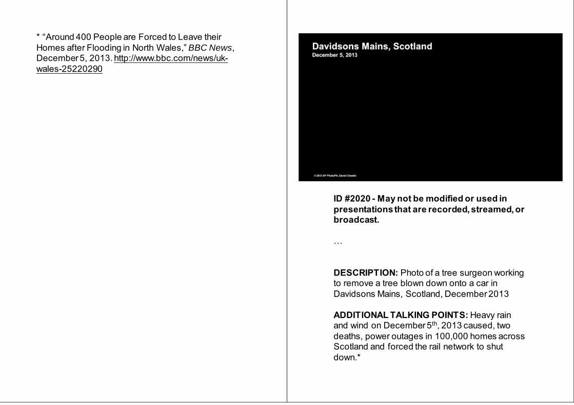
* “Around 400 People are Forced to Leave their Homes after Flooding in North Wales,” BBC News, December 5, 2013. http://www.bbc.com/news/uk-wales-25220290
ID #2020 - May not be modified or used in presentations that are recorded, streamed, or broadcast.
…
DESCRIPTION: Photo of a tree surgeon working to remove a tree blown down onto a car in Davidsons Mains, Scotland, December 2013
ADDITIONAL TALKING POINTS: Heavy rain and wind on December 5th, 2013 caused, two deaths, power outages in 100,000 homes across Scotland and forced the rail network to shut down.*
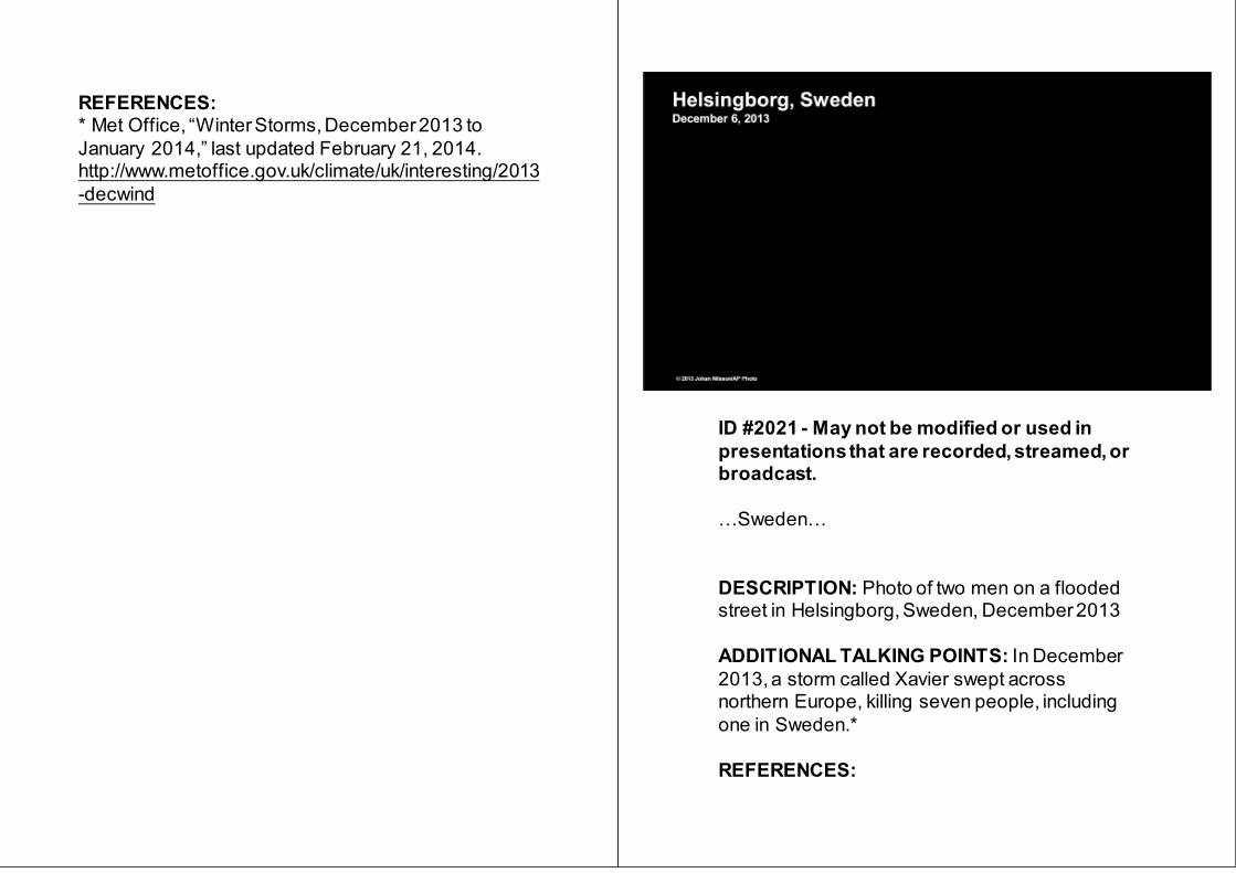
REFERENCES:* Met Office, “Winter Storms, December 2013 to January 2014,” last updated February 21, 2014. http://www.metoffice.gov.uk/climate/uk/interesting/2013-decwind
ID #2021 - May not be modified or used in presentations that are recorded, streamed, or broadcast.
…Sweden…
DESCRIPTION: Photo of two men on a flooded street in Helsingborg, Sweden, December 2013
ADDITIONAL TALKING POINTS: In December 2013, a storm called Xavier swept across northern Europe, killing seven people, including one in Sweden.*
REFERENCES:
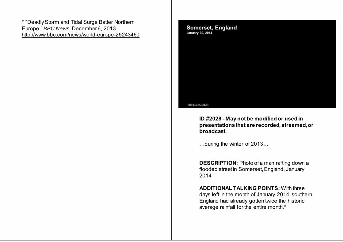
* “Deadly Storm and Tidal Surge Batter Northern Europe,” BBC News, December 6, 2013. http://www.bbc.com/news/world-europe-25243460
ID #2028 - May not be modified or used in presentations that are recorded, streamed, or broadcast.
…during the winter of 2013…
DESCRIPTION: Photo of a man rafting down a flooded street in Somerset, England, January 2014
ADDITIONAL TALKING POINTS: With three days left in the month of January 2014, southern England had already gotten twice the historic average rainfall for the entire month.*
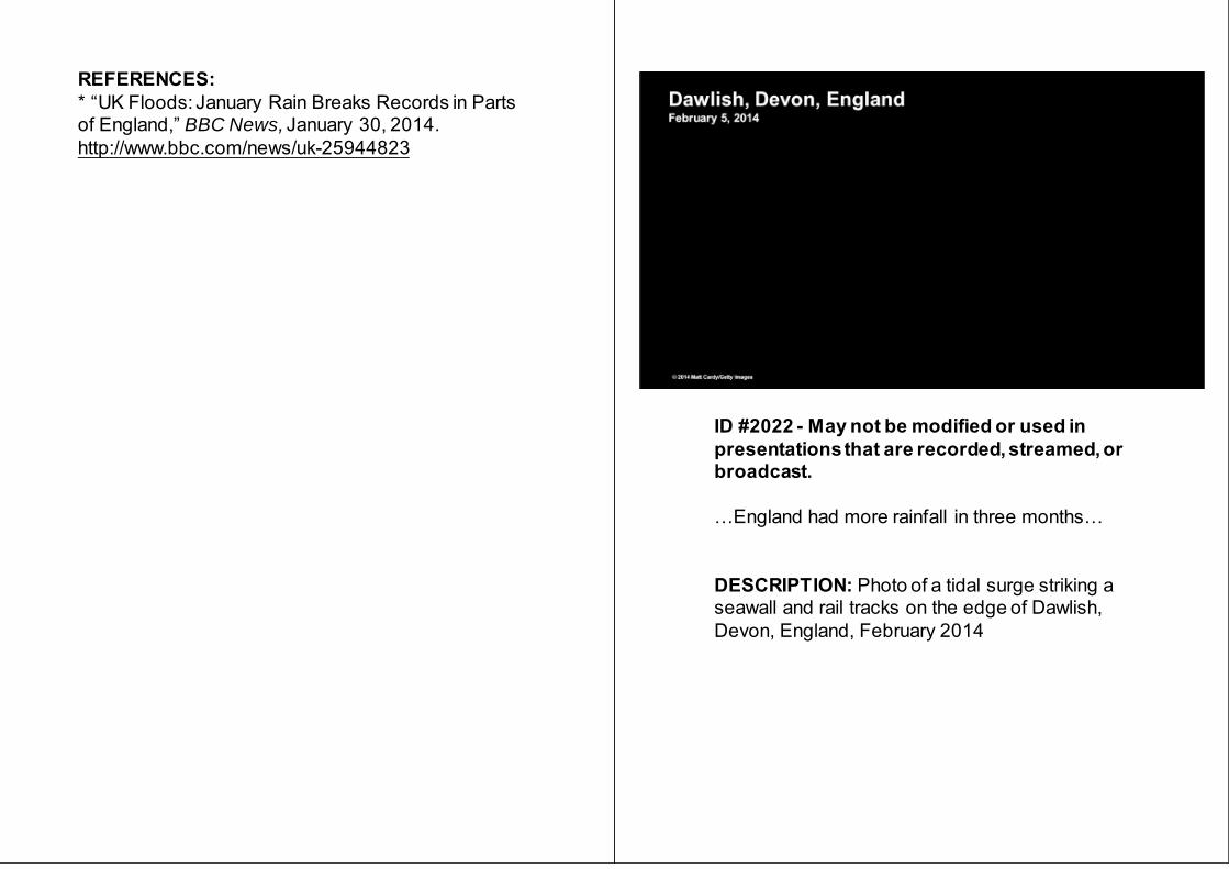
REFERENCES:* “UK Floods: January Rain Breaks Records in Parts of England,” BBC News, January 30, 2014. http://www.bbc.com/news/uk-25944823
ID #2022 - May not be modified or used in presentations that are recorded, streamed, or broadcast.
…England had more rainfall in three months…
DESCRIPTION: Photo of a tidal surge striking a seawall and rail tracks on the edge of Dawlish, Devon, England, February 2014
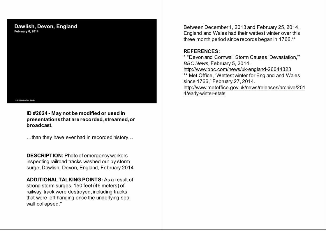
ID #2024 - May not be modified or used in presentations that are recorded, streamed, or broadcast.
…than they have ever had in recorded history…
DESCRIPTION: Photo of emergency workers inspecting railroad tracks washed out by storm surge, Dawlish, Devon, England, February 2014
ADDITIONAL TALKING POINTS: As a result of strong storm surges, 150 feet (46 meters) of railway track were destroyed, including tracks that were left hanging once the underlying sea wall collapsed.*
Between December 1, 2013 and February 25, 2014, England and Wales had their wettest winter over this three month period since records began in 1766.**
REFERENCES:* “Devon and Cornwall Storm Causes ‘Devastation,’” BBC News, February 5, 2014. http://www.bbc.com/news/uk-england-26044323** Met Office, “Wettest winter for England and Wales since 1766,” February 27, 2014. http://www.metoffice.gov.uk/news/releases/archive/2014/early-winter-stats
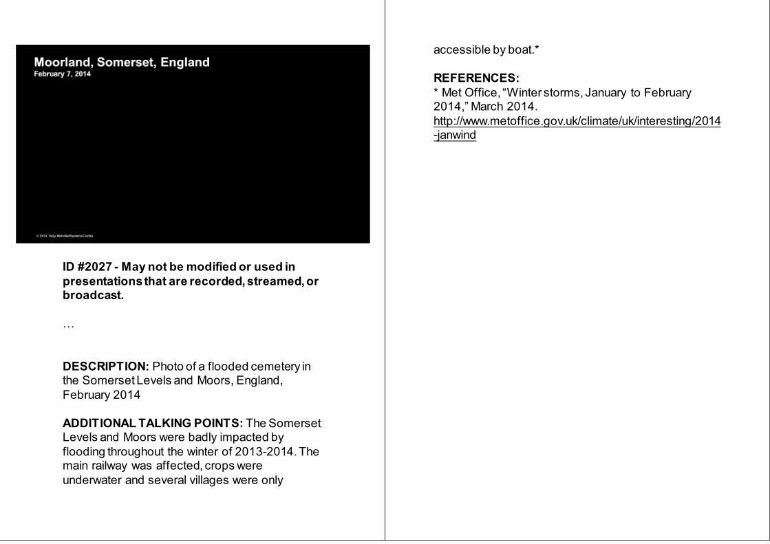
ID #2027 - May not be modified or used in presentations that are recorded, streamed, or broadcast.
…
DESCRIPTION: Photo of a flooded cemetery in the Somerset Levels and Moors, England, February 2014
ADDITIONAL TALKING POINTS: The Somerset Levels and Moors were badly impacted by flooding throughout the winter of 2013-2014. The main railway was affected, crops were underwater and several villages were only
accessible by boat.*
REFERENCES:* Met Office, “Winter storms, January to February 2014,” March 2014. http://www.metoffice.gov.uk/climate/uk/interesting/2014-janwind
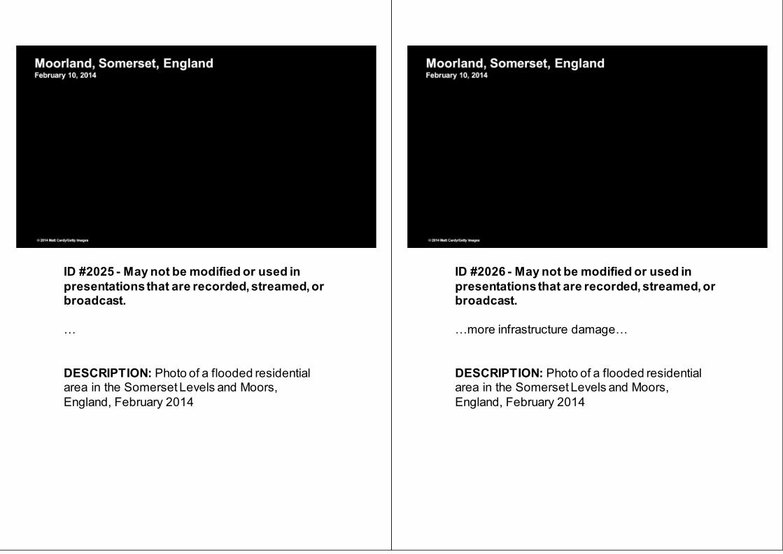
ID #2025 - May not be modified or used in presentations that are recorded, streamed, or broadcast.
…
DESCRIPTION: Photo of a flooded residential area in the Somerset Levels and Moors, England, February 2014
ID #2026 - May not be modified or used in presentations that are recorded, streamed, or broadcast.
…more infrastructure damage…
DESCRIPTION: Photo of a flooded residential area in the Somerset Levels and Moors, England, February 2014
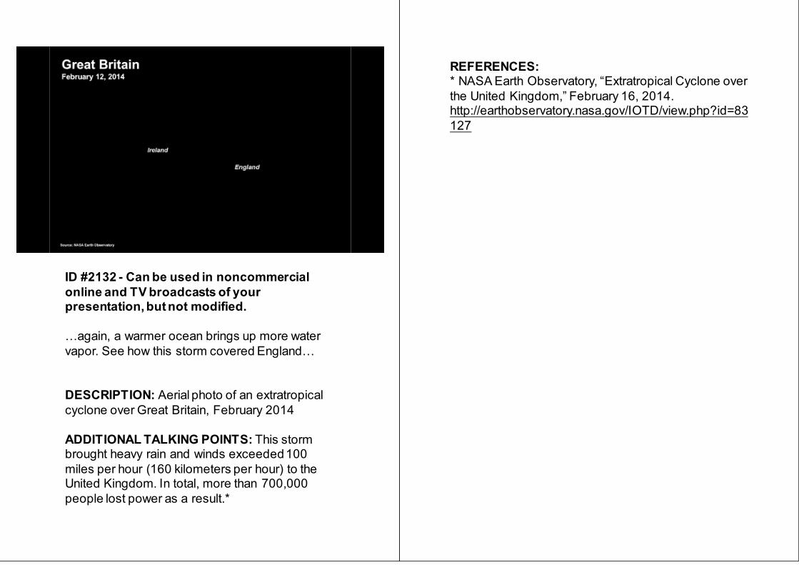
ID #2132 - Can be used in noncommercial online and TV broadcasts of your presentation, but not modified.
…again, a warmer ocean brings up more water vapor. See how this storm covered England…
DESCRIPTION: Aerial photo of an extratropical cyclone over Great Britain, February 2014
ADDITIONAL TALKING POINTS: This storm brought heavy rain and winds exceeded 100 miles per hour (160 kilometers per hour) to the United Kingdom. In total, more than 700,000 people lost power as a result.*
REFERENCES:* NASA Earth Observatory, “Extratropical Cyclone over the United Kingdom,” February 16, 2014. http://earthobservatory.nasa.gov/IOTD/view.php?id=83127
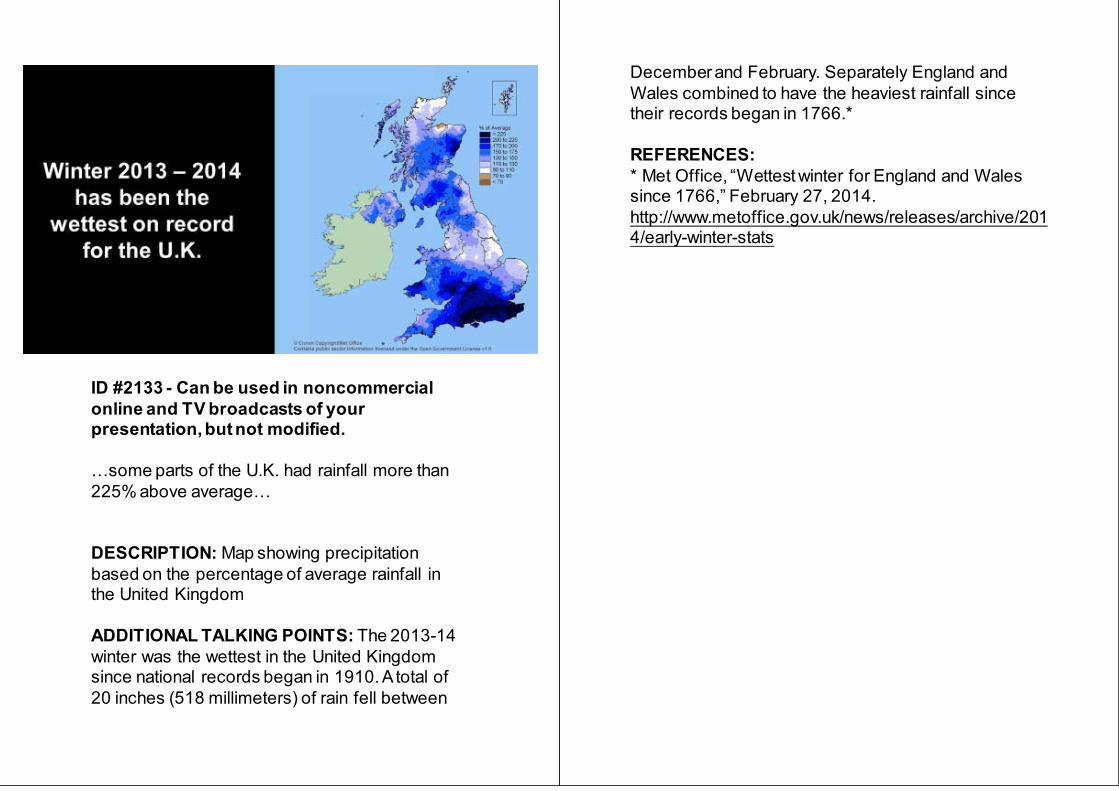
ID #2133 - Can be used in noncommercial online and TV broadcasts of your presentation, but not modified.
…some parts of the U.K. had rainfall more than 225% above average…
DESCRIPTION: Map showing precipitation based on the percentage of average rainfall in the United Kingdom
ADDITIONAL TALKING POINTS: The 2013-14 winter was the wettest in the United Kingdom since national records began in 1910. A total of 20 inches (518 millimeters) of rain fell between
December and February. Separately England and Wales combined to have the heaviest rainfall since their records began in 1766.*
REFERENCES:* Met Office, “Wettest winter for England and Wales since 1766,” February 27, 2014. http://www.metoffice.gov.uk/news/releases/archive/2014/early-winter-stats
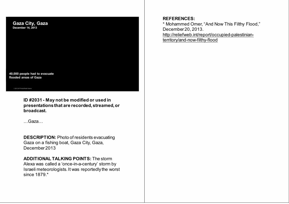
ID #2031 - May not be modified or used in presentations that are recorded, streamed, or broadcast.
…Gaza…
DESCRIPTION: Photo of residents evacuating Gaza on a fishing boat, Gaza City, Gaza, December 2013
ADDITIONAL TALKING POINTS: The storm Alexa was called a ‘once-in-a-century’ storm by Israeli meteorologists. It was reportedly the worst since 1879.*
REFERENCES:* Mohammed Omer, “And Now This Filthy Flood,” December 20, 2013. http://reliefweb.int/report/occupied-palestinian-territory/and-now-filthy-flood
ID #2032 - May not be modified or used in presentations that are recorded, streamed, or broadcast.
…
DESCRIPTION: Photo of a boat moving through a flooded street in Gaza City, Gaza, December 2013
ADDITIONAL TALKING POINTS: Not only did flooding in Gaza City force 40,000 people to evacuate their homes, two were killed and 108 were injured.*
REFERENCES:* Mohammed Omer, “And Now This Filthy Flood,” December 20, 2013. http://reliefweb.int/report/occupied-palestinian-territory/and-now-filthy-flood

ID #1062 - Can be used in noncommercial online and TV broadcasts of your presentation, but not modified.
As temperatures continue to increase, this pattern will continue.
DESCRIPTION: Text slide about the intensification of the water cycle
ID #964 - Can be used in noncommercial online and TV broadcasts of your presentation, but not modified.
The more warming you have, the more water vapor and the bigger the downpours, but also the longer and deeper droughts. The evaporation into the atmosphere increases even more, the warmer air holds even more, the downpours get even heavier, the snowpack melts even earlier, causing spring flooding and depriving the land of moisture during the hot summer months. In many areas, there are longer intervals between downpours, and more water quickly evaporates from the soil.

DESCRIPTION: Text slide summarizing the intensification of the water cycle
ID #965 - May not be modified or used in presentations that are recorded, streamed, or broadcast.
Most moisture in the soil is in the top layer. The heat sucks moisture out of the ground, drying the ground and causing drought.
DESCRIPTION: Animation of evaporation from the ocean and land
ID #784 - May not be modified or used in presentations that are recorded, streamed, or broadcast.
This is Indiana…
DESCRIPTION: Photo of a dock over the dry bed of the Morse Reservoir, Noblesville, Indiana, July 2012
ADDITIONAL TALKING POINTS: Nearly 100% of the state of Indiana suffered drought in July and August 2012.* Morse Reservoir, in central Indiana, reached its fourth lowest level on record in mid-July of 2012.**
REFERENCES:* U.S. Drought Monitor, “Drought Condition (Percent Area): Indiana,” last updated May 2014. http://droughtmonitor.unl.edu/MapsAndData/MapArchive.aspx (On this page please see archives for July and August 2012 data for state of Indiana). ** National Oceanic and Atmospheric Administration, “Advanced Hydrologic Prediction Service: Morse Reservoir,” last updated May 2014. http://water.weather.gov/ahps2/hydrograph.php?wfo=ind&gage=nmsi3
ID #1284 - May not be modified or used in presentations that are recorded, streamed, or broadcast.
…Macedonia…
DESCRIPTION: Photo of the Paljurci Dam, Macedonia, August 2012
ADDITIONAL TALKING POINTS: In 2012 the Balkans Region was hit by what officials said was the hottest summer and worst drought in 40 years. Such extreme weather left the Palijurci Dam, used to irrigate land near Bogdanci in southeastern Macedonia, practically empty.*
Climate change projections for Macedonia point toward a decrease in average rainfall, decreases in surface water, and groundwater recharge for many of the country’s rivers.**
REFERENCES:* Dusan Stojanovic, “Balkans Region Hit by Worst Drought in Decades,” The Associated Press, August 23, 2013. http://bigstory.ap.org/article/balkans-region-hit-worst-drought-decades** United Nations Framework Convention on Climate Change, “Third National Communication on Climate Change: Water Resources Sector,” March 22, 2013. http://www.unfccc.org.mk/content/Documents/VULNERABILITY/Water/Vulnerability%20Assessment%20Water%20resources.pdf
ID #2033 - May not be modified or used in presentations that are recorded, streamed, or broadcast.
…
DESCRIPTION: Photo of a cow walking across the dry bed of the Cervera Reservoir during a drought in Palencia, Spain, March 2012
ADDITIONAL TALKING POINTS: Spain suffered its driest winter in 70 years during the 2011-2012 winter season. The resulting conditions included reservoirs shrinking and bush fires destroying large swaths of wooded areas. Spanish farmers
found crops stunted and a lack of grass for farm animals to graze on.*
REFERENCES:*Gabriel Rubio, “Spain Wilts in Driest Winter for 70 Years,” Phys Org, March 4, 2012. http://phys.org/news/2012-03-spain-wilts-driest-winter-years.html
ID #2134 - May not be modified or used in presentations that are recorded, streamed, or broadcast.
…in Brazil…
DESCRIPTION: Photo of dead cattle in Pernambuco State, Brazil, January 2014
ADDITIONAL TALKING POINTS: Hundreds of thousands of cattle died from dry conditions in Northeast Brazil in 2014.*
REFERENCES:* “Record Brazil Heat Pressures Crops, Energy
Prices, Government,” Reuters, January 31, 2014. http://www.reuters.com/article/2014/02/01/us-brazil-heat-idUSBREA0U1PM20140201
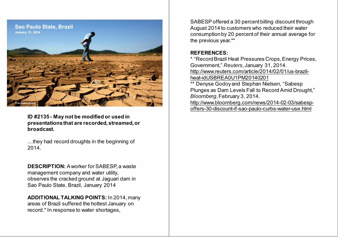
ID #2135 - May not be modified or used in presentations that are recorded, streamed, or broadcast.
…they had record droughts in the beginning of 2014.
DESCRIPTION: A worker for SABESP, a waste management company and water utility, observes the cracked ground at Jaguari dam in Sao Paulo State, Brazil, January 2014
ADDITIONAL TALKING POINTS: In 2014, many areas of Brazil suffered the hottest January on record.* In response to water shortages,
SABESP offered a 30 percent billing discount through August 2014 to customers who reduced their water consumption by 20 percent of their annual average for the previous year.**
REFERENCES:* “Record Brazil Heat Pressures Crops, Energy Prices, Government,” Reuters, January 31, 2014. http://www.reuters.com/article/2014/02/01/us-brazil-heat-idUSBREA0U1PM20140201** Denyse Godoy and Stephan Nielsen, “Sabesp Plunges as Dam Levels Fall to Record Amid Drought,” Bloomberg, February 3, 2014. http://www.bloomberg.com/news/2014-02-03/sabesp-offers-30-discount-if-sao-paulo-curbs-water-use.html
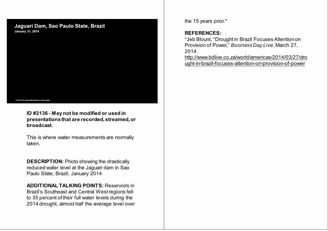
ID #2136 - May not be modified or used in presentations that are recorded, streamed, or broadcast.
This is where water measurements are normally taken.
DESCRIPTION: Photo showing the drastically reduced water level at the Jaguari dam in Sao Paulo State, Brazil, January 2014
ADDITIONAL TALKING POINTS: Reservoirs in Brazil’s Southeast and Central West regions fell to 35 percent of their full water levels during the 2014 drought, almost half the average level over
the 15 years prior.*
REFERENCES:*Jeb Blount, “Drought in Brazil Focuses Attention on Provision of Power,” Business Day Live, March 27, 2014. http://www.bdlive.co.za/world/americas/2014/03/27/drought-in-brazil-focuses-attention-on-provision-of-power
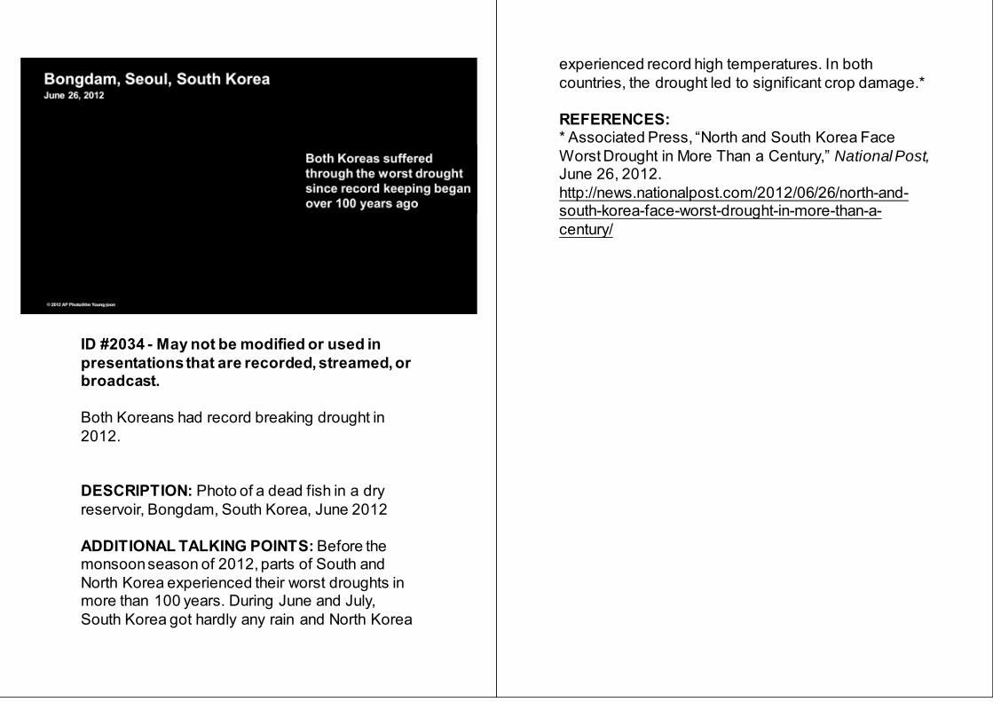
ID #2034 - May not be modified or used in presentations that are recorded, streamed, or broadcast.
Both Koreans had record breaking drought in 2012.
DESCRIPTION: Photo of a dead fish in a dry reservoir, Bongdam, South Korea, June 2012
ADDITIONAL TALKING POINTS: Before the monsoon season of 2012, parts of South and North Korea experienced their worst droughts in more than 100 years. During June and July, South Korea got hardly any rain and North Korea
experienced record high temperatures. In both countries, the drought led to significant crop damage.*
REFERENCES:* Associated Press, “North and South Korea Face Worst Drought in More Than a Century,” National Post,June 26, 2012. http://news.nationalpost.com/2012/06/26/north-and-south-korea-face-worst-drought-in-more-than-a-century/
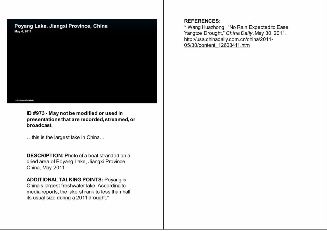
ID #973 - May not be modified or used in presentations that are recorded, streamed, or broadcast.
…this is the largest lake in China…
DESCRIPTION: Photo of a boat stranded on a dried area of Poyang Lake, Jiangxi Province, China, May 2011
ADDITIONAL TALKING POINTS: Poyang is China’s largest freshwater lake. According to media reports, the lake shrank to less than half its usual size during a 2011 drought.*
REFERENCES:* Wang Huazhong, “No Rain Expected to Ease Yangtze Drought,” China Daily, May 30, 2011. http://usa.chinadaily.com.cn/china/2011-05/30/content_12603411.htm

ID #971 - May not be modified or used in presentations that are recorded, streamed, or broadcast.
…
DESCRIPTION: Photo of farmers carrying water to their fields in Wuhan, Hubei Province, China, May 2011
ADDITIONAL TALKING POINTS: In early 2011, during what was called “the worst drought in six decades,” this part of China got only about 133 millimeters (5 inches) of rain over a 6-month period — the amount that would normally fall in a
month.*
REFERENCES:* Wang Guanqun, “Worst Drought in 6 Decades Hits C China's Wuhan,” May 27, 2011. http://www.gov.cn/english/2011-05/27/content_1871981.htm
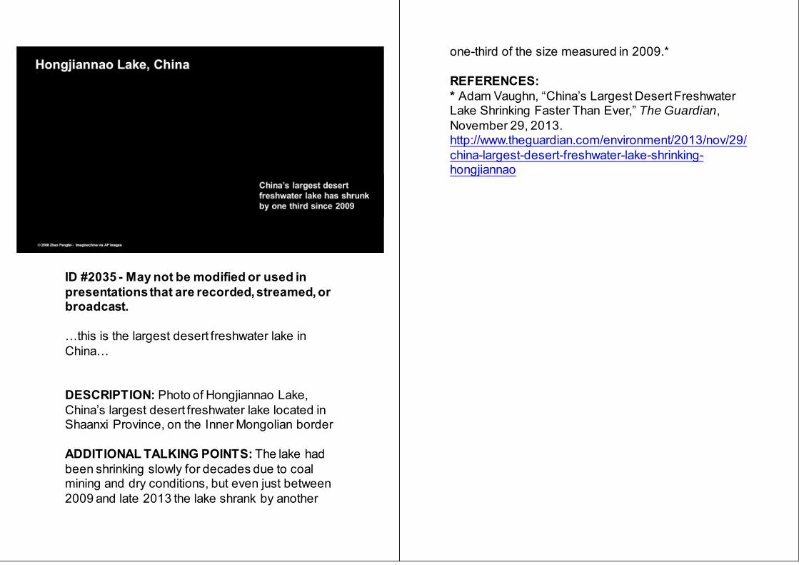
ID #2035 - May not be modified or used in presentations that are recorded, streamed, or broadcast.
…this is the largest desert freshwater lake in China…
DESCRIPTION: Photo of Hongjiannao Lake, China’s largest desert freshwater lake located in Shaanxi Province, on the Inner Mongolian border
ADDITIONAL TALKING POINTS: The lake had been shrinking slowly for decades due to coal mining and dry conditions, but even just between 2009 and late 2013 the lake shrank by another
one-third of the size measured in 2009.*
REFERENCES:* Adam Vaughn, “China’s Largest Desert Freshwater Lake Shrinking Faster Than Ever,” The Guardian, November 29, 2013. http://www.theguardian.com/environment/2013/nov/29/china-largest-desert-freshwater-lake-shrinking-hongjiannao

ID #972 - May not be modified or used in presentations that are recorded, streamed, or broadcast.
…extreme and severe drought covered vast regions of China.
DESCRIPTION: Map of drought conditions in China on June 2, 2011. The browns and reds indicate extremely dry and severely dry conditions, respectively.
ID #2036 - Can be used in noncommercial online and TV broadcasts of your presentation, but not modified.
The drought that hit the United States in 2012 is still going on in some parts…
DESCRIPTION: Map of drought conditions in the United States, July 31, 2012
ADDITIONAL TALKING POINTS: In July 2012, average temperatures for the contiguous U.S. were 3.3 degrees Fahrenheit (1.8 degrees Celsius) above the 20th century average.*
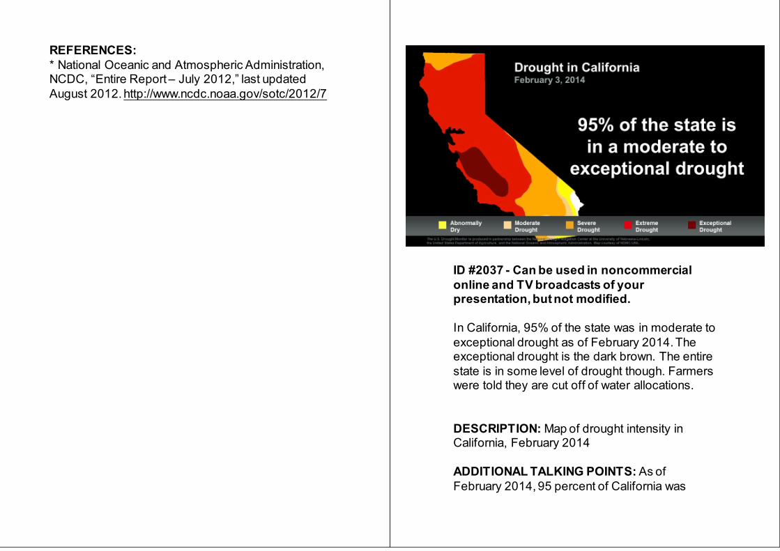
REFERENCES:* National Oceanic and Atmospheric Administration, NCDC, “Entire Report – July 2012,” last updated August 2012. http://www.ncdc.noaa.gov/sotc/2012/7
ID #2037 - Can be used in noncommercial online and TV broadcasts of your presentation, but not modified.
In California, 95% of the state was in moderate to exceptional drought as of February 2014. The exceptional drought is the dark brown. The entire state is in some level of drought though. Farmers were told they are cut off of water allocations.
DESCRIPTION: Map of drought intensity in California, February 2014
ADDITIONAL TALKING POINTS: As of February 2014, 95 percent of California was
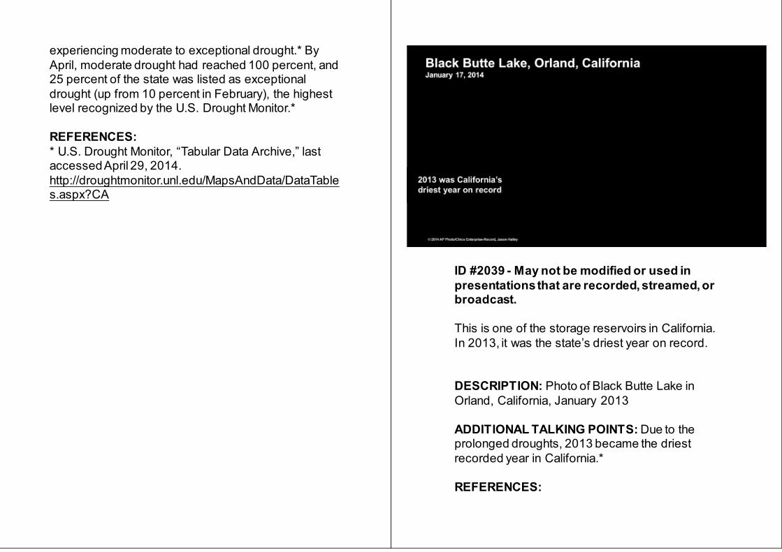
experiencing moderate to exceptional drought.* By April, moderate drought had reached 100 percent, and 25 percent of the state was listed as exceptional drought (up from 10 percent in February), the highest level recognized by the U.S. Drought Monitor.*
REFERENCES:* U.S. Drought Monitor, “Tabular Data Archive,” last accessed April 29, 2014. http://droughtmonitor.unl.edu/MapsAndData/DataTables.aspx?CA
ID #2039 - May not be modified or used in presentations that are recorded, streamed, or broadcast.
This is one of the storage reservoirs in California. In 2013, it was the state’s driest year on record.
DESCRIPTION: Photo of Black Butte Lake in Orland, California, January 2013
ADDITIONAL TALKING POINTS: Due to the prolonged droughts, 2013 became the driest recorded year in California.*
REFERENCES:

* B. Lynn Ingram and Frances Malamud-Roam, “A Drier California Than Ever? Pretty Much.,” Los Angles Times, February 3, 2014. http://www.latimes.com/opinion/commentary/la-oe-ingram-california-drought-20140203,0,5178537.story#axzz2xpxl4RPX
ID #2040 - May not be modified or used in presentations that are recorded, streamed, or broadcast.
…
DESCRIPTION: Photo of the Almaden Reservoir in San Jose, California, January 2014
ADDITIONAL TALKING POINTS: In January 2014, California Governor Jerry Brown declared a state of emergency. The water shortage led the Governor to urge people to use less water and to conserve the resource in every way possible.*
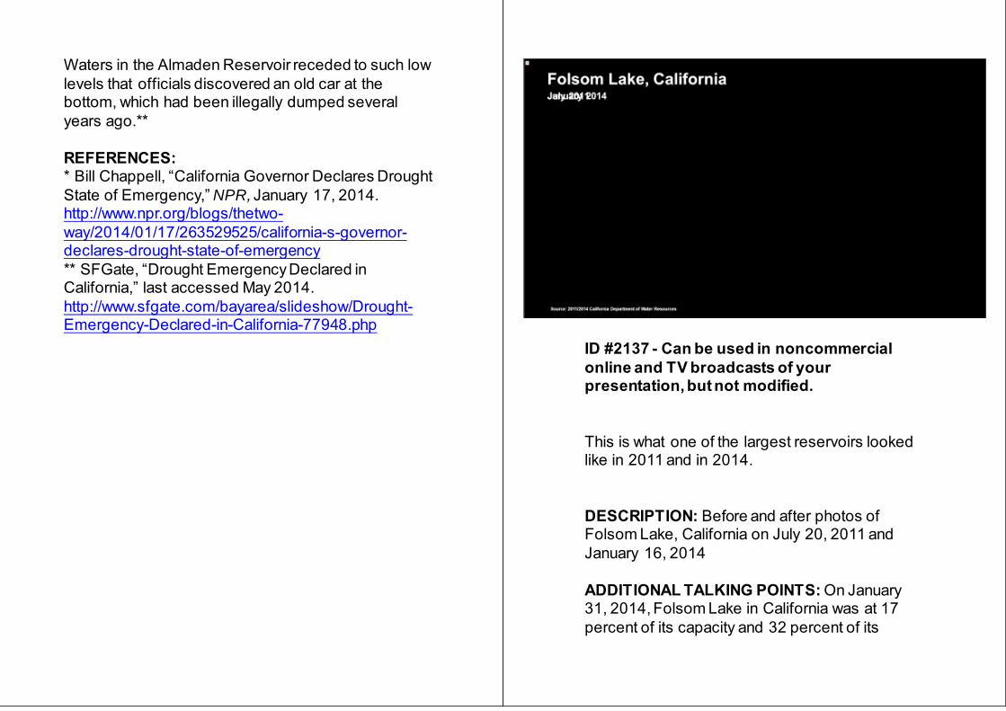
Waters in the Almaden Reservoir receded to such low levels that officials discovered an old car at the bottom, which had been illegally dumped several years ago.**
REFERENCES:* Bill Chappell, “California Governor Declares Drought State of Emergency,” NPR, January 17, 2014. http://www.npr.org/blogs/thetwo-way/2014/01/17/263529525/california-s-governor-declares-drought-state-of-emergency** SFGate, “Drought Emergency Declared in California,” last accessed May 2014. http://www.sfgate.com/bayarea/slideshow/Drought-Emergency-Declared-in-California-77948.php
ID #2137 - Can be used in noncommercial online and TV broadcasts of your presentation, but not modified.
This is what one of the largest reservoirs looked like in 2011 and in 2014.
DESCRIPTION: Before and after photos of Folsom Lake, California on July 20, 2011 and January 16, 2014
ADDITIONAL TALKING POINTS: On January 31, 2014, Folsom Lake in California was at 17 percent of its capacity and 32 percent of its
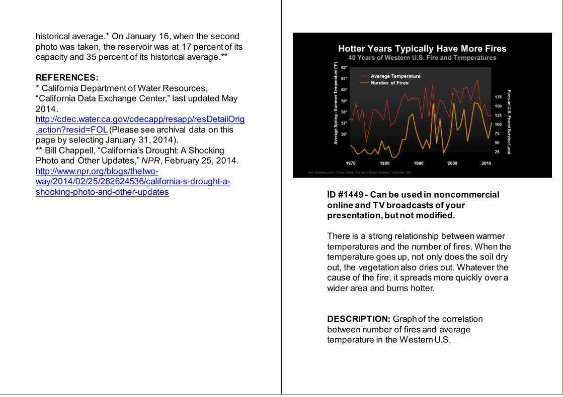
historical average.* On January 16, when the second photo was taken, the reservoir was at 17 percent of its capacity and 35 percent of its historical average.**
REFERENCES:* California Department of Water Resources, “California Data Exchange Center,” last updated May 2014. http://cdec.water.ca.gov/cdecapp/resapp/resDetailOrig.action?resid=FOL(Please see archival data on this page by selecting January 31, 2014).** Bill Chappell, “California’s Drought: A Shocking Photo and Other Updates,” NPR, February 25, 2014. http://www.npr.org/blogs/thetwo-way/2014/02/25/282624536/california-s-drought-a-shocking-photo-and-other-updates ID #1449 - Can be used in noncommercial
online and TV broadcasts of your presentation, but not modified.
There is a strong relationship between warmer temperatures and the number of fires. When the temperature goes up, not only does the soil dry out, the vegetation also dries out. Whatever the cause of the fire, it spreads more quickly over a wider area and burns hotter.
DESCRIPTION: Graph of the correlation between number of fires and average temperature in the Western U.S.

ADDITIONAL TALKING POINTS: Compared to 40 years ago, wildfires in the Western U.S. burn on average twice as much land area each year. In the same time period, the typical burn season has grown 75 days longer.*
REFERENCES:* Climate Central, The Age of Western Wildfires(September, 2012). http://www.climatecentral.org/wgts/wildfires/Wildfires2012.pdf
ID #2115 - May not be modified or used in presentations that are recorded, streamed, or broadcast.
This is the western part of the United States. With just 1 degree Celsius of warming, some areas could see a projected increase of up to 600% in the median area burned.
DESCRIPTION: Map showing how the area burned by fire in the western U.S. could change if the global average temperature increased 1°C (1.8°F)
PRESENTATION TIP: It is important to not to

misstate this as “a 600% increase in the total area burned by fire.” This study only analyzed the change in the area burned during the median fire year. In other words, if you ranked seven years by the area burned each year, how would the area burned during the middle ranked year (year 3) change in the future?
ID #1528 - May not be modified or used in presentations that are recorded, streamed, or broadcast.
Over the last few years, in California and the rest of the western United States, there have been terrible fires…
DESCRIPTION: Photo of a firefighter looking on as the Powerhouse wildfire burns its way through the Angeles National Forest, California, June 2013
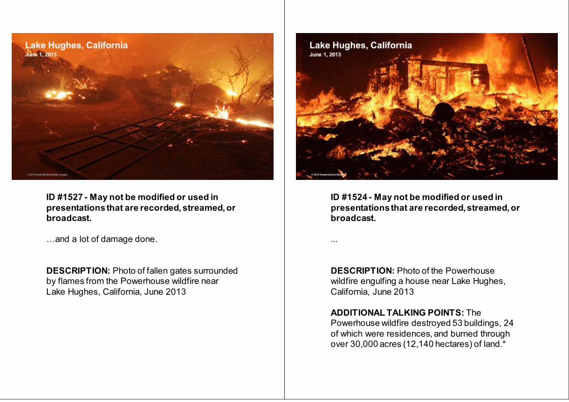
ID #1527 - May not be modified or used in presentations that are recorded, streamed, or broadcast.
…and a lot of damage done.
DESCRIPTION: Photo of fallen gates surrounded by flames from the Powerhouse wildfire near Lake Hughes, California, June 2013
ID #1524 - May not be modified or used in presentations that are recorded, streamed, or broadcast.
...
DESCRIPTION: Photo of the Powerhouse wildfire engulfing a house near Lake Hughes, California, June 2013
ADDITIONAL TALKING POINTS: The Powerhouse wildfire destroyed 53 buildings, 24 of which were residences, and burned through over 30,000 acres (12,140 hectares) of land.*
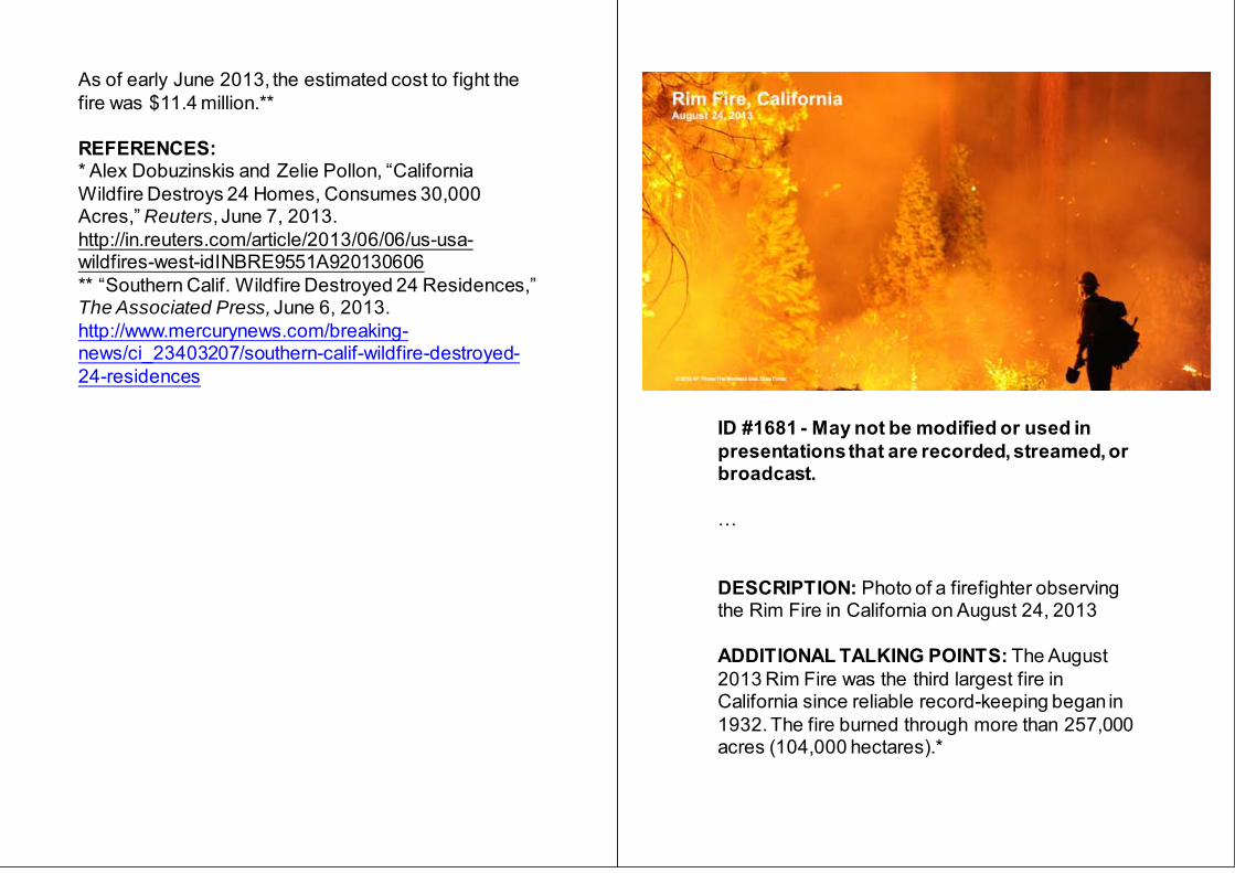
As of early June 2013, the estimated cost to fight the fire was $11.4 million.**
REFERENCES:* Alex Dobuzinskis and Zelie Pollon, “California Wildfire Destroys 24 Homes, Consumes 30,000 Acres,” Reuters, June 7, 2013. http://in.reuters.com/article/2013/06/06/us-usa-wildfires-west-idINBRE9551A920130606** “Southern Calif. Wildfire Destroyed 24 Residences,” The Associated Press, June 6, 2013. http://www.mercurynews.com/breaking-news/ci_23403207/southern-calif-wildfire-destroyed-24-residences
ID #1681 - May not be modified or used in presentations that are recorded, streamed, or broadcast.
…
DESCRIPTION: Photo of a firefighter observing the Rim Fire in California on August 24, 2013
ADDITIONAL TALKING POINTS: The August 2013 Rim Fire was the third largest fire in California since reliable record-keeping began in 1932. The fire burned through more than 257,000 acres (104,000 hectares).*

REFERENCES:* California Department of Forestry and Fire Protection, “Top 20 Largest California Wildfires,” last updated November 1, 2013. http://www.fire.ca.gov/communications/downloads/fact_sheets/20LACRES.pdf
ID #1680 - May not be modified or used in presentations that are recorded, streamed, or broadcast.
…
DESCRIPTION: Photo of an entrance sign at Yosemite National Park, California surrounded by burned land
ADDITIONAL TALKING POINTS: Approximately 30 percent of the areas burned by the fire were located within Yosemite National Park. From the time the fire started on August 17, 2013, these affected areas were closed to the public until

being reopened nearly eight months later.*
REFERENCES:* National Park Service, “Yosemite National Park Reopens Areas Affected by Rim Fire,” April 2, 2014. http://www.nps.gov/yose/parknews/yosemite-national-park-reopens-areas-affected-by-rim-fire.htm
ID #1684 - May not be modified or used in presentations that are recorded, streamed, or broadcast.
…
DESCRIPTION: Photo of firefighters walking as the Rim Fire burns around them
ADDITIONAL TALKING POINTS: The Rim Fire took more than three months to contain, and it cost an estimated $127.4 million to fight.*
REFERENCES:* InciWeb, “Rim Fire,” last updated October 25,
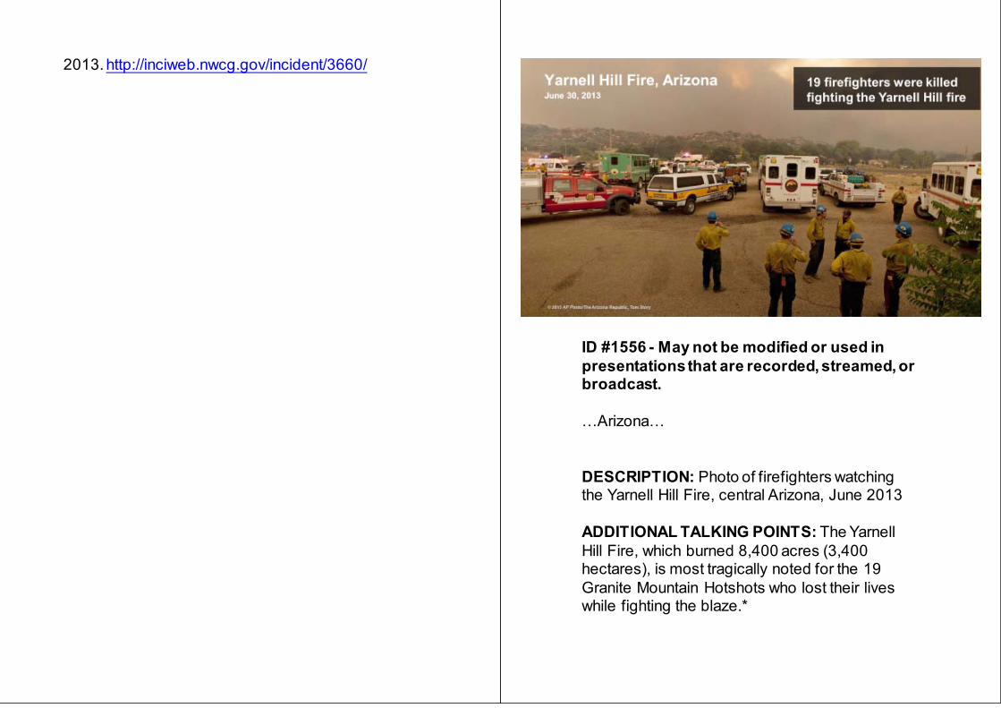
2013. http://inciweb.nwcg.gov/incident/3660/
ID #1556 - May not be modified or used in presentations that are recorded, streamed, or broadcast.
…Arizona…
DESCRIPTION: Photo of firefighters watching the Yarnell Hill Fire, central Arizona, June 2013
ADDITIONAL TALKING POINTS: The Yarnell Hill Fire, which burned 8,400 acres (3,400 hectares), is most tragically noted for the 19 Granite Mountain Hotshots who lost their lives while fighting the blaze.*
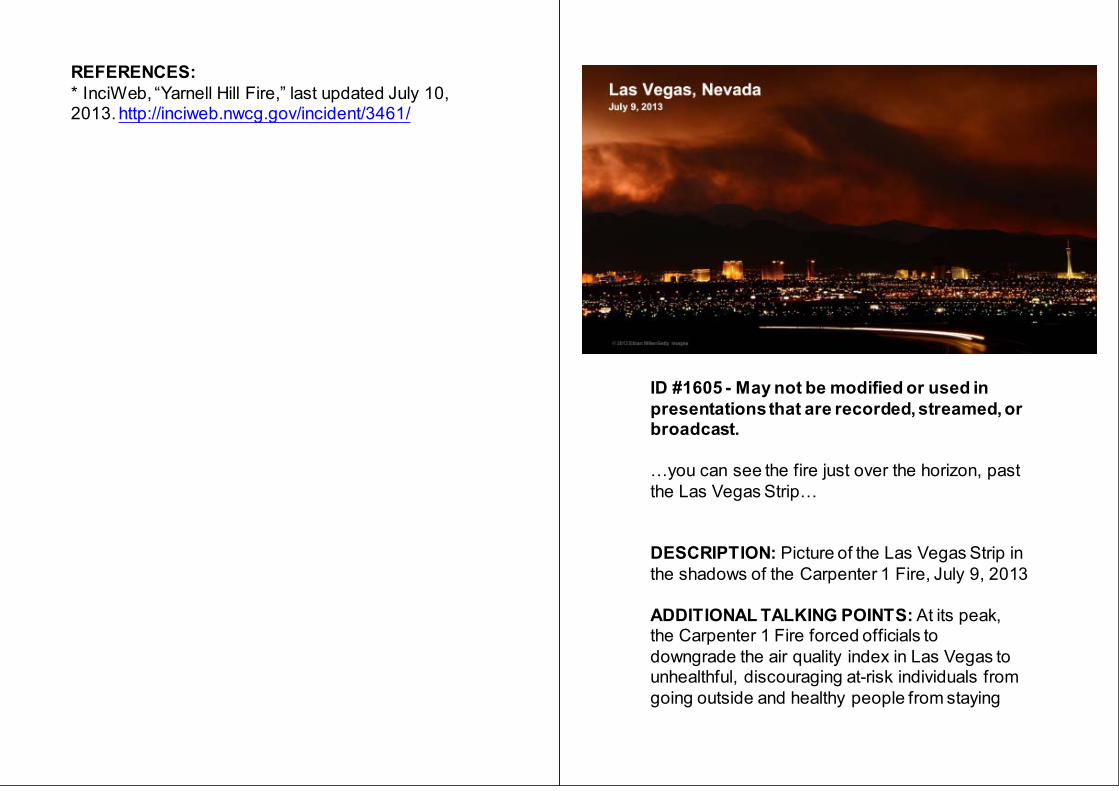
REFERENCES:* InciWeb, “Yarnell Hill Fire,” last updated July 10, 2013. http://inciweb.nwcg.gov/incident/3461/
ID #1605 - May not be modified or used in presentations that are recorded, streamed, or broadcast.
…you can see the fire just over the horizon, past the Las Vegas Strip…
DESCRIPTION: Picture of the Las Vegas Strip in the shadows of the Carpenter 1 Fire, July 9, 2013
ADDITIONAL TALKING POINTS: At its peak, the Carpenter 1 Fire forced officials to downgrade the air quality index in Las Vegas to unhealthful, discouraging at-risk individuals from going outside and healthy people from staying
outdoors for extended periods of time.*
REFERENCES:* Jay Jones, “Las Vegas: Wildfire Grows; Air Quality Downgraded to Unhealthful,” Los Angeles Times, July 10, 2013. http://articles.latimes.com/2013/jul/10/news/la-trb-las-vegas-wildfire-air-quality-unhealthful-20130710
ID #743 - May not be modified or used in presentations that are recorded, streamed, or broadcast.
This is Colorado Springs…
DESCRIPTION: Photo of houses burning in Colorado Springs, Colorado, June 2012
ADDITIONAL TALKING POINTS: The Waldo Canyon fire, just north of Colorado Springs, was the most destructive fire in Colorado history. Over 17 days, the fire destroyed almost 350 homes, burned more than 18,000 acres (73 square kilometers) and caused $110 million in
damages.*
The fire consumed all surface vegetation and roots in nearly 20 percent of the burn area, increasing the risk of flooding and landslides.**
REFERENCES:* Kirk Mitchell, “Rain Helps Firefighters at Waldo Canyon Fire, Now 80% Contained,” The Denver Post, July 4, 2012. http://www.denverpost.com/wildfires/ci_21005593/colorado-wildfires-rain-helps-firefighters-waldo-canyon-80-percent ** Burned Area Emergency Response, Waldo Canyon Fire (July 2012). https://inciweb.nwcg.gov/ftp/InciWeb/COPSF/2012-06-23-16:51-waldo-canyon-fire/related_files/ftp-20120717-183522.pdf
ID #1393 - May not be modified or used in presentations that are recorded, streamed, or broadcast.
…
DESCRIPTION: Photo of a neighborhood burned by fire, Colorado Springs, June 2013

ID #1161 - May not be modified or used in presentations that are recorded, streamed, or broadcast.
…
DESCRIPTION: Photo of a neighborhood burning during the Waldo Canyon wildfire in Colorado, June 2012
ADDITIONAL TALKING POINTS: In June 2012, Colorado Springs, Colorado was hit by one of the most destructive wildfires in the state’s history. The fire destroyed 347 homes, and led to $353 million in insurance claims.*
REFERENCES: * Ryan Budnick, “Colorado Springs Releases Final Report on Waldo Canyon Fire,” ABC7—The Denver Channel, April 3, 2013. http://www.thedenverchannel.com/news/local-news/colorado-springs-releasing-final-report-on-waldo-canyon-fire
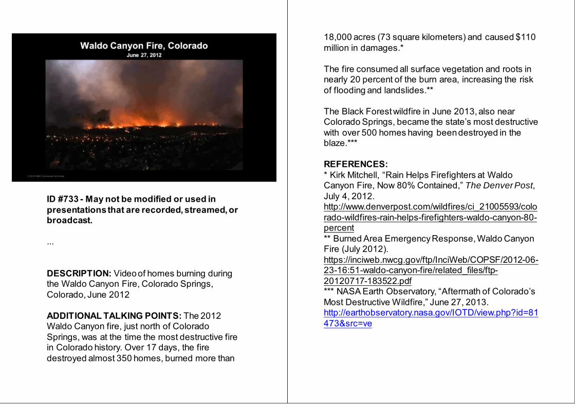
ID #733 - May not be modified or used in presentations that are recorded, streamed, or broadcast.
...
DESCRIPTION: Video of homes burning during the Waldo Canyon Fire, Colorado Springs, Colorado, June 2012
ADDITIONAL TALKING POINTS: The 2012 Waldo Canyon fire, just north of Colorado Springs, was at the time the most destructive fire in Colorado history. Over 17 days, the fire destroyed almost 350 homes, burned more than
18,000 acres (73 square kilometers) and caused $110 million in damages.*
The fire consumed all surface vegetation and roots in nearly 20 percent of the burn area, increasing the risk of flooding and landslides.**
The Black Forest wildfire in June 2013, also near Colorado Springs, became the state’s most destructive with over 500 homes having been destroyed in the blaze.***
REFERENCES:* Kirk Mitchell, “Rain Helps Firefighters at Waldo Canyon Fire, Now 80% Contained,” The Denver Post, July 4, 2012. http://www.denverpost.com/wildfires/ci_21005593/colorado-wildfires-rain-helps-firefighters-waldo-canyon-80-percent ** Burned Area Emergency Response, Waldo Canyon Fire (July 2012). https://inciweb.nwcg.gov/ftp/InciWeb/COPSF/2012-06-23-16:51-waldo-canyon-fire/related_files/ftp-20120717-183522.pdf*** NASA Earth Observatory, “Aftermath of Colorado’s Most Destructive Wildfire,” June 27, 2013. http://earthobservatory.nasa.gov/IOTD/view.php?id=81473&src=ve

ID #2041 - May not be modified or used in presentations that are recorded, streamed, or broadcast.
These fires are happening repeatedly. This was a year later in a nearby area.
DESCRIPTION: Aerial photo of neighborhoods charred by the Black Forest fire, Colorado, June 2013
ADDITIONAL TALKING POINTS: The Black Forest fire in June 2013 was Colorado’s most destructive, in terms of homes burned.* The fire burned more than 14,000 acres (5,600
hectares)** and generated almost $300 million in insurance claims.***
REFERENCES:* NASA Earth Observatory, “Black Forest Blaze is Colorado’s Most Destructive,” June 12, 2013. http://earthobservatory.nasa.gov/NaturalHazards/view.php?id=81396** InciWeb, “Black Forest Fire,” last updated June 24, 2013. http://inciweb.nwcg.gov/incident/3424*** Aldo Svaldi, “Black Forest Fire Insurance Claims Nearing $300 Million,” The Denver Post, July 15, 2013. http://www.denverpost.com/ci_23663772/black-forest-fire-insurance-claims-nearing-300-million

ID #1552 - May not be modified or used in presentations that are recorded, streamed, or broadcast.
…
DESCRIPTION: A man surveys his home burned by the Black Forest fire, Colorado Springs, Colorado, June 2013
ADDITIONAL TALKING POINTS: Aside from the hundreds of homes destroyed, the Black Forest fire burned through acres of ponderosa pine trees, worth approximately $29 million.*
REFERENCES:* Ryan Handy, “Damage Assessment Grows for Black Forest Fire,” The Gazette, July 16, 2013. http://gazette.com/damage-assessment-grows-for-black-forest-fire/article/1503565
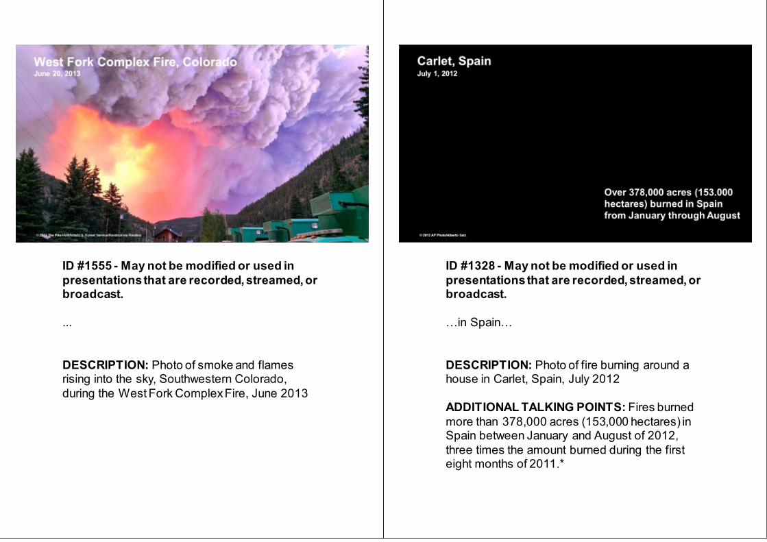
ID #1555 - May not be modified or used in presentations that are recorded, streamed, or broadcast.
...
DESCRIPTION: Photo of smoke and flames rising into the sky, Southwestern Colorado, during the West Fork Complex Fire, June 2013
ID #1328 - May not be modified or used in presentations that are recorded, streamed, or broadcast.
…in Spain…
DESCRIPTION: Photo of fire burning around a house in Carlet, Spain, July 2012
ADDITIONAL TALKING POINTS: Fires burned more than 378,000 acres (153,000 hectares) in Spain between January and August of 2012, three times the amount burned during the first eight months of 2011.*
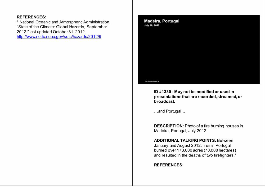
REFERENCES: * National Oceanic and Atmospheric Administration, “State of the Climate: Global Hazards, September 2012,” last updated October 31, 2012. http://www.ncdc.noaa.gov/sotc/hazards/2012/9
ID #1330 - May not be modified or used in presentations that are recorded, streamed, or broadcast.
…and Portugal…
DESCRIPTION: Photo of a fire burning houses in Madeira, Portugal, July 2012
ADDITIONAL TALKING POINTS: Between January and August 2012, fires in Portugal burned over 173,000 acres (70,000 hectares) and resulted in the deaths of two firefighters.*
REFERENCES:
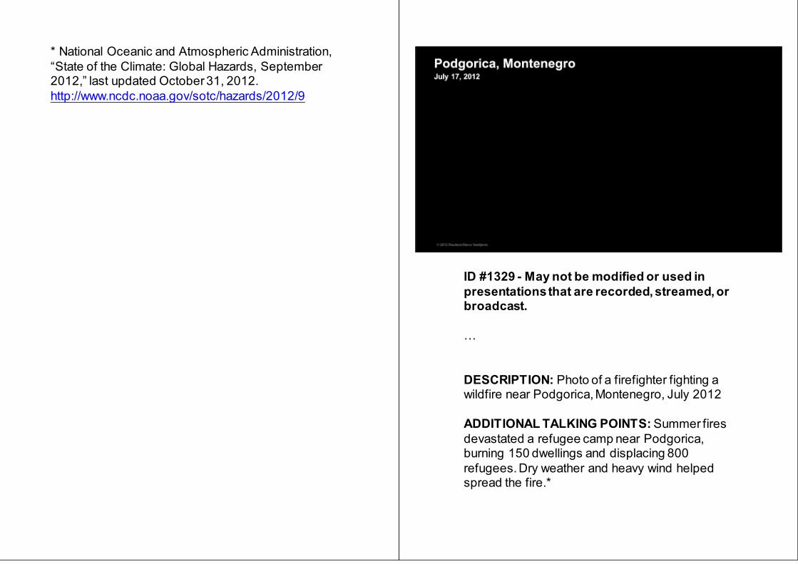
* National Oceanic and Atmospheric Administration, “State of the Climate: Global Hazards, September 2012,” last updated October 31, 2012. http://www.ncdc.noaa.gov/sotc/hazards/2012/9
ID #1329 - May not be modified or used in presentations that are recorded, streamed, or broadcast.
…
DESCRIPTION: Photo of a firefighter fighting a wildfire near Podgorica, Montenegro, July 2012
ADDITIONAL TALKING POINTS: Summer fires devastated a refugee camp near Podgorica, burning 150 dwellings and displacing 800 refugees. Dry weather and heavy wind helped spread the fire.*
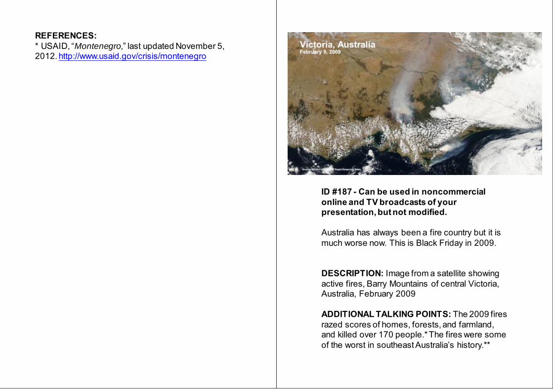
REFERENCES:* USAID, “Montenegro,” last updated November 5, 2012. http://www.usaid.gov/crisis/montenegro
ID #187 - Can be used in noncommercial online and TV broadcasts of your presentation, but not modified.
Australia has always been a fire country but it is much worse now. This is Black Friday in 2009.
DESCRIPTION: Image from a satellite showing active fires, Barry Mountains of central Victoria, Australia, February 2009
ADDITIONAL TALKING POINTS: The 2009 fires razed scores of homes, forests, and farmland, and killed over 170 people.* The fires were some of the worst in southeast Australia’s history.**
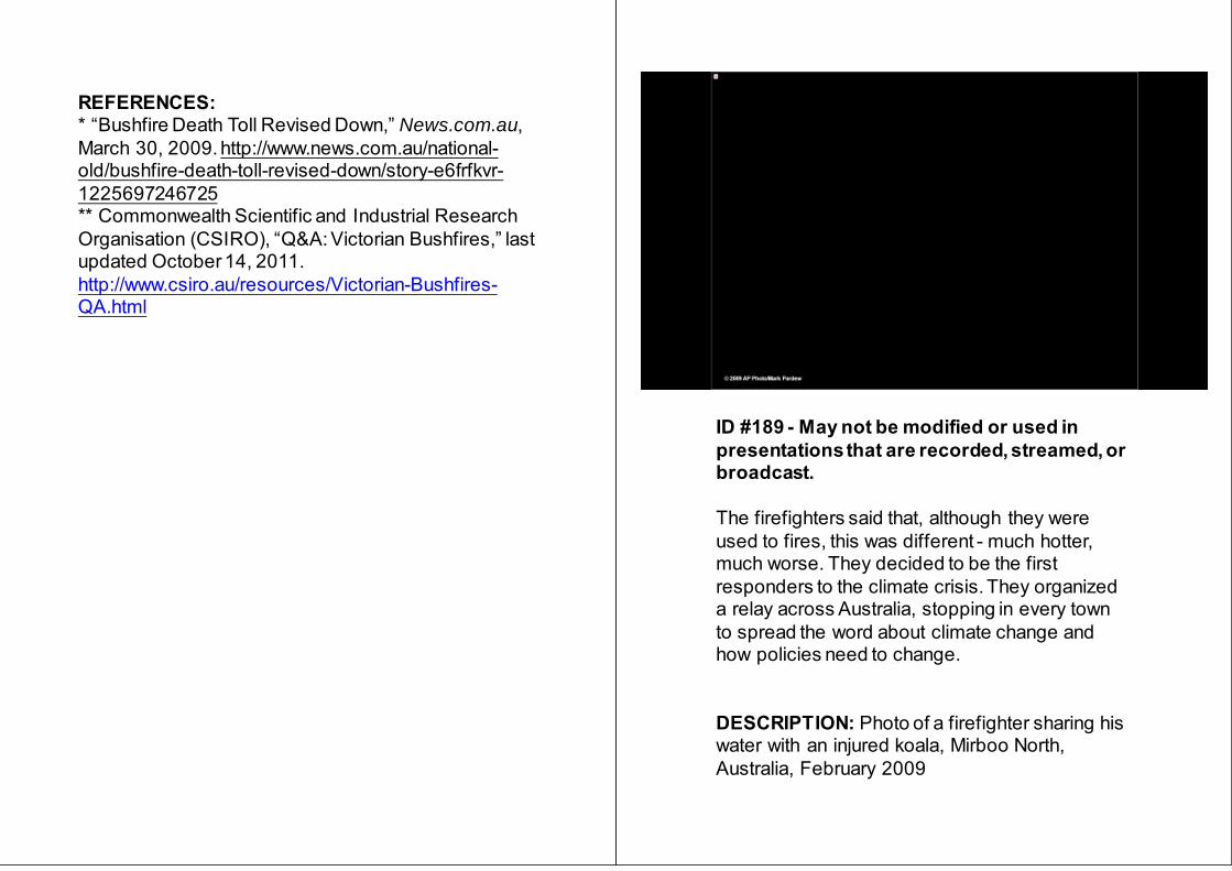
REFERENCES:* “Bushfire Death Toll Revised Down,” News.com.au, March 30, 2009. http://www.news.com.au/national-old/bushfire-death-toll-revised-down/story-e6frfkvr-1225697246725 ** Commonwealth Scientific and Industrial Research Organisation (CSIRO), “Q&A: Victorian Bushfires,” last updated October 14, 2011. http://www.csiro.au/resources/Victorian-Bushfires-QA.html
ID #189 - May not be modified or used in presentations that are recorded, streamed, or broadcast.
The firefighters said that, although they were used to fires, this was different - much hotter, much worse. They decided to be the first responders to the climate crisis. They organized a relay across Australia, stopping in every town to spread the word about climate change and how policies need to change.
DESCRIPTION: Photo of a firefighter sharing his water with an injured koala, Mirboo North, Australia, February 2009
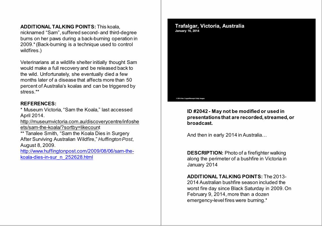
ADDITIONAL TALKING POINTS: This koala, nicknamed “Sam”, suffered second- and third-degree burns on her paws during a back-burning operation in 2009.* (Back-burning is a technique used to control wildfires.)
Veterinarians at a wildlife shelter initially thought Sam would make a full recovery and be released back to the wild. Unfortunately, she eventually died a few months later of a disease that affects more than 50 percent of Australia’s koalas and can be triggered by stress.**
REFERENCES:* Museum Victoria, “Sam the Koala,” last accessed April 2014. http://museumvictoria.com.au/discoverycentre/infosheets/sam-the-koala/?sortby=likecount ** Tanalee Smith, “Sam the Koala Dies in Surgery After Surviving Australian Wildfire,” Huffington Post, August 8, 2009. http://www.huffingtonpost.com/2009/08/06/sam-the-koala-dies-in-sur_n_252628.html
ID #2042 - May not be modified or used in presentations that are recorded, streamed, or broadcast.
And then in early 2014 in Australia…
DESCRIPTION: Photo of a firefighter walking along the perimeter of a bushfire in Victoria in January 2014
ADDITIONAL TALKING POINTS: The 2013-2014 Australian bushfire season included the worst fire day since Black Saturday in 2009. On February 9, 2014, more than a dozen emergency-level fires were burning.*

On February 11, 2014, flights at Melbourne’s airport were delayed due to smoke coming from fires burning in the outer suburbs of the city.**
REFERENCES:* Helen Davidson, “Victorian Bushfires Continue to Rage Despite Drops in Temperatures,” The Guardian, February 9 , 2014. http://www.theguardian.com/world/2014/feb/09/fires-continue-to-rage-through-victoria-despite-drops-in-temperature** Oliver Smith, “Bushfires Delay Fights at Melbourne Airport,” The Telegraph, February 11, 2014. http://www.telegraph.co.uk/travel/destinations/australiaandpacific/australia/10630237/Bushfires-delay-flights-at-Melbourne-Airport.html
ID #2043 - May not be modified or used in presentations that are recorded, streamed, or broadcast.
…
DESCRIPTION: Photo of firefighters in the middle of the Perth Hills fire on January 13, 2014 in Perth, Australia
ADDITIONAL TALKING POINTS: The Perth Hills fire was ignited by wires from a fallen power pole. It took nearly a week to fully contain the fire, which destroyed 52 properties.*

REFERENCES:* Kaitlyn Offer, Phil Hickey, and Australian Associated Press, “Residents Begin to Return Home after 52 Properties Lost to Perth Hills fire,” Perthnow.com.au, January 16, 2014. http://www.perthnow.com.au/news/western-australia/residents-begin-to-return-home-after-52-properties-lost-to-perth-hills-fire/story-fnhocxo3-1226800056158
ID #2047 - Can be used in noncommercial online and TV broadcasts of your presentation, but not modified.
Africa has more than half of the world’s wildfires so the spread of fires could have an even larger impact of Africa. Whatever the cause of the fire, the ability for it to spread is enhanced in new conditions.
DESCRIPTION: Text slide about wildfire occurrence across Africa
ADDITIONAL TALKING POINTS: Each year, wildfires across the African continent account for

70 percent of the total area burned globally by wildfires.*
REFERENCES:* University of Leeds, School of Earth and Environment, “Climate and Atmospheric Sciences (ICAS) PhD Project,” last accessed April 2014. http://www.see.leeds.ac.uk/admissions-and-study/research-degrees/icas/arnold-spracklen-1/
ID #1962 - May not be modified or used in presentations that are recorded, streamed, or broadcast.
Here’s an example from Kenya…
DESCRIPTION: Photo of a helicopter dumping water on a wildfire in Kenya in March 2012
ADDITIONAL TALKING POINTS: This fire on Mount Kenya—believed to have been ignited by poachers—burned through 10 percent of the mountain’s forest.* The natural forest located within Mt. Kenya National Park is a UNESCO World Heritage site.**
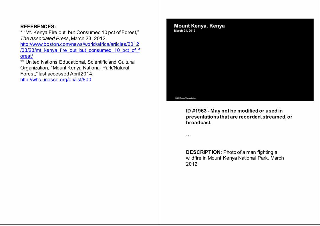
REFERENCES:* “Mt. Kenya Fire out, but Consumed 10 pct of Forest,” The Associated Press, March 23, 2012. http://www.boston.com/news/world/africa/articles/2012/03/23/mt_kenya_fire_out_but_consumed_10_pct_of_forest/** United Nations Educational, Scientific and Cultural Organization, “Mount Kenya National Park/Natural Forest,” last accessed April 2014. http://whc.unesco.org/en/list/800
ID #1963 - May not be modified or used in presentations that are recorded, streamed, or broadcast.
…
DESCRIPTION: Photo of a man fighting a wildfire in Mount Kenya National Park, March 2012
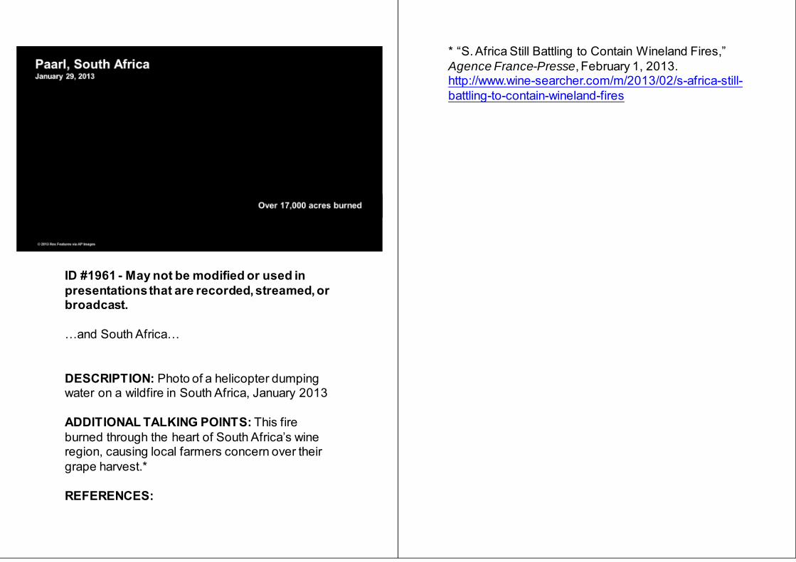
ID #1961 - May not be modified or used in presentations that are recorded, streamed, or broadcast.
…and South Africa…
DESCRIPTION: Photo of a helicopter dumping water on a wildfire in South Africa, January 2013
ADDITIONAL TALKING POINTS: This fire burned through the heart of South Africa’s wine region, causing local farmers concern over their grape harvest.*
REFERENCES:
* “S. Africa Still Battling to Contain Wineland Fires,” Agence France-Presse, February 1, 2013. http://www.wine-searcher.com/m/2013/02/s-africa-still-battling-to-contain-wineland-fires

ID #2044 - May not be modified or used in presentations that are recorded, streamed, or broadcast.
…
DESCRIPTION: Photo of a firefighter walking through charred forest in Kenya, March 2009
ADDITIONAL TALKING POINTS: These wildfires raged through indigenous forests in Kenya, including the Mau Forest Complex, a key source of water for at least twelve rivers. A substantial loss of forest in this area could lead to economic losses in tourism, tea, and energy
sectors totaling more than $300 million per year.*
REFERENCES:* United Nations Environment Programme, “Forest Fires Destroy Kenya’s Key Water Catchments,” March 25, 2009. http://www.unep.org/Documents.Multilingual/Default.asp?DocumentID=573&ArticleID=6109&l=en
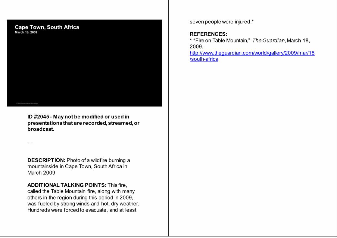
ID #2045 - May not be modified or used in presentations that are recorded, streamed, or broadcast.
…
DESCRIPTION: Photo of a wildfire burning a mountainside in Cape Town, South Africa in March 2009
ADDITIONAL TALKING POINTS: This fire, called the Table Mountain fire, along with many others in the region during this period in 2009, was fueled by strong winds and hot, dry weather. Hundreds were forced to evacuate, and at least
seven people were injured.*
REFERENCES:* “Fire on Table Mountain,” The Guardian, March 18, 2009. http://www.theguardian.com/world/gallery/2009/mar/18/south-africa
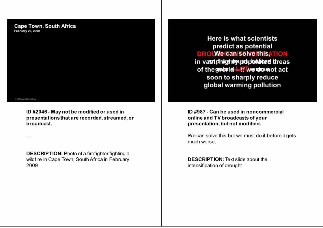
ID #2046 - May not be modified or used in presentations that are recorded, streamed, or broadcast.
…
DESCRIPTION: Photo of a firefighter fighting a wildfire in Cape Town, South Africa in February 2009
ID #987 - Can be used in noncommercial online and TV broadcasts of your presentation, but not modified.
We can solve this but we must do it before it gets much worse.
DESCRIPTION: Text slide about the intensification of drought
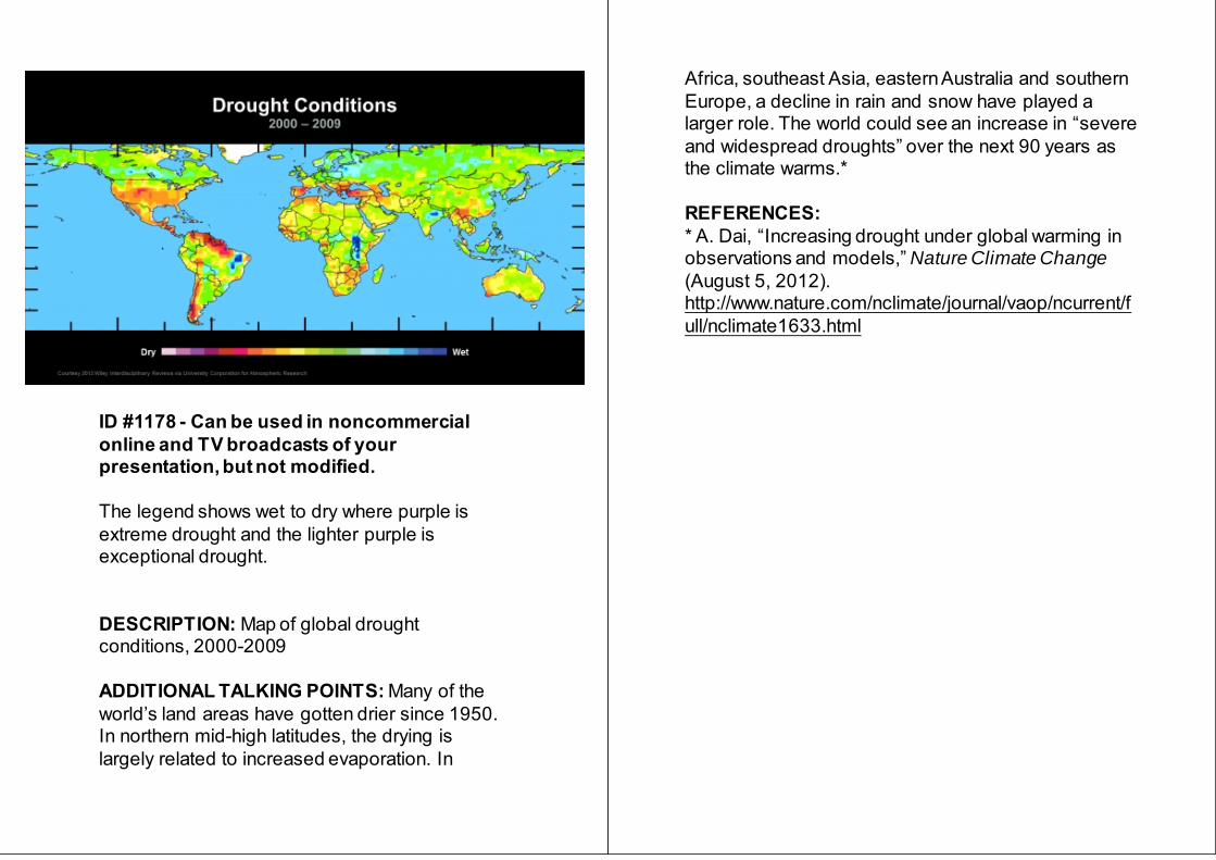
ID #1178 - Can be used in noncommercial online and TV broadcasts of your presentation, but not modified.
The legend shows wet to dry where purple is extreme drought and the lighter purple is exceptional drought.
DESCRIPTION: Map of global drought conditions, 2000-2009
ADDITIONAL TALKING POINTS: Many of the world’s land areas have gotten drier since 1950. In northern mid-high latitudes, the drying is largely related to increased evaporation. In
Africa, southeast Asia, eastern Australia and southern Europe, a decline in rain and snow have played a larger role. The world could see an increase in “severe and widespread droughts” over the next 90 years as the climate warms.*
REFERENCES:* A. Dai, “Increasing drought under global warming in observations and models,” Nature Climate Change(August 5, 2012). http://www.nature.com/nclimate/journal/vaop/ncurrent/full/nclimate1633.html
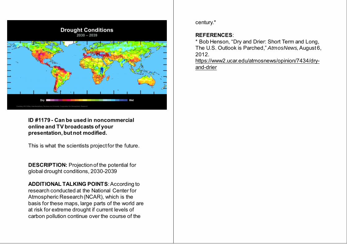
ID #1179 - Can be used in noncommercial online and TV broadcasts of your presentation, but not modified.
This is what the scientists project for the future.
DESCRIPTION: Projection of the potential for global drought conditions, 2030-2039
ADDITIONAL TALKING POINTS: According to research conducted at the National Center for Atmospheric Research (NCAR), which is the basis for these maps, large parts of the world are at risk for extreme drought if current levels of carbon pollution continue over the course of the
century.*
REFERENCES: * Bob Henson, “Dry and Drier: Short Term and Long, The U.S. Outlook is Parched,” AtmosNews, August 6, 2012. https://www2.ucar.edu/atmosnews/opinion/7434/dry-and-drier
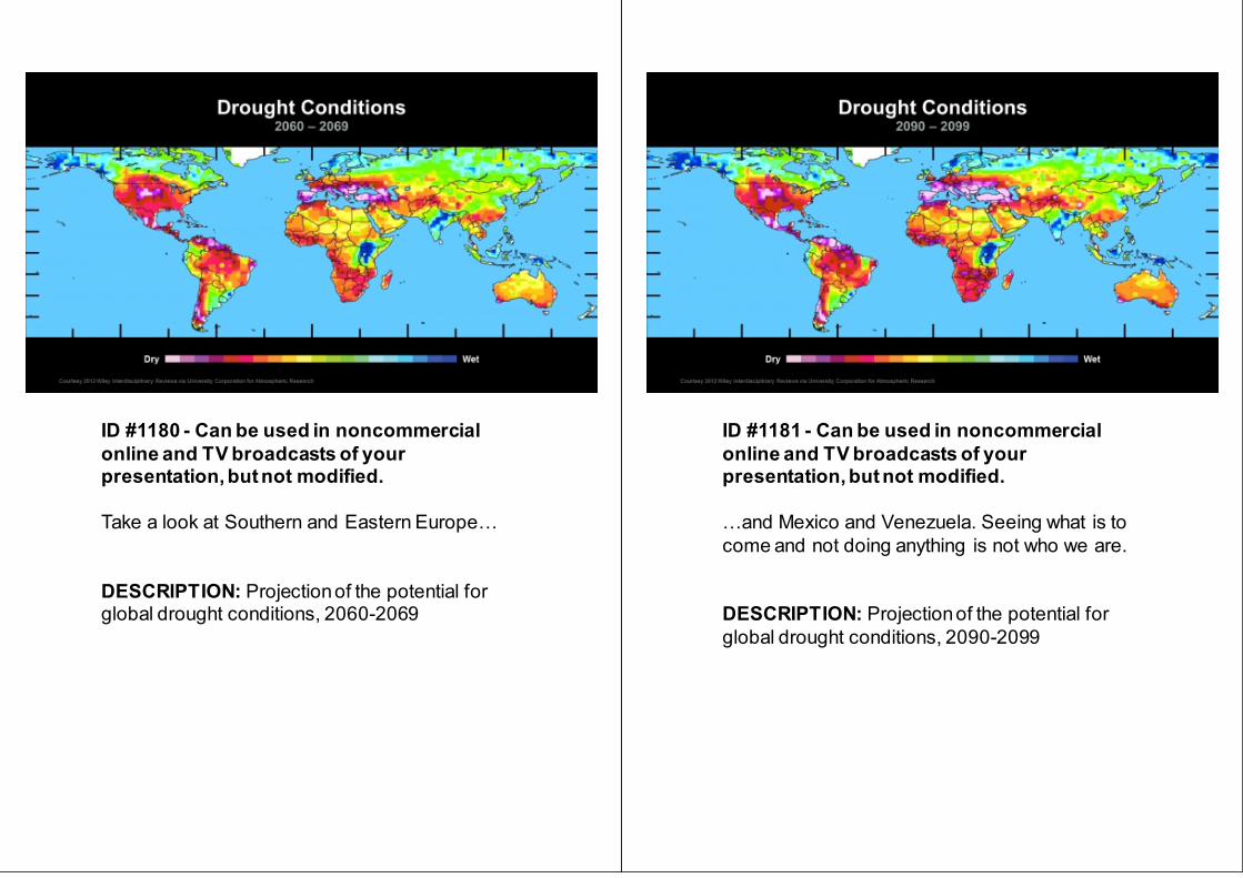
ID #1180 - Can be used in noncommercial online and TV broadcasts of your presentation, but not modified.
Take a look at Southern and Eastern Europe…
DESCRIPTION: Projection of the potential for global drought conditions, 2060-2069
ID #1181 - Can be used in noncommercial online and TV broadcasts of your presentation, but not modified.
…and Mexico and Venezuela. Seeing what is to come and not doing anything is not who we are.
DESCRIPTION: Projection of the potential for global drought conditions, 2090-2099
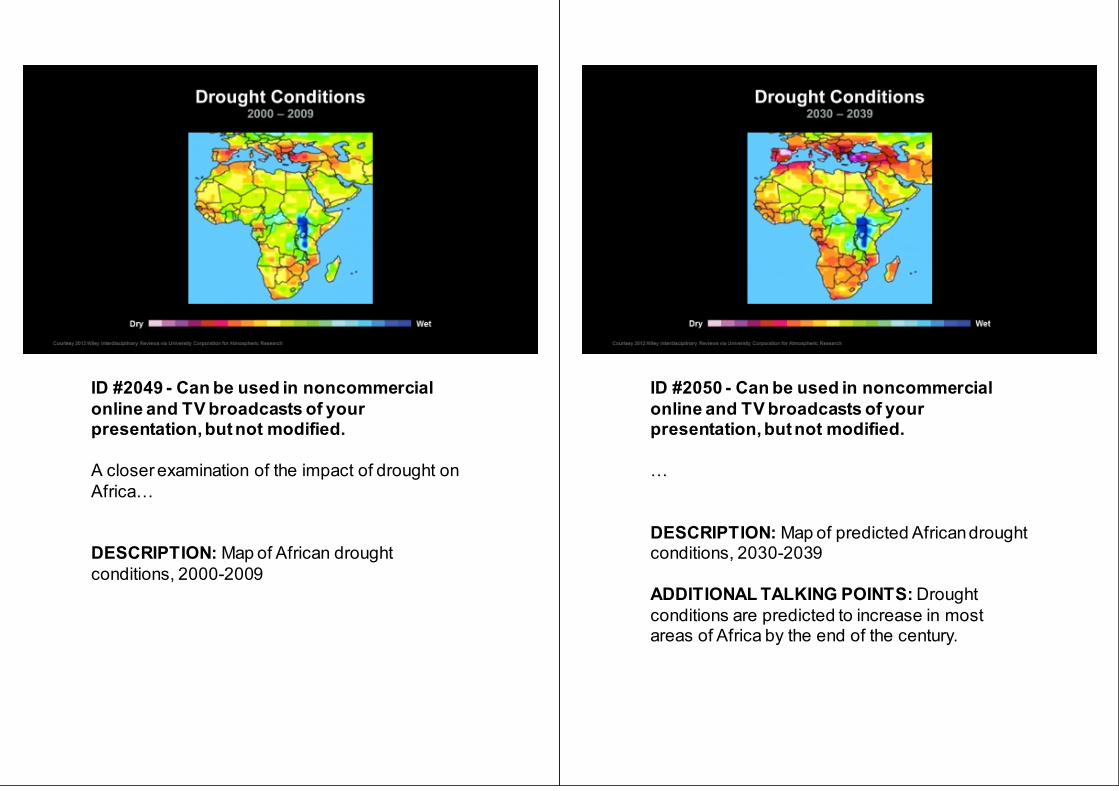
ID #2049 - Can be used in noncommercial online and TV broadcasts of your presentation, but not modified.
A closer examination of the impact of drought on Africa…
DESCRIPTION: Map of African drought conditions, 2000-2009
ID #2050 - Can be used in noncommercial online and TV broadcasts of your presentation, but not modified.
…
DESCRIPTION: Map of predicted African drought conditions, 2030-2039
ADDITIONAL TALKING POINTS: Drought conditions are predicted to increase in most areas of Africa by the end of the century.
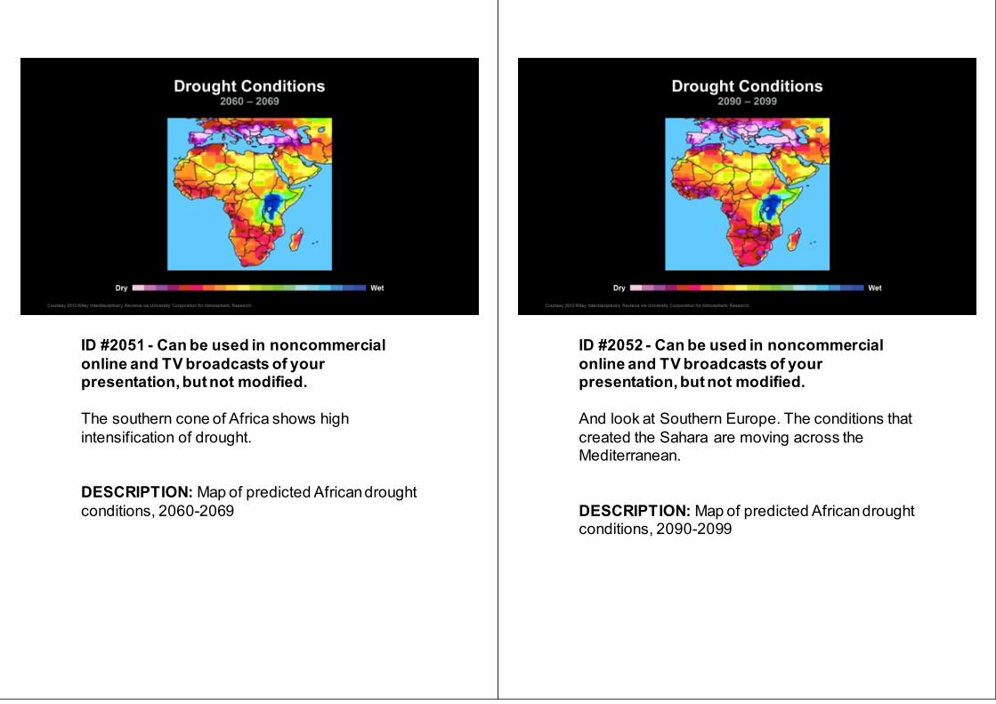
ID #2051 - Can be used in noncommercial online and TV broadcasts of your presentation, but not modified.
The southern cone of Africa shows high intensification of drought.
DESCRIPTION: Map of predicted African drought conditions, 2060-2069
ID #2052 - Can be used in noncommercial online and TV broadcasts of your presentation, but not modified.
And look at Southern Europe. The conditions that created the Sahara are moving across the Mediterranean.
DESCRIPTION: Map of predicted African drought conditions, 2090-2099
ID #967 - May not be modified or used in presentations that are recorded, streamed, or broadcast.
Here is the largest river in France. Southern France is known as the Garden of France. This is what it looked like in 2011. These conditions are already becoming persistent in southern Europe and northern Africa.
DESCRIPTION: Photo of the dried bed of the Loire River, western France, May 2011
ADDITIONAL TALKING POINTS: Between February and May of 2011, there was 40-80%
less rainfall than usual over Europe, compared to the second half of the twentieth century.* In France, rainfall accumulation from January to April 2011 was at its lowest level since 1975. During the dry spell France kept close watch on its nuclear reactors, most of which are cooled with river water.*
Droughts are expected to become more frequent and severe in southern Europe as the climate changes.**
REFERENCES:* Jeremy Lovell and ClimateWire, “Europe Braces for Serious Crop Losses and Blackouts,” Scientific American, June 13, 2011. http://www.scientificamerican.com/article.cfm?id=europe-braces-for-serious-crop-losses** B. Lehner, Petra Döll, J. Alcamo et al., “Estimating the impact of global change on flood and drought risks in Europe: A continental, integrated analysis,” Climatic Change 75, no. 3 (2006): 273-299. http://www.springerlink.com/content/v588106vv06nk12j/
ID #1954 - May not be modified or used in presentations that are recorded, streamed, or broadcast.
…
DESCRIPTION: Photo of a farmer squatting on drought-stricken land in al-Dakahlya, Egypt, June 2013
ADDITIONAL TALKING POINTS: Farming land in al-Dakahlya, Egypt, was once well irrigated by the Nile River, but with decreased water availability the farmlands have been reduced to desolate soil.*
REFERENCES:* “Africa in Pictures: 31 may-6 June 2013,” BBC, June 7, 2013. http://www.bbc.com/news/world-africa-22811991
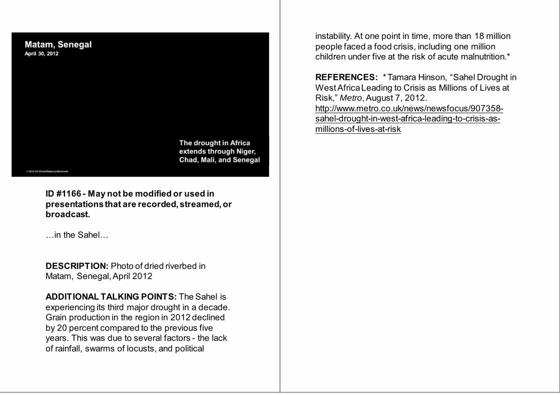
ID #1166 - May not be modified or used in presentations that are recorded, streamed, or broadcast.
…in the Sahel…
DESCRIPTION: Photo of dried riverbed in Matam, Senegal, April 2012
ADDITIONAL TALKING POINTS: The Sahel is experiencing its third major drought in a decade. Grain production in the region in 2012 declined by 20 percent compared to the previous five years. This was due to several factors - the lack of rainfall, swarms of locusts, and political
instability. At one point in time, more than 18 million people faced a food crisis, including one million children under five at the risk of acute malnutrition.*
REFERENCES:* Tamara Hinson, “Sahel Drought in West Africa Leading to Crisis as Millions of Lives at Risk,” Metro, August 7, 2012. http://www.metro.co.uk/news/newsfocus/907358-sahel-drought-in-west-africa-leading-to-crisis-as-millions-of-lives-at-risk
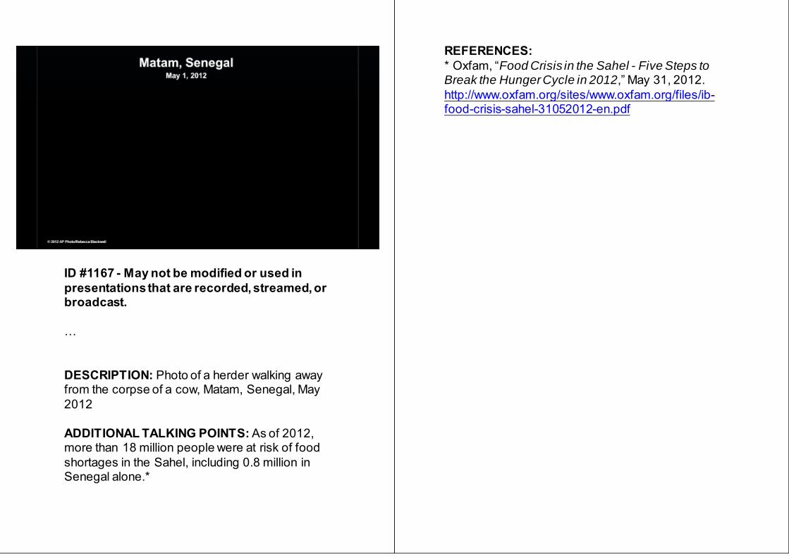
ID #1167 - May not be modified or used in presentations that are recorded, streamed, or broadcast.
…
DESCRIPTION: Photo of a herder walking away from the corpse of a cow, Matam, Senegal, May 2012
ADDITIONAL TALKING POINTS: As of 2012, more than 18 million people were at risk of food shortages in the Sahel, including 0.8 million in Senegal alone.*
REFERENCES:* Oxfam, “Food Crisis in the Sahel - Five Steps to Break the Hunger Cycle in 2012,” May 31, 2012. http://www.oxfam.org/sites/www.oxfam.org/files/ib-food-crisis-sahel-31052012-en.pdf
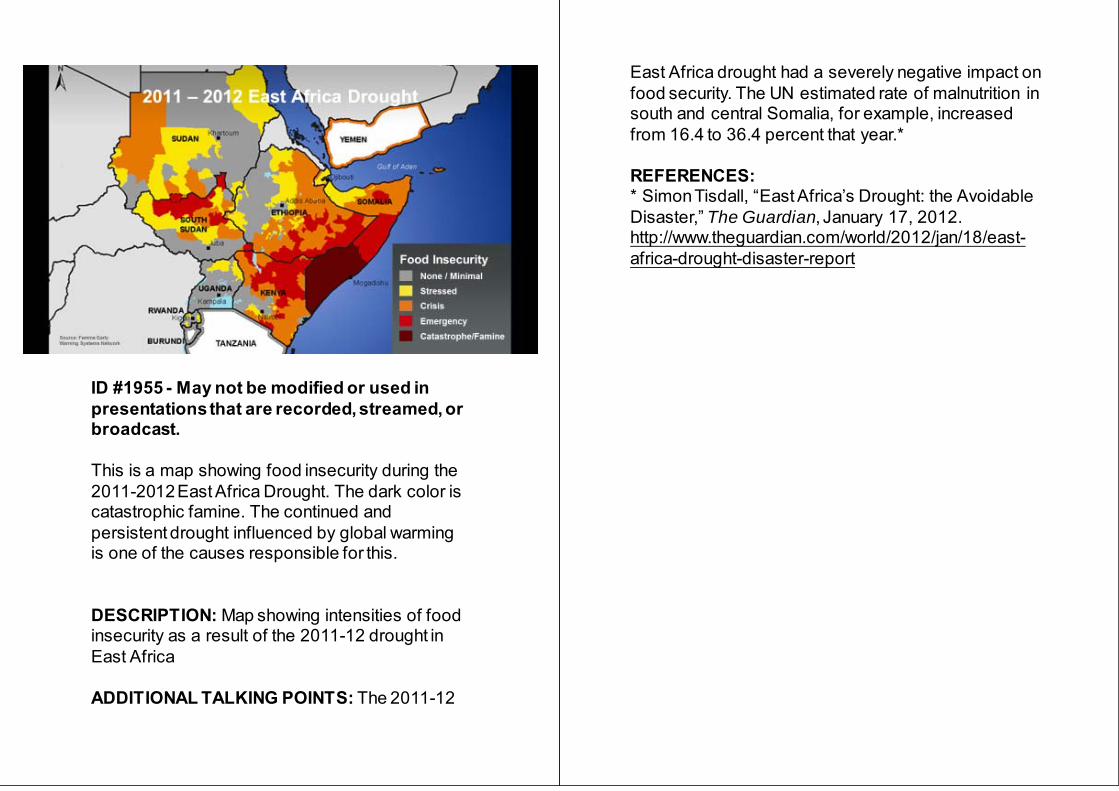
ID #1955 - May not be modified or used in presentations that are recorded, streamed, or broadcast.
This is a map showing food insecurity during the 2011-2012 East Africa Drought. The dark color is catastrophic famine. The continued and persistent drought influenced by global warming is one of the causes responsible for this.
DESCRIPTION: Map showing intensities of food insecurity as a result of the 2011-12 drought in East Africa
ADDITIONAL TALKING POINTS: The 2011-12
East Africa drought had a severely negative impact on food security. The UN estimated rate of malnutrition in south and central Somalia, for example, increased from 16.4 to 36.4 percent that year.*
REFERENCES:* Simon Tisdall, “East Africa’s Drought: the Avoidable Disaster,” The Guardian, January 17, 2012. http://www.theguardian.com/world/2012/jan/18/east-africa-drought-disaster-report
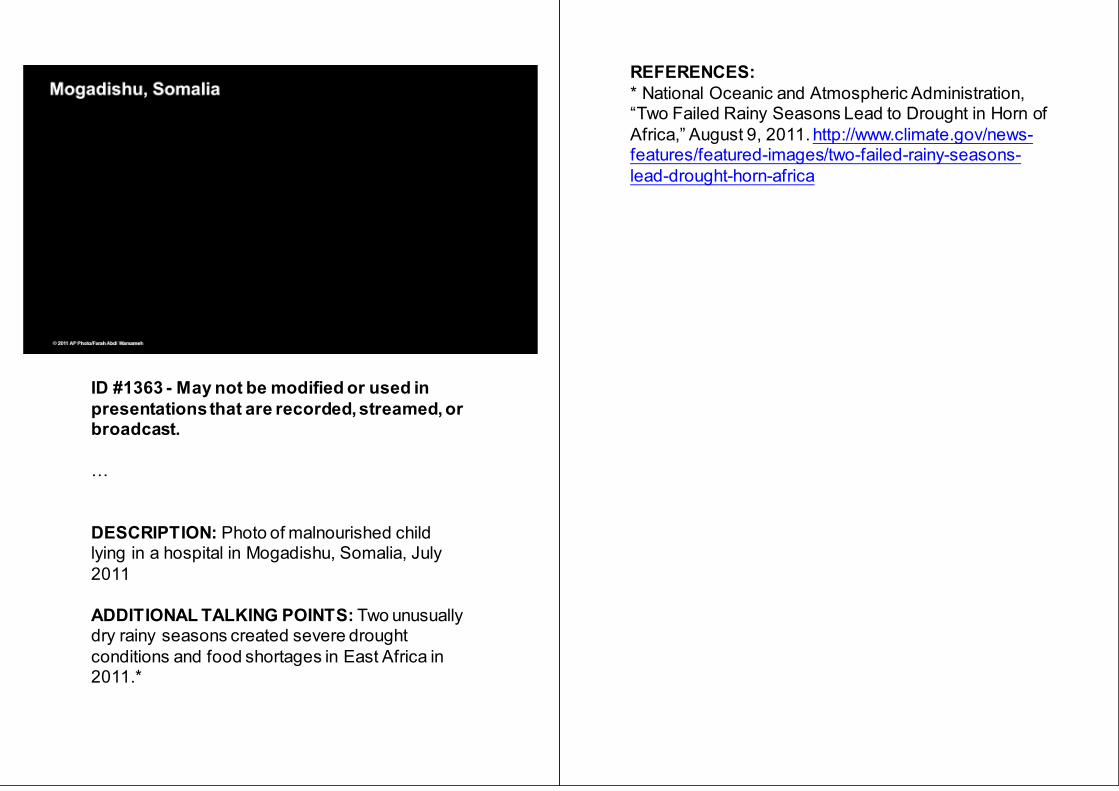
ID #1363 - May not be modified or used in presentations that are recorded, streamed, or broadcast.
…
DESCRIPTION: Photo of malnourished child lying in a hospital in Mogadishu, Somalia, July 2011
ADDITIONAL TALKING POINTS: Two unusually dry rainy seasons created severe drought conditions and food shortages in East Africa in 2011.*
REFERENCES:* National Oceanic and Atmospheric Administration, “Two Failed Rainy Seasons Lead to Drought in Horn of Africa,” August 9, 2011. http://www.climate.gov/news-features/featured-images/two-failed-rainy-seasons-lead-drought-horn-africa
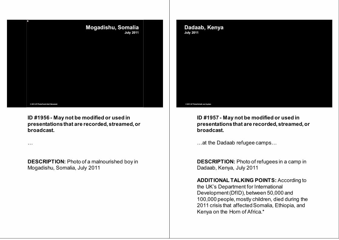
ID #1956 - May not be modified or used in presentations that are recorded, streamed, or broadcast.
…
DESCRIPTION: Photo of a malnourished boy in Mogadishu, Somalia, July 2011
ID #1957 - May not be modified or used in presentations that are recorded, streamed, or broadcast.
…at the Dadaab refugee camps…
DESCRIPTION: Photo of refugees in a camp in Dadaab, Kenya, July 2011
ADDITIONAL TALKING POINTS: According to the UK’s Department for International Development (DfID), between 50,000 and 100,000 people, mostly children, died during the 2011 crisis that affected Somalia, Ethiopia, and Kenya on the Horn of Africa.*
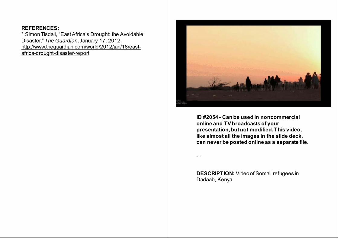
REFERENCES:* Simon Tisdall, “East Africa’s Drought: the Avoidable Disaster,” The Guardian, January 17, 2012. http://www.theguardian.com/world/2012/jan/18/east-africa-drought-disaster-report
ID #2054 - Can be used in noncommercial online and TV broadcasts of your presentation, but not modified. This video, like almost all the images in the slide deck, can never be posted online as a separate file.
…
DESCRIPTION: Video of Somali refugees in Dadaab, Kenya
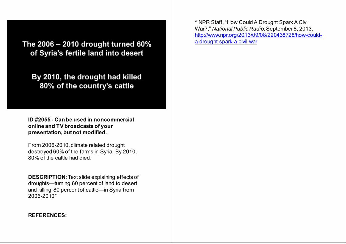
ID #2055 - Can be used in noncommercial online and TV broadcasts of your presentation, but not modified.
From 2006-2010, climate related drought destroyed 60% of the farms in Syria. By 2010, 80% of the cattle had died.
DESCRIPTION: Text slide explaining effects of droughts—turning 60 percent of land to desert and killing 80 percent of cattle—in Syria from 2006-2010*
REFERENCES:
* NPR Staff, “How Could A Drought Spark A Civil War?,” National Public Radio, September 8, 2013.http://www.npr.org/2013/09/08/220438728/how-could-a-drought-spark-a-civil-war
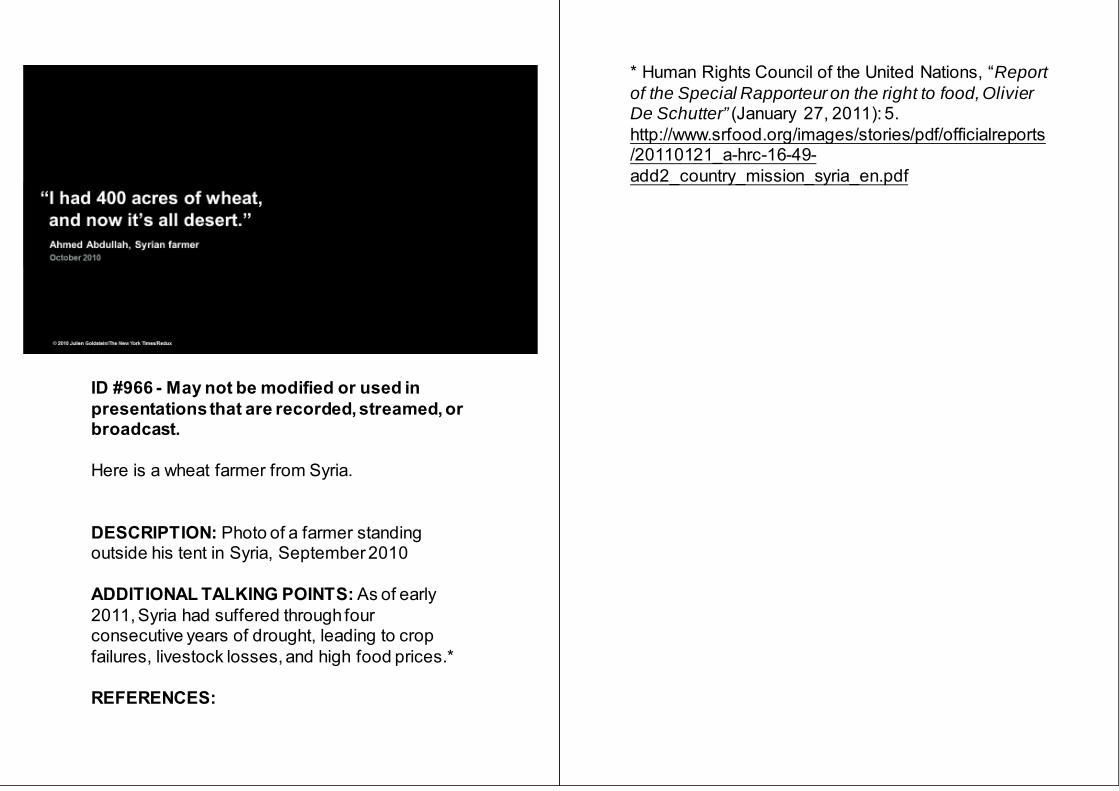
ID #966 - May not be modified or used in presentations that are recorded, streamed, or broadcast.
Here is a wheat farmer from Syria.
DESCRIPTION: Photo of a farmer standing outside his tent in Syria, September 2010
ADDITIONAL TALKING POINTS: As of early 2011, Syria had suffered through four consecutive years of drought, leading to crop failures, livestock losses, and high food prices.*
REFERENCES:
* Human Rights Council of the United Nations, “Report of the Special Rapporteur on the right to food, Olivier De Schutter” (January 27, 2011): 5.http://www.srfood.org/images/stories/pdf/officialreports/20110121_a-hrc-16-49-add2_country_mission_syria_en.pdf
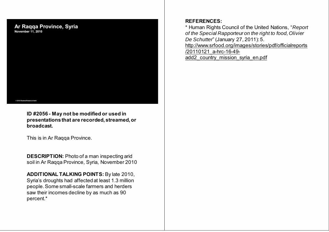
ID #2056 - May not be modified or used in presentations that are recorded, streamed, or broadcast.
This is in Ar Raqqa Province.
DESCRIPTION: Photo of a man inspecting arid soil in Ar Raqqa Province, Syria, November 2010
ADDITIONAL TALKING POINTS: By late 2010, Syria’s droughts had affected at least 1.3 million people. Some small-scale farmers and herders saw their incomes decline by as much as 90 percent.*
REFERENCES:* Human Rights Council of the United Nations, “Report of the Special Rapporteur on the right to food, Olivier De Schutter” (January 27, 2011): 5.http://www.srfood.org/images/stories/pdf/officialreports/20110121_a-hrc-16-49-add2_country_mission_syria_en.pdf
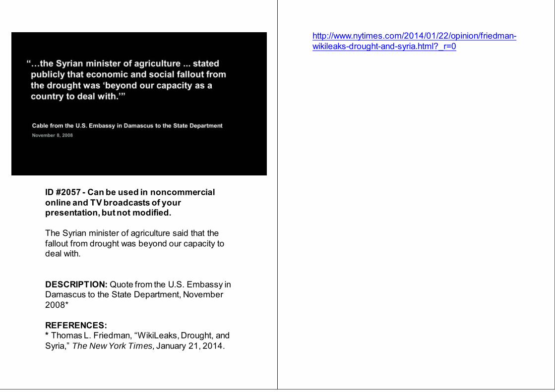
ID #2057 - Can be used in noncommercial online and TV broadcasts of your presentation, but not modified.
The Syrian minister of agriculture said that the fallout from drought was beyond our capacity to deal with.
DESCRIPTION: Quote from the U.S. Embassy in Damascus to the State Department, November 2008*
REFERENCES:* Thomas L. Friedman, “WikiLeaks, Drought, and Syria,” The New York Times, January 21, 2014.
http://www.nytimes.com/2014/01/22/opinion/friedman-wikileaks-drought-and-syria.html?_r=0
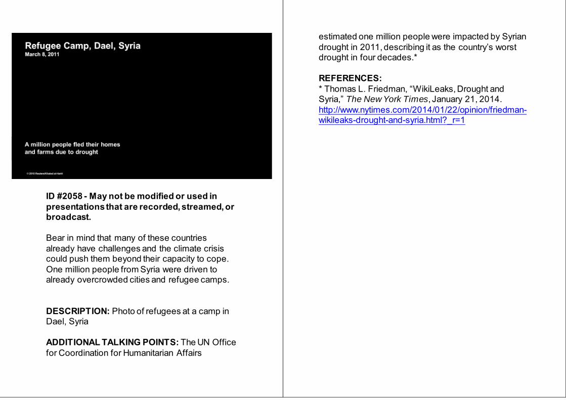
ID #2058 - May not be modified or used in presentations that are recorded, streamed, or broadcast.
Bear in mind that many of these countries already have challenges and the climate crisis could push them beyond their capacity to cope. One million people from Syria were driven to already overcrowded cities and refugee camps.
DESCRIPTION: Photo of refugees at a camp in Dael, Syria
ADDITIONAL TALKING POINTS: The UN Office for Coordination for Humanitarian Affairs
estimated one million people were impacted by Syrian drought in 2011, describing it as the country’s worst drought in four decades.*
REFERENCES:* Thomas L. Friedman, “WikiLeaks, Drought and Syria,” The New York Times, January 21, 2014. http://www.nytimes.com/2014/01/22/opinion/friedman-wikileaks-drought-and-syria.html?_r=1

ID #1473 - May not be modified or used in presentations that are recorded, streamed, or broadcast.
Water policy and desertification is another part of this that must be dealt with.
DESCRIPTION: Aerial photo of the Nile Valley, Egypt
ADDITIONAL TALKING POINTS: Since the 1970s, desertification has left over 105 million hectares of land in Africa unsuitable for agriculture. Climate change is expected to increase desertification.*
REFERENCES:* United Nations-Water/Africa, “African Water Development Report 2006,” June 9, 2006. http://www.uneca.org/sites/default/files/publications/awdr2006_full.pdf
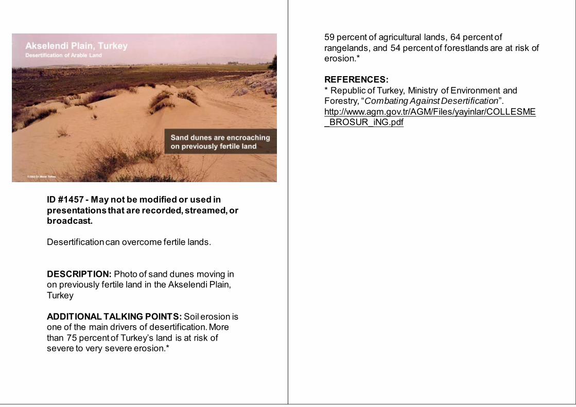
ID #1457 - May not be modified or used in presentations that are recorded, streamed, or broadcast.
Desertification can overcome fertile lands.
DESCRIPTION: Photo of sand dunes moving in on previously fertile land in the Akselendi Plain, Turkey
ADDITIONAL TALKING POINTS: Soil erosion is one of the main drivers of desertification. More than 75 percent of Turkey’s land is at risk of severe to very severe erosion.*
59 percent of agricultural lands, 64 percent of rangelands, and 54 percent of forestlands are at risk of erosion.*
REFERENCES: * Republic of Turkey, Ministry of Environment and Forestry, “Combating Against Desertification”. http://www.agm.gov.tr/AGM/Files/yayinlar/COLLESME_BROSUR_iNG.pdf
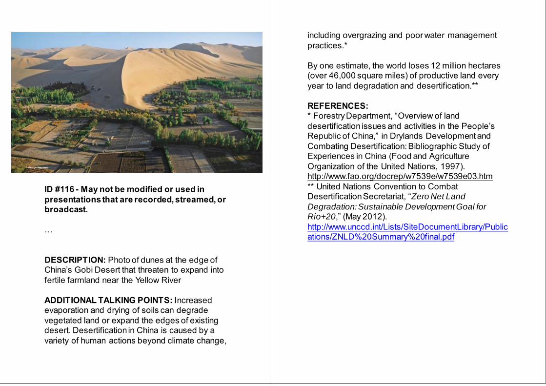
ID #116 - May not be modified or used in presentations that are recorded, streamed, or broadcast.
…
DESCRIPTION: Photo of dunes at the edge of China’s Gobi Desert that threaten to expand into fertile farmland near the Yellow River
ADDITIONAL TALKING POINTS: Increased evaporation and drying of soils can degrade vegetated land or expand the edges of existing desert. Desertification in China is caused by a variety of human actions beyond climate change,
including overgrazing and poor water management practices.*
By one estimate, the world loses 12 million hectares (over 46,000 square miles) of productive land every year to land degradation and desertification.**
REFERENCES:* Forestry Department, “Overview of land desertification issues and activities in the People’s Republic of China,” in Drylands Development and Combating Desertification: Bibliographic Study of Experiences in China (Food and Agriculture Organization of the United Nations, 1997). http://www.fao.org/docrep/w7539e/w7539e03.htm** United Nations Convention to Combat Desertification Secretariat, “Zero Net Land Degradation: Sustainable Development Goal for Rio+20,” (May 2012). http://www.unccd.int/Lists/SiteDocumentLibrary/Publications/ZNLD%20Summary%20final.pdf
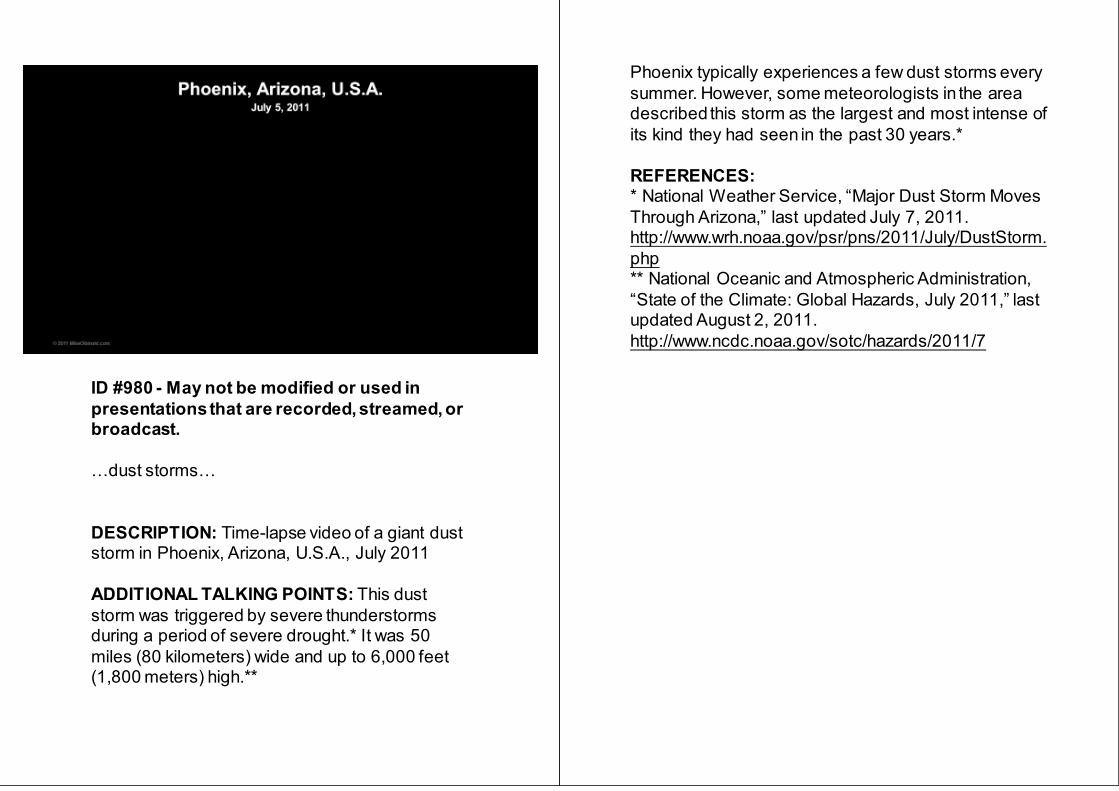
ID #980 - May not be modified or used in presentations that are recorded, streamed, or broadcast.
…dust storms…
DESCRIPTION: Time-lapse video of a giant dust storm in Phoenix, Arizona, U.S.A., July 2011
ADDITIONAL TALKING POINTS: This dust storm was triggered by severe thunderstorms during a period of severe drought.* It was 50 miles (80 kilometers) wide and up to 6,000 feet (1,800 meters) high.**
Phoenix typically experiences a few dust storms every summer. However, some meteorologists in the area described this storm as the largest and most intense of its kind they had seen in the past 30 years.*
REFERENCES:* National Weather Service, “Major Dust Storm Moves Through Arizona,” last updated July 7, 2011. http://www.wrh.noaa.gov/psr/pns/2011/July/DustStorm.php ** National Oceanic and Atmospheric Administration, “State of the Climate: Global Hazards, July 2011,” last updated August 2, 2011. http://www.ncdc.noaa.gov/sotc/hazards/2011/7
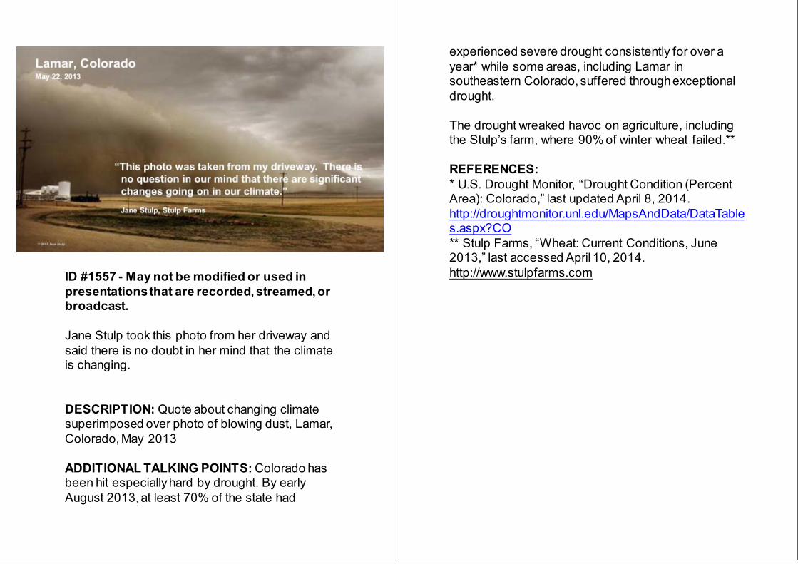
ID #1557 - May not be modified or used in presentations that are recorded, streamed, or broadcast.
Jane Stulp took this photo from her driveway and said there is no doubt in her mind that the climate is changing.
DESCRIPTION: Quote about changing climate superimposed over photo of blowing dust, Lamar, Colorado, May 2013
ADDITIONAL TALKING POINTS: Colorado has been hit especially hard by drought. By early August 2013, at least 70% of the state had
experienced severe drought consistently for over a year* while some areas, including Lamar in southeastern Colorado, suffered through exceptional drought.
The drought wreaked havoc on agriculture, including the Stulp’s farm, where 90% of winter wheat failed.**
REFERENCES:* U.S. Drought Monitor, “Drought Condition (Percent Area): Colorado,” last updated April 8, 2014. http://droughtmonitor.unl.edu/MapsAndData/DataTables.aspx?CO** Stulp Farms, “Wheat: Current Conditions, June 2013,” last accessed April 10, 2014. http://www.stulpfarms.com
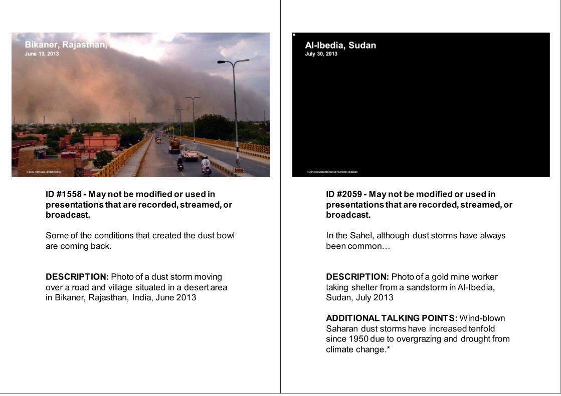
ID #1558 - May not be modified or used in presentations that are recorded, streamed, or broadcast.
Some of the conditions that created the dust bowl are coming back.
DESCRIPTION: Photo of a dust storm moving over a road and village situated in a desert area in Bikaner, Rajasthan, India, June 2013
ID #2059 - May not be modified or used in presentations that are recorded, streamed, or broadcast.
In the Sahel, although dust storms have always been common…
DESCRIPTION: Photo of a gold mine worker taking shelter from a sandstorm in Al-Ibedia, Sudan, July 2013
ADDITIONAL TALKING POINTS: Wind-blown Saharan dust storms have increased tenfold since 1950 due to overgrazing and drought from climate change.*

REFERENCES:* G. Miller and Scot Spoolman, “Living in the environment: Principles, connections, and solutions,” Cengage Learning, September 24, 2008. 16th edition, page 148. http://books.google.com/books?id=5gC9Dy1YWfkC&lpg=PA148&ots=FF9QYhcEkh&dq=sahara%20dust%20storms%20ten%20fold%20since%201950&pg=PA148#v=onepage&q=sahara%20dust%20storms%20ten%20fold%20since%201950&f=false
ID #1959 - May not be modified or used in presentations that are recorded, streamed, or broadcast.
…there is now a dangerous set of conditions growing in Africa.
DESCRIPTION: Photo of desert encroachment near the Ogrein Railway Station in Ogrein, Sudan, August 2013
ADDITIONAL TALKING POINTS: Desertification currently affects about 40 percent of Africa, and the UN warns that two-thirds of the continent’s arable land could be lost to desert encroachment
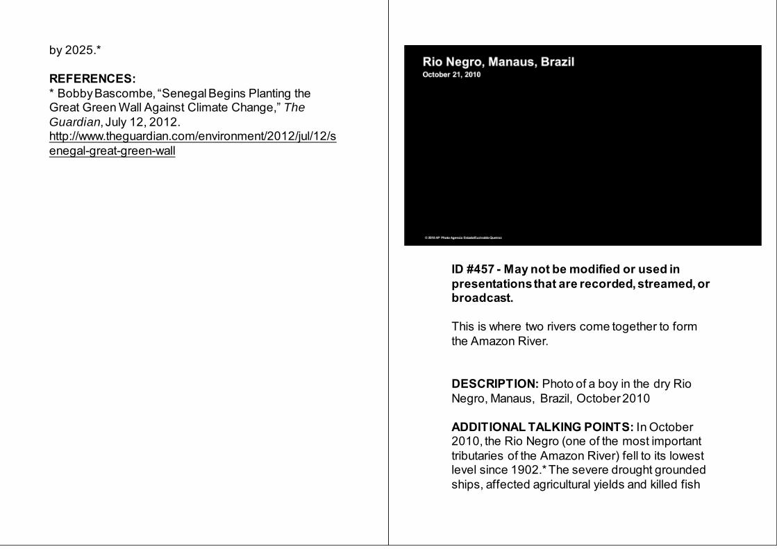
by 2025.*
REFERENCES:* Bobby Bascombe, “Senegal Begins Planting the Great Green Wall Against Climate Change,” The Guardian, July 12, 2012. http://www.theguardian.com/environment/2012/jul/12/senegal-great-green-wall
ID #457 - May not be modified or used in presentations that are recorded, streamed, or broadcast.
This is where two rivers come together to form the Amazon River.
DESCRIPTION: Photo of a boy in the dry Rio Negro, Manaus, Brazil, October 2010
ADDITIONAL TALKING POINTS: In October 2010, the Rio Negro (one of the most important tributaries of the Amazon River) fell to its lowest level since 1902.* The severe drought grounded ships, affected agricultural yields and killed fish
used as food by local communities.**
Northeast Brazil is home to more than 20 million people, “making it the most densely populated dry region in the world.” The area faces a chronic water shortage and is vulnerable to further reductions of rainfall.***
Through early 2013, the area suffered through one of the worst droughts in 50 years.****
REFERENCES:* Tom Phillips, “Drought Brings Amazon Tributary to Lowest Level in a Century,” The Guardian, October 25, 2010. http://www.guardian.co.uk/world/2010/oct/26/amazon-drought-tributary-rio-negro-climate-change ** Stuart Grudgings, “Brazil’s Amazon Region Suffers Severe Drought,” Reuters, October 26, 2010. http://www.reuters.com/article/2010/10/26/us-brazil-amazon-drought-idUSTRE69P3NC20101026 *** Brazil Ministry of Science and Technology, “Second National Communication of Brazil to the United Nations Framework Convention on Climate Change” (2010): 395. http://www.mct.gov.br/upd_blob/0214/214079.pdf**** “Brazil’s Rousseff Promises BRL32 Billion in Investments in Drought-Stricken Northeast,” The Wall Street Journal, April 8, 2013. http://online.wsj.com/article/BT-CO-20130408-705711.html
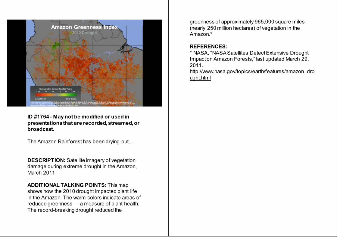
ID #1764 - May not be modified or used in presentations that are recorded, streamed, or broadcast.
The Amazon Rainforest has been drying out…
DESCRIPTION: Satellite imagery of vegetation damage during extreme drought in the Amazon, March 2011
ADDITIONAL TALKING POINTS: This map shows how the 2010 drought impacted plant life in the Amazon. The warm colors indicate areas of reduced greenness — a measure of plant health. The record-breaking drought reduced the
greenness of approximately 965,000 square miles (nearly 250 million hectares) of vegetation in the Amazon.*
REFERENCES:* NASA, “NASA Satellites Detect Extensive Drought Impact on Amazon Forests,” last updated March 29, 2011. http://www.nasa.gov/topics/earth/features/amazon_drought.html
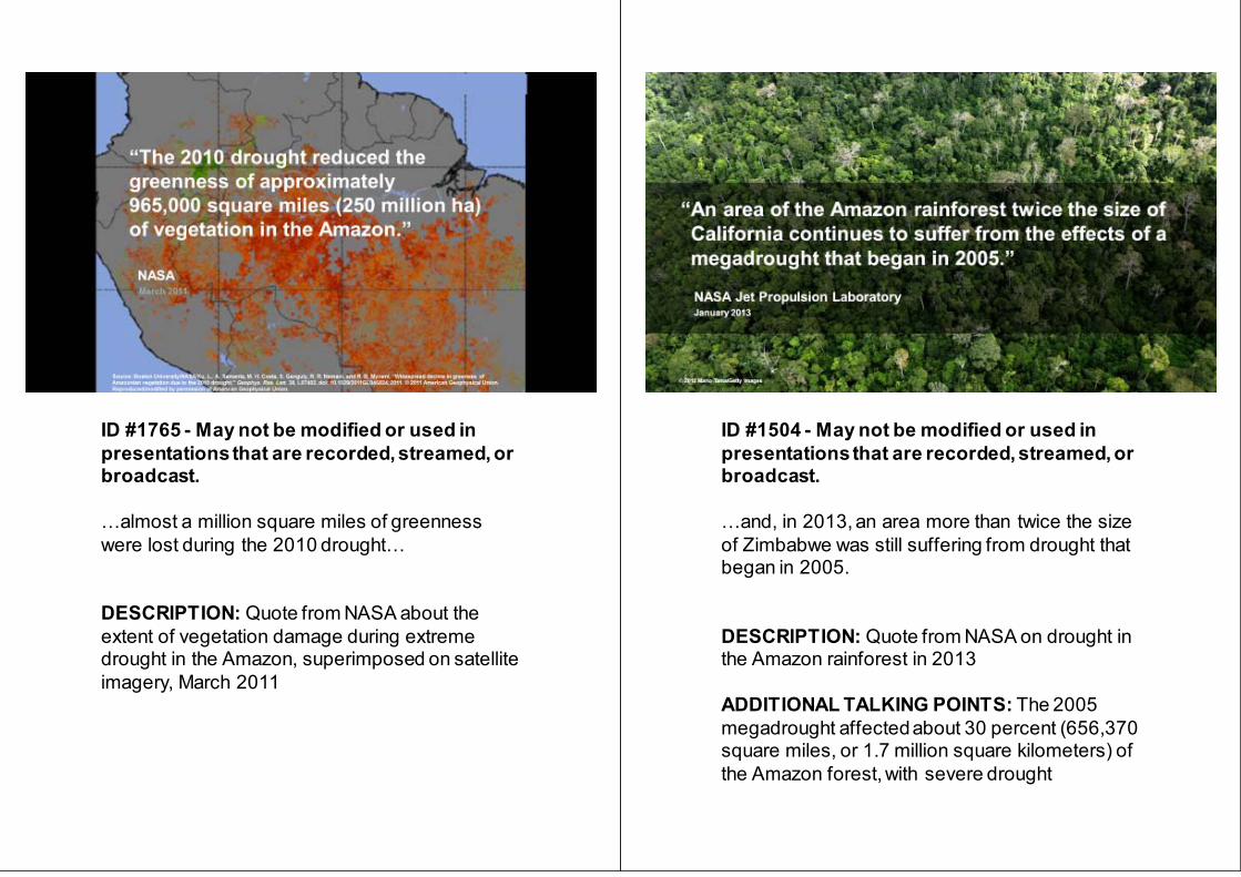
ID #1765 - May not be modified or used in presentations that are recorded, streamed, or broadcast.
…almost a million square miles of greenness were lost during the 2010 drought…
DESCRIPTION: Quote from NASA about the extent of vegetation damage during extreme drought in the Amazon, superimposed on satellite imagery, March 2011
ID #1504 - May not be modified or used in presentations that are recorded, streamed, or broadcast.
…and, in 2013, an area more than twice the size of Zimbabwe was still suffering from drought that began in 2005.
DESCRIPTION: Quote from NASA on drought in the Amazon rainforest in 2013
ADDITIONAL TALKING POINTS: The 2005 megadrought affected about 30 percent (656,370 square miles, or 1.7 million square kilometers) of the Amazon forest, with severe drought
conditions seen in roughly 5 percent of the forest. In 2010, the Amazon was hit by another severe drought that affected nearly half of the forest.*
REFERENCES: * Alan Buis, “Study Finds Severe Climate Jeopardizing Amazon Forest,” Jet Propulsion Laboratory, January 17, 2013. http://www.jpl.nasa.gov/news/news.php?release=2013-025
ID #117 - May not be modified or used in presentations that are recorded, streamed, or broadcast.
Switching gears to the Arctic…
DESCRIPTION: 3-second animation of spinning globe, ending on the Arctic
PRESENTATION TIP: Use this slide to transition to the Arctic section of the presentation.
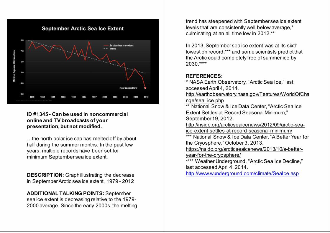
ID #1345 - Can be used in noncommercial online and TV broadcasts of your presentation, but not modified.
…the north polar ice cap has melted off by about half during the summer months. In the past few years, multiple records have been set for minimum September sea ice extent.
DESCRIPTION: Graph illustrating the decrease in September Arctic sea ice extent, 1979 - 2012
ADDITIONAL TALKING POINTS: September sea ice extent is decreasing relative to the 1979-2000 average. Since the early 2000s, the melting
trend has steepened with September sea ice extent levels that are consistently well below average,* culminating at an all time low in 2012.**
In 2013, September sea ice extent was at its sixth lowest on record,*** and some scientists predict that the Arctic could completely free of summer ice by 2030.****
REFERENCES:* NASA Earth Observatory, “Arctic Sea Ice,” last accessed April 4, 2014. http://earthobservatory.nasa.gov/Features/WorldOfChange/sea_ice.php ** National Snow & Ice Data Center, “Arctic Sea Ice Extent Settles at Record Seasonal Minimum,” September 19, 2012. http://nsidc.org/arcticseaicenews/2012/09/arctic-sea-ice-extent-settles-at-record-seasonal-minimum/ *** National Snow & Ice Data Center, “A Better Year for the Cryosphere,” October 3, 2013. https://nsidc.org/arcticseaicenews/2013/10/a-better-year-for-the-cryosphere/**** Weather Underground, “Arctic Sea Ice Decline,” last accessed April 4, 2014. http://www.wunderground.com/climate/SeaIce.asp
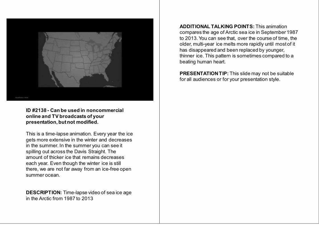
ID #2138 - Can be used in noncommercial online and TV broadcasts of your presentation, but not modified.
This is a time-lapse animation. Every year the ice gets more extensive in the winter and decreases in the summer. In the summer you can see it spilling out across the Davis Straight. The amount of thicker ice that remains decreases each year. Even though the winter ice is still there, we are not far away from an ice-free open summer ocean.
DESCRIPTION: Time-lapse video of sea ice age in the Arctic from 1987 to 2013
ADDITIONAL TALKING POINTS: This animation compares the age of Arctic sea ice in September 1987 to 2013. You can see that, over the course of time, the older, multi-year ice melts more rapidly until most of it has disappeared and been replaced by younger, thinner ice. This pattern is sometimes compared to a beating human heart.
PRESENTATION TIP: This slide may not be suitable for all audiences or for your presentation style.
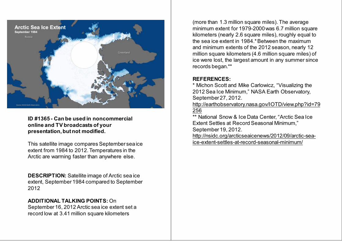
ID #1365 - Can be used in noncommercial online and TV broadcasts of your presentation, but not modified.
This satellite image compares September sea ice extent from 1984 to 2012. Temperatures in the Arctic are warming faster than anywhere else.
DESCRIPTION: Satellite image of Arctic sea ice extent, September 1984 compared to September 2012
ADDITIONAL TALKING POINTS: On September 16, 2012 Arctic sea ice extent set a record low at 3.41 million square kilometers
(more than 1.3 million square miles). The average minimum extent for 1979-2000 was 6.7 million square kilometers (nearly 2.6 square miles), roughly equal to the sea ice extent in 1984.* Between the maximum and minimum extents of the 2012 season, nearly 12 million square kilometers (4.6 million square miles) of ice were lost, the largest amount in any summer since records began.**
REFERENCES:* Michon Scott and Mike Carlowicz, “Visualizing the 2012 Sea Ice Minimum,” NASA Earth Observatory, September 27, 2012. http://earthobservatory.nasa.gov/IOTD/view.php?id=79256 ** National Snow & Ice Data Center, “Arctic Sea Ice Extent Settles at Record Seasonal Minimum,” September 19, 2012. http://nsidc.org/arcticseaicenews/2012/09/arctic-sea-ice-extent-settles-at-record-seasonal-minimum/
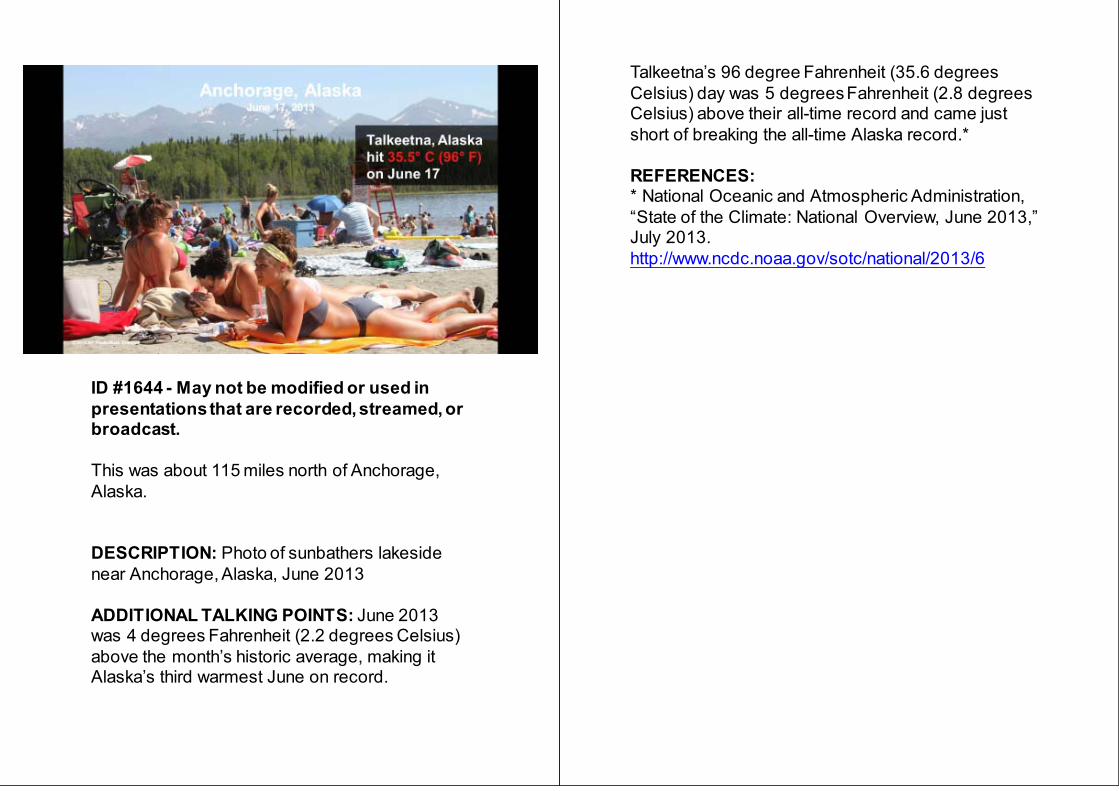
ID #1644 - May not be modified or used in presentations that are recorded, streamed, or broadcast.
This was about 115 miles north of Anchorage, Alaska.
DESCRIPTION: Photo of sunbathers lakeside near Anchorage, Alaska, June 2013
ADDITIONAL TALKING POINTS: June 2013 was 4 degrees Fahrenheit (2.2 degrees Celsius) above the month’s historic average, making it Alaska’s third warmest June on record.
Talkeetna’s 96 degree Fahrenheit (35.6 degrees Celsius) day was 5 degrees Fahrenheit (2.8 degrees Celsius) above their all-time record and came just short of breaking the all-time Alaska record.*
REFERENCES:* National Oceanic and Atmospheric Administration, “State of the Climate: National Overview, June 2013,” July 2013. http://www.ncdc.noaa.gov/sotc/national/2013/6

ID #1459 - Can be used in noncommercial online and TV broadcasts of your presentation, but not modified.
The warming Arctic also means that some of the frozen methane, stored in shallow pools in the tundra, is vulnerable to melting.
DESCRIPTION: Photo of methane pools in Alaska
ADDITIONAL TALKING POINTS: Perennially frozen ground, known as permafrost, stores about 1.7 trillion tons of carbon*—more than twice the amount of carbon currently in the
atmosphere.**
Irreversible thawing of permafrost could change the Arctic from a carbon sink (i.e., an absorber of carbon) to a carbon source by the mid-2020s. That could be enough to cancel out the storage impact of 42-88% of the current natural carbon storage areas (i.e., soils and trees) on land.***
REFERENCES: * A.H. MacDougall et al., “Significant contribution to climate warming from the permafrost carbon feedback,” Nature Geoscience5 (September 9, 2012): 719-721. http://www.nature.com/ngeo/journal/v5/n10/full/ngeo1573.html ** CDAIC, “The Carbon Cycle,” last modified September 26, 2012. http://cdiac.ornl.gov/carbon_cycle.html *** K. Schaefer et al., “Amount and timing of permafrost carbon release in response to climate warming,” Tellus 63, no. 2 (February 15, 2011): 165-180. http://onlinelibrary.wiley.com/doi/10.1111/j.1600-0889.2011.00527.x/abstract
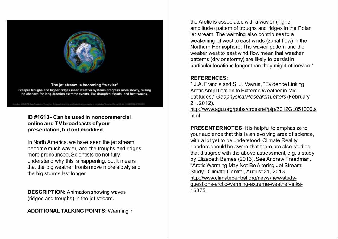
ID #1613 - Can be used in noncommercial online and TV broadcasts of your presentation, but not modified.
In North America, we have seen the jet stream become much wavier, and the troughs and ridges more pronounced. Scientists do not fully understand why this is happening, but it means that the big weather fronts move more slowly and the big storms last longer.
DESCRIPTION: Animation showing waves (ridges and troughs) in the jet stream.
ADDITIONAL TALKING POINTS: Warming in
the Arctic is associated with a wavier (higher amplitude) pattern of troughs and ridges in the Polar jet stream. The warming also contributes to a weakening of west to east winds (zonal flow) in the Northern Hemisphere. The wavier pattern and the weaker west to east wind flow mean that weather patterns (dry or stormy) are likely to persist in particular locations longer than they might otherwise.*
REFERENCES:* J.A. Francis and S. J. Vavrus, “Evidence Linking Arctic Amplification to Extreme Weather in Mid-Latitudes,” Geophysical Research Letters (February 21, 2012). http://www.agu.org/pubs/crossref/pip/2012GL051000.shtml
PRESENTER NOTES: It is helpful to emphasize to your audience that this is an evolving area of science, with a lot yet to be understood. Climate Reality Leaders should be aware that there are also studies that disagree with the above assessment, e.g. a study by Elizabeth Barnes (2013). See Andrew Freedman, “Arctic Warming May Not Be Altering Jet Stream: Study,” Climate Central, August 21, 2013. http://www.climatecentral.org/news/new-study-questions-arctic-warming-extreme-weather-links-16375
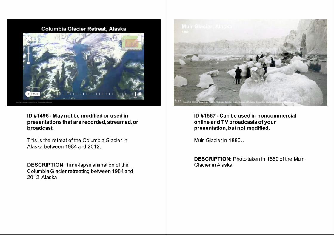
ID #1496 - May not be modified or used in presentations that are recorded, streamed, or broadcast.
This is the retreat of the Columbia Glacier in Alaska between 1984 and 2012.
DESCRIPTION: Time-lapse animation of the Columbia Glacier retreating between 1984 and 2012, Alaska
ID #1567 - Can be used in noncommercial online and TV broadcasts of your presentation, but not modified.
Muir Glacier in 1880…
DESCRIPTION: Photo taken in 1880 of the Muir Glacier in Alaska
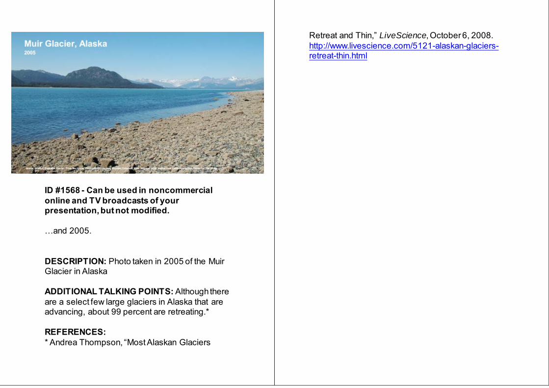
ID #1568 - Can be used in noncommercial online and TV broadcasts of your presentation, but not modified.
…and 2005.
DESCRIPTION: Photo taken in 2005 of the Muir Glacier in Alaska
ADDITIONAL TALKING POINTS: Although there are a select few large glaciers in Alaska that are advancing, about 99 percent are retreating.*
REFERENCES:* Andrea Thompson, “Most Alaskan Glaciers
Retreat and Thin,” LiveScience, October 6, 2008. http://www.livescience.com/5121-alaskan-glaciers-retreat-thin.html
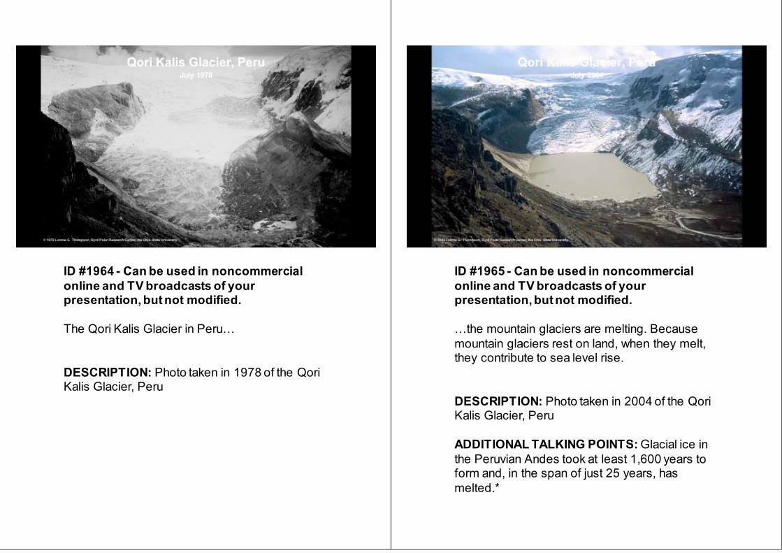
ID #1964 - Can be used in noncommercial online and TV broadcasts of your presentation, but not modified.
The Qori Kalis Glacier in Peru…
DESCRIPTION: Photo taken in 1978 of the Qori Kalis Glacier, Peru
ID #1965 - Can be used in noncommercial online and TV broadcasts of your presentation, but not modified.
…the mountain glaciers are melting. Because mountain glaciers rest on land, when they melt, they contribute to sea level rise.
DESCRIPTION: Photo taken in 2004 of the Qori Kalis Glacier, Peru
ADDITIONAL TALKING POINTS: Glacial ice in the Peruvian Andes took at least 1,600 years to form and, in the span of just 25 years, has melted.*
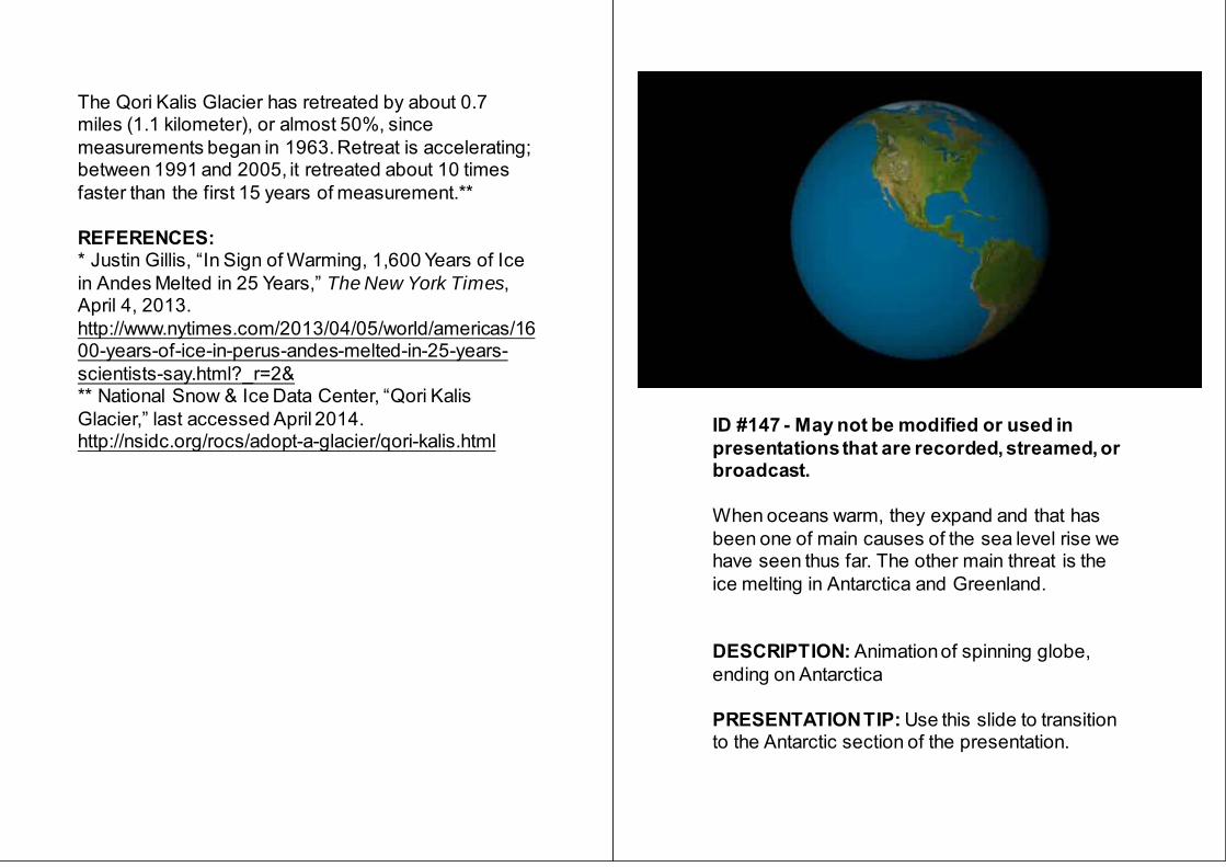
The Qori Kalis Glacier has retreated by about 0.7 miles (1.1 kilometer), or almost 50%, since measurements began in 1963. Retreat is accelerating; between 1991 and 2005, it retreated about 10 times faster than the first 15 years of measurement.**
REFERENCES: * Justin Gillis, “In Sign of Warming, 1,600 Years of Ice in Andes Melted in 25 Years,” The New York Times, April 4, 2013. http://www.nytimes.com/2013/04/05/world/americas/1600-years-of-ice-in-perus-andes-melted-in-25-years-scientists-say.html?_r=2& ** National Snow & Ice Data Center, “Qori Kalis Glacier,” last accessed April 2014. http://nsidc.org/rocs/adopt-a-glacier/qori-kalis.html
ID #147 - May not be modified or used in presentations that are recorded, streamed, or broadcast.
When oceans warm, they expand and that has been one of main causes of the sea level rise we have seen thus far. The other main threat is the ice melting in Antarctica and Greenland.
DESCRIPTION: Animation of spinning globe, ending on Antarctica
PRESENTATION TIP: Use this slide to transition to the Antarctic section of the presentation.
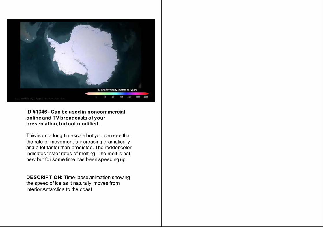
ID #1346 - Can be used in noncommercial online and TV broadcasts of your presentation, but not modified.
This is on a long timescale but you can see that the rate of movement is increasing dramatically and a lot faster than predicted. The redder color indicates faster rates of melting. The melt is not new but for some time has been speeding up.
DESCRIPTION: Time-lapse animation showing the speed of ice as it naturally moves from interior Antarctica to the coast
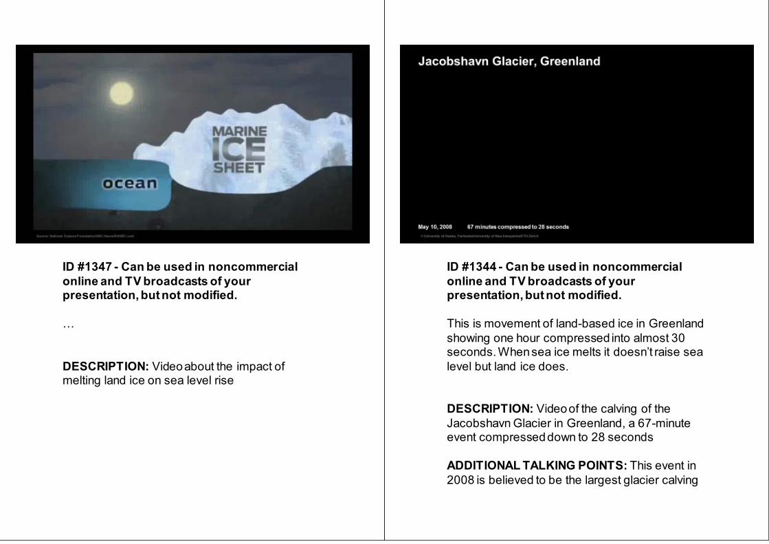
ID #1347 - Can be used in noncommercial online and TV broadcasts of your presentation, but not modified.
…
DESCRIPTION: Video about the impact of melting land ice on sea level rise
ID #1344 - Can be used in noncommercial online and TV broadcasts of your presentation, but not modified.
This is movement of land-based ice in Greenland showing one hour compressed into almost 30 seconds. When sea ice melts it doesn’t raise sea level but land ice does.
DESCRIPTION: Video of the calving of the Jacobshavn Glacier in Greenland, a 67-minute event compressed down to 28 seconds
ADDITIONAL TALKING POINTS: This event in 2008 is believed to be the largest glacier calving
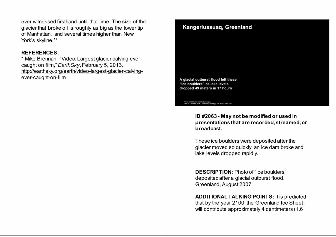
ever witnessed firsthand until that time. The size of the glacier that broke off is roughly as big as the lower tip of Manhattan, and several times higher than New York’s skyline.**
REFERENCES: * Mike Brennan, “Video: Largest glacier calving ever caught on film,” EarthSky, February 5, 2013. http://earthsky.org/earth/video-largest-glacier-calving-ever-caught-on-film
ID #2063 - May not be modified or used in presentations that are recorded, streamed, or broadcast.
These ice boulders were deposited after the glacier moved so quickly, an ice dam broke and lake levels dropped rapidly.
DESCRIPTION: Photo of “ice boulders” deposited after a glacial outburst flood, Greenland, August 2007
ADDITIONAL TALKING POINTS: It is predicted that by the year 2100, the Greenland Ice Sheet will contribute approximately 4 centimeters (1.6

inches) to sea level rise. However, this is probably a conservative estimate.* Melting glaciers in Greenland have contributed to about 15 percent of global sea level rise over the past 20 years.**
REFERENCES: * Kendall Haven, “Greenland’s Ice Island Alarm,” NASA, August 28, 2007. http://earthobservatory.nasa.gov/Features/Greenland/printall.php** Brian Kahn, “New Greenland Ice Melt Fuels Sea Level Rise Concerns,” Climate Central, March 16, 2014. http://www.climatecentral.org/news/new-greenland-ice-melt-fuels-sea-level-rise-concerns-17187
ID #1566 - May not be modified or used in presentations that are recorded, streamed, or broadcast.
Insurance companies are already saying that parts of the world are going to be uninsurable because of climate change.
DESCRIPTION: Newspaper article from the Financial Times about the risk caused by warming oceans, June 2013
ADDITIONAL TALKING POINTS: Not only do warmer ocean waters amplify ice melt and cause sea level rise, they also increase the chance of
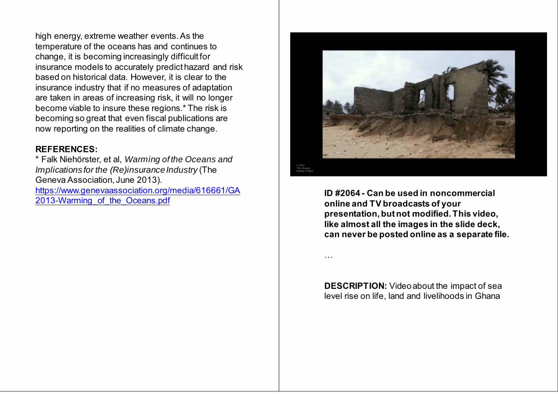
high energy, extreme weather events. As the temperature of the oceans has and continues to change, it is becoming increasingly difficult for insurance models to accurately predict hazard and risk based on historical data. However, it is clear to the insurance industry that if no measures of adaptation are taken in areas of increasing risk, it will no longer become viable to insure these regions.* The risk is becoming so great that even fiscal publications are now reporting on the realities of climate change.
REFERENCES:* Falk Niehörster, et al, Warming of the Oceans and Implications for the (Re)insurance Industry (The Geneva Association, June 2013). https://www.genevaassociation.org/media/616661/GA2013-Warming_of_the_Oceans.pdf
ID #2064 - Can be used in noncommercial online and TV broadcasts of your presentation, but not modified. This video, like almost all the images in the slide deck, can never be posted online as a separate file.
…
DESCRIPTION: Video about the impact of sea level rise on life, land and livelihoods in Ghana
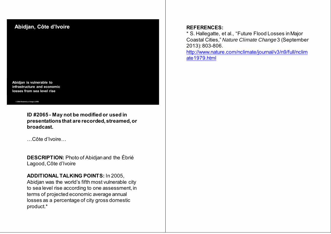
ID #2065 - May not be modified or used in presentations that are recorded, streamed, or broadcast.
…Côte d’Ivoire…
DESCRIPTION: Photo of Abidjan and the Ébrié Lagood, Côte d’Ivoire
ADDITIONAL TALKING POINTS: In 2005, Abidjan was the world’s fifth most vulnerable city to sea level rise according to one assessment, in terms of projected economic average annual losses as a percentage of city gross domestic product.*
REFERENCES:* S. Hallegatte, et al., “Future Flood Losses in Major Coastal Cities,” Nature Climate Change 3 (September 2013): 803-806. http://www.nature.com/nclimate/journal/v3/n9/full/nclimate1979.html
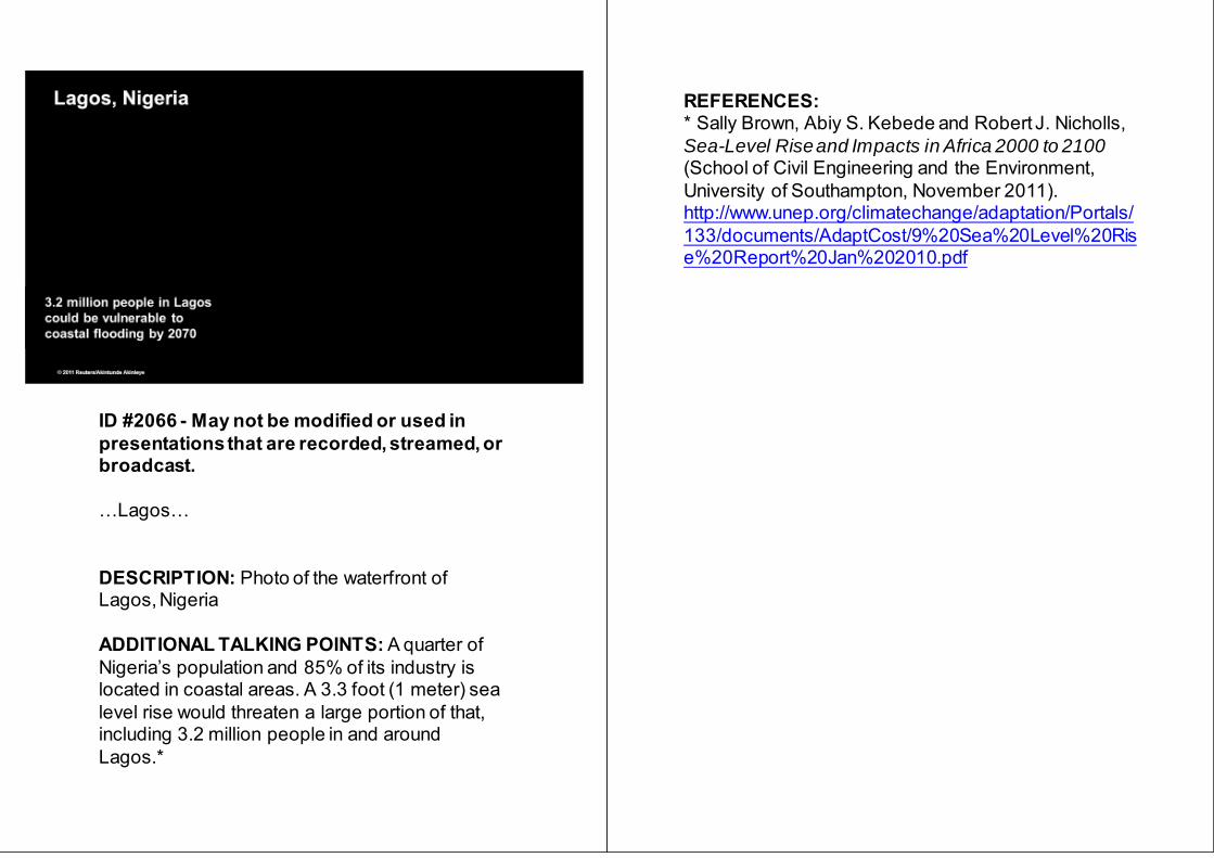
ID #2066 - May not be modified or used in presentations that are recorded, streamed, or broadcast.
…Lagos…
DESCRIPTION: Photo of the waterfront of Lagos, Nigeria
ADDITIONAL TALKING POINTS: A quarter of Nigeria’s population and 85% of its industry is located in coastal areas. A 3.3 foot (1 meter) sea level rise would threaten a large portion of that, including 3.2 million people in and around Lagos.*
REFERENCES:* Sally Brown, Abiy S. Kebede and Robert J. Nicholls, Sea-Level Rise and Impacts in Africa 2000 to 2100 (School of Civil Engineering and the Environment, University of Southampton, November 2011). http://www.unep.org/climatechange/adaptation/Portals/133/documents/AdaptCost/9%20Sea%20Level%20Rise%20Report%20Jan%202010.pdf
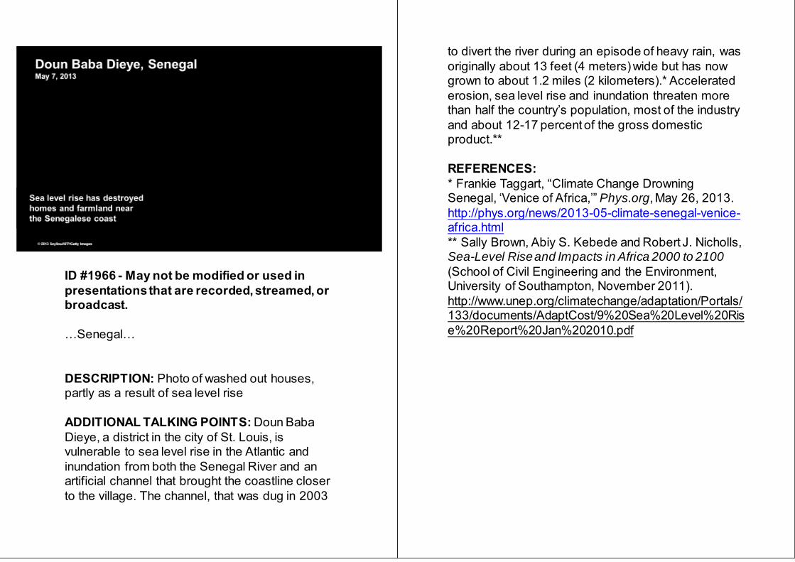
ID #1966 - May not be modified or used in presentations that are recorded, streamed, or broadcast.
…Senegal…
DESCRIPTION: Photo of washed out houses, partly as a result of sea level rise
ADDITIONAL TALKING POINTS: Doun Baba Dieye, a district in the city of St. Louis, is vulnerable to sea level rise in the Atlantic and inundation from both the Senegal River and an artificial channel that brought the coastline closer to the village. The channel, that was dug in 2003
to divert the river during an episode of heavy rain, was originally about 13 feet (4 meters) wide but has now grown to about 1.2 miles (2 kilometers).* Accelerated erosion, sea level rise and inundation threaten more than half the country’s population, most of the industry and about 12-17 percent of the gross domestic product.**
REFERENCES:* Frankie Taggart, “Climate Change Drowning Senegal, ‘Venice of Africa,’” Phys.org, May 26, 2013. http://phys.org/news/2013-05-climate-senegal-venice-africa.html** Sally Brown, Abiy S. Kebede and Robert J. Nicholls, Sea-Level Rise and Impacts in Africa 2000 to 2100(School of Civil Engineering and the Environment, University of Southampton, November 2011). http://www.unep.org/climatechange/adaptation/Portals/133/documents/AdaptCost/9%20Sea%20Level%20Rise%20Report%20Jan%202010.pdf
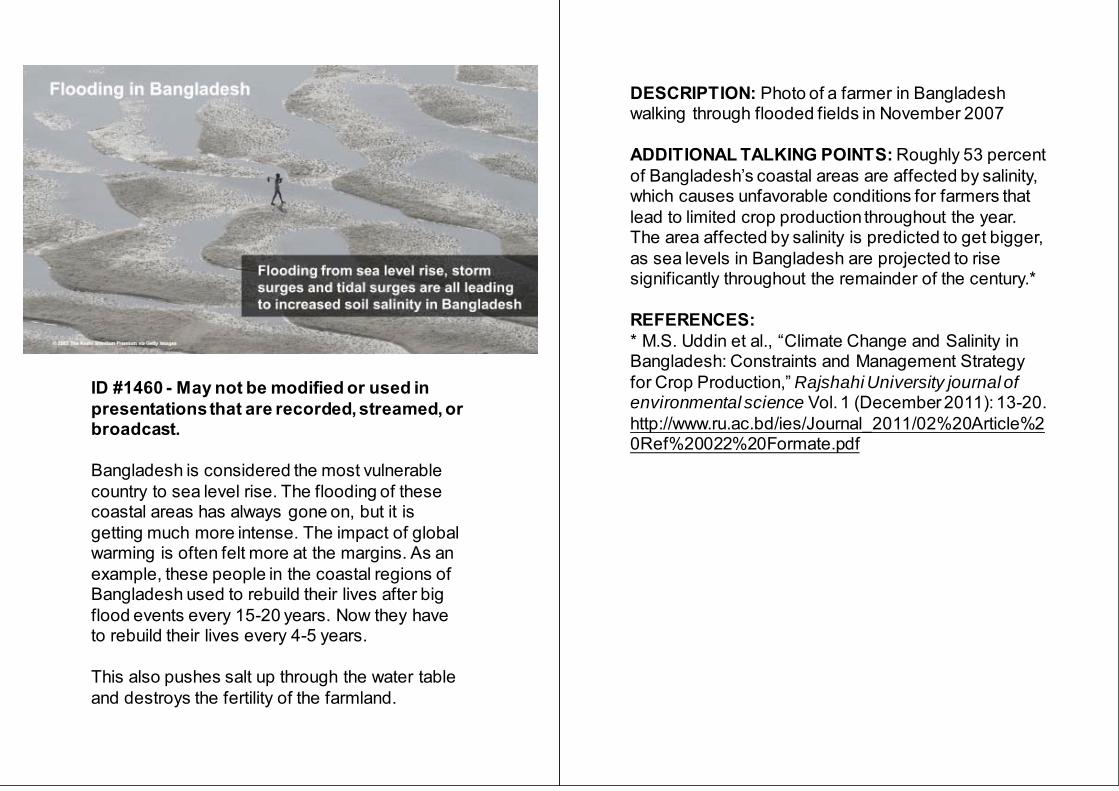
ID #1460 - May not be modified or used in presentations that are recorded, streamed, or broadcast.
Bangladesh is considered the most vulnerable country to sea level rise. The flooding of these coastal areas has always gone on, but it is getting much more intense. The impact of global warming is often felt more at the margins. As an example, these people in the coastal regions of Bangladesh used to rebuild their lives after big flood events every 15-20 years. Now they have to rebuild their lives every 4-5 years.
This also pushes salt up through the water table and destroys the fertility of the farmland.
DESCRIPTION: Photo of a farmer in Bangladesh walking through flooded fields in November 2007
ADDITIONAL TALKING POINTS: Roughly 53 percent of Bangladesh’s coastal areas are affected by salinity, which causes unfavorable conditions for farmers that lead to limited crop production throughout the year. The area affected by salinity is predicted to get bigger, as sea levels in Bangladesh are projected to rise significantly throughout the remainder of the century.*
REFERENCES: * M.S. Uddin et al., “Climate Change and Salinity in Bangladesh: Constraints and Management Strategy for Crop Production,” Rajshahi University journal of environmental science Vol. 1 (December 2011): 13-20. http://www.ru.ac.bd/ies/Journal_2011/02%20Article%20Ref%20022%20Formate.pdf
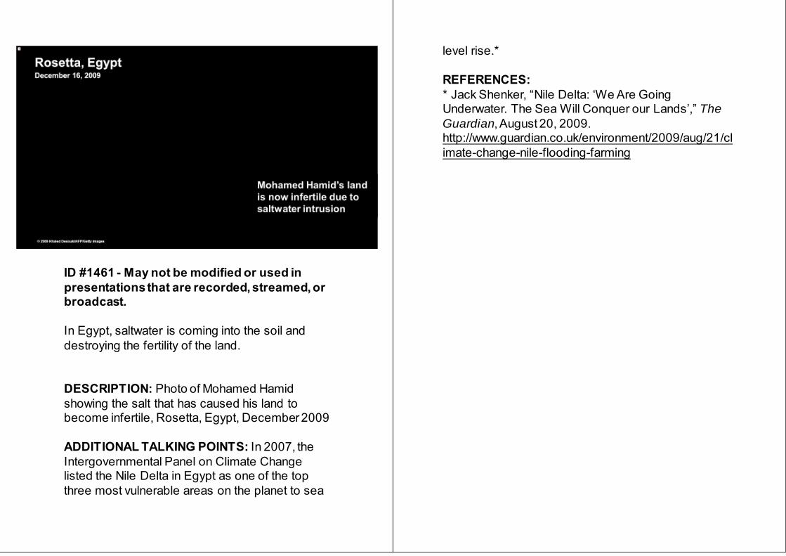
ID #1461 - May not be modified or used in presentations that are recorded, streamed, or broadcast.
In Egypt, saltwater is coming into the soil and destroying the fertility of the land.
DESCRIPTION: Photo of Mohamed Hamid showing the salt that has caused his land to become infertile, Rosetta, Egypt, December 2009
ADDITIONAL TALKING POINTS: In 2007, the Intergovernmental Panel on Climate Change listed the Nile Delta in Egypt as one of the top three most vulnerable areas on the planet to sea
level rise.*
REFERENCES: * Jack Shenker, “Nile Delta: ‘We Are Going Underwater. The Sea Will Conquer our Lands’,” The Guardian, August 20, 2009. http://www.guardian.co.uk/environment/2009/aug/21/climate-change-nile-flooding-farming

ID #1850 - May not be modified or used in presentations that are recorded, streamed, or broadcast.
…Egypt is building breakwaters to combat sea level rise…
DESCRIPTION: Photo of a crane unloading rocks to build a coastal defense breakwater, Alexandria, Egypt, May 2007
ADDITIONAL TALKING POINTS: One study suggests that Alexandria could see as much as a foot (30 centimeters) of sea level rise by 2025, which could displace over half a million people.*
Breakwaters act as a defense line again rising sea levels, however, there is question as to whether their foundations could withstand rising sea levels and stronger waves.**
REFERENCES:* Egypt Climate Change, “Key Issues … Coastal Zones,” last accessed April 2014. http://www.eeaa.gov.eg/ecc/ClimateIssuesCZ.htm** * Intergovernmental Panel on Climate Change, “Economic Costs of Sea-Level Rise,” Contribution of Working Group II to the Fourth Assessment Report of the Intergovernmental Panel on Climate Change, 2007 (Cambridge: Cambridge University Press, 2007). http://www.ipcc.ch/publications_and_data/ar4/wg1/en/ch10s10-3-2-3.html
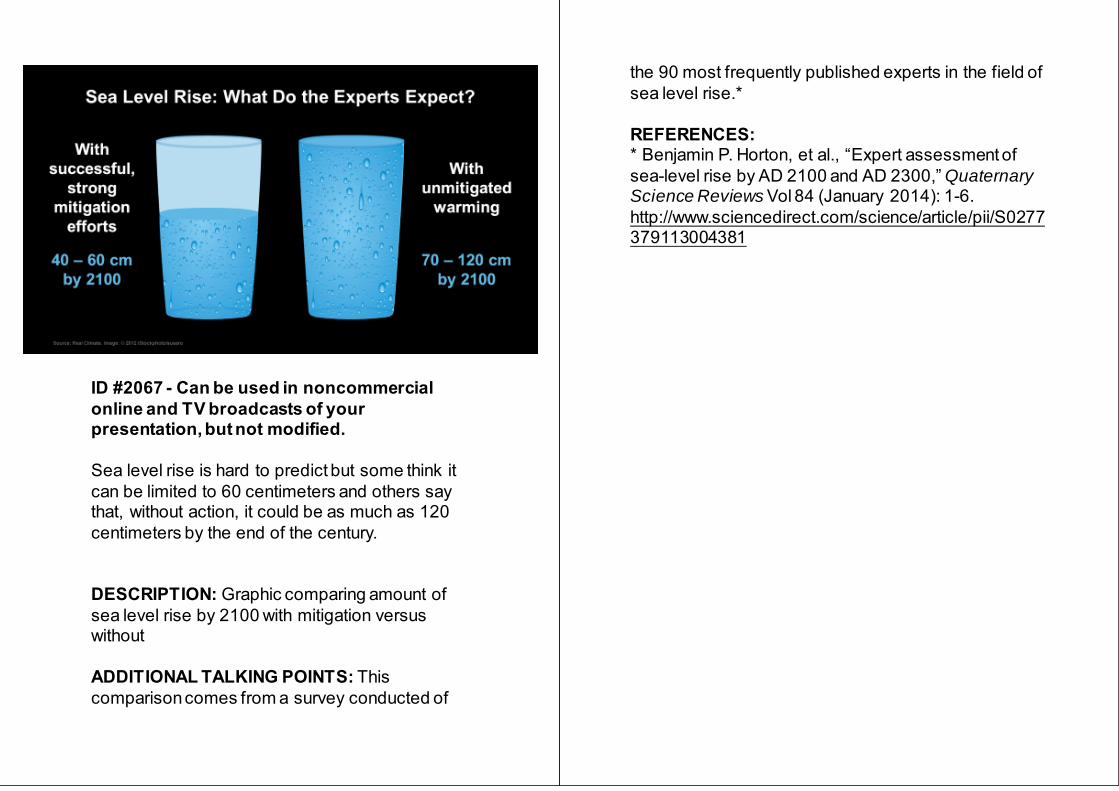
ID #2067 - Can be used in noncommercial online and TV broadcasts of your presentation, but not modified.
Sea level rise is hard to predict but some think it can be limited to 60 centimeters and others say that, without action, it could be as much as 120 centimeters by the end of the century.
DESCRIPTION: Graphic comparing amount of sea level rise by 2100 with mitigation versus without
ADDITIONAL TALKING POINTS: This comparison comes from a survey conducted of
the 90 most frequently published experts in the field of sea level rise.*
REFERENCES:* Benjamin P. Horton, et al., “Expert assessment of sea-level rise by AD 2100 and AD 2300,” Quaternary Science Reviews Vol 84 (January 2014): 1-6. http://www.sciencedirect.com/science/article/pii/S0277379113004381
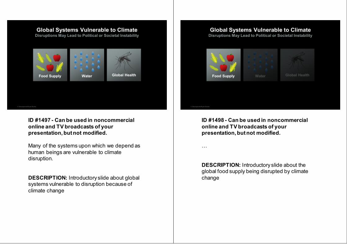
ID #1497 - Can be used in noncommercial online and TV broadcasts of your presentation, but not modified.
Many of the systems upon which we depend as human beings are vulnerable to climate disruption.
DESCRIPTION: Introductory slide about global systems vulnerable to disruption because of climate change
ID #1498 - Can be used in noncommercial online and TV broadcasts of your presentation, but not modified.
…
DESCRIPTION: Introductory slide about the global food supply being disrupted by climate change
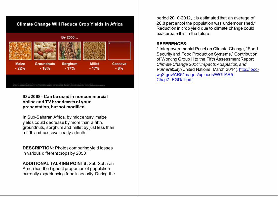
ID #2068 - Can be used in noncommercial online and TV broadcasts of your presentation, but not modified.
In Sub-Saharan Africa, by midcentury, maize yields could decrease by more than a fifth, groundnuts, sorghum and millet by just less than a fifth and cassava nearly a tenth.
DESCRIPTION: Photos comparing yield losses in various different crops by 2050
ADDITIONAL TALKING POINTS: Sub-Saharan Africa has the highest proportion of population currently experiencing food insecurity. During the
period 2010-2012, it is estimated that an average of 26.8 percent of the population was undernourished.* Reduction in crop yield due to climate change could exacerbate this in the future.
REFERENCES:* Intergovernmental Panel on Climate Change, “Food Security and Food Production Systems,” Contribution of Working Group II to the Fifth Assessment Report Climate Change 2014: Impacts Adaptation, and Vulnerability (United Nations, March 2014). http://ipcc-wg2.gov/AR5/images/uploads/WGIIAR5-Chap7_FGDall.pdf

ID #2069 - Can be used in noncommercial online and TV broadcasts of your presentation, but not modified.
Sub-Saharan Africa is particularly susceptible to loss of croplands as temperatures increase.
DESCRIPTION: Text slide about crop loss in Sub-Saharan Africa with various degrees of warming
ADDITIONAL TALKING POINTS: Already wheat in Sub-Saharan Africa is experiencing stress due to annual average temperatures above the optimal. Warming of 1.5 degrees Celsius (3.25
degrees Fahrenheit) is likely by the 2030s and 2 degrees Celsius (3.6 degrees Fahrenheit) by midcentury, both of which will significantly reduce current cropland.*Depending on the level of temperature rise, farmers in sub-Saharan Africa stand to lose between 40 and 80 percent of arable cropland by the 2030s to 2040s.**
REFERENCES:* The World Bank, Turn Down the Heat: Climate Extremes, Regional Impacts, and the Case for Resilience (June 2013). http://www-wds.worldbank.org/external/default/WDSContentServer/WDSP/IB/2013/06/14/000333037_20130614104709/Rendered/PDF/784220WP0Engli0D0CONF0to0June019090.pdf** The World Bank, “What Climate Change Means for Africa, Asia, and the Coastal Poor,” June 19, 2013. http://www.worldbank.org/en/news/feature/2013/06/19/what-climate-change-means-africa-asia-coastal-poor
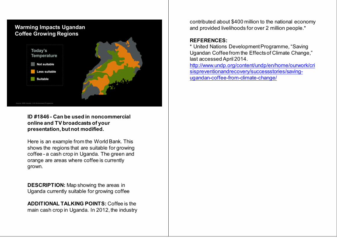
ID #1846 - Can be used in noncommercial online and TV broadcasts of your presentation, but not modified.
Here is an example from the World Bank. This shows the regions that are suitable for growing coffee - a cash crop in Uganda. The green and orange are areas where coffee is currently grown.
DESCRIPTION: Map showing the areas in Uganda currently suitable for growing coffee
ADDITIONAL TALKING POINTS: Coffee is the main cash crop in Uganda. In 2012, the industry
contributed about $400 million to the national economy and provided livelihoods for over 2 million people.*
REFERENCES:* United Nations Development Programme, “Saving Ugandan Coffee from the Effects of Climate Change,” last accessed April 2014. http://www.undp.org/content/undp/en/home/ourwork/crisispreventionandrecovery/successstories/saving-ugandan-coffee-from-climate-change/
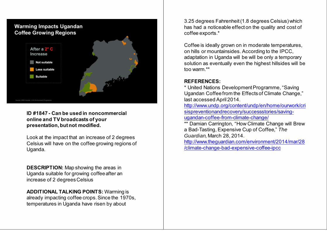
ID #1847 - Can be used in noncommercial online and TV broadcasts of your presentation, but not modified.
Look at the impact that an increase of 2 degrees Celsius will have on the coffee growing regions of Uganda.
DESCRIPTION: Map showing the areas in Uganda suitable for growing coffee after an increase of 2 degrees Celsius
ADDITIONAL TALKING POINTS: Warming is already impacting coffee crops. Since the 1970s, temperatures in Uganda have risen by about
3.25 degrees Fahrenheit (1.8 degrees Celsius) which has had a noticeable effect on the quality and cost of coffee exports.*
Coffee is ideally grown on in moderate temperatures, on hills or mountainsides. According to the IPCC, adaptation in Uganda will be will be only a temporary solution as eventually even the highest hillsides will be too warm.**
REFERENCES:* United Nations Development Programme, “Saving Ugandan Coffee from the Effects of Climate Change,” last accessed April 2014. http://www.undp.org/content/undp/en/home/ourwork/crisispreventionandrecovery/successstories/saving-ugandan-coffee-from-climate-change/** Damian Carrington, “How Climate Change will Brew a Bad-Tasting, Expensive Cup of Coffee,” The Guardian, March 28, 2014. http://www.theguardian.com/environment/2014/mar/28/climate-change-bad-expensive-coffee-ipcc
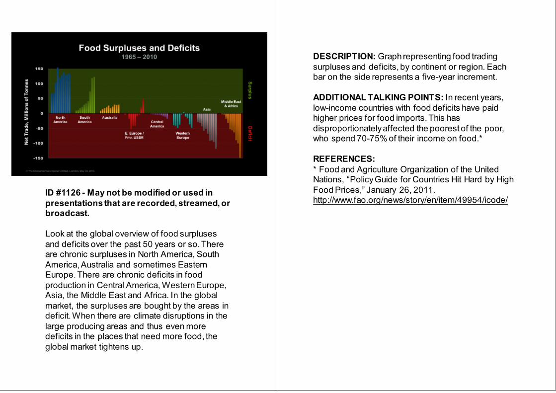
ID #1126 - May not be modified or used in presentations that are recorded, streamed, or broadcast.
Look at the global overview of food surpluses and deficits over the past 50 years or so. There are chronic surpluses in North America, South America, Australia and sometimes Eastern Europe. There are chronic deficits in food production in Central America, Western Europe, Asia, the Middle East and Africa. In the global market, the surpluses are bought by the areas in deficit. When there are climate disruptions in the large producing areas and thus even more deficits in the places that need more food, the global market tightens up.
DESCRIPTION: Graph representing food trading surpluses and deficits, by continent or region. Each bar on the side represents a five-year increment.
ADDITIONAL TALKING POINTS: In recent years, low-income countries with food deficits have paid higher prices for food imports. This has disproportionately affected the poorest of the poor, who spend 70-75% of their income on food.*
REFERENCES:* Food and Agriculture Organization of the United Nations, “Policy Guide for Countries Hit Hard by High Food Prices,” January 26, 2011. http://www.fao.org/news/story/en/item/49954/icode/
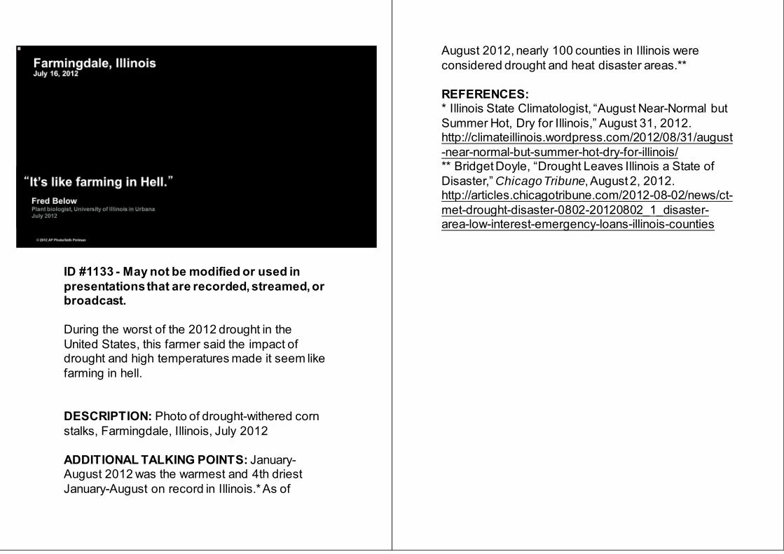
ID #1133 - May not be modified or used in presentations that are recorded, streamed, or broadcast.
During the worst of the 2012 drought in the United States, this farmer said the impact of drought and high temperatures made it seem like farming in hell.
DESCRIPTION: Photo of drought-withered corn stalks, Farmingdale, Illinois, July 2012
ADDITIONAL TALKING POINTS: January-August 2012 was the warmest and 4th driest January-August on record in Illinois.* As of
August 2012, nearly 100 counties in Illinois were considered drought and heat disaster areas.**
REFERENCES:* Illinois State Climatologist, “August Near-Normal but Summer Hot, Dry for Illinois,” August 31, 2012. http://climateillinois.wordpress.com/2012/08/31/august-near-normal-but-summer-hot-dry-for-illinois/** Bridget Doyle, “Drought Leaves Illinois a State of Disaster,” Chicago Tribune, August 2, 2012. http://articles.chicagotribune.com/2012-08-02/news/ct-met-drought-disaster-0802-20120802_1_disaster-area-low-interest-emergency-loans-illinois-counties
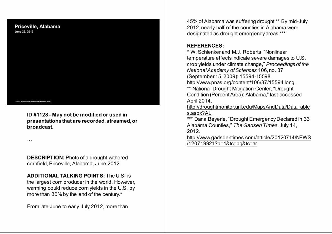
ID #1128 - May not be modified or used in presentations that are recorded, streamed, or broadcast.
…
DESCRIPTION: Photo of a drought-withered cornfield, Priceville, Alabama, June 2012
ADDITIONAL TALKING POINTS: The U.S. is the largest corn producer in the world. However, warming could reduce corn yields in the U.S. by more than 30% by the end of the century.*
From late June to early July 2012, more than
45% of Alabama was suffering drought.** By mid-July 2012, nearly half of the counties in Alabama were designated as drought emergency areas.***
REFERENCES: * W. Schlenker and M.J. Roberts, “Nonlinear temperature effects indicate severe damages to U.S. crop yields under climate change,” Proceedings of the National Academy of Sciences 106, no. 37 (September 15, 2009): 15594-15598. http://www.pnas.org/content/106/37/15594.long ** National Drought Mitigation Center, “Drought Condition (Percent Area): Alabama,” last accessed April 2014. http://droughtmonitor.unl.edu/MapsAndData/DataTables.aspx?AL*** Dana Beyerle, “Drought Emergency Declared in 33 Alabama Counties,” The Gadsen Times, July 14, 2012. http://www.gadsdentimes.com/article/20120714/NEWS/120719921?p=1&tc=pg&tc=ar

ID #1127 - May not be modified or used in presentations that are recorded, streamed, or broadcast.
…
DESCRIPTION: Photo of farmers in Owensboro, Kentucky checking on their soybean crop
ADDITIONAL TALKING POINTS: In 2012, the soybean yield per acre was 39.6 bushels, a 5 percent drop from 2011. The area planted for growing soybeans in 2012 was almost equal to that in 2010, but production was more than 9 percent lower than in 2010.*
REFERENCES:* U.S. Department of Agriculture, Crop Production--2012 Summary (January 2013). http://usda01.library.cornell.edu/usda/nass/CropProdSu//2010s/2013/CropProdSu-01-11-2013.pdf
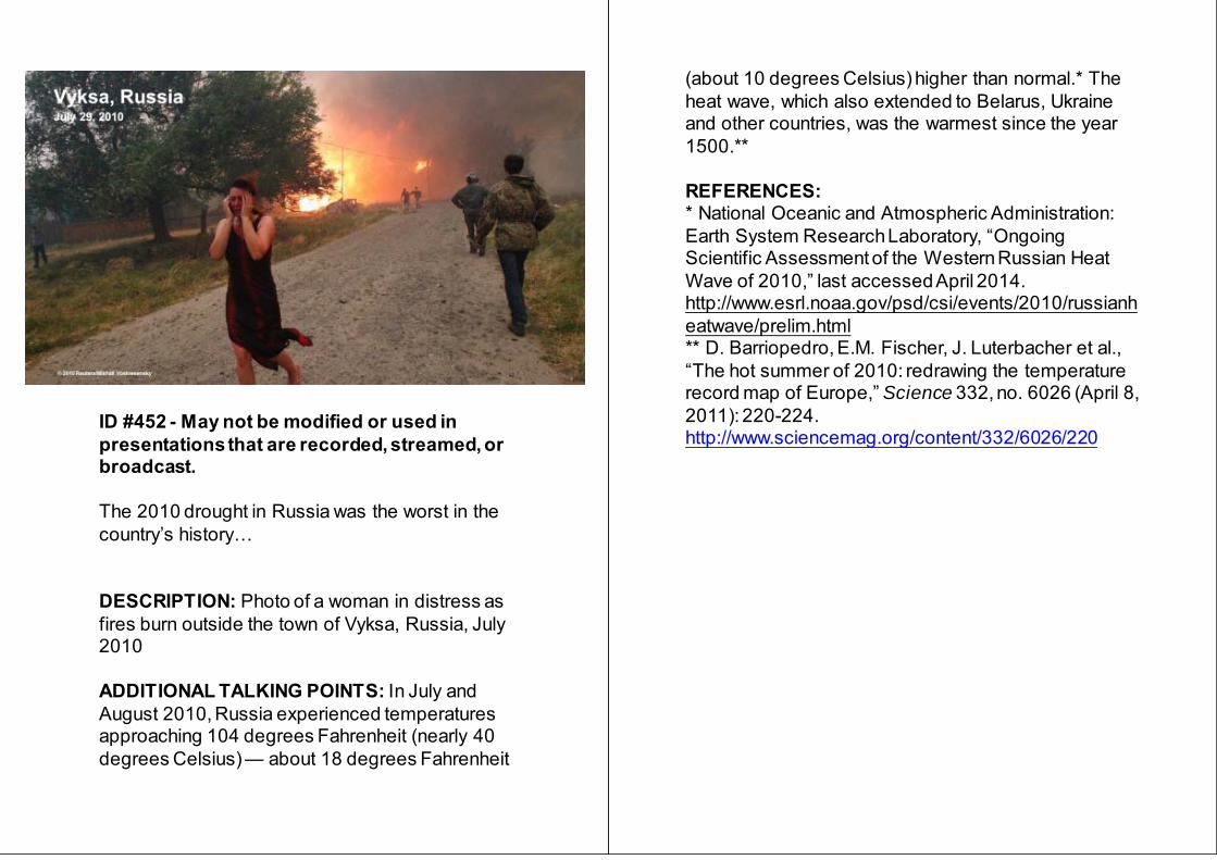
ID #452 - May not be modified or used in presentations that are recorded, streamed, or broadcast.
The 2010 drought in Russia was the worst in the country’s history…
DESCRIPTION: Photo of a woman in distress as fires burn outside the town of Vyksa, Russia, July 2010
ADDITIONAL TALKING POINTS: In July and August 2010, Russia experienced temperatures approaching 104 degrees Fahrenheit (nearly 40 degrees Celsius) — about 18 degrees Fahrenheit
(about 10 degrees Celsius) higher than normal.* The heat wave, which also extended to Belarus, Ukraine and other countries, was the warmest since the year 1500.**
REFERENCES:* National Oceanic and Atmospheric Administration: Earth System Research Laboratory, “Ongoing Scientific Assessment of the Western Russian Heat Wave of 2010,” last accessed April 2014. http://www.esrl.noaa.gov/psd/csi/events/2010/russianheatwave/prelim.html ** D. Barriopedro, E.M. Fischer, J. Luterbacher et al., “The hot summer of 2010: redrawing the temperature record map of Europe,” Science 332, no. 6026 (April 8, 2011): 220-224. http://www.sciencemag.org/content/332/6026/220
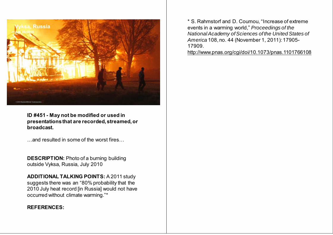
ID #451 - May not be modified or used in presentations that are recorded, streamed, or broadcast.
…and resulted in some of the worst fires…
DESCRIPTION: Photo of a burning building outside Vyksa, Russia, July 2010
ADDITIONAL TALKING POINTS: A 2011 study suggests there was an “80% probability that the 2010 July heat record [in Russia] would not have occurred without climate warming.”*
REFERENCES:
* S. Rahmstorf and D. Coumou, “Increase of extreme events in a warming world,” Proceedings of the National Academy of Sciences of the United States of America 108, no. 44 (November 1, 2011): 17905-17909. http://www.pnas.org/cgi/doi/10.1073/pnas.1101766108
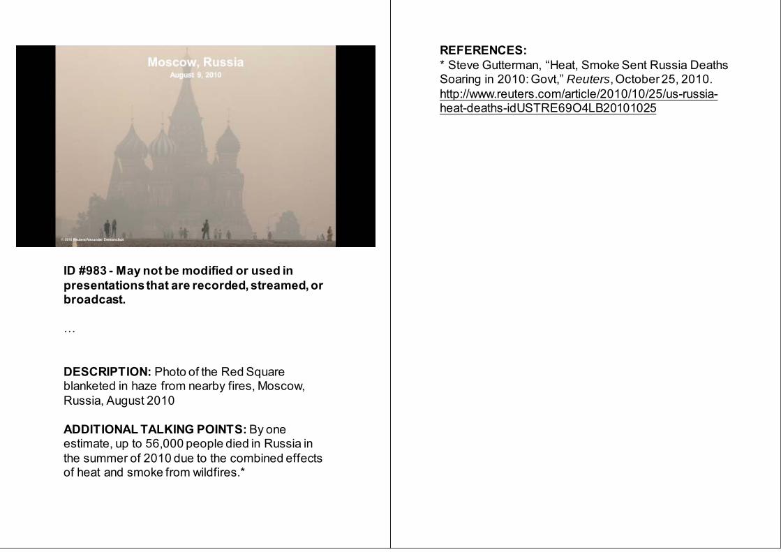
ID #983 - May not be modified or used in presentations that are recorded, streamed, or broadcast.
…
DESCRIPTION: Photo of the Red Square blanketed in haze from nearby fires, Moscow, Russia, August 2010
ADDITIONAL TALKING POINTS: By one estimate, up to 56,000 people died in Russia in the summer of 2010 due to the combined effects of heat and smoke from wildfires.*
REFERENCES:* Steve Gutterman, “Heat, Smoke Sent Russia Deaths Soaring in 2010: Govt,” Reuters, October 25, 2010. http://www.reuters.com/article/2010/10/25/us-russia-heat-deaths-idUSTRE69O4LB20101025
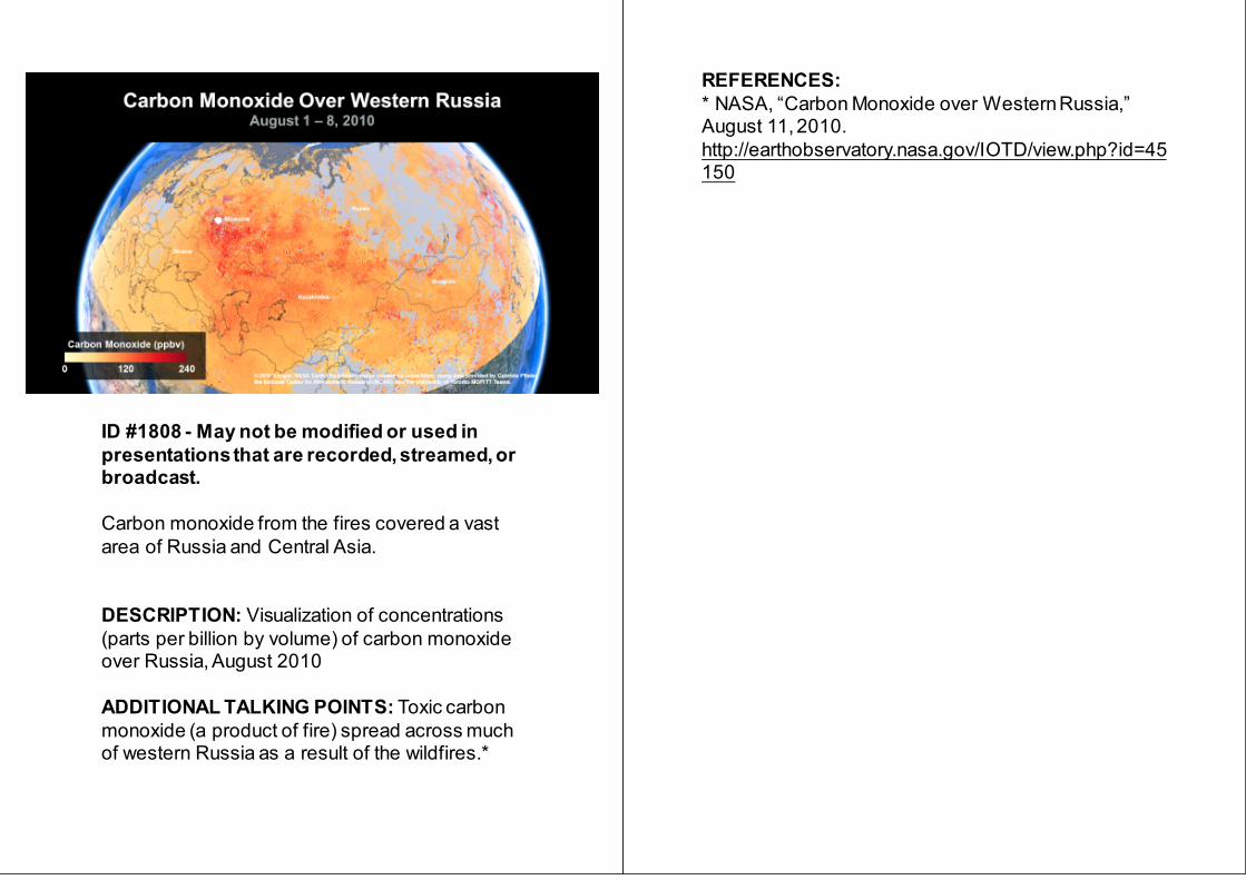
ID #1808 - May not be modified or used in presentations that are recorded, streamed, or broadcast.
Carbon monoxide from the fires covered a vast area of Russia and Central Asia.
DESCRIPTION: Visualization of concentrations (parts per billion by volume) of carbon monoxide over Russia, August 2010
ADDITIONAL TALKING POINTS: Toxic carbon monoxide (a product of fire) spread across much of western Russia as a result of the wildfires.*
REFERENCES:* NASA, “Carbon Monoxide over Western Russia,” August 11, 2010. http://earthobservatory.nasa.gov/IOTD/view.php?id=45150
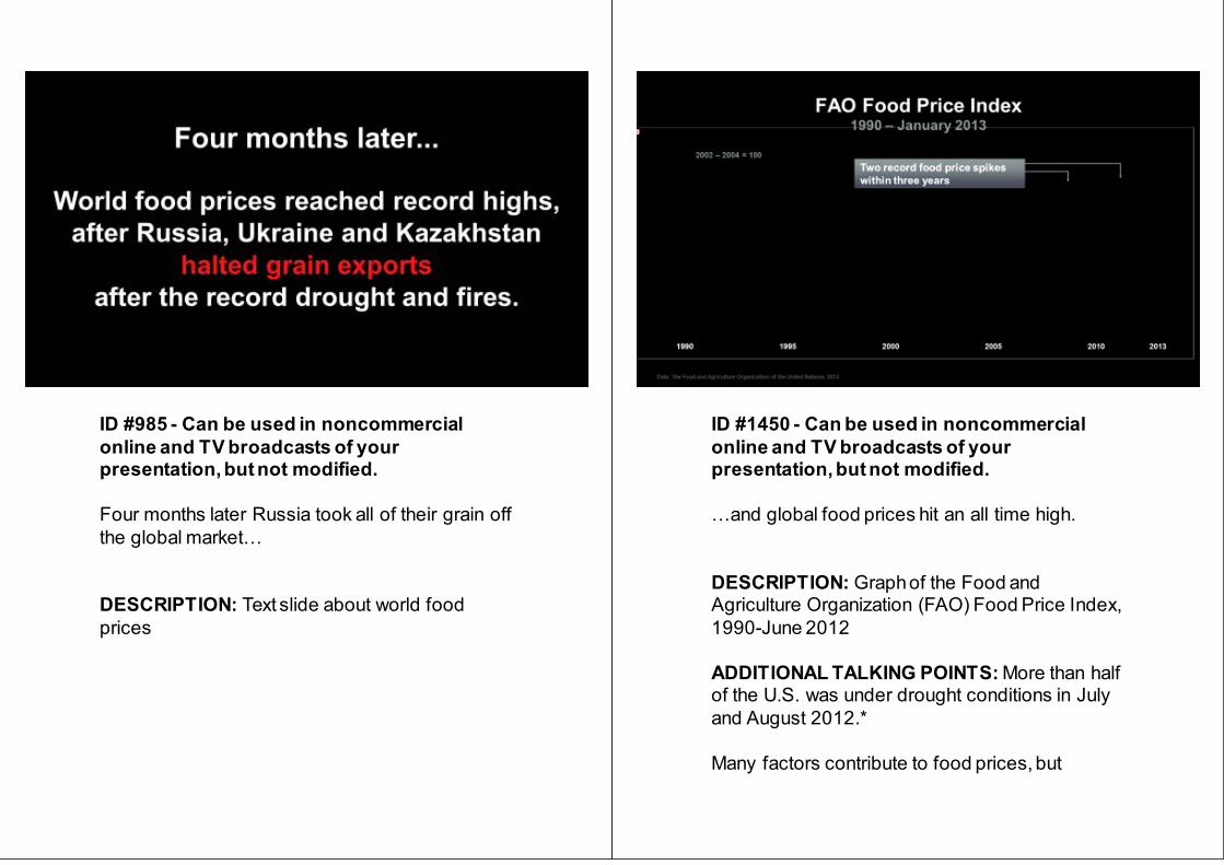
ID #985 - Can be used in noncommercial online and TV broadcasts of your presentation, but not modified.
Four months later Russia took all of their grain off the global market…
DESCRIPTION: Text slide about world food prices
ID #1450 - Can be used in noncommercial online and TV broadcasts of your presentation, but not modified.
…and global food prices hit an all time high.
DESCRIPTION: Graph of the Food and Agriculture Organization (FAO) Food Price Index, 1990-June 2012
ADDITIONAL TALKING POINTS: More than half of the U.S. was under drought conditions in July and August 2012.*
Many factors contribute to food prices, but
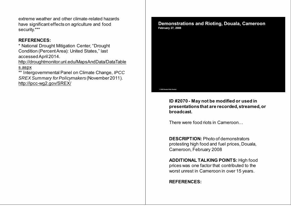
extreme weather and other climate-related hazards have significant effects on agriculture and food security.***
REFERENCES: * National Drought Mitigation Center, “Drought Condition (Percent Area): United States,” last accessed April 2014. http://droughtmonitor.unl.edu/MapsAndData/DataTables.aspx** Intergovernmental Panel on Climate Change, IPCC SREX Summary for Policymakers (November 2011). http://ipcc-wg2.gov/SREX/
ID #2070 - May not be modified or used in presentations that are recorded, streamed, or broadcast.
There were food riots in Cameroon…
DESCRIPTION: Photo of demonstrators protesting high food and fuel prices, Douala, Cameroon, February 2008
ADDITIONAL TALKING POINTS: High food prices was one factor that contributed to the worst unrest in Cameroon in over 15 years.
REFERENCES:
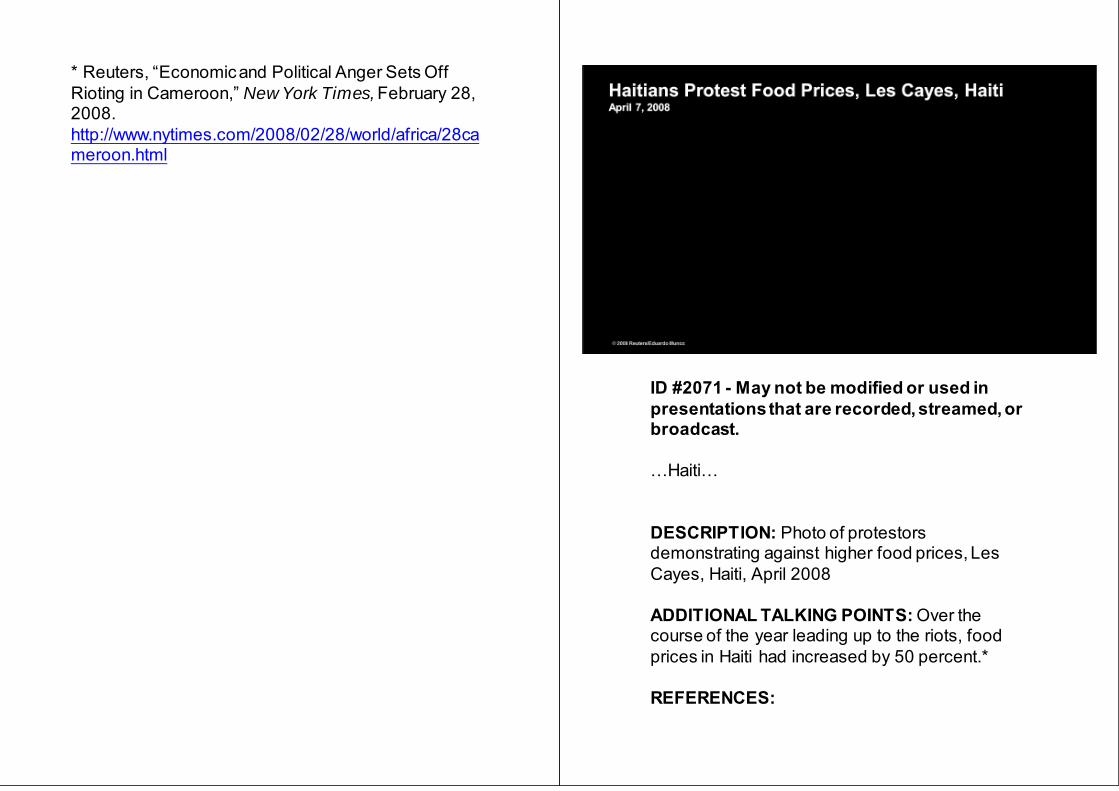
* Reuters, “Economic and Political Anger Sets Off Rioting in Cameroon,” New York Times, February 28, 2008. http://www.nytimes.com/2008/02/28/world/africa/28cameroon.html
ID #2071 - May not be modified or used in presentations that are recorded, streamed, or broadcast.
…Haiti…
DESCRIPTION: Photo of protestors demonstrating against higher food prices, Les Cayes, Haiti, April 2008
ADDITIONAL TALKING POINTS: Over the course of the year leading up to the riots, food prices in Haiti had increased by 50 percent.*
REFERENCES:
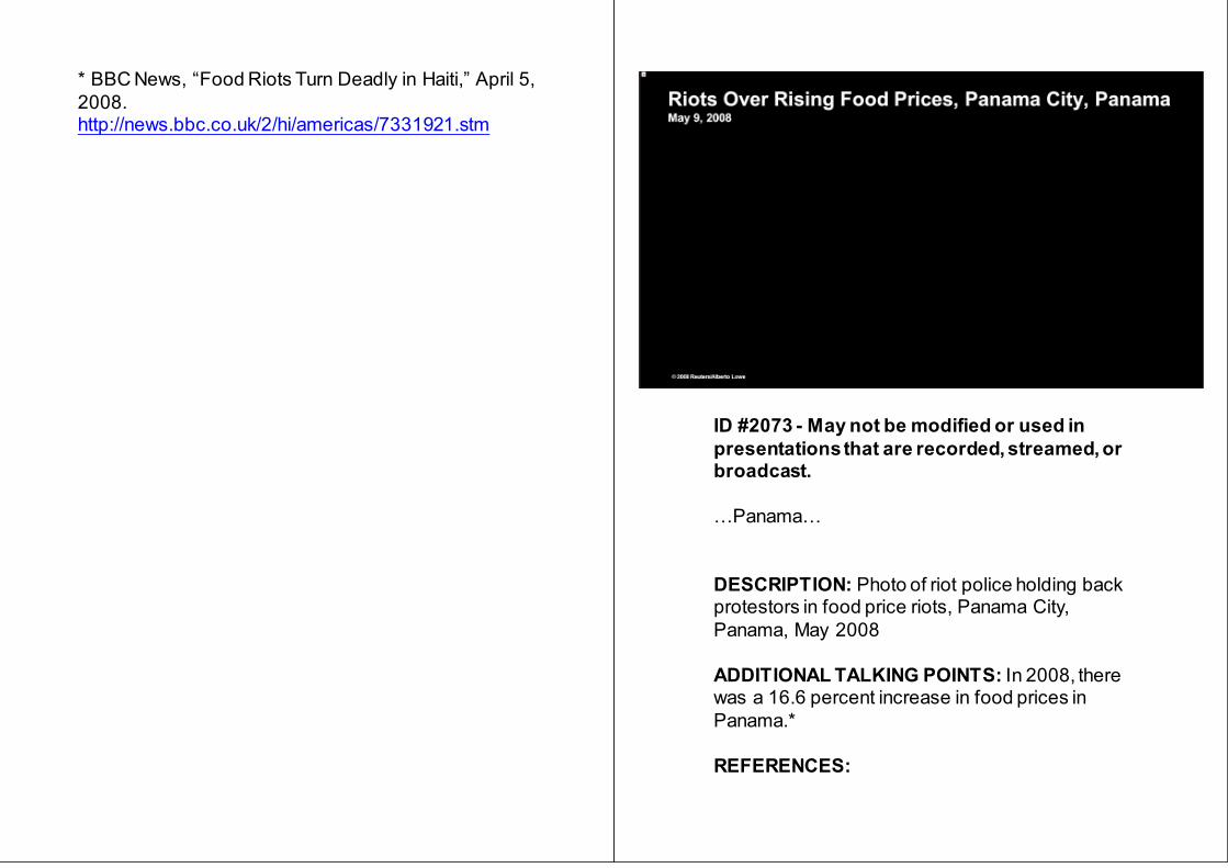
* BBC News, “Food Riots Turn Deadly in Haiti,” April 5, 2008. http://news.bbc.co.uk/2/hi/americas/7331921.stm
ID #2073 - May not be modified or used in presentations that are recorded, streamed, or broadcast.
…Panama…
DESCRIPTION: Photo of riot police holding back protestors in food price riots, Panama City, Panama, May 2008
ADDITIONAL TALKING POINTS: In 2008, there was a 16.6 percent increase in food prices in Panama.*
REFERENCES:
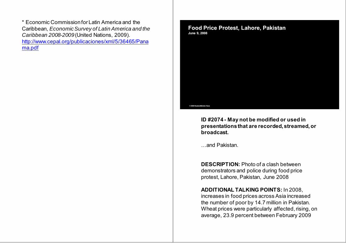
* Economic Commission for Latin America and the Caribbean, Economic Survey of Latin America and the Caribbean 2008-2009 (United Nations, 2009). http://www.cepal.org/publicaciones/xml/5/36465/Panama.pdf
ID #2074 - May not be modified or used in presentations that are recorded, streamed, or broadcast.
…and Pakistan.
DESCRIPTION: Photo of a clash between demonstrators and police during food price protest, Lahore, Pakistan, June 2008
ADDITIONAL TALKING POINTS: In 2008, increases in food prices across Asia increased the number of poor by 14.7 million in Pakistan. Wheat prices were particularly affected, rising, on average, 23.9 percent between February 2009
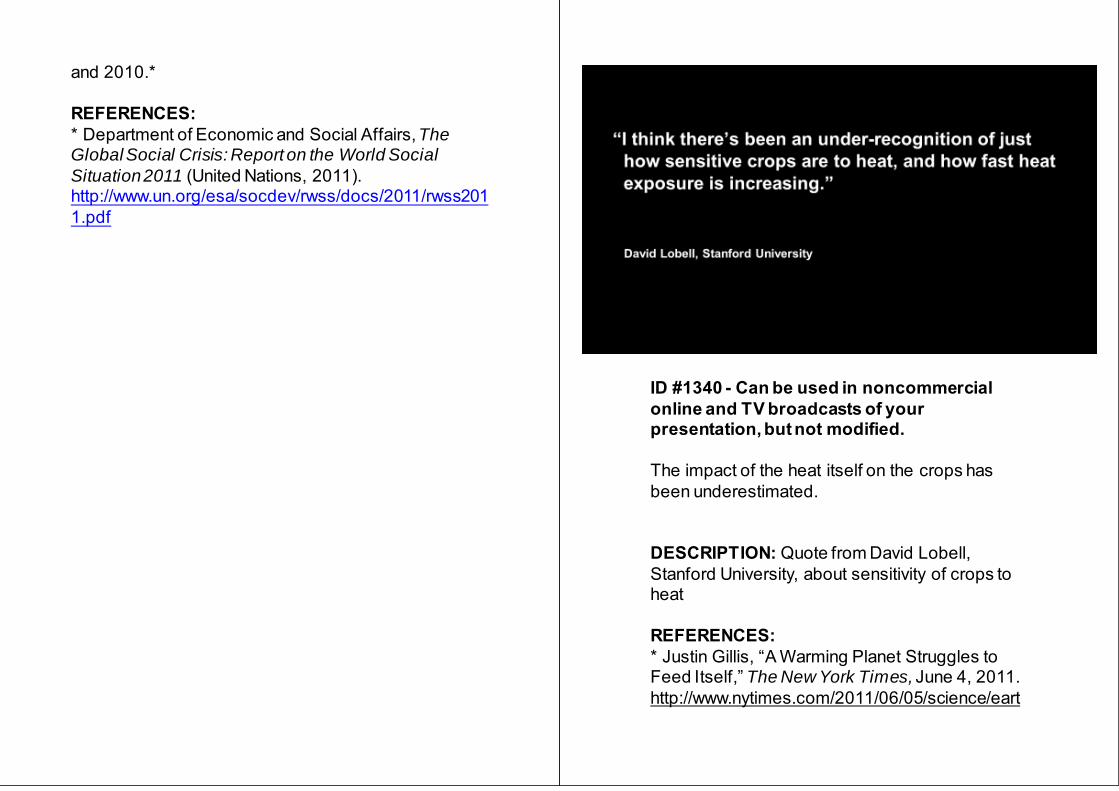
and 2010.*
REFERENCES:* Department of Economic and Social Affairs, The Global Social Crisis: Report on the World Social Situation 2011 (United Nations, 2011). http://www.un.org/esa/socdev/rwss/docs/2011/rwss2011.pdf
ID #1340 - Can be used in noncommercial online and TV broadcasts of your presentation, but not modified.
The impact of the heat itself on the crops has been underestimated.
DESCRIPTION: Quote from David Lobell, Stanford University, about sensitivity of crops to heat
REFERENCES:* Justin Gillis, “A Warming Planet Struggles to Feed Itself,” The New York Times, June 4, 2011. http://www.nytimes.com/2011/06/05/science/eart
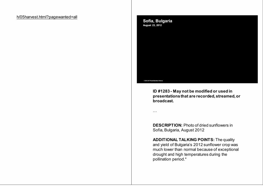
h/05harvest.html?pagewanted=all
ID #1283 - May not be modified or used in presentations that are recorded, streamed, or broadcast.
…
DESCRIPTION: Photo of dried sunflowers in Sofia, Bulgaria, August 2012
ADDITIONAL TALKING POINTS: The quality and yield of Bulgaria’s 2012 sunflower crop was much lower than normal because of exceptional drought and high temperatures during the pollination period.*
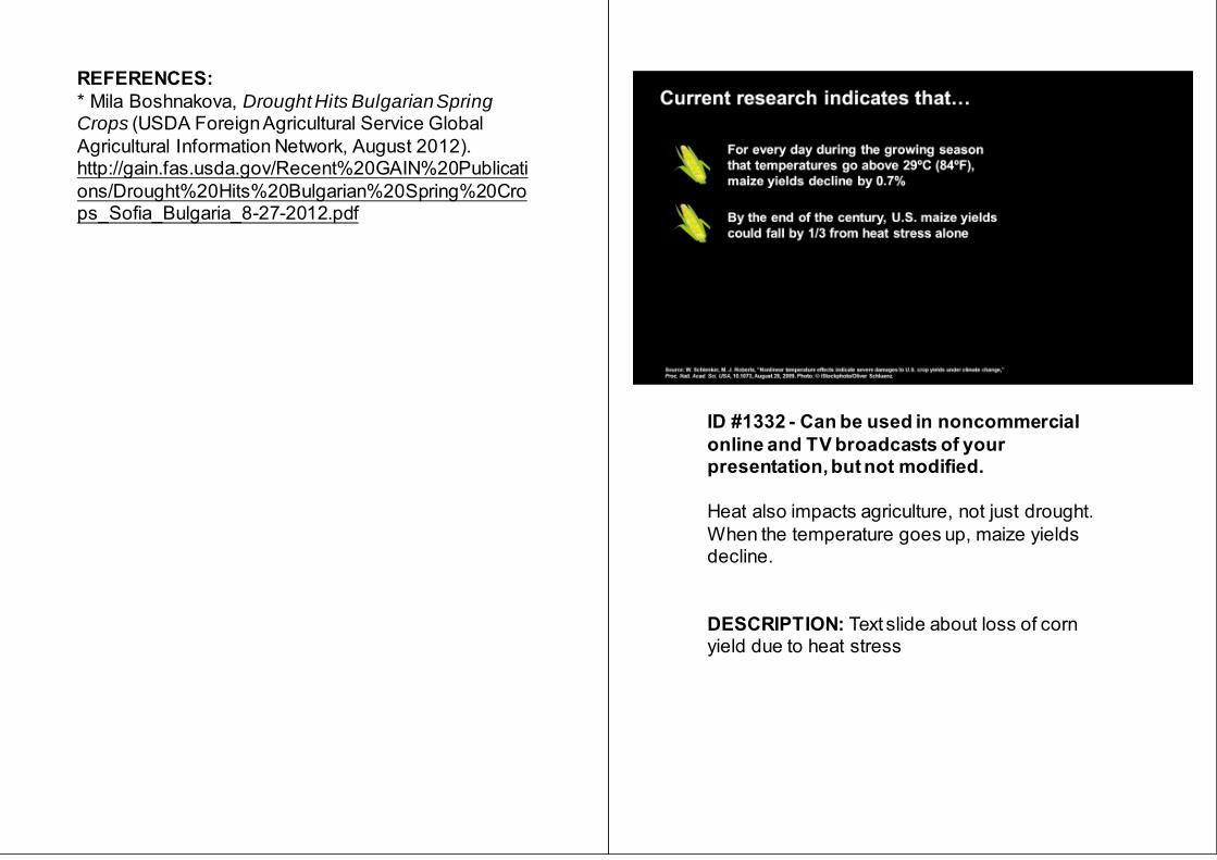
REFERENCES:* Mila Boshnakova, Drought Hits Bulgarian Spring Crops (USDA Foreign Agricultural Service Global Agricultural Information Network, August 2012). http://gain.fas.usda.gov/Recent%20GAIN%20Publications/Drought%20Hits%20Bulgarian%20Spring%20Crops_Sofia_Bulgaria_8-27-2012.pdf
ID #1332 - Can be used in noncommercial online and TV broadcasts of your presentation, but not modified.
Heat also impacts agriculture, not just drought. When the temperature goes up, maize yields decline.
DESCRIPTION: Text slide about loss of corn yield due to heat stress
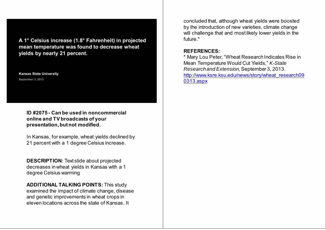
ID #2075 - Can be used in noncommercial online and TV broadcasts of your presentation, but not modified.
In Kansas, for example, wheat yields declined by 21 percent with a 1 degree Celsius increase.
DESCRIPTION: Text slide about projected decreases in wheat yields in Kansas with a 1 degree Celsius warming
ADDITIONAL TALKING POINTS: This study examined the impact of climate change, disease and genetic improvements in wheat crops in eleven locations across the state of Kansas. It
concluded that, although wheat yields were boosted by the introduction of new varieties, climate change will challenge that and most likely lower yields in the future.*
REFERENCES:* Mary Lou Peter, “Wheat Research Indicates Rise in Mean Temperature Would Cut Yields,” K-State Research and Extension, September 3, 2013. http://www.ksre.ksu.edu/news/story/wheat_research090313.aspx
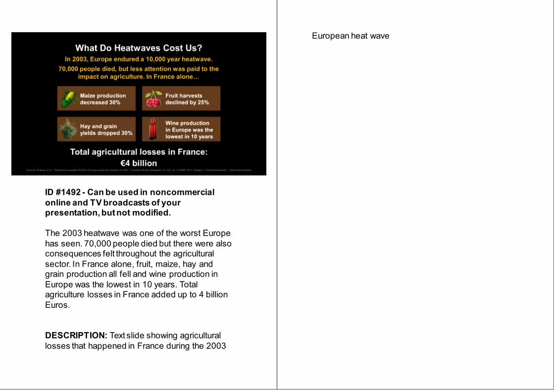
ID #1492 - Can be used in noncommercial online and TV broadcasts of your presentation, but not modified.
The 2003 heatwave was one of the worst Europe has seen. 70,000 people died but there were also consequences felt throughout the agricultural sector. In France alone, fruit, maize, hay and grain production all fell and wine production in Europe was the lowest in 10 years. Total agriculture losses in France added up to 4 billion Euros.
DESCRIPTION: Text slide showing agricultural losses that happened in France during the 2003
European heat wave
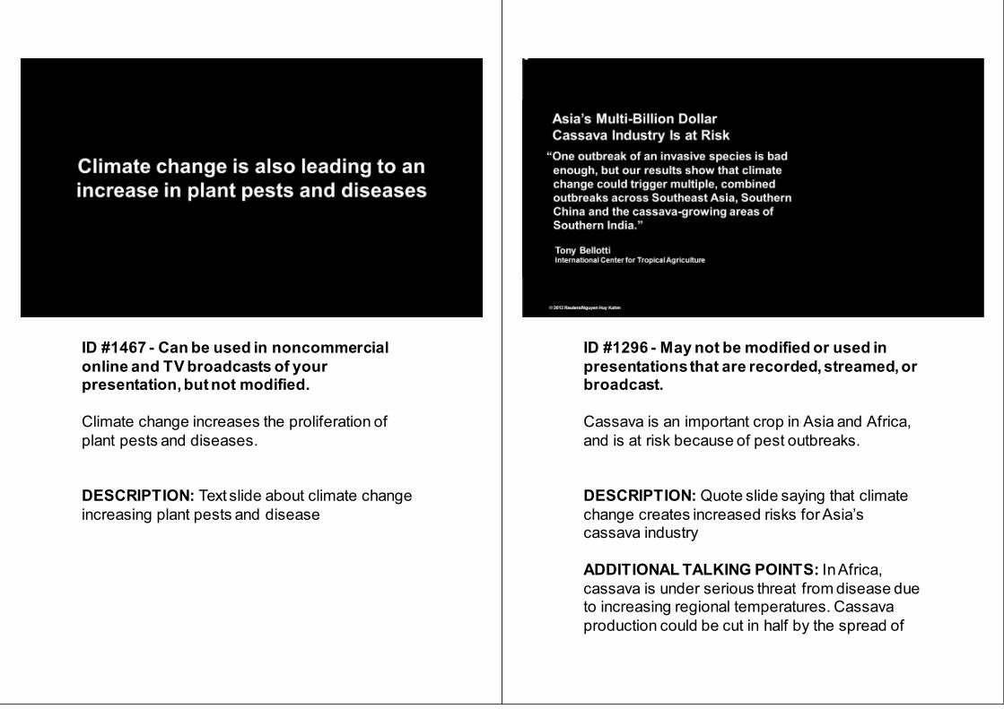
ID #1467 - Can be used in noncommercial online and TV broadcasts of your presentation, but not modified.
Climate change increases the proliferation of plant pests and diseases.
DESCRIPTION: Text slide about climate change increasing plant pests and disease
ID #1296 - May not be modified or used in presentations that are recorded, streamed, or broadcast.
Cassava is an important crop in Asia and Africa, and is at risk because of pest outbreaks.
DESCRIPTION: Quote slide saying that climate change creates increased risks for Asia’s cassava industry
ADDITIONAL TALKING POINTS: In Africa, cassava is under serious threat from disease due to increasing regional temperatures. Cassava production could be cut in half by the spread of
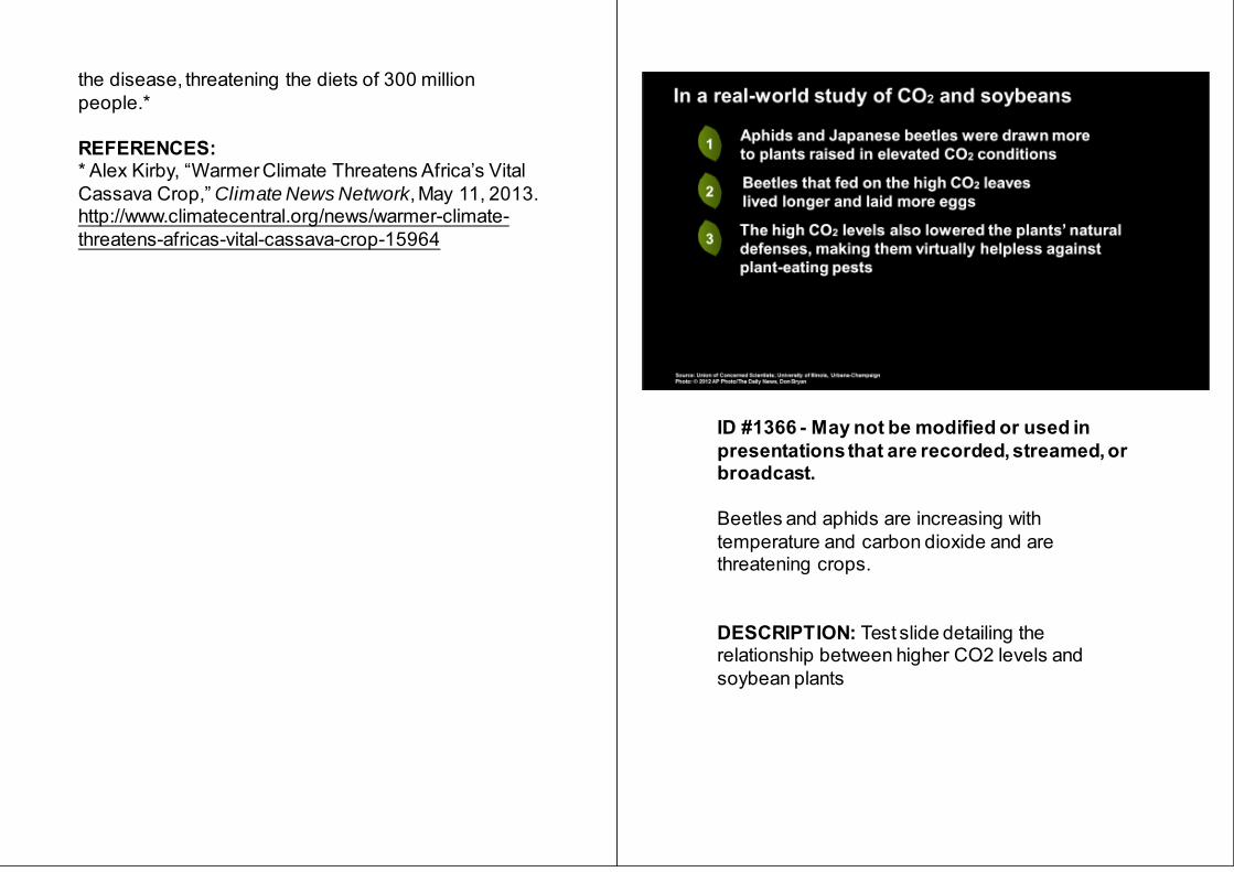
the disease, threatening the diets of 300 million people.*
REFERENCES: * Alex Kirby, “Warmer Climate Threatens Africa’s Vital Cassava Crop,” Climate News Network, May 11, 2013. http://www.climatecentral.org/news/warmer-climate-threatens-africas-vital-cassava-crop-15964
ID #1366 - May not be modified or used in presentations that are recorded, streamed, or broadcast.
Beetles and aphids are increasing with temperature and carbon dioxide and are threatening crops.
DESCRIPTION: Test slide detailing the relationship between higher CO2 levels and soybean plants
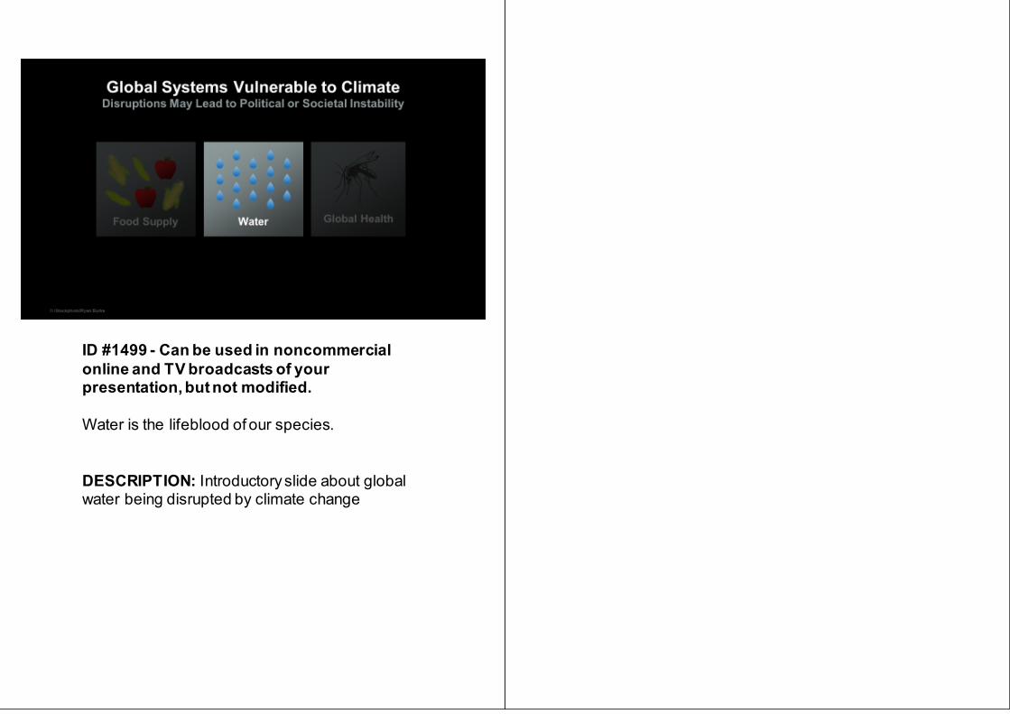
ID #1499 - Can be used in noncommercial online and TV broadcasts of your presentation, but not modified.
Water is the lifeblood of our species.
DESCRIPTION: Introductory slide about global water being disrupted by climate change
Every year, worldwide freshwater demand increases by about 64 billion cubic meters (1 cubic meter = 1,000 liters).***
REFERENCES: * Food and Agriculture Organization of the United Nations (FAO), “Water Uses,” AquaStat, last accessed May 2014. http://www.fao.org/nr/water/aquastat/water_use/index.stm ** IFAD, “Water Facts and Figures – Water Use,” last accessed May 2014. http://www.ifad.org/english/water/key.htm*** UN Water – Statistics, “Population Increase Implies Increased Freshwater Demand of About 64 Billion Cubic Meters a Year,” last updated February 6, 2014. http://www.unwater.org/statistics/statistics-detail/en/c/211814/

Over-pumping groundwater resources leads to many negative effects, such as the drying up of wells, reduction of water in streams and lakes, deterioration of water quality, increased pumping costs, and land subsidence.**
REFERENCES:* Lester R. Brown, “Peak Water: What Happens When the Wells Go Dry?,” Earth Policy Institute, July 9, 2013. http://www.earth-policy.org/plan_b_updates/2013/update115 ** United States Geological Survey, “Groundwater Depletion,” last updated August 5, 2013. http://ga.water.usgs.gov/edu/gwdepletion.html
per person per year.*
REFERENCES:* Food and Agriculture Organization of the United Nations, “The Near East and North Africa: Growing Demand, Limited Resources,” 2006. http://www.fao.org/newsroom/en/focus/2006/1000252/article_1000254en.html
million people.**
REFERENCES:* United Nations Department of Economic and Social Affairs, “Water for Life 2005-2015),” last updated April 11, 2014. http://www.un.org/waterforlifedecade/africa.shtml** Climat Environment Société, “Conférence ‘Water Scarcity in Africa: Issues and Challenges’,” October 3, 2012. http://www.gisclimat.fr/manifestation-scientifique/conf%C3%A9rence-%E2%80%9Cwater-scarcity-africa-issues-and-challenges%E2%80%9D
terrible sign when camels start dying because when they start to die, then what chance have sheep, goats and cattle?"*
REFERENCES:*Sophia Jones, “Foreign Policy: Sally The Camel Has Thirsty Humps,” NPR, July 14, 2011. http://www.npr.org/2011/07/14/137842287/foreign-policy-sally-the-camel-has-thirsty-humps
scarcity leads to decreased food production, which leads inexorably to hunger, and conflicts and violence increase with hunger.**
REFERENCES:* United Nations Department of Economic and Social Affairs, “Water for Life 2005-2015),” last updated April 11, 2014. http://www.un.org/waterforlifedecade/africa.shtml** Siegfried Modola, “Fishing and Firearms on Lake Turkana,” Reuters, December 2, 2013. http://blogs.reuters.com/photographers-blog/2013/12/02/fishing-and-firearms-on-lake-turkana/

REFERENCES:* “KENYA: Drought Exacerbates Conflict in Turkana,” IRIN News, July 29, 2011. http://www.irinnews.org/fr/report/93363/kenya-drought-exacerbates-conflict-in-turkana
REFERENCES:* “KENYA: Drought Exacerbates Conflict in Turkana,” IRIN News, July 29, 2011. http://www.irinnews.org/fr/report/93363/kenya-drought-exacerbates-conflict-in-turkana
REFERENCES:*Joseph Akwiri, “Raiders Kill 38 in Latest Land Clashes in Kenya,” Reuters, September 10, 2012. http://www.reuters.com/article/2012/09/10/us-kenya-clashes-idUSBRE88912W20120910
* Water.org, “Kenya,” last accessed May 2014. http://water.org/country/kenya/
River.*
REFERENCES:* Tristan McConnell, “It’s Where Mankind Was Born. Now Mankind is Killing it, Experts Say,” Global Post, December 14, 2013. http://www.globalpost.com/dispatch/news/regions/africa/kenya/131213/its-where-mankind-was-born-now-mankind-killing-it
REFERENCES:* UNICEF, “Central African Republic,” last accessed May 2014. http://www.unicef.org/infobycountry/car_statistics.html
December 24, 2013. http://www.unicef.org/infobycountry/ethiopia_statistics.html
among Senegalese children is 14 percent—right at the World Health Organization’s emergency threshold—and more than one million children in the sub-Saharan region under the age of five are at risk of life-threatening food shortage.*
REFERENCES:* Associated Press, “Hunger Stalks Africa’s young,” Times Union, May 26, 2012. http://www.timesunion.com/news/article/Hunger-stalks-Africa-s-young-3588178.php
Zimbabweans often resort to drinking from unprotected wells and other sources that are contaminated with sewage.*
REFERENCES:* Sebastian Mhofu, “Rights Group Fears Waterborne Diseases Looming in Harare,” Voice of America, November 19, 2013. http://www.voanews.com/content/rights-group-fears-waterborne-diseases-looming-in-harare/1793144.html
In Qunu, the hometown of the late Nelson Mandela, most villagers do not even have water in their homes.**
REFERENCES:*The Water Project, “Water in Crisis – South Africa,” last accessed May 2014. http://thewaterproject.org/water-in-crisis-south-africa** Henriette Geldenhuys, “No Water in Qunu,” IOL News, June 19, 2014. http://www.iol.co.za/news/south-africa/eastern-cape/no-water-in-qunu-1.1534412#.U2l-0NzWs3h

of water) by 2030.* This deficit is projected to lead to a 17 percent water gap between water demand and supply in the country.*
REFERENCES:* 2030 Water Resources Group, “2012 Annual Report,” January 25, 2013. http://www.2030wrg.org/wp-content/uploads/2013/01/2030-WRG-Annual-Report1.pdf

mosquitos that carry West Nile to broaden their range and make them more abundant.* Warm conditions have been shown to instigate outbreaks.******Rift Valley Fever: The UN has warned that changing weather patterns could allow this mosquito-borne disease to move out of Africa and across the Arabian and Mediterranean Seas.* Rift Valley Fever outbreaks are closely related to rainfall patterns.*****Chikungunya: This mosquito-borne disease has spread from Africa, Asia, and India into Europe.*Chagas Disease: Carried by Reduviid bugs (commonly known as “kissing bugs”) this disease was first identified in Brazil and the Amazon and has since made its way to North America.** Research has shown that as our climate warms, the risk of Chagas Disease in the southern United States is expected to increase.***Cryptococcus gatti fungus: Once confined to tropical and subtropical climates, Cryptococcus gatti is now present in the Pacific Northwest of North America.*Dengue Fever: Dengue is the most rapidly spreading mosquito-borne disease in the world. The range of the Aedes moquitos that spread dengue is affected in part by rainfall, temperature, and humidity patterns – all of which are affected by climate change. ****
REFERENCES:* James West, “7 Climate Change Diseases to Ruin Your Monday,” Mother Jones, August 6, 2012. http://www.motherjones.com/environment/2012/08/climate-change-diseases
** Patricia Dorn, “A Brief Summary of Chagas Disease and its Natural Transmission in the United States,” Chagas in the U.S.A., last updated September 2010. http://www.loyno.edu/~dorn/Chagas_in_US.htm *** Click Lambert et al., “The potential for emergency of Chagas disease in the United States,” Geospatial Health 2 (2008). http://www.ncbi.nlm.nih.gov/pubmed/18686271 **** Yacoub et al., “Disease appearance and evolution against a background of climate change and reduced resources,” Philosophical Transactions of the Royal Society 369 (2011). http://rsta.royalsocietypublishing.org/content/369/1942/1719.full***** Compton Tucker et al., “Climate Change, Extreme Weather Events, and Fungal Disease Emergency and Spread,” NASA, 2011. http://ntrs.nasa.gov/archive/nasa/casi.ntrs.nasa.gov/NTRS-PDF/20110012851_2011013365.pdf ****** Shlomit Paz, “West Nile Virus eruptions in summer 2010 – what Is the possible linkage with climate change?” National Security and Human Health Implications of Climate Change (2012). http://link.springer.com/chapter/10.1007/978-94-007-2430-3_21
endemic areas.** With respect to dengue, India leads the world in disease burden, as 34 percent of all dengue cases occur there.***
REFERENCES:* Praja.org, Report on The State of Health of Mumbai (2012). http://www.praja.org/praja_downloads/Report%20on%20The%20STATE%20of%20HEALTH%20of%20MUMBAI.pdf** IANS, “World Malaria Day: Mosquito Sting Continues to Pose Grave Threat,” India Today, April 25, 2013. http://indiatoday.intoday.in/story/world-malaria-day-mosquito-sting-continues-to-pose-grave-threat/1/267609.html*** Gopal Raj, “India Leads the World in Dengue Burden,” The Hindu, April 8, 2013. http://www.thehindu.com/sci-tech/health/policy-and-issues/india-leads-the-world-in-dengue-burden-nature/article4592098.ece

epidemic.html?pagewanted=all&_r=0
14. By 2040 that date could move up to April 8.*
REFERENCES:* John Platt, “Pollen Counts — and Allergies —Expected to Double by 2040,” Mother Nature Network, March 25, 2013. http://www.mnn.com/health/allergies/stories/pollen-counts-and-allergies-expected-to-double-by-2040


The fire on board the rig killed 11 workers and injured seven others.**
REFERENCES:* Ocean Portal Team, “Gulf Oil Spill,” Ocean Portal –Smithsonian National Museum of Natural History, last accessed May 2014. http://ocean.si.edu/gulf-oil-spill ** United Nations Environment Programme, “The Gulf of Mexico Oil Spill – The World’s Largest Accidental Oil Spill,” August 2010. https://na.unep.net/geas/getUNEPPageWithArticleIDScript.php?article_id=65

REFERENCES:* National Wildlife Federation, “How Does the BP Oil Spill Impact Wildlife and Habitat?” last accessed May 2014. https://www.nwf.org/What-We-Do/Protect-Habitat/Gulf-Restoration/Oil-Spill/Effects-on-Wildlife.aspx

ruptured.**
REFERENCES:* Susan White, “Exxon Oil Spill Could Be 40% Larger Than Company Estimates, EPA Figures Show,” Inside Climate News, April 5, 2013. http://insideclimatenews.org/news/20130405/exxon-oil-spill-could-be-40-larger-company-estimates-epa-figures-show** “Exxon Faces Deadline for Oil Spill,” United Press International, April 10, 2013. http://www.upi.com/Business_News/Energy-Resources/2013/04/10/Exxon-faces-deadline-for-oil-spill/UPI-56081365598614/
REFERENCES: * “Wildlife Affected by Mayflower Oil Spill,” KATV, April 1, 2013. http://www.katv.com/story/21845148/wildlife-affected-by-mayflower-oil-spill
degree Celsius warming of global temperature, the African nations of South Africa and Namibia may lose 41-51 percent of biodiversity from endemic plant species.*
REFERENCES:* Intergovernmental Panel on Climate Change, “Climate Change 2007: Working Group II: Impacts, Adaptation and Vulnerability — Global synthesis including impacts on biodiversity,” September 18, 2007. http://www.ipcc.ch/publications_and_data/ar4/wg2/en/ch4s4-4-11.html
for African elephants by 2080.*
REFERENCES:* “Climate Change and Wildlife,” World Wildlife Fund, last accessed April 18, 2014. http://www.wwf.org.uk/what_we_do/tackling_climate_change/impacts_of_climate_change/climate_change_and_animals/
the plants may be altered by warmer temperatures. In turn, leaf-eating primates, including mountain gorillas, may be unable to cope with the sudden loss of food or nutrition within their ever-shrinking habitats.*
REFERENCES:* Christine Dell’Amore, “Global Warming Indigestion May Kill Gorillas, Monkeys,” National Geographic, January 11, 2009. http://news.nationalgeographic.com/news/2010/01/100111-global-warming-indigestion-monkeys-gorillas/?rptregcta=reg_free_np&rptregcampaign=20131016_rw_membership_r1p_us_se_w#close-modal
Nigerian government has resulted in the environmental damage being ignored.**
REFERENCES:* Associated Press, “$1 Billion Cleanup Tab in Nigeria Oil Mess, UN Says,” NBC News, August 4, 2011. http://www.nbcnews.com/id/44015602/ns/world_news-world_environment/t/billion-cleanup-tab-nigeria-oil-mess-un-says/#.U1FKta1dVmo** John Vidal, “UN Report on the Ogoniland Oil Spills Could be Catalyst for Change,” The Guardian, August 10, 2011. http://www.theguardian.com/global-development/poverty-matters/2011/aug/10/un-nigeria-ogoniland-oil-spills

* Hilary Uguru and Michelle Faul, “Nigerian Navy Destroys 260 Illegal Oil Refineries; Thefts up to 200,000 Barrels a Day,” US News, March 16, 2014. http://www.usnews.com/news/world/articles/2014/03/16/nigeria-navy-destroys-260-illegal-oil-refineries** AP, “Oil Thefts Threaten Nigeria’s Economy, Environment,” Boston Herald, July 1, 2013. http://bostonherald.com/business/business_markets/2013/07/oil_thefts_threaten_nigerias_economy_environment
* Reuters and Associated Press, “$1 Billion Oil Cleanup Tab in Nigeria Oil Mess, UN Says,” NBC News, August 4, 2011. http://www.nbcnews.com/id/44015602/ns/world_news-world_environment/t/billion-cleanup-tab-nigeria-oil-mess-un-says/#.U2eyYNzWs3g
REFERENCES:* John Vidal, “Nigeria on Alert as Shell Announces Worst Oil Spill in Decade,” The Guardian, December 22, 2011. http://www.theguardian.com/environment/2011/dec/22/nigerian-shell-oil-spill

one of the most biologically diverse places in the world—is crucial for the livelihoods of local residents, such as those from Vitshumbi. Lake Edward is an important aquatic corridor of the park that sustains more than 27,000 fishers and provides drinking water to 50,000 people.* Concession-holding companies, like Soco International and Total SA, have been allocated rights for oil exploration across 85 percent of Virguna.*
REFERENCES:* Jenna Bonello, “WWF: Oil Exploration Threatens Africa’s Billion Dollar World Heritage Site,” World Wildlife Fund, July 31, 2013. http://worldwildlife.org/press-releases/wwf-oil-exploration-threatens-africa-s-billion-dollar-world-heritage-site

and the main airport were shut down when visibility was reduced to less than 65 feet (20 meters) in some places and the level of fine particulate matter in the air reached 40 times the permissible amount outlined by the World Health Organization.*
In 2010, China’s outdoor air pollution problem was estimated to have cost $230 billion—3.5 percent of the country’s GDP—and resulted in 1.2 million deaths.**
REFERENCES:* Christina Nunez, “Harbin Smog Crisis Highlights China’s Coal Problem,” National Geographic, October 22, 2013. http://news.nationalgeographic.com/news/energy/2013/10/131022-harbin-ice-city-smog-crisis-china-coal/** “China Airpocalypse,” Aljazeera, December 13, 2013. http://www.aljazeera.com/programmes/101east/2013/12/china-airpocalypse-2013129105135331303.html
REFERENCES:* “Severe Smog Chokes China; Nanjing Issues Code Red,” MarketWatch, December 5, 2013. http://blogs.marketwatch.com/thetell/2013/12/05/severe-smog-chokes-china-nanjing-issues-a-code-red/** “China Airpocalypse,” Aljazeera, December 13, 2013. http://www.aljazeera.com/programmes/101east/2013/12/china-airpocalypse-2013129105135331303.html
By 2015, China’s five northwestern provinces are expected to see an increase of about 1,540 million tons (1,400 metric tons) of carbon monoxide—equivalent to Russia’s national output in 2010—and air pollution from coal use and automobile emissions could worsen 70 percent by 2025.**
REFERENCES:* “Severe Smog Chokes China; Nanjing Issues Code Red,” MarketWatch, December 5, 2013. http://blogs.marketwatch.com/thetell/2013/12/05/severe-smog-chokes-china-nanjing-issues-a-code-red/** “China Airpocalypse,” Aljazeera, December 13, 2013. http://www.aljazeera.com/programmes/101east/2013/12/china-airpocalypse-2013129105135331303.html

ADDITIONAL TALKING POINTS: According to a study from the Proceedings of the National Academy of Sciences (PNAS), life expectancies north of the Huai River in China, where the government’s free coal policy was in effect between 1950 and 1980, are about 5.5 years lower due to prevalent heart and lung disease.*
The Chinese government downplayed a report from the Shanghai Academy of Social Science, which noted that Beijing’s air quality is nearing levels that do not qualify as livable.**
REFERENCES:* Alister Doyle, “Coal Pollution Cuts Lifespans in North China by 5.5 years -study,” Reuters, July 8, 2013. http://www.reuters.com/article/2013/07/08/china-environment-coal-idUSL6N0FE1W620130708** Radio Free Asia, “China Quashes Reports of ‘Unlivable’ Beijing,” February 13, 2014. http://www.rfa.org/english/news/china/pollution-02132014172135.html
pollution in China.**
REFERENCES:* Edward Wong, “Air Pollution Linked to 1.2 Million Premature Deaths in China,” The New York Times, April 1, 2013. http://www.nytimes.com/2013/04/02/world/asia/air-pollution-linked-to-1-2-million-deaths-in-china.html** ScienceDaily, “Researchers Constrain the Sources of Climate and Health-Affecting Air Pollution from China,” August 8, 2013. http://www.sciencedaily.com/releases/2013/08/130808091930.htm
air pollution.* A high percentage of these deaths occurred in South Asia, East Asia and across Europe.*
Today, accounting for one out of every eight deaths, air pollution is now the world’s largest single environmental health risk.** The World Health Organization reported that around 7 million people died due to air pollution exposure in 2012.**
REFERENCES:* Raquel A. Silva, et al., “Global Premature Mortality due to Anthropogenic Outdoor Air Pollution and the Contribution of Past Climate Change,” Environmental Research Letters, Volume 8 (3). July 11, 2013. http://iopscience.iop.org/1748-9326/8/3/034005/pdf/1748-9326_8_3_034005.pdf** World Health Organization, “7 Million Death Annually Linked to Air Pollution,” last accessed April 22, 2014. http://www.who.int/phe/health_topics/outdoorair/databases/en/
Beijing alone.*
REFERENCES:* Kaijing Xiao, “China’s Filthy Air Prompts Mask Rush and Sale of Fresh Air in Cans,” ABC News, January 30, 2013. http://abcnews.go.com/International/chinas-filthy-air-prompts-mask-rush-cans-fresh/story?id=18352787
particle count of 755 per million, the highest on record. The World Health Organization measures particle count (particulate matter with 2.5 micrometer diameter) on a scale between 0 and 500 parts per million (ppm), and recommends a count of no more than 20 ppm.*
REFERENCES:* Victoria Cavaliere, “China’s Air Pollution is so Bad it’s Visible from Space,” New York Daily News, February 2, 2013. http://www.nydailynews.com/news/world/china-pollution-bad-visible-space-article-1.1253838

REFERENCES:* “Air Pollution Blamed as China Loses Tourists,” Associated Press, August 13, 2013. http://www.telegraph.co.uk/travel/travelnews/10239362/Air-pollution-blamed-as-China-loses-tourists.html
power plants in the region.*
REFERENCES:* Peter Dizikes, “News Release: Innovative Study Estimates Extent to Which air Pollution in China Shortens Human Lives,” MIT News, July 8. 2013. http://globalchange.mit.edu/news-events/news/news_id/287#.UhvJKaWBNjQ

USA, February 17, 2014. http://usa.chinadaily.com.cn/opinion/2014-02/17/content_17285876.htm
city.* New Delhi also ranks high on the World Health Organization’s list of all cities, both major and minor, as the twelfth most polluted based on 2008 data.**
REFERENCES:* Simon Busch, “And the World’s Most Polluted City is …,” CNN, January 31, 2014. http://www.cnn.com/2014/01/30/travel/most-polluted-city/** World Health Organization, “Urban Outdoor Air Pollution Database,” September 2011. http://www.who.int/entity/phe/health_topics/outdoorair/databases/OAP_database.xls?ua=1

* World Health Organization, “Urban Outdoor Air Pollution Database,” September 2011. http://www.who.int/entity/phe/health_topics/outdoorair/databases/OAP_database.xls?ua=1
biggest sources of U.S.** and global*** greenhouse gas emissions.
REFERENCES:* Quit Coal, “Display Ad 11, No Title,” September 21, 1921. http://www.documentcloud.org/documents/357212-1921-9-21-nyt-cleancoal.html ** U.S. Environmental Protection Agency, “Sources of Greenhouse Gas Emissions,” last accessed April 22, 2014. http://www.epa.gov/climatechange/ghgemissions/sources.html*** U.S. Environmental Protection Agency, “Global Emissions,” last accessed April 22, 2014. http://www.epa.gov/climatechange/ghgemissions/global.html
REFERENCES:* Stanford School of Medicine, “Stanford Research into the Impact of Tobacco Advertising,” last accessed April 22, 2014. http://tobacco.stanford.edu/tobacco_main/images.php?token2=fm_st138.php&token1=fm_img4072.php&theme_file=fm_mt015.php&theme_name=Targeting%20Teens&subtheme_name=Joe%20Camel


ADDITIONAL TALKING POINTS: Researcher James Powell reviewed 2,258 papers in peer reviewed scientific journals published between November 2012 and December 2013. He found that only one published peer reviewed paper disagreed with the consensus that climate change is happening.*
As a follow-up, James Powell conducted the same study with peer reviewed articles published throughout the year 2013 in scientific journals. He found 10,885 such articles and established that only two of those rejected the scientific consensus on climate change.**
REFERENCES:* James Powell, “January 2014 Update,” last accessed April 2014. http://www.jamespowell.org/Second%20study/secondstudy.html** James Powell, “Science and Global Warming,” last accessed April 2014. http://www.jamespowell.org

equivalent of the power consumed by 6,000 households.** Testing began in October 2012.**
REFERENCES: * Siemens, “Wind Turbine with Record-Breaking Rotors,” last accessed April 2014. http://www.siemens.com/innovation/en/news/2012/e_inno_1223_2.htm ** Siemens, “Wind Turbine with the World’s Largest Rotor Goes into Operation,” October 2012. https://www.siemens.com/press/en/presspicture/?press=/en/presspicture/pictures-photonews/2012/pn201209.php
capacity of 630 megawatts.* Generation from Phase One of the London Array is expected to avoid 925,000 metric tons (1,019,640 tons) of carbon dioxide per year.
When Phase Two is completed (no timeline yet), the London Array will have a capacity of 1,000 megawatts.
REFERENCES:* The London Array Project, “How it all began,” last accessed April 2014. http://www.londonarray.com/the-project/
could provide the equivalent of up to 20 percent of Kenya’s current total installed power.**
REFERENCES:* Xan Rice, “Kenya to Build Africa’s Biggest Windfarm,” The Guardian, July 27, 2009. http://www.guardian.co.uk/environment/2009/jul/27/kenya-wind-farm ** Lake Turkana Wind Power, “Project Profile,” last accessed April 2014. http://ltwp.co.ke/the-project/project-profile
REFERENCES: * Guillaume Klein, “Renewable Energy Drive Gains Pace in Morocco: Africa Largest Wind Farm to Open in 2014,” Middle East Online, May 18, 2013. http://www.middle-east-online.com/english/?id=58827
resilient” by 2025,* and to increase electric generating capacity by 400 percent by 2015.**
REFERENCES: * David Smith “Ethiopia Opens Africa’s Biggest Windfarm,” The Guardian, October 28, 2013. http://www.theguardian.com/global-development/2013/oct/28/ethiopia-opens-africa-biggest-windfarm** E.G. Woldegebriel, “Ethiopia Turns to Wind Power to Boost Energy Security,” Reuters, September 28, 2012. http://www.trust.org/item/?map=ethiopia-turns-to-wind-power-to-boost-energy-security/
for the private sector to begin developing wind energy in South Africa.*
REFERENCES: * Liane Greeff, “Power From the Wind in South Africa,” Africa Renewal, April 2012. http://www.un.org/africarenewal/magazine/april-2012/power-wind-south-africa
capacity is in the early stages of development.*****
REFERENCES: * Eskom, “Renewable Energy Independent Power Producer Procurement Programme,” last accessed April 22, 2014. http://www.eskom.co.za/Whatweredoing/Pages/RE_IPP_Procurement_Programme.aspx** Eskom, “Eskom Power Stations,” last updated February 2013. http://www.eskom.co.za/Whatweredoing/ElectricityGeneration/PowerStations/Documents/EskomGenerationDivMapREV81.pdf*** Darling Wind Power, “Project Fact Sheet,” last accessed April 22, 2014. http://www.darlingwindfarm.co.za/projectfactsheet.htm**** United Nations Framework Convention on Climate Change, “Project Design Document Form—Coega IDZ Windfarm,” December 12, 2014. http://cdm.unfccc.int/UserManagement/FileStorage/UB1DG6JSNM5RP749A8EYHFCX0LTV2Z***** Eskom, “Renewable Energy Independent Power Producer Procurement Programme,” last accessed April 22, 2014. http://www.eskom.co.za/Whatweredoing/Pages/RE_IPP_Procurement_Programme.aspx

percent of the country’s GHG emissions.**
REFERENCES: * “Belen Windfarm (Turkey),” The Wind Power: Wind Turbines and Wind Farms Database, last updated February 2013. http://www.thewindpower.net/windfarm_en_6109_belen.php ** Republic of Turkey, Ministry of Environment and Urbanization, National Climate Change Action Plan 2011-2023, (2011). http://www.cem.gov.tr/erozyon/Files/faaliyetler/dis_iliskiler/iklim_degisikligi_cerceve_sozlesmesi/Cevre_Bak_Ulusal_Eylem_Plani_ing_2011_2023_2_.pdf
production from renewable sources by 2017,** and quadruple renewable energy production by 2022.***
REFERENCES:* Global Wind Energy Council, “Top 10 Cumulative Installed Capacity in 2013,” last accessed April 22, 2014. http://www.gwec.net/wp-content/uploads/2014/04/9_Top-ten-cumulative.jpg** Natalie Obiko Pearson, “India Targets Doubling of Renewable-Energy Installations to 2017,” Bloomberg, May 22, 2012. http://www.bloomberg.com/news/2012-05-22/india-targets-doubling-of-renewable-energy-installations-to-2017.html *** Eric Yep, “India Raises Renewable Energy Target Fourfold,” The Wall Street Journal, December 29, 2010. http://online.wsj.com/article/SB10001424052970203513204576048870791325278.html
REFERENCES:* TheBioEnergySite News Desk, “Huaneng's Wind Farm in Weifang Starts Operation,” TheBioEnergySite, February 25, 2010. http://www.thebioenergysite.com/news/5627/huanengs-wind-farm-in-weifang-starts-operation
electricity to power a city of 500,000 people and reduce carbon emissions by about 600,000 metric tons (661,375 tons) per year.**
REFERENCES:* Mark Stevenson, “Mexico Fires up $550 Million Wind Farm,” USA Today, last updated January 23, 2009. http://www.usatoday.com/money/industries/energy/2009-01-22-laventosa_N.htm** “Mexico Looks Beyond Oil and Toward the Wind,” NBC News, January 22, 2009. http://www.msnbc.msn.com/id/28798851/ns/world_news-world_environment/t/mexico-looks-beyond-oil-toward-wind/#.Tjqz2ByaJpQ
of new electric generating capacity added in the U.S.**
REFERENCES:* Sherman County, “Powering Up With Wind,” last accessed December 2012. http://www.sherman-county.com/windpower.asp** Energy Information Administration, “Half of Power Plant Capacity Additions in 2013 Came from Natural Gas,” April 8, 2014. http://www.eia.gov/todayinenergy/detail.cfm?id=15751
in wind power and related fields.**
REFERENCES:* U.S. Department of Energy, “Installed Wind Capacity,” last updated April 8, 2014. http://www.windpoweringamerica.gov/wind_installed_capacity.asp ** American Wind Energy Association, “Wind Energy Facts at a Glance,” last accessed April 22, 2014. http://www.awea.org/Resources/Content.aspx?ItemNumber=5059&navItemNumber=742
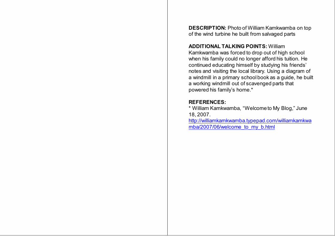
DESCRIPTION: Photo of William Kamkwamba on top of the wind turbine he built from salvaged parts
ADDITIONAL TALKING POINTS: William Kamkwamba was forced to drop out of high school when his family could no longer afford his tuition. He continued educating himself by studying his friends’ notes and visiting the local library. Using a diagram of a windmill in a primary school book as a guide, he built a working windmill out of scavenged parts that powered his family’s home.*
REFERENCES:* William Kamkwamba, “Welcome to My Blog,” June 18, 2007. http://williamkamkwamba.typepad.com/williamkamkwamba/2007/06/welcome_to_my_b.html
world to distribute solar powered laptops across Africa, including in Sierra Leone.*
REFERENCES: * “UAE Teacher Distributes Solar-powered Laptops to Africa,” Sierra Express Media, March 26, 2011. http://www.sierraexpressmedia.com/archives/21531
incomes.*
The growth has been sparked by South Africa’s ample year-round sunshine and a 120 billion Rand (approximately $11 billion US) government incentive program that aims to catalyze 3,725 Megawatts of renewable electricity by 2016.*
REFERENCES: * Jaco Visser, “Solar Boom Boosts South African Salaries With 25% Jobless,” Bloomberg, December 11, 2013. http://www.bloomberg.com/news/2013-12-11/solar-boom-boosts-south-african-salaries-with-25-jobless.html
start-up companies have introduced a “pay-as-you-go” model for solar power in sub Saharan Africa. These reduce the up-front costs of solar home systems, making them affordable to the poorest households. These small two-to-five watt systems can typically power LED lights or charge a mobile phone, and customers can pay for their power as and when they need it.*
This is a cheaper, cleaner and healthier way for rural homes to meet some of their energy needs (such as lighting) compared to the traditional fuel of choice, Kerosene.**
REFERENCES: * David Wogan, “Pay-as-You-Go Solar Energy Finds Success in Africa,” Scientific American, November 22, 2013. http://www.scientificamerican.com/article/pay-as-you-go-solar-energy/** Ross Brooks, “Pay-as-You-Go Solar Panels Offer African Communities a Cheaper Energy Alternative,” Inhabitat, November 26, 2013. http://inhabitat.com/pay-as-you-go-solar-panels-offer-african-communities-a-cheaper-energy-alternative/
the rich quantity of solar energy received by much of these regions.*
Solar energy potential is highest in northern Africa (countries spanning the Sahara and sub-Saharan belt), and in the southern, peninsular region of Africa. Over 20 countries in Africa have undertaken solar energy assessments.**
REFERENCES: * SolarGIS, “Free Download of Solar Maps - Global Horizontal Irradiation,” last accessed April 2014. http://solargis.info/doc/71** IRENA, Africa’s Renewable Future - The Path to Sustainable Growth (2013). http://www.irena.org/DocumentDownloads/Publications/Africa_renewable_future.pdf

The plant is built on an area equivalent to 140 soccer pitches and can generate enough electricity to power over 30,000 households.**
REFERENCES: * Lucy Woods, “South Africa’s First Utility-scale Solar Plant Begins Generating Electricity,” PV Tech,November 18, 2013. http://www.pv-tech.org/news/south_africas_first_utility_scale_solar_park_begins_generating_electricity** South African Photovoltaic Industry Association, “SMA Supplies Inverters for One of the First Large-scale PV Power Plants in Africa,” November 16, 2012. http://www.sapvia.co.za/sma-supplies-inverters-for-one-of-the-first-large-scale-pv-power-plants-in-africa/
REFERENCES:* “Philippines Ready to Move Forward on Renewable Energy?,” UPI.com, June 3, 2013. http://www.upi.com/Business_News/Energy-Resources/2013/06/03/Philippines-ready-to-move-forward-on-renewable-energy/UPI-84061370287472/
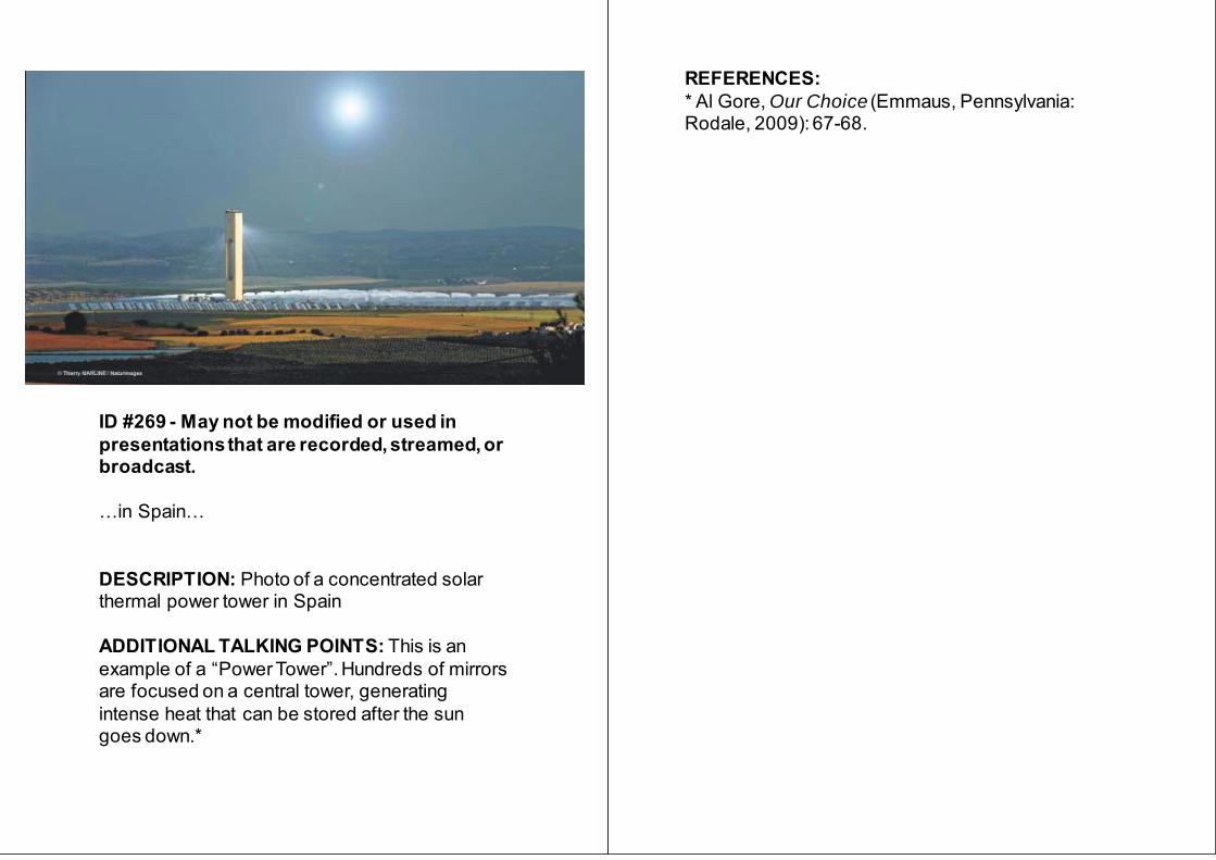
ID #269 - May not be modified or used in presentations that are recorded, streamed, or broadcast.
…in Spain…
DESCRIPTION: Photo of a concentrated solar thermal power tower in Spain
ADDITIONAL TALKING POINTS: This is an example of a “Power Tower”. Hundreds of mirrors are focused on a central tower, generating intense heat that can be stored after the sun goes down.*
REFERENCES:* Al Gore, Our Choice (Emmaus, Pennsylvania: Rodale, 2009): 67-68.
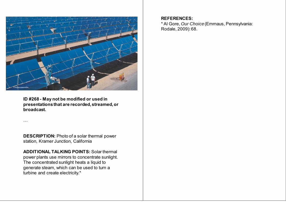
ID #268 - May not be modified or used in presentations that are recorded, streamed, or broadcast.
…
DESCRIPTION: Photo of a solar thermal power station, Kramer Junction, California
ADDITIONAL TALKING POINTS: Solar thermal power plants use mirrors to concentrate sunlight. The concentrated sunlight heats a liquid to generate steam, which can be used to turn a turbine and create electricity.*
REFERENCES:* Al Gore, Our Choice (Emmaus, Pennsylvania: Rodale, 2009): 68.

ID #2092 - May not be modified or used in presentations that are recorded, streamed, or broadcast.
…
DESCRIPTION: Photo of Wymeswold solar farm in Leicestershire, England
ADDITIONAL TALKING POINTS: At the time the Wymeswold solar power farm was commissioned, it was the largest in the United Kingdom in terms of total generation.*
According to different estimates, it has a capacity
of between 33** and 35*** Megawatts of power, the equivalent of producing power for 8,000 households.**
Despite poor weather, from November 2013 to January 2014 the farm outperformed all predictions and generated 15 percent more power than it was initially expected to.****
REFERENCES:* Renewables MAP UK, “List of Major Solar Energy Schemes in the UK,” last accessed April 2014. http://www.renewables-map.co.uk/Solar.asp** Andy Colthorpe, “UK’s Largest Farm Sold for 43.7 Million Pounds,” Solar Power Portal, November 11, 2013. http://www.solarpowerportal.co.uk/news/uks_largest_solar_farm_sold_for_43.7_million_2356*** Renewables Map UK, “Wymeswold Solar Farm (Solar, Active)” last accessed April 2014. http://www.renewables-map.co.uk/details.asp?pageid=2220&pagename=Wymeswold%20Solar%20Farm**** Peter Bennett, “Wymeswold Solar Farm Outperforms Predictions,” Solar Power Portal, January 27, 2014. http://www.solarpowerportal.co.uk/news/wymeswold_solar_farm_outperforms_predictions_2356
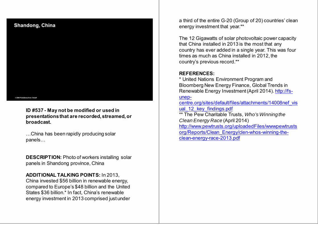
ID #537 - May not be modified or used in presentations that are recorded, streamed, or broadcast.
…China has been rapidly producing solar panels…
DESCRIPTION: Photo of workers installing solar panels in Shandong province, China
ADDITIONAL TALKING POINTS: In 2013, China invested $56 billion in renewable energy, compared to Europe’s $48 billion and the United States $36 billion.* In fact, China’s renewable energy investment in 2013 comprised just under
a third of the entire G-20 (Group of 20) countries’ clean energy investment that year.**
The 12 Gigawatts of solar photovoltaic power capacity that China installed in 2013 is the most that any country has ever added in a single year. This was four times as much as China installed in 2012, the country’s previous record.**
REFERENCES:* United Nations Environment Program and Bloomberg New Energy Finance, Global Trends in Renewable Energy Investment (April 2014). http://fs-unep-centre.org/sites/default/files/attachments/14008nef_visual_12_key_findings.pdf** The Pew Charitable Trusts, Who’s Winning the Clean Energy Race (April 2014) http://www.pewtrusts.org/uploadedFiles/wwwpewtrustsorg/Reports/Clean_Energy/clen-whos-winning-the-clean-energy-race-2013.pdf
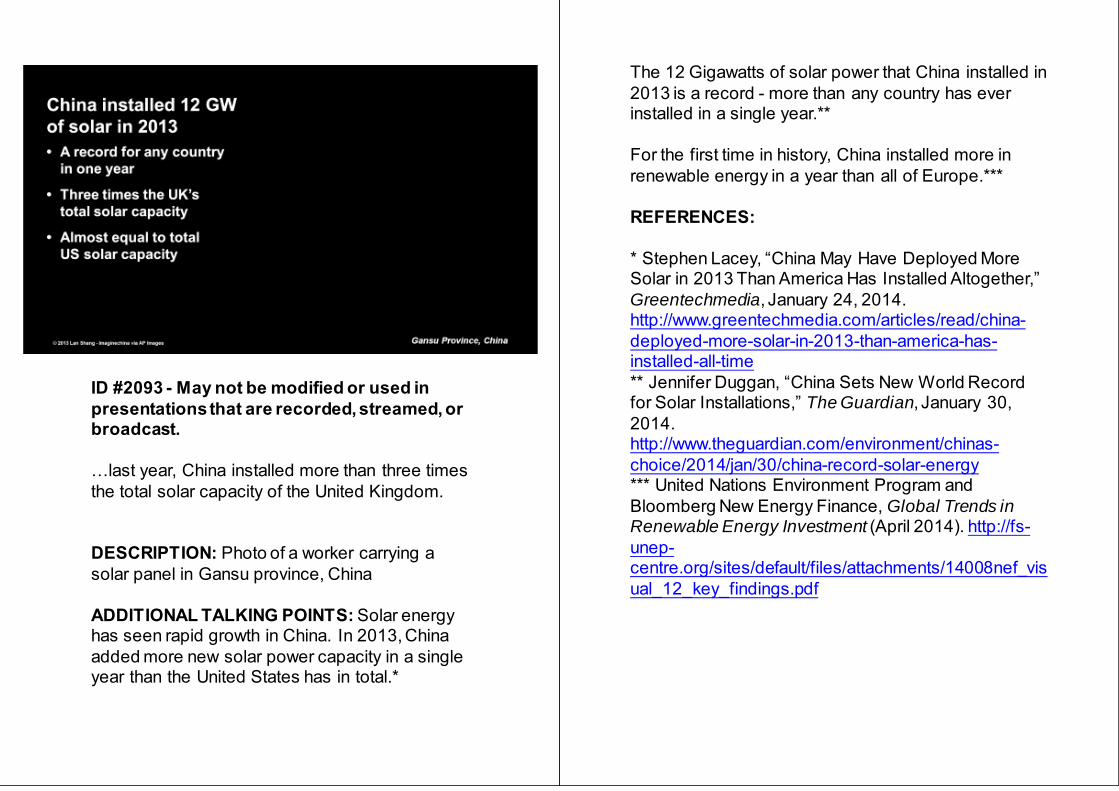
ID #2093 - May not be modified or used in presentations that are recorded, streamed, or broadcast.
…last year, China installed more than three times the total solar capacity of the United Kingdom.
DESCRIPTION: Photo of a worker carrying a solar panel in Gansu province, China
ADDITIONAL TALKING POINTS: Solar energy has seen rapid growth in China. In 2013, China added more new solar power capacity in a single year than the United States has in total.*
The 12 Gigawatts of solar power that China installed in 2013 is a record - more than any country has ever installed in a single year.**
For the first time in history, China installed more in renewable energy in a year than all of Europe.***
REFERENCES:
* Stephen Lacey, “China May Have Deployed More Solar in 2013 Than America Has Installed Altogether,” Greentechmedia, January 24, 2014. http://www.greentechmedia.com/articles/read/china-deployed-more-solar-in-2013-than-america-has-installed-all-time** Jennifer Duggan, “China Sets New World Record for Solar Installations,” The Guardian, January 30, 2014. http://www.theguardian.com/environment/chinas-choice/2014/jan/30/china-record-solar-energy*** United Nations Environment Program and Bloomberg New Energy Finance, Global Trends in Renewable Energy Investment (April 2014). http://fs-unep-centre.org/sites/default/files/attachments/14008nef_visual_12_key_findings.pdf
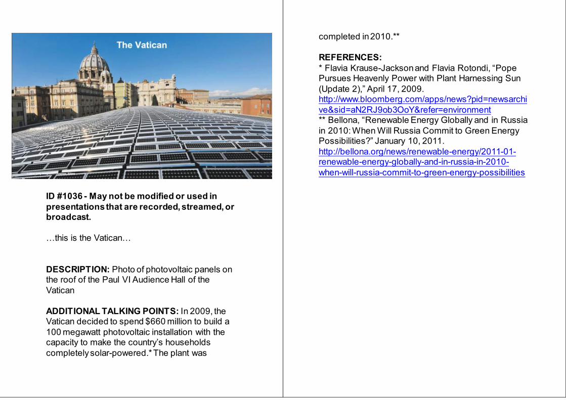
ID #1036 - May not be modified or used in presentations that are recorded, streamed, or broadcast.
…this is the Vatican…
DESCRIPTION: Photo of photovoltaic panels on the roof of the Paul VI Audience Hall of the Vatican
ADDITIONAL TALKING POINTS: In 2009, the Vatican decided to spend $660 million to build a 100 megawatt photovoltaic installation with the capacity to make the country’s households completely solar-powered.* The plant was
completed in 2010.**
REFERENCES:* Flavia Krause-Jackson and Flavia Rotondi, “Pope Pursues Heavenly Power with Plant Harnessing Sun (Update 2),” April 17, 2009. http://www.bloomberg.com/apps/news?pid=newsarchive&sid=aN2RJ9ob3OoY&refer=environment** Bellona, “Renewable Energy Globally and in Russia in 2010: When Will Russia Commit to Green Energy Possibilities?” January 10, 2011. http://bellona.org/news/renewable-energy/2011-01-renewable-energy-globally-and-in-russia-in-2010-when-will-russia-commit-to-green-energy-possibilities
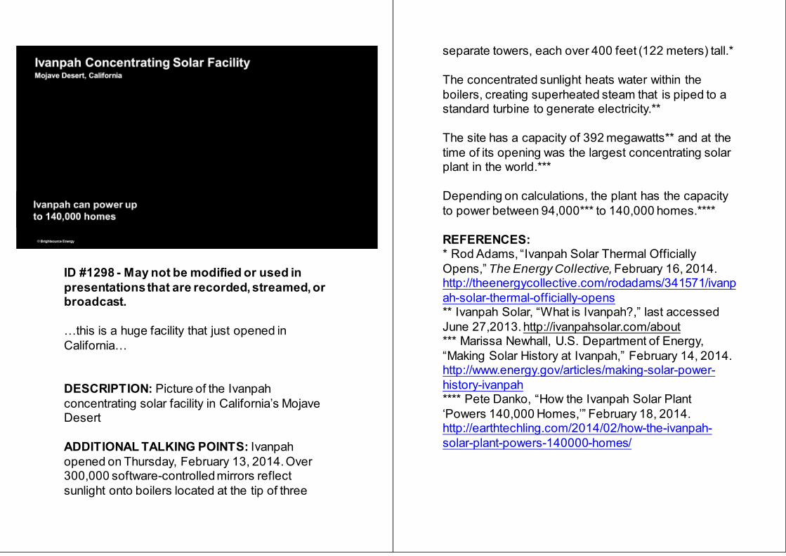
ID #1298 - May not be modified or used in presentations that are recorded, streamed, or broadcast.
…this is a huge facility that just opened in California…
DESCRIPTION: Picture of the Ivanpah concentrating solar facility in California’s Mojave Desert
ADDITIONAL TALKING POINTS: Ivanpah opened on Thursday, February 13, 2014. Over 300,000 software-controlled mirrors reflect sunlight onto boilers located at the tip of three
separate towers, each over 400 feet (122 meters) tall.*
The concentrated sunlight heats water within the boilers, creating superheated steam that is piped to a standard turbine to generate electricity.**
The site has a capacity of 392 megawatts** and at the time of its opening was the largest concentrating solar plant in the world.***
Depending on calculations, the plant has the capacity to power between 94,000*** to 140,000 homes.****
REFERENCES: * Rod Adams, “Ivanpah Solar Thermal Officially Opens,” The Energy Collective, February 16, 2014. http://theenergycollective.com/rodadams/341571/ivanpah-solar-thermal-officially-opens** Ivanpah Solar, “What is Ivanpah?,” last accessed June 27,2013. http://ivanpahsolar.com/about *** Marissa Newhall, U.S. Department of Energy, “Making Solar History at Ivanpah,” February 14, 2014. http://www.energy.gov/articles/making-solar-power-history-ivanpah**** Pete Danko, “How the Ivanpah Solar Plant ‘Powers 140,000 Homes,’” February 18, 2014. http://earthtechling.com/2014/02/how-the-ivanpah-solar-plant-powers-140000-homes/
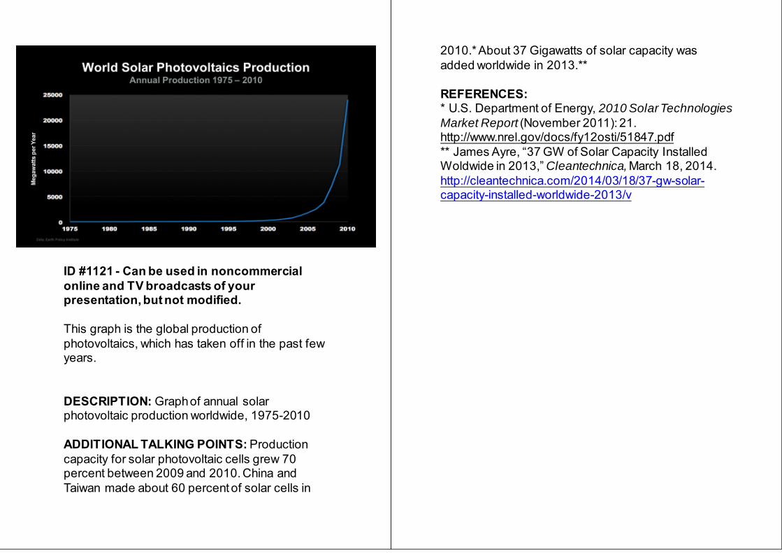
ID #1121 - Can be used in noncommercial online and TV broadcasts of your presentation, but not modified.
This graph is the global production of photovoltaics, which has taken off in the past few years.
DESCRIPTION: Graph of annual solar photovoltaic production worldwide, 1975-2010
ADDITIONAL TALKING POINTS: Production capacity for solar photovoltaic cells grew 70 percent between 2009 and 2010. China and Taiwan made about 60 percent of solar cells in
2010.* About 37 Gigawatts of solar capacity was added worldwide in 2013.**
REFERENCES: * U.S. Department of Energy, 2010 Solar Technologies Market Report (November 2011): 21. http://www.nrel.gov/docs/fy12osti/51847.pdf ** James Ayre, “37 GW of Solar Capacity Installed Woldwide in 2013,” Cleantechnica, March 18, 2014. http://cleantechnica.com/2014/03/18/37-gw-solar-capacity-installed-worldwide-2013/v
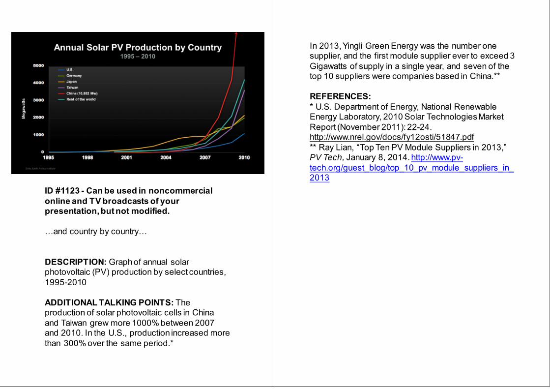
ID #1123 - Can be used in noncommercial online and TV broadcasts of your presentation, but not modified.
…and country by country…
DESCRIPTION: Graph of annual solar photovoltaic (PV) production by select countries, 1995-2010
ADDITIONAL TALKING POINTS: The production of solar photovoltaic cells in China and Taiwan grew more 1000% between 2007 and 2010. In the U.S., production increased more than 300% over the same period.*
In 2013, Yingli Green Energy was the number one supplier, and the first module supplier ever to exceed 3 Gigawatts of supply in a single year, and seven of the top 10 suppliers were companies based in China.**
REFERENCES: * U.S. Department of Energy, National Renewable Energy Laboratory, 2010 Solar Technologies Market Report (November 2011): 22-24. http://www.nrel.gov/docs/fy12osti/51847.pdf ** Ray Lian, “Top Ten PV Module Suppliers in 2013,” PV Tech, January 8, 2014. http://www.pv-tech.org/guest_blog/top_10_pv_module_suppliers_in_2013
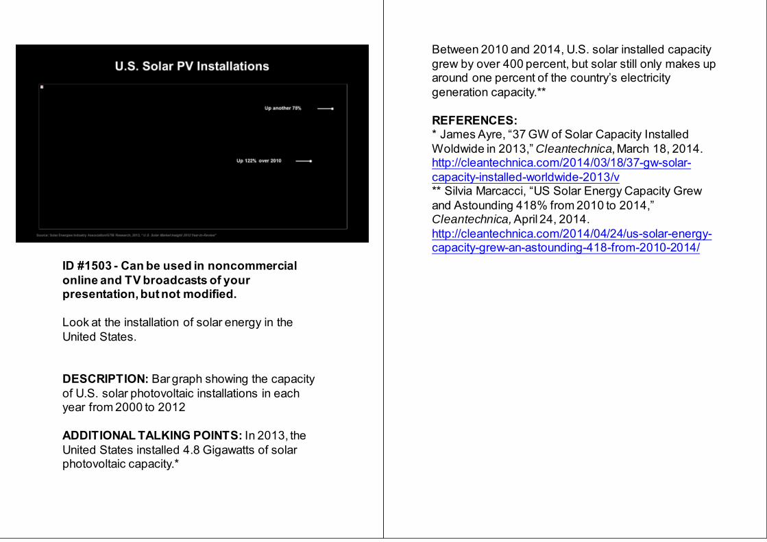
ID #1503 - Can be used in noncommercial online and TV broadcasts of your presentation, but not modified.
Look at the installation of solar energy in the United States.
DESCRIPTION: Bar graph showing the capacity of U.S. solar photovoltaic installations in each year from 2000 to 2012
ADDITIONAL TALKING POINTS: In 2013, the United States installed 4.8 Gigawatts of solar photovoltaic capacity.*
Between 2010 and 2014, U.S. solar installed capacity grew by over 400 percent, but solar still only makes up around one percent of the country’s electricity generation capacity.**
REFERENCES: * James Ayre, “37 GW of Solar Capacity Installed Woldwide in 2013,” Cleantechnica, March 18, 2014. http://cleantechnica.com/2014/03/18/37-gw-solar-capacity-installed-worldwide-2013/v** Silvia Marcacci, “US Solar Energy Capacity Grew and Astounding 418% from 2010 to 2014,” Cleantechnica, April 24, 2014. http://cleantechnica.com/2014/04/24/us-solar-energy-capacity-grew-an-astounding-418-from-2010-2014/
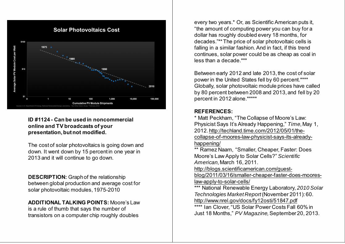
ID #1124 - Can be used in noncommercial online and TV broadcasts of your presentation, but not modified.
The cost of solar photovoltaics is going down and down. It went down by 15 percent in one year in 2013 and it will continue to go down.
DESCRIPTION: Graph of the relationship between global production and average cost for solar photovoltaic modules, 1975-2010
ADDITIONAL TALKING POINTS: Moore’s Law is a rule of thumb that says the number of transistors on a computer chip roughly doubles
every two years.* Or, as Scientific American puts it, “the amount of computing power you can buy for a dollar has roughly doubled every 18 months, for decades.”** The price of solar photovoltaic cells is falling in a similar fashion. And in fact, if this trend continues, solar power could be as cheap as coal in less than a decade.***
Between early 2012 and late 2013, the cost of solar power in the United States fell by 60 percent.**** Globally, solar photovoltaic module prices have called by 80 percent between 2008 and 2013, and fell by 20 percent in 2012 alone.*****
REFERENCES:* Matt Peckham, “The Collapse of Moore’s Law: Physicist Says It’s Already Happening,” Time, May 1, 2012. http://techland.time.com/2012/05/01/the-collapse-of-moores-law-physicist-says-its-already-happening/ ** Ramez Naam, “Smaller, Cheaper, Faster: Does Moore’s Law Apply to Solar Cells?” Scientific American, March 16, 2011. http://blogs.scientificamerican.com/guest-blog/2011/03/16/smaller-cheaper-faster-does-moores-law-apply-to-solar-cells/ *** National Renewable Energy Laboratory, 2010 Solar Technologies Market Report (November 2011): 60. http://www.nrel.gov/docs/fy12osti/51847.pdf **** Ian Clover, “US Solar Power Costs Fall 60% in Just 18 Months,” PV Magazine, September 20, 2013.

http://www.pv-magazine.com/news/details/beitrag/us-solar-power-costs-fall-60-in-just-18-months_100012797/#axzz2zqJbWC7A***** Zachary Shahan, “Solar PV Module Prices Have Fallen 80% Since 2008, Wind Turbines 29%,” Cleantechnica, May 6, 2013. http://cleantechnica.com/2013/05/06/solar-pv-module-prices-have-fallen-80-since-2008-wind-turbines-29/
ID #1628 - Can be used in noncommercial online and TV broadcasts of your presentation, but not modified.
Since 2010, these countries are likely to have reached grid parity, which means that electricity can be produced from solar panels at a cost that is cheaper or equal to the average price of electricity that people are paying now. And over the next few years, more countries will reach solar grid parity. The Atlanta Tea Party is in a fight with the Koch Brothers because the Tea Party want to put solar panels on their roof because it’s cheaper. Of course the fossil fuel industries want to slow it down.
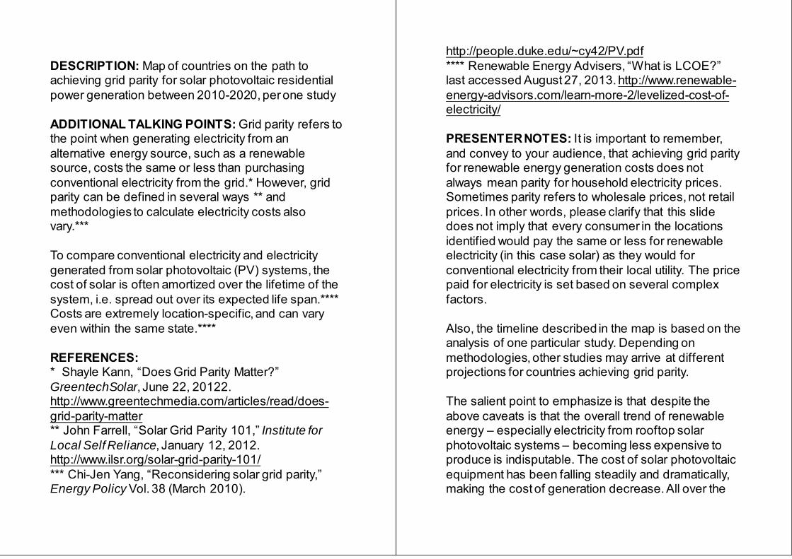
DESCRIPTION: Map of countries on the path to achieving grid parity for solar photovoltaic residential power generation between 2010-2020, per one study
ADDITIONAL TALKING POINTS: Grid parity refers to the point when generating electricity from an alternative energy source, such as a renewable source, costs the same or less than purchasing conventional electricity from the grid.* However, grid parity can be defined in several ways ** and methodologies to calculate electricity costs also vary.***
To compare conventional electricity and electricity generated from solar photovoltaic (PV) systems, the cost of solar is often amortized over the lifetime of the system, i.e. spread out over its expected life span.**** Costs are extremely location-specific, and can vary even within the same state.****
REFERENCES: * Shayle Kann, “Does Grid Parity Matter?” GreentechSolar, June 22, 20122. http://www.greentechmedia.com/articles/read/does-grid-parity-matter ** John Farrell, “Solar Grid Parity 101,” Institute for Local Self Reliance, January 12, 2012. http://www.ilsr.org/solar-grid-parity-101/ *** Chi-Jen Yang, “Reconsidering solar grid parity,” Energy Policy Vol. 38 (March 2010).
http://people.duke.edu/~cy42/PV.pdf **** Renewable Energy Advisers, “What is LCOE?” last accessed August 27, 2013. http://www.renewable-energy-advisors.com/learn-more-2/levelized-cost-of-electricity/
PRESENTER NOTES: It is important to remember, and convey to your audience, that achieving grid parity for renewable energy generation costs does not always mean parity for household electricity prices. Sometimes parity refers to wholesale prices, not retail prices. In other words, please clarify that this slide does not imply that every consumer in the locations identified would pay the same or less for renewable electricity (in this case solar) as they would for conventional electricity from their local utility. The price paid for electricity is set based on several complex factors.
Also, the timeline described in the map is based on the analysis of one particular study. Depending on methodologies, other studies may arrive at different projections for countries achieving grid parity.
The salient point to emphasize is that despite the above caveats is that the overall trend of renewable energy – especially electricity from rooftop solar photovoltaic systems – becoming less expensive to produce is indisputable. The cost of solar photovoltaic equipment has been falling steadily and dramatically, making the cost of generation decrease. All over the

world, it is becoming increasingly cheaper to generate electricity from solar photovoltaics. The best part about this type of generation is that the costs will remain fixed over the lifetime of the unit, since fuel costs do not rise, unlike conventional power, which gets more expensive as fuel costs increase.
ID #2096 - Can be used in noncommercial online and TV broadcasts of your presentation, but not modified.
South Africa has high potential for solar photovoltaics, but there are also large subsidies for coal which is interfering with them reaching solar grid parity.
DESCRIPTION: Text slide about South Africa being the most attractive emerging solar market but it not achieving grid parity
ADDITIONAL TALKING POINTS: According to an analysis by IHS Technology, in 2013 South
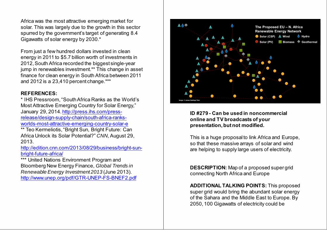
Africa was the most attractive emerging market for solar. This was largely due to the growth in this sector spurred by the government’s target of generating 8.4 Gigawatts of solar energy by 2030.*
From just a few hundred dollars invested in clean energy in 2011 to $5.7 billion worth of investments in 2012, South Africa recorded the biggest single-year jump in renewables investment.** This change in asset finance for clean energy in South Africa between 2011 and 2012 is a 23,410 percent change.***
REFERENCES:* IHS Pressroom, “South Africa Ranks as the World’s Most Attractive Emerging Country for Solar Energy,” January 29, 2014. http://press.ihs.com/press-release/design-supply-chain/south-africa-ranks-worlds-most-attractive-emerging-country-solar-e** Teo Kermeliotis, “Bright Sun, Bright Future: Can Africa Unlock its Solar Potential?” CNN, August 29, 2013. http://edition.cnn.com/2013/08/29/business/bright-sun-bright-future-africa/*** United Nations Environment Program and Bloomberg New Energy Finance, Global Trends in Renewable Energy Investment 2013 (June 2013). http://www.unep.org/pdf/GTR-UNEP-FS-BNEF2.pdf
ID #279 - Can be used in noncommercial online and TV broadcasts of your presentation, but not modified.
This is a huge proposal to link Africa and Europe, so that these massive arrays of solar and wind are helping to supply large users of electricity.
DESCRIPTION: Map of a proposed super grid connecting North Africa and Europe
ADDITIONAL TALKING POINTS: This proposed super grid would bring the abundant solar energy of the Sahara and the Middle East to Europe. By 2050, 100 Gigawatts of electricity could be
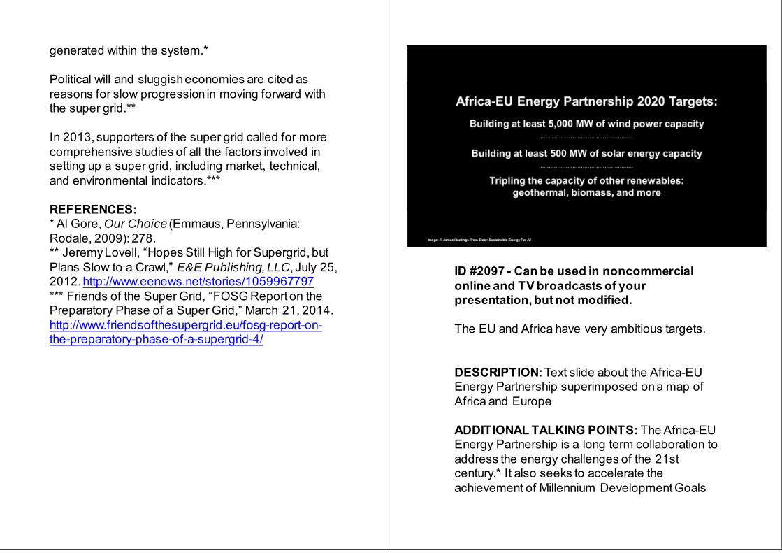
generated within the system.*
Political will and sluggish economies are cited as reasons for slow progression in moving forward with the super grid.**
In 2013, supporters of the super grid called for more comprehensive studies of all the factors involved in setting up a super grid, including market, technical, and environmental indicators.***
REFERENCES:* Al Gore, Our Choice (Emmaus, Pennsylvania: Rodale, 2009): 278.** Jeremy Lovell, “Hopes Still High for Supergrid, but Plans Slow to a Crawl,” E&E Publishing, LLC, July 25, 2012. http://www.eenews.net/stories/1059967797*** Friends of the Super Grid, “FOSG Report on the Preparatory Phase of a Super Grid,” March 21, 2014. http://www.friendsofthesupergrid.eu/fosg-report-on-the-preparatory-phase-of-a-supergrid-4/
ID #2097 - Can be used in noncommercial online and TV broadcasts of your presentation, but not modified.
The EU and Africa have very ambitious targets.
DESCRIPTION: Text slide about the Africa-EU Energy Partnership superimposed on a map of Africa and Europe
ADDITIONAL TALKING POINTS: The Africa-EU Energy Partnership is a long term collaboration to address the energy challenges of the 21st century.* It also seeks to accelerate the achievement of Millennium Development Goals
(MDGs).**
By 2020, the partnership — in coordination with the United nations’ Sustainable Energy for All program —aims to bring electricity to an additional 100 million Africans, build 10,000 Megawatts of additional hydropower, 5,000 Megawatts of additional wind power, and 500 Megawatts of additional collar capacity.***
REFERENCES:* Europa, The Africa-EU Energy Partnership, last accessed April 2014. http://ec.europa.eu/development/icenter/repository/africa_ue_energy_partnership_fiche03_en.pdf** Africa-EU Partnership, “Energy,” last accessed April 2014. http://www.africa-eu-partnership.org/areas-cooperation/energy*** Sustainable Energy for All, “2020 Targets of the Africa-EU Energy Partnership,” last accessed April 2014. http://www.se4all.org/commitment/2020-targets-of-the-africa-eu-energy-partnership-aeep/
ID #1035 - May not be modified or used in presentations that are recorded, streamed, or broadcast.
…Morocco…
DESCRIPTION: Photo of a solar power plant in Ain Beni Mathar, Morocco, August 2009
ADDITIONAL TALKING POINTS: Morocco reportedly plans to invest $11 billion in clean energy by 2020.*
The largest solar plant in Africa is currently being built in Morocco, which could produce power for
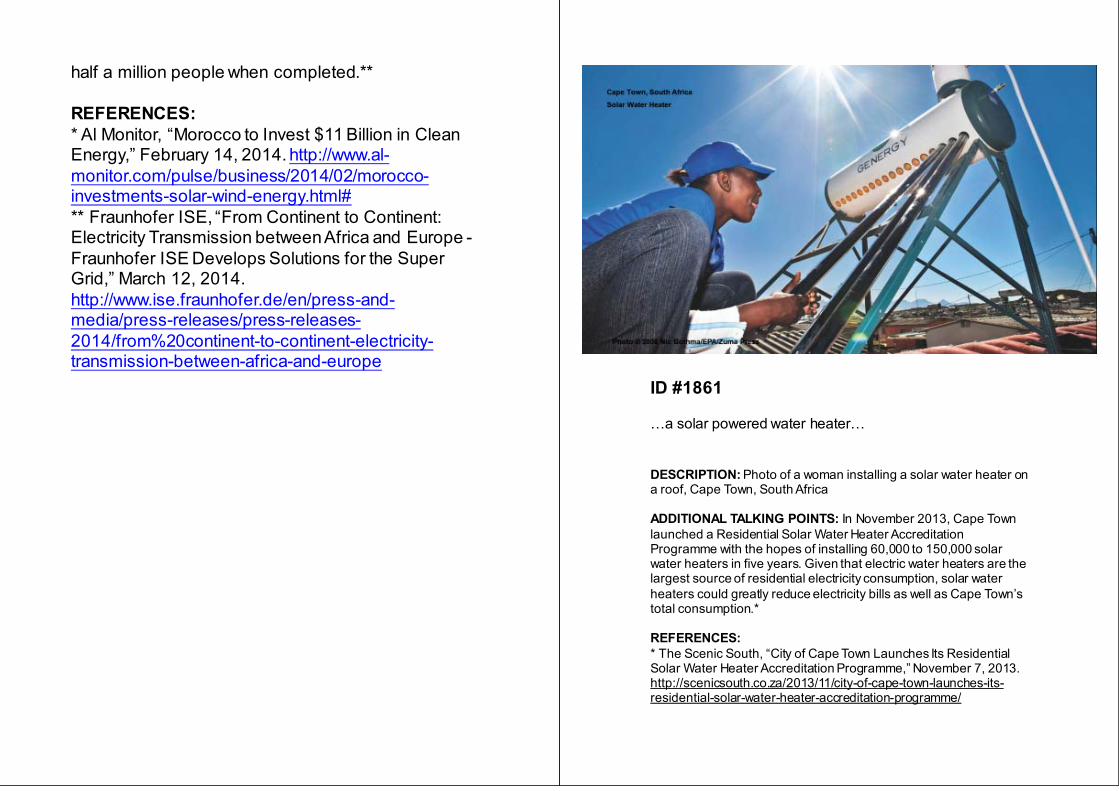
half a million people when completed.**
REFERENCES:* Al Monitor, “Morocco to Invest $11 Billion in Clean Energy,” February 14, 2014. http://www.al-monitor.com/pulse/business/2014/02/morocco-investments-solar-wind-energy.html#** Fraunhofer ISE, “From Continent to Continent: Electricity Transmission between Africa and Europe -Fraunhofer ISE Develops Solutions for the Super Grid,” March 12, 2014. http://www.ise.fraunhofer.de/en/press-and-media/press-releases/press-releases-2014/from%20continent-to-continent-electricity-transmission-between-africa-and-europe
ID #1861
…a solar powered water heater…
DESCRIPTION: Photo of a woman installing a solar water heater on a roof, Cape Town, South Africa
ADDITIONAL TALKING POINTS: In November 2013, Cape Town launched a Residential Solar Water Heater Accreditation Programme with the hopes of installing 60,000 to 150,000 solar water heaters in five years. Given that electric water heaters are the largest source of residential electricity consumption, solar water heaters could greatly reduce electricity bills as well as Cape Town’s total consumption.*
REFERENCES:* The Scenic South, “City of Cape Town Launches Its Residential Solar Water Heater Accreditation Programme,” November 7, 2013. http://scenicsouth.co.za/2013/11/city-of-cape-town-launches-its-residential-solar-water-heater-accreditation-programme/

ID #1991 - May not be modified or used in presentations that are recorded, streamed, or broadcast.
Wangari Mathai’s work was not only about planting trees, but also sustainable agriculture.
DESCRIPTION: Photo of Wangari Maathai in a garden
ADDITIONAL TALKING POINTS: Wangari Maathai was the founder of the Green Belt Movement and a lifelong activist for democracy, human rights, and the environmental movement.*
In 2004 she was awarded the Novel Peace Price in recognition of her advancing sustainability through tree planting initiatives.**
REFERENCES:* The Green Belt Movement, “Wangari Maathai: Biography,” last accessed April 2014. http://www.greenbeltmovement.org/wangari-maathai/biography** Nobel Prize, “Wangari Maathai - Biographical,” last accessed April 2014. http://www.nobelprize.org/nobel_prizes/peace/laureates/2004/maathai-bio.html
ID #1984 - May not be modified or used in presentations that are recorded, streamed, or broadcast.
The 17th meeting of the Conference of Parties to the United Nations Framework Convention on Climate Change was in Durban in 2011.
DESCRIPTION: Photo of a group of demonstrators during the international climate negotiations conference in Durban, South Africa
ADDITIONAL TALKING POINTS: in 2011 the seventeenth Conference of Parties (COP17) of the United Nations Framework Convention on
Climate Change (UNFCCC) too place in Durban, South Africa.*
One of the most significant breakthroughs achieved at COP17 was a decision by all participating countries to adopt by 2015 a new international legal agreement or instrument to tackle climate change.**
The new agreement is slated to take effect in 2020, and — per the “Durban Platform” that countries agreed to — will be “applicable to all,” a departure from the previous international climate treaty which did not create universal obligations for all countries.***
REFERENCES:* COP17/CMP7, “Working Together, Saving Tomorrow Today,” last accessed April 2014. http://www.cop17-cmp7durban.com** UNFCCC, “Durban Climate Change Conference: November/December 2011,” last accessed April 2014. https://unfccc.int/meetings/durban_nov_2011/meeting/6245.php*** IISD Linkages, “Summary of the Durban Climate Change Conference,” Earth Negotiations BulletinVol. 12 No. 534 (December 13, 2011). http://www.iisd.ca/vol12/enb12534e.html
ID #1985 - May not be modified or used in presentations that are recorded, streamed, or broadcast.
The EU has very ambitious targets.
DESCRIPTION: Photo of officials at the United Nations climate change conference in Durban in 2011
ADDITIONAL TALKING POINTS: The European Union (EU) has set for itself a target of reducing its greenhouse gas (GHG) emissions by 20 percent below 1990 levels.*
South Africa made a voluntary pledge in 2010, after the UN climate change conference in Copenhagen, to reduce the growth rate of its emissions by 34 percent by 2020 compared to a business-as-usual pathway (i.e. to slow down the pace at which its emissions are growing), and 42 percent by 2025, contingent on the provision of financial and technical assistance from developed countries.**
REFERENCES:* European Commission, Climate Action, “What is the EU Doing About Climate Change?” last updated April 15, 2014. http://ec.europa.eu/clima/policies/brief/eu/index_en.htm** The Natural Resources Defense Council, “From Copenhagen Accord to Climate Action,” last accessed April 2014. http://www.nrdc.org/international/copenhagenaccords/

ID #1992 - May not be modified or used in presentations that are recorded, streamed, or broadcast.
Native trees are being planted in Madagascar to help offset carbon emissions.
DESCRIPTION: Photo of plant nursery in Madagascar
ADDITIONAL TALKING POINTS: The Andasibe-Mantadia Corridor Restoration and Conservation Project promotes reforestation in Madagascar, with the potential to earn carbon credits as an additional revenue stream.*
Madagascar has introduced a number of reforestation initiatives to help recover some of its lost forests by planting endemic trees in their natural range.**
REFERENCES:* Jonny Hogg, “Madagascar Program Sows Conservation,” The Los Angeles Times, March 9, 2008. http://articles.latimes.com/2008/mar/09/news/adfg-lament9** Kate Moses and Derek Schuurman, “Forest Recovery Programs in Madagascar,” Mongabay, June 1, 2009. http://news.mongabay.com/2009/0601-moses_schiirman_madagascar.html
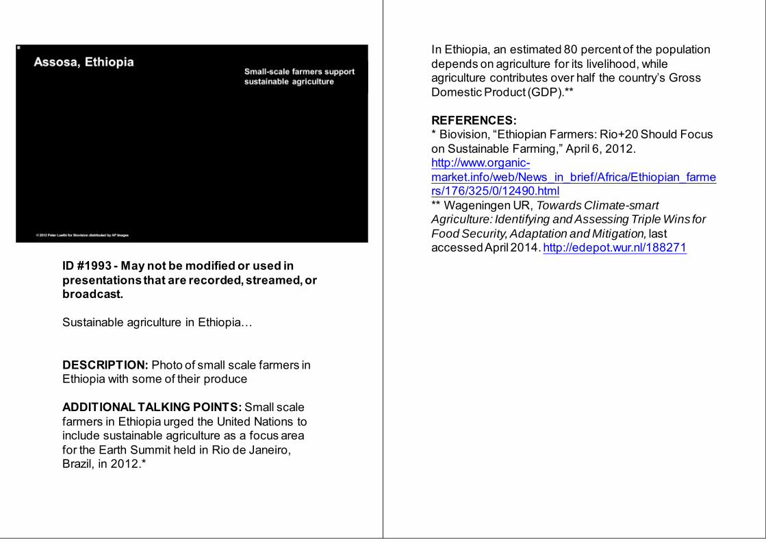
ID #1993 - May not be modified or used in presentations that are recorded, streamed, or broadcast.
Sustainable agriculture in Ethiopia…
DESCRIPTION: Photo of small scale farmers in Ethiopia with some of their produce
ADDITIONAL TALKING POINTS: Small scale farmers in Ethiopia urged the United Nations to include sustainable agriculture as a focus area for the Earth Summit held in Rio de Janeiro, Brazil, in 2012.*
In Ethiopia, an estimated 80 percent of the population depends on agriculture for its livelihood, while agriculture contributes over half the country’s Gross Domestic Product (GDP).**
REFERENCES:* Biovision, “Ethiopian Farmers: Rio+20 Should Focus on Sustainable Farming,” April 6, 2012. http://www.organic-market.info/web/News_in_brief/Africa/Ethiopian_farmers/176/325/0/12490.html** Wageningen UR, Towards Climate-smart Agriculture: Identifying and Assessing Triple Wins for Food Security, Adaptation and Mitigation, last accessed April 2014. http://edepot.wur.nl/188271
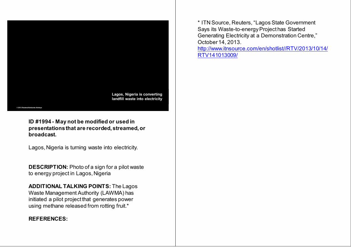
ID #1994 - May not be modified or used in presentations that are recorded, streamed, or broadcast.
Lagos, Nigeria is turning waste into electricity.
DESCRIPTION: Photo of a sign for a pilot waste to energy project in Lagos, Nigeria
ADDITIONAL TALKING POINTS: The Lagos Waste Management Authority (LAWMA) has initiated a pilot project that generates power using methane released from rotting fruit.*
REFERENCES:
* ITN Source, Reuters, “Lagos State Government Says its Waste-to-energy Project has Started Generating Electricity at a Demonstration Centre,” October 14, 2013. http://www.itnsource.com/en/shotlist//RTV/2013/10/14/RTV141013009/
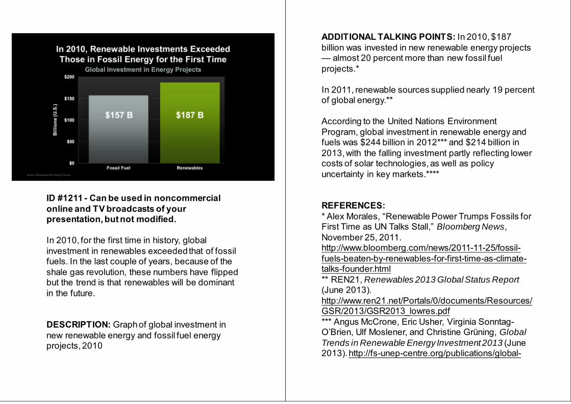
ID #1211 - Can be used in noncommercial online and TV broadcasts of your presentation, but not modified.
In 2010, for the first time in history, global investment in renewables exceeded that of fossil fuels. In the last couple of years, because of the shale gas revolution, these numbers have flipped but the trend is that renewables will be dominant in the future.
DESCRIPTION: Graph of global investment in new renewable energy and fossil fuel energy projects, 2010
ADDITIONAL TALKING POINTS: In 2010, $187 billion was invested in new renewable energy projects — almost 20 percent more than new fossil fuel projects.*
In 2011, renewable sources supplied nearly 19 percent of global energy.**
According to the United Nations Environment Program, global investment in renewable energy and fuels was $244 billion in 2012*** and $214 billion in 2013, with the falling investment partly reflecting lower costs of solar technologies, as well as policy uncertainty in key markets.****
REFERENCES: * Alex Morales, “Renewable Power Trumps Fossils for First Time as UN Talks Stall,” Bloomberg News, November 25, 2011. http://www.bloomberg.com/news/2011-11-25/fossil-fuels-beaten-by-renewables-for-first-time-as-climate-talks-founder.html ** REN21, Renewables 2013 Global Status Report(June 2013).http://www.ren21.net/Portals/0/documents/Resources/GSR/2013/GSR2013_lowres.pdf*** Angus McCrone, Eric Usher, Virginia Sonntag-O’Brien, Ulf Moslener, and Christine Grüning, Global Trends in Renewable Energy Investment 2013 (June 2013). http://fs-unep-centre.org/publications/global-
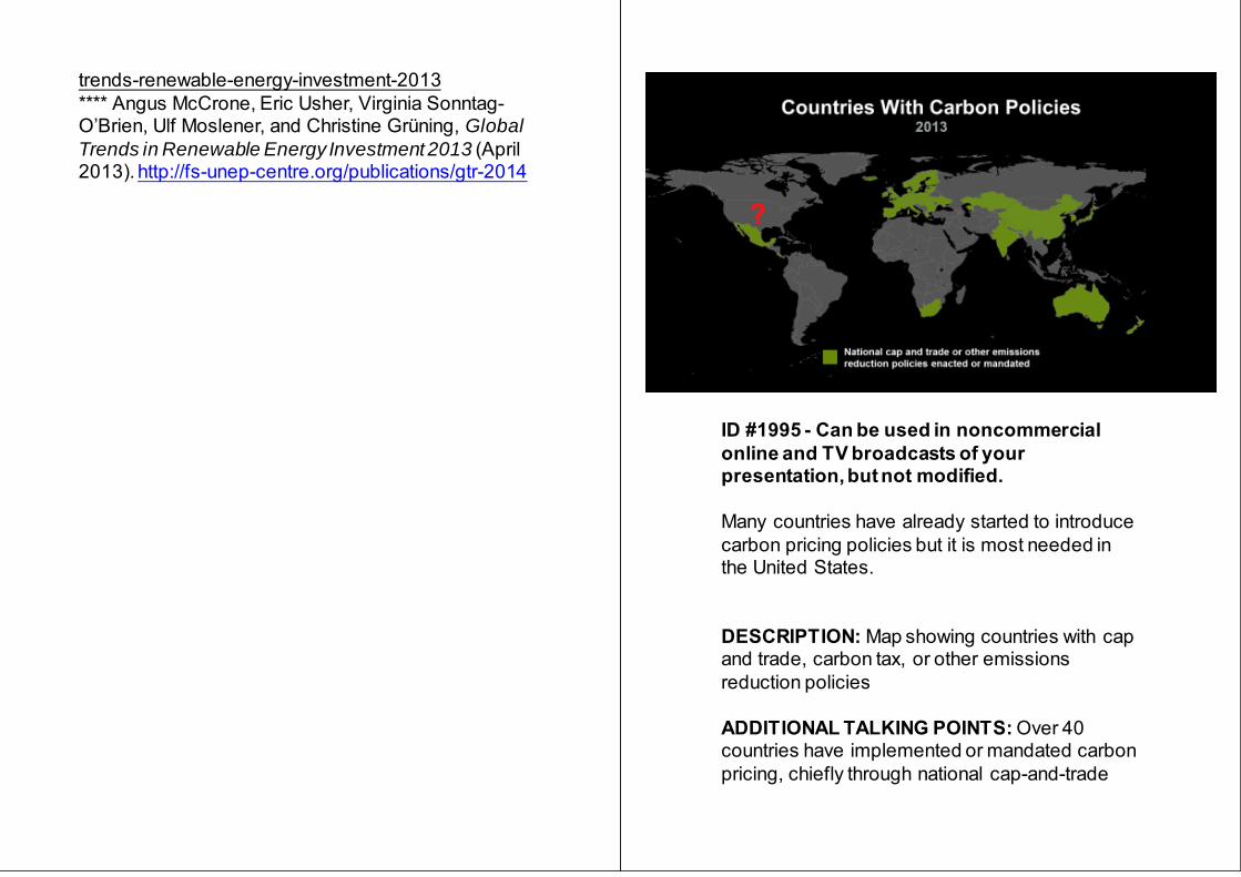
trends-renewable-energy-investment-2013 **** Angus McCrone, Eric Usher, Virginia Sonntag-O’Brien, Ulf Moslener, and Christine Grüning, Global Trends in Renewable Energy Investment 2013 (April 2013). http://fs-unep-centre.org/publications/gtr-2014
ID #1995 - Can be used in noncommercial online and TV broadcasts of your presentation, but not modified.
Many countries have already started to introduce carbon pricing policies but it is most needed in the United States.
DESCRIPTION: Map showing countries with cap and trade, carbon tax, or other emissions reduction policies
ADDITIONAL TALKING POINTS: Over 40 countries have implemented or mandated carbon pricing, chiefly through national cap-and-trade
mechanisms and/or carbon taxes.*
There are currently 30 countries that participate in the European Union’s (EU) Emissions Trading Scheme (ETS)—all 27 member countries and non-members Iceland, Norway, and Liechtenstein. Switzerland is currently in negotiations to join the EU’s ETS.**
South Korea has passed legislation for an ETS, which is scheduled to take effect in 2015. China has plans to implement a nationwide ETS sometime un the period between 2015 and 2020, and is currently running pilot cap and trade projects in five cities and two provinces.**
REFERENCES:* The World Bank, “Domestic Carbon Pricing Initiatives Offer Hope for Future Market,” May 29, 2013. http://www.worldbank.org/en/news/press-release/2013/05/29/domestic-carbon-pricing-initiatives-offer-hope-for-future-market* Environmental and Energy Study Institute, “Carbon Pricing around the World,” October 2012. http://www.eesi.org/fact-sheet-carbon-pricing-around-world-17-oct-2012

reduction targets and program specifics are tailored accordingly. In Shenzhen — the first city to launch its program — emissions will be reduced by 21 percent by 2015 if all goes according to plan.*
REFERENCES:* Stefanie Tanenhaus, “China Adds Another Tool to Curb Pollution, Launching First Cap And Trade Program,” NRDC Switchboard, June 18, 2013. http://switchboard.nrdc.org/blogs/stanenhaus/china_adds_another_tool_to_cur.html
ID #1886 - Can be used in noncommercial online and TV broadcasts of your presentation, but not modified.
China is banning any new coal-fired plants in and around these three cities in China.
DESCRIPTION: News headline about China banning new coal plants in three cities
ADDITIONAL TALKING POINTS: In September 2013 China’s State Council announced that it will ban new coal-fired power plants in three industrial regions: the region surrounding Beijing, the Yangtze delta near Shanghai, and the Pearl
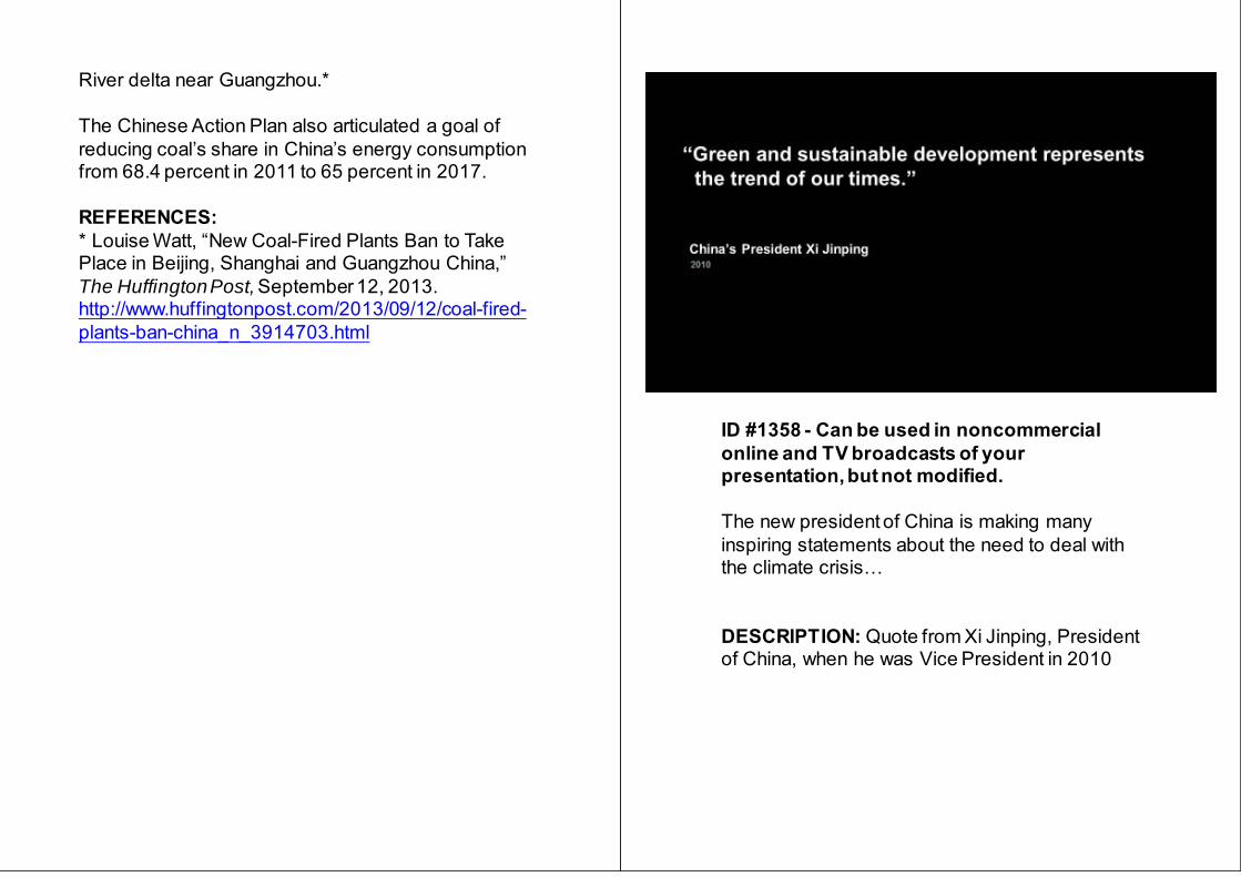
River delta near Guangzhou.*
The Chinese Action Plan also articulated a goal of reducing coal’s share in China’s energy consumption from 68.4 percent in 2011 to 65 percent in 2017.
REFERENCES:* Louise Watt, “New Coal-Fired Plants Ban to Take Place in Beijing, Shanghai and Guangzhou China,” The Huffington Post, September 12, 2013. http://www.huffingtonpost.com/2013/09/12/coal-fired-plants-ban-china_n_3914703.html
ID #1358 - Can be used in noncommercial online and TV broadcasts of your presentation, but not modified.
The new president of China is making many inspiring statements about the need to deal with the climate crisis…
DESCRIPTION: Quote from Xi Jinping, President of China, when he was Vice President in 2010

ID #1359 - Can be used in noncommercial online and TV broadcasts of your presentation, but not modified.
…and the need to quicken the pace of renewable energy.
DESCRIPTION: Quote from Xi Jinping, President of China, when he was Vice President in 2010
ID #2100 - Can be used in noncommercial online and TV broadcasts of your presentation, but not modified.
The European Union has committed to an emissions trading system…
DESCRIPTION: Map of Europe showing countries that participate in its Emissions Trading System
ADDITIONAL TALKING POINTS: The European Union’s Emissions Trading System (EU ETS) covers almost 45 percent of total greenhouse gases from EU member-countries.*
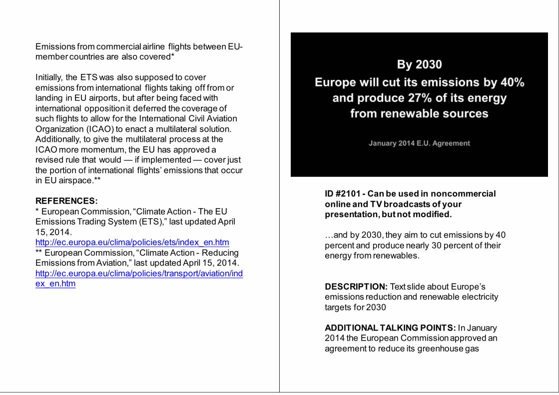
Emissions from commercial airline flights between EU-member countries are also covered*
Initially, the ETS was also supposed to cover emissions from international flights taking off from or landing in EU airports, but after being faced with international opposition it deferred the coverage of such flights to allow for the International Civil Aviation Organization (ICAO) to enact a multilateral solution. Additionally, to give the multilateral process at the ICAO more momentum, the EU has approved a revised rule that would — if implemented — cover just the portion of international flights’ emissions that occur in EU airspace.**
REFERENCES:* European Commission, “Climate Action - The EU Emissions Trading System (ETS),” last updated April 15, 2014. http://ec.europa.eu/clima/policies/ets/index_en.htm** European Commission, “Climate Action - Reducing Emissions from Aviation,” last updated April 15, 2014. http://ec.europa.eu/clima/policies/transport/aviation/index_en.htm
ID #2101 - Can be used in noncommercial online and TV broadcasts of your presentation, but not modified.
…and by 2030, they aim to cut emissions by 40 percent and produce nearly 30 percent of their energy from renewables.
DESCRIPTION: Text slide about Europe’s emissions reduction and renewable electricity targets for 2030
ADDITIONAL TALKING POINTS: In January 2014 the European Commission approved an agreement to reduce its greenhouse gas
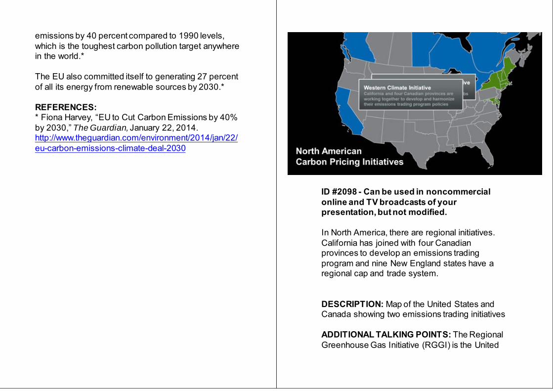
emissions by 40 percent compared to 1990 levels, which is the toughest carbon pollution target anywhere in the world.*
The EU also committed itself to generating 27 percent of all its energy from renewable sources by 2030.*
REFERENCES:* Fiona Harvey, “EU to Cut Carbon Emissions by 40% by 2030,” The Guardian, January 22, 2014. http://www.theguardian.com/environment/2014/jan/22/eu-carbon-emissions-climate-deal-2030
ID #2098 - Can be used in noncommercial online and TV broadcasts of your presentation, but not modified.
In North America, there are regional initiatives. California has joined with four Canadian provinces to develop an emissions trading program and nine New England states have a regional cap and trade system.
DESCRIPTION: Map of the United States and Canada showing two emissions trading initiatives
ADDITIONAL TALKING POINTS: The Regional Greenhouse Gas Initiative (RGGI) is the United
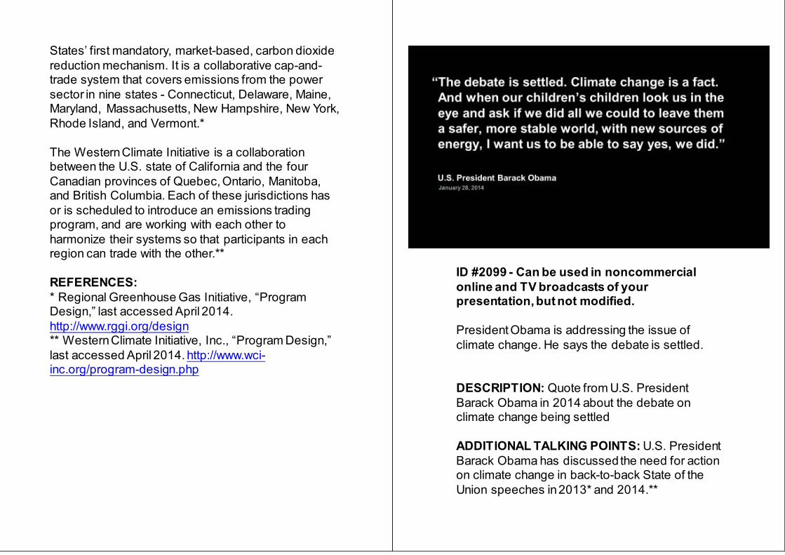
States’ first mandatory, market-based, carbon dioxide reduction mechanism. It is a collaborative cap-and-trade system that covers emissions from the power sector in nine states - Connecticut, Delaware, Maine, Maryland, Massachusetts, New Hampshire, New York, Rhode Island, and Vermont.*
The Western Climate Initiative is a collaboration between the U.S. state of California and the four Canadian provinces of Quebec, Ontario, Manitoba, and British Columbia. Each of these jurisdictions has or is scheduled to introduce an emissions trading program, and are working with each other to harmonize their systems so that participants in each region can trade with the other.**
REFERENCES:* Regional Greenhouse Gas Initiative, “Program Design,” last accessed April 2014. http://www.rggi.org/design** Western Climate Initiative, Inc., “Program Design,” last accessed April 2014. http://www.wci-inc.org/program-design.php
ID #2099 - Can be used in noncommercial online and TV broadcasts of your presentation, but not modified.
President Obama is addressing the issue of climate change. He says the debate is settled.
DESCRIPTION: Quote from U.S. President Barack Obama in 2014 about the debate on climate change being settled
ADDITIONAL TALKING POINTS: U.S. President Barack Obama has discussed the need for action on climate change in back-to-back State of the Union speeches in 2013* and 2014.**
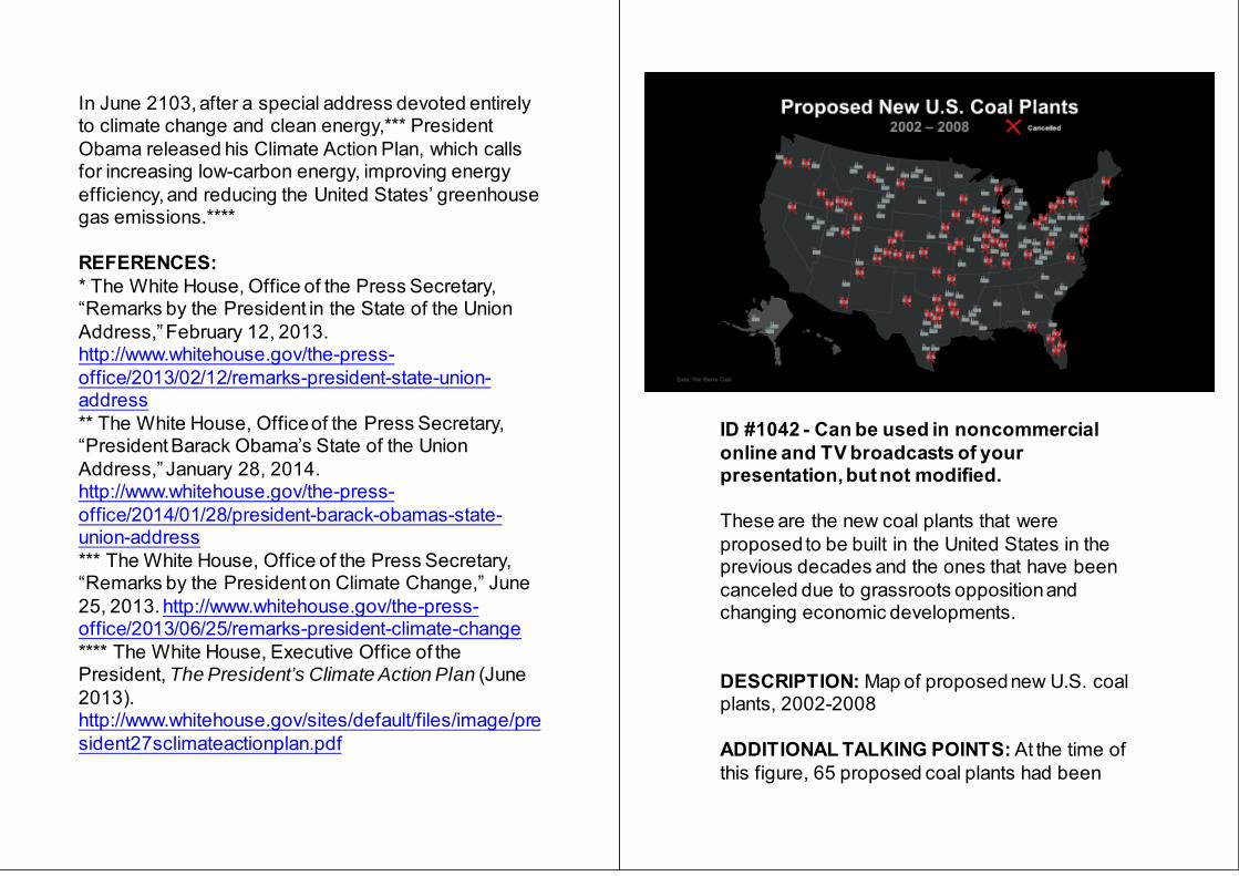
In June 2103, after a special address devoted entirely to climate change and clean energy,*** President Obama released his Climate Action Plan, which calls for increasing low-carbon energy, improving energy efficiency, and reducing the United States’ greenhouse gas emissions.****
REFERENCES:* The White House, Office of the Press Secretary, “Remarks by the President in the State of the Union Address,” February 12, 2013. http://www.whitehouse.gov/the-press-office/2013/02/12/remarks-president-state-union-address** The White House, Office of the Press Secretary, “President Barack Obama’s State of the Union Address,” January 28, 2014. http://www.whitehouse.gov/the-press-office/2014/01/28/president-barack-obamas-state-union-address*** The White House, Office of the Press Secretary, “Remarks by the President on Climate Change,” June 25, 2013. http://www.whitehouse.gov/the-press-office/2013/06/25/remarks-president-climate-change**** The White House, Executive Office of the President, The President’s Climate Action Plan (June 2013). http://www.whitehouse.gov/sites/default/files/image/president27sclimateactionplan.pdf
ID #1042 - Can be used in noncommercial online and TV broadcasts of your presentation, but not modified.
These are the new coal plants that were proposed to be built in the United States in the previous decades and the ones that have been canceled due to grassroots opposition and changing economic developments.
DESCRIPTION: Map of proposed new U.S. coal plants, 2002-2008
ADDITIONAL TALKING POINTS: At the time of this figure, 65 proposed coal plants had been
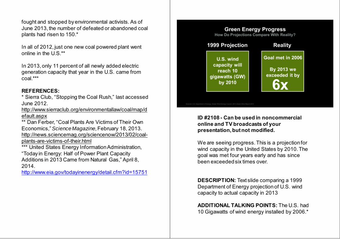
fought and stopped by environmental activists. As of June 2013, the number of defeated or abandoned coal plants had risen to 150.*
In all of 2012, just one new coal powered plant went online in the U.S.**
In 2013, only 11 percent of all newly added electric generation capacity that year in the U.S. came from coal.***
REFERENCES:* Sierra Club, “Stopping the Coal Rush,” last accessed June 2012. http://www.sierraclub.org/environmentallaw/coal/map/default.aspx** Dan Ferber, “Coal Plants Are Victims of Their Own Economics,” Science Magazine, February 18, 2013. http://news.sciencemag.org/sciencenow/2013/02/coal-plants-are-victims-of-their.html *** United States Energy Information Administration, “Today in Energy: Half of Power Plant Capacity Additions in 2013 Came from Natural Gas,” April 8, 2014. http://www.eia.gov/todayinenergy/detail.cfm?id=15751
ID #2108 - Can be used in noncommercial online and TV broadcasts of your presentation, but not modified.
We are seeing progress. This is a projection for wind capacity in the United States by 2010. The goal was met four years early and has since been exceeded six times over.
DESCRIPTION: Text slide comparing a 1999 Department of Energy projection of U.S. wind capacity to actual capacity in 2013
ADDITIONAL TALKING POINTS: The U.S. had 10 Gigawatts of wind energy installed by 2006.*

By the end of 2012, over 60 Gigawatts of wind electricity was installed,** enough to power over 15 million homes for a year.***
In 2012, for the first time in U.S. history, wind was the number one source of new electricity capacity added in a given year, accounting for 42% of new capacity.****
However, largely due to policy uncertainty, in 2013 wind accounted for 8 percent of total new electricity capacity added that year.***** By the end of 2013, over 61 Gigawatts of wind electricity was installed in the United States, providing over 4 percent of the country’s electricity and over a quarter of the year’s electricity needs in states like Iowa and South Dakota.******
REFERENCES:* Ryan Wiser, Mark Bolinger, Galen Barbose et al., 2011 Wind Technologies Market Report (U.S. Department of Energy, August 2012). http://www1.eere.energy.gov/wind/pdfs/2011_wind_technologies_market_report.pdf** Ryan Wiser, Mark Bolinger, Galen Barbose et al., 2012 Wind Technologies Market Report (U.S. Department of Energy, August 2012). https://www1.eere.energy.gov/wind/pdfs/2012_wind_technologies_market_report.pdf*** American Wind Energy Association, “Wind 101: The Basics of Wind Energy,” last accessed April 2014.
http://www.awea.org/Resources/Content.aspx?ItemNumber=900&navItemNumber=587**** American Wind Energy Association, “Wind Energy Top Source for New Generation in 2012; American Wind Power Installed New record of 13,124 MW,” January 30, 2013. http://www.awea.org/MediaCenter/pressrelease.aspx?ItemNumber=4744***** United States Energy Information Administration, “Today in Energy: Half of Power Plant Capacity Additions in 2013 Came from Natural Gas,” April 8, 2014. http://www.eia.gov/todayinenergy/detail.cfm?id=15751****** American Wind Energy Association, “Get the Facts: U.S. Capacity and Generation,” last accessed April 2014. http://www.awea.org/AnnualMarketReport.aspx?ItemNumber=6305&RDtoken=35392&userID=
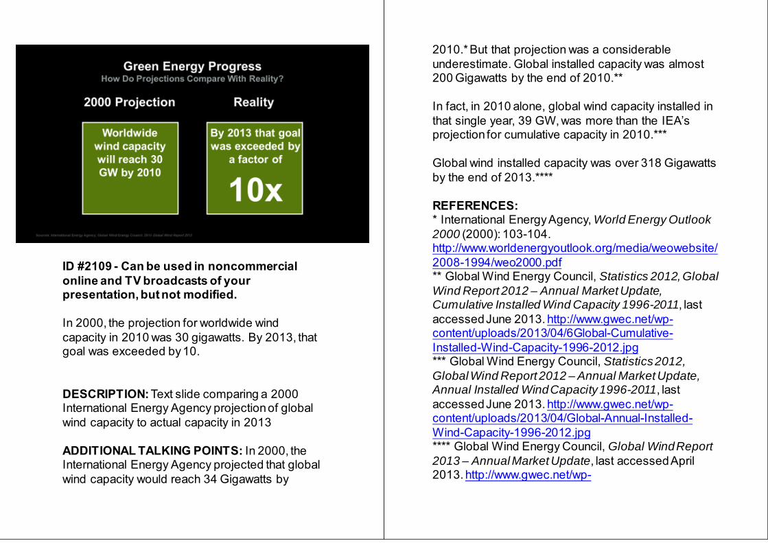
ID #2109 - Can be used in noncommercial online and TV broadcasts of your presentation, but not modified.
In 2000, the projection for worldwide wind capacity in 2010 was 30 gigawatts. By 2013, that goal was exceeded by 10.
DESCRIPTION: Text slide comparing a 2000 International Energy Agency projection of global wind capacity to actual capacity in 2013
ADDITIONAL TALKING POINTS: In 2000, the International Energy Agency projected that global wind capacity would reach 34 Gigawatts by
2010.* But that projection was a considerable underestimate. Global installed capacity was almost 200 Gigawatts by the end of 2010.**
In fact, in 2010 alone, global wind capacity installed in that single year, 39 GW, was more than the IEA’s projection for cumulative capacity in 2010.***
Global wind installed capacity was over 318 Gigawatts by the end of 2013.****
REFERENCES:* International Energy Agency, World Energy Outlook 2000 (2000): 103-104. http://www.worldenergyoutlook.org/media/weowebsite/2008-1994/weo2000.pdf** Global Wind Energy Council, Statistics 2012, Global Wind Report 2012 – Annual Market Update, Cumulative Installed Wind Capacity 1996-2011, last accessed June 2013. http://www.gwec.net/wp-content/uploads/2013/04/6Global-Cumulative-Installed-Wind-Capacity-1996-2012.jpg*** Global Wind Energy Council, Statistics 2012, Global Wind Report 2012 – Annual Market Update, Annual Installed Wind Capacity 1996-2011, last accessed June 2013. http://www.gwec.net/wp-content/uploads/2013/04/Global-Annual-Installed-Wind-Capacity-1996-2012.jpg**** Global Wind Energy Council, Global Wind Report 2013 – Annual Market Update, last accessed April 2013. http://www.gwec.net/wp-

content/uploads/2014/04/GWEC-Global-Wind-Report_9-April-2014.pdf
ID #1208 - Can be used in noncommercial online and TV broadcasts of your presentation, but not modified.
China exceeded their 2000 projected installation by 22 times. And may exceed it 75 times over by 2020.
DESCRIPTION: Text slide comparing a 2000 International Energy Agency projection of China’s wind capacity to actual capacity in 2010
ADDITIONAL TALKING POINTS: In 2000, the International Energy Agency projected that China would install approximately 2 Gigawatts of wind
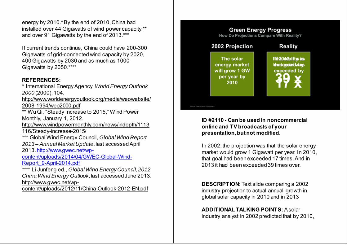
energy by 2010.* By the end of 2010, China had installed over 44 Gigawatts of wind power capacity,** and over 91 Gigawatts by the end of 2013.***
If current trends continue, China could have 200-300 Gigawatts of grid-connected wind capacity by 2020, 400 Gigawatts by 2030 and as much as 1000 Gigawatts by 2050.****
REFERENCES: * International Energy Agency, World Energy Outlook 2000 (2000): 104. http://www.worldenergyoutlook.org/media/weowebsite/2008-1994/weo2000.pdf ** Wu Qi, “Steady Increase to 2015,” Wind Power Monthly, January 1, 2012. http://www.windpowermonthly.com/news/indepth/1113116/Steady-increase-2015/ *** Global Wind Energy Council, Global Wind Report 2013 – Annual Market Update, last accessed April 2013. http://www.gwec.net/wp-content/uploads/2014/04/GWEC-Global-Wind-Report_9-April-2014.pdf**** Li Junfeng ed., Global Wind Energy Council, 2012 China Wind Energy Outlook, last accessed June 2013. http://www.gwec.net/wp-content/uploads/2012/11/China-Outlook-2012-EN.pdf
ID #2110 - Can be used in noncommercial online and TV broadcasts of your presentation, but not modified.
In 2002, the projection was that the solar energy market would grow 1 Gigawatt per year. In 2010, that goal had been exceeded 17 times. And in 2013 it had been exceeded 39 times over.
DESCRIPTION: Text slide comparing a 2002 industry projection to actual annual growth in global solar capacity in 2010 and in 2013
ADDITIONAL TALKING POINTS: A solar industry analyst in 2002 predicted that by 2010,

the global solar industry would be adding 1 Gigawatt of new capacity each year. The actual annual addition in 2010 was 17 Gigawatts, 17 times the original projection.*
In 2013, the global photovoltaic solar capacity added over the course of the year was 39 Gigawatts, a record annual addition.**
REFERENCES:* Michael Noble, “Skeptical About Renewable Energy Predictions? You Should Be,” Fresh Energy, June 18, 2012. http://fresh-energy.org/2012/06/skeptical-about-renewable-energy-predictions-you-should-be/** United Nations Environment Program and Bloomberg New Energy Finance, Global Trends in Renewable Energy Investment 2013 (April 2014). http://fs-unep-centre.org/sites/default/files/attachments/14008nef_visual_12_key_findings.pdf
ID #2111 - Can be used in noncommercial online and TV broadcasts of your presentation, but not modified.
This is the projection for Chinese solar. They were almost doubled by 2010 and added 24 times more in 2013 alone.
DESCRIPTION: Text slide comparing 1996 projection of China’s installed solar energy by 2020 to the installed capacity in 2010 and 2013
ADDITIONAL TALKING POINTS: In 1996, the World Bank predicted that China would install 500 Megawatts of solar power by 2020.*
But by the end of 2010, China already had 893 Megawatts of installed solar power** — and over 18 Gigawatts of cumulative solar photovoltaic by the end of 2013.***
In fact, China added 12 Gigawatts of solar photovoltaic capacity in 2013 alone.****
REFERENCES:* The World Bank, China: Renewable Energy for Electric Power (Report number 15595-CHA, September 11, 1996): 6. http://www-wds.worldbank.org/external/default/WDSContentServer/WDSP/IB/1999/08/15/000009265_3961214185459/Rendered/PDF/multi_page.pdf** Rachel Gelman, 2010 Renewable Energy Data Book (U.S. Department of Energy, 2011): 69. http://www.nrel.gov/analysis/pdfs/51680.pdf*** International Energy Agency, PVPS Report: Snapshot of Global PV 1992-2013, last accessed April 2014. http://www.iea-pvps.org/fileadmin/dam/public/report/statistics/PVPS_report_-_A_Snapshot_of_Global_PV_-_1992-2013_-_final_3.pdf**** Christopher Martin, “China Installed a Record 12 Gigawatts of Solar in 2013 Alone,” Bloomberg,January 23, 2014. http://www.bloomberg.com/news/2014-01-23/china-installed-a-record-12-gigawatts-of-solar-in-2013.html

ID #1074 - Can be used in noncommercial online and TV broadcasts of your presentation, but not modified.
So what can you do?
DESCRIPTION: Text slide
ID #1043 - Can be used in noncommercial online and TV broadcasts of your presentation, but not modified.
Win the conversation. Do not let denial go unchallenged. Use social media speak out. Some people have been afraid to even mention the word climate, much less the climate crisis. During the 2012 presidential election in the United States, there were more televised debates than any other campaign and even with all of the billion dollar disasters – the drought, Superstorm Sandy… – not a single journalist asked a question to any of the candidates about climate. That didn’t happen because the fossil fuel companies are spending all that money on
advertising. People try to keep the peace and not mention climate.
DESCRIPTION: Text slide about winning the conversation
ID #1045 - Can be used in noncommercial online and TV broadcasts of your presentation, but not modified.
Join The Climate Reality Project…
DESCRIPTION: Text slide about joining The Climate Reality Project
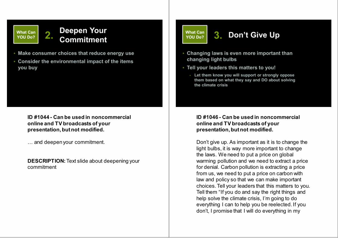
ID #1044 - Can be used in noncommercial online and TV broadcasts of your presentation, but not modified.
… and deepen your commitment.
DESCRIPTION: Text slide about deepening your commitment
ID #1046 - Can be used in noncommercial online and TV broadcasts of your presentation, but not modified.
Don’t give up. As important as it is to change the light bulbs, it is way more important to change the laws. We need to put a price on global warming pollution and we need to extract a price for denial. Carbon pollution is extracting a price from us, we need to put a price on carbon with law and policy so that we can make important choices. Tell your leaders that this matters to you. Tell them “If you do and say the right things and help solve the climate crisis, I’m going to do everything I can to help you be reelected. If you don’t, I promise that I will do everything in my
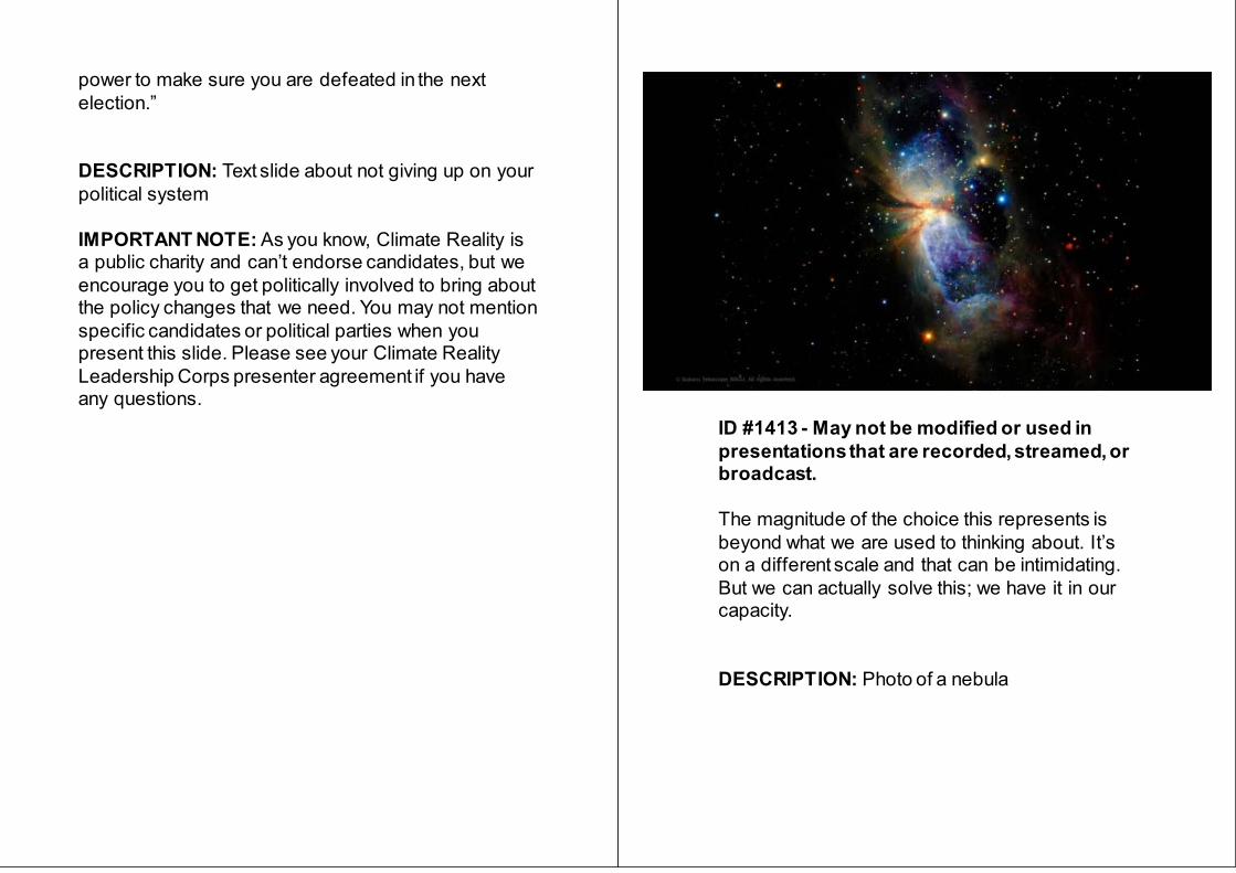
power to make sure you are defeated in the next election.”
DESCRIPTION: Text slide about not giving up on your political system
IMPORTANT NOTE: As you know, Climate Reality is a public charity and can’t endorse candidates, but we encourage you to get politically involved to bring about the policy changes that we need. You may not mention specific candidates or political parties when you present this slide. Please see your Climate Reality Leadership Corps presenter agreement if you have any questions.
ID #1413 - May not be modified or used in presentations that are recorded, streamed, or broadcast.
The magnitude of the choice this represents is beyond what we are used to thinking about. It’s on a different scale and that can be intimidating. But we can actually solve this; we have it in our capacity.
DESCRIPTION: Photo of a nebula
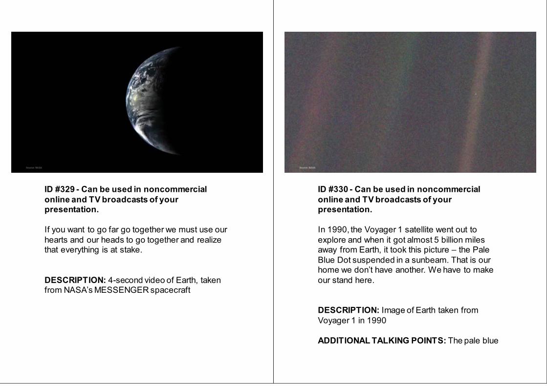
ID #329 - Can be used in noncommercial online and TV broadcasts of your presentation.
If you want to go far go together we must use our hearts and our heads to go together and realize that everything is at stake.
DESCRIPTION: 4-second video of Earth, taken from NASA’s MESSENGER spacecraft
ID #330 - Can be used in noncommercial online and TV broadcasts of your presentation.
In 1990, the Voyager 1 satellite went out to explore and when it got almost 5 billion miles away from Earth, it took this picture – the Pale Blue Dot suspended in a sunbeam. That is our home we don’t have another. We have to make our stand here.
DESCRIPTION: Image of Earth taken from Voyager 1 in 1990
ADDITIONAL TALKING POINTS: The pale blue
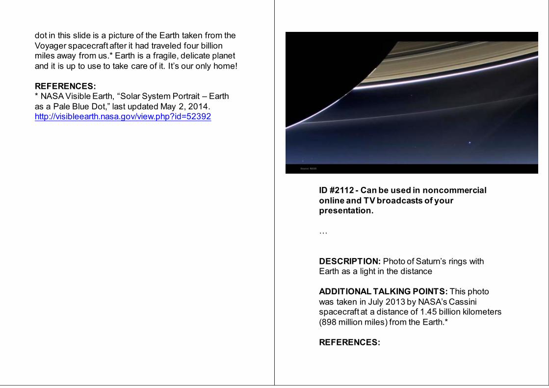
dot in this slide is a picture of the Earth taken from the Voyager spacecraft after it had traveled four billion miles away from us.* Earth is a fragile, delicate planet and it is up to use to take care of it. It’s our only home!
REFERENCES:* NASA Visible Earth, “Solar System Portrait – Earth as a Pale Blue Dot,” last updated May 2, 2014. http://visibleearth.nasa.gov/view.php?id=52392
ID #2112 - Can be used in noncommercial online and TV broadcasts of your presentation.
…
DESCRIPTION: Photo of Saturn’s rings with Earth as a light in the distance
ADDITIONAL TALKING POINTS: This photo was taken in July 2013 by NASA’s Cassini spacecraft at a distance of 1.45 billion kilometers (898 million miles) from the Earth.*
REFERENCES:
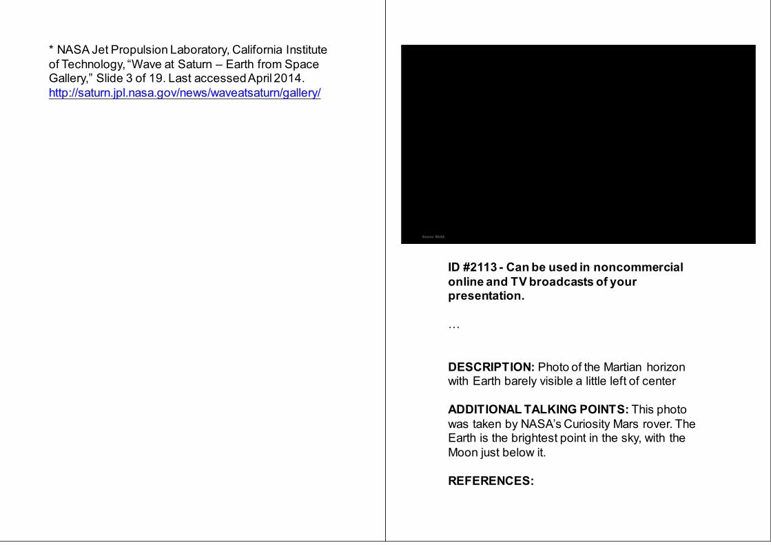
* NASA Jet Propulsion Laboratory, California Institute of Technology, “Wave at Saturn – Earth from Space Gallery,” Slide 3 of 19. Last accessed April 2014. http://saturn.jpl.nasa.gov/news/waveatsaturn/gallery/
ID #2113 - Can be used in noncommercial online and TV broadcasts of your presentation.
…
DESCRIPTION: Photo of the Martian horizon with Earth barely visible a little left of center
ADDITIONAL TALKING POINTS: This photo was taken by NASA’s Curiosity Mars rover. The Earth is the brightest point in the sky, with the Moon just below it.
REFERENCES:
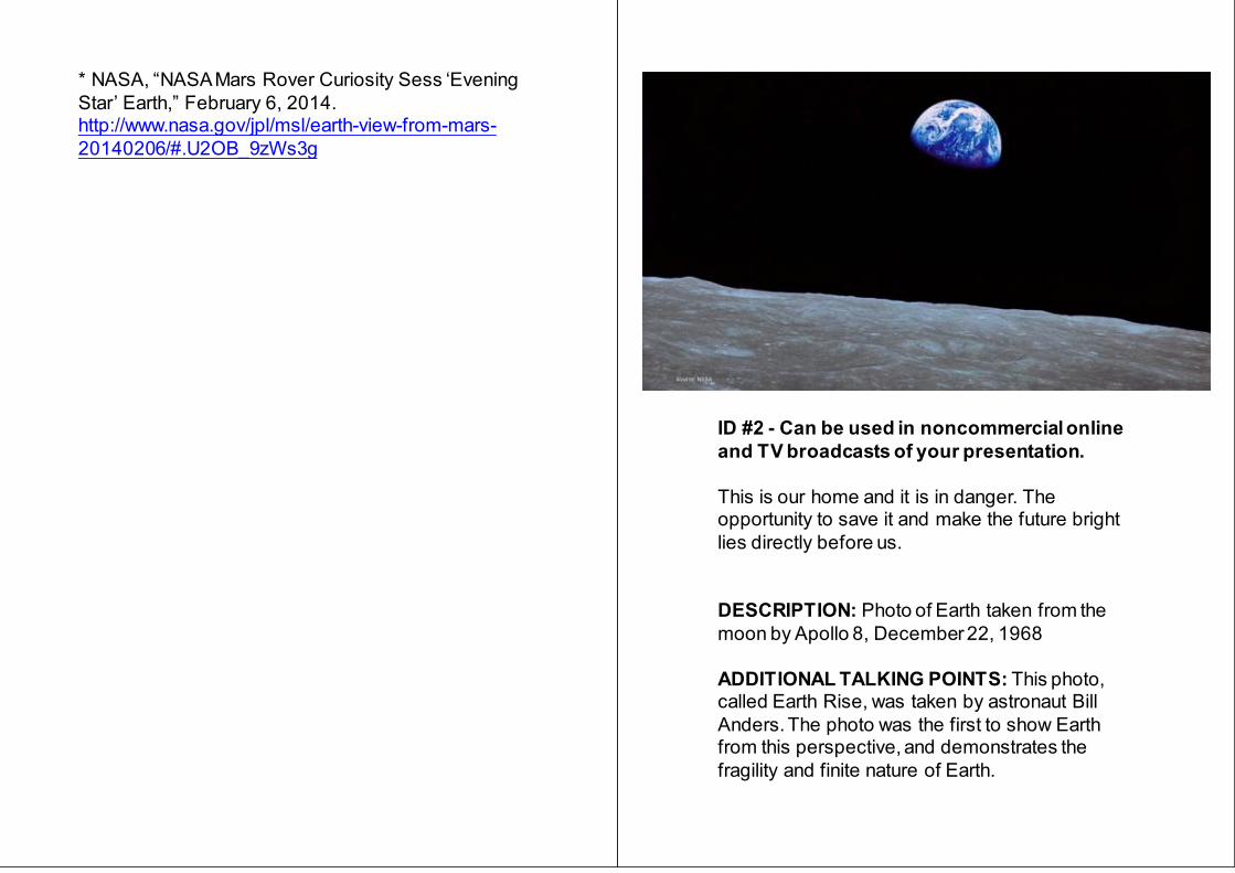
* NASA, “NASA Mars Rover Curiosity Sess ‘Evening Star’ Earth,” February 6, 2014. http://www.nasa.gov/jpl/msl/earth-view-from-mars-20140206/#.U2OB_9zWs3g
ID #2 - Can be used in noncommercial online and TV broadcasts of your presentation.
This is our home and it is in danger. The opportunity to save it and make the future bright lies directly before us.
DESCRIPTION: Photo of Earth taken from the moon by Apollo 8, December 22, 1968
ADDITIONAL TALKING POINTS: This photo, called Earth Rise, was taken by astronaut Bill Anders. The photo was the first to show Earth from this perspective, and demonstrates the fragility and finite nature of Earth.

REFERENCES:* NPR, “On Anniversary of Apollo 8, How the ‘EarthRise’ Photo Was Made,” December 23, 2013. http://www.npr.org/blogs/thetwo-way/2013/12/23/256605845/on-anniversary-of-apollo-8-how-the-earthrise-photo-was-made** NASA, “Earthrise at Christmas,” last accessed April 2014. http://www.nasa.gov/multimedia/imagegallery/image_feature_102.html
ID #3 - Can be used in noncommercial online and TV broadcasts of your presentation.
…
DESCRIPTION: Photo from Apollo 17, taken as the crew was traveling toward the moon
ADDITIONAL TALKING POINTS: This picture is called the “Blue Marble” image of the earth, and was taken in 1972, during the last Apollo mission. It is unique because the entire circle of the earth is revealed; the photo helps us think about our planet in its entirety.*

It was the first time the Apollo mission made it possible to capture almost the entire southern polar ice cap.**
REFERENCES:* LIFE Magazine, “Home, Sweet Home: In Praise of ‘Blue Marble,’ last accessed April 2014. http://life.time.com/history/blue-marble-the-iconic-apollo-17-photo-of-earth-from-space/#1** NASA, Visible Earth, “The Blue Marble from Apollo 17,” December 7, 1972. http://visibleearth.nasa.gov/view.php?id=55418
ID #1 - Can be used in noncommercial online and TV broadcasts of your presentation.
…
DESCRIPTION: Blank slide