Assisting Reading and Analysis of Text Documents by ...
440
Assisting Reading and Analysis of Text Documents by Visualization Ross J. Maloney BE, MEngSc, BAppSc(Maths), GradDipComp, GradDipMaths This dissertation is presented in fulfilment of requirements for the degree of Doctor of Philosophy of Murdoch University August 2005 School of Information Technology Murdoch University
-
Upload
khangminh22 -
Category
Documents
-
view
3 -
download
0
Transcript of Assisting Reading and Analysis of Text Documents by ...
Assisting Reading and Analysisof Text Documents by
Visualization
Ross J. MaloneyBE, MEngSc, BAppSc(Maths), GradDipComp, GradDipMaths
This dissertation is presented in fulfilment of requirements for thedegree of Doctor of Philosophy of Murdoch University
August 2005
School of Information TechnologyMurdoch University

I declare that this dissertation is my own account of my research and contains as itsmain content work which has not previously been submitted for a degree at any othertertiary institution.
Ross James Maloney
Abstract
The research reported here examined the use of computer generated graphics as a
means to assist humans to analyse text documents which have not been subject to
markup. The approach taken was to survey available visualization techniques in a
broad selection of disciplines including applications to text documents, group those
techniques using a taxonomy proposed in this research, then develop a selection of
techniques that assist the text analysis objective. Development of the selected tech-
niques from their fundamental basis, through their visualization, to their demonstra-
tion in application, comprises most of the body of this research. A scientific orien-
tation employing measurements, combined with visual depiction and explanation of
the technique with limited mathematics, is used as opposed to fully utilising any one
of those resulting techniques for performing complete text document analysis.
Visualization techniques which apply directly to the text and those which exploit
measurements produced by associated techniques are considered. Both approaches
employ visualization to assist the human viewer to discover patterns which are then
used in the analysis of the document. In the measurement case, this requires con-
sideration of data with dimensions greater than three, which imposes a visualization
difficulty. Several techniques for overcoming this problem are proposed. Word fre-
quencies, Zipf considerations, parallel coordinates, colour maps, Cusum plots, and
fractal dimensions are some of the techniques considered.
One direct application of visualization to text documents is to assist reading of
that document by de-emphasising selected words by fading them on the display from
which they are read. Three word selection techniques are proposed for the automatic
selection of which words to use.
An experiment is reported which used such word fading techniques. It indicated
that some readers do have improved reading speed under such conditions, but oth-
ers do not. The experimental design enabled the separation of that group which did

decrease reading times from the remaining readers who did not. Measurement of
comprehension errors made under different types of word fading were shown not to
increase beyond that obtained under normal reading conditions.
A visualization based on categorising the words in a text document is proposed
which contrasts to visualization of measurements based on counts. The result is a
visual impression of the word composition, and the evolution of that composition
within that document.
The text documents used to demonstrates these techniques include English novels
and short stories, emails, and a series of eighteenth century newspaper articles known
as the Federalist Papers. This range of documents was needed because all analysis tech-
niques are not applicable to all types of documents. This research proposes that an
interactive use of the techniques on hand in a non-prescribed order can yield useful
results in a document analysis. An example of this is in author attribution, i.e. as-
signing authorship of documents via patterns characteristic of an individual’s writing
style. Different visual techniques can be used to explore the patterns of writing in
given text documents.
A software toolkit as a platform for implementing the proposed interactive analysis
of text documents is described. How the techniques could be integrated into such a
toolkit is outlined. A prototype of software to implement such a toolkit is included
in this research. Issues relating to implementation of each technique used are also
outlined.
ii

Acknowledgments
To:
My parents, Pat and Jim Maloney, who made undertaking this research possible;
Erica Daymond of Edith Cowan University, for her assistance in formulating the con-
tents of the reading experiment so as to achieve the required objectives;
Prof. Tamas Gedeon who as a supervisor provided initial guidance, particularly into
the necessary background for this research that I had not considered;
Susan Alexander who through her direct and indirect support was instrumental in
ensuring this research was brought to completion;
Dr Graham Mann whose interest, encouragement, and assistance in this research both
preceded, and then continued through, him assuming the role as a supervisor;
Dr Andrew Turk who saw the research through from inception to completion and
during that time provided guidance, encouragement, and constant timely reviews,
which in combination demonstrated supervision skills second to none.
Thank you all.
iii
Contents
1 Making pictures from words 1
1.1 Overview . . . . . . . . . . . . . . . . . . . . . . . . . . . . . . . . . . . . . 2
1.2 The problem and its importance . . . . . . . . . . . . . . . . . . . . . . . 7
1.3 Methodology of this research . . . . . . . . . . . . . . . . . . . . . . . . . 11
1.3.1 Assumed interactions . . . . . . . . . . . . . . . . . . . . . . . . . 12
1.3.2 Research hypotheses . . . . . . . . . . . . . . . . . . . . . . . . . . 13
1.3.3 Assumptions . . . . . . . . . . . . . . . . . . . . . . . . . . . . . . 15
1.3.4 Approach . . . . . . . . . . . . . . . . . . . . . . . . . . . . . . . . 17
1.3.5 Relationships between the concepts in this research . . . . . . . . 19
1.4 Implementation testbed – ‘Serine’ . . . . . . . . . . . . . . . . . . . . . . 21
1.4.1 Graphical user interface for control . . . . . . . . . . . . . . . . . . 24
1.4.2 Implementation . . . . . . . . . . . . . . . . . . . . . . . . . . . . 25
1.5 Summary . . . . . . . . . . . . . . . . . . . . . . . . . . . . . . . . . . . . . 27
2 Some literature which guides visualization 30
2.1 A taxonomy for text document visualization . . . . . . . . . . . . . . . . 31
2.2 Scientific visualization . . . . . . . . . . . . . . . . . . . . . . . . . . . . . 41
2.2.1 Specific examples . . . . . . . . . . . . . . . . . . . . . . . . . . . . 45
2.3 Information visualization . . . . . . . . . . . . . . . . . . . . . . . . . . . 50
2.3.1 Specific examples . . . . . . . . . . . . . . . . . . . . . . . . . . . . 52
2.4 Visualization of high dimensions . . . . . . . . . . . . . . . . . . . . . . . 56
2.4.1 Specific examples . . . . . . . . . . . . . . . . . . . . . . . . . . . . 57
2.5 Text visualization . . . . . . . . . . . . . . . . . . . . . . . . . . . . . . . . 59
2.5.1 Specific examples . . . . . . . . . . . . . . . . . . . . . . . . . . . . 60
2.6 Consolidating the visualization techniques . . . . . . . . . . . . . . . . . 63
iv

CONTENTS
2.7 Non-visual text analysis techniques . . . . . . . . . . . . . . . . . . . . . 65
2.7.1 Comparing between texts . . . . . . . . . . . . . . . . . . . . . . . 65
2.7.2 Examination of a stand-alone text . . . . . . . . . . . . . . . . . . 69
2.8 Use to be made of existing techniques . . . . . . . . . . . . . . . . . . . . 71
2.9 Summary . . . . . . . . . . . . . . . . . . . . . . . . . . . . . . . . . . . . . 72
3 Visualization via document type 74
3.1 Markup . . . . . . . . . . . . . . . . . . . . . . . . . . . . . . . . . . . . . 76
3.1.1 Markup occurs in two forms . . . . . . . . . . . . . . . . . . . . . 77
3.1.2 Interpretation of markup . . . . . . . . . . . . . . . . . . . . . . . 79
3.2 Plain text . . . . . . . . . . . . . . . . . . . . . . . . . . . . . . . . . . . . . 80
3.2.1 Defining plain text . . . . . . . . . . . . . . . . . . . . . . . . . . . 81
3.2.2 Significance of such a definition . . . . . . . . . . . . . . . . . . . 82
3.3 Approaches to document classification . . . . . . . . . . . . . . . . . . . 82
3.3.1 Classification by subject content . . . . . . . . . . . . . . . . . . . 84
3.3.2 An alternative – classification by functional objects . . . . . . . . 87
3.3.3 Linking appropriate analysis to classification . . . . . . . . . . . . 92
3.4 Summary . . . . . . . . . . . . . . . . . . . . . . . . . . . . . . . . . . . . . 93
4 Analysis of documents by word lists 96
4.1 Text transformation . . . . . . . . . . . . . . . . . . . . . . . . . . . . . . 98
4.1.1 Isolating sentences and paragraphs . . . . . . . . . . . . . . . . . 98
4.1.2 Algorithm for isolating sentences from paragraphs . . . . . . . . 100
4.1.3 Algorithm for isolating words . . . . . . . . . . . . . . . . . . . . 102
4.1.4 Software implementation . . . . . . . . . . . . . . . . . . . . . . . 107
4.2 Zipf’s laws . . . . . . . . . . . . . . . . . . . . . . . . . . . . . . . . . . . . 110
4.2.1 Word frequency verses rank . . . . . . . . . . . . . . . . . . . . . 111
4.2.2 Frequency of occurrence of word numbers . . . . . . . . . . . . . 115
v
CONTENTS
4.2.3 A resulting message principle . . . . . . . . . . . . . . . . . . . . . 117
4.3 Word frequency lists . . . . . . . . . . . . . . . . . . . . . . . . . . . . . . 118
4.3.1 Variability in word frequency lists . . . . . . . . . . . . . . . . . . 119
4.3.2 Derivation of a reference word frequency list . . . . . . . . . . . 123
4.3.3 Influence of the type of document on word frequency . . . . . . . 128
4.4 Analysis applications using word frequencies . . . . . . . . . . . . . . . 133
4.4.1 Methods using word frequency for classification . . . . . . . . . 134
4.4.2 Influence on classification of text sampling method used . . . . . 139
4.5 Top-Tail Truncation Technique (T 4) . . . . . . . . . . . . . . . . . . . . . 143
4.5.1 Design . . . . . . . . . . . . . . . . . . . . . . . . . . . . . . . . . . 143
4.5.2 An example of positioning frequency regions . . . . . . . . . . . 146
4.5.3 Implementation of T 4 as interactive software . . . . . . . . . . . . 147
4.5.4 Fading frequent words . . . . . . . . . . . . . . . . . . . . . . . . 151
4.6 Summary . . . . . . . . . . . . . . . . . . . . . . . . . . . . . . . . . . . . . 152
5 Effectiveness of word fading 155
5.1 Positioning of this experiment . . . . . . . . . . . . . . . . . . . . . . . . 156
5.1.1 Text reduction experiments . . . . . . . . . . . . . . . . . . . . . . 156
5.1.2 Speed of reading . . . . . . . . . . . . . . . . . . . . . . . . . . . . 163
5.1.3 Delivery medium . . . . . . . . . . . . . . . . . . . . . . . . . . . . 163
5.2 Design of experiment . . . . . . . . . . . . . . . . . . . . . . . . . . . . . . 166
5.2.1 Hypothesis . . . . . . . . . . . . . . . . . . . . . . . . . . . . . . . 166
5.2.2 Method . . . . . . . . . . . . . . . . . . . . . . . . . . . . . . . . . . 167
5.2.3 Implementation . . . . . . . . . . . . . . . . . . . . . . . . . . . . . 170
5.3 Preliminary result processing . . . . . . . . . . . . . . . . . . . . . . . . . 174
5.3.1 Verification of experiment’s length . . . . . . . . . . . . . . . . . . 174
5.3.2 Resolution of dataset anomalies . . . . . . . . . . . . . . . . . . . 175
5.4 Reading speeds using all participants . . . . . . . . . . . . . . . . . . . . 176
vi
CONTENTS
5.4.1 Summary of the data . . . . . . . . . . . . . . . . . . . . . . . . . . 177
5.4.2 Analysis of results . . . . . . . . . . . . . . . . . . . . . . . . . . . 181
5.4.3 Discussion . . . . . . . . . . . . . . . . . . . . . . . . . . . . . . . . 182
5.5 Comprehension errors using all participants . . . . . . . . . . . . . . . . 184
5.5.1 Summary of the data . . . . . . . . . . . . . . . . . . . . . . . . . . 184
5.5.2 Analysis of results . . . . . . . . . . . . . . . . . . . . . . . . . . . 187
5.5.3 Discussion . . . . . . . . . . . . . . . . . . . . . . . . . . . . . . . . 188
5.6 Those whose reading time did decrease . . . . . . . . . . . . . . . . . . . 189
5.6.1 Summary of the data . . . . . . . . . . . . . . . . . . . . . . . . . . 190
5.6.2 Analysis of results . . . . . . . . . . . . . . . . . . . . . . . . . . . 192
5.6.3 Discussion . . . . . . . . . . . . . . . . . . . . . . . . . . . . . . . . 194
5.7 Summary of experimental findings . . . . . . . . . . . . . . . . . . . . . . 196
5.8 Summary . . . . . . . . . . . . . . . . . . . . . . . . . . . . . . . . . . . . . 197
6 Visualizing numeric data 200
6.1 A classic author attribution dataset . . . . . . . . . . . . . . . . . . . . . 201
6.1.1 Background . . . . . . . . . . . . . . . . . . . . . . . . . . . . . . . 202
6.1.2 Patterns to observe . . . . . . . . . . . . . . . . . . . . . . . . . . . 203
6.2 Parallel Coordinate plots . . . . . . . . . . . . . . . . . . . . . . . . . . . 208
6.2.1 Effect of noise and scaling on the Parallel Coordinate plots . . . 210
6.2.2 The number of Parallel Coordinate plots required . . . . . . . . . 215
6.3 Visualization of the Federalist Papers’ variables . . . . . . . . . . . . . . . 220
6.3.1 Parallel axes plots . . . . . . . . . . . . . . . . . . . . . . . . . . . 222
6.3.2 Star plots . . . . . . . . . . . . . . . . . . . . . . . . . . . . . . . . 226
6.3.3 Colour Maps . . . . . . . . . . . . . . . . . . . . . . . . . . . . . . 229
6.3.4 Reducing the number of variables by Sammon plots . . . . . . . 233
6.3.5 Summary of multi-dimensional visualization section . . . . . . . 237
6.4 Fractal dimension – a toolkit number . . . . . . . . . . . . . . . . . . . . 237
vii
CONTENTS
6.4.1 Fractal dimension theory . . . . . . . . . . . . . . . . . . . . . . . 238
6.4.2 Algorithm used . . . . . . . . . . . . . . . . . . . . . . . . . . . . 242
6.4.3 Some practical issues in fractal dimension measurement . . . . . 249
6.4.4 Summary of this fractal dimension section . . . . . . . . . . . . . 253
6.5 Variation trending . . . . . . . . . . . . . . . . . . . . . . . . . . . . . . . 254
6.5.1 An overview of QSUM . . . . . . . . . . . . . . . . . . . . . . . . 255
6.5.2 Environment used to examine QSUM . . . . . . . . . . . . . . . . 256
6.5.3 Handling of Shewhart and Cusum charts . . . . . . . . . . . . . . 260
6.5.4 Author attribution using QSUM and fractal dimension . . . . . . 265
6.5.5 Concluding remarks on QSUM . . . . . . . . . . . . . . . . . . . . 273
6.6 Summary . . . . . . . . . . . . . . . . . . . . . . . . . . . . . . . . . . . . . 273
7 Visualizing document composition 276
7.1 Two styles of sentence diagramming . . . . . . . . . . . . . . . . . . . . . 278
7.2 ‘Sentence stick’: A sentence visualization . . . . . . . . . . . . . . . . . . 281
7.2.1 Word class selection and refinement . . . . . . . . . . . . . . . . . 281
7.2.2 Special word classes . . . . . . . . . . . . . . . . . . . . . . . . . . 287
7.2.3 Representation of the word classes . . . . . . . . . . . . . . . . . . 288
7.2.4 Implementation . . . . . . . . . . . . . . . . . . . . . . . . . . . . . 289
7.3 Calibration of this visualization . . . . . . . . . . . . . . . . . . . . . . . . 292
7.3.1 Sentences used in this tuning . . . . . . . . . . . . . . . . . . . . . 293
7.3.2 Occurrences of the word classes . . . . . . . . . . . . . . . . . . . 295
7.3.3 Direction assignment . . . . . . . . . . . . . . . . . . . . . . . . . . 298
7.4 Extension for paragraph visualization . . . . . . . . . . . . . . . . . . . . 305
7.4.1 Two approaches to visualizing sequential paragraphs . . . . . . . 305
7.4.2 Implementation in the ‘Serine’ software . . . . . . . . . . . . . . . 307
7.5 Two examples of potential applications . . . . . . . . . . . . . . . . . . . 311
7.5.1 Difference in writing style . . . . . . . . . . . . . . . . . . . . . . . 312
viii
CONTENTS
7.5.2 The Federalist Papers . . . . . . . . . . . . . . . . . . . . . . . . . . 315
7.6 Summary . . . . . . . . . . . . . . . . . . . . . . . . . . . . . . . . . . . . . 320
8 Conclusions and future directions 323
8.1 Critique of this research . . . . . . . . . . . . . . . . . . . . . . . . . . . . 324
8.1.1 Placing the visualizations considered into perspective . . . . . . . 325
8.1.2 Evaluation against the research hypotheses . . . . . . . . . . . . . 326
8.1.3 Beyond the limits of this research . . . . . . . . . . . . . . . . . . . 335
8.2 New in this thesis . . . . . . . . . . . . . . . . . . . . . . . . . . . . . . . . 337
8.3 Future directions . . . . . . . . . . . . . . . . . . . . . . . . . . . . . . . . 338
8.4 Overall conclusion . . . . . . . . . . . . . . . . . . . . . . . . . . . . . . . 341
A Snap shots of the visualization literature 343
A.1 Examples of scientific visualization . . . . . . . . . . . . . . . . . . . . . 343
A.2 Examples of information visualization . . . . . . . . . . . . . . . . . . . . 354
A.3 Examples of high dimension visualization . . . . . . . . . . . . . . . . . 365
A.4 Examples of text visualization . . . . . . . . . . . . . . . . . . . . . . . . 371
B Directions given to experiment participants 377
C Reading experiment questions 379
C.1 Text - Clarke . . . . . . . . . . . . . . . . . . . . . . . . . . . . . . . . . . . 379
C.2 Text - Tritten . . . . . . . . . . . . . . . . . . . . . . . . . . . . . . . . . . . 382
C.3 Text - Haldeman . . . . . . . . . . . . . . . . . . . . . . . . . . . . . . . . . 386
C.4 Text - Banks . . . . . . . . . . . . . . . . . . . . . . . . . . . . . . . . . . . 390
D Examples of experiment’s reading screens 392
E Auxiliary Parallel Coordinate plot Information 395
E.1 Representation of a point in Parallel Coordinates . . . . . . . . . . . . . . 395
ix
CONTENTS
E.2 Parallel Coordinate plots showing linear dependency . . . . . . . . . . . 396
E.3 All 6 Parallel Coordinate plots for the Federalist Papers’ variables . . . . 399
References 406
x

List of Tables
1.1 The hypotheses base of each Chapter . . . . . . . . . . . . . . . . . . . . . 15
2.1 Revised Shneiderman(1996) taxonomy for information visualization . . 34
2.2 Proposed taxonomy for Information Visualization . . . . . . . . . . . . . 37
2.3 A sample of scientific visualization techniques . . . . . . . . . . . . . . . 47
2.4 Distribution in proposed taxonomy of sample scientific visualizations . 49
2.5 A sample of information visualization techniques . . . . . . . . . . . . . 53
2.6 Distribution in proposed taxonomy of sample information visualizations 55
2.7 A sample of techniques for visualizing high dimensions . . . . . . . . . 58
2.8 Distribution in proposed taxonomy of sample visualizations of high di-mensions . . . . . . . . . . . . . . . . . . . . . . . . . . . . . . . . . . . . . 59
2.9 A sample of text visualization techniques . . . . . . . . . . . . . . . . . . 61
2.10 Distribution in proposed taxonomy of sample text visualizations . . . . 62
2.11 Distribution of all the examples across the taxonomy with text visual-izations highlighted . . . . . . . . . . . . . . . . . . . . . . . . . . . . . . . 64
3.1 Functional objects present in various types of documents . . . . . . . . . 90
3.2 Techniques of document analysis considered and the functional objectsused . . . . . . . . . . . . . . . . . . . . . . . . . . . . . . . . . . . . . . . . 92
4.1 Parameters for examples using frequency verses rank considerations . . 112
4.2 Parameters for examples using frequency verses number considerations 115
4.3 Lists of frequently occurring words in children’s books . . . . . . . . . . 122
4.4 Summary of the British National Corpus unlemmatised list information 125
4.5 Summary of the British National Corpus data used . . . . . . . . . . . . 126
4.6 50 most frequently occurring words in British English . . . . . . . . . . . 127
4.7 Word variability in the British National Corpus . . . . . . . . . . . . . . . 129
xi
LIST OF TABLES
4.8 Word occurrences in various forms of British English . . . . . . . . . . . 131
4.9 Occurrence percentages of the words of interest in the sample documents135
4.10 Correlation coefficients (r) obtained when classifying sample documents 136
4.11 Sample document percentage word occurrence explained by doc. type . 137
4.12 Changing classifications of documents through their length . . . . . . . . 141
4.13 Changing classification of text through two sample documents using asmaller sample size . . . . . . . . . . . . . . . . . . . . . . . . . . . . . . . 142
5.1 Summary of word reduction experiments cited from the literature . . . . 162
5.2 Relationship between factors and data filling for the experiment . . . . . 168
5.3 Sources of texts used in these experiments . . . . . . . . . . . . . . . . . . 171
5.4 Words remaining unfaded in texts after the cut off conditions used . . . 172
5.5 Summary statistics for ANOVA reading time cells using all participants 179
5.6 Summary statistics for ANOVA comprehension error cells using all par-ticipants . . . . . . . . . . . . . . . . . . . . . . . . . . . . . . . . . . . . . 185
5.7 Summary statistics for Group A and B reading times and comprehen-sion data . . . . . . . . . . . . . . . . . . . . . . . . . . . . . . . . . . . . . 191
5.8 Summary statistics for ANOVA reading time and comprehension errorcells for Group A . . . . . . . . . . . . . . . . . . . . . . . . . . . . . . . . 191
6.1 The literature’s allocation of authors to the Federalist Papers . . . . . . . . 203
6.2 Variables used for analysis of each Federalist paper . . . . . . . . . . . . 206
6.3 Correlation coefficient matrix of the Federalist Papers’ data set . . . . . . . 207
6.4 Sequences of vertices for use in Parallel Coordinate plots . . . . . . . . . 218
6.5 A 9 vertex edge matrix in use constructing a Hamiltonian circuit . . . . . 220
6.6 Successful QSUM habits included in Farringdon (1996) . . . . . . . . . . 257
6.7 Numbers of the Federalist Papers that employ reference citations . . . . . 260
6.8 QSUM results employing fractal dimensions for selected Federalist pa-pers . . . . . . . . . . . . . . . . . . . . . . . . . . . . . . . . . . . . . . . . 271
xii
LIST OF TABLES
7.1 Inclusion of the 50 most frequently occurring words in British Englishby the proposed word classes . . . . . . . . . . . . . . . . . . . . . . . . . 285
7.2 Colour assignments used for the word classes . . . . . . . . . . . . . . . . 292
7.3 Test sentences used to determine the word class direction allocation . . . 294
7.4 Word classes that appear in the test sentences . . . . . . . . . . . . . . . . 296
7.5 Word class directions tested . . . . . . . . . . . . . . . . . . . . . . . . . . 298
8.1 Relationship between the visualizations of this research and the litera-ture . . . . . . . . . . . . . . . . . . . . . . . . . . . . . . . . . . . . . . . . 325
xiii

List of Figures
1.1 Examples of text document visualizations considered later in this thesis 4
1.2 Meta-level interactions assumed in this research . . . . . . . . . . . . . . 6
1.3 Association map outline of the components of this research . . . . . . . . 18
1.4 Analysis process with concepts and visualizations used in this research . 20
1.5 Logical interconnection between the elements of the ‘Serine’ toolkit . . . 23
1.6 Making selections in ‘Serine’ while displaying the text to be analysed . . 25
1.7 Progress map from Chapters 1 to 2 . . . . . . . . . . . . . . . . . . . . . . 28
2.1 Visualization of astrophysics results after Keller & Keller(1993) page 66 . 39
2.2 Visualization of pollutant measurements after Keller & Keller(1993) page53 . . . . . . . . . . . . . . . . . . . . . . . . . . . . . . . . . . . . . . . . . 40
2.3 Visualization of dance steps after Tufte(1990) . . . . . . . . . . . . . . . . 51
2.4 Progress map from Chapters 2 to 3 . . . . . . . . . . . . . . . . . . . . . . 73
3.1 Progress map from Chapters 3 to 4 . . . . . . . . . . . . . . . . . . . . . . 94
4.1 State-machine for grouping characters into generalised words . . . . . . 103
4.2 Interconnection of implementation software modules in ‘PerlBreaker’and intermediate files it generates . . . . . . . . . . . . . . . . . . . . . . 109
4.3 Word frequency verses rank for email examples . . . . . . . . . . . . . . 113
4.4 Word frequency verses rank for article and novel chapter examples . . . 114
4.5 Frequency verses word numbers for email and novel chapter examples . 116
4.6 The words present in Federalist paper 36 . . . . . . . . . . . . . . . . . . 148
4.7 Screen shot of ‘Serine’ top/tail truncation technique module applied toFederalist paper 36 . . . . . . . . . . . . . . . . . . . . . . . . . . . . . . . 150
4.8 Screen shot of ‘Serine’ frequent word fade module applied to Federalistpaper 36 . . . . . . . . . . . . . . . . . . . . . . . . . . . . . . . . . . . . . 152
4.9 Progress map from Chapter 4 to 5 . . . . . . . . . . . . . . . . . . . . . . . 154
xiv
LIST OF FIGURES
5.1 Strip-chart plot of measured reading times against word fading type(including outliers which were removed before further analysis) . . . . . 177
5.2 Strip plot of reading time data used in analysis against text being read . 178
5.3 Histogram of all reading time data . . . . . . . . . . . . . . . . . . . . . . 179
5.4 Strip plot of reading time data against comprehension error . . . . . . . 180
5.5 Strip-chart of percentage comprehension errors against word fading . . 184
5.6 Histogram of percentage comprehension errors . . . . . . . . . . . . . . . 186
5.7 Reading time and comprehension error histograms for improved andnon-improved groups . . . . . . . . . . . . . . . . . . . . . . . . . . . . . 190
5.8 Scatter plots of reading times and comprehension error against wordfading in the group with decreasing reading times (Group A) . . . . . . 192
5.9 Progress map from Chapter 5 to 6 . . . . . . . . . . . . . . . . . . . . . . . 198
6.1 Examples of data plotted as Parallel Coordinate and Star plots . . . . . . 209
6.2 Effect of change in scaling of axes on Parallel Coordinate plots . . . . . . 212
6.3 Parallel Coordinate plots of simulated data with noise added . . . . . . . 214
6.4 Parallel Coordinate plots of Federalist papers – arrangement 1 . . . . . . 223
6.5 Star plots of Federalist paper’s statistics – self scaled . . . . . . . . . . . . 228
6.6 Colour Maps of the variables measured in the Federalist papers . . . . . 232
6.7 Sammon plot of the Federalist Papers data . . . . . . . . . . . . . . . . . . 236
6.8 Changing length of a line due to measurements taken . . . . . . . . . . . 239
6.9 Positioning of boxes over data to determine their fractal dimension . . . 243
6.10 Construction for determining the box cover of a line . . . . . . . . . . . . 244
6.11 A method of determining whether a line enters a box . . . . . . . . . . . 245
6.12 Log/log plot of box counts for the straight line example . . . . . . . . . . 250
6.13 Plot of data that produced the wiggly line example . . . . . . . . . . . . 251
6.14 Log/log plot of box counts of the wiggly line example . . . . . . . . . . . 252
6.15 Relationship of software and files used in this part of this research . . . . 258
6.16 Plot of Shewhart and Cusum charts for the same input data . . . . . . . 261
xv
LIST OF FIGURES
6.17 Box covering data obtained for the Cusum chart . . . . . . . . . . . . . . 263
6.18 Box covering data used to find Cusum chart fractal dimension . . . . . . 264
6.19 QSUM plots of sentence length, 23lw, and 23lw + ivw Federalist paper17 . . . . . . . . . . . . . . . . . . . . . . . . . . . . . . . . . . . . . . . . . 266
6.20 QSUM plots of sentence length, 23lw, and 23lw + ivw Federalist paper37 . . . . . . . . . . . . . . . . . . . . . . . . . . . . . . . . . . . . . . . . . 267
6.21 Plot of data used to calculate the fractal dimension of Federalist paper17 . . . . . . . . . . . . . . . . . . . . . . . . . . . . . . . . . . . . . . . . . 269
6.22 QSUM plots of appended texts from selected Federalist Papers . . . . . . 270
6.23 QSUM plots of appended texts from selected Federalist papers for au-thor attribution . . . . . . . . . . . . . . . . . . . . . . . . . . . . . . . . . 272
6.24 Progress map from Chapter 6 to 7 . . . . . . . . . . . . . . . . . . . . . . . 275
7.1 Similarity of ‘sentence stick’ and molecular visualizations . . . . . . . . . 277
7.2 Sentence diagramming using syntactic parse-tree and Reed-Kellogg di-agram . . . . . . . . . . . . . . . . . . . . . . . . . . . . . . . . . . . . . . . 278
7.3 A Read-Kellogg diagram with sentence recovery difficulties . . . . . . . 280
7.4 The Octagon of directions and their corresponding word classes . . . . . 288
7.5 Change in stick model visualizations resulting from direction alloca-tions to reduce model spread . . . . . . . . . . . . . . . . . . . . . . . . . 300
7.6 Change in stick model visualizations resulting from word class direc-tion allocations to minimize spread and diagram complexity . . . . . . . 304
7.7 Visualization without rotation of example text containing multiple sen-tences and paragraphs . . . . . . . . . . . . . . . . . . . . . . . . . . . . . 306
7.8 Diagrammatic representation of stacking multiple paragraphs for visu-alization . . . . . . . . . . . . . . . . . . . . . . . . . . . . . . . . . . . . . 309
7.9 Visualization with rotation of example text containing multiple sen-tences and paragraphs . . . . . . . . . . . . . . . . . . . . . . . . . . . . . 310
7.10 Visualization without rotation of emails of sample emails . . . . . . . . . 313
7.11 Visualization with rotation of emails of sample emails . . . . . . . . . . . 314
7.12 Extracts from ‘sentence sticks’ for the Federalist Papers know to be writ-ten by Hamilton . . . . . . . . . . . . . . . . . . . . . . . . . . . . . . . . . 317
xvi
LIST OF FIGURES
7.13 Extracts from ’sentence sticks’ for the Federalist Papers know to be writ-ten by Madison . . . . . . . . . . . . . . . . . . . . . . . . . . . . . . . . . 318
7.14 Extracts from stick diagrams for the Federalist Papers for which author-ship is disputed . . . . . . . . . . . . . . . . . . . . . . . . . . . . . . . . . 319
8.1 Meta-level interactions in ’human in charge’ text document analysis . . 324
8.2 Use of the ‘Serine’ software toolkit . . . . . . . . . . . . . . . . . . . . . . 334
D.1 Clarke screen with no word fading . . . . . . . . . . . . . . . . . . . . . . 393
D.2 Clarke screen with Type 1 word fading . . . . . . . . . . . . . . . . . . . . 393
D.3 Clarke screen with Type 2 word fading . . . . . . . . . . . . . . . . . . . . 394
D.4 Clarke screen with Type 3 word fading . . . . . . . . . . . . . . . . . . . . 394
E.1 Parallel coordinate representation of linear dependency . . . . . . . . . . 397
E.2 Parallel Coordinate plots of the Federalist Papers – arrangement 1 . . . . . 400
E.3 Parallel Coordinate plots of the Federalist Papers – arrangement 2 . . . . . 401
E.4 Parallel Coordinate plots of the Federalist Papers – arrangement 3 . . . . . 402
E.5 Parallel Coordinate plots of the Federalist Papers – arrangement 4 . . . . . 403
E.6 Parallel Coordinate plots of the Federalist Papers – arrangement 5 . . . . . 404
E.7 Parallel Coordinate plots of the Federalist Papers – arrangement 6 . . . . . 405
xvii
Chapter 1
Making pictures from words
In this Chapter an overview is given of the research reported in subsequent Chapters.
This research deals with the application of computer generated visualization1 of text
documents for the purposes of:
• assisting its reading and accompanying information extraction; and
• various analyses which might be performed upon it
by a human user. Each of these purposes are separate endeavours but can overlap.
Each could be performed directly by a machine but instead this research proposes
that the visual presentation of data that can be gathered by that machine, or computer,
should service the needs of the human user. The first of those purposes is applicable
to a general user, while the second is possibly confined more to a specialised analyst
having experience with use of the techniques that are proposed. But the analyst might
also want to read the text document in the analysis process before applying the more
specific analysis techniques which require his higher levels of understanding, just as
the general user might try the analysis techniques. The effective use of techniques for
each of these purposes needs them both to be available to the user, and that the user be
familiar with their use and outcomes produced, be that to different degrees. Reference
back to these conditions is repeatedly made in what follows.
1British English spelling is used in the following except in the case of ‘visualize’ and words derivedfrom it where the ‘z’ form is used so as to be consistent with the majority of the subject’s literature.
1
1.1. Overview
Text documents are very common, so this Chapter positions this research into the
matrix of those existing text documents. The problem posed by understanding text
documents currently is not trivial. What is considered in this research as ‘understand-
ing’ of such documents, and the approach adopted in obtaining that understanding
through the sample of techniques included in this research, are outlined below.
1.1 Overview
Language in the form of print, printable, or hand-written characters is one of the main
means of communication between the originator and the consumer of a message. This
is particularly true if the communicating individuals are remote from one another.
This message is a form of ‘store and forward’ where the remoteness might be through
distance and/or time. The words alone, and how they are combined, carry the mes-
sage independent of inflection of voice, gesticulations, or other forms of interaction
which might otherwise be used between those communicating. The task of this re-
search is to assist the reading and thus the understanding of the contents of the mes-
sage.
It is proposed that visualization techniques are appropriate for this task of under-
standing text documents. Such visualization is more than making the characters of the
text legible so that they can be read. It could take on many forms. For example, a vi-
sualization in the form of a coloured ribbon which when passed though the sentences
associated with the one theme, concept, or idea with such sentences located on a plane
depicting the text would assist locating information contained in the text. Another vi-
sualization example might be a plot of the number of verbs that appear in successive
sentences, which would enable comparison between different text documents. Still
another visualization could be a ‘space filling’ diagram using coloured line segments
orientated in prescribed directions to indicate the word types which compose each
sentence of a text, similar in form to a model a chemist uses for a molecular structure.
2
1.1. Overview
At another level, visualization could be used to emphasize the words in the text that
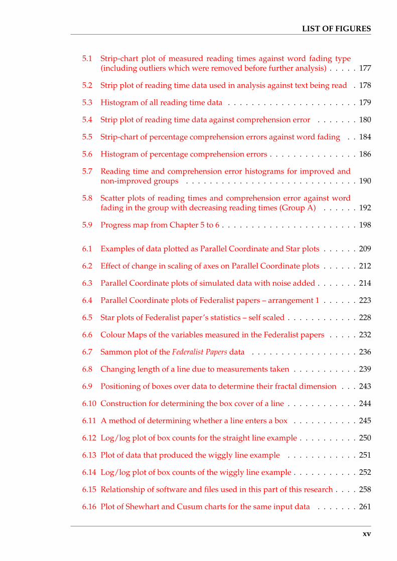
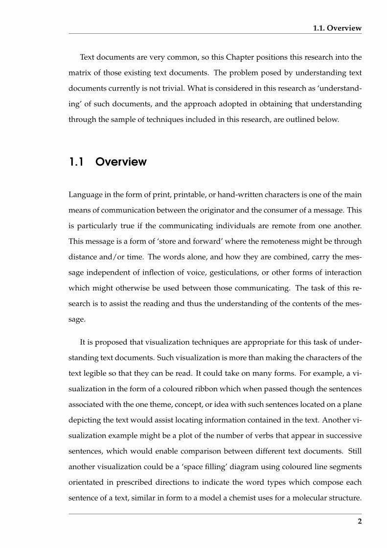
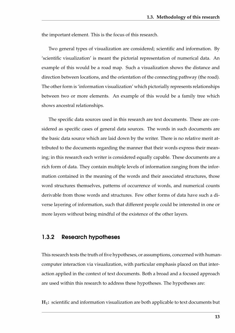
are ‘important’, to expedite reading of that text by a human reader. Figure 1.1 shows
two examples of this type of text document visualizations each of which is consid-
ered in detail later (visualization (a) in Chapter 7, and visualization (b) in Chapter 4).
Some visualizations are more appropriate for presentation of the text document, while
others for the analysis of that document; alternately, some for information extraction
(as what the visualization in Figure 1.1 (a) might be used), and others for comparison
between documents (as what the visualization in Figure 1.1 (b) might be used).
Text documents can be analysed for their information content. Most education is
aimed at equipping people to obtain the information content of a message, because
that is the purpose of the message. The words in the message build up ideas in the
mind of the reader. Those ideas are connected together by other words, and the con-
struction of the message, to achieve the communication’s goal. Visualization can be
used to indicate that composition and those interconnections, and therefore assist the
understanding of the message content. As users might have different needs of the
information from a message, so different visualizations are needed to guide the user
and to assist them to extract that information. One application of such visualization
that is used in this research is for author attribution which is based on the observation
that different writers tend to distributed the information content in their writings in
a manner which is their characteristic, and which can in turn identify them. Deter-
mining that identity can be an important result, and as will be shown later, different
visualization techniques can be used to obtain such results.
Techniques of extracting information from the document, sufficient to only supply
the requirements of the visualization, is the subject of this research. Words are taken
as the fundamental unit and the source of the information. In overview this process
would be: the user selects what information is of interest, chooses from visualizations
available and appropriate, reviews the resulting presentation, refines those selections,
and repeats the process. Deductions that might be made from such visualizations are
3

1.1. Overview
(a) a visualization to assist analysis
(b) a visualization to assist reading
Figure 1.1: Examples of text document visualizations considered later in this thesis
4

1.1. Overview
then examined. A prototype for a software tool kit which supports that process of
interaction with shifting focus is developed through the course of this research.
For some text document investigations a numerical analysis of the document is
appropriate. These, and visualizations associated with this type of analysis, are con-
sidered. In this case, different types of visualizations are needed from those associated
with the meaning or association of the words. Thus two types of visualization, called
‘scientific’ and ‘information’, are encompassed in this research; the first dealing with
data in the form of numbers (or counts), and the other with the words and their mean-
ing, contained in the document. In some instances after transforming the numerical
data into visuals, noting the change between visuals may be difficult. One manner of
overcoming this is to represent that visual as a number, and then perform the com-
parison of the visuals based on that derived number. In that situation the numerical
data cycles through the visualization, to become numerical data again. This is an ex-
ample of the general circulation of the data, the visualization of that data, and the
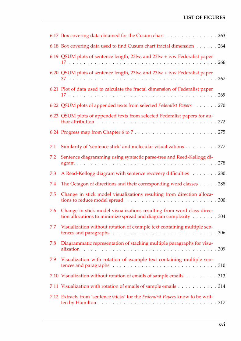
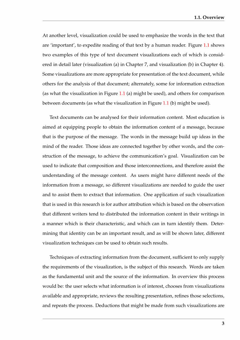
results that are deduced from that data, form a circular relationship which is depicted
in Figure 1.2. Such results can then become data, or form another visualizations.
The emphasis is on the visualization and the data on which it is based, not on the
detail of the computing which produced that visualization (although that is indicated
where appropriate). An ‘expert’ human is assumed to control the cycling between
the results, data, and visualization. That expertise is in both the understanding of
the results and the problem whose answer is being deduced, together with familiarity
with both the transformations that can be performed on the data and interpretation of
the visualizations produced.
To assist assessment of available techniques of data visualization, a taxonomy is
proposed for linking data type to visualization type. Given the data type appropri-
ate for an analysis, an idea of appropriate visualization can be obtained using such a
taxonomy. But despite a large literature on visualization, this taxonomy indicates that
an even distribution over all possible data-visualization pairs is not available. A more
5
1.1. Overview
uniform coverage is hypothesised as being advantageous. This indicating that work
on visualization is not complete. The relationship between techniques that have ap-
peared in the visualization literature, and those employed in this research, are brought
together by using that taxonomy.
visu
aliz
atio
n
data results
Figure 1.2: Meta-level interactions assumed in this research
One application of this research is to provide additional uses for the millions of
PCs on desktops in business and industry; more than for sending and receiving emails
and preparation of text documents. Such computers now have good graphics capa-
bility together with processing power which is currently under exploited. Analysis
of such text documents is one possibility. The preparation side of text documents is
not considered here, but there is increasing evidence that reading and understanding
of text documents consumes more time than their preparation. It is that reading and
understanding component that is considered for analysis in this research. Although
the term analysis might have been thought to be confined to academia, the analyses
6

1.2. The problem and its importance
considered in this research have application beyond that confine.
It is hypothesised that by using the analysis proposed in this research, and particu-
larly by having the results presented as visualizations, their user has the potential for
better understanding of the contents of particular text documents and obtaining that
understanding in a shorter interval of time.
1.2 The problem and its importance
The basic problem addressed in this research is the need for a more effective way
of processing words that are required to be read. Not only are those words to be
scanned, but they are to be understood and placed correctly in context. The concern
is not the words themselves but the meaning that they convey. The problem is further
exacerbated by the flood of such words.
For example, there has been a huge increase in the volume of scientific research
publication. An indicator of such ’openly accessible’ scientific publications is pro-
vided by the Science Citation Index. The statistical summary produced by the publisher
of this index shows that in the decade from 1990 to 2000, there was an approximately
constant annual growth of 700,000 citations per year, i.e. approximately 4.9% growth
per annum. That growth resulted in there being in the year 2000 approximately 18
million citations per annum spread over 36,000 sources of such publications. The cor-
responding number of publications containing those citations grew at approximately
3.3% per annum over the same time period. In the year 2000, this resulted in approxi-
mately 800,000 publications. This growth rate shows no indication of slowing.
Such figures are not uncommon in modern literature. In some disciplines the
growth of publications is huge but may be starting from a small base, while in others
the increase is less steep. Although the number of publications needing to be accessed
by an individual would be considerably less than the 800,000 total mentioned above,
7

1.2. The problem and its importance
the majority of professional people (technicians, medical people, lawyers, managers,
etc.) can expect to have a large reading load. All the time that load is increasing.
In the 1985 issue of Science devoted to computers, Waldrop (1985) speaks of an
appreciable increase in the number of words that appeared in US college assignment
papers due to the availability of personal computers. The significance of 1985 is that
the availability of personal computers was in its infancy. Those students are now in
industry and commerce and they have brought that verbosity with them. The reports
these people write are greater in number than those written by their predecessors. It
is not only academics who have a greater volume of text to inspect and evaluate, but
also others interested in the information produced by these people and presented in
such reports.
The Science Citation Index is available ‘on line’ to facilitate the use of computer tech-
nology for its search. Similar abstracting services are available for news items, research
in areas other than science, in Law, and other disciplines. Similar growth is occurring
in those information sources which, in turn, are providing computer search facilities.
Once the article of interest has been located, it must be read. But with more arti-
cles available a greater amount of time must be found for such reading. In too many
instances, that time is not available. Expressions such as information overload, infoglut,
or info smog, have been used to describe this situation.
The Internet is a significant contributor to that information explosion, and of di-
rect interest to this research because that information is computer readable. The cover
topic of the June 1992 edition of Byte Magazine described the position of the Internet
in the 1980s as being in a state of “Information Glut”. That situation has deteriorated.
Berners-Lee, Cailliau, Luotonen, Nielsen & Secret (1994) describe the World Wide Web
as being in its infancy in 1993, a year after the Byte cover story. The World Wide Web
was then mainly accessed via NCSA’s Mosaic W3 browsers on X Window worksta-
tions. Two years later, the survey results of Berghel (1996) indicates that 83% of the
8

1.2. The problem and its importance
respondents were using the Web for “surfing”, 51% of which was work related. With
increased availability of World Wide Web access and easier to use human interfaces for
that access, increased usage followed. With that increase, more information became
available. The spiral had begun.
Lyman & Varian (2000) estimate that the world wide annual production of office
documents consumes 190 Tera-bytes of storage, which is eight times the storage re-
quired for newspapers, and half that required for image storage. Also, in their evalu-
ation of the World Wide Web in February 1999, Lawrence & Giles (1999) determined
that there was twice as much storage devoted to holding text than for images. They
estimated that there were 800 million pages (6 Tera-bytes) of publicly accessible text
information on the Web as opposed to 180 million images (3 Tera-bytes). Thus the
intuitive notion of an image orientated World Wide Web is not true from either the
perspective of the number of items available, or the stored volume of such items. The
majority of presented information is in the form of text.
The reliability of Internet data is also an issue. Berghel (1997) notes the increasing
importance being placed on the Internet as an information source. However, he states
that although a resource may be available on the Internet, this does not provide any
guarantee of its importance, accuracy, utility, or value. This could also be said of a
telephone conversation between two individuals, but in that situation due to the com-
municating pair being (more likely) known to one another, each can make an assess-
ment of the importance, accuracy, utility, and value of the messages exchanged. On
the Internet these assessments may be more difficult to obtain. Despite this, Roberts
(2000) projected that by the year 2002, the volume of Internet traffic would overtake
voice traffic for communication between remote users of the system. As a conse-
quence, what is available for reading, needs intelligent interpretation before the text is
accepted as useful.
The Internet also plays an increasing role in communications. According to Lyman
& Varian (2000), 90% of households in North American use the Internet for email com-
9

1.2. The problem and its importance
pared with 30% for reading of newpapers online and downloading software. Today,
email transmission accounts for 40% of Internet traffic.
Leysen, van Iterson, Bols & Fell (2000) report a survey which was conducted in
June 2000 on email use by professionals in Brussels, Belgium. That survey revealed
that less than 11% of those surveyed received less than 10 emails per day, while 18%
receive 50 or more emails per day. The majority of the survey respondents were from
Northern Europe, with Belgians and British being the most prominent. Almost 40%
were officials of the European Union. Only 10% spent less than one hour per day on
the Internet, 46% spent an hour while a further 25% spent two hours a day. Most used
the Internet for professional activities. About three quarters of the respondents used
the web as their first contact with an organisation. Of more significance here was that
three quarters thought the Internet information was as reliable as that in print.
These inundations in terms of specific message types need to be put in context.
Keim (2002) makes reference to an estimate from researchers at the University of Cal-
ifornia, Berkeley, that the annual production of data is 1 Exabyte (= 1MillionTera −
byte = 1018 byte). The conclusion made from this is that over the next three years, more
data will be generated than in all of human history. Of significance to this research is
that a large proportion of that data is in digital form which suggests, if not necessitates,
the use of computers in processing that data. This “fire hose of data” is one reason
why in 1986, as reported by Domik (2000), the new research field of visualization of
scientific computing was brought into existence. McCormick, DeFanti & Brown (1987)
present the report which proposed a national visualization initiative in the United
States. It covered scientific and engineering opportunities which would follow, indus-
trial competitiveness issues, and proposed both short and long term objectives for the
program. One outcome of the adoption of this initiative has been increase research
activity in creation of new visualizations, and then their application. This has subse-
quently led to the development of recommendations for education topics that need
to be covered in the broad field of visualization, as summarized by Domik (2000), to
10

1.3. Methodology of this research
capitalise on that effort.
With increasing information exposure, there is the danger of overlooking impor-
tant messages. What is the consequences of missing an important message? An elec-
tronic email can be converted to a printed record that can be produced in court as an
indication of the sending and receiving of that message, because of the time stamping
that is applied in the delivery process. But if that message is overlooked due to too
many emails being received by an individual, then the significance of the notification
can be lost. Using a receive acknowledgment email system compliant with ISO stan-
dard Message Handling Systems as described by Dickson & Lloyd (1992), the sender
has confirmation that the message has been delivered to the addressee, or at least the
associated Message Store defined in the appropriate international standard.
The statistics above indicate that an information explosion is occurring and the
majority of that information is in the form of text. To assist humans to cope with this
information over supply, text analysis and presentation techniques need to evolve. It
is also known that humans are predisposed to pictures. If such text is presented on
computer screens, the capacity of those screens and associated computers currently
available are able to provide conversion of those words into pictures via visualizations.
Different visualizations are appropriate for different purposes and such cross-linkages
need to be understood. However, success in such an endeavour can assist humans in
coping with the increasing flood of text documents.
1.3 Methodology of this research
The problems associated with text documents as outlined in Section 1.2 do not have a
simple solution. This research is viewed as part of a wider effort in finding measures
that can be taken by individuals to produce solutions that fulfil their immediate needs.
To do so, a corner of the problem needs to be isolated, the boundaries of that area need
11
1.3. Methodology of this research
to be specified, the expected outcomes defined, and the manner in which it is proposed
to achieve those outcomes enumerated. Fulfilling those objectives is the purpose of
this section.
1.3.1 Assumed interactions
Figure 1.2 (page 6) shows the interaction presumed by this research to exist during
information extraction between a data source, results of an analysis of that data, and
the possible involvement of visualization. Achieving the required objective, or result,
may not involve visualization at all. In the majority of such interactions currently a
minimum of visualization may occur, more from the perspective of explanation of an
analysis result than actively being involved in achieving that result. Instead, the data
is accessed directly, possibly passing through an analysis processes such as filtering,
transformation, or extraction. But an active use of visualization can assist a number of
currently used analysis processes, together with facilitating new methods of analysis.
Visualization could also be used to present the text of the document in a different way,
and that difference might foster recognition of the potential use of non-visual analysis
methods.
In this research visualization is not an aim in itself, but is taken as a specific process
on a pathway connecting data and results. It is one of many such processing alterna-
tives to achieve an analysis function. However, it is the process which is examined in
this research.
Visualization results from interacting with data, using that data to generate the
visual. Once displayed, the user interprets the visual, obtaining the insight offered,
and then they may revise selections so that a different visual is produced. Such refined
requirements involve interaction of the visualization process with the data to generate
a new visual. The process continues until a conclusion can be reached from the results.
In this interaction, the user’s understanding of the meaning contained in the visual is
12
1.3. Methodology of this research
the important element. This is the focus of this research.
Two general types of visualization are considered; scientific and information. By
‘scientific visualization’ is meant the pictorial representation of numerical data. An
example of this would be a road map. Such a visualization shows the distance and
direction between locations, and the orientation of the connecting pathway (the road).
The other form is ‘information visualization’ which pictorially represents relationships
between two or more elements. An example of this would be a family tree which
shows ancestral relationships.
The specific data sources used in this research are text documents. These are con-
sidered as specific cases of general data sources. The words in such documents are
the basic data source which are laid down by the writer. There is no relative merit at-
tributed to the documents regarding the manner that their words express their mean-
ing; in this research each writer is considered equally capable. These documents are a
rich form of data. They contain multiple levels of information ranging from the infor-
mation contained in the meaning of the words and their associated structures, those
word structures themselves, patterns of occurrence of words, and numerical counts
derivable from those words and structures. Few other forms of data have such a di-
verse layering of information, such that different people could be interested in one or
more layers without being mindful of the existence of the other layers.
1.3.2 Research hypotheses
This research tests the truth of five hypotheses, or assumptions, concerned with human-
computer interaction via visualization, with particular emphasis placed on that inter-
action applied in the context of text documents. Both a broad and a focused approach
are used within this research to address these hypotheses. The hypotheses are:
H1: scientific and information visualization are both applicable to text documents but
13
1.3. Methodology of this research
there is an opportunity for expansion in such use;
H2: visualization provides an alternative (or a supplement) to analytical methods for
interpreting the same sets of text data;
H3: visualization techniques can be used with advantage by humans to aid in reading
and comprehension of text documents;
H4: visualization can assist in finding similarities and differences in the composition
of text documents; and
H5: text document visualizations can be produced in an efficient manner to enable
their use as a toolkit for interactive analysis of such documents
The nature of these hypotheses requires a broad interpretation in this research as what
constitutes visualization. The bolding of characters or words, colouring of font, and
shading of the background around selected words in a display of text characters is
considered here as being visualization (viz H3), just as different line types, line colour,
and block shading used in a drawing of a graph or a picture (viz H4). In this research,
both these forms of display are considered as being visualization. Just because differ-
ent computer hardware and software might be needed to implement these different
types of visualization does not mean that they are not all visualizations.
These hypotheses are not independent, but are inter-related. Hypothesis H1 is
taken as being more general in scope than hypothesis H2. Although hypotheses H3
and H4 are themselves general in scope, they are also specific components of hypothe-
ses H1 and H2. Hypothesis H5 focuses on implementation issues when trying to make
use of the other hypotheses collectively via a software tool.
Specific examples are used in this research to provide support for the truth of these
hypotheses. No attempt is made to disprove any hypothesis. Table 1.1 indicates the
Chapters where the each research hypothesis, and combination of such hypotheses,
are considered.
14
1.3. Methodology of this research
Table 1.1: The hypotheses base of each Chapter
Research hypothesesChapterH1 H2 H3 H4 H5
1 52 1 23 24 2 3 55 3 56 2 4 57 4 58 1 2 3 4 5
1.3.3 Assumptions
For this research, the implementation of the high-order interactions depicted in Fig-
ure 1.2 (page 6) is performed using three blocks; the text document being considered,
the user, and software. The text document block corresponds to the data of the fig-
ure. The user is the human for whom the results are produced, and who controls
of the interactive analysis process being performed. The software is responsible for
transformation of the text document to produce the results required by the user, and
for revising the text document, if necessary, at the instigation of the user. The visu-
alization is the means of expressing the results. Production of the visualization and
the results is the function of the software, which in turn interacts with the data. This
research is implemented via these three aspects.
The degree of generality to which the research hypotheses are answered is con-
strained by the assumptions made concerning these three aspects. Those assumptions
are:
• For the text documents considered:
1. each text document is complete in that it does not require access to other docu-
ments for its correct interpretation, or satisfaction of links within that document;
2. the text is written in the English language;
3. the complete document is in computer readable form;
15
1.3. Methodology of this research
4. the subject matter dealt with in the text document is of general interest and not
oriented towards a specialist readership;
5. the words which compose the text document contain all the information, i.e.
there are no graphics, illustrations, nor tables that augment the text;
6. the text in the document is correctly constructed in grammatical form and con-
sistency of spelling; and
7. plain text is used i.e. the text is not ‘marked up’.
• For the software used:
1. it is not specially tuned (customized) for individual requirements, needs, or pref-
erences;
2. it functions correctly and produces any visualizations in a consistent manner and
of consistent quality;
3. it is independent of any other application software operating concurrently on
the computer used; and
4. it has exclusive access to the text document as a local file, as opposed to across a
network, so that the document is not subject to change.
• The human user:
1. requires computer literacy only to the extent of operating a mouse, control-
ling software by clicking on buttons generated by the software on the computer
screen, or making selections from software generated menus; and
2. has reasonable level of reading comprehension skill.
These are the overall assumptions applicable to this research. Specific assumptions
will be stated when the need arises.
16

1.3. Methodology of this research
1.3.4 Approach
Implementation of this research was by software. Such software accessed the text
document data and produced results for the user of the software. The aim was not to
produce a prototype of production quality software code ready for use by the potential
user outside of this research. Rather the intention was to explore what that production
code would need to contain.
This research is concerned with four inter-related topics. Those topics are:
• text as data;
• overall tool design;
• informatics; and
• visualization.
Text is a rich data source since it can be analysed numerically by taking measurements
of it, and by considering the relationships embodied in the words from which it is
formed. This influences the composition of the software and how it functions. This
needs consideration. The software provides a number of processing tasks which pro-
duce intermediate results, some of which might be of use in the user’s overall explo-
ration of the text document data. Consideration of the overall design of the tool is to
ensure that the software user progresses naturally and smoothly through the required
processing tasks so as to arrive at the required result. It also considers presentations for
selecting such progression. In turn this design is associated with the inter-relationship
of the tasks required to address the research hypotheses. Informatics covers the fil-
tering, transformation, and extraction processes that the software needs to perform
for presentation of results to the user, either directly from the text document or less
directly through visualizations. Visualization considers techniques for presenting the
17
1.3. Methodology of this research
informatics results on the screen in a graphical manner. When dealing with large num-
bers of variables simultaneously, this can represent a considerable challenge.
informatics
text
Not used
Next chapter
This chapter
Legend
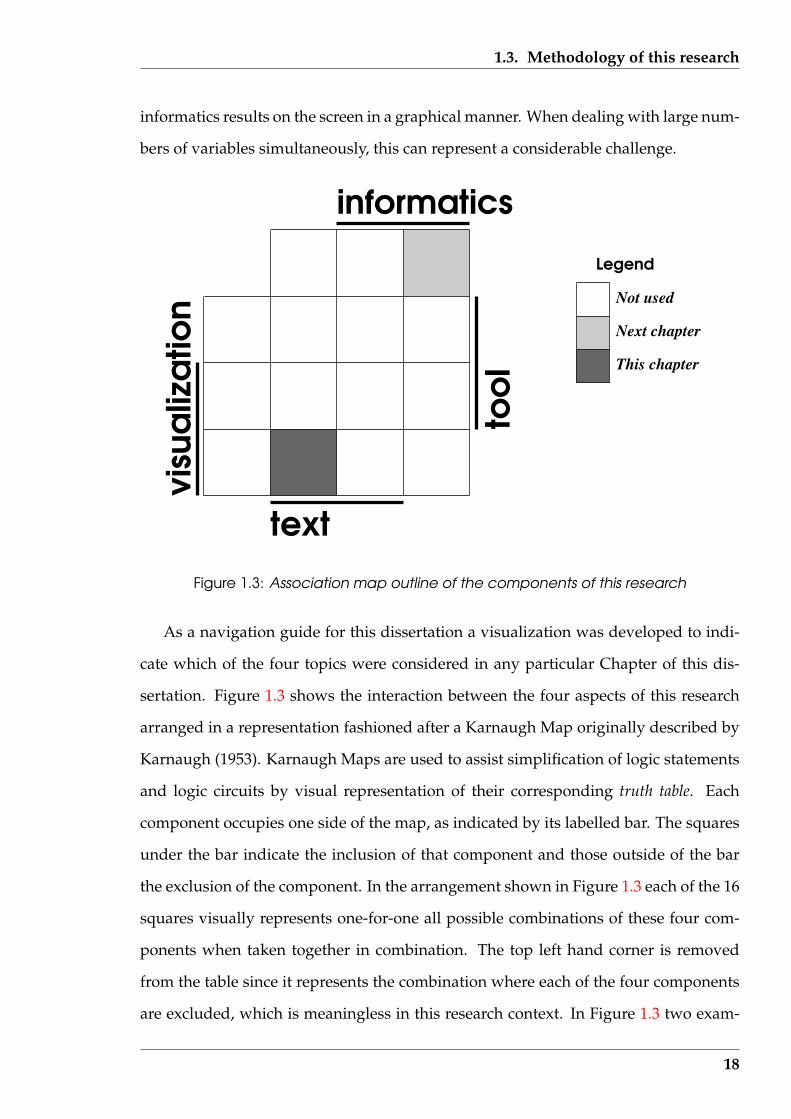
Figure 1.3: Association map outline of the components of this research
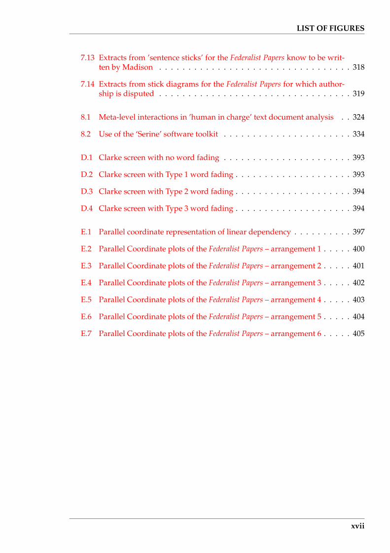
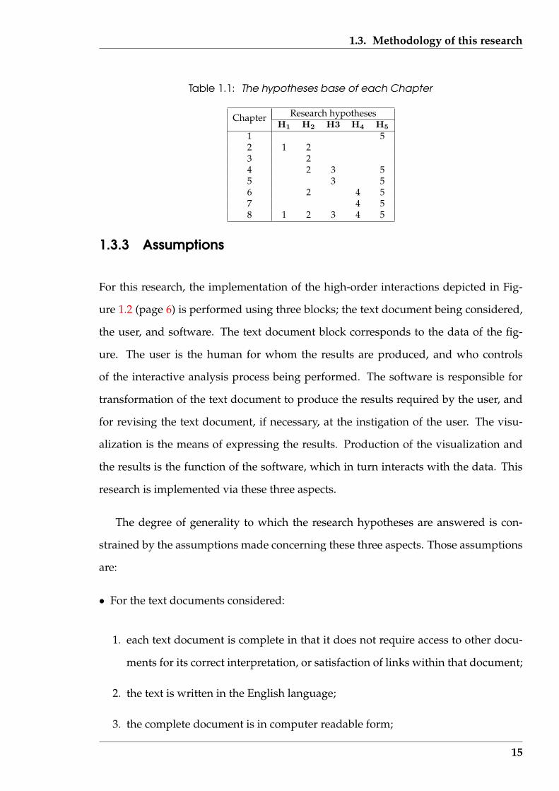
As a navigation guide for this dissertation a visualization was developed to indi-
cate which of the four topics were considered in any particular Chapter of this dis-
sertation. Figure 1.3 shows the interaction between the four aspects of this research
arranged in a representation fashioned after a Karnaugh Map originally described by
Karnaugh (1953). Karnaugh Maps are used to assist simplification of logic statements
and logic circuits by visual representation of their corresponding truth table. Each
component occupies one side of the map, as indicated by its labelled bar. The squares
under the bar indicate the inclusion of that component and those outside of the bar
the exclusion of the component. In the arrangement shown in Figure 1.3 each of the 16
squares visually represents one-for-one all possible combinations of these four com-
ponents when taken together in combination. The top left hand corner is removed
from the table since it represents the combination where each of the four components
are excluded, which is meaningless in this research context. In Figure 1.3 two exam-
18
1.3. Methodology of this research
ples of the table’s use are shown. The shaded square at the top of the figure indicates
consideration of the ‘informatics’ component while excluding consideration of ‘visu-
alization’, ‘text’, and the ‘tool’. The shaded square at the bottom of the figure indicates
consideration of ‘text’ and ‘visualization’ while excluding consideration of ‘informat-
ics’ and the ‘tool’.
A map of the form of Figure 1.3 will be used in this thesis as a navigation aid to
indicate progression between Chapters. The components considered in the current
Chapter will be shaded dark as in the lower square of Figure 1.3 while a lighter shad-
ing (as in the upper right-hand corner square) will be used to indicate components to
be considered in the next Chapter. In the case when a component is considered in both
the current and next Chapter, the square has both shadings separated by the square’s
diagonal.
1.3.5 Relationships between the concepts in this research
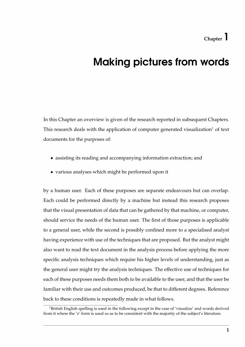
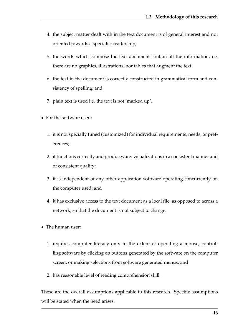
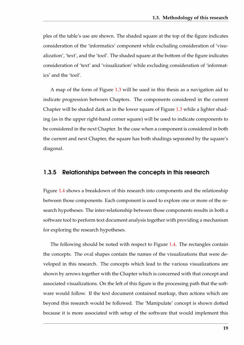
Figure 1.4 shows a breakdown of this research into components and the relationship
between those components. Each component is used to explore one or more of the re-
search hypotheses. The inter-relationship between those components results in both a
software tool to perform text document analysis together with providing a mechanism
for exploring the research hypotheses.
The following should be noted with respect to Figure 1.4. The rectangles contain
the concepts. The oval shapes contain the names of the visualizations that were de-
veloped in this research. The concepts which lead to the various visualizations are
shown by arrows together with the Chapter which is concerned with that concept and
associated visualizations. On the left of this figure is the processing path that the soft-
ware would follow. If the text document contained markup, then actions which are
beyond this research would be followed. The ‘Manipulate’ concept is shown dotted
because it is more associated with setup of the software that would implement this
19
1.3. Methodology of this research
Text document
Document type
Plain text
Objective achieved?
Reading
Sentence composition
Parallel coordinates
Analysis
Manipulate
Evaluate
Compare
Sammon plots
Colour histograms
Top-tail fading
Shewhart plot QSUM plot
Fractal dimension
Word frequencies
Frequent word fading
Sentence construction
Star plots
Zipf plot
Sentence sticks
Paragraph sticks
Chapter 4
Chapter 3
Chapter 6
Chapters 4 & 5
Chapters 6 & 7Chapter 6
Analysis process
Con
cept
s an
d as
soci
ated
vis
ualiz
atio
n op
tions
Concepts and associated visualization options
Figure 1.4: Analysis process with concepts and visualizations used in this research
20

1.4. Implementation testbed – ‘Serine’
analysis than in addressing the research hypotheses. It is shown to indicate its place
in the analysis sequence. Most of the visualizations are associated with analysis of
text documents, except the two shown in the dotted area, which are associated with
investigating reading speed.
The processing path is ’human centred’ in that it is controlled by the human user
of the process. The visualizations produced by the analyses are evaluated by the hu-
man, compared with other sources, and from that the user makes an assessment as
to whether the text document analysis objective has been achieved. If not, the user
makes changes to the analysis, or uses a different analysis, and the loop is repeated.
Two items are implicit in Figure 1.4. Software is not shown but each item in the fig-
ure is considered from the perspective of implementing it as software. Consequently,
the above mentioned four aspects of the software expand to become a foundation for
this research. The other item is a visualization taxonomy, which is dealt with in Chap-
ter 2. That taxonomy is used to consider specific aspects of a particular technique, to
relate such techniques to those used in other fields in which visualization is applied,
and thus assist future work by incorporating knowledge gained in those other fields.
Both software and taxonomy add a dimension above the distribution shown in Fig-
ure 1.4.
1.4 Implementation testbed – ‘Serine’
‘Serine’ is the name used in this research for the prototype software toolbox proposed
as the delivery agent for most of the techniques considered. Some of the techniques
were implemented in this toolkit, while other were not, depending on whether such
incorporation assisted the explanation of that technique. However, all techniques con-
sidered in this research would be expected to be part of a ‘Serine’ based toolkit em-
bedded under the appropriate pull-down menus outlined in this prototype.
21
1.4. Implementation testbed – ‘Serine’
‘Serine’ takes its name from the Serine amino acid of biochemistry in which it is
a building block for protein molecules (see Garrett & Grisham (1999)). According to
the Genetic Code, the Serine amino acid is biosynthesised by the TCG codon (among
others) from the DNA molecule. In the context of this research, TCG would mean Text
Computer Graphics and be linked with computer graphics building understanding of
text. If the productive outcome of TCG in the biochemistry case is the Serine amino
acid for building proteins, so the same name follows for the software implementing
research on building text understanding. Just as Serine, the amino acid, is one ele-
ment in building the final protein result with its associated structures, so ‘Serine’, the
program, is one element in building understanding of the inherent structure of a text.
The organisation of the toolkit via its proposed graphical user interface is discussed
below. Figure 1.5 shows the logical elements that make up the toolkit and possible se-
quences of use of those elements in the process of analysis of a text document. Those
logical elements are presented to the user of the toolkit via a graphical user interface
which binds those elements into a whole and allows the user the choice, and move-
ment between, different aspects of the software functionality.
The logical elements contained in ’Serine’ and shown in Figure 1.5 map into the
concepts contained in Figure 1.4. Since ’Serine’ is a prototype, a one-to-one corre-
spondence between these two figures is not obtained. The visualizations shown in
Figure 1.5 map to the balloons of Figure 1.4. The Q & Q (quantitative and qualitative)
methods and the Analysis methods blocks in Figure 1.5 map to the Analysis and rect-
angular elements outside of the Analysis process dotted box of Figure 1.4. The Docu-
ment category, Document type, and Analysis objective blocks of Figure 1.5 collectively
map to the concept boxes of Figure 1.5 shown within the Analysis process dotted box,
with the exception of the Analysis box whose mapping has been just given.
22

1.4. Implementation testbed – ‘Serine’
Counting word types
Word colouring
Connection ribbons
Popular
Learned Scientific
Legal
Technical
Learned Nonscience
x-y graph
Colour histogram
Star diagram
Parallel axes plot
Colour patches
Math statistics
Sentence limiting
Word occurrence
Theme locating
Word distribution
QSUM
New words appearing
Stats across docs.
Link following
Author attribution
Topics present
Reference usage
Topic development
Topic relationships
Vocabulary used
Completeness
Magazine article
Newspaper article
Novel
Poem
Script for a play
Act of parliament
Confession
Legal regulation
Deed
Will
Operating instruc.
Specification
Assembly instruc.
Using mark up
Topic distribution
Document category
Document type
Analysis objective
Analysis methods
Q&Q methods
Visualization
Figure 1.5: Logical interconnection between the elements of the ‘Serine’ toolkit
23
1.4. Implementation testbed – ‘Serine’
1.4.1 Graphical user interface for control
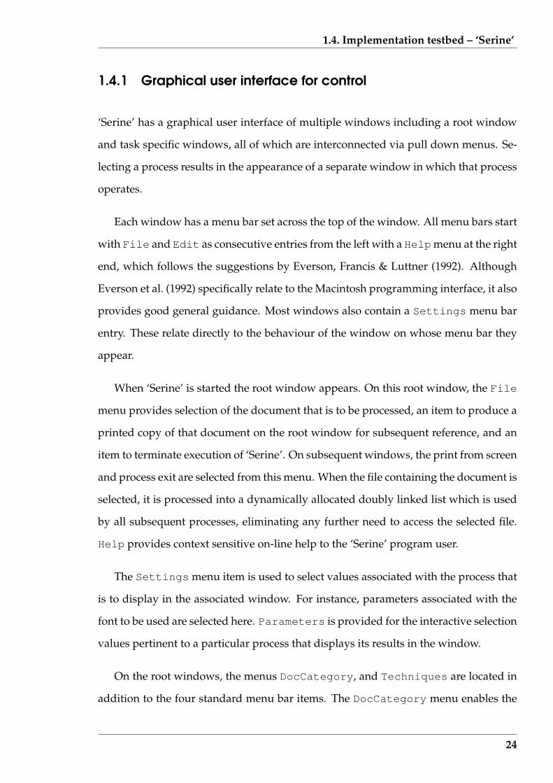
‘Serine’ has a graphical user interface of multiple windows including a root window
and task specific windows, all of which are interconnected via pull down menus. Se-
lecting a process results in the appearance of a separate window in which that process
operates.
Each window has a menu bar set across the top of the window. All menu bars start
with File and Edit as consecutive entries from the left with a Helpmenu at the right
end, which follows the suggestions by Everson, Francis & Luttner (1992). Although
Everson et al. (1992) specifically relate to the Macintosh programming interface, it also
provides good general guidance. Most windows also contain a Settings menu bar
entry. These relate directly to the behaviour of the window on whose menu bar they
appear.
When ‘Serine’ is started the root window appears. On this root window, the File
menu provides selection of the document that is to be processed, an item to produce a
printed copy of that document on the root window for subsequent reference, and an
item to terminate execution of ‘Serine’. On subsequent windows, the print from screen
and process exit are selected from this menu. When the file containing the document is
selected, it is processed into a dynamically allocated doubly linked list which is used
by all subsequent processes, eliminating any further need to access the selected file.
Help provides context sensitive on-line help to the ‘Serine’ program user.
The Settings menu item is used to select values associated with the process that
is to display in the associated window. For instance, parameters associated with the
font to be used are selected here. Parameters is provided for the interactive selection
values pertinent to a particular process that displays its results in the window.
On the root windows, the menus DocCategory, and Techniques are located in
addition to the four standard menu bar items. The DocCategory menu enables the
24
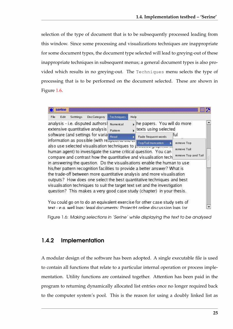
1.4. Implementation testbed – ‘Serine’
selection of the type of document that is to be subsequently processed leading from
this window. Since some processing and visualizations techniques are inappropriate
for some document types, the document type selected will lead to greying-out of these
inappropriate techniques in subsequent menus; a general document types is also pro-
vided which results in no greying-out. The Techniques menu selects the type of
processing that is to be performed on the document selected. These are shown in
Figure 1.6.
Figure 1.6: Making selections in ‘Serine’ while displaying the text to be analysed
1.4.2 Implementation
A modular design of the software has been adopted. A single executable file is used
to contain all functions that relate to a particular internal operation or process imple-
mentation. Utility functions are contained together. Attention has been paid in the
program to returning dynamically allocated list entries once no longer required back
to the computer system’s pool. This is the reason for using a doubly linked list as
25
1.4. Implementation testbed – ‘Serine’
opposed to a single link list. Error handling is performed by making calls to a single
procedure.
The ‘Serine’ software adopts the philosophy of incremental building, using a chain
of software modules. Each module performs a single function that can be used by sub-
sequent modules in that chain. This chain of dependencies is implemented by using
the output of one module as input to the next module in the sequence. The user con-
trols the progress through these dependencies by interaction with the ‘Serine’ menu
structure. The most obvious of such interactions is in selection of an analysis tech-
nique. Interlocks are incorporated into the software so as to ensure the user completes
actions which are pre-requisites for subsequent options. This interlocking mechanism
enables the software modules to service access requests in varying order to match the
user’s processing requirements, consequently providing a greater interactivity for the
user’s investigation. If a subsequent analysis technique is selected which necessitates
‘Serine’ to internally retrace its processing steps back to the point where the required
input data is available, this is done such as to use a minimum of reprocessing to ob-
tain the input requirements of the revised selection. This enables different analyses
to be performed on the same material, but using common processes where possible
environment , together with decreasing the processing time required by the software.
Processing begins with ‘Serine’ by the selection of the text document (file) to be
processed. That file is read in its entirety and stored in ‘Serine’-controlled memory
as a dynamically allocated double linked list. Each entry in the list corresponds to a
line of the original text document. Those entries are arranged so that their sequence of
occurrence in the document is preserved by the application of the forward link which
connect each line to its successor. The reverse link connects each line to the line that
proceeded it in the text document so as to enable removal of that line from the list
when required. The contents of each line is broken into its word constituents.
‘Serine’ is written in the C language, using the Gtk+ graphics library for generat-
ing all graphical aspects. Software development was performed on a Toshiba laptop
26
1.5. Summary
having a Intel Pentium processor running the Red Hat Linux 8 operating system envi-
ronment. It was compiled used GNU C version 3.2 and linked with the Gtk+ version
2.0.6 library.
1.5 Summary
This Chapter has introduced this research and the foundations on which it is placed.
The research is positioned in respect of the need of humans to process an increasing
amount of textual material. The approach is to use computer generated visualizations
of such materials. Words are taken as the fundamental unit for processing such doc-
uments. The document analysis is performed by the human using the visualizations
produced by the computer. To assist that process, both scientific and information vi-
sualization is used as appropriate for the different objectives of the human analyst. A
software prototype (‘Serine’) is outlined which draws together the techniques exam-
ined in this research into a productive text document analysis tool. The components
of visualization, informatics, text, and tool that these considerations have invoked are
shown as a dark shading in the navigation map of Figure 1.7.
Five hypotheses for this research project are stated in this Chapter. They are centred
on using computer visualization as a useful tool for aiding the understanding of text
documents.
The ‘Serine’ software prototype provides an integrating of the various component
parts of this research and their associated research hypotheses H1 to H4, into a single
toolkit. It therefore addresses research hypothesis H5 (text document visualizations
can be produced in an efficient manner to enable their use as a toolkit for interactive
analysis of such documents). The ‘Serine’ prototype’s design, implementation, use,
and positioning of those component parts has been considered in this Chapter.
Different visualizations are required by different people depending on their objec-
27
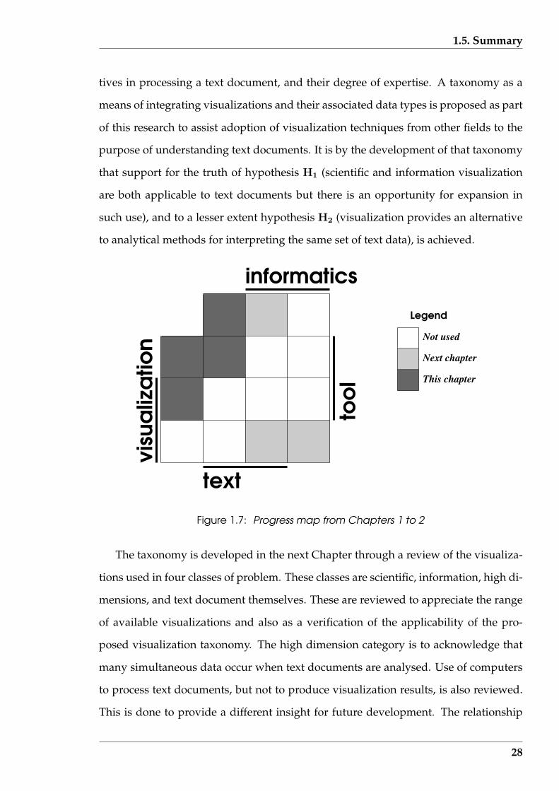
1.5. Summary
tives in processing a text document, and their degree of expertise. A taxonomy as a
means of integrating visualizations and their associated data types is proposed as part
of this research to assist adoption of visualization techniques from other fields to the
purpose of understanding text documents. It is by the development of that taxonomy
that support for the truth of hypothesis H1 (scientific and information visualization
are both applicable to text documents but there is an opportunity for expansion in
such use), and to a lesser extent hypothesis H2 (visualization provides an alternative
to analytical methods for interpreting the same set of text data), is achieved.
informatics
text
Not used
Next chapter
This chapter
Legend
Figure 1.7: Progress map from Chapters 1 to 2
The taxonomy is developed in the next Chapter through a review of the visualiza-
tions used in four classes of problem. These classes are scientific, information, high di-
mensions, and text document themselves. These are reviewed to appreciate the range
of available visualizations and also as a verification of the applicability of the pro-
posed visualization taxonomy. The high dimension category is to acknowledge that
many simultaneous data occur when text documents are analysed. Use of computers
to process text documents, but not to produce visualization results, is also reviewed.
This is done to provide a different insight for future development. The relationship
28
1.5. Summary
such considerations have with the underlying concepts of visualization, informatics,
text, and tool are shown as a light shading in Figure 1.7.
29
Chapter 2
Some literature which guides
visualization
This Chapter reviews a range of available visualization techniques. This is done to
establish a framework (taxonomy) of techniques to assist in identifying appropriate
visualizations that might be used with text documents. The analysis of text documents
can be done using numerical or relational data measured from the document. Since
scientific and information visualizations applies to these respective data types, each
visualization type is considered. As will be shown in subsequent Chapters, this data
involves multiple variables, and visualization of more than three variables represent
difficulties which have received consideration in the literature. Such visualizations
have broad application domains and it is in those domains that they are reviewed.
Finally, the focus is shifted specifically to text document visualizations and their asso-
ciated data types.
The proposed taxonomy, and the visualization examples cited, is investigated for
support of research hypothesis H1 (scientific and information visualization are both
applicable to text documents but there is an opportunity for expansion in such use).
The meaning of the terms contained in that hypothesis are examined in this Chapter,
although further narrowing of which types of text documents are considered in this
research occurs in the next Chapter. The taxonomy indicates were visualization gen-
erally, and that specifically related to text documents, can be expanded to increase
30
2.1. A taxonomy for text document visualization
coverage.
These reviews are cast in terms of a proposed taxonomy which links the data being
visualized and the visual used. Each review includes a summary table, with more
complete information on each article contained in Appendix A. Each summary table
includes the classification of the visualization in term of the proposed taxonomy. That
taxonomy is then used to display the range of visualizations available. These reviews
also enable the utility of that taxonomy to be demonstrated.
This research considers computers to be involved both in the analysis of text doc-
uments (under human control) and the visualization of the results. But it also asserts
that the analysis and visualization are two distinct functions. To support this, a review
is also made of analysis techniques in which computers have been applied to text doc-
uments without producing visualizations. Analysis is the main application to which
these techniques are considered. These alternative approaches to analysis are exam-
ined as support for research hypothesis H2 (visualization provides and alternative to
analytical methods for interpreting the same set of text data). In this instance the data
are measurements taken of a text document.
2.1 A taxonomy for text document visualization
Consideration and classification of a wide range of visualization techniques assists the
selection of an appropriate one for any particular text-related objective. A means of
categorizing such visualizations in an abstract manner and relating them to some cri-
teria could assist that selection process. Examples of such a criteria might be the type
of data being processed, the outcome being sought, or the sequence of actions that the
user is to follow. Adoption of a criteria in the text document processing situation then
narrows the range of appropriate visualizations. Without such a criteria, the richness
of available visualizations can distract from the purpose of the visualization. One
31

2.1. A taxonomy for text document visualization
manner of associating visualizations and selection criteria is to employ a taxonomy.
Appropriateness in selecting visualizations in the text document context is a central
thread of this research.
The construction of such a taxonomy appropriate for the purposes of this research
was built upon existing taxonomies. Such taxonomies focus on computer application,
and in particular on using computers to produce visualizations. Three taxonomy ap-
proaches were considered.
The first is topic centred. A taxonomy close to the needs of this research is the
Computer Graphics Imaging (CGI) taxonomy of the ACM Graphics Special Interest
Group as described by Ford Morie (2001). That is an evolving taxonomy of detailed
topics which is shown to run over many pages. Although that taxonomy is specifically
aimed at CGI, the stated aim of the effort is to generalize the taxonomy into covering
the broad range of Computer Graphics topics.
However, as discussed by McCormick et al. (1987), visualization lies at the inter-
section of computer graphics, image processing, computer vision, computer aided de-
sign, signal processing, and user interface design. Therefore, the CGI taxonomy will
also have application to visualization, although visualization also has topics that are
specific to it. As Ford Morie (2001) indicates, more work is required in finalizing this
CGI taxonomy. Some of that effort is required in forging stronger embodiment of vi-
sualization relate topics.
A second approach is that of the Data Flow Model described by Upson, Faulhaber,
Kamins, Laidlaw, Schegel, Vroom, Gurwitz & van Dam (1989) and the Data State Ref-
erence Model proposed by Chi (2000). As opposed to a topic based taxonomy like
those discussed above, here a sequence of activities form the basis of this taxonomy
approach. The Data Flow Model is conceived by Upson et al. (1989) as being part of
the computational cycle, which includes the following repeatedly performed activi-
ties:
32
2.1. A taxonomy for text document visualization
• filtering: selecting the components for further consideration
from the available data;
• mapping: representing the data in geometric form; and
• rendering: converting the geometric forms into images.
Implementing each of these activities needs considerable attention to be paid to detail.
In contrast, the Data State Model by Chi (2000) consists of identifying the states of:
• value: raw data;
• analytical abstraction: data modelling;
• visualization abstraction: data as visualizable objects; and
• view: viewing of the objects on a screen.
The progression between these states results in a visualization.
The states of the Data State Model are arguably related to the activities of the Data
Flow Model. Included in the Data State Model are the processing steps “data trans-
formation”, “visualization transformation”, and “visual mapping transformation” for
progressing from the “value” to “analytical abstraction”, “analytical abstraction” to
“visualization abstraction”, and “visualization abstraction” to the “view” states, re-
spectively. Both of these models (or taxonomies) represent transformations that the
data undergoes in producing a visualization. The Data Flow Model also includes con-
nections between its activities. Chi (2002) shows that both of these taxonomies are
equally capable of representing the same transformations to generate a visualization.
The third taxonomy approach, and the one adopted in this research, is a linkage
approach most easily understood if presented as a matrix. This type of taxonomy is
intermediate in size and discriminating ability between the first and second approach
considered above. Such a linkage taxonomy between the data type being considered
and the user actions that can follow on from a visualization is proposed by Shnei-
derman (1996). There a visualization taxonomy based on seven data types and seven
user tasks performed on those data types is defined. The seven data types are: 1-
33

2.1. A taxonomy for text document visualization
dimensional, 2-dimensional, 3-dimensional, multidimensional, temporal, tree (or hi-
erarchical), network (or graph). The seven user tasks are of a high level of abstraction
and consist of: overview, zoom, filter, details-on-demand, relative, history, and extract.
OLIVE (1998) revises this taxonomy by adding the “workspace” data type. Table 2.1
shows the matrix of this taxonomy incorporating this revision in data types.
Table 2.1: Revised Shneiderman(1996) taxonomy for information visualization
User task
overview zoom filter details-on relative history extractData type-demand
1-dimensional2-dimensional3-dimensional
multi-dimensionaltemporal
hierarchicalnetwork
workspace
Based on the descriptions by Shneiderman (1996) and OLIVE (1998), a summary of
each data type in Table 2.1 is as follows:
• 1-dimensional: a single variable taking on multiple values;
• 2-dimensional: two variables each taking on multiple values;
• 3-dimensional: three variable each taking on multiple values;
• multi-dimensional: greater than three variables each taking on multiple val-
ues;
• hierarchical: the two or more variables present take on values that are
linked to one another is a tree-like manner;
• network: the relationship between the two or more variables
present is more complex than a hierarchical relationship;
• temporal: time is one of the variables present; and
• workspace: relates to the visualization environment in such aspects
as the use and updating of multiple windows.
The user tasks are described as:
34
2.1. A taxonomy for text document visualization
• overview: summary of total data collection;
• zoom: narrowing focus and obtaining increasing detail of inter-
est;
• filter: removal of detail not of immediate interest;
• relate: view relationships among data items;
• detail-on-demand: set focus for obtaining detail on data items;
• history: log of actions performed in visualization; and
• extract: removal of subsets of data items.
This Shneiderman taxonomy connects data type with user tasks for the purpose
of designing user interfaces to access the data. It also contains many of the features
proposed by Price, Baecher & Small (1993), which built upon the work of Myers (1990).
In all three of these works, the interest was in the tasks performed by the user of
the data, all of which are not confined to visualization. Thus in the context of the
current research, it represents the passage from input to operation, without providing
the insight into the visualization tool which it will be asserted here lies between those
two limits. However, it does give insight into data types to consider and the usefulness
of this form of taxonomy.
In this current research a three part process was proposed. The first station was
the data. The second station was the visual. The third station was making use of the
data, or the result. These three processes are connected in a circular manner as de-
picted in Figure 1.2 (page 6). One path from the data to the required result goes via
visualization, while another does not; i.e. in some instances, the use of the data does
not involve visualization. A path also leads from the visualization to data, suggesting
that a visualization can generate data which can lead to results. This interplay is de-
picted in the circular-arrowed relationships of Figure 1.2. The appropriate form of the
visual to apply to the data at any instance of this cycle is a question that the user must
answer.
It is in an attempt to provide this answer which sets the requirements for a taxon-
35
2.1. A taxonomy for text document visualization
omy that associates data type to visualization type. If such a taxonomy is constructed
in abstract terms, specific visualization examples (from possibly other fields of endeav-
our) can be used to guide visualization selection, in that they provide detail packed
around the defining characteristics used in the taxonomy. Although taxonomies exist
which approach this association, a sharper focus was warranted to support the current
research.
It is assumed that data consists of multiple values of one or more variables, with
those variables having a consistent meaning throughout the data under consideration.
The dimension of the data reflects the number of different variables present in the data:
1-dimensional data contains one variable, 2-dimensional data contains two variables,
etc. The dimension of a set of data is generally constant, and is characteristic of that
data set. However, only a subset of the variables available in a set of data may be under
consideration at the one instance. It is the dimension, or the number of variables, of
that instance which is considered in the taxonomy.
Table 2.2 is a visualization taxonomy constructed in such abstract terms for this
research. The data types used in Table 2.1 (page 34) have been revised to include both
sequential and non-sequential data, in place of the single temporal type. This was done
since temporal data is a particular case of sequential (or ordinal) data. Each of these
two broad classes are divided into seven subdivisions. Together, these subdivisions
form the rows of the taxonomy. The visualization types are the columns of the taxon-
omy. These columns are divided into one, two, and three dimensional visualizations.
These dimensional groups are then further subdivided as appropriate. The associ-
ated cells generated by these rows and columns are general, enabling it to contain all
visualizations encountered in practice. The proposed taxonomy of Table 2.2 is visual-
ization centred compared to that of Table 2.1 which is the activity-centred taxonomy
of Shneiderman (1996).
The proposed taxonomy contains changes to the data types of the Shneiderman
taxonomy of Table 2.1. The data division into sequential and non-sequential data types
36
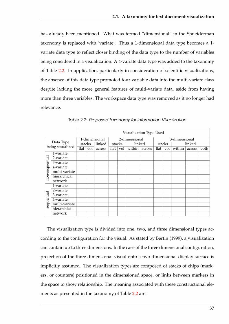
2.1. A taxonomy for text document visualization
has already been mentioned. What was termed “dimensional” in the Shneiderman
taxonomy is replaced with ‘variate’. Thus a 1-dimensional data type becomes a 1-
variate data type to reflect closer binding of the data type to the number of variables
being considered in a visualization. A 4-variate data type was added to the taxonomy
of Table 2.2. In application, particularly in consideration of scientific visualizations,
the absence of this data type promoted four variable data into the multi-variate class
despite lacking the more general features of multi-variate data, aside from having
more than three variables. The workspace data type was removed as it no longer had
relevance.
Table 2.2: Proposed taxonomy for Information Visualization
Visualization Type Used
1-dimensional 2-dimensional 3-dimensionalData Type stacks linked stacks linked stacks linked
being visualized flat vol across flat vol within across flat vol within across both1-variate2-variate3-variate4-variatemulti-variatehierarchicalnetwork1-variate2-variate3-variate4-variatemulti-variatehierarchicalse
quen
tial
non-
sequ
enti
al
network
The visualization type is divided into one, two, and three dimensional types ac-
cording to the configuration for the visual. As stated by Bertin (1999), a visualization
can contain up to three dimensions. In the case of the three dimensional configuration,
projection of the three dimensional visual onto a two dimensional display surface is
implicitly assumed. The visualization types are composed of stacks of chips (mark-
ers, or counters) positioned in the dimensioned space, or links between markers in
the space to show relationship. The meaning associated with these constructional ele-
ments as presented in the taxonomy of Table 2.2 are:
37

2.1. A taxonomy for text document visualization
• stacks flat: indicators are used to show which cells in the space
are occupied and possibly the variety of such occupiers
when warranted.
• stacks vol: indicators are used not only to indicate cell occupancy
but also additional information, such as the value of the
occupier if the data contains comparable values.
• linked within: indicators of connection are provided between values of
the variables in the plane containing the variables, e.g. a
line connecting values in a two dimensional plot. How-
ever, these links could be more general, e.g a band of
colour that encompasses a range of values
of the variables.
• linked across: indicators of connections (e.g. by lines) between all, or
some, of the planes that contain the distribution of the
values of each variable to indicate relationships between
such values.
• linked both: connections occur both within the plane and between the
planes of the distribution of the values of the variables.
These are the basic elements that make up a visualization. The detail that surrounds
these elements is what makes the visual impact of the visualization and gives the
impression that the visual is unique.
Two example applications of this proposed visualization taxonomy follow. They
are both after Keller & Keller (1993). The category given in that collection for the vi-
sualization is given to contrast with the classification using the proposed taxonomy. It
is hypothesised that a greater clarity in description of function and form of the visual-
ization is obtained.
Figure 2.1, which is copied from page 66 of Keller & Keller (1993), is included
38

2.1. A taxonomy for text document visualization
there under the “time” category. The data is derived from a computational simula-
tion in astrophysics and consists of matched sets of density, temperature, and energy
values evolving over time for an ionized stellar plasma. Thus there are three depen-
dent variables and one independent variable. The visualization consists of squares
positioned in a 2-dimensional plot of density against temperature. Each square is
coloured according to the corresponding energy value. The squares are placed in their
time sequenced order. Using the proposed visualization taxonomy, this data would
be characterised as being ‘sequential’, with ‘three variates,. The visualization is ‘two
dimensional’, using ‘stacks vol’ because the colour is being used to change the charac-
teristics of the stack placed on the two dimensional table.
Figure 2.1: Visualization of astrophysics results after Keller & Keller(1993) page 66
Figure 2.2 is taken from Keller & Keller (1993) (page 53) where it is categorized as
“multivariate”. This visualizes values of temperature, carbon monoxide, and sulphur
dioxide samples measured in Colorado Springs (USA) at 10 minute intervals over a
365 day period. Thus there are three variables measured sequentially in time, as in the
previous example. This visualization consists of three coloured plots with different
39
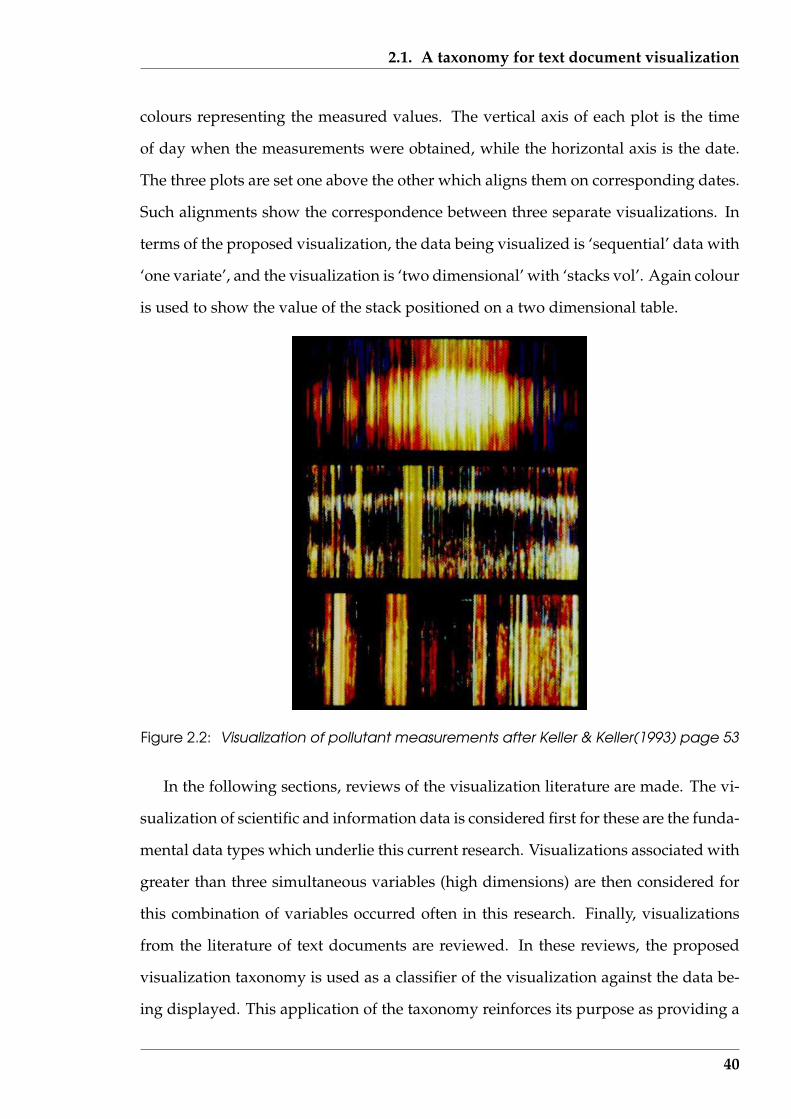
2.1. A taxonomy for text document visualization
colours representing the measured values. The vertical axis of each plot is the time
of day when the measurements were obtained, while the horizontal axis is the date.
The three plots are set one above the other which aligns them on corresponding dates.
Such alignments show the correspondence between three separate visualizations. In
terms of the proposed visualization, the data being visualized is ‘sequential’ data with
‘one variate’, and the visualization is ‘two dimensional’ with ‘stacks vol’. Again colour
is used to show the value of the stack positioned on a two dimensional table.
Figure 2.2: Visualization of pollutant measurements after Keller & Keller(1993) page 53
In the following sections, reviews of the visualization literature are made. The vi-
sualization of scientific and information data is considered first for these are the funda-
mental data types which underlie this current research. Visualizations associated with
greater than three simultaneous variables (high dimensions) are then considered for
this combination of variables occurred often in this research. Finally, visualizations
from the literature of text documents are reviewed. In these reviews, the proposed
visualization taxonomy is used as a classifier of the visualization against the data be-
ing displayed. This application of the taxonomy reinforces its purpose as providing a
40

2.2. Scientific visualization
framework for comparing the techniques in the literature, and for collecting together
visualizations with the type of data with which they are used.
2.2 Scientific visualization
The amount of literature concerning scientific visualization in comparison to visual-
ization of other information suggests more effort has been applied to the former, at
least in recent years. The availability of large capacity computing devises such as su-
percomputers is suggested by McCormick et al. (1987) as a driving force for interest
in visualization of numeric data arising from science and technology. Keim (2002) es-
timates data doubling in three year periods suggests that deployment of digital mea-
suring and transaction processing equipment is a large contributing factor to this data
explosion. A need exists to understand, or inspect, such abundant data.
Naturally, different authors consider the interaction of visualization with data with
respect to their own perspective or purpose. For example, Rhyne, Bolstad, Rheingans,
Petterson & Shackelford (1993) make the statement that environmental visualization
aims to make visible the unseen. Then visualization of ozone concentrations across re-
gions of the United States are considered. A similar viewpoint, but expressed slightly
differently, is made by Silver (1995) who asserted that visualization helps a scientist
understand important features and results of an experiment. The consideration here
is feature extraction from a dataset resulting from computational fluid mechanics ex-
periments.
A separation of scientific visualization from computer graphics is suggested by
Woodward (1993). Scientific visualization is described as being concerned with the
visual presentation of that which cannot be otherwise seen. Its goal is to make a sys-
tem’s nature apparent at a glance, but not necessarily to make it appear real. This
differs from the purpose of computer graphics which is more concerned with realistic
41
2.2. Scientific visualization
rendering of scenes that either do exist, or might exist, in the real world.
A different viewpoint is taken by Taylor (2000) who is concerned more with the
internal functioning of scientific visualization. There it is stated that scientific visu-
alization is not as yet founded on well understood principles but instead relies on
rules-of-thumb. This article probes the effectiveness of a collection of ad hoc techniques
through examination of examples. It presents a number of techniques of representa-
tion and the rules associated with each. Techniques considered are:
1. measurement projection in which the data is viewed in its natural spatial extent
providing quantitative insight and understanding of known questions;
2. mapping data into a coordinate system (which is not natural), which can make
the data easier to interpret in the visualization;
3. interactive moving through data by changing the viewpoint, which can assist
insight into the data;
4. simultaneous display of aligned data for the one subject from different datasets,
which assists the understanding of the data relationships; and
5. haptic (or feeling) feedback, which reinforces the meaning of the data.
Taylor (2000) gives examples of each of these techniques. An example of technique
1 is viewing the micro-structure of steel by removing a layer at a time, rescanning
the resulting surface after polishing with a scanning electron microscope, and then
viewing each resulting slice in three dimensions. The purpose of this study was to un-
derstand the morphology and distribution of grains and precipitates within the steel.
Technique 2 is applicable to visualizing the results from x-ray crystallography data.
Whereas in three dimensional Euclidean space the data is difficult to comprehend, in a
transformed reciprocal spherical coordinate system greater insight is obtained. Three
dimensional holograms of medical images overlaid on the patient’s actual anatomy
42
2.2. Scientific visualization
in a visualization environment is an example of technique 3. This visualization envi-
ronment enables surgeons to plan their actions in advance. Technique 4 is commonly
used for determining the structure of protein from crystallography data using a den-
sity fitting system and thus negating the need to build a physical model. The haptic
feedback of technique 5 finds its application in locating parts of the surface being vi-
sualized to where greater precision is required; the feel of the surface reinforcing the
visualization. A force feedback can be especially useful in manipulation tasks.
That rule-of-thumb idea of Taylor (2000) is reinforced by the large collection of
visualizations illustrated by Keller & Keller (1993). Keller & Keller (1993) propose
thirteen categories of visualization: comparison and relationships; multivariate; time;
process; animation; motion; 2-D data; surface and slice; volume; models multiform
visualizations; artistic dues; and black and white examples. This differs from the five
techniques mentioned above as used by Taylor (2000). These categories are offered by
Keller & Keller (1993) as the means to think about data or visualization. Thus, with
two different publications there are two different ways of thinking about visualiza-
tion of data. An alternative to these two taxonomies (or classification schemes) for
visualization is proposed in Section 2.1 for use in this current research. Although that
taxonomy follows those same rules-of-thumb, the outcomes are different.
The categories of the proposed taxonomy of Section 2.1 are aligned with those pro-
posed by Keller & Keller (1993). Each data point to be displayed is associated with
other values that have resulted in the value of that data point. These are the dependent
variables. For example, a data point in an atmospheric dataset might consist of mea-
surements of carbon monoxide concentration, carbon dioxide concentration, nitrous
oxide concentration, particulate matter concentration, and wet and dry bulb tempera-
tures (further to the data used in Figure 2.2). Such a point has six dependent variables.
Each point is recorded across a city which is considered to be a plane. The location of
each point is also recorded. That location is composed of two parts which define the
point’s location. Each point thus has two independent variables. So a visualization of
43

2.2. Scientific visualization
all the data at this data point would need to handle six dependent variables and two
independent variables. The one visual would be composed of many such data points,
each having different values for these six dependent and two independent variables.
Keller & Keller (1993) group visualizations by using the number of dependent and
independent variables simultaneously under consideration when considering their
104 examples. They do this to assist the reader’s selection of an appropriate visual-
ization technique for a new application. Each visualization is of multiple data points.
For that collection, a breakdown of visualization presentations is:
Number of Number of Number ofdependent independent examplesvariables variables
1 1 11 2 221 3 441 4 12 2 72 3 92 4 13 1 33 2 23 3 53 4 14 2 14 3 25 2 15 3 16 3 17 2 1
12 4 120 1 1
This tabulation indicates that most visualizations, or at least those in the Keller &
Keller (1993) collection, fall within the three dimensional space limitation stated by
Bertin (1999). A surface is defined by a collection of three variables and this is the
most complex object that can be drawn. Two independent variables together with one
dependent variable define a point on such a surface which can then be presented as
a visualization (for example, the height of topography at different values of latitude
and longitude). From the tabulation, Keller & Keller (1993) indicate 22 such exam-
ples. Alternately, three independent variables can be used to form a single surface
on which the dependent variable is then displayed, using a colour scale to show its
44
2.2. Scientific visualization
value variations. Keller & Keller (1993) indicate 44 such examples. These two combi-
nations account for 66 of the 104 examples by Keller & Keller (1993). There is also the
situation, which occurs in a large number of circumstances, where the physical form
of the independent variables suggests how they should be represented. For example,
air flow over a three dimensional relief land surface suggests a box form construction.
In each case, classification of these visualizations centres on the number of variables
being displayed.
However, classification of visualizations based on the number of variables alone is
insufficient. A further classification is warranted to indicate the order of interaction be-
tween the dependent variables. The proposed visualization taxonomy in Section 2.1,
which includes such interaction between the variables involved, will be applied here.
Consideration of the process producing the data (the Informatics) produces the num-
ber and type of dependent and independent variables. Different levels of interaction
between the dependent variables will prompt the use of different types of visualiza-
tions assisted by knowledge of successful combinations obtained previously by oth-
ers. Both the number of dependent and independent variables, as used in the Keller &
Keller (1993) collection classification, and the data type and relationship being visual-
ized as required by the Information Visualization taxonomy of Table 2.2, are included
in the following examples.
2.2.1 Specific examples
In order to test the utility of the proposed visualization taxonomy of Section 2.1 (page
31), a representative selection of 40 examples from the literature concerning scien-
tific visualization are examined below. This number of examples was a compromise
between covering all the relevant visualizations and brevity. Table 2.3 provides a sum-
mary of some of the features of the visualizations that are considered in the following
literature. Such visualizations appear to produce a rich tapestry, but they are also quite
45

2.2. Scientific visualization
restricted in the scope of relationships that are displayed. These aspects are shown in
the following examples where the number of dependent and independent variables
under consideration are given together with the layer in the taxonomy of Table 2.2 in
which the example falls.
Further details of each example are provided in Appendix A.1. The column la-
belled Tag in Table 2.3 is a further key into the descriptions of Appendix A.1.
The following should be noted in respect to the contents of Table 2.3:
• Most of the referenced articles contain a number of examples, but one in particu-
larly receives consideration so as to obtain a wide sample of different approaches
within limited space;
• 3D indicates that 3 spatial dimensions are used;
• CFD mean Computational Fluid Dynamics and is the computer approximation
of the solution to the differential equations which describe the behaviour of flu-
ids, in particular the behaviour of air;
• PET means Positron Emission Tomography and is a medical application of ob-
servation of the decay of irradiating positrons in soft tissue in the human body;
• A vector is composed of both a magnitude and direction and both aspects are
encompassed in the visualization;
• MRI means Magnetic Resonance Imaging and is described in application to hu-
man heart shape monitoring during the cardiac cycle;
• FEM means Finite Element Methods. This techniques breaks up a continuum
into a series of interconnected finite regions over which an approximation is
generated; the accumulated affect of each region approximates the solution to
the initial problem; and
46
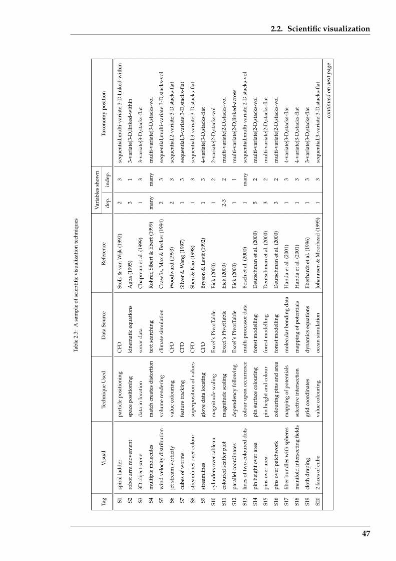
2.2. Scientific visualization
Tabl
e2.
3:A
sam
ple
ofsc
ient
ific
visu
aliz
atio
nte
chni
ques
Var
iabl
essh
own
Tag
Vis
ual
Tech
niqu
eU
sed
Dat
aSo
urce
Ref
eren
cede
p.in
dep.
Taxo
nom
ypo
siti
on
S1sp
iral
ladd
erpa
rtic
lepo
siti
onin
gC
FDSt
olk
&va
nW
ijk(1
992)
23
sequ
enti
al,m
ulti
-var
iate|3
-D,li
nked
-wit
hin
S2ro
bota
rmm
ovem
ent
spac
epo
siti
onin
gki
nem
atic
equa
tion
sA
gba
(199
5)3
13-
vari
ate|
3-D
,link
ed-w
ithi
n
S33D
obje
ctsc
ene
data
inlo
cati
onso
nar
data
Cha
pman
etal
.(19
99)
13
3-va
riat
e|3-
D,s
tack
s-fla
t
S4m
ulti
ple
mol
ecul
esm
atch
crea
tes
dist
orti
onte
xtse
arch
ing
Roh
rer,
Sibe
rt&
Eber
t(19
99)
man
ym
any
mul
ti-v
aria
te|3
-D,s
tack
s-vo
l
S5w
ind
velo
city
dist
ribu
tion
volu
me
rend
erin
gcl
imat
esi
mul
atio
nC
raw
fis,M
ax&
Beck
er(1
994)
23
sequ
enti
al,m
ulti
-var
iate|3
-D,s
tack
s-vo
l
S6je
tstr
eam
vort
icit
yva
lue
colo
urin
gC
FDW
oodw
ard
(199
3)2
3se
quen
tial
,2-v
aria
te|3
-D,s
tack
s-fla
t
S7cu
bes
ofw
orm
sfe
atur
etr
acki
ngC
FDSi
lver
&W
ang
(199
7)1
3se
quen
tial
,3-v
aria
te|3
-D,s
tack
s-fla
t
S8st
ream
lines
over
colo
ursu
perp
osit
ion
ofva
lues
CFD
Shen
&K
ao(1
998)
13
sequ
enti
al,3
-var
iate|3
-D,s
tack
s-fla
t
S9st
ream
lines
glov
eda
talo
cati
ngC
FDBr
yson
&Le
vit(
1992
)1
34-
vari
ate|
3-D
,sta
cks-
flat
S10
cylin
ders
over
tabl
eau
mag
nitu
desc
alin
gEx
cel’s
Pivo
tTab
leEi
ck(2
000)
12
2-va
riat
e|2-
D,s
tack
s-vo
l
S11
colo
ured
scat
ter
plot
mag
nitu
desc
alin
gEx
cel’s
Pivo
tTab
leEi
ck(2
000)
2-3
2m
ulti
-var
iate|2
-D,s
tack
s-vo
l
S12
para
llelc
oord
inat
esde
pend
ency
follo
win
gEx
cel’s
Pivo
tTab
leEi
ck(2
000)
11
mul
ti-v
aria
te|2
-D,li
nked
-acr
oss
S13
lines
oftw
o-co
lour
eddo
tsco
lour
upon
occu
rren
cem
ulti
-pro
cess
orda
taBo
sch
etal
.(20
00)
1m
any
sequ
enti
al,m
ulti
-var
iate|2
-D,s
tack
s-vo
l
S14
pin
heig
htov
erar
eapi
nsu
rfac
eco
lour
ing
fore
stm
odel
ling
Deu
tsch
man
etal
.(20
00)
52
mul
ti-v
aria
te|2
-D,s
tack
s-vo
l
S15
pins
over
area
pin
heig
htan
dco
lour
fore
stm
odel
ling
Deu
tsch
man
etal
.(20
00)
32
mul
ti-v
aria
te|2
-D,s
tack
s-fla
t
S16
pins
over
patc
hwor
kco
lour
ing
pins
and
area
fore
stm
odel
ling
Deu
tsch
man
etal
.(20
00)
32
mul
ti-v
aria
te|2
-D,s
tack
s-vo
l
S17
fiber
bund
les
wit
hsp
here
sm
appi
ngof
pote
ntia
lsm
olec
ular
bond
ing
data
Han
daet
al.(
2001
)1
34-
vari
ate|
3-D
,sta
cks-
flat
S18
man
ifol
din
ters
ecti
ngfie
lds
sele
ctiv
ein
ters
ecti
onm
appi
ngof
pote
ntia
lsH
anda
etal
.(20
01)
13
4-va
riat
e|3-
D,s
tack
s-fla
t
S19
clot
hdr
apin
ggr
idco
ordi
nate
sdy
nam
ics
equa
tion
sEb
erha
rdte
tal.
(199
6)1
33-
vari
ate|
3-D
,sta
cks-
flat
S20
2fa
ces
ofcu
beva
lue
colo
urin
goc
ean
sim
ulat
ion
Joha
nnse
n&
Moo
rhea
d(1
995)
13
sequ
enti
al,3
-var
iate|3
-D,s
tack
s-fla
t
cont
inue
don
next
page
47
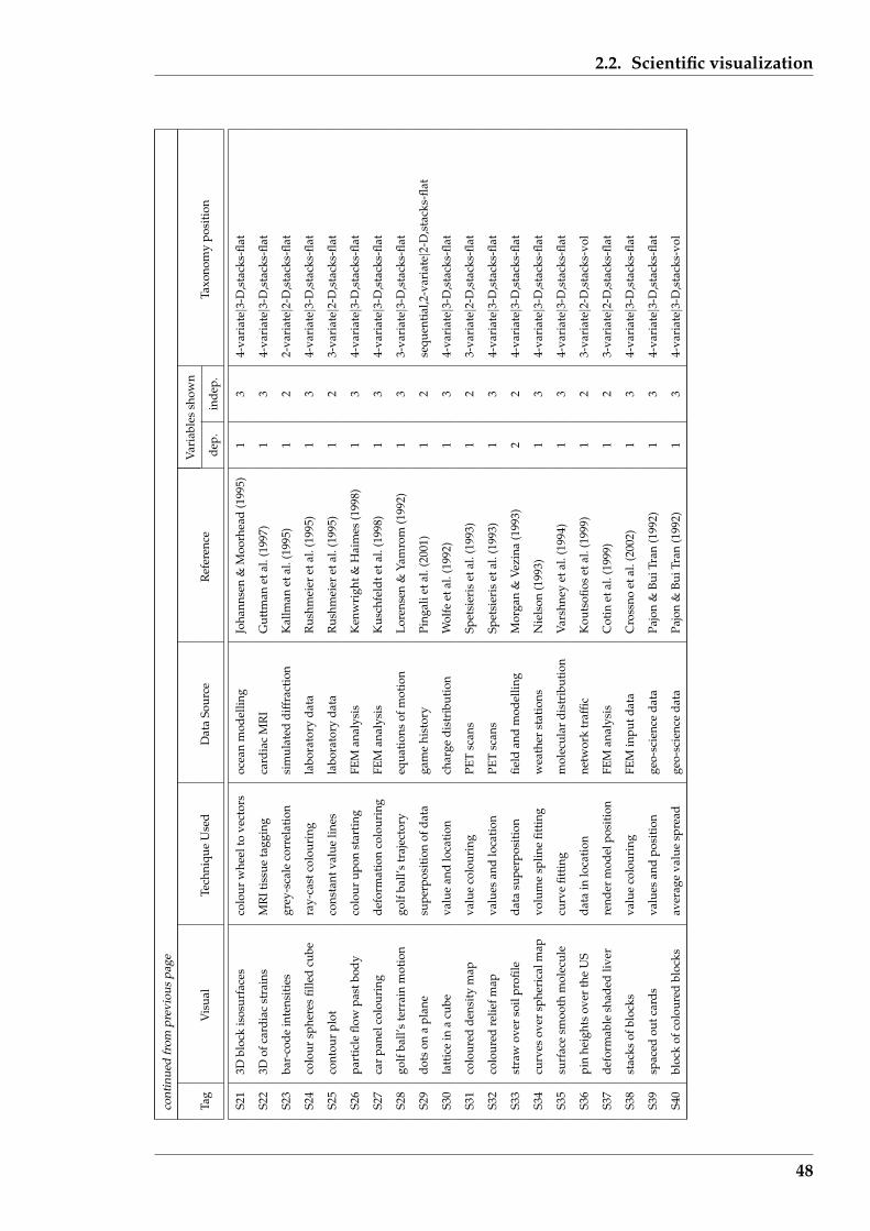
2.2. Scientific visualization
cont
inue
dfr
ompr
evio
uspa
ge
Var
iabl
essh
own
Tag
Vis
ual
Tech
niqu
eU
sed
Dat
aSo
urce
Ref
eren
cede
p.in
dep.
Taxo
nom
ypo
siti
on
S21
3Dbl
ock
isos
urfa
ces
colo
urw
heel
tove
ctor
soc
ean
mod
ellin
gJo
hann
sen
&M
oorh
ead
(199
5)1
34-
vari
ate|
3-D
,sta
cks-
flat
S22
3Dof
card
iac
stra
ins
MR
Itis
sue
tagg
ing
card
iac
MR
IG
uttm
anet
al.(
1997
)1
34-
vari
ate|
3-D
,sta
cks-
flat
S23
bar-
code
inte
nsit
ies
grey
-sca
leco
rrel
atio
nsi
mul
ated
diff
ract
ion
Kal
lman
etal
.(19
95)
12
2-va
riat
e|2-
D,s
tack
s-fla
t
S24
colo
ursp
here
sfil
led
cube
ray-
cast
colo
urin
gla
bora
tory
data
Rus
hmei
eret
al.(
1995
)1
34-
vari
ate|
3-D
,sta
cks-
flat
S25
cont
our
plot
cons
tant
valu
elin
esla
bora
tory
data
Rus
hmei
eret
al.(
1995
)1
23-
vari
ate|
2-D
,sta
cks-
flat
S26
part
icle
flow
past
body
colo
urup
onst
arti
ngFE
Man
alys
isK
enw
righ
t&H
aim
es(1
998)
13
4-va
riat
e|3-
D,s
tack
s-fla
t
S27
car
pane
lcol
ouri
ngde
form
atio
nco
lour
ing
FEM
anal
ysis
Kus
chfe
ldte
tal.
(199
8)1
34-
vari
ate|
3-D
,sta
cks-
flat
S28
golf
ball’
ste
rrai
nm
otio
ngo
lfba
ll’s
traj
ecto
ryeq
uati
ons
ofm
otio
nLo
rens
en&
Yam
rom
(199
2)1
33-
vari
ate|
3-D
,sta
cks-
flat
S29
dots
ona
plan
esu
perp
osit
ion
ofda
taga
me
hist
ory
Ping
alie
tal.
(200
1)1
2se
quen
tial
,2-v
aria
te|2
-D,s
tack
s-fla
t
S30
latt
ice
ina
cube
valu
ean
dlo
cati
onch
arge
dist
ribu
tion
Wol
feet
al.(
1992
)1
34-
vari
ate|
3-D
,sta
cks-
flat
S31
colo
ured
dens
ity
map
valu
eco
lour
ing
PET
scan
sSp
etsi
eris
etal
.(19
93)
12
3-va
riat
e|2-
D,s
tack
s-fla
t
S32
colo
ured
relie
fmap
valu
esan
dlo
cati
onPE
Tsc
ans
Spet
sier
iset
al.(
1993
)1
34-
vari
ate|
3-D
,sta
cks-
flat
S33
stra
wov
erso
ilpr
ofile
data
supe
rpos
itio
nfie
ldan
dm
odel
ling
Mor
gan
&Ve
zina
(199
3)2
24-
vari
ate|
3-D
,sta
cks-
flat
S34
curv
esov
ersp
heri
calm
apvo
lum
esp
line
fitti
ngw
eath
erst
atio
nsN
iels
on(1
993)
13
4-va
riat
e|3-
D,s
tack
s-fla
t
S35
surf
ace
smoo
thm
olec
ule
curv
efit
ting
mol
ecul
ardi
stri
buti
onV
arsh
ney
etal
.(19
94)
13
4-va
riat
e|3-
D,s
tack
s-fla
t
S36
pin
heig
hts
over
the
US
data
inlo
cati
onne
twor
ktr
affic
Kou
tsofi
oset
al.(
1999
)1
23-
vari
ate|
2-D
,sta
cks-
vol
S37
defo
rmab
lesh
aded
liver
rend
erm
odel
posi
tion
FEM
anal
ysis
Cot
inet
al.(
1999
)1
23-
vari
ate|
2-D
,sta
cks-
flat
S38
stac
ksof
bloc
ksva
lue
colo
urin
gFE
Min
putd
ata
Cro
ssno
etal
.(20
02)
13
4-va
riat
e|3-
D,s
tack
s-fla
t
S39
spac
edou
tcar
dsva
lues
and
posi
tion
geo-
scie
nce
data
Pajo
n&
BuiT
ran
(199
2)1
34-
vari
ate|
3-D
,sta
cks-
flat
S40
bloc
kof
colo
ured
bloc
ksav
erag
eva
lue
spre
adge
o-sc
ienc
eda
taPa
jon
&Bu
iTra
n(1
992)
13
4-va
riat
e|3-
D,s
tack
s-vo
l
48

2.2. Scientific visualization
• in the table the term “pin heights” is used as it appears to better describe what
Koutsofios et al. (1999) refer to as “Cityscape”.
Table 2.4 shows the distribution of the sample of scientific visualizations sum-
marised in Table 2.3 across the proposed Information Visualization taxonomy (in-
troduced as Table 2.2). From this, 15 of the 40 examples (37.5%) are classified as
4-variate data type and a 3-dimensional, stacks-flat visualization type, 12 examples
(30.0%) are of visualization type 2-dimensional, stacks (flat and vol combined), 25 ex-
amples (62.5%) are of visualization type 3-dimensional, stacks (flat and vol combined),
while 8 examples (20.0%) have a sequential data type. With 8 examples being of a se-
quential data type, the majority of the examples (80%) considered the visualization of
non-sequential data. There were no examples of a 1-dimensional visualization type.
Table 2.4: Distribution in proposed taxonomy of sample scientific visualizations
Visualization Type Used
1-dimensional 2-dimensional 3-dimensionalData Type stacks linked stacks linked stacks linked
being visualized flat vol across flat vol within across flat vol within across both1-variate2-variate 1 13-variate 3 1 3 14-variate 15 1multi-variate 1 3 1 1hierarchicalnetwork1-variate2-variate 1 13-variate 34-variatemulti-variate 1 1 1hierarchicalse
quen
tial
non-
sequ
enti
al
network
The 13 (32.5%) and 27 (67.5%) proportion of the examples occurring in the ‘2-
dimensional’ and ‘3-dimensional’ visualization type categories of this sample respec-
tively, is consistent with the corresponding proportions suggested by Keller & Keller
(1993) which have been discussed above. Although this sample and that by Keller &
Keller (1993) was not chosen at random, these visualizations might be taken as repre-
49
2.3. Information visualization
sentative of scientific visualizations. If this is the case, then the distribution shown in
Table 2.4 represents (approximately) the data and type of visualizations that appear in
scientific studies.
Table 2.4 indicates that scientific visualizations show simultaneously occurring val-
ues within the Bertin (1999) three variable limit by a ‘stack’ of some form, e.g. of colour.
Relationships between the variables within the data are (generally) not included ex-
plicitly in the visualization.
2.3 Information visualization
It is a mistake to believe that computers can only handle numerical information. Al-
though all data are formed in computers as numbers, such numbers can be interpreted
and manipulated to show relationships that transcend those primary values. By con-
sidering the values of variables, relationships of higher order can be deduced between
the variables being represented by the values. Relationships more complex than co-
existent (simultaneous occurrence) which commonly occurs in scientific data can be
traced. For example, consider the sequential data shown on page 27 of Tufte (1990)
(reproduced here as Figure 2.3) which indicates a timed sequence, in this case of dance
steps. Each position of the feet are represented as a coordinate in a two dimensional
plane. The sequence of feet placement would form a list of pairs of numbers. How-
ever, if those coordinates are displayed with connecting lines indicating the sequence
in which those coordinates are traversed, then a network structure is assumed by those
points and this is easier to understand. Using the taxonomy of Table 2.2, the visual-
ization of the numerical sequence for the dance steps shown by Tufte (1990) would be
[2-dimensional, network structure].
An alternative visualization of the above mentioned dance step examples could
be a time sequence of foot placement coordinates, analogous to Figure 2.1 which is
50

2.3. Information visualization
from page 66 of Keller & Keller (1993). In that example, the time evolution of density
and temperature of stellar plasma is shown with density and temperature used as
coordinates of the visualization. Such a scientific visualization, because of the looping
nature of the sequence involved, could be more difficult to follow than the network
structure offered in visualizing the data as if it were information, and not numbers.
Envisaging data as information offers a richer opportunity “to escape the flatlands”
(as it is described on page 12 of Tufte (1990)), than has been achieved with scientific
visualization.
Figure 2.3: Visualization of dance steps after Tufte(1990)
Success in information visualization is more difficult to achieve than with scien-
tific visualization. Information visualization requires consideration beyond the data.
51

2.3. Information visualization
The data of a scientific visualization could suggest the pattern existing between the
variables that are then depicted visually. In fact searching for such a pattern is one of
the purposes for visualizing that data. But in information visualization, relationships
within the data are shown explicitly. It is argued that this aspect separates informa-
tion visualization from scientific visualization. Obtaining such interconnections can
be difficult and are not always suggested by the data.
For these information visualizations, the relationship is revealed by the perception
of the visualization and cognitive processing by the viewer. A visualization is more
successful if it facilitates this meaning generation process effectively.
2.3.1 Specific examples
Information visualization is taken as ‘explanation’ visualization: that which shows re-
lationships explicitly. Such visualizations, as shown in the examples of Tufte (1990),
have a long history. However, their generation via computer has not been as numer-
ous as in scientific visualization. Consequently 35 examples are presented in Table 2.5
(compared with 40 in Table 2.3 for scientific visualizations). Also, some examples
given in Table 2.5 might be argued to be scientific visualizations as opposed to visu-
alizing information. This difficulty arises when relationships between numerical (and
thus scientific orientated) data are shown explicitly and thus taken as information
visualization in contrast to having those relationships deduced from the data visual-
ization.
In compiling Table 2.5 specific example types have been used, avoiding survey ar-
ticles such as that by Herman, Melancon & Marshall (2000) which covers multiples of
such types. Even so, many articles include more than one type (but not as many as
a survey). In those situations, the type which is described in some detail in the refer-
enced article, is selected for inclusion in the table. This approach resulted in a good
cross section of examples of information visualization which can act as a ‘reference
52
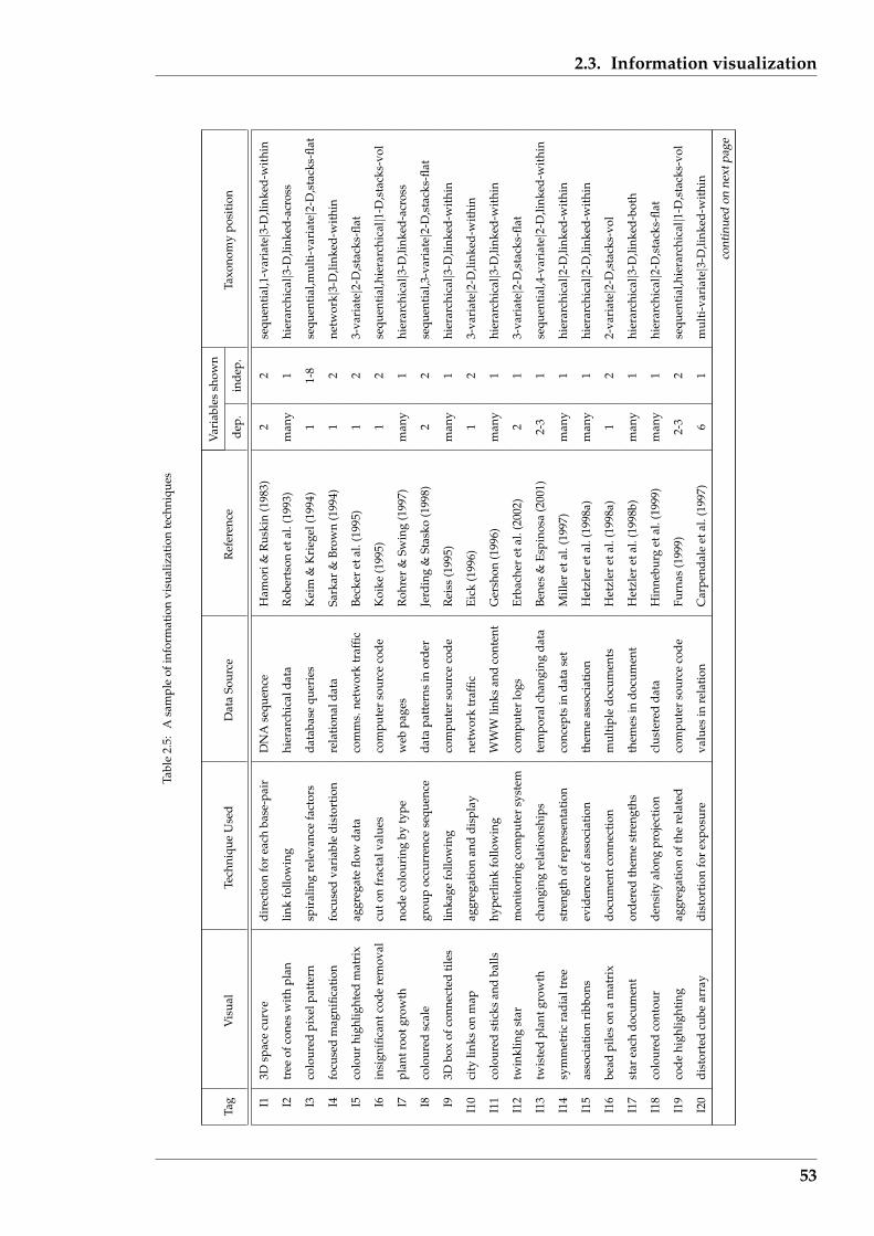
2.3. Information visualization
Tabl
e2.
5:A
sam
ple
ofin
form
atio
nvi
sual
izat
ion
tech
niqu
es
Var
iabl
essh
own
Tag
Vis
ual
Tech
niqu
eU
sed
Dat
aSo
urce
Ref
eren
cede
p.in
dep.
Taxo
nom
ypo
siti
on
I13D
spac
ecu
rve
dire
ctio
nfo
rea
chba
se-p
air
DN
Ase
quen
ceH
amor
i&R
uski
n(1
983)
22
sequ
enti
al,1
-var
iate|3
-D,li
nked
-wit
hin
I2tr
eeof
cone
sw
ith
plan
link
follo
win
ghi
erar
chic
alda
taR
ober
tson
etal
.(19
93)
man
y1
hier
arch
ical|3
-D,li
nked
-acr
oss
I3co
lour
edpi
xelp
atte
rnsp
iral
ing
rele
vanc
efa
ctor
sda
taba
sequ
erie
sK
eim
&K
rieg
el(1
994)
11-
8se
quen
tial
,mul
ti-v
aria
te|2
-D,s
tack
s-fla
t
I4fo
cuse
dm
agni
ficat
ion
focu
sed
vari
able
dist
orti
onre
lati
onal
data
Sark
ar&
Brow
n(1
994)
12
netw
ork|
3-D
,link
ed-w
ithi
n
I5co
lour
high
light
edm
atri
xag
greg
ate
flow
data
com
ms.
netw
ork
traf
ficBe
cker
etal
.(19
95)
12
3-va
riat
e|2-
D,s
tack
s-fla
t
I6in
sign
ifica
ntco
dere
mov
alcu
ton
frac
talv
alue
sco
mpu
ter
sour
ceco
deK
oike
(199
5)1
2se
quen
tial
,hie
rarc
hica
l|1-D
,sta
cks-
vol
I7pl
antr
ootg
row
thno
deco
lour
ing
byty
pew
ebpa
ges
Roh
rer
&Sw
ing
(199
7)m
any
1hi
erar
chic
al|3
-D,li
nked
-acr
oss
I8co
lour
edsc
ale
grou
poc
curr
ence
sequ
ence
data
patt
erns
inor
der
Jerd
ing
&St
asko
(199
8)2
2se
quen
tial
,3-v
aria
te|2
-D,s
tack
s-fla
t
I93D
box
ofco
nnec
ted
tile
slin
kage
follo
win
gco
mpu
ter
sour
ceco
deR
eiss
(199
5)m
any
1hi
erar
chic
al|3
-D,li
nked
-wit
hin
I10
city
links
onm
apag
greg
atio
nan
ddi
spla
yne
twor
ktr
affic
Eick
(199
6)1
23-
vari
ate|
2-D
,link
ed-w
ithi
n
I11
colo
ured
stic
ksan
dba
llshy
perl
ink
follo
win
gW
WW
links
and
cont
ent
Ger
shon
(199
6)m
any
1hi
erar
chic
al|3
-D,li
nked
-wit
hin
I12
twin
klin
gst
arm
onit
orin
gco
mpu
ter
syst
emco
mpu
ter
logs
Erba
cher
etal
.(20
02)
21
3-va
riat
e|2-
D,s
tack
s-fla
t
I13
twis
ted
plan
tgro
wth
chan
ging
rela
tion
ship
ste
mpo
ralc
hang
ing
data
Bene
s&
Espi
nosa
(200
1)2-
31
sequ
enti
al,4
-var
iate|2
-D,li
nked
-wit
hin
I14
sym
met
ric
radi
altr
eest
reng
thof
repr
esen
tati
onco
ncep
tsin
data
set
Mill
eret
al.(
1997
)m
any
1hi
erar
chic
al|2
-D,li
nked
-wit
hin
I15
asso
ciat
ion
ribb
ons
evid
ence
ofas
soci
atio
nth
eme
asso
ciat
ion
Het
zler
etal
.(19
98a)
man
y1
hier
arch
ical|2
-D,li
nked
-wit
hin
I16
bead
pile
son
am
atri
xdo
cum
entc
onne
ctio
nm
ulti
ple
docu
men
tsH
etzl
eret
al.(
1998
a)1
22-
vari
ate|
2-D
,sta
cks-
vol
I17
star
each
docu
men
tor
dere
dth
eme
stre
ngth
sth
emes
indo
cum
ent
Het
zler
etal
.(19
98b)
man
y1
hier
arch
ical|3
-D,li
nked
-bot
h
I18
colo
ured
cont
our
dens
ity
alon
gpr
ojec
tion
clus
tere
dda
taH
inne
burg
etal
.(19
99)
man
y1
hier
arch
ical|2
-D,s
tack
s-fla
t
I19
code
high
light
ing
aggr
egat
ion
ofth
ere
late
dco
mpu
ter
sour
ceco
deFu
rnas
(199
9)2-
32
sequ
enti
al,h
iera
rchi
cal|1
-D,s
tack
s-vo
l
I20
dist
orte
dcu
bear
ray
dist
orti
onfo
rex
posu
reva
lues
inre
lati
onC
arpe
ndal
eet
al.(
1997
)6
1m
ulti
-var
iate|3
-D,li
nked
-wit
hin
cont
inue
don
next
page
53
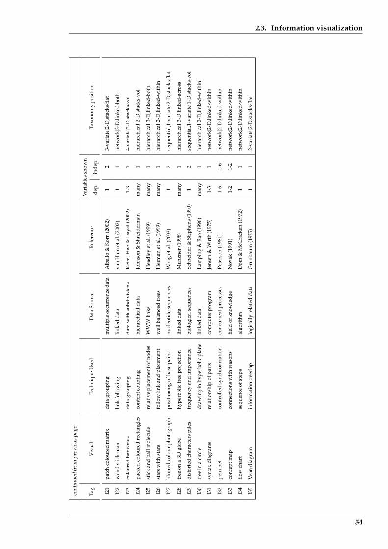
2.3. Information visualization
cont
inue
dfr
ompr
evio
uspa
ge
Var
iabl
essh
own
Tag
Vis
ual
Tech
niqu
eU
sed
Dat
aSo
urce
Ref
eren
cede
p.in
dep.
Taxo
nom
ypo
siti
on
I21
patc
hco
lour
edm
atri
xda
tagr
oupi
ngm
ulti
ple
occu
rren
ceda
taA
lbel
lo&
Kor
n(2
002)
12
3-va
riat
e|2-
D,s
tack
s-fla
t
I22
wei
rdst
ick
man
link
follo
win
glin
ked
data
van
Ham
etal
.(20
02)
11
netw
ork|
3-D
,link
ed-b
oth
I23
colo
ured
bar
code
sda
tagr
oupi
ngda
taw
ith
subd
ivis
ions
Kei
m,H
ao&
Day
al(2
002)
1-3
14-
vari
ate|
2-D
,sta
cks-
vol
I24
pack
edco
lour
edre
ctan
gles
cont
entc
ount
ing
hier
arch
ical
data
John
son
&Sh
neid
erm
anm
any
1hi
erar
chic
al|2
-D,s
tack
s-vo
l
I25
stic
kan
dba
llm
olec
ule
rela
tive
plac
emen
tofn
odes
WW
Wlin
ksH
endl
eyet
al.(
1999
)m
any
1hi
erar
chic
al|3
-D,li
nked
-bot
h
I26
star
sw
ith
star
sfo
llow
link
and
plac
emen
tw
ellb
alan
ced
tree
sH
erm
anet
al.(
1999
)m
any
1hi
erar
chic
al|2
-D,li
nked
-wit
hin
I27
blur
red
colo
urph
otog
raph
posi
tion
ing
ofba
se-p
airs
nucl
eoti
dese
quen
ces
Won
get
al.(
2003
)1
2se
quen
tial
,1-v
aria
te|2
-D,s
tack
s-fla
t
I28
tree
ona
3Dgl
obe
hype
rbol
ictr
eepr
ojec
tion
linke
dda
taM
unzn
er(1
998)
man
y1
hier
arch
ical|3
-D,li
nked
-acr
oss
I29
dist
orte
dch
arac
ters
pile
sfr
eque
ncy
and
impo
rtan
cebi
olog
ical
sequ
ence
sSc
hnei
der
&St
ephe
ns(1
990)
12
sequ
enti
al,1
-var
iate|1
-D,s
tack
s-vo
l
I30
tree
ina
circ
ledr
awin
gin
hype
rbol
icpl
ane
linke
dda
taLa
mpi
ng&
Rao
(199
6)m
any
1hi
erar
chic
al|2
-D,li
nked
-wit
hin
I31
synt
axdi
agra
ms
rela
tion
ship
ofpa
rts
com
pute
rpr
ogra
mJe
nsen
&W
irth
(197
5)1-
31
netw
ork|
2-D
,link
ed-w
ithi
n
I32
petr
inet
cont
rolle
dsy
nchr
oniz
atio
nco
ncur
rent
proc
esse
sPe
ters
on(1
981)
1-6
1-6
netw
ork|
2-D
,link
ed-w
ithi
n
I33
conc
eptm
apco
nnec
tion
sw
ith
reas
ons
field
ofkn
owle
dge
Nov
ak(1
991)
1-2
1-2
netw
ork|
2-D
,link
ed-w
ithi
n
I34
flow
char
tse
quen
ceof
step
sal
gori
thm
Dor
n&
McC
rack
en(1
972)
11
netw
ork|
2-D
,link
ed-w
ithi
n
I35
Venn
diag
ram
info
rmat
ion
over
lap
logi
cally
rela
ted
data
Gru
nbau
m(1
975)
11
2-va
riat
e|2-
D,s
tack
s-fla
t
54
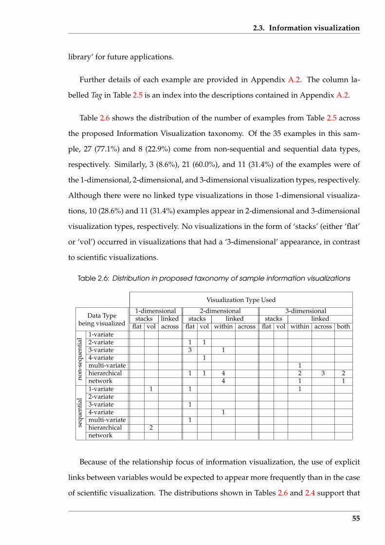
2.3. Information visualization
library’ for future applications.
Further details of each example are provided in Appendix A.2. The column la-
belled Tag in Table 2.5 is an index into the descriptions contained in Appendix A.2.
Table 2.6 shows the distribution of the number of examples from Table 2.5 across
the proposed Information Visualization taxonomy. Of the 35 examples in this sam-
ple, 27 (77.1%) and 8 (22.9%) come from non-sequential and sequential data types,
respectively. Similarly, 3 (8.6%), 21 (60.0%), and 11 (31.4%) of the examples were of
the 1-dimensional, 2-dimensional, and 3-dimensional visualization types, respectively.
Although there were no linked type visualizations in those 1-dimensional visualiza-
tions, 10 (28.6%) and 11 (31.4%) examples appear in 2-dimensional and 3-dimensional
visualization types, respectively. No visualizations in the form of ‘stacks’ (either ‘flat’
or ‘vol’) occurred in visualizations that had a ‘3-dimensional’ appearance, in contrast
to scientific visualizations.
Table 2.6: Distribution in proposed taxonomy of sample information visualizations
Visualization Type Used
1-dimensional 2-dimensional 3-dimensionalData Type stacks linked stacks linked stacks linked
being visualized flat vol across flat vol within across flat vol within across both1-variate2-variate 1 13-variate 3 14-variate 1multi-variate 1hierarchical 1 1 4 2 3 2network 4 1 11-variate 1 1 12-variate3-variate 14-variate 1multi-variate 1hierarchical 2se
quen
tial
non-
sequ
enti
al
network
Because of the relationship focus of information visualization, the use of explicit
links between variables would be expected to appear more frequently than in the case
of scientific visualization. The distributions shown in Tables 2.6 and 2.4 support that
55
2.4. Visualization of high dimensions
expectation. However, in both information and scientific visualization cases, the ‘2-
dimensional stacks’ classification (both ‘flat’ and ‘vol’ types) were occupied, possibly
indicating that type of visualization is broader in application than to visualization of
specific relationship types.
2.4 Visualization of high dimensions
Analysis of text needs consideration of many variables as will be shown later in this
thesis. Each of those variables is a dimension of the problem. Whether data be sci-
entific (numeric) or of a relational type, the visualization of more than three variables
simultaneously represents a problem. Yet simultaneous viewing of greater than three
dimensions is necessary to enable exploration of the interplay between such dimen-
sions. Consideration of visualization techniques available for dimensions higher than
three is thus the next step beyond consideration of scientific and information visual-
ization.
In Sections 2.2 (page 41) and 2.3 (page 50) (with their specific examples) the visu-
alizations were of relationship types known to exist in the data. The manner in which
the dependent variables related to the independent variables was known. The situa-
tion of interest in this section is where the dependent and independent variables are
known (in general) but the relationship between them is unclear. From the visualiza-
tion of that data, insight into such relationships is sought. Numerical and information
type data are considered. Sometimes a technique considered applied to one such type
of data, and in other cases the technique is data type specific. Visualization of data to
deduce its structure is the purpose of this research. Although the specific source of the
data for this research is text, numeric and information data are also examined, thus
placing those techniques into a broader data source context is helpful.
56
2.4. Visualization of high dimensions
2.4.1 Specific examples
The examples in Table 2.7 deal with the visualization of dimensions (independent vari-
ables) greater than three, in contrast to those in Sections 2.2, and 2.5. Table 2.5 which
also references information visualization, contains two citations to visualizations with
the capacity to exceed such a limit. However, those examples fell more naturally into
that categorisation although they are equally applicable here.
Table 2.7 summarizes a selection of visualizations from the literature as belonging
to this visualization category. There are only 15 examples here, which reflects the over-
lap with other categories. Further details of each visualization example is contained in
Appendix A.3. The entries in Table 2.7 under the Tag heading is an index for locating
the corresponding description in Appendix A.3.
Table 2.8 shows the numeric distribution of the 15 examples of Table 2.7 across
the proposed visualization taxonomy. Of these, 11 (73.3%) are classified as consid-
ering non-sequential data types while 4 (26.7%) consider sequential data. Of the vi-
sualization types used, 3 (20.0%) are ‘1-dimensional’ presentations, 10 (66.7%) are 2-
dimensional, and 2 (13.3%) are ‘3-dimensional’. Only 2 (13.3%) of the visualizations
showed explicit relationship links between elements of the data in contrast to the re-
maining 13 (86.7%) which visualized numerical data. Multi-variate data, which is one
of seven data types present in this sample of examples, contains 8 (53.3%) of those
examples.
Although the number of examples in Table 2.7 is small and thus limits generali-
sation, two thirds of them are categorised as ‘2-dimensional stacks’. This category is
also well represented in the scientific and information visualizations of Tables 2.3 and
2.5, respectively, indicating the wide use of visualizations of that type. Conversely, the
low representation of examples in the ‘link’ categories suggests that visualization of
high dimensions has mainly occurred in consideration of scientific data more so than
information data.
57

2.4. Visualization of high dimensions
Tabl
e2.
7:A
sam
ple
ofte
chni
ques
for
visu
aliz
ing
high
dim
ensi
ons
Var
iabl
essh
own
Tag
Vis
ual
Tech
niqu
eU
sed
Dat
aSo
urce
Ref
eren
cede
p.in
dep.
Taxo
nom
ypo
siti
on
H1
curv
esfr
om−
πto
πtr
igon
omet
ric
func
tion
plot
n-di
men
sion
alva
lues
And
rew
s(1
972)
1<
10
sequ
enti
al,m
ulti
-var
iate|2
-D,s
tack
s-fla
t
H2
colle
ctio
nof
face
sa
face
for
ada
tava
lue
n-di
men
sion
alva
lues
Che
rnof
f(19
73)
1<
18
mul
ti-v
aria
te|2
-D,s
tack
s-vo
l
H3
rect
angl
esin
rect
angl
essu
bsys
tem
san
dth
eir
part
sco
mpu
ter
sour
ceco
deBa
ker
&Ei
ck(1
995)
man
y1
2-va
riat
e|1-
D,s
tack
s-vo
l
H4
lines
ofsh
ape
sym
bols
base
repr
esen
tati
onD
NA
sequ
ence
Nin
io&
Miz
raji
(199
5)2
2se
quen
tial
,1-v
aria
te|1
-D,s
tack
s-fla
t
H5
stre
ams
ofco
lour
them
eev
olut
ion
them
esin
docu
men
tsH
avre
etal
.(19
99)
22
sequ
enti
al,m
ulti
-var
iate|1
-D,s
tack
s-vo
l
H6
mul
ti-f
ram
esc
atte
rplo
tsin
tera
ctiv
eda
tabr
ushi
ngn-
dim
ensi
onal
valu
esBe
cker
&C
leve
land
(198
7)m
any
man
ym
ulti
-var
iate|2
-D,s
tack
s-fla
t
H7
clus
ter
ofpo
ints
proj
ecti
ngda
taon
plan
esn-
dim
ensi
onal
valu
esFr
iedm
an&
Tuke
y(1
974)
14-
10m
ulti
-var
iate|2
-D,s
tack
s-fla
t
H8
char
acte
rsw
ith
enci
rcle
men
tsgr
oup
iden
tific
atio
nam
ino
acid
sin
prot
eins
Gab
oria
udet
al.(
1987
)2
3se
quen
tial
,3-v
aria
te|2
-D,s
tack
s-fla
t
H9
sequ
ence
of2D
scat
terp
lots
2D-f
ram
ege
nera
tion
n-di
men
sion
alva
lues
Asi
mov
(198
5)m
any
man
ym
ulti
-var
iate|2
-D,s
tack
s-fla
t
H10
lines
wit
hin
tria
ngle
sse
ttin
gsfo
rda
tabr
ushi
ngre
lati
onal
data
Fua
etal
.(20
00)
4m
any
hier
arch
ical|2
-D,s
tack
s-vo
l
H11
lines
betw
een
para
llela
xes
coor
dina
tem
appi
ngn-
dim
ensi
onal
valu
esIn
selb
erg
(198
5)1
4-20
mul
ti-v
aria
te|2
-D,li
nked
-acr
oss
H12
surf
aces
inm
ulti
ple
3Dax
esfr
ames
insi
defr
ames
n-di
men
sion
alva
lues
Fein
er&
Besh
ers
(199
0)m
any
man
ym
ulti
-var
iate|3
-D,li
nked
-wit
hin
H13
farm
land
from
the
air
inpu
tsig
nalt
unin
gun
know
nre
lati
onsh
ipK
ohon
en(1
990)
21
3-va
riat
e|2-
D,s
tack
s-fla
t
H14
tabu
lati
onof
grap
hsda
tace
llse
lect
ion
spre
adsh
eett
ype
data
Rao
&C
ard
(199
9)m
any
man
ym
ulti
-var
iate|2
-D,s
tack
s-vo
l
H15
sect
ion
poin
tsin
clou
dse
ctio
nth
enpr
ojec
tion
n-di
men
sion
alva
lues
Furn
as&
Buja
(199
4)1
4-10
mul
ti-v
aria
te|3
-D,s
tack
s-fla
t
58
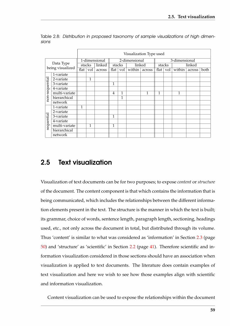
2.5. Text visualization
Table 2.8: Distribution in proposed taxonomy of sample visualizations of high dimen-sions
Visualization Type used
1-dimensional 2-dimensional 3-dimensionalData Type stacks linked stacks linked stacks linked
being visualized flat vol across flat vol within across flat vol within across both1-variate2-variate 13-variate 14-variatemulti-variate 4 1 1 1 1hierarchical 1network1-variate 12-variate3-variate 14-variatemulti-variate 1 1hierarchicalse
quen
tial
non-
sequ
enti
al
network
2.5 Text visualization
Visualization of text documents can be for two purposes; to expose content or structure
of the document. The content component is that which contains the information that is
being communicated, which includes the relationships between the different informa-
tion elements present in the text. The structure is the manner in which the text is built;
its grammar, choice of words, sentence length, paragraph length, sectioning, headings
used, etc., not only across the document in total, but distributed through its volume.
Thus ‘content’ is similar to what was considered as ‘information’ in Section 2.3 (page
50) and ‘structure’ as ‘scientific’ in Section 2.2 (page 41). Therefore scientific and in-
formation visualization considered in those sections should have an association when
visualization is applied to text documents. The literature does contain examples of
text visualization and here we wish to see how those examples align with scientific
and information visualization.
Content visualization can be used to expose the relationships within the document
59
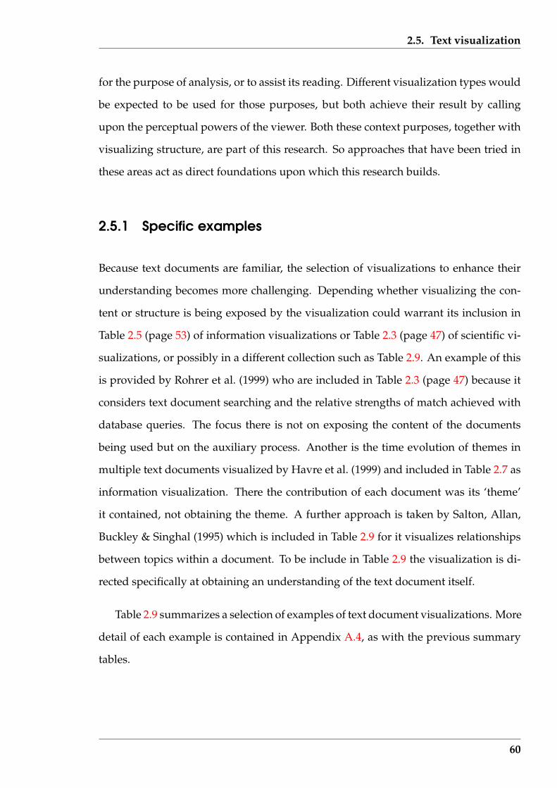
2.5. Text visualization
for the purpose of analysis, or to assist its reading. Different visualization types would
be expected to be used for those purposes, but both achieve their result by calling
upon the perceptual powers of the viewer. Both these context purposes, together with
visualizing structure, are part of this research. So approaches that have been tried in
these areas act as direct foundations upon which this research builds.
2.5.1 Specific examples
Because text documents are familiar, the selection of visualizations to enhance their
understanding becomes more challenging. Depending whether visualizing the con-
tent or structure is being exposed by the visualization could warrant its inclusion in
Table 2.5 (page 53) of information visualizations or Table 2.3 (page 47) of scientific vi-
sualizations, or possibly in a different collection such as Table 2.9. An example of this
is provided by Rohrer et al. (1999) who are included in Table 2.3 (page 47) because it
considers text document searching and the relative strengths of match achieved with
database queries. The focus there is not on exposing the content of the documents
being used but on the auxiliary process. Another is the time evolution of themes in
multiple text documents visualized by Havre et al. (1999) and included in Table 2.7 as
information visualization. There the contribution of each document was its ‘theme’
it contained, not obtaining the theme. A further approach is taken by Salton, Allan,
Buckley & Singhal (1995) which is included in Table 2.9 for it visualizes relationships
between topics within a document. To be include in Table 2.9 the visualization is di-
rected specifically at obtaining an understanding of the text document itself.
Table 2.9 summarizes a selection of examples of text document visualizations. More
detail of each example is contained in Appendix A.4, as with the previous summary
tables.
60
2.5. Text visualization
Tabl
e2.
9:A
sam
ple
ofte
xtvi
sual
izat
ion
tech
niqu
es
Var
iabl
essh
own
Tag
Vis
ual
Tech
niqu
eU
sed
Dat
aSo
urce
Ref
eren
cede
p.in
dep.
Taxo
nom
ypo
siti
on
T1pa
gew
ith
linke
dm
inia
ture
sin
form
atio
non
page
sre
late
dpa
ges
Yank
elov
ich
etal
.(19
85)
11
hier
arch
ical|2
-D,li
nked
-wit
hin
T2lin
ked
page
disp
lays
prep
arat
ion
ofhy
perl
inks
rela
ted
info
rmat
ion
Con
klin
(198
7)1
1hi
erar
chic
al|2
-D,li
nked
-wit
hin
T3co
lum
nsw
ith
colo
urba
rsfin
ding
sim
ilari
ties
orde
red
lines
ofte
xtEi
cket
al.(
1992
)1
12-
vari
ate|
1-D
,sta
cks-
vol
T4pa
intb
lobs
onsh
eet
wor
dre
lati
onfin
ding
wor
dsin
docu
men
tsG
ersh
on&
Eick
(199
5)1
23-
vari
ate|
2-D
,sta
cks-
flat
T5ci
tati
onst
rips
bibl
iogr
aphi
cde
tail
docu
men
tcol
lect
ion
Rao
etal
.(19
95)
31
hier
arch
ical|3
-D,s
tack
s-vo
l
T6ar
cof
topi
csw
ith
links
find
sim
ilari
tyan
dch
opco
llect
ion
ofdo
cum
ents
Salt
onet
al.(
1995
)2
1hi
erar
chic
al|2
-D,li
nked
-wit
hin
T7sq
uare
hous
epl
anse
lf-o
rgan
isin
gm
apw
ord
freq
uenc
ies
Lin
(199
9)2
13-
vari
ate|
2-D
,sta
cks-
flat
T8te
xtat
conv
erge
nce
geom
etri
cdi
stor
tion
docu
men
tpag
esR
ober
tson
&M
acki
nlay
(199
9)1
12-
vari
ate|
2-D
,sta
cks-
vol
T9te
rrai
nm
apof
them
esth
emes
and
asso
ciat
ions
docu
men
tcor
pus
Wis
eet
al.(
1999
)3
14-
vari
ate|
2-D
,sta
cks-
vol
T10
3Dm
apof
links
them
esan
das
soci
atio
nsdo
cum
entc
orpu
sH
etzl
eret
al.(
1998
b)1
1hi
erar
chic
al|3
-D,li
nked
-wit
hin
T11
tall
gras
sel
evat
ion
bend
ing
asva
rian
cedo
cum
entc
orpu
sR
ose
&W
ong
(200
0)m
any
1m
ulti
-var
iate|1
-D,s
tack
s-vo
l
T12
tem
pora
ltop
iclin
ksto
pic
impl
ies
anot
her
corp
usco
nten
twor
dsW
ong
etal
.(20
00)
12
sequ
enti
al,h
iera
rchi
cal|2
-D,li
nked
-wit
hin
T13
mul
ti-t
race
docu
men
tstr
ips
com
pute
dw
avel
eten
ergy
cont
ent-
bear
ing
wor
dsM
iller
etal
.(19
98)
21
sequ
enti
al,2
-var
iate|2
-D,s
tack
s-fla
t
T14
text
fade
d/hi
ghlig
hted
findi
ngim
port
antw
ords
ate
xtdo
cum
ent
Schi
litet
al.(
1999
)1
12-
vari
ate|
2-D
,sta
cks-
flat
T15
sent
ence
diag
ram
gram
mat
ical
anal
ysis
text
sent
ence
sK
olln
(198
6)1
1ne
twor
k|2-
D,li
nked
-wit
hin
61
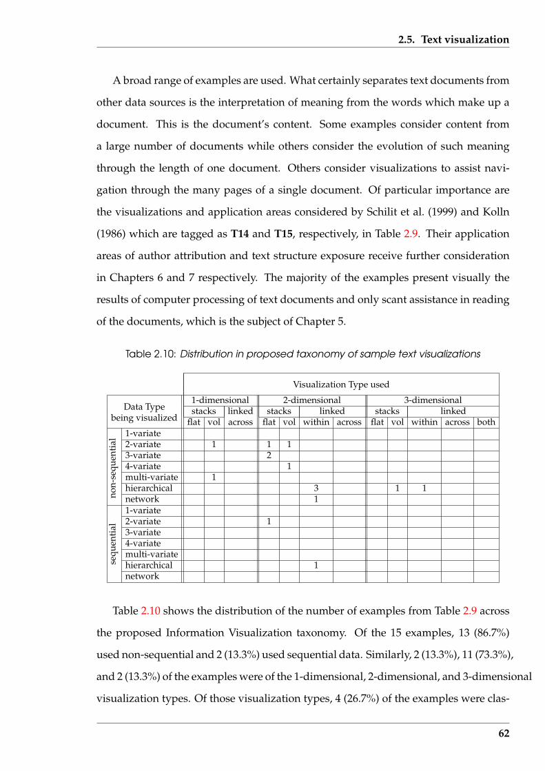
2.5. Text visualization
A broad range of examples are used. What certainly separates text documents from
other data sources is the interpretation of meaning from the words which make up a
document. This is the document’s content. Some examples consider content from
a large number of documents while others consider the evolution of such meaning
through the length of one document. Others consider visualizations to assist navi-
gation through the many pages of a single document. Of particular importance are
the visualizations and application areas considered by Schilit et al. (1999) and Kolln
(1986) which are tagged as T14 and T15, respectively, in Table 2.9. Their application
areas of author attribution and text structure exposure receive further consideration
in Chapters 6 and 7 respectively. The majority of the examples present visually the
results of computer processing of text documents and only scant assistance in reading
of the documents, which is the subject of Chapter 5.
Table 2.10: Distribution in proposed taxonomy of sample text visualizations
Visualization Type used
1-dimensional 2-dimensional 3-dimensionalData Type stacks linked stacks linked stacks linked
being visualized flat vol across flat vol within across flat vol within across both1-variate2-variate 1 1 13-variate 24-variate 1multi-variate 1hierarchical 3 1 1network 11-variate2-variate 13-variate4-variatemulti-variatehierarchical 1se
quen
tial
non-
sequ
enti
al
network
Table 2.10 shows the distribution of the number of examples from Table 2.9 across
the proposed Information Visualization taxonomy. Of the 15 examples, 13 (86.7%)
used non-sequential and 2 (13.3%) used sequential data. Similarly, 2 (13.3%), 11 (73.3%),
and 2 (13.3%) of the examples were of the 1-dimensional, 2-dimensional, and 3-dimensional
visualization types. Of those visualization types, 4 (26.7%) of the examples were clas-
62
2.6. Consolidating the visualization techniques
sified as stacks-flat, 5 (33.3%) were stacks-vol, and 6 (40.0%) were linked-within.
This small size sample of text visualizations makes generalization statements diffi-
cult. But of interest is the lack of ‘linked-across’ and ‘linked-both’ visualization types
which were not seen in the literature. This was despite such relationships being the
way that the information content of text is composed; the content of one sentence being
linked logically with others. The ‘linked-within’ category, in which the composition
of individual sentences occurs, has the representation in the sample which would be
expected. Also, words are sequential in text documents, thus a greater proportion in
the sequential data type might have been expected.
2.6 Consolidating the visualization techniques
Table 2.11 collates the literature examples summarised in Tables 2.4, 2.6, 2.8 and 2.10
by using the proposed Information Visualization taxonomy. The numerals indicate,
as a percentage of the total of 105 examples, the number of examples applying to
that entry in the table of the taxonomy. These percentages are rounded to the nearest
integer which introduces small errors, but the resulting values are adequate for the
purpose of showing the distribution of the examples.
Apparent from Table 2.11 is the non-uniform occupancy of the taxonomy by the ex-
amples examined. Those examples were taken from sources found which covered the
division of visualization chosen in this research, and in application areas which could
be related to the objectives of this research. Visualizing non-sequential data represents
82% of the examples, distributed over 28 of the 84 (= 7×12) possible categories in that
portion of the taxonomy. By comparison, the remaining sequential data portion has
16 of its 84 possible categories occupied. The stack-flat subdivisions of the visualiza-
tion types account for 2%, 26%, and 22% of the examples under the 1-dimensional,
2-dimensional, and 3-dimensional divisions, respectively. By contract, the stacks-
63
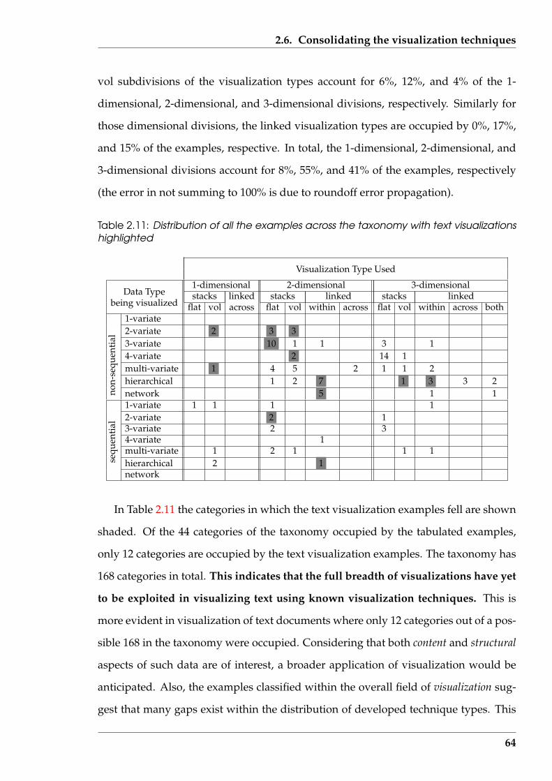
2.6. Consolidating the visualization techniques
vol subdivisions of the visualization types account for 6%, 12%, and 4% of the 1-
dimensional, 2-dimensional, and 3-dimensional divisions, respectively. Similarly for
those dimensional divisions, the linked visualization types are occupied by 0%, 17%,
and 15% of the examples, respective. In total, the 1-dimensional, 2-dimensional, and
3-dimensional divisions account for 8%, 55%, and 41% of the examples, respectively
(the error in not summing to 100% is due to roundoff error propagation).
Table 2.11: Distribution of all the examples across the taxonomy with text visualizationshighlighted
Visualization Type Used
1-dimensional 2-dimensional 3-dimensionalData Type stacks linked stacks linked stacks linked
being visualized flat vol across flat vol within across flat vol within across both1-variate2-variate 2 3 33-variate 10 1 1 3 14-variate 2 14 1multi-variate 1 4 5 2 1 1 2hierarchical 1 2 7 1 3 3 2network 5 1 11-variate 1 1 1 12-variate 2 13-variate 2 34-variate 1multi-variate 1 2 1 1 1hierarchical 2 1se
quen
tial
non-
sequ
enti
al
network
In Table 2.11 the categories in which the text visualization examples fell are shown
shaded. Of the 44 categories of the taxonomy occupied by the tabulated examples,
only 12 categories are occupied by the text visualization examples. The taxonomy has
168 categories in total. This indicates that the full breadth of visualizations have yet
to be exploited in visualizing text using known visualization techniques. This is
more evident in visualization of text documents where only 12 categories out of a pos-
sible 168 in the taxonomy were occupied. Considering that both content and structural
aspects of such data are of interest, a broader application of visualization would be
anticipated. Also, the examples classified within the overall field of visualization sug-
gest that many gaps exist within the distribution of developed technique types. This
64
2.7. Non-visual text analysis techniques
suggests that there is much space available for development.
The research presented in later Chapters describes the application of a variety of
visualization techniques to assist human in:
a. efficient and effective reading of text documents; and
b. analysis of text documents for classification, author attribution, etc.
2.7 Non-visual text analysis techniques
The availability of computers has produced increased interest in analysis of text. Par-
ticularly the computer’s ease of handling large volumes of numerical and other forms
of data has meant that a variety of techniques (particularly mathematical) have be-
come practical for use with text. Application of such techniques to real texts, not just
those limited so as to enable manual handling of the data involved, is now available.
The outcome of such techniques may be assisted by visual display of their results by
using techniques such as those reviewed in Sections 2.2 (page 41), 2.3 (page 50), and 2.4
(page 56). This contrasts to the direct visual analysis of text as reviewed in Section 2.5
(page 59). However, in each case, some level of data manipulation (informatics) is re-
quired. An appreciation of existing non-visual informatic processes which have been
applied to text is warranted.
Such text informatics are considered to have two aspects: for comparing between
texts, and for considering an individual text.
2.7.1 Comparing between texts
Burrows (1992) describes processes for characterising texts using the fifty most fre-
quently occurring words in those texts. For each text under consideration, the occur-
rence of all words in a sample of 8000 words are counted and ranked in frequency of
65
2.7. Non-visual text analysis techniques
occurrence. If personal pronouns such as I, you, he, she and the verb said rank high
in such a list, then the author proposes that the text is most likely to be a novel. An
inference to the character being discussed in the text sample might be determined by
the comparative frequency of words; for example, words such as she and her if the
character is female. To compare two texts, the statistical correlation coefficient matrix
is proposed for calculation between the ranked word frequency lists of each text and
then observing the components of the first two or three eigenvectors of that matrix. If
word frequency list characteristic of an author is established, then that list can be used
in this eigenvector method for determining whether a new text has this same author.
Determining similarity of content and language of text documents for the purpose
of document retrieval, sorting, and clustering is the aim of the “Acquaintance” tech-
nique described by Damashek (1995). It creates a numerical similarity measure using
n-gram, or number of n consecutive letter groups, that appear in a document, as a
basis for determining similarity of documents, not the words that each documents
contains. A vector containing each such n-gram, normalized by the total n-gram in
the document, then represents that document. The claim is made that documents hav-
ing similar such representing vectors deal with related subject matter. The use of this
vector is shown to cluster documents written in similar languages together. When
the documents are written in the same language, good clustering of documents on
subject matter is obtained by this technique without the need for a training process as
would be required to produce comparable results using neural network techniques.
Suen (1979) presents a comprehensible survey of the occurrence of n-gram in English
language documents.
In contrast, Craig (1999) uses statistical discriminant analysis to compare eighty
five plays against the twelve by the English Renaissance dramatist Thomas Middle-
ton. The plays used for comparison are of the same publishing period in which Mid-
dleton was writing. Multiple 2000 word segments are taken from each play. The 155
most commonly appearing words across all the plays are determined. Those words
66

2.7. Non-visual text analysis techniques
are taken as representing both the structural and idiosyncratic characteristics of each
dramatist’s writing style. A statistical discriminant analysis is performed using 110
Middleton and 775 non-Middleton such word segments. This technique identifies all
but one of the Middleton segments as being of Middleton’s authorship, but also classi-
fied eight other non-Middleton segments as also pertaining (incorrectly) to Middleton.
Such results indicate more refinement of the technique’s discrimination properties is
required.
Craig (1999) and Forsyth & Holmes (1996) both use text “markers” for comparing
texts statistically. Craig (1999) used ten marker words which appear to be associated
with the plays of Middleton in comparison to the plays of other play-wrights used in
the reported study. Of those ten words, six occur more often in Middleton’s works
while four less often. From these statistics, expected occurrences of such words can be
created for the Middleton plays and compared with the observed occurrences from a
play of unknown writer. Statistical measures can then be used to deduce authorship.
However, Forsyth & Holmes (1996) used five different markers. These markers are the
counts of each character of the alphabet present, the occurrence of the ninety-six most
common words in the document, the most common ninety-six digrams (two letter
pairs), progressive pairwise chunking of character sequence pairs in the document,
and feature finding using a Monte-Carlo technique. These markers were then applied
to a suite of ten problems (three authorship attribution, three chronology, two context
based, and two produced from randomly selected sentences from archives of sixteenth
and seventeenth century writers). For those problems, those respective markers are
reported as ranging from 69% to 79% in success of identifying authorship.
Principal Component Analysis (PCA) developed by Chatfield & Collins (1980) as
a statistical procedure is applied to text analysis by Holmes (1992), Holmes & Forsyth
(1995), and Nilo, Binongo & Smith (1999). Holmes (1992) applied PCA (plus other
techniques) to 24 biblical text samples, using the first five principal component vectors
as separators while using five measurements of the “richness of language” used in
67
2.7. Non-visual text analysis techniques
the texts. Considering those principal components in pairs enables clustering of the
documents on the style present. These same measures of language richness are used
by Holmes & Forsyth (1995) as separators for authorship attribution of the Federalist
Papers (see Section 6.1 for an outline of the problem these papers pose) using PCA.
Words occurring with high frequency in papers where the authorship is known, and
also author marker words, are used as additional sources of data for further PCAs
of these papers. In contrast to these application oriented articles, Nilo et al. (1999)
provide a critical analysis of PCA as a means of author attribution. They conclude
that best results with PCA are obtained when comparing anonymous documents with
documents from two known authors. Then, a qualitative suggestion of the degree
of affinity or otherwise between the texts of known authorship and the unknown is
obtained.
Attribution of text authorship using neural networks under different conditions
are described by Matthews & Merriam (1993), Merriam & Matthews (1994), Twed-
die, Singh & Holmes (1996), and Hoorn, Frank, Kowalczyk & van der Ham (1999).
A three layer multilayer perception (MLP) technique for discriminating the works of
Shakespeare and Fletcher is described by Matthews & Merriam (1993). They use five
words (are, in, no, of, and the), divided by the number of words in the text sample, as
the discriminators for the MLP. Two different training criteria are used, with both giv-
ing excellent results for text samples of the known play-wright. That success is then
applied to plays where there is disputation regarding which of these play-wrights is
the author. Back propagation was used too train the neural network used in this pro-
cess. A reapplication of that MLP trained using the plays of Shakespeare and Marlowe
is described by Merriam & Matthews (1994) and again good discrimination between
those two play-wrights works are obtained. Tweddie et al. (1996) describe the use of
a MLP neural net for discrimination of the authorship of Madison and Hamilton in
the Federalist Papers. In this case the occurrence of the function words (an, any, can, do,
every, from, his, may, on, there, upon) per 1000 words of each paper, were used as
the data and “conjugate gradients” were used in the training method for the neural
68

2.7. Non-visual text analysis techniques
network. Using this trained MLP, all the disputed papers were assigned to Madison
as the author, a finding consistent with that of Mosteller & Wallace (1984).
Poetry was used as the texts of interest in the work described by Hoorn et al. (1999).
Trigrams (groups of three letter sequences) were obtained for each poem and those
having a minimum occurrence of 0.4% for at least one of the poets were used. A back
propagation neural network using these trigrams was shown to correctly identify the
poet in 72-83% of the cases tested.
2.7.2 Examination of a stand-alone text
Clausing (1993) builds on the work published in Chapter 4 (“Language”) of Bennett
(1976) concerning the Eddington Problem: Getting monkeys to type “to be, or not
to be, that is the question”. Most monkeys at a keyboard will type gibberish; ran-
domly striking the keys of the keyboard. A more general statement of this problem
is: Could all the works of literature be generated by a random process? To investi-
gate this hypothesis, a sequence of random numbers is generated and those numbers
select the next character to be printed. A first-order (1-gram) text is produced when
the random numbers select the next character for printing based only on the known
occurrence in English sentences of each letter of the alphabet. This is done indepen-
dent of previous characters. If the random number selects a character based on the
occurrence of a character, knowing the previous character selected (2-gram) then a
second-order text results. Texts of third, fourth, and higher orders occur by using 3-
gram, 4-grams and higher order gram. Suen (1979) contains tables of experimentally
determined 1-gram, 2-gram, up to 5-gram. Bennett (1976) explored up to third-order
text and found that as the order increased, the generated text became more sensible.
Clausing (1993) advanced the order of texts generated by noting that all characters
in successive gram were not available due to constraints introduced by English word
construction. The resulting sparse matrix representing such gram are shown to be rep-
69

2.7. Non-visual text analysis techniques
resentable as linked lists which save on the amount of memory storage needed to hold
such tables. Results indicate that the percentage of meaningful words being generated
approached 70% logarithmically as the order becomes 15. The data by Suen (1979)
indicates few English words exceed 16 characters in length. But although the words
may be valid English words, the sequence of words generated by this random process
may not make grammatical sense.
English word usage obtained by analysis of corpus of different types of text is de-
scribed by Kilgarriff (1996) and Fang (1997). Kilgarriff (1996) deals with word usage in
formal and natural speech, and written prose from both books and newspapers. The
result is a list of the most frequently used words. Alternately, Fang (1997) considers a
small corpus of spoken and written English in arriving at a ranked order list of English
verb occurrences. In both studies, the ordered rank varies with the source of the text
(be it spoken or written) and the formality, resulting from the intended audience of the
original text. Such overall surveys assist the analysis of an individual text document,
for example, by providing general estimates of word occurrences.
Spelling errors that occur in text documents are surveyed by Kukich (1992). Such
errors can result from optical character recognition (OCR), when software is used to
convert printed text to a machine readable form, and from human error. Human errors
follow more of a pattern than OCR errors. Damerau (1964) presents the observation
that 80% of all spelling errors contain a single instance of insertion, deletion, substitu-
tion, or transposition involving a single character. Consequently, most spelling errors
are two characters in length with few (approximately 3%) being the first character of a
word. Each word can be checked by a dictionary lookup but the boundary separating
successive words must be clear as this separator can be the source of an error (e.g.
words running together). N-gram (groups of N letters) have been used for detecting
spelling errors, but these are more applicable for detecting OCR errors than human
generated errors. One possible technique for improvement in the process of detecting
and correcting spelling errors is by considering the context in which the word appears.
70

2.8. Use to be made of existing techniques
Manning & Schutze (1999) gives a description of the observation by Zipf that En-
glish word occurrence frequencies are proportional to the ranked order of those words.
This relationship is shown by Li (1992) to also occur in English texts that are generated
randomly. This relationship is considered further in Section 4.2 of this thesis.
2.8 Use to be made of existing techniques
Upon this foundation of existing visualization techniques, and approaches to obtain
an appreciation of the contents of text documents, this research is built. Existing tech-
niques that have been used in fields other than text documents could be applied when
the underlying basis of such techniques are understood. This is the reasoning behind
consideration of scientific visualization in some detail. As Section 2.7.2 (page 69) in-
dicated, numbers can be used to generate text and to understand its composition, just
as Section 2.7.1 (page 65) indicated that numerical statistics can help resolve questions
such as author attribution.
The purpose of creating text documents is for the carrying of information. But
information occurs in other forms, as well. Attempts at understanding the visual pre-
sentation of information, and interactions between different parts of that information,
has potential application to text documents. Existing attempts to use information,
and scientific visualization techniques directed particularly at text are considered in
Section 2.5 (page 59). Both scientific and information visualization can require the
use of many dimensions simultaneously, and this requires consideration of multi-
dimensions as in Section 2.4 (page 56).
The research which is described in the following Chapters uses both a numerical
and a graphical approach, with each augmenting the other. Both of these aspects are
available through computers. The purpose of this research is to assist humans to un-
derstand text documents by appropriate use of computer techniques.
71
2.9. Summary
2.9 Summary
This Chapter has dealt with using computers in the general realm of visual analysis
of data. Then the specific application to text documents was considered. Whether the
information contained in the text is to be interpreted for what it is communicating or
being analysed for the way that it goes about that objective, text documents represent
a rich source of data. To enable the full use of visualization, an appreciation of vi-
sualization from different data perspectives has been considered. That visualization
provided an alternative manner of interpreting data supports research hypothesis H2
(visualization provides an alternative to analytical methods for interpreting the same
set of text data). The Visualization Information taxonomy of Section 2.1 (page 31) was
used to unify such considerations. This supported the leading part of research hypoth-
esis H1 (scientific and information visualization are both applicable to text documents
but there is an opportunity for expansion in such cases). Support for the second part of
that research hypothesis came from the coalescence of the different types of scientific,
information, higher dimension, and text visualization considered in Section 2.6 (page
63).
Application of computers to the analysis of text using non-visual means was also
considered. This was done so as to provide a foundation onto which visualization
approaches could be laid, while providing additional support for research hypothe-
sis H2. The two analysis techniques of comparing between texts and examining the
internal composition of an individual text document were considered.
As depicted in Figure 2.4, this Chapter has considered visualization generally and
that specifically related to text. The data being processed, or informatics, was consid-
ered related to visualization in general, and to text with and without consideration of
visualization. In the next Chapter the overall internal structure that a text document
can assume is considered. This has implications as to what visualization, and analysis,
might be appropriately applied to that text document. It thus provides more back-
72
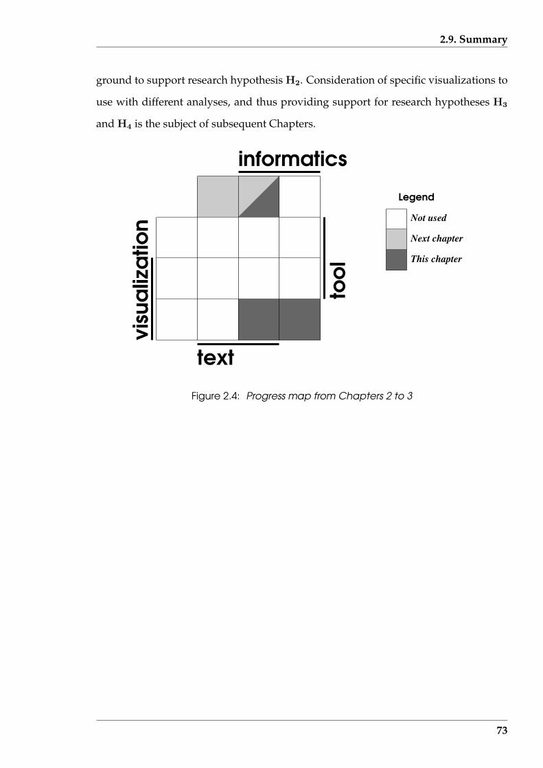
2.9. Summary
ground to support research hypothesis H2. Consideration of specific visualizations to
use with different analyses, and thus providing support for research hypotheses H3
and H4 is the subject of subsequent Chapters.
informatics
text
Not used
Next chapter
This chapter
Legend
Figure 2.4: Progress map from Chapters 2 to 3
73
Chapter 3
Visualization via document type
This Chapter is concerned with exploring criteria as to what analysis could be appro-
priate for a given text document. Different types among text documents give clues
to where appropriate information can be located. Although computers are to be used
to assist such analysis, they are not being used to apply ‘artificial intelligence’ to un-
derstand the contents and purpose of the document. So structural characteristics of
the internals of the document (such as sectioning, numbering paragraphs, quoting
of speech, etc.), which are comparatively easily located, are being sought as possible
indicators of information sources that can refine the analysis focus. A visualization
could be a possible outcome of such analysis, but there are alternatives. This Chapter
takes a broad-brush approach to the possibilities which follow from the data which can
be derived from text documents, while the next Chapters are more focused on specific
data. This emphasis on data reflects the prime importance it plays in this research.
That orientation of this Chapter enables investigation of research hypothesis H2 (vi-
sualization provides an alternative to analytical methods for interpreting the same set
of text data).
Text documents are the sources which contain the data of interest. Such data can
exist at a number of levels in such documents. However, numerical information such
as word counts, types of words used, sentence structure, etc. can be extracted when
addressing different analytical ends. Obtaining a lead into the ways such analytic in-
formation might be fruitful in gaining an understanding of a document, is preliminary
74
CHAPTER 3. VISUALIZATION VIA DOCUMENT TYPE
to deeper considerations. What appears to be superficial treatment of a document can
yield such insight.
Interpretation of the subject matter is taken in this research to be the province of
humans, possibly assisted by the visualizations. But knowledge of the document’s
subject matter can be used to assist in the process of finding the data being sought.
Text documents exist as different types and some subject material is more likely to ap-
pear in a particular type of text document. Although linkage of subject matter to text
document type mapping is not exclusive, this association is worthy of exploration.
This leads to the process of classification of documents. Both subject classification and
consideration of the arrangement of the elements hard copy formats only are consid-
ered in the following, although generalisation may be possible.
The techniques discussed in this thesis rely upon documents being in computer
readable form. Tsujimoto & Asada (1992) consider some of the issues involved in
conversion of hardcopy documents to such a computer readable form, particularly
when the printed documents involving complex layouts of the textural material. If
Bimbo, Santini & Sanz (1994) are correct, the associated optimisation of optical char-
acter recognition (OCR) techniques and procedures is a continuing difficulty in such
efforts. For the purpose of the discussion in this thesis, it is assumed that conversion
of documents from print into computer readable form has been carried out correctly.
A key issue with computer readable text documents is the form in which the doc-
ument exists – i.e. as plain text or as markup. The implication of these forms are
considered in this Chapter. All work subsequent to this Chapter considers plain text,
although a large proportion of current publishing and word processing systems are
also able to produce “marked up” documents.
75

3.1. Markup
3.1 Markup
Markup is a process of revealing elements within a text document and the relation-
ship between such element, derived from the plain text version of a document. Such
elements could be structural components of the document such as headings, cross-
references to sections within the document, illustration or table links, etc. They could
also be elements of information, which in combination defines the information content
of that document. The markup locates such elements; at least one opinion as to those
elements. Thus, in accord with the argument used on page 59, these elements might
be ’content’ or ’structure’. Since arriving at a particular markup, clues are taken from
the original plain text, different interpretations of such clues can give rise to different
markups. Because markup makes interpretation of the document easier of the human
reader, it can influence the interpretation of the (marked up) document. Consequently
there is both a good and bad perspective to markup. Particularly when visualization
techniques are used to enhance the markup of a text document, both of these aspects
can be heightened.
The use of markup is aimed at improving access to the different layers of informa-
tion contained in text documents. Markup indicates the type of information present
and how it is to be processed. The markup has the dual function of separating the
information elements present in the document, from the specification of how those el-
ements are to be presented. Both components are retained in the one document which
is viewed as an advantage, particularly from the perspective of the presentation spec-
ification, which looses its significance without the information elements. But markup
is not a necessary outcome of text document preparation since such documents can
be prepared without its inclusion. Although markup has advantages, it’s production
requires expenditure of effort, generally including significant human effort.
76

3.1. Markup
3.1.1 Markup occurs in two forms
In Annex A of ISO:8879 (1986), two types of markup are described. “Procedural
markup” identifies the processing that is to be performed upon particular elements
of the text. One method of doing this is to use macros as the representatives of such
procedures and identify the text they operate upon as arguments to such macros. The
TEX systems described by Knuth (1986) is such a markup system and requires such
macros and delineation of their arguments to be added into the document by hand.
Those macros are additional and plainly visible words inserted into the source docu-
ment during its preparation. With TEX being a publishing markup system, particularly
used for documents containing mathematics, a reasonable level of skill is required in
inserting the TEX directives. Such manual insertion of macro identifiers contrasts with
word processing systems such as Word and Word Perfect. They insert their controls for
identifying processing by inserting special characters into the document. In contrast
to TEX and like systems, those identifiers are generally not visible on the screen. Both
these implementations of procedural markup are not orientated towards identifying
the logical elements within the document, just how they are to be processed.
The alternative to Procedural markup is “Descriptive markup”. In this, the log-
ical elements of the document are identified, for example as being a heading, a list
of items, a paragraph, a label, etc. Generally the start and end of such elements are
specified, using a macro or macro sequences similar in concept to that of TEX. The ad-
vantage of descriptive markup is achieved by having the additional step of specifying
how the logical elements are processed. Consequently a document that has under-
gone descriptive markup can be processed to different end forms, by using different
processing interpretations of the original marked up logical elements. For example, a
text document which has the Descriptive markups which includes headings and sub-
headings, could be processed to show the document in its entirety. Alternatively, by
redefining how the logical elements of headings and subheadings are processed, a fi-
nal result consisting only the contents of those headings and subheadings could be
77
3.1. Markup
produced. In both cases there is no change to the original markup of the document.
One such Descriptive markup system is the Standard Generalized Markup Lan-
guage (SGML) defined by ISO:8879 (1986). In SGML, the markup of the document is
done in terms of “tags”. The manner in which these tags are processed depends on a
Document Type Definition (DTD) that is defined externally to the document contain-
ing the tags. Both the markup to be included in the document and the constructs used
in produce the Document Type Definition are defined in that standard. The combina-
tion of marked up document and Document Type Definition are coupled together at
the last stage, when producing the final form of the document.
Both TEX and SGML are complete, but complex systems. To assist users who do not
need all the facilities available in these ‘parent systems’, simpler systems have been in-
troduced. The World Wide Web has inspired much innovation in documentation. A
key issue is the need to minimize the human effort required in document preparation
particularly when used in multiple forms. LATEX simplifies TEX, and it is through con-
sideration of LATEX that Goossens, Rahtz, Gurari, Moore & Sutor (1999) describe the use
of TEX in the preparation of text documents for use via the World Wide Web. Similarly,
the Extensible Markup Language (XML) defined by Bray, Paoli & Sperberg-McQueen
(1997) simplifies SGML. The Hypertext Markup Language (HTML) is described by
Connolly, Khare & Rifkin (1997) as being initially produced for the purpose of cre-
ating documents for distribution across the World Wide Web, and only later being
defined in terms of a Document Type Definition of SGML to formalise its definition.
A negative result of the attempt to keep the definition of HTML simple has been it
had limited constructs available, with the possibility for alternate implementations of
some construct’s details. These have given impetus to the creation of XML. But the ex-
istence of large numbers of HTML documents will require the consideration of HTML
for some time to come.
Marking up of documents is not a trivial task. But it can be cost effective in industry
if the one (marked-up) document, or parts of it, can be used in multiple applications.
78
3.1. Markup
By using at template in this way the cost of the marking up can be amortized over those
multiple applications. For example, Greenbaum (1994) discusses the of use of SGML
by a German aerospace company in preparation of maintenance manuals (for holding
online) in an endeavour to reduce obsolescence resulting from computer technology
innovation. The advantage achieved with markup defined by international standard is
that those documents so marked will remain readable despite advances that will occur
in the display and storage technology. Initial care is needed to ensure meaningful
tags are applied to assist the extraction of the available information contained in the
document, because revision could nullify the cost advantage achieved.
Both Procedural and Descriptive markup of documents can enable the use of vi-
sualizations to the extent intended by this research. Further advances on the use of
visualization with marked up text documents will be made. In extending those tools,
Procedural markup appears the less appropriate technique to use due to the ‘hard
wiring’ of the presentation. A Descriptive markup could provide ‘on demand’ visu-
alization of the internal detail of the document, as considered in this research. But,
at least currently, the effort required to provide this is prohibitive due to the markup
insertion effort. Markup languages such as SGML and XML also appear to require
augmenting to fulfil such a role.
3.1.2 Interpretation of markup
The contrast between Procedural and Descriptive markups is shown in the examples
provided by Wright (1992). In those examples, the distraction of the human reader
of the raw marked up document due to such marks is apparent. But raw marked up
documents are not intended for presentation to a reader; their advantage comes after
processing.
A big advantage of markup follows from the use of ‘links’. A link is a reference
established between one point in a document to connect it to another part of the doc-
79

3.2. Plain text
ument. One of the purposes of a document browser is to follow such links, bringing
the appropriate text into view. By this mechanism, a particular relationship between
items in a document, which may not be readily apparent without this technique, can
be revealed. But establishing links is a laborious process for the author of the docu-
ment. In markup, such links are static and not adaptive to the different requirements
of readers of the document. Even if such relationships could be foreseen, the marking
up of all requirements may be inappropriate. A relationship search engine, of a higher
intelligence to that which follows established links, would be required in the general
instance.
If visualization is to be used to expose the information content of a text document
an interactive approach is most appropriate, following the data-result model of Fig-
ure 1.2 (page 6). The level of markup followed, or being displayed at any instant,
would depend on the current understanding of the document by the user, who is
guiding the presentation machine. That presentation machine would interrupt a text
display with a graphic display when appropriate, or when requested. This assumes
that such layering of markup is available in the document in contrast to the single
layer available currently. Markup including a graphics context would be needed to
have been put in place in the document. Such a presentation machine would have a
‘feel’ different from those currently used with markup.
3.2 Plain text
Text documents with no markup present represent the most challenge from the per-
spective of examining their structure. Many documents are not already marked-up
or when markup is used, that markup may be inappropriate for the desired analysis.
This research assumes the document being processed is of plain text form. It is from
this plain text that the marked up variety could be produced. Plain text has not had
the intellectual and physical energy applied to it for ‘sign posting’ of its information,
80

3.2. Plain text
grammatical, or organisational structure. It is the ‘ground state’.
3.2.1 Defining plain text
All computer files are ultimately in binary format, with the vast majority composed
of a sequence of bytes. In text, the sequence of bytes in the file represent (printable)
characters. The correspondence between the bit pattern in each byte and the print-
able character is defined by international standards. Such definitions mean that text
documents retain their meaning across computer architecture, computer software of
different origins, and time. The one document will print the same on any printer that
supports these standard definitions.
Such standards induce uniform behaviour of text in contrast to that of other binary
files. The interpretation of the byte sequence in most binary files tend to be specific
to either computer architecture, computer software, and time – or a combination of
these factors. If a byte is lost in a general binary file, the whole file can become useless,
whereas in the specific case of a text file, such a lost results in the lost of a single char-
acter, which may not have great significance for the understanding of the document.
‘Plain text’ is taken here to be a restricted form of text. The characters present in a
plain text file are not meant to be interpreted as embedded indicators of relationship
between sequences of characters, i.e. they are not markup. Instead, the characters
present are ‘flat’. Any structure between blocks of characters in the document is ob-
tained by interpretation of the words formed by characters within the document. Since
source code of computer programs, and HTML marked-up documents contain special
(although printable) characters to indicate grouping, they are not plain text.
81
3.3. Approaches to document classification
3.2.2 Significance of such a definition
Plain text presents both a problem and an advantage with respect to understanding
and analysis of documents. The problem is that the location of information or data
is not ‘sign posted’. Finding the relevant information requires more effort than when
markup is used. This can be an advantage in comparison to following the indicated
information (in a marked-up document) which leads to following the wrong course
through the document for solving the exact purpose in hand (i.e. the markup is inap-
propriate to the current objective). Although the words present are more difficult to
interpret than following any markup present, they contain the information which is
to be interpreted. Also the structure, created by punctuation, the distribution of para-
graph breaks (possibly denoted by blank lines), numbering of clauses and sections,
and the grammar associated with the words themselves, also contribute to that infor-
mation. Each process attempting to understand a plain text document must reprocess
these elements afresh. The outcome in the understanding of the one document might
be different between different processings. Following markup, the same understand-
ing is the expected result.
Marked up text may be the most common form of document in the future, but for
sometime the need to deal with plain text will remain. The plain text produced today
is being adding to a sizable archive of documents in that format. Printed documents,
when scanned, are converted to plain text. That process alone ensures a great need for
dealing with plain text. Indeed, dealing with the plain text form of a document is a
step in converting that document into a marked-up form.
3.3 Approaches to document classification
Converting words to information content (by an automatic process) in the plain text
file is not easy, since there is little assistance available. Words can have one or more
82

3.3. Approaches to document classification
meanings, and the particular meaning intended can be influenced by the context in
which they are used. Thus the context influences the word-information thread in the
text, but the word-information association influences the context; a circular problem
that can be resolved but with varying degrees of difficulty. One approach is to pro-
vide a classification of the document according to its subject matter and this can give
suggestions regarding the words and their meaning expected to be encountered. Doc-
uments within a particular document classification can have an associated ordering,
referencing, and style of expressing the information. So knowing the classification of
a plain text document can assist in deciding the manner of processing that file. This
approach is followed in this research.
Documents dealing with similar subject matter, and taking similar approaches, can
be expected to have similar characteristics. Only a small number of characteristics
may be necessary to establish one classification as separate from most, if not all, oth-
ers considered in the scheme. Such defining characteristics can have hierarchical or-
der, starting with the most general defining characteristics and proceeding through to
more detailed characteristics. A decision has to be made as to the level of matching
in such a hierarchy necessary to be achieved before a document can be accepted into
a classification. So all documents in a classification can be expected to have similar
characteristics, but not necessarily all the same.
For a document to be a member of a particular classification of documents, it must
contain the defining characteristics of that classification. In some instances, such defin-
ing characteristics may be difficult to enunciate. For example, a transcript of a parlia-
mentary debate and script for a play have many aspects in common (direct speech
is used, who is speaking is indicated, etc.) but it is appropriate (say) that these doc-
uments should be classified as different. Although such documents are similar, the
differences which separate one from the other needs to be defined to enable classifi-
cation to proceed. An alternative method of allocating classification is to compare the
document to be classified with documents that have already been classified. Matched
83
3.3. Approaches to document classification
document characteristics are then used to imply matching classification. By this ap-
proach, initial classifications influence subsequent classifications but without precisely
quantifying the characteristics which define that classification.
Many text documents contain components (e.g. internal structure, word usage,
and internal referencing) which are similar, or common, across their ultimate classifi-
cations. The final classification may result from differences in only one, or few, deter-
miners for that classification. After the classifications are formed, the result could visu-
alized (for understanding of the concepts) as a map on a plane with areas representing
all the classifications found arranged in a manner reflecting their association in the
document. The distance separating different areas might indicate the degree of simi-
larity between the items represented by those areas. Such visualizations which show
‘degrees of association’ have applications beyond document classification and might
be thought of as “self-organizing maps” which are developed by Kohonen (2001); the
“self-organizing” title following from the iterative manner of refinement which is in-
volved the various algorithms that find those associations. From such a map, a tree
representation can be produced as shown by Skupin (2002). If these visualizations
were applied to document classification, such a tree visualization readily shows the
branching which separates on classification from another and any layering that might
be present in such a classification hierarchy. Alternately, the map gives a better indica-
tion of how distinct, or separated, one classification is from another. However, before
such visualizations are used, the classification needs to have been performed, and that
can pose difficulties.
3.3.1 Classification by subject content
A simplistic or first order approach to classifying documents is by their subject matter.
Such a procedure is often adopted in libraries and information retrieval systems. This
approach is useful for an overall map of the general neighbourhood where a document
84
3.3. Approaches to document classification
belongs, but difficulties arise when detail is important.
Consider a hierarchical classification of documents. In this system each class of
document is divided using some criteria into subclasses, and those subclasses are then
subdivided in a recursive fashion until no further subdivision is appropriate. An ex-
ample of this is the Computer Classification System (CCS) of the Association of Com-
puting Machinery (ACM) described by Coulter (1998) for classifying documents with
subject matters related to computers and computing. In the CCS, there are four clas-
sification criteria consisting of broad computing area, classification, subclassification,
and finally the subject. Three levels of sub-classes are used in this instance. It is im-
portant to note that when using a hierarchical classification scheme (such as CCS) it is
necessary to first consider whether the subject of the document in question is appro-
priately classified using that particular system. For instance, because computers and
computing have entered most facets of modern life, there may be conjecture as to the
appropriate classification scheme for an article dealing with the implications of hav-
ing a computer in the home on the socialisation of a child in the school playground.
Does such an article belong to the discipline of Sociology, Education, or Computing,
or perhaps all three?
Classification of documents is essentially a manual process in libraries. Piggott
(1990) discusses the uses of the Anglo-American Cataloging Rules (AACR) which are
widely used in libraries for this purpose. This scheme is designed to place printed
materials, of any recognised subject, in a consistent place in the catalogue hierarchy.
Once placed, those documents can be found when required. Or alternatively, doc-
uments available in a particular subject area could be browsed because they would
have a similar ‘address’ within the storage system.
Are there other methods of classification which could be automated? The CCS and
AACR systems mentioned above produced excellent results but are labour intensive.
Perhaps an automated classification system, which may be less definitive but more
cost-effective, could be used in some instances.
85

3.3. Approaches to document classification
One approach is a word-to-subject association. An automatic document classifica-
tion system of this type is considered by Kohonen (2001) using word occurrence in a
large numbers of document files. This method starts by forming a vector of word oc-
currences for each of the documents being considered. This vector is the same length
(dimension) for each document and is fixed by the words prescribed for counting. A
matrix is formed using each of these vectors of counts as its columns. That matrix is
then processed for determining common factors. The number of words and the docu-
ments considered determine the dimension of this matrix. As Kohonen (2001) states,
this can result in a matrix having huge dimensionality, particularly when plain-text is
considered. Skupin (2000) considers Multidimensional Scaling, Principal Component
Analysis, and Self-Organizing Maps as techniques for analysis of this matrix. Due to
the high dimension of the matrix, Skupin (2000) considers that Self-Organizing Maps
is the best choice for this analysis. The clustering identified can then be ascribed to sub-
ject content of the documents. Means of reducing the word related dimension of that
matrix are considered by Kohonen (2001). Since the words that occur in a document
are used to infer the classification to which that document belongs, this constrains the
word reduction.
A subject-only (or topic) can give a partial classification but it is insufficient in
that it does not consider how the subject is presented in the document. For example,
a screen play based on a novel would have the same subject matter, but the screen
play and the novel as documents would be different. Such differences are important
for this research. Systems mentioned above are more appropriate for classification
of documents for retrieval than for arriving at an expectation of how the subject is
presented in a document. In this research the distribution of the subject through the
document influences (if not determines) what analysis techniques are applicable to
that document.
86

3.3. Approaches to document classification
3.3.2 An alternative – classification by functional objects
A ‘functional object’ is another characteristic of a document’s construction. Such an
object is a particular element of “Descriptive markup”. It is distinct from the subject
of the document but could be related to that subject. For example, a book about math-
ematics would be expected to contain mathematical expressions, whereas that would
be unexpected in a book concerning medieval literature. Mathematical equations are
an example of a means for constructing a document, and are a functional object. A
table of values would be expected to appear in the annual report of a business corpo-
ration, but not in a theatrical play about family rivalry. Such tables are another form
of functional object. For example, two doctoral dissertations on the subject of abo-
riginal languages may present their arguments in different manners; one containing
map illustrations, while the other does not. These doctoral dissertations have the same
subject but different functional objects present in the case of the map, while other con-
structional aspects would be expected to be similar. In general terms, for a particular
subject an expectation follows of the forms (functional objects) that might appear, but
what does appear may be different from what is expected. But a doctoral dissertation
on geography or cartography also would be expected to contain maps, but each is of
a different subject than aboriginal languages (despite all being doctoral dissertations).
It is proposed to classify documents by the functional objects which they contain.
The reason for adopting a functional object classification is that the presence of
similar objects suggests similarity in approach to presentation (display) of the docu-
ment and approach to its analysis. A document type of being a novel, dissertation,
play, contract, newspaper articles, journal article, etc. might give an expectation of
the types of functional objects that will be present. For example, an applied physics
journal article might be expected to contain the functional objects:
• mathematics in the form of formulae;
• citations to external publications which are listed in the document;
87
3.3. Approaches to document classification
• figures and tables that are referenced within the text; and
• sections, and subsections that are cross-referenced by explicit means within the
document.
Similarly, an education journal article is likely to contain these same objects, with the
exception of mathematical formulae (although they could conceivably be present). De-
pending on which functional objects define a particular classification would determine
whether these journal articles are in the same classification grouping, or closely related
groupings. A mapping between document types and their functional object classifica-
tions could be established, but it would not be infallible.
Functional objects are physical constructs within a document that can be deter-
mined without reading and comprehending the document. Since processing of the
document is to follow from its classification, a different route to obtaining the classifi-
cation is appropriate. A subject classification needs reading and comprehension to be
applied for its determination.
For this research the functional objects used for document classification were se-
lected to be few in number. Limiting the number minimised the time required in
finding their occurrence and determining the resultant classification for any particular
document. Being physical constructs meant they could be measured directly from the
text without a need to interpret the meaning of the text. This also reduces the effort
needed in determining the presence of the object. The functional objects used, and the
interpretation of each are:
• words: Groups of print characters that have dictionary meaning in the subject
area of the text;
• sentences: Groupings of one or more words followed by a full stop (.), question
mark (?), or an exclamation mark (!);
• paragraphs: One or more sentences that are grouped together and separated
88

3.3. Approaches to document classification
from other such groupings within the same text document by one or two blank
lines;
• numerals used in the text: Within the text, numerals appear in addition to that
used to reference material in the text, page numbers, or dates;
• equations: An expression which has both a left and right hand side that are
related via a symbol, for example in the mathematical equation y = x + 24,
chemical equation 2H+ + O−− → H2O, and the implication high grades =⇒
conscientious, or very lucky, student;
• illustrations: Within the text, illustrations in the form of images, drawings,
graphs, etc. appear;
• tabular material: Columns of text or numbers that are related down the column
and possibly across each row;
• illustrations referenced: Each illustration included under the above heading
has some form of identifier (in addition to proximity) associated with it and that
identifier is used to uniquely reference that illustration within the text;
• tabular material referenced: Each block of tabular material included under the
above heading has some form of identifier (in addition to proximity) associated
with it and that identifier is used to uniquely reference that tabular material
within the text.
• internal cross references: Explicit pointing to parts of the text from within that
text for the purpose of reference; and
• external document references: The text gives explicit reference to other docu-
ments with sufficient detail to enable the reader to find each such document.
Table 3.1 tabulates the functional objects of a collection of document types resulting
from analysis of examples by the author. The functional object types included are a
89
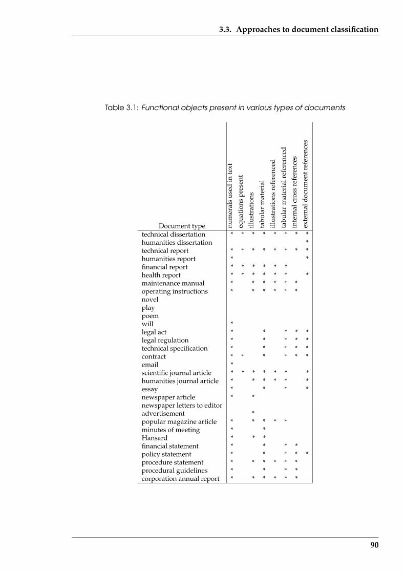
3.3. Approaches to document classification
Table 3.1: Functional objects present in various types of documents
Document type num
eral
sus
edin
text
equa
tion
spr
esen
t
illus
trat
ions
tabu
lar
mat
eria
l
illus
trat
ions
refe
renc
ed
tabu
lar
mat
eria
lref
eren
ced
inte
rnal
cros
sre
fere
nces
exte
rnal
docu
men
tref
eren
ces
technical dissertation * * * * * * * *humanities dissertation *technical report * * * * * * * *humanities report * *financial report * * * * * *health report * * * * * * *maintenance manual * * * * * *operating instructions * * * * * *novelplaypoemwill *legal act * * * * *legal regulation * * * * *technical specification * * * * *contract * * * * * *email *scientific journal article * * * * * * *humanities journal article * * * * * *essay * * * *newspaper article * *newspaper letters to editoradvertisement *popular magazine article * * * * *minutes of meeting * *Hansard * * *financial statement * * * *policy statement * * * * *procedure statement * * * * * *procedural guidelines * * * *corporation annual report * * * * * *
90

3.3. Approaches to document classification
subset of the list above. An asterisk (*) is used to indicate the presence of that charac-
teristic in a document classification type; a blank indicates absence. In compiling this
list, approximately twenty examples of each listed type of document were inspected.
Overall characteristics of each document type are shown because there are exceptions.
For example, some dissertations which fall within the natural humanities classifica-
tion were noticed to contain figures and others to contain tabular data, while some
technical dissertations contained no tabular data. Some Hansard documents also con-
tain figure illustrations. But the attributes listed in Table 3.1 are associated with the
majority of the documents that belong to the classifications included. However, in the
case of novel, play, and poem none of the listed attributes (functional objects) appear.
All the document types shown in Table 3.1 implicitly contain the functional objects
of words, sentences, and paragraphs. In the case of a poem, the stanza was taken as
a paragraph, while the line used in the laying out of the poem was taken as a sen-
tence. These common functional objects are not shown in the table in an endeavour to
highlight those functional objects that are useful to define each document type.
The document types included in Table 3.1 have in most cases distinguishing char-
acteristics beyond those selected here as functional objects. A number of those ad-
ditional characteristics are associated with the printed form of the document. Tsuji-
moto & Asada (1992) describe some of those print associated forms, the difficulties
they present in getting at the plain text present, and means of resolving those difficul-
ties. Document classification is a significant problem requiring research beyond this
project. For this research, the set of common functional objects of words, sentences,
and paragraphs received further consideration. As a result, Table 3.1 indicates that
only a beginning has been made.
91

3.3. Approaches to document classification
3.3.3 Linking appropriate analysis to classification
As shown by Figure 1.5 (page 23), document classification is important in the doc-
ument analysis process prototyped by the ‘Serine’ software. The analyses that are
appropriate follow from such classifications. The documents analysed were in plain
text form.
Table 3.2 lists the document analysis techniques described in the following chap-
ters of this dissertation together with the functional objects that each operates upon.
The functional objects of word, sentence, and paragraph which are shown, are the
functional objects common to all the document types listed in Table 3.1. Thus any of
the documents types listed in Table 3.1 could have such analysis techniques applied
to them. Document types contain more specific functional objects (e.g. those in Ta-
ble 3.1) and more specialised aspects, such as patterns of linking to tabular material
or cross references that occur in some documents types could be applicable to specific
types of analysis. However, such analysis types are beyonds the scope of this current
research. The section number where each analysis technique is discussed is also given
in Table 3.2.
Table 3.2: Techniques of document analysis considered and the functional objectsused
Document analysis technique Functional objects Taxonomy’s Visualization typeName Section wds. sents. paras. (data type|visual type)
frequent word usage 4.3 * *parallel coordinates 6.3.1 * * * multi-var.|2-D,linked-acrosscolour histogram 6.3.3 * * * multi-var.|2-D,stack-volstar diagram 6.3.2 * * * multi-var.|2-D,linked-acrossSammon scatter plot 6.3.4 * * * 2-var.|2-D,stacks-flatZipf’s first law 4.2 * seq,1-var.|2-D,linked-withinfractal comparison of plots 6.4 *comparing texts (QSUM) 6.5 * seq,2-var.|2-D,linked-withinShewhart chart 6.5.3 * seq,1-var.|2-D,linked-withindirected word frequencies 4.3.2 *typing by word frequency 4.3.3 *frequent word fading 4.5.4 * seq,1-var.|2-D,stacks-flattop/tail fading 4.5 * seq,1-var.|2-D,stacks-flatsentence structure 7.3 * * seq,1-var.|2-D,linked-withinword classing 7.2.1 * multi-var.|2-D,linked-withinparagraph structure 7.4 * * seq,multi-var.|3-D,linked-within
92

3.4. Summary
Most of the analysis techniques in Table 3.2 have an associated visualization tech-
nique; the association of that visualization with the analysis type is given in the dis-
sertation section listed. The types of such visualizations are shown with respect to
the proposed Information Visualization taxonomy of Section 2.2 (page 37). Such vi-
sualizations reflect the underlying analysis of the words present in a document and
the sequence of such words. That is consistent with word, sentence, and paragraph
functional objects carrying such information. Extension to this work would need to
consider analysis and visualization techniques appropriate for the functional objects
of Table 3.1. Although not strictly markup in the sense of Section 3.1 (page 76), the
functional objects of Table 3.1 offer a low level indication of information association
which has the potential for exploitation.
3.4 Summary
This Chapter was concerned with the broad types of data, or information, that are
present in text documents. The use of markup to identify locations of information in
text documents was discussed. A focus on plain text was then made, a focus that is
used in the remainder of this research. A text document being plain text means that
recourse to other information locating techniques, other than that flagged by markup,
must be used. But that has the advantage that the information content specific to
a particular need can be obtained without the distraction of markup that follows a
different course. An expectation of what information structuring might occur in a
plain text document was postulated in this Chapter as being linked to a classification
of that document. A functional objects approach to such classification was proposed
because such objects can then be linked to selection of the appropriate visualization
techniques to use. Further development of that approach is beyond the scope of this
research.
Considerations here have been of the data content in text documents and the sub-
93
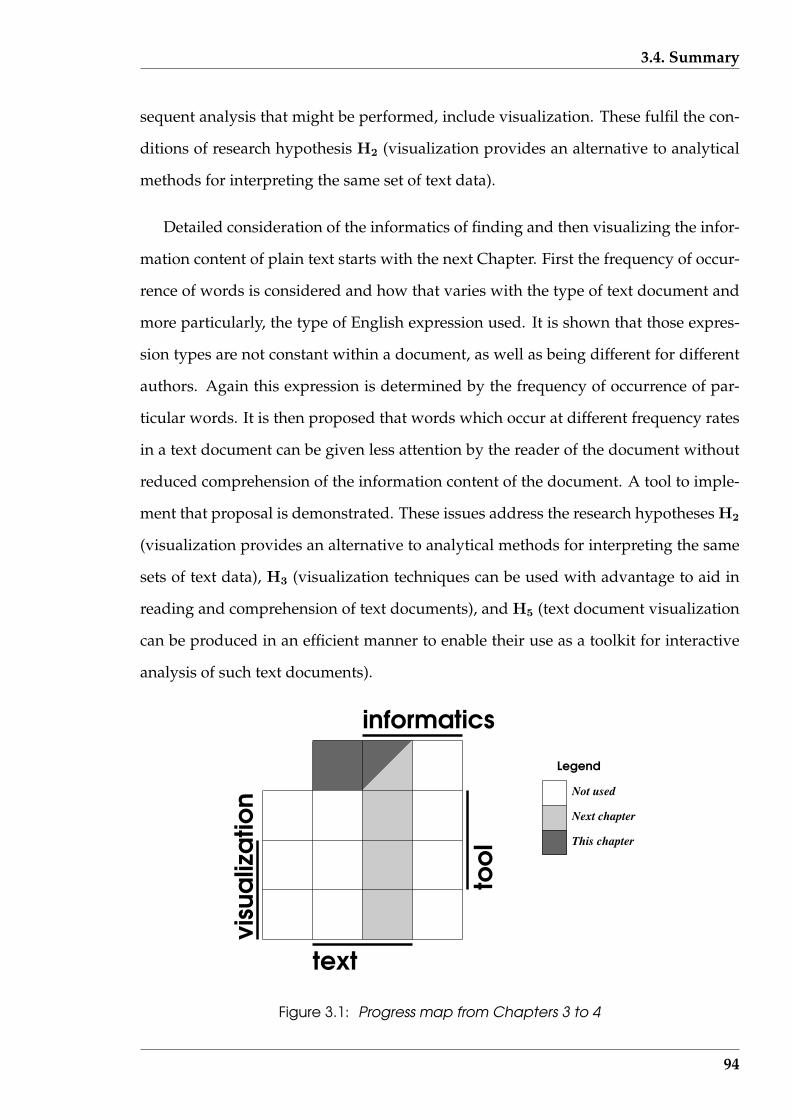
3.4. Summary
sequent analysis that might be performed, include visualization. These fulfil the con-
ditions of research hypothesis H2 (visualization provides an alternative to analytical
methods for interpreting the same set of text data).
Detailed consideration of the informatics of finding and then visualizing the infor-
mation content of plain text starts with the next Chapter. First the frequency of occur-
rence of words is considered and how that varies with the type of text document and
more particularly, the type of English expression used. It is shown that those expres-
sion types are not constant within a document, as well as being different for different
authors. Again this expression is determined by the frequency of occurrence of par-
ticular words. It is then proposed that words which occur at different frequency rates
in a text document can be given less attention by the reader of the document without
reduced comprehension of the information content of the document. A tool to imple-
ment that proposal is demonstrated. These issues address the research hypotheses H2
(visualization provides an alternative to analytical methods for interpreting the same
sets of text data), H3 (visualization techniques can be used with advantage to aid in
reading and comprehension of text documents), and H5 (text document visualization
can be produced in an efficient manner to enable their use as a toolkit for interactive
analysis of such text documents).
informatics
text
Not used
Next chapter
This chapter
Legend
Figure 3.1: Progress map from Chapters 3 to 4
94

3.4. Summary
The combinations of visualization, text, informatics, and tool elements that are em-
ployed in this and the next Chapter to support the research hypotheses are depicted
in the navigation guide of Figure 3.1.
95
Chapter 4
Analysis of documents by word lists
In this Chapter the words present in a document are analysed, not for their grammat-
ical contribution to the structure of the document, just their presence. Of particular
interest is the frequency distribution of all the words from which the text document
is composed. From this distribution, inference can be obtained as to the document’s
type. Such inference is shown to extend to the writing style of individuals, how that is
characteristic of their writing, and identifying an individual as the author of a docu-
ment. It is also argued that all the words present in a text document are not necessary
for the reading (obtaining the information) of that document and that the overlooking
of selected words can speed up the reading process. It is proposed that words to be
read, and those to be overlooked, follow from the word frequency distribution within
each document. These are specific applications to which knowledge of the word list
associated within a text document can be applied. Such applications are generally an-
alytical, but in this Chapter visualization is also shown to be applicable. This enables
research hypothesis H2 (visualization provides an alternative to analytical methods
for interpreting the same set of text data) to be investigated.
The approach taken in this Chapter is to isolate the words, then determine the
bulk distribution of such words, followed by making use of characteristics previously
‘learnt’ from such distributions. In making use of the words in this manner, they
are considered in isolation; not in context of the grammar or information content be-
ing communicated. The algorithms used in this research for the purpose of isolating
96

CHAPTER 4. ANALYSIS OF DOCUMENTS BY WORD LISTS
words from a text document is considered first. Experience has shown that reliable
performance of such a task is a non-trivial matter. Two different approaches are then
developed to use the word occurrence frequencies obtained to arrive at insights into
the document. One approach compares the observed word distribution with an ex-
pected baseline distribution which is document type dependent. Comparison with
that baseline provides a means for broadly classifying a text document. An offshoot
of this approach is a means of characterising writing style. The other technique pos-
tulates that high and low frequency words are of lesser importance in the reading
process and can consequently be given lesser attention. Each of these are taken as be-
ing contained within in the research hypothesis H3 (visualization techniques can be
used with advantage by humans to aid in reading and comprehension of text docu-
ments). Thus, by investigating those techniques, H3 is also examined. In developing
of these techniques, English literature, historic newspaper articles, and emails are the
text documents used as data for the analyses in this Chapter.
The algorithm used to isolate the word content of a text document is given together
with an overview of the software that implements it. It is applied in a multi-step man-
ner. This is done to examine research hypothesis H5 (text document visualization
can be produced in an efficient manner to enable their use as a toolkit for interactive
analysis of such documents). In this case, the efficient manner is meant that the visu-
alizations, and the data for their production, can be produced dynamically, consistent
with interactive usage of the software.
Although the techniques considered are principally for text document analysis,
they also form a foundation for reading considerations of the following Chapter.
97
4.1. Text transformation
4.1 Text transformation
All text documents were transformed to assist subsequent analysis. This resulted in
repackaging of paragraphs, sentences, and words into a data structure which had two
properties. One was that the data structure contained sufficient information in it to
enable the original text document to be reproduced from it. The other was simplifi-
cation of obtaining individual paragraphs, sentences, and words in comparison to the
original document. In this respect, ‘words’ were considered as generalised character
units (which will be shown below). First paragraphs, then sentences, then words were
isolated from the given text document. In constructing this data structure a number of
compromises were made that needed to be taken into account during the subsequent
analyses.
This transformation was implemented using two suites of computer code. In each,
a multi-step process was employed. One suite allowed manual control of these steps
which enabled access to intermediate results. That implementation was directed at ex-
perimentation allowing examination of the processes and the results of modifications
introduced had upon results they produced. The other was more production oriented
directed at producing the end results required by the ‘Serine’ production prototype
outlined in Section 1.4 (page 21).
4.1.1 Isolating sentences and paragraphs
The format of a sentence, coupled with typesetting (and other presentation) tech-
niques enables the trained human eye to readily detect the start and finish of a sen-
tence. This is true without attempting to read the contents of the sentence. Because
sentences are the basic unit that a writer uses to organise the information he wishes
to convey, their ready detection is important. Therefore, sentence structure should be
preserved irrespective of the manner in which the text is presented or displayed. How-
98

4.1. Text transformation
ever, the length of a line on the page or screen is influenced by such factors as the font
used and the width of type-column allowed. When reading, it is the line which is the
tracking mechanism used by the eye, rather than the primary grouping of meaning.
So if some lines are skipped, the reader needs to find the start of the sentence that con-
tains the lines skipped for the understanding of the information to continue. In other
words, line skipping may devolve into skipping sentences unless it is corrected. This
supports clear indication of the ends of a sentence from a typographic perspective. As
will be indicated in the following, finding such end points in computer readable text
documents can be a little more elusive.
Locating a paragraph on a page is generally an easier task than locating a sentence,
thus it is used as the starting point. Here a paragraph is taken to exist only as a collec-
tion of sentences. Grammatically those sentences in the one paragraph should relate
to the same subject, but that point will be considered later when structures higher than
their primary structure are considered. In documents, paragraphs are often separated
by blank lines, making locating them an easy task.
With the paragraph isolated, sentences from which it is constructed can be sepa-
rated out. The approach taken initially in this investigation was to break a paragraph
into words without considering the sentence structure, i.e. a ‘word first’ approach.
As will be seen, the test for the success of the break down which resulted was to re-
construct the original paragraph, including its sentence structure. Under most cir-
cumstances this approach worked. But then computational difficulties were noted.
Punctuation characters, as defined in Chapter 6 of Australian Government Publishing
Service (1992), not only enter into defining the ends of a sentence but they can also
affect the word selection as well. As an example, in emails the string r.maloney is a
single name which should be counted as a single word despite internally containing
the period character. But a period also usually denotes the end of a sentence.
Under that decomposition technique, single quotation marks also pose a problem.
They can appear to indicate possession, word omission or shortening, as well as de-
99

4.1. Text transformation
limiting direct speech. From the point of view of isolating words, these three situa-
tions must be detected correctly. In the first two cases, the quote mark is part of the
word. However, in the case of direct speech, the quote mark is not part of any word
involved. The difficulty with quotation identification is determining where it finishes,
for the quotation mark is also an indicator of word shortening which can be included
in a quotation. The two situations of quotation mark usage must not be confused if
software is to achieve an appropriate approach to word and sentence identification.
Another problem is hyphenated words. Hyphens occur in two main situations; to
join two parts of a word separated by a line break, and to indicate compound words,
complex words, and range of values. In the case of compound and complex words,
this research considered the hyphen as part of the one word. In the case of words
broken across lines and expressing a range of values, the hyphen was taken as part of
neither of the two words being separated. It was the difficulty in correctly removing
hyphens from line separated words that lead to the abandonment of this ‘word first’
approach of text decomposition. An algorithm to isolate sentences before words was
adopted as its replacement in this research.
4.1.2 Algorithm for isolating sentences from paragraphs
Given a text document, paragraphs were isolated first. The assumptions used for
locating a paragraph are:
• one or more zero-length lines separate consecutive paragraphs;
• the end of the file marker terminates a paragraph, i.e. paragraphs are not contin-
ued across files.
The assumptions for locating the two ends of a sentence are:
• a sentence always starts with a capital letter;
100

4.1. Text transformation
• a full stop, question mark, or exclamation mark at the end of the line terminates
a sentence;
• a full stop, question mark, or exclamation mark followed by one or more spaces,
then a capital letter terminates the sentence and creates the possibility for the
commencement of a following sentence;
• a full stop following a capital letter is not the end of the sentence;
• between the punctuation mark terminating one sentence and the start of the fol-
lowing sentence, parentheses may occur;
• in emails, constructs such as ‘:)’ do not indicate an end of sentence; and
• although grammatically incorrect, a phrase alone can occupy a paragraph. This
situation is likely to occur in emails. In that situation the paragraph is composed
of this one sentence.
Based on these assumptions, the algorithm for sentence collection was:
repeatread the next line in the file;calculate the number of characters in that line;if line length > 0then store that line and get another (the paragraph continues)else (in this case a paragraph break has been reached)
beginjoin all the gathered lines together with a space character added at the join;split the resulting single line containing all sentences in the
paragraph into the component sentences by replacing any full stop,question mark, or exclamation mark followed by one or more spacecharacters, which in turn are followed by a capital letter, by thosesame punctuation marks and capital letter but with the space (orspaces) replaced by a single newline character;
don’t end the sentence if a capital letter precedes a full stop;send these sentences to the output file;send another blank line to the output file to denote the end of paragraph;
enduntil end of documentjoin the lines of the final paragraph into a single line;
101
4.1. Text transformation
split that line into it’s component sentences;send the results to the output file, using the same techniques as above.
This algorithm combines both paragraph and sentence extraction. The result is that
all paragraphs are separated by two newline characters (two lines of zero length each;
one denoting the end of the last sentence in the previous paragraph, and a single blank
line indicating the current paragraph’s end). The end of each sentence is indicated by
a newline character, meaning that each sentence becomes a single line of text irrespec-
tive of how it was arranged in the original text document.
4.1.3 Algorithm for isolating words
Words are the basis of all analyses performed in this research. Therefore, each word
needs to be determined accurately. The original text was to be stored in a form which
assisted its use in subsequent analysis but was such that the original text could be
reconstituted from this stored form. A general algorithm for isolating the words in a
line of text was devised together with a means of storing the results. Each word itself
was recorded in the result together with a marker to locate the end of that word. Thus
all the words occurring in a line of text could be held in one record, with each word
isolated from the other, and packed in the same order to that of their appearance in
the original text line. The marker used was a BELL character, it being judged as being
unlikely to appear in a text document. As a result, each line of the original text is held
by ‘Serine’ as that line with the BELL character separating each word. These lines are
then strung together as a doubly linked list. Figure 4.1 gives a pictorial representation
for the algorithm devised for word locating and storage of the result.
A general definition of what constitutes a word was necessary to encompass both
conventional words as well as punctuation marks and formatting markers, such as
newline indicators and spaces within a line. This was achieved by collecting charac-
ters into five categories as shown in the boxes on the left of each the sub-figures of
102
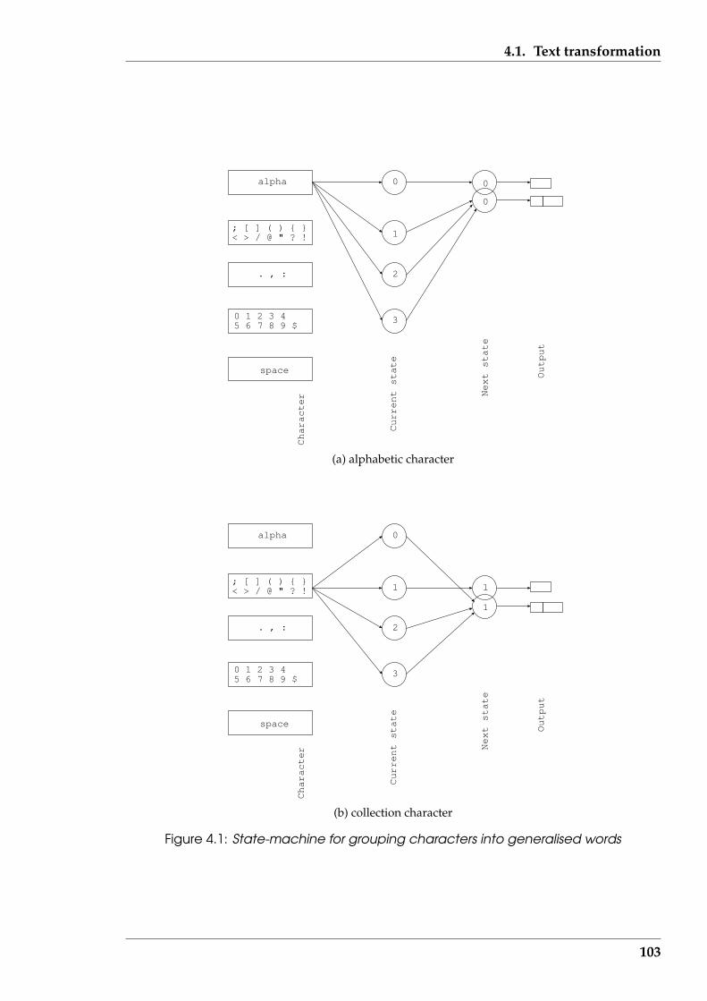
4.1. Text transformation
Output
Current state
Next state
Character
3
2
1
0alpha
; [ ] ( ) { }< > / @ " ? !
. , :
0 1 2 3 45 6 7 8 9 $
space
0
0
(a) alphabetic character
Output
Current state
Next state
Character
3
2
1
0alpha
; [ ] ( ) { }< > / @ " ? !
. , :
0 1 2 3 45 6 7 8 9 $
space
1
1
(b) collection character
Figure 4.1: State-machine for grouping characters into generalised words
103

4.1. Text transformation
Output
Current state
Next state
Character
3
2
1
0alpha
; [ ] ( ) { }< > / @ " ? !
. , :
0 1 2 3 45 6 7 8 9 $
space
1
2
(c) finishing character
Output
Current state
Next state
Character
3
2
1
0alpha
; [ ] ( ) { }< > / @ " ? !
. , :
0 1 2 3 45 6 7 8 9 $
space
2
2
(d) numeric character
Figure 4.1: State-machine for grouping characters into generalised words(. . . continued)
104

4.1. Text transformation
Output
Current state
Next state
Character
3
2
1
0alpha
; [ ] ( ) { }< > / @ " ? !
. , :
0 1 2 3 45 6 7 8 9 $
space
3
3
(e) space character
Figure 4.1: State-machine for grouping characters into generalised words(. . . continued)
Figure 4.1. These sub-figures show the five state-machines that describe the internal
behaviour of the word isolation algorithm. The original text document is submitted to
this algorithm one character at a time, via each sentence, which has previously been
isolated from the document. Each one character entered into the algorithm can pro-
duced one or two characters of output, which is the result that is stored.
The five state-machines of Figure 4.1 have four internal states that are shared by
all machines. Whether a character constitutes an end of a word being formed in the
output of the algorithm depended on the previous character seen by the algorithm.
Each character received in the input is routed to the state-machine through the route
indicated leading from the box on the left hand side which contains that character. The
arrows in the figure between those character collection boxes and the current states in-
dicate checking of the current state of the machine. Depending on the current character
and the current state, the next state is determined together with the output, which can
be either one or two characters. If a single character the same as the input character
is to be output, this is indicated in each of the state-machines of Figure 4.1 by a single
rectangular box on the right of each subfigure. A two character output consisting of
105
4.1. Text transformation
the input character followed by a BELL character and is indicated by a double box.
The internal states of the machine are shown by the circles which are numbered to
name each state. In most cases, the state does not change and this is indicated in Fig-
ure 4.1 by an overlap in the circles denoting the next state. The case for the characters .
, : (subfigure (c)) is the exception. The output of that part of the algorithm depends not
only on the current character at the algorithm’s input, but also upon previous input
character. The initial state of the machine is 0.
The groups produced consists of both single letters and collections of letters. The
conventional words such as man, satisfaction, Julia and numbers such as 2, 8.341, 3..5 are
collected as single groupings. However, an email address such as [email protected]
edu.au would produce seven groupings consisting of maloney, then the @ character
alone, then murdoch, then the period (.) character alone, then etc, etc. Similarly, the
phrase: sneezing is common would be contained in five groups, two of which would
contain a single space character. Compare this to an Internet address such as 192.168.150.1
which would be contained in one grouping. The groupings produced are designed to
assist subsequent analysis.
Some character sequences which are split by this algorithm have significance for
interpretation when grouped together. In these cases, more than one group needs to
be taken into consideration when interpreting the transformed text. Sequences which
have this caveat include the following examples:
• a period mark indicating abbreviation (as in para. for paragraph and R. Maloney
for Ross Maloney) is contained alone in the grouping following that containing
the abbreviation (thus para. would consist of two groupings, one containing para
and the following one containing the period);
• the punctuation mark indicating the end of a sentence is contained in a grouping
by itself; and
• in the cases were parentheses and brackets (curly, angle and square) occur, both
106
4.1. Text transformation
the opening and corresponding closing members are stored as groupings.
Any matching of pairs of such characters needs to be performed in the analysis phrase
of such transformed text.
Grefenstette & Tapanainen (1994) present an approach for isolating sentences, and
the words within those sentences, from text documents. It was only after designing
and implementing the algorithms presented in this section that the work of Grefen-
stette & Tapanainen (1994) was found. Although that approach is similar to that pre-
sented here, there are also differences. However, that works offers support to the
approach used here.
4.1.4 Software implementation
Two versions of software were written to implement the decomposition of text docu-
ments using the algorithms described above. One was as part of the ‘Serine’ software
(outlined in Section 1.4 (page 21)) which serves as a template for a production imple-
mentation of this research. It was written in the C language.
The other version was written in the Perl language. Let it be known as ‘Perl-
Breaker’. It provides a proof of concept implementation, as opposed to one of maximum
efficiency, together with making intermediate results available for inspection. This en-
abled the modularization of the various steps involved in the text transformation and
the multiple use of intermediate results as depicted in the interconnection diagram of
Figure 4.2. Where graphics results were appropriate, they were created as coloured
Postscript programs by the Perl programs onto disk files for subsequent display or
printing. The version used depended on the immediate outcome required.
Perl, as Humphreys (1992) points out, is ideally suited for linguistic computing.
Schwartz & Christiansen (1997) show that processing files of text by lines, regular
expression search, and transliteration, together with constructs such as the hash (as-
107

4.1. Text transformation
sociative) array, are available in the standard Perl language. Such attributes make
construction of text processing algorithms relatively easy. In particular, the dynamic
dimensioning available for hash arrays and their use of strings as indices made up
from words, are ideally suited for determination of word frequencies. Experience
showed that the same algorithm programmed in Perl was half the length and took
one third the time to write using Perl as opposed to C. But Perl does not have the pro-
cessing efficiency of C. As a result, Perl was appropriate for the proof of concept of the
algorithms and the general approach, while C was more appropriate for the ‘Serine’
software.
The Perl version of the software was constructed from separate modules that were
executed in sequence via manual control. The sequencing of execution of those mod-
ules is shown in Figure 4.2 together with the files produced. Being Perl programs,
those modules are identified by the name of the file containing each program with a
.pl suffix. In most instances, the data exchanged between modules was by disk file. A
named pipe in the form of a first in, first out connection was used to join and synchro-
nize the output of the intosentences.pl process to the input of the context.pl
process. The termination of a branch in the processing chain is denoted in Figure 4.2
by a black filled circle. The .txt suffix denotes that the associated file of results was
printable. Each of these Perl processes had a single dedicated purpose.
Both the intosentences.pl and content.pl processes use regular expres-
sions in their search processing. Paragraph breaks are passed through this process and
result in zero-length lines in the fragments.out file. The resulting fragments.out
file contains all the information to enable the original text document file to be recon-
structed, while being more amenable for analytic processing.
The text document decomposition process of Figure 4.2 consists of the following
steps:
• the process intosentences.pl breaks the original text file (Original text)
108
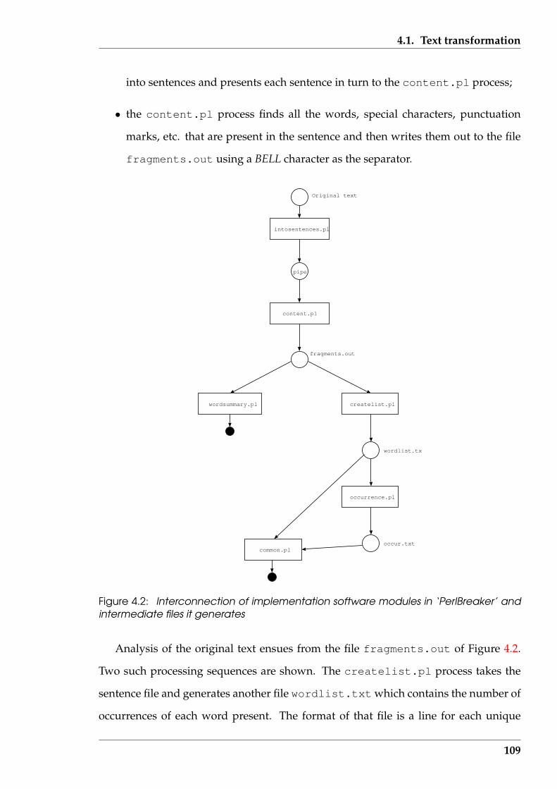
4.1. Text transformation
into sentences and presents each sentence in turn to the content.pl process;
• the content.pl process finds all the words, special characters, punctuation
marks, etc. that are present in the sentence and then writes them out to the file
fragments.out using a BELL character as the separator.
pipe
intosentences.pl
content.pl
fragments.out
createlist.plwordsummary.pl
wordlist.txt
occurrence.pl
occur.txtcommon.pl
Original text
Figure 4.2: Interconnection of implementation software modules in ‘PerlBreaker’ andintermediate files it generates
Analysis of the original text ensues from the file fragments.out of Figure 4.2.
Two such processing sequences are shown. The createlist.pl process takes the
sentence file and generates another file wordlist.txt which contains the number of
occurrences of each word present. The format of that file is a line for each unique
109

4.2. Zipf’s laws
word that appears in the sentence file. On each line is a word together with the
number of times that it appears in the sentence file, and thus the original text doc-
ument. From this word occurrence list, the process occurrence.pl produces the
file occur.txt which tabulates the words present in the original text, grouped ac-
cording to their frequency of occurrence. The fragments.out, wordlist.txt and
the occur.txt files are decompositions results of the original text file (Original
text) from which all visualizations and tabulations can be generated. The process
common.pl and wordsummary.pl are two such processes which display a summary
of the paragraph, sentence, word distribution, and word occurrence information con-
cerning the original document. These two processes approach that task differently.
For the analyses in the remainder of this chapter and Chapter 6, additional pro-
cesses are attached to the processing tree of Figure 4.2. In Chapter 5 a constrained
implementation of the analysis results of this chapter is used. In Chapter 7, the ‘Ser-
ine’ implementation of this software is again used.
4.2 Zipf’s laws
Starting with Section 4.3, the occurrence frequency of specific words in text documents
will be considered for leading to analysis techniques. It is reasonable that the count
of the occurrence of each word in a document can be arranged in order from highest
to lowest occurrence. Zipf (1949) studied such word distributions. He found that
all the words appearing in any document followed mathematical relationships. Any
particular word, i.e. the, an, aardvark, etc. did not have predictable positions in such
a general distribution. Such general word distributions provide a reference template
for the specific distributions in the following studies.
Manning & Schutze (1999) discuss several of the empirical word relation laws that
were introduced by Zipf (1949). These laws are possibly better ascribed the status
110
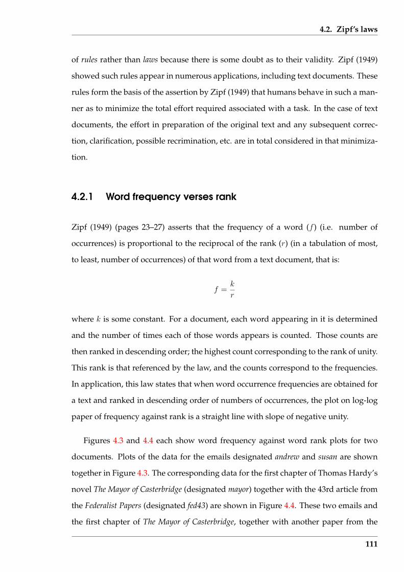
4.2. Zipf’s laws
of rules rather than laws because there is some doubt as to their validity. Zipf (1949)
showed such rules appear in numerous applications, including text documents. These
rules form the basis of the assertion by Zipf (1949) that humans behave in such a man-
ner as to minimize the total effort required associated with a task. In the case of text
documents, the effort in preparation of the original text and any subsequent correc-
tion, clarification, possible recrimination, etc. are in total considered in that minimiza-
tion.
4.2.1 Word frequency verses rank
Zipf (1949) (pages 23–27) asserts that the frequency of a word (f ) (i.e. number of
occurrences) is proportional to the reciprocal of the rank (r) (in a tabulation of most,
to least, number of occurrences) of that word from a text document, that is:
f =k
r
where k is some constant. For a document, each word appearing in it is determined
and the number of times each of those words appears is counted. Those counts are
then ranked in descending order; the highest count corresponding to the rank of unity.
This rank is that referenced by the law, and the counts correspond to the frequencies.
In application, this law states that when word occurrence frequencies are obtained for
a text and ranked in descending order of numbers of occurrences, the plot on log-log
paper of frequency against rank is a straight line with slope of negative unity.
Figures 4.3 and 4.4 each show word frequency against word rank plots for two
documents. Plots of the data for the emails designated andrew and susan are shown
together in Figure 4.3. The corresponding data for the first chapter of Thomas Hardy’s
novel The Mayor of Casterbridge (designated mayor) together with the 43rd article from
the Federalist Papers (designated fed43) are shown in Figure 4.4. These two emails and
the first chapter of The Mayor of Casterbridge, together with another paper from the
111
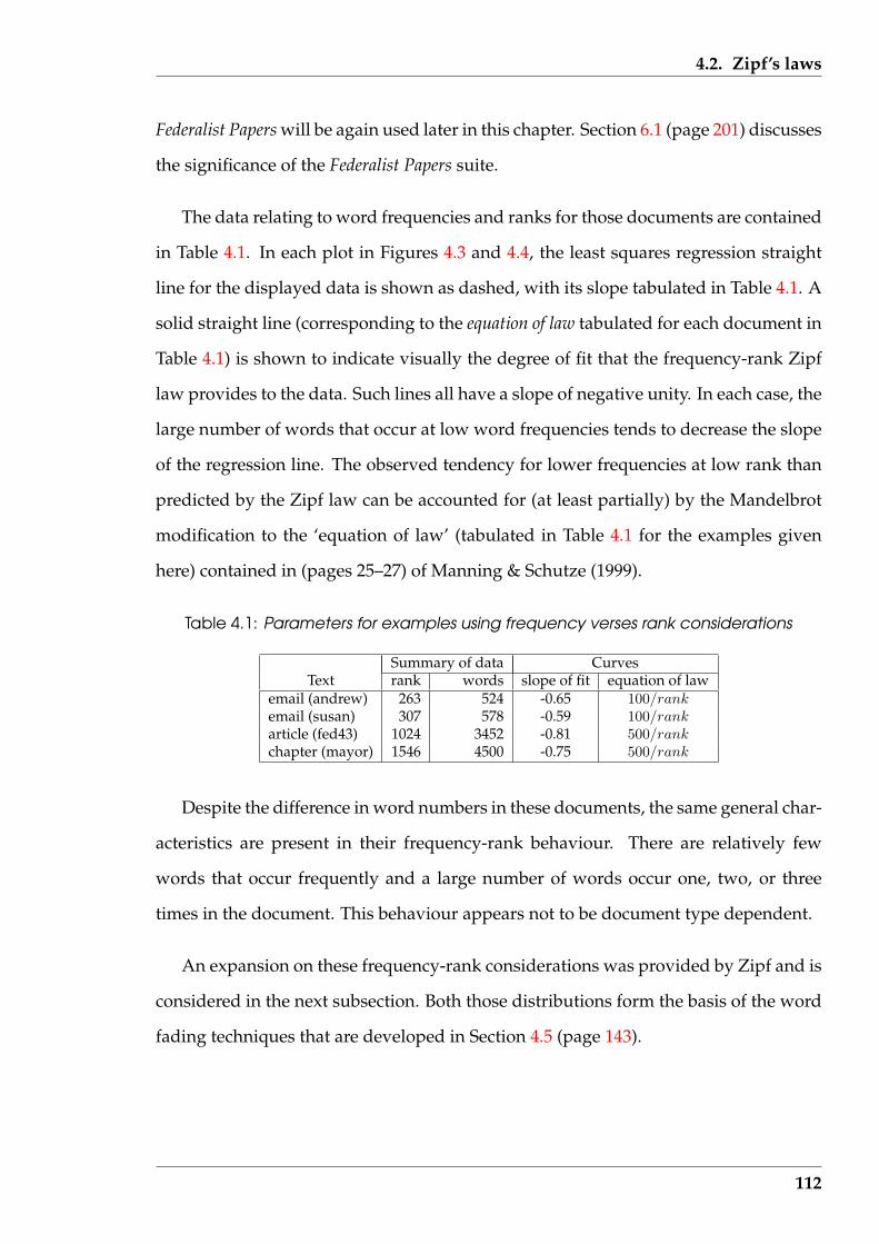
4.2. Zipf’s laws
Federalist Papers will be again used later in this chapter. Section 6.1 (page 201) discusses
the significance of the Federalist Papers suite.
The data relating to word frequencies and ranks for those documents are contained
in Table 4.1. In each plot in Figures 4.3 and 4.4, the least squares regression straight
line for the displayed data is shown as dashed, with its slope tabulated in Table 4.1. A
solid straight line (corresponding to the equation of law tabulated for each document in
Table 4.1) is shown to indicate visually the degree of fit that the frequency-rank Zipf
law provides to the data. Such lines all have a slope of negative unity. In each case, the
large number of words that occur at low word frequencies tends to decrease the slope
of the regression line. The observed tendency for lower frequencies at low rank than
predicted by the Zipf law can be accounted for (at least partially) by the Mandelbrot
modification to the ‘equation of law’ (tabulated in Table 4.1 for the examples given
here) contained in (pages 25–27) of Manning & Schutze (1999).
Table 4.1: Parameters for examples using frequency verses rank considerations
Summary of data CurvesText rank words slope of fit equation of law
email (andrew) 263 524 -0.65 100/rankemail (susan) 307 578 -0.59 100/rankarticle (fed43) 1024 3452 -0.81 500/rankchapter (mayor) 1546 4500 -0.75 500/rank
Despite the difference in word numbers in these documents, the same general char-
acteristics are present in their frequency-rank behaviour. There are relatively few
words that occur frequently and a large number of words occur one, two, or three
times in the document. This behaviour appears not to be document type dependent.
An expansion on these frequency-rank considerations was provided by Zipf and is
considered in the next subsection. Both those distributions form the basis of the word
fading techniques that are developed in Section 4.5 (page 143).
112
4.2. Zipf’s laws
1 2 5 10 20 50 100 200 500
12
510
2050
rank
frequ
ency
(a) email (andrew)
1 2 5 10 20 50 100 200 500
12
510
2050
rank
frequ
ency
(b) email (susan)
Figure 4.3: Word frequency verses rank for email examples
113
4.2. Zipf’s laws
1 5 10 50 100 500 5000
12
510
2050
100
200
500
rank
frequ
ency
(a) article (fed43)
1 5 10 50 100 500 5000
12
510
2050
100
200
500
rank
frequ
ency
(b) chapter (mayor)
Figure 4.4: Word frequency verses rank for article and novel chapter examples
114
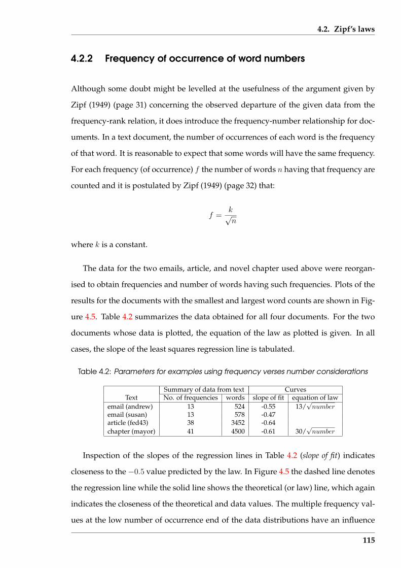
4.2. Zipf’s laws
4.2.2 Frequency of occurrence of word numbers
Although some doubt might be levelled at the usefulness of the argument given by
Zipf (1949) (page 31) concerning the observed departure of the given data from the
frequency-rank relation, it does introduce the frequency-number relationship for doc-
uments. In a text document, the number of occurrences of each word is the frequency
of that word. It is reasonable to expect that some words will have the same frequency.
For each frequency (of occurrence) f the number of words n having that frequency are
counted and it is postulated by Zipf (1949) (page 32) that:
f =k√n
where k is a constant.
The data for the two emails, article, and novel chapter used above were reorgan-
ised to obtain frequencies and number of words having such frequencies. Plots of the
results for the documents with the smallest and largest word counts are shown in Fig-
ure 4.5. Table 4.2 summarizes the data obtained for all four documents. For the two
documents whose data is plotted, the equation of the law as plotted is given. In all
cases, the slope of the least squares regression line is tabulated.
Table 4.2: Parameters for examples using frequency verses number considerations
Summary of data from text CurvesText No. of frequencies words slope of fit equation of law
email (andrew) 13 524 -0.55 13/√
numberemail (susan) 13 578 -0.47article (fed43) 38 3452 -0.64chapter (mayor) 41 4500 -0.61 30/
√number
Inspection of the slopes of the regression lines in Table 4.2 (slope of fit) indicates
closeness to the −0.5 value predicted by the law. In Figure 4.5 the dashed line denotes
the regression line while the solid line shows the theoretical (or law) line, which again
indicates the closeness of the theoretical and data values. The multiple frequency val-
ues at the low number of occurrence end of the data distributions have an influence
115

4.2. Zipf’s laws
1 2 5 10 20 50 100 200 500
12
510
2050
number
frequ
ency
(a) email (andrew)
1 5 10 50 100 500 5000
12
510
2050
100
200
500
number
frequ
ency
(b) chapter (mayor)
Figure 4.5: Frequency verses word numbers for email and novel chapter examples
116
4.2. Zipf’s laws
on this difference between these two straight line fits.
4.2.3 A resulting message principle
Although the following are not used further in the developments of this research, Zipf
(1949) makes further observations. These observations may prove fruitful in extending
the research reported in this thesis.
If f denotes frequency of the word occurrence, r the ranked order of that occur-
rence frequency, L the length of a word, and m the number of meanings that each
word has, then Sections 4.2.1 and 4.2.2 provide evidence to support the claims by Zipf
(1949) that:
f ∝ 1
r
f ∝ 1√n
From page 30 of Zipf (1949), the number of meanings of a word (m) is proportional
to the square of the rank of the word (r) or:
m ∝ 1
r2
Also, Manning & Schutze (1999) (page 28) attributes to Zipf the law that the length (L)
of a word is inverse proportional to the frequency (f ) of occurrence of that word, i.e.:
f ∝ 1
L
Resulting from collecting and manipulation of these four proportionalities, is that
117
4.3. Word frequency lists
the meaning of a word is subject to the series of relations:
m ∝ f 2 ∝ 1
L2∝ 1
n
These relationships expand on the least effort principal in communications pro-
posed by Zipf (1949) (pages 20–21). The originator of the message desires few words
(and thus low n) which have many meanings, while the receiver wants to process as
few words (thus low f ) which would require each word to have as few meanings as
possible. A compromise solution that fulfils the minimum requirements of the sender
and receiver of the message is required. Since these parameters are dependent on
the rank of the words used in the message, then the rank of the words influences the
position of the minimum that is attainable, and the solution attained.
Much of this current research makes use of specific words and/or the frequency
of occurrence of words in different types of documents. These parts used from Zipf’s
work links that approach, through the various techniques used in this research, to the
broader issue of minimising human effort. Although Zipf (1949) devotes considerable
space to consideration of text documents, they were used to support the thesis that
humans behave to minimise the effort needed to perform a task. As was stated in
Section 1.2 (page 7), this research provides approaches to assist humans (which implies
minimising effort) in obtaining information from text documents, which is consistent
with Zipf’s approach.
4.3 Word frequency lists
One implication of Zipf’s laws is that the frequency of word occurrence in text docu-
ments is not necessarily due to the grammatical contribution of those words. It is pro-
posed in this section that certain types of words occur more frequently in certain text
document types. Classification of text documents by the ‘functional objects’ that they
118
4.3. Word frequency lists
contain was proposed in Section 3.3.2 (page 87), and Table 3.1 (page 90) indicates the
combinations of functional objects different document types contain. Table 3.2 (page
92) shows an association between function objects and analysis techniques included
in this research. Therefore occurrence of those characteristic words is of importance
to this research for they can potentially help to classify a document, before actually
reading it. This section shows that this is partially true. A confounding factor is that
word occurrence varies between different writers as well as document types. It is
also proposed in the following that this relationship can also be considered in the re-
verse direction; for a given document type, the types of words used might indicate the
writer.
Techniques are examined in this section for performing such discrimination. These
techniques use word occurrence frequency lists as their basis.
4.3.1 Variability in word frequency lists
Word frequency lists are dependent on a variety of factors. The frequency list for
a child’s first reader is different from that used in general adult written communica-
tion, which is different from that appearing in transcription of spoken communica-
tion, which in turn is different from that for academic writing. With a language such
as English, differences between British and American usage also occur – in some in-
stances. There is also a temporal component to be considered for languages such as
English that are evolving, as distinct from those, such as Esperanto, which have been
defined (or standardised) and are hence reasonably stable. For example, the form of
the English language used in the seventeenth century, and reflected in the works of
William Shakespeare, is different from that used in contemporary discourse.
Although a writer selects all the words used in a text document, some are selected
to carry the information and emphasis, while others follow from the requirement for
grammatical structure of the document. From observation of the particular words
119
4.3. Word frequency lists
that repeatedly occur in the higher rank orders when the Zipf’s laws of Section 4.2
(page 110) are applied to a number of text documents, a conclusion was drawn by this
research that the structural words occur most frequent, and the less frequent words
are generally associated with the information content of the text. This produced the
assertion that:
the primary function performed by the most frequently occurring words in
a text is structural, and not information carrying.
Consequently, frequently occurring words can have less attention paid to them when
reading a text for the purpose of extracting the message that is being conveyed. The
message is carried by the words that remain after these frequently occurring words are
suppressed. This assertion is related to the hypothesis tested by Bassin & Martin (1976)
(page 649) that some word redundancy “serves to make a sentence grammatically
correct but does not contribute substantially to the understanding of the sentence”.
The experiment reported by Bassin & Martin (1976) and that reported in Chapter 5 of
this thesis support the truth of this assertion.
A reader could ignore grammatical structure if the text being read conforms to a
paradigm pre-supposed by the reader. The words that confirm such structure are no-
ticed to occur and can, with experience, be given less attention. If the grammar results
in the use of a higher percentage of structural words than information carry words,
then the above assertion is consistent with that situation. Then frequently occurring
words can be given less emphasis during the reading process. The skilled reader could
also predict the ongoing occurrence of such words within the text.
Such a paradigm would be expected to relate to what in this research was consid-
ered as the classification of the text. Examples of such classifications are whether the
text is a children’s text, a transcript of an interview, a transcript of a parliamentary
speech, a piece of scientific writing, or an academic writing from the humanities sec-
tor. By knowing in which classification the writing belongs, an expectation of message
120
4.3. Word frequency lists
content, and its structure, follows. A refinement in appropriate analysis techniques
can then be applied. Techniques adapted for the particular classification of a message
can be expected to yield better extraction results than a more general technique which
is aimed at obtaining that same outcome for unclassified messages.
There are difficulties in obtaining a word frequency list appropriate for all such
purposes. Consider such a list arising from contemporary children’s books. From
the Internet, two word frequency lists based on the books that children read were ob-
tained. Both are American in origin. One is the Dolch Word List1 which is described
as being derived from the words found in books that children read. This results in
these words being suggested for study by first and second grade students. The other
is from the Cache County School District 2 and lists the most frequent words in books
for beginning readers. Table 4.3 tabulates those word lists in the rank order each list
assigns to words it contains. For comparison, the corresponding word for each fre-
quency from a study discussed in Section 4.3.2 (page 123) of overall (adult orientated)
British English is included. In that British English list, the ’s indicates the grouping of
words containing the possessive ’s tail.
In Table 4.3, the first twenty most frequently occurring words from those list are
tabulated. This choice of twenty was a compromise between length of tabulation and
inclusion of high occurrence frequency words in English in general, which is consid-
ered in Section 4.3.2.
Inspection of Table 4.3 shows that different word lists obtained from different sources,
although for the same classification of text, show differences. The Dolch and Cache
County word lists have 13 of their 20 words in common. The words in common are
shown shaded dark grey in Table 4.3. In the Dolch list was appears, but not is. But
the Cache County list contains is, but not was. Both was and is occur in the Overall
list. Similarly, only 11 of the words common to both the Dolch and Cache County lists
1http://www.theschoolbell.com/Links/Dolch/Dolch.html, accessed 8 May 20022http://www.cache.k12.ut.us/htmlfiles/curriculum/literacy_high_freq_word_
list.htm, accessed 8 May 2002
121
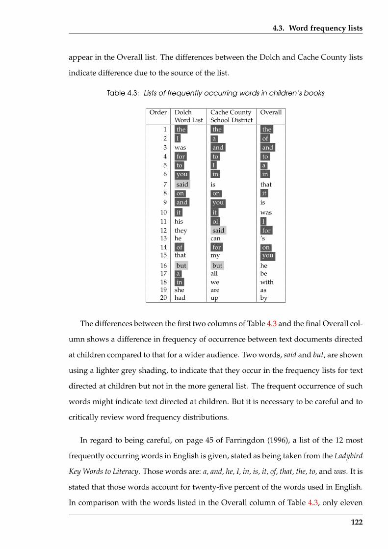
4.3. Word frequency lists
appear in the Overall list. The differences between the Dolch and Cache County lists
indicate difference due to the source of the list.
Table 4.3: Lists of frequently occurring words in children’s books
Order Dolch Cache County OverallWord List School District
1 the the the2 I a of3 was and and4 for to to5 to I a6 you in in
7 said is that8 on on it9 and you is
10 it it was11 his of I12 they said for13 he can ’s14 of for on15 that my you
16 but but he17 a all be18 in we with19 she are as20 had up by
The differences between the first two columns of Table 4.3 and the final Overall col-
umn shows a difference in frequency of occurrence between text documents directed
at children compared to that for a wider audience. Two words, said and but, are shown
using a lighter grey shading, to indicate that they occur in the frequency lists for text
directed at children but not in the more general list. The frequent occurrence of such
words might indicate text directed at children. But it is necessary to be careful and to
critically review word frequency distributions.
In regard to being careful, on page 45 of Farringdon (1996), a list of the 12 most
frequently occurring words in English is given, stated as being taken from the Ladybird
Key Words to Literacy. Those words are: a, and, he, I, in, is, it, of, that, the, to, and was. It is
stated that those words account for twenty-five percent of the words used in English.
In comparison with the words listed in the Overall column of Table 4.3, only eleven
122
4.3. Word frequency lists
of the Farringdon listed words appeared among the top twelve words of the Overall
list. The missing word he in the Farringdon list is replaced by for in the Overall list. In
fact eleven of the words in the Farringdon list (the exception being is) appear in the
Dolch Word List, while he, that, and was are absent from the Cache Country School
District list. So word frequency rank varies with the source, and there is variability
with regard to the importance placed on the words.
4.3.2 Derivation of a reference word frequency list
Word usage, and frequency of occurrence of particular words, would be expected to
vary across types of communications, for example, formal or everyday speech, or writ-
ten prose from a scholarly journal, business memoranda, or newspaper. Establishing
such baselines for types of general English usage are considered here. Such baselines
take the form of lists, ranked in order of occurrence, of the 50 most frequently used
words in the (British) English language.
The data for establishing this list were sourced from the British National Corpus
project described by Kilgarriff (1996) as a large, modern survey of English word usage
over a broad coverage of text documents. The corpus used in that project contained
some 100 million words derived from 4120 separate documents3. These data were
taken as providing true statistics on the nature of word occurrence in British English.
The data available was in the form of lists of word occurrences processed in a number
of ways.
Word occurrence lists were obtained from the Internet URL4. Two categories of
word lists were available; lemmatised and unlemmatised. The words in the lemmatised
list were collected into word categories; each word belonged to one word category.
There were 11 such word categories and each word appeared once in the resulting list.
3http://www.itri.brighton.ac.uk/˜Adam.Kilgarriff/bnc-readme.html, accessed 20May 2002
4http://www.itri.brighton.ac.uk/˜Adam.Kilgarriff, accessed 8 May 2002
123
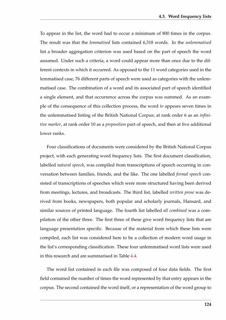
4.3. Word frequency lists
To appear in the list, the word had to occur a minimum of 800 times in the corpus.
The result was that the lemmatised lists contained 6,318 words. In the unlemmatised
list a broader aggregation criterion was used based on the part of speech the word
assumed. Under such a criteria, a word could appear more than once due to the dif-
ferent contexts in which it occurred. As opposed to the 11 word categories used in the
lemmatised case, 76 different parts of speech were used as categories with the unlem-
matised case. The combination of a word and its associated part of speech identified
a single element, and that occurrence across the corpus was summed. As an exam-
ple of the consequence of this collection process, the word to appears seven times in
the unlemmatised listing of the British National Corpus; at rank order 6 as an infini-
tive marker, at rank order 10 as a preposition part of speech, and then at five additional
lower ranks.
Four classifications of documents were considered by the British National Corpus
project, with each generating word frequency lists. The first document classification,
labelled natural speech, was compiled from transcriptions of speech occurring in con-
versation between families, friends, and the like. The one labelled formal speech con-
sisted of transcriptions of speeches which were more structured having been derived
from meetings, lectures, and broadcasts. The third list, labelled written prose was de-
rived from books, newspapers, both popular and scholarly journals, Hansard, and
similar sources of printed language. The fourth list labelled all combined was a com-
pilation of the other three. The first three of these give word frequency lists that are
language presentation specific. Because of the material from which these lists were
compiled, each list was considered here to be a collection of modern word usage in
the list’s corresponding classification. These four unlemmatised word lists were used
in this research and are summarised in Table 4.4.
The word list contained in each file was composed of four data fields. The first
field contained the number of times the word represented by that entry appears in the
corpus. The second contained the word itself, or a representation of the word group to
124
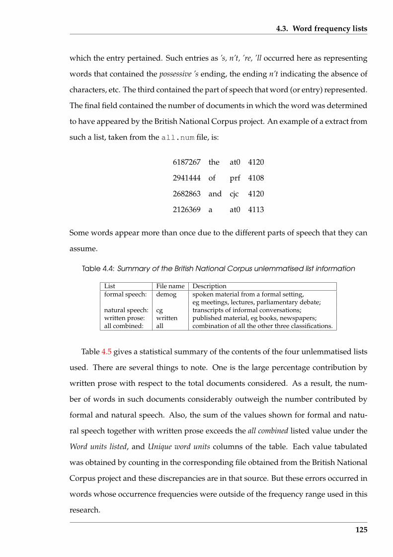
4.3. Word frequency lists
which the entry pertained. Such entries as ’s, n’t, ’re, ’ll occurred here as representing
words that contained the possessive ’s ending, the ending n’t indicating the absence of
characters, etc. The third contained the part of speech that word (or entry) represented.
The final field contained the number of documents in which the word was determined
to have appeared by the British National Corpus project. An example of a extract from
such a list, taken from the all.num file, is:
6187267 the at0 4120
2941444 of prf 4108
2682863 and cjc 4120
2126369 a at0 4113
Some words appear more than once due to the different parts of speech that they can
assume.
Table 4.4: Summary of the British National Corpus unlemmatised list information
List File name Descriptionformal speech: demog spoken material from a formal setting,
eg meetings, lectures, parliamentary debate;natural speech: cg transcripts of informal conversations;written prose: written published material, eg books, newspapers;all combined: all combination of all the other three classifications.
Table 4.5 gives a statistical summary of the contents of the four unlemmatised lists
used. There are several things to note. One is the large percentage contribution by
written prose with respect to the total documents considered. As a result, the num-
ber of words in such documents considerably outweigh the number contributed by
formal and natural speech. Also, the sum of the values shown for formal and natu-
ral speech together with written prose exceeds the all combined listed value under the
Word units listed, and Unique word units columns of the table. Each value tabulated
was obtained by counting in the corresponding file obtained from the British National
Corpus project and these discrepancies are in that source. But these errors occurred in
words whose occurrence frequencies were outside of the frequency range used in this
research.
125
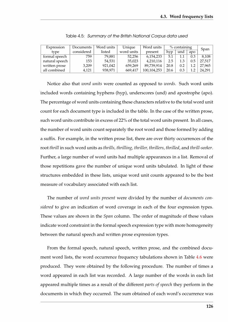
4.3. Word frequency lists
Table 4.5: Summary of the British National Corpus data used
Expression Documents Word units Unique Word units % containingtype considered listed word units present hyp und apo
Span
formal speech 759 79,881 52,256 6,154,233 5.1 1.1 0.3 8,108natural speech 153 54,531 35,023 4,210,116 2.5 1.3 0.5 27,517written prose 3,209 921,042 659,269 89,739,914 20.8 0.2 1.2 27,965all combined 4,121 938,971 669,417 100,104,253 20.6 0.3 1.2 24,291
Notice also that word units were counted as opposed to words. Such word units
included words containing hyphens (hyp), underscores (und) and apostrophe (apo).
The percentage of word units containing these characters relative to the total word unit
count for each document type is included in the table. In the case of the written prose,
such word units contribute in excess of 22% of the total word units present. In all cases,
the number of word units count separately the root word and those formed by adding
a suffix. For example, in the written prose list, there are over thirty occurrences of the
root thrill in such word units as thrills, thrilling, thriller, thrillers, thrilled, and thrill-seeker.
Further, a large number of word units had multiple appearances in a list. Removal of
those repetitions gave the number of unique word units tabulated. In light of these
structures embedded in these lists, unique word unit counts appeared to be the best
measure of vocabulary associated with each list.
The number of word units present were divided by the number of documents con-
sidered to give an indication of word coverage in each of the four expression types.
These values are shown in the Span column. The order of magnitude of these values
indicate word constraint in the formal speech expression type with more homogeneity
between the natural speech and written prose expression types.
From the formal speech, natural speech, written prose, and the combined docu-
ment word lists, the word occurrence frequency tabulations shown in Table 4.6 were
produced. They were obtained by the following procedure. The number of times a
word appeared in each list was recorded. A large number of the words in each list
appeared multiple times as a result of the different parts of speech they perform in the
documents in which they occurred. The sum obtained of each word’s occurrence was
126
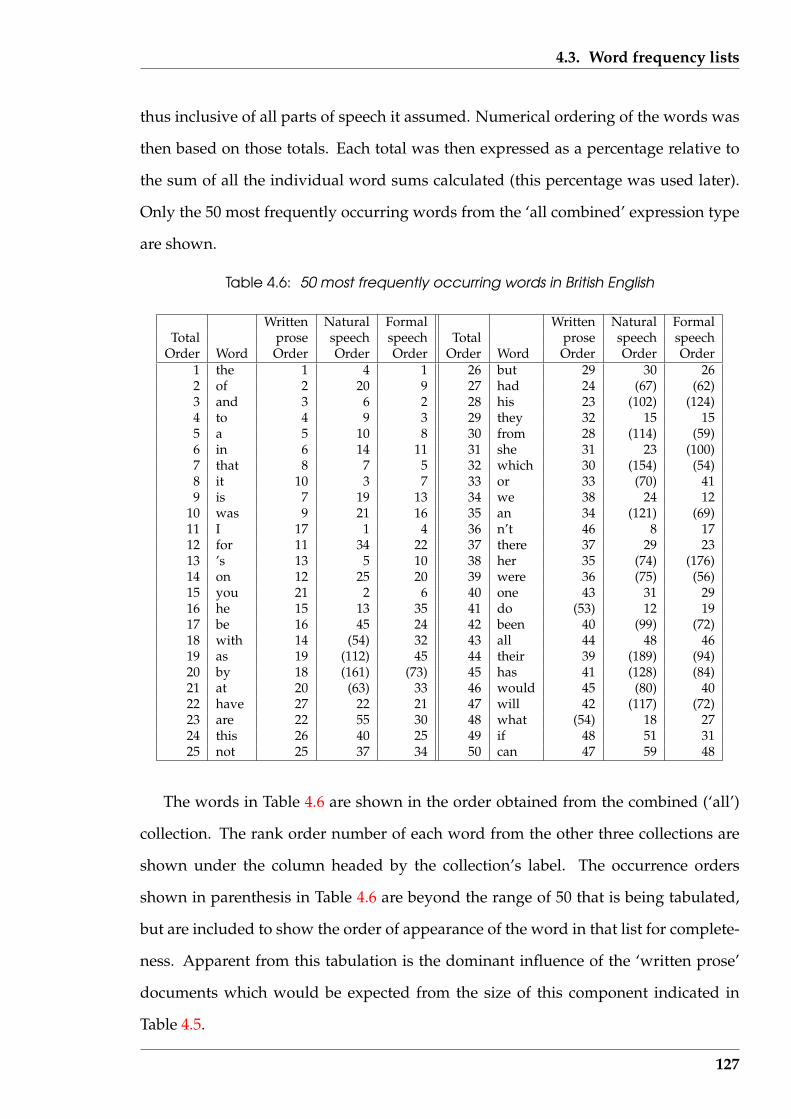
4.3. Word frequency lists
thus inclusive of all parts of speech it assumed. Numerical ordering of the words was
then based on those totals. Each total was then expressed as a percentage relative to
the sum of all the individual word sums calculated (this percentage was used later).
Only the 50 most frequently occurring words from the ‘all combined’ expression type
are shown.
Table 4.6: 50 most frequently occurring words in British English
Written Natural Formal Written Natural FormalTotal prose speech speech Total prose speech speech
Order Word Order Order Order Order Word Order Order Order1 the 1 4 1 26 but 29 30 262 of 2 20 9 27 had 24 (67) (62)3 and 3 6 2 28 his 23 (102) (124)4 to 4 9 3 29 they 32 15 155 a 5 10 8 30 from 28 (114) (59)6 in 6 14 11 31 she 31 23 (100)7 that 8 7 5 32 which 30 (154) (54)8 it 10 3 7 33 or 33 (70) 419 is 7 19 13 34 we 38 24 12
10 was 9 21 16 35 an 34 (121) (69)11 I 17 1 4 36 n’t 46 8 1712 for 11 34 22 37 there 37 29 2313 ’s 13 5 10 38 her 35 (74) (176)14 on 12 25 20 39 were 36 (75) (56)15 you 21 2 6 40 one 43 31 2916 he 15 13 35 41 do (53) 12 1917 be 16 45 24 42 been 40 (99) (72)18 with 14 (54) 32 43 all 44 48 4619 as 19 (112) 45 44 their 39 (189) (94)20 by 18 (161) (73) 45 has 41 (128) (84)21 at 20 (63) 33 46 would 45 (80) 4022 have 27 22 21 47 will 42 (117) (72)23 are 22 55 30 48 what (54) 18 2724 this 26 40 25 49 if 48 51 3125 not 25 37 34 50 can 47 59 48
The words in Table 4.6 are shown in the order obtained from the combined (‘all’)
collection. The rank order number of each word from the other three collections are
shown under the column headed by the collection’s label. The occurrence orders
shown in parenthesis in Table 4.6 are beyond the range of 50 that is being tabulated,
but are included to show the order of appearance of the word in that list for complete-
ness. Apparent from this tabulation is the dominant influence of the ‘written prose’
documents which would be expected from the size of this component indicated in
Table 4.5.
127

4.3. Word frequency lists
The word frequencies obtained were not affected by suffixed forms of words. Al-
though such forms did occur, their occurrence was beyond the cut off frequency of
interest. In addition, because hyphenated word units also did not appear within the
order considered, it is appropriate to use the term word as opposed to word unit as in
the considerations above.
4.3.3 Influence of the type of document on word frequency
The frequency at which different words appear in a document varies with both the
subject matter and its manner of presentation. Farringdon (1996) used a list of frequent
words from the Ladybird Key Words to Literacy. Those word occurrences are biased
towards words that would be expected to occur in children’s first readers. In Table 4.3
the relative pattern between two other sources of first reader words and those derived
from the British National Corpus project are tabulated. One of the attributes of the
British National Corpus data introduced in Section 4.3.2 is the separation of word
frequency into document types. That data enables documents broader in scope than
children’s first readers to be investigated. Such an investigation is the function of this
section.
The percentage values mentioned in Section 4.3.2 as having been calculated in de-
riving the results tabulated in Table 4.6 are used to form Table 4.7. That table shows
the dominance of a small number of words over all words counted in the four British
National Corpus word lists. The number of word units counted together with the
number of documents used to create the word list associated with each type of expres-
sion (reflected in the type of document) is also included so the size of the word sample
used can be seen. The word counts used (as also in obtaining Table 4.6) are summed
across the various parts of speech that contain that word in the word list. The per-
centages were calculated as decimal fractions, but are shown in the table rounded to
the nearest whole number because, in this particular application, a decimal does not
128
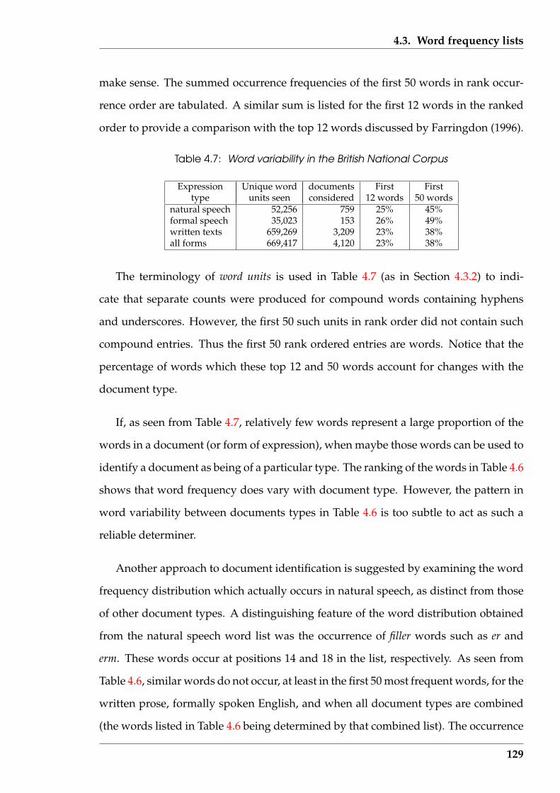
4.3. Word frequency lists
make sense. The summed occurrence frequencies of the first 50 words in rank occur-
rence order are tabulated. A similar sum is listed for the first 12 words in the ranked
order to provide a comparison with the top 12 words discussed by Farringdon (1996).
Table 4.7: Word variability in the British National Corpus
Expression Unique word documents First Firsttype units seen considered 12 words 50 words
natural speech 52,256 759 25% 45%formal speech 35,023 153 26% 49%written texts 659,269 3,209 23% 38%all forms 669,417 4,120 23% 38%
The terminology of word units is used in Table 4.7 (as in Section 4.3.2) to indi-
cate that separate counts were produced for compound words containing hyphens
and underscores. However, the first 50 such units in rank order did not contain such
compound entries. Thus the first 50 rank ordered entries are words. Notice that the
percentage of words which these top 12 and 50 words account for changes with the
document type.
If, as seen from Table 4.7, relatively few words represent a large proportion of the
words in a document (or form of expression), when maybe those words can be used to
identify a document as being of a particular type. The ranking of the words in Table 4.6
shows that word frequency does vary with document type. However, the pattern in
word variability between documents types in Table 4.6 is too subtle to act as such a
reliable determiner.
Another approach to document identification is suggested by examining the word
frequency distribution which actually occurs in natural speech, as distinct from those
of other document types. A distinguishing feature of the word distribution obtained
from the natural speech word list was the occurrence of filler words such as er and
erm. These words occur at positions 14 and 18 in the list, respectively. As seen from
Table 4.6, similar words do not occur, at least in the first 50 most frequent words, for the
written prose, formally spoken English, and when all document types are combined
(the words listed in Table 4.6 being determined by that combined list). The occurrence
129
4.3. Word frequency lists
of such words in a text might, therefore, be used as determining that text came from
speech.
A closer examination of the expected word frequency patterns in written prose,
formal speech, and natural speech was performed with the aim of using the resulting
information for document discrimination. Table 4.8 contains the results.
A design criteria was that the number of words needing to be included should
be a minimum but consistent with providing reasonable document type recognition,
say with correct determination 75% of the time. From Table 4.7, the 12 most frequent
words are shown to account for approximately one quarter of all words that appear in
each document type. To be able to discriminate documents by considering the 12 most
frequently occurring words in a document type would be an advantage. However,
since those 12 most frequent words are different for the different document types, a
greater number than 12 words would need to be considered to cover all of the 12 most
frequent words for the three document types. Increasing that number of known words
from 12 to 50, would result in a four-fold increase in effort to located such words in
a sample of text. But as Table 4.7 indicates that, at best, would double the number of
words known to exist in a sample. This disparity encouraged the the examination of
words numbering in the order of 12, as opposed to 50.
The sample size in which the word occurrence was actually measured was chosen
as 150 words for these experiments. This size was a compromise between being large
enough to remove the influence of unimportant variations, and being small for min-
imising the search for words being present. A small sample size would also assist the
use of the resulting discriminator on small documents. This size had implications in
the following.
Which words should be used? The policy adopted was to have the expected fre-
quency of occurrence of the selected word to be at least 0.67% when expressed relative
to the total number of words in a given document type. Consequently, on average, that
130

4.3. Word frequency lists
Table 4.8: Word occurrences in various forms of British English: words shaded dark greyare the top 12 words; light grey shading for the next 6 in order; no shading for wordsbeyond a ranking of 18
written natural formalword prose speech speech
[%] [%] [%]the 6.44 2.74 4.81of 3.11 0.83 1.91and 2.70 2.16 2.77to 2.60 1.70 2.54a 2.18 1.69 1.99in 1.95 1.06 1.49is 1.00 0.84 1.14that 0.99 1.99 2.27was 0.94 0.83 0.80I 4.02 2.30it 0.93 3.05 2.05for 0.88 0.69
Sum 23.72 20.91 24.76on 0.72 0.79 0.74’s 0.68 2.56 1.50with 0.68he 0.68 1.15be 0.67 0.67you 3.21 2.18
Sum 27.15 28.62 29.85we 0.80 1.23er 1.09they 1.04 0.86n’t 1.84 0.80yeah 1.40do 1.29 0.74oh 0.99no 0.93what 0.91have 0.81 0.71she 0.80well 0.78know 0.75got 0.74there 0.75 0.67erm 0.75
Sum 27.15 42.45 36.70
131

4.3. Word frequency lists
word would be expected to appear at least once in a sample of 150 words of text from
that document type. Table 4.8 shows the resulting word lists for the three document
types.
Table 4.8 shows the occurrence percentage of the most common words of British
English as measured for natural speech, formal speech, and written prose. The words
appear in the rank order produced by the indicated percentages by first using those
of written prose, then using natural speech, and then those of formal speech for the
remainder. The 12 most common occurring shown in Table 4.6, which result from
the all forms word list, are shown with a dark grey shading. The accumulated sum
expected occurrence of those 12 words for each document type is shown. A lighter
grey shading is applied to the next 6 words in that same rank order. These shaded
(both dark and light) words indicate those words ranked in the top 18 most frequently
appearing words from Table 4.6. The next two words from Table 4.6, as and by, fall
below of the 0.67 percent criterion for inclusion in this table. In other places where
a particular word occurrence in a document type falls below that criterion, a gap is
present. By using the percentage values for the words in Table 4.8, the ranks shown in
Table 4.6 follow.
The contrast between the word content for these document types is apparent from
Table 4.8. As shown in Table 4.7, 50 words accounted for 38.0% of the total number
of words in the British National corpus. That is an overall figure. Table 4.8 offers a
refinement of that overall figure for written British English prose, in that 16 words
account for 27.15% of the words that appear in that overall total (compared with the
figure for 50 words). For formal speech, 29 words account for 42.45% of the words
appearing. For natural speech, 24 words account for 36.70% of the words appearing.
It follows from Table 4.8 that each of the words tabulated would be expected to occur
at least once in a 150 words text sample (150× 0.67100
> 1.0).
132

4.4. Analysis applications using word frequencies
4.4 Analysis applications using word frequencies
The reason given in Section 3.3 (page 82) for classification of document types was to
assist in their subsequent analysis. In Section 4.3.3 relationships between the words
they contain and their frequency of occurrence was established. In this Section, that
relationship is used to classify documents for assisting selection of analysis techniques
that might be appropriate. These classifications can also give an insight into the ‘style’
of writing used in a document.
Trials were performed to determine the effectiveness of classification of documents
by using the word occurrence patterns of Table 4.8. Two issues were of interest. One
was how the size of the continuous block of text drawn from a document influenced
the classification outcome. The second was how many of the words tabulated in Ta-
ble 4.8 should be used to arrive at that classification.
The technique of classification consists of the following. A sample of text from a
document was taken which consisted of successive words, without exclusions. Dif-
ferent methods of performing that sampling were considered. All the words in the
text sample were counted, but only those words tabulated in Table 4.8 were consid-
ered for determining the document’s classification. The word count percentages of
the occurrence of the words tabulated in Table 4.8 were compared to the expected val-
ues for the three document classifications; the closest alignment of measured against
tabulated word occurrence determined the classification of the document sample.
Two approaches to obtaining the text sample for analysis were used. One used the
whole document while the other selected a block of 150 words from the document.
In the first sampling method all words present in the document were counted and
the occurrence of the words of interest calculated as a percentage of that total word
count. The alternative was to consider one or more blocks of 150 words from the
document. In each block the occurrence of the words of interest were counted and
converted to a percentage using the total number of words in that block. In either
133
4.4. Analysis applications using word frequencies
case, the percentages obtained were compared against the standard measures shown
in Table 4.8 and the document type thus deduced. If multiple blocks of 150 words
were used, the resulting determination was for each block.
Another question considered was whether a block size less then 150 could be em-
ployed and still maintain a consistent document typing.
4.4.1 Methods using word frequency for classification
The ‘PerlBreaker’ software of Section 4.1.4 (page 107) was used. The required statis-
tics were obtained by applying the software processing tree shown in Figure 4.2 (page
109) to each text separately. From the word occurrence file wordlist.txt produced
from the createlist.pl process, the occurrence of the words of interest were found.
These counts were converted to percentages of the total of all word occurrences counted;
that total word occurrences being taken as the words present in the document. The re-
sult of this is that the word counts used in the documents was not constant, and was
in excess of 150 words.
This software was applied to a selection of documents. The first chapters of the
novels Hard Times by Charles Dickens, Black Arrow by Robert Louis Stevenson, and
The Mayor of Casterbridge by Thomas Hardy were taken as representative of classical
novels. Table 4.9 and Table 4.10 which show the results obtained, these documents
are denoted as hard1, black1, and mayor1. The first paper of the Federalist Papers was
used as an example of magazine/newspaper writing and is denoted as fed1. Emails
were used as examples of a modern form of expression. Three emails were used and
are denoted as andrew, susan, and susan2 with the second and third of these from the
same writer. In the case of each email, the ‘header’ information which included the
email addresses involved, together with the subject line were removed, making for
a ‘cleaner’ document. The header line was a potential source of words not relevant
to the analysis being performed, and experience showed that no significant error was
134
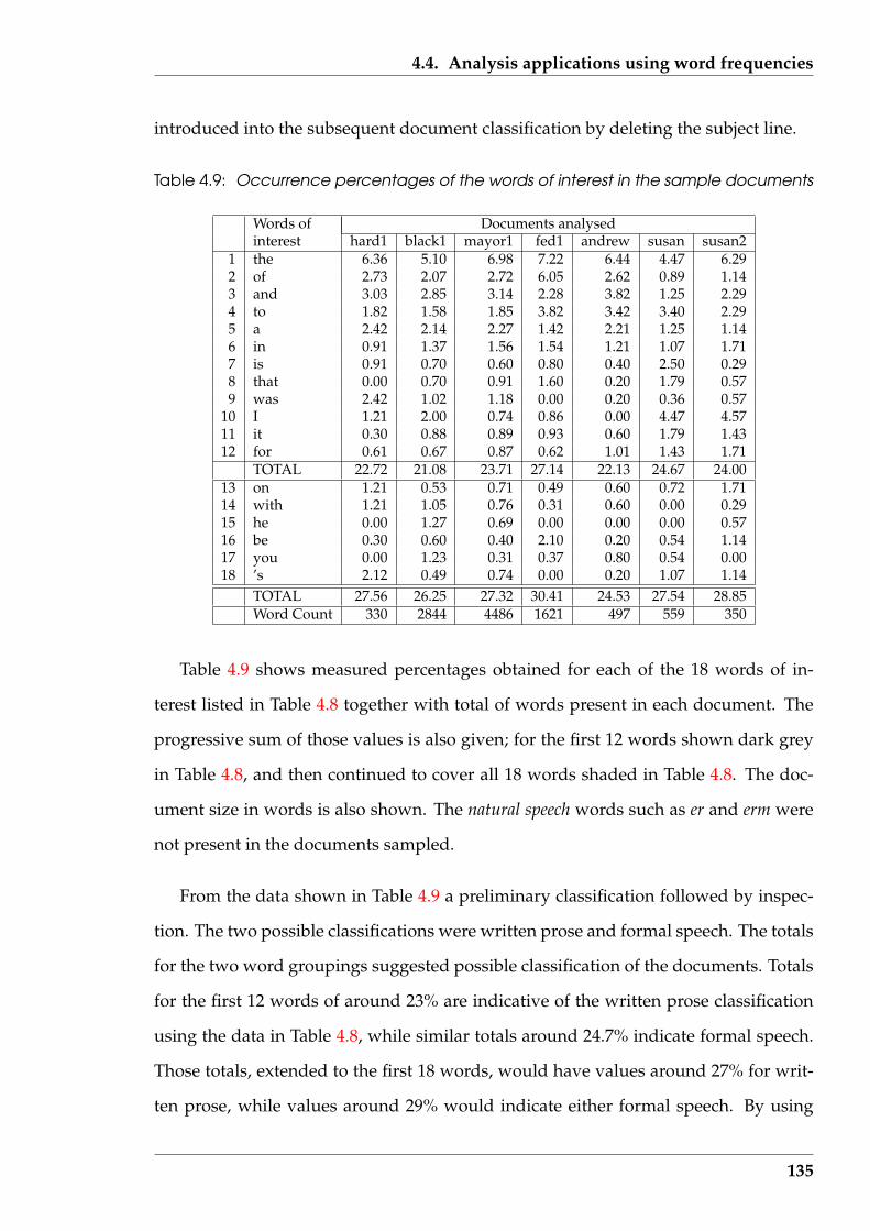
4.4. Analysis applications using word frequencies
introduced into the subsequent document classification by deleting the subject line.
Table 4.9: Occurrence percentages of the words of interest in the sample documents
Words of Documents analysedinterest hard1 black1 mayor1 fed1 andrew susan susan2
1 the 6.36 5.10 6.98 7.22 6.44 4.47 6.292 of 2.73 2.07 2.72 6.05 2.62 0.89 1.143 and 3.03 2.85 3.14 2.28 3.82 1.25 2.294 to 1.82 1.58 1.85 3.82 3.42 3.40 2.295 a 2.42 2.14 2.27 1.42 2.21 1.25 1.146 in 0.91 1.37 1.56 1.54 1.21 1.07 1.717 is 0.91 0.70 0.60 0.80 0.40 2.50 0.298 that 0.00 0.70 0.91 1.60 0.20 1.79 0.579 was 2.42 1.02 1.18 0.00 0.20 0.36 0.57
10 I 1.21 2.00 0.74 0.86 0.00 4.47 4.5711 it 0.30 0.88 0.89 0.93 0.60 1.79 1.4312 for 0.61 0.67 0.87 0.62 1.01 1.43 1.71
TOTAL 22.72 21.08 23.71 27.14 22.13 24.67 24.0013 on 1.21 0.53 0.71 0.49 0.60 0.72 1.7114 with 1.21 1.05 0.76 0.31 0.60 0.00 0.2915 he 0.00 1.27 0.69 0.00 0.00 0.00 0.5716 be 0.30 0.60 0.40 2.10 0.20 0.54 1.1417 you 0.00 1.23 0.31 0.37 0.80 0.54 0.0018 ’s 2.12 0.49 0.74 0.00 0.20 1.07 1.14
TOTAL 27.56 26.25 27.32 30.41 24.53 27.54 28.85Word Count 330 2844 4486 1621 497 559 350
Table 4.9 shows measured percentages obtained for each of the 18 words of in-
terest listed in Table 4.8 together with total of words present in each document. The
progressive sum of those values is also given; for the first 12 words shown dark grey
in Table 4.8, and then continued to cover all 18 words shaded in Table 4.8. The doc-
ument size in words is also shown. The natural speech words such as er and erm were
not present in the documents sampled.
From the data shown in Table 4.9 a preliminary classification followed by inspec-
tion. The two possible classifications were written prose and formal speech. The totals
for the two word groupings suggested possible classification of the documents. Totals
for the first 12 words of around 23% are indicative of the written prose classification
using the data in Table 4.8, while similar totals around 24.7% indicate formal speech.
Those totals, extended to the first 18 words, would have values around 27% for writ-
ten prose, while values around 29% would indicate either formal speech. By using
135
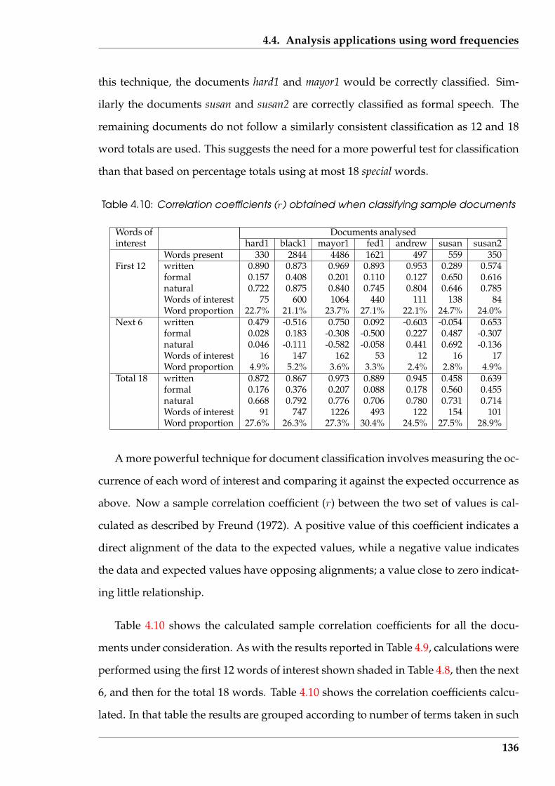
4.4. Analysis applications using word frequencies
this technique, the documents hard1 and mayor1 would be correctly classified. Sim-
ilarly the documents susan and susan2 are correctly classified as formal speech. The
remaining documents do not follow a similarly consistent classification as 12 and 18
word totals are used. This suggests the need for a more powerful test for classification
than that based on percentage totals using at most 18 special words.
Table 4.10: Correlation coefficients (r) obtained when classifying sample documents
Words of Documents analysedinterest hard1 black1 mayor1 fed1 andrew susan susan2
Words present 330 2844 4486 1621 497 559 350First 12 written 0.890 0.873 0.969 0.893 0.953 0.289 0.574
formal 0.157 0.408 0.201 0.110 0.127 0.650 0.616natural 0.722 0.875 0.840 0.745 0.804 0.646 0.785Words of interest 75 600 1064 440 111 138 84Word proportion 22.7% 21.1% 23.7% 27.1% 22.1% 24.7% 24.0%
Next 6 written 0.479 -0.516 0.750 0.092 -0.603 -0.054 0.653formal 0.028 0.183 -0.308 -0.500 0.227 0.487 -0.307natural 0.046 -0.111 -0.582 -0.058 0.441 0.692 -0.136Words of interest 16 147 162 53 12 16 17Word proportion 4.9% 5.2% 3.6% 3.3% 2.4% 2.8% 4.9%
Total 18 written 0.872 0.867 0.973 0.889 0.945 0.458 0.639formal 0.176 0.376 0.207 0.088 0.178 0.560 0.455natural 0.668 0.792 0.776 0.706 0.780 0.731 0.714Words of interest 91 747 1226 493 122 154 101Word proportion 27.6% 26.3% 27.3% 30.4% 24.5% 27.5% 28.9%
A more powerful technique for document classification involves measuring the oc-
currence of each word of interest and comparing it against the expected occurrence as
above. Now a sample correlation coefficient (r) between the two set of values is cal-
culated as described by Freund (1972). A positive value of this coefficient indicates a
direct alignment of the data to the expected values, while a negative value indicates
the data and expected values have opposing alignments; a value close to zero indicat-
ing little relationship.
Table 4.10 shows the calculated sample correlation coefficients for all the docu-
ments under consideration. As with the results reported in Table 4.9, calculations were
performed using the first 12 words of interest shown shaded in Table 4.8, then the next
6, and then for the total 18 words. Table 4.10 shows the correlation coefficients calcu-
lated. In that table the results are grouped according to number of terms taken in such
136
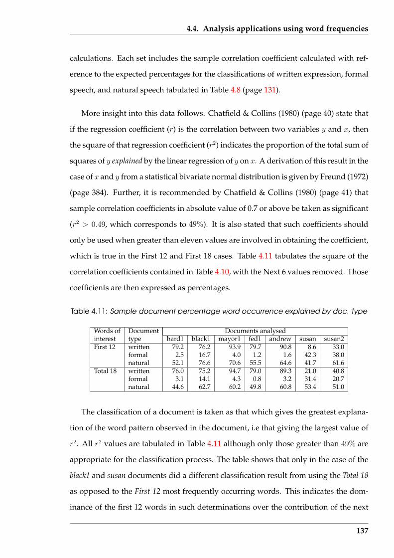
4.4. Analysis applications using word frequencies
calculations. Each set includes the sample correlation coefficient calculated with ref-
erence to the expected percentages for the classifications of written expression, formal
speech, and natural speech tabulated in Table 4.8 (page 131).
More insight into this data follows. Chatfield & Collins (1980) (page 40) state that
if the regression coefficient (r) is the correlation between two variables y and x, then
the square of that regression coefficient (r2) indicates the proportion of the total sum of
squares of y explained by the linear regression of y on x. A derivation of this result in the
case of x and y from a statistical bivariate normal distribution is given by Freund (1972)
(page 384). Further, it is recommended by Chatfield & Collins (1980) (page 41) that
sample correlation coefficients in absolute value of 0.7 or above be taken as significant
(r2 > 0.49, which corresponds to 49%). It is also stated that such coefficients should
only be used when greater than eleven values are involved in obtaining the coefficient,
which is true in the First 12 and First 18 cases. Table 4.11 tabulates the square of the
correlation coefficients contained in Table 4.10, with the Next 6 values removed. Those
coefficients are then expressed as percentages.
Table 4.11: Sample document percentage word occurrence explained by doc. type
Words of Document Documents analysedinterest type hard1 black1 mayor1 fed1 andrew susan susan2First 12 written 79.2 76.2 93.9 79.7 90.8 8.6 33.0
formal 2.5 16.7 4.0 1.2 1.6 42.3 38.0natural 52.1 76.6 70.6 55.5 64.6 41.7 61.6
Total 18 written 76.0 75.2 94.7 79.0 89.3 21.0 40.8formal 3.1 14.1 4.3 0.8 3.2 31.4 20.7natural 44.6 62.7 60.2 49.8 60.8 53.4 51.0
The classification of a document is taken as that which gives the greatest explana-
tion of the word pattern observed in the document, i.e that giving the largest value of
r2. All r2 values are tabulated in Table 4.11 although only those greater than 49% are
appropriate for the classification process. The table shows that only in the case of the
black1 and susan documents did a different classification result from using the Total 18
as opposed to the First 12 most frequently occurring words. This indicates the dom-
inance of the first 12 words in such determinations over the contribution of the next
137
4.4. Analysis applications using word frequencies
six. In both the susan and susan2 documents, the r2 values are close to the cutoff value
of 49%. However, in the susan document case, the additional six test words produced
a result, while in the susan2 case the result was less conclusive when using those ad-
ditional six words, although the same classification was obtained in both instances.
Since both are emails from the same person and in the same environment, the same
classification would be expected.
The documents hard1, black1, mayor1, fed1, and andrew are classified as written doc-
uments from Table 4.11 for the most frequent words present matched that type of
document. The words used to characterise written documents showed in excess of
75% agreement between observed and expected occurrence (r2 > 0.75 for the written
document type). Only in the case of black1 did the additional six test words change
the classification and in that instance the written document classification was close to
the natural speech classification obtained using the first 12 words. Despite the concern
expressed above about the coefficients in the case of the susan and susan2 documents,
these are both classified as natural speech type documents.
Production of correlation coefficients using both First 12 and Total 18 words of in-
terest provides an indication of confidence in the document classification obtained by
using either value. As opposed to a single determination, any change produced by
additional data can be taken into consideration in arriving at the classification subse-
quently assigned. A viewing of two values thus gives at least some indication of the
stability, and thus an indication of confidence, in the classification being assigned.
Reference to Table 4.10 indicates that hard1 and susan2, and the andrew and su-
san were documents approximately of the same size being measured in hundreds of
words, while black1 and mayor1 were thousands of words in length. Coupling those
lengths to the classifications obtained from Table 4.11, and their progression when us-
ing 12 or 18 test words, suggests that document length may not be a major determiner
of the outcome of this classification process.
138
4.4. Analysis applications using word frequencies
4.4.2 Influence on classification of text sampling method used
In this section the correlation coefficient technique described in the previous section
is used with two different manners of sampling the text from a document. In one, the
position in the document from where the sample was taken is considered. In the other,
the size of the sample was decreased to below the 150 word limit previously set as the
text sample size.
Complete lines were taken in succession from a document to produce the text sam-
ple of the required number of words. This had two consequences. The sample pro-
duced contained its word content in context (which will be used later) in contrast to
what would result if the words were drawn from the document at random. The other
result was the need to adjust the number of lines extracted so as to achieve approxi-
mately the required number of words for the sample size of interest. As a consequence
of this process, and the varying number of words per line within and between docu-
ments, the number of words did vary between samples. A text editor was used to
obtain the samples, each was saved as a file, and then that file processed using the
‘PerlBreaker’ word counting software of Figure 4.2 (page 109). This procedure was
repeated so that each line in the original document appeared in one sample that was
processed by the word counting software. In general, the final block processed for
each document was smaller than the prescribed sample size due to running out of
word blocks of the required size. That sample size was set at 150 words.
Categorisation was performed using the Total 18 model, since the additional com-
putations above that for the First 12 model did not result in an appreciable time penalty
in arriving at a categorisation, although a slight improvement in category determina-
tion might result. The word counters were reset between processing of each block of
lines. Consequently, each classification was independent of those obtained from other
samples within a document.
Each of the documents used in Table 4.10 were processed in this way. The results
139
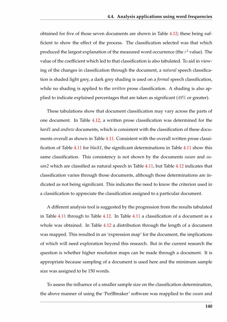
4.4. Analysis applications using word frequencies
obtained for five of those seven documents are shown in Table 4.12; these being suf-
ficient to show the effect of the process. The classification selected was that which
produced the largest explanation of the measured word occurrence (the r2 value). The
value of the coefficient which led to that classification is also tabulated. To aid in view-
ing of the changes in classification through the document, a natural speech classifica-
tion is shaded light grey, a dark grey shading is used on a formal speech classification,
while no shading is applied to the written prose classification. A shading is also ap-
plied to indicate explained percentages that are taken as significant (49% or greater).
These tabulations show that document classification may vary across the parts of
one document. In Table 4.12, a written prose classification was determined for the
hard1 and andrew documents, which is consistent with the classification of these docu-
ments overall as shown in Table 4.11. Consistent with the overall written prose classi-
fication of Table 4.11 for black1, the significant determinations in Table 4.11 show this
same classification. This consistency is not shown by the documents susan and su-
san2 which are classified as natural speech in Table 4.11, but Table 4.12 indicates that
classification varies through those documents, although those determinations are in-
dicated as not being significant. This indicates the need to know the criterion used in
a classification to appreciate the classification assigned to a particular document.
A different analysis tool is suggested by the progression from the results tabulated
in Table 4.11 through to Table 4.12. In Table 4.11 a classification of a document as a
whole was obtained. In Table 4.12 a distribution through the length of a document
was mapped. This resulted in an ‘expression map’ for the document, the implications
of which will need exploration beyond this research. But in the current research the
question is whether higher resolution maps can be made through a document. It is
appropriate because sampling of a document is used here and the minimum sample
size was assigned to be 150 words.
To assess the influence of a smaller sample size on the classification determination,
the above manner of using the ‘PerlBreaker’ software was reapplied to the susan and
140
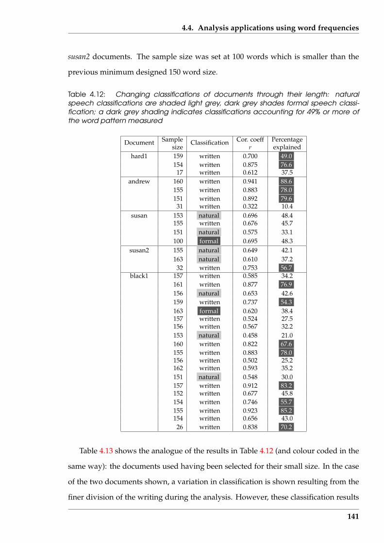
4.4. Analysis applications using word frequencies
susan2 documents. The sample size was set at 100 words which is smaller than the
previous minimum designed 150 word size.
Table 4.12: Changing classifications of documents through their length: naturalspeech classifications are shaded light grey, dark grey shades formal speech classi-fication; a dark grey shading indicates classifications accounting for 49% or more ofthe word pattern measured
Sample Cor. coeff PercentageDocumentsize
Classificationr explained
hard1 159 written 0.700 49.0154 written 0.875 76.6
17 written 0.612 37.5andrew 160 written 0.941 88.6
155 written 0.883 78.0151 written 0.892 79.6
31 written 0.322 10.4susan 153 natural 0.696 48.4
155 written 0.676 45.7151 natural 0.575 33.1100 formal 0.695 48.3
susan2 155 natural 0.649 42.1163 natural 0.610 37.2
32 written 0.753 56.7black1 157 written 0.585 34.2
161 written 0.877 76.9156 natural 0.653 42.6159 written 0.737 54.3163 formal 0.620 38.4157 written 0.524 27.5156 written 0.567 32.2153 natural 0.458 21.0160 written 0.822 67.6155 written 0.883 78.0156 written 0.502 25.2162 written 0.593 35.2151 natural 0.548 30.0157 written 0.912 83.2152 written 0.677 45.8154 written 0.746 55.7155 written 0.923 85.2154 written 0.656 43.0
26 written 0.838 70.2
Table 4.13 shows the analogue of the results in Table 4.12 (and colour coded in the
same way): the documents used having been selected for their small size. In the case
of the two documents shown, a variation in classification is shown resulting from the
finer division of the writing during the analysis. However, these classification results
141
4.4. Analysis applications using word frequencies
are consistent with the ‘natural speech’ classification indicated in Table 4.11 for these
documents in total. As in Table 4.12, the ‘percentage explained’ (= 100 × r2) parame-
ters obtained are generally low and statistically inconclusive, although the similarities
across these two sample sizes is worth noting. From Table 4.12, similar ’percentage
explained’ results were obtained for these documents with the sample size of 150 (low
values for ‘natural speech’ classification and higher values for the ‘written’ classifica-
tion). However, in both Table 4.13 and Table 4.12, the sample size is too small for their
to be reasonable likelihood as to obtain greater than eleven occurrences of each word
which is used used in calculating the correlation coefficient (the Chatfield & Collins
(1980) (page 41) criterion cited above). Thus these results, and others not tabulated
here, indicate that using the 100 word sample size produces results comparable to
these with a 150 sample size, but they are only indicative of a document’s classifica-
tion.
Table 4.13: Changing classification of text through two sample documents using asmaller sample size: natural speech classifications are shaded light grey, dark greyshades formal speech classification; a dark grey shading indicates classifications ac-counting for 49% or more of the word pattern measured
Sample cor. coeff PercentageDocumentsize Classification r explained
susan 111 natural 0.723 52.3108 natural 0.647 41.9106 natural 0.612 37.5107 natural 0.577 33.3112 formal 0.568 32.3
15 written -0.293 8.6susan2 104 natural 0.663 44.0
115 formal 0.422 17.8112 written 0.777 60.4
19 written 0.430 18.5
A visualization could be produced using the above process by assigning a dif-
ferent colour to each of the written, formal, and natural document classifications, a
visualization based on results similar to those for Tables 4.12 (and Table 4.13) could be
constructed. Successive classifications of blocks of text sampled from a text document
would be represented as blocks of colour denoting the classification determination of
142
4.5. Top-Tail Truncation Technique (T 4)
that block. A ‘strip chart’ visualization of adjoining coloured blocks would indicate
successive text block classifications for that document. But as indicated in Table 4.12,
and additional colour would be needed to denote blocks of text where the computed
‘percentage explained’ for that block’s determination was less than the prescribed cut-
off value. Alternatively, the four colours could each be replaced by a single letter. In
this case the classification sequence would take the form analogous to a DNA sequence
from biotechnology as used by Garrett & Grisham (1999).
4.5 Top-Tail Truncation Technique (T 4)
The Top-Tail Truncation Technique (or T 4) is a method proposed for the automatic
compression, or more correctly decreasing in amount of consideration given to, words
in a text document. The limit to which such compression is possible is considered in
Section 5.1 (page 156) as a preliminary to experimental evaluation of the technique in
the Sections that follow. Examined in this Section are the design of the T 4 technique
and its implementation in the context of the ‘Serine’ software prototype.
4.5.1 Design
The words being considered in T 4 are those that actually appear in a document, not
the words that might be expected to occur. This contrasts to the techniques of Sec-
tion 4.4. The T 4 technique is aimed at assisting the human reading process by high-
lighting words of different importance in a text document, as opposed to classifying
the document and then providing assistance as a result of such a classification.
Examination of Figures 4.3 (page 113) and 4.4 (page 114) of word frequency verses
word rank for text documents inspired by Zipf shows the existence of three regions.
In the first, successive ranks are formed by one word, with that word having multiple
occurrences. In the second, successive word rankings contain a small reduction in the
143

4.5. Top-Tail Truncation Technique (T 4)
occurrence frequencies of each word. In the third, successive word rankings contain
the same number, or a small reduction, in the frequency of occurrence of such words.
Here, those regions are termed the ‘top’, the ‘body’, and the ‘tail’, respectively.
An assumption made in the T 4 is that all words appearing in a document do not
have the same purpose. Some words carry the main message while others are struc-
tural, either grammatical or grouping (or dispersing) the message. To obtain the main
message in the document, the content-bearing words must be located. When located,
visualization (or enhancement) techniques can be used to indicate their position in the
text, and with the expenditure of more effort, their inter-relationship.
The frequency of occurrence of words can assist in separating the content-bearing
words from the structural words. In Section 4.3.1 ( page 119) where frequently occur-
ring words were examined, it was asserted that:
the primary function performed by the most frequently occurring words in
a text is structural, and not information carrying.
The words contained in the top region occur frequently. This implies that words in the
top region of the frequency distribution perform structural functions. In addition, the
least frequently occurring words may also be involved in structuring the text but are
also unlikely to contribute significantly to the content-bearing part of the message. It
is asserted, based on observation and partially verified in the experimental results of
Chapter 5, that:
the information being carried in a text is not primarily carried in words that
appear a small number of times.
The tail region is composed of those words that occur infrequently. Thus words in
the tail region are not expected to contribute significantly to the message content of
the text. If the top and the tail regions do not contain message information, then that
144

4.5. Top-Tail Truncation Technique (T 4)
main message component must be in the 2nd (middle) region of the word frequency
distribution.
The T 4 is not applicable to all reading situations. Sometimes a document is read
to ensure that it makes sense so that changes can be made to correct errors. The T 4
is not meant for use in such applications. But in the majority of cases, the document
is read so as to extract the message contained in it. It is for that application that T 4
is intended. The structure of the document being read is assumed to be correct, and
the structural aspects can be viewed as background, while concentrating on the words
that contain the message.
The border between the three regions of interest to T 4 can be difficult to assign.
This is demonstrated by the plot in Figure 4.3 (page 113), where the difficulty in as-
signing the two boundaries possibly results from the smaller number of words in those
emails. But the problem is also present in Figure 4.4 (page 114) which shows data from
a newspaper article and a chapter from a novel which have considerably more words
than those in the emails. With the word frequencies generated automatically, a divi-
sion into three frequency regions is also supplied by the ‘Serine’ software. However,
the facility is also provided in ‘Serine’ for those boundaries to be changed to values
the user believes to be more appropriate.
The automatic setting of the two division lines follows after obtaining the occur-
rence of each word in the text document and arranging them in descending order of
frequency of occurrence. The first division is automatically set above the occurrence
frequency which occurs more than once. The second division occurs after the fre-
quency which appears occurs less than five times. Placement of these divisions will
be shown in the example that follows.
145
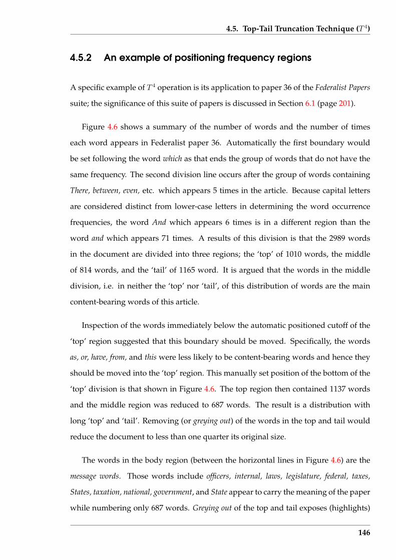
4.5. Top-Tail Truncation Technique (T 4)
4.5.2 An example of positioning frequency regions
A specific example of T 4 operation is its application to paper 36 of the Federalist Papers
suite; the significance of this suite of papers is discussed in Section 6.1 (page 201).
Figure 4.6 shows a summary of the number of words and the number of times
each word appears in Federalist paper 36. Automatically the first boundary would
be set following the word which as that ends the group of words that do not have the
same frequency. The second division line occurs after the group of words containing
There, between, even, etc. which appears 5 times in the article. Because capital letters
are considered distinct from lower-case letters in determining the word occurrence
frequencies, the word And which appears 6 times is in a different region than the
word and which appears 71 times. A results of this division is that the 2989 words
in the document are divided into three regions; the ‘top’ of 1010 words, the middle
of 814 words, and the ‘tail’ of 1165 word. It is argued that the words in the middle
division, i.e. in neither the ‘top’ nor ‘tail’, of this distribution of words are the main
content-bearing words of this article.
Inspection of the words immediately below the automatic positioned cutoff of the
‘top’ region suggested that this boundary should be moved. Specifically, the words
as, or, have, from, and this were less likely to be content-bearing words and hence they
should be moved into the ‘top’ region. This manually set position of the bottom of the
‘top’ division is that shown in Figure 4.6. The top region then contained 1137 words
and the middle region was reduced to 687 words. The result is a distribution with
long ‘top’ and ‘tail’. Removing (or greying out) of the words in the top and tail would
reduce the document to less than one quarter its original size.
The words in the body region (between the horizontal lines in Figure 4.6) are the
message words. Those words include officers, internal, laws, legislature, federal, taxes,
States, taxation, national, government, and State appear to carry the meaning of the paper
while numbering only 687 words. Greying out of the top and tail exposes (highlights)
146
4.5. Top-Tail Truncation Technique (T 4)
the words from the body region of the word frequency distribution which contains the
main information content of the original document.
4.5.3 Implementation of T 4 as interactive software
The ability of some readers to distinguish the important from the less important words
while reading, and thus give more attention to the important words, was emulated in
software. This was done using different colours to indicate the importance of each
word. The manner of determining the importance of each word was by dividing the
words of a text document into their ‘top’, middle, and ‘tail’ regions.
A module to implement T 4 was introduced into the ‘Serine’ software prototype.
The result of this module was the display of the text document with the least and
most frequent words reduced in intensity by using colour. There are three possible
regions a word could occupy, and consequently three different manners in which that
word could be displayed. Words that fall in the ‘top’ region were displayed in a light
blue/grey coloured font and those in the ‘tail’ category were displayed in a green font.
Those words in neither the top or tail categories are displayed in a black font. This
contrast of colour was designed to vary the intensity of words displayed, particularly
between the words in the medium and the two extreme word frequency occurrence
categories. The font style and white background screen colour was the same for each
category of word displayed. Punctuation characters are displayed on screen in the
manner of the medium frequency words (i.e. black). Further research is necessary
to indicate whether such selection of colour for the fonts did achieve the appropriate
visual fading effect, or what colours are more appropriate.
This software module calculated a word occurrence list using the sentence list gen-
erated when ‘Serine’ opens the requested document. This list was created dynamically
and took the form of a doubly linked list in which each entry contains the word and a
counter of its observed occurrence in the document. The words were added to this list
147
4.5. Top-Tail Truncation Technique (T 4)
Appear No. ofwords
247 1 the194 1 of129 1 to82 1 be71 1 and67 1 in44 1 a43 1 that36 1 it34 1 is32 1 will31 1 which28 2 as or27 1 have22 2 from this
21 2 State The20 1 by19 1 its18 1 are16 3 can for government15 6 may more not power their with14 4 I an been there11 1 national10 7 Union all answer any must them those9 6 States either general has most taxation8 10 different federal first knowledge legislature
local other revenue taxes under7 7 As but each such they upon we6 10 And if nature objects on one ought people
than would5 14 There between even far influence internal
kind laws make might no officers should use
4 293 582 1451 585
Total number of words = 2989Number of unique words = 907
Figure 4.6: The words present in Federalist paper 36
148
4.5. Top-Tail Truncation Technique (T 4)
as they were observed in the document. As a result, words occurring first in the docu-
ment were located towards the start of this list. There was no reason to subsequently
reorder this list. The back link was maintained to enable the removal and recovery of
the memory used in the list when it was no longer required.
The user of the software has the option of using the automatic allocation to regions
of a document’s words (as described above) or to interactively modify the placement
of those boundaries. Assistance in selection of appropriate values is provided by the
software after the user has inspected the word occurrence frequencies, as measured.
The maximum and minimum word occurrence is displayed to the user, together with
the mean and statistical unbiased estimate of the standard deviation of those values. In
calculating those means and standard deviations, account was taken of the frequencies
and also the number of words that occur at each frequency.
A document is processed twice; once to obtain the word frequency distribution,
and again to display the document. During the second pass, as each word is located
in the document, it is looked up in the word frequency list. The overall occurrence
of that word is determined from that list and that value compared with the top and
tail boundary values, before being displayed. For book-keeping purposes, separate
counts of words that are displayed in each of the three categories are kept; their final
values give a summary of the display produced.
Figure 4.7 shows an example screen produced when the T 4 module embedded in
the ‘Serine’ software was applied to Federalist paper 36. This example uses the same
paper for which Figure 4.6 presents the word distribution (although the position of
the boundaries between the top and tail have changed). The tail, shown in green font,
contains words that appeared once in the total document. Those that appear 10 or
more times are contained in the top region of the word frequency distribution and
are shown in light blue/grey. The words in black type are those in the body portion
of the word distribution, i.e. those words that occur between two and nine times
in the document. The statistical parameters calculated by this module for the word
149

4.5. Top-Tail Truncation Technique (T 4)
occurrence distribution in the document was:
mean: 3.20
standard deviation: 11.72
maximum word occurrence: 218
minimum word occurrence: 1
These figures confirm that some words in the document appear once, which in this
case constitutes the tail and are shown as the words in the green font in Figure 4.7.
On average, each word appears 3.2 times. But as would be expected with a spread of
1 to 218 occurrence of the words in this document, a large variation (denoted by the
standard deviation in comparison to the mean) from the average word occurrence is
present in the document.
Figure 4.7: Screen shot of ‘Serine’ top/tail truncation technique module applied toFederalist paper 36: words in the ‘top’ region are coloured light blue/grey, those in the‘tail’ are coloured green, the remainder are black
This is an example screen resulting from the T 4 word distribution of:
150
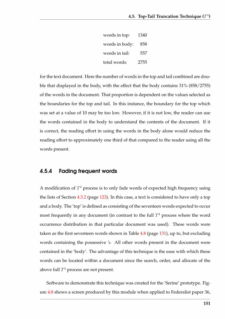
4.5. Top-Tail Truncation Technique (T 4)
words in top: 1340
words in body: 858
words in tail: 557
total words: 2755
for the text document. Here the number of words in the top and tail combined are dou-
ble that displayed in the body, with the effect that the body contains 31% (858/2755)
of the words in the document. That proportion is dependent on the values selected as
the boundaries for the top and tail. In this instance, the boundary for the top which
was set at a value of 10 may be too low. However, if it is not low, the reader can use
the words contained in the body to understand the contents of the document. If it
is correct, the reading effort in using the words in the body alone would reduce the
reading effort to approximately one third of that compared to the reader using all the
words present.
4.5.4 Fading frequent words
A modification of T 4 process is to only fade words of expected high frequency using
the lists of Section 4.3.2 (page 123). In this case, a text is considered to have only a top
and a body. The ‘top’ is defined as consisting of the seventeen words expected to occur
most frequently in any document (in contrast to the full T 4 process where the word
occurrence distribution in that particular document was used). These words were
taken as the first seventeen words shown in Table 4.8 (page 131), up to, but excluding
words containing the possessive ’s. All other words present in the document were
contained in the ‘body’. The advantage of this technique is the ease with which these
words can be located within a document since the search, order, and allocate of the
above full T 4 process are not present.
Software to demonstrate this technique was created for the ‘Serine’ prototype. Fig-
ure 4.8 shows a screen produced by this module when applied to Federalist paper 36,
151
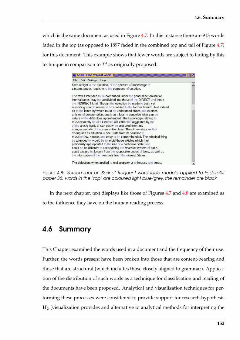
4.6. Summary
which is the same document as used in Figure 4.7. In this instance there are 913 words
faded in the top (as opposed to 1897 faded in the combined top and tail of Figure 4.7)
for this document. This example shows that fewer words are subject to fading by this
technique in comparison to T 4 as originally proposed.
Figure 4.8: Screen shot of ‘Serine’ frequent word fade module applied to Federalistpaper 36: words in the ‘top’ are coloured light blue/grey, the remainder are black
In the next chapter, text displays like those of Figures 4.7 and 4.8 are examined as
to the influence they have on the human reading process.
4.6 Summary
This Chapter examined the words used in a document and the frequency of their use.
Further, the words present have been broken into those that are content-bearing and
those that are structural (which includes those closely aligned to grammar). Applica-
tion of the distribution of such words as a technique for classification and reading of
the documents have been proposed. Analytical and visualization techniques for per-
forming these processes were considered to provide support for research hypothesis
H2 (visualization provides and alternative to analytical methods for interpreting the
152
4.6. Summary
same set of text data). In the reading situation, the techniques proposed are aimed
at providing to a wider audience the technique that some human readers have of de-
tecting the more important words present in a text and only using those to extract the
meaning of the text.
Two varieties of word frequency were examined; expected and actual occurrence in
a document. The laws attributed to Zipf were used to introduce the expectation that
word frequency has implication on the internal composition of a document, appar-
ently independent of the author’s purpose for the document. But patterns of occur-
rence of particular words were shown to depend on types, or style, of documents.
Matching actual patterns of word occurrence against the expected occurrence was
demonstrated as a means of document classification. In contrast to this analytic proce-
dure, word frequency division was demonstrated as a means of revealing the message
words in a document. Visualization following from that decomposition was proposed
as a possible way to facilitate human reading of text on a computer screen. In explor-
ing that approach, support was obtained for research hypothesis H3 (visualization
techniques can be used with advantage by humans to aid in reading and comprehen-
sion of text documents).
Software, which is important to this research, was considered with a parallel devel-
opment of a stand alone implementation together with an integrated tool. An overall
modular design of the software allowed reuse of components. Different end results
would follow by connecting purpose-specific modules to a common, but incomplete,
substrate. The algorithms used to isolate words from a computer readable document
are a basic substrate, and are developed in this Chapter together with their imple-
mentation. The stand alone implementation is used for analysis of word frequency
for document classification. The implementation as the tool is then used to examine
reader applications of word frequencies. In combination, production of these software
solutions provided support for research hypothesis H5 (text document visualization
can be produced in an efficient manner to enable their use as a toolkit for interactive
153
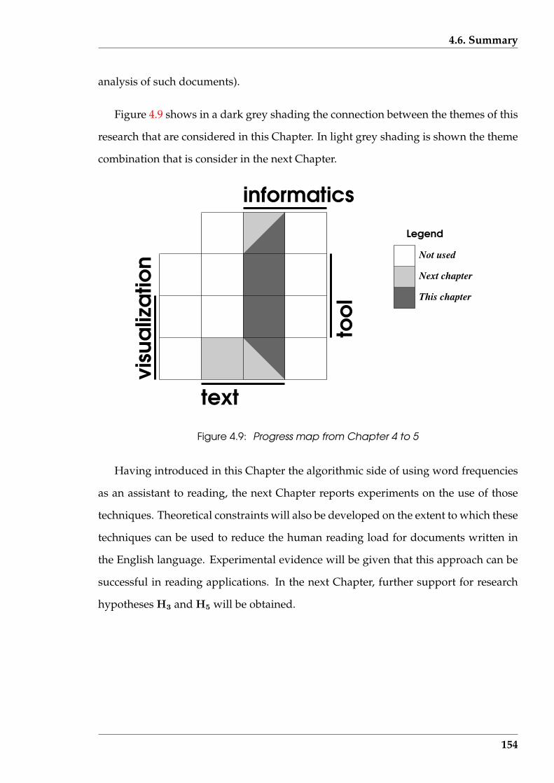
4.6. Summary
analysis of such documents).
Figure 4.9 shows in a dark grey shading the connection between the themes of this
research that are considered in this Chapter. In light grey shading is shown the theme
combination that is consider in the next Chapter.
informatics
text
Not used
Next chapter
This chapter
Legend
Figure 4.9: Progress map from Chapter 4 to 5
Having introduced in this Chapter the algorithmic side of using word frequencies
as an assistant to reading, the next Chapter reports experiments on the use of those
techniques. Theoretical constraints will also be developed on the extent to which these
techniques can be used to reduce the human reading load for documents written in
the English language. Experimental evidence will be given that this approach can be
successful in reading applications. In the next Chapter, further support for research
hypotheses H3 and H5 will be obtained.
154
Chapter 5
Effectiveness of word fading
Presented in this Chapter is an experiment which evaluates the effect of applying par-
ticular visualization techniques to text reading and its influence on the information
extraction by the reader. Those techniques are word fading, including the top-tail
truncation technique (T 4). The experiment looks at the influence that those word fad-
ings have on the time to read the text and the effectiveness of that reading. Reading
effectiveness is assessed by application of comprehension questions. This is done to
assess research hypothesis H3 (visualization techniques can be used with advantage
by humans to aid in reading and comprehension of text documents).
A subset of the text reduction techniques suggested in Chapter 4 are used exper-
imentally in this Chapter. The main objective is to examine the utility of the top/tail
technique for significantly reducing the number of words in a block of text that need
to be read to obtain a reasonable understanding of the document. For this technique,
reduction is done by fading selected words on a computer screen so that they remain
visible but are so coloured to direct the human reader’s eye away from them to the
other (more significant) words. Both the fading of the seventeen most frequently oc-
curring words considered in Section 4.5.4 (page 151), and T 4 of Section 4.5 (page 143)
are used. A specific program was written for obtaining the required experimental
data. The successful use of that program would provide support for research hypoth-
esis H5 (visualization techniques can be used with advantage by humans to aid in
reading and comprehension of text documents).
155
5.1. Positioning of this experiment
Word fading is a technique for changing visual emphasis. It is common to ‘bold’
important words in a text to catch the reader’s eye. In making a personal study of a
text, words and phrases judged important might be ‘highlighted’ so that they can be
easily located in subsequent reading. By contrast, the word fading used here attempts
to emphasis words by reducing the visual intensity of words judged less important. It
is because of this intensity change that word fading is considered here to be a visual-
ization technique.
Specifically, this Chapter considers:
• the background for the experiment, reviewing the theoretical basis and similar
work reported in the literature;
• the design and implementation of the experiment; and
• the results obtained.
Some additional details are provided in Appendix B and Appendix C.
5.1 Positioning of this experiment
This experiment needs to be placed in the context of the prior experimental evidence.
Such evidence provides clues to the experimental method(s) likely to be successful,
experimental difficulties to be avoided, and expectation of the results likely to be ob-
tained.
5.1.1 Text reduction experiments
Removing text from (immediate) consideration by the reader has the potential to re-
duce the effort required to obtain information from a document. Such removal is the
156
5.1. Positioning of this experiment
operational thrust of this experiment. However, the experimental parameters must
be based on limits which are theoretically possibly and the results of similar reported
experiments.
The realisation that the English language can be treated as a communication chan-
nel (in an information science sense) is first proposed by Shannon (1948). English can
be considered to contain the same attributes as a digital electronic communications
link. In the case of the electronic communications, electrical pulses are used on the
media, and groups of these pulses represent the message. The English language ana-
logue of such pulses are characters.
Shannon (1948) defined several terms; entropy, relative entropy and redundancy. The
entropy, H , is defined mathematically as:
H = −n∑
i=1
pi log2 pi
where pi is the probability of occurrence of the event i. The ratio of the entropy of
a source to the maximum value it could have, while still using only the same sym-
bols, was termed the relative entropy. The highest relative entropy is the maximum
compression possible when using those symbols. One minus the relative entropy is
the redundancy. The redundancy gives a measure of the amount of the transmitted
message that can be discarded and still have the receiver reconstruct the information
contained in the original message. In the specific case of English text, the redundancy
is the number (expressed as a percentage) of characters in the original message that can
be ignored with the reader still obtaining a reasonable understanding of the original
text. By knowing the statistical distribution of 2, 3, 4, etc. combinations of succes-
sive letters in a language, then prediction of the next character in a sequence becomes
easier. How many characters are needed in the given sequence and the number of sub-
sequent characters that can be predicted determines the redundancy of the language.
Through this process, Shannon (1948) then stated the redundancy of ordinary English
157
5.1. Positioning of this experiment
to be roughly 50% when consideration of statistical effects (of English) beyond a dis-
tance greater than eight letters were not considered. This redundancy corresponds to
an entropy of 2.3 bits per character when using a 26 character alphabet.
This estimate of 50% redundancy in English is based on experiment. Shannon
(1951) provides experimental results to support the existence of an upper and lower
entropy limits of 1.9 and 1.1 bit per character, respectively when using an alphabet of
27 characters (26 alphabetic characters plus a space character). In determining these
entropy values, the expected statistical occurrence of groups of 2, 3, . . ., up to 100 long
character sequences were considered. The maximum entropy when using a 27 charac-
ter alphabet is 4.75 bit per character (= log2 27). This factor results in giving the upper
and lower bounds on redundancy estimates as 40% and 77%.
Other redundancy estimates have also been obtained. Cover & King (1978) pro-
vides a committee decision estimate of 1.3 bits per character was obtained for the entropy
for printed English. Since a 27 character alphabet was used, this entropy indicates a
redundancy of 73%. An estimate of approximately 2.1 bit per character for the en-
tropy of English is reported by Grassberger (1989). This determination was based on
applying a Lempel-Ziv algorithm to a variety of text document types while using a
modified ASCII code alphabet having a maximum entropy of 4.254 bit per character.
Some experimental scatter is apparent from the reported results. A redundancy of
70% corresponds to that entropy value. Variation of entropy with document type is
also reported by Moradi, Grzymala-Busse & Roberts (1998) where values from 1.9 to
3.0 bit per character are tabulated, averaging 2.2. Assuming the use of a 7-bit ASCII
coding of those documents, the corresponding average redundancy measure equals
68%.
Based on the redundancy measures computed from the published entropy deter-
minations cited above, a value of 67% appeared to be a good estimate. This is an
average, however, it is noted that the type of document is a significant determining
factor. Thus two thirds of the characters in a text could be discarded without loosing
158

5.1. Positioning of this experiment
a significant portion of the information in the original text document. This estimate is
based on the results of general information theory, a link between it and English being
used in Shannon’s original work, which were taken as a guide to practical English text
word reductions in this research.
This theoretical redundancy limit of 67% previously stated is based on characters,
not words. Thus reading 33% of the characters present would enable the information
content of the message contained by all the characters to be read and understood. The
information is constructed by building the characters into words, and it is from those
words that the information is read. Of more interest is the effect on the reading process
if a word cannot be recovered or read. What redundancy exists in English with respect
to words, i.e. the percentage of words which could be lost from a message without
the meaning of the message becoming lost? Although “word redundancy” would
not have the same value as character redundancy, it is anticipated here to be slightly
lower in value, i.e. fewer words can be lost from a message than characters before the
meaning of a message becomes lost. This follows from the expectation that a word
can be deduced using fewer random known characters that form that word, than can
missing words surrounding known words. This expectation needs verification, but
that is beyond this project. What follows from that expectation is what is significant
for this research, and that is that the character redundancy will act as an upper bound
on word redundancy, i.e. the word redundancy in English is less than (or equal) 67%.
Experiments on reducing the amount of text needing to be read have been reported
in the literature, but further work is required to understand its use and implementa-
tion. These works reduce the text less than the above theoretical 67% redundancy
condition. Tuinman & Gray (1972) used reductions of 38%, and 50% of their original
document in their reported experiment. The lesser reduction resulted from deleting
all words that were not nouns, verbs, adjectives, adverbs, numbers, copula, pronouns,
address words, possessive pronouns, and the words yes, no, and not. For the sec-
ond reduction only nouns, verbs, adjectives, adverbs, and numbers were retained. A
159
5.1. Positioning of this experiment
significant reduction in comprehension, as measured by correct answers to a ques-
tionnaire, was shown between the original documents and the two documents with
reduced words. However, the observed difference between correct answers using the
two word reduced documents was not significant, indicating a possible leveling out
of comprehension loss from word reduction. In the experiment reported by Bassin &
Martin (1976), reductions of 10%, 30%, and 50% were used, resulting from increasing
severity of the reduction technique used, again compared with the original document.
Three such reduction criteria were used: importance of parts of speech present; fre-
quency of words present in the text passage; and a subjective rank ordering of the
importance of words present. Here, no significant reduction in comprehension test
scores were obtained between those using the original and those using the 10% and
30% word reduced documents no matter which reduction technique was used. A sim-
ilar non-significant difference between using the original and 50% reduced documents
was observed, except in the case of the subjective reduction technique which gave bet-
ter performance. These results suggest that appropriate word reduction techniques
may retain comprehension of the original document.
Bassin & Martin (1976) also considered reading time and reading speed using both
the original text document and the three levels of word reduction applied to that text.
Surprisingly, no significant change in reading time was observed between using the
original text and the reduced texts. Hence, the speed of reading (in words per minute)
was significantly slower for the reduced texts compared with the original text. Fur-
ther, as the word reduction increased, the reading speed dropped, independent of the
technique used to perform the word reduction. This suggests that the word reduc-
tion techniques used did not increase reading speed, for although there were fewer
words to read, the same time was taken in reading. During this, the same level of
comprehension was retained, possibly suggesting that the readers were interested in
understanding the text being read than hastening their reading.
As opposed to the word reduction techniques mentioned above which used prop-
160
5.1. Positioning of this experiment
erties of the words for determining which to delete, a purely numeric means for locat-
ing words for removal has also been reported. Called the Cozy procedure, it is discussed
by MacGinitie (1961) where removing every 24th, 12th, or 6th word is reported as not
affecting the recovery (comprehension) of the original text. Such removals are within
the above redundancy limit discussed earlier in this Section. But deleting every 3rd
word, which is closer to, but still within the above theoretical redundancy limit, did
significantly affect comprehension.
Tuinman, Blanton & Gray (1975) also used this same reduction technique to ob-
tain 30% and 50% reductions in text. The resulting comprehension scores measured
showed a significant loss in text comprehension. These comprehension scores being
significantly below the corresponding results reported by Tuinman & Gray (1972).
Such results possibly indicate that not only the volume of text removed, but how that
removal in determined, is significant.
The effect of greying out of words on reading performance using software to drive
the screen being read is examined by Broberg (2000). This “Text-Col” software greyed
out words in the text based on the assignment of different weights, or emphasis, to
each word. The data tabulated from a controlled experiment using this software in-
dicates this word fading scheme decreased reading speed when word fading was in-
troduced. Comprehension tests consisting of identifying given words from being in
the text, and recalling representative words used in the text, were then given to the
experiment participants. Although those tests were acknowledged by that author as
being subjective in nature, they did indicate that correct and incorrect answers were
not influenced by word fading.
These experiments, summarised in Table 5.1, suggest the need for further exper-
imentation. The cited experiments divide into two groups; one using seventh grade
primary school students, and the other using college (university) students. Although
the first group was not timed during the reading task, the removal of words from
the reading material decreased comprehension. Since the participants were primary
161

5.1. Positioning of this experiment
school students, perhaps the word removal technique was too severe for participants
with that level word experience. The second group contained participants with greater
word experience, and in this group no change in comprehension was observed. This
occurred when words were removed from the text being read (as in the first group)
and also when the words were faded. Whereas reading time was observed not to
change when using word removal, it decreased when word fading was used. So there
is some indication that word fading can reduce reading time without influencing com-
prehension, but would word fading techniques, such as those of Section 4.5 (page 143),
have that desired outcome? Further, comprehension measurements such as those used
by Dyson & Haselgrove (2000) would give better indication of whether different types
of comprehension were affected. An experiment covering these aspects is described
in the remainder of this Chapter.
Table 5.1: Summary of word reduction experiments cited from the literature
Word reduction Significant parameterExperiment reportedmethod
Subjectsreading time comprehension
Tuinman & Gray (1972) removal seventh graders unlimited decreasedTuinman et al. (1975) removal seventh graders unlimited decreasedMacGinitie (1961) removal college students fixed no changeBassin & Martin (1976) removal college students no change no changeBroberg (2000) fading uni students decreased no change
From the theoretical word redundancy for English mentioned above, it follows that
33% of words present in a text are critical to reading of that text. However, reading 33%
of the words present is a limit that has not been approached experimentally without
test data indicating a non-significant reduction in comprehension of what was being
read. This limit contrasts with skim reading. Such skim reading techniques, consid-
ered by Rayner & Pollatsek (1989), reduce the number of words being handled but at a
consequence of reduction in comprehension. The display produced by the skim reader
used in the Xlibris reading appliance shown as Figure 4 of Schilit et al. (1999) indicates
fewer words highlighted than the 33% limit for reading with comprehension.
Whether the theoretical reduction proposition is practical and how best to select
the words that need to be read in attaining that theoretical 33% limit are open ques-
162
5.1. Positioning of this experiment
tions. Tuinman & Gray (1972) and Bassin & Martin (1976) used different techniques
for selecting such words. The experiments presented in Section 5.2 (page 166) utilise
alternative techniques developed in this research project.
5.1.2 Speed of reading
Establishing expectations of reading speed is important for assessing the duration of
the experiment and anticipated values of such speed from the experiment.
Reading speed is a determiner used in the literature for separating “skim read-
ing” from “rapid reading”. Rayner & Pollatsek (1989) gives special attention to speed
reading. There, it is stated, the average reading speed varies from 200 to 350 words
per minute, with an upper bound of roughly 600 words per minute stated by psy-
chologists working in the discipline. Reading speeds in this range were measured by
Muter & Maurutto (1991), Dyson & Haselgrove (2000), Dyson & Haselgrove (2001),
and Castelhano & Muter (2001). However, the reading speeds reported by Bassin &
Martin (1976) are below this range (i.e. 109 to 188).
Experimental evidence is cited by Rayner & Pollatsek (1989) that higher reading
speeds, particularly those claimed by what are known as “speed-readers”, result from
skimming the text. This reading technique gets the gist of the text but suffers in com-
prehending the detail that is presented in the text. The results reported by Muter &
Maurutto (1991), and Dyson & Haselgrove (2000) support these observations.
5.1.3 Delivery medium
Computer screens are proposed as the means of presenting the text to participants
in the experiment. However, previous experiments on text removal such as by Tuin-
man & Gray (1972) and Bassin & Martin (1976) presented the reduced text as print
on paper. Early experimental results reviewed by Dillon (1992) indicate that reading
163
5.1. Positioning of this experiment
from screen was slower than from paper. However, Muter & Maurutto (1991) present
results of repeating previously performed experiments which suggest that off-screen
and off-paper reading are now comparable. This change is rationalised in that paper
to be due to improvement in the resolution of the display screen, together with the
clarity of the fonts used. These technologies have improved even further over the sub-
sequent decade. It could also be hypothesised that readers are now much more used
to reading from screens than in earlier decades. The work reported by Bruijn, Mul &
Oostendorp (1992) indicates that neither the size of the screen used to read the text,
nor the layout of the text on the screen is significant in the comprehension of that text
by human readers. Such works indicate presentation of the text on computer screens
is appropriate for the reading task in the experiment.
The text should be presented in lines of roughly 60 characters. Dyson & Haselgrove
(2001) studied the influence of character line length on reading speed and subsequent
comprehension of text read from a screen. Using line lengths of 25, 55, and 100 char-
acters, the experimental results indicated 55 to be the best. But it is admitted that the
variation of tested lengths was coarse.
It is important in measuring comprehension that the experiment participant is us-
ing the information directly obtained from the article just read and not drawing upon
other (prior) knowledge. This drawing upon other knowledge is cited by Rayner &
Pollatsek (1989) as the technique used by speed-reading advocates to overcome the
deficiencies produced by such rapid reading. Although texts used in the experiments
reported by Dyson & Haselgrove (2000) and Dyson & Haselgrove (2001) were of a gen-
eral interest nature (taken from National Geographic), attention was taken to ensure that
the documents were in fact read. Six types of comprehension questions were designed
to measure either specific information or inference from the text. Those question types
were:
• alternate title for the passage;
164
5.1. Positioning of this experiment
• main ideas present;
• sequential order of items presented;
• main facts present;
• incidental detail; and
• appearance in the passage of a given piece of text.
Each question was presented in multiple choice format. Although this design of
questions is useful, the answers to at least some of the sample questions included in
the paper might have been obtained from outside sources, violating the cautionary
condition given by Rayner & Pollatsek (1989). Allowance must also be made for the
percentage of correct answers due to random choice effects, i.e. guessing the answers,
given the multiple choice format. Unfortunately, such details concerning the question-
naire generally are not included in papers of this nature.
Removing words from text can be a hindrance to the reading of a document which
adversely affects reading time. In the experiment reported by Bassin & Martin (1976),
reading time is seen to not be affected by a reduction in the size of the texts. Although
comprehension was not affected, the reduced words remaining after the reduction did
not decrease reading time as would be expected. In that experiment, the words were
removed and the remaining text blocked up to leave no blank spaces (this is assumed
from the “telegraphic style” mentioned). This is shown to also be the case by Tuinman
& Gray (1972). Hence, readers had to sort out the meaning unaware of where words
had been removed. This takes time. But the intent of these experiments was for the
experiment participants to read through those deletions. This requirement, but with the
possibility to circumvent following it in the word fading case, had implications for the
experiment described in the following Section.
It is argued that there are two types of comprehension; that sufficient to estimate
missing words and characters in a text, and the understanding of the information con-
165
5.2. Design of experiment
tent of the text. It is also acknowledged that these types of comprehension are not
independent of one another. The comprehension considered in both Cover & King
(1978) and Moradi et al. (1998) is of the type to obtain the missing character. By con-
trast, Tuinman & Gray (1972) and Bassin & Martin (1976) consider the information
content of the text. It is comprehension relating to obtaining the information content
of a text document that is of interest in this research.
5.2 Design of experiment
5.2.1 Hypothesis
Hypothesis: Fading the common frequently occurring words, and words in the ex-
clusion zones identified by the top-tail truncation technique, can be used to decrease
reading time of a text document without significantly reducing comprehension of the
document.
This hypothesis is at odds with the outcome of the experiments reported by Bassin
& Martin (1976) where it was shown that the comprehension was retained as the num-
ber of words available for reading in the article was reduced, but the reading time
remained relatively constant. In the proposed experiment, the words recognised as
redundant are faded, whereas in the Bassin & Martin (1976) experiment the redundant
words were removed. By removing the redundant words, and blocking-up the re-
maining text so the position of the removed words was lost, the resulting text is dif-
ficult to read. This might account for the reading time increasing, as the number of
words available to read decreases. By fading the redundant words, the reader is being
encouraged to give such words reduced attention, but they retain their place-marking
property. Indeed, if the reader finds comprehension of the non-faded words difficult
(in some particular place in the document), they can attend to the faded words in that
vicinity, to aid comprehension. This is expected to be a much more effective approach
166
5.2. Design of experiment
to utilising text reduction techniques in practical applications.
In contrast to the experiments summarised in Table 5.1, the design of this exper-
iment enabled analysis of the results in two manners, as opposed to their one. As
with those other experiments, the effects of the test factors upon reading time and
comprehension of the participants in total was performed. The second manner re-
sulted from each experiment participant here being tested under no word fading and
with word fading reading conditions; the participants whose reading times changed
under those conditions could be separated and then analysed. Three groups were
proposed with respect to how each participant’s reading times changed from the no
fading condition through the two word fading conditions, with those word fading
conditions ordered from the least number of words faded to the most words faded.
One group contained those participants whose reading times continually decreased.
Another contained those whose reading times continually increased across those cat-
egories. The third group contained the remainder. This separation did not change the
statistical properties of the reading times data, but distributed that data into different
groups of interest which were then analysed directly for the effects of the test factors.
5.2.2 Method
Table 5.2 shows the overall design of the experiment as consisting of two factors (word
fading and texts), containing 4 and 3 treatments, respectively. For each cell presented,
two sets of data were gathered; reading time, and comprehension score from questions
asked concerning the content of the article read.
The texts chosen where science fiction articles. This choice was made so that each
article was self-consistent within itself while dealing with its subject matter in a man-
ner that the reader could not use knowledge from outside of that article. Consequently,
to answer the comprehension questions, the particular article had to have been read.
The only alternative was for that particular article to have been read before participat-
167

5.2. Design of experiment
ing in the experiment. When asked after performing the experiment, each participant
stated that they had never read the articles used in the experiment before. An ad-
ditional article to the three shown in Table 5.2 was used in the demonstration of the
experiment that each participant was asked to perform before starting the actual ex-
periment.
Table 5.2: Relationship between factors and data filling for the experiment: A and Bdenote data from two experiment participants, while 1, 2, and 3 indicate the order inwhich those data were produced
word fading
None Type 1 Type 2 Type 3
clarke A1 B1
tritten B2 A2
text
s
haldeman B3 A3
Typographical errors were added to the texts. This was done so that each text em-
ulated an email, it being observed that emails too often contain errors of this type. The
result was texts of greater difficulty to read due to the distracting influence of the typo-
graphical errors. If the hypothesis was shown to be true for these error containing text
documents, then it is most likely true in the case with no such errors. However, truth
for the case with no such errors does not imply truth with the errors. The application
to emails is of immediate value in itself.
Four word fadings were used. The treatment denoted as None contained no fading
at all. In Type 1, the first seventeen most frequent occurring words listed in Table 4.9
(page 135) of Section 4.4.1 were faded. Types 2 word fading was the analogue of the
technique of Section 4.5.4 (page 151) for fading frequently occurring words that ap-
pear in the article. Type 3 word fading was an implementation of the T 4 technique of
Section 4.5 (page 143).
From the processes under experimental control, it was judged that the articles to
be read were independent of one another while the word fadings had a possible in-
168

5.2. Design of experiment
teractive affect on one another. Changing the order of one article being read before
another would not change the reading performance of a reader for subsequent arti-
cles. In contrast, if a Type3 word fading was applied to an article being read, and then
a Type 2 was used on the following article, there was a possibility (although small)
that the Type 2 performance could be changed via that prior using of Type 3. Thus a
randomising of the order of applying the word fadings was thought appropriate in an
effort to remove any order effect that might be present, but that was not warranted in
the case of the different articles being read.
The experiment comprises a demonstration part followed by the experiment proper.
In the demonstration, the experiment participant would be given the one science fic-
tion article to read under the four word fading conditions. The the comprehension
questions associated with that article would be asked. In each of these demonstra-
tion parts, the software used would be the same as that to be used in the experiment
proper. The first article using the first allocated word fading techniques is presented
to the experiment participant, and when they indicated they have finished reading,
the comprehension questions are presented. Each comprehension question, together
with its list of six answer options, is presented on the one screen. Then this process
is repeated for the next question, until all questions have been asked. When all ques-
tions have been answered, the next article using a different word fading appears in the
screen and the process repeats. This reading/questioning cycle is repeated three times.
As a result, all three science fiction articles are read, but only three of the four word
fadings are used with each experiment participant. One of each three word fadings
will be the None type (i.e. no words being faded).
The experiment design shown in Table 5.2 takes the form of an Analysis of Vari-
ance. Multiple observations per treatment (cell) were to be used. The number of ob-
servations required per cell was determined by iteration of the procedure described
by Bowker & Lieberman (1959) (pages 339–40).
The null hypothesis of the experiment was that the means associate with the rows
169
5.2. Design of experiment
were equal, and those associated with the columns were equal. The experiment was
to have a 1% probability of rejecting this null hypothesis if in fact it were correct (a
type I error), and a 10% chance of accepting the null hypothesis if in fact it was wrong
(a type II error). The experiment was also designed to reject these null hypotheses if
there was a 20% change in the standard deviation between the rows (or columns). The
iterative process gave the cell size to be 8 observations (as a minimum).
There are 12 such text/fading cells requiring 8 data values. Each experiment par-
ticipant was to read three text documents, one of which would be under the None
word fading. Thus anyone of the three texts is equally likely to be read under the no
word fading condition. With one text selected to be read with no word fading, the
other two texts have a one in three chance of being read in one of the three word fad-
ing modes. Continuing this line of reasoning, 12 selections of each of the three texts
for reading without fading will give 8 readings of all the texts under the three word
fading conditions; each text being read twelve times under no word fading. Thus a
minimum of 36 participants were required.
Table 5.2 shows part of the cell filling by two experiment participants, A and B.
The numbers shown associated with each A and B indicate the order in which that cell
was presented to the participant. The schedule of cells presented to each participant
enabled the contribution from each to accumulate the overall number of cell entries
required. The experiment participants themselves were taken as a secondary factor
in this design. Via this data production process, the experiment participant data con-
tained large numbers of missing values, but this can be accommodated by modern
statistical software.
5.2.3 Implementation
The four science fiction texts used are identified in Table 5.3. The texts banks and clarke
were contiguous sections of the novel from which they were taken, while tritten and
170
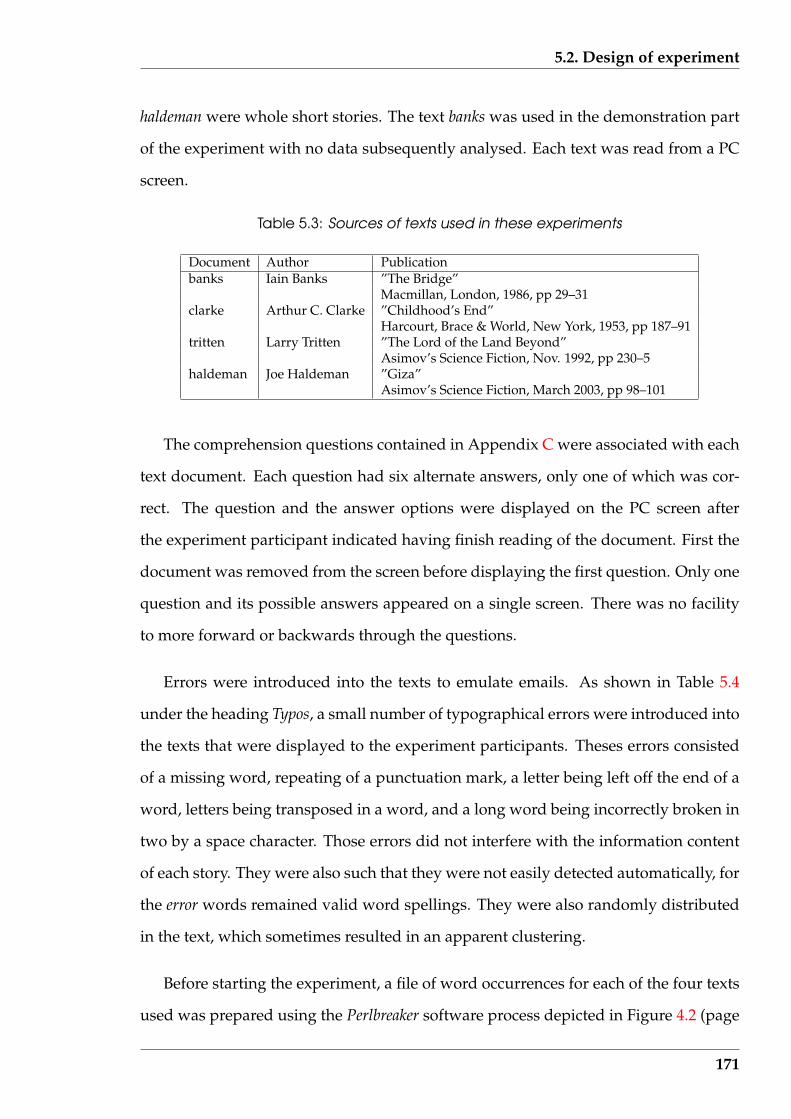
5.2. Design of experiment
haldeman were whole short stories. The text banks was used in the demonstration part
of the experiment with no data subsequently analysed. Each text was read from a PC
screen.
Table 5.3: Sources of texts used in these experiments
Document Author Publicationbanks Iain Banks ”The Bridge”
Macmillan, London, 1986, pp 29–31clarke Arthur C. Clarke ”Childhood’s End”
Harcourt, Brace & World, New York, 1953, pp 187–91tritten Larry Tritten ”The Lord of the Land Beyond”
Asimov’s Science Fiction, Nov. 1992, pp 230–5haldeman Joe Haldeman ”Giza”
Asimov’s Science Fiction, March 2003, pp 98–101
The comprehension questions contained in Appendix C were associated with each
text document. Each question had six alternate answers, only one of which was cor-
rect. The question and the answer options were displayed on the PC screen after
the experiment participant indicated having finish reading of the document. First the
document was removed from the screen before displaying the first question. Only one
question and its possible answers appeared on a single screen. There was no facility
to more forward or backwards through the questions.
Errors were introduced into the texts to emulate emails. As shown in Table 5.4
under the heading Typos, a small number of typographical errors were introduced into
the texts that were displayed to the experiment participants. Theses errors consisted
of a missing word, repeating of a punctuation mark, a letter being left off the end of a
word, letters being transposed in a word, and a long word being incorrectly broken in
two by a space character. Those errors did not interfere with the information content
of each story. They were also such that they were not easily detected automatically, for
the error words remained valid word spellings. They were also randomly distributed
in the text, which sometimes resulted in an apparent clustering.
Before starting the experiment, a file of word occurrences for each of the four texts
used was prepared using the Perlbreaker software process depicted in Figure 4.2 (page
171
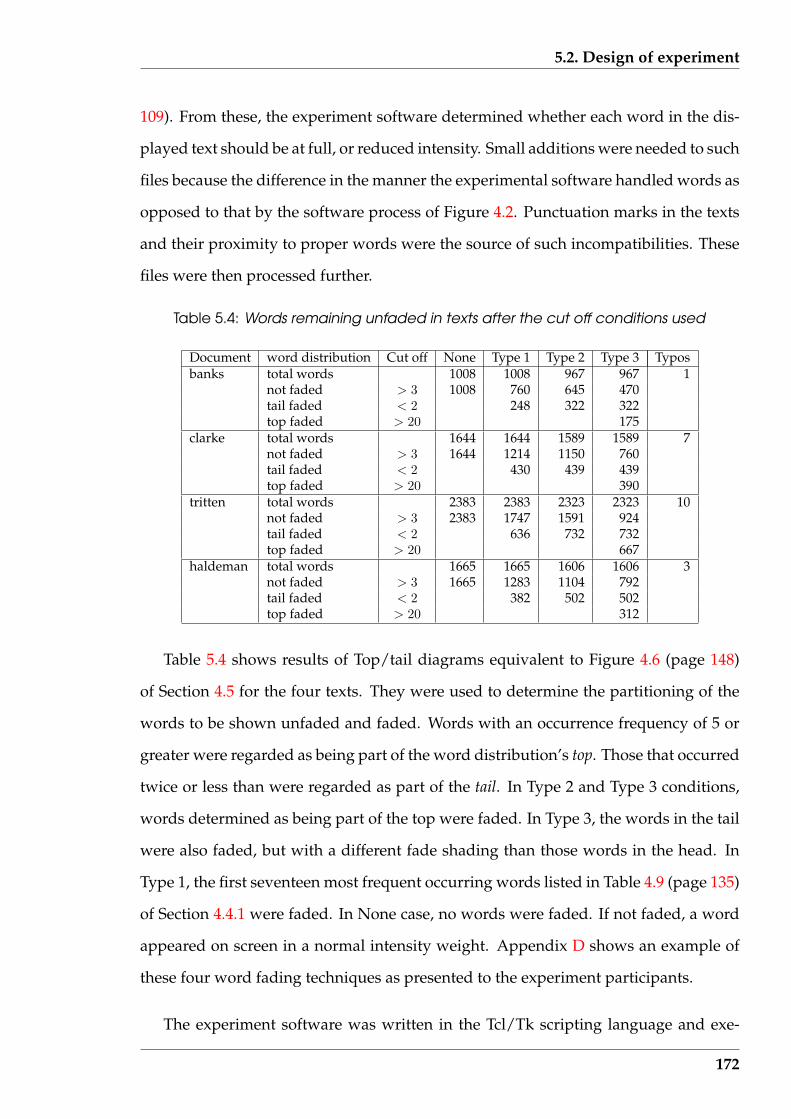
5.2. Design of experiment
109). From these, the experiment software determined whether each word in the dis-
played text should be at full, or reduced intensity. Small additions were needed to such
files because the difference in the manner the experimental software handled words as
opposed to that by the software process of Figure 4.2. Punctuation marks in the texts
and their proximity to proper words were the source of such incompatibilities. These
files were then processed further.
Table 5.4: Words remaining unfaded in texts after the cut off conditions used
Document word distribution Cut off None Type 1 Type 2 Type 3 Typosbanks total words 1008 1008 967 967 1
not faded > 3 1008 760 645 470tail faded < 2 248 322 322top faded > 20 175
clarke total words 1644 1644 1589 1589 7not faded > 3 1644 1214 1150 760tail faded < 2 430 439 439top faded > 20 390
tritten total words 2383 2383 2323 2323 10not faded > 3 2383 1747 1591 924tail faded < 2 636 732 732top faded > 20 667
haldeman total words 1665 1665 1606 1606 3not faded > 3 1665 1283 1104 792tail faded < 2 382 502 502top faded > 20 312
Table 5.4 shows results of Top/tail diagrams equivalent to Figure 4.6 (page 148)
of Section 4.5 for the four texts. They were used to determine the partitioning of the
words to be shown unfaded and faded. Words with an occurrence frequency of 5 or
greater were regarded as being part of the word distribution’s top. Those that occurred
twice or less than were regarded as part of the tail. In Type 2 and Type 3 conditions,
words determined as being part of the top were faded. In Type 3, the words in the tail
were also faded, but with a different fade shading than those words in the head. In
Type 1, the first seventeen most frequent occurring words listed in Table 4.9 (page 135)
of Section 4.4.1 were faded. In None case, no words were faded. If not faded, a word
appeared on screen in a normal intensity weight. Appendix D shows an example of
these four word fading techniques as presented to the experiment participants.
The experiment software was written in the Tcl/Tk scripting language and exe-
172

5.2. Design of experiment
cuted on PCs operating under the Microsoft Windows XP operating system. The texts
were presented for reading in a Palatino font in a normal weight at 20 point size on a
17 inch colour display configured at 1024 by 768 pixel resolution using 24 bit colour.
The reading screen had an 80 character line length and the scroll window was 28 lines
high. All characters were set against a white background with the non-faded char-
acters using a black foreground, the low occurrence frequency words with a grey95
foreground, and a grey90 foreground for the high occurrence word’s fading. Charac-
ters in this latter shade were barely discernible from the white background.
The same process was followed for each experiment participant. Before starting the
experiment’s software, each participant had read to them the contents of the starting
instructions contained in Appendix B. Then, using the experimental software, each
participant was given a demonstration run by the experiment software to show the
operation of the software and the fading techniques that were being tested i.e. the
demonstration phase. The banks text alone was used for this purpose. All three fading
techniques and the non-fading were used in that demonstration, in the order None,
Type 1, Type 2, and then Type 3, where the Types correspond to the fading techniques
indicated in Table 5.4. After the four types had been shown on that text, the asso-
ciated comprehension questions were presented for answering as demonstration of
what would be required in the actual test. The experiment itself followed.
When the participant started the testing part of the experiment, a schedule of no
fading (None) and two out of the three remaining fading types were assigned ran-
domly. The documents were presented in the order clarke, followed by tritten, and
finally haldeman. But according to the schedule allocated to that experiment partici-
pant, the documents would be presented with different fadings applied. The experi-
ment participant indicated starting and finishing of each phase of the experiment by
a mouse click on the screen. The software recorded the time occurrence of each such
click for determining the required experimental timing data.
The experiment’s participants were undergraduate and postgraduate students at
173
5.3. Preliminary result processing
Murdoch University recruited by placing notices on campus notice boards offering
$14 for participating. The respondents had a variety of study majors from IT, environ-
mental science, veterinary science, psychology, economics, and journalism. They also
were of different national origins and different educational backgrounds and ranged
from first year students to those about to complete their doctorate; aged from eighteen
year olds to mature aged students.
5.3 Preliminary result processing
From each participant in the experiment, the software produced a dataset containing a
record of that session. This consisted of the performance of the experiment participant
during both parts of the experiment; during a warm up where the different word
fading techniques were demonstrated and the experiment participant responded to 5
test questions, and the experiment proper. Reading start and stop times were recorded
in seconds by the experiment’s software. The schedule of word fadings and their
order of presentation was also recorded as well as responses to the comprehension
questions.
5.3.1 Verification of experiment’s length
Reports by Tuinman & Gray (1972) and Bassin & Martin (1976) concerning experi-
ments which explored questions similar to those of interest here divided their exper-
iment participants into groups and then administered one treatment to each group.
The participants were thus not asked to perform repeated reading operations. In the
current experiment, asking participants to repeat the same process, although using
different tests, introduced a fatigue factor which might effect the results. However, this
was offset by the advantage of direct measurement of the effect of the different treat-
ments on individual participants. It did introduce the possibility of ‘learning’ within
174
5.3. Preliminary result processing
the experiments, affecting the results. To minimise this factor, the order of presentation
of the different conditions was randomized.
Was the experimental design used here too ambitious? After the experiment, a
number of the experiment participants commented that they felt tied. This was as-
sumed to have resulted from the attention effort required by the experiment process.
Several participants also took small duration rest breaks between different sections of
the experiment. But each participant completed all parts of the experiment. These ob-
servations were taken as an indications that the effort required was approaching the
limit that the experiment participants were prepared to provide. If four, as opposed
to three, word fadings had been administered to each participant then that limit may
well have been exceeded.
5.3.2 Resolution of dataset anomalies
Four adjustments were made to the data before proceeding with the analysis. Firstly,
experiment participants whose results indicated there they were not taking the exper-
iment seriously or (less likely) were not suitably skilled for the purposes of the study,
were eliminated.
An implicit assumption was made that each participant would exhibit a reason-
able level of comprehension ability associated with their reading. Although reading
time was the central concern, the error rate was important. The quality of the data
are reduced if the reading times for ineffective readers are included. Effectiveness of
reading was deduced from the participant’s comprehension errors during the demon-
stration portion of the experimental procedure, which used the banks text. Part C.4
for Appendix C contains those questions. Of the 44 participants, 9 made no errors, 20
made one error, 9 made two errors, 4 made 3 errors, 1 made 4 errors, and 1 made 5
errors. Those making 3 or more errors in this part of the experiment (6 participants)
were eliminated, being judged as not taking the experiment seriously and/or having
175

5.4. Reading speeds using all participants
inappropriate reading skill. This reduced the sample size to 38.
The scatter plot of the reading time data shown in Figure 5.1 indicates three read-
ing times of unreasonable long duration (outliers). These data belong to two of the
experiment participants. Examination of the reading times for these two participants
indicated that all their reading times were of longer duration than what would be ex-
pected, and in comparison with the corresponding data from other participants. The
data from these two participants were eliminated from further consideration on the
basis that they constituted extremes of the population possibly indicating lack of in-
terest in the experiment, and thus producing an inappropriate mask for the population
behaviour under consideration.
Secondly, one participant received a mobile telephone call during one of the read-
ing phases of his trial and hence that resulting time was assigned as a missing value.
Thirdly, reading times were normalised according to the different lengths of the
texts. The total word length of the texts shown in Table 5.4 under the Type 1 column
were used for this purpose. The value 2383 given for the tritten test was taken as the
reference length. Multipliers of 1.45, 1.0, and 1.43 were then applied to the computed
reading times associated with the clarke, tritten, and haldeman texts respectively.
All analysis was done using this revised set of data consisting of 36 records corre-
sponding to the second part of the experiment (not the demonstration phase). The R
statistical package was used for the statistical analysis (calculations and plot-
ting).
5.4 Reading speeds using all participants
Considered in this Section is the effect the factors such as word fading in use, the text
being read, and comprehension errors resulting after performing the reading, had on
176
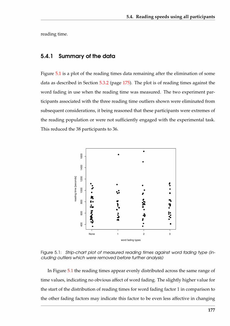
5.4. Reading speeds using all participants
reading time.
5.4.1 Summary of the data
Figure 5.1 is a plot of the reading times data remaining after the elimination of some
data as described in Section 5.3.2 (page 175). The plot is of reading times against the
word fading in use when the reading time was measured. The two experiment par-
ticipants associated with the three reading time outliers shown were eliminated from
subsequent considerations, it being reasoned that these participants were extremes of
the reading population or were not sufficiently engaged with the experimental task.
This reduced the 38 participants to 36.
None 1 2 3
400
600
800
1000
1200
1400
1600
word fading types
read
ing
time
[sec
onds
]
Figure 5.1: Strip-chart plot of measured reading times against word fading type (in-cluding outliers which were removed before further analysis)
In Figure 5.1 the reading times appear evenly distributed across the same range of
time values, indicating no obvious affect of word fading. The slightly higher value for
the start of the distribution of reading times for word fading factor 1 in comparison to
the other fading factors may indicate this factor to be even less affective in changing
177
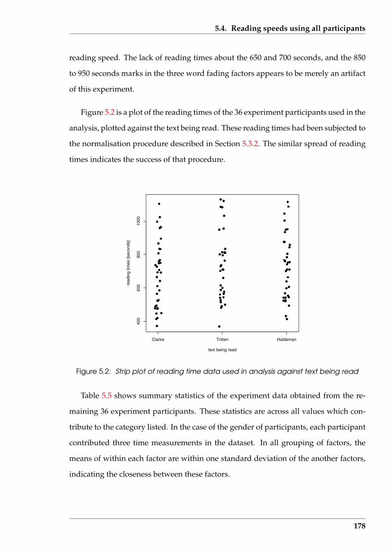
5.4. Reading speeds using all participants
reading speed. The lack of reading times about the 650 and 700 seconds, and the 850
to 950 seconds marks in the three word fading factors appears to be merely an artifact
of this experiment.
Figure 5.2 is a plot of the reading times of the 36 experiment participants used in the
analysis, plotted against the text being read. These reading times had been subjected to
the normalisation procedure described in Section 5.3.2. The similar spread of reading
times indicates the success of that procedure.
Clarke Tritten Haldeman
400
600
800
1000
text being read
read
ing
times
[sec
onds
]
Figure 5.2: Strip plot of reading time data used in analysis against text being read
Table 5.5 shows summary statistics of the experiment data obtained from the re-
maining 36 experiment participants. These statistics are across all values which con-
tribute to the category listed. In the case of the gender of participants, each participant
contributed three time measurements in the dataset. In all grouping of factors, the
means of within each factor are within one standard deviation of the another factors,
indicating the closeness between these factors.
178

5.4. Reading speeds using all participants
Table 5.5: Summary statistics for ANOVA reading time cells using all participants
No. ofCategory Mean Std. Dev.values
No Fading 687.1 205.5 36Fading 1 709.2 180.1 22Fading 2 715.2 184.9 25Fading 3 746.1 209.7 25Clarke 680.0 196.0 36Tritten 728.5 202.8 36Haldeman 727.2 189.3 36Male 701.1 211.4 48Female 720.1 183.5 60
Figure 5.3 is a histogram of all the reading times obtained from the 36 experiment
participants. Those 108 measurements had a mean of 711.8 and a standard deviation of
195.5. The curve of a Normal distribution having those parameters with its ordinate
expressed in term of the cell frequencies used in the histogram is superimposed in
Figure 5.3. The agreement in shape of the histogram with that distribution suggests
the reading time population is approximately Normally distributed.
reading time [seconds]
Freq
uenc
y
200 400 600 800 1000 1200
02
46
810
1214
Figure 5.3: Histogram of all reading time data
The two peaks present in this histogram suggest that the distribution could be bi-
modal. Attempts to separate this data into two mono-modal distributions based on
179
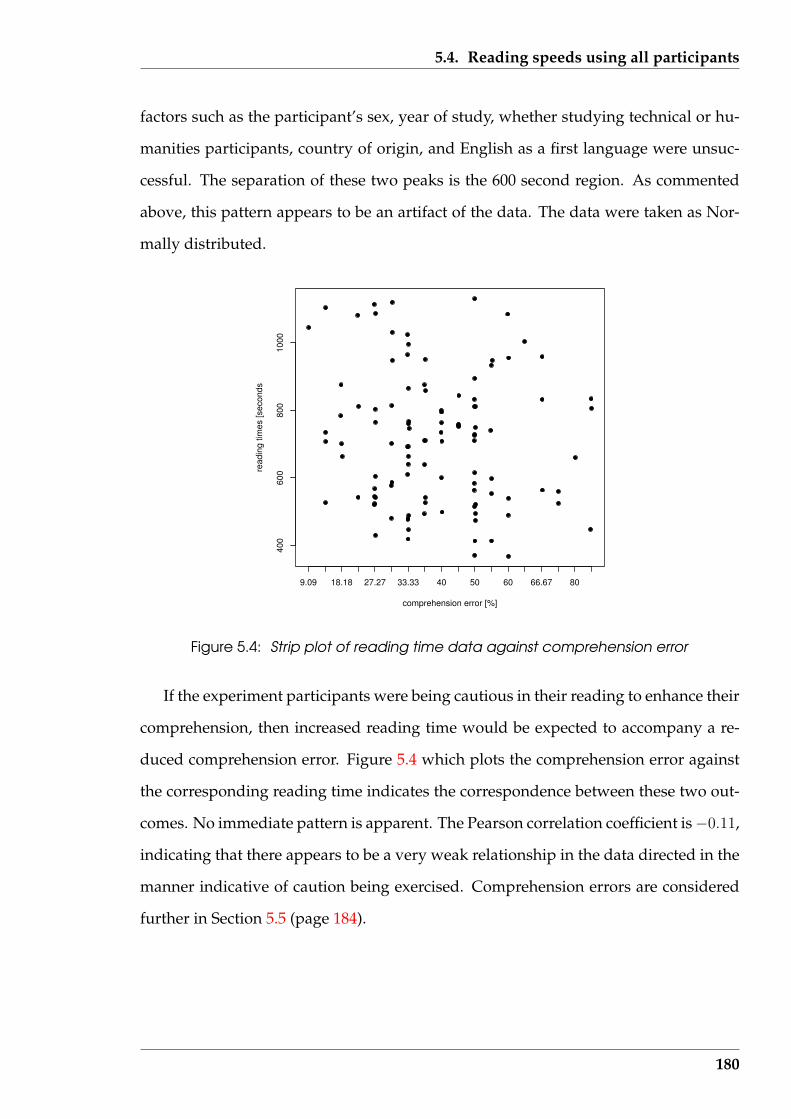
5.4. Reading speeds using all participants
factors such as the participant’s sex, year of study, whether studying technical or hu-
manities participants, country of origin, and English as a first language were unsuc-
cessful. The separation of these two peaks is the 600 second region. As commented
above, this pattern appears to be an artifact of the data. The data were taken as Nor-
mally distributed.
9.09 18.18 27.27 33.33 40 50 60 66.67 80
400
600
800
1000
comprehension error [%]
read
ing
times
[sec
onds
Figure 5.4: Strip plot of reading time data against comprehension error
If the experiment participants were being cautious in their reading to enhance their
comprehension, then increased reading time would be expected to accompany a re-
duced comprehension error. Figure 5.4 which plots the comprehension error against
the corresponding reading time indicates the correspondence between these two out-
comes. No immediate pattern is apparent. The Pearson correlation coefficient is−0.11,
indicating that there appears to be a very weak relationship in the data directed in the
manner indicative of caution being exercised. Comprehension errors are considered
further in Section 5.5 (page 184).
180
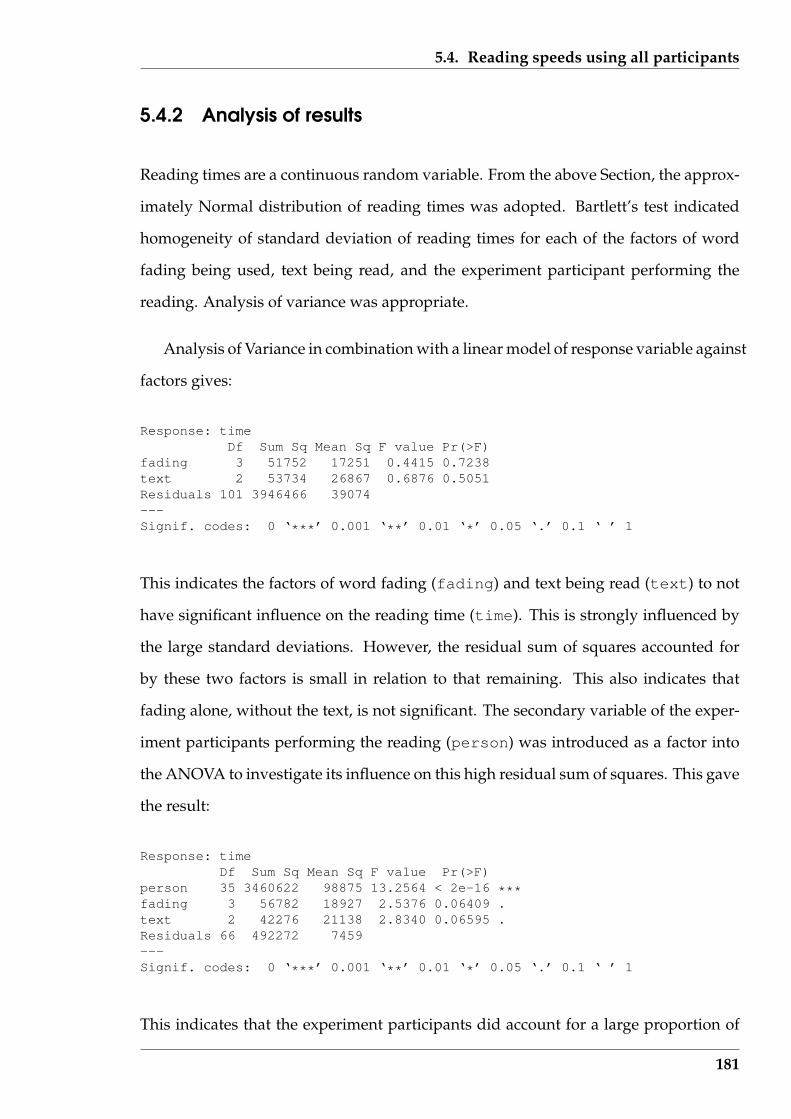
5.4. Reading speeds using all participants
5.4.2 Analysis of results
Reading times are a continuous random variable. From the above Section, the approx-
imately Normal distribution of reading times was adopted. Bartlett’s test indicated
homogeneity of standard deviation of reading times for each of the factors of word
fading being used, text being read, and the experiment participant performing the
reading. Analysis of variance was appropriate.
Analysis of Variance in combination with a linear model of response variable against
factors gives:
Response: timeDf Sum Sq Mean Sq F value Pr(>F)
fading 3 51752 17251 0.4415 0.7238text 2 53734 26867 0.6876 0.5051Residuals 101 3946466 39074---Signif. codes: 0 ‘***’ 0.001 ‘**’ 0.01 ‘*’ 0.05 ‘.’ 0.1 ‘ ’ 1
This indicates the factors of word fading (fading) and text being read (text) to not
have significant influence on the reading time (time). This is strongly influenced by
the large standard deviations. However, the residual sum of squares accounted for
by these two factors is small in relation to that remaining. This also indicates that
fading alone, without the text, is not significant. The secondary variable of the exper-
iment participants performing the reading (person) was introduced as a factor into
the ANOVA to investigate its influence on this high residual sum of squares. This gave
the result:
Response: timeDf Sum Sq Mean Sq F value Pr(>F)
person 35 3460622 98875 13.2564 < 2e-16 ***fading 3 56782 18927 2.5376 0.06409 .text 2 42276 21138 2.8340 0.06595 .Residuals 66 492272 7459---Signif. codes: 0 ‘***’ 0.001 ‘**’ 0.01 ‘*’ 0.05 ‘.’ 0.1 ‘ ’ 1
This indicates that the experiment participants did account for a large proportion of
181
5.4. Reading speeds using all participants
the observed variation (sum of squares). Both fading and text are insignificant
(Pr ≈ 0.065). However, text approaching significance is of interest and should be
viewed with caution in any future work. Although not a variable in the experimental
design, the gender of the person doing the reading was added to the analysis but was
found to account for a smaller proportion of the sum of squares than the fading or
text factors. The gender factor thus received no further consideration.
5.4.3 Discussion
The introduction of word fading in text is not shown to significantly affect reading
time; although the means were somewhat higher with increased number of faded
words. This non-significant affect of word fading factor measured in this experiment
is aligned with the findings of Bassin & Martin (1976). They attributed the lack of
influence of word reduction on reading time to the possible factors of:
• that the participant had mentally adopted a reading rate that gave them a com-
fortable rate of information input which they did not voluntarily exceed; and
• they were not accustom to reading word reduced text.
In contrast to Bassin & Martin (1976), in this experiment the words were not re-
moved but reduced in visual intensity with the experiment participants asked (largely)
to ignore such words. However, comments from some of those participants after com-
pleting the experiment concerned the difficulty they experienced reading the faded
words. That difficulty, combined with actual reading of the reduced intensity words,
possibly accounts for the results.
For the three documents read under the experimental word fading conditions, the
mean and range of reading speeds (in words per minute) were:
182
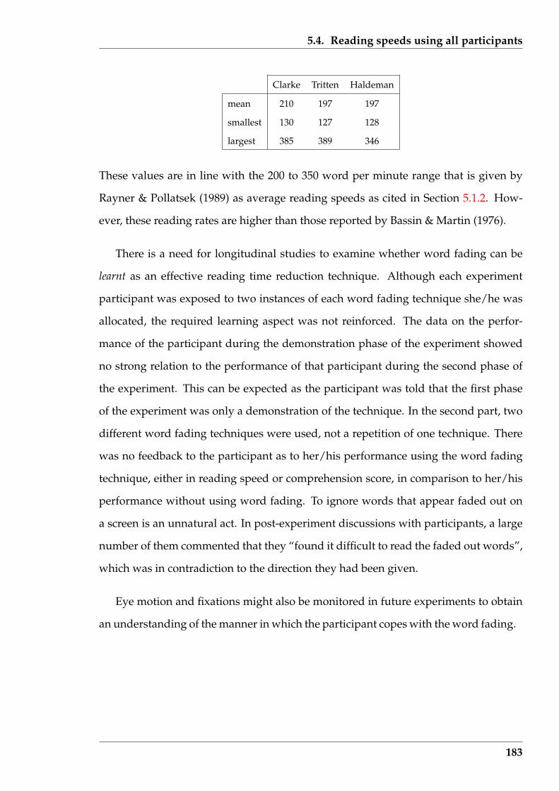
5.4. Reading speeds using all participants
Clarke Tritten Haldeman
mean 210 197 197
smallest 130 127 128
largest 385 389 346
These values are in line with the 200 to 350 word per minute range that is given by
Rayner & Pollatsek (1989) as average reading speeds as cited in Section 5.1.2. How-
ever, these reading rates are higher than those reported by Bassin & Martin (1976).
There is a need for longitudinal studies to examine whether word fading can be
learnt as an effective reading time reduction technique. Although each experiment
participant was exposed to two instances of each word fading technique she/he was
allocated, the required learning aspect was not reinforced. The data on the perfor-
mance of the participant during the demonstration phase of the experiment showed
no strong relation to the performance of that participant during the second phase of
the experiment. This can be expected as the participant was told that the first phase
of the experiment was only a demonstration of the technique. In the second part, two
different word fading techniques were used, not a repetition of one technique. There
was no feedback to the participant as to her/his performance using the word fading
technique, either in reading speed or comprehension score, in comparison to her/his
performance without using word fading. To ignore words that appear faded out on
a screen is an unnatural act. In post-experiment discussions with participants, a large
number of them commented that they “found it difficult to read the faded out words”,
which was in contradiction to the direction they had been given.
Eye motion and fixations might also be monitored in future experiments to obtain
an understanding of the manner in which the participant copes with the word fading.
183
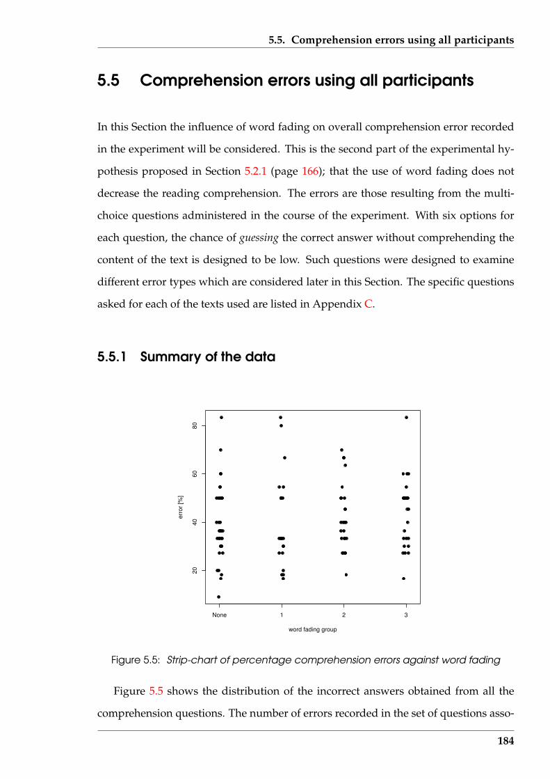
5.5. Comprehension errors using all participants
5.5 Comprehension errors using all participants
In this Section the influence of word fading on overall comprehension error recorded
in the experiment will be considered. This is the second part of the experimental hy-
pothesis proposed in Section 5.2.1 (page 166); that the use of word fading does not
decrease the reading comprehension. The errors are those resulting from the multi-
choice questions administered in the course of the experiment. With six options for
each question, the chance of guessing the correct answer without comprehending the
content of the text is designed to be low. Such questions were designed to examine
different error types which are considered later in this Section. The specific questions
asked for each of the texts used are listed in Appendix C.
5.5.1 Summary of the data
None 1 2 3
2040
6080
word fading group
erro
r [%
]
Figure 5.5: Strip-chart of percentage comprehension errors against word fading
Figure 5.5 shows the distribution of the incorrect answers obtained from all the
comprehension questions. The number of errors recorded in the set of questions asso-
184
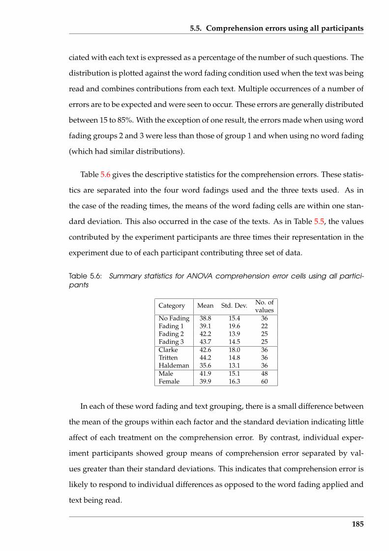
5.5. Comprehension errors using all participants
ciated with each text is expressed as a percentage of the number of such questions. The
distribution is plotted against the word fading condition used when the text was being
read and combines contributions from each text. Multiple occurrences of a number of
errors are to be expected and were seen to occur. These errors are generally distributed
between 15 to 85%. With the exception of one result, the errors made when using word
fading groups 2 and 3 were less than those of group 1 and when using no word fading
(which had similar distributions).
Table 5.6 gives the descriptive statistics for the comprehension errors. These statis-
tics are separated into the four word fadings used and the three texts used. As in
the case of the reading times, the means of the word fading cells are within one stan-
dard deviation. This also occurred in the case of the texts. As in Table 5.5, the values
contributed by the experiment participants are three times their representation in the
experiment due to of each participant contributing three set of data.
Table 5.6: Summary statistics for ANOVA comprehension error cells using all partici-pants
No. ofCategory Mean Std. Dev.values
No Fading 38.8 15.4 36Fading 1 39.1 19.6 22Fading 2 42.2 13.9 25Fading 3 43.7 14.5 25Clarke 42.6 18.0 36Tritten 44.2 14.8 36Haldeman 35.6 13.1 36Male 41.9 15.1 48Female 39.9 16.3 60
In each of these word fading and text grouping, there is a small difference between
the mean of the groups within each factor and the standard deviation indicating little
affect of each treatment on the comprehension error. By contrast, individual exper-
iment participants showed group means of comprehension error separated by val-
ues greater than their standard deviations. This indicates that comprehension error is
likely to respond to individual differences as opposed to the word fading applied and
text being read.
185

5.5. Comprehension errors using all participants
Figure 5.6 is a histogram of the distribution of the comprehension error data. No-
tice the zero occurrence in the 10, 20, 40, and 70 percent bins. The first three of these
four bins did not appear in the data. The data was composed of the percentage errors
for 6, 10, and 11 questions. Since only integer values were used (a questions was only
right or wrong), these three question numbers could not produce values covered in
the 10, 20, and 40 percent error bins of the histogram. The lack of a value in the 70
percent bin is a result of the data values.
error [%]
Freq
uenc
y
20 40 60 80
05
1015
20
Figure 5.6: Histogram of percentage comprehension errors
Lumping together, all 108 comprehension errors (3 sets of errors for each of the 36
participants) had a mean of 40.8 and standard deviation of 15.8. These values were
used to produce the Normal curve with ordinates of percentage comprehension error
that is superimposed on Figure 5.6. There is reasonable agreement between the shapes
of these two curves to enable the comprehension error data to be considered Normally
distributed.
McConkie, Rayner & Wilson (1973) suggest reading comprehension be divided
into five components: factual, numeric factual, inferential, structural, and recognition.
It was reasoned that the factual, factual numeric, and inferential components were
186
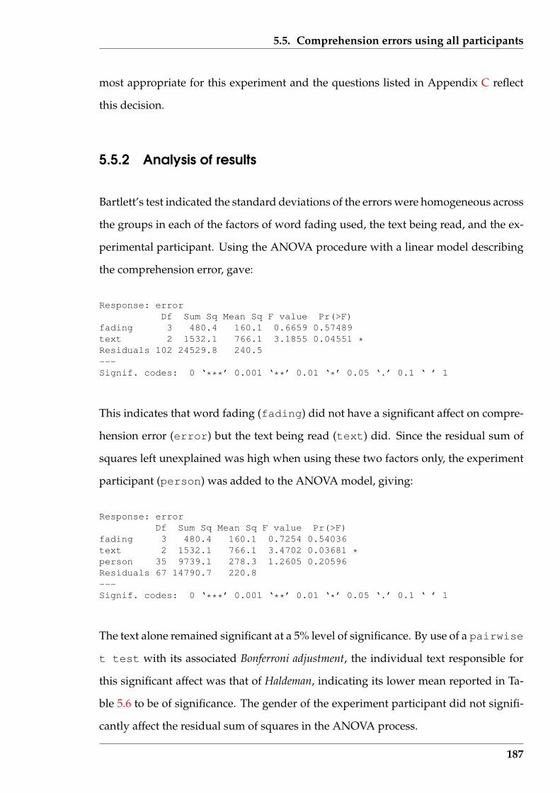
5.5. Comprehension errors using all participants
most appropriate for this experiment and the questions listed in Appendix C reflect
this decision.
5.5.2 Analysis of results
Bartlett’s test indicated the standard deviations of the errors were homogeneous across
the groups in each of the factors of word fading used, the text being read, and the ex-
perimental participant. Using the ANOVA procedure with a linear model describing
the comprehension error, gave:
Response: errorDf Sum Sq Mean Sq F value Pr(>F)
fading 3 480.4 160.1 0.6659 0.57489text 2 1532.1 766.1 3.1855 0.04551 *Residuals 102 24529.8 240.5---Signif. codes: 0 ‘***’ 0.001 ‘**’ 0.01 ‘*’ 0.05 ‘.’ 0.1 ‘ ’ 1
This indicates that word fading (fading) did not have a significant affect on compre-
hension error (error) but the text being read (text) did. Since the residual sum of
squares left unexplained was high when using these two factors only, the experiment
participant (person) was added to the ANOVA model, giving:
Response: errorDf Sum Sq Mean Sq F value Pr(>F)
fading 3 480.4 160.1 0.7254 0.54036text 2 1532.1 766.1 3.4702 0.03681 *person 35 9739.1 278.3 1.2605 0.20596Residuals 67 14790.7 220.8---Signif. codes: 0 ‘***’ 0.001 ‘**’ 0.01 ‘*’ 0.05 ‘.’ 0.1 ‘ ’ 1
The text alone remained significant at a 5% level of significance. By use of a pairwise
t test with its associated Bonferroni adjustment, the individual text responsible for
this significant affect was that of Haldeman, indicating its lower mean reported in Ta-
ble 5.6 to be of significance. The gender of the experiment participant did not signifi-
cantly affect the residual sum of squares in the ANOVA process.
187
5.5. Comprehension errors using all participants
The factual, factual numeric, and inferential comprehension errors were also used
separately in place of the total comprehension errors used in the above ANOVA. These
analyses yielded no indications of significant effects.
5.5.3 Discussion
The important result is that comprehension error was not significantly affected by
the word fading applied in reading the text although the mean number of errors is
slightly higher with successive increases in the number of words being faded. This
applied when considering the combined comprehension error, and factual and infer-
ential comprehension errors separately. The word fading factor ranged from No fading
through fading 1, 2, and 3 which represented techniques that greyed out an increas-
ing percentage of the words of the text. This non-significant effect of increasing word
reduction is in agreement with the experiment reported by Bassin & Martin (1976),
but contrasts to the significant adverse effects reported by Tuinman & Gray (1972), for
comprehension error with increasing word reduction. However, those experiments
removed the reduced words completely from view in contrast to the greying out used
in this experiment.
The value of the errors were higher than expected considering the population
from which the experiment participants were drawn (undergraduate and graduate
students). On average the experiment participants were making approximately 40%
errors, or alternately, getting 60% correct. If the participants were guessing the an-
swers, the expected error for each of the Clarke, Tritten, and Haldeman texts would
be 83.3% (all questions asked presented six optional answers). So the mean values of
the observed error occurrences shown in Table 5.6 indicate that the participants were
answering the questions based on their reading. The two standard deviation spread
is therefore 10% to 70% errors (or 90% to 30% correct). These values would suggest
that some participants did have real comprehension difficulties in reading. The data
188
5.6. Those whose reading time did decrease
suggests that this difficulty was not dependent on the word fading condition, but text
related.
It could be inferred that the experiment participants were concentrating on reading
the faded texts carefully, rather than quickly, as they made no significantly greater
numbers of errors and took approximately the same time as for the non-faded texts.
5.6 Those whose reading time did decrease
Part of the hypothesis for this experiment stated in Section 5.2.1 (page 166) was the
monitoring of each participant as they progress through the different parts. A conse-
quence of this was that the influence of each experiment factor upon the performance
of each participant could be measured directly as opposed to inferring that influence
from group statistics. In Sections 5.4 (page 176) and 5.5 (page 184), reading time and
comprehension error were analysed by pooling together the relevant data gathered
from those participants. Here that pooled data is collected into two groups. These
two groups are analogous to the purpose described by Atkinson, Atkinson, Smith &
Bem (1993) (page 459) for the Binet IQ scale to separate children for schooling. In
this case, group A contained readers whose reading times decrease for both applica-
tions of word fading (or word reduction) techniques applied to the texts they were
reading. This allocation was done without consideration of the magnitude of those
reading times, only that they got smaller. Group B contained all the remaining read-
ers, i.e. those whose reading timed did not decrease with both applications of the
experiment’s word fading techniques. Groups A and B contain a redistribution of the
same reading times (and comprehension) values used Sections 5.4 and 5.5.
Groups A and B contain separate samples of the population of ‘all readers’. Look-
ing for differences between those population samples, aside from their size relative to
the population from which they were obtained would be inappropriate. The influence
189
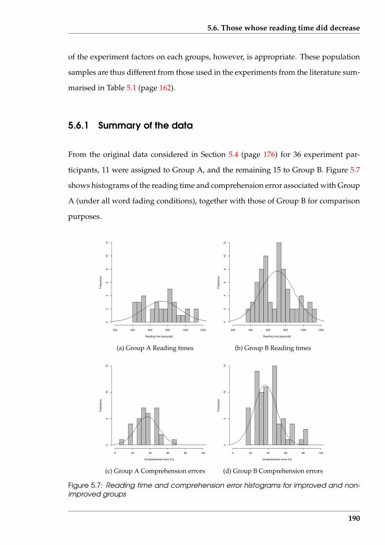
5.6. Those whose reading time did decrease
of the experiment factors on each groups, however, is appropriate. These population
samples are thus different from those used in the experiments from the literature sum-
marised in Table 5.1 (page 162).
5.6.1 Summary of the data
From the original data considered in Section 5.4 (page 176) for 36 experiment par-
ticipants, 11 were assigned to Group A, and the remaining 15 to Group B. Figure 5.7
shows histograms of the reading time and comprehension error associated with Group
A (under all word fading conditions), together with those of Group B for comparison
purposes.
Reading time [seconds]
Freq
uenc
y
200 400 600 800 1000 1200
02
46
810
12
(a) Group A Reading times
Reading time [seconds]
Freq
uenc
y
200 400 600 800 1000 1200
02
46
810
12
(b) Group B Reading times
Comprehension error [%]
Freq
uenc
y
0 20 40 60 80 100
05
1015
(c) Group A Comprehension errors
Comprehension error [%]
Freq
uenc
y
0 20 40 60 80 100
05
1015
(d) Group B Comprehension errors
Figure 5.7: Reading time and comprehension error histograms for improved and non-improved groups
190

5.6. Those whose reading time did decrease
Table 5.7 contains the corresponding statistical summary of those two groups. As
before, the number of values reflects that each participant contributed three sets of
data.
Table 5.7: Summary statistics for Group A and B reading times and comprehensiondata
No. ofData type Mean Std. Dev.values
Group A Reading time [seconds] 729.4 207.5 33Comprehension error [%] 36.7 13.0 33
Group B Reading time [seconds] 703.9 109.7 75Comprehension error [%] 42.6 16.6 75
These statistics indicate that the members of Group A took more time to read than
Group B, but their comprehension error was less. Using these statistics as parame-
ters, the corresponding normal curve is superimposed on each histogram. The his-
togram/normal curve combination indicates that both the reading time and compre-
hension error data for Group A can be considered to be normally distributed.
Table 5.8: Summary statistics for ANOVA reading time and comprehension error cellsfor Group A
No. ofCategory Mean Std. Dev.values
Reading times [seconds] No Fading 806.2 218.2 11Fading 1 709.0 172.6 8Fading 2 687.1 199.5 6Fading 3 675.9 236.7 8
Comprehension [%] No Fading 36.8 16.1 11Fading 1 31.4 9.8 8Fading 2 41.1 8.0 6Fading 3 38.6 14.2 8
Reading times [seconds] Clarke 660.8 192.5 11Tritten 760.6 202.0 11Haldeman 768.9 228.3 11
Comprehension [%] Clarke 36.4 10.1 11Tritten 39.1 15.1 11Haldeman 34.7 14.0 11
Table 5.8 shows descriptive statistics for reading time and comprehension error for
Group A against the factors of word fading and text read, respectively.
Figure 5.8 shows for Group A the distribution of reading times and comprehen-
sion errors across word fading factors. Figure 5.8 also indicates that as more words
191
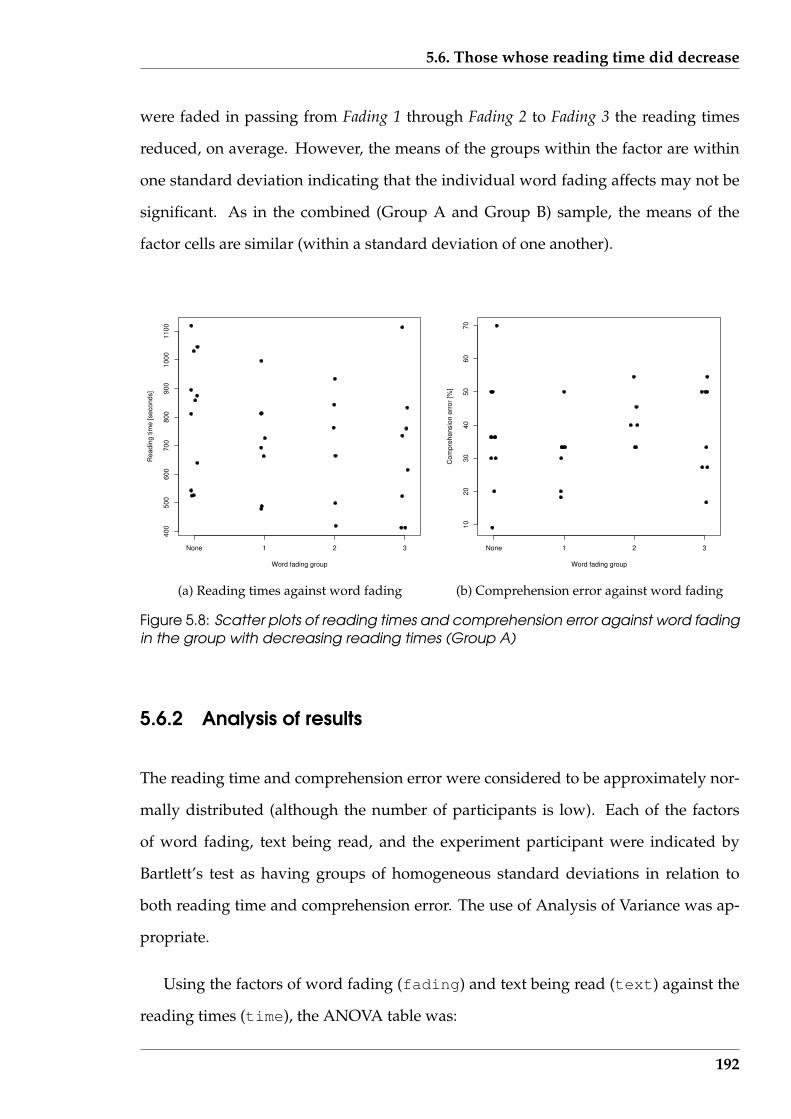
5.6. Those whose reading time did decrease
were faded in passing from Fading 1 through Fading 2 to Fading 3 the reading times
reduced, on average. However, the means of the groups within the factor are within
one standard deviation indicating that the individual word fading affects may not be
significant. As in the combined (Group A and Group B) sample, the means of the
factor cells are similar (within a standard deviation of one another).
None 1 2 3
400
500
600
700
800
900
1000
1100
Word fading group
Rea
ding
tim
e [s
econ
ds]
(a) Reading times against word fading
None 1 2 3
1020
3040
5060
70
Word fading group
Com
preh
ensi
on e
rror
[%]
(b) Comprehension error against word fading
Figure 5.8: Scatter plots of reading times and comprehension error against word fadingin the group with decreasing reading times (Group A)
5.6.2 Analysis of results
The reading time and comprehension error were considered to be approximately nor-
mally distributed (although the number of participants is low). Each of the factors
of word fading, text being read, and the experiment participant were indicated by
Bartlett’s test as having groups of homogeneous standard deviations in relation to
both reading time and comprehension error. The use of Analysis of Variance was ap-
propriate.
Using the factors of word fading (fading) and text being read (text) against the
reading times (time), the ANOVA table was:
192

5.6. Those whose reading time did decrease
Response: timeDf Sum Sq Mean Sq F value Pr(>F)
fading 3 101926 33975 0.7424 0.5361text 2 39850 19925 0.4354 0.6515Residuals 27 1235602 45763---Signif. codes: 0 ‘***’ 0.001 ‘**’ 0.01 ‘*’ 0.05 ‘.’ 0.1 ‘ ’ 1
Both factors had no significant effect on the reading time. But the sum of squares not
distributed to the factors (fading and text) is too high. In an attempt to resolve
this difficulty, the experiment participants (person) was introduced, resulting in the
ANOVA table:
Response: timeDf Sum Sq Mean Sq F value Pr(>F)
fading 3 101926 33975 13.0048 0.0001161 ***text 2 39850 19925 7.6268 0.0043242 **person 10 1191189 119119 45.5953 2.770e-10 ***Residuals 17 44413 2613---Signif. codes: 0 ‘***’ 0.001 ‘**’ 0.01 ‘*’ 0.05 ‘.’ 0.1 ‘ ’ 1
This indicates that the three factors of word fading, the text being read, and the indi-
vidual experiment participant themselves had significant effect on the reading time in
Group A. Because of the manner which this group was selected, it is not surprising
that word fading was significant, however, it was not a necessary consequence of that
group’s formulation.
For the comprehension error, the ANOVA table was:
Response: errorDf Sum Sq Mean Sq F value Pr(>F)
fading 3 368.28 122.76 0.7173 0.5552text 2 153.24 76.62 0.4477 0.6464person 10 1931.63 193.16 1.1287 0.3971Residuals 17 2909.42 171.14---Signif. codes: 0 ‘***’ 0.001 ‘**’ 0.01 ‘*’ 0.05 ‘.’ 0.1 ‘ ’ 1
This indicates that comprehension error was not affected by word fading nor the text
193
5.6. Those whose reading time did decrease
being read, after the individual differences of the experiment participants (person)
had been taken into consideration.
5.6.3 Discussion
The experiment was conducted with the participants not having access to a clock nor
was timing information provided to them via the software. Thus participants adjust-
ing their reading time so as to show increased reading times with increased word
reduction would appear unlikely to have occurred. However, the values of the mean
and standard variation of the group which improved their times with increasing sever-
ity of word fading (Group A) were larger than the other group. Those differences were
not statistically significant. As a result, one conclusion might be that the participants
assigned to Group A had greater ‘opportunity’ to improve than the others.
Group A contained 11 of the 36 experiment participants, representing 31%. Statis-
tically, the occurrence of members belonging to Group A is described by a Binomial
distribution having a population parameter θ. From page 264 of Freund (1972), the
minimum variance unbiased estimate (i.e. the best estimate) of the parameter θ is 0.31
(= 11/36) for the available experimental data.
An estimate of the size of Group A in a broader population can be obtained using
Bayesian statistics to update the value of 0.31 obtained in this experiment. This pa-
rameter (θ) is from a Binomial statistical distribution and Iversen (1984) describes this
updating process, starting from initial estimates.
As an illustration of the Bayesian process, assume initially estimates of the mean
and standard deviation of θ are 0.4 and 0.2 respectively, i.e. that half of the reading
population would benefit from word fading and that most experimental measure-
ments of that proportion lie in the range 0.0 to 0.8 (two standard deviations about
the mean). These mean and standard deviation values give 2.0 and 3.0 as estimates of
194
5.6. Those whose reading time did decrease
the Beta distribution parameters α and β used, as shown by Iversen (1984), to describe
the parameter θ. The a priori probability of the parameter θ is given by:
P (Data; θ) =
(36
11
)θ11(1− θ)25
and the probability of the value of θ is (retaining the standard form for the Beta func-
tion):
P (θ) =Γ(5)
Γ(2)Γ(3)θ2−1(1− θ)3−1
So the expression for the posterior probability of θ given the experimental data is:
P (θ; Data) =P (Data; θ)P (θ)
P (Data)
= kθ13−1(1− θ)28−1
where k is an unknown constant value unimportant to the current considerations.
This probability is another Beta function and the mean and variance of that statistical
function is shown by Freund (1972) to depend only on the values of the parameters α
and β which specify the function. Using these relationships, the posterior mean is:
µ =α
α + β= 0.32
and the corresponding variance:
σ2 =αβ
(α + β)2(α + β + 1)= 5.15× 10⁻³
Using the experimental value of 0.31 one cycle of Bayesian inference has revised the
initial estimate of the proportion of the reading population who improve when using
word fading from 0.4 with a standard deviation 0.2 to a new estimate of 0.32 with
a standard deviation of 0.07 (=√
5.16× 10⁻³) after one cycle of Bayesian inference.
Subsequent experimental values of the size of Group A would be used in this process
to revise this estimate of the true value of θ.
195
5.7. Summary of experimental findings
This Bayesian process suggests that approximately one third of readers could ben-
efit by the use of word fading. It may be that the ability to benefit from word fading
may be linked to cognitive style or it may be capable of being learned. But conversely,
for two thirds of readers word fading does not appear applicable. The response from
some experiment participants that they had been trying to read the faded words de-
spite being told to ignore them, might indicate a benefit of training, a potential result
from which would improve their reading time. These results also indicate that soft-
ware for general use that employs word fading techniques should make these tech-
niques optional, so that individuals can choose (based upon their experience) whether
to use them or not.
5.7 Summary of experimental findings
The experiment hypothesis had two parts to it and the experimental results support
one but not the other. The first part was that fading the common frequently occur-
ring words, and words in the exclusion zones (top and tail) identified by the top-tail
truncation technique, would reduce document reading time. This was not supported.
However, the other part of the hypothesis that such word fadings do not influence the
comprehension of the document’s information content, was supported.
The data suggested that increased reading speed was aligned with patterns of be-
haviour adopted by the experiment participants. Despite being given the direction to
ignore the faded words, many participants commented on the difficulty they experi-
enced in reading such words. This implied that the direction was not followed. If the
individual’s normal reading style was to read every word, then difficulty in interpret-
ing a word (due to fading) would cost a large amount of time. If the individual read
words selectively, and if the words selected were faded in the experiment, then read-
ing speed would suffer, but possibly not to the same extent as if all words were being
read. The experiment was interacting with those individual reading styles. To edu-
196
5.8. Summary
cate the participants to following the experiment’s reading style requires a different
approach than the demonstration phase used here. Further work should give more
emphasis to this education process.
Possible statistical significance of the affects of word fading were masked by the
large standard deviations measured in reading times. This may be due to the mis-
alignment of the experiment’s required reading style with that of the individual as
mentioned above. Another cause could be the attitude of the participant: Were they in-
terested in performing the experiment, or getting the remuneration? A larger number
of experiment participants would give more confidence that the experiment sample
was a true indicator of the population.
Overall, the results of this experiment were suggestive of further work. It is un-
derstandable that the word fading, having never before been seen by the experiment
participants, slowed their reading speed. Despite this, there was a group of approxi-
mately 30% of the participants that did show increased reading speed. Whether ‘train-
ing’ can be used to increase this proportion needs further investigation. Samples taken
across a wider educational background are necessary to enable the results obtained to
generalise to the broader population.
5.8 Summary
This Chapter considered theoretical and experimental possibilities of using computer
generated visualization to assist human reading of text documents. Thus, research
hypothesis H3 (visualization techniques can be used with advantage by humans to
aid in reading and comprehension of text documents) was under consideration. The
reading being assisted was not skim reading which is aimed at obtaining an idea of
the information content, but reading of the content so that the detail is retained in
that reading. Such visualizations were by fading words that were less important in
197
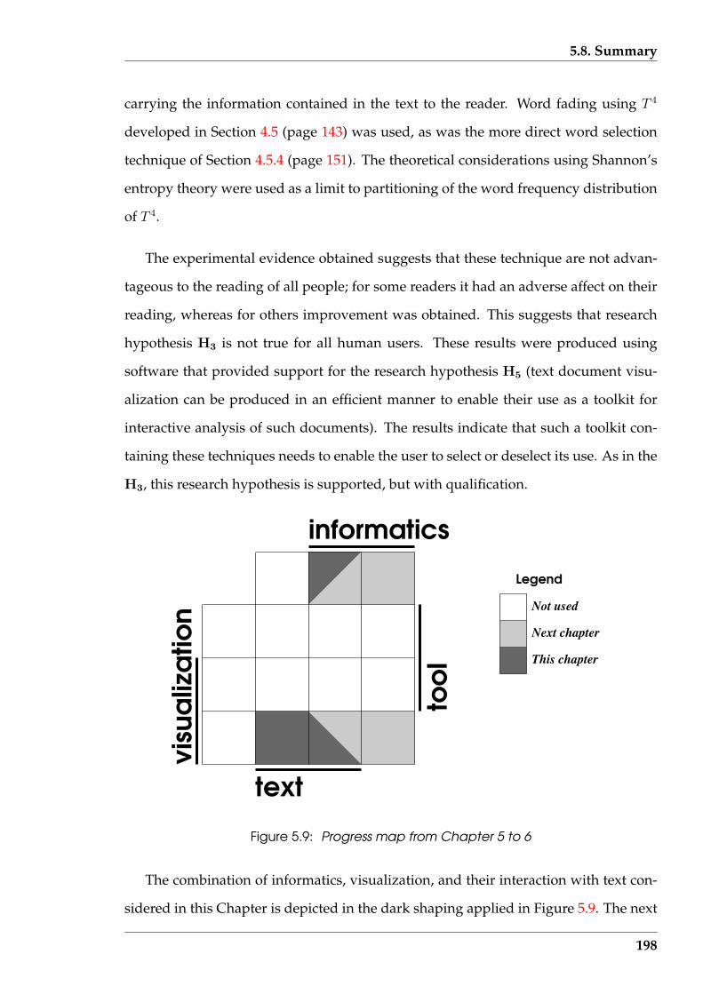
5.8. Summary
carrying the information contained in the text to the reader. Word fading using T 4
developed in Section 4.5 (page 143) was used, as was the more direct word selection
technique of Section 4.5.4 (page 151). The theoretical considerations using Shannon’s
entropy theory were used as a limit to partitioning of the word frequency distribution
of T 4.
The experimental evidence obtained suggests that these technique are not advan-
tageous to the reading of all people; for some readers it had an adverse affect on their
reading, whereas for others improvement was obtained. This suggests that research
hypothesis H3 is not true for all human users. These results were produced using
software that provided support for the research hypothesis H5 (text document visu-
alization can be produced in an efficient manner to enable their use as a toolkit for
interactive analysis of such documents). The results indicate that such a toolkit con-
taining these techniques needs to enable the user to select or deselect its use. As in the
H3, this research hypothesis is supported, but with qualification.
informatics
text
Not used
Next chapter
This chapter
Legend
Figure 5.9: Progress map from Chapter 5 to 6
The combination of informatics, visualization, and their interaction with text con-
sidered in this Chapter is depicted in the dark shaping applied in Figure 5.9. The next
198
5.8. Summary
Chapter considers those themes in the context of analytic techniques. Their combina-
tion is shown shaded light grey in that Figure.
The next Chapter considers several analytic techniques applied to text. Of par-
ticular interest is the problem of assigning authorship of a text of unknown author-
ship by matching patterns embedded in other texts of known authorship. Visualiza-
tion is considered as one technique for exposing such patterns. Such patterns intro-
duce a multi-dimensional character to consideration of text; a dimensionality greater
than three, which is a limitation commonly encountered in visualizations. In some
instances, comparing such visualized patterns can become subjective making it de-
sirable to have analytic techniques that can assist such comparison. A technique to
perform that function is include in the next Chapter. Such considerations are made
to investigate research hypotheses H5, together with H2 (visualization provides and
alternative to analytical methods for interpreting the same sets of text data) and H4
(visualization can assist in finding similarities and differences in the composition of
text documents).
199
Chapter 6
Visualizing numeric data
Numerical analysis is possible for all text documents. Data in the form of counts are
often used to characterize text documents. Such counts might be the number of words
in the document, the number of sentences, number of subjects dealt with, etc. When
computers become involved, production of such counts proliferate and sorting out
which counts are useful becomes more challenging. Simultaneous consideration of
different counts can assist such an evaluation process but such increasing ‘dimension-
ality’ creates difficulties in coordinating such comparison, for example, in ensuring
that all possible comparisons have been considered. Assigning numbers to the results
of an analysis, whether that analysis is performed numerically or not, can assist com-
parison across analyses. Those numbers can also assist in coordinating the analysis
as a whole. But to facilitate that process, a systematic, rather than heuristic, analy-
sis approach is more useful. Such processes are considered here to be applied to text
documents.
Visualization can assist such a process by converting numerical values produced
into visual patterns which assist the human user to coordinate the overall analysis, and
assess the final outcome. Examination of that process is also an investigation of the re-
search hypothesis H2 (visualization provides and alternative to analytical methods
for interpreting the same set of text data). It is shown that analysis of text documents
readily yield multiple variables that are best treated simultaneously; sometimes for
the document as a whole, and in other instances, evolving through the length of the
200
6.1. A classic author attribution dataset
document. This Chapter focuses on that complexity, and the synergistic use of visu-
alization and analytic processes in such an environment. Extracting (or surfacing) of
patterns present is examined, followed by distilling them, comparing them, and eval-
uating them. The software to perform this repetitive process would need to implement
research hypothesis H5 (text document visualizations can be produced in an efficient
manner to enable their use as a toolkit for interactive analysis of such documents).
One application for such complex text document analysis is the author attribution
problem. In it, patterns embedded in a text document in which the authorship is in
question are extracted and compared with similar patterns from other documents of
known authorship. Similarity in such patterns is then used to assert that the docu-
ments have a common author. An understandable difficulty is finding patterns that
contain the writer’s characteristic traits which separate his writing from those of all
others. Problems associated with finding and comparing such traits are used in this
Chapter as an example application for the combined use of visualization and analysis
of text documents. The objective at hand is to examine the processes involved, rather
than to assign authors to particular documents. But in the process, an examination is
also obtained of research hypothesis H4 (visualization can assist in finding similarities
and differences in the composition of text documents).
The emphasis in this Chapter is on analysing measurements made from text docu-
ments, not on reading such documents.
6.1 A classic author attribution dataset
A series of eighteenth century papers were used in this research as sources of text
document data. The controversy regarding the authorship of a number of those papers
exists to this day.
201
6.1. A classic author attribution dataset
6.1.1 Background
The Federalist Papers, described by Mosteller & Wallace (1984), are an example of a set
of documents to which author attribution has been applied in the literature, and part
of this data set was used in this research. The documents are a series of papers which
are numbered according to their order of publication in four New York newspapers
between October 1787 and April 1788. Eight additional papers were added to those
already published, when they were all released in book form in May 1788. According
to Holmes & Forsyth (1995), that book has remained in print for over 200 years. Each
paper was written with the purpose of persuading the reader to vote for ratification of
the proposed United States constitution about to be put to the people. The difficulty
and interest in these papers follows from them all appearing under Publius as the
indicated author. Subsequent to their publication, three men claimed authorship of
various papers. The authorship claims by two of those men, Alexander Hamilton
(who was an army general) and James Madison (who was the fourth president of the
United States), overlap for 12 papers.
In these 85 papers, there are three groupings of authorship. Some papers are
known to have been written by one author, others are known to have been written by
two authors in collaboration, and yet others are of disputed single authorship. Hence
these papers offer opportunities to study variables in documents that can be ascribed
as the style of the author, and whether that style can identify the correct author in the
case of the papers of disputed authorship.
Each paper is titled by topic. This title can be used as an indicator of the author’s
intent of the paper. That intent needs to be retained by any processing that is applied
to the document.
Table 6.1 lists the paper number and author attribution given by Mosteller & Wal-
lace (1984). These allocations are those contained in the computer readable version
of the papers held in the Project Gutenberg website. Such assignments are generally
202
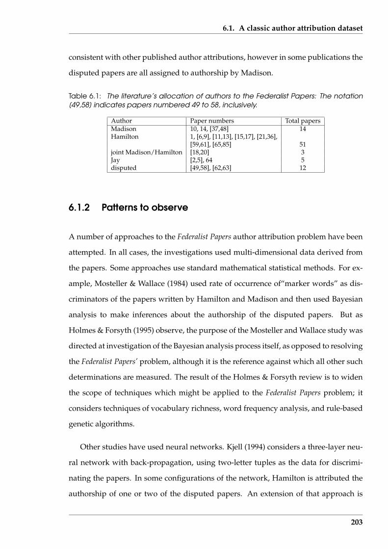
6.1. A classic author attribution dataset
consistent with other published author attributions, however in some publications the
disputed papers are all assigned to authorship by Madison.
Table 6.1: The literature’s allocation of authors to the Federalist Papers: The notation[49,58] indicates papers numbered 49 to 58, inclusively.
Author Paper numbers Total papersMadison 10, 14, [37,48] 14Hamilton 1, [6,9], [11,13], [15,17], [21,36],
[59,61], [65,85] 51joint Madison/Hamilton [18,20] 3Jay [2,5], 64 5disputed [49,58], [62,63] 12
6.1.2 Patterns to observe
A number of approaches to the Federalist Papers author attribution problem have been
attempted. In all cases, the investigations used multi-dimensional data derived from
the papers. Some approaches use standard mathematical statistical methods. For ex-
ample, Mosteller & Wallace (1984) used rate of occurrence of“marker words” as dis-
criminators of the papers written by Hamilton and Madison and then used Bayesian
analysis to make inferences about the authorship of the disputed papers. But as
Holmes & Forsyth (1995) observe, the purpose of the Mosteller and Wallace study was
directed at investigation of the Bayesian analysis process itself, as opposed to resolving
the Federalist Papers’ problem, although it is the reference against which all other such
determinations are measured. The result of the Holmes & Forsyth review is to widen
the scope of techniques which might be applied to the Federalist Papers problem; it
considers techniques of vocabulary richness, word frequency analysis, and rule-based
genetic algorithms.
Other studies have used neural networks. Kjell (1994) considers a three-layer neu-
ral network with back-propagation, using two-letter tuples as the data for discrimi-
nating the papers. In some configurations of the network, Hamilton is attributed the
authorship of one or two of the disputed papers. An extension of that approach is
203
6.1. A classic author attribution dataset
the two-layer neural network study described by Tweddie et al. (1996) which uses
eleven “function” words obtained from the papers as the input data. Here, Madison
is deduced as the sole author of the twelve disputed papers. Both of these approaches
contrast to that described by Martindale & McKenzie (1995) who use “context” words
to differentiate the Federalist Papers using a Probability Neural Network (PNN). There,
the context in which a word appears in a text is brought into consideration, as well as
its frequency of occurrence. The result was that the disputed papers were probably
written by Madison, but not with great certainty.
In the majority of cases, these techniques suggest that Madison was the author of
all the disputed papers. Following from these determinations it could be said that
Madison is ‘favoured’ as the author of the disputed papers, but the issue has some
uncertainty.
Those approaches have drawn upon other author attribution studies not directed
at the Federalist Papers. For example, Burrows (1992) used the twenty, twenty-eight,
fifty, sixty, and seventy-five most frequent words occurring in texts for their compar-
ison. Those frequencies were then normalised using Pearson product-moment meth-
ods. Principal component analysis was then applied, and the distribution of the first
two or three eigenvectors that are produced was observed. Another relevant study is
that by Martindale & Tuffin (1996) where the occurrence of the 100 most frequently
occurring words, the 100-200 most frequently occurring words, and those words oc-
curring at a frequency of 0.01% or less in the classics Iliad and Odyssey were consid-
ered. They proposed discriminant analysis as the means for such text comparisons.
The central component of each of these techniques was vectors of data derived from
the words present in the text documents.
Other approaches have been tried for author attribution using data derived less
directly from the words present. Holmes & Forsyth (1995) report the use of sentence
length, proportion of nouns, proportion of adjectives, number of one-letter and two-
letter words, and the frequency of the definite article. Holmes (1994) offers in addition:
204
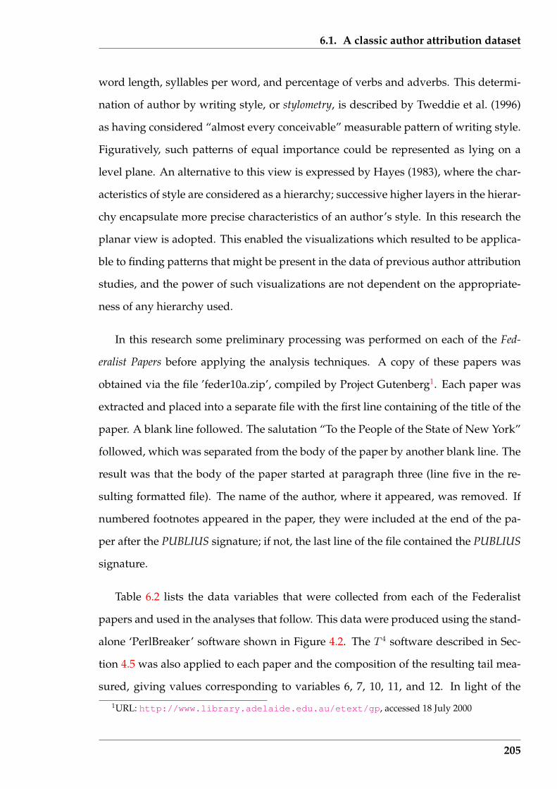
6.1. A classic author attribution dataset
word length, syllables per word, and percentage of verbs and adverbs. This determi-
nation of author by writing style, or stylometry, is described by Tweddie et al. (1996)
as having considered “almost every conceivable” measurable pattern of writing style.
Figuratively, such patterns of equal importance could be represented as lying on a
level plane. An alternative to this view is expressed by Hayes (1983), where the char-
acteristics of style are considered as a hierarchy; successive higher layers in the hierar-
chy encapsulate more precise characteristics of an author’s style. In this research the
planar view is adopted. This enabled the visualizations which resulted to be applica-
ble to finding patterns that might be present in the data of previous author attribution
studies, and the power of such visualizations are not dependent on the appropriate-
ness of any hierarchy used.
In this research some preliminary processing was performed on each of the Fed-
eralist Papers before applying the analysis techniques. A copy of these papers was
obtained via the file ’feder10a.zip’, compiled by Project Gutenberg1. Each paper was
extracted and placed into a separate file with the first line containing of the title of the
paper. A blank line followed. The salutation “To the People of the State of New York”
followed, which was separated from the body of the paper by another blank line. The
result was that the body of the paper started at paragraph three (line five in the re-
sulting formatted file). The name of the author, where it appeared, was removed. If
numbered footnotes appeared in the paper, they were included at the end of the pa-
per after the PUBLIUS signature; if not, the last line of the file contained the PUBLIUS
signature.
Table 6.2 lists the data variables that were collected from each of the Federalist
papers and used in the analyses that follow. This data were produced using the stand-
alone ‘PerlBreaker’ software shown in Figure 4.2. The T 4 software described in Sec-
tion 4.5 was also applied to each paper and the composition of the resulting tail mea-
sured, giving values corresponding to variables 6, 7, 10, 11, and 12. In light of the
1URL: http://www.library.adelaide.edu.au/etext/gp, accessed 18 July 2000
205

6.1. A classic author attribution dataset
comments by Holmes (1994) (page 104), this particular set of variables is unlikely to
provide a definitive resolution to the Federalist Papers author attribution problem. But
they do give data which enable exploration of techniques that might assist in resolving
that problem. Consequently, these variables were used in other parts of this research
as providing characterisation of text documents.
Table 6.2: Variables used for analysis of each Federalist paper
No. Description1 Federalist paper number2 Total number of words3 Number of unique words4 Occurrence number of the highest occurring word5 Number of words that appear once6 Number of words which fall on the tail7 The occurrence number of the word at which the tail commenced8 Total number of paragraphs9 Total number of sentences
10 Number of unique words which fall on the tail11 Total number of words accounted for by the tail12 Number of word occurrence groupings that appear in the tail13 Total of all word occurrence groupings present
The Federalist paper number (variable No. 1) in the list of variables of Table 6.2 has
two functions in that data set, although being at apparent odds to the measurements
which form the other variables. It identifies the paper to which the other values relate.
More significantly, each of the papers were published sequentially, giving rise of the
paper’s number. Thus the paper’s number indicates a possible temporal evolution
inherent in the other variables. The significance of this will be discussed later.
With 85 papers, there are 85 sets of these 13 data variables. One means of look-
ing for possible relationships among the data variables is to generate the matrix of
correlation coefficients. Table 6.3 is the diagonal and upper triangular portion of the
correlation coefficient matrix for that data. As in Section 4.4.1 (page 134), off-diagonal
coefficients greater than 0.7 in value in that matrix indicates a possible relationship be-
tween the corresponding variables, and are shown shaded in Table 6.3. Only variables
1, 6, and 7 (Federalist paper number, number of words which fall on the tail, and the
occurrence number of the words at which the tail commenced) appear independent
206
6.1. A classic author attribution dataset
of the other variables. These dependencies will be explored through the visualization
techniques which are applied to this data.
Table 6.3: Correlation coefficient matrix of the Federalist Papers’ data set
1 2 3 4 5 6 7 8 9 10 11 12 131 1.00 0.24 0.03 0.36 -0.10 0.03 0.35 0.06 0.19 0.14 0.29 0.25 0.262 1.00 0.92 0.93 0.80 0.09 0.65 0.77 0.94 0.79 0.99 0.92 0.943 1.00 0.80 0.97 0.08 0.51 0.74 0.91 0.67 0.85 0.81 0.824 1.00 0.67 0.08 0.64 0.69 0.87 0.75 0.94 0.89 0.905 1.00 0.07 0.38 0.67 0.82 0.55 0.72 0.69 0.696 1.00 -0.13 0.11 0.10 0.36 0.12 0.15 0.127 1.00 0.50 0.60 0.38 0.65 0.63 0.678 1.00 0.79 0.63 0.75 0.69 0.709 1.00 0.73 0.91 0.86 0.87
10 1.00 0.84 0.81 0.7811 1.00 0.93 0.9412 1.00 0.9913 1.00
In the next Sections visualization techniques which assist finding patterns of sim-
ilarity, and dependencies between variables, are examined. A ‘variable rich’ environ-
ment is considered analogous to Table 6.3. The existence of multiple variables (greater
than three variables) leads to difficulty in interpreting the interaction between the vari-
ables in the matrix of Table 6.3. Such multiple variables also influence the visualization
techniques that can be used. This complexity introduced into the visualization is elo-
quently put by Bertin (1999) when he writes (page 62):
With up to three rows, a data table can be constructed directly as a single
image, producing a scatter plot or correlation diagram, in which the objects
are in the z. However, an image has only three dimensions. And this bar-
rier is impassable.
With this research, those rows are the variables (also called dimensions) and they num-
ber greater than three. It will be shown that this barrier can, at least partially, be
surpassed.
It should be noted that the correlation matrix of Table 6.3 is for all 85 Federalist Pa-
207

6.2. Parallel Coordinate plots
pers. When these papers are considered in the visualizations of the following sections,
that full set of papers is broken into four groups. Differences in correlation between
variables within each group would be expected, and different from that of the total set.
However, because of the number of strong positive correlations shown in Table 6.3 for
the papers in total, a large proportion of representations of such positive relationships
is to be expected within the visualizations of each sub-group.
6.2 Parallel Coordinate plots
In Section 2.4 (page 56) and its associated summary Table 2.7 (page 58), techniques
for visualization of multi-dimensional data are reviewed. As indicated there, tech-
niques of varying sophistication have been devised in an attempt to overcome the
three dimensional spatial constraint with which humans are familiar, but still exploit
the comparative capacity of human vision. Most such techniques use some recursive
application of the three dimensions at a time principle. An alternative technique is Par-
allel Coordinate plots.
Parallel Coordinate plots is a technique for visualizing simultaneously the rela-
tionship of individual data interacting with multiple variables. In combination across
a set of data, those influences indicate how the measurement variables are related. The
sample provided in the data is used to deduce broader relationships between the mea-
surement variables, which are deduced visually. Such attributes are rarely available
in combination. But as remarked by Wegman (1990), interpretation of Parallel Coor-
dinate plots is not intuitive due to their unfamiliar basis. However, the effort involved
in obtaining that familiarity pays dividends.
Figure 6.1 shows an example of multiple data points having 13 coordinates (or
variables) each displayed using two implementation forms of these ideas. The data
used (and these plots) will be considered later. These two forms of plot have both
208
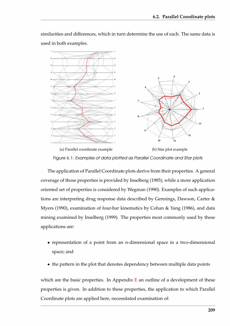
6.2. Parallel Coordinate plots
similarities and differences, which in turn determine the use of each. The same data is
used in both examples.
1 1
2 2
3 3
4 4
5 5
6 6
7 7
8 8
9 9
10 10
11 11
12 12
13 13
1 1
(a) Parallel coordinate example
1
2
3
45
6
7
8
9
10 11
12
13
(b) Star plot example
Figure 6.1: Examples of data plotted as Parallel Coordinate and Star plots
The application of Parallel Coordinate plots derive from their properties. A general
coverage of those properties is provided by Inselberg (1985), while a more application
oriented set of properties is considered by Wegman (1990). Examples of such applica-
tions are interpreting drug response data described by Gennings, Dawson, Carter &
Myers (1990), examination of four-bar kinematics by Cohan & Yang (1986), and data
mining examined by Inselberg (1999). The properties most commonly used by these
applications are:
• representation of a point from an n-dimensional space in a two-dimensional
space; and
• the pattern in the plot that denotes dependency between multiple data points
which are the basic properties. In Appendix E an outline of a development of these
properties is given. In addition to these properties, the application to which Parallel
Coordinate plots are applied here, necessitated examination of:
209

6.2. Parallel Coordinate plots
• the influence that disturbance in the data has upon the theoretical behaviour of
the Parallel Coordinate plots; and
• the number of Parallel Coordinate plots necessary.
It was felt that these issues were not explored sufficiently in the literature seen, despite
the practical influence they have on the deductions made via the Parallel Coordinate
plots. Each of these issues is considered in the following two subsections before ap-
plying Parallel Coordinate plots to the author attribution problem, using the Federalist
Papers. Although consideration of these issues divert from text documents, they are
important and are used subsequently for text document analysis.
6.2.1 Effect of noise and scaling on the Parallel Coordinate plots
One of the properties of Parallel Coordinate plots (the second significant result of Ap-
pendix E) enables detecting linear dependency between the dimensions (variables)
present. If there is a negative linear relationship between adjacent variables (i.e. as
one variable increases, the other decreases), the lines representing the data will inter-
sect between the parallel coordinate axes representing those variables. If the variables
are directly proportional, then the lines between the corresponding parallel axes will
be parallel. For any other positive linear relationship, the lines will intersect, but not
between the corresponding parallel coordinate axes of the Parallel Coordinate plots.
With measurement data, the embedded relationships between the variables are
more complex than simple linear dependencies. The effect that such impure relation-
ships have upon the appearance of a Parallel Coordinate plots is examined here. Noise
is introduced into the data which initially contains known relationships between the
variables. In using Parallel Coordinate plots, matching of observed behaviour in the
plot to the Parallel Coordinate plots resulting here from perturbing the known rela-
tionships, gives insight into the existence of possible relationships between the vari-
210
6.2. Parallel Coordinate plots
ables.
Implicit in observing the tendency for intersections of the data lines, and the po-
sitioning of such intersections, is how the Parallel Coordinates are plotted. The be-
haviour of the lines (see Figure 6.2 (page 212)) between each pair of coordinate axes is
influenced by the scale used on each axis to plot the data values. Lines that are parallel
when plotted using one set of scales for a pair of axes, can become convergent when
plotted using another combination of scales. Similarly, lines that should converge due
to the numerical relationship in the data can appear parallel with some scales used for
plotting. The scale selected for each axis must also contain all the values that are to be
plotted along its length. So selection of the scaling of the axes in the Parallel Coordi-
nate plot influences the appearance of the plot and the expected information that can
be obtained from it.
Also, measurements are rarely exact, but instead contain errors embedded in them.
In Section 6.3 (page 220), Parallel Coordinate plots are applied to the measurements of
the Federalist Papers to examine the influence of the variables in Table 6.2 (page 206).
Such measurements will contain errors of the type considered here. The interest here
is how much disturbance can be introduced by such a measurement process and still
maintain detection of the dependencies between the variables by a Parallel Coordi-
nate plot. Or, how can a Parallel Coordinate plot look in practice which indicates an
underlying dependence between the variables?
Both scaling along the axes of the plot and the influence of disturbance in the data
(noise) has on the plot is only implicitly considered in the literature. Parallel Coordi-
nate plots of 3-dimensional data are considered here to assist subsequent implemen-
tation of the technique and interpretation of the results produced. Data with three
independent variables (dimensions) is sufficient to be considered multi-dimensional
data while retaining simplicity for implementation as an illustrative example.
An example set of data for use in this investigation (which has no known physical
211
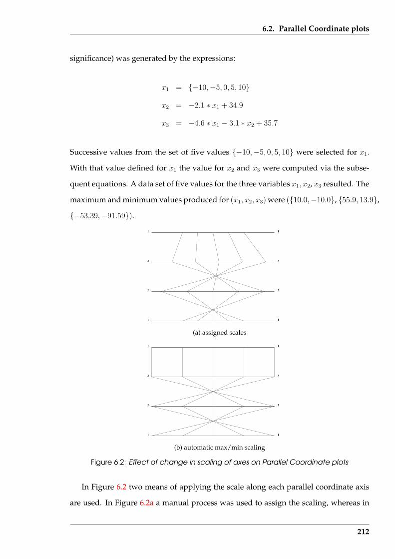
6.2. Parallel Coordinate plots
significance) was generated by the expressions:
x1 = {−10,−5, 0, 5, 10}
x2 = −2.1 ∗ x1 + 34.9
x3 = −4.6 ∗ x1 − 3.1 ∗ x2 + 35.7
Successive values from the set of five values {−10,−5, 0, 5, 10} were selected for x1.
With that value defined for x1 the value for x2 and x3 were computed via the subse-
quent equations. A data set of five values for the three variables x1, x2, x3 resulted. The
maximum and minimum values produced for (x1, x2, x3) were ({10.0,−10.0}, {55.9, 13.9},
{−53.39,−91.59}).
1 1
2 2
3 3
1 1
(a) assigned scales
1 1
2 2
3 3
1 1
(b) automatic max/min scaling
Figure 6.2: Effect of change in scaling of axes on Parallel Coordinate plots
In Figure 6.2 two means of applying the scale along each parallel coordinate axis
are used. In Figure 6.2a a manual process was used to assign the scaling, whereas in
212
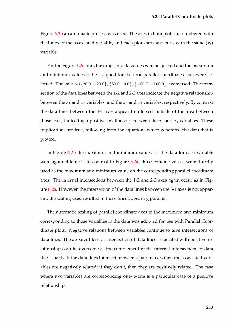
6.2. Parallel Coordinate plots
Figure 6.2b an automatic process was used. The axes in both plots are numbered with
the index of the associated variable, and each plot starts and ends with the same (x1)
variable.
For the Figure 6.2a plot, the range of data values were inspected and the maximum
and minimum values to be assigned for the four parallel coordinates axes were se-
lected. The values ({20.0,−20.0}, {60.0, 10.0}, {−50.0,−100.0}) were used. The inter-
section of the data lines between the 1-2 and 2-3 axes indicate the negative relationship
between the x1 and x2 variables, and the x2 and x3 variables, respectively. By contrast
the data lines between the 3-1 axes appear to intersect outside of the area between
those axes, indicating a positive relationship between the x3 and x1 variables. These
implications are true, following from the equations which generated the data that is
plotted.
In Figure 6.2b the maximum and minimum values for the data for each variable
were again obtained. In contrast to Figure 6.2a, those extreme values were directly
used as the maximum and minimum value on the corresponding parallel coordinate
axes. The internal intersections between the 1-2 and 2-3 axes again occur as in Fig-
ure 6.2a. However, the intersection of the data lines between the 3-1 axes is not appar-
ent: the scaling used resulted in those lines appearing parallel.
The automatic scaling of parallel coordinate axes to the maximum and minimum
corresponding to those variables in the data was adopted for use with Parallel Coor-
dinate plots. Negative relations between variables continue to give intersections of
data lines. The apparent lose of intersection of data lines associated with positive re-
lationships can be overcome as the complement of the internal intersections of data
line. That is, if the data lines intersect between a pair of axes then the associated vari-
ables are negatively related; if they don’t, then they are positively related. The case
where two variables are corresponding one-to-one is a particular case of a positive
relationship.
213

6.2. Parallel Coordinate plots
To the equation generated data a noise component was added to simulate the be-
haviour of measurement data. This noise was from a Normal distribution of zero
mean. The noise values used were obtained from the R statistical software
package via a standard function call as in rnorm(15,mean=0,sd=1.5) which gen-
erates 15 Normally distributed numbers with a mean of zero and a standard deviation
of 1.5. The values of x1, x2, and x3 were computed, as before, using the above equa-
tions. Then the first five of the noise values were added to the x1 data values, the
second five to the x2 values and the final five to the x3 values. For that level of noise,
the maximum and minimum data values were found and used to generate a Paral-
lel Coordinate plot for that data. This process was repeated for each of the standard
deviation (s.d.) values of 0.5, 1.5, 2,5 and 5.0. The resulting Parallel Coordinate plots
are shown in Figure 6.3. These plots are of the same type and basic data as that of
Figure 6.2b.
1 1
2 2
3 3
1 1
(a) s.d. = 0.5
1 1
2 2
3 3
1 1
(b) s.d. = 1.5
1 1
2 2
3 3
1 1
(c) s.d. = 2.5
1 1
2 2
3 3
1 1
(d) s.d. = 5.0
Figure 6.3: Parallel Coordinate plots of simulated data with noise added
214
6.2. Parallel Coordinate plots
To be noted from the Parallel Coordinate plots of Figure 6.3 is the influence of in-
creasing noise in the data as introduced by the standard deviation (s.d.) values. The
theoretical intersection of lines at one point between coordinate axes that have a neg-
ative relationship (1-2 and 2-3) is disturbed as the noise increases. The lines continue
to intersect, but at more than one point. But this intersecting property remains more
pronounced than that for variables with a positive relationship (axes 3-1).
The addition of noise into the original data does change the relationships between
the variables in that data, which is reflected in the Parallel Coordinate plots. The inter-
section between the 1-2 and 2-3 axes in Figure 6.3 is retained with increasing amounts
of noise. The consequence of this is that the underlying negative linear relationships
between the variables represented by the enclosing axes can be deduced. But con-
trast, the positive linear relationship between the variables of the 1-3 axes become less
clear as that relationship becomes more perturbed. A consequence is that, presented
with a pattern in a Parallel Coordinate plot like that between the 1-3 and the 1-2 axes
of Figure 6.3d, there is a component of judgement in the determination whether the
relationship is a positive or negative linear relationship, or a linear relationship at all.
6.2.2 The number of Parallel Coordinate plots required
A Parallel Coordinate plot contains a coordinate axis for each of the independent vari-
ables. Thus the number of axes corresponds to the dimension of the visualization.
But the power of the visualization offered by the Parallel Coordinate plot applies only
between the variables depicted by the coordinate axes which are drawn adjacent. In
one Parallel Coordinate plot each variable appears once and is adjacent to two other
variables. Which variables are adjacent to others is dependent on the order in which
the variables are selected for generating the plot.
How many Parallel Coordinate plots are required so that every independent vari-
able in the data appears as a coordinate axes adjacent to every other variable? In what
215
6.2. Parallel Coordinate plots
order (in each plot) should those coordinate axes be assembled? To assist the viewing
of such plots, the required number of plots should be a minimum.
As shown in Figures 6.2 and 6.3, one technique of reducing the number of Parallel
Coordinate plots is to repeat one of the coordinate axes. As in those Figures, this
can result in the one Parallel Coordinate plot having all three axes adjacent to one
another. If that coordinate is the same as the first coordinate, then the coordinate axes
are numbered with all the variables in a circular manner, concluding from where they
commenced. Despite the potential saving that this repetition presents, the Parallel
Coordinate plot literature that has been seen, does not pick-up on this technique. Of
particular note in this respect is the automobile example given by Wegman (1990).
The proposed solution is based on Graph Theory. If each of the n variables are
numbered 1 to n and arranged in order around the perimeter of a circle, then they
represent the vertices of a graph. The edge connecting one vertex to another repre-
sents the adjacency of the corresponding vertices. All vertices are adjacent to only two
others when the path of edges connecting each vertex once finishes at the vertex from
where the path started.
A vertex ordering generated by the expression:
nk+1 = [nk + (−1)k+1k] mod n for k = 1, 2, . . . , n− 1
while using the definition that 0 mod n = n mod n = n, is suggested by Wegman
(1990) as a solution to this adjacency problem. There are n/2 and (n + 1)/2 such se-
quences, respectively, for n being even or odd valued. The first sequence starts with
n1 = 1, the next with n1 = 2, etc. However, these vertex sequences do not return
to the starting vertex, this being a requirement for the parallel coordinate plot, in the
approach used in this research.
Graph Theory also provides an alternate solution through an analogous problem.
216
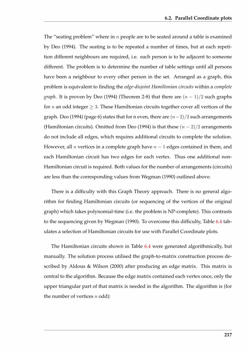
6.2. Parallel Coordinate plots
The “seating problem” where in n people are to be seated around a table is examined
by Deo (1994). The seating is to be repeated a number of times, but at each repeti-
tion different neighbours are required, i.e. each person is to be adjacent to someone
different. The problem is to determine the number of table settings until all persons
have been a neighbour to every other person in the set. Arranged as a graph, this
problem is equivalent to finding the edge-disjoint Hamiltonian circuits within a complete
graph. It is proven by Deo (1994) (Theorem 2-8) that there are (n − 1)/2 such graphs
for n an odd integer ≥ 3. These Hamiltonian circuits together cover all vertices of the
graph. Deo (1994) (page 6) states that for n even, there are (n−2)/2 such arrangements
(Hamiltonian circuits). Omitted from Deo (1994) is that these (n − 2)/2 arrangements
do not include all edges, which requires additional circuits to complete the solution.
However, all n vertices in a complete graph have n − 1 edges contained in them, and
each Hamiltonian circuit has two edges for each vertex. Thus one additional non-
Hamiltonian circuit is required. Both values for the number of arrangements (circuits)
are less than the corresponding values from Wegman (1990) outlined above.
There is a difficulty with this Graph Theory approach. There is no general algo-
rithm for finding Hamiltonian circuits (or sequencing of the vertices of the original
graph) which takes polynomial-time (i.e. the problem is NP-complete). This contrasts
to the sequencing given by Wegman (1990). To overcome this difficulty, Table 6.4 tab-
ulates a selection of Hamiltonian circuits for use with Parallel Coordinate plots.
The Hamiltonian circuits shown in Table 6.4 were generated algorithmically, but
manually. The solution process utilised the graph-to-matrix construction process de-
scribed by Aldous & Wilson (2000) after producing an edge matrix. This matrix is
central to the algorithm. Because the edge matrix contained each vertex once, only the
upper triangular part of that matrix is needed in the algorithm. The algorithm is (for
the number of vertices n odd):
217
6.2. Parallel Coordinate plots
Table 6.4: Sequences of vertices for use in Parallel Coordinate plots
number of sequence of verticesvertices
4 1 2 3 4 11 3 2 4
5 1 2 3 4 5 11 3 5 2 4 1
6 1 2 3 4 5 6 11 3 6 4 2 5 11 4 2 6 5 3
7 1 2 3 4 5 6 7 11 3 7 5 2 4 6 11 4 7 2 6 3 5 1
8 1 2 3 4 5 6 7 8 11 3 8 5 2 7 4 6 11 4 8 2 6 3 7 5 11 7 3 5 2 4 6 8
9 1 2 3 4 5 6 7 8 9 11 3 6 9 2 5 7 4 8 11 4 9 3 7 2 6 8 5 11 6 4 2 8 3 5 9 7 1
10 1 2 3 4 5 6 7 8 9 10 11 3 6 8 10 2 5 9 4 7 11 6 2 9 3 5 7 10 4 8 11 4 2 7 3 8 5 10 6 9 11 5 8 2 4 6 10 3 7 9
11 1 2 3 4 5 6 7 8 9 10 11 11 3 5 8 10 4 6 11 9 2 7 11 4 7 10 2 5 11 3 9 6 8 11 10 6 3 8 2 11 4 9 7 5 11 6 2 4 8 11 7 3 10 5 9 1
12 1 2 3 4 5 6 7 8 9 10 11 12 11 3 7 12 2 4 8 5 10 6 9 11 11 4 6 12 10 2 5 11 7 9 3 8 11 5 12 9 2 6 8 10 3 11 4 7 11 6 11 8 2 7 10 4 12 3 5 9 11 10 2 11 3 6 4 9 5 7 12 8
13 1 2 3 4 5 6 7 8 9 10 11 12 13 11 3 13 7 2 9 4 12 8 5 10 6 11 11 4 13 8 2 12 3 6 9 11 5 7 10 11 5 2 6 8 4 11 3 10 13 9 7 12 11 6 4 10 2 13 5 12 9 3 8 11 7 11 8 10 12 6 13 11 2 4 7 3 5 9 1
14 1 2 3 4 5 6 7 8 9 10 11 12 13 14 11 3 14 2 9 6 12 4 8 13 5 11 7 10 11 4 14 7 2 13 9 3 5 10 6 11 8 12 11 5 12 2 4 11 9 7 3 13 6 14 10 8 11 6 8 3 12 9 14 11 2 5 7 4 10 13 11 9 5 8 14 12 7 13 4 6 2 10 3 11 11 7 8 2 3 6 4 9 5 14 10 12 11 13
218

6.2. Parallel Coordinate plots
calculate the number of Hamiltonian circuits[= (n− 1)/2] to be found;construct the edge matrix;construct the first circuit as 2 to 3, 3 to 4, . . . , n− 2 to n− 1, and then n to 1;indicate this circuit in the edge matrix;set found = 1;repeat
make selection any vertex connected to vertex 1 that has not been previously used;set count = 0;
10: repeatmark selection as having been selected;find a vertex to connect to selection that has not been selected;that vertex then becomes selection;increment edge count by 1;
until count == nif selection == 1
then increment count of circuits found by 1;else go to 10
until found ≥ circuits
The algorithm finds Hamiltonian circuits that start and finish at the vertex num-
bered 1. In the path selected does not have that as its final vertex, then the path is
invalid. This is the reason for the ‘go to 10’ clause of the algorithm; if the final path
is invalid, try again. Using this algorithm showed that this ‘trial-and-error’ process
increasing in occurrence as the number of vertices increased and also the number of
previously obtained solutions increased.
With n even, the above algorithm was used to produce the (n − 1)/2 Hamiltonian
circuits, with the remaining (one) non-Hamiltonian circuit obtained by connecting the
unconnected n/2 vertices, alternating with n/2 edges already connected.
As an example of this solution process, consider a circuit containing 9 vertices.
Table 6.5 shows the edge matrix as it is used to construct the required vertex combi-
nations. The matrix shows the instance where the path 1-4-9-7-2 has been traced and
an edge leading from vertex 2 is about to be selected. The matrix row index is shown
greyed to indicate the vertices that have been selected already for this circuit. Notice
that the edges which are a part of previously determined circuits (1-2-3-4-5-6-7-8-9-1
and 1-3-6-9-2-5-7-4-8-1) are shown greyed to a different shade, with that same shade
219
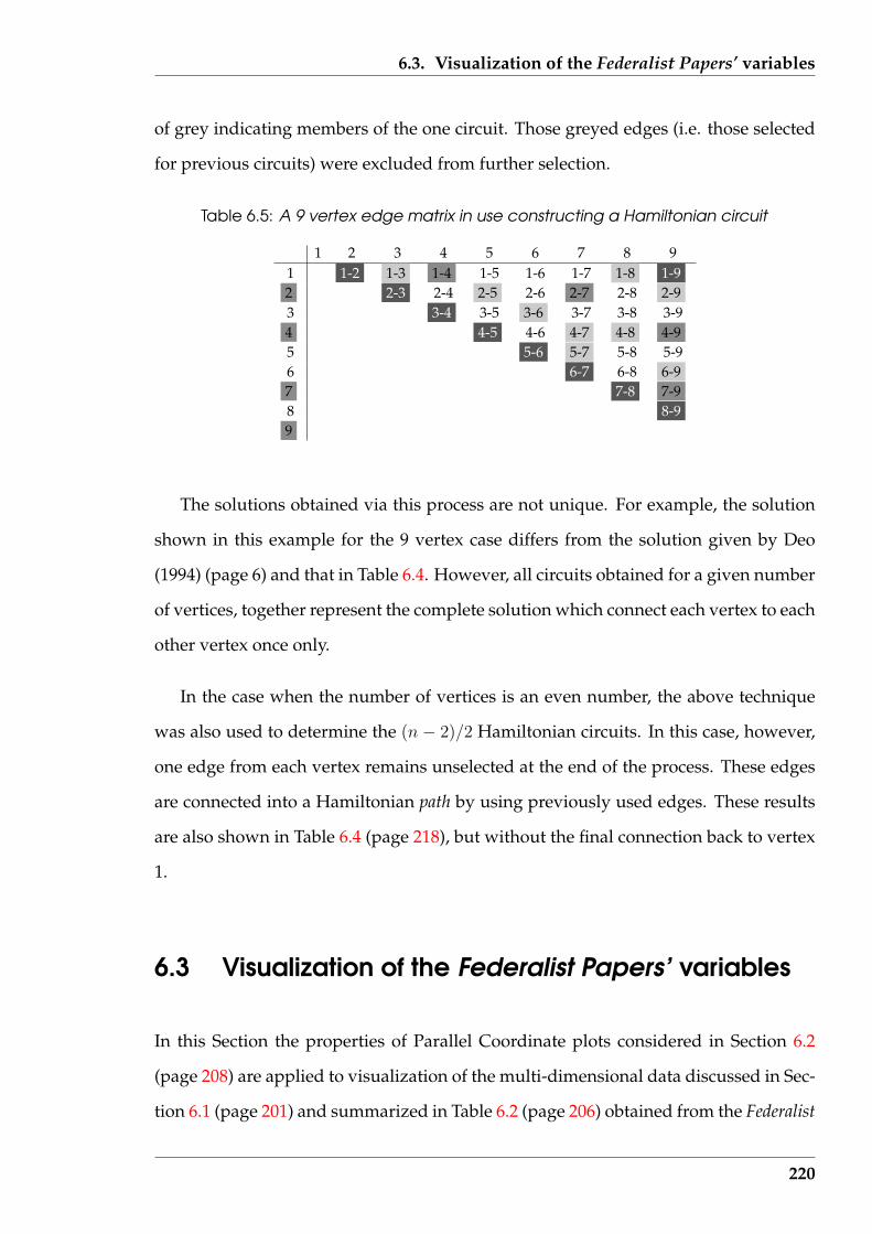
6.3. Visualization of the Federalist Papers’ variables
of grey indicating members of the one circuit. Those greyed edges (i.e. those selected
for previous circuits) were excluded from further selection.
Table 6.5: A 9 vertex edge matrix in use constructing a Hamiltonian circuit
1 2 3 4 5 6 7 8 91 1-2 1-3 1-4 1-5 1-6 1-7 1-8 1-92 2-3 2-4 2-5 2-6 2-7 2-8 2-93 3-4 3-5 3-6 3-7 3-8 3-94 4-5 4-6 4-7 4-8 4-95 5-6 5-7 5-8 5-96 6-7 6-8 6-97 7-8 7-98 8-99
The solutions obtained via this process are not unique. For example, the solution
shown in this example for the 9 vertex case differs from the solution given by Deo
(1994) (page 6) and that in Table 6.4. However, all circuits obtained for a given number
of vertices, together represent the complete solution which connect each vertex to each
other vertex once only.
In the case when the number of vertices is an even number, the above technique
was also used to determine the (n − 2)/2 Hamiltonian circuits. In this case, however,
one edge from each vertex remains unselected at the end of the process. These edges
are connected into a Hamiltonian path by using previously used edges. These results
are also shown in Table 6.4 (page 218), but without the final connection back to vertex
1.
6.3 Visualization of the Federalist Papers’ variables
In this Section the properties of Parallel Coordinate plots considered in Section 6.2
(page 208) are applied to visualization of the multi-dimensional data discussed in Sec-
tion 6.1 (page 201) and summarized in Table 6.2 (page 206) obtained from the Federalist
220

6.3. Visualization of the Federalist Papers’ variables
Papers. After application of Parallel Coordinate plots, alternatives to those plots pro-
vided by Star plots, and Colour Histograms, are demonstrated. These two techniques
use differing amounts of the properties considered in Section 6.2.
There are 85 Federalist papers. As indicated in Section 6.1.2 (page 203), 13 variables
were computed from each text document representing features of the writing. Thus
a 13 dimensional space is considered in these visualizations. From Table 6.4 (page
218), for 13 vertices (variables), 6 separate Parallel Coordinate plots each containing
different pairings of the 13 variables are needed to explore all combinations of those
variables and thus the relationships that exist between those variables.
The interest in the Federalist Papers is not in any relationship that those 13 variables
have running through all the papers, but in how any such relationships differ between
their authors. It is accepted in the literature relating to these papers that three people
(Jay, Madison, and Hamilton) were the authors. The authorship of most of the individ-
ual papers is known, but there is a set of 12 papers which both Madison and Hamilton
claim to have individually written. The resolution of this authorship question in the
main has been approached using statistical means as surveyed in Section 6.1.1 (page
202). Here, a visual examination of these claims is performed. A matching of the vi-
sual patterns between such variables across the papers of each known author is then
compared to that obtained for the papers of disputed authorship. Since this ques-
tion of whether Madison or Hamilton wrote the disputed papers has been ongoing
for two hundred years, a definitive answer is not expected. Although a judgement
will be offered, more of an appreciation of the difficulty of answering this problem is
expected to be obtained from the visualization. These types of visualization could be
used successfully to resolve more tractable author attribution problems.
Of the 85 Federalist papers, 80 fall into one of four groups used in this investigation.
Those groups were the papers known to have been written by Madison (14 papers),
and Hamilton (51 papers), individually; those by Madison and Hamilton jointly (3
papers); and the disputed papers ( 12 papers). The first two groups were used to
221
6.3. Visualization of the Federalist Papers’ variables
characterize the writing of the two contesting authors. The joint authorship group
was taken to be of secondary interest for comparison with the individually authored
papers, since it contained only three papers. The behaviour of the variables for the 12
papers in the disputed authorship group was of main interest, being compared against
the Madison and Hamilton groups. The visualization comparison is of the behaviour
with respect to the variables plotted of each group as a whole, not of individual papers
in those groups.
All plots were generated using stand-alone software, written in the Perl language,
that used the data described in Section 6.1.2 (page 203). Values for each of the 13 vari-
ables were gathered for the papers from each of the four groups. This data was then
processed by a Perl program, separate from the plot generating program, to generate
a file containing the maximum and minimum values of each of the 13 variables within
each group. Where applicable these results were used to scale the axes of the plots.
The plots produced were themselves Encapsulated Postscript programs which could
subsequently be viewed or printed.
6.3.1 Parallel axes plots
For 13 variables, Table 6.4 (page 218) indicates that 6 Parallel Coordinate plots are
needed to display each variable as a parallel axis that is adjacent to each of the other
twelve variables. All six such plots produced for the Federalist paper data are included
in Appendix E.3, with Figure 6.4 included here to indicate the form those plots assume.
The ordering of the variables for the axes correspond to the tabulated sequences of
vertices in Table 6.4, tagged by the vertices (variables) for the problem – in this case 13.
There is one plot for each of the four groups of papers with grouping based on their
(assumed) authorship: Disputed papers, Hamilton papers, Joint authorship papers,
and Madison papers. To assist comparison of the plots between groups, a set of four
group plots using a common ordering of variables are displayed together. In these
222
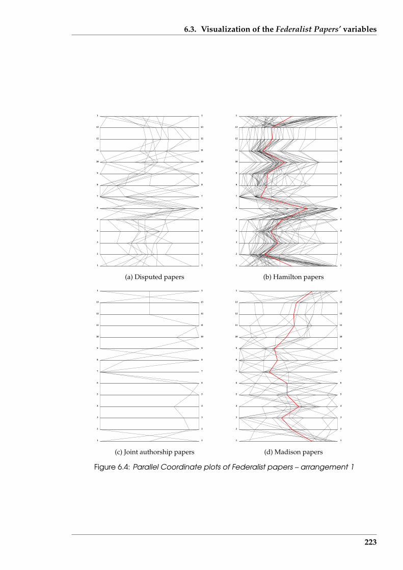
6.3. Visualization of the Federalist Papers’ variables
1 1
2 2
3 3
4 4
5 5
6 6
7 7
8 8
9 9
10 10
11 11
12 12
13 13
1 1
(a) Disputed papers
1 1
2 2
3 3
4 4
5 5
6 6
7 7
8 8
9 9
10 10
11 11
12 12
13 13
1 1
(b) Hamilton papers
1 1
2 2
3 3
4 4
5 5
6 6
7 7
8 8
9 9
10 10
11 11
12 12
13 13
1 1
(c) Joint authorship papers
1 1
2 2
3 3
4 4
5 5
6 6
7 7
8 8
9 9
10 10
11 11
12 12
13 13
1 1
(d) Madison papers
Figure 6.4: Parallel Coordinate plots of Federalist papers – arrangement 1
223
6.3. Visualization of the Federalist Papers’ variables
plots, the pattern produced by the data between these parallel axes is of interest.
A thick, red coloured line is plotted on the Parallel Coordinate plots for the Madi-
son and Hamilton papers to show the mean of the data values in that group. This
can simplify comparison between groups. This mean behaviour is in contrast to those
plots for the joint and disputed papers groupings. In those, the focus is on the form
of the plotted line for each individual paper. It is those individual plots that are com-
pared to the mean behaviours of the Madison and Hamilton paper groupings for ar-
riving at a possible match, and hence possible authorship, on that individual paper.
Although not apparently used in the Parallel Coordinate literature, this mean curve
might have direct application to comparing data, and author attribution in this in-
stance, based on that data. Similarity in the shape between groups of these mean
curves contained in the six Parallel Coordinate plots (each having a different arrange-
ment of parallel coordinates) was taken as an indicator of similarity in the style of
writing in the papers. Plots such as those in Figure 6.4 show the distribution of all the
measured data about the mean values. For establishing association of any particular
document with other documents, the data line for that document is compared against
the mean value line used to define the comparator, in this case, against that for the
Hamilton and Madison documents. The same scaling and technique of producing the
plot is used in the plots being compared. For example, in Figure 6.4, each plot axis
was scaled to encompass individual maximum and minimum values. In most cases,
multiple sets of such plots need be compared. In the case of the Federalist papers used
here, six such plots are required.
A general principle used in this research is that similar objects produce similar
visualizations. A person not knowing how (or using what variables) a visualization
was produced can still identify similarities between visualizations of different objects,
without having to understand the significance of such similarities. A major difficulty
can be determining what variables characterise one group of objects and separate them
from other objects. Section 6.1.2 discussed this for the case of the Federalist Papers
224
6.3. Visualization of the Federalist Papers’ variables
from the perspective of identifying one author’s style of writing from that of another.
If appropriate variables are selected, correct identification of similar objects, and sep-
aration of dissimilar objects, follows. So any user of a visualization can group simi-
lar visualizations together without understanding the consequence of that grouping,
while trained users would appreciate the significance. The trained user would appre-
ciate the interplay of the variables used, similarities of visualizations produced, and
what changes need to be made in the next step in using this visualization technique.
Consider the curves of Figure 6.3.1 labelled as being produced by the Federalist
Papers written by Hamilton. Individual curves do vary from the mean (red) curve. But
by taking an individual curve representing any particular paper from this Hamilton
group, its visualization (curve) is more similar to the mean (red) line of the Hamilton
group than of that for the Madison group. It is argued that the visualization alone and
matching patterns enables grouping of the papers.
Similarity in the curves implies membership of a group. From the curves of Ap-
pendix E.3 (of which Figure 6.4 is an example), there is some similarity between the
Madison and Hamilton papers, but the mean (red) line also indicates a degree of dis-
similarity. By visually comparing the individual curves for the twelve disputed papers
with these Madison and Hamilton ‘mean’ lines, the conclusion from the literature re-
viewed in Section 6.1.2 (page 203) that Madison probably wrote all the disputed papers
cannot be concurred with; at least half of those papers appear to follow the Parallel Co-
ordinate pattern of the Hamilton papers. The conclusion, based on the variables used
in this analysis, is that Madison did not write (at least some) of the disputed papers.
Using the consideration given in Section 6.2.1 (page 210) of the appearance of lin-
ear relationships in ‘practical’ Parallel Coordinate plots, the Madison, Hamilton, and
disputed paper groups, show few clear positive linear relationships between the vari-
ables. This is an apparent contradiction to the correlation coefficients of Table 6.3 for
these papers. One exception from Figure E.2 (page 400) (which is reproduced in Fig-
ure 6.4) is that a positive linear relationship appears to exist between variables 12
225

6.3. Visualization of the Federalist Papers’ variables
(number of different word occurrences that appear in the tail) and 13 (total number
of word groupings in the document). Another is the positive relationship between
variables 3 (number of unique words present) and 5 (number of words in the paper)
suggested in Figure E.7 (page 405). In contrast to these few clear positive linear rela-
tionships, no clear negative linear relationships between the variables were observed
in any of these groups. The lack of such relationships supports the difficulty of assign-
ing authorship to the disputed papers, as suggested in the Federalist Papers literature.
However, more arguably positive linear relationships can be found in the set of six
Parallel Coordinate plots to suggest that Hamilton was the author of the disputed pa-
pers. Chief among these are the 5-6 and 6-7 relationship in Figure E.2 (page 400), the
2-6 and 6-8 relationships in Figure E.5 (page 403), and the 12-6 and 6-13 relationships
in Figure E.7 (page 405). There appear to be stronger relationships in the Hamilton,
as opposed to the Madison, group while also occurring in the disputed papers group.
Other relationships appear in the six Parallel Coordinate plots, but with equal empha-
sis in each of the Madison, Hamilton, and disputed papers groups. Such emphasis
counters their separation. The conclusion of similarity between the Hamilton and dis-
puted paper groups is consistent with that conclusion arrived at above via the mean
data line.
6.3.2 Star plots
Star plots presented by Fienberg (1979) are shown in Appendix B of Wegman (1990)
to be similar to Parallel Coordinate plots, however, they lack some of the statistical
interpretation that can be given to the parallel axes form. In their favour is the fact
that Star plots are more compact, and the closed shapes that they contain can be easier
to recognise.
From the perspective of this research, Star plots are reformatted Parallel Coordinate
plots. The parallel coordinate axes are replaced by radial coordinate axes with their
226
6.3. Visualization of the Federalist Papers’ variables
minimum values co-locating at the centre of the Star diagram. The maximum value is
located on the circumferential end of each axis. The spacing between each axis is such
that all axes divide equally the circular space about the plot’s centre.
Each data point to be plotted consists of multiple values which collectively repre-
sent one instance of the data. These multiple values are the contribution to the data
point from each of the multiple variables represented by the radial coordinate axes of
the Star plot. A data point is plotted as a sequence of straight line segments which
connect the value of the variables that compose that data point located on adjacent
radial coordinate axes. A closed figure results from each such data point if the starting
axis of the Star plot is also the concluding axis. Thus, the Star plot is a folded version
of the Parallel Coordinate plot considered in Section 6.2 (page 208).
The shape of the Star diagram is determined by which variables are associated
with adjacent axes. As with the Parallel Coordinate plot case, the same considerations
of Section 6.2.2 (page 215) result in there being a definite number of arrangements of
adjacent axes for any Star plot. For a given set of data, each of these different arrange-
ment of axes produces a different Star plot. But the sequence of such pairings (which
determine the overall shape of the closed Star plot) are not unique. Figure 6.5 is a set
of such Star plots which will be discussed below.
It is shown by Wegman (1990) (Appendix B) that the point-line duality present in
the parallel axes plots does not apply to Star plots. Consequently the statistical inter-
pretation of the straight line segments representing data values between the associated
radial coordinate axes in Star plots cannot be applied. However, a line connecting the
means of each variable for all data values plotted, forms a characteristic shape which
can be used to compare datasets. A similar approach was used in Section 6.3.1 with
Parallel Coordinate plots.
The Federalist Papers are an example where comparison between groups of papers
is required and where Star plots, like Parallel Coordinate plots, are applicable. The
227

6.3. Visualization of the Federalist Papers’ variables
characteristic shape which the data assumes will change with different allocation of
adjacent variables (axes). For the data generated from these papers as described in
Section 6.1.2 (page 203), there would be 6 such characteristic shapes; this value be-
ing obtained in the same manner as that used to determine the number of Parallel
Coordinate plots.
1
2
3
45
6
7
8
9
10 11
12
13
(a) Madison papers
1
2
3
45
6
7
8
9
10 11
12
13
(b) Hamilton papers
1
2
3
45
6
7
8
9
10 11
12
13
(c) Joint authorship papers
1
2
3
45
6
7
8
9
10 11
12
13
(d) Disputed authorship papers
Figure 6.5: Star plots of Federalist paper’s statistics – self scaled
Figure 6.5 is one of the six required plots if Star plots were used to analyse the
Federalist Papers, as in Section 6.3.1 (page 222). It contains the same data as Figure 6.4
(page 223), with the same variables plotted adjacent to one another, so that the centre
of the diagram corresponds to the minimum value of each variable. The outer radius
228
6.3. Visualization of the Federalist Papers’ variables
along each axis corresponds to the maximum value of that variable. In Figure 6.5 the
mean value of each variable is plotted using a thicker line coloured red.
Based on the shape of this Star plot, the variables plotted indicate similarity of
the disputed papers with those papers authored by Hamilton. The closed form of
the mean value line in Figure 6.5 enables detection of similarity between plots more
readily than the corresponding Parallel Coordinate plots in Figure 6.4. Similarity of
shape is reinforced by the spike resulting from variable 6 (the number of words which
fall on the tail). This is the same conclusion obtained from Figure 6.4 (page 223) in
Section 6.3.1. This viewing of closed forms highlights data behaviour more readily
than the Parallel Coordinate plots of Figure 6.4. For example, the minimum value be-
haviour of variable 7 of the joint authorship papers is more obvious in Figure 6.5 than
in Figure 6.4. A full analysis of the data would require production and examination of
all six Star plots as was done in Section 6.3.1 for Parallel Coordinate plots.
6.3.3 Colour Maps
Colour Maps provide an alternative visual to Parallel Coordinate plots for locating
linear relationships between variables. The range of values that a variable assumes is
divided to a specified fixed number of equal cells, each of which is assigned a colour.
In practice, 5-15 such cells are typically specified. The occurrence of each value in the
data is then represented by the colour of the cell in which the value falls. If a data point
contains multiple variables, and the value of each of those variables in the data point
are coloured in accord with this colouring scheme, then a representation of those data
values is produced. Relationships between data points, and between the variables, are
determine by matching the patterns of colour.
‘Colour Maps’ here are modelled after the Colour Histograms proposed by Weg-
man (1990). The process of forming the Colour Histogram, as described by Wegman
(1990) (page 672), starts by selecting one variable as a reference. The values of that
229
6.3. Visualization of the Federalist Papers’ variables
variable in all the data values (or observations) are arranged in ascending order. That
arrangement of values is then divided into bins, with a colour assigned to indicate
each bin. For the reference variable Wegman (1990) (pages 673) states:
. . . blocks of colour are arranged according to the colour gradient, with
the width of the block being proportional to the number of observations
falling into the colour bin. The observations on the other axes (variables)
are arranged in the order corresponding to the reference axis (variable) and
colour coded according to their magnitude.
This process appeared complex, and somewhat at odds with the example Colour His-
togram given by Wegman (1990) (page 673).
What was thought to be a more direct approach than Colour Histograms was
adopted as the Colour Map. Colour Maps use the same bin coloring as Colour His-
tograms. The range of values of each variable across the data values (observations) is
converted to an equal number of bins. Each of those bins uses the same sequence of
colours, although the same colour would represent bins of different numerical value
for different variables. Colour Maps visualize each value of a variable in a data point
with equal sized colour patches. The frequency of occurrence of a range of values,
represented by a colour, is obtained visually and not used as part of the visualization
algorithm.
By knowing the key (or sequence) of the colouring used in a Colour Map, the pat-
tern of values across variables can be deduced. For relationship detection, the values
represented by the colours is not important for they are of the proportion for all vari-
ables. The patterns in colour indicate the terrain produced in the data by the variables.
If variables are positively related, then the order in the terrain of ‘hills’ and ‘valleys’
produced across data points will be similar. If the size of those hills and valleys are
produced by the same number of colour patches, then the corresponding variables are
positively related in a linear manner. With unequal numbers of colour patches forming
230
6.3. Visualization of the Federalist Papers’ variables
the hills and valleys, the relationship is positive, by nonlinear. Similarly, if the order
of hills and valleys are reversed in order between variables across the data, then those
variables are negatively related. The linear on nonlinear nature of that relationship
follows the same determination as for the positive relationship case above. Because of
the way in which the colour key is derived, the colour representing the maximum and
minimum value must be present in each row of the overall map.
Figure 6.6 shows Colour Maps for the Federalist Papers known to have been written
by Madison, and Hamilton, and those of disputed authorship. The maps are in terms
of the same 13 variables used in previous Sections where those papers were examined
using the Parallel Coordinate and Star plots. Successive columns across each map con-
tains the data associated with each paper, with the variables running vertically. Issues
of adjacency of variables which occur when using Parallel Coordinate and Star plots
does not occur here as different pairings of the variables does not alter the perceived
patterns of colour. The meaning of each variable is that shown in Table 6.2 (page 206).
The three maps use the common colour key as shown. In the rows of each map which
represent the variables, the colours represents the comparative maximum and mini-
mum value of that variable relative to that key.
In the Colour Maps of Figure 6.6 the terrain of colour along the columns of each
of the three maps is the main issue. Each column shows the values of each of the
variables for one paper. Variable 1 (the paper’s number) is of little use in that regard,
but it does show (by the uniform colour gradient across each map) that the columns
are the data from successive papers from each grouping. A difference appears to exist
between the later papers in the Hamilton group (those to the right end) compared to
the others in that group. Aside from the occasional black colour, a large number of
the papers from Hamilton are coloured in the low end (left end) of the colour key.
Some of the later papers are coloured more in the centre and upper part of that key.
By contrast, the disputed papers are coloured more in the centre of the colour key, as
are the Madison papers. This suggests that some papers were written by Madison and
231
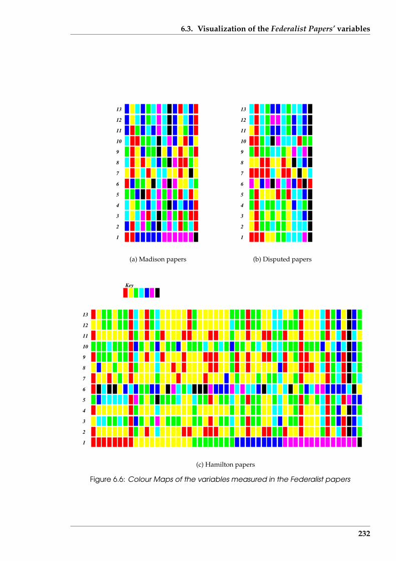
6.3. Visualization of the Federalist Papers’ variables
1
2
3
4
5
6
7
8
9
10
11
12
13
(a) Madison papers
1
2
3
4
5
6
7
8
9
10
11
12
13
(b) Disputed papers
1
2
3
4
5
6
7
8
9
10
11
12
13
Key
(c) Hamilton papers
Figure 6.6: Colour Maps of the variables measured in the Federalist papers
232
6.3. Visualization of the Federalist Papers’ variables
others by Hamilton, as was concluded by the analysis using Parallel Coordinate plots
in Section 6.3.1 (page 222).
The Colour Maps of Figure 6.6, consistent with the Parallel Coordinate plots of Sec-
tion 6.3.1 and the Star plots of Section 6.3.2, indicate that the 13 variables used for this
analysis of the Federalist Papers are not constant in behaviour across all papers. For at-
tributing authorship, different variables appear to be necessary. The literature dealing
with the author attribution problem in the Federalist Papers does use variables different
that the 13 used here. The Colour Maps effectively indicate that the distribution of the
variables changed over the evolution of the papers (as indicated by variable 1).
6.3.4 Reducing the number of variables by Sammon plots
An issue with the 13 variables introduced in Section 6.1.2 (page 203), and used in the
above visualization to analysis the Federalist Papers, is whether those variables are in-
dependent. If the behaviour of one variable can be expressed in terms of the behaviour
of one or more other variables, then the first variable is not independent of the other
variables. Thirteen variables are within the scope of consideration of the visualiza-
tion techniques considered. But a reduction in that number of variables might assist
in more simply locating similarity in the papers, and thus attribute authorship to the
disputed papers.
Reducing the number of variables is the purpose of Cluster Analysis (Chatfield
& Collins (1980) (Chapter 11)). A more visual approach is that of “Self-Optimizing
Maps” which in turn builds upon the work of Sammon (1969). Sammon plots are one
approach to overcoming visually the curse of dimensionality.
Self-Optimizing Maps (also know as Kohonen Maps) show relationships between
variables as described by Kohonen (2001). Techniques of this type reduce the amount
of data by categorising or grouping similar data items together into data clusters. One
233
6.3. Visualization of the Federalist Papers’ variables
implementation of Kohonen Maps is the software package SOM PAK (Deboeck (1998)).
Both Kohonen and Deboeck link the success of Kohonen Maps to their use of the non-
linear mapping algorithm of Sammon (1969) which itself was designed to display
multi-dimensional data so as to expose any underlying structure in that data. Each
structure in the data is described by a variable. So uniqueness in structure implies
independence in the variables which describe those structures.
The ‘Sammon’ algorithm is based on the idea of multi-dimensional space. The
variables in a set of data specify the dimension of the space that defines that set of data.
So a data set containing multiple variables is defined in a multi-dimensional space.
The nonlinear Sammon algorithm maps points in one multi-dimensional space into
another multi-dimensional space of reduced dimension, such that the structure in the
data is approximately preserved under the mapping. This is done such that proximity
of data is preserved under the transformation, i.e. if there is a ‘close’ relationship
between data in a high dimensional space, it is also close in the reduced dimensional
space. A ‘measure ’ is defined relative to the separation of the data, and the algorithm
proceeds to optimally reduce the number of dimensions while mimimising the change
in the sum of that measure.
In the SOM PAK distribution, this is implemented as sammon. The sammon pro-
gram, as with most of the eleven programs provided in that distribution, could be run
independently of one another. The problem to be processed was expressed via a data
file the first line of which contained the number of variables that were contained in all
subsequent lines of that file: one line per set of data. Best success was achieved by re-
questing the sammon program to produce its graphical output in Postscript form, and
then converting that into an Encapsulated Postscript file. The number of iterations
was specified via a command line parameter. The correct functioning and use of the
program was verified by running the circular, helix data, and nonlinear data from the
Sammon (1969) paper (pages 403-5) for 300 to 600 iterations to obtain the published
results.
234

6.3. Visualization of the Federalist Papers’ variables
Figure 6.7 shows the output produced by sammon for the Federalist Paper data de-
scribed in Section 6.1.2 (page 203), but with the paper number removed. For these
twelve variables (or dimensions), the algorithm was run for 480 iterations to produce
the variable separation shown on a two dimensional plane; the small filled circles
in the plot denote the positioning of the 85 Federalist papers. The sammon software
placed the associated labelling of the data point.
The relative location in Figure 6.7 of the data indicates that an underlying (but
undefined) structure exists in this data. There is a general trend from the top left, to
the bottom right of the diagram following a non-linear curve with some dispersion.
The documents known to have been written by Madison (labelled M) tend to cluster
in the centre of the distribution. Those believed written by Jay (four of them) are in the
lower part of the distribution. Those known to be of Hamilton’s authorship populate
the whole distribution with a concentration in the lower part of the diagram. This part
of the figure also contains the majority of the papers of disputed authorship.
Similarity in data associated with each data point is an interpretation of close prox-
imity of data points. The clustering that appears in Figure 6.7 suggests that the data as-
sociated with the disputed authorship papers are a combination from both Hamilton
and Madison, lending support to the conclusion using the Parallel Coordinate plots
technique of Section 6.3 (page 220). If this data correctly characterises the Federalist
Papers, then Hamilton should at least be accredited with authoring some of the dis-
puted papers. Again reinforcing those other visualization techniques, there is no clear
separation of Madison, Hamilton, and the disputed papers. There are some points
representing the disputed papers that are closer to points depicting Madison’s papers
than those for Hamilton. In those instances, either could have been the author of that
disputed paper. In the light of this visualization, Madison alone does not have a style
of writing which aligns him exclusively to the style present in the disputed papers.
235
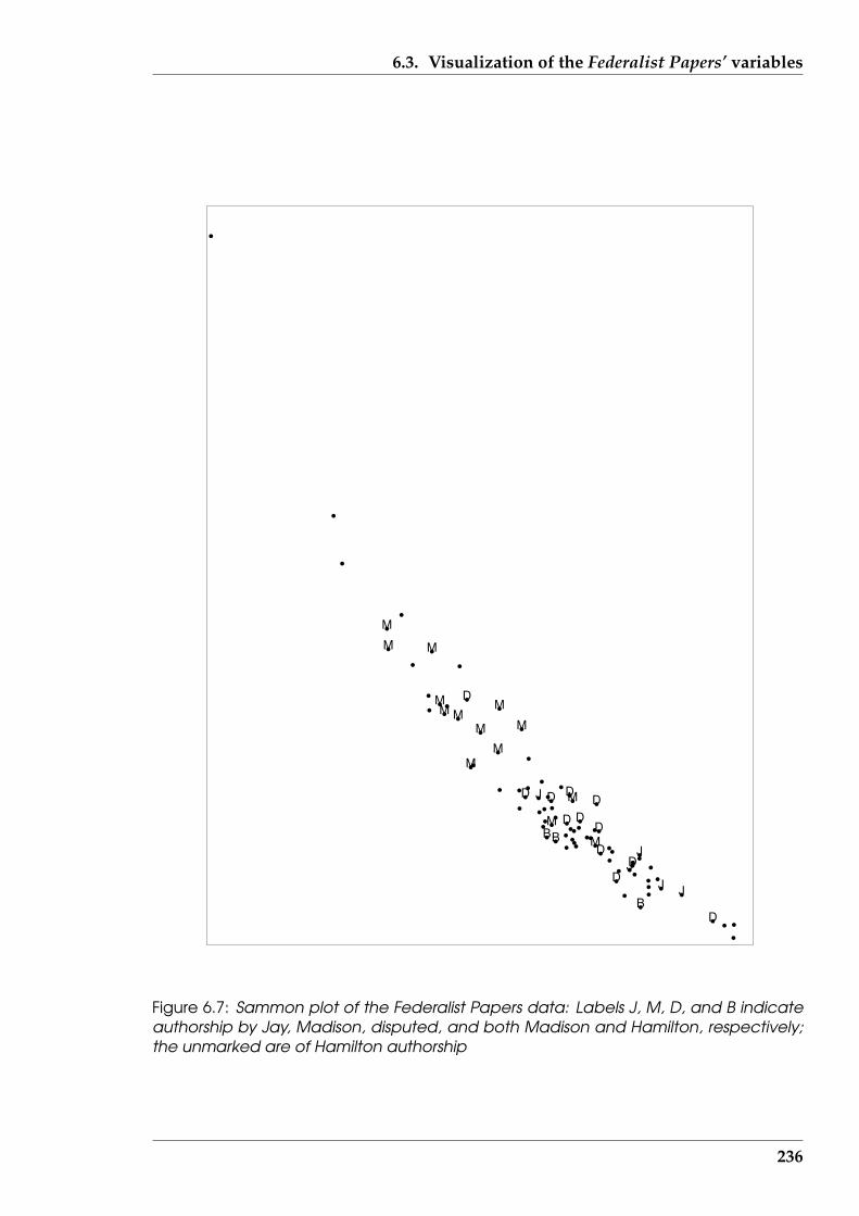
6.3. Visualization of the Federalist Papers’ variables
J
JJ
J
M
MBB
B
M
M
M
M
M
M
M
M
M
M
M
M
D
D
D
D
DD
D
D
D
D
D
D
J
Figure 6.7: Sammon plot of the Federalist Papers data: Labels J, M, D, and B indicateauthorship by Jay, Madison, disputed, and both Madison and Hamilton, respectively;the unmarked are of Hamilton authorship
236
6.4. Fractal dimension – a toolkit number
6.3.5 Summary of multi-dimensional visualization section
Four techniques for visualizing multi-dimensional data were applied to the Federalist
Papers. That data corresponded to thirteen variables which were measured for each
of the 85 papers. These variables may not appropriately represent the writing styles
of the three authors known to have written those papers, but the visualization tech-
niques give an indication of patterns which result, as well as being consistent within
themselves. These techniques do indicate that there is little difference in the patterns
from those papers, and particularly across the papers known to be written by the two
contending authors. This reinforces the controversy that has surrounded authorship
of the disputed papers for two hundred years.
These techniques offer alternatives to numerical techniques which are commonly
used. Although visualization is a powerful tool which is frequently used, there are
difficulties in applying it to more than three dimensions, or variables. This is testi-
fied by the visualization literature reviewed in Chapter 2. The four techniques used
in this section overcome this limitation. In terms of the visualization taxonomy of
Section 2.1 (page 31), these four techniques are 2-dimensional visualizations flat stack
(colour map and Sammon plots) or linked across (parallel coordinates and star plots)
types. They are most appropriate for visualizing multi-dimensional data types with
dimensions of three or greater.
6.4 Fractal dimension – a toolkit number
In Section 6.5 (page 254) successive data values are obtained from text documents and
visualized using a ‘trend line’. According to the taxonomy of Section 2.1 (page 31)
such a visualization is of type ‘2-dimensional linked across type’ of 1 or 2-variate data.
To compare two (or more) such lines, and thus the text documents from which the data
was obtained, a comparison of the trend lines is necessary. As the complexity of such
237
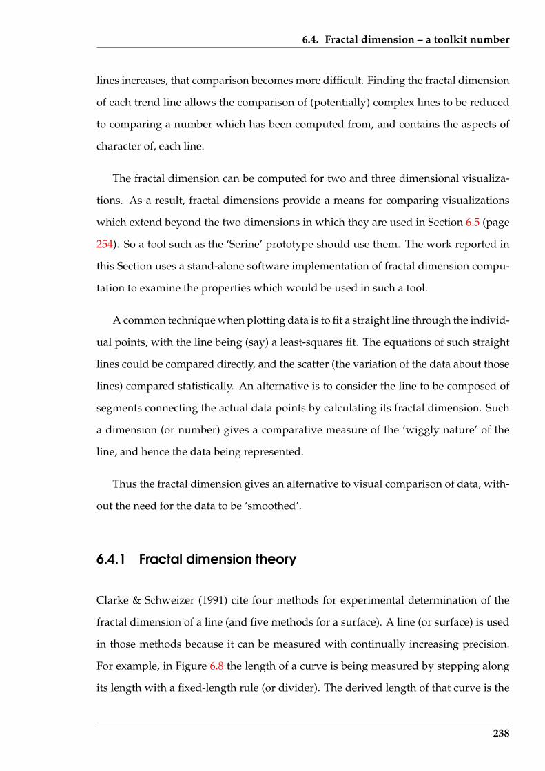
6.4. Fractal dimension – a toolkit number
lines increases, that comparison becomes more difficult. Finding the fractal dimension
of each trend line allows the comparison of (potentially) complex lines to be reduced
to comparing a number which has been computed from, and contains the aspects of
character of, each line.
The fractal dimension can be computed for two and three dimensional visualiza-
tions. As a result, fractal dimensions provide a means for comparing visualizations
which extend beyond the two dimensions in which they are used in Section 6.5 (page
254). So a tool such as the ‘Serine’ prototype should use them. The work reported in
this Section uses a stand-alone software implementation of fractal dimension compu-
tation to examine the properties which would be used in such a tool.
A common technique when plotting data is to fit a straight line through the individ-
ual points, with the line being (say) a least-squares fit. The equations of such straight
lines could be compared directly, and the scatter (the variation of the data about those
lines) compared statistically. An alternative is to consider the line to be composed of
segments connecting the actual data points by calculating its fractal dimension. Such
a dimension (or number) gives a comparative measure of the ‘wiggly nature’ of the
line, and hence the data being represented.
Thus the fractal dimension gives an alternative to visual comparison of data, with-
out the need for the data to be ‘smoothed’.
6.4.1 Fractal dimension theory
Clarke & Schweizer (1991) cite four methods for experimental determination of the
fractal dimension of a line (and five methods for a surface). A line (or surface) is used
in those methods because it can be measured with continually increasing precision.
For example, in Figure 6.8 the length of a curve is being measured by stepping along
its length with a fixed-length rule (or divider). The derived length of that curve is the
238

6.4. Fractal dimension – a toolkit number
sum of the lengths from each of the rule’s steps needed to cover the original curve’s
length. Two different measurements of the curve’s length using different lengths for
the rule are shown in Figure 6.8. In this example, the resulting length for the curve is
longer when using the rule with the smaller length. This results from the mis-match of
the curvature of the curve compared with the rules which are straight; so the length of
the curve is being measured as the straight line equivalents. If the curve being measured
was itself straight, the length estimates obtained by this process would be the same.
Figure 6.8: Changing length of a line due to measurements taken
This technique for estimating the length of a curve is the same as that used by L.F.
Richardson, as described on pages 60–62 of Kaye (1993), for estimating the length of
coastlines and national boarders. Richardson plotted such estimates against the length
of the step used in obtaining that estimate. That plot was done on a log-log basis so
as to accommodate the large range of data lengths. Although that straight line tends
to infinity as described by Mandelbrot (1983) for decreasing measurement steps, the
slope of the straight line is a constant. The slope of that line is the fractal dimension,
which follows from the definition of “fractal dimension”.
From Voss (1988) (page 28), the fractal (or “self-similarity”) dimension D is defined
as:
D =ln(N)
ln(1r)
where N is the number of segments being counted, each of length r. With curves
that retain their wiggling structure with decreasing segment length, this expression
239
6.4. Fractal dimension – a toolkit number
can be used directly to determine the fractal dimension of that curves. In this case
this determination is repetitive. However, if this similarity nature of the curve being
measured is limited or constrained, a modification to this approached is needed. Such
a constraint exists in the application to which fractal dimension is proposed for use
here and its implications will be considered below.
For determination of the fractal dimension D of a real curve when it alone is avail-
able, the experimental approach can emulate the above repetitive method. In Eu-
clidean geometry (following the logic by Voss (1988)), if a straight line of unit length is
divided into N equal segments, each of r length units, then r = 1N
is the size of those
N segments. If a unit square is divided into N equal parts, each r units on a side, then
r = 12√
N. If a unit cube is divided into N equal parts, then r = 1
3√N
. So in general, the
length of each N equal subdivision of a unit figure is:
r =1
D√
N
where D is the dimension of the space being subdivided. Re-writing this last expres-
sion in terms of N :
N =1
rD= (
1
r)D
By taking logarithms, and rearranging the terms, the defining expression for D is ob-
tained. In Euclidean geometry, D has integer values; in the fractal case this is allowed
to take on real number (decimal fraction) values.
More rigorously, Barnsley (1993) defines (page 173, and after appropriate change
of symbols) the fractal dimension as
D = limr→0
{N1r
}
where N is a function of the length r. Thus from the above the length of a curve, L,
240
6.4. Fractal dimension – a toolkit number
which is composed of N such segments each of length r, is
L = N · r
has the property that it also is a function of the length of the measurement r and
subject to a limit process. Figure 6.8 shows two instances of that limit process where
decreasing the measurement lengths (r) gives better approximation of the length of
the curve. The length of the curved line is being approximated by two sets of straight
line segments, the first of three segments (terminated by circles) and the second by five
segments (terminated by squares). It is seen that the sum of neither the three or five
segment lengths gives the true length of the curved line, the five segment (having a
lower segment length r) is closer than the three segment approximation. As the length
of the straight line segments decrease in length, a better estimate of the length of the
curved line is obtained.
Experimentally determined values of the number of length increments and their
length (inverted) tend to the required value of the fractal dimension of the given line.
The slope of the straight line through those measured values gives the required frac-
tal dimension as the size of the length increments decreases. Different experimental
methods used different ways of obtaining the length increments and the number of
such increments needed to approximate the length of the given line.
For higher dimensional cases of surfaces and volumes to be fractal dimensioned,
the length being covered is replaced by the surface and volume whose fractal dimen-
sion is sought. The incremental length is then the size of the sides of the area or volume
used in that covering process.
When considering experimentally determined fractal dimensions, Barnsley (1993)
(page 188) states:
. . . when the fractal dimension of a physical set is quoted, some indication
241
6.4. Fractal dimension – a toolkit number
of how it was calculated must also be provided. There is not yet a broadly
accepted unique way of associating a fractal dimension with a set of exper-
imental data.
This must be considered when stating values that are computed.
6.4.2 Algorithm used
Fractals can be considered to be of three types: those that are lines in a plane, those
that have area in a plane, and surfaces in three dimensional space. Kaye (1993) gives
indepth coverage of determining fractals of lines in a plain. Barnsley (1993) examines
the fractal dimensions of lines in a plane and areas bounded by such lines. Clarke
(1986) and Clarke & Schweizer (1991) extend such considerations to determining the
fractal dimension of irregular surfaces in space.
Of the different experimental approaches for determining fractal dimension de-
scribed by Barnsley (1993), an algorithm based on Box Counting was developed in
this research. This algorithm involved overlaying a grid of equi-spaced lines on the
line whose fractal dimension is to be measured. The intersection of these lines form
boxes. The number of boxes which contain any portion of the line being dimensioned
are counted. This count is recorded together with the spacing of the lines that gave
that count (Figure 6.9). The spacing between the grid lines is then halved and the
counting and recording process repeated. This process is repeated for as many times
as box counts can be obtained.
Through the data pairs of box counts and their length (on a side) obtained, a nu-
merical equivalent of a log-log plot (known as a “Richardson plot”) is produced and
a straight line fit to that data obtained. In that plot, the inverse of each box length is
used so as to obtain 1r. Natural logarithms and a least squares line fit were used.
A manual process could be used to obtain the number of boxes through which
242
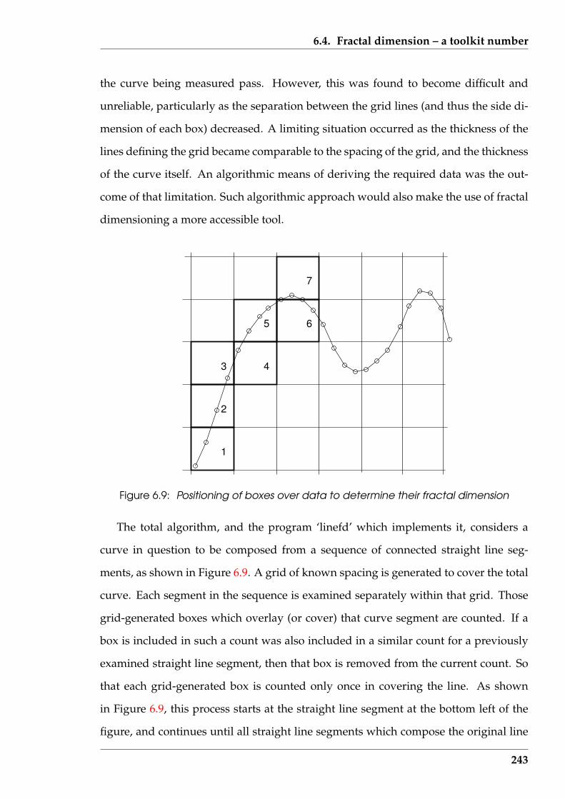
6.4. Fractal dimension – a toolkit number
the curve being measured pass. However, this was found to become difficult and
unreliable, particularly as the separation between the grid lines (and thus the side di-
mension of each box) decreased. A limiting situation occurred as the thickness of the
lines defining the grid became comparable to the spacing of the grid, and the thickness
of the curve itself. An algorithmic means of deriving the required data was the out-
come of that limitation. Such algorithmic approach would also make the use of fractal
dimensioning a more accessible tool.
1
2
3 4
5 6
7
Figure 6.9: Positioning of boxes over data to determine their fractal dimension
The total algorithm, and the program ‘linefd’ which implements it, considers a
curve in question to be composed from a sequence of connected straight line seg-
ments, as shown in Figure 6.9. A grid of known spacing is generated to cover the total
curve. Each segment in the sequence is examined separately within that grid. Those
grid-generated boxes which overlay (or cover) that curve segment are counted. If a
box is included in such a count was also included in a similar count for a previously
examined straight line segment, then that box is removed from the current count. So
that each grid-generated box is counted only once in covering the line. As shown
in Figure 6.9, this process starts at the straight line segment at the bottom left of the
figure, and continues until all straight line segments which compose the original line
243
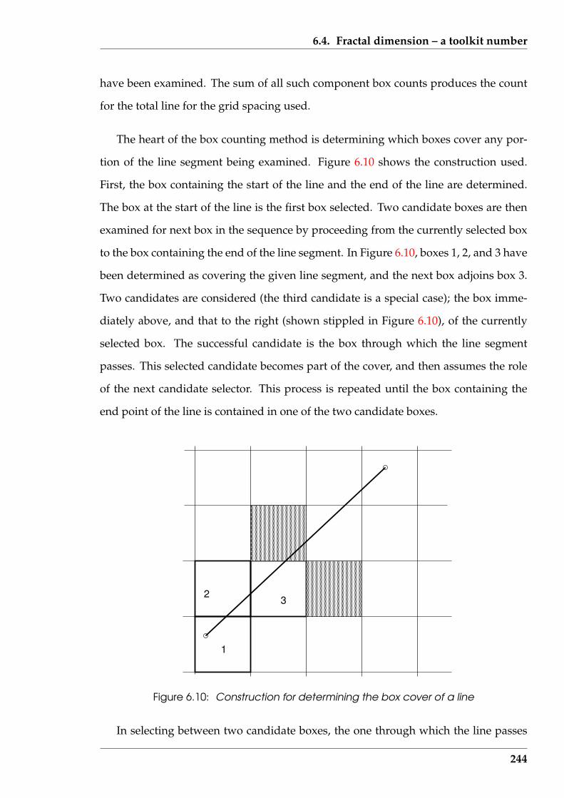
6.4. Fractal dimension – a toolkit number
have been examined. The sum of all such component box counts produces the count
for the total line for the grid spacing used.
The heart of the box counting method is determining which boxes cover any por-
tion of the line segment being examined. Figure 6.10 shows the construction used.
First, the box containing the start of the line and the end of the line are determined.
The box at the start of the line is the first box selected. Two candidate boxes are then
examined for next box in the sequence by proceeding from the currently selected box
to the box containing the end of the line segment. In Figure 6.10, boxes 1, 2, and 3 have
been determined as covering the given line segment, and the next box adjoins box 3.
Two candidates are considered (the third candidate is a special case); the box imme-
diately above, and that to the right (shown stippled in Figure 6.10), of the currently
selected box. The successful candidate is the box through which the line segment
passes. This selected candidate becomes part of the cover, and then assumes the role
of the next candidate selector. This process is repeated until the box containing the
end point of the line is contained in one of the two candidate boxes.
1
23
Figure 6.10: Construction for determining the box cover of a line
In selecting between two candidate boxes, the one through which the line passes
244
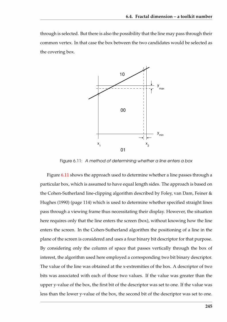
6.4. Fractal dimension – a toolkit number
through is selected. But there is also the possibility that the line may pass through their
common vertex. In that case the box between the two candidates would be selected as
the covering box.
10
01
00
1x x
2
ymin
maxy
Figure 6.11: A method of determining whether a line enters a box
Figure 6.11 shows the approach used to determine whether a line passes through a
particular box, which is assumed to have equal length sides. The approach is based on
the Cohen-Sutherland line-clipping algorithm described by Foley, van Dam, Feiner &
Hughes (1990) (page 114) which is used to determine whether specified straight lines
pass through a viewing frame thus necessitating their display. However, the situation
here requires only that the line enters the screen (box), without knowing how the line
enters the screen. In the Cohen-Sutherland algorithm the positioning of a line in the
plane of the screen is considered and uses a four binary bit descriptor for that purpose.
By considering only the column of space that passes vertically through the box of
interest, the algorithm used here employed a corresponding two bit binary descriptor.
The value of the line was obtained at the x-extremities of the box. A descriptor of two
bits was associated with each of those two values. If the value was greater than the
upper y-value of the box, the first bit of the descriptor was set to one. If the value was
less than the lower y-value of the box, the second bit of the descriptor was set to one.
245
6.4. Fractal dimension – a toolkit number
In all other cases it was zero. Figure 6.11 shows the values of the descriptors in relation
to the box with respect to the line’s value at the box x-extremities.
The entry of the line into the box follows. If both bits of either descriptor were
zero, the line entered the box. If corresponding bits of the left and right descriptors
had opposite values, then the line passed through the box. In all other cases, the line
did not enter the box.
The situation depicted in Figures 6.10 and 6.11 is the case where the line being cov-
ered had a positive gradient (slope). Two additional situations required modifications
to this algorithm for it to be of general use. In the case of a line to be covered with a
negative slope, the two candidate squares were those to the right and below the last
selected square, as opposed to the right and above in the positive gradient case. A ver-
tical lines also needed to be handled separately. Because of the need to evaluate the
line at the x-extremities of the box, the equation of the straight line passing through
the given end-points was formed. But this equation is undefined when the line is ver-
tical. For the vertical case a more direct approach was followed based on the vertical
stacking of the grid boxes. This was taken as a special case.
The above process is performed for each of the components which make up the
line being fractal dimensioned. In recording boxes which cover each component line
segment, boxes which have been used to cover other line segments are not counted
again. The total box count for all line segments is then recorded together with the
grid spacing used in obtaining that count. The grid spacing is then halved, and the
whole process repeated. This continues until a prescribed grid spacing in attained. A
Richardson plot of the natural logarithm of the box counts against the natural loga-
rithm of the inverse of the grid spacing is made. Then a least squares line is then fitted
to that plot. The gradient of that line is the fractal dimension sought. The overall
‘linefd’ algorithm for determining the fractal dimension was:
246
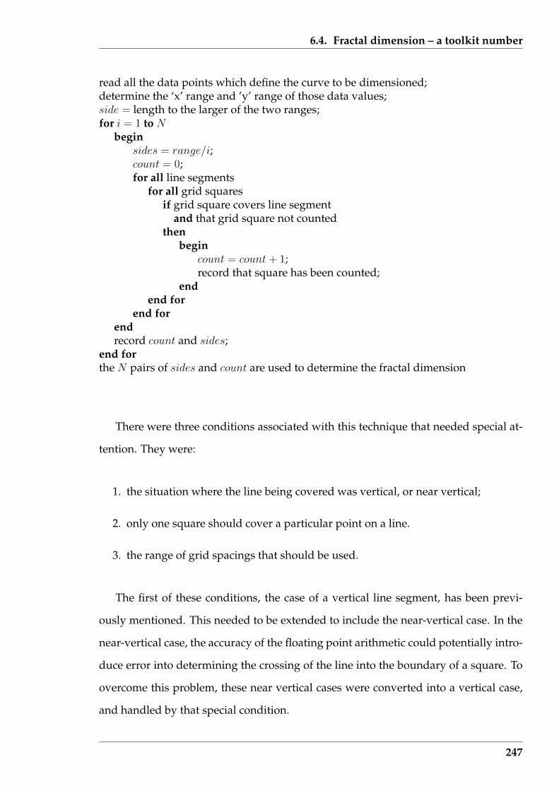
6.4. Fractal dimension – a toolkit number
read all the data points which define the curve to be dimensioned;determine the ‘x’ range and ’y’ range of those data values;side = length to the larger of the two ranges;for i = 1 to N
beginsides = range/i;count = 0;for all line segments
for all grid squaresif grid square covers line segment
and that grid square not countedthen
begincount = count + 1;record that square has been counted;
endend for
end forendrecord count and sides;
end forthe N pairs of sides and count are used to determine the fractal dimension
There were three conditions associated with this technique that needed special at-
tention. They were:
1. the situation where the line being covered was vertical, or near vertical;
2. only one square should cover a particular point on a line.
3. the range of grid spacings that should be used.
The first of these conditions, the case of a vertical line segment, has been previ-
ously mentioned. This needed to be extended to include the near-vertical case. In the
near-vertical case, the accuracy of the floating point arithmetic could potentially intro-
duce error into determining the crossing of the line into the boundary of a square. To
overcome this problem, these near vertical cases were converted into a vertical case,
and handled by that special condition.
247

6.4. Fractal dimension – a toolkit number
Implicit in the examples of determining fractal dimensions of lines shown by Barns-
ley (1993) and Kaye (1993) is that only one box covers any particular point of the line
being fractal dimensioned. A problem occurs when using a regular grid of lines to
produce the boxes that are used in the covering process. In the situation where the
line being fractal dimensioned passes through the intersection of two lines, there are
four squares that could be used to cover that intersection point. This second condition
was overcome by providing a more exact definition of the extent of a box. Using Fig-
ure 6.11 as a reference, the horizontal (x direction) of a box was defined as x1 ≤ x < x2
and vertical extent (y direction) was ymin ≤ y < ymax. For programming, the upper
inequalities were converted to new limit values, a small distance inside the maximum
value and thus forming the maximum limits to a box. The intersections of the line be-
ing dimensioned are shown circled in Figure 6.11 and have the reference value of the
top of the box for defining entry into the box being that reduced value (shown hashed
in the figure).
The third of the special conditions pertains to the appropriate range of covering
box size that is appropriate for determining the fractal dimension of a particular line.
More box covering data may not lead to a more accurate determination of the fractal
dimension. This is alluded to in the demonstration examples for experimental fractal
determination by Barnsley (1993). The range of box-sizes used in the determination is
recommended to be included when giving the fractal dimension obtained. Decreasing
the size of those boxes assumes that the data contains what Peitgen, Jurgens & Saupe
(1992) describe as “self-similarity”; the complexity of the data is retained with increas-
ing magnification of scale. Although self-similarity is at the heart of fractal dimension
determination, this condition can be relaxed, but with caution. In data, the degree of
self-similarity is constrained by the scale of the measurements. That limitation needs
to be observed when using the box-counting method for obtaining an estimate of the
fractal dimension. If the size of the covering boxes is incompatible with the data, a
poor fractal dimension will be obtained. This is demonstrated by the following two
examples.
248
6.4. Fractal dimension – a toolkit number
6.4.3 Some practical issues in fractal dimension measurement
To verify correct functioning of this fractal dimensioning algorithm implementation a
comparison was sought. Books such as Kaye (1993), Mandelbrot (1983), and Barnsley
(1993) contain many examples of fractal dimension determinations. However, when
the data is given from which such determinations are derived, they are simplistic with
little structure. A curve of more useful data is often given which consists of more com-
plex data (for example in the Strahle (1991) paper, page 411) but taking off coordinates
from such curves for use as test data proved impractical. Available software for deter-
mining fractal dimension also used data incompatible with the implementation being
tested. Without access to their source code, this could not be changed. Changing the
test implementation to process data compatible with the available software would not
provide testing of this algorithm’s implementation. As a result, another approach was
followed.
A straight line and a more complex line similar in form to that used by Strahle
(1991) were used. It is known from theoretical considerations that the fractal dimen-
sion of a straight line is unity. So a straight line broken into segments for data should
give that unit value. The more complex line was similar in form, but has less self-
similarity than that of the Strahle (1991) example (Fig. 1(b), page 410) whose fractal
dimension was given as 1.58. So the fractal dimension of this complex line is known
to be higher than unity for a straight line but less than 1.58 of the Strahel line.
A straight line between the points (1,3) and (15,16.1) was analysed in the coordinate
block of 0 to 20 in both x and y directions using the software of Section 6.4.2 (page 242).
The size of the covering boxes ranged from 5 to 0.0098 (= 20/2048) units. The length
of the sides of the boxes were halved between measurements. The boxes were in the
form of squares. Figure 6.12 shows the log/log plot (analogue of the Richardson plot)
of the covering box sizes and counts obtained.
Using the ten data points obtained, the slope of the least squares fitting line (shown
249
6.4. Fractal dimension – a toolkit number
as a solid line in Figure 6.12) was 0.970 which would be the fractal dimension measure-
ment. In Figure 6.12 a line of unit slope, which corresponds to the theoretical fractal
dimension of a straight line, is also shown – bashed. The inclusion of the lower cov-
ering box sizes (at the right-hand end of the plot) in the least squares determination
accounts for the difference in these two lines. Excluding the first two points gave a
least squares slope of 0.989; excluding the first three, gave a slope of 0.993. The ex-
pected accuracy of a fractal dimension determined by this experimental method is
one, may be two, decimal places. The determination of 0.99 suggests that these small
covering box sizes was too small and should not be used.
0.2 0.5 1.0 2.0 5.0 10.0 20.0 50.0 100.0
1020
5010
020
050
020
00
inverse of covering box size [1/r]
coun
t of c
over
ing
boxe
s [c
ount
]
Figure 6.12: Log/log plot of box counts for the straight line example
So, for the straight line between the coordinates (1,3) and (15,16.1), its fractal di-
mension was 0.99 over the range of length from 2.5 to 0.0097.
The second validation of the ‘linefd’ algorithm involved the measurement of the
fractal dimension of the data plotted in Figure 6.13. Ninety (x,y) value pairs with the
x data values ranged from 0 to 17.8 units at a uniform increment of 0.2. The shape
250

6.4. Fractal dimension – a toolkit number
of this curve is similar to, but lacks the self-similarity, or wiggly nature, of the Strahle
(1991) temperature probe data that is analysed as a demonstration example by Barns-
ley (1993). As a consequence, the fractal dimension of the data of Figure 6.13 was
expected to be greater than the value 1.00 of a straight line but less than the 1.58 value
obtained for the Strahle (1991) data.
0 5 10 15 20
05
1015
20
x
y
Figure 6.13: Plot of data that produced the wiggly line example
Application of the box counting software produced results that are plotted on
log/log axes in Figure 6.14. Four sets of data are shown. These respective data sets
had initial box size assignments of 30, 25, 21, and 19 units and are represented in Fig-
ure 6.14 by the circle, triangle, plus sign, and multiply sign, respectively. The size
of these initial covering boxes was such as to cover the whole of the line data being
measured. Those box sizes with a box covering count of one are included in the plot
of Figure 6.14. Following the box counting algorithm, a data point was produced for
each halving of those initial boxes. This halving process was stopped after 9 cycles,
whereby the box size was smaller than the 0.2 increment in the data. As shown in
Figure 6.14, this resulted in a uniform coverage of box sizes (plotted as the inverse of
251

6.4. Fractal dimension – a toolkit number
the box size r in the Figure) over a scale of 100.
0.02 0.05 0.10 0.20 0.50 1.00 2.00 5.00 10.00
15
1050
500
5000
1/r
coun
t
Figure 6.14: Log/log plot of box counts of the wiggly line example
Superimposed on the data in Figure 6.14 is a dashed line of unit slope together
with a solid line that indicates the slope of the fractal dimension which was deduced.
The line of unit slope runs through the data values with 1/r values above 5.0 which
corresponds to the r value of 0.2 which is the increment in the data being fractal di-
mensioned. These values were thus measuring the straight line segments between the
data values, which is not a part of the data that is required to be measured. Conse-
quently, these points were removed from the determination of the fractal dimension
of the data.
At the other end of Figure 6.14, the four 1/r values having unit counts were those
of the initial covering boxes. Except for one of those four values, they are off the line
passing through the remaining points. Their inclusion with the other points in fitting
a straight line would tend to increase the slope of that fitted line, and hence the fractal
dimension determination. On this basis, these four points were removed from further
252

6.4. Fractal dimension – a toolkit number
consideration.
The least squares fit straight line through the remaining point in Figure 6.14 had a
slope of 1.35 and was taken as the fractal dimension of the data shown in Figure 6.13.
That fractal dimension of 1.35 was determined over a 15 to 0.234 length range.
As a side issue, the data of Figure 6.13 was translated in the y direction by the
addition of an offset to each y value. This translation was needed to enable negative
values appearing in the data set to be accommodated within a positive range of val-
ues on which the initial size of the covering boxes could be selected. It was found
that for this translation not to introduce difference in the experimentally determined
fractal dimension, the translation needed to be a integer power of two of that cover-
ing box size. For example, with an initial covering box size of 24, a translation of 6
introduced no change, but a translation of 4 would cause a change in the determined
fractal dimension determination of the translated line. Under such special conditions,
translations do not change the relative count of the boxes covering the line.
6.4.4 Summary of this fractal dimension section
Fractal dimension was introduced as a tool-kit item for assessing a line. The specific
line considered was that passing through data points appearing on a two-dimensional
visualization. In terms of the proposed visualization taxonomy of Section 2.1 (page
31), the fractal dimension was linked to 2-variate or sequential 1-variate data types
using a 2-dimensional linked within visualization type. The fractal dimension is a
decimal fraction in the range between 1 and 2. The use of such an item is to assist
human comparison of lines appearing in different visualizations.
Being a number, the fractal dimension is computed using data derived from the
visualization of the line. However, the value arrived at depends on what data is used
in that computation. If inappropriate data is included then the desired result is not
253

6.5. Variation trending
obtained. It was shown that visualization of that data can assist filtering of the inap-
propriate parts. Although the same class of visualization in used during that filtering
process, the data is different from the data whose fractal dimension is sought. The
process of fractal dimension determination was derived as consisting of:
• visualize the original data;
• apply the fractal dimension algorithm
• visualize the box size against box covering counts that result;
• eliminate inappropriate box count data; and then
• fit a straight line to the remaining data to give the fractal dimension.
As stated at the start of this Section, fractal dimension is proposed in this research
for comparing ‘trend lines’ of data derived from text documents. Because such lines
are drawn from discrete data, this imposes constraint on the algorithm that is used to
compute that fractal dimension in that continuous reduction of the ‘step size’ is not
practical. This Section has considered not only an algorithm for computing the fractal
dimension of such data, but also the consequences associated with that limit process.
The next Section considers formulation of such ‘trend lines’, the problems associated
with comparing them, and the use of fractal dimension to reduce this difficulty.
6.5 Variation trending
Successive or ordered values of a variable can be plotted to show variation (or trend)
in that variable. In an industrial process, the measurements could be a sequence over
time. In a text document, the measurements could apply to each sentence, paragraph,
or chapter, which occur in succession. From the visualization of how the variable
changes over that sequencing (the variation trend), deductions about the reason for
the observed change (across the text document) can commence.
254
6.5. Variation trending
The relationships being visualized in this Section are thus of a different type than
those of Section 6.3 (page 220). Visualization of high dimensions is appropriate when
a number of variables are observed simultaneously, for example, the variables listed
in Table 6.2 (page 206). In this Section, one variable is followed as it takes on different
values through a document, for example the number of nouns that appear in each
sentence. With a difference in the type of visualization that results for these different
types of variables, there is a difference in the conclusions that can be drawn.
6.5.1 An overview of QSUM
The QSUM is a technique for deducing the authorship of texts which utilises trends
in variables through the text including, importantly, in legal cases. Farringdon (1997)
demonstrates the technique applied to text document analysis. However, QSUM is
a modification of the cumulative sum (Cusum) technique which Montgomery (1997)
shows to have its roots in statistical control of industrial processes.
Montgomery (page 314) introduces the Cusum technique as building upon She-
whart control charts. Sequential measurements are taken of a process that potentially
could produce change. In an industrial process such as a machine that fills beer cans,
the measurement is (for instance) the level of beer in each can, and those measure-
ments are sequential in time because each can is filled in turn. The requirement of the
process is to fill each can, one after the other, to the same level. The resulting plot of
levels is a called a Shewhart chart. The variable being plotted has statistical properties
and from those properties upper and lower limits can be set on the variable to indi-
cate allowable values of normal fluctuations. The modification of the Shewhart chart
to produce the Cusum chart results in increased sensitivity of the chart in detecting
significant fluctuations. This modification is explored below.
Farringdon (1996) gives a detailed discussion of the QSUM technique for perform-
ing text document analysis for the purpose of attributing authorship. The QSUM tech-
255
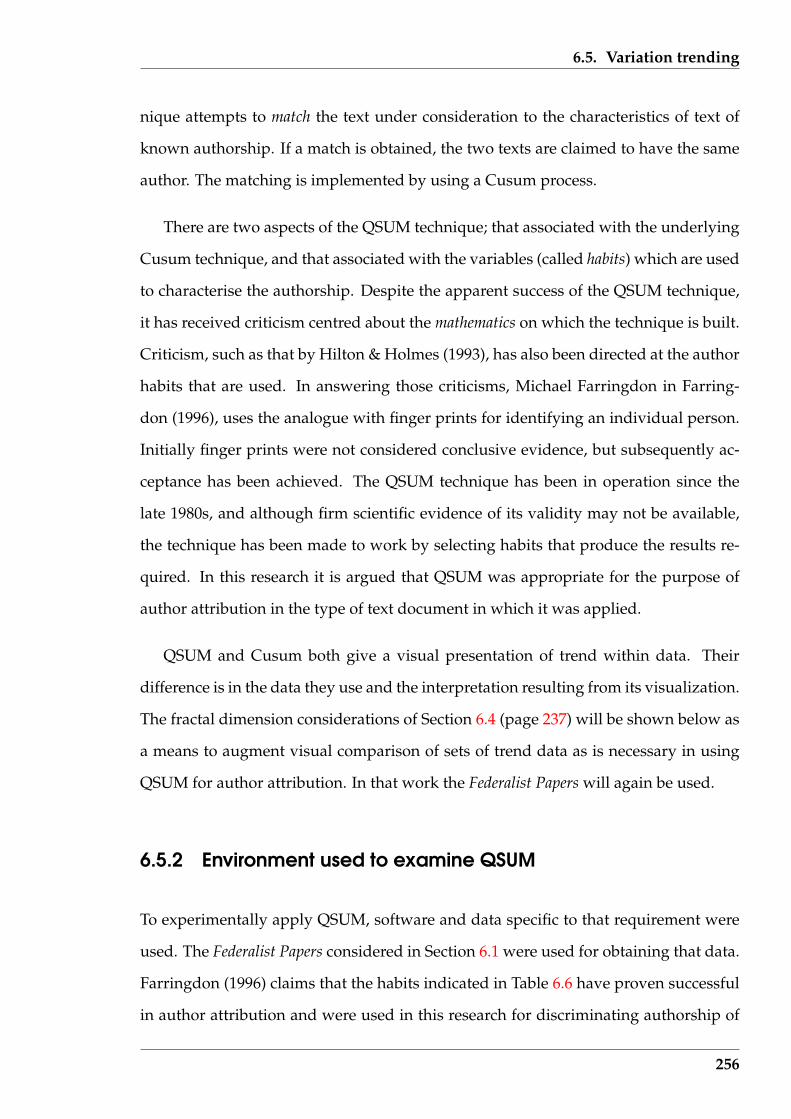
6.5. Variation trending
nique attempts to match the text under consideration to the characteristics of text of
known authorship. If a match is obtained, the two texts are claimed to have the same
author. The matching is implemented by using a Cusum process.
There are two aspects of the QSUM technique; that associated with the underlying
Cusum technique, and that associated with the variables (called habits) which are used
to characterise the authorship. Despite the apparent success of the QSUM technique,
it has received criticism centred about the mathematics on which the technique is built.
Criticism, such as that by Hilton & Holmes (1993), has also been directed at the author
habits that are used. In answering those criticisms, Michael Farringdon in Farring-
don (1996), uses the analogue with finger prints for identifying an individual person.
Initially finger prints were not considered conclusive evidence, but subsequently ac-
ceptance has been achieved. The QSUM technique has been in operation since the
late 1980s, and although firm scientific evidence of its validity may not be available,
the technique has been made to work by selecting habits that produce the results re-
quired. In this research it is argued that QSUM was appropriate for the purpose of
author attribution in the type of text document in which it was applied.
QSUM and Cusum both give a visual presentation of trend within data. Their
difference is in the data they use and the interpretation resulting from its visualization.
The fractal dimension considerations of Section 6.4 (page 237) will be shown below as
a means to augment visual comparison of sets of trend data as is necessary in using
QSUM for author attribution. In that work the Federalist Papers will again be used.
6.5.2 Environment used to examine QSUM
To experimentally apply QSUM, software and data specific to that requirement were
used. The Federalist Papers considered in Section 6.1 were used for obtaining that data.
Farringdon (1996) claims that the habits indicated in Table 6.6 have proven successful
in author attribution and were used in this research for discriminating authorship of
256
6.5. Variation trending
the Federalist Papers. The occurrence of such habits are measured in each sentence
of the text document. Those habits are composed from five counts of distinct word
types: two-, three-, and four- letter words, words starting with a vowel, and the total
words present. From these five counts, the eight habits indicated in Table 6.6 were
constructed.
Table 6.6: Successful QSUM habits included in Farringdon (1996)
Designation Meaning23lw two- and three- letter wordsivw words starting with a vowel23lw + ivw both two- three letter words and words starting with a vowel234lw two-, three-, and four- letter words234lw + ivw two-, three, and four- letter words plus words starting with a vowel34lw three- and four- letter words34lw + ivw three- and four- letter words plus words starting with a vowelnot 23lw every word which is NOT a two- or three- letter word
These five required counts are readily extracted from computer-readable text, once
the difficulties mentioned in Section 4.1 (page 98) for isolating sentences and words
from a text document are overcome. However, opinion varies concerning the utility of
the use of these eight “habits” for characterising an individual’s writing style. Hilton
& Holmes (1993) are critical that the habits of the number of initial vowel words (ivw)
and nouns (additional to the above list) per sentence are not useful. In contrast Far-
ringdon (1996) argues the use of verbs in a sentence is not a habit, but supports the use
of initial vowel words, adding that such habit is regularly available in a text sample
as it occurs in 35-50 percent of English expression. A high occurrence rate of whatever
the measure, is an advantage in collecting data; small counts make comparisons dif-
ficult. Experience has show that these five habits listed in Table 6.6 do have that high
occurrence. Having a high expected occurrence rate makes obtaining of a representa-
tive sample of a writer’s habits more likely in a given number of sentences from a text
document.
Hilton & Holmes (1993) suggest that habits do not consistently recur in an individ-
ual’s writings. For the purpose of this research, the more common opinion favouring
the use of habits is adopted. However, the limitations of the technique must not be
257

6.5. Variation trending
ignored.
intosentences.pl
content.pl
one
fed17.txt
fragments.out
habits.pl
counts.txt
linefd.cqsum.pl
qsum.txt
(pipe)
linefd.c
Figure 6.15: Relationship of software and files used in this part of this research
Figure 6.15 shows the relationship of the software components used in this re-
search. The file fed17.txt is an example file input to the software chain shown
in Figure 6.15. As in Section 4.1.4 (page 107), the Perl script intosentences.pl was
supplied with the text being analysed. The output of this process consisted of the
original text rearranged so that each sentence occupied one line, which was piped into
the content.pl Perl script which generated an output file called fragments.out
consisting of all the sentences with their ’words’ isolated from one another. That out-
put file consisting of the original text with all its sentences and words identified, was
processed by the Perl script habits.pl to yield the text file counts.txt.
Each line in counts.txt contained information about a single sentence from the
258

6.5. Variation trending
text file processed by the intosentences.pl script. Each successive line repre-
sented successive sentences in the original text. Each line contained:
• paragraph number in which the sentence appears;
• chronological sentence number;
• count of two-letter words present;
• count of three-letter words present;
• count of four-letter words present;
• count of words present starting with a vowel; and
• total number of words in that sentence, i.e. the sentence length.
That text file (counts.txt) could be treated as data representing a Shewhart plot, or
processed further using the qsum.pl script to produce the qsum.txt file of a QSUM
plot. The fractal dimension of such plots would be obtained from the linefd.c pro-
gram using either of those two text files as data.
The QSUM technique is not applicable to all text documents. Michael Farringdon
in Chapter 10 of Farringdon (1996) claims the QSUM technique is inappropriate for
text documents consisting of lists, sentences with frequently occurring words, short
answer questions consisting of yes and no, and academic writings. One indication of
such academic writing is the appearance of referencing and footnotes, and their cita-
tion within the document. An examination of the 85 Federalist Papers showed that those
papers listed in Table 6.7 used such a citation scheme and as a result were excluded
from being selected for this series of experiments. In Table 6.7, the paper numbers
shown in italics had two to four occurrences of footnote numbering using a numeral
in square brackets; those in bold type containing five or more; while all others have a
single occurrence of a reference citation. It is interesting to note that of these 33 papers,
259

6.5. Variation trending
only paper 40 is known to be written by somebody other than Hamilton (paper 40 was
written by Madison, and paper 56 is of disputed authorship).
Table 6.7: Numbers of the Federalist Papers that employ reference citations
1 6 7 8 911 12 15 18 1922 24 27 28364056 5960 67 68 6970 71 73 77 78 7981 82 83 84 85
Of the applicable Federalist Papers, papers 13 and 17 were taken from the set that
are generally recognised as Hamilton’s writing, while paper 37 was taken from those
similarly recognised as due to Madison. Those papers were taken at random as sam-
ples of their writings, at least in the context of the Federalist Papers. Paper 49 was taken
as representing the disputed papers. All these documents were of the same format
– newspaper articles, basically with the same subject – that of the proposed United
States constitution and its operation, and with the same intent – that of influencing
the reader to vote favourably for the adoption of the constitution.
6.5.3 Handling of Shewhart and Cusum charts
The QSUM technique of author attribution is based on the Cusum algorithm used
in industrial process control. In Montgomery (1997) the Cusum algorithm is demon-
strated as being able to detect a shift of one standard deviation in a process with an
underlying Normal distribution. This is put into perspective by Tukey (1986) where
the observation is made that for statistical processes in general, detecting a shift of
5 standard deviations is nearly trivial, but detection a shift of 0.05 standard devia-
tions is nearly impossible, when there are systematic errors present in the data. So the
correct terminology in testing whether two pieces of text are from the one author is
that the texts, according to the test used, are different or alternatively ‘they have not
260
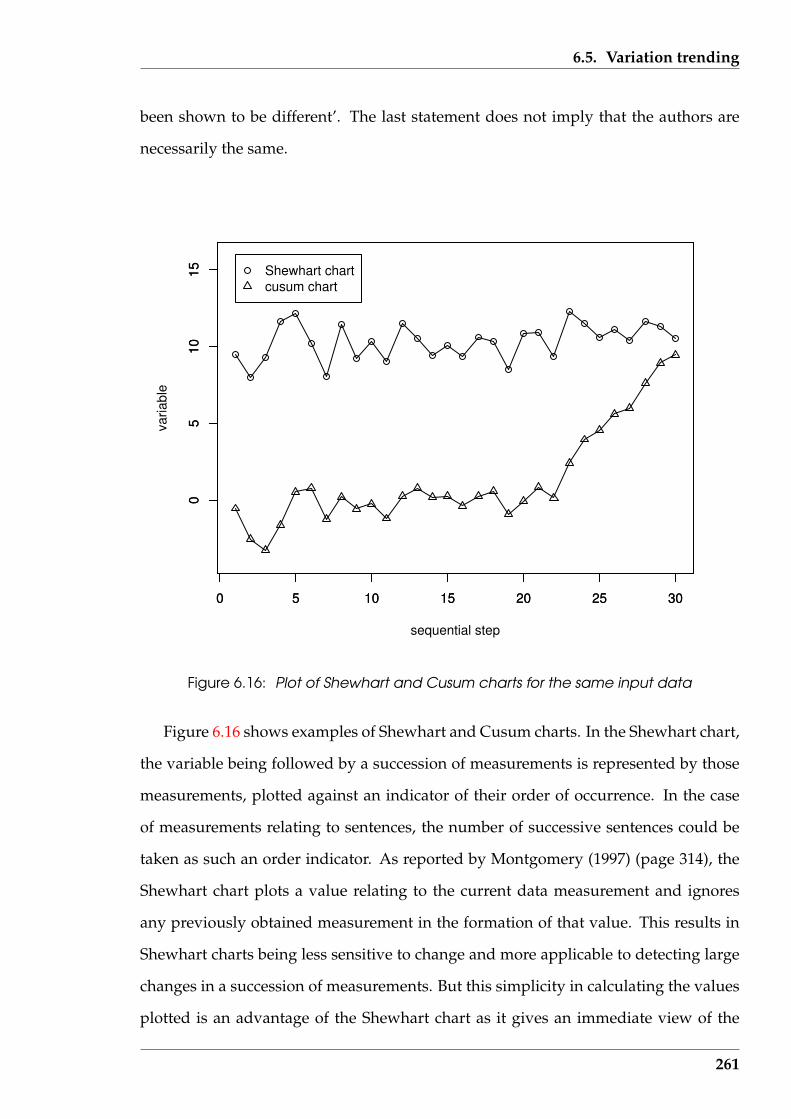
6.5. Variation trending
been shown to be different’. The last statement does not imply that the authors are
necessarily the same.
0 5 10 15 20 25 30
05
1015
sequential step
varia
ble
0 5 10 15 20 25 30
05
1015 Shewhart chart
cusum chart
Figure 6.16: Plot of Shewhart and Cusum charts for the same input data
Figure 6.16 shows examples of Shewhart and Cusum charts. In the Shewhart chart,
the variable being followed by a succession of measurements is represented by those
measurements, plotted against an indicator of their order of occurrence. In the case
of measurements relating to sentences, the number of successive sentences could be
taken as such an order indicator. As reported by Montgomery (1997) (page 314), the
Shewhart chart plots a value relating to the current data measurement and ignores
any previously obtained measurement in the formation of that value. This results in
Shewhart charts being less sensitive to change and more applicable to detecting large
changes in a succession of measurements. But this simplicity in calculating the values
plotted is an advantage of the Shewhart chart as it gives an immediate view of the
261
6.5. Variation trending
progression of the measurements.
Cusum charts involve more calculation to produce a plot. The resulting visual is
a chart referenced to a zero value while the Shewhart chart is referenced to a non-
zero value (generally). This reference value is the “control point”. Whereas the visual
Shewhart chart directly shows the data relative to this control point, that control point
is implicit in the Cusum chart visual, due to the control point being incorporated in the
Cusum calculations. For the Cusum, each measurement is subtracted from the control
point value and that difference added to a cumulative sum which is initially set to zero.
The Cusum chart plots that cumulative sum at each measurement. As a consequence
of this, Cusum charts use knowledge obtained from previous measurements and as
a result have greater sensitivity to changes. The Cusum chart is used in the QSUM
technique.
The Shewhart and Cusum charts shown in Figure 6.16 are based on the same data.
The top line of Figure 6.16 is the Shewhart chart and the Cusum chart is the bottom
line. The data is from Montgomery (1997) (page 315) and consists of a stream of ran-
dom numbers from a Normal distribution with a variance of unity (1). Initially the
mean of that Normal distribution was 10, but at sample 21 that mean was changed
to 11. This change in mean corresponds to a shift of the value of the variance in the
process being charted. Montgomery (1997) states (page 314) that this change is below
the level of sensitivity to change that the Shewhart chart can detect. This is confirmed
in Figure 6.16 where the Shewhart chart shows no change, but the Cusum chart in-
dicates a drift from the zero (mean) value without oscillating about the mean value.
This degree of oscillation was used in this research as a technique to assist compari-
son between Cusum charts; a comparison of importance when using these charts in
association with text documents.
The fractal dimension software of Section 6.4 can assist in comparing two or more
Shewhart or Cusum charts. In this regard, the purpose of the fractal dimension is
to capture the oscillatory characteristic of the chart. A complication in determining
262
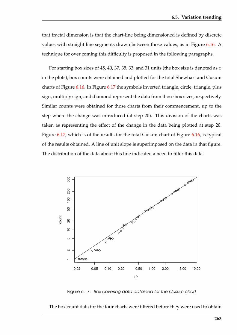
6.5. Variation trending
that fractal dimension is that the chart-line being dimensioned is defined by discrete
values with straight line segments drawn between those values, as in Figure 6.16. A
technique for over coming this difficulty is proposed in the following paragraphs.
For starting box sizes of 45, 40, 37, 35, 33, and 31 units (the box size is denoted as r
in the plots), box counts were obtained and plotted for the total Shewhart and Cusum
charts of Figure 6.16. In Figure 6.17 the symbols inverted triangle, circle, triangle, plus
sign, multiply sign, and diamond represent the data from those box sizes, respectively.
Similar counts were obtained for those charts from their commencement, up to the
step where the change was introduced (at step 20). This division of the charts was
taken as representing the effect of the change in the data being plotted at step 20.
Figure 6.17, which is of the results for the total Cusum chart of Figure 6.16, is typical
of the results obtained. A line of unit slope is superimposed on the data in that figure.
The distribution of the data about this line indicated a need to filter this data.
0.02 0.05 0.10 0.20 0.50 1.00 2.00 5.00 10.00
12
510
2050
100
200
500
1/r
coun
t
Figure 6.17: Box covering data obtained for the Cusum chart
The box count data for the four charts were filtered before they were used to obtain
263
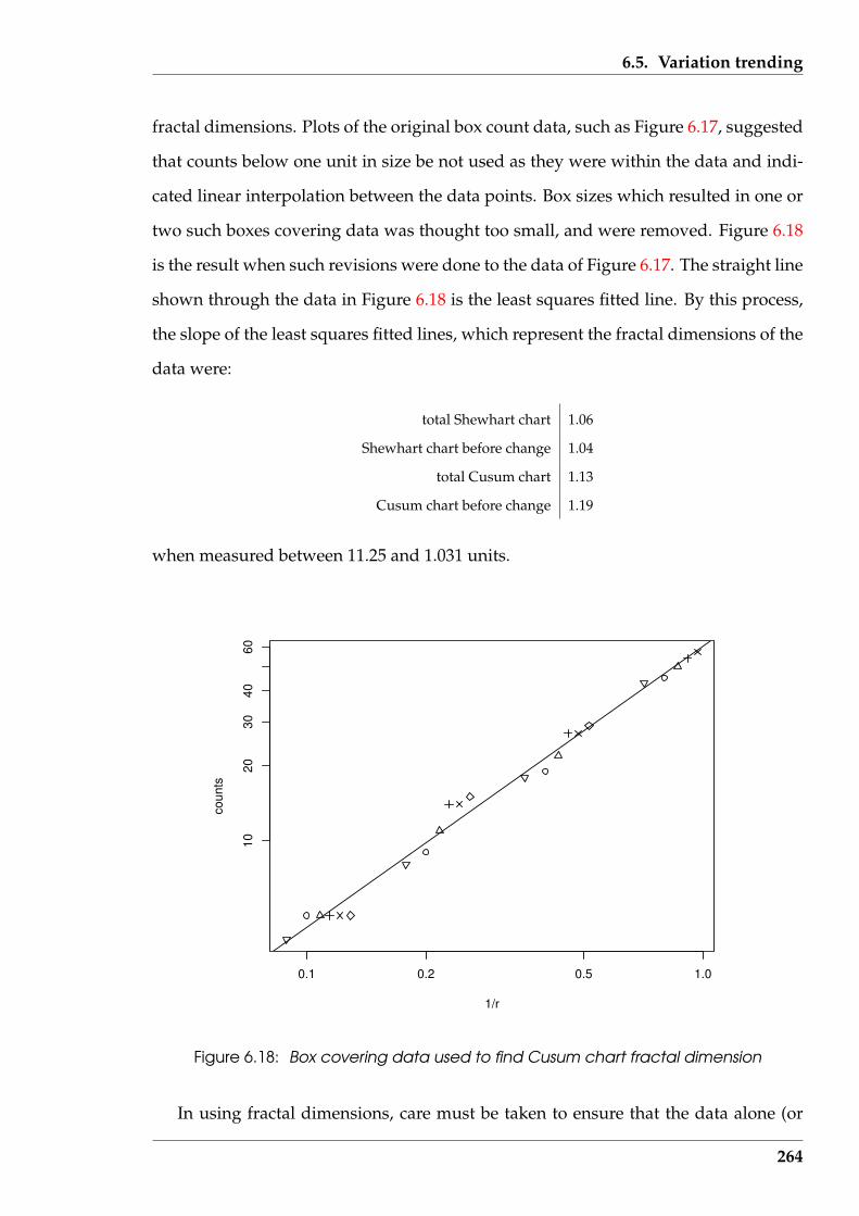
6.5. Variation trending
fractal dimensions. Plots of the original box count data, such as Figure 6.17, suggested
that counts below one unit in size be not used as they were within the data and indi-
cated linear interpolation between the data points. Box sizes which resulted in one or
two such boxes covering data was thought too small, and were removed. Figure 6.18
is the result when such revisions were done to the data of Figure 6.17. The straight line
shown through the data in Figure 6.18 is the least squares fitted line. By this process,
the slope of the least squares fitted lines, which represent the fractal dimensions of the
data were:
total Shewhart chart 1.06
Shewhart chart before change 1.04
total Cusum chart 1.13
Cusum chart before change 1.19
when measured between 11.25 and 1.031 units.
0.1 0.2 0.5 1.0
1020
3040
60
1/r
coun
ts
Figure 6.18: Box covering data used to find Cusum chart fractal dimension
In using fractal dimensions, care must be taken to ensure that the data alone (or
264
6.5. Variation trending
predominately) is used in its determination. In this case, attempting to extract too
much data for the calculation will give an incorrect value for the required line. With
this observed, the measured fractal dimensions above indicate that the response of
Shewhart and Cusum charts to change are detectable by fractal dimensions. There
is a slight change in the fractal dimension of the Shewhart chart resulting from the
change in the data of the chart. This indicated change is close to the error that is as-
sociated with this method of fractal dimension determination. This is consistent with
the visual behaviour observed in Figure 6.16. A more substantial change is indicated
in the fractal dimensions of the parts of the Cusum chart, consistent with Figure 6.16.
Those differences in the fractal dimensions were observed using a common range of
measurement in their determination.
6.5.4 Author attribution using QSUM and fractal dimension
The QSUM technique used with the author habits listed in Table 6.6 (page 257) is
described by Farringdon (1997). The distribution of these habits across successive
sentences in a text document is proposed by this technique as being characteristic of
an author, and different from that of other authors. In this respect, a sentence is used
as a convenient divider of the whole text document. A chart is used to track that habit
across successive sentences and to compare it with a similar chart using the length of
those successive sentences. It is proposed that the fractal dimension can be used to
compare such charts, as opposed to using visual comparison alone.
The technique consists of three stages. For a sample of text, the occurrence of the
selected habit is counted. Then:
1. the average occurrence of that habit across all sentences in the sample is calcu-
lated;
2. that average is subtracted from the counted occurrence of that habit in each sen-
265
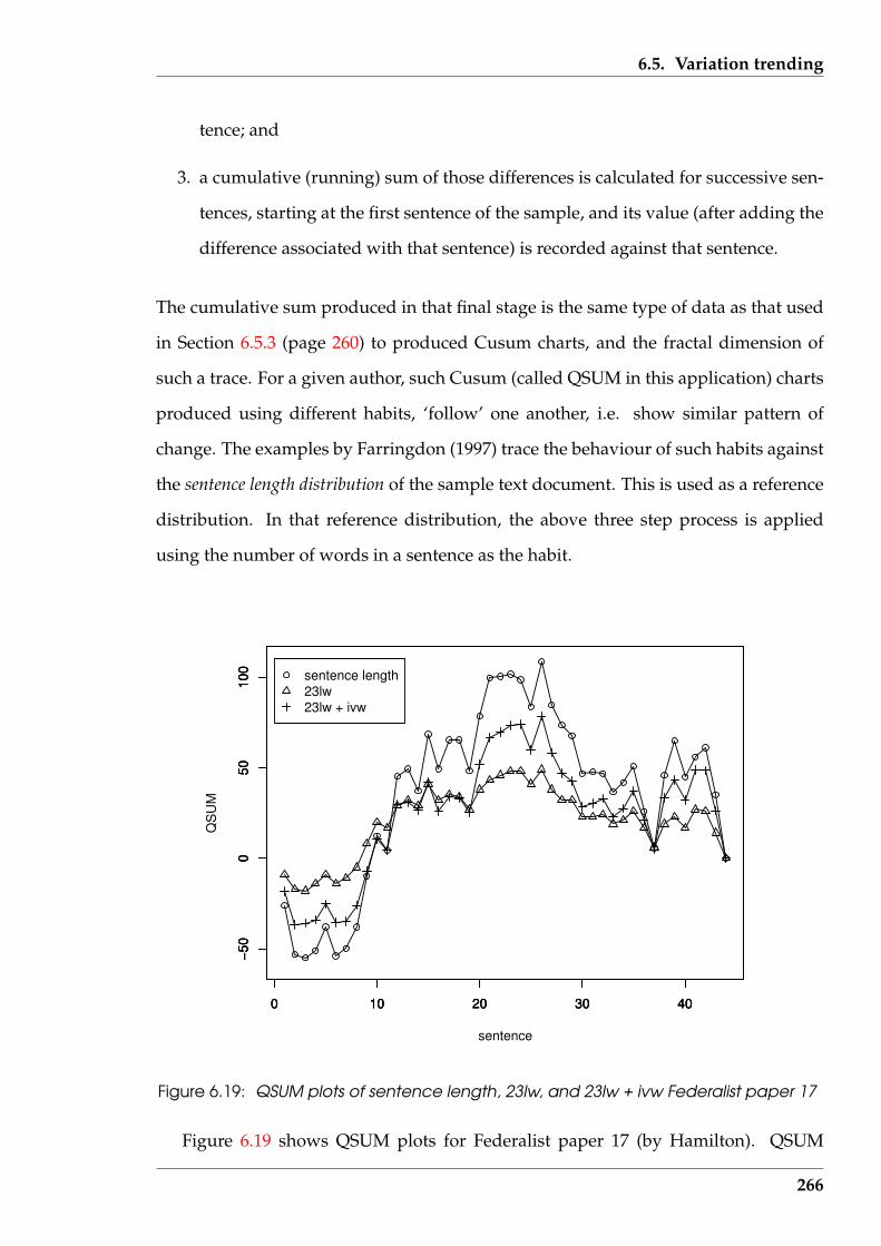
6.5. Variation trending
tence; and
3. a cumulative (running) sum of those differences is calculated for successive sen-
tences, starting at the first sentence of the sample, and its value (after adding the
difference associated with that sentence) is recorded against that sentence.
The cumulative sum produced in that final stage is the same type of data as that used
in Section 6.5.3 (page 260) to produced Cusum charts, and the fractal dimension of
such a trace. For a given author, such Cusum (called QSUM in this application) charts
produced using different habits, ‘follow’ one another, i.e. show similar pattern of
change. The examples by Farringdon (1997) trace the behaviour of such habits against
the sentence length distribution of the sample text document. This is used as a reference
distribution. In that reference distribution, the above three step process is applied
using the number of words in a sentence as the habit.
0 10 20 30 40
−50
050
100
sentence
QS
UM
sentence length23lw23lw + ivw
0 10 20 30 40
−50
050
100
0 10 20 30 40
−50
050
100
Figure 6.19: QSUM plots of sentence length, 23lw, and 23lw + ivw Federalist paper 17
Figure 6.19 shows QSUM plots for Federalist paper 17 (by Hamilton). QSUM
266
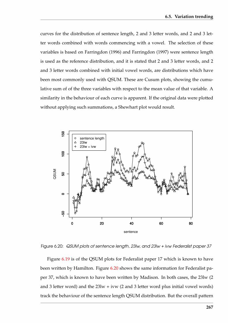
6.5. Variation trending
curves for the distribution of sentence length, 2 and 3 letter words, and 2 and 3 let-
ter words combined with words commencing with a vowel. The selection of these
variables is based on Farringdon (1996) and Farringdon (1997) were sentence length
is used as the reference distribution, and it is stated that 2 and 3 letter words, and 2
and 3 letter words combined with initial vowel words, are distributions which have
been most commonly used with QSUM. These are Cusum plots, showing the cumu-
lative sum of of the three variables with respect to the mean value of that variable. A
similarity in the behaviour of each curve is apparent. If the original data were plotted
without applying such summations, a Shewhart plot would result.
0 20 40 60 80
−50
050
100
150
sentence
QS
UM
0 20 40 60 80
−50
050
100
150
0 20 40 60 80
−50
050
100
150
sentence length23lw23lw + ivw
Figure 6.20: QSUM plots of sentence length, 23lw, and 23lw + ivw Federalist paper 37
Figure 6.19 is of the QSUM plots for Federalist paper 17 which is known to have
been written by Hamilton. Figure 6.20 shows the same information for Federalist pa-
per 37, which is known to have been written by Madison. In both cases, the 23lw (2
and 3 letter word) and the 23lw + ivw (2 and 3 letter word plus initial vowel words)
track the behaviour of the sentence length QSUM distribution. But the overall pattern
267
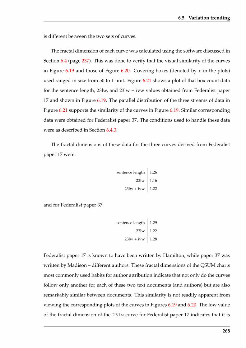
6.5. Variation trending
is different between the two sets of curves.
The fractal dimension of each curve was calculated using the software discussed in
Section 6.4 (page 237). This was done to verify that the visual similarity of the curves
in Figure 6.19 and those of Figure 6.20. Covering boxes (denoted by r in the plots)
used ranged in size from 50 to 1 unit. Figure 6.21 shows a plot of that box count data
for the sentence length, 23lw, and 23lw + ivw values obtained from Federalist paper
17 and shown in Figure 6.19. The parallel distribution of the three streams of data in
Figure 6.21 supports the similarity of the curves in Figure 6.19. Similar corresponding
data were obtained for Federalist paper 37. The conditions used to handle these data
were as described in Section 6.4.3.
The fractal dimensions of these data for the three curves derived from Federalist
paper 17 were:
sentence length 1.26
23lw 1.16
23lw + ivw 1.22
and for Federalist paper 37:
sentence length 1.29
23lw 1.22
23lw + ivw 1.28
Federalist paper 17 is known to have been written by Hamilton, while paper 37 was
written by Madison – different authors. These fractal dimensions of the QSUM charts
most commonly used habits for author attribution indicate that not only do the curves
follow only another for each of these two text documents (and authors) but are also
remarkably similar between documents. This similarity is not readily apparent from
viewing the corresponding plots of the curves in Figures 6.19 and 6.20. The low value
of the fractal dimension of the 23lw curve for Federalist paper 17 indicates that it is
268
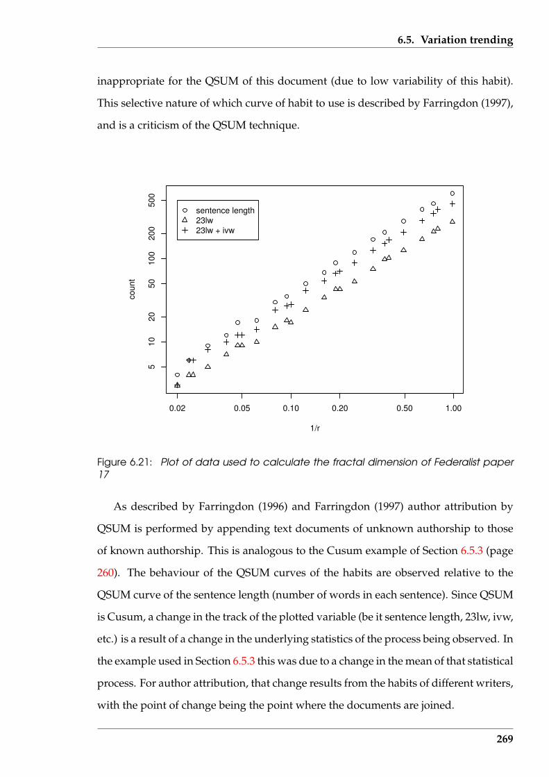
6.5. Variation trending
inappropriate for the QSUM of this document (due to low variability of this habit).
This selective nature of which curve of habit to use is described by Farringdon (1997),
and is a criticism of the QSUM technique.
0.02 0.05 0.10 0.20 0.50 1.00
510
2050
100
200
500
1/r
coun
t
sentence length23lw23lw + ivw
Figure 6.21: Plot of data used to calculate the fractal dimension of Federalist paper17
As described by Farringdon (1996) and Farringdon (1997) author attribution by
QSUM is performed by appending text documents of unknown authorship to those
of known authorship. This is analogous to the Cusum example of Section 6.5.3 (page
260). The behaviour of the QSUM curves of the habits are observed relative to the
QSUM curve of the sentence length (number of words in each sentence). Since QSUM
is Cusum, a change in the track of the plotted variable (be it sentence length, 23lw, ivw,
etc.) is a result of a change in the underlying statistics of the process being observed. In
the example used in Section 6.5.3 this was due to a change in the mean of that statistical
process. For author attribution, that change results from the habits of different writers,
with the point of change being the point where the documents are joined.
269
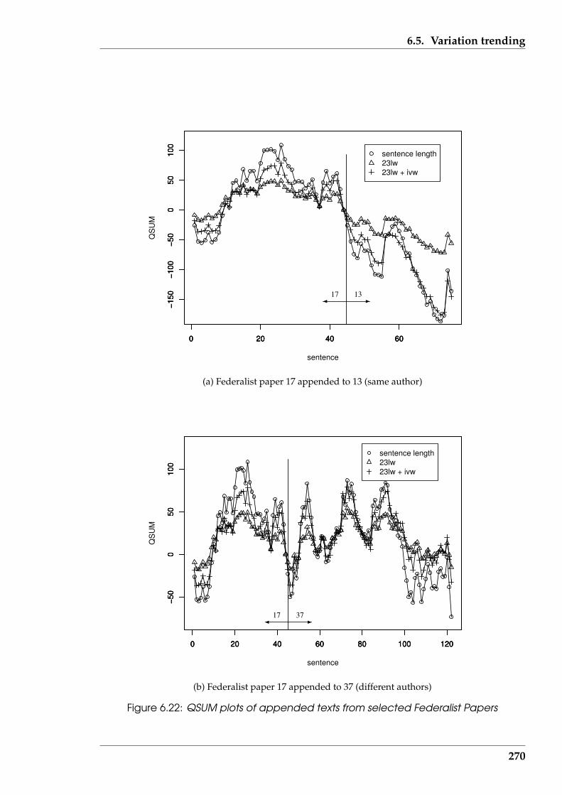
6.5. Variation trending
0 20 40 60
−150
−100
−50
050
100
sentence
QS
UM
0 20 40 60
−150
−100
−50
050
100
0 20 40 60
−150
−100
−50
050
100
sentence length23lw23lw + ivw
1317
(a) Federalist paper 17 appended to 13 (same author)
0 20 40 60 80 100 120
−50
050
100
sentence
QS
UM
0 20 40 60 80 100 120
−50
050
100
0 20 40 60 80 100 120
−50
050
100
sentence length23lw23lw + ivw
3717
(b) Federalist paper 17 appended to 37 (different authors)
Figure 6.22: QSUM plots of appended texts from selected Federalist Papers
270

6.5. Variation trending
To test this process, Federalist papers 13 and 49 were used together with papers
17 and 37. Federalist paper 13, like paper 17, was written by Hamilton. Paper 37 is
known to be written by Madison while Paper 49 is of disputed authorship. The con-
tents of paper 13 was appended it the end of the contents of paper 17, and the contents
of paper 37 to the end of paper 17. Sentence length, 2 and 3 letter words, and 2 and
3 letter words with initial vowel words were used as the QSUM habits. The mean
of each of these habits was determined for the original Federalist papers 17 and 37.
Those corresponding means were then used to form the QSUM habits that are plot-
ted in Figure 6.22. Those means are tabulated in Table 6.8. There is some difficulty
in assessing from those Figures whether the 23lw, and 23lw + iv curves continue to
follow the sentence length curve. The fractal dimension of each of those curves are
also tabulated in Table 6.8. The closeness of the fractal dimension values of the sen-
tence length and the 23lw + ivw habit curves of combined Federalist papers 17 and
37 against those for those for the 17 and 13 combination is of note. This contradicts
what would be expected according to QSUM, since Federalist papers 13 and 17 are of
Hamilton’s writing, while Federalist paper 37 is from Madison. The habits of those
two authors should be different and this should be reflected in the QSUM plots.
Table 6.8: QSUM results employing fractal dimensions for selected Federalist papers
means of QSUM data fractal dimension of QSUM curveText documentsentence length 23lw 23lw + ivw sentence length 23lw 23lw + ivw
Fed paper 17 35.98 14.00 26.25 1.26 1.16 1.22Fed paper 37 35.04 13.81 25.83 1.29 1.22 1.28Fed papers 17 + 13 34.16 13.25 24.31 1.27 1.22 1.21Fed papers 17 + 37 35.38 13.88 25.98 1.31 1.25 1.29Fed papers 17 + 49 31.00 12.73 23.18 1.16 1.15 1.17Fed papers 37 + 49 31.70 12.94 23.70 1.19 1.17 1.19
To examine the disputed authorship question associated with Federalist paper 49,
it was appended to Federalist paper 17 (representing Hamilton) and also to paper 37
(representing Madison). Again the means for the three habits used in producing the
QSUM plots of Figure 6.23 were those corresponding to the reference papers although
the means for the habits of the appended documents are tabulated in Table 6.8. It is
unclear from the QSUM plots of Figure 6.23 which of the two sets of curves contain the
271
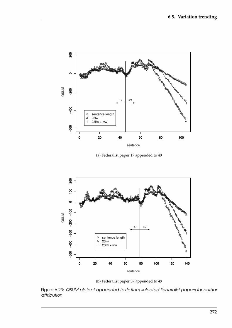
6.5. Variation trending
0 20 40 60 80 100
−600
−400
−200
020
0
sentence
QS
UM
sentence length23lw23llw + ivw
0 20 40 60 80 100
−600
−400
−200
020
0
0 20 40 60 80 100
−600
−400
−200
020
0
17 49
(a) Federalist paper 17 appended to 49
0 20 40 60 80 100 120 140
−500
−400
−300
−200
−100
010
020
0
sentence
QS
UM
0 20 40 60 80 100 120 140
−500
−400
−300
−200
−100
010
020
0
0 20 40 60 80 100 120 140
−500
−400
−300
−200
−100
010
020
0
sentence length23lw23lw + ivw
37 49
(b) Federalist paper 37 appended to 49
Figure 6.23: QSUM plots of appended texts from selected Federalist papers for authorattribution
272
6.6. Summary
best correspondence (followings). The fractal dimensions of those curves are tabulated
in Table 6.8. The closeness of these values indicates a similar degree of similarity
between the habit curves of each set. This would indicate, that the QSUM technique
is unable to resolve who was the author of Federalist paper 49.
6.5.5 Concluding remarks on QSUM
The QSUM technique of authorship attribution of text documents has been performed,
linking it with its counterpart in statistical quality control. The assumption was made
that the QSUM technique is appropriate for its stated purpose. The use of habits, al-
though a basis of the criticism of QSUM by Hilton & Holmes (1993), has been used in
this examination. Fractal dimensions have been shown to be a useful means of com-
paring Cusum charts which form the basis of QSUM analysis, offering an alternative
approach to visually comparing varying lines. From the documents analysed here,
QSUM may not conclusively differentiate one author’s writings from those of another
author. However, the role of this study has been to indicate the availability and use of
trends in measurement made in text documents, some of the difficulties in employing
such techniques visually, and for providing assistance in interpreting visualizations.
6.6 Summary
This Chapter has examined techniques for visualizing the patterns in numerical count
data that can be obtained from documents. Two classes of data have been consid-
ered. The first class visualized the occurrence patterns of data from multiple variables
simultaneously. This encompassed determining the number of visualizations of this
type that are necessary to view all patterns between such variables. The second in-
volved tracking the values of one or two variables between successive sentences in a
text document in such a manner as to show change in the pattern. Fractal Dimensions
273

6.6. Summary
were introduced as a technique applicable to detecting such change in reinforcement
of visual determination. This interplay of visualization and analytical techniques gives
support to research hypothesis H2 (visualization provides an alternative to analytical
methods for interpreting the same sets of text data).
The processes used in this Chapter can generate new visualizations quickly when
different data becomes available. This enables the extraction, visualization, and anal-
ysis of what results to be performed interactively using software although the ‘Serine’
prototype toolkit was not considered. That this interaction is a possibility supports
the truth of research hypothesis H5 (text document visualizations can be produced
in an efficient manner to enable their use as a toolkit for interactive analysis of such
documents).
This work has been cast in terms of processes for determining the authorship of
text documents. This is a comparison process; looking for patterns, and matching
the observed patterns in a text of unknown authorship to that of texts of known au-
thorship. The documents used were from the Federalist Papers. This is a classic set
of newspaper articles in which the authorship of most articles is known but where
the authorship of others is disputed between these known authors. In using that set
of documents, the purpose here was not to resolve the dispute, but to demonstrate
how the visual techniques being examined might be used in such a delineation of au-
thorship. This provides support to research hypothesis H4 (visualization can assist in
finding similarities and differences in the composition of text documents).
The visualization techniques of Parallel Coordinates, Star plots, Colour Maps, and
Cusum charts were all applied to the Federalist Papers to examine patterns in numerical
count data derived from the papers. The author attribution technique of QSUM, which
is derived from Cusum, was also applied. But these techniques are known to result in
comparing plots for their similarity. So fractal dimensions were introduced to assist
in that assessment. These techniques indicate the difficulty of author attribution for
the Federalist Papers, by showing the similarity of those documents. In some cases,
274

6.6. Summary
application of these techniques resulted in same assignment of authorship as in the
literature, while others gave the opposite conclusion.
informatics
text
Not used
Next chapter
This chapter
Legend
Figure 6.24: Progress map from Chapter 6 to 7
Figure 6.24 indicates that this Chapter considered information extracted from text,
and alternate analytical and visualization of the results obtained. The next Chapter
examines a different manner of visualizing the composition of text documents, which
includes the distribution of word types in the sentences it contains. This will provide
another means for examining research hypothesis H4. Also, because the software to
perform that visualization is integrated into the ‘Serine’ prototype, the next Chapter
also provides a means to further examine research hypothesis H5.
275
Chapter 7
Visualizing document composition
This Chapter develops a new visualization of the composition of text documents for
use by an expert analyst. Like the visualizations of Chapter 6, it is not intended to as-
sist in the reading, or understanding, of the information content of the document upon
which it is used. But unlike those of Chapter 6 which extracted measurements from
a sentence for display, this visualization represents the words and punctuation marks
present, and preserves their appearance order. This visualization has the dual purpose
of being a specific representation and also a means of exploring research hypothesis
H4 (visualization can assist in finding similarities and differences in the composition
of text documents). Implementation of the visualization enables further exploration of
research hypothesis H5 (text document visualization can be produced in an efficient
manner to enable their use as a toolkit for interactive analysis of such documents).
The visualization represents each sentence in the text document, from the com-
position of each sentence, through how individual sentences are gathered into para-
graphs, on into the arrangement of those paragraphs in the composition of the whole
text document (or of any particular part). It is called a ‘sentence stick’. It contains a
large amount of detail. It is of interest what influence that detail has upon research
hypotheses H4 and H5.
The ‘sentence stick’ approach is similar to the visualization of molecules at the
atomic level as used in modern chemistry. Figure 7.1 shows an example of a “wire-
276
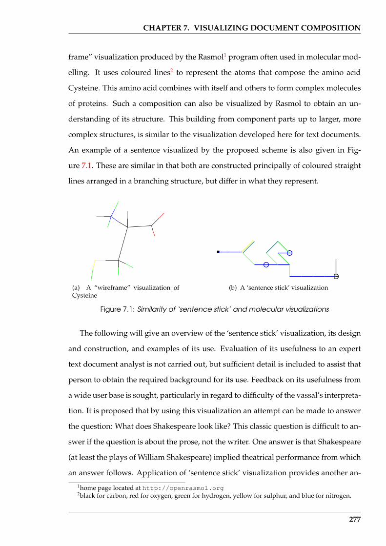
CHAPTER 7. VISUALIZING DOCUMENT COMPOSITION
frame” visualization produced by the Rasmol1 program often used in molecular mod-
elling. It uses coloured lines2 to represent the atoms that compose the amino acid
Cysteine. This amino acid combines with itself and others to form complex molecules
of proteins. Such a composition can also be visualized by Rasmol to obtain an un-
derstanding of its structure. This building from component parts up to larger, more
complex structures, is similar to the visualization developed here for text documents.
An example of a sentence visualized by the proposed scheme is also given in Fig-
ure 7.1. These are similar in that both are constructed principally of coloured straight
lines arranged in a branching structure, but differ in what they represent.
(a) A “wireframe” visualization ofCysteine
(b) A ‘sentence stick’ visualization
Figure 7.1: Similarity of ‘sentence stick’ and molecular visualizations
The following will give an overview of the ‘sentence stick’ visualization, its design
and construction, and examples of its use. Evaluation of its usefulness to an expert
text document analyst is not carried out, but sufficient detail is included to assist that
person to obtain the required background for its use. Feedback on its usefulness from
a wide user base is sought, particularly in regard to difficulty of the vassal’s interpreta-
tion. It is proposed that by using this visualization an attempt can be made to answer
the question: What does Shakespeare look like? This classic question is difficult to an-
swer if the question is about the prose, not the writer. One answer is that Shakespeare
(at least the plays of William Shakespeare) implied theatrical performance from which
an answer follows. Application of ‘sentence stick’ visualization provides another an-
1home page located at http://openrasmol.org2black for carbon, red for oxygen, green for hydrogen, yellow for sulphur, and blue for nitrogen.
277
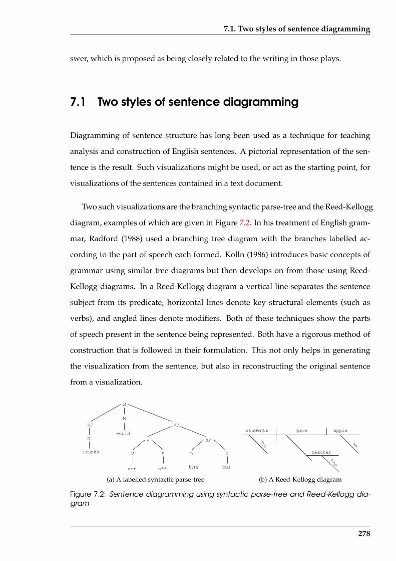
7.1. Two styles of sentence diagramming
swer, which is proposed as being closely related to the writing in those plays.
7.1 Two styles of sentence diagramming
Diagramming of sentence structure has long been used as a technique for teaching
analysis and construction of English sentences. A pictorial representation of the sen-
tence is the result. Such visualizations might be used, or act as the starting point, for
visualizations of the sentences contained in a text document.
Two such visualizations are the branching syntactic parse-tree and the Reed-Kellogg
diagram, examples of which are given in Figure 7.2. In his treatment of English gram-
mar, Radford (1988) used a branching tree diagram with the branches labelled ac-
cording to the part of speech each formed. Kolln (1986) introduces basic concepts of
grammar using similar tree diagrams but then develops on from those using Reed-
Kellogg diagrams. In a Reed-Kellogg diagram a vertical line separates the sentence
subject from its predicate, horizontal lines denote key structural elements (such as
verbs), and angled lines denote modifiers. Both of these techniques show the parts
of speech present in the sentence being represented. Both have a rigorous method of
construction that is followed in their formulation. This not only helps in generating
the visualization from the sentence, but also in reconstructing the original sentence
from a visualization.
NP
N
M
would
Drunks
VP
V
off the bus
V P
get
NP
D N
S
(a) A labelled syntactic parse-tree
students gave apple
teacher
the
The an
(b) A Reed-Kellogg diagram
Figure 7.2: Sentence diagramming using syntactic parse-tree and Reed-Kellogg dia-gram
278
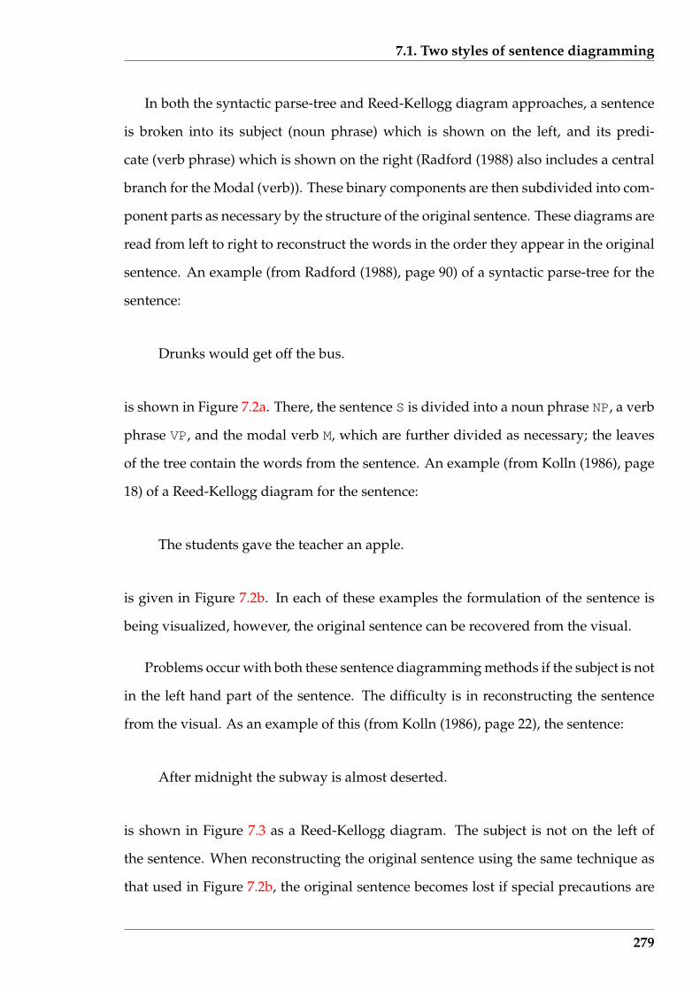
7.1. Two styles of sentence diagramming
In both the syntactic parse-tree and Reed-Kellogg diagram approaches, a sentence
is broken into its subject (noun phrase) which is shown on the left, and its predi-
cate (verb phrase) which is shown on the right (Radford (1988) also includes a central
branch for the Modal (verb)). These binary components are then subdivided into com-
ponent parts as necessary by the structure of the original sentence. These diagrams are
read from left to right to reconstruct the words in the order they appear in the original
sentence. An example (from Radford (1988), page 90) of a syntactic parse-tree for the
sentence:
Drunks would get off the bus.
is shown in Figure 7.2a. There, the sentence S is divided into a noun phrase NP, a verb
phrase VP, and the modal verb M, which are further divided as necessary; the leaves
of the tree contain the words from the sentence. An example (from Kolln (1986), page
18) of a Reed-Kellogg diagram for the sentence:
The students gave the teacher an apple.
is given in Figure 7.2b. In each of these examples the formulation of the sentence is
being visualized, however, the original sentence can be recovered from the visual.
Problems occur with both these sentence diagramming methods if the subject is not
in the left hand part of the sentence. The difficulty is in reconstructing the sentence
from the visual. As an example of this (from Kolln (1986), page 22), the sentence:
After midnight the subway is almost deserted.
is shown in Figure 7.3 as a Reed-Kellogg diagram. The subject is not on the left of
the sentence. When reconstructing the original sentence using the same technique as
that used in Figure 7.2b, the original sentence becomes lost if special precautions are
279
7.1. Two styles of sentence diagramming
not taken. The need for such special conditions detract from quickly indicating the
character of the sentence visual.
subway is deserted
almostmidnight
After
the
Figure 7.3: A Read-Kellogg diagram with sentence recovery difficulties
From the view point of this research, the Reed-Kellogg diagram offers the better
visuals of these two alternatives. However, it does have problems. A visualization
is required which provides a quick overview of the sentence, without engaging the
user in detailed analysis. In this, the compact spatial form of the Reed-Kellogg di-
agram is an advantage. The words themselves are a detail of the sentence, with its
structure denoted by the lines. Colouring of the lines representing the different word
types could be used in place of the words themselves. The sentence as a result would
be represented as a branching structure of coloured lines. Although this is attrac-
tive, visuals analogues to Figure 7.3 would have difficulty in indicating the start of
the sentence. Another problem with the Reed-Kellogg diagram is that the sentence
does not flow through its structure: one word (or line) leading onto the next. It was
never designed for that purpose; it is designed to show functional relationships. Thus
two sentences which have different construction but the same functional relationships
are represented by the same Reed-Kellogg diagram, whereas the visualization should
indicate that difference in construction, together with the similarity in functional rela-
tionships.
A new sentence visual was sought that employs the ideas embedded in the Reed-
Kellogg diagram but which can be immediately interpreted as representing a particu-
lar sentence.
280
7.2. ‘Sentence stick’: A sentence visualization
7.2 ‘Sentence stick’: A sentence visualization
The aim is to produce a visualization of a sentence which is:
• consistent for the occurrence of the same information present in the sentence,
within and between, text documents;
• readily interpreted by an expert familiar with how it is constructed and hence its
use;
• a unique representation of each unique set of information present in a sentence;
and
• a representation that can act as a modular component for visualizing an entire
text document.
The ‘sentence stick’ model is used to achieve these goals. Figure 7.1b (page 277) is an
example of such a visualization of a sentence.
A sentence contains both the idea being communicated, and the structural ele-
ments needed, or chosen, for that communication. The visualization here represents as
straight line segments (or sticks) the words that form the sentence. The words in a sen-
tence, how those words are used, and the sequence in which they occur, characterise
a sentence. With those words represented as straight line segments, the visualization
is locked to the original sentence.
7.2.1 Word class selection and refinement
Classes of words, not each word itself, that appear in a text document are used in the
visualization to represent the structure and style of the document. Each class is repre-
sented via a straight line segment. One approach is to use word classes composed of
nouns, verbs, and adjectives that occur in each sentence. However, general algorithms
281

7.2. ‘Sentence stick’: A sentence visualization
for identifying such words can be complex. A substitute for such word classes is used
here.
An implementation constraint on word class selection was imposed. The standard
‘class’ of a word can change with the context in which the word is used. For example,
‘Jack’ could be a proper noun, a verb, or a noun, depending upon the context in which
it is used and the location in the sentence (the capital letter can denote a proper noun,
and also the first word of a sentence). A modified ’class’ for words was adopted that
enabled a word’s class to be determined from the sentence in isolation from surround-
ing sentences in the text. This word class determination could then be performed by
a function in the software that is passed only a single word at a time. Thus word
characteristics that depend on in situ behaviour of words which would be obtained
by parsing the sentence for determining such characteristics are not relevant to this
method.
Swan (1995), with his practical survey of current general English usage, helped
to define the set of word classes. However, that division resulted in too many word
classes; many of which were context dependent. A modification to such classes was
proposed. Having too few classes, could lead to increased chance of inconsistent clas-
sifications of the same word in different usages. But if there are too many classes,
then their visual representation becomes difficult from a recognition perspective. This
modification was also to be such that each word class was not tuned to a specific type
of text document. As discussed in Chapter 3, particular word classes can be more ap-
propriate for specific text document types, however, the modified ’classes’ used here
would be more uniform in interpretation across different text document types.
The following is a list of word categories which offer useful characteristics in a
sentence. They also fulfil the above implementation constraint. Some of these word
categories are common with Section 4.3.2 (page 123), where primary structure compo-
nents were being discussed. Those words, their category, and their interpretations are
as follows:
282
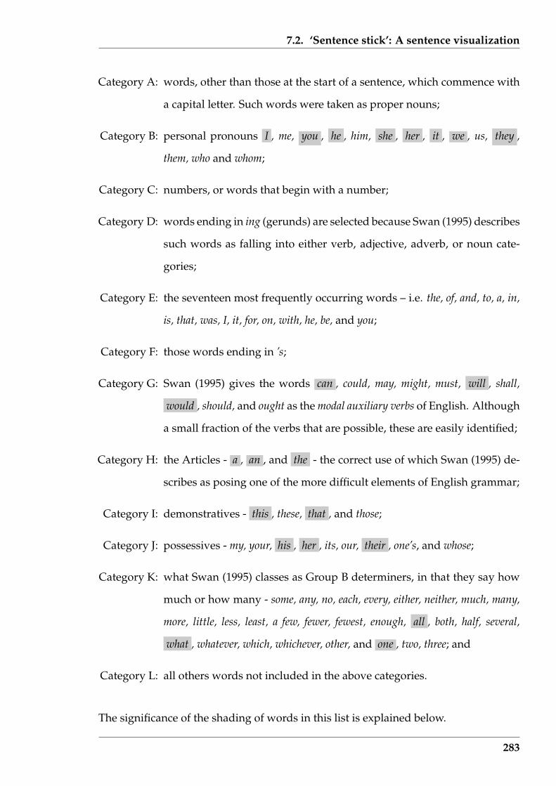
7.2. ‘Sentence stick’: A sentence visualization
Category A: words, other than those at the start of a sentence, which commence with
a capital letter. Such words were taken as proper nouns;
Category B: personal pronouns I , me, you , he , him, she , her , it , we , us, they ,
them, who and whom;
Category C: numbers, or words that begin with a number;
Category D: words ending in ing (gerunds) are selected because Swan (1995) describes
such words as falling into either verb, adjective, adverb, or noun cate-
gories;
Category E: the seventeen most frequently occurring words – i.e. the, of, and, to, a, in,
is, that, was, I, it, for, on, with, he, be, and you;
Category F: those words ending in ’s;
Category G: Swan (1995) gives the words can , could, may, might, must, will , shall,
would , should, and ought as the modal auxiliary verbs of English. Although
a small fraction of the verbs that are possible, these are easily identified;
Category H: the Articles - a , an , and the - the correct use of which Swan (1995) de-
scribes as posing one of the more difficult elements of English grammar;
Category I: demonstratives - this , these, that , and those;
Category J: possessives - my, your, his , her , its, our, their , one’s, and whose;
Category K: what Swan (1995) classes as Group B determiners, in that they say how
much or how many - some, any, no, each, every, either, neither, much, many,
more, little, less, least, a few, fewer, fewest, enough, all , both, half, several,
what , whatever, which, whichever, other, and one , two, three; and
Category L: all others words not included in the above categories.
The significance of the shading of words in this list is explained below.
283
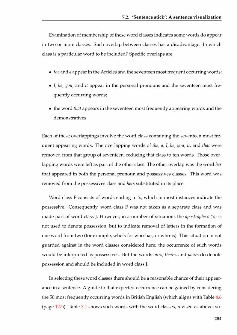
7.2. ‘Sentence stick’: A sentence visualization
Examination of membership of these word classes indicates some words do appear
in two or more classes. Such overlap between classes has a disadvantage: In which
class is a particular word to be included? Specific overlaps are:
• the and a appear in the Articles and the seventeen most frequent occurring words;
• I, he, you, and it appear in the personal pronouns and the seventeen most fre-
quently occurring words;
• the word that appears in the seventeen most frequently appearing words and the
demonstratives
Each of these overlappings involve the word class containing the seventeen most fre-
quent appearing words. The overlapping words of the, a, I, he, you, it, and that were
removed from that group of seventeen, reducing that class to ten words. Those over-
lapping words were left as part of the other class. The other overlap was the word her
that appeared in both the personal pronoun and possessives classes. This word was
removed from the possessives class and hers substituted in its place.
Word class F consists of words ending in ’s, which in most instances indicate the
possessive. Consequently, word class F was not taken as a separate class and was
made part of word class J. However, in a number of situations the apostrophe s (’s) is
not used to denote possession, but to indicate removal of letters in the formation of
one word from two (for example, who’s for who-has, or who-is). This situation in not
guarded against in the word classes considered here; the occurrence of such words
would be interpreted as possessives. But the words ours, theirs, and yours do denote
possession and should be included in word class J.
In selecting these word classes there should be a reasonable chance of their appear-
ance in a sentence. A guide to that expected occurrence can be gained by considering
the 50 most frequently occurring words in British English (which aligns with Table 4.6
(page 127)). Table 7.1 shows such words with the word classes, revised as above, su-
284
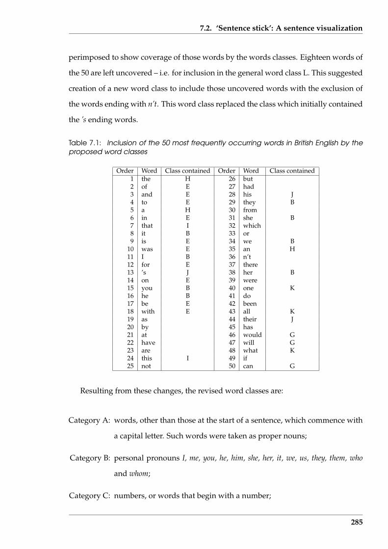
7.2. ‘Sentence stick’: A sentence visualization
perimposed to show coverage of those words by the words classes. Eighteen words of
the 50 are left uncovered – i.e. for inclusion in the general word class L. This suggested
creation of a new word class to include those uncovered words with the exclusion of
the words ending with n’t. This word class replaced the class which initially contained
the ’s ending words.
Table 7.1: Inclusion of the 50 most frequently occurring words in British English by theproposed word classes
Order Word Class contained Order Word Class contained1 the H 26 but2 of E 27 had3 and E 28 his J4 to E 29 they B5 a H 30 from6 in E 31 she B7 that I 32 which8 it B 33 or9 is E 34 we B
10 was E 35 an H11 I B 36 n’t12 for E 37 there13 ’s J 38 her B14 on E 39 were15 you B 40 one K16 he B 41 do17 be E 42 been18 with E 43 all K19 as 44 their J20 by 45 has21 at 46 would G22 have 47 will G23 are 48 what K24 this I 49 if25 not 50 can G
Resulting from these changes, the revised word classes are:
Category A: words, other than those at the start of a sentence, which commence with
a capital letter. Such words were taken as proper nouns;
Category B: personal pronouns I, me, you, he, him, she, her, it, we, us, they, them, who
and whom;
Category C: numbers, or words that begin with a number;
285
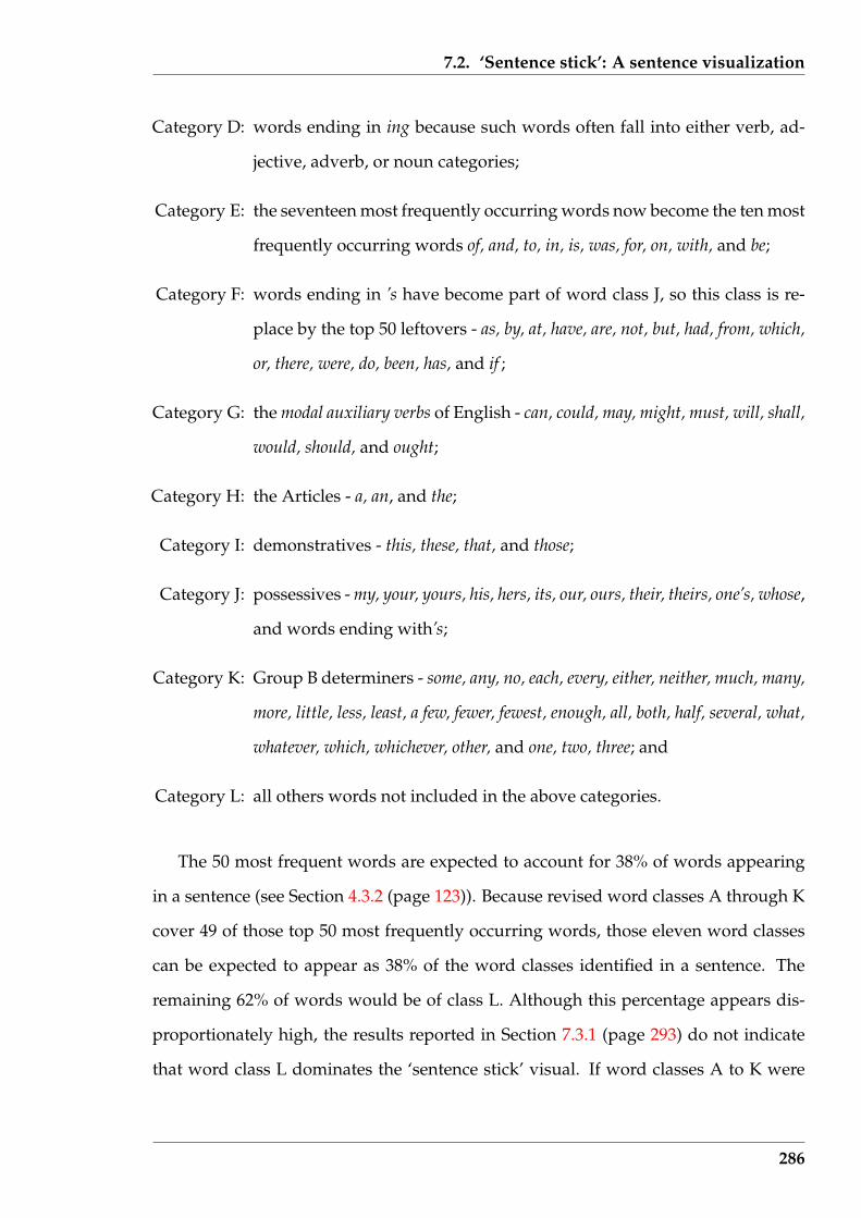
7.2. ‘Sentence stick’: A sentence visualization
Category D: words ending in ing because such words often fall into either verb, ad-
jective, adverb, or noun categories;
Category E: the seventeen most frequently occurring words now become the ten most
frequently occurring words of, and, to, in, is, was, for, on, with, and be;
Category F: words ending in ’s have become part of word class J, so this class is re-
place by the top 50 leftovers - as, by, at, have, are, not, but, had, from, which,
or, there, were, do, been, has, and if ;
Category G: the modal auxiliary verbs of English - can, could, may, might, must, will, shall,
would, should, and ought;
Category H: the Articles - a, an, and the;
Category I: demonstratives - this, these, that, and those;
Category J: possessives - my, your, yours, his, hers, its, our, ours, their, theirs, one’s, whose,
and words ending with’s;
Category K: Group B determiners - some, any, no, each, every, either, neither, much, many,
more, little, less, least, a few, fewer, fewest, enough, all, both, half, several, what,
whatever, which, whichever, other, and one, two, three; and
Category L: all others words not included in the above categories.
The 50 most frequent words are expected to account for 38% of words appearing
in a sentence (see Section 4.3.2 (page 123)). Because revised word classes A through K
cover 49 of those top 50 most frequently occurring words, those eleven word classes
can be expected to appear as 38% of the word classes identified in a sentence. The
remaining 62% of words would be of class L. Although this percentage appears dis-
proportionately high, the results reported in Section 7.3.1 (page 293) do not indicate
that word class L dominates the ‘sentence stick’ visual. If word classes A to K were
286
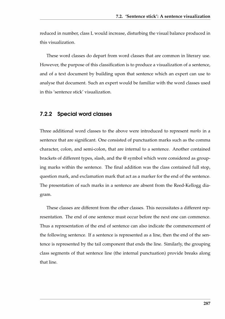
7.2. ‘Sentence stick’: A sentence visualization
reduced in number, class L would increase, disturbing the visual balance produced in
this visualization.
These word classes do depart from word classes that are common in literary use.
However, the purpose of this classification is to produce a visualization of a sentence,
and of a text document by building upon that sentence which an expert can use to
analyse that document. Such an expert would be familiar with the word classes used
in this ‘sentence stick’ visualization.
7.2.2 Special word classes
Three additional word classes to the above were introduced to represent marks in a
sentence that are significant. One consisted of punctuation marks such as the comma
character, colon, and semi-colon, that are internal to a sentence. Another contained
brackets of different types, slash, and the @ symbol which were considered as group-
ing marks within the sentence. The final addition was the class contained full stop,
question mark, and exclamation mark that act as a marker for the end of the sentence.
The presentation of such marks in a sentence are absent from the Reed-Kellogg dia-
gram.
These classes are different from the other classes. This necessitates a different rep-
resentation. The end of one sentence must occur before the next one can commence.
Thus a representation of the end of sentence can also indicate the commencement of
the following sentence. If a sentence is represented as a line, then the end of the sen-
tence is represented by the tail component that ends the line. Similarly, the grouping
class segments of that sentence line (the internal punctuation) provide breaks along
that line.
287
7.2. ‘Sentence stick’: A sentence visualization
7.2.3 Representation of the word classes
Figure 7.4 is an octagon of connected and directed line segments that was use to rep-
resent word classes. A regular eight sided figure was selected as a compromise. Eight
equally spaced directions on a page can be readily discriminated by eye. Those direc-
tions are to represent fourteen word classes were proposed in the previous Sections
(twelve word categories A to L, plus internal punctuation, plus grouping markers, but
not the end of sentence markers). Less than eight sides is too few. More sides than
eight become too complex. If eight directions are used, then some directions will need
to have multiple word class assignments. Such multiple assignments present an im-
plementation issue. This difficulty was overcome by the use of colour, as described
below, in the implementation.
L
X
Y
AB
C
D
E
F G
HI
J K
1
2
3
4
5
6
7
8
Figure 7.4: The Octagon of directions and their corresponding word classes
The path representing the structure of a sentence, and in turn a text document,
is formed by adding head to tail the line segment which represents successive word
classes identified in that sentence. Figure 7.4 shows each side of the octagon identified
by a numeral contained in a circle. Also shown is the allocation of word classes to the
288
7.2. ‘Sentence stick’: A sentence visualization
available directions. Each side of the octagon is a ‘vector’ which has a positive, nega-
tive, or zero x and y increment determined by the defined location of the x and y axes.
Such increments are associated with word classes by assigning those word classes to
positions on the sides of the octagon. Thus for a given sentence, the allocation of the
position of word classes on this base octagon influences the shape and position of the
end point of the path traced out to represent that sentence. The length of each side of
this octagon are equal.
A colour is also used with each word class. Because this colour has a different
purpose than that of Chapter 5, different techniques for selection were necessary. By
representing the words in a sentence as connected coloured ‘sticks’ having their ori-
entation, as well as their colour, determined by that category gives rise to a shape for
the sentence. It is that shape that is used to visually characterise the sentence.
7.2.4 Implementation
With the twelve word classes (A to L) and the three additional classes representing the
marks (internal punctuation, grouping marks, and end of sentence), a total of fifteen
different entities were available for visualization.
The algorithm for producing the ‘sentence stick’ visualization used the definition
given in Section 4.1.3 (page 102) as what composed a word. That definition was used in
all the ‘Serine’ software components. In this definition, a word was as general grouping
of one or more characters from the text document file. Such a word could be made
up of a space character, a punctuation mark, a collection of alphabetic characters, a
collection of numerals, etc. All decisions about the characteristics of the document
were based on the individual words isolated by this process. The algorithm is:
289
7.2. ‘Sentence stick’: A sentence visualization
repeatbreak sentence into its word components;for each word in sentence
for all word classesif word = wordclass
begindraw line representing that class;break from inner for-loop;
endend fordraw sentence end indicator;
end foruntil end of document
In this algorithm, word classes were implemented as functions that were called
with the word being tested passed as a parameter. If the function returned a posi-
tive match, then the action corresponding to that word class was implemented and
all remaining comparisons were aborted. To make this process as efficient as possible,
the functions were called in order of the most probable to return a match, to the least
probable. Thus the function to detect a sentence terminator was called after the func-
tion that determined whether the word was a space character. Functions for detecting
possessives and determiners were called last, since they were the least likely to return
a positive result of any given word.
Although the directions shown in Figure 7.4 form a closed figure, each side of that
octagon represents a direction of a line segment. Associated with each line segment is
one or two word classes. The direction to follow in the stick diagram representing a
sentence is determined by the word class of the next word of the sentence. The direc-
tion of that line segment is determined by the assignment of direction to word class
contained in Figure 7.4. That assignment determines the shape of the resulting rep-
resentation of a sentence and is a tuning process in achieving an acceptable pictorial
result. The degree of closure that is achieved with a sentence is determined by the
word class direction assignment made through such a diagram.
In an attempt to give the occurrence of the special word classes (those representing
290
7.2. ‘Sentence stick’: A sentence visualization
punctuation marks, grouping marks, and sentence termination marks) greater promi-
nence, they were implemented as a circle filled with colour. The assignment of such
colour followed from the process used with the other word classes.
Directions and colours needed to be assigned to twelve of the word classes, and
colours to the remaining three special word classes. With only eight directions avail-
able using an octagon representation, some classes needed to be assigned to the same
direction. This was done so as to even out the occurrence of such directed line seg-
ments in the resultant diagram for a calibration sentence. Although classes may share
a direction, each was to be coloured uniquely.
The allocation of colour presented a more challenging problem. As MacDonald
(1999) note, a seven nominal colour code leads to an easily discerned diagram, but
increasing that to eleven results in loosing some of its effectiveness. Going to 14 as
needed here, is more difficult. But again from MacDonald (1999), bright colours on
a dark background are dramatic and eye catching. A black background was used for
the screen generated by the software. The required total colours were divided into
two halves; one half would be full intensity colours, and the other half paler colours.
In the ‘Serine’ software an option for generating a Postscript version of the stick
model produced on the screen was provided. This Postscript was generated from
the same data as the on-screen presentation, but used different code. The differences
between those versions were cosmetic and included:
• filled coloured circles denoting word classes M, N, and O in the on-screen ver-
sion was replaced by open circles in the Postscript version;
• the vertical bar and filled circle denoting the end of sentence was shown white
on-screen and black in the Postscript version; and
• the on-screen version used a black background.
The Postscript versions are used in this report. The colours assigned to the word
291
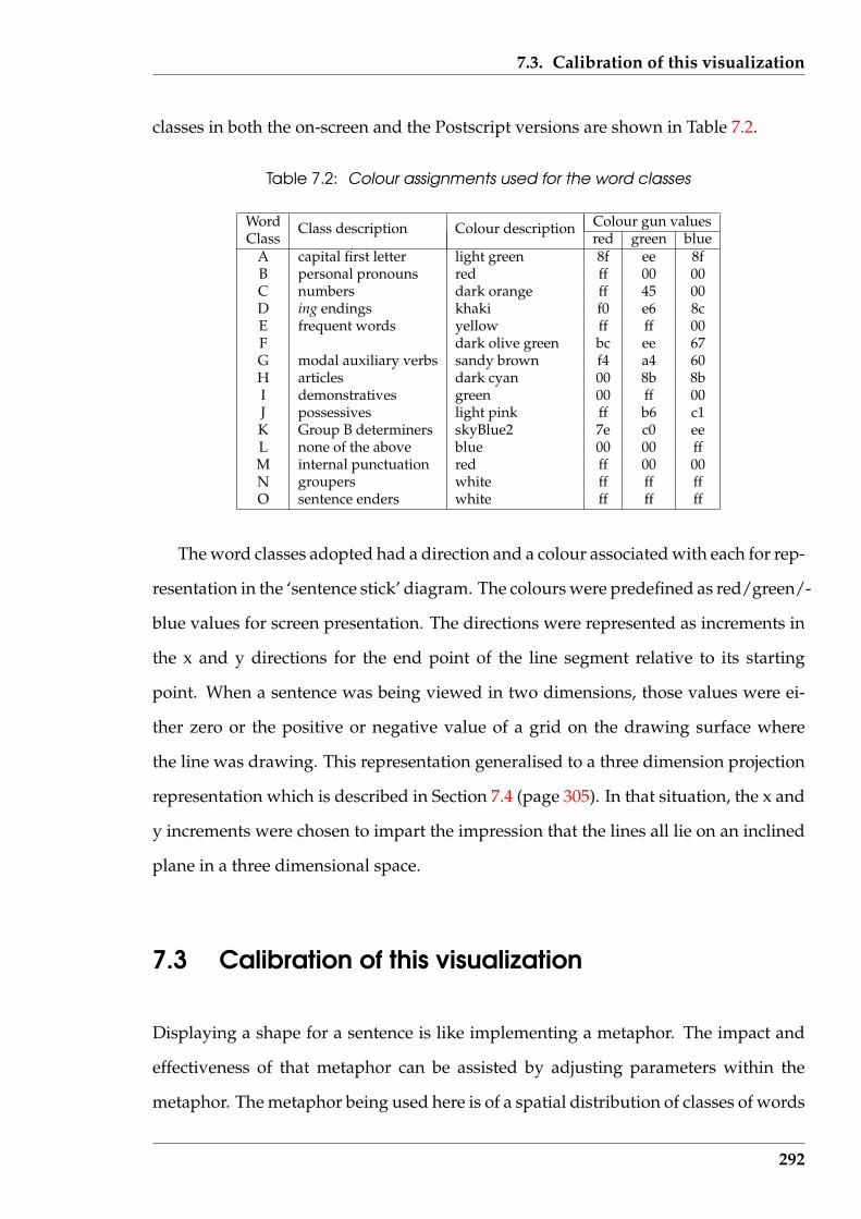
7.3. Calibration of this visualization
classes in both the on-screen and the Postscript versions are shown in Table 7.2.
Table 7.2: Colour assignments used for the word classes
Word Colour gun valuesClass
Class description Colour descriptionred green blue
A capital first letter light green 8f ee 8fB personal pronouns red ff 00 00C numbers dark orange ff 45 00D ing endings khaki f0 e6 8cE frequent words yellow ff ff 00F dark olive green bc ee 67G modal auxiliary verbs sandy brown f4 a4 60H articles dark cyan 00 8b 8bI demonstratives green 00 ff 00J possessives light pink ff b6 c1K Group B determiners skyBlue2 7e c0 eeL none of the above blue 00 00 ffM internal punctuation red ff 00 00N groupers white ff ff ffO sentence enders white ff ff ff
The word classes adopted had a direction and a colour associated with each for rep-
resentation in the ‘sentence stick’ diagram. The colours were predefined as red/green/-
blue values for screen presentation. The directions were represented as increments in
the x and y directions for the end point of the line segment relative to its starting
point. When a sentence was being viewed in two dimensions, those values were ei-
ther zero or the positive or negative value of a grid on the drawing surface where
the line was drawing. This representation generalised to a three dimension projection
representation which is described in Section 7.4 (page 305). In that situation, the x and
y increments were chosen to impart the impression that the lines all lie on an inclined
plane in a three dimensional space.
7.3 Calibration of this visualization
Displaying a shape for a sentence is like implementing a metaphor. The impact and
effectiveness of that metaphor can be assisted by adjusting parameters within the
metaphor. The metaphor being used here is of a spatial distribution of classes of words
292
7.3. Calibration of this visualization
within a sentence presented as a visualization.
Unlike physical structures where sub-elements have defined orientations and po-
sitions, the spatial relationship of the word classes in a sentence do not have a natural
angular alignment that is to be preserved in the visualization. An angular disposition
of word classes could be introduced into the visualization if appropriate. A freedom
is available for the selection of the form that shape assumes. But form must satisfy the
constraint that adjacent words in the sentence must be represented by adjacent word
classes in the model and its visualization. The visualization should readily assist the
detection of functional word classes and their groupings.
The sticks (or line segments) of the proposed model represent the word classes
identified in the sentence. These sticks join together to represent the classes contained
within that sentence. Colour and orientation of these sticks are variables available for
selection to achieve a useful visualization. An experimental process was used to make
that selection. In that process the resulting formation for a sentence was required to
enable multiple sentences to be assembled, as they appear in a text document, but yet
have each sentence individually comprehensible.
7.3.1 Sentences used in this tuning
Table 7.3 is a collection of 18 sentences taken from a variety of publications rang-
ing from literature, through government publications, to popular press. They act
as the tuning set for the assignment of directions for the word classes being consid-
ered. All 15 proposed word classes appear multiple times across these sentences: 12
word classes proper, and three word classes representing punctuation and grouping
marks. This sample gives an indication of the relative occurrence rate of the different
word classes, disregarding the more specialised classes such as C, D, M, N, and O. Ex-
perience with the set during the experimentation showed that opposing behaviours,
which would be expected to appear across a broad selection of sentences, did appear
293
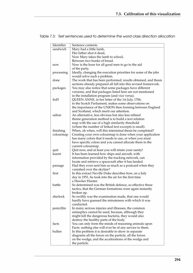
7.3. Calibration of this visualization
Table 7.3: Test sentences used to determine the word class direction allocation
Identifier Sentence contentssandwich Mary had a little lamb,
Her father shot it dead,Now Mary takes the lamb to school,Between two hunks of bread.
now Now is the hour for all good men to go to the aidof the party.
processing Ideally, changing the execution priorities for some of the jobswould solve such a problem.
done The work that has been performed, results obtained, and thesissections already prepared all fall into this revised framework.
packages You may also notice that some packages have differentversions, and that packages listed here are not mentionedin the installation program (and vice versa).
fed5 QUEEN ANNE, in her letter of the 1st July, 1706,to the Scotch Parliament, makes some observations onthe importance of the UNION then forming between Englandand Scotland, which merit our attention.
salton An alternative, less obvious but also less refinedtheme generation method is to build a text relationmap with the use of a high similarity threshold(where the number of linked text excerpts is small).
finishing When, oh when, will this interminal thesis be completed?colourmap Creating your own colourmap is done when your application
has many colors that it needs to use, or when you musthave specific colors and you cannot allocate them in thecurrent colourmap.
quit Quit now, and at least you will retain your sanity!learnt It has been learned how ships and aircraft, with
information provided by the tracking network, canlocate and retrieve a spacecraft after it has landed.
passage Had they even sent him as much as a postcard when theyvanished over the skyline?
first In this extract Neville Duke describes how, on a Julyday in 1951, he took into the air for the first timea Hawker Hunter.
battle So determined was the British defence, so effective thesetactics, that the German formations were again instantlybroken up.
sherlock So swiftly was the examination made, that one wouldhardly have guessed the minuteness with which it wasconducted.
penicillin In many serious injuries and illnesses, the commonantiseptics cannot be used, because, although theymight kill the dangerous bacteria, they would alsodestroy the healthy parts of the body.
facts You can only form the minds of reasoning animals uponFacts: nothing else will ever be of any service to them.
bullen In this problem it is desirable to show in separatediagrams all the forces on the particle, all the forceson the wedge, and the accelerations of the wedge andthe particle.
294

7.3. Calibration of this visualization
in this set.
The tuning process was performed by assigning directions to each word class, em-
bedding those choices in the ‘Serine’ software introduced in Section 1.4, and then ob-
serving the result obtained for the test sentences of Table 7.3.
7.3.2 Occurrences of the word classes
Table 7.4 (page 296) shows word class sequences and counts for each of the word
classes A to L that appear in the sentences of Table 7.3. Notice that the special word
classes M (internal punctuation), N (group markers), and O (sentence terminators)
appear in those sequences but are not subsequently in the words counted as they made
no sense in that context. Under the Size column is the count of word classes A to L
present in each sentence. This is used as an indicator of size of the sentence. Both the
counts of word classes present, their nature, and sequence influence the selection of
direction allocations for the word classes in drawing the stick diagrams.
From Table 7.4, the dominance of word classes L, E, and H is apparent. These
classes account for 49.1%, 13.6%, and 10.4%, respectively, of all words in the eigh-
teen sentences considered. Thus class L accounts for approximately half of all classes
present. Classes L, E and H together accounted from approximately three quarters
of the words present in the sample set of sentences. The remaining one quarter of the
words fall into the remaining nine word classes. It is those remaining word classes that
in the sentence stick visual separate the positions for the L, E, and H words classes in
a sentence. If those nine classes were reduced in number, such separation would be
compromised, aside from reducing the detail. Alternately, if those nine word classes
were increased in number by creating new classes, there members which here fall into
word class L, might decrease that separation. However, they would also increase the
information contained in the visualization, which is already reasonably high.
295
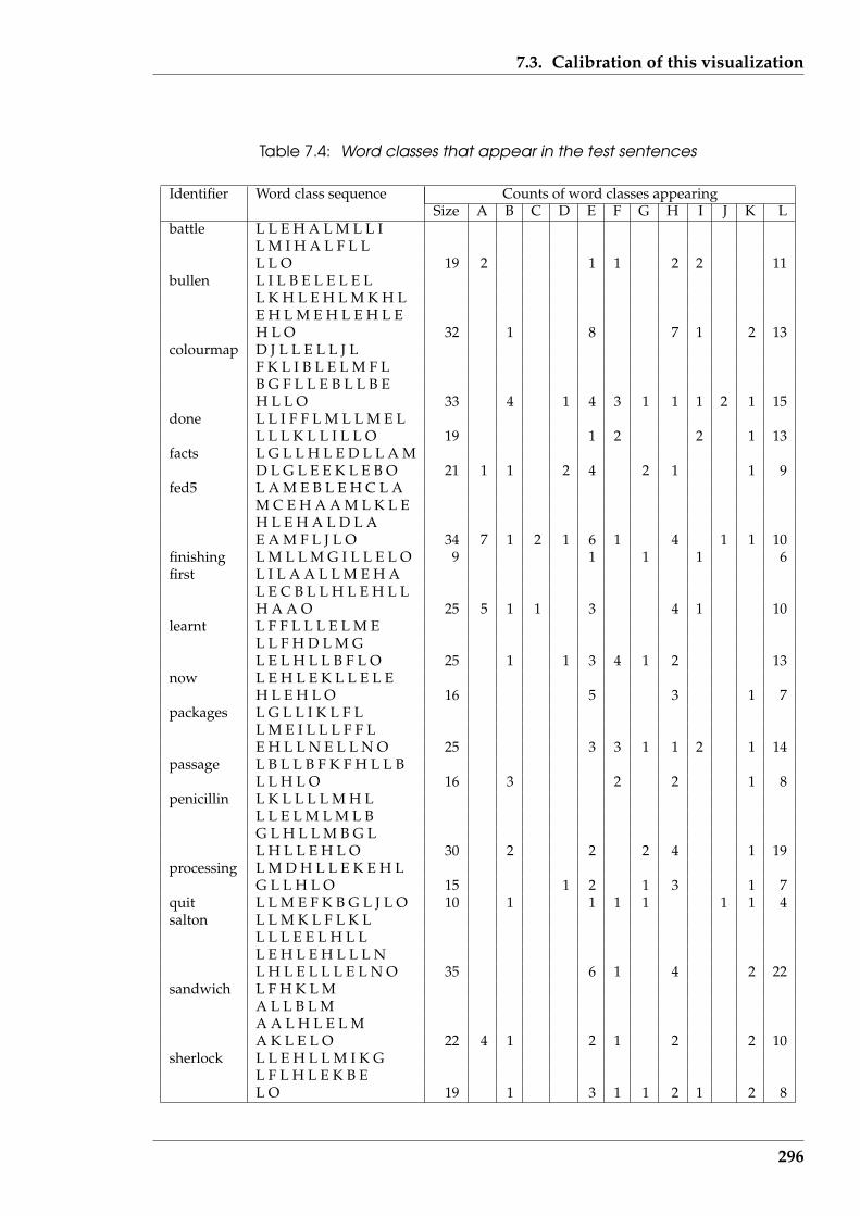
7.3. Calibration of this visualization
Table 7.4: Word classes that appear in the test sentences
Identifier Word class sequence Counts of word classes appearingSize A B C D E F G H I J K L
battle L L E H A L M L L IL M I H A L F L LL L O 19 2 1 1 2 2 11
bullen L I L B E L E L E LL K H L E H L M K H LE H L M E H L E H L EH L O 32 1 8 7 1 2 13
colourmap D J L L E L L J LF K L I B L E L M F LB G F L L E B L L B EH L L O 33 4 1 4 3 1 1 1 2 1 15
done L L I F F L M L L M E LL L L K L L I L L O 19 1 2 2 1 13
facts L G L L H L E D L L A MD L G L E E K L E B O 21 1 1 2 4 2 1 1 9
fed5 L A M E B L E H C L AM C E H A A M L K L EH L E H A L D L AE A M F L J L O 34 7 1 2 1 6 1 4 1 1 10
finishing L M L L M G I L L E L O 9 1 1 1 6first L I L A A L L M E H A
L E C B L L H L E H L LH A A O 25 5 1 1 3 4 1 10
learnt L F F L L L E L M EL L F H D L M GL E L H L L B F L O 25 1 1 3 4 1 2 13
now L E H L E K L L E L EH L E H L O 16 5 3 1 7
packages L G L L I K L F LL M E I L L L F F LE H L L N E L L N O 25 3 3 1 1 2 1 14
passage L B L L B F K F H L L BL L H L O 16 3 2 2 1 8
penicillin L K L L L L M H LL L E L M L M L BG L H L L M B G LL H L L E H L O 30 2 2 2 4 1 19
processing L M D H L L E K E H LG L L H L O 15 1 2 1 3 1 7
quit L L M E F K B G L J L O 10 1 1 1 1 1 1 4salton L L M K L F L K L
L L L E E L H L LL E H L E H L L L NL H L E L L L E L N O 35 6 1 4 2 22
sandwich L F H K L MA L L B L MA A L H L E L MA K L E L O 22 4 1 2 1 2 2 10
sherlock L L E H L L M I K GL F L H L E K B EL O 19 1 3 1 1 2 1 2 8
296
7.3. Calibration of this visualization
Data in Table 7.4 was used to tune the sentence stick visualization. It was assumed
that set was representative of the sequence order of the word classes across a broad
range of English sentences. Thus tuning via this set would be applicable to wider
sentence usage. The specific issues from Table 7.4 are:
1. word class L is the most common;
2. the sequence LE is the most common two class sequence. This in no surprise
as word classes L and E contain all the words not otherwise allocated to a word
class, and the eleven most frequently occurring words, respectively;
3. the word class sequences EH and EL occur at approximately the same frequency,
which is half that of LE, but are the next most common word class occurrence
sequences observed;
4. the three word class sequence LEH had an occurrence rate approximately that of
the two word class sequences EH and EL;
5. the sentence identified as now contained the least number of word classes, being
L, E, H, and K;
6. sentences salton contained the same word classes as sentence now but also added
word class F, but the occurrence of L, E, and H were of a greater frequency in
salton;
7. the 18 sentences contain from 4 word classes in sentences now and finishing through
5, 6, 7, and 8 to sentences colourmap and fed5 which contain 10;
8. large counts of word class occurrence in a sentence do not necessarily imply large
numbers of different word classes. For example, the sentences colourmap and
fed5 contain high word class counts and 10 different word classes being present,
while salton contains 5 different word classes but a similar number of total counts
to those other two sentences.
297
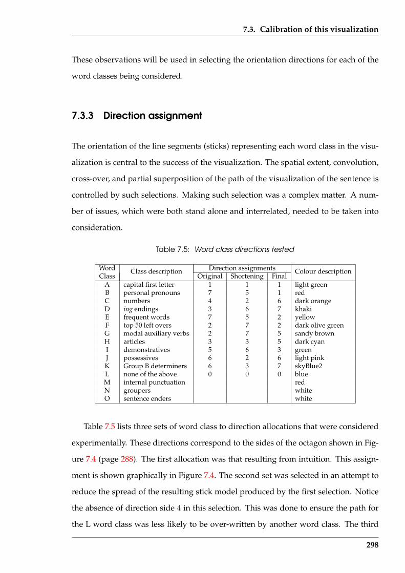
7.3. Calibration of this visualization
These observations will be used in selecting the orientation directions for each of the
word classes being considered.
7.3.3 Direction assignment
The orientation of the line segments (sticks) representing each word class in the visu-
alization is central to the success of the visualization. The spatial extent, convolution,
cross-over, and partial superposition of the path of the visualization of the sentence is
controlled by such selections. Making such selection was a complex matter. A num-
ber of issues, which were both stand alone and interrelated, needed to be taken into
consideration.
Table 7.5: Word class directions tested
Word Direction assignmentsClass
Class descriptionOriginal Shortening Final
Colour description
A capital first letter 1 1 1 light greenB personal pronouns 7 5 1 redC numbers 4 2 6 dark orangeD ing endings 3 6 7 khakiE frequent words 7 5 2 yellowF top 50 left overs 2 7 2 dark olive greenG modal auxiliary verbs 2 7 5 sandy brownH articles 3 3 5 dark cyanI demonstratives 5 6 3 greenJ possessives 6 2 6 light pinkK Group B determiners 6 3 7 skyBlue2L none of the above 0 0 0 blueM internal punctuation redN groupers whiteO sentence enders white
Table 7.5 lists three sets of word class to direction allocations that were considered
experimentally. These directions correspond to the sides of the octagon shown in Fig-
ure 7.4 (page 288). The first allocation was that resulting from intuition. This assign-
ment is shown graphically in Figure 7.4. The second set was selected in an attempt to
reduce the spread of the resulting stick model produced by the first selection. Notice
the absence of direction side 4 in this selection. This was done to ensure the path for
the L word class was less likely to be over-written by another word class. The third
298

7.3. Calibration of this visualization
set was the final allocation which produced a acceptable spread of the stick model
without excessive overlapping of the path in the sentence model progression. This
could only be achieved for most of the test sentences, not all, because of the variation
in characteristics embedded in each sentence. Word classes M, N, and O are shown in
Table 7.5 with blank direction assignments due to their representation as circles, not
sticks. The remainder of this Section gives the detail associated with these direction
allocations.
From the perspective of assigning directions to classes, the frequency of appear-
ance of the classes and their sequence of appearance are significant. Table 7.4 (page
296) gives the occurrence sequence of the word classes in the test sentences. Examina-
tion of those sequences indicates the dominate classes in each sentence are in line with
the overall behaviour observed. The sequencing and clustering of those word classes
is also available. Allocation of directions to classes with higher presence naturally in-
fluences the spread of the ‘sentence stick’ model. As each word class in the sentence is
processed, its assigned direction results in incrementing the x and y direction spread
for the whole sentence. These aggregate to give the coordinates of the end point of the
sentence (given the start point). Taking the directions from the column headed Orig-
inal in Table 7.5 and using a common unit increment of 20 units (pixel for on-screen
and points for Postscript), the form and resulting end point for each of the eighteen
test sentences was obtained. The left-hand column of Figure 7.5 shows the six (for sen-
tences tiled battle, bullen, colourmap, fed5, processing, and salton in Tables 7.3 (page
294) & Tables 7.4 (page 296)) most significant results obtained. All line drawings are
to the same scale.
A number of factors influence the horizontal and vertical space occupied by the
‘sentence stick’ for each sentence. The end point, easily calculated, gave an indication
of the spread and appearance of the diagram. A large spread was accompanied by
an elongated diagram while too small a spread resulted in folding of the path and
crossing of the sticks in the diagram. What was too large or too small was not quan-
299
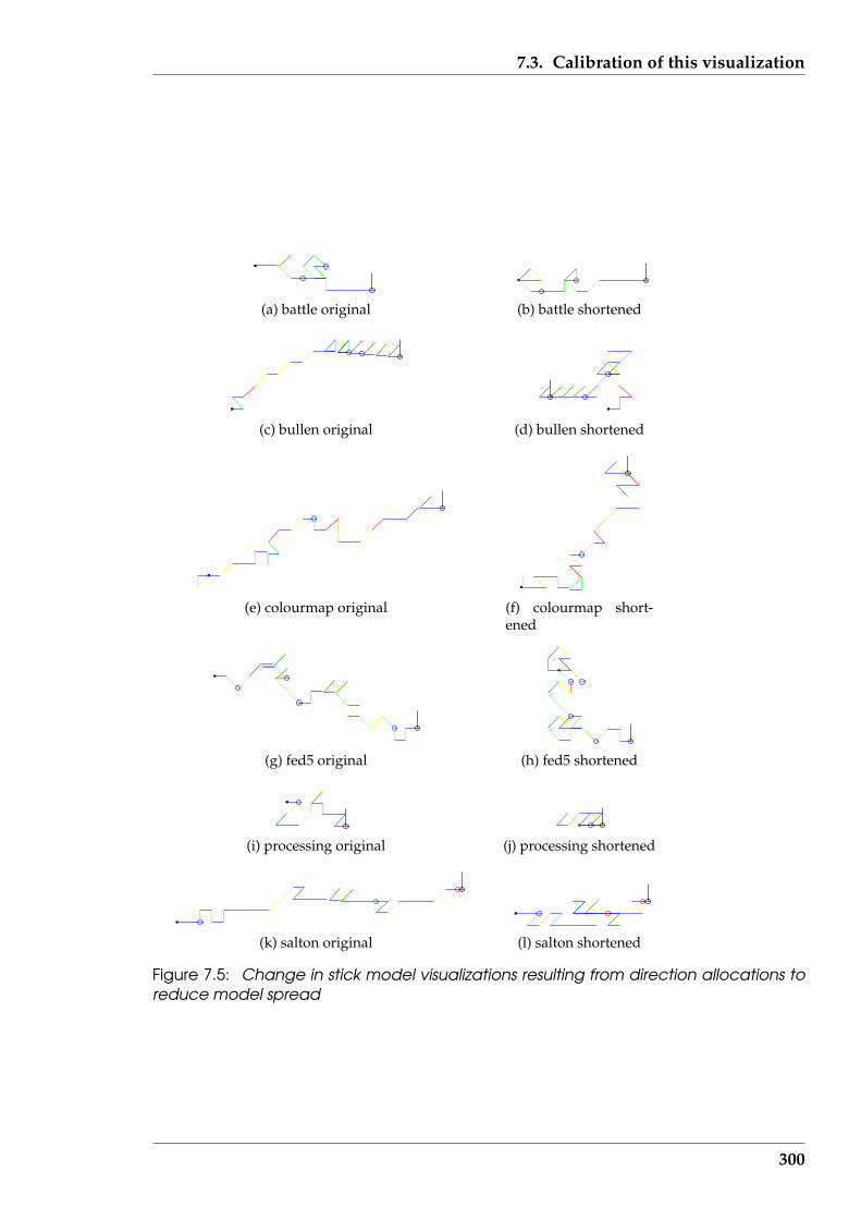
7.3. Calibration of this visualization
(a) battle original (b) battle shortened
(c) bullen original (d) bullen shortened
(e) colourmap original (f) colourmap short-ened
(g) fed5 original (h) fed5 shortened
(i) processing original (j) processing shortened
(k) salton original (l) salton shortened
Figure 7.5: Change in stick model visualizations resulting from direction allocations toreduce model spread
300
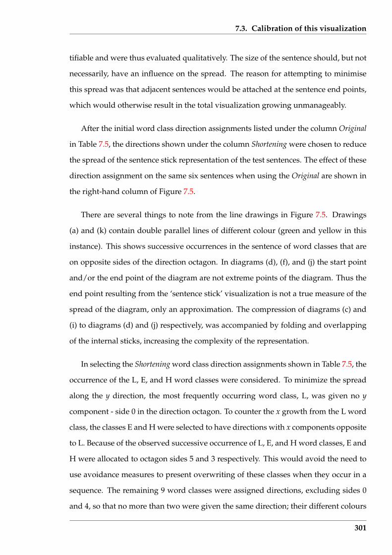
7.3. Calibration of this visualization
tifiable and were thus evaluated qualitatively. The size of the sentence should, but not
necessarily, have an influence on the spread. The reason for attempting to minimise
this spread was that adjacent sentences would be attached at the sentence end points,
which would otherwise result in the total visualization growing unmanageably.
After the initial word class direction assignments listed under the column Original
in Table 7.5, the directions shown under the column Shortening were chosen to reduce
the spread of the sentence stick representation of the test sentences. The effect of these
direction assignment on the same six sentences when using the Original are shown in
the right-hand column of Figure 7.5.
There are several things to note from the line drawings in Figure 7.5. Drawings
(a) and (k) contain double parallel lines of different colour (green and yellow in this
instance). This shows successive occurrences in the sentence of word classes that are
on opposite sides of the direction octagon. In diagrams (d), (f), and (j) the start point
and/or the end point of the diagram are not extreme points of the diagram. Thus the
end point resulting from the ‘sentence stick’ visualization is not a true measure of the
spread of the diagram, only an approximation. The compression of diagrams (c) and
(i) to diagrams (d) and (j) respectively, was accompanied by folding and overlapping
of the internal sticks, increasing the complexity of the representation.
In selecting the Shortening word class direction assignments shown in Table 7.5, the
occurrence of the L, E, and H word classes were considered. To minimize the spread
along the y direction, the most frequently occurring word class, L, was given no y
component - side 0 in the direction octagon. To counter the x growth from the L word
class, the classes E and H were selected to have directions with x components opposite
to L. Because of the observed successive occurrence of L, E, and H word classes, E and
H were allocated to octagon sides 5 and 3 respectively. This would avoid the need to
use avoidance measures to present overwriting of these classes when they occur in a
sequence. The remaining 9 word classes were assigned directions, excluding sides 0
and 4, so that no more than two were given the same direction; their different colours
301
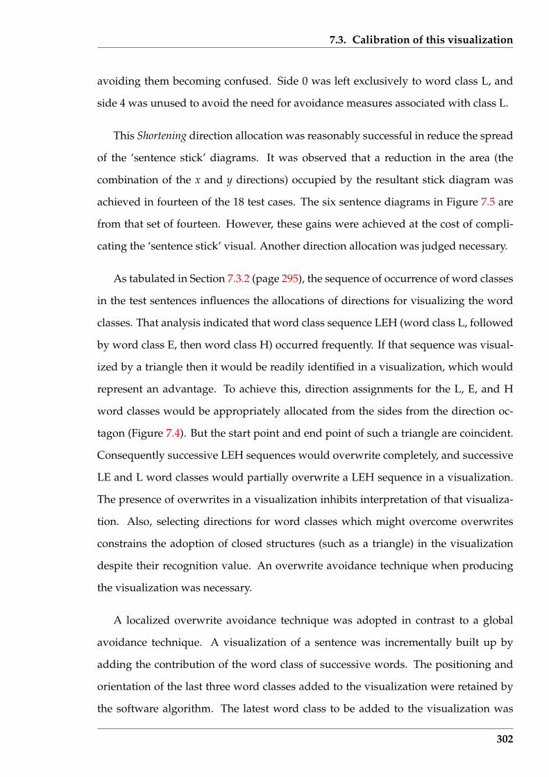
7.3. Calibration of this visualization
avoiding them becoming confused. Side 0 was left exclusively to word class L, and
side 4 was unused to avoid the need for avoidance measures associated with class L.
This Shortening direction allocation was reasonably successful in reduce the spread
of the ‘sentence stick’ diagrams. It was observed that a reduction in the area (the
combination of the x and y directions) occupied by the resultant stick diagram was
achieved in fourteen of the 18 test cases. The six sentence diagrams in Figure 7.5 are
from that set of fourteen. However, these gains were achieved at the cost of compli-
cating the ‘sentence stick’ visual. Another direction allocation was judged necessary.
As tabulated in Section 7.3.2 (page 295), the sequence of occurrence of word classes
in the test sentences influences the allocations of directions for visualizing the word
classes. That analysis indicated that word class sequence LEH (word class L, followed
by word class E, then word class H) occurred frequently. If that sequence was visual-
ized by a triangle then it would be readily identified in a visualization, which would
represent an advantage. To achieve this, direction assignments for the L, E, and H
word classes would be appropriately allocated from the sides from the direction oc-
tagon (Figure 7.4). But the start point and end point of such a triangle are coincident.
Consequently successive LEH sequences would overwrite completely, and successive
LE and L word classes would partially overwrite a LEH sequence in a visualization.
The presence of overwrites in a visualization inhibits interpretation of that visualiza-
tion. Also, selecting directions for word classes which might overcome overwrites
constrains the adoption of closed structures (such as a triangle) in the visualization
despite their recognition value. An overwrite avoidance technique when producing
the visualization was necessary.
A localized overwrite avoidance technique was adopted in contrast to a global
avoidance technique. A visualization of a sentence was incrementally built up by
adding the contribution of the word class of successive words. The positioning and
orientation of the last three word classes added to the visualization were retained by
the software algorithm. The latest word class to be added to the visualization was
302

7.3. Calibration of this visualization
checked that it did not overwrite one from this list of three. If it did, the start point
of the line representing this new word class was offset from the point it would have
otherwise have used, thus locally avoiding overwriting. This approach worked well
with the sentence examples used in this research.
With overwrite avoidance available an incremental approach was followed in se-
lecting the word class direction assignments. Those assignments were done by consid-
ering the word class combinations which were met. The statistics of the test sentences
in Table 7.4 (page 296) were used. Each sentence was selected in turn such that it
introduced a minimum of new word classes into those that had been considered to
that point. Except for the first sentence selected, this process introduced a single new
word class for consideration. The sentence now was selected first since it contained
four different word classes (as does finishing) and three of those classes were L, E, and
H. Experimentation was used to arrive at direction allocations for these four word
classes that produced visually and functionally adequate diagrams. This process was
followed using the succession of sentences salton, done, packages, bullen, battle, quit,
learnt, and first, in that order. The remaining nine sentences were then used as checks
that the results obtained carried over to more sentences.
The word class direction assignments obtained via this process are shown under
the Final column of Table 7.5 (page 298) . For comparison of the results achieved by
the above process, a selection of visualizations for six of the sentences are show in
Figure 7.6 together with the corresponding visualizations using the original word class
direction assignments.
Locating the starting and end point of the paths in Figures 7.5 (page 300) and 7.6
can present difficulty. But their location is important for the interpretation of the vi-
sualization. To assist locating of the start a small square, filled with black colour, is
placed at the commencement of the sentence. At the end of the sentence, a small circle
filled with black colour in the screen version and unfilled in the Postscript (printable)
version was fixed to the end of the path. A black line was drawn vertical from the
303

7.3. Calibration of this visualization
(a) battle original (b) battle final
(c) bullen original (d) bullen final
(e) colourmap original (f) colourmap final
(g) fed5 original (h) fed5 final
(i) processing original (j) processing final
(k) salton original (l) salton final
Figure 7.6: Change in stick model visualizations resulting from word class directionallocations to minimize spread and diagram complexity
304
7.4. Extension for paragraph visualization
centre of that circle (in the printed version). This indication of the start and end of
sentences is discussed further in the next section where visualization of multiple sen-
tences is considered.
7.4 Extension for paragraph visualization
Generally a text document is composed of more than one paragraph and a paragraph
composed of more than one sentence. It is proposed that a visualization of a text doc-
ument be built from visualization of their component sentences using the techniques
of Section 7.2 (page 281). This Section considers how that is achieved.
7.4.1 Two approaches to visualizing sequential paragraphs
Since the paragraphs, and the sentences in them, are sequential within a text docu-
ment, a visualization, including the stick model visualization, should preserve that
situation. That sequential component in the text document was achieved by stacking
of the parts together. Two means of stacking sentence models were considered and
are reported here. One approach was to stack the sentences in their occurrence order
and provide an indication of the grouping of those sentences into paragraphs. The
other approach was to stack the paragraphs in their occurrence order and consider the
sentences as component parts of those paragraphs. In both cases, the visual stacking
was done vertically.
The first stacking technique was sentence centred. It arranged all the sentences
vertically, one above the other. In this, all sentences started with the same “x” coordi-
nate in the visualization. A vertical space separated one sentence from the next, with
a larger vertical space used to indicate a paragraph break. The resulting drawing was
tall and thin. The height was the consequence of the total number of sentences present
and their vertical space requirements. That vertical spacing had to be sufficient for
305
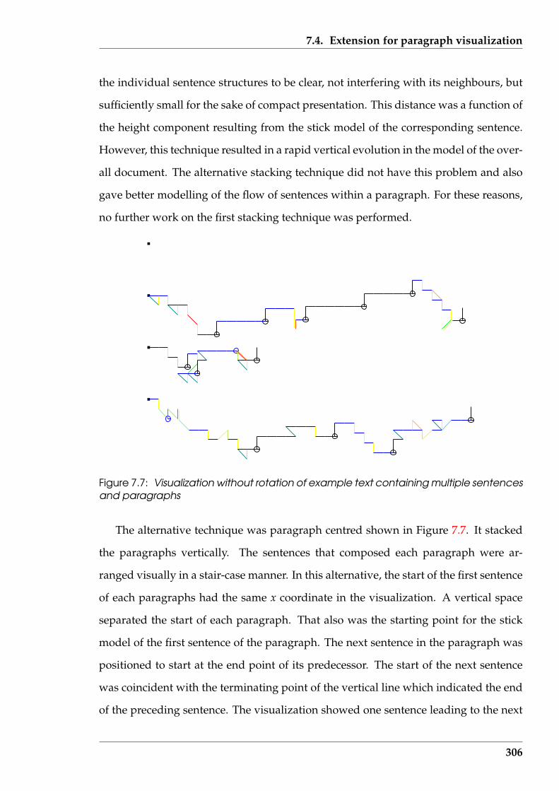
7.4. Extension for paragraph visualization
the individual sentence structures to be clear, not interfering with its neighbours, but
sufficiently small for the sake of compact presentation. This distance was a function of
the height component resulting from the stick model of the corresponding sentence.
However, this technique resulted in a rapid vertical evolution in the model of the over-
all document. The alternative stacking technique did not have this problem and also
gave better modelling of the flow of sentences within a paragraph. For these reasons,
no further work on the first stacking technique was performed.
Figure 7.7: Visualization without rotation of example text containing multiple sentencesand paragraphs
The alternative technique was paragraph centred shown in Figure 7.7. It stacked
the paragraphs vertically. The sentences that composed each paragraph were ar-
ranged visually in a stair-case manner. In this alternative, the start of the first sentence
of each paragraphs had the same x coordinate in the visualization. A vertical space
separated the start of each paragraph. That also was the starting point for the stick
model of the first sentence of the paragraph. The next sentence in the paragraph was
positioned to start at the end point of its predecessor. The start of the next sentence
was coincident with the terminating point of the vertical line which indicated the end
of the preceding sentence. The visualization showed one sentence leading to the next
306

7.4. Extension for paragraph visualization
in a progressive manner, with a jump to the start of the next paragraph.
One difficulty was visually locating the start of a leading sentence. All lead sen-
tences started with the same x screen coordinate. But the visualization of the classes
that formed the sentence grew in unanticipated directions. Depending on the ‘shap-
ing’ that had been applied to the directions representing those classes, the body of one
sentence could overlap the start of subsequent sentences. This difficulty was over-
come by using a marker in the form of a small filled square, placed at the start of each
paragraph’s first sentence. The form and colouring of the sentence terminator was
sufficient for detecting the sentences that concluded each paragraph.
7.4.2 Implementation in the ‘Serine’ software
This visualization was implemented in the ‘Serine’ software introduced in Section 1.4
(page 21). In that implementation, the start of the next sentence was placed in the
visualization before the existence of the next sentence was determined. This resulted
in a clear end of document indicator. At the end of a text document there are no
further sentences to be displayed. The end of a document was denoted as sentence
start square in the visualization without any attached lines denoting word classes.
That end of the document would be at the top of the displayed page if all the document
was being displayed.
The visualization of Figure 7.7 was produced by the ‘Serine’ software for the small
text document consisting of these paragraphs:
It is Wednesday, 8 January 2003 and I am about to start looking at visualiza-tion of documents as a stick model. This task builds upon the stick modelrepresentation of single sentences. A document is assumed to consist ofmultiple sentences. So the required document model should be formed bystacking together the models of each component sentence.
A number of problems are foreseen. One of those is the vertical growth of
307
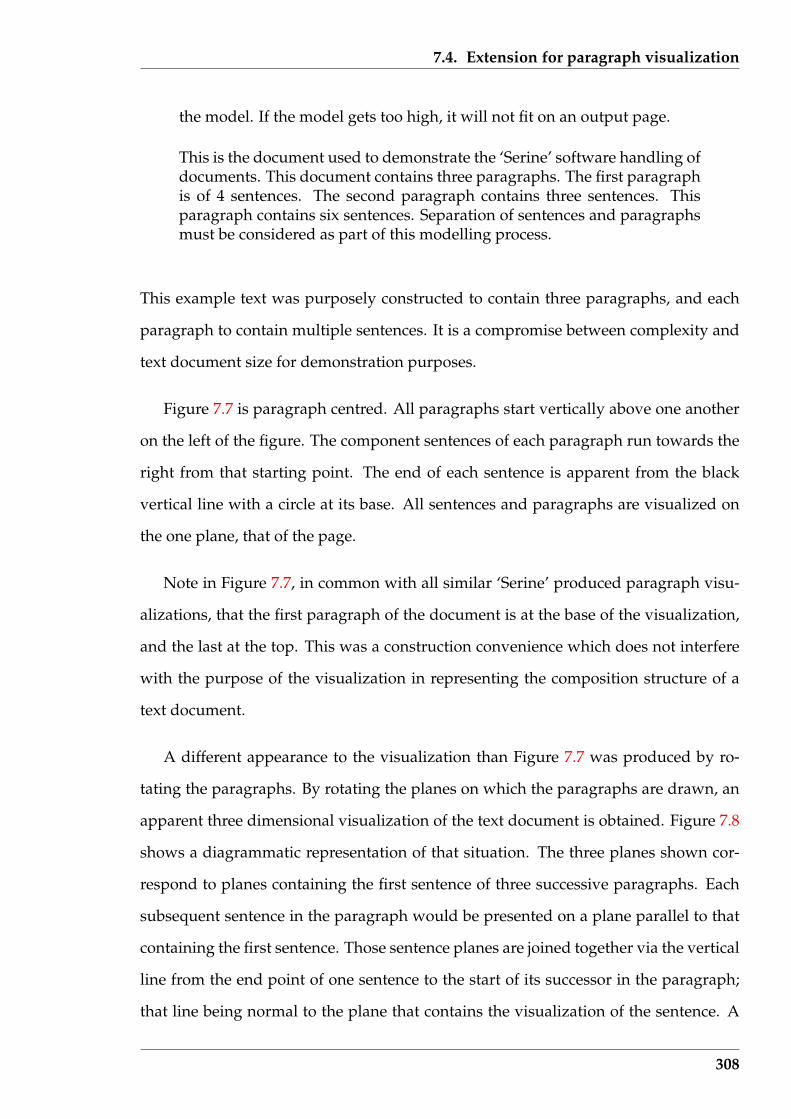
7.4. Extension for paragraph visualization
the model. If the model gets too high, it will not fit on an output page.
This is the document used to demonstrate the ‘Serine’ software handling ofdocuments. This document contains three paragraphs. The first paragraphis of 4 sentences. The second paragraph contains three sentences. Thisparagraph contains six sentences. Separation of sentences and paragraphsmust be considered as part of this modelling process.
This example text was purposely constructed to contain three paragraphs, and each
paragraph to contain multiple sentences. It is a compromise between complexity and
text document size for demonstration purposes.
Figure 7.7 is paragraph centred. All paragraphs start vertically above one another
on the left of the figure. The component sentences of each paragraph run towards the
right from that starting point. The end of each sentence is apparent from the black
vertical line with a circle at its base. All sentences and paragraphs are visualized on
the one plane, that of the page.
Note in Figure 7.7, in common with all similar ‘Serine’ produced paragraph visu-
alizations, that the first paragraph of the document is at the base of the visualization,
and the last at the top. This was a construction convenience which does not interfere
with the purpose of the visualization in representing the composition structure of a
text document.
A different appearance to the visualization than Figure 7.7 was produced by ro-
tating the paragraphs. By rotating the planes on which the paragraphs are drawn, an
apparent three dimensional visualization of the text document is obtained. Figure 7.8
shows a diagrammatic representation of that situation. The three planes shown cor-
respond to planes containing the first sentence of three successive paragraphs. Each
subsequent sentence in the paragraph would be presented on a plane parallel to that
containing the first sentence. Those sentence planes are joined together via the vertical
line from the end point of one sentence to the start of its successor in the paragraph;
that line being normal to the plane that contains the visualization of the sentence. A
308
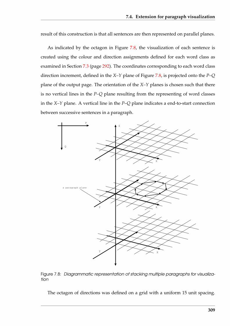
7.4. Extension for paragraph visualization
result of this construction is that all sentences are then represented on parallel planes.
As indicated by the octagon in Figure 7.8, the visualization of each sentence is
created using the colour and direction assignments defined for each word class as
examined in Section 7.3 (page 292). The coordinates corresponding to each word class
direction increment, defined in the X–Y plane of Figure 7.8, is projected onto the P–Q
plane of the output page. The orientation of the X–Y planes is chosen such that there
is no vertical lines in the P–Q plane resulting from the representing of word classes
in the X–Y plane. A vertical line in the P–Q plane indicates a end-to-start connection
between successive sentences in a paragraph.
Y X
Y X
Y X
ZP
Q
a paragraph plane
Figure 7.8: Diagrammatic representation of stacking multiple paragraphs for visualiza-tion
The octagon of directions was defined on a grid with a uniform 15 unit spacing.
309
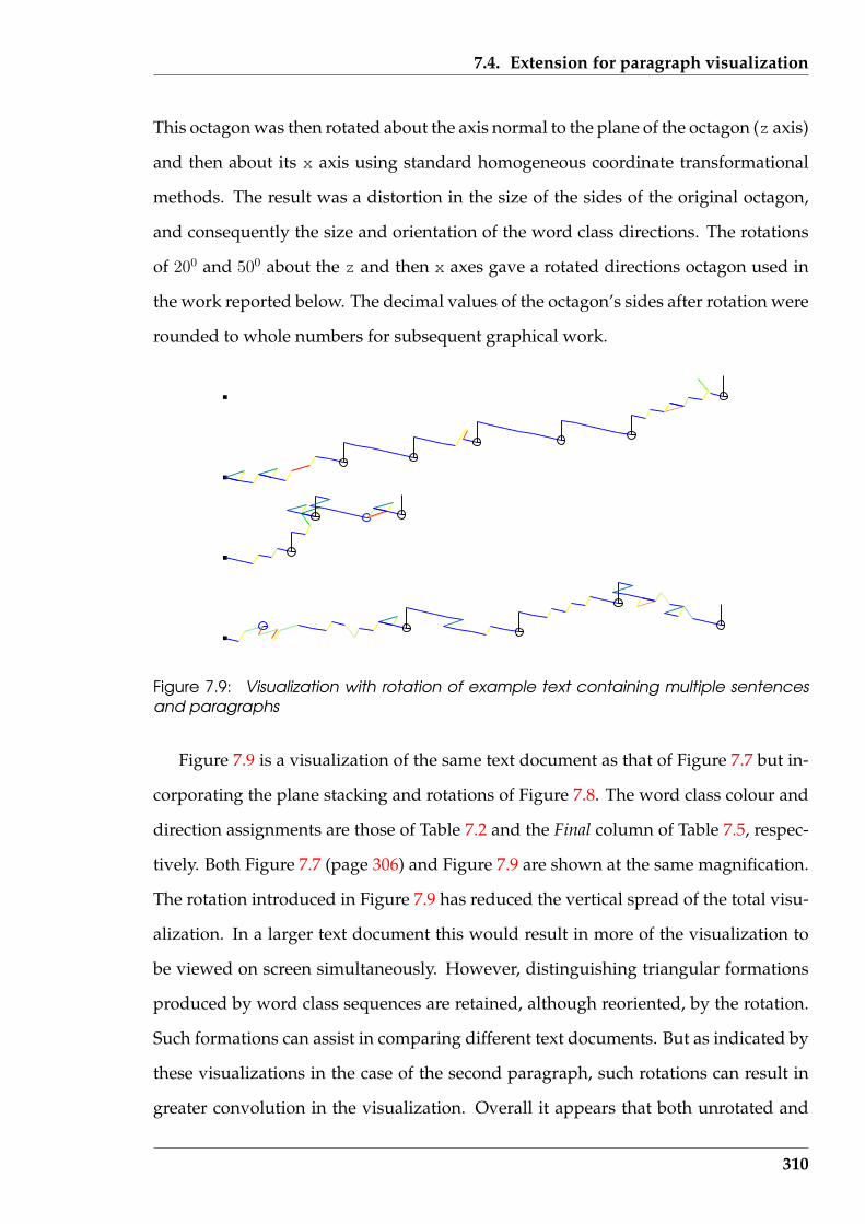
7.4. Extension for paragraph visualization
This octagon was then rotated about the axis normal to the plane of the octagon (z axis)
and then about its x axis using standard homogeneous coordinate transformational
methods. The result was a distortion in the size of the sides of the original octagon,
and consequently the size and orientation of the word class directions. The rotations
of 200 and 500 about the z and then x axes gave a rotated directions octagon used in
the work reported below. The decimal values of the octagon’s sides after rotation were
rounded to whole numbers for subsequent graphical work.
Figure 7.9: Visualization with rotation of example text containing multiple sentencesand paragraphs
Figure 7.9 is a visualization of the same text document as that of Figure 7.7 but in-
corporating the plane stacking and rotations of Figure 7.8. The word class colour and
direction assignments are those of Table 7.2 and the Final column of Table 7.5, respec-
tively. Both Figure 7.7 (page 306) and Figure 7.9 are shown at the same magnification.
The rotation introduced in Figure 7.9 has reduced the vertical spread of the total visu-
alization. In a larger text document this would result in more of the visualization to
be viewed on screen simultaneously. However, distinguishing triangular formations
produced by word class sequences are retained, although reoriented, by the rotation.
Such formations can assist in comparing different text documents. But as indicated by
these visualizations in the case of the second paragraph, such rotations can result in
greater convolution in the visualization. Overall it appears that both unrotated and
310
7.5. Two examples of potential applications
rotated forms of this type of visualization are appropriate for use in different circum-
stances.
7.5 Two examples of potential applications
As stated at the start of this Chapter, the ‘sentence stick’ visualization is experimental
and proposed for use by experts in their analysis of text documents. The words, the
classes of those words, and the sequence in which an author uses each word influ-
ences the ‘character’ of the document via those word patterns. Such characteristics
are distinct from, but yet interact with, the information contained in the document
obtained by reading it. Such patterns often indicate the style of the author’s writing.
Author attribution considered in Chapter 6 assumes that the one author continually
uses such a pattern, although in Chapter 6 only limited sequences (consistent with
patterns followed in the current literature) were used. The current visualization pro-
vides another tool for examination of the word patterns existing in a text document.
An expert analyst can then provide an interpretation to their significance.
The patterns of interest is the repeating sequence of word type occurring through-
out a text document. Some combinations, or styles, may be grammatically incorrect
and this visualization might provide one route for detecting such errors. But as shown
in Section 3.3 (page 82), some styles are appropriate for particular writing tasks (and
types of documents), but inappropriate in others. Given a particular type of docu-
ment, the style present a document might be characteristic of the document’s type or
it might be more characteristic of the document’s author. The interpretation of the
significance of the patterns produced by the ‘sentence stick’ visualization is up to the
human viewer.
The next two sections indicate example patterns produced by text documents and
their interpretation. They operate from the base of knowing the characteristic present
311
7.5. Two examples of potential applications
in the document to viewing the visualization and the characteristics that visualization
contains. Work beyond this research is needed to establish whether such ‘sentence
stick’ visualizations can be used to reverse this process, that is, are useful as a tech-
nique for identification of a document’s characteristics.
7.5.1 Difference in writing style
Here word occurrence frequencies were used to provide an indication of possible dif-
ferences in a small set of emails. The question being asked is whether three emails
were from the one individual. The approach here is different to that used in Sec-
tion 4.4 (page 133). This question is distinct from (but with similarities to) whether a
particular individual wrote a particular document (e.g. an email), which is discussed
in the next Section. The ‘sentence stick’ visualization (as implemented in the ‘Serine’
software) was used to probe an answer to this question.
Figures 7.10 and 7.11 show visualizations of the three sample emails indicating
their respective word class compositions. In Figure 7.10 the visualization is with all of
the sentence in the one plane, while in Figure 7.11 the planes are parallel to one an-
other, but rotated, as in Figure 7.8 (page 309). As a chemist would examine a chemical
structure by using “wireframe” visualizations such that in Figure 7.1a (page 277) by
rotating the structure, these visualization provide a similar approach. Each of these
visualizations are shown to the same scale. To use these visualizations for analysis
of the emails from which they are drawn, similarities and differences in the patterns
appearing are observed.
Figures 7.10 and 7.11 show overall shapes resulting from the combination of sen-
tences in the texts. With such figures the composition of each sentence is not being
considered here (although it could be in another context). Instead, trends in overall
shape induced by those individual sentences are being observed and discussed. The
shape contribution of each sentence will be enhanced as more sentences are joined to
312

7.5. Two examples of potential applications
0
1
2
3
4
5
6
(a) email 1
0
1
2
3
4
5
6
7
(b) email 2
0
1
2
3
4
5
6
(c) email 3
Figure 7.10: Visualization without rotation of emails of sample emails
313

7.5. Two examples of potential applications
0
1
2
3
4
5
6
7
(a) email 1
0
1
2
3
4
5
6
7
(b) email 2
0
1
2
3
4
5
6
(c) email 3
Figure 7.11: Visualization with rotation of emails of sample emails
314

7.5. Two examples of potential applications
form a paragraph. Paragraphs with few sentences offer less indication of the ‘style’ in
the text than paragraphs with a greater number. Vague terms are used here to reflect
the unquantified nature being used to recognise such shaping trends. But as a guide,
paragraphs with fewer than four sentences will tend not to show the desired trending.
In Figure 7.10, email 2 shows a tendency to ‘droop’ as the sentence chains within
any paragraph becomes longer. This is also seen in email 3. Both diagrams were gen-
erated from emails written by the same person (called Susan). In contrast, sentence
chains in email 1 show a tendency to remain horizontal or to rise. There appears to
be a difference in the manner of writing, indicating that this sample of emails may
have been written by two writers. In fact email 1 was written by a different individual
(called Andrew).
Figure 7.11 shows the rising and drooping behaviour for this same email sample
but these individual behaviours have been reversed due only to the rotation applied
to the planes on which the sentences were drawn. The same conclusions could be
reached. The introduction of rotation of the sentence planes is an experimental ele-
ment that can be used to separate trends when comparing samples of text. Different
styles of writing by these two authors has been found by observing overall trends built
from the detail manner each author used to compose these sample text documents. A
sample of three, as here, would be insufficient to perform author attribution, but it is
sufficient to provide evidence that more than one writer was involved in producing
the emails. It does serve to illustrate how the techniques of ‘sentence stick’ visual-
ization could be applied to detecting similarities in text documents, particularly those
small in length as with emails.
7.5.2 The Federalist Papers
Detecting a writing style of an author which can be used to identify that author can be
elusive. An example of this difficulty is provided by the Federalist Papers. After two
315
7.5. Two examples of potential applications
hundred years of consideration, there is still doubt about the authorship of twelve of
those papers. In Chapter 6 those papers were described and several techniques appli-
cable to that analysis were examined. Here the ‘sentence stick’ visualization technique
is used to give an additional, and alternative, visual indication of the similarity of writ-
ing style of the authors involved. Again it indicates the closeness of the writing styles
of the authors giving rise to the difficulty of the author attribution associated with this
documents collection.
The Federalist Papers have the desired characteristics which make them suitable
for consideration of style. They are all newspaper articles published over a period
of one year. Thus the influence of time and document type on style are not large
factors. They also have the same purpose, that of persuading the reader to favourably
consider voting for the adoption of the new constitution of the proposed United States
of America. So the influence of differing purpose on style is also not present. Only
the authors Hamilton and Madison are considered here. For each of these authors
there is at least ten articles from the total collection of eighty five papers in which their
authorship is not disputed. Consequently a reasonable sample of each authors writing
style is available.
Figures 7.12 and 7.13 each contain three samples of visualizations of papers known
to have been written by Hamilton and Madison, respectively. The numbering of the
paragraphs that appear in these figures indicate that only a portion of the total vi-
sualization of the indicated Federalist paper is shown. The rotated plane version of
the visualization is used in each case. This was chosen as it best showed the overall
effects that are being considered, in contrast to the detailed composition of each sen-
tence. These figures show the portion of the visualization that was judged to act as a
signature of the author of the paper. This selection was compiled after viewing similar
visualizations for the greater set of papers from the Federalist Papers collection known
to have been written individually by Hamilton and Madison.
Conclusions based on the observed trends in these examples are indicative, not
316
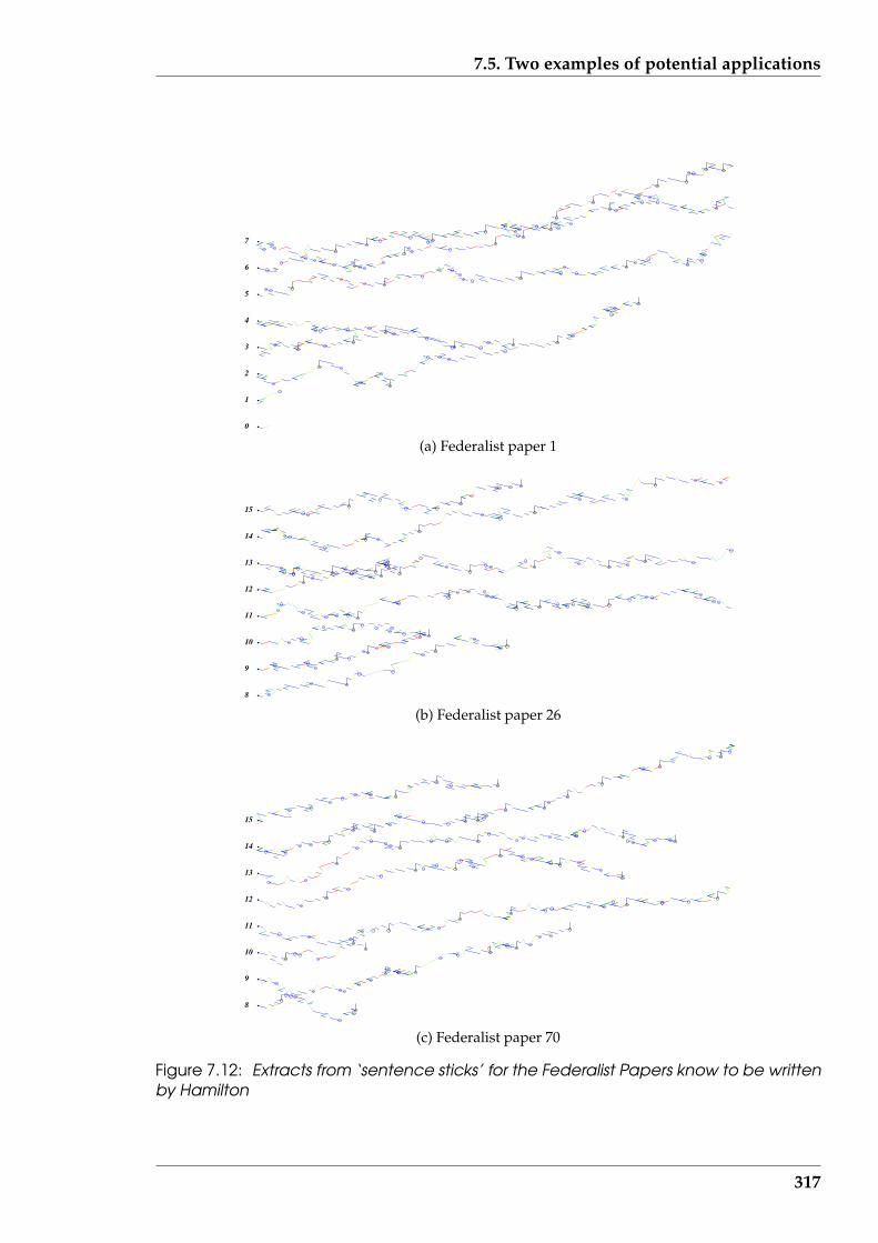
7.5. Two examples of potential applications
0
1
2
3
4
5
6
7
(a) Federalist paper 1
8
9
10
11
12
13
14
15
(b) Federalist paper 26
8
9
10
11
12
13
14
15
(c) Federalist paper 70
Figure 7.12: Extracts from ‘sentence sticks’ for the Federalist Papers know to be writtenby Hamilton
317
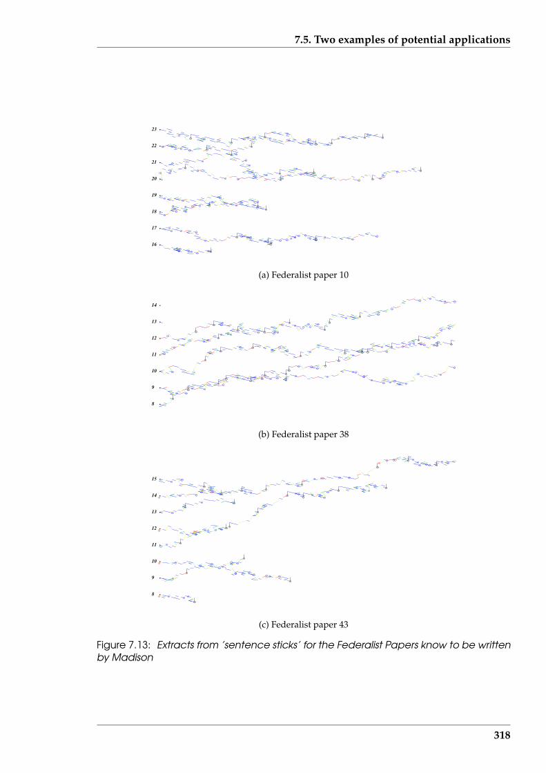
7.5. Two examples of potential applications
16
17
18
19
20
21
22
23
(a) Federalist paper 10
8
9
10
11
12
13
14
(b) Federalist paper 38
8
9
10
11
12
13
14
15
(c) Federalist paper 43
Figure 7.13: Extracts from ’sentence sticks’ for the Federalist Papers know to be writtenby Madison
318
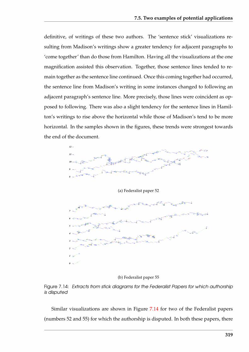
7.5. Two examples of potential applications
definitive, of writings of these two authors. The ‘sentence stick’ visualizations re-
sulting from Madison’s writings show a greater tendency for adjacent paragraphs to
‘come together’ than do those from Hamilton. Having all the visualizations at the one
magnification assisted this observation. Together, those sentence lines tended to re-
main together as the sentence line continued. Once this coming together had occurred,
the sentence line from Madison’s writing in some instances changed to following an
adjacent paragraph’s sentence line. More precisely, those lines were coincident as op-
posed to following. There was also a slight tendency for the sentence lines in Hamil-
ton’s writings to rise above the horizontal while those of Madison’s tend to be more
horizontal. In the samples shown in the figures, these trends were strongest towards
the end of the document.
8
9
10
11
12
(a) Federalist paper 52
0
1
2
3
4
5
6
7
(b) Federalist paper 55
Figure 7.14: Extracts from stick diagrams for the Federalist Papers for which authorshipis disputed
Similar visualizations are shown in Figure 7.14 for two of the Federalist papers
(numbers 52 and 55) for which the authorship is disputed. In both these papers, there
319

7.6. Summary
is a tendency for the sentence lines between adjacent paragraphs to follow one an-
other. The sentence lines tend to be horizontal as opposed to rising above the horizon-
tal, in the paragraphs with larger numbers of sentences. Both these characteristics are
aligned with those seen in Madison’s writings suggesting that Madison was the au-
thor of both Federalist papers 52 and 55. This agrees with Mosteller & Wallace (1984)
who base their determination on classical techniques. This is consistent with a deter-
mination (not included) using the Parallel Coordinate technique of Section 6.3.1 (page
222) and the Star plots technique of Section 6.3.2 (page 226).
As with the other visualization techniques applied to the Federalist Papers in this
research, definitive results of author attribution are difficult to obtain. The variation in
author determination obtained here is consistent with the close similarities observed
for all these papers under all of these visualization techniques. Both similarities and
differences between these documents is examined via this visualization. The visual-
ization is proposed as a tool to assist comparing and contrasting the documents.
More detailed comparisons can be made by examining the paragraph composition
revealed by ‘sentence stick’ visualizations (i.e. the sequencing of word types). How-
ever, this was considered to be beyond the scope of the current research as it could
involve very complex interpretations.
7.6 Summary
This Chapter has presented a visualization (‘sentence stick’) which indicates the con-
structional details of a text document. Such detail is composed of the sequence of
word classes into which the words forming the document fall. Those word classes are
followed through sentences which build into paragraphs. Both shape and colour are
assigned to represent each of these word classes by a straight line segment. A space-
filling curve representing the document is the result. This is a generalisation of the
320

7.6. Summary
H-curve proposed by Hamori & Ruskin (1983) for representing the DNA molecule of
molecular biology, and the “wireframe” molecular visualization such as in Figure 7.1a
(page 277) but in this case using an ‘alphabet’ of fourteen word classes in contrast to
the four letter ‘alphabet’ of DNA.
The detail contained in the visualization does provide a means of comparing one
document against another, or one part of a single document against another part. As
such, the visualization fulfilled the conditions of research hypothesis H4 (visualization
can assist in finding similarities and differences in the composition of text documents).
This document composition visualization was implemented as an option in the
‘Serine’ software prototype. As such, considerations of all the four aspects of text,
visualization, informatics, and tool were included. Detail of the implementation was
covered as this is needed in understanding how the visualization works and in in-
terpreting the resulting visual. In terms of the visualization taxonomy of Section 2.1
(page 31), this visualization is of a linked within type, using data of a multi-variate
type. The computation needed to produce the visualization were performed at speed
appropriate for interactive use of the visualization, this fulfilling research hypothesis
H5 (text document visualization can be produced in an efficient manner to enable their
use as a toolkit for interactive analysis of such a document).
As with a number of the other visualizations produced for this research, the de-
tailed interpretation of a stick model visualization is not easy. However, it is envis-
aged that such visualizations will be used by experts who will become familiar with
the representations involved and hence find them useful for detailed interpretations
of text documents. An assessment of the utility with which such experts can apply
these visualizations is beyond this research.
In the next Chapter the outcomes of this research as a whole will be discussed.
Mention will be made of the new techniques developed, and new applications of ex-
isting techniques, which have been embodied in this research for understanding text
321
7.6. Summary
documents. Possible future research directions are also discussed.
322
Chapter 8
Conclusions and future directions
This research is an investigation of the potential synergy between numerical statis-
tics, information distribution, and visualization, applied to text documents. Interac-
tions between these three are proposed to assist humans to gain better access to the
meaning in text documents. The particular type of text documents considered in this
research are those which are accessed by computers; whether that be email, Internet
web browsing, or other forms of electronic document exchange. It is a truism that text
documents are not new. But their growing occurrence, particularly in electronic form
has created a need for new approaches which at least augment existing methods of
processing and analysing such documents.
This research has been concerned with developing a collection of techniques which
could be applied interactively to text documents via an analysis tool. It is interactive in
that application of one analysis presents data or information to the user that suggests
a modification before re-applying an analysis. The analysis loop depicted in Figure 8.1
(which is the same as Figure 1.2 (page 6)) shows such an approach, with a human in-
terpreting the results of an analysis and giving the next direction of exploration. Thus
a ‘human in charge’ approach is being proposed, using the intelligence of the human
as the controller and offering a tool to assist his exploration of the text document. But
‘analysis’ means different things to different people. To cater for those differences,
different analysis approaches were considered. Acknowledging that there are many
such analysis techniques for diverse analysis purposes, a selection of each has been
323
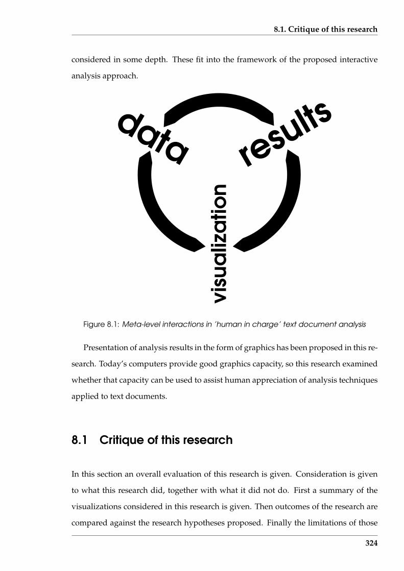
8.1. Critique of this research
considered in some depth. These fit into the framework of the proposed interactive
analysis approach.
visu
aliz
atio
n
data results
Figure 8.1: Meta-level interactions in ’human in charge’ text document analysis
Presentation of analysis results in the form of graphics has been proposed in this re-
search. Today’s computers provide good graphics capacity, so this research examined
whether that capacity can be used to assist human appreciation of analysis techniques
applied to text documents.
8.1 Critique of this research
In this section an overall evaluation of this research is given. Consideration is given
to what this research did, together with what it did not do. First a summary of the
visualizations considered in this research is given. Then outcomes of the research are
compared against the research hypotheses proposed. Finally the limitations of those
324
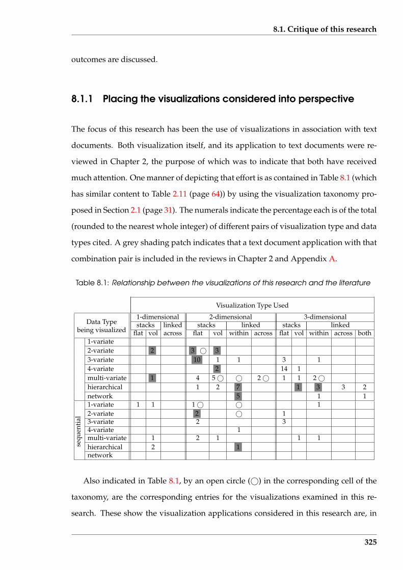
8.1. Critique of this research
outcomes are discussed.
8.1.1 Placing the visualizations considered into perspective
The focus of this research has been the use of visualizations in association with text
documents. Both visualization itself, and its application to text documents were re-
viewed in Chapter 2, the purpose of which was to indicate that both have received
much attention. One manner of depicting that effort is as contained in Table 8.1 (which
has similar content to Table 2.11 (page 64)) by using the visualization taxonomy pro-
posed in Section 2.1 (page 31). The numerals indicate the percentage each is of the total
(rounded to the nearest whole integer) of different pairs of visualization type and data
types cited. A grey shading patch indicates that a text document application with that
combination pair is included in the reviews in Chapter 2 and Appendix A.
Table 8.1: Relationship between the visualizations of this research and the literature
Visualization Type Used
1-dimensional 2-dimensional 3-dimensionalData Type stacks linked stacks linked stacks linked
being visualized flat vol across flat vol within across flat vol within across both1-variate2-variate 2 3 © 33-variate 10 1 1 3 14-variate 2 14 1multi-variate 1 4 5 © © 2 © 1 1 2 ©hierarchical 1 2 7 1 3 3 2network 5 1 11-variate 1 1 1 © © 12-variate 2 © 13-variate 2 34-variate 1multi-variate 1 2 1 1 1hierarchical 2 1se
quen
tial
network
Also indicated in Table 8.1, by an open circle (©) in the corresponding cell of the
taxonomy, are the corresponding entries for the visualizations examined in this re-
search. These show the visualization applications considered in this research are, in
325
8.1. Critique of this research
most cases, different from those noted from the literature. The occurrence of one open
circle can indicate more than one visualization of that type in this research. This indi-
cates that this research fulfilled its objective of examining new types of visualization
which might be applied to facilitate analysis of text documents.
Since count data is readily visualized by some form of marker in a ‘stack’ configu-
ration, the high proportion of the ‘stack’ visualization type in Table 8.1 indicates that
visualization is broadly directed at count data. The shading included in that Table
indicates that tendency carries over to text documents. Since text documents contain
‘threads’ of information which link developments of such topics throughout a doc-
ument, the use of ‘linked’ visualization types would be expected to receive greater
use. Although it is seen that most data types have been visualized, the sequential
data which might be expected to be found in text documents has not received as much
consideration. This would appear to be a paradox, given that text documents are com-
posed from a sequence of words. Some effort in re-establishing this balance is achieved
using the visualizations developed in this research, is indicated by the © in Table 8.1.
8.1.2 Evaluation against the research hypotheses
This research is evaluated against each of the research hypotheses stated in Section 1.3.2.
Hypothesis: H1: scientific and information visualization are both applicable to text docu-
ments but there is an opportunity for expansion in such use
This research has considered data to be of two type: scientific and information.
These were surveyed in Chapter 2. Simplistically, scientific data is numeric, while in-
formation involves data that embodies some measure of relationship or association.
In the context of text documents, scientific data would be the number of words in a
sentence, or the position of the verb of a sentence. Information would be how the verb,
nouns, adjectives, and other parts of grammatical structure are placed relative to one
326

8.1. Critique of this research
another in a sentence. Scientific data is more related to measures (or counts) while in-
formation data is related to structure. As indicated in the taxonomy of Chapter 2, there
are different types of data which are in both the scientific and information categories.
A visualization attempts to show relationships among the data. An outcome of this
logic is that visualization of information data involves indicating relations among the
relations embodied in the data. The simultaneous consideration of different aspects of
those data types were shown in Chapter 2 to lead to consideration of high-dimensional
data. Those types data were then shown to be applicable to text documents.
Visualization of scientific and information data in a variety of application areas
was surveyed in Chapter 2, locating the visualization and the data which it visual-
ized, in a taxonomy indicated in Table 8.1 (page 325). Visualizations relating to text
documents from the literature are indicated in that table. The table indicates that the
distribution of visualizations is not uniform across that taxonomy. To those, add the
visualizations of text documents considered in this research. Chapter 6 includes a
number of scientific visualization techniques used with count data derived from text
documents. Information visualization techniques have been used in Chapters 4, 5,
and 7. In those, counts again were used, but the visualization was of structure that
followed from such counts. In Chapter 5 that visualization of structure was directed
at reading the document.
A uniform distribution of visualizations relating to text documents across the tax-
onomy of Table 8.1 is not to be expected. Some data types and visualization types may
be inappropriate in the context of text documents. However, that taxonomy does indi-
cate that growth in visualization of text documents to fill in the gaps, is to be expected.
Such visualizations can also introduce new combinations of data and visualization
types.
The use of the visualization taxonomy proposed in this research, together with
applications made of it during this research, provides support for research hypothesis
H1 as being true.
327

8.1. Critique of this research
Hypothesis: H2: visualization provides and alternative (or a supplement) to analytical meth-
ods for interpreting the same sets of text data
This hypothesis received the most examination during this research of all five re-
search hypotheses. It is central to this research, the hypothesis being explored in Chap-
ters 2, 3, 4, and 6. This hypothesis represents a strong current trend in scientific inves-
tigations to supplement analytical or numerical methods with the use of visualization
of those results. Analysis has built up a large catalogue of techniques over centuries.
However, the solution produced can be difficult to interpret. For example, expected
change in temperature of a metal bar while being heated can be predicted analyti-
cally, but that solution which consists of a sum of algebraic terms (a Fourier series)
is difficult to interpret. By contrast, a visualization describing that situation, whether
it is produced directly from the analytical solution or via other means, presents the
change in temperature of the metal bar in a form more easily understood. Most of the
examples of scientific visualization cited in Chapter 2 are of this model.
This research was built upon using measurements as a form of data. Such mea-
surements could be the counts of sentence length and numbers of two and three letter
words (23lw) used in the plot of Figure 6.19 (page 266), or the position of the dancer’s
feet used in Figure 2.3 (page 51). The process used comprised obtaining the mea-
surements, then finding patterns in those measurements in an attempt to understand
those measurements. Finding the patterns might be done numerically, possibly using
statistical techniques, or by visually representing the data. For example, a numerical
correlation coefficient is used in Section 4.4.1 (page 134) to indicate how the measured
occurrence of expected frequently occurring words is matched against that predicted
(by the type of text document being measured). Alternately, in Section 4.5 (page 143)
word occurrence count measurements are used to produce the T 4 visualization pro-
posed to enhance human reading of that text document. The one type of data, word
occurrence counts, has been used both for numerical pattern presentation and for pro-
duction of a visual display.
328

8.1. Critique of this research
Chapter 3 was important to this research hypothesis because it introduced mea-
surement of text documents. As shown in Section 3.3.2 (page 87) the occurrence of
particular functional objects in such measurements suggests the type of the text docu-
ment, which in turn suggests what analysis might subsequently be applied. Table 3.2
(page 92) indicates the different numerical and visualization techniques which are sub-
sequently examined are all based on word counts, with sentence and paragraph counts
used in a selection of those techniques. Once measurements are obtained, alternate
approaches can be used for their analysis, but each using the same measurements (or
sub-parts of them).
A further example of this re-use of data is the QSUM of Section 6.5 (page 254). This
was presented as a technique to indicate trends of word usage in successive sentences
of a text document. The fractal dimension of Section 6.4 (page 237) was then applied
to this same data in Section 6.5.3 (page 260) as shown in the QSUM. The same data
was used: the QSUM produced a visualization while the fractal dimension gave a
numerical value.
Repeatedly throughout this research, data in the form of measurements derived
from text documents were analysis by numerical and visualization methods. After the
data was obtained, the appropriate analysis method was then used. This is consistent
with the concept design of this research shown in Figure 1.4 (page 20). The success of
this approach supports the truth of research hypothesis H2. However, the QSUM and
fractal dimension pairing would suggest that visualization is not only an alternative
to analytical methods (as in the research hypothesis) but that analytical methods can
also be an alternative to (or supplement) visualization.
Hypothesis: H3: visualization techniques can be used with advantage by humans to aid in
reading and comprehension of text documents
The text document visualization techniques of T 4 proposed in Section 4.5 (page
143) and fading frequent words proposed in Section 4.5.4 (page 151) were evaluated
329
8.1. Critique of this research
by experiment which is reported in Chapter 5. The interpretation given to the research
hypothesis’s phrase used with advantage was that reading time decreased. With such
a decreased reading time, comprehension of the contents of the article being read did
not decrease. Alternately, if the reading time increased, comprehension increased.
In this experiment, approximately one third of the participants had their reading
times decreased. For another third of the experiment participants their reading times
were unchanged, while for the remaining third their reading times increased. The
results of this experiment, in contrast to the experiments cited in the literature, gives
an indication of all readers which fall into the three divisions that would be expected
to be present.
These results indicate that word fading, which is one type of visualization tech-
nique, can be used to decrease the reading time of some, but not all, readers. Thus to
avoid non-beneficial reading effects, software providing such a visualization service
should be presented as an option to the reader. Training and/or experience in use of
this visualization technique could well increase its usefulness to readers.
The experiment indicates that word fading, as a visualization technique applied to
text documents, does not influence the comprehension errors made by human readers
of such documents. The comprehension errors made when using word fading were
not changed with respect to those made when reading without word fading. This
finding is counter to findings reported in the literature where complete elimination
of words did increase the comprehension errors being made. It would appear that
fading a word but still having it visible, in contrast to removing it, is less disruptive to
the reading process. These findings remained the same whether there was any change
(increase, decreased, or remained unchanged) in the reading time. The nature of the
particular documents being read had greater influence on comprehension errors made
than the impact of word fading.
The comprehension errors were then sub-divided into two groups; inferential er-
330
8.1. Critique of this research
rors, and combined factual plus numeric factual errors. Neither of these error group-
ings were found to be significantly influenced by the word fading conditions in use
when the corresponding reading was performed.
Limited support for research hypothesis H3 was obtained. For approximately one
third of the reading population word fading was found to increase reading speed with-
out a decrease in comprehension. For the other two thirds of the population the hy-
pothesis was not supported. In this group, comprehension of what was being read
was not impaired. These results indicate that if word fading was to be introduced into
general ‘browser’ software then a user facility to make it available/unavailable would
be required. These results also indicate that more experimentation is warranted, as is
discussed in Section 8.3 (page 338).
Hypothesis: H4: visualization can assist in finding similarities and differences in the com-
position of text documents
If visualization gives an overview of data, then it can assist comparing different
data sources. Text documents were the source of such data considered in this research.
There are different kinds of comparisons. A count of characters, words, and lines
present in two text documents might give a primitive comparison between those doc-
uments. The names of the writers of the text documents is another such comparison.
However, most analysis based comparisons of text documents require more data than
just a few quantities. The Colour Map visualization of Figure 6.6 (page 232) is an ex-
ample where a number (in that case 13) variables are used to compare documents. In
this case visualization assists analysing the behaviour within individual documents,
together with providing comparison between those documents.
Consider the QSUM techniques of Section 6.5 (page 254) and the ‘sentence stick’
visualization of Chapter 7 as examples of that kind of comparison. In QSUM, the al-
gorithm on which the plot is based highlights changes in the internal construction of
a document. This was exploited by constructing one text document by joining two
331
8.1. Critique of this research
documents head to tail and noting the behaviour of the plot of that compound doc-
ument, particularly that resulting from the text in the immediate vicinity of where
the two documents were joined together. The shape of the QSUM plot across a sin-
gle text document is not considered of much interest. But in the case of the ‘sentence
stick’ visualization, the construction of each sentence in a single document is shown.
A visualization for each document being compared would be done so as to facilitate
comparison of the documents via the patterns in those visualizations.
In a practical comparison of text documents a combination of individual values
and overall patterns of values is needed. Visualization assists with over viewing of
values used in the comparison. As indicated in Section 6.5.1 (page 255), the dispute
about the ability of QSUM to perform author attribution is based on the variables used
in the visualization, not on the use of visualization.
To use a visualization for detecting similarities and differences between text docu-
ments depends on the familiarity the viewer has with the visualization. This is espe-
cially so as the complexity of the visualization increases. One would expect that most
people could comprehend a graph of one variable against another, as in Figure 6.19
(page 266) which shows a QSUM plot of the number of words in a sentence having
different properties against the number of the sentence. The significance of such a vi-
sualization might not be understood, but the viewer should be able to interpret this
as a graph depicting a succession of values, the values being those denoted by labels
on the axes of the graph. Contrast that with Figure 6.4 (page 223) which shows a par-
allel coordinate plot of 13 variables. Not only the significance of such a visualization
could be difficult to interpret by those unfamiliar with that kind of visualization, but
an interpretation beyond a ‘mess of lines’ requires familiarity. Familiarity is required
in the graph case, but more people would be expected to have that familiarity than
in the case of parallel coordinate plot, which is more applicable to an expert analyst.
Although the patterns present in a visualization can be recognised by most people, the
greater expertise is needed to recognise the implication of the pattern. To exploit the
332
8.1. Critique of this research
potential of any visualization requires familiarity with that visualization.
In support of this familiarity requirement, consider looking for similarities in more
than three columns of numbers. This is known to be a difficult problem. Contrast
that to the Colour Map of Figure 6.6 (page 232) which is used for the comparison of
the equivalent of 13 columns of numbers. This tableau of colour represents computed
values. It is argued that patterns of similarity are more easily detected is such a visu-
alization via the use of colour. The complexity level of Figure 6.6 is closer to the graph
of Figure 6.19 than to the parallel coordinate plot of Figure 6.4. As a result, although
instruction is needed to enable a human to effectively interpret the Colour Map, that
level of instruction would remain approximately constant for three or more variables
being compared.
This research supports research hypothesis H4 as being true by demonstrating how
visualization facilitates comparison of text documents, for example, in the case of au-
thor attribution.
Hypothesis: H5: text document visualization can be produced in an efficient manner to
enable their use as a toolkit for interactive analysis of such documents
For use as a toolkit, visualizations must be generated at sufficient speed by soft-
ware so that an interactive approach to text document analysis remains attractive to
the software user. If there is too much delay between the request for an analysis and
the production of the resulting visualization, the human user of the toolkit is likely to
become frustrated. Any delay exceeding one second needs to be accompanied by a
visual indicator that processing is proceeding, as for example the ‘sand glass’ used by
Microsoft.
The toolkit ‘Serine’ consists of developed software which is selected by menu, in a
fashion demonstrated by the example of operation shown in Figure 8.2. Each analysis
requested would require data processing associated with the text documents. As de-
scribed in Section 1.4.2 (page 25), the ‘Serine’ implementation of the proposed toolkit
333

8.1. Critique of this research
re-uses data processing between analyses so as to minimise the overall processing per-
formed and hence reduce delay in displaying any visualization.
Figure 8.2: Use of the ‘Serine’ software toolkit
This research indicates that production of an interactive toolkit for text document
analysis by visualization is plausible. Such a toolkit as ’Serine’ provides a common
user interface to a selection of techniques collected together under pull-down menus.
The overall design of ‘Serine’ is described in Section 1.4 (page 21). When implemented
experimentally, the time between a user’s request to the appearance of the visualiza-
tion was less than a second in elapsed time when executing on a laptop computer em-
ploying a 1.6MHz Pentium Mobile processor. This response is within acceptable lim-
its. The standalone processing and associated visualizations required similar elapsed
times. In such processing the text documents had word counts of 3500 or less. These
visualizations were directed at analysis.
The reported reading experiment used computer word occurrences to generate vi-
sualizations in an endeavour to reduce reading time, not to analyse the document. In
that experiment, the word fadings were pre-processed and hard-coded into the soft-
ware used in that experiment. This was only done to facilitate the movement of the
334
8.1. Critique of this research
coding for word fading of that experiment into the more general environment pro-
vided by ‘Serine’. However, the data structures used were common, where appropri-
ate, to those used in the ‘Serine’ prototype so as to enable the ‘on demand’ use of such
word fadings in future work.
Although the ‘Serine’ software was developed only to a prototype stage, the re-
search was able to demonstrate its effectiveness in producing visualizations to facili-
tate interactive interpretation of text documents. This provides support for hypothesis
H5 although an interactive usability study is warranted to provide more substantial
evidence. This would require a fully developed prototype version of the software, to-
gether with appropriate documentation, tutorials, and help files. This was considered
to be beyond the scope of this research project.
8.1.3 Beyond the limits of this research
It is recognised that this research is exploratory rather than conclusive. It has inves-
tigated the interactive support that can be provided by visualizations to the under-
standing of text documents. Indicative examples have been provided and prototype
software developed. However, the research has not sought to conclusively prove that
the application of the techniques has improved interpretation in specific instances.
Since many aspects of the interpretation require participants with considerable exper-
tise, such an approach was beyond the scope of this research.
It is recognised that the conclusions based on the reading experiment of this re-
search might apply only to the ‘educated’ portion of the general populace, for it was
from a university student population that the participants used were drawn. Making
generalisations to the wider population needs to be undertaken with reservation. To
widen such conclusions, these experiments need to be repeated using a random sam-
ple drawn from business, industry, and the community in general. Greater funding
and time would be necessary to do such a research project. However, the participants
335
8.1. Critique of this research
did vary in age, their level of study in the university, and many were of nationality
where English was not their first language.
All of the text documents considered were of prose types. But as outlined in Chap-
ter 3, such text document types are a selection from the classifications used in Table 3.1
(page 90). From the available mass of documents, these types may be the most com-
mon, but in certain areas of business and industry this is not so, for example con-
tract and specification documents are more common in an engineering than a public
library setting. So techniques considered in this research may be of less value (or pos-
sibly greater value) in analysing such documents in contrast to the prose type. Further
research is necessary to determine whether these same techniques apply to such con-
tract and specification documents, or medical records. The topic of visualization of
information threads which appear in most text documents, and which was beyond
the scope of this project, would be one technique that will be of general usage. By
contrast, most techniques considered in this research were more aligned to a ‘literary
analysis’ more likely to be associated with prose, and topics such as author attribution
that branch off from such a stream. But nevertheless, the techniques would be useful
for writers, poets, literary critics, etc.
Although the ‘Serine’ software package has been used during this research to per-
form analysis of text documents, it is not complete. Many items of software engineer-
ing (for example, error recovery) would need to be incorporated in it for it to be of
wider use. But as a research platform, for which it was created, it performs its func-
tion. Other techniques have been implemented outside of the ‘Serine’ software for
reasons of experimental need in languages such as Perl and Postscript which directly
serviced those needs. Effort would need to be made to integrate those techniques into
the ‘Serine’ software if it was to be developed into a general ‘production’ version.
A selection of visualization techniques was used in this research to explore the
principle analysis steps for prose type text documents. Understandably there could
have been other techniques selected. But the purpose of the research was to exam-
336

8.2. New in this thesis
ine a selection of techniques and consider their application to text documents, not to
provide a catalogue of all techniques of possible use.
In doing this examination, a visual approach has been followed. In the application
of such techniques to the author attribution problem associated with the Federalist Pa-
pers, these selected techniques demonstrated the difficulty of this problem and why
it has survived unresolved for two hundred years. These techniques indicated how
similar are the subject documents. But this particular problem was treated as only an
application target for the visualization techniques without intention of resolving this
particular author attribution. In all cases, the visualization techniques were the main
topic of interest and the research focused on details of their application to example text
analysis problems, rather than the solution of the particular problems themselves.
8.2 New in this thesis
The principal contributions made by this research may be summarised as follows:
1. a taxonomy for visualization that associates the data being visualized and the
form of the resultant visualization;
2. examination of visual methods of exploring patterns present in multi-dimensional
data derived from text documents;
3. application of visual methods to the Federalist Papers in contrast to numerical sta-
tistical methods which suggested that Hamilton may have a claim of authorship
to at least some of the twelve disputed papers;
4. refinement of particular visualization techniques, e.g. by repeating the first axis
of a parallel coordinate plot as its last, the total number of plots necessary is
reduced;
337

8.3. Future directions
5. the solution of the Graph Theory “table seating” problem was used to indicate
how many Parallel Coordinate plots are necessary for a given number of vari-
ables and the ordering of axes in each plot;
6. examination and extension of QSUM and then its application as an author attri-
bution technique to the Federalist Papers;
7. exploration of constraints needing to be observed in the process of determining
fractal dimensions of plotted data so as to exclude the influence of too large and
too small a division of the measurement space;
8. application of fractal dimension to the comparison of various types of visualiza-
tions, including QSUM techniques, when the complexity of the visualization has
the potential to make difficult the comparison of contained detail;
9. direct exploration of the influence on reading speed and comprehension by word
fading in comparison to those factors normally achieved for each individual
from a representative sample of ‘readers’;
10. new methods of word fading which utilised the T 4 (top and tail truncation tech-
nique) developed in this research;
11. a new visual technique (’sentence stick’ model) to show the constructional as-
pects of a text document;
Not all of the above may be new. However, if accounts of them do exist no evidence
of them has been seen in the context developed in this thesis.
8.3 Future directions
From this research, further work suggests itself. Some potential topics, linked to the
parts of this research, are discussed below.
338
8.3. Future directions
The word fading techniques used in the experiment of Chapter 5 indicated that
comprehension of the document being read under those conditions did not decrease,
but also that there was a potential for increased reading speed. Future work might
address whether human readers can be ‘trained’ to use word fading so as to increase
their reading speed. The reason why word fading had differing results on human
readers also needs further research. Lack of familiarity may have been the reason
for slowing of reader times in the experiment reported in Chapter 5. Training may
also further increase the speed of those already exhibiting an increase. But the group
possibly to benefit more from training are those which showed no change with respect
to their normal reading speed.
One immediate application of word fading is for increased reading speed in read-
ing of emails. But the text documents used in the experiment of Chapter 5 were longer
than the general email. More research is needed to determine whether the word fad-
ing techniques used are directly applicable to text documents smaller in length, and if
not, what changes need to be made.
In the implementation of the T 4 top-tail truncation technique, green and blue/grey
colouring of the font was used to produce a ‘fading’ of words judged less important
in a text document. Further research is needed in determining whether such a fading
was effective visually and whether other colour selections would be more effective.
The ‘sentence stick’ visualization proposed in Chapter 7 for text documents is a
‘space filling’ structure. A dynamic means of rotating such structures in three dimen-
sional space is needed to assist in their examination, similar in effect to that used in
the RasMol software used to visualized the structure of atomic molecules.
The ‘sentence stick’ models give some idea of the word/sentence/paragraph con-
struction of a text document. Those words contain the threads of information that is
contained in that document. The next step is to show the development of those infor-
mation threads, superimposed on the graphic of the stick model. This might take the
339
8.3. Future directions
form of coloured ribbons connecting words that contribute to that information thread,
similar in concept to the Rainbow visualization presented by Hetzler et al. (1998a).
Such a visualization would give a clue to the location and distribution of the informa-
tion content. More research is necessary to examine whether a text document ‘expert’
can effectively use the information exposed by stick model visualizations.
Another application of the ‘sentence stick’ model of Chapter 7 is detection of incor-
rect sentence construction. This would require the establishment of what a correctly
constructed sentence stick model should look like. Then in application, a means of
detecting such models of abnormal (or questionable) constructions amongst a sea of
correct configurations would have to be resolved.
An application of the stick model used in Chapter 7 was as a means to determining
author attribution of a text document. This was done by looking for similarity in
the manner of construction of sentences within the document. Further research into
using fractal dimensions to characterise such sentence representations for comparative
purposes, similar to that used in Chapter 6, might prove fruitful.
Combinations of techniques such as word occurrence frequencies that led to the
word fading techniques in Chapter 4, might be considered with stick models as com-
position traces in text documents to indicate style. Then, maybe in combination with
other evaluation techniques, changes might be introduced into the document to change
that style. This might have application is converting the complexity of documents
such that the information content is not lost. Such an application might be the conver-
sion of legal documents (for example wills or contracts) to ‘plain English’.
A prototype for implementing interactive analysis of text documents was intro-
duced with the ‘Serine’ software. The stand alone software used in parts of this re-
search should be incorporated into ‘Serine’ to improve the techniques it makes avail-
able. However, more techniques are needed, and these should be added to further
develop the utility of the software.
340
8.4. Overall conclusion
An open question is whether using such a prototype, with a collection of analysis
techniques available, does in fact assist the user to obtain the knowledge they want
concerning a text document. Can that knowledge be obtained via an interactive inter-
action with the document using a succession of techniques? Is such an approach more
effective than others? More research is needed to resolve such questions. This would
require the involvement of appropriate text analysis experts.
The question of whether a visualization is comprehensible needs further research.
Once the visualization is understood it can be of assistance in assessing analysis re-
sults. But the amount of ‘training’ that a user needs to effectively use a particular
visualization remains an open question.
In the end of Section 4.4.2 (page 139) an ‘expression map’ for text documents was
proposed by building upon classification of whole text documents. A visualization de-
picting such a map was then proposed. Work needs to be done to determine whether
such maps can be used to characterise different subclasses of documents or authors. In
that Section it was shown that for the email subclass of text documents, the andrew
document by one author was different from the susan document (and susan2) written
by another.
Further work needs to be done on the Graph Theory based algorithm for ordering
of the axes in Parallel Coordinate plots. The algorithm developed in this research
contained a ‘trial-and-error’ component that needs to be eliminated so the procedure
can be included in general Parallel Coordinate software.
8.4 Overall conclusion
In this research a wide range of new and improved visualization techniques for use in
analysis of text documents have been described. However, no one technique has been
dealt with comprehensively or its particular application to a text document analysis
341
8.4. Overall conclusion
problem pursued to finality. To have done so could have consumed all the resources
available for this research. Rather, the author has chosen to only discuss each particu-
lar technique in sufficient detail so as to explain its purpose, indicate its possible area
of application, and evaluate its potential utility.
This fulfils the objectives stated in Chapter 1 and expanded upon in Chapter 2,
were a range of new possibilities for text visualizations were identified via the taxon-
omy developed in that chapter. This is the major contribution of this research. It is left
to other researchers to identify (from the information provided) which particular visu-
alization(s) might fulfil their specific requirements, then to develop their application
in full detail.
This research has demonstrated that visualization can facilitate interpretation of
text documents and that interactive software utilising such an approach can assist in
analysis of text documents. Although considerable more work is required in this field,
the research reported in this thesis makes a contribution to this effort.
342

Appendix A
Snap shots of the visualization
literature
This Appendix contains summaries of the sample of the visualization literature con-
sidered in Chapter 2. Each type of visualization considered occupies a Section. An
index number is included in each summary to assist linking of the description with
the associated entry of the summary table contained in Chapter 2. With each sum-
mary, the number of dependent and independent variables used in the visualization
is given, together with the position the visualization occupies in the propose Informa-
tion Visualization of Table 2.2 from Section 2.1.
A.1 Examples of scientific visualization
Stolk & van Wijk (1992) and van Wijk (1993) describe a surface particle technique to
visualize two dimensional, time dependent flow. The surface particles are very small,
flat parts of the surface representing the variable to be visualized. Each particle has a
normal direction associated with it and the visualization exploits the light reflecting
properties of the surfaces such particles trace. Coloured pictures are given in the pa-
pers showing the visualization of flow velocity magnitude and direction in a rotational
flow situation. Stream surfaces, stream tubes, and a combination of particle trajectories
and spheres moving in the flow are used in different visualizations [S1] [2 dependent, 3
343
A.1. Examples of scientific visualization
independent variables © sequential,multi-variate|3-D,linked-within]. The depen-
dent variables are the flow velocity’s magnitude and orientation, with these depend-
ing on two spatial dimensions and time. In the data being visualized, a dependency
of the flow velocity magnitude is not shown as depending of the velocity orientation;
they occur together. van Wijk (1993) continues the use of this technique to visualize
air flowing through a television receiver.
Agba (1995) describes a combined simulator and remote control system for a vehicle-
mounted manipulator arm is described. Although described for the general case, the
three-link arm with grasping device upon the free end is the subject of the graphics
given. The visualization of the positioning of the arm and warnings of potential ob-
struction by other objects are coupled with the solution of the equations that govern
the motion of the mechanism. With the equations being the informatics, this article be-
longs to the class that combines informatics and visualizations. The position in three
dimensional space of each arm follows from solution of the equations of motion which
contain the constraints such as the fixed length of each arm. The resulting visualiza-
tion shows position in three dimensional space of each point along the three inde-
pendent arms plus the grasping device [S2] [3 dependent, 1 independent variables
© 3-variate|3-D,linked-within]. There is no time component to the visualization, al-
though different orientations of the arms occur at different times. Each one of those is
a different visualization.
Chapman et al. (1999) presents three different end-purpose applications of visual-
izations following on from digital terrain maps produced from sonar data. Each data
point consists of the contents (e.g. water, rock, steel, etc.) of a point in space under-
water identified by a set of tuples consisting of Easting, Northing, and sea bed depth.
From the same data source, software tuned for specific features in the input data pro-
duces different outcomes. Visualizations showing debris at the foot of the harbour
wall at Ijmuiden, Holland, the form of a sunken ship, and a underwater pipeline are
given in the paper. The visualizations are three spatial dimension scene interpretation
344
A.1. Examples of scientific visualization
of the data [S3] [1 dependent, 3 independent variables © 3-variate|3-D,stacks-flat].
Rohrer et al. (1999) explore a visualization technique for displaying the results of
data mining of text databases is described. The search engine is the public domain
Smart Information Retrieval System code created by G. Salton. The interaction with
the database is through the Smart software, but the results are presented as three di-
mensional molecular shapes as in chemistry. Each component of the query is mapped
equi-spaced onto a sphere, with one such sphere for each document that contains a
match. The relative strength of the match from each document is represented as a
length along corresponding directions in each document’s sphere. A smooth curve
is then fitted over such lengths to give a spatial, and relative, representation of each
document’s match for the provided queries. The search engine handles the informat-
ics component, then that numerical information is converted to a relative measure
between one or more documents by the visualization [S4] [many dependent, many
independent variables © multi-variate|3-D,stacks-vol]. Each document is a inde-
pendent variable and each query is a dependent variable, but no relationship beyond
occurrence together in a document, is shown.
Crawfis et al. (1994) consider two categories of techniques for visualizing vector
fields such as wind velocity, fluid vorticity, and electrical and magnetic wave propa-
gation studied in weather, fluid mechanics, and electromagnetics, respectively. Such
fields occupy three dimensional space which introduces problems of display on a two
dimensional display. Two existing techniques are reviewed. The first visualization
paradigm is an arrow plot of some part of the flow, and the second traces the behaviour
of a set of particles in the flow. The fact that little advancement has been recently made
in the first of these paradigms is reported. The article introduces a technique called
texture splats which belongs to the second paradigm. This technique mathematically
incorporates a known uniform texture into the visualization. Distortion of that uni-
form texture in the visualization process is used to indicate the direction components
of the vector field. Colour is used through the field to indicate of the magnitude of
345
A.1. Examples of scientific visualization
the quantity being visualized. Magnitude and direction are being visualized [S5] [2 de-
pendent, 3 independent variables © sequential,multi-variate|3-D,stacks-vol]. This
technique contrasts with the particle distribution visualization technique mentioned
above due to van Wijk (1993).
Woodward (1993) discusses the visualization of large data sets produced by sim-
ulations in fluid mechanics. At the time of writing, the computing power of super-
computers was sufficient to enable real-time human interaction with the fluid flow
simulations in 2 dimension, but not in 3 dimensions. Still, large amounts of data were
produced that required visualization. To offset the computational power shortfall, un-
realistic rendering of the data is favoured to achieve more rapid rendering. One exam-
ple showing this is volume rendering of fluid vorticity (fluid speed and direction) in a
cube fixed in space inside a turbulent flow (presumable of air). Ray tracing techniques
but ignoring the complications due to light scattering are used. This cube contains the
flow field across two spatial dimensions, with time along the third side of the cube [S6]
[2 dependent, 3 independent variables © sequential,2-variate|3-D,stacks-flat].
Other approaches to visualization of time varying fluid flow have also received
attention. For example, Silver & Wang (1997) consider the visualization of time evolv-
ing turbulent flow motions as objects, following on from the work reported by Sil-
ver (1995). The visualization is in the form of the position and shape of each object
at discrete times [S7] [1 dependent, 3 dependent variables © sequential,3-variate|3-
D,stacks-flat] with each shown in a cube of the flow. This contrasts to Shen & Kao
(1998) which gives another computational technique for generating streamline around
objects in air flows which are varying in time [S8] [1 dependent, 3 independent vari-
ables © sequential,3-variate|3-D,stacks-flat] which is presented as a time sequence
evolution of streamlines using colour to represent additional values.
Within that same fluid mechanics theme, a data-glove interface to the data from
numerical flow simulation is described by Bryson & Levit (1992). The visualizations
available are numerical analogues of those used in real wind tunnels; such as tufts,
346
A.1. Examples of scientific visualization
streaklines, particle paths, and streamlines. The glove is used to position the visual-
ization source which is then computer integrated using the available flow simulation
data to produce the required flow visualization. The data-glove facilitates interaction
with the data and thus facilitates the obtaining a visualization which is presented in
a three dimensional space [S9] [1 dependent, 3 independent variables © 4-variate|3-
D,stacks-flat], different colours being used to distinguish the common value defining
each streamline.
Eick (2000) defines a data cube as the raw data structure in a multi-dimensional
database which organises information as a series of categories. The categories are
called dimensions and the data, called measures, are stored in cells. The cube dimen-
sions are frequently organised into hierarchies and usually include a dimension rep-
resenting time. The standard interface for viewing and manipulating data cubes is
a Pivot Table or Cross Tab. The paper presents three visualization techniques. One
visualization is of a single measure to answer what questions [S10] [1 dependent, 2
independent variables © 2-variate|2-D,stacks-vol] and takes the form of cylinders
over an annotated grid. A scatter plot using colour and two spatial dimensions is
examined for exploring why questions [S11] [2-3 dependent, 2 independent variables
© multi-variate|2-D,stacks-vol]. Then exploring three to 20 measures is considered
using parallel coordinate plots [S12] [1 dependent, 1 independent variables © multi-
variate|2-D,linked-across]. These visualizations do not show the data, just the exis-
tence of patterns from which the user might deduce relationships.
Bosch et al. (2000) describe the Rivet software tool for visualizing computer sys-
tem performance. Diagrams are given to show the process of taking the data taken
concerning the computer’s performance, the transformations that are applied, and the
visualizations that results. Gantt charts are the basis for the visualizations depicting
the simultaneous access occurrences across multiple processors over a period of time,
of task scheduling and memory access [S13][1 dependent, many independent vari-
ables © sequential,multi-variate|2-D,stacks-vol]. Each processor is an independent
347

A.1. Examples of scientific visualization
variable whose behaviour over a period of time is being visualized.
Deutschman et al. (2000) cites Tufte (1983) as arguing that modern graphics do
more than replace statistical tables but instead offer the simplest and most powerful
means of reasoning about quantitative information. The paper shows visualizations of
the output of a program simulating growth in a forest. One visualization shows the 2
dimensional spatial distribution of three tree species together with their height and di-
ameter [S14] [5 dependent, 2 independent variables © multi-variate|2-D,stacks-vol].
The data values are shown by colouring the inner and outer surfaces of the pins used
to show location in the model. Another shows the spatial distribution of three in-
dividual tree species [S15] [3 dependent, 2 independent variables © multi-variate|2-
D,stacks-flat] by using coloured pins, while another considers the distribution of those
species and the corresponding light on the forest floor [S16] [3 dependent, 2 indepen-
dent variables © multi-variate|2-D,stacks-vol] using coloured pins to represent tree
species over a tiled area denoting light availability. The pin distribution visualization
used is most effective in producing the required insight into the data. Each visualiza-
tion shows the pattern of occurrence, but not that one occurrence is caused by another.
Two visualization techniques of the electrostatic fields within atomic molecules are
presented by Handa et al. (2001). These fields are of interest in determining participa-
tion of the molecule in chemical reactions. The visualizations are directed at manip-
ulation of these fields. One technique uses a mathematical extension of the defined
topological atomic skeleton of the molecule [S17] [1 dependent, 3 independent vari-
ables © 4-variate|3-D,stacks-flat] with line of electrostatic potential along the atomic
bonds. In the other, selective functions are used to isolate parts of the molecule of
interest [S18] [1 dependent, 3 independent variables © 4-variate|3-D,stacks-flat] and
are shown as manifolds in the visualizations. Three dimensional molecules are shown
shrouded by the surface containing the variable of interest.
A particle interaction system as a model for cloth draping is described by Eber-
hardt et al. (1996). The information content consists of modelling distance-force rela-
348
A.1. Examples of scientific visualization
tionships between the particles which enables the simulation of the cloth behaviour
in situations as a table cloth overhanging the sides of a table top. The visualization
shows the drape of the cloth under different conditions [S19] [1 dependent, 3 indepen-
dent variables© 3-variate|3-D,stacks-flat]. It is composed from the position assumed
by the many particles that simulate the cloth.
Johannsen & Moorhead (1995) described a visualization system which takes its
data from an ongoing simulation of the Pacific Ocean. The data visualized is magni-
tude of flow. The visuals take the form of a cube. One set of results are displayed with
a plan view on top of the cube with a slice through the ocean depth [S20] [1 dependent,
3 independent variables© sequential,3-variate|3-D,stacks-flat] through the depth to
show flow variations at sequential depths. Other results show the flow magnitudes in
a portion of the ocean which is visualized internal to a cube using colour to show flow
variation [S21] [1 dependent, 3 independent variables © 4-variate|3-D,stacks-flat].
Comparison by visualization means of cardiac magnetic resonance detected mo-
tions of a target heart and a reference heart is described by Guttman et al. (1997). The
visualization is a 3 dimensional surface of the heart computed from the data [S22] [1
dependent, 3 independent variables © 4-variate|3-D,stacks-flat]. The time compo-
nent of the motions are not part of the visualization. Dark tagging bands are added
on the target image to assist the visual detection of deformations which can be used
as an indicator of medical problems. The informatics component for the visualization
is matching the tagged data from the target and reference heart.
Kallman et al. (1995) describe the visual presentation of the simulated deformation
by an indenter of a single crystal of silicon. The informatics is the simulated diffrac-
tion. The visualization of the results is in the form of electron and X-ray diffraction
patterns for these are the forms that experimenters in this science are most familiar [S23]
[1 dependent, 2 independent variables © 2-variate|2-D,stacks-flat]. The diffraction
patterns are in a two dimensional plane. Visual comparison is also offered between
two samples by constructing bar-code plots is demonstrated.
349
A.1. Examples of scientific visualization
Rushmeier et al. (1995) visualize the data obtained from a burning pool of liquid
fuel. A concentric cylindrical grid of spheres is used to visualize the irradiation from
the fire as a time invariant distribution with the colour of the spheres indicating the
irradiation values [S24] [1 dependent, 3 dependent© 4-variate|3-D,stacks-flat]. When
the data is rotationally symmetric, a two dimensional visualization of the results can
be used [S25] [1 dependent, 2 independent variables © 3-variate|2-D,stacks-flat].
It is important to locate vortexes around aircraft because of their adverse influence
on the aircraft structure. Kenwright & Haimes (1998) describe an eigenvector method
to improve the visual analysis of aerospace flow datasets resulting from flow simula-
tions generally done via finite element methods. The eigenvector is used as a predictor
of the position of were a vortex will occur and at that point the finite element mesh
can be refined locally to obtain more definitive data. The resulting visualization is of
streamlines [S26] [1 dependent, 3 independent variables © 4-variate|3-D,stacks-flat]
with colour to indicate the different magnitudes of the fluid velocity, the vortex being
seen a rotating streamlines in a three dimensional space.
Kuschfeldt et al. (1998) and Schulz, Reuding & Ertl (1998) describe efforts to use
visualizations to improve the analysis phase of simulation of car crashes performed
using finite element methods. Schulz et al. (1998) indicate that 60% of the time in-
volved in analysis is involved in post-simulation assessment and communications of
finding which visualization can offer reductions. Kuschfeldt et al. (1998) give an ex-
ample where colour with texture mapping is used to indicate degrees of deformation
of the car body displayed in three dimensions [S27] [1 dependent, 3 independent vari-
ables © 4-variate|3-D,stacks-flat]. Schulz et al. (1998) provide other examples along
the same theme.
Visualization is finding application in support of televising sporting events. Golf
ball’s rolling path visualization is the subject of Lorensen & Yamrom (1992) where
the topography of the green is coupled to the equation of motion of the ball. The
numerical solution of the resulting boundary value problem gives the path of the ball
350

A.1. Examples of scientific visualization
[S28] [1 dependent, 3 independent variables © 3-variate|3-D,stacks-flat] which can
then augment television coverage of golf tournament giving predicted putt results.
Another application to sport televising is provided by Pingali et al. (2001) were
the LacentVision System for visualization of tennis matches is described. The system
tracks players and ball using a network of eight TV cameras and stores the observed
motion trajectories in a database. A query driven system produces visualization such
as court coverage, landing points for first and second services, and graphs of ball
speed over course of match. Each of these dependent variables, is displayed one at
a time on a two dimensional representation of the tennis court [S29] [1 dependent, 2
independent variables © sequential,2-variate|2-D,stacks-flat].
Wolfe et al. (1992) use volumetric rendering to visualize the electronic charge den-
sity data produced in numerical condensed matter physics. A rendering of surfaces
containing an interval of electronic charge density is done as a luminescent cloud con-
tained in the three dimensional space of the material’s structure [S30] [1 dependent,
3 independent variables © 4-variate|3-D,stacks-flat]. This approach contrasts to the
stick and ball approach which concentrated on the geometric relationships of the atoms
and their bonds. Numerical simulation produces the data being visualized. The paper
centres consideration on the atomic arrangement of silicon atoms.
Visualization of positron emission tomography (PET) data used by physicians and
neuroscientists in studying the functioning of various organs is described by Spetsieris
et al. (1993). Biomathematical algorithms transform raw PET data, in the form of ra-
dioactive tracer decay counts, to physiological parameters for quantitative analysis.
The software enables the user to select via a menu to have this quantitative data pre-
sented in the form of coloured sections [S31] [1 dependent, 2 independent variables
© 3-variate|2-D,stacks-flat] or as three dimensional surfaces through the organ [S32] [1
dependent, 3 independent variables © 4-variate|3-D,stacks-flat].
Morgan & Vezina (1993) use visualizations to combine different data collected
351
A.1. Examples of scientific visualization
across a landscape to show common patterns of occurrence. Data such as soil surface
topography, rainfall, soil moisture content, and straw distribution are used to under-
stand water infiltration and erosion. Visualizations of straw distribution above the
soil surface topography are presented in relief mapping style across a plain. A three
dimensional cube is used, with the straw distribution plain suspended above the cor-
responding soil surface topography [S33] [2 dependent, 2 independent variables ©
4-variate|3-D,stacks-flat].
Nielson (1993) presents a number of techniques for displaying measurements whose
distribution is a function of three spatial dimensions. Projections in such situations
can loose an independent variable. This paper includes surface-on-surface visualiza-
tions which are appropriate when then independent variables form a surface such as
a sphere; the surface representing the data is superimposed on the uniform reference
sphere. An application of this technique is given showing EEG data measured at dif-
ferent time arranged on different spheres [S34] [1 dependent, 3 independent variables
© 4-variate|3-D,stacks-flat]. A similar technique is used by Rhyne et al. (1993) to show
ozone concentration distributions on a sphere representing the world.
Another visualization of molecules is given by Varshney et al. (1994) which de-
scribes an algorithm for computing smooth molecular surfaces for molecules com-
posed of many atoms. This smooth surface is defined as the surface that an exterior
probe-sphere touches as it rolls over the spherical atoms of the molecule. This sur-
face changes with the diameter of the probe being simulated. One example given is of
the crambin molecule using different probe diameters [S35] [1 dependent, 3 indepen-
dent variables © 4-variate|3-D,stacks-flat]. A similar approach is given by Waldherr-
Teschner, Goetze, Heiden, Knoblauch, Vollhardt & Brickmann (1992).
A Visualization of telecommunication network traffic is shown by Koutsofios et al.
(1999). An interactive visualization for the total network traffic is provided by a user
movable slider on a graph over time of the total traffic. With the time selected, de-
tailed histograms of the network traffic at that time are given superimposed on the
352
A.1. Examples of scientific visualization
corresponding geographic position on a map of the United States of the data [S36] [1
dependent, 2 dependent © 3-variate|2-D,stacks-vol].
Cotin et al. (1999) describe a simulation technique for liver-surgery in real-time.
The experimentally determined deformations of parts of the liver and a geometric
model of the liver determined by medical scanning techniques act as input to a finite
element solution for deformations of the whole liver. A visualization in the form of
a two dimensional projection of the three dimensional computed deformation of the
liver results [S37] [1 dependent, 2 independent variables © 3-variate|2-D,stacks-flat].
This is done in real time. Load is applied to the model through a force feedback device
to provide input from the surgeon and the resulting visual of the liver produces a
visual-force feedback.
Visualization as a means of locating problems in finite element meshes is described
by Crossno et al. (2002). Finding errors in such three dimensional meshes can result in
the expenditure of significant amounts of human effort. Problems such as an inverted
element are located readily when the assembled mesh is visually rendered. Errors in
assignment of material properties to element are more readily seen when colour is
associated with those materials. The resulting visualization resembles a three dimen-
sional assembly of blocks coloured according to the corresponding finite element’s
properties [S38] [1 dependent, 3 independent variables © 4-variate|3-D,stacks-flat].
Pajon & Bui Tran (1992) describe subsoil visualization as a set of distorted par-
allelepipeds. One visualization is of a three dimensional cube which is sectioned to
show two dimensional slices which depict the data [S39] [1 dependent, 3 independent
variables © 4-variate|3-D,stacks-flat] at the corresponding plain of the data. This
technique is shown for both discrete and continuous data. Multi-layered data is dis-
played as superimposed, but separated surfaces. Another technique is to isolate a
three dimensional cube of the visualization, and then show the data as colourings on
the stack of parallelepipeds which compose that cube [S40] [1 dependent, 3 indepen-
dent variables © 4-variate|3-D,stacks-vol].
353
A.2. Examples of information visualization
A.2 Examples of information visualization
Hamori & Ruskin (1983) give a visualization in the form of a twisted line in three
dimensional space which represents the base-pair sequence along a DNA (deoxyri-
bonucleic acid) molecule. The line consists of equal length straight line segments
whose orientation relative to the point representing the current base-pair is deter-
mined by the next base-pair in the sequence [I1] [2 dependent, 2 independent vari-
ables© sequential,1-variate| 3-D,linked-within]. A cube with the four possible base-
pairs arranged at the corners of its base is positioned at the centre of its top face on the
current base-pair. The line from this centred position to the corner of the cube denot-
ing the next base-pair determines the direction of the line segment representing that
next base pair. This cube centring and direction determination is repeated for each
base-pair in the sequence. The resulting three-dimensional position is mapped in to
a two dimensions. This technique is offered as an alternative to the letter sequence
(e.g. AAGTGCCCTTA) that is commonly used to represent such sequences. This 3D
representation assists examination of the whole molecule for regions of interest more
so than the letter sequence representation.
The representation of hierarchical data in the form of a tree of cones is presented by
Robertson et al. (1993). The file directory structure of a computer system follows such
a data structure. Starting at a root point, the apex of the first cone is drawn. Around
the perimeter of the cone’s base, the data of the children of the apex are distributed
evenly. Each child then becomes the root of another cone, and the construction process
is continued. The use of transparent cones in the visualization [I2] [many dependent,
1 independent variables © hierarchical, 3-D,linked-across] enables other members
on the base of each cone to be seen as belonging to the same data cluster. This mem-
bership understanding is also assisted by providing a plan of the cone tree utilising
shadows. The alternative of the cone tree growing horizontally as opposed to verti-
cally downward is also shown.
354
A.2. Examples of information visualization
Keim & Kriegel (1994) use display pixel colouring to show the distribution of
database elements relevant to queries containing greater than one component. Se-
lection, or mining, of databases using two or more selection criteria is common. The
relevance of each entry in the data base is measured against each selection criteria
(considered as dimensions) and that measure is mapped into a colour. A spiral ar-
rangement is used as the visualization [I3] [1 dependent, 1-8 independent variables©
sequential,multi-variate|2-D,stacks-flat] showing successive database entries. Each
entry in that spiral consists of a block containing a consistent arrangement of the
colours representing that data entry compared to each selection criteria. The result-
ing visualization gives an overview of the database content against the given selection
criteria.
Selective magnification of detail in related data by using a fisheye view is proposed
by Sarkar & Brown (1994). All links connecting the data elements present are dis-
played as nodes in a network with the links drawn according to the relationship
present in the data. That network is distorted by selective application of a magnifica-
tion to provided detail on data elements of interest while retaining the overall context
of that data. Different manners of producing distortion of the network in the visual-
ization [I4] [1 dependent, 2 independent variables© network|3-D,linked-within] are
explored.
Ineffective and effective representation of the same communication network traffic
overload data in the United States is shown by Becker et al. (1995). The ineffective
display consists of lines jointing communication nodes superimposed on a map of
the United States. The result is too congested to enable detail to be obtained. That
same data is effectively represented as a to/from matrix where a coloured square is
used to represent the overload between the from column and the to row network node
[I5] [1 dependent, 2 independent variables © 3-variate|2-D,stacks-flat]. An effective
graphical representation of email traffic between users is shown using lines of differ-
ent thickness and colour to represent messages between the users arranged around
355

A.2. Examples of information visualization
the perimeter of a circle, in a fashion similar to, but not the same, as that used by
Salton et al. (1995) which is described later in these reviews. A low order hierarchy is
displayed connecting pairs of nodes in the data.
Computer software is an example of relational data that could be visualized as
a tree structure. Koike (1995) proposes a visualization of hierarchical data as a tree
structure where each branch from a given node is assigned a computed fractal value.
Although the data at all nodes linked (by the data tree) to a given node appear in the
visualization, their size is decreased by using the successively decreasing fractal val-
ues [I6] [1 dependent, 2 independent variables© sequential,hierarchical|1-D,stacks-
vol]. The technique is applied to visualizing computer source code by scaling the
fonts by the computed fractal value of lines as their content relates to the line that is
the centre of interest.
Rohrer & Swing (1997) present the hierarchical structure of Web pages as a cone
tree. What is different here from that of the cone tree by Robertson et al. (1993) ([I2]
above) is that the nodes are colour coded according to their content, function, and
organization type [I7] [many dependent, 1 independent variables © hierarchical|3-
D,linked-across]. The links in the visualization contain the Web hyperlink. The pur-
pose of the visualization is to enable document extraction from the Web. A user se-
lects an organization node, clicks the link to the required node type leading from the
node representing that organization, and the associated Web document is loaded into
a browser.
Jerding & Stasko (1998) described the Mural algorithm for representation of large
datasets for the purpose of obtaining an overall view while examining a portion of
that dataset in detail. Colour and intensity are used to portray attributes and den-
sity of information within the dataset by application of an algorithmic mapping [I8]
[2 dependent, 2 independent variables © sequential,3-variate|2-D,stacks-flat]. One
example given is the editing of a LATEXdocument with the sections of the overall doc-
ument shown as coloured bars in the scroll bar of the editor. Another example is
356
A.2. Examples of information visualization
the occurrence of keywords in documents which are shown as coloured patches on a
black area which represents the document. This indicates the relative occurrence of
these keywords.
Reiss (1995) describes visualizations of hierarchical data arranged inside a cube [I9]
[many dependent, 1 independent variables © hierarchical|3-D,linked-within]. La-
belled tiles representing the data are placed in a 3 dimensional cube with lines show-
ing the relationships between those data elements. The positioning of the tiles in the
cube changes when different methods are used in selecting the depth coordinate. For
example, the depth could be selected to be unique for each tile, or an averaging of
the depths of all nodes connected to the current node which have been previously po-
sitioned. A plan of the 3 dimensional hierarchy is given on the base of the cube as
shadows as if cast from an above light source. The hierarchical data considered is that
occurring in computer source code.
Eick (1996) considers visualization of public access electronic network traffic using
colour to denote traffic density. Coloured lines are drawn superimposed on a map (in
one case of the United States, and the world in another case) connecting the geographic
source and origin of each piece of traffic [I10] [1 dependent, 2 independent variables
© 3-variate|2-D,linked-within].
Visualizing the World Wide Web is considered by Gershon (1996) via presenting a 3
dimensional space distributed diagram containing balls and sticks [I11] [many depen-
dent, 1 independent variables © hierarchical|3-D,linked-within]. Each ball could
represent a page or a collection of pages with the connecting sticks representing hy-
perlinks. By varying the separation of balls their association can be depicted. By
varying the ball’s diameter, the importance of a Web sight or relevance to a particular
information criterion can be indicated. The result is a visualization of hyperspace.
Erbacher et al. (2002) describe a visualization of information in a computer log file
which indicates intrusions and misuse of the system to assist system administrators.
357
A.2. Examples of information visualization
The visualization is in the form of a star with the ray of the star indicating the amount
and type of user activity by using different line types [I12] [2 dependent, 1 indepen-
dent variables © 3-variate|2-D,stacks-flat]. This visualization is continually updated
to indicate the current activity as a sequence of visualizations. What the underlying
software identifies as an intrusion is shown on the visualization of that user’s activity
line (ray) in red.
Benes & Espinosa (2001) describe a visualization technique using particles which
shows the evolution over time of a simulation. The interest is in the shape, topol-
ogy, and spatial distribution of all particles and their trajectories, all of which together
generate a texture which produces the visualization [I13] [2-3 dependent, 1 indepen-
dent variables © sequential,4-variate|2-D,linked-within]. The texture produced is
dependent on generators that create the particles, attractors that attract or repel the
particles, and cutters the control the trajectory of the particles. This technique has po-
tential applications in visualization of simulations with temporal evolution because of
its reduced computing time relative to other particle following systems.
Miller et al. (1997) explore the use of several techniques for visualizing the infor-
mation contained in text documents. A fractal projection visualization displaying
the results from the 12,000 MedLine abstract database for documents about cancer
is described. It takes the appearance of a tree growing radially outwards which is
generated via a fractal process [I14] [many dependent, 1 independent variables ©
hierarchical|2-D,linked-within]. Documents, or other information, are then assigned
to the nodes of this tree in such a manner that the distance on the visualization is
proportional to a criteria of separation of the documents. The advantage of this visual-
ization is the compact representation achieved.
Hetzler et al. (1998a) explore a number of techniques to visualize relationships in
datasets generally, and text documents specifically. In a visualization called Rainbows,
coloured arcs are drawn connecting names that appear in Shakespearean plays [I15]
[many dependent, 1 independent variables © hierarchical|2-D,linked-within]. The
358
A.2. Examples of information visualization
placement and relative separation of each name in the visual depends on the corre-
sponding proportional separation of those names in the text. The colour of the con-
necting arc represents the relationship of the characters of the connected names. An-
other visualization, entitled Connex View, has the appearance of stacks of beads in
an ordered array [I16] [1 dependent, 2 independent variables © 2-variate|2-D,stacks-
vol]. The elements being related are arranged along the sides of the array, and beads
are added at the intersection of each row and column when the relationship being
visualized is present in the data.
Hetzler et al. (1998b) describe the Starstruck visualization for comparing the con-
tents of different data clusters. In the example given, the clusters are different text
documents in an anthology. Each cluster is drawn as a star with the rays of each star
representing the presence in that cluster of a particular attribute, with the length of
the ray proportional to the strength of the attribute in that cluster [I17] [many depen-
dent, 1 independent variables © hierarchical|3-D,linked-both]. Similar clusters are
identified through the visualization as having stars of similar shape.
Visualization of the results of clustering analysis in data is presented by Hinneb-
urg et al. (1999). Forms of dependencies are found among the clusters which can
be expressed as a hierarchical tree. By the algorithm proposed in this paper, pro-
jections are created from these hierarchical data dependencies to provide separation
between the clusters. Those projections are presented as coloured icons. From those
icons, a two dimensional colour map [I18][many dependent, 1 independent variables
© hierarchical|2-D,stacks-flat] is formed indicating the distribution of data of differ-
ent types in the original dataset.
A text display-type (in contrast to a graphical) visualization called a Fisheye View
is demonstrated by Furnas (1999) for showing the structure of text. The text being
displayed is assumed to have an internal hierarchical structure, with computer source
code taken as an example of such text. Line numbers, missing lines, and the current
line of a flat window as it is moved through the text file is shown in the Fisheye View
359
A.2. Examples of information visualization
[I19] [2-3 dependent, 2 independent variables © sequential,hierarchical|1-D,stacks-
vol]. The overall hierarchical structure (called Degree of Interest) of the file is indicated
by the use of underlines which, together with the current position of the flat window,
form the visualization.
For data arranged in a three dimensional structure, Carpendale et al. (1997) pro-
pose a distortion visualization for providing visual access. The technique is designed
to maintain the detail of the focus point in context of the remaining data. Different
distortion algorithms result in different distortion and apparent size of data about the
point of interest while retaining the three dimensional nature of the structure in the vi-
sualization [I20] [6 dependent, 1 independent variables © multi-variate|3-D,linked-
within].
Albello & Korn (2002) show a two dimensional matrix representation of telephone
call density between US states placed along the rows and columns of the matrix.
Shades of colour are used to indicate the density at the interacting row and column
[I21] [1 dependent, 2 independent variable © 3-variate|2-D,stacks-flat]. An alterna-
tive is multiple wedge radial displays with each radial a histogram. The system im-
plementation (MGV) that includes these displays is designed to enable an overview,
zooming, and filtering of data in large datasets having prescribed relationships in the
data.
van Ham et al. (2002) describe the interactive visualization of large finite state ma-
chine transition diagrams. A state machine’s nodes are ranked and the visualization
in the form of links of varying thickness and shades of colour are used to show ranks
proceeding down the screen with fine lines showing backward interconnections [I22]
[1 dependent, 1 independent variable © network|3-D,linked-both].
The bar chart is one means of displaying categorical data with the height of bars in-
dicating numerical relationship. Keim et al. (2002) present the use of a bar chart where
the width of the bar represents the relative size between the categories in the bars pro-
360

A.2. Examples of information visualization
ducing a space filling display which uses the available display screen space effectively.
Division of data along the length of each bar and within each sub-bar part that results
is presented as coloured pixels according to the value of the data value being rep-
resented [I23] [1-3 dependent, 1 independent variables © 4-variate|2-D,stacks-vol].
Each bar can in turn be broken into a sub bar chart creating a hierarchical display,
with the same division representation recursively applied.
A compact visualization in two dimensions of hierarchical data is given by John-
son & Shneiderman (1999). Each level in the hierarchy is represented by a block of
colour. The children of each layer are represented at right-angles to it along its length
by a block for each child. So under each block representing a parent, its children are
contained within its length. This recursive filling process continues until the given
hierarchical tree has been covered [I24] [many dependent, 1 independent variable ©
hierarchical|2-D,stacks-vol]. The visualization is applied to representing the contents
of the file system of a Macintosh computer.
A visualization of the World Wide Web in the form of a three dimensional stick-
and-ball model is given by Hendley et al. (1999). The visualization software is called
Narcissus. Given data containing links, this software places the nodes of the visu-
alization using a force of attraction principle to the nodes, and over a small number
of iterations and appropriate stable position of the relates nodes (or objects) is ob-
tained suitable for visualization [I25] [many dependent, 1 independent variables ©
hierarchical|3-D,linked-both]. The visualization takes the form of a two dimensional
projection of that resulting three dimensional arrangement.
Visualization of hierarchical data using a balloon view is included by Herman et al.
(1999) while describing the Latour tree visualization software. The links from each
node in the hierarchy are spread out to surround that node. A node connecting to a
link is positioned at the end of its representing link, and its links are drawn in a similar
fashion [I26] [many dependent, 1 independent variables © hierarchical|2-D,linked-
within]. This process is applied recursively to include all node of the hierarchy in the
361
A.2. Examples of information visualization
visualization.
Wong et al. (2003) present a compact pixel visualization of nucleotide sequences.
Each of the four nucleotides is assigned a colour. That colour is used to represent
each nucleotide in the sequence by painting a pixel on the screen with sequence line
following a Hilbert curve. Image processing techniques of filtering, equalisation, and
smoothing are then applied to enhance the pattern created in this laying down process
[I27] [1 dependent, 2 independent variables © sequential,1-variate|2-D,stacks-flat].
This is shown to reveal detail in the sequence sufficient to assist in aligning nucleotide
sequences and exploring their features.
Munzner (1998) describes an implementation of linked graph representation on a
sphere that can handle graphs two orders of magnitude larger than previous systems.
The nodes and links present in the data a mapped into a mathematical hyperbolic
space which is projected on to the surface of a sphere [I28] [many dependent, 1 inde-
pendent variables © hierarchical|3-D,linked-across]. The resulting visualization is
useful for locating links and filtering between a large number of items.
A technique to display as a logo the relative frequency and importance of sequences
of bases in DNA, RNA, and proteins is given by Schneider & Stephens (1990). The se-
quences are represented as characters (such as A, T, C, and G for DNA). The sequence
is first divided at identifiable points, say at binding sites. The bases between those
points are counted and sorted into their relative frequency. The most frequent base is
the consensus at that position. An entropy measure of the significance of each position
is then computed. This entropy measure, expressed as a length, is then proportioned
according to the relative frequency of each base in printing the character representing
that base. The resulting visualization is of a stack of characters equally placed along
the sequence but of distorted heights in accord with the determined relative frequency
[I29] [1 dependent, 2 independent variables © sequential,1-variate|1-D,stacks-vol].
Lamping & Rao (1996) propose a hyperbolic browser for visualization of large sets
362

A.2. Examples of information visualization
of hierarchically related data. The visualization takes the form of a branching network
of links that terminate on the perimeter of a circle [I30] [many dependent, 1 indepen-
dent © hierarchical|2-D,linked-within]. Each node of this graph represents a topic
and can thus be labelled according to that subject. Moving the focus to different nodes
in the displayed tree results in the visualization showing only related branches of that
node from the overall data structure.
Syntax diagrams are used by Jensen & Wirth (1975) to visually describe the BNF
definitions of programs written in the Pascal computer programming language. The
overall syntax diagram is broken into sub-diagrams, each defining an aspect of the
language. Each of those sub-diagrams has a unique descriptive tag. When the defi-
nition being portrayed in one sub-diagram requires the definition defined in another
sub-diagram, the associated descriptive tags of that sub-diagram is included in the
current diagram. The embedding of such definitions together with the reserve words
of the language in these syntax diagrams yields an overall visual description of paths
through a Pascal program when it is syntactically correct [I31] [1-3 dependent, 1 inde-
pendent © network|2-D,linked-within].
Petri net graphs resemble electronic circuits at first sight but are constructed to
show interaction of concurrent activities that also need synchronization. They were
developed in the 1960s for that purpose and are now the subject of standardisation
(ISO/IEC 15909). These graphs are made up of circles (called places), bars (called
transitions, dots in the circles (called marks), and directed arcs (arrows) [I32] [1-6 de-
pendent, 1-6 independent variables © network|2-D,linked-within]. The purpose
of these symbols is described by Peterson (1981); conditions are depicted by circles
(places), events (actions) occur at bar (transitions), and dots (marks) indicate refine-
ment on a condition. A Petri net allows multiple arcs from one circle or bar to another.
It is the use marks which enables depiction of the synchronization of different parts of
the system depicted in the Petri net. Marsan, Gribaudo, Meo & Sereno (2001) provide
an application of Petri nets, their visual representation, and the modelling that can
363
A.2. Examples of information visualization
follow.
Concept maps are described by Novak (1991) as an effective learning tool for visu-
alizing the inter-relationship of concepts, facts, and processes - all of which together is
called knowledge. Such maps are mainly hierarchical in nature but with cross links oc-
curring between hierarchical branches. The boxes in the map contain the concepts or
facts and are labelled with a single word or short phrase. A Link between associated
concepts is shown using a line, with that line becoming an arrow if there is a causal
relationship between the two concepts. Such links are labelled with a word or short
phrase describing the process that is being depicted by such a link [I33] [1-2 dependent,
1-2 independent variables © network|2-D,linked-within]. The purpose of the map
is to clarify knowledge by visualizing how one piece of knowledge relates to another
piece. If that knowledge is complete, then the map is also complete; but if there are
gaps in that knowledge then they will also appear in the map as well.
One method of describing the sequence of steps required in implementing a com-
putational process is via flow charts as used by Dorn & McCracken (1972). A collection
of diamond, rectangular, rhombic, and circle-ended rectangles are jointed together by
straight arrows [I34] [1 dependent, 1 independent variables © network|2-D,linked-
within]. Each arrow indicates the direction of progression from one flow chart element
to the next. The diamond, rectangle, rhombus, and circle-ended rectangle have prede-
fined meanings as decision element, general function, input/output, and start/finish,
respectively. Each of these elements is labelled in a specific flow chart according to the
specific operation it performs for the process being visualized by that flow chart.
Grunbaum (1975) traces the origin of Venn diagrams, which show logical relation-
ships between data, to the nineteenth century English logician John Venn, . They are
widely used in mathematics but are applicable to any situation that involves multi-
ple collections (sets) of information each of which contains multiple topics and such
topics can occur in one or more of those information collections. In a two dimen-
sional space, each set is represented as an enclosed area (say a circle) with overlap-
364
A.3. Examples of high dimension visualization
ping of topics of interest in each set visualized by overlapping of the corresponding
areas representing the sets concerned [I35] [1 dependent, 1 independent variables ©
2-variate|2-D,stacks-flat]. Conventional Venn diagrams are limited to handling five
sets. For larger sets Edwards (1989) shows a Venn diagram solution using projections
onto a sphere to overcome this limit, while Fisher, Koh & Grunbaum (1988) present
a mathematical process which uses rectangles in place of circles in such diagrams. In
situations depicted in Venn diagrams the standard meaning of dependent variables
becomes difficult to apply.
A.3 Examples of high dimension visualization
To examine the n dimensional data x = (x1, x2, ..., xn), Andrews (1972) proposed that
the function:
fx(t) = x1/√
2 + x2 sin t + x3 cos t + x4 sin 2t + x5 cos 2t + ...
be plotted over the range −π < t < π. A similar plot would be produced from each
vector of multi-dimensional data, each overlaid upon the other [H1] [1 dependent,
< 10 independent variables © sequential,multi-variate|2-D,stacks-flat]. A number
of properties of the resulting composite plot are then discussed. One such property
is if the plotted functions remain close together over the range of values (of t), then
the corresponding data (x) are clustered together. A limit of 10 is suggested for the
number of independent variables (data points) for use with the technique without
modification.
Chernoff (1973) proposed the use of cartoon drawings of a face to represent multi-
dimensional data. Characteristics of the face, such as curvature of mouth, length of
nose, and separation of eyes, are each used to represent a dimension (or characteristic)
in the data. Data is then mapped on to these facial features [H2] [1 dependent, < 18
365
A.3. Examples of high dimension visualization
independent variables © multi-variate|2-D,stacks-vol]. This imposes a limit of 18 to
the number of dimensions that can be represented. Each data point is represented by
a single face. Because of the human ability to recognize faces, identification of data
similarity is achieved.
The SeeSys software tool for visualizing hierarchies in software is described by
Baker & Eick (1995). It is based on the idea that software systems can be decomposed
into component parts. A visualization of boxes containing boxes is produced; each set
of boxes contained within another indicating the decomposition of that component
[H3] [many dependent, 1 independent variables © 2-variate|1-D,stacks-vol]. Once a
definition of size has been made (for example, the number of non-commentary source
lines), scaling the size of these boxes and indication of the relative size of each com-
ponent can be obtained. Interaction with the software enables decomposition of parts
of particular interest to be obtained. The dimension in this case is the number of parts
that a component can be broken into and thus varies from one component of the visu-
alization to another.
The representation of DNA sequences consisting of four possible bases is consid-
ered by Ninio & Mizraji (1995) from the perspective of recognizing sequence com-
binations. Each base is represented as a single character/graphic symbol and those
characters are printed in a line to denote the occurrence of the corresponding base in
the sequence [H4] [2 dependent, 2 independent variables © sequential,1-variate|1-
D,stacks-flat]. For identification of the occurrence of important four-base combina-
tions in the sequence, different assignments of character/graphics to bases are used
and the sequence displayed. The success of the technique depends on the appropriate
assignment of character/graphics to represent each base.
Themes in multiple documents, particularly text documents, are presented as a
continuous flow metaphor named ThemeRiver by Havre, Hetzler, Whitney & Nowell
(2002). The data of interest is the occurrence in time of specified events and then plac-
ing all of them on to a time line. The resulting visualization uses colour to separate
366

A.3. Examples of high dimension visualization
the simultaneous temporal occurrence of those themes [H5] [2 dependent, 2 indepen-
dent variables © sequential,multi-variate|1-D,stacks-vol]. The flow is of time. This
ThemeRiver display is based on the Gestalt School of Psychology theory that the whole
is greater than the sum of its parts. Too fully exploit this concept, the choice of which
themes to simultaneously display is significant. This work continues that initially de-
scribed by Havre et al. (1999).
Becker & Cleveland (1987) describe the use of brushing data in a scatterplot visual.
The scatter plot consists of an array of plots. Each plot in that array consists of one
dimension of the data plotted against another and shows all the corresponding values
of the data plotted as points. Data values in one plot are then selected (or brushed) and
their corresponding points in the other plots are indicated by highlighting, or deleted
[H6] [many dependent, many independent variables©multi-variate|2-D,stacks-flat].
Patterns in the data can thus be explored.
Friedman & Tukey (1974) describe a method of projecting multi-dimensional data
on to planes computed from the data. The distance between the data points and their
variance with respect to projection axes are used to produce an index. A numerical
hill-climbing algorithm is then used to maximize this index. With a maximum ob-
tained, the data is projected onto the plane defined by these determined projection
axes for viewing [H7] [1 dependent, 4-10 independent variables © multi-variate|2-
D,stacks-flat]. The exploration proceeds by attempting to cluster the data, manually
isolating the data of such clusters, and then reapplying the process. Determining the
combinations of the independent variables on the dependent variables is the outcome
of the process.
Gaboriaud et al. (1987) build upon the work of Dunnill (1968) to produce in a two
dimensional visual the three dimensional structure of proteins while retaining useful
properties of a three dimensional model. The sequence of 20 possible amino acids are
represented as a sequence of characters, one characters for each amino acid in the se-
quence along the α-helix of the protein molecule. This sequence is wrapped around a
367
A.3. Examples of high dimension visualization
cylinder which is then cut along its axis and flattened out. This pattern is then dupli-
cated. Clusters of hydrophobic amino acids in the resulting pattern are encircled [H8]
[2 dependent, 3 independent variables © sequential,3-variate|2-D,stacks-flat]. Such
encircled groups of amino acids assists alignment of sequences between proteins being
compared and well as assisting the prediction of secondary structure in the protein.
A Grand Tour of multi-dimensional data is proposed by Asimov (1985) for ex-
ploring the relationships among the dependent and independent variables present.
The independent variables take the form of orthogonal axes onto which the data is
projected in specified pairs of combinations of the independent variables. Three tech-
niques for automatically selecting such combinations of axes and thus viewing planes
are examined which produce dense subspaces of the data. Once the directions of the
axes are determined they can be applied to multiple dependent variables. Although
specific examples are not given in the article, the resulting visualization is a sequence
of two dimensional scatterplots [H9] [many dependent, many independent variables
© multi-variate|2-D,stacks-flat].
For data with natural or imposed internal structure, Fua et al. (2000) describe an
interactive brushing technique for selection of sections of interest from within such
a database. A triangular representation is used as the visualization [H10] [4 depen-
dent, many independent variables © hierarchical|2-D,stacks-vol]. Indicator of the
structure of the data being examined, how that examination is set up, and the level
of detail being examined are depicted in the triangular visualization. Colour is used
to represent closely related data within the structure space indicated by the triangle.
The technique is proposed as a navigation aid for exploring such relational databases
relating what is depicted in the triangle display to the detail contained in hierarchical
parallel coordinate plots and tree map displays. The data itself is not being explored
by this visual.
Inselberg (1985) develops the properties of parallel coordinate plots and the proper-
ties that follow from such plots. A number of duals between parallel coordinates and
368

A.3. Examples of high dimension visualization
plots in Euclidean coordinates are given but the duality between points in Euclidean
space becoming lines in the parallel coordinates space is the most significant. Each
piece of numerical data containing n-independent variables is represented as a line of
straight line segments between n parallel lines, each of these parallel line represent-
ing a single independent variable [H11] [1 dependent, 4-20 independent variables ©
multi-variate|2-D,linked-across]. From the visual behaviour of such lines for all the
data, insight into the properties of the data can be explored.
A data-glove is used in the World within Worlds visual data exploration system de-
scribed by Feiner & Beshers (1990) to indicate to the system how to proceed with the
visualization. Numerical data with multiple independent variables are drawn as sur-
faces in three dimensional coordinate systems on the display. Dependency between
variables is explored by holding all but two independent variables constant and view-
ing the dependent variable in the data as a surface having the selected independent
variables as axes. The system described allows a nesting of such boxes to create an
impression of the influence of other independent variables on the surface being dis-
played despite those independent variables being held constant while drawing the
current displayed surface [H12] [many dependent, many independent variables ©
multi-variate|3-D,linked-within]. The available dimensions are grouped three at a
time; two independent and one dependent for generating the coordinate axis frame-
work and surface that represents the resulting data arrangement. The system enables
reallocation of independent and dependent variables so as to explore different variable
interactions.
Self-Organizing Maps (SOM) are described by Kohonen (1990) as a technique where
neighbouring cells of data interact in ways that have previously been established by
a training processes. In this training, known outputs are indicated to the software sys-
tem for known inputs. Those outputs can then be represented as a two dimensional
map in which variables having the required characteristics, as prescribed by their de-
pendencies, are clustered together [H13] [2 dependent, 1 independent variables © 3-
369
A.3. Examples of high dimension visualization
variate|2-D,stacks-flat]. Outputs that occur together are arranged to occupy adjacent
cells, which imposes a limit in the dependencies that can be obtained. The outputs
are regarded as values of the dependent variable, one value per cell. Once the link
between output and input values have been established, other sets of data can be pro-
cessed by the SOM to examine them for the occurrence of such patterns, or parts of
such patterns.
Rao & Card (1999) describe the Table Lens visualization technique that is applica-
ble to spreadsheet-type data arrays. The visualization takes the form of a lens that
magnifies cells that are in its focus (and thus selecting those cells) and diminishing
the cells outside of the lens focus. Thus the data of the selected cells are visualized in
context. The results is a technique applicable to tabular data and order of magnitude
in size when compared with conventional spreadsheets. By moving the lens about the
table, the relationships contained among the different cells of data can be explored.
Withing the tabular format of the visualization, graphical representations of numeric
data is used, for examples, as a bar graph distributed over selected cells [H14] [many
dependent, many independent variables © multi-variate|2-D,stacks-vol].
The use of combined sectioning and projection (or prosections) in dimensional
spaces greater than three are proposed by Furnas & Buja (1994). The dimension of the
space corresponds to the number of independent variables of the data. The examples
shown are of clouds of data points whose structure becomes clearer when mathemati-
cally defined planes are imposed on the data and the data points are computationally
projected onto such planes, and then viewed. This results in a view of reduced dimen-
sion of the data [H15] [1 dependent, 4-10 independent variables © multi-variate|3-
D,stacks-flat].
370
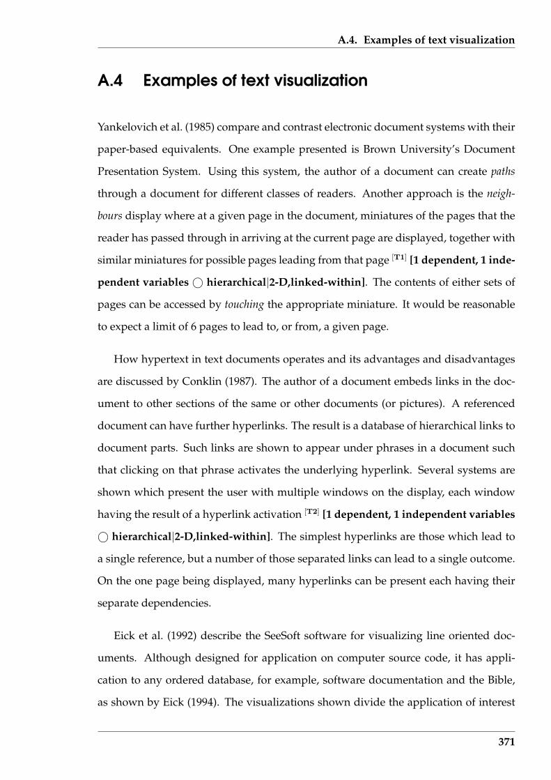
A.4. Examples of text visualization
A.4 Examples of text visualization
Yankelovich et al. (1985) compare and contrast electronic document systems with their
paper-based equivalents. One example presented is Brown University’s Document
Presentation System. Using this system, the author of a document can create paths
through a document for different classes of readers. Another approach is the neigh-
bours display where at a given page in the document, miniatures of the pages that the
reader has passed through in arriving at the current page are displayed, together with
similar miniatures for possible pages leading from that page [T1] [1 dependent, 1 inde-
pendent variables © hierarchical|2-D,linked-within]. The contents of either sets of
pages can be accessed by touching the appropriate miniature. It would be reasonable
to expect a limit of 6 pages to lead to, or from, a given page.
How hypertext in text documents operates and its advantages and disadvantages
are discussed by Conklin (1987). The author of a document embeds links in the doc-
ument to other sections of the same or other documents (or pictures). A referenced
document can have further hyperlinks. The result is a database of hierarchical links to
document parts. Such links are shown to appear under phrases in a document such
that clicking on that phrase activates the underlying hyperlink. Several systems are
shown which present the user with multiple windows on the display, each window
having the result of a hyperlink activation [T2] [1 dependent, 1 independent variables
© hierarchical|2-D,linked-within]. The simplest hyperlinks are those which lead to
a single reference, but a number of those separated links can lead to a single outcome.
On the one page being displayed, many hyperlinks can be present each having their
separate dependencies.
Eick et al. (1992) describe the SeeSoft software for visualizing line oriented doc-
uments. Although designed for application on computer source code, it has appli-
cation to any ordered database, for example, software documentation and the Bible,
as shown by Eick (1994). The visualizations shown divide the application of interest
371
A.4. Examples of text visualization
into component parts, or files. Each part is presented as an elongated box from top to
bottom on the screen, with the box length proportional to the number of lines in the
component that box represents. The statistics relevant to each part is shown in the as-
sociated elongated box. Such statistics as the age of the lines of text and lines changed
to fix bugs are shown as coloured bars, giving the resulting visual the appearance
of bar-codes or biotechnology nucleotide maps [T3] [1 dependent, 1 independent vari-
able© 2-variate|1-D,stacks-vol]. A code reading window can be used to obtain detail
of the part of the source in response to the an area of interest revealed by the statistic’s
visualization.
Gershon & Eick (1995) show a number of visualization techniques applied to text
documents but the word table visualization is of interest here. In this example, all the
words in Lewis Carroll’s Alice in Wonderland were determined and their occurrence in
pairs within a sentence were counted. An overall visualization using coloured dot to
indicate the occurrence of each word in such pairings, indicates areas of interest, but
no further detail is shown [T4] [1 dependent, 2 independent variables © 3-variate|2-
D,stacks-flat]. By interactively zooming in, the words which exhibit different levels of
correlation are shown at the intersection of the axes of the corresponding words. The
overview for broad distribution, and then obtaining more detail when required, when
using different word combinations (in this case of words paired in a sentence) is the
interest here.
Rao et al. (1995) present a number of text visualization techniques, but the Butter-
fly visualization for display of bibliographic search results is considered here. That
visualization presents the results of interaction with a bibliographic library database.
At the head of the butterfly is a summary of the article of interest. The wings show
the article’s reference and on the right are citation to that article [T5] [3 dependent, 1
independent variables © hierarchical|3-D,stacks-vol]. A pseudo three dimensional
visualization results. Colour is used to indicate properties such as frequency of ci-
tation. Clicking on items in the wings brings up the bibliographic summary of that
372
A.4. Examples of text visualization
article and adjusts the wings of the butterfly to reflect this new selection.
A number of different visualizations for showing the occurrence of themes in dif-
ferent documents is given by Salton et al. (1995). The Smart is used to identify text that
correspond to given queries after elimination of common words and word suffixes.
A measure of similarity is computed so that the level of similarity between different
matches can be put into order. The documents containing the matches are drawn as
being parts of the circumference of an ellipse with the proportion each occupies being
proportion to the length of the text. The proportional position where the matching
text occurs is labelled and a straight line drawn between pairs of text producing a
similarity. A threshold similarity value is applied for inclusion in the visualization. A
modified version of this visualization is also given when themes are identified within
text documents by associations established between words used in those documents.
Again the selected paragraphs are arranged in an elliptic formation. One selected
paragraph from a document may be connected to more than one other selection [T6] [2
dependent, 1 independent variables © hierarchical|2-D,linked-within]. More than
one theme can be shown on the one visualization.
A Kahonen’s feature map applied to documents is discussed by Lin (1999). Here
the occurrence of words in the documents considered are considered as indicating a
topic. The underlying software is trained on how to associate words with topics, with
around 40 topics. The occurrence in a document of words associated with more than
one topic implies a relationship between those topics. The area for each topic in the
visualization presenting the result is allocated according to their occurrence counts
of each topic. The visualization resembles a house plan with each room containing
a topic and neighbouring topics associated with it in the data [T7] [2 dependent, 1
independent variables © 3-variate|2-D,stacks-flat]. Topics are drawn adjacent in the
visualization is accordance with their joint occurrence in the document collection the
results for which are being displayed.
The document lens is described by Robertson & Mackinlay (1999) as a focusing de-
373
A.4. Examples of text visualization
vice which retains context. All the pages of the document are proposed to be laid out
on a large flat surface. A search can then be performed on the document and the oc-
currence on each page of passages of interest can be high-lighted, say in red against
the usual black typeface. The lens is rectangular which corresponds to a single page
of text. It is orientated parallel to the plane of the pages while being part of a trans-
parent mass which is placed between the reader’s eye and those pages. The document
lens can be positioned above a page of interest so enabling it to be read, while other
pages covered by the transparent mass appear distorted, diminishing in size proceed-
ing from the edges of the lens. The visualization gives a clear view of the text page
under the lens for its reading and distorted views of those at its sides [T8] [1 dependent,
1 independent variables © 2-variate|2-D,stacks-vol].
The visualization known as ThemeScape is described by Wise et al. (1999). An entire
document corpus, individual documents, or the sentences and paragraphs of a single
document can be visualized with ThemeScape. The themes in the target are deter-
mined via occurrence of words that imply the themes. The occurrence of the themes,
their relative prevalence, and inter-relationships are conveyed by the distribution of
hills and valleys in the visualization [T9] [3 dependent, 1 independent variables ©
4-variate|2-D,stacks-vol]. The landscape metaphor assists the understanding of the
theme interactions and the taking of sections and core samples to further explore the
underlying documents.
The Cosmic Tumbleweed is described by Hetzler et al. (1998b) as a three dimen-
sional visualization designed to show complex relationship between themes and top-
ics. The Cosmic Tumbleweed starts by identifying the topics in a text document corpus
and placing them in a context vector associated with each document. Such multi-
dimensional topic vectors are then reduced to the three most dominant topics present
in each document. Each dominant topic becomes a vertex of the visualization and a
document’s representation triangle is positioned on the line joining the document’s
most dominant topics, offset by the third most dominant topic present in that docu-
374
A.4. Examples of text visualization
ment [T10] [1 dependent, 1 independent variables© hierarchical|3-D,linked-within].
Both the topics present in the corpus, and the number of documents dealing with those
topics, are readily seen from the visualization.
Rose & Wong (2000) present a document visualization as a series of end to tail con-
nected line segments. There is lone line segment for each feature (or topic) present
in the document collection and contained within the document being represented.
Each line segment has a horizontal and a vertical component. The values given to
these components reflect the variance associated with that feature and the pattern of
that feature occurring across the document collection. The line segments representing
each document are placed adjacent to one another to produce the DriftWeed visual-
ization [T11] [many dependent, 1 independent variables © multi-variate|1-D,stacks-
vol]. Similar documents appear as having similar combinations of line segments and
variations across the document collection are also clearly seen.
A visualization of the time evolution of themes in a text document corpus is de-
scribed by Wong et al. (2000). The topics in the corpus are determined and from that
a selection of which to follow in the visualization is made manually. Each document
is time-stamped in some manner, say by its publishing data in the case of a corpus
of news articles. Sequential patterns of topics are determined algorithmically, and a
measure of support for that pattern is calculated for all patterns observed on the time
frame of interest. Patterns having a support less than a given threshold are discarded.
The visualization has the time axis horizontal and the vertical axis containing the se-
lected topics, with coloured straight lines showing the temporal pattern evolution of
those topics [T12] [1 dependent, 2 independent variables© sequential,hierarchical|2-
D,linked-within]. The colour of the straight lines indicate the computed measure of
support for that part of the pattern.
Miller et al. (1998) describe the application of energy calculations to the visualiza-
tion of a single text document at multi-resolution levels. The number of such lev-
els depend on the length of the document. Three different types of wavelet energies
375
A.4. Examples of text visualization
are defined which act was filters on the contents of the document relative to its in-
formation content. Each wavelet has a different application, such as keyword ex-
traction and query matching. The visualization takes the form of a strip chart for
each multi-resolution level with a trace of the selected wavelet energy along the docu-
ment’s length [T13] [2 dependent, 1 independent variables © sequential,2-variate|2-
D,stacks-flat]. From such strip charts islands of the information in the document can
be visualized. Collectively the visualization are known as Tropic Islands.
Skim reading of text is assisted by the visualization produced on the XLibris hand-
held electronic device described by Schilit et al. (1999). Although all the words of a
text document that will fit onto the device’s screen are shown, some ten percent of
the words are shown in bold type [T14] [1 dependent, 1 independent variables © 2-
variate|2-D,stacks-flat]. Such words are selected algorithmically by the device to assist
the user to skim read the text. The hierarchical dependency between the words and the
contribution each makes to the information content in the given text are attempted to
be captured in the highlighted words. By reading those highlighted words, the reader
can estimate the information content of the whole text document.
One popular method of sentence structure analysis is by Reed-Kellogg diagrams
which are developed by Kolln (1986). Such diagrams arrange the parts of a sentence
in a stick diagram formation with the branches of the diagram labelled with the words,
or groups of words, from the sentence [T15] [1 dependent, 1 independent variables
© network|2-D,linked-within]. Branching in the diagram is done to show the rela-
tionship between the associated words. Kolln (1986) shows ten basic forms of such
diagrams as being capable of representing the majority of sentences encountered in
English grammar.
376

Appendix B
Directions given to experiment
participants
This experiment measures the time that it takes you to read a passage of science fiction.
It then asks some comprehension questions related to the passage that you have just
read. When answering those questions the text will not be available for reference, so
you should pay attention to detail in your reading.
What you will see on the screen is the text with some words appearing black and
others in grey. Try and concentrate in your reading on the words shown in black,
and use the other words as assistants. The experiment is aimed at determining the
influence that balance of black and grey words has upon your reading.
The experiment is broken into two parts. The first part is a demonstration. In it you
will be shown the one piece of science fiction four times. In the first, there will be no
words greyed out, and in the next three different techniques will be used to grey out
words. These are the four greying techniques that are used in the experiment. After
reading those four copies, you will be asked some comprehension questions. Those
comprehension questions will related to the one text that you have read under the four
different word fadings.
In the second half of the experiment you will be shown three different pieces of
science fiction. Each piece will have a different word fading applied to it. One of those
377

APPENDIX B. DIRECTIONS GIVEN TO EXPERIMENT PARTICIPANTS
word fadings will be without any words greyed out at all. After you have read each
piece you will be asked the comprehension questions related to that piece of science
fiction that you have just read. Remember that the software that you are using during
this experiment is keeping track of the time that you take to read each text, but not
while you answer the comprehension questions.
To start the first part of the experiment, click the Initialize button first. When you
are ready to start reading, click the Start button. When you are finished reading click
the Stop button. This Start/Stop sequence will be used throughout both parts of the
experiment. Once you are happy with the answer that you have selected for a com-
prehension question, click the That is my answer – Next question button at the bottom
of that question panel. The experiment proceeds automatically, or by asking for your
action when necessary. All reading and answering of questions is done using the PC.
Have you any questions before you get started?
378
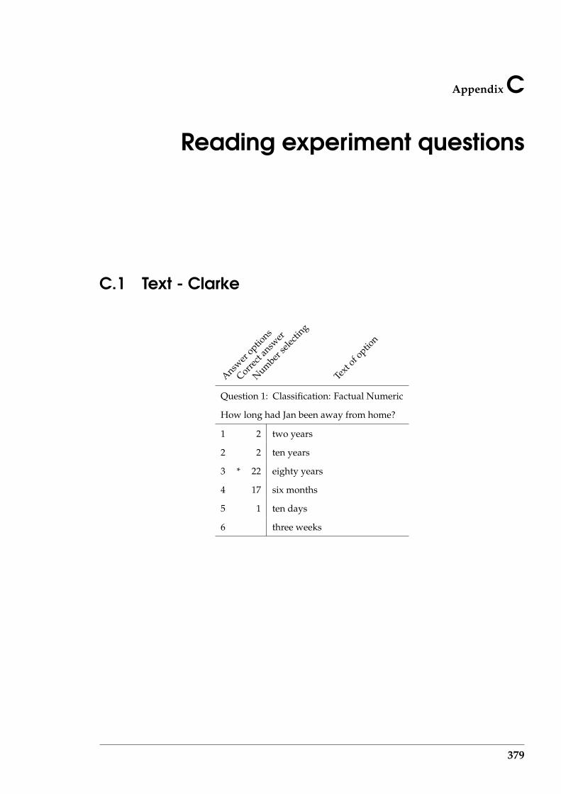
Appendix C
Reading experiment questions
C.1 Text - Clarke
Answer
options
Correct
answ
er
Number
selec
ting
Text
of option
Question 1: Classification: Factual Numeric
How long had Jan been away from home?
1 2 two years
2 2 ten years
3 * 22 eighty years
4 17 six months
5 1 ten days
6 three weeks
379

C.1. Text - Clarke
Answer
options
Correct
answ
er
Number
selec
ting
Text
of option
Question 2: Classification: Factual Numeric
How many pilots were there on the Overlord’s ship?
1 1 none
2 2 one
3 2 two
4 * 37 three
5 2 four
6 one at a time
Question 3: Classification: Factual
What was shown on the Overlord’s ship’s control panel?
1 * 18 shapes and colours
2 8 banks of meters
3 9 great screen
4 4 flashing coloured lights
5 5 a map of the universe
6 an interactive game
Question 4: Classification: Inferential
At the end of his outward journey, in what environment did Jan find himself?
1 3 cities with towers lost among the clouds
2 1 Earth like
3 24 almost featureless plain
4 * 12 city with no streets
5 3 a vaulted chamber with closing roof
6 1 an apartment similar to his one at home
380

C.1. Text - Clarke
Answer
options
Correct
answ
er
Number
selec
ting
Text
of option
Question 5: Classification: Inferential
In what way did Overlords differ from humans?
1 13 they do not need regular sleep periods
2 all understand English well
3 3 communicate well by gestures
4 * 28 they fly
5 their head appears too large for their body
6 they have four body subdivisions
Question 6: Classification: Inferential
Which of the following is the best title to describe this article?
1 5 Jan’s life
2 * 22 Culture from another sun
3 9 Overlord society
4 2 The language of the Overlords
5 Overlord airlines
6 6 Abduction
381

C.2. Text - Tritten
C.2 Text - Tritten
Answer
options
Correct
answ
er
Number
selec
ting
Text
of option
Question 1: Classification: Factual
Why was Giddy missing from Bravo’s side?
1 2 been run over by a mechanical horse
2 4 had got too close to Kodak
3 * 34 had died of a color overdose
4 2 run off with one of the Mates
5 1 a glass bird had taken her away
6 1 had fallen under the influence of black drizzle
Question 2: Classification: Factual
How many balls of lint had Bravo’s efforts produced?
1 2 none
2 * 6 one
3 1 twenty
4 2 boxes full
5 5 eight
6 28 it is not stated in the article
Question 3: Classification: Factual
For what talent was Bravo noted?
1 he was a plumber
2 6 he was a restless youth
3 1 for his clear thinking
4 * 34 he was a dreamer
5 3 he was a hard worker
6 fortune telling
382
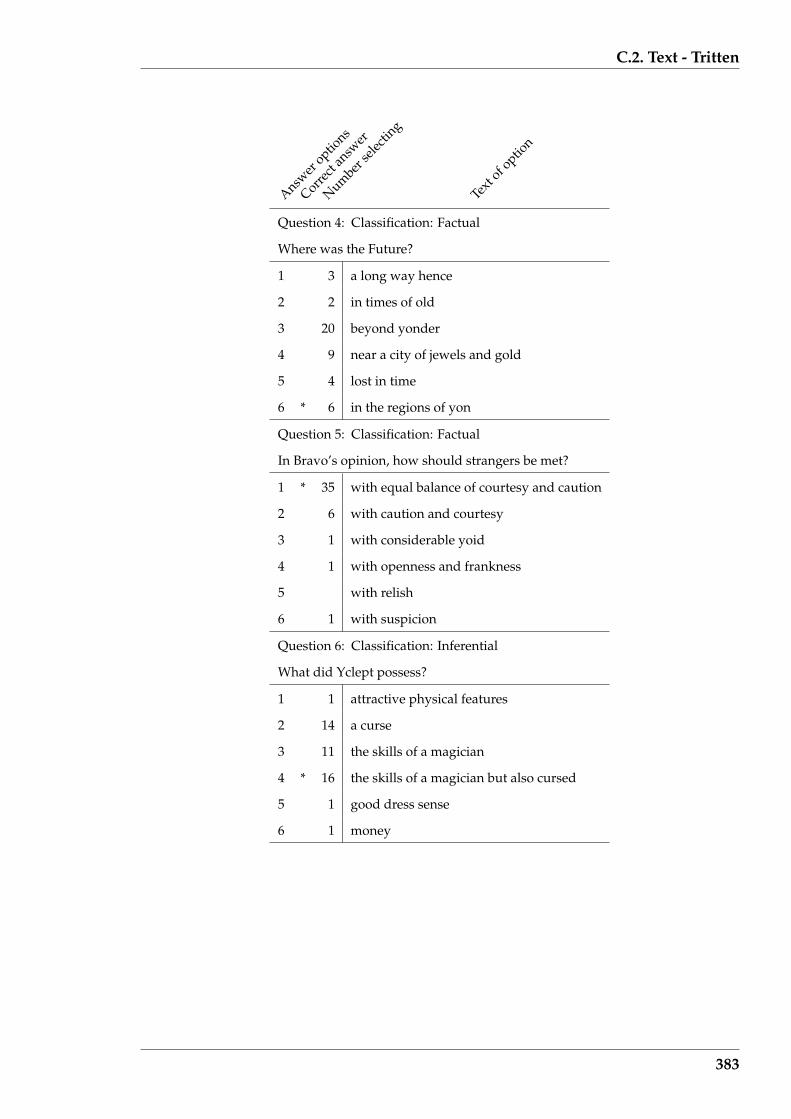
C.2. Text - Tritten
Answer
options
Correct
answ
er
Number
selec
ting
Text
of option
Question 4: Classification: Factual
Where was the Future?
1 3 a long way hence
2 2 in times of old
3 20 beyond yonder
4 9 near a city of jewels and gold
5 4 lost in time
6 * 6 in the regions of yon
Question 5: Classification: Factual
In Bravo’s opinion, how should strangers be met?
1 * 35 with equal balance of courtesy and caution
2 6 with caution and courtesy
3 1 with considerable yoid
4 1 with openness and frankness
5 with relish
6 1 with suspicion
Question 6: Classification: Inferential
What did Yclept possess?
1 1 attractive physical features
2 14 a curse
3 11 the skills of a magician
4 * 16 the skills of a magician but also cursed
5 1 good dress sense
6 1 money
383

C.2. Text - Tritten
Answer
options
Correct
answ
er
Number
selec
ting
Text
of option
Question 7: Classification: Factual Numeric
How many new and useful pieces of education did Yclept impart to Bravo?
1 * 18 more than a hundred
2 6 six
3 3 seven
4 7 eight
5 * 6 one hundred
6 4 thousands
Question 8: Classification: Inferential
What happened to Yclept?
1 * 37 he was exterminated
2 1 he left Bravo in the village inn
3 1 he continued his travels independent of Bravo
4 2 he remained in the straw hut village with the young woman
5 1 he continued travelling with Bravo beyond the straw hut village
6 2 he returned to the land from which he came
Question 9: Classification: Inferential
How long did Bravo’s travels, recounted in the article, last?
1 8 ten minutes
2 * 23 many days
3 3 one day
4 4 nine days
5 3 ten days
6 3 eleven days
384

C.2. Text - Tritten
Answer
options
Correct
answ
er
Number
selec
ting
Text
of option
Question 10: Classification: Inferential
Where did Bravo’s travels end?
1 2 in a far off land
2 3 in a whirlpool
3 * 28 at work at his desk
4 7 with Brynmawr near a tumbled pile of stones
5 2 with his family
6 2 the continued endlessly
385
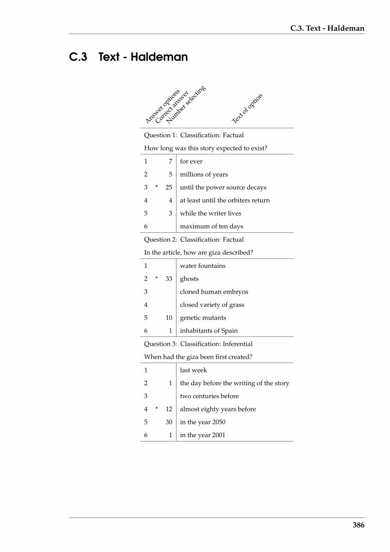
C.3. Text - Haldeman
C.3 Text - Haldeman
Answer
options
Correct
answ
er
Number
selec
ting
Text
of option
Question 1: Classification: Factual
How long was this story expected to exist?
1 7 for ever
2 5 millions of years
3 * 25 until the power source decays
4 4 at least until the orbiters return
5 3 while the writer lives
6 maximum of ten days
Question 2: Classification: Factual
In the article, how are giza described?
1 water fountains
2 * 33 ghosts
3 cloned human embryos
4 closed variety of grass
5 10 genetic mutants
6 1 inhabitants of Spain
Question 3: Classification: Inferential
When had the giza been first created?
1 last week
2 1 the day before the writing of the story
3 two centuries before
4 * 12 almost eighty years before
5 30 in the year 2050
6 1 in the year 2001
386
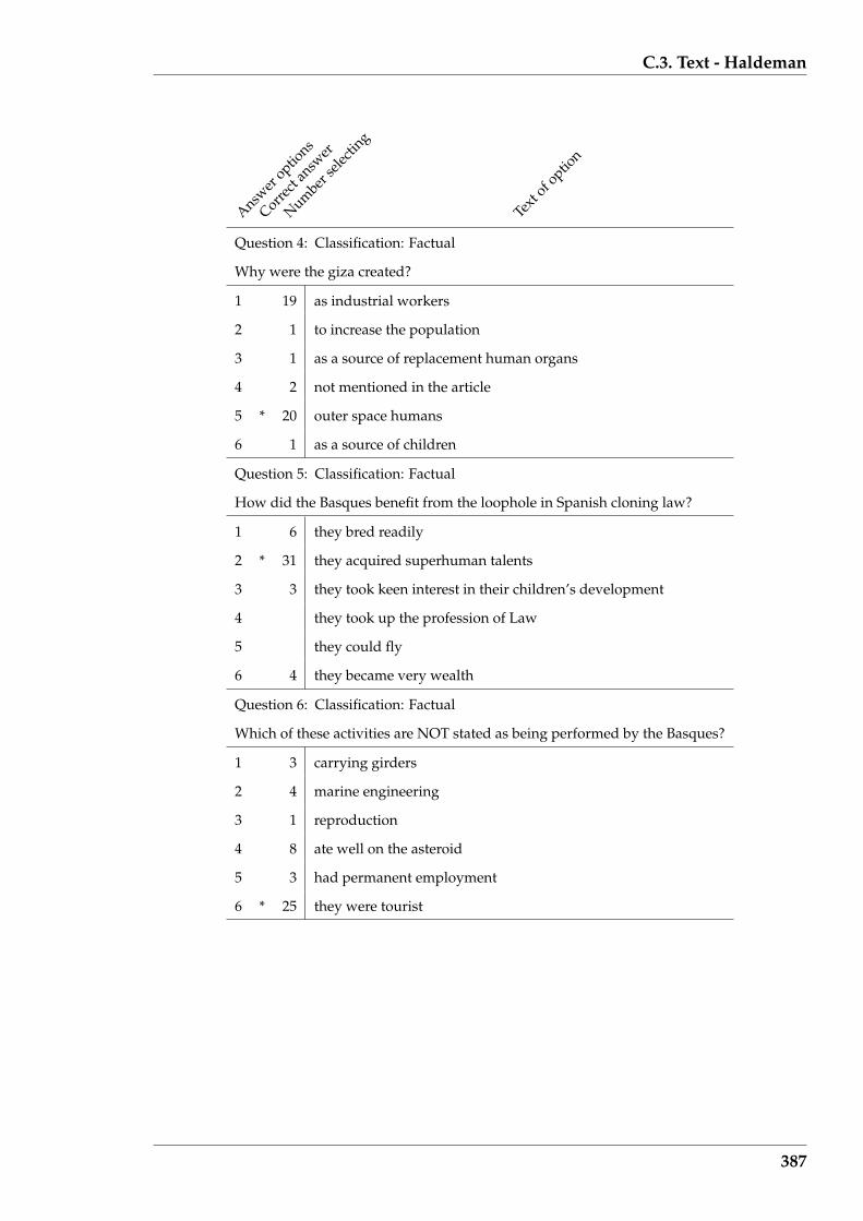
C.3. Text - Haldeman
Answer
options
Correct
answ
er
Number
selec
ting
Text
of option
Question 4: Classification: Factual
Why were the giza created?
1 19 as industrial workers
2 1 to increase the population
3 1 as a source of replacement human organs
4 2 not mentioned in the article
5 * 20 outer space humans
6 1 as a source of children
Question 5: Classification: Factual
How did the Basques benefit from the loophole in Spanish cloning law?
1 6 they bred readily
2 * 31 they acquired superhuman talents
3 3 they took keen interest in their children’s development
4 they took up the profession of Law
5 they could fly
6 4 they became very wealth
Question 6: Classification: Factual
Which of these activities are NOT stated as being performed by the Basques?
1 3 carrying girders
2 4 marine engineering
3 1 reproduction
4 8 ate well on the asteroid
5 3 had permanent employment
6 * 25 they were tourist
387
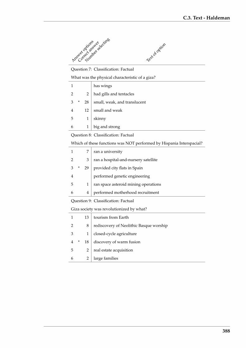
C.3. Text - Haldeman
Answer
options
Correct
answ
er
Number
selec
ting
Text
of option
Question 7: Classification: Factual
What was the physical characteristic of a giza?
1 has wings
2 2 had gills and tentacles
3 * 28 small, weak, and translucent
4 12 small and weak
5 1 skinny
6 1 big and strong
Question 8: Classification: Factual
Which of these functions was NOT performed by Hispania Interspacial?
1 7 ran a university
2 3 ran a hospital-and-nursery satellite
3 * 29 provided city flats in Spain
4 performed genetic engineering
5 1 ran space asteroid mining operations
6 4 performed motherhood recruitment
Question 9: Classification: Factual
Giza society was revolutionized by what?
1 13 tourism from Earth
2 8 rediscovery of Neolithic Basque worship
3 1 closed-cycle agriculture
4 * 18 discovery of warm fusion
5 2 real estate acquisition
6 2 large families
388
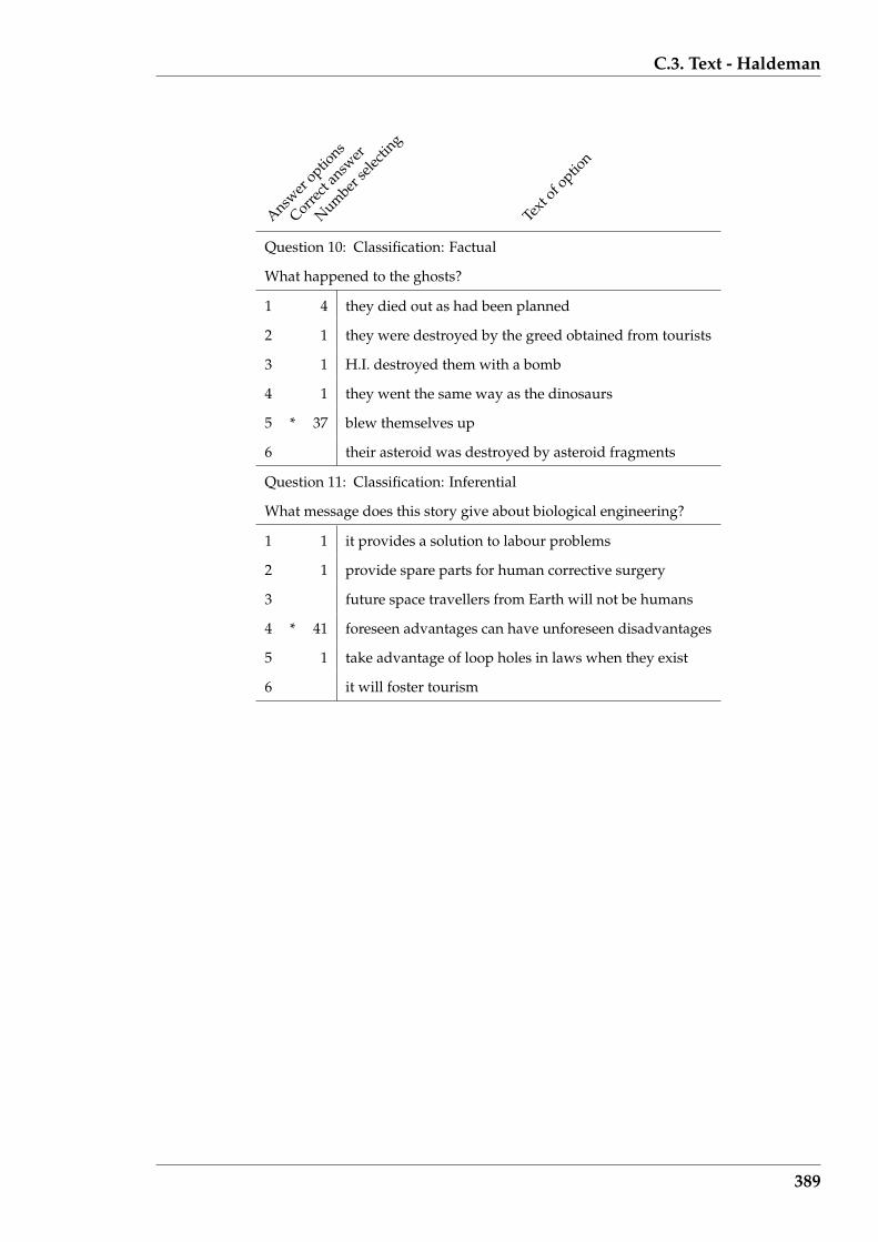
C.3. Text - Haldeman
Answer
options
Correct
answ
er
Number
selec
ting
Text
of option
Question 10: Classification: Factual
What happened to the ghosts?
1 4 they died out as had been planned
2 1 they were destroyed by the greed obtained from tourists
3 1 H.I. destroyed them with a bomb
4 1 they went the same way as the dinosaurs
5 * 37 blew themselves up
6 their asteroid was destroyed by asteroid fragments
Question 11: Classification: Inferential
What message does this story give about biological engineering?
1 1 it provides a solution to labour problems
2 1 provide spare parts for human corrective surgery
3 future space travellers from Earth will not be humans
4 * 41 foreseen advantages can have unforeseen disadvantages
5 1 take advantage of loop holes in laws when they exist
6 it will foster tourism
389

C.4. Text - Banks
C.4 Text - Banks
Answer
options
Correct
answ
er
Number
selec
ting
Text
of option
Question 1: Classification: Factual
What obscures the bridge?
1 3 the sea
2 2 the river
3 * 37 grey clouds
4 2 mist from the moor
5 mist from the far distance
6 sleepy eyes
Question 2: Classification: Inferential
What is the attitude of the writer to clothes?
1 3 cannot be determined from the article
2 * 33 they make a statement of class
3 they hide the body
4 6 they impress the observer
5 2 a coat of paint
6 a uniform
Question 3: Classification: Inferential
How many times does the sick man appear?
1 2 once
2 * 36 twice
3 2 three times
4 1 four times
5 2 many times
6 1 there is no sick man
390
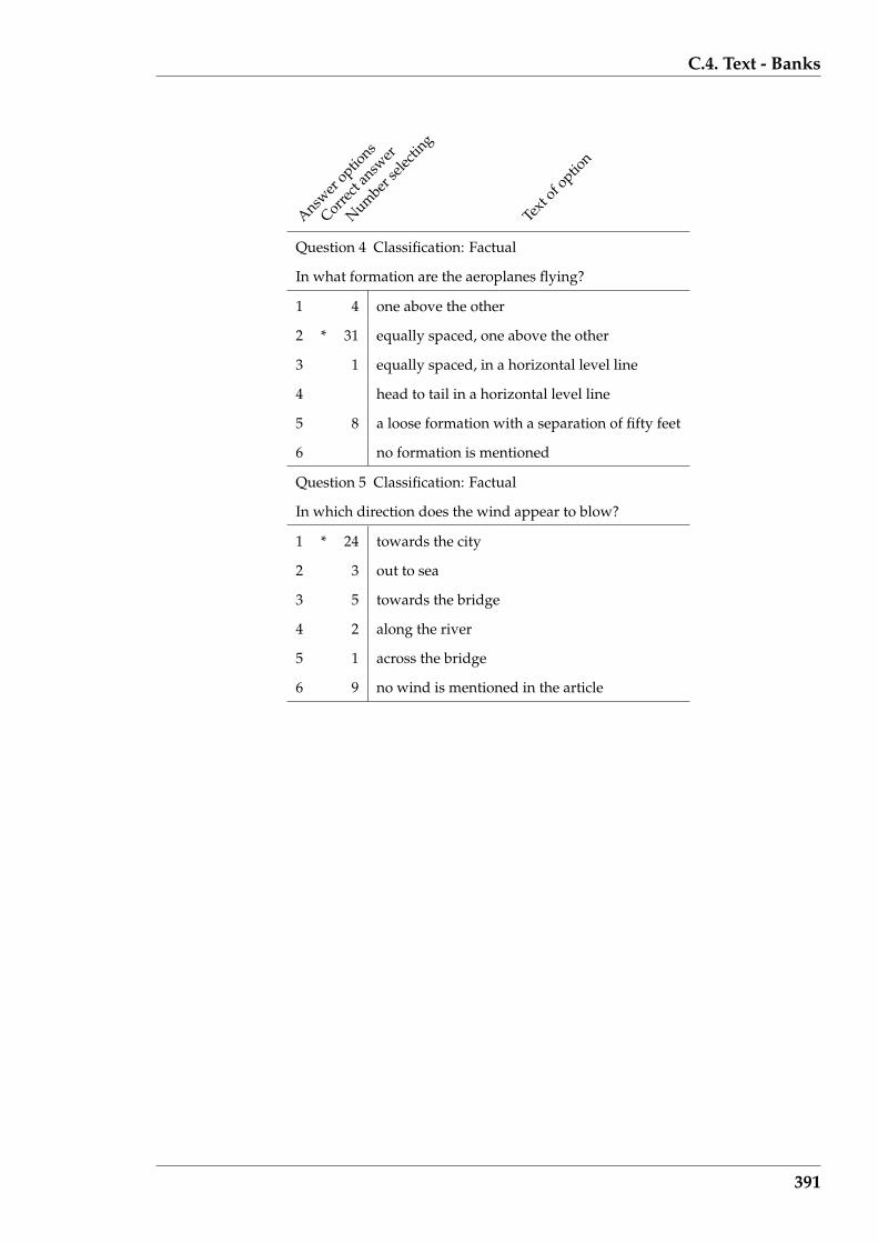
C.4. Text - Banks
Answer
options
Correct
answ
er
Number
selec
ting
Text
of option
Question 4 Classification: Factual
In what formation are the aeroplanes flying?
1 4 one above the other
2 * 31 equally spaced, one above the other
3 1 equally spaced, in a horizontal level line
4 head to tail in a horizontal level line
5 8 a loose formation with a separation of fifty feet
6 no formation is mentioned
Question 5 Classification: Factual
In which direction does the wind appear to blow?
1 * 24 towards the city
2 3 out to sea
3 5 towards the bridge
4 2 along the river
5 1 across the bridge
6 9 no wind is mentioned in the article
391
Appendix D
Examples of experiment’s reading
screens
Examples of the information displays presented to the reading experiment partici-
pants are shown. Each shows the same segment of text, the start of the clarke article,
under the four word fading conditions:
• no fading;
• Type 1 (fading the seventeen common most frequent words);
• Type 2 (fading words occurring five or more times in the article); and
• Type 3 (fading words occurring five or more times, and those occurring twice or
fewer times, in the article)
used in the experiment. Type 2 corresponds to fading the top of the word frequency
distribution of that article, while Type 3 fades the words of Type 2 plus the words in
that distribution’s tail. The experiment participants were asked to read only the words
that were not faded.
The experiment participant needed to drag the slider on the right side of the screen
to scroll additional faded text into the reading screens.
392
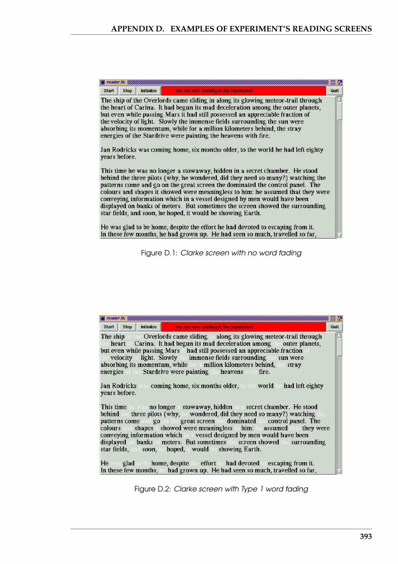
APPENDIX D. EXAMPLES OF EXPERIMENT’S READING SCREENS
Figure D.1: Clarke screen with no word fading
Figure D.2: Clarke screen with Type 1 word fading
393
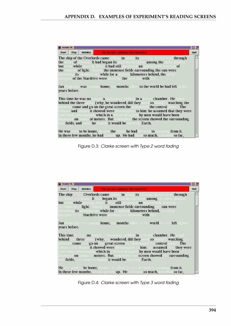
APPENDIX D. EXAMPLES OF EXPERIMENT’S READING SCREENS
Figure D.3: Clarke screen with Type 2 word fading
Figure D.4: Clarke screen with Type 3 word fading
394
Appendix E
Auxiliary Parallel Coordinate plot
Information
This Appendix contains information which supports the development in Section 6.2
of Parallel Coordinates, and their associated plots, for display of multi-dimensional
data. The additional five Parallel Coordinate plots used in the Federalist Papers author
attribution problem of Section 6.3 are also included here.
E.1 Representation of a point in Parallel Coordinates
An n dimensional Euclidean space has n coordinate axes (which are its dimensions).
By definition of an Euclidean space, these n axes are orthogonal (at right angles) to
each other. The position of a point in this space is defined by the projections that that
points makes on each of these n axes; the position of the point is specified by those n
values.
Now consider a non-Euclidean space where the coordinate axes are not orthogo-
nal, but parallel. For each axis in the Euclidean space there is to one, and only one,
corresponding axis in this non-Euclidean space. A consequence of this is the initial
n dimensional Euclidean space is mapped into the new n dimensional non-Euclidean
space, called a parallel coordinate space. Thus each orthogonal Euclidean axis corre-
395
E.2. Parallel Coordinate plots showing linear dependency
sponds to one parallel coordinate axis. Further, a mapping between the Euclidean
and parallel coordinate spaces is defined such that a point in the Euclidean space is
mapped to a polyline in the parallel coordinate space. That polyline is composed of
straight line segments connecting the mapped coordinate intercepts between adjacent
parallel axes.
Notice in the above definition that the order of the parallel coordinates, i.e. which
parallel coordinates are adjacent, is not specified. There is also no requirement that
each parallel coordinate has the same scale which maps a numeric value to a spatial
representation. Each parallel coordinate axis is usually orientated in the same direc-
tion, but this is not necessary.
E.2 Parallel Coordinate plots showing linear depen-
dency
In Parallel Coordinate plots, the coordinate values are considered in pairs for the in-
terest is in the polyline between each pair of coordinate axes. The polylines between
paired parallel coordinate axes is in the same plane that contains the corresponding
parallel coordinates. This can be represented, without loss of generality, in a two di-
mensional Euclidean space. In such a two dimensional Euclidean space, consider a
straight line H as shown in Figure E.1a. This line denotes a particular collection of lin-
ear dependent values of the variables x and y. Let this straight line intersect the y axis
at b, and the x axis at c, so the points (0, b) and (c, 0) lie on the straight line H which
is represented by the equation y = mx + b, where m and b are (as yet) unspecified
constants.
On the x− y coordinate system, superimpose two lines parallel to the y axis sepa-
rated by distance d, as shown in Figure E.1b. Denote these parallel lines as X1 and X2.
These are the parallel coordinates corresponding to the x and y axis, respectively, of
396

E.2. Parallel Coordinate plots showing linear dependency
Figure E.1a. To simplify the calculations which follow, arrange the X1 parallel coordi-
nate axis to coincide with the y axis.
(0,b)
(c,0) x
y
y = mx + b
H
(a) linear function of 2 variables
y
X1 2X
x
P
Q
R
d0
b
0
c
a
am + b
i
(b) same function in parallel coordinates
Figure E.1: Parallel coordinate representation of linear dependency
Consider points on the line H in Figure E.1a. Two particular points on the line H
are where it intersects the x and y axes. The point (0, b) is mapped to the points 0 on
X1 and b on X2 in Figure E.1b (the X1 parallel axis takes the x component and the X2
parallel axis takes the y component). The line Q passes through those two points in
the parallel coordinate system of Figure E.1b. Similarly, the point (c, 0) in Figure E.1a
line on the line P in Figure E.1b. If these lines are not parallel, they will intersect at
some point i. Now take a general value, a, for the variable x in Figure E.1a laying on
the line H . Then the value am + b is the corresponding value of y, this being obtained
from the equation of the line H . The line R passes through those points in Figure E.1b.
Since the point (a, ma + b) is any point on the line H of Figure E.1a which includes
the particular points (0, b) and (c, 0), and since the lines Q and P intersect at the point
i, then the line R must also pass through that point i. Consequently, the line R is the
general line (the locus) in the parallel coordinate system of any general point on the
line H of the Euclidean coordinate system of Figure E.1a.
397
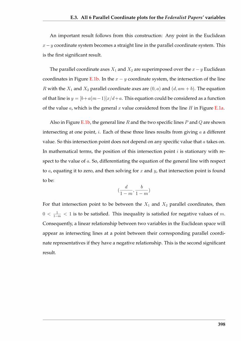
E.3. All 6 Parallel Coordinate plots for the Federalist Papers’ variables
An important result follows from this construction: Any point in the Euclidean
x− y coordinate system becomes a straight line in the parallel coordinate system. This
is the first significant result.
The parallel coordinate axes X1 and X2 are superimposed over the x− y Euclidean
coordinates in Figure E.1b. In the x − y coordinate system, the intersection of the line
R with the X1 and X2 parallel coordinate axes are (0, a) and (d, am + b). The equation
of that line is y = [b+a(m−1)]x/d+a. This equation could be considered as a function
of the value a, which is the general x value considered from the line H in Figure E.1a.
Also in Figure E.1b, the general line R and the two specific lines P and Q are shown
intersecting at one point, i. Each of these three lines results from giving a a different
value. So this intersection point does not depend on any specific value that a takes on.
In mathematical terms, the position of this intersection point i is stationary with re-
spect to the value of a. So, differentiating the equation of the general line with respect
to a, equating it to zero, and then solving for x and y, that intersection point is found
to be:
(d
1−m,
b
1−m)
For that intersection point to be between the X1 and X2 parallel coordinates, then
0 < 11−m
< 1 is to be satisfied. This inequality is satisfied for negative values of m.
Consequently, a linear relationship between two variables in the Euclidean space will
appear as intersecting lines at a point between their corresponding parallel coordi-
nate representatives if they have a negative relationship. This is the second significant
result.
398

E.3. All 6 Parallel Coordinate plots for the Federalist Papers’ variables
E.3 All 6 Parallel Coordinate plots for the Federalist
Papers’ variables
In exploring the 85 Federalist papers, 13 variables were used. Using Parallel Coordi-
nate plots, 6 plots are required so as to obtain each of the 13 variables, represented by
the parallel axes, to be adjacent to all of the others. It is between each of these parallel
axes that the behaviour of the data lines is of interest. Each plot has a different combi-
nation of adjacent axes, although all axes are present. Each plot starts and concludes
with the axes of variable 1. Each axes is scaled for plotting so that the maximum and
minimum positions on that axes corresponds to the maximum and minimum of the
data plotted on that axis. The meaning of each of these numbered variables is con-
tained in Table 6.2.
With each selection of the ordering of the axes, a Parallel Coordinate plot was gen-
erated for the Federalist Papers known (or accepted) to have been authored by Madi-
son, Hamilton, and jointly by both. A similar plot was generated for the papers whose
authorship is disputed. To assist visual comparison, these plots of the four different
subjects are grouped with common axes arrangements.
399

E.3. All 6 Parallel Coordinate plots for the Federalist Papers’ variables
1 1
2 2
3 3
4 4
5 5
6 6
7 7
8 8
9 9
10 10
11 11
12 12
13 13
1 1
(a) Madison papers
1 1
2 2
3 3
4 4
5 5
6 6
7 7
8 8
9 9
10 10
11 11
12 12
13 13
1 1
(b) Hamilton papers
1 1
2 2
3 3
4 4
5 5
6 6
7 7
8 8
9 9
10 10
11 11
12 12
13 13
1 1
(c) Joint authorship papers
1 1
2 2
3 3
4 4
5 5
6 6
7 7
8 8
9 9
10 10
11 11
12 12
13 13
1 1
(d) Disputed papers
Figure E.2: Parallel Coordinate plots of the Federalist Papers – arrangement 1
400
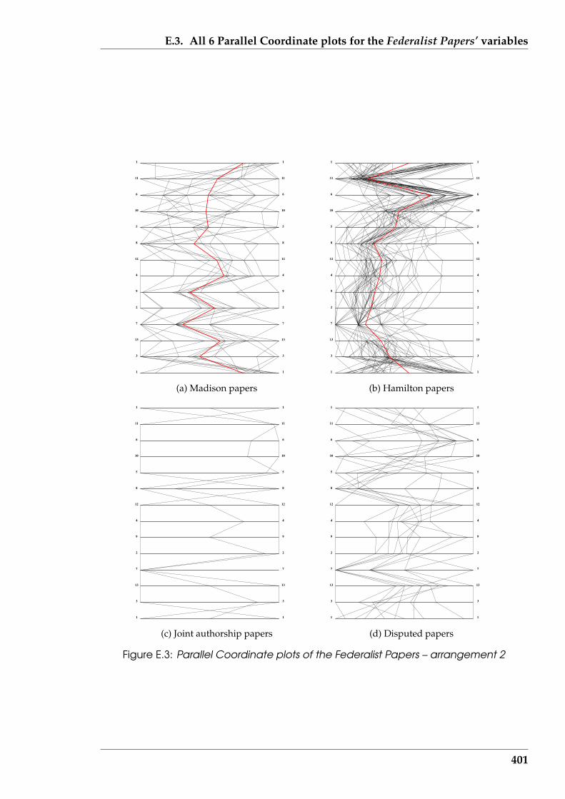
E.3. All 6 Parallel Coordinate plots for the Federalist Papers’ variables
1 1
3 3
13 13
7 7
2 2
9 9
4 4
12 12
8 8
5 5
10 10
6 6
11 11
1 1
(a) Madison papers
1 1
3 3
13 13
7 7
2 2
9 9
4 4
12 12
8 8
5 5
10 10
6 6
11 11
1 1
(b) Hamilton papers
1 1
3 3
13 13
7 7
2 2
9 9
4 4
12 12
8 8
5 5
10 10
6 6
11 11
1 1
(c) Joint authorship papers
1 1
3 3
13 13
7 7
2 2
9 9
4 4
12 12
8 8
5 5
10 10
6 6
11 11
1 1
(d) Disputed papers
Figure E.3: Parallel Coordinate plots of the Federalist Papers – arrangement 2
401
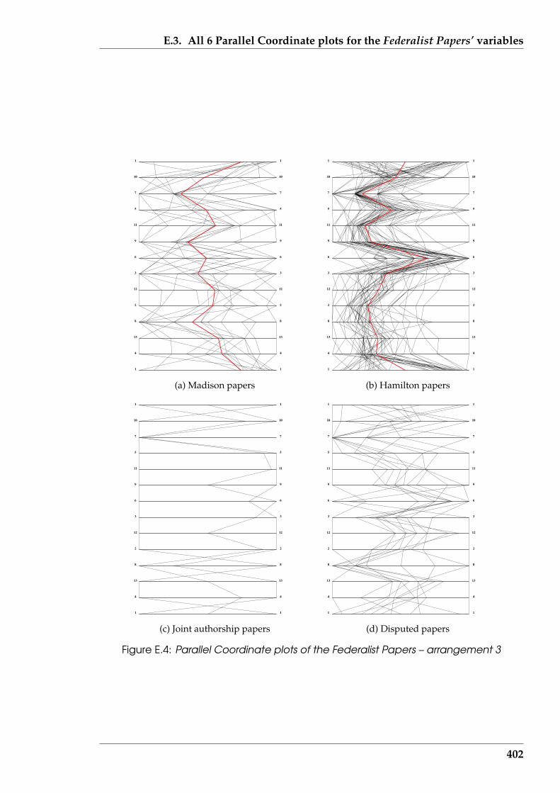
E.3. All 6 Parallel Coordinate plots for the Federalist Papers’ variables
1 1
4 4
13 13
8 8
2 2
12 12
3 3
6 6
9 9
11 11
5 5
7 7
10 10
1 1
(a) Madison papers
1 1
4 4
13 13
8 8
2 2
12 12
3 3
6 6
9 9
11 11
5 5
7 7
10 10
1 1
(b) Hamilton papers
1 1
4 4
13 13
8 8
2 2
12 12
3 3
6 6
9 9
11 11
5 5
7 7
10 10
1 1
(c) Joint authorship papers
1 1
4 4
13 13
8 8
2 2
12 12
3 3
6 6
9 9
11 11
5 5
7 7
10 10
1 1
(d) Disputed papers
Figure E.4: Parallel Coordinate plots of the Federalist Papers – arrangement 3
402

E.3. All 6 Parallel Coordinate plots for the Federalist Papers’ variables
1 1
5 5
2 2
6 6
8 8
4 4
11 11
3 3
10 10
13 13
9 9
7 7
12 12
1 1
(a) Madison papers
1 1
5 5
2 2
6 6
8 8
4 4
11 11
3 3
10 10
13 13
9 9
7 7
12 12
1 1
(b) Hamilton papers
1 1
5 5
2 2
6 6
8 8
4 4
11 11
3 3
10 10
13 13
9 9
7 7
12 12
1 1
(c) Joint authorship papers
1 1
5 5
2 2
6 6
8 8
4 4
11 11
3 3
10 10
13 13
9 9
7 7
12 12
1 1
(d) Disputed papers
Figure E.5: Parallel Coordinate plots of the Federalist Papers – arrangement 4
403
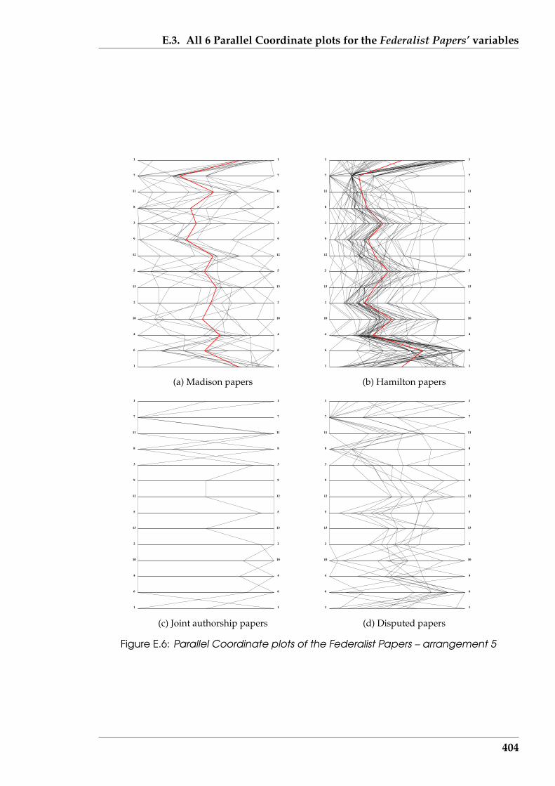
E.3. All 6 Parallel Coordinate plots for the Federalist Papers’ variables
1 1
6 6
4 4
10 10
2 2
13 13
5 5
12 12
9 9
3 3
8 8
11 11
7 7
1 1
(a) Madison papers
1 1
6 6
4 4
10 10
2 2
13 13
5 5
12 12
9 9
3 3
8 8
11 11
7 7
1 1
(b) Hamilton papers
1 1
6 6
4 4
10 10
2 2
13 13
5 5
12 12
9 9
3 3
8 8
11 11
7 7
1 1
(c) Joint authorship papers
1 1
6 6
4 4
10 10
2 2
13 13
5 5
12 12
9 9
3 3
8 8
11 11
7 7
1 1
(d) Disputed papers
Figure E.6: Parallel Coordinate plots of the Federalist Papers – arrangement 5
404
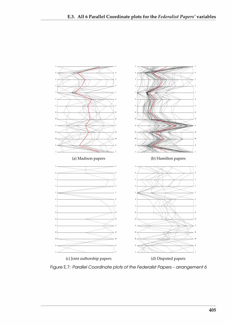
E.3. All 6 Parallel Coordinate plots for the Federalist Papers’ variables
1 1
8 8
10 10
12 12
6 6
13 13
11 11
2 2
4 4
7 7
3 3
5 5
9 9
1 1
(a) Madison papers
1 1
8 8
10 10
12 12
6 6
13 13
11 11
2 2
4 4
7 7
3 3
5 5
9 9
1 1
(b) Hamilton papers
1 1
8 8
10 10
12 12
6 6
13 13
11 11
2 2
4 4
7 7
3 3
5 5
9 9
1 1
(c) Joint authorship papers
1 1
8 8
10 10
12 12
6 6
13 13
11 11
2 2
4 4
7 7
3 3
5 5
9 9
1 1
(d) Disputed papers
Figure E.7: Parallel Coordinate plots of the Federalist Papers – arrangement 6
405
References
Agba, E. I. (1995): “SeaMaster: An ROV-manipulator system simulator”, IEEE Com-puter Graphics and Applications, vol. 15, no. 1, pp. 24–31.
Albello, J. & Korn, J. (2002): “MGV: A system for visualizing massive multidigraphs”,IEEE Transactions on Visualization and Computer Graphics, vol. 8, no. 1, pp. 21–38.
Aldous, J. M. & Wilson, R. J. (2000): Graphs and Applications: An Introductory Approach,Springer, London.
Andrews, D. (1972): “Plots of high-dimensional data”, Biometrics, vol. 28, no. 1, pp.125–36.
Asimov, D. (1985): “The Grand Tour: A tool for viewing multidimensional data”,SIAM Journal on Scientific and Statistical Computing, vol. 6, no. 1, pp. 128–43.
Atkinson, R. L., Atkinson, R. C., Smith, E. E., & Bem, D. J. (1993): Introduction to Psy-chology, Harcourt Brace College Publishers, Fort Worth, eleventh edn.
Australian Government Publishing Service (1992): Style Manual: For Authors, Editorsand Printers, Australian Government Publishing Service, Canberra, fourth edn.
Baker, M. J. & Eick, S. G. (1995): “Space-filling software visualization”, Journal of VisualLanguages and Computing, vol. 6, no. 2, pp. 119–33.
Barnsley, M. F. (1993): Fractals Everywhere: The First Course in Deterministic Fractal Ge-ometry, Academic Press, San Diego, CA., 2nd edn.
Bassin, C. B. & Martin, C. J. (1976): “Effects of three types of redundancy reductionon comprehension, reading rate, and reading time of English prose”, Journal ofEducational Psychology, vol. 68, no. 5, pp. 649–52.
Becker, R. A. & Cleveland, W. S. (1987): “Brushing scatterplots”, Technometrics, vol. 29,no. 2, pp. 127–42.
Becker, R. A., Eick, S. G., & Wilks, A. R. (1995): “Visualizing network data”, IEEETransactions on Visualization and Computer Graphics, vol. 1, no. 1, pp. 16–28.
Benes, B. & Espinosa, E. (2001): “Using particles for 3D texture sculpting”, Journal ofVisualization and Computer Animation, vol. 12, no. 4, pp. 191–201.
Bennett, W. R., Jr (1976): Scientific and Engineering Problem-solving with the Computer,Prentice-Hall, Englewood Cliffs, NJ.
Berghel, H. L. (1996): “The client’s side of the World-Wide Web”, Communications ofthe ACM, vol. 39, no. 1, pp. 30–40.
Berghel, H. L. (1997): “Digital village: Cyberspace 2000: Dealing with informationoverload”, Communications of the ACM, vol. 40, no. 2, pp. 19–24.
406
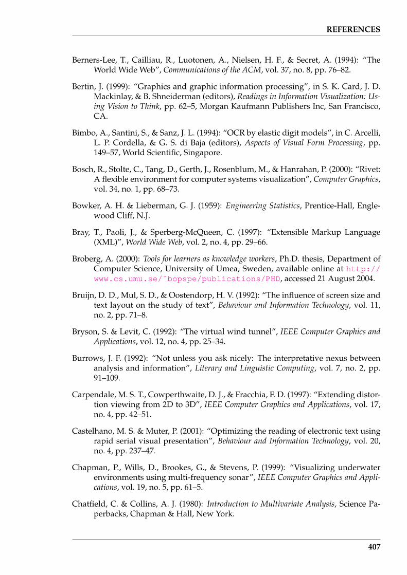
REFERENCES
Berners-Lee, T., Cailliau, R., Luotonen, A., Nielsen, H. F., & Secret, A. (1994): “TheWorld Wide Web”, Communications of the ACM, vol. 37, no. 8, pp. 76–82.
Bertin, J. (1999): “Graphics and graphic information processing”, in S. K. Card, J. D.Mackinlay, & B. Shneiderman (editors), Readings in Information Visualization: Us-ing Vision to Think, pp. 62–5, Morgan Kaufmann Publishers Inc, San Francisco,CA.
Bimbo, A., Santini, S., & Sanz, J. L. (1994): “OCR by elastic digit models”, in C. Arcelli,L. P. Cordella, & G. S. di Baja (editors), Aspects of Visual Form Processing, pp.149–57, World Scientific, Singapore.
Bosch, R., Stolte, C., Tang, D., Gerth, J., Rosenblum, M., & Hanrahan, P. (2000): “Rivet:A flexible environment for computer systems visualization”, Computer Graphics,vol. 34, no. 1, pp. 68–73.
Bowker, A. H. & Lieberman, G. J. (1959): Engineering Statistics, Prentice-Hall, Engle-wood Cliff, N.J.
Bray, T., Paoli, J., & Sperberg-McQueen, C. (1997): “Extensible Markup Language(XML)”, World Wide Web, vol. 2, no. 4, pp. 29–66.
Broberg, A. (2000): Tools for learners as knowledge workers, Ph.D. thesis, Department ofComputer Science, University of Umea, Sweden, available online at http://www.cs.umu.se/˜bopspe/publications/PHD, accessed 21 August 2004.
Bruijn, D. D., Mul, S. D., & Oostendorp, H. V. (1992): “The influence of screen size andtext layout on the study of text”, Behaviour and Information Technology, vol. 11,no. 2, pp. 71–8.
Bryson, S. & Levit, C. (1992): “The virtual wind tunnel”, IEEE Computer Graphics andApplications, vol. 12, no. 4, pp. 25–34.
Burrows, J. F. (1992): “Not unless you ask nicely: The interpretative nexus betweenanalysis and information”, Literary and Linguistic Computing, vol. 7, no. 2, pp.91–109.
Carpendale, M. S. T., Cowperthwaite, D. J., & Fracchia, F. D. (1997): “Extending distor-tion viewing from 2D to 3D”, IEEE Computer Graphics and Applications, vol. 17,no. 4, pp. 42–51.
Castelhano, M. S. & Muter, P. (2001): “Optimizing the reading of electronic text usingrapid serial visual presentation”, Behaviour and Information Technology, vol. 20,no. 4, pp. 237–47.
Chapman, P., Wills, D., Brookes, G., & Stevens, P. (1999): “Visualizing underwaterenvironments using multi-frequency sonar”, IEEE Computer Graphics and Appli-cations, vol. 19, no. 5, pp. 61–5.
Chatfield, C. & Collins, A. J. (1980): Introduction to Multivariate Analysis, Science Pa-perbacks, Chapman & Hall, New York.
407
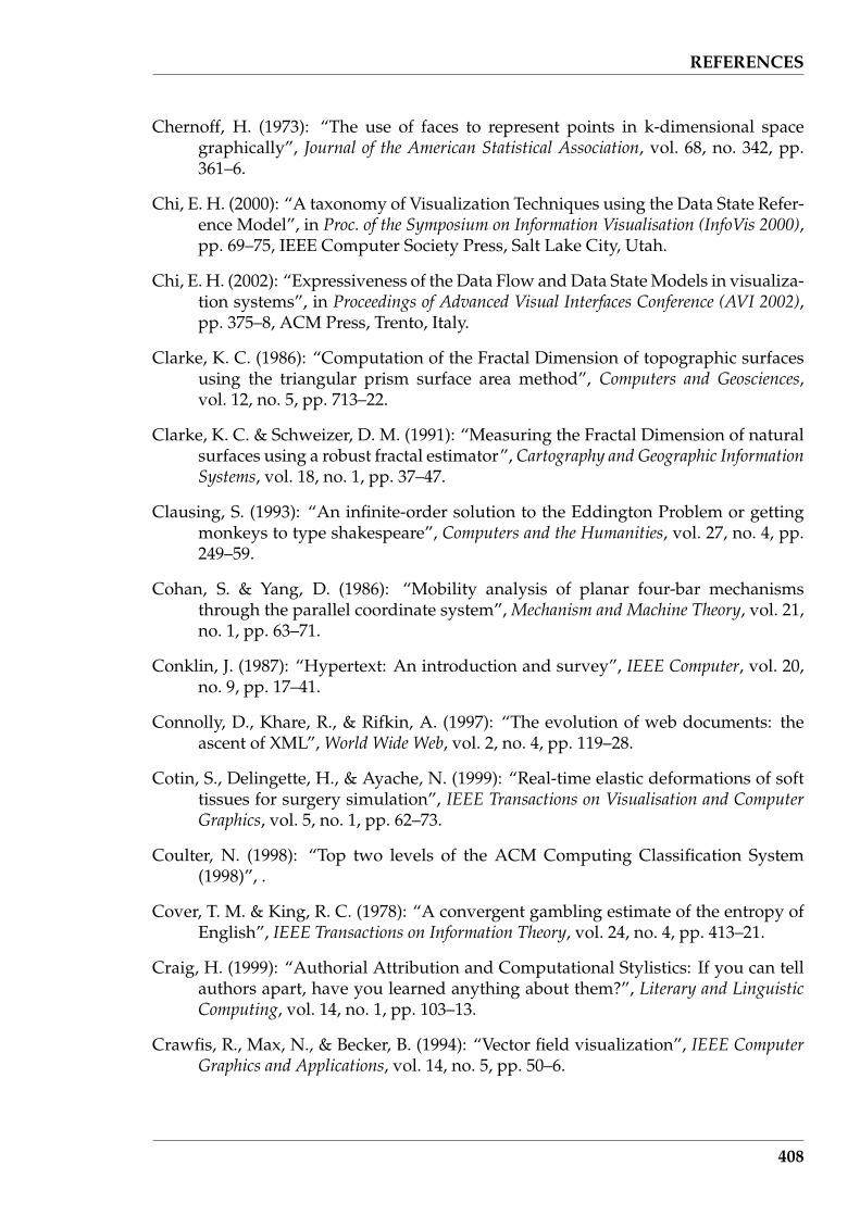
REFERENCES
Chernoff, H. (1973): “The use of faces to represent points in k-dimensional spacegraphically”, Journal of the American Statistical Association, vol. 68, no. 342, pp.361–6.
Chi, E. H. (2000): “A taxonomy of Visualization Techniques using the Data State Refer-ence Model”, in Proc. of the Symposium on Information Visualisation (InfoVis 2000),pp. 69–75, IEEE Computer Society Press, Salt Lake City, Utah.
Chi, E. H. (2002): “Expressiveness of the Data Flow and Data State Models in visualiza-tion systems”, in Proceedings of Advanced Visual Interfaces Conference (AVI 2002),pp. 375–8, ACM Press, Trento, Italy.
Clarke, K. C. (1986): “Computation of the Fractal Dimension of topographic surfacesusing the triangular prism surface area method”, Computers and Geosciences,vol. 12, no. 5, pp. 713–22.
Clarke, K. C. & Schweizer, D. M. (1991): “Measuring the Fractal Dimension of naturalsurfaces using a robust fractal estimator”, Cartography and Geographic InformationSystems, vol. 18, no. 1, pp. 37–47.
Clausing, S. (1993): “An infinite-order solution to the Eddington Problem or gettingmonkeys to type shakespeare”, Computers and the Humanities, vol. 27, no. 4, pp.249–59.
Cohan, S. & Yang, D. (1986): “Mobility analysis of planar four-bar mechanismsthrough the parallel coordinate system”, Mechanism and Machine Theory, vol. 21,no. 1, pp. 63–71.
Conklin, J. (1987): “Hypertext: An introduction and survey”, IEEE Computer, vol. 20,no. 9, pp. 17–41.
Connolly, D., Khare, R., & Rifkin, A. (1997): “The evolution of web documents: theascent of XML”, World Wide Web, vol. 2, no. 4, pp. 119–28.
Cotin, S., Delingette, H., & Ayache, N. (1999): “Real-time elastic deformations of softtissues for surgery simulation”, IEEE Transactions on Visualisation and ComputerGraphics, vol. 5, no. 1, pp. 62–73.
Coulter, N. (1998): “Top two levels of the ACM Computing Classification System(1998)”, .
Cover, T. M. & King, R. C. (1978): “A convergent gambling estimate of the entropy ofEnglish”, IEEE Transactions on Information Theory, vol. 24, no. 4, pp. 413–21.
Craig, H. (1999): “Authorial Attribution and Computational Stylistics: If you can tellauthors apart, have you learned anything about them?”, Literary and LinguisticComputing, vol. 14, no. 1, pp. 103–13.
Crawfis, R., Max, N., & Becker, B. (1994): “Vector field visualization”, IEEE ComputerGraphics and Applications, vol. 14, no. 5, pp. 50–6.
408
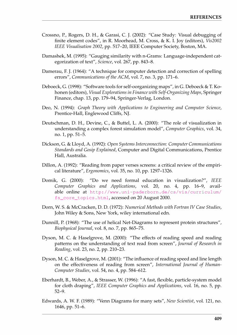
REFERENCES
Crossno, P., Rogers, D. H., & Garasi, C. J. (2002): “Case Study: Visual debugging offinite element codes”, in R. Moorhead, M. Cross, & K. I. Joy (editors), Vis2002IEEE Visualisation 2002, pp. 517–20, IEEE Computer Society, Boston, MA.
Damashek, M. (1995): “Gauging similarity with n-Grams: Language-independent cat-egorization of text”, Science, vol. 267, pp. 843–8.
Damerau, F. J. (1964): “A technique for computer detection and correction of spellingerrors”, Communications of the ACM, vol. 7, no. 3, pp. 171–6.
Deboeck, G. (1998): “Software tools for self-oorganizing maps”, in G. Deboeck & T. Ko-honen (editors), Visual Explorations in Finance with Self-Organizing Maps, SpringerFinance, chap. 13, pp. 179–94, Springer-Verlag, London.
Deo, N. (1994): Graph Theory with Applications to Engineering and Computer Science,Prentice-Hall, Englewood Cliffs, NJ.
Deutschman, D. H., Devine, C., & Buttel, L. A. (2000): “The role of visualization inunderstanding a complex forest simulation model”, Computer Graphics, vol. 34,no. 1, pp. 51–5.
Dickson, G. & Lloyd, A. (1992): Open Systems Interconnection: Computer CommunicationsStandards and Gosip Explained, Computer and Digital Communications, PrenticeHall, Australia.
Dillon, A. (1992): “Reading from paper verses screens: a critical review of the empiri-cal literature”, Ergonomics, vol. 35, no. 10, pp. 1297–1326.
Domik, G. (2000): “Do we need formal education in visualization?”, IEEEComputer Graphics and Applications, vol. 20, no. 4, pp. 16–9, avail-able online at http://www.uni-paderborn.de/cs/vis/curriculum/fs_core_topics.html, accessed on 20 August 2000.
Dorn, W. S. & McCracken, D. D. (1972): Numerical Methods with Fortran IV Case Studies,John Wiley & Sons, New York, wiley international edn.
Dunnill, P. (1968): “The use of helical Net-Diagrams to represent protein structures”,Biophysical Journal, vol. 8, no. 7, pp. 865–75.
Dyson, M. C. & Haselgrove, M. (2000): “The effects of reading speed and readingpatterns on the understanding of text read from screen”, Journal of Research inReading, vol. 23, no. 2, pp. 210–23.
Dyson, M. C. & Haselgrove, M. (2001): “The influence of reading speed and line lengthon the effectiveness of reading from screen”, International Journal of Human-Computer Studies, vol. 54, no. 4, pp. 584–612.
Eberhardt, B., Weber, A., & Strasser, W. (1996): “A fast, flexible, particle-system modelfor cloth draping”, IEEE Computer Graphics and Applications, vol. 16, no. 5, pp.52–9.
Edwards, A. W. F. (1989): “Venn Diagrams for many sets”, New Scientist, vol. 121, no.1646, pp. 51–6.
409
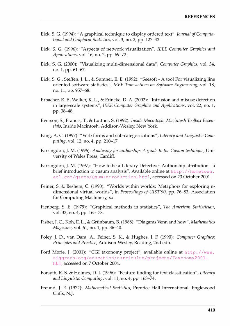
REFERENCES
Eick, S. G. (1994): “A graphical technique to display ordered text”, Journal of Computa-tional and Graphical Statistics, vol. 3, no. 2, pp. 127–42.
Eick, S. G. (1996): “Aspects of network visualization”, IEEE Computer Graphics andApplications, vol. 16, no. 2, pp. 69–72.
Eick, S. G. (2000): “Visualizing multi-dimensional data”, Computer Graphics, vol. 34,no. 1, pp. 61–67.
Eick, S. G., Steffen, J. L., & Sumner, E. E. (1992): “Seesoft - A tool For visualizing lineoriented software statistics”, IEEE Transactions on Software Engineering, vol. 18,no. 11, pp. 957–68.
Erbacher, R. F., Walker, K. L., & Frincke, D. A. (2002): “Intrusion and misuse detectionin large-scale systems”, IEEE Computer Graphics and Applications, vol. 22, no. 1,pp. 38–48.
Everson, S., Francis, T., & Luttner, S. (1992): Inside Macintosh: Macintosh Toolbox Essen-tials, Inside Macintosh, Addison-Wesley, New York.
Fang, A. C. (1997): “Verb forms and sub-categorizations”, Literary and Linguistic Com-puting, vol. 12, no. 4, pp. 210–17.
Farringdon, J. M. (1996): Analysing for authorship: A guide to the Cusum technique, Uni-versity of Wales Press, Cardiff.
Farringdon, J. M. (1997): “How to be a Literary Detective: Authorship attribution - abrief introduction to cusum analysis”, Available online at http://hometown.aol.com/qsums/QsumIntroduction.html, accessed on 23 October 2001.
Feiner, S. & Beshers, C. (1990): “Worlds within worlds: Metaphors for exploring n-dimensional virtual worlds”, in Proceedings of UIST’90, pp. 76–83, Associationfor Computing Machinery, xx.
Fienberg, S. E. (1979): “Graphical methods in statistics”, The American Statistician,vol. 33, no. 4, pp. 165–78.
Fisher, J. C., Koh, E. L., & Grunbaum, B. (1988): “Diagams Venn and how”, MathematicsMagazine, vol. 61, no. 1, pp. 36–40.
Foley, J. D., van Dam, A., Feiner, S. K., & Hughes, J. F. (1990): Computer Graphics:Principles and Practice, Addison-Wesley, Reading, 2nd edn.
Ford Morie, J. (2001): “CGI taxonomy project”, available online at http://www.siggraph.org/education/curriculum/projects/Taxonomy2001.htm, accessed on 7 October 2004.
Forsyth, R. S. & Holmes, D. I. (1996): “Feature-finding for text classification”, Literaryand Linguistic Computing, vol. 11, no. 4, pp. 163–74.
Freund, J. E. (1972): Mathematical Statistics, Prentice Hall International, EnglewoodCliffs, N.J.
410

REFERENCES
Friedman, J. H. & Tukey, J. W. (1974): “A projection pursuit algorithm for exploratorydata analysis”, IEEE Tranactions on Computers, vol. 23, no. 9, pp. 881–90.
Fua, Y.-H., Ward, M. O., & Rundersteiner, E. A. (2000): “Structure-based brushes:A mechanism for navigating hierarchically organized data and informationspaces”, IEEE Transactions on Visualization and Computer Graphics, vol. 6, no. 2,pp. 150–9.
Furnas, G. W. (1999): “The FISHEYE view: A new look at structured files”, in S. K.Card, J. D. Mackinlay, & B. Shneiderman (editors), Readings in Information Visu-alization: Using Vision to Think, pp. 312–30, Morgan Kaufmann Publishers Inc,San Francisco, CA.
Furnas, G. W. & Buja, A. (1994): “Prosections views: Dimensional inference throughsections and projections”, Journal of Computational and Graphical Statistics, vol. 3,no. 4, pp. 323–53.
Gaboriaud, C., Bissery, V., Benchetrit, T., & Mornon, J. (1987): “Hybrophobic ClusterAnalysis: An efficient new way to compare and analyse amino acid sequences”,FEBS Letters, vol. 224, no. 1, pp. 149–55.
Garrett, R. H. & Grisham, C. M. (1999): Biochemistry, Saunders College Publishing,Fort Worth, second edn.
Gennings, C., Dawson, K. S., Carter, W. H., & Myers, R. H. (1990): “Interpreting plotsof a multidimensional dose-response surface in a parallel coordinate system”,Biometrics, vol. 46, no. 3, pp. 719–35.
Gershon, N. (1996): “Moving happily through the World Wide Web”, IEEE ComputerGraphics and Applications, vol. 16, no. 2, pp. 72–5.
Gershon, N. & Eick, S. G. (1995): “Visualization’s new tack: Making sense of informa-tion”, IEEE Spectrum, vol. 32, no. 11, pp. 38–40,42,44–47,55–56.
Goossens, M., Rahtz, S., Gurari, E., Moore, R., & Sutor, R. (1999): The LATEX Web Com-panion: Integrating TEX, HTML, and XML, Addison-Wesley, Reading, MA.
Grassberger, P. (1989): “Estimating the information content of symbol sequences andefficient codes”, IEEE Transactions on Information Theory, vol. 35, no. 3, pp. 669–75.
Greenbaum, J. (1994): “Why SGML is so hot in Europe”, Open Computing, vol. 11, no. 6,pp. 73–4.
Grefenstette, G. & Tapanainen, P. (1994): “What is a word, What is a sentence? Prob-lems in Tokenization”, in Proceedings of the Third International Conference on Com-putational Lexicography, pp. 79–87, Budapest.
Grunbaum, B. (1975): “Venn Diagrams and independent families of sets”, MathematicsMagazine, vol. 48, no. 1, pp. 12–23.
411
REFERENCES
Guttman, M. A., Zerhouni, E. A., & McVeigh, E. R. (1997): “Analysis of cardiac func-tion from MR images”, IEEE Computer Graphics and Applications, vol. 17, no. 1,pp. 30–8.
Hamori, E. & Ruskin, J. (1983): “H Curves, A novel method of representation of nu-cleotide series especially suited for long DNA sequences”, The Journal of Biologi-cal Chemistry, vol. 258, no. 2, pp. 1318–27.
Handa, S., Kasiwagi, H., & Takada, T. (2001): “Visualization techniques for 3D vectorfields: An application to electrostatic fields of molecules”, Journal of Visualizationand Computer Animation, vol. 12, no. 3, pp. 167–80.
Havre, S., Hetzler, B., & Nowell, L. (1999): “ThemeRiver: In search of trends, pat-terns, and relationships”, in Proceedings of IEEE Symposium on Information Vi-sualization (InfoViz’99), San Francisco, CA., 25-26 October, IEEE Service Cen-ter, Atlanta, GA, available online at http://multimedia.pnl.gov:2080/infoviz/themeriver99.pdf, accessed 2 June 2000.
Havre, S., Hetzler, E., Whitney, P., & Nowell, L. (2002): “ThemeRiver: Visualizing the-matic changes in large document collections”, IEEE Transacctions on Visualizationand Computer Graphics, vol. 8, no. 1, pp. 9–20.
Hayes, B. (1983): “Computer Recreations: A process report on the fine artof turning literature into drivel”, Scientific American, vol. 249, no. 5, pp.18,21,24,24A,24D,25,26,28.
Hendley, R., Drew, N., Wood, A., & Beale, R. (1999): “Narcissus: Visualising infor-mation”, in S. K. Card, J. D. Mackinlay, & B. Shneiderman (editors), Readings inInformation Visualization: Using Vision to Think, pp. 503–11, Morgan KaufmannPublishers Inc, San Francisco, CA.
Herman, I., Melancon, G., de Ruiter, M., & Delest, M. (1999): Latour - a tree visu-alisation system, Tech. Rep. INS-R9904, National Research Institute for Mathe-matics and Computer Science (CWI), Amsterdam, available online at http://www.cwi.nl/InfoVisu/papers/LatourOverview.pdf, accessed on 7November 2000.
Herman, I., Melancon, G., & Marshall, M. S. (2000): “Graph visualization and navi-gation in Information Visualization: A survey”, IEEE Transations on Visualizationand Computer Graphics, vol. 6, no. 1, pp. 24–43.
Hetzler, B., Harris, W. M., Havre, S., & Whitney, P. (1998a): “Visualizing the Full Spec-trum of Document Relationships”, in Proceedings of the 5th International ISKOConference: Structures and Relations in Knowledge Organization, pp. 168–75, ER-GON Verlag, Wurzburg, available online at http://multimedia.pnl.gov:2080/infoviz/isko.pdf, accessed on 2 June 2000.
Hetzler, B., Whitney, P., Martucci, L., & Thomas, J. (1998b): “Multi-faceted insightthrough interoperable visual information analysis paradigms”, in Proceedingsof IEEE Symposium on Information Visualization (InfoViz’98), Research TrianglePark, North Carolina, 19-20 October, pp. 137–44, IEEE Service Center, Atlanta,
412
REFERENCES
GA., available online at http://multimedia.pnl.gov:2080/infoviz/insight.pdf, accessed on 2 June 2000.
Hilton, M. L. & Holmes, D. I. (1993): “An Assessment of Cumulative Sum Charts forAuthorship Attribution”, Literary and Linguistic Computing, vol. 8, no. 2, pp. 73–80.
Hinneburg, A., Keim, D. A., & Wawryniuk, M. (1999): “HD-Eye: Visual mining ofhigh-dimensional data”, IEEE Computer Graphics and Applications, vol. 19, no. 5,pp. 22–31.
Holmes, D. (1992): “A Stylometric Analysis of Mormon scripture and related texts”,Journal of the Royal Statistical Society (A), vol. 155, no. 1, pp. 91–120.
Holmes, D. & Forsyth, R. (1995): “The Federalist revisited: New directions in author-ship attribution”, Literary and Linguistic Computing, vol. 10, no. 2, pp. 111–27.
Holmes, D. I. (1994): “”Authorship attribution””, Computers and the Humanities, vol. 28,no. 2, pp. 87–106.
Hoorn, J. F., Frank, S. L., Kowalczyk, W., & van der Ham, F. (1999): “Neural networkidentification of poets using letter sequences”, Literary and Linguistic Computing,vol. 14, no. 3, pp. 311–38.
Humphreys, R. L. (1992): “Technical Note: Perl for literary and linguistic computing”,Literary amd Linguistic Computing, vol. 7, no. 3, pp. 194–8.
Inselberg, A. (1985): “The plane with Parallel Coordinates, Special issue on Computa-tional Geometry”, The Visual Computer: International Journal of Computer Graphics,vol. 1, no. 2, pp. 69–91.
Inselberg, A. (1999): “Multidimensional detective”, in S. K. Card, J. D. Mackinlay, &B. Shneiderman (editors), Readings in Information Visualization: Using Vision toThink, pp. 107–14, Morgan Kaufmann Publishers Inc., San Francisco, CA.
ISO:8879 (1986): “Information Processing – Text and Office Systems – Standard Gen-eralized Markup Language (SGML)”, International Standards Organisation.
Iversen, G. R. (1984): Bayesian Statistical Inference, no. 07-043 in Sage University Pa-per series in Quantitative Applications in the Social Sciences, Sage Publications,Newbury Park, CA.
Jensen, K. & Wirth, N. (1975): Pascal User Manual and Report, Springer-Verlag, NewYork, second edn.
Jerding, D. F. & Stasko, J. T. (1998): “The Information Mural: A technique for display-ing and navigating large information spaces”, IEEE Transactions on Visualizationand Computer Graphics, vol. 4, no. 3, pp. 257–71.
Johannsen, A. & Moorhead, R. J., II (1995): “AGP: Ocean model flow visualization”,IEEE Computer Graphics and Applications, vol. 15, no. 4, pp. 28–33.
413
REFERENCES
Johnson, B. & Shneiderman, B. (1999): “Tree-Maps: A space-filling approach to the vi-sualization of hierarchical information structures”, in S. K. Card, J. D. Mackinlay,& B. Shneiderman (editors), Readings in Information Visualization: Using Vision toThink, pp. 152–9, Morgan Kaufmann Publishers Inc, San Francisco, CA.
Kallman, J. S., De Groot, A. J., Hoover, C. G., & Hoover, W. G. (1995): “Visualizationtechniques for molecular dynamics”, IEEE Computer Graphics and Applications,vol. 15, no. 6, pp. 72–7.
Karnaugh, M. (1953): “The map method for synthhesis of combinational logic cir-cuits”, Transactions of the American Institute of Electrical Engineers, Part 1, vol. 72,no. 9, pp. 593–9.
Kaye, B. H. (1993): Chaos and Complexity: Discovering the Surprising Patterns of Scienceand Technology, VCH Verlagsgesellschaft mbH, Weinheim, Germany.
Keim, D. A. (2002): “Information visualization and visual data mining”, IEEE Transac-tionson Visualization and Computer Graphics, vol. 8, no. 1, pp. 1–8.
Keim, D. A., Hao, M. C., & Dayal, U. (2002): “Hierarchical pixel bar charts”, IEEETransactions on Visualization and Computer Graphics, vol. 8, no. 3, pp. 255–69.
Keim, D. A. & Kriegel, H.-P. (1994): “VisDB: Database exploration using multidemen-sional visualization”, IEEE Computer Graphics and Applications, vol. 14, no. 5, pp.40–9.
Keller, P. R. & Keller, M. M. (1993): Visual Cues: Practical Data Visualization, IEEE Com-puter Society Press, Los Alamitos, CA.
Kenwright, D. N. & Haimes, R. (1998): “Automatic vortex core detection”, IEEE Com-puter Graphics and Applications, vol. 18, no. 4, pp. 70–4.
Kilgarriff, A. (1996): “Putting frequencies in the dictionary”, International Journal ofLexicography, vol. 10, no. 2, pp. 135–55.
Kjell, B. (1994): “Authorship determination using letter pair frequency features withneural network clarifiers”, Literary and Linguistic Computing, vol. 9, no. 2, pp.120–4.
Knuth, D. E. (1986): The TEXbook, vol. A of Computers & Typesetting, Addison-Wesley,Reading, MA.
Kohonen, T. (1990): “The Self-Organizing Map”, Proceeding of the IEEE, vol. 78, no. 9,pp. 1464–80.
Kohonen, T. (2001): Self-Organizing Maps, Springer, Berlin, 3rd edn.
Koike, H. (1995): “Fractal Views: A Fractal-based method for controlling informationdisplay”, ACM Transations on Information Systems, vol. 13, no. 3, pp. 305–23.
Kolln, M. (1986): Understanding English Grammar, Macmillan Publishing Company,New York, 2nd edn.
414

REFERENCES
Koutsofios, E. E., North, S. C., & Keim, D. A. (1999): “Visualizing large telecommu-nication data sets”, IEEE Computer Graphics and Applications, vol. 19, no. 3, pp.16–9.
Kukich, K. (1992): “Techniques for automatically correcting words in text”, ACM Com-puting Surveys, vol. 24, no. 4, pp. 377–439.
Kuschfeldt, S., Holzner, M., Sommer, O., & Ertl, T. (1998): “Efficient visualization ofcrash-worthiness simulations”, IEEE Computer Graphics and Applications, vol. 18,no. 4, pp. 60–5.
Lamping, J. & Rao, R. (1996): “The Hyperbolic Browser: A Focus + Context tech-nique for visualizing large hierarchies”, Journal of Visual Languages and Comput-ing, vol. 7, no. 1, pp. 33–55.
Lawrence, S. & Giles, C. L. (1999): “Accessibility of information on the Web”, Nature,vol. 400, no. 6740, pp. 107–9.
Leysen, S., van Iterson, A., Bols, T., & Fell, M. (2000): “Brussels Internet Survey”,Accessed 5 March 2005.URL: www.moorris-chapman.com/hosted/bis/html/bishome.html
Li, W. (1992): “Random texts exhibit Zipf’s-law-like word frequency distribution”,IEEE Transactions on Information Theory, vol. 38, no. 6, pp. 1842–5.
Lin, X. (1999): “Visualization for the Document Space”, in S. K. Card, J. D. Mackinlay,& B. Shneiderman (editors), Readings in Information Visualization: Using Vision toThink, pp. 432–9, Morgan Kaufmann Publishers Inc, San Francisco, CA.
Lorensen, W. E. & Yamrom, B. (1992): “Golf green visualization”, IEEE ComputerGraphics and Applications, vol. 12, no. 4, pp. 35–44.
Lyman, P. & Varian, H. R. (2000): “How much information”, Downloaded 16 April2002.URL: http://www.sims.berkeley.edu/how-much-info
MacDonald, L. W. (1999): “Using color effectively in computer graphics”, IEEE Com-puter Graphics and Applications, vol. 19, no. 4, pp. 20–35.
MacGinitie, W. H. (1961): “Contextual constraint in English prose paragraphs”, TheJournal of Psychology, vol. 51, pp. 121–30.
Mandelbrot, B. B. (1983): The Fractal Geometry of Nature, W.H. Freeman & Compnay,New York.
Manning, C. D. & Schutze, H. (1999): Foundations of Statistical Natural Language Pro-cessing, MIT Press.
Marsan, M. A., Gribaudo, M., Meo, M., & Sereno, M. (2001): “On Petri Net-basedmodeling paradigms for the performance analysis of wireless Internet accesses”,in 9th IEEE International Workshop on Petri Nets & Performance Models, Aachen,Germany, 11-14 September, pp. 19–28, IEEE Computer Society.
415
REFERENCES
Martindale, C. & McKenzie, D. (1995): “On the utility of Content Analysis in authorattribution: The Federalist”, Computers and the Humanities, vol. 29, no. 4, pp.259–70.
Martindale, C. & Tuffin, P. (1996): “If Homer is the Poet of the Iliad, then he may notbe the poet of the Odyssey”, Literary and Linguistic Computing, vol. 11, no. 3, pp.109–20.
Matthews, R. A. & Merriam, T. V. (1993): “Neural computation in Stylometry I: Anapplication to the works of Shakespeare and Fletcher”, Literary and LinguisticComputing, vol. 8, no. 4, pp. 203–9.
McConkie, G. W., Rayner, K., & Wilson, S. J. (1973): “Experimental manipulation ofreading strategies”, Journal of Educational Psychology, vol. 65, no. 1, pp. 1–8.
McCormick, B. H., DeFanti, T. A., & Brown, M. D. (1987): “Visualization in ScientificComputing”, Computer Graphics, vol. 21, no. 6, p. whole issue.
Merriam, T. V. N. & Matthews, R. A. J. (1994): “Neural computation in Stylometry II:An application to the works of Shakespeare and Marlowe”, Literary and Linguis-tic Computing, vol. 9, no. 1, pp. 1–6.
Miller, N., Hetzler, B., Nakamura, G., & Whitney, P. (1997): “The need for metricsin visual information analysis”, in Proceedings of Workshop on New Paradigms inInformation and Manipulation, ACM Press, Las Vegas, Nevada, 13-14 Novem-ber, available online at http://multimedia.pnl.gov:2080/infoviz/MetricNeedsforViz.pdf, accessed on 2 June 2000.
Miller, N. E., Wong, P. C., Brewster, M., & Foote, H. (1998): “TROPIC ISLAND- A wavelet-based text visualization system”, in Proceedings of IEEE Sympo-sium on Information Visualization (InfoVis’98), Research Triangle Park, NorthCarolina, 19-20 October, IEEE Service Center, Atlanta, GA., available onlineat http://multimedia.pnl.gov:2080/infoviz/vis98paper.pdf, ac-cessed on 19 June 2000.
Montgomery, D. C. (1997): Introduction to Statistical Quality Control, John Wiley & Sons,New York, third edn.
Moradi, H., Grzymala-Busse, J. W., & Roberts, J. A. (1998): “Entropy of English text:experiments with humans and a machine learning system based on rough sets”,Information Sciences, vol. 104, no. 1, pp. 31–47.
Morgan, C. J. & Vezina, G. (1993): “Visualizing soil surfaces and crop residues”, IEEEComputer Graphics and Applications, vol. 13, no. 2, pp. 40–7.
Mosteller, F. & Wallace, D. L. (1984): Applied Bayesian and Classical Inference: The Case ofThe Federalist Papers, Springer Series in Statistics, Springer-Verlag, New York.
Munzner, T. (1998): “Exploring large graphs in 3D hyperbolic space”, IEEE ComputerGraphics and Applications, vol. 18, no. 4, pp. 18–23.
416
REFERENCES
Muter, P. & Maurutto, P. (1991): “Reading and skimming from computer screensand books: the paperless office revisited?”, Behaviour and Information Technology,vol. 10, no. 4, pp. 257–66.
Myers, B. A. (1990): “Taxonomies of visual programming and program visualization”,Journal of Visual Languages and Computing, vol. 1, no. 1, pp. 97–123.
Nielson, G. M. (1993): “Scattered data modeling”, IEEE Computer Graphics and Appli-cations, vol. 13, no. 1, pp. 60–70.
Nilo, J., Binongo, G., & Smith, M. (1999): “The Application of Principal ComponentAnalysis to Stylometry”, Literary and Linguistic Computing, vol. 14, no. 4, pp.445–65.
Ninio, J. & Mizraji, E. (1995): “Preceptive features in graphical representations of nu-cleic acid sequences”, in C. A. Pickover (editor), Visualizing Biological Information,pp. 33–42, World Scientific, Singapore.
Novak, J. D. (1991): “Clarify with Concept Maps”, The Science Teacher, vol. 58, no. 7,pp. 45–9.
OLIVE (1998): “On-line library of Information Visualization environments”, Availableonline at http://otal.umd.edu/Olive, accessed on 7 October 2004.
Pajon, J. L. & Bui Tran, V. (1992): “Discrete Data Visualization in Geology”, in F. H. Post& A. J. S. Hin (editors), Advances in Scientific Visualization, pp. 22–36, Springer-Verlag, Berlin.
Peitgen, H.-O., Jurgens, H., & Saupe, D. (1992): Chaos and Fractals: New Frontiers ofScience, Springer-Verlag, New York.
Peterson, J. L. (1981): Petri Net Theory and the Modeling of Systems, Prentice-Hall, Engle-wood Cliffs.
Piggott, M. (1990): The Catalogue’s Way Through AACR2, The Library Association, Lon-don.
Pingali, G., Opalach, A., Jean, Y., & Carlbom, I. (2001): “Visualization of sport usingmotion trajectories: Providing insights into performance, style and strategy”,in T. Ertl, K. Joy, & A. Varshney (editors), Proceedings of Visualization 2001, pp.75–82, IEEE Computer Society, San Diego.
Price, B. A., Baecher, R. M., & Small, I. S. (1993): “A principled taxonomy of softwarevisualization”, Journal of Visual Langauges and Computing, vol. 4, no. 3, pp. 211–66.
Radford, A. (1988): Transformational Grammar: A First Course, Cambridge UniversityPress.
Rao, R. & Card, S. K. (1999): “The Table Lens: Merging graphical and symbolic rep-resentations in an interactive Focus+Context visualization for tabular informa-tion”, in S. K. Card, J. D. Mackinlay, & B. Shneiderman (editors), Readings in In-formation Visualization, pp. 343–9, Morgan Kaufmann Publishers, Inc., San Fran-cisco.
417
REFERENCES
Rao, R., Pedersen, J. O., Hearst, M. A., MacKinlay, J. D., Card, S. K., Masinter, L.,Halvorsen, P.-K., & Robertson, G. G. (1995): “Rich interaction in the digital li-brary”, Communications of the ACM, vol. 38, no. 4, pp. 29–39.
Rayner, K. & Pollatsek, A. (1989): The Psychology of Reading, Lawrence Erlbaum Asso-ciates, Hillsdale, New Jersey.
Reiss, S. P. (1995): “An engine for the 3D visualization of program information”, Jour-nal of Visual Languages and Computing, vol. 6, no. 3, pp. 299–323.
Rhyne, T., Bolstad, M., Rheingans, P., Petterson, L., & Shackelford, W. (1993): “Visual-izing environmental data at the EPA”, IEEE Computer Graphics and Applications,vol. 13, no. 2, pp. 34–8.
Roberts, L. G. (2000): “Beyond Moore’s Law: Internet growth trends”, IEEE Computer,vol. 33, no. 1, pp. 117–9.
Robertson, G. G., Card, S. K., & Mackinlay, J. D. (1993): “Information Visualizationusing 3D interactive animation”, Communications of the ACM, vol. 36, no. 4, pp.57–71.
Robertson, G. G. & Mackinlay, J. D. (1999): “The Document Lens”, in S. K. Card, J. D.Mackinlay, & B. Shneiderman (editors), Readings in Information Visualization: Us-ing Vision to Think, pp. 562–9, Morgan Kaufmann Publishers Inc, San Francisco,CA.
Rohrer, R. M., Sibert, J. L., & Ebert, D. S. (1999): “A shape-based visual interface fortext retrieval”, IEEE Computer Graphics and Applications, vol. 19, no. 5, pp. 40–5.
Rohrer, R. M. & Swing, E. (1997): “Web-Based information visualization”, IEEE Com-puter Graphics and Applications, vol. 17, no. 4, pp. 52–9.
Rose, S. & Wong, P. C. (2000): “DriftWeed - A visual metaphor for interactive anal-ysis of multivariate data”, in Proceedings of IS&T/SPIE Conference on VisualData Exploration and Analysis, San Jose, CA, January, available online at http://multimedia.pnl.gov:2080/infoviz/SPIE2000Driftweed.pdf, ac-cessed on 18 October 2000.
Rushmeier, H., Hamins, A., & Chio, M. Y. (1995): “Volume rendering of pool fire data”,IEEE Computer Graphics and Applications, vol. 15, no. 4, pp. 62–7.
Salton, G., Allan, J., Buckley, C., & Singhal, A. (1995): “Automatic analysis, themegeneration, and summarization of machine-readable texts”, Science, vol. 264, no.5164, pp. 1421–6.
Sammon, J. W. (1969): “A nonlinear mapping for data structure analysis”, IEEE Trans-actions on Computers, vol. C-18, no. 5, pp. 401–9.
Sarkar, M. & Brown, M. H. (1994): “Graphical Fisheye Views”, Communications of theACM, vol. 37, no. 12, pp. 73–84.
Schilit, B., Price, M., Golovchinsky, G., Tanaka, K., & Marshall, C. (1999): “As we mayread: The reading appliance revolution”, Computer, vol. 32, no. 1, pp. 65–73.
418

REFERENCES
Schneider, T. D. & Stephens, R. M. (1990): “Sequence logos: a new way to displayconsensus sequences”, Nucleic Acids Research, vol. 18, no. 20, pp. 6097–6100.
Schulz, M., Reuding, T., & Ertl, T. (1998): “Analyzing engineering simulations in avirtual environment”, IEEE Computer Graphics and Applications, vol. 18, no. 6,pp. 46–52.
Schwartz, R. L. & Christiansen, T. (1997): Learning Perl, O’Reilly & Associates, Se-bastopol, CA, 2nd edn.
Shannon, C. E. (1948): “A mathematical theory of communications”, Bell System Tech-nical Journal, vol. 27, pp. 379–423.
Shannon, C. E. (1951): “Prediction and entropy of printed English”, Bell System Techni-cal Journal, vol. 30, pp. 50–64.
Shen, H. & Kao, D. L. (1998): “A new line integral convolution algorithm for visual-izing time-varying flow fields”, IEEE Transactions on Visualization and ComputerGraphics, vol. 4, no. 2, pp. 98–108.
Shneiderman, B. (1996): “The eyes have it: A task by Data Type Taxonomy for Infor-mation Visualization”, in Proceedings of IEEE Workshop on Visual Languages ’96,pp. 336–43, IEEE Computer Society Press.
Silver, D. (1995): “Object-oriented visualization”, IEEE Computer Graphics and Applica-tions, vol. 15, no. 3, pp. 54–62.
Silver, D. & Wang, X. (1997): “Tracking and visualizing turbulant 3D features”, IEEETransactions on Visualization and Computer Graphics, vol. 3, no. 2, pp. 129–41.
Skupin, A. (2000): “From metaphor to method: Cartographic perspectives on Infor-mation Visualization”, in Proceedings of the 2000 IEEE Symposium on InformationVisualization, pp. 91–7, IEEE, IEEE Publications, Sal Lake City, Utah.
Skupin, A. (2002): “A cartographic approach to visualizing conference abstracts”, IEEEComputer Graphics and Applications, vol. 22, no. 1, pp. 50–8.
Spetsieris, P. G., Dhawan, V., Takikawa, S., Margouleff, D., & Eidelberg, D. (1993):“Imaging cerebral function”, IEEE Computer Graphics and Applications, vol. 13,no. 1, pp. 15–26.
Stolk, J. & van Wijk, J. J. (1992): “Surface-particles for 3D flow visualization”, inF. H. Post & A. J. S. Hin (editors), Advances in Scientific Visualization, pp. 119–30, Springer-Verlag, Berlin.
Strahle, W. C. (1991): “Turbulent combustion data analysis using fractals”, AIAA Jour-nal, vol. 29, no. 3, pp. 409–17.
Suen, C. Y. (1979): “n-Gram statistics for natural language understanding and textprocessing”, IEEE Transactions on Pattern Analsis and Machine Intelligence, vol.PAMI-1, no. 2, pp. 164–72.
Swan, M. (1995): Practical English Usage, Oxford University Press, second edn.
419

REFERENCES
Taylor, R. M., II (2000): “Practical scientific visualization examples”, Computer Graph-ics, vol. 34, no. 1, pp. 74–9.
Tsujimoto, S. & Asada, H. (1992): “Major components of a complete text reading sys-tem”, Proceedings of the IEEE, vol. 80, no. 7, pp. 1133–49.
Tufte, E. R. (1983): The Visual Display of Quantitative Information, Graphics Press,Cheshire, Connecticut.
Tufte, E. R. (1990): Envisioning Information, Graphics Press, Cheshire, Connecticut.
Tuinman, J. J., Blanton, W. E., & Gray, G. (1975): “A note on Cloze as a measure ofcomprehension”, The Journal of Psychology, vol. 90, pp. 159–62.
Tuinman, J. J. & Gray, G. (1972): “The effect of reducing the redundancy of writtenmessages by deletion of function words”, The Journal of Psychology, vol. 82, pp.299–306.
Tukey, J. W. (1986): “Sunset salvo”, The American Statistician, vol. 40, no. 2, pp. 72–76.
Tweddie, F. J., Singh, S., & Holmes, D. I. (1996): “Neural network applications in Sty-lometry: The Federalist Papers”, Computers and the Humanities, vol. 30, no. 1, pp.1–10.
Upson, C., Faulhaber, T., Kamins, D., Laidlaw, D., Schegel, D., Vroom, J., Gurwitz, R.,& van Dam, A. (1989): “The application visualization system: A computationalenvironment for scientific visualization”, IEEE Computer Graphics and Applica-tions, vol. 9, no. 4, pp. 30–42.
van Ham, F., van de Wetering, H., & van Wijk, J. J. (2002): “Interactive visualization ofstate transition systems”, IEEE Transactions on Visualization and Computer Graph-ics, vol. 8, no. 4, pp. 319–29.
van Wijk, J. J. (1993): “Flow visualization with surface particles”, IEEE Computer Graph-ics and Applications, vol. 13, no. 4, pp. 18–24.
Varshney, A., Frederick P. Brooks, J., & Wright, W. V. (1994): “Computing smoothmolecular surfaces”, IEEE Computer Graphics and Applications, vol. 14, no. 5, pp.19–25.
Voss, R. F. (1988): “Fractals in Nature: From Characterization to Simulation”, in H.-O.Peitgen & D. Saupe (editors), The Science of Fractal Images, chap. 1, pp. 21–70,Springer-Verlag, New York.
Waldherr-Teschner, M., Goetze, T., Heiden, W., Knoblauch, M., Vollhardt, H., & Brick-mann, J. (1992): “MOLCAD - Computer aided visualization and manipulationof models in Molecular Science”, in F. H. Post & A. J. S. Hin (editors), Advancesin Scientific Visualization, pp. 58–67, Springer-Verlag, Berlin.
Waldrop, M. M. (1985): “Personal computers on campus”, Science, vol. 228, no. 4698,pp. 438–44.
420

REFERENCES
Wegman, E. J. (1990): “Hyperdimensional data analysis using Parallel Coordinates”,Journal of the American Statistical Association, vol. 85, no. 411, pp. 664–75.
Wise, J. A., Thomas, J. J., Pennock, K., Lantrip, D., Pottier, M., Schur, A., & Crow, V.(1999): “Visualizing the non-visual: Spatial analysis and interaction with infor-mation for text documents”, in S. K. Card, J. D. Mackinlay, & B. Schneiderman(editors), Readings in Information Visualization: Using Vision to Think, pp. 442–50,Morgan Kaufmann Publishers Inc, San Francisco, CA.
Wolfe, R. W., Needels, M., Arias, T., & Joannopoulos, J. D. (1992): “Visual revela-tions from Silicon ab initio calculations”, IEEE Computer Graphics and Applica-tions, vol. 12, no. 4, pp. 45–53.
Wong, P. C., Cowley, W., Foote, H., Jurrus, E., & Thomas, J. (2000): “Visualizingsequential patterns for text mining”, in Proceesing of IEEE Information Visual-ization 2000, Salt Lake City, Utah, 8-13 October, IEEE Service Center, Atlanta,GA., available online at http://multimedia.pnl.gov:2080/infoviz/sequential_patterns.pdf, accessed on 18 October 2000.
Wong, P. C., Wong, K. K., Foote, H., & Thomas, J. (2003): “Global visualization andalignments of whole bacterial genomes”, IEEE Transactions on Visualization andComputer Graphics, vol. 9, no. 3, pp. 361–77.
Woodward, P. R. (1993): “Interactive Scientific Visualization of fluid flow”, Computer,vol. 26, no. 10, pp. 13–25.
Wright, H. (1992): “SGML frees information”, BYTE, vol. 17, no. 6, pp. 279–82,284,286,.
Yankelovich, N., Meyrowitz, N., & van Dam, A. (1985): “Reading and writing theelectronic book”, IEEE Computer, vol. 18, no. 10, pp. 15–30.
Zipf, G. K. (1949): Human Behavior and the Principle of Least Effort: An Introduction toHuman Ecology, Addison-Wesley, New York.
421